
STATISTICAL ALCHEMY
29
STATISTICAL ALCHEMY Alchemy 1 noun al·che·my \ˈal-kə-mē\ 1. a science that was used in the Middle Ages with the goal of changing ordinary metals into gold Alchemy was a pseudo-science that was attractive to many because if it worked, it would be easy to become wealthy. Imagine being able to turn a common metal into gold. Some modern aspects of Quality science are, quite simply alchemy. They sound really cool. They promise to make our jobs easier and simpler. Most utilize mathematical formulas giving them a veneer of statistical validity. They reference theories most of us have heard of and think we understand. Most also appeal to our human desire to have a yes or no answer 2 . If only they actually worked. This article will test some of your long held beliefs and perhaps validate some of your long held skepticism and nagging doubts. “It ain’t what you don’t know that gets you into trouble. It’s what you know for sure that just ain’t so. – Josh Billings, 1874 (popularly and ironically attributed incorrectly to Mark Twain) A rock and a hard place Quality practitioners are caught between two statistical approaches: statistical purity and statistical alchemy. Statistical purity is the realm of theoretical statistics; it is based on the precise estimation of population parameters. Statistical alchemy is primarily the realm of the binary yes or no answer derived from mathematical and physical fallacies. The score mentality I suggest that our fixation on quantifying things is related to our need for a score. Our lives are surrounded by scores. Who won the super bowl? The score will tell you. Should I wear a coat or a jacket? The temperature will tell you. Who’s going to win the election? The poll numbers will tell you. Am I healthy? My blood pressure, heart rate, weight, and cholesterol numbers will tell me. Scores are simple. They are easy to communicate and easy to understand. We are told that we need data to make decisions. We accept a number at face value because we want a simple direct fast easy to understand answer. Unfortunately, we accept numbers at face value. We don’t probe into the test structure; we don’t try to understand the ‘scoring method’ (formula), we don’t even look to ensure that the number wasn’t just randomly selected. It’s a number – that’s data; it must be correct, right? This belief in numbers is so strong that we suffer from cognitive dissonance: even when we know the scoring method is fundamentally flawed and the resulting number has no reliable meaning, we persist in calculating it, reporting it and making decisions based on it. Because it’s a number. And we want it to work. Because it’s a number. Numbers aren’t subjective, right? They are precise. They are exact. They are data.
-
Upload
khangminh22 -
Category
Documents
-
view
2 -
download
0
Transcript of STATISTICAL ALCHEMY

STATISTICAL ALCHEMY Alchemy1
noun al·che·my \ˈal-kə-mē\
1. a science that was used in the Middle Ages with the goal of changing ordinary metals into gold
Alchemy was a pseudo-science that was attractive to many because if it worked, it would be easy to become wealthy. Imagine being able to turn a common metal into gold. Some modern aspects of Quality science are, quite simply alchemy. They sound really cool. They promise to make our jobs easier and simpler. Most utilize mathematical formulas giving them a veneer of statistical validity. They reference theories most of us have heard of and think we understand. Most also appeal to our human desire to have a yes or no answer2. If only they actually worked. This article will test some of your long held beliefs and perhaps validate some of your long held skepticism and nagging doubts.
“It ain’t what you don’t know that gets you into trouble. It’s what you know for sure that just ain’t so. – Josh Billings, 1874 (popularly and ironically attributed incorrectly to Mark Twain)
A rock and a hard place
Quality practitioners are caught between two statistical approaches: statistical purity and statistical alchemy. Statistical purity is the realm of theoretical statistics; it is based on the precise estimation of population parameters. Statistical alchemy is primarily the realm of the binary yes or no answer derived from mathematical and physical fallacies.
The score mentality
I suggest that our fixation on quantifying things is related to our need for a score. Our lives are surrounded by scores. Who won the super bowl? The score will tell you. Should I wear a coat or a jacket? The temperature will tell you. Who’s going to win the election? The poll numbers will tell you. Am I healthy? My blood pressure, heart rate, weight, and cholesterol numbers will tell me. Scores are simple. They are easy to communicate and easy to understand. We are told that we need data to make decisions. We accept a number at face value because we want a simple direct fast easy to understand answer. Unfortunately, we accept numbers at face value. We don’t probe into the test structure; we don’t try to understand the ‘scoring method’ (formula), we don’t even look to ensure that the number wasn’t just randomly selected. It’s a number – that’s data; it must be correct, right? This belief in numbers is so strong that we suffer from cognitive dissonance: even when we know the scoring method is fundamentally flawed and the resulting number has no reliable meaning, we persist in calculating it, reporting it and making decisions based on it. Because it’s a number. And we want it to work. Because it’s a number. Numbers aren’t subjective, right? They are precise. They are exact. They are data.
Deming often paraphrased a quote by William Bruce Cameron1: “Some things that can be counted don’t count and some things that count can’t be counted”. We need to learn that difference.
Three types of statistics
Quality practitioners are charged with detecting, solving and preventing Quality Problems. Theoretical statistics is not focused on or particularly helpful in this aspect of industrial statistics. The difference in focus is best described by understanding the difference between enumerative and analytic studies as set forth by W. Edwards Deming3. In brief, theoretical statistics is primarily focused on precise estimates of population parameters while Quality professionals need to determine causal mechanisms and improve future results. Increased precision in estimates and determination of the underlying distributional model of the data do not accomplish this. Many of the founders of the modern Quality profession were not even statisticians: Shewhart, Deming, Gossett, Seder and Juran among others. Some were degreed statisticians who ‘broke ranks’ such as Dr. Ellis Ott and Dr. Donald Wheeler.
Do NOT misunderstand me. Theoretical statistics is as valuable as any other theoretical pursuit and it has an important role to play in many real life situations; I have immense respect for theoretical statisticians. Without them we wouldn’t have most of our popular and useful statistical tools. I’m not saying that theory isn’t important to quality practitioners. It is important that we understand the theory to truly understand the variation we are trying to reduce. We must remember what Deming said: “without theory, there is nothing to modify or learn; without theory we can only copy2.” However, we must put theory in the right place. Again, Deming said: “Every theory is correct in its own world, but the problem is that the theory may not make contact with this world3.“
Statistical alchemy is a completely different beast. While these methods were developed with good - even honorable - intentions, they have brought nothing but wasted effort and emotion to the Quality profession. So, what are these methods? Fasten your seatbelts, it’s gonna be a bumpy ride.
• The RPN value • The process capability indices (Cp>2, Ppk >1.33) • Measurement error as a percent of the tolerance (<10% is acceptable) • p value <0.05 • Fishbone diagrams
1 William Bruce Cameron, Informal Sociology: A Casual Introduction to Sociological Thinking, Random House, 1963 2 W.E. Deming, The New Economics, MIT Press, 2nd Edition, 2000 3 W.E. Deming, from his 4 day lecture series, “The Deming Institute”, https://blog.deming.org/w-edwards-deming-quotes/large-list-of-quotes-by-w-edwards-deming/

What is wrong with each of these? They are commonly accepted as good Quality practices. Well respected Companies require the use of these methods by their suppliers. But if we take the time to think about these practices and develop a deep understanding of them and the assumptions, interpretations and mathematics behind them we will see that they are rather different than what we would hope they would be; they are indeed flawed.
FMEA and RPN Numbers4,5,6,7,8,9,10
An often overlooked aspect of risk is that it is a vector. Risk is comprised of two independent factors: the severity of the effect of the event and the probability or frequency of occurrence of the event. We do need to be clear about which element of risk we are talking about. Detection is a mitigation of the risk. If we can detect the failure in-house rather than having it detected by the Customer we can reduce the overall cost or effect of a given failure mode. Since these 3 factors of risk are involved in risk management, we have a strong desire to somehow combine them into a single ‘number’. However, as we shall see, the calculation of a mathematical formula is no substitute for thinking.
The Mathematical Fallacies
Now let’s look at the math and understand why the RPN is an invalid mathematical calculation that results in misleading answers.
1. Ordinal data cannot be added or multiplied: RPN = Severity ∗ Occurrence ∗ Detection. Severity, occurrence and detection typically have ranking scales that range from 1-5 or 1-10. There is some operational definition for each ranking value for each category. This ranking results in ordinal data. The reason that ordinal data cannot be multiplied (by the rules of mathematics) is that there is no true zero point and the cell widths are not of equal width and the cell centers are not equidistant from each other. A severity ranking of 2 doesn’t not mean that it is half as severe as a ranking of 4. An example of this width and distance problem is with the occurrence:
Clearly this scale demonstrates a lack of equal cell width as well as unequal distances between cells. Severity and detection suffer from the same lack of underlying inequalities. Multiplying ordinal data that lacks equal width and distance results in wildly disparate numbers that are not obvious from a cursory look at the resulting RPN numbers.
Ordinal data cannot be added or subtracted. The number we assign to a ‘bin’ is not a number in the mathematical sense of counting. Nominal, interval and ratio ‘numbers’ are all counts of real things. The thing may be an object, event or unit of measure of a
Rank1 0.00000067 < 0.67 ppm2 0.00000673 0.0000674 0.00055 0.00256 0.01257 0.0508 0.1259 0.33
10 0.50 > 50%
Occurrence Rate

dimension or property. These are objective in nature. The numbers in an ordinal scale are simply a rank order or sequence. The number is not an objective quantification; it is the name – and ranked order - of importance of a subjective bin. This makes the multiplication of ordinal data even more meaningless. The fact that we assign an integer to each ranking simply masks the lack of numerical requirements necessary to apply standard rules of mathematics. The result of this are two very important complications:
a. The same RPN value doesn’t represent the same risk. For example: As Donald Wheeler points out there are 2 failure modes with an RPN of 360:
Failure Mode Severity Occurrence Detection RPN A 10 9 4 360 B 4 9 10 360
Failure Mode A has a severity of 10 which indicates a serious threat to life and the failure will occur without warning. It has a very high occurrence rating (>1 in 3 or 33% and is “almost inevitable”). The detection ability however, is only moderately high. With this high of an occurrence rate a detection rating of 4 provides very little actual protection; there will inevitably be a substantial number of escapes that are at the highest level of severity. Contrast this with the results for Failure Mode B which has a very low severity (minor disruption, annoying to the Customer if they notice it), a very high occurrence rate and no real way to detect the cause or failure so that the failure is certain to escape to the field. Both have the same RPN, but they are not of the same importance. Clearly a very high severity failure mode whose occurrence level and detection rating ensure that a substantial number of failures (death or serious injury) will occur has a much higher priority than a minor disruption or annoyance even when it is pervasive.
b. Some higher RPNs represent a lower risk than some lower RPNs. For example, compare the following two failure modes:
Failure Mode Severity Occurrence Detection RPN A 9 7 1 63 B 2 7 10 140
Failure mode A has a very high severity (a hazardous event and/or serious legal or regulatory noncompliance) and a high occurrence (AIAG indicates this as a 5% rate) with a very effective detection control (almost every event will be detected). In contrast Failure Mode B has a severity that will not even be noticed by most Customers. It occurs at the same rate as Failure Mode A and will certainly not be detected by the detection control. Failure Mode B is innocuous, yet it has a higher RPN than Failure Mode A which cause a great deal of internal scrap and/or rework
as it is detected and corrected in house. It will certainly have to be fixed – at great expense and potential delay) when it is detected during the Design process in the case of a Design FMEA…Why would anyone work Failure Mode B before Failure Mode A?
These two examples clearly show the fallacy of using the S*O*D formula as a prioritization rating algorithm.
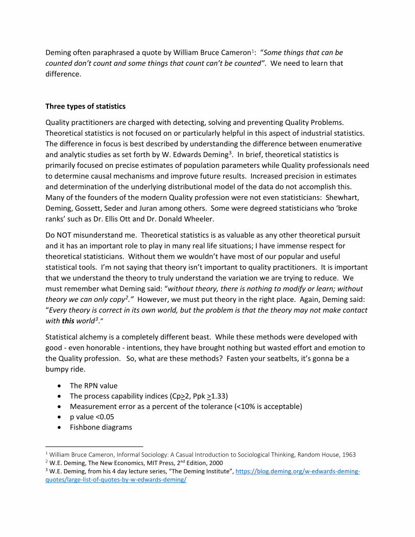
2. The ordinal nature of the data results in only a relatively few possible RPN values. Using a 1-10 scale results in 10∗10∗10 = 1000 combinations, however, there are only 360 unique RPN numbers. In a 1-5 ranking scale there are 125 combinations and 30 unique RPN values. This enables further misperceptions regarding the relative difference in RPN values and their meaning regarding the actual difference in importance of the mathematical difference between RPN numbers.
3. The ranking categories are not independent. This again violates a fundamental
requirement for mathematical operations. Occurrence and Detection are inextricably linked. The ability of any measurement or detection system can be effected by the occurrence rate and the magnitude of the defect or failure. Some examples:
a. A continuous characteristic that is marginal to a (true) specification limit may falsely pass yet fail in the Customer’s use. This is exacerbated when interactions are present. The larger the R&R variation, the larger the potential false accept events.
b. Intermittent failures with a small sample size can escape to users. c. Visual detection is often directly related to the intensity of the defect. (e.g. visual
defects that are small or light are harder to detect than large or dark defects) d. Occurrence rate estimates based on similar product history is subject to under-
reporting by Customers and the use of Customer complaint ‘buckets’ or causal buckets from Service personnel which obscure the true failure in the data recording method.
4. The ranking values are not usually quantitatively determined. Additional complications occur due to the subjective nature of the rankings. The rankings are often assigned using qualitative information at best and subjective and biased opinion at worst. The method of assigning the ranking is not very repeatable, unless a lot of effort goes into improving the ranking process. A non-repeatable
Distribution of RPN Values for a 1-10 scale
0 5 10 20 30 40 50 60 70 80 90 100 110 120 130 14
Distribution of RPN Values for a 1-5 scale

qualitative value for the rankings will result in inaccurate and imprecise estimates of the total ranking. So, beyond the problem of ordinal data, we now have very fuzzy ordinal data…
a. Severity can be objectively assessed through knowledge of physics and product function. The most difficult concept to grasp is that severity never changes. Failure modes can have multiple effects each with their own severity. Mitigations can reduce the occurrence of some of the failures or their effects but not all. Since no mitigation is perfect, we keep the severity at the effect with the highest severity rating. This is the worst-case effect given that the failure mode does occur. The severity is assessed without regard to likelihood, probability or frequency occurrence. The only time the severity of an effect is affected is when the failure mode or its effect become physically impossible, not improbable but impossible. This only happens when the system is re-designed to eliminate/replace a specific mechanism of a function or the function itself. Severity is independent of both occurrence and detection. Some teams may try to soften the severity when they perceive that there is a low probability or a high detection ability. This is a misuse of the intent of a severity rating.
b. Occurrence can only be quantitatively determined by testing it. i. If a failure is occurring at some rate during the FMEA process this rate can
be used but would only apply during the period of failure at that level. ii. The ranking may be based on the history of similar products or functions,
but it is still a guess that the new product will behave similarly to the similar product.
iii. A well-structured validation experiment could help determine the failure rate given that no assignable cause changes occur outside the experimental space, but these studies are only rarely done and when they are performed, they typically use the extremes of the specified input and operating parameters. (e.g. OQ – or Operating Qualification studies) This results in an estimate that is biased low to future potential excursions.
The largest weakness of Occurrence ratings is that they are static within the FMEA time period and do not incorporate what can happen in the future. This becomes particularly concerning when Design FMEAs restrict themselves to assuming production – including suppliers – will always meet the specification and Process FMEAs restrict themselves to assuming that all upstream operations produce material that is in specification. This approach also assumes that Design identified all critical characteristics and that the specifications were engineered and validated and are predictive of failure. This approach leaves large gaps in terms of prioritizing corrective actions and mitigations – including control plans – for when an excursion occurs whether the characteristic is in specification or not.
Excursions are not uncommon and so a very low occurrence ‘baseline’ could increase drastically due to an unintended consequence of some future change. How does the RPN capture this likely scenario? Should we use the worst-case occurrence rate? What is that – 100%? Now we might talk about likelihood or probability of a high occurrence rate, but that is even more subjective. And it is often catastrophically wrong. This is because of our predilection to base the probability of future events on our knowledge of past events and our misunderstanding of how probability works. This phenomenon has been well documented in “The Black Swan” and “The Failure of Risk Management: Why It's Broken and How to Fix It”. Occurrence and likelihood are therefore usually a guess that is firmly rooted in hope and hopelessly biased to the low side. The key point to remember about FMEA is that intended to identify, prioritize and initiate actions to prevent, mitigate and detect (control) future failures. How does ranking current occurrence rate or potential occurrence rate or likelihood of a failure based on an assumption of meeting specifications accomplish this? How does any discussion of occurrence facilitate this?
c. Detection can only be quantitatively determined by testing it (this scale is the opposite of severity and occurrence; a 1 typically means the failure is almost certain to be detected and a 10 means that it is almost certain that the failure will not be detected.) A well-structured MSA can determine the ability of the detection method to detect the failure, but these studies are done only slightly more often than an occurrence study prior to the FMEA. The Design validation testing protocols are further compromised as their detection ability is dependent on the likelihood of occurrence and/or occurrence rate. A relatively low occurrence rate (<5%, or a rating of less than 7) will require either fairly large sample sizes or will require directed testing of some type. So, this ranking is typically also a guess.
These 4 weaknesses obviate the use of the mathematical multiplication of rankings to determine overall risk or priority. This begs the question: without RPN values how do we know which failure modes need attention and which have been acceptably mitigated? The answer is simple but not necessarily easy. The Control Plan provides the means by which we mitigate the potential failure modes by ensuring that the CTQs are sufficiently controlled and monitored. The Verification & Validation Testing provides the objective evidence that the control is effective. This requires more understanding than a ‘simple’ RPN value, but there really are few things in life that can be reduced to a cursory summary number. True improvement is a result of deep and thorough understanding.
Recommendations: Severity Scales: Keep it simple Create a simple scale that everyone uses. Experience has shown that a 1-5 scale is usually

sufficient. 1-3 scales can be perceived as lacking in resolution and often leads to distress as teams struggle with large categories. 1-10 scales tend to have too fine a resolution and teams struggle with the small differences. 1-5 seems to be ‘just right’. Multiple scales only create confusion when trying to make comparisons between products or when team members or managers are confronted with different scales. Teams waste time trying to come up with their own scales and users waste time trying to remember and understand the different scales. Thresholds are not needed. Just keep working on the worst failure modes that haven’t been adequately mitigated. Thresholds are arbitrary and can drive teams to ‘skew’ their assessments to avoid having to take actions. They also create an artificial barrier to continual improvement. Prevention; a priori assessments: Use only severity for a priori assessments. The concept of FMEA is to prevent bad things from happening. It should be an iterative process from Design concept through launch and any subsequent changes that could affect form fit or function of the product. Corrective and mitigation actions should be based on severity irrespective of potential occurrence rate or likelihood. Detection is really a mitigation action. Remember severity is always assessed without regard to occurrence or detection… There really is no need to use the ‘changing’ RPN value (as you take actions to improve the detectability or likelihood/defect rate of occurrence) to prioritize or track your improvements. Human logic is all that is needed to manage and prioritize what still needs work. We can simply look at the controls put in place and the objective measurements of their effectiveness; increased precision of mode by mode ranking – even if the RPN had some mathematical precision or meaning – doesn’t add value to the prioritization process which is really fairly ordinal (yes, no, later). Correction; per eventus assessments: Use actual values of all three to assess the risk of releasing defective material during an active occurrence. Once a failure mode occurs at some unacceptable rate, we are often confronted with several dilemmas:
Stop the Occurrence: We need to determine causal mechanism to stop the occurrence.
Improve the Detection Method: We probably need to improve the detection methods depending on where the failure was detected. If the failure was created immediately prior to detection and there were no escapes to downstream operations – or the Customer - then the detection method is effective and doesn’t require improvement. If any detection step missed the failure (or cause) such that some or all defects/failures escaped downstream resulting in extra cost, shipment delays or Customer dissatisfaction then the detection method is not effective and needs to be improved.
Disposition of Defective Material: We may need to disposition quarantined or returned product. It isn’t always economically or politically prudent or even in the Customer’s best

interest to scrap all defective material and rework may not be possible or financially viable. In these cases, we need to assess the risk of allowing defective material into the field. Severity, actual occurrence rate and the actual detection ability are all relevant to these decisions. However, there is still no need to multiply them together.

The Statistical Cracks in the Foundation of the Popular Gauge R&R Approach
10 parts, 3 repeats and 3 operators to calculate the measurement error as a % of the tolerance
Repeatability: size matters
The primary purpose of the repeatability study is to estimate the measurement system error within a single operator. Measurement error is quantified as a standard deviation. The precision of an estimate of a standard deviation requires much larger sample sizes than required for an estimate of an average for an equivalent level of precision. The popular Gauge R&R uses a sample size of 3 repeated readings to estimate the standard deviation of the measurement error of each of 10 parts. The measurement error is then calculated by adjusting the average of the 10 part standard deviations by the appropriate bias correction factor (d2 for ranges and c4 for standard deviations).
The best way to estimate a population standard deviation is to take the average of many small independent subgroups. 10 parts is a pretty small number of subgroups; it can be biased by a single extreme value. 30 would be better; it would be less influenced by any single extreme value.
When estimating the contribution of measurement error to the observed variation (%study variation) 10 parts simply doesn’t provide a representative sample of the process variation. 10 samples will always be biased with either very heavy tails, very narrow spread or very light tails. The sample sized borders on a fixed effect rather than a random effect. This bias can be corrected by increasing the sample size and ensuring random sampling. Alternatively, a well-designed graphical display can help with the analysis of a non-random part selection or a selection of parts that are not representative of the full range of future process variation. The eye can make a decent comparison of the measurement error in comparison to the tolerance in ways that mathematical calculations simply cannot. An alternative is to use the historical known observed variation.
The overall sample size of 10 parts x 3 repeated readings yields 30 total measurements. The difference in precision of the dispersion estimate for 3 repeated readings is not substantially better than for 2 repeated readings. If we use 2 repeated readings and increase the number of parts to 30 we will substantially improve precision of the estimate of the measurement error as well as the overall informative value of the study. The total number of measurements rises to 60 but this is a small price to pay for a more informative study.

% Tolerance: mathematical alchemy11,12,13
Standard deviations do not combine in a straightforward additive fashion. The observed variation, σT is equal to the square root of the sum of the squares of the measurement variation, σe, and the actual part variation, σP. 𝜎𝜎𝑇𝑇 = �𝜎𝜎𝑃𝑃2 + 𝜎𝜎𝑒𝑒2
The popular %Tolerance ratio is: 6σe / (USL-LSL) X 100%. The tolerance is on the same vector as the observed variation. This means that the equation is not mathematically valid. % tolerance is presented as if the measurement error ‘consumes’ a portion of the tolerance that is equal to this ratio. This is obviously absurd. The ratio has no directly informative value; it overstates the measurement error contribution to the observed variation. The following diagram demonstrates the mathematical fallacy.
A second issue with the %tolerance ratio is the values used for determining acceptability. They are simply arbitrary ranges (of a mathematically incorrect number) that were never derived (mathematically or empirically).
A third issue that further blurs the attempt to create a “bright line” for decision making is that many specifications are not themselves bright lines. Specifications may be created from ‘best practice conventions” (e.g. +5% or +10%). Specifications may be incorrectly derived from process capability instead of a study that determines when the product will actually fail to perform as intended. Specifications may be set to accommodate various conditions that might interact with the product to induce failure. These conditions for failure will vary in real life and are typically beyond the control of the manufacturer and even the user. Therefore, some parts that are beyond the specification may not ever fail if they don’t encounter extreme conditions. Specifications must also consider such interactions as wear and tolerance stack-ups as well as user perception. These situations also effect the choice for specification limits and were the original reason for focusing on reduction of variation within the specification limits.
σp
USLLSL
True product variation ≠ σT - σe
σT
σe

And so the specifications are themselves not bright lines. In fact, they can be quite blurry even when engineered.
People desire a simple yes or no answer. Like a “p value less than .05” or “Cpk > 1.33”, the “< 10% of the tolerance” rule provides that ‘bright line’ for decision making. While seemingly convenient, it is very fuzzy, arbitrarily placed, mathematically invalid and therefore wasteful. There is no ‘bright line’ no matter how much we desire it. The calculation of mathematical formulas is not a substitute for thinking.
The most effective approach is to plot the data and think about what it means to your process. Again, the popular method comes up short in this regard as the horrible spreadsheet approach that is most common is very difficult to decipher and typically no informative graphical display is offered. When graphics are offered (as in the common graphical report offered by Minitab), they often do not directly plot the data in a useful manner. The two most effective graphical designs are either a Youden plot or a multi-vari chart. The control chart approach utilized by Western Electric has some utility for repeatability but the Youden plot displays the data without any manipulation in a single chart. This allows for more direct interpretation of the results.
The Youden Plot14
The Youden plot is a square scatter diagram with a 1:1 45 degree line originating from the 0,0 point. If there is no difference between two repeated measures (no measurement error) all of the points will fall on this line. Measurement error is seen in the scatter of the points along a vector that is perpendicular to the 45 degree 1:1 line4. (Unlike regression where the variation is seen along the Y-Axis, the Youden acknowledges the variation in both the first and second readings.) This display clearly shows the measure error in relationship to the observed variation and the tolerance limits (the red square is constructed directly from the lower and upper specification limits). Any bias will show up as data that is not centered on the 1:1 line.
4 Dorian Shainin dubbed this square scatter plot an IsoplotSM. The plot itself was first published by Jack Youden in
1959.
StrengthStress
Distribution of the characteristic for the
product
Distribution of the severity of the conditions that the product can experience Parts that fail

EXAMPLE: Repeatability of the measurement of a gap
30 units are randomly selected and measured twice.
A simple multi-vari showing the measurement error vs the tolerances
The control chart approach
Notice how much more ‘work’ the eye – and mind – must do to translate the range and average to real measurement error. The control chart approach gives a decent indication of discrimination but it is difficult to quantify it any meaningful way.
Converting the gap measurement from a multi-vari to a Youden plot:
Variability Chart for Gap
Gap
10
20
30
40
50
60
70
80
90
1 2 3 4 5 6 7 8 9 10 11 12 13 14 15 16 17 18 19 20 21 22 23 24 25 26 27 28 29 30
Part #
XBar of Gap
0
10
20
30
40
50
60
70
80
90
Part #
R of Gap
0
2
4
6
8
10
Part #
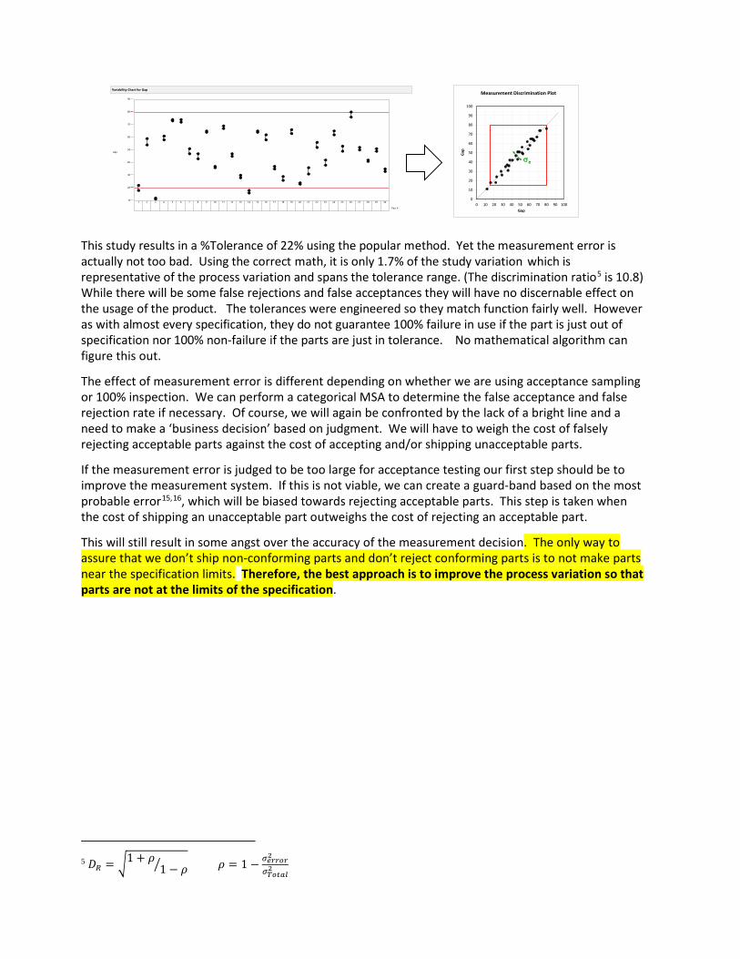
This study results in a %Tolerance of 22% using the popular method. Yet the measurement error is actually not too bad. Using the correct math, it is only 1.7% of the study variation which is representative of the process variation and spans the tolerance range. (The discrimination ratio5 is 10.8) While there will be some false rejections and false acceptances they will have no discernable effect on the usage of the product. The tolerances were engineered so they match function fairly well. However as with almost every specification, they do not guarantee 100% failure in use if the part is just out of specification nor 100% non-failure if the parts are just in tolerance. No mathematical algorithm can figure this out.
The effect of measurement error is different depending on whether we are using acceptance sampling or 100% inspection. We can perform a categorical MSA to determine the false acceptance and false rejection rate if necessary. Of course, we will again be confronted by the lack of a bright line and a need to make a ‘business decision’ based on judgment. We will have to weigh the cost of falsely rejecting acceptable parts against the cost of accepting and/or shipping unacceptable parts.
If the measurement error is judged to be too large for acceptance testing our first step should be to improve the measurement system. If this is not viable, we can create a guard-band based on the most probable error15,16, which will be biased towards rejecting acceptable parts. This step is taken when the cost of shipping an unacceptable part outweighs the cost of rejecting an acceptable part.
This will still result in some angst over the accuracy of the measurement decision. The only way to assure that we don’t ship non-conforming parts and don’t reject conforming parts is to not make parts near the specification limits. Therefore, the best approach is to improve the process variation so that parts are not at the limits of the specification.
5 𝐷𝐷𝑅𝑅 = �1 + 𝜌𝜌
1 − 𝜌𝜌� 𝜌𝜌 = 1 − 𝜎𝜎𝑒𝑒𝑒𝑒𝑒𝑒𝑒𝑒𝑒𝑒2
𝜎𝜎𝑇𝑇𝑒𝑒𝑇𝑇𝑇𝑇𝑇𝑇2
0
10
20
30
40
50
60
70
80
90
100
0 10 20 30 40 50 60 70 80 90 100
Gap
Gap
Measurement Discrimination Plot
σe
Variability Chart for Gap
Gap
10
20
30
40
50
60
70
80
90
1 2 3 4 5 6 7 8 9 10 11 12 13 14 15 16 17 18 19 20 21 22 23 24 25 26 27 28 29 30
Part #

Reproducibility: A truly bogus calculation
Reproducibility is typically assessed using 2-4 appraisers. The mathematical alchemy here is that the variation of the operators is usually a fixed effect and not a random effect. This holds even if the appraisers are randomly chosen. If there is a true difference between the appraisers the difference will be systemic. e.g. if appraiser 3 is found to always measure parts high relative to appraiser 1, they will always be high. It is of course helpful to understand if a systemic difference exists, but a mathematical calculation of a standard deviation of the appraisers is not required to understand and correct the difference. If there is no real difference between the appraisers, then the variation will be a random effect and not a fixed effect. In this case, a calculation of the standard deviation of the appraisers is mathematically acceptable. A simple plot of the appraisers’ results will display the differences and provide information on the size of the difference as well as the statistical significance of the difference. The intent with reproducibility is to determine if there are differences and if they are large enough to warrant improvement. This can be done simply with a graphical display; statistical calculations, even if they are valid, simply do not add ‘believability’ or actionable information.

EXAMPLE: Fin to tip length, 3 supplier inspectors and 1 IQA inspector at the Customer
The standard GR&R report shows that the %Tolerance is >100 (~103%). The % study variance has the R&R at ~100% of the study variance.
The Range charts which show the individual repeatability indicate that the repeatability of the IQA inspector is quite good compared to the supplier inspectors.
The average chart shows that the IQA inspector is measuring much lower than the supplier inspectors.
This mean bias is also evident in the box plots, but the repeatability isn’t as evident as with the range chart.
The multi-vari shows a bimodal distribution…
The charts are more effective than the traditional table of statistical numbers, however, this is a lot of charts to say something rather simple…

Results in a combined Youden Plot
The plot clearly - and quickly - shows the IQA inspector to be biased low relative to the other inspectors. The IQA inspector also has very good repeatability while the supplier inspectors have more measurement error than part to part variation. At this point, what do we really need to know? Would any additional analysis of the MSA data provide more insight? Probably not. There is something fundamentally different between the Customer’s approach and the supplier’s approach. The next step should be to determine what this difference is; we need to talk to the inspectors and observe the measurement procedures. In doing this it was discovered that the supplier was measuring from a knit line just above the fins to the tip, using an optical comparator. The IQA inspector was using a fixture to locate the bottom of the fin and measuring down to the fin tip with a height gage. Once the supplier’s method was changed to match the IQA inspector’s method, both the bias and the lack of repeatability were eliminated.
Of course the next question is if the GR&R is sufficient for acceptance inspection and for SPC? The popular GR&R method puts the R&R value at 68% of the tolerance. The Youden plot with its mathematically correct estimate of the total measurement error, clearly shows that 68% is overstated. The measurement error doesn’t consume 68% of the tolerance, it is substantially less than this. The operator to operator differences, while statistically significant are of no practical importance. The difference between them is not discernable compared to the tolerance range. It is also important to note that measurement error is not as influential as many people may interpret17.
This measurement error, while not ideal is acceptable for acceptance sampling. This is a high-volume part that will not be 100% inspected, so there will not be individual part acceptance just batch acceptance. If a batch of parts shifts to one of the spec limits, the shift will be detected in the mean of the sample and if the shift is close enough to the spec limits some parts will fail and the batch will be rejected. Again, these are decisions that are made based on knowledge of the process and not solely the statistics.
Error σ 6σ Repeatability, σe .000169 .0010112 Reproducibility, σo .000164 .0009828 Repeatability & Reproducibility, σR&R .000235 .0014101
Fin to Tip Length
6σe
6σo

Can the system be used for SPC18,19? There are some who believe that the discrimination ratio must be of a specific level to enable SPC. The best approach is to plot your data on a control chart and see how it looks. Be sure to select a rational subgrouping20,21 scheme. If the measurement error is too large compared to the process variation such that it can’t provide more than a rough detection of shifts, you may need to improve your measurement system. On the other hand, if your process variation is very small compared to the specification limits, this rough detection may be sufficient. In some cases, you may not be able to use all of the Western Electric or Nelson rules, especially those for small shifts but most changes will be detected relatively quickly, and the charts will provide invaluable insight into process changes. Logic must prevail over rigid rules.
For tip length it essential that we create separate charts for each cavity as the cavities have a systemic difference (a fixed effect):
We also see in this chart that parts manufactured subsequent to the initial MSA show that the part variation is now much larger than in the original study. The mean has shifted up and it is wider.
The control charts for the 4 cavities exhibit enough variation to be useful to detect shifts and trends:
As Ellis Ott said: Plot your data and think about your data
Variability Chart for Length
1.168
1.17
1.172
1.174
1.176
1.178
1 2 3 4 5 6 7 8 9 10 11 12 13 14 15 16 17 18 19 20 21 22 23 24 25 26 27 28 29 30
Subgroup
Individual Measurement of Length
1.169
1.17
1.171
1.172
1.173
1.174
1.175
1.176
1.177
Subgroup
Individual Measurement of Length
1.169
1.17
1.171
1.172
1.173
1.174
1.175
1.176
1.177
Subgroup
Individual Measurement of Length
1.169
1.17
1.171
1.172
1.173
1.174
1.175
1.176
1.177
Subgroup
Individual Measurement of Length
1.169
1.17
1.171
1.172
1.173
1.174
1.175
1.176
1.177
Subgroup
Cavity 1 Cavity 2
Cavity 3 Cavity 4

The Perils of Process Capability Indices
The concept of a “capability index” was a well-intended but poorly executed attempt to gain acceptance of the idea that simply producing parts that are within specified tolerances is – in many cases - not sufficient to creating a quality part. Unfortunately, the index has become the indicator of the need for improvement. It does make qualification easier and faster for the manager, supplier quality engineer and other approvers/scorekeepers, but does it really serve to improve quality?
Four Reasons to avoid Capability Indices (and it has nothing to do with the Normal distribution)
1. Reducing variation to a single number is an oxymoron. The number doesn’t tell you anything about the true nature of the variation of the process. It cannot show you shifts and drifts or non-homogeneity.
2. Conflating a continuous variable with a categorical count of ‘defects’ is a scientifically and statistically flawed approach to quantifying process capability22. (see below)
3. The very nature of using a ‘goal-line’ target (Cpk>1.33 is a good process) inhibits continual improvement23. While human beings desire a simple yes or no answer24, real world manufacturing is far more complicated than scoring points in a game. When we take into account the nature of the validity of specifications and the various shapes and trends of different processes, this goal line mentality enables rationalization for not improving and it serves as a basis for denial of actual quality problems.
4. Capability Indices are not actionable. They tell you nothing about the capability or performance of the process and they certainly don’t help you maintain or improve the performance or stability.
The calculation of a mathematical formula is no substitute for thinking; ratings do not confer knowledge or insight.
Reducing variation to a single number is an oxymoron Capability indices are a function of the process average and standard deviation. These summary statistics are not very useful if the process is non-homogenous25 and most processes are non-homogenous. There is a caveat that capability cannot be assessed until the process is proven to be stable. The traditional SPC charts are great detectors of non-homogeneity. However, not all non-homogenous processes are ‘unstable’ or incapable. This is why the concept of rational subgrouping26,27,28,29 was introduced. Focusing on a single number diverts us from the incredible insight available form even a simple run chart of the data. We also publish this number as if it’s exact. If one were to calculate the confidence intervals around the estimate we could see exactly how inexact the estimate is.
Conflating Continuous variation with a categorical count is fatally flawed When Process Capability Indices were initially proposed, they were not used to make any prediction regarding the number of defects a process would be expected to create30. Cpk was
first utilized to quantify variation in relationship to specification limits. It didn’t try to equate the index to any defect rate. In fact, the original intent was to prioritize variation reduction based on how many values were near the specification. It wasn’t based on any distribution. It wasn’t intended to be a precise measure of variation either. It was based on the concept that parts that vary from the target are subject to stack-up tolerance ‘fit’ failures, wear, and decreased perception of quality. The primary ‘stories’ describing this phenomenon are the Sony television differences between Japan built and US built TVs31 and the Ford vs Mazda transmission reliability32 studies. Those who advocated for variation reduction – as opposed to reducing ‘defects’ - were fully cognizant of several facts:
- Not all specifications are engineered so failures may result from parts that are “within specification” and conversely parts that are “out of specification” may never fail at all.
- Interactions between characteristics and conditions will produce even more inconsistencies between non-conformances to a specification and system failures.
- ALL theoretical distributions are inaccurate concerning the actual distribution of events in the extreme tails33. Usually this is taken to be anything beyond ~2SD. Theoretical distributions are modeled as having infinite tails, because we don’t know where the tails actually end. But in reality, all processes create distributions that have finite tails.
When the index for continuous data variation gets conflated with a theoretical (categorical) count of non-conformances to specifications we take several unwarranted leaps of logic that we have predicted a defect rate or worse, a quality level.
The very nature of a ‘goal line’ target inhibits improvement. The common and persistent behavior with specification limits is that the limits are a sharp delineation of good vs bad. In specification is good and passing and out of specification is bad and failing. This results in an attitude of ‘good enough’ that inhibits variation reduction. Although capability indices were an attempt to change this (by requiring an index that indicated that the variation was substantially less than the specification range) capability index advocates substituted one goal line for another - albeit tighter - goal. This might have been a step forward if specifications were engineered and interactions were taken into account and the study structure and raw data were required to be reported. When we only report the index, we open the door to gamesmanship, cheating and delusion that all is well.
The arbitrary goal line also encourages and enables gamesmanship in order to meet the goal. When a supplier or engineer reports a single number how do you know that the number was calculated appropriately? Was the sample size large enough? Was it representative of the actual variation; were all of the components of variation included in the study? Was the sample from a statistically stable process? None of these questions can be answered from a single number. Complicating this is the nature of the process. Since too many people conflate the index with a defect rate and most processes are either not Normal, not homogenous and or are not symmetrical and two sided, the index calculation can be very misleading unless a great deal
of thought and care go into their calculation. People often spend an enormous amount of effort to generate a ‘passing’ capability index. (I have witnessed all kinds of statistical tricks used to try to generate the passing index. Some of these tricks are warranted others are not.) So much so that they have little energy or organizational desire to actually work on improving the process.
Capability Indices are not actionable A Capability Index is the result of a “capability study”. So, what is the purpose of a Capability Study? Capability studies have been around far longer than Capability Indices. Capability studies are intended to provide insight into the process behavior. How do different operators, raw material lots, settings, equipment, mold cavities, measurement systems, etc. effect the variation? When done properly they reveal the primary components of variation and enable us to truly understand and improve both the performance and the stability of the process. If a process capability study is well structured, the resulting capability index will have some meaning (as will the average and standard deviation) but it is very meager. It can be nothing more than a quantification of the performance of the process devoid of context. One simply cannot use the index to improve the process.
Example 1: Lot to Lot Variation
This process creates a wall thickness on a lathe. 8 parts are machined on a circular fixture at a time. Scientifically this is a non-homogenous process: the factor that creates the lot average is not the same factor(s) that create the within lot variation.
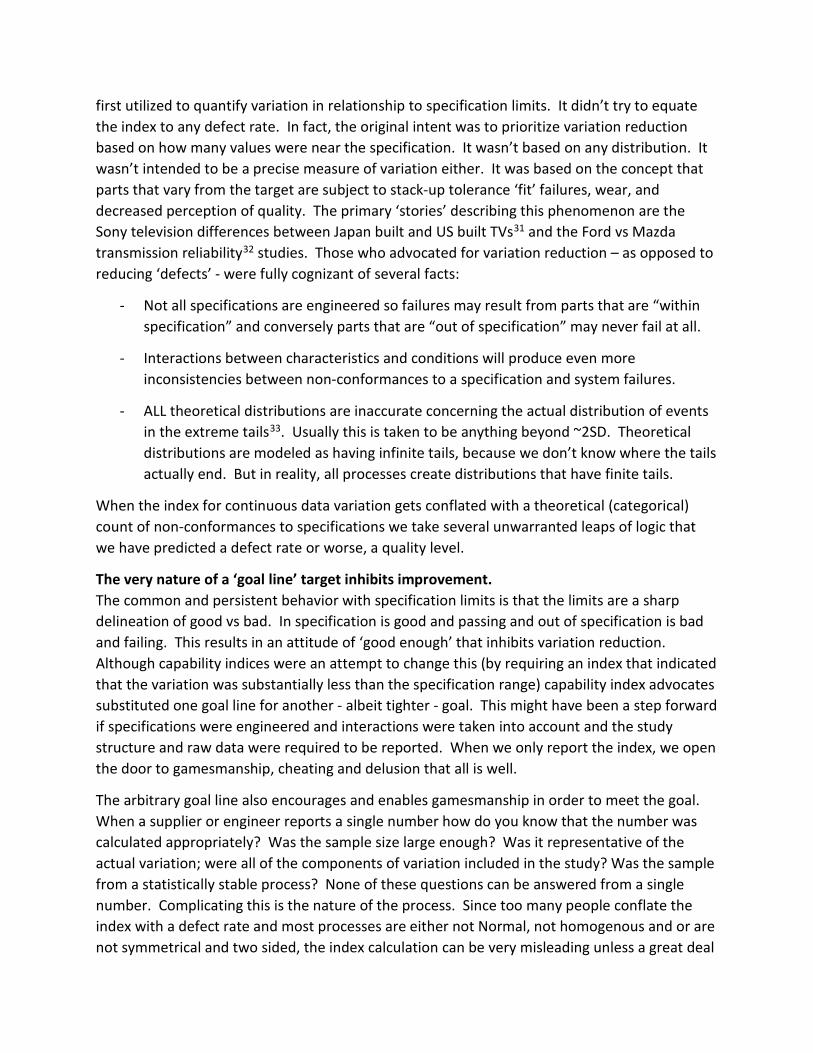
A simple capability study across 20 lots yields a Ppk of 0.709.
The Ppk value is the upper (Ppu) value as it is slightly worse than the lower (Ppl) value. But this process spans the full tolerance range. Both graphical displays tell us a lot more about the process than a simple Ppk number. The multi-vari is the most actionable as it shows that lot to lot is the largest component of variation6. This substantially reduces the number of factors to consider when trying to reduce the variation of the process. The multi-vari also demonstrates that the process is indeed non-homogenous. Also noteworthy is the lack of correlation of the defect rate predicted by the Ppk value (1.7% for the upper limit and 3.1% total) and the
6 While this process may look statistically unstable due to the non-homogeneity when we rationally subgroup the process it is quite stable. Since the lot average and the within lot standard deviation are controlled by different factors we must chart the two components of variation separately. An I, MR for the lot averages and a Standard Deviation chart for the within lot variation provide the best assessment and confirm stability.
Ppk = 0.709
Variability Chart for Thickness
0.01
0.015
0.02
0.025
1 2 3 4 5 6 7 8 1 2 3 4 5 6 7 8 1 2 3 4 5 6 7 8 1 2 3 4 5 6 7 8 1 2 3 4 5 6 7 8 1 2 3 4 5 6 7 8 1 2 3 4 5 6 7 8 1 2 3 4 5 6 7 8 1 2 3 4 5 6 7 8 1 2 3 4 5 6 7 8 1 2 3 4 5 6 7 8 1 2 3 4 5 6 7 8 1 2 3 4 5 6 7 8 1 2 3 4 5 6 7 8 1 2 3 4 5 6 7 8 1 2 3 4 5 6 7 8 1 2 3 4 5 6 7 8 1 2 3 4 5 6 7 8 1 2 3 4 5 6 7 8 1 2 3 4 5 6 7 8
Part1 2 3 4 5 6 7 8 9 10 11 12 13 14 15 16 17 18 19 20
Lot

observed rate (.2%). This data is not a sample, it is 100% of the material produced; historical results show similar behavior with very few parts out of specification. What is not obvious is that although this is a feature that fits into another part the specification limits were engineered to minimize any fit interaction or wear. Although variation reduction is still a goal, the urgency of the reduction is not apparent in the Ppk value.
Example 2: Injection Molding
This process has 4 cavities and the characteristic of interest is the length of a pipette tip. A simple capability study across 30 subgroups yields a Ppk of 0.981
Again the multi-vari provides the most insight to the process. A Ppk of 0.981 does convey that the process is close to the upper limit but it alone can’t convey that the process takes up to 75% of the tolerance range. What isn’t clear from the Ppk value or the histogram is that there is a substantial systemic (fixed effect) difference between cavity 1 and cavity 4. Fixing this will drastically improve the variation in the process. The scientific considerations about the process behavior are also critical. The lower specification is more important than the upper specification. If the length is short a catastrophic functional failure could occur so it is advantageous to bias the process output a bit high to accommodate cavity to cavity, set-up to set-up, resin to resin and press to press variation. Only cavity to cavity variation is included in this capability study. What are the effects of the other components of variation? If a ‘passing’ index is all that is required, how is anyone to know if the index is representative of the variation?
Summary
In general, I don’t believe in claiming a method is not valuable simply because people don’t execute it correctly. However even if we perform a well-structured study, including a control chart to assure stability, the index itself provides no additional value. So why do it? Capability indices only give us an allusion of process capability. They do make it easier for the scorekeepers to ‘check the box’ on new product launches, process changes and supplier quality monitoring but this is not the goal of an organization. Our goal is to accelerate value to the Customer. Calculating and tracking capability indices is simply over processing. It diverts energy form real process improvements. If we need a simple way of tracking process capability, we can create a report using small multiple charts of the multi-vari and control charts for the process as well as reporting and tracking actual defect rates. This data is already necessary for
Ppk = 0.981 Cavity● 1● 2○ 3● 4

any real process capability study and so creating a report is minimal extra work. Remember the calculation of a mathematical formula is no substitute for thinking.

FISHBONE (ISHIKAWA) DIAGRAMS
The Fishbone diagram was developed by Kaoru Ishikawa as a means of organizing causes. While it was originally well intended it has morphed over the years to a brainstorming device that presents far too much detail on possible root causes and tends to drive teams to focusing on proving specific factors as being the root cause. One of the biggest drawbacks is that it requires one to actually list the cause, where the Y-X approach enables the team to iteratively narrow in on the cause – even those that are not thought of in the beginning of the process. It takes a long time to list the possible causes and the end result can be so overwhelming that the team resorts to large fractional factorials, multi-voting and/or a set of poorly designed one factor at a time experiments (in order to ‘save time’) that are often inconclusive at best and misleading at worst.
The original intent of the Ishikawa diagram was to group causal factors for a first level split. The initial ‘universal’ groupings were: Man, Measurement, Mother Nature, Machine, Material and Methods. These categories are mutually exclusive and exhaustive.
The difficulty occurs when these are the only categories used as they are restrictive to a single split tactic. Ishikawa believed that simpler was better and most problems that he intended the fishbone for were fairly straightforward Problems to be solved at the lowest level possible. Subsequent popular use has tended to continue this restriction for complex physics based problems. Functional, structural and temporal splits provide much more leverage and power in diagnosing problems to their causal systems.
A common dilemma occurs when the team must move to sub causes (the little bones of the fish). Should the team keep only machine causes in the Machine branch? Many causal mechanisms are combinations: a human operates a machine that processes raw material in an environment and measures the resulting quality characteristics. The Fishbone approach of keeping sub causes consistent with their parent category breaks the cause and effect chain.
ManMother Nature Measurement
MachineMaterialMethods
Problem

The Y-X diagram follows the cause and effect chain by creating new categories for each split level. However, the intent of the Y-X diagram (in problem solving) is to only fill out the causal categories that are shown to contain the causal mechanism.
The generic Fishbone diagram process relies on brainstorming and therefore downplays data based decisions or clue generation that can rapidly eliminate potential causes. The Fishbone diagram focuses on generating a large number of potential causes. A weakness in listing all factors that could potentially create the effect is that the team tends to get tired and confused as the process is haphazard and not focused. ‘Brainstorming’ (opinions) is utilized rather than data. The team is also advised that all opinions are listed creating potential conflict among the team members. The result is that many factors are vague, imprecise and occasionally judgmental. Factors also tend to be more behavioral based than physics based. These weaknesses make the factors very difficult to test.
Example: A Partially completed fishbone for “dirt in the paint” of a car
The team first tried the traditional Fishbone approach, creating a large diagram as shown above (not all potential causes are listed to allow the diagram to be readable). The team that worked on this problem quickly realized that testing the listed causes was going to take too much time. The team then switched to the Y-X method. Their first step was to perform a Measurement System Analysis to determine if the visual detection of dirt was repeatable. It was, even under varying lighting conditions. Next the team contemplated a ‘structural’ split or a temporal split. The structural split was to analyze the dirt to determine its nature (oil, metal, fibers, food, dust, bird poop, sealer, etc.). This approach was rapidly ruled out due to the cost. The team chose a temporal split that started with an operational breakdown: where in the process was the most dirt coming from? This analysis took 24 hours and identified the tack rag ‘cleaning’ operation (operation 5 in the chart below) just prior to clear coating. The tack rags were creating dirt dust
Dirt in paint of car
Measurements Man
Materials Machine
Mother Nature
Methods
Dirty
Fibers from clothes
Cleans tools in paint areaDoesn’t pay attention
Attitude
measurement not sensitive enough
Sampling not adequate
Temperature
Dirt in air
Dirt in clear coat
Doesn’t put on clean clothes
Dirt in paint
Other dirt in machine
Dirt in lines
Tools are dirty
RustyOil drippingLines not cleaned
out properly
Doesn’t bathe
Doesn’t wash up at breaks
Deodorant, makeup, hair products flake off
Food particles
Ignores policy
Poor inspection
Comes to work dirty
Gets dirty at work
Poor supplier controls
Ventilation sucks in dirty air
Excessive wearPoor maintenanceloose connections
Poor maintenanceDirty containersNo standard
No standard
Humidity
Static
Clogged filtersPoor supplier controls
Dirty containers
White body is dirty
White body clean process inadequate
White body clean solution is dirty
Doesn’t follow processes
No clean storage
No standard
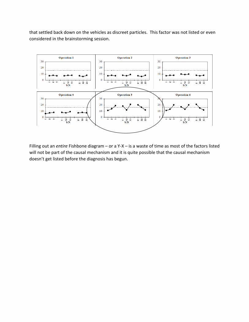
that settled back down on the vehicles as discreet particles. This factor was not listed or even considered in the brainstorming session.
Filling out an entire Fishbone diagram – or a Y-X – is a waste of time as most of the factors listed will not be part of the causal mechanism and it is quite possible that the causal mechanism doesn’t get listed before the diagnosis has begun.


REFERENCES
1 Merriam-Webster http://www.merriam-webster.com/dictionary/alchemy 2 Kida, Thomas, “Don’t Believe Everything You Think, Prometheus Books, 2006 3 W. E. Deming, “On Probability as a Basis for Action”, American Statistician, November 1975, Vol. 29, No. 4, pp. 146-152 https://deming.org/files/145.pdf 4 Wheeler, Donald, “Problem with Risk Priority Numbers, More Mathematical Jabberwocky”, Quality Digest, June 2011. http://www.qualitydigest.com/inside/quality-insider-article/problems-risk-priority-numbers.html 5 Youssef, Nataly F. and Hyman, William A., “Analysis of Risk: Are Current Methods Theoretically Sound? Applying risk assessment may not give manufacturers the answers they think they are getting”, Medical Device & Diagnostic Industry, October 2009 http://www.mddionline.com/article/analysis-risk-are-current-methods-theoretically-sound 6 Flaig, John, “Rethinking Failure Mode and Effects Analysis”, Quality Digest, June 2015 https://www.qualitydigest.com/inside/statistics-column/062415-rethinking-failure-mode-and-effects-analysis.html 7 Imran, Muhammad, “The Failure of Risk Management and How to Fix It”, Book Review, Journal of Strategy & Performance Management, 2(4), 2014 pp. 162-165 http://jspm.firstpromethean.com/documents/162-165.pdf 8 Crosby, David, “Words that Kill Quality and Spill Oil”, Quality Digest, July, 2010 https://www.qualitydigest.com/inside/twitter-ed/words-kill-quality-and-spill-oil.html 9 Hubbard, Douglas W., The Failure of Risk Management; Why It’s Broken and How to Fix It, John Wiley and Sons, 2009 10 Taleb, Nassim Nicholas, The Black Swan: The Impact of the Highly Improbable, Random House Trade Paperbacks, May 2010 11 Donald J Wheeler, Craig Award Paper, “Problems With Gauge R&R Studies”, 46th Annual Quality Congress, May 1992, Nashville TN, pp. 179-185.
12 Donald S. Ermer and Robin Yang E-Hok, “Reliable data is an Important Commodity”, The Standard, ASQ Measurement Society Newsletter, Winter 1997, pp. 15-30. 13 Donald J Wheeler, “An Honest Gauge R&R Study”, Manuscript 189, January 2009. http://www.spcpress.com/pdf/DJW189.pdf
14 Youden, William John, “Graphical Diagnosis of Interlaboratory Test Results”, Industrial Quality Control, May 1959, Vol. 15, No. 11 15 Donald Wheeler, “The Relative Probable Error”, SPC press, June 2003 16 Donald Wheeler, “Is the Part in Spec?”, Quality Digest, June 2010 http://www.qualitydigest.com/inside/twitter-ed/part-spec.html

17 Donald Wheeler, “How to Establish Manufacturing Specifications”, ASQ Statistics Division Special Publication, June2003 http://www.spcpress.com/pdf/DJW168.pdf
18 Donald Wheeler, “Good Data, Bad Data and Process Behavior Charts”, ASQ Statistics Division Special Publication, SPC Press, January 2003 http://www.spcpress.com/pdf/DJW165.pdf
19 Donald Wheeler, “Myths About Process Behavior Charts”, Quality Digest, September, 2011 http://www.qualitydigest.com/inside/quality-insider-article/myths-about-process-behavior-charts.html 20 Frank McGue, Donald S Ermer, “Rational Samples – Not Random Samples”, Quality Magazine, December, 1988
21 Donald Wheeler, “What is a Rational Subgroup?”, Quality Digest, October, 1997 http://www.qualitydigest.com/oct97/html/spctool.html
22 Gunter, Berton H., “The Use and Abuse of Cpk”, Statistics Corner, Quality Progress, Part 1, January 1989, Part 2, March 1989, Part 3, May 1989, Part 4, July 1989 23 Leonard, James, “I Ain’t Gonna Teach It”, Process Improvement Blog, 2013 http://www.jimleonardpi.com/blog/i-aint-gonna-teach-it/ 24 Kida, Thomas, “Don’t Believe Everything You Think, Prometheus Books, 2006 25 Wheeler, Donald, “Why We Keep Having Hundred Year Floods”, Quality Digest, June 2013, http://www.qualitydigest.com/inside/quality-insider-column/why-we-keep-having-100-year-floods.html 26 McGue, Frank; Ermer, Donald S., “Rational Samples – Not Random Samples”, Quality Magazine, December, 1988
27 Wheeler, Donald, “What is a Rational Subgroup?”, Quality Digest, October, 1997 http://www.qualitydigest.com/oct97/html/spctool.html
28 Wheeler, Donald, “Rational Subgrouping”, Quality Digest, June 2015 http://www.qualitydigest.com/inside/quality-insidercolumn/060115-rational-subgrouping.html 29 Wheeler, Donald, “The Chart for Individual Values”, https://www.iienet2.org/uploadedfiles/IIE/Education/Six_Sigma_Green_Belt_Transition/The%20Chart%20For%20Individual%20Values.pdf 30 Sullivan, L. P., “Reducing Variability: A New Approach to Quality”, Quality Progress, July 1984 and “Letters” Quality Progress, April, 1985 31 Taguchi, Genichi, CLausing, Don, “Robust Quality”, Harvard Business Review, January-February 1990. https://hbr.org/1990/01/robust-quality 32 Internal Ford Video “Continuous Improvement in Quality and Productivity” produced by Radio, TV, and Public Affairs Staff, Ford Motor Company, Dearborn, MI (1987). https://www.youtube.com/watch?v=uAfUOfSY-S0 33 Pyzdek, Thomas, “Why Normal Distributions Aren’t (All That Normal)”, Quality Engineering 1995, 7(4), pp. 769-777 Available for free as “Non-Normal Distributions in the Real World” at http://www.qualitydigest.com/magazine/1999/dec/article/non-normal-distributions-real-world.html