Research Note: Sankey diagrams for visualizing land cover dynamics
14
Research Note: Sankey diagrams for visualizing land cover dynamics Nicholas CUBA 1 1 School of Geography, Clark University, 950 Main St., Worcester, MA, 01610, USA; [email protected]; Tel.: +1-508-793-7336; Fax: +1-508-793-8881 Landscape and Urban Planning, 139, July 2015, 163-167 doi:10.1016/j.landurbplan.2015.03.010 ABSTRACT: Comparison of categorical maps from two or more points in time is a common technique to detect land cover and land use change. Cross-tabulation matrices, which contain information on the sizes of categorical differences between two maps, are often used to describe the amount and type of land cover change that has occurred between two points in time. However, the use of multiple matrices to describe changes occurring over more than one time interval can be difficult to interpret. This article presents a graphical method for presenting the land cover information contained in one or more cross-tabulation matrices based on Sankey diagrams, which depict the flow of energy or materials through a network. Through the example of a series of land cover maps of the San Juan, Puerto Rico area (1999-2003), this form of Sankey diagram is demonstrated to efficiently and elegantly present information on land cover persistence and change over multiple time intervals.
Transcript of Research Note: Sankey diagrams for visualizing land cover dynamics
Research Note: Sankey diagrams for visualizing land cover
dynamics
Nicholas CUBA 1
1 School of Geography, Clark University, 950 Main St., Worcester, MA, 01610, USA;
[email protected]; Tel.: +1-508-793-7336; Fax: +1-508-793-8881
Landscape and Urban Planning, 139, July 2015, 163-167
doi:10.1016/j.landurbplan.2015.03.010
ABSTRACT: Comparison of categorical maps from two or more points in time is a common
technique to detect land cover and land use change. Cross-tabulation matrices, which contain
information on the sizes of categorical differences between two maps, are often used to describe
the amount and type of land cover change that has occurred between two points in time. However,
the use of multiple matrices to describe changes occurring over more than one time interval can
be difficult to interpret. This article presents a graphical method for presenting the land cover
information contained in one or more cross-tabulation matrices based on Sankey diagrams, which
depict the flow of energy or materials through a network. Through the example of a series of land
cover maps of the San Juan, Puerto Rico area (1999-2003), this form of Sankey diagram is
demonstrated to efficiently and elegantly present information on land cover persistence and change
over multiple time intervals.
1. Introduction
Comparison of categorical maps from two or more points in time is a common technique
to detect land cover and land use change. Cross-tabulation matrices, in which each row is a land
cover category at time t0, each column is a land cover category at a subsequent time t1, and each
entry is the area experiencing land cover change or persistence during the interim between t0 and
t1, are widely used to facilitate map comparison (see Figure 3; Lewis & Brown, 2001; Pontius &
Cheuk, 2006). These matrices usefully communicate precise quantities related to a map of
change, and metrics derived from diagonal and non-diagonal entries, and from row and column
totals, in the cross-tabulation matrix can indicate rates of change in a landscape, and the
prevalence of certain categorical transitions (Aldwaik & Pontius, 2012; Han et al., 2009).
However, when it is desirable to track the amount or intensity of land cover changes over more
than one time interval, reliance on the use multiple tables to compare maps can yield an
inefficient and difficult to interpret presentation of results when compared to graphical figures
(Runfola & Pontius, 2013).
In particular, new methods for communicating and visualizing land change dynamics are
needed in response to recent advances in the remote sensing of land systems that track fine and
moderate resolution change using temporally dense image stacks (see Kennedy et al., 2010).
These advances, made feasible by free distribution of Landsat data (Wulder et al., 2012) and
expanded processing of global imagery (USGS, 2013), allow for the identification and analysis
of discrete land change drivers and their impacts in functionally diverse land systems. Such
methodological innovations will be useful for work toward several central issues in land change
science, such as illuminating processes of land use competition, and identifying distal drivers of
change in a landscape or telecoupled systems (Munroe et al., 2014).
Methods of visual representation are central to landscape planning and analysis, allowing
for easier involvement of non-experts in these processes (Lange, 2011; Orland, 1994) and
serving to highlight the form or scale of underappreciated phenomena or interactions among
actors (Bebbington et al., 2014). Visual clarity in the presentation of baseline or predicted
scenarios can enhance community engagement efforts, and communication between researchers
and practitioners (Pettit et al., 2011). Techniques such as image segmentation and color shading
are used to highlight the spatial and temporal patterns of fine-scale changes in a map (see e.g.
Zhu et al., 2012). This article presents an easy to interpret format for depicting the summary,
broad-scale land cover dynamics information contained in one or more cross-tabulation matrix
using Sankey diagrams.
Sankey diagrams depict flow to and from various nodes in a network, and have been most
typically applied to analysis of energy or material flows (Schmidt, 2008). Arrows or directional
lines are used to represent these flows, with the thickness of the arrow or line proportional to the
magnitude of the flow. These diagrams are commonly employed in Industrial Ecology to depict
product life cycle assessments, and in engineering to visualize quickly energy efficiency
(Schmidt, 2008).
Sankey Diagrams give emphasis to the size and direction of flows within a system, and
because of their broad utility have been applied in many geographic or human-environment
research contexts. Sankey diagrams’ utility for tracing material flows has made them illustrative
tools for the analysis of food systems (Courtonne et al., 2012), greenhouse gas emissions
(Bachmaier et al., 2010; Schnitzer et al., 2007), and water resources (Curmi et al., 2013).
Although the application of Sankey diagrams to land cover change research described here is
novel, the role of land change as a driver of increased atmospheric CO2 has featured in some of
the better known examples of the diagram, which trace the relative proportions of global
greenhouse gas emissions originating from various source sectors or activities (see Herzog,
2005).
2. Data and Methods
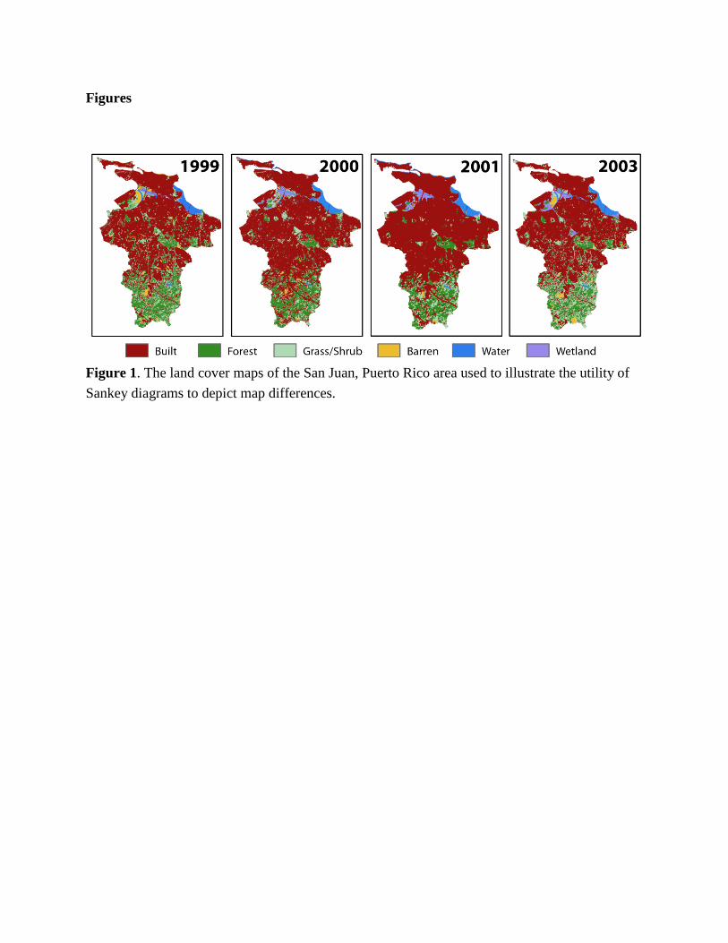
This paper examines land cover maps of the Río Piedras River Watershed and environs in
the San Juan, Puerto Rico area using 30 m spatial resolution maps from 1999, 2000, 2001, and
2003 (Fig. 1). The year 1999 and 2003 maps were produced at spatial resolution of 15 m and
were upscaled to 30 m and assigned the pixel majority/plurality category. Each map has a
different institutional origin, produced in order to further diverse applications and using different
methods (Gould et al., 2007; Helmer & Ruefenacht, 2005; Homer et al., 2004; Lugo et al., 2011).
Originally, each map used between 10 and 70 land cover categories prior to category aggregation
undertaken to facilitate comparison, which attributed all pixels to one of six semantically broad
categories, e.g. Barren, Built, Forest, Grass/Shrub, Water, and Wetland. Although substantial
variation in map production methods and semantic differences in category taxonomy that persist
after aggregation likely account for a non-trivial portion of difference between maps, these are
ever-present features of land cover mapping (Ahlqvist & Gahegan, 2005), and this set of maps
works well to illustrate the utility of Sankey diagrams for depicting differences between land
cover maps of the same area from multiple points in time.
In order to facilitate a discussion of this set of maps and the use of Sankey diagrams to
depict land cover dynamics, certain terms are defined. For a comparison of two categorical land
cover maps that use the same set of N categories, there are N * (N – 1) potential forms of map
difference, with each form consisting of pixels which are classified as category i in one map and
category j in the other map, where i does not equal j. In addition to map differences, there are N

instances of map similarity, or groups of pixels that are classified as the same category in both
maps. Map differences are typically regarded as land cover or land use change, while instances
of map similarity are typically regarded as land cover or land use persistence. Together, these
instances of persistence and change account for all entries in the cross-tabulation matrix, and
each is represented in the Sankey diagram by a persistence or transition line.
The Sankey diagram used here to visualize land cover dynamics in the area of the Río
Piedras River Watershed shows classification results from four maps, and the persistence and
change observed in three time intervals: 1999 to 2000, 2000 to 2001, and 2001 to 2003. Cross-
tabulation matrices that compare the two maps which bound each time interval are also
presented.
3. Results and Discussion
The presented Sankey diagram visualizes land cover category extent in the San Juan area
in four years, and persistence and change occurring from 1999 to 2000, 2000 to 2001, and 2001
to 2003 (Fig. 2). It is accompanied by three cross-tabulation matrices that list the category
extents in each year, the size of category persistence and transitions during the three time
intervals, and the gross gain and loss of each category (Fig. 3). Figure 2 is comprised of four
stacked vertical bars representing land cover within the study area in each of the four years for
which land cover maps were available, and three sets of persistence and transition lines
positioned between each chronologically sequential pair of stacked bars.
The stacked bars visualize the relative abundance of each land cover category in 1999,
2000, 2001, and 2003. The height of each component in the stacked bars is proportional to the
relative abundance of the represented land cover category in the study area, and categories are
arranged vertically by spatial extent, in largest-to-smallest order.
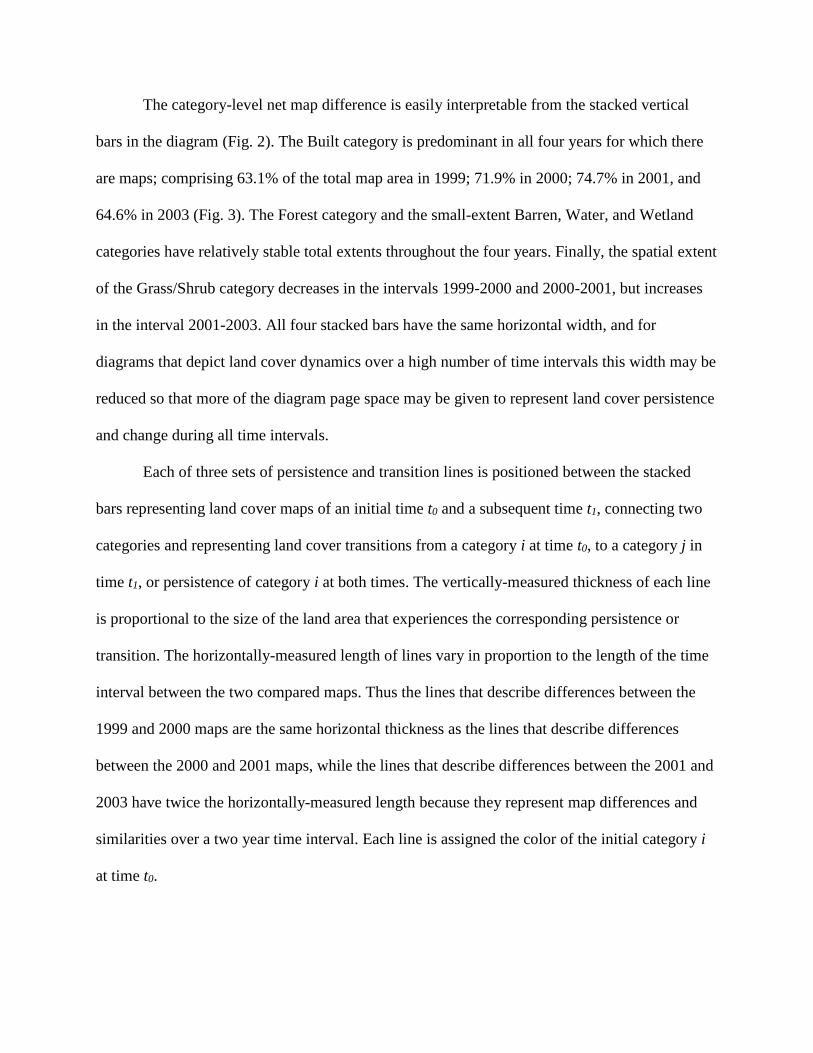
The category-level net map difference is easily interpretable from the stacked vertical
bars in the diagram (Fig. 2). The Built category is predominant in all four years for which there
are maps; comprising 63.1% of the total map area in 1999; 71.9% in 2000; 74.7% in 2001, and
64.6% in 2003 (Fig. 3). The Forest category and the small-extent Barren, Water, and Wetland
categories have relatively stable total extents throughout the four years. Finally, the spatial extent
of the Grass/Shrub category decreases in the intervals 1999-2000 and 2000-2001, but increases
in the interval 2001-2003. All four stacked bars have the same horizontal width, and for
diagrams that depict land cover dynamics over a high number of time intervals this width may be
reduced so that more of the diagram page space may be given to represent land cover persistence
and change during all time intervals.
Each of three sets of persistence and transition lines is positioned between the stacked
bars representing land cover maps of an initial time t0 and a subsequent time t1, connecting two
categories and representing land cover transitions from a category i at time t0, to a category j in
time t1, or persistence of category i at both times. The vertically-measured thickness of each line
is proportional to the size of the land area that experiences the corresponding persistence or
transition. The horizontally-measured length of lines vary in proportion to the length of the time
interval between the two compared maps. Thus the lines that describe differences between the
1999 and 2000 maps are the same horizontal thickness as the lines that describe differences
between the 2000 and 2001 maps, while the lines that describe differences between the 2001 and
2003 have twice the horizontally-measured length because they represent map differences and
similarities over a two year time interval. Each line is assigned the color of the initial category i
at time t0.
A vertical ordering scheme of stacked bars based on category spatial extent at each time
results in the persistence line of the largest category being placed at the top of the figure. Such a
placement for this typically large land cover persistence concentrates many of the smaller
persistence and transitions lines in the bottom portion of the figure.
Small-thickness, vertical white lines separate the stacked bars from persistence and
transition lines to demarcate clearly these diagram components. Figure 2 employs a slightly
darker color shade for persistence and transition lines than for category extents of the stacked bar
charts to further differentiate these component types. In order to reduce visual clutter in the
diagram, a threshold value may be chosen and applied to map persistence and transitions, such
that all lines smaller than the threshold are not depicted. Here, only lines of thickness greater
than 0.4% of the total map area are shown. A higher threshold value may be desirable due to
space considerations as the number of time intervals or categories examined increases.
The transition lines reveal high amounts of gross category-level map difference in the
face of relatively low net difference, particularly for the categories of Forest and Grass/Shrub
(Fig. 2). The net increase in the spatial extent of the Built category observed from 1999 to 2000
and from 2000 to 2001 is seen to be largely attributable to conversion of Grass/Shrub (Fig. 3;
7.3% of map from 1999 to 2000 and 5.2% from 2000 to 2001), and to a lesser extent Forest
(5.2% of map from 1999 to 2000 and 2.1% from 2000 to 2001). The presence of high gross
change in the absence of substantial net change may be indicative of cyclical land management
strategies such as crop rotation. In contrast, the presence of net increases or decreases involving
the same losing and gaining categories across multiple time intervals is evidence for broad-scale,
directional, and temporally persistent land change drivers.
The diagram highlights those categories that are dynamic in both absolute and relative
terms. The Grass/Shrub category extent is one such dynamic category, with large gross gains and
losses in category extent observed in multiple time intervals. The dynamic quality of this
behavior is visually evident from the low ratio of Grass/Shrub persistence relative to observed
Grass/Shrub category extent. Calculated using entries in the cross-tabulation matrices, the
proportion of Grass/Shrub persistence relative to the spatial extent of Grass/Shrub in the initial
year of each time interval was 0.29 from 1999 to 2000, 0.26 from 2000 to 2001, and 0.54 from
2001 to 2003. The proportion of persistence relative to the spatial extent of Grass/Shrub in the
final year of each time interval was similarly low: 0.40 from 1999 to 2000, 0.36 from 2000 to
2001, and 0.26 from 2001 to 2003. The relatively low ratios for Grass/Shrub contrast sharply to
the proportional measurements of a less dynamic category such as Built. Built persistence
relative to the spatial extent of Built in the final year of each time interval is 0.81 from 1999 to
2000, 0.88 from 2000 to 2001, and 0.96 from 2001 to 2003.
Sankey diagrams such as the one presented here complement the cross-tabulation matrix
as a means for conveying the size of land cover category extents at different times, and amounts
of change and persistence during the interim. Sankey diagrams might potentially be used as a
suitable replacement for these matrices if the size of all components of the diagram were
labelled. Such labels might not be able to be included in a static diagram due to limits on figure
space, but an interactive diagram can incorporate this information effectively in popup windows
prompted when the cursor hovers over related diagram components.
4. Conclusions

This paper presents a graphical method for presenting the land cover information
contained in one or more cross-tabulation matrices based on Sankey diagrams, which depict the
flow of energy or materials through a network. This form of Sankey diagram is easy to visually
interpret, and can efficiently convey land cover change over multiple time intervals.
Visualization of land cover dynamics using Sankey diagrams does not abrogate the usefulness of
presenting precise measurements of land cover dynamics in tabular form, but rather offers
benefits that complement those of cross-tabulation matrices. The example case of land cover
change in the area of San Juan, Puerto Rico, illustrates the potential for the visualization method
to depict net and gross change in category extent over one or more time intervals.
Acknowledgments
The author would like to thank the San Juan Urban Long Term Research Area project
(NSF: #BCS-0948507) for providing data, as well as two anonymous reviewers and Dr. Robert
Gilmore Pontius Jr. for providing feedback and encouragement.
References
Ahlqvist, O., & Gahegan, M. (2005). Probing the Relationship between Classification Error and
Class Similarity. Photogrammetric Engineering & Remote Sensing, 71, 1365-1373.
Aldwaik, S. Z., & Pontius Jr., R. G. (2012). Intensity analysis to unify measurements of size and
stationarity of land changes by interval, category, and transition. Landscape and Urban
Planning, 106, 103-114.
Bachmaier, J., Effenberger, M., & Gronauer, A. (2010). Greenhouse gas balance and resource
demand of biogas plants in agriculture. Engineering in Life Sciences, 10, 560-569.
Bebbington, A. J., Cuba, N., & Rogan, J. (2014). Visualizing competing claims on resources:
Approaches from extractive industries research. Applied Geography, 52, 55-56. doi -
10.1016/j.apgeog.2014.04.015
Courtonne, J.-Y., Alapetite, J., Longaretti, P.-Y., Dupre, D., Arnaud, E., & Prados, E. (2012).
Study of cereals flows at local scales: Examples in the Rhone-Alpes region, the Isere
department and the SCOT de Grenoble. CompSust’12 – 3rd International Conference on
Computational Sustainability, 1-2.
Curmi, E., Fenner, R., Richards, K., Allwood, J. M., Bajželj, B., & Kopec, G.M. (2013).
Visualising a Stochastic Model of Californian Water Resources Using Sankey Diagrams.
Water Resources Management, 27, 3035-3050.
Gould, W. A., Alarcón, C., Fevold, B., Jiménez, M. E., Martinuzzi, S., Potts, G., Solórzano, M.,
& Ventosa, E. (2007). Puerto Rico Gap Analysis Project – Final Report; U.S. Geological
Survey and U.S. Department of Agriculture Forest Service International Intitute of Tropical
Forestry: Moscow ID and Río Piedras, PR, U.S.A.
Han, J., Hayashi, Y., Cao, X., & Imura, H. (2009). Evaluating land-use change in rapidly
urbanizing China: Case study of Shanghai. Journal of Urban Planning and Development,
135, 166-171.
Helmer, E. H., & Ruefenacht, B. (2005). Cloud-Free Satellite Image Mosaics with Regression
Trees and Histogram Matching. Photogrammetric Engineering & Remote Sensing, 71,
1079-1089.
Homer, C., Huang, C., Yang, L., Wylie, B. K., & Coan, M. (2004). Development of a 2001
National Land-Cover Database for the United States, Photogrammetric Engineering &
Remote Sensing 70, 829-840. doi - 10.14358/PERS.70.7.829
Kennedy, R. E., Yang, Z., & Cohen, W. B. (2010). Detecting trends in forest disturbance and
recovery using yearly Landsat time series: 1. LandTrendr. Remote Sensing of Environment,
114, 2897-2910. doi - 10.1016/j.rse.2010.07.008
Lange, E. (2011). 99 volumes later: We can visualize. Now what? Landscape and Urban
Planning, 100, 403-406. doi - 10.1016/j.landurbplan.2011.02.016
Lewis, H. G., & Brown, M. (2001). A generalized confusion matrix for assessing area estimates
from remotely sensed data. International Journal of Remote Sensing, 22, 3223-3235.
Lugo, A. E., Ramos Gonzalez, O. M., & Pedraza, C. R. (2011). The Río Piedras Watershed and
Its Surrounding Environment. USDA International Institute of Tropical Forestry, FS-980.
Munroe, D., McSweeney, K., Olson, J. L., & Mansfield, B. (2014). Using economic geography
to reinvigorate land-change science. Geoforum, 52, 12-21. doi -
10.1016/j.geoforum.2013.12.005
Orland, B. (1994). Visualization techniques for incorporation in forest planning geographic
information systems. Landscape and Urban Planning, 30, 83-97. doi - 10.1016/0169-
2046(94)90069-8
Pettit, C. J., Raymond, C. R., Bryan, B. A., & Lewis, H. (2011). Identifying strengths and
weaknesses of landscape visualization for effective communication of future alternatives.
Landscape and Urban Planning, 100, 231-241. doi - 10.1016/j.landurbplan.2011.01.001
Pontius Jr., R. G, & Cheuk, M.L. (2006). A generalized cross-tabulation matrix to compare soft-
classified maps at multiple resolutions. International Journal of Geographic Information
Science, 20, 1-30.
Runfola, D. M., & Pontius Jr., R. G. (2013). Measuring the temporal instability of land change
using the flow matrix. International Journal of Geographic Information Science, 27, 1696-
1716.
Schmidt, M. (2008). The Sankey Diagram in Energy and Material Flow Management, Part I:
History. Journal of Industrial Ecology, 12, 82-94.
Schnitzer, H., Brunner, C., & Gwehenberger, G. (2007). Minimizing greenhouse gas emissions
through the application of solar thermal energy in industrial processes. Journal of Cleaner
Production, 15, 1271-1286.
USGS (2013). Product Guide: Landsat Climate Data Record (CDR) Surface Reflectance (v 3.4).
retrieved May 2014 from: http://landsat.usgs.gov/documents/cdr_sr_product_guide.pdf
Herzog, T. (2005). World Greenhouse Gas Emissions in 2005. WRI Working Paper. World
Resources Institute: Washington, D.C.
Wulder, M. A., Masek, J. G., Cohen, W. B., Loveland, T. R., & Woodcock, C. E. (2012).
Opening the archive: How free data has enabled the science and monitoring promise of
Landsat. Remote Sensing of Environment, 122, 2-10. doi - 10.1016/j.rse.2012.01.010
Zhu, Z., Woodcock, C. E., & Olofsson, P. (2012). Continuous monitoring of forest disturbance
using all available Landsat imagery. Remote Sensing of Environment, 122, 75-91. doi -
10.1016/j.rse.2011.10.030
Figures
Figure 1. The land cover maps of the San Juan, Puerto Rico area used to illustrate the utility of
Sankey diagrams to depict map differences.
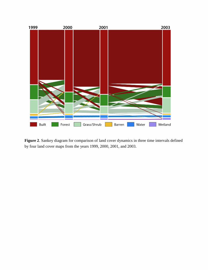
Figure 2. Sankey diagram for comparison of land cover dynamics in three time intervals defined
by four land cover maps from the years 1999, 2000, 2001, and 2003.
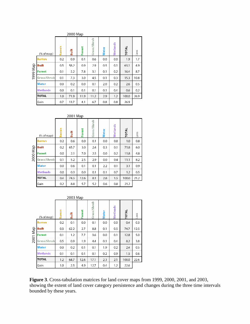
Figure 3. Cross-tabulation matrices for land cover maps from 1999, 2000, 2001, and 2003,
showing the extent of land cover category persistence and changes during the three time intervals
bounded by these years.