Proceedings of the Third International Symposium on ...
179
Proceedings of the Third International Symposium on Analytical Methods in Philately Edited by Susan Smith, John H. Barwis THE INSTITUTE FOR ANALYTICAL PHILATELY , INC .
-
Upload
khangminh22 -
Category
Documents
-
view
1 -
download
0
Transcript of Proceedings of the Third International Symposium on ...
Proceedings of the Third International Symposium on Analytical Methods
in Philately
Edited by
Susan Smith, John H. Barwis
t h e i n s t i t u t e f o r a na ly t i ca l p h i l at e ly, i n c.
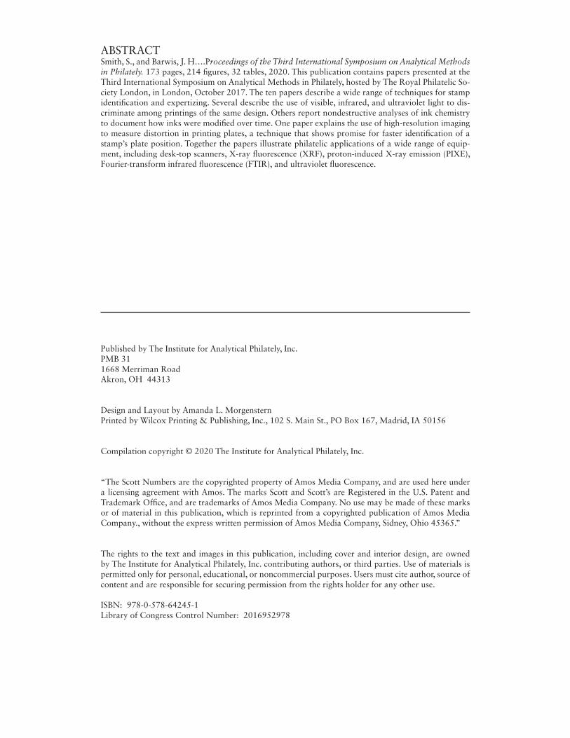
ABSTRACTSmith, S., and Barwis, J. H….Proceedings of the Third International Symposium on Analytical Methods in Philately. 173 pages, 214 figures, 32 tables, 2020. This publication contains papers presented at the Third International Symposium on Analytical Methods in Philately, hosted by The Royal Philatelic So-ciety London, in London, October 2017. The ten papers describe a wide range of techniques for stamp identification and expertizing. Several describe the use of visible, infrared, and ultraviolet light to dis-criminate among printings of the same design. Others report nondestructive analyses of ink chemistry to document how inks were modified over time. One paper explains the use of high-resolution imaging to measure distortion in printing plates, a technique that shows promise for faster identification of a stamp’s plate position. Together the papers illustrate philatelic applications of a wide range of equip-ment, including desk-top scanners, X-ray fluorescence (XRF), proton-induced X-ray emission (PIXE), Fourier-transform infrared fluorescence (FTIR), and ultraviolet fluorescence.
Published by The Institute for Analytical Philately, Inc.PMB 311668 Merriman RoadAkron, OH 44313
Design and Layout by Amanda L. MorgensternPrinted by Wilcox Printing & Publishing, Inc., 102 S. Main St., PO Box 167, Madrid, IA 50156
Compilation copyright © 2020 The Institute for Analytical Philately, Inc.
“The Scott Numbers are the copyrighted property of Amos Media Company, and are used here under a licensing agreement with Amos. The marks Scott and Scott’s are Registered in the U.S. Patent and Trademark Office, and are trademarks of Amos Media Company. No use may be made of these marks or of material in this publication, which is reprinted from a copyrighted publication of Amos Media Company., without the express written permission of Amos Media Company, Sidney, Ohio 45365.”
The rights to the text and images in this publication, including cover and interior design, are owned by The Institute for Analytical Philately, Inc. contributing authors, or third parties. Use of materials is permitted only for personal, educational, or noncommercial purposes. Users must cite author, source of content and are responsible for securing permission from the rights holder for any other use.
ISBN: 978-0-578-64245-1Library of Congress Control Number: 2016952978

WELCOME LETTER viiElliot Gruber
PREFACE ixJohn Barwis, IAP PresidentJonas Hällström, IAP Director, Technical Program ChairChris Harman, Chair, RPSL Ltd Expert CommitteeSusan Smith, Winton M. Blount Research Chair, Smithsonian National Postal Museum
The Use of Tonal Histograms for the Study of Stamp Shades 1Tim Lyerla
Chemistry of Analine Inks, 2-cent Admiral Issues of Canada 11Richard Judge
Impact of Technical Analyses on Greene Foundation Expertising 25J. Edward Nixon and Garfield Portch
The Colors of the Germany Crown and Eagle Series: A Tutorial on the Objective 35 Determination of Color Varieties
John M. Cibulskis
Progress Report on the U.S. 24¢ Purple Sstamp Enigma of 1970-75 51John H. Barwis and Harry G. Brittain
A Versatile Comparison of Stamps by High Resolution Image Differencing 63Robert V. Mustacich
Forensic Philately in 2020: Challenges and Opportunities 77 Paul Leonard
Exploring Color Mysteries in the United States Large and Small Numeral 97 Postage Due Stamps Using X-ray Fluorescence Spectrometry
Harry K. Charles
Using the Bruker XRF to Distinguish the Six Different Printings of the 127 U.S. Newspaper Stamp Designs N4 and N5
Larry Lyons
Non-Destructive Analyses: Creating Standards for Imperial Brazilian 135 Stamps From a Case Study of Cottens Essays Fernando Silva Moreira dos Santos and Márcia Almeida Rizzutto
Contents

Welcome Letter
April 20, 2019
It is my great pleasure to present the Proceedings of the Third International Symposium on Analytical Methods in Philately. The symposium met at the Royal Philatelic Society, London, (RPSL) the world’s oldest philatelic society, from 12-14 October 2017. The RPSL will be celebrating its 150th anniversary in 2019 and has been publishing philatelic literature for nearly as long. Its emphasis on ‘philatelic excellence, expertise and friendship’ made it an appropriate and wonderful host.
This gathering built on the work of the first two symposia, held respectively in Washington DC in 2012 at the Smithsonian National Postal Museum (NPM) and in Chicago in 2015 prior to CHICAGOPEX. The Institute of Analytical Philately (IAP) solicited papers for all three symposia. The Institute was formed in 2010 as a nonprofit corporation dedicated to deepening our understanding of stamps and covers through the use of scientific technology and the open publication of experimental results. The technical and financial support IAP provides can be tailored to the needs of philatelists with no scientific background, as well as those with advanced degrees in science or engineering.Accordingly, and in conjunction with the Smithsonian Institution’s mission to increase and diffuse knowledge and that of NPM to study and present postal history and philately, this publication aims to introduce the field of analytical philately to a general audience and to promote conversation among those philatelists using forensic tools and methods to learn more. We thank Susan Smith, the Winton M. Blount Research Chair at NPM, for her work with the authors.
The Fourth International Symposium will be held November 13, 2020 at the Smith-sonian’s National Postal Museum, home to one of the world’s largest philatelic collections. The museum’s philatelic forensic laboratory is open by appointment to all interested philatelists, who may apply for research funds available from the IAP and NPM. For more information, please check the webpages of the IAP and NPM:
http://analyticalphilately.org/ and https://postalmuseum.si.edu/research/.
We hope to see you soon!
Elliot Gruber Director, National Postal Museum
• vii

It is our pleasure to present the Proceedings of the Third International Symposium on Analytical Methods in Philately, hosted by the Royal Philatelic Society London on 13-15 October, 2017. The symposium was officially opened on the evening of 12 October at a delightful dinner hosted by RPSL President Patrick Maselis.
This symposium provided many opportunities for both fellowship and learning. An open house in the rooms of the RPSL Ltd Expert Committee allowed delegates to learn how expertising work is done, and to study the committee’s extensive reference collection of stamps as well as its historical records of submissions. Equipment manufacturers provided demonstrations of the newest spectral comparator and X-ray fluorescence instruments.
Expert Committee Chairman Chris Harman’s keynote address for the ensuing two days of technical sessions was a fitting segue between how expertising decisions must be made and the nature of facts that can be established by technical equipment. He showed several examples of how scientific analyses can mislead when data are used inappropriately or the wrong questions are asked. In philately, science is “a most useful assistant to the knowledgeable” rather than an end in itself.
The technical papers explored a wide range of analytical methods. The use of a scanners and digital photography were shown to identify subtle image differences in positions from a single sheet of stamps, and to determine shade groups in stamp issues with subtle color differences. Printing ink chemistry was differentiated using X-ray fluorescence, Fourier-Transform infrared fluorescence, and proton-induced X-ray emission. Practical applications of technology in expertising were also presented. Visual spectrometry was shown by the Greene Foundation to reveal a previously unidentifiable fake, while the Philatelic Foundation demonstrated the use of X-ray fluorescence to discriminate different printings of otherwise nearly identical stamps.
A highlight of the symposium was the participation of 50 RPSL Fellows and Members in an open forum about the future role of technology in philately. The liveliest of the wide-ranging discussions surrounded the need for consistency in color standards in stamp catalogues.
The fourth international symposium will be held at the Smithsonian National Postal Museum in Washington DC on November 13, 2020. We look forward to continuing our conversations.
John Barwis, IAP PresidentJonas Hällström, IAP Director, Technical Program ChairChris Harman, Chair, RPSL Ltd Expert CommitteeSusan Smith, Winton M. Blount Research Chair, Smithsonian National Postal Museum
http://analyticalphilately.org/ • http://www.rpsl.org.uk/ • https://postalmuseum.si.edu/
Preface
• ix

ABSTRACT. ABSTRACT. The purpose of this work was to determine the value of tonal histograms in identifying stamp shades of an issue whose catalog listings comprise more than two varieties. The 10 Pfennig value of the 1889 “crown and eagle” issue from the German Empire was chosen for this investigation. This is a classical red stamp under VIS light with some 11 different shades in UV described in the Michel® Germany Specialized cat-alog. Because of the large number of possible shades, this study concentrated on the red-type shades designated as types “d” - red (shades) in UV; “da” - dark red in UV; and “db” - pale vermilion in UV. The 10 Pfennig stamps sent for use in four German colonies, the Marianas, Caroline Islands, New Guinea and German Southwest Africa, are listed as having only one or two of these d-type shades, allowing these to serve as models for each of these shades. The three different shades could be distinguished by three different patterns of tonal histograms. The stamps examined from the Marianas, Caroline Islands, and New Guinea islands exhibited tonal histograms in keeping with their expectations from the Michel® catalog descriptions, whereas those from South West Africa did not. The three patterns can be seen at the single pixel level and characterized numerically with data collected at this level. In addition, three of the 10 Pfennig stamps encountered in this study showed the presence of two of these shades that could be affirmed using tonal histograms, indicating there were some common elements of the dyes and pigments used in their production. From these investigations, it is reasonable to expect that tonal histograms can provide an objective tool for distinguishing different, but closely related, shades of stamps.
INTRODUCTION
The Michel® Germany Specialized catalog lists some 11 different shades of the 10 Pfennig value for the 1889 "crown and eagle" issue of the German Empire, and all are recognizable under UV illumination. There are 4 different types (a, b, c, and e), each with two varieties observed under UV and one, type d, with three different UV varieties (Table 1).
The Use of Tonal Histograms for the Study of Stamp ShadesTim Lyerla
2 • I N S T I T U T E F O R A N A LY T I C A L P H I L AT E LY
There is no relationship between shade types and print runs. The a, aa, db, e, and ea shades were the first printed, each for only one year at the beginning of production 1889-1890; the b, ba, c and ca shades were printed from 1890 to 1896; and the d and da shades began production last and ran for the longest period from 1893 to 1900.
The basic color of this stamp is red and it would be ex-tremely difficult to distinguish among the 11 different shades under visible (VIS) light alone given their apparently subtle differences. Also, it would not even be possible to tell the differ-ence between the 47e and 47ea shades by VIS light, as they are listed as identical under this lighting condition and can only be separated into two shades by the use of UV light (Table 1). So the German stamp collector wishing to possess all 11 shades of this stamp must know how to recognize their shades in UV light in order to confirm their identification, or rely upon expertization for determining this property.
Another conundrum presented by this array is the diffi-culty of distinguishing among three different types of shades under UV light of the "d" type listing. Comparing only two shades with one another is relatively far simpler than trying to do this with three or more varieties, especially if one is listed as "shades" of red, another as "dark red", and a third as "pale vermilion". To this observer, "dark red" is a shade of red, and "pale vermilion" could easily fall into this category as well.
For this reason, and because the 47d red (shades) is the most commonly found among all the different shades of the is-sue, this study focused upon verifying these three shade variants using UV photography and tonal histograms.
This was aided by issues that were overprinted for use in four of the German colonies and limited to only one or two of these three shade varieties (Table 2). Note that some of these stamps are recognized by unique criteria that do not involve the shade itself, so these items can be considered as models for these shades. These criteria include the three-word overprint is-sue of German South West Africa and the 48o angle overprints for Caroline Islands and the Marianas. The 10 Pfennig "crown and eagle" stamps issued for German New Guinea were only of two types, according to the Michel® Germany Specialized
catalog, red (shades) and pale vermilion, and usually these can be distinguished from one another by eye. In sum, there are two representatives each for the d type shade (red [shades]) and da type (dark red), and one for the db type (pale vermilion), and there are never more than two shades to distinguish when examining these particular stamps among these four colonies.
MATERIALS AND METHODS
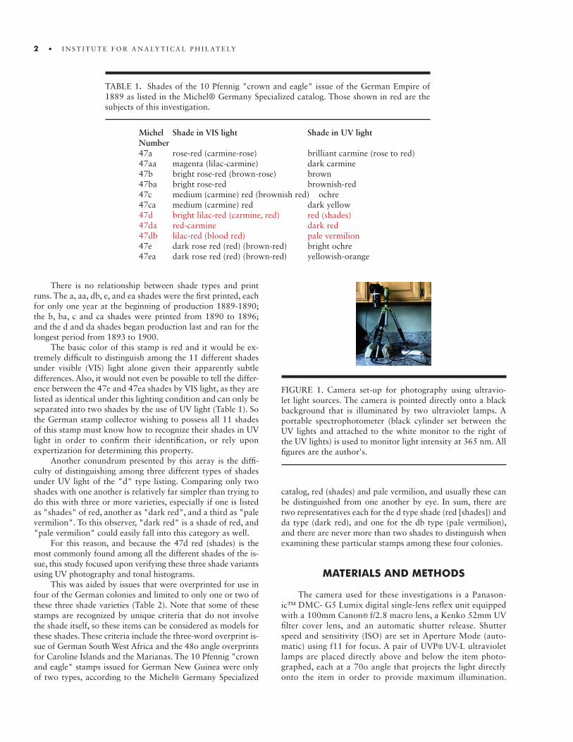
The camera used for these investigations is a Panason-ic™ DMC- G5 Lumix digital single-lens reflex unit equipped with a 100mm Canon® f/2.8 macro lens, a Kenko 52mm UV filter cover lens, and an automatic shutter release. Shutter speed and sensitivity (ISO) are set in Aperture Mode (auto-matic) using f11 for focus. A pair of UVP® UV-L ultraviolet lamps are placed directly above and below the item photo-graphed, each at a 70o angle that projects the light directly onto the item in order to provide maximum illumination.
FIGURE 1. Camera set-up for photography using ultravio-let light sources. The camera is pointed directly onto a black background that is illuminated by two ultraviolet lamps. A portable spectrophotometer (black cylinder set between the UV lights and attached to the white monitor to the right of the UV lights) is used to monitor light intensity at 365 nm. All figures are the author's.
TABLE 1. Shades of the 10 Pfennig "crown and eagle" issue of the German Empire of 1889 as listed in the Michel® Germany Specialized catalog. Those shown in red are the subjects of this investigation.
Michel Shade in VIS light Shade in UV light Number47a rose-red (carmine-rose) brilliant carmine (rose to red)47aa magenta (lilac-carmine) dark carmine47b bright rose-red (brown-rose) brown47ba bright rose-red brownish-red47c medium (carmine) red (brownish red) ochre47ca medium (carmine) red dark yellow47d bright lilac-red (carmine, red) red (shades)47da red-carmine dark red47db lilac-red (blood red) pale vermilion47e dark rose red (red) (brown-red) bright ochre47ea dark rose red (red) (brown-red) yellowish-orange
• 3
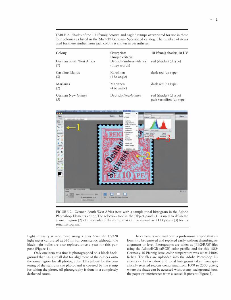
FIGURE 2. German South West Africa item with a sample tonal histogram in the Adobe Photoshop Elements editor. The selection tool in the Object panel (1) is used to delineate a small region (2) of the shade of the stamp that can be viewed as 2133 pixels (3) for its tonal histogram.
Light intensity is monitored using a Sper Scientific UVA/B light meter calibrated at 365nm for consistency, although the black-light bulbs are also replaced once a year for this pur-pose (Figure 1).
Only one item at a time is photographed on a black back-ground that has a small dot for alignment of the camera onto the same region for all photographs. This allows for the cen-tering of the stamp in the photo, and is covered by the stamp for taking the photo. All photography is done in a completely darkened room.
The camera is mounted onto a professional tripod that al-lows it to be removed and replaced easily without disturbing its alignment or level. Photographs are taken as JPEG/RAW files using the AdobeRGB (aRGB) color profile, and for this 1889 Germany 10 Pfennig issue, color temperature was set at 5400o Kelvin. The files are uploaded into the Adobe Photoshop El-ements (v. 12) window and tonal histograms taken from spe-cifically selected regions comprising from 1000 to 2500 pixels, where the shade can be accessed without any background from the paper or interference from a cancel, if present (Figure 2).
TABLE 2. Shades of the 10 Pfennig "crown and eagle" stamps overprinted for use in these four colonies as listed in the Michel® Germany Specialized catalog. The number of items used for these studies from each colony is shown in parentheses.
Colony Overprint/ 10 Pfennig shade(s) in UV Unique criteria German South West Africa Deutsch-Südwest-Afrika red (shades) (d type)(7) (three words) Caroline Islands Karolinen dark red (da type)(3) (48o angle)
Marianas Marianen dark red (da type)(2) (48o angle)
German New Guinea Deutsch-Neu-Guinea red (shades) (d type)(5) pale vermilion (db type)
1
2
3
4 • I N S T I T U T E F O R A N A LY T I C A L P H I L AT E LY
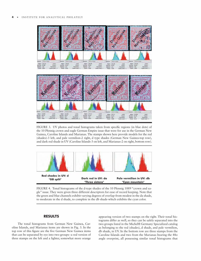
FIGURE 3. UV photos and tonal histograms taken from specific regions (in blue dots) of the 10 Pfennig crown and eagle German Empire issue that were for use in the German New Guinea, Caroline Islands and Marianas. The stamps shown here provide models for the red (shades)-3 left, and pale vermilion-2 right, d type shades (German New Guinea-top row), and dark red shade in UV (Caroline Islands-3 on left, and Marianas-2 on right, bottom row).
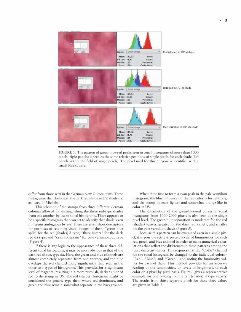
FIGURE 4. Tonal histograms of the d-type shades of the 10 Pfennig 1889 “crown and ea-gle” issue. They were given three different descriptors for ease of record keeping. Note that the green and blue channels exhibit varying degrees of overlap-from modest in the da shade, to moderate in the d shade, to complete in the db shade-which exhibits the cyan color.
Red shades in UV: d"GB split" Dark red in UV: da
"Three sistens"Pale vermilion in UV: db
"Cyan mountain"
RESULTS
The tonal histograms from German New Guinea, Car-oline Islands, and Marianas items are shown in Fig. 3. In the top row of this figure are the five German New Guinea items that can be separated by eye into two groups--a red version of three stamps on the left and a lighter, somewhat more orange
appearing version of two stamps on the right. Their tonal his-tograms differ as well, so they can be safely separated into the two groups listed in the Michel® Germany Specialized catalog as belonging to the red (shades), d shade, and pale vermilion, db shade, in UV. In the bottom row are three stamps from the Caroline Islands and two from the Marianas bearing the 48o angle overprint, all possessing similar tonal histograms that
• 5
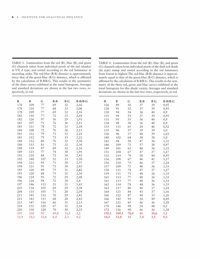
FIGURE 5. The pattern of green-blue-red peaks seen in tonal histograms of more than 1000 pixels (right panels) is seen as the same relative positions of single pixels for each shade (left panels within the field of single pixels). The pixel used for this purpose is identified with a small blue square.
differ from those seen in the German New Guinea items. These histograms, then, belong to the dark red shade in UV, shade da, as listed in Michel®.
This selection of ten stamps from three different German colonies allowed for distinguishing the three red-type shades from one another by use of tonal histograms. There appears to be a specific histogram that can act to identify that shade, even if it seems ambiguous by eye. These are given short descriptors for purposes of retaining visual images of them--"green blue split" for the red (shades) d type, "three sisters" for the dark red da type, and "cyan mountain" for pale vermilion, db type (Figure 4).
If there is any logic to the appearance of these three dif-ferent tonal histograms, it may be most obvious in that of the dark red shade, type da. Here, the green and blue channels are almost completely separated from one another, and the blue overlaps the red channel more significantly than seen in the other two types of histograms. This provides for a significant level of magenta, resulting in a more purplish, darker color of red to the stamp in UV. The red (shades) histogram might be considered the generic type then, where red dominates, and green and blue remain somewhat separate in the background.
When these fuse to form a cyan peak in the pale vermilion histogram, the blue influence on the red color is lost entirely, and the stamp appears lighter and somewhat orange-like in color in UV.
The distribution of the green-blue-red curves in tonal histograms from 1000-2000 pixels is also seen at the single pixel level. The green-blue separation is moderate for the red (shades) variety, greater for the dark red variety, and smaller for the pale vermilion shade (Figure 5).
Because this pattern can be examined even in a single pix-el, it is possible retrieve precise levels of luminosities for each red, green, and blue channel in order to make numerical calcu-lations that reflect the differences in these patterns among the three different shades. This requires that the "Color" channel for the tonal histogram be changed to the individual colors--"Red", "Blue", and "Green"--and noting the luminosity val-ues for each of these. This method provides for an accurate reading of the luminosities, or levels of brightness, of each color on a pixel-by-pixel basis. Figure 6 gives a representative example for one reading for the red (shades) d type variety. The results from thirty separate pixels for these three values are given in Table 3.
6 • I N S T I T U T E F O R A N A LY T I C A L P H I L AT E LY
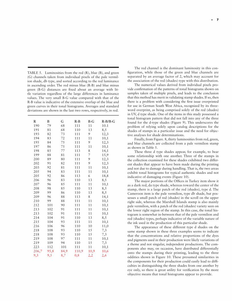
TABLE 3. Luminosities from the red (R), blue (B), and green (G) channels taken from individual pixels of the red (shades) in UV, d type, and sorted according to the red luminance in ascending order. The red-blue (R-B) distance is approximately twice that of the green-blue (B-G) distance, which is affirmed by the calculation of R-B/B-G. This results in the asymmetry of the three curves exhibited in the tonal histogram. Averages and standard deviations are shown in the last two rows, re-spectively, in red.
R B G R-B B-G R-B/B-G178 109 77 69 32 2,16178 110 77 68 33 2,06178 109 77 69 32 2,16182 110 77 72 33 2,18182 126 97 56 29 1,93183 107 71 76 36 2,11183 111 78 72 33 2,18184 108 72 76 36 2,11185 112 79 73 33 2,21185 112 79 73 33 2,21188 112 80 76 32 2,38188 113 81 75 32 2,34188 119 87 69 32 2,16189 115 77 74 38 1,95191 118 88 73 30 2,43192 140 107 52 33 1,58194 123 93 71 30 2,37194 121 91 73 30 2,43195 120 89 75 31 2,42195 120 88 75 32 2,34196 124 95 72 29 2,48196 124 94 72 30 2,4197 146 115 51 31 1,65203 134 105 69 29 2,38204 133 105 71 28 2,54211 141 112 70 29 2,41211 143 115 68 28 2,43213 147 116 66 31 2,13218 151 120 67 31 2,16220 150 120 70 30 2,33193 124 92 69,8 31,5 2,211,9 14,1 15,6 6,4 2,3 0,2
TABLE 4. Luminosities from the red (R), blue (B), and green (G) channels taken from individual pixels of the dark red shade (da type) stamp and sorted according to the red luminance from lowest to highest The red-blue (R-B) distance is approxi-mately equal to that of the green-blue (B-G) distance, which is affirmed by the calculation of R-B/B-G. This results in the sym-metry of the three red, green and blue curves exhibited in the tonal histogram for this shade variety. Averages and standard deviations are shown in the last two rows, respectively, in red.
R B G R-B B-G R-B/B-G126 89 50 37 39 0,95128 91 52 37 39 0,95130 94 54 36 40 0,9131 94 55 37 39 0,95131 95 55 36 40 0,9134 98 58 36 40 0,9135 111 65 24 46 0,52135 96 57 39 39 1,0136 96 57 40 39 1,03140 102 64 38 38 1,0141 94 58 47 36 1,31146 109 71 37 38 0,97149 101 65 48 36 1,33151 104 67 47 37 1,27152 114 74 38 40 0,95156 108 67 48 41 1,17156 110 73 46 37 1,24157 109 73 48 36 1,33158 111 74 47 37 1,27159 111 75 48 36 1,33161 113 77 48 36 1,33161 113 77 48 36 1,33162 114 78 48 36 1,33163 117 80 46 37 1,24164 121 84 43 37 1,16166 122 87 44 35 1,26166 142 93 24 49 0,49167 121 85 46 36 1,28170 146 98 24 48 0,5172 126 90 46 36 1,28150,1 109,1 70,4 41 38,6 1,114,4 13,8 13 7,4 3,5 0,3
• 7
The red channel is the dominant luminosity in this con-figuration, while those of the green and blue channels are separated by an average factor of 2, which may account for the association of the red (shades) type with this distribution.
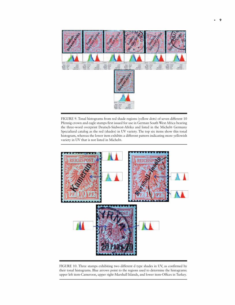
The numerical values derived from individual pixels pro-vide confirmation of the patterns of tonal histograms shown on samples taken of multiple pixels, and leads to the conclusion that this method has merit in validating stamp shades. If so, then there is a problem with considering the first issue overprinted for use in German South West Africa, recognized by its three-word overprint, as being comprised solely of the red (shades) in UV, d type shade. One of the items in this study possessed a tonal histogram pattern that did not fall into any of the three found for the d-type shades (Figure 9). This underscores the problem of relying solely upon catalog descriptions for the shades of stamps in a particular issue and the need for objec-tive analyses for shade determinations.
Finally, from Figure. 8, thirty luminosities from red, green, and blue channels are collected from a pale vermilion stamp as shown in Table 5.
These three d type shades appear, for example, to bear some relationship with one another. Three of the stamps in the collection examined for these shades exhibited two differ-ent shades that appear to have been made during the printing and not due to damage during handling. That is, the two areas exhibit tonal histograms for typical authentic shades and not indicative of damaging events (Figure 10).
The major portions of the Offices in Turkey item show it as a dark red, da type shade, whereas toward the center of the stamp, there is a large patch of the red (shades), type d. The Cameroon item is the pale vermilion, type db shade, but pos-sesses a small patch of red (shades) in the scroll on the upper right side, whereas the Marshall Islands stamp is also mainly pale vermilion, with a patch of the red (shades) variety seen on the lower right region of the stamp. In this case, the tonal his-togram is somewhat in-between that of the pale vermilion and red (shades) types, perhaps indicative of the variable nature of the ink used in the production of this particular shade.
The appearance of these different type d shades on the same stamp shown in these three examples seems to indicate that the concentrations and relative proportions of the dyes and pigments used in their production were likely variations of a theme and not singular, independent productions. The com-ponents also may, on occasion, have distributed differentially onto the stamps during their printing, leading to the three oddities shown in Figure 10. These presumed similarities in the components for their production could easily lead to diffi-culties in distinguishing the three shades from one another by eye only, so there is great utility for verification by the more objective means that tonal histograms appear to provide.
TABLE 5. Luminosities from the red (R), blue (B), and green (G) channels taken from individual pixels of the pale vermil-ion shade, db type, and sorted according to the red luminance in ascending order. The red minus blue (R-B) and blue minus green (B-G) distances are fixed about an average with lit-tle variation regardless of the large differences in luminance values. The very small B-G value compared with that of the R-B value is indicative of the extensive overlap of the blue and green curves in their tonal histograms. Averages and standard deviations are shown in the last two rows, respectively, in red.
R B G R-B B-G R-B/B-G190 79 68 111 11 10.1191 81 68 110 13 8,5193 82 73 111 9 12,3194 83 72 111 11 10,1195 84 75 111 9 12,3197 86 75 111 11 10,1198 85 77 113 8 14,1199 88 81 111 7 15,9200 89 80 111 9 12,3202 91 82 111 9 12,3203 92 81 111 11 10,1205 94 83 111 11 10,1205 92 86 113 6 18,8206 96 83 110 13 8,5207 96 85 111 11 10,1208 98 85 110 13 8,5209 99 86 110 13 8,5209 96 88 113 8 14,1210 99 88 111 11 10,1212 101 90 111 11 10,1213 102 91 111 11 10,1213 102 91 111 11 10,1214 104 91 110 13 8,5215 104 93 111 11 10,1216 106 96 110 10 11,0218 108 93 110 15 7,3218 108 93 110 15 7,3219 108 97 111 11 10,1219 109 94 110 15 7,3223 112 101 111 11 10,1206,7 95,8 84,9 110,9 10,9 10,69,3 9,5 8,7 0,8 2,2 2,6
8 • I N S T I T U T E F O R A N A LY T I C A L P H I L AT E LY
The methods described here are empirical and involve comparisons of patterns of tonal histograms, not unlike visual comparisons used by experts to distinguish various shades of stamps. The advantage of tonal histograms is that they do not require the extensive study of a large number of specimens required for developing the expertise sufficient to be certified as an expert. Also, they are somewhat more objective than an expert’s opinion and can provide confirmation of visual ex-aminations. However, they require samples of known shades for determining histograms associated with those under study, either expertized or recognizable by other criteria--as in this investigation--in order to identify the shade of a stamp that is currently unknown using tonal histograms. Even if only two shades were to be compared, it would be useful to have multiple examples of tonal histograms from known samples of each shade order to reach conclusions confidently. The German “crown and eagle” was chosen for this study as a challenge because of the multiple shades listed within each denomina-tion. The results presented here with the 10 Pfennig value of this issue indicate that tonal histograms can provide a useful tool for distinguishing among several different shades.
FIGURE 7. Example of the luminosity values for each color channel (Green, Blue and Red) from a single pixel (indicated by the blue square to the left of the Colors Channel Histo-gram)—dark red in UV da-type shade.
FIGURE 8. Luminosities for each color channel (Green, Blue and Red) from a single pixel (indicated by the blue square at the left of the Colors Channel Histogram)—pale vermilion in UV db-type shade.
FIGURE 6. Example of the luminosities for each color channel (Green, Blue and Red) from a single pixel (indicated by the blue square to the left of the Colors Channel Histogram)—red (shades) in UV d-type shade.
• 9
FIGURE 9. Tonal histograms from red shade regions (yellow dots) of seven different 10 Pfennig crown and eagle stamps first issued for use in German South West Africa bearing the three-word overprint Deutsch-Südwest-Afrika and listed in the Michel® Germany Specialized catalog as the red (shades) in UV variety. The top six items show this tonal histogram, whereas the lower item exhibits a different pattern indicating more yellowish variety in UV that is not listed in Michel®.
FIGURE 10. Three stamps exhibiting two different d type shades in UV, as confirmed by their tonal histograms. Blue arrows point to the regions used to determine the histograms: upper left item-Cameroon, upper right-Marshall Islands, and lower item-Offices in Turkey.
Chemistry of Aniline Inks, 2-cent Admiral Issues of CanadaRichard H. Judge
ABSTRACT.ABSTRACT. The 2-cent carmine Admiral issue of Canada had a long production period that overlapped the First World War. This investigation will document the changes in ink formulations that resulted from the unavailability of key ingredients during the war and the subsequent shade variations and a production flaw. The major challenge of cor-relating any changes in ink chemistry with the extensive production time frame from late 1911 to late 1920 was achieved by analyzing a substantial fraction of plate blocks from the 188 plates of that period, all of known approval dates.
Shade variations were investigated from the reflectance spectra of unused plate blocks of both regular and war-tax stamps. The variation in elemental composition of the inks was studied using X-ray Fluorescence (XRF) spectroscopy. The change in molecular or ionic compounds within the ink was followed using Attenuated Total Reflectance Fourier Transform Infrared (ATR-FTIR) spectroscopy.
The results of the analysis of the reflectance spectra show a partitioning of the reflec-tance curves into two main types and correlate with the change of shade from pre-war rose carmine to post-war carmine. The war years represented the transition period and gave rise to several shade variations of which the aniline ink pink shade is the most striking. XRF analysis shows that the element Zn disappears just before the start of the war and never substantially returned. The other major change is the appearance, only during the war, of Cr but at concentrations that are quite variable. Additional changes in the ATR-FTIR spectra parallel that seen in the reflectance spectra, namely changes over the three time periods of pre-, during and post- WWI. However, the actual compounds in flux are not identified in this study only the appearance and disappearance of spectral features are documented. A discussion of the steps used in formulating an ink, as gleaned from the literature of the early 1900’s, is presented and focuses on the appearance of various elements and compounds in each step of the ink making process. The paper also focuses on the aniline ink variety, i.e. stamps that show significant bleed through of the ink to the gum side of the stamp. It is shown that a pre-WWI aniline ink plate block has no discernable spectral differences from normal stamps of similar or identical plate numbers. However, the aniline ink stamps produced during the war show major differences in Cr levels and are lower than normal stamps of that period. By eye, the bleed through of the WWI aniline ink stamps is approximately inversely proportional to the Cr level.
The primary conclusion from this paper is that the major changes in ink formulations necessitated by WWI shortages resulted in production difficulties that gave rise to the aniline ink variety and the aniline pink shade. It is uncertain if the absence of Cr in this bleed through variety is due to the inability to properly fix the dye into a pigment early in the process or whether Cr compounds become unavailable during the later part of the ink making process and their absence caused the bleed through.
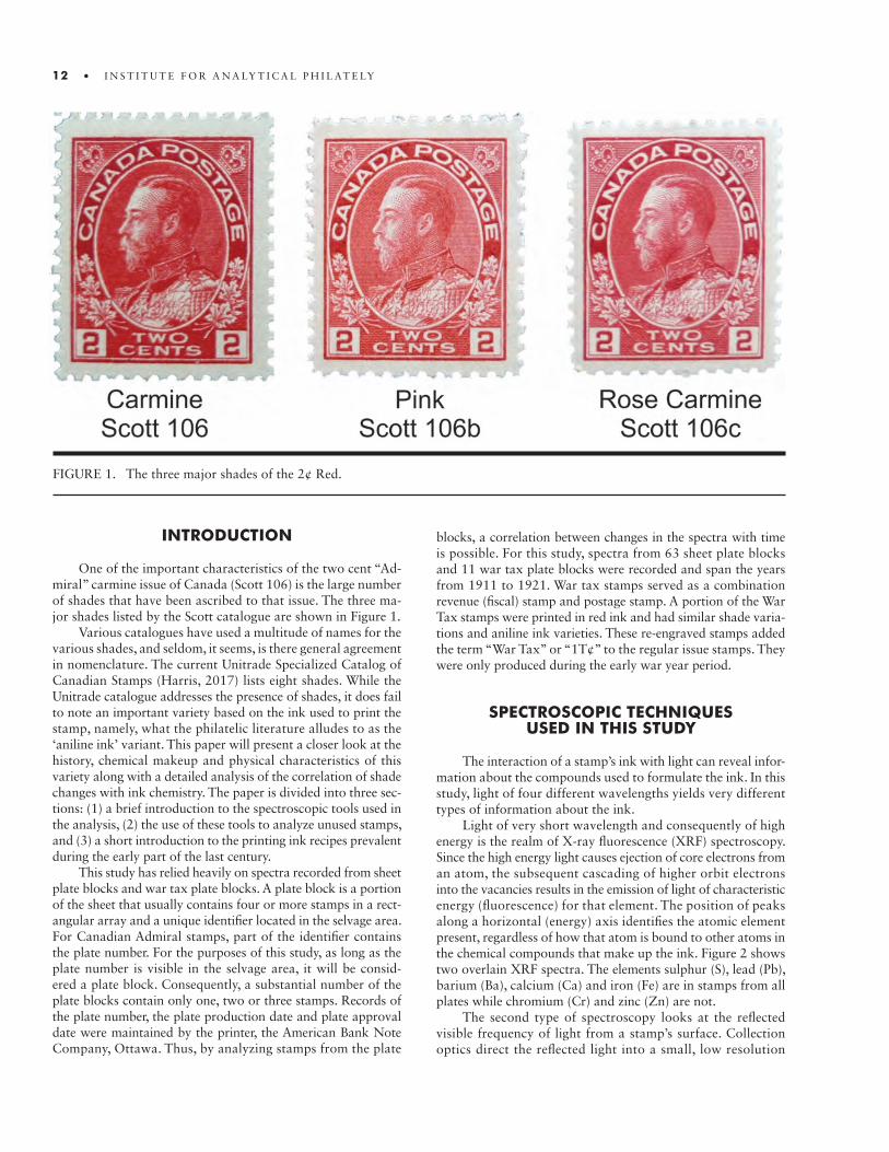
FIGURE 1. The three major shades of the 2¢ Red.
10 • I N S T I T U T E F O R A N A LY T I C A L P H I L AT E LY
INTRODUCTION
One of the important characteristics of the two cent “Ad-miral” carmine issue of Canada (Scott 106) is the large number of shades that have been ascribed to that issue. The three ma-jor shades listed by the Scott catalogue are shown in Figure 1.
Various catalogues have used a multitude of names for the various shades, and seldom, it seems, is there general agreement in nomenclature. The current Unitrade Specialized Catalog of Canadian Stamps (Harris, 2017) lists eight shades. While the Unitrade catalogue addresses the presence of shades, it does fail to note an important variety based on the ink used to print the stamp, namely, what the philatelic literature alludes to as the ‘aniline ink’ variant. This paper will present a closer look at the history, chemical makeup and physical characteristics of this variety along with a detailed analysis of the correlation of shade changes with ink chemistry. The paper is divided into three sec-tions: (1) a brief introduction to the spectroscopic tools used in the analysis, (2) the use of these tools to analyze unused stamps, and (3) a short introduction to the printing ink recipes prevalent during the early part of the last century.
This study has relied heavily on spectra recorded from sheet plate blocks and war tax plate blocks. A plate block is a portion of the sheet that usually contains four or more stamps in a rect-angular array and a unique identifier located in the selvage area. For Canadian Admiral stamps, part of the identifier contains the plate number. For the purposes of this study, as long as the plate number is visible in the selvage area, it will be consid-ered a plate block. Consequently, a substantial number of the plate blocks contain only one, two or three stamps. Records of the plate number, the plate production date and plate approval date were maintained by the printer, the American Bank Note Company, Ottawa. Thus, by analyzing stamps from the plate
blocks, a correlation between changes in the spectra with time is possible. For this study, spectra from 63 sheet plate blocks and 11 war tax plate blocks were recorded and span the years from 1911 to 1921. War tax stamps served as a combination revenue (fiscal) stamp and postage stamp. A portion of the War Tax stamps were printed in red ink and had similar shade varia-tions and aniline ink varieties. These re-engraved stamps added the term “War Tax” or “1T¢” to the regular issue stamps. They were only produced during the early war year period.
SPECTROSCOPIC TECHNIQUES USED IN THIS STUDY
The interaction of a stamp’s ink with light can reveal infor-mation about the compounds used to formulate the ink. In this study, light of four different wavelengths yields very different types of information about the ink.
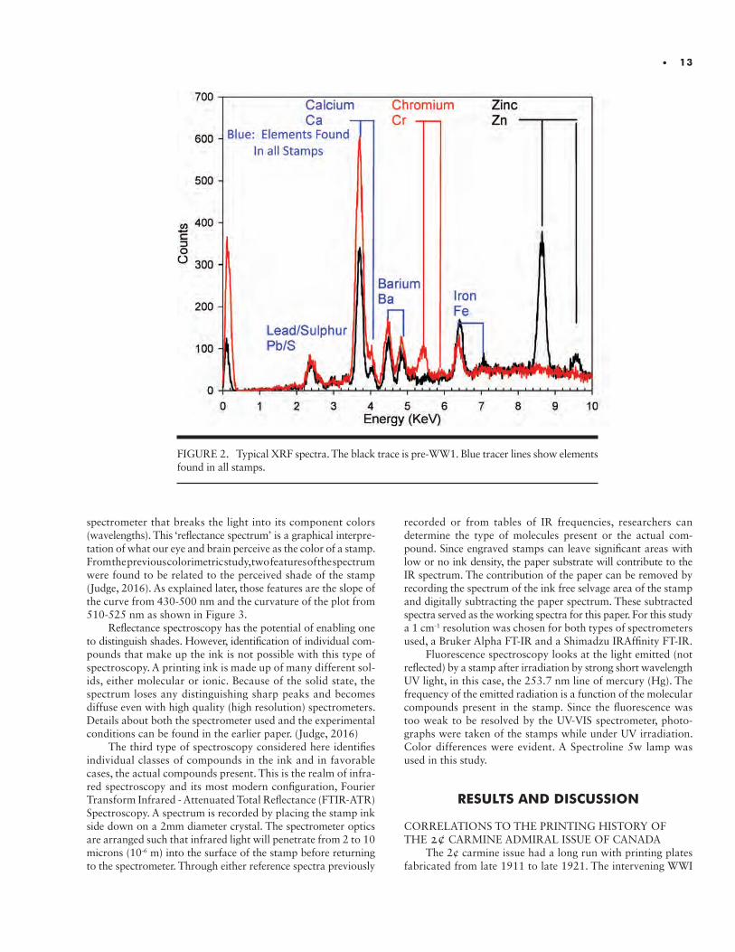
Light of very short wavelength and consequently of high energy is the realm of X-ray fluorescence (XRF) spectroscopy. Since the high energy light causes ejection of core electrons from an atom, the subsequent cascading of higher orbit electrons into the vacancies results in the emission of light of characteristic energy (fluorescence) for that element. The position of peaks along a horizontal (energy) axis identifies the atomic element present, regardless of how that atom is bound to other atoms in the chemical compounds that make up the ink. Figure 2 shows two overlain XRF spectra. The elements sulphur (S), lead (Pb), barium (Ba), calcium (Ca) and iron (Fe) are in stamps from all plates while chromium (Cr) and zinc (Zn) are not.
The second type of spectroscopy looks at the reflected visible frequency of light from a stamp’s surface. Collection optics direct the reflected light into a small, low resolution
12 • I N S T I T U T E F O R A N A LY T I C A L P H I L AT E LY
• 13
spectrometer that breaks the light into its component colors (wavelengths). This ‘reflectance spectrum’ is a graphical interpre-tation of what our eye and brain perceive as the color of a stamp. From the previous colorimetric study, two features of the spectrum were found to be related to the perceived shade of the stamp (Judge, 2016). As explained later, those features are the slope of the curve from 430-500 nm and the curvature of the plot from 510-525 nm as shown in Figure 3.
Reflectance spectroscopy has the potential of enabling one to distinguish shades. However, identification of individual com-pounds that make up the ink is not possible with this type of spectroscopy. A printing ink is made up of many different sol-ids, either molecular or ionic. Because of the solid state, the spectrum loses any distinguishing sharp peaks and becomes diffuse even with high quality (high resolution) spectrometers. Details about both the spectrometer used and the experimental conditions can be found in the earlier paper. (Judge, 2016)
The third type of spectroscopy considered here identifies individual classes of compounds in the ink and in favorable cases, the actual compounds present. This is the realm of infra-red spectroscopy and its most modern configuration, Fourier Transform Infrared - Attenuated Total Reflectance (FTIR-ATR) Spectroscopy. A spectrum is recorded by placing the stamp ink side down on a 2mm diameter crystal. The spectrometer optics are arranged such that infrared light will penetrate from 2 to 10 microns (10-6 m) into the surface of the stamp before returning to the spectrometer. Through either reference spectra previously
recorded or from tables of IR frequencies, researchers can determine the type of molecules present or the actual com-pound. Since engraved stamps can leave significant areas with low or no ink density, the paper substrate will contribute to the IR spectrum. The contribution of the paper can be removed by recording the spectrum of the ink free selvage area of the stamp and digitally subtracting the paper spectrum. These subtracted spectra served as the working spectra for this paper. For this study a 1 cm-1 resolution was chosen for both types of spectrometers used, a Bruker Alpha FT-IR and a Shimadzu IRAffinity FT-IR.
Fluorescence spectroscopy looks at the light emitted (not reflected) by a stamp after irradiation by strong short wavelength UV light, in this case, the 253.7 nm line of mercury (Hg). The frequency of the emitted radiation is a function of the molecular compounds present in the stamp. Since the fluorescence was too weak to be resolved by the UV-VIS spectrometer, photo-graphs were taken of the stamps while under UV irradiation. Color differences were evident. A Spectroline 5w lamp was used in this study.
RESULTS AND DISCUSSION
CORRELATIONS TO THE PRINTING HISTORY OF THE 2¢ CARMINE ADMIRAL ISSUE OF CANADA
The 2¢ carmine issue had a long run with printing plates fabricated from late 1911 to late 1921. The intervening WWI
FIGURE 2. Typical XRF spectra. The black trace is pre-WW1. Blue tracer lines show elements found in all stamps.
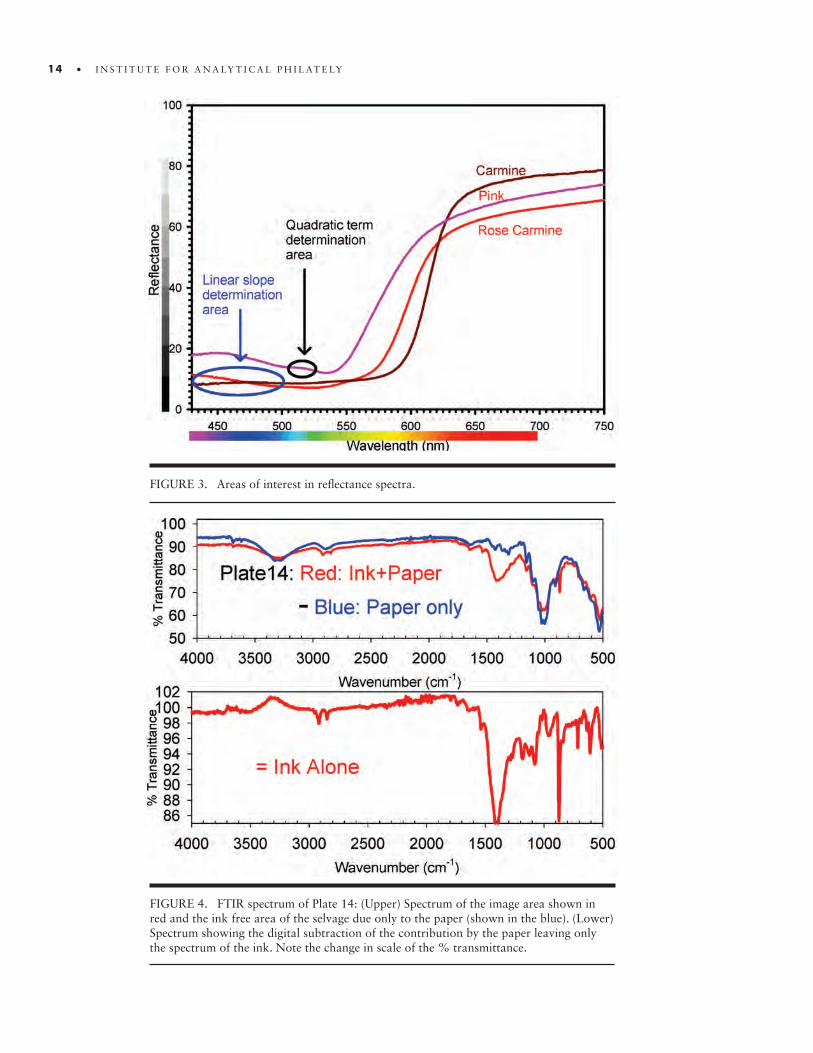
FIGURE 3. Areas of interest in reflectance spectra.
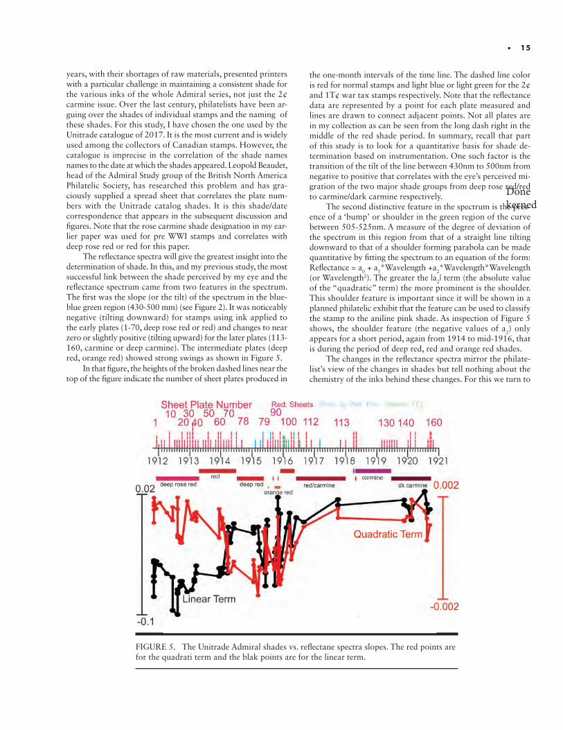
FIGURE 4. FTIR spectrum of Plate 14: (Upper) Spectrum of the image area shown in red and the ink free area of the selvage due only to the paper (shown in the blue). (Lower) Spectrum showing the digital subtraction of the contribution by the paper leaving only the spectrum of the ink. Note the change in scale of the % transmittance.
14 • I N S T I T U T E F O R A N A LY T I C A L P H I L AT E LY
Donekerned
• 15
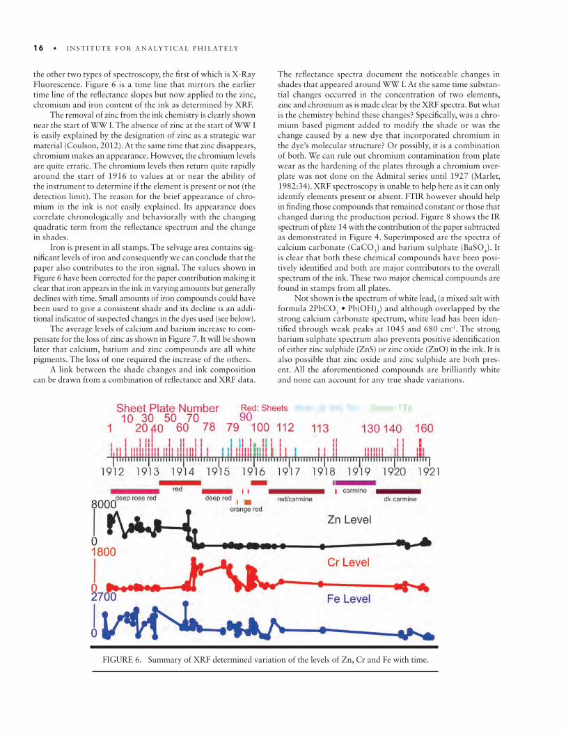
years, with their shortages of raw materials, presented printers with a particular challenge in maintaining a consistent shade for the various inks of the whole Admiral series, not just the 2¢ carmine issue. Over the last century, philatelists have been ar-guing over the shades of individual stamps and the naming of these shades. For this study, I have chosen the one used by the Unitrade catalogue of 2017. It is the most current and is widely used among the collectors of Canadian stamps. However, the catalogue is imprecise in the correlation of the shade names names to the date at which the shades appeared. Leopold Beaudet, head of the Admiral Study group of the British North America Philatelic Society, has researched this problem and has gra-ciously supplied a spread sheet that correlates the plate num-bers with the Unitrade catalog shades. It is this shade/date correspondence that appears in the subsequent discussion and figures. Note that the rose carmine shade designation in my ear-lier paper was used for pre WWI stamps and correlates with deep rose red or red for this paper.
The reflectance spectra will give the greatest insight into the determination of shade. In this, and my previous study, the most successful link between the shade perceived by my eye and the reflectance spectrum came from two features in the spectrum. The first was the slope (or the tilt) of the spectrum in the blue-blue green region (430-500 mm) (see Figure 2). It was noticeably negative (tilting downward) for stamps using ink applied to the early plates (1-70, deep rose red or red) and changes to near zero or slightly positive (tilting upward) for the later plates (113-160, carmine or deep carmine). The intermediate plates (deep red, orange red) showed strong swings as shown in Figure 5.
In that figure, the heights of the broken dashed lines near the top of the figure indicate the number of sheet plates produced in
the one-month intervals of the time line. The dashed line color is red for normal stamps and light blue or light green for the 2¢ and 1T¢ war tax stamps respectively. Note that the reflectance data are represented by a point for each plate measured and lines are drawn to connect adjacent points. Not all plates are in my collection as can be seen from the long dash right in the middle of the red shade period. In summary, recall that part of this study is to look for a quantitative basis for shade de-termination based on instrumentation. One such factor is the transition of the tilt of the line between 430nm to 500nm from negative to positive that correlates with the eye’s perceived mi-gration of the two major shade groups from deep rose red/red to carmine/dark carmine respectively.
The second distinctive feature in the spectrum is the pres-ence of a ‘bump’ or shoulder in the green region of the curve between 505-525nm. A measure of the degree of deviation of the spectrum in this region from that of a straight line tilting downward to that of a shoulder forming parabola can be made quantitative by fitting the spectrum to an equation of the form: Reflectance = a
0 + a1*Wavelength +a2*Wavelength*Wavelength (or Wavelength2). The greater the |a2| term (the absolute value of the “quadratic” term) the more prominent is the shoulder. This shoulder feature is important since it will be shown in a planned philatelic exhibit that the feature can be used to classify the stamp to the aniline pink shade. As inspection of Figure 5 shows, the shoulder feature (the negative values of a2) only appears for a short period, again from 1914 to mid-1916, that is during the period of deep red, red and orange red shades.
The changes in the reflectance spectra mirror the philate-list’s view of the changes in shades but tell nothing about the chemistry of the inks behind these changes. For this we turn to
FIGURE 5. The Unitrade Admiral shades vs. reflectane spectra slopes. The red points are for the quadrati term and the blak points are for the linear term.
16 • I N S T I T U T E F O R A N A LY T I C A L P H I L AT E LY
the other two types of spectroscopy, the first of which is X-Ray Fluorescence. Figure 6 is a time line that mirrors the earlier time line of the reflectance slopes but now applied to the zinc, chromium and iron content of the ink as determined by XRF.
The removal of zinc from the ink chemistry is clearly shown near the start of WW I. The absence of zinc at the start of WW I is easily explained by the designation of zinc as a strategic war material (Coulson, 2012). At the same time that zinc disappears, chromium makes an appearance. However, the chromium levels are quite erratic. The chromium levels then return quite rapidly around the start of 1916 to values at or near the ability of the instrument to determine if the element is present or not (the detection limit). The reason for the brief appearance of chro-mium in the ink is not easily explained. Its appearance does correlate chronologically and behaviorally with the changing quadratic term from the reflectance spectrum and the change in shades.
Iron is present in all stamps. The selvage area contains sig-nificant levels of iron and consequently we can conclude that the paper also contributes to the iron signal. The values shown in Figure 6 have been corrected for the paper contribution making it clear that iron appears in the ink in varying amounts but generally declines with time. Small amounts of iron compounds could have been used to give a consistent shade and its decline is an addi-tional indicator of suspected changes in the dyes used (see below).
The average levels of calcium and barium increase to com-pensate for the loss of zinc as shown in Figure 7. It will be shown later that calcium, barium and zinc compounds are all white pigments. The loss of one required the increase of the others.
A link between the shade changes and ink composition can be drawn from a combination of reflectance and XRF data.
The reflectance spectra document the noticeable changes in shades that appeared around WW I. At the same time substan-tial changes occurred in the concentration of two elements, zinc and chromium as is made clear by the XRF spectra. But what is the chemistry behind these changes? Specifically, was a chro-mium based pigment added to modify the shade or was the change caused by a new dye that incorporated chromium in the dye’s molecular structure? Or possibly, it is a combination of both. We can rule out chromium contamination from plate wear as the hardening of the plates through a chromium over- plate was not done on the Admiral series until 1927 (Marler, 1982:34). XRF spectroscopy is unable to help here as it can only identify elements present or absent. FTIR however should help in finding those compounds that remained constant or those that changed during the production period. Figure 8 shows the IR spectrum of plate 14 with the contribution of the paper subtracted as demonstrated in Figure 4. Superimposed are the spectra of calcium carbonate (CaCO
3) and barium sulphate (BaSO4). It is clear that both these chemical compounds have been posi-tively identified and both are major contributors to the overall spectrum of the ink. These two major chemical compounds are found in stamps from all plates.
Not shown is the spectrum of white lead, (a mixed salt with formula 2PbCO3 • Pb(OH)2) and although overlapped by the strong calcium carbonate spectrum, white lead has been iden-tified through weak peaks at 1045 and 680 cm-1. The strong barium sulphate spectrum also prevents positive identification of either zinc sulphide (ZnS) or zinc oxide (ZnO) in the ink. It is also possible that zinc oxide and zinc sulphide are both pres-ent. All the aforementioned compounds are brilliantly white and none can account for any true shade variations.
FIGURE 6. Summary of XRF determined variation of the levels of Zn, Cr and Fe with time.

• 17
FIGURE 7. XRF spectrum showing the increease in Ca and Ba to compensate for the loss of Zn.
FIGURE 8. FTIR spectra of the major compounds present in the ink. ZnS is likely present but note that all of its peaks are obscured. The two peaks at ~3000cm-1 are not unique to ZnS.
18 • I N S T I T U T E F O R A N A LY T I C A L P H I L AT E LY
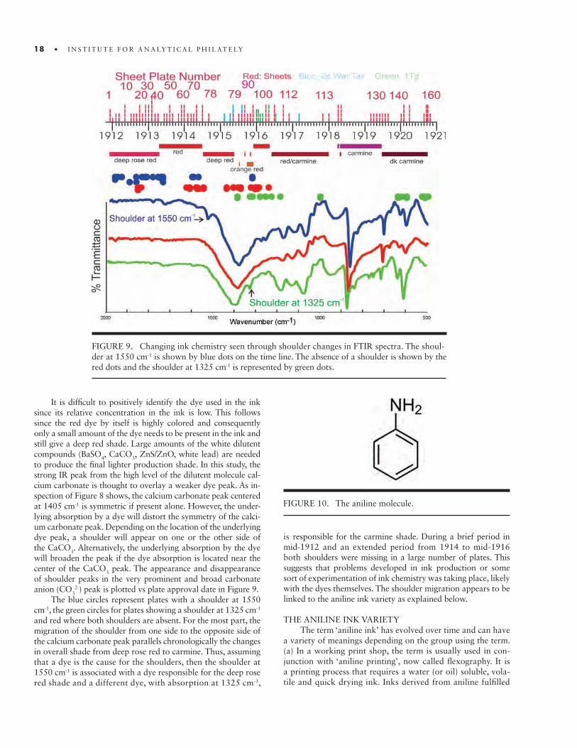
It is difficult to positively identify the dye used in the ink since its relative concentration in the ink is low. This follows since the red dye by itself is highly colored and consequently only a small amount of the dye needs to be present in the ink and still give a deep red shade. Large amounts of the white dilutent compounds (BaSO4, CaCO3, ZnS/ZnO, white lead) are needed to produce the final lighter production shade. In this study, the strong IR peak from the high level of the dilutent molecule cal-cium carbonate is thought to overlay a weaker dye peak. As in-spection of Figure 8 shows, the calcium carbonate peak centered at 1405 cm-1 is symmetric if present alone. However, the under-lying absorption by a dye will distort the symmetry of the calci-um carbonate peak. Depending on the location of the underlying dye peak, a shoulder will appear on one or the other side of the CaCO3. Alternatively, the underlying absorption by the dye will broaden the peak if the dye absorption is located near the center of the CaCO3 peak. The appearance and disappearance of shoulder peaks in the very prominent and broad carbonate anion (CO3
2-) peak is plotted vs plate approval date in Figure 9. The blue circles represent plates with a shoulder at 1550
cm-1, the green circles for plates showing a shoulder at 1325 cm-1 and red where both shoulders are absent. For the most part, the migration of the shoulder from one side to the opposite side of the calcium carbonate peak parallels chronologically the changes in overall shade from deep rose red to carmine. Thus, assuming that a dye is the cause for the shoulders, then the shoulder at 1550 cm-1 is associated with a dye responsible for the deep rose red shade and a different dye, with absorption at 1325 cm-1,
is responsible for the carmine shade. During a brief period in mid-1912 and an extended period from 1914 to mid-1916 both shoulders were missing in a large number of plates. This suggests that problems developed in ink production or some sort of experimentation of ink chemistry was taking place, likely with the dyes themselves. The shoulder migration appears to be linked to the aniline ink variety as explained below.
THE ANILINE INK VARIETYThe term ‘aniline ink’ has evolved over time and can have
a variety of meanings depending on the group using the term. (a) In a working print shop, the term is usually used in con-junction with ‘aniline printing’, now called flexography. It is a printing process that requires a water (or oil) soluble, vola-tile and quick drying ink. Inks derived from aniline fulfilled
FIGURE 9. Changing ink chemistry seen through shoulder changes in FTIR spectra. The shoul-der at 1550 cm-1 is shown by blue dots on the time line. The absence of a shoulder is shown by the red dots and the shoulder at 1325 cm-1 is represented by green dots.
FIGURE 10. The aniline molecule.
Donekerned
• 19
these requirements. (b) For a commercial dye maker, aniline ink is a “fast-drying printing ink that is a solution of a coal-tar dye in an organic solvent or a solution of a pigment in an or-ganic solvent or water.” (Licker, 2003:819). (c) To a chemist, an aniline ink is formulated from a dye whose complex chemical structure is related to reaction products of starting compounds found in coal tar. One of those compounds is aniline, a major component of coal tar (Figure 10), that is itself colorless. (d) Finally, to the philatelist, aniline ink designates (1) “a water-sol-uble dye in the red color range, usually qualified as ‘scarlet’ that suffuses the paper and shows through the back to a marked degree, and that, when inspected by ultraviolet rays, fluoresces brilliantly, with a golden or flame color - for example, Great Britain 1912 1d, aniline scarlet [or]; (2) ... any dye that suffuses the paper and exhibits marked fluorescence when inspected by ultraviolet rays.” (Williams, 1990:599).
The definition of ink bleeding is important for the discus-sion that follows. Norman Underwood and Thomas Sullivan (Chief and Assistant Chief of the Ink Making Division of the Bureau of Engraving and Printing in 1915) wrote: “Certain
pigments when mixed with water or oil or any of the various printing-ink vehicles are partially soluble and this solubility is called bleeding... [A]s a general rule a pigment that bleeds has not been properly made.”(Underwood and Sullivan, 1915:12). Further on they state “When work is printed wet, as is often the case in plate printing, this striking through is sometimes due to pigments somewhat soluble in water.” (Underwood and Sullivan. 1915:110). Combining both statements, one can conclude that a bleed or strike through is not necessarily an indication of the use of a water soluble ‘aniline ink’ (printer’s definition) but could be instead the result of a standard production run using ink made from an improperly manufactured pigment i.e. a bad batch.
Before I go into a discussion of the spectra of the Admiral issue aniline ink variety, it is interesting to document what var-ious authors have noted about this variety. Over the decades, various plate numbers have been associated with the aniline ink variety. Marler, in his 1982 book comments about the sheet stamps and states “ that those from plates 89 to 94, and perhaps from other plates used at much the same time, were in shades of Scarlet, with which the term ‘aniline’ is associated, the color
FIGURE 11. Plate 17 and nearby plates showing varying degrees of bleed through.
20 • I N S T I T U T E F O R A N A LY T I C A L P H I L AT E LY
showing on the back even of mint copies.”(Marler, 1982:224) Noted Admiral scholar Hans Reiche, in his 1965 book, mentions stamps from plates 93 and 94 as showing pink on the back and thus being of the aniline ink variety. (Reiche, 1965:42) He also alludes to other plates likely printed with aniline ink although he gives no further details. He does indicate that the color changed from deep rose carmine to “the aniline dye,” that he presumed was restricted to near the end of the retouched die period, plate 86. According to the Canada Plate block catalogue, published in 1965, aniline ink was used for stamps from plates 17 (vermilion), 37 (vermilion), 81 and 82 (vermilion), and 90 (orange vermilion). The catalogue also noted that aniline dye could possibly be found on stamps produced from plates 17 and 94. (White and Bileski, 1965) In summary, the simplest and most definitive criterion for the identification of an aniline ink variety is the bleeding through of the dye to the back of the stamp paper, even for mint copies. Indeed, Don Young in his 1954 article in the Canadian Philatelist when asked about identifying the aniline ink variety wrote: “Just turn the stamp over.” (Young, 1954:3)
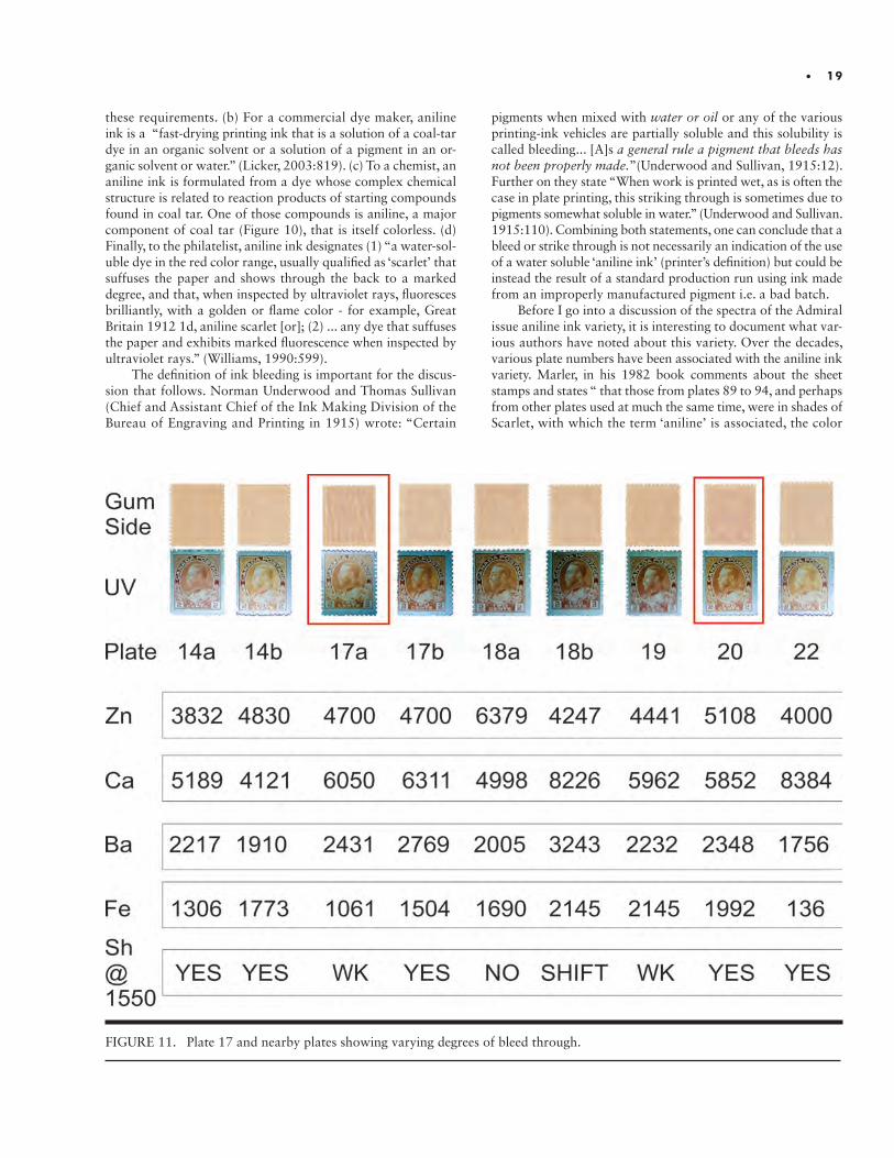
ANALYSIS OF THE SPECTRA SHOWING ANILINE INK Stamps from plate 17 are known to be the aniline ink variety.
However, nearby plates also show some minor bleed-through but to varying degrees. Do spectra from either XRF or FTIR show major differences in their features for normal or bleed through stamps? Figure 11 summarizes the data for nine plates in this region with plates 17 and 20 showing noticeable bleed through.
Included are photographs of the fluorescence under UV light. The fluorescence of stamps from plates 14 and 22 are rep-resentative of the fluorescence seen in earlier and later plates (up to plate 60). Some observations from that figure: (a) Except for iron (Fe) in plate 20, the count rates for the major elements are similar. (b) Some bleed through is seen for most stamps. (c) There appears to be some experimentation in ink chemistry around the time period of plates 17, 18 and 19 - roughly Sep-tember-October 1912- with the disappearance of the shoulder at 1550 cm-1. (d) The fluorescence for plates 17 to 21 shows a shift in hue. (e) Plate 20 is anomalous in that it appears, based on the shoulder at 1550 cm-1, to have the earlier ink chemistry
FIGURE 12. Plates from the major aniline ink time period showing the variation in chromium content.
• 21
but shows extensive bleed through. The above suggest that there was some problem with the quality of the pigment around this time frame and some alternate inks were used but did not involve significant changes in the major elements.
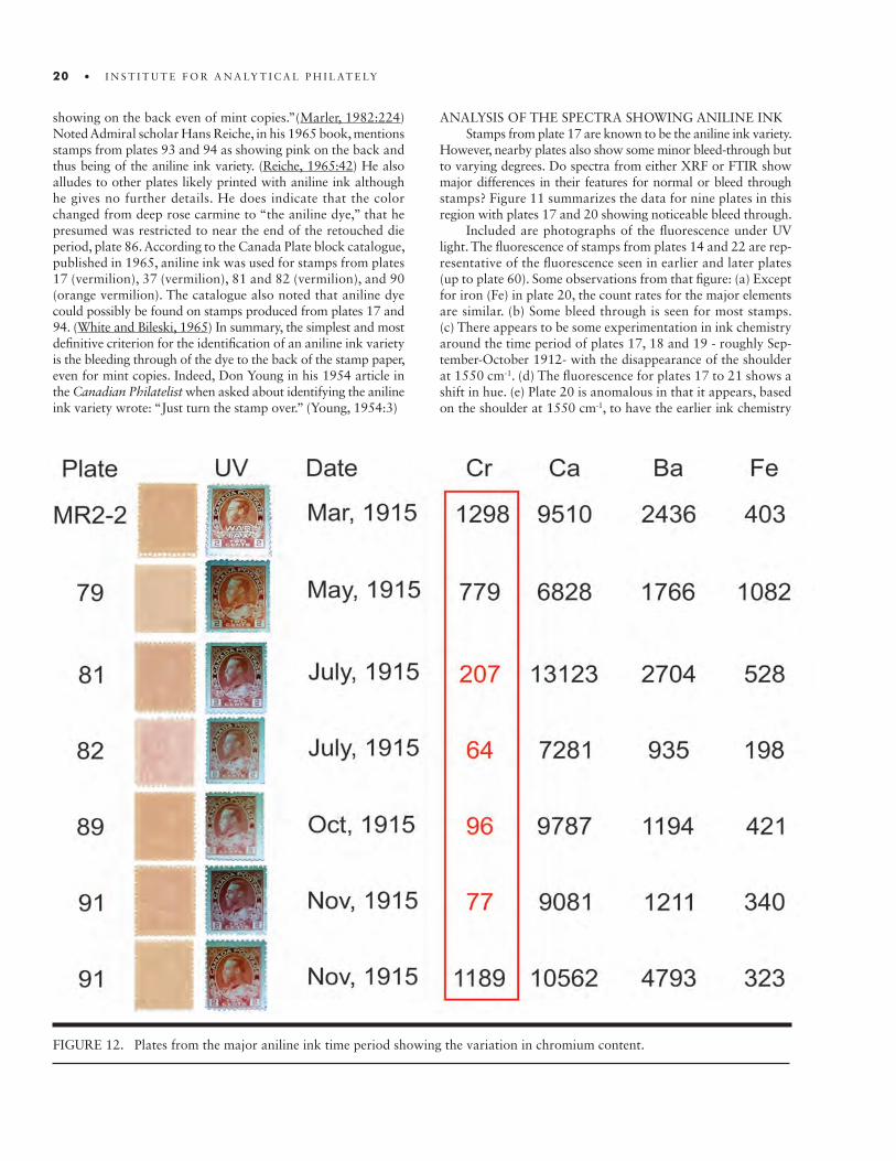
Stamps from around plates 80 to 95 are the major con-tributors to the aniline ink population. The time period is short from March 1915 to December 1915. Figure 12 shows most of the plates available to the author for this time period.
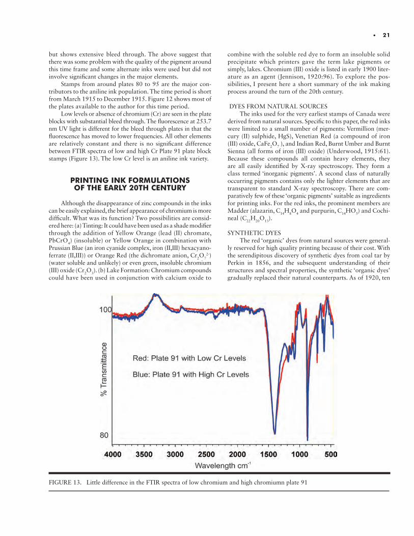
Low levels or absence of chromium (Cr) are seen in the plate blocks with substantial bleed through. The fluorescence at 253.7 nm UV light is different for the bleed through plates in that the fluorescence has moved to lower frequencies. All other elements are relatively constant and there is no significant difference between FTIR spectra of low and high Cr Plate 91 plate block stamps (Figure 13). The low Cr level is an aniline ink variety.
PRINTING INK FORMULATIONS OF THE EARLY 20TH CENTURY
Although the disappearance of zinc compounds in the inks can be easily explained, the brief appearance of chromium is more difficult. What was its function? Two possibilities are consid-ered here: (a) Tinting: It could have been used as a shade modifier through the addition of Yellow Orange (lead (II) chromate, PbCrO4) (insoluble) or Yellow Orange in combination with Prussian Blue (an iron cyanide complex, iron (II,III) hexacyano-ferrate (II,III)) or Orange Red (the dichromate anion, Cr2O7
2-) (water soluble and unlikely) or even green, insoluble chromium (III) oxide (Cr2O3). (b) Lake Formation: Chromium compounds could have been used in conjunction with calcium oxide to
combine with the soluble red dye to form an insoluble solid precipitate which printers gave the term lake pigments or simply, lakes. Chromium (III) oxide is listed in early 1900 liter-ature as an agent (Jennison, 1920:96). To explore the pos-sibilities, I present here a short summary of the ink making process around the turn of the 20th century.
DYES FROM NATURAL SOURCESThe inks used for the very earliest stamps of Canada were
derived from natural sources. Specific to this paper, the red inks were limited to a small number of pigments: Vermillion (mer-cury (II) sulphide, HgS), Venetian Red (a compound of iron (III) oxide, CaFe2O7 ), and Indian Red, Burnt Umber and Burnt Sienna (all forms of iron (III) oxide) (Underwood, 1915:61). Because these compounds all contain heavy elements, they are all easily identified by X-ray spectroscopy. They form a class termed ‘inorganic pigments’. A second class of naturally occurring pigments contains only the lighter elements that are transparent to standard X-ray spectroscopy. There are com-paratively few of these ‘organic pigments’ suitable as ingredients for printing inks. For the red inks, the prominent members are Madder (alazarin, C14H8O4 and purpurin, C14HO5) and Cochi-neal (C22H20O13).
SYNTHETIC DYESThe red ‘organic’ dyes from natural sources were general-
ly reserved for high quality printing because of their cost. With the serendipitous discovery of synthetic dyes from coal tar by Perkin in 1856, and the subsequent understanding of their structures and spectral properties, the synthetic ‘organic dyes’ gradually replaced their natural counterparts. As of 1920, ten
FIGURE 13. Little difference in the FTIR spectra of low chromium and high chromiumn plate 91
classes of synthetic dyes were in use as printing inks, each with its own characteristic properties (Jennison 1920:5). Only two will be considered here: The Oxyketone group (C=O) to which the synthetic version of Madder and Cochineal belong and the Azo group (N=N) which were by far the most widely used of the synthetic dyes.
LAKESThe synthetic dyes by themselves, although highly colored,
are of little use as ingredients in the formulation of printing inks. Most are water soluble and must be converted to water insoluble compounds through the formation of solid precipi-tates in order for them to be sold as colored pigments. Since dyes may be either acidic or basic, the choice of precipitating agent is dictated by this property. For acidic dyes, the precipitating agents of interest in this study are compounds of zinc (Zn), lead (Pb), barium (Ba), aluminum (Al), calcium (Ca) and chromium (Cr). The common precipitating agent for basic dyes is tannic acid but acids of the heavy metals arsenic (As), antimony (Sb) and tin (Sn) are also used.
INK FORMULATIONSThe lake in its pure form is too highly colored and is un-
suitable as an ink. Multiple ingredients must be added to the pigment to make a working ink. The pigment must first be sus-pended in a suitable ‘vehicle’ such as linseed oil varnish. Often compounds such as barium sulphate (BaSO4), calcium carbon-ate (CaCO3) or aluminum hydroxide (Al2(OH)6) are added to improve the work ability of the ink. Next, dilutents are add-ed to bring the ink from color saturation to the desired level. Common dilutents are zinc oxide (ZnO), white lead (a basic lead carbonate (PbCO3)), lead hydroxide (Pb(OH)2) and litho-pone ( a mixture of barium sulphate (BaSO4) and zinc sulphide (ZnS)). All these dilutents are intensely white compounds with superior covering power and strength. Finally, driers such as manganese (Mn) organic salts are added to speed up the dry-ing and fixation of the ink to paper. Figure 14 shows a con-densed summary of the above paragraphs. The starting dyes at the top of the chart give a red colored ink.
CONCLUSION
Based on the above discussion of ink chemistry at the turn of the last century, what are some of the possible explanations to account for the many changes and features seen in the var-ious spectra shown in this paper? The likely reason for the shade changes are the changes in the dye used at the very start of the ink making process. All the major peaks seen in the XRF and FTIR spectra are from colorless compounds that were used primarily as dilutents. The only exception is an iron containing compound or compounds but its small variation in concentra-tions does not correlate with the shade changes. A search of the literature of that time period shows that the oxyketones
such as the alizarin like compounds and the azo compounds form red lakes. An oxyketone such as alizarin has a major IR absorption peaks around 1330 cm-1 (Camamares. 2004:924) while the azo compounds have an absorption feature at 1550 cm-1 (N=N) (Ahmed, 2016:73). Both these frequencies are seen as the migrating shoulders of the strong carbonate anion peak of calcium carbonate. Certainly this is not proof of the pres-ence of these two dyes but it does give supporting evidence. A statement by Jennison is used to support the assignment of the peak at 1330 cm-1 to that of alizarin: “The reds derived from the alizarine colors are among the most important of all lake colors and the most difficult to manufacture.”(Jennison, 1920:96)
Given the complex nature of printing inks, it is not sur-prising that the three types of spectroscopy were unable to give a full, definitive answer to the chemical makeup of the inks. But the spectroscopy was able to document chemical compo-sition and changes in ink chemistry through time. It was also able to show that the aniline ink variety associated with the earlier plate, plate 17, likely arose from some experimentation with the dyes either because of shortages or bad batches from the manufacturer. Given the noticeable difference in chromium content of the war-years inks, XRF supports the assignment of a distinct variety that correlates to stamps that show prom-inent bleed through and low chromium content. FTIR spec-troscopy was not able to show a definite difference between spectra of the bleed through stamps and stamps with minimal bleed though during this period.
FTIR did show a migration of a shoulder peak that mir-rored the change of shade from deep rose red to carmine. One explanation for the observed spectra is that three major dyes were used in the full production period. The middle period (war time) used a dye that had considerable bleed through problems if chromium that was added as a base did not prop-erly fix the dye. A further interpretation of the FTIR spectrum has a dye used pre-war as likely an azo dye while post war the dye was an oxyketone type.
ACKNOWLEDGMENTS
I am pleased to acknowledge the help and encouragement offered by Tom Lera of the National Postal Museum in the use the FTIR and XRF instruments in the museum’s lab. His pa-tience during that period is most appreciated. Leopold Beaudet, editor Admiral’s Log, BNAPS, was very kind in supplying the data about the literature references that correlated plate num-bers to aniline ink and a separate data base of time vs shade labels. John Barwis, president and senior fellow IAP, was in-strumental in getting me started with the whole spectroscopic study of the Admiral Issue with his critical evaluation of my earlier color studies. Fred Baumann of the American Philatelic Research Library (APRL) supplied very valuable and complete references to the available literature on the aniline ink problem.
22 • I N S T I T U T E F O R A N A LY T I C A L P H I L AT E LY

FIGURE 14. Flow chart for the production of printing inks in the early 20th century.
• 23
REFERENCES
Coulson, Michael. 2012.The History of Mining: The Events, Technology and People Involved in the Industry that Forged the Modern World. pp. 197. Hamp-shire, Great Britain: Harriman House Limited.
Harris, D.R, ed. 2017. Unitrade Specialized Catalogue of Canadian Stamps. Toronto, Canada: The Unitrade Press.
Jennison, E. H. 1920. Manufacture of Lake Pigments from Artificial colors. 2nd revised ed. London, GB. Scott, Greenwood and Son.
Judge, Richard H. 2016. “The Admiral Issue of Canada: A Colorimetric and XRF Study of the Carmine 2¢ Issue.” Proceedings of the Second International Symposium on Analytical Methods in Philately, ed. J. H. Barwis and T. Lera, pp. 21-30. Washington, D.C.: Smithsonian Institution Scholarly Press.
Licker, Mark D. 2003. McGraw-Hill Dictionary of Scientific & Technical
Terms. 6E. New York. The McGraw-Hill Companies, Inc.
Marer, George C. 1982. The Admiral Series of Canada. State College, PA. American Philatelic Society.
Reiche, Hans. 1965. Canada: The Admiral Stamps of 1911 to 1925. Ottawa, Canada. Hans Reiche.
Underwood, Norman and Thomas V. Sullivan. 1915. The Chemistry and Technology of Printing Inks. New York. D. Van Nostrand Co.
White, K. Hamilton and Kasimir K. Bileski. 1965. The Canada Plate Block Catalogue. Winnipeg, Canada. Baker and Sons.
Williams, L. N. 1990. Fundamentals of Philately. State College, PA. American Philatelic Society.
Young, D. A. 1954. Admiral Addict: Analine (sic) Variety. Canadian Phi-latelist, 5(1):3

Impact of Technical Analyses on Greene Foundation ExpertizingJ. Edward Nixon FRPSC & Garfield Portch FRPSC
EXPERTIZING AT THE GREENE FOUNDATION.EXPERTIZING AT THE GREENE FOUNDATION. The Vincent Graves Greene Phil-atelic Research Foundation, based in Toronto Canada, has been expertizing the stamps and postal history of British North America for about 40 years. The Foundation has issued about 24,600 Genuine (green) certificates and 5,000 False (pink) certificates during this period up to the end of 2016. Currently we issue about 1,300 certificates a year. We issue a Genuine (green) certificate to fault free items or items with faults that have not been repaired. We issue a False (pink) certificate to items having faults that have been repaired, or changes made to alter the original state of the item.
An Expert Committee of volunteer collectors and dealers meets monthly to review and render an opinion on the submitted stamps and postal history items. The certificate issued by the Committee is an opinion, not a legal guarantee. The Foundation has been a long-term member of the Association International des Experts en Philatélie (AIEP).
In early 2012, we acquired a Foster+Freeman video spectral comparator – VSC6000, after being given a good introduction to their equipment by Tom Lera at the Smithsonian (Washington, D.C.). Prior to this we had used the CrimeScope CS-16 for about 10 years which gave us some knowledge of the application of infra-red technology to our examina-tion of stamps. However, the VSC6000 has many more functions and processes that can be applied than prior technology. We never stop learning what it can do. After five years of owning this terrific machine it seems appropriate to reflect on how it has impacted expertizing at the Greene Foundation.
EXPERTIZING IS NOW MORE ANALYTICAL.EXPERTIZING IS NOW MORE ANALYTICAL. Our expertizing process has become more analytical and less intuitive. There is no substitute for knowledge, experience, and in depth understanding of the printing of stamps and their postal usage. However, the introduction of technology and scientific processes enhances and broadens the scope and depth of a review. Essentially one becomes more objective in reviewing the issues affecting the submitted item.
This is not the same as saying science alone answers the question. There is no pre-sumption that a scientific tool can deliver a conclusion in all matters. But the existence of technology forces the question ‘if you are not sure then what else can it be?’ One cannot simply say – ‘if I am not sure or it doesn’t look right then it must have faults or repairs or alterations’.
In years past with only a magnifying glass and strong light to aid an examination sometimes we would be uncertain whether a stamp had been rebacked, the design redrawn, or margins added to enhance its appearance and value. The opinion rendered sometimes was really a best guess based on knowledge, experience and our feeling on that given day.
However, the range and variety of invisible light functions available in the VSC6000 and the potential to combine them, along with the ability to display magnified images on
26 • I N S T I T U T E F O R A N A LY T I C A L P H I L AT E LY
a large computer screen offers dramatically more usable tech-nology. The excellent presentation on the screen allows several Expert Committee members to analyse and discuss the results together. The group discussion facilitates better conclusions in many situations.
There is another reason for greater use of analytical methods in philatelic expertizing today. Historically, our hobby had a few senior key respected figures, both dealers and collectors who had a broad enough knowledge on a wide range of stamp issues that they were credited with the ability to opine on everything. Objective tools such as the VSC6000 provide hard facts which add more substance and assurance to an expert opinion.
Many modern types of printing varieties and errors cannot be seen with the naked eye as printing processes have gone beyond just engraving and lithography. Also, catalogue listings for which expertization is required contain many more sub listings of both early and modern stamps.
Further, to some extent our job in expertizing is to provide integrity and assurance to philatelists that if they are willing to spend meaningful amounts of money to acquire stamps and postal history, there is a serious service available to certify the genuineness of their purchase. Today with the use of online buying sites and the inability to examine an item, the role of expertizing services has gained importance.
ROLE AND USE OF THE VSC6ROLE AND USE OF THE VSC6000000.. The variety of functions and processes provided by the VSC6000 combined in one machine allows much more extensive and complete analysis than would exist if several machines were required with each having only one or two functions.
While analytical thinking pervades our expertizing process now, the direct use of the VSC6000 applies in only about 10 to 15% of the submitted items. The remaining items can easily be examined and expertized using traditional methods. It is taking some time for us to develop a formal protocol for when its use should be automatically triggered.
For instance, uncancelled Canadian stamps without gum from pre-1870 printings should be subjected to a review for a removed cancel using the infra-red and ultra-violet light ranges. Rarely do we detect a removed cancel, but the test needs to be done simply to prove the point.
Stamps that are suspected of being repaired or altered often have been subjected to very skillful work that cannot be seen with the naked eye. These stamps provide the most dramatic and exciting results from application of the VSC6000. This machine provides a printed picture of what it sees in the non- visible spectrum. Providing this picture to the submitter to
support our certificate is probably the most powerful impact offered by the VSC6000. It has become known that if a submitter wants to debate the extent of repair expressed on our certificate it is likely that a photo exists to support the deceptive repair work seen by the infra-red or ultra-violet wavelengths.
The ability to overlay images helps establish the genuineness of surcharges, overprints and perforated initials. The use of spot fluorescence highlights the addition of foreign matter in many situations of skillfully repaired stamps, magnification of which adds to the dramatic contrast of fluorescence variations. The use of high intensity transmitted light from under a cover can detect whether there are relevant features hidden on the cover under the stamp or on the back of the stamp. Relevant features may include markings or endorsements on the back of the stamp or rating information (weight) on the cover.
We have begun to develop some colour analysis techniques to assist with expertization of several difficult sub listings of shade variations. Key examples of the contentious colours are the Prussian Blue of Newfoundland (Scott number 124a) and the Pink of the Admiral Issue (Scott number 106b).
The Foundation now receives more submissions from outside Canada than in the past. Also, there is the tendency now for some dealers to secure certificates simply to help in marketing good quality genuine fault-free stamps. The use of technology and a more analytical thinking process has enhanced the rep-utation of the expertizing process at the Greene Foundation. The commitment to continued improvement of expertizing by purchase of the VSC6000 five years ago was the turning point.
STATISTICAL REVIEW OF EXPERTIZING CERTIFICATES BEFORE AND
AFTER THE USE OF THE VSC6000FALSE CERTIFICATES AS A
PROPORTION OF TOTAL CERTIFICATES
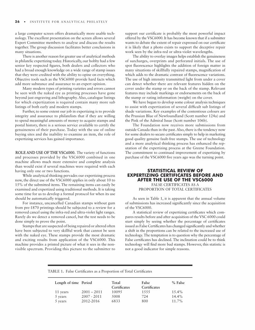
As seen in Table 1, it is apparent that the annual volume of submissions has increased significantly since the acquisition of the VSC6000.
A statistical review of expertizing certificates which com-pares results before and after acquisition of the VSC 6000 could start simply by seeing whether the percentage of certificates issued as False Certificates has changed significantly and whether a shift in the proportions can be related to the increased use of technology. The temptation is to question why the percentage of False certificates has declined. The inclination could be to think technology will find more bad stamps. However, this statistic is not a good indicator for simple reasons.
TABLE 1. False Certificates as a Proportion of Total Certificates
Length of time Period Total False % False Certificates Certificates11 years 2001 – 2011 10095 1555 15.4%5 years 2007 - 2011 5008 724 14.4%5 years 2012-2016 6833 800 11.7%

• 27
First, dealers are submitting more perfectly good stamps specifically to receive the certification that will assist in marketing their items thereby amending the balance or distribution of submitted items.
Second, one can imagine that over time there will be a decreasing number of repaired or altered stamps in the market among the older issues simply because the repaired and altered stamps have already been identified and given False certificates. Thus, we need to examine the reasons for giving the False certif-icate and the role that technology played.
TYPES OF FALSE CERTIFICATES
A review of False Certificates has been prepared to see if the distribution of reasons or causes for issuing the False Cer-tificate has changed as the result of a more analytical approach bolstered by use of the VSC6000.
Table 2 shows the distribution of certification results issued for a group of 200 false certificates issued between March 2010 and October 2011, compared to 200 issued between February 2015 and August 2016.
For instance, since “Regumming” seems to be the greatest source of False certificates at about 25% of the total, both pre and post VSC6000, is there7more we can do to help collectors avoid such copies or discourage fakers from creating regummed copies?
To date, examinations leading to “regummed” decisions rarely use the VSC6000 Although it is the most prevalent cause for a False certificate, it is also sometimes contentious and a source of uncertainty. For instance, was the entire stamp re- gummed, is it original gum that has been redistributed to deceive, or was just the hinge area sweated or smoothed over? Reflecting on this category prompts us to think about whether other tools can be applied to assist us in reaching better decisions.
For instance, recently a mint stamp was submitted as never hinged, with potentially altered gum in the hinge area that became contentious. A review under ultra-violet light showed the hinge area glowing quite differently than the rest of the stamp.
Clearly it had been altered. Clearly, the use of ultra-violet ra-diation can help in gum analysis and that can help identify regummed stamps.
Next, a quick look at categories 3, 4 and 5 (repaired stamps, and rebacked or redesigned) above shows that stamps in these categories constitute about 45% of the False certificates. The VSC6000 was used in a very high proportion of these cases. By comparison these categories contributed 36% of cases before acquiring the VSC6000. The use of the spectral comparator facilitated faster and more accurate identification of bad stamps.
Regarding category 10 (Cancels / marks removed, or stamp cleaned), it is curious that the percentage of False certificates for this cause has dropped from 7% to 4% of the total. It is conceivable this could be a negative result of using technology. But the reverse might be true: submitters might be more wary of sending in altered items knowing the technology now used.
We test all uncancelled stamps without gum from the pre-1870 period for removed cancels. Rarely do we see a removed cancel with the VSC6000. However, we can all see that many of these stamps look grubby, faded, scuffed, soiled, or discoloured – certainly not fresh “unused”. In earlier days if we “did not like the look of the stamp” we sometimes said, “it must have been cleaned” to make it look unused and it received a False certificate. Perhaps some additional considerations need to be applied in describing this category of submissions.
Category 2 (reperforated stamps) has increased from 6% to 10% of total False certificates. We certainly are plagued by an increasing number of very skillfully reper-forated stamps which are getting increasingly difficult to identify. Almost always they are mint never hinged copies reperforated on at least one side to improve the centering of the stamp design. Much has been written about key features to watch for in deciding if a stamp is reperforated. Perhaps some thought should be given by the Greene Foundation as to how best to present this information in a user-friendly man-ner for magnification and computer screen presentation on the VSC6000, where a genuine template could be compared to a submitted item.
TABLE 2. Distribution by Percentage and Reasons for the Issuing of False Certificates between March 2010 and October 2011.
Reason or Type of Cause for False Certificate Pre VSC6000 With VSC60001. Regummed (a few also cleaned, some 26% 24% original gum redistributed)2. Reperforated 6% 10%3. Repaired (mostly tears or filled thins, 11% 13% strengthened perforations)4. Covers with stamps that did not belong 8% 3%5. Fake creations (complete fake of whole 12% 13% stamp, not a forgery)6. Forgery (typically Sperati, Oneglia, etc.) 4% 3%7. Rebacked, Margins Added, Design redrawn, etc. 13% 19%8. Fake overprints, surcharges or cancels 8% 7%9. Chemical change to modern stamps 5% 4%10. Cancels/marks removed (typically pen), cleaned 7% 4%Total 100% 100%

28 • I N S T I T U T E F O R A N A LY T I C A L P H I L AT E LY
EXAMPLES OF THE APPLICATION OF VSC6000
In this section specific examples are presented of our appli-cation of some of the processes available with the VSC6000 to assist in expertizing stamps and postal history:
MINOR REPAIR AT FIRST IMPRESSION
This 1854 Three Pence Beaver, shown in Figures 1a and 1b, viewed under high magnification shows some retouching to the bottom frame line, presumably to cover some loss of the design caused by a horizontal crease across the bottom edge of the stamp.
However, examination using spot fluorescence we see more than a little touch-up. The images shown in Figures 2a and 2b indicate partial rebacking with the addition of paper along the bottom edge to support a more extensive repair (as indicated by the high fluorescence across the bottom edge of the stamp). It appears the artist chose to include his own initials also.
In the past, our False certificate opinion would have iden-tified the retouching of the bottom frame line but would be perceived as rather minor and sometimes get a negative reaction from the submitter. Today a printed copy of the images such as
FIGURE 1a.
Three Pence Beaver stamp under magnification: (a) front; (b) back. Each of the images presented here was created under plain light.
FIGURE 1b.
FIGURE 2a.
Three Pence Beaver shown in Figure 1under spot fluorescence: (a) the front of the stamp; (b) the back of the stamp showing the forger’s signature. Very clever repair work is quite charac-teristic of what we now see every month using the spot fluo-rescence function.
FIGURE 2b.
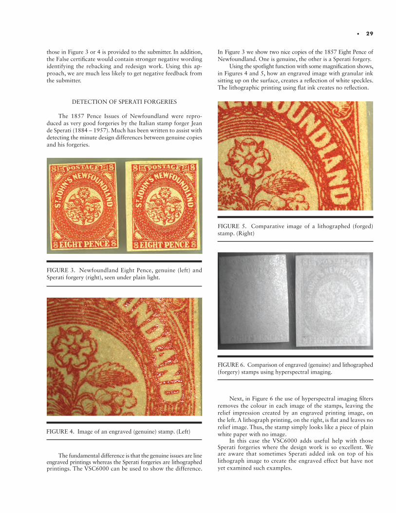
• 29
those in Figure 3 or 4 is provided to the submitter. In addition, the False certificate would contain stronger negative wording identifying the rebacking and redesign work. Using this ap-proach, we are much less likely to get negative feedback from the submitter.
DETECTION OF SPERATI FORGERIES
The 1857 Pence Issues of Newfoundland were repro-duced as very good forgeries by the Italian stamp forger Jean de Sperati (1884 – 1957). Much has been written to assist with detecting the minute design differences between genuine copies and his forgeries.
The fundamental difference is that the genuine issues are line engraved printings whereas the Sperati forgeries are lithographed printings. The VSC6000 can be used to show the difference.
FIGURE 4. Image of an engraved (genuine) stamp. (Left)
FIGURE 3. Newfoundland Eight Pence, genuine (left) and Sperati forgery (right), seen under plain light.
In Figure 3 we show two nice copies of the 1857 Eight Pence of Newfoundland. One is genuine, the other is a Sperati forgery.
Using the spotlight function with some magnification shows, in Figures 4 and 5, how an engraved image with granular ink sitting up on the surface, creates a reflection of white speckles. The lithographic printing using flat ink creates no reflection.
Next, in Figure 6 the use of hyperspectral imaging filters removes the colour in each image of the stamps, leaving the relief impression created by an engraved printing image, on the left. A lithograph printing, on the right, is flat and leaves no relief image. Thus, the stamp simply looks like a piece of plain white paper with no image.
In this case the VSC6000 adds useful help with those Sperati forgeries where the design work is so excellent. We are aware that sometimes Sperati added ink on top of his lithograph image to create the engraved effect but have not yet examined such examples.
FIGURE 5. Comparative image of a lithographed (forged) stamp. (Right)
FIGURE 6. Comparison of engraved (genuine) and lithographed (forgery) stamps using hyperspectral imaging.

30 • I N S T I T U T E F O R A N A LY T I C A L P H I L AT E LY
A REMARKABLE FAKE
A nice looking unused 7½ pence 1855 Issue was submitted but one of our Committee members had an uncertain, uneasy feeling about it. This item, shown in Figure 7a, had a Genuine Greene Foundation certificate from 1997, well before the intro-duction of analytical techniques.
We re-examined the stamp with our usual VSC6000 treatment under spot fluorescence which revealed the surprising result shown in Figure 7b. We did not understand why the four value tablets glowed, but subsequent examination shows that the value tablets were not part of the original printing.
We used a proof of the 7½ pence to have a crisp clean impression of the design and compared the cross-hatching in the background on the two items as shown in Figures 11 and 12. On the proof (Figure 11) the cross-hatching is diamond shaped whereas it is rectangular on the submitted item (Figure 12).
In 1859 a 12½ cent stamp was issued with a similar design to the 7½ pence. The cross-hatching on the 12½ cent matches the submitted item as shown in a comparison of the two stamps in Figure 10.
Finally, under magnification it could be seen that the 12½ cent had the values removed in the four corners and the design redrawn with the sterling 6 pence and 7½ pence values added to fake the much more valuable 1855 pence issue stamp. Since all of the 12½ cent stamps were issued perforated, it was also
FIGURE 7a. FIGURE 7b. 7½ pence 1855 Issue: (a) as submitted; (b) viewed using spot fluorescence.
necessary for the forger to trim those perforations to create the illusion of an imperforate stamp.
This is a clear example of how technology corrected an erroneous opinion. None of us previously had realized that the background cross-hatching on these two similar designed stamps was quite different, a characteristic that was clearly revealed under high magnification.
EVIDENCE FOR A GENUINE CERTIFICATE
Although much of the interesting use of the VSC6000 applies to finding faults, repairs and deceptive adjustments, in some situations this tool can also play a key role in certifying genuineness of an item.
The Newfoundland Airmail stamp for the Hawker flight in April 1919 has the overprint “First Trans-Atlantic Air Post, April 1919” applied to the 3 Cent Caribou Issue (Figure 11a). The overprint is not difficult to fake. However genuine copies have the manuscript initials “JAR” signed on the reverse (Figure 11b).
Copies off cover are easy to certify. However, copies on cover can be more difficult. The example shown in Figure 12 presented this challenge. The use of high intensity transmitted light applied to the copy on cover, shown in Figure 13, and the ability to print this result for the submitter, confirmed the genuineness of the Hawker Airmail stamp.

• 31
FIGURE 8. Proof of the 7½ pence on india paper.
FIGURE 9. Submitted item.
FIGURE 10. Background cross-hatching is rectangular on both stamps: (a) 7½ pence stamp submitted for examination; (b) 12½ cent stamp from the reference collection.
FIGURE 11a.
Newfoundland ‘Hawker’ Airmail stamp: (a) front; (b) back. Note that the Postmaster, J. Alex Robinson, (JAR) has initialled the back of this stamp.
FIGURE 11b.
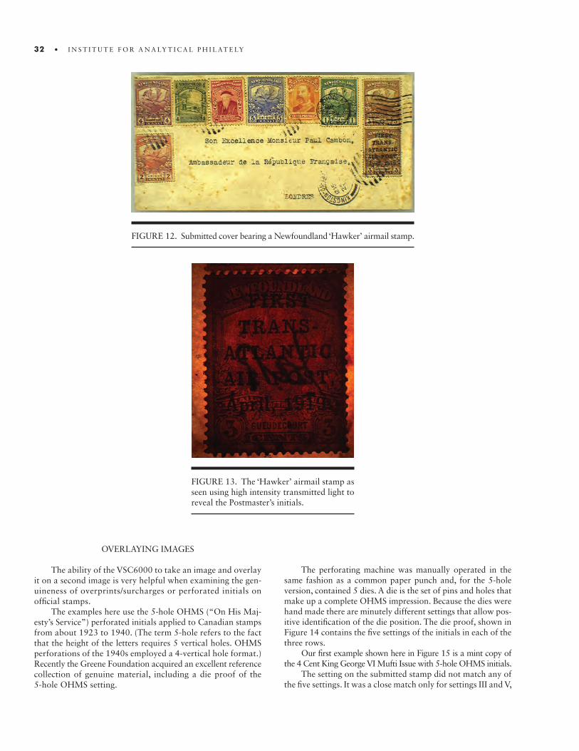
32 • I N S T I T U T E F O R A N A LY T I C A L P H I L AT E LY
FIGURE 12. Submitted cover bearing a Newfoundland ‘Hawker’ airmail stamp.
FIGURE 13. The ‘Hawker’ airmail stamp as seen using high intensity transmitted light to reveal the Postmaster’s initials.
OVERLAYING IMAGES
The ability of the VSC6000 to take an image and overlay it on a second image is very helpful when examining the gen-uineness of overprints/surcharges or perforated initials on official stamps.
The examples here use the 5-hole OHMS (“On His Maj-esty’s Service”) perforated initials applied to Canadian stamps from about 1923 to 1940. (The term 5-hole refers to the fact that the height of the letters requires 5 vertical holes. OHMS perforations of the 1940s employed a 4-vertical hole format.) Recently the Greene Foundation acquired an excellent reference collection of genuine material, including a die proof of the 5-hole OHMS setting.
The perforating machine was manually operated in the same fashion as a common paper punch and, for the 5-hole version, contained 5 dies. A die is the set of pins and holes that make up a complete OHMS impression. Because the dies were hand made there are minutely different settings that allow pos-itive identification of the die position. The die proof, shown in Figure 14 contains the five settings of the initials in each of the three rows.
Our first example shown here in Figure 15 is a mint copy of the 4 Cent King George VI Mufti Issue with 5-hole OHMS initials.
The setting on the submitted stamp did not match any of the five settings. It was a close match only for settings III and V,
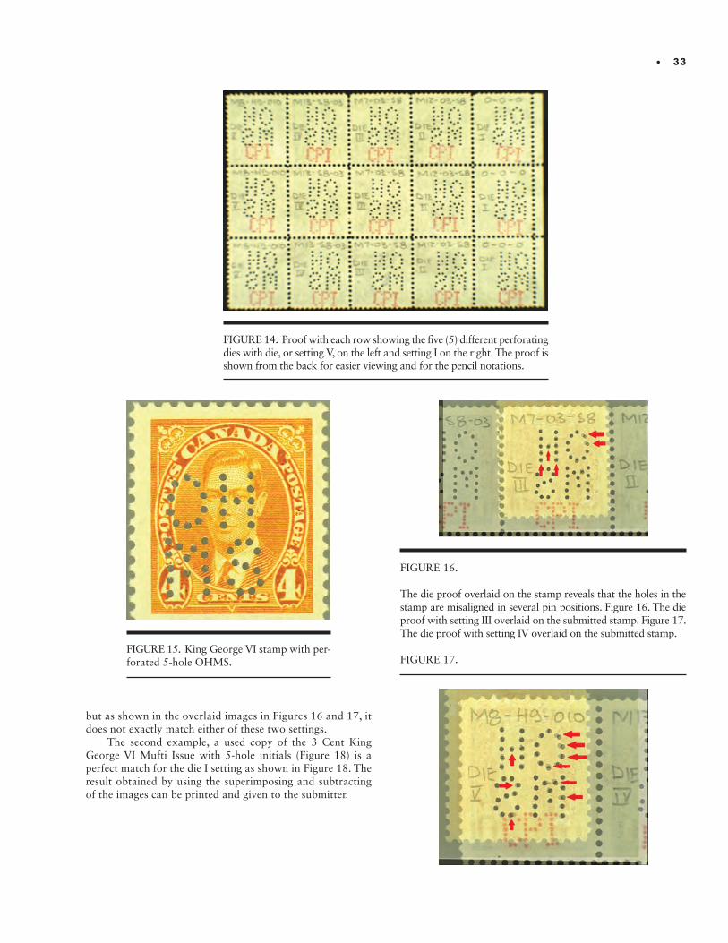
• 33
FIGURE 15. King George VI stamp with per-forated 5-hole OHMS.
FIGURE 14. Proof with each row showing the five (5) different perforating dies with die, or setting V, on the left and setting I on the right. The proof is shown from the back for easier viewing and for the pencil notations.
FIGURE 16.
The die proof overlaid on the stamp reveals that the holes in the stamp are misaligned in several pin positions. Figure 16. The die proof with setting III overlaid on the submitted stamp. Figure 17. The die proof with setting IV overlaid on the submitted stamp.
FIGURE 17.
but as shown in the overlaid images in Figures 16 and 17, it does not exactly match either of these two settings.
The second example, a used copy of the 3 Cent King George VI Mufti Issue with 5-hole initials (Figure 18) is a perfect match for the die I setting as shown in Figure 18. The result obtained by using the superimposing and subtracting of the images can be printed and given to the submitter.
34 • I N S T I T U T E F O R A N A LY T I C A L P H I L AT E LY
FIGURE 18. A used copy of the 3 Cent King George VI Mufti Issues with 5-hole initials.
FIGURE 19. The die proof of King George VI overlaid on the stamp reveals a perfect match of the 5-hole OHMS perforations for Die I.
CONCLUSIONS:
Review and analysis of our expertizing process would not have occurred without the initiative created by the purchase of the VSC6000 five years ago. Introduction of this technology created the analytical environment and changed our thinking process. Having the variety of functions in the same machine is extremely useful for a repetitive administrative process such as expertizing.
The VSC6000 also changes the general method of examin-ing stamps. Since there is no way of knowing what a submitted stamp may have hidden, examination is done using any number of options on the machine. Now one simply starts with the different lighting configurations in combination with filters
and reviews until an unexpected result shows on the screen. Once an unexpected result shows research can begin to determine the cause of that result. On the other hand, the absence of unexpected results generally indicates that the stamp is genuine.
The VSC6000 also opens the door to deeper study of issues such as colour distinction which plague some catalogue sub listings. The ability to easily produce a picture of results that are not evident to the naked eye and provide such picture to the submitter has diminished disagreements about opinions on certificates and enhanced the reputation of the Greene Foundation.
Image Credits:Image Credits: Each of the images presented in this discus-sion was created by Garfield Portch using the VSC6000 at the Greene Foundation.

ABSTRACT.ABSTRACT. This study was initiated in order to find an objective process for identifying the color varieties of the stamps of the Germany “Crown and Eagle” series. The intent was to be able to cluster the stamps so that each of the groups had the property that it was a subset of exactly one of the Michel cataloged varieties. We insisted that the process only utilize the aid of an inexpensive desktop scanner. Although this goal was found to be impossible, we nevertheless found an objective process for obtaining the stamp colors and grouping them into true color varieties. Thus, although the original intent was only to determine the color varieties of this series of stamps, the paper developed a supplementary tutorial aspect on the objective determination of color varieties.
INTRODUCTION
What do we mean by the color of a stamp?What do we mean when we say that two stamps “have the same color”?What is a stamp color?Are these philosophical questions or can they be rephrased in an objective manner?These are the questions that we wish to address in this paper.
We will illustrate our discussion with an examination of the colors of the stamps of the Germany Crown and Eagle Series. In the Michel (Mi) catalog, they are the stamps Mi 45-52; in Scott they are Sc 45-51; in Gibbons they are Gi 45-51. The stamps in this series have numerous color varieties which are notoriously difficult to distinguish. This is the main reason it was chosen for analysis. The second reason is because it is relatively easy to acquire large numbers of used copies of these stamps.
First of all, we wish to make it clear what exactly we shall mean by a color variety of a stamp. In this paper we will not be concerned with the chemical properties of the ink that was used in the printing of the stamp. Although this type of analysis is needed to differentiate between the various printings of a stamp and some definitions of color varieties insist that this is the meaning of a color variety, this is not our goal. Distinguishing between the types of ink used in the various printings is also the purpose of looking at the UV characteristics of a stamp. The UV color is a property of the ink composition. Although we shall mention the UV characteristics of some stamps in later sections in an attempt to identify the Michel (Mi) color variety to which the stamp might belong, it is only incidental to our discussion.
What we are interested in is the color of the stamp as may be observed by the eye under ordinary lighting conditions. The process of physically viewing a stamp by eye has been extensively studied and documented. A step by step methodology of comparing two stamp colors has been meticulously described all the way from the exact lighting conditions that must be used through the preparation of one’s eyes prior to the examination.
The Colors of the Germany Crown and Eagle SeriesA Tutorial on the Objective Determination of Color Varieties
John M. Cibulskis, Ph.D.

Historically, the color of a stamp has been defined in a strictly subjective manner. A collector is presented with a “color guide” and s/he is given directions as to how to use the color guide to “properly” match the color of a stamp with a color swatch in the guide. For our discussion, the exact method of matching the two is immaterial. What is important is that whatever process is used, the final judgment is made by the collector saying “O.K. This stamp appears to have the same color as the swatch in the color guide so this is the color of the stamp.” That is, the decision is left up to the collector’s judgment and the process is therefore subjective.
It is our purpose to remove this subjectivity from the process and replace it with a strictly objective methodology. It may be that certain parts of the overall process will still require a subjective judgment. This is understandable since the perception of color by humans is a subjective process. Different people will perceive colors differently even under the same lighting and viewing conditions. So, our goal should be less am-bitious. We will instead strive to remove the subjectivity from the final decision making, knowing full well that some steps in the overall procedure may include some amount of subjectivity.
THE THEORY
We begin by assuming that we have a set of stamps S and some distance function d defined on this set. The distance func-tion is meant to determine the distance between the colors of the stamps and is a pseudo-metric on the set S. That is, the function has the following properties:
Positive: for each s, t in S, d(s,t) >= 0Symmetric: for each s,t in S, d(s,t) = d(t,s)Triangle Inequality: for each r, s, t in S, d(r,t) <= d(r,s) + d(s,t)
In practice, such a function d arises from a metric D defined on a particular color model and is defined by: d(s,t) = D(Color(s),Col-or(t)). A metric differs from a pseudo-metric by also satisfying:
Definite: if D(a,b) = 0, then a = b
where a and b represent any two colors in the color model.
We see that it is reasonable for this property to be satisfied in a color model but not for a set of stamps. It is quite reason-able for two different stamps to have the same color and thus for their distance d(s,t) to be zero.
In Figure 1, we have:
d(s,t) = D(A,A) = 0d(u,v) = D(B,B) = 0d(s,u) = D(A,B) ≠ 0
In our investigations, the situation is a little more com-plicated. We begin with a set of stamps S. We then scan them and obtain images, one per stamp. We process the images one by one in order to obtain their color parameters in the color model we are using. For short, we will use the term Color for the parameters in the model.
Stamp Image Color
Each step in this process is a potential source of error.
The stamp gets converted to an image with a scanner. The output of the scanner is a file in which colors of the pixels are encoded in the RGB color model. This encoding is a potential source of error.
The image has a Color extracted from it by some process (implemented as a computer program) which returns the color parameters of the stamp design for a specified color model. The extraction of the color parameters from the stamp image is a second source of error.
Once the Colors of two stamps s and t have been deter-mined, the distance can then be computed. There is a relatively minor source of error associated with this process and so we will mostly ignore it. Comparison of the Colors of the stamps is only meaningful provided that we use the same scanner and the same color extraction process for the two stamps.
When the stamps are cancelled the color extraction pro-cess may be noisier than when they are mint since the design pixels which lie under the cancel must be removed from the color determination process. The process of performing this removal is anything but straightforward and, unless one is very careful, may play a significant role in contributing to the error in the color determination process.
Stamp Image Image with Cancel Removed Color
The color determination process can be broken up into parts as follows:
Working with the Image:
a. Determine which pixels are clearly in the cancel or background to the stamp image and remove them from the processing.
b. Determine which pixels are clearly in the unprinted paper portion of the stamp and remove them from the processing.
c. Attempt to determine which pixels are in the stamp design but are partially obscured by the cancellation. Remove these pixels from the processing.
d. Extract the dominant Color from the remaining pixels.
The details of the color extraction process which we use, as well as examples, are contained in the following sections.
It is tempting to try to define two stamps to have the same color provided that their distance is small; say that their distance is less than some preset tolerance T. This process has one serious drawback: “almost the same color” is not a transitive relation.
There are many different relations we may define on the colors of stamps: darker than, lighter than, brighter than, are of different colors, are exactly the same color, are almost the same color. To say that two stamps are exactly the same color is the most stringent of these relations. This relation has the following three properties:
36 • I N S T I T U T E F O R A N A LY T I C A L P H I L AT E LY
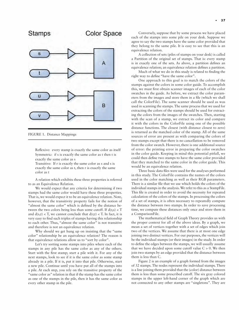
FIGURE 1. Distance Mappings
• 37
Reflexive: every stamp is exactly the same color as itselfSymmetric: if s is exactly the same color as t then t is exactly the same color as sTransitive: If r is exactly the same color as s and s is exactly the same color as t, then r is exactly the samecolor as t
A relation which exhibits these three properties is referred to as an Equivalence Relation.
We would expect that any criteria for determining if two stamps had the same color would have these three properties. That is, we would expect it to be an equivalence relation. Note, however, that the transitivity property fails for the notion of “almost the same color” which is defined by the distance be-tween the two colors being less than some cutoff. If d(r,s) < T and d(s,t) < T, we cannot conclude that d(r,t) < T. In fact, it is very easy to find such triples of stamps having this relationship to each other. Thus, “almost the same color” is not transitive and therefore is not an equivalence relation.
Why should we get hung up on insisting that the “same color” relationship be an equivalence relation? The reason is that equivalence relations allow us to “sort by color”.
Let’s try sorting some stamps into piles where each of the stamps in any pile has the same color as any of the others. Start with the first stamp; start a pile with it. For any of the next stamps, look to see if it is the same color as some stamp already in a pile. If it is, put it into that pile. Otherwise, start a new pile. Continue until you have put all of the stamps into a pile. At each step, you rely on the transitive property of the “same color as” relation in that if the stamp has the same color as one of the stamps in the pile, then it has the same color as every other stamp in the pile.
Conversely, suppose that by some process we have placed each of the stamps into some pile on your desk. Suppose we agree to say the two stamps have the same color provided that they belong to the same pile. It is easy to see that this is an equivalence relation.
A collection of sets (piles of stamps on your desk) is called a Partition of the original set of stamps. That is: every stamp is in exactly one of the sets. As above, a partition defines an equivalence relation; an equivalence relation defines a partition.
Much of what we do in this study is related to finding the right way to define “have the same color”.
One approach to this goal is to match the colors of the stamps against the colors in some color guide. To accomplish this, we must first obtain scanner images of each of the color swatches in the guide. As before, we extract the color param-eters from the images and store them in a file (which we shall call the ColorFile). The same scanner should be used as was used in scanning the stamps. The same process that we used for extracting the colors of the stamps should be used for extract-ing the colors from the images of the swatches. Then, starting with the scan of a stamp, we extract its color and compare it with the colors in the ColorFile using one of the possible distance functions. The closest (with distance closest to zero) is returned as the matched color of the stamp. All of the same sources of error are present as with comparing the colors of two stamps except that there is no cancellation to be removed from the color swatch. However, there is one additional source of error: the printing error in preparing the color swatches in the color guide. Keeping in mind this potential pitfall, we could then define two stamps to have the same color provided that they matched to the same color in the color guide. This would be an equivalence relation.
Three basic data files were used for the analyses performed in this study. The ColorFile contains the names of the colors used in the color matching as well as their RGB parameters. There is a similar file that we use which holds the colors of the individual stamps in the analysis. We refer to this as a StampFile. This file is created in order to avoid the necessity for repeated calculation of the colors of the stamps. In processing the colors of a set of stamps, it is often necessary to repeatedly compute the distance between two stamps. In order to save processing time, we compute these distances only once and store them in a ComparisonFile.
The mathematical field of Graph Theory provides us with the proper context for all of the above ideas. By a graph, we mean a set of vertices together with a set of edges which join two of the vertices. We assume that there is at most one edge joining two distinct vertices. For our purposes, the vertices will be the individual stamps (or their images) in the study. In order to define the edges between the stamps, we will usually assume that we have decided upon some cutoff value C > 0. We then join two stamps by an edge provided that the distance between them is less than C.
Figure 2 is an example of a graph formed from the images of 32 stamps. The nodes represent the individual stamps. There is a line joining them provided that the (color) distance between them is less than some prescribed cutoff. The six gray colored stamps in the upper left-hand corner of the graph which are not connected to any other stamps are “singletons”. They are
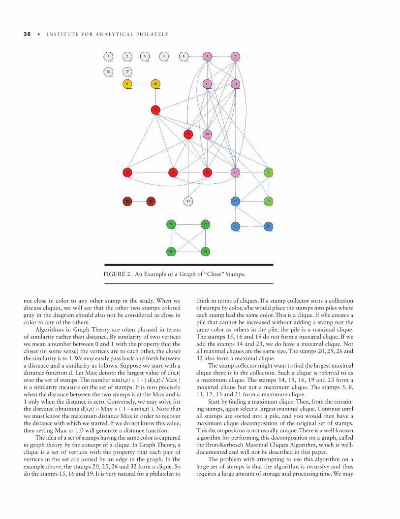
38 • I N S T I T U T E F O R A N A LY T I C A L P H I L AT E LY
not close in color to any other stamp in the study. When we discuss cliques, we will see that the other two stamps colored gray in the diagram should also not be considered as close in color to any of the others.
Algorithms in Graph Theory are often phrased in terms of similarity rather than distance. By similarity of two vertices we mean a number between 0 and 1 with the property that the closer (in some sense) the vertices are to each other, the closer the similarity is to 1. We may easily pass back and forth between a distance and a similarity as follows. Suppose we start with a distance function d. Let Max denote the largest value of d(s,t) over the set of stamps. The number sim(s,t) = 1 - ( d(s,t) / Max ) is a similarity measure on the set of stamps. It is zero precisely when the distance between the two stamps is at the Max and is 1 only when the distance is zero. Conversely, we may solve for the distance obtaining d(s,t) = Max × ( 1 - sim(s,t) ). Note that we must know the maximum distance Max in order to recover the distance with which we started. If we do not know this value, then setting Max to 1.0 will generate a distance function.
The idea of a set of stamps having the same color is captured in graph theory by the concept of a clique. In Graph Theory, a clique is a set of vertices with the property that each pair of vertices in the set are joined by an edge in the graph. In the example above, the stamps 20, 25, 26 and 32 form a clique. So do the stamps 15, 16 and 19. It is very natural for a philatelist to
think in terms of cliques. If a stamp collector sorts a collection of stamps by color, s/he would place the stamps into piles where each stamp had the same color. This is a clique. If s/he creates a pile that cannot be increased without adding a stamp not the same color as others in the pile, the pile is a maximal clique. The stamps 15, 16 and 19 do not form a maximal clique. If we add the stamps 14 and 23, we do have a maximal clique. Not all maximal cliques are the same size. The stamps 20, 25, 26 and 32 also form a maximal clique.
The stamp collector might want to find the largest maximal clique there is in the collection. Such a clique is referred to as a maximum clique. The stamps 14, 15, 16, 19 and 23 form a maximal clique but not a maximum clique. The stamps 5, 8, 11, 12, 13 and 21 form a maximum clique.
Start by finding a maximum clique. Then, from the remain-ing stamps, again select a largest maximal clique. Continue until all stamps are sorted into a pile, and you would then have a maximum clique decomposition of the original set of stamps. This decomposition is not usually unique. There is a well-known algorithm for performing this decomposition on a graph, called the Bron-Kerbosch Maximal Cliques Algorithm, which is well- documented and will not be described in this paper.
The problem with attempting to use this algorithm on a large set of stamps is that the algorithm is recursive and thus requires a large amount of storage and processing time. We may
FIGURE 2. An Example of a Graph of “Close” Stamps.
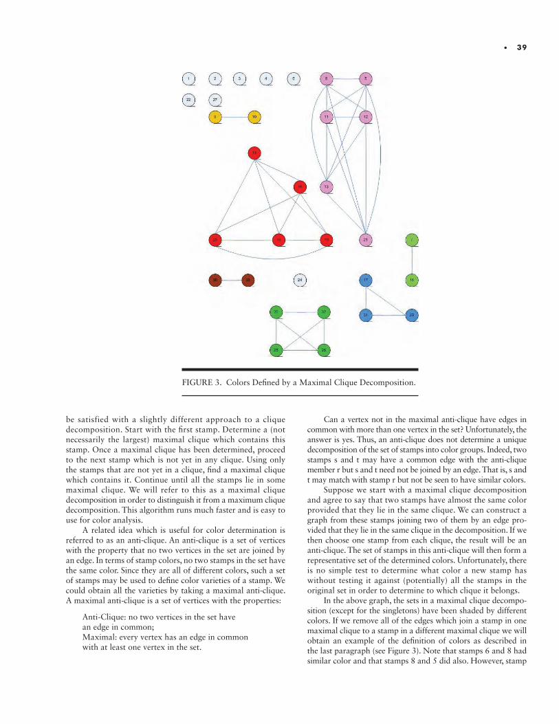
• 39
be satisfied with a slightly different approach to a clique decomposition. Start with the first stamp. Determine a (not necessarily the largest) maximal clique which contains this stamp. Once a maximal clique has been determined, proceed to the next stamp which is not yet in any clique. Using only the stamps that are not yet in a clique, find a maximal clique which contains it. Continue until all the stamps lie in some maximal clique. We will refer to this as a maximal clique decomposition in order to distinguish it from a maximum clique decomposition. This algorithm runs much faster and is easy to use for color analysis.
A related idea which is useful for color determination is referred to as an anti-clique. An anti-clique is a set of vertices with the property that no two vertices in the set are joined by an edge. In terms of stamp colors, no two stamps in the set have the same color. Since they are all of different colors, such a set of stamps may be used to define color varieties of a stamp. We could obtain all the varieties by taking a maximal anti-clique. A maximal anti-clique is a set of vertices with the properties:
Anti-Clique: no two vertices in the set havean edge in common;Maximal: every vertex has an edge in common with at least one vertex in the set.
Can a vertex not in the maximal anti-clique have edges in common with more than one vertex in the set? Unfortunately, the answer is yes. Thus, an anti-clique does not determine a unique decomposition of the set of stamps into color groups. Indeed, two stamps s and t may have a common edge with the anti-clique member r but s and t need not be joined by an edge. That is, s and t may match with stamp r but not be seen to have similar colors.
Suppose we start with a maximal clique decomposition and agree to say that two stamps have almost the same color provided that they lie in the same clique. We can construct a graph from these stamps joining two of them by an edge pro-vided that they lie in the same clique in the decomposition. If we then choose one stamp from each clique, the result will be an anti-clique. The set of stamps in this anti-clique will then form a representative set of the determined colors. Unfortunately, there is no simple test to determine what color a new stamp has without testing it against (potentially) all the stamps in the original set in order to determine to which clique it belongs.
In the above graph, the sets in a maximal clique decompo-sition (except for the singletons) have been shaded by different colors. If we remove all of the edges which join a stamp in one maximal clique to a stamp in a different maximal clique we will obtain an example of the definition of colors as described in the last paragraph (see Figure 3). Note that stamps 6 and 8 had similar color and that stamps 8 and 5 did also. However, stamp
FIGURE 3. Colors Defined by a Maximal Clique Decomposition.
40 • I N S T I T U T E F O R A N A LY T I C A L P H I L AT E LY
6 did not have a color similar to stamp 5 so stamp 6 could not belong to the clique containing 8 and 5.
What then is a “color variety”? From the partition point of view, a variety is a sub-collection of the subsets in the partition. For example, as part of the partition, we may have three sets whose underlying colors are all very close to crimson. The collection of these three subsets may then be called the “crim-son color variety”. What we would desire from a color-based partition of the stamps is that each of the cataloged color varieties could be identified with a collection of subsets in the partition. We would desire that each such collection be disjoint from the others and that each of the partition subsets belongs to one of the collections. In effect, we would be forming a partition of the original partition. Each of the collections in this new partition would correspond to a cataloged color variety of the stamp.
So, the crucial part of the process is to form a partition of the original set of stamps. We need the partition to be fine enough (enough subsets in the partition) so that each of the cataloged color varieties is a collection of these subsets. (Alternatively viewed, that each color variety is the union of subsets from the partition.) How many subsets should we have in the partition?
There is a minimal type of a solution to this problem: choose the partition so that each subset contained only one stamp. Then, the variety would consist of all of these single- element sets (singletons) which actually belong to the given color variety. When faced with a new stamp, we would ask: “Is this stamp closest to a stamp in this variety? Or, is it closer to a stamp in another variety?” In order to accomplish this, we would actually need to know unambiguously to which color variety each of the original stamps belonged. We would also need to be certain that the stamps we had were representative of all of the stamps in this variety. We reject this type of a partition for color definition as being “unpractical”.
At the other extreme, we can merely assert that all stamps are to have the same color. The partition then consists of one set which contains all of the stamps. For example, this is exactly what has been done for Mi 52. All stamps are merely “gray”.
THE PRACTICESCANNING THE COLOR GUIDE
AND CREATING THE COLOR FILE
The primary scanner used in this study was the Canon LiDE 120. It is cheap and reliable, and therefore a good choice for the average philatelist to afford and use for his/her studies. In addition, two other scanners were used in order to obtain some comparative results: an HP Photosmart 6520 “All-in-one” and an Epson Perfection V600 Photo.
The pages of the color guide can be scanned one by one. The colors can then be determined either directly from this page scan or the page may be broken up into individual color swatch images and the colors determined from these images. The actual calculation of the color parameters should be performed using the same algorithm as will be described in the sections titled “DETERMINING THE HUE AND SATURATION” and “DETERMINING THE LUMINANCE”.
For this study, the pages were scanned one by one. A file containing the names (both German and English) of the colors was created in the same order in which they appear in the color guide. The pages were automatically broken up into individual color swatch images, their colors were determined and a Color File was produced.
Initially, the colors of the swatches were determined by a slightly different process. A large rectangle contained entirely within the color swatch was automatically determined and the pixels within this region were individually read. Their RGB values were averaged and that average was used for the color of the swatch. In the case of the Michel Color Guide, there is a hole in the center of the swatch and so the rectangle was chosen to lie entirely above this hole. In a number of the swatches, the ink used was fairly thick and as a consequence the color was lighter around the edges of the swatch. This affected the averaged color. This computed average was later tested by re-computing the colors of the swatches in the manner used for the stamps. The results were quite close. However, the “thick” colors described above tended to differ a little from the new colors. It was decided that the colors of the swatches should instead be computed exactly in the same manner as the colors of the stamps. This made more sense all around.
SCANNING THE STAMPS
The stamps should all be scanned with the same scanner, the same scanner driver and the same settings. These are all necessary to ensure that stamp color comparisons will be meaningful. The programs used in this analysis are optimized for scans of 300 DPI. The scans should be performed with a black background and all driver settings should be set to the default so as not to have it perform any image enhancement. The black background serves two purposes. First of all, it provides a uniform background so that the cancellations and the black background can be treated as one pixel group in the processing. Secondly it insures that there will not be any reflected light returning from the background, through the paper and affecting the perceived color of the stamp. The scanner will only be seeing the light reflected off the face of the stamp. Paper color will be ignored.
REMOVING THE CANCELLATION AND PAPER PIXELS
Removing the background, cancellation and paper pixels is accomplished through the luminance histogram. Ideally, the luminance histogram will consist of three peaks: the background and cancellation, the stamp design, the unprinted portions of the stamp paper. The design pixels will constitute the center peak. Using the low and high cutoffs we may exclude the dark peak and the light peak leaving only the design pixels. The remaining “included” pixels may be examined to see if the cutoffs are well positioned. Under ideal conditions, the “Included Pixels” image will show only the stamp design and the Hue-Saturation histogram will show a clean well-formed peak in the H-S plane. (See the images in the Section titled “REMOVING THE GRAY PIXELS”.) However, things are not usually this neat.
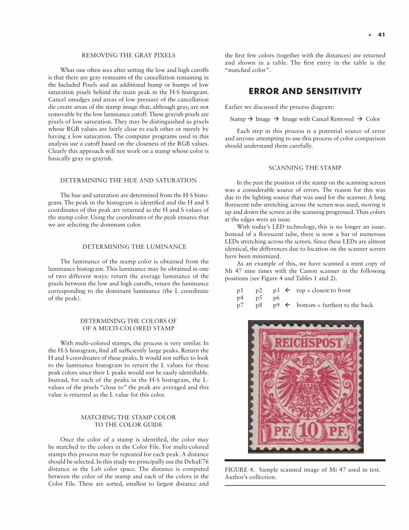
• 41
REMOVING THE GRAY PIXELS
What one often sees after setting the low and high cutoffs is that there are gray remnants of the cancellation remaining in the Included Pixels and an additional hump or humps of low saturation pixels behind the main peak in the H-S histogram. Cancel smudges and areas of low pressure of the cancellation die create areas of the stamp image that, although gray, are not removable by the low luminance cutoff. These grayish pixels are pixels of low saturation. They may be distinguished as pixels whose RGB values are fairly close to each other or merely by having a low saturation. The computer programs used in this analysis use a cutoff based on the closeness of the RGB values. Clearly this approach will not work on a stamp whose color is basically gray or grayish.
DETERMINING THE HUE AND SATURATION
The hue and saturation are determined from the H-S histo-gram. The peak in the histogram is identified and the H and S coordinates of this peak are returned as the H and S values of the stamp color. Using the coordinates of the peak ensures that we are selecting the dominant color.
DETERMINING THE LUMINANCE
The luminance of the stamp color is obtained from the luminance histogram. This luminance may be obtained in one of two different ways: return the average luminance of the pixels between the low and high cutoffs, return the luminance corresponding to the dominant luminance (the L coordinate of the peak).
DETERMINING THE COLORS OF OF A MULTI-COLORED STAMP
With multi-colored stamps, the process is very similar. In the H-S histogram, find all sufficiently large peaks. Return the H and S coordinates of these peaks. It would not suffice to look to the luminance histogram to return the L values for these peak colors since their L peaks would not be easily identifiable. Instead, for each of the peaks in the H-S histogram, the L- values of the pixels “close to” the peak are averaged and this value is returned as the L value for this color.
MATCHING THE STAMP COLOR TO THE COLOR GUIDE
Once the color of a stamp is identified, the color may be matched to the colors in the Color File. For multi-colored stamps this process may be repeated for each peak. A distance should be selected. In this study we principally use the DeltaE76 distance in the Lab color space. The distance is computed between the color of the stamp and each of the colors in the Color File. These are sorted, smallest to largest distance and
the first few colors (together with the distances) are returned and shown in a table. The first entry in the table is the “matched color”.
ERROR AND SENSITIVITY
Earlier we discussed the process diagram:
Stamp Image Image with Cancel Removed Color
Each step in this process is a potential source of error and anyone attempting to use this process of color comparison should understand them carefully.
SCANNING THE STAMP
In the past the position of the stamp on the scanning screen was a considerable source of errors. The reason for this was due to the lighting source that was used for the scanner. A long florescent tube stretching across the screen was used, moving it up and down the screen as the scanning progressed. Thus colors at the edges were an issue.
With today’s LED technology, this is no longer an issue. Instead of a florescent tube, there is now a bar of numerous LEDs stretching across the screen. Since these LEDs are almost identical, the differences due to location on the scanner screen have been minimized.
As an example of this, we have scanned a mint copy of Mi 47 nine times with the Canon scanner in the following positions (see Figure 4 and Tables 1 and 2).
p1 p2 p3 top = closest to frontp4 p5 p6p7 p8 p9 bottom = furthest to the back
FIGURE 4. Sample scanned image of Mi 47 used in test. Author’s collection.
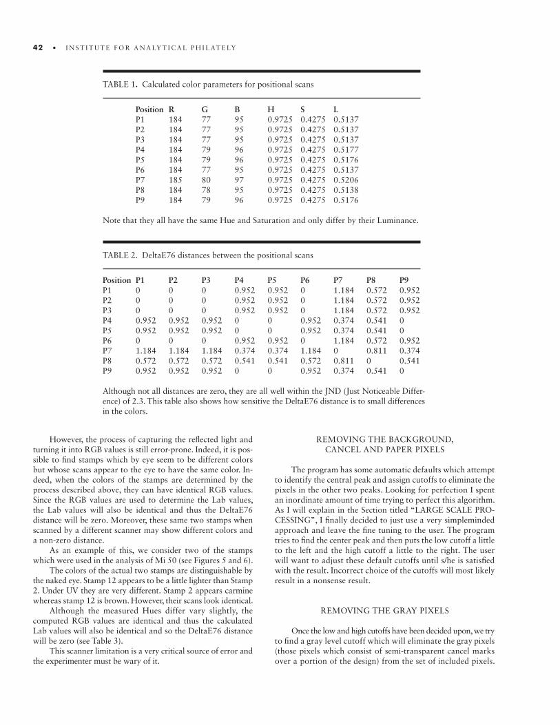
42 • I N S T I T U T E F O R A N A LY T I C A L P H I L AT E LY
However, the process of capturing the reflected light and turning it into RGB values is still error-prone. Indeed, it is pos-sible to find stamps which by eye seem to be different colors but whose scans appear to the eye to have the same color. In-deed, when the colors of the stamps are determined by the process described above, they can have identical RGB values. Since the RGB values are used to determine the Lab values, the Lab values will also be identical and thus the DeltaE76 distance will be zero. Moreover, these same two stamps when scanned by a different scanner may show different colors and a non-zero distance.
As an example of this, we consider two of the stamps which were used in the analysis of Mi 50 (see Figures 5 and 6).
The colors of the actual two stamps are distinguishable by the naked eye. Stamp 12 appears to be a little lighter than Stamp 2. Under UV they are very different. Stamp 2 appears carmine whereas stamp 12 is brown. However, their scans look identical.
Although the measured Hues differ vary slightly, the computed RGB values are identical and thus the calculated Lab values will also be identical and so the DeltaE76 distance will be zero (see Table 3).
This scanner limitation is a very critical source of error and the experimenter must be wary of it.
TABLE 1. Calculated color parameters for positional scans
Position R G B H S LP1 184 77 95 0.9725 0.4275 0.5137P2 184 77 95 0.9725 0.4275 0.5137P3 184 77 95 0.9725 0.4275 0.5137P4 184 79 96 0.9725 0.4275 0.5177P5 184 79 96 0.9725 0.4275 0.5176P6 184 77 95 0.9725 0.4275 0.5137P7 185 80 97 0.9725 0.4275 0.5206P8 184 78 95 0.9725 0.4275 0.5138P9 184 79 96 0.9725 0.4275 0.5176
Note that they all have the same Hue and Saturation and only differ by their Luminance.
TABLE 2. DeltaE76 distances between the positional scans
Position P1 P2 P3 P4 P5 P6 P7 P8 P9P1 0 0 0 0.952 0.952 0 1.184 0.572 0.952P2 0 0 0 0.952 0.952 0 1.184 0.572 0.952P3 0 0 0 0.952 0.952 0 1.184 0.572 0.952P4 0.952 0.952 0.952 0 0 0.952 0.374 0.541 0P5 0.952 0.952 0.952 0 0 0.952 0.374 0.541 0P6 0 0 0 0.952 0.952 0 1.184 0.572 0.952P7 1.184 1.184 1.184 0.374 0.374 1.184 0 0.811 0.374P8 0.572 0.572 0.572 0.541 0.541 0.572 0.811 0 0.541P9 0.952 0.952 0.952 0 0 0.952 0.374 0.541 0
Although not all distances are zero, they are all well within the JND (Just Noticeable Differ-ence) of 2.3. This table also shows how sensitive the DeltaE76 distance is to small differences in the colors.
REMOVING THE BACKGROUND, CANCEL AND PAPER PIXELS
The program has some automatic defaults which attempt to identify the central peak and assign cutoffs to eliminate the pixels in the other two peaks. Looking for perfection I spent an inordinate amount of time trying to perfect this algorithm. As I will explain in the Section titled “LARGE SCALE PRO-CESSING”, I finally decided to just use a very simpleminded approach and leave the fine tuning to the user. The program tries to find the center peak and then puts the low cutoff a little to the left and the high cutoff a little to the right. The user will want to adjust these default cutoffs until s/he is satisfied with the result. Incorrect choice of the cutoffs will most likely result in a nonsense result.
REMOVING THE GRAY PIXELS
Once the low and high cutoffs have been decided upon, we try to find a gray level cutoff which will eliminate the gray pixels (those pixels which consist of semi-transparent cancel marks over a portion of the design) from the set of included pixels.

• 43
FIGURE 5. Stamp 2. Author’s collection. FIGURE 6. Stamp 12. Author’s collection.
TABLE 3. Parameters of the color pair
Stamp R G B H S LStamp 2 145 92 89 0.0084 0.2379 0.4600Stamp 12 145 92 89 0.0087 0.2379 0.4600
Note that they all have the same Hue and Saturation and only differ by their Luminance.
If this is not needed at all (for instance, if the stamp were mint) one can merely turn off the Gray Pixel Exclusion. Otherwise, one starts with the default gray level cutoff of 30. One changes the level and presses the “Refresh” button to see the updat-ed image or histogram. Most likely you will want to use the Included Pixels image. If it seems satisfactory, you are done. Otherwise you try again.
This can be a quite tedious process. In the Section titled “LARGE SCALE PROCESSING” we will discuss an automa-tion of the process which you will most likely want to use if you have a fairly large number of stamps to process.
Some colors are more sensitive to changes in the gray level cutoff than others. If the color itself has a high saturation then changes in this cutoff will have little effect. However, if the color borders on a (possibly tinted) gray, the peak determination in the H-S histogram may be very sensitive to changes in the gray level cutoff.
As an illustration of this, we show the results of computing the colors of Stamp 12 in two ways: (1) computing the color with no Gray Pixel Elimination, and (2) using Gray Pixel Elimination with the cutoff set to 40 (see Figure 7 a and b, Figure 8 a and b and Table 4).
TABLE 4. Parameters with and without gray pixels
Setting R G B H S LWith Gray Pixels 146 93 90 0.0087 0.2378 0.4638Eliminated 145 92 89 0.0087 0.2379 0.4600
The distance between them (in the Lab color space) is: DeltaE76 = 0.3987.
FIGURE 7. Stamp 12 without Gray Pixel Elimination: (a) stamp; (b) Hue-Saturation Histogram. Author’s Collection.
DETERMINING THE LUMINANCE
There are two main methods of finding the luminance that should be used for the stamp color. The most stable process is by finding the L position of the peak in the luminance histogram of the included pixels. Computing a local average of the L values of the included pixels in the neighborhood of the peak will provide a more stable method. However, sometime this process can be misleading. If there is no clearly defined peak in the
FIGURE 8. Stamp 12 with Gray Pixel Elimination with Cut-off at 40: (a) stamp; (b) Hue-Saturation Histogram. Author’s Collection.
included luminance region then this process will most likely return the luminance at one of the end points. This will most likely be either too small or too large. In such a case, the average value of the luminance of the included pixels will be a better choice. Both alternatives are supported by the software with the peak method being the default. As an example, we consider the stamp Mi 118 (see Figures 9, 10 and 11).
In these diagrams, the Peak Luminance is denoted with the red vertical line; the Average Luminance is marked with the
44 • I N S T I T U T E F O R A N A LY T I C A L P H I L AT E LY

central black vertical line. With the Luminance computed by the Peak method the reported color is too bright. The Average method produces much better results. The DeltaE76 distance between the two results is 15.25.
DETERMINING THE HUE AND SATURATION
As indicated above, the determination of the HS coor-dinates of the peak in the H-S histogram may be sensitive to
FIGURE 9. Mi 118 Requiring use of Averaged Luminance. Author’s collection.
FIGURE 10. Peak Luminance denoted with the red vertical line. FIGURE 11. Average Luminance marked with the central black vertical line.
changes in the gray level cutoff. This sensitivity to the gray level cutoff value can be reduced by returning a local average of the H and S values around the peak rather than the coor-dinates of the peak itself. The problem with this is that the reported H value may not agree with the position of the peak in the Hue histogram. This is probably all right but if, for some reason, the user desires the two values to be closer, the user has the option of turning off this averaging. The default is that the averaging will take place.
• 45

46 • I N S T I T U T E F O R A N A LY T I C A L P H I L AT E LY
LARGE SCALE PROCESSING
When a large number of stamp images are to be processed, something must be done to decrease the amount of effort required of the user.
SCANNING A LARGE NUMBER OF STAMPS
If one is going to scan 5,000 stamps, scanning them one-by-one is not practical. The approach used by the author was to scan a large number of stamps at a time (up to a maximum of 64) and then use a specially designed program to separate the stamps into individual files.
An eight by eight grid containing openings for the individual stamps was created from black construction paper. The stamps were inserted into the openings and the scan was performed (see Figures 12 and 13). The large image of multiple stamps was then automatically split into individual files.
SELECTION OF THE LOW AND HIGH LUMINANCE CUTOFFS
Earlier I discussed the difficulties of automating a good default position for the low and high cutoffs and the selection of the gray level cutoff. The alternative is to allow the program to learn from the user what s/he considers to be good cutoffs. The values of the cutoffs are principally a property of the L histogram. We have built into the program the ability to learn what the user considers to be good cutoffs given the shape of the luminance histogram. When the user is satisfied with her/his cutoffs, s/he may press the “Train” button. The result is that a low-level approximation to the L histogram is saved in the Training File together with the values of the cutoffs. When a similar L histogram is encountered, these saved values are loaded as the defaults. The user may simply use these values or may modify the values and again “train” the program. The new values will be averaged in to the stored values.
This has shown itself to be a considerable time saver when large numbers of stamps are to be processed. After a relatively small number of stamps have had their cutoffs adjusted by the user most of the remaining stamp images will have acceptable defaults.
DETERMINATION OF THE GRAY LEVEL CUTOFF
Determination of a good choice for the gray level cutoff can take a good deal of time. Of course, when a large number of stamps are to be processed the problem is compounded. We also would like to use the same (repeatable) process for all the stamps to be compared. The author has investigated two approaches to this problem: (1) merely use the default gray level for all the stamps; (2) use an automated process for determining the cutoff and use it for all the stamps. We have chosen to use the Auto method for this study since it is never very obvious as to how much error will be introduced if we just use the default settings and leave a number of low saturation pixels in the analysis set.
The Auto Gray Level algorithm is the following:
1. Decide on the following values:a. a maximum value CMax that you will allow for thegray level cutoff.
b. an initial value C0 that you will use for a proposed gray level cutoff.
c. a small increment INCR to the cutoff that you will addat each test.
d. a fixed percentage PCT of pixels that you will use todetermine if too many pixels are being eliminated by the increase in the gray level cutoff.
2. Determine the number of pixels within the low and high luminance cutoffs. Call this number NTotal.
3. Set the test value TEST to be the fixed percentage PCT of this NTotal.
4. Set the proposed gray level cutoff C to the default starting value C0.
5. Determine the number N0 of gray pixels that the cutoff C identifies.
6. Increase the cutoff by INCR calling the new cutoff value C1.7. Compute the new number of identified gray pixels N1 and let I denote the increase over the initial amount N. i.e., I = N1 – N0.
8. If (I < TEST) and (C1< CMax)a. Let C = C1;b. Let C1 = C + INCR;c. Let N1 = number of gray level pixels that C1 identifies;d. Let I = N1 – N0;e. Repeat step 8.
ElseReturn the number C as the gray level cutoff.
In other words, keep increasing the proposed gray level cutoff until the next cutoff would get rid of too many pixels or would be too high. Use this last acceptable value for the cutoff.
CONSECUTIVE NAMING AND PROCESSING OF THE IMAGES
In order to automatically consecutively process the images a fixed naming convention must be used. A prefix PFX for the image names must be chosen and the images must be labelled PFX 1 through PFX n where n is the number of images of the stamp.
For example, if you have 100 copies of the stamp Mi 45, you may label the images by Mi 45 1, Mi 45 2, …, Mi 45 100.
The programs utilize the prefix and the range of indices in order to consecutively process all of the images.
THE STUDIES
We have obtained an accumulation of 4,926 samples, mainly cancelled, of the stamps of the Germany Crown and Eagle series, 1889-1900. 3,359 of these stamps have legible years in their cancels (see Table 5). Since the Michel catalog provides years of usage of the various color varieties that they list, it was felt that these cancellations could help us identify
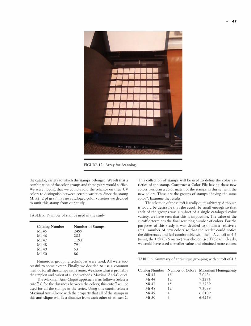
• 47
FIGURE 12. Array for Scanning.
the catalog variety to which the stamps belonged. We felt that a combination of the color groups and these years would suffice. We were hoping that we could avoid the reliance on their UV colors to distinguish between certain varieties. Since the stamp Mi 52 (2 pf gray) has no cataloged color varieties we decided to omit this stamp from our study.
Numerous grouping techniques were tried. All were suc-cessful to some extent. Finally we decided to use a common method for all the stamps in the series. We chose what is probably the simplest and easiest of all the methods: Maximal Anti-Cliques.
The Maximal Anti-Clique approach is as follows: Select a cutoff C for the distances between the colors; this cutoff will be used for all the stamps in the series. Using this cutoff, select a Maximal Anti-Clique with the property that all of the stamps in this anti-clique will lie a distance from each other of at least C.
TABLE 5. Number of stamps used in the study
Catalog Number Number of StampsMi 45 2499Mi 46 285Mi 47 1193Mi 48 791Mi 49 53Mi 50 86
This collection of stamps will be used to define the color va-rieties of the stamp. Construct a Color File having these new colors. Perform a color match of the stamps in this set with the new colors. These are the groups of stamps “having the same color”. Examine the results.
The selection of the cutoff is really quite arbitrary. Although it would be desirable that the cutoff be small enough so that each of the groups was a subset of a single cataloged color variety, we have seen that this is impossible. The value of the cutoff determines the final resulting number of colors. For the purposes of this study it was decided to obtain a relatively small number of new colors so that the reader could notice the differences and feel comfortable with them. A cutoff of 4.5 (using the DeltaE76 metric) was chosen (see Table 6). Clearly, we could have used a smaller value and obtained more colors.
TABLE 6. Summary of anti-clique grouping with cutoff of 4.5
Catalog Number Number of Colors Maximum HomogeneityMi 45 18 7.0434Mi 46 12 7.2276Mi 47 15 7.2939Mi 48 12 7.3039Mi 49 4 6.8109Mi 50 6 6.6259

48 • I N S T I T U T E F O R A N A LY T I C A L P H I L AT E LY
FIGURE 13. Resulting Image from Scan.
• 49
The details of the maximal anti-clique creation and the re-sulting color groups can be found in the appendices which may be found on the website of the Institute for Analytical Philately.
The matched color groups from these color definitions leave something to be desired. Explicitly, their homogeneities are larger than we would like. As a consequence, I performed another color decomposition using maximum cliques with a maximum distance set at 4.5. Table 7 summarizes the results. We have not included any details of these analyses. Although the maximum homogeneities are now approximately 4.5, there are probably too many colors determined to be of any real use.
The following table summarizes the results.
SUMMARY AND CONCLUSIONS
In this paper we have endeavored to put on a firm, objective footing the notion of a “color variety”. We have discussed techniques for processing a large number of stamps, extracting their colors and combining them into groups of similar colors. We have shown how to apply these techniques to the stamps of the Germany “Crown and Eagle” series. In doing so, we have discovered the weaknesses of such methods and discussed and exhibited an approach which minimizes these pitfalls. We have shown that, even with the careful methods we have used, it is impossible (with the three scanners we have used in this experi-ment) to objectively group the stamps in order to identify them with the cataloged varieties. We have identified objective color varieties for all of the stamps in this series (with the exception of the 2pf gray stamp). Although these color varieties cannot be uniquely associated with the cataloged varieties, they are none-theless true color varieties objectively extracted from a large sampling of the stamps in the series.
FURTHER READING
Color Models – Basic Definitions[1] Color model. Wikipedia. https://en.wikipedia.org/wiki/
Color_model (accessed 17 February 2017).
Matching Colors to the Munsell Color Codes:[2] Kelly, Kenneth L. and Fred W. Billmeyer, Jr. 1981. “APS
Manual for Determining Color Designations of Stamp Colors.” The American Philatelist, August: 708-717.
General Reference on Color in Philately:[3] White, R. H. 1979. Color in Philately. New York: The
Philatelic Foundation.
Bron-Kerbosch Algorithm:[4] Conte, Alessio. Review of the Bron-Kerbosch Algorithm
and Variations. Available at University of Glasgow School of Computing Science. http://www.dcs.gla.ac.uk/~pat/jchoco/clique/enumeration/report.pdf
Definitions of Clique, Maximal Clique, Maximum Clique, as well as a concise list of basic graph theory definitions:
[5] “Clique (graph theory),” Wikipedia, April 11, 2017, https://en.wikipedia.org/wiki/Clique_(graph_theory)
[6] Clique Problem. Wikipedia. https://en.wikipedia.org/wiki/Clique_problem (accessed 6 February, 2017).An “anti-clique” is another name for an “independent set”. It is a set of vertices in a graph no two of which are adjacent. Alterna-tively, it is a clique in the complementary graph.
[7] Independent set (graph theory). Wikipedia. https://en.wikipedia.org/wiki/Independent_set_(graph_theory) (accessed 12 April, 2017).
Color Guides and Instructions for their use:[8] Michel Color Guide, Version 38. 2011 Schwaneberger
Verlag GmbH.[9] Stanley Gibbons Stamp Colour Key. England: Stanley
Gibbons Ltd. [10] Wonder Color Gauge. 1940. Los Angeles: Meghrig.[11] The Philatelic Color Guide. Hygrade Products.
Basic Mathematical Terms used in the Paper:[12] “Algebra,” Thomas W. Hungerford, 1974, Holt, Rine-
hart and Winston, Inc., U.S.A.[13] Swamy, M. N. S. and K. Thulasiraman. 1981. Graphs,
Networks, and Algorithms. New York: John Wiley & Sons.
Location of the Appendices:[14] http://analyticalphilately.org/
ACKNOWLEDGEMENTS
The above work is the culmination of approximately ten to fifteen years of study, programming, testing and evaluation. During this period, the author was in communication with a number of philatelists sharing a common interest in removing the ambiguities associated with the differentiation between the various color varieties of stamps. Since I was a beginner in the subject, I wish specifically to thank Jerry Jensen and Tony Torres for helping me get started in this difficult subject. I also wish to thank Peter Weisensel for his encouragement in leading me to my first publication along these lines in the German Postal Spe-cialist. Susan Smith, I thank for her review of an early version of the paper and her patience during the modifications needed to bring it up to the required format for publication. There are a number of philatelists who I have used as a sounding board on multiple occasions: Bob Mustacich, Mike Suckling, Tim Lyer-la, Stephen Bodanske and Walter Cibulskis. Finally, I wish to thank my wife, Carol, for the patience she has shown to me while I spent many hours at the computer.
TABLE 7. Summary of maximum clique grouping with cutoff of 4.5
Catalog Number Number of Colors Maximum HomogeneityMi 45 40 4.5074Mi 46 19 4.4980Mi 47 30 4.5008Mi 48 30 4.5000Mi 49 9 4.4711Mi 50 10 4.4610
ABSTRACT. ABSTRACT. The twenty-four-cent purple stamps printed by the Continental Bank Note Company (Scott 164) cannot be identified based solely on the design, since Continental used a single, unaltered printing plate created by the National Bank Note Company, printer of the 1870 issue. Only one 24¢ stamp has been certified by The Philatelic Foun-dation as having been printed by Continental, an opinion based solely on the basis of its having been printed on ribbed paper, a type of paper on which no National Bank Note Company stamp has ever been observed.
This study seeks to discriminate between National and Continental 24¢ stamps by identifying chemical differences in the printing inks used by the two companies, using X-ray fluorescence (XRF) and Fourier-transform infrared (FTIR) spectroscopic analysis. Seven dated covers were examined, as well as 24 off-cover stamps bearing New York foreign-mail cancels, for which usage date-ranges had been established by researchers who had done census work on examples of these cancels on dated covers (Weiss, 1990; Kirke 2016).
The FTIR spectra of the studied stamps indicated that one of the coloring agents in the ink was ultramarine; indicating that the purple color was attained through the addition of a red pigment (probably carmine). The amount of ultramarine measured by FTIR served to differentiate the stamps into two categories, which we denote as low and high ultramarine. Elemental analyses by XRF enabled a further differentiation of the low-ultramarine stamps into three discrete classes based on the relative abundance of phosphorus (high, medium or low). Although we have not yet identified the compound containing phosphorus, we note that all the high ultramarine stamps contain medium levels of phosphorus. Work is still in progress.
INTRODUCTION
Prior to 1894, United States postage stamps were printed by private companies under a Post Office Department contract. The first 24¢ denomination was designed, engraved and printed by Toppan, Carpenter & Co. of Philadelphia in 1857. Subsequent contracts were awarded to the National Bank Note Co. of New York, which provided new designs and manufactured the issues of 1861 and 1869, both of which included 24¢ values (Brookman, 1966).
The 1869 issue – America’s first pictorial stamps – quickly fell into public disfavor, so early in 1870 the Postmaster General requested new designs from the National Bank Note Co. The new stamps were to be one third larger, and to feature distinguished de-ceased Americans, using designs taken from marble busts specified by the Third Assistant
Progress Report on the U.S. 24¢ Purple Stamp Enigma of 1870-75John H. Barwis & Harry G. Brittain

52 • I N S T I T U T E F O R A N A LY T I C A L P H I L AT E LY
Postmaster General (Brookman, 1966). The 1870 24¢ stamp depicts General Winfield Scott, a national hero who had distin-guished himself in the wars of 1812-15 and 1846-48, and was Commanding General of the Army when the Civil War began in 1861. The stamp’s design is shown in Figure 1.
STAMP PRODUCTION – NATIONAL BANK NOTE COMPANY
At the onset of their contract for producing the 1870 issues, the National Bank Note Company had difficulty in for-mulating an acceptable color for the 24¢ stamp, as indicated by this letter from Stamp Agent Boyd to the Third Assistant Postmaster General:
U.S. Postage Stamp and Envelope AgencyNew York, April 13th, 1870
Sir:Your letter and telegram of 12th ins’t rec’d. My tele-
gram of the 12th inst related to issuing of the 15s 30s and 90s of the old series until I had the new series complete. Your telegram and letter is [sic] explicit and I am therefore issu-ing all denominations of the new series except twelves and twenty fours. I herewith send a sheet of twelve cent stamps for your inspection which I think is as near like the specimen submitted as they can get on sized paper. They have not yet produced a twenty four cent stamp in my opinion like the sample and therefore I will not receive them. They are doing their best and expect to have some ready tomorrow.
The trouble seems to be that the color selected (Pur-ple) although looking like the specimen when taken from the press fades and loses its brilliancy by drying and gum-ming. I notice even that the specimens submitted to you and returned here as samples have lost considerable of their brilliancy and sharp appearance. I can assure you that ev-ery person connected with the company and this Dep’t are exerting themselves to the utmost to carry out the wishes of the Dept and give satisfaction to the public and yourself knowing your interest and anxiety with the matter.
All the stamps of the new series was [sic] ready for delivery on the 12th inst according to my promise except the twelves and twenty fours in the production of which (12s & 24s) I had no control further than to except [sic] them if satisfactory, they not being so made all the trouble.
If the specimen enclosed meets your approval please telegraph so that I can have them ready for delivery on Saturday the 16th.
Respectfully yoursDM Boyd ag’t
Hon W.H.H. TerrellThird ass’t P.M. Gen’lWashington D.C.
(Travers Papers, 1870).
The Travers Papers record that Terrell replied by telegraph the following day, writing “The specimens of 12c stamps are satisfactory,” but omitting mention of the 24¢ stamps. Boyd sent another sheet of 24¢ on April 18th which was approved by Gen. Terrell the same day (Travers Papers, April 18, 1870).
The company went on to produce a total of 6,775 sheets of 200 stamps before their contract expired on March 31, 1873 (Table 1). In a competitive bid against National based on cost, Continental was awarded a new four-year contract to begin on May 1. All of the dies, transfer rolls and plates used to manufacture the 1870 issues were turned over to the Conti-nental Bank Note Co. by Stamp Agent Boyd at 8 p.m. on April 1, 1873, as documented by a telegram sent from Boyd the next day to Terrell (Travers Papers).
STAMP PRODUCTION – CONTINENTAL BANK NOTE COMPANY
Continental acid-etched a small area of each of the eleven
dies, presumably to distinguish their work from their predeces-sor’s. The 24¢ design was altered by deepening four lines in the lower-right star (Figure 2). For reasons unknown the altered dies were not used to lay down new plates for any of the three highest values – the 24, 30 and 90 cent stamps. Probably the relatively
FIGURE 1. National Bank Note Co. die proof of the 24¢ large bank note issue. Courtesy Robert A. Siegel Auction Galleries.
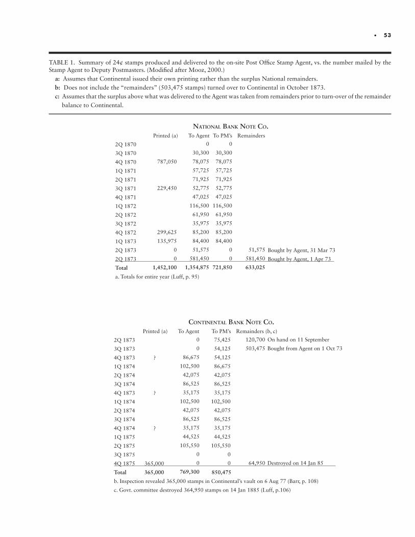
• 53
TABLE 1. Summary of 24¢ stamps produced and delivered to the on-site Post Office Stamp Agent, vs. the number mailed by the Stamp Agent to Deputy Postmasters. (Modified after Mooz, 2000.)
a: Assumes that Continental issued their own printing rather than the surplus National remainders.b: Does not include the “remainders” (503,475 stamps) turned over to Continental in October 1873.c: Assumes that the surplus above what was delivered to the Agent was taken from remainders prior to turn-over of the remainder balance to Continental.
NatioNal BaNk Note Co. Printed (a) To Agent To PM’s Remainders
2Q 1870
3Q 1870
4Q 1870
1Q 1871
2Q 1871
3Q 1871
4Q 1871
1Q 1872
2Q 1872
3Q 1872
4Q 1872
1Q 1873
2Q 1873 Bought by Agent, 31 Mar 73
2Q 1873 Bought by Agent, 1 Apr 73
Total
a. Totals for entire year (Luff, p. 95)
CoNtiNeNtal BaNk Note Co. Printed (a) To Agent To PM’s Remainders (b, c)
2Q 1873
3Q 1873
4Q 1873 ?
1Q 1874
2Q 1874
3Q 1874
4Q 1873 ?
1Q 1874
2Q 1874
3Q 1874
4Q 1874 ?
1Q 1875
2Q 1875
3Q 1875
4Q 1875 365,000
Total 365,000 850,475
b. Inspection revealed 365,000 stamps in Continental’s vault on 6 Aug 77 (Barr, p. 108)
c. Govt. committee destroyed 364,950 stamps on 14 Jan 1885 (Luff, p.106)
0
30,300
78,075
57,725
71,925
52,775
47,025
116,500
61,950
35,975
85,200
84,400
0
0
721,850
0
30,300
78,075
57,725
71,925
52,775
47,025
116,500
61,950
35,975
85,200
84,400
51,575
581,450
1,354,875
787,050
229,450
299,625
135,975
0
0
1,452,100
51,575
581,450
633,025
0
0
86,675
102,500
42,075
86,525
35,175
102,500
42,075
86,525
35,175
44,525
105,550
0
0
769,300
120,700
503,475
64,950
75,425
54,125
54,125
86,675
42,075
86,525
35,175
102,500
42,075
86,525
35,175
44,525
105,550
0
0
On hand on 11 September
Bought from Agent on 1 Oct 73
Destroyed on 14 Jan 85
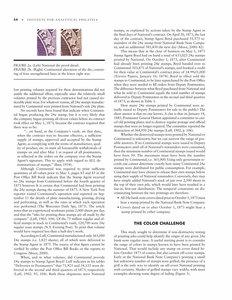
54 • I N S T I T U T E F O R A N A LY T I C A L P H I L AT E L 8
low printing volumes required for these denominations did not justify the additional effort, especially since the relatively small volumes printed by the previous contractor had not caused no-ticeable plate wear. For whatever reason, all 24¢ stamps manufac-tured by Continental were printed from National’s sole 24¢ plate.
No records have been found that indicate when Continen-tal began producing the 24¢ stamp, but it is very likely that the company began printing all eleven values before its contract took effect on May 1, 1873, because the contract required that there was to be:
“…on hand, in the Company’s vault, on that date, when the contract was to become effective, a sufficient supply of stamps, approved and accepted by the Stamp Agent, as complying with the terms of manufacture, qual-ity of product, etc. to meet all foreseeable withdrawals of stamps on and after May 1 at request of all postmasters, as reflected in the orders on the company over the Stamp Agent’s signature. This to apply with regard to ALL de-nominations of stamps.” (Barr, 1954).
Although Continental was required to print sufficient quantities of all values prior to May 1, pages 83 and 85 in the Post Office Bill Book indicate that the Stamp Agent received no 24¢ stamps from Continental before the fourth quarter of 1873 however. It is certain that Continental had been printing the 24¢ stamps during the summer of 1873. A New York Post reporter visited Continental’s operation and reported on Sep-tember 11 the details of plate manufacturing, printing, drying and perforating, as well as the rates at which each operation was performed (The Worcester Daily Spy, 1873). The article notes that an experienced workman prints 2,000 sheets per day, and that the “inks for printing these stamps are all made by the company” (Luff, 1902: 104). Of the 75 million regular and of-ficial stamps in stock in Continental’s vault, 120,700 were 24¢ regular issue stamps (N.Y. Evening Post). To print that volume would have required less than a half-day’s work.
According to Luff, Continental manufactured only 365,000 24¢ stamps (i.e. 1,825 sheets), all of which were delivered to the Stamp Agent in 1875. The source of that figure cannot be verified by either the Post Office Bill Books or the reports to Congress (Mooz, 2000).
When, and in what volumes, did Continental provide 24¢ stamps to Stamp Agent Boyd? Luff indicates in his tables “Deliveries to Postmasters” that 71,925 and 54,125 were de-livered in the second and third quarters of 1873, respectively (Luff, 1902: 95, 104). Both these shipments were National
stamps, as explained by actions taken by the Stamp Agent in the final days of National’s contract. On April 30, 1873, the last day of the contract, Stamp Agent Boyd purchased 51,575 re-mainders of the 24¢ stamp from National Bank Note Compa-ny, and an additional 581,450 the next day (Mooz, 2000: 42).
This means that at the close of business on May 1, 1873 Stamp Agent Boyd had on hand a total of 633,025 24¢ stamps printed by National. On October 1, 1873, after Continental had already been printing 24¢ stamps, Boyd handed over to Continental 503,475 of National’s stamps, and booked a credit for their value at Continental’s contract price of 14.99¢/1,000 (Travers Papers, January 16, 1874). Boyd in effect sold the stamps to Continental, to be later repurchased by the Post Office when they were needed to fill orders from Deputy Postmasters. The difference between what Boyd purchased from National and what he sold to Continental equals the total number of stamps delivered to Deputy Postmasters in the second and third quarters of 1873, as shown in Table 1.
How many 24¢ stamps printed by Continental were ac-tually issued to Deputy Postmasters for sale to the public? The short answer is that no one knows. A clue is that on January 14, 1885, Postmaster General Hatton appointed a committee to can-cel old printing plates and to destroy regular postage and official stamps that were no longer required. The committee reported the destruction of 364,950 24¢ stamps (Luff, 1902, p. 106).
Whether the destroyed stamps were printed by National or Continental is unknown, but we can narrow the range of pos-sible answers. If no Continental stamps were issued to Deputy Postmasters until all of National’s remainders were consumed, then the minimum number of Continental stamps issued would have been 50. The maximum must have been the number printed by Continental, i.e. 365,000. Using only government re-cords one cannot determine exactly how many Continental 24¢ stamps were distributed for public consumption. For example, Continental may have chosen to release their own stamps before using their supply of National remainders. Conversely, they may have simply added National’s stack of just over 2,500 sheets to the top of their own pile, which would later have resulted in a last-in, first-out distribution. The temporal constraints on dis-criminating between the two printings are therefore:
• All 24¢ bank-note covers dated prior to October 1, 1873 must bear a stamp printed by the National Bank Note Company.• Covers dated on or after October 1, 1873 might bear a stamp printed by either company.
THE COLOR CHALLENGE
This study sought to determine if non-destructive testing of printing inks could help identify the origin of any given 24¢ bank-note regular issue. A useful starting point is to consider the range of colors in stamps known to have been printed by National. That would include any stamp on cover dated be-fore October 1873 of course, but also certain off-cover stamps. Early in the National Bank Note Company’s printing a small but unknown number of stamps were grilled; the presence of a grill is the only way to identify an off-cover National printing with certainty. Shades of grilled stamps vary widely, with most examples showing some degree of fading (Figure 3).
FIGURE 2a. (Left) National die proof detail. FIGURE 2b. (Right) Continental alteration of the die, consist-ing of four strengthened lines in the lower right star.
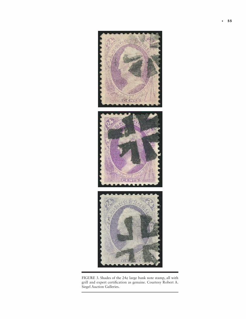
• 55
FIGURE 3. Shades of the 24¢ large bank note stamp, all with grill and expert certification as genuine. Courtesy Robert A. Siegel Auction Galleries.
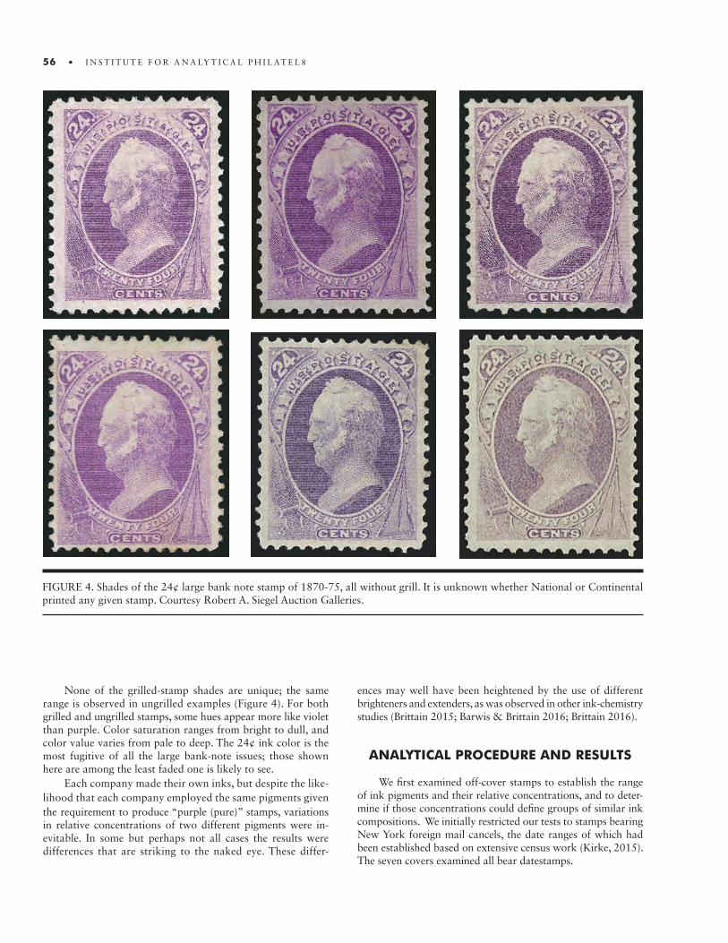
56 • I N S T I T U T E F O R A N A LY T I C A L P H I L AT E L 8
None of the grilled-stamp shades are unique; the same range is observed in ungrilled examples (Figure 4). For both grilled and ungrilled stamps, some hues appear more like violet than purple. Color saturation ranges from bright to dull, and color value varies from pale to deep. The 24¢ ink color is the most fugitive of all the large bank-note issues; those shown here are among the least faded one is likely to see.
Each company made their own inks, but despite the like-lihood that each company employed the same pigments given the requirement to produce “purple (pure)” stamps, variations in relative concentrations of two different pigments were in-evitable. In some but perhaps not all cases the results were differences that are striking to the naked eye. These differ-
ences may well have been heightened by the use of different brighteners and extenders, as was observed in other ink-chemistry studies (Brittain 2015; Barwis & Brittain 2016; Brittain 2016).
ANALYTICAL PROCEDURE AND RESULTS
We first examined off-cover stamps to establish the range of ink pigments and their relative concentrations, and to deter-mine if those concentrations could define groups of similar ink compositions. We initially restricted our tests to stamps bearing New York foreign mail cancels, the date ranges of which had been established based on extensive census work (Kirke, 2015). The seven covers examined all bear datestamps.
FIGURE 4. Shades of the 24¢ large bank note stamp of 1870-75, all without grill. It is unknown whether National or Continental printed any given stamp. Courtesy Robert A. Siegel Auction Galleries.
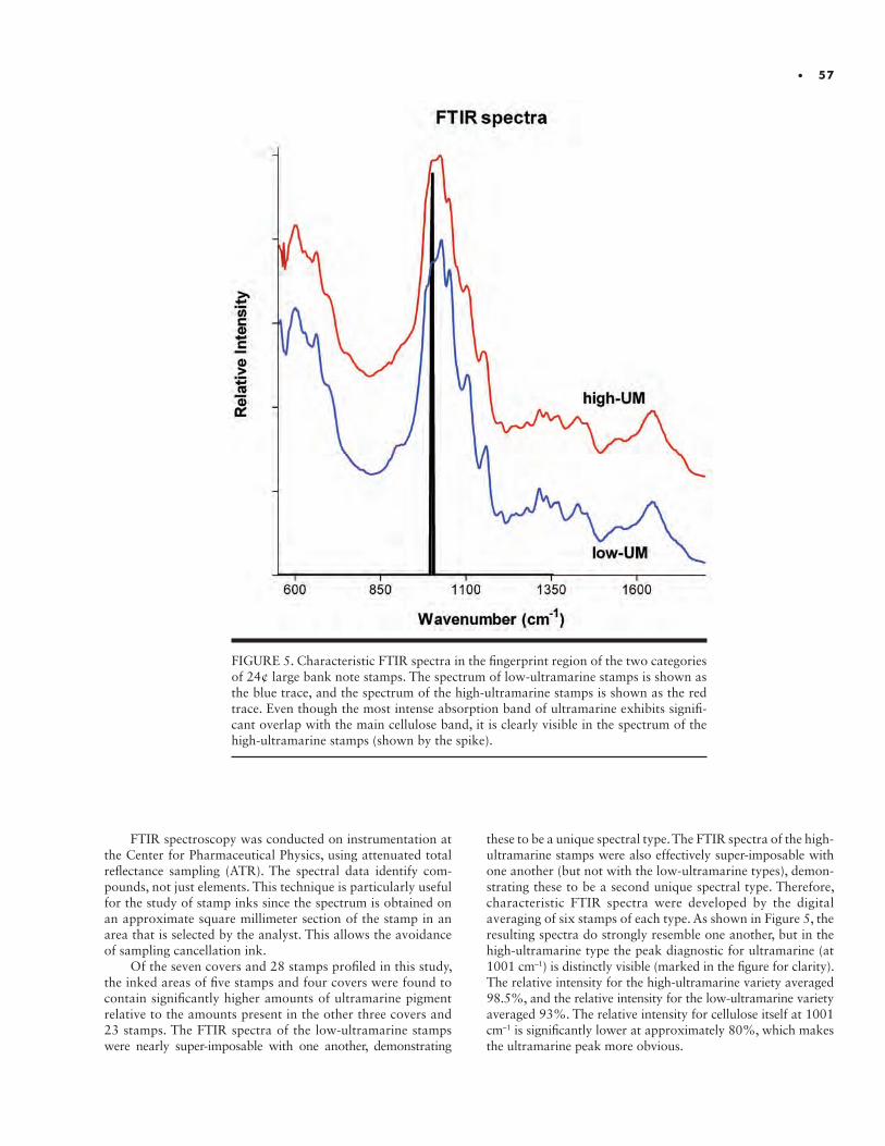
• 57
FIGURE 5. Characteristic FTIR spectra in the fingerprint region of the two categories of 24¢ large bank note stamps. The spectrum of low-ultramarine stamps is shown as the blue trace, and the spectrum of the high-ultramarine stamps is shown as the red trace. Even though the most intense absorption band of ultramarine exhibits signifi-cant overlap with the main cellulose band, it is clearly visible in the spectrum of the high-ultramarine stamps (shown by the spike).
FTIR spectroscopy was conducted on instrumentation at the Center for Pharmaceutical Physics, using attenuated total reflectance sampling (ATR). The spectral data identify com-pounds, not just elements. This technique is particularly useful for the study of stamp inks since the spectrum is obtained on an approximate square millimeter section of the stamp in an area that is selected by the analyst. This allows the avoidance of sampling cancellation ink.
Of the seven covers and 28 stamps profiled in this study, the inked areas of five stamps and four covers were found to contain significantly higher amounts of ultramarine pigment relative to the amounts present in the other three covers and 23 stamps. The FTIR spectra of the low-ultramarine stamps were nearly super-imposable with one another, demonstrating
these to be a unique spectral type. The FTIR spectra of the high- ultramarine stamps were also effectively super-imposable with one another (but not with the low-ultramarine types), demon-strating these to be a second unique spectral type. Therefore, characteristic FTIR spectra were developed by the digital averaging of six stamps of each type. As shown in Figure 5, the resulting spectra do strongly resemble one another, but in the high-ultramarine type the peak diagnostic for ultramarine (at 1001 cm–1) is distinctly visible (marked in the figure for clarity). The relative intensity for the high-ultramarine variety averaged 98.5%, and the relative intensity for the low-ultramarine variety averaged 93%. The relative intensity for cellulose itself at 1001 cm–1 is significantly lower at approximately 80%, which makes the ultramarine peak more obvious.
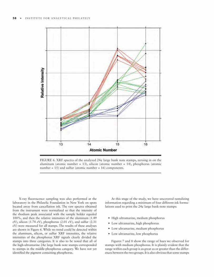
58 • I N S T I T U T E F O R A N A LY T I C A L P H I L AT E LY
FIGURE 6. XRF spectra of the analyzed 24¢ large bank note stamps, zeroing in on the aluminum (atomic number = 13), silicon (atomic number = 14), phosphorus (atomic number = 15) and sulfur (atomic number = 16) components.
X-ray fluorescence sampling was also performed at the laboratory in the Philatelic Foundation in New York on spots located away from cancellation ink. The raw spectra obtained from the instrument were normalized so that the intensity of the rhodium peak associated with the sample holder equaled 100%, and then the relative intensities of the aluminum (1.49 eV), silicon (1.74 eV), phosphorus (2.01 eV), and sulfur (2.31 eV) were measured for all stamps. The results of these analyses are shown in Figure 6. While no trend could be detected within the aluminum, silicon, or sulfur XRF intensities, the relative intensities of the phosphorus XRF signals clearly divided the stamps into three categories. It is also to be noted that all of the high-ultramarine 24¢ large bank note stamps corresponded to stamps in the middle-phosphorus category. We have not yet identified the pigment containing phosphorus.
At this stage of the study, we have uncovered tantalizing information regarding a minimum of four different ink formu-lations used to print the 24¢ large bank-note stamps:
• High ultramarine, medium phosphorus
• Low ultramarine, high phosphorus
• Low ultramarine, medium phosphorus
• Low ultramarine, low phosphorus
Figures 7 and 8 show the range of hues we observed for stamps with medium phosphorus. It is plainly evident that the range within each group is as great as or greater than the differ-ences between the two groups. It is also obvious that some stamps

• 59
FIGURE 7. Stamps printed with ink of high-ultramarine and medium phosphorus content. Top two rows are off-cover examples; captions are the date ranges of respective New York foreign-mail cancels, estab-lished in an extensive study by Nick Kirke (unpublished). Courtesy of Nick Kirke.
High Ultramarine, Medium Phosphorus
5/70 – 12/74 8/74 – 9/743/73 – 4/7
9/74 – 6/75 2/751/75 – 7/75
3/73 – 4/75
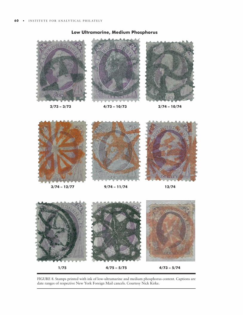
60 • I N S T I T U T E F O R A N A LY T I C A L P H I L AT E LY
Low Ultramarine, Medium Phosphorus
2/73 – 3/73 2/74 – 10/744/73 – 10/73
3/74 – 12/77 12/749/74 – 11/74
1/75 4/73 – 5/744/75 – 5/75
FIGURE 8. Stamps printed with ink of low-ultramarine and medium phosphorus content. Captions are date ranges of respective New York Foreign Mail cancels. Courtesy Nick Kirke.
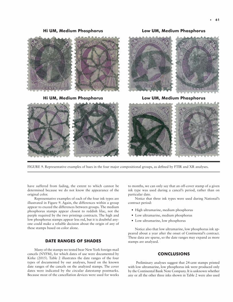
• 61
Hi UM, Medium Phosphorus Low UM, Medium Phosphorus
Hi UM, Medium Phosphorus Low UM, Medium Phosphorus
FIGURE 9. Representative examples of hues in the four major compositional groups, as defined by FTIR and XR analyses.
have suffered from fading, the extent to which cannot be determined because we do not know the appearance of the original color.
Representative examples of each of the four ink types are illustrated in Figure 9. Again, the differences within a group appear to exceed the differences between groups. The medium phosphorus stamps appear closest to reddish lilac, not the purple required by the two printings contracts. The high and low phosphorus stamps appear less red, but it is doubtful any-one could make a reliable decision about the origin of any of these stamps based on color alone.
DATE RANGES OF SHADES
Many of the stamps we tested bear New York foreign-mail cancels (NYFM), for which dates of use were documented by Kirke (2015). Table 2 illustrates the date ranges of the four types of documented by our analyses, based on the known date ranges of the cancels on the analyzed stamps. The cover dates were indicated by the circular datestamp postmarks. Because most of the cancellation devices were used for weeks
to months, we can only say that an off-cover stamp of a given ink type was used during a cancel’s period, rather than on particular date.
Notice that three ink types were used during National’s contract period:
• High ultramarine, medium phosphorus
• Low ultramarine, medium phosphorus
• Low ultramarine, low phosphorus
Notice also that low ultramarine, low phosphorus ink ap-peared about a year after the onset of Continental’s contract. These data are sparse, so the date ranges may expand as more stamps are analyzed.
CONCLUSIONS Preliminary analyses suggest that 24-cent stamps printed
with low ultramarine, low phosphorus ink were produced only by the Continental Bank Note Company. It is unknown whether any or all the other three inks shown in Table 2 were also used
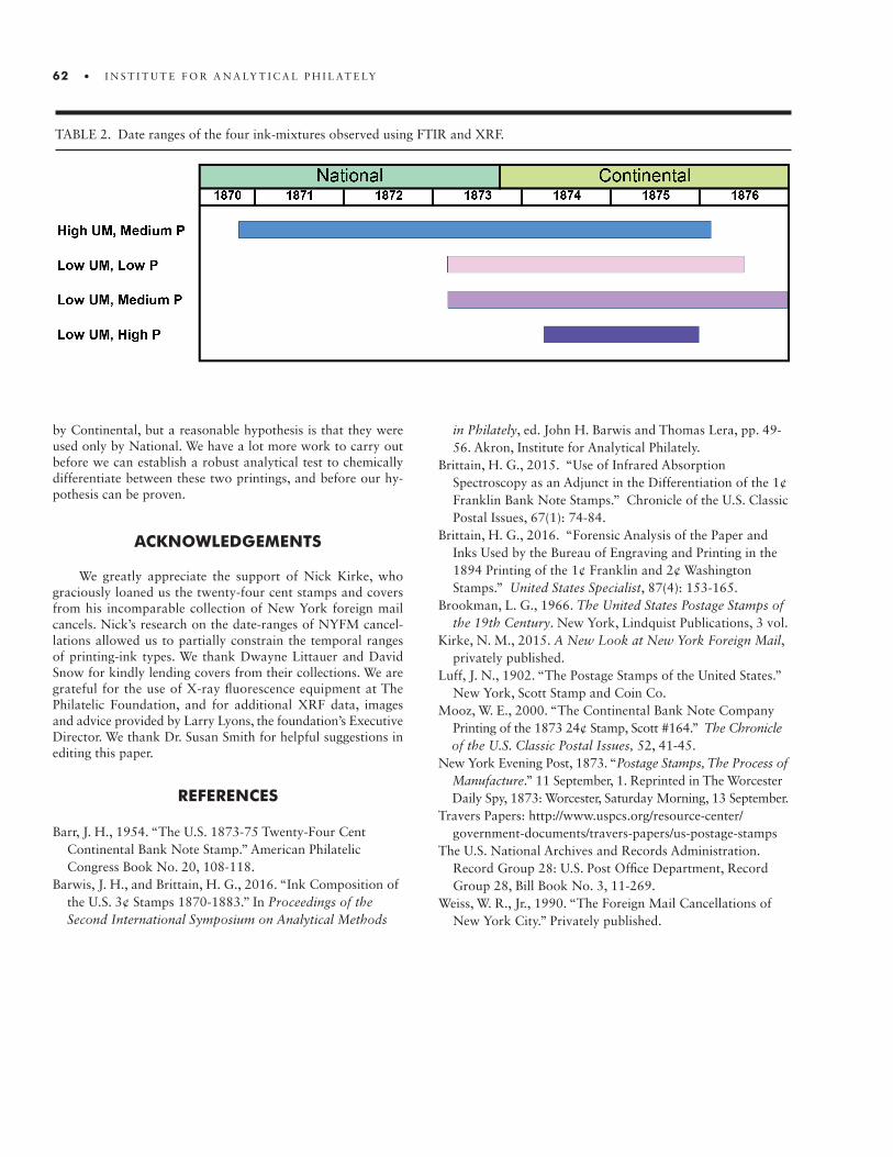
62 • I N S T I T U T E F O R A N A LY T I C A L P H I L AT E LY
TABLE 2. Date ranges of the four ink-mixtures observed using FTIR and XRF.
by Continental, but a reasonable hypothesis is that they were used only by National. We have a lot more work to carry out before we can establish a robust analytical test to chemically differentiate between these two printings, and before our hy-pothesis can be proven.
ACKNOWLEDGEMENTS
We greatly appreciate the support of Nick Kirke, who graciously loaned us the twenty-four cent stamps and covers from his incomparable collection of New York foreign mail cancels. Nick’s research on the date-ranges of NYFM cancel-lations allowed us to partially constrain the temporal ranges of printing-ink types. We thank Dwayne Littauer and David Snow for kindly lending covers from their collections. We are grateful for the use of X-ray fluorescence equipment at The Philatelic Foundation, and for additional XRF data, images and advice provided by Larry Lyons, the foundation’s Executive Director. We thank Dr. Susan Smith for helpful suggestions in editing this paper.
REFERENCES
Barr, J. H., 1954. “The U.S. 1873-75 Twenty-Four Cent Continental Bank Note Stamp.” American Philatelic Congress Book No. 20, 108-118.Barwis, J. H., and Brittain, H. G., 2016. “Ink Composition of the U.S. 3¢ Stamps 1870-1883.” In Proceedings of the Second International Symposium on Analytical Methods
in Philately, ed. John H. Barwis and Thomas Lera, pp. 49- 56. Akron, Institute for Analytical Philately.Brittain, H. G., 2015. “Use of Infrared Absorption Spectroscopy as an Adjunct in the Differentiation of the 1¢ Franklin Bank Note Stamps.” Chronicle of the U.S. Classic Postal Issues, 67(1): 74-84.Brittain, H. G., 2016. “Forensic Analysis of the Paper and Inks Used by the Bureau of Engraving and Printing in the 1894 Printing of the 1¢ Franklin and 2¢ Washington Stamps.” United States Specialist, 87(4): 153-165.Brookman, L. G., 1966. The United States Postage Stamps of the 19th Century. New York, Lindquist Publications, 3 vol.Kirke, N. M., 2015. A New Look at New York Foreign Mail, privately published. Luff, J. N., 1902. “The Postage Stamps of the United States.” New York, Scott Stamp and Coin Co.Mooz, W. E., 2000. “The Continental Bank Note Company Printing of the 1873 24¢ Stamp, Scott #164.” The Chronicle of the U.S. Classic Postal Issues, 52, 41-45.New York Evening Post, 1873. “Postage Stamps, The Process of Manufacture.” 11 September, 1. Reprinted in The Worcester Daily Spy, 1873: Worcester, Saturday Morning, 13 September.Travers Papers: http://www.uspcs.org/resource-center/ government-documents/travers-papers/us-postage-stamps The U.S. National Archives and Records Administration. Record Group 28: U.S. Post Office Department, Record Group 28, Bill Book No. 3, 11-269.Weiss, W. R., Jr., 1990. “The Foreign Mail Cancellations of New York City.” Privately published.

• 63
ABSTRACT.ABSTRACT. This research demonstrates the successful development of a method for determining the relative distortion differences between positions in a printing plate by comparing stamp images so that large multiples printed from the plate are no longer re-quired for this analysis. Different methods were compared for their ability to compensate for stamp size differences due to post-printing shrinkage, and bilinear adjustments to the images performed best. For pre-1953 wet-printed engraved stamps, the results were superior to previous analyses using multiples. A bilinear method employing local image matching of the four corner regions of the stamp images to more precisely define and match the corner positions gave the best performance. These new methods for directly comparing individual stamps’ relative distortion patterns require only a single reference stamp. This allows a wide set of individual stamps from the same issue to be compared regardless of plate number and plate position. This was demonstrated in the re-analysis of groups of stamps of the same issue thought to share faint re-entry features, but originating from unknown plates and positions. I used a comparison of the distortion patterns from a large group of stamps to challenge and reassess the original groupings of these stamps. While many of the original groupings were confirmed, a number of these were revised and new relationships were discovered.
INTRODUCTION
High resolution digital images are now a standard means for viewing and exam-ining philatelic materials. The enlargement of details advantageously highlights many small features for further study. High resolution, however, magnifies size differences and distortions, making computer-based image comparison of fine details very challenging; examination has relied on the human eye. The focus of my research has been to develop digital comparison techniques which correct for size differences and distortions to provide a direct, pixel by pixel comparison of high resolution stamp images.
In a previous phase of my research, I corrected for inconsistencies between images, and compared any two same-issue stamps in detail over the entirety of their images (Mustacich, 2016). This technique effectively aligned images for any two stamps of the same issue, but the microscopic adjustments to the images for their alignment did not seem to provide any additional information of value. I was surprised to find that when image comparisons involved stamps from a large block (a “multiple”), additional infor-mation was revealed about features of the original printing plate. My recent research efforts, described in this article, are aimed at obtaining printing plate information by comparing individual stamps, without requiring these stamps to be from large multiples.
A Versatile Comparison of Stamps by High Resolution Image DifferencingRobert V. Mustacich

64 • I N S T I T U T E F O R A N A LY T I C A L P H I L AT E LY
FIGURE 1. An illustration of the subtraction of two stamp images. The colored areas are the two printed designs that need to be aligned. After locating each of the designs within the two images, computer optimization aligns the designs using rotation, a horizontal shift, and a vertical shift. To compensate for small size differences and spatial distortions, computer optimization next re-aligns the image divided into small patches, one patch at a time. The fine adjustment of these patches provides an array of small, “second-order” corrections that are spatially blended to create a final image subtraction having fine alignment of image features throughout.
BACKGROUND
The only previous publication of research undertaken by subtracting high resolution images of stamps from each other is my article from 2016 (Mustacich, 2016). This approach to high-resolution image differencing, described below, combined techniques to overcome the following difficulties: accurately locating by computer the stamp designs within the images; aligning the designs from two images; minimizing sources of digital noise in the process; maximizing the reproducibility of detail in high resolution optical scans; and compensating for distortions arising from post-printing shrinkage of wet-printed stamps. Figure 1 illustrates the approach used. Two different stamp images, one shown in red and one in blue, are first analyzed to determine the borders of the printed stamp designs. The designs are represented by the shaded areas within the borders of each stamp image. The designs are located by searching inward from the edges of the images to locate the color transition at edges of the printed designs. Lines are then fit to this data to define the edges. The edges of the stamp designs are most often linear, but this is not a requirement for this approach to work. The crossings of the four fitted lines determine the effective corners of the design and the approx-imate center of the design. It should be noted that seemingly rectangular stamp designs are not perfectly rectangular, and printed corners typically are not sharply defined when viewed with high resolution. In the scheme shown in Figure 1, the two
image centers and the fitted lines combine to estimate alignment using three parameters: horizontal and vertical shifts, and a rotation. This alignment is then determined by optimizing the matching of the digital content, pixel-by-pixel. (In this paper, subsequent discussions regarding fitting, matching, or compar-ing “stamps” should be understood to be about the stamps’ printed designs.)
Because stamps are not perfectly rectangular and differ slightly in their overall sizes, the pixel-by-pixel subtraction with optimized alignment still exhibits a large amount of local misalignment spread over the extent of the image, a very unsatisfactory and relatively useless result. Additional steps to the image differencing process, shown in the lower part of Figure 1, compensate for this residual variation. In these steps, the overlay of the two aligned images is divided into an array of rectangular patches and their alignments are re-optimized just over the extent of each patch. An 8 x 12 array of patches was used in these studies for second order corrections. This was found to provide a robust balance between adequate contour detail and sufficient patch size to prevent erroneous patch alignments in regions with less design detail. A two-parameter optimization is applied to fine adjust the horizontal and vertical alignment of each patch. The result is an array of “second or-der” adjustments to finely align each patch. Minimizing the difference of the pixel-by-pixel subtraction is used again as the optimization criterion. The final illustration in Figure 1 shows the realignment of the corner patches so that the printed designs

• 65
FIGURE 2. A comparison of distortion patterns between plate impressions calculated for two blocks of 16 stamps, same plate num-ber 26003, same plate positions, of the 1953 dry-printed ½ cent U.S. Franklin stamp using the Intra-sheet method published earlier (Mustacich, 2016). These contour plots, like topographic maps, show the vertical shifts of the die features, darker shades being increasingly upward, and lighter shades being increasingly downward. Note the similarity of the distortion patterns in comparing the same plate positions in the two blocks.
are now in proper alignment. The mathematics and other details of the overall process are described in the earlier published work (Mustacich, 2016).
The final step of the image subtraction uses an interpola-tion of these local adjustments to provide a satisfactory, high resolution subtraction of the stamp images. This process is demonstrated with images of a stamp with and without re-entry features (additional plate impression details typically made in error) in fig 1 of the earlier published work (Mustacich, 2016). Figs 2-4 of this earlier publication show similar applications to stamps having re-entries and plate flaws, and forgeries.
As mentioned in the introduction, the surprise of relating the second-order corrections to the actual plate impressions was discovered by comparing images within blocks of stamps, what I will refer to as “Intra-sheet” comparisons. It was possible to use linear combinations of these Intra-sheet subtractions to estimate the differences between the plate impressions. These differences reveal the relative distortion patterns between each of the plate impressions. It was further possible to generalize this process to arbitrarily large sizes of stamp multiples (Mustacich, 2016). The array of patch adjustments can be most easily viewed as a pair of contour maps, one for the horizontal corrections and one for the vertical corrections. For example, in the case of the vertical corrections, this array can be viewed as a topographic map in which the grid of altitudes has been replaced by the array of upward or downward shifts to the image patches.
Figure 2 shows the relative distortion patterns for the Intra- sheet differencing of the dry-printed 1953 U.S. ½ cent Franklin stamp, when comparing two different sheets from plate number 26003 for the same block of 16 stamps. In these contour plots, dark shades represent upward image adjustments and light
shades are downward adjustments. Notice the similarity of the patterns when comparing the same plate positions for the two different sheets. For example, the top rows of both exhibit a relative compression of the height of the image (top shifted downward and bottom shifted upward). The magnitude of these shifts in Figure 2 is small, typically less than 10µm. Thus, each plate position has its own distortion pattern, a consequence of the small differences in the “plastic” flow of the soft steel of the plates when manually rocking in each impression from the transfer roll. Extremely high pressures are required with as many as 20 or more passes when rocking in a design. The pres-sures when making the transfer roll itself have been reported to be in the range of 8-35 tons per square inch (110-483 MPa) (Sheaff, 1981). Consequently, variation is inevitable. This small variation inherent in the plate differences should be present in comparing any two stamps of the same issue. The research described in this article seeks to overcome the limitations of Intra-sheet comparisons, namely the requirement for large stamp multiples, because of their potential scarcity and cost, and the inability to analyze individual stamps. The desired goal is to subtract any two single stamps of the same issue, regardless of plate number and plate position, and arrive at a distortion pattern revealing differences in their plate impressions.
MODIFICATIONS TO THE PREVIOUS METHOD
When the method in Figure 1 is applied to a pair of stamps having different sizes, gradients are introduced to the dis-tortion patterns. This problem is demonstrated in Figure 3.
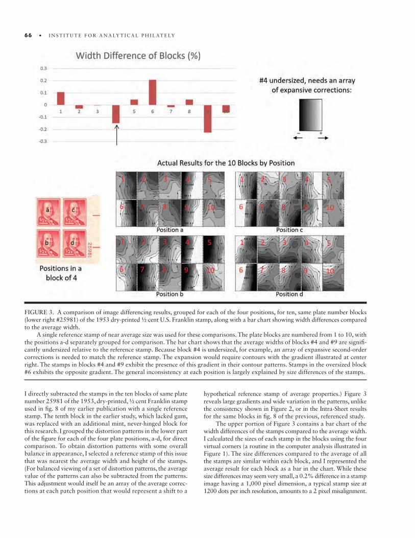
66 • I N S T I T U T E F O R A N A LY T I C A L P H I L AT E LY
I directly subtracted the stamps in the ten blocks of same plate number 25981 of the 1953, dry-printed, ½ cent Franklin stamp used in fig. 8 of my earlier publication with a single reference stamp. The tenth block in the earlier study, which lacked gum, was replaced with an additional mint, never-hinged block for this research. I grouped the distortion patterns in the lower part of the figure for each of the four plate positions, a-d, for direct comparison. To obtain distortion patterns with some overall balance in appearance, I selected a reference stamp of this issue that was nearest the average width and height of the stamps. (For balanced viewing of a set of distortion patterns, the average value of the patterns can also be subtracted from the patterns. This adjustment would itself be an array of the average correc-tions at each patch position that would represent a shift to a
hypothetical reference stamp of average properties.) Figure 3 reveals large gradients and wide variation in the patterns, unlike the consistency shown in Figure 2, or in the Intra-Sheet results for the same blocks in fig. 8 of the previous, referenced study.
The upper portion of Figure 3 contains a bar chart of the width differences of the stamps compared to the average width. I calculated the sizes of each stamp in the blocks using the four virtual corners (a routine in the computer analysis illustrated in Figure 1). The size differences compared to the average of all the stamps are similar within each block, and I represented the average result for each block as a bar in the chart. While these size differences may seem very small, a 0.2% difference in a stamp image having a 1,000 pixel dimension, a typical stamp size at 1200 dots per inch resolution, amounts to a 2 pixel misalignment.
FIGURE 3. A comparison of image differencing results, grouped for each of the four positions, for ten, same plate number blocks (lower right #25981) of the 1953 dry-printed ½ cent U.S. Franklin stamp, along with a bar chart showing width differences compared to the average width.
A single reference stamp of near average size was used for these comparisons. The plate blocks are numbered from 1 to 10, with the positions a-d separately grouped for comparison. The bar chart shows that the average widths of blocks #4 and #9 are signifi-cantly undersized relative to the reference stamp. Because block #4 is undersized, for example, an array of expansive second-order corrections is needed to match the reference stamp. The expansion would require contours with the gradient illustrated at center right. The stamps in blocks #4 and #9 exhibit the presence of this gradient in their contour patterns. Stamps in the oversized block #6 exhibits the opposite gradient. The general inconsistency at each position is largely explained by size differences of the stamps.

• 67
This is a large systematic error when subtracting pixel by pixel. For example, the stamps in block #4 have a smaller width than average. The adjustments to the images of the stamps in this block to match the width in the reference stamp im-age would require horizontal stretching. This corresponds to the left side moving further left, thus negative changes (dark shades) in the x coordinate, and the opposite changes to the right side. The expected gradient from these expansive corrections can be visualized by the contour plot shown at center right in Figure 3. Blocks #4 and #9 are significantly undersized, and the distortion patterns for all four stamps in these blocks reveal this dominant gradient. The oversized block #6 has the opposite gradient.
Real variations in the movement of the soft steel when cre-ating plate impressions should result in small size differences. However, the post-printing shrinkage of the paper is large and quite variable depending on the degree of wetting and the prop-erties of the paper. Large distortions, such as the examples in Figure 3, are much greater than those found in Intra-sheet comparisons, and directly correlate with large size differences. This suggests that factoring size differences into an image subtraction could correct for this artifact. A direct way to incorporate this would be to resize one of the images by a proportionality factor based on the measured size difference before the first alignment step in Figure 1. I created such a “Linear Scaling” method by using ratios of the average widths and heights of the two stamps to resize one of the images. Since the stamps are not perfectly square, I used the average distance between lines fit to the stamp edges to determine widths and heights. An expected shortcoming is that this approach may overcompensate and eliminate small size differences that exist in the plate impressions. However, departures from rectangularity will remain since this irregularity is not corrected by a simple proportionality factor. The Linear Scaling method also will not correct for shrinkage which is not uniform over a stamp, but nonuniform wetting is not expected to be a large
FIGURE 4. Bilinear mapping between two stamp images, their irregular shapes exaggerated for illustration purposes. The grid lines in each image divide the edges by the same propor-tions. The red arrow illustrates the corresponding points in the two images having grid lines of the same proportions, shown as dashed lines. This approach is one of the alternatives for matching in-plane distortions such as shrinkage.
problem; the paper used for stamps is porous and water is highly mobile through capillary action. This assumes some reasonable consistency in the wetting of stamps for printing, which may not be the case for early stamp production.
Another approach to size compensation is the use of bilinear mapping. As mentioned above, stamps are not perfectly rectangular, and are more accurately classified as “irregular quadrilaterals,” which are four-sided polygons with unequal sides. A bilinear mapping connects each point in one quad-rilateral to a corresponding point in another quadrilateral. Figure 4 shows a bilinear mapping between two stamps, their irregularity exaggerated for illustration purposes. Each quadri-lateral is gridded with lines which divide the sides by the same proportions; in this example, each vertical side is divided by the grid lines into five equal lengths. In this manner, every point in a quadrilateral corresponds uniquely to a point in another quadrilateral having the same proportions in its grid. The red arrow in Figure 4 illustrates how each point in one grid maps to a corresponding point in the other grid determined by inter-secting lines with the same proportions along each side. While a bilinear mapping should overcompensate for shape irregularity originating from the plate impression differences, nonlinear distortions in the plate impressions will remain. To implement bilinear size adjustment, I simply modified the image subtraction process shown in Figure 1 by substituting a bilinear mapping for the initial, overall alignment step (finding shifts and a rotation as illustrated in the top right). The remainder of the process is the same. I have termed this approach simply “Bilinear.”
The eight corner positions for the two stamps fully define the mapping. Consequently, the quality of bilinear mapping depends on the accuracy of the corner positions. An interesting possible improvement to this mapping is to more accurately align the four corners of the two stamps as an initial step. This can be done with the image matching illustrated in the second stage of Figure 1, applied to the corner patches. I have termed this meth-od “Bilinear-4C,” an abbreviation of “Bilinear-Four Corners.”
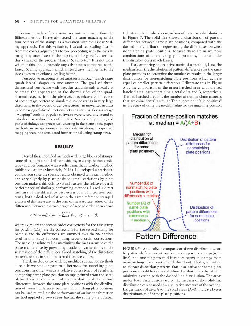
This conceptually offers a more accurate approach than the Bilinear method. I have also tested the same matching of the four corners of the stamps as a variation with the Linear Scal-ing approach. For this variation, I calculated scaling factors from the corner adjustments before proceeding with the overall image alignment step in the top right of Figure 1. I termed this variant of the process “Linear Scaling-4C.” It is not clear whether this should provide any advantages compared to the Linear Scaling approach which instead uses the lines fit to the side edges to calculate a scaling factor.
Perspective mapping is yet another approach which maps quadrilateral shapes to one another. The goal of three- dimensional perspective with irregular quadrilaterals typically is to create the appearance of the shorter sides of the quad-rilateral receding from the observer. This relative compression of some image content to simulate distance results in very large distortions in the second order corrections, an unwanted artifact in comparing relative distortions between stamps. Certain image “warping” tools in popular software were tested and found to introduce large distortions of this type. Since stamp printing and paper shrinkage are processes occurring in the plane of the paper, methods or image manipulation tools involving perspective mapping were not considered further for adjusting stamp sizes.
RESULTS
I tested these modified methods with large blocks of stamps, same plate number and plate positions, to compare the consis-tency and performance with results using the Intra-sheet method published earlier (Mustacich, 2016). I developed a statistical comparison since the specific results obtained with each method can vary slightly by plate position; small variations by plate position make it difficult to visually assess the relative overall performance of similarly performing methods. I used a direct measure of the difference between a pair of distortion pat-terns, both calculated relative to the same reference stamp. I expressed this measure as the sum of the absolute values of the differences between the two arrays of second order corrections
Pattern difference = ∑ (|xi - xii' | + |yi - yi' |)
where (xi,yi) are the second order corrections for the first stamp for patch i; (xii',yi') are the corrections for the second stamp for patch i; and the differences are summed over the 96 patches used in this study for computing second order corrections. The use of absolute values maximizes the measurement of the pattern difference by preventing accidental cancelations in the summation of the differences. Good matching of the distortion patterns results in small pattern difference values.
The desired objective with the modified subtraction methods is to achieve smaller pattern differences for matching plate positions, in other words a relative consistency of results in comparing same plate position stamps printed from the same plates. Thus, a comparison of the distribution of the pattern differences between the same plate positions with the distribu-tion of pattern differences between nonmatching plate positions can be used to evaluate the performance of an image subtraction method applied to two sheets having the same plate number.
I illustrate the idealized comparison of these two distributions in Figure 5. The solid line shows a distribution of pattern differences between same plate positions, compared with the dashed-line distribution representing the differences between nonmatching plate positions. Because there are many more combinations of nonmatching plate positions, the area under this distribution is much larger.
For comparing the relative merit of a method, I use the median from the distribution of pattern differences for the same plate positions to determine the number of results in the larger distribution for non-matching plate positions which achieve equal or smaller pattern differences. I illustrate this in Figure 5 as the comparison of the green hatched area with the red hatched area, each containing a total of A and B, respectively. The red hatched area B is the number of nonmatching patterns that are coincidentally similar. These represent “false positives” in the sense of using the median value for the matching position
i=96i=1
FIGURE 5. An idealized comparison of two distributions, one for pattern differences between same plate position stamps (solid line), and one for pattern differences between stamps from nonmatching plate positions (dashed line). Ideally, a method to extract distortion patterns that is selective for same plate positions should have the solid-line distribution to the left and minimize overlap with the dashed-line distribution. The areas under both distributions up to the median of the solid-line distribution can be used as a qualitative measure of the overlap. Larger ratios of area A to the total areas (A+B) indicate better discrimination of same plate positions.
68 • I N S T I T U T E F O R A N A LY T I C A L P H I L AT E LY

• 69
results to discriminate for matching plate positions. The frac-tion of all possible combinations that represent matching positions at this median value can be then expressed as a percentage using the ratio A/(A+B). Methods with greater values of this percentage provide better discrimination of plate position matching. Methods with the largest A/(A+B) ratios should be considered the best performing methods, provided that the underlying distributions are not unusually broad, a condition suggestive of poor general performance.
Figure 6 shows the distributions of pattern differences for the various methods applied to the U.S. ½ cent Franklin stamp of 1953, dry-printed, plate #26003, for 28 positions on two separate sheets (a total of 56 stamps). For a reference stamp, I selected a stamp closest to the average size. This reference stamp was not used in the intra-sheet method since the stamps of each sheet collectively serve as references in this specific method.
Figure 6 includes a table of results showing in order the follow-ing: the median of the distribution for same position differences; the range of the pattern differences for matching positions from the tenth percentile to the ninetieth percentile; the percentage of pattern differences for matching plate positions up to the median; and the median for the distribution of nonmatching pattern differences. Note the different scales on the vertical axes for each pair of distributions. The dashed distributions for non-matching plate positions include more combinations, and these distributions use the vertical scales shown on the right.
The top and bottom examples in Figure 6 show the two extremes in this example, but actually use the same image subtraction method shown in Figure 1. The difference is that the Intra-sheet method uses multiple stamps from the same sheet as references and then combines these to determine the distortion patterns as described in my earlier publication (Mustacich, 2016).
FIGURE 6. A comparison of distributions of pattern differences, for same posi-tions and for nonmatching positions, for the modified methods of image sub-traction together with the earlier published Intra-sheet method for reference. All but the Intra-sheet method compare stamps of the dry-printed ½ cent 1953 Franklin stamp, plate number 26003, with a single reference stamp. The Intra-sheet method is the previously published method using a large block of stamps from the same sheet. The table provides several measures of the distributions that are de-scribed in the text. The Bilinear-4C method performs best of the modified methods.
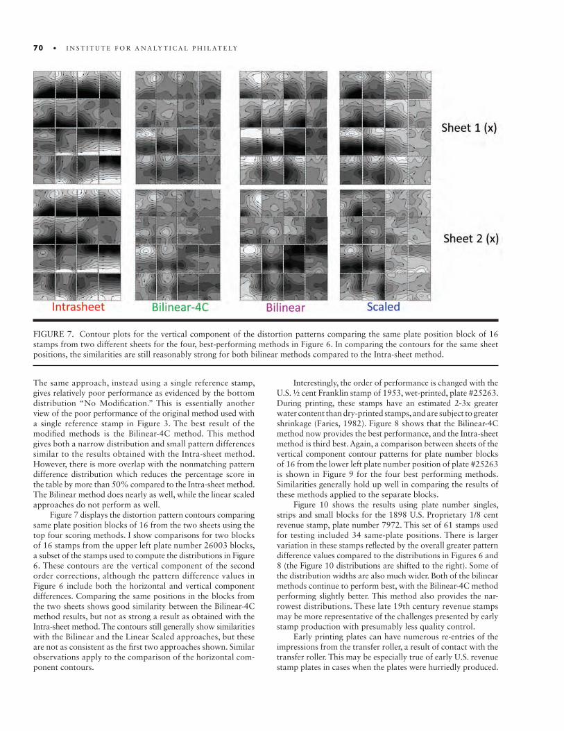
70 • I N S T I T U T E F O R A N A LY T I C A L P H I L AT E LY
FIGURE 7. Contour plots for the vertical component of the distortion patterns comparing the same plate position block of 16 stamps from two different sheets for the four, best-performing methods in Figure 6. In comparing the contours for the same sheet positions, the similarities are still reasonably strong for both bilinear methods compared to the Intra-sheet method.
The same approach, instead using a single reference stamp, gives relatively poor performance as evidenced by the bottom distribution “No Modification.” This is essentially another view of the poor performance of the original method used with a single reference stamp in Figure 3. The best result of the modified methods is the Bilinear-4C method. This method gives both a narrow distribution and small pattern differences similar to the results obtained with the Intra-sheet method. However, there is more overlap with the nonmatching pattern difference distribution which reduces the percentage score in the table by more than 50% compared to the Intra-sheet method. The Bilinear method does nearly as well, while the linear scaled approaches do not perform as well.
Figure 7 displays the distortion pattern contours comparing same plate position blocks of 16 from the two sheets using the top four scoring methods. I show comparisons for two blocks of 16 stamps from the upper left plate number 26003 blocks, a subset of the stamps used to compute the distributions in Figure 6. These contours are the vertical component of the second order corrections, although the pattern difference values in Figure 6 include both the horizontal and vertical component differences. Comparing the same positions in the blocks from the two sheets shows good similarity between the Bilinear-4C method results, but not as strong a result as obtained with the Intra-sheet method. The contours still generally show similarities with the Bilinear and the Linear Scaled approaches, but these are not as consistent as the first two approaches shown. Similar observations apply to the comparison of the horizontal com-ponent contours.
Interestingly, the order of performance is changed with the U.S. ½ cent Franklin stamp of 1953, wet-printed, plate #25263. During printing, these stamps have an estimated 2-3x greater water content than dry-printed stamps, and are subject to greater shrinkage (Faries, 1982). Figure 8 shows that the Bilinear-4C method now provides the best performance, and the Intra-sheet method is third best. Again, a comparison between sheets of the vertical component contour patterns for plate number blocks of 16 from the lower left plate number position of plate #25263 is shown in Figure 9 for the four best performing methods. Similarities generally hold up well in comparing the results of these methods applied to the separate blocks.
Figure 10 shows the results using plate number singles, strips and small blocks for the 1898 U.S. Proprietary 1/8 cent revenue stamp, plate number 7972. This set of 61 stamps used for testing included 34 same-plate positions. There is larger variation in these stamps reflected by the overall greater pattern difference values compared to the distributions in Figures 6 and 8 (the Figure 10 distributions are shifted to the right). Some of the distribution widths are also much wider. Both of the bilinear methods continue to perform best, with the Bilinear-4C method performing slightly better. This method also provides the nar-rowest distributions. These late 19th century revenue stamps may be more representative of the challenges presented by early stamp production with presumably less quality control.
Early printing plates can have numerous re-entries of the impressions from the transfer roller, a result of contact with the transfer roller. This may be especially true of early U.S. revenue stamp plates in cases when the plates were hurriedly produced.
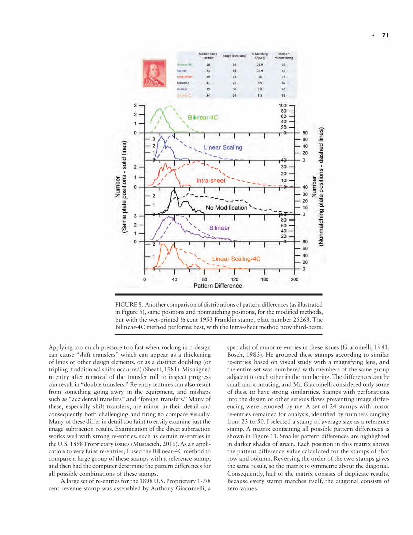
• 71
Applying too much pressure too fast when rocking in a design can cause “shift transfers” which can appear as a thickening of lines or other design elements, or as a distinct doubling (or tripling if additional shifts occurred) (Sheaff, 1981). Misaligned re-entry after removal of the transfer roll to inspect progress can result in “double transfers.” Re-entry features can also result from something going awry in the equipment, and mishaps such as “accidental transfers” and “foreign transfers.” Many of these, especially shift transfers, are minor in their detail and consequently both challenging and tiring to compare visually. Many of these differ in detail too faint to easily examine just the image subtraction results. Examination of the direct subtraction works well with strong re-entries, such as certain re-entries in the U.S. 1898 Proprietary issues (Mustacich, 2016). As an appli-cation to very faint re-entries, I used the Bilinear-4C method to compare a large group of these stamps with a reference stamp, and then had the computer determine the pattern differences for all possible combinations of these stamps.
A large set of re-entries for the 1898 U.S. Proprietary 1-7/8 cent revenue stamp was assembled by Anthony Giacomelli, a
FIGURE 8. Another comparison of distributions of pattern differences (as illustrated in Figure 5), same positions and nonmatching positions, for the modified methods, but with the wet-printed ½ cent 1953 Franklin stamp, plate number 25263. The Bilinear-4C method performs best, with the Intra-sheet method now third-bests.
specialist of minor re-entries in these issues (Giacomelli, 1981, Bosch, 1983). He grouped these stamps according to similar re-entries based on visual study with a magnifying lens, and the entire set was numbered with members of the same group adjacent to each other in the numbering. The differences can be small and confusing, and Mr. Giacomelli considered only some of these to have strong similarities. Stamps with perforations into the design or other serious flaws preventing image differ-encing were removed by me. A set of 24 stamps with minor re-entries remained for analysis, identified by numbers ranging from 23 to 50. I selected a stamp of average size as a reference stamp. A matrix containing all possible pattern differences is shown in Figure 11. Smaller pattern differences are highlighted in darker shades of green. Each position in this matrix shows the pattern difference value calculated for the stamps of that row and column. Reversing the order of the two stamps gives the same result, so the matrix is symmetric about the diagonal. Consequently, half of the matrix consists of duplicate results. Because every stamp matches itself, the diagonal consists of zero values.
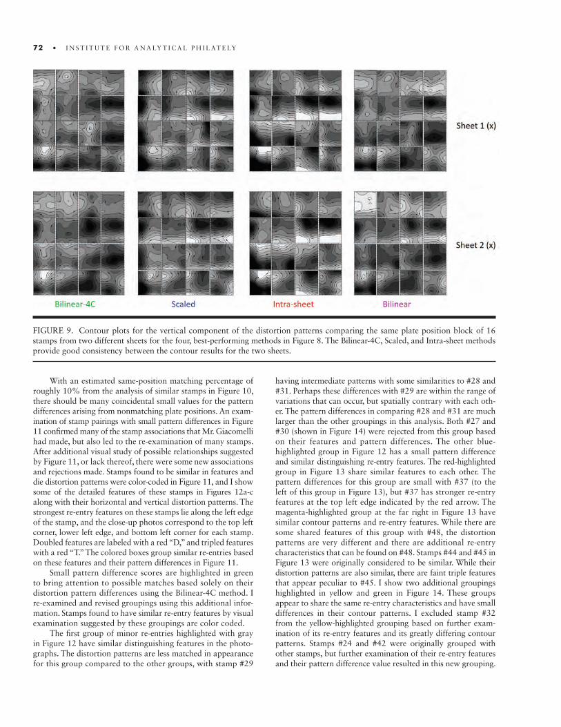
72 • I N S T I T U T E F O R A N A LY T I C A L P H I L AT E LY
FIGURE 9. Contour plots for the vertical component of the distortion patterns comparing the same plate position block of 16 stamps from two different sheets for the four, best-performing methods in Figure 8. The Bilinear-4C, Scaled, and Intra-sheet methods provide good consistency between the contour results for the two sheets.
With an estimated same-position matching percentage of roughly 10% from the analysis of similar stamps in Figure 10, there should be many coincidental small values for the pattern differences arising from nonmatching plate positions. An exam-ination of stamp pairings with small pattern differences in Figure 11 confirmed many of the stamp associations that Mr. Giacomelli had made, but also led to the re-examination of many stamps. After additional visual study of possible relationships suggested by Figure 11, or lack thereof, there were some new associations and rejections made. Stamps found to be similar in features and die distortion patterns were color-coded in Figure 11, and I show some of the detailed features of these stamps in Figures 12a-c along with their horizontal and vertical distortion patterns. The strongest re-entry features on these stamps lie along the left edge of the stamp, and the close-up photos correspond to the top left corner, lower left edge, and bottom left corner for each stamp. Doubled features are labeled with a red “D,” and tripled features with a red “T.” The colored boxes group similar re-entries based on these features and their pattern differences in Figure 11.
Small pattern difference scores are highlighted in green to bring attention to possible matches based solely on their distortion pattern differences using the Bilinear-4C method. I re-examined and revised groupings using this additional infor-mation. Stamps found to have similar re-entry features by visual examination suggested by these groupings are color coded.
The first group of minor re-entries highlighted with gray in Figure 12 have similar distinguishing features in the photo-graphs. The distortion patterns are less matched in appearance for this group compared to the other groups, with stamp #29
having intermediate patterns with some similarities to #28 and #31. Perhaps these differences with #29 are within the range of variations that can occur, but spatially contrary with each oth-er. The pattern differences in comparing #28 and #31 are much larger than the other groupings in this analysis. Both #27 and #30 (shown in Figure 14) were rejected from this group based on their features and pattern differences. The other blue- highlighted group in Figure 12 has a small pattern difference and similar distinguishing re-entry features. The red-highlighted group in Figure 13 share similar features to each other. The pattern differences for this group are small with #37 (to the left of this group in Figure 13), but #37 has stronger re-entry features at the top left edge indicated by the red arrow. The magenta-highlighted group at the far right in Figure 13 have similar contour patterns and re-entry features. While there are some shared features of this group with #48, the distortion patterns are very different and there are additional re-entry characteristics that can be found on #48. Stamps #44 and #45 in Figure 13 were originally considered to be similar. While their distortion patterns are also similar, there are faint triple features that appear peculiar to #45. I show two additional groupings highlighted in yellow and green in Figure 14. These groups appear to share the same re-entry characteristics and have small differences in their contour patterns. I excluded stamp #32 from the yellow-highlighted grouping based on further exam-ination of its re-entry features and its greatly differing contour patterns. Stamps #24 and #42 were originally grouped with other stamps, but further examination of their re-entry features and their pattern difference value resulted in this new grouping.

• 73
FIGURE 10. A comparison of distributions of pattern differences, same positions and nonmatching positions, for the modified methods, but with the singles and small multiples of the 1/8 cent U.S. Proprietary Revenue stamp of 1898, plate number 7972. It was not possible to test the Intra-sheet method because of the lack of any large multiples. The bilinear methods performed significantly better, but with broader, more variable distributions of pattern differences.
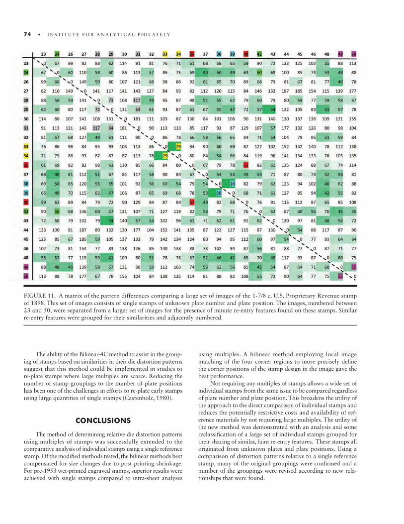
74 • I N S T I T U T E F O R A N A LY T I C A L P H I L AT E LY
FIGURE 11. A matrix of the pattern differences comparing a large set of images of the 1-7/8 c. U.S. Proprietary Revenue stamp of 1898. This set of images consists of single stamps of unknown plate number and plate position. The images, numbered between 23 and 50, were separated from a larger set of images for the presence of minute re-entry features found on these stamps. Similar re-entry features were grouped for their similarities and adjacently numbered.
The ability of the Bilinear-4C method to assist in the group-ing of stamps based on similarities in their die distortion patterns suggest that this method could be implemented in studies to re-plate stamps where large multiples are scarce. Reducing the number of stamp groupings to the number of plate positions has been one of the challenges in efforts to re-plate early stamps using large quantities of single stamps (Castenholz, 1980).
CONCLUSIONS
The method of determining relative die distortion patterns using multiples of stamps was successfully extended to the comparative analysis of individual stamps using a single reference stamp. Of the modified methods tested, the bilinear methods best compensated for size changes due to post-printing shrinkage. For pre-1953 wet-printed engraved stamps, superior results were achieved with single stamps compared to intra-sheet analyses
using multiples. A bilinear method employing local image matching of the four corner regions to more precisely define the corner positions of the stamp design in the image gave the best performance.
Not requiring any multiples of stamps allows a wide set of individual stamps from the same issue to be compared regardless of plate number and plate position. This broadens the utility of the approach to the direct comparison of individual stamps and reduces the potentially restrictive costs and availability of ref-erence materials by not requiring large multiples. The utility of the new method was demonstrated with an analysis and some reclassification of a large set of individual stamps grouped for their sharing of similar, faint re-entry features. These stamps all originated from unknown plates and plate positions. Using a comparison of distortion patterns relative to a single reference stamp, many of the original groupings were confirmed and a number of the groupings were revised according to new rela-tionships that were found.
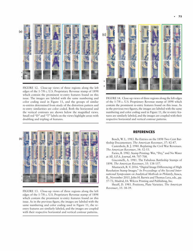
• 75
FIGURE 12. Close-up views of three regions along the left edges of the 1-7/8 c. U.S. Proprietary Revenue stamp of 1898 which contain the prominent re-entry features found on this issue. The images are labeled with the same numbering and color coding used in Figure 11, and the groups of similar re-entries determined from study of the distortion pattern and re-entry similarities are color coded. Both the horizontal and the vertical contours are shown below the magnified views. Small red “D” and “T” labels on the views highlight areas with doubling and tripling of features.
REFERENCES
Bosch, W. L. 1983. Re-Entries on the 1898 Two Cent Bat-tleship Documentary. The American Revenuer, 37: 82-87.
Castenholz, B. J. 1980. Replating the Civil War Revenues. The American Revenuer, 34: 52-53.
Faries, B. 1982. Stamp Printing: Wet, “Dry,” and No Water at All. S.P.A. Journal, 44: 707-708.
Giacomelli, A. 1981. The Fabulous Battleship Stamps of 1898. The American Revenuer, 35: 138-157.
Mustacich, R. V. 2016. “Digital Image Differencing of High Resolution Stamp Images.” In Proceedings of the Second Inter-national Symposium on Analytical Methods in Philately, Itasca, IL, November 2015, John H. Barwis and Thomas Lera, eds., pp. 57-72, Madrid, IA: Wilcox Printing and Publishing, Inc.
Sheaff, D. 1981. Positions, Plate Varieties. The American Revenuer, 35: 38-39.
FIGURE 13. Close-up views of three regions along the left edges of the 1-7/8 c. U.S. Proprietary Revenue stamp of 1898 which contain the prominent re-entry features found on this issue. As in the previous figure, the images are labeled with the same numbering and color coding used in Figure 11, the re- entry features are similarly labeled, and the images are coupled with their respective horizontal and vertical contour patterns.
FIGURE 14. Close-up views of three regions along the left edges of the 1-7/8 c. U.S. Proprietary Revenue stamp of 1898 which contain the prominent re-entry features found on this issue. As in the previous two figures, the images are labeled with the same numbering and color coding used in Figure 11, the re-entry fea-tures are similarly labeled, and the images are coupled with their respective horizontal and vertical contour patterns.

ABSTRACT.ABSTRACT. Looking critically at a collection of stamps, a keen philatelist will wish to ascertain as much information as possible in terms of the production of the material, potential variations and ideally, whether the items are genuine or fraudulently manipulated. This paper briefly considers different printing methods with examples of genuinely pro-duced stamps and forgeries. These may be determined with the help of forensic methods, reference books and collective knowledge from people involved with the expertisation of philatelic material. Such techniques and knowledge are continually evolving and sugges-tions are provided that could be tackled in the future such as international agreement of colour shades and the use of elemental analysis to determine different printings.
INTRODUCTION
The dictionary tells us that ‘forensic’ is an adjective defined as related to the use of scientific methods to investigate crime and that ‘philately’ is a noun that involves the collection and study of postage stamps (Oxford English Dictionary, 2005). An opinion as to the genuineness of an item, based in personal knowledge and assisted by forensic analysis, is the fundamental goal of philatelic assessment. Together with a keen eye for detail, traditional analysis of stamps includes the use of extensive personal knowledge backed by reference material such as may be found in major philatelic society libraries. A summary of the recording methods, the notes provided for future reference by several people serving on expertising committees, highlights the importance of access to philatelic reference collections. For example, for the members of the Expert Committee and their helpers at the Royal Philatelic Society, London, these reference collections are held in albums and accessed from secure areas where the temperature and humidity is controlled at the British Library, the Royal Philatelic Collection, or at the society premises (Leonard, 2017).
In the context of forensic analysis, an historical review of techniques was presented at the Second International Symposium on Analytical Methods in Philately (Odenweller, 2016). As today, a comprehensive philatelic library would also have been a prime source of information. Techniques used a hundred years ago, would include the use of magnifying glasses x3 and x10, tweezers, a perforation gauge, and watermark fluid. Photography, microscopes and ultraviolet lamps have been important tools over the last hundred years, and while they remain important, the field has changed dramatically. This paper considers what can be achieved by traditional forensic approaches and to highlight some of the challenges of using historical methods linked with more specialised, forensic philatelic analysis as we approach 2020.
Forensic Philately in 2020 - Challenges & OpportunitiesPaul Leonard

78 • I N S T I T U T E F O R A N A LY T I C A L P H I L AT E LY
FIGURE 1. A stamp from the Queen Victoria reign showing the design produced for postal use from 31 October 1890 and a value of one half penny. Paul Leonard collection.
FUNDAMENTAL APPROACHES TO / CHALLENGES INTERMINING AUTHENTICITY
THE PRODUCTION OF STAMPS
This section explores modern methods related to the stamp production process and the associated concerns regarding potential fraudulent manipulation, whether the creation of forgeries and counterfeits, respectively to deceive collectors and defraud postal services, or the creation of fakes through subtly changing physical characteristics of stamps. The need to limit potential fraudulent use of philatelic items, which can be pro-duced in the millions, has exercised many postal authorities throughout the world. Methods of decreasing the likelihood of fraud included the production of particular types of printing plates and the use of particular papers and inks, as suggested above as well as making changes to the paper itself whether through marking the paper, adding inks and/or adding or re-moving gum.
Stamp collectors enjoy collecting material that reflects their personal interests. With the aid of a magnifying glass, many subtle differences become apparent. For those people start-ing their journey of discovery, this may include establishing a particular reign or theme. In this example, stamps from the Leeward Islands show that the printer used the same method to produce material.
In these three examples, the stamps are unused and have the same basic design. Turning from being a stamp collector to a philatelist requires more detailed analysis and the following sections explore some of the issues to be considered.
THE PRINTING PROCESS
Early stamps were created through recess, intaglio or line- engraved processes in which the approved image was engraved onto a metal plate or cylinder, adding an ink or inks and ap-plying pressure to get the image onto paper. Postage stamps were produced in Great Britain from 1840. The production of an engraved printing plate involves significant expense and technical competence so many forgers operating in the period 1890 – 1920 utilised processes known as photogravure and lithography. The key aspect of these printing methods was to have the art work transferred to the printing plate by chemical etching (photogravure) or onto specially coated metal plates (lithography). Such methods are not used by postal authorities today. From a philatelic perspective, the intaglio method pro-duced stamps of superior quality, so the use of these other two methods provides a potential method to determine fraud. The example below shows the quality of printing from the intaglio process compared to the photogravure method. The intaglio
FIGURE 2. A stamp from the King Edward VII reign show-ing the design produced for postal use from 11 August 1902 and a value of one half penny. Paul Leonard collection.
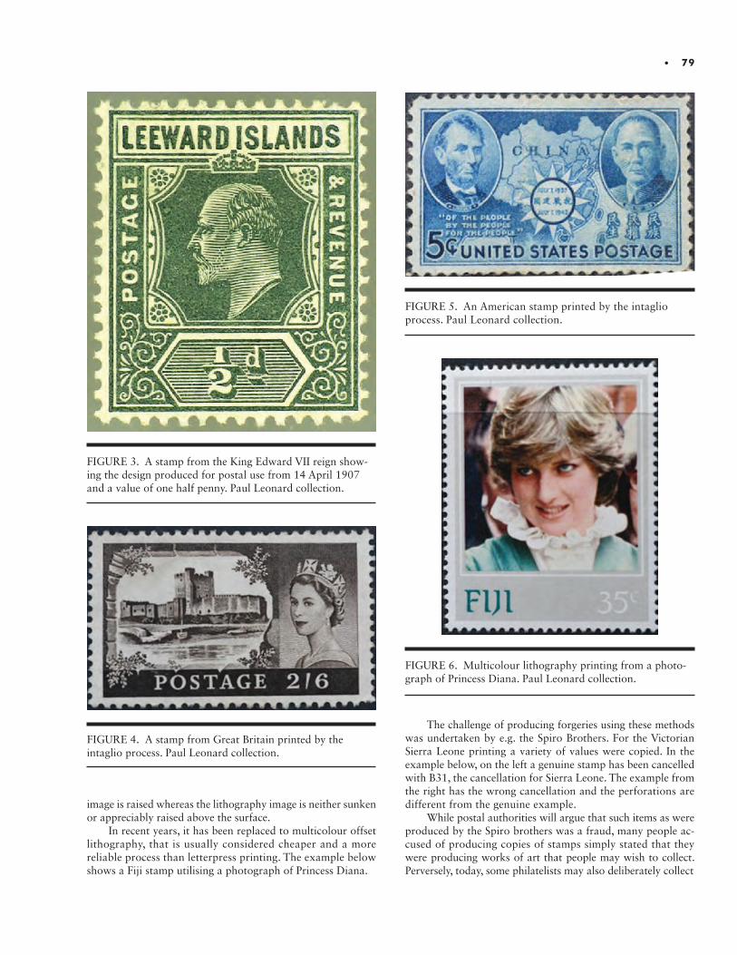
• 79
image is raised whereas the lithography image is neither sunken or appreciably raised above the surface.
In recent years, it has been replaced to multicolour offset lithography, that is usually considered cheaper and a more reliable process than letterpress printing. The example below shows a Fiji stamp utilising a photograph of Princess Diana.
FIGURE 3. A stamp from the King Edward VII reign show-ing the design produced for postal use from 14 April 1907 and a value of one half penny. Paul Leonard collection.
FIGURE 4. A stamp from Great Britain printed by the intaglio process. Paul Leonard collection.
FIGURE 5. An American stamp printed by the intaglio process. Paul Leonard collection.
FIGURE 6. Multicolour lithography printing from a photo-graph of Princess Diana. Paul Leonard collection.
The challenge of producing forgeries using these methods was undertaken by e.g. the Spiro Brothers. For the Victorian Sierra Leone printing a variety of values were copied. In the example below, on the left a genuine stamp has been cancelled with B31, the cancellation for Sierra Leone. The example from the right has the wrong cancellation and the perforations are different from the genuine example.
While postal authorities will argue that such items as were produced by the Spiro brothers was a fraud, many people ac-cused of producing copies of stamps simply stated that they were producing works of art that people may wish to collect. Perversely, today, some philatelists may also deliberately collect
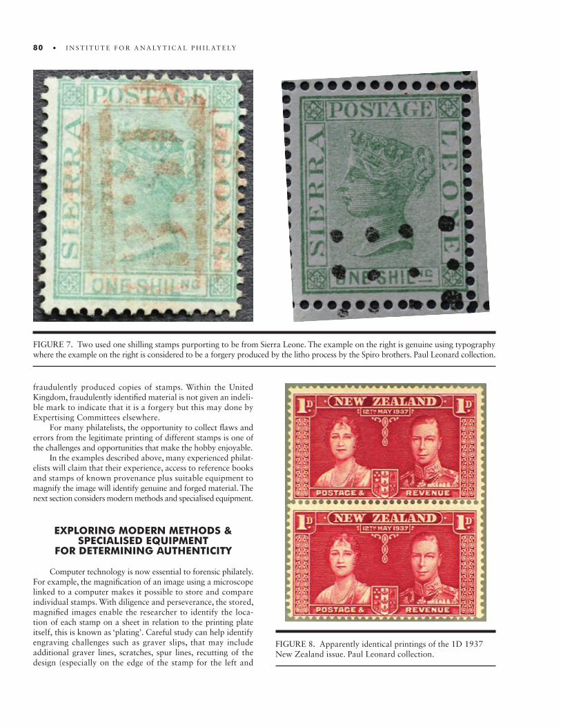
80 • I N S T I T U T E F O R A N A LY T I C A L P H I L AT E LY
FIGURE 7. Two used one shilling stamps purporting to be from Sierra Leone. The example on the right is genuine using typography where the example on the right is considered to be a forgery produced by the litho process by the Spiro brothers. Paul Leonard collection.
FIGURE 8. Apparently identical printings of the 1D 1937 New Zealand issue. Paul Leonard collection.
fraudulently produced copies of stamps. Within the United Kingdom, fraudulently identified material is not given an indeli-ble mark to indicate that it is a forgery but this may done by Expertising Committees elsewhere.
For many philatelists, the opportunity to collect flaws and errors from the legitimate printing of different stamps is one of the challenges and opportunities that make the hobby enjoyable.
In the examples described above, many experienced philat-elists will claim that their experience, access to reference books and stamps of known provenance plus suitable equipment to magnify the image will identify genuine and forged material. The next section considers modern methods and specialised equipment.
EXPLORING MODERN METHODS & SPECIALISED EQUIPMENT
FOR DETERMINING AUTHENTICITY
Computer technology is now essential to forensic philately. For example, the magnification of an image using a microscope linked to a computer makes it possible to store and compare individual stamps. With diligence and perseverance, the stored, magnified images enable the researcher to identify the loca-tion of each stamp on a sheet in relation to the printing plate itself, this is known as ‘plating’. Careful study can help identify engraving challenges such as graver slips, that may include additional graver lines, scratches, spur lines, recutting of the design (especially on the edge of the stamp for the left and

• 81
FIGURE 9. 13 May 1937 New Zealand Coronation stamps printed by the Recess method by Bradbury Wilkinson. The two unused stamps have been taken at random from a sheet and studied at high magnification to compare whether each stamp is dif-ferent. Close inspection of the right eye of King George VI shows a difference. Neither stamps are fakes or forgeries but illustrate that subtle differences can be found that may attract a premium. Paul Leonard collection.
right frames). Coloured dots or bands of dots across the stamp, missing or faint lines of shading are also helpful to determine the position of a stamp in a sheet (Hancox 2016).
Printing methods have continued to evolve with the chal-lenge of producing high volumes of material, cost effectively, with the need for security features to deter fraudulent use. With the use of laser and dot matrix printers, available worldwide, this provides a potential fraudster with an opportunity to deceive the postal authorities (when such material would be referred to as ‘counterfeits’) or many stamp collectors might call forgeries. The availability of such material is facilitated by the world wide web and a willingness by stamp collectors to obtain examples cheaply. The Quarter Anna example below (Figure 10) is pro-duced by a low quality laser printer. Other modern printing methods may involve three dimensional images and the use of holograms but the possibility of fraudulent production needs to be kept under review as there becomes easier access for the public to such technology.
PRINTING INKS
Postal authorities have always been very concerned with printing costs and many stamps appear with the same design but with different values. Vignettes or images could be separated from the frames that contain the values so that values can be swapped. This might simply involve printing with different inks with the value being changed between print runs. This approach
FIGURE 10. The Quarter anna example is produced by a low quality laser printer. Paul Leonard collection.

82 • I N S T I T U T E F O R A N A LY T I C A L P H I L AT E LY
FIGURE 11. The Swaziland 6d stamp of 1935 has, apparently, the addition of a fraudulently added second flagstaff to the left of the main tower of Windsor Castle: (a) stamp; (b) detail with the second flagstaff to the left of the main tower of Windsor Castle. Credit: John Shaw. Detail of the Swaziland 6d stamp of 1935 shown under filtered light; the second flagstaff clearly had been added because the ink in the added portion responds differently to the forensic test. Credit: John Shaw.
a.
b. c.
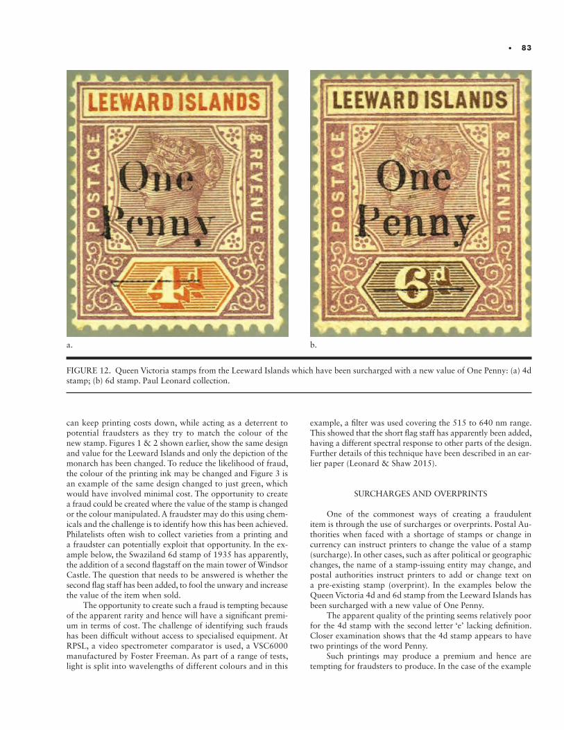
• 83
can keep printing costs down, while acting as a deterrent to potential fraudsters as they try to match the colour of the new stamp. Figures 1 & 2 shown earlier, show the same design and value for the Leeward Islands and only the depiction of the monarch has been changed. To reduce the likelihood of fraud, the colour of the printing ink may be changed and Figure 3 is an example of the same design changed to just green, which would have involved minimal cost. The opportunity to create a fraud could be created where the value of the stamp is changed or the colour manipulated. A fraudster may do this using chem-icals and the challenge is to identify how this has been achieved. Philatelists often wish to collect varieties from a printing and a fraudster can potentially exploit that opportunity. In the ex-ample below, the Swaziland 6d stamp of 1935 has apparently, the addition of a second flagstaff on the main tower of Windsor Castle. The question that needs to be answered is whether the second flag staff has been added, to fool the unwary and increase the value of the item when sold.
The opportunity to create such a fraud is tempting because of the apparent rarity and hence will have a significant premi-um in terms of cost. The challenge of identifying such frauds has been difficult without access to specialised equipment. At RPSL, a video spectrometer comparator is used, a VSC6000 manufactured by Foster Freeman. As part of a range of tests, light is split into wavelengths of different colours and in this
FIGURE 12. Queen Victoria stamps from the Leeward Islands which have been surcharged with a new value of One Penny: (a) 4d stamp; (b) 6d stamp. Paul Leonard collection.
a. b.
example, a filter was used covering the 515 to 640 nm range. This showed that the short flag staff has apparently been added, having a different spectral response to other parts of the design. Further details of this technique have been described in an ear-lier paper (Leonard & Shaw 2015).
SURCHARGES AND OVERPRINTS
One of the commonest ways of creating a fraudulent item is through the use of surcharges or overprints. Postal Au-thorities when faced with a shortage of stamps or change in currency can instruct printers to change the value of a stamp (surcharge). In other cases, such as after political or geographic changes, the name of a stamp-issuing entity may change, and postal authorities instruct printers to add or change text on a pre-existing stamp (overprint). In the examples below the Queen Victoria 4d and 6d stamp from the Leeward Islands has been surcharged with a new value of One Penny.
The apparent quality of the printing seems relatively poor for the 4d stamp with the second letter ‘e’ lacking definition. Closer examination shows that the 4d stamp appears to have two printings of the word Penny.
Such printings may produce a premium and hence are tempting for fraudsters to produce. In the case of the example
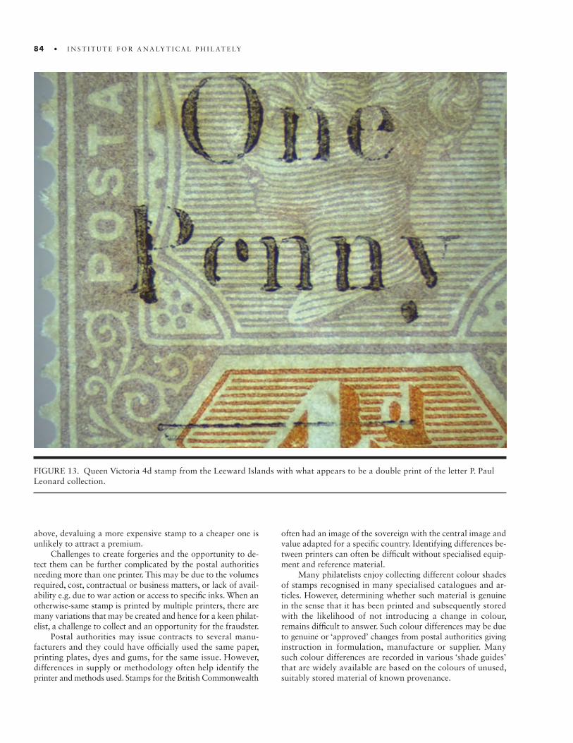
84 • I N S T I T U T E F O R A N A LY T I C A L P H I L AT E LY
above, devaluing a more expensive stamp to a cheaper one is unlikely to attract a premium.
Challenges to create forgeries and the opportunity to de-tect them can be further complicated by the postal authorities needing more than one printer. This may be due to the volumes required, cost, contractual or business matters, or lack of avail-ability e.g. due to war action or access to specific inks. When an otherwise-same stamp is printed by multiple printers, there are many variations that may be created and hence for a keen philat-elist, a challenge to collect and an opportunity for the fraudster.
Postal authorities may issue contracts to several manu-facturers and they could have officially used the same paper, printing plates, dyes and gums, for the same issue. However, differences in supply or methodology often help identify the printer and methods used. Stamps for the British Commonwealth
FIGURE 13. Queen Victoria 4d stamp from the Leeward Islands with what appears to be a double print of the letter P. Paul Leonard collection.
often had an image of the sovereign with the central image and value adapted for a specific country. Identifying differences be-tween printers can often be difficult without specialised equip-ment and reference material.
Many philatelists enjoy collecting different colour shades of stamps recognised in many specialised catalogues and ar-ticles. However, determining whether such material is genuine in the sense that it has been printed and subsequently stored with the likelihood of not introducing a change in colour, remains difficult to answer. Such colour differences may be due to genuine or ‘approved’ changes from postal authorities giving instruction in formulation, manufacture or supplier. Many such colour differences are recorded in various ‘shade guides’ that are widely available are based on the colours of unused, suitably stored material of known provenance.
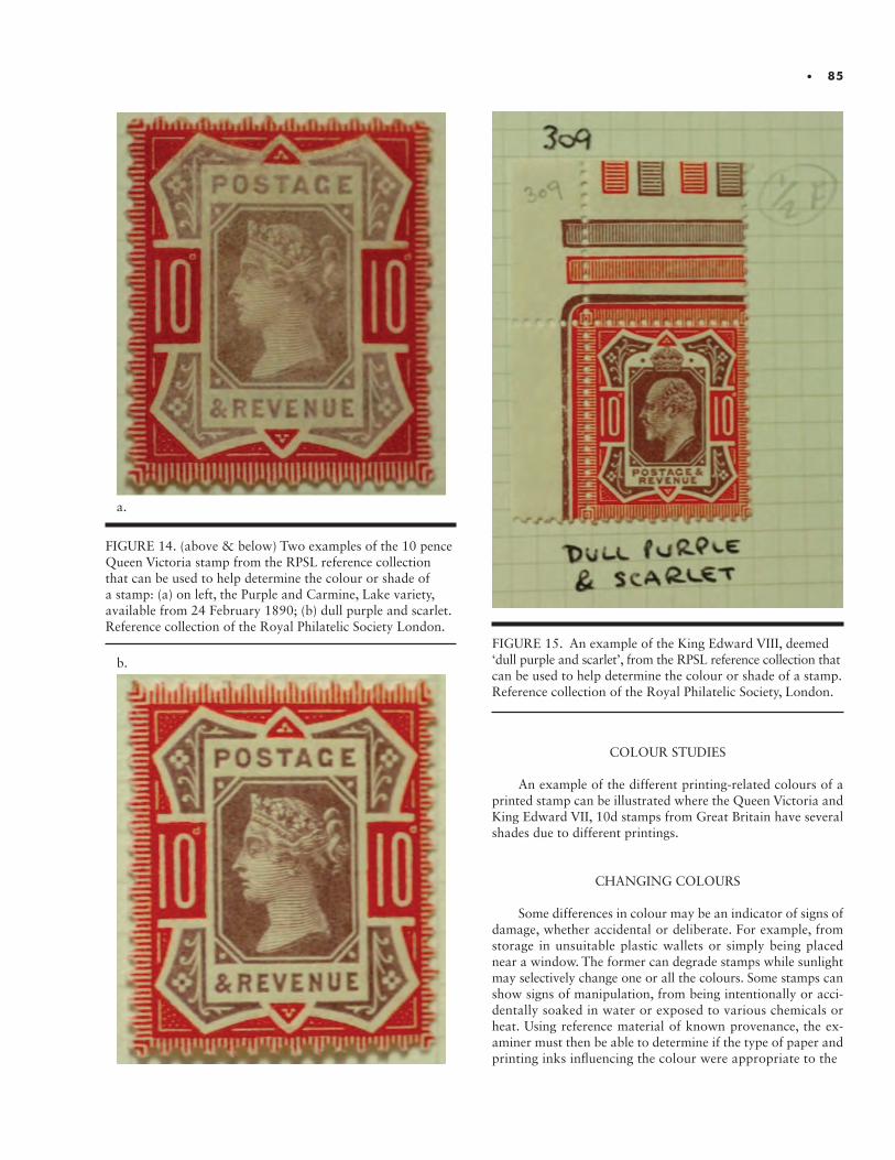
• 85
FIGURE 14. (above & below) Two examples of the 10 pence Queen Victoria stamp from the RPSL reference collection that can be used to help determine the colour or shade of a stamp: (a) on left, the Purple and Carmine, Lake variety, available from 24 February 1890; (b) dull purple and scarlet. Reference collection of the Royal Philatelic Society London.
a.
b.
FIGURE 15. An example of the King Edward VIII, deemed ‘dull purple and scarlet’, from the RPSL reference collection that can be used to help determine the colour or shade of a stamp. Reference collection of the Royal Philatelic Society, London.
COLOUR STUDIES
An example of the different printing-related colours of a printed stamp can be illustrated where the Queen Victoria and King Edward VII, 10d stamps from Great Britain have several shades due to different printings.
CHANGING COLOURS
Some differences in colour may be an indicator of signs of damage, whether accidental or deliberate. For example, from storage in unsuitable plastic wallets or simply being placed near a window. The former can degrade stamps while sunlight may selectively change one or all the colours. Some stamps can show signs of manipulation, from being intentionally or acci-dentally soaked in water or exposed to various chemicals or heat. Using reference material of known provenance, the ex-aminer must then be able to determine if the type of paper and printing inks influencing the colour were appropriate to the
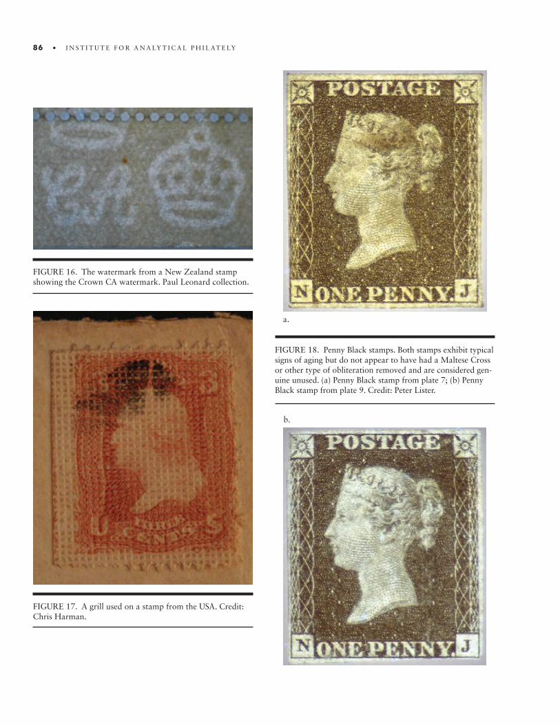
86 • I N S T I T U T E F O R A N A LY T I C A L P H I L AT E LY
FIGURE 16. The watermark from a New Zealand stamp showing the Crown CA watermark. Paul Leonard collection.
FIGURE 17. A grill used on a stamp from the USA. Credit: Chris Harman.
FIGURE 18. Penny Black stamps. Both stamps exhibit typical signs of aging but do not appear to have had a Maltese Cross or other type of obliteration removed and are considered gen-uine unused. (a) Penny Black stamp from plate 7; (b) Penny Black stamp from plate 9. Credit: Peter Lister.
a.
b.

• 87
period and to the printer, whether they were those approved by the relevant postal authority, and whether non-standard colours are the result of production errors, inadvertent dam-age or intentional manipulation.
MARKS IN THE PAPER
Paper on which stamps have been printed has often been marked by pressing an image, known as a watermark, into the paper, or, in an early American series, through the introduction of a pressed pattern, or grill. Watermarks, effectively the result of the intentional thinning of the paper in the particular pat-tern, give the stamp collector some reassurance of the origin of the material. Some early American stamps included a grill in the paper to make the stamps more difficult to forge. The examples below (Figure 16___ and _17__) show the Crown CA watermark and a USA stamp with a grill.
While it is easy to see that a grill has been applied, spe-cialist equipment such as the Foster Freeman VSC8000 will be
required to check what type of grill is present in terms of the dimensions. Fraudulent examples are known where the grill has been manipulated to potentially enhance the value and the challenge is to understand what changes have been made.
GUM
A stamp that has apparently lost its gum but appears to be unused tempts a fraudster to add a gum due to the generally higher value placed on unused stamps. For example, an order of magnitude difference may be paid for the first British stamp, the Penny Black, depending on whether it is gummed or not. The adhesive used may be historic Gum Arabic or a modern Polyvinyl Acetate. Gums were applied by hand or machine .
Therefore, fakes can be created by adding an adhesive or redistributing original adhesive on an unused stamp. The later, fraudulent addition of gum may be detected, however, if ‘bleed-ing’, the presence of glue on the edge of the stamp or within the perforations, is found. The components of the gums can
FIGURE 19. An example of an overprint that has been fraudulently added after postal use; the letters A & T appear over the curved line which is part of the cancellation. Paul Leonard Collection.

88 • I N S T I T U T E F O R A N A LY T I C A L P H I L AT E LY
also help determine whether they were added when the stamps were originally made. A future challenge will be to determine the elemental and/or chemical compositions of gums from ref-erence material and compare them with submitted materials. A basic question that will need to be answered, for example, is: were the organic or inorganic components of the gum used at the time the stamp was printed?
MANIPULATION OF PHILATELIC MATERIALPOSTAL USE
The relative scarcity of unused stamps in good condition from 19th century printings creates a premium in terms of val-ue so the question whether or not a stamp has been used is critical. In this example, for the Penny Black stamps of Great Britain, this may include checking if a black cancellation e.g. a Maltese Cross or pen cancellation has been removed from a Penny Black stamp. In Figure 5, both of these 1840 ‘Penny Black’ stamps have been exposed to 365nm underlit illumina-tion using the VSC6000. The stamp from the left is from plate 7, a variety on experimental thin paper and on the right the stamp is from plate 9 (RPSL id 209624).
Indeed, one of the existing challenges for forensic analysis to determine authenticity is the so-called ‘black on black’ problem where black obliterations occur on a stamp that has been printed with black ink. Added to the importance of this challenge is the fact that a premium may be paid for overprinted or surcharged stamps. Typical examples are the Great Britain Government Departmental stamps, such as those issued by the Inland Rev-enue, Office of Works, Army, Government Parcels, Admiralty, Board of Education and the Royal Household. Specialised cat-alogues such as the Stanley Gibbons King Edward VII to King George VI provide the following warning ‘Many of the Official stamps may be found with forged overprints and collectors should be on their guard when buying. Detection requires highly sophisticated equipment and it is recommended that these stamps should only be purchased when supported by Expert Com-mittee certificates dated subsequent to 1973’. The use of a micro-scope and/or chemical analysis may help identify material with a fraudulent overprint or surcharge, as seen in Figure 19.
Beyond manipulating or forging the physical make-up and characteristics of the stamps themselves, those committing fraud can manipulate or create false evidence of the postal use of stamps in a variety of ways. Cancellations and other postal markings can be added, removed, or doctored. Basic informa-tion regarding the routes and rates of a postal item can be made to deceive with the aim of making the item more desirable.
A fraud often seen at the Royal concerns the removal of a cancellation on a stamp used for fiscal purposes (to collect taxes or fees in a manner other than through the post). Such material offers a challenge to determine. However, with suitable forensic equipment, such frauds can be detected. In the example below, a stamp from Zanzibar appears to have a suitable postally used cancellation, however under a light filter, a fiscal cancellation can also be seen. (Further details are described in Leonard & Shaw, 2016.)
Since postage rates historically were often based on the dis-tance the object was to travel, it is possible to find evidence of
fraud by asking if the value of the stamps was correct for the route if the route can be identified. This can be assessed from reference books and philatelic specialists. However, answering just this question is usually insufficient. A fraudster may wish to source a contemporary envelope, adapt cancellations and produce alternative postal markings with the aim of deceiving the unwary philatelist. For example, in relation to the cover below (Figure 21), is the shape of the cancellations correct? Are the envelope and handwriting correct for the period? This cover is a forgery; to illustrate the type of fraud that can be manufactured and magnification makes clear that the cancel-lation is made up of a series of dots, typical of a laser printer.
FIGURE 20. (above & below) Comparison of Zanzibar stamps to determine whether a fiscal obliteration has been re-moved and a fraudulent cancellation added: (a) under normal light; (b) subjected to an orange filter. Credit: John Shaw.
a.
b.

• 89
FIGURE 21. Cover to Mr. Jonas David with a bisected 8p purple with 2a orange, both printed by the United Kingdom based printers, De La Rue., with obliterations made using a laser printer. Paul Leonard Collection.
Such false stamp production methods usually have a series of characteristics from which the printing method can be estab-lished. Using a magnification of 10 times for philatelic material is usually sufficient to show fraudulent material produced by laser printers.
The opportunity to use a laser printer to commit fraud is now obvious. Through the use of suitable forensic equipment, this challenge can be met. All laser printers produce microscopic ink particles and for high specification laser printers, such parti-cles can only be detected under a magnification of 800 to 1,000 times. The analysis of such particles is known as ‘spewing’.
EXPLORING MODERN FORENSIC OPPORTUNITIES FOR DETERMINING
AUTHENTICITY
Clearly, the potential for fraud takes many forms and the philatelist needs to be constantly aware that material he or she may potentially wish to purchase may not be all that it seems. In the previous section, a variety of different types of fraud have
been discussed; discovering which types, if any, have been per-petrated on any given object results in the challenge of deter-mining authenticity. Developments in forensic philately offer new opportunities to address these challenges.
The range of developments is impressive. Within the last fifty years, beta radiation has raised the possibility of identifying watermarks on postal stationery, while elemental or chemical analysis by X-ray fluorescence (XRF), Fourier Infrared Spec-trometry (FTIR) and/or Raman spectrometry can assist in determining whether philatelic material is fraudulent or genuine. The reader may find further information via: www.Analytical-Philately.org In conjunction with these methods, information technology available via computers has made possible the exchange of information, the storage of philatelic records in searchable databases, and access to manipulation software, such as retroReveal, in which a variety of colour spaces can be created, and software, such as Photoshop.
The First & Second International Symposia on Analytical Methods in Philately reported on the use of the VSC, XRF, FTIR, Raman spectrometry, and reflectance spectrometry. Occa-sionally, such methods have been used by the Royal Philatelic
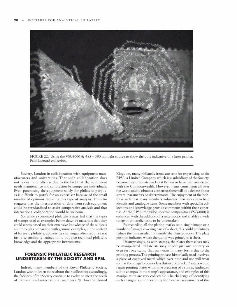
90 • I N S T I T U T E F O R A N A LY T I C A L P H I L AT E LY
FIGURE 22. Using the VSC6000 & 485 – 590 nm light source to show the dots indicative of a laser printer. Paul Leonard collection.
Society, London in collaboration with equipment man-ufacturers and universities. That such collaboration does not occur more often is due to the fact that the equipment needs maintenance and calibration by competent individuals. Even purchasing the equipment solely for philatelic purpos-es is difficult to justify for an expertiser because of the small number of opinions requiring this type of analysis. This also suggests that the interpretation of data from such equipment could be standardised to assist comparative analysis and that international collaboration would be welcome.
So, while experienced philatelists may feel that the types of stamps used as examples below describe materials that they could assess based on their extensive knowledge of the subjects and through comparison with genuine examples, in the context of forensic philately, addressing challenges often requires not just a scientifically trained mind but also technical philatelic knowledge and the appropriate instruments.
FORENSIC PHILATELIC RESEARCH UNDERTAKEN BY THE SOCIETY AND RPSL
Indeed, many members of the Royal Philatelic Society, London wish to learn more about their collection; accordingly, the facilities of the Society continue to evolve to meet the needs of national and international members. Within the United
Kingdom, many philatelic items are sent for expertising to the RPSL, a Limited Company which is a subsidiary of the Society, because they originated in Great Britain or have been associated with the Commonwealth. However, items come from all over the world and to obtain a consensus there will be a debate about several parameters or determinants. The enjoyment of the hob-by is such that many members volunteer their services to help identify and catalogue items. Some members with specialist col-lections and knowledge provide comments within their exper-tise. At the RPSL, the video spectral comparator (VSC6000) is enhanced with the addition of a microscope and enables a wide range of philatelic tasks to be undertaken.
By recording all the plating marks on a single image or a number of images covering part of a sheet, this could potentially reduce the time needed to identify the plate position. The plate position indicates where the stamp was printed in a sheet.
Unsurprisingly, as with stamps, the plates themselves may be manipulated. Philatelists may collect just one country or even just one stamp that may exist in many forms due to the printing process. The printing process historically used involved a piece of engraved metal which over time and use will wear so that the image becomes less distinct or crack. Printers would repair printing plates within the press run of a stamp, leading to subtle changes in the stamp’s appearance, and examples of this manipulation are very collectable. The challenge of identifying such changes is an opportunity for forensic assessments of the
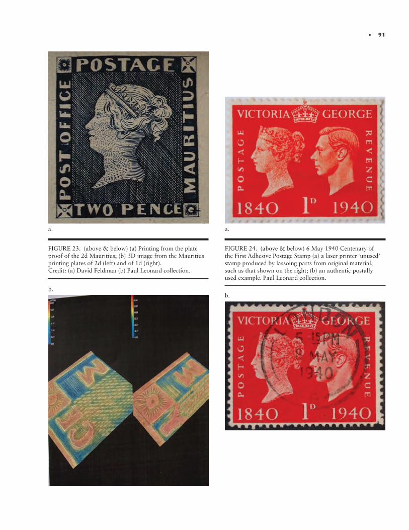
• 91
FIGURE 23. (above & below) (a) Printing from the plate proof of the 2d Mauritius; (b) 3D image from the Mauritius printing plates of 2d (left) and of 1d (right). Credit: (a) David Feldman (b) Paul Leonard collection.
a.
b.
FIGURE 24. (above & below) 6 May 1940 Centenary of the First Adhesive Postage Stamp (a) a laser printer ‘unused’ stamp produced by lassoing parts from original material, such as that shown on the right; (b) an authentic postally used example. Paul Leonard collection.
a.
b.
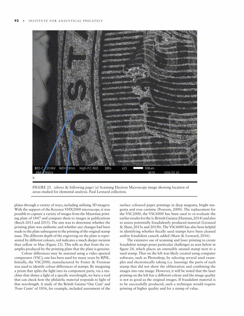
92 • I N S T I T U T E F O R A N A LY T I C A L P H I L AT E LY
FIGURE 25. (above & following page) (a) Scanning Electron Microscope image showing location of areas studied for elemental analysis. Paul Leonard collection.
a.
plates through a variety of ways, including utilising 3D imagery. With the support of the Keyence VHX2000 microscope, it was possible to capture a variety of images from the Mauritius print-ing plate of 1847 and compare them to images in publications (Beech 2013 and 2015). The aim was to determine whether the printing plate was authentic and whether any changes had been made to the plate subsequent to the printing of the original stamp issue. The different depth of the engraving on the plate is repre-sented by different colours, red indicates a much deeper incision than yellow or blue (Figure 23). This tells us that from the ex-amples produced by the printing plate that the plate is genuine.
Colour differences may be assessed using a video spectral comparator (VSC); one has been used for many years by RPSL. Initially, the VSC2000, manufactured by Foster & Freeman was used to identify colour differences of stamps. By imagining a prism that splits the light into its component parts, via a ma-chine that shines a light of a specific wavelength, we have a tool that can check how the philatelic material responds to light of that wavelength. A study of the British Guiana ‘One Cent’ and ‘Four Cents’ of 1856, for example, included assessment of the
surface coloured paper printings in deep magenta, bright ma-genta and rose carmine (Pearson, 2000). The replacement for the VSC2000, the VSC6000 has been used to re-evaluate the earlier results for the 1c British Guiana (Harman, 2014) and also to assess potentially fraudulently produced material (Leonard & Shaw, 2015a and 2015b). The VSC6000 has also been helpful in identifying whether fiscally used stamps have been cleaned and/or fraudulent cancels added (Shaw & Leonard, 2016).
The extensive use of scanning and laser printing to create fraudulent stamps poses particular challenges as seen below in figure 24, which places an ostensibly unused stamp next to a used stamp. That on the left was likely created using computer software, such as Photoshop, by selecting several used exam-ples and electronically taking (i.e. lassoing) the parts of each stamp that did not show the obliteration and combining the images into one image. However, it will be noted that the laser printing on the left has a different colour and the image quality is not as good as the original images. If fraudulent material is to be successfully produced, such a technique would require printing of higher quality and for a stamp of value.

• 93
Position 1 (Top) = b and Position 2 (Below) = c.
FIGURE 25 (above & below) (b) Utilising the Joel Scanning Electron Microscope with an overprinted Queen Victoria stamp to determine whether a postal cancellation and overprint have been fraudulently produced.
b.
c.
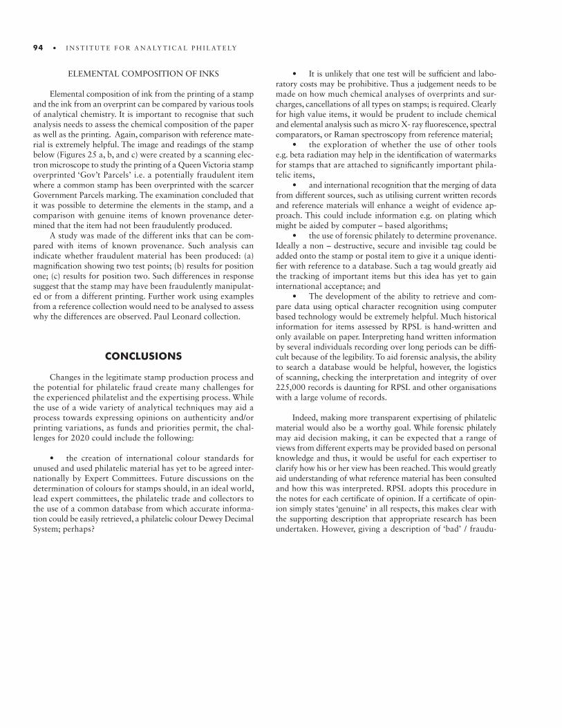
94 • I N S T I T U T E F O R A N A LY T I C A L P H I L AT E LY
ELEMENTAL COMPOSITION OF INKS
Elemental composition of ink from the printing of a stamp and the ink from an overprint can be compared by various tools of analytical chemistry. It is important to recognise that such analysis needs to assess the chemical composition of the paper as well as the printing. Again, comparison with reference mate-rial is extremely helpful. The image and readings of the stamp below (Figures 25 a, b, and c) were created by a scanning elec-tron microscope to study the printing of a Queen Victoria stamp overprinted ‘Gov’t Parcels’ i.e. a potentially fraudulent item where a common stamp has been overprinted with the scarcer Government Parcels marking. The examination concluded that it was possible to determine the elements in the stamp, and a comparison with genuine items of known provenance deter-mined that the item had not been fraudulently produced.
A study was made of the different inks that can be com-pared with items of known provenance. Such analysis can indicate whether fraudulent material has been produced: (a) magnification showing two test points; (b) results for position one; (c) results for position two. Such differences in response suggest that the stamp may have been fraudulently manipulat-ed or from a different printing. Further work using examples from a reference collection would need to be analysed to assess why the differences are observed. Paul Leonard collection.
CONCLUSIONS
Changes in the legitimate stamp production process and the potential for philatelic fraud create many challenges for the experienced philatelist and the expertising process. While the use of a wide variety of analytical techniques may aid a process towards expressing opinions on authenticity and/or printing variations, as funds and priorities permit, the chal-lenges for 2020 could include the following:
• the creation of international colour standards for unused and used philatelic material has yet to be agreed inter-nationally by Expert Committees. Future discussions on the determination of colours for stamps should, in an ideal world, lead expert committees, the philatelic trade and collectors to the use of a common database from which accurate informa-tion could be easily retrieved, a philatelic colour Dewey Decimal System; perhaps?
• It is unlikely that one test will be sufficient and labo-ratory costs may be prohibitive. Thus a judgement needs to be made on how much chemical analyses of overprints and sur-charges, cancellations of all types on stamps; is required. Clearly for high value items, it would be prudent to include chemical and elemental analysis such as micro X- ray fluorescence, spectral comparators, or Raman spectroscopy from reference material;
• the exploration of whether the use of other tools e.g. beta radiation may help in the identification of watermarks for stamps that are attached to significantly important phila-telic items,
• and international recognition that the merging of data from different sources, such as utilising current written records and reference materials will enhance a weight of evidence ap-proach. This could include information e.g. on plating which might be aided by computer – based algorithms;
• the use of forensic philately to determine provenance. Ideally a non – destructive, secure and invisible tag could be added onto the stamp or postal item to give it a unique identi-fier with reference to a database. Such a tag would greatly aid the tracking of important items but this idea has yet to gain international acceptance; and
• The development of the ability to retrieve and com-pare data using optical character recognition using computer based technology would be extremely helpful. Much historical information for items assessed by RPSL is hand-written and only available on paper. Interpreting hand written information by several individuals recording over long periods can be diffi-cult because of the legibility. To aid forensic analysis, the ability to search a database would be helpful, however, the logistics of scanning, checking the interpretation and integrity of over 225,000 records is daunting for RPSL and other organisations with a large volume of records.
Indeed, making more transparent expertising of philatelic material would also be a worthy goal. While forensic philately may aid decision making, it can be expected that a range of views from different experts may be provided based on personal knowledge and thus, it would be useful for each expertiser to clarify how his or her view has been reached. This would greatly aid understanding of what reference material has been consulted and how this was interpreted. RPSL adopts this procedure in the notes for each certificate of opinion. If a certificate of opin-ion simply states ‘genuine’ in all respects, this makes clear with the supporting description that appropriate research has been undertaken. However, giving a description of ‘bad’ / fraudu-
• 95
lently produced without supporting evidence is likely to be counter-productive and unhelpful. Thus, RPSL often provides some additional information, such as ‘is a modern reproduction’ or a subsequent printing.
While expertising may be seen as a competitive and adver-sarial process, in that a submitter may want the best value for their money on an opinion and therefore acquire several opin-ions, differing opinions can be understood as an opportunity for the sharing and debating of findings as a means of reaching con-sensus and increasing knowledge. Hence, there is not just a role of stating that X or Y has given a ‘good’ or ‘bad’ certificate but there is a role for consensus by sharing and debating findings. This is particularly relevant to expert committees around the world that will have changing membership, assisted by forensic analysis that is constantly evolving. Scientific interpretation of philatelic items will change and the ability to challenge, share material and data should lead to a greater transparency of the process. Ideally, Ex-pert Committees will agree with submitters that information can be openly shared and provide evidence of their opinions through closer co-operation with other respected individuals or commit-tees. In the case of internationally significant philatelic items, a policy of publishing results in the philatelic press could aid confidence in the importance of such material.
ACKNOWLEDGEMENTS AND DISCLAIMER
I am grateful to all the Expert Committee members of RPSL for their advice and patience and to Gerald Bodily and Adrian Myer at the British Philatelic Association for their help-ful discussion on the similar forensic challenges faced during their expertising process. I also wish to record my thanks to Terry Hancox for his diligent and inspiring work on plating and to David Feldman for access to the Mauritius printing plate.
Finally to the equipment manufacturers who generously granted me access to their products, I am grateful to Tom McCotter and Paul White at Foster Freeman for use of the VSC6000 & VSC8000 video spectrometers, Paul Whitford & Claire Nivens at Keyence for use of their 3D microscope, and Chris Dickinson at Joel for access to their scanning electron microscope.
The author is not a member of the Expert Committee but is a member of a significant team of assistants to that committee, specialising in the use of the equipment owned and used regu-larly by RPSL as well as contributing to the forward thinking of
tackling emerging challenges through scientific analysis. These personal thoughts do not necessarily reflect the views of the of-ficers of the Society or of the members of the Expert Committee.
REFERENCES
Beech, D. R., 2013. “The Place for New Tools in Forensic Philately.” Proceedings of the First International Symposium on Analytical Methods in Philately, ed. pp. 1-4. Washington: Smithsonian Institution Scholarly Press.Beech, D. R. 2015 “Mauritius 1847 Post Office Printing Plate New Information.” London Philatelist, 124 (1424): 154-156.Hancox, T. 2016 “New Zealand Postage Stamps Errors and Varieties. 1933 Health Stamp ‘Pathway’ Plating,” http://www.nzsgb.org.uk/research/hancox/1933%20 Health%20Plating.pdf (accessed 3 May 2017).).Harman, C. 2014. “British Guiana 1856 Local Provisional Unique 1c Black on Magenta Surface-Coloured Paper.” London Philatelist, 123: 110–111.Leonard, P. 2017. “The Challenge of Determining the the Fraudulent Use of Postage Stamps.” American Society of Questioning Document Examiners 20(1): 33-40.Leonard P. and J. Shaw . 2015. “Forensic Philately (2) Assessing Whether a Stamp Has a Recognised Printing Flaw”. London Philatelist, 124(1424): 248-250.Odenweller.R. 2016. “Retrospective of Technical Research in Philately.” In Proceedings of the Second International Symposium on Analytical Methods in Philately, pp. 5-18. Washington: Smithsonian Institution Scholarly Press.Oxford English Dictionary. 3rd ed. 2005. Oxford: Oxford University Press.Pearson, P. 2000. “British Guiana ‘Four Cents’ and One Cent’ of 1856.” London Philatelist 109: 108–113.Shaw, J. and P. Leonard. 2016. “Forensic Philately (3) Assessing Whether a Stamp Has Been Manipulated for Fraudulent Purposes ~ Removing a Fiscal Cancellation and Adding a Postal Cancellation”. London Philatelist 125(1435): 188-189.Stanley Gibbons 2015 Great Britain Specialised Stamp Catalogue King Edward VII to King George VI (Volume 2), 14th Edition p. 66., ISBN – 10 0 -85259 – 841 - 6
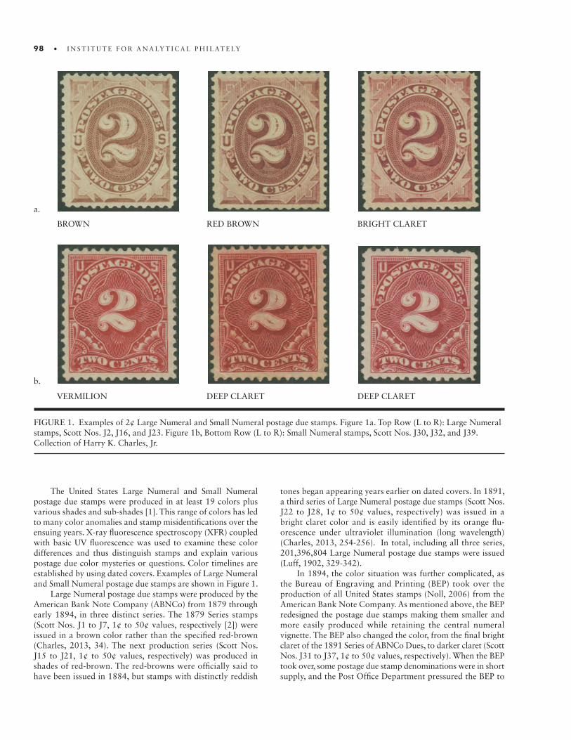
98 • I N S T I T U T E F O R A N A LY T I C A L P H I L AT E LY

• 99
TABLE 1. 1894 and 1895 Series Postage Due stamps by Denomination, Scott No., Color, Watermark, and Issue Date (to postmasters).
Value Scott No. color(S) Watermark ISSue Datea)
1¢ J29 Vermilion, pale vermilion None b)
J31 Deep claret, claret, lake None 14 August 1894
J38 Deep claret, claret, carmine, lake Double-line 29 August1895
2¢ J30 Vermilion, deep vermilion None b)
J32 Deep claret, claret, lake None 20 July 1894
J39 Deep claret, claret, carmine, lake Double-line 14 September 1895
3¢ J33 Deep claret, lake None 27 April 1895
J40 Deep claret, claret, rose red, carmine Double-line 30 October1895
5¢ J34 Deep claret, claret None 27 April 1895
J41 Deep claret, claret, carmine rose Double-line 15 October 1895
10¢ J35 Deep claret None 24 September 1894
J42 Deep claret, claret, carmine, lake Double-line 14 September 1895
30¢ J36 Deep claret, claret, carminec), pale rosed) None 27 April 1895
J43 Deep claret, claret Double-line 21 April 1897
50¢ J37 Deep claret, pale rosee) None 27 April 1895
J44 Deep claret, claret Double-line 17 March 1896
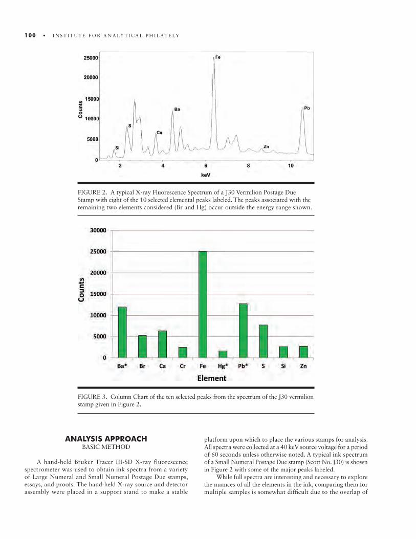
100 • I N S T I T U T E F O R A N A LY T I C A L P H I L AT E LY
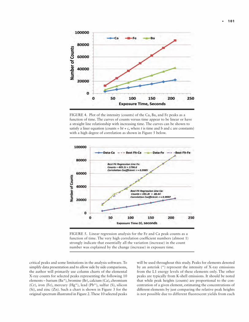
• 101
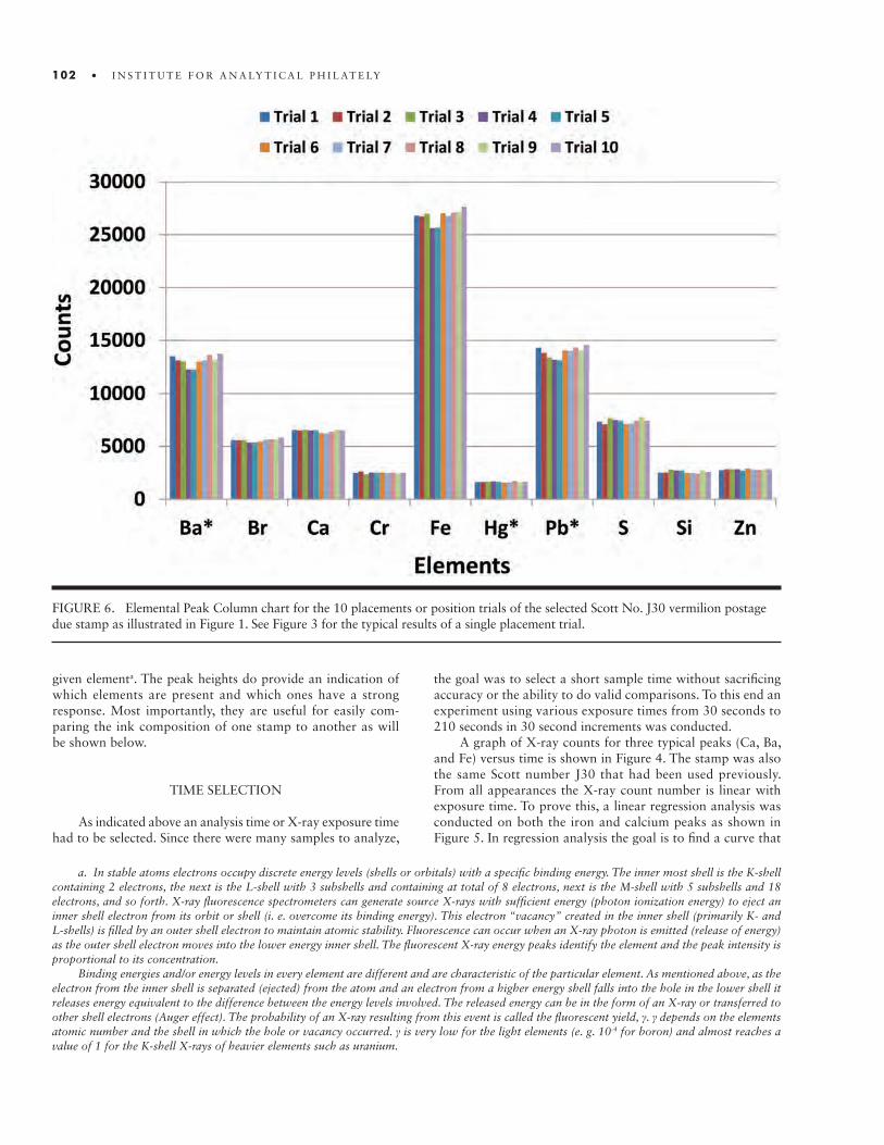
102 • I N S T I T U T E F O R A N A LY T I C A L P H I L AT E LY

• 103
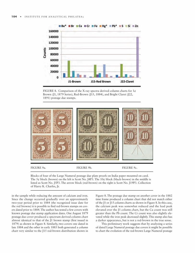
104 • I N S T I T U T E F O R A N A LY T I C A L P H I L AT E 8 2
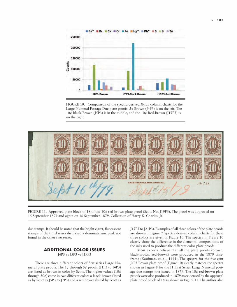
• 105
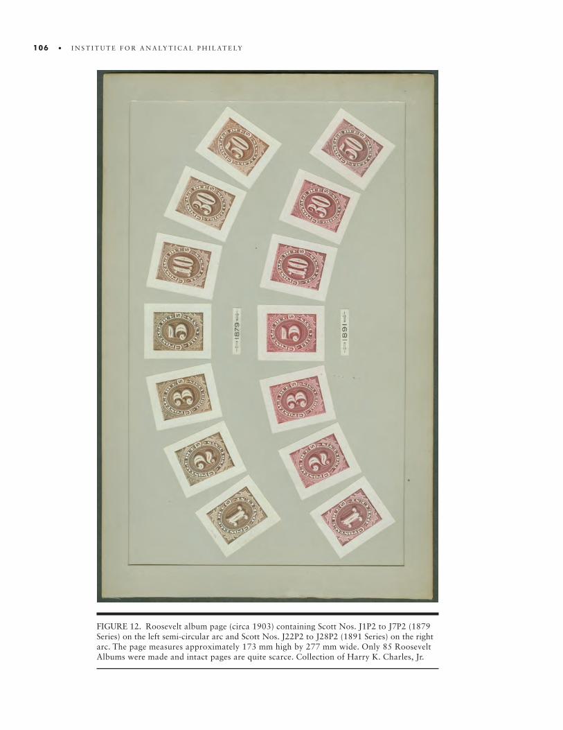
106 • I N S T I T U T E F O R A N A LY T I C A L P H I L AT E LY
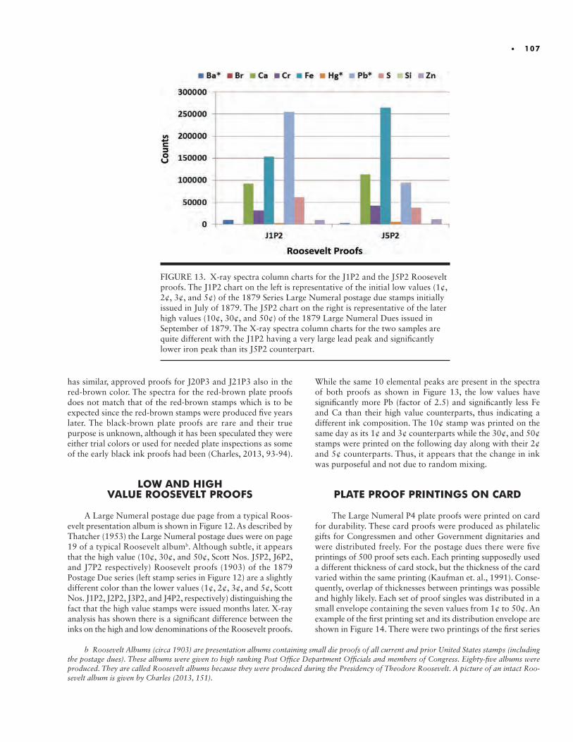
• 107
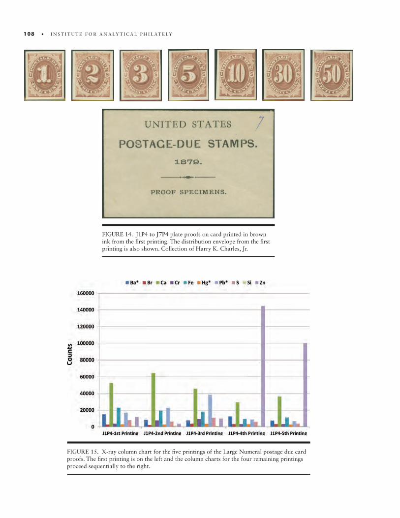
108 • I N S T I T U T E F O R A N A LY T I C A L P H I L AT E LY
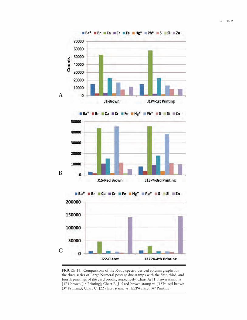
• 109

110 • I N S T I T U T E F O R A N A LY T I C A L P H I L AT E L 8
FIGURE 17. Scott No. J23P1 printed at the BEP as a color sample for the First Bureau postage due stamps. The die impression on the proof measures 47 mm wide by 59 mm high. There is a tear through the proof vertically. Collection of Harry K. Charles, Jr.
(Scott Nos. J1P4 to J7P4, brown), one printing of the second series (Scott Nos. J15P4 to J21P4, red-brown), and two print-ings of the third series (Scott Nos. J22P4 to J28P4, bright claret). As mentioned above, each printing had its own distinct distri-bution envelope which could be used to identify the proof set -- assuming, of course, that the envelope had not been separated and re-associated improperly over the intervening 125 or so years. Unfortunately, separations must have been frequent and many envelopes must have been lost over the years-since finding a card proof set with an envelope is difficult.
Given the possibility that proof sets and envelopes could be mixed up, it was hoped that X-ray spectral analysis could be used to distinguish between printings -- especially between the first and the second (the brown printings in 1879 and 1885) and the fourth and the fifth (the bright claret printings in Jan-uary and May of 1893). A column chart for the 10 selected
element peaks is given in Figure 15 for all five printings. As can be seen from Figure 15 all the spectra are somewhat different reflecting the brown color in the first two printings, the red-brown in the third printing, and the bright claret in the fourth and the fifth printing. It should also be noted that the fourth and fifth printings of the card proofs fluoresce under UV light, just like the bright claret stamps.
Looking at the derived element counts in Figure 16, one sees immediately that the spectrum for J1P4 is essentially identical to that of the J1 brown postage due stamp as shown in chart A of Figure 16. Similarly the spectrum for the J15P4 is approxi-mately the same as the J15 red-brown postage due stamp. Given that the J15P4 was produced in 1890 and the stamp in question dates to the mid-1880s some minor color variations are to be expected (see Figure 16 B). The spectrum of the 4th
printing (J22P4) also matches extremely closely with that of
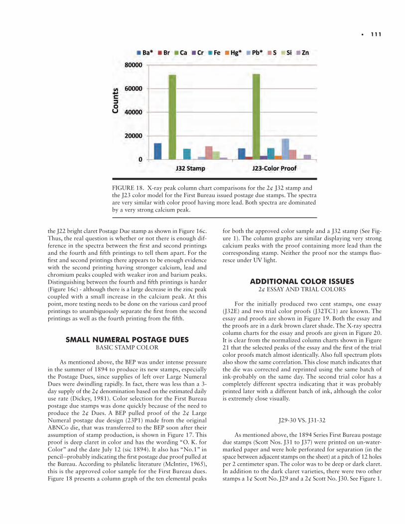
• 111
FIGURE 18. X-ray peak column chart comparisons for the 2¢ J32 stamp and the J23 color model for the First Bureau issued postage due stamps. The spectra are very similar with color proof having more lead. Both spectra are dominated by a very strong calcium peak.
the J22 bright claret Postage Due stamp as shown in Figure 16c. Thus, the real question is whether or not there is enough dif-ference in the spectra between the first and second printings and the fourth and fifth printings to tell them apart. For the first and second printings there appears to be enough evidence with the second printing having stronger calcium, lead and chromium peaks coupled with weaker iron and barium peaks. Distinguishing between the fourth and fifth printings is harder (Figure 16c) - although there is a large decrease in the zinc peak coupled with a small increase in the calcium peak. At this point, more testing needs to be done on the various card proof printings to unambiguously separate the first from the second printings as well as the fourth printing from the fifth.
SMALL NUMERAL POSTAGE DUESBASIC STAMP COLOR
As mentioned above, the BEP was under intense pressure
in the summer of 1894 to produce its new stamps, especially the Postage Dues, since supplies of left over Large Numeral Dues were dwindling rapidly. In fact, there was less than a 3- day supply of the 2¢ denomination based on the estimated daily use rate (Dickey, 1981). Color selection for the First Bureau postage due stamps was done quickly because of the need to produce the 2¢ Dues. A BEP pulled proof of the 2¢ Large Numeral postage due design (23P1) made from the original ABNCo die, that was transferred to the BEP soon after their assumption of stamp production, is shown in Figure 17. This proof is deep claret in color and has the wording “O. K. for Color” and the date July 12 (sic 1894). It also has “No.1” in pencil--probably indicating the first postage due proof pulled at the Bureau. According to philatelic literature (McIntire, 1965), this is the approved color sample for the First Bureau dues. Figure 18 presents a column graph of the ten elemental peaks
for both the approved color sample and a J32 stamp (See Fig-ure 1). The column graphs are similar displaying very strong calcium peaks with the proof containing more lead than the corresponding stamp. Neither the proof nor the stamps fluo-resce under UV light.
ADDITIONAL COLOR ISSUES2¢ ESSAY AND TRIAL COLORS
For the initially produced two cent stamps, one essay (J32E) and two trial color proofs (J32TC1) are known. The essay and proofs are shown in Figure 19. Both the essay and the proofs are in a dark brown claret shade. The X-ray spectra column charts for the essay and proofs are given in Figure 20. It is clear from the normalized column charts shown in Figure 21 that the selected peaks of the essay and the first of the trial color proofs match almost identically. Also full spectrum plots also show the same correlation. This close match indicates that the die was corrected and reprinted using the same batch of ink-probably on the same day. The second trial color has a completely different spectra indicating that it was probably printed later with a different batch of ink, although the color is extremely close visually.
J29-30 VS. J31-32
As mentioned above, the 1894 Series First Bureau postage due stamps (Scott Nos. J31 to J37) were printed on un-water-marked paper and were hole perforated for separation (in the space between adjacent stamps on the sheet) at a pitch of 12 holes per 2 centimeter span. The color was to be deep or dark claret. In addition to the dark claret varieties, there were two other stamps a 1¢ Scott No. J29 and a 2¢ Scott No. J30. See Figure 1.
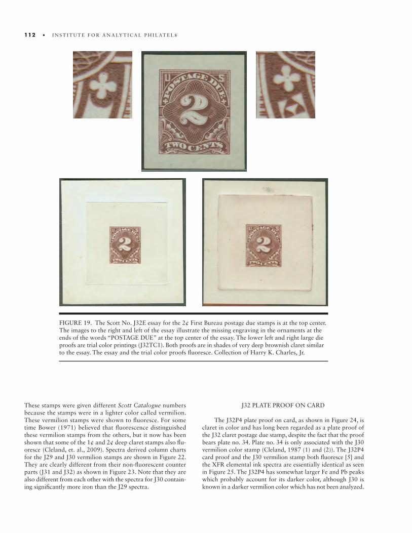
FIGURE 19. The Scott No. J32E essay for the 2¢ First Bureau postage due stamps is at the top center. The images to the right and left of the essay illustrate the missing engraving in the ornaments at the ends of the words “POSTAGE DUE” at the top center of the essay. The lower left and right large die proofs are trial color printings (J32TC1). Both proofs are in shades of very deep brownish claret similar to the essay. The essay and the trial color proofs fluoresce. Collection of Harry K. Charles, Jr.
112 • I N S T I T U T E F O R A N A LY T I C A L P H I L AT E L 8
These stamps were given different Scott Catalogue numbers because the stamps were in a lighter color called vermilion. These vermilion stamps were shown to fluoresce. For some time Bower (1971) believed that fluorescence distinguished these vermilion stamps from the others, but it now has been shown that some of the 1¢ and 2¢ deep claret stamps also flu-oresce (Cleland, et. al., 2009). Spectra derived column charts for the J29 and J30 vermilion stamps are shown in Figure 22. They are clearly different from their non-fluorescent counter parts (J31 and J32) as shown in Figure 23. Note that they are also different from each other with the spectra for J30 contain-ing significantly more iron than the J29 spectra.
J32 PLATE PROOF ON CARD
The J32P4 plate proof on card, as shown in Figure 24, is claret in color and has long been regarded as a plate proof of the J32 claret postage due stamp, despite the fact that the proof bears plate no. 34. Plate no. 34 is only associated with the J30 vermilion color stamp (Cleland, 1987 (1) and (2)). The J32P4 card proof and the J30 vermilion stamp both fluoresce [5] and the XFR elemental ink spectra are essentially identical as seen in Figure 25. The J32P4 has somewhat larger Fe and Pb peaks which probably account for its darker color, although J30 is known in a darker vermilion color which has not been analyzed.
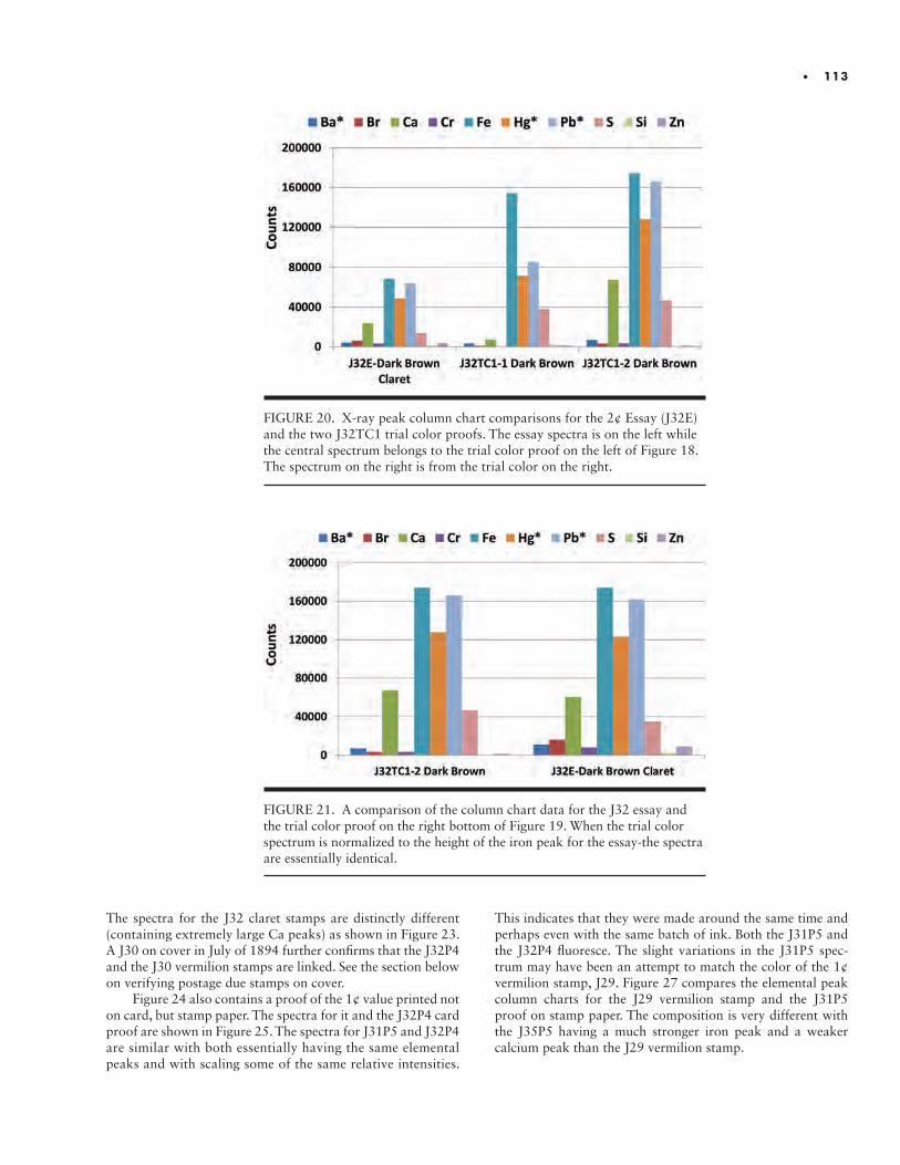
FIGURE 20. X-ray peak column chart comparisons for the 2¢ Essay (J32E) and the two J32TC1 trial color proofs. The essay spectra is on the left while the central spectrum belongs to the trial color proof on the left of Figure 18. The spectrum on the right is from the trial color on the right.
FIGURE 21. A comparison of the column chart data for the J32 essay and the trial color proof on the right bottom of Figure 19. When the trial color spectrum is normalized to the height of the iron peak for the essay-the spectra are essentially identical.
• 113
The spectra for the J32 claret stamps are distinctly different (containing extremely large Ca peaks) as shown in Figure 23. A J30 on cover in July of 1894 further confirms that the J32P4 and the J30 vermilion stamps are linked. See the section below on verifying postage due stamps on cover.
Figure 24 also contains a proof of the 1¢ value printed not on card, but stamp paper. The spectra for it and the J32P4 card proof are shown in Figure 25. The spectra for J31P5 and J32P4 are similar with both essentially having the same elemental peaks and with scaling some of the same relative intensities.
This indicates that they were made around the same time and perhaps even with the same batch of ink. Both the J31P5 and the J32P4 fluoresce. The slight variations in the J31P5 spec-trum may have been an attempt to match the color of the 1¢ vermilion stamp, J29. Figure 27 compares the elemental peak column charts for the J29 vermilion stamp and the J31P5 proof on stamp paper. The composition is very different with the J35P5 having a much stronger iron peak and a weaker calcium peak than the J29 vermilion stamp.

114 • I N S T I T U T E F O R A N A LY T I C A L P H I L AT E LY
FIGURE 22. Column charts of the 1¢ vermilion J29 postage due stamp and the 2¢ darker vermilion J30 Postage Due stamp. Both stamps have strong barium, lead, and sulfur peaks. The J29 also has a strong calcium peak and a weak iron peak. The J30 on the other hand has a relatively weak calcium peak but a very strong Iron peak. The strong Iron peak in J30 might explain the darker vermilion color. (Since the very dark black brown Large Numeral dues have a strong Iron peak.) J30 also appears to be darker than J29- probably due to the increased iron content.
FIGURE 23. Column charts for the inks used on the low plate number non-fluorescent First Bureau postage due stamps. Within the margin of error, due to design position placement and ink density, the spectra from all three plates is essentially identical, indicating they were all printed with the same ink formulation. The closeness of the spectra indicates that the batch mixing of ink was well controlled on these 1¢ and 2¢ values.
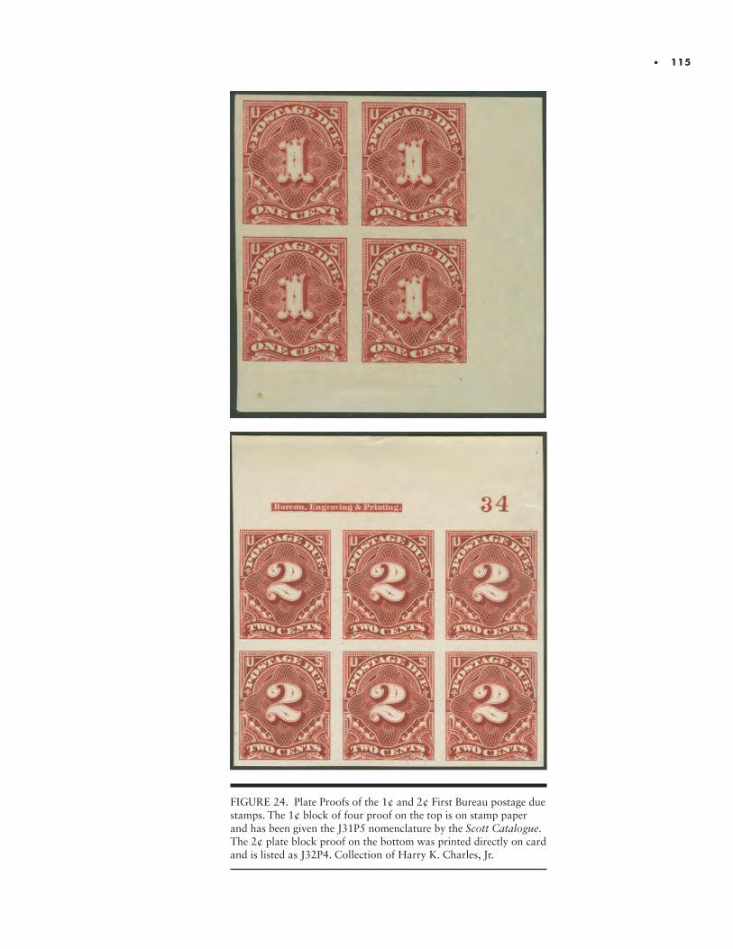
• 115
FIGURE 24. Plate Proofs of the 1¢ and 2¢ First Bureau postage due stamps. The 1¢ block of four proof on the top is on stamp paper and has been given the J31P5 nomenclature by the Scott Catalogue. The 2¢ plate block proof on the bottom was printed directly on card and is listed as J32P4. Collection of Harry K. Charles, Jr.
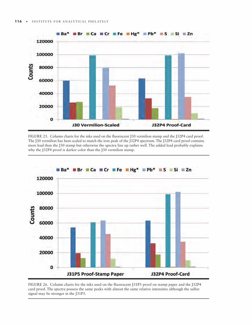
116 • I N S T I T U T E F O R A N A LY T I C A L P H I L AT E LY
FIGURE 25. Column charts for the inks used on the fluorescent J30 vermilion stamp and the J32P4 card proof. The J30 vermilion has been scaled to match the iron peak of the J32P4 spectrum. The J32P4 card proof contains more lead than the J30 stamp but otherwise the spectra line up rather well. The added lead probably explains why the J32P4 proof is darker color than the J30 vermilion stamp.
FIGURE 26. Column charts for the inks used on the fluorescent J31P5 proof on stamp paper and the J32P4 card proof. The spectra possess the same peaks with almost the same relative intensities although the sulfur signal may be stronger in the J31P5.
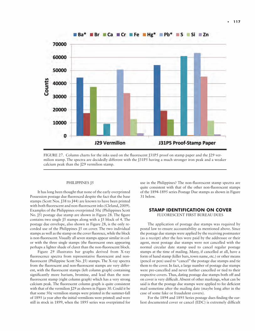
• 117
FIGURE 27. Column charts for the inks used on the fluorescent J31P5 proof on stamp paper and the J29 ver-milion stamp. The spectra are decidedly different with the J31P5 having a much stronger iron peak and a weaker calcium peak than the J29 vermilion stamp.
PHILIPPINES J5
It has long been thought that none of the early overprinted Possession postage due fluoresced despite the fact that the base stamps (Scott Nos. J38 to J44) are known to have been printed with both fluorescent and non-fluorescent inks (Cleland, 2009). Examples of the Philippines overprinted 50¢ (Philippines Scott No. J5) postage due stamp are shown in Figure 28. The figure contains two single J5 stamps along with a J5 block of 4. The postage due envelope, also shown in Figure 28, is the only re-corded use of the Philippines J5 on cover. The two individual stamps as well as the stamp on the cover fluoresce, while the block is non-fluorescent. Visually all seven stamps appear similar in col-or with the three single stamps (the fluorescent ones appearing perhaps a lighter shade of claret than the non-fluorescent block.
Figure 29 illustrates bar graphs derived from X-ray fluorescence spectra from representative fluorescent and non- fluorescent (Philippine Scott No. J5) stamps. The X-ray spectra from the fluorescent and non-fluorescent stamps are very differ-ent, with the fluorescent stamps (left column graph) containing significantly more barium, bromine, and lead than the non- fluorescent stamp (right column graph) which has a very strong calcium peak. The fluorescent column graph is quite consistent with that of the vermilion J29 as shown in Figure 30. Could it be that some 50¢ vermilion stamps were printed in the summer-fall of 1895 (a year after the initial vermilions were printed) and were still in stock in 1899, when the 1895 series was overprinted for
use in the Philippines? The non-fluorescent stamp spectra are quite consistent with that of the other non-fluorescent stamps of the 1894-1895 series Postage Due stamps as shown in Figure 31 below.
STAMP IDENTIFICATION ON COVERFLUORESCENT FIRST BUREAU DUES
The application of postage due stamps was required by postal law to ensure accountability as mentioned above. Since the postage due stamps were applied by the receiving postmaster (as a receipt) after the fees were paid by the addressee or their agent, most postage due stamps were not cancelled with the normal circular date stamp used to cancel regular postage stamps at the time of mailing. Many, if cancelled at all, have a form of hand stamp (killer bars, town name, etc.) or other means (pencil or pen) used to “cancel” the postage due stamps and tie them to the cover. In fact, a large number of postage due stamps were pre-cancelled and never further cancelled or tied to their respective covers. Thus, dating postage due stamps both off and on cover is very difficult. Absent of other markings, what can be said is that the postage due stamps were applied to fee deficient mail sometime after the mailing date (maybe long after in the case of some fake or fraudulent covers).
For the 1894 and 1895 Series postage dues finding the ear-liest documented cover or cancel (EDC) is extremely difficult
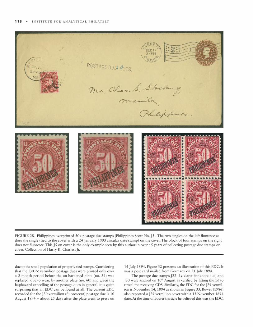
118 • I N S T I T U T E F O R A N A LY T I C A L P H I L AT E LY
FIGURE 28. Philippines overprinted 50¢ postage due stamps (Philippines Scott No. J5). The two singles on the left fluoresce as does the single (tied to the cover with a 24 January 1903 circular date stamp) on the cover. The block of four stamps on the right does not fluoresce. This J5 on cover is the only example seen by this author in over 45 years of collecting postage due stamps on cover. Collection of Harry K. Charles, Jr.
due to the small population of properly tied stamps. Considering that the J30 2¢ vermilion postage dues were printed only over a 2-month period before the un-hardened plate (no. 34) was replaced, due to wear, by another plate (no. 60) and given the haphazard cancelling of the postage dues in general, it is quite surprising that an EDC can be found at all. The current EDC recorded for the J30 vermilion (fluorescent) postage due is 10 August 1894 -- about 25 days after the plate went to press on
14 July 1894. Figure 32 presents an illustration of this EDC. It was a post card mailed from Germany on 31 July 1894.
The postage due stamps J22 (1¢ claret banknote due) and J30 were applied on 10th August as verified by lifting the 1¢ to reveal the receiving CDS. Similarly, the EDC for the J29 vermil-ion is November 14, 1894 as shown in Figure 33. Bower (1986) also reported a J29 vermilion cover with a 15 November 1894 date. At the time of Bower’s article he believed this was the EDC.
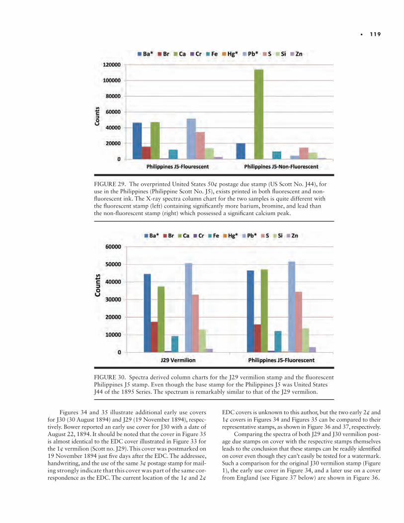
• 119
FIGURE 29. The overprinted United States 50¢ postage due stamp (US Scott No. J44), for use in the Philippines (Philippine Scott No. J5), exists printed in both fluorescent and non- fluorescent ink. The X-ray spectra column chart for the two samples is quite different with the fluorescent stamp (left) containing significantly more barium, bromine, and lead than the non-fluorescent stamp (right) which possessed a significant calcium peak.
FIGURE 30. Spectra derived column charts for the J29 vermilion stamp and the fluorescent Philippines J5 stamp. Even though the base stamp for the Philippines J5 was United States J44 of the 1895 Series. The spectrum is remarkably similar to that of the J29 vermilion.
Figures 34 and 35 illustrate additional early use covers for J30 (30 August 1894) and J29 (19 November 1894), respec-tively. Bower reported an early use cover for J30 with a date of August 22, 1894. It should be noted that the cover in Figure 35 is almost identical to the EDC cover illustrated in Figure 33 for the 1¢ vermilion (Scott no. J29). This cover was postmarked on 19 November 1894 just five days after the EDC. The addressee, handwriting, and the use of the same 3¢ postage stamp for mail-ing strongly indicate that this cover was part of the same cor-respondence as the EDC. The current location of the 1¢ and 2¢
EDC covers is unknown to this author, but the two early 2¢ and 1¢ covers in Figures 34 and Figures 35 can be compared to their representative stamps, as shown in Figure 36 and 37, respectively.
Comparing the spectra of both J29 and J30 vermilion post-age due stamps on cover with the respective stamps themselves leads to the conclusion that these stamps can be readily identified on cover even though they can’t easily be tested for a watermark. Such a comparison for the original J30 vermilion stamp (Figure 1), the early use cover in Figure 34, and a later use on a cover from England (see Figure 37 below) are shown in Figure 36.
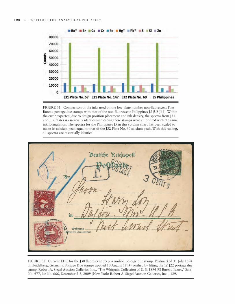
120 • I N S T I T U T E F O R A N A LY T I C A L P H I L AT E LY
FIGURE 31. Comparison of the inks used on the low plate number non-fluorescent First Bureau postage due stamps with that of the non-fluorescent Philippines J5 (US J44). Within the error expected, due to design position placement and ink density, the spectra from J31 and J32 plates is essentially identical-indicating these stamps were all printed with the same ink formulation. The spectra for the Philippines J5 in this column chart has been scaled to make its calcium peak equal to that of the J32 Plate No. 60 calcium peak. With this scaling, all spectra are essentially identical.
FIGURE 32. Current EDC for the J30 fluorescent deep vermilion postage due stamp. Postmarked 31 July 1894 in Heidelberg, Germany. Postage Due stamps applied 10 August 1894 (verified by lifting the 1¢ J22 postage due stamp. Robert A. Siegel Auction Galleries, Inc., “The Whitpain Collection of U. S. 1894-98 Bureau Issues,” Sale No. 977, lot No. 666, December 2-3, 2009 (New York: Robert A. Siegel Auction Galleries, Inc.), 129.
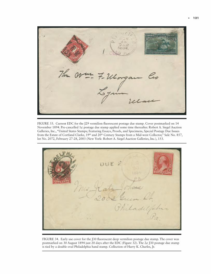
• 121
FIGURE 33. Current EDC for the J29 vermilion fluorescent postage due stamp. Cover postmarked on 14 November 1894. Pre-cancelled 1¢ postage due stamp applied some time thereafter. Robert A. Siegel Auction Galleries, Inc., “United States Stamps; Featuring Essays, Proofs, and Specimens, Special Postage Due Issues from the Estate of Cortland Clarke, 19th and 20th Century Stamps from a Mid-west Collector,” Sale No. 857, lot No. 2072, February 27-28, 2003 (New York: Robert A. Siegel Auction Galleries, Inc.), 153.
FIGURE 34. Early use cover for the J30 fluorescent deep vermilion postage due stamp. The cover was postmarked on 30 August 1894 just 20 days after the EDC (Figure 32). The 2¢ J30 postage due stamp is tied by a double oval Philadelphia hand stamp. Collection of Harry K. Charles, Jr.

122 • I N S T I T U T E F O R A N A LY T I C A L P H I L AT E LY
FIGURE 35. An early use cover for the J29 fluorescent deep vermilion postage due stamp. Cover postmarked on 19 November 1894 just five days after the EDC (Figure 33). The addressee, handwriting, and the use of the same 3¢ stamp for postage strongly indicate that this cover was part of the same correspondence as the EDC. Collection of Harry K. Charles, Jr.
FIGURE 36. Spectra derived column charts for the J30 vermilion postage due stamp, an early use cover of J30 (within 5 days of the current EDU) and the J30 on a cover from England with an 1896 date (Figure 36). The spectra of all three stamps are remarkably similar.
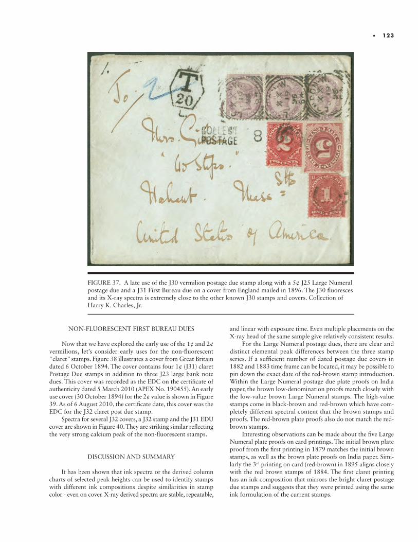
• 123
FIGURE 37. A late use of the J30 vermilion postage due stamp along with a 5¢ J25 Large Numeral postage due and a J31 First Bureau due on a cover from England mailed in 1896. The J30 fluoresces and its X-ray spectra is extremely close to the other known J30 stamps and covers. Collection of Harry K. Charles, Jr.
NON-FLUORESCENT FIRST BUREAU DUES
Now that we have explored the early use of the 1¢ and 2¢ vermilions, let’s consider early uses for the non-fluorescent “claret” stamps. Figure 38 illustrates a cover from Great Britain dated 6 October 1894. The cover contains four 1¢ (J31) claret Postage Due stamps in addition to three J23 large bank note dues. This cover was recorded as the EDC on the certificate of authenticity dated 5 March 2010 (APEX No. 190455). An early use cover (30 October 1894) for the 2¢ value is shown in Figure 39. As of 6 August 2010, the certificate date, this cover was the EDC for the J32 claret post due stamp.
Spectra for several J32 covers, a J32 stamp and the J31 EDU cover are shown in Figure 40. They are striking similar reflecting the very strong calcium peak of the non-fluorescent stamps.
DISCUSSION AND SUMMARY
It has been shown that ink spectra or the derived column charts of selected peak heights can be used to identify stamps with different ink compositions despite similarities in stamp color - even on cover. X-ray derived spectra are stable, repeatable,
and linear with exposure time. Even multiple placements on the X-ray head of the same sample give relatively consistent results.
For the Large Numeral postage dues, there are clear and distinct elemental peak differences between the three stamp series. If a sufficient number of dated postage due covers in 1882 and 1883 time frame can be located, it may be possible to pin down the exact date of the red-brown stamp introduction. Within the Large Numeral postage due plate proofs on India paper, the brown low-denomination proofs match closely with the low-value brown Large Numeral stamps. The high-value stamps come in black-brown and red-brown which have com-pletely different spectral content that the brown stamps and proofs. The red-brown plate proofs also do not match the red-brown stamps.
Interesting observations can be made about the five Large Numeral plate proofs on card printings. The initial brown plate proof from the first printing in 1879 matches the initial brown stamps, as well as the brown plate proofs on India paper. Simi-larly the 3rd printing on card (red-brown) in 1895 aligns closely with the red brown stamps of 1884. The first claret printing has an ink composition that mirrors the bright claret postage due stamps and suggests that they were printed using the same ink formulation of the current stamps.
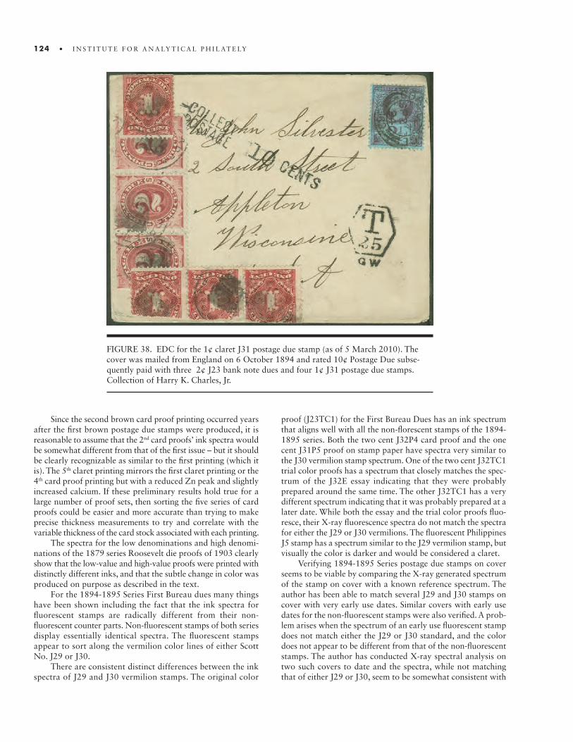
124 • I N S T I T U T E F O R A N A LY T I C A L P H I L AT E LY
FIGURE 38. EDC for the 1¢ claret J31 postage due stamp (as of 5 March 2010). The cover was mailed from England on 6 October 1894 and rated 10¢ Postage Due subse-quently paid with three 2¢ J23 bank note dues and four 1¢ J31 postage due stamps. Collection of Harry K. Charles, Jr.
Since the second brown card proof printing occurred years after the first brown postage due stamps were produced, it is reasonable to assume that the 2nd card proofs’ ink spectra would be somewhat different from that of the first issue – but it should be clearly recognizable as similar to the first printing (which it is). The 5th claret printing mirrors the first claret printing or the 4th card proof printing but with a reduced Zn peak and slightly increased calcium. If these preliminary results hold true for a large number of proof sets, then sorting the five series of card proofs could be easier and more accurate than trying to make precise thickness measurements to try and correlate with the variable thickness of the card stock associated with each printing.
The spectra for the low denominations and high denomi-nations of the 1879 series Roosevelt die proofs of 1903 clearly show that the low-value and high-value proofs were printed with distinctly different inks, and that the subtle change in color was produced on purpose as described in the text.
For the 1894-1895 Series First Bureau dues many things have been shown including the fact that the ink spectra for fluorescent stamps are radically different from their non- fluorescent counter parts. Non-fluorescent stamps of both series display essentially identical spectra. The fluorescent stamps appear to sort along the vermilion color lines of either Scott No. J29 or J30.
There are consistent distinct differences between the ink spectra of J29 and J30 vermilion stamps. The original color
proof (J23TC1) for the First Bureau Dues has an ink spectrum that aligns well with all the non-florescent stamps of the 1894-1895 series. Both the two cent J32P4 card proof and the one cent J31P5 proof on stamp paper have spectra very similar to the J30 vermilion stamp spectrum. One of the two cent J32TC1 trial color proofs has a spectrum that closely matches the spec-trum of the J32E essay indicating that they were probably prepared around the same time. The other J32TC1 has a very different spectrum indicating that it was probably prepared at a later date. While both the essay and the trial color proofs fluo-resce, their X-ray fluorescence spectra do not match the spectra for either the J29 or J30 vermilions. The fluorescent Philippines J5 stamp has a spectrum similar to the J29 vermilion stamp, but visually the color is darker and would be considered a claret.
Verifying 1894-1895 Series postage due stamps on cover seems to be viable by comparing the X-ray generated spectrum of the stamp on cover with a known reference spectrum. The author has been able to match several J29 and J30 stamps on cover with very early use dates. Similar covers with early use dates for the non-fluorescent stamps were also verified. A prob-lem arises when the spectrum of an early use fluorescent stamp does not match either the J29 or J30 standard, and the color does not appear to be different from that of the non-fluorescent stamps. The author has conducted X-ray spectral analysis on two such covers to date and the spectra, while not matching that of either J29 or J30, seem to be somewhat consistent with
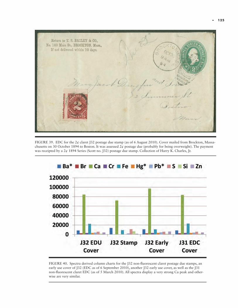
• 125
FIGURE 39. EDC for the 2¢ claret J32 postage due stamp (as of 6 August 2010). Cover mailed from Brockton, Massa-chusetts on 30 October 1894 to Boston. It was assessed 2¢ postage due (probably for being overweight). The payment was receipted by a 2¢ 1894 Series (Scott no. J32) postage due stamp. Collection of Harry K. Charles, Jr.
FIGURE 40. Spectra derived column charts for the J32 non-fluorescent claret postage due stamps, an early use cover of J32 (EDC as of 6 September 2010), another J32 early use cover, as well as the J31 non-fluorescent claret EDC (as of 5 March 2010). All spectra display a very strong Ca peak and other-wise are very similar.

126 • I N S T I T U T E F O R A N A LY T I C A L P H I L AT E LY
each other – which may mean another “standard” ink formu-lation may arise. Thus, giving rise to the statement that “all vermilion stamps fluoresce but that all fluorescent stamps are not vermilion.” Much more work needs to be done to clarify the color-fluorescent relationship with the 1894-1895 Series First Bureau dues.
ENDNOTES
1. The First Bureau postage due stamps issued during the 1894-1897 period (1¢ to 50¢ denominations) encompass 16 major Scott Catalogue (see Table 1 above and Endnote 2 be-low) numbers based on stamp denomination, watermark, and to some degree color. These stamps cover the range of Scott Nos. from J29 to J44 with color descriptions from vermilion to shades of carmine and claret. The J29 through J37 stamps were printed on un-watermarked paper and were perforation 12. These are typically referred to as the 1894 Series of First Bureau Postage Due stamps (although some denominations were not issued to postmasters until 1895-see Table 1 in the text). The J38 through J44 postage due stamps were also perforation 12, but the paper was double-line watermarked. The J38 to J44 postage due stamps are often referred to as the 1895 Series of First Bureau postage dues (although again certain denomina-tions were not issued until 1896 and in one case 1897 (30¢ denomination)). To simplify the text, the nomenclature 1894 Series is used to refer to the perforation 12 postage due stamps printed on un-watermarked paper (Scott Nos. J29 to J37). Similarly, the 1895 Series refers to the perforation 12 postage due stamps (Scott Nos. J38 to J44) printed on double-line watermarked paper.
2. Scott numbers are a trademark of the Scott Publishing Company. For reference, they can be found in the Scott Special-ized Catalogue of United States Stamps & Covers published by the Scott Publishing Company, 911 Vandemark Road, Sidney, Ohio 45365-0828.
3. The George W. Brett Papers and Document Collection at the Smithsonian National Postal Museum. His files contained handwritten notes on the number of postage due stamps issued to postmasters for Government Fiscal Years 1879 to 1910. The numbers were taken from the Annual Reports of the Postmaster General. Up until FY 1901, the numbers in the files agreed with those reported by Luff in his 1902 book. For a complete listing of the number of stamps issued by denomination and fiscal year for the Small Numeral postage dues see Charles’ book (2013, Appendix O, 266).
4. Ever since the first postage due stamps were produced in 1879, the standard printing format was in sheets of 200 - separable in panes of 100. Even when the BEP took over printing of the postage dues, the sheet size was kept at 200. The First Bureau postage dues in sheets of 200 were printed until 1910 when new 400-subject plates were made.
5. It should be pointed out that in the Cleland, et. al. article (2009) there is a major error in reporting fluorescence
versus non-fluorescence. On page 294 in the caption for Figure 1, Cleland states “The proof on thin cardboard of plate 34 (above) has non-fluorescent ink….” This is clearly an error. While the ink may be slightly darker than what is commonly recognized as vermilion, the ink glows bright orange under long wavelength ultra-violet light. Several copies of these thin card-board proofs reside in the author’s collection and all fluoresce brightly. The same can be said for the 1¢ imperforate stamp proofs printed on gummed stamp paper. All of these stamp paper proofs fluoresce orange under long wavelength UV light.
REFERENCES
George W. Arfken, Postage Due, The United States Large Numeral Postage Due Stamps 1879-1894, The Chicago Collectors club, 1991, 21-24.Warren R. Bower, “Ultraviolet Identification of U. S. Postage Due Stamps and Proofs”, Essay-Proof Journal, Vol. 28, 1971, 99-100.Warren R. Bower, “Update on the Vermilion Bureau Postage Dues,” The United States Specialist, Vol. 57(11), November 1986, 532-533.Harry K. Charles, Jr., Postage Due: The United States Postage Due Essays, Proofs, and Specimens 1879-1986, The Collectors Club of Chicago, 2013.Wallace Cleland, Clarke Yarbrough, and William Shuman, “Early Postage Dues with Fluorescent Ink,” The United States Specialist, Vol. 80(7), July 2009, 293-296.W. Wallace Cleland, “Printing History of the Early Postage Due Plates,” The United States Specialist, Vol. 58(8), August 1987, 339-347.W. Wallace Cleland, “Printing History of the Early Postage Due Plates – 2,” The United States Specialist, Vol. 58 (10), October 1987, 437-445.Budd Dickey, “Beginnings of Postage Stamp Production by the Bureau of Engraving and Printing,” The United States Specialist, Vol. 55(11), November 1981, 467-493.John N. Luff, The Postage Stamps of the United States, New York, Scott Stamp and Coin Co., 1902, 329-342.Lewis Kaufman and George W. Arfken, Essays and Proofs of the Large Numeral Postage Due Stamps,” The American Philatelist, Vol. 102 (7), July 1988, 644-652.Walter A. McIntire, “Preparing the Dies for the U. S. Postage Due stamps 1894-1930,” The Essay-Proof Journal, Vol. 11, 1965, 3-8.A. Sen and M. Srwastava, Regression Analysis-Theory Methods, and Applications, (Berlin, Germany: Springer- Verlag, 2010.Allan M. Thatcher, “The Roosevelt Albums of United States Die Proofs,” The Essay-Proof Journal, Vol. 10 (1953), pp. 67-71.Morrison Waud, “The Postage Dues of the United States to 1894,” Forty-Second American Philatelic Congress Book, 1976, 13-36.
INTRODUCTION.INTRODUCTION. The Continental Bank Note Company, the American Bank Note Company and the Bureau of Engraving and Printing all issued black and red newspaper stamps from the same plates as the Post Office contract to print these stamps moved from one company to another. These stamps are listed in the Scott Specialized Catalogue as PR9-23, PR57-70 and PR90-99 respectively. The years of the printings were 1875, 1879-1885 and 1894 respectively. In 1895 the design of the stamps changed after which the stamps became easily differentiated. The designs being discussed here are the N4 and N5 designs showing the Statue of Freedom on the Capitol dome by Thomas Crawford and the Statue of Justice. The low-value stamps of 2 cents thru 10 cents were printed in shades of black using the N4(Freedom) design and the higher values of 12 cents through 96 cents were printed in shades of red using the N5(Justice) design. All of the printings are perforate 12.
Through the years collectors and experts have agonized and disagreed on the identi-fication of these stamps. Most tried to compare the shades to known reference examples, resulting in imperfect outcomes and much disagreement of opinion–wouldn’t it be remark-able if a scientific approach was to be a clear method of telling the different printings apart with 100 percent certainty?
Before presenting the scientific differences, which can be used to differentiate between the Continental, American and Bureau printings, a little more explanation into the difficulty of telling these printings apart needs to be presented.
THE PAPERS
According to the Scott Specialized Catalogue the first Continental printing is on thin hard paper (PR9-23). The American printing is on soft porous paper (PR57-70); and the Bureau printing is on soft wove paper (PR90-99). According to the extensive Philatelic Foundation reference collection assembled by John Luff the paper used for each printing can vary in appearance and is therefore difficult to use as a definitive means of identi-fication. See Figure 1. The physical appearance of an individual stamp is dependent on any changes due to toning, and due to gum soaking through the stamp. Also light and exposure affects the color and some printings could have been “drier printings” than others. These factors affect the appearance of the color and the appearance of the paper, making identification by eye difficult.
THE COLORS
According to the Scott Specialized Catalogue the color of the low-value Continental printing ink was black; the American printing ink was black and the Bureau printing ink
Using the Bruker XRF to Distinguish the Six Different Printings of the U.S. Newspaper Stamp Designs N4 and N5
Larry Lyons

128 • I N S T I T U T E F O R A N A LY T I C A L P H I L AT E LY
was intense black. Intense black being just a little deeper black. Many intense black stamps appear black and identification by color ranges from extremely difficult to impossible. The higher value newspaper stamps printed by Continental were rose; the American color is described as red and the Bureau color is called pink. Rose and pink can be extremely similar and red usually dulls from age to be rose or pink. Again, the eye can be confused by the color of a stamp, even when compared to known examples. Often a stamp appears to be in the middle and, not to belong to either known color group.
So, the designs of the stamps printed by Continental, Ameri-can and the Bureau are exactly the same, the perforations are the same size, the colors are remarkably similar and the paper used is not a good means of identification for most examples. It is time to approach the identification of these stamps by other means.
SCIENCE
The spectrographic analysis of the newspaper stamps in question using the VSC6000 is not definitive. It is a “visual spectrograph” and since these colors vary and are so similar the interpretation of the visual result at different wave lengths is very difficult. They can appear to be all very similar. Use of the UV lamp is also not definitive. The differences are extremely subtle and very difficult to find making the Bruker X-ray Fluo-rescence (XRF) Spectrometer a very important tool. The XRF measures the individual component energies of the X-ray emitted when the sample is irradiated with an X-ray beam. The spec-trum is produced which depicts those elements found in the tested area and provides comparative levels of the individual elements contained in the ink and paper. It ignores anything that is organic and contains no metallic elements. Best of all, the use of this device ignores the toning, the dirt on the paper and the effects of light and air on the ink and paper. I have also found the results are not alterable by chemical means. Now the idea is to see if the three printing companies used different ink formulas that can be easy to detect.
THE STUDY
Testing was done in the areas to the left and right of the base of the statues where the color is the most uniform and intense. At least fifteen examples of each of the black stamps of the three printings companies were analyzed and the results were recorded. This was repeated with fifteen examples of the red stamps from each of the three printings companies. Lower value stamps could be used to “prove” higher value stamps. The quantity of the number of samples increased as new patients were tested and recorded. No category ended up with less than 15 samples and most had 20 or more samples. The results were very remarkable and extremely definitive. Tables of the XRF results are measurements of the levels of the elements in magni-tude above the baseline.
Here are the results of the study for the black newspaper stamps:
1. The Continental Bank Note Company used an ink formula with relatively low levels of iron and manganese
for stamps PR9-15. Its paper has moderately low levels of silicon and arsenic: Fe .18 to .21 Mn .02 to .03 Si .02 to .07 As .08 to .09
2. The American Bank Note Company (PR57-62) used an ink formula with much higher copper content than the Bureau of Engraving and Printing. They used higher amounts of manganese than the Continental Bank Note Company and the paper has higher silicon than the Continental papers. It is noted in the Scott Cat-alogue that the American Bank Note Company paper is described as soft porous and the Continental as thin hard paper. Some of the results for the American Bank Note Company black stamp printings are as follows: Fe .21 to .28 Cu .05 to .10 Zn 0 to .03 Pb .02 to .07 Mn .04 to .10 S .07 to .15 3. The Bureau of Engraving and Printing (PR90-94) used an ink formula with higher levels of iron and low levels of lead. The levels of sulfur and arsenic can be lower than shown in testing results from examples of the stamps of the other two printing companies. Results for the Bureau of Engraving and printings of the black stamps are as follows: Fe .25 to .45 Pb 0 to .05 S .07 to .10 As 0 to .07
The full elemental signatures for each of the three printing companies for the black ink newspaper stamps can be seen in Table 1.
The boxed results are the ones that when viewed all together can be used to differentiate the three printing company inks from one another. The study of the results of the black stamps produced by each of the three printing companies is difficult. By comparison the study of the difference of the red stamps produced by each of the three printing companies is much more dramatic and definitive.
MORE ON BLACK NEWSPAPER STAMP PRINTINGS
The Continental Bank Note Company 1875 regular printing created stamp denominations for PR9-15 in black. See Figure 1. In 1875 the Continental Bank Note Company made a Special Printing on hard white paper without gum. See Figure 2. The colors of the low-value stamps are called gray black (PR33-39) and the color of the higher value stamps is called pale rose (PR40-47). It is extremely difficult to distinguish the black of
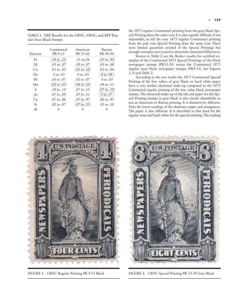
• 129
FIGURE 1. CBNC Regular Printing PR 9-15 Black
TABLE 1. XRF Results for the CBNC, ABNC, and BEP Reg-ular Issue Black Stamps
the 1875 regular Continental printing from the gray black Spe-cial Printing done the same year. It is also equally difficult, if not impossible, to tell the rose 1875 regular Continental printing from the pale rose Special Printing done the same year. There were limited quantities printed of the Special Printings but enough examples were tested to determine elemental differences.
Shown in Table 2 are the Bruker results for certified ex-amples of the Continental 1875 Special Printings of the black newspaper stamps (PR33-39) versus the Continental 1875 regular issue black newspaper stamps (PR9-15). See Figures 3, 4 and Table 2.
According to the test results the 1875 Continental Special Printing of the low values of gray black on hard white paper have a very similar elemental make-up compared to the 1875 Continental regular printing of the low value black newspaper stamps. The elemental make-up of the ink and paper for the Spe-cial Printing stamps in gray black is also clearly identifiable as not an American or Bureau printing. It is distinctively different. Note the lower readings of the elements copper and manganese. The paper is also different. It is described as thin hard for the regular issue and hard white for the special printing. The reading
Element
FeNiCuZnPbMnS
AsCaSiAl
ContinentalPR 9-15
.18 to .21
.05 to .07
.03 to .05 0 to .03.05 to .07.02 to .03.10 to .13.07 to .09.87 to .88.02 to .07
0
AmericanPR 57-62
.21 to.28.05 to .07.05 to .10 0 to .03.02 to .07.04 to .10.07 to .15.07 to .11.87 to .97.07 to .13
0
BureauPR 90-94
.25 to .45
.03 to .08
.03 to .040 to .08 0 to .05.04 to .15.07 to .100 to .07
.86 to .95
.05 to .100
FIGURE 2. CBNC Special Printing PR 33-39 Gray Black
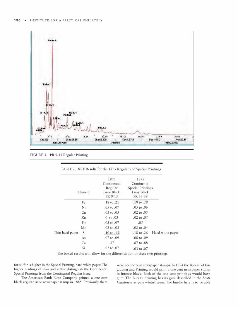
130 • I N S T I T U T E F O R A N A LY T I C A L P H I L AT E LY
FIGURE 3. PR 9-15 Regular Printing
were no one cent newspaper stamps. In 1894 the Bureau of En-graving and Printing would print a one cent newspaper stamp in intense black. Both of the one cent printings would have gum. The Bureau printing has its gum described in the Scott Catalogue as pale whitish gum. The hurdle here is to be able
for sulfur is higher in the Special Printing, hard white paper. The higher readings of iron and sulfur distinguish the Continental Special Printings from the Continental Regular Issue.
The American Bank Note Company printed a one cent black regular issue newspaper stamp in 1885. Previously there
TABLE 2. XRF Results for the 1875 Regular and Special Printings
1875Continental
Regular Issue Black
PR 9-15
.18 to .21
.05 to .07
.03 to .050 to .03.05 to .07.02 to .03.10 to .13.07 to .09
.87.02 to .07
Element
FeNiCuZnPbMnS
AsCaSi
Thin hard paper
1875 Continental
Special Printings Gray Black PR 33-39
.18 to .28
.05 to .06
.02 to .05
.02 to .05.05
.02 to .04
.18 to .26
.08 to .09
.87 to .88
.03 to .07
Hard white paper
The boxed results will allow for the differentiation of these two printings.

• 131
FIGURE 4. PR 33-39 Special Printing
TABLE 3. XRF Results for the 1885 American 1-Cent Printing versus the 1894 BEP Printing
Element
FeNiCuZnPbMnS
AsCaSiAl
1885 American1¢ Black PR81
.30
.07.04 to .08
.03
.04
.04.08 to .10
.07
.87.04 to .06
0
1894 Bureau Intense Black
PR90-94.25 to .45.03 to .08.03 to .040 to .08 0 to .05.04 to .15.07 to .100 to .07
.86 to .95
.05 to .100
to distinguish a used one cent example of the Bureau print-ing which catalogues $5,000 from the 1885 American printing which catalogues $12.50. There are examples which have been chemically altered to appear differently. Testing with the Bruker X-ray spectrometer has proven that most of the elements in the original ink cannot be altered. Table 3 shows the results of testing on the one cent 1885 American Bank Note black news-paper stamp versus the 1894 Bureau printing in intense black.
There are only subtle differences between the 1¢ 1885 American Regular Issue black stamp and the 1894 Bureau printing in intense black. The American Printing has a higher level of copper and the Bureau printing has a higher level of manganese and possibly zinc. Many examples also have a higher level of iron.
The last important study involves the American Bank Note Company Special Printing of 1883. Only one denomination was produced and it is described as a two cent newspaper stamp in intense black. The stamp, printed in a limited quantity without gum, has a Scott Catalogue value of $1,700. The question to be answered is does this Special Printing have particular ele-ments that easily distinguish it from other two cent newspaper stamps? Continental printed a two cent regular issue newspaper stamp in 1875. Continental also did a Special Printing two cent newspaper stamp in 1875. The Bureau issued a two cent news-paper stamp in 1894 and the American Bank Note Company had produced a two cent newspaper stamp in 1879. Table 1 showed the differences between the Continental, American and
Bureau printings. Now the American Bank Note Company two cent Special Printing must be tested and compared to the other three printings. This 1883 American Bank Note Company printing is entitled “Special Printing of 1879.” Would the Amer-ican Bank Note Company Special Printing of the two cent

132 • I N S T I T U T E F O R A N A LY T I C A L P H I L AT E 1 3 2
newspaper stamp be distinguishable from the 1879 regular issue American Bank Note Company printing? This is the im-portant question because we have already concluded that we can distinguish between the Continental, American and Bureau printings. As it turns out the American Bank Note Company Special Printing of the two cent newspaper stamp has a very unique set of elemental readings and can be easily distinguished. The intensity level of the iron is an absolute discriminating characteristic, which is used in the certification process at The Philatelic Foundation. Table 4 shows the results of testing on the American Bank Note Company Special Printing two cent newspaper stamps. The level of iron is shown boxed. It is this level which allows for the clear identification of the 1883 American Special Printing of the two-cent intense black stamp PR80. This was PR80. This was a limited quantity printing and only one batch of ink was used, resulting in a very tight range of elements found in each stamp. More than 15 samples were tested and found to belong in this group. The XRF results were definitive while most experts could not identify these stamps and usually declined to do so.
The following summarizes the results of the study for the red newspaper stamps:
1. The Continental Bank Note Company used an ink formula with low levels of lead and manganese. The paper contains moderately low levels of sulfur and a low level of arsenic:
Pb .05 Mn .07 S .18 to .20 As .05 to .10
2. The American Bank Note Company used an ink formula which often had high levels of manganese and always had higher levels of lead. The paper con-tains very high levels of sulfur. The key ingredient for the red ink was mercury. This was not found in any
TABLE 4. XRF Comparison of the Four Two-Cent Black Newspaper Stamps
Element
FeNiCuZnPbMnS
AsCaSiAl
1883 AmericanSpecial PrintingIntense Black
PR80
.14 to .15.03.030
.03 to .04.03
.06 to .08.06.90
.04 to .050
1879 AmericanRegular Issue
BlackPR57-62
.21 to .28
.05 to .07
.05 to .100 to .03
.02 to .07
.04 to .10
.07 to .15
.07 to .11
.87 to .97
.04 to .130
1875 ContinentalRegular Issue
BlackPR9-15
.18 to .21
.05 to .07
.03 to .050 to .03.05 to .07.02 to .03.10 to .13.07 to .09.87 to .88.02 to .07
0
1894 BureauRegular IssueIntense Black
PR90-94
.25 to .45
.03 to .08
.03 to .040 to .080 to .05.04 to .15.07 to .100 to .07
.86 to .95
.05 to .100
TABLE 5. XRF Results for the Red Stamps
ElementFeNiCuZnPbMnS
AsCaSi
Hg
ContinentalPR16-23
.17 to .18.13
.07 to 08.07 to .10
.05
.07.18 to .20.05 to .10.87 to .88.05 to .06
0
AmericanPR63-70
.07 to .25
.07 to .20
.04 to .10
.08 to .15
.18 to .26
.05 to .19
.54 to .70
.40 to .88
.05 to .23
.32 to .60
BureauPR95-99
.09 to .15
.04 to .10
.03 to .05
.02 to .030
.02 to .15
.05 to .070
.87 to .97.100
other ink formula that was tested. The level of arsenic was also found to be extremely high.
Pb .18 to .36 Mn .05 to .19 S .54 to .70 Hg .32 to .60 As
3. The Bureau of Engraving and Printing used an ink formula with no lead and no arsenic and the pa-per has a very low sulfur reading.
Pb 0 S .05 to .07 As 0
The full elemental signatures for each of the three printing companies for the red ink newspaper stamps is as follows can be seen in Table 5.

• 133
TABLE 6. XRF Results for the 1875 Regular Issue Rose Stamps versus the 1875 Special Printing of the Pale Rose Stamps
Element
FeNiCuZnPbMnS
AsCaSi
1875 Continental Regular Issue
PR 16-23Rose
.09 to .18.13
.08 to .09
.07 to .10.05.07
.18 to .20
.05 to .10.88.05
1875 Continental Special Printings
PR 40-47Pale Rose
.16 to .20
.13 to .17
.07 to .12
.07 to .08
.07 to .10
.07 to .09
.25 to .27
.11 to .15
.87 to .88.07
Lower lead
Hard white paper
The boxed results, when viewed all together, lead to an easy differentiation of the three printing company ink from one another.
The human eye may not be able to tell the difference in the printings of the red newspaper stamps issued by Continental, American, or the Bureau but one could tell the difference using the results obtained using the Bruker X-ray spectrometer with-out having to even look at the stamp.
In 1875 the Continental Bank Note Company made a Spe-cial Printing on hard white paper without gum. The color of the higher value stamps is called pale rose (PR40-47). It is diffi-cult, if not impossible, to tell the rose 1875 regular Continental printing from the pale rose Special Printing done the same year. There were limited quantities printed of the Special Printings but enough examples were tested to determine elemental differences.
When the higher value 1875 Continental Special Printings in pale rose (PR40-47) are compared to the 1875 regular Con-tinental printing in rose (PR16-23) the results are not clearly definitive. Although the reading for sulfur is higher in the Spe-cial Printing versus the reading for the regular issue rose stamps
there is not a difference great enough that could be relied upon. The silicon is usually less in the Continental Special Printing pale rose stamps but not appreciably. Although there are no great specific elemental differences except for perhaps iron the fact that all of the metals have lower readings in the Regular Printing of rose stamps versus the Special Printing of pale rose stamps is telling. See the Table 6 results for the Continental 1875 Special Printings of the pale rose newspaper stamps ver-sus the Continental 1875 regular issue stamps.
The boxed results taken all together differentiate the two printings from each other. The regular issue Continental print-ing (PR16-23) has a lower level of lead and the Continental special printing (PR40-47) has distinctively higher levels of sulfur and arsenic.
CONCLUSION
The Bruker X-ray spectrometer is extremely useful to dis-tinguish the numerous different printings of the black and also the red newspaper stamps, a challenge that has baffled col-lectors and experts alike. The study of the elements in the ink and paper is an expedient and conclusive process to confirm opinions as well as to resolve conflicts of opinions. One cannot rely solely on what one “sees.” The presence of organic gum soaks and dirt can make the visual identification process dif-ficult but is made easier with the elemental analyses provided by the Bruker XRF.
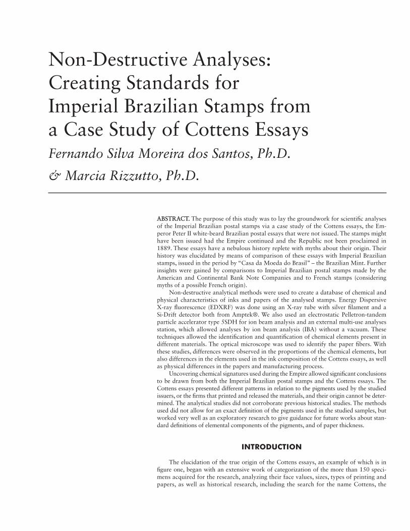
ABSTRACT. ABSTRACT. The purpose of this study was to lay the groundwork for scientific analyses of the Imperial Brazilian postal stamps via a case study of the Cottens essays, the Em-peror Peter II white-beard Brazilian postal essays that were not issued. The stamps might have been issued had the Empire continued and the Republic not been proclaimed in 1889. These essays have a nebulous history replete with myths about their origin. Their history was elucidated by means of comparison of these essays with Imperial Brazilian stamps, issued in the period by “Casa da Moeda do Brasil” – the Brazilian Mint. Further insights were gained by comparisons to Imperial Brazilian postal stamps made by the American and Continental Bank Note Companies and to French stamps (considering myths of a possible French origin).
Non-destructive analytical methods were used to create a database of chemical and physical characteristics of inks and papers of the analysed stamps. Energy Dispersive X-ray fluorescence (EDXRF) was done using an X-ray tube with silver filament and a Si-Drift detector both from Amptek®. We also used an electrostatic Pelletron-tandem particle accelerator type 5SDH for ion beam analysis and an external multi-use analyses station, which allowed analyses by ion beam analysis (IBA) without a vacuum. These techniques allowed the identification and quantification of chemical elements present in different materials. The optical microscope was used to identify the paper fibers. With these studies, differences were observed in the proportions of the chemical elements, but also differences in the elements used in the ink composition of the Cottens essays, as well as physical differences in the papers and manufacturing process.
Uncovering chemical signatures used during the Empire allowed significant conclusions to be drawn from both the Imperial Brazilian postal stamps and the Cottens essays. The Cottens essays presented different patterns in relation to the pigments used by the studied issuers, or the firms that printed and released the materials, and their origin cannot be deter-mined. The analytical studies did not corroborate previous historical studies. The methods used did not allow for an exact definition of the pigments used in the studied samples, but worked very well as an exploratory research to give guidance for future works about stan-dard definitions of elemental components of the pigments, and of paper thickness.
INTRODUCTION
The elucidation of the true origin of the Cottens essays, an example of which is in figure one, began with an extensive work of categorization of the more than 150 speci-mens acquired for the research, analyzing their face values, sizes, types of printing and papers, as well as historical research, including the search for the name Cottens, the
Non-Destructive Analyses: Creating Standards for Imperial Brazilian Stamps from a Case Study of Cottens EssaysFernando Silva Moreira dos Santos, Ph.D.
& Marcia Rizzutto, Ph.D.
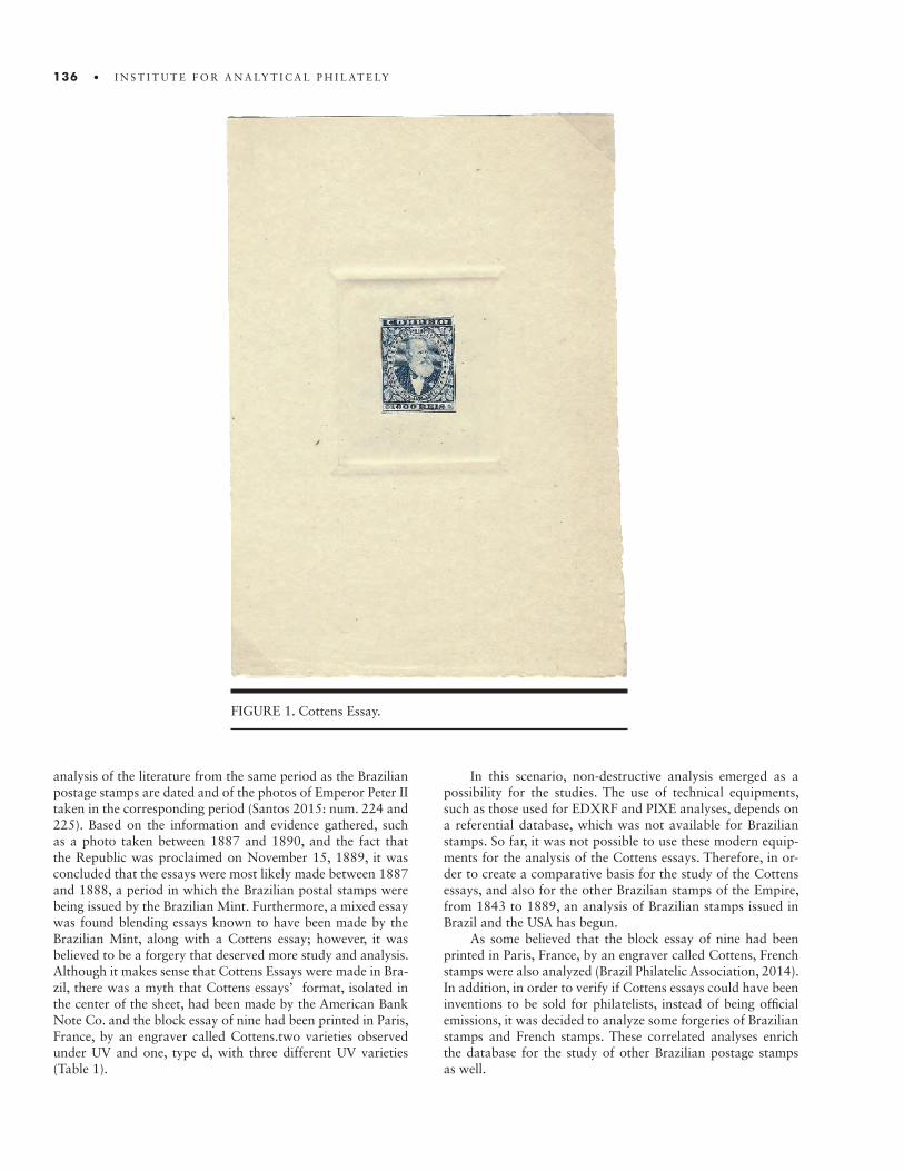
136 • I N S T I T U T E F O R A N A LY T I C A L P H I L AT E LY
analysis of the literature from the same period as the Brazilian postage stamps are dated and of the photos of Emperor Peter II taken in the corresponding period (Santos 2015: num. 224 and 225). Based on the information and evidence gathered, such as a photo taken between 1887 and 1890, and the fact that the Republic was proclaimed on November 15, 1889, it was concluded that the essays were most likely made between 1887 and 1888, a period in which the Brazilian postal stamps were being issued by the Brazilian Mint. Furthermore, a mixed essay was found blending essays known to have been made by the Brazilian Mint, along with a Cottens essay; however, it was believed to be a forgery that deserved more study and analysis. Although it makes sense that Cottens Essays were made in Bra-zil, there was a myth that Cottens essays’ format, isolated in the center of the sheet, had been made by the American Bank Note Co. and the block essay of nine had been printed in Paris, France, by an engraver called Cottens.two varieties observed under UV and one, type d, with three different UV varieties (Table 1).
In this scenario, non-destructive analysis emerged as a possibility for the studies. The use of technical equipments, such as those used for EDXRF and PIXE analyses, depends on a referential database, which was not available for Brazilian stamps. So far, it was not possible to use these modern equip-ments for the analysis of the Cottens essays. Therefore, in or-der to create a comparative basis for the study of the Cottens essays, and also for the other Brazilian stamps of the Empire, from 1843 to 1889, an analysis of Brazilian stamps issued in Brazil and the USA has begun.
As some believed that the block essay of nine had been printed in Paris, France, by an engraver called Cottens, French stamps were also analyzed (Brazil Philatelic Association, 2014). In addition, in order to verify if Cottens essays could have been inventions to be sold for philatelists, instead of being official emissions, it was decided to analyze some forgeries of Brazilian stamps and French stamps. These correlated analyses enrich the database for the study of other Brazilian postage stamps as well.
FIGURE 1. Cottens Essay.
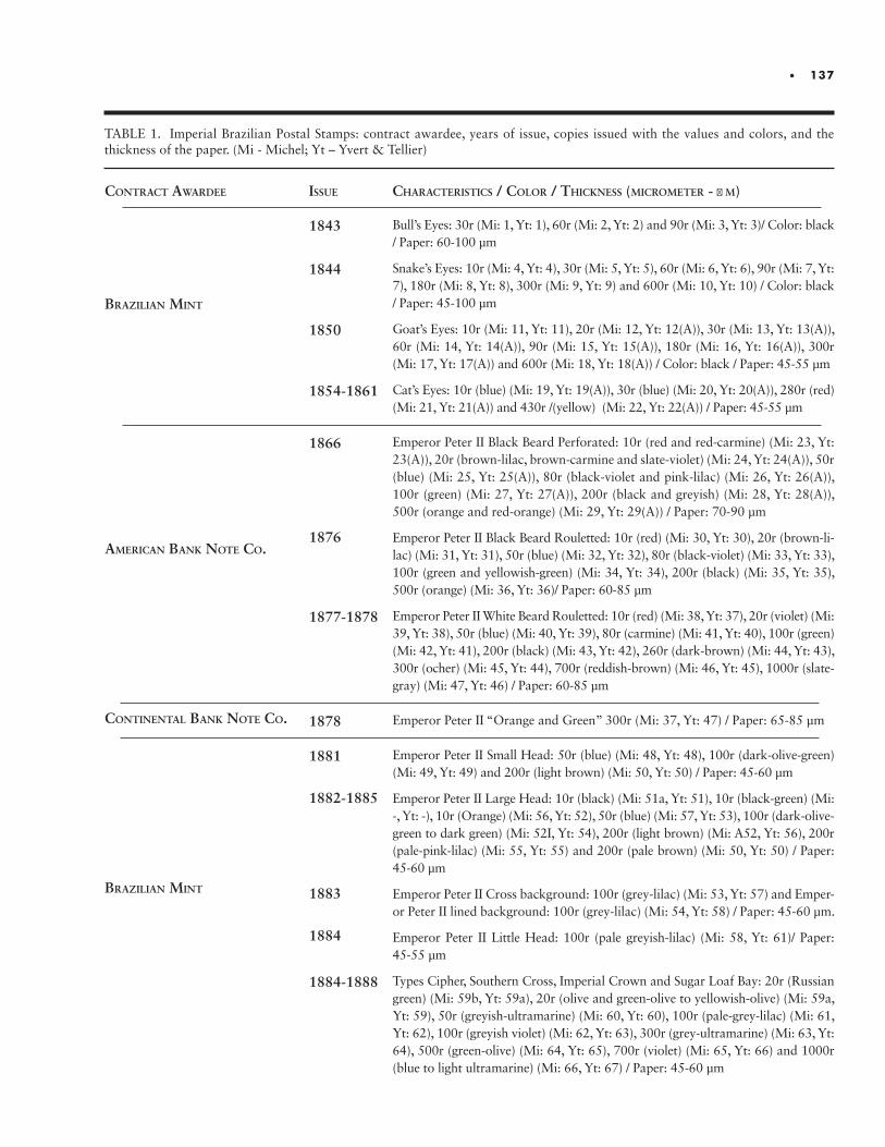
• 137
ContraCt awardee
Brazilian Mint
aMeriCan Bank note Co.
Continental Bank note Co.
Brazilian Mint
issue
1843
1844
1850
1854-1861
1866
1876
1877-1878
1878
1881
1882-1885
1883
1884
1884-1888
CharaCteristiCs / Color / thiCkness (MiCroMeter - µ M)
Bull’s Eyes: 30r (Mi: 1, Yt: 1), 60r (Mi: 2, Yt: 2) and 90r (Mi: 3, Yt: 3)/ Color: black / Paper: 60-100 µm
Snake’s Eyes: 10r (Mi: 4, Yt: 4), 30r (Mi: 5, Yt: 5), 60r (Mi: 6, Yt: 6), 90r (Mi: 7, Yt: 7), 180r (Mi: 8, Yt: 8), 300r (Mi: 9, Yt: 9) and 600r (Mi: 10, Yt: 10) / Color: black / Paper: 45-100 µm
Goat’s Eyes: 10r (Mi: 11, Yt: 11), 20r (Mi: 12, Yt: 12(A)), 30r (Mi: 13, Yt: 13(A)), 60r (Mi: 14, Yt: 14(A)), 90r (Mi: 15, Yt: 15(A)), 180r (Mi: 16, Yt: 16(A)), 300r (Mi: 17, Yt: 17(A)) and 600r (Mi: 18, Yt: 18(A)) / Color: black / Paper: 45-55 µm
Cat’s Eyes: 10r (blue) (Mi: 19, Yt: 19(A)), 30r (blue) (Mi: 20, Yt: 20(A)), 280r (red) (Mi: 21, Yt: 21(A)) and 430r /(yellow) (Mi: 22, Yt: 22(A)) / Paper: 45-55 µm
Emperor Peter II Black Beard Perforated: 10r (red and red-carmine) (Mi: 23, Yt: 23(A)), 20r (brown-lilac, brown-carmine and slate-violet) (Mi: 24, Yt: 24(A)), 50r (blue) (Mi: 25, Yt: 25(A)), 80r (black-violet and pink-lilac) (Mi: 26, Yt: 26(A)), 100r (green) (Mi: 27, Yt: 27(A)), 200r (black and greyish) (Mi: 28, Yt: 28(A)), 500r (orange and red-orange) (Mi: 29, Yt: 29(A)) / Paper: 70-90 µm
Emperor Peter II Black Beard Rouletted: 10r (red) (Mi: 30, Yt: 30), 20r (brown-li-lac) (Mi: 31, Yt: 31), 50r (blue) (Mi: 32, Yt: 32), 80r (black-violet) (Mi: 33, Yt: 33), 100r (green and yellowish-green) (Mi: 34, Yt: 34), 200r (black) (Mi: 35, Yt: 35), 500r (orange) (Mi: 36, Yt: 36)/ Paper: 60-85 µm
Emperor Peter II White Beard Rouletted: 10r (red) (Mi: 38, Yt: 37), 20r (violet) (Mi: 39, Yt: 38), 50r (blue) (Mi: 40, Yt: 39), 80r (carmine) (Mi: 41, Yt: 40), 100r (green) (Mi: 42, Yt: 41), 200r (black) (Mi: 43, Yt: 42), 260r (dark-brown) (Mi: 44, Yt: 43), 300r (ocher) (Mi: 45, Yt: 44), 700r (reddish-brown) (Mi: 46, Yt: 45), 1000r (slate-gray) (Mi: 47, Yt: 46) / Paper: 60-85 µm
Emperor Peter II “Orange and Green” 300r (Mi: 37, Yt: 47) / Paper: 65-85 µm
Emperor Peter II Small Head: 50r (blue) (Mi: 48, Yt: 48), 100r (dark-olive-green) (Mi: 49, Yt: 49) and 200r (light brown) (Mi: 50, Yt: 50) / Paper: 45-60 µm
Emperor Peter II Large Head: 10r (black) (Mi: 51a, Yt: 51), 10r (black-green) (Mi: -, Yt: -), 10r (Orange) (Mi: 56, Yt: 52), 50r (blue) (Mi: 57, Yt: 53), 100r (dark-olive-green to dark green) (Mi: 52I, Yt: 54), 200r (light brown) (Mi: A52, Yt: 56), 200r (pale-pink-lilac) (Mi: 55, Yt: 55) and 200r (pale brown) (Mi: 50, Yt: 50) / Paper: 45-60 µm
Emperor Peter II Cross background: 100r (grey-lilac) (Mi: 53, Yt: 57) and Emper-or Peter II lined background: 100r (grey-lilac) (Mi: 54, Yt: 58) / Paper: 45-60 µm.
Emperor Peter II Little Head: 100r (pale greyish-lilac) (Mi: 58, Yt: 61)/ Paper: 45-55 µm
Types Cipher, Southern Cross, Imperial Crown and Sugar Loaf Bay: 20r (Russian green) (Mi: 59b, Yt: 59a), 20r (olive and green-olive to yellowish-olive) (Mi: 59a, Yt: 59), 50r (greyish-ultramarine) (Mi: 60, Yt: 60), 100r (pale-grey-lilac) (Mi: 61, Yt: 62), 100r (greyish violet) (Mi: 62, Yt: 63), 300r (grey-ultramarine) (Mi: 63, Yt: 64), 500r (green-olive) (Mi: 64, Yt: 65), 700r (violet) (Mi: 65, Yt: 66) and 1000r (blue to light ultramarine) (Mi: 66, Yt: 67) / Paper: 45-60 µm
TABLE 1. Imperial Brazilian Postal Stamps: contract awardee, years of issue, copies issued with the values and colors, and the thickness of the paper. (Mi - Michel; Yt – Yvert & Tellier)
138 • I N S T I T U T E F O R A N A LY T I C A L P H I L AT E LY
ANALYTICAL METHODS IN BRAZIL
The use of physical, chemical and biological methods in the study of archaeological objects, art, and historical cultural heritage has been established for decades. There are groups and research centers in universities and laboratories directly linked to large museums, which are very active and work on interdisciplin-ary projects with collaborators from different areas. The same development has occurred in the area of philately and encourag-es non-destructive analytical methods.
In Latin America, the use of analytical methods for the study of cultural heritage is a relatively recent development. In Brazil, several research groups, mainly linked to universities, have ac-tively participated in these studies and several works are being carried out with the aim of better studying and characterizing the collections and objects of art and cultural heritage (Rizzutto et al., 2014). However, in the field of philately everything is very new, with few studies being known. Therefore, in partnership with the University of São Paulo, this study hopes to encourage and increase use of analytical methods in Brazil, taking an inter-disciplinary - physical, chemical and philatelic – approach.
THE PRINTING CONTRACTS
Brazilian stamps can be categorized according to the four contracts under which they were printed. The first one was with the Brazilian postal service itself, which requested the issuance from the Brazilian Mint, that made four numerary sets: Bull’s Eyes, Snake’s Eyes, Goat’s Eyes and Cat’s Eyes. With complaints about the quality of these first Brazilian issues, the government decided to order new stamps from the American Bank Note Co. – ABN Co. For this order, the emperor’s effigy was used on the stamps, and three series were issued: the Emperor Peter II Perfo-rated Black Beard, the Emperor Peter II Rouletted Black Beard and the Emperor Peter II Rouletted White Beard. Subsequently, for unknown reasons, the first bicolor Brazilian stamp was or-dered by the Brazilian government from the Continental Bank Note Co. Finally, once the government decided to internalize the production again, the Brazilian Mint issued five sets of stamps: Emperor Peter II Small Head, Emperor Peter II Large Head, Em-peror Peter II Little Head and Types Cipher, Southern Cross, Im-perial Crown and Sugar Loaf Bay. All of these Brazilian stamps were intaglio.
The dates of issuance of the 1866 stamps by ABN Co. prob-ably correspond to those of the manufacturing order by the Bra-zilian government, since the same dates are included for all the stamps within the files of the company. As reported by Comelli, it is assumed that the first issue of the stamps of 20 reis were purple or slate and that, after questioning by the Brazilian government, they were changed to brown-lilac. The records of the Continen-tal Bank Note Co. indicated the colors “Myrtle green & deep orange” (Comelli, 1992).
It is important to note that there are not any known forger-ies of the “Small Head” and “Large Head” stamps issued by the Brazilian Mint, creating more reliable references for the stamps of this period. In contrast, the stamps issued by Brazil from
1843 to 1861, hard to find and popular with collectors, were frequently forged by both unknown and well-known forgers such as Oneglia, Patroni, Zechmeyer, Spiro, Fournier, Mercier, and Sperati. Postal fraud was carried out through the re-use of true postage stamps, and not by forgeries.
SAMPLES
From a wide sampling of postage stamps and essays, we se-lected Cottens essays, forgeries, and genuine stamps to represent the emission made by the four contracting entities, in various colors. Our focus was on the pigments that create red and blue. As the Cottens essays in green are more difficult to find, this color was not prioritized, although stamps of this color were also analyzed making it possible to begin the creation of refer-ence data. Due to the representativeness for the period, black was also chosen as one of the analyzed colors. Furthermore, to allow a more insightful database, other colors and shades were analyzed. Care has been taken to select legitimate samples and standardized emission colors.
Three forged stamps were made by the Spiro Brothers, one by Fournier and six by unknown forgers. The Spiro Brothers be-long to the first generation of counterfeiters, who falsified mainly to sell to stamp collectors desiring Brazilian stamps issued from 1843 to 1861, which were still hard to find in the period. At the end of the nineteenth century, a second generation of counterfeit-ers began to emerge, with better techniques, producing stamps that were very similar to the originals, such as Fournier. There-fore, for comparative purposes, stamps were chosen from one forger of the first generation, another from the second, as well as a third from an unknown source.
All the stamps were analyzed in natura, without any special preparation and avoiding, as a rule, the analysis of the gum and the rubber ink stamps. Only the presence or the absence of gum on the stamps was compared.
The first two series of Brazilian stamps differ in paper and size, but, as stated in a communication to the Post Office Gen-eral Director dated August 22nd, 1844, there is no evidence of a difference in ink (Guatemosin, 1935), therefore, for the purpose of pigment analysis, only sample S1, consisting of Bull’s Eyes of 60 reis, was studied;.
Five of the samples did not emerge from the primary peri-od of analysis, 1843-1889. The reason for the choice of the S46 was because of it being issued in 1890, just after the end of the Empire, and the need of a reference for the red ink of this peri-od from the American Bank Note Co. period in order to make a comparison possible with the red Cottens essays. The sam-ple S34 was selected to be used as a reference for the Fournier counterfeiter. As sample S23 has titanium, only used after 1920, and samples S57 and S61 are modern forgeries and will serve to compare old and modern standards. All other stamps are from 1843 to 1889, which corresponds to the period of the Empire.
As discussed in the next section, from the 63 selected sam-ples, 49 were examined by X-Ray Fluorescence (XRF), two by PIXE analysis, all samples by analysis in optical microscopy. Micrometer was used to define paper thickness.
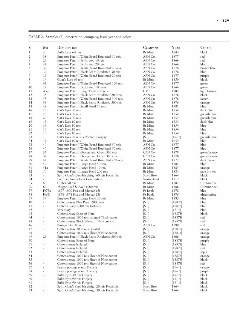
• 139
s Mi desCription CoMpany year Color
1 2 Bull’s Eyes 60 reis Br Mint 1843 black2 38 Emperor Peter II White Beard Rouletted 10 reis ABN Co. 1877 red3 23 Emperor Peter II Perforated 10 reis ABN Co. 1866 red4 24 Emperor Peter II Perforated 20 reis ABN Co. 1866 lilac5 39 Emperor Peter II White Beard Rouletted 20 reis ABN Co. 1876 brown lilac6 32 Emperor Peter II Black Beard Rouletted 50 reis ABN Co. 1876 blue7 39 Emperor Peter II White Beard Rouletted 20 reis ABN Co. 1877 purple8 14 Goat’s Eyes 60 reis Br Mint 1850 black9 42 Emperor Peter II White Beard Rouletted 100 reis ABN Co. 1877 green10 27 Emperor Peter II Perforated 100 reis ABN Co. 1866 green11 A52 Emperor Peter II Large Head 200 reis CMB 1882 light brown12 35 Emperor Peter II Black Beard Rouletted 200 reis ABN Co. 1876 black13 45 Emperor Peter II White Beard Rouletted 300 reis ABN Co. 1878 ocher14 36 Emperor Peter II Black Beard Rouletted 500 reis ABN Co. 1876 orange15 48 Emperor Peter II Small Head 50 reis Br Mint 1881 blue16 20 Cat’s Eyes 30 reis Br Mint 1854 dark blue17 20 Cat’s Eyes 30 reis Br Mint 1854 greyish blue18 20 Cat’s Eyes 30 reis Br Mint 1854 greyish blue19 19 Cat’s Eyes 10 reis Br Mint 1854 dark blue20 19 Cat’s Eyes 10 reis Br Mint 1854 blue21 19 Cat’s Eyes 10 reis Br Mint 1854 blue22 19 Cat’s Eyes 10 reis Br Mint 1854 blue23 - Cat’s Eyes 30 reis Perforated Forgery [S.l.] [19--?] greyish blue24 19 Cat’s Eyes 10 reis Br Mint 1854 blue25 40 Emperor Peter II White Beard Rouletted 50 reis ABN Co. 1877 blue26 40 Emperor Peter II White Beard Rouletted 50 reis ABN Co. 1877 blue27 37 Emperor Peter II Orange and Green 300 reis CBN Co. 1878 green/orange28 37 Emperor Peter II Orange and Green 300 reis CBN Co. 1878 green/orange29 44 Emperor Peter II White Beard Rouletted 260 reis ABN Co. 1877 dark brown30 57 Emperor Peter II Large Head 50 reis Br Mint 1885 blue31 51a Emperor Peter II Large Head 10 reis Br Mint 1885 orange32 50 Emperor Peter II Large Head 200 reis Br Mint 1884 pale brown33 - Spiro Goat’s Eyes 4th design 60 reis Facsimile Spiro Bros 1864 black34 - Fournier Goat’s Eyes Counterfeits Switzerland 1912 black35 60 Cipher 50 reis Br Mint 1887 Ultramarine36 66 “Sugar Loaf & Bay” 1000 reis Br Mint 1888 Ultramarine37 Fr73a 1877-1900 Pax and Mercur 15f Fr Bank 1878 blue38 Fr63I 1876-1878 Pax and Mercur 25f Fr Bank 1876 ultramarine39 57 Emperor Peter II Large Head 50 reis Br Mint 1885 blue40 - Cottens essay Blue Paper 2000 reis [S.l.] [1887?] blue41 - Cottens Essay 2000 reis Isolated [S.l.] [1887?] blue42 - Mix essay [S.l.] [18--?] blue43 - Cottens essay Sheet of Nine [S.l.] [1887?] black44 - Cottens essay 1000 reis Isolated Thick paper [S.l.] [1887?] red45 - Cottens essay Block (Sheet of Nine cutout) [S.l.] [1887?] red46 Postage Due 10 reis ABN Co. 1890 red47 - Cottens essay 2000 reis Isolated [S.l.] [1887?] orange48 - Cottens essay 1000 reis Sheet of Nine cutout [S.l.] [1887?] orange49 29 Emperor Peter II Black Beard Rouletted 500 reis ABN Co. 1866 orange50 - Cottens essay Sheet of Nine [S.l.] [1887?] purple51 - Cottens essay Isolated [S.l.] [1887?] blue52 - Cottens essay Isolated [S.l.] [1887?] red53 - Cottens essay Isolated [S.l.] [1887?] sepia54 - Cottens essay 1000 reis Sheet of Nine cutout [S.l.] [1887?] orange55 - Cottens essay 1000 reis Sheet of Nine cutout [S.l.] [1887?] black56 - Cottens essay 1000 reis Sheet of Nine cutout [S.l.] [1887?] red57 - France postage stamp Forgery [S.l.] [19--?] orange58 - France postage stamp Forgery [S.l.] [19--?] purple59 - Bull’s Eyes 30 reis Forgery [S.l.] [19--?] black60 - Bull’s Eyes 90 reis Forgery [S.l.] [19--?] black61 - Bull’s Eyes 90 reis Forgery [S.l.] [19--?] black62 - Spiro Goat’s Eyes 3th design 20 reis Facsimile Spiro Bros 1864 black63 - Spiro Goat’s Eyes 4th design 30 reis Facsimile Spiro Bros 1864 black
TABLE 2. Samples (S): description, company, issue year and color.
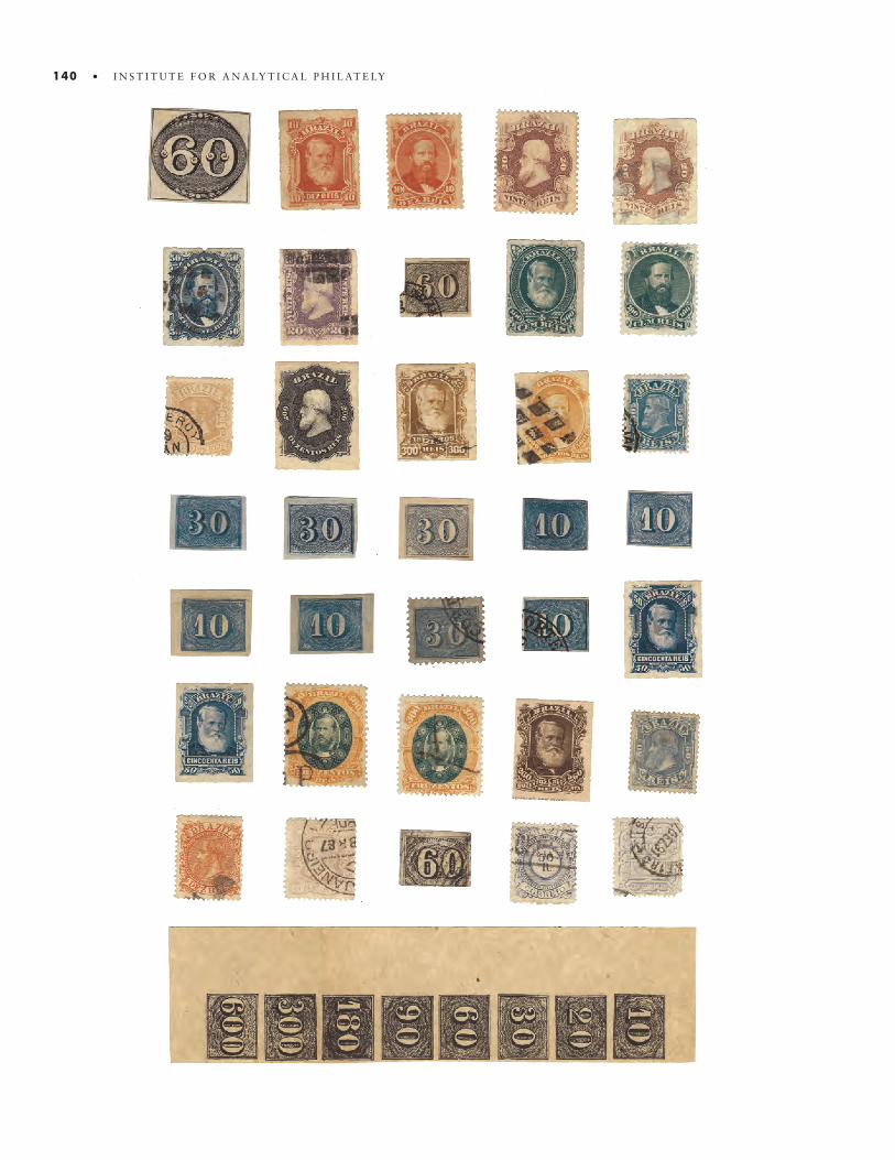
140 • I N S T I T U T E F O R A N A LY T I C A L P H I L AT E LY
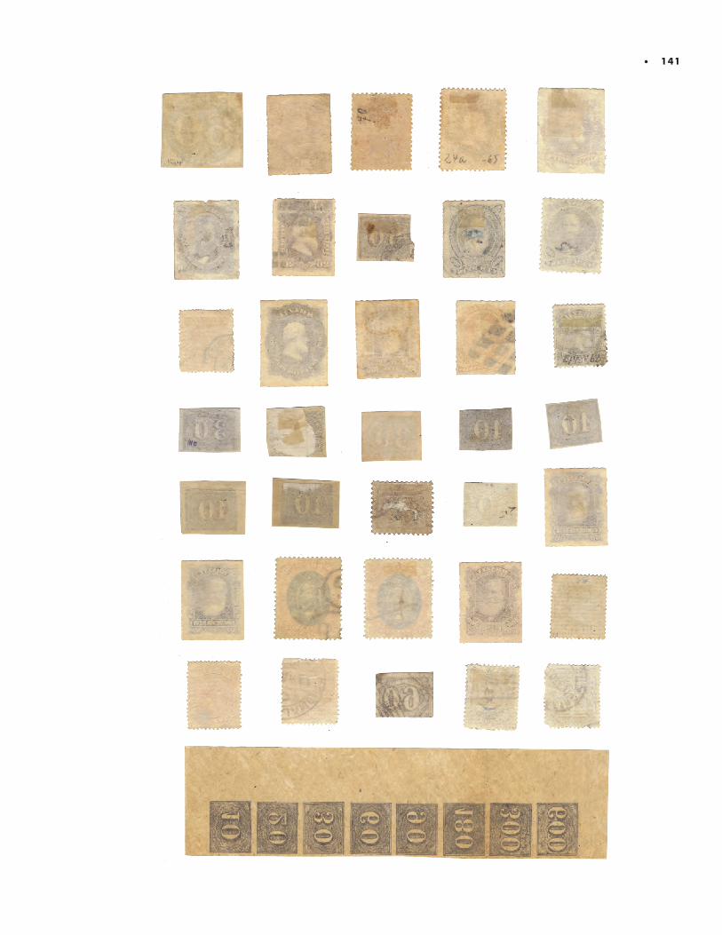
• 141
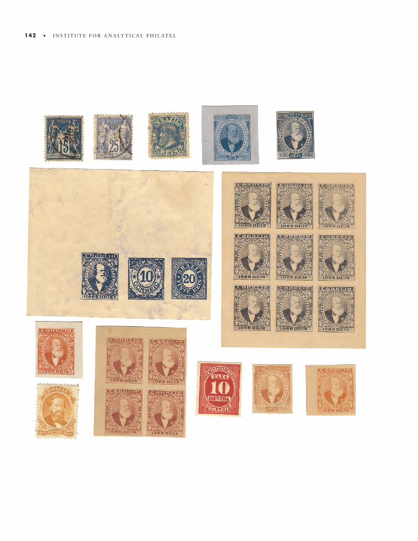
142 • I N S T I T U T E F O R A N A LY T I C A L P H I L AT E L
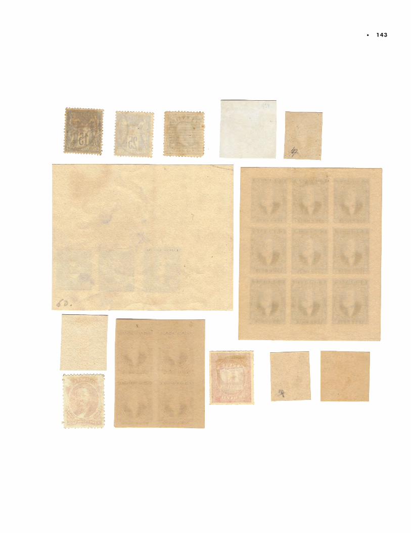
• 143

144 • I N S T I T U T E F O R A N A LY T I C A L P H I L AT E LY

• 145
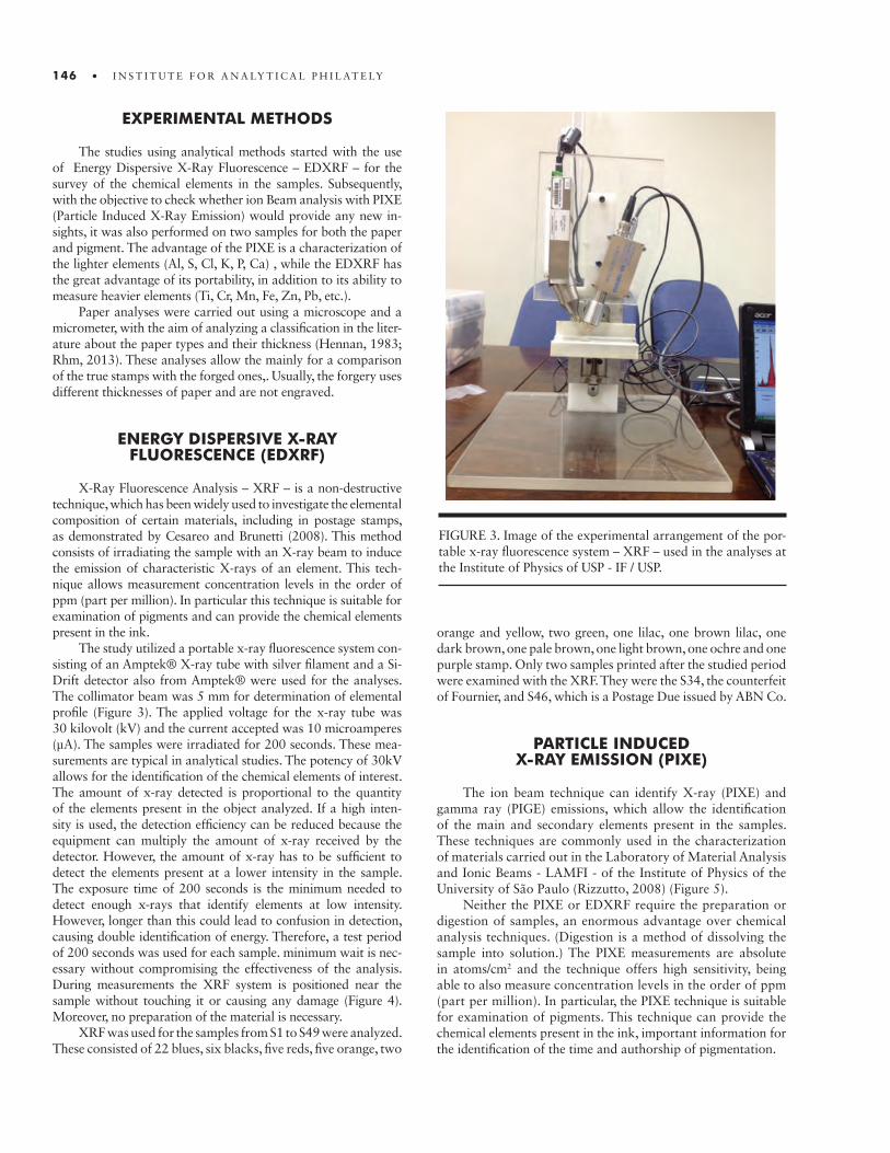
EXPERIMENTAL METHODS
The studies using analytical methods started with the use of Energy Dispersive X-Ray Fluorescence – EDXRF – for the survey of the chemical elements in the samples. Subsequently, with the objective to check whether ion Beam analysis with PIXE (Particle Induced X-Ray Emission) would provide any new in-sights, it was also performed on two samples for both the paper and pigment. The advantage of the PIXE is a characterization of the lighter elements (Al, S, Cl, K, P, Ca) , while the EDXRF has the great advantage of its portability, in addition to its ability to measure heavier elements (Ti, Cr, Mn, Fe, Zn, Pb, etc.).
Paper analyses were carried out using a microscope and a micrometer, with the aim of analyzing a classification in the liter-ature about the paper types and their thickness (Hennan, 1983; Rhm, 2013). These analyses allow the mainly for a comparison of the true stamps with the forged ones,. Usually, the forgery uses different thicknesses of paper and are not engraved.
ENERGY DISPERSIVE X-RAYFLUORESCENCE (EDXRF)
X-Ray Fluorescence Analysis – XRF – is a non-destructive technique, which has been widely used to investigate the elemental composition of certain materials, including in postage stamps, as demonstrated by Cesareo and Brunetti (2008). This method consists of irradiating the sample with an X-ray beam to induce the emission of characteristic X-rays of an element. This tech-nique allows measurement concentration levels in the order of ppm (part per million). In particular this technique is suitable for examination of pigments and can provide the chemical elements present in the ink.
The study utilized a portable x-ray fluorescence system con-sisting of an Amptek® X-ray tube with silver filament and a Si-Drift detector also from Amptek® were used for the analyses. The collimator beam was 5 mm for determination of elemental profile (Figure 3). The applied voltage for the x-ray tube was 30 kilovolt (kV) and the current accepted was 10 microamperes (µA). The samples were irradiated for 200 seconds. These mea-surements are typical in analytical studies. The potency of 30kV allows for the identification of the chemical elements of interest. The amount of x-ray detected is proportional to the quantity of the elements present in the object analyzed. If a high inten-sity is used, the detection efficiency can be reduced because the equipment can multiply the amount of x-ray received by the detector. However, the amount of x-ray has to be sufficient to detect the elements present at a lower intensity in the sample. The exposure time of 200 seconds is the minimum needed to detect enough x-rays that identify elements at low intensity. However, longer than this could lead to confusion in detection, causing double identification of energy. Therefore, a test period of 200 seconds was used for each sample. minimum wait is nec-essary without compromising the effectiveness of the analysis. During measurements the XRF system is positioned near the sample without touching it or causing any damage (Figure 4). Moreover, no preparation of the material is necessary.
XRF was used for the samples from S1 to S49 were analyzed. These consisted of 22 blues, six blacks, five reds, five orange, two
146 • I N S T I T U T E F O R A N A LY T I C A L P H I L AT E LY
FIGURE 3. Image of the experimental arrangement of the por-table x-ray fluorescence system – XRF – used in the analyses at the Institute of Physics of USP - IF / USP.
orange and yellow, two green, one lilac, one brown lilac, one dark brown, one pale brown, one light brown, one ochre and one purple stamp. Only two samples printed after the studied period were examined with the XRF. They were the S34, the counterfeit of Fournier, and S46, which is a Postage Due issued by ABN Co.
PARTICLE INDUCED X-RAY EMISSION (PIXE)
The ion beam technique can identify X-ray (PIXE) and gamma ray (PIGE) emissions, which allow the identification of the main and secondary elements present in the samples. These techniques are commonly used in the characterization of materials carried out in the Laboratory of Material Analysis and Ionic Beams - LAMFI - of the Institute of Physics of the University of São Paulo (Rizzutto, 2008) (Figure 5).
Neither the PIXE or EDXRF require the preparation or digestion of samples, an enormous advantage over chemical analysis techniques. (Digestion is a method of dissolving the sample into solution.) The PIXE measurements are absolute in atoms/cm2 and the technique offers high sensitivity, being able to also measure concentration levels in the order of ppm (part per million). In particular, the PIXE technique is suitable for examination of pigments. This technique can provide the chemical elements present in the ink, important information for the identification of the time and authorship of pigmentation.
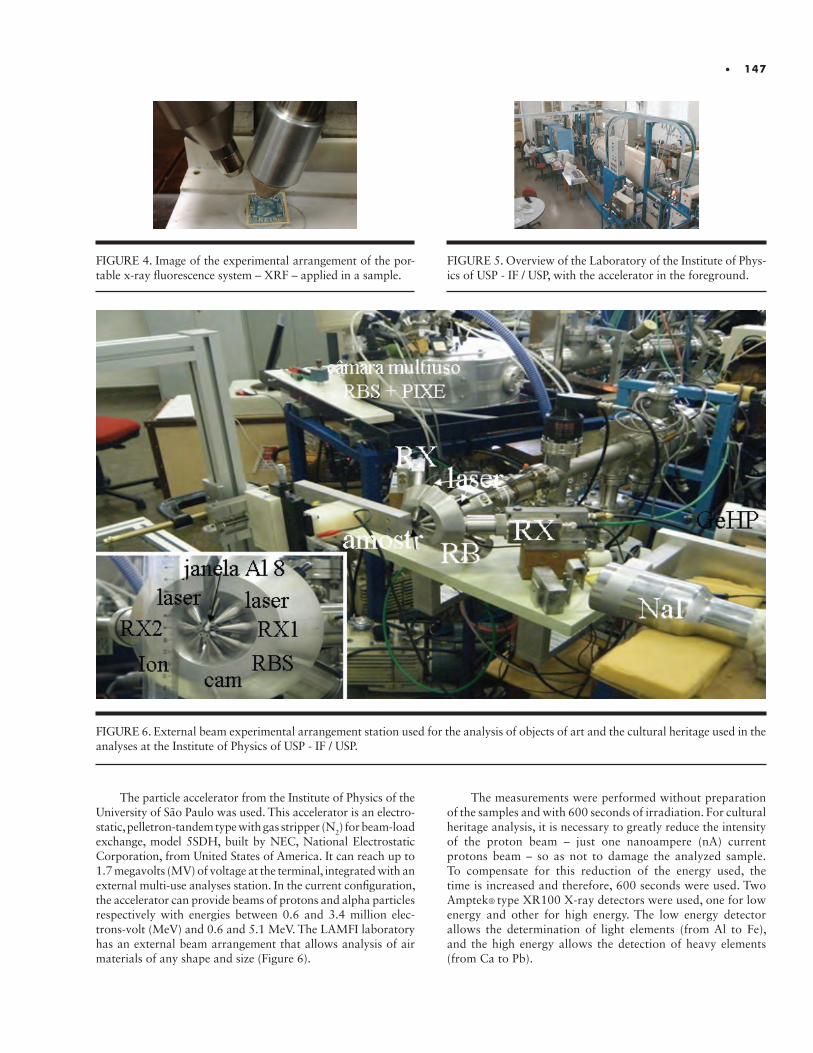
• 147
FIGURE 4. Image of the experimental arrangement of the por-table x-ray fluorescence system – XRF – applied in a sample.
The particle accelerator from the Institute of Physics of the University of São Paulo was used. This accelerator is an electro-static, pelletron-tandem type with gas stripper (N2) for beam-load exchange, model 5SDH, built by NEC, National Electrostatic Corporation, from United States of America. It can reach up to 1.7 megavolts (MV) of voltage at the terminal, integrated with an external multi-use analyses station. In the current configuration, the accelerator can provide beams of protons and alpha particles respectively with energies between 0.6 and 3.4 million elec-trons-volt (MeV) and 0.6 and 5.1 MeV. The LAMFI laboratory has an external beam arrangement that allows analysis of air materials of any shape and size (Figure 6).
FIGURE 5. Overview of the Laboratory of the Institute of Phys-ics of USP - IF / USP, with the accelerator in the foreground.
The measurements were performed without preparation of the samples and with 600 seconds of irradiation. For cultural heritage analysis, it is necessary to greatly reduce the intensity of the proton beam – just one nanoampere (nA) current protons beam – so as not to damage the analyzed sample.To compensate for this reduction of the energy used, the time is increased and therefore, 600 seconds were used. Two Amptek® type XR100 X-ray detectors were used, one for low energy and other for high energy. The low energy detector allows the determination of light elements (from Al to Fe), and the high energy allows the detection of heavy elements (from Ca to Pb).
FIGURE 6. External beam experimental arrangement station used for the analysis of objects of art and the cultural heritage used in the analyses at the Institute of Physics of USP - IF / USP.
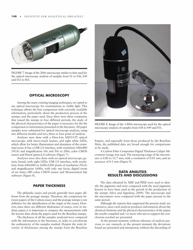
148 • I N S T I T U T E F O R A N A LY T I C A L P H I L AT E LY
OPTICAL MICROSCOPY
Among the many existing imaging techniques, we opted to use optical microscopy for examinations in visible light. This technique allows the best comparison with currently available information, particularly about the production process of the stamps, and the paper used. Since there were three companies that issued the stamps in four different periods, the study of the physical characteristics of the paper is necessary for the the comparison to information presented in the literature. All paper samples were submitted for optical microscope analysis, using two different models and two, three or four point of analysis.
Analyses were done with a Dino-Lite AM3113T optical microscope, with micro-touch feature, and eight white LEDs, which allow for better illumination and sharpness of the exam-ined areas. It has a USB 2.0 interface, with resolution: 640x480 (VGA) and magnification 10x and 50x to 200x, color CMOS sensor and DinoCapture2.0 software (Figure 7).
Analyses were also done with an optical microscope, ge-neric brand, with eight LEDs, USB 2.0 interface, with resolu-tion: from 640x480 to 1600x1200 pixels of resolution (VGA) and magnification 1600x, with only one focus, digital zoom of six times, HD color, CMOS sensor and Measurement Ink software (Figure 8).
PAPER THICKNESS
The philatelic essays and proofs generally have paper dif-ferent from the postage stamps. Therefore, the comparison be-tween papers of the Cottens essays and the postage stamps is not definitive for the identification of the origin of the essays. How-ever, since there are different thicknesses of essays, even in me-dium paper, it is important to compare the measurements with the known data about the papers used for the Brazilian stamps.
The thickness of all the samples analyzed were compared with the information in the literature, in order to corroborate the authenticity of the samples studied. Despite the wide di-versity of thicknesses among the stamps from the Brazilian
FIGURE 7. Image of the 200x microscope similar to that used for the optical microscopy analysis of samples from S1 to S36, S50 and S52 to S63.
FIGURE 8. Image of the 1.800x microscope used for the optical microscopy analysis of samples from S38 to S49 and S51.
Empire, and especially from those produced by the Brazilian Mint, the published data are broad enough for comparisons to be made.
A Carbon Fiber Composites Digital Thickness Caliper Mi-crometer Gauge was used. The measuring range of the microm-eter is 0.00 to 12.7 mm, with a resolution of 0.01 mm, and an accuracy of 0.1 mm (Figure 9).
DATA ANALYSIS RESULTS AND DISCUSSIONS
The data obtained by XRF and PIXE were used to iden-tify the pigments and were compared with the used pigments known to have been used in the period of the production of the stamps (Silva and Appoloni, 2009). The microscope and the micrometer were compared with the paper present in the same period.
Although the reports that supported the present study are extensive, since each analysis produces information about the chemical elements and the physical characteristics of the paper, the results compiled and / or more relevant to support the con-clusions reached are presented.
At the present moment, without reference of analysis pre-vious to our research, at the present moment the deviations found are presented and interpreted, without the discarding of
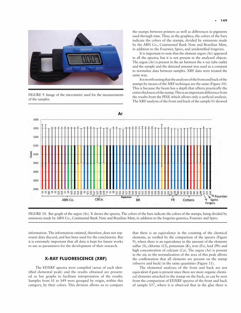
• 149
FIGURE 9. Image of the micrometer used for the measurements of the samples.
information. The information omitted, therefore, does not rep-resent data discard, and has been used for the conclusions. But it is extremely important that all data is kept for future works to use as parameters for the development of their research.
X-RAY FLUORESCENCE (XRF)
The EDXRF spectra were compiled (areas of each iden-tified elemental peak) and the results obtained are present-ed as bar graphs to facilitate interpretation of the results. Samples from S1 to S49 were grouped by origin, within this category, by their colors. This division allows us to compare
the stamps between printers as well as differences in pigments used through time. Thus, in the graphics, the colors of the bars indicate the colors of the stamps, divided by emissions made by the ABN Co., Continental Bank Note and Brazilian Mint, in addition to the Fournier, Spiro, and unidentified forgeries.
It is important to note that the element argon (Ar) appeared in all the spectra; but it is not present in the analyzed objects. The argon (Ar) is present in the air between the x-ray tube outlet and the sample and the detected amount was used as a constant to normalize data between samples. XRF data were treated the same way.
It is worth noting that the analyses of the front and back of the stamps by means of the XRF technique are the same (Figure 10). This is because the beam has a depth that affects practically the entire thickness of the stamp. This is an important difference from the results from the PIXE which allows only a surficial analysis. The XRF analysis of the front and back of the sample S1 showed
that there is an equivalence in the counting of the chemical elements, as verified by the comparison of the spectra (Figure 9), where there is an equivalence in the amount of the elements sulfur (S), chlorine (Cl), potassium (K), iron (Fe), lead (Pb) and high concentration of calcium (Ca). The argon (Ar) is present in the air, so the normalization of the area of this peak allows the confirmation that all elements are present on the stamp (observe and back) in the same quantities (Figure 11).
The elemental analyses of the front and back are not equivalent if gum is present since there are more organic chemi-cal elements attached to the stamp on the back, as can be seen from the comparison of EDXRF spectra of the front and back of sample S37, where it is observed that in the glue there is
FIGURE 10. Bar graph of the argon (Ar). X shows the spectra. The colors of the bars indicate the colors of the stamps, being divided by emissions made by ABN Co., Continental Bank Note and Brazilian Mint, in addition to the forgeries generics, Fournier and Spiro.

150 • I N S T I T U T E F O R A N A LY T I C A L P H I L AT E LY
more barium (Ba), potassium (K), chlorine (Cl) and sulfur (S), while the front of the stamp has more iron (Fe) and zinc (Zn), which are elements that can be connected to the use of Prussian blue pigment (Fe4[Fe9CN)6]3) as well as white zinc (ZnO) or lithopone (ZnS + BaSO4) (Figure 12).
In the vast majority of samples, there was no need to measure at the ink site and in a point with only paper. This is because in an exploratory analysis undertaken by the authors prior to the present study, no significant differences were found regarding the metal-lic chemical elements present in the paper. Moreover, in many cases, by accidents in the process, there is a contamination of the paper by the ink. The same conclusion was made in the analysis of 16 samples by Schwab et al. (2016), in which the elements present only in paper are of very low intensity and occur more with the potassium element (K), which is bound to the paper, since it is the element for plant growth and, therefore, the raw material of paper (Schwab et al., 2016).
Our analysis is continued with the study of the pigment used to compose the black color. The black samples S1, S8, S12, S33, S34 and S43 different manufacturing origins. The S1 and S8 were issued by the Brazilian Mint respectively in the years 1843 and 1850. The S12 was made by the ABN Co. in 1876. The S34 is a counterfeit made by Fournier in Switzer-land around 1912. And, the S43 is a Cottens essay, probably made in the late 1880s, around 1887/88.
The Bull’s Eyes (S1), Spiro’s facsimile (S33) and Fournier’s counterfeit (S34) contained no phosphorus (P) (Table 3). Phos-phorus is used in the whitener “bone white” (Ca3(PO4)2) and in the pigment bone black (C+Ca3(PO4)2). As the same pattern for the phosphorus of the authentic stamp (S1) was found in the forgeries S33 and S34, it is possible that the black pigment used by the forgers was consistent with the pigment used for the authentic stamps. For these samples it is possible to note the use of carbon-based pigments with iron oxides, and in the
first two there may also be lead-based pigments – lead sulphide (PbS) or lead oxide (PbO2), responsible for dark gray to black. Lead-based pigments are also possibly present on the Emperor Peter II Rouletted 200 reis stamp issued by ABN Co. (S12) and in the Cottens essay (S43). Eubanks and Brittain identified lead sulfide (PbS) in their analysis of the composition of the black pigment in the 5 cents U.S. stamp of 1847 (Eubanks and Brit-tain, 2012). In this same study, the calcium (Ca) was presented as being used in the white pigment that lightens the black and acts as an ink “extender”. It is present as calcium carbonate (CaCO3). Carbon (C) can not be identified by the XRF – and this information is consistent with the level of calcium (Ca) found in the samples analyzed in black.
In the Brazilian stamps, lead (Pb) presents an interesting change, having been used in 1843, but not in 1850, and then used again in the year 1854 in the blue stamps, indicating its use as a whitener because there is no blue pigment containing this element and the absence of chromium (Cr) precludes the use of pigments bound to lemon yellow. Then, in the second pe-riod of stamp issuance by the Brazilian Mint, lead (Pb) appears especially on the orange stamp S31, as a component of pigment based on lead oxide (PbO), and not as a whitener, having prob-ably been used the lithopone (BaSO4 ZnS) as whitener in S31. The low amount of lead (Pb) after 1881 shows that the Brazil-ian Mint reduced the use of this element as a white pigment, and lead (Pb) was found only in the Large Head samples – S30 and S39. Thus, there is a relevant difference between the “Large Head” samples, which are slightly more blue, and the “Small Head” samples, with more intense blue. The difference is the use of lead (Pb) to lighten the blue of the “Large Head”.
The presence of lead (Pb) (Figure 13) is also observed in S6, a blue-color stamp issued by the ABN Co., however, unlike in the stamps printed by the Brazilian Mint, this element is re-lated to the use of chrome yellow (PbCrO3). ABN Co. also used
FIGURE 11. Comparison of the XRF spectra of the front (black line) and the back (red line) of sample the Bull’s Eyes - S1.
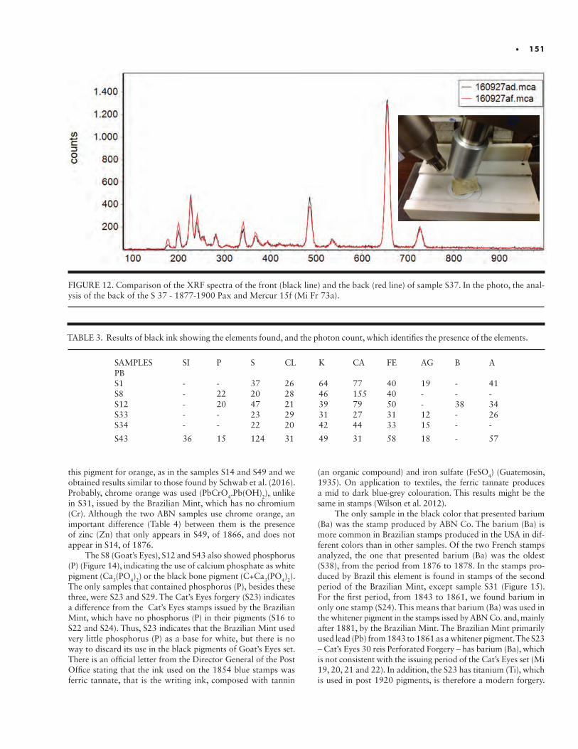
• 151
FIGURE 12. Comparison of the XRF spectra of the front (black line) and the back (red line) of sample S37. In the photo, the anal-ysis of the back of the S 37 - 1877-1900 Pax and Mercur 15f (Mi Fr 73a).
this pigment for orange, as in the samples S14 and S49 and we obtained results similar to those found by Schwab et al. (2016). Probably, chrome orange was used (PbCrO4.Pb(OH)2), unlike in S31, issued by the Brazilian Mint, which has no chromium (Cr). Although the two ABN samples use chrome orange, an important difference (Table 4) between them is the presence of zinc (Zn) that only appears in S49, of 1866, and does not appear in S14, of 1876.
The S8 (Goat’s Eyes), S12 and S43 also showed phosphorus (P) (Figure 14), indicating the use of calcium phosphate as white pigment (Ca3(PO4)2) or the black bone pigment (C+Ca3(PO4)2). The only samples that contained phosphorus (P), besides these three, were S23 and S29. The Cat’s Eyes forgery (S23) indicates a difference from the Cat’s Eyes stamps issued by the Brazilian Mint, which have no phosphorus (P) in their pigments (S16 to S22 and S24). Thus, S23 indicates that the Brazilian Mint used very little phosphorus (P) as a base for white, but there is no way to discard its use in the black pigments of Goat’s Eyes set. There is an official letter from the Director General of the Post Office stating that the ink used on the 1854 blue stamps was ferric tannate, that is the writing ink, composed with tannin
(an organic compound) and iron sulfate (FeSO4) (Guatemosin, 1935). On application to textiles, the ferric tannate produces a mid to dark blue-grey colouration. This results might be the same in stamps (Wilson et al. 2012).
The only sample in the black color that presented barium (Ba) was the stamp produced by ABN Co. The barium (Ba) is more common in Brazilian stamps produced in the USA in dif-ferent colors than in other samples. Of the two French stamps analyzed, the one that presented barium (Ba) was the oldest (S38), from the period from 1876 to 1878. In the stamps pro-duced by Brazil this element is found in stamps of the second period of the Brazilian Mint, except sample S31 (Figure 15). For the first period, from 1843 to 1861, we found barium in only one stamp (S24). This means that barium (Ba) was used in the whitener pigment in the stamps issed by ABN Co. and, mainly after 1881, by the Brazilian Mint. The Brazilian Mint primarily used lead (Pb) from 1843 to 1861 as a whitener pigment. The S23 – Cat’s Eyes 30 reis Perforated Forgery – has barium (Ba), which is not consistent with the issuing period of the Cat’s Eyes set (Mi 19, 20, 21 and 22). In addition, the S23 has titanium (Ti), which is used in post 1920 pigments, is therefore a modern forgery.
TABLE 3. Results of black ink showing the elements found, and the photon count, which identifies the presence of the elements.
SAMPLES SI P S CL K CA FE AG B A PBS1 - - 37 26 64 77 40 19 - 41S8 - 22 20 28 46 155 40 - - -S12 - 20 47 21 39 79 50 - 38 34S33 - - 23 29 31 27 31 12 - 26S34 - - 22 20 42 44 33 15 - -
S43 36 15 124 31 49 31 58 18 - 57
152 • I N S T I T U T E F O R A N A LY T I C A L P H I L AT E LY
FIGURE 13. Evolution of the use of lead (Pb) by Brazilian Mint. FIGURE 14. Evolution of the use of zinc (Zn) by ABN Co.
FIGURE 15. Bar chart of the presence and levels of barium (Ba).
• 153
TABLE 4. Evolution of the use of lead (Pb) by the Brazilian Mint. The intensity shows the photon count, which identifies the presence of the elements.
ISSUE SAMPLE INTENSITY CATALOGED COLORS
S1S8
S16S17S18S19S20S21S22S24S15S11S32S30S31S39S35S36
184318501854185418541854185418541854185418811882188418851885188518871888
410
2410712218051234213441000
47823390
0
BlackBlack
Dark blueGreyish blueGreyish blueDark blue
BlueBlueBlue
Greyish blueBlue
Light brownPale brown
BlueOrange
BlueUltramarineUltramarine
FIGURE 16. XRF spectrum of sample S23, showing titanium (Ti) in the red circle.
Consequently, the presence of particular whitening elements (Figure 16) can help to identify authentic as opposed to forged stamps, as well as assisting in the identification of printers and periods.
The only sample in the black color that contained silicon (Si) was the Cottens essay S43, which had high sulfur (S) and high silicon (Si) levels. The essay also has potassium (K), calci-um (Ca) and iron (Fe). The sulfur (S) combined with the lead (Pb) present in sample S43 indicates the use of lead sulphide (PbS), which constitutes the black pigment. In comparison to the other essays, the essay S43 has a different pattern of chemi-cal elements when presenting the phosphorus (P). The presence of phosphorus (P) indicates the use of bone white and/or the black pigment calcium phosphate. The sulfur (S) level in all Cottens essays differs greatly from the Brazilian Mint pattern, and is, in fact, more similar to the level of sulfur in the North American-made stamps. Incidentally, by analyzing the histo-grams of all the samples, a different pattern is found for the Cottens essays, indicating that the essays were not issued by the printers in the analyzed period.
The same high concentrations of sulfur (S) and silicon (Si) (Figure 17) occurred in the Cottens essays S44 (red), S45 (red), S47 (orange) and S48 (orange), but not in the S40, S41 and S42 blue essays. The occurrence of sulfur (S) in essays S44, S45 and S47 indicates the use of vermilion (HgS), which does not exist in the S48 essay, which is based on lead (Pb) and was printed on an unusual thickness of paper for this type of essay (40-50 μm). No other specimens with the characteristics of sample S48 are known (Table 5).
The essays S42 and S47 have a considerable amount of cal-cium (Ca) and barium (Ba), indicating the presence of whitener pigments such as calcite, because there is no zinc (Zn), excluding lithopon; or because the presence of sulfur (S) the base could be barite (BaSO4). The presence of sulfur (S) and lead (Pb) indicates that the whitener pigment may be lead white (PbSO4) or that
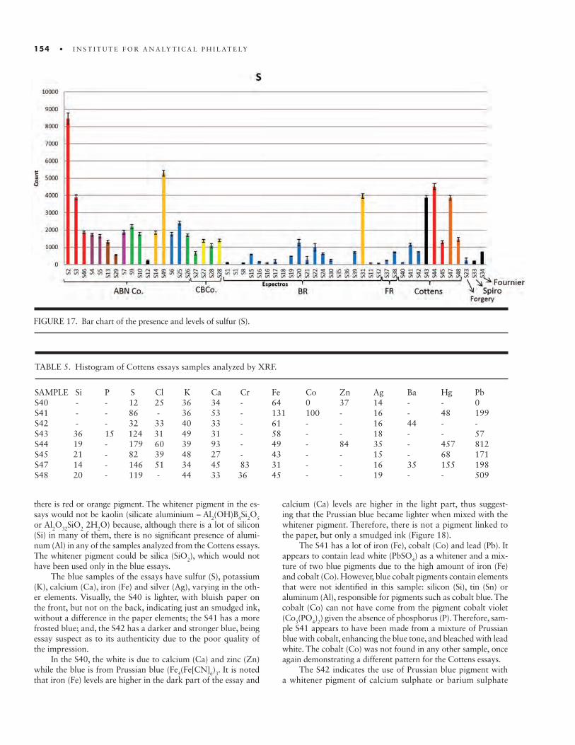
154 • I N S T I T U T E F O R A N A LY T I C A L P H I L AT E LY
FIGURE 17. Bar chart of the presence and levels of sulfur (S).
TABLE 5. Histogram of Cottens essays samples analyzed by XRF.
SAMPLE Si P S Cl K Ca Cr Fe Co Zn Ag Ba Hg PbS40 - - 12 25 36 34 - 64 0 37 14 - - 0S41 - - 86 - 36 53 - 131 100 - 16 - 48 199S42 - - 32 33 40 33 - 61 - - 16 44 - -S43 36 15 124 31 49 31 - 58 - - 18 - - 57S44 19 - 179 60 39 93 - 49 - 84 35 - 457 812S45 21 - 82 39 48 27 - 43 - - 15 - 68 171S47 14 - 146 51 34 45 83 31 - - 16 35 155 198S48 20 - 119 - 44 33 36 45 - - 19 - - 509
there is red or orange pigment. The whitener pigment in the es-says would not be kaolin (silicate aluminium – Al2(OH)B4Si2O5
or Al2O32SiO2 2H2O) because, although there is a lot of silicon (Si) in many of them, there is no significant presence of alumi-num (Al) in any of the samples analyzed from the Cottens essays. The whitener pigment could be silica (SiO2), which would not have been used only in the blue essays.
The blue samples of the essays have sulfur (S), potassium (K), calcium (Ca), iron (Fe) and silver (Ag), varying in the oth-er elements. Visually, the S40 is lighter, with bluish paper on the front, but not on the back, indicating just an smudged ink, without a difference in the paper elements; the S41 has a more frosted blue; and, the S42 has a darker and stronger blue, being essay suspect as to its authenticity due to the poor quality of the impression.
In the S40, the white is due to calcium (Ca) and zinc (Zn) while the blue is from Prussian blue (Fe4(Fe[CN]6)3. It is noted that iron (Fe) levels are higher in the dark part of the essay and
calcium (Ca) levels are higher in the light part, thus suggest-ing that the Prussian blue became lighter when mixed with the whitener pigment. Therefore, there is not a pigment linked to the paper, but only a smudged ink (Figure 18).
The S41 has a lot of iron (Fe), cobalt (Co) and lead (Pb). It appears to contain lead white (PbSO4) as a whitener and a mix-ture of two blue pigments due to the high amount of iron (Fe) and cobalt (Co). However, blue cobalt pigments contain elements that were not identified in this sample: silicon (Si), tin (Sn) or aluminum (Al), responsible for pigments such as cobalt blue. The cobalt (Co) can not have come from the pigment cobalt violet (Co3(PO4)2) given the absence of phosphorus (P). Therefore, sam-ple S41 appears to have been made from a mixture of Prussian blue with cobalt, enhancing the blue tone, and bleached with lead white. The cobalt (Co) was not found in any other sample, once again demonstrating a different pattern for the Cottens essays.
The S42 indicates the use of Prussian blue pigment with a whitener pigment of calcium sulphate or barium sulphate
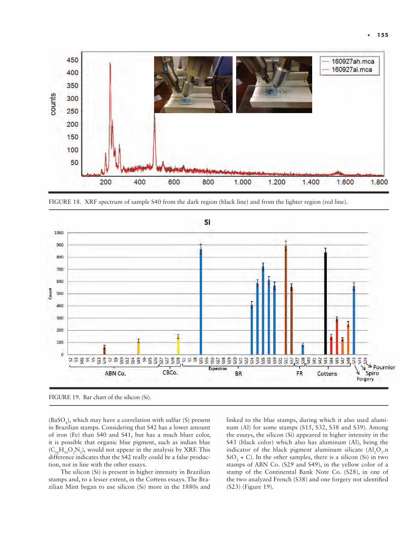
• 155
(BaSO4), which may have a correlation with sulfur (S) present in Brazilian stamps. Considering that S42 has a lower amount of iron (Fe) than S40 and S41, but has a much bluer color, it is possible that organic blue pigment, such as indian blue (C16H10O2N2), would not appear in the analysis by XRF. This difference indicates that the S42 really could be a false produc-tion, not in line with the other essays.
The silicon (Si) is present in higher intensity in Brazilian stamps and, to a lesser extent, in the Cottens essays. The Bra-zilian Mint began to use silicon (Si) more in the 1880s and
FIGURE 18. XRF spectrum of sample S40 from the dark region (black line) and from the lighter region (red line).
FIGURE 19. Bar chart of the silicon (Si).
linked to the blue stamps, during which it also used alumi-num (Al) for some stamps (S15, S32, S38 and S39). Among the essays, the silicon (Si) appeared in higher intensity in the S43 (black color) which also has aluminum (Al), being the indicator of the black pigment aluminum silicate (Al2O3.n SiO2 + C). In the other samples, there is a silicon (Si) in two stamps of ABN Co. (S29 and S49), in the yellow color of a stamp of the Continental Bank Note Co. (S28), in one of the two analyzed French (S38) and one forgery not identified (S23) (Figure 19).
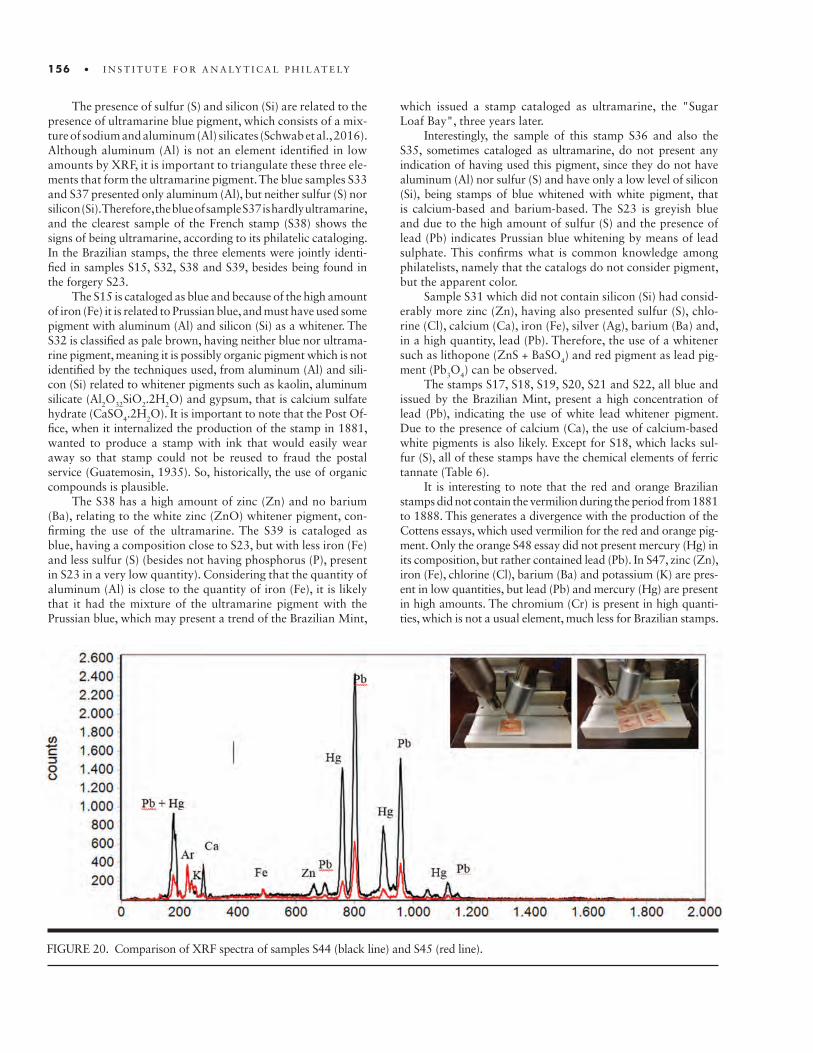
156 • I N S T I T U T E F O R A N A LY T I C A L P H I L AT E LY
The presence of sulfur (S) and silicon (Si) are related to the presence of ultramarine blue pigment, which consists of a mix-ture of sodium and aluminum (Al) silicates (Schwab et al., 2016). Although aluminum (Al) is not an element identified in low amounts by XRF, it is important to triangulate these three ele-ments that form the ultramarine pigment. The blue samples S33 and S37 presented only aluminum (Al), but neither sulfur (S) nor silicon (Si). Therefore, the blue of sample S37 is hardly ultramarine, and the clearest sample of the French stamp (S38) shows the signs of being ultramarine, according to its philatelic cataloging. In the Brazilian stamps, the three elements were jointly identi-fied in samples S15, S32, S38 and S39, besides being found in the forgery S23.
The S15 is cataloged as blue and because of the high amount of iron (Fe) it is related to Prussian blue, and must have used some pigment with aluminum (Al) and silicon (Si) as a whitener. The S32 is classified as pale brown, having neither blue nor ultrama-rine pigment, meaning it is possibly organic pigment which is not identified by the techniques used, from aluminum (Al) and sili-con (Si) related to whitener pigments such as kaolin, aluminum silicate (Al2O32SiO2.2H2O) and gypsum, that is calcium sulfate hydrate (CaSO4.2H2O). It is important to note that the Post Of-fice, when it internalized the production of the stamp in 1881, wanted to produce a stamp with ink that would easily wear away so that stamp could not be reused to fraud the postal service (Guatemosin, 1935). So, historically, the use of organic compounds is plausible.
The S38 has a high amount of zinc (Zn) and no barium (Ba), relating to the white zinc (ZnO) whitener pigment, con-firming the use of the ultramarine. The S39 is cataloged as blue, having a composition close to S23, but with less iron (Fe) and less sulfur (S) (besides not having phosphorus (P), present in S23 in a very low quantity). Considering that the quantity of aluminum (Al) is close to the quantity of iron (Fe), it is likely that it had the mixture of the ultramarine pigment with the Prussian blue, which may present a trend of the Brazilian Mint,
which issued a stamp cataloged as ultramarine, the "Sugar Loaf Bay", three years later.
Interestingly, the sample of this stamp S36 and also the S35, sometimes cataloged as ultramarine, do not present any indication of having used this pigment, since they do not have aluminum (Al) nor sulfur (S) and have only a low level of silicon (Si), being stamps of blue whitened with white pigment, that is calcium-based and barium-based. The S23 is greyish blue and due to the high amount of sulfur (S) and the presence of lead (Pb) indicates Prussian blue whitening by means of lead sulphate. This confirms what is common knowledge among philatelists, namely that the catalogs do not consider pigment, but the apparent color.
Sample S31 which did not contain silicon (Si) had consid-erably more zinc (Zn), having also presented sulfur (S), chlo-rine (Cl), calcium (Ca), iron (Fe), silver (Ag), barium (Ba) and, in a high quantity, lead (Pb). Therefore, the use of a whitener such as lithopone (ZnS + BaSO4) and red pigment as lead pig-ment (Pb3O4) can be observed.
The stamps S17, S18, S19, S20, S21 and S22, all blue and issued by the Brazilian Mint, present a high concentration of lead (Pb), indicating the use of white lead whitener pigment. Due to the presence of calcium (Ca), the use of calcium-based white pigments is also likely. Except for S18, which lacks sul-fur (S), all of these stamps have the chemical elements of ferric tannate (Table 6).
It is interesting to note that the red and orange Brazilian stamps did not contain the vermilion during the period from 1881 to 1888. This generates a divergence with the production of the Cottens essays, which used vermilion for the red and orange pig-ment. Only the orange S48 essay did not present mercury (Hg) in its composition, but rather contained lead (Pb). In S47, zinc (Zn), iron (Fe), chlorine (Cl), barium (Ba) and potassium (K) are pres-ent in low quantities, but lead (Pb) and mercury (Hg) are present in high amounts. The chromium (Cr) is present in high quanti-ties, which is not a usual element, much less for Brazilian stamps.
FIGURE 20. Comparison of XRF spectra of samples S44 (black line) and S45 (red line).
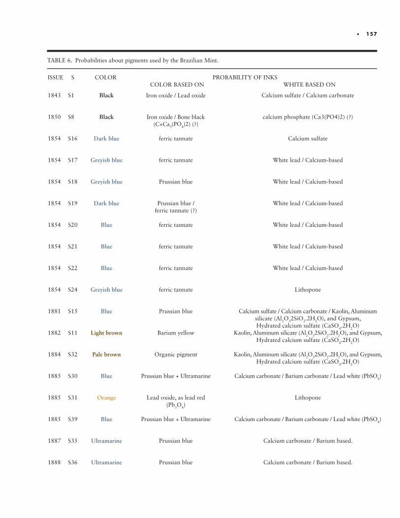
• 157
TABLE 6. Probabilities about pigments used by the Brazilian Mint.
ISSUE S COLOR PROBABILITY OF INKS COLOR BASED ON WHITE BASED ON
1843
1850
1854
1854
1854
1854
1854
1854
1854
1854
1881
1882
1884
1885
1885
1885
1887
1888
S1
S8
S16
S17
S18
S19
S20
S21
S22
S24
S15
S11
S32
S30
S31
S39
S35
S36
Black
Black
Dark blue
Greyish blue
Greyish blue
Dark blue
Blue
Blue
Blue
Greyish blue
Blue
Light brown
Pale brown
Blue
Orange
Blue
Ultramarine
Ultramarine
Iron oxide / Lead oxide
Iron oxide / Bone black (C+Ca3(PO4)2) (?)
ferric tannate
ferric tannate
Prussian blue
Prussian blue / ferric tannate (?)
ferric tannate
ferric tannate
ferric tannate
ferric tannate
Prussian blue
Barium yellow
Organic pigment
Prussian blue + Ultramarine
Lead oxide, as lead red (Pb3O4)
Prussian blue + Ultramarine
Prussian blue
Prussian blue
Calcium sulfate / Calcium carbonate
calcium phosphate (Ca3(PO4)2) (?)
Calcium sulfate
White lead / Calcium-based
White lead / Calcium-based
White lead / Calcium-based
White lead / Calcium-based
White lead / Calcium-based
White lead / Calcium-based
Lithopone
Calcium sulfate / Calcium carbonate / Kaolin, Aluminum silicate (Al2O32SiO2.2H2O), and Gypsum, Hydrated calcium sulfate (CaSO4.2H2O)
Kaolin, Aluminum silicate (Al2O32SiO2.2H2O), and Gypsum, Hydrated calcium sulfate (CaSO4.2H2O)
Kaolin, Aluminum silicate (Al2O32SiO2.2H2O), and Gypsum, Hydrated calcium sulfate (CaSO4.2H2O)
Calcium carbonate / Barium carbonate / Lead white (PbSO4)
Lithopone
Calcium carbonate / Barium carbonate / Lead white (PbSO4)
Calcium carbonate / Barium based.
Calcium carbonate / Barium based.
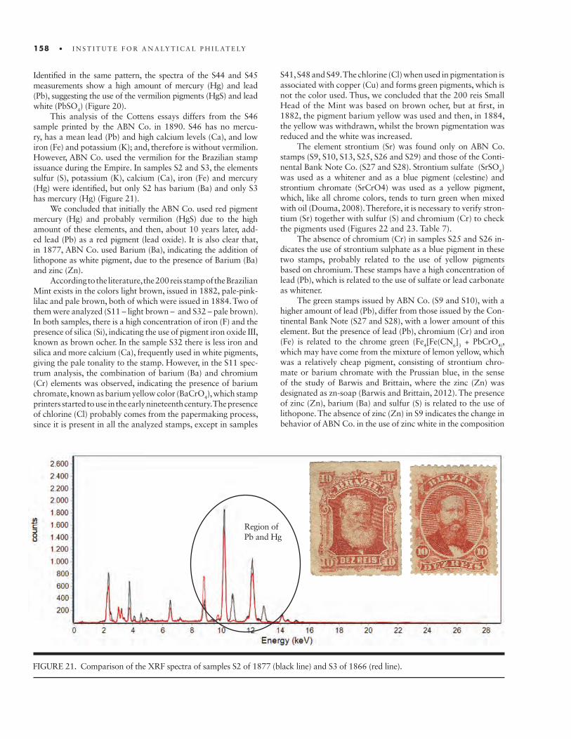
158 • I N S T I T U T E F O R A N A LY T I C A L P H I L AT E LY
FIGURE 21. Comparison of the XRF spectra of samples S2 of 1877 (black line) and S3 of 1866 (red line).
Region ofPb and Hg
Identified in the same pattern, the spectra of the S44 and S45 measurements show a high amount of mercury (Hg) and lead (Pb), suggesting the use of the vermilion pigments (HgS) and lead white (PbSO4) (Figure 20).
This analysis of the Cottens essays differs from the S46 sample printed by the ABN Co. in 1890. S46 has no mercu-ry, has a mean lead (Pb) and high calcium levels (Ca), and low iron (Fe) and potassium (K); and, therefore is without vermilion. However, ABN Co. used the vermilion for the Brazilian stamp issuance during the Empire. In samples S2 and S3, the elements sulfur (S), potassium (K), calcium (Ca), iron (Fe) and mercury (Hg) were identified, but only S2 has barium (Ba) and only S3 has mercury (Hg) (Figure 21).
We concluded that initially the ABN Co. used red pigment mercury (Hg) and probably vermilion (HgS) due to the high amount of these elements, and then, about 10 years later, add-ed lead (Pb) as a red pigment (lead oxide). It is also clear that, in 1877, ABN Co. used Barium (Ba), indicating the addition of lithopone as white pigment, due to the presence of Barium (Ba) and zinc (Zn).
According to the literature, the 200 reis stamp of the Brazilian Mint exists in the colors light brown, issued in 1882, pale-pink-lilac and pale brown, both of which were issued in 1884. Two of them were analyzed (S11 – light brown – and S32 – pale brown). In both samples, there is a high concentration of iron (F) and the presence of silica (Si), indicating the use of pigment iron oxide III, known as brown ocher. In the sample S32 there is less iron and silica and more calcium (Ca), frequently used in white pigments, giving the pale tonality to the stamp. However, in the S11 spec-trum analysis, the combination of barium (Ba) and chromium (Cr) elements was observed, indicating the presence of barium chromate, known as barium yellow color (BaCrO4), which stamp printers started to use in the early nineteenth century. The presence of chlorine (Cl) probably comes from the papermaking process, since it is present in all the analyzed stamps, except in samples
S41, S48 and S49. The chlorine (Cl) when used in pigmentation is associated with copper (Cu) and forms green pigments, which is not the color used. Thus, we concluded that the 200 reis Small Head of the Mint was based on brown ocher, but at first, in 1882, the pigment barium yellow was used and then, in 1884, the yellow was withdrawn, whilst the brown pigmentation was reduced and the white was increased.
The element strontium (Sr) was found only on ABN Co. stamps (S9, S10, S13, S25, S26 and S29) and those of the Conti-nental Bank Note Co. (S27 and S28). Strontium sulfate (SrSO4) was used as a whitener and as a blue pigment (celestine) and strontium chromate (SrCrO4) was used as a yellow pigment, which, like all chrome colors, tends to turn green when mixed with oil (Douma, 2008). Therefore, it is necessary to verify stron-tium (Sr) together with sulfur (S) and chromium (Cr) to check the pigments used (Figures 22 and 23. Table 7).
The absence of chromium (Cr) in samples S25 and S26 in-dicates the use of strontium sulphate as a blue pigment in these two stamps, probably related to the use of yellow pigments based on chromium. These stamps have a high concentration of lead (Pb), which is related to the use of sulfate or lead carbonate as whitener.
The green stamps issued by ABN Co. (S9 and S10), with a higher amount of lead (Pb), differ from those issued by the Con-tinental Bank Note (S27 and S28), with a lower amount of this element. But the presence of lead (Pb), chromium (Cr) and iron (Fe) is related to the chrome green (Fe4[Fe(CN6]3 + PbCrO4), which may have come from the mixture of lemon yellow, which was a relatively cheap pigment, consisting of strontium chro-mate or barium chromate with the Prussian blue, in the sense of the study of Barwis and Brittain, where the zinc (Zn) was designated as zn-soap (Barwis and Brittain, 2012). The presence of zinc (Zn), barium (Ba) and sulfur (S) is related to the use of lithopone. The absence of zinc (Zn) in S9 indicates the change in behavior of ABN Co. in the use of zinc white in the composition
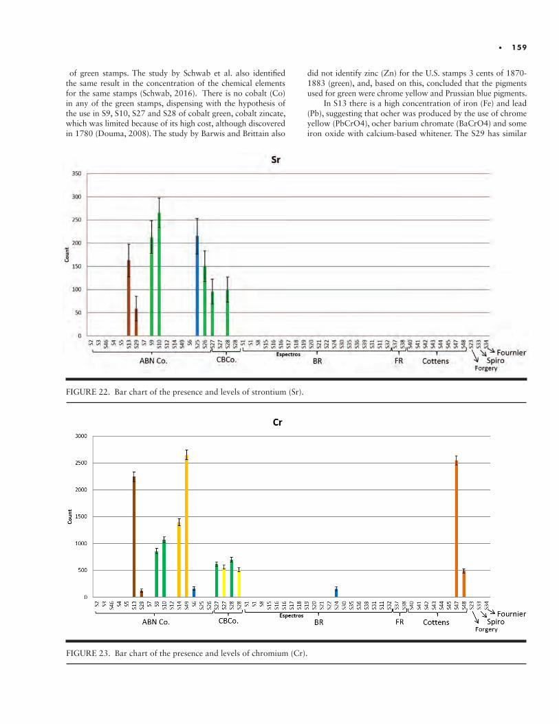
• 159
FIGURE 22. Bar chart of the presence and levels of strontium (Sr).
FIGURE 23. Bar chart of the presence and levels of chromium (Cr).
of green stamps. The study by Schwab et al. also identified the same result in the concentration of the chemical elements for the same stamps (Schwab, 2016). There is no cobalt (Co) in any of the green stamps, dispensing with the hypothesis of the use in S9, S10, S27 and S28 of cobalt green, cobalt zincate, which was limited because of its high cost, although discovered in 1780 (Douma, 2008). The study by Barwis and Brittain also
did not identify zinc (Zn) for the U.S. stamps 3 cents of 1870-1883 (green), and, based on this, concluded that the pigments used for green were chrome yellow and Prussian blue pigments.
In S13 there is a high concentration of iron (Fe) and lead (Pb), suggesting that ocher was produced by the use of chrome yellow (PbCrO4), ocher barium chromate (BaCrO4) and some iron oxide with calcium-based whitener. The S29 has similar
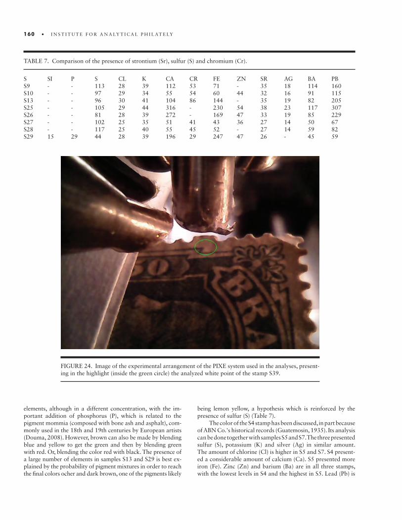
160 • I N S T I T U T E F O R A N A LY T I C A L P H I L AT E LY
TABLE 7. Comparison of the presence of strontium (Sr), sulfur (S) and chromium (Cr).
S SI P S CL K CA CR FE ZN SR AG BA PBS9 - - 113 28 39 112 53 71 - 35 18 114 160S10 - - 97 29 34 55 54 60 44 32 16 91 115S13 - - 96 30 41 104 86 144 - 35 19 82 205S25 - - 105 29 44 316 - 230 54 38 23 117 307S26 - - 81 28 39 272 - 169 47 33 19 85 229S27 - - 102 25 35 51 41 43 36 27 14 50 67S28 - - 117 25 40 55 45 52 - 27 14 59 82S29 15 29 44 28 39 196 29 247 47 26 - 45 59
elements, although in a different concentration, with the im-portant addition of phosphorus (P), which is related to the pigment mommia (composed with bone ash and asphalt), com-monly used in the 18th and 19th centuries by European artists (Douma, 2008). However, brown can also be made by blending blue and yellow to get the green and then by blending green with red. Or, blending the color red with black. The presence of a large number of elements in samples S13 and S29 is best ex-plained by the probability of pigment mixtures in order to reach the final colors ocher and dark brown, one of the pigments likely
FIGURE 24. Image of the experimental arrangement of the PIXE system used in the analyses, present-ing in the highlight (inside the green circle) the analyzed white point of the stamp S39.
being lemon yellow, a hypothesis which is reinforced by the presence of sulfur (S) (Table 7).
The color of the S4 stamp has been discussed, in part because of ABN Co.'s historical records (Guatemosin, 1935). Its analysis can be done together with samples S5 and S7. The three presented sulfur (S), potassium (K) and silver (Ag) in similar amount. The amount of chlorine (Cl) is higher in S5 and S7. S4 present-ed a considerable amount of calcium (Ca). S5 presented more iron (Fe). Zinc (Zn) and barium (Ba) are in all three stamps, with the lowest levels in S4 and the highest in S5. Lead (Pb) is
• 161
lower in S5 and higher in S4 and S7. With this, a correlation of the chemical elements present in the colors of these three stamps is already perceived, just with a difference in the quan-tity of each element.
S5 has more iron (Fe) than the other two but in a joint visu-al analysis of the colors of the stamps, it is probable that iron oxide pigments, such as iron oxide, were used. Lead (Pb) must have been used as pigment, justifying the lighter color of S5 and stronger in the other two. The purple of S7 is not justified by the chemical elements, indicating the presence of organic pigment to give the tonality. With the absence of cobalt (Co) and manganese (Mn), there remains the possibility that violet organic pigment was used. The strong presence of zinc (Zn), sulfur (S) and barium (Ba) is associated with the presence of the white pigment lithopone (ZnS and BaSO4).
Therefore, in view of the comparative analysis done with the chemical elements of the stamps issued by the American Bank Note Co., Continental Bank Note Co., French Mint and Brazilian Mint, it is concluded that the Cottens essays do not
have pigments similar to the standards of the stamps, generat-ing doubts as to the veracity of the stories about their origins.
X-RAY SPECTROSCOPY (PIXE)
The S39 and S51 samples, both blue in color, were analyzed using the PIXE technique in order to allow, in addition to the comparison with the XRF data, the evaluation of the possibili-ty of the Cottens essays being issued by the Brazilian Mint. By analyzing the stamp issued in 1885, in a period close to what is believed to be the period when the Cottens essays were created, it is possible to compare the chemical composition of the pigments used and to evaluate the probability of the objects having been emitted at the same place.
The S39 stamp was analyzed by both the PIXE and XRF tech-niques and the results presented were the same, the elements alu-minium (Al), silicon (Si), sulfur (S), chlorine (Cl), potassium (K), cal-cium (Ca), barium (Ba), iron (Fe) and lead (Pb) are clearly observed.
FIGURE 25. Spectra (linear scale) of high (above) and low (below) PIXE energies for the white point shown in Fig. 22.
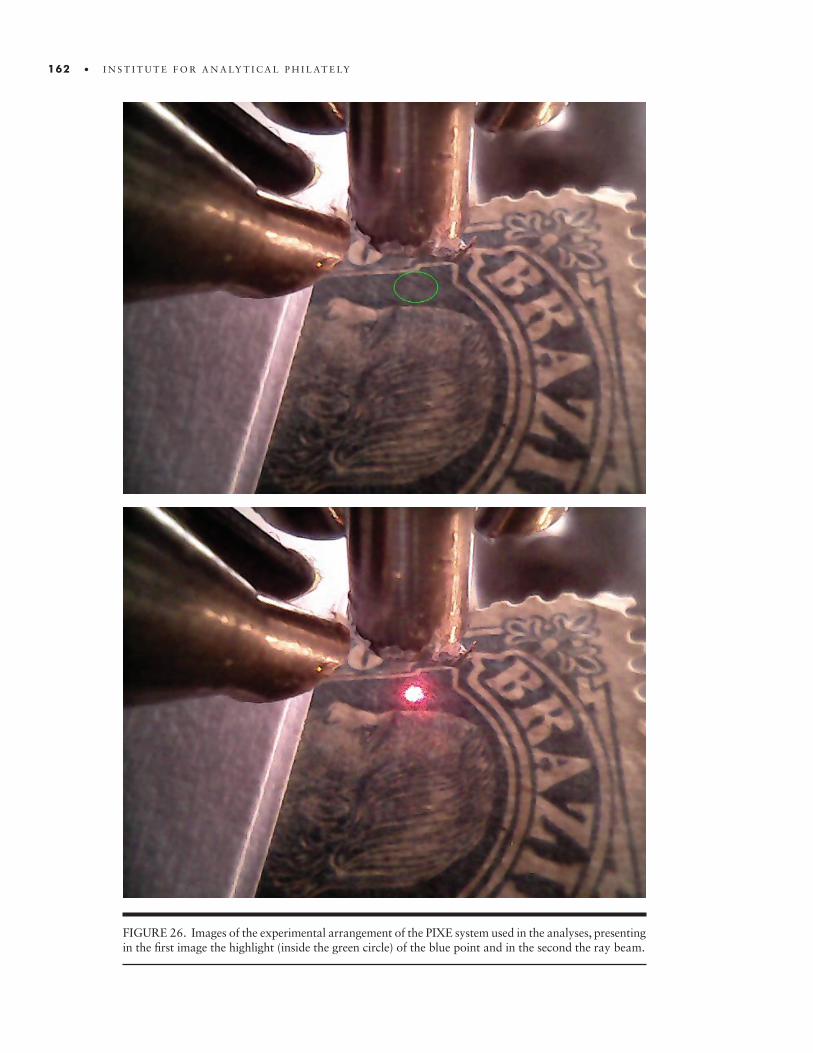
162 • I N S T I T U T E F O R A N A LY T I C A L P H I L AT E LY
FIGURE 26. Images of the experimental arrangement of the PIXE system used in the analyses, presenting in the first image the highlight (inside the green circle) of the blue point and in the second the ray beam.
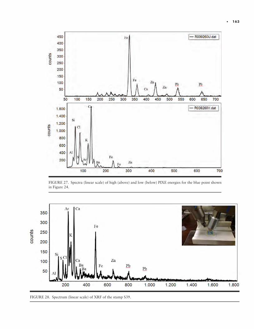
• 163
FIGURE 27. Spectra (linear scale) of high (above) and low (below) PIXE energies for the blue point shown in Figure 24.
FIGURE 28. Spectrum (linear scale) of XRF of the stamp S39.
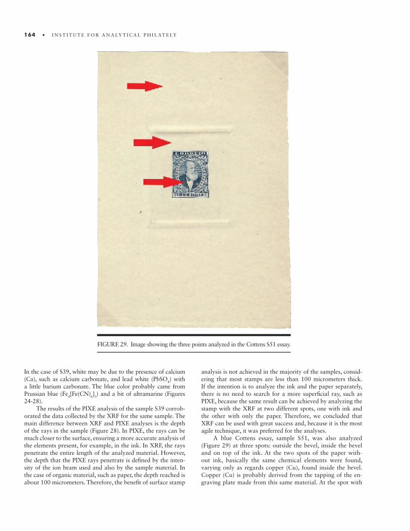
164 • I N S T I T U T E F O R A N A LY T I C A L P H I L AT E LY
FIGURE 29. Image showing the three points analyzed in the Cottens S51 essay.
In the case of S39, white may be due to the presence of calcium (Ca), such as calcium carbonate, and lead white (PbSO4) with a little barium carbonate. The blue color probably came from Prussian blue (Fe4[Fe(CN)6]3) and a bit of ultramarine (Figures 24-28).
The results of the PIXE analysis of the sample S39 corrob-orated the data collected by the XRF for the same sample. The main difference between XRF and PIXE analyses is the depth of the rays in the sample (Figure 28). In PIXE, the rays can be much closer to the surface, ensuring a more accurate analysis of the elements present, for example, in the ink. In XRF, the rays penetrate the entire length of the analyzed material. However, the depth that the PIXE rays penetrate is defined by the inten-sity of the ion beam used and also by the sample material. In the case of organic material, such as paper, the depth reached is about 100 micrometers. Therefore, the benefit of surface stamp
analysis is not achieved in the majority of the samples, consid-ering that most stamps are less than 100 micrometers thick. If the intention is to analyze the ink and the paper separately, there is no need to search for a more superficial ray, such as PIXE, because the same result can be achieved by analyzing the stamp with the XRF at two different spots, one with ink and the other with only the paper. Therefore, we concluded that XRF can be used with great success and, because it is the most agile technique, it was preferred for the analyses.
A blue Cottens essay, sample S51, was also analyzed (Figure 29) at three spots: outside the bevel, inside the bevel and on top of the ink. At the two spots of the paper with-out ink, basically the same chemical elements were found, varying only as regards copper (Cu), found inside the bevel. Copper (Cu) is probably derived from the tapping of the en-graving plate made from this same material. At the spot with
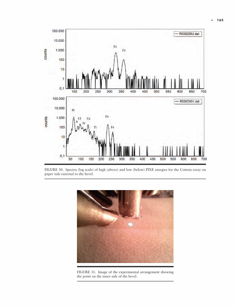
• 165
FIGURE 31. Image of the experimental arrangement showing the point on the inner side of the bevel.
FIGURE 30. Spectra (log scale) of high (above) and low (below) PIXE energies for the Cottens essay on paper side external to the bevel.
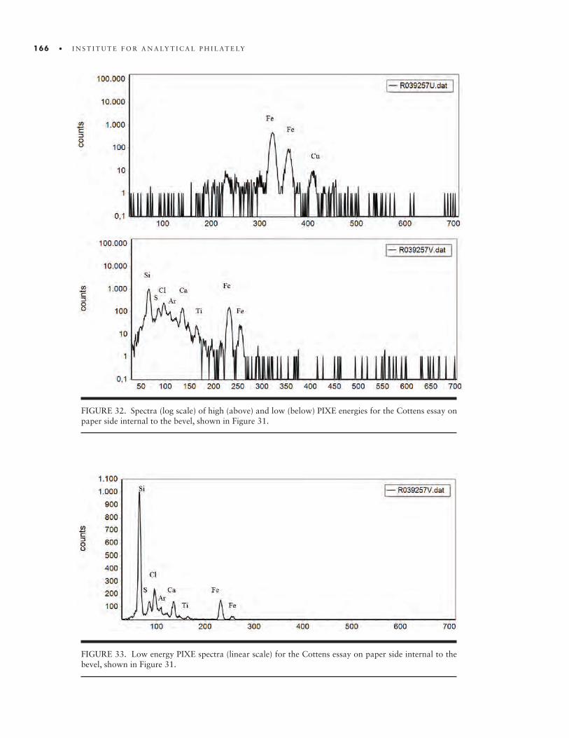
166 • I N S T I T U T E F O R A N A LY T I C A L P H I L AT E LY
FIGURE 32. Spectra (log scale) of high (above) and low (below) PIXE energies for the Cottens essay on paper side internal to the bevel, shown in Figure 31.
FIGURE 33. Low energy PIXE spectra (linear scale) for the Cottens essay on paper side internal to the bevel, shown in Figure 31.
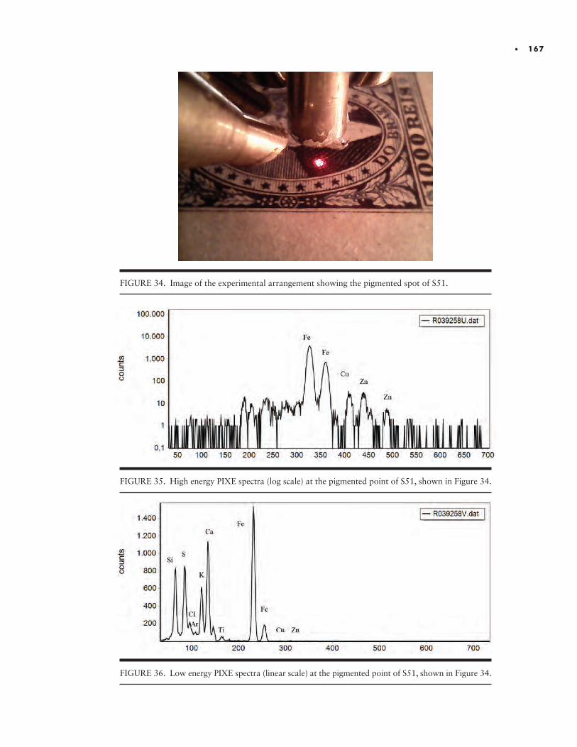
• 167
FIGURE 34. Image of the experimental arrangement showing the pigmented spot of S51.
FIGURE 35. High energy PIXE spectra (log scale) at the pigmented point of S51, shown in Figure 34.
FIGURE 36. Low energy PIXE spectra (linear scale) at the pigmented point of S51, shown in Figure 34.
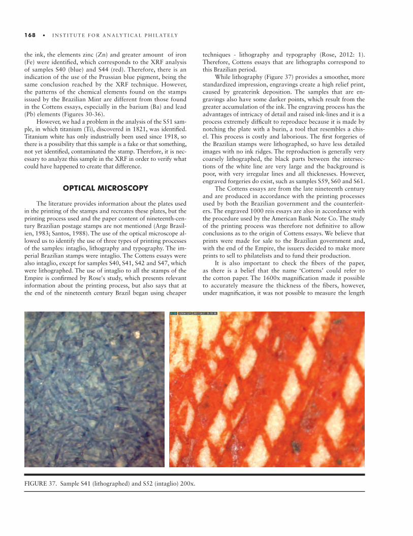
168 • I N S T I T U T E F O R A N A LY T I C A L P H I L AT E LY
the ink, the elements zinc (Zn) and greater amount of iron (Fe) were identified, which corresponds to the XRF analysis of samples S40 (blue) and S44 (red). Therefore, there is an indication of the use of the Prussian blue pigment, being the same conclusion reached by the XRF technique. However, the patterns of the chemical elements found on the stamps issued by the Brazilian Mint are different from those found in the Cottens essays, especially in the barium (Ba) and lead (Pb) elements (Figures 30-36).
However, we had a problem in the analysis of the S51 sam-ple, in which titanium (Ti), discovered in 1821, was identified. Titanium white has only industrially been used since 1918, so there is a possibility that this sample is a fake or that something, not yet identified, contaminated the stamp. Therefore, it is nec-essary to analyze this sample in the XRF in order to verify what could have happened to create that difference.
OPTICAL MICROSCOPY
The literature provides information about the plates used in the printing of the stamps and recreates these plates, but the printing process used and the paper content of nineteenth-cen-tury Brazilian postage stamps are not mentioned (Arge Brasil-ien, 1983; Santos, 1988). The use of the optical microscope al-lowed us to identify the use of three types of printing processes of the samples: intaglio, lithography and typography. The im-perial Brazilian stamps were intaglio. The Cottens essays were also intaglio, except for samples S40, S41, S42 and S47, which were lithographed. The use of intaglio to all the stamps of the Empire is confirmed by Rose's study, which presents relevant information about the printing process, but also says that at the end of the nineteenth century Brazil began using cheaper
techniques - lithography and typography (Rose, 2012: 1). Therefore, Cottens essays that are lithographs correspond to this Brazilian period.
While lithography (Figure 37) provides a smoother, more standardized impression, engravings create a high relief print, caused by greaterink deposition. The samples that are en-gravings also have some darker points, which result from the greater accumulation of the ink. The engraving process has the advantages of intricacy of detail and raised ink-lines and it is a process extremely difficult to reproduce because it is made by notching the plate with a burin, a tool that resembles a chis-el. This process is costly and laborious. The first forgeries of the Brazilian stamps were lithographed, so have less detailed images with no ink ridges. The reproduction is generally very coarsely lithographed, the black parts between the intersec-tions of the white line are very large and the background is poor, with very irregular lines and all thicknesses. However, engraved forgeries do exist, such as samples S59, S60 and S61.
The Cottens essays are from the late nineteenth century and are produced in accordance with the printing processes used by both the Brazilian government and the counterfeit-ers. The engraved 1000 reis essays are also in accordance with the procedure used by the American Bank Note Co. The study of the printing process was therefore not definitive to allow conclusions as to the origin of Cottens essays. We believe that prints were made for sale to the Brazilian government and, with the end of the Empire, the issuers decided to make more prints to sell to philatelists and to fund their production.
It is also important to check the fibers of the paper, as there is a belief that the name ‘Cottens’ could refer to the cotton paper. The 1600x magnification made it possible to accurately measure the thickness of the fibers, however, under magnification, it was not possible to measure the length
FIGURE 37. Sample S41 (lithographed) and S52 (intaglio) 200x.

• 169
FIGURE 38. Sample S1 200x and 1600x. The parallel red lines are a tool to measure fiber width.
FIGURE 39. Sample S26 200x and 1600x. The parallel red lines are a tool to measure fiber width.
FIGURE 40. 200x and 1600x of the paper of the S52, presenting the paper usually found in the Cottens essays. On right, the fine fiber is visible. In red lines, the tool to measure the fibers.
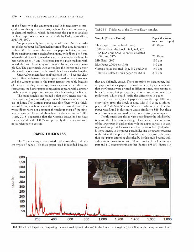
170 • I N S T I T U T E F O R A N A LY T I C A L P H I L AT E LY
of the fibers with the equipment used. It is necessary to pro-ceed to another type of analysis, such as electronic microscopy or chemical analysis, which decomposes the paper to analyze the fiber type, as was done in the study by Farley Katz (Katz, 2015: 98-100).
Samples generally have two types of paper. One is a medi-um thickness paper half-hatched in cotton fiber, used for samples such as S1. The cotton fiber used for paper is linter, the short fibers clinging to cotton seeds after ginning, with fibers 2 to 3 mm in length and 12 to 38 μm in diameter. In the samples the linter fi-bers varied up to 17 μm. The second paper is plain medium with mixed fiber, with fibers ranging from 6 to 16 μm, such as in sam-ple S26. The paper made with cotton has the shorter and denser fibers and the ones made with mixed fiber have variable lengths.
Under 200x magnification (Figures 38-39), it becomes clear that a difference between the stamps analyzed in the microscope and the Cottens essays is the paper texture. Probably because of the fact that they are essays, however, even in their different formatting, the higher paper compaction appears, with a greater brightness in the paper and without clearly showing the fibers.
The main conclusion reached is that the Cottens essay pa-per (Figure 40) is a mixed paper, which does not indicate the use of linter. The Cottens paper uses fine fibers with a thick-ness of 6 μm, which indicates the presence of wood fibers, The wood fibers were not common throughout most of the nine-teenth century. The wood fibers began to be used in the 1880s (Katz, 2015) suggesting that the Cottens essays had to have been made after the 1880’s and probably the name Cottens is not a reference to cotton.
PAPER THICKNESS
The Cottens essays have varied thicknesses due to differ-ent types of paper. The thick paper used is justified because
TABLE 8. Thickness of the Cottens Essay samples.
Sample (Cottens Essays) Paper thickness (micrometer - µm) Thin paper from the block (S48) 40-50 µm 1000 reis from the block (S43, S45, S50, S54, S55 and S56) / 2000 reis isolated (S41 and S47). 70-90 µmMix Essay (S42) 130 µmBlue Paper 2000 reis (S40) 140 µmCottens Essay Isolated (S51, S52 and S53) 150 µm1000 reis Isolated Thick paper red (S44) 230 µm
FIGURE 41. XRF spectra comparing the measured spots in the S43 in the lower dark region (black line) with the upper (red line).
they are philatelic essays. There are prints on card paper, Indi-an paper and stock paper. This wide variety of papers indicates that the Cottens were printed at different times, not seeming to be mere essays, but perhaps they were a production made for philatelists, which could justify the differences in paper.
There are two types of paper used for the type 1000 reis essay taken from the block of nine, with S48 using a thin pa-per, while S50, S54, S55 and S56 use medium paper. The thin paper was found in five more essays similar to S48, but these other essays were not used in the present study as samples.
The thickness can also to vary according to the ink distribu-tion and therefore there is a range of variation. The comparison of the lower part in dark region with the upper part also in dark region of sample S43 shows a small variation of lead (Pb), which is more intense in the upper part, indicating the greater presence of the ink in this upper part. This difference may justify the asser-tion that paper cannot be classified by its thickness because indi-vidual stamps were found with 90 micrometer of thickness in one part and 110 micrometer in another (Santos, 1988:7) (Figure 41).
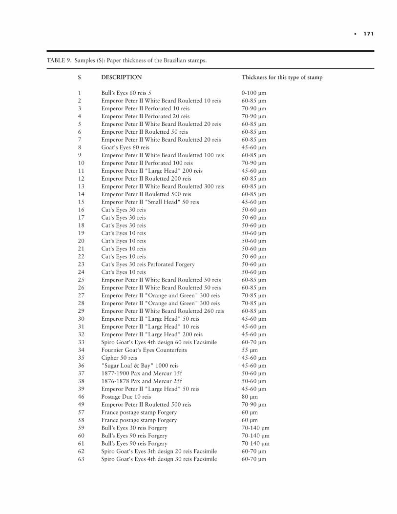
• 171
TABLE 9. Samples (S): Paper thickness of the Brazilian stamps.
S DESCRIPTION Thickness for this type of stamp
1 Bull’s Eyes 60 reis 5 0-100 µm2 Emperor Peter II White Beard Rouletted 10 reis 60-85 µm3 Emperor Peter II Perforated 10 reis 70-90 µm4 Emperor Peter II Perforated 20 reis 70-90 µm5 Emperor Peter II White Beard Rouletted 20 reis 60-85 µm6 Emperor Peter II Rouletted 50 reis 60-85 µm7 Emperor Peter II White Beard Rouletted 20 reis 60-85 µm8 Goat's Eyes 60 reis 45-60 µm9 Emperor Peter II White Beard Rouletted 100 reis 60-85 µm10 Emperor Peter II Perforated 100 reis 70-90 µm11 Emperor Peter II "Large Head" 200 reis 45-60 µm12 Emperor Peter II Rouletted 200 reis 60-85 µm13 Emperor Peter II White Beard Rouletted 300 reis 60-85 µm14 Emperor Peter II Rouletted 500 reis 60-85 µm15 Emperor Peter II "Small Head" 50 reis 45-60 µm16 Cat's Eyes 30 reis 50-60 µm17 Cat's Eyes 30 reis 50-60 µm18 Cat's Eyes 30 reis 50-60 µm19 Cat's Eyes 10 reis 50-60 µm20 Cat's Eyes 10 reis 50-60 µm21 Cat's Eyes 10 reis 50-60 µm 22 Cat's Eyes 10 reis 50-60 µm 23 Cat's Eyes 30 reis Perforated Forgery 50-60 µm24 Cat's Eyes 10 reis 50-60 µm25 Emperor Peter II White Beard Rouletted 50 reis 60-85 µm26 Emperor Peter II White Beard Rouletted 50 reis 60-85 µm27 Emperor Peter II "Orange and Green" 300 reis 70-85 µm28 Emperor Peter II "Orange and Green" 300 reis 70-85 µm29 Emperor Peter II White Beard Rouletted 260 reis 60-85 µm30 Emperor Peter II "Large Head" 50 reis 45-60 µm31 Emperor Peter II "Large Head" 10 reis 45-60 µm32 Emperor Peter II "Large Head" 200 reis 45-60 µm33 Spiro Goat's Eyes 4th design 60 reis Facsimile 60-70 µm34 Fournier Goat's Eyes Counterfeits 55 µm35 Cipher 50 reis 45-60 µm36 "Sugar Loaf & Bay" 1000 reis 45-60 µm37 1877-1900 Pax and Mercur 15f 50-60 µm38 1876-1878 Pax and Mercur 25f 50-60 µm39 Emperor Peter II "Large Head" 50 reis 45-60 µm46 Postage Due 10 reis 80 µm49 Emperor Peter II Rouletted 500 reis 70-90 µm57 France postage stamp Forgery 60 µm58 France postage stamp Forgery 60 µm59 Bull’s Eyes 30 reis Forgery 70-140 µm60 Bull’s Eyes 90 reis Forgery 70-140 µm61 Bull’s Eyes 90 reis Forgery 70-140 µm62 Spiro Goat's Eyes 3th design 20 reis Facsimile 60-70 µm63 Spiro Goat's Eyes 4th design 30 reis Facsimile 60-70 µm

172 • I N S T I T U T E F O R A N A LY T I C A L P H I L AT E LY
In order to perform an exploratory analysis, we compared the measurements of the essays with that of the other Brazilian stamps. The thickness of the paper for the stamps of the Brazil-ian Empire varies widely. The analysis of the literature on paper thickness, supported by a study of small sampling of stamps, allows us to conclude the existence of the following thicknesses for the types of the stamps chosen for the present study (San-tos, 1988; Hennan, 1983; Rose, 2012). In relation to the French stamps and forgeries, S37, S38, S57 and S58, the measurement of the paper thickness presented is only of the samples; no stud-ies exist to allow comparisons. Nevertheless, the thickness of these samples was also measured so that an exploratory com-parison could be made with Cottens essays (Table 9).
The analyzed samples are within the specifications found in the literature, except for the forgeries S59 (180 μm) and S60 (160 μm), which are thicker than the measurement range found by Rose (2012), who studied the forgeries in depth. Samples S1, S59, S60 and S61 show the difference in thickness between true stamps and forged, while the S1 has 80 μm, the S59 has 180 μm, the S60 has 160 μm and the S61 has 130 μm. The forgeries are thicker.
SUMMARY OF STANDARDS
The number of chemical elements found in Brazilian stamps, which justify the inclusion of several pigments in the consti-tution of the ink used both to give color and to lighten it, demonstrates a complex process of ink formulation, making it difficult to analyze and catalog. However, some conclusions can be drawn, particularly as regards the choice of compounds for the periods of stamp issuance. This allows the creation of a database for the study of counterfeits and other productions such as the Cottens essays.
An earlier historical study led us to believe that the Cot-tens essays could have been produced by the Brazilian Mint itself (Santos, 2015). However, the use of the vermilion in the essays and the fact that the Brazilian Mint did not use it in other materials at that time raised the possibility that the Mint had not produced the essays. The low level of barium (Ba) in the essays seems to rule out the possibility of the essays having been produced by some US company, although the essays have a sulfur level (S) closer to the ABN Co. stamps than to those of the Brazilian Mint. In addition, analyzing the histograms of the chemical elements identified by the XRF verifies that the Cottens essays presented a singular pattern when compared to the other samples, which results in the conclusion that they were not issued by any of the printers studied.
Based on our studies, we noticed that after 1881 the Brazil-ian Mint increased the use of white pigments based on barium (Ba) and reduced the use of lead (Pb). For the stamps Emperor Peter II Large Head 50 blue kings, issued in 1885, lead (Pb) was used as a whitener pigment, but not for the Emperor Peter II Small Head 50 reis blue, for which a calcium based white pigment was used.
For the first period of stamp issues by the Brazilian Mint, the phosphorus (P) is found as connected to the black pigment. The Brazilian stamps Cipher 50 reis and "Sugar Loaf Bay" are cataloged as ultramarine, however, this pigment was not used. There are indications, however, of the BrazilianMint having used the ultramarine for stamps classified as blue. Based only on the studies carried out so far, it is concluded that the cataloging of particular Brazilian stamps made by RHM as ultramarine based on visual examinations does not represent the pigments actually used (RHM, 2013).
The Brazilian Mint did not use vermilion for the period from 1881 to 1888, unlike the Cottens essays, which contain vermilion for the red and orange pigment. It is also found that ABN Co. used mercury-based pigment (Hg), probably the ver-milion (HgS), and about 10 years later it added lead (Pb) as a red pigment (lead oxide), reducing the use of zinc (Zn).
There is a wide variety of paper thickness among the Cot-tens essays some of which may have been affected by the dis-tribution of the ink in the impression. Another observation is that the paper thickness variety of the 1000 reis Cottens essays taken from the block of nine indicates that their production was not uniform, which is not consistent with the production of philatelic essays.
The analysis by optical microscopy identified two papers in the samples, one with fibers indicating linter and another with mixed fibers, which indicate the presence of wood fibers, due to the presence of fibers with about six µm. The Cottens essays presented these fine wood fibers, indicating that they were pro-duced later than 1880 and that their name ‘Cottens’ would not be due to the use of cotton paper in their production.
CONCLUSION
The application of analytical methods in philately allowed the creation of a database of the chemical elements present on Imperial Brazilian postal stamps. Due to the number of Brazil-ian stamps from the Empire and the number of variables re-garding the paper and quantity of the pigments used in the inks, this study established an initial database, but without exhaust-ing the conclusions. Much more needs to be done, in particular

• 173
to analyze a larger number of each of the Brazilian stamps in a sufficient quantity – until the data are perfectly replicated for any sample. Significant conclusions were drawn from both the Brazilian stamps in general and the Cottens essays. The Cottens essays presented different patterns in relation to the pigments used by the studied emitters and their origin cannot be de-termined. The analytical studies did not corroborate previous historical studies.
The analytical methods used were insufficient to provide exact definitions of the pigments used, but worked very well as ex-ploratory research in order to give guidance for future works. For the study of philatelic material it is possible to use XRF with the same efficiency of PIXE. So far, in the case of postal stamps, PIXE analysis does not provide any useful information beyond what can be garnered with the XRF. Other methods such as Fourier transform infrared spectroscopy (FTIR) and Raman spectroscopy may provide the information required for the completion of this database for the Brazilian postal stamps.
REFERENCES
Arbeitsgemeinschaft Brasilien im BDPh e.V. – Arge Brasilien. “Dom Pedro plattenstudien und platten rekonstruktionen 1866 - 1876”. Lohmar, 1983.Barwis, John H., Brittain, Harry G. 2012. Ink composition of the U.S. 3¢ stamps of 1870-1883. First International Sym- posium on Analytical Methods in Philately. Proceedings of the Second International Symposium On Analytical Methods In Philately, 02: 49-56.Brazil Philatelic Association. 2014. Bull’s Eyes, Journal of the Brazil Philatelic Association, Third Quarter, vol. 45, num. 3, pp.1-2.Cesareo, R., & Brunetti, A. 2008. X-ray fluorescence - analysis of 19th century stamps. X-Ray Spectrometry, 37(3), 260-264.Comelli, Paulo. 1992. “O arquivo do American Bank Note”. In Revista Mosaico, march/1992, vol. 4, pp. 45-50. Belo Horizon- te: Câmara Brasileira de Filatelia.Douma, M., Curator. (2008). Pigments through the Ages. http:// www.webexhibits.org/pigments (accessed 15 June 2017).Eubanks, Gordon; Brittain, Harry. 2012. Analysis of pigment composition of the U.S. 5c 1847 issue. Slides presentation in http://analyticalphilately.org/wp-content/uploads/2016/01 /Eubanks.pdf (accessed 01 June 2017).Guatemosin, Dorvelino. 1935. Miscelania Historica, Postal e Filo- telica Nacional. Hennan, Clarence. 1983. “Império do Brazil 1843-1889”. In Phi- latelistische Studien und Forschungen. Arbeitsgemeinschaft Brasilien um BDPh e. V.
Johansson S. A. E. and Campbell J. L. 1988. PIXE: A Novel Tech- nique for elemental analysis.Katz, F. P. The “Rosette Eagles” of Mexico – Microscopic Analysis of Paper Content of Mystery Mexican Stamps Confirms Origin and Date. International Symposium on Analytical Methods in Philately. Proceedings of the Second International Symposium On Analytical Methods In Philately, 02: 96-101.Rhm. 2013. “Catálogo de selos do Brasil de 2013 : completo de 1648 – 2012”. 58ª edição. São Paulo: Editora Rhm Ltda.Rizzutto, Marcia Almeida. 2008. Análises não-destrutivas em de obras de arte com técnicas atômico-nucleares. In Revista CPC, v. 6, pp. 1-11, USP.Rizzutto, M. A.; Mouro, M. V.; Silva, T. F.; Trindade, G. F.; Added, N.; Tabacniks, M. H.; Campos, P. H. O. V.; Kajiya, E. A. M.; Magalhães, A. G.; Barbosa, M. “External PIXE analysis for the study of painting pigments an easel painting of the MAC muse- um”, Nuclear Instruments and Methods, B 332 (2014) 411– 414, doi: 10.1016/j.nimb.2014.02.108.Rose, Stephen. 2012. Brazil – Early forgeries, facsimiles & postal counterfeits. Chicagopex. https://stamps.org/userfiles/file/My APS/Exhibits/Brazil.pdf (accessed 01 June 2017).Santos, F. S. M.. 2015. “Um estudo inacabado sobre a verdadeira história dos ensaios postais de Dom Pedro II barba branca não emitidos: os ‘ensaios de Cottens’ – Parte I”. In Boletim Infor- mativo da Sociedade Philatelica Paulista. São Paulo, April 2015, num. 224, pp. 52-63.______. 2015. “Um estudo inacabado sobre a verdadeira história dos ensaios postais de Dom Pedro II barba branca não emit- idos: os ‘ensaios de Cottens’ – parte II”. In Boletim Informa- tivo da Sociedade Philatelica Paulista. São Paulo, August 2015, num. 225, pp. 57-63.Santos, R. C. 1988. “Estudo da Emissão D. Pedro II 1866 – 1976”. São Paulo, 1988.Schwab, N. V., Da-Col, J. A., Meyer, P., Bueno, M. I. M. S. and Eberlin, M. N. 2016. Energy Dispersive X-Ray Fluorescence Profile of Some Brazilian Postage Stamps. Journal of the Bra- zilian Chemical Society, 27(7), 1305-1310. https://dx.doi.org/ 10.5935/0103-5053.20160029 (01 August 2016).Silva, W. D. and Appoloni, C. R.. “Pigmentos: propriedades físicas, químicas e o período histórico de utilização”. LFNATEC. Pub- licação Técnica do Laboratório de Física Nuclear Aplicada, v. 13, n. 01, Londrina, UEL. http://www.uel.br/grupos/gfna/ pigmentos2009.pdf (15 June 2017).Wilson, H., C. Carr, and M. Hacke. 2012. Production and Vali- dation of Model Iron-Tannate Dyed Textiles for Use as Historic Textile Substitutes in Stabilisation Treatment Studies. Chemis- try Central Journal 6: 641–656. doi: 10.1186/1752-153X-6-44. https://link.springer.com/article/10.1186/1752-153X-6-44 (30 June 2017).

174 • I N S T I T U T E F O R A N A LY T I C A L P H I L AT E LY
Want to know more about your stamps?
We can help with technical advice, funding for laboratory analyses, and free technical reviews of your draft publications.
To learn more, visit our website:www.analyticalphilately.org
• 175
AUTHORS
Elliot Gruber [email protected]
John H. Barwis: [email protected]
Jonas Hällström [email protected]
Chris Harman [email protected]
Susan N. Smith: [email protected]
Paul Leonard: [email protected]
J. Edward Nixon: [email protected]
Garfield Portch: [email protected]
Robert V. Mustacich: [email protected]
Tim Lyerla: [email protected]
John M. Cibulskis: [email protected]
Harry G. Brittain: [email protected]
Harry K. Charles: [email protected]
Richard Judge: [email protected]
Larry Lyons: [email protected]
Fernando S. Moreira dos Santos: [email protected]