Practical Data Visualization - Duke Computer Science
119
Practical Data Visualization March 18, 2015 COMPSCI 216: Everything Data Angela Zoss Data Visualization Coordinator Data and Visualization Services
-
Upload
khangminh22 -
Category
Documents
-
view
1 -
download
0
Transcript of Practical Data Visualization - Duke Computer Science

Practical Data Visualization
March 18, 2015 COMPSCI 216: Everything Data
Angela Zoss Data Visualization Coordinator Data and Visualization Services

WHY VISUALIZE?

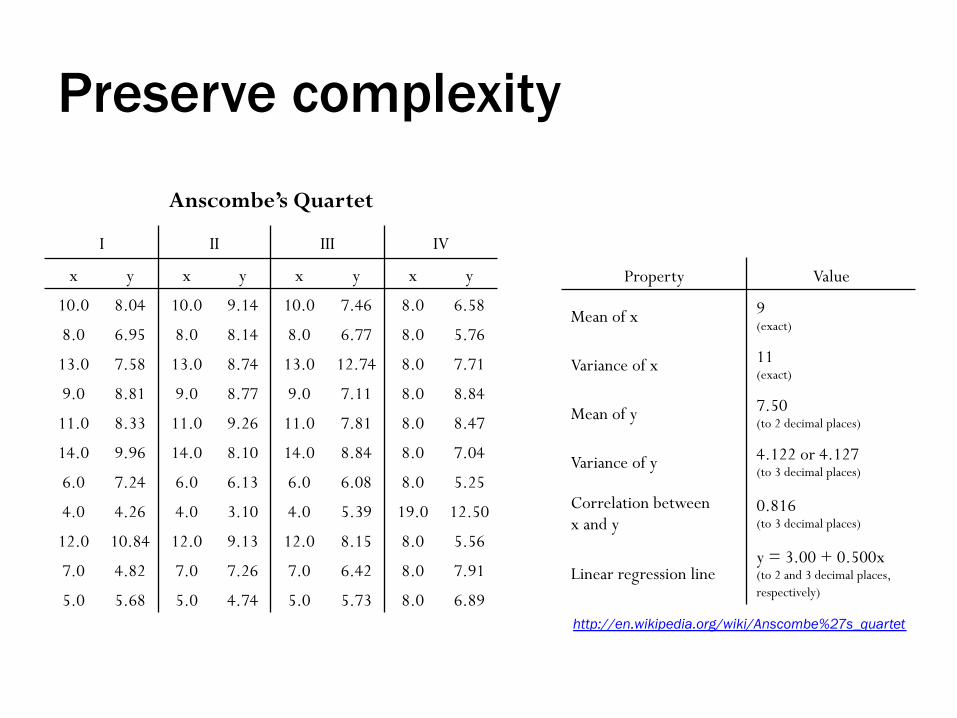
Preserve complexity
Anscombe’s Quartet
I II III IV
x y x y x y x y
10.0 8.04 10.0 9.14 10.0 7.46 8.0 6.58
8.0 6.95 8.0 8.14 8.0 6.77 8.0 5.76
13.0 7.58 13.0 8.74 13.0 12.74 8.0 7.71
9.0 8.81 9.0 8.77 9.0 7.11 8.0 8.84
11.0 8.33 11.0 9.26 11.0 7.81 8.0 8.47
14.0 9.96 14.0 8.10 14.0 8.84 8.0 7.04
6.0 7.24 6.0 6.13 6.0 6.08 8.0 5.25
4.0 4.26 4.0 3.10 4.0 5.39 19.0 12.50
12.0 10.84 12.0 9.13 12.0 8.15 8.0 5.56
7.0 4.82 7.0 7.26 7.0 6.42 8.0 7.91
5.0 5.68 5.0 4.74 5.0 5.73 8.0 6.89
Preserve complexity
http://en.wikipedia.org/wiki/Anscombe%27s_quartet
Anscombe’s Quartet
I II III IV
x y x y x y x y
10.0 8.04 10.0 9.14 10.0 7.46 8.0 6.58
8.0 6.95 8.0 8.14 8.0 6.77 8.0 5.76
13.0 7.58 13.0 8.74 13.0 12.74 8.0 7.71
9.0 8.81 9.0 8.77 9.0 7.11 8.0 8.84
11.0 8.33 11.0 9.26 11.0 7.81 8.0 8.47
14.0 9.96 14.0 8.10 14.0 8.84 8.0 7.04
6.0 7.24 6.0 6.13 6.0 6.08 8.0 5.25
4.0 4.26 4.0 3.10 4.0 5.39 19.0 12.50
12.0 10.84 12.0 9.13 12.0 8.15 8.0 5.56
7.0 4.82 7.0 7.26 7.0 6.42 8.0 7.91
5.0 5.68 5.0 4.74 5.0 5.73 8.0 6.89
Property Value
Mean of x 9 (exact)
Variance of x 11 (exact)
Mean of y 7.50 (to 2 decimal places)
Variance of y 4.122 or 4.127 (to 3 decimal places)
Correlation between x and y
0.816 (to 3 decimal places)
Linear regression line y = 3.00 + 0.500x (to 2 and 3 decimal places, respectively)

Preserve complexity
http://en.wikipedia.org/wiki/Anscombe%27s_quartet
Anscombe’s Quartet

Evaluate data quality
Query using Facebook API • Node-link diagram
Kandel, Heer, Plaisant, et al. (2011) http://dx.doi.org/10.1177/1473871611415994

Query using Facebook API • Node-link diagram • Matrix display with clustering
Evaluate data quality
Kandel, Heer, Plaisant, et al. (2011) http://dx.doi.org/10.1177/1473871611415994

Kandel, Heer, Plaisant, et al. (2011) http://dx.doi.org/10.1177/1473871611415994
Query using Facebook API • Node-link diagram • Matrix display with clustering • Matrix display, API return order
Evaluate data quality

Kandel, Heer, Plaisant, et al. (2011) http://dx.doi.org/10.1177/1473871611415994
Query using Facebook API • Node-link diagram • Matrix display with clustering • Matrix display, API return order
5000-item result limit Silent failure
Evaluate data quality

Tell a story
Hans Rosling – The River of Myths http://www.youtube.com/watch?v=OwII-dwh-bk
http://www.gapminder.org/

CREATING A VISUALIZATION

From Data to Graphic
• What data types are present in the data source? Categorical? Numerical? Relational?

Matching Data Types to Visual Elements
Mackinlay, J. (1986). Automating the design of graphical presentations of relational information. ACM Transactions on Graphics, 5(2), 110-141. http://dx.doi.org.proxy.lib.duke.edu/10.1145/22949.22950
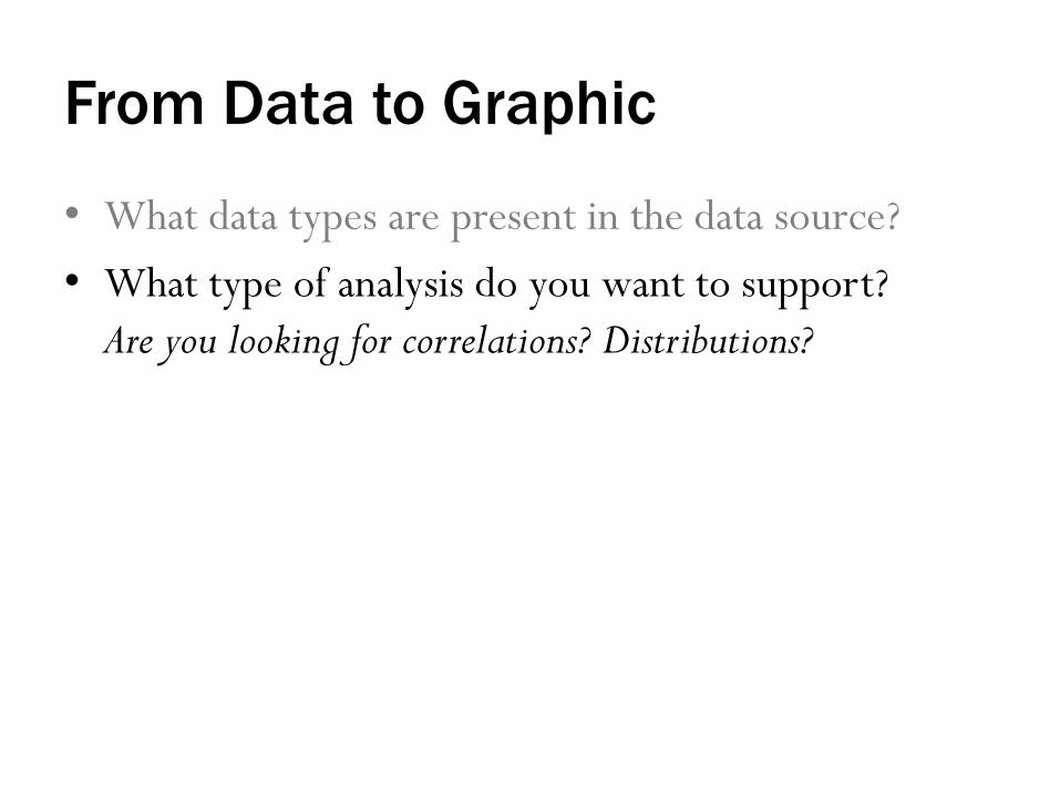
From Data to Graphic
• What data types are present in the data source? • What type of analysis do you want to support?
Are you looking for correlations? Distributions?

Circular Area Chart Line Chart Column Chart Line Chart
Scatter Chart
3D Area Chart
Pie Chart Waterfall Chart Stacked 100% Column Chart
with Subcomponents
Stacked Area ChartStacked 100%
Area Chart
Stacked
Column Chart
Stacked 100%
Column Chart
Bubble Chart
Scatter Chart
Variable Width
Column Chart
Table or Table with
Embedded Charts
Bar Chart Column Chart
Column Histogram
Line Histogram
http://extremepresentation.typepad.com/blog/2006/09/choosing_a_good.html

From Data to Graphic
• What data types are present in the data source? • What type of analysis do you want to support? • What visualization type seems to be the best fit for
the goal? Do you want the visualization to be accessible for a broad audience? Flashy and engaging? Convincing?

POSITION IS EVERYTHING. @moritz_stefaner

Basic tips
• Rotated text is harder to read • People are very good at reading x/y position,
bar length • People are not as good at reading angles, areas • Avoid overlap by filtering, aggregating, leaving space
http://guides.library.duke.edu/topten

COLOR IS DIFFICULT. @moritz_stefaner

Basic tips
For categorical variables: • People have trouble differentiating between more than
5-7 hues (colors)
For numerical variables: • People have trouble differentiating between more than
5-7 shades • Rainbow color gradients are very problematic
For highest contrast, only use color to highlight
http://guides.library.duke.edu/topten

VISUALIZATION TYPES http://guides.library.duke.edu/vis_types

Showing Values

Basic charts and graphs

Binned Scatterplot
http://raw.densitydesign.org/

Parallel Coordinates
http://eagereyes.org/techniques/parallel-coordinates

Sankey/Alluvial Diagram
http://raw.densitydesign.org/
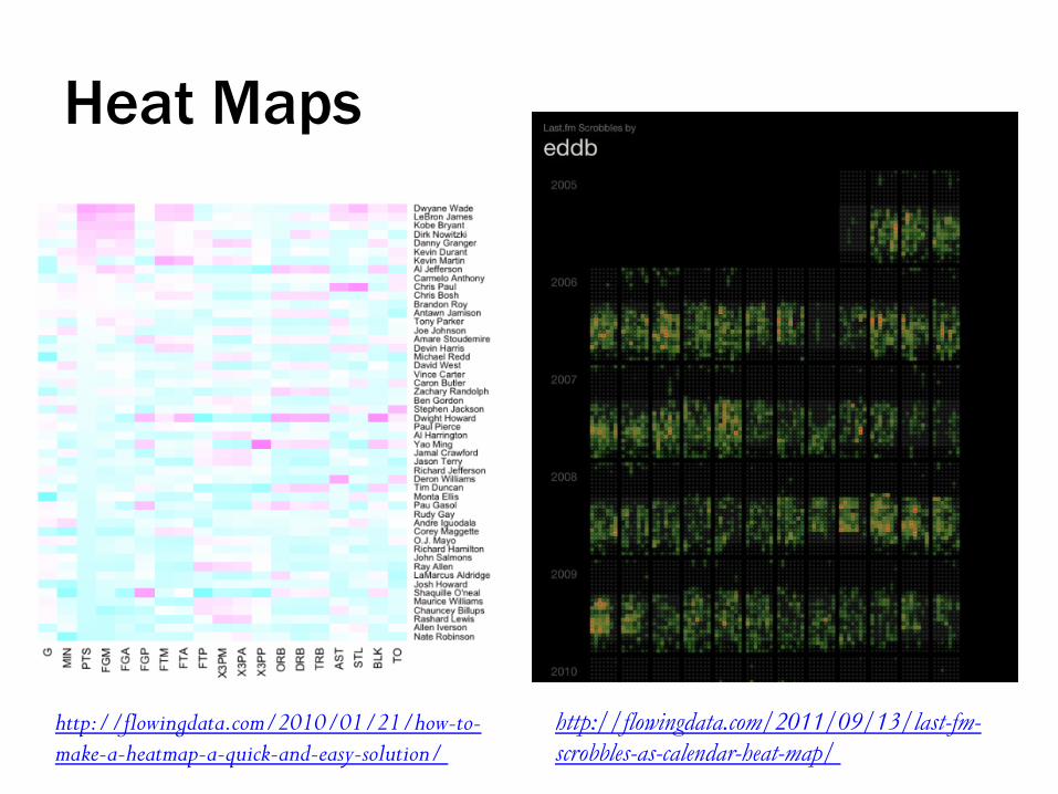
http://flowingdata.com/2010/01/21/how-to-make-a-heatmap-a-quick-and-easy-solution/
http://flowingdata.com/2011/09/13/last-fm-scrobbles-as-calendar-heat-map/
Heat Maps
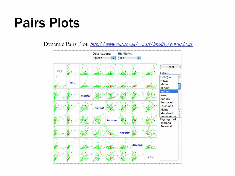
Dynamic Pairs Plot: http://www.stat.sc.edu/~west/bradley/census.html
Pairs Plots

Showing Distributions
One-dimensional scatter plot
Histogram

Showing Space
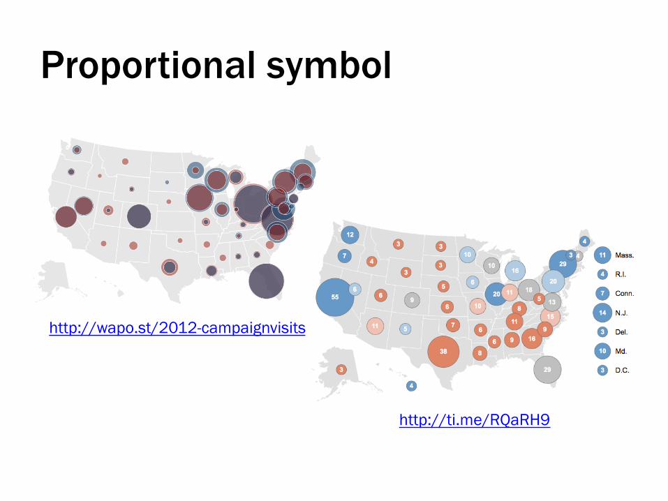
Proportional symbol
http://ti.me/RQaRH9
http://wapo.st/2012-campaignvisits

Proportional symbol

Choropleth
https://twitter.com/mihi_tr/status/330261204083810304/photo/1

Choropleth
https://twitter.com/mihi_tr/status/330261204083810304/photo/1
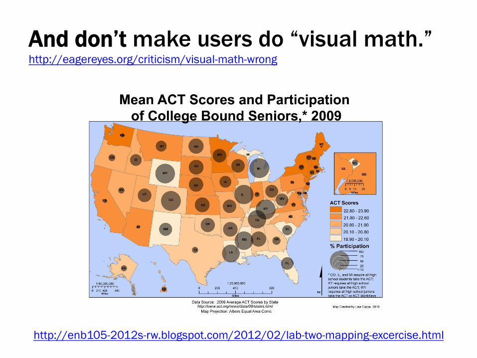
And don’t make users do “visual math.” http://eagereyes.org/criticism/visual-math-wrong
http://enb105-2012s-rw.blogspot.com/2012/02/lab-two-mapping-excercise.html

Common Routes Based on Ship Log Data
http://bit.ly/1i3PSQh

Atlas of the Historical Geography of the United States (1932)
http://bit.ly/1qv0Lvo

Possible tools for mapping • ArcGIS • QGIS • Tableau Public • CartoDB • Google Fusion Tables • Google Earth • GeoCommons
• JavaScript – D3
http://d3js.org/ – Leaflet
http://leafletjs.com/
– Kartograph http://kartograph.org/
– Polymaps http://polymaps.org/
– Google Maps API https://developers.google.com/maps/documentation/javascript/
• Very basic: – Google Spreadsheets – BatchGeo
http://batchgeo.com/ – OpenHeatMap
http://www.openheatmap.com/
See also: http://library.duke.edu/data/gis https://github.com/veltman/learninglunches/tree/master/maps

For congress data in Tableau
• http://www.tableau.com/public/blog/2012/10/congressional-districts-1696 • http://onlinehelp.tableau.com/current/pro/
online/en-us/help.htm#maps_geographicroles.html

Showing Time

Economic indicators over time
http://blogs.library.duke.edu/data/2012/11/12/adding-colored-regions-to-excel-charts/

http://seawifs.gsfc.nasa.gov/SEAWIFS/BACKGROUND/Gallery/time_series.jpg
Time series of 2D data set

Connected Scatterplot
http://bit.ly/1AADeyq

Stream graphs
cancer (neoplasms)
mental and behavioral disorders
infectious and parasitic diseases
endocrine, nutritional and metabolic diseases
diseases of the respiratory system
pregnancy and childbirth
injury, poisoning and other external causes
diseases of the digestive system
diseases of the circulatory system
EnglishFrench
RussianGermanJapanese
http://bit.ly/pubmedvis

Storylines
http://xkcd.com/657/

Shape of Song
http://www.turbulence.org/Works/song/mono.html

Over the Decades, How States Have Shifted
http://nyti.ms/Wr1dhZ

Possible tools for temporal vis.
• Basic charting tools • Raw
http://raw.densitydesign.org/ • TimelineJS
http://timeline.knightlab.com/ • Simile Timeline
http://simile.mit.edu/ • D3

Showing Relationships

Edges
http://www.aaronkoblin.com/work/flightpatterns/

Nodes
http://nihmaps.org/vids.php

Both
http://kieranhealy.org/blog/archives/2013/06/09/using-metadata-to-find-paul-revere/

With color and size coding
http://republicofletters.stanford.edu/casestudies/spanishempire.html

Bipartite graph, alluvial diagram
http://stanford.io/1hCYwkd

Circular layout/chord diagram
http://www.niceone.org/lab/refugees/

Tube Map
http://diagrams.org/images/png/large/f00022.html

Possible tools for network vis. • D3 • Gephi
http://gephi.org/ • NodeXL
http://nodexl.codeplex.com/ • Pajek
http://vlado.fmf.uni-lj.si/pub/networks/pajek/
• Cytoscape • Network Workbench/Sci2
http://nwb.cns.iu.edu/, https://sci2.cns.iu.edu/
• VOSviewer http://www.vosviewer.com/
• UCINET https://sites.google.com/site/ucinetsoftware/home
• GUESS http://graphexploration.cond.org/
• R • SigmaJS
http://sigmajs.org/ • Circos
http://circos.ca/

Showing Text
http://guides.library.duke.edu/text_vis
cancer (neoplasms)
mental and behavioral disorders
infectious and parasitic diseases
endocrine, nutritional and metabolic diseases
diseases of the respiratory system
pregnancy and childbirth
injury, poisoning and other external causes
diseases of the digestive system
diseases of the circulatory system
Word cloud
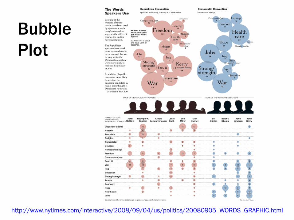
http://www.nytimes.com/interactive/2008/09/04/us/politics/20080905_WORDS_GRAPHIC.html
Bubble Plot

Frequencies over time
http://languagelog.ldc.upenn.edu/nll/?p=4126

Scatter Plot
http://tabsoft.co/1ByN2br
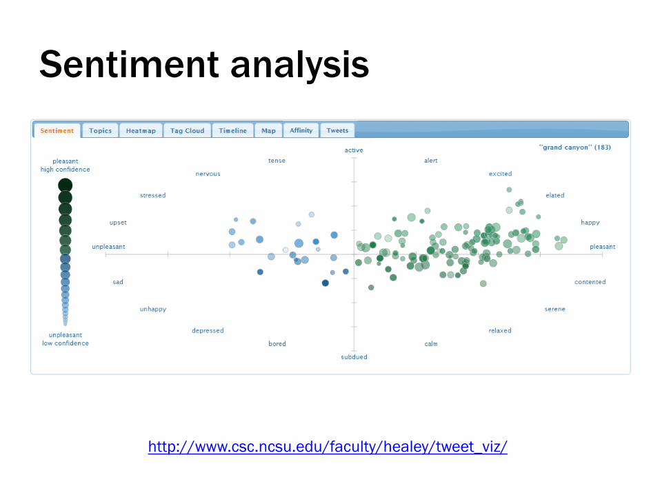
http://www.csc.ncsu.edu/faculty/healey/tweet_viz/
Sentiment analysis

http://neoformix.com/2013/NovelViews.html
Sentiment analysis

Word Tree
http://hint.fm/projects/wordtree/

Word co-occurrence network
http://en.wikipedia.org/wiki/Co-occurrence_networks

Phrasenet
http://www-01.ibm.com/software/analytics/many-eyes/

http://itsbeenreal.co.uk/index.php?/wwwords/rhythm-textures/

VISUALIZING UNCERTAINTY
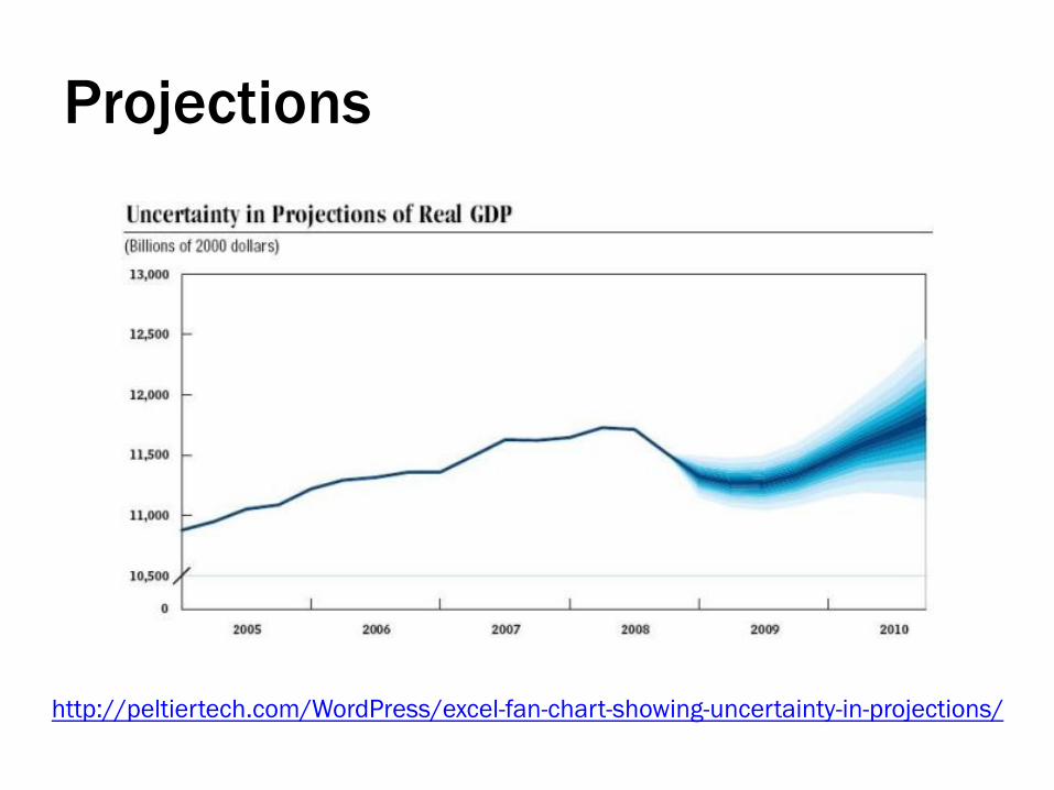
Projections
http://peltiertech.com/WordPress/excel-fan-chart-showing-uncertainty-in-projections/

Missing data
http://ivi.sagepub.com/content/10/4/271

Alternative solutions
http://vialab.science.uoit.ca/portfolio/lattice-uncertainty-visualization-understanding-machine-translation-and-speech-recognition

Take-away
Uncertainty is blue.

TOOLS THAT DON’T NEED INSTALLATION

Plot.ly
https://plot.ly/

Plot.ly
• Browser based (or Excel add-in) • Makes wide variety of chart types • Allows for python, MATLAB, R, etc. syntax • Makes charts that are hosted/shareable
https://plot.ly/
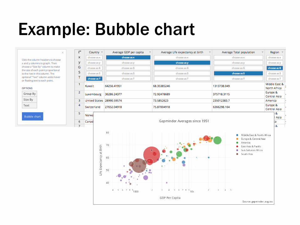
Example: Bubble chart
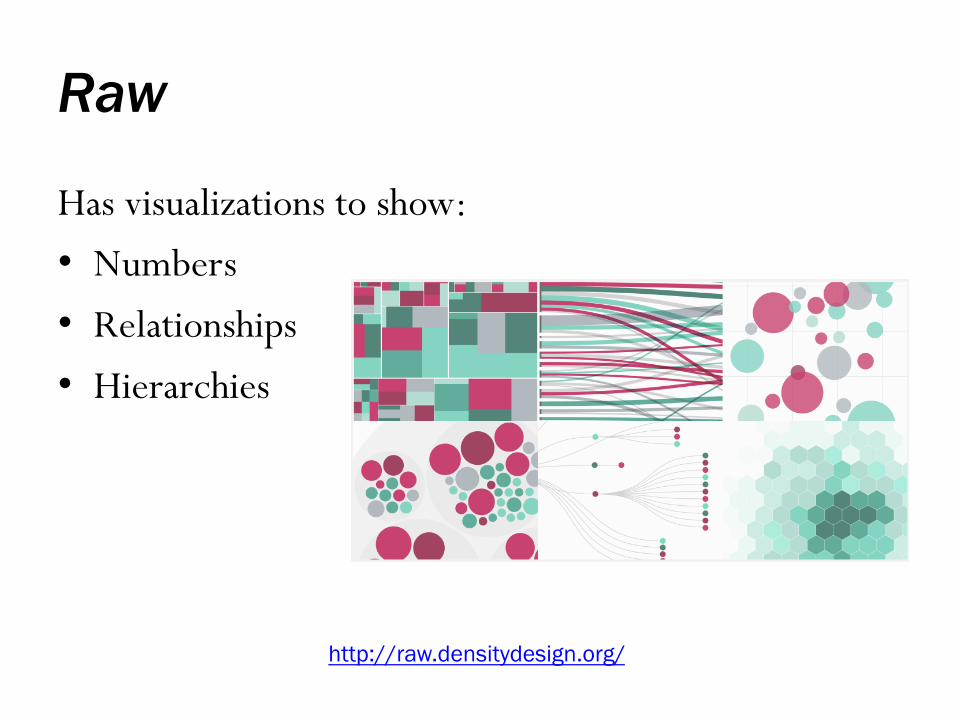
Raw
http://raw.densitydesign.org/
Has visualizations to show: • Numbers • Relationships • Hierarchies

Raw
http://raw.densitydesign.org/
• Paste in a data table (.csv, .tsv, copied from Excel) • Select chart type • Drag column headers to different chart attributes • Save out image or SVG code

Example: Alluvial Diagram

Google Spreadsheets
https://drive.google.com/

TimelineJS
http://timeline.knightlab.com/

Timeliner
http://timemapper.okfnlabs.org/

StoryMapJS
http://storymap.knightlab.com/

Also, GitHub auto-rendering
• 3D Files https://help.github.com/articles/3d-file-viewer
• GeoJSON/TopoJSON https://help.github.com/articles/mapping-geojson-files-on-github
• CSV/TSV https://help.github.com/articles/rendering-csv-and-tsv-data

SOFTWARE APPLICATIONS
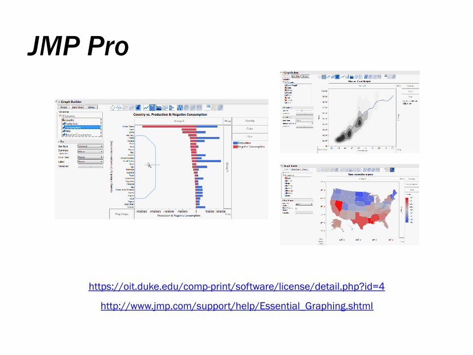
JMP Pro
https://oit.duke.edu/comp-print/software/license/detail.php?id=4
http://www.jmp.com/support/help/Essential_Graphing.shtml

JMP: Essential Graphing
• Overlay Plots • Scatterplot 3D • Contour Plots • Bubble Plots • Parallel Plots • Cell Plots
• Treemaps • Scatterplot Matrix • Ternary Plots • Summary Charts • Create Maps
http://www.jmp.com/support/help/Essential_Graphing.shtml

Example: Contour Plot

JMP Pro
• Statistical software • Drag-and-drop chart builder • Good charting options, including a basic map • Can save code for all charts
(good for reproducibility)
• Can save vector graphics from charts (good for print publications and graphic design work)

Tableau
http://guides.library.duke.edu/tableau

What can Tableau make? • Text tables • Heat maps
a grid representing variables by size and color
• Highlight tables a grid representing variables by text and color
• Maps (symbol, filled) • Pie charts • Horizontal bars • Stacked bars • Side-by-side bars • Treemap
a grid representing variables by size
• Circle views • Side-by-side circles • Lines/Area charts • Lines/Area charts
(discrete) • Dual lines • Dual combination • Scatter plots • Histogram • Box-and-whisker • Gantt • Bullet graphs • Packed bubbles/
Word cloud

Tableau Desktop
• Built specifically for visualization • Can create interactive charts and dashboards • Can post to the web
(but make sure data are safe to share) • Not great for print charts
(basically have to take screenshots)
Free for students: http://www.tableau.com/academic/students

Example: Animated Map

Gephi
http://bit.ly/gephi_workshop

Data formats
• Confusing number of choices
• GEXF supports many program features, but a pain to write by hand
• Spreadsheet is convenient and supports important features
https://gephi.org/users/supported-graph-formats/
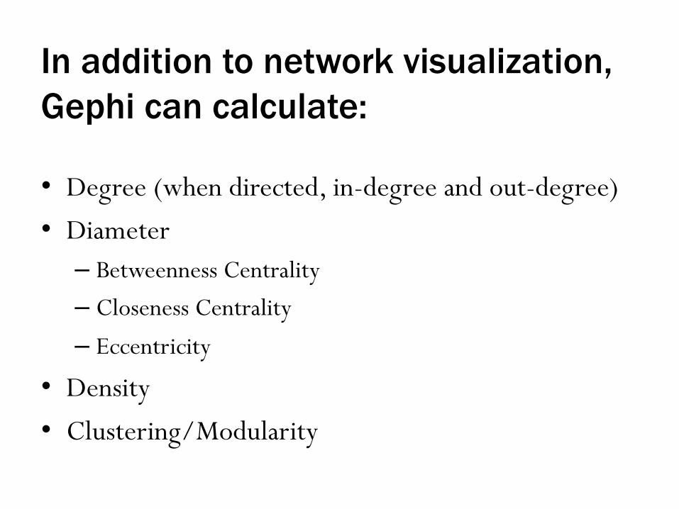
In addition to network visualization, Gephi can calculate:
• Degree (when directed, in-degree and out-degree) • Diameter – Betweenness Centrality – Closeness Centrality – Eccentricity
• Density • Clustering/Modularity

ADVANCED TOOLS

D3.js
http://bl.ocks.org/dukevis/8782982
http://d3js.org

About D3
• JavaScript library • Fairly low level; building with rectangles and circles
and lines, instead of pre-made chart structures* • Basic functioning makes it easy to join HTML
elements with data points

*D3 Middleware Basic line/area chart: • xCharts ~10 lines?
http://tenxer.github.io/xcharts/ • Rickshaw (specifically for time series) ~16 lines
http://code.shutterstock.com/rickshaw/ • NVD3 ~31 lines
http://nvd3.org/ • Vega ~57 lines
http://trifacta.github.io/vega/
http://chimera.labs.oreilly.com/books/1230000000345/ch02.html#_tools_built_with_d3
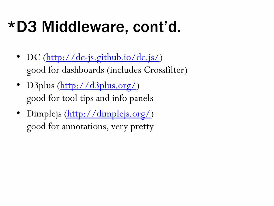
*D3 Middleware, cont’d.
• DC (http://dc-js.github.io/dc.js/) good for dashboards (includes Crossfilter)
• D3plus (http://d3plus.org/) good for tool tips and info panels
• Dimplejs (http://dimplejs.org/) good for annotations, very pretty
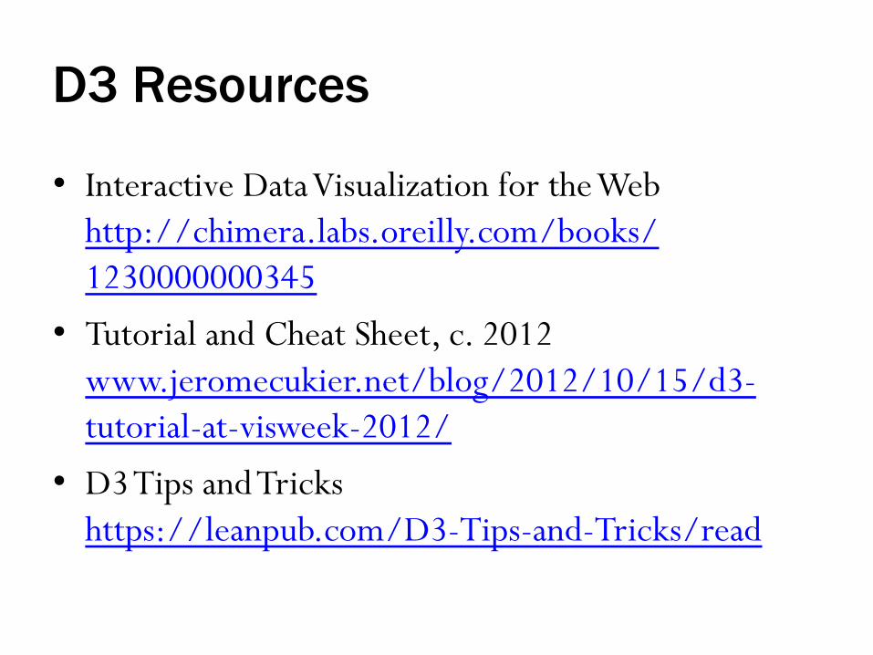
D3 Resources
• Interactive Data Visualization for the Web http://chimera.labs.oreilly.com/books/1230000000345
• Tutorial and Cheat Sheet, c. 2012 www.jeromecukier.net/blog/2012/10/15/d3-tutorial-at-visweek-2012/
• D3 Tips and Tricks https://leanpub.com/D3-Tips-and-Tricks/read

When to use D3
• Need for customized chart types (http://bl.ocks.org/mbostock)
• Want to use JavaScript • Have only a low number of data points or elements
(SVG vs. HTML5 Canvas) • Want to have it on your résumé

D3 workshop tomorrow!
Visualization in d3 Thursday, March 19, 7-9pm Edge Workshop Room (Bostock 1st Floor) http://library.duke.edu/events/data/event.do?id=6817&occur=15231 (Workshop is full, but if there are no-shows you could try to sneak in.)

Python
• Bokeh http://bokeh.pydata.org web visualizations with big datasets

Python
• ggplot2 for python http://ggplot.yhathq.com/ includes good graphical principles

Python
• Anaconda https://store.continuum.io/cshop/anaconda/ good for installing many data analysis packages, including matplotlib
http://matplotlib.org/

R Shiny
https://vm-manage.oit.duke.edu/
http://www.shinyapps.io/
http://shiny.rstudio.com/

ELK stack
http://www.elasticsearch.org/

ELK stack
• Elasticsearch “flexible and powerful open source, distributed, real-time search and analytics engine” · full-text search (lucene) plus fast queries and many built-in aggregations for large data (time-based and stats w/facets)
• Logstash “helps you take logs and other time based event data from any system and store it in a single place” · parse
• Kibana “Elasticsearch’s data visualization engine” · sharable dashborads for real-time, interactive visual exploration

ELK stack
• Open source, but company builds APIs for all major languages
• Potential end-to-end solution for storage, plus monitoring by both developers and customers
• Geared towards large time-based, geo-spatial, and textual data
• Free for academic use • Security product is pay only

MORE TIPS

Good Chart Makeover Examples The Why Axis chart remakes http://thewhyaxis.info/remakes/
Storytelling With Data visual makeovers: http://www.storytellingwithdata.com/search/label/Visual%20Makeover

On the web
• Bad examples: WTF Viz, http://wtfviz.net/
• Good examples: Thumbs Up Viz, http://thumbsupviz.com/
• Ask for help: Help Me Viz, http://helpmeviz.com/

More on Data Visualization
Visual communication: http://guides.library.duke.edu/visualcomm Data visualization: http://guides.library.duke.edu/datavis/ Top 10 dos and don’ts for charts and graphs: http://guides.library.duke.edu/topten

GETTING HELP

Data and Visualization Services
• Data collections, LibGuides, etc. http://library.duke.edu/data/
• Blog (tutorials, announcements, etc.) http://blogs.library.duke.edu/data/
• Walk-in consultations http://library.duke.edu/data/about/schedule (or by appointment – [email protected])
• Data and Visualization Lab in the Edge http://library.duke.edu/data/about/lab (fast hardware, diverse software)
• Additional workshops http://library.duke.edu/data/news/ (listserv – [email protected])

QUESTIONS? SUGGESTIONS? [email protected] http://twitter.com/duke_vis