Formation of Frequency Distribution
27
14BGE14A: Allied: Statistics-I UNIT-II Handled & Prepared by: Dr.S.RaviSankar Page: 1 I BSc Geography (English Medium) Dept.of Statistics UNIT-II Formation of Frequency Distribution Frequency distribution is a series when a number of observations with similar or closely related values are put in separate bunches or groups, each group being in order of magnitude in a series. It is simply a table in which the data are grouped into classes and the number of cases which fall in each class are recorded. It shows the frequency of occurrence of different values of a single Phenomenon. A frequency distribution is constructed for three main reasons: ✓ To facilitate the analysis of data. ✓ To estimate frequencies of the unknown population distribution from the distributionof sample data and ✓ To facilitate the computation of various statistical measures Raw data: The statistical data collected are generally raw data or ungrouped data. Let us consider the daily wages (in Rs ) of 30 labours in a factory. 80 70 55 50 60 65 40 30 80 90 75 45 35 65 70 80 82 55 65 80 60 55 38 65 75 85 90 65 45 75 The above figures are nothing-but raw or ungrouped data and they are recorded as they occur without any pre consideration. This representation of data does not furnish any useful information and is rather confusing to mind. A better way to express the figures in an ascending or descending order of magnitude and is commonly known as array. But this does not reduce the bulk of the data. The above data when formed into an array is in the following form: 30 35 38 40 45 45 50 55 55 55 60 60 65 65 65 65 65 65 70 70 75 75 75 80 80 80 80 85 90 90 The array helps us to see at once the maximum and minimum values. It also gives a rough idea of the distribution of the items over the range . When we have a large number of items, the formation of an array is very difficult, tedious and cumbersome. The Condensation should be directed for better understanding and may be done in two ways, depending on the nature of the data. A. Discrete (or) Ungrouped frequency distribution: In this form of distribution, the frequency refers to discrete value. Here the data are presented in a way that exact measurement of units are clearly indicated. There are definite difference between the variables of different groups of items. Each class is distinct and separate from the other class. Non-continuity from one class to another class exist. Data as such facts like the number of rooms in a house, the number of companies registered in a country, the number of children in a family, etc.
-
Upload
khangminh22 -
Category
Documents
-
view
0 -
download
0
Transcript of Formation of Frequency Distribution

14BGE14A: Allied: Statistics-I UNIT-II Handled & Prepared by: Dr.S.RaviSankar Page: 1
I BSc Geography (English Medium) Dept.of Statistics
UNIT-II
Formation of Frequency Distribution
Frequency distribution is a series when a number of observations with similar or closely
related values are put in separate bunches or groups, each group being in order of magnitude in
a series. It is simply a table in which the data are grouped into classes and the number of cases
which fall in each class are recorded. It shows the frequency of occurrence of different values
of a single Phenomenon.
A frequency distribution is constructed for three main reasons:
✓ To facilitate the analysis of data.
✓ To estimate frequencies of the unknown population distribution from the
distribution of sample data and
✓ To facilitate the computation of various statistical measures
Raw data:
The statistical data collected are generally raw data or ungrouped data. Let us consider
the daily wages (in Rs ) of 30 labours in a factory.
80 70 55 50 60 65 40 30 80 90
75 45 35 65 70 80 82 55 65 80
60 55 38 65 75 85 90 65 45 75
The above figures are nothing-but raw or ungrouped data and they are recorded as they
occur without any pre consideration. This representation of data does not furnish any useful
information and is rather confusing to mind. A better way to express the figures in an ascending
or descending order of magnitude and is commonly known as array. But this does not reduce
the bulk of the data. The above data when formed into an array is in the following form:
30 35 38 40 45 45 50 55 55 55
60 60 65 65 65 65 65 65 70 70
75 75 75 80 80 80 80 85 90 90
The array helps us to see at once the maximum and minimum values. It also gives a
rough idea of the distribution of the items over the range . When we have a large number of
items, the formation of an array is very difficult, tedious and cumbersome. The Condensation
should be directed for better understanding and may be done in two ways, depending on the
nature of the data.
A. Discrete (or) Ungrouped frequency distribution:
In this form of distribution, the frequency refers to discrete value. Here the data are
presented in a way that exact measurement of units are clearly indicated.
There are definite difference between the variables of different groups of items. Each
class is distinct and separate from the other class. Non-continuity from one class to another
class exist. Data as such facts like the number of rooms in a house, the number of companies
registered in a country, the number of children in a family, etc.

14BGE14A: Allied: Statistics-I UNIT-II Handled & Prepared by: Dr.S.RaviSankar Page: 2
I BSc Geography (English Medium) Dept.of Statistics
The process of preparing this type of distribution is very simple. We have just to count
the number of times a particular value is repeated, which is called the frequency of that class.
In order to facilitate counting prepare a column of tallies.
In another column, place all possible values of variable from the lowest to the highest.
Then put a bar (Vertical line) opposite the particular value to which it relates.
To facilitate counting, blocks of five bars are prepared and some space is left in
between each block. We finally count the number of bars and get frequency.
Example:
In a survey of 40 families in a village, the number of children per family was recorded
and the following data obtained.
1 0 3 2 1 5 6 2
2 1 0 3 4 2 1 6
3 2 1 5 3 3 2 4
2 2 3 0 2 1 4 5
3 3 4 4 1 2 4 5
Represent the data in the form of a discrete frequency distribution.
Solution:
Frequency distribution of the number of children
Number of Children
Tally Marks
Frequency
0
3
1
7
2 10
3
8
4
6
5 4
6 2
Total 40
B. Continuous frequency distribution:
In this form of distribution refers to groups of values. This becomes necessary in the case
of some variables which can take any fractional value and in which case an exact measurement
is not possible. Hence a discrete variable can be presented in the form of a continuous frequency
distribution.

14BGE14A: Allied: Statistics-I UNIT-II Handled & Prepared by: Dr.S.RaviSankar Page: 3
I BSc Geography (English Medium) Dept.of Statistics
Wage distribution of 100 employees
Weekly wages
(Rs)
Number of
employees
50-100 4
100-150 12
150-200 22
200-250 33
250-300 16
300-350 8
350-400 5
Total 100
Nature of class:
The following are some basic technical terms when a continuous frequency distribution
is formed or data are classified according to class intervals.
a) Class limits:
The class limits are the lowest and the highest values that can be included in the class.
For example, take the class 30-40. The lowest value of the class is 30 and highest class is 40.
The two boundaries of class are known as the lower limits and the upper limit of the class. The
lower limit of a class is the value below which there can be no item in the class. The upper limit
of a class is the value above which there can be no item to that class. Of the class 60-79, 60 is the
lower limit and 79 is the upper limit, i.e. in the case there can be no value which is less than 60
or more than 79. The way in which class limits are stated depends upon the nature of the data.
In statistical calculations, lower class limit is denoted by L and upper class limit by U.
b) Class Interval:
The class interval may be defined as the size of each grouping of data. For example, 50-
75, 75-100, 100-125… are class intervals. Each grouping begins with the lower limit of a class
interval and ends at the lower limit of the next succeeding class interval
c) Width or size of the class interval:
The difference between the lower and upper class limits is called Width or size of class
interval and is denoted by ‘ C’ .
14BGE14A: Allied: Statistics-I UNIT-II Handled & Prepared by: Dr.S.RaviSankar Page: 4
I BSc Geography (English Medium) Dept.of Statistics
d) Range:
The difference between largest and smallest value of the observation is called The Range
and is denoted by ‘ R’ ie
R = Largest value – Smallest value
R = L - S
e) Mid-value or mid-point:
The central point of a class interval is called the mid value or mid-point. It is found out
by adding the upper and lower limits of a class and dividing the sum by 2.
L + U (i.e.) Mid value =
2
For example, if the class interval is 20-30 then the mid-value is
20 + 30 = 25
2
f) Frequency:
Number of observations falling within a particular class interval is called frequency of that
class. Let us consider the frequency distribution of weights of persons working in a company.
Weight
(in Kgs)
Number of
persons
30-40 25
40-50 53
50-60 77
60-70 95
70-80 80
80-90 60
90-100 30
Total 420
In the above example, the class frequencies are 25,53,77,95,80,60,30. The total frequency
is equal to 420. The total frequency indicates the total number of observations considered in a
frequency distribution.
g) Number of class intervals:
The number of class interval in a frequency is matter of importance. The number of
class interval should not be too many. For an ideal frequency distribution, the number of class
intervals can vary from 5 to 15. To decide the number of class intervals for the frequency

14BGE14A: Allied: Statistics-I UNIT-II Handled & Prepared by: Dr.S.RaviSankar Page: 5
I BSc Geography (English Medium) Dept.of Statistics
distributive in the whole data, we choose the lowest and the highest of the values. The difference
between them will enable us to decide the class intervals.
Thus the number of class intervals can be fixed arbitrarily keeping in view the nature of
problem under study or it can be decided with the help of Sturges’ Rule. According to him, the
number of classes can be determined by the formula
K = 1 + 3. 322 log10N
where N = Total number of observations
log = logarithm of the number
K = Number of class intervals.
Thus, if the number of observation is 10,
then the number of class intervals is K = 1 + 3. 322 log 10 = 4.322 4
If 100 observations are being studied,
the number of class interval is K = 1 + 3. 322 log 100 = 7.644 8 and so on.
h) Size of the class interval:
Since the size of the class interval is inversely proportional to the number of class
interval in a given distribution. The approximate value of the size (or width or magnitude) of
the class interval ‘ C’ is obtained by using sturges rule as
Size of class interval = C =
=
Range
Number of class interval
Range / (1 + 3.322 log10 N)
where Range = Largest Value – smallest
value in the distribution.
Types of class intervals:
There are three methods of classifying the data according to class intervals namely
a) Exclusive method
b) Inclusive method
c) Open-end classes
a) Exclusive method:
When the class intervals are so fixed that the upper limit of one class is the lower limit of
the next class; it is known as the exclusive method of classification. The following data are
classified on this basis.
Expenditure (Rs.) No. of families
0-5000 60
5000-10000 95
10000-15000 122
15000-20000 83
20000-25000 40
Total 400

14BGE14A: Allied: Statistics-I UNIT-II Handled & Prepared by: Dr.S.RaviSankar Page: 6
I BSc Geography (English Medium) Dept.of Statistics
The exclusive method ensures continuity of data as much as the upper limit of one class
is the lower limit of the next class. In the above example, there are so families whose expenditure
is between Rs.0 and Rs.4999.99. A family whose expenditure is Rs.5000 would be included in
the class interval 5000-10000. This method is widely used in practice.
b) Inclusive method:
In this method, the overlapping of the class intervals is avoided. Both the lower and upper
limits are included in the class interval. This type of classification may be used for a grouped
frequency distribution for discrete variable like members in a family, number of workers in a
factory etc., where the variable may take only integral values. It cannot be used with fractional
values like age, height, weight etc.
This method may be illustrated as follows:
Class interval Frequency
5-9 7
10-14 12
15-19 15
20-29 21
30-34 10
35-39 5
Total 70
Thus, to decide whether to use the inclusive method or the exclusive method, it is
important to determine whether the variable under observation in a continuous or discrete one.
In case of continuous variables, the exclusive method must be used. The inclusive method
should be used in case of discrete variable.
c) Open end classes:
A class limit is missing either at the lower end of the first class interval or at the upper
end of the last class interval or both are not specified. The necessity of open end classes arises
in a number of practical situations, particularly relating to economic and medical data when
there are few very high values or few very low values which are far apart from the majority of
observations.
The example for the open-end classes as follows:
Salary Range No. of workers
Below 2000 7
2000-4000 5
4000-6000 6
6000-8000 4
8000 and above 3

14BGE14A: Allied: Statistics-I UNIT-II Handled & Prepared by: Dr.S.RaviSankar Page: 7
I BSc Geography (English Medium) Dept.of Statistics
Formation or Construction of the frequency table:
Constructing or forming a frequency distribution depends on the nature of the given
data. Hence, the following general consideration may be borne in mind for ensuring meaningful
classification of data:
(i) The number of classes should preferably be between 5 and 20. However there is no
rigidity about it.
(ii) As far as possible one should avoid values of class intervals as 3,7,11,26….etc.
preferably.
(iii) One should have class intervals of either five or multiples of 5 like 10,20,25,100 etc.
(iv) The starting point i.e., the lower limit of the first class, should either be zero or 5 or multiple of 5.
(v) To ensure continuity and to get correct class interval we should adopt exclusive method.
(vi) Wherever possible, it is desirable to use class interval of equal sizes.
Preparation of frequency table:
The premise of data in the form of frequency distribution describes the basic pattern
which the data assumes in the mass. Frequency distribution gives a better picture of the
pattern of data if the number of items is large. If the identity of the individuals about whom a
particular information is taken, is not relevant then the first step of condensation is to divide the
observed range of variable into a suitable number of class-intervals and to record the number of
observations in each class. Let us consider the weights in kg of 50 college students.
42 62 46 54 41 37 54 44 32 45
47 50 58 49 51 42 46 37 42 39
54 39 51 58 47 64 43 48 49 48
49 61 41 40 58 49 59 57 57 34
56 38 45 52 46 40 63 41 51 41
Here the size of the class interval as per Sturges rule is obtained as follows
Size of class interval = C =
Range
1 + 3.322 log N
= 64 − 32
=
1 + 3.322 log(50)
32 5
6.64
14BGE14A: Allied: Statistics-I UNIT-II Handled & Prepared by: Dr.S.RaviSankar Page: 8
I BSc Geography (English Medium) Dept.of Statistics
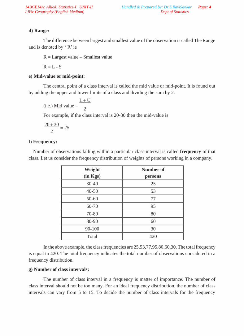
Thus, the number of class interval is 7 and size of each class is 5. The required size
of each class is 5. The required frequency distribution is prepared using tally marks as given
below:
Class
Interval
Tally
Marks Frequency
30-35
2
35-40
6
40-45
12
45-50
14
50-55
6
55-60
6
60-65
4
Total 50
Example:
Given below are the number of tools produced by workers in a factory.
43 18 25 18 39 44 19 20 20 26
40 45 38 25 13 14 27 41 42 17
34 31 32 27 33 37 25 26 32 25
33 34 35 46 29 34 31 34 35 24
28 30 41 32 29 28 30 31 30 34
31 35 36 29 26 32 36 35 36 37
32 23 22 29 33 37 33 27 24 36
23 42 29 37 29 23 44 41 45 39
21 21 42 22 28 22 15 16 17 28
22 29 35 31 27 40 23 32 40 37
Construct frequency distribution with inclusive type of class interval. Also find.
a. How many workers produced more than 38 tools?
b. How many workers produced less than 23 tools?
Solution:
Using Sturges formula for determining the number of class intervals, we
have
Number of class intervals = 1+ 3.322 log10N
= 1+ 3.322 log10100
= 7.6
Sizes of class interval = Range
Number of class interval

14BGE14A: Allied: Statistics-I UNIT-II Handled & Prepared by: Dr.S.RaviSankar Page: 9
I BSc Geography (English Medium) Dept.of Statistics
= 46 −13
7.6
5
Hence taking the magnitude of class intervals as 5, we have 7 classes 13-17, 18-22…
43-47 are the classes by inclusive type. Using tally marks, the required frequency distribution
is obtain in the following table
Class Interval Tally Marks Number of tools produced
(Frequency)
13-17
6
18-22
11
23-27
18
28-32
25
33-37
22
38-42
11
43-47
7
Total 100
2.1 Presentation of data:
The techniques of classification and tabulation that help in summarizing the collected data
and presenting them in a systematic manner. However, these forms of presentation do not always
prove to be interesting to the common man. One of the most convincing and appealing ways in
which statistical results may be presented is through diagrams and graphs. Just one diagram is
enough to represent a given data more effectively than thousand words.
Moreover, even a layman who has nothing to do with numbers can also understands
diagrams. Evidence of this can be found in newspapers, magazines, journals, advertisement, etc.
There are five types of representation an they are
a) Textual presentation b) Tabular presentation
c) Diagrammatic representation d) Graphical Representaion
Diagrammatic Representation of data:
A diagram is a visual from for presentation of statistical data, highlighting their basic
facts and relationship. If we draw diagrams on the basis of the data collected they will easily be
understood and appreciated by all. It is readily intelligible and save a considerable amount of
time and energy.

14BGE14A: Allied: Statistics-I UNIT-II Handled & Prepared by: Dr.S.RaviSankar Page: 10
I BSc Geography (English Medium) Dept.of Statistics
Significance of Diagrams and Graphs:
Diagrams and graphs are extremely useful because of the following reasons.
i. They are attractive and impressive.
ii. They make data simple and intelligible.
iii. They make comparison possible
iv. They save time and labour.
v. They have universal utility.
vi. They give more information.
vii. They have a great memorizing effect.
General rules for constructing diagrams:
The construction of diagrams is an art, which can be acquired through practice. However,
observance of some general guidelines can help in making them more attractive and effective.
The diagrammatic presentation of statistical facts will be advantageous provided the following
rules are observed in drawing diagrams:
(i) A diagram should be neatly drawn and attractive.
(ii) The measurements of geometrical figures used in diagram should be accurate and
proportional.
(iii) The size of the diagrams should match the size of the paper.
(iv) Every diagram must have a suitable but short heading.
(v) The scale should be mentioned in the diagram.
(vi) Diagrams should be neatly as well as accurately drawn with the help of drawing
instruments.
(vii) Index must be given for identification so that the reader can easily make out the meaning
of the diagram.
(viii) Footnote must be given at the bottom of the diagram.
(ix) Economy in cost and energy should be exercised in drawing diagram.
Types of diagrams:
In practice, a very large variety of diagrams are in use and new ones are constantly being
added. For the sake of convenience and simplicity, they may be divided under the following
heads:
A. One-dimensional diagrams
B. Two-dimensional diagrams
C. Three-dimensional diagrams
D. Pictograms and Cartograms
A. One-dimensional diagrams:
In such diagrams, only one-dimensional measurement, i.e height is used and the width
is not considered. These diagrams are in the form of bar or line charts and can be classified as
(i) Line Diagram
(ii) Simple Diagram
(iii) Multiple Bar Diagram
(iv) Sub-divided Bar Diagram
(v) Percentage Bar Diagram

14BGE14A: Allied: Statistics-I UNIT-II Handled & Prepared by: Dr.S.RaviSankar Page: 11
I BSc Geography (English Medium) Dept.of Statistics
Line Diagram:
Line diagram is used in case where there are many items to be shown and there is not
much of difference in their values. Such diagram is prepared by drawing a vertical line for each
item according to the scale. The distance between lines is kept uniform. Line diagram makes
comparison easy, but it is less attractive.
Example: Show the following data by a line chart:
No. of children 0 1 2 3 4 5
Frequency 10 14 9 6 4 2
Line Diagram
16
14
12
10
8
6
4
2
0
0 1 2 3 4 5 6
No. of Children
Simple Bar Diagram:
Simple bar diagram can be drawn either on horizontal or vertical base, but bars on
horizontal base more common. Bars must be uniform width and intervening space between bars
must be equal. While constructing a simple bar diagram, the scale is determined on the basis of
the highest value in the series.
To make the diagram attractive, the bars can be coloured. Bar diagram are used in
business and economics. However, an important limitation of such diagrams is that they can
present only one classification or one category of data. For example, while presenting the
population for the last five decades, one can only depict the total population in the simple bar
diagrams, and not its sex-wise distribution.
Example: Represent the following data by a bar diagram.
Year Production (in tones)
1991 45
1992 40
1993 42
1994 55
1995 50
Fre
qu
ency

14BGE14A: Allied: Statistics-I UNIT-II Handled & Prepared by: Dr.S.RaviSankar Page: 12
I BSc Geography (English Medium) Dept.of Statistics
Solution :
Simple Bar Diagram
60
50
40
30
20
10
0
Multiple Bar Diagram:
1991 1992 1993 1994 1995
Year
Multiple bar diagram is used for comparing two or more sets of statistical data. Bars are
constructed side by side to represent the set of values for comparison. In order to distinguish
bars, they may be either differently coloured or there should be different types of crossings or
dotting, etc. An index is also prepared to identify the meaning of different colours or dottings.
Example: Draw a multiple bar diagram for the following data.
Solution :
Multiple Bar Diagram
200
180
160
140
120
100
80
60
40
20
0 1998 1999 2000 2001
Year
Pro
du
cti
on
(in
to
nn
es)
Pro
fit
(in
Rs)
32 140 2001
45 165 2000
87 200 1999
80 195 1998
Profit after tax (in lakhs of rupees) Profit before tax (in lakhs of rupees) Year
Profit before tax Profit after tax

14BGE14A: Allied: Statistics-I UNIT-II Handled & Prepared by: Dr.S.RaviSankar Page: 13
I BSc Geography (English Medium) Dept.of Statistics
Sub-divided Bar Diagram:
In a sub-divided bar diagram, the bar is sub-divided into various parts in proportion to
the values given in the data and the whole bar represent the total. Such diagrams are also called
Component Bar diagrams. The sub divisions are distinguished by different colours or crossings
or dottings.
The main defect of such a diagram is that all the parts do not have a common base to
enable one to compare accurately the various components of the data.
Example:
Represent the following data by a sub-divided bar diagram.
Expenditure items Monthly expenditure (in Rs.)
Family A Family B
Food 75 95
Clothing 20 25
Education 15 10
Housing Rent 40 65
Miscellaneous 25 35
Solution :
Percentage bar diagram:
This is another form of component bar diagram. Here the components are not the actual
values but percentages of the whole. The main difference between the sub-divided bar diagram
and percentage bar diagram is that in the former the bars are of different heights since their
totals may be different whereas in the latter the bars are of equal height since each bar represents
100 percent. In the case of data having sub-division, percentage bar diagram will be more
appealing than sub-divided bar diagram.

14BGE14A: Allied: Statistics-I UNIT-II Handled & Prepared by: Dr.S.RaviSankar Page: 14
I BSc Geography (English Medium) Dept.of Statistics
Example: Represent the following data by a percentage bar diagram.
Particular Factory X Factory Y
Selling Price 400 650
Quantity Sold 240 365
Wages 3500 5000
Materials 2100 3500
Miscellaneous 1400 2100
Solution:
Convert the given values into percentages as follows:
Particulars Factory A Factory B
Rs. % Rs. %
Selling Price 400 5 650 6
Quantity Sold 240 3 365 3
Wages 3500 46 5000 43
Materials 2100 28 3500 30
Miscellaneous 1400 18 2100 18
Total 7640 100 11615 100
Solution :
Sub-divided Percentage Bar Diagram
B. Two-dimensional Diagrams:
In one-dimensional diagrams, only length 9 is considered. But, in two-dimensional
diagrams, the area represent the data and so the length and breadth have both to be taken into
account. Such diagrams are also called area diagrams or surface diagrams. The important types
of area diagrams are:
a) Rectangles b) Squares c) Circles or Pie-diagrams
14BGE14A: Allied: Statistics-I UNIT-II Handled & Prepared by: Dr.S.RaviSankar Page: 15
I BSc Geography (English Medium) Dept.of Statistics
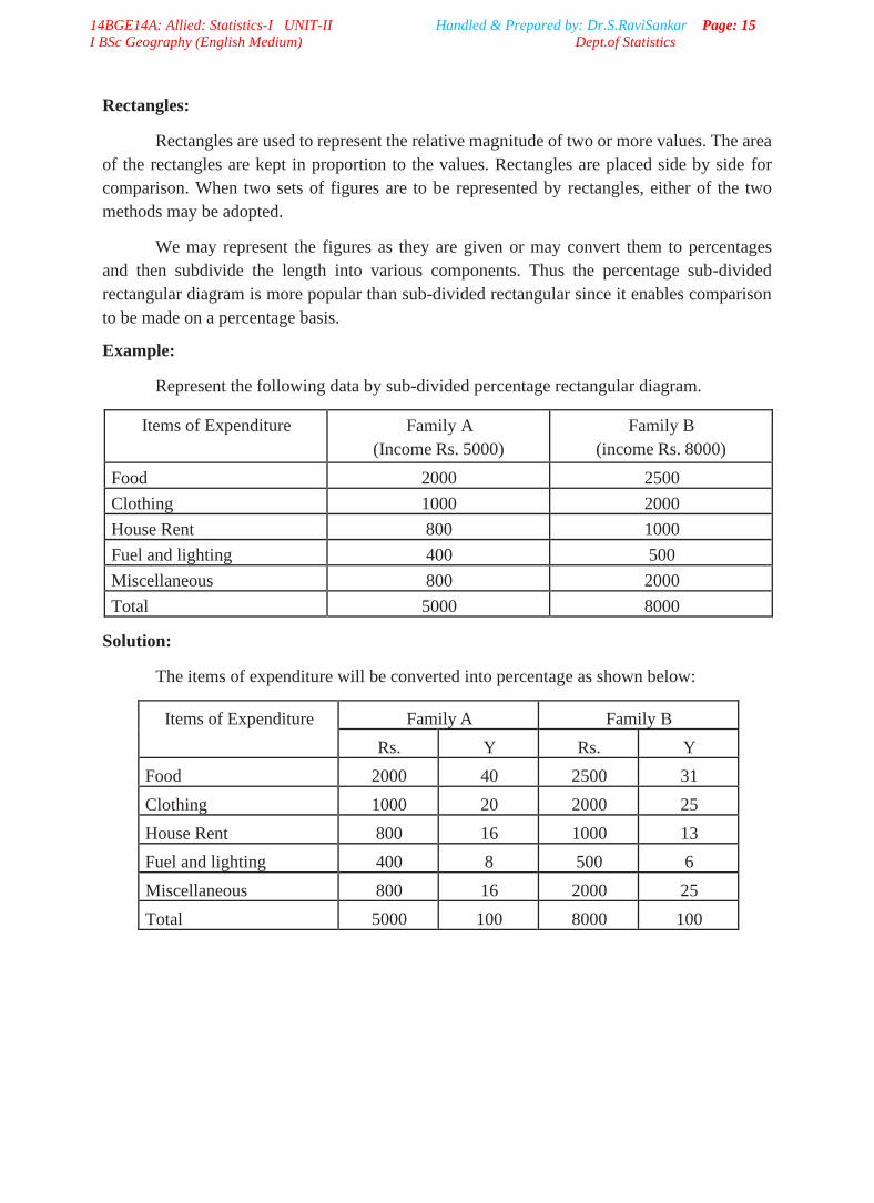
Rectangles:
Rectangles are used to represent the relative magnitude of two or more values. The area
of the rectangles are kept in proportion to the values. Rectangles are placed side by side for
comparison. When two sets of figures are to be represented by rectangles, either of the two
methods may be adopted.
We may represent the figures as they are given or may convert them to percentages
and then subdivide the length into various components. Thus the percentage sub-divided
rectangular diagram is more popular than sub-divided rectangular since it enables comparison
to be made on a percentage basis.
Example:
Represent the following data by sub-divided percentage rectangular diagram.
Items of Expenditure Family A
(Income Rs. 5000)
Family B
(income Rs. 8000)
Food 2000 2500
Clothing 1000 2000
House Rent 800 1000
Fuel and lighting 400 500
Miscellaneous 800 2000
Total 5000 8000
Solution:
The items of expenditure will be converted into percentage as shown below:
Items of Expenditure Family A Family B
Rs. Y Rs. Y
Food 2000 40 2500 31
Clothing 1000 20 2000 25
House Rent 800 16 1000 13
Fuel and lighting 400 8 500 6
Miscellaneous 800 16 2000 25
Total 5000 100 8000 100

14BGE14A: Allied: Statistics-I UNIT-II Handled & Prepared by: Dr.S.RaviSankar Page: 16
I BSc Geography (English Medium) Dept.of Statistics
Sub-divided Percentage Rectangular Diagram
120
100
80
60
40
20
0
Family A (0-5000)
Family B (0-8000)
Squares:
The rectangular method of diagrammatic presentation is difficult to use where the values
of items vary widely. The method of drawing a square diagram is very simple. One has to take
the square root of the values of various item that are to be shown in the diagrams and then select
a suitable scale to draw the squares.
Example:
Yield of rice in Kgs. per acre of five countries are
Country U.S.A. Australia U.K Canada India
Yield of rice in Kgs per acre 6400 1600 2500 3600 4900
Represent the above data by Square diagram.
Solution:
To draw the square diagram we calculate as follows:
Country Yield Square root Side of the square in cm
U.S.A 6400 80 4
Australia 1600 40 2
U.K. 2500 50 2.5
Canada 3600 60 3
India 4900 70 3.5
USA AUST UK CANADA INDIA
Food Clothing House Rent Fuel and Lighting Miscellaneous
4 cm
2 cm 2.5 cm
3 cm 3.5 cm
Perc
enta
ge

14BGE14A: Allied: Statistics-I UNIT-II Handled & Prepared by: Dr.S.RaviSankar Page: 17
I BSc Geography (English Medium) Dept.of Statistics
Pie Diagram or Circular Diagram:
Another way of preparing a two-dimensional diagram is in the form of circles. In such
diagrams, both the total and the component parts or sectors can be shown. The area of a circle
is proportional to the square of its radius.
While making comparisons, pie diagrams should be used on a percentage basis and not
on an absolute basis. In constructing a pie diagram the first step is to prepare the data so that
various components values can be transposed into corresponding degrees on the circle.
The second step is to draw a circle of appropriate size with a compass. The size of
the radius depends upon the available space and other factors of presentation. The third step
is to measure points on the circle and representing the size of each sector with the help of a
protractor.
Example: Draw a Pie diagram for the following data of production of sugar in quintals of various
countries.
Country Production of Sugar
(in quintals)
Cuba 62
Australia 47
India 35
Japan 16
Egypt 6
Solution:
The values are expressed in terms of degree as follows.
Country Production of Sugar
In Quintals In Degrees
Cuba 62 134
Australia 47 102
India 35 76
Japan 16 35
Egypt 6 13
Total 166 360

14BGE14A: Allied: Statistics-I UNIT-II Handled & Prepared by: Dr.S.RaviSankar Page: 18
I BSc Geography (English Medium) Dept.of Statistics
Pie Diagram
C. Three-dimensional diagrams:
Three-dimensional diagrams, also known as volume diagram, consist of cubes, cylinders,
spheres, etc. In such diagrams three things, namely length, width and height have to be taken
into account. Of all the figures, making of cubes is easy. Side of a cube is drawn in proportion
to the cube root of the magnitude of data. Cubes of figures can be ascertained with the help of
logarithms. The logarithm of the figures can be divided by 3 and the antilog of that value will
be the cube-root.
Example:
Represent the following data by volume diagram.
Category Number of Students
Under-graduate 64000
Post-graduate 27000
Professionals 8000
Solution:
The sides of cubes can be determined as follows
Category Number of Students Cube root Side of cube
Under-graduate 64000 40 4 cm
Post-graduate 27000 30 3 cm
Professionals 8000 20 2 cm
Undergraduate Postgraduate Professional
4 cm
3 cm 2 cm
14BGE14A: Allied: Statistics-I UNIT-II Handled & Prepared by: Dr.S.RaviSankar Page: 19
I BSc Geography (English Medium) Dept.of Statistics
D. Pictograms and Cartograms:
Pictograms are not abstract presentation such as lines or bars but really depict the kind
of data we are dealing with. Pictures are attractive and easy to comprehend and as such this
method is particularly useful in presenting statistics to the layman. When Pictograms are used,
data are represented through a pictorial symbol that is carefully selected.
Cartograms or statistical maps are used to give quantitative information as a geographical
basis. They are used to represent spatial distributions. The quantities on the map can be shown in
many ways such as through shades or colours or dots or placing pictogram in each geographical
unit.
2.2 Graphical representation of data:
A histogram is a bar chart or graph showing the frequency of occurrence of each value
of the variable being analysed. In histogram, data are plotted as a series of rectangles. Class
intervals are shown on the ‘X-axis’ and the frequencies on the ‘Y-axis’ .
The height of each rectangle represents the frequency of the class interval. Each rectangle
is formed with the other so as to give a continuous picture. Such a graph is also called staircase
or block diagram.
However, we cannot construct a histogram for distribution with open-end classes. It
is also quite misleading if the distribution has unequal intervals and suitable adjustments in
frequencies are not made.
Example: Draw a histogram for the following data.
Daily Wages Number of Workers
0-50 8
50-100 16
100-150 27
150-200 19
200-250 10
250-300 6

14BGE14A: Allied: Statistics-I UNIT-II Handled & Prepared by: Dr.S.RaviSankar Page: 20
I BSc Geography (English Medium) Dept.of Statistics
Solution :
30
HISTOGRAM
25
20
15
10
5
0 50 100 150 200
Daily Wages (in Rs.)
250
Example: For the following data, draw a histogram.
Marks Number of Students
21-30 6
31-40 15
41-50 22
51-60 31
61-70 17
71-80 9
Solution:
For drawing a histogram, the frequency distribution should be continuous. If it is not continuous,
then first make it continuous as follows.
Marks Number of Students
20.5-30.5 6
30.5-40.5 15
40.5-50.5 22
50.5-60.5 31
60.5-70.5 17
70.5-80.5 9
Nu
mb
er o
f W
ork
ers

14BGE14A: Allied: Statistics-I UNIT-II Handled & Prepared by: Dr.S.RaviSankar Page: 21
I BSc Geography (English Medium) Dept.of Statistics
HISTOGRAM
35
30
25
20
15
10
5
0 20.5 30.5 40.5 50.5 60.5 70.5 80.5
Marks
Example: Draw a histogram for the following data.
Profits
(in lakhs)
Number of
Companies
0-10 4
10-20 12
20-30 24
30-50 32
50-80 18
80-90 9
90-100 3
Solution:
When the class intervals are unequal, a correction for unequal class intervals must be
made. The frequencies are adjusted as follows: The frequency of the class 30-50 shall be divided
by two since the class interval is in double. Similarly, the class interval 50- 80 can be divided
by 3. Then draw the histogram.
Now we rewrite the frequency table as follows.
Nu
mb
er o
f S
tud
ents

14BGE14A: Allied: Statistics-I UNIT-II Handled & Prepared by: Dr.S.RaviSankar Page: 22
I BSc Geography (English Medium) Dept.of Statistics
Profits
(in lakhs)
Number of
Companies
0-10 4
10-20 12
20-30 24
30-40 16
40-50 16
50-60 6
60-70 6
70-80 6
80-90 9
90-100 3
HISTOGRAM 30
25
20
15
10
5
0 10 20 30 40 50
60 70 80 90 100
Profit (in Lakhs)
No
. o
f C
om
pa
nie
s
14BGE14A: Allied: Statistics-I UNIT-II Handled & Prepared by: Dr.S.RaviSankar Page: 23
I BSc Geography (English Medium) Dept.of Statistics
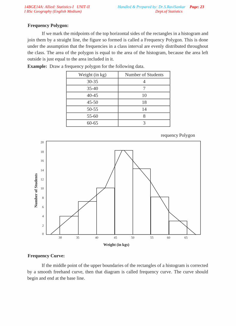
Frequency Polygon:
If we mark the midpoints of the top horizontal sides of the rectangles in a histogram and
join them by a straight line, the figure so formed is called a Frequency Polygon. This is done
under the assumption that the frequencies in a class interval are evenly distributed throughout
the class. The area of the polygon is equal to the area of the histogram, because the area left
outside is just equal to the area included in it.
Example: Draw a frequency polygon for the following data.
Weight (in kg) Number of Students
30-35 4
35-40 7
40-45 10
45-50 18
50-55 14
55-60 8
60-65 3
requency Polygon
20
18
16
14
12
10
8
6
4
2
0 30 35
40 45 50 55 60 65
Weight (in kgs)
Frequency Curve:
If the middle point of the upper boundaries of the rectangles of a histogram is corrected
by a smooth freehand curve, then that diagram is called frequency curve. The curve should
begin and end at the base line.
Nu
mb
er o
f S
tud
ents

14BGE14A: Allied: Statistics-I UNIT-II Handled & Prepared by: Dr.S.RaviSankar Page: 24
I BSc Geography (English Medium) Dept.of Statistics
Example: Draw a frequency curve for the following data.
Monthly Wages
(in Rs.)
No. of family
0-1000 21
1000-2000 35
2000-3000 56
3000-4000 74
4000-5000 63
5000-6000 40
6000-7000 29
7000-8000 14
Solution:
80
Frequency Curve
70
60
50
40
30
20
10
0
1000 2000 3000 4000
5000 6000 7000 8000
No
. o
f F
am
ily

14BGE14A: Allied: Statistics-I UNIT-II Handled & Prepared by: Dr.S.RaviSankar Page: 25
I BSc Geography (English Medium) Dept.of Statistics
Monthly Wages in Rs.
Ogive curves
Cumulative frequency table:
Cumulative frequency distribution has a running total of the values. It is
constructed by adding the frequency of the first class interval to the frequency of the second
class interval. Again add that total to the frequency in the third class interval continuing until
the final total appearing opposite to the last class interval will be the total of all frequencies.
The cumulative frequency may be downward or upward.
A downward cumulation results in a list presenting the number of frequencies “less
than” any given amount as revealed by the lower limit of succeeding class interval and the
upward cumulative results in a list presenting the number of frequencies “more than” and
given amount is revealed by the upper limit of a preceding class interval.
Example:
Age group
(in years)
Number of women Less than Cumulative
frequency
More than cumulative
frequency
15-20 3 3 64
20-25 7 10 61
25-30 15 25 54
30-35 21 46 39
35-40 12 58 18
40-45 6 64 6
(a) Less than cumulative frequency distribution table
End values upper limit Less than Cumulative frequency
Less than 20 3
Less than 25 10
Less than 30 25
Less than 35 46
Less than 40 58
Less than 45 64
(b) More than cumulative frequency distribution table
End values lower limit Cumulative frequency more than
15 and above 64
20 and above 61
25 and above 54
30 and above 39
35 and above 18
40 and above 6

14BGE14A: Allied: Statistics-I UNIT-II Handled & Prepared by: Dr.S.RaviSankar Page: 26
I BSc Geography (English Medium) Dept.of Statistics
Ogive Curves:
For a set of observations, we know how to construct a frequency distribution. In
some cases we may require the number of observations less than a given value or more than
a given value. This is obtained by a accumulating (adding) the frequencies upto
These cumulative frequencies are then listed in a table is called cumulative
frequency table. The curve table is obtained by plotting cumulative frequencies is called a
cumulative frequency curve or an ogive.
There are two methods of constructing ogive namely:
✓ The ‘ less than ogive’ method
✓ The ‘more than ogive’ method.
In less than ogive method we start with the upper limits of the classes and go adding
the frequencies. When these frequencies are plotted, we get a rising curve. In more than
ogive method, we start with the lower limits of the classes and from the total frequencies
we subtract the frequency of each class. When these frequencies are plotted we get a
declining curve.
Example:
Draw the Ogives for the following data.
Class interval Frequency
20-30 4
30-40 6
40-50 13
50-60 25
60-70 32
70-80 19
80-90 8
90-100 3
Solution :
Class limit Less than ogive More than ogive
20 0 110
30 4 106
40 10 100
50 23 87
60 48 62
70 80 30
80 99 11
90 107 3
100 110 0

14BGE14A: Allied: Statistics-I UNIT-II Handled & Prepared by: Dr.S.RaviSankar Page: 27
I BSc Geography (English Medium) Dept.of Statistics
@@@ End of UNIT-II @@@