2.1: Frequency Distributions
14
2.1: Frequency Distributions Frequency Distribution: organization of _____ data into groups called ____________. A: Categorical Frequency Distribution – used for ____________ and _____________ level qualitative data that can be put into categories. Ex 1). A sample of 21 M&M’s is observed and their colors are recorded. Green Yellow Red Red Blue Blue Brown Green Blue Orange Yellow Blue Red Brown Yellow Blue Blue Green Yellow Red Red B: Grouped Frequency Distribution – used for quantitative data with a __________ ___________. Steps: 1. Find the minimum and maximum values 2. Calculate the range: _____________________________________ 3. To find the width: 4. Always round the width up! If a whole number, round up to the next whole number. 5. Begin the first class with the minimum value in the data set and add the width to get the start of the next class (the lower limit). Continue adding down until you reach your final class. Then fill in the upper limits. Ex 2). Blood glucose levels for a sample of 60 participants is recorded. Organize into a grouped frequency distribution using 6 classes. Width = 55 115 118 114 59 109 63 97 90 59 105 81 84 81 82 61 103 77 92 76 68 86 97 80 77 85 69 62 101 83 58 83 101 86 84 78 59 92 88 97 87 92 70 86 72 84 82 84 101 80 93 56 65 91 75 78 100 74 74 90 Boundaries: numbers given that separate the classes so that there are ____ ________ in the frequency distribution. Used when graphing a _______________________.
-
Upload
khangminh22 -
Category
Documents
-
view
2 -
download
0
Transcript of 2.1: Frequency Distributions
2.1: Frequency Distributions
Frequency Distribution: organization of _____ data into groups called ____________.
A: Categorical Frequency Distribution – used for ____________ and _____________ level qualitative
data that can be put into categories.
Ex 1). A sample of 21 M&M’s is observed and their colors are recorded.
Green Yellow Red
Red Blue Blue
Brown Green Blue
Orange Yellow Blue
Red Brown Yellow
Blue Blue Green
Yellow Red Red
B: Grouped Frequency Distribution – used for quantitative data with a __________ ___________.
Steps:
1. Find the minimum and maximum values
2. Calculate the range: _____________________________________
3. To find the width:
4. Always round the width up! If a whole number, round up to the next whole
number.
5. Begin the first class with the minimum value in the data set and add the width to
get the start of the next class (the lower limit). Continue adding down until you
reach your final class. Then fill in the upper limits.
Ex 2). Blood glucose levels for a sample of 60 participants is recorded. Organize into a grouped
frequency distribution using 6 classes.
Width =
55 115 118 114 59 109
63 97 90 59 105 81
84 81 82 61 103 77
92 76 68 86 97 80
77 85 69 62 101 83
58 83 101 86 84 78
59 92 88 97 87 92
70 86 72 84 82 84
101 80 93 56 65 91
75 78 100 74 74 90
Boundaries: numbers given that separate the classes so that there are ____ ________ in the
frequency distribution. Used when graphing a _______________________.

Ex 3). Find the boundaries, widths, and midpoints of the following classes.
a). 6 – 12
b). 5.5 – 9.5
c). 6.23 – 9.14
d). 1.123 – 13.324
Rules/Guidelines for Constructing a Frequency Distribution
1. There should be between _____ and ______ classes.
2. It is preferable but not absolutely necessary that the class width be an _______ number.
a. This makes the midpoint have the same place value as the original data.
i. Odd Width: 2 – 8
ii. Even Width: 2 – 9
3. The classes must be _____________ ______________ (no overlap).
4. The classes must be _____________________ (no gaps).
5. The classes must be ____________________ (enough classes to accommodate all data).
6. The classes must be of ___________ width (avoids distorted views of the data).
Exception to Rule #6: Open-Ended Frequency Distribution – When the first class has
no specific beginning value or the last class has no specific ending value.
C: Cumulative Frequency Distribution – Shows number of data values ________ _________ or equal
to a specific value (usually the upper ______________________). Used to construct an _____________.
Ex 4). Construct a Cumulative Frequency Distribution for the glucose levels in Example 2.
Grouped Frequency Distribution: Cumulative Frequency Distribution:
Boundaries Frequency
54.5 – 65.5 10
65.5 – 76.5 8
76.5 – 87.5 21
87.5 – 98.5 11
98.5 – 109.5 7
109.5 – 120.5 3
60

D: Ungrouped Frequency Distribution – Used when the range of data values is relatively __________.
A single data value is used for each class. The width is _________.
Ex 5). The following data represent the number of hours of TV viewing per week for 20 people.
Construct an ungrouped frequency distribution.
7 5 4 7
4 6 6 6
5 4 6 7
2 7 5 5
6 2 2 7
Reasons for Constructing Frequency Distributions:
1. To _____________________ the data in a meaningful, intelligible way
2. To enable the reader to determine the __________ or _________ of the distribution
3. To facilitate computational procedures for measures of _________________ and spread
(Chapter 3)
4. To enable the researcher to draw ________ and __________ for the presentation of data
5. To enable the reader to make ____________________ among different data sets.
Homework: pg. 46 #1 – 9


2.2 – Histograms Frequency polygons & ogives
Complete the following while watching the video.
1. “By figuring out a way to display your data you can start to see ________________ and make
________________ about what those data mean.”
2. What are the two striking features of the histogram that Pardis points out?
3. What are the data that stand out from the rest of the data called?
4. Explain what a “right skewed” histogram looks like.
HISTOGRAM: _____________________________________________________________________________
______________________________________________________________________________________________
STEPS:
1. Draw and label the x and y axes.
2. Represent the frequency on the y-axis and the class boundaries on the x-axis.
3. Using the frequencies as the heights, draw vertical bars for each class. Bars must be
touching.
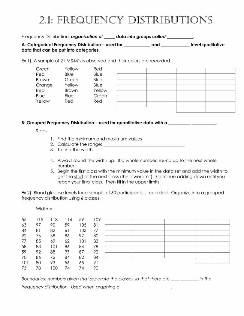
FREQUENCY POLYGON: _________________________________________________________________
______________________________________________________________________________________________
STEPS:
1. Find the midpoints for each class.
2. Draw the x and y axes. Label the x-axis with the midpoints and the y-axis with a suitable
scale for the frequencies.
3. Plot each point.
4. Connect the adjacent points with line segments. Draw a line back to the x-axis at the
beginning and the end of the graph, at the same distance that the previous and next
midpoints would be located.
OGIVE: _____________________________________________________________________________________
______________________________________________________________________________________________
STEPS:
1. Find the cumulative frequency for each class.
2. Draw the x and y axes. Label the x-axis with the class boundaries. Label the y-axis with a
suitable scale for the cumulative frequencies.
3. Plot the cumulative frequency at each upper class boundary. Upper boundaries are used
since the cumulative frequencies represent the number of data values accumulated up to
the upper boundary of each class.
4. Connect the adjacent points with line segments. Then extend the graph to the first lower
class boundary on the x-axis.
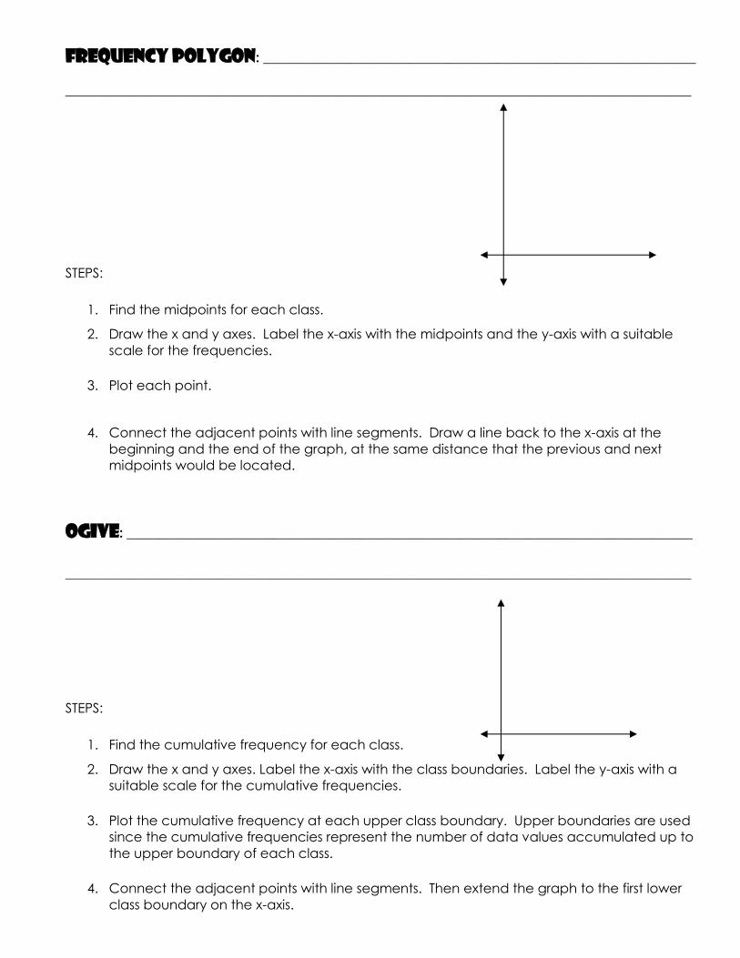
RELATIVE FREQUENCY GRAPHS: _____________________________________________________
*Useful when it is more important to know the proportion of data within each category than the
actual number of data values in the classes. Often used to compare two data values.
STEPS:
1. Convert each frequency to a proportion or relative frequency (percent).
2. Find the cumulative relative frequency. Should always add to 100%
3. Draw each graph. For the histogram and ogive, use the class boundaries along the x-axis.
For the frequency polygon, use the midpoints on the x-axis. The scale on the y-axis uses
proportions.
DISTRIBUTION SHAPES:
Bell-Shaped Uniform
Right-Skewed Left-Skewed
Bimodal U-Shaped
Homework: pg. 61 #1, 2, 4 (all graphs are to be completed on graph paper, neatly with a ruler)


2.3 – Bar Graphs, Pareto Charts, Time Series Graphs, & Pie Charts Bar Graph: ___________________________________________________________________________________
______________________________________________________________________________________________
*Used for _______________ or ________________ data.
STEPS:
1. Draw and label the x and y axes. The x-axis is the frequency, where the y-axis represents
the categories.
2. Draw the bars corresponding to the frequencies. The bars should not touch.
Pareto Charts: ________________________________________________________________________________
______________________________________________________________________________________________
*Used for qualitative or categorical data.
STEPS:
1. Arrange the data from the largest to the smallest according to frequency.
2. Draw and label the x and y axes.
3. Draw the bars corresponding to the frequencies.
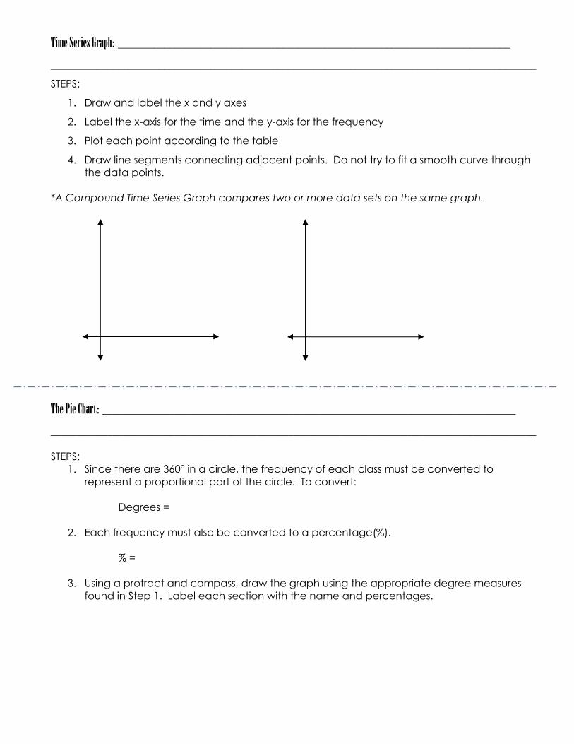
Time Series Graph: ____________________________________________________________________________
______________________________________________________________________________________________
STEPS:
1. Draw and label the x and y axes
2. Label the x-axis for the time and the y-axis for the frequency
3. Plot each point according to the table
4. Draw line segments connecting adjacent points. Do not try to fit a smooth curve through
the data points.
*A Compound Time Series Graph compares two or more data sets on the same graph.
The Pie Chart: ________________________________________________________________________________
______________________________________________________________________________________________
STEPS:
1. Since there are 360° in a circle, the frequency of each class must be converted to
represent a proportional part of the circle. To convert:
Degrees =
2. Each frequency must also be converted to a percentage(%).
% =
3. Using a protract and compass, draw the graph using the appropriate degree measures
found in Step 1. Label each section with the name and percentages.

In class example page 84, #4: Construct a pie chart:
Homework: pg. 84 #1, 3, 7, 10

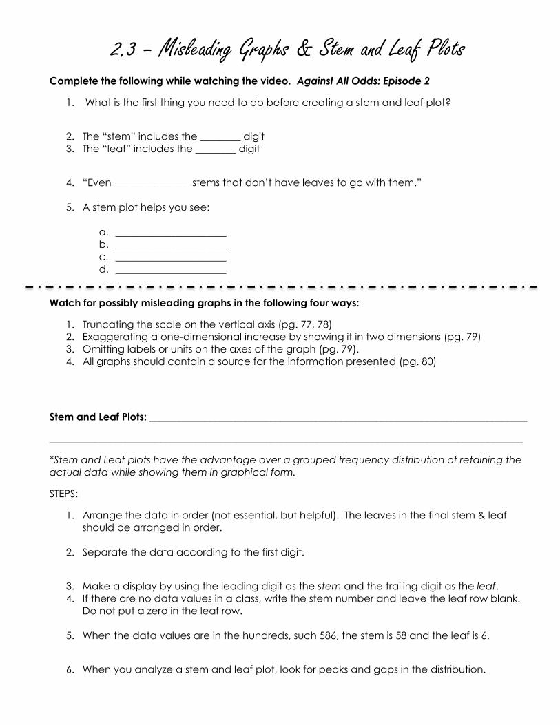
2.3 – Misleading Graphs & Stem and Leaf Plots Complete the following while watching the video. Against All Odds: Episode 2
1. What is the first thing you need to do before creating a stem and leaf plot?
2. The “stem” includes the ________ digit
3. The “leaf” includes the ________ digit
4. “Even _______________ stems that don’t have leaves to go with them.”
5. A stem plot helps you see:
a. ______________________
b. ______________________
c. ______________________
d. ______________________
Watch for possibly misleading graphs in the following four ways:
1. Truncating the scale on the vertical axis (pg. 77, 78)
2. Exaggerating a one-dimensional increase by showing it in two dimensions (pg. 79)
3. Omitting labels or units on the axes of the graph (pg. 79).
4. All graphs should contain a source for the information presented (pg. 80)
Stem and Leaf Plots: ___________________________________________________________________________
______________________________________________________________________________________________
*Stem and Leaf plots have the advantage over a grouped frequency distribution of retaining the
actual data while showing them in graphical form.
STEPS:
1. Arrange the data in order (not essential, but helpful). The leaves in the final stem & leaf
should be arranged in order.
2. Separate the data according to the first digit.
3. Make a display by using the leading digit as the stem and the trailing digit as the leaf.
4. If there are no data values in a class, write the stem number and leave the leaf row blank.
Do not put a zero in the leaf row.
5. When the data values are in the hundreds, such 586, the stem is 58 and the leaf is 6.
6. When you analyze a stem and leaf plot, look for peaks and gaps in the distribution.

Ex 1). Complete a stem and leaf plot for the list of grades on a recent test in Geometry.
73, 42, 67, 78, 99, 84, 91, 82, 86, 94
Ex 2). Complete a back to back stem and leaf plot comparing the two classes on a recent test.
Compare the two classes.
Mod 1-2: 78, 67, 79, 81, 45, 91, 93, 66, 80, 81
Mod 12-13: 97, 88, 69, 80, 73, 81, 75, 81, 96, 95
Homework: pg. 84 #13, 14, 15, 17, 24, 25