Evaluating and improving the user-interface of existing GIS ...
61
DEGREE PROJECT, IN , SECOND MEDIA AND INTERACTION DESIGN (MID) LEVEL STOCKHOLM, SWEDEN 2015 Evaluating and improving the user-interface of existing GIS-applications by the use of HCI evaluation techniques MARTIN ANDERSEN KTH ROYAL INSTITUTE OF TECHNOLOGY SCHOOL OF COMPUTER SCIENCE AND COMMUNICATION (CSC)
-
Upload
khangminh22 -
Category
Documents
-
view
2 -
download
0
Transcript of Evaluating and improving the user-interface of existing GIS ...
DEGREE PROJECT, IN , SECONDMEDIA AND INTERACTION DESIGN (MID)LEVEL
STOCKHOLM, SWEDEN 2015
Evaluating and improving theuser-interface of existingGIS-applications by the use of HCIevaluation techniques
MARTIN ANDERSEN
KTH ROYAL INSTITUTE OF TECHNOLOGY
SCHOOL OF COMPUTER SCIENCE AND COMMUNICATION (CSC)

www.kth.se
Abstract
Geographical Information Systems (GIS) are large systems that handles, storesand manipulates geographical data. This report is based on the fact that GIS-applications, in general, tend to be quite complex and contain large quantitiesof data as well as lots of functionality. Because of this, it is a challenge todesign a good user-interface for such applications and the ones who suffer fromthis are the users. Thereby, the motivation for this report is formed, which isabout proposing improvements to a user-interface of existing GIS-applicationsin order to increase the users satisfaction with it. The GIS-applications that arethe focus of this report are the applications of the company Digpro.
The question that attempts to be answered in this project is: "What can bedone to improve the user-interface of existing GIS-applications from a generalHCI-perspective and from the perspective of the users?".
The method for doing this is to research for theory about HCI, and alsothrough interactions with the users. These interactions are done by using QueryEvaluation Techniques in the form of interviews and questionnaires. By usingthe result of these Query Evaluation Techniques combined with the theory got-ten from the research, a number of improvement ideas have been developed andpresented as mock-ups and concept sketches. These ideas have been evaluatedusing Heuristic Evaluation and a final prototype has been developed.
In the end, the final prototype is the result of this project. The prototype in-cludes all, but one, of the improvement ideas and shows the interaction betweenthe ideas and the already existing user-interface. Further, since the prototypehas been developed with a lot of regard for the users opinions in order to in-crease their satisfaction with the user-interface, the results are very much in linewith the motivation for this master thesis.
Sammanfattning
Geografiska Informations System (GIS) är stora system som hanterar, lagrar ochmanipulerar geografisk data. Rapporten är baserad på att GIS-applikationer, ge-nerellt, tenderar att vara ganska komplexa och innehåller stora mängder dataoch mycket funktionalitet. På grund av detta, är det en utmaning att designaett bra gränssnitt för sådana applikationer och de som får lida av detta är an-vändarna. Därigenom kommer motivationen för denna rapport, som handlar omatt föreslå förbättringar till ett gränsnitt för existerande GIS-applikationer föratt genom detta kunna göra användarna nöjdare med det. GIS-applikationernasom är i fokus för denna rapport är applikationer från företaget Digpro.
Frågan som försöker besvaras i detta projekt är: "Vad kan göras för attförbättra gränssnittet hos existerande GIS-applikationer från ett generellt MDI-perpektiv och från användarnas perspektiv?".
Metoden för att göra detta är att studera teorin bakomMDI, och även genominteraktion med användare. Dessa interaktioner görs genom Fråge-utvärderingstekniker i form utav intervjuer och enkäter. Genom att användaresultatet från dessa Fråge-utvärderingstekniker i kombination med teorin frånstudien, har en mängd förbättrings-idéer blivit utvecklade och presenterade sommock-ups och konceptskisser. Dessa idéer har utvärderats genom att användaHeuristisk utvärdering och en slut-prototyp har utvecklats.
I slutändan, är slut-prototypen resultatet av det här projektet. Prototypeninkluderar alla, förutom en, förbättrings-idéer och visar interaktionen mellandessa idéer och det redan existerande gränssnittet. Dessutom, eftersom prototy-pen har utvecklats med användarnas åsikter i åtanke för att göra dem nöjdaremed gränssnittet, ligger resultatet i linje med motivationen för det här examens-arbetet.
Contents
1 Introduction 11.1 About Digpro . . . . . . . . . . . . . . . . . . . . . . . . . . . . . 11.2 Problem statement . . . . . . . . . . . . . . . . . . . . . . . . . . 21.3 Motivation . . . . . . . . . . . . . . . . . . . . . . . . . . . . . . 21.4 Intended readers . . . . . . . . . . . . . . . . . . . . . . . . . . . 31.5 Related work . . . . . . . . . . . . . . . . . . . . . . . . . . . . . 3
2 Background 42.1 About HCI . . . . . . . . . . . . . . . . . . . . . . . . . . . . . . 42.2 Query Evaluation Techniques . . . . . . . . . . . . . . . . . . . . 4
2.2.1 Questionnaires . . . . . . . . . . . . . . . . . . . . . . . . 52.2.2 Interviews . . . . . . . . . . . . . . . . . . . . . . . . . . . 5
2.3 About GIS . . . . . . . . . . . . . . . . . . . . . . . . . . . . . . 62.3.1 The applications of Digpro . . . . . . . . . . . . . . . . . 62.3.2 The current interface . . . . . . . . . . . . . . . . . . . . . 7
2.4 How we perceive a user-interface . . . . . . . . . . . . . . . . . . 92.4.1 The power of the first impression . . . . . . . . . . . . . . 9
2.5 Design ideas for interfaces . . . . . . . . . . . . . . . . . . . . . . 92.5.1 Consistency . . . . . . . . . . . . . . . . . . . . . . . . . . 102.5.2 Cleaning up . . . . . . . . . . . . . . . . . . . . . . . . . . 102.5.3 Helping the user . . . . . . . . . . . . . . . . . . . . . . . 102.5.4 Other ideas . . . . . . . . . . . . . . . . . . . . . . . . . . 11
3 Method 123.1 Phase I - Setup & Research . . . . . . . . . . . . . . . . . . . . . 12
3.1.1 Setup . . . . . . . . . . . . . . . . . . . . . . . . . . . . . 133.1.2 Research . . . . . . . . . . . . . . . . . . . . . . . . . . . . 13
3.2 Phase II - Performing the evaluation of the user-interface . . . . 133.2.1 The questionnaires . . . . . . . . . . . . . . . . . . . . . . 133.2.2 The interviews . . . . . . . . . . . . . . . . . . . . . . . . 153.2.3 Comparing the user-interface to HCI theory and guidelines 16
3.3 Phase III - Evaluating the results . . . . . . . . . . . . . . . . . . 163.3.1 The questionnaires . . . . . . . . . . . . . . . . . . . . . . 163.3.2 The interviews . . . . . . . . . . . . . . . . . . . . . . . . 16
3.4 Phase IV - Improving the user-interface . . . . . . . . . . . . . . 163.4.1 Concept sketches . . . . . . . . . . . . . . . . . . . . . . . 163.4.2 Prototype . . . . . . . . . . . . . . . . . . . . . . . . . . . 17
4 Result 184.1 Statistics of questionnaires . . . . . . . . . . . . . . . . . . . . . . 18
4.1.1 Statements . . . . . . . . . . . . . . . . . . . . . . . . . . 184.1.2 Non-mandatory questions . . . . . . . . . . . . . . . . . . 20
4.2 Statistics of interviews . . . . . . . . . . . . . . . . . . . . . . . . 21
5 Improvements 225.1 Idea 1 - Create own shortcuts . . . . . . . . . . . . . . . . . . . . 22
5.1.1 Version 1 . . . . . . . . . . . . . . . . . . . . . . . . . . . 225.1.2 Version 2 . . . . . . . . . . . . . . . . . . . . . . . . . . . 245.1.3 Version 3 . . . . . . . . . . . . . . . . . . . . . . . . . . . 25
5.2 Idea 2 - Cleaning up in command-list . . . . . . . . . . . . . . . . 265.3 Idea 3 - Making the commandbar and the iconbar customizable . 28
5.3.1 Version 1 . . . . . . . . . . . . . . . . . . . . . . . . . . . 295.3.2 Version 2 . . . . . . . . . . . . . . . . . . . . . . . . . . . 30
5.4 Idea 4 - The statusbar . . . . . . . . . . . . . . . . . . . . . . . . 325.5 Idea 5 - New icons . . . . . . . . . . . . . . . . . . . . . . . . . . 345.6 Idea 6 - The startscreen . . . . . . . . . . . . . . . . . . . . . . . 365.7 Final prototype . . . . . . . . . . . . . . . . . . . . . . . . . . . . 37
6 Discussion & Conclusions 386.1 Difference in results - interviews vs questionnaire . . . . . . . . . 386.2 Choice of method . . . . . . . . . . . . . . . . . . . . . . . . . . . 396.3 Project evaluation . . . . . . . . . . . . . . . . . . . . . . . . . . 396.4 Future work . . . . . . . . . . . . . . . . . . . . . . . . . . . . . . 40
7 Bibliography 41
A Diagrams for questionnaire statements 44
B Matrix for non-mandatory questionnaire questions 54
Chapter 1
Introduction
1.1 About DigproThe company Digpro1 offers multiple GIS-applications (Geographic InformationSystem) for their users. The base for these applications is dpSpatial, which, alittle simplified, is a database that handles, stores and presents geographical,or spatial, data which can be used for a number of different purposes. Thisleads to the applications of Digpro, which uses the functionality of dpSpatialto allow Digpro’s customers to use this data in various ways depending onwhich application is used. For example, dpPower is used to provide a graphicalrepresentation of power lines in a desired area while dpCom provides the samefunctionality for Telecom-wires. Further, these applications can be combinedwith a number of modules for further functionality.
The relationship between dpSpatial, the servers and the clients of Digprocan be seen in image 1.1 below. The client that will be in focus for this projectwill be the Java Applet.
The interface of the different applications all follow the same basic con-cept. Also, the main graphical components are the same across the applica-tions. Thereby, these similarities plays a huge part in how the user experiencesthe interface of the applications, and Digpro want to know what can be done toimprove it.
1http://digpro.se/index.php/en/
1
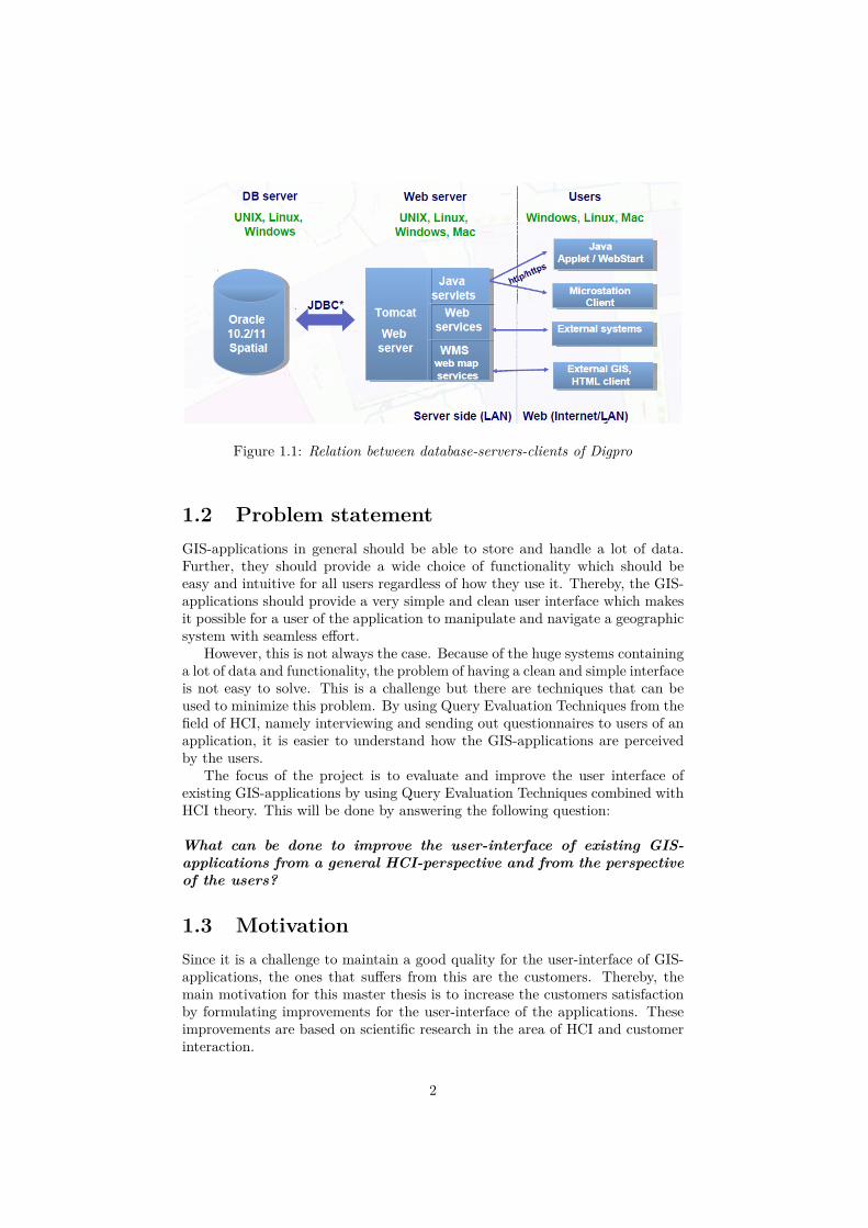
Figure 1.1: Relation between database-servers-clients of Digpro
1.2 Problem statementGIS-applications in general should be able to store and handle a lot of data.Further, they should provide a wide choice of functionality which should beeasy and intuitive for all users regardless of how they use it. Thereby, the GIS-applications should provide a very simple and clean user interface which makesit possible for a user of the application to manipulate and navigate a geographicsystem with seamless effort.
However, this is not always the case. Because of the huge systems containinga lot of data and functionality, the problem of having a clean and simple interfaceis not easy to solve. This is a challenge but there are techniques that can beused to minimize this problem. By using Query Evaluation Techniques from thefield of HCI, namely interviewing and sending out questionnaires to users of anapplication, it is easier to understand how the GIS-applications are perceivedby the users.
The focus of the project is to evaluate and improve the user interface ofexisting GIS-applications by using Query Evaluation Techniques combined withHCI theory. This will be done by answering the following question:
What can be done to improve the user-interface of existing GIS-applications from a general HCI-perspective and from the perspectiveof the users?
1.3 MotivationSince it is a challenge to maintain a good quality for the user-interface of GIS-applications, the ones that suffers from this are the customers. Thereby, themain motivation for this master thesis is to increase the customers satisfactionby formulating improvements for the user-interface of the applications. Theseimprovements are based on scientific research in the area of HCI and customerinteraction.
2
1.4 Intended readersThis master thesis is first and foremost intended to be read by students that arein their senior years of a university, preferably with a focus in science and/ortechnology.
1.5 Related workThe different techniques that will be used to gather information from usersabout the interface, interviews and questionnaires, are two common techniquesin the category Query Evaluation Techniques in the field of HCI [14]. Thetechniques are widely used for evaluating different interfaces, and there aremany works that are related to this project. An example of such a work isdescribed in the paper by Alencar, Raposo & Barbosa from 2011 which canbe seen in [12]. In this paper, the authors describes an evaluation they haveperformed of the usability of HybridDesk, which is a system for creating virtualenvironments. The technique they have chosen for doing this is a combinationof multiple evaluation techniques. The authors sets up an experiment to testthe usability of HybridDesk. The techniques for evaluating this experiment are,among others, interviews and questionnaires which in the end plays a big partin the results gotten from the experiment.
Another project which is quite similar to the one described in this reportcan be seen in [19]. This is a paper by Könik from 2003 in which the authordescribes an evaluation of a music software. The author uses HCI evaluationtechniques very similar to the ones that will be used for this project, namelyquestionnaires and interviews. And even though her paper is more about thefunctionality of the software and not the interface, there is a clear focus on HCIand evaluation techniques which makes it closely related to this report.
3
Chapter 2
Background
2.1 About HCIHCI, human-computer interaction, can be defined as the study of interactionbetween people and computers. This interaction is made at the user-interfaceof an application [18]. The main goal in the field of HCI is to develop a user-interface that is as usable and effective as possible, in the eyes of the users.In order to do this, there are three general dimensions in HCI: Theory devel-opment, engineering construction and evaluation techniques. The first phase,theory development, is about studying human perception and cognition in orderto understand how people perceive and interpret things. Engineering construc-tion, which is the second phase, is about designing the desired interface. Manyprofessional user-interface designers start with sketching some kind of layoutfor the interface on a paper at first. This helps in exploring and constructingthe interface as a whole instead of refining small details in the beginning of thedesign-phase. Further in this phase, a storyboard is usually developed by num-bering the sketches and drawing arrows in them to show how the navigation andtransitions of the application will look like. Lastly, some kind of prototype ispreferably created before actually implementing the ideas for the user-interfaceinto the system [3].
The last phase, evaluation techniques, is used to evaluate the designed user-interface from phase two [1]. Evaluation of a user-interface is a key-componentin HCI [13]. It is used to identify any problems with the usability of the interface,and it is also used to collect information and to determine the satisfaction ofthe users [18, 13, 14].
2.2 Query Evaluation TechniquesWhen it comes to evaluating a user-interface, a number of different techniquesand methods exist. There are empirical studies which are studies through obser-vations or measurements of the users. On the other hand there are analytic stud-ies which are studies for reasoning and working by analysing a user-interface.Further, there are qualitative and quantitative evaluations. The results fromqualitative evaluations are usually reports containing detailed information about
4
a small number of users, while the results from quantitative evaluations are usu-ally numbers which can be used to compare a larger number of users [15].
Query Evaluation Techniques represents a specific category of evaluationtechniques in the field of HCI. In this category, evaluation through question-naires and interviews are very common [14]. These techniques are an importantpart of the method for this project, which will be presented in more detail inchapter 3. In the section below, the techniques will be described, as well as theiradvantages and disadvantages.
2.2.1 QuestionnairesThe advantage of using questionnaires as an evaluation technique for an appli-cation is that it provides a fast way of reaching out to many users. Furthermore,the results gotten from questionnaires are often quite simple to analyze, and tovisualize in tables or diagrams. You can easily see what the users think of, forexample, a feature of an application by simply letting the users rank the qual-ity of that specific feature with a value between 1-5 in the questionnaire. Thismakes it simple to get a quick overview of what features are good and whichones needs to be focused on to maintain the quality of the user-interface. Also,since the questionnaires usually generate a lot of answers from many users, theresults can be considered quite reliable [14, 15].
The disadvantages of using questionnaires, on the other hand, is that it canbe hard to know exactly what to do with the results. If the users say that thequality of a certain feature is "quite bad", it isn’t exactly clear what should bedone to improve it or what the users think is bad with the feature. Hence, abig challenge with developing a good questionnaire is to make the questions asspecific enough so that the results are useful and also non-specific enough sothat the questionnaire still generates a lot of results and not takes too mucheffort and time to complete for the users.
To summarize, the best way to use this technique might be to confirm theresults gotten from using other techniques, or to get a quick overview of thequality of the application. However, a good questionnaire can still provide veryuseful results on its own.
2.2.2 InterviewsInterviews as an evaluation technique for an application has the advantage ofproviding results that contain a lot of insight into how the users of the applica-tion actually perceive it. Through the use of interviews it might be more clearwhat is hard or intuitive for a user to understand, and it will be easier to un-derstand what should be done in order to improve a certain feature or a generalaspect of the user-interface. Further, the results gotten can be quite easy toanalyze, since the questions throughout these interviews are the same, only theanswers differ. So, if some answers to the same question all point towards acommon factor, you can understand that you need to focus on that factor [14].
The disadvantage of this technique is that it is quite time-consuming andthat it is complicated to reach a very large number of people. Thereby, a smallcrowd will have to represent the opinions of all users, which might lead to badresults. Further, the results are very hard to visualize since the answers for theinterview-questions will all be different [14].
5
So to sum up the features of using interviews as an evaluation technique,this technique is good to use when a deeper knowledge about how the usersexperience and perceive the user-interface is needed to improve it. But it shouldprobably be combined with a quantitative evaluation technique which generatesa larger number of results quicker.
2.3 About GISGIS stands for Geographic Information System which is a system for storing,manipulating and presenting geographical data. The GIS-applications are builtupon a database which can store spatial, or geographic, data and the datacan be presented to the user through the use of queries to the database. Say,for example, that a user wants to be able to see all electric lines in a certainarea, a query will be sent to the database for retrieving that specific infor-mation and is then presented to the user by visualizing the information on amap [7]. GIS-applications tend to be quite complex, as they usually hold ahuge amount of spatial data, and should be able to handle it with good scala-bility [2]. The spatial data of the GIS-applications is mapped, or georeferenced,to locations on a map. This makes the applications very flexible, allowing themto present and manage data with high speed [7]. GIS-applications can be usedfor a lot of different purposes including resource management, network-planningand location-based services in general [9]. When it comes to this project, theGIS-applications that will be focused on are the applications of Digpro, whichcan be read about in the next section.
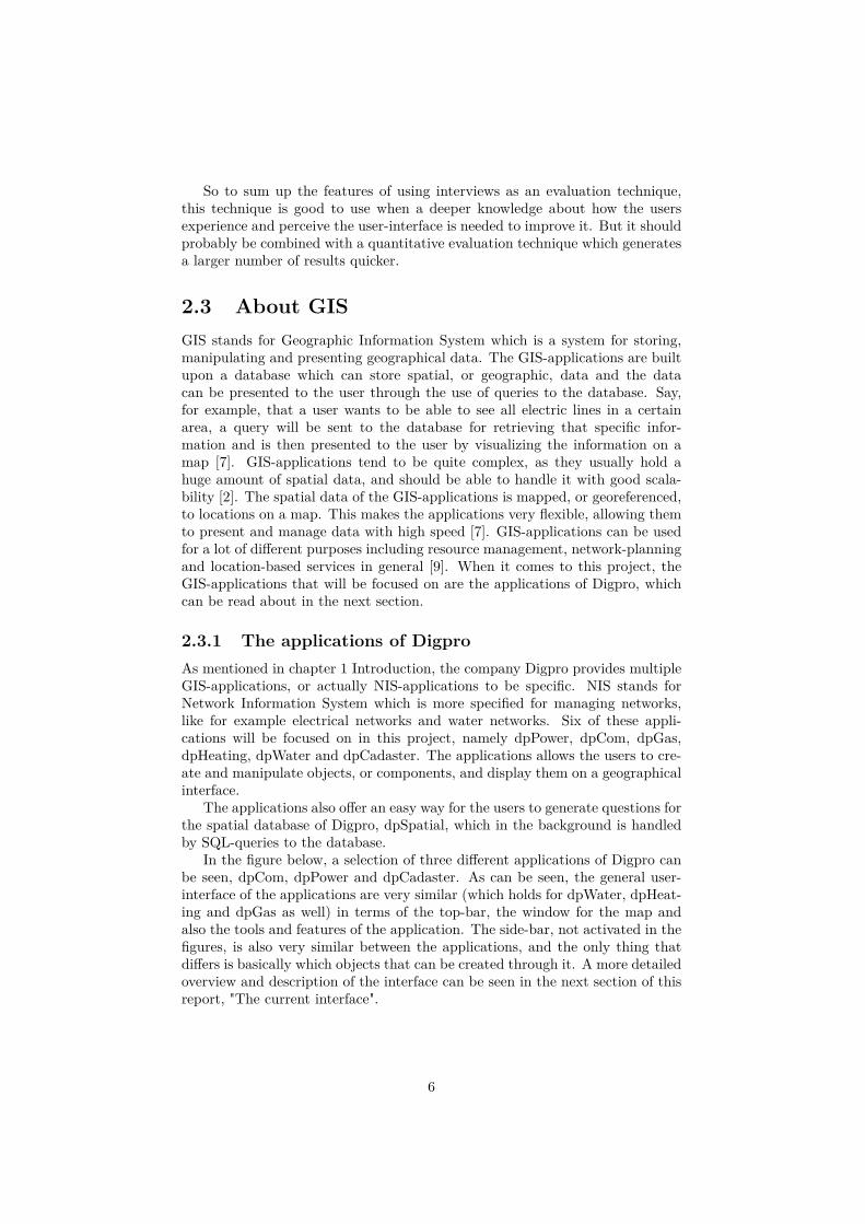
2.3.1 The applications of DigproAs mentioned in chapter 1 Introduction, the company Digpro provides multipleGIS-applications, or actually NIS-applications to be specific. NIS stands forNetwork Information System which is more specified for managing networks,like for example electrical networks and water networks. Six of these appli-cations will be focused on in this project, namely dpPower, dpCom, dpGas,dpHeating, dpWater and dpCadaster. The applications allows the users to cre-ate and manipulate objects, or components, and display them on a geographicalinterface.
The applications also offer an easy way for the users to generate questions forthe spatial database of Digpro, dpSpatial, which in the background is handledby SQL-queries to the database.
In the figure below, a selection of three different applications of Digpro canbe seen, dpCom, dpPower and dpCadaster. As can be seen, the general user-interface of the applications are very similar (which holds for dpWater, dpHeat-ing and dpGas as well) in terms of the top-bar, the window for the map andalso the tools and features of the application. The side-bar, not activated in thefigures, is also very similar between the applications, and the only thing thatdiffers is basically which objects that can be created through it. A more detailedoverview and description of the interface can be seen in the next section of thisreport, "The current interface".
6
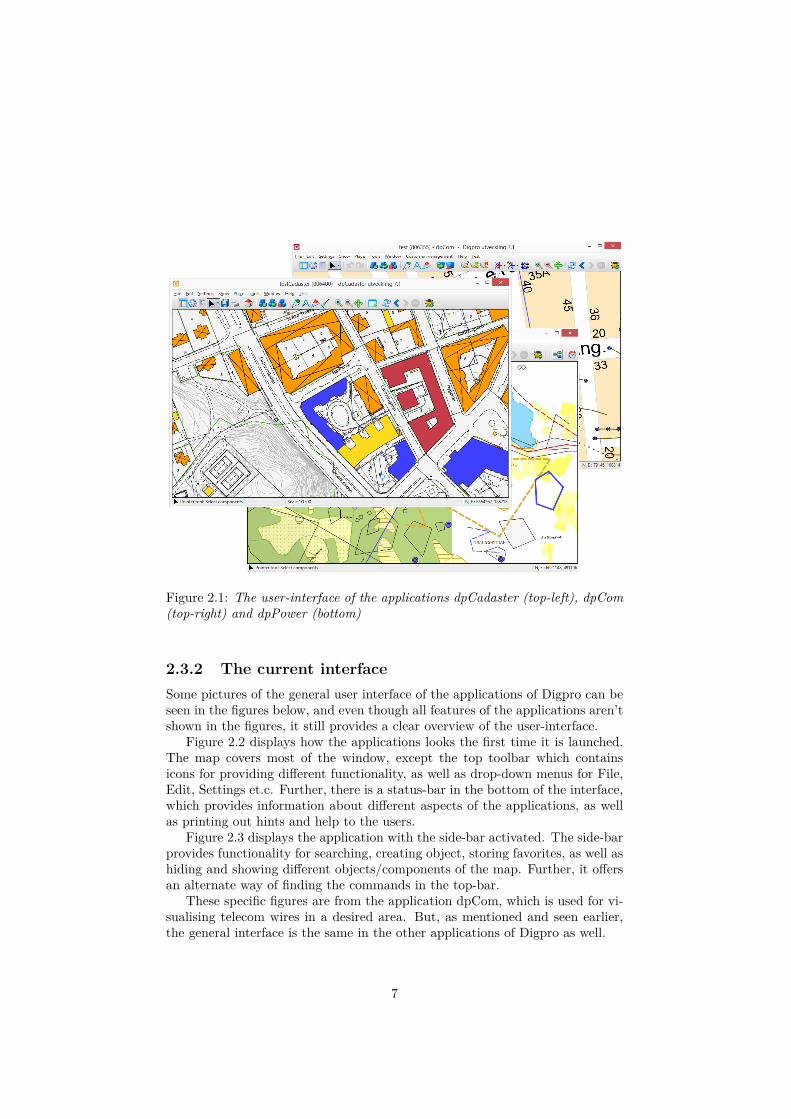
Figure 2.1: The user-interface of the applications dpCadaster (top-left), dpCom(top-right) and dpPower (bottom)
2.3.2 The current interfaceSome pictures of the general user interface of the applications of Digpro can beseen in the figures below, and even though all features of the applications aren’tshown in the figures, it still provides a clear overview of the user-interface.
Figure 2.2 displays how the applications looks the first time it is launched.The map covers most of the window, except the top toolbar which containsicons for providing different functionality, as well as drop-down menus for File,Edit, Settings et.c. Further, there is a status-bar in the bottom of the interface,which provides information about different aspects of the applications, as wellas printing out hints and help to the users.
Figure 2.3 displays the application with the side-bar activated. The side-barprovides functionality for searching, creating object, storing favorites, as well ashiding and showing different objects/components of the map. Further, it offersan alternate way of finding the commands in the top-bar.
These specific figures are from the application dpCom, which is used for vi-sualising telecom wires in a desired area. But, as mentioned and seen earlier,the general interface is the same in the other applications of Digpro as well.
7
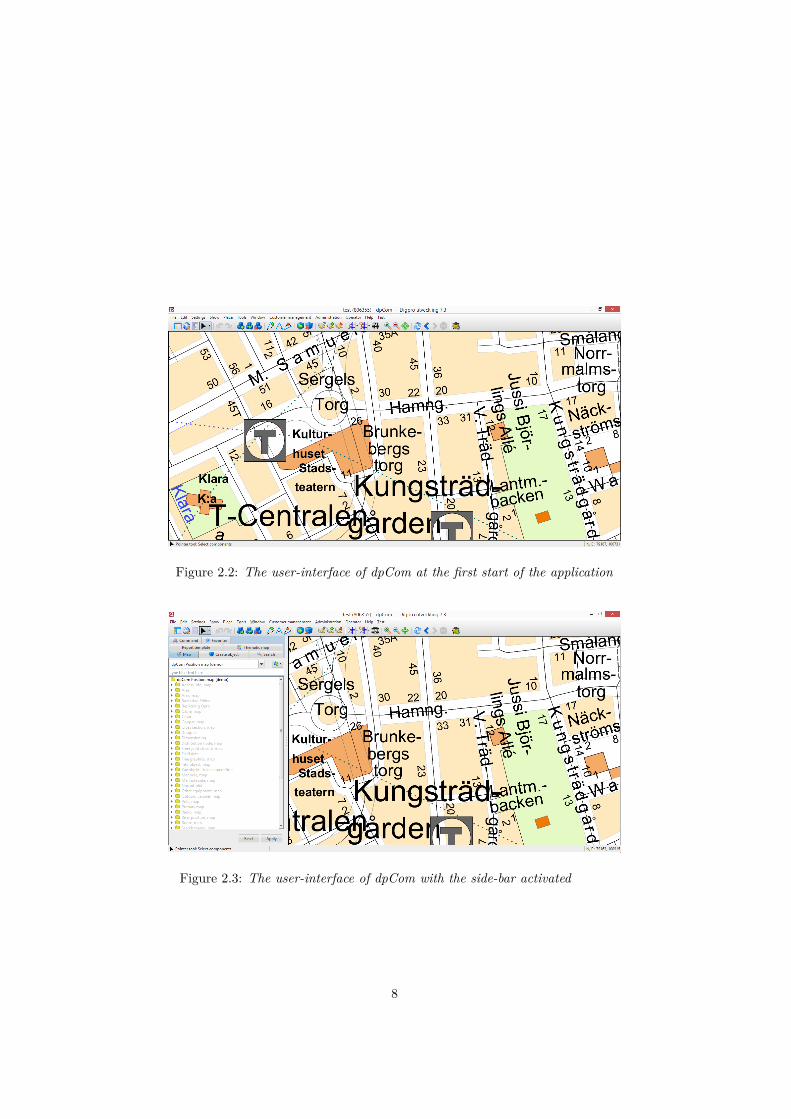
Figure 2.2: The user-interface of dpCom at the first start of the application
Figure 2.3: The user-interface of dpCom with the side-bar activated aaaaa
8
2.4 How we perceive a user-interfaceThis section will treat the H in HCI, namely the human aspect. Psychology is abig aspect when it comes to understanding how people perceive a user-interface.There is a reason to why people are drawn to a specific user-interface, or to whypeople tend to notice certain components more than others in a user-interface.The psychology aspects needs to be taken into consideration when designing agood and understandable interface.
2.4.1 The power of the first impressionPeople always develop a first impression of someone or something, whether theylike it or not. Sometimes it’s positive as it allows us to make initial judgmentsvery fast, but at the same time it can be negative as the first impression mightnot always be right. The process of creating a first impression, or an initialhypothesis, of something is extremely quick, some studies suggests as fast as50-100 ms [4, 8]. Studies show that first impressions are almost solely madeby the visual appeal of someone or something. Basically, if we don’t like whatwe see, the first impression makes us build up a bad impression before we havetaken in all the information about the object we’re looking at [8, 11].
The reason why the power of the first impression is brought up in this reportis that it, of course, is a very important factor to consider in a user-interface.If the user of an application gets a good first impression of the interface, it is avery good start when it comes to the usability of the application. Studies showthat the stimulus presented or detected first gets an inappropriate amount ofattention which leads to our judgments being overwhelmingly based on our firstimpression [11]. Therefore, it cannot be ignored as an important factor whenit comes to the interface of an application. Further, the first impression is alsovery difficult to change according to a study made by Bertram Gawronski. Thestudy suggests that new experiences that contradicts the first impression wehave built up, become bound to the context in which they were experienced.This means that the first impression is still dominant in all other contexts [6].There is also a term called confirmation bias which means that it is hard for usto accept facts that contradicts our first impression of something, which mighthappen to us sometimes [4]. For these reasons, the first impression we get mightbe very hard to change.
To put this in context with this report, the summary of this section is that thefirst encounter with the user-interface of an application might actually determinehow the users will feel about the interface, as well as the application, in general,regardless of how good, useful and complex the application might be. Thereby,the start-screen of an application is extremely important, and it is a significantfactor which is worth to put a lot of thought and time into.
2.5 Design ideas for interfacesThere are some proposed ways of making a user-interface as successful andwell-perceived as possible. Some key-aspects include making the interface asconsistent as possible, cleaning up the interface to make it feel lighter/simplerand helping the user as much as possible [10, 16, 17].
9
2.5.1 ConsistencyTo be able to make the interface as consistent as possible, there are some thingsthat can be done. Making sure that components look the same throughout theapplication is one way of doing this. The basic structure of a window should bethe same for all windows, a basic example is that if the button for closing thewindow is in the top-right corner of one window, it should be in the top-rightcorner for other windows as well. Further, making sure that gestures and mouse-clicks are consistent is also an important part. If a right-click with the mouse onan object in the application has a certain functionality, it should have the samefunctionality when clicking on other objects [10, 16]. Another aspect that needsto be taken into consideration is the consistency with other applications. If it isconventional to have the close-button in the top-right corner of an application,it might be appropriate to follow that convention in order to make your owninterface as consistent with the convention as possible [16, 17].
2.5.2 Cleaning upIn order to make the interface feel as light and clean as possible, it is good togroup things together in a logical sense and also to avoid making the interfacelook busy. An example of where it is a good idea to group things togetheris if you have many different functions that are quite similar and have similarfunctionality. Instead of having these functions separately, you could groupthem under one function or window and let the user choose which one of themthat should be used there instead. To have a busy interface can mean thatthere are a lot of things happening in the interface at the same time, or thatthe screen is too crowded. Avoiding this will make the interface feel lighter [10].
Further, decreasing the number of options for the user will also make theinterface feel lighter and easier to use. Breaking one big step into several smallsteps will have the same effect, as the user will not get overwhelmed by all theinformation. Last but not least, it is good to know which are the key-aspects, ormost important factors, of the application in order to make these aspects easilyreachable in the interface. This will help the users a lot, allowing them to avoidnavigating through many different steps in order to find them, and thus makingthe interface seem cleaner and simpler [17].
2.5.3 Helping the userIt is very important to have an interface which helps making it easy for the userto use the application. To do this, there are many different approaches. One ideais to constantly provide the user with feedback or help, but do it in a very subtleway. It can be done for example with hover-over text that describes an icon orfunction when the user holds the cursor over that icon. Another way to do itis to alert or notify the user with colors and descriptive text when somethingis unclear, in order to make them notice it and thereby more easily be able tohelp. Further, using appropriate names or icons that properly describe theirfunctions helps the user a lot when it comes to understanding the application.Also, explaining the features of the application in a good way through theinterface is also very helpful for the user [10, 16, 17].
10
Another thing that needs to be thought about when developing a good user-interface is that the users will make mistakes. When they do, the interface needsto be forgiving and provide functionality for handling this. A common exampleis an undo-button for when the user wants to undo something, for example whena mistake was made [5, 10, 16, 17].
2.5.4 Other ideasOther ideas that might be good to take into consideration when developing auser-interface is that it should be easily navigated, it should use colors andcontrasts in a good way, fields should be aligned effectively, there should besupport for both beginner and expert users of the applications, the interfaceshould work fast and be efficient (and if something takes a little more time,provide a progress bar for the loading time) and it should provide some freedomfor the users to sort/filter/organize/manage objects in the application [13, 10,16, 17]. Lastly, it is a good idea to ask the users for feedback in order to maintainthe quality of the application as well as improving it [17].
11
Chapter 3
Method
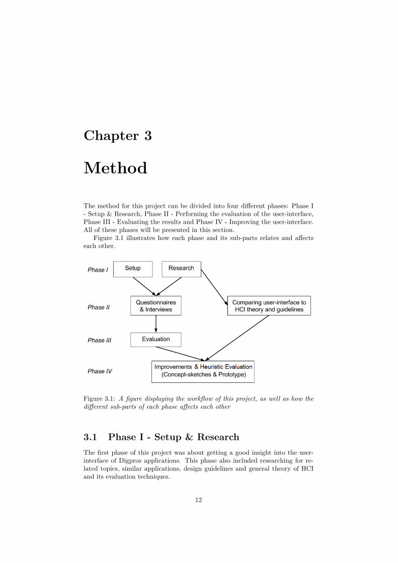
The method for this project can be divided into four different phases: Phase I- Setup & Research, Phase II - Performing the evaluation of the user-interface,Phase III - Evaluating the results and Phase IV - Improving the user-interface.All of these phases will be presented in this section.
Figure 3.1 illustrates how each phase and its sub-parts relates and affectseach other.
Figure 3.1: A figure displaying the workflow of this project, as well as how thedifferent sub-parts of each phase affects each other
3.1 Phase I - Setup & ResearchThe first phase of this project was about getting a good insight into the user-interface of Digpros applications. This phase also included researching for re-lated topics, similar applications, design guidelines and general theory of HCIand its evaluation techniques.
12
3.1.1 SetupThe setup in the beginning of the project was about getting a better insight intothe applications as well as getting a better feeling for the user-interface. Themain reason why this was necessary was to better understand how the appli-cation worked, and which the good aspects and the flaws of the user-interfacewere. Because of this, it was easier to select which parts to be evaluated andfocused on in the interviews and questionnaires, which will be described laterin the report. I also took a three-day course about how to work with one ofDigpros applications, dpPower, in this part of the first phase. This was good inorder to better understand its intended purpose and see how Digpros customerswork with the applications.
3.1.2 ResearchThe research part also played a major role when it came to understandingwhich aspects of the user-interface that should be focused on throughout theproject. Studies of similar applications and different guidelines for useful andgood interface design, which can be read about in the chapter 2, helped in thataspect. These studies were also necessary for the comparison of the theory ofHCI and the actual user-interface of the applications of Digpro in the next phaseof the project.
Furthermore, research about HCI Evaluation Techniques provided importantinformation about how to think when applying the Query Evaluation Techniquesand how to evaluate the results which will be presented later in this report.Studying previous research in the area of HCI and the general theory behindit, as well as the human-aspect of HCI, provided further information which wasneeded to compare the theory of HCI with the user-interface of the applicationsof Digpro.
Lastly, some inspiration for this project has been found through researchingrelated studies of user-interfaces which was mentioned in the introduction ofthis report.
3.2 Phase II - Performing the evaluation of theuser-interface
This phase describes the method for developing and performing/sending outquestionnaires and interviews which was used to understand how the users ofthe applications of Digpro perceived the user-interface. As mentioned in chapter2, the questionnaires were used in order to get a lot of answers from a varietyof users quickly, while the interviews were used to get a deeper insight andunderstanding about how they perceived and worked with the applications ofDigpro.
3.2.1 The questionnairesDevelopment
As mentioned earlier, the first phase of this project helped a lot when it cameto developing the questionnaires. The key-aspects to focus on in the user-
13
interface were identified and the design of the questionnaire could be constructedaccordingly. As mentioned in chapter 2, one of the biggest challenges was todesign the questions of the questionnaire to be as easily answered as possiblebut still provide useful results. Another challenge was that the questions neededto be quite general because the users of these applications don’t necessarily usethe same functions, but they still needed to be quite specific in order to generatesomething useful.
In the end, the questionnaire consisted of three different categories of ques-tions, or statements to be precise. The statements stated something aboutthe interface of the applications, and the person answering the questionnairechose if he/she agreed to the statement or not. The categories differed a bit,where Category A was about the whole interface in general, Category B wasabout the interface and usability of specific functions and Category C was non-mandatory questions where the person could express her-/himself about theinterface in questions that could be answered with a little more depth. Exceptfrom statements, some non-mandatory questions could be found throughout thequestionnaires in order to allow the person answering to specify a little moreabout how he/she perceived the user-interface.
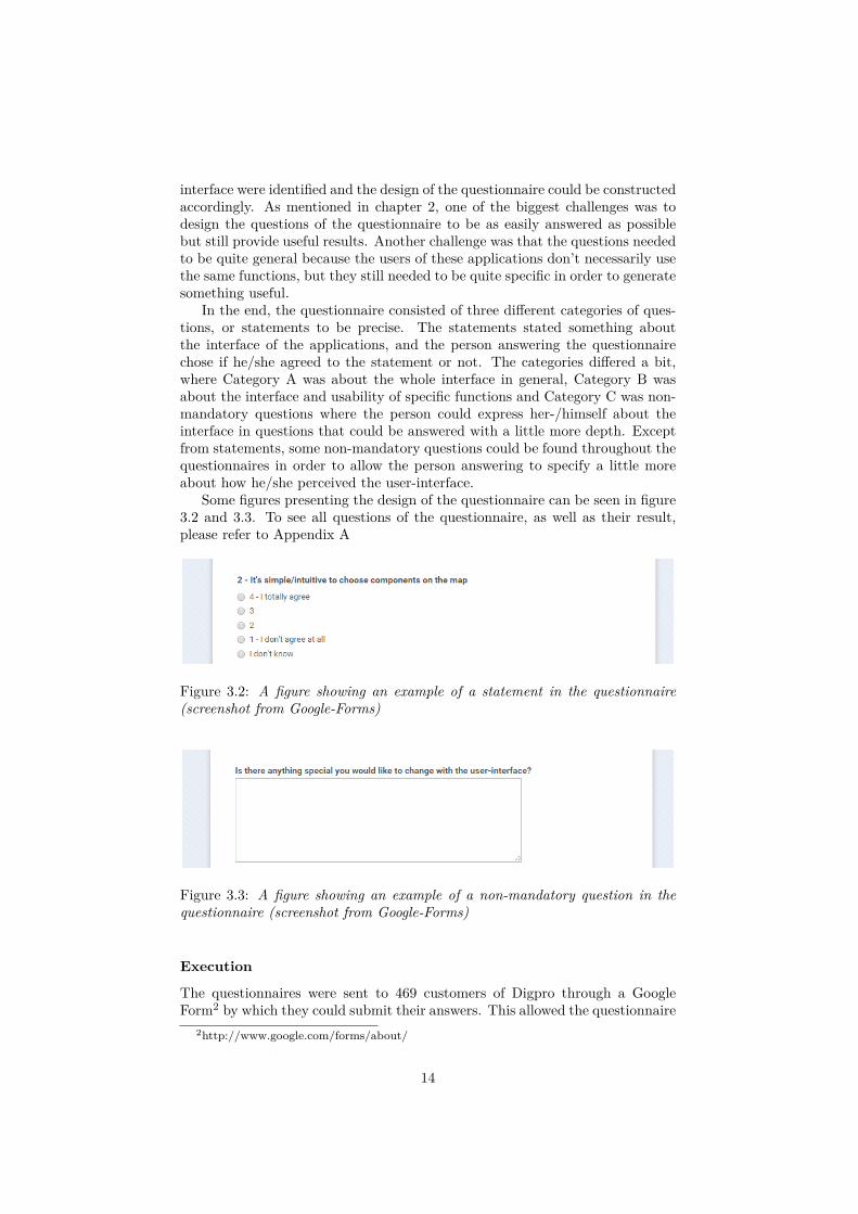
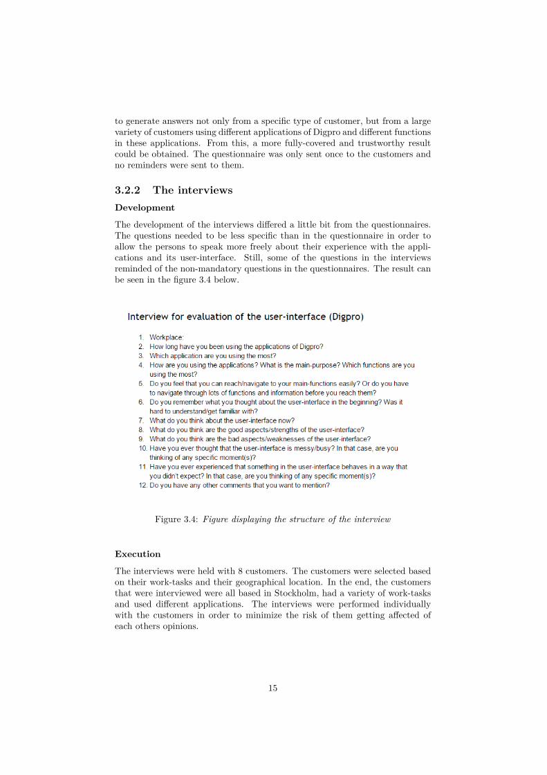
Some figures presenting the design of the questionnaire can be seen in figure3.2 and 3.3. To see all questions of the questionnaire, as well as their result,please refer to Appendix A
Figure 3.2: A figure showing an example of a statement in the questionnaire(screenshot from Google-Forms)
Figure 3.3: A figure showing an example of a non-mandatory question in thequestionnaire (screenshot from Google-Forms)
Execution
The questionnaires were sent to 469 customers of Digpro through a GoogleForm2 by which they could submit their answers. This allowed the questionnaire
2http://www.google.com/forms/about/
14
to generate answers not only from a specific type of customer, but from a largevariety of customers using different applications of Digpro and different functionsin these applications. From this, a more fully-covered and trustworthy resultcould be obtained. The questionnaire was only sent once to the customers andno reminders were sent to them.
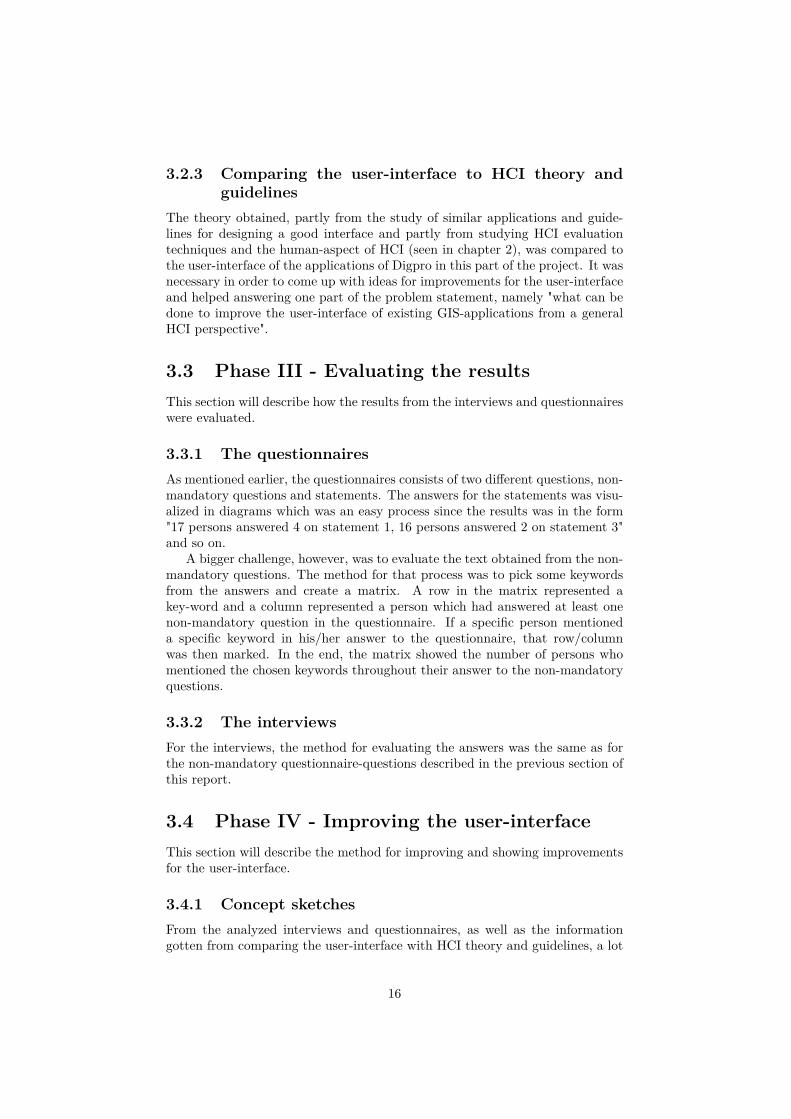
3.2.2 The interviewsDevelopment
The development of the interviews differed a little bit from the questionnaires.The questions needed to be less specific than in the questionnaire in order toallow the persons to speak more freely about their experience with the appli-cations and its user-interface. Still, some of the questions in the interviewsreminded of the non-mandatory questions in the questionnaires. The result canbe seen in the figure 3.4 below.
Figure 3.4: Figure displaying the structure of the interview
Execution
The interviews were held with 8 customers. The customers were selected basedon their work-tasks and their geographical location. In the end, the customersthat were interviewed were all based in Stockholm, had a variety of work-tasksand used different applications. The interviews were performed individuallywith the customers in order to minimize the risk of them getting affected ofeach others opinions.
15
3.2.3 Comparing the user-interface to HCI theory andguidelines
The theory obtained, partly from the study of similar applications and guide-lines for designing a good interface and partly from studying HCI evaluationtechniques and the human-aspect of HCI (seen in chapter 2), was compared tothe user-interface of the applications of Digpro in this part of the project. It wasnecessary in order to come up with ideas for improvements for the user-interfaceand helped answering one part of the problem statement, namely "what can bedone to improve the user-interface of existing GIS-applications from a generalHCI perspective".
3.3 Phase III - Evaluating the resultsThis section will describe how the results from the interviews and questionnaireswere evaluated.
3.3.1 The questionnairesAs mentioned earlier, the questionnaires consists of two different questions, non-mandatory questions and statements. The answers for the statements was visu-alized in diagrams which was an easy process since the results was in the form"17 persons answered 4 on statement 1, 16 persons answered 2 on statement 3"and so on.
A bigger challenge, however, was to evaluate the text obtained from the non-mandatory questions. The method for that process was to pick some keywordsfrom the answers and create a matrix. A row in the matrix represented akey-word and a column represented a person which had answered at least onenon-mandatory question in the questionnaire. If a specific person mentioneda specific keyword in his/her answer to the questionnaire, that row/columnwas then marked. In the end, the matrix showed the number of persons whomentioned the chosen keywords throughout their answer to the non-mandatoryquestions.
3.3.2 The interviewsFor the interviews, the method for evaluating the answers was the same as forthe non-mandatory questionnaire-questions described in the previous section ofthis report.
3.4 Phase IV - Improving the user-interfaceThis section will describe the method for improving and showing improvementsfor the user-interface.
3.4.1 Concept sketchesFrom the analyzed interviews and questionnaires, as well as the informationgotten from comparing the user-interface with HCI theory and guidelines, a lot
16
of ideas sprung and a number of mock-ups and concept sketches were created.The evaluation of these mock-ups and sketches were done through a heuristicevaluation, which means that a number of experts judge a user-interface basedon some criteria, or heuristics [14]. For this project that meant that the sketchesand mock-ups were shown to 3 user-interface experts at Digpro, which had a lotof knowledge about the user-interface of the applications, as well as the devel-opment of them. These experts were shown the mock-ups through occasionalmeetings and judged them based on a number of heuristics.
3.4.2 PrototypeThe ideas that were considered good when evaluated led to the final part of thisproject. A prototype for showing these improvements of the user-interface wasdeveloped using Justinmind3.
3http://www.justinmind.com/
17
Chapter 4
Result
The results that will be presented in this section are the analysis of the answersgotten from the questionnaire and the interview.
4.1 Statistics of questionnairesThe results from the questionnaires will be presented in two parts, first thestatistics of the statements and then the statistics of the non-mandatory ques-tions.
4.1.1 StatementsThe statistics for all the statements in the questionnaire were made in circle-diagrams and can be seen in Appendix A. The results from these circle-diagramsare presented in this section. In total, 85 persons from a variety of differentcompanies and with a variety of work-tasks answered the questionnaire, whichcorresponds to a response-frequency of about 18%.
The results from the questionnaire statement were the following, and asmentioned in chapter 3, the answers to the statement were either "4 - I totallyagree", "3", "2", "1 - I don’t agree at all", and "I don’t know". Also, to avoid anyconfusion, the user-interface that these statements refers to is the user-interfaceas it was before any ideas for improvements (described later in the report) weremade:
• Statement: "The user-interface is intuitive to use and understand"
– 60% of the customers has answered with either 4 or 3– 40% has answered with 2 or 1
• Statement: "The user-interface is simple and neat"
– 63.5% of the customers has answered with either 4 or 3– 36.5% has answered with 2 or 1
• Statement: "There are situations where the user-interface can be perceivedas messy"
18
– 65.8% of the customers has answered with either 4 or 3– 31.8% has answered with 2 or 1
• Statement: "The user-interface was hard to get familiar with at first"
– 54.1% of the customers has answered with either 4 or 3– 44.7% has answered with 2 or 1
• Statement: "There are some things in the user-interface that hasn’t be-haved the way I thought it would"
– 53% of the customers has answered with either 4 or 3– 29.4% has answered with 2 or 1
• Statement: "Icons in the user-interface describes its functions well"
– 68.3% of the customers has answered with either 4 or 3– 25.9% has answered with 2 or 1
• Statement: "My main functions are easily navigated in the user-interface"
– 69.3% of the customers has answered with either 4 or 3– 29.4% has answered with 2 or 1
• Statement: "The user-interface provides good help when problems or am-biguities are encountered"
– 38.8% of the customers has answered with either 4 or 3– 52.9% has answered with 2 or 1
• Statement: "I always have the sidebar activated"
– 91.8% of the customers has answered with either 4 or 3– 7% has answered with 2 or 1
• Statement: "The sidebar should be activated at the start of the applica-tion"
– 62.3% of the customers has answered with either 4 or 3– 24.7% has answered with 2 or 1
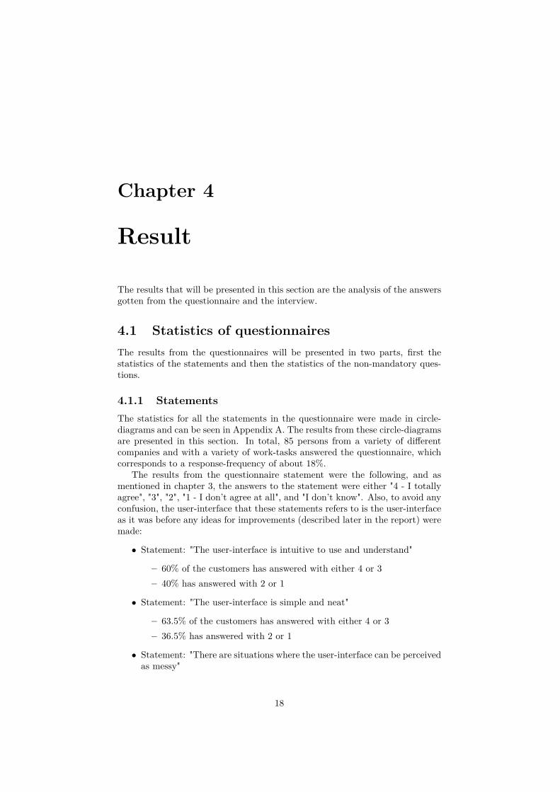
and lastly, the result from asking the customers which of the three imagesbelow that best described their most preferable start-zoom.
19
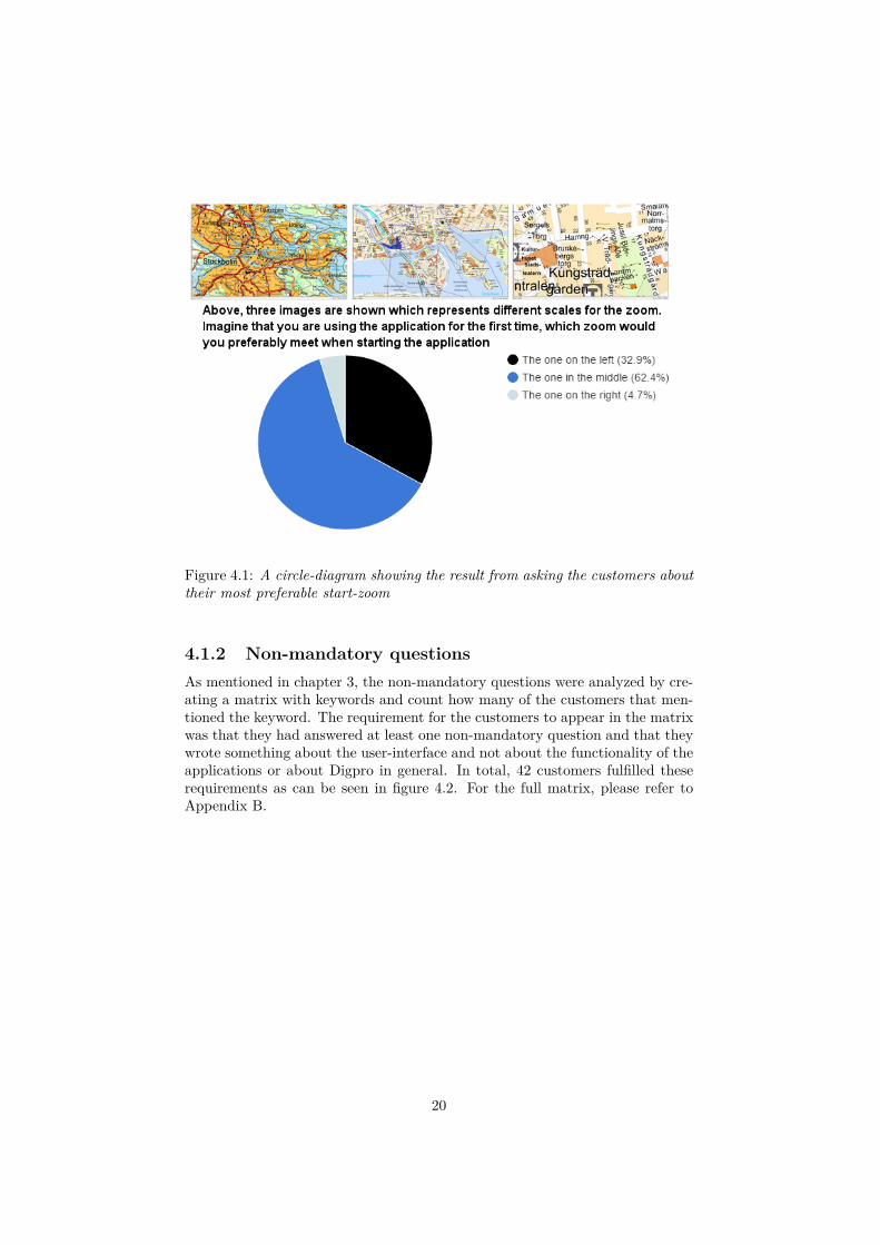
Figure 4.1: A circle-diagram showing the result from asking the customers abouttheir most preferable start-zoom
4.1.2 Non-mandatory questionsAs mentioned in chapter 3, the non-mandatory questions were analyzed by cre-ating a matrix with keywords and count how many of the customers that men-tioned the keyword. The requirement for the customers to appear in the matrixwas that they had answered at least one non-mandatory question and that theywrote something about the user-interface and not about the functionality of theapplications or about Digpro in general. In total, 42 customers fulfilled theserequirements as can be seen in figure 4.2. For the full matrix, please refer toAppendix B.
20
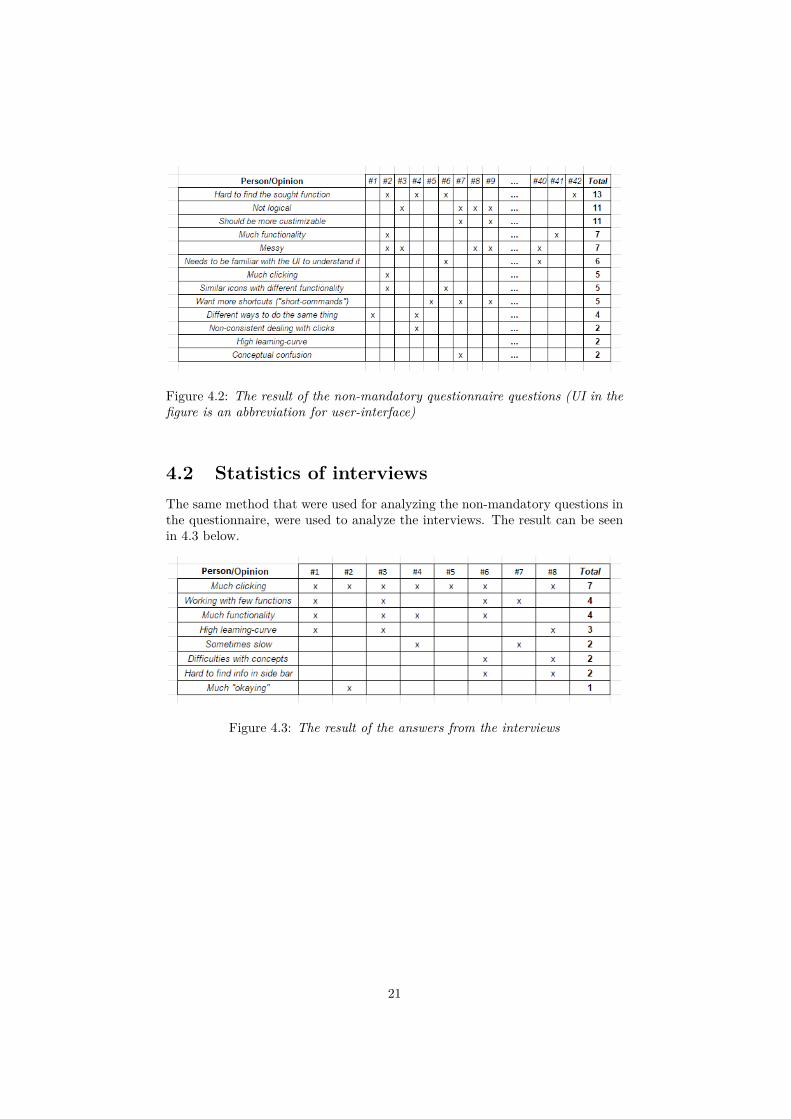
Figure 4.2: The result of the non-mandatory questionnaire questions (UI in thefigure is an abbreviation for user-interface)
4.2 Statistics of interviewsThe same method that were used for analyzing the non-mandatory questions inthe questionnaire, were used to analyze the interviews. The result can be seenin 4.3 below.
Figure 4.3: The result of the answers from the interviews
21
Chapter 5
Improvements
Judging from the statements in the questionnaire, the majority of customersstill think that the user-interface is quite simple, intuitive and neat in manycases. So when coming up with ideas, I have chosen to keep the main featuresof the user-interface rather similar to not confuse the customers who thinksthat the user-interface is good the way it is. So an attempt have been made tointroduce discreet changes, or discretely refine existing features, that will helpthe customers who wants to use the new changes/features while not disturbingthe customers who don’t want to use them.
5.1 Idea 1 - Create own shortcutsThe first idea is about letting the users create their own shortcuts. Many ofthe users mention that there are a lot of clicking in the applications of Digpro,and some say that they want to have more shortcuts. Others, about 30%, saythat they think it’s hard to navigate to their main functions in the interface. Ibelieve that it will be easier and quicker for the users to navigate main functionsif they can store them as shortcuts instead. Further, the number of clicks woulddecrease since the shortcuts can be used instead of clicking with the mouse.
In order to understand idea 1, the sidebar for the applications needs to bedescribed in more detail. As mentioned in chapter 2 Background, the sidebarprovides functionality for creating objects (the Create Object-tab), handlingwhat to be shown or hidden on the map (the Map-tab), searching for objectson the map (the Search-tab), reaching different commands (the Command-tab)and handling favorites (the Favorites-tab). The objects in Create Object, theobjects in Search and the commands in Command are what can be stored asfavorites. This is done by right-clicking on for example a command in the sidebarand choose "add to favorites".
5.1.1 Version 1Version 1 of idea 1 combines the opinions:
• From the questionnaire:
– Should be more customizable, which 11 persons mentioned inthe non-mandatory questions
22
– Much clicking, which 5 persons mentioned in the non-mandatoryquestions
– Want more shortcuts ("short-commands"), which 5 personsmentioned in the non-mandatory questions
– Uses sidebar much, which 91.8% agreed to in the statements– Hard to navigate to main functions, which 29.4% agreed to in
the statements
• From the interviews:
– Much clicking, which 7 persons mentioned during the interviews
• From the theory:
– Make it easier to navigate the user-interface– Provide freedom for the user
The first version of this idea aimed to let the users store shortcuts for thetabs Create object, Search, Command and Favorites. They should be able to doso using any non-reserved key-combination and they should be able to handletheir shortcuts in the sidebar where a shortcut-tab was added. This can be seenin 5.1 below.
Heuristic evaluation
The result of the heuristic evaluation of this version was that the experts thoughtthat it would be hard to handle shortcuts for Create Object, Search and Fa-vorites, but it would be possible to do so for Commands. Also, they thoughtthat it would be too many tabs in the sidebar if a shortcut-tab would be added,it would be better if it was somehow connected to Command.
23
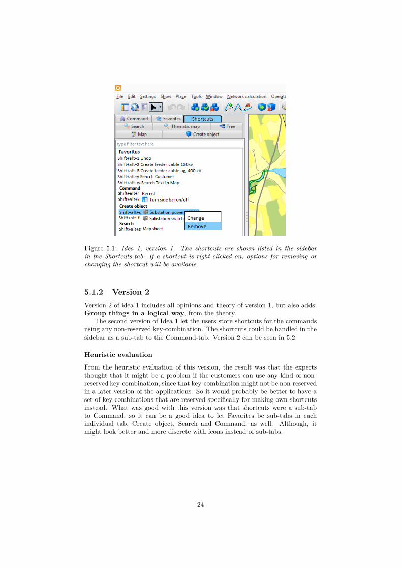
Figure 5.1: Idea 1, version 1. The shortcuts are shown listed in the sidebarin the Shortcuts-tab. If a shortcut is right-clicked on, options for removing orchanging the shortcut will be available
5.1.2 Version 2Version 2 of idea 1 includes all opinions and theory of version 1, but also adds:Group things in a logical way, from the theory.
The second version of Idea 1 let the users store shortcuts for the commandsusing any non-reserved key-combination. The shortcuts could be handled in thesidebar as a sub-tab to the Command-tab. Version 2 can be seen in 5.2.
Heuristic evaluation
From the heuristic evaluation of this version, the result was that the expertsthought that it might be a problem if the customers can use any kind of non-reserved key-combination, since that key-combination might not be non-reservedin a later version of the applications. So it would probably be better to have aset of key-combinations that are reserved specifically for making own shortcutsinstead. What was good with this version was that shortcuts were a sub-tabto Command, so it can be a good idea to let Favorites be sub-tabs in eachindividual tab, Create object, Search and Command, as well. Although, itmight look better and more discrete with icons instead of sub-tabs.
24
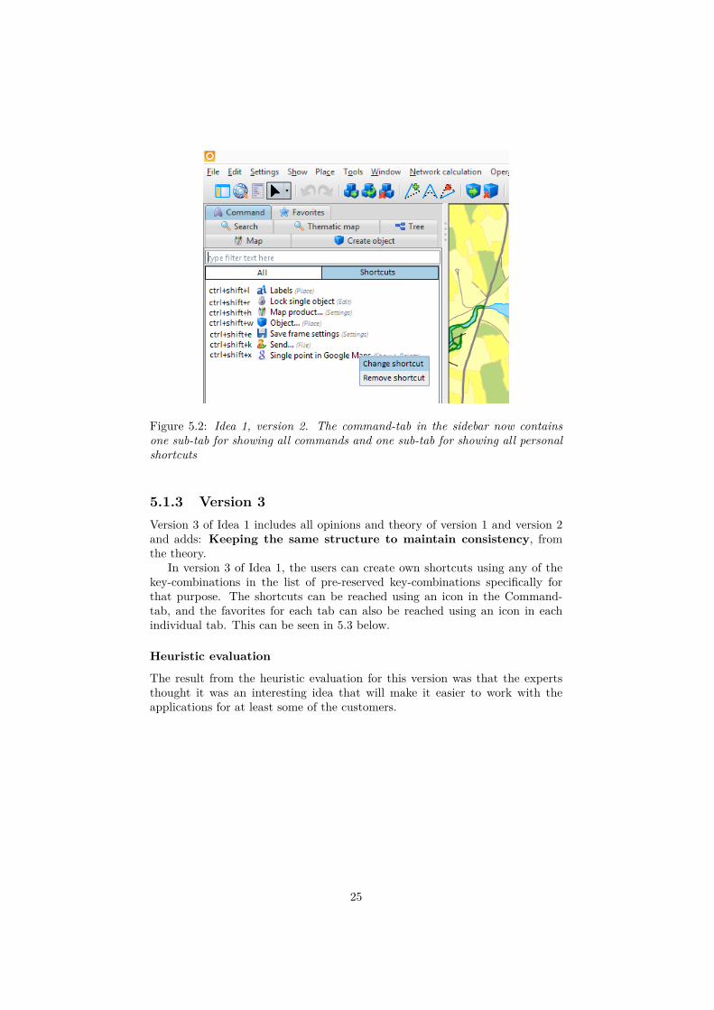
Figure 5.2: Idea 1, version 2. The command-tab in the sidebar now containsone sub-tab for showing all commands and one sub-tab for showing all personalshortcuts
5.1.3 Version 3Version 3 of Idea 1 includes all opinions and theory of version 1 and version 2and adds: Keeping the same structure to maintain consistency, fromthe theory.
In version 3 of Idea 1, the users can create own shortcuts using any of thekey-combinations in the list of pre-reserved key-combinations specifically forthat purpose. The shortcuts can be reached using an icon in the Command-tab, and the favorites for each tab can also be reached using an icon in eachindividual tab. This can be seen in 5.3 below.
Heuristic evaluation
The result from the heuristic evaluation for this version was that the expertsthought it was an interesting idea that will make it easier to work with theapplications for at least some of the customers.
25
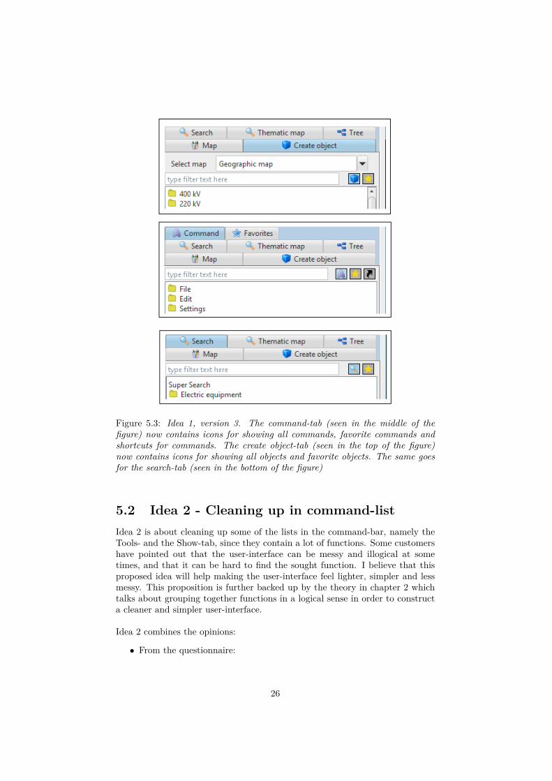
Figure 5.3: Idea 1, version 3. The command-tab (seen in the middle of thefigure) now contains icons for showing all commands, favorite commands andshortcuts for commands. The create object-tab (seen in the top of the figure)now contains icons for showing all objects and favorite objects. The same goesfor the search-tab (seen in the bottom of the figure)
5.2 Idea 2 - Cleaning up in command-listIdea 2 is about cleaning up some of the lists in the command-bar, namely theTools- and the Show-tab, since they contain a lot of functions. Some customershave pointed out that the user-interface can be messy and illogical at sometimes, and that it can be hard to find the sought function. I believe that thisproposed idea will help making the user-interface feel lighter, simpler and lessmessy. This proposition is further backed up by the theory in chapter 2 whichtalks about grouping together functions in a logical sense in order to constructa cleaner and simpler user-interface.
Idea 2 combines the opinions:
• From the questionnaire:
26
– Hard to find the sought function, which 13 persons mentionedin the non-mandatory questions
– Not logical, which 11 persons mentioned in the non-mandatoryquestions
– Much functionality, which 7 persons mentioned in the non-mandatoryquestions
– Messy, which 7 persons mentioned in the non-mandatory questionsand 65.8% agreed to, in the statements, that the user-interface canbe at some times
– Not simple and neat, which 36.5% agreed to in the statements– Not intuitive to use and understand, which 40% agreed to in
the statements
• From the interviews:
– Much functionality, which 4 persons mentioned during the inter-views
• From the theory:
– Make it easier to navigate the user-interface– Group things in a logical way
The changes that has been done can be seen in 5.4. The figure shows thechanges in the Show-tab, where the previous list can be seen on the left and theupdated list can be seen to the right. The functions from the previous list havebeen grouped together in the new list. An example is that the two functions"History from view" and "Object history" has been grouped under "History ->"in the new list. In the end, the 34 items in the previous Show-tab were groupedinto 21 items in the new Show-tab. As for the Tool-tab, the 27 items in theprevious Tool-tab were grouped into 20 items in the new Tool-tab.
Heuristic evaluation
The result from the heuristic evaluation for this idea was simply that the expertsthought it was a great idea.
27
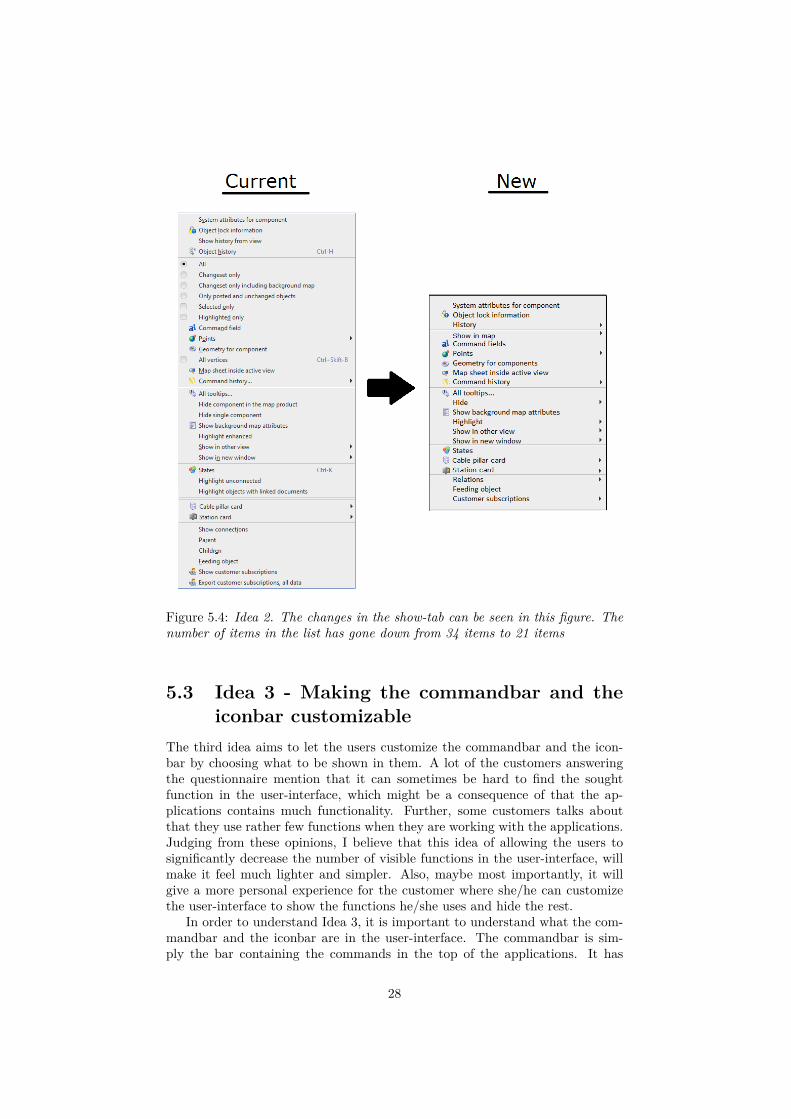
Figure 5.4: Idea 2. The changes in the show-tab can be seen in this figure. Thenumber of items in the list has gone down from 34 items to 21 items
5.3 Idea 3 - Making the commandbar and theiconbar customizable
The third idea aims to let the users customize the commandbar and the icon-bar by choosing what to be shown in them. A lot of the customers answeringthe questionnaire mention that it can sometimes be hard to find the soughtfunction in the user-interface, which might be a consequence of that the ap-plications contains much functionality. Further, some customers talks aboutthat they use rather few functions when they are working with the applications.Judging from these opinions, I believe that this idea of allowing the users tosignificantly decrease the number of visible functions in the user-interface, willmake it feel much lighter and simpler. Also, maybe most importantly, it willgive a more personal experience for the customer where she/he can customizethe user-interface to show the functions he/she uses and hide the rest.
In order to understand Idea 3, it is important to understand what the com-mandbar and the iconbar are in the user-interface. The commandbar is sim-ply the bar containing the commands in the top of the applications. It has
28
dropdown-lists for File, Edit, Show, and so on. The iconbar is more specific forthese applications and holds some of the most popular functions represented asicons. It can be seen directly under the commandbar in the applications.
5.3.1 Version 1Version 1 of Idea 3 combines the opinions:
• From the questionnaire:
– Hard to find the sought function, which 13 persons mentionedin the non-mandatory questions
– Not logical, which 11 persons mentioned in the non-mandatoryquestions
– Much functionality, which 7 persons mentioned in the non-mandatoryquestions
– Messy, which 7 persons mentioned in the non-mandatory questionsand 65.8% agreed to, in the statements, that the user-interface canbe at some times
– More customizable, which 11 persons mentioned in the non-mandatoryquestions
– Needs to be familiar with the UI to understand it, which 6persons mentioned in the non-mandatory questions
– Different ways to do the same thing, which 4 persons mentionedin the non-mandatory questions
– Not simple and neat, which 36.5% agreed to in the statements– Some things in the user-interface doesn’t behave as expected,
which basically means that it isn’t logical. 53% agrees to this inthe statements
• From the interviews:
– Much functionality, which 4 persons mentioned during the inter-views
– Works with few functions, which 4 persons mentioned during theinterviews
• From the theory:
– Make it easier to navigate the user-interface– Provide freedom for the user– Decrease the number of options in the user-interface
The first version of this idea allowed the users to customize the commandbarusing an option in the Settings-tab which was called "Customize command-bar..." , see 5.5 below. If that option was clicked, a new window with a tree-structure for all commands appeared, where the users could check the boxescorresponding to the functions that they wanted to show in the commandbar.For the iconbar, one icon for adding icons to the bar and one icon for removing
29
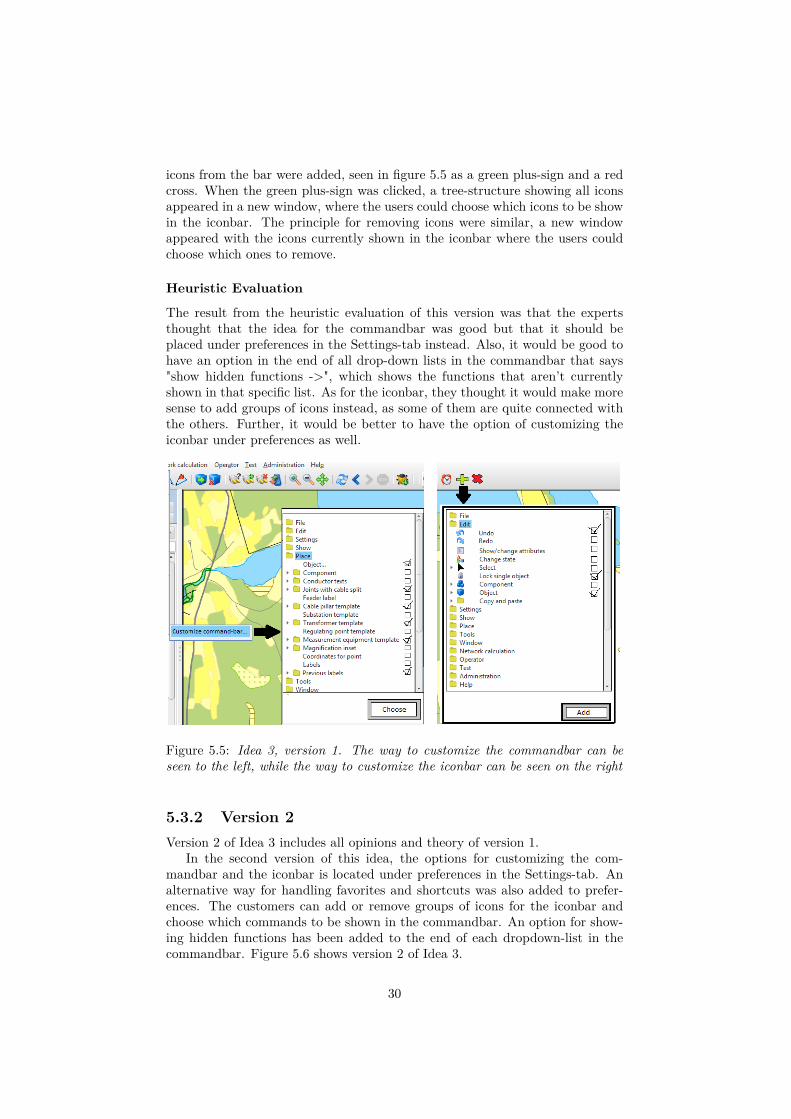
icons from the bar were added, seen in figure 5.5 as a green plus-sign and a redcross. When the green plus-sign was clicked, a tree-structure showing all iconsappeared in a new window, where the users could choose which icons to be showin the iconbar. The principle for removing icons were similar, a new windowappeared with the icons currently shown in the iconbar where the users couldchoose which ones to remove.
Heuristic Evaluation
The result from the heuristic evaluation of this version was that the expertsthought that the idea for the commandbar was good but that it should beplaced under preferences in the Settings-tab instead. Also, it would be good tohave an option in the end of all drop-down lists in the commandbar that says"show hidden functions ->", which shows the functions that aren’t currentlyshown in that specific list. As for the iconbar, they thought it would make moresense to add groups of icons instead, as some of them are quite connected withthe others. Further, it would be better to have the option of customizing theiconbar under preferences as well.
Figure 5.5: Idea 3, version 1. The way to customize the commandbar can beseen to the left, while the way to customize the iconbar can be seen on the right
5.3.2 Version 2Version 2 of Idea 3 includes all opinions and theory of version 1.
In the second version of this idea, the options for customizing the com-mandbar and the iconbar is located under preferences in the Settings-tab. Analternative way for handling favorites and shortcuts was also added to prefer-ences. The customers can add or remove groups of icons for the iconbar andchoose which commands to be shown in the commandbar. An option for show-ing hidden functions has been added to the end of each dropdown-list in thecommandbar. Figure 5.6 shows version 2 of Idea 3.
30
Heuristic evaluation
The result from the heuristic evaluation of this version was that the expertsthought that the idea of letting the customers customize the commandbar wouldwork well and make it easier to navigate the user-interface for a lot of customers,if they would use this new feature. The risk is that the process of hiding a lot offunctions might take too long for the users to have the energy to do it. But nev-ertheless, an interesting idea. The idea of allowing the customers to hide/showgroups of icons in the iconbar, was considered a good idea. Lastly, to have theability of customizing these things under preferences was also considered good.
31
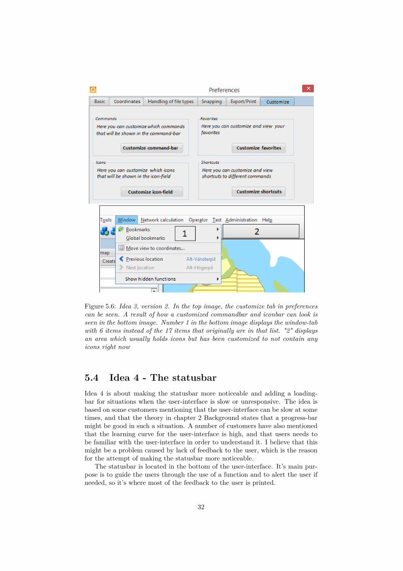
Figure 5.6: Idea 3, version 2. In the top image, the customize tab in preferencescan be seen. A result of how a customized commandbar and iconbar can look isseen in the bottom image. Number 1 in the bottom image displays the window-tabwith 6 items instead of the 17 items that originally are in that list. "2" displaysan area which usually holds icons but has been customized to not contain anyicons right now
5.4 Idea 4 - The statusbarIdea 4 is about making the statusbar more noticeable and adding a loading-bar for situations when the user-interface is slow or unresponsive. The idea isbased on some customers mentioning that the user-interface can be slow at sometimes, and that the theory in chapter 2 Background states that a progress-barmight be good in such a situation. A number of customers have also mentionedthat the learning curve for the user-interface is high, and that users needs tobe familiar with the user-interface in order to understand it. I believe that thismight be a problem caused by lack of feedback to the user, which is the reasonfor the attempt of making the statusbar more noticeable.
The statusbar is located in the bottom of the user-interface. It’s main pur-pose is to guide the users through the use of a function and to alert the user ifneeded, so it’s where most of the feedback to the user is printed.
32
The theory in chapter 2 Background talks about two main ways of providingfeedback to the users. The first one is through hover-over text which is shownwhen a user hovers the cursor over a component of the user-interface. This kindof feedback is very good in the current user-interface so this will not be the focusfor this idea. Instead, the attempt will be to provide feedback by the secondway proposed in the theory, through the use of color.
Idea 4 combines the opinions:
• From the questionnaire:
– Needs to be familiar with the UI to understand it, which 6persons mentioned in the non-mandatory questions
– High learning-curve, which 2 persons mentioned in the non-mandatoryquestions
– The user-interface doesn’t provide good help when problemsof ambiguities occur, which 52.9% agrees to in the statements
– The user-interface was hard to get familiar with at first,which 54.1% agreed to in the statements
• From the interviews:
– Sometimes slow, which 2 persons mentioned during the interviews– High learning-curve, which 3 persons mentioned during the inter-
views
• From the theory:
– The user-interface should be fast and efficient, provide aprogress-bar if there are long times for loading
– Help the users by providing them with discrete feedback,for example by using colors
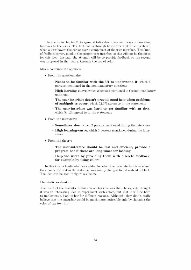
In this idea, a loading-bar was added for when the user-interface is slow andthe color of the text in the statusbar was simply changed to red instead of black.The idea can be seen in figure 5.7 below.
Heuristic evaluation
The result of the heuristic evaluation of this idea was that the experts thoughtit was an interesting idea to experiment with colors, but that it will be hardto implement a loading-bar for different reasons. Although, they didn’t reallybelieve that the statusbar would be much more noticeable only by changing thecolor of the text in it.
33
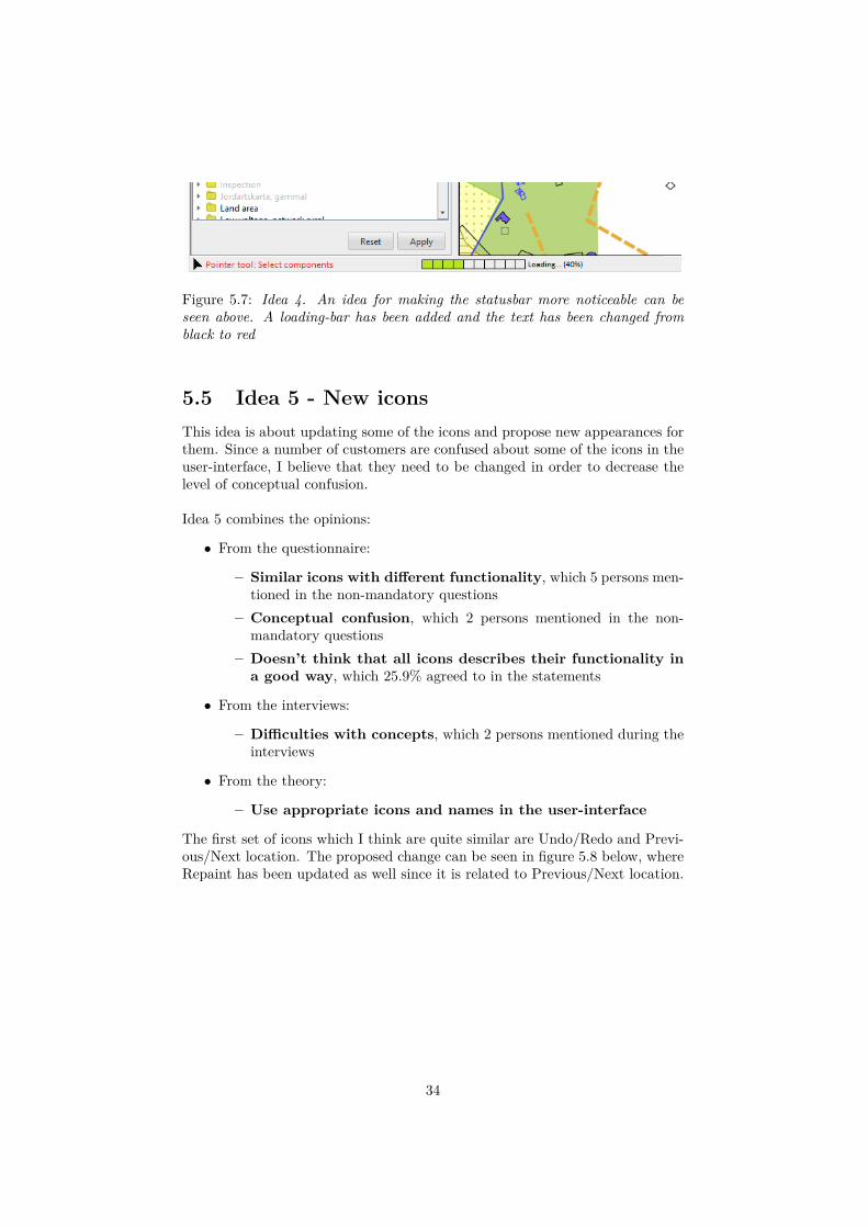
Figure 5.7: Idea 4. An idea for making the statusbar more noticeable can beseen above. A loading-bar has been added and the text has been changed fromblack to red
5.5 Idea 5 - New iconsThis idea is about updating some of the icons and propose new appearances forthem. Since a number of customers are confused about some of the icons in theuser-interface, I believe that they need to be changed in order to decrease thelevel of conceptual confusion.
Idea 5 combines the opinions:
• From the questionnaire:
– Similar icons with different functionality, which 5 persons men-tioned in the non-mandatory questions
– Conceptual confusion, which 2 persons mentioned in the non-mandatory questions
– Doesn’t think that all icons describes their functionality ina good way, which 25.9% agreed to in the statements
• From the interviews:
– Difficulties with concepts, which 2 persons mentioned during theinterviews
• From the theory:
– Use appropriate icons and names in the user-interface
The first set of icons which I think are quite similar are Undo/Redo and Previ-ous/Next location. The proposed change can be seen in figure 5.8 below, whereRepaint has been updated as well since it is related to Previous/Next location.
34
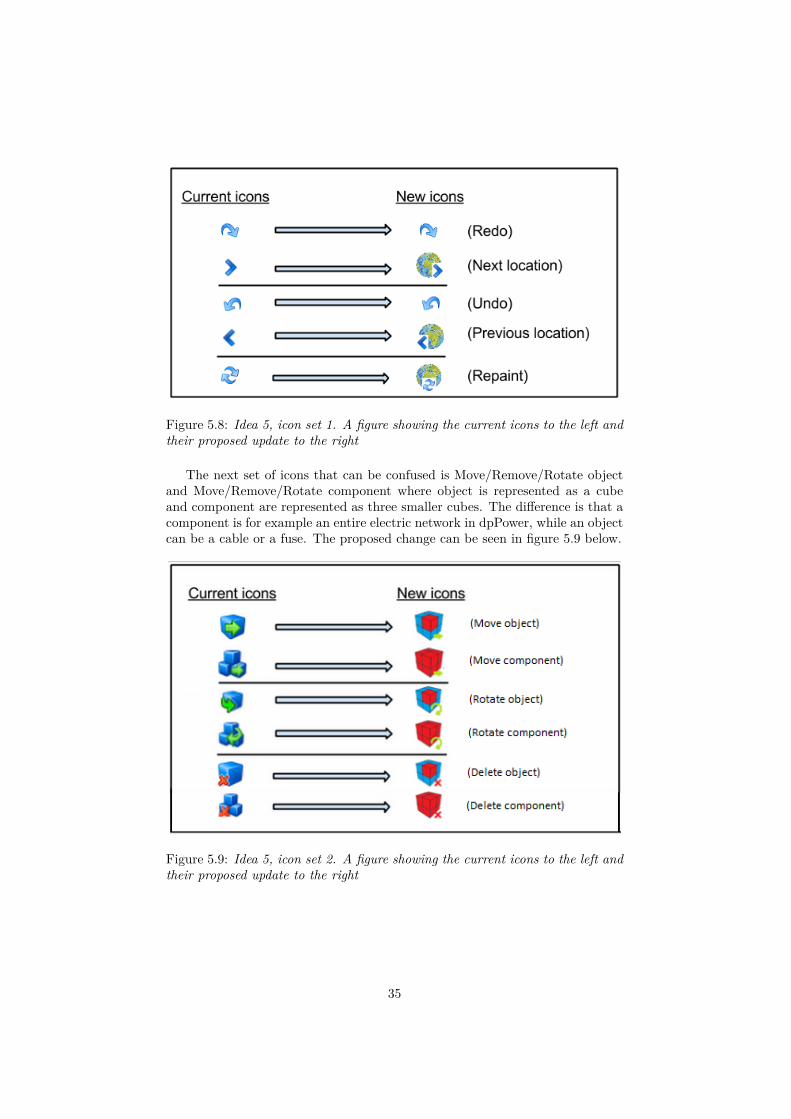
Figure 5.8: Idea 5, icon set 1. A figure showing the current icons to the left andtheir proposed update to the right
The next set of icons that can be confused is Move/Remove/Rotate objectand Move/Remove/Rotate component where object is represented as a cubeand component are represented as three smaller cubes. The difference is that acomponent is for example an entire electric network in dpPower, while an objectcan be a cable or a fuse. The proposed change can be seen in figure 5.9 below.
Figure 5.9: Idea 5, icon set 2. A figure showing the current icons to the left andtheir proposed update to the right
35
Heuristic evaluation
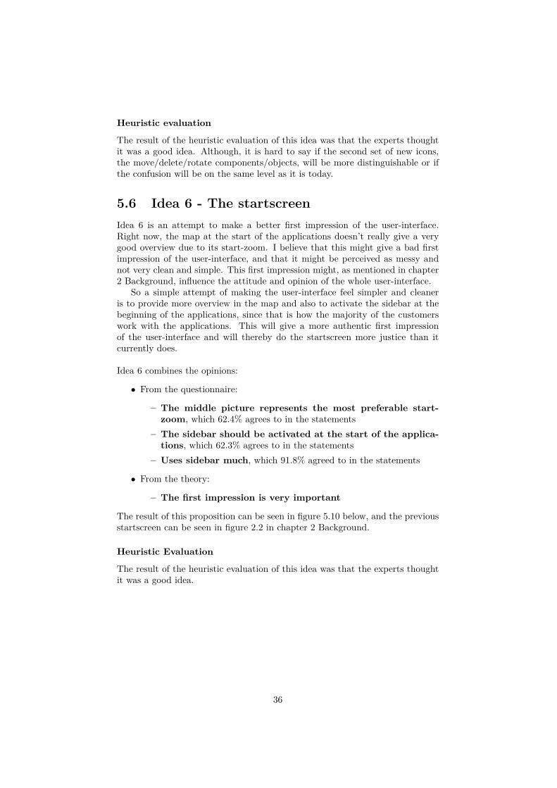
The result of the heuristic evaluation of this idea was that the experts thoughtit was a good idea. Although, it is hard to say if the second set of new icons,the move/delete/rotate components/objects, will be more distinguishable or ifthe confusion will be on the same level as it is today.
5.6 Idea 6 - The startscreenIdea 6 is an attempt to make a better first impression of the user-interface.Right now, the map at the start of the applications doesn’t really give a verygood overview due to its start-zoom. I believe that this might give a bad firstimpression of the user-interface, and that it might be perceived as messy andnot very clean and simple. This first impression might, as mentioned in chapter2 Background, influence the attitude and opinion of the whole user-interface.
So a simple attempt of making the user-interface feel simpler and cleaneris to provide more overview in the map and also to activate the sidebar at thebeginning of the applications, since that is how the majority of the customerswork with the applications. This will give a more authentic first impressionof the user-interface and will thereby do the startscreen more justice than itcurrently does.
Idea 6 combines the opinions:
• From the questionnaire:
– The middle picture represents the most preferable start-zoom, which 62.4% agrees to in the statements
– The sidebar should be activated at the start of the applica-tions, which 62.3% agrees to in the statements
– Uses sidebar much, which 91.8% agreed to in the statements
• From the theory:
– The first impression is very important
The result of this proposition can be seen in figure 5.10 below, and the previousstartscreen can be seen in figure 2.2 in chapter 2 Background.
Heuristic Evaluation
The result of the heuristic evaluation of this idea was that the experts thoughtit was a good idea.
36
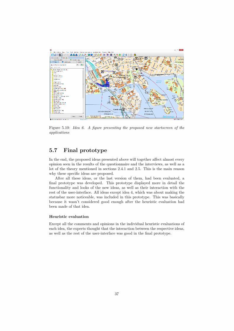
Figure 5.10: Idea 6. A figure presenting the proposed new startscreen of theapplications
5.7 Final prototypeIn the end, the proposed ideas presented above will together affect almost everyopinion seen in the results of the questionnaire and the interviews, as well as alot of the theory mentioned in sections 2.4.1 and 2.5. This is the main reasonwhy these specific ideas are proposed.
After all these ideas, or the last version of them, had been evaluated, afinal prototype was developed. This prototype displayed more in detail thefunctionality and looks of the new ideas, as well as their interaction with therest of the user-interface. All ideas except idea 4, which was about making thestatusbar more noticeable, was included in this prototype. This was basicallybecause it wasn’t considered good enough after the heuristic evaluation hadbeen made of that idea.
Heuristic evaluation
Except all the comments and opinions in the individual heuristic evaluations ofeach idea, the experts thought that the interaction between the respective ideas,as well as the rest of the user-interface was good in the final prototype.
37
Chapter 6
Discussion & Conclusions
6.1 Difference in results - interviews vs ques-tionnaire
An interesting observation when the results from the interviews and the non-mandatory questions were analysed, was that they differ quite a lot in someaspects. The two most popular opinions in the interviews were that there wasmuch clicking in the applications, and that the customers uses quite few func-tions when working with the applications. While 7 out of 8 customers hasmentioned that there is "much clicking" during the interviews, only 5 out of42 customers mentions this in the questionnaire. Also, 4 out of 8 people men-tions that they "work with few functions" during the interview, while this isn’tmentioned by anyone in the questionnaire.
I believe that the main reason for this difference is due to the focus of theinterview and the questionnaire. As mentioned in chapter 3, one of the mainfocuses of the interviews was to get a better insight about how the customerswork with the applications while this wasn’t the focus for the questionnaire. Be-cause of this, the questions differed between the interviews and questionnaires.For the interviews, this meant that the customers could speak more freely anddescribe in more detail how they work with the applications as well as mentionsmaller, everyday distractions such as for example "much clicking" and "the ap-plication can be slow sometimes". I think that this is the biggest reason to whythere is a difference in the results from the interviews and the non-mandatoryquestionnaire questions.
Other than that, I think that the opinions are quite alike when compar-ing the questionnaire and the interviews. They are just described in differentways. When it comes to the non-mandatory questions in the questionnaire, thethree most popular opinions, "hard to find the sought function", "not logical" and"should be more customizable", cannot be found in the result from the interviewanswers. But if we look into the interview answers, the opinions "high learning-curve", "difficulties with concepts" and "hard to find info in sidebar" might bean effect of the application not being logical. Also, the opinions "much func-tionality", "working with few functions", "difficulties with concepts" and "hardto find info in the sidebar" from the interview answers, might be the problemthat causes the customers to find it hard to find the sought function and want
38
a more customizable user-interface. Thereby, I believe that a lot of the answersto the interview questions are connected to the answers to the non-mandatoryquestions in the questionnaire, even though they aren’t explicitly the same. Thedifference is probably due to how the questions have been formulated, as well asthe environment and the situation that the questions were asked in (interviewor questionnaire).
6.2 Choice of methodIt has been a good method to use the customers opinions as a basis for the pro-posed improvements to the user-interface. I believe that a better user-interface,as well as better ideas, will come from putting the customers in focus, since theopinions then come directly from the primary users.
Also, questionnaires and interviews have worked out very well for this project,given the time for the project and that the customers of Digpro are widelyspread geographically. So in this case, questionnaires were a good way of get-ting a bigger quantity of opinions fast. The initial idea was to perform a fewmore interviews to be able to give a better and more reliable analysis of theresult. But as the answers to the interviews seems to point the same directionas the questionnaires, the results still seems fair.
Another method that could have been used instead of, or as a complementto, the interviews is observations. This means that I could have observed howthe customers use the application while they were actually working with it. ButI decided to not use that method, due to the fact that it would have taken longertime than the interviews, and also that the interest for observations were lowerthan for interviews among the customers. So interviews were better suited forthis project.
When it comes to the heuristic evaluations, it was a quick and simple wayof getting an evaluation of the ideas, in order to know if the ideas were good orif they needed improvement.
So in the end, I think that the methods described in chapter 3 has workedvery well for this project.
6.3 Project evaluationGiving the results acquired from the heuristic evaluations seen in chapter 5,I believe that the ideas will help improving the user-interface. Also, as allideas have been mainly based on the customers opinions, I believe that this willincrease the customers satisfaction with the user-interface, which is preciselywhat the motivation for this master thesis, seen in section 1.3, was about.
Looking at the problem statement described in section 1.2, the questionstated has been answered. This was done using the theory from section 2.4and 2.5 combined with the result from the questionnaire and interviews seen inchapter 4.
Many of the ideas presented in chapter 5 are not only applicable to the ap-plications of Digpro. As mentioned in 2.3, GIS-applications tend to be quitecomplex and contain a lot of functionality. Thereby, many of the ideas for sim-plifying lists of functions and making it easier to navigate them, presented in
39
this report, can be applicable for other GIS-applications as well. This includesthe ideas for customizing and cleaning up the commandbar, or other lists offunctions. Also, I believe that many GIS-applications has some kind of equiv-alent feature to the iconbar seen in the applications of Digpro. So the ideasthat include the iconbar, namely the feature for customizing it and also to de-crease conceptual confusion by making new icons, can also be useful for otherGIS-applications.
So even though the ideas are presented explicitly to help the customers ofDigpro in this report, they can of course be applied to other GIS-applicationswith slight adjustments. Thereby, I believe that this report will contribute tomake GIS-applications all over the world easier to use.
6.4 Future workThe obvious next step for this project is to get the proposed improvementsinto the actual existing applications of Digpro. When this is done, follow-up interviews and questionnaires can be performed in order to evaluate if theproposed improvements truly increases the satisfaction with the user-interfacefor the customers.
40
Chapter 7
Bibliography
Articles
[1] G. Fischer. “Human-computer interaction software: lessons learned, chal-lenges ahead.” In: Software, IEEE 6.1 (Jan. 1989), pp. 44–52. issn: 0740-7459. doi: 10.1109/52.16901.
[2] J. Jani. “GIS as a tool for modelling groundwater flow.” In: Business, En-gineering and Industrial Applications (ISBEIA), 2012 IEEE Symposiumon. Sept. 2012, pp. 513–517. doi: 10.1109/ISBEIA.2012.6422939.
[3] J.A. Landay. “Informal User Interface For Natural Human-Computer In-teraction.” In: Intelligent Systems and their Applications, IEEE 13.3 (May1998), pp. 14–16. issn: 1094-7167. doi: 10.1109/MIS.1998.683175.
[4] G. Lindgaard et al. “Attention web designers: You have 50 millisecondsto make a good first impression!” In: Behavior & Information Technology.Vol. 25, no.2. Apr. 2006, pp. 115 –126.
[5] A.M. Moreno et al. “HCI Practices for Building Usable Software.” In:Computer 46.4 (Apr. 2013), pp. 100–102. issn: 0018-9162. doi: 10.1109/MC.2013.133.
[6] R. Ph.D. Nauert. “Why First Impressions Are Difficult to Change: Study.”In: Livescience. Jan. 2011.
[7] Sandra E. Swanson. “GIS.” In: Journal of Hospital Librarianship 1.3 (2001),pp. 83–89. doi: 10.1300/J186v01n03\_09. eprint: http://dx.doi.org/10.1300/J186v01n03_09. url: http://dx.doi.org/10.1300/J186v01n03_09.
41
[8] J. Willis and A. Todorov. “First Impressions - Making Up Your Mind Aftera 100-Ms Exposure to a Face.” In: Association for Psychological Science.Vol. 17, No.7. 2006, pp. 592–598.
[9] C. Yang. “Study on new GIS support platform of telecommunications.”In: Communication Software and Networks (ICCSN), 2011 IEEE 3rd In-ternational Conference on. May 2011, pp. 343–346. doi: 10.1109/ICCSN.2011.6013729.
Books
[10] Q. Chen. Human Computer Interaction: Issues and Challenges. Idea GroupPublishing, 2001.
[11] J. Hammonds, T. Gross, and J. Wesson. Usability: Gaining a CompetitiveEdge. Kluwer Academic Publishers, 2002.
Miscellaneous
[12] M. Alencar, A. Raposo, and S. Barbosa. Composition of HCI EvaluationMethods for Hybrid Virtual Environments. 2011.
[13] R. Beale and A. Howes. Evaluation. University of Birmingham, School ofComputer Science. Avaliable at: http://www.cs.bham.ac.uk/internal/courses/hci/lectures/HCI%20-%20Evaluation.pdf(Last accessed: 2015-02-25).
[14] A. Dix et al. Human-Computer Interaction. 3:rd edition. chapter 9 - evalu-ation techniques. Avaliable at: http://www.hcibook.com/e3-docs/slides/notes-pdf/e3-chap-09-6up.pdf(Last accessed: 2015-02-25).
[15] A. Dr.Blackwell. Human-Computer Interaction - Lecture 8: Usability eval-uation methods. University of Cambridge, Faculty of Computer Scienceand Technology. Avaliable at: https://www.cl.cam.ac.uk/teaching/1213/HCI/HCI2013-lecture8.pdf(Last accessed: 2015-02-25). Apr. 2013.
[16] D. Fadeyev. 8 Characteristics Of Successful User Interfaces. Apr. 2009.[17] N. Gibson. Dashboard Design: 10 Tips to Design User-Friendly Dash-
boards. May 2014.
42
[18] T. Huang. HCI Evaluation. INFO5993 IT Research Methods, University ofSydney. Avaliable at: http://sydney.edu.au/engineering/it/ info4990/2009s2/rm06b.pdf(Lastaccessed: 2015-02-25). 2009.
[19] S. Könik. Music education software: An HCI evaluation of existing soft-ware and prototype implementation of an ear training programme basedon a proposed approach. 2003-08-20.
43
Appendix A
Diagrams for questionnairestatements
In this appendix, the result of the questionnaire statements that were excludedfrom section 4.1 can be seen in diagrams.
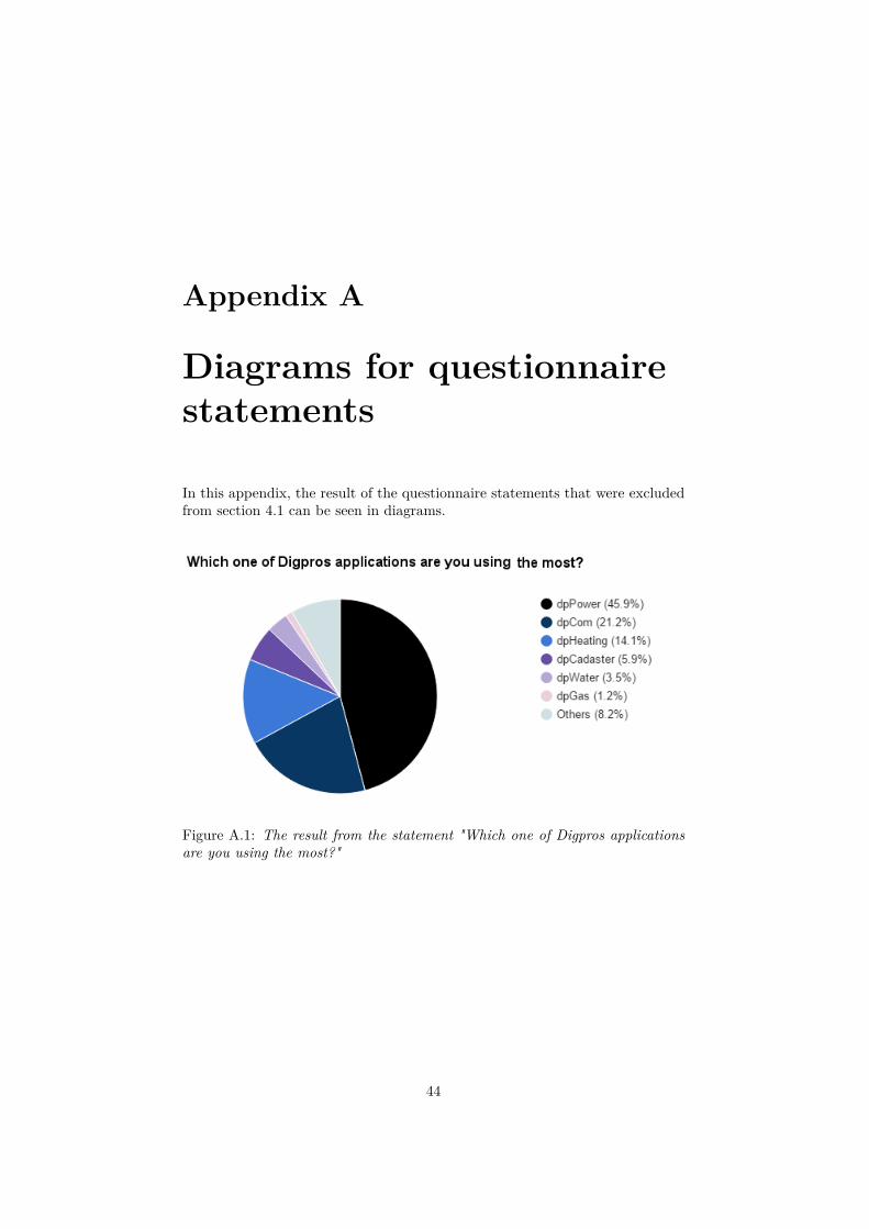
Figure A.1: The result from the statement "Which one of Digpros applicationsare you using the most?"
44
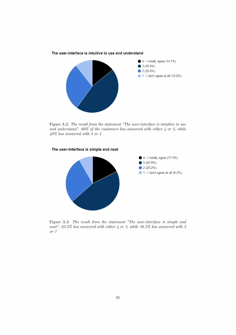
Figure A.2: The result from the statement "The user-interface is intuitive to useand understand". 60% of the customers has answered with either 4 or 3, while40% has answered with 2 or 1
Figure A.3: The result from the statement "The user-interface is simple andneat". 63.5% has answered with either 4 or 3, while 36.5% has answered with 2or 1
45
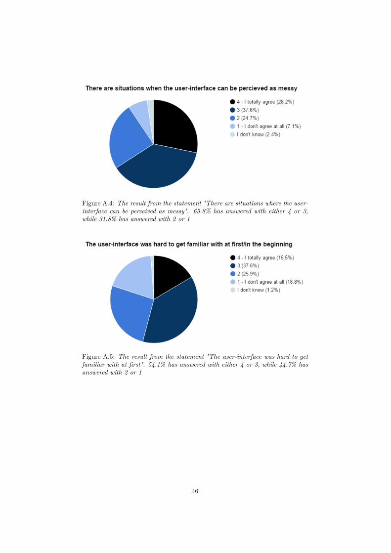
Figure A.4: The result from the statement "There are situations where the user-interface can be perceived as messy". 65.8% has answered with either 4 or 3,while 31.8% has answered with 2 or 1
Figure A.5: The result from the statement "The user-interface was hard to getfamiliar with at first". 54.1% has answered with either 4 or 3, while 44.7% hasanswered with 2 or 1
46
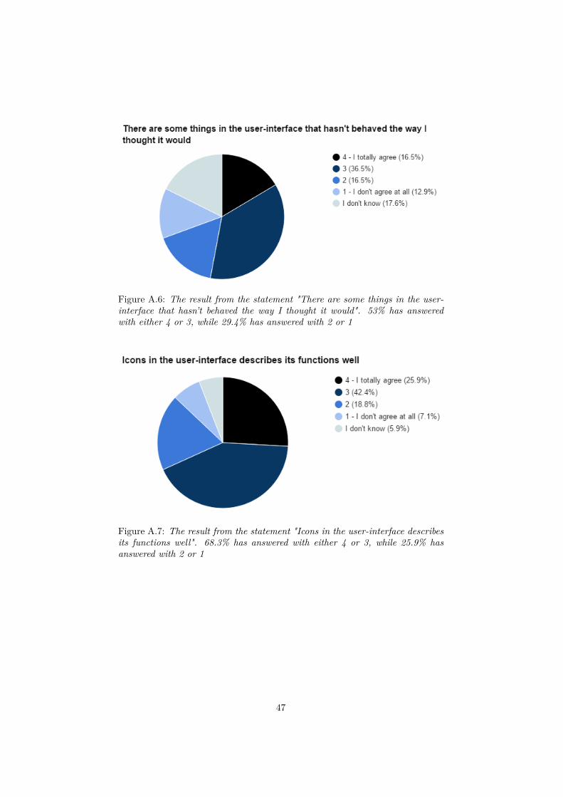
Figure A.6: The result from the statement "There are some things in the user-interface that hasn’t behaved the way I thought it would". 53% has answeredwith either 4 or 3, while 29.4% has answered with 2 or 1
Figure A.7: The result from the statement "Icons in the user-interface describesits functions well". 68.3% has answered with either 4 or 3, while 25.9% hasanswered with 2 or 1
47
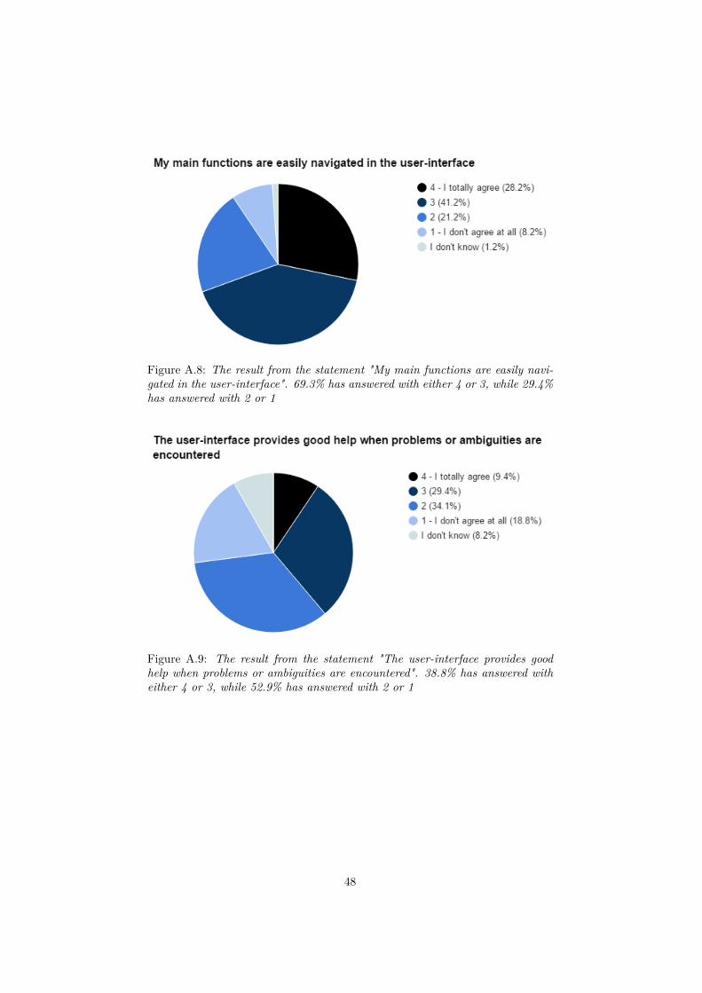
Figure A.8: The result from the statement "My main functions are easily navi-gated in the user-interface". 69.3% has answered with either 4 or 3, while 29.4%has answered with 2 or 1
Figure A.9: The result from the statement "The user-interface provides goodhelp when problems or ambiguities are encountered". 38.8% has answered witheither 4 or 3, while 52.9% has answered with 2 or 1
48
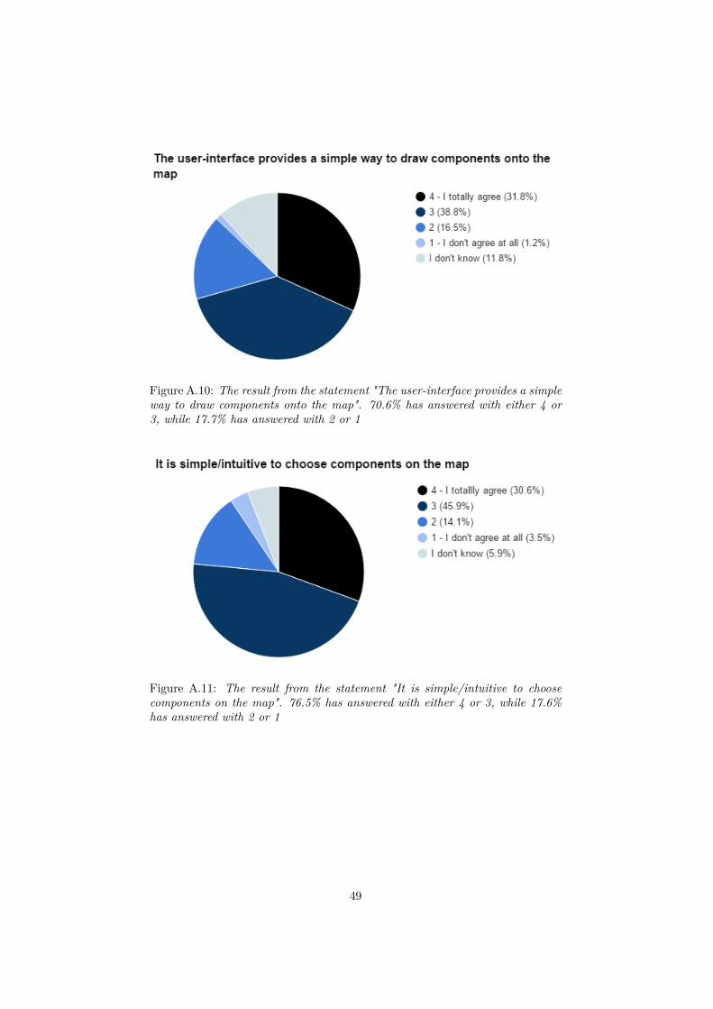
Figure A.10: The result from the statement "The user-interface provides a simpleway to draw components onto the map". 70.6% has answered with either 4 or3, while 17.7% has answered with 2 or 1
Figure A.11: The result from the statement "It is simple/intuitive to choosecomponents on the map". 76.5% has answered with either 4 or 3, while 17.6%has answered with 2 or 1
49
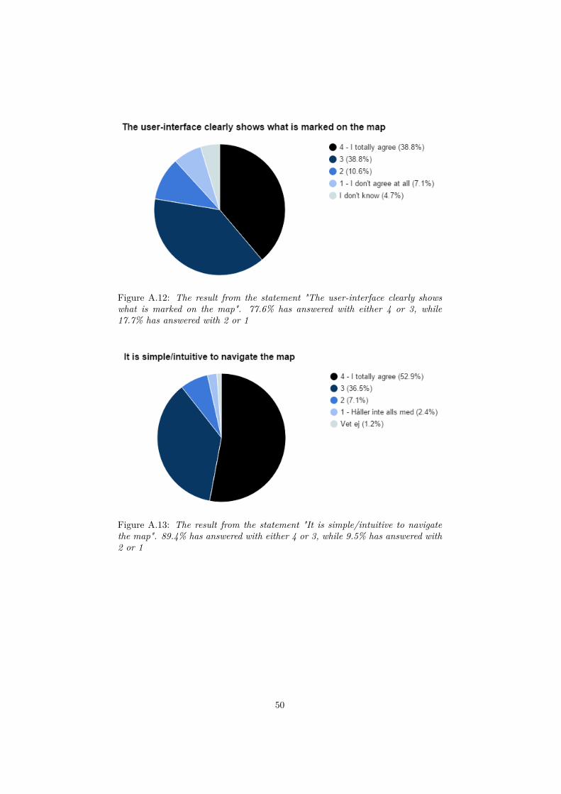
Figure A.12: The result from the statement "The user-interface clearly showswhat is marked on the map". 77.6% has answered with either 4 or 3, while17.7% has answered with 2 or 1
Figure A.13: The result from the statement "It is simple/intuitive to navigatethe map". 89.4% has answered with either 4 or 3, while 9.5% has answered with2 or 1
50
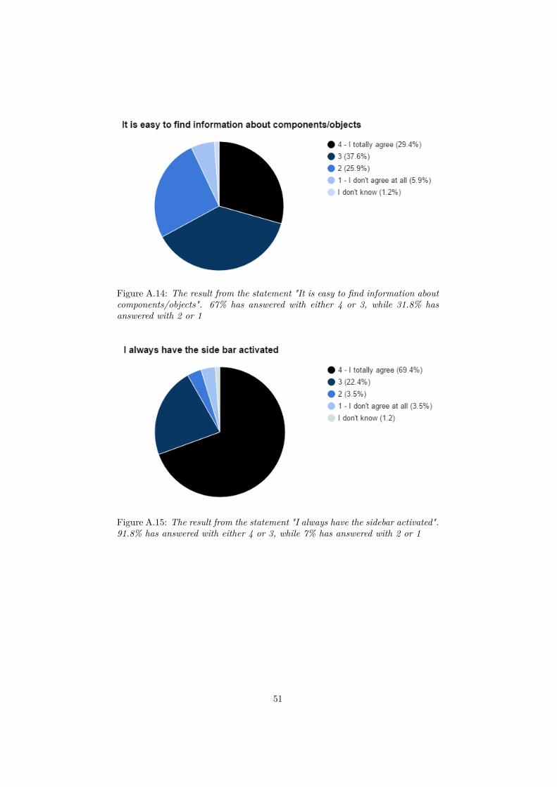
Figure A.14: The result from the statement "It is easy to find information aboutcomponents/objects". 67% has answered with either 4 or 3, while 31.8% hasanswered with 2 or 1
Figure A.15: The result from the statement "I always have the sidebar activated".91.8% has answered with either 4 or 3, while 7% has answered with 2 or 1
51
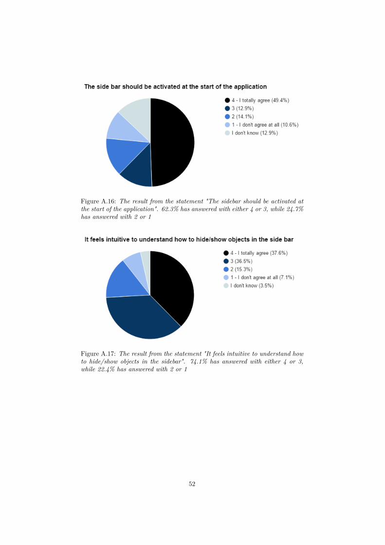
Figure A.16: The result from the statement "The sidebar should be activated atthe start of the application". 62.3% has answered with either 4 or 3, while 24.7%has answered with 2 or 1
Figure A.17: The result from the statement "It feels intuitive to understand howto hide/show objects in the sidebar". 74.1% has answered with either 4 or 3,while 22.4% has answered with 2 or 1
52
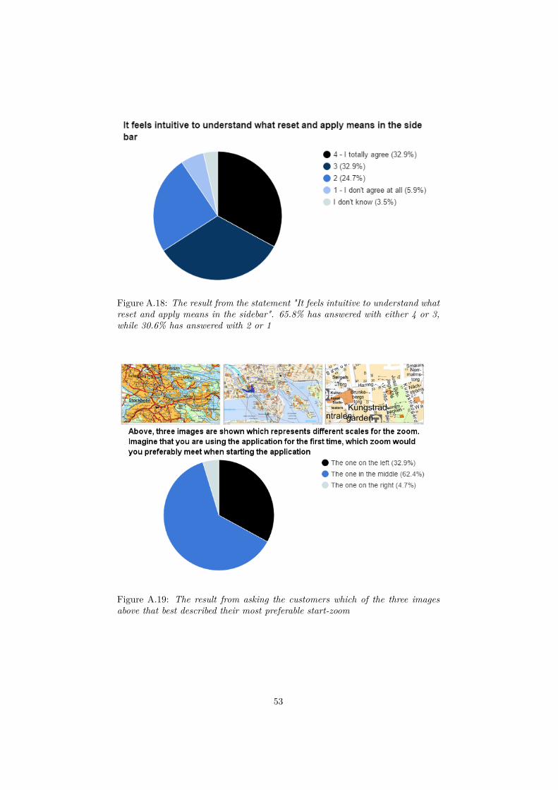
Figure A.18: The result from the statement "It feels intuitive to understand whatreset and apply means in the sidebar". 65.8% has answered with either 4 or 3,while 30.6% has answered with 2 or 1
Figure A.19: The result from asking the customers which of the three imagesabove that best described their most preferable start-zoom
53
Appendix B
Matrix for non-mandatoryquestionnaire questions
In this appendix, the full matrix for the non-mandatory questionnaire questionscan be seen. The non-mandatory questions that were asked in the questionnairewere the following:
• If you think that the user-interface can be messy at some times, when orwhy do you think so?
• If there are situations when the user-interface hasn’t behaved the way youinitially thought, when was that?
• Do you have any other opinions about general aspects of the user-interface?
• Do you have any other opinions about specific functions and features inthe user-interface?
• Is there anything that you think is especially good in the user-interface?
• Is there anything that you would like to change about the user-interface?
• Is there anything that you think is especially difficult with the user-interface?
• Is there anything else you want to mention about the user-interface?
All these questions combined generated the result that can be seen in the matrixbelow, which is a summary of the answers gotten from these questions.
54
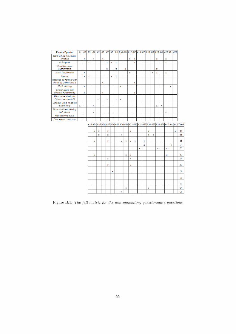
Figure B.1: The full matrix for the non-mandatory questionnaire questions
55