
Epidemic spreading over networks - A view from neighbourhoods
21
65 1 Introduction It is a well known fact of this century that electronic information can spread to many people in a very short time. This fact is good news for some people (spam- mers, bloggers), but can be rather bad news for those responsible for security. The battle against viruses, spam, and other forms of harmful or undesirable, self-propagating information is never-ending. We have in our own work approached the problem of security from the direction of network analysis. In particular, we have sought to answer two questions: (i) Given a network topology (data network, social network, etc), how can one usefully describe its structure? – and more specifically, how can one identify (based on the topological input) the well connected clusters in the network? (ii) Given such an analysis, how can it help us to understand how harm- ful information (viruses, diseases) are spread over the network? We note that the latter question is very closely related to a third question: (iii) Knowing the network topology, what measures can we take, in a cost-effective way, to hinder the spreading of viruses and other harmful information? In this paper, we will report on and summarize some answers that we have obtained to question (i) (Ref. [1]) and to question (ii) (Ref. [2]). In addition, we will pre- sent some partial answers to question (iii); this work has not been published before. Since questions (i) and (ii) are confined purely to understanding the phe- nomenon of spreading, any answers we find may be useful either towards the goal of helping information propagation, or towards the goal of hindering it. Hence much of what we report here has implications for both goals. When we come to the question of designing or modifying networks however, we will focus primarily (although not exclusively) on the aim of making the network more secure. Furthermore, we note that our analysis is done at such a level of abstraction that it may be applied equally well to social networks (gossip spreading, disease spreading, spreading of innovations [3]) as to data networks. In fact, most of our analysis has application to any network for which it makes sense to model the links as being symmetric with respect to spreading. The simulations that we describe below are in fact carried out over empirically measured social networks, as these were readily available to us. We note in this regard that many modern networks are in fact a nontrivial mixture of social and technological. An outstanding example is a peer-to-peer file-sharing network, which is simply a network of computers, but one where the choice of active links is made (at least partially) by the human users. Such networks are self- organized in a very real sense; and this gives them rather interesting topological properties. We will have more to say on this when we report on our simulations of spreading over snapshots [4] of the Gnutella file- sharing network. There are many kinds of models for epidemic spread- ing. In perhaps the simplest class of such models, one assigns to each node only one of two possible states: ‘uninfected’ or ‘infected’. If you are uninfected (‘sus- ceptible’), you are deemed liable to be infected by any infected neighbors. Correspondingly, if you are infected, you remain so for the duration of the experi- ment – and you remain capable of infecting any or all of your neighbors. Of course, on some appropriate time scale, nodes become ‘immune’ to the infection: a human develops antibodies, a machine gets anti- virus software, the gossip becomes boring, or the innovation becomes outmoded. We focus on a shorter time scale here, so that we can ignore the state of acquired immunity. The technical name for our model of spreading is ‘SI’, since the nodes have only two states: Susceptible or Infected. Epidemic spreading over networks – A view from neighbourhoods GEOFFREY S. CANRIGHT AND KENTH ENGØ-MONSEN Geoffrey S. Canright is senior researcher with Telenor R&D Kenth Engø- Monsen is research scientist at Telenor R&D Telektronikk 1.2005 We give an overview of a new approach to understanding epidemic spreading on networks. The ideas are basic, and yet we believe that they have ready application to a wide range of problems, including the control of the spread of data viruses and other harmful electronic information. We build a ‘topo- graphic’ picture of the network, in the sense that there are neighborhoods of high and low spreading power. From this picture we develop a detailed understanding, at the level of neighbourhoods, of epidemic spreading over the network. Our analysis of spreading thus gives a finer resolution than typical whole-graph studies. Our picture is strongly confirmed by a series of simulations on empirical social networks, and is also supported by some limited mathematical results. Finally, we offer a set of design suggestions for both helping and hindering spreading, and report on some tests of these suggestions. The results of these tests are encouraging. Thus we find clear support for our belief that our approach can have significant practical value for the problem of network security.
Transcript of Epidemic spreading over networks - A view from neighbourhoods

65
1 IntroductionIt is a well known fact of this century that electronicinformation can spread to many people in a very shorttime. This fact is good news for some people (spam-mers, bloggers), but can be rather bad news for thoseresponsible for security. The battle against viruses,spam, and other forms of harmful or undesirable,self-propagating information is never-ending. Wehave in our own work approached the problemof security from the direction of network analysis. Inparticular, we have sought to answer two questions:(i) Given a network topology (data network, socialnetwork, etc), how can one usefully describe itsstructure? – and more specifically, how can oneidentify (based on the topological input) the wellconnected clusters in the network? (ii) Given such ananalysis, how can it help us to understand how harm-ful information (viruses, diseases) are spread overthe network? We note that the latter question is veryclosely related to a third question: (iii) Knowing thenetwork topology, what measures can we take, in acost-effective way, to hinder the spreading of virusesand other harmful information?
In this paper, we will report on and summarize someanswers that we have obtained to question (i) (Ref. [1])and to question (ii) (Ref. [2]). In addition, we will pre-sent some partial answers to question (iii); this workhas not been published before. Since questions (i) and(ii) are confined purely to understanding the phe-nomenon of spreading, any answers we find may beuseful either towards the goal of helping informationpropagation, or towards the goal of hindering it. Hencemuch of what we report here has implications for bothgoals. When we come to the question of designing ormodifying networks however, we will focus primarily(although not exclusively) on the aim of making thenetwork more secure. Furthermore, we note that our
analysis is done at such a level of abstraction that itmay be applied equally well to social networks (gossipspreading, disease spreading, spreading of innovations[3]) as to data networks. In fact, most of our analysishas application to any network for which it makessense to model the links as being symmetric withrespect to spreading. The simulations that we describebelow are in fact carried out over empirically measuredsocial networks, as these were readily available to us.We note in this regard that many modern networks arein fact a nontrivial mixture of social and technological.An outstanding example is a peer-to-peer file-sharingnetwork, which is simply a network of computers, butone where the choice of active links is made (at leastpartially) by the human users. Such networks are self-organized in a very real sense; and this gives themrather interesting topological properties. We will havemore to say on this when we report on our simulationsof spreading over snapshots [4] of the Gnutella file-sharing network.
There are many kinds of models for epidemic spread-ing. In perhaps the simplest class of such models, oneassigns to each node only one of two possible states:‘uninfected’ or ‘infected’. If you are uninfected (‘sus-ceptible’), you are deemed liable to be infected byany infected neighbors. Correspondingly, if you areinfected, you remain so for the duration of the experi-ment – and you remain capable of infecting any or allof your neighbors. Of course, on some appropriatetime scale, nodes become ‘immune’ to the infection:a human develops antibodies, a machine gets anti-virus software, the gossip becomes boring, or theinnovation becomes outmoded. We focus on a shortertime scale here, so that we can ignore the state ofacquired immunity. The technical name for ourmodel of spreading is ‘SI’, since the nodes have onlytwo states: Susceptible or Infected.
Epidemic spreading over networks – A view from neighbourhoods
G E O F F R E Y S . C A N R I G H T A N D K E N T H E N G Ø - M O N S E N
Geoffrey S.
Canright is
senior researcher
with Telenor R&D
Kenth Engø-
Monsen is
research
scientist at
Telenor R&D
Telektronikk 1.2005
We give an overview of a new approach to understanding epidemic spreading on networks. The ideas
are basic, and yet we believe that they have ready application to a wide range of problems, including
the control of the spread of data viruses and other harmful electronic information. We build a ‘topo-
graphic’ picture of the network, in the sense that there are neighborhoods of high and low spreading
power. From this picture we develop a detailed understanding, at the level of neighbourhoods, of
epidemic spreading over the network. Our analysis of spreading thus gives a finer resolution than
typical whole-graph studies. Our picture is strongly confirmed by a series of simulations on empirical
social networks, and is also supported by some limited mathematical results. Finally, we offer a set
of design suggestions for both helping and hindering spreading, and report on some tests of these
suggestions. The results of these tests are encouraging. Thus we find clear support for our belief that
our approach can have significant practical value for the problem of network security.

66 Telektronikk 1.2005
Since spreading takes place over the links of a net-work, it is clear that the topology of the network canhave a profound influence on the spreading process.In particular, we believe that the best understandingof spreading will come from a perspective which isbased on a view of the whole network, and on anunderstanding of that network’s structure. In earlierwork [1], we have presented an approach to the anal-ysis of network structure which is applicable to anynetwork with symmetric (undirected) links. We alsosuggested that the analysis should be useful for theunderstanding of spreading over such a network.Recently [2], we have developed a detailed semi-quantitative theory for how spreading takes place onsuch networks. The theory is based entirely on ourstructural analysis. In this paper, we will offer a sum-mary of the results of [1] and [2], along with somenew results; most of the latter address the question ofactive design or management of networks for the pur-pose of controlling (helping or hindering) spreading.Our analysis offers clear suggestions for how to con-trol spreading. We report here some of these sugges-tions, including some preliminary tests via furthersimulation.
Our approach departs from previous work in that wefocus on both the time and spatial progression ofthe epidemic spreading. We take a spatial resolutionwhich is not microscopic, but rather at the level of‘neighborhoods’ – connected subgraphs withroughly the same spreading power. More traditionalapproaches (reviewed in [5]) start from the ‘well-mixed’ approximation that every node can infectevery other with some probability, at all times. Thisapproach may be said to have no network perspec-tive; or, it may be said to postulate a graph withextremely good mixing – such as a random graphof high degree, or a complete graph. The review ofNewman [5] also discusses more recent work, involv-ing a network perspective. All such work is basedon whole-graph properties, such as the node degreedistribution; also, these approaches have focused onobtaining whole-graph results, either over time [6,7],or focusing especially on the infected fraction at verylong times [8]. This latter question is of course onlyinteresting for models more complex than the SImodel; and indeed most work is directed towards thebehavior of the SIS model (where nodes lose theirinfection after some time, and so become Susceptibleagain), or the SIR model (where nodes, after losingtheir infection, go through a refractory period).
Brauer [9] has examined the SI model for the casethat the nodes (organisms, especially humans) areborn and die. Because of the addition of thesedynamic features, the steady infection rate is notnecessarily 100 %. This work uses the well-mixed
approximation, which gives rise to coupled ordinarydifferential equations.
A work which is perhaps closest to the present workis that of Wang et al. [10]. Their model is SIS, in thatnodes can be “cured”; but it is based on a fully micro-scopic view of the network. In fact, their time evolu-tion operator is the same as the one we develop inRef. [2], with two differences. One is their addition ofthe “curing” term. This term is simply a multiple ofthe unit matrix, and so does not change the dominanteigenvector – which remains that of the adjacencymatrix A. Because their model is SIS, the long-timeinfection fraction is not obvious, and must be solvedfor. The second difference in the time evolution oper-ator of Wang et al. is that they neglect the cross terms– i.e. those arising from multiple transmissions to aninfected node. This approximation is valid for lowinfection fraction – while (as we discuss below) itmay also be good even as the infection fractionbecomes large. Wang et al. report simulations whichoffer some support for this statement.
We emphasize that our theoretical work, like that ofWang et al. [10], uses the full adjacency matrix A inmodelling the time evolution of the infection. Thuswe start from a microscopic foundation. However,we will quickly appeal to a ‘mesoscopic’ picture, inwhich it is meaningful and useful to speak of neigh-borhoods and their properties. As far as we know,our work is unique in this regard.
2 Topography from topologyIn this section we give a review of the networkanalysis presented in [1]. An essential aspect of ourapproach to analysing the structure of a network isto define a measure of centrality for each node in thenetwork. There are in fact many different measures ofcentrality, most of them coming from social science[11]. Our aim has been to find a measure of centralitywhich implies well-connectedness. Furthermore, wewant a notion of well-connectedness which is notpurely local. That is, we want a definition of well-connectedness (centrality) for node i which tells ussomething about the neighbourhood of node i. Wereason that this kind of centrality can be useful fordefining well connected clusters in the network, and,based on that, for understanding spreading on thesame network.
Our strategy is to choose eigenvector centrality [12]as a useful measure of well-connectedness. Eigenvec-tor centrality (EVC) has the desirable property that –since it depends on the properties of the neighbor-hood of a node, and not just of the node itself – it israther ‘smooth’ over the graph (or network; we use

67Telektronikk 1.2005
these terms interchangeably). This is in contrast to therelated quantity degree centrality, which simplycounts the links leaving a node and so is completelylocal.
Let us elaborate on this difference. We start withdegree centrality. It measures the ‘importance’ orconnectedness of a node simply by counting thenode’s neighbors. Hence the degree centrality of nodei is its node degree ki. Clearly this quantity is com-pletely local: a given node may have a very highdegree centrality, and yet all of its neighbors mayhave a very low degree centrality – there is no corre-lation between this quantity from one node to itsneighbors. Eigenvector centrality is seemingly (atleast, in words) only a slight modification. To find anode’s EVC, one (again) counts the node’s neighbors.but weighting the count by the centrality (EVC) of theneighbors. That is: it’s not just how many people youknow, but who you know that matters. Mathemati-cally we express this by
(1)
Here ei is the EVC of node i, and j = nn(i) means onlysum over the nearest neighbors of i. This definition isclearly circular – my centrality depends on that of myneighbors, but theirs depends also on mine. HoweverEquation (1) is readily solved to find the EVC, aslong as one includes the constant (const) in theweighted sum. Furthermore, assuming only that thegraph is connected and the links are symmetric, weknow that the EVC values will all be positive(although they can be ‘practically zero’ for veryperipheral nodes).
Thus we see that the EVC depends not only on howmany neighbors a node has, but also on longer-rangedquestions such as how many neighbors a node’sneighbors have, etc. In fact, in principle, the EVC ofa node depends on the whole graph. More relevantfor our purposes, however, are two things: (i) theEVC clearly does measure well-connectedness insome kind of non-local fashion, and (ii) becauseof (i), the EVC values of nodes on any given paththrough the network cannot vary randomly and arbi-trarily. That is, Eq. (1) forces the EVC of any nodeto be positively coupled to the EVC of that node’sneighbors. We like to rephrase this as follows: theEVC is ‘smooth’ as one moves over the graph. (Moremathematical arguments for this ‘smoothness’ aregiven in [1].)
The smoothness of the EVC allows one to think interms of the ‘topography’ of the graph. That is, if anode has high EVC, its neighborhood (from smooth-ness) will also have a somewhat high EVC – so that
one can imagine EVC as a smoothly varying ‘height’,with mountains, valleys, mountaintops, etc. We cau-tion the reader that all standard notions of topographyassume that the rippling ‘surface’ which the topogra-phy describes is continuous (and typically two-dimensional, such as the Earth’s surface). A graph, onthe other hand, is not continuous; nor does it (in gen-eral) have a clean correspondence with a discrete ver-sion of a d-dimensional space for any d. Hence, onemust use topographic ideas with care. Nevertheless,we will appeal often to topographic ideas as aids tothe intuition. Our definitions will be inspired by thisintuition, but still mathematically precise, and appro-priate to the realities of a discrete network.
First we define a ‘mountaintop’. This is a point thatis higher than all its neighboring points – a definitionwhich can be applied unchanged to the case of a dis-crete network. That is, if a node’s EVC is higher thanthat of any of its neighbors (so that it is a local maxi-mum of the EVC), we call that node a Center. Next,we know that there must be a mountain for eachmountaintop. We will call these mountains regions;and they are important entities in our analysis. Thatis, each node which is not a Center must either belongto some Center’s mountain (region), or lie on a ‘bor-der’ between regions. In fact, our preferred definitionof region membership has essentially no nodes onborders between regions. Thus our definition ofregions promises to give us just what we wanted:a way to break up the network into well connectedclusters (the regions).
Here is our preferred definition for region member-ship: all those nodes for which a steepest-ascent pathterminates at the same local maximum of the EVCbelong to the same region. That is, a given node canfind which region it belongs to by finding its highestneighbour, and asking that highest neighbour to findits highest neighbour, and so on, until the steepest-ascent path terminates at a local maximum of theEVC (i.e. at a Center). All nodes on that path belongto the region of that Center. Also, every node willbelong to only one Center, barring the unlikely eventthat a node has two or more highest neighbors havingexactly the same EVC, but belonging to differingregions.
Finally we discuss the idea of ‘valleys’ betweenregions. Roughly speaking, a valley is defined topo-graphically by belonging to neither mountainside thatit runs between. Hence, with our definition of regionmembership, essentially no nodes lie in the valleys.Nevertheless, it is useful to think about the ‘space’between mountains – it is after all this ‘space’ thatconnects the regions, and thus plays an important rolein spreading. This ‘valley space’ is however typically
ei = (const) ×∑
j=nn(i)
ej .

68 Telektronikk 1.2005
composed only of inter-region links. We call theseinter-region links bridging links. (And any nodewhich lies precisely on the border may be termed abridging node.)
Figure 1 offers a pictorial view of these ideas. Weshow a simple graph with 16 nodes. We draw topo-graphic contours of equal height (EVC). The two Cen-ters, and the mountains (regions) associated with eachare clearly visible in the figure. The figure suggestsstrongly that the two regions, as defined by our analy-sis, are better connected internally than they are to oneanother. Furthermore, from the figure it is intuitivelyplausible that spreading (e.g. of a virus) will occurmore readily within a region than between regions.Hence, Figure 1 expresses pictorially the two aims weseek to achieve by using EVC: (i) find the well con-nected clusters, and (ii) understand spreading.
In the next section we will elaborate on (ii), givingour qualitative arguments for the significance of EVCand regions (as we have defined them) for under-standing spreading. We emphasize here that the term‘region’ has, everywhere in this paper, a precisemathematical meaning; hence, to discuss subgraphswhich lie together in some looser sense, we use termssuch as ‘neighborhood’ or ‘area’.
3 Topography and epidemicspreading
In order to understand spreading from a network per-spective, we would like somehow to evaluate thenodes in a network in terms of their “spreadingpower”. That is, we know that some nodes play animportant role in spreading, while others play a lessimportant role. One need only imagine the extreme
case of a star: the center of the star is absolutely cru-cial for spreading of infection over the star; while theleaf nodes are entirely unimportant, having only theone aspect (common to every node in any network)that they can be infected.
Clearly, the case of the star topology has an obviousanswer to the question of which nodes have an impor-tant role in spreading (have high spreading power).The question is then, how can one generate equallymeaningful answers for general and complex topolo-gies, for which the answer is not at all obvious? Inthis section we will propose and develop a qualitativeanswer to this question.
Our basic assumption (A) is simple, and may beexpressed in a single sentence:
Eigenvector centrality (EVC) is a goodmeasure of spreading power. (A)
We have tested this idea, via both simulations andtheory [2]. In this section we will give qualitativearguments which support assumption (A); we willthen go on to explore the implications of this assump-tion. We will see that we can develop a fairly detailedpicture of how epidemic spreading occurs over a net-work, based on (A) and our structural analysis – inshort, based on the ideas embodied in Figure 1.
First we recall that, because a node’s EVC dependson that of its neighbors, the EVC values over a net-work may be thought of as ‘smoothly varying’ overthe network. That is, a node with very high EVC can-not be surrounded by nodes with very low EVC. Ofcourse, it is true that EVC tends to be positively cor-related with a simpler measure of centrality, namely
Figure 1 Our topographic view of a network, with two ‘mountains’ (regions)
69Telektronikk 1.2005
the node degree. In fact, one might say that the prin-cipal difference between the two measures is thatEVC is constrained by its definition to be smooth,while node degree centrality is not1). This differencecan however be nontrivial. For instance, a node withhigh degree, surrounded by many leaf nodes, andlinked only tenuously to the bulk of a large and well-connected network, will have a low EVC, in spite ofits high degree. The point is that EVC is sensitive toproperties of neighborhoods, while node degree is not.
Thus, in short, there are no isolated nodes with highEVC. That is, a node with high EVC is embedded ina neighborhood with high EVC. (There can howeverbe relatively isolated nodes with low EVC, as this sit-uation is self-consistent. Low-EVC nodes can be iso-lated in the sense of having very few neighbors; butit is still the case that their neighbors will not havevery much higher EVC.) Now if we take our basicassumption (A) to be true, then there are no isolatednodes with high spreading power. Instead, there areneighborhoods with high spreading power.
We then suppose that an infection has reached a nodewith modest spreading power. Suppose further thatthis node is not a local maximum of EVC; instead,it will have a neighbor or neighbors of even higherspreading power. The same comment applies to theseneighbors, until one reaches the local maximum ofEVC/spreading power.
Now, given that there are neighborhoods, we can dis-cuss spreading in terms of neighborhoods rather than
in terms of single nodes. It follows from the meaningof spreading power that a neighborhood characterizedby high spreading power will have more rapidspreading than one characterized by low spreadingpower. Furthermore, we note that these differenttypes of neighborhoods (high and low) are smoothlyjoined by areas of intermediate spreading power (andspeed).
It follows from all this that, if an infection starts in aneighbourhood of low spreading power, it will tendto spread to a neighbourhood of higher spreadingpower. That is: spreading is faster towards neighbor-hoods of high spreading power, because spreading isfaster in such neighborhoods. Then, upon reachingthe neighbourhood of the nearest local maximum ofspreading power, the infection rate will also reach amaximum (with respect to time). Finally, as the highneighborhood saturates, the infection moves back‘downhill’, spreading out in all ‘directions’ from thenearly saturated high neighborhood, and saturatinglow neighborhoods.
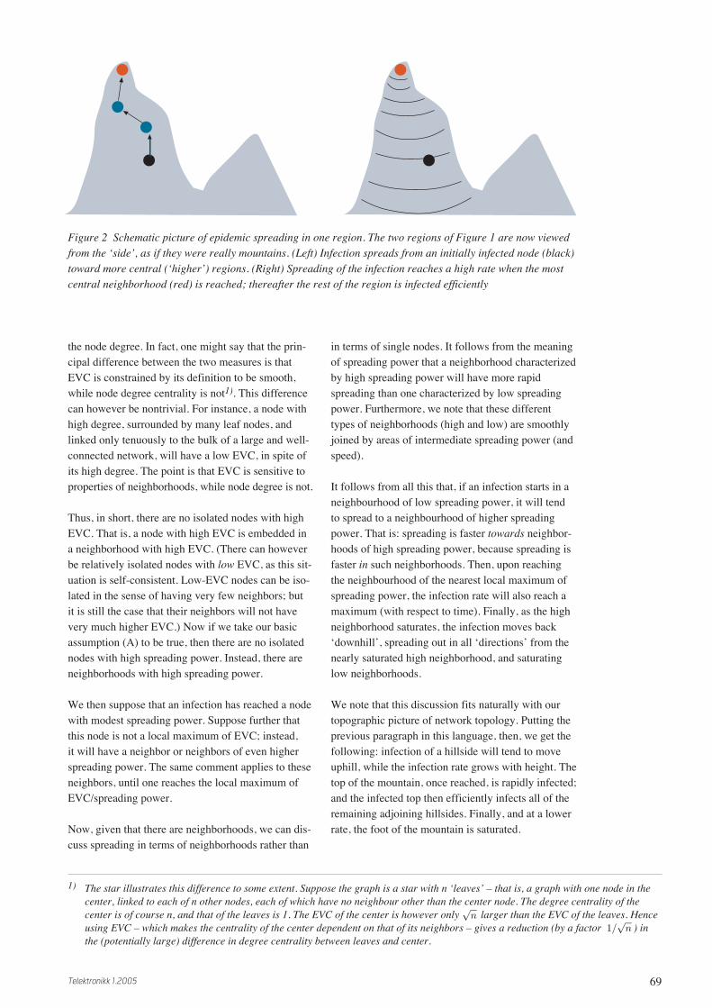
We note that this discussion fits naturally with ourtopographic picture of network topology. Putting theprevious paragraph in this language, then, we get thefollowing: infection of a hillside will tend to moveuphill, while the infection rate grows with height. Thetop of the mountain, once reached, is rapidly infected;and the infected top then efficiently infects all of theremaining adjoining hillsides. Finally, and at a lowerrate, the foot of the mountain is saturated.
Figure 2 Schematic picture of epidemic spreading in one region. The two regions of Figure 1 are now viewedfrom the ‘side’, as if they were really mountains. (Left) Infection spreads from an initially infected node (black)toward more central (‘higher’) regions. (Right) Spreading of the infection reaches a high rate when the mostcentral neighborhood (red) is reached; thereafter the rest of the region is infected efficiently
1) The star illustrates this difference to some extent. Suppose the graph is a star with n ‘leaves’ – that is, a graph with one node in thecenter, linked to each of n other nodes, each of which have no neighbour other than the center node. The degree centrality of thecenter is of course n, and that of the leaves is 1. The EVC of the center is however only larger than the EVC of the leaves. Henceusing EVC – which makes the centrality of the center dependent on that of its neighbors – gives a reduction (by a factor ) inthe (potentially large) difference in degree centrality between leaves and center.
√n
1/√
n

70 Telektronikk 1.2005
Figure 2 expresses these ideas pictorially. The figureshows our two-region example of Figure 1, butviewed from the ‘side’ – as if each node truly has aheight. The initial infection occurs at the black nodein the left region. It then spreads primarily uphill,with the rate of spreading increasing with increasing‘height’ (= EVC, which tells us, by our assumption,the spreading power). The spreading of the infectionreaches a maximum rate when the most central nodesin the region are reached; it then ‘takes off’, andinfects the rest of the region.
We see that this qualitative picture addresses nicelythe various stages of the classic S curve of innovationdiffusion [13]. The early, flat part of the S is the earlyinfection of a low area; during this period, the infec-tion moves uphill, but slowly. The S curve begins totake off as the infection reaches the higher part ofthe mountain. Then there is a period of rapid growthwhile the top of the mountain is saturated, along withthe neighboring hillsides. Finally, the infection rateslows down again, as the remaining uninfected low-lying areas become infected.
We again summarize these ideas with a figure. Figure3 shows a typical S curve for infection, in the case (aswe study in this paper) that immunity is not possible.Above this S curve, we plot the expected centrality ofthe newly infected nodes over time. According to ourarguments above, relatively few nodes are infectedbefore the most central node is reached – even as thecentrality of the infection front is steadily rising. The
takeoff of the infection then roughly coincides withthe infection of the most central neighbourhood.Hence, the part of Figure 3 to the left of the dashedline corresponds to the left half of Figure 2; similarly,the right-hand parts of the two figures correspond.
One might object that this picture is too simple, in thefollowing sense. Our picture gives an S curve for asingle mountain. Yet we know that a network is oftencomposed of several regions (mountains). The ques-tion is then, why should such multi-region networksexhibit a single S curve?
Our answer here is that such networks need not nec-essarily exhibit a single S curve. That is, our argu-ments predict that each region – defined around alocal maximum of the EVC – will have a single Scurve. Then – assuming that each node belongs to asingle region, as occurs with our preferred rule forregion membership – the cumulative infection curvefor the whole network is simply the sum of the infec-tion curves for each region. These latter single-regioncurves will be S curves. Thus, depending on the rela-tive timing of these various single-region curves, thenetwork as a whole may, or may not, exhibit a singleS curve. For example, if the initial infection is from aperipheral node which is close to only one region,then that region may take off well before neighboringregions. On the other hand, if the initial infection is ina valley which adjoins several mountains, then theymay all exhibit takeoff roughly simultaneously – withthe result being a sum of roughly synchronized Scurves, hence a single S curve.
Let us now summarize and enumerate the predictionswe take from this qualitative picture.
a Each region has an S curve.
b The number of takeoff/plateau occurrences in thecumulative curve for the whole network may bemore than one; but it will not be more than thenumber of regions in the network.
c For each region – assuming (which will be typical)that the initial infection is not a very central node –growth will at first be slow.
d For each region (same assumption) initial growthwill be towards higher EVC.
e For each region, when the infection reaches theneighborhood of high centrality, growth “takesoff”.
hnew(t)
cumulativeinfected
t
t
Figure 3 Schematic picture of the progress of aninfection. (lower) The cumulative number of infectednodes over time. The infection “takes off” when itreaches highly central nodes. (upper) Our predictionof the “height” (centrality) of newly infected nodesover time. The vertical dashed line indicates roughlywhere in time the most central node’s neighbourhoodis reached

71Telektronikk 1.2005
f An observable consequence of (e) is then that, foreach region, the most central node will be infectedat, or after, the takeoff – but not before.
g For each region, the final stage of growth (satura-tion) will be characterized by low centrality.
4 SimulationsWe have run simple simulations to test our qualitativepicture. As noted above, we have implemented an SImodel. That is, each node is Susceptible or Infected.Once infected, it remains so, and retains the ability toinfect its neighbors indefinitely. We have used a vari-ety of sample networks, extracted from data obtainedin previous studies. Results reported here will betaken from simulations performed on: (i) seven dis-tinct snapshots [4] of the Gnutella peer-to-peer file-sharing network, taken in late 2001; (ii) a snapshot ofthe collaboration graph of our own R&D department;and (iii) a snapshot of the collaboration graph for theSanta Fe Institute [14]. We will denote these graphsas (i) g1 – g7; (ii) fou (Norwegian for R&D); and(iii) sfi. We use social networks, rather than data net-works, as the former were both empirically measuredand readily available.
Our procedure is as follows. We initially infect a sin-gle node. Each link ij in the graph is assumed to besymmetric (consistent with our use of EVC), and tohave a constant probability p, per unit time, of trans-mitting the infection from node i to node j (or from jto i), whenever the former is infected and the latter isnot. All simulations were run to the point of 100 %saturation. Thus, the ultimate x and y coordinates ofeach cumulative infection curve give, respectively,the time needed to 100 % infection, and the numberof nodes in the graph.
4.1 Gnutella graphs
The Gnutella graphs, like many self-organizedgraphs, have a power-law node degree distribution,and are thus well connected. Consistent with this, ouranalysis returned either one or two regions for each ofthe seven snapshots. We discuss these two cases (oneor two regions) in turn. Each snapshot is taken from[4], and has a number of nodes on the order of 900 –1000.
4.1.1 Single region
The snapshot termed ‘g3’ was found by our analysisto consist of a single region.
Figure 4 (top) Cumulative infection for the Gnutella graph g3. The circle marks the time at which the mostcentral node is infected. (bottom) Average EVC (‘height’) of newly infected nodes at each time step
1000
800
600
400
200
00 20 40 60 80 100 120
Time
# in
fec
ted
no
de
s in
ea
ch
re
gio
nµ
(EV
C)
of
ne
wly
infe
cte
d n
od
es
in e
ac
h r
eg
ion
0 20 40 60 80 100 120
Time
0.2
0.15
0.1
0.05
0

72 Telektronikk 1.2005
Figure 5 Same simulation as Figure 1, except for: (i) p = 0.6, and (ii) new random numbers determining theinfection events
1000
800
600
400
200
0
# in
fect
ed
no
de
s in
ea
ch r
eg
ion
µ(E
VC
) o
f n
ew
ly in
fect
ed
no
de
sin
ea
ch r
eg
ion 0.2
0.15
0.1
0.05
0
0 2 4 6 8 10 12 14
Time
0 2 4 6 8 10 12 14
Time
1000
800
600
400
200
0
# in
fect
ed
no
de
s in
ea
ch r
eg
ion
0 20 40 60 80 100 120 140 160 180
Time
0
0.14
0.12
0.1
0.08
0.06
0.04
0.02
020 40 60 80 100 120 140 160 180
Time
µ(E
VC
) o
f n
ew
ly in
fect
ed
no
de
sin
ea
ch r
eg
ion
Figure 6 (top) Cumulative infection curves, and (bottom) µ curves, for a two-region graph g1, with p = 0.04.The upper plot shows results for each region (black and blue), plus their sum (also black). The lower plot givesµ curves for each region. Note that here, and in all subsequent multiregion figures, we mark the time of infec-tion of the highest-EVC node for each region with a small colored circle

73Telektronikk 1.2005
Figure 4 shows a typical result for the graph g3, withlink infection probability p = 0.05. The upper part ofthe figure shows the cumulative S curve of infection,with the most central node becoming infected nearthe ‘knee’ of the S curve. The lower part of Figure 4shows a quantity termed µ – that is, the average EVCvalue for newly infected nodes at each time. Ourqualitative arguments (Figure 3) say that this quantityshould first grow, and subsequently fall off, and thatthe main peak of µ should coincide with the takeoffin the S curve. We see, from comparing the two partsof Figure 4, that the most central nodes are infectedroughly between time 2 and time 20 – coincidingwith the period of maximum growth in the S curve.Thus, this figure supports all of our predictions a – gabove, with the minor exception that there are somefluctuations superimposed on the growth and subse-quent fall of µ over time.
It is interesting to note that this picture is ratherinsensitive to the probability parameter p. For exam-ple, Figure 5 shows results for the same graph andsame initial node, with the probability now p = 0.6.We see that the main effect of this much higher p issimple, and offers few surprises: the time scale is ofcourse much compressed, with the expected result
that the cumulative curve is less smooth. We note thateven the extreme case of setting p = 1 gives a picturevery much like that of Figure 5.
4.1.2 Two regions
Figure 6 shows typical behavior for the graph g1,which consists of two regions. We see that the tworegions go through takeoff roughly simultaneously.This is not surprising, as the two regions have manybridging links between them. The result is that thesum of the regional infection curves is a single Scurve. We also see that each region behaves essen-tially the same as did the single-region graph g3.For instance, the new centrality (µ) curves for eachregion first rise, and then fall, with their main peak(before time 20) coinciding with the period of mostrapid growth for the respective regions (and for thewhole graph). These results thus add further supportto our predictions a – g.
4.2 Telenor R&D
We have formed a collaboration graph for theresearchers working at Telenor R&D. (The rules forforming a collaboration graph are simple: the nodesare researchers, and if two researchers have authoredone or more papers together, they get a link between
140
120
100
80
60
40
20
0
0.35
0.3
0.25
0.2
0.15
0.1
0.05
0
0 20 40 60 80 100 120 140
Time
# in
fec
ted
no
de
s in
ea
ch
re
gio
nµ
(EV
C)
of
ne
wly
infe
cte
d n
od
es
in e
ac
h r
eg
ion
0 20 40 60 80 100 120 140
Time
Figure 7 Spreading for the single-region fou graph, with p = 0.04. Note that the S curve is somewhat ‘flat’ ona time scale of 100 % saturation

74 Telektronikk 1.2005
them.) For this graph, we analyzed the largest con-nected component, consisting of 137 nodes. Our anal-ysis gave a single region for this graph. Spreadingbehavior was much like that seen in Figure 4. Onedifference is that the S curve is less smooth – aneffect of the small size of the fou graph. Another dif-ference is that, for many simulations (but not all), thetime period of the rise of the S is disproportionatelylarge compared to the time needed for 100 % of satu-ration. Also, in such cases, the time of infection ofthe most central node tends to fall rather late after theonset of the rise (the ‘knee’ of the S). We show anexample of this behavior in Figure 7.
The differences between Figures 4 and 7 are interest-ing; however both figures are fully consistent withour predictions a – g. We note also an interestingcorrelation here, which is not surprising: steeper Scurves tend to be associated with earlier infectiontimes (relative to the knee) for the most central node.
One possible explanation for the slow rise in the Scurve of Figure 7 is that the single mountain for thefou graph is relatively flat. That is, we expect the rateof growth of the infection to be high when the infec-tion front is at a neighbourhood of high centrality –
but for a single, flat region, the latter is never verylarge, and so the takeoff will not be very pronounced.
4.3 Santa Fe Institute
The sfi graph gives three regions under our analysis.The spreading behavior varied considerably on thisgraph, depending both on the initially infected node,and on the stochastic outcomes for repeated trialswith the same starting node.
Figure 8 shows an untypical case for this graph. Theaspect that is untypical here is that the whole-graphcumulative infection curve resembles (somewhat) asingle, smooth, S curve. This result was obtainedhowever for the rather artificial starting condition thatthe first infected node was the most central node inthe largest region – hence in the entire graph. Theresult is that this region takes off immediately. (Ourprediction c thus does not hold; but its assumptionhas been violated by our infecting the most centralnode first.) The next largest region (blue curve) ishowever infected fairly soon thereafter, so that itstakeoff is not clearly seen in the total curve. Finally,the third region (red curve) takes off considerablylater. But, because it is small, and its takeoff occursbefore the blue region is fully saturated, the takeoff
Figure 8 Spreading on the sfi graph, p = 0.04. The start node is the most central node in the largest of thethree regions (black); hence its infection time is not marked
0 20 40 60 80 100 120 140
Time
# in
fec
ted
no
de
s in
ea
ch
re
gio
nµ
(EV
C)
of
ne
wly
infe
cte
d n
od
es
in e
ac
h r
eg
ion
0 20 40 60 80 100 120 140
Time
120
100
80
60
40
20
0
0.7
0.6
0.5
0.4
0.3
0,2
0.1
0

75Telektronikk 1.2005
Figure 9 Same as Figure 8, except a randomly chosen start node
Figure 10 Spreading on the sfi graph, p = 0.05. In this case, the existence of three regions in the graph isclearly seen in the total cumulative infection curve
0 20 40 60 80 100 120 140 160 180 200
Time
0 20 40 60 80 100 120 140 160 180 200
Time
0
# in
fec
ted
no
de
s in
ea
ch
re
gio
nµ
(EV
C)
of
ne
wly
infe
cte
d n
od
es
in e
ac
h r
eg
ion
120
100
80
60
40
20
0
0.7
0.6
0.5
0.4
0.3
0,2
0.1
0
0
# in
fec
ted
no
de
s in
ea
ch
re
gio
nµ
(EV
C)
of
ne
wly
infe
cte
d n
od
es
in e
ac
h r
eg
ion
120
100
80
60
40
20
0
0.7
0.6
0.5
0.4
0.3
0,2
0.1
0
20 40 60 80 100 120 140
Time
0 20 40 60 80 100 120 140
Time

76 Telektronikk 1.2005
of this third region is also not clear from inspectionof the total infection curve.
From observing the µ curves, we see that that of theblue region is as predicted. The red region is similarbut not visible on the scale of the figure. The largest(black) region’s µ curve lacks the initial rise in cen-trality – but this is to be expected, as the infectionbegan at the top.
Now we move to a more typical case for the sfigraph. Figure 9 shows the behavior for the sameinfection probability, but with a randomly chosenstart node.
The interesting feature of this simulation is that thecumulative curve shows very clearly two takeoffs,and two plateaux. That is, it resembles strongly thesum of two S curves. And yet it is easy to see howthis comes about, from our region decomposition: theblue and red curves take off roughly simultaneously,while the largest (black) region takes off only afterthe other regions are saturated.
The µ curves show roughly the expected behavior– the qualification being that they are rather noisy.Nevertheless, the main peak of each µ curve corre-sponds to the main rise of the corresponding region’sS curve.
We reiterate that the behavior seen in Figure 9 ismuch more typical for this graph than that seen inFigure 8.
We examine yet one more example from the sfigraph. Figure 10 shows a simulation with a differentstart node from Figures 9 or 8, and with p = 5 %. Themessage from Figure 10 is clear: the cumulative in-fection curve shows clearly three distinct S curves –takeoff followed by plateau – one after the other. It isalso clear from our regional infection curves that eachregion is responsible for one of the S curves in thetotal infection curve: the smallest (red) region takesoff first, followed by the blue region, and finally thelargest (black) region. In each case, the time of infec-tion for the most central node of the region undergo-ing takeoff lies very close to the knee of the takeoff.And, in each case, the peak of the µ curve coincidesroughly with the knee of the takeoff.
We note that the behavior seen in Figure 10 is neithervery rare nor very common. The most commonbehavior, from examination of over 50 simulationswith this graph, is most like that seen in Figure 9; butwe have seen behavior which is intermediate to thatin Figures 8 and 9 (i.e. neither clearly one nor clearlytwo takeoffs), and also behavior which is intermedi-
ate to that of Figures 9 and 10. In particular, multiplesimulations with the same start node and probabilityas that for Figure 10 have yielded two clear takeoffs(as in Figure 9), three clear takeoffs (as in Figure 10),and intermediate behavior. It is interesting to notethat the behavior for this start node, with p = 1 (hencewith deterministic behavior), gives a cumulativeinfection curve which is best described as showingbetween two and three takeoffs.
Thus the behavior of spreading on the sfi graph givesthe strongest confirmation yet of our prediction b:that, for a graph with r regions, one may see up tor, but not more than r, distinct S curves in the totalcumulative infection curve. All of our observations,on the various graphs, are consistent with our predic-tions; but it is only in the sfi graph that we clearly seeall of the (multiple) regions found by our analysis tobe present in the graph.
One very coarse measure of the well-connectednessof a network is the number of regions in it, with ahigh degree of connectivity corresponding to a smallnumber of regions, and with a large number ofregions implying poor connectivity. By this verycoarse criterion, the sfi graph is as well connectedas another three-region graph studied by us (the ‘hiograph’, reported in [2] and in [3]). Based on ourspreading simulations on this hio graph (reported in[2]), we would say that in fact the sfi graph is lesswell connected than the hio graph. We base this state-ment on the observation that, for the hio graph, wenever found cases where the different regions tookoff at widely different times – the three regions arebetter connected to one another than is the case forthe sfi graph. (In detail: the three regions define threepairs of regions; and these three pairs are bridged by57, 50, and 7 bridge links.)
Examination of the sfi graph itself (Figure 11) ren-ders this conclusion rather obvious: the three regionsare in fact connected in a linear chain. (The threepairs of regions have 6, 10, and 0 bridging links.)Thus, it is not surprising that we can, in some simula-tion runs, clearly see the takeoff of each region, wellseparated in time from that of the other regions. Thehio graph, in contrast, has many links between eachpair of regions of the three. We note finally in thiscontext that the Gnutella graphs are very well con-nected; those that resolve to two regions always havenumerous links between the two.
Finally, we note that the sfi graph, while clearlyconforming to our assertion b (we see up to threeregions), does not wholly agree with assertion a (thateach region will have a clear S curve). For instance,in Figure 9, the black region has a small ‘premature’
77Telektronikk 1.2005
takeoff around time 40, giving a visible plateaubefore the ‘main’ takeoff after time 120. Similarly,both the blue and the black regions show such ‘pre-mature’ takeoffs in Figure 10. These observations arenot exceptional: the blue region in particular is proneto such behavior, showing two stages of growth inover half of the simulations we have run on the sfigraph. This weakens the support for assertion a; wewould then say that a single S curve for a singleregion is a rule that is followed in most cases, but notall. However these two-stage takeoffs do not contra-dict the other predictions on our list. For instance,there is always a corresponding ‘premature hump’ inthe µ curve for the region in question.
It is clear from Figure 11 where the ‘premature take-offs’ arise. The black region includes a subclusterwhich is easily identified visually in Figure 11 (closeto the next region). This subcluster is connected tothe remainder of the black region by a single link.These same statements hold true for the blue region– it has a subcluster, joined to it by a single link, butclose to the rightmost region. Hence, in Figure 10, forexample, the infection starts on the ‘far side’ of the
red region. Then it spreads to the adjacent subclusterof the blue region, but does not reach the most centralnodes of that region until after about 20 more unitsof time (about 1/p). Soon after the center of the blueregion is infected, the subcluster of the black regionbegins to be infected; but again there is a delay (abouttwice 1/p) before reaching the main center of theblack region.
We have explored other rules for assigning nodes toregions [1]. For instance, if we simply use shortestdistance rather than steepest ascent as our criterion,then the two above mentioned subclusters move: theblue subcluster moves to the red region, and the blacksubcluster becomes a set of ‘border nodes’ equidis-tant from both centers. We have not used the shortestdistance rule in this paper, because it tends to placetoo many nodes in general in border regions. Possi-bly, one could obtain cleaner S curves for the threesfi regions using the shortest distance rule. However,this rule for defining regions ignores the view that theEVC should be viewed as a height function; hence itis less topographically motivated, and so may alsogive poorer results in many cases.
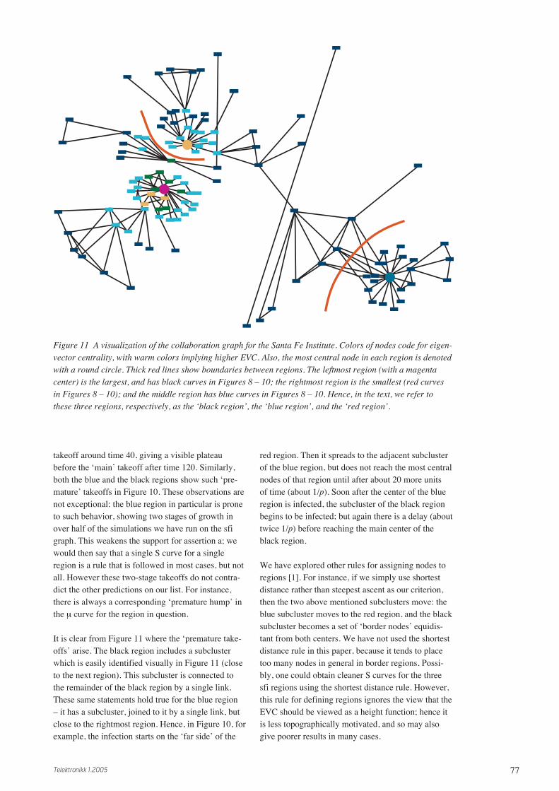
Figure 11 A visualization of the collaboration graph for the Santa Fe Institute. Colors of nodes code for eigen-vector centrality, with warm colors implying higher EVC. Also, the most central node in each region is denotedwith a round circle. Thick red lines show boundaries between regions. The leftmost region (with a magentacenter) is the largest, and has black curves in Figures 8 – 10; the rightmost region is the smallest (red curvesin Figures 8 – 10); and the middle region has blue curves in Figures 8 – 10. Hence, in the text, we refer tothese three regions, respectively, as the ‘black region’, the ‘blue region’, and the ‘red region’.

78 Telektronikk 1.2005
5 Mathematical theoryIn [2] we have developed a mathematical theory forthe qualitative ideas expressed here. We have focusedon two aspects there, which we will simply summa-rize here.
5.1 Definition of spreading power
The first problem is to try to quantify and make pre-cise our assumption (A). Since (A) relates to twoquantities – spreading power and EVC – and the lat-ter is precisely defined, the task is then to define theformer, and then to seek a relation between the two.
Such a relation is intuitively reasonable. A nodewhich is connected to many well-connected nodesshould have higher spreading power, and higherEVC, than a node which is connected to equallymany, but poorly connected, nodes. We have offereda precise definition of spreading power in [2]. Ourreasoning has two steps: first we define an ‘infectioncoefficient’ C(i,j) between any pair of nodes i and j.This is simply a weighted sum of all non-self-retrac-ing paths between i and j, with lower weight givento longer paths. Thus many short paths between twonodes gives them a high infection coefficient. Ourdefinition is symmetric, so that C(i,j) = C(j,i).
Next we define the spreading power of node i to besimply the sum over all other nodes j of its infectioncoefficient C(i,j) with respect to j. As long as thegraph is connected, every node will have a nonzeroC(i,j) with every other, thus contributing to the sum.Hence each node has the same number of terms in thesum; but the nodes with many large infection coeffi-cients will of course get a higher spreading power.
We then show in [2] that one can make a strong con-nection between this definition of spreading powerand the EVC, if one can ignore the restriction to non-self-retracing paths in the definition. We restrict thesum to non-self-retracing paths because self-retracingpaths do not contribute to infection in the SI case.This restriction makes the obtaining of analyticalresults harder.
5.2 Mathematical theory of SI spreading
We have in [2] given exact equations for the propaga-tion of an infection, for arbitrary starting node, in theSI case. These equations are stochastic – expressed interms of probabilities – due to the probabilistic modelfor spreading over links. They are not generally solv-able, even in the deterministic case when p = 1. Theproblem in the latter case is again the need to excludenon-self-retracing paths. However, we have per-formed an expansion in powers of p for the time evo-lution of the infection probability vector. This expan-sion shows that the dominant terms are those
obtained by naïvely applying the adjacency matrix(i.e. ignoring self-retracing paths because they arelonger, hence higher order in p). The connection toEVC is then made: naïvely applying the adjacencymatrix gives weights (infection probabilities) whichapproach a distribution proportional to the EVC.Hence we get some confirmation for our claim that,in the initial stages of an infection, the front movestowards higher EVC.
An interesting observation that remains to be ex-plained is the insensitivity of the time evolution (seeFigures 4 and 5) to the probability p. We note thatshort paths receive the most weight in two limits: p –>0 and p –> 1. The observed insensitivity to p suggeststhat such short paths dominate for all p between theselimits; but we know of no proof for this suggestion.
6 Design and improvement ofnetworks
In this section we go beyond the problem of analysis,and address the problem of design of networks [15].Our ideas have some obvious implications for design.Since we focus in this paper on security – i.e. on pre-venting the spreading of harmful information such asviruses – we will focus primarily on design for pre-vention here. However, we begin with a discussion ofthe opposite problem: how to help spreading, bymodifying the topology of a given network.
6.1 Measures to improve spreading
We frame our ideas in terms of our topographic pic-ture. Now we suppose that we wish to design, ormodify the design of, a network, so as to improve itsefficiency with respect to spreading. It is reasonable,based on our picture, to assume that a single regionis the optimal topology for efficient spreading. Hencewe offer here two ideas which might push a given(multi-region) network topology in this direction:
1 We can add more bridge links between the regions;2 As an extreme case of 1, we can connect the Cen-
ters of the regions.
Idea 2 is a “greedy” version of idea 1. In fact, thegreediest version of idea 2 is to connect all Centersto all, thus forming a complete subgraph among theCenters. However, such greedy approaches may inpractice be difficult or impossible. There remains thenthe general idea 1 of building more bridges betweenthe regions. Here we see however no reason for nottaking the greediest practical version of this idea. Thatis: build the bridges between nodes of high centralityon both sides – preferably as high as possible. Ourpicture strongly suggests that this is the best strategyfor modifying topology so as to help spreading.

79Telektronikk 1.2005
We note that the greediest strategy is almost guaran-teed to give a single-region topology as a result. Ourreasoning is simple. First, the existing Centers cannotall be Centers after they are all connected one toanother – because two adjacent nodes cannot bothbe local maxima of the EVC (or of anything else).Therefore, either new Centers turn up among theremaining nodes as a result of the topology modifica-tion, or only one Center survives the modification. Inthe latter case we have one region. The former case,we argue, is unlikely: we note that the EVC of theexisting Centers is (plausibly) strengthened (raised) bythe modification more than the EVC of other nodes.That is, we believe that connecting existing centers ina complete subgraph will ‘lift them up’ with respect tothe other nodes, as well as bringing them closertogether. If this ‘lifting’ idea is correct, then we endup with a single Center and a single region.
We have tested the ‘greediest’ strategy, using the sfigraph as our starting point. We connected the threeCenters of this graph (Figure 11) pairwise. The resultwas a single region, with the highest Center of theunmodified graph at its Center. We then ran 1000 SIspreading simulations on this modified graph, with p= 10 %, and collected the results in the form of timeto saturation for each run.
In our first test, we used a random start node (firstinfected node) in each of the 1000 runs. For theunmodified sfi graph, we found a mean saturationtime of 83.8 time units. For the modified, single-region graph, the corresponding result was 64.0 timeunits – a reduction by 24 %. Note that this largereduction was achieved by adding only three links toa graph which originally had about 200 links among118 nodes.
Figure 12 gives a view of the distribution of satura-tion times for these two sets of runs. We show boththe binned data and a fit to a gamma probability dis-tribution function. Here we see that the variance aswell as the mean of the distribution is reduced by thetopology improvement.
Our next set of tests used a start node located close tothe highest Center (the only Center in the modifiedgraph). These tests thus involve another form of‘help’, namely, choosing a strategically located startnode. We wish then to see if the new topology gives asignificant difference even in the face of this strategicstart. Our results, for mean saturation time over 1000runs, were 68.9 time units for the unmodified sfigraph, and 56.0 units for the modified graph. Thus,connecting the three Centers of the sfi graph reducedthe mean saturation time by almost 20 %, eventhough a highly advantageous node was used to start
the infection. Also, as in Figure 12, the variance wasreduced by the topology improvement. We summa-rize these results in Table 1.
From Table 1 we get some idea of the relative effi-cacy of the two kinds of help. That is, our base case isthe unmodified graph with random start node (83.8).Choosing a strategic start node gave about an 18 %reduction in mean saturation time. Improving thetopology, without controlling the start node, gavealmost 24 % reduction. Thus we see that, for theselimited tests, both kinds of help give roughly thesame improvement in spreading rate, with a slightadvantage coming from the greedy topology change.Finally, note that using both kinds of help in combi-nation gave a reduction of mean saturation time ofabout 1/3. We note that both of these kinds of helpare based on our topology analysis, and cannot beimplemented without it.
0.04
0.03
0.02
0.01
0
De
nsi
ty
40 60 80 100 120 140 160
Data
SFI - 3 regions
3 regions - Gamma
SFI - 1 region
1 region - Gamma
40 60 80 100 120 140 160
Data
Figure 12 Distribution of saturation times for 1000 runs on the sfigraph, with a random start node. Left (blue): with the addition of threelinks connecting the three Centers. Right (red): original graph, withthree regions.
Random High-EVC
start node start node
Original graph 83.8 68.9
Connect Centers 64.0 56.0
Table 1 Mean time to saturation for the sfi graph,with and without two kinds of assistance: connectingthe Centers of the three regions, and choosing a wellplaced start node

80 Telektronikk 1.2005
of ‘inoculation’ strategies – inoculating nodes (whichis equivalent to removing them, as far as spreading ofthe virus is concerned), or inoculating links (which isalso equivalent to removing them). Again we offera list of ideas:
1 We can inoculate the Centers – along with, per-haps, a small neighbourhood around them.
2 We could instead find a ring of nodes surroundingeach Center (at a radius of perhaps two or threehops) and inoculate the ring.
3 We can inoculate bridge links.
4 We can inoculate nodes at the ends of bridge links.
We note that ideas 1 and 2 are applicable even in thecase that only a single region is present. Ideas 3 and 4may be used when multiple regions are found. Notethat inoculating a bridge link (idea 3) is not the sameas inoculating the two nodes which the link joins(idea 4): inoculating a node effectively removes thatnode and all links connected to it, while inoculatinga link removes only that link.
Also, with link inoculation, one has the same consid-erations as with link addition – namely, the height ofthe link matters. We define the “link EVC” to be thearithmetic mean of the EVC values of the nodes onthe ends of the link. Ideas 3 and 4 are then almost cer-tainly most effective if the bridging links chosen forinoculation have a relatively high link EVC.
In order to get some idea of the merits of these fourideas, we have tested two of them: ideas 1 and 3.(Ideas 1 and 2 are similar in spirit, as are ideas 3 and4.) First we give results for idea 3. We again startwith the sfi graph, and measure effects on saturationtime, averaged over 1000 runs, with a random startnode for each run. We have tested two strategies forbridge link removal: (i) remove the k bridge linksbetween each region pair that have the lowest linkEVC; and (ii) remove the k bridge links between eachregion pair that have the highest link EVC. As maybe seen by inspection of Figure 11, the highest andmiddle regions have 6 bridge links joining them,while the middle and lowest regions have ten (and thehighest and lowest regions have no bridging linksbetween them). Hence we have tested idea 3, in thesetwo versions, for k = 1 and for k = 3 (which is possi-ble without disconnecting the graph). Our confidencethat strategy (ii) – remove the k highest bridge links– will have much more effect is borne out by ourresults. For example, in Figures 13 and 14, we com-pare results for k = 3. We see from Figure 13 that theeffect of removing the lowest three bridge links is
0.025
0.02
0.015
0.01
0.005
0
40 60 80 100 120 140 160
Data
SFI - Reference Min
FIT -Reference Min
SFI - BLR Min
FI T- BLR Min
De
nsi
ty
0.025
0.02
0.015
0.01
0.005
0
40 60 80 100 120 140 160
Data
De
nsi
ty
SFI - Reference Max
FIT -Reference Max
SFI - BLR Max
FI T- BLR Max
Figure 13 Effects on saturation time of removing the three bridge links(for each region pair) with lowest EVC
Figure 14 Effects on saturation time of removing the three bridge links(for each region pair) with highest EVC
6.2 Measures to prevent spreading
Now we address the problem of designing, or re-designing, a network topology so as to hinder spread-ing. Here life is more complicated than in the helpingcase. The reason for this is that we build networks inorder to support and facilitate communication. Hencewe cannot simply seek the extreme, ‘perfect’ solution– because the ideal solution for hindering spreading isone region per node, i.e. disconnect all nodes from allothers! Instead we must consider incrementalchanges to a given network. We consider two types

81Telektronikk 1.2005
negligible. Figure 14, in contrast, shows a significantretardation of saturation time as a result of removingthe top three bridge links from between each pair ofregions.
We have also, for comparison purposes, removed thesame number of links, but at random. For example,for the case k = 1, we remove one bridge link be-tween each connected pair of regions, hence twototal; so for comparison we do the same, but choosingthe two links randomly (with a new choice of re-moved links for each of the 1000 runs).
Table 2 summarizes the results of our bridge-linkremoval experiments, both for k = 1 and for k = 3. Ineach case we see that removing the highest bridgeshas a significantly larger retarding effect than remov-ing the lowest – and that the latter effect is bothextremely small, and not significantly different fromremoving random links.
We have examined growth curves for some of thebridge-link removal experiments. These curves reveala surprising result: the number of regions actuallydecreases (for k = 3) when we deliberately removebridge links. Specifically, removing the lowest threelinks between region pairs changes three regions totwo; and removing the highest three links changesthree regions to one.
Figure 15 shows fairly representative infectiongrowth curves for the k = 3 case, contrasting randomlink removal (top) with removal of bridge links withhighest EVC (bottom). The upper part of Figure 15offers few surprises. In the bottom part, we see asingle region, which nevertheless reaches saturationmore slowly than the three-region graph of the upperplot. It is also clear, from the rather irregular form of
k = 1 k = 3
Reference 82.9 83.3
Remove random 84.3 87.1
Remove lowest 84.4 85.8
Remove highest 87.7 96.5
Table 2 Mean saturation times for two sets of bridge-removal experiments on the sfi graph
1
0.8
0.6
0.4
0.2
00 10 20 30 40 50 60 70 80
Time
Nu
mb
er
of i
nfe
cte
d n
od
es
0 10 20 30 40 50 60 70 80
Time
1
0.8
0.6
0.4
0.2
0
Nu
mb
er
of i
nfe
cte
d n
od
es
Figure 15 Infection curves for the sfi graph. (top) Six randomly chosen links have been removed. (bottom) Thethree highest links between the black and blue regions, and also those between the blue and red regions, havebeen removed. The result is a graph with a single region

82 Telektronikk 1.2005
the growth curve in the bottom part of Figure 15, thatthe single region is not internally well connected.
Thus, our attempt to isolate the three regions evenmore thoroughly, by removing the “best” bridge linksbetween them, has seemingly backfired! Some reflec-tion offers an explanation. It is clear from examiningFigure 11 that removing the three highest linksbetween the highest and middle regions will stronglyaffect the centrality (EVC) of the nodes near thoselinks. In particular, the Center (round yellow node inFigure 11) of the middle region (giving blue growthcurves in Figures 8 – 10) will have its EVC signifi-cantly lowered by removing the strongest links fromits region to the highest region. If its EVC is signifi-cantly weakened, it (plausibly) ceases to be a localmaximum of the EVC, so that its region is “swal-lowed” by the larger one. A similar effect can makethe lowest Center also cease to be a Center. This pic-ture is supported by the fact that the Center of themodified, one-region graph (bottom curve in Figure15) is the same Center as that of the highest region inthe original graph (round, magenta node in Figure 11).
Next we report on our tests to date of idea 1. We didnot use the sfi graph for these tests, because the graphbreaks into large pieces if one inoculates (removes)either of the two high-EVC Centers (see Figure 11).Hence we used the hio graph from [3]. This graphalso has three regions, and hence three Centers whichcan be inoculated. We find that, as with the sfi graph,removing these Centers also isolates some nodes –but (unlike with the sfi graph) only a few. Hence wesimply adjusted our spreading simulation so as toignore these few isolated nodes (13 in number, inthe case of inoculating all three Centers).
As noted earlier, we regard the hio graph as beingbetter connected than the sfi graph (even though bothresolve to three regions). Hence we might expect thehio graph to be more resilient in the face of attackson its connectedness – in the form of inoculations. Infact, we only found a slight increase in average satu-ration time, even when we inoculated all three Cen-ters. For this test on the hio graph, we found the meansaturation time to increase from 71.5 to 74.8 – anincrease of about 5 %. We know of no valid way tocompare this result quantitatively with the corre-sponding case for the sfi graph – because, in the lattercase, so many nodes are disconnected by removingthe Centers that the mean saturation time must beregarded as infinite (or meaningless).
It is also of interest to compare our two approaches tohindering spreading (inoculate Centers, or inoculatebridges) on the same graph. Our results so far show abig effect from inoculating bridges for the sfi graph,
and a (relatively) small effect for inoculating Centersfor the hio graph. Can we conclude from this thatinoculating bridges is more effective than inoculatingCenters? Or is the difference simply due to the factthat the sfi graph is more poorly connected, andhence more easily inoculated? To answer these ques-tions, we have run a test of idea 3 on the hio graph.Specifically, we ran the k = 3 case, removing ninelinks total.
The results are given in Table 3. Here we see that thek = 3 strategy, which worked well on the sfi graphwhen targeted to the highest-EVC links, has almostno effect (around 1 %) for the hio graph. This is trueeven when we remove the highest links, and removenine of them (as opposed to six for the sfi case).Hence we find yet another concrete interpretation ofthe notion of well-connectedness: the hio graph isbetter connected than the sfi graph, in the sense thatis it much less strongly affected by either bridge linkremoval or Center inoculation (which causes the sfigraph to break down).
We also see that removing the three Centers from thehio graph has a much larger effect (5 % compared to1 %) than removing the three highest bridge linksbetween each pair of regions. (Note however thatremoving a Center involves removing many morethan three links.) This result is reminiscent of a well-known result for scale-free graphs [16]. Scale-freegraphs have a power-law degree distribution and areknown, by various criteria, to be very well connected.In [16] it was shown however that removing a smallpercentage of nodes – but those with the highest nodedegree – had a large effect on the connectivity of thegraph (as measured by average path length); whileremoving the same fraction of nodes, but randomlychosen, had essentially no effect. That is, in such wellconnected networks, the best strategy is to vaccinatethe most connected nodes – a conclusion that is alsosupported, at this general level of wording, by ourresults here. In our center-inoculation experiments,we remove again a very small fraction of well con-nected nodes, and observe a large effect. However,our node removal criterion is neither the node degree,nor even simply the EVC: instead we focus on the
k = 3
Remove random 71.2
Remove lowest 72.1
Remove highest 71.9
Table 3 Mean saturation times for two sets of bridge-removal experiments on the hio graph

83Telektronikk 1.2005
EVC of the node relative to the region it lies in. Also,our measure of effect is not path length, but rather thesaturation time – a direct measure of spreading effi-ciency. Hence our approach is significantly differentfrom that in [16] (and related work such as [17]); butour general conclusion is similar.
7 Discussion and future workIn this paper we have summarized two closely relatedresearch efforts: one involving a new method forstructural analysis for undirected graphs [1], andanother [2] applying this analysis to the problem ofepidemic spreading on a network. We have also pre-sented some new results in this paper. That is, theresults of [1] and [2] strongly suggest strategies foreither helping or hindering spreading (of information,innovation, diseases, viruses, etc). We have testedsome of these strategies, inspired by our topographicpicture, and report the results here. These results sug-gest clearly that our approach can be useful for man-aging or controlling spreading, via design or modifi-cation of network topology [15]. We look forward todeveloping further tests, and to implementing practi-cal applications of the ideas presented here for modi-fying (plus or minus!) the spreading properties of net-works.
We believe that our topographic picture of the struc-ture of a network, based on using eigenvector central-ity (EVC) as a height function over the network, withmountains, peaks, slopes, and valleys, is an excellentstarting point for an understanding of spreading.From this starting point, we have developed a set ofqualitative arguments which yield seven specific pre-dictions (Section 3). Our picture, in short, is that aninitial infection on the side of a mountain will run‘up’ the mountain, while the rate of infection of newnodes grows with height. This is a self-reinforcingprocess, so that infection rate takes off at some pointhigh up on the mountain, and the whole top is satu-rated quickly; finally the remaining hillsides are satu-rated at a decreasing rate. These predictions havebeen tested, and convincingly confirmed, in a seriesof simulations that we have run on various socialnetworks for which we have data on the topology.
To supplement these qualitative arguments and simu-lations, we have developed a mathematical theory,which is presented in detail in [2] and summarizedin Section 5 here. In the theoretical work we addresstwo things: the definition of the spreading power ofa node, and the dynamics of simple SI spreading. Ineach case, exact solutions are not possible, due to theproblem that double infections must not be counted.However, in each case, we have shown that ignoringthe double-counting problem gives an approximation
which supports our basic claim (spreading power maybe approximated by EVC). In particular, we presentarguments why the correction terms due to doublecounting are likely to be small compared to thosewhich ignore double counting; and these latter termssupport the claim that infection probability is posi-tively correlated with EVC. These results need to bedeepened and extended in future work. Also, someobvious extensions of the present studies, whichshould be studied both theoretically and via simula-tions, include the case in which nodes are infectedfrom ‘outside’ the graph at some steady rate, and thecase where nodes lose their infection status aftersome time (SIS), perhaps after a refractory period(SIR).
We note that the sfi graph offered the most extremebehavior, stemming from the weak coupling bothbetween and within its three regions. Thus we findthe sfi graph to be the least well connected, in termsof criteria derived from our structural analysis andfrom our observations of spreading. We have arguedin [1] that the property of being poorly connected isrelated to poor mixing, and thus to a small eigenvaluegap (difference between the dominant and secondeigenvalues of the adjacency matrix). It would be ofinterest to test these ideas with the set of graphs stud-ied here. If the gap is small in poorly connected (byour definition) graphs, then many things will be rela-tively sensitive to small changes in topology: theirEVC values (from the dominant eigenvector); theirtopography, as obtained by our analysis, and theirspreading behavior. This too could be tested.
More generally, we wish to deepen and render morequantitative our notion of the well-connectedness of agraph. Clearly, our coarse starting point (number ofregions) give useful information in itself; but muchmore remains to be done. Besides making a connec-tion to the eigenvalue gap, one could seek to quantifythe degree of inter-region connectedness. Further-more, one should seek connections and correlationsbetween these different measures.
We note that our method of network structure analy-sis suggests a method of graph visualization. Figure11 is an example of this: nodes in each region areplaced close together on the page, so that the regions(and the height function defining them as ‘moun-tains’) are visually clear. Figure 11 represents workin progress. We hope to be able to present improve-ments on, and refinements of, this visualizationapproach in future work. One very attractive goal isto display epidemic spreading simulations (or empiri-cal data!) on a network – in the form of snapshots, ora movie – with the network visualized topographi-cally (as in Figure 11). Then one can hope to see our

84 Telektronikk 1.2005
predictions a – g, not in the form of static plots as inthis paper, but in the form of time development of theinfection over the topography (as displayed in 2D) ofthe graph. We believe such a visualization techniquecould be a highly practical tool in those cases wheredata on the network topology (and, if possible, alsothe infection status) are available.
Our analysis suggests strategies for improving thespreading of information. These ideas may be usefulwhen such improvement is desirable – for example,for the spreading of useful information within anorganization. We have discussed two such ideas, andtested one of them – connecting Centers when thereare multiple regions. We find that adding just threenew links (but in the right place) can give arounda 25 % reduction in the time needed to saturate thenetwork. Hence we are encouraged to explore theseideas further.
Our picture also suggests a number of simple ways ofhindering spreading. We have listed four in Section6, and tested two of them in a limited fashion. Theresults of these tests are promising: we have shownthat we can significantly retard spreading, by inocu-lating a small but strategically chosen number oflinks against spreading, or by inoculating a fewstrategically central nodes which are picked out byour analysis. Hence we believe that further testing iswarranted, towards the goal of applying our ideas toreal-world security problems. We are confident thatsuch real-world application will be worthwhile; infact, we believe that the sum collection of resultsreported here establishes that we have understoodspreading in a highly useful way, at the neighbour-hood level.
Further tests of “design for the control of spreading”should look at other performance metrics than thoseused in the preliminary studies reported here. Forexample, the saturation time is prone to large fluctua-tions due to the slow stochastic nature of infecting thelast small fraction of nodes. Hence, one should lookat (e.g.) the time to 80 % saturation, or other criteriathat involve less than 100 % saturation. Also, the setof design ideas that we list here should be more thor-oughly tested, and augmented with further ideas. Weexpect the result of such work to be a compact buthighly useful set of design/improvement tools forchoosing a network topology that has desired spread-ing properties.
Acknowledgments
We thank Michelle Girvan for sharing data on theSFI collaboration graph with us, Mark Burgess andLada Adamic for helpful discussions, and ÅsmundWeltzien for extremely fruitful collaboration in
applying these ideas (along with help with Figures 1and 2). This work was partially supported by theFuture & Emerging Technologies unit of the Euro-pean Commission through Project BISON (IST-2001-38923), and partially supported by the EUwithin the 6th Framework Programme under contract001907 (DELIS).
References1 Canright, G, Engø-Monsen, K. Roles in Net-
works. Science of Computer Programming, 53,195–214, 2004.
2 Canright, G, Engø-Monsen, K. Spreading on net-works: a topographic view. Submitted to Euro-pean Conference on Complex Systems (ECCS05).
3 Canright, G, Engø-Monsen, K, Weltzien, Å,Pourbayat, F. Diffusion in social networks anddisruptive innovations. IADIS e-Commerce 2004proceedings. Lisbon 2004.
4 Jovanovic, M A, Annexstein, F S, Berman, K A.Scalability issues in large peer-to-peer networks– a case study of Gnutella. University of Cincin-nati, 2001. Technical Report.
5 Newman, M E J. The structure and function ofcomplex networks. SIAM Review, 45, 167–256,2003.
6 Pastor-Satorras, R, Vespignani, A. EpidemicSpreading in Scale-Free Networks. Phys. Rev.Lett, 86, 3200–3203, 2001.
7 Pastor-Satorras, R, Vespignani, A. Epidemicdynamics and endemic states in complex net-works. Phys. Rev. E, 63, 066117, 2001.
8 Newman, M E J. Spread of epidemic disease onnetworks. Phys. Rev. E, 66, 016128, 2002.
9 Brauer, F. A model for an SI disease in an age-structured population. Discrete and ContinuousDynamical Systems, B2, 257–264, 2002.
10 Wang, Y, Chakrabarti, D, Wang, C, Faloutsos, C.Epidemic spreading in real networks: an eigen-value viewpoint. Proceedings 22nd Symposiumon Reliable Distributed Systems (SRDS 2003),25–34, 2003.
11 A good introduction to many of these definitionsmay be found in: http://www.analytictech.com/networks/centrali.htm

85Telektronikk 1.2005
12 Bonacich, P. Factoring and weighting approachesto status scores and clique identification. Journalof Mathematical Sociology, 2, 113–120, 1972.
13 Rogers, E M. Diffusion of Innovations, 3rd ed.Free Press, New York, 1983.
14 Girvan, M, Newman, M E J. Community struc-ture in social and biological networks. Proc. Natl.Acad. Sci. USA, 99, 8271–8276, 2002.
15 For a discussion of closely related ideas, see:Burgess, M, Canright, G and Engø-Monsen, K.A graph theoretical model of computer security:from file sharing to social engineering. Interna-tional Journal of Information Security, 3 (2),70–85, 2004.
17 Albert, R, Jeong, H, Barabasi, A-L. Attack anderror tolerance of complex networks. Nature, 406,378–382, 2000.
18 Holme, P, Kim, B J, Yoon, C N, Han, S K. Attackvulnerability of complex networks. Phys. Rev. E,65, 056109, 2002.
Geoffrey S. Canright is a senior researcher with Telenor R&D. His background is in statistical physics.
His current interests include network analysis and graph theory, social networks, self-organizing systems,
and bio-inspired algorithms.
email: [email protected]
Kenth Engø-Monsen is a research scientist at Telenor R&D. He holds a PhD (2000) in computer science
from the University of Bergen, Norway, and a master in industrial mathematics (1995) and a master in
technology management (2001) from NTNU, Norway. Since joining Telenor R&D in 2000, his interests
have been in network analysis and graph theory, searching, and mathematical finance and risk.
email: [email protected]