
Economie Statistique Economics Statistics | Insee
136
Economie Statistique Economics Statistics AND ET Dossier thématique Inégalités et éducation Articles Participation des salariés, performance des entreprises et distribution de liquidités – Paysage et modélisation de l’urbanisation Thematic Section Inequality and Education Articles Employee Participation, Corporate Performance and Cash Distribution – Landscape and Modelling of Urbanisation N° 528-529 - 2021
-
Upload
khangminh22 -
Category
Documents
-
view
0 -
download
0
Transcript of Economie Statistique Economics Statistics | Insee

EconomieStatistique
EconomicsStatisticsAND
ET
Dossier thématique Inégalités et éducation
Articles Participation des salariés, performance des
entreprises et distribution de liquidités – Paysage et modélisation de l’urbanisation
Thematic Section Inequality and Education
Articles Employee Participation, Corporate
Performance and Cash Distribution – Landscape and Modelling of Urbanisation
N° 528-529 - 2021
N° 5
28-5
29 -
2021
EC
ON
OM
IE E
T ST
ATI
STIQ
UE
/ EC
ON
OM
ICS
AN
D S
TATI
STIC
S

EconomicsStatisticsAND
EconomieStatistiqueET
Conseil scientifique / Scientific CommitteeJacques LE CACHEUX, président (Université de Pau et des pays de l’Adour)Frédérique BEC (Thema, CY Cergy Paris Université et CREST-ENSAE)Flora BELLONE (Université Côte d'Azur et GREDEG-CNRS)Céline BESSIERE (Université Paris-Dauphine, IRISSO, PSL Research University)Jérôme BOURDIEU (École d'Économie de Paris)Pierre CAHUC (Sciences Po)Eve CAROLI (Université Paris Dauphine - PSL)Sandrine CAZES (OCDE)Gilbert CETTE (Banque de France et École d'Économie d'Aix-Marseille)Yannick L'HORTY (Université Gustave Eiffel - Erudite, TEPP)Daniel OESCH (LINES et Institut des sciences sociales-Université de Lausanne) Sophie PONTHIEUX (Insee)Katheline SCHUBERT (École d'Économie de Paris, Université Paris I)Louis-André VALLET (CNRS & Sorbonne University - GEMASS)François-Charles WOLFF (Université de Nantes)
Comité éditorial / Editorial Advisory BoardLuc ARRONDEL (École d’Économie de Paris) Lucio BACCARO (Max Planck Institute for the Study of Societies et Département de Sociologie-Université de Genève)Antoine BOZIO (Institut des politiques publiques/École d’Économie de Paris) Clément CARBONNIER (Théma/Université de Cergy-Pontoise et LIEPP-Sciences Po)Erwan GAUTIER (Banque de France et Université de Nantes) Pauline GIVORD (Dares et Crest) Florence JUSOT (Université Paris-Dauphine, Leda-Legos et Irdes) François LEGENDRE (Erudite/Université Paris-Est) Claire LELARGE (Université de Paris-Sud, Paris-Saclay et Crest)Claire LOUPIAS (Direction générale du Trésor)Pierre PORA (Insee)Ariell RESHEF (École d’Économie de Paris, Centre d’Économie de la Sorbonne et CEPII)Thepthida SOPRASEUTH (Théma/Université de Cergy-Pontoise)
La revue est en accès libre sur le site www.insee.fr. Il est possible de s’abonner aux avis de parution sur le site. La revue peut être achetée sur le site www.insee.fr, rubrique « Services / Acheter nos publications ».
The journal is available in open access on the Insee website www.insee.fr. Publication alerts can be subscribed online. The printed version of the journal (in French) can be purchased on the Insee website www.insee.fr.
© Insee Institut national de la statistique et des études économiques88, avenue Verdier - CS 70058 - 92541 Montrouge Cedex
Tél : +33 (0)1 87 69 50 00
Directeur de la publication / Director of Publication: Jean-Luc TAVERNIERRédactrice en chef / Editor in Chief: Sophie PONTHIEUXResponsable éditorial / Editorial Manager: Pascal GODEFROYAssistant éditorial / Editorial Assistant: ...Traductions / Translations: RWS Language SolutionsChiltern Park, Chalfont St. Peter, Bucks, SL9 9FG Royaume-UniMaquette PAO et impression / CAP and printing: JOUVE1, rue du Docteur-Sauvé, BP3, 53101 Mayenne
Economie et Statistique / Economics and StatisticsIssue 528-529 – 2021
THEMATIC SECTION: INEQUALITY AND EDUCATION
3 School Inequalities and Educational Policies: An IntroductionGeorges Felouzis
9 Social Diversity: A Review of Twelve Years of Targeting Priority Education PoliciesPierre Courtioux and Tristan-Pierre Maury
29 What Makes a Good High School? Measuring School Effects beyond the AveragePauline Givord and Milena Suarez Castillo
47 Inequalities in Skills at the End of EducationFabrice Murat
63 French Universities – A Melting Pot or a Hotbed of Social Segregation? A Measure of Polarisation within the French University System (2007-2015)Romain Avouac and Hugo Harari-Kermadec
ARTICLES
85 Employee Participation in Corporate Governance: What Impact on the Performance and Cash Distribution Policy in the SBF 120 (2000-2014)?Cécile Cézanne and Xavier Hollandts
109 Characterising the Landscape in the Analysis of Urbanisation Factors: Methodology and Illustration for the Urban Area of AngersJulie Bourbeillon, Thomas Coisnon, Damien Rousselière and Julien Salanié
129 Reviewers 2018-2019

The views or opinions expressed by the authors engage only themselves, and neither the institutions they work with, nor Insee.

3ECONOMIE ET STATISTIQUE / ECONOMICS AND STATISTICS N° 528-529, 2021 3
School Inequalities and Educational Policies: An Introduction
Georges Felouzis*
The articles in this thematic section of Economie et Statistique / Economics and Statistics have in common to address educational policies at the beginning of the 21st century from the angle of social inequalities in education, by using large databases capable of providing an objective and precise view of the trends in the French education system over the last twenty years.
This questioning of inequalities is rooted in a long tradition of educational research, stem‑ming in particular from sociology. Since the first works by Coleman (1966) in the United States, Bernstein (1975) in the United Kingdom and Bourdieu & Passeron (1964) in France, the issue of educational inequalities has been imposed on our democratic societies, where one of the major principles for the attribution of places is the educational qualification – the diploma –, thought of as a measurement of merit and acquired skills.
One of the questions that sociology has constantly raised through its work on educational inequalities is that of access to merit and diplomas, which ethnographic approaches and statistical observations (van Zanten, 2015; Bourdieu, 1989) show to be closely linked to the objective characteristics of individuals – i.e. their social origin, their gender, their membership of a minority, etc. – and to the nature of the education system as well as the functioning of the institutions themselves. This questioning is all the more relevant today as France appears in international surveys to be one of the most unequal countries in the northern hemisphere in terms of the extent of the link between pupils’ social and cultural position and their achievements at age 15 (OECD, 2019). This magnitude of social inequality in attainment takes on particular significance given the reference to equality in the national discourse.
In analysing this phenomenon, we are far from starting from zero. The social sciences have been working for decades to dissect it in its descriptive and empirical dimension and to identify its sources, in relation to the nature of the school institution itself. It is therefore not enough to measure inequalities, however precise and reliable the measures may be. It is also necessary to question public action in education and the means of limiting the extent of educational inequalities, the consequences of which on the fate of individuals and access to employment are regularly recalled (Henrard & Ilardi, 2017).
To that end, it is to explain what is meant by “inequalities” in the field of education and what their different forms are, to look at their sources and conditions, and finally, to address the issue of policies. This is what this introduction proposes before presenting the articles in this thematic section.
What Do “Inequalities” Mean?
To begin with, we can define the concept of inequality by two main dimensions. The first is the nature of the goods that are unequally distributed; the second is the concrete principles
* University of Geneva ([email protected])
Translated from French.The opinions and analyses presented in this article are those of the author(s) and do not necessarily reflect their institutions’ or Insee’s views.Citation: Felouzis, G. (2021). School Inequalities and Educational Policies: An Introduction. Economie et Statistique/Economics and Statistics, 528–529, 3–8. doi: 10.24187/ecostat.2021.528d.2056
THEMATIC SECTION: POPULATION PROJECTIONS

ECONOMIE ET STATISTIQUE / ECONOMICS AND STATISTICS N° 528-529, 20214
that govern the distribution of these goods. Inequality exists where the goods concerned are scarce, useful and valued.
These may be material goods (income, assets or a quality living environment, for example) but also goods that are more symbolic, such as those distributed by schools in the form of qualifications or acquired skills. In sociology and economics of education, differences in the distribution of these scarce goods between individuals are considered to be inequalities when they depend on membership of a social group. This is the reasoning behind the statistical analysis of large school databases. For example, effort is made to explain – in the statistical sense of the term – the variance in the scores of pupils on standardised tests, through either their characteristics or their standing: their social background, gender, migratory background, their school, class, etc., in order to isolate things that do not depend on the individual as such – e.g. their effort, merit or talents – but on their membership of a particular social group, whether they benefit or are penalised from it.
However, this dichotomy between what depends on “society” and what depends on “the individual” quickly reaches its limits when viewed from a sociological perspective. Since the work of Bourdieu & Passeron (1970), it is acknowledged that “merit”, understood as the set of skills relevant to success at school, is itself the result of the family socialisation work that takes place from a very early age. It is therefore not surprising that these skills – or, if one prefers, this “merit” – are strongly linked to the social background of pupils. The work by van Zanten (2009) on this daily parental work, involving the transmission of knowledge and school values, as well as strategies for placement in the right establishments, clearly shows this construction of merit in close connection with the social standing of families. From a similar perspective but in different fields, Lahire (2019) gives a very precise view of the construction of young children’s psyches and individualities in contrasting social contexts. In a stratified society that is highly structured by inequalities in living conditions, these individualities are bound to have differentiated relationships to school and to school expectations. Hence the limits of meritocracy (Duru‑Bellat, 2009), which consists of giving more – the best learning conditions, the most ambitious programmes, etc. – to those who already have more – the best pupils, often from the most privileged backgrounds. The preparatory classes for the French grandes écoles, the social recruitment of which is not very diversified, represent for many authors a symbol of the perverse effects of this meritocracy. For Baudelot & Establet (2009), this process is part of a “republican elitism” that functions as a powerful factor of social reproduction.
Academic Merit as a Social Construct
To further explore the concept of inequality in education, especially to identify its sources, it is possible to introduce a first analytical distinction. In the case of learning, as mentioned above, the social advantage of pupils from privileged backgrounds is a powerful factor of inequality. From the earliest age, even before schooling, the development of children’s oral language, for example, is highly dependent on the family context – linguistic and cultural in particular – in which they grow up. However, language development is a strong predictor of attainment in terms of reading (Zorman et al., 2015) and overall schooling. Inequalities are therefore created very early on and can be described as “primary” (Boudon, 1973) in the sense that they are strongly rooted in the primary socialisation of individuals. The foundation on which school builds is therefore not a homogeneous population, far from it. However, a simple international comparison of education systems shows that inequalities are not only primary. They also depend on the education systems themselves, the content valued in teaching, the methods used for selecting and assessing pupils, the general organisation of curricula, etc. PISA surveys do nothing more than reveal, every three years, these “secondary” inequalities linked to the education systems themselves and the slow sedimentation of successive education policies. An example can be found in one of the latest PISA reports (OECD, 2020) about the links between the age of the first stage of streaming and the extent of social inequalities in skills at age 15 in each country participating in the survey. The earlier this first step occurs in pupils’ schooling, the greater the social inequalities in performance and therefore the less fair the education systems
School Inequalities and Educational Policies: An Introduction
ECONOMIE ET STATISTIQUE / ECONOMICS AND STATISTICS N° 528-529, 2021 5
(OECD, 2020, p. 82). These streaming policies, which most often take place at the beginning of compulsory secondary education, thus accentuate the extent of learning inequalities.
A second analytical distinction concerns the scarcity of the goods whose distribution is being studied. This scarcity always depends on the state of schooling at a given time in a given society. Hence the difficulty of measuring the evolution of educational inequalities over the long term through the distribution of qualifications whose meaning and rarity may change over time. The example of the French baccalaureate is emblematic of this difficulty. Its pass rate has risen so sharply since the mid‑20th century under the effect of policies to democratise education that long‑term comparisons become difficult. Moreover, with its gradual differentiation in streams and options, the question arises as to what this diploma really measures. Hence the debate in the sociology of education on the evolution of social inequalities in obtaining the baccalaureate. According to Thélot & Vallet (2000), the differences according to social origin were much smaller at the end of the 1990s than in the 1960s, while leaving a large gap between the children of managers and workers for all baccalaureates combined, and more marked for the general stream alone. Merle (2000) introduced the notion of “segregative democratisation” to describe the twofold movement of widening access to the baccalaureate and differentiation of social origin according to streams and series. The same questions arise in higher education, whose opening up has been accompanied by a strong diversification of the courses offered.
Inequalities: What Role for Educational Policies?
The sources of educational inequalities are multiple and it is not possible to give a complete overview of them in the necessarily limited framework of this introduction.1 The way in which schools consider and deal with inequalities between pupils from the outset is of course decisive. All dimensions of schooling are concerned, from the concrete space of the classroom and the course of teaching (Rochex & Crinon, 2011) to the structure and organisation of education systems (Mons, 2007). How do education policies produce more or less equality?
To echo the articles in this issue, we will attempt a brief response to these questions by taking the example of segregation. Research work, from the seminal research by Jencks (1979) to secondary analyses of the PISA data (Pomianowicz, 2021), has shown that school segregation is a powerful factor in inequality. School segregation can result from multiple factors: the consequence of a policy of early streaming starting at the end of primary education (Woessmann, 2009), school markets or quasi‑markets (Felouzis et al., 2013), differentiation of urban areas coupled with a school mapping system (van Zanten, 2012), or their combination. In any case, the degree of segregation of pupils based on their social or cultural characteristics, their migratory origin or their performance at school is strongly linked to the extent of inequalities in learning, orientation or obtaining qualifications.
Several mechanisms contribute to this phenomenon. This may be an effect of the diffe‑rentiation of educational provision (i.e. curricula), in terms of both quality and quantity. This is the case, in particular, in education systems where streams prevail from the end of primary education, such as in Germany or in many cantons in Switzerland. However, differentiation can also result from the establishment, and then mainly as a function of place of residence, as in French secondary schools (Merle, 2012), with qualitatively contrasting schooling conditions, particularly in relation to peer effects. The meta‑analysis by van Ewijk & Sleegers (2010) on the effects of the socio‑economic status of peers on the level of learning of pupils shows that such peer effects are substantial, accumulate over the years and that they explain a large part of the deleterious effects of school segregation on the learning of the most disadvantaged pupils.
1. See Felouzis (2020) for an in-depth review.

ECONOMIE ET STATISTIQUE / ECONOMICS AND STATISTICS N° 528-529, 20216
The few results mentioned above suggest that increasing social diversity in schools is one way to make the education system more equitable. In 2016, the report of the Conseil national d’évaluation du système scolaire (Cnesco, 2016) offered an unprecedented review of the reasons why schools in France produce injustice, amongst which segregation by social or migratory origin. In a contribution to this report (Felouzis et al., 2016), we wondered whether the perverse effects of certain policies (e.g. priority education) had not in fact contributed to school segregation.
The example of the effects of segregation and the attempts to regulate them through the priority education policy show the extent of the questions that remain open. However, our analyses show that the fight against segregation itself, and the rebalancing of the social composition of junior high schools (collèges) in particular, is a significant way of improving the equity of education systems. An experiment with “multi‑college sectors”, which has been underway since 2017 in two Parisian arrondissements, is a step in this direction. With the explicit objective of increasing social diversity in junior high schools, it aims to mix pupils at the start of junior high school (equiv. 6th grade in the US, year 7 in UK), thus tackling one of the aspects of segregation in large conurbations, where the assignment of pupils according to school sectorisation can result in large differences in social composition between geographically very close collèges. Limited to three school sectors, each involving two collèges that were initially very different in terms of the social origin of the pupils, its evaluation after three years (Grenet & Souidi, 2021) shows that voluntary actions can improve social diversity.2
Of course, this is only a local experiment, the results of which have not yet been evaluated, particularly in terms of its effects on the results of pupils in junior high school and the continuation of their schooling in high school. Moreover, from a pragmatic point of view, it can only be implemented in large conurbations where social diversity and a very fine school network are combined. But we choose to retain that a real political will can increase the social mix in schools and thus potentially give the best chances to a greater number of people to benefit from equitable conditions of learning and success.
Four Contributions on Inequalities and Educational Policies
These questions regarding the links between educational policies and inequalities are examined from different angles and for different levels of schooling and education in the four articles in this thematic section. Without revealing all the richness of the results presented, we now propose a short presentation.
The article by Pierre Courtioux and Tristan‑Pierre Maury provides an analysis of the evolution of social diversity in secondary schools classified as priority education from 2004 to 2016 and the targeting of this policy: have its numerous reforms led to it being refocussed on the most disadvantaged secondary schools, or not? Beyond this factual question, the authors examine whether priority education promotes the social integration of pupils, with a view to improving their learning conditions. Their analyses, carried out on exhaustive data from the French Ministry of education (Base Centrale Scolarité – BCS), show that a genuine refocusing of resources took place in 2015, with the implementation of priority education networks, relating to the secondary schools with the least wealthy social composition. Priority education, which aims to compensate for the effects of school segregation, thus appears to be better targeted at the end of the period studied, which is reflected in the lower social mix in the secondary schools concerned and the accentuation of the differences in mix between these schools and the others.
Pauline Givord and Milena Suarez Castillo look at the measurement of “school effects”, which aims to account for the contribution of the school – here, high schools – to the results of their students. In very brief terms, this effect is measured at individual school level as
2. The experiment is continuing, but has not been extended to other arrondissements.

School Inequalities and Educational Policies: An Introduction
ECONOMIE ET STATISTIQUE / ECONOMICS AND STATISTICS N° 528-529, 2021 7
the difference between the results obtained by pupils in the French baccalaureate and the results predicted on the basis of their characteristics (social background in particular) and their initial schooling level (their grade in the brevet – GCSE equivalent). The authors point out all the difficulties in measuring this effect, but above all they question the relevance of measuring it at the average: does a positive effect reflect the action of a high school in which all students do better, or one in which only some students do very well and others do less well than expected in view of their characteristics? Using quantile regressions and for the results of the French baccalaureate in 2015, they show firstly that, in the vast majority of high schools, the differences between baccalaureate scores and those expected are not significant. However, they also note that, contrary to the idea that more equality means a levelling down, some high schools are succeeding in both reducing the gaps between students and improving the results of all their students.
The article by Fabrice Murat addresses the issue of educational inequalities from the perspective of school leavers’ skills at the end of their studies. Based on an in‑depth analysis of the 2004 and 2011 French Information et Vie Quotidienne (IVQ) surveys, the author shows firstly that there is a close link between skills and level of education, which is reassuring for the reader, but also that inequalities in skills can be observed at a given level of qualification. However, their extent remained stable between 2004 and 2011. Using data from the Program for the International Assessment of Adult Competencies (PIAAC), the article also provides an international perspective, which shows that France is in the middle of the pack among European countries. This result, which contrasts with those of the PISA surveys from 2003 onwards, is explained by the fact that the young people who finished their studies in 2011 tend to correspond to those who took the PISA in the early 2000s, before the increase in social inequalities.
The thematic section of this issue ends with the article by Romain Avouac and Hugo Harari‑Kermadec, who tackle an ambitious question: is university a “melting pot” or a place of social segregation? Using data from the Système d’information sur le suivi de l’étudiant (SISE, which monitors students university enrolment in France) to study the evolution of the social composition of universities over the 2007‑2015 period, the authors show both the continuing trend towards opening up higher education, which began in the 1970s and 1980s, and a strong social polarisation of institutions. The social hierarchy of institutions is then linked to various mechanisms (in particular the Initiatives d’excellence, Idex label, a major mechanism in terms of resources for the institutions) and international rankings (Shanghai Ranking). This relationship shows that the resources associated with the Idex labels go to the establishments that concentrate the most advantaged student populations. In the end, this raises the question of the redistribution operated by higher education policies.
References
Baudelot, C. & Establet, R. (2009). L’élitisme républicain. L’école française à l’épreuve des comparaisons internationales. Paris: Éditions du Seuil. Bernstein, B. (1974). Langage et classes sociales. Paris: Minuit. Boudon, R. (1973). L’Inégalité des chances. Paris: Hachette. Bourdieu, P. (1989). La Noblesse d’État. Grandes écoles et esprit de corps. Paris: Minuit. Bourdieu, P. & Passeron, J.‑C. (1964). Les Héritiers. Paris: Minuit. Bourdieu, P. & Passeron, J.‑C. (1970). La Reproduction. Éléments pour une théorie du système d’enseignement. Paris: Minuit. Coleman, J. S. et al. (1966). Equality of educational opportunity. Washington, DC: U.S. Government Printing Office.Cnesco (2016). Comment l'école amplifie‑t‑elle les inégalités sociales et migratoires ? Rapport scientifique. Paris: Conseil national d'évaluation du système scolaire.http://www.cnesco.fr/wp‑content/uploads/2016/10/1610927_Rapport_Cnesco_Inegalites‑4.pdf

ECONOMIE ET STATISTIQUE / ECONOMICS AND STATISTICS N° 528-529, 20218
Duru‑Bellat, M. (2009). Le Mérite contre la justice. Paris: Presses de Sciences Po. van Ewijk, R. & Sleegers, P. (2010). The effect of peer socioeconomic status on student achie‑vement: A meta‑analysis, Educational Research Review, 5, 134–150. http://dx.doi.org/10.2139/ssrn.1402645 Felouzis, G., Maroy, C. & van Zanten, A. (2013). Les Marchés scolaires. Sociologie d’une politique publique d’éducation. Paris: Puf. Felouzis, G., Fouquet‑Chauprade, B., Charmillot, S. & Imperiale‑Arfaine, L. (2016). Inégalités scolaires et politiques d’éducation. Contribution au rapport du Cnesco (op. cit.). Felouzis, G. (2020). Les inégalités scolaires. Paris: Puf. Grenet, J. & Souidi, Y. (2021). Secteurs multi‑collèges à Paris : quel bilan après 3 ans ? Note de l’IPP N° 62. https://www.ipp.eu/publication/fevrier‑2021‑secteurs‑multi‑colleges‑paris‑bilan‑trois‑ans/Henrard, V. & Ilardi V. (Coord.) (2017). Quand l’école est finie. Premiers pas dans la vie active de la Génération 2013, Céreq Enquêtes N° 1. https://www.cereq.fr/quand‑lecole‑est‑finie‑premiers‑pas‑dans‑la‑vie‑active‑de‑la‑generation‑2013 Jencks, C. (1979). L’inégalité. Influence de la famille et de l’école en Amérique. Paris: Puf. Lahire, B. (dir.) (2019). Enfances de classe. De l’inégalité parmi les enfants. Paris: Seuil. Merle, P. (2000). Le concept de démocratisation de l’institution scolaire : une typologie et sa mise à l’épreuve. Population, 55(1), 15–50. doi : 10.2307/1534764Merle, P. (2012). La ségrégation scolaire. Paris: La Découverte. Mons, N. (2007). Les Nouvelles Politiques éducatives. Paris: Puf. OECD (2019). PISA 2018 Results (Volume II): Where All Students Can Succeed, PISA, OECD Publishing, Paris. https://doi.org/10.1787/b5fd1b8f‑en. OECD (2020). PISA 2018 Results (Volume V): Effective Policies, Successful Schools, PISA, OECD Publishing, Paris. https://doi.org/10.1787/ca768d40‑en. Pomianowicz, P. (2021). Educational achievement disparities between second generation and non‑immigrant students: Do school characteristics account for tracking effects? European Educational Research Journal, Sept. https://doi.org/10.1177%2F14749041211039929 Rochex, J.‑Y. & Crinon, J. (2011). La Construction des inégalités scolaires. Au coeur des pratiques et des dispositifs d’enseignement. Rennes: Pur. Thélot, C. & Vallet, L.‑A. (2000). La réduction des inégalités sociales devant l’école depuis le début du siècle, Économie et Statistique, 334, 3–32. https://doi.org/10.3406/estat.2000.7526 Van Zanten, A. (2009). Choisir son école. Stratégies familiales et médiations locales. Paris: PUF. Van Zanten, A. (2012). L’École de la périphérie. Paris: Puf. Van Zanten, A. (2015). La fabrication familiale et scolaire des élites et les voies de mobilité ascendante en France, L’Année sociologique, 65, N° 2, 81–113. Woessmann, L. (2009). International Evidence on School Tracking: A Review. CESifo DICE Report, 7, 26–34. Zorman, M., Bressoux, P., Bianco, M., Lequette, C., Pouget, G. & Pourchet, M. (2015). PARLER : un dispositif pour prévenir les difficultés scolaires, Revue française de pédagogie, 193, 57–76. https://doi.org/10.4000/rfp.489010

ECONOMIE ET STATISTIQUE / ECONOMICS AND STATISTICS N° 528-529, 2021 9
Social Diversity: A Review of Twelve Years of Targeting Priority Education Policies
Pierre Courtioux* and Tristan‑Pierre Maury**
Abstract – Using data from the Base Centrale Scolarité (exhaustive data on pupils and schools, BCS), we highlight a number of stylised facts regarding changes to the targeting of priority educa‑tion during the 2004‑2016 period and segregation between middle schools. To start, we observe a decline in the proportion of disadvantaged pupils during the 2004‑2014 period, followed by a period in which the focus of priority education is shifted to the most disadvantaged populations from 2015 onwards. The calculation of a mutual information index and its decomposition allows us to show that, in terms of social segregation, during a period characterised by relative stability with regard to inter‑school segregation at the global level, the differences between middle schools in priority education and others tended to narrow until 2014 before beginning to increase again. The geographical decomposition of these indices shows that the fall in the share of disadvantaged pupils was driven by the highly urbanised regions, but that the refocusing of priority education on the least diverse middle schools concerned both rural and more urbanised areas alike.
JEL Classification: I24, I28Keywords: segregation, territory, social origin, middle school, priority education
* Paris School of Business ([email protected]); ** Edhec Business School, Lille, France ([email protected])The authors would like to thank two anonymous reviewers for their comments on earlier drafts of this article.
Received in March 2019, accepted in October 2020. Translated from “Mixité sociale : retour sur douze ans de ciblage des politiques d’éducation prioritaires”.The opinions and analyses presented in this article are those of the author(s) and do not necessarily reflect their institutions’ or Insee’s views.
Citation: Courtioux, P. & Maury, T.‑P. (2021). Social Diversity: A Review of Twelve Years of Targeting Priority Education Policies. Economie et Statistique / Economics and Statistics, 528‑529, 9–28 (First published online: 29 July 2021). doi: 10.24187/ecostat.2021.528d.2059

ECONOMIE ET STATISTIQUE / ECONOMICS AND STATISTICS, N° 528-529, 202110
The creation of zones d’éducation prioritaires (priority education areas, ZEP) during the
early 1980s and, more generally, éducation prioritaire (priority education, EP) in France, is a “positive discrimination” policy aimed at providing the establishments in which the most disadvantaged populations are concentrated with greater resources (Merle, 2012). Within this framework, aimed to advance the “democrati‑sation of education” and the level of education (Merle, 2009a; Duru‑Bellat & Kieffer, 2008), the main objective is to improve the academic skills of disadvantaged pupils and to drive for‑ward equal opportunities. However, looking beyond the evaluation of the impact of EP and the assessment of the success of pupils participat‑ing in the various EP schemes, there is a degree of conflict between the desire to focus efforts on disadvantaged populations and the objectives of increasing social diversity, as is reflected in recent debates concerning these policies.
Indeed, due to its diversified implementation at the local level and the numerous reforms it has undergone since its launch, the EP policy is a somewhat blurred object with character‑istics that are difficult to define (Kherroubi & Rochex, 2002; 2004), yet it remains at the heart of the debates on education.1 For example, the recent CNESCO (Conseil National d’Évaluation Scolaire – National Council for School System Evaluation) report in 2016 highlights the low level of success and, above all, the deficient resources actually made available for EP and, looking beyond a complete overhaul of the schemes, stresses the necessity of improving social diversity in the most segregated schools, i.e. those with the most disadvantaged popula‑tions. Although the report recommends that EP schemes should remain in place in the short term, it does suggest that this type of public policy is not ideal over the longer term. This criticism of the labelling of the scheme as EP without having adequate resources to accompany it forms part of a longer‑standing debate as to whether there is a risk that “the ‘priority education’ label reinforces the stigma that it is supposed to combat” (Merle, 2012). This questioning of the merit of the princi‑ples behind the targeting of EP in recent debates can be viewed in the context of two points of public policy that are open to discussion: the low impact of the scheme in terms of the academic success of the populations that benefit from it2 and, since the mid‑2010s, the emphasis placed on the necessity of increasing social diversity in schools. On this second point, the report by Durand & Salles (2015) emphasises the inadequate concentration of priority education
resources on the most disadvantaged areas. This finding refers to the observation of Courtioux & Maury (2018), who show that, at national level, although EP is very heavily over‑represented within the least diverse middle schools, some of the EP middle schools are among the top 50% most socially diverse. This points to a partial disconnect between the criteria for defining disadvantaged middle schools (particularly the proportion of disadvantaged pupils) and social diversity (i.e. the mix of pupils from all social categories:3 although they have a significant number of disadvantaged pupils, some EP middle schools also have large proportions of pupils from other social groups – intermediate, privileged and highly privileged). This article is also in keeping with the trade‑off between two major educational policy tools: positive discrim‑ination, where more resources are dedicated to the most disadvantaged secondary schools and social integration (homogeneous distribution of social profiles of pupils throughout the territory). Piketty (2004) highlights the interaction between these two concepts: a complete social integration policy would render any positive discrimination policy meaningless (since there would no longer be any disadvantaged areas to target). Here, we will pursue this logic by combining a positive discrimination (priority education) policy with levels of social segregation (within and outside of EP).
In a context in which some authors point to the benefits of social diversity when it comes to academic results (Trancart, 2012), it is impor‑tant to consider the extent to which middle schools falling into the EP sector are homoge‑neous in terms of social diversity and which policies allow for a refocusing of EP support on middle schools with a large proportion of disadvantaged pupils and a very low degree of social diversity in order to rationalise the public policy driven by these two principles of action. From this point of view, Courtioux & Maury (2018) leave some grey areas: the findings that they present consider (in a simplified manner) priority education as a block, yet the definition and targeting of these policies have undergone changes over time, some of which have involved the overlay of different strata corresponding to different levels of state support. In addition, the
1. In particular Armand & Gilles (2006), Obin & Peyroux (2007), Cour des comptes (2018).2. In particular Meuret (1994), Brizard (1995), Bénabou et al. (2004), Kherroubi & Rochex (2004), Caille (2001), Beffy & Davezies (2013), Caille et al. (2016).3. In this field, it is usual to differentiate between those who are “highly privileged”, “privileged”, “intermediate” and “disadvantaged” (see Box for a discussion of this).

ECONOMIE ET STATISTIQUE / ECONOMICS AND STATISTICS, N° 528-529, 2021 11
Social Diversity: A Review of Twelve Years of Targeting Priority Education Policies
social composition of the population of pupils as a whole has changed to include a higher proportion of highly privileged pupils. Not all middle schools have seen the same increase in the number of highly privileged pupils, which has ultimately resulted in a reduction of social diversity (Givord et al., 2016; Courtioux & Maury, 2018; 2020) that is likely to have been compounded by the avoidance of “bad middle schools” by the most privileged social groups (Van Zanten & Obin, 2008; Monso et al., 2018).
This article aims to shed light on the changes in the way in which EP is targeted and the impact of this on social diversity during the period from 2004 to 2016. It forms part of a body of French work on the subject of education (Ly & Riegert, 2015; Givord et al., 2016; Courtioux & Maury, 2018; 2020), informed by the methodological debates on the calculation of segregation indices (Massey & Denton, 1988; Frankel & Volij, 2011). Our contribution consists of focusing specifically on EP: we present a diagnosis of its place in terms of social diversity. It is a question of identifying the extent to which the various reforms resulted in the EP label(s) being refo‑cused on the most disadvantaged middle schools and which of two reforms the impact of such refocusing derives from: a drift towards greater or lesser diversity may be the result of a change in the proportion of the various social groups within the population as a whole, making it more or less simple to mix; the impact of the absorption of certain social groups by the other sectors (private and non‑EP state); or other types of reform aimed at improving social diversity (such as a reform of the map of school catchment areas or the aggregated impact of various local initiatives). In this article, we are not seeking to identify the various factors behind this drift. Our aim is to verify whether the diagnosis of the trend of downgrading4 certain middle schools to EP, which was identified by Trancart (1998) during the last century, has continued beyond 2000, as has been suggested by a number of studies,5 and whether the major reforms of EP represent turning points in this trajectory.6
In the first section, we present the various EP schemes in France in order to test the hypothesis of a drift in the targeting. We then analyse the social composition of middle schools entering and leaving EP during the period in question, and we show that the refocusing on disadvantaged populations takes place at the very end of the period. In the second section, we seek to verify whether these overall trends are observed on a local scale or, conversely, whether there are differences within the scope of EP between the
establishments that have a significant propor‑tion of disadvantaged pupils, but with a mix of diverse social origins, and other establishments that fully segregate these groups. We start by describing the methodology used and the prin‑ciple of decomposing segregation. We then go on to verify that the refocusing of EP from 2015 onwards does indeed concern the most segre‑gated middle schools. Next, we look at whether this trend is homogeneous across France or whether it is more specific to the population of certain regional education authorities. We end by analysing the geographical areas that are home to the populations in which the change in EP segregation has been observed.
1. Priority Education in France: Schemes and Targets
1.1. Priority Education Schemes Between 2004 and 2016
Between 2004 and 2016, no fewer than seven EP schemes were active, covering periods of between two and six years (Table 1): the Zones d’éduca-tion prioritaire (ZEP), the Réseaux d’éducation prioritaire (priority education networks, REP, REP 2015 and REP+), the Réseaux Ambition Réussite (aim for success networks, RAR), the Réseaux de Réussite Scolaire (educational achievement networks, RRS) and the Écoles, Collèges, Lycées pour l’Ambition, l’Innovation et la Réussite (schools for ambition, innovation and success, ECLAIR) scheme.
Certain schemes, such as the ZEPs and REPs (first version), which were present at the begin‑ning of the period, are in fact older. Indeed, the ZEPs were created in 1981 with the aim of using selective resources, grouped into priority education programmes, to strengthen educational activities in the areas in which the most socially disadvantaged people are concen‑trated. The objective was to combat inequality, particularly social inequality, in schools with the intention of addressing the desire to “increase the equality of opportunities offered to young people being educated in state establishments” (Radica, 1995). Each ZEP targeted areas with a high proportion of “disadvantaged”7 pupils. ZEPs were initially intended to be in place for
4. Merle (2012) uses the term prolétarisation (proletarianisation) to describe this trend.5. For example, Obin & Peyroux (2007), Merle (2010; 2012).6. For example, Thaurel‑Richard & Murat (2013) did not observe any change in the social profile of EP during the period from 2004 to 2011.7. According to criteria associated with the socio‑professional category, nationality or level of education of their parents, or even the education of the children.

ECONOMIE ET STATISTIQUE / ECONOMICS AND STATISTICS, N° 528-529, 202112
just four years; however, additional ZEPs were eventually established and the ZEP map under‑went several revisions (Bénabou et al., 2004; Radica, 1995). The 1997 revision of the ZEP map was accompanied by the creation of REPs. This constituted an extension of the scheme that provided specific assistance to establishments already listed as ZEPs, giving rise to the drawing up of a success contract.
The other EP schemes were launched during the period under analysis. In 2006, a new plan was agreed for the relaunch of EP with the establishment of RARs. These schemes are provided with additional resources (particularly in terms of pedagogical assistance), improved monitoring and management at national level, with the remaining ZEPs and REPs becoming RRSs. The ECLAIR scheme was subsequently launched in 2011; it had been “tested” by through the experimental CLAIR (Collège Ambition Innovation Réussite – school ambition, innova‑tion and success) programme the previous year, replaced the RARs with the aim of increasing the autonomy of local stakeholders, establishments and networks to encourage the emergence of innovative methods. In 2014, the geography of priority education was revised once again. The former ECLAIR and RRS schemes disap‑peared and two new schemes were created: REP8 and REP+, which have different levels of intervention in order to ensure that resources are allocated in proportion to the social and educational difficulties encountered (REP+, in which more resources are concentrated, concerns
the most disadvantaged neighbourhoods). In addition, this geographical renovation was accompanied by a set of pedagogical measures: the establishment of a pedagogical reference framework for effective teacher practices and the creation of a pedagogical innovation fund. The medical and social assistance teams were also strengthened.
The data that we use (Box) allows us to calculate the change in the number of EP middle schools according to the scheme in place.9 As can be seen in Table 1, the number of EP middle schools remained relatively stable between 2004 and 2016 with around 1,100 establishments, which represents 16% of all state and private middle schools. Within EP, REP middle schools were dominant until 2009, although some of these were replaced by RAR in 2007 (the number of REP middle schools fell from 1,011 to 797, while 263 secondary schools were newly classi‑fied as RAR). In our database, the RRS middle schools appear in 2010, the year that the REP (old version) and ZEP middle schools finally disappeared. In 2011, the ECLAIR scheme replaced the RARs. This scheme involved 297 middle schools in 2011 and as many as 310
8. In the remainder of this article, we will refer to these schemes as REP 2015 to allow them to be distinguished from the former REP schemes, which disappeared in 2010.9. It should be noted that there may be some discrepancies between the official years of creation/disappearance of certain schemes (RAR, RRS, ECLAIR) and their appearance/disappearance in the BCS. According to the explanations provided by the DEPP, this is due in particular to the “safe‑guarding” clauses, which allow some establishments no longer covered by EP to continue to benefit from the allowances for a certain period of time.
Table 1 – Annual number and flows of middle schools entering and leaving priority education (EP)2004 2005 2006 2007 2008 2009 2010 2011 2012 2013 2014 2015 2016
Types of EP schemeREP 991 1,016 1,011 797 792 739 ZEP 109 94 95 63 61 84 RAR 263 264 254 264 RRS 826 805 783 778 778 ECLAIR 297 310 309 310 11 11REP 2015 742 730REP+ 352 364Total secondary schools in EP
1,100 1,110 1,106 1,123 1,117 1,077 1,090 1,102 1,093 1,087 1,088 1,105 1,105Status of secondary school with regard to EPRemaining in EP ‑ 1,096 1,105 1,100 1,116 1,074 1,031 1,064 1,077 1,083 1,086 898 1,103Entering EP ‑ 14 1 23 1 3 59 19 16 4 2 207 2Leaving EP ‑ 4 5 6 7 43 46 26 6 10 1 190 2Total secondary schools 6,924 6,944 6,942 6,951 6,955 6,940 6,929 6,951 6,952 6,946 6,951 6,956 6,960
Notes: The bottom row indicates the total number of middle schools each year, including state and private establishments not enrolled in priority education.Reading note: In 2004, there were 991 middle schools classified as REP and 109 as ZEP, i.e. a total of 1,100 in priority education from a total of 6,924 middle schools. 1,096 middle schools already in priority education in 2004 remained there in 2005. In 2005, 14 middle schools (new or not in priority education in 2004) entered priority education. That same year, 4 middle schools (enrolled in priority education in 2004) left.Sources: DEPP, BCS 2004‑2016, authors’ calculations.

ECONOMIE ET STATISTIQUE / ECONOMICS AND STATISTICS, N° 528-529, 2021 13
Social Diversity: A Review of Twelve Years of Targeting Priority Education Policies
in 2014. Finally, in 2015, the REP 2015 (not to be confused with the REPs present until 2009) and the REP+ appeared. The establishment of this new scheme brought about a slight increase in the number of EP schools in 2015.
In spite of the large number of schemes that have been introduced since 2004, the number of establishments entering and leaving EP has often remained relatively small. Therefore, prior to 2009, the number of middle schools joining or leaving EP remained very low (cf. Table 1). In terms of entries, the only year that saw a significant influx of new middle schools into priority education was 2007 following the creation of RARs. The period from 2009 to 2011 (which saw the disappearance of the REPs and ZEPs, the experimental CLAIR scheme and the introduction of the ECLAIR scheme) is more active in terms of flows. The period from 2011 to 2014 marks a return to stability with few entries and exits.
However, within this period, 2015 was an exceptional year. Indeed, the geography of
priority education was revised following the introduction of the law of 8 July 2013 on the restructuring of schools. The former ECLAIR and RRS schemes disappeared and two new schemes were created: REP 2015 and REP+, which were aimed at the middle schools expe‑riencing the greatest social and educational difficulties, which implicitly acknowledged that the scope of EP had gradually drifted away from the most disadvantaged areas. The introduction of the REP 2015 and REP+ has brought about a very significant revision of the scope of EP: 190 middle schools left EP, while 207 middle schools that did not previously fall under EP were newly classified as REP 2015 or REP+.
1.2. The Changes Made to Priority Education Do Not Systematically Target the Disadvantaged
In 2004, the proportion of disadvantaged pupils in EP middle schools was in excess of 62% compared with a little under 39% in the non‑EP state sector and around 25% in the private
Box – Data
We use data covering the period 2004‑2016 from the Base Centrale Scolarité(a) (central education databases, BCS), a comprehensive administrative database for metropolitan France and some overseas departments (Guadeloupe, Martinique, French Guiana, Réunion). It includes a pupils file and an establishments file.The establishments file contains the administrative and geographical characteristics of all secondary schools in France, in particular the sector (state/private), whether they belong to an EP scheme and their location. As regards EP, we know the precise nature of the scheme for each establishment (ZEP, RAR, REP, REP 2015 and REP+, RRS, ECLAIR scheme). An establishment identification number is available that remains the same for all years of observation, which allows us to identify establishments entering and leaving the EP schemes.(b)
The pupils file provides the socio‑demographic characteristics of each individual in the total population of students in secondary education: gender, nationality, social origin and department of residence, together with information regard‑ing their education (studies followed, foreign languages studied, etc.). An establishment identifier can be used to link the establishments files with the pupils files. By way of example, for 2004, we have individual information relating to 3,252,380 pupils spread across 6,924 secondary schools. However, unlike the establishments file, the identification number of a certain pupil changes from year to year: it is therefore not possible for us to reconstruct the academic progression of individuals.From the variables available, we use the social origin of the pupil’s guardian to reconstruct the classification of socio‑ professional categories used by the Direction de l’évaluation, de la prospective et de la performance (DEPP, the sta‑tistical and evaluation department of the Ministry of Education):(c) pupils are divided into four social groups: “highly privileged”, “privileged”, “intermediate” and “disadvantaged”. This variable is obviously not precise enough to take account of the many social difficulties encountered by disadvantaged pupils, or even more generally for their relation‑ship with school. On the question of immigration, for example, the educational trajectories of the children of immigrants vary significantly depending on the geographical origin of their parents, all else being equal (Brinbaum & Kiefer, 2009); however, the differences in geographical origin for a given social origin also point to very different relationships with school (Ichou & Oberti, 2014). Contrary to a number of studies (Brinbaum & Kiefer, 2009; Ichou & Oberti, 2014; Courtioux, 2016), our aim here is not to discuss the relevance of the categorisation of social background according to the DEPP, or to amend it in view, for example, of what is known about the link between social background and educa‑tional success. We consider this definition to be institutional data, i.e. a categorisation of social origin allowing for the operationalisation of public policies aiming to promote social diversity.(d)
(a) 2004 et 2005 DEP, 2006‑2016 DEPP, Ministry of Education [producer]‑ADISP‑CMH [distributor](b) Since we only have the establishment identifier, it is not possible for us to specifically identify openings, closures and merging of establishments.(c) Cf. in particular Durand & Salles (2015), appendix 2, p.220.(d) Nevertheless, in order to discuss the robustness of our results, we have also tested an alternative social categorisation, drawing inspiration from that proposed by Courtioux (2016) on the basis of academic results on starting the first year of secondary school (see Appendix, Table A‑2).

ECONOMIE ET STATISTIQUE / ECONOMICS AND STATISTICS, N° 528-529, 202114
sector (Figure I). Highly privileged pupils only make up a little over 6% of pupils at EP middle schools, compared with around 19% in the non‑EP state sector and almost 30% in the private sector (cf. Appendix, Table A‑1).
The distribution of EP students by social origin has changed slightly since 2004. In 2016, the proportion of disadvantaged pupils was a little over 64%, two points higher than in 2004. The proportion of highly privileged pupils has remained at around 6%, whereas it has increased by more than two points in the non‑EP state sector (reaching more than 21%) and, in particular, by more than seven points (reaching more than 36%) in the private sector. Over the same period, the share of disadvan‑taged pupils fell outside of EP, particularly in the private sector. However, the refocusing of EP on disadvantaged pupils took place at the end of the period, following the reform in 2015. Indeed, in 2014, the proportion of disadvantaged pupils in EP was around 1.5 percentage points lower than that seen in 2004. The changes seen here are similar to those highlighted up until 2013 by Stéfanou (2015). Our findings from the period between 2007 and 2012 can also be compared with those of Stéfanou (2017), who shows that
the proportion of disadvantaged pupils who have spent four years in RARs was 68.6%, compared with just 52.9% in RRSs and 31.6% outside of EP. This discrepancy when compared with our findings is undoubtedly down to the fact that the author was only working with a panel of students who started their first year of middle school in 2007.
Assuming the effective adaptation of EP targeting to the most disadvantaged pupils, it is to be expected, first of all, that the proportion of disadvantaged pupils would be much higher in the middle schools entering EP than in those that are leaving EP (cf. Figure I), which is generally the case, although this is not always verified. Such cases of “deficient” targeting point, first of all, to marginal effects with little impact at the aggregated level, as is the case for 2014 (where only three middle schools changed their status with respect to EP, cf. Table 1) and, to a lesser extent, for 2005 (when only four middle schools left EP). However, this also applies to 2011, where the number of middle schools changing their status was much larger, but where the differences in the number of middle schools entering and leaving were much smaller.
Figure I – Proportion of pupils from disadvantaged social backgrounds according to the sector that their middle school belongs to and its situation with regard to priority education
during the period 2004‑2016
20
30
40
50
60
70
80
2004 2005 2006 2007 2008 2009 2010 2011 2012 2013 2014 2015 2016State excluding EPRemaining in EP
All excluding EP*Entering EP
EPPrivateLeaving EP
(%)
Notes: EP stands for priority education (éducation prioritaire); (*) includes non‑EP state and private secondary schools.Reading note: In 2005, among the middle schools that had recently entered EP (i.e. those that were non‑EP in 2004 or had just been established), the proportion of pupils from disadvantaged social backgrounds was 52.5%. Among the middle schools that were in EP in 2004 and that left in 2005 (or that no longer existed), this proportion was 63.6% in 2004.Sources: DEPP, BCS 2004‑2016, authors’ calculations.

ECONOMIE ET STATISTIQUE / ECONOMICS AND STATISTICS, N° 528-529, 2021 15
Social Diversity: A Review of Twelve Years of Targeting Priority Education Policies
Exclusionary effects of targeting are also to be expected: the middle schools leaving EP are those that have seen their proportion of disad‑vantaged pupils decrease and have therefore returned to a more “normal” situation that no longer justifies additional resources. Again, Figure I shows that the exclusion effect was indeed significant in 2015 (a difference of 19 percentage points between middle schools leaving and those remaining in EP),10 and was also seen, albeit to a lesser extent (both in terms of the number of middle schools excluded from EP and the differences in terms of the share of disadvantaged pupils) in 2009 and 2013. The lack of a significant exclusion effect in the other years can be explained by the small number of middle schools leaving EP.11 However, during 2011, which was characterised by the establish‑ment of the ECLAIR scheme and the exit of 26 middle schools from EP, the middle schools that were excluded had a more disadvantaged population than those that remained in EP. The phenomenon of exclusion from EP for middle schools that have relatively few disadvantaged pupils was therefore not systematic during this period either.
The targeting can also be expected to produce recovery effects: the labels applied aim to inte‑grate the most disadvantaged middle schools, or those that have become disadvantaged, into EP. In that regard, it can be expected that the proportion of disadvantaged pupils within those middle schools entering will be higher than that seen in the others. Once again, this effect is far from systematic. For example, in 2010, the year in which the RRSs were put in place, the proportion of disadvantaged pupils within the 59 middle schools that entered was around seven percentage points lower than that of the middle schools already in EP; the same is true of the 207 middle schools that entered in 2015, in which the proportion of disadvantaged pupils was slightly lower, but very close to that of the middle schools already in EP.
1.3. A Downward Trend in the Proportion of Disadvantaged Pupils and a Very Recent Refocusing on Those Pupils
The trend towards an increase in the proportion of disadvantaged pupils in EP establishments during the last century has led some authors to speak of the “downgrading” or even the “proletarianisation” of these establishments (Trancart, 1998; Merle, 2012). As regards the period studied here, between 2005 and 2014, a slight decrease is observed in the proportion of disadvantaged pupils in establishments that
remained in EP from one year to the next. It fell from 62.2% in 2005 to just 61% in 2014 (cf. Figure I). Although the change in this rela‑tive proportion is small, it contrasts with what has been observed in middle schools that remain outside of EP, which saw little change in their proportion of disadvantaged pupils over that same period. At the same time, the proportion of highly privileged pupils increased within EP (from 6.5% to 7.6%), at proportions similar to those observed outside of EP (from 22% to 24.5%, see Appendix, Table A‑1).
This slight decrease in the proportion of disadvantaged pupils in EP secondary schools is not just observed during periods of stability of the priority education schemes (2005‑2007 and 2011‑2014), but also during periods where these have been modified. As a result, in 2011, the year in which the ECLAIR scheme was established, the proportion of disadvantaged pupils in middle schools remaining within EP was 61.1% (compared with 61.6% in 2010), while the share of highly privileged pupils was 7.1% (compared with 7.3%). There are two possible factors at play here: the change in the social composition of EP middle schools in 2010 and 2011 (which would therefore have inducted slightly fewer disadvantaged pupils in 2011 than in 2010), coupled with the fact that the middle schools that left priority education in 2011 were not the most affluent (62.4% disadvantaged pupils, a larger proportion than is seen among the middle schools remaining in EP). It is true that the secondary schools that newly entered into EP in 2011 had a propor‑tion of disadvantaged pupils that was below that of the existing EP secondary schools, but this did not result in a significant refocusing of EP middle schools on the most disadvan‑taged the following year: in 2012, the share of disadvantaged pupils within the middle schools remaining in EP was 60.9% (compared with 61.1% in 2011). Based on these obser‑vations, we can conclude that the ECLAIR scheme did not contribute to the refocusing of
10. Figure I shows all of the establishments that entered EP (either non‑EP state middle schools or newly created secondary schools) and all those leaving EP (those rejoining the non‑EP state secondary schools or those that closed). In order to supplement these findings, we have reproduced in Table A‑1 in the Appendix, the changes in social composition by focus‑ing solely on the non‑EP state middle schools moving into EP (discounting newly created establishments, which only represent a very small fraction of the middle schools entering EP) and those leaving EP to join the non‑EP state middle schools (discounting the establishments that have closed, which only represent a small fraction of the middle schools leaving EP). The results are similar to those in Figure I, particularly for 2015. 11. For example, for the years 2005, 2012, 2014 and 2016.

ECONOMIE ET STATISTIQUE / ECONOMICS AND STATISTICS, N° 528-529, 202116
priority education on the most disadvantaged populations.12
This observation regarding the effects of the targeting of the ECLAIR scheme can be repeated for other years during the period leading up to the reform in 2011, which were characterised by large flows of middle schools entering and leaving EP. As a result, we observe that, in 2010, it was indeed the relatively privileged establishments that left priority education (only 52.3% disadvantaged pupils and more than 11% highly privileged pupils); however, at the same time, the establishments entering priority education were also relatively privileged (54.3% disadvantaged pupils and more than 9% highly privileged pupils). This new targeting of the EP scheme therefore did not refocus the scheme on disadvantaged populations.
The picture is slightly different for the years 2007 and 2009, which were also marked by significant flows (increase in the number of entries into EP in 2007 and the number of exits in 2009). In 2007, it was the relatively disad‑vantaged middle schools that entered into EP (RARs), whereas in 2009, the middle schools that left EP were relatively privileged. This should have contributed to an increase in the proportion of disadvantaged pupils in priority education. However, this is not clear from the data for either 2007 or 2009.13 Indeed, the impact of the changes to the EP scheme was reduced or even cancelled out completely by the changes in the social composition of the establishments remaining in EP. It therefore does appear that, during those years, a slight decrease was seen in the share of disadvantaged pupils in the EP sector on a like‑for‑like basis. The same obser‑vation can be extended across almost the entire period from 2004‑2014, including the years in which no notable reform took place: on average, the social composition of EP middle schools grew closer to that of other middle schools. The middle schools that remained in EP saw their proportion of disadvantaged pupils fall slightly (and the proportion of highly privileged pupils increase) almost every year. This could be down to the fact that the population residing in the EP sector (on a like‑for‑like basis) has changed and that the proportion of disadvantaged pupils is decreasing while that of the more privileged pupils is increasing (bearing in mind that these are the national trends presented in the previous section). This is also potentially linked to the nature of the requests for exemption: a possible reduction in requests for exemption from EP from wealthy families or an increase in exemp‑tions received from the poorest families.14
It therefore appears that, far from an (absolute or relative) impoverishment of the EP sector, the proportion of disadvantaged pupils in the sector has actually decreased slightly, while the number of pupils from wealthy backgrounds increased up until 2014. In this respect, the sector has experienced trends comparable to those seen in other secondary schools, whether they be non‑EP state middle schools or private secondary schools. As regards the proportion of disadvantaged pupils, it could even be argued that the fall is slightly more marked within EP (fall of almost 1.5 percentage points between 2004 and 2014) than in non‑EP state and private middle schools combined (fall of around one percentage point). Assuming that wealthy families are the most likely to request an exemption, this could suggest that some of them have gradually decided not to do so (or that they have been unable to find a place elsewhere, since the proportion of highly privileged pupils is increasing everywhere). This trend has not been curbed by the various redistributions of EP that took place during this period. The RAR and ECLAIR schemes therefore do not repre‑sent a refocusing on disadvantaged populations, whose proportion continued to decline in 2007 and 2011.
Conversely, the introduction of the REP (and REP+) in 2015 had a significant impact on the social composition of the priority education middle schools: among the middle schools already enrolled in EP, the proportion of pupils from poor backgrounds increased by more than three percentage points between 2014 and 2015 (from 61% to 64.6%), while that of the most privileged pupils fell by more than 1.5 percentage points (from 7.6% to 6.1%). This is directly linked to the flows into and out of EP. The proportion of disadvantaged pupils within the establishments that left EP in 2015 was just 45.2% (only slightly higher than that seen in all non‑EP state middle schools, cf. Figure I). Likewise, the proportion of highly privileged pupils within those schools was much higher than in the rest of EP (14.8%). The establish‑ments that joined the new REP 2015 schemes
12. This is not especially surprising: the establishment of the CLAIR pro‑gramme was more closely linked to issues surrounding the educational climate than questions regarding the social origin of pupils.13. It should be noted, however, that the impact of the entry of relatively disadvantaged establishments in 2007 was felt by the stock of existing middle schools in 2008 via an increase in the proportion of disadvantaged pupils (61.4%, compared with 60.9% in 2007).14. Fack & Grenet (2013) point to an increase in requests for exemptions and a fall in numbers in EP in 2007 following the relaxation of the map of school catchment areas. However, Thaurel‑Richard & Murat (2013) show that this was not accompanied by any significant change to the social profile of EP secondary schools.

ECONOMIE ET STATISTIQUE / ECONOMICS AND STATISTICS, N° 528-529, 2021 17
Social Diversity: A Review of Twelve Years of Targeting Priority Education Policies
were much more oriented towards poorer profiles (63.7% disadvantaged pupils and 7% highly privileged pupils). The REP 2015 reform is therefore the first since 2004 to have resulted in a true refocusing of the scheme on poorer populations.
2. Analysis and Decomposition of Social Segregation
2.1. Methodology Used To Calculate and Decompose Segregation
The extensive literature on segregation indices has led to the creation of more than twenty indices (Massey & Denton, 1988). The study by Frankel & Volij (2011) proposes a complete axiomatisation of the properties of these various indices. According to these authors, the mutual information index M is one of the few that verify the ability to perform a (strong) additive break‑down by unit. Given the breakdowns by sector (EP vs. non‑EP) that we are led to perform in the article, this property is crucial here and we have therefore chosen to work with M.
N represents the size of the population, i.e. the total number of pupils in the French middle schools surveyed. This population is divided into geographical units K (i.e. secondary schools), where N k is the number of pupils within the middle school k (k = 1,...,K). G is the number of groups, i.e. social categories. In this case, G = 4 (disadvantaged, intermediate, privileged, highly privileged). The total number of pupils belonging to group g is Ng (g = 1,...,G). Ng
k is the number of pupils in group g in middle school k.
pg is the proportion of pupils belonging to group g within the total population, i.e. pg = Ng/N. pk = N k/N is the proportion of pupils at middle school k within the total population. pg
k = Ngk/N k is the
proportion of pupils from group g within middle school k. P is the distribution of the various groups in the population, P = (p1, p2, p3, p4 ) and P k is the distribution of those groups within middle school k, P k = (p1
k, p2k, p3
k, p4k ).
The M index is defined as follows:
M h P p h Pk
Kk k= ( ) − ( )
=∑
1 (1)
where h(P) is the entropy of the distribution P:
h P ppg
gg
( ) =
=
∑1
4 1ln (2)
M equals zero when the distribution of groups within each of the middle schools is consistent with the national distribution (P k = P and there‑fore h(P k) = h(P) regardless of k). In this case,
we have M = 0. With maximum segregation, i.e. when each middle school specialises in a given group, this gives h(P k) = 0 regardless of k and therefore M = h(P). The M index values are therefore between 0 and h(P). It is therefore not standardised and, unlike other segregation indices, is not expressed as a percentage (Frankel & Volij, 2011).
The mutual information index is therefore based on a comparison of the various individual situ‑ations (social composition of each secondary school) with the national situation. It summarises this information as a single number between 0 – absolute homogeneity, all secondary schools are identical – and h(P) – maximum heteroge‑neity. It provides more information than a simple analysis of the changes in the proportions of each group. Indeed, the latter provides aggregated information (averages) and does not allow for the heterogeneity of local situations to be simply judged in relation to the national average.
In addition, among other desirable properties for an index (scale invariance, school division property, composition invariance, group division property, cf. Frankel & Volij, 2011), the mutual information index also allows breakdowns to be performed (between sectors vs. within sectors). Therefore, if X and Y are two sectors (the priority education sector and a sector comprising all other secondary schools, for example), this gives
M X Y M c X c Y NN N
M X NN N
M YX
X Y
Y
X Y∪( ) = ( ) ∪ ( )( ) ++
( ) ++
( )
M X Y M c X c Y NN N
M X NN N
M YX
X Y
Y
X Y∪( ) = ( ) ∪ ( )( ) ++
( ) ++
( ) (3)
where X ∪ Y is the combination of these two sectors (all middle schools, EP and non‑EP combined) and c(X) (or c(Y)) is the fictitious middle school resulting from the combination of all EP (or non‑EP) middle schools. In this heavy version of the breakdown, the intra and inter‑sector components are a priori inde‑pendent. M(c(X) ∪ c(Y)) is the inter‑sectoral component. Relative to M(X ∪ Y), it measures the contribution of the differences between sectors (i.e. between EP and non‑EP) to the total observed segregation. This measure will be used extensively in the remainder of the article. M(X) and M(Y) are the intra‑sectoral components: they measure the segregation within each of the two sectors (EP and non‑EP separately).
Regardless of the geographical level considered, we measure the contribution of the different sectors to social segregation, together with the contribution of the inter‑sectoral differences. As we do not focus on the differences between state

ECONOMIE ET STATISTIQUE / ECONOMICS AND STATISTICS, N° 528-529, 202118
and private middle schools in this article,15 we group together state and private non‑EP schools and concentrate on the social gaps between EP and non‑EP. Finally, in some cases, we focus on the state sector alone and measure the contribu‑tion of the differences between EP and non‑EP state middle schools to social segregation, ignoring the private sector.
Note that we use the term ‘social diversity’ in the following as the opposite of social segregation. In the literature, social diversity sometimes refers to the cohabitation of diverse populations (privileged and disadvantaged) within the same establishments, while in other cases it refers to the differences in the social composition between middle schools. It is this second meaning that we are adopting here for the remainder of the article.
2.2. The 2015 Reform Resulted in the Focus Being Shifted Back to the Most Segregated Middle Schools
Based on the above descriptive statistics, our study period can be separated into two parts (Figure II). Between 2004 and 2014, the M index remained relatively stable (between 0.1253 and 0.1274). There was therefore little variation
in the levels of social segregation during this period. This finding has already been established in the literature (Givord et al., 2016). At the same time, the proportion of this social segregation that is brought about by differences between the three sectors (EP, non‑EP state and private) is increasing very steadily (Table 2); again, this is a finding that has already been highlighted by Givord et al. (2016) with just two sectors – state and private – and Courtioux (2016), with three sectors. The differences in terms of social composition between the three sectors have therefore increased steadily:16 private schools are educating more and more highly privileged pupils and fewer and fewer disad‑vantaged pupils. However, if we focus solely on the differences between EP and non‑EP (i.e. by grouping together non‑EP state and private secondary schools), they were tending to narrow up until 2014. The social composition of EP middle schools has therefore become closer to that of other middle schools, especially those run by the state. This effect was particularly marked in 2011, the year in which the introduction of the ECLAIR scheme helped to integrate some of the “less disadvantaged” middle schools into priority education. Differences between EP and non‑EP middle schools narrowed and the degree of segregation resulting from social differences between EP and non‑EP fell from 19.2% to 18.6%. This narrowing of the gap between EP and non‑EP is also observed during years in which the scope was not changed or changed very little (particularly before 2007 or, to a lesser extent, between 2011 and 2014).
There have been a number of changes since 2015. First, social segregation is increasing: M rose from 0.1274 in 2014 to 0.1306 in 2016. More importantly, the share of this segregation that corresponds to the differences between
15. See Courtioux & Maury (2018) for a detailed analysis of the contri‑bution of the differences between the state and private sector to social segregation.16. Cf. Figure I and Table A‑1 in the Appendix. Similar findings are also made where a segregation index is used that focuses on the disadvantaged pupils alone: we performed this breakdown for an exposure index standard‑ised to the highly disadvantaged (see Frankel & Volij, 2011, for example, for a description) for the various years being analysed here. The results are available from the authors on request.
Table 2 – Change in the proportion of segregation resulting from differences in social composition between middle schools in priority education and those in other sectors
Years 2004 2005 2006 2007 2008 2009 2010 2011 2012 2013 2014 2015 2016Proportion (as a %) of M explained by differences in composition between...…the 3 sectors (EP, non‑EP state, private) 26.2 26.1 26.6 27.1 27.5 28.1 28.6 28.7 29.4 29.9 30.1 35.8 36.4…EP/non‑EP 20.3 20.1 20.0 20.2 19.5 19.0 19.2 18.6 18.7 18.7 18.5 24.9 25.2
Reading note: EP stands for priority education (éducation prioritaire); M is the mutual information index; 20.3% of the level of M (cf. Figure II) can be explained by differences in social composition between pupils in EP and those not in EP.Sources: DEPP, BCS 2004‑2016, authors’ calculations.
Figure II – Changes in segregation at national level and within priority education
0.02
0.04
0.06
0.08
0.10
0.12
0.14
2004 2006 2008 2010 2012 2014 2016
M M EP M non-EP
Reading note: EP stands for priority education (éducation prioritaire); M is the mutual information index; it is 0.1253 for 2004.Sources: DEPP, BCS 2004‑2016, authors’ calculations.

ECONOMIE ET STATISTIQUE / ECONOMICS AND STATISTICS, N° 528-529, 2021 19
Social Diversity: A Review of Twelve Years of Targeting Priority Education Policies
sectors leapt up in 2015 (35.8% compared with 30.1% in 2014). This phenomenon is the result of the refocusing of EP that took place during that year with the introduction of the REP 2015 and REP+. Following that refocusing, as mentioned in the previous section, the propor‑tion of disadvantaged pupils increased in EP and some middle schools that were enrolled in the former ECLAIR scheme left EP. As a result, the social differences between EP and non‑EP middle schools increased significantly, which explains their increased contribution to social segregation.17
The level of the M index depends on three components (see above): the term measuring inter‑sectoral differences ( M c X c Y( ) ∪ ( )( ) ) that we have just analysed, but also the levels of segregation within each sector. Here, we analyse the levels of segregation within EP and non‑EP secondary schools.
Within EP middle schools, the levels of segrega‑tion have been low since 2004, and they remained stable between 2004 and 2014. The arrival of new, highly privileged, pupils within EP has not contributed to any significant increase in segre‑gation, which seems to suggest that, during this period, these pupils were spread fairly evenly across the EP middle schools in the area. The EP middle schools are therefore relatively homoge‑neous: almost all of them have large numbers of pupils from disadvantaged backgrounds.
The introduction of REP and REP+ in 2015 further accentuated the phenomenon of homo genisation, resulting in a reduction of segregation within EP (from 0.0584 in 2014 to 0.0459). At the same time, having brought together the most disadvantaged middle schools within the REP 2015 also helped to increase the homogeneity of non‑EP middle schools. The levels of segregation outside of EP had risen to 0.1124 in 2014 before falling back down to 0.1072 in 2015. Throughout the entire period from 2004 to 2016, segregation outside of EP fell slightly. This is all the more remarkable18 given that the set of non‑EP middle schools is, by its very nature, disparate, since it includes state middle schools and private secondary schools, and other studies have shown that the private sector is becoming increasingly hetero‑geneous (see Givord et al., 2016; Courtioux & Maury, 2018).
In summary, at the national level, our results show that the differences between EP and other middle schools, which were on a downward trend prior to 2015, increased as a result of the
REP 2015 reform, while the differences within each of the groups of middle schools reduced significantly during that same year.19
There are, in theory, two possible explanations for the changes in segregation within EP since 2004 and, in particular, the break observed in 2015. They may result from the various shifts in focus of EP (effects of middle schools entering and leaving EP) or could also be due to changes in the population of EP secondary schools on a like‑for‑like basis (with a possible crowding‑out effect, as suggested by Davezies & Garrouste, 2020). Without claiming to give a definitive answer to this question in the absence of a causal analysis, we nevertheless see a change in the composition of the establishments remaining within EP throughout the entire period between 2004 and 2016. This concerns 803 middle schools. The results show that the social compo‑sition of these middle schools has developed in parallel with that observed previously for all middle schools between 2004 and 2014, with a fall in the number of disadvantaged pupils (see Appendix, Table A‑1). This fall is slightly less pronounced within the middle schools remaining within EP than it is when we look at middle schools as a whole, which suggests that the process of middle schools entering and leaving EP has contributed to bringing the priority educa‑tion sector closer to other (non‑EP) secondary schools in terms of their social composition. In 2015, we observe little change: the proportion of disadvantaged pupils rose from 64.5% to 64.8%. These results therefore suggest that it is primarily the entry and exit of establishments following the various shifts in the focus of EP that impact upon the dynamics of segregation between EP and non‑EP and within EP, more so than a change in the composition of the popula‑tions or an eviction effect.
Finally, at this stage, we have considered EP as a whole without making any distinction between its various levels. However, disparities may have emerged within priority education since 2004. In Table 3, among the middle schools enrolled in priority education, we distinguish the reinforced
17. The results in Table 3 have been reproduced excluding the private sector and therefore comparing EP secondary schools with non‑EP state middle schools. These additional analyses, which are available from the authors, confirm the robustness of the findings obtained when the private sector is included.18. For all practical purposes, we checked for differences in the propor‑tion of disadvantaged pupils among pupils in EP between 2014 and 2015. The test concluded that there was a significant difference (see Appendix, Table A‑3).19. It should be noted that these findings remain robust when faced with a change in the composition of the social categories that are more in line with the average findings upon starting the first year of middle school (cf. Box and the results shown in Appendix, Table A‑2).

ECONOMIE ET STATISTIQUE / ECONOMICS AND STATISTICS, N° 528-529, 202120
schemes from the rest of priority education (RAR vs. non‑RAR from 2007 onwards, ECLAIR vs. non‑ECLAIR from 2011 onwards and REP+ vs. REP from 2015 onwards) and measure the levels of segregation resulting from inter‑ sectoral differences within EP. The findings do not reveal any increase in these differences (with the exception, perhaps, of 2016). The heterogeneity within priority education appears to be relatively stable, which validates our decision to consider EP as a whole in the remainder of this article.
2.3. Refocusing Primarily Concerns the Most Urbanised Regional Education Authorities
The above findings show overall trends for the country as a whole, which may mask geographical disparities. We therefore reduce our geographical scale and calculate levels of social segregation: 1) for each regional education authority, 2) based on the size of the urban unit, 3) based on the type of municipality in which the middle school is located (city centre, suburbs, isolated town, rural area). Table 4 shows, for each regional education authority, the overall levels of social segregation, those within each sector (EP and non‑EP) and the proportion of segregation resulting from the differences between the sectors for the years 2004, 2014 and 2016, during which there were breaks in the trend (see above).20
In 2004, very strong disparities can be seen in the levels of social segregation from one regional education authority to the next: M is very high in the regional education authorities within the Paris region (0.1845 in the Paris regional education authority, 0.1392 in the Créteil regional education authority and 0.1653 in the Versailles regional education authority) as well as in some other regional education authorities covering large urban areas (0.1341 in Aix‑Marseille and 0.1167 in Lyon). Conversely, other regional education authorities, particularly those that are not located in large urban areas,
have significantly lower levels of segregation (0.0601 in Besançon, 0.0624 in Limoges and 0.0679 in Poitiers). Levels of segregation there‑fore vary threefold between Paris and certain far less urbanised regional education authorities.
Between 2004 and 2014, it is interesting to note that the relative stability at national level actually masks contrasting developments from one regional education authority to another: a significant drop in segregation in Paris and in the Créteil regional education authority, but a notable increase in the Versailles regional educa‑tion authority and in Lyon. In regional education authorities covering smaller urban areas, the trends between 2004 and 2014 are again very heterogeneous. Levels of segregation increased significantly in Nice (and to a lesser extent in Toulouse and Bordeaux), while they decreased in some regional education authorities, particularly those where levels were initially low (such as Besançon and Limoges). These findings do not suggest any trend towards regional convergence (or divergence) of segregation levels.
Between 2014 and 2016, the increase in segre‑gation observed at national level was driven by a large majority of regional education authorities (Aix‑Marseille, Lyon, Créteil, Versailles, as well as numerous small regional education author‑ities), with the exception of Paris, where the decline observed prior to 2014 continued. This demonstrates the special position held by the capital: there, the challenges in terms of social segregation are very different from the rest of the country.
If we now focus on levels of segregation within just those middle schools enrolled in EP, once again, we see significant heterogeneity in the dynamics from one regional education
20. The results for all years between 2004 and 2016 are available from the authors.
Table 3 – Changes in segregation within middle schools in priority education at national levelType of index/years 2007 2008 2009 2010 2011 2012 2013 2014 2015 2016M EP 0.0594 0.0580 0.0574 0.0579 0.0576 0.0586 0.0576 0.0584 0.0459 0.0468M RAR 0.0140 0.0132 0.0126 0.0119 M ECLAIR 0.0125 0.0129 0.0125 0.0124 M REP+ 0.0089 0.0103Proportion (as a %) of M explained by differences in composition within EP between...…RAR/non‑RAR (%) 23.6 22.7 22.0 20.6 …ECLAIR/non‑ECLAIR (%) 21.8 22.1 21.8 21.2 …REP+/non‑REP+ (%) 19.3 21.9
Reading note: EP stands for priority education (éducation prioritaire); M is the mutual information index; it is 0.0594 for priority education in 2007, 23.6% of which can be explained by differences in social composition between pupils in RAR and the other pupils in EP.Sources: DEPP, BCS 2004‑2016, authors’ calculations.

ECONOMIE ET STATISTIQUE / ECONOMICS AND STATISTICS, N° 528-529, 2021 21
Social Diversity: A Review of Twelve Years of Targeting Priority Education Policies
Table 4 – Segregation index and its breakdown between priority education (EP) and non‑priority education (non‑EP) at various geographical levels
Level of geographical breakdown
M global M EP M non‑EP Difference EP / non‑EP (in %)
2004 2014 2016 2004 2014 2016 2004 2014 2016 2004 2014 2016Regional education authority
PARIS 0.1845 0.1749 0.1696 0.0487 0.0835 0.0358 0.1380 0.1408 0.1247 33.74 25.09 34.01AIX‑MARSEILLE 0.1342 0.1346 0.1406 0.0803 0.0707 0.0526 0.0798 0.0893 0.0906 40.44 37.94 42.47BESANCON 0.0601 0.0556 0.0569 0.0317 0.0265 0.0305 0.0512 0.0462 0.0467 21.18 21.23 22.06BORDEAUX 0.0820 0.0838 0.0895 0.0343 0.0359 0.0199 0.0768 0.0803 0.0832 12.53 10.60 14.20CAEN 0.0797 0.0786 0.0808 0.0314 0.0369 0.0291 0.0749 0.0742 0.0756 10.08 8.23 10.00CLERMONT‑FERRAND 0.0760 0.0698 0.0714 0.0391 0.0341 0.0347 0.0750 0.0639 0.0654 9.20 11.91 11.61DIJON 0.0716 0.0643 0.0646 0.0359 0.0311 0.0191 0.0641 0.0603 0.0589 17.57 13.19 16.72GRENOBLE 0.0753 0.0687 0.0723 0.0318 0.0217 0.0183 0.0674 0.0600 0.0624 16.80 18.33 19.45LILLE 0.1355 0.1374 0.1387 0.0262 0.0311 0.0271 0.1189 0.1223 0.1194 27.97 25.47 30.13LYON 0.1167 0.1272 0.1289 0.0539 0.0548 0.0362 0.0941 0.1079 0.0994 25.15 21.59 29.79MONTPELLIER 0.0892 0.0926 0.0950 0.0542 0.0671 0.0408 0.0704 0.0753 0.0713 23.34 19.63 28.90NANCY‑METZ 0.0986 0.0859 0.0917 0.0496 0.0387 0.0323 0.0897 0.0790 0.0799 14.49 13.48 19.59POITIERS 0.0679 0.0657 0.0704 0.0564 0.0474 0.0529 0.0636 0.0612 0.0639 7.12 8.31 10.38RENNES 0.0710 0.0804 0.0804 0.0241 0.0342 0.0233 0.0684 0.0763 0.0748 6.49 7.25 9.28STRASBOURG 0.0930 0.0937 0.1008 0.0427 0.0289 0.0254 0.0742 0.0708 0.0748 24.16 29.80 32.19TOULOUSE 0.0845 0.0901 0.0927 0.0713 0.0508 0.0410 0.0742 0.0824 0.0843 12.48 11.12 12.06NANTES 0.0851 0.0893 0.0923 0.0507 0.0459 0.0308 0.0806 0.0838 0.0842 7.60 8.48 12.02ORLEANS‑TOURS 0.0864 0.0804 0.0796 0.0442 0.0362 0.0308 0.0712 0.0719 0.0699 21.79 14.61 17.00REIMS 0.0886 0.0900 0.0894 0.0297 0.0282 0.0280 0.0769 0.0835 0.0754 23.70 18.31 25.97AMIENS 0.1047 0.1023 0.1040 0.0284 0.0346 0.0308 0.0968 0.0953 0.0920 20.88 18.14 24.33ROUEN 0.1026 0.0906 0.0907 0.0531 0.0414 0.0265 0.0887 0.0766 0.0761 22.47 23.16 25.71LIMOGES 0.0624 0.0567 0.0603 0.0465 0.0541 0.0529 0.0562 0.0499 0.0510 11.12 11.30 14.99NICE 0.0898 0.1067 0.1119 0.0991 0.0860 0.0590 0.0673 0.0897 0.0906 21.19 16.20 21.34CRETEIL 0.1393 0.1318 0.1360 0.0450 0.0443 0.0364 0.1047 0.1025 0.1001 38.03 36.02 41.56VERSAILLES 0.1653 0.1716 0.1767 0.0495 0.0522 0.0329 0.1167 0.1220 0.1266 37.37 36.33 37.28CORSE 0.0650 0.0700 0.0682 0.0310 0.0230 0.0217 0.0591 0.0747 0.0616 32.31 32.43 34.78REUNION 0.0820 0.0857 0.0907 0.0258 0.0259 0.0156 0.0917 0.0912 0.0868 22.53 29.09 44.12GUADELOUPE 0.0707 0.0777 0.0991 0.0223 0.0230 0.0261 0.0712 0.0826 0.1024 17.95 23.76 28.00MARTINIQUE 0.0644 0.0679 0.0709 0.0196 0.0219 0.0180 0.0623 0.0722 0.0726 22.25 10.53 17.32GUYANE 0.1204 0.1223 0.1267 0.0517 0.0567 0.0546 0.0810 0.1890 0.0945 43.35 23.52 53.25
Size of urban unitRural 0.0605 0.0627 0.0639 0.0714 0.0842 0.0837 0.0580 0.0588 0.0571 2.76 4.05 9.40< 5,000 inhabitants 0.0578 0.0603 0.0606 0.0399 0.0462 0.0272 0.0578 0.0598 0.0583 1.80 1.84 5.49[5,000 ‑ 10,000[ 0.0617 0.0756 0.0762 0.0475 0.0498 0.0510 0.0571 0.0703 0.0574 9.03 9.04 25.53[10,000 ‑ 20,000[ 0.0634 0.0709 0.0764 0.0405 0.0398 0.0446 0.0563 0.0635 0.0592 14.78 14.57 25.09[20,000 ‑ 50,000[ 0.0848 0.0899 0.0948 0.0438 0.0419 0.0410 0.0692 0.0794 0.0681 25.02 20.35 34.32[50,000 ‑ 100,000[ 0.1021 0.1010 0.1028 0.0514 0.0446 0.0389 0.0698 0.0774 0.0752 35.84 30.54 34.98[100,000 ‑ 200,000[ 0.1196 0.1179 0.1241 0.0485 0.0462 0.0397 0.0924 0.0919 0.0901 29.26 28.94 36.20[200,000 ‑ 2,000,000[ 0.1553 0.1595 0.1632 0.0631 0.0532 0.0407 0.1090 0.1180 0.1135 35.78 33.83 39.48Paris region 0.1878 0.1935 0.1975 0.0492 0.0620 0.0397 0.1398 0.1461 0.1436 37.61 35.24 40.16
Type of municipalityRural 0.0605 0.0627 0.0639 0.0714 0.0842 0.0837 0.0580 0.0588 0.0571 2.76 4.05 9.40Isolated towns 0.0683 0.0706 0.0731 0.0534 0.0473 0.0368 0.0605 0.0612 0.0613 12.80 15.70 19.96City centres 0.1313 0.1356 0.1382 0.0595 0.0634 0.0458 0.1096 0.1165 0.1131 23.44 20.58 26.81Suburbs 0.1445 0.1433 0.1470 0.0531 0.0483 0.0365 0.1169 0.1183 0.1168 28.23 26.96 31.20
Reading note: M is the mutual information index; it is 0.1845 for the Paris regional education authority in 2004, 33.7% of which can be explained by differences in social composition between pupils in EP and pupils not in EP.Sources: DEPP, BCS 2004‑2016, authors’ calculations.
authority to the next prior to 2014, and relative homogeneity after 2014. Between 2004 and 2014, social segregation within EP was increasing in
the majority of regional education authorities within large urban areas (Paris, Lyon, Lille), with the exception of Aix‑Marseille. Conversely, it

ECONOMIE ET STATISTIQUE / ECONOMICS AND STATISTICS, N° 528-529, 202122
is falling in the majority of small and medium‑ sized regional education authorities. It therefore appears that the EP middle schools are becoming increasingly heterogeneous in regional educa‑tion authorities covering large urban areas and increasingly homogeneous in smaller urban areas (where levels of segregation were often low).21
After 2014, levels of segregation within EP decreased significantly in the majority of regional education authorities. The 2015 reform therefore had a tangible impact across almost the entire territory and has helped to re‑homog‑enise the social composition of EP secondary schools in many regional education authorities. In Paris, the M index in EP fell from 0.0835 to 0.0358 in two years (a drop of around 53%). A significant fall was also seen in Aix‑Marseille, Lyon, Versailles and Créteil, which were also affected by high levels of segregation within EP in 2014. In general, the few regional educa‑tion authorities where M has not fallen are less urbanised and had low levels of segregation within EP to start with, for example: Besançon, Clermont‑Ferrand, Reims, Limoges. This shows that the 2015 reform was, indeed, geographically targeted towards areas in which the (relative) effect of the fall in the number of disadvantaged pupils in EP middle schools up until 2014 was the most marked. In these areas, this has helped to refocus the scheme on disadvantaged groups.
If we look at the contribution of the differences between EP and non‑EP to the observed levels of segregation by regional education authority, once again we see strong geographical disparities. As a result, in 2016, more than 42% of the segre‑gation observed in the Aix‑Marseille regional education authority resulted from the social differences between EP and non‑EP secondary schools taken as a whole. This contribution is also close to 40% in Créteil and Versailles and 34% in Paris. Conversely, the contribution in the Caen and Rennes regional education authorities is less than 10%. Overall, these contributions tend to be low in the least segregated regional education authorities.22
Between 2004 and 2014, the differences between EP and non‑EP showed a narrowing trend in many regional education authorities, particu‑larly in those covering large urban areas. The fact that the EP middle schools became more similar to other middle schools in 2014 in terms of their social composition therefore concerns the majority of the French territory. The 2015 reform helped to significantly increase the differ‑ences between the EP and non‑EP sectors. As a
result of the refocusing of the scheme on disad‑vantaged populations, the social gaps between EP and non‑EP middle schools have widened. This increase in the differences between EP and non‑EP middle schools since 2015 is seen in almost all regional education authorities, particularly those where these differences already accounted for a significant proportion of total segregation. Therefore, in Paris, in spite of a sharp decline between 2004 and 2014, the differences between EP and non‑EP middle schools still account for a quarter (25.1%) of total segregation in 2014. Following the 2015 reform, in Paris in particular (where there was a marked increase from 25.1% in 2014 to 34% in 2016), the differences between EP and non‑EP middle schools reached a record high in the overwhelming majority of regional education authorities: EP and non‑EP pupils had never been so different in terms of their social composition since 2004 across almost the entire country.
To conclude, in terms of targeting, the 2015 reform seems to have prioritised the regional education authorities in which the levels of segregation within the EP sector were high, i.e. where the EP middle schools were not socially heterogeneous. However, these regional educa‑tion authorities were also those in which the social differences between EP and non‑EP were the most marked; a situation that the 2015 reform helped to accentuate.
2.4. The Convergence of Priority Education and Non‑Priority Education Middle Schools: An Urban Phenomenon
As regards the urban unit23 division and the type of municipality, Table 4 shows that the larger the urban area, the greater the social segregation. In 2004, the M index was three times higher in the Paris region (0.1878) than in rural areas (0.0605). However, the levels of segregation are relatively similar between rural municipalities and small urban areas (with fewer than 20,000 inhabitants). Social segregation only really increases with the size of the urban unit from 20,000 inhabitants upwards.
The changes in segregation that took place prior to 2014 contrast with one another: there was an
21. These findings are confirmed below, through the analysis of segrega‑tion levels according to the size of the urban area.22. For example, the Limoges, Dijon, Poitiers and Clermont‑Ferrand regional education authorities have an M of below 0.0714 and a difference between EP and non‑EP of less than 17%.23. An urban unit is a municipality or group of municipalities with a min‑imum population of 2,000 across its continuous built‑up area, where no more than 200 metres separates any two dwellings and where more than half of the population of each municipality lives within this continuous built‑up area.

ECONOMIE ET STATISTIQUE / ECONOMICS AND STATISTICS, N° 528-529, 2021 23
Social Diversity: A Review of Twelve Years of Targeting Priority Education Policies
increase in the Paris region24 and in small towns and rural areas, but a decline in medium‑sized urban areas. From 2015 onwards, segregation increased again, regardless of the size of the urban area.
In 2004, the contribution of the differences between the EP and non‑EP sectors to segrega‑tion was much lower in small urban areas (and even more so in rural areas, where EP is almost absent) than in large and medium‑sized urban areas. As a result, the differences between the EP and non‑EP sectors only accounted for a 2.8% contribution to social segregation in rural areas, compared with 14.8% in the urban units home to between 10,000 and 20,000 inhabitants and more than 35% in those with between 50,000 and 100,000 inhabitants (37.6% in Paris). The social differences between EP and non‑EP establishments were therefore a largely “urban” phenomenon in 2004, which had little or no impact on small urban areas and rural areas. Twelve years on, although this urban/rural interpretation is still valid, the differences have narrowed considerably.
Indeed, since 2004, the dynamics of the differ‑ences between the EP and non‑EP sectors according to the size of the urban area have remained relatively homogeneous: decreasing until 2014, except in rural areas and small towns, and increasing everywhere after 2014. During the period from 2004 to 2014, these findings confirm those mentioned in Table 4, where only the “small” regional education authorities, with low urbanisation, saw an increase in the differences between the EP and non‑EP sectors. The convergence between EP and non‑EP estab‑lishments seen at the national level is therefore an urban phenomenon. It is interesting to note that, between 2014 and 2016, although the differences between the EP and non‑EP sectors were increasing throughout the country (peaking at 40.2% in Paris in 2016), this increase was much more pronounced in rural areas and small towns (from 4% to 9.4% in rural areas and from 9% to 25.5% in small urban areas with between 5,000 and 10,000 inhabitants). The rural areas can therefore be seen to be “catching up” with the urban areas: the social gaps between EP and non‑EP middle schools were specific to the large urban areas in 2004 and almost non‑existent in towns with fewer than 10,000 inhabitants, whereas this is now a much more widespread phenomenon. This development appears to be directly linked to the 2015 reform.25
We have supplemented the above analysis with a decomposition by type of municipality
(Table 4). This “type of municipality” variable distinguishes between rural areas, isolated towns, suburban municipalities and those in city centres. The contribution of the differences between the EP and non‑EP sectors is very small in rural areas and isolated towns. The changes to these differences between 2004 and 2016 in isolated towns are similar to those seen in small urban areas.
The levels of segregation were higher in suburban municipalities than in city centres in both 2004 and 2016. Above all, the differences between the EP and non‑EP sectors were greater (contribution of 26.8% in city centres and 31.2% in the suburbs in 2016). The social differences between EP and non‑EP middle schools are therefore more marked in the suburbs. However, it does not appear that the 2015 reform made a significant contribution to this: its impact (an increase in the differences between the EP and non‑EP sectors) is similar for city centres and suburbs. More than just a central/peripheral phenomenon within large urban areas, the refo‑cusing of EP on the least privileged secondary schools in terms of social diversity is a more general urban phenomenon.
* * *
In this article, based on an analysis of data from the Base Centrale Scolarité between 2004 and 2016, we highlight a break in the targeting of priority education (EP) in 2015, with a shift in focus to the most disadvantaged pupils and the secondary schools with the least social diversity.
Our results show that the period from 2004‑2014 corresponds to a decrease in the proportion of disadvantaged pupils in EP. In this context, the EP reforms did not constitute a refocusing of the schemes on the most socially disadvantaged middle schools; indeed, they did not systemat‑ically correspond to an eviction phenomenon among middle schools in which the social composition has become more favourable, nor did they bring about a “recovery” effect within
24. Given that, over the same period, segregation was falling in the Paris and Créteil regional education authorities and showing a moderate increase in the Versailles regional education authority, this means that the inter‑academic gaps increased.25. This sharp increase in the differences between the EP and non‑EP sectors in rural areas and areas with low urbanisation was not the result of an increase in the proportion of EP within these areas from 2014 onwards. This has remained very low (3.2% in 2015) and close to or even below the levels observed previously (5.7% in 2014). This effect is therefore not linked to the higher weighting of rural areas, but rather an effect of the social composition of each of the sectors under the M index.

ECONOMIE ET STATISTIQUE / ECONOMICS AND STATISTICS, N° 528-529, 202124
priority education for the secondary schools with a large proportion of disadvantaged pupils not previously enrolled in EP. In terms of social diversity, this period is characterised by a rela‑tive “standardisation” of EP, which is reflected in a decrease in inter‑sectoral differences at national level. These findings appear to be quite at odds with the dynamics of the down‑grading of secondary schools to EP highlighted by Trancart (1998) for the period from 1979 to 1997. A geographical analysis shows that the trend observed is driven by highly urbanised regional education authorities where the overall level of segregation is high.
In 2015, the introduction of the priority education networks (REP and REP+) represents a break in the trend. The latter resulted in the refocusing of EP on the most disadvantaged populations by means of the mass eviction of secondary schools with lower numbers of disadvantaged pupils. This refocusing of the target brought about a significant accentuation of the differ‑ences in terms of social diversity between EP and non‑EP middle schools. The differences in
social diversity within EP middle schools have tended to decrease since the reform. We show that, contrary to the phenomenon of a fall in the proportion of disadvantaged pupils during the previous period, this phenomenon of refo‑cusing EP and of accentuating the differences between EP and non‑EP middle schools concerns many more regional education authorities and also affects rural areas and areas with low urbanisation.
Finally, unlike the other reforms that EP under‑went during the period studied, the 2015 reform corresponds to the emergence of a heavier demarcation line in terms of target populations and the degree of social diversity between EP and non‑EP middle schools in a relatively homo‑geneous geographical manner. It suggests that this new phase of targeting of priority education allows for resources to be concentrated on those most in need, both because these are the middle schools with a high proportion of disadvantaged pupils and because it is also in those same middle schools that the most disadvantaged pupils mix the least with other social groups.
BIBLIOGRAPHY
Armand, A. & Gilles, B. (2006). La contribution de l’éducation prioritaire à l’égalité des chances des élèves. Rapport pour le Ministre de l’Éducation nationale de l’Enseignement supérieur et de la Recherche.https://www.education.gouv.fr/la‑contribution‑de‑l‑education‑prioritaire‑l‑egalite‑des‑chances‑des‑ eleves‑10247Beffy, M. & Davezies, L. (2013). Has the ‘Ambition Sucess Networks’ educational program achieved its Ambition? Annals of Economics and Statistics, 111/112, 271–293. https://doi.org/10.2307/23646334Benabou, R., Kramarz, F. & Prost C. (2004). Zones d’éducation prioritaire : quels moyens pour quels résul‑tats ? Une évaluation sur la période 1982‑1992. Économie et Statistique, 380, 3–34.https://doi.org/10.3406/estat.2004.7676Brizard, A. (1995). Comparaison des performances des élèves scolarisés en ZEP et hors ZEP. Éducation et Formations, 41, 39–42.https://archives‑statistiques‑depp.education.gouv.fr/Default/doc/SYRACUSE/2378/education‑formations‑ n‑41‑juin‑1995‑article‑4‑comparaison‑des‑performances‑des‑eleves‑scolarises‑en‑Brinbaum, Y. & Kieffer, A. (2009). Les scolarités des enfants d’immigrés de la sixième au baccalauréat : différenciation et polarisation des parcours. Population, 64(3), 53–75. https://doi.org/10.3917/popu.903.0561Caille, J.‑P. (2001). Les collégiens de ZEP à la fin des années quatre‑vingt‑dix : caractéristiques des élèves et impact de la scolarisation en ZEP sur la réussite. Éducation et Formations, 61, 111–140.https://doi.org/10.3917/reco.673.0639Caille, J.‑P., Davezies, L. & Garrouste, M. (2016). Les résultats scolaires des collégiens bénéficient‑ils des réseaux ambition‑réussite ? Une analyse par régression sur discontinuité. Revue économique, 67(3), 639–666.Conseil National d’Évaluation du système Scolaire (CNESCO) (2016). Inégalités sociales et migratoires. Comment l’école amplifie‑t‑elle les inégalités ? Ministère de l’Éducation Nationale, de l’Enseignement Supérieur et de la Recherche.http://www.cnesco.fr/wp‑content/uploads/2017/04/Inegalites_sociales_rapport_Cnesco.pdfCour des Comptes (2018). L’éducation prioritaire. Rapport d’évaluation d’une politique publique.https://www.ccomptes.fr/system/files/2018‑10/20181017‑rapport‑education‑prioritaire.pdf

ECONOMIE ET STATISTIQUE / ECONOMICS AND STATISTICS, N° 528-529, 2021 25
Social Diversity: A Review of Twelve Years of Targeting Priority Education Policies
Courtioux, P. (2016). Dix ans de mixité sociale au collège : le public fait‑il vraiment mieux que le privé ? EDHEC Position Paper, Mai.https://www.edhec.edu/fr/publications/dix‑ans‑de‑mixite‑sociale‑au‑college‑le‑public‑fait‑il‑vraiment‑ mieux‑que‑le‑priveCourtioux, P. & Maury T.‑P. (2018). Public, privé et éducation prioritaire : une analyse comparative de la mixité sociale à l’école. Formation emploi, 144, 133–154. https://doi.org/10.4000/formationemploi.6703Courtioux, P. & Maury T.‑P. (2020). Private and public school: a spatial analysis of social segregation in France. Urban Studies, 57(4), 865–882. https://doi.org/10.1177/0042098019859508Davezies, L. & Garrouste, M. (2020). More harm than good? Sorting Effects in a compensatory education program. The Journal of Human Resources, 55(1), 240–277. https://doi.org/10.3368/jhr.55.1.0416‑7839R1Durand, Y. & Salles, R. (2015). Rapport d’information sur l’évaluation des politiques publiques en faveur de la mixité sociale dans l’éducation nationale. Assemblée nationale, N° 3292.https://www.assemblee‑nationale.fr/14/pdf/rap‑info/i3292.pdfDuru‑Bellat, M. & Kieffer, A. (2008). Du baccalauréat à l’enseignement supérieur en France : déplacement et recomposition des inégalités. Population, 63(1), 123–257. https://doi.org/10.3917/popu.801.0123Fack, G. & Grenet J. (2013). Les effets de l’assouplissement de la carte scolaire dans l’éducation prioritaire. Éducation et Formations, 83, 25–37.https://www.education.gouv.fr/les‑effets‑de‑l‑assouplissement‑de‑la‑carte‑scolaire‑11579Frankel, D. & Volij, O. (2011). Measuring School Segregation. Journal of Economic Theory, 146(1), 1–38.https://doi.org/10.1016/j.jet.2010.10.008Givord, P., Guillerm, M., Monso, O. & Murat, F. (2016). Comment mesurer la ségrégation dans le système éducatif ? Une étude de la composition sociale des collèges français. Éducation et Formations, 91, 21–51.https://archives‑statistiques‑depp.education.gouv.fr/Default/doc/SYRACUSE/13304/comment‑mesurer‑ la‑segregation‑dans‑le‑systeme‑educatif‑une‑etude‑de‑la‑composition‑sociale‑des‑collIchou, M. & Oberti, M. (2014). Le rapport à l’école des familles déclarant une origine immigrée : enquête dans quatre lycées de la banlieue populaire. Population, 69 (4), 617–657. https://doi.org/10.3917/popu.1404.0617Kherroubi, M. & Rochex, J.‑Y. (2002). La recherche en éducation et les ZEP en France. 1. Politique ZEP, objets, postures et orientations de recherche. Revue française de pédagogie, 140, 103–132.https://doi.org/10.3406/rfp.2002.2905Kherroubi, M. & Rochex, J.‑Y. (2004). La recherche en éducation et les ZEP en France. 2. Apprentissages et exercices professionnels en ZEP : résultats, analyses et interprétations. Revue française de pédagogie, 146, 115–190. https://doi.org/10.3406/rfp.2004.3101Ly, S.‑T. & Riegert, A. (2015). Mixité sociale et scolaire et ségrégation inter et intra établissement dans les collèges et lycées français. Rapport pour le CNESCO.http://www.cnesco.fr/wp‑content/uploads/2016/09/SegregationFrance1.pdfMassey, D. & Denton, N. (1988). The dimensions of residential segregation. Social Forces, 67(2), 281–315.https://doi.org/10.2307/2579183Merle, P. (2010). Structure et dynamique de la ségrégation sociale dans les collèges parisiens. Revue française de pédagogie, 170, 73–85. https://doi.org/10.4000/rfp.1597Merle, P. (2012). La ségrégation scolaire. Paris: La découverte.Meuret, D. (1994). L’efficacité de la politique des zones d’éducation prioritaire dans les collèges. Revue française de pédagogie, 109, 41–64. https://doi.org/10.3406/rfp.1994.1245Monso, O., Boutchenik, B. & Givord, P. (2018). How do restrictive zoning and parental school choices impact social diversity in schools? An empirical evaluation in France. Journées de méthodologie statistique de l’Insee.http://www.jms‑insee.fr/2018/S15_1_ACTEv2_BOUTCHENIK_JMS2018.pdfObin, J.‑P. & Peyroux, C. (2007). Les nouvelles dispositions de la carte scolaire. Rapport de l’Inspection générale, 94. https://www.vie‑publique.fr/sites/default/files/rapport/pdf/124000267.pdfPiketty, T. (2004). L’impact de la taille des classes et de la ségrégation sociale sur la réussite scolaire dans les écoles françaises : une estimation à partir du panel primaire 1997. PSE, mimeo.http://piketty.pse.ens.fr/fichiers/public/Piketty2004b.pdfRadica, K. (1995). ‘Taux plafonds’ d’élèves en zones d’éducation prioritaires. Éducation et Formations, 41, 31–38.https://archives‑statistiques‑depp.education.gouv.fr/Default/doc/SYRACUSE/2377/education‑forma‑tions‑n‑41‑juin‑1995‑article‑3‑taux‑plafonds‑d‑eleves‑en‑zones‑d‑education‑prioritair?_lg=fr‑FRStefanou, A. (2015). L’éducation prioritaire de 1982 à 2013. In: Pumain & Mattei (Eds) Données urbaines, Economica‑Anthropos N° 7, pp. 107–123.

ECONOMIE ET STATISTIQUE / ECONOMICS AND STATISTICS, N° 528-529, 202126
Stefanou, A. (2017). Éducation Prioritaire. Scolarité des élèves au collège de 2007 à 2012. Éducation et Formations, 95, 87–106.https://halshs.archives‑ouvertes.fr/halshs‑01779982/file/DEPP‑EF95‑2017‑article‑4‑education‑prioritaire_ 867157.pdfThaurel‑Richard, M. & Murat, F. (2013). Évolution des caractéristiques des collèges durant la mise en œuvre de l’assouplissement de la carte scolaire en 2007. Éducation et Formations, 83, 11–20.https://archives‑statistiques‑depp.education.gouv.fr/Default/doc/SYRACUSE/13198/evolution‑des‑caracteristiques‑ des‑colleges‑durant‑la‑mise‑en‑oeuvre‑de‑l‑assouplissement‑de‑la‑cart?_lg=fr‑FRTrancart, D. (1998). L’évolution des disparités entre collèges publics. Revue française de pédagogie, 124, 43–54. https://doi.org/10.3406/rfp.1998.1115Trancart, D. (2012). Quel impact des ségrégations socio‑spatiales sur la réussite au collège. Formation emploi, 120, 35–55. https://doi.org/10.4000/formationemploi.3761Van Zanten, A. & Obin, J.‑P. (2008). La carte scolaire. Paris: PUF.

ECONOMIE ET STATISTIQUE / ECONOMICS AND STATISTICS, N° 528-529, 2021 27
Social Diversity: A Review of Twelve Years of Targeting Priority Education Policies
APPENDIX ____________________________________________________________________________________________
Table A‑1 – Annual distribution of the social origin of pupils according to the sector that their middle school belongs to and its situation with regard to priority education (as a %)
Social origin of pupils 2004 2005 2006 2007 2008 2009 2010 2011 2012 2013 2014 2015 2016
Sector of the middle school
EP
Disadvantaged 62.5 62.0 61.6 60.9 61.4 61.4 61.2 61.1 61.1 61.1 61.0 64.4 64.7Intermediate 25.6 26.0 26.6 27.3 27.2 27.5 27.6 27.7 27.7 27.7 27.7 25.8 25.6
Privileged 5.5 5.5 5.3 5.2 4.2 4.0 4.0 3.9 3.8 3.7 3.6 3.5 3.4H. privileged 6.3 6.5 6.5 6.6 7.1 7.1 7.2 7.3 7.4 7.5 7.6 6.3 6.3
Statenon‑EP
Disadvantaged 38.5 38.1 37.9 37.2 38.3 38.2 38.0 38.4 38.5 38.7 38.8 37.9 37.8Intermediate 34.3 34.5 34.8 35.4 35.1 35.3 35.4 35.3 35.3 35.2 35.1 35.5 35.5
Privileged 8.1 7.9 7.8 7.7 6.0 5.8 5.6 5.5 5.4 5.3 5.2 5.2 5.2H. privileged 19.0 19.5 19.4 19.6 20.6 20.7 20.9 20.8 20.8 20.8 20.9 21.4 21.5
Private
Disadvantaged 25.5 24.9 24.4 23.8 23.0 22.3 21.9 21.5 21.2 21.1 20.9 20.7 20.5Intermediate 37.0 37.0 37.1 37.2 37.2 37.1 37.1 37.0 37.0 36.8 36.6 36.3 36.0
Privileged 8.3 8.2 8.1 7.9 7.7 7.4 7.3 7.3 7.3 7.3 7.2 7.2 7.3H. privileged 29.2 29.9 30.4 31.0 32.1 33.2 33.7 34.1 34.5 34.8 35.3 35.8 36.3
Total EP excluded(*)
Disadvantaged 35.3 34.9 34.6 33.9 34.5 34.3 33.9 34.2 34.3 34.4 34.4 33.2 33.4Intermediate 35.0 35.1 35.4 35.9 35.6 35.8 35.8 35.8 35.7 35.6 35.5 35.7 35.6
Privileged 8.1 8.0 7.9 7.8 6.4 6.2 6.0 5.9 5.9 5.8 5.7 5.8 5.7H. privileged 21.5 22.0 22.1 22.4 23.5 23.8 24.2 24.1 24.2 24.3 24.5 25.3 25.3
Status of middle school with regard to EP
Remaining in EP
Disadvantaged ‑ 62.2 61.6 60.9 61.4 61.3 61. 6 61.1 60.9 61.1 61.0 64.6 64.6Intermediate ‑ 25.9 26.6 27.3 27.3 27.5 27.4 27.7 27.8 27.7 27.7 26.0 25.6
Privileged ‑ 5.4 5.3 5.2 4.2 4.0 3.9 3.9 3.8 3.7 3.6 3.3 3.4H. privileged ‑ 6.5 6.5 6.6 7.1 7.1 7.1 7.3 7.5 7.5 7.6 6.1 6.3
Entering EP
Disadvantaged ‑ 52.5 66.9 62.1 79.4 64.2 54.3 62.3 71.5 48.3 44.9 63.7 79.5Intermediate ‑ 29.8 27.4 27.4 12.5 26.7 31.6 26.7 20.4 37.3 44.9 25.3 14.2
Privileged ‑ 7.1 3.8 4.9 4.4 3.1 4.7 4.1 3.7 4.5 2.3 4.1 2.7H. privileged ‑ 10.6 1.8 5.6 3.7 6.0 9.4 6.8 4.4 9.9 7.9 7.0 3.6
Leaving EP
Disadvantaged ‑ 63.6 61.0 55.1 57.8 50.4 52.3 62.4 63.9 43.1 71.8 45.2 65.0Intermediate ‑ 25.4 21.8 32.3 29.3 32.6 31.8 26.5 26.4 34.9 20.9 35.2 23.6
Privileged ‑ 5.6 5.0 6.2 4.8 4.6 4.5 3.2 5.2 6.1 1.8 4.8 6.4H. privileged ‑ 5.4 12.2 6.3 8.2 12.4 11.4 7.8 4.5 15.9 5.5 14.8 5.0
Remaining in EP throughout
2004‑2016
Disadvantaged 65.6 65.4 65.1 64.5 65.1 64.8 64.8 64.7 64.6 64.6 64.5 64.8 64.9Intermediate 24.2 24.3 24.9 25.5 25.5 25.9 25.9 26.0 26.0 26.1 26.2 26.0 25.8
Privileged 5.1 5.1 4.9 4.8 4.0 3.7 3.6 3.6 3.5 3.4 3.4 3.3 3.3H. privileged 5.1 5.1 5.1 5.1 5.5 5.6 5.6 5.8 5.8 5.9 6.0 5.9 6.0
Entering EP (excluding new establishments)
Disadvantaged ‑ 52.5 66.9 62.7 57.4 ‑ 54.3 62.3 72.2 48.3 42.3 63.3 74.7Intermediate ‑ 29.8 27.4 27.3 30.9 ‑ 31.6 26.7 20.0 37.3 46.8 25.5 17.9
Privileged ‑ 7.1 3.8 4.8 3.4 ‑ 4.7 4.1 3.5 4.5 2.5 4.1 1.8H. privileged ‑ 10.6 1.8 5.1 8.3 ‑ 9.4 6.8 4.3 9.9 8.4 7.1 5.6
Leaving EP (excluding those that
have closed)
Disadvantaged ‑ 61.9 22.5 43.0 44.9 48.4 51.1 61.3 ‑ 36.5 ‑ 45.2 66.9Intermediate ‑ 26.2 38.2 41.7 38.9 33.8 32.6 27.4 ‑ 40.5 ‑ 35.3 22.3
Privileged ‑ 6.0 10.8 7.3 5.8 4.8 4.6 3.3 ‑ 6.9 ‑ 4.8 6.7H. privileged ‑ 5.9 28.4 8.0 10.4 13.0 11.7 8.0 ‑ 16.2 ‑ 14.8 4.1
Notes: EP stands for priority education (éducation prioritaire); (*) includes state and private non‑EP schools.Reading note: The proportion of highly privileged (abbreviated ‘H. privileged’ in the table) pupils within EP middle schools in 2004 was 6.3%. In 2005, the proportion of disadvantaged pupils among the middle schools enrolled in EP in 2004 and that remained in EP in 2005 was 62.2%. Among the middle schools that had recently entered EP (i.e. those that were non‑EP in 2004 or had just been established), this proportion was 52.5%. Among the middle schools in EP in 2004 and that left in 2005 (or no longer existed), this proportion was 63.6% in 2004.Sources: DEPP, BCS 2004‑2016, authors calculations.
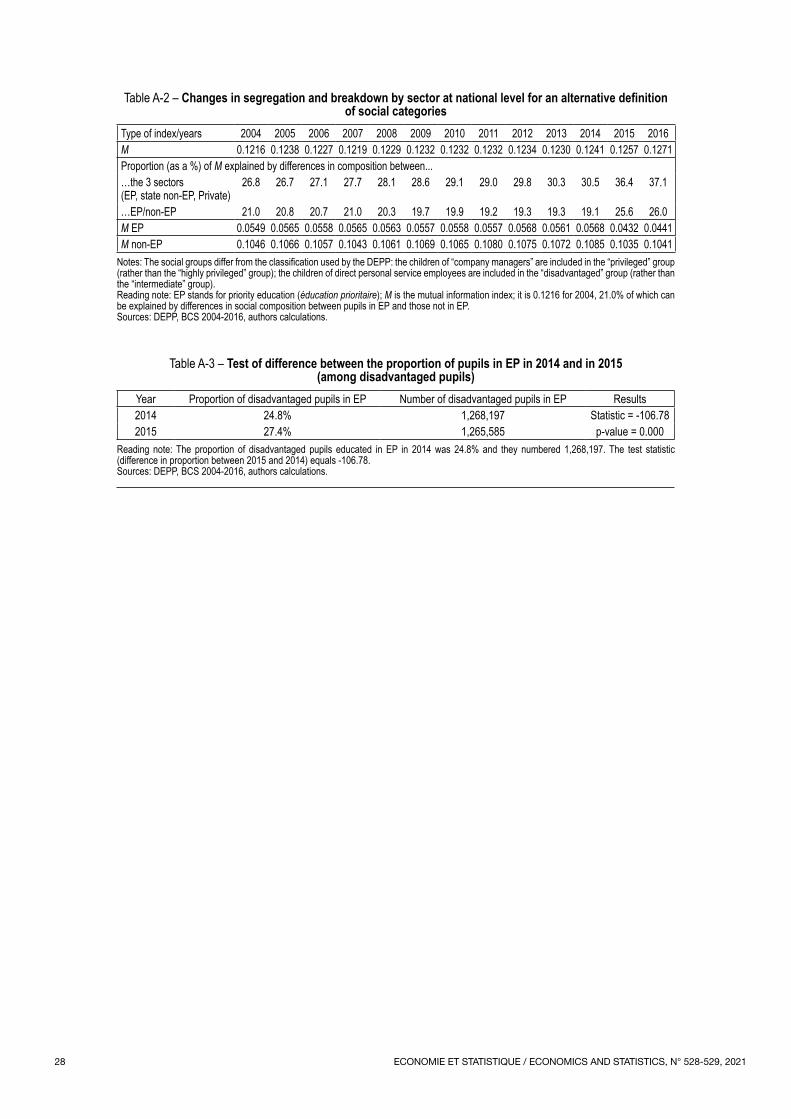
ECONOMIE ET STATISTIQUE / ECONOMICS AND STATISTICS, N° 528-529, 202128
Table A‑2 – Changes in segregation and breakdown by sector at national level for an alternative definition of social categories
Type of index/years 2004 2005 2006 2007 2008 2009 2010 2011 2012 2013 2014 2015 2016M 0.1216 0.1238 0.1227 0.1219 0.1229 0.1232 0.1232 0.1232 0.1234 0.1230 0.1241 0.1257 0.1271Proportion (as a %) of M explained by differences in composition between...…the 3 sectors (EP, state non‑EP, Private)
26.8 26.7 27.1 27.7 28.1 28.6 29.1 29.0 29.8 30.3 30.5 36.4 37.1
…EP/non‑EP 21.0 20.8 20.7 21.0 20.3 19.7 19.9 19.2 19.3 19.3 19.1 25.6 26.0M EP 0.0549 0.0565 0.0558 0.0565 0.0563 0.0557 0.0558 0.0557 0.0568 0.0561 0.0568 0.0432 0.0441M non‑EP 0.1046 0.1066 0.1057 0.1043 0.1061 0.1069 0.1065 0.1080 0.1075 0.1072 0.1085 0.1035 0.1041
Notes: The social groups differ from the classification used by the DEPP: the children of “company managers” are included in the “privileged” group (rather than the “highly privileged” group); the children of direct personal service employees are included in the “disadvantaged” group (rather than the “intermediate” group).Reading note: EP stands for priority education (éducation prioritaire); M is the mutual information index; it is 0.1216 for 2004, 21.0% of which can be explained by differences in social composition between pupils in EP and those not in EP.Sources: DEPP, BCS 2004‑2016, authors calculations.
Table A‑3 – Test of difference between the proportion of pupils in EP in 2014 and in 2015 (among disadvantaged pupils)
Year Proportion of disadvantaged pupils in EP Number of disadvantaged pupils in EP Results2014 24.8% 1,268,197 Statistic = ‑106.782015 27.4% 1,265,585 p‑value = 0.000
Reading note: The proportion of disadvantaged pupils educated in EP in 2014 was 24.8% and they numbered 1,268,197. The test statistic (difference in proportion between 2015 and 2014) equals ‑106.78.Sources: DEPP, BCS 2004‑2016, authors calculations.

29ECONOMIE ET STATISTIQUE / ECONOMICS AND STATISTICS N° 528‑529, 2021
What Makes a Good High School? Measuring School Effects beyond the Average
Pauline Givord* and Milena Suarez Castillo**
Abstract – Assessing the ability of schools to help their students to progress is a complex exercise, as it is difficult to distinguish between the effects brought about by the school itself and those resulting from the characteristics of the students they enrol. This article starts by describing the two main statistical models currently in use (Value‑Added models and Student Growth Percentile models) and discusses their advantages and limitations in the light of recent literature. It then proposes indicators to complement the traditional measures of the value‑added of schools, in particular by assessing whether the results achieved by the students of a high school are more or less dispersed than would be expected given the characteristics of its students. These indicators are useful for assessing the relevance of the information provided by the indicators on average effect of the schools. This method is applied using exhaustive data on baccalaureate grades from 2015.
JEL Classification: I20, C21, C50Keywords: quantile regression, school value‑added, student growth percentile
*INSEE‑LIEPP ([email protected]); **CREST‑INSEE (milena.suarez‑[email protected])We would like to thank Fabrice Murat, Cédric Afsa, Caroline Simonis‑Sueur and Fabienne Rosenwald for authorising access to the data, as well as Olivier Monso, Thierry Rocher, Franck Evain and Laetitia Evrard for hosting us at DEPP and for their advice. We would like to thank participants in INSEE’s seminars, in particular Marco Paccagnella, for their stimulating discussion of an earlier version of this article and two anonymous reviewers for their careful and accurate remarks which helped improve it. The authors remain solely responsible for any remaining errors or approximations.
Received in October 2020, accepted in May 2021. Translated from: “Qu’est‑ce qu’un bon lycée ? Mesurer les effets établissements, au‑delà de la moyenne”.The opinions and analyses presented in this article are those of the author(s) and do not necessarily reflect their institutions’ or Insee’s views.
Citation: Givord, P. & Suarez Castillo, M. (2021). What Makes a Good High School? Measuring School Effects beyond the Average. Economie et Statistique / Economics and Statistics, 528‑529, 29–45. doi: 10.24187/ecostat.2021.528d.2057

ECONOMIE ET STATISTIQUE / ECONOMICS AND STATISTICS N° 528-529, 202130
What makes a good high school? In recent decades, a large number of research
projects have focused on measuring the effect of schools on the success of students with a view to improving the information available, accompanying a growing demand and interest in evaluating this subject. In France, the eval‑uation of the education system has long been identified, and regularly reaffirmed, as key to improving the quality of the public education service, from the early thoughts on the need for a culture of evaluation (Thélot, 1994a; 1994b) to the creation, in 2019, of the Conseil d’évaluation de l’école (School Evaluation Council). In the case of high schools, this has resulted in particular in the regular publication of Indicateurs de Valeur Ajoutée des Lycées (Value‑Added indicators for high schools, or IVALs) by the Direction de l’évaluation, de la prospective et de la performance (DEPP, the statistical office of the Ministry of National Education). The IVALs provide a set of indica‑tors on the performance of French high schools in terms of the success of their students in the baccalaureate, but also with regard to their ability to support them right through to their final examination, taking account in particular of the profile of the students taught (see Box 1). In the United States, the evaluation of schools, primarily on the basis of quantitative criteria, dates back much further, to the development of a results‑based culture in the 1980s and the idea of handing the responsibility for the success of students to the schools themselves (with a view in particular to improving school selection). The most symbolic example of this development was the adoption of the “No Child Left Behind” federal law in the United States in 2001, which required states to subject all students to annual tests and offered strong incentives for schools to meet student success targets. In order to meet these objectives, the majority of states developed measurement tools for schools and even teachers.
Such assessments can serve at least two main purposes, which raise various measurement issues. The first, which underlies the devel‑opment of measures of this type in the United States, aims to provide the public authorities in charge of managing schools with instruments for assessing their effectiveness and efficiency. This could, for example, be a case of comparing the good results achieved by a high school (or, conversely, the disappointing results) with the practices and resources implemented. As pointed out by Raudenbush & Wilms (1995), for example, this objective is especially complex,
since schools have no control over some of the elements that can influence the success of their students, such as the impact that other students have on individual achievements. Such “peer effects” on success are complex and, above all, very difficult to measure (for a recent overview, see e.g. Monso et al., 2019). It is therefore generally impossible to distinguish between the elements of the measurement of the school’s effect on student success that are the result of the actions of the school and those that result from interactions between the students. However, measures of high school effects can be useful for fulfilling a second, more modest purpose, which is to provide families with an indication of the expected effect of attending one school over another, whether that effect is related to the school’s practices or the contex‑tual effects linked to the interactions with other students.
Even if we limit ourselves to this objective of providing information to families, it is difficult to identify relevant measurement tools. Firstly, because parents may have different criteria for what makes a good high school. Of course, for the majority of parents, a good school is one that is capable of providing their children with support right through to the baccalaureate, guar‑anteeing them a problem‑free education, while also ensuring that they are as well prepared as possible for the future. Nevertheless, the assessment of how well a school meets these objectives could vary depending on students. Some teenagers may thrive in schools that encourage competition and academic excel‑lence, while others may suffer if faced with an overly competitive atmosphere. Beyond pure academic performance, some parents may value the ability of teachers to instil a taste for learning and self‑confidence in their students, the quality of the atmosphere within the school or the assis‑tance provided to students in establishing their future direction and making it a reality.
Regardless of what defines a good high school, identifying a school that meets the criteria is even more complex. It would require to deter‑mine what a student’s education would have been like at a school other than the one they attended, which is difficult if not impossible. In general, parents have little to go on when judging a school. Past experiences of acquain‑tances or siblings and the baccalaureate pass rate are certainly useful information, but they only provide indirect information with regard to how a particular student will ultimately adapt to a high school. The success demonstrated by a high school is first and foremost a reflection of the
ECONOMIE ET STATISTIQUE / ECONOMICS AND STATISTICS N° 528-529, 2021 31
What Makes a Good High School? Measuring School Effects beyond the Average
characteristics of the students who are educated there, but not accounting for selection effects can give a distorted picture of the quality of schools and therefore provide information that is of little relevance for families. That is why indicators, such as those developed by the DEPP, take account of students’ starting levels.
The most frequently used indicators focus on average effects. However, such averages may mask disparities: the same average effect could be measured for a high school that helps all of its pupils to make a small amount of progress and another that helps a small minority of students to make significant progress. The degree to which the information provided by the indicator is relevant will vary, particularly for those parents who would use these measures to enrol their children in the high school offering the best education. This article therefore aims to enrich
the description of the high school effect by providing indicators that aim to characterise high schools based on their propensity to amplify or, conversely, reduce, inequalities in baccalaureate examination performance when compared with what is expected in view of the characteristics of the students.1 The remainder of the article starts by proposing a review of the extensive literature on high school effects measurement before going on to detail the approach used here for French high schools in the general and tech‑nological streams, based on the baccalaureate results achieved in 2015.
1. A full evaluation of a school, which would require information on the financial resources, exceeds the scope of this article, which seeks to mea‑sure the effect that a school has on improving the academic success of its students.
Box 1 – Value‑Added Indicators for High Schools (IVAL)
Since 1993, IVALs have been disseminated by the statistical office, now the DEPP, of the Ministry of National Education (for a detailed presentation, see Evain, 2020).While the methodology used for their construction has changed over time, their aim is to allow comparisons to be made between schools, taking account of the initial differences between the students that they educate. The “value‑added” of high schools is highlighted by comparing the expectations given the characteristics of their students (particularly in terms of their educational level and social background), as predicted by a model, and the student results actually observed within that school.To take account of the difficulty of evaluating the action of a school on the basis of a single indicator, several indicators are proposed. The first looks at the probability that a student enrolled at the school will pass the baccalaureate exam: this is the indicator that most directly resembles the rankings published by the media, but in this case it also takes account of the initial composition of the schools.This indicator of successfully passing the baccalaureate is supplemented by the probability of passing the exam having attended the school since year 11 or 12, the “access rate”. Analysis of the value‑added of the access rates makes it possible to avoid overvaluing schools with a “skimming” policy by means of which they select the best students as they progress through high school: these schools may have very good final examination results, but at the expense of the less promising students who find themselves being dropped. Conversely, increased value‑added for the access rate reflects the school’s ability to support its students throughout their schooling.(i)
Finally, since 2017, the value‑added has also been calculated for the probability of achieving a distinction in the exam. This makes it possible to better account for the disparities between the different levels at which the students find them‑selves, going beyond the mere fact of passing the exam. Indeed, the baccalaureate success rate has become fairly indistinguishable given the very high levels observed, particularly in the general and technological streams: in the 2019 baccalaureate session, the average pass rate was 91% for the general stream, 88% for the technological stream and 82% for the vocational stream. Looking at the probability of achieving a distinction (i.e. having obtained an average of at least 12/20 in the examination) makes it possible to draw finer distinctions between schools.In practice, value‑added is calculated on the basis of the logistic modelling of the probability of passing the examination, using random effects modelling to take account of the high school effects (for details, see Duclos & Murat, 2014 and Evrard & Evain, 2017). The model incorporates individual student variables: academic level, social position index,(ii) age and gender.(iii) The correlations observed between these individual characteristics are used to estimate the probability of students passing their examinations predicted by the model, which when aggregated at the high school level, allows for the calculation of an “expected” pass rate. The value‑added corresponds to the difference between the observed rate and the expected rate._________________(i) However, one limitation presented by the indicator measuring the access rate is that it does not allow distinguishing between moves made voluntarily by the students and specific practices implemented by the schools.(ii) This index is a synthetic measure of the social, economic, and cultural dimensions associated with school success, by parental occupation and social class (Rocher, 2016).(iii) In addition, the means of these variables are added to the model (see the discussion in Box 2), which allows to account for the fact that these estimates of individual variables may be biased if they are correlated with the unobserved characteristics of the high school.

ECONOMIE ET STATISTIQUE / ECONOMICS AND STATISTICS N° 528-529, 202132
1. Measuring the Effectiveness of a School or a Teacher: Methodological Issues and Challenges for Interpretation1.1. Selection Effects Make it Difficult to Measure the Effects of Individual Schools or Teachers
One of the key difficulties in measuring the ability of a school or a teacher to help their students to progress is the existence of significant selection effects (Felouzis, 2005). For example, a high school that selects its students on the basis of their academic record at entry (the classe de seconde, which is the first year at lycée – equiv‑alent to the 10th grade in the US, and year 11 in UK) will obviously have a very high pass rate for the baccalaureate. This does not mean that it can be credited with making any particular effort to help its students to progress. It also does not mean that any student who is educated in such a school would be guaranteed to achieve equally good results, regardless of their starting level. Generally speaking, schools do not educate the same students, and students do not have the same teachers within schools. The apparent success of some may simply reflect differences in the initial level of their students. These same questions arise if the aim is to measure “teacher effect” or, in other words, to assess the extent to which a teacher’s actions could influence their students’ outcomes, either positively or negatively. These are central issues within school systems that have institutionalised performance‑related pay, as is the case in certain US states. For this reason, a large body of literature has focused in particular on the issue of measuring teacher effects (see, for example, Chetty et al., 2014). Although the underlying factors determining the effect of schools or teachers are clearly different, both raise identical methodological issues from a statistical point of view.
In order to compare two teachers or two high schools, you would ideally want to compare their ability to help the same types of students to progress. Measuring the specific effect of a school would, in theory, require the ability to randomly assign students with identical profiles to high schools and classes; however, the feasibility of such an exercise is very limited for both practical and ethical reasons. Most models developed to measure the effect of schools aim to reduce the biases linked to the effects of different school or class compositions by controlling for the initial level of students. Two main types of models have been developed within this framework: Value‑Added models and Student Growth Percentile models.
1.1.1. Two Statistical Models: Value‑Added Models and Student Growth Percentile Models
In their simplest form, Value‑Added models (VAMs) assume that the variable of interest (e.g. the average baccalaureate examination results) depends on the results achieved previously by each student, a certain number of observable characteristics, such as their initial level or background, and an effect specific to the school. The latter is captured by introducing an indi‑cator that is common to all of the students at the school. This type of model is used by DEPP to measure the value‑added of high schools for a set of indicators, including in particular the prob‑ability of passing the baccalaureate or of earning a distinction, as well as the probability of a student who has completed their entire education within the school of passing the baccalaureate (cf. Box 1).
Student Growth Percentile (SGP) models were most notably developed by the US State of Colorado (Betebenner, 2007), followed by 18 other US states, while VAMs are used in 15 states, having been pioneered by Tennessee (see Kurtz, 2018 for a review). SGP models offer the advantage, for operational use, of being fairly simple to interpret. Their principle is based on the following question: how well did a student perform compared with students who had achieved comparable results in previous tests? Students are “ranked” according to their test results, with their position in this ranking being represented by the percentile in the grade distribution. For example, if a student performs better in an end‑of‑year test than 80% of students who were at a similar level to them at the start of the year, a positive effect of 80 is attributed to the high school for that student. The effectiveness of the school (or the teacher) will then correspond to the mean (or the median) of these effects, measured across all of the students enrolled at the school (or taught by the teacher). In prac‑tice, these estimates are derived from quantile regressions, which allow the distribution of test scores to be modelled conditionally based on the results of previous tests (see Box 2).
1.1.2. Statistical Limitations of the Two Models
The measurement of school effects and teacher effects has been the subject of intense method‑ological research. This level of interest can be explained by the high stakes that may be associ‑ated with these indicators. While the perceived quality of schools can be an important factor

ECONOMIE ET STATISTIQUE / ECONOMICS AND STATISTICS N° 528-529, 2021 33
What Makes a Good High School? Measuring School Effects beyond the Average
in the decision by parents as to which school they enrol their children in, the publication of “league tables” can contribute to widening the initial gaps – particularly as the parents who are better informed or who have the means to choose the school at which their children will be educated often have greater academic capital. More radically, these methods are sometimes used, for example in the United Kingdom and certain US states, to measure the “effectiveness” of schools or teachers, with consequences that can be significant for those being evaluated: financial incentives for teachers based on their performance or closure of schools – or dismissal of teachers – whose effectiveness is assessed as inadequate.2 Given the high stakes involved for those concerned, it is crucial that the instruments used are valid and relevant.3 However, the tools available attract criticism from several sides.
Firstly, the majority of contributions highlight the difficulty that these models face in over‑coming the limitations associated in particular with the absence of randomisation (for a summary, see, for example, Everson, 2016). In particular, the measurement of teacher effects or school effects is extremely sensitive to the variables used to control for composition effects. Failure of the models to take account of some of the characteristics of students that may influence their academic progress, such as their social background, significantly reduces the ability of these models to differentiate between effective teaching and teaching students from backgrounds that are more conducive to academic success. SGP models, which are used routinely, do not take account of these dimen‑sions and are often criticised for this (Guarino et al., 2015a). The various comparisons suggest that these indicators tend to penalise teachers dealing with students from disadvantaged social backgrounds or with special needs when compared with VAMs, which take these dimen‑sions into account (Walsh & Isenberg, 2015). Since the information that would be needed is not always available, this issue also arises for VAMs. The type of variables used to control for composition effects within this other model type can also affect the conclusions that can be drawn from it (Ehlert et al., 2014; Sass et al., 2014), as can the statistical specification used (Guarino et al., 2015b; Soland, 2016). In addi‑tion, as was discussed in the introduction, some of the effects that composition has on success stem from the interactions between pupils, which are especially difficult to measure (for an example of a measurement of this in French high schools, see Boutchenik & Maillard, 2019),
and the respective effect of which is generally impossible to separate from the school effect.
More generally, certain authors are highly sceptical of the possibility of reducing selection biases, which are linked in particular to the fact that the characteristics of the students and the teachers that educate them are not independent of one another (Rothstein, 2010; Sass et al., 2014), although others have more confidence in the possibility of relying on factors such as the mobility of teachers between schools and between classes to evaluate these effects (Chetty et al., 2014; Koedel et al., 2015). In addition, the effects measured by these models can be very imprecise, especially since they are estimated on the basis of a small number of observations. A recent study observed, for example, that these models can be used to identify pseudo teacher effects on elements such as the height of their students, a characteristic that is not likely to be altered by teaching practices (Bitler et al., 2019). The authors demonstrate that this para‑doxical finding can be explained by the small sample sizes from which the estimates were derived, which leads to factors being incorrectly attributed to the teacher that are nothing more than statistical “noise”. Although this effect disappears when the observations used are gathered over several years, this solution is not always used when assessing, for example, the value‑added of teachers.
1.2. Back to the Question: Can What Makes a Good High School be Measured?
Looking beyond these methodological issues, the use of instruments of this type to evaluate teachers has also been criticised for the fact that it tends to focus on what we know how to measure best (student success in academic tests) to the detriment of more fundamental competencies, such as the ability of teachers to instil self‑ confidence, the desire to learn or critical thinking in their students, dimensions that only partially overlap with cognitive competencies. For example, an American study randomly assigned students to classes as part of a randomised study aimed at comparing teacher effects on standardised test scores with those obtained via
2. One of these was the No Child Left Behind act mentioned in the intro‑duction, which required all public schools to demonstrate “adequate annual progress” in the performance of their students, as measured by yearly tests, with a set of sanctions and incentives in the event that this was not achie‑ved. Repeated failure to meet these targets for six consecutive years would lead to the establishment of a plan for the complete restructuring of the school, which could go as far as its closure, the dismissal of all of its staff or its conversion into a charter school (see Gamoran, 2012 for an explana‑tion). This law was repealed in 2015.3. For an example of a critique of these practices, particularly in view of the inherent limitations of the underlying measurement, see Jacob (2005).

ECONOMIE ET STATISTIQUE / ECONOMICS AND STATISTICS N° 528-529, 202134
open‑ended questions, or on the effort put in by students and their motivation. It found that the correlation between these various dimensions is very weak (Kraft, 2019). Another study also demonstrated that the effect that teachers have on the success of their students during tests shows very little correlation with the effect that they have on the behaviour of those students (for example, absenteeism or having to repeat a year), even though these are the dimensions that are better suited to predicting the future success of students (Jackson, 2018).
In addition, since there are high stakes associ‑ated with the assessments – which is the case in particular where they are linked to financial schemes (performance bonuses) for teachers, or simply to the reputation of a school, which is of importance for the quality of the students it will educate in the future – they can induce strategic behaviour on the part of the people concerned, which can have the opposite effect to that intended (for a recent contribution, see Fryer, 2013 and for a review, see Jacob, 2005). In particular, there are frequent attempts to manipu‑late the indicators. This could involve devoting a disproportionate amount of teaching time to preparing students for the tests (the “teaching to the test” phenomenon, see Wall, 2000). SGP models are a priori less likely to bring about such cramming phenomena (Barlevy & Neal, 2002), since the measurement of the school or teacher effect is based on a relative metric (the progress made by students when compared with those with the same initial level), whereas value‑added models require the use of standardised tests, the format and content of which are subject to little variation, to allow reliable and fair compari‑sons to be made over time. Nevertheless, the sensitivity of these two models to student charac‑teristics other than their initial level could compel the schools or the teachers being evaluated by this measure to take steps to minimise risk. For example, schools can select the most promising students or exclude those who are not achieving adequate results. When they have a choice in where they are assigned, teachers tend to avoid schools with the highest proportions of disadvan‑taged students (Walsh & Isenberg, 2015), which means that it is often the teachers who have no choice in this regard (often the least qualified or the most inexperienced) who find themselves teaching the students with the greatest needs.
2. Measuring the Dispersion beyond the AverageEven when considering only academic perfor‑mance indicators, the quality of the schools can
be questioned beyond the traditionally measured average effects. An apparent similarity between two average effects could mask very different realities: the same positive average effect could result from the actions of a school in which all of the students are making progress or one in which only a minority of the students are performing extremely well, while the rest are performing much more poorly than expected in view of their characteristics.
This article therefore aims to enrich the descrip‑tion that can be made using traditional means of measuring high school effect by providing indicators that look beyond the average. The aim here is not only to measure the effect of high schools on the average distribution of grades, but also to assess the extent to which a high school tends to have more dispersed or homogeneous baccalaureate results when compared with identical high schools that are similar in terms of the characteristics of the students enrolled. The intuition is illustrated in Figure I, based on a fictitious example representing the theoretical densities of grades, i.e. as expected based on student characteristics, and taking account of the effect of the high school, in three separate cases. The first (Figure I‑A) shows a situation in which the high school effect is the same for all students: when compared with the expected distribution of grades, the observed distribution in this school shifts slightly to the right if the effect is positive and slightly to the left if it is negative, but the shape remains unchanged. The second case (Figure I‑B) represents the opposite situation, i.e. one in which the high school has a very different effect depending on its students: the weakest students obtain lower grades than expected and the strongest students achieve higher grades than expected. In this fictitious case, the effect is completely symmetrical and there is therefore no impact on average grades (the estimated average effect will be zero); however, the dispersion of the grades observed is much wider. Finally, the third case (Figure I‑C) is a combination of the two previous figures: the effect of the high school is positive on average and also tends to increase the dispersion of the grades.
The intention here is to model the effect of the high school at various levels of the distri‑bution of grades within the high school. This is done using a statistical technique known as quantile regression, which is explained in Box 2. Modelling in this way allows us to look beyond this fictitious case, which assumes that the effects are perfectly symmetrical (greater success at the top end of the distribution is “paid

ECONOMIE ET STATISTIQUE / ECONOMICS AND STATISTICS N° 528-529, 2021 35
What Makes a Good High School? Measuring School Effects beyond the Average
The statistical method used here is therefore a hybrid model combining elements of the SGP and VA models. Like the former, it is based on the modelling of the high school effect on the distribution of grades on the basis of quantile regressions, but, like the latter, it takes account of all of the observable characteristics of the students, in particular their initial level and their social background, with a view to trying to reduce selection bias to the greatest possible extent.
In order to estimate the effects specific to each high school, beyond the effects linked to their initial composition, indicators are introduced into the model for each high school, with a standardisation condition. This method, which is traditionally referred to as “fixed effects models” in the econometric literature, offers the advantage of requiring very few assumptions with regard, on the one hand, to the distribution of these fixed effects (they can differ greatly across high schools, without any particular form being specified for these differences) and, on the other hand, to the possible links between these high school effects and the characteristics of the students on whom we wish to measure the effects. More precisely, it is possible to establish an unbiased estimate of the effects that the char‑acteristics of the students have on baccalaureate results, even if the distribution of students within the high schools is based on a combination of these characteristics (e.g. their academic level) and the unobserved characteristics of the high schools. One of the risks posed by this type of model is that the effects can be poorly estimated in schools that only have a small number of students:4 this is why the analysis is limited here to high schools with an “adequate” number of students (at least 65 in the general stream and 25 in the technological stream, with these thresh‑olds having been selected by striking a balance between not excessively limiting the sample – and its representativeness – and reducing the risk of obtaining biased estimators).
It should be noted that the high school fixed effects “capture” all of the characteristics of high schools: it is therefore impossible to provide an estimate for a single characteristic (such as the seniority of the teachers or the average level of the other students). Moreover, the effect of these variables is generally very difficult to estimate
4. This problem is especially crucial when modelling non‑continuous variables (for example where the variable of interest is passing the bac‑calaureate rather than the average grade for the baccalaureate), since the poor approximation of fixed effects “contaminates” the estimation of the coefficients that correspond to the individual characteristics of the students.
Figure I – Illustration of the effects of a high school on the dispersion and the mean distribution
of grades (scale transposition model)
A – Simple translation
B – Simple deformation
−4 −2 0 2 4
0.00.1
0.20.3
0.40.5
α(τ = 0.2)*< 0 α(τ = 0.8)*> 0α(τ = 0.5)*= 0
τ=0.2
C – Location scale
−5 0 5 10
0.00.1
0.20.3
0.40.5
τ=0.2
α2(τ = 0.2)∗ < α2(τ = 0.2)∗
All studentsStudents of the high school
0.0
0.1
0.2
0.3
0.4
0.5
−5 0 5 10
α(τ = 0.5)*> 0
for” by lesser success at the bottom end of the distribution): indeed, we will model the top and bottom ends of the distribution of grades within the high school separately, without assuming that the effects are symmetrical. Comparing the effects at the top and bottom ends of the distribution also makes it possible to estimate the extent to which certain schools are able to amplify or reduce the dispersion of the grades achieved by their students when compared with what is expected given their characteristics. The aim is therefore to observe whether certain high schools are able to achieve more homogeneous results or, conversely, more unequal results, than high schools in which the initial charac‑teristics of the students (including in terms of their educational level upon completing middle school) are similar.

ECONOMIE ET STATISTIQUE / ECONOMICS AND STATISTICS N° 528-529, 202136
when there are selection effects at play (for example, where the most experienced teachers are more likely to be assigned to the high schools that have the most privileged students, or where the students tend to be grouped by level). So‑called “random effects” models, which require the use of a specific distribution (generally normal distribution) to model the effects specific to the schools, make it possible to also estimate coefficients for the variables at the level of the high schools at the same time, together with the effects for each high school (this is the model used by Page et al., 2017, for example). However, where there is a link between the characteristics of the students and the high school effects, the estimated coefficients are likely to be biased (for a general discussion of these types of model in the context of the
data used here, see Givord & Guillerm, 2016, for example).5 This is why fixed‑effect models are preferred in this case.
Quantile regressions are used to estimate the fixed effects at the high school level for the weakest students (this level is defined here as the first quintile of the distribution of grades
5. It is possible to demonstrate that unbiased coefficients can be obtai‑ned for the effects brought about by the individual characteristics of the students, provided that the averages of these characteristics, aggregated at the level of the high school, are added into the model (this is known as the “Mundlak regression”). However, this correction does not allow for the correction of possible bias in the variables estimated at the level of the high schools. Therefore, adding the average level of all students in a high school to the score achieved by an individual student allows for an unbiased esti‑mate of the effect that the level of an individual has on success; however, the coefficient obtained for the average cannot be causally interpreted as the effect that the level of these peers has on a student’s level (see Castellano et al., 2014).
Box 2 – Quantile Regression and the Measurement of High School Effects
Quantile regression is a statistical method of linear regression used to describe how a variable of interest varies on the basis of co‑variates (for a detailed description, see, for example, D’Haultfoeuille & Givord, 2014). While standard linear regression models how the mean of the variable of interest varies on the basis of observable variables, quantile regression consists of modelling the quantile of that variable conditional on its observables, with both methods being reliant on a linear approximation. For the quantile q Xτ ( ) of order τ (between 0 and 1) of the distribution of the variable of interest Y conditional on co‑variates X, the following assumption is therefore made:
q X Xτ τβ( ) =
where βτ is the coefficient to be estimated.It is therefore possible, on the basis of multiple quantile regressions, to enrich the description of how one variable is dependent on another by modelling the effect of the co‑variates for several percentiles – for example, the first decile, the median and the last decile.In practice, it has been demonstrated that this coefficient can be obtained without bias by the linear program:
β ρ βτ β τ τ= −( )( )argmin E Y X
where the function ρτ .( ) is defined by ρ ττ u uu( ) = −( )<1 0 .The coefficient β τj for a variable Xj reflects the way in which the quantile of order τ of the variable of interest varies on the basis of a variation in the variable Xj. If Xj is a continuous variable, the coefficient β τj is interpreted as the manner in which the quantile varies as a result of a marginal variation of Xj.In some cases, a linear approximation may be an oversimplified form of the real relationship between the variable of interest and the variables that are observable based on the data and, as with a linear regression, it is possible to use a more complex form, either by means of a transformation (e.g. the logarithm of the variable under consideration), or by a polynomial form in the variable Xj. For the data in this case, it appeared more appropriate to use a quadratic form to approximate the relationship between baccalaureate grades and the grades obtained in the junior secondary education certificate (Diplôme National du Brevet, DNB). In practice, this means that, in order to interpret the effect of the DNB grade on the distribution of baccalaureate grades, account must be taken of the two coefficients that correspond to the average baccalaureate grade β τB and its square, respectively β
τB2 . For example, for τ = 0 80. , the last quintile for students who passed their DNB with grade N (the level obtained by no more than 20% of students with this initial level) is β βτ τB B N+ ∗ +( )2 2 1 lower than the quintile of the distribution of baccalaureate grades for students who obtained grade N+1 in the DNB. In the case of this variable, both coefficients are positive for the three quantiles observed. This takes account of the fact that a high DNB grade is a predictor of good baccalaureate results, but also means that those students who performed very well in their DNB can make an even greater difference with the baccalaureate.It is also possible to compare the effects of the same variable across the various different quantiles. The fact that a variable X has a greater effect on a low grade distribution quantile than on a high grade distribution quantile can be interpreted in terms of the dispersion of the baccalaureate grades. For example, the fact that the coefficient of the indi‑cator that indicates that a student is female is higher for the first quintile than for the last quintile means that girls achieve better results, but with grades that are less dispersed than those of their male counterparts.It is this type of comparison that is used to interpret the high school effects.

ECONOMIE ET STATISTIQUE / ECONOMICS AND STATISTICS N° 528-529, 2021 37
What Makes a Good High School? Measuring School Effects beyond the Average
within the high school, i.e. such that only 20% of students obtain poorer results) and for the strongest students (defined here as the last quintile, i.e. the level at which just 20% of students have a higher level), once account has been taken of their composition, particularly in terms of the initial academic level and the social background of the students.
3. An Application Based on the 2015 Baccalaureate Results
3.1. The Data
We draw upon the comprehensive database of the results of the 2015 national baccalaureate examination. This database provides all of the grades obtained in the various tests, but in this case we use the average grades for the various subjects (weighted by their coefficients in the chosen series), obtained the first time the exam‑ination was sat.6 These results are supplemented by the anonymised files for studies and research (FAERE), which are produced and made avail‑able by DEPP. This database, which has been compiled for research purposes on the basis of administrative files that monitor students’ educa‑tion, contains personal information, such as the gender and age of the student, the socio‑profes‑sional category of their parents, and the schools attended. It also contains the individual results for the junior secondary education certificate (Diplôme National du Brevet, DNB), which provide an indicator for the academic level of the student upon starting high school.
Table 1 illustrates the strong compositional effects that the model aims to take into account. It shows the average characteristics of the schools, estimated for three separate groups of schools defined using the average baccalaureate grades obtained by their students. They distin‑guish between the 20% of high schools with the poorest examination results (352 general high schools and 310 technological high schools), the 20% of high schools with the best examination results and a third group made up of the high schools that fall between these two extremes (1,055 general high schools and 929 technolog‑ical high schools). By design, this ranking is based on the average grades observed for each school: therefore, while the average grade for all general high schools is 12.2/20, it is just 10.5 for the group of schools with the poorest grades, 12.2 for the middle group and 13.8 for the high schools in the final group. The first observation is that, on average, the vast majority of high schools reproduce the level of their students upon leaving middle school, particularly in the
general stream. The average DNB grade for high school students taking the technological bacca‑laureate was lower, but this same “gradient” is also found in the other direction: the high schools returning the best baccalaureate results are also those that are most likely to educate the students who performed best upon leaving middle school. These differences in performance can also be linked to the socio‑economic level of the students, which is one of the most important factors in determining academic success, and the hierarchy of which can be found here. In addition, the high schools that educate the best students on average also have more homoge‑neous students from a social and academic point of view, as can be seen from the reduced variance in these two indicators for this group of high schools. This means in particular that these high schools are less likely to enrol disadvantaged students, which can be seen from the number of pupils who repeated at least one year during their schooling (referred to as “repeaters” in Table 1 and below). In the general stream, only 3% of the students enrolled in the “best” high schools are repeaters, compared with 11% in the high schools showing the poorest performance.
The estimation of the fixed effects for each high school makes it possible to assess the effects attributable to the schools in the success of their students above and beyond these composition effects. These estimations are made separately for the general and technological streams. In order to reduce the variance in the estimators obtained, the sample is restricted to the schools that had at least 65 students enrolled in 2015 for the general stream and 25 students for the technological stream. These thresholds were selected to retain 95% of students in the two streams and are the result of a compromise. On the one hand, it is a question of keeping enough students per high school to ensure that the pupils who could have highly atypical profiles do not carry too much weight when estimating high school effects. On the other hand, it is important that the overall sample of students remains large enough to not reduce the ability to generalise the results, which could be the case, for example,
6. The grades for the first session of the examination correspond to the grades after the harmonisation sessions on marking, but before the catch‑up tests. These tests are offered to students whose average score was between 8 and 10, to provide them with an opportunity to repeat an oral examination for certain tests and ultimately increase their average to above 10, which is the score required in order to pass the DNB. For this reason, the distribution of grades after the second session is highly irregular (Givord & Suarez Castillo, 2019), with a significant accumulation point just above 10/20 (this is also the case, but to a lesser extent, for the grades for the first session of the examination) and a mass deficit between 8 and 10. In addition, using the grade from the second session means comparing students’ results on two very different scales, since the grades also relate to tests that are not identical for all students.

ECONOMIE ET STATISTIQUE / ECONOMICS AND STATISTICS N° 528-529, 202138
if the students enrolled in “large” high schools differ from those in smaller high schools. Details of how these grades are used can be found in Givord & Suarez Castillo (2019). Individual baccalaureate results are regressed on the basis of the observable individual characteristics of the students: whether they are male or female, their social background,7 whether they repeated a year during the course of their schooling and results of their final DNB examinations (with a quad‑ratic specification), along with a fixed effect for all students at the same high school. The effect of these variables is estimated at three levels of the baccalaureate grade distribution – first and last quintiles and median. The estimates relate to general and technological high schools, with the two streams being separated. Effects specific to each series (three in the general stream, eight in the technological stream) are also added. They make it possible to take account of the fact that marking practices differ between the various disciplines, the weighting for which differs from one series to the next.
3.2. The DNB Score is the Variable that Best Correlates with Baccalaureate Results
The correlations between the estimated variables and other variables are in line with the results obtained by more conventional means (Table 2). As has already been pointed out by Evain & Evrard (2017) in connection with similar data, there appears to be a high correlation between
average baccalaureate grades and average DNB scores. The estimates made here suggest that this dependence is observed at all levels of the distribution, and also that this dependence is non‑linear: the quadratic term is positive for the three deciles studied (cf. Box 2). This result can be explained by the fact that the vast majority of very good students generally have very good results upon completing middle school, whereas students with poorer DNB grades can have more variable results.
As regards the impact of repeating a year, the conditional distribution of the baccalaureate results of students who have repeated a year is significantly lower than that of non‑repeaters, with the gap being wider at the bottom end of the distribution. Girls generally achieve better results than boys, and their results are also less dispersed, as illustrated by the fact that the “girl” effect is greater at the bottom end than at the top end of the distribution. Unlike the other explanatory variables studied here, the social background (captured by the indicator that looks at the social background of the parents) has an almost identical effect at the three levels of the distribution of baccalaureate grades studied here. Moreover, this is also the only variable in the model for which the correlation with baccalau‑reate grades is very significantly reduced when high school‑specific fixed effects are introduced,
7. As captured by DEPP’s Social Position Index (cf. Box 1).
Table 1 – Initial characteristics of high schools by average baccalaureate performance groupsGeneral Stream Technological Stream
Total Lowest 20%
Median group ]20,80[
Highest 20% Total Lowest
20%
Median group ]20,80[
Highest 20%
Number of high schools 1,759 352 1,055 352 1,549 310 929 310Average baccalaureate grades (1st session) 12.3 10.9 12.2 13.7 11.6 10.5 11.6 12.7
Average DNB grades 12.3 11.2 12.3 13.3 9.7 8.9 9.8 10.5Average Social Position Index(a) 120.7 107.9 120.6 133.6 105.3 95.9 105.5 114.0
Variance in baccalaureate grades (1st session) 6.4 6.6 6.6 5.6 4.4 5.4 4.3 3.8
Variance in DNB grades 4.3 4.7 4.4 3.6 3.1 3.4 3.1 3.0Variance in the social posi‑tion index 1,048.7 1,144.6 1,085.6 842.1 975.0 975.1 981.1 956.5
Proportion of students repea‑ting a year (%) 6 11 5 3 18 24 17 14
Proportion of private high schools (%) 26 3 19 70 20 6 16 45
(a) see Box 1.Notes: The high schools are grouped by stream (general and technological) according to the average grades obtained by their students during the first session of the baccalaureate.Sources: MENJ‑DEPP, anonymised files for studies and research (FAERE).

ECONOMIE ET STATISTIQUE / ECONOMICS AND STATISTICS N° 528-529, 2021 39
What Makes a Good High School? Measuring School Effects beyond the Average
The dispersion of these high school fixed effects is slightly higher in the technological stream than in the general stream (Figure II). This can be at least partly explained by the fact that, for technological high schools, the fixed effects are sometimes estimated on the basis of fewer students, and are therefore less precise. In both streams, it is also possible to observe that the dispersion is slightly greater for the effects of high schools at the bottom end of the distribution (at the level of the first quintile) than at the top (at the level of the last quintile), with extreme values that are far removed from the mean.
Figure III illustrates a case involving two high schools. It represents, for each school, the relationship estimated by quantile regressions between average baccalaureate grades and DNB grades (each observation relates to one student)
8. There are 3 series in the general stream (and baccalaureate): S for ‘scientific’, L for ‘literature’ and ES for ‘economic‑social’.9. This finding suggests that it could be useful to look at the interaction of each individual variable for each series to take account of the differences in testing in each series, and to introduce differentiated expectations for each series according to the characteristics of the students. This option has not been used here, since it greatly increases the number of coefficients that need to be estimated, even though the number of students per series in each high school can be small, bringing with it a risk that the models will be “over‑adjusted”, which also has consequences for the estimation of the high school fixed effects. It would be prudent to estimate this type of model on the basis of several consecutive years (which was not possible with the data available for this study).
as suggested by the comparison with estimates that do not include these fixed effects (see Givord & Suarez Castillo, 2019). This statistical effect highlights the significant differences in social intake from one high school to the next.
Finally, large gaps can be seen in the distribu‑tion of grades between streams. These gaps can be explained by differences in grading for the dominant subjects in each stream, as well as by compositional effects. It can therefore be observed that students in the S series8 obtain lower average baccalaureate grades than those observed for the two other series in the general stream, once account has been taken of the initial level of the students and their other individual characteristics.9
3.3. Widely Dispersed School Effects
The fixed effects specific to the high school also make it possible to capture the school effects. However, it is necessary to set an identifica‑tion constraint – within a linear model, it is not possible to estimate the constant and the coefficients separately for all high schools. By convention, the average coefficient for the high schools must be set to zero, which means that for each high school, the estimated fixed effect corre‑sponds to a deviation by this high school from the average effect observed for all high schools.
Table 2 – Impact of explanatory variables on the distribution of average baccalaureate grades (with high school fixed effects)
Q20 Q50 Q80Coeff. Std‑E Coeff. Std‑E Coeff. Std‑E
General stream (N=318,222)Mean DNB grade (level) 0.593*** (0.002) 0.632*** (0.002) 0.646*** (0.002)Mean DNB grade (square) 0.107*** (0.001) 0.105*** (0.001) 0.082*** (0.001)Social position index 0.079*** (0.002) 0.079*** (0.002) 0.079*** (0.002)Repeater (ref.: non‑repeater) ‑0.271*** (0.008) ‑0.245*** (0.007) ‑0.193*** (0.008)Girl (ref.: boy) 0.08*** (0.004) 0.052*** (0.003) 0.032*** (0.004)L series (ref.: ES) 0.074*** (0.005) 0.086*** (0.005) 0.088*** (0.006)S series ‑0.194*** (0.004) ‑0.172*** (0.004) ‑0.147*** (0.004)Technological streama (N=122,286)Mean DNB grade (level) 0.358*** (0.004) 0.392*** (0.003) 0.408*** (0.004)Mean DNB grade (square) 0.018*** (0.002) 0.025*** (0.002) 0.034*** (0.002)Social position index 0.034*** (0.004) 0.027*** (0.003) 0.027*** (0.004)Repeater (ref.: non‑repeater) ‑0.285*** (0.010) ‑0.258*** (0.007) ‑0.228*** (0.008)Girl (ref.: boy) 0.241*** (0.007) 0.211*** (0.007) 0.189*** (0.008)ST2S (ref.: STMG) ‑0.155*** (0.011) ‑0.168*** (0.010) ‑0.165*** (0.013)STD2A 0.002 (0.036) 0.012 (0.027) 0.056** (0.032)STI2D 0.010 (0.014) 0.067*** (0.010) 0.168*** (0.013)STL 0.140*** (0.020) 0.207*** (0.015) 0.261*** (0.020)HOT ‑0.360*** (0.054) ‑0.397*** (0.040) ‑0.456*** (0.049)
a The series of the technological stream, as of 2015, are related to management (STMG), health and welfare (ST2S), laboratory (STL), manufac‑turing (STI2D), design and applied arts (STD2A), hostelry (HOT).Notes: Effects of explanatory variables on the results of baccalaureate grades (average of all grades) obtained by quantile regressions for the first quintile (Q20), the median and the last quintile (Q80). Standard errors in brackets: *** significant at 1%;** significant at 5%.Sources: MENJ‑DEPP, FAERE files.
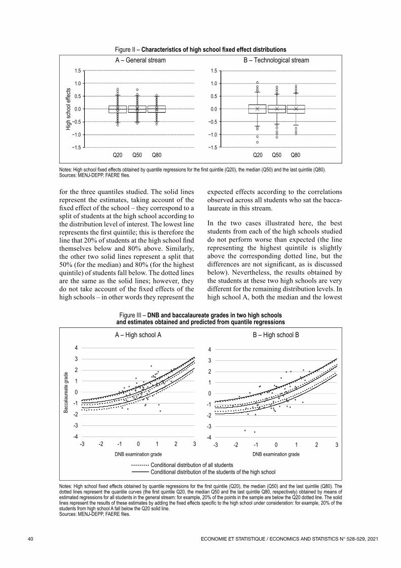
ECONOMIE ET STATISTIQUE / ECONOMICS AND STATISTICS N° 528-529, 202140
for the three quantiles studied. The solid lines represent the estimates, taking account of the fixed effect of the school – they correspond to a split of students at the high school according to the distribution level of interest. The lowest line represents the first quintile; this is therefore the line that 20% of students at the high school find themselves below and 80% above. Similarly, the other two solid lines represent a split that 50% (for the median) and 80% (for the highest quintile) of students fall below. The dotted lines are the same as the solid lines; however, they do not take account of the fixed effects of the high schools – in other words they represent the
expected effects according to the correlations observed across all students who sat the bacca‑laureate in this stream.
In the two cases illustrated here, the best students from each of the high schools studied do not perform worse than expected (the line representing the highest quintile is slightly above the corresponding dotted line, but the differences are not significant, as is discussed below). Nevertheless, the results obtained by the students at these two high schools are very different for the remaining distribution levels. In high school A, both the median and the lowest
Figure II – Characteristics of high school fixed effect distributions
High
scho
ol eff
ects
Q20 Q50 Q80 Q20 Q50 Q80
A – General stream B – Technological stream
−1.0
−0.5
0.0
0.5
1.0
1.5
−1.5
−1.0
−0.5
0.0
0.5
1.0
1.5
−1.5
Notes: High school fixed effects obtained by quantile regressions for the first quintile (Q20), the median (Q50) and the last quintile (Q80).Sources: MENJ‑DEPP, FAERE files.
Figure III – DNB and baccalaureate grades in two high schools and estimates obtained and predicted from quantile regressions
A – High school A B – High school B
Conditional distribution of all studentsConditional distribution of the students of the high school
-4
-3
-2
-1
0
1
2
3
4
-3 -2 -1 0 1 2 3-4
-3
-2
-1
0
1
2
3
4
-3 -2 -1 0 1 2 3
Bacc
alaur
eate
grad
e
DNB examination grade DNB examination grade
Notes: High school fixed effects obtained by quantile regressions for the first quintile (Q20), the median (Q50) and the last quintile (Q80). The dotted lines represent the quantile curves (the first quintile Q20, the median Q50 and the last quintile Q80, respectively) obtained by means of estimated regressions for all students in the general stream: for example, 20% of the points in the sample are below the Q20 dotted line. The solid lines represent the results of these estimates by adding the fixed effects specific to the high school under consideration: for example, 20% of the students from high school A fall below the Q20 solid line.Sources: MENJ‑DEPP, FAERE files.

ECONOMIE ET STATISTIQUE / ECONOMICS AND STATISTICS N° 528-529, 2021 41
What Makes a Good High School? Measuring School Effects beyond the Average
quintile are significantly higher, which means that at least 80% of students at this high school have performed better than expected; this shows that the high school achieved above‑average results without this being to the detriment of certain students. Conversely, high school B succeeded in making its top 20% of students perform slightly better than expected, but the weakest 20% did significantly worse than expected. Unlike the previous example, not only does this high school have poorer results at the median level, it also tends to magnify the perfor‑mance gaps when compared with expectations.
These stylised facts are summarised in Figure IV, which shows the estimated fixed effects for the first quintile, the median and the last quintile in the two high schools. For high school A, all of the coefficients are positive, although the coefficient corresponding to the last quintile is not significant. In high school B, only the coefficient corresponding to the last quintile is positive (but not significant), while the others are negative. The effects show a downward trend for high school A, which also means that the gaps are smaller than expected at this high school, whereas they show an upward trend in high school B, which means that the gaps there are larger than expected.
This analysis can be performed in a more systematic manner: more precisely, it is possible to compare the specific effect for each high school as estimated by the model at the level of the last and first quintiles of the distribution of conditional grades. It is therefore possible to test whether the difference is significantly positive, which would indicate that the high school in question tends to increase performance inequalities among its students, or, conversely,
significantly negative, which would indicate that it tends to reduce it. However, these tests must take account of the fact that the repeated use of statistical tests (across all high schools) may lead to an overly frequent acceptance of significantly non‑zero differences (see Givord & Suarez Castillo, 2019 for an in‑depth discus‑sion). While, for the majority of high schools, the gap does not statistically differ from zero, 8.2% of general high schools and 6% of tech‑nological high schools tend to significantly increase performance gaps among their students, while, conversely, 8.5% of general high schools and 7.6% of technological high schools tend to reduce them.
However, reducing the dispersion of the results achieved by students is not an objective in itself. It is not desirable if it will trigger a race to the bottom, i.e. where less unequal results are achieved among students to the detriment of requirements. The case of high school A illus‑trates that it is possible to observe both improved performance and reduced inequality. To assess whether this phenomenon can be observed more generally, it is possible to compare the effect of each high school at the median level (which corresponds to an approximation of its average value‑added) with the gap between the own effects measured at the first and last quintile, respectively, which corresponds to a measure of the effect of the high school on the dispersion of grades.
This relationship is illustrated separately for the general and technological streams in Figure V. Each point in this figure represents a high school. The x‑axis represents the estimated effect of the high school on the median: a positive value means that the high school tends to improve
Figure IV – Estimates of the fixed effects in two high schools at three levels of the grade distribution
A – High school A B – High school B
-1.0-0.8-0.6-0.4-0.20.00.20.40.60.81.0
Q20 Q50 Q80
Fixed
effec
t
Quantile
-1.0-0.8-0.6-0.4-0.20.00.20.40.60.81.0
Q20 Q50 Q80Quantile
Coefficients of high school effects by quantile regressions. The dotted lines correspond to the 95% confidence intervals.Sources: MENJ‑DEPP, FAERE files.

ECONOMIE ET STATISTIQUE / ECONOMICS AND STATISTICS N° 528-529, 202142
the performance of at least half of its students, while, conversely, a negative value means that it tends to worsen the performance of the majority of students. The y‑axis represents the difference between the estimated coefficients for the last and first quintiles. A positive value is associated with more dispersed results than expected at this high school, which means that the high school tends to increase performance inequalities at a given initial composition, and a negative value signifies that the high school tends to reduce performance inequalities among these students.
The first lesson to be learned from this illus‑tration is that high school A is not an isolated case. Across the high schools observed, there was a negative correlation between an increase in performance and an increase in performance inequalities. Numerous high schools are there‑fore able to help their students to succeed without sacrificing the weakest. However, the slope is steeper in the general stream than in the technological stream. Moreover, this rela‑tionship between efficiency and equality is far from deterministic. While “egalitarian” high schools, i.e. those that succeed in reducing the gaps in performance between their students, are more often equally successful, in the sense that they are able to increase average perfor‑mance, the majority of students in other high
schools perform worse than expected. Likewise, while “inegalitarian” high schools (i.e. where the dispersion of results among the students is greater than expected) are more likely to perform worse than average, some of them are also ranked among those that succeed in improving the performance of their students.
* * *
The evaluation of schools has become a central issue in the public debate. As discussed in the literature review, this issue is further compli‑cated by the fact that the quality of a school is inevitably multidimensional and cannot be judged on a single indicator: this is why the IVALs produced by DEPP look at a number of dimensions (not just success in the baccalaureate, but also retention rates, which are understood as the ability of high schools to support their students throughout their schooling). This article further enriches this description by illustrating the extent to which the indicators that focus purely on the average are as good at reflecting the ability of a school to help all of its students to progress as they are at reflecting a situation in which the focus is on just some of the students.
Figure V – Effects of high schools on the dispersion and the median (general and technological streams)
High school effect at the medianNon-significant Dispersion significantly negative
-0.8
-0.6
-0.4
-0.2
0.0
0.2
0.4
0.6
0.8
1.0
-0.8 -0.3 0.2 0.7
-0.8
-0.6
-0.4
-0.2
0.0
0.2
0.4
0.6
0.8
1.0
-1.2 -0.7 -0.2 0.3 0.8
High school effect at the median
A – General stream B – Technological streamDi
sper
sion (
differ
ence
in hi
gh sc
hool
effec
ts be
twee
n the
top a
nd bo
ttom
ends
of
the di
stribu
tion)
Dispersion significantly positiveNotes: Fixed effects obtained by quantile regressions at the first and last quintiles, as well as at the median.Reading note: Each dot represents a high school with the estimated fixed effect at the median shown on the x‑axis and the difference between the fixed effects of this high school at the first and last quintiles, on the y‑axis.Sources: MENJ‑DEPP, FAERE files.

ECONOMIE ET STATISTIQUE / ECONOMICS AND STATISTICS N° 528-529, 2021 43
What Makes a Good High School? Measuring School Effects beyond the Average
The results suggest that, while for the majority of high schools it is not possible to statistically highlight heterogeneous effects (the gaps observed are of the same statistical order as those expected), around one sixth of them tend to either amplify or reduce the gaps between the results obtained by their students. Contrary to the opinion sometimes expressed, “inclusive” high schools, which succeed in narrowing the performance gaps among all of their students, do not achieve this by levelling down all of the results. Indeed, these high schools appear to be over‑represented in the group of schools that succeed in obtaining better results than expected at the median level. Several remarks must be made with regard to the interpretation of these results.
The first is that, by their very nature, the high school effects are estimated on the basis of limited numbers of observations and are there‑fore imprecise. It is then difficult to separate exceptional circumstances (such as a few very bright students or an accident that occurred within the school and disrupted schooling, etc.) from those that are fundamental to the school (school projects, school climate, cohesion of the teaching team, etc.). There is a risk that devia‑tions from the mean that are simply statistical accidents could be over‑interpreted. To verify the robustness of these findings and to make the estimates obtained less volatile, it would be interesting to compare the estimates obtained for the same high school from one year to the next, or to estimate these effects on the basis of multiple years where these are available (for this study, we were only able to use the data for a single year), as suggested by Bitler et al. (2019).
Another difficulty in assessing these effects stems from the fact that they are based on the assumption that all students sitting the baccalau‑reate have completed the entirety of their high school education at the same school. However, this assumption is not always borne out: some students may move during their school years, or may switch to a different high school to follow a course not offered at the school in which they completed their first year of high school (10th grade). Such changes of school are not just down to the students – some high schools may choose not to accept students whose chances of passing the exam are too low, for example by refusing to enrol them on a course offered or by refusing to allow them to repeat a year. Such strategic behaviour by schools can skew the performance indicators linked to the baccalaureate results. Excluding the students with the poorest results can lead to an overestimation of the value‑added
of high schools, and can also reduce the disper‑sion of the results – and therefore make them appear more egalitarian than they are (see Givord & Suarez Castillo, 2019 for a more in‑depth discussion). As previously discussed, these effects may become even more important as the evaluation of the schools becomes an issue for stakeholders.10
Addressing this issue fully would require student levels to be measured more frequently, in particular to assess the progress that students are making from one year to the next. It is also important to look at other indicators concerning the study paths followed by students: this is made possible by the indicators produced by the DEPP, together with those relating to the baccalaureate pass rate, which provide informa‑tion regarding the rates of students accessing the baccalaureate from 10th to 12th grades (or years 11, 12 and 13) and therefore potentially regarding these selection mechanisms during the course of their schooling. This question serves as a reminder, as discussed above, that a high school performance cannot be assessed based on a single dimension and that it is essential that multiple dimensions be combined. Beyond the performance in the baccalaureate examination, one option would be to look into the climate at the school and the well‑being of its students, or their subsequent integration into higher educa‑tion and the labour market.
A final key question relates to the ultimate use of indicators to measure school effects. While these measures can serve as guiding tools for various stakeholders within the limits set out in the introduction, their use by families, particu‑larly when it comes to choosing a school, must still be questioned. In fact, studies carried out in New York City show that, in situations where people are choosing schools, and even when information on the value‑added of the schools
10. This point can be linked to the fact that the various experiments invol‑ving performance bonuses for teachers do not always provide conclusive results in terms of student progress. A review of the economic literature on this subject can be found in Imberman (2015). While some experiments have demonstrated the effectiveness of performance bonuses in certain developing countries, particularly in India (Muralidharan & Sundaraman, 2011) and in Tanzania (Mbiti et al., 2019), with more ambiguous results in Kenya (Glewwe et al., 2010), the various experiments conducted in the United States in particular return findings that do not allow a consensus to be reached with regard to their effectiveness (Dee & Wyckoff, 2015; Fryer, 2013; Springer et al., 2016). The various reasons put forward to explain the minimal or even negative consequences on student progress include the assertion that the bonuses are too small to have any real impact, the fact that financial incentives have no direct effect on teacher motivation or that they compel teachers to focus solely on the subjects and formats of the standardised tests on which the assessment is based. These findings suggest that the effects of performance‑based incentive policies are highly sensitive to the specific nature of their implementation (Goodman & Turner, 2013), and in particular that teachers should be evaluated on a number of different criteria rather than relying purely on quantitative measures.

ECONOMIE ET STATISTIQUE / ECONOMICS AND STATISTICS N° 528-529, 202144
is available, families do not seem to take this into account when making their choice, prior‑itising instead the schools that educate the best students (Abdulkadiroğlu et al., 2020). It would
be interesting to investigate this point in the case of France, where a significant communication effort around the measurement of high school effects has existed for a long time.
BIBLIOGRAPHY
Abdulkadiroğlu, A., Pathak, P., Schellenberg, J. & Walters, C. (2020). Do Parents Value School Effective‑ness? American Economic Review, 110 (5), 1502–1539. http://dx.doi.org/10.1257/aer.20172040Barlevy, G. & Neal, D. (2002). Pay for Percentile. American Economic Review, 102(5), 1805–1831.http://dx.doi.org/10.1257/aer.102.5.1805.Betebenner, D. (2007). Estimation of Student Growth Percentiles for the Colorado Student. Technical report, National Center for the Improvement of Educational Assessment (NCIEA).https://www.researchgate.net/publication/228822935_Estimation_of_student_growth_percentiles_for_the_Colorado_Student_Assessment_ProgramBitler, M., Corcoran, S., Thusrton, D. & Penner, E. (2019). Teacher Effects on Student Achievement and Height: A Cautionary Tale. National Bureau of Economic Research, Working paper N° 26480.http://dx.doi.org/10.3386/w26480Boutchenik, B. & Maillard, S. (2019). Élèves hétérogènes, pairs hétérogènes. Éducation & Formations, 100, 53–72. https://dx.doi.org/10.48464/halshs‑02426355Castellano, K. E., Rabe‑Hesketh, S. & Skrondal, A. (2014). Composition, Context, and Endogeneity in School and Teacher Comparisons. Journal of Educational and Behavioral Statistics, 39(5), 333–367.http://dx.doi.org/10.3102/1076998614547576Chetty, R., Friedman, J. & Rockoff, J. (2014). Measuring the Impacts of Teachers II: Teacher Value‑Added and Student Outcomes in Adulthood. American Economic Review, 104(9), 2633–2679.http://dx.doi.org/10.1257/aer.104.9.2633.D’Haultfoeuille, X. & Givord, P. (2014). La régression quantile en pratique. Économie et Statistique, 471, 85–111. http://dx.doi.org/10.3406/estat.2014.10484.Dee, T. & Wyckoff, J. (2015). Incentives, Selection, and Teacher Performance: Evidence from IMPACT. Journal of Policy Analysis and Management, 34(2), 267–297. http://dx.doi.org/10.1002/pam.21818.Duclos, M. & Murat, F. (2014). Comment évaluer la performance des lycées. Éducation & Formations, 85, 72–84.https://archives‑statistiques‑depp.education.gouv.fr/Default/doc/SYRACUSE/10554/education‑formations‑n‑ 85‑novembre‑2014‑chap‑5‑comment‑evaluer‑la‑performance‑des‑lycees‑un‑point‑suEhlert, M., Koedel, C., Parsons, E. & Podgursky, M. J. (2014). The Sensitivity of Value‑Added Estimates to Specification Adjustments: Evidence From School‑ and Teacher‑Level Models in Missouri. Statistics and Public Policy, 1(1), 19–27. http://dx.doi.org/10.1080/2330443x.2013.856152.Evain, F. (2020). Indicateurs de valeur ajoutée des lycées : Du pilotage interne à la diffusion grand public. Courrier des Statistiques, 5, 74–94. https://www.insee.fr/fr/information/5008703?sommaire=5008710Evain, F. & Evrard, L. (2017). Une meilleure mesure de la performance des lycées : Refonte de la méthodologie des IVAL (session 2015). Éducation & Formations, 94, 91–116. https://dx.doi.org/10.48464/halshs‑01693896Everson, K. (2016). Value‑Added Modeling and Educational Accountability. Review of Educational Research, 87(1), 35–70. http://dx.doi.org/10.3102/0034654316637199.Felouzis, G. (2005). Performances et « valeur ajoutée » des lycées : le marché scolaire fait des différences. Revue française de sociologie, 46(1), 3–36. http://dx.doi.org/10.3917/rfs.461.0003.Fryer, R. (2013). Teacher Incentives and Student Achievement: Evidence from New York City Public Schools. Journal of Labor Economics, 31(2), 373–407. http://dx.doi.org/10.1086/667757.Gamoran, A. (2012). Bilan et devenir de la loi No Child Left Behind aux États‑Unis. Revue française de pédagogie, 178, 13–26. https://doi.org/10.4000/rfp.3509Givord, P. & Guillerm, M. (2016). Les modèles multiniveaux. Insee, Document de Travail N° M2016/05.https://www.insee.fr/fr/statistiques/2022152

ECONOMIE ET STATISTIQUE / ECONOMICS AND STATISTICS N° 528-529, 2021 45
What Makes a Good High School? Measuring School Effects beyond the Average
Givord, P. & Suarez Castillo, M. (2019). Excellence for all? Heterogeneity in high‑schools’ value‑added. Insee, Document de Travail N° G2019/14. https://www.insee.fr/en/statistiques/4266034Glewwe, P., Ilias, N. & Kremer, M. (2010). Teacher Incentives. American Economic Journal: Applied Economics, 2(3), 205–227. http://dx.doi.org/10.1257/app.2.3.205Goodman, S. & Turner, L. (2013). The Design of Teacher Incentive Pay and Educational Outcomes: Evidence from the New York City Bonus Program. Journal of Labor Economics, 31(2), 409–420.http://dx.doi.org/10.1086/668676Guarino, C., Reckase, M., Stacy, B. & Wooldridge, J. (2015a). A Comparison of Student Growth Percentile and Value‑Added Models of Teacher Performance. Statistics and Public Policy, 2(1), 1–11.http://dx.doi.org/10.1080/2330443X.2015.1034820Guarino, C., Reckase, M. & Wooldridge, J. (2015b). Can Value‑Added Measures of Teacher Performance Be Trusted? Education Finance and Policy, 10(1), 117–156. http://dx.doi.org/10.1162/edfp_a_00153Imberman, S. (2015). How effective are financial incentives for teachers? IZA World of Labor.http://dx.doi.org/10.15185/izawol.158Jackson, C. (2018). What Do Test Scores Miss? The Importance of Teacher Effects on Non–Test Score Outcomes. Journal of Political Economy, 126(5), 2072–2107. http://dx.doi.org/10.1086/699018Jacob, B. (2005). Accountability, incentives and behavior: the impact of high‑stakes testing in the Chicago Public Schools. Journal of Public Economics, 89(5‑6), 761–779. http://dx.doi.org/10.1016/j.jpubeco.2004.08.004.Koedel, C., Mihaly, K. & Rockoff, J. (2015). Value‑added modeling: A review. Economics of Education Review, 47, 180–195. http://dx.doi.org/10.1016/j.econedurev.2015.01.006Kraft, M. (2019). Teacher Effects on Complex Cognitive Skills and Social‑Emotional Competencies. Journal of Human Resources, 54(1), 1–36. http://dx.doi.org/10.3368/jhr.54.1.0916.8265r3Kurtz, M. (2018). Value‑Added and Student Growth Percentile Models: What Drives Differences in Estimated Classroom Effects? Statistics and Public Policy, 5(1), 1–8. http://dx.doi.org/10.1080/2330443x.2018.1438938Mbiti, I., Muralidharan, K., Romero, M., Schipper, Y., Manda, C. & Rajani, R. (2019). Inputs, Incen‑tives, and Complementarities in Education: Experimental Evidence from Tanzania. The Quarterly Journal of Economics, 134(3), 1627–1673. http://dx.doi.org/10.1093/qje/qjz010Monso, O., Fougère, D., Givord, P. & Pirrus, C. (2019). Les camarades influencent‑ils la réussite et le parcours des élèves ? Les effets de pairs dans l’enseignement primaire et secondaire. Éducation & Formations, 100, 23–52.https://www.education.gouv.fr/la‑reussite‑des‑eleves‑contextes‑familiaux‑sociaux‑et‑territoriaux‑educa‑tion‑formations‑ndeg‑100‑41657.Muralidharan, K. & Sundararaman, V. (2011). Teacher Performance Pay: Experimental Evidence from India. Journal of Political Economy, 119(1), 39–77. http://dx.doi.org/10.1086/659655.Page, G., San Martín, E., Orellana, J. & González, J. (2017). Exploring complete school effectiveness via quantile value added. Journal of the Royal Statistical Society: Series A (Statistics in Society), 180, 315–340.https://doi.org/10.1111/rssa.12195Raudenbush, S. W. & Wilms, J. D. (1995). The estimation of school Effects. Journal of Educational and Behavorial Statistics, 20(4), 307–335. https://doi.org/10.3102/10769986020004307Rocher, T. (2016). Construction d’un indice de position sociale des élèves. Éducation & Formations, 90, 5–27.https://dx.doi.org/10.48464/hal‑01350095Rothstein, J. (2010). Teacher Quality in Educational Production: Tracking, Decay, and Student Achievement. Quarterly Journal of Economics, 125(1), 175–214. http://dx.doi.org/10.1162/qjec.2010.125.1.175Sass, T., Semykina, A. & Harris, D. (2014). Value‑added models and the measurement of teacher productivity. Economics of Education Review, 38, 9–23. http://dx.doi.org/10.1016/j.econedurev.2013.10.003Soland, J. (2016). Is Teacher Value Added a Matter of Scale? The Practical Consequences of Treating an Ordinal Scale as Interval for Estimation of Teacher Effects. Applied Measurement in Education, 30(1), 52–70.http://dx.doi.org/10.1080/08957347.2016.1247844Springer, M., Swain, W. & Rodriguez, L. (2016). Effective Teacher Retention Bonuses. Educational Evalu‑ation and Policy Analysis, 38(2), 199–221. http://dx.doi.org/10.3102/0162373715609687.Thélot, C. (1994a). Les arcanes de l’évaluation. Courrier des statistiques, 71‑72, 3–6.Thélot, C. (1994b). L’évaluation du système éducatif français. Revue française de pédagogie, 107, 5–28.https://doi.org/10.3406/rfp.1994.1261Wall, D. (2000). The impact of high‑stakes testing on teaching and learning: can this be predicted or controlled? System, 28(4), 499–509. http://dx.doi.org/10.1016/s0346‑251x(00)00035‑xWalsh, E. & Isenberg, E. (2015). How Does Value Added Compare to Student Growth Percentiles? Statistics and Public Policy, 2(1), 1–13. http://dx.doi.org/10.1080/2330443x.2015.1034390


47ECONOMIE ET STATISTIQUE / ECONOMICS AND STATISTICS N° 528‑529, 2021
Inequalities in Skills at the End of Education
Fabrice Murat*
Abstract – School‑based skills assessments, such as those conducted with PISA, are well established and show significant differences between students depending on their parents’ occu‑pation, geographical origin and gender, at the end of primary school or at the end of secondary school. This article, using surveys that include an assessment of skills among young adults aged 18 to 29 years (IVQ and PIAAC), looks at these inequalities at a less commonly studied time: the end of education. These young people have higher skills than older people, but with high variability, especially depending on the qualification. Their skills are linked to their social back‑ground, gender and geographical origin and partly, but only partly, to long‑known educational inequalities. At the end of education, the inequalities in skills observed in France are on the same scale as those observed in other OECD countries; in France and elsewhere, they are close to what is observed at age 15.
JEL classification: I21, I24Keywords: inequality, education, skills, competencies
*DEPP ([email protected])The author wishes to thank two anonymous reviewers for their comments and suggestions.
Received in February 2020, accepted in April 2021. Translated from “Les inégalités de compétences à la fin des études”.The opinions and analyses presented in this article are those of the author(s) and do not necessarily reflect their institutions’ or Insee’s views.
Citation: Murat, F. (2021). Inequalities in Skills at the End of Education. Economie et Statistique / Economics and Statistics, 528‑529, 47–61. doi: 10.24187/ecostat.2021.528d.2060

ECONOMIE ET STATISTIQUE / ECONOMICS AND STATISTICS N° 528-529, 202148
The inequalities in education can be studied from different angles, in particular that of
the educational pathway (education tracks and study options, achieving a qualification, etc.) or of the acquisition of skills (in French and in maths, for example), these scopes being partly linked. This article looks at inequalities at the end of education, in particular with an analysis in terms of skills, which has rarely been con‑ducted at this point of education.1
Indeed, for a long time, the study of the educational pathway and the qualifications achieved has been prioritised in the analysis of inequalities in education. The interest in this perspective is probably due to the fact that, in line with Bourdieu’s analyses, the differences in educational pathway according to the parents’ profession allow the analysis of the reproduction of social classes from one generation to another. Thus, work on educational inequality often fits into the perspective of social mobility (Goux & Maurin, 1997a; Vallet, 1999; more recently, Godin & Hindriks, 2018).
From a school‑based perspective, work based on the French survey Formation et Qualification Professionnelle (FQP, a survey on training and vocational qualification) or the Labour Force Survey has allowed to describe the evolution of inequality of access to qualifications during the 20th century. These studies all highlight the significant extension of education for all students, often referred to as “quantitative democratisation”, but differ on the evolution of social inequalities, or “qualitative democra‑tisation”. For some (Goux & Maurin, 1995; 1997b), the democratisation of education has been uniform: all social groups have equally benefited from the extension of education, keeping social inequalities at the same level. Others point to a slight reduction in educational inequalities, depending on the parents’ profes‑sion (Thélot & Vallet, 2000; Albouy & Tavan, 2007). However, this improvement has also been discussed with the widening of access to the baccalaureate (equiv. A‑levels) and higher education: social inequalities would have simply shifted from one level of education to the next (Duru‑Bellat & Kieffer, 2000). Moreover, at a given level of education, the differences in social recruitment are very clear across sectors, for example, between baccalaureate courses or between higher education tracks and do not seem to have been mitigated, leading Merle (2000) to refer to “segregative democratisation”.
Studying the skills and knowledge of students directly makes it possible to partly break away
from the effects of the development of the educa‑tion system in terms of training offer. Indeed, increasingly, research in this area is based on this type of data: the OECD’s PISA (Programme for International Student Assessment) survey has become a key benchmark for assessing education systems at the end of compulsory schooling. Since 2003, the Cedre Survey (aimed at the evaluation of pupils' skills) by the DEPP (the statistical directorate of the French Ministry of Education) has provided indicators on the mastery of school curricula, in mathematics and reading, but also in foreign languages, history, geography and science, at the end of primary school and at the end of secondary school. This interest in skills is justified by the desire to measure more directly whether the school’s objectives are met, but also by the search for a more precise picture of “human capital” (Hanushek et al., 2015). These surveys gener‑ally provide indicators of the effectiveness of education systems (in terms of student success), but also of their degree of equity, particularly in different social environments. For example, PISA highlighted France’s average performance position, but above all a very high level of social inequality.
According to the PISA survey, France is indeed one of the countries where the difference in skill scores between students from highly disadvan‑taged and highly advantaged backgrounds is greatest, after an increase in social inequality in France occurring in the 2000s. In 2000, in reading comprehension, France was slightly above the OECD average in terms of social inequality: one unit of variation in the Economic, Social and Cultural Status Index (ESCS)2 was associated with a 44‑point increase in reading performance compared with 39 for the OECD as a whole (with a standard deviation of 100); 9 years later, the effect of the social background increased to 51 points in France compared with 38 points in all OECD countries (Fumel et al., 2010). The development was even more marked for mathematics skills (Keskpaik & Salles, 2013): in 2003, one unit of variation in the ESCS index was associated with a score increase of 43 points compared with 39 points in the OECD as a whole; in 2012, the increase in score linked to one unit of variation in the ESCS index increased
1. Another article (Murat, forthcoming), also relating to young adults’ skills at the end of their education and using the same sources, addresses the question of the average level and the gross distribution of the results.2. This index, constructed by the OECD from the students’ responses to the survey’s biographical questionnaire, combines information on the pro‑fession and educational level of parents, with information on educational or cultural items available at home and various goods related to the standard of living (dishwasher, car, etc.).

ECONOMIE ET STATISTIQUE / ECONOMICS AND STATISTICS N° 528-529, 2021 49
Inequalities in Skills at the End of Education
to 57 points in France and remained stable in the OECD as a whole. Regarding the reading comprehension score, 28.1% of the variance in 2009 is explained by student characteristics in France, compared with 22.1% in the OECD as a whole (OECD, 2011). For the mathematics score, the share of variance explained by the detailed characteristics of students was 29.9% in 2012, compared with 21.0% in all OECD countries (OECD, 2013). The latest PISA results showed a stable inequality between the late 2010s and today (Chabanon et al., 2019). The same level of correlation (about 30% variance in performance explained by student characteristics) was observed at the end of lower secondary school (equiv. 9th Grade), on a panel of students starting secondary school in 2007 monitored by the DEPP, with skill assessments in various fields and a very precise descrip‑tion of the family environment (Ben Ali & Vour’h, 2015).
However, at age 15 or at the end of secondary school, pupils are still far from having completed their studies and can take very different paths in secondary and higher education depending on their social environment. Unfortunately, there is almost no statistical operation of skills assessment after the end of secondary school, in France in any case (except for a reading assessment during the Defence and Citizenship days attended by all 17‑year‑olds of French nationality, but no information on the social background is collected). We will attempt to work around this issue by using surveys that include an adult skills assessment. This type of survey as yet has a short history: since the mid‑1990s, the OECD has conducted a cycle of three operations: International Adult Literacy Survey (IALS), Adult Literacy and Lifeskills Survey (ALSS) and Program for the International Assessment of Adult Skills (PIAAC). In the 2000s, France organised its own survey – Information et vie quotidienne (IVQ) – in 2004 and 2011; the work presented here is primarily based on this survey.
This IVQ survey included exercises in reading comprehension, calculation and oral comprehen‑sion.3 It represents a sample of approximately 4,400 people aged 18 to 29, of whom 1,100 are still in education, 1,500 having finished less than five years before the date of survey, and 1,800 five years before or more. Complementary results from PIAAC will also be presented, with a smaller sample for France (1,700 people aged 16 to 29 years), but an interesting international comparison perspective.4
In a first section, we will define the framework for this study, specifying what we mean by inequalities in skills and level of education and the methodology to measure them. The second section, using IVQ, will seek to quantify and describe skills inequalities among young people who have just completed their studies. It will firstly show the strong link between skills and level of education. The skills and then the level of education will then be compared with the characteristics of the young people (social environment, gender, geographical origin, etc.). After the study of Place & Vincent (2009), it will then be possible to link these two tradi‑tions of statistical analyses of social inequality in education: study of the highest qualification achieved (necessarily for people who have completed their education) and study of skills (rarely carried out beyond secondary school).5 Despite a clear convergence, consistent with the strong correlation between these two indicators of educational achievement, the inequalities are not identical. In a final section, we will study the temporal development of skills inequalities, comparing IVQ 2004 and IVQ 2011 and mobi‑lising PIAAC to confirm the results and provide an international perspective.
1. Measure of the Inequalities in Skills and Education Level
1.1. What Are Educational Inequalities?
Statistical analysis of the education system has long been based on indicators relating to the educational pathway (qualifications achieved, study tracks and options, repeating years). However, with the opening up of education to the wider population, the sharp rise in educational attainment throughout the 20th century has raised questions, often worrying ones, about the value of qualifications and, indeed, more generally, about student skills, as pointed out by Thélot (1992) or Baudelot & Establet (1989). This is why more and more surveys are being conducted on students’ skills.
For several reasons, the skills gaps do not corre‑spond to the educational gaps. On the one hand, at a given level of education, a wide variation
3. This survey is presented in Vallet (2015). Further references to adult competencies assessments and a more detailed description of IVQ exer‑cises are provided in Murat (forthcoming).4. PIAAC measures “literacy” and “numeracy” with a different protocol from IVQ, but a careful comparison shows a strong convergence of results between the two surveys, particularly in terms of correlation with age, gen‑der and qualification (Jonas et al., 2013).5. Compared to the work of Place & Vincent (2009), this article has the advantage of having more data (IVQ 2011 and PIAAC 2012); it also puts a greater emphasis on young people, and adopts a different methodological approach regarding the measurement of educational attainment.

ECONOMIE ET STATISTIQUE / ECONOMICS AND STATISTICS N° 528-529, 202150
in skills is generally observed (two individuals with the same qualification do not have exactly the same level of skills). On the other hand, the skills assessed also do not make it possible to predict the highest level of education achieved. In fact, in addition to possible errors in the measurement of skills that can mitigate the relationship, the level of education also depends on other factors: non‑observed skills, particular tastes, different expectations for different fami‑lies, etc. There are therefore differences in skills at a given level of education, and differences in educational level with fixed skills, which can be linked to individuals’ characteristics.
The link between inequalities in skills and education was examined very early in empirical work. The longitudinal perspective is essential here, making it possible to compare the educa‑tional pathway (study tracks and options or final level of education) with the initial level of skills, or to study the development of skills according to the choice of study track. The first panel of students followed from the start of secondary school was set up by Ined (the French National institute of demography) in the early 1960s. It showed that the social inequalities in early study tracks could not be explained entirely by skill gaps (Girard & Bastide, 1963). The next panels, led by the statistical services of the Ministry of National Education, have allowed for refinement and monitoring of the development of social inequalities in secondary school and also in primary school (see Caille, 2017 for a review of how they have been used). The work of IREDU highlighted, in the 1990s, the increase in social inequalities in skills over the course of lower secondary school (Duru‑Bellat et al., 1993).
In this article, we will take a broad approach to educational inequalities, not limited to “social” inequalities, i.e. inequalities depending on social background and in particular parents’ profession. However, these social inequalities remain the dominant factor in theoretical analyses and empirical results. The first studies, extending, as mentioned, the analyses on social mobility, have focused on the parents’ profession (the father’s in particular). This angle of analysis remains very frequent, probably because it is information that is fairly easy to acquire (even by the students), and is found in the information systems of the Ministry of National Education. However, the cultural capital of families was also taken into account, using the parents’ qual‑ifications in the analyses discussed above, and this often appeared more related to children’s educational success than the parents’ profes‑sion. Subsequently, it was economic capital,
as measured by household income, that was used to analyse educational results (Goux & Maurin, 2000).
By necessity or choice, student surveys some‑times use social background indicators other than parents’ qualification or household income: indeed, students do not necessarily know this information very reliably. The PISA survey, for example, bases much of its measurement of the family environment on the possession of various goods (cars, televisions, computers, books, etc.). In this perspective, the number of books at home appears to be one of the variables most related to educational outcomes and a question on this topic is now often included in education surveys (PISA, PIAAC, student panels of DEPP). Of course, this should be interpreted with caution: if having books at home can be an asset in itself to academic achievement, it is probably also a sign of a certain level of income (to buy and store books) and a certain level of culture (expressed in the choice of expenditure).
The characterisation of the student is often supplemented by information on the family (such as living with both parents, the number of siblings, the position among these siblings, etc.) or on the students themselves (gender or geographical origin). Geographical origin, analysed through the nationality and country of birth of the student and/or their parents, is the subject of specific studies in French work (Vallet & Caille, 1996) and the importance of the ethnic category in American studies is well known. Of course, gender is also information often used to study educational questions, sometimes combined with social inequality (e.g. Duru‑Bellat et al., 2001).
Here, we take an extensive approach to educational inequalities, where students are characterised both on the conventional register of their parents’ qualification and profession, and by information on the type of family and number of siblings, as well as the geographical origin and gender of the student.
1.2. How Do We Measure Educational Inequalities?
As Godin & Hindriks (2018) highlighted, there are many methods for measuring educational inequalities (for an overview, see Felouzis, 2014). In line with the extensive approach to educational inequalities adopted here, we will favour a global indicator, the coefficient of determination, the R². An econometric model will be constructed, linking a quantitative measure of academic achievement to a set of

ECONOMIE ET STATISTIQUE / ECONOMICS AND STATISTICS N° 528-529, 2021 51
Inequalities in Skills at the End of Education
individual characteristics (social origin, gender, etc.), where the R², i.e. the share of the variance explained by the factors included in the model, indicates the extent of the correlations. If a single explanatory, quantitative, variable was used, the R² would correspond to the square of the correlation coefficient with the explained variable. The closer the value is to 1, the greater the inequalities. Conversely, an indicator close to 0 indicates relatively low inequalities.
The counterpart of this global indicator, which allows simple comparison of different popula‑tions (see Box) is, however, like any synthetic indicator, an insensitivity to margins; therefore, it can correspond to different situations under the same value. Thus, the same R² can be associated with models of a different form: for a popula‑tion, the predominant factor will be cultural capital, measured by the parents’ qualification, whereas in another model with the same R² it will be income. Even with a single factor (as in the analyses carried out with the ESCS index in PISA), an R² can refer to different levels of gross inequalities: the same social gap may be associated with a larger gap in skills score in one population than in another, but if the score dispersion is also larger in the first population, the R² may be the same. For this reason, we will also present the coefficients associated with each variable in the main models estimated for IVQ and PIAAC, for scores and education level indicators. The problem, of course, is that some unobserved social factors may be more important in one population than in another: the R² will in this case underestimate the inequal‑ities in the first population.6 Moreover, the interpretation of the R² also requires upstream inequalities to be taken into account. Indeed, the same R², the same model, has a different meaning depending on whether it affects a very heterogeneous population (with, say, many rich and many poor people) or not (with a strong middle class): the dispersion of the results (for example, the standard deviation of the score) will be lower in the second case.
This methodology can be applied to skills scores summarising responses to exercises or to the school leaving age that, while not entirely contin‑uous, are both quantitative in nature. However, the level of education or the qualification, which are discrete variables, are not suitable for this type of analysis.
To compare inequalities in skills and in educa‑tional level, Place & Vincent (2009), using IVQ, took educational level as a reference and sought to present skills scores in a comparable form.
They have divided these scores into hierarchical groups of comparable size to the qualification distribution. They then used ordered polytomic logistic regressions. Reverse standardisation has been applied here, taking skills scores as a benchmark and seeking to make the level of education comparable in a quantitative form. To this end, we first define education levels taking into account both the level of training completed and whether or not the corresponding qualification has been obtained (e.g. having reached the 12th grade and obtained, or not, the baccalaureate, Bac hereafter). Each level of education is then assigned the corresponding average overall score (see values in Table 2).7 This method is similar to various attempts to “quantify” the social environment, such as the PISA indices (see for example Rocher, 2016, who sought to quantify the occupations of parents available in the information systems of the Ministry of National Education). Here, the dimension on which the levels of education are projected is reduced to the measurement of skills. In what follows, we will refer to the ‘quantified education level’. In a way, this modelling presents the differences in scores that should be observed if the skills at the end of education were deduced directly from the level of education. Other choices for quantification of the level of education are possible (e.g. takink the age of completion of studies as a reference, using polytomic regression); they give fairly similar results (see Online Appendix – link at the end of the article). In addition, models using the school leaving age will also be presented.
2. Inequalities in Skills and in Levels of Education Are Quite Similar
2.1. A Strong Link Between Skills and Education Level
Because skills are measured on scales that are partly arbitrary, it is customary, especially when several measures are used, to standardise the data by setting the standard deviation to 1,
6. In the case of a linear model (such as the one used by the OECD to link PISA scores to the ESCS), another risk of underestimating inequalities may come from the non‑linear form of the relationship. In this article, because all the explanatory variables are qualitative, the problem does not arise as such, but one can transpose the criticism by considering that the combi‑nations of modalities that we had to make, given the rather small sample, are not optimal. The results may also be sensitive to the distribution of the dependent, quantitative variable. The variations on quantification of the level of studies presented in the Online Appendix show some robustness of the results on this point.7. It is therefore a projection of the levels of education on a competency axis. The variance of this variable is therefore lower than that of the original skills score. To facilitate comparison, this quantified education level indi‑cator has been standardised, assigning it the same mean and standard deviation as the overall competency score.

ECONOMIE ET STATISTIQUE / ECONOMICS AND STATISTICS N° 528-529, 202152
the differences between populations being given as percentages of standard deviation (standard deviation points, referred to hereafter simply as “points”).8
According to IVQ, the 18‑ to 29‑year‑olds had significantly better results than the 30‑ to 65‑year‑olds, more evidently in reading than in calculation or oral comprehension (Table 1): in reading, they were separated by 40 points, compared with about 20 points in calculation and oral comprehension. This larger gap in reading probably stems from the fact that the exercises in this skill were more numerous, allowing a more precise and less “noisy” measure. To summarise the results and ensure measurement reliability, two global scores were constructed: one combining the three areas, the other only reading and calculation results. If the first score gives a broad view of the skills, the second more
directly measures the skills developed in school; this is why it will be preferred in the comparison with the level of education. The results are very close when the population is restricted to young people who have just completed their studies (more precisely, less than five years before the survey).9
8. To give some meaning to these differences, it is worth noting that those close to the average passed about three‑quarters of the items offered in the skills assessment (the assessment was fairly easy); those 50 points below this average had a success rate of 68%; those 50 points above this average had a success rate of 86%. See Murat (forthcoming) for a more detailed description of the exercises.9. We introduce an age restriction, both to make an overall comparison between young people and older generations, and for technical reasons. On the one hand, young people aged 16‑18 years old were not interviewed in IVQ 2004. To ensure consistency between 2004 and 2011, we remove them from 2011 (however, they remain in the scope of PIAAC). Those over 29 were excluded, because in PIAAC the question of education is less constrained by the fact that it relates to initial schooling: there are several older people amongst those leaving education, suggesting many resume their studies. The impact of these choices on the measurement of inequality appears to be quite limited (see footnote 11).
Box – The comparison of the R2
Here we present some theoretical elements which allow for statistical inference based on the comparison of R2. Usually, a Fisher test can verify that the R2 is significantly different from 0, which is not sufficient here. The Chow test (1960) allows comparison of a model with the same variables over two different populations, but it is normally significant as soon as one parameter differs in the two regressions. For example, it is sufficient for the constant to be different. Now, in this case, the R2 is the same, as are the inequalities. The comparison tests between two R2 are complicated by the fact that these are indicators restricted between 0 and 1. In the case of Pearson’s correlation coefficient between two variables, Fisher (1921) has proposed a transformation to correct this problem:
z = +−
12
11
ln ρρ
the variable thus obtained is supposed to follow approximately a normal law of variance 13N −
. Olkin & Finn (1995) proposed solutions for R2 of a more general model. They give the following formula as an approximation of the variance:
V Rr r n k
n n2
2 2 2
2
4 1 11 3
( ) =−( ) − −( )
−( ) +( )²
where r2 is the observed value, n is the number of observations and k is the number of degrees of freedom used by the model.The second problem relates to the size of samples, sometimes rather small, for some sub‑populations. We know that the R2 increases mechanically when we add variables to a model. A similar problem arises when the sample size is reduced, even randomly: the model will improve its explanatory power, because there is less information to explain. To solve this problem, we have chosen the solution used to correct the bias mentioned above when adding explanatory variables: the adjusted R2, which does not depend on the number of variables taken into account in the model:
RR n
n ka2
2
11 1
1= −
−( ) −( )− −
the variance of this estimator is fairly easily deduced from that of the R2 indicated above (a multiplicative factor close to 1 distinguishes them).We did an empirical check of these formulae: of the 1,483 respondents to IVQ in 2004 and 2011, we conducted a random draw of one in two people (giving a sample equivalent in size to those of 2004 and 2011 taken in isolation), we calculated the gross R2 and adjusted R2 (using the model on the overall score) for this population. This operation has been repeated 1,000 times.This simulation confirms the overestimation of the R2 in small populations: whereas the value over the 1,483 observations is 21.4%, the mean over the 1,000 sub‑samples is 24.2%, i.e. a difference of 2.8 points. The adjusted R2 does a little better, but does not appear to entirely solve the problem: the value over the 1,483 observations is 20.2%, while the mean over the 1,000 sub‑samples is 21.8%, i.e. a difference of 1.6 points. The Olkin & Finn formula seems to give a good esti‑mate of the dispersion of the estimate: for a sample of about 700 individuals, it gives a value of 2.6 points (see values for IVQ 2004 and IVQ 2011 in Table 3). However, the dispersion of the estimates over the 1,000 sub‑samples is 2.7 points.
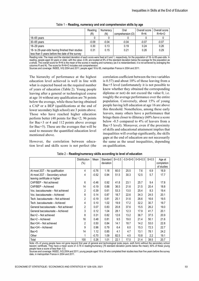
ECONOMIE ET STATISTIQUE / ECONOMICS AND STATISTICS N° 528-529, 2021 53
Inequalities in Skills at the End of Education
The hierarchy of performance at the highest education level achieved is well in line with what is expected based on the required number of years of education (Table 2). Young people leaving after a general or technological course at age 16 without any qualification are 76 points below the average, while those having obtained a CAP or a BEP (qualifications at the end of lower secondary high school) are 3 points above. Those who have reached higher education perform better (48 points for Bac+2; 96 points for Bac+3 or 4 and 112 points above average for Bac+5). These are the averages that will be used to measure the quantified education level mentioned above.
However, the correlation between educa‑tion level and skills score is not perfect (the
correlation coefficient between the two variables is 0.57) and about 10% of those leaving from a Bac+5 level (unfortunately it is not possible to know whether they obtained the corresponding diploma or not) do not exceed the value 0, i.e. roughly the average performance over the entire population. Conversely, about 15% of young people having left education at age 16 are above this threshold. Nonetheless, among these early leavers, many others have a performance that brings them closer to illiteracy (60% have a score below ‑0.5 compared to 4% of leavers from a Bac+5 level). Moreover, even if the proximity of skills and educational attainment implies that inequalities will overlap significantly, the skills gaps at the end of education are not necessarily the same as the usual inequalities, depending on qualification.
Table 1 – Reading, numeracy and oral comprehension skills by ageReading
(R)Numeracy
(N)Oral
comprehension (O)Overall score
R+NOverall score
R+N+O18–65 years 0 0 0 0 030–65 years ‑0.09 ‑0.04 ‑0.04 ‑0.07 ‑0.0718–29 years 0.30 0.13 0.19 0.24 0.2618‑ to 29‑year‑olds having finished their studies less than 5 years before the date of the survey
0.31 0.15 0.21 0.26 0.29
Reading note: The mean and the standard deviation of each score were fixed at 0 and 1, respectively, for the population of 18‑ to 65‑year‑olds. In reading, people aged 30 years or older, with the value ‑0.09, are located at 9% of the standard deviation below the average for the population as a whole. The overall score for R+N is the mean of the scores in reading and numeracy (as it is restandardised, it is not achieved by averaging the columns R and N). The score for R+N+O includes oral comprehension.Sources and coverage: INSEE, IVQ 2004 and 2011; people aged 18 to 65, metropolitan France in 2004 and 2011.
Table 2 – Reading/numeracy skills according to level of education Distribution
(%)Mean Standard
deviationS<‑0.5 ‑0.5<S<0 0<S<0.5 S>0.5 Age at
completion of studies
At most 2GT – No qualification 4 ‑0.76 1.18 60.0 25.5 7.6 6.9 16.9At most 2GT – Secondary school leaving certificate or higher
4 ‑0.52 0.94 51.5 30.3 12.5 5.7 17.7
CAP/BEP – Not achieved 6 ‑0.46 0.92 41.8 23.1 25.7 9.4 17.8CAP/BEP – Achieved 14 ‑0.19 0.88 36.5 21.6 21.5 20.4 18.8Voc. baccalaureate – Not achieved 2 ‑0.39 0.61 53.3 13.0 25.4 8.3 19.4Voc. baccalaureate – Achieved 8 0.14 0.87 18.7 22.6 34.3 24.5 20.1Tech. baccalaureate – Not achieved 2 ‑0.19 0.81 25.1 31.6 26.6 16.6 19.5Tech. baccalaureate – Achieved 4 0.10 1.02 19.9 17.2 32.2 30.7 19.7General baccalaureate – Not achieved 2 0.07 0.83 20.8 37.6 15.5 26.2 19.0General baccalaureate – Achieved 3 0.12 1.04 28.1 12.3 17.9 41.7 20.1Bac+2 – Not achieved 8 0.31 0.82 12.6 13.2 36.7 37.5 20.9Bac+2 – Achieved 16 0.48 0.81 9.5 19.0 21.4 50.1 21.6Bac+3/4 – Not achieved 2 0.50 0.84 14.1 18.7 14.2 53.0 22.8Bac+3/4 – Achieved 9 0.96 0.79 6.4 6.0 15.3 72.3 22.7Bac+5 14 1.12 0.85 4.1 4.7 13.1 78.1 24.2Other 1 ‑0.70 1.09 82.5 4.5 10.8 2.2 19.1Total 100 0.26 1.01 22.1 17.0 21.4 39.5 20.7
Note: 4% of young people have not gone beyond first year of general and technological lycée (equiv. sixth form) without the secondary school leavers’ certificate. They have a mean score of ‑0.76 in reading/numeracy (76 standard deviation points below the mean); 60% of these young people have a score of less than ‑0.5.Sources and coverage: INSEE, IVQ 2004 and 2011; young people aged 18 to 29 who completed their studies less than five years before the survey date, in metropolitan France in 2004 and 2011.

ECONOMIE ET STATISTIQUE / ECONOMICS AND STATISTICS N° 528-529, 202154
2.2. Close Inequalities in Skills and in Education Level
Given the samples’ size, which are quite limited for some populations studied, we have restricted the number of variables and modalities. However, even with a limited characterisation of the young people and their environments, inequalities appear to be quite significant (Table 3): 27.5% of the variance in the quantified education level, one‑fifth of the overall skills score and the age at which education is completed can be explained by the characteristics of the young person. Skills inequalities seem slightly lower, but this dimension is estimated with a significant measurement error, reducing the correlations. The R² for the quantified education level is also sensitive to the quantification method used, but variants show some robustness of the results to the specification (see Online Appendix). The overall skills score (using the three areas, including oral comprehension), has a level of inequality that is very slightly lower than that of skills in reading and calculation, because the differences in oral comprehension are lower (the R² is 8.5%, versus 14.4% in calculation and 19.2% in reading). The test of oral compre‑hension is indeed rather short, which makes the measurement less precise, but this is also the case with the test of calculation. It is certainly the less academic nature of oral comprehension that explains less marked inequalities.
As expected, significant differences in skills, quantified education level or age of ending studies appear, depending on the number of siblings, the parents’ qualification or occupa‑tion: young people whose father graduated from higher education perform 42 points higher than those whose father does not have a qualification, and they are separated by one and a quarter years of study.
Young men have a higher skills score than young women: this is mainly due to higher performance in calculation, whereas the results are equal in reading and oral comprehension. In contrast, young women have a higher quantified education level, which translates into half a year more education.
Family type is not associated with differences in skills. In contrast, a deficit of two‑thirds of a year of study is found for young people who have not lived with both parents during childhood. Material difficulties, common for single‑parent families, may have hampered the school choices of these young people.
Young people born abroad10 have lower skills than those born in France (about one‑third of standard deviation). The gap is not significant for qualifications. As for the age of completing school, the situation is reversed: the fact that the young person was born abroad is associ‑ated with three‑quarters of a year extra study; arrival in France may have resulted in a shift in schooling or repeating the year. Foreign‑born young people’s quantified education level is therefore higher than their skills scores. This seems consistent with research that, according to Vallet & Caille (1996), has shown that, at a given skills level, immigrants’ children leave primary school with a higher educational level than the rest of the population.
It is also interesting to compare the skills score and the quantified education level of leavers with some information on the course of these studies, particularly at their start, controlling the variables used in the previous model (Table 4). Interpreting these correlations is, of course, more complex because of possible reverse causality: repeating a year usually results from learning difficulties at the beginning of primary school; this being associated with lower skills in adulthood is therefore explained much more by this initial selection effect than by the nega‑tive effectiveness of this treatment. However, this means that repeating did not allow for a complete catch‑up (a goal which, it is true, is ambitious for pupils who start out far behind the others in terms of skills). For example, half of the overall standard deviation score separates young people who have or have not repeated a year at primary school, to the benefit of those who have not. The gap is even more striking in terms of years of schooling: young people who have repeated a year finish their studies a year earlier, while repeating a year exactly corresponds to one extra year of schooling.
The age of starting kindergarten gives rise to significant differences. It should be noted that in 1980‑1990, the 2‑year‑old enrolment rate was higher than it is today: one in three pupils. For skills, there are no differences between the most frequent situations (starting at age 2 and 3); only deferred starts (at age 4) are associated with weaker performance (one third of standard deviation). More unexpectedly, a small effect can be seen for the quantified level of education (15 standard deviation points) for pupils starting
10. This geographical origin criterion was preferred to a definition parents’ country of birth because, as it identifies fewer individuals, it gives rise to greater deviations. Given the size of the sample, it was not possible to com‑bine these highly correlated criteria.

ECONOMIE ET STATISTIQUE / ECONOMICS AND STATISTICS N° 528-529, 2021 55
Inequalities in Skills at the End of Education
Table 3 – Modelling of skills, quantified education level and age at completion of studies depending on the characteristics of the young people
Overall score Quantified level of studies
Age at completion of studies
Constant 0.07 ns 0.98 *** 22.40 ***Gender (Ref.: Female)Male 0.10 ** ‑0.23 *** ‑0.58 ***Living with both parents (Ref.: Yes)No 0.06 ns ‑0.27 *** ‑0.64 ***Born in France (Ref.: Yes)No ‑0.40 *** 0.08 ns 0.73 ***Number of siblings (Ref.: 3 or more)None 0.40 *** 0.43 *** 0.89 ***1 0.38 *** 0.37 *** 0.70 ***2 0.33 *** 0.18 *** 0.46 ***Type of accommodation during childhood (Ref.: Flat other than council accommodation)House 0.01 ns ‑0.14 ** ‑0.30 *Council accommodation ‑0.21 ** ‑0.42 *** ‑0.67 ***Father’s qualification (Ref.: Higher education)Qualification unknown 0.30 ns ‑0.30 ns ‑1.58 **No degree/qualification or primary school certificate (CEP) ‑0.42 *** ‑0.57 *** ‑1.10 ***BEPC/CAP/BEP/Bac ‑0.13 ns ‑0.15 ns 0.05 nsMother’s qualification (Ref.: Higher education)Qualification unknown ‑0.25 ns ‑0.49 ** ‑0.76 nsNo degree/qualification or primary school certificate (CEP) ‑0.32 *** ‑0.37 *** ‑0.80 ***BEPC/CAP/BEP/Bac ‑0.12 ns ‑0.19 ** ‑0.40 *Father’s occupation (Ref.: Blue‑collar worker)Profession unknown ‑0.52 *** ‑0.02 ns 0.89 *Farmer, craftsman, shop owner 0.17 ** 0.14 * 0.10 nsManagerial/teacher, middle‑management 0.23 *** 0.24 *** 0.51 ***White‑collar worker 0.11 ns 0.07 ns 0.07 nsMother’s profession (Ref.: Blue‑collar worker)Profession unknown ‑0.05 ns 0.08 ns 0.51 **Farmer, craftswoman, shop owner ‑0.19 ns 0.07 ns 0.68 **Managerial/teacher, middle‑management 0.09 ns 0.16 * 0.77 ***White‑collar worker 0.01 ns 0.14 ** 0.48 ***
Population Number R² (in %)Leavers (18‑ to 29‑year‑olds having finished their studies less than five years before the date of the survey)
in 2004 and 2011 1,483 19.7 (1.9) 27.5 (2) 18.1 (1.8)in 2004 725 20.7 (2.7) 31.3 (2.8) 18.1 (2.6)in 2011 762 21.8 (2.7) 26.5 (2.7) 19.1 (2.6)in reading (R) 1,483 19.2 (1.8) in numeracy (N) 1,483 14.4 (1.7) in oral comprehension (O) 1,483 8.5 (1.5) of the overall R+N+O score 1,483 19.1 (1.8)
Leavers without age conditions (persons 16 years of age and older who completed their studies less than five years before the date of the survey)
in 2011 815 21.8 (2.6) 27.2 (2.5) 19.6 (0)Young people aged 16–18
in 2011 499 24.6 (3.3)Note: This table shows the results of a set of linear regressions of the combined score for reading and numeracy, of the level of education (in quantified form, with a standard deviation identical to the score) and of the age at completion of studies. The top part gives the coefficients for the different variables used, of the model relating to leavers in 2004 and 2011: compared with women, all the other variables being fixed, the men have an overall score that is 0.1 higher, i.e. 10 points of standard deviation, a quantified level of studies of 23 standard deviation points lower and finish their studies 0.58 before the women. The asterisks system takes into account the significance of the coefficients (*** at 1%; ** at 5%; * at 10%). The first line of the second part of the table gives the R² (more precisely the adjusted R²) of these three linear regressions. The following lines show this R² either for the scores in each discipline or for particular populations. The standard errors of the R² are shown between parentheses.Sources and coverage: INSEE, IVQ 2004 and 2011; young people aged 18 to 29 who completed their studies less than five years before the survey date (unless otherwise stated), in metropolitan France in 2004 and 2011.
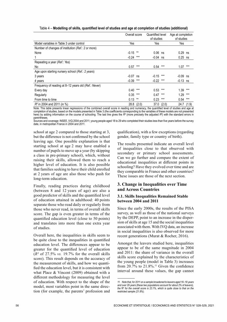
ECONOMIE ET STATISTIQUE / ECONOMICS AND STATISTICS N° 528-529, 202156
school at age 2 compared to those starting at 3, but the difference is not confirmed by the school leaving age. One possible explanation is that starting school at age 2 may have enabled a number of pupils to move up a year (by skipping a class in pre‑primary school), which, without raising their skills, allowed them to reach a higher level of education. It is also possible that families seeking to have their child enrolled at 2 years of age are also those who push for long‑term education.
Finally, reading practices during childhood (between 8 and 12 years of age) are also a good predictor of skills and the quantified level of education attained in adulthood: 40 points separate those who read daily or regularly from those who never read, in terms of overall skills score. The gap is even greater in terms of the quantified education level (close to 50 points) and translates into more than one extra year of studies.
Overall here, the inequalities in skills seem to be quite close to the inequalities in quantified education level. The differences appear to be greater for the quantified level of education (R² of 27.5% vs. 19.7% for the overall skills score). This result depends on the accuracy of the measurement of skills, and how we quanti‑fied the education level, but it is consistent with what Place & Vincent (2009) obtained with a different methodology for measuring the level of education. With respect to the shape of the model, most variables point in the same direc‑tion (for example, the parents’ profession and
qualification), with a few exceptions (regarding gender, family type or country of birth).
The results presented indicate an overall level of inequalities close to that observed with secondary or primary school assessments. Can we go further and compare the extent of educational inequalities at different points in schooling? Have they evolved over time and are they comparable in France and other countries? These issues are those of the next section.
3. Change in Inequalities over Time and Across Countries3.1. Skills Inequalities Remained Stable between 2004 and 2011
Since the early 2000s, the results of the PISA survey, as well as those of the national surveys by the DEPP, point to an increase in the disper‑sion of skills at age 15 and the social inequalities associated with them. With IVQ data, an increase in social inequalities is also observed for more recent generations (Murat & Rocher, 2016).
Amongst the leavers studied here, inequalities appear to be of the same magnitude in 2004 and 2011: the share of variance in the overall skills score explained by the characteristics of the young people (model in Table 3) increases from 20.7% to 21.8%.11 Given the confidence interval around these values, the gap cannot
11. Note that, for 2011 on a sample broadened to leavers aged 16–18 years and over 29 years (these two populations account for about 2% of leavers), the R² for the overall score is 23.1%, which is quite close to that on the restricted sample (21.8%).
Table 4 – Modelling of skills, quantified level of studies and age at completion of studies (additional)Overall score Quantified level
of studies Age at completion
of studies Model variables in Table 3 under control Yes Yes Yes Number of changes of institution (Ref.: 2 or more)None ‑0.15 ** 0.06 ns 0.29 ns1 ‑0.24 *** ‑0.04 ns 0.25 nsRepeating a year (Ref.: Yes)No 0.57 *** 0.54 *** 1.07 ***Age upon starting nursery school (Ref.: 2 years)3 years ‑0.07 ns ‑0.15 *** ‑0.09 ns4 years ‑0.39 *** ‑0.22 *** ‑0.13 nsFrequency of reading at 8–12 years old (Ref.: Never)Every day 0.40 *** 0.53 *** 1.39 ***Regularly 0.35 *** 0.47 *** 1.29 ***From time to time 0.13 ** 0.23 *** 0.54 ***R² in 2004 and 2011 (in %) 28.8 (2.0) 37.0 (2.0) 24.7 (1.9)
Note: This table presents linear regressions of the combined overall score in reading and numeracy, the quantified level of studies and age at completion of studies, based on the models presented in Table 3 (the coefficients corresponding to the variables of these models are not presented here) by adding information on the course of schooling. The last line gives the R² (more precisely the adjusted R²) with the standard errors in parentheses.Sources and coverage: INSEE, IVQ 2004 and 2011; young people aged 18 to 29 who completed their studies less than five years before the survey date, in metropolitan France in 2004 and 2011.
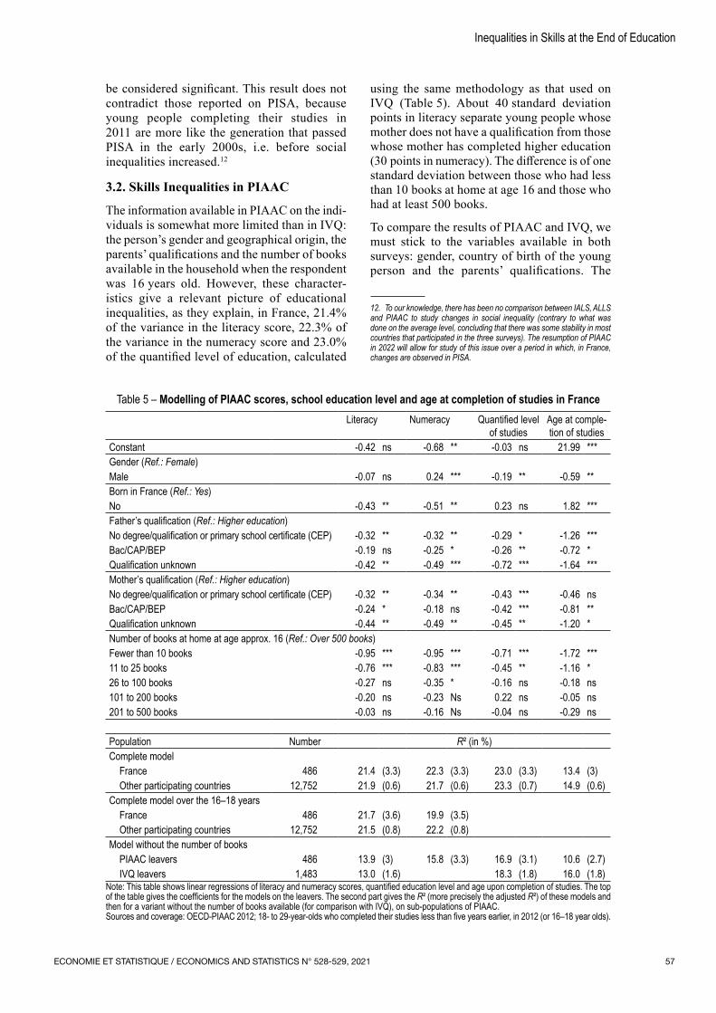
ECONOMIE ET STATISTIQUE / ECONOMICS AND STATISTICS N° 528-529, 2021 57
Inequalities in Skills at the End of Education
be considered significant. This result does not contradict those reported on PISA, because young people completing their studies in 2011 are more like the generation that passed PISA in the early 2000s, i.e. before social inequalities increased.12
3.2. Skills Inequalities in PIAAC
The information available in PIAAC on the indi‑viduals is somewhat more limited than in IVQ: the person’s gender and geographical origin, the parents’ qualifications and the number of books available in the household when the respondent was 16 years old. However, these character‑istics give a relevant picture of educational inequalities, as they explain, in France, 21.4% of the variance in the literacy score, 22.3% of the variance in the numeracy score and 23.0% of the quantified level of education, calculated
using the same methodology as that used on IVQ (Table 5). About 40 standard deviation points in literacy separate young people whose mother does not have a qualification from those whose mother has completed higher education (30 points in numeracy). The difference is of one standard deviation between those who had less than 10 books at home at age 16 and those who had at least 500 books.
To compare the results of PIAAC and IVQ, we must stick to the variables available in both surveys: gender, country of birth of the young person and the parents’ qualifications. The
12. To our knowledge, there has been no comparison between IALS, ALLS and PIAAC to study changes in social inequality (contrary to what was done on the average level, concluding that there was some stability in most countries that participated in the three surveys). The resumption of PIAAC in 2022 will allow for study of this issue over a period in which, in France, changes are observed in PISA.
Table 5 – Modelling of PIAAC scores, school education level and age at completion of studies in FranceLiteracy Numeracy Quantified level
of studies Age at comple‑tion of studies
Constant ‑0.42 ns ‑0.68 ** ‑0.03 ns 21.99 ***Gender (Ref.: Female)Male ‑0.07 ns 0.24 *** ‑0.19 ** ‑0.59 **Born in France (Ref.: Yes)No ‑0.43 ** ‑0.51 ** 0.23 ns 1.82 ***Father’s qualification (Ref.: Higher education)No degree/qualification or primary school certificate (CEP) ‑0.32 ** ‑0.32 ** ‑0.29 * ‑1.26 ***Bac/CAP/BEP ‑0.19 ns ‑0.25 * ‑0.26 ** ‑0.72 *Qualification unknown ‑0.42 ** ‑0.49 *** ‑0.72 *** ‑1.64 ***Mother’s qualification (Ref.: Higher education)No degree/qualification or primary school certificate (CEP) ‑0.32 ** ‑0.34 ** ‑0.43 *** ‑0.46 nsBac/CAP/BEP ‑0.24 * ‑0.18 ns ‑0.42 *** ‑0.81 **Qualification unknown ‑0.44 ** ‑0.49 ** ‑0.45 ** ‑1.20 *Number of books at home at age approx. 16 (Ref.: Over 500 books)Fewer than 10 books ‑0.95 *** ‑0.95 *** ‑0.71 *** ‑1.72 ***11 to 25 books ‑0.76 *** ‑0.83 *** ‑0.45 ** ‑1.16 *26 to 100 books ‑0.27 ns ‑0.35 * ‑0.16 ns ‑0.18 ns101 to 200 books ‑0.20 ns ‑0.23 Ns 0.22 ns ‑0.05 ns201 to 500 books ‑0.03 ns ‑0.16 Ns ‑0.04 ns ‑0.29 ns
Population Number R² (in %)Complete model
France 486 21.4 (3.3) 22.3 (3.3) 23.0 (3.3) 13.4 (3)Other participating countries 12,752 21.9 (0.6) 21.7 (0.6) 23.3 (0.7) 14.9 (0.6)
Complete model over the 16–18 yearsFrance 486 21.7 (3.6) 19.9 (3.5)Other participating countries 12,752 21.5 (0.8) 22.2 (0.8)
Model without the number of booksPIAAC leavers 486 13.9 (3) 15.8 (3.3) 16.9 (3.1) 10.6 (2.7)IVQ leavers 1,483 13.0 (1.6) 18.3 (1.8) 16.0 (1.8)
Note: This table shows linear regressions of literacy and numeracy scores, quantified education level and age upon completion of studies. The top of the table gives the coefficients for the models on the leavers. The second part gives the R² (more precisely the adjusted R²) of these models and then for a variant without the number of books available (for comparison with IVQ), on sub‑populations of PIAAC. Sources and coverage: OECD‑PIAAC 2012; 18‑ to 29‑year‑olds who completed their studies less than five years earlier, in 2012 (or 16–18 year olds).

ECONOMIE ET STATISTIQUE / ECONOMICS AND STATISTICS N° 528-529, 202158
quality of the models drops significantly: the coefficients of determination drop to 13.9% in literacy and 15.8% in numeracy. This illustrates the importance of the number of books at home as an indicator of the cultural environment. The same modelling using IVQ gives close results: 13.0% for the overall skills score, 18.3% for the quantified education level (compared with 16.9% for PIAAC) and 16.0% for school leaving age (compared with 10.6% for PIAAC).13
Using the indicators from the full model, the R² are quite close to those estimated in other countries (21.9% in literacy and 21.7% in numeracy). This seems consistent with the first PISA surveys, which did not find too high a level of social inequality in France in the early 2000s. More precisely, if France is at an average level in terms of inequalities, whether in skills or in quantified education levels, there are clear differences between countries (see Figure). These two measures seem to be fairly correlated: Italy, the United Kingdom, the Czech Republic and Slovakia are countries where inequalities in skills and the quantified education level are high (with the R² exceeding 25% for both indicators); in Cyprus and Korea, on the other hand, the two indicators are quite low (less than 15%). However, the trend is not perfect and, for an average level of inequalities in skills (around
20%), some countries, such as Sweden, limit the inequalities in the quantified level of education (R² of 10%), whereas these are higher in other countries (R² of 33% in Slovenia).
3.3. Changes in Skills Inequalities between the End of Compulsory Education and the End of Education
This article provides a picture of skills inequal‑ities at leaving education, a point in schooling generally not studied on the issue of skills. Can these results be compared with those observed at the end of compulsory schooling? Borgonovi et al. (2017) have compared, in detail, the PISA and PIAAC surveys and shown that, despite some protocol differences, the two surveys were very similar in their objectives and methods. This justified, in particular, the comparison between the results in PISA 2000 and 2003 and those in PIAAC, particularly in terms of social inequalities. They compared two populations which are a priori similar: the 15‑year‑olds
13. The gap is larger for the latter variable. Note that the age at the end of studies is defined in a slightly different way in IVQ and in PIAAC: in IVQ, it is asked directly and followed by questions detailing the educational pathway; in PIAAC, the first question relates to the highest qualification and the date of graduation is then requested. This is likely to help include more conti‑nuing education (the average age of leaving education is higher in PIAAC than in IVQ), which are less sensitive to social conditions.
Figure – Inequalities in skills and inequalities in education level in different countries
Belg.
Chile
Cyprus
Czech Rep.
Danemark
Estonia
Finland
France
GreeceIreland
Israël
Italy
Japan
Korea
Lithuania
Netherlands
Norway
Poland
Russia
Slovakia
SloveniaEspagne
Sweden
TurkeyUnited Kingdom
Austria
CanadaGermany
Singapore
United States
0
0.05
0.1
0.15
0.2
0.25
0.3
0.35
0.4
0.45
0.5
0 0.05 0.1 0.15 0.2 0.25 0.3 0.35 0.4 0.45
Inequ
alitie
s in e
duca
tion l
evel
Inequalities in skills
Note: This graph shows the R² of the models linking the indicators of educational achievement to the characteristics of the young people. Grey indicates countries for which age at completion of studies is not disclosed; in this case, all 18‑ to 29‑year‑olds who have completed their studies longer than five years ago have been retained.Sources and coverage: OECD‑PIAAC 2012; young people aged 18 to 29 who completed their studies in 2012.

ECONOMIE ET STATISTIQUE / ECONOMICS AND STATISTICS N° 528-529, 2021 59
Inequalities in Skills at the End of Education
in 2000 and 2003 and the 26‑28‑year‑olds in PIAAC in 2012. In most countries, particularly France, social inequalities appear a little more pronounced for the 26‑28‑year‑olds than for the 15‑year‑olds. Such work was also carried out including observation at the level of primary school, with the PIRLS and TIMSS surveys (Dämmrich & Trigenti, 2016). This obliges the authors to retain the only variable common to all surveys: the number of books at home. Across all countries considered, they observe stability or even increased inequalities (especially in mathematics) between primary school and early adulthood. In France, for the assessment of reading only, the trend is more towards stability.
We propose a few additional elements by comparing the results of the 16‑18‑year‑olds and those of leavers using IVQ (2011) and PIAAC. In relation to the work of Borgonovi et al. (2017), this has the disadvantage of not comparing the same cohorts, but the advan‑tage is that the measures of skills and social environment are exactly the same (which is not quite the case in a comparison between PISA and PIAAC). With both surveys, the magnitude of the skills inequalities appears very similar between the two populations. With PIAAC, in France, the R² for literacy and numeracy is 21.7% and 19.9% for the 16‑18‑year‑olds, close to the values for leavers (21.4% and 23.3%, the difference of 3.4 points in numeracy is not significant). The same is true for all participating countries: in numeracy, as in literacy, for the 16‑18‑year‑olds or leavers, the R² only slightly deviates from 22% (varying between 21.7% and 22.2%).14 With IVQ, the R² for the 2011 overall score for the 16‑18‑year‑olds is not significantly different from that for leavers (24.6% and 21.8%, respectively).
* * *
At the end of education, skills inequalities are significant in France, as in other participating countries: between a fifth and a quarter of the variance in skill scores can be explained by the descriptors used here. This is a low estimate: a more detailed description of the social envi‑ronment and a more precise measurement of skills would probably increase the correlation significantly. These inequalities overlap with the long‑standing inequalities that have been evident at educational levels, but only partly. In the ana ‑lysis of young people’s occupational integration or their entry into adult life, the skills therefore provide additional information, in particular on the influence of the social background.
The skills inequalities upon leaving school appear very close to those at age 16‑18 (also close to those reflected in assessments of students at the end of compulsory schooling, such as based on PISA). Indeed, research into high school value‑added indicators has shown that continuing to high school is essentially dependent on the level of skills attained at the end of secondary school (measured by the results of the national secondary school leavers’ certificate), and that the social environment then plays a relatively small role beyond its impact on success at secondary school (Evain & Evrard, 2017).
14. The same model can be applied to PISA 2012 data. The values are close to the average of the countries participating in the two surveys (R² = 24% in literacy and R² = 21.4% in numeracy). By contrast, for France, as stated in the introduction, PISA shows more inequalities (31.8% and 32.3%). A lower level of inequality in France may mean either that the PIAAC assessment is less discriminatory in France, or that the variables in the social environment are of lower quality.
Link to the Online Appendix: https://www.insee.fr/en/statistiques/fichier/6005373/ES528‑529_Murat_Annexe‑en‑ligne_Online‑Appendix.pdf
BIBLIOGRAPHY
Albouy, V. & Tavan, C. (2007). Accès à l’enseignement supérieur en France : une démocratisation réelle mais de faible ampleur. Économie et Statistique, 310, 3–22. https://doi.org/10.3406/estat.2007.7053Baudelot, C. & Establet, R. (1989). Le niveau monte. Paris: Seuil.Ben Ali, L. & Vourch’h, R. (2015). Évolution des acquis cognitifs au collège au regard de l’environnement de l’élève – Constat et mise en perspective longitudinale. Éducation & formations, 86‑87, 211–233. https://archives‑statistiques‑depp.education.gouv.fr/Default/digital‑viewer/c‑10284
https://www.insee.fr/en/statistiques/fichier/6005373/ES528-529_Murat_Annexe-en-ligne_Online-Appendix

ECONOMIE ET STATISTIQUE / ECONOMICS AND STATISTICS N° 528-529, 202160
Borgonovi, F., Pokropek, A., Keslair, F., Gauly, B. & Paccagnella, M. (2017). Youth in Transition: How Do Some of The Cohorts Participating in PISA Fare in PIAAC? Documents de travail de l’OCDE sur l’éducation N° 155. Paris: OCDE. https://doi.org/10.1787/51479ec2‑enCaille, J.-P. (2017). Quarante‑cinq ans de panels d’élèves à la direction de l’évaluation, de la prospective et de la performance (DEPP). Éducation & formations, 95, 5–31. https://archives‑statistiques‑depp.education.gouv.fr/Default/digital‑viewer/c‑44939 Chabanon, L., Durand de Monestrol, H. & Verlet I. (2019). PISA 2018 : stabilité des résultats en compré‑hension de l’écrit. DEPP, Note d’information, 49. https://archives‑statistiques‑depp.education.gouv.fr/Default/digital‑viewer/c‑44252Chow, G. C. (1960). Tests of Equality Between Sets of Coefficients in Two Linear Regressions. Econometrica, 28(3), 591–605. https://doi.org/10.2307/1910133Dämmrich, J. & Triventi, M. (2016). From primary school to young adulthood – A cross‑national analysis of cognitive competencies and related social inequality. In: Blossfeld, H.‑P. et al. Secondary Education Models and Social Inequality: An International Comparison. Cheltenham, UK and Northampton, MA, USA:Edward Elgar Publishing.Duru‑Bellat, M. & Kieffer, A. (2000). La démocratisation de l’enseignement en France – polémique autour d’une question d’actualité. Population, 55‑1, 51–79. www.persee.fr/doc/pop_0032‑4663_2000_num_55_1_7097Duru‑Bellat, M., Kieffer, A. & Marry, C. (2001). La dynamique des scolarités des filles : le double handicap questionné. Revue française de sociologie, 42‑2, 251–280. www.persee.fr/doc/rfsoc_0035‑2969_2001_num_42_2_5354Duru-Bellat, M., Jarousse, J.-P. & Mingat, A. (1993). Les scolarités de la maternelle au lycée : étapes et pro‑cessus dans la production des inégalités sociales. Revue française de sociologie, 34‑1, 43–60. www.persee.fr/doc/rfsoc_0035‑2969_1993_num_34_1_4218Evain, F. & Evrard, L. (2017). Une meilleure mesure de la performance des lycées – Refonte de la méthodo‑logie des IVAL (session 2015). Éducation & formations, 96, 91–166.https://archives‑statistiques‑depp.education.gouv.fr/Default/digital‑viewer/c‑44933Felouzis, G. (2014). Les inégalités scolaires. Paris: Puf, coll. Que sais‑je.Fisher, R. A. (1921). On the ‘probable error’ of a coefficient of correlation deduced from a small sample. Metron. 1, 3–32. https://hdl.handle.net/2440/15169Fumel, S., Keskpaik, S. & Girard, J. (2010). L’évolution des acquis des élèves de 15 ans en compréhension de l’écrit – Premiers résultats de l’évaluation internationale PISA 2009. DEPP, Note d’information, 24. https://archives‑statistiques‑depp.education.gouv.fr/Default/digital‑viewer/c‑2357 Girard, A. & Bastide, H. (1963). La stratification sociale et la démocratisation de l’enseignement. Population, 18, 435–472. www.persee.fr/doc/pop_0032‑4663_1963_num_18_3_10590Godin, M. & Hindriks, J. (2018). Une comparaison internationale des systèmes scolaires basée sur la mobilité sociale. Économie et Statistique, 499, 61–78. https://doi.org/10.24187/ecostat.2018.499s.1940 Goux, D. & Maurin, É. (1995). Origine sociale et destinée scolaire. L’inégalité des chances devant l’ensei‑gnement à travers les enquêtes FQP 1970, 1977, 1985 et 1993. Revue française de sociologie, 36‑1, 81–121. www.persee.fr/doc/rfsoc_0035‑2969_1995_num_36_1_4396Goux, D. & Maurin, É. (1997a). Destinées sociales : le rôle de l’école et du milieu d’origine. Économie et Statistique, 306, 13–26. https://doi.org/10.3406/estat.1997.2569Goux, D. & Maurin, É. (1997b). Démocratisation de l’école et persistance des inégalités. Économie et Statistique, 306, 27–39. https://doi.org/10.3406/estat.1997.2570Goux, D. & Maurin, É. (2000). La persistance du lien entre pauvreté et échec scolaire. In: Insee, France Portrait social, pp. 87–98.Hanushek, E. A., Schwerdt, G., Wiederhold, S. & Woessmann, L. (2015). Returns to skills around the world: Evidence from PIAAC. European Economic Review, 73, 103–130. https://doi.org/10.1016/j.euroecorev.2014.10.006Jonas, N., Lebrère, A., Pommier, P. & Trosseille, B. (2013). Mesurer les compétences des adultes : comparai‑son de deux enquêtes. Insee Analyses N° 13. https://www.insee.fr/fr/statistiques/1521326 Keskpaik, S. & Salles, F. (2013). Les élèves de 15 ans en France selon PISA 2012 en culture mathématique : baisse des performances et augmentation des inégalités depuis 2003. DEPP, Note d’information, 31. https://archives‑statistiques‑depp.education.gouv.fr/Default/digital‑viewer/c‑9505Merle, P. (2000). Le concept de démocratisation de l’institution scolaire. Population, 55‑1, 15–20. https://www.persee.fr/doc/pop_0032‑4663_2000_num_55_1_7096

ECONOMIE ET STATISTIQUE / ECONOMICS AND STATISTICS N° 528-529, 2021 61
Inequalities in Skills at the End of Education
Murat, F. & Rocher, T. (2016). L’évolution des compétences des adultes : effet « génération » et effet « cycle de vie ». Économie et Statistique, 490, 62–83. https://doi.org/10.3406/estat.2016.10721Murat, F. (forthcoming). Que savent les jeunes à la fin de leurs études ? Les compétences en lecture, en calcul et en compréhension orale selon le parcours scolaire. Éducation & formations.OCDE (2011). Résultats du PISA 2009 : Surmonter le milieu social : L’égalité des chances et l’équité du rendement de l’apprentissage (Volume II). Paris: OCDE.OCDE (2013). Perspectives de l’OCDE sur les compétences 2013 – Premiers résultats de l’évaluation des compétences des adultes. Paris: OCDE.https://www.oecd.org/fr/competences/piaac/Skills%20(FR)‑‑eBook_Final_B%C3%A0T_06%20dec%202013).pdf Olkin, I. & Finn, J. D. (1995). Correlations redux. Psychological Bulletin, 188, 155–164. https://doi.org/10.1037/0033‑2909.118.1.155Place, D. & Vincent, B. (2009). L’influence des caractéristiques sociodémographiques sur les diplômes et les compétences. Économie et Statistique, 424‑425, 125–147. https://doi.org/10.3406/estat.2009.8034Rocher, T. (2016). Construction d’un indice de position sociale. Éducation & formations, 90, 5–27. https://archives‑statistiques‑depp.education.gouv.fr/Default/digital‑viewer/c‑9936 Thélot, C. (1992). Que sait‑on des connaissances des élèves ? Les dossiers éducation et formation, 17, ministère de l’Éducation nationale, DEP. https://archives‑statistiques‑depp.education.gouv.fr/Default/digital‑viewer/c‑2164 Thélot, C. & Vallet, L.-A. (2000). La réduction des inégalités sociales devant l’école depuis le début du siècle. Économie et Statistique, 334, 3–32. https://doi.org/10.3406/estat.2000.7526Vallet, L.-A. (1999). Quarante année de mobilité sociale en France – L’évolution de la mobilité sociale à la lumière de modèles récents. Revue française de sociologie, 40‑1, 5–64. www.persee.fr/doc/rfsoc_0035‑2969_1999_num_40_1_5146Vallet, L.-A. & Caille, J.-P. (1996). Les élèves étrangers ou issus de l’immigration dans l’école et le collège français. Une étude d’ensemble. Les dossiers éducation et formation, 67, ministère de l’Éducation nationale, DEP. https://archives‑statistiques‑depp.education.gouv.fr/Default/digital‑viewer/c‑2763Vallet, L.-A. (2015). L’enquête Information et vie quotidienne 2011 parmi les dispositifs nationaux et interna‑tionaux de mesure des compétences des adultes. Économie et Statistique, 490, 5–15. https://doi.org/10.3406/estat.2016.10718

ECONOMIE ET STATISTIQUE / ECONOMICS AND STATISTICS N° 528-529, 2021 63
French Universities – A Melting Pot or a Hotbed of Social Segregation? A Measure of Polarisation within the French University System (2007‑2015)
Romain Avouac* and Hugo Harari‑Kermadec**
Abstract – Despite changes recently introduced within higher education (cluster‑building policies, the influence of university rankings, etc.) which may have fueled fears of a disparity between a pocket of world‑class universities and a vast group of second‑tier universities, relatively few quantitative studies exist to examine this matter. Using data from the Système d’information sur le suivi de l’étudiant (SISE), an information system for monitoring students university enrolments in France, we provide an exhaustive overview of the university landscape taking into account the capital held by various student populations. We then apply measures of segregation and polarisation to analyse the change in heterogeneity, which increased between 2007 and 2015. Lastly, we link this polarisation to the measures implemented at domestic and international level (Initiatives d’Excellence in France, and university rankings globally) which shape the foundations for globalisation among universities since the mid‑2000s.
JEL Classification: I24, I23, I28, C38Keywords: higher education, polarisation, academic inequality, university rankings, social background, France
*ENS Paris‑Saclay and ENSAE ([email protected]); **IDHES, ENS Paris‑Saclay (hugo.harari@ens‑paris‑saclay.fr)We would like to thank Frédéric Lebaron and Thibaut de Saint Pol, for their comments on a preliminary version of this work at the seminar on Reflexive Quantitativism at IDHES, as well as two anonymous reviewers whose comments and suggestions contributed to the improvement of this article.
Received in October 2018, accepted in October 2020. Translated from “L’université française, lieu de brassage ou de ségrégation sociale ? Mesure de la polarisation du système universitaire français (2007‑2015)”. The opinions and analyses presented in this article are those of the author(s) and do not necessarily reflect their institutions’ or Insee’s views
Citation: Avouac, R. & Harari‑Kermadec, H. (2021). French Universities – A Melting Pot or a Hotbed of Social Segregation? A Measure of Polarisation within the French University System (2007‑2015). Economie et Statistique / Economics and Statistics, 528‑529, 63–83. doi: 10.24187/ecostat.2021.528d.2058

ECONOMIE ET STATISTIQUE / ECONOMICS AND STATISTICS N° 528-529, 202164
The last decade has been characterised by growing globalisation in higher education,
symbolised in the French public debate by the emergence of the Academic Ranking of World Universities (ARWU), or Shanghai Ranking. As part of this trend, exposure of select insti‑tutions on the international stage has been pursued as a priority by public policy through competitive procedures for the allocation of major funds, beginning with the Initiatives d’excellence (IDEX). A large number of institu‑tions then took part in cluster‑forming projects in an attempt to reach “critical mass” – the level required for inclusion on the international rank‑ing tables or to rise up those tables. This raises the question of the “performativity” (Espeland & Sauder, 2007; Paradeise & Thoenig, 2015) of these measures: do international rankings actually influence the reality they are supposed to describe?
There is still no guarantee that excellence, within the global arena, of a few universities which top the rankings in France would systematically transfer to excellence within a system of higher education made generally accessible. Amsler & Bolsmann (2012) argue that, in the United Kingdom, international rankings promote a more blinkered view of education, focusing public debate on elite institutions while consigning democratisation concerns to the back‑burner. Policies and the allocation of public funds would therefore tend to concentrate on a select few institutions, which risks contributing to the spread of two‑tier education systems in which a small number of world‑class universities receive a significant proportion of resources and a vast group of second‑tier universities share what resources remain (Van Parijs, 2009). Merton (1968) refers to the “Matthew effect” to describe the cumulative effect of academic reputation within research circles.
Universities have been the main place of mass access to higher education in France in recent decades. The proportion of children of blue‑collar workers who graduated from university rose from 6% in 1984 to 24% in 2009 (Peugny, 2013). As a result, we now see different types of students, from different backgrounds, rubbing shoulders at universities (Brinbaum et al., 2018). Although the university sector is stratified (Frouillou, 2017; Convert 2006), we might expect that it allows students from working class backgrounds to continue accu‑mulating academic capital but also to partially compensate for the deficit of social capital from the initial socialisation, thanks to the peers they meet at university (Truong, 2015). On the
other hand, with prestigious higher education institutions already being broadly off limits to the working classes (Ichou & Vallet, 2013), a polarised university system would, in keeping with the educational experience, lead to heavily segregated access to adult life for young people and therefore reinforce the determinism inherent in academic trajectories and subsequent profes‑sional trajectories.
But are we really witnessing polarisation within the French university system, in terms of social composition? To provide answers to this question, we study the changes in the social composition of student populations, using data available between 2007 and 2015 from the comprehensive database of enrolments in French universities (SISE1).
In a first step, we provide a comprehensive statis‑tical view of the French university landscape by looking at the social and academic characteristics of the student populations at various institutions. To do this, we use a principal component analysis (PCA) in order to summarise the information in the initial data. The hierarchical ascendant classification method (HAC) then allows us to build a university typology, which we use to analyse the level of heterogeneity within a cross section of institutions. We highlight a socially heterogeneous and hierarchical univer‑sity landscape, corroborating the results that Brusadelli & Lebaron (2012) obtain using a similar methodology.
In a second stage, we develop an analysis that aims to quantify the changes in the hetero‑geneity of the social composition of higher education institutions between 2007 and 2015. We first introduce a measure of polarisation drawn from the econometric literature (Esteban & Ray, 1994), which indicates an increase in social polarisation during the period studied. We compare these results to the ones obtained using a normalised entropy index typically used in the literature on academic segregation.
Lastly, we link social heterogeneity, which is characteristic of French higher education, to national measures (IDEX, university groups) and international measures (university rankings) which provide the foundations for globalisa‑tion at university level. These measures target institutions with the most privileged student populations. Additional (public or private) funding allocated via excellence‑related
1. Developed by the SIES (Sous‑direction des Systèmes d’Information et des Études Statistiques), the statistical information and studies department of the French Ministry of Higher Education and Research.

ECONOMIE ET STATISTIQUE / ECONOMICS AND STATISTICS N° 528-529, 2021 65
French Universities – A Melting Pot or a Hotbed of Social Segregation?
measures is therefore channelled towards those students who enjoy the most capital, of all varie‑ties. This finding raises the question of resource redistribution via higher education policy.
1. A Socially Heterogeneous University LandscapeWhile the massification of higher education cannot be denied, the democratisation of access to all higher education institutions raises ques‑tions. To address the gap between these two dynamics, we propose using a concept of social polarisation. This requires us to first define the social composition of universities.
For each student enrolled at a French university, the comprehensive databases of enrolments at French universities (SISE for enrolments) available between 2007 and 2015 include the institution at which the student is enrolled, socio‑demographic information, and data concerning the student’s previous and current education (Box 1). These data allow us to characterise the composition of the student population at each institution. For example, for each university, the proportion of students for whom the reference parent is a senior executive is calculated. The tables that include qualitative variables describing students therefore lead to aggregate tables that include quantitative varia‑bles describing universities.
1.1. Principal Component Analysis as a Summary Tool
To depict the distribution of the social and academic characteristics of the student popu‑lations, we apply a principal component analysis (PCA) to the transformed data. This method allows downscaling the dimension of the problem, which is initially equal to the number of variables included to define the social composition of the universities’ student
populations. This approach has notably been used by authors seeking to produce socio‑ economic status indices based on many variables that imperfectly describe social background (Vyas & Kumaranayake, 2006). More recently, Rocher (2016) notes that “classifications of professions and social categories are limited when it comes to describing the social tonality of groups of pupils (classes, institutions, acade‑mies)” (translated from Rocher, 2016, p. 16) and therefore also uses factorial methods to construct a “student social position index”.
Once aggregated, several variables at student level can be used to describe the social compo‑sition of universities. The socio‑professional categories (CS) of students’ parents are a signifi‑cant marker of a student’s social background and the capital, of multiple varieties, that the parents can pass on to the student, even though these variables do not fully quantify the influence of background upon individual academic trajec‑tories (Boutchénik et al., 2015). Although it is common practice to use the CS of an individual’s father to summarise their social background, the predominant role played by the mother’s level of education in the level attained by the child (Place & Vincent, 2009) provides an argument for both CS to be included. Homogeneity is a concern in our case, as we are restricted by the fact that SISE does not record the CS of the child’s second reference parent until 2009. We therefore use the CS of the child’s first refer‑ence parent to define the social background of students (see Appendix 1 for the classification system selected).
A more detailed description of the composition of universities may result from the inclusion of variables relating to the students’ education. In particular, the baccalaureate is a significant social indicator that plays a key role in higher educational trajectories (Duru‑Bellat & Kieffer,
Box 1 – The SISE Database
Since its creation in 1995 by the SIES (see footnote 1), the SISE database has been collecting data on students enrolled at the main universities. A major advantage of this database is its comprehensive nature: SISE records all of the (main) enrolments at the institutions surveyed. In 2007, SISE held data on 1.4 million of the 2.2 million students enrolled at a higher education institution, which equates to a coverage rate of around 63%. All university components are considered, including institutes of technology, affiliated engineering schools, remote learning, etc. For each student included in the database, information is available concerning their previous education (type of baccalaureate, year of initial enrolment in higher education, etc.) and current education (description of the institution at which the student has enrolled, the qualification undertaken, the level attained in higher education, etc.), as is socio‑demographic information (gender, socio‑professional category – CS hereafter – of the reference parent, nationality, etc.) and geographical infor‑mation (the student’s country and municipality of residence, and of their parents, etc.).After the reference parents’ CS have been coded and harmonised (see Appendix 1), the university tables on which our work is based include 81 institutions over the whole period studied, and 18 variables created from the initial individual tables relating to the students.

ECONOMIE ET STATISTIQUE / ECONOMICS AND STATISTICS N° 528-529, 202166
2008). The student’s status as a (higher educa‑tion) grant holder and the level of the grant also appear to be relevant. However, these variables are only available between 2007 and 2011, which is why they have not been retained in order to maintain a homogeneous approach over the period studied. Further analyses (not provided here) for this shorter period show that their inclu‑sion does not alter the results obtained.
Lastly, we include the student’s gender and the cycle of enrolment (Bachelor’s degree/Master’s degree/doctorate) as supplementary variables in the PCA – i.e. they play no part in the definition of the axes. While there are clear differences in the students’ higher educational academic trajectories (Rosenwald, 2006), we do not believe the gender distribution among those students to be an inherent determining factor in the social composition of universities. Similarly, although the level of higher education attained depends on social background (Brinbaum et al., 2018), its inclusion as an active variable could raise the issue of endogeneity given that we are interested in the effect of social background on higher educational trajectories.
1.2. The First Principal Component as a General Index of Social Composition
Ultimately, 13 active variables are used for the PCA. We present only the PCA based on the 2007 data. The axes of this PCA are the reference we use to construct the social composition index and ensure its comparability over time (Box 2).
The “scree plot” of eigenvalues can be used to evaluate the quality of the PCA’s reduction of the initial data (see Appendix, Figure A3‑I). The application of the “elbow criterion”2 leads to the selection of the first two principal compo‑nents (PC) to conduct the analysis. The Kaiser criterion3 leads to the selection of the third PC. However, unlike the first two axes, the third axis appears to be difficult to interpret and provides only very minimal additional information with respect to the mean of the axes. That is why we limit the analysis to the first factorial plane, i.e. the plane of the first two PCs. The latter repre‑sents 64% of the total inertia. The representations obtained for the first two dimensions capture a large proportion of the information in the initial cluster and lend themselves well to interpretation.
The graph of variables (Figure I) allows us to analyse the pattern of correlations between active variables and to interpret the axes of the PCA. The variables which contribute most strongly to the first (horizontal) axis represent the proportion of children of senior executives on the left, and, on the opposite side, the percentages of students holding a
2. The PCA arranges the dimensions in decreasing order of inertia. The inertia tends to decrease rapidly for the first few dimensions, then more slowly and evenly for the subsequent, less informative dimensions. The “elbow criterion” involves selection of the dimensions before the break in the inertia gradient.3. The Kaiser criterion involves selecting total inertia divided by the number of dimensions as the threshold. The dimensions for which inertia is above the mean are then selected and the others omitted.
Box 2 – Comparability Over Time of the Universities’ Social Composition Index
The first axis of the PCA enables us to arrange institutions by social composition: from populations with a privileged background (on the left of the factorial plane) to populations with a working class background (on the right). A large proportion of the information in the initial cluster is also included in this axis, which makes it more relevant. We there‑fore select the distribution of the institutions’ coordinates on this axis as a general index of the universities’ social composition.Later on in this article, we analyse the change in the polarisation of the distribution of social compositions between 2007 and 2015. This index must be comparable over time to ensure that this analysis is relevant. Although the PCA’s pattern of correlations shows a high level of stability over the years – the graph of correlations of the PCA created in 2007 is very similar to those obtained when we create an equivalent PCA based on data from subsequent years – the positions of the variables vary slightly compared to the first two principal components as does the quality of the representation of the first axis. It is therefore not immediately possible to compare the changes in university coordinates over time. To compensate for this, the axes of the PCA in 2007, the only year in which the PCA is carried out, are fixed. The data from subsequent years are then projected onto the 2007 factorial plane as additional individual data. The institutions’ coordinates on the first axis correspond to the value of their social composition index over time. This procedure ensures that the axes of the PCA measure the same thing each year and guarantees the comparability of successive index values over time.A limitation to this analysis is the idiosyncratic role it gives to the reference year – 2007 in this case. Data from subse‑quent years are analysed with respect to the intrinsic structure of the 2007 data. To ensure that the results obtained are not overwhelmingly dependent upon this selection, we have reproduced the analysis developed in the remainder of this article by making each year of the period studied the respective reference year. The observed upward trend in polarisation is consistent between 2009 and 2015 regardless of the reference year, with greater variability during the first two years of that period.

ECONOMIE ET STATISTIQUE / ECONOMICS AND STATISTICS N° 528-529, 2021 67
French Universities – A Melting Pot or a Hotbed of Social Segregation?
vocational or technological baccalaureate, as well as the proportions of children of unskilled blue‑collar workers, white‑collar workers, and, to a lesser extent, skilled blue‑collar workers. This close correlation between the variables on the right of the axis confirms the observation that “students from working class backgrounds […] [are] over‑represented in these vocational and technological streams” (translated from Duru‑Bellat & Kieffer, 2008, p. 126). Accordingly, axis 1 seems to specifi‑cally contrast the most privileged children of workers with the most disadvantaged, which confirms the ongoing substantial differences between these social backgrounds in terms of their trajectories in higher education (Albouy & Tavan, 2007). With a moderate correlation with respect to both axes, children of self‑employed parents are somewhat poorly represented in the factorial plane – even if their positions on axis 1 appear to be sociologically relevant. The only variable with a surprising position is the share of students whose reference parent has a mid‑level profession: the level of correlation with axis 1 is slightly lower level than for skilled blue‑collar workers. This may be due to this category being highly heterogeneous. Ultimately, this very clear distinction between social backgrounds and their characteristics on axis 1 enables us to interpret this as ordering the universities by their respective populations’ social composition: those from a privileged background on the left,
and those from a working class background on the right. Lastly, it should be noted that this opposition appears to be highly discriminant within the French university landscape: axis 1 alone accounts for 44% of the information in the initial cluster. This axis therefore appears to be a reliable and relevant measure of university composition in a variety of ways.
1.3. Significant Inequality between Institutions
Although the second (vertical) axis is less straightforward to interpret, it provides useful insights for the analysis. The variables which contribute most significantly to this axis are the proportion of students who hold a Science Baccalaureate (S) at the lower end of the axis, and the proportions of students who hold either a Baccalaureate in Economics and Social Sciences (ES) or a Literary Baccalaureate (L) at the upper end of the axis. For a given social composition, the second axis therefore seems to oppose primarily scientific universities and those that primarily teach humanities. This interpretation is confirmed by the graph of individuals (Figure II) in which primarily humanities‑focused universities appear at the top, while primarily science‑ focused universities, including affiliated engi‑neering schools, appear at the bottom.
The positions of the additional variables on the factorial plane provide additional information
Figure I – PCA variables in 2007 (dimensions 1 and 2)
S_Bac
ES_Bac
L_Bac
vocational Bac
Technol._Bacfarmers
craftspeople-merchants
entrepreneurs
exec-int.prof
mid-level prof.
white-collar worker
skilled blue-collar
unskilled blue-collar
Men
Women
bachelor degrees
masters doctorates
Axis 2 (19%)
Axis 1 (44%)
Active variables Supplementary variables-1
-0.8
-0.6
-0.4
-0.2
0
0.2
0.4
0.6
0.8
1
0-1 -0.8 -0.6 -0.4 -0.2 0.2 0.4 0.6 0.8 1
Reading note: The [exec‑int.prof.] variable (which, for each institution, gives the percentage of students for whom the reference parent belongs to the CS ‘Executives and intellectual professions’ – see Appendix) is highly and negatively correlated with the first axis (‑0.96) but its correlation with the second axis is very low (+0.19).Sources and Coverage: MESRI‑SIES, SISE; French universities and elite institutions under the authority of the Minister for Higher Education.

ECONOMIE ET STATISTIQUE / ECONOMICS AND STATISTICS N° 528-529, 202168
about the arrangement of the correlations. As these variables play no role in the definition of the PCA’s axes, their position and any inter‑pretation we may draw from that appear all the more relevant. A first notable point is the close proximity between girls and ES/L Baccalaureate holders, as is the proximity between boys and S Baccalaureate holders, in proportional terms. This proximity confirms the observation made by Rosenwald (2006), among others, that although girls tend to be more successful in their studies no matter their level and the baccalaureate stream pursued, they remain over‑represented in predominantly literary streams. In addition, the contrast between the variables indicating the rates of enrolment in Bachelor’s degrees (on the right) and those indicating the rates of enrolment in Master’s degrees (on the left) is also revealing. The reproduction quality of the variable indicating the rates of doctoral students is poor, which hinders any interpretation. Not all universities have the same ratio of undergrad‑uates to postgraduates, and this ratio is shaped by social factors. Although these variables relate to institutions here and not directly to students, this finding seems to corroborate the notion that not only are children from working class backgrounds less likely to enter higher education in general, but those who do are less likely to attain a Master’s degree (Peugny, 2013; Selz & Vallet, 2006).
The positions on the social composition axis are relevant from a sociological perspective. The institutions with the most privileged student compositions tend to be the institutions that can select their students and in some cases even charge high enrolment fees, e.g. the “elite” institutions (Paris Dauphine University, IEP Paris, Observatoire de Paris) and the university‑ affiliated engineering schools (INP Toulouse, Polytech Grenoble, etc.). The over‑representation of Parisian universities is clear given that they are consistently positioned on the left of the axis. In contrast, universities in the French overseas departments are the first to appear from the right on the graph, followed by medium‑sized provin‑cial cities, generally in the north (Valenciennes, Artois, Upper Alsace) and south‑east (Perpignan, Avignon, Nîmes, Toulon) of France. The posi‑tions of the universities on the social composition axis therefore generally match the distribution of living standards within the various regions (as described by Auzet et al., 2007, for example). This corroborates studies demonstrating that much of the inequality between universities can be traced back directly to unequal social distribution within French territories (Nicourd et al., 2011).
Lastly, we observe a high degree of social heterogeneity among the institutions given the distribution of their positions along axis 1 of the
Figure II – PCA individuals in 2007 (dimensions 1 and 2)
-4
-3
-2
-1
0
1
2
3
4
5
-7 -5 -3 -1 3 5
Axis 2 (19%)
Axis 1 (44%)1Saint-Etienne
Avignon
CorseLa Réunion
Lille 3Nîmes
Nouv-Calédonie
Perpignan
Polynésie FR
Rennes 2Tlse 2 Toulon
UEVE
AntillesArtois
Franche-Comté
Havre INU ChampollionLa Rochelle
Pau
PoitiersReims
UBO
ULCO
Valenciennes
Bx 3
Caen
Lyon 2Nice
Paris 12
Paris 8
Savoie
Tlse 1
ToursUPEM
Aix-Mars
Bx Univ
Cergy-PontGre-Alpes
INP Toulouse
Lille 1
Lille 2
Lyon 1
Obs Paris
Paris 11
Paris 5
Paris 6
Paris 7
Polytech Grenoble
Rennes 1
Strasbourg
Tlse 3
UTBM
UTCUTT
Versailles
Cler-Fer 1
Mtp Univ
Nantes
Dauphine
IEP Paris
INALCO Lyon 3
Mtp 3
Pant-Assas
Pant-Sorbonne
Paris 13
Paris 3Paris 4
Angers
Bourgogne
Limoges
Lorraine
Paris 10
Rouen Haute-AlsaceCler-Fer 2
UBSOrléansPicardieMaine
Sources and Coverage: See Fig. I.

ECONOMIE ET STATISTIQUE / ECONOMICS AND STATISTICS N° 528-529, 2021 69
French Universities – A Melting Pot or a Hotbed of Social Segregation?
PCA (see Figure II). As no interpretation can be drawn directly from the scale of the PCA, reverting to the initial variables can better illustrate this heterogeneity. If we focus on the endpoints of the social composition axis, we can see, for example, that the proportion of children of senior executives is 66% at Paris Dauphine University and the IEP Paris, which reflects a very strong over‑representation compared to the socio‑ professional structure of the parents’ generation (Marchand, 2010). At the other end of the axis, children of senior executives account for only around 20% of students at universities in French overseas departments,4 and 25% at universities in the north and south‑east of mainland France, these universities appearing on the right of the factorial plane. Conversely, the proportion of children of unskilled blue‑collar workers is 7% in the universities of Avignon and Nîmes, while these children are virtually absent from a number of institutions in Paris. Similarly, the proportion of students whose parents are skilled blue‑collar workers exceeds 20% in the univer‑sities of Northern France compared to 2% in the elite institutions in Paris (Paris Dauphine University, IEP Paris, Observatoire de Paris) and 3 to 5% in inner‑city Parisian universities (Panthéon‑Assas, Paris 7, Paris 5, Paris 4, Panthéon‑Sorbonne, etc.).
1.4. A Typology of French Higher Education Institutions
The fact that institutions are highly scattered on the first factorial plane suggests that a typology can be based on the PCA’s results. To achieve this, we proceed with a hierarchical ascendant classification (HAC) based on the coordinates of the institutions on the principal components of the PCA.5
We retain the first two dimensions of the PCA to construct the typology. Although the first axis appears to be a relevant measure of the social composition of the universities, it does not fully summarise the social heterogeneity seen in the factorial plane. The variable indicating the proportions of Science Baccalaureate holders, for example, appears to be significantly corre‑lated with both axes 1 and 2, which underlines the Science Baccalaureate’s role as a social indicator. So, while the vertical axis measures a university’s primary discipline first and foremost, it also includes some of the social heterogeneity of the institutions that the hori‑zontal axis fails to register. The dynamics of social differentiation at play in higher education are therefore described more comprehensively by constructing the typology from the first two
dimensions. In addition, we show that the clas‑sifications obtained are sociologically relevant (cf. Box 2).
Beyond their descriptive capacity, the typologies that we present will allow us to subsequently apply the polarisation measure of Esteban & Ray (1994) as part of a dynamic analysis. This measure is based on the existence of well‑ defined groups in the population studied. For the analysis of the changes in polarisation to be justified, the typologies produced must retain their interpretation over the period studied while highlighting a deformation of the groups, i.e. potential changes in the group of certain institutions over the period studied, which are expressed through a shift on the factorial plane. To meet both conditions, we perform the HAC using data from all years simultaneously. In this way, the groups produced keep, necessarily, the same interpretation over the years, and changes of group of certain institutions are observed over the period studied.
The literature offers many criteria to guide the decision on how many groups to select. In practice, this selection is the result of a trade‑off between parsimony and homogeneity within the groups, “the principal criterion being that the typology finally selected should be coherent and informative with respect to the research being conducted” (translated from Robette, 2011, p. 19). Following this logic, we choose to focus the analysis on the four‑group typology derived from the HAC (Figure III). Broadly speaking, the left side of the plane groups together institu‑tions with a privileged composition – institutions based in Paris for the most part – and universities in large provincial towns and cities. The right side of the plane is populated by institutions with populations from a background ranging from intermediate to working class, most of these institutions being located in average‑sized cities and in French overseas departments. Among institutions that have a privileged composi‑tion, the classification also draws a distinction between those for which the main field of study is literature or economics and social sciences (at the top of the plane) and those for which it is mainly scientific (at the bottom). Heterogeneity along axis 2 is much more pronounced on the left of the plane, among institutions with a privileged composition, whereas institutions
4. We checked that restricting the coverage to metropolitan institutions only did not alter the main results.5. The factorial and classification methods complement one another. Directly using the principal components to produce the classification rather than the initial data reduces the influence of statistical noise in those data (Husson et al., 2010).

ECONOMIE ET STATISTIQUE / ECONOMICS AND STATISTICS N° 528-529, 202170
with an intermediate or working class student population, on the right of the plane, display significant homogeneity along axis 2. This makes it possible to distinguish, among institutions with a privileged social composition, those that are primarily scientific from the others, while insti‑tutions with an intermediate or working class student population do not seem to be marked in terms of field of study. In this respect, it seems relevant to separate these different groups because they may be characterised by distinct polarisation logics. To limit the sensitivity of the results to the selected typology, the following analyses have all been reproduced using the two‑ and three‑group typologies (see Appendix, Figures A3‑II and A3‑III). Similar results are obtained in all cases.
The relevance of the typology is confirmed by the statistical description of the various groups (see Appendix 2). In terms of the social compo‑sition, there is a clear social gradient for each of the determinant variables of axis 1 among the three groups of institutions (privileged, intermediate and working class populations). The proportion of children of senior executives is thus 52‑54% in the two privileged population groups, compared to 38% in the intermediate population group and 28% in the working class population group. Conversely, the proportion of children of skilled blue‑collar workers does not exceed 6% in institutions with a privileged composition, compared with an average of 13% for institutions with a working class population.
This social gradient can also be seen very clearly when we focus on the distribution of the various levels of study (Bachelor’s/Master’s/Doctorate) within the groups.
With the exception of vocational and techno‑logical baccalaureates, which are mainly social indicators and therefore behave in a similar manner to the variables described above, the analysis of the distribution of the various types of baccalaureate shows the relevance of sepa‑rating the privileged groups by field of study. The proportion of Science Baccalaureate holders varies by 48 percentage points between both groups with a privileged composition. However, it should be noted that the proportion of Science Baccalaureate holders in the group of institutions with a working class social composition is almost the same as in the group of institutions with a privileged and primarily humanities‑focused composition. This observation confirms that the Science Baccalaureate also plays a significant role of social marker, which, among other things, justifies the decision to base the typology on the factorial plane, rather than just axis 1, in order to capture all social differentiation processes. By contrast, ES and L Baccalaureate holders are highly under‑represented in the group of socially privileged compositions in which science is the primary field of study and, conversely, over‑ represented in the institutions in which literature is the primary field of study. Nevertheless, as the heterogeneity of the groups in relation to these types of baccalaureate appears to be less
Figure III – Representation of the four-group, HAC-derived typology
-6
-4
-2
0
2
4
6
-7 -5 -3 -1 1 3 5 7
Privileged publics (primary field: humanities) Privileged publics (primary field: scientific) Middle class publics Working class publics
Axis 1 (44%)
Axis 2 (19%)
Sources and Coverage: See Fig. I.

ECONOMIE ET STATISTIQUE / ECONOMICS AND STATISTICS N° 528-529, 2021 71
French Universities – A Melting Pot or a Hotbed of Social Segregation?
pronounced, so too appears the social role of these types of baccalaureate, which corroborates the position of the associated variables on the factorial plane. Lastly, the variables indicating the proportion of women and men are in very close proximity to those indicating the propor‑tions of S and ES/L Baccalaureate holders, which is in keeping with the significant differentiation of disciplines by gender already observed.
2. Growing Social Polarisation among French Higher Education InstitutionsThe first factorial plane obtained from the PCA highlights, statically, a significant level of social heterogeneity at institution level. The literature on recent developments in higher educational policy, including the increased use of quanti‑tative performance indicators, suggests that a shift in polarisation within the higher education system can be observed (Van Parijs, 2009). It is also possible that the democratisation of access to university is accompanied by a segregative dimension, similar to that observed in access to the Baccalaureate (Merle, 2002). Based on these hypotheses, we propose a dynamic analysis using two different indices: a polarisation index derived from the econometric literature, and a multi‑group segregation index, typical in the literature on academic segregation.
First, we examine the changes in the social composition index from the PCA, between 2007 and 2015 (Figure IV). The advantage of this analysis is that it does not depend on any typology. The standard deviation of the distri‑bution, a measure of the degree of inequality of the distribution of social compositions (McKenzie, 2005), rises by 15% between 2007 and 2015. The interquartile range increases by
11%. Finally, the maximum range increases by 18% between 2007 and 2015. This is the gap between the institutions that are farthest apart – Paris‑Dauphine University and the University of French Polynesia throughout the period studied – on the social composition axis.
Our initial analysis shows an increase in inequality in terms of social composition over the course of the period studied. However, this analysis is limited by its inability to determine where in the distribution the changes take place. A way around this limit is to analyse the change in the positions of the various institutions on the factorial plane, according to their group. To do this, we plot the evolution of each group’s barycentres – i.e. the average points of each group on both PCA dimensions, weighted by the number of students enrolled in the various institutions (Figure V). Among the institutions with a privileged social composition, the group in which science is the primary field of study appears to be closing, while the humanities‑ focused group reveals a mild social accessibility. Similarly, the group of intermediate social compositions is marginally accessible. Lastly, the group of institutions with a working class composition consistently shifts to the right. Ultimately, it therefore seems that the deepening inequality observed can be largely explained by the dynamics of extremes: the inaccessibility of the group of scientific institutions with a privi‑leged student population versus the accessibility of those institutions with a population of students from a working class background.
To explore this in greater depth, we now use econometric indices of segregation and polari‑sation for measuring the heterogeneity of a population split into groups.
2.1. A Decrease in the Level of Segregation...
First, we use the normalised entropy index, which is conventionally used in the literature on academic segregation and its evolution. A common feature of segregation indices is that they are based on the division of a population into several categories, following which the population is distributed into different units. The observed distribution of the categories within the different units is then compared to the overall distribution of these categories in the population, in order to quantify the devia‑tion from what would be a homogeneous distribution of the categories. Many indices have been developed and applied in the liter‑ature, reflecting the many different situations
Figure IV – Change in the dispersion of the social composition index
-7
-5
-3
-1
1
3
5
7
9
2007 2009 2011 2013 2015
Notes: The unit is that of the PCA’s axes.Sources and Coverage: See Fig. I.

ECONOMIE ET STATISTIQUE / ECONOMICS AND STATISTICS N° 528-529, 202172
that these indices may encounter – binary or multi‑category distribution, a variable used to characterise the categories, selection of units, etc. Among the available indices, we select the normalised entropy index H (see a formalised presentation in the Online Appendix – link at the end of the article), which is relevant to study multi‑category segregation. This index has a set of properties that are desirable for that type of index, namely statistical properties that enable comparisons over time. It also has the property of additive decomposability across both catego‑ries and units (see Reardon & Firebaugh, 2002 for a detailed presentation of these properties, as well as a formalised comparison with several other common multi‑category indices). This index has been widely used in the literature on multi‑category segregation in schools because of these advantages (see, for example, Fack et al., 2014; Givord et al., 2016 for applications to secondary education in France).
Here, students are categorised according to their social background, as measured by the refer‑ence parent’s CS, and distributed into higher education institutions. We then measure the distribution of the CS of the students’ reference parents across the four groups derived from the HAC. The segregation index shows a relatively steady total decline of around 10% from 2010 onwards (Figure VI).
2.2. ... and an Increase in Polarisation
We now test the hypothesis that the social compositions of French higher education insti‑tutions are polarised. The economic literature traditionally addresses this type of question using measures of inequality such as the Gini
coefficient to determine whether the concentra‑tion of a distribution (usually income inequality) increases over time. However, as noted by Esteban & Ray (1994), in the case of a shift from unimodal to bimodal distribution over time – i.e. a polarisation of two groups based on local aver‑ages – classical measures of inequality founded on the Pigou‑Dalton transfer principle would indicate that inequality decreases. Nevertheless, such a situation could indeed characterise a polarising effect (the gap increases in favour of those institutions that have a better position at the outset). Polarisation measures make it possible to overcome this limitation of measures of inequality.
Figure V – Change in the barycentres in the four-group, HAC-derived typology between 2007 and 2015
20072011 2015
20072011 2015
2007
2011 20152007
20112015
-2
-1
0
1
2
3
4
-4 -3 -2 -1 0 1 2 3 4
Axis 2 (19%)
Axis 1 (44%)
Notes: The arrows indicate the trajectory of the barycentres on the factorial design between 2007 and 2015.Sources and Coverage: See Fig. I.
Figure VI – Change in the normalised entropy index, broken down according
to the four-group typology
0.005
0.010
0.015
0.020
0.025
2007 2008 2009 2010 2011 2012 2013 2014 2015Total entropy Inter-group entropy
Intra-group entropy
Reading note: In 2007, the normalised entropy index is 0.023, the sum of the inter‑group component (0.011) and the intra‑group com‑ponent (0.012).Sources and Coverage: See Fig. I.

ECONOMIE ET STATISTIQUE / ECONOMICS AND STATISTICS N° 528-529, 2021 73
French Universities – A Melting Pot or a Hotbed of Social Segregation?
We therefore seek to understand a situation in which the distribution of the social composition and academic capital of the student populations within French universities tends to evolve from a unimodal situation to a bimodal or multi‑modal one, i.e. a situation in which the distribution for each mode tends to become more concen‑trated and/or the modes move further apart. The econometric polarisation framework that we use, which is proposed by Esteban & Ray (1994), is presented in more detail in the Online Appendix. Here, the groups are identified a priori via the typology derived from the HAC. We therefore apply the measure developed in the initial article (for an application of this measure to income data in France, see Échevin & Parent, 2002).
There are a number of reasons to apply the polari‑sation framework to the subject of our study. First, the polarisation’s axioms appear to be met. Each of the typologies derived from the HAC produces a small number of groups (between two and four groups). These groups are inherently homogeneous when considered individually, but highly heterogeneous when considered collec‑tively, as shown by the descriptive statistics (see Appendix 2, Table A2 for the four‑group config‑uration). One condition is that each group must be “significant in size”. Although this condition is somewhat vague, it seems to be true here, since the relative sizes of the groups are similar in each of the configurations.
Additionally, the creation of pressure groups, which include university presidents, at the end of the period studied suggests that the subjective aspects of polarisation considered by Esteban & Ray (1994) are also present. In 2015, 21 French university presidents collectively signed an open letter, condemning “the obsession with interna‑tional rankings [which prevails] in budgetary support decision‑making, the notion of scien‑tific excellence and critical mass [which] are becoming key, to the detriment of university’s other goals, which include success for all and lifelong learning”.6 This open letter, which will lead to the Alliance des Universités de Recherche et de Formation (AUREF, an alliance of universities), only includes signatories from the intermediate and working class groups in our typology. At the opposite extreme of the principal plane are the institutions presided by signatories of the 2017 open letter distinguishing “a few research universities that intend to be competitive at global level”,7 and the members of the Coordination des universités de recherche intensive françaises (CURIF, a network French research‑intensive universities, created in 2008
and since restructured as Udice). These examples illustrate both the sense of identification that can exist between institutions with similar social compositions, and the alienation they can feel towards institutions that are distant from them in the distribution, in the words of Esteban & Ray (1994).
The econometric approach proposed by Esteban & Ray (1994) to study the change in the degree of social polarisation between institutions (see Online Appendix) leads to the reverse outcome to that which emerged from the segregation approach. There is indeed an increase in social polarisation among higher education institu‑tions between 2005 and 2017 (Figure VII). The change in the degree of polarisation is of the order of 20% for our main four‑group typology. This result is robust if we retain a 2‑ or 3‑group typology, and it is also robust to the choice of the polarisation sensitivity parameter α , i.e. the assumption made about the degree of homo‑geneity of the groups in a static approach (see Online Appendix).
Segregation and polarisation therefore have opposite dynamics, but the fact that the two indices cannot be interpreted directly makes it difficult to explain these contrasting
6. https://blogs.mediapart. fr /edit ion/les‑invites‑de‑mediapart/article/290515/quel‑avenir‑pour‑l‑enseignement‑superieur‑et‑la‑ recherche‑francais7. https:/ / lemonde.fr / idees/art ic le/2017/05/30/enseignement‑ superieur‑rapprocher‑les‑meilleurs‑organismes‑de‑recherche‑des‑ meilleurs‑etablissements_5135898_3232.html
Figure VII – Change in the polarisation index of Esteban & Ray with the four-group typology
0.5
0.7
0.9
1.1
1.3
1.5
1.7
1.9
2.1
2.3
2.5
2007 2008 2009 2010 2011 2012 2013 2014 2015
α=0 α=0.25 α=0.50 α=0.75 α=1
Reading note: In 2007, the polarisation index of Esteban & Ray is equal to 2.1 when the polarisation sensitivity parameter is set to zero.Sources and Coverage: See Fig. I.

ECONOMIE ET STATISTIQUE / ECONOMICS AND STATISTICS N° 528-529, 202174
developments. Two explanations emerge when we revisit the underlying raw data used to calcu‑late these indices, however.
A first possibility is that this divergence is partly due to the different concepts that these two indices aim to measure. The decomposition of the entropy index according to the HAC’s groups into an inter‑group component and an intra‑group component shows that virtually the entire decline in total entropy over the period can be explained by the decline in the intra‑group component, while the inter‑group component remains unchanged (cf. Figure VII). This observation means that most of the decline in the level of segregation observed over the period is explained not by a convergence of the different groups of institutions but by an homogenisation of these groups in terms of their social compo‑sition. So although different institutions in the same group have increasingly similar student populations, in terms of the reference parent’s CS, the gap between each individual group pairing remains consistent. This is precisely one of the dynamics that the polarisation index aims to measure and this is what distinguishes it from the conventional inequality and segregation indices. This kind of situation, in which the centres of the groups studied do not move and instead the institutions move closer to the centre within each group, tends to produce a more marked multi‑modal distribution, which corresponds to the first polarisation axiom (Esteban & Ray, 1994). Segregation and polarisation develop together with heterogeneity between group centres, but this development is inverse when intra‑group heterogeneity is introduced. When intra‑group heterogeneity decreases, segregation decreases but polarisation increases.
Another explanation, which is also backed up by the data, is that these two analyses do not use the same definition of student background. Only the reference parent’s CS is used to calculate the entropy index. The general index of social composition produced by the PCA – from which the polarisation index is calculated – is based on a wider definition of institutional social composition, which includes academic capital. In particular, the graph of the PCA variables (cf. Figure I) shows that the vocational baccalaureate is a social indicator with an effect similar to that of being a child of an unskilled white‑collar or blue‑collar worker. However, a precise analysis of the change in the socio‑academic profile of students over the period reveals a considerable increase in the number of vocational baccalau‑reate holders in higher education. This number increased by a factor of 2.6 between 2007 and
2015, whereas the development for other types of baccalaureate remains stable or marginal (10%). If we break this change down according to the HAC‑derived typology, we see that most of this increase is attributable to institutions belonging to the working class social compo‑sition group. At the outset, these institutions already had a significantly higher percentage of vocational baccalaureate holders among their student populations (Figure VIII). It therefore seems that the particularly pronounced change in the barycentre of the group of institutions with a working class social composition (cf. Figure V) can be largely explained by the fact that, over the period 2007‑2015, there was a very high level of access to higher education for holders of a vocational baccalaureate, and enrolments of these students were very unequally distributed among institutions. The polarisation analysis identifies this trend due to the general index of socio‑academic capital produced by the PCA. However, a segregation analysis based solely on the reference parent’s CS would not be able to detect such a trend. The endogeneity of the polari sation index is what allows the various trends to be identified, whereas the segregation analysis requires to select beforehand the rele‑vant categories (in this case, the percentage of vocational baccalaureate holders).
Figure VIII – Change in the proportion of vocational baccalaureate holders among students
in the four groups derived from the HAC, between 2007 and 2015
0
0.01
0.02
0.03
0.04
0.05
0.06
0.07
2007 2008 2009 2010 2011 2012 2013 2014 2015Working class publicsMiddle class publicsPrivileged publics (primary field: humanities)Privileged publics (primary field: scientific)
Reading note: The proportion of vocational baccalaureate holders among students in the group of institutions with a working class social composition increases from 2.6% to 6.1% between 2007 and 2015.Notes: The number of vocational baccalaureate holders among stu‑dents enrolled in higher education increases from 10,917 to 28,772 between 2007 and 2015.Sources and Coverage: See Fig. I.

ECONOMIE ET STATISTIQUE / ECONOMICS AND STATISTICS N° 528-529, 2021 75
French Universities – A Melting Pot or a Hotbed of Social Segregation?
The conclusion of the dynamic analysis therefore depends directly on the operationalisation of the concept used to measure the shift in the distri‑bution of social compositions. The conclusion of the analysis of a polarisation index is that of an increase, insofar as this distribution appears to be increasingly marked by the existence of groups of institutions that are clearly identified by the socio‑academic capital held by their students. However, the conclusion drawn from the analysis of a segregation index is that of a decrease, although this is essentially the product of the homogenisation of the social compositions within the groups derived from the typology. These different analyses generally lead to the conclusion that French universities, which were highly socially heterogeneous at the outset, do not exhibit any overall homogenisation that would reflect a converging composition of student populations in the institutions during the period studied.
3. “Policies of Excellence” in Higher Education: A Reverse Redistribution?Our results indicate that higher education insti‑tutions are statically characterised by a high degree of social heterogeneity. This heteroge‑neity also appears to increase between 2007 and 2015. However, identifying the causes of such a process, which is probably multifaceted, is complicated.
For example, we have shown that the (static) heterogeneity of the social compositions some‑what mirrored the unequal distribution of those compositions in various regions. It is therefore possible that greater social inequality between regions will systematically influence the social composition of the universities affected. However, this explanation assumes that students have a low level of mobility in connection with their family home. In fact, the propensity for student mobility cannot be neglected and is inherently dependent on social background. In 2007, in groups of institutions with an inter‑mediate or working class social composition, approximately 25% of students are enrolled in an institution for which the academy is located in a place other than the place of residence of the students’ parents. In institutions that accept more privileged students, this rises to 40% in the primarily science‑focused group and 50% in the primarily humanities‑focused group. This mobility makes it difficult to conclude that changes in regional inequality are systematically transmitted to the academic sphere. Furthermore, the distribution of social compositions within French regions appears to be relatively
consistent over the period studied. To arrive at this observation, we take the normalised entropy index – which is a useful way of quantifying changes in the degree of separation between several groups in a region – and apply it to the distributions of socio‑professional categories by academy, calculated using data taken from recent censuses. We therefore see a 2% increase in the index between 1999 and 2010, followed by a 3.8% decrease between 2010 and 2015. These changes do not seem to be sufficient to explain the observed trends of social recruitment within higher education.
Increased polarisation is one of the theoretical predictions to emerge from the literature which analyses the performativity of the measures that have partly shaped recent policy in higher educa‑tion: Initiatives d’excellence (IDEXs), university rankings to justify groupings of universities and institutions (COMUEs), etc. (Espeland & Sauder, 2007; Van Parijs, 2009; Halffman & Leydesdorff, 2010; Brusadelli & Lebaron, 2012; Paradeise & Thoenig, 2015). However, it would appear difficult to empirically establish the causal link between these two phenomena, especially given that a reverse causal link is possible. For example, a privileged social composition could “attract” IDEXs if the average level of students in these institutions were higher. In this section, we focus on the link between the social composition of institutions and the fact of being distinguished by the aforementioned measures. We particu‑larly concentrate on IDEXs, which, due to the potential financial benefits they bring, appear to be a major component of higher education policy during the period studied. Considering the social heterogeneity highlighted in the previous analyses, this relationship seriously raises the question of fairness and the redistribution of resources within higher education.
The aim of the Programme d’investissements d’avenir (PIA – “Investments for the future” programme), which was introduced by the Amending Finance Law of 9 March 2010, is to support innovative projects in a number of sectors deemed “national priorities”. Academia is high up on this list of priorities. 7.7 billion euros of funding were granted to IDEXs, which comfort‑ably makes it the largest budget item.8 In 2018, after the first two waves of investments for the future (PIA1 and PIA2), ten institutions had been awarded the IDEX label – three of which are in a
8. See the 2015 Rapport relatif à la mise en œuvre et au suivi des inves‑tissements d’avenir de 2015 (https://www.performance‑publique.budget.gouv.fr/sites/performance_publique/files/farandole/ressources/2015/pap/pdf/jaunes/jaune2015_investissements_avenir.pdf).

ECONOMIE ET STATISTIQUE / ECONOMICS AND STATISTICS N° 528-529, 202176
probationary period: the Paris‑Saclay University, PSL Research University and University of Paris projects. In addition, the PIA2 programmes also recognised Initiatives‑Science–Innovation–Territoires–Économie (I‑SITEs) among the IDEXs. The innovative potential of I‑SITEs is recognised but they are not intended to become world‑class universities, and consequently receive substantially less funding than IDEXs.
On the factorial plane, we show the universities covered that belong to a group – generally a COMUE – assigned the IDEX label (Figure IX). To do so, we had to construct the University of Clermont Auvergne (resulting from the merger of Blaise Pascal University and the University of Auvergne in 2017) on an ex ante basis using the 2015 data from the SISE database, in order to make our scope comparable to the universities benefiting from the IDEX label.
Several observations can be made on the basis of this figure. First, universities belonging to an IDEX institution tend to be positioned in the left quadrant of the factorial plane, and these therefore correspond to universities with socially privileged student populations. In reality, our representation certainly underestimates this fact. In practice, these universities generally belong to a COMUE along with prestigious higher education and research institutions (the Grandes Écoles). If we had the data required to fully reconstruct the field components of these groups, it is very likely that they would shift further to
the left on the plane. This is particularly true for all the universities in the right quadrant: the University of Evry‑Val‑d’Essonne (UEVE, on the right of the plane) is part of the University of Paris‑Saclay, together with Versailles Saint‑Quentin‑en‑Yvelines University, Paris‑Sud University and the Grandes Écoles (ENS Paris‑Saclay, AgroParisTech, CentraleSupélec, etc.). Lyon 2 and Lyon 3 belong to the University of Lyon COMUE, together with Lyon 1, the Grandes Écoles (ENS Lyon, Institute of Political Studies of Lyon, EM Lyon Business School, etc.) and others.
We also note that the hierarchy of the IDEXs has a somewhat natural order along the social composition axis of the PCA. If we consider the HAC‑derived classifications, the vast majority of IDEXs belong to the groups of institutions with socially privileged student populations, and the I‑SITEs belong to the groups with an intermediate social composition, but no institu‑tion belonging to the group with a working class social composition has the IDEX label – apart from the University of Evry‑Val‑d’Essonne (UEVE), but this is more a matter of statistical artefact for the aforementioned reasons.
The labels of excellence and associated excep‑tional funding are thus awarded to institutions with relatively high levels of the most privileged students, reproducing within the university system itself a well‑established reverse redistribution of public resources between this university system
Figure IX – Projection on the PCA factorial plane of the institutions granted an IDEX in 2015
Aix-Mars
Bx Univ
Dauphine
Gre-Alpes
Lyon 1
Lyon 2
Lyon 3
Nice
Paris 11
Paris 5
Paris 7
Sorbonne Univ
Strasbourg
UEVEVersailles
-3
-2
-1
0
1
2
3
4
5
-7 -5 -3 -1 1 3 5 7
IDEX I-SITE No label
Bourgogne
Cergy-Pont
Lille Univ
Lorraine
Mtp Univ
Nantes
Paris 12
PauUPEM
Axis 2 (19.1%)
Axis 1 (41.3%)
Sources and Coverage: See Fig. I.

ECONOMIE ET STATISTIQUE / ECONOMICS AND STATISTICS N° 528-529, 2021 77
French Universities – A Melting Pot or a Hotbed of Social Segregation?
and the Preparatory classes to the “Grandes Écoles” (Flacher et al., 2018). On the other hand, the competitive procedure between institutions to obtain these labels produces a selection which strongly reflects the social composition of their student populations, even though it is based solely on an evaluation of the institutional and scientific projects of those institutions.
A similar observation can be made concerning the main university rankings, the increasing applica‑tion of which to justify higher education policy was noted as early as 2007 (Hazelkorn, 2007). Rankings are widely used in calls for projects in connection with IDEXs, in particular. Of the twenty successful institutions in the competitive procedure for IDEX and I‑SITE initiatives, four‑teen cite the opportunity to improve their position in the Shanghai Ranking as justification for their project (Charpin et al., 2017). Unsurprisingly, the projection on the factorial plane of institutions appearing in the 2015 Shanghai Ranking largely coincides with that for the IDEXs, in particular those institutions granted an IDEX (Figure X). These rankings, which are only very imperfect measures of university excellence due to signifi‑cant methodological shortcomings (Billaut et al., 2010), therefore also appear to distinguish insti‑tutions with a privileged social composition for the most part. We may then question the extent to which these various measures encourage genuine competition and allocate more resources to the most worthy institutions, or, on the contrary,
whether they in fact support institutions whose role in the massification of higher education is merely peripheral.
* * *
Using data from comprehensive student enrolment databases, we show that the French university system is characterised by a high level of social heterogeneity. Although higher education is pursuing greater accessibility for young working class people, a process that we have been witnessing for a number of decades, this accessibility does not result in greater social diversity in universities. The indicators that we use suggest that the level of social heterogeneity did not decrease significantly between 2007 and 2015. We also show that the Initiatives d’excel‑lence (IDEXs), which are a major component of recent higher education policy, give priority to institutions with a privileged social composition. Given the high level of academic massification which is borne unequally by the institutions, this observation justifies a thorough reconsideration of the distribution of funding in higher education.
Other recent developments suggest that this polarisation may continue in the years to come. After some uncertainty concerning the statutes of the university groups (associations, clusters, communities, etc.), the drafting of exceptional
Figure X – Projection on the PCA factorial plane of the institutions appearing on the Shanghai Ranking (ARWU) in 2015
Aix-Mars
Bx Univ
Cler-Fer 1
Dauphine
Gre-Alpes
Lorraine
Lyon 1
Mtp Univ
Nice
Paris 11
Paris 5
Paris 6
Paris 7
Rennes 1
Strasbourg
Tlse 3
-3
-2
-1
0
1
2
3
4
5
-7 -5 -3 -1 1 3 5 7
Ranked in the ARWU 2015 Not ranked
Axis 2 (19.1%)
Axis 1 (41.3%)
Sources and Coverage: See Fig. I.

ECONOMIE ET STATISTIQUE / ECONOMICS AND STATISTICS N° 528-529, 202178
statutes for IDEXs in the second half of 2018 could result in the existence of two distinct types of universities in France. In connection with this legal development, the fact that universities with a status of Grand établissement can introduce much higher enrolment fees than other insti‑tutions may increase social polarisation, both because it acts as a barrier to entry to institutions with a socially privileged student population and because it widens the gap in resources between the respective institutions in both groups.
Several extensions of the study presented here can be considered. Looking further back in time, we could test the presence of a period of social accessibility within the university system with less or even no polarisation. However, gradually expanding the scope of the SISE university data‑base risks making this type of study less feasible. We could include institutions under the authority
BIBLIOGRAPHY
Albouy, V. & Tavan, C. (2007). Accès à l’enseignement supérieur en France: une démocratisation réelle mais de faible ampleur. Économie et Statistique, 410, 3–22. https://doi.org/10.3406/estat.2007.7053Amsler, S.‑S. & Bolsmann, C.‑H. (2012). University Ranking as Social Exclusion. British Journal of Sociology of Education, 33, 283–301. https://doi.org/10.1080/01425692.2011.649835Auzet, L. & Février, M. (2007). Niveaux de vie et pauvreté en France : les départements du Nord et du Sud sont les plus touchés par la pauvreté et les inégalités. Insee Première N° 1162.https://www.epsilon.insee.fr/jspui/bitstream/1/91/1/ip1162.pdfBillaut, J. C., Bouyssou, D. & Vincke, P. (2010). Should you believe in the Shanghai ranking? Scientometrics, 84, 237–263. https://akjournals.com/view/journals/11192/84/1/article‑p237.xmlBoutchénik, B., Coron, C., Grobon, S., Goffette, C. & Vallet, L.‑A. (2015). Quantifier l’influence totale de la famille d’origine sur le devenir scolaire et professionnel des individus. Économie et Statistique, 477, 5–23.https://doi.org/10.3406/estat.2015.10532Brinbaum, Y., Hugrée, C. & Poullaouec, T. (2018). 50 % à la licence... mais comment? Les jeunes de familles populaires à l’université en France. Économie et Statistique, 499, 79–105.https://doi.org/10.24187/ecostat.2018.499s.1941Brusadelli, N. & Lebaron, F. (2012). Les indicateurs de « performance » universitaire. Savoir/Agir, 4, 97–104.https://doi‑org.ezproxy.universite‑paris‑saclay.fr/10.3917/sava.022.0097Charpin, J.‑M., Filliatreau, G., Aimé, P., Dulbecco, P. & Foucault, M. (2017). La prise en compte des classements internationaux dans les politiques de site. Rapport de l’IGF et de l’IGAENR.https://www.enseignementsup‑recherche.gouv.fr/cid119176/la‑prise‑en‑compte‑des‑classements‑internationaux‑ dans‑les‑politiques‑de‑site.htmlConvert, B. (2006). Les impasses de la démocratisation scolaire. Paris: Raisons d’Agir.Duru‑Bellat, M. & Kieffer, A. (2008). Du baccalauréat à l’enseignement supérieur en France: déplacement et recomposition des inégalités. Population, 63, 123–157. https://doi.org/10.3917/popu.801.0123Échevin, D. & Parent, A. (2002). Les indicateurs de polarisation et leur application à la France. Économie & prévision, 155, 13–30. https://doi.org/10.3917/ecop.155.0013Espeland, W.‑N. & Sauder, M. (2007). Rankings and Reactivity: How Public Measures Recreate Social Worlds. American Journal of Sociology, 113, 1–40. https://doi.org/10.1086/517897Esteban, J.‑M. & Ray, D. (1994). On the Measurement of Polarization. Econometrica, 62, 819–851.https://doi.org/10.2307/2951734
of other ministries, which could produce more useful results and would test the hypothesis of a convergence of universities and prestigious higher education institutions. This would strengthen our interpretation regarding IDEXs. Finally, a multi‑scale analysis is also possible: within the institutions themselves, can we observe an internal social polarisation between Bachelor’s and Master’s degrees for example, between disci‑plines or between different campuses at the same university? What about during the Bachelor’s degree cycle, when students from the Preparatory classes to Higher Schools enter the third year of a Bachelor’s degree or in the case of dual‑ honours degrees and other special arrangements? We could then break down the respective roles of the institution, campus, discipline, cycle, etc. in the social mix or polarisation experienced by young students.
Link to Online Appendix: https://www.insee.fr/en/statistiques/fichier/5391226/ES_Avouac‑Harari_Annexe‑en‑ligne_Online‑Appendix.pdf

ECONOMIE ET STATISTIQUE / ECONOMICS AND STATISTICS N° 528-529, 2021 79
French Universities – A Melting Pot or a Hotbed of Social Segregation?
Fack, G., Grenet, J. & Benhenda, A. (2014). L’impact des procédures de sectorisation et d’affectation sur la mixité sociale et scolaire dans les lycées d’Île‑de‑France. Institut des Politiques Publiques, Rapport N° 3.https://hal.archives‑ouvertes.fr/hal‑02464102/Flacher, D., Harari‑Kermadec, H. & Moulin, L. (2018). Régime par répartition dans l’enseignement supérieur : fondements théoriques et estimations empiriques. Économie et institutions [en ligne], 27.https://doi.org/10.4000/ei.6233Frouillou, L. (2017). Des publics hétérogènes ? Tableau des étudiants en Géographie des universités françaises. Carnets de géographes, 10, 1–17. https://doi.org/10.4000/cdg.1129Givord, P., Guillerm, M., Monso, O. & Murat, F. (2016). La ségrégation sociale entre les collèges : Quelles différences entre public et privé, aux niveaux national, académique et local ? Éducation et Formations, Massi‑fication scolaire et mixité sociale, 53–76. https://hal.archives‑ouvertes.fr/halshs‑01447198/Halffman, W. & Leydesdorff, L. (2010). Is Inequality Among Universities Increasing? Gini Coefficients and the Elusive Rise of Elite Universities. Minerva, 48, 55–72. https://arxiv.org/abs/1001.2921Hazelkorn, E. (2007). L’impact du classement des établissements sur la prise de décision dans l’enseignement supérieur. Politiques et gestion de l’enseignement supérieur, 19, 95–122. https://doi.org/10.1787/hemp‑v19‑art12‑frHusson, F., Josse, J. & Pagès, J. (2010). Principal component methods – hierarchical clustering ‑ partitional clustering: why would we need to choose for visualizing data? Agrocampus, Rapport technique.http://www.sthda.com/english/upload/hcpc_husson_josse.pdfIchou, M. & Vallet, L.‑A. (2013). Academic achievement, tracking decisions, and their relative contribution to educational inequalities: Change over four decades in France. In: M. Jackson (Ed.). Determined to succeed? Performance versus choice in educational attainment, pp. 116–148. Stanford (Cal.): Stanford University Press.Jauneau, Y. (2009). Les employés et ouvriers non qualifiés. Insee Première N° 1250.http://www.epsilon.insee.fr/jspui/bitstream/1/672/1/ip1250.pdfMarchand, O. (2010). 50 ans de mutations de l’emploi. Insee Première N° 1312.http://www.epsilon.insee.fr/jspui/bitstream/1/583/1/ip1312.pdfMcKenzie, D.‑J. (2005). Measuring Inequality with Asset Indicators. Journal of Population Economics, 18, 229–260. https://doi.org/10.1007/s00148‑005‑0224‑7Merle, P. (2002). Démocratisation ou accroissement des inégalités scolaires? L’exemple de l’évolution de la durée des études en France (1988‑1998). Population, 57(4‑5), 633–659. https://doi.org/10.2307/1534799Merton, R.‑K. (1968). The Matthew Effect in Science. Science, 159, 56–63.https://doi.org/10.1126/science.159.3810.56Nicourd, S., Samuel, O. & Vilter, S. (2011). Les inégalités territoriales à l’université: effets sur les parcours des étudiants d’origine populaire. Revue française de pédagogie, 176, 27–40. https://doi.org/10.4000/rfp.3153Paradeise, C. & Thoenig, J. C. (2015). In Search of Academic Quality. London: Palgrave MacMillan.Peugny, C. (2013). Le destin au berceau. Inégalités et reproduction sociale. Paris: Seuil.Place, D. & Vincent, B. (2009). L’influence des caractéristiques sociodémographiques sur les diplômes et les compétences. Économie et Statistique, 424‑425, 125–147. https://doi.org/10.3406/estat.2009.8034Reardon, S.‑F. & Firebaugh, G. (2002). Measures of Multigroup Segregation. Sociological Methodology, 32, 33–67. https://doi.org/10.1111/1467‑9531.00110Robette, N. (2011). Explorer et décrire les parcours de vie : les typologies de trajectoires. Paris: CEPED.Rocher, T. (2016). Construction d’un indice de position sociale des élèves. Éducation et Formations, 90, 5–27.https://hal.archives‑ouvertes.fr/hal‑01350095/Rosenwald, F. (2006). Filles et garçons dans le système éducatif depuis vingt ans. Insee, Données sociales : La société française, pp. 87–94. https://www.insee.fr/fr/statistiques/fichier/1371989/donsoc06i.pdfSelz, M. & Vallet, L.‑A. (2006). La démocratisation de l’enseignement et son paradoxe apparent. Insee, Données sociales: La société française, 101–107. https://www.insee.fr/fr/statistiques/fichier/1371955/donsoc06k.pdfTruong, F. (2015). Comment les « nouveaux étudiants » s’ajustent aux études supérieures par le bas. Diversité, 181, 68–73.https://www.academia.edu/16262361/Comment_les_nouveaux_%C3%A9tudiants_s_ajustent_aux_%C3%A9tudes_sup%C3%A9rieures_par_le_basVan Parijs, P. (2009). European Higher Education Under the Spell of University Rankings. Ethical Perspectives, 16, 189–206. https://doi.org/10.2143/EP.16.2.2041651Vyas, S. & Kumaranayake, L. (2006). Constructing Socio‑Economics Status Indices: How to Use Principal Components Analysis. Health Policy and Planning, 21, 459–468. https://doi.org/10.1093/heapol/czl029
https://www.academia.edu/16262361/Comment_les_nouveaux_%C3%A9tudiants_s_ajustent_aux_%C3%A9tudes_sup

ECONOMIE ET STATISTIQUE / ECONOMICS AND STATISTICS N° 528-529, 202180
APPENDIX 1 _________________________________________________________________________________________________
CODING OF THE REFERENCE PARENTS’ SOCIO-PROFESSIONAL CATEGORY (CS) AND HARMONISATION
Selection of the classification system for coding the socio‑professional category of the reference parentInformation concerning the CS of the student’s reference parent is coded in SISE using a classification system similar to the two‑digit socio‑professional classification system used by INSEE (PCS). The size of our sample, whereby the analysis relates to 81 higher edu cation institutions rather than students, makes it impossible to directly include all of these conditions into the PCA as variables. However, the single‑digit PCS classification system does not appear to be entirely satisfactory either: certain categories present significant hete rogeneity, particularly in terms of social and cultural capital, and this could conceal clear differences in higher educational trajectories. Therefore, we use a refined version of this system, using divi‑sions frequently used by sociologists for social stratification purposes. In particular, we separate entrepreneurs with ten or more employees (CS 23) from craftspeople/traders (CS 21 and 22). We also draw a distinction between skilled blue‑collar workers (CS 61 in SISE) and unskilled blue‑collar workers (CS 66 and 69 in SISE). Similarly, there is no doubt that it would have been useful to distinguish the skill level of white‑collar workers, but this requires classification systems that are more detailed (Jauneau, 2009).Changes to the database coverageThe coding of the reference parent’s CS in SISE forces us to omit individuals from our analysis. First, the categories of retirees (CS 71 to 76 in SISE) are combined: for example, CS 76 corresponds to retired white‑collar and blue‑collar workers. These categories therefore cannot be broken down using the CS classification system that we have selected. That is why we do not include any students for whom the reference parent is a retiree. In addition, we also omit individuals for whom the reference parent’s code is “unemployed having never worked” (too few observations to create a variable associated with this condition) or “other not engaged in reference activity” (imprecise and potentially heterogeneous category), or for whom the reference parent’s CS is not provided.To ensure that our analyses can be compared over time, we must limit the database coverage. First, certain university com‑ponents – such as the Instituts Universitaires de Formation des Maîtres (IUFM, institutes for teacher training) in Martinique, Guadeloupe and French Guiana, Centre Universitaire de Mayotte as well as the Paris‑Est centre for research and higher education (PRES) – either emerge or change significantly during the period studied, so we omit them to ensure that our cov‑erage remains consistent. Similarly, between 2007 and 2008, certain engineering schools affiliated with an institution become non‑university engineering schools in the coverage. These are therefore no longer present in the SISE university tables.Several universities merge into a single entity during the period studied. We are choosing to reconstruct these mergers on an ex‑ante basis to ensure that our results can be compared over time. For example, the University of Bordeaux was created in 2014 following the merger of the Bordeaux I, Bordeaux II and Bordeaux IV universities. We therefore reconstruct this consolidated institution from 2007 onwards by combining the student populations from these three separate univer‑sities during each year between 2007 and 2013. This reconstruction is not neutral from a statistical perspective. Mergers generally have an “averaging” effect on the PCA factorial plane, with the consolidated institution tending to be positioned in the centre of the plane. This is because mergers effectively aggregate institutions that previously might have occupied very distinct positions on the factorial plane. However, due to the number and size of institutions resulting from mergers, deleting them would produce a significant representativeness bias.
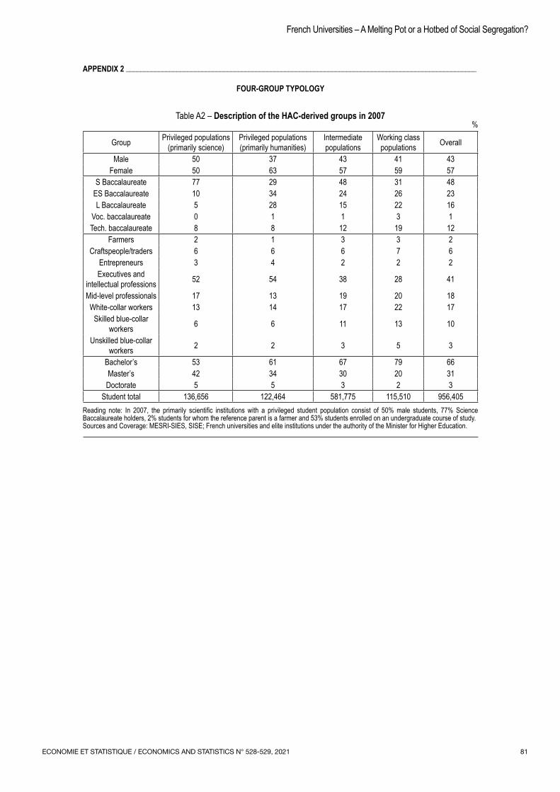
ECONOMIE ET STATISTIQUE / ECONOMICS AND STATISTICS N° 528-529, 2021 81
French Universities – A Melting Pot or a Hotbed of Social Segregation?
APPENDIX 2 _________________________________________________________________________________________________
FOUR-GROUP TYPOLOGY
Table A2 – Description of the HAC-derived groups in 2007 %
Group Privileged populations (primarily science)
Privileged populations (primarily humanities)
Intermediate populations
Working class populations Overall
Male 50 37 43 41 43Female 50 63 57 59 57
S Baccalaureate 77 29 48 31 48ES Baccalaureate 10 34 24 26 23L Baccalaureate 5 28 15 22 16
Voc. baccalaureate 0 1 1 3 1Tech. baccalaureate 8 8 12 19 12
Farmers 2 1 3 3 2Craftspeople/traders 6 6 6 7 6
Entrepreneurs 3 4 2 2 2Executives and
intellectual professions 52 54 38 28 41
Mid‑level professionals 17 13 19 20 18White‑collar workers 13 14 17 22 17
Skilled blue‑collar workers 6 6 11 13 10
Unskilled blue‑collar workers 2 2 3 5 3
Bachelor’s 53 61 67 79 66Master’s 42 34 30 20 31Doctorate 5 5 3 2 3
Student total 136,656 122,464 581,775 115,510 956,405Reading note: In 2007, the primarily scientific institutions with a privileged student population consist of 50% male students, 77% Science Baccalaureate holders, 2% students for whom the reference parent is a farmer and 53% students enrolled on an undergraduate course of study. Sources and Coverage: MESRI‑SIES, SISE; French universities and elite institutions under the authority of the Minister for Higher Education.

ECONOMIE ET STATISTIQUE / ECONOMICS AND STATISTICS N° 528-529, 202182
APPENDIX 3 _________________________________________________________________________________________________
PCA AND TYPOLOGY
Figure A3‑I – Variance explained by the various dimensions of the PCA in 2007
05
101520253035404550
1 2 3 4 5 6 7 8 9 10 11 12 13
% in
ertia
EigenvalueReading note: The first dimension of the PCA reproduces 44% of the initial cluster’s inertia.Sources and Coverage: See Fig. I.
Figure A3‑II – Representation of the two-group HAC-derived typology
-6
-4
-2
0
2
4
6
-7 -5 -3 -1 1 3 5 7
Privileged publics Middle and working class publics
Axis 1 (44%)
Axis 2 (19%)
Sources and Coverage: See Fig. I.

ECONOMIE ET STATISTIQUE / ECONOMICS AND STATISTICS N° 528-529, 2021 83
French Universities – A Melting Pot or a Hotbed of Social Segregation?
Figure A3‑III – Representation of the three-group HAC-derived typology
-6
-4
-2
0
2
4
6
-7 -5 -3 -1 1 3 5 7
Privileged publics (primary field: humanities) Privileged publics (primary field: scientific) Middle and working class publics
Axis 1 (44%)
Axis 2 (19%)
Sources and Coverage: See Fig. I.


85ECONOMIE ET STATISTIQUE / ECONOMICS AND STATISTICS N° 528‑529, 2021
Employee Participation in Corporate Governance: What Impact on the Performance and Cash Distribution Policy in the SBF 120 (2000‑2014)?
Cécile Cézanne* and Xavier Hollandts**
Abstract – This article analyzes the impact of employee share ownership and representation in governance structures on the performance and the payout policy of French listed companies. This empirical work is based on data from a combination of three sources (IODS, Eikon and Thomson Reuters) for a sample of French listed companies listed over the period 2000‑2014. Our results show that employee participation in corporate governance has different impacts. Employee share ownership helps to increase corporate profitability but also to limit dividend payments and share buyback practices. At the same time, employee participation in the Board of Directors (or Supervisory Board) moderates dividend payments to shareholders. These results provide new insights regarding the renewal of corporate governance and the evolution of payout policy.
JEL Classification: G32, G35, J54, L25Keywords: corporate governance, employee share ownership, co‑determination, dividend distribution, share buybacks
*University of Côte d’Azur, CNRS, GREDEG (cecile.cezanne@univ‑cotedazur.fr); **Kedge Business School and ClerMa ([email protected])The authors would like to thank two anonymous reviewers for their comments and suggestions, which allowed for significant improvement of successive versions of the article. They declare that they have no conflict of interest in relation to the text of this article.
Received in January 2020, accepted in February 2021. Translated from “La participation des salariés à la gouvernance d’entreprise : quel impact sur la performance et la politique de distribution des liquidités dans le SBF 120 (2000‑2014) ?“The opinions and analyses presented in this article are those of the author(s) and do not necessarily reflect their institutions’ or Insee’s views
Citation: Cézanne, C. & Hollandts, X. (2021). Employee Participation in Corporate Governance: What Impact on the Performance and Cash Distribution Policy in the SBF 120 (2000‑2014)? Economie et Statistique / Economics and Statistics, 528‑529, 85–107. doi: 10.24187/ecostat.2021.528d.2061

ECONOMIE ET STATISTIQUE / ECONOMICS AND STATISTICS N° 528-529, 202186
Employee share ownership has developed significantly since the 1970s in most
Western economies (Crifo & Rebérioux, 2019). In Europe, as in the United States (since the ERISA Act of 1974), governments have con‑sistently supported the expansion of financial participation and employee savings schemes to private sector employees1 (Gomez, 2019). In France, profit sharing (since 1959) and employee share ownership (since 1967) are the main sources of funding for employee savings, which partly address issues of purchasing power and building up retirement capital (Aglietta & Rebérioux, 2005; Aglietta, 2019). Data from surveys by DARES (the Directorate of research, economic studies and statistics of the Ministry of Labour) consistently show that, depending on the year, 7 to 9 million employees have access to at least one employee savings scheme (employee participation, profit sharing or com‑pany savings plan). In late 2017, this concerned 8.8 million employees, i.e. 49.9% of French employees in the non‑agricultural market sector (Boutier, 2019).
Financial participation and employee savings schemes, usually converted into employee stock ownership (ESO hereafter), allow company employees to invest the sums they hold (often under advantageous conditions due to discounts and matching contributions) in shares or stock in the company that employs them (Desbrières, 2002). Employee share ownership has been growing steadily in most Western countries. France stands out due to its high levels of capital distribution and employee
share ownership. According to figures from the European Federation of Employee Share Ownership (EFES), about 3 million employees in large French companies have access to a specific employee share ownership scheme (EFES, 2018, p. 30). In France, as in other countries, employee share ownership is mainly concentrated in listed companies. Employee share ownership is obviously higher in (very) large companies, particularly listed companies. In France, it is used in 82% of companies with more than 1,000 employees, compared with only 14.5% of companies with between 10 and 49 employees (Boutier, 2019). Among the 120 largest companies listed in the Paris market (hereafter the SBF 120)2 more than half have an employee share ownership scheme (Figure I). The average employee share ownership rate over the period 2006‑2018 is 3.72% of the capital, while the European average is 1.57% (EFES, 2018).
At company level, profit‑sharing and employee participation mechanisms allow for the direct transfer of part of the wealth produced to employees, which has a positive effect on employee retention, satisfaction and commitment
1. Employee savings, financial participation and employee share ownership are largely overlapping concepts. Employee savings include incentives, company profit sharing and employee savings plans. In gene‑ral, these sums are converted, under certain conditions, into support for investment in company shares and thus feed into employee share owner‑ship mechanisms (employee share ownership) (Desbrières, 2002; Boutier, 2019).2. This index, which stands for Société des Bourses Françaises, groups together the 120 largest companies in terms of market capitalisation and volume of trade on the Euronext Paris market.
Figure I – Evolution and spread of employee share ownership in the SBF 120 (2000‑2014)
0
10
20
30
40
50
60
70
0
1
2
3
4
2000 2001 2002 2003 2004 2005 2006 2007 2008 2009 2010 2011 2012 2013 2014
Average percentage of employee share ownership (left axis)
Proportion of companies with employee share ownership > 0 (right axis)
% %
Sources and Coverage: IODS database and AMF reference documents. SBF 120.

ECONOMIE ET STATISTIQUE / ECONOMICS AND STATISTICS N° 528-529, 2021 87
Employee Participation in Corporate Governance
(Kruse, 1996; Blasi et al., 2003; Robinson & Zhang, 2005). It is therefore common to see a positive relationship between employee participation, profit sharing and company performance, through an increase in employee involvement and productivity (Jones & Kato, 1995; Doucouliagos et al., 2020).
In this context, employee financial participation is a clear sign of the spread of a shareholding culture within companies (Aglietta & Rebérioux, 2005; Aglietta, 2019). It allows employees to benefit from a share of the value created, while providing them with a significant lever for taking action in terms of corporate governance (Boatright, 2004; Faleye et al., 2006). Indeed, employee shareholders collectively own a fraction, which is usually substantial, of the shares in the company that employs them, and they benefit from the rights associated to the shares (right to dividend and right to vote at the general shareholders’ meeting). This legal power is all the more important as the remaining capital is usually diluted and few shareholders exercise their voting rights. Furthermore, certain clauses of the articles of association or other extra‑statutory clauses offer them additional voting rights or mitigate the impact of votes from other shareholder groups (Desbrières, 2002). Employee shareholders therefore have an increasingly important role by playing a pivotal role in some shareholding strategies (Balsmeier et al., 2013). Even as minority shareholders, they can thus influence the control of decisions when they create or join a shareholder coali‑tion (Charléty, 2018). For the past fifteen years, legislative developments3 have strengthened the
weighting of employee shareholders in corporate governance by granting them representation on the board of directors (or supervisory board) of listed companies (Hollandts & Aubert, 2019; Crifo & Rebérioux, 2019). While this trend seems to be moving towards a more employee‑ inclusive form of governance and more inclu‑sive capitalism, at the same time we are seeing records for cash payouts to shareholders (Driver et al., 2020). Figure II describes this trend for the sample we analyse as part of this article.
In Europe, France is even thought to be the country paying the most cash to shareholders (Trabelsi et al., 2019). In 2019, €60.2 billion were distributed in the form of share buybacks and dividends paid out to shareholders of CAC 40 companies (+12% compared to 2018 and steadily increasing since 2009)4 with an average profit distribution rate of 48% for the companies in the sample. This trend is character‑istic of the context of increasing financialisation of the economy and of governance that is mainly oriented towards shareholders – on this subject, see the works of Lazonick & O’Sullivan (2000) and Lazonick (2018) in the Anglo‑Saxon context, or Auvray et al. (2016) and Aglietta (2019) in the French context. At present, it is indeed the shareholders who benefit most from
3. The law of 30 December 2006 requires employee shareholders to be represented on the board of directors of listed companies. The law of 22 May 2019 on the growth and transformation of companies (PACTE law), even extends this system to the largest unlisted companies (over 1,000 employees in France or 5,000 if the company is active in France and abroad, see Article 184 of the PACTE law).4. https://www.lerevenu.com/bourse/dividendes‑vers‑un‑record‑en‑2019‑avec‑plus‑de‑50‑milliards‑deuros‑distribues‑par‑le‑cac‑40 and Vernimmen.net (2020).
Figure II – Evolution of dividend payouts and share buybacks in the SBF 120
Dividend payouts Share buybacks
0
100
200
300
400
500
600
2000 2001 2002 2003 2004 2005 2006 2007 2008 2009 2010 2011 2012 2013 2014
Billion€
Sources and Coverage: IODS database and AMF reference documents. SBF 120.

ECONOMIE ET STATISTIQUE / ECONOMICS AND STATISTICS N° 528-529, 202188
the distribution of profits (Driver et al., 2020), although they can also benefit employees or the company itself.
In this context characterised by increasing employee share ownership, we suggest that it is appropriate to consider the financial conse‑quences of employee participation on capital and on strategic decision‑making bodies. How does this employee participation influence the relationship between the company and its shareholders? To what extent does this practice interfere with profit‑sharing decisions? The aim of this article is twofold: to analyse the impact of employee share ownership and participa‑tion in decision‑making (i) on the company’s performance and (ii) on its cash distribution policy. This empirical work is carried out using original data from a sample of companies listed in France between 2000 and 2014. To the best of our knowledge, this is one of the very first studies on the subject carried out using French data, over a recent and relatively long period. The French case is all the more interesting to study because it constitutes a hybrid system of corporate governance, halfway between the Germanic and Nordic models (including a compulsory presence of employee directors without any link with employee share owner‑ship via co‑determination) and the Anglo‑Saxon models (with significant employee share owner‑ship but without employee representation at governance level). This econometric study continues and extends previous work on the link between employee share ownership and corporate financial policy (Aubert et al., 2016; 2017; Ginglinger et al., 2011). It sheds light on and analyses this phenomenon using more recent data on large French stock market capitalisations and in the light of recent developments.
After a review of the literature covering the effects of employee participation, we present the data, the variables and an initial descriptive approach (Section 2), followed by the estimation method and the results (Section 3).
1. A Review of the LiteratureThe literature on the effects of employee partic‑ipation has developed in two directions that are of interest to us here: by analysing its effects on corporate performance and on the company’s cash distribution policy.
1.1. Employee Participation and Company Performance
A part of the historically dated academic litera‑ture considers, in line with the analysis by Jensen
& Meckling (1979), that any form of collec‑tive association (partial, majority or total) of employees in the capital and/or in the decisions of the company is unsatisfactory compared to an optimal configuration characterised by a strict separation between shareholders, managers and employees. According to Jensen & Meckling (1979), employee participation (in capital and/or decisions) is imposed on companies by public authorities and leads to failures that hinder corporate governance and corporate perfor‑mance. For the authors, the main reason for these failures is the time horizon of employees, which is limited by the expiry of their employment contracts. Employees are thus naturally inclined to choose investment projects that correspond to the end of their employment contracts, to the detriment of the company’s development whose time horizon is assumed to be infinite. Furthermore, they expose the company and its shareholders to hold‑up risks, which manifest themselves in the promotion of decisions related to wage and benefit increases based on oppor‑tunistic behaviour. Employees seek to increase the benefits available to them, which may lead them to reduce, delay or eliminate the invest‑ments needed to develop firm‑specific assets and thus damage the company’s competitiveness. In other words, in the absence of an effective incentive system, employee shareholders, who act in accordance with a limited time horizon, tend to under‑invest and deprive the company of part of the wealth it could create.
While employee participation can be detrimental at collective level, at the individual level it can have positive effects due to interest alignment. In line with the rationale of the agency theory (Jensen & Meckling, 1976; Holmström & Milgrom, 1994; Hart, 1995; Shleifer & Vishny, 1997), employee share ownership is an effec‑tive individual incentive and control tool that steers the company’s employees in question towards a strategy that is in line with maximising shareholder value. The direct participation of employees in the capital of the company can be seen as a way for shareholders to transfer ex ante part of the risk of the company’s activity to employees, especially those providing the most critical resources (Aglietta & Rebérioux, 2005). More precisely, the delegation of owner‑ship rights is an indicator of the residual control of the firm (embodied by its shareholders) over its key employees, as well as being a measure of residual income sharing to encourage them to behave in a manner that fulfils the objective of maximising the value of the firm’s equity. Opening up the capital makes it possible to align

ECONOMIE ET STATISTIQUE / ECONOMICS AND STATISTICS N° 528-529, 2021 89
Employee Participation in Corporate Governance
the interests of employees with those of share‑holders and helps to resolve potential agency conflicts. This is also suggested (albeit based on a radically different representation of the firm) by Blair (1999, 2012) in a legal approach, or Kruse (1996) in a managerial perspective. These authors argue that the development of employee share ownership makes it possible to combat hold‑up attempts linked to the risk of underinvestment in human capital,5 in particular because of the monetary gains associated with employee share ownership. At the same time, it has positive effects on encouraging individuals to invest, leading to an increase in employee productivity (Doucouliagos et al., 2020; Jones & Kato, 1995).
Numerous empirical studies on the subject show a positive relationship between employee share ownership and company performance measured in terms of value created for shareholders (Blasi et al., 2016; Kim & Patel, 2017). The meta‑ analysis by O’Boyle et al. (2016) on 102 samples representing 56,984 companies representative of the global corporate population goes in the same direction and confirms that employee share ownership has a positive and statistically signif‑icant relationship with company performance.
Owning capital gives employee shareholders control rights that can be used to strengthen their influence at the heart of governance. This is precisely the case when they become direc‑tors, in addition to their collective ownership of company capital. Since the board of directors (or supervisory board) has decision‑making rights, supervisory and sanctioning powers, but is also able to participate in the management of the company, its composition is crucial. Employee participation can be positive insofar as it makes it possible to align the interests of the productive coalition (Fama & Jensen, 1983; Goodijk, 2000). Employees provide a critical view of the impact of proposed strategies on the development of human capital, which is increasingly central to the creation of corporate value (Mahoney & Kor, 2015; Wang et al., 2009). Furthermore, their good knowledge of the employee culture and life within the company can enable the board to assess and evaluate how employees receive and implement the proposed strategies (Jensen & Meckling, 1995). Finally, since experienced employees are the bearers of a shared memory, they often provide the historical perspective necessary for prudent decision‑making by suggesting that past failures and successes be taken into account. Ultimately, employee directors help to optimise the decisions of the governance body while ensuring strong
negotiating power over management. Empirical studies confirm the positive impact of co‑deter‑mination (i.e. the sharing of management and decision control powers between shareholders and employees) on the performance of compa‑nies, measured in terms of economic value and stock market value (Gorton & Schmidt, 2004; Fauver & Fuerst, 2006).
Based on this prevailing theoretical and empir‑ical work, which examines employee ownership as a tool for individual incentive to interest alignment, we make the following assumptions: - (H1) there is a positive relationship between
employee share ownership and company performance; - (H2) there is a positive relationship between
employee membership of the board of directors and company performance.
1.2. Employee Participation and Cash Distribution Policy
Since it guarantees employees decision‑making power over the company’s major orientations, employee share ownership has an impact on the choices regarding the distribution of the compa‑ny’s cash. Depending on how employee share ownership is represented, it can have a positive or negative effect on the redistribution of the wealth created for shareholders.
1.2.1. Employee Representation Leads to a Distribution of Wealth that is Favourable to Shareholders
In line with the traditional lessons of agency theory, employee share ownership enables employees to influence and guide business strategies in the desired direction (Ginglinger et al., 2011). Based on the fundamental principle of “one share = one vote”, it allows employee shareholders to exercise their discretionary power directly in the general meeting. They can thus influence the ordinary management of the company and financial policy decisions such as the distribution of dividends.
At the same time, the presence of employee shareholders on governance bodies allows other shareholder representatives to access information that they would not otherwise have been able to obtain. Employee directors hold private information which, by being disclosed to other directors, strongly limits information
5. The risk of underinvestment in human capital manifests itself, for example, in turnover, absenteeism, work stoppages, strikes or even resi‑gnations (Fauver & Fuerst, 2006).

ECONOMIE ET STATISTIQUE / ECONOMICS AND STATISTICS N° 528-529, 202190
asymmetry, which can benefit to management (Germain & Lyon‑Caen; 2016). Employee directors are said to be the best informed about the situation and functioning of the company (Ginglinger et al., 2011), much better informed than other directors, especially external ones (Cavaco et al., 2017). Thus, the presence of employees on the board reduces overall informa‑tion asymmetry (Acharya et al., 2011), including that relative to management decisions on value creation and distribution strategy (Germain & Lyon‑Caen, 2016). It limits the moral risks associated with, inter alia, poor cash allocation choices (particularly the act of holding “idle” cash) and ensures wealth distribution that is favourable to shareholders.
1.2.2. Employee Representation Contributes to Balanced Profit Sharing
A positive partnership approach argues that the presence of employee shareholders on the board of directors is decisive in its ability to control opportunistic shareholder behaviour (Gorton & Schmid, 2004; Derouiche, 2013). It responds to the principle of co‑determination in corporate governance and thus contributes to the stabilisation of power within the company. Inexpensive, institutional employee participa‑tion allows for effective cooperation within the firm to create and appropriate income collec‑tively (Aoki, 1984). Indeed, the presence of employee directors, who are sensitive to the development of human capital, alongside other directors who are sensitive to the development of financial capital, ensures effective dual control for the collective (Aoki, 1990). More generally, employee participation is a way of protecting the interests of all critical resource holders in the company, especially the employees them‑selves as the holders of specific human capital. Employee shareholders bear a very high level of risk associated with the potential loss of their human and financial capital (Desbrières, 2002) and, as such, they pay particular attention to the company’s profit redistribution policy. The payment of cash that only benefits shareholders can therefore damage the income and value of employee shareholders’ savings, both in the short term (lack of revaluation of bonuses and salaries) and in the long term (career and employment at risk in the absence of invest‑ments favourable to company growth). Thus, employee shareholders seek to maintain their bargaining power over the company’s cash flows in order to favour employee remuneration and/or to support the company’s productive invest‑ment. They apply pressure to retain corporate
profits, rather than paying them out in the form of dividends and share buybacks. Indeed, since dividends, and especially buybacks financed by the issuance of debt securities, increase the risk of the company, all other things being equal, employees should give preference to a lower distribution of cash to shareholders.
This is suggested by some work that is critical of corporate strategies that focus on down‑sizing, which favours an increased return on equity (distribute) (Lazonick & O’Sullivan, 2000; Tulum & Lazonick, 2018). The resulting allocation of resources to shareholders alone deteriorates the productive and innovative capacities of companies and causes employment instability, income inequality and falling produc‑tivity (Rajan & Zingales, 2004; Rebérioux & Aglietta, 2005; Auvray et al., 2016; Lazonick, 2018). However, the few empirical studies of which we are aware that observe the relationship between the presence of employee shareholders and directors and the pay out of cash do not allow us to draw any general conclusions. In their study of the German co‑determination system, Fauver & Fuerst (2006) find that companies with employee representation are more likely to pay out dividends. In the French case, Ginglinger et al. (2011) show that the presence of employee shareholders on the board has no significant influence on cash distribution policy choices.
Given the absence of theoretical consensus and the small number of empirical studies on the subject, we assume the existence of a statistical relationship, without being able to determine its direction, and make the following general assumptions: - (H3) there is a non‑neutral relationship
between employee share ownership and the company’s cash distribution policy; - (H4) there is a non‑neutral relationship
between the presence of employee directors and the company’s cash distribution policy.
2. Data, Variables and Initial Descriptive ElementsThe data used and analysed are based on a sample of companies listed on the SBF 120 index, which includes the 120 largest capi‑talisations on the Paris Stock Exchange. The SBF 120 index has two specific features. Firstly, it is broader than the CAC 40, the flagship index of the Paris Stock Exchange, and better repre‑sents the diversity of French listed companies (Ginglinger et al., 2011). Secondly, the SBF 120 index is composed in a relatively balanced way,

ECONOMIE ET STATISTIQUE / ECONOMICS AND STATISTICS N° 528-529, 2021 91
Employee Participation in Corporate Governance
including companies with and without employee share ownership.
Our final sample is composed of 85 compa‑nies, analysed over 15 consecutive years. Banks and insurance companies have not been included, due to their financial structure and the specific nature of their economic performance (Ginglinger et al., 2011; Lazonick, 2018; Trabelsi et al., 2019). Finally, companies with too many missing values have been removed from the final sample.
Over the observation period, depending on the year, between 42% and 63% of the companies in this sample have a level of employee share ownership higher than zero. The highest figures were reached in the two years preceding the 2008 crisis before stabilising at a level of 60% in the years following the financial crisis (cf. Figure II).
The final database is the result of a combination of three main sources of economic and finan‑cial data. The first, IODS (INSEAD OEE Data Services), mainly provides variables related to corporate governance (board size, number of independent directors, number of employee directors, etc.). The second, Eikon, provides financial data on company performance as well as the practices and amounts paid out in cash redistribution to shareholders. Finally, some control variables are taken from the Thomson Reuters database. The usual data review and cleaning procedures have been carried out (search for outliers and missing values); we have also carried out a manual search of the reference documents or annual reports of the companies concerned in order to correct data reporting errors or missing data.
2.1. Variables of the Analysis
In line with our questions and assumptions, we seek to characterise employee ownership and corporate governance on the one hand, and company performance and cash distribution on the other, which will be our dependent variables.
Two broad categories of dependent variables are defined. The first category, concerning company performance, includes: return on assets (ROA), return on invested capital (ROI) and return on equity (ROE). We favour an approach linked to the economic value of the company (rather than its financial value) in order to take into account the operational performance of the company6 which is commonly used in the methods for calcu‑lating the amounts distributed under employee savings and employee share ownership (in
particular profit‑sharing and incentive schemes) (Desbrières, 2002; Ginglinger et al., 2011; Boutier, 2019). The second category, relative to the distribution of cash to shareholders, consists of the amount spent on share buybacks and the amount of dividends paid out to shareholders.
In terms of explanatory variables, employee participation covers, on the one hand, employee share ownership, measured by the percentage of capital held by employees, and, on the other hand, direct employee participation in the board of directors (or supervisory board), measured by the proportion of employee directors, in line with the work of Balsmeier et al. (2013), Hollandts et al. (2009) or Ginglinger et al. (2011) carried out in relation to the French context.7 We also include a series of variables relating to the key features of ‘good’ corporate governance (Afep‑MEDEF, 2020): the type of structure, whether it is dual or not; the propor‑tion of independent directors, and the proportion of female directors, are considered to ensure a certain level of control over the behaviour and performance of managers.
Finally, we use the traditional control variables for studies of this type: business sector, company size, debt level, number of years since IPO.
Table 1 summarises this set of variables and reports the associated statistics for the sample, averaged over the study period.
We find that the average level of employee share ownership is approaching the 3% threshold, which is the level used by legislators and the literature to correspond to a significant level of employee share ownership (Ginglinger et al., 2011).8 Furthermore, on average, there are one
6. Here we use economic and accounting indicators rather than financial indicators. Firstly, financial performance is more easily subject to variations due to exogenous factors. Indeed, the literature shows that companies, like some shareholders, are able to vary or even ‘manipulate’ market values, which reflect the company’s performance on a momentary and imperfect basis. Secondly, the issue of profit distribution is originally linked to the com‑pany’s economic results and not to its financial value. Finally, employees have a direct interest, above all, in the accounting and economic per‑formance of the company, insofar as the participation and profit‑sharing mechanisms are directly linked (in respect of their calculation formula) to this type of performance.7. In France, employee representation on the board of directors (or super‑visory board) is mandatory where employees hold more than 3% of the company’s capital. The presence of employee directors without any link to employee share ownership (i.e. co‑determination) was made compul‑sory by the Employment Security Law in June 2013 (recently reinforced by the May 2019 PACTE Law). While the distinction between these two types of employee directors seems clear from a regulatory point of view, it is much less clear in practice. Indeed, it is common for some “trade union” employee directors to also be elected to positions reserved for employee shareholder representatives. In this context, we prefer to observe the ove‑rall effect of employee representation rather than separating the two types of representation.8. Over the whole period, the average level is 2.18%, but in the last year (2014) the average is 2.95% compared to 2.01% at the beginning of the period (2000).

ECONOMIE ET STATISTIQUE / ECONOMICS AND STATISTICS N° 528-529, 202192
or two employee representatives on the board of directors or supervisory board, with this proportion rising to more than a third in the company that is most advanced in this area. The proportion of independent directors is slightly below 50%, while the proportion of women is over 10% (and is rising due to the effects of the Copé‑Zimmermann law of 2011).
2.2. Main Developments
Here we present the main trends in the devel‑opment of employee participation and cash
distribution to shareholders (amounts of divi‑dends paid out and shares bought back) in the companies in the sample. Table 2 presents the descriptive statistics of our sample, over the entire study period.
Figure III shows the development of the average level of employee share ownership and the average level of profitability (ROA, ROE and ROI) of the companies in our sample that have employee share ownership. It indicates a collapse in company performance around the time of the 2008/2009 financial crisis.
Table 1 – Variables used in the estimationsVariable type Variable category Name Description
Dependent
PerformanceROA Net margin × Asset turnoverROE Net income in year n / (equity in n + equity in n‑1)/2ROI Net income / Net assets
Cash distributions
Dividends Total amount of dividends distributed to shareholders in year n
Share buybacks Total amount of shares bought back by the company on the stock exchange in year n
Independent
Employee participation
Employee shareholding Proportion of capital held by employeesEmployee directors Proportion of employee directors
GovernanceBoard structure Single board (Board of Directors) or dual board
(Supervisory Board and Management Board)Independent directors Proportion of independent directorsFemale directors Proportion of female directors
Other controlvariables
Assets Total amount of the company’s assetsTurnover Total sales by the companyEBITDA Operating result of the companyDebt Total debt of the companyLength of time on the Stock Exchange (IPO) Number of years listed on the Paris Stock Exchange
Business sector Industry dummy (manufacutring vs. other industries)
Table 2 – Descriptive statistics of the variables in the analysis (2000‑2014)Mean Standard deviation Min Max
Dependent variablesROA 4.23 7.44 ‑85.67 49.25ROE 9.25 24.57 ‑332.74 127.43ROI 6.99 14.19 ‑188.81 72.74Dividends paid out (M€) 336.8 757.2 0 5540.1Share buybacks (M€) 147.2 162.4 0 6160.2
Independent variablesEmployee share ownership 2.58 2.32 0 32.75Ratio of employee directors 1.49 5.93 0 35.29Dual structure 0.27 0.44 0 1Proportion of independent directors 46.53 19.88 0 66.66Proportion of female directors 11.84 10.99 0 53.84Assets (M€) 19,603.4 34,304.1 4.15 265,043.1Turnover (M€) 12,101.5 22,703.1 170.3 182,141.2EBITDA (M€) 1,454.18 28,276.07 ‑114.4 18,960Debt (M€) 271.4 331.4 1 927.77Length of time since IPO 30.01 25.13 3 133
Number of observations: 1,105Sources and Coverage: IODS database and AMF reference documents, authors’ calculations, SBF 120.

ECONOMIE ET STATISTIQUE / ECONOMICS AND STATISTICS N° 528-529, 2021 93
Employee Participation in Corporate Governance
The three performance indicators follow a relatively similar trend, although the ROE displays a higher level of volatility than the other two variables.
Figure IV shows the levels of share buybacks and dividend payments per year (for compa‑nies with employee share ownership only). There has been a steady increase in these levels (expressed as a percentage of net income) with a peak being achieved in the year before the 2008 crisis. These developments are in line with what many observers have been pointing out for several years (see, for example, Vernimmen.
net, 2020, or Trabelsi et al., 2019). The level of share buybacks remains relatively constant over the period, unlike dividends, which are more sensitive to the company’s results, the business sector or stock market dynamics.
Finally, within the sample, the levels of share buybacks and dividend payments remain at relatively high levels after the 2008‑2009 finan‑cial crisis (Figure V‑A), confirming a focus on shareholders in profit distribution practices. The level of employee share ownership, on the other hand, is relatively stable over the whole period (Figure V‑B).
Figure III – Average level of employee share ownership and average profitability of SBF 120 companies with employee share ownership scheme
-15
-10
-5
0
5
10
15
0
1
2
3
4
2000 2001 2002 2003 2004 2005 2006 2007 2008 2009 2010 2011 2012 2013 2014
Employee share ownership (left axis) ROA (right axis)
ROE (right axis) ROI (right axis)
% Ratios
Sources and Coverage: IODS database and AMF reference documents. SBF 120 restricted to companies with employee shareholding above zero.
Figure IV – Average annual proportion of net result allocated to dividend payouts and share buybacks
-60
-40
-20
0
20
40
60
80
100
120
2000 2001 2002 2003 2004 2005 2006 2007 2008 2009 2010 2011 2012 2013 2014
Dividend payouts/Net result Share buybacks/Net result
%
Sources and Coverage: IODS database and AMF reference documents. SBF120 restricted to companies with employee shareholding above zero.

ECONOMIE ET STATISTIQUE / ECONOMICS AND STATISTICS N° 528-529, 202194
3. Estimation Method and Results3.1. Econometric Approach
The structure of our data leads us to carry out dynamic panel estimates over fifteen consecu‑tive years. This method makes it possible to take into account the endogeneity problems generally found in studies linking performance variables and governance variables (Cameron & Triverdi, 2005; Wintoki et al., 2012). Endogeneity is a source of bias in the estimates and failure to account for it could cast doubt on the results obtained or even invalidate them (Wooldridge, 2010; Wintoki et al., 2012). There are several sources of endogeneity: omitted variables, meas‑urement errors and reverse causality (Cameron & Triverdi, 2005; Wooldridge, 2010). To deal with endogeneity, the literature recommends the use of the GMM estimation method for the estimation of dynamic panel models.
Consequently, the general structure of our dynamic regression model is as follows:
VD VD AS Gouvernance Controlit it it it it i i= + + + + + +−β β β β β µ π1 2 1 3 4 5� ++ εit
VD VD AS Gouvernance Controlit it it it it i i= + + + + + +−β β β β β µ π1 2 1 3 4 5� ++ εit
VDit , the dependent variable, alternately corre‑sponds to performance (ROI, ROA and ROE) and the cash distribution (dividends and share buybacks) of company i at date t.
VDit−1 represents the dependent variable lagged by a period; ASit is the measurement of employee share ownership of company i as at date t; Gouvernanceit represents the set of governance variables of company i as at date t; Controlit is the set of control variables of company i as at date t; µi represents individual fixed effects that reflect unobservable effects that do not vary over time; π i represents the sector‑specific fixed
Figure V – Share of employee shareholding, dividend payouts and share buybacks
A – Proportion of employee share ownership and dividend payouts
B – Proportion of employee share ownership and share buybacks
0
1
2
3
4
0
100
200
300
400
500
600
2000 2001 2002 2003 2004 2005 2006 2007 2008 2009 2010 2011 2012 2013 2014Dividend payouts (left axis) Employee share ownership (right axis)
%Billion€
0
1
2
3
4
020406080
100120140160180200
2000 2001 2002 2003 2004 2005 2006 2007 2008 2009 2010 2011 2012 2013 2014Share buybacks (left axis) Employee share ownership (right axis)
Billion€ %
Sources and Coverage: IODS database and AMF reference documents. SBF 120 restricted to companies with employee shareholding above zero.

ECONOMIE ET STATISTIQUE / ECONOMICS AND STATISTICS N° 528-529, 2021 95
Employee Participation in Corporate Governance
effects that reflect the unobservable factors common to all sectors; εit is the error term.
There are two ways of estimating a dynamic regression model: the GMM first difference esti‑mation model of Arellano & Bond (1991) and the GMM system estimation model of Blundell & Bond (1998). The latter combines first difference equations and level equations; the instrumen‑tation of the explanatory variables is carried out based on their first differences. We use the GMM system estimation model developed by Blundell & Bond (1998) because the authors have shown using Monte Carlo simulation that this estimation model performs best (Cameron & Triverdi, 2005; Wooldridge, 2010). It thus allows us to take into account the complexity of the relationship between employee share owner‑ship and profit sharing and to deal effectively with the endogeneity problem (Nekhili et al., 2019). Furthermore, in our study, we consider that the relationship between employee share ownership and cash distribution can be observed simultaneously: employee share ownership has an impact on company performance and the resulting cash distribution, but performance and cash distribution could at the same time have a causal effect on employee share ownership (Ginglinger et al., 2011). To sum up, the GMM system estimation model not only makes it possible to address this endogeneity problem but also takes into account all sources of bias by instrumenting the explanatory variables with their lagged differences and lagged levels (or internal instruments). GMM system esti‑mates are validated in dynamic panels based on two types of tests. Firstly, Sargan’s over‑ identification test makes it possible to test the validity of lagged variables as instruments (the null assumption being that the instruments are valid). Secondly, two tests defined by Arellano & Bond (1991) are used to verify the validity of the null hypothesis of autocorrelation of the first order residuals (AR1) and the absence of second order autocorrelation in the errors of the first difference equation (AR2), respectively.
3.2. Results
Firstly, the correlation matrix shows a link between most of the variables of interest (see Appendix 1), but the level of the coefficients between the explanatory variables excludes possible multicollinearity problems in our regression models.9 Secondly, we seek to test the links formulated in the assumptions justified above with the help of an econometric study, the main results of which are presented in Tables 3 and 4.
Table 3 looks at assumptions H1 and H2 and the influence of employee share ownership and employee membership of the board of directors (or supervisory board) on company performance. Models (1), (2) and (3) reveal, all other things being equal, a positive and significant effect of employee share ownership on company performance, whatever the profit‑ability indicator (ROA, ROE, ROI) used. These results show that the impact of employee share ownership is not sensitive to the performance measurement used. Assumption H1 is therefore validated. These same models (1), (2) and (3) do not allow us to robustly identify, all other things being equal, a direct and significant effect of the presence of employee directors on the profitability of the company. These results do not validate assumption H2.
Table 4 looks at assumptions H3 and H4 and the relationship between employee share owner‑ship and employee membership of the board of directors (or supervisory board) and the company’s cash distribution policy. Models (5) and (7) show that, all other things being equal, employee share ownership has a negative and significant effect on the propensity of companies to pay dividends to their shareholders and to buy back their own shares. These results validate assumption H3 and shed light on the direction of the relationship by showing that employee share ownership is negatively associated with practices of cash redistribution to shareholders. Models (4) and (5) indicate that, all other things being equal, the presence of employee directors also has a negative and significant impact on dividend payouts. This result provides empirical evidence for assumption H4; it reveals that the presence of employee directors limits the cash distribution policy of companies by moderating the amounts of dividends they pay out. However, we do not observe a significant effect on share buybacks. Finally, it can be noted that the governance structure as well as the composition of the board have a significant impact on the cash redistribution policy.
3.3. Robustness Tests
Several econometric problems, mainly relating to endogeneity, were likely to arise in our study and led to additional estimations.
The use of dynamic panel models largely addresses endogeneity issues. The introduction
9. The absence of multicollinearity is corroborated by the analysis of the tolerance or the Variance inflation factor (VIF, equal to the inverse of the tolerance), not presented in the econometric results tables but requested in the STATA software.

ECONOMIE ET STATISTIQUE / ECONOMICS AND STATISTICS N° 528-529, 202196
Table 3 – Influence of employee share ownership on company performance (ROA, ROE, ROI)ROA ROE ROI
(1) (2) (3)ROA* 0.0934 ***
(0.0282)ROE* 0.287 ***
(0.0375)ROI* 0.143 ***
(0.0326)Employee share ownership 2.272 *** 3.527 ** 2.045 **
(0.824) (1.657) (0.979)Employee directors ‑0.211 0.134 0.0417
(0.148) (0.410) (0.202)Dual structure ‑1.729 12.05 ** 1.994
(2.114) (5.607) (2.717)Independent directors ‑0.0548 0.0275 0.0566
(0.0381) (0.0933) (0.0429)Female directors ‑0.00535 0.00955 ‑0.101 **
(0.0373) (0.100) (0.0478)Assets ‑0.876 3.168 ‑1.889 *
(0.671) (2.504) (1.131)Turnover 0.00073 ‑0.00045 0.000098 *
(0.00052) (0.000127) (0.000059)EBITDA 0.00139 *** 0.00540 *** 0.00165 ***
(0.000494) (0.00117) (0.000530)Debt ‑0.000643 ‑0.00441 0.00698
(0.0107) (0.0254) (0.0123)Length of time since IPO 0.216 * 0.602 ** ‑0.00525
(0.114) (0.240) (0.147)Business sector ‑0.890 9.713 *** 3.414 ***
(1.322) (2.574) (1.277)Constant ‑399.6 ‑1.302 34.39
(229.6) (481.3) (302.3)AR(1) ‑1.78 (p=0.00) ‑2.12 (p=0.00) ‑2.02 (p=0.00)AR(2) ‑0.701 (p=0.31) ‑0.84 (p=0.35) ‑1.45 (p=0.22)Sargan 1 1 0.99Number of observations 1,105 1,105 1,105Number of companies 85 85 85
* One year lag.Note: GMM estimates. Significance: ***1%, **5%, *10%, standard deviations in brackets.Sources: IODS database and AMF reference documents, authors’ calculations.
of instrumental and lagged variables thus makes it possible to correct the estimation bias of the effect of employee share ownership on value redistribution. The dynamic models used introduce a time lag of at least one year. The results of other estimations with a lag of 1, 2 and 3 years are stable and consistent, in terms of both significance and the value of the coef‑ficients (see Appendix 2, Table A2‑1). In these circumstances, we have given preference to the results of models estimated using a time lag of one year, which we believe to be the most relevant given the postulated effect between shareholding and value distribution (decided in the following year) and in line with similar work
on the subject: there is no evidence to support the thesis of a lagged effect of two or more years between the observed value of employee share ownership in a given year and its potential effect on value redistribution (Nekhili et al., 2019).
Furthermore, while we have chosen to use an indicator of overall employee representation, we have also made additional estimations distinguishing among employee directors those who represent employee shareholders from those who represent employees more broadly – the latter generally being employee or union representatives. The results of these additional estimations (see Appendix 2, Table A2‑2) do not

ECONOMIE ET STATISTIQUE / ECONOMICS AND STATISTICS N° 528-529, 2021 97
Employee Participation in Corporate Governance
Table 4 – Influence of employee share ownership on cash redistributionDividend payout Share buybacks
(4) (5) (6) (7)Dividend payout* 0.678 *** 0.695 ***
(0.0251) (0.0255)Share buybacks* 0.301 *** 0.328 ***
(0.0278) (0.0279)Employee share ownership ‑192.2 *** ‑36.56 *
(42.59) (26.66)Employee directors ‑12.92 ** ‑12.36 ** 1.482 1.206
(6.009) (6.034) (6.035) (6.043)Dual structure 456.1 *** 394.4 *** 45.27 52.03
(71.17) (72.75) (73.68) (73.91)Independent directors 3.890 *** 4.287 *** 2.300 * 2.315 *
(1.309) (1.317) (1.321) (1.322)Female directors 1.200 0.404 ‑3.135 ** ‑3.268 **
(1.541) (1.558) (1.473) (1.477)Assets 193.8 *** 166.1 *** 26.45 4.419
(34.57) (35.25) (28.39) (32.65)Turnover 0.00430 ** 0.00416 * ‑0.000165 ‑0.000179
(0.00106) (0.00107) (0.00151) (0.00151)EBITDA ‑0.0326 ‑0.0374 * ‑0.0152 ‑0.0129
(0.0202) (0.0203) (0.0202) (0.0203)Debt ‑0.0817 ‑0.0680 ‑0.0906 ‑0.0868
(0.369) (0.370) (0.371) (0.371)Length of time since IPO 0.491 13.21 * 7.911 * 5.126
(6.423) (7.037) (4.435) (4.881)Business sector ‑413.0 *** ‑748.9 *** 63.64 * 108.7 **
(46.85) (88.05) (33.05) (46.63)Constant 4,904 ‑19,104 ‑16,616 ‑10,874
(12,849) (13,954) (8,628) (9,597)AR(1) ‑2.19 (p=0.00) ‑2.04(p=0.00) ‑6.78 (p=0.00) ‑6.54 (p=0.00)AR(2) 0.93 (p=0.38) 1.15(p=0.31) 0.56 (p=0.58) 0.58 (p=0.51)Sargan 1 1 0.99 0.99Number of observations 1,066 1,066 1,066 1,066Number of companies 82 82 82 82
* One year lag.Note: GMM estimates. Significance: ***1%, **5%, *10%, standard deviations in brackets. The number of observations is smaller than in Table 3 because of missing values.Sources: IODS database and AMF reference documents, authors’ calculations.
reveal any significant effect differentiated by type of employee representation, whereas we do observe an effect on the overall representation. In our view, this lack of effect is primarily due to the low number of observations when the two types of representation are strictly separated.
Finally, as mentioned above, we carried out sensitivity tests on various measures of performance (particularly net income). The results obtained do not vary depending on the performance measure used (see Appendix 2, Table A2‑3). We are therefore confident in the quality and robustness of the results presented.
* * *
This article proposed an analysis of the effects of employee share ownership and participation in governance bodies on the performance and cash distribution policy of French companies.
From the point of view of the “employee share ownership‑performance” relationship, our results are in line with those of the liter‑ature which show a positive contribution by employee share ownership to the performance of the firm. These results, which are obtained in both the French case (Aubert et al., 2016; 2017; Ginglinger et al., 2011; Nekhili et al., 2019) and with non‑French data (Blasi et al., 2016; Kim & Patel, 2017; O’Boyle et al., 2016), confirm that employee share ownership contributes to generating performance and ultimately profits.

ECONOMIE ET STATISTIQUE / ECONOMICS AND STATISTICS N° 528-529, 202198
Consequently, these results justify the involve‑ment of employee shareholders in decisions on the redistribution of these same profits (Crifo & Rebérioux, 2019) and fuel the debates on the subject (see the Cotis report, 2009, or more recently the Notat & Senard report, 2018). However, studies warn of ambivalent effects when employee share ownership exceeds certain levels (see Guedri & Hollandts, 2008, on French data). This is the case for the study by Faleye et al. (2006) on a sample of US listed companies in the mid‑1990s, which is still considered one of the most comprehensive on the subject. The study shows that the positive effects of employee ownership on performance are more important for moderate levels (below 5% of capital) and tend to decrease above this threshold.
From the point of view of the “employee direc‑tors‑performance” relationship, our results indicate that the mere presence of employees on the board of directors, all other things being equal, has no significant direct effect on company performance. They are in line with the results of research that suggests that, in order to be an efficient arrangement, employee participation in governance bodies needs to be limited. This is a lesson imparted by the study by Gorton & Schmid (2004), for example. Carried out on the 250 largest German non‑financial public limited companies over the period 1989‑1993, that study shows that high levels of co‑determination have a significant negative impact on company performance: a change from one‑third to one‑half of the supervisory board being made up by employee representatives (which is allowed under German law) lowers the value of the company. More specifically, the results indicate that companies with equal representation (50% being employees) have a share value (as measured by market‑to‑book ratio of equity) 31% lower than that of compa‑nies with lower employee representation (a proportion of one‑third being employees). Fauver & Fuerst (2006) extend and refine these findings using a sample of 786 German listed companies observed in 2003. They demonstrate that limited levels of employee representation on boards increase the efficiency and market value of firms (as measured by Tobin’s Q). For complex industries that require a high level of co‑ordination, employee representation leads to diminishing marginal returns above a certain threshold (around one third of employee repre‑sentatives) although higher levels of participation (more than one third) still improve company performance. Their results further show that this positive effect is not observed for trade union
representatives. The study by Ginglinger et al. (2011), based on 1,638 observations of SBF 120 companies over the period 1998‑2008, presents similar contrasting results: the link between co‑determination and company performance is not clear and uniform and depends on the type of employee representation. Specifically, this study indicates that the fraction of board seats held by employee shareholders is positively and significantly related to Tobin’s Q and both ROA measures (a robust result regardless of the model specification). In contrast, the fraction of board seats held by employee representatives (i.e. not related to employee share ownership) is significantly positively related to only ROA, and only for certain model specifications. Thus, in situations in which incentive mechanisms operate at individual level (characteristics of employee share ownership and employee shareholder representation on the board) but employee representation does not exceed certain thresholds so as not to have too much influence on decisions, collective employee participation in corporate governance (at aggregate level) increases company performance.
As regards the relationship between employee share ownership and cash distribution to share‑holders, our results show that (i) employee share ownership has a direct, negative and significant impact on the amount of dividends distributed and the amount of shares bought back by the company, (ii) the presence of employee directors also has a negative and significant impact on the amount of dividends paid out by the company. These results clearly suggest that employee participation through shareholding and pres‑ence in governance bodies tends to moderate the redistribution of profits to shareholders alone. They provide a first basis for a proposal in favour of a negative relationship between the presence of employee shareholders and directors and the company’s profit redistribution policy. Empirically, by indicating that employee partici‑pation moderates the redistribution of wealth to shareholders, our results are in line with recent work advocating a balanced allocation of value to ensure company survival and development (Rajan & Zingales, 2004; Aglietta & Rebérioux, 2005; Auvray et al., 2016; Lazonick, 2018; Tulum & Lazonick, 2018). They suggest that the interests and time horizon of employee shareholders are aligned with a longer‑term perspective, perhaps because of the minimum five‑year lock‑in period for shareholdings. Employee participation in corporate governance leads to preference being given to the profit retention for the benefit of the internal coalition

ECONOMIE ET STATISTIQUE / ECONOMICS AND STATISTICS N° 528-529, 2021 99
Employee Participation in Corporate Governance
and the company itself. If profits are less distrib‑uted to external shareholders, they can be used more to self‑finance the company’s investment projects or to benefit the employees themselves. As employees contribute positively to perfor‑mance, a virtuous circle is likely to emerge.
Ultimately, employee participation is not neutral: it contributes, all other things being equal, to sustaining and improving the performance of the company. It also makes it possible to influence cash distribution policy, by acting as a factor for moderation (or balancing) of the redistribution of profits to shareholders alone, the constant increase, or even abuse, of which is regularly denounced.
The empirical work presented here is part of a more general context of reflections on the mutation of shareholder capitalism, undertaken both at academic level (Auvray et al., 2016; Crifo & Rebérioux, 2019) and at political level. In France, for example, the recent PACTE law (2019) led to several important changes to the French Civil Code and promoted a more inclu‑sive form of capitalism, in the government’s own words, notably by promoting and further devel‑oping employee savings mechanisms (Aubert & Bernheim, 2020). The political debate (see statements by the French Minister of the Interior or Prime Minister)10 also highlights employee savings and shareholding as major levers for the evolution of French capitalism: firstly, by encouraging managers and shareholders to change corporate governance, including cash redistribution policy; secondly, by offering each company the opportunity to establish a virtuous economic circle within its own organisation (Aubert et al., 2009).
Beyond France’s borders, strong statements such as those made by the CEO of Blackrock
(the world’s largest asset manager) or the BRT (Business Roundtable, a powerful business lobby in the United States) point in the direction of a more partnership‑based capitalism and govern‑ance. Thus, in France as elsewhere, avenues are being explored for a more balanced form of governance that could eventually lead to a less unbalanced distribution of profits. Indeed, very recent empirical studies show that employee profit sharing is a way of boosting productivity and thus company performance by increasing workplace cooperation, information sharing and employee engagement (see the meta‑regression by Doucouliagos et al., 2020). In the coming years, it will be interesting to observe the effects of employee participation on the performance and cash distribution policies of companies. Indeed, our results show noticeable effects in the period prior to the PACTE law, the intention of which is to rapidly promote employee partic‑ipation in the capital and governance bodies of companies. Will the provisions set out by this law be such as to amplify these effects? Will increased employee share ownership (the target set by the PACTE law for 10% of French compa‑nies’ capital to be held by their employees by 2030) and the systematic presence of employees on boards continue to boost company profita‑bility? Will the effects observed in terms of profit sharing be confirmed or even accentuated? Beyond these issues, it will also be interesting to observe the effects of employee participation and cash distribution policy on the economic dynamism of companies, in terms of their ability both to grow and to innovate or develop.
10. https://www.lesechos.fr/economie‑france/social/pourquoi‑darma‑nin‑veut‑relancer‑le‑chantier‑de‑la‑participation‑1205269, https://www.rtl.fr/actu/politique/emploi‑jean‑castex‑pas‑defavorable‑au‑deblocage‑anti‑cipe‑de‑l‑interessement‑7800772343
BIBLIOGRAPHY
Acharya, V., Myers S. & Rajan R. (2011). The internal governance of firms, Journal of Finance, 66(3), 689–720. https://doi.org/10.1111/j.1540‑6261.2011.01649.xAfep‑MEDEF (2020). Code Afep‑ MEDEF révisé de gouvernement d’entreprise des sociétés cotées, janvier. https://afep.com/wp‑content/uploads/2020/01/Code‑Afep_Medef‑r%C3%A9vision‑janvier‑2020_‑002.pdf.Aglietta, M. (2019). Capitalisme. Le temps des ruptures. Paris: Odile Jacob.Aglietta, M. & Rebérioux, A. (2005). Corporate governance adrift: a critique of shareholder value. Cheltenham, UK: Edward Elgar Publishing.Aoki, M. (1984). The co‑operative game theory of the firm. New York: Oxford University Press.Aoki, M. (1990). Toward an economic model of the Japanese firm. Journal of Economic Literature, 28(1), 1–27. https://www.jstor.org/stable/2727189

ECONOMIE ET STATISTIQUE / ECONOMICS AND STATISTICS N° 528-529, 2021100
Arellano, M. & Bond, S. (1991). Some tests of specification for panel data: Monte Carlo evidence and an application to employment equations. The Review of Economic Studies, 58(2), 277–297.https://doi.org/10.2307/2297968Aubert, N. & Bernheim P. (2020). What the PACTE law changes for employee savings and participation? Bankers Markets and Investors, in press. https://hal.archives‑ouvertes.fr/hal‑02532708/Aubert, N., Chassagnon, V. & Hollandts, X. (2016). Actionnariat salarié, gouvernance et performance de la firme : une étude de cas économétrique portant sur un groupe français coté. Revue d’Économie Industrielle, 154, 151–176. https://doi.org/10.4000/rei.6365Aubert, N., Grand, B., Lapied, A. & Rousseau, P. (2009). Is employee ownership so senseless? Finance, 30(2), 5–29. https://doi.org/10.3917/fina.302.0005Aubert, N., Kern, A. & Hollandts, X. (2017). Employee stock ownership and the cost of capital. Research in International Business and Finance, 41, 67–78. https://doi.org/10.1016/j.ribaf.2017.04.007Auvray, T., Dallery, T. & Rigot, S. (2016). L’entreprise liquidée. La finance contre l’investissement. Paris: Michalon. https://hal.archives‑ouvertes.fr/hal‑01380394Balsmeier, B., Bermig, A. & Dilger, A. (2013). Corporate governance and employee power in the boardroom: An applied game theoretic analysis. Journal of Economic Behavior & Organization, 91, 51–74.https://doi.org/10.1016/j.jebo.2013.04.004Blasi, J., Freeman, R. & Kruse, D. (2016). Do broad‑based employee ownership, profit sharing and stock options help the best firms do even better? British Journal of Industrial Relations, 54(1), 55–82.https://doi.org/10.1111/bjir.12135Blasi, J. R., Kruse, D. & Bernstein, A. (2003). In the company of owners: The truth about stock options (and why every employee should have them). New York: Basic Books.Blair, M. M. (1999). Firm‑specific human capital and theories of the firm. In: M. M. Blair & M. J. Roe (Ed.), Employees and Corporate Governance, Ch 2. Washington, DC: Brookings Institution Press.Blair, M. M. (2012). In the best interest of the corporation: Directors’ duties in the wake of the global crisis. In: T. Clarke & D. Branson (Ed.), The SAGE Handbook of Corporate Governance, Ch. 2. Washington, DC: SAGE.Blundell, R. & Bond, S. (1998). Initial conditions and moment restrictions in dynamic panel data models. Journal of econometrics, 87(1), 115–143. https://doi.org/10.1016/S0304‑4076(98)00009‑8Boatright, J. R. (2004). Employee governance and the ownership of the firm. Business Ethics Quarterly, 14(1), 1–21. https://www.jstor.org/stable/3857770Boutier, K. (2019). Participation, intéressement et épargne salariale en 2017. Dares Résultats N° 036.https://dares.travail‑emploi.gouv.fr/publications/participation‑interessement‑et‑epargne‑salariale‑en‑2017Cameron, A. & Trivedi, P. (2005). Microeconometrics: Methods and applications. Cambridge: Cambridge University Press.Cavaco, S., Crifo, P., Rebérioux, A. & Roudaut, G. (2017). Independent directors: Less informed but better selected than affiliated board members? Journal of Corporate Finance, 43, 106–121.https://doi.org/10.1016/j.jcorpfin.2017.01.004Charléty, P. (2018). L’activisme actionnarial dans l’assemblée générale : quels bénéfices pour les actionnaires et les entreprises ? Revue d’Économie Financière, 2(130), 195–221. https://doi.org/10.3917/ecofi.130.0195Crifo, P. & Rebérioux, A. (2019). La participation des salariés : du partage d’information à la codétermina-tion. Paris : Presses de Sciences Po. https://www.pressesdesciencespo.fr/fr/book/?gcoi=27246100262630Cotis, J.‑P. (2009). Partage de la valeur ajoutée, partage des profits et écarts de rémunérations en France. Rapport au Président de la République. Insee. https://www.vie‑publique.fr/sites/default/files/rapport/pdf/094000213.pdfDerouiche, I. (Ed.) (2013). Quel rôle pour le conseil d’administration dans la détention de liquidités ? Cas des entreprises françaises cotées. Paris: Lavoisier.Desbrières, P. (2002). Les actionnaires salariés. Revue Française de Gestion, 5(141), 255–281.https://www.cairn.info/revue‑francaise‑de‑gestion‑2002‑5‑page‑255.htmDoucouliagos, H., Laroche, P., Kruse, D. & Stanley, T. (2020). Is Profit Sharing Productive? A Meta‑Regres‑sion Analysis. British Journal of Industrial Relations, 58(2), 364–395. https://doi.org/10.1111/bjir.12483Driver, C., Grosman, A. & Scaramozzino, P. (2020). Dividend policy and investor pressure. Economic Modelling, 89, 559–576. https://doi.org/10.1016/j.econmod.2019.11.016EFES – European Federation of Employee Share Ownership (2018). Economic survey of employee share ownership in European countries in 2018.http://www.efesonline.org/Annual%20Economic%20Survey/2018/Presentation.htm (Accessed 18/12/2019)Faleye, O., Mehrotra, V. & Morck, R. (2006). When labor has a voice in corporate governance. Journal of Financial and Quantitative Analysis, 41(3), 489–510. https://doi.org/10.1017/S0022109000002519

ECONOMIE ET STATISTIQUE / ECONOMICS AND STATISTICS N° 528-529, 2021 101
Employee Participation in Corporate Governance
Fama, E. F. & Jensen, M. C. (1983). Separation of ownership and control. The Journal of Law and Economics, 26(2), 301–325. https://www.journals.uchicago.edu/doi/abs/10.1086/467037Fauver, L. & Fuerst, M. E. (2006). Does good corporate governance include employee representation? Evidence from German corporate boards. Journal of Financial Economics, 82(3), 673–710.https://doi.org/10.1016/j.jfineco.2005.10.005Germain, L. & Lyon‑Caen, C. (2016). Do we need employee representation on the board of directors? SSRN working papers. https://papers.ssrn.com/sol3/papers.cfm?abstract_id=2729708Ginglinger, E., Megginson, W. & Waxin, T. (2011). Employee ownership, board representation and corporate financial policies. Journal of Corporate Finance, 17(4), 868–887.https://doi.org/10.1016/j.jcorpfin.2011.03.005Gomez, P.‑Y. (2019). L’esprit malin du capitalisme. Comprendre la crise qui vient. Paris: Desclée De Brouwer.Gorton, G. & Schmid, F. A. (2004). Capital, labor, and the firm: A study of German codetermination. Journal of the European Economic Association, 2(5), 863–905. https://doi.org/10.1162/1542476042782260Goodijk, R. (2000). Corporate governance and workers’ participation. Corporate Governance: An Internatio-nal Review, 8(4), 303–310. https://doi.org/10.1111/1467‑8683.00209Guedri, Z. & Hollandts, X. (2008). Beyond dichotomy: The curvilinear impact of employee ownership on firm performance. Corporate Governance: an International Review, 16(5), 460–474.https://doi.org/10.1111/j.1467‑8683.2008.00703.xHart, O. (1995). Firms, contracts, and financial structure. New York: Oxford University Press − Clarendon Press.Holmström, B. & Milgrom, P. (1994). The firm as an incentive system. The American Economic Review, 84(4), 972–991. https://www.jstor.org/stable/i337079Hollandts, X., Guedri, Z. & Aubert, N. (2009). Représentation du travail au CA et performance de l’entre‑prise : une étude empirique sur le SBF 250 (2000‑2005). In: M.‑N. Auberger & A. Conchon (Ed.), Les adminis-trateurs salariés et la gouvernance d’entreprise. Paris: La Documentation Française.https://hal.archives‑ouvertes.fr/hal‑01989060/documentHollandts, X. & Aubert, N. (2019). La gouvernance salariale : contribution de la représentation des salariés à la gouvernance d’entreprise. Finance Contrôle Stratégie, 22 (1). https://doi.org/10.4000/fcs.3256Jensen, M. C. & Meckling, W. H. (1976). Theory of the firm: Managerial behavior, agency costs and owner‑ship structure. Journal of Financial Economics 3(4), 305‑360. https://doi.org/10.1016/0304‑405X(76)90026‑XJensen, M. C. & Meckling, W. H. (1979). Rights and production functions: An application to labor‑managed firms and codetermination. The Journal of Business, 52(4), 469–506. https://www.jstor.org/stable/2352442Jensen, M. C. & Meckling, W. H. (1995). Specific and general knowledge, and organizational structure. Journal of Applied Corporate Finance, 8(2), 4–18. https://doi.org/10.1111/j.1745‑6622.1995.tb00283.xJones, D. C. & Kato, T. (1995). The productivity effects of employee stock‑ownership plans and bonuses: evidence from Japanese panel data. American Economic Review, 85(3), 391–414.https://www.jstor.org/stable/2118180Kim, K. Y. & Patel, P. C. (2017). Employee ownership and firm performance: A variance decomposition analy‑sis of European firms. Journal of Business Research, 70, 248–254. https://doi.org/10.1016/j.jbusres.2016.08.014Kruse, D. L. (1996). Why do firms adopt profit‑sharing and employee ownership plans? British Journal of Industrial Relations, 34(4), 515–538. https://doi.org/10.1111/j.1467‑8543.1996.tb00488.xLazonick, W. (2018). The functions of the stock market and the fallacies of shareholder value. In: C. Driver & G. Thompson (Ed.), Corporate Governance in Contention, Ch. 6. New York: Oxford University Press.Lazonick, W. & O’sullivan, M. (2000). Maximizing shareholder value: a new ideology for corporate governance. Economy and society, 29(1), 13–35. https://doi.org/10.1080/030851400360541Mahoney, J. T. & Kor, Y. (2015). Advancing the human capital perspective on value creation by joining capabilities and governance approaches. Academy of Management Perspectives, 29(3), 296–308.https://doi.org/10.5465/amp.2014.0151Nekhili, M., Boukadhaba, A., Nagati, H. & Chtioui, T. (2019). ESG performance and market value: the moderating role of employee board representation. The International Journal of Human Resource Manage-ment, 1–27. https://doi.org/10.1080/09585192.2019.1629989Notat, N. & Senard, J.‑D. (2018). L’entreprise, objet d’intérêt collectif. Rapport aux Ministres de la Transition écologique et solidaire, de la Justice, de l’Economie et des Finances, du Travail. 9 mars 2018.https://www.economie.gouv.fr/files/files/PDF/2018/entreprise_objet_interet_collectif.pdfO’Boyle, E. H., Patel, P. C. & Gonzalez‑Mulé, E. (2016). Employee ownership and firm performance: a meta‑analysis. Human Resource Management Journal, 26(4), 425–448. https://doi.org/10.1111/1748‑8583.12115

ECONOMIE ET STATISTIQUE / ECONOMICS AND STATISTICS N° 528-529, 2021102
Rajan, R. G. & Zingales, L. (2004). Saving capitalism from the capitalists: Unleashing the power of financial markets to create wealth and spread opportunity. Princeton: Princeton University Press.Robinson, A. M. & Zhang, H. (2005). Employee share ownership: safeguarding investments in human capital. British Journal of Industrial Relations, 43(3), 469–488. https://doi.org/10.1111/j.1467‑8543.2005.00365.xShleifer, A. & Vishny, R. W. (1997). A survey of corporate governance. Journal of Finance, 52(2), 737–783. https://doi.org/10.1111/j.1540‑6261.1997.tb04820.xTrabelsi, D., Aziz, S. & Lilti, J. (2019). A behavioral perspective on corporate dividend policy: evidence from France. Corporate Governance, 19(1), 102–119. https://doi.org/10.1108/CG‑02‑2018‑0077Tulum, Ö. & Lazonick, W. (2018). Financialized corporations in a national innovation system: The US phar‑maceutical industry. International Journal of Political Economy, 47(3‑4), 281–316.https://doi.org/10.1080/08911916.2018.1549842Verminnem.net (2020). Dividendes et rachats d’actions en 2019. La Lettre Verminnem N° 175.https://www.vernimmen.net/Lire/Lettre_Vernimmen/Lettre_175.htmlWang, H. C., He, J. & Mahoney, J. T. (2009). Firm‑specific knowledge resources and competitive advantage: the roles of economic‑and relationship‑based employee governance mechanisms. Strategic Management Journal, 30(12), 1265–1285. https://doi.org/10.1002/smj.787Wintoki, M. B., Linck, J. S. & Netter, J. M. (2012). Endogeneity and the dynamics of internal corporate governance. Journal of Financial Economics, 105(3), 581–606. https://doi.org/10.1016/j.jfineco.2012.03.005Wooldridge, J. M. (2010). Econometrics analysis of cross section and panel data. Cambridge, MA. and London: The MIT Presss

ECONOMIE ET STATISTIQUE / ECONOMICS AND STATISTICS N° 528-529, 2021 103
Employee Participation in Corporate Governance
APPENDIX 1 ___________________________________________________________________________________________
CORRELATION MATRIX
Employee share ownership
ROA
ROE
ROI
Dividend
Share buybacks
Dual structure
Business sector
Assets
Independent directors
Female directors
Employee directors
Lenght of time since IPO
Turnover
Debt
EBIDTA
Emplo
yee s
hare
ow
nersh
ip1
ROA
‑0.05
011
ROE
0.013
10.0
11
ROI
‑0.03
150.0
399
0.84*
1
Divid
end
0.068
50.0
472
‑0.05
3‑0
.0249
1
Shar
e buy
back
s0.0
351
0.09*
‑0.07
94‑0
.0992
*0.4
*1
Dual
struc
ture
‑0.12
*‑0
.0761
0.020
10.0
206
‑0.07
73‑0
.0071
1
Busin
ess s
ector
‑0.26
52*
‑0.00
660.0
807
0.135
4*‑0
.1415
*‑0
.111.1
171*
1
Asse
ts0.2
568*
‑0.02
94‑0
.0068
‑0.08
93*
0.554
2*0.2
522*
‑0.27
79*
‑0.20
75*
1
Indep
ende
nt dir
ector
s0.0
363
‑0.02
04‑0
.031
‑0.04
29‑0
.0425
‑0.03
680.2
156*
0.029
0.030
71
Fema
le dir
ector
s‑0
.0292
0.004
40.0
225
0.042
7‑0
.0143
‑0.00
75‑0
.0839
*0.0
721
‑0.03
29‑0
.0168
1
Emplo
yee d
irecto
rs‑0
.0446
‑0.11
87*
‑0.02
69‑0
.0408
‑0.03
76‑0
.0258
‑0.07
53‑0
.0323
‑0.06
86‑0
.1815
*0.0
814
1
Leng
ht of
time s
ince
IPO
‑0.04
430.0
153
‑0.02
1‑0
.012
0.170
3*0.0
678
‑0.06
03‑0
.0834
0.016
7‑0
.1529
*0.0
442
0.166
8*1
Turn
over
0.169
2*‑0
0218
‑0.05
6‑0
.077
0.519
4*0.3
042*
‑0.07
8‑0
.1494
*0.5
660*
‑0.01
75‑0
.0092
‑0.04
360.0
411
Debt
0.008
70.0
237
‑0.11
35*
‑0.14
88*
‑0.07
35‑0
.0316
‑0.01
72‑0
.1080
*‑0
.0257
0.058
30.0
260.0
395
‑0.02
26‑0
.0391
1
EBID
TA0.0
722
‑0.01
880.0
402
0.006
4‑0
.0475
‑0.03
07‑0
.1468
*‑0
.0645
0.040
4‑0
.0115
0.086
9*0.5
526*
‑0.03
35‑0
.0163
0.010
21
Note: The bottom diagonal shows the Pearson correlation coefficients. *significant at the 5% level.Sources: IODS database and AMF reference documents, authors’ calculations.

ECONOMIE ET STATISTIQUE / ECONOMICS AND STATISTICS N° 528-529, 2021104
APPENDIX 2 ___________________________________________________________________________________________
Table A2‑1 – Influence of employee shareholding on cash redistribution in year n, with a lag from 1 to 3 years of the variable of interest
A – Dividend payouts(5) (5a) (5b)
Dividend payout* 0.695 *** 0.582 *** 0.563 ***(0.0255) (0.0298) (0.0313)
Dividend payout** 0.172 *** 0.235 ***(0.0262) (0.0353)
Dividend payout*** ‑0.0747 **(0.0338)
Employee share ownership ‑192.2 *** ‑192.7 *** ‑246.9 ***(42.59) (40.60) (48.87)
Employee directors ‑12.36 ** ‑13.29 ** ‑12.46 **(6.034) (6.123) (6.286)
Dual structure 394.4 *** 428.5 *** 452.4 ***(72.75) (71.14) (73.51)
Independent directors 4.287 *** 3.487 *** 2.157(1.317) (1.293) (1.410)
Female directors 0.404 0.182 1.218(1.558) (1.503) (1.583)
Assets 166.1 *** ‑177.3 *** ‑183.3 ***(35.25) (34.92) (37.64)
Turnover 0.00416 *** 0.00432 *** 0.00430 ***(0.00107) (0.00102) (0.00106)
EBITDA ‑0.0374 * ‑0.0411 ** ‑0.0403 **(0.0203) (0.0194) (0.0202)
Debt ‑0.0680 ‑0.0388 ‑0.0568(0.370) (0.354) (0.363)
Length of time since IPO 13.21 * 12.52 * 24.69 ***(7.037) (6.843) (8.752)
Business sector ‑748.9 *** ‑779.3 *** ‑941.0 ***(88.05) (84.88) (105.2)
Constant ‑19,104 ‑17,355 ‑40,512(13,954) (13,573) (17,274)
AR(1) ‑2.04(p=0.00) ‑2.07 (p=0.00) ‑2.09 (p=0.00)AR(2) 1.15(p=0.31) 0.45 (p=0.61) 0.61 (p=0.43)Sargan 1 0.99 1Number of observations 1,066 1,066 1,066Number of companies 82 82 82

ECONOMIE ET STATISTIQUE / ECONOMICS AND STATISTICS N° 528-529, 2021 105
Employee Participation in Corporate Governance
B – Share buybacks(7) (7a) (7b)
Share buybacks* 0.0328 ** ‑0.0233 ** ‑0.0412 **(0.0279) (0.0291) (0.0302)
Share buybacks** ‑0.204 ** ‑0.205 **(0.0307) (0.0326)
Share buybacks*** ‑0.253 **(0.0786)
Employee share ownership ‑36.56 * ‑34.85 * ‑31.55 *(26.66) (27.05) (27.92)
Employee directors 1.206 ‑1.627 ‑1.555(6.043) (6.438) (6.609)
Dual structure 52.03 21.82 ‑6.587(73.91) (75.88) (78.03)
Independent directors 2.315 * 2.920 ** 3.046 **(1.322) (1.359) (1.455)
Female directors ‑3.268 ** ‑4.029 *** ‑4.022 ***(1.477) (1.492) (1.560)
Assets 4.419 ‑25.72 ‑67.83 *(32.65) (34.60) (40.24)
Turnover ‑0.000179 0.000825 0.000522(0.00151) (0.00154) (0.00158)
EBITDA ‑0.0129 ‑0.0277 ‑0.0315(0.0203) (0.0204) (0.0212)
Debt ‑0.0868 ‑0.00640 ‑0.0433(0.371) (0.372) (0.381)
Length of time since IPO 5.126 8.051 13.14 **(4.881) (5.027) (5.452)
Business sector 108.7 ** 138.1 *** 149.5 ***(46.63) (46.89) (48.55)
Constant ‑10,874 ‑16,097 ‑25,235(9,597) (9,882) (10,661)
AR(1) ‑6.54 (p=0.00) ‑7.12 (p=0.00) ‑6.92 (p=0.00)AR(2) 0.58 (p=0.51) 1.51 (p=0.27) 0.54 (p=0.49)Sargan 0.99 1 1Number of observations 1,066 1,066 1,066Number of companies 82 82 82
* One year lag. ** Two year lag.*** Three year lag.Notes: ***significant at 1%, **significant at 5%, *significant at 10%. Standard deviations in brackets.

ECONOMIE ET STATISTIQUE / ECONOMICS AND STATISTICS N° 528-529, 2021106
Table A2‑2 – Results of GMM regressions testing the differential effect of the type of employee representation (employee shareholders or employees). One‑year lag in the variable of interest
(Dividend payouts or share buybacks)Dividend payouts Share buybacks
(5c) (5d) (7c) (7d)Dividend payouts* 0.682 *** 0.680 ***
(0.0251) (0.0251)Share buybacks* 0.299 *** 0.297 ***
(0.0278) (0.0278)Dual structure 461.8 *** 460.6 *** 49.49 45.58
(71.13) (71.17) (73.87) (73.68)Independent directors 4.163 *** 4.167 *** 2.233 * 2.292 *
(1.304) (1.304) (1.320) (1.319)Female directors 0.804 0.846 ‑3.376 ** ‑3.175 **
(1.533) (1.532) (1.477) (1.465)Employee shareholder directors ‑7.631 ‑80.34
(70.50) (65.86)Employee directors ‑90.92 ‑12.93
(54.68) (55.51)Assets ‑192.5 *** ‑193.8 *** 35.13 26.40
(35.24) (34.67) (29.30) (28.40)Turnover 0.00436 *** 0.00415 *** ‑0.000156 ‑0.000136
(0.00107) (0.00107) (0.00151) (0.00151)EBITDA ‑0.0259 ‑0.0260 ‑0.0177 ‑0.0160
(0.0200) (0.0200) (0.0201) (0.0200)Debt ‑0.0801 ‑0.0872 ‑0.0902 ‑0.0911
(0.369) (0.369) (0.371) (0.371)Length of time since IPO 0.320 0.428 8.422 * 7.670 *
(6.467) (6.395) (4.437) (4.410)Business sector ‑417.7 *** ‑409.6 *** 57.34 * 62.28 *
(47.02) (46.90) (32.98) (32.68)Constant 5,185 4,983 ‑17,791 ‑16,127
(12,961) (12,802) (8,645) (8,575)AR(1) ‑1.82 (p=0.00) ‑2.15 (p=0.00) ‑2.07 (p=0.00) ‑2.11 (p=0.00)AR(2) 0.38 (p=0.35) 0.75 (p=0.33) 1.11 (p=0.25) 1.46 (p=0.22)Sargan 0.99 0.99 1 1Number of observations 1,066 1,066 1,066 1,066Number of companies 82 82 82 82
* One year lag.Notes: ***significant at 1%, **significant at 5%, *significant at 10%. Standard deviations in brackets.

ECONOMIE ET STATISTIQUE / ECONOMICS AND STATISTICS N° 528-529, 2021 107
Employee Participation in Corporate Governance
Table A2‑3 – Results of GMM regressions testing the effect of employee shareholding on other company performance indicators
Net result Tobin’s Q Net cashNet result* 0.103 ***
(0.0248)Tobin's Q* 0.202 ***
(0.0303)Net cash* 0.453 ***
(0.0339)Employee share ownership 0.168 *** 0.620 *** 0.134 *
(0.0498) (0.142) (0.0921)Dual structure 0.0383 *** ‑0.0274 * 0.0917 ***
(0.0142) (0.0158) (0.0248)Independent directors 0.102 0.116 0.0606
(0.180) (0.215) (0.313)Female directors 0.00540 ‑0.00509 0.00264
(0.00295) (0.00350) (0.00547)Employee directors 0.000169 0.0150 * 0.00898 *
(0.00341) (0.00335) (0.00541)Assets 0.372 *** ‑0.267 ** 0.944 ***
(0.0923) (0.106) (0.127)Turnover 0.000044 ‑0.00026 ‑0.00029
(0.00038) (0.000045) (0.00075)EBITDA ‑0.00035 ‑0.0008 ** 0.000131 *
(0.0004) (0.00038) (0.00072)Debt 0.000907 0.000368 0.000841
(0.000797) (0.000982) (0.00155)Length of time since IPO 0.00162 ‑0.0280 0.0700 ***
(0.00595) (0.0247) (0.0146)Business sector 0.382 *** ‑0.224 0.158
(0.0998) (0.173) (0.355)Constant 1.118 65.54 ‑147.7 *
(11.56) (49.85) (29.60)AR(1) ‑1.71 (p=0.00) ‑1.61 (p=0.00) ‑1.82 (p=0.00)AR(2) 0.72 (p=0.33) 0.82 (p=0.26) 0.86 (p=0.25)Sargan 0.99 0.99 0.99Number of observations 1,105 1,105 1,105Number of companies 85 85 85
* One year lag.Notes: ***significant at 1%, **significant at 5%, *significant at 10%. Standard deviations in brackets.

109ECONOMIE ET STATISTIQUE / ECONOMICS AND STATISTICS N° 528‑529, 2021
Characterising the Landscape in the Analysis of Urbanisation Factors: Methodology and Illustration for the Urban Area of Angers
Julie Bourbeillon*, Thomas Coisnon**, Damien Rousselière** and Julien Salanié***
Abstract – Urbanisation is usually modelled to account for the trade‑off between the rent from an agricultural and urban land‑use in a location. In this article, we propose a model that includes a characterisation of the land in respect of not only its economic and physical aspects, but also using variables in relation to landscape perception. To that end, we develop an original two‑stage approach consisting of estimating a probability of urbanisation and then taking the uncertainty of urbanisation into account using an internal meta‑regression method. The landscape descrip‑tors, constructed based on a textual analysis of the Landscape Atlases, are introduced in this second stage. The application of this method to the urban area of Angers shows the importance of these elements in analysing urbanisation.
JEL Classification: C25, R14Keywords: landscape atlas, internal meta‑regression, perceptions, urbanisation
*Institut Agro, University of Angers, INRAE, IRHS, SFR 4207 QuaSaV (julie.bourbeillon@agrocampus‑ouest.fr); **SMART‑LERECO, INRAE, Institut Agro (thomas.coisnon@agrocampus‑ouest.fr, damien.rousseliere@agrocampus‑ouest.fr); ***University of Lyon, UJM Saint‑Etienne, GATE UMR 5824 (julien.salanie@univ‑st‑etienne.fr)The authors would like to thank two anonymous reviewers for their constructive comments. This work was funded by the French Ministry of Ecology (at the time Ministère de l’Écologie, du Développement Durable, des Transports et du Logement, MEDDTL) within the framework of the Paysage et Développement Durable programme (agreement n°11‑MUTS‑PDD‑3‑CVS‑019).
Received in December 2018, accepted in December 2020. Translated from “Caractériser le paysage dans l’analyse des facteurs de l’urbanisation : méthodologie et illustration pour l’aire urbaine d’Angers”.The opinions and analyses presented in this article are those of the author(s) and do not necessarily reflect their institutions’ or Insee’s views
Citation: Bourbeillon, J., Coisnon, T., Rousselière, D. & Salanié, J. (2021). Characterising the Landscape in the Analysis of Urbanisation Factors: Methodology and Illustration for the Urban Area of Angers. Economie et Statistique / Economics and Statistics, 528‑529, 109–128. doi: 10.24187/ecostat.2021.528d.2062

ECONOMIE ET STATISTIQUE / ECONOMICS AND STATISTICS N° 528-529, 2021110
In France, as in the rest of Europe and in North America, most of the increase in the
footprint of urban land use is taking place on land used for agriculture. The scale of the phe‑nomenon is the result of two forces: firstly, urban growth, under the natural effect of popu‑lation growth (Grekousis & Mountrakis, 2015) and the rural exodus generated by the differ‑ences in standards of living between town and country (Polèse & Shearmur, 2005); secondly, urban deconcentration, as illustrated by the United States, where the population of cities living in the suburbs – these mixed areas made accessible in particular by the advent of the private car – rose from 40% to 60% between 1950 and 1990 (Couch et al., 2007). In Europe, while almost 75% of the population lives in cities, built‑up land covers just under 5% of the territory but continues to expand its spatial footprint steadily, albeit at a slower pace than in the early 2000s (EEA, 2019). CORINE Land Cover data,1 which bring together geographical data for 39 European countries, make it possible to assess the extent of urban pressure on agri‑cultural, forest and natural areas: between 2012 and 2018 in this group of countries, urban land use (residential, commercial, etc.) led to the taking of almost 496,000 ha of agricultural land, forests and natural areas (i.e. the surface area of an average French department, such as the Jura or Haute‑Loire, for example). At European level, about 42% of this land take occurred on arable land, 27% on grassland, nearly 20% on forests and the rest (about 11%) on vari‑ous natural areas (moorland, wasteland and wetlands), with, of course, a very high degree of heterogeneity inherent in the characteristics of the various countries. The French situation is fairly close to the European average: over the same period, of the more than 47,000 ha of land taken for development, 50% came from arable land, 31% from grassland and 15% from forest areas.
In this article, we measure land take through the conversion of a plot of land from its original agri‑cultural or forestry use to so‑called urban use. The main determining factors are well‑known: for a plot of land to be converted, its alternative use must become relatively more attractive than its original use. In the suburbs, the main alter‑native use is residential. The theoretical model developed in Coisnon et al. (2014) shows how the profitability of the two main alternative uses, agricultural and residential, is changing spatially. It also shows that amenities and the living environment can play an important role,
in addition to the classic determining factors of incomes associated with these uses.
Therefore, we ask the following research ques‑tion:2 how can an empirical model of land use change include elements relating to landscape perception in addition to the usual determining factors? Indeed, although there is a substantial amount of empirical literature on the formation of agricultural land prices, urban land prices and the determining factors of land use change, it does not, to our knowledge, take into account the “cultural” dimension of the living environment, which underpins landscape analysis in cultural geography (Cosgrove, 2003). The purpose of our contribution is both methodological and oper‑ational. We propose linking a land use model to descriptors of this dimension that we take from the textual analysis of Landscape Atlases. In order to test its operational nature, we apply this innovative methodology to the case of the urban area of Angers over the period 2000‑2010.
Landscape Atlases are created at departmental or regional level, by a generally multidisciplinary team. In 1994, the Directorate of Architecture and Urban Planning proposed a drafting method, which includes an analysis of the sensitive dimen‑sion, so as to ensure that these Atlases constitute “a shared state of reference” (Brunet‑Vinck, 2004). This methodology suggests three parts in particular: the delimitation of landscape units, thus defining the study level (Roche, 2007), perceptions and changes to landscapes. The aim is to translate the European Convention’s definition of landscape: “an area, as perceived by people, whose character is the result of the action and interaction of natural and/or human factors” (Council of Europe, 2000). Landscape Atlases can therefore be considered to be “a tool for identifying and classifying landscapes [...]” (Ambroise, 2010). They thus represent a body of knowledge on landscapes and, more specifically, the way in which they are perceived, which fits into the framework of our study.
The rest of this article is organised in the following manner. First, we present our two‑stage econometric strategy. The latter is an original contribution to the literature, aiming to quantify the importance of the landscape vari‑ables introduced in the model while taking into account the uncertainty linked to the selection of models within a reasonable estimation time. We
1. Provided by the European Environment Agency (EEA). https://www.eea.europa.eu/data‑and‑maps/dashboards/land‑take‑statistics, last accessed on 05/02/2020.2. This article follows on from research on the links between landscape and urban sprawl (PAYTAL, 2014).

ECONOMIE ET STATISTIQUE / ECONOMICS AND STATISTICS N° 528-529, 2021 111
Characterising the Landscape in the Analysis of Urbanisation Factors
also specify the method used to extract landscape data from a textual analysis of the Landscape Atlases. We then move on to the digital applica‑tion of our methodological proposal for the urban area of Angers. We conclude by discussing the limitations of our approach and the opportunities for future research that arise from this work.
1. Empirical Strategy: A Two‑Stage EstimationIn order to assess the role of cultural and percep‑tual elements of landscapes in urbanisation, we carry out a two‑stage econometric approach, inspired by various recent works (Bryan & Jenkins, 2016; Coisnon et al., 2019).3 We then provide details on the construction of the land‑scape variables.
1.1. A Model for Estimating Land Use Change
The model proposed by Polyakov & Zhang (2008) and taken up in Nery et al. (2019), on land use change taking into account the initial situation, with the latter being seen as a proxy for conversion costs. This model, which is also referred to as a short‑run model in the literature (Ay et al., 2017), is estimated using a multino‑mial logit model (see Online Appendix C1 for a presentation; link at the end of the article). As the assumptions of the multinomial logit model may be restrictive with respect to the data (in particular the assumption of independence of irrelevant alternatives), we also estimate multi‑nomial probit models and binomial models (logit and probit). Within the framework of a Bayesian model selection procedure, with the function of the first stage being the prediction of a marginal effect, we rely on the Akaike Information Criterion (AIC), which is particu‑larly well adapted to this predictive objective (Gelman et al., 2014).
The AIC then makes it possible to calculate the probability of each model approximating the true data generation process and which is there‑fore considered to be the best competing model among all the estimated models (Burnham & Anderson, 2004). It also makes it possible to calculate the Ockham window composed of the set of models with a probability that is reason‑ably different from zero (Tsai & Li, 2008).
In addition to numerous robustness checks, we introduce indicators relating to belonging to a geographical area that is homogeneous from a landscape point of view. For this purpose, we use the landscape units (LU) as defined in the Landscape Atlases.
In the robustness checks, we introduce variables capable of defining the physical dimensions of landscapes, such as landscape metrics or indicators of agricultural and topographical specificities at LU level. We describe these in subsection 2.3. In this way, we can extract the effect of belonging to each LU of a Landscape Atlas, independently of the physical character‑istics of the landscapes of these landscape units, which have been extracted separately through the estimation of the econometric model.
We can thus estimate the marginal effect of belonging to a given landscape unit LUm, where m = {1, ..., M}, on the probability for a plot i to be allocated to a land‑use k urban (k=u) at time t knowing that it was allocated to a land‑use j non‑urban (j≠u) in the previous period. This marginal effect, noted Pkui
m is given by:
PProb k u j u t
LUProb k u j u t LU
Prob
kuim i
m
im
=∂ = ≠( )
∂=
= ≠ =( )−
|
|
,�
,� , 1
iimk u j u t LU= ≠ =( )| ,� ,� 0
(1)
We can therefore describe these estimated marginal conditional probabilities through their first two empirical moments:
the� sample� mean � for is
the� sample
P
NP
kuim
Pm
m kuim
iN m
µ = =∑11
�� covariance� of� is P
NP
kuim
Pm
m kuim
Pm
iN m
( )σ µ22
1
11
=−
−( )
=∑
(2)
where Nm is the number of non‑urban plots located in LU m at the beginning of the period.
These elements allow us to assess the differences between LUs. In particular, they enable us to set up a second stage in which we explain the observed differences in the average µP
m estimated marginal conditional probabilities for each LU. We relate these average marginal effects to measurements derived from a textual analysis of the Landscape Atlases and we regress µP
m on indicators of lexical richness or results of auto‑matic language processing that describe the main semantic fields appearing in the LU descriptions.
In order to study the role of perception variables in a second stage, we introduce objective descrip‑tors of landscapes that can be correlated with their sensitive aspects (see Uuemaa et al., 2009,
3. The underlying theoretical model is detailed in the PAYTAL report (2014).

ECONOMIE ET STATISTIQUE / ECONOMICS AND STATISTICS N° 528-529, 2021112
whose literature review suggests a link between objective landscape descriptors and their subjec‑tive counterparts) as control variables in the first stage. We will use landscape metrics borrowed from ecology, agricultural zoning (in small agricultural regions, Petites Régions Agricoles, PRA), the technical‑economic orientations of farms (orientations technico‑économiques des exploitations agricoles, OTEX) and administra‑tive divisions (cantons).
1.2. A Meta‑Model for Analysing the Role of Perceptions in Controlling Model Selection Uncertainty
In order to assess the impact of the modelling options in the first stage on the measurement of the parameters of interest and the results of the second stage, we carry out an internal meta‑analysis, following the method suggested by Banzhaf & Smith (2007). In practice, as Banzhaf & Smith (2007), Kuminoff et al. (2010) or Klemick et al. (2018), have done, a set of models corresponding to the inclusion/exclusion of different variables can be estimated. In this way, a meta‑regression is established which explains the effect obtained in the first stage as a function of the different modelling options chosen (i.e. inclusion/exclusion of a particular variable) and as a function of the quality of the model in question (Sutton & Higgins, 2008). We also introduce the AIC as a simple additional variable in the regression of this second stage. If the original model contains a set of K explanatory variables, there are then 2K potential models to estimate. The result, derived from the calculation of marginal effects on a large number of obser‑vations, leads to the type of problem described as intractable in econometrics; extremely costly in terms of calculation time, it requires adapted algorithms in order to be performed within a reasonable time (Moral‑Benito, 2015). We therefore restrict the candidate models to those that contain variables likely to represent other landscape aspects than those approximated by the Landscape Atlases. If we use four variables (OTEX, PRA, landscape metrics and cantons), for example, taking into account the possibility of an estimation via a probit or logit link and a dichotomous or categorical response, this leads to estimating 2P=64 models4 representing all possible inclusion/exclusion combinations for these six variants of the model.5
We calculate the moments µPm and ( )σ P
m 2 of the M marginal effects calculated for each model, i.e. M×64 measurements of marginal effects. It is on these measurements that we perform a meta‑regression to explain the significance
of the measured effect according to the LU descriptors and the modelling options used in the first stage.
In this second stage, we use the following random effects model:
µ θ θPrm
R r D r r rR D u= + + + with u Nr ~ ( , )0 2τ and r Pr
mN~ ( ,( ) )0 2σ (3)
where the index r denotes the r‑th of the 64 models estimated in the first stage, Rr is a vector of variables describing the LUs and Dr is a vector of variables comprising the descriptors of the model, i.e. the presence or absence of a variable in the first stage and θR and θD are two corre‑sponding vectors of parameters to be estimated. ur is a random term specific to each regression of the first stage and τ 2 therefore represents the inter‑regression variance to be estimated. r is a traditional random term representing the vari‑ance of the result of the first stage. We therefore have µ θ θ τ σPr
mR r D r Pr
mN R D~ ( , ( ) )+ +2 2 , which makes it possible to show that the variability of the results is linked to the specific char‑acteristics of the LUs (vector Rr ) and to the modelling options of the first stage (Dr). The variability of the results can also be explained by two components, the variability specific to each regression of the first stage (( )σ Pr
m 2) and a residual inter‑regression variability (τ 2).
The parameters θR, θD , and τ 2 of (3) are estimated by restricted maximum likelihood (REML), with standard errors corrected according to the method of Knapp & Hartung (2003). The combi‑nation of these two methods has been shown to be particularly effective.6
As shown by Bryan & Jenkins (2016), based on the original idea in Saxonhouse (1976), this two‑stage method is conceptually equivalent to the sequential estimation of a random‑effects model (i.e. a multinomial multilevel model). In addition to its econometric efficiency (with a reasonable estimation time), this approach has two further advantages. The first is, as already mentioned, that it makes it possible to control all the uncertainties related to the selection of the models in a simple way, which would be totally unrealistic if we had to do it in the framework of a one‑stage model approach. The second is that it makes it possible to quantify the
4. Here, P=6 variants of the model, so 64 models to be estimated.5. For the sake of robustness, we also estimated 64 other models without including the initial states. These models, which do not take into account these conversion costs, are largely outside the Ockham window and are therefore not taken into account in the meta‑regression in the second stage.6. For this purpose we used the metareg procedure developed in Stata.

ECONOMIE ET STATISTIQUE / ECONOMICS AND STATISTICS N° 528-529, 2021 113
Characterising the Landscape in the Analysis of Urbanisation Factors
importance of the variables used in the second stage (here, the landscape perception variables) through two traditional meta‑regression indi‑cators: the share of inter‑estimation variance (measured by the adjusted R2 coefficient) and the total variance attributable to the differences between the studies (measured by the I2 coef‑ficient). We return to Coisnon et al. (2019) for a recent example of the implementation of this method.
1.3. Characterisation of the Landscape Perception Variables
To construct the landscape data, we relied on a textual analysis of the Landscape Atlases.7 Theoretically, there are two possible approaches: a lexicographical approach, which relies on ad hoc dictionaries and/or reducing a priori the meaning of a text to the sum of the words that compose it, and a semantic approach, corre‑sponding to a more global approach that aims to preserve the meaning of the text (see Lebart, 1994). These approaches largely correspond to different textual analysis tools that have been greatly refined in recent years: massive text mining, neural networks, sentiment analysis through word embedding, etc. (Loughran & McDonald, 2016; Nowak & Smith, 2017; Kozlowski et al., 2019).
We have chosen to test these two input methods. For lexicographical input (Nowak & Smith, 2017; Blanc et al., 2019), indicators for richness of vocabulary have been estimated for all the territories covered by the Landscape Atlases at our disposal. We have used various large ad hoc dictionaries using thesauri such as Eurovoc or Gemet in relation to certain themes present in the texts.8 The indicator used is the frequency of terms related to these different dictionaries (architecture, botany, economics, animal husbandry, mineralogy, urban planning, forestry, geology, countryside, viticulture, religion and water).9 It was then standardised across all of the digitised LUs. In this way, we have an indicator that allows us to compare the relative richness for the same dictionary across different LUs.
For semantic input (Loughran & McDonald, 2016; Maire & Liarte, 2019), we have used the Tropes software developed by Molette (2009), which is part of the field of Natural Language Processing (NLP), a discipline that brings together linguistics, IT and artificial intelligence. Each text (article, speech, publication, etc.) is analysed in order to reveal the skeleton of the text, its meaning. To do this, Tropes relies on a
set of theoretical models, which aim to remove the subjectivity of the user from the analysis. The study of texts is based on a morphosyntactic analysis, a lexicon and a semantic network. It makes it possible to evaluate, among other things: the styles and settings of the text, the remarkable propositions, the global context (“the reference universes”), the references used, the relations between elements, the lists of verbs and adjectives used (and their frequencies), etc. The Tropes terminology extraction method is based on taxonomies called scenarios. These scenarios are designed to enrich and filter the classes of equivalents (the associated concepts and terms) in accordance with an analysis strategy. Once the analysis has been completed, it is possible to generate a full report of the text studied. The reference dictionary, called the “concept scenario”, contains a very broad lexicon of 28 basic categories.10 The software thus allows the analysis of any type of discourse through more than 60,000 terms of basic French vocabulary, organised hierarchically according to these categories. The text made up of descrip‑tions of all the LUs was classified according to these concepts defined in the “concept scenario”. The variables created are, again, relative vocabu‑lary richness variables for each of the basic categories and have been standardised.
2. Application to the Urban Area of Angers for the Period 2000‑2010
2.1. Presentation of the Territory Studied
The urban area of Angers corresponds to that used by INSEE,11 updated in 2011 based on data from 2010. Our study area contains 133 municipalities and offers a certain land‑scape diversity, due in particular to a specific and highly spatialised agricultural dynamic. It includes, for example, wine‑growing landscapes in the Layon and Aubance valleys to the south of the urban area, a more concentrated area of horticulture and market gardening within the horticultural triangle bordered by the Loire and Maine rivers, a wooded plateau in the Haut‑Anjou to the north and a denser, hilly wooded area to the west. The east of the urban
7. Pre‑processing operations are detailed in the PAYTAL report (2014).8. The ad hoc nature of these dictionaries, although expertly chosen, partly justifies the fact that we do not focus the econometric analysis of urbanisa‑tion in what follows on this type of indicator.9. See, for example, https://www.eionet.europa.eu/gemet/en/theme/40/concepts/ for the dictionary relating to water.10. The exact list of categories or themes in this scenario is available from the Tropes software installation page (https://www.tropes.fr/) 11. The definition of urban areas used by INSEE is essentially based on commuters, i.e. individuals who do not work in the municipality in which they live. In our study area, for each municipality, at least 40% of the wor‑king age population works in the municipality of Angers.

ECONOMIE ET STATISTIQUE / ECONOMICS AND STATISTICS N° 528-529, 2021114
area is characterised by fruit‑growing landscapes and a dynamic of opening up the landscape along the Authion valley, characterised by the devel‑opment of large‑scale farming. The diversity of landscapes within the urban area of Angers is thus relevant for the empirical application of our methodology.
Land use data were obtained through remote detection;12 they describe three alternative land uses (forest, agricultural, urban) for pixels with sides measuring 100 m. In the estimation of model (1), the “plots” thus correspond to these square pixels. We have more than 200,000 obser‑vations for any given date.
The land‑use transition matrices show that urbanisation is taking place mainly on agricul‑tural land: the share of agricultural land fell from 84% in 1990 to 82% in 2000 and 78% in 2010 (Table 1). For these same years, urbanisation increased from 6.9% to 8.7% and 10.6%; this urbanisation concerns the whole of the territory studied, with greater conversion pressure on the outskirts of Angers (see Figure). Urbanisation is virtually irreversible, since only 0.03% of the areas urbanised in 1990 have been returned to agricultural or forestry use (Chakir & Parent, 2009, make a similar observation for the Rhône department).
The shapes of urban areas, as measured by landscape metrics, have also changed between 1990, 2000 and 2010. The first two metrics (number of patches and perimeter) are meas‑urements of the fragmentation of land use classes. We see that there is a general trend for agriculture to be less fragmented: the number of
patches decreases and their perimeter increases (Table 2). The perimeter/area ratio increases for agriculture and forests but decreases for urban areas. This indicates that, overall, agricultural and forest areas tend to be less compact (less round shapes) and the urban patches tend to agglomerate, because the urbanisation takes place next to existing urbanised patches. The shape index corrects the assessments that can be made by the perimeter/area ratio by taking into account the fact that the pixels are square. We then see that the shape of the urban patches has also become more complex, but less so than with the other two classes.
To summarise, we can say that at the level of the Angers urban area, urban sprawl has essen‑tially taken place on agricultural land, mainly by filling in the gaps between existing urbanised areas, and that this urbanisation has been accom‑panied by larger and more complex patches of forest and agricultural areas.
2.2. Socio‑Economic Data
The conversion of land is determined by the incomes from its alternative uses and by the costs of conversion. In the absence of precise agronomic and pedological data, we assess the income from agricultural use through the slope
12. The original raster provides land use data for pixels with sides mea‑suring 20 m. Since the urban area is about 60 km high and 60 km wide, this leads to the observation of more than 3 million pixels. To facilitate data processing, we have aggregated these data on a raster with a base pixel size of 100 m by 100 m, i.e. 25 original pixels. When aggregating, we gave priority to urban pixels (a pixel is classed as urban if at least 1/5e of it is urbanised, otherwise it is classed as being used for the most prevalent purpose); this reduces the dataset to just over 220,000 observations, with minimal loss of information.
Table 1 – Land use transition matrices for the urban area of Angers (number of pixels and % contribution of previous uses)
Land use in 1990Urban Agriculture Forest Total
Land use in 2000
Urban 15,292 3,916 148 19,356(79.0 %) (20.2 %) (0.8 %) (100.0 %)
Agriculture 11 177,876 3,511 181,398(0.0 %) (98.0 %) (1.9 %) (100.0 %)
Forest 8 3,994 16,331 20,333(0.0 %) (19.6 %) (80.3 %) (100.0 %)
Land use in 2000 Urban Agriculture Forest Total
Land use in 2010
Urban 19,221 4,054 169 23,444(82.0 %) (17.3 %) (0.7 %) (100.0 %)
Agriculture 125 169,915 2,634 172,674(0.0 %) (98.4 %) (1.5 %) (100.0 %)
Forest 10 7,429 17,530 24,969(0.0 %) (29.7 %) (70.2 %) (100.0 %)
Reading note (first line): In 2000, of the 19,356 pixels detected as urban, 15,292 were already urban pixels in 1990 (i.e. 79.0%), 3,916 were agri‑cultural pixels (i.e. 20.2%) and 148 were forest pixels (i.e. 0.8%).

ECONOMIE ET STATISTIQUE / ECONOMICS AND STATISTICS N° 528-529, 2021 115
Characterising the Landscape in the Analysis of Urbanisation Factors
measured on our pixels with sides measuring 100 m, based on the IGN’s BDALTI digital terrain model (DTM) with metric precision for the Maine‑et‑Loire department. We define the slope as the difference between the highest and lowest points of each of our pixels. We also assess agricultural income through the differences in the technical‑economic orientation (OTEX) of the municipalities in the 2000 Agricultural Census, which includes a set of considerations such as soil quality, market opportunities, the price of agricultural inputs and products and the agglomeration economies that influence farmers’ choices. This can cause endogeneity problems if the same variables influence these choices and the conversion.13 However, we believe that this risk is minor here because the OTEX is determined at the aggregated level (the municipality), independently of individual decisions. For robustness, different estimates are carried out with and without this variable. We also use the municipal share of arable land in the utilised agricultural area in 1988. Finally, we use the zoning of areas as Small Agricultural Regions (PRA) as an indicator of agricultural potential.
Urban income is strongly dependent on acces‑sibility to jobs and services. We use three accessibility indicators: distances to Angers city centre and to the nearest main town of a munic‑ipality14 and distance to the main inter‑city road network.15 The data available from the IGN for
13. Impermanence syndrome is a known manifestation of this problem (Lopez et al., 1988). It is seen in areas subject to heavy urbanisation when farmers under‑invest in the expectation of an increase in land value when a plot is converted.
Figure – Changes in the urbanisation of the urban area of Angers
A – 1990
B – 2000
C – 2010
Table 2 – Evolution of some landscape metrics for the urban area of Angers
Land use 1990 2000 2010Number of patches
Agriculture 128,838 122,368 107,300Forest 5,704 6,223 6,763Urban 4,839 6,220 8,027
PerimeterAgriculture 55,076 56,872 64,284
Forest 24,122 22,914 31,240Urban 17,672 22,112 25,250
Perimeter/area ratioAgriculture 0.296 0.314 0.372
Forest 1.207 1.127 1.251Urban 1.154 1.142 1.077
Shape indexAgriculture 31.910 33.376 38.632
Forest 42.618 40.059 49.274Urban 35.629 39.627 41.124

ECONOMIE ET STATISTIQUE / ECONOMICS AND STATISTICS N° 528-529, 2021116
calculating distances by road date from 2010, i.e. once the urbanisation decisions have been taken; for distances to Angers (CBD) and to the main towns of the municipalities (SBD), we therefore use the traditional option of calculating distances as the crow flies, as suggested by Chomitz & Gray (1996).
In order to take into account the neighbourhood externalities generated by urban development, we choose the percentage of urbanised pixels within a radius of 250 m16 as done in some of the literature (e.g. Irwin & Bockstael, 2002, or Newburn et al., 2006).
We also take into account the major confluences and partial embankment of the Loire river on one bank only, which create large areas subject to flooding, by introducing the zoning of areas as recognised flood zones (zones d’inondation constatées – ZIC) used by the Pays de la Loire Regional Directorate for the Environment, Development and Housing (Direction régionale de l’Environnement, de l’Aménagement et du Logement – DREAL).17
Finally, local public decision‑makers, in particular mayors, can implement restrictive urban planning policies, specifically through land use plans (plans d’occupation des sols – POS), which were replaced in 200018 by local urban planning plans (plans locaux d’urbanisme – PLU). Some municipalities decide upon a slightly less restrictive municipal charter, and municipalities with little land pressure decide not to implement zoning and instead submit to the national urban planning regulations (règlement national d’urbanisme – RNU), which stipulate that new buildings must favour the coherence of the built environment. All of these provisions aim to combat urban sprawl.
We do not have information on the different zoning of the 133 municipalities studied, but we consider this a minor limitation. First, we analyse conversions at intervals of 10 years. Over these periods, urban planning documents are largely amended or revised to adjust to the development needs of the municipalities. Next, the delays in the implementation of the SRU law since 2000, its anticipation during the previous period and the negotiation of the Territorial Coherence Scheme (Schéma de Cohérence de Territoriale – SCoT) of the Loire Angers Metropolitan Hub, which covers 66 of our 133 municipalities, have certainly led to a period of instability in zoning, which has been revised in accordance with the progress made by the municipalities and communities of municipalities in defining
their development strategy. For these reasons, we believe that zoning has not played a major role.19 In contrast, we believe that it can affect the level of compactness of urban development. In particular, contiguous development and a positive effect of development on neighbouring plots are expected, due to zoning constraints, at least for low development densities. Zoning has the opposite effect to neighbourhood exter‑nalities. In addition to zoning, local taxation on land (housing tax, tax on undeveloped land and tax on developed land) can have a significant effect on urbanisation.
In order to take this into account, one option would be to introduce municipal dummy varia‑bles to identify the effects of zoning policy and municipal tax policy. However, this amounts to entering 133×2=266 variables into the model and leads to a significant increase in the time needed for estimation. This is why we have chosen a reasonable compromise consisting in entering municipal dummies:20 without covering all the specific features of the municipalities, they iden‑tify a good part of them, notably because of the existence of strategic tax mimicry behaviours (see, for example, Cassette & Paty, 2006).
2.3. Physical and Landscape Perception Data
The landscape data are constructed for the landscape units of the Landscape Atlas of the Maine‑et‑Loire department. The GIS layer for this division is the one created by Groult & Roche (2009),21 available on the CARMEN website. Each pixel of the urban area is coded in dummy form as belonging to an LU. It is the parameters estimated based on these dummies that will allow us to calculate the probability of urbanisation for each pixel, conditional on non‑urbanisation in the previous period and on belonging to an LU.
We describe the physical dimensions of the landscapes using three landscape metrics
14. For the coordinates of the main town of a municipality, we use GEOFLA data from the IGN. For a point in space, depending on the spatial configu‑ration, the nearest main town of a municipality is not necessarily that of the municipality in which the point is located.15. I.e. the main IGN BDTOPO road network.16. In our data, 79.9% of the pixels have 20 neighbours, 13.6% have between 15 and 19 neighbours, 6.1% have between 10 and 14 neighbours and only 0.4% of the pixels have fewer than 9 neighbours.17. http://www.sigloire.fr/ last accessed on 2 June 2020.18. Law on urban solidarity and renewal of 13 December 2000, known as the “SRU law”.19. In addition, the study by Kline et al. (2001) on Oregon, a pioneering US state in terms of urban planning, finds no significant effect of zoning on the probability of parcel development.20. The urban area of Angers is spread over 21 cantons.21. We are grateful to Richard Raymond for his valuable assistance in obtaining this data.

ECONOMIE ET STATISTIQUE / ECONOMICS AND STATISTICS N° 528-529, 2021 117
Characterising the Landscape in the Analysis of Urbanisation Factors
calculated at the beginning of the period: the perimeter/area ratio, the shape index and the fractal dimension index, calculated on a square grid with sides measuring 3 km. Each pixel is allocated the index values of the square within this grid in which it is located. These indices make it possible to describe the landscape shapes in the close environment of each pixel, even if not directly adjacent.
Some of the proxy variables we use reflect a landscape aspect: for example, the Small Agricultural Regions (PRA) have been established on the basis of the agronomic homogeneity of the territories ‑ a division which certainly has a strong link with the physical aspects of the landscapes. The same applies in respect of the technical‑economic orientations of the farms at municipal level (OTEX) or of the municipal division. This is why we will analyse the sensitivity of our results to the inclusion/exclusion of these variables in the economic model of the first stage. The descriptive statis‑tics of the variables included in the model (1) are presented in the Appendix.
Table 3, on landscape perception data, shows the distribution of words for each first‑level
category representing at least 2% of the words. It shows the predominance of themes that are at the heart of the Landscape Atlases, such as agriculture and the environment, land use and characterisation. In contrast, perception‑related elements are rare: they represent a fraction of the themes “Characteristics”, “Behaviour and feelings” or “Strengths and quantities”.
3. Results of the estimations3.1. Stage one: estimation of the land allocation modelAs the Landscape Atlas for the Maine‑et‑Loire department was created in 2000–2001, we decided to present only the estimates for the 2000–2010 period here. The estimation of the 128 models (without/with the initial situations) for this period is done by maximum likelihood.22 The 64 models that do not include the initial situations, and thus the conversion costs, have a very high AIC and an almost‑zero probability of reflecting the data generation process. The results are presented in Table 4 for the models with the lowest AIC (models (105) and (108) for the dichotomous models and (9) and (41) for
22. The detailed tables of these estimates are available from the authors.
Table 3 – Descriptive statistics for perception variablesTheme Number of words Percentage of wordsGeography, countries and territories 7,625 16Characteristics 7,173 15Agriculture and the environment 5,077 10Politics and society 3,628 8Strengths and quantities 2,155 4Construction, property and housing 2,078 4Communications and media 1,487 3Animals and plants 1,469 3Behaviours and feelings 1,419 3Other concepts 6,907 14Other themes (<2%) 9,336 19Total 48,354 100
Notes: ‘Other concepts’ corresponds to a residual category in Tropes grouping together “tool” concepts that do not belong to any other category; the line ‘Other themes’ groups together 18 other least frequent themes.
Table 4 – Results of the estimation of the land allocation modelsModel (9) Model (41) Model (105) Model (108)
Forest Urban Forest Urban Urban UrbanConstant ‑16.256*** 5.482*** ‑9.843*** 2.511** 2.375*** 1.999***
(1.083) (1.616) (0.687) (0.982) (0.715) (0.308)CBD distance ‑0.103*** 0.162*** ‑0.071*** 0.089*** 0.077*** 0.068***
(0.030) (0.048) (0.020) (0.030) (0.022) (0.021)(CBD distance)2 0.000 ‑0.003*** 0.000 ‑0.002*** ‑0.001*** ‑0.001***
(0.000) (0.001) (0.000) (0.000) (0.000) (0.000)SBD distance 0.503*** ‑1.626*** 0.264*** ‑0.966*** ‑0.746*** ‑0.748***
(0.052) (0.071) (0.033) (0.043) (0.031) (0.031) ➔

ECONOMIE ET STATISTIQUE / ECONOMICS AND STATISTICS N° 528-529, 2021118
Table 4 – Results of the estimation of the land allocation models (contd.)Model (9) Model (41) Model (105) Model (108)
Forest Urban Forest Urban Urban Urban(SBD distance)2 ‑0.081*** 0.262*** ‑0.041*** 0.156*** 0.120*** 0.120***
(0.012) (0.018) (0.008) (0.011) (0.008) (0.008)Municipality income ‑0.000** 0.000*** ‑0.000** 0.000*** 0.000*** 0.000***
(0.000) (0.000) (0.000) (0.000) (0.000) (0.000)Municipality income x CBD distance 0.000*** ‑0.000*** 0.000*** ‑0.000** ‑0.000*** ‑0.000***
(0.000) (0.000) (0.000) (0.000) (0.000) (0.000)Distance to Road 0.270*** ‑0.103*** 0.182*** ‑0.045** ‑0.053*** ‑0.066***
(0.018) (0.030) (0.012) (0.018) (0.013) (0.013)(Distance to Road)2 ‑0.030*** 0.011*** ‑0.021*** 0.006*** 0.007*** 0.008***
(0.002) (0.004) (0.002) (0.002) (0.002) (0.002)Slope 0.059*** 0.057*** 0.041*** 0.039*** 0.026*** 0.027***
(0.007) (0.014) (0.004) (0.008) (0.006) (0.006)(Slope)2 0.000 ‑0.004*** 0.000 ‑0.002*** ‑0.002*** ‑0.002***
(0.000) (0.001) (0.000) (0.001) (0.000) (0.000)PNR 0.187 0.339** 0.149* 0.198** 0.125* 0.154**
(0.118) (0.146) (0.076) (0.093) (0.067) (0.067)Municipality equipment 0.002*** 0.003*** 0.002*** 0.002*** 0.002*** 0.002***
(0.000) (0.001) (0.000) (0.000) (0.000) (0.000)Munic. Equip. × SBD Distance ‑0.000*** 0.000*** ‑0.000** 0.000*** 0.000*** 0.000***
(0.000) (0.000) (0.000) (0.000) (0.000) (0.000)Vicinity urbanised in 2000 ‑2.298*** 10.281*** ‑1.075*** 6.274*** 4.812*** 4.825***
(0.262) (0.233) (0.166) (0.155) (0.110) (0.110)(Vicinity urbanised in 2000)2 3.499*** ‑6.804*** 2.397*** ‑3.395*** ‑2.933*** ‑2.918***
(0.504) (0.350) (0.325) (0.261) (0.180) (0.179)Agricultural 2000 ‑0.479 ‑7.766*** ‑1.116*** ‑5.441*** ‑3.879*** ‑3.878***
(0.347) (0.098) (0.147) (0.055) (0.038) (0.038)Forest 2000 4.231*** ‑6.787*** 2.630*** ‑4.275*** ‑4.240*** ‑4.222***
(0.347) (0.132) (0.147) (0.074) (0.052) (0.052)Susceptible to flooding 0.539*** ‑1.700*** 0.345*** ‑0.980*** ‑0.754*** ‑0.753***
(0.077) (0.171) (0.048) (0.095) (0.071) (0.071)Loire des Promontoires ‑0.176 0.051 0.025 ‑0.035 ‑0.036 ‑0.063
(0.188) (0.165) (0.122) (0.115) (0.082) (0.081)Beaugeois ‑0.258 ‑1.190*** ‑0.089 ‑0.751*** ‑0.553*** ‑0.586***
(0.175) (0.187) (0.116) (0.124) (0.090) (0.089)Couloir du Layon 0.440*** ‑0.652*** 0.353*** ‑0.364*** ‑0.322*** ‑0.349***
(0.163) (0.167) (0.107) (0.111) (0.080) (0.079)Haut Anjou ‑0.390* ‑1.396*** ‑0.143 ‑0.933*** ‑0.680*** ‑0.700***
(0.207) (0.232) (0.135) (0.152) (0.110) (0.109)Saumurois 0.688*** ‑0.320** 0.517*** ‑0.149 ‑0.184** ‑0.214***
(0.161) (0.157) (0.106) (0.106) (0.076) (0.075)Segréen ‑0.759*** ‑1.347*** ‑0.302** ‑0.886*** ‑0.629*** ‑0.681***
(0.188) (0.184) (0.122) (0.125) (0.090) (0.088)Val d’Anjou ‑0.763*** ‑0.179 ‑0.399*** ‑0.237 ‑0.161 ‑0.193*
(0.216) (0.246) (0.141) (0.160) (0.116) (0.115)Basses Vallées Angevines ‑0.228 ‑1.473*** ‑0.071 ‑0.863*** ‑0.646*** ‑0.669***
(0.170) (0.179) (0.111) (0.120) (0.087) (0.085)Marches du Segréen ‑1.298*** ‑0.883*** ‑0.763*** ‑0.674*** ‑0.452*** ‑0.468***
(0.261) (0.340) (0.171) (0.215) (0.156) (0.155)Mauges 0.788*** ‑0.400*** 0.585*** ‑0.241** ‑0.246*** ‑0.257***
(0.164) (0.152) (0.109) (0.106) (0.076) (0.075) ➔

ECONOMIE ET STATISTIQUE / ECONOMICS AND STATISTICS N° 528-529, 2021 119
Characterising the Landscape in the Analysis of Urbanisation Factors
the multinomial models). The two multinomial models differ only in respect of the link function used (logit or probit), whereas the dichotomous models are all probit models and differ only in respect of the inclusion or exclusion of landscape metrics. All of these models show consistent and very similar results. The coefficients for a final land use of agriculture (in 2010) are taken as a reference and normalised to 0. We therefore present estimated coefficients for the other two land use categories, forest and urban. A positive coefficient indicates23 that the variable favours conversion to one of these other uses, with agri‑culture being used as the reference. The opposite is true of a negative coefficient.
As we are interested in the dynamics of urbani‑sation, we limit ourselves to a quick discussion of the positivity/negativity of the estimated coefficients for the urbanised plots in 2010. The linear term and the quadratic term for distance to Angers, i.e. distance to jobs, indicate a concave, inverted‑U relationship between distance to the CBD and the probability of urbanisation. The top of the inverted U‑curve is about 1.8 km from the centre of Angers. Thus, non‑urbanised plots in the Angers municipality itself have a lower probability of being urbanised than plots in the immediate vicinity of Angers (around 2 km). This has two effects. Firstly, the spaces are highly valuable in their non‑urbanised state, as they provide amenities and are therefore certainly protected. Furthermore, these areas essentially correspond to the banks of the Maine, which are subject to flooding. Beyond 2 km, plots have a decreasing probability of being urbanised, reflecting the effect of increased costs of transport to the workplace. The effect
of distance to the city centre (SBD) is decreasing and convex. The probability of urbanisation is therefore higher in the immediate vicinity of the market towns than when further away from them, which reflects the value of proximity to services and social proximity, on the one hand, and, on the other, the unobserved effect of the planning documents which favour the contiguity of urban development. The decreasing and convex relationship for proximity to the main road network reflects the value of accessibility to Angers and the main regional centres.
Average income in the municipality has a posi‑tive effect, reflecting the preference of suburban households for better‑off neighbourhoods. This is a classic manifestation of the forces at play behind segregation. The level of equipment in the municipalities also has a positive effect.
Natural amenities also play a role. Firstly, the municipalities located in the Loire‑Anjou‑ Touraine Regional Nature Park have a greater probability of being urbanised than the others. Conversely, flood‑prone areas have a much lower probability of being urbanised. The esti‑mated parameters for slopes reflect a widely observed phenomenon: households value landforms and views, but land that is too rough has conversion costs that are too high and lower approval values.
Finally, the estimated parameters for neigh‑bourhood externalities also show an inverted U‑shaped relationship between the probability of
23. It is generally easier to interpret the coefficients of a logit or probit model, whether multinomial or dichotomous, in terms of marginal effects; however, as the coefficients of the first stage are not our focus, we limit ourselves to a quick discussion of their positivity/negativity.
Table 4 – Results of the estimation of the land allocation models (contd.)Model (9) Model (41) Model (105) Model (108)
Forest Urban Forest Urban Urban UrbanPlateaux de l’Aubance ‑0.155 ‑0.012 0.036 ‑0.078 ‑0.104 ‑0.159
(0.208) (0.220) (0.135) (0.146) (0.106) (0.104)Portes du Beaugeois 0.212 ‑0.722*** 0.172 ‑0.451*** ‑0.377*** ‑0.420***
(0.180) (0.167) (0.118) (0.117) (0.085) (0.082)PRA Yes Yes Yes YesCanton Yes Yes Yes YesOTEX Yes Yes Yes YesLandscape metrics Yes Yes Yes NoMethodology Multinomial Multinomial Binomial BinomialLink Logit Probit Probit ProbitObservations 221,087 221,087 221,087 221,087Log‑likelihood ‑51,477 ‑51,452 ‑15,068 ‑15,077AIC 103,227 103,176 30,272 30,284
Notes: The standard errors are shown in brackets. ***, ** and * identify the significant parameters at the 0.01%, 0.05% and 0.1% thresholds.

ECONOMIE ET STATISTIQUE / ECONOMICS AND STATISTICS N° 528-529, 2021120
conversion of a plot and its probability of urban‑isation. In a sparsely urbanised area, increasing the level of urbanisation in the vicinity of a plot is favourable to the urbanisation thereof as this facilitates its conversion by lowering the costs of servicing the land. Beyond that, the probability of urbanisation decreases: the negative external‑ities of density (loss of sight, congestion, etc.) then become preponderant.
3.2. Stage Two: Analysis of the Role of Perceptions
For each of the estimated models and for each LU, we estimate the marginal probability that a pixel is urbanised in 2010, knowing that it was not urbanised in 2000. Table 5 shows the descriptive statistics for these effects. Belonging to the “Agglomération angevine” (the Greater Angers area) has the strongest effect on the prob‑ability of conversion to urban use. This effect is 3.6%, while the effect of belonging to any LU is 2.2%. Belonging to this LU therefore increases the conversion probability of a pixel by about 1.4%, compared to the average. As can be seen from the standard errors, the variability of the measured effects is low, indicating significant differences between the LUs.
To estimate the metamodel (3), we use the estimated marginal effects and their standard errors. To explain the variability of the condi‑tional probability measurements, we regress them using indicators of vocabulary richness relating to several topics (dictionary) but also using the importance of different semantic fields (Tropes scenarios).
We focus our analysis on the semantic fields taken from the Landscape Atlases based on
the Tropes scenario. The variables created are vocabulary distribution variables expressed as a percentage (also the residual category “Other concepts” grouping together mainly “tools” concepts has not been introduced in the analyses). The results can then be interpreted as measuring the impact of an increase in the share of vocabulary related to a given concept (compared to the residual category) on the prob‑ability of urbanisation in the LU. Vocabulary is then seen as an indicator of the presence or absence of amenities sought by individuals, with the implicit assumption that it is the nature and richness of the description that counts, not its positive or negative connotation. While this assumption can be debated at national level, it is reasonable in the context of our study.
The results of the estimations for (3) are shown in Table 6. As this is an internal meta‑regression, using the same data and with similar models, the estimated inter‑estimation variance τ2 is low, which is normal for analyses of this type. We see that the content indicators of the landscape unit descriptions explain almost all of the vari‑ation in the measured effects. The proportion of the inter‑estimation variance explained by the model is measured by the adjusted R2 coef‑ficient. The explanatory variables introduced in the meta‑models thus make it possible to explain between 74% and 79% of the differences measured between LUs.24 Furthermore, the I2 coefficient provides an estimate of the total variance that can be attributed to differences between the models. The estimated meta‑models
24. This proportion should be compared with models that do not include perception variables (less than 20% for a full model without the introduction of Tropes scenarios or without the introduction of dictionary analyses, see Online Appendix C2).
Table 5 – Descriptive statistics for estimated marginal effects (Pkuim)
Landscape unit Marginal effect Minimum MaximumµP
m ( )σ Pm 2 µP
m ( )σ Pm 2 µP
m ( )σ Pm 2
Agglomération Angevine 0.0360 0.0037 0.0258 0.0024 0.0444 0.0050Loire des Promontoires 0.0308 0.0024 0.0239 0.0015 0.0399 0.0036Beaugeois 0.0193 0.0012 0.0146 0.0009 0.0259 0.0016Couloir du Layon 0.0257 0.0015 0.0217 0.0008 0.0316 0.0020Haut Anjou 0.0112 0.0012 0.0074 0.0007 0.0147 0.0018Saumurois 0.0258 0.0019 0.0168 0.0008 0.0302 0.0027Segréen 0.0148 0.0011 0.0121 0.0009 0.0200 0.0013Val d’Anjou 0.0230 0.0026 0.0154 0.0010 0.0340 0.0048Basses Vallées Angevines 0.0170 0.0016 0.0116 0.0012 0.0227 0.0020Marches du Segréen 0.0139 0.0031 0.0089 0.0021 0.0208 0.0050Mauges 0.0224 0.0019 0.0143 0.0009 0.0278 0.0027Plateaux de l’Aubance 0.0248 0.0024 0.0185 0.0011 0.0373 0.0044Portes du Beaugeois 0.0217 0.0017 0.0159 0.0013 0.0282 0.0024Total 0.0220 0.0020 0.0074 0.0007 0.0444 0.0050
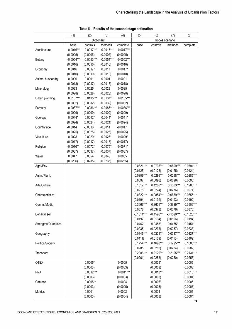
ECONOMIE ET STATISTIQUE / ECONOMICS AND STATISTICS N° 528-529, 2021 121
Characterising the Landscape in the Analysis of Urbanisation Factors
Table 6 – Results of the second stage estimation(1) (2) (3) (4) (5) (6) (7) (8)
Dictionary Tropes scenariobase controls methods complete base controls methods complete
Architecture 0.0016*** 0.0017*** 0.0017*** 0.0017***(0.0005) (0.0005) (0.0005) (0.0005)
Botany ‑0.0054*** ‑0.0053*** ‑0.0054*** ‑0.0052***(0.0016) (0.0016) (0.0016) (0.0016)
Economy 0.0016 0.0017* 0.0017 0.0017*(0.0010) (0.0010) (0.0010) (0.0010)
Animal husbandry 0.0000 0.0001 0.0001 0.0001(0.0018) (0.0017) (0.0018) (0.0018)
Mineralogy 0.0023 0.0025 0.0023 0.0025(0.0028) (0.0028) (0.0028) (0.0028)
Urban planning 0.0137*** 0.0135*** 0.0137*** 0.0135***(0.0032) (0.0032) (0.0032) (0.0032)
Forestry 0.0087*** 0.0086*** 0.0087*** 0.0086***(0.0009) (0.0009) (0.0009) (0.0009)
Geology 0.0044* 0.0042* 0.0044* 0.0041*(0.0024) (0.0024) (0.0024) (0.0024)
Countryside ‑0.0014 ‑0.0016 ‑0.0014 ‑0.0017(0.0025) (0.0025) (0.0025) (0.0025)
Viticulture 0.0028 0.0029* 0.0028* 0.0029*(0.0017) (0.0017) (0.0017) (0.0017)
Religion ‑0.0076** ‑0.0072* ‑0.0075** ‑0.0071*(0.0037) (0.0037) (0.0037) (0.0037)
Water 0.0047 0.0054 0.0043 0.0055(0.0236) (0.0235) (0.0235) (0.0235)
Agri./Env. 0.0821*** 0.0795*** 0.0809*** 0.0794***(0.0125) (0.0123) (0.0125) (0.0124)
Anim./Plant. 0.0309*** 0.0286*** 0.0298*** 0.0285***(0.0097) (0.0096) (0.0096) (0.0096)
Arts/Culture 0.1312*** 0.1286*** 0.1303*** 0.1286***(0.0278) (0.0274) (0.0276) (0.0274)
Characteristics ‑0.0822*** ‑0.0854*** ‑0.0839*** ‑0.0855***(0.0194) (0.0192) (0.0193) (0.0192)
Comm./Media 0.3666*** 0.3609*** 0.3639*** 0.3606***(0.0378) (0.0373) (0.0376) (0.0373)
Behav./Feel. ‑0.1511*** ‑0.1526*** ‑0.1520*** ‑0.1528***(0.0197) (0.0194) (0.0196) (0.0194)
Strengths/Quantities ‑0.0462* ‑0.0453* ‑0.0455* ‑0.0451*(0.0238) (0.0235) (0.0237) (0.0235)
Geography 0.0346*** 0.0328*** 0.0337*** 0.0327***(0.0111) (0.0109) (0.0110) (0.0109)
Politics/Society 0.1754*** 0.1690*** 0.1725*** 0.1686***(0.0285) (0.0282) (0.0284) (0.0282)
Transport 0.2086*** 0.2129*** 0.2105*** 0.2131***(0.0261) (0.0258) (0.0260) (0.0258)
OTEX 0.0005* 0.0005 0.0005* 0.0005(0.0003) (0.0003) (0.0003) (0.0003)
PRA 0.0012*** 0.0011*** 0.0013*** 0.0013***(0.0003) (0.0003) (0.0003) (0.0004)
Cantons 0.0005** 0.0004 0.0006* 0.0005(0.0003) (0.0005) (0.0003) (0.0006)
Metrics ‑0.0001 ‑0.0002 ‑0.0001 ‑0.0001(0.0003) (0.0004) (0.0003) (0.0004)
➔

ECONOMIE ET STATISTIQUE / ECONOMICS AND STATISTICS N° 528-529, 2021122
therefore explain 81% to 82% of this variance. All of the tests show that the models are clearly significant.
We take into account the differences between the models estimated in the first stage to explain the variability of the measured effects. Indeed, if the information they convey is correlated with that conveyed by the LUs, then their exclusion may introduce an omitted variable bias. This is not the case here in the full model. The coefficient estimated using landscape metrics, OTEX or cantons are not significant. The dummies for the LUs therefore reflect a different dimension than these variables, which we interpret as the cultural component of the landscapes. We note, however, that the division into PRAs is significant. As we had anticipated (see subsection 2.3), the construction of the PRAs does reflect a cultural‑historical aspect of landscapes. To account for the fact that some of the 64 models generating the data in this second stage are better models than others, we also introduce the Akaike Information Criterion (AIC), measured by the difference with the best model (which differs depending on whether the estimated model is multinomial or dichot‑omous). It is never significant, which indicates that the measured effects are independent of the quality of the model estimated in the first stage. Finally, it is interesting to note that there is no significant effect due to the method used (probit or logit link/categorical or dichotomous dependent variable).
Conversely, our textual and semantic indicators of the content of the descriptions of the LUs in the
Landscape Atlas of the Maine‑et‑Loire depart‑ment play a role in explaining the differences in urbanisation probabilities. LUs described with a richer vocabulary relating to agriculture and the environment had a higher probability of being urbanised. Thus a 1% increase in the share of these themes in the total vocabulary leads to an increase of about 0.08% in the probability of urbanisation. We find the same results for vocab‑ulary related to the themes “Arts and Culture”, “Communications and Media”, “Politics and Society”, “Transport”, “Animals and Plants” and “Geography”. If we follow our assump‑tion regarding a link between the description of landscapes and the nature of the amenities produced, we can thus assume that amenities relating to agriculture, the environment and the local social and cultural dynamics, while taking into account amenities relating to transport, have been drivers of the urbanisation of these areas. We thus see that the results validate the assumptions of the urban sprawl model in rela‑tion to environmental and agricultural amenities proposed by Coisnon et al. (2014). Conversely, a higher share of vocabulary related to the themes “Strengths and quantities” or “Characteristics” decreases the probability of urbanisation. One may think that this vocabulary (which includes terms such as level, mass and power) describes areas that are rather difficult to “live in” or less attractive because they produce fewer amenities sought by households. This may correspond to areas that are difficult and therefore costly to develop. Finally, the theme “Behaviour and feelings” is negatively related to the probability of urbanisation.
Table 6 – Results of the second stage estimation (contd.)(1) (2) (3) (4) (5) (6) (7) (8)
Dictionary Tropes scenariobase controls methods complete base controls methods complete
AIC ‑0.0257*** ‑0.0048 ‑0.0274*** ‑0.0035(0.0078) (0.0185) (0.0085) (0.0202)
Probit ‑0.0004 ‑0.0003 ‑0.0004 ‑0.0003(0.0003) (0.0003) (0.0003) (0.0003)
Dichotomous 0.0001 0.0001 0.0000 0.0001(0.0003) (0.0003) (0.0003) (0.0003)
Constant 0.0134 0.0110 ‑0.0116 0.0062 ‑0.0038 ‑0.0030 ‑0.0300*** ‑0.0063(0.0352) (0.0350) (0.0358) (0.0393) (0.0081) (0.0080) (0.0115) (0.0211)
Observations 832 832 832 832 832 832 832 832τ² 1.04e‑05 1.04e‑05 1.04e‑05 1.04e‑05 1.28e‑05 1.27e‑05 1.29e‑05 1.28e‑05I2 0.805 0.806 0.806 0.807 0.818 0.818 0.818 0.819Adjusted R2 0.791 0.790 0.790 0.790 0.741 0.743 0.740 0.742LR test (τ2 = 0) 4.93e‑05 4.93e‑05 4.93e‑05 4.93e‑05 4.93e‑05 4.93e‑05 4.93e‑05 4.93e‑05Model F test 174.6 134.2 141.9 112.8 162.5 121.5 127.2 99.97
Notes: The standard errors are shown in brackets. ***, ** and * identify the significant parameters at the 0.01%, 0.05% and 0.1% thresholds.

ECONOMIE ET STATISTIQUE / ECONOMICS AND STATISTICS N° 528-529, 2021 123
Characterising the Landscape in the Analysis of Urbanisation Factors
* * *
In this article, we sought to assess the role of perceptual landscape elements on land use choices. We estimate a two‑stage econometric land conversion model. In the first stage, we estimate the probability of urbanisation of a plot and then take into account its uncertainty using an internal meta‑regression method. A textual analysis of the Landscape Atlases allows the introduction of landscape descriptors in a second stage. In this way, we can account for the impact of economic and landscape deter‑mining factors on urbanisation, in both their physical and perceptual aspects. Our estimates highlight the relative importance of the factors of urbanisation identified in the European and North American literature. We see that, in the case of the urban area of Angers as elsewhere, the probability of urbanisation depends on the proximity to the employment centre and to transport infrastructures, as well as on the living environment and neighbourhood externalities (average income of the municipality, public facilities, natural amenities and surrounding urbanisation).
Our estimates also show that the conditional probability of a given location being urbanised is significantly dependent on its belonging to a landscape unit. The diversity of the positivity/negativity of the associated coefficients makes it possible to highlight the heterogeneity of the preferences expressed with regard to this or that landscape unit. This probability was removed from the physical aspect of the landscapes in the first stage. It is linked, through a meta‑re‑gression, to descriptors constructed from texts describing the landscape units. This approach makes it possible to account for the uncertainty associated with model selection. We can thus confirm that cultural aspects of landscapes play a significant role in urbanisation and we can identify the components of perceptions that play the most important role. Thus, the territories described with greater richness in agricultural, political and societal terms,25 which are therefore more likely to produce the associated amenities, seem to be more sought after by households. The relative significance of these effects, which have been revealed in the case of the urban area of Angers, could however be different for other urban areas.
Taking into account the sensitive aspect of landscapes, beyond their physical characteris‑tics, thus provides a way to better understand the residential location choices of households. The landscape, as perceived by individuals, can explain the desertion of certain rural peripheral areas characterised by a low landscape quality or, conversely, the residential attractiveness of certain areas, entailing a risk of facing an increased urban sprawl phenomenon.
To our knowledge, this work is pioneering in respect of its incorporation of a landscape perception indicator for the analysis of urban‑isation phenomena. It is fully in line with the development of so‑called mixed approaches in social sciences. Other recent work also high‑lights the important role of perceptions. For example, Jones & Dantzler (2021) show that perceptions of different neighbourhoods in a city shape residential mobility.
Here, this mixed approach is necessary because of the complexity of the social term “landscape”, which is difficult to reduce to a single aspect, either as physical elements (observable and objectifiable), or as perceptions of individuals or groups of individuals (difficult to quantify and observe). However, it must be stressed that this approach is not only methodologically demanding but also costly. Indeed, we had to create two original datasets, one using satellite images 10 years apart, the other to construct perception data, which are linked to other databases. Application to other urban areas is therefore subject to the availability of similar data. This is why spreading this work will mean it is necessary to find solutions in the absence of a Landscape Atlas.
One possibility would be to use dated and geoc‑oded information generated by social networks. For example, using data from Twitter, Park et al. (2021) show that it is possible to identify areas of a city that generate feelings of happiness or dissatisfaction. Using data from the platform Yelp, Glaeser et al. (2018) show that the infor‑mation generated by social networks can not only provide a better understanding of gentrification phenomena but can also predict them, almost in real time. Such data could be used in the model presented in this article.
25. Terms related to the themes “Agriculture and Environment”, “Arts and Culture”, “Communications and Media” and “Politics and Society”.
Link to the Online Appendix: https://www.insee.fr/en/statistiques/fichier/6005377/ES528‑529_Bourbeillon‑et‑al_Annexe‑en‑ligne_Online‑Appendix.pdf

ECONOMIE ET STATISTIQUE / ECONOMICS AND STATISTICS N° 528-529, 2021124
BIBLIOGRAPHY
Ambroise, R. (2010). Appréhender le paysage sous l’angle de son fonctionnement pour gérer la biodiversité. Espaces Naturels, 32, 20–26.http://www.espaces‑naturels.info/apprehender‑paysage‑sous‑angle‑son‑fonctionnement‑pour‑gerer‑biodiversiteAy, J.‑S., Chakir, R. & Le Gallo, J. (2017). Aggregated versus individual land‑use models: Modeling spatial autocorrelation to increase predictive accuracy. Environmental Modeling & Assessment, 22(2), 129–145. https://doi.org/10.1007/s10666‑016‑9523‑5 Banzhaf, H. S. & Smith, V. K. (2007). Meta‑analysis in model implementation: choice sets and the valuation of air quality improvements. Journal of Applied Econometrics, 22(6), 1013–1031. https://doi.org/10.1002/jae.977 Blanc, A., Peton, H. & Garcias, F. (2019). L’analyse lexicométrique des macro discours par les vocabulaires –enjeux théoriques et méthodologiques. Finance Contrôle Stratégie, (NS‑6). https://doi.org/10.4000/fcs.3459Brunet‑Vinck, V. (2004). Méthode pour les Atlas de paysages – Enseignements méthodologiques de 10 ans de travaux. Rapport technique, Ministère de l’Ecologie et du Développement Durable. http://temis.documentation.developpement‑durable.gouv.fr/document.html?id=Temis‑0070141 Bryan, M. L. & Jenkins, S. P. (2016). Multilevel modelling of country effects: A cautionary tale. European Sociological Review, 32(1), 3–22. https://doi.org/10.1093/esr/jcv059 Burnham, K. & Anderson, D. (2004). Multimodel inference. Understanding AIC and BIC in model selection. Sociological Methods and Research, 33(2), 261–304. https://doi.org/10.1177/0049124104268644 Cassette, A. & Paty, S. (2006). La concurrence fiscale entre communes est‑elle plus intense en milieu urbain qu’en milieu rural ? Cahiers d’Économie et Sociologie Rurales, 78, 6–30. https://ageconsearch.umn.edu/record/201679 Chakir, R. & Parent, O. (2009). Determinants of land use changes: A spatial multinomial probit approach. Papers in Regional Science, 88(2), 327–344. https://doi.org/10.1007/s00701‑011‑0993‑6Chomitz, K. M. & Gray, D. A. (1996). Roads, land use, and deforestation: a spatial model applied to Belize. The World Bank Economic Review, 10(3), 487–512. https://doi.org/10.1093/wber/10.3.487Coisnon, T., Oueslati, W. & Salanié, J. (2014). Urban sprawl occurrence under spatially varying agricultural ame‑nities. Regional Science and Urban Economics, 44, 38–49. https://doi.org/10.1016/j.regsciurbeco.2013.11.001 Coisnon, T., Rousselière, D. & Rousselière, S. (2019). Information on biodiversity and environmental beha‑viors: A European study of individual and institutional drivers to adopt sustainable gardening practices. Social Science Research, 84,102–123. https://doi.org/10.1016/j.ssresearch.2019.06.014 Council of Europe (2000). Convention Européenne du Paysage – Florence, 20 octobre 2000. Division de l’aménagement du territoire et du paysage, Bruxelles. https://www.coe.int/en/web/conventions/full‑list?module=treaty‑detail&treatynum=176Cosgrove, D. (2003). Handbook of cultural geography, Chapter: Landscape and the European sense of sight–eyeing nature, pp. 249–268. London: Sage Publications. http://dx.doi.org/10.4135/9781848608252.n17 Couch, C., Leontidou, L. & Petschel‑Held, G. (2007). Urban Sprawl in Europe. Oxford: Black‑Well Publishing.EEA (2019). Land and soil in Europe: why we need to use these vital and finite resources sustainably. Report 2443‑7662, European Environment Agency. https://www.eea.europa.eu/publications/eea‑signals‑2019‑land/download Gelman, A., Carlin, J., Stern, H., Dunson, D., Vehtari, A. & Rubin, D. (2014). Bayesian Data Analysis, Third Edition. Boca Raton: CRC Press. http://www.stat.columbia.edu/~gelman/book/BDA3.pdf Glaeser, E. L., Kim, H. & Luca, M. (2018). Nowcasting gentrification: using yelp data to quantify neighbo‑rhood change. American Economic Review: Papers and Proceedings, 108(2), 77–82. http://dx.doi.org/10.1257/pandp.20181034 Grekousis, G. & Mountrakis, G. (2015). Sustainable development under population pressure: Lessons from developed land consumption in the conterminous U.S. PLOS ONE, 10(3), e0119675. https://doi.org/10.1371/journal.pone.0119675Groult, M. & Roche, A. (2009). Carte des Unités de Paysage contenue dans les Atlas de Paysage publiés entre 1993 et 2009. CNRS – UMR 7533 LADYSS, Paris.Irwin, E. & Bockstael, N. (2002). Interacting agents, spatial externalities and the evolution of residential land use patterns. Journal of Economic Geography, 2(1), 31–54. https://doi.org/10.1093/jeg/2.1.31Irwin, E. G. & Geoghegan, J. (2001). Theory, data, methods: developing spatially explicit economic models of land use change. Agriculture, Ecosystems & Environment, 85(1), 7–24. https://doi.org/10.1016/S0167‑8809(01)00200‑6

ECONOMIE ET STATISTIQUE / ECONOMICS AND STATISTICS N° 528-529, 2021 125
Characterising the Landscape in the Analysis of Urbanisation Factors
Jones, A. & Dantzler, P. (2021). Neighbourhood perceptions and residential mobility. Urban Studies, 58(9), 1792–1810. https://doi.org/10.1177/0042098020916440Klemick, H., Griffiths, C., Guignet, D. & Walsh, P. (2018). Improving water quality in an iconic estuary: an internal meta‑analysis of property value impacts around the Chesapeake Bay. Environmental and Resource Economics, 69(2), 265–292. https://doi.org/10.1007/s10640‑016‑0078‑3 Kline, J. D., Moses, A. & Alig, R. J. (2001). Integrating urbanization into landscape‑level ecological assess‑ments. Ecosystems, 4(1), 3–18. https://doi.org/10.1007/s100210000056Knapp, G. & Hartung, J. (2003). Improved tests for a random‑effects meta‑regression with a single covariate. Statistics in Medicine, 22, 2693–2710. https://doi.org/10.1002/sim.1482 Kozlowski, A. C., Taddy, M. & Evans, J. A. (2019). The geometry of culture: Analyzing the meanings of class through word embeddings. American Sociological Review, 84(5), 905–949. https://doi.org/10.1177/0003122419877135 Kuminoff, N. V., Zhang, C. & Rudi, J. (2010). Are travelers willing to pay a premium to stay at a “green” hotel? Evidence from an internal meta‑analysis of hedonic price premia. Agricultural & Resource Economics Review, 39(3), 468–484. https://doi.org/10.1017/S1068280500007450 Lebart, L. (1994). Sur les analyses statistiques de textes. Journal de la Société Française de Statistique, 135(1), 17–36. http://www.numdam.org/item/JSFS_1994__135_1_17_0/ Lopez, R., Adelaja, A. & Andrews, M. (1988). The effects of suburbanization on agriculture. American Journal of Agricultural Economics, 70(2), 346–358. https://doi.org/10.2307/1242075 Loughran, T. & McDonald, B. (2016). Textual analysis in accounting and finance: A survey. Journal of Accounting Research, 54(4), 1187–1230. https://doi.org/10.1111/1475‑679X.12123Maire, S. & Liarte, S. (2019). Classifier, représenter et labelliser : Cadre et outils méthodologiques associés pour une émergence automatique de thématiques sur données textuelles. Finance Contrôle Stratégie, (NS‑6). https://doi.org/10.4000/fcs.3423 McGarigal, K., Cushman, S. A., Neel, M. C. & Ene, E. (2002). Fragstats: spatial pattern analysis program for categorical maps. Rapport technique, University of Massachusetts, Amherst. http://www.umass.edu/landeco/research/fragstats/fragstats.html Molette, P. (2009). De l’APD à Tropes : comment un outil d’analyse de contenu peut évoluer en logiciel de classification sémantique généraliste. In Actes du colloque Psychologie sociale de la communication, Tarbes, Juin 2009. https://www.tropes.fr/PierreMolette‑CommunicationColloquePsychoTarbesJuin2009.pdf Molette, P. (2014). Comportements et sentiments. de l’ambiguïté dans les émotions? journées d’étude sur la mesure des émotions dans les corpus textuels. Rapport technique, Atelier Texto du Labex SMS, Toulouse.Moral‑Benito, E. (2015). Model averaging in economics: An overview. Journal of Economic Surveys. 29(1), 46–75. https://doi.org/10.1111/joes.12044 Nery, T., Polyakov, M., Sadler, R. & White, B. (2019). Spatial patterns of boom and bust forestry investment development: A case study from Western Australia. Land Use Policy, 86, 67–77. https://doi.org/10.1016/j.landusepol.2019.04.015 Newburn, D. A., Berck, P. & Merenlender, A. M. (2006). Habitat and open space at risk of land‑use conver‑sion: targeting strategies for land conservation. American Journal of Agricultural Economics, 88(1), 28–42. https://doi.org/10.1111/j.1467‑8276.2006.00837.xNowak, A. & Smith, P. (2017). Textual analysis in real estate. Journal of Applied Econometrics, 32(4), 896–918. https://doi.org/10.1002/jae.2550 Park, Y., Kim, M., & Seong, K. (2021). Happy neighborhoods: Investigating neighborhood conditions and sentiments of a shrinking city with Twitter data. Growth and Change, 52(1), 539–566. https://doi.org/10.1111/grow.12451 PAYTAL (2014). PAYsage et éTALement urbain: dynamiques physique et culturelle et modélisation. Athané, E., Bourbeillon, J., Coisnon, T, Guyet T., Nicolas H., Oueslati W., Rousselière, D. & Salanié, J. (coordinateur), Agrocampus Ouest. http://temis.documentation.developpement‑durable.gouv.fr/documents/Temis/0082/Temis‑0082075/22025_Rapport.pdfPolèse, M. & Shearmur, R. (2005). Économie urbaine et régionale : introduction à la géographie économique. Paris: Economica. Polyakov, M. & Zhang, D. (2008). Population growth and land use dynamics along urban– rural gradient. Journal of Agricultural and Applied Economics, 40(2), 649–666. https://doi.org/10.1017/S1074070800023919Roche, A. (2007). Les unités et structures paysagères dans les atlas de paysage. Rapport technique, Ministère de l’Ecologie, du Développement et de l’Aménagement Durables.

ECONOMIE ET STATISTIQUE / ECONOMICS AND STATISTICS N° 528-529, 2021126
Saxonhouse, G. R. (1976). Estimated parameters as dependent variables. The American Economic Review, 66(1), 178–183. https://www.jstor.org/stable/1804956 Sutton, A. J. & Higgins, J. P. (2008). Recent developments in meta‑analysis. Statistics in Medicine, 27, 625–650. https://doi.org/10.1002/sim.2934Tsai, F. T.‑C. & Li, X. (2008). Inverse groundwater modeling for hydraulic conductivity estimation using baye‑sian model averaging and variance window. Water Resources Research, 44(9), W09434. https://doi.org/10.1029/2007WR006576.Uuemaa, E., Antrop, M., Roosaare, J., Marja, R. & Mander, Ü. (2009). Landscape metrics and indices: an overview of their use in landscape research. Living Reviews in Landscape Research, 3(1), 1–28. http://lrlr.landscapeonline.de/Articles/lrlr‑2009‑1/

ECONOMIE ET STATISTIQUE / ECONOMICS AND STATISTICS N° 528-529, 2021 127
Characterising the Landscape in the Analysis of Urbanisation Factors
APPENDIX ____________________________________________________________________________________________
DESCRIPTIVE STATISTICS
Description Mean Standard error
Sources
Land use in 2010 Agricultural 0.781
Authors
Forest 0.113Urban 0.106
Land use in 2000 Agricultural 0.820Forest 0.092Urban 0.088
Vicinity urbanised in 2000 Number of urbanised pixels within a 200 m radius 0.088 0.212P/A ratio Perimeter to area ratio in 2000 0.468 0.213Shape index Shape index in 2000 2.799 0.795FD index Fractal dimension index in 2000 1.312 0.101CBD distance Distance to Angers (km) 18.951 7.026
IGNa
SBD distance Distance to nearest town (km) 1.862 0.875Distance to road Distance to main road network (km) 2.729 2.169Slope Height difference within the pixel (m) 2.663 2.899PNR Municipality of a regional nature park (dummy) 0.152Municipality income Average income/capita in the municipality (euros) in 2000 14,713 3,467 INSEEb
Municipality equipment Number of pieces of equipment in the municipality in 1998 117.6 509.1 INSEEc
Susceptible to flooding Recognised flood zones 0.045 DREALPRA Small agricultural regions in 1981 (dummy)
Beaugeois 0.220
Agrested
Angers woodland 0.430Choletais 0.147Saumurois 0.071Vallée de la Loire 0.132
OTEX Technical/economic orientation of the municipality in 2000 (dummy)
Agrested
Dairy cattle 0.009Mixed cattle 0.040Fruit‑Permanent Crops 0.007Field crops 0.024Mixed Granivores 0.059Horticulture 0.067Vegetable growing 0.012Oilseeds 0.001Polyculture‑Animal husbandry 0.667Viticulture 0.102Poultry 0.013
➔

ECONOMIE ET STATISTIQUE / ECONOMICS AND STATISTICS N° 528-529, 2021128
Description Mean Standard error
Sources
Canton Belonging to a canton (dummy)
Inseee
Angers 0.017 ‑Angers‑Nord‑Est 0.030 ‑Angers‑Est 0.010 ‑Baugé 0.023 ‑Beaufort‑en‑Vallée 0.072 ‑Chalonnes‑sur‑Loire 0.024 ‑Châteauneuf‑sur‑Sarthe 0.091 ‑Doué‑la‑Fontaine 0.006 ‑Durtal 0.019 ‑Gennes 0.029 ‑Lion‑d’Angers 0.087 ‑Louroux‑Béconnais 0.091 ‑Ponts‑de‑Cé 0.086 ‑Saint‑Georges‑sur‑Loire 0.070 ‑Seiches‑sur‑le‑Loir 0.088 ‑Thouarcé 0.111 ‑Tiercé 0.066 ‑Angers‑Trélazé 0.022 ‑Angers‑Ouest 0.016 ‑Angers‑Nord 0.037 ‑Angers‑Nord‑Ouest 0.006 ‑
Landscape unit Belonging to an LU (dummy)
LADYSS
Agglomération angevine 0.030 ‑Loire des promontoires 0.041 ‑Beaugeois 0.143 ‑Couloir du Layon 0.077 ‑Haut Anjou 0.211 ‑Saumurois 0.063 ‑Segréen 0.143 ‑Val d’Anjou 0.065 ‑Basses vallées angevines 0.039 ‑Marches du Segréen 0.080 ‑Mauges 0.013 ‑Plateaux de l’Aubance 0.054 ‑Portes du Beaugeois 0.040 ‑
(a) BDALTI, MNT500, BDTOPO, Geoportail – authors’ calculations.(b) Population census.(c) 1998 municipal inventory.(d) 2000 agricultural census, Zoning into Agricultural Regions.(e) Official Geographical Code.

ECONOMIE ET STATISTIQUE / ECONOMICS AND STATISTICS N° 528-529, 2021 129
Mo AbdirAhmAn
Jérôme AccArdo
Nadim AhmAd
Valérie Albouy
Thomas Amossé
Luc Arrondel
Jean‑Sauveur Ay
Olivier bArgAin
Eva bAujouAn
Christophe bellégo
Didier blAnchet
Florence bouvet
Thomas bredA
Cécile brousse
Jennifer bruner
Dominique bureAu
David byrne
Giancarlo cAmArdA
Mathieu cAstry
Sylvain chAbé‑Ferret
Guillaume chApelle
Andrew clArk
Élise coudin
Thomas couppié
Olivier dAgnelie
Thibaut de sAint pol
Benjamin denecheAu
Clément dherbécourt
Richard dorsett
Arnaud duprAy
Anne duquerroy
Julie FAlcon
Pascal FAvArd
Giulia FerrAri
John FitzgerAld
Barbara FrAumeni
Nicolas FrémeAux
Florent FremigAcci
Olivier gAllAnd
Bertrand gArbinti
Christelle gArrouste
Manon gArrouste
Jérôme gAutié
Erwan gAutier
Jérémie gignoux
Joshua goldstein
Dominique goux
Marie gouyon
Shane greenstein
Jean‑François guillAume
Danièle guillemot
Sarah guillou
Jean hindriks
Gérald houdeville
Élise huillery
Charles hulten
Nicolas jAcquemet
Anne lAvigne
Jérôme lê
Jacques le cAcheux
Christine le clAinche
Éliane le dAntec
Frédéric lebAron
Fabrice lenglArt
Claire leroy
Marion leturcq
David levy
Patricia loncle
Thomas lorentzen
Ryan mAcdonAld
Ronan mAhieu
Joseba mArtinez
Nadine mAssArd
Emmanuelle mAunAye
Haley mcAvAy
Dominique meurs
Marco mirA d’ercole
Benjamin montmArtin
Virginie munigliA
Fabrice murAt
Yann musiedlAk
Julien nAvAux
Brian nolAn
Maxime pArodi
Vladimir pAsseron
Thierry pénArd
Hélène périvier
Pierre‑Alain pionnier
Gilles pison
Sophie piton
Marie plessz
Aurélien poissonnier
Pierre porA
Dylan rAssier
Roland rAthelot
Yvon rocAboy
Jean‑François royer
Alina sAndor
Emmanuelle sAntelli
Erik schokkAert
Katheline schubert
François sémécurbe
Camille signoretto
Roxanne silbermAn
Julie solArd
Anne solAz
Rosalinda solotAreFF
Rachel soloveichik
Thomas spoorenberg
Xavier timbeAu
Dominique torre
Laurent toulemon
Alain trAnnoy
Sandy tubeuF
Stéphane turollA
Emmanuel vAlAt
Louis‑André vAllet
Jacques vAllin
Cécile vAn de velde
Grégory verdugo
Thibaud vergé
John verrinder
Vincent vicArd
Augustin vicArd
Nicolas vincent
Michaël zemmour
Wouter zwysen
Reviewers 2018‑2019


ECONOMIE ET STATISTIQUE / ECONOMICS AND STATISTICS N° 528-529, 2021 131
Au sommaire des précédents numéros / In Previous Issues
N° 526-527 (2021) – VARIA
DOSSIER THEMATIQUE / THEMATIC SECTION
• Imposition des couples et statut marital – Simulation de trois réformes du quotient conjugal en France / Taxation of Couples and Marital Status – Simulation of Three Reforms of the Marital Quotient in France – Guillaume Allègre, Hélène Périvier & Muriel Pucci • Effets redistributifs de l’imposition des couples et des familles : une étude par microsimulation de l’impôt
sur le revenu / Redistributive Effects of the Taxation of Couples and Families: A Microsimulation Study of Income Tax – Mathias André & Antoine Sireyjol • Commentaire – La familialisation des taxes et transferts, un enjeu pour l’impôt sur le revenu et les autres
politiques publiques / Comment: Family-Based Tax and Transfer System – Issues for Income Tax and Other Public Policies – Clément Carbonnier
ARTICLES
• Les inégalités de revenu entre les départements français depuis cent ans / Income Inequality across French Departments over the Last 100 Years – Florian Bonnet, Hippolyte d’Albis & Aurélie Sotura • Le travail dissimulé en France / Undeclared Work – Evidence from France – Laila AitBihiOuali & Olivier Bargain • Le durcissement des conditions d’accès et d’emploi dans les professions artistiques en France – Les cas
de la danse et du cirque (2006-2016) / The Tightening of Employment Conditions and Access to Jobs in Artistic Occupations in France – The case of Dance and Circus Arts (2006-2016) – Samuel Julhe & Émilie Salaméro • Évaluation du crédit d’impôt innovation / An Evaluation of the Innovation Tax Credit – Simon Bunel
& Benjamin Hadjibeyli
N° 524-525 (2021) – VARIA
DOSSIER THEMATIQUE / THEMATIC SECTION
º Introduction au dossier Économie de la santé / Introduction to the Thematic Section on Health Economics – Carine Franc • L’introduction du paiement à la performance : quel impact sur l’activité des médecins généralistes en France ? /
The Introduction of Pay-for-Performance: What Impact on General Practitioners’ Activity in France? – Brigitte Dormont, Aimée Kingsada & Anne-Laure Samson • L’interdiction des dépassements d’honoraires pour les bénéficiaires de la CMU-C : quelles conséquences
pour les médecins et dentistes libéraux ? / The Ban on Extra-Fees for Beneficiaries of the CMU-C Health Cover: What Consequences for Physicians and Dentists in Private Practice? – Brigitte Dormont & Cécile Gayet • Les travailleurs indépendants sous-investissent-ils dans leur santé ? / Must-Trade and Catch-Up’ – Do the
Self-Employed Under-Invest in Their Health? – Estelle Augé & Nicolas Sirven • Préférences de la population française pour l’accès à l’information génétique : une étude de choix discrets /
Preferences of the French Population Regarding Access to Genetic Information: A Discrete Choice Experiment – Christine Peyron, Aurore Pélissier & Nicolas Krucien • Effet de la réforme de l’APA à domicile de 2015 sur les plans d’aide notifiés aux bénéficiaires / The Effect
of the 2015 Reform of the Personalized Autonomy Allowance on the Care Plans Notified to Beneficiaries – Louis Arnault & Jérôme Wittwer
ARTICLES
• Liens entre les motifs de migration et l’origine géographique des migrants et leurs résultats sur les marchés du travail en Europe / Linking Migration Reasons and Origins to Labour Market Outcomes: Recent Evidence from Europe – Mehtap Akgüç & Cécile Welter-Médée • Le cumul emploi retraite – Déterminants individuels et profils types des cumulants / Combining Work
and a Pension – Individual Determining Factors and Combiners’ Profiles – Agathe Dardier
N° 522-523 (2021) – VARIA
• Effets de moyen terme d’une hausse de TVA sur le niveau de vie et les inégalités : une approche par microsimulation / Medium-Term Effects of a Rise in VAT on Standard of Living and Inequality: A Microsimulation Approach – Mathias André & Anne-Lise Biotteau • Chômage et comportements à risque : quel effet de la perte d’emploi sur la consommation d’alcool
et de tabac ? / Unemployment and Risky Behaviours: The Effect of Job Loss on Alcohol and Tobacco Consumption – Jérôme Ronchetti & Anthony Terriau • Les perspectives d’emploi des jeunes diplômés en Italie pendant et après la crise de 2008 / The Employment
Prospects of Young Graduates in Italy during and after the 2008 Crisis – Raffaella Cascioli • Les disparités spatiales d’accès à l’autonomie résidentielle précoce en France / Spatial Disparities in Young
Adults’ Early Residential Independence in France – Claire Kersuzan & Matthieu Solignac • Inégalités sociales et désynchronisation du sommeil au sein des couples / Social Inequalities
and the Desynchronisation of Sleep within Couples – Capucine Rauch

ECONOMIE ET STATISTIQUE / ECONOMICS AND STATISTICS N° 528-529, 2021132
N° 520-521 (2020) – VARIA
DOSSIER THEMATIQUE / THEMATIC SECTION
º Introduction au dossier thématique projections de population / Introduction to the Thematic Section on Population Projections – Laurent Toulemon, Gilles Pison & Isabelle Robert Bobée • Perspectives de population mondiale – Une vision sur le long terme / World Population Prospects:
A Long View – Thomas Buettner • Projections probabilistes bayésiennes de population pour la France / Bayesian Probabilistic Population
Projections for France – Vianney Costemalle • Évaluer les prévisions probabilistes de population / Evaluating Probabilistic Population Forecasts – Nico Keilman • Le vieillissement de la population française est il inéluctable ? / Is the Ageing of the French Population
Unavoidable? – Nathalie Blanpain • Les dimensions dans les projections mondiales : un état des lieux / Dimensions in Global Projections:
An Overview – Anne Goujon
ARTICLES
• L’accumulation de liquidités par les sociétés non financières en France : l’effet des besoins de couverture et de la baisse des coûts de financement / Cash Accumulation by Non Financial Corporations: New Evidence of the Role of Hedging Needs and Lower Financing Costs in France – Marie Baïanne Khder & Simon Ray
• Pouvoir de marché et part du travail / Market Power and Labor Share – Arthur Bauer & Jocelyn Boussard
N° 517-518-519 (2020) – AU-DELÀ ET AUTOUR DU PIB : QUESTIONS A LA COMPTABILITÉ NATIONALE / BEYOND AND AROUND GDP: QUESTIONS TO NATIONAL ACCOUNTING
º Préface – Comptabilité nationale : retour sur des questions anciennes, plus quelques nouvelles / Preface – National Accounting: Old Questions Revisited, Plus Some New Ones – Diane Coyle • Construire des indicateurs de la croissance inclusive et de sa soutenabilité : que peuvent offrir les comptes
nationaux et comment les compléter ? / Building Indicators for Inclusive Growth and its Sustainability: What Can the National Accounts Offer and How Can They Be Supplemented? – Didier Blanchet & Marc Fleurbaey • Compléter le PIB : quelques contributions récentes de la statistique sociale / Supplementing GDP: Some
Recent Contributions from Official Social Statistics – Jérôme Accardo • Vers un système de comptes nationaux distributifs : méthodes et estimations des inégalités mondiales
avec les données WID.world / Towards a System of Distributional National Accounts: Methods and Global Inequality Estimates from WID.world – Facundo Alvaredo, Lucas Chancel, Thomas Piketty, Emmanuel Saez & Gabriel Zucman • Pourquoi et comment mesurer le capital humain dans la comptabilité nationale ? / Why and How Should
Human Capital be Measured in National Accounts? – Nicolas Canry • Coût social du réchauffement climatique et indicateurs de soutenabilité : les enseignements d’une application
à la France / The Social Cost of Global Warming and Sustainability Indicators: Lessons from an Application to France – Jean-Marc Germain & Thomas Lellouch • Une comparaison de déflateurs pour les services de télécommunications / A Comparison of Deflators
for Telecommunications Services Output – Mo Abdirahman, Diane Coyle, Richard Heys & Will Stewart • La mesure du numérique explique-t-elle le ralentissement de la productivité ? Le cas de l’Australie / Does
Measurement of Digital Activities Explain Productivity Slowdown? The Case for Australia – Derek Burnell & Amani Elnasri • L’économie numérique fausse-t-elle le partage volume-prix du PIB ? L’expérience française / Does the Digital
Economy Distort the Volume-Price Split of GDP? The French Experience – Lorraine Aeberhardt, Florian Hatier, Marie Leclair, Benoît Pentinat & Jean-Denis Zafar • Les services gratuits issus de l’économie numérique : faut-il, et comment, les valoriser ? / Free Services
from the Digital Economy: Do We Need to Measure Their Value and How? – Alexandre Bourgeois • L’énigme de la croissance du PIB irlandais en 2015 : tentatives de réponse / Irish GDP Growth in 2015:
A Puzzle and Propositions for a Solution – Marie-Baïanne Khder, Jérémi Montornès & Nicolas Ragache • La cohérence dans une économie mondialisée : harmonisation du traitement de la R&D dans les comptes
nationaux et la balance des paiements en Irlande / Consistency in a Globalised Economy: Aligning the Treatment of R&D in the Irish National Accounts and Balance of Payments – Niamh Holton, Margaret Kinsella, Oisín Mangan, Shaun McLaughlin & Patrick Quill • Quelle signification pour le concept de produit intérieur dans des économies mondialisées ? / What Should
the Concept of Domestic Production Mean in Globalized Economies? – Didier Blanchet

Economie et Statistique / Economics and Statistics
Objectifs généraux de la revue
Economie et Statistique / Economics and Statistics publie des articles traitant de tous les phénomènes économiques et sociaux, au niveau micro ou macro, s’appuyant sur les données de la statistique publique ou d’autres sources. Une attention particulière est portée à la qualité de la démarche statistique et à la rigueur des concepts mobilisés dans l’analyse. Pour répondre aux objectifs de la revue, les principaux messages des articles et leurs limites éventuelles doivent être formulés dans des termes accessibles à un public qui n’est pas nécessairement spécialiste du sujet de l’article.
Soumissions
Les propositions d'articles, en français ou en anglais, doivent être adressées à la rédaction de la revue ([email protected]), de préférence en format MS-Word. Il doit s'agir de travaux originaux, qui ne sont pas soumis en parallèle à une autre revue. Un article standard fait environ 11 000 mots en français (y compris encadrés, tableaux, figures, annexes et bibliographie, non compris éventuelles annexes en ligne). Aucune proposition initiale de plus de 12 500 mots (11 500 pour les soumissions en anglais) ne sera examinée.
La soumission doit comporter deux fichiers distincts :
• Un fichier d’une page indiquant : le titre de l’article ; le prénom et nom, les affiliations (maximum deux), l’adresse e-mail et postale de chaque auteur ; un résumé de 160 mots maximum (soit environ 1 050 signes espaces compris) qui doit présenter très brièvement la problématique, indiquer la source et donner les principaux axes et conclusions de la recherche ; les codes JEL et quelques mots-clés ; d’éventuels remerciements.
• Un fichier anonymisé du manuscrit complet (texte, illustrations, bibliographie, éventuelles annexes) indiquant en première page uniquement le titre, le résumé, les codes JEL et les mots-clés.
Les propositions retenues sont évaluées par deux à trois rapporteurs (procédure en « double-aveugle »). Les articles acceptés pour publication devront être mis en forme suivant les consignes aux auteurs (accessibles sur https://www.insee.fr/fr/information/2410168). Ils pourront faire l’objet d’un travail éditorial visant à améliorer leur lisibilité et leur présentation formelle.
Publication
Les articles sont publiés en français dans l’édition papier et simultanément en français et en anglais dans l'édition électronique. Celle-ci est disponible, en accès libre, sur le site de l’Insee, le jour même de la publication ; cette mise en ligne immédiate et gratuite donne aux articles une grande visibilité. La revue est par ailleurs accessible sur le portail francophone Persée, et référencée sur le site international Repec et dans la base EconLit.
Main objectives of the journal
Economie et Statistique / Economics and Statistics publishes articles covering any micro- or macro- economic or sociological topic, either using data from public statistics or other sources. Particular attention is paid to rigor in the statistical approach and clarity in the concepts and analyses. In order to meet the journal aims, the main conclusions of the articles, as well as possible limitations, should be written to be accessible to an audience not necessarily specialist of the topic.
Submissions
Manuscripts can be submitted either in French or in English; they should be sent to the editorial team ([email protected]), preferably in MS-Word format. The manuscript must be original work and not submitted at the same time to any other journal. The standard length of an article is of about 10,000 words (including boxes if needed, tables and figures, appendices, bibliography, but not counting online appendices if any). Manuscripts of more than 11,500 words will not be considered. Submissions must include two separate files:
• A one-page file providing: the title of the article; the first name, name, affiliation-s (at most two), e-mail et postal addresses of each author; an abstract of maximum 160 words (about 1050 characters including spaces), briefly presenting the question(s), data and methodology, and the main conclusions; JEL codes and a few keywords; acknowledgements.
• An anonymised manuscript (including the main text, illustrations, bibliography and appendices if any), mentioning only the title, abstract, JEL codes and keywords on the front page.
Proposals that meet the journal objectives are reviewed by two to three referees (“double-blind” review). The articles accepted for publication will have to be presented according to the guidelines for authors (available at https://www.insee.fr/en/information/2591257). They may be subject to editorial work aimed at improving their readability and formal presentation.
Publication
The articles are published in French in the printed edition, and simultaneously in French and in English in the online edition. The online issue is available, in open access, on the Insee website the day of its publication; this immediate and free online availability gives the articles a high visibility. The journal is also available online on the French portal Persée, and indexed in Repec and EconLit.

EconomicsStatisticsAND
EconomieStatistique
ET
N° 528-529 - 2021
ISBN 978-2-11-162344-6 - ISSN 0336-1454 - ECO 528-529Parution décembre 2021 - PRIX : 17,20 € 9 7 8 2 1 1 1 6 2 3 4 4 6 N°
528
-529
- 20
21
ECO
NO
MIE
ET
STA
TIST
IQU
E /
ECO
NO
MIC
S A
ND
STA
TIST
ICS