Improving access to HIV testing and treatment services for ...
Upload
independentCategory
view
1download
0
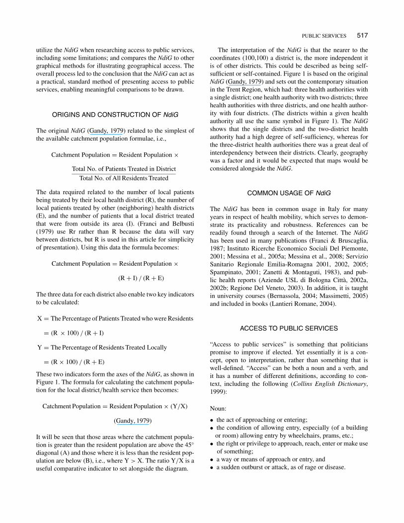
International Journal of Public Administration, 34: 516–527, 2011Copyright © Taylor & Francis Group, LLCISSN: 0190-0692 print / 1532-4265 onlineDOI: 10.1080/01900692.2011.582623
Demonstrating Access to Public Services Diagrammatically
Rob GandyNHS Healthcare Consultant, Wirral, & Liverpool John Moores University, Liverpool, United Kingdom
Alberto Franci and Caterina GurrieriCentre for Public Health and Social Care Studies, Faculty of Sociology, University of Urbino “Carlo Bo„” Urbino, Italy
Bob McClellandLiverpool Business School, Liverpool John Moores University, Liverpool, United Kingdom
The Nomogramma di Gandy is a practical analytical tool and presentational method that canbe applied to the subject of access to public services, such as universities, prisons, and hospi-tals. Illustrative examples are provided. It is flexible, requires minimal data, and can compareaccess across many geographical areas in one presentation. It addresses the need to appreciatethe dynamics that can exist behind summary statistical analyses that focus on net changes,and can show trends over time. Such visual scanning of multiple data points and their rela-tive juxtapositions, enables many common thinking errors to be minimized, if not completelyavoided.
Keywords: hospital services, nomogramma di Gandy, prison services, public service access,universities
INTRODUCTION
Access to public services is a key issue of interest to man-agers and planners of the services themselves, as well aspoliticians and the public. For reasons of logistics, manypublic services involve institutions that can deliver to widegeographical areas. Therefore, the degree to which usersaccess their local public services, or have to travel fartherafield is important information.
Gandy (1979) developed a diagrammatic representa-tion of patient flows for hospital services in the contextof health district catchment populations, using data fromTrent Regional Health Authority in the United Kingdom(UK), which covered South Yorkshire and most of theEast Midlands. This addressed the fact that very differentpatterns of mobility for hospital patients between health dis-tricts could result in the same, or very similar, catchmentpopulations, yet the service planning implications for the dif-ferent scenarios could vary considerably. The diagram was
Correspondence should be addressed to Rob Gandy, 13 Woodkind Hey,Spital, Wirral, CH63 9JY, UK. E-mail: [email protected]
subsequently taken up by researchers of hospital mobility inItaly, who also validated the mathematics of the method andmodel (Franci & Belbusti, 1979). They named the methodthe Nomogramma di Gandy (NdiG) and it has been regularlyused in this field, and taught in related university courses,ever since (see below).
The NdiG was revisited and re-evaluated, from 2007, toestablish whether it had wider application. This article sum-marizes the findings, with its focus being to present how theNdiG can usefully highlight variations in access to a rangeof public services. To this end the article: describes the ori-gins and construction of the NdiG, and provides examplesof its common usage in Italy; reviews the different interpre-tations of the term “access” in respect of public services,before confirming the context within which the NdiG can beused in this regard; outlines the methodology adopted to con-firm the detail of the NdiG’s application in respect of publicsector access, including reference to other applications of theNdiG, and the conventions to be adhered to; provides illus-trative examples of the application of the NdiG for access touniversities, prisons and hospitals; describes how the NdiGcan be used to show changes over time; describes how best to
PUBLIC SERVICES 517
utilize the NdiG when researching access to public services,including some limitations; and compares the NdiG to othergraphical methods for illustrating geographical access. Theoverall process led to the conclusion that the NdiG can act asa practical, standard method of presenting access to publicservices, enabling meaningful comparisons to be drawn.
ORIGINS AND CONSTRUCTION OF NdiG
The original NdiG (Gandy, 1979) related to the simplest ofthe available catchment population formulae, i.e.,
Catchment Population = Resident Population !
Total No. of Patients Treated in DistrictTotal No. of All Residents Treated
The data required related to the number of local patientsbeing treated by their local health district (R), the number oflocal patients treated by other (neighboring) health districts(E), and the number of patients that a local district treatedthat were from outside its area (I). (Franci and Belbusti(1979) use Rr rather than R because the data will varybetween districts, but R is used in this article for simplicityof presentation). Using this data the formula becomes:
Catchment Population = Resident Population !
(R + I) / (R + E)
The three data for each district also enable two key indicatorsto be calculated:
X = The Percentage of Patients Treated who were Residents
= (R ! 100) / (R + I)
Y = The Percentage of Residents Treated Locally
= (R ! 100) / (R + E)
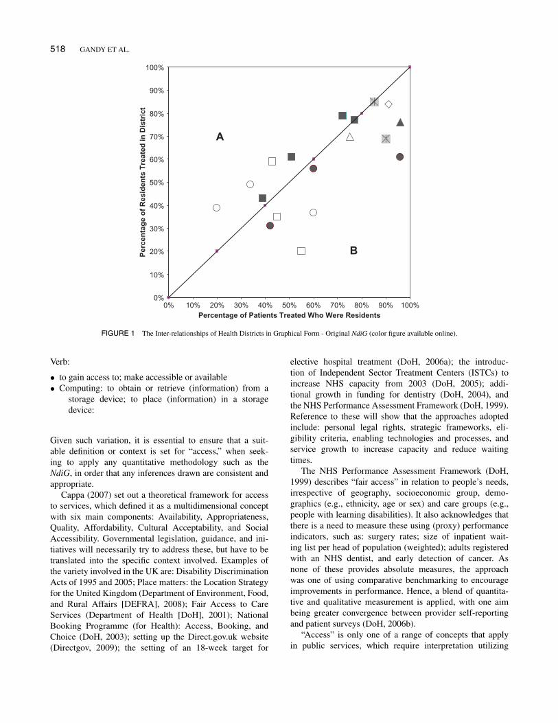
These two indicators form the axes of the NdiG, as shown inFigure 1. The formula for calculating the catchment popula-tion for the local district/health service then becomes:
Catchment Population = Resident Population ! (Y/X)
(Gandy, 1979)
It will be seen that those areas where the catchment popula-tion is greater than the resident population are above the 45"
diagonal (A) and those where it is less than the resident pop-ulation are below (B), i.e., where Y > X. The ratio Y/X is auseful comparative indicator to set alongside the diagram.
The interpretation of the NdiG is that the nearer to thecoordinates (100,100) a district is, the more independent itis of other districts. This could be described as being self-sufficient or self-contained. Figure 1 is based on the originalNdiG (Gandy, 1979) and sets out the contemporary situationin the Trent Region, which had: three health authorities witha single district; one health authority with two districts; threehealth authorities with three districts, and one health author-ity with four districts. (The districts within a given healthauthority all use the same symbol in Figure 1). The NdiGshows that the single districts and the two-district healthauthority had a high degree of self-sufficiency, whereas forthe three-district health authorities there was a great deal ofinterdependency between their districts. Clearly, geographywas a factor and it would be expected that maps would beconsidered alongside the NdiG.
COMMON USAGE OF NdiG
The NdiG has been in common usage in Italy for manyyears in respect of health mobility, which serves to demon-strate its practicality and robustness. References can bereadily found through a search of the Internet. The NdiGhas been used in many publications (Franci & Bruscaglia,1987; Instituto Ricerche Economico Sociali Del Piemonte,2001; Messina et al., 2005a; Messina et al., 2008; ServizioSanitario Regionale Emilia-Romagna 2001, 2002, 2005;Spampinato, 2001; Zanetti & Montaguti, 1983), and pub-lic health reports (Aziende USL di Bologna Città, 2002a,2002b; Regione Del Veneto, 2003). In addition, it is taughtin university courses (Bernassola, 2004; Massimetti, 2005)and included in books (Lantieri Romane, 2004).
ACCESS TO PUBLIC SERVICES
“Access to public services” is something that politicianspromise to improve if elected. Yet essentially it is a con-cept, open to interpretation, rather than something that iswell-defined. “Access” can be both a noun and a verb, andit has a number of different definitions, according to con-text, including the following (Collins English Dictionary,1999):
Noun:
• the act of approaching or entering;• the condition of allowing entry, especially (of a building
or room) allowing entry by wheelchairs, prams, etc.;• the right or privilege to approach, reach, enter or make use
of something;• a way or means of approach or entry, and• a sudden outburst or attack, as of rage or disease.
518 GANDY ET AL.
0%
10%
20%
30%
40%
50%
60%
70%
80%
90%
100%
0% 10% 20% 30% 40% 50% 60% 70% 80% 90% 100%Percentage of Patients Treated Who Were Residents
Per
cen
tag
e o
f R
esid
ents
Tre
ated
in D
istr
ict
A
B
FIGURE 1 The Inter-relationships of Health Districts in Graphical Form - Original NdiG (color figure available online).
Verb:
• to gain access to; make accessible or available• Computing: to obtain or retrieve (information) from a
storage device; to place (information) in a storagedevice:
Given such variation, it is essential to ensure that a suit-able definition or context is set for “access,” when seek-ing to apply any quantitative methodology such as theNdiG, in order that any inferences drawn are consistent andappropriate.
Cappa (2007) set out a theoretical framework for accessto services, which defined it as a multidimensional conceptwith six main components: Availability, Appropriateness,Quality, Affordability, Cultural Acceptability, and SocialAccessibility. Governmental legislation, guidance, and ini-tiatives will necessarily try to address these, but have to betranslated into the specific context involved. Examples ofthe variety involved in the UK are: Disability DiscriminationActs of 1995 and 2005; Place matters: the Location Strategyfor the United Kingdom (Department of Environment, Food,and Rural Affairs [DEFRA], 2008); Fair Access to CareServices (Department of Health [DoH], 2001); NationalBooking Programme (for Health): Access, Booking, andChoice (DoH, 2003); setting up the Direct.gov.uk website(Directgov, 2009); the setting of an 18-week target for
elective hospital treatment (DoH, 2006a); the introduc-tion of Independent Sector Treatment Centers (ISTCs) toincrease NHS capacity from 2003 (DoH, 2005); addi-tional growth in funding for dentistry (DoH, 2004), andthe NHS Performance Assessment Framework (DoH, 1999).Reference to these will show that the approaches adoptedinclude: personal legal rights, strategic frameworks, eli-gibility criteria, enabling technologies and processes, andservice growth to increase capacity and reduce waitingtimes.
The NHS Performance Assessment Framework (DoH,1999) describes “fair access” in relation to people’s needs,irrespective of geography, socioeconomic group, demo-graphics (e.g., ethnicity, age or sex) and care groups (e.g.,people with learning disabilities). It also acknowledges thatthere is a need to measure these using (proxy) performanceindicators, such as: surgery rates; size of inpatient wait-ing list per head of population (weighted); adults registeredwith an NHS dentist, and early detection of cancer. Asnone of these provides absolute measures, the approachwas one of using comparative benchmarking to encourageimprovements in performance. Hence, a blend of quantita-tive and qualitative measurement is applied, with one aimbeing greater convergence between provider self-reportingand patient surveys (DoH, 2006b).
“Access” is only one of a range of concepts that applyin public services, which require interpretation utilizing
PUBLIC SERVICES 519
proxy measures. Others include “workload,” “capacity,” and“collaboration” (Gandy & Beaumont, 2003). However, theactual nomenclature can be interpreted differently in dif-ferent arenas, and can evolve over time. Words will crossinternational boundaries and cannot be assumed to retain thesame meaning in the respective countries. Also people willtake words and terms and interpret them and abuse them fortheir own purposes (Gandy et al, 2002).
Alvesson and Deetz (2000) highlight the problems causedby trying to establish a common definition of a particularconcept. The diversity of interpretation and the associatedvariables means that a coherent definition with universalaspirations may say relatively little in terms of the richnessand complexity of the quite varied phenomena it suppos-edly refers to. The impossibility of fixing a concept is partlyrelated to the ways in which words are informed by the rootmetaphors for the phenomenon being studied. Researchers,like other people, structure worlds metaphorically (Brown,1977; Morgan, 1980, 1986; Alvesson, 1993). Words get theirmeaning through the metaphorical context in which theyare employed. This means that words work in an imagina-tive and associative rather than analytically clear-cut manner(Alvesson & Deetz, 2000). Hence, there will never be a final“right” answer, and so nomenclature must always be usedclearly and consistently within whatever context applies(Gandy et al., 2002).
Given the above, it will be shown that the NdiG can beused to demonstrate a high-level geographical interpretationof access, using quantitative mobility data which are nor-mally readily available. The geography can be in terms ofarea, region, or country, but most often it will be used forregions within a single country. It examines the degree towhich people have to cross (regional) boundaries to accessor receive a service. In this context, the general inference isdrawn that the greater the percentage of people who receive aservice within their home region, the greater the local access.The corollary is that there is less local access the greater thepercentage of people who have to travel to another region toreceive the service.
EXPLORATORY METHODOLOGY
Through communications between two of the authors(Gandy and Franci) in 2007, it was established that theapplication of the NdiG could be expanded from the initialremit of patient mobility in health care. The related iterativeapproach established that it was very important that the keyindicators that act as the axes should make sense to potentialusers. In some circumstances, it was found that the descrip-tions of the key indicators made more sense conceptuallywhen self-sufficiency is attributed to the coordinates (0, 0),rather than (100,100) as above. One example involved col-laboration between hospitals in the North West of Englandin the production and usage of aseptic dispensing products.
Products that one hospital provided or sold to another weredescribed as being “exported” by the former hospital and“imported” by the latter.
Accordingly, a self-sufficient hospital sourced all theproducts it needed from within the hospital, and all theproducts it produced were used by the hospital itself, i.e.,the percentage of products used locally that were importedfrom outside the hospital, and the percentage of productsproduced locally that were exported from the hospital wereboth zero. The degree to which hospitals traded aseptic dis-pensing products between one another was used as a proxymeasure for “collaboration”: the greater the amount of tradethe greater the degree of collaboration. Accordingly, increas-ing collaboration was demonstrated by hospitals movingfarther away from the coordinates (0,0) over time (Gandy &Beaumont, 2003). To avoid confusion, the diagram wherethe coordinates (0,0) reflects self-sufficiency was describedas an Inverted NdiG.
Other examples of the application of the Inverted NdiGinclude changes in smoking habits (Gandy & Coladangelo,2010), and churn in international trade and populationmobility (Gandy, 2009).
One particular focus of the exploratory work relatedto the access of public services, where mobility is a keyfactor. It was found that the NdiG could be applied asa simple method/technique for presenting high-level rela-tionships between where public services are geographicallylocated/delivered and where the service users come from,in the context described in the final paragraph of the pre-vious section. This applies to those public services wherethere are institutions which serve a wide geographical area,for whatever reason.
It is important that the data used are large enough to bemeaningful. Therefore, applying the NdiG to public serviceson a regional basis usually makes most sense, as has beenregularly the case in Italy (see above). However, the defini-tion of “region” is open to interpretation by researchers intheir research context.
For the purposes of constructing the NdiG to reflectaccess to public services, only three pieces of data arerequired for each geographical region, which are consistentwith those utilized by the original NdiG, above:
R = Service users who accessed a service within their ownregion
I = Service users who accessed a region’s services who werefrom outside that region
E = Service users from a region who accessed a serviceoutside that region
“I” can be described as the number of service users thatwere imported to the region, and “E” can be described asthe number of service users that were exported from theregion.
520 GANDY ET AL.
Accordingly, to demonstrate such access, the axes of theNdiG are defined as:
X = Percentage of service users accessing a region’s ser-vices that were local service users
Y = Percentage of a region’s local service users thataccessed the services within the region
Formulaically, the axes are X = (R x 100) / (R + I) andY = (R ! 100) / (R + E)
Set out below are a number of different examples whichillustrate the application of the NdiG to demonstrate accessto a variety of public services in Italy and the UK.
CONVENTIONS TO BE ADHERED TO WHENAPPLYING THE NdiG
Because of its nature, there are options to how the NdiGcan be constructed and presented. Therefore, it is necessaryto stipulate some simple conventions which ensure suitableconsistency, and need to be borne in mind when consideringthe illustrative examples. These are set out below in Table 1,in the context of geographical areas for public services.
ILLUSTRATIVE EXAMPLES OF APPLICATIONOF THE NdiG
Having hypothesized that the NdiG can best be applied toshow access to public services where institutions serve awide geographical area, it was necessary to demonstratethis in practice. Arguably the three most important publicservices that this applies to, in any country, are universi-ties, prisons and hospitals. Therefore, examples for each aregiven below.
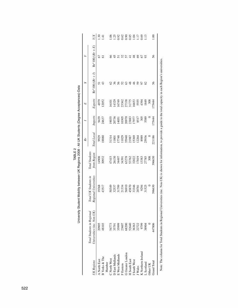
Universities
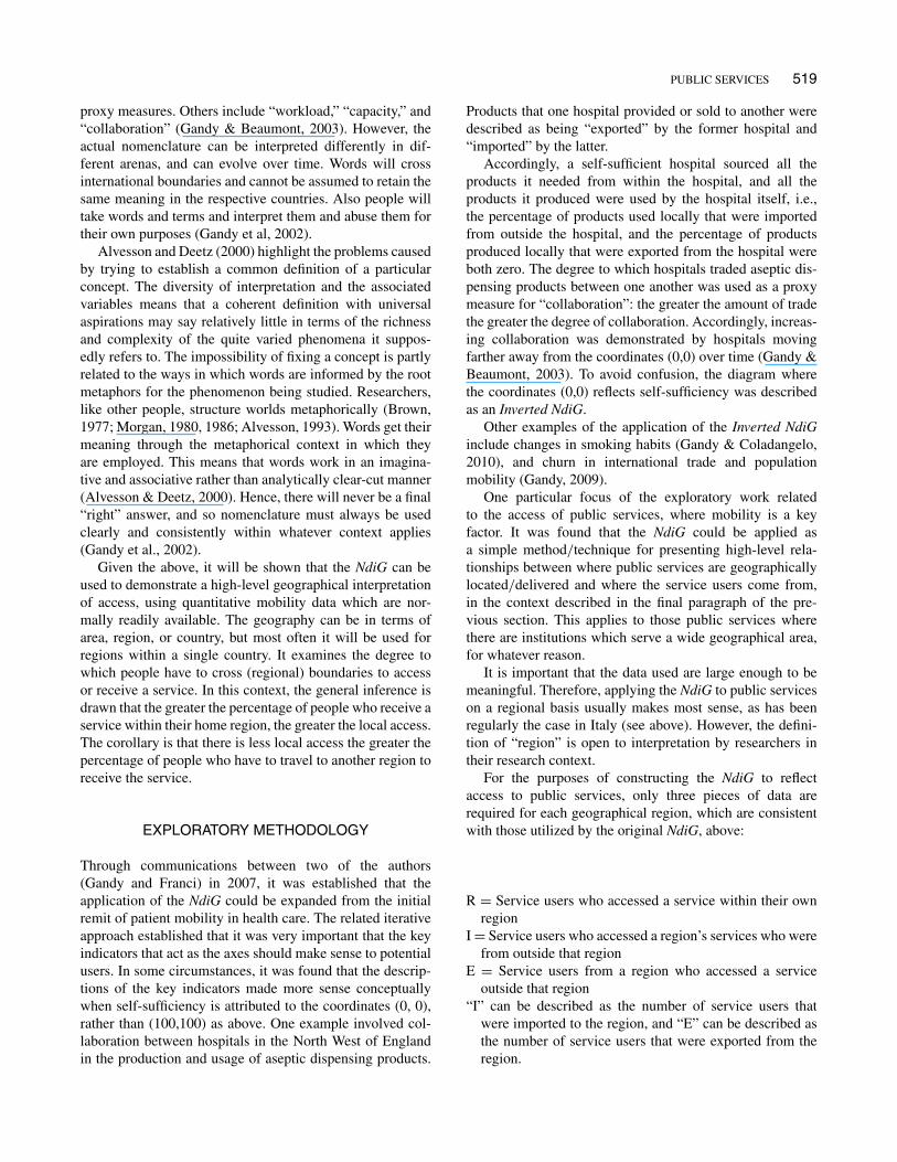
Figure 2 shows the application of the NdiG for all undergrad-uate degree acceptances for UK students in UK universities,by region, in 2008 (McClelland & Gandy, in press). Table 2provides the associated data. These highlight that NorthernIreland, Scotland, and Wales have among the highest per-centages of students who choose to study locally. This isparticularly high for Scotland (93 percent), no doubt influ-enced by the fact that Scottish students do not have to paytuition fees if they study within Scotland. Scottish studentsaccounted for 82 percent of all UK students studying inScotland. By contrast, 67 percent of Northern Ireland stu-dents chose local universities, but these students represented97 percent of all UK students in Northern Ireland, suggest-ing that the province has difficulties in attracting other UKstudents. This might be attributed to its geographical accessi-bility, and possibly its recent history (McClelland & Gandy,in press).
Interestingly, the three north of England regions are allnet importers of UK students, while the three regions inthe south and east of England are all net exporters. One ofthe reasons for Eastern, South East, and Northern Irelandbeing net exporters is the fact that the total number ofplaces in their local universities (which include non-UK stu-dents) was less than the total number of students from theregions. One factor could be regional population growth notbeing matched by local university developments (particu-larly Eastern England) (McClelland & Gandy, in press).
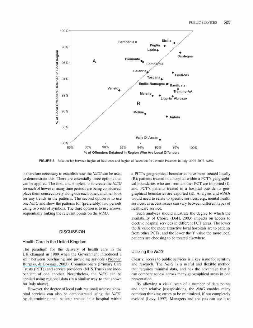
Prison Services
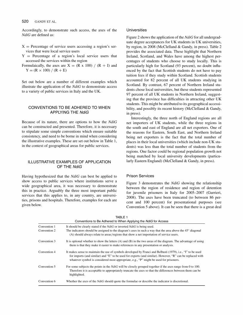
Figure 3 demonstrates the NdiG showing the relationshipbetween the region of residence and region of detentionfor juvenile prisoners in Italy for 2005–2007 (Gurrieri,2008). The axes have been truncated (to between 86 per-cent and 100 percent) for presentational purposes (seeConvention 5 above). It can be seen that there is a great deal
TABLE 1Conventions to Be Adhered to When Applying the NdiG for Access
Convention 1 It should be clearly stated if the NdiG or inverted NdiG is being used.Convention 2 The indicators should be assigned to the diagram’s axes in such a way that the area above the 45" diagonal
(A) should always relate to areas/regions that show a net importation of service users.
Convention 3 It is optional whether to show the letters (A) and (B) in the two areas of the diagram. The advantage of usingthem is that they make it easier to make references in any presentation or analysis.
Convention 4 It makes sense to maintain the use of symbols developed by Franci and Belbusti (1979), i.e., “I” to be usedfor imports (and similar) and “E” to be used for exports (and similar). However, “R” can be replaced withwhatever symbol is considered most appropriate, e.g., “P” might be used for prisoners.
Convention 5 For some subjects the points in the NdiG will be closely grouped together if the axes range from 0 to 100.Therefore it is acceptable to appropriately truncate the axes so that the differences between them can behighlighted.
Convention 6 Whether the axes of the NdiG should quote the formulae or describe the indicator is discretional.
PUBLIC SERVICES 521
100North East
North West
South West
East Midlands
Eastern
London
South East
Wales
N Ireland
Scotland
West Midlands
Yorks & Humberside
100
90
90
80
70
80
A
B
70
60
60
% o
f L
oca
l Stu
den
ts S
tud
yin
g in
Lo
cal R
egio
n
% of Students Studying in Region Who Are Local Students
50
50
40
40
30
30
20
20
10
100
0
FIGURE 2 University Student Mobility between UK Regions 2008 - All UK Students (Degree Acceptances) - NdiG.
of self-sufficiency—suggesting locally accessible services—with the percentage of prisoners in a region that are localbeing greater than 90 percent for all regions. The percentageof prisoners that were detained in their local region was alsoin excess of 86 percent for all regions. It is interesting to notethat the three regions nearest to (100,100) are geographicallyremote, comparatively: Sardinia and Sicily are major islandsand Puglia (Apulia) covers the “heel” of Italy.
Hospital Services
The cornerstone of the Italian National Health System isthat every citizen must find responses to any health needwithin his/her own local area (which normally coincideswith the local provinces (Messina et al., 2005b). Legislativechanges in 2001 made health care services financially andmanagerially dependent on the Italian regions.
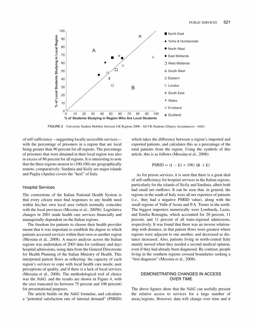
The freedom for patients to choose their health providermeant that it was important to establish the degree to whichpatients accessed services within their own or another region(Messina et al., 2008). A macro analysis across the Italianregions was undertaken of 2003 data for (ordinary and day)hospital admissions, using data from the General Directoratefor Health Planning of the Italian Ministry of Health. Thisinterpreted patient flows as reflecting: the capacity of eachregion’s services to cope with local health care needs; userperceptions of quality, and if there is a lack of local services(Messina et al., 2008). The methodological tool of choicewas the NdiG, and the results are shown in Figure 4, withthe axes truncated (to between 75 percent and 100 percent)for presentational purposes.
The article builds on the NdiG formulae, and calculatesa “potential satisfaction rate of internal demand” (PSRID)
which takes the difference between a region’s imported andexported patients, and calculates this as a percentage of thetotal patients from the region. Using the symbols of thisarticle, this is as follows (Messina et al., 2008):
PSRID = (I # E) ! 100/ (R + E)
As for prison services, it is seen that there is a great dealof self-sufficiency for hospital services in the Italian regions,particularly for the islands of Sicily and Sardinia, albeit bothhad small net outflows. It can be seen that, in general, theregions in the south of Italy were all net exporters of patients(i.e., they had a negative PSRID value), along with thesmall regions of Valle d’Aosta and P.A. Trento in the north.The biggest importers numerically were Lombardy, Lazio,and Emilia Romagna, which accounted for 20 percent, 11percent, and 11 percent of all trans-regional admissions,respectively. It was found that there was an inverse relation-ship with distance, in that patient flows were greatest whereregions were adjacent to one another, and decreased as dis-tance increased. Also, patients living in north-central Italymainly moved when they needed a second medical opinion,even if they had already been diagnosed. By contrast, peopleliving in the southern regions crossed boundaries seeking a“first diagnosis” (Messina et al., 2008).
DEMONSTRATING CHANGES IN ACCESSOVER TIME
The above figures show that the NdiG can usefully presentthe relative access to services for a large number ofareas/regions. However, data will change over time and it
TAB
LE2
Uni
vers
ityS
tude
ntM
obili
tybe
twee
nU
KR
egio
ns20
08-
All
UK
Stu
dent
s(D
egre
eA
ccep
tanc
es)-
Dat
a
Rr
IE
XY
UK
Reg
ions
Tota
lStu
dent
sin
Reg
iona
lU
nive
rsiti
es(i
nc.N
on-U
K)
Tota
lUK
Stud
ents
inR
egio
nalU
nive
rsiti
esTo
talS
tude
nts
from
Reg
ion
Tota
lLoc
alIm
port
sE
xpor
tsR
r$10
0/(R
r+
I)R
r$10
0/(R
r+
E)
Y/X
AN
orth
Eas
t20
905
1936
814
908
9929
9439
4979
5167
1.30
BY
orks
&T
heH
umbe
r48
103
4351
730
932
1888
024
637
1205
243
611.
41
CN
orth
Wes
t54
773
5034
947
415
3131
419
035
1610
162
661.
06D
Eas
tMid
land
s35
791
3253
726
130
1180
120
736
1432
936
451.
25E
Wes
tMid
land
s35
999
3179
934
497
1774
814
051
1674
956
510.
92F
Eas
tern
2360
721
334
3439
111
029
1030
523
362
5232
0.62
GG
reat
erL
ondo
n68
200
5691
063
278
3594
020
970
2733
863
570.
90H
Sout
hE
ast
5264
045
870
5376
221
987
2388
331
775
4841
0.85
ISou
thW
est
3636
333
346
3202
215
369
1797
716
653
4648
1.04
JW
ales
2272
220
781
1781
912
264
8517
5555
5969
1.17
KN
orth
ern
Irel
and
9799
9294
1338
389
8930
543
9497
670.
69L
Scot
land
3890
431
525
2778
525
936
5589
1849
8293
1.13
Oth
erU
K0
030
80
030
8G
rand
Tota
l44
7806
3966
3039
6630
2211
8617
5444
1754
4456
561.
00
Not
e:T
heco
lum
nfo
rTot
alSt
uden
tsin
Reg
iona
lUni
vers
ities
(inc
.Non
-UK
)is
show
nfo
rinf
orm
atio
n,to
prov
ide
agu
ide
toth
eto
talc
apac
ityin
each
Reg
ion’
sun
iver
sitie
s.
522
PUBLIC SERVICES 523
100%
98%
98% 100%
96%
96%
94%
94%
% o
f L
oca
l Off
end
ers
Det
ain
ed in
Lo
cal R
egio
n
% of Offenders Detained in Region Who Are Local Offenders
92%
92%
90%
90%
88%
88%86%
86%
Umbria Molise
Liguria Abruzzo
Trentino-AA
Basilicata
Marche
Emilia-Romagna
Valle D' Aosta
Friuli-VG
Sardegna
SiciliaPuglia
Lazio
Piemonte
Campania
Veneto
Lombardia
Calabria
Toscana
A
B
FIGURE 3 Relationship between Region of Residence and Region of Detention for Juvenile Prisoners in Italy: 2005–2007- NdiG.
is therefore necessary to establish how the NdiG can be usedto demonstrate this. There are essentially three options thatcan be applied. The first, and simplest, is to create the NdiGfor each of however many time periods are being considered,place them consecutively alongside each other, and then lookfor any trends in the patterns. The second option is to useone NdiG and show the patterns for (preferably) two periodsusing two sets of symbols. The third option is to use arrows,sequentially linking the relevant points on the NdiG.
DISCUSSION
Health Care in the United Kingdom
The paradigm for the delivery of health care in theUK changed in 1989 when the Government introduced asplit between purchasing and providing services (Propper,Burgess, & Gossage, 2003). Commissioners (Primary CareTrusts (PCT)) and service providers (NHS Trusts) are inde-pendent of one another. Nevertheless, the NdiG can beapplied using regional data (in a similar way to that shownfor Italy above).
However, the degree of local (sub-regional) access to hos-pital services can also be demonstrated using the NdiG,by determining that: patients treated in a hospital within
a PCT’s geographical boundaries have been treated locally(R); patients treated in a hospital within a PCT’s geographi-cal boundaries who are from another PCT are imported (I);and, PCT’s patients treated in a hospital outside its geo-graphical boundaries are exported (E). Analyses and NdiGswould need to relate to specific services, e.g., mental healthservices, as access issues can vary between different types ofhealthcare service.
Such analyses should illustrate the degree to which theavailability of Choice (DoH, 2003) impacts on access toelective hospital services in different PCT areas. The lowerthe X value the more attractive local hospitals are to patientsfrom other PCTs, and the lower the Y value the more localpatients are choosing to be treated elsewhere.
Utilizing the NdiG
Clearly, access to public services is a key issue for scrutinyand research. The NdiG is a useful and flexible methodthat requires minimal data, and has the advantage that itcan compare access across many geographical areas in onepresentation.
By allowing a visual scan of a number of data pointsand their relative juxtapositions, the NdiG enables manycommon thinking errors to be minimized, if not completelyavoided (Levy, 1997). Managers and analysts can use it to

524 GANDY ET AL.
100
95
90
85
80
7575
15 18
2
5
128
14
7
104
36
1316
20
21
11
A
B
9
19
17
80 85% Patients Admitted in Region that are Local Residents
% o
f L
oca
l Pat
ien
ts A
dm
itte
d in
Lo
cal R
egio
n
90 95 100
1 Piedmont
2 Valle d’Aosta
3 Lombardy
4 P.A. Bolzano
5 P.A. Trento
6 Veneto
7 Friuli V. Guilia
8 Liguria
9 Emilia Romagna
10 Tuscany
11 Umbria
12 Marche
13 Lazio
14 Abruzzo
15 Molise
16 Campania
17 Apulia
18 Basilicata
19 Calabria
20 Sicily
21 Sardinia
FIGURE 4 NdiG for Italian Regions in 2003 - Hospital Admissions (Ordinary + Day Hospital) (Messina et al, 2008).
explore problematical issues relating to access to public ser-vices in the wide range of situations and sectors described,and similar, through questioning individual values (i.e., the“Whats”) and their juxtaposition to each other (i.e., the“Whys and Wherefores”).
As illustrated, Figure 2 takes the over one-hundred indi-vidual data in Table 2 and presents them in such a waythat the net importing and net exporting regions for uni-versity places are clear, and the outlier regions of Scotland,Northern Ireland, and Eastern England are readily identified.This straightaway begs the question as to why these regionsare outliers, and although the capacity issue for the lattercan be inferred from the data, the potential influences forthe others, such as tuition fee policy, geography and history,would require further information or research. The fact thatthe majority of the regions cluster around the centre of theNdiG serves to highlight that there is a great deal of mobilitybetween the UK regions.
Access to prison services and hospital services in Italyappears to be more local, within people’s home region, judg-ing by the high X and Y values for all regions in bothFigures 3 and 4. Net importing and net exporting regionsare again clear, as are the outlier regions. The geographyof Italy is naturally an influence, with Sicily and Sardiniabeing the most self-sufficient regions for both types ofservice, presumably because they are major islands. By con-trast, Valle D’Aosta is an alpine region bordering France
and Switzerland, with the smallest population of all Italianregions, viz. 120,909 (Messina et al., 2008). There is effec-tively only one major road out of the region, which allowsaccess to Piedmont and Lombardy. Consequently, it is nosurprise that Valle D’Aosta shows as an outlier net exporter.
These examples demonstrate that the NdiG can be uti-lized as an exploratory data analysis and benchmarkingtool to inform the decision-making process. Used in theearly stages of an investigation it can point to where moredetailed, localized analysis may be required, and supports anAction Learning approach (Teare & Prestoungrange, 2004)to generate management learning from personal experience.
In all cases, it is important that geographical and policy-related factors are borne in mind when drawing inferencesfrom the NdiG. The former is illustrated by the exam-ples given above for Italy. A further example, in respectof UK universities is the relative geographical remotenessof Scotland and Northern Ireland to the rest of the UK.Policy-related factors are illustrated by the fact that Scotlandwas a clear outlier in respect of universities (see Figure 2).Scotland had a no student tuition fee policy, in contrast to therest of the UK, raising the question of the extent to which thisinfluenced the observed pattern.
As a high-level application the NdiG is bound by theadministrative definitions of the geographical areas/regionsfor which data are available. This will inevitably ignore geo-graphical, communications, and cultural factors that can lead
PUBLIC SERVICES 525
to local mobility across certain boundaries. For example,many students living just outside London, in an adjacentregion, will find it easier to commute by train to study inthe city, where there are many universities and a great dealof choice. This will apply for many students in the Easternregion of England, where there are capacity constraints andseveral of the region’s universities are geographically moredifficult to get to.
By its design the NdiG focuses on percentages, but per-centages by definition mask relative size. Consequently, theNdiG (and inverted NdiG) does not indicate the relative sizeor activity of each region/institution, and the percentagesfor different regions and institutions for a given service can-not be used on their own, automatically, to produce derivedstatistics such as sum, difference or mean. Therefore, itis always desirable for NdiG presentations to be alongsidetables showing the actual data and percentages.
The public services where the NdiG is most useful indescribing access are those where there is a regional per-spective and mobility is a key factor, either because culturalfactors come in to play (e.g., universities), or because theinstitutions necessarily serve a wide geographical area (e.g.,prisons). The public services where the NdiG is of least rel-evance in terms of access are those which by definition needto be delivered locally to a given population. These includeservices provided by Local Authorities, such as schools,social services, and housing.
The nature and detail of the NdiG is such that it can bereadily taught, and it would be appropriate for statistical edu-cation modules in postgraduate public-sector courses, wherestudents would have the opportunity to understand the tech-nicalities involved, consider examples, and explore how itmight be relevant to services that are of interest to them.
Other Methods of Illustrating Geographical AccessGraphically
As stated earlier, “Access” can be interpreted in a variety ofways in relation to public services, and involve a range ofquantitative and qualitative (proxy) performance indicators.This article has focused on the context of the geographi-cal interpretation of access, and highlighted the advantagesof graphical over tabular presentation. Therefore it is use-ful to compare the NdiG with other graphical methods usedto illustrate geographical access. Three examples are givenbelow.
1. A simple method is to interpret “access” as the num-ber of service users per thousand (relevant) populationfor all defined geographical areas. A color-coded mapcan then be used to reflect the gradient in the resultantrates. This can be undertaken at both a regional anda local level, but the method does not highlight any-thing in relation to service user mobility between thedefined areas.
2. Demonstrating isochrones on a map; isochrones arelines which can join points that are the same trav-eling time from a given point, or facility, takingaccount of the various communication routes andtravel means (Mayhew, 1981). Isochrones thereforetend to be localized to a comparatively limited geo-graphical area, and do not show patterns of how ser-vice users actually access services or facilities. Insteadthey provide a valuable insight to traveling times forservice users.
3. A method regularly used by the National CancerServices Analysis Team (2010) illustrates the catch-ment areas for hospital service providers in the UK.The initial component involves the presentation of amap covering identified service providers. A dot isplaced on the map for each patient accessing a serviceaccording to where he or she lives, with the color-coded dots representing each provider accessed. Theresultant map enables the viewer to readily appreci-ate the “natural catchment areas” that each providerserves. Most locations on the map will have a clearmajority of patients looking to one service provider,and they are therefore automatically assigned to thatprovider’s catchment area. Where dots of different col-ors are gathered together in one location, the secondcomponent of the method analyzes and allocates thelocation to the dominant provider’s catchment area.In this way all locations on the map are allocatedto one service provider or another, with the definedcatchment area for each provider being the aggrega-tion of all its assigned locations. Repetition of thisapproach enables the creation of a map of the whole ofa geographical area, broken down into provider dom-inant catchment areas, which can overlay statutoryboundaries (National Cancer Services Analysis Team,2010).
The assignment of each location to one serviceprovider or another, masks where there are locationswith many patients going to different providers. In thisregard, the National Cancer Services Analysis Team’smethod differs from the NdiG, which aims at high-lighting where there is variable mobility. However, theTeam’s objectives are observed to be different.
The above three methods are very useful and can be usedalongside the NdiG, where appropriate to the access issuebeing researched. However, they all involve superimposingsomething that reflects access on to a map. Naturally, mapsfor different areas will vary, and the need to present thedata that each method covers in an intelligible form canrestrict the overall geographical area covered. By compar-ison, the NdiG does not involve a map, and can cover a largenumber of regions. It is a standard presentation that showsthe dynamics of service user mobility between regions, andoffers more options for demonstrating changes over time. It
526 GANDY ET AL.
follows that the NdiG and the other methods are comple-mentary to one another. The NdiG enables an initial analysiswhich can then be followed by the use of one or more of theother methods, as appropriate, to examine what is happeningin specific locales of interest.
CONCLUSIONS
It has been demonstrated that the NdiG is a practical ana-lytical tool and presentational method that can be applied tothe subject of access to public services, in the stated con-text. It can present a complex situation in a way that enablesinferences to be readily made, and addresses the need for anappreciation of the dynamics that can exist behind summarystatistical analyses that focus on presenting net changes. It issufficiently flexible to show trends over time.
It is advisable to present the actual access/mobility dataand rates involved alongside the NdiG, because it uses per-centages, which in themselves do not indicate the totalnumbers of whatever currency is involved. The NdiG’sstrength is its simplicity: it provides (initial) visual presenta-tion, using comparatively limited data, to suggest evidenceof differential patterns that may exist.
In conclusion, the NdiG represents a welcome additionto the armory of methods and tools available to consultants,managers and analysts, when dealing with the question ofaccess to public services.
ACKNOWLEDGMENTS
The authors would like to thank Dr. Gabriele Messina, ofSiena University, and the Italian Journal of Public Healthfor kindly giving their permission for Figure 4 to be repro-duced from the article “Patient Migration among the ItalianRegions in 2003” (Messina et al., 2008).
They would also like to acknowledge the contributionand help of Denis Adams, Research Fellow, Liverpool JohnMoores University, and Helen Forbes, Clinical InformationManager with the National Cancer Services Analysis Team.
REFERENCES
Alvesson, M., & Deetz, S. (2000). Doing critical management research.London: Sage Publications.
Aziende USL di Bologna Città. [Local Health Authorities of Bologna](2002a). Rapporto sulle caratteristiche dei tossicodipendenti e deglialcolisti seguiti dai servizi pubblici delle, Bologna Sud e Bologna Nordnel corso del 2001 [Report on the characteristics of drug and alcoholabusers under the care of public services in the North and South ofBologna during the year 2001]
Aziende USL di Bologna Città. [Local Health Authorities of Bologna](2002b). Rapporto sulle caratteristiche dei tossicodipendenti e deglialcolisti seguiti dai servizi pubblici delle, Bologna Sud e Bologna Nordnel corso del 1"semestre 2002 [Report on the characteristics of drug and
alcohol abusers under the care of public services in the North and Southof Bologna during the first six months of 2002]
Bernassola, A. (2004). Department of Demographic Science. La SapienzaUniversity, Rome: Course on Sanitary Statistics: Sanitary Mobility; theNomogramma of Gandy. Translated version retrieved May 16, 2005,from http://w3_uniroma1_it-scidemo-bernassola.
Brown, R.H. (1977). A poetic for sociology. Chicago: University of ChicagoPress.
Cappa, C. (2007). Capturing Access to Public Services: Health andEducation Technical Consultation on “Making Children Visible inRoutine Surveys” UNICEF Innocenti Research Centre, Florence, July26–27. Retrieved on Dec. 16, 2009, from http://www.unicef-irc.org/datasets/access_public_services.pdf
Collins English dictionary Millennium Edition. (1999). Glasgow: HarperCollins Publishing.
Department for Environment, Food and Rural Affairs (DEFRA). (2008).Place matters: The location strategy for the United Kingdom. Retrievedon Dec. 16, 2009, from http://www.communities.gov.uk/documents/communities/pdf/locationstrategy.pdf
Department of Health. (1999). The NHS Performance AssessmentFramework. Retrieved on Dec. 16, 2009, from http://www.dh.gov.uk/en/Publicationsandstatistics/Publications/PublicationsPolicyAndGuidance/DH_4009190
Department of Health. (2001). Fair Access to Care Services: PolicyGuidance - Consultation Draft, July. Retrieved on Dec. 16, 2009, fromhttp://www.dh.gov.uk/prod_consum_dh/groups/dh_digitalassets/@dh/@en/documents/digitalasset/dh_4082333.pdf
Department of Health. (2003). NHS Modernisation Agency NationalBooking Programme: Access, Booking and Choice. Retrieved onDec. 16, 2009, froms http://www.dh.gov.uk/en/Publicationsandstatistics/Publications/PublicationsPolicyAndGuidance/DH_4010178
Department of Health. (2004). Letter to: SHA Chief ExecutivesNovember 16. http://www.dh.gov.uk/en/Publicationsandstatistics/Lettersandcirculars/Dearcolleagueletters/DH_4095480
Department of Health. (2005). ISTC manual. Retrieved on Dec.16, 2009, from http://www.dh.gov.uk/prod_consum_dh/groups/dh_digitalassets/@dh/@en/documents/digitalasset/dh_4128146.pdf
Department of Health. (2006a). The challenge of 18 weeks. Retrieved onDec. 16, 2009, from http://www.18weeks.nhs.uk/Content.aspx?path=/Library-of-resources/presentations/presentations-archive
Department of Health. (2006b). Primary Care Access Letter to: SHADirectors of Performance Retrieved on Dec. 16, 2009, from http://www.dh.gov.uk/en/Publicationsandstatistics/Lettersandcirculars/Dearcolleagueletters/DH_4136050. See also, http://www.18weeks.nhs.uk
Directgov. (2009). Retrieved on Dec. 16, 2009, from www.Direct.gov.ukDisability Discrimination Act 1995. (1995). Her Majesty’s Stationery
Office (HMSO). Retrieved on Dec. 16, 2009, from http://www.opsi.gov.uk/acts/acts1995/ukpga_19950050_en_1
Disability Discrimination Act 2005. (2005). London: HMSO. Retrievedon Dec. 16, 2009, from http://www.opsi.gov.uk/acts/acts1995/ukpga_20050013_en_1
Franci, A., & Belbusti, G. (1979). L’utilizzo del nomogramma di Gandyper valuazione della mobilita ospedaliera [Use of the Gandy diagram inthe evaluation of hospital patient flows]. Ospedali D’Italia [Hospitals ofItaly] 33–68.
Franci, A., & Bruscaglia, G. (1987). La statistica e la gestione dei servizisocio-sanitari [Social statistics and the management of health and socialservices]. Rimini, Italy: Maggioli Editore.
Gandy, R. (1979). A graphical representation of the inter-relationshipbetween districts. Hospital and Health Services Review, 75, 50–51.
Gandy, R. (2009). Demonstrating Churn Diagrammatically 32nd Institutefor Small Business & Entrepreneurship Conference, Liverpool,November 3–6, 2009.
Gandy, R., & Beaumont, I. (2003). Analysing aseptic preparation—Workload measurement and capacity planning. Hospital Pharmacist, 10,338–347.
PUBLIC SERVICES 527
Gandy, R., & Coladangelo, R. (2010). Projecting Smoking Cessation inthe North of England Using Delphi Methods. UK National SmokingCessation Conference, Glasgow, June 14–15, 2010. Retrieved on Sept. 6,2010, from http://www.uknscc.org/2010_UKNSCC/speakers/rob_gandy.html
Gandy, R., Kershaw, K., & Beaumont, I. (2002). Nomenclature issues inaseptic preparation of medicines. British Journal of Clinical Governance,7(4), 242–249.
Gurrieri, C. (2008). Youth Crime in Italy: A Statistical Analysis UsingGandy’s Diagram. Meeting of the Italian Society of Criminology. SanMarino, October 23–25, 2008. Retrieved on Dec. 15, 2009, from http://www.maramassai.com/items/workshop.pdf
Instituto Ricerche Economico Sociali Del Piemonte. [Institute ofEconomics and Social Research of the Piedmont Region] (2001).Piemonte Economico Sociale © 2000. I Dati e I Commenti Sulla Regione[Data Analysis and Comments for the Region] Retrieved on July 8, 2006,from http://www.ires.piemonte.it/PDF/RSE00.pdf
Lantieri Romane. (2004). Retrieved on Sept. 3, 2009, from http://www.catalogo.mcgraw-hill.it/pdf/indice_pref/1635-3_indice.pdf
Levy, D. (1997). Tools of critical thinking: metathoughts for psychology.Boston: Allyn & Bacon.
Massimetti, G. (2005). Semestre Medical statistics 2" University of Pisa2005–2006. Retrieved on July 6, 2006, from http://virmap.unipi.it/cgi-bin/virmap/regibo?registri:16789892;main
Mayhew, L.D. (1981). Automated isochrones and the locations ofemergency services in cities. The Professional Geographer, 33(4),423–428.
McClelland, R., & Gandy, R. (in press). Undergraduate regional migra-tion in the UK: Perspectives on local markets and trends for gender andinternational student groups. Studies in Higher Education, 37 (8).
Messina, G., Addari, P., Macchi, C., & Nante, N. (2005a). Programmazioneospedaliera e flussi di pazienti: esperienza senese. [Hospital planning andpatient flows: Siennese experience]. Annali di Igiene [Annals of Hygiene]17(4),323–333.
Messina, G., Lispi, L., Barbini, E., Cacciatore, P., Ghirardini, A., &Nante, N. (2005b). Follow-up della mobilità sanitaria italiana (1998–2003)., Poster Comunicazioni, IX Conferenza Nazionale di SanitàPubblica • L’igienista nelle scelte strategiche e opertative [Follow-upstudy on Italian patient flows (1998–2003), Poster presentation, IXNational Public Health Conference. The role of hygienists in the oper-ational and strategic planning in the National Health System]. Retrievedon July 6, 2006, from http://www.sitinazionale.org/cont/2260con/0504/1604/12581all1.pdf
Messina, G., Vigiani, N., Lucia, L., & Nante, N. (2008). Patient migra-tion among the Italian regions in 2003. Italian Journal of Public Health,5(1), 45–52.
Morgan, G. (1980). Paradigms, metaphors and puzzle solvingin organization theory. Administrative Science Quarterly, 25,605–622.
Morgan, G. (1986). Images of organization. Newbury Park, CA: Sage.National Cancer Services Analysis Team. (2010). NHS Cancer Services
Catchment Areas and Populations, Retrieved on Dec. 13, 2010, fromhttp://www.canceruk.net/catchment/
Propper, C., Burgess, S., & Gossage, D. (2003). Competition and Quality:Evidence from the NHS Internal Market 1991–1999. CMPO WorkingPaper Series No. 03/077. Retrieved on Apr. 5, 2007, from http://www.bristol.ac.uk/Depts/CMPO/workingpapers/wp77.pdf
Regione Del Veneto [Veneto Region]. (2003). Allegato: Tavole statistiche[Addendum: Statistics Tables] 1996/97 http://www.regione.veneto.it/NR/rdonlyres/EC808E21-F221-46B0-9A0E-74ABDC7A8CF8/0/REL9697_tavolevolume.pdf
Servizio Sanitario Regionale Emilia-Romagna [Emilia-Romagna RegionalHealth Authority]. (2001). Incidenti stradali nel territorio delle AziendeUnità Sanitarie Locali di Ferrara, Ravenna, Forlì, Cesena, Rimini: Analisidei ricoveri ospedalieri (1999)., della mortalità (1994–1998) ed elementiessenziali della dinamica incidentale (1994–1998) [Road accidents in thedistricts of the local health authorities of Ferrara, Ravenna, Forli, Cesena,Rimini: An analysis of admissions to hospital, mortalities, and factorsinfluencing road accidents]. Retrieved on July 8, 2006, from http://www.snop.it/webeditor/16/1/cybersnop/cybersno/contribu/Incidenti.doc
Servizio Sanitario Regionale Emilia-Romagna [Emilia-Romagna RegionalHealth Authority]. (2002). I Traumi Cranici in Romagna Analisi deiricoveri ospedalieri (1999) e della mortalità [Head injuries in theRomagna district. Analysis of hospital admissions (1999) and mortalities(1994–1999)].
Servizio Sanitario Regionale Emilia-Romagna [Emilia-Romagna RegionalHealth Authority]. (2005). Incidenti stradali: nelle province della costaemiliano-romagnola (1994–2003) [Traffic accidents along the Adriaticcoast of the Emilia-Romagna Region (1994–2003)], March. Retrievedon July 6, 2006, from http://www.ausl.fe.it/piani_per_la_salute/new/incidenti_stradali/DEF_Sintesi.pdf
Spampinato, G. (2001). Analisi dell’applicabilità dei contratti con il settoreassistenziale privato nella Regione Siciliana. Dipartimento di Economiae Metodi Quantitativi, Università di Catania, Corso Italia, 55 - 95129-Catania [Analyses of the applicability of contracts with the privatehealth care sector in the Region of Sicily, Department of Economics andQuantitative Methods, University of Catania, Italy] Retrieved on July 6,2006, from http://www.aiesweb.it/media/pdf/co0002/doc0023.pdf
Teare, R., & Prestoungrange, R. (2004). Who Was Reg Revans? AccreditingManagers at Work in the 21st Century. Prestoungrange, Scotland:Prestoungrange University Press. Retrieved on Nov. 22, 2007, fromhttp://www.imcasocrates.org/resources/download/111602.PDF
Zanetti, M., & Montaguti, U. (1983). Indicatori di utilizzo del servizioospedaliero Epidenúologia e Prevenzione, n. 19-20:89-100. Quoted byAssociazione Mario Zanetti [Performance indicators of hospital serviceuse. Epidemiologia e Prevenzione, n. 19–20: 89–100. Quoted by theMario Zanetti Association. http://www.assozanetti.it/zanetti/abstracts/abstracts_01.htm
Copyright © 2022 FDOKUMEN