Comparative Analysis of the Athens and Columbus Public Library Websites
25
Comparative Analysis Comparative Analysis of the Athens and Columbus Public Library Websites Introduction Group Three analyzed the web presence of two public library systems in Georgia: the Athens Regional Library System (ARLS) and the Chattahoochee Valley Regional Library System (CVRLS) serving the Columbus area. Both public libraries provide comprehensive services to populations over 150,000 with multiple branches and maintain websites with more than 50 pages. Chattahoochee Valley Regional Library System’s stated mission is to “be a vital and dynamic community resource that promotes universal literacy, encourages open access to ideas, and facilitates the enrichment of cultural experiences. Its vision statement says that “the Library will be the center for literacy development and intellectual growth that teaches and encourages its customers to access, evaluate and use print, electronic, and other informational sources so they can transform information and ideas into usable knowledge.” The main branch library is located in Columbus, with eight other branches serving the surrounding communities. The library contains 380,000 volumes, serving a 1
Transcript of Comparative Analysis of the Athens and Columbus Public Library Websites

Comparative Analysis
Comparative Analysis of the Athens and Columbus Public LibraryWebsites
Introduction
Group Three analyzed the web presence of two public library
systems in Georgia: the Athens Regional Library System (ARLS) and
the Chattahoochee Valley Regional Library System (CVRLS) serving
the Columbus area. Both public libraries provide comprehensive
services to populations over 150,000 with multiple branches and
maintain websites with more than 50 pages.
Chattahoochee Valley Regional Library System’s stated
mission is to “be a vital and dynamic community resource that
promotes universal literacy, encourages open access to ideas, and
facilitates the enrichment of cultural experiences. Its vision
statement says that “the Library will be the center for literacy
development and intellectual growth that teaches and encourages
its customers to access, evaluate and use print, electronic, and
other informational sources so they can transform information and
ideas into usable knowledge.” The main branch library is located
in Columbus, with eight other branches serving the surrounding
communities. The library contains 380,000 volumes, serving a
1

Comparative Analysis
total population of approximately 276,000 residents. According
to the 2005 annual report the library circulation increased to
over 1 million loaned items or 5.66 per capita, almost 17% more
then the Georgia average of 4.84 per capita. In the last five
years, usage has doubled. In 2003 it received a $15,000,000
endowment and in 2005 opened a new, 100,000 square foot main
library in Columbus (CRLS Strategic Plan).
Athens Regional Library System is comprised of eight
libraries and five resource centers. All of the center’s hours,
locations and contact information are conveniently located on one
web page: http://www.clarke.public.lib.ga.us/arls/directory.html.
The library system provides resources and educational programming
for the citizens of Athens-Clarke, Franklin, Madison, Oconee, and
Oglethorpe Counties. This area includes the communities of
Athens, Winterville, Lavonia, Royston, Danielsville,
Watkinsville, Bogart and Lexington. The mission of the library
system is to “provide information and gateways to resources which
will address the issues and needs of the community, as well as
preserve the history and culture of Athens-Clarke County.” One
expressed goal is to “encourage a lifelong love of reading within
2

Comparative Analysis
a safe, exciting, interesting environment.” The library system
serves a total population of 175,000 library patrons (Athens
Regional Library System).
Methods
We chose to compare the Athens and Columbus library websites
based on the following similarities:
Both serve similar sized populations
Both provide similar library services to their patrons
Both are intended for public use of all age groups.
Both are non-profit public libraries.
Both have more than one page on their website.
Both represent comprehensive library services.
Both contain current information, a clear indication of
regular updating.
Neither site requires software/hardware/multimedia to access
its content.
The group leader developed a wiki for communication among
group members and tasked everyone to develop a list of five to
fifteen criteria that could be used to heuristically evaluate the
two websites. After everyone had made contributions to the list
on the wiki, the suggestions were combined into one list and each
group member used it as the basis of his/her evaluation (See
3

Comparative Analysis
Appendix A). Each member then individually evaluated both
websites and noted the differences and similarities between the
sites, as well as the sites’ positive and negative attributes.
Again, these findings were grouped into a comprehensive list that
was used for both this research and the presentation.
Literature Review
When patrons enter a library, they can browse the shelves,
search the catalog, or ask a librarian for help. But when the
doors are closed or when they just can’t get there, patrons are
often finding many of those same services through the library’s
website (Norlin, 2002, p.1).
Today almost every library is faced with the challenge of
developing a website that provides an abundance of information
but in an organized, non-cluttered atmosphere, similar to the
atmosphere of the traditional brick and mortar library. Norlin
recommended using the KISS acronym for “Keep It Simple, Stupid”
to ensure the library website meets the needs of its users.
She said that even though simplicity is not always easy to
achieve, it is important that the website appear simple and have
4

Comparative Analysis
a consistent look and feel throughout since consistency leads to
familiarity. She further noted that if users interpret the site
as being simple and easy to use, they will return (Norlin, 2002,
p. 12).
Although he was not specifically speaking about libraries,
Nielsen declared that the most important page on any website is
its homepage. He called homepages “the most valuable real estate
in the world,” and the company’s “face to the world.” His
suggestion for increasing the usability of homepages, and thus
driving more users to the site was to help them find what they
need by giving them a clear starting point for the main tasks
that they can accomplish on the site (Nielsen, 2002).
More of Nielsen’s recommendations for the homepage included:
using a single style sheet for all pages to ensure familiarity as
the user navigates the site; emphasizing the site’s high-priority
tasks; including a search input box; and beginning link names
with the most important keywords.
A website’s colors are also major considerations of how well a
site is designed. D’Angelo and Little recommended using no more
than four colors per screen to provide visual consistency.
5
Comparative Analysis
Relying on marketing tactics, they also advised indicating action
with warm colors and emphasis with bright colors (D’Angelo and
Little, 1998).
Navigation is another important aspect of any library’s
website. Krug (2000, p. 59) suggested good web navigation
representing the site’s hierarchy can compensate for the lost
feeling many users experience when using the web. Other purposes
of good navigation, according to Krug, are to reveal the content
of the site, tell users how to use the site, and provide an
overall good impression of the site.
Another essential facet of good web design is labeling of
contextual links, headings, navigational system choices, and
index terms (Rosenfeld & Morville, 2002, p. 80). Rosenfeld and
Morville called labeling the “most difficult aspect of
information architecture,” but they noted two ways of ensuring
labels are less ambiguous. One of their suggestions was to
compile content into subsites targeted at specific audiences.
Another guideline was to ensure labels are consistent in style,
presentation, syntax, granularity, comprehensiveness, and
audience (Rosenfeld & Morville, 2002, p. 93).
6

Comparative Analysis
Besides the design of a website, a library must also focus on
its content. There are many ways a library can provide patron
services via its website, but some specific recommendations
include: internal search engines, online reference services,
stable links to other Internet sites, access to the online
catalog and other databases, basic information about the library
(hours, staff, collections, etc.), and timely updates (Stover,
1997).
As libraries today face competition for customers, i.e.,
patrons, from booksellers and other ecommerce sites, it is
important for libraries to maintain websites that reflect the
needs of their users. Although much literature is dedicated to
designing productive websites, much of the information can be
summarized by two important criteria: 1) the site should be easy
to navigate, and 2) it should provide the user what he is looking
for.
Discussion
Without a doubt, the single greatest difficulty in designing
a web interface for a public library is the heterogeneity of the
user community. Users’ ages range from preteen to the elderly;
7
Comparative Analysis
computer skills from the novice, first-time user to the highly
sophisticated, skilled user; subject matter from the
poststructuralist’s deconstruction to home construction. The
challenge for the web designer is to ensure that all communities
are well served and that all can locate desired information with
minimum difficulty. In our study of the Athens Regional Library
System (ARLS) http://www.clarke.public.lib.ga.us/ and the
Chattahoochee Valley Regional Library System (Columbus Library)
www.thecolumbuslibrary.org, we discovered distinct differences in
the abilities of the two sites to meet the needs of the
communities that they serve. In general, our findings can be
grouped into four general areas: page layout (design, colors, use
of screen real estate), navigation (use of bars and hyperlinks),
labeling (both of links and headings) and library services
(community services and calendar of activities).
Even the most casual perusal of the two websites shows
striking differences in their approach to information
architecture. Overall ARLS’ approach is superior in nearly every
way, but both sites could be improved with some simple changes in
labels and layout. Neither employs a particularly effective color
8
Comparative Analysis
scheme, but whereas ARLS’s color scheme seems random, that for
Columbus Library is simply unappealing. Little is done to draw
the user in and much space is wasted or misused.
ARLS evidences a significantly better use of screen real
estate, with contextual links to the most important search tools
(including Pines and Galileo), a reader’s corner, a drop-down box
with frequently asked questions, a link to a plain-text version
of the main menu, and sections for news/events specific to each
branch. The lower left-hand portion of the screen is reserved for
information on an upcoming event with an accompanying photograph.
Other than the header and navigation bar, the Columbus Library’s
site is almost exclusively devoted to upcoming events. The
jumbled and confusing navigation links make the Columbus site
much more difficult to use. The fix for Columbus is a major
reordering of the navigation tools and changes to label names.
This is discussed in detail below but essentially Columbus crams
too much into the left task bar and doesn’t organize this
information, leaving the bulk of the page to promote two major
upcoming events with large photos above a random list of small
hyperlinked events and features.
9

Comparative Analysis
Overall the ARLS site shows a significantly better use of
screen space than Columbus but is aesthetically unappealing,
seeming too busy and too crowded. Part of this problem results
from the jarring use of colors for box borders and backgrounds:
purple, burnt orange, green, black, yellow, and gray.
Furthermore, some of the overcrowding results from redundancy.
For example, the link to Friends of the Library could easily be
joined with that for how to support your library. Similarly, the
rather unappealing photograph that serves as the link to Readers’
Corner could easily be eliminated, with the hyperlink being
associated with the heading for the Readers’ Corner. Furthermore,
the catalog quick search box belongs logically with the links for
the various search tools. Making these few changes (along with a
consistent color scheme) would open the space so that the screen
would appear less cluttered, thus making the site appear more
organized and inviting.
While both sites could improve their use of screen real
estate, ARLS vastly outshines Columbus in its organizational
structure and its deployment of a navigational tool. A good
example is the two sites’ catalog search function, an essential
10
Comparative Analysis
component to any library’s site. The catalog quick search box is
one the most useful features on ARLS’s site. This feature is a
simple and intuitive Google style search box which will be
familiar to most users. In one step, a patron can complete a
search for an item without having to navigate past the homepage.
This is a great feature for any website but particularly for a
library’s site since it gives users immediate access to a
library’s most important tool: a list of its holdings.
The Columbus site’s search function is far less intuitive. A
similar search of the Columbus site requires going to a link
labeled “Library Catalog” and choosing between two options:
“Inside Library” and “Outside Library.” The problem here is these
refer not to some characteristic of the search tool but to the
physical location of the person doing the search. “Inside
Library” does not, as many members of our group thought, refer to
search of the library’s holdings but is a link for use by patrons
standing inside the library! To outside users this is a dead
link.
Clicking on Columbus’ “Outside Library,” and entering the
search criteria works well but interestingly, ARLS’s quick search
11

Comparative Analysis
seems more effective. For example, entering the terms “Gone”
“With” “Wind” results in 38 hits for Columbus, of which the first
three have nothing to do with Margaret Mitchell or her novel;
Mitchell’s novel does not appear until the ninth item (behind an
Earth, Wind, and Fire album, among other things); with ARLS, all
of the first six items relate to Mitchell or her novel, with the
novel being the third item listed. A simple fix for Columbus
would be the addition of a search box on the home page similar to
ARLS.
One area in which the sites differ is in how they have
organized the global navigation bars. ARLS groups their links
into six logically clustered drop-down boxes, one of which is the
Home link. The Columbus Library’s menu consists of seventeen pop-
out links, including the home link. The ARLS site is consistent
in its use of the global navigational bar, with the bar appearing
on all pages except those which are made up of pdf files.
Ideally, such files would either be converted to html format so
that they too could carry the navigation tool or would be moved
to a local navigation tool which noted that links would open such
files.
12

Comparative Analysis
The problems with the ARLS website are, however,
insignificant compared to those with the Columbus website. Some
of the seventeen choices on the menu could have been combined to
reduce the number of options, thus making selection simpler.
Furthermore, many of the links are to external sites but do not
warn the user of that fact. When practical, external links should
carry a warning to let users know that the linking site is not
responsible for the content of the linked site and to provide
instructions on how to return to the original site.
While ARLS is fairly consistent in its use of topical
organization, Columbus uses a hybrid organizational pattern in
which items are organized by topic and by audience. Columbus
attempts to cluster related navigational topics together and to
distinguish them through a subtle change of background color in
the left task bar. Thus, for example, the section of the global
navigation tool organized by audience (kids, teens, parents)
rests on a slightly darker background than does the more task-
oriented section that includes “Using the Library.” Though it
may be helpful to use color to distinguish sections of the
navigation bar, the change in color may be too subtle to catch
13

Comparative Analysis
the eye of the average user. Furthermore, such color changes may
not be particularly helpful to persons who have vision problems.
That many of the links from the global navigation bar are to
external sites suggests part of the organizational problem with
the Columbus page. It seems that the developers of the page
confused the purpose of global and local navigation, merging the
two into one tool. Columbus should consider adding a global
navigation bar across the page, just under the header and moving
the following links: “Home”, “About the Library”, “Programs and
Events”, “Library Branches”, “Using the Library” and “Outreach
Services” to this bar.
The three groups of audience-centered links (all but one of
which are external links), might be better combined into one
which could be headed something such as “links for kids, teens,
parents.” That link could then lead to a child page which would
make hyperlinks available, as well as provide the needed
information and warnings regarding external links. The exception
is the “Teen” link which opens to a list of events for teens (and
which is unnecessarily repeated as a title and subtitle). The
14

Comparative Analysis
events for teens can be moved to special events in the universal
navigation bar.
In short the Columbus site needs significant overhaul
through the changes described: consolidation and relocation of
the global navigation system, the addition of a search box on the
home page, along with the addition of such basic informational
links as “Support,” “Contact Us,” and “Site Index” to the upper
right hand corner of the header will make the site easier to use.
Unlike those for Columbus, the links for the Athens website
are well organized and effectively presented. Thus, for example,
under the clearly labeled heading “Research & Locate,” users can
quickly gain access to tools to search for books, articles, and
websites. Research & Locate also provides access to research
guides compiled by library staff, as well as
learningexpresslibrary.com which provides practice tests for the
GED, college entrance exams, and so forth.
As with the navigation system, labeling for the ARLS site
tends to be clear and intuitive, whereas that for Columbus is
often confusing and unnecessarily complex. Columbus even seems
unable to maintain consistent labeling of the organization
15

Comparative Analysis
sponsoring the website. The page title for the homepage is The
Columbus Library, The Chattahoochee Valley Regional Library
System. The header for the homepage lists only The Chattahoochee
Valley Regional Library System. The mission statement begins with
the words, “The mission of the Muscogee County Public Library.”
Neither the Columbus Library nor the Chattahoochee Valley
Regional Library is mentioned in the mission statement. Other
labeling problems include the rather inexplicable item on the
global navigation bar “Books, Movies, & Music” which links to two
pages: “Bookletters” and “Best Sellers and Great Books.” Since
the page for Bookletters is blank, users are left to guess at
what the library means by the term. Clicking on Best Sellers and
Great Books takes the user to a page that lists various best-
seller lists, including New York Times and Barnes and Noble.
Other labeling issues with the Columbus site include:
the rather awkwardly labeled “Downloadables,” which links
only to Netlibrary Audio Books (though users must go through
two steps--Downloadables and then Netlibrary--to reach the
page);
CLASS under Outreach Services is, in fact, not instruction
but is the acronym for Columbus Library for Accessible
16

Comparative Analysis
Service, the library’s service for blind and handicapped
patrons;
Reading Express Schedule under Outreach Services is never
defined; the linked page only gives the dates, times, and
locations at which it will take place; and
Several child pages (including that for the lecture on
Shakespeare) are not given titles in the metadata.
Particularly in consideration of the navigation problems of the
site, these and other labeling problems make using the Columbus
site difficult and unpleasant.
The one area in which the Columbus site excels is in its
promotion of events and activities. Virtually all of the free
space on the homepage is devoted to promoting such items as the
lecture on Shakespeare, a lecture series entitled “Worldviews,”
movies, and book clubs. The five subheadings under Programs and
Events in the global navigation bar include event calendars for
children’s activities at each branch. Athens devotes about a
quarter of its page space to promoting upcoming events;
information on events at each branch can also be accessed through
“Events and Classes” on its global navigation bar.
In regard to other structural or organizational issues for
the two websites, both use cascading style sheets to format their
17

Comparative Analysis
pages and, with the exceptions noted above, both make good use of
metadata (including page description and key terms). One
confusing aspect of the Athens site is in its definition of
“home.” Going to http://www.clarke.public.lib.ga.us/index.html
takes the user to the homepage for the headquarters of ARLS, but
not to the homepage for the site. Since the homepage for the site
provides little value and tends to be easily confused with the
homepage for the library’s headquarters, the site would be
improved if the two were merged or the site’s homepage was simply
eliminated with the headquarters’ homepage being treated as the
homepage for the site.
At least one of the contextual links for current events
proves problematic on the Columbus site. Clicking on
“Shakespeare: As You Like It; Patronage and Censorship” opens a
new page
(http://www.thecolumbuslibrary.org/programsevents/shakespeare.htm
) with information about the event. It also opens a pop-up window
(http://www.thecolumbuslibrary.org/SecondaryPage/secondarypage.ht
m) which contains a page-not-found error message.
18

Comparative Analysis
With the exceptions already noted, both sites do a
reasonably good job in serving the public within their
communities. If, in addition to providing access to information,
the functions of a public library include such activities as
making meeting space available, offering classes for community
members, promoting book clubs, and providing access to the
Internet, both libraries are succeeding in their mission.
Addresses and operating hours for branches are easily accessible
and special services (such as passport information offered on the
Athens site) are clearly detailed. Columbus Library’s site may be
more difficult and confusing to use, but even it ultimately
incorporates the essential functions of a public library.
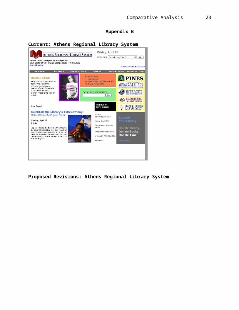
Appendices B and C present images of the current versions
and revision recommendations of each website.
19
Comparative Analysis
References
Athens Regional Library System (n.d.). Retrieved April 10, 2007 from http://www.clarke.public.lib.ga.us/
Chattahoochee Valley Library System Strategic Plan (n.d.). Retrieved April 10,2007 fromhttp://www.thecolumbuslibrary.org/PDFs/StrategicPlan.pdf
D’Angelo, J. & Little, S.K. (1998). Successful web pages: what are they and do they exist?
Information Technology and Libraries, 17(2). Retrieved April 10, 2007, from ProQuest Research Library database
Krug, S. (2000). Don’t make me think!: a common sense approach to Web usability.
Indianapolis, IN: New Riders Press.
Nielsen, J. (2003). Ten Most Violated Homepage Design Guidelines.Retrieved April 10, 2007,
from http://www.useit.com/alertbox/20031110.html
Norlin, E. (2002). Usability testing for library websites: a hands-on guide. Chicago: American
Library Association.
Rosenfeld, L. & Morville, P. (2002). Information Architecture for the World Wide Web.
Sebastopol, CA: O’Reilly & Associates.
Stover, M. (1997). Library web sites: mission and function in thenetworked organization.
Internet Librarian, 17(10). Retrieved April 10, 2007, from EBSCOHost Research
20
Comparative Analysis
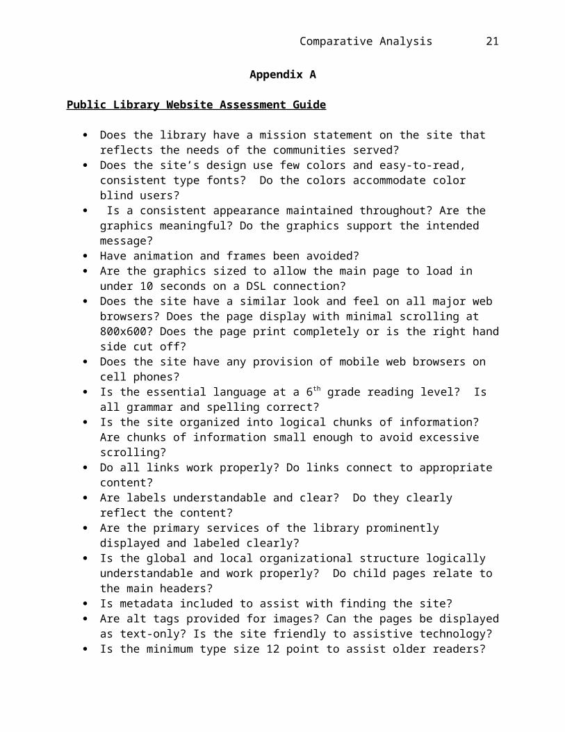
Appendix A
Public Library Website Assessment Guide
Does the library have a mission statement on the site that reflects the needs of the communities served?
Does the site’s design use few colors and easy-to-read, consistent type fonts? Do the colors accommodate color blind users?
Is a consistent appearance maintained throughout? Are the graphics meaningful? Do the graphics support the intended message?
Have animation and frames been avoided? Are the graphics sized to allow the main page to load in
under 10 seconds on a DSL connection? Does the site have a similar look and feel on all major web
browsers? Does the page display with minimal scrolling at 800x600? Does the page print completely or is the right handside cut off?
Does the site have any provision of mobile web browsers on cell phones?
Is the essential language at a 6th grade reading level? Is all grammar and spelling correct?
Is the site organized into logical chunks of information? Are chunks of information small enough to avoid excessive scrolling?
Do all links work properly? Do links connect to appropriate content?
Are labels understandable and clear? Do they clearly reflect the content?
Are the primary services of the library prominently displayed and labeled clearly?
Is the global and local organizational structure logically understandable and work properly? Do child pages relate to the main headers?
Is metadata included to assist with finding the site? Are alt tags provided for images? Can the pages be displayed
as text-only? Is the site friendly to assistive technology? Is the minimum type size 12 point to assist older readers?
21
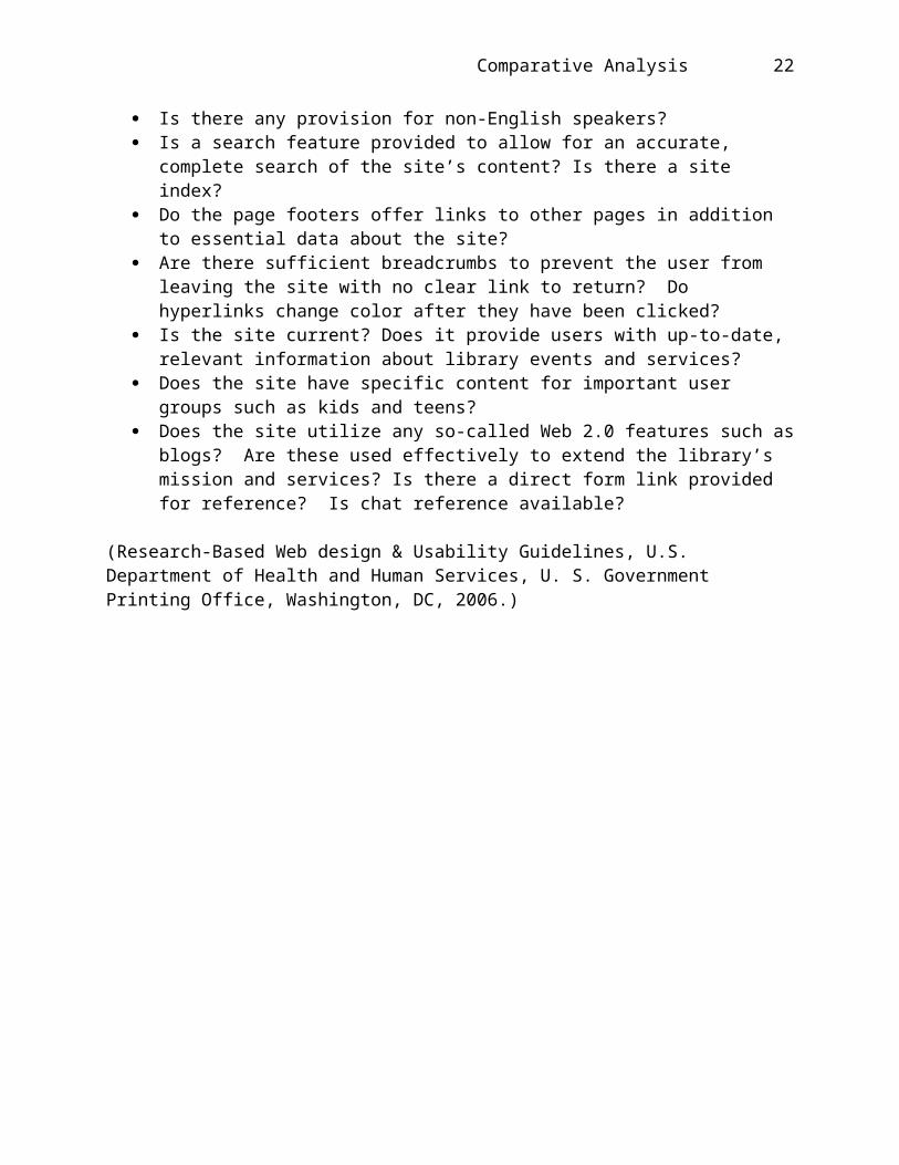
Comparative Analysis
Is there any provision for non-English speakers? Is a search feature provided to allow for an accurate,
complete search of the site’s content? Is there a site index?
Do the page footers offer links to other pages in addition to essential data about the site?
Are there sufficient breadcrumbs to prevent the user from leaving the site with no clear link to return? Do hyperlinks change color after they have been clicked?
Is the site current? Does it provide users with up-to-date, relevant information about library events and services?
Does the site have specific content for important user groups such as kids and teens?
Does the site utilize any so-called Web 2.0 features such asblogs? Are these used effectively to extend the library’s mission and services? Is there a direct form link provided for reference? Is chat reference available?
(Research-Based Web design & Usability Guidelines, U.S. Department of Health and Human Services, U. S. Government Printing Office, Washington, DC, 2006.)
22
Comparative Analysis
Appendix B
Current: Athens Regional Library System
Proposed Revisions: Athens Regional Library System
23

Comparative Analysis
Appendix C
Current: Columbus Library
24

Comparative Analysis
Proposed Revisions: Columbus Library
25