Communication and Persuasion in a Didactic Exhibition: The Power of Maps Study
20
Communication and Persuasion in a Didactic Exhibition: The Power of Maps Study ZAHAVA D. DOERING, ADAM BICKFORD, DAVID A. KARNS, AND AUDREY E. KINDLON A B s T R A c T This article describes a study of The Power ofMaps, an exhibition presented in 1992 at the Cooper-Hewitt, National Design Museum, in New York City. The study compared the result of surveys administered to visitors at the Cooper- Hewitt as they entered and exited the exhibition with a control group of surveys administered to visitors at the National Portrait Gallery in Washington, DC, who had not seen The Power ofMaps exhibition. It was found that visitors who were surveyed as they entered the exhibition were closer in agreement with the message of the exhibition than the control group. It was also found that visitors surveyed upon exiting The Power ofMups exhibition were in closer agreement with the message of the exhibition than with visitors who were surveyed as they entered the exhibition. The study demonstrates that it is possible to document a change in visitors’ conceptions about a topic as a result of hearing about or visiting an exhibition and reliably determine the degree to which exhibitions can influence visitors. BACKGROUND TO THE EXHIBITION Between October 1992 and March 1993, The Power of‘Maps exhibition was on view at the Cooper-Hewitt, National Design Museum, Smithsonian Institution, in New York City. The exhibition aligned with the museum’s goal to educate the public on the importance of design in every aspect of their daily lives. As the director wrote at the time: A goal of Cooper-Hewitt, National Museum of Design is to encourage people to think in new ways about ordinary objects, buildings, transportation systems, urban and re- gional plans-those things we often take for granted. We hope to remind people that our world-from objects to political systems-is in the hands of a variety of designers and that their decisions have a major impact on all our lives. From the moment we awake, and in the course of the routine of our daily lives, design affects us personally. The Museum operates with the belief that with greater understanding, people will come to recognize themselves as designers in their own right, become better consumers, and feel empowered to express their views and be more involved with the world around them. (Pilgrim, 1993) Zahava D. Doering is director, Institutional Studies Office, Smithsonian Institution, Washington, DC 20560-0405 [[email protected]]. David A. Karns is a social science analyst in the Institu- tional Studies Office [[email protected]]. Adam Bickford and Audrey E. Kindlon are former staff members. 88
Transcript of Communication and Persuasion in a Didactic Exhibition: The Power of Maps Study

Communication and Persuasion in a Didactic Exhibition: The Power of Maps Study ZAHAVA D. DOERING, ADAM BICKFORD, DAVID A. K A R N S , A N D AUDREY E. KINDLON
A B s T R A c T This article describes a study of The Power ofMaps, an exhibition presented in 1992 a t the Cooper-Hewitt, National Design Museum, in New York City. The study compared the result of surveys administered to visitors a t the Cooper- Hewitt as they entered and exited the exhibition with a control group of surveys administered to visitors at the National Portrait Gallery in Washington, DC, who had not seen The Power ofMaps exhibition. It was found that visitors who were surveyed as they entered the exhibition were closer in agreement with the message of the exhibition than the control group. It was also found that visitors surveyed upon exiting The Power ofMups exhibition were in closer agreement with the message of the exhibition than with visitors who were surveyed as they entered the exhibition. The study demonstrates that it is possible to document a change in visitors’ conceptions about a topic as a result of hearing about or visiting a n exhibition and reliably determine the degree to which exhibitions can influence visitors.
BACKGROUND TO T H E EXHIBITION
Between October 1992 and March 1993, The Power of‘Maps exhibition was on view at the Cooper-Hewitt, National Design Museum, Smithsonian Institution, in New York City. The exhibition aligned with the museum’s goal to educate the public on the importance of design in every aspect of their daily lives. As the director wrote at the time:
A goal of Cooper-Hewitt, National Museum of Design is to encourage people to think in new ways about ordinary objects, buildings, transportation systems, urban and re- gional plans-those things we often take for granted. We hope to remind people that our world-from objects to political systems-is in the hands of a variety of designers and that their decisions have a major impact on all our lives. From the moment we awake, and in the course of the routine of our daily lives, design affects us personally. The Museum operates with the belief that with greater understanding, people will come to recognize themselves as designers in their own right, become better consumers, and feel empowered to express their views and be more involved with the world around them. (Pilgrim, 1993)
Zahava D. Doering is director, Institutional Studies Office, Smithsonian Institution, Washington, DC 20560-0405 [[email protected]]. David A. Karns is a social science analyst in the Institu- tional Studies Office [[email protected]]. Adam Bickford and Audrey E. Kindlon are former staff members.
88

CURATOR 42/2 APRIL 1999 89
The Power o fMaps , although intended to support this agenda, was a departure from previous installations in the directness of its message and the extent of its di- dactic materials. Through panels and text labels, the exhibition’s “voice” repeat- edly and insistently put forward the position that “all maps-whether rare or fa- miliar, new or old, Western or non-Western-are more than simply guides to help you find your way. Like advertisements and other forms of graphic design, maps express particular viewpoints in support of specific interests. Depending on their function and purpose, all maps present information selectively, shaping our view of the world and our place in it.”’
Although The Power of Maps contained maps in many media from a wide range of historical periods and cultures, its aim was thus quite different from most previous presentations of the subject. It was not a history of maps, nor simply an engaging display of interesting, unusual maps. It was designed as an act of com- munication and persuasion. As such, it openly stated its point of view in didactic materials and invited visitors to challenge it and to disagree, if they wished.2 Ex- hibition organizers wanted visitors to leave the exhibition saying something like, “I never thought about maps that way before, and I’ll never think of them the same way again.”
Banner for The Power of Maps outside the museum. (Photo courtesy of Cooper-Hewitt, National Design Museum, Smithsonian Institution.)
90 ZAHAVA D. DOERING ET AL. THE POWER OF MAPS STUDY
The exhibition’s message and persuasiveness were heavily dependent on text. Exhibition planners realized that visitors have different approaches to viewing an exhibition, and that many visitors would miss an unconventional message unless it was reinforced repeatedly. And the exhibition makers accepted the fact that many (if not most) of those who understood the message would not be convinced by it. In order to maximize the possibility of communication, the exhibition pre- sented and demonstrated the message repeatedly.
The exhibition was structured as a narrative-like sequence that led visitors through an argument in seven main stages, each presented in a separate space. Within each exhibition section the key texts were presented on the room’s infor- mation unit, a tall, brightly colored metal stanchion, which stood alone facing the entrance. Each of the texts on these units began with the same statement that em- bodied the exhibition thesis and implied the sequence of the presentation:
Maps are useful, but never neutral. Like advertisements and other fonns of graphic de- sign, they present information selectively, reflecting particular points of view. They sup- port specific interests. Even ordinary maps can persuade and control. Maps can be made to serve your interests too.
In each section of the exhibition, the portion of the text that directly referred to the contents of the room in which it stood was highlighted in a contrasting color. In addition, this central unit displayed a section number, title, and a short ~ummary .~ The exhibition message was reinforced among the displays themselves by bright yellow “interpretive labels” that accompanied the factual “identification labels” in section 2 (“Which way is up?”), and section 3 (“Whose world is this?”). Interpretive labels were used most extensively in section 5 (“Whose agenda is in your glove compartment?”), known popularly as the “North Carolina Room,” be- cause the co-curator, Denis Wood, used the promotional highway maps of his home state, North Carolina, as the centerpiece in his interpretive deconstruction of the government’s interest in mapping.
DESIGNING THE STUDY
The Power of Maps aimed to influence the way visitors thought about common ob- jects of their culture. Exhibition organizers felt reasonably confident that they were offering most visitors a new way of thinking about maps. A formal back- ground study of visitors’ orientations to maps was not feasible. However, the mu- seum staff conducted informal interviews with museum visitors during the exhi- bition planning process, using actual artifacts and prototype identification and interpretive labels.
These informal interviews suggested that the exhibition ideas were not only new to some visitors, but also generated discomfort among some visitors, and might not be easily accepted. While they saw old maps as historical artifacts that were constrained by the limited knowledge of the time, most people interviewed expressed the belief that contemporary maps were objective, scientific documents that provide reliable information about a place. At the same time, people did not
CURATOR 42/2 APRIL 1999 91
express strong feelings about maps. While these interviews helped the Cooper- Hewitt staff refine interpretive materials, they also helped IS0 anticipate issues among the potential study subjects.
The ISO’s study of this exhibition also marked a departure from our previous work at the Cooper-Hewitt, which had focused more on the demographic and so- cial characteristics of the museum‘s audiences. We were asked to design a study to measure the effectiveness of the exhibition’s communication in two respects: the extent to which visitors recognized the exhibition’s point of view and the extent to which they accepted it.
Issues of evaluation were considered from a relatively early stage in the exhi- bition development process. Addressing the evaluation problem had several unin- tended consequences for the exhibition makers. Our discussions made it clear, first, that planning an assessment required the exhibition team to state the exhi- bition’s essential message in a simple, direct, unequivocal form. Second, it re- quired an articulation of precisely what perceptions or ideas were expected to change for visitors. Third, it kept the exhibition team focused on the effectiveness of communication as the central goal.
The formal study design was influenced by sociological writings on decision- making and specifically by a general framework of how individuals make deci- sions to visit cultural institutions and specific exhibitions within them (Prince, 1990). Prince wrote that a choice is made both on the basis of the information available and on how the individual feels about the nature of the place as the focus of the proposed visit. The choice process is influenced by two fundamental psy- chological elements: a cognitive (knowledge) element of what the place or visit is, and an affective component that assigns a value to the understanding of the place or visit. Information, to Prince, is a core element in the attitude development process and that information itself is value-bound, since it is derived and assimi- lated from a wide range of sources, each of which is assigned a value by the indi- vidual. For example, information and recommendations from family and friends are more likely to be positively viewed than information from the media.
In sum, a study to assess the extent to which visitors grasped the message of The Power of Maps needed to consider their demographic and social characteris- tics, and their prior experience with the Cooper-Hewitt. For those who decided to visit the exhibition (rather than the museum more generally), we needed to con- sider their sources of information and orientation to the general topic of maps.
The core of the study was a set of questions about the message of the exhibi- tion that was asked both of entering and exiting visitors. Because the exhibition took up about two thirds of the museum’s total exhibition space we decided to in- terview representative samples of visitors as they entered (Entrance Survey) and exited the Cooper-Hewitt (Exit S ~ r v e y ) . ~ By posing the same questions about maps to different, but equally representative samples at entrance and exit and compar- ing their results, we expected to be able to isolate the impact of the exhibition on visitors’ thinking.5
This design still needed to address, however, the extent to which visitors to the exhibition were self-selected on the basis of topical interest in maps or had prior

92 ZAHAVA D. DOERING E T AL. THE POWER OF MAPS STUDY
information about the exhibition’s approach. In the extreme, a result that shows no difference in responses to exhibition-related questions between the Entrance and Exit Surveys could be interpreted in one of two ways: that visitors could have been “untouched” by the exhibition’s messages or that the only visitors who came were those who had “accepted” the exhibition’s messages before coming. Thus, in addition to conducting surveys at the Cooper-Hewitt, we decided to conduct a sur- vey about maps at a distant, unrelated museum where maps were not part of the displays.
We used the National Portrait Gallery (NPG) in Washington, DC as our “con- trol” location. Our previous work showed that visitors to NPG were very similar in
“Whose world is this?”, The Power of Maps. (Photo courtesy of Cooper-Hewitt, National Design Museum, Smithsonian Institution.)
CURATOR 42/2 APRIL 1999 93
their demographic characteristics to the Cooper-Hewitt audience.6 Moreover, NPG did not have any exhibitions focused on maps.
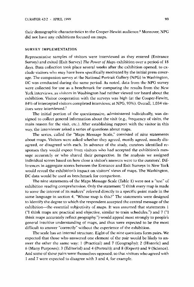
SURVEY I M P L E M E N T A T I O N
Representative samples of visitors were interviewed as they entered (Entrance Survey) and exited (Exit Survey) The Power of Maps exhibition over a period of 18 days. Data collection took place several weeks after the exhibition opened, to ex- clude visitors who may have been specifically motivated by the initial press cover- age. The companion survey at the National Portrait Gallery (NPG) in Washington, DC was conducted during the same period. As noted, data from the NPG survey were collected for use as a benchmark for comparing the results from the New York interviews, as visitors in Washington had neither viewed nor heard about the exhibition. Visitor cooperation with the surveys was high (at the Cooper-Hewitt, 84% of intercepted visitors completed interviews; at NPG, 93%). Overall, 1,034 vis- itors were interviewed.’
The initial portion of the questionnaire, administered individually, was de- signed to collect general information about the visit (e.g., frequency of visits, the main reason for the visit, etc.). After establishing rapport with the visitor in this way, the interviewer asked a series of questions about maps.
The series, called the “Maps Message Scale,” consisted of nine statements about maps. Visitors were asked whether they agreed, mostly agreed, mostly dis- agreed, or disagreed with each. In advance of the study, curators identified re- sponses they would expect from visitors who had accepted the exhibition’s mes- sage accurately or who shared their perspective. In the analysis we assigned individual scores based on how close a visitor’s answers were to the curators’. Dif- ferences in aggregate scores between the Entrance and Exit Surveys in New York would reveal the exhibition’s impact on visitors’ views of maps. The Washington, DC data would be used as benchmark for comparison.
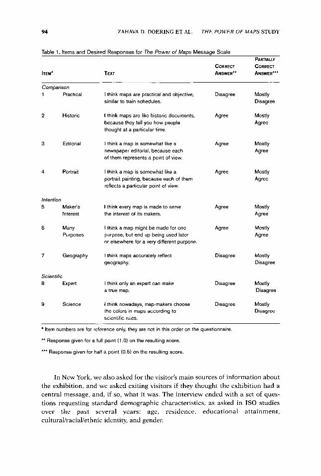
The nine statements of the Maps Message Scale (Table 1) were not a “test” of exhibition reading comprehension. Only the statement “I think every map is made to serve the interest of its makers” referred directly to a specific point made in the same language in section 4, “Whose map is this?” The statements were designed to identify the degree to which the respondent accepted the central message of the exhibition-the essential subjectivity of maps. It was assumed that statements 1 (“I think maps are practical and objective, similar to train schedules.”) and 7 (“I think maps accurately reflect geography.”) would appeal most strongly to people’s general intuitive understanding of maps, and thus were expected to be the most difficult to answer “correctly” without the experience of the exhibition.
The scale has an internal structure. Eight of the nine questions form pairs. We expected that those who answered one element of the pair would be likely to an- swer the other the same way: 1 (Practical) and 7 (Geography); 2 (Historic) and 6 (Many Purposes); 3 (Editorial) and 4 (Portrait); and 8 (Expert) and 9 (Science). And some of these pairs were themselves opposed, so that visitors who agreed with 1 and 7 were expected to disagree with 3 and 4, for example.
94 ZAHAVA D. DOERING ET AL. THE POWER OF MAPS STUDY
Table 1. Items and Desired Resoonses for The Power of Maos Messaae Scale PARTIALLY
CORRECT CORRECT ANSWER** ANSWER'*' ITEM. TEXT
Comparison 1 Practical I think maps are practical and objective,
similar to train schedules. Disagree Mostly
Disagree
2 Historic I think maps are like historic documents, because they tell you how people thought at a particular time.
Agree Mostly Agree
3 Agree Mostly Agree
Editorial I think a map is somewhat like a newspaper editorial, because each of them represents a point of view.
4 Agree Portrait I think a map is somewhat like a portrait painting, because each of them reflects a particular point of view.
Mostly Agree
Intention 5 Maker's
Interest Agree Mostly
Agree I think every map is made to serve the interest of its makers.
6 Many Purposes
I think a map might be made for one purpose, but end up being used later or elsewhere for a very different purpose.
Agree Mostly Agree
7 Geography I think maps accurately reflect geography.
Disagree Mostly Disagree
Scientific 8 Expert I think only an expert can make
a true map. Disagree Mostly
Disagree
9 Science I think nowadays, map-makers choose the colors in maps according to scientific rules.
Disagree Mostly Disagree
Item numbers are for reference only, they are not in this order on the questionnaire.
** Response given for a full point (1 .O) on the resulting score.
*** Response given for half a point (0.5) on the resulting score.
In New York, we also asked for the visitor's main sources of information about the exhibition, and we asked exiting visitors if they thought the exhibition had a central message, and, if so, what it was. The interview ended with a set of ques- tions requesting standard demographic characteristics, as asked in IS0 studies over the past several years: age, residence, educational attainment, cultural/racial/ethnic identity, and gender.

CURATOR 42/2 APRIL 1999 95
Another view of "Whose world is this?" The Power of Maps. (Photo courtesy of Cooper-Hewiit, National Design Museum, Smithsonian Institution.)
RESULTS
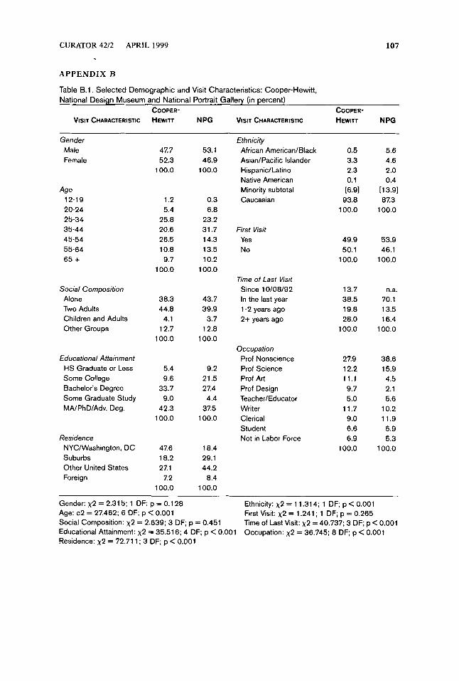
The Visitors. There were no significant differences in demographic characteristics be- tween visitors interviewed in the Entrance Survey and those interviewed in the Exit Survey at the Cooper-Hewitt. There were some statistically significant differences be- tween the NPG visitors and Cooper-Hewitt visitors (see Table B.l in Appendix B).
Approximately equal numbers of women and men came to both museums (52% women at Cooper-Hewitt and 47% at NPG). Ethnic minorities were better represented at NPG (7% at Cooper-Hewitt and 14% at NPG).
Both museums were visited predominantly by adults, alone or in groups, with few children accompanying adults (4% of Cooper-Hewitt and NPG visitors were visiting with children). The majority at both museums were age 25 or older (90% at the Cooper-Hewitt and 92% at NPG).

96 ZAHAVA D. DOEFUNG ET AL. THE POWER OF MAPS STUDY
Almost all visitors at both museums had at least some college (94% at the Cooper-Hewitt and 93% at NPG). Consistent with their high educational attain- ment, the majority of visitors reported professional occupations. At both museums nonscience professionals (i.e., attorneys, brokers, accountants, etc.) formed the largest category (28% at Cooper-Hewitt and 39% at NPG). Science professionals were about equally represented (12% at Cooper-Hewitt and 16% at NPG). There were twice as many arts professionals (i.e., artists, designers, and teachers-most of them art teachers) at Cooper-Hewitt (26% vs. 12% at NPG).
Approximately half of the visitors had previously visited the Cooper-Hewitt or NPG. More than half of repeat visitors had been to the respective museum within the last year (52% at the Cooper-Hewitt and 70% at NPG).
Sources ofznfomzation. Approximately two out of three visitors (63%) came to the Cooper-Hewitt specifically to see The Power of Maps. Almost one third of all re- spondents who had heard about the exhibition prior to entering the museum had learned about it first from newspapers and another 16 percent from magazine re- views (Figure 1). Nearly one quarter (24%) heard about the exhibition from friends or family.
TV/Rad io
Other 5
Museum Calendar 6 -
Sign on Fifth Avenue
Magazines
Family/Friends
Newspapers
0 10 20 30 40 50 Percent
Figure 1. Responses to “Where did you first hear about The Power of Maps?” Cooper-Hewitt visitors only (in percent)
Exhibition Message. In the Cooper-Hewitt Exit Survey we asked, “Do you think the exhibition has a central message?” and further asked those who said “Yes” (83% of exiting respondents), “What do you think that message is?” As shown in Table 2, half (50%) of the respondents who felt there was a central message articulated one that was consistent with the central message of the exhibitiom8 The others gave a response that was either neutral or inconsistent with the curatorial per- spective.
Although these results are not p r e ~ i s e , ~ they suggest that approximately 42% of the visitors recognized the exhibition’s message.

CURATOR 42/2 '.' APRIL 1999 97
Table 2. Responses to Open-Ended Questions about the Central Message of The Power of Maps
PERCENT DESCRIPTION
17
50
50
- 100
Do you think the exhibition has a central message? No Yes
What do you think that message is? Message consistent with curatoral intent: 24 13 6 5 Maps are interpretive objects. 2 Maps reflect different cultures
Maps reflect a subjective point of view. Maps serve the interest of their makers. Maps are powerful objects in their multiple uses.
(e.g., different cultures make different maps).
Message not consistent with curatorial intent: 18 Nonevaluative statement (e.g., show what
maps can do). 7 Maps reflect changing history. 4 Maps are pretty/interesting/attractive.
0 7 No real answedcan't articulate.
14 Maps are usefullimportantlreliable. Maps show geography (i.e., accurately reflect the physical world).
Total of "yes" answers
Curatorial Perspective. The Maps Message Scale scores have a possible range from zero (indicating that the respondent did not agree with any of the exhibition's mes- sage) to nine points (indicating that the respondent was in complete agreement with the exhibition's message). For all 1,009 adults who completed interviews at all three locations, the mean score was 4.4 (Standard Deviation [SD] = 1.6 points).
For respondents interviewed in the NPG survey the mean score was 3.9 (SD = 1.5); for respondents intercepted before entering the exhibition at the Cooper-Hewitt (Entrance Survey) the mean score was 4.3 (SD = 1.6); and for re- spondents intercepted as they left the exhibition (Exit Survey) the mean score was 4.7 (SD = 1.6) (Table 3).
Table 3. Maps Message Scale Scores STANDARD
RESPONDENTS MEAN DEVIATION MINIMUM MAXIM u M
All Cases
~~
990 4.4 1.6 0.5 9.0
National Portrait Gallery 266 3.9 1.5 0.5 8.0 Cooper-Hewitt Entrance" 383 4.3 1.6 0.5 9.0 Cooper-Hewitt Exit** 341 4.8 1.6 0.5 9.0
"'F = 26.5, DF = (2, 986), p < ,0001
The overall trend of mean scores by interview locations is consistent with a hypothesis that the message of the exhibition influenced visitors' thinking, align- ing it closer to that of the curator. People at NPG, who had no exposure to the ex-

98 ZAHAVA D. DOERING ET AL. THE POWER OF MAPS STUDY
hibition, had the lowest scores overall. People who came to view the exhibition and were interviewed before seeing it (Entrance Survey) had higher scores but still lower than scores from the Exit Survey. The differences between the mean score for people at NPG and for those intercepted before they entered the Cooper-Hewitt exhibition hall was 0.4. Viewing the exhibition increased the mean score by an- other 0.4 (indicated by a comparison of Entrance Survey and Exit Survey scores). In total, between respondents from NPG, who had no exposure to The Power of M a p s exhibition, and respondents intercepted leaving the exhibition, the mean scores differ by 0.8 point.
In addition, we found significant differences between each location for seven out of the nine individual items in the scale (Table 4).1° The exceptions were “I think maps are like historic documents, because they tell you how people thought at a particular time” and “A map might be made for one purpose, but ends up being used later or elsewhere for a very different purpose.” Almost all respondents, at all survey locations, agreed with those statements. In the case of all other items, the results clearly show an increase in the percentage giving a correct or partially correct response among the NPG location, the Cooper-Hewitt Entrance Survey, and the Cooper-Hewitt Exit Survey.
Table 4. Percent of Respondents Giving a Correct or Partially Correct Response to The Power of Maps Message Scale, by Item and Survey Location
COOPER-HEWITT ITEM’ N PG ENTRANCE EXIT
Practical Historic Editorial Portrait Maker’s Interest Many Purposes Geography Expert Science
12.4 93.4 64.0 75.9 52.7 91.3 13.6 49.2 42.2
20.1 96.7 73.5 80.9 57.6 93.1 25.5 52.8 45.9
28.3 97.9 80.2 85.2 68.7 93.2 32.5 59.6 57.0
~ ~
*See Table 1 for complete wording.
Can these score differences be attributed to differences in the demographic composition of visitors intercepted at the two museums? To explore this possibil- ity, we used multiple regression analysis as an analytical tool.” The Maps Scale Score was regressed on a number of visitor characteristics: gender, age, racialleth- nic identification, respondent education, respondent occupation, the number of information sources for The Power of Maps, whether the respondent was visiting the Cooper-Hewitt primarily to see The Power o fMups or not, and respondent’s in- terview location. The results of the final regression model show that differences in scores are not due to the different demographic characteristics of respondents. Rather, scores were predicted by only three factors: the respondent’s occupation, whether a visitor came to the Cooper-Hewitt for the exhibition, and the visitor’s experience in the exhibition itself.

CURATOR 4212 APRIL 1999 99
Among these three predictive factors, the strongest effect is due to the re- spondent‘s occupation. Persons with “artistic” occupations (artists, designers, teachers’*), as opposed to all other respondents, had significantly higher scores. On average, being an artist, designer, or teacher increased respondent scores by 0.8 points. This is followed by the effect of seeing the exhibition (i.e., being among the respondents intercepted as they exited the exhibition). On the average, having seen the exhibition increased respondent scores by 0.5 point. Finally, respondents who had come to the Cooper-Hewitt for The Power of Maps had higher scores (0.4).
The influence of these predictive factors is additive. For example, an arts pro- fessional who came primarily to see the exhibition and who was interviewed on exit from the exhibition was likely to score nearly two points higher than a non- arts professional at NPG.
Exiting visitors who correctly identified the message of the exhibition also had significantly higher scoresi3 (Table 5 ) .
Table 5. Mean Maps Scale Scores of Visitors Who Identified an Exhibition Message, bv Messaae TvDe (Exit Survev)
MESSAGE (N) MEAN STANDARD DEVIATION
Curator’s Message Other Message
116 109
5.3’ 4.6
1.6 1.7
‘T-value = -2.9667, DF = 223.0, p < 0.0033
T H E C O N F I G U R A T I O N O F M A P S M E S S A G E SCALE S C O R E S
To better understand the significance of the Maps Messages Scale scores and to test their validity, we analyzed the internal consistency of the nine responses, using the statistical technique known as “cluster analy~is.”’~ Cluster analysis identifies the correlations among an individual’s responses, on the assumption that items that are viewed similarly by a respondent will tend to be answered ~imi1arly.l~
Overall, the cluster analysis indicates that respondents at NPG and the en- trance to the Cooper-Hewitt tended to see the statements as forming three clus- ters, or attitudes toward maps, which we can term scientific (“Expert” and “Sci- ence,” items 8 and 9 in Table l), interpretive (“Editorial,” “Portrait,” and “Maker’s Interest,” items 3 to 5 in Table l), and practical (“Practical” and “Geography,” items 1 and 7 in Table 1). (Two items were excluded from the cluster analysis since fewer than ten percent of the respondents disagreed with the exhibition’s message: (a) “Historic” and (b) “Many Purposes.”)
The responses of those leaving the exhibition at Cooper-Hewitt demonstrated a new development in the pattern of responses, which now linked practical and scientific. In other words, exiting visitors no longer saw a distinction between
100 ZAHAVA D. DOERING ET AL. THE POWER OF MAPS STUDY
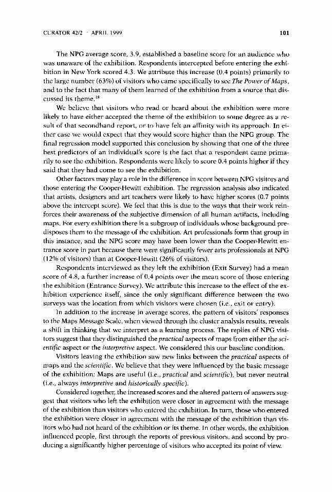
practical and scientific, and distinguished both of these from interpretive. We be- lieve that this shift indicates visitors’ movement toward the message of the exhi- bition. The key statement of the exhibition message: “Maps are useful, but never neutral” also suggests a strong contrast between utility and subjectivity.16
The cluster patterns also confirm the internal consistency of the scale. At all three locations, answers were paired as expected, and item 5 (“Maker’s Interest”), the only one that was not designed to be paired with another, regularly clustered with the pair consisting of item 3 (“Editorial”) and item 4 (“Portrait”).
SUMMARY AND INTERPRETATION
As exhibit developers become increasingly interested in the educative power of ex- hibitions, more and more visitor studies address the impact of exhibitions on vis- itors’ thinking. Many exhibitions present themes with which the majority of their visitors agree in principle, if not in detail. Because The Power of Maps confronted conventional ideas, it offered an opportunity to evaluate the degree to which an exhibition could persuade visitors to adopt new viewpoints on familiar matters.
Several important issues in this regard were beyond the scope of this study. First, we do not know the degree to which entering visitors were consciously aware of their ideas about maps. Thus we cannot say whether the differences in the Maps Message Scale scores between entrance and exit indicated that visitors changed their ideas or that they simply took on the exhibition interpretation. Sec- ond, even if some visitors were consciously aware of their ideas about maps, we do not know the intensity with which those ideas were held. Thus we cannot say to what degree the results indicate a successful conversion from existing beliefs. In other words, it is impossible to suggest what might be the limits of movement for scores on the Maps Message Scale, and what degree of resistance the exhibi- tion managed to overcome. These issues are ultimately critical for a proper un- derstanding of the degree to which this or any exhibition can “teach” people things that they may not want to hear.
This study was designed primarily to understand the degree to which the ex- hibition message was accepted by visitors, both before and after the exhibition ex- perience. Its instruments (such as the Maps Message Scale) and analytical tech- niques (such as regression and cluster analysis) were directed solely toward that end. It was not intended to provide direct practical feedback on exhibition tech- niques to the exhibition makers, even though The Power of Maps was a unique event” that departed from the museum’s usual practice.
The Maps Message Scale was used to assess the degree to which respondents accepted the idea that maps are subjective representations, or, as the exhibition texts put i t , that “Maps are useful, but never neutral.” The nine statements of the scale approached the subjectivity of maps from different directions in an overlap- ping manner. The Maps Message Scale scores have a possible range from zero (in- dicating that the respondent did not accept any part of the exhibition’s message) to nine (indicating that the respondent was in complete agreement with the exhi- bition’s message).
CURATOR 42/2 APRIL 1999 101
The NPG average score, 3.9, established a baseline score for an audience who was unaware of the exhibition. Respondents intercepted before entering the exhi- bition in New York scored 4.3. We attribute this increase (0.4 points) primarily to the large number (63%) of visitors who came specifically to see The Power of Maps, and to the fact that many of them learned of the exhibition from a source that dis- cussed its theme.ls
We believe that visitors who read or heard about the exhibition were more likely to have either accepted the theme of the exhibition to some degree as a re- sult of that secondhand report, or to have felt an affinity with its approach. In ei- ther case we would expect that they would score higher than the NPG group. The final regression model supported this conclusion by showing that one of the three best predictors of an individual’s score is the fact that a respondent came prima- rily to see the exhibition. Respondents were likely to score 0.4 points higher if they said that they had come to see the exhibition.
Other factors may play a role in the difference in score between NPG visitors and those entering the Cooper-Hewitt exhibition. The regression analysis also indicated that artists, designers and art teachers were likely to have higher scores (0.7 points above the intercept score). We feel that this is due to the ways that their work rein- forces their awareness of the subjective dimension of all human artifacts, including maps. For every exhibition there is a subgroup of individuals whose background pre- disposes them to the message of the exhibition. Art professionals form that group in this instance, and the NPG score may have been lower than the Cooper-Hewitt en- trance score in part because there were significantly fewer arts professionals at NPG (1 2% of visitors) than at Cooper-Hewitt (26% of visitors).
Respondents interviewed as they left the exhibition (Exit Survey) had a mean score of 4.8, a further increase of 0.4 points over the mean score of those entering the exhibition (Entrance Survey). We attribute this increase to the effect of the ex- hibition experience itself, since the only significant difference between the two surveys was the location from which visitors were chosen (i.e., exit or entry).
In addition to the increase in average scores, the pattern of visitors’ responses to the Maps Message Scale, when viewed through the cluster analysis results, reveals a shift in thinking that we interpret as a learning process. The replies of NPG visi- tors suggest that they distinguished the practical aspects of maps from either the sci- entific aspect or the interpretive aspect. We considered this our baseline condition.
Visitors leaving the exhibition saw new links between the practical aspects of maps and the scientific. We believe that they were influenced by the basic message of the exhibition: Maps are useful (i.e., practical and scientific), but never neutral (i.e., always interpretive and historically specific).
Considered together, the increased scores and the altered pattern of answers sug- gest that visitors who left the exhibition were closer in agreement with the message of the exhibition than visitors who entered the exhibition. In turn, those who entered the exhibition were closer in agreement with the message of the exhibition than vis- itors who had not heard of the exhibition or its theme. In other words, the exhibition influenced people, first through the reports of previous visitors, and second by pro- ducing a significantly higher percentage of visitors who accepted its point of view.
102 ZAHAVA D. DOERING ET AL. THE POWER OF MAPS STUDY
This study does not analyze the specific processes by which visitors moved closer to the exhibition’s viewpoint. They probably accepted it gradually, in stages of awareness. Yet we know that by the time they left the exhibition, nearly half of the visitors were consciously aware of the exhibition message, and that these in- dividuals on average were more in agreement with the curator than those who did not identify the exhibition message correctly.
In conclusion, this study shows, however imperfectly, that The Power of M a p s did change visitors’ opinions about maps. While the magnitude of this change is relatively small and the experience of seeing the exhibition proved to be only one of several factors influencing visitor agreement with the exhibition‘s thesis, the re- sults of the regression analysis demonstrate that, in the aggregate, the opinions of visitors leaving the exhibition were more in agreement with the exhibition thesis than the opinions of those who had not seen the exhibition. In addition, the results of the cluster analysis clearly show a pattern of increasing awareness and persua- sion across the three parts of the study design, from visitors to the National Por- trait Gallery to Cooper-Hewitt visitors leaving the exhibition.
For exhibition practice The Power of M a p s study demonstrates that, with cu- ratorial participation, an appropriate survey design, and a carefully executed measurement strategy, it is possible to reliably determine the degree to which ex- hibitions influence their visitors.
ACKNOWLEDGMENTS
This study was conducted with the cooperation of many people, whom we would like to ac- knowledge. Lucy Fellowes, Cooper-Hewitt, National Design Museum, and Denis Wood, professor of design, North Carolina State University, The Power of Maps co-curators, supported the study. Susan Yelavich, assistant director for Public Programs and Dorothy Dunn, Education Depart- ment, Cooper-Hewitt, National Design Museum, and Alan Fern, director, and Carolyn Carr, deputy director, National Portrait Gallery, facilitated the data collection. We are also gratehl for the crit- ical comments of Jeffrey K. Smith and other reviewers.
REFERENCES
Doering, Z. D., & Ziebarth, E. K. (1990). Museum images: A study of the National Museum of Amer- ican Art and the National Portrait Gallery (91-1). Washington, DC: Smithsonian Institution.
Doering, Z. D., Kindlon, A. E., & Bickford, A. (1993). The power ofmaps: A study o f a n exhibition at Cooper-Hewitt, National Museum of Design (93-5). Washington, DC: Smithsonian Institu- tion.
Pilgrim, D. H. ( 1 993). Director’s statement. Unpublished document. New York; Cooper-Hewitt Na- tional Museum of Design.
Prince, D. R. (1990). Factors influencing museum visits: An empirical evaluation of audience se- lection. Museum Management and Curatorship, 9, 149-168.
NOTES
I . The Power of Maps Press Release, September 8, 1992. 2. Comments recorded in the visitor comment books showed that many visitors found these
ideas very hard to accept. The comment books contained passionate debates between those who embraced the exhibition’s message and those who rejected it. The central focus for controversy
CURATOR 4212 APRIL 1999 103
was the North Carolina room (section 5) where co-curator Denis Wood presented his case most directly and emotionally.
3. See appendix A for these texts and the contents of each exhibition section. 4. Interviews conducted at the door to the museum, rather than at the exhibition entrance
and exit would ensure data from a representative sample of all visitors to the Cooper-Hewitt. From the Exit Survey we could see if, among all visitors, some specific subset elected not to visit The Power of M a p s .
5. We interviewed two different but equally representative samples, one at entrance and one at exit, because we were interested in aggregate rather than individual results, and because we wanted to avoid experimental effects that arise when the same person is interviewed more than once.
6 . See Doering & Ziebarth (1991). In fact, a Washington, DC venue was planned by the Smithsonian.
7. The Cooper-Hewitt surveys were conducted between October 27 and November 17, 1992 and at the National Portrait Gallery between November 2 and November 14, 1992. Interviewing teams, using a sampling method developed for our large-scale surveys, intercepted individuals, administered the questionnaire, and thanked the participants with a booklet on the collection (Cooper-Hewitt) or a special postcard (NPG).
8. Although this question was asked after presenting the Maps Message Scale discussed below, we felt that the scale would not influence it for two reasons: first, a reading of the scale statements alone does not suggest the exhibition theme (this was confirmed by the cluster analy- ses for the pretest respondents and the NPG respondents); second, the language of the scale statements deliberately excluded key words that could represent the theme (this is confirmed by the language of the open-ended responses, which preferred the word “subjective” over all others).
9. Many responses were difficult to understand and there is often ambiguity in open-ended replies that is resolved in the coding process. The statistical result from a fixed scale, such as the Maps Message Scale, is generally more reliable, because from the visitors’ perspective, responding to items in the Maps Message Scale was much simpler than articulating complete thoughts about central mes- sages. Similarly, from the interviewers’ perspective, reading items in the Maps Message Scale, and waiting for and recording a response was simpler than recording open-ended responses.
10. In Table 4 we have combined the percent of respondents giving a Correct or Partially Correct response for each item by survey location. The disaggregated data are in the complete re- port, Table D.5, Appendix D. The complete report (Doering et al. 1993) is available by contacting the Institutional Studies Office.
11. Regression analysis is a statistical technique for predicting the variation of one variable in terms of other variables. The variable whose variation is to be explained is called the dependent vari- able, and the variables used to predict this variation are called the independent variables. The most common type of regression model is called a linear regression model because it exploits the key prop- erty of a straight line, that is, the amount of change in the value of the dependent variable along one axis is constant for each one-unit change in value of an independent variable along the other axis. The amount of this change is presented as a summary statistic, the regression coefficient.
To determine the most significant predictors of Map Scale Scores, we used regression analy- sis with the Map Scale Score as the dependent variable. In the final model, three independent vari- ables, Being an arts professional, Exiting the exhibition, and Having come to see the exhibition, predicted Map Scale Scores quite well. The standardized regression coefficients for the predictor variables were: (1) Arts professional, 0.2135; (2) Exiting the exhibition at the Cooper-Hewitt, 0.1574; and (3) Having come specifically to see The Power of M a p s , 0.1242. Each predictor vari- able was statistically significant at a level less than 0.0001. The statistical significance level for the regression model as a whole was less than 0.001 and the multiple correlation was 0.31.
12. Most of the teachers identified themselves as art teachers. 13. There is no significant difference in mean score between those who said the exhibition
had a message and those who said it did not have a message. 14. Cluster analysis is a statistical technique used to classify respondents into nested
groups based on their “closeness” to one another, that is, the likelihood that two people who give the same answer to one question will also give the same answer to another question. The statistical procedure has several steps. First, all of the responses included in an analysis are
104 ZAHAVA D. DOERING ET AL. THE POWER OF MAPS STUDY
correlated with one another. The set of correlations is called a similarity matrix. Once the sim- ilarity matrix is calculated, cluster analysis combines the pairs of questions that are close to- gether into groups, or clusters. After an initial clustering, the process repeats itself until all of the responses to the original questions are combined into a single cluster. Once the clustering is complete, one looks at the pattern of the nested grouping to identify any underlying patterns among the different groups.
15. Details of the analysis, together with the resultant graphic presentations, are in the com- plete report.
16. The attitude shift suggested by the cluster analysis was confirmed by a more sophisti- cated statistical technique, Multidimensional Scaling Analysis. The analysis revealed that the at- titude shift applied both to visitors’ views on how maps were made, as well as to their views on how maps are used.
17. The co-curator, Denis Wood, who provided the principal intellectual and narrative struc- ture for the exhibition, was brought in by the museum to collaborate on this exhibition alone. Later, as a result of the exhibition’s popularity, The Power ofMaps was re-presented, somewhat dif- ferently, in Washington, DC.
18. The exhibition theme was presented with unusual accuracy and prominence in the news- paper and magazine reviews, which, together with the museum calendar, accounted for 53.1% of the places where visitors heard of the exhibition (see Figure 1) .
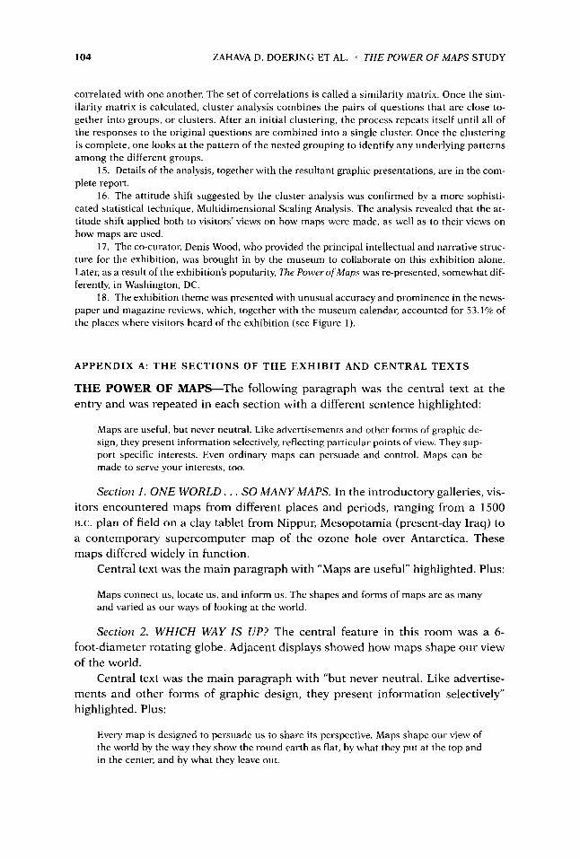
APPENDIX A: T H E SECTIONS OF T H E EXHIBIT AND CENTRAL TEXTS
THE POWER OF MAPS-The following paragraph was the central text at the entry and was repeated in each section with a different sentence highlighted:
Maps are useful, but never neutral. Like advertisements and other forms of graphic de- sign, they present information selectively, reflecting particular points of view. They sup- port specific interests. Even ordinary maps can persuade and control. Maps can be made to serve your interests, too.
Section 1 . O N E WORLD. . . SO MANY MAPS. In the introductory galleries, vis- itors encountered maps from different places and periods, ranging from a 1500 B.C. plan of field on a clay tablet from Nippur, Mesopotamia (present-day Iraq) to a contemporary supercomputer map of the ozone hole over Antarctica. These maps differed widely in function.
Central text was the main paragraph with “Maps are useful” highlighted. Plus:
Maps connect us, locate us, and inform us. The shapes and forms of maps are as many and varied as our ways of looking at the world.
Section 2. WHICH WAY IS UP? The central feature in this room was a 6- foot-diameter rotating globe. Adjacent displays showed how maps shape our view of the world.
Central text was the main paragraph with “but never neutral. Like advertise- ments and other forms of graphic design, they present information selectively” highlighted. Plus:
Every map is designed to persuade us to share its perspective. Maps shape our view of the world by the way they show the round earth as flat, by what they put at the top and in the center, and by what they leave out.

CURATOR 42/2 APRIL 1999 105
Section 3. WHOSE WORLD IS THIS? This section included a nineteenth-century Sioux map, Pacific Islanders’ stick charts, secret-society maps from central Africa, and an Australian aboriginal painting that maps a “Dreaming.” The central feature of this room was a matrix of maps selected to highlight how mapmakers “create” world views.
Central text was the main paragraph with “reflecting particular points of view highlighted.” Plus:
Every map takes the perspective of its time and place. Every map represents the period and culture from which it comes. What is considered a map depends on who its mak- ers and users are. On the left side of this room are maps from many cultures. On the right are world maps made at different periods within one culture.
Section 4. WHOSE MAP IS THIS? The central feature of this room was a study of maps for the area of Ringwood, New Jersey, some produced by the U.S. Geo- logical Survey, an agency established in 1879 through legislation introduced by Rep. Abram S. Hewitt (1 822-1902), whose daughters founded Cooper-Hewitt Mu- seum. The USGS maps show Hewitt’s properties, iron mines, and place names, re- flecting his imprint on the land.
Central text was the main paragraph with “They support specific interests” highlighted. Plus:
Even ordinary maps can persuade and control. Maps can be made to serve your inter- ests, too. A map belongs first to those who commission it. The map takes their point of view and meets their needs. They decide what is on the map and what is not. Once made, a map is available to others to use in different ways to serve their interests.
Section 5. WHOSE AGENDA IS IN YOUR GLOVE COMPARTMENT? Denis Wood, co-curator of the exhibition, commented on North Carolina maps in this section, which also included license plates, postcards, and souvenirs.
Central text was the main paragraph with “Even ordinary maps can persuade and control” highlighed. Plus:
Even an ordinary highway map has hidden messages. In this gallery Denis Wood, co- curator of this exhibition and a resident of North Carolina, shares his reading of maps from that state.
Section 6. OPEN THE MAP! Case studies demonstrated how maps can be used effectively to address local, regional, and global issues. Local mapping projects in- cluded a study of injury to children, commissioned by Cooper-Hewitt Museum with the Harlem Hospital Injury Prevention Program, and a cumulative survey of the incidence of AIDS in the Bronx.
Central text was the main paragraph with “Maps can be made to serve your interests, too” highlighted. Plus:
Take the power of maps into your own hands. The maps in this room are available to you. Put them to work to advance your interests. Take action on local, regional, or global issues that matter to you.

106 ZAHAVA D. DOERING ET AL. THE POWER OF MAPS STUDY
“WHAT DO YOU THINK?” was a sign posted above comment books with the following text panel:
Exhibitions, too, are useful but never neutral. They present information selectively, re- flecting particular points of view. They support specific interests. They can persuade and control. Exhibitions can be made to serve your interests too.
The view of maps presented in this exhibition is just one of many. Do you agree? Let us know what you think about this exhibition and the museum.
Section 7. USE THE MAP! At the end of the exhibition, visitors were told:
On the second floor you can try out computer programs in the Computer Mapping Room, and you can study atlases, books, and periodicals in the Map Resource Center.
CURATOR 4212 APRIL 1999 107
APPENDIX B
Table B.l. Selected Demographic and Visit Characteristics: Cooper-Hewitt, National Design Museum and National Portrait Gallery (in percent)
COOPER- COOPER- VISIT CHARACTERISTIC HEWITT N PG VISIT CHARACTERISTIC HEWITT NPG
Gender Male Female
Age 12-19 20-24 25-34 35-44 45-54 55-64 65 +
Social Composition Alone Two Adults Children and Adults Other Groups
Educational Attainment HS Graduate or Less Some College Bachelor's Degree Some Graduate Study MNPhDIAdv. Deg.
Residence NYCIWashington, DC Suburbs Other United States Foreign
47.7 52.3
100.0
1.2 5.4
25.8 20.6 26.5 10.8 9.7
100.0
38.3 44.8
4.1 12.7
100.0
5.4 9.6
33.7 9.0
42.3 100.0
47.6 18.2 27.1
7.2 100.0
53.1 46.9
100.0
0.3 6.8
23.2 31.7 14.3 13.5 10.2
100.0
43.7 39.9
3.7 12.8
100.0
9.2 21.5 27.4 4.4
37.5 100.0
18.4 29.1 44.2
8.4 100.0
Ethnicity African AmericadBlack AsianlPacific Islander HispanicILatino Native American Minority subtotal Caucasian
First Visit Yes No
Time of Last Visit Since 10108192 In the last year 1-2 years ago 2+ years ago
Occupation Prof Nonscience Prof Science Prof Art Prof Design TeacherIEducator Writer Clerical Student Not in Labor Force
0.5 3.3 2.3 0.1 E.91
93.8 100.0
49.9 50.1
100.0
13.7 38.5 19.8 28.0
100.0
27.9 12.2 11.1 9.7 5.0
11.7 9.0 6.6 6.9
100.0
5.6 4.6 2.0 0.4
[13.9] 87.3
100.0
53.9 46.1
100.0
n.a. 70.1 13.5 16.4
100.0
38.6 15.9 4.5 2.1 5.6
10.2 11.9 5.9 5.3
100.0
Gender: x2 = 2.31 5; 1 DF; p = 0.1 28 Age: c2 = 27.462; 6 DF; p < 0.001 Social Composition: x2 = 2.639; 3 DF; p = 0.451 Educational Attainment: x2 == 35.51 6; 4 DF; p < 0.001 Residence: x2 = 72.71 1; 3 DF; p < 0.001
Ethnicity: x2 = 11.31 4; 1 DF; p < 0.001 First Visit: x2 = 1.241 ; 1 DF; p = 0.265 Time of Last Visit: x2 = 40.737; 3 DF; p < 0.001 Occupation: x2 = 36.745; 8 DF; p < 0.001