ArcGIS GeoBIM Connects Projects in Context 8 - Esri
72
Fall 2021 The Magazine for Esri Software Users Arc User Using GIS to Effect Change for the ALS Community 58 A Place for National Mourning 40 ArcGIS GeoBIM Connects Projects in Context 8
-
Upload
khangminh22 -
Category
Documents
-
view
0 -
download
0
Transcript of ArcGIS GeoBIM Connects Projects in Context 8 - Esri

Fall 2021
The Magazine for Esri Software Users
ArcUser
Using GIS to Effect Change for the ALS Community 58
A Place for National Mourning 40
ArcGIS GeoBIM Connects Projects
in Context 8

Create powerful systems of action with Cityworks and ArcGIS.Local government and utility organizations have no shortage of data. But turning that data into actionable insights can sometimes feel … impossible. Cityworks is the leading GIS-centric public asset management and permitting solution that leverages your investment in ArcGIS to make sense of the complexity of data and create scalable systems of action for any workflow or vertical asset.
From IoT remote monitoring to enterpise asset management, you can easily track and visualize every asset and its associated history, labor, costs, materials, permitting workflows, and so much more.
Download your Guide to Enterprise Asset Management and request your personal demo at Cityworks.com/Esri
UTILITIES AND LOCAL GOVERNMENT WITH

Contents Fall 2021 Vol. 24 No. 4
3esri.com/arcuser Fall 2021 au
18
40
66
Focus10 US Border Patrol Uses ArcGIS to Rescue Migrants
14 Highway Data Collection Improves Operations and Saves Money
18 Fighting Snow More Effectively with GIS
Special Section40 A Place for National Mourning
End Notes66 If More Women Owned Land, More People Might Be Fed

Monica PrattArcUser Editor
4 au Fall 2021 esri.com/arcuser
Fall 2021 Vol. 24 No. 4
ArcUserBuilding a Better Future
ISSN 1534-5467ArcUser is published quarterly by Esri at380 New York Street, Redlands, CA 92373-8100 usa.ArcUser is written for users of Esri software and distributed free of charge to registered users.
Read ArcUser OnlineVisit the ArcUser website (www.esri.com/arcuser) to download tutorials, read current and past issues, and access additional resources.
Subscribe to ArcUserResidents of the United States can subscribe to the print edition of ArcUser at go.esri.com/subscribe.
Manage Your ArcUser SubscriptionMake changes to your subscription information at go.esri.com/manage-subscriptions.
Advertise in ArcUserFor information regarding placing an advertisement in ArcUser magazine, contact the advertising coordinator at [email protected].
Editorial InquiriesMonica Pratt, ArcUser Editor 380 New York Street Redlands, CA 92373-8100 usa [email protected]
Read the article submission guidelines at https://bit.ly/3mwMRxc.
EditorialEditor Monica PrattContributors Jim Baumann, Carla Wheeler, Citabria StevensTechnical Adviser Paul DoddCopyediting Allan Mendiola
DesignCreative Director James HitchcockDesigner Doug Huibregtse Illustrator Dan GillPhotographers Eric Laycock, Eric JohnsonPrint Coordinator Lilia Arias
Advisory BoardCorporate Marianna KantorProducts Damian SpangrudInternational Dean AngelidesMarketing Communications Jeff BrazilIndustries Damian Spangrud
From building affordable housing to designing infrastructure that is resilient to the stresses of climate change, governments and commercial organizations will need to invest vast sums to create a sustainable future.
A geographic approach is required to realize this future. Placing infrastructure in a geographic context allows for more intelligent and cost-effective development. GIS, the technology that enables the geographic approach, integrates and analyzes data from many systems and fosters collaboration, leading to better outcomes. As the benefits of this perspective have been more widely appreciated, the application of GIS technology has been expanding, not only moving across organizations but also aiding collaboration between organizations. The New York City Department of Sanitation, which developed real-time situational awareness of its snow removal activities using GIS and live feeds, is expanding GIS use to other mission-critical services that maintain the city’s infrastructure. The Idaho Transportation Department (ITD) expanded its mobile data collection program from a single district to every district in the state. It inventoried the location, condition, and status of its entire highway system and, in the process, saved 300,000 hours of labor and $3.8 million in wages. ITD made this infrastructure data available to its staff, partners, and the public using ArcGIS Hub. With the introduction of ArcGIS GeoBIM, GIS applies the geographic framework to the built environment of cities. By bridging the gap between GIS and building information modeling (BIM), ArcGIS GeoBIM provides a single authoritative view of infrastructure projects that combines data from many sources in a geographic context. This view can be accessed by project teams and stakeholders, which enhances collaboration and improves decisions. A geospatial infrastructure supports the design, construction, and maintenance of the physical infrastructure needed for a sustainable future.

Departments
5esri.com/arcuser Fall 2021 au
34
44
64
Software and Data
6 Briefly Noted
8 ArcGIS GeoBIM Connects Projects in Context
Manager’s Corner
22 Proactive, Unified Approach to Modernizing GIS
26 Put Your Geospatial Strategy on One Page
29 The Next Generation of Self-Service Government
30 Building System Stability with a Maintenance Plan
Developer’s Section
34 Data-Driven Map Animations for the Web
Hands On
44 Working Together across ArcGIS Online Organizations
46 Map the Uncertainty of Ranges with Unclassed Symbology
50 End Confusion with This Process for Deprecating Items
52 Get the Word Out to Your ArcGIS Organization
54 Polishing Your Halo
Bookshelf
56 Collaborative Cities: Mapping Solutions to Wicked Problems
56 Keeping People Safe: GIS for Public Safety
56 GIS Jump Start for Health Professionals
Faces of GIS
58 Using GIS to Effect Change for the ALS Community
Education
62 Wise Advice for Those Considering a GIS-Related Career
64 Using GIS to Innovate Business Education

6 au Fall 2021 esri.com/arcuser
Briefly NotedEsri Redistricting Solution Includes 2020 Census DataUS states, counties, cities, and towns are beginning the process of reshaping political boundaries based on the latest population figures from the 2020 US Census. Redrawing election district boundaries is integral to creating fair representation from among the country’s elected offices. The Esri Redistricting solution lets governments and the public collaborate in developing, analyzing, and reviewing proposed redistricting plans. Built-in checks in the software ensure plans comply with constitutional requirements. The solution now includes the most recent US census data for all 50 states and the District of Columbia. Traditionally, prisoners are counted as residents of the districts where they are incarcerated. However, several states have passed laws modifying their redistricting procedures for incarcerated per-sons, by allocating counts of incarcerated people to where they last lived before they were imprisoned. Esri Redistricting includes the incarceration data for the states of California and Virginia. These datasets are adjusted at the state’s census block level so that redis-tricting can be performed based on data that reflects the correct populations in compli-ance with the state’s new apportionment procedures regarding incarcerated persons. Deadlines to complete redistricting maps are expected to be especially tight, as the release of census data was delayed because of the COVID-19 pandemic. Redrawn boundaries for legislative and congressional districts typically must be completed ahead of candidate filing deadlines for the next primary elections. For more resources, including tutorials on how to use Esri Redistricting, visit esri.com/en-us/arcgis/products/esri-redistricting/resources.
GIS Boosts Data-Driven Governance in Egypt To address geographic disparities in northern Egypt, the Egyptian Ministry of Local Development and the World Bank are implementing Esri technology. A unified geoda-tabase and a map viewer will let users explore geostatistical information and generate reports, graphics, and thematic maps. The system will employ mobile apps for data collec-tion and dashboards to provide policy makers with a holistic view of development projects.
The Esri Redistricting solution lets governments and the public collaborate in developing, analyzing, and reviewing proposed redistricting plans.

7esri.com/arcuser Fall 2021 au
Software and Data
Esri Supports United Nations Program to Save the OceanThe ocean faces many serious threats, such as climate change, species decline, and plastic pollution. The United Nations (UN) Decade of Ocean Science for Sustainable Development (www.oceandecade.org) is a global cooperative program to expand scientific and industry partnerships that will support groundbreaking science, management, conservation, and sustain-able development of the ocean. Esri has supported UN initiatives and programs for years. The Ocean Decade’s implementation plan includes more than 60 programs. Esri is a participating partner in actions associated with five of these programs: • Deep Ocean Observing Strategy (DOOS), led by the Scripps
Institution of Oceanography • Digital Twins of the Ocean (DITTO), led by the GEOMAR
Helmholtz Center for Ocean Research Kiel, Kiel University • Early Career Ocean Professionals (ECOP), led by the Ocean Decade Informal Working
Group for early career ocean professionals • Seabed 2030, led by the Nippon Foundation and the General Bathymetric Chart of the
Oceans (GEBCO) • Promote Seabed 2030 and ocean mapping, led by the National Oceanic and Atmospheric
Administration (NOAA)
Telecom Uses Esri Tech to Bridge Digital DivideMatanuska Telecom Association (MTA), which is bridging the digital divide across south central Alaska by offering broadband, television, and telephone services to residents in a 10,000-square-mile area, signed an enterprise agreement (EA) with Esri to help streamline operations and workflows. The small utility will employ ArcGIS Online to build mobile apps and collaborate in real time. To learn more about EAs for small utilities, visit esri.com/suela.
What kinds of articles do you want to read in ArcNews, ArcUser, and other Esri publications? And how would you like to receive them?
Please use the QR Code to access a short survey. Thanks for your help.
Open the camera app on your smartphone, focus the QR Code in the center, and follow the instructions that appear on-screen.

8 au Fall 2021 esri.com/arcuser
Despite the narrowing of the gap between GIS and building information modeling (BIM) over the last few years, ar-chitecture, engineering, and construction (AEC) firms and their clients are still battling with disparate data on multiple platforms. They struggle to provide a single authori-tative view of project data to communicate project information easily and securely. A new product, ArcGIS GeoBIM, deliv-ers an innovative, easy-to-use web-based experience for project teams to explore and collaborate on BIM projects and issues using data from multiple systems in a geospatial context. ArcGIS GeoBIM enables the linking of projects and work-flows by connecting ArcGIS with the Autodesk Construction Cloud and BIM 360. [Autodesk is an Esri partner.] Within an ArcGIS GeoBIM project,
ArcGIS GeoBIM Connects Projects in Context
georeferenced ArcGIS features can be linked with Autodesk records so it’s easier to access, visualize, and query project doc-umentation from multiple sources. ArcGIS GeoBIM also makes it easier to communi-cate and collaborate within a secure, web-based environment, which can be tailored to the needs of multiple stakeholders. ArcGIS GeoBIM will benefit customers in any sector in which organizations construct, manage, or renovate fixed physical assets such as road networks, rail networks, util-ity networks, campuses, and water facilities. However, for AEC executives and project managers, and facilities owners and man-agers, ArcGIS GeoBIM can deliver new benefits from connecting GIS and BIM. AEC executives need visibility into the data and documents that their teams are managing so that they can measure
progress, understand risks and costs, and communicate seamlessly with stakeholders. AEC executives also want to differentiate themselves from competitors by streamlin-ing processes and providing better insight into projects for their clients. ArcGIS GeoBIM provides a single common experience to access project data. By leveraging ArcGIS and the Autodesk Construction Cloud in a web-based app, digital models, GIS data, sup-porting documentation, and issues can be consolidated both within a single project and on a portfolio level. In addition to viewing up-to-date BIM and GIS data, maps can be connected to dashboards and tabular data that provides insight into how a project is progressing. For example, issues can be mapped and tracked according to issue type, subtype, and status.

ArcGIS GeoBIM allows AEC executives to see all project activity on a single map without specialized desktop software.
9esri.com/arcuser Fall 2021 au
Software and Data
As team members collaborate and resolve issues within the Autodesk Construction Cloud, that information is automatically vis-ible to stakeholders within ArcGIS GeoBIM. ArcGIS GeoBIM also enables more seam-less communication of project information with stakeholders. ArcGIS GeoBIM apps provide a secure and highly configurable way for AEC executives to access views into a single project, or a portfolio of projects. As stakeholder needs change, apps can be tailored to provide different dashboards, types of information, and functionality, with the ability to securely control who can see apps and data. Often AEC project managers find that their teams are spending time locating and re-creating project information; convert-ing data from one format to another; and building one-off, bespoke tools to provide visibility into project locations and status. These workflows are ineffective and inef-ficient and eat into budgets. Design managers, construction manag-ers, project managers, and others want to organize projects without reorganizing data; minimize data conversion; and use out-of-the-box, enterprise-ready tools to provide tailored experiences for different team members and stakeholders. ArcGIS GeoBIM links directly to BIM data stored in its native environment. ArcGIS features are linked to dynamic BIM data-sets so that when a construction sheet is updated or a new model version is upload-ed to the Autodesk Construction Cloud, that information is available at once. The need for data to be moved, duplicated, or converted is greatly reduced, saving teams time and effort. ArcGIS GeoBIM also gives AEC pro-ject managers a highly configurable en-vironment connected to the Autodesk Construction Cloud that can be used to meet standards such as ISO 19650. It can also provide a scalable web experience that can be reused on future projects, mini-mizing the risks and costs associated with one-off, in-house custom tools. People who own and manage facili-ties, assets, and capital projects need an overview of all their current projects, but information on maintenance and manage-ment is often separated from design and construction documentation. They need
insight into their portfolio and want asset and engineering documents at their fin-gertips, They also need to share project information securely and easily within their organizations’ departments. ArcGIS GeoBIM can be configured for a single project or a portfolio of assets, and it can be easily accessed by project members and members of other departments without the need for specialized tools or training. Teams can find construction documents, models, and other asset information using an ArcGIS GeoBIM app that combines a web-based map with data in multiple systems. They can search existing GIS fea-tures, find related linked datasets from the map, and view models within the Autodesk Construction Cloud, and know that they are seeing the latest versions of relevant con-tent being served directly through ArcGIS GeoBIM, using the Autodesk Forge Viewer. Organizations can communicate di-rectly through the Autodesk common data
environment. A geospatially enabled view creates a truly connected experience, from planning to design to construction to main-tenance. Detailed digital records can be passed to the owner or operator, increas-ing their understanding of the built assets they own and empowering them to make better decisions. ArcGIS GeoBIM delivers an innovative, easy-to-use web-based experience for project teams to explore and collaborate on BIM projects and issues using data from multiple systems in a geospatial context. AEC teams and owners can work with linked data from multiple systems in configurable web apps that simplify communication and collaboration with teams and stakeholders. With ArcGIS GeoBIM, teams spend less time on file conversion, thus increasing access to reliable, up-to-date data while enabling secure access to project informa-tion. Visit the ArcGIS GeoBIM page (https://bit.ly/3oAYbfO) for more information.

10 au Fall 2021 esri.com/arcuser
Although increasing numbers of people have been crossing at multiple locations along the US border with Mexico, the Rio Grande Valley in south Texas sees some of the highest crossing rates in the coun-try. Once in the US, migrants pass through urban areas such as McAllen, Harlingen, and Brownsville along the border. As they travel north, smuggling organizations pro-vide groups of migrants with foot guides who lead them through rugged terrain to rendezvous points where drivers pick them up and transport them to the interior of the United States. This initial part of the journey is on foot. It often takes days, walking through south Texas ranch lands that have sandy soil and little to no shade. These conditions are dif-ficult for experienced and well-supplied hikers, but migrants are often fatigued to begin with and carry minimal provisions. Temperatures regularly exceed 100 de-grees Fahrenheit. To further complicate matters, migrants are often told their journey will be no more than a few miles, instead of distances that are up to 40 miles.
US Border PatrolUses ArcGIS to
Rescue MigrantsBy Paul B. T. Merani
Lack of experience and preparation combined with the tough pace set by guides creates a situation in which mi-grants are susceptible to injury or illness. Smugglers abandon injured or ill migrants and continue pushing their groups north. This complete disregard for human life by smugglers prompted the US Border Patrol (USBP) to expend considerable resources, to save the lives of hundreds of migrants in distress each year, as reported by the Department of Homeland Security.
Managing Rescue EffortsUSBP rescue efforts begin in the home countries of many migrants. USBP advises migrants who have entered the US illegally and are in distress to immediately call 9-1-1 from a mobile phone. Injured or ill migrants will often wait hours or days for their guide to return for them. When it becomes ap-parent that the guide is not returning, dis-tressed migrants then call 9-1-1. Brooks and Kenedy counties in south Texas receive hundreds of such calls each year, but state and local officials do not have the staff or resources to respond to all these calls. Consequently, USBP has taken a primary role in conducting search and rescue (SAR) operations for migrants in distress. The USBP Missing Migrant Program (MMP) is the lead unit involved in rescues of distressed migrants in the Rio Grande Valley. SAR events often involve multiple offices and assets both in the field and at
As the end of the fiscal year (FY) for 2021 approached, the US Customs and Border Protection (CBP) was on track to have more than 1.1 million encounters with migrants along the US-Mexico border. The last time migrant encounters occurred at this rate was in 2006.
headquarters. In the Rio Grande Valley, rescue partners include local 9-1-1 dispatch, USBP agents in the field, USBP agents at the Rio Grande Valley Sector headquarters, special operations personnel, and Air and Marine Operations (AMO). Managing these events is a complex task with time being the crucial component. Time can mean the difference between life and death for migrants. When a rescue event is initiated, it typically begins at a local 9-1-1 dispatch center. A person in dis-tress dials 9-1-1 for emergency assistance. Once the caller is identified as a migrant, operators transfer the call to USBP. The migrant’s location is reported as either phase 1 or 2, which determines the method used to identify the mobile phone’s loca-tion and the relative reliability of that loca-tion. USBP has documented errors of up to 40 miles for phase 1 and up to 4 miles for phase 2.
Coordinating ResponseProximity to Mexico means many of the emergency calls are received by C4, Mexico’s emergency services. Currently, C4 does not have the capability to provide coordinates to USBP. In addition, no stand-ard operating procedures were in place for call transfer, so different USBP offices—local stations, dispatch centers, and sector headquarters—received emergency calls. Responding offices assuming the prima-ry role for the SAR operation often had their
Time can mean the difference between life and death for migrants.

11esri.com/arcuser Fall 2021 au
own procedures. USBP personnel asked questions based on local protocols, wrote information down on paper, or entered it digitally, and followed procedures with minimal guidance. SAR partners became involved in these events through phone calls and emails requesting support. Agencies providing support were often responding based on information that was thirdhand or even farther removed from its source and could provide an incomplete view of the event. There was potential for critical information to be overlooked or lost. After looking at event response, MMP identified three specific issues: • Information collected for SAR events was
not standardized or prioritized, which made communication among rescue partners complex and often gave rescue personnel incomplete information.
• Migrant distress calls frequently oc-curred in areas with minimal cellu-lar signal, so location accuracy was unreliable.
• Overall situational awareness of SAR events was poor, and communication among SAR partners and assets was inefficient.
Improving ResponseTo address these issues, MMP collaborated with the author, who is the USBP Sector Intelligence Unit Cartographer (SIU-C). As a specialist in GIS who is highly proficient with Esri software, the author reviewed MMP requirements and recommended the CBP Portal as the optimal resource for a new SAR system. The CBP Portal is built on ArcGIS Enterprise. Information can be managed within the CBP Portal and dis-played in a variety of formats tailored to USBP SAR requirements and accessible to all CBP staff. Such a system could improve communication among rescue assets, assist SAR coordination, enhance location identification and verification, and provide a comprehensive overview of events. At the end of FY 2019, the author de-ployed a new portal-based SAR system for the Rio Grande Valley using CBP Portal. The system addresses each concern identified by MMP and consists of three
primary components: GeoForm, ArcGIS Web AppBuilder, and ArcGIS Dashboards. These components are nested within a tabbed ArcGIS StoryMaps story, making the SAR system readily accessible. The system was designed to provide a single-tab solution for each of the three concerns outlined by MMP. When initially opening the story, the first tab opens a Portal for ArcGIS GeoForm. This is a web-based data entry form with an imbedded map. The map is preloaded with critical information to assist data entry per-sonnel in identifying and verifying the loca-tion before data submission. The GeoForm was built with a series of open text fields for descriptive information, and drop-down options based on domains are available for select fields in the target feature layer. By utilizing prebuilt entry fields, data is standardized. This addresses the first
concern MMP raised in its initial assess-ment of USBP SAR operations. Fields are arranged to collect high-priority informa-tion first—phone number, phone battery level, and the caller's well-being. This increases the effectiveness of initial data collection in case the call is disconnected before the GeoForm can be completed or if the battery level is sufficiently low that the agent responding to the call needs to quickly submit the GeoForm to initiate SAR operations right away. This data triage ensures SAR operations can begin with the minimum necessary information. Further down the form, infor-mation captured is designed to assist SAR personnel in identifying and verifying the location of the caller. This also entails get-ting a description of the immediate area and any unique features that may stand out—es-pecially from the air. These could be natural
The second component of the MMP SAR system is ArcGIS Web AppBuilder, which powers Location Matrix searches to find people in distress.
Focus

12 au Fall 2021 esri.com/arcuser
features, such as lakes and rivers; built fea-tures, such as buildings and roads; landmark features, such as electric transformers or windmills; or USBP location markers. To aid in locating migrants and address errors in their initial location, the author and MMP created the location matrix (LM). Migrants may have reported being near one of these features but had no way to uniquely identify them, so USBP couldn’t locate them. LM is a series of points of
The MMP Location Matrix consists of civilian infrastructure (a, b, c) and USBP assets, such as rescue beacons (d) and placards (e), to locate migrants in distress and save lives.
known features, found throughout the Rio Grande Valley, that have unique identifiers. MMP contacted local infrastructure man-agers and landowners and requested GPS locations for these features. The author compiled the information and standardized the data into a single feature layer. MMP enhanced LM by adding its own features such as location signs and rescue beacons. LM features, which have unique ID numbers, are placed in areas where public and private infrastructure is sparse. Currently, USBP has more than 1,200 LM features in the Rio Grande Valley, with more scheduled for deployment soon. LM features were added to an interactive map-ping application built with ArcGIS Web AppBuilder and included on tab 2 of the SAR system. ArcGIS Web AppBuilder provides a tool that facilitates a search of records based on information in a target field of a feature layer. In this case, the target field contains
the unique LM ID assigned to each LM feature. Migrants read the ID to USBP per-sonnel, who enter it in the app. Although markings can fade or become unreadable, the search tool can locate LM features based on a partial ID. In addition to the search, USBP personnel can use the app to update SAR records with new information, edit existing information, and export re-cords to share with SAR partners that may not have access to the CBP Portal. USBP rescue personnel also take ad-vantage of the high-resolution imagery provided by Esri that is available in the app to verify the location of LM features. USBP personnel can zoom in to the location pro-vided by a migrant to query the surround-ing area. If the information provided by the migrant does not match the imagery, call-ers can be directed to find LM features, or USBP personnel can use traditional aerial photo interpretation skills to identify the correct location. Once the record is complete, SAR per-sonnel view the location right away in vari-ous command and operation centers, in the field, and at Rio Grande Valley Sector headquarters, where MMP and USBP lead-ership can make appropriate command decisions to conduct the rescue.
Overall Situational AwarenessThe final component of MMP’s SAR system, located on tab 3 of the ArcGIS StoryMaps story, is the information dashboard. Using ArcGIS Dashboards, the author developed an interactive situational awareness tool so SAR partners can view all active SAR events. The tool also provides all standard-ized call information and a comprehensive view of SAR operations conducted in the Rio Grande Valley and makes historical information and statistics readily available. This information helps USBP deploy rescue assets, track illicit organizations, and con-tinue improving rescue efforts. As the lead unit responsible for SAR events, MMP regularly uses the dashboard to provide visibility into its activities, re-spond to requests for information, and advise agency management of conditions in the Rio Grande Valley. It also provides a live view of current events, with interactive
In the 24 months since the system went live, it has been used to successfully rescue more than 1,000 people.

ATHENS, GEORGIAsoforgis.uga.edu
Remote connection and limited in-personattendance will be accommodated
Save the Date!
December 6-7, 2021
13th Southern Forestryand Natural Resource
Management GIS Conference
13esri.com/arcuser Fall 2021 au
The third component of the MMP SAR system is a dashboard, providing situational awareness to command-and-control personnel.
counters, filters, graphs, and other widgets that display a large amount of information concisely.
Improved Rescue RateSAR operations are a priority lifesaving mis-sion at USBP. The novel SAR system based on ArcGIS Enterprise is the key component for USBP management of rescue events in the Rio Grande Valley. By standardizing and prioritizing information, improving sit-uational awareness, and disseminating key information for decision-making and analy-ses, MMP maximizes rescue effectiveness. In FY 2019, these SAR operations suc-cessfully saved slightly more than half the number of migrants in distress. After the SAR system was deployed, the rescue rate improved considerably. As of July 2021, the rescue rate in the Rio Grande Valley is almost 90 percent for the current FY. In the 24 months since the system went live, it has been used to successfully rescue more than 1,000 people. This substantial improve-ment of USBP SAR efforts demonstrates the power of ArcGIS Enterprise applica-tions to provide novel solutions to critical problems. When considering the extent of
the ongoing humanitarian crisis at the US-Mexico border, the benefits are clear. For more information, contact the author, Paul B. T. Merani at 956-289-4800 or [email protected].
About the AuthorPaul B. T. Merani is a cartographer for the Sector Intelligence Unit of the US Border Patrol (USBP), Rio Grande Valley Sector, in Edinburg, Texas. He began supporting the MMP early in his USBP career. His work saving lives earned him the 2019 Professional Employee of the Year, USBP Meritorious Achievement Awards, and other awards. Prior to working for USBP, Merani was a GIS specialist at the University of Nebraska-Lincoln (UNL), where he provided environ-mental GIS support to the Nebraska Army National Guard. He has master’s degrees from UNL in geography with a specializa-tion in remote sensing, and natural resource sciences with a specialization in GIS. He re-ceived a bachelor’s degree in government and politics from the University of Maryland, College Park. Merani is an avid pilot and sailboat captain who enjoys working with aeronautical and marine charts.
Focus
Focus

14 au Fall 2021 esri.com/arcuser
The timely, accurate, and complete acquisi-tion of highway transportation asset data, such as signs and guardrails, was a long-time goal of ITD. Visualizing and analyzing geospatial data improves and expedites highway infrastructure planning, opera-tions, and design projects. Over the years, ITD also acquired a va-riety of spatial data-based applications to improve its capabilities but often had insufficient data to effectively utilize these tools. Further, the lack of a reliable highway inventory was sometimes noted in legal issues when ITD was unable to demonstrate knowledge of the assets under scrutiny. Even with GPS technology, gathering asset data along ITD highways remained a time-consuming, manual “boots-on-the-ground” process. Each of ITD’s six semiautonomous administrative districts collected data using different methods and timetables. Data collection typically had to be distributed across numerous ITD staff, thereby introducing consistency issues. Due to the staggering time invest-ment needed to perform inventories, they were often done in piecemeal fashion or were not finished. Even when inventories were completed for a district, there were no standard methods for updating them, so inventories frequently went stale. This scenario likely sounds all too familiar to anyone who deals with GIS transporta-tion data and its management. Limited
Highway Data Collection Improves Operations and Saves MoneyBy Nik Sterbentz
The Idaho Transportation Department (ITD) employed mobile vehicle-based data collection and automated data extraction methods to speed and standardize the statewide inventory of its highway system.
resources and the intense focus on deliver-ing roadway infrastructure projects often means data collection efforts fall to the wayside or slip into the margins of projects. To rectify this shortfall of roadway asset data, transportation departments across the United States are increasingly relying on mobile vehicle-based data collection and automated data extraction methods. These are typically provided by specialized vendors utilizing technologies such as lidar, high-resolution roadway photography, and automated intelligence software for effi-cient data-gathering methods that provide
accurate data. Mobile technologies can be used by any organization that is responsible for roads or road maintenance, including those at the city or county level. Utility and communications companies, or other indus-tries with assets located along linear routes, can benefit from these processes. In summer 2018, ITD initiated a pilot pro-ject called the Statewide Asset Attribute Inventory (SWAAI, pronounced “sway”) to remedy its data-gathering issues and move ITD forward in its data practices. The project collected vehicle-based lidar and roadway photography data for Idaho’s
Cyclomedia Technology, selected for the inventory project, collected vehicle-based lidar and roadway photography data for Idaho’s entire state highway.

15esri.com/arcuser Fall 2021 au
Focus
entire state highway system. Following its collection, the data was used to extract a list of deliverable Esri geodatabase feature class roadway asset inventories according to ITD’s specifications.
Preliminary PlanningDuring the SWAAI project’s first year, simi-lar projects and capabilities previously un-dertaken by other state Departments of Transportation (DOTs) were investigated. Early discussions with Utah DOT staff provided insight into the extent of data collection options as well as sample docu-mentation. Utah had conducted similar projects for years and had a running record of many of its assets. Armed with a stronger understanding of new-technology data collection methods, a data dictionary of asset types, and associated attributes, the SWAAI project team had a better under-standing of what could be accomplished by its mobile data collection project. Initially envisioned as a project limited to mobile data gathering for a single district, the project was expanded statewide follow-ing a recommendation from ITD headquar-ters. In summer 2019, as project planning
progressed, ITD’s District 5 formally part-nered with the ITD headquarters Roadway Data section and its IT group with the goal of building a standard ITD data framework and ultimately selecting a vendor to provide the collection services and data. A statewide ITD data stakeholder team was organized with a central core commit-tee to guide the project and an extended, continually growing group of interested ITD staff from fields across the organiza-tion. These stakeholders were kept in the loop with a series of monthly emails as well as invitations to training activities and pres-entations. This mailing list grew from 100 to more than 300 recipients over the course of the project. Throughout the next year, the SWAAI project team compiled and prioritized data needs, prepared and issued a request for proposal (RFP), and conducted two rounds of meetings in each ITD district and head-quarters. A business analyst consultant was brought in to help facilitate these discus-sions, build on the data standards, and pri-oritize the asset data types most important to ITD staff. ITD issued its RFP in March 2020 and
spent the next few months answering ques-tions from potential vendors and evaluating the proposals that were submitted. Five SWAAI team members selected the vendor based on the following criteria: knowledge/experience, data quality/consistency, avail-able resources, and innovation/value adds.
Project LaunchCyclomedia Technology, an Esri partner with a strong understanding of GIS technol-ogy, was selected from the 11 vendors who submitted proposals. The next step was negotiation. ITD had considered its data dictionary of about 30 asset types as a wish list and anticipated only 12 to 15 key data items could be included given the project’s $2.5 million budget. However, Cyclomedia surpassed all ITD’s expectations and deliv-ered 28 feature classes. In addition to the wide breadth of data types, the asset list included significant depth in attribution. The ability to per-form drive-by inspections of curb ramps and sidewalks to ensure conformance with the requirements of the Americans with Disabilities Act (ADA) was an intriguing possibility going into the project. As it turned out, this was fully feasible. Lidar data gathered during the project produced a 3D model of ITD’s entire state highway system at a high degree of point-to-point accuracy (±0.79 inches, or 2 centimeters), allowing for reliable meas-urements of everything on the road, from guardrail heights to lane widths. Lidar- and photo-collected data from all 7,200 miles of Idaho’s state highway system was acquired in less than three weeks in July 2020. Cyclomedia began extracting the 28 asset feature classes immediately after data collection and delivered the results to ITD each month as a series of geodatabases for quality assurance purposes. ITD GIS staff around the state reviewed the data and provided feedback to Cyclomedia. Early in the project, it was vital to identify the refinements needed to Cyclomedia’s semiautomated data extraction process to meet ITD specifications. Issues such as ap-proach (driveway) pavement status, guard-rail post materials, and lane configuration definitions were clarified and rectified through this process.
GIS asset features from an intersection in Lewiston, Idaho.

16 au Fall 2021 esri.com/arcuser
Browser-Based Access to DataApart from asset data, another key—but unexpected—aspect of the SWAAI project was Cyclomedia’s Street Smart, a browser-based viewer, which made the 360-degree roadway photography and lidar accessible. Equipped with measuring tools that allow for ad hoc measurements directly from the high-resolution imagery, ITD users quickly discovered many use cases for Street Smart. Although this project value add was pro-vided by Cyclomedia on a complimentary basis, it became a key tool for promoting the project to ITD staff. Street Smart provided a solid visual representation soon after vehicle-based collection was completed, immediately showing stakeholders the rapid progress being made. Street Smart use spread like wildfire. More than 300 interested ITD staff attended Cyclomedia-led trainings to learn how best to leverage its viewing, measur-ing, and sharing capabilities. For ITD GIS staff, one of the most exciting
The Statewide Asset Attribute Inventory (SWAAI) is accessible through the Idaho Transportation Department (ITD) SWAAI ArcGIS Online hub site and is clearly presented using dashboards.
aspects of Street Smart was its integration with the extracted GIS feature data. Every GIS feature linked to Street Smart provided a view of its location in street-level imagery and focused the camera viewpoint on that feature. The online GIS web application allows users to zoom in to a view of each sign, guardrail, or bridge clearance.
Making Data AvailableMaking data available in a timely fashion to the people who need it was a project priority. Data usefulness depends on its accessibility. Having all data as geoda-tabase feature classes makes the data usable across a wide variety of geospatial and CADD applications and allows it to be easily exported to tabular formats. In March 2021, copies of the final geodata-base delivered by Cyclomedia were provid-ed to each of ITD's six district. ArcGIS Online tools were available to ITD and provided the SWAAI data to its stakeholders. The full ge-odatabase was published to ArcGIS Online
as a feature service. Online GIS mapping ap-plications showcasing the data are featured on the ITD SWAAI ArcGIS Online hub site (swaai-iplan.hub.ArcGIS.com/). ArcGIS Hub was ideal for presenting the data on multiple levels. It served as an infor-mation tool for describing project methods, progress, and other information. SWAAI’s business analysis—including the complete data dictionary and potential use cases for each data type—are also displayed, along with specifications on Cyclomedia’s data collection, extraction, and Street Smart. Ultimately, the hub site became a data showcase, providing an amazing level of detail and revealing fascinating statistics and patterns. For example, more than 90 percent of the objects crossing ITD high-ways are utility lines. Data on these assets was not previously collected. The number of specific signs or pavement markings can quickly and accurately be determined. Previously this would have been all but im-possible. Highly detailed ADA curb ramp

17esri.com/arcuser Fall 2021 au
Focus
Street Smart provides access to 3D street-level imagery.
Idaho interstate highway bridge, seen as a lidar depth surface in Street Smart.
and sidewalk information is available from a series of pie charts, and intersections are placed in relation to their subintersection legs, traffic signals, junction boxes, and power pedestals. This is a wealth of data available for ITD staff, partners, and the public to explore.
The Value of SWAAIThe SWAAI data and hub site were present-ed at the ITD Program Delivery Conference in April 2021. The level of enthusiasm sur-rounding the SWAAI project was palpable. Reliable data was needed for a long time, and it was finally delivered. By one estimate, SWAAI saved nearly 300,000 hours of per-sonnel data collection and an estimated $3.8 million in maintenance staff wages. However, the surprise was just how im-mediate and far-reaching SWAAI benefits are. One of the earliest and most intensive uses of the data came from the ITD HQ Planning Services division. Over the years, ITD has struggled to maintain its ADA com-pliance data on accessible curb ramps and sidewalks. The consistent, efficient, repeat-able, and cost-effective method of data collection pioneered by SWAAI avoids ex-pensive and time-consuming inspections. Now, curbs and ramps can be categorized as those in compliance, those that can be cost-effectively retrofitted, and those that need replacement. This return on in-vestment is an impressive example of the power of GIS data. ITD staff, led by district GIS analysts, are finding innovative ways to leverage the new
data that ranges from speed zone analysis to identifying the locations of all incorrectly sized stop signs that need replacement. SWAAI data is also being used to provide estimates of the number of guardrails, signs, or other materials required for infra-structure projects. Processed lidar point cloud data is also available for ITD planning and design staff, who can use it to generate topographic surfaces for CADD drawings.
The Future of SWAAIFollowing the statewide success of this enterprise data-gathering venture, ITD is planning to refresh the data every three
years going forward. Today, conversa-tions surrounding maintenance, standards, ownership, and other data governance considerations are being had across the organization. Prior to the SWAAI pro-ject, these discussions were hypothetical because they were based on data gath-ered sometime in the future. Having this volume of data in hand has elevated these discussions from vague desires to a tan-gible reality made possible today by geo-spatial technology. For more information, contact Nik Sterbentz at [email protected].
About the AuthorNik Sterbentz is the GIS analyst for District 5 of ITD, located in Pocatello, Idaho. He was the project manager for the SWAAI project. In his eight years with ITD, Sterbentz has worked with an excellent team of profes-sionals in his district and across the state, developing a variety of time-saving, inno-vative approaches to challenges and issues in IDT’s workflows. He also participates in research on emerging technology and concepts. Sterbentz graduated from Idaho State University with a GIS-based master’s degree and holds a postbaccalaureate certificate in geotechnology. He received ITD’s 2020 Excellence in Transportation—Professional of the Year Award.

18 au Fall 2021 esri.com/arcuser
While everyone is enjoying summer, the New York City Department of Sanitation (DSNY) is thinking about winter. DSNY is the world’s largest sanitation department, and it is responsible for keeping New York City healthy, safe, and clean. Besides collecting more than 10,500 tons of residential and institutional garbage and 1,760 tons of recyclables each day, DSNY cleans up street litter and vacant lots and is
Fighting SnowMore Effectively with GISBy Wai Ming Chan
For cities that receive significant snow, removing it from streets in a consistent and timely manner is important to the safety of residents and the economic well-being of businesses. The City of New York employs GIS and live feeds to provide near real-time situational awareness to manage snow removal activities.
committed to the zero waste to landfill ini-tiative. [New York City’s Zero Waste initiative aims to reduce the amount of material sent to landfills by 90 percent by 2030, with an even-tual goal of eliminating the use of landfills through waste reduction, wastewater treat-ment, and reuse and recycling programs.] During wintertime, DSNY is responsible for snow removal on 19,000 lane miles of roadways. The Operations Management
Division (OMD) of DSNY monitors the progress of snow removal operations. Previously, operations were mostly paper based. Routes were saved in word process-ing documents, printed out, and assigned to field crews. With more than 1,800 snow removal routes to run, the task of efficiently main-taining them became a challenge. In 2014, the Enterprise Geospatial Program Management Office (EGPMO) was estab-lished within OMD to add geospatial data management and analytics capabilities to the agency. EGPMO began working with other DSNY divisions, city agencies, and vendors to quickly create GIS tracking and analytic tools to gain situational awareness during snow removal operations.

19esri.com/arcuser Fall 2021 au
Tracking Snow RemovalDSNY has a snow removal fleet of more than 2,000 collection trucks converted to snowplows, and more than 700 salt spread-ers. These assets are equipped with GPS devices so their locations can be tracked during snow removal operations. The GPS pings are snapped to the nearest Citywide Street Centerline (CSCL) segments, the city’s official GIS street network dataset, which is maintained by the New York City’s Department of Information Technology & Telecommunications (DoITT) and Department of City Planning (DCP). The traversed CSCL segments allow DSNY to accurately track and report com-pletion percentages. They also provide locations of missed segments, where DSNY can quickly deploy the proper resources for those missed streets. The operation progress is displayed in an internal GIS web mapping application called Bladerunner, which was built using Esri technology. OMD worked closely with DSNY’s Bureau of
A heat map of 3-1-1 complaints provides the New York City Department of Sanitation (DSNY) with a better understanding of how to allocate resources when tackling a snowstorm.
Focus
Information Technology (BIT) and Critigen, an Esri partner, in developing the first ver-sion of the Bladerunner application. Using the ArcGIS Server web service protocol and the ArcGIS GeoEvent Server licensing role, Bladerunner can display, process, and ana-lyze automated vehicle location (AVL) pings from snow removal vehicles in near real time. To promote public transparency, DSNY and DoITT also publish PlowNYC, a public-facing web mapping application that allows members of the public to know their street’s snow priority designation and monitor snow removal progress. The appli-cation is updated every 15 minutes during a snowstorm, with progress updates based on the AVL tracking. PlowNYC was origi-nally hosted by DoITT. Beginning with the 2020–2021 snow season, responsibility for maintaining and hosting PlowNYC shifted from DoITT to DSNY and Rastrac. Rastrac collects and processes raw GPS pings to link each point to a specific CSCL segment.
The operation progress is displayed in an internal GIS web mapping
application called Bladerunner, which was built using Esri technology.

20 au Fall 2021 esri.com/arcuser
It also generates last serviced information for each block that is displayed in PlowNYC.
Tracking Snow ComplaintsIn addition to AVL tracking, DSNY also tracks problem areas using the city’s 3-1-1 system. Operational since 2003, New York City’s 3-1-1 system provides government information and nonemergency services to residents. New Yorkers can also report snow-related complaints or request ser-vices through the 3-1-1 system. These calls are logged and geocoded, based on the addresses or locations given. These geocoded locations are invalu-able to operations. Using near real-time 3-1-1 data, EGPMO created an internal Esri operations dashboard within its ArcGIS
Enterprise portal. The 3-1-1 data goes through several automated geoprocessing steps to add customized DSNY operational fields for the dashboard. The operations dashboard provides interactive web maps, charts, and quick metrics that give insights into the who, what, when, and where of the reported issues. DSNY then provides the how to deploy the proper resources to investigate and mitigate those complaints. The application can be filtered by date and time, district, and/or complaint status for more detailed neighborhood information.
Enhanced Situational AwarenessWaze traffic data is another crowdsourc-ing tool for gaining situational awareness during snow events. Waze Live Alerts
Layer, provided by Waze through the ArcGIS Marketplace, shows locations of traffic issues reported by the many users of the Waze app. These users include driv-ers and riders throughout the city as well as map editors. Overlaying this live point feature layer with Esri’s World Traffic Service layer, along with live feeds of more than 700 closed-circuit traffic cameras maintained by various regional trans-portation authorities—New York City Department of Transportation, New York State Department of Transportation, New York State Thruway Authority, and Metropolitan Transportation Authority—gives DSNY a better understanding of current traffic situations. Putting all these traffic sources together in an operations dashboard gives decision-makers a single source of situational aware-ness for traffic movement. Any potential issues are relayed to snow removal staff in the field so they can avoid delays, minimize time in traffic, and maximize time spent on snow removal.
The operations dashboard provides interactive web maps, charts, and quick metrics that give insights into the who, what, when, and where of the reported issues.

21esri.com/arcuser Fall 2021 au
Another Tool—SaltBeginning with the 2019–2020 snow season, DSNY added another tool to fight snow—salt brine. [Salt brine, a solution of salt
(typically sodium chloride) and water, has a freezing point lower than pure water, which makes it useful in reducing the adhesion of snow and ice to road surfaces.] Salt brine is sprayed on dry roadways and bike lanes before snow falls and forms a barrier that prevents ice buildup. To better provide situational aware-ness during brine operations, EGPMO developed an application called Auto Completion Report for Brine, or ACR Brine. The application automates the calculation of DSNY’s key performance indicators that show the completion of assigned routes during snow operations. Built using open-source GeoTools, such as GeoPandas, LeafletJS, and OpenStreetMap, ACR Brine provides an interactive map tool for end users and identifies missed streets. ACR Brine provides DSNY with the additional tools to automate and visualize the status of its snow operations.
Expanding GIS UseThe pioneering use of GIS in DSNY in fight-ing snow has opened the door to expand the use of geospatial technology for other mission-critical services provided by the agency. In addition to snow clearance, GIS is now used for tracking the status of vacant
lot cleaning and the locations of more than 23,000 litter baskets throughout the city. For collection operations, GIS has revolution-ized DSNY’s route management process. EGPMO has worked with the Operations Assistance Unit (OAU), another OMD unit, to create Ruto, an award-winning internal map-ping application designed to streamline the creation, storage, management, and analyt-ics of more than 3,000 collection routes. For more information, contact Wai Ming Chan at [email protected].
About the AuthorWai Ming Chan is the geospatial systems manager at EGPMO in DSNY. He is part of a team of GIS developers and data sci-entists that support analysis, build custom applications, and provide innovative so-lutions to operations using geospatial data. Chan holds a bachelor’s degree in natural resources management from State University of New York (SUNY) College of Environmental Science and Forestry (ESF) and a master’s degree in applied mathemat-ics from Queens College, City University of New York (CUNY). He is currently pursuing a master’s degree in cybersecurity from New York University. Chan is passionate about geospatial data accuracy and integrity.
Generating route completion percentages is one of the most used functionalities in Bladerunner.
With the Waze Live Alerts Layer, Esri’s World Traffic Service, and live traffic cameras, the dashboard gives DSNY an extensive view of the traffic situation in real time every day.
Focus
22 au Fall 2021 esri.com/arcuser
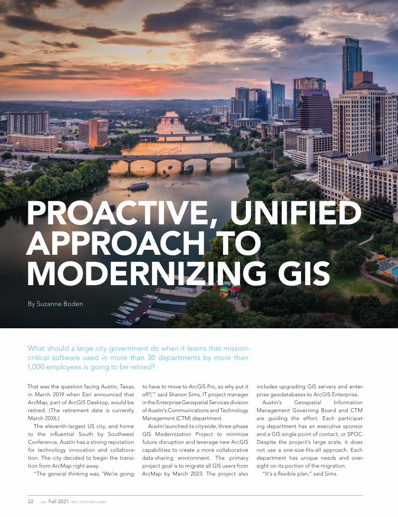
That was the question facing Austin, Texas, in March 2019 when Esri announced that ArcMap, part of ArcGIS Desktop, would be retired. (The retirement date is currently March 2026.) The eleventh-largest US city, and home to the influential South by Southwest Conference, Austin has a strong reputation for technology innovation and collabora-tion. The city decided to begin the transi-tion from ArcMap right away. “The general thinking was, ‘We’re going
PROACTIVE, UNIFIED APPROACH TO MODERNIZING GISBy Suzanne Boden
to have to move to ArcGIS Pro, so why put it off?,’” said Shanon Sims, IT project manager in the Enterprise Geospatial Services division of Austin’s Communications and Technology Management (CTM) department. Austin launched its citywide, three-phase GIS Modernization Project to minimize future disruption and leverage new ArcGIS capabilities to create a more collaborative data-sharing environment. The primary project goal is to migrate all GIS users from ArcMap by March 2023. The project also
What should a large city government do when it learns that mission-critical software used in more than 30 departments by more than 1,000 employees is going to be retired?
includes upgrading GIS servers and enter-prise geodatabases to ArcGIS Enterprise. Austin’s Geospatial Information Management Governing Board and CTM are guiding the effort. Each participat-ing department has an executive sponsor and a GIS single point of contact, or SPOC. Despite the project’s large scale, it does not use a one-size-fits-all approach. Each department has unique needs and over-sight on its portion of the migration. “It’s a flexible plan,” said Sims.

23esri.com/arcuser Fall 2021 au
Planning Gets Under WayAs an Advantage Program member, Austin has access to Esri Services experts on all aspects of complex GIS implementa-tions—technical and human. When the GIS Modernization Project began, department sponsors completed a series of implemen-tation assessments. One assessment revealed that, due in part to the number of individuals and departments impacted, some GIS users may not immediately embrace migration-related changes. When individuals are ambivalent about—or even resistant to— changes impacting their daily work, the risks of slower rates of technology adoption
and delayed project milestones increase. Austin’s proactive approach to migration is intended to reap the business benefits of modern GIS infrastructure more quickly. Aligning technical goals with people-focused goals was a logical step to drive project success. Esri consultant Michael Green was engaged to conduct people-focused change management activities. “The people side of the modernization project is just as important as making sure the technical solutions are solid,” said Green. Six city departments participated in phase 1 of the project, which included change management. Green led the depart-ment sponsors and stakeholders through a Preparing for Change workshop, in which participants documented the strategic business outcomes that their departments would achieve from the technology project. Those business outcomes would be translated into key messaging points and embedded into detailed change manage-ment and communications plans for each department.
Putting a People Plan into Action The GIS Modernization Project charter states that 100 percent of Austin’s ArcMap users will be provided with a modern GIS so-lution. Before the team could determine the right GIS solution for each ArcMap user, they had to identify all GIS workflows, applica-tions, and software versions in use citywide. The number of ArcMap users was origi-nally thought to be 1,200, but later, through ArcGIS License Manager data and installa-tion lists, the team found that the actual number was about 1,400. To determine the right solution for each ArcMap user, CTM examined ArcMap license usage data to ascertain the user activity level in each department. “We had to define power users versus light users and all the variations across the spectrum,” said Sims. The team decided that power users (those performing geo-spatial analysis and advanced workflows) would migrate to ArcGIS Pro, and light users (those primarily using ArcMap for vis-ualization) would switch to ArcGIS Online.
Manager's Corner
The Importance of TrainingWith a clear migration path for each ArcMap user, it became imperative to provide individuals with the support they would need to be productive with their new GIS solution. “We have an overarching plan to mi-grate all City of Austin GIS users, but de-partment by department, that looks differ-ent,” said Sims. “As we looked at the initial needs, we realized that training was a huge part of the change management and of the migration effort.” In fact, training is a key component of every people-focused change manage-ment plan. Supporting individuals with resources tailored to their needs is an ef-fective way to build trust and confidence that change is achievable. Esri training consultant Tamara Adamson works with Sims on course recommenda-tions and training plans. EAP credits were allocated for GIS users to attend instructor-led classes, and Esri e-Learning resources are heavily used. Adamson is impressed with Austin’s commitment and detailed approach to training. “The city is ahead of the curve,” she said. “They’ve gotten very specific in identifying people who need instructor-led training and those who need e-Learning. They’ve been very purposeful about it.” Adamson shares training usage reports with Sims and assists with customized learning plans that managers can assign to individuals through Esri Academy (www.esri.com/training/) and then monitor their progress. Learning plans can include in-structor-led or self-paced resources or both. In addition to classes, videos, web courses, and tutorials, technical documents, like the ArcGIS Terminology Guide, are available. As the migration progresses, SPOCs work directly with individuals to help them identify best-fit course paths based on their ArcMap and ArcGIS experience and the GIS workflows they perform. “We didn’t start off knowing what these paths are and how we could organize the resources this concisely,” Sims said. “It’s been a work in progress to get to this point,” she continued. “With remote work situations due to
The eleventh-largest US city and home to the influential South by Southwest Conference, Austin has a strong reputation for technology innovation.

24 au Fall 2021 esri.com/arcuser
The 2021 edition of the Austin Bike Map was produced by Alan De Anda entirely in ArcGIS Pro for the first time.
COVID-19 restrictions, Esri’s e-Learning and instructor-led online classroom have provided the just-in-time training needed to help everyone effectively and efficiently migrate,” said Sims. While not mandated, training is strongly encouraged. Sims frequently discusses train-ing resources in project team and govern-ing board meetings, and they are featured prominently in her user communications.
Staying on Course with Creative CommunicationsFrom the outset, Green emphasized the importance of communication. Effective change management requires continual at-tention to building awareness that change is coming and sharing information on project progress and its benefits to the organization
and to each impacted individual. For Sims, communication is a top priority. The city’s EAP credits enabled her to continue working with Green on a biweekly basis in phase 2. Communication is a fre-quent topic in their discussions. “Michael has been really integral in help-ing me develop language, key messaging points, and how we approach training,” said Sims. She leverages data to communicate the project’s current state. Sims created a report for each department that shows monthly ArcMap and ArcGIS installation and license usage for its users. The report is color coded, which makes it easy to visualize how ArcGIS use is growing within each department over time or, in some cases, lagging behind expectations. When
managers see that an individual is still mostly using ArcMap after receiving ArcGIS migra-tion support, they reach out to that person to discuss training resources and reinforce the benefits of migrating to ArcGIS Pro. Sims also creates visually engaging presentations, flyers, infographics, and dashboards to communicate with project stakeholders and GIS users. She sends a monthly newsletter to all employees who have ArcGIS on their device. Communication topics include project updates, training resources, and interesting new information products that have been created. One example is the 2021 edition of the Austin Bike Map. Previously, staff used ArcMap to create the map, then exported simple line work to Adobe Illustrator, where the bike routes were stylized and placed on

Specialized Program n Combines management
and technical proficiency n Customized for those in
government, business and non-profits
n Earn education credits toward GISP® certification
Convenient and Accessible: 100% online n Earn degree full time in
13 months or part time in 2 years
n Complete coursework on your schedule
n Begin classes summer, fall or spring
n Open to international students
n Flexible scheduling for U.S. military, including those serving overseas
Value-Added Education n Degree frequently leads to
substantial salary increases n Third-party billing
options make employer payment easy
n Flat tuition rate, regardless of location
Take the Next Step! Earn Your Master’s in GIS Management
Salisbury University’s M.S. in GISM – now in its 14th year – is designed specically for the working GIS professional who seeks the management credentials needed for career advancement.
www.salisbury.edu/msgism
APPLY NOW
Top Online Master’s Degrees Ranked #1 Online GIS Program Nationally
GRE Waived for 2021 Applicants 100% Online
More Information: Dr. Stuart Hamilton • [email protected]
SU_MS_GISM_ArcUSER_Ad_32021_4C_8e1fbefc85105f186dc0eab99e8a4dfd.qxp_Layout 3/4/21 3:19 PM Page 1
25esri.com/arcuser Fall 2021 au
Manager's Corner
top of the city’s basemap. That workflow sometimes created discrepancies between the map and the GIS database. “If new bike routes came online during the styling process, they would be added in Illustrator, but sometimes the updates would be missing in the GIS,” said Alan De Anda, senior geospatial analyst in the Austin Transportation Department’s Data and Technology Services group. “The basemap data could also get stale, which can happen very quickly in a city as rapidly growing as Austin,” De Anda con-tinued. “Now, all our geographic layers are maintained and stylized in ArcGIS Pro, and only exported to Adobe Illustrator to mix with the infographic art.” All communications are designed to reinforce awareness of the migration and answer questions that GIS users may think but not verbalize, such as Why are we doing this? and What’s in it for me?
“One aspect that’s really added value to the communication from a change per-spective is that Shanon integrated change management activities directly into her project plan,” said Green. “She’s operating from one plan, not two, which streamlines execution and serves her well.”
A Sustainable GIS for the Future The final group of departments will soon begin their migration. The city is well positioned to meet its self-imposed dead-line of March 2023. Sims, who started her job with CTM just five weeks before the COVID-19 pandemic forced employees to work from home, is pleased with the city’s unified approach to building a sustainable, modern GIS infra-structure. But as important as the technol-ogy is, she most values the people side of the project. “I had a very small window to meet my
team and learn the ins and outs of city government operations. Their support has been tremendous. I could not ask for a better group of people to work with.” For more information on the City of Austin’s GIS modernization initiative, con-tact Sims at [email protected].
About the AuthorSuzanne Boden is a marketing and com-munications specialist with Esri Training Services. She is passionate about sharing the real-life stories of individuals and or-ganizations using GIS to improve business processes, enhance government services, and advance organizational goals. She writes about Esri technology, workforce development, and strategies to help or-ganizations build geospatial literacy at an enterprise scale. Boden has a bach-elor’s degree in English literature from the University of Maryland, College Park.

26 au Fall 2021 esri.com/arcuser
Creating a strategy on a page takes work. There are no shortcuts when it comes to understanding business needs, setting a strate-gic direction, or devising an implementation plan. The one-page approach is simply a tool to distill a geospatial strategic plan down to its critical elements so that your team can keep it front and center in your quest for geospatial excellence.
1 Vision
The first element of the strategy on a page summarizes your vision and includes your vision statement, supporting goals, and guiding principles. Together, these three components articulate how your organization defines success with geospatial. The vision statement is the first and perhaps most important component. A well-crafted vision statement is your organization’s
“North Star.” It describes a future in which your geospatial aspira-tions have been realized. It also functions as a guide for future strategic decisions. To create an impactful vision statement, focus on future out-comes. Some good questions to ask when defining your vision statement can include the following: • How will geospatial technology benefit our stakeholders? • What is the scope of our aspirations?
Here’s a nice example of a vision statement written for an energy transmission business: “Our geospatial capabilities will accelerate the efficiency and effectiveness of spatial planning and decision-making across the organization and provide access to secure, high-quality spatial in-formation across the full span of our asset base anytime, anywhere.” Developing your vision statement will take time. It’s a bit of an
Put Your Geospatial Strategy on One PageBy Matthew Lewin and Allen Williams
To move from developing a planning strategy to its successful implementation requires an ongoing commitment from all stakeholders. You need a simple, stripped-down visual that communicates the goals and direction of the strategy so that it doesn’t become shelfware. You need a one-page geospatial strategy. This article takes you through the four main elements of the strategy on a page—vision, value proposition, strategy, and road map—and provides tips and guidance on its use.
art, so prepare a few different versions until you land on one that most of the people developing your strategy can agree with.
Goals and Guiding PrinciplesSupporting goals and guiding principles are connected to your vision statement. These goals describe the desired outcomes in your vision statement with an additional level of detail. Goals help you assess progress toward your vision. Ideally, that means your goals should be measurable so that you have an objective indicator of success. Using the vision statement written for an energy transmission business as an example, you will need to define “accelerate the efficiency and effectiveness of spatial planning and decision-making.” Accelerate efficiency and effectiveness by how much? Accelerate efficiency and effectiveness by the same amount for spatial planning as for decision-making? The terms used in a vision statement are often vague, so refin-ing them in the process of setting your supporting goals helps everyone understand what you’re striving for. If you’re struggling to define measurable goals, it’s often because your vision state-ment needs more work. Fine-tune it until you have a statement that links clearly to specific goals. Guiding principles—both business and technical—make up the final piece of the vision element. They are like guideposts for stra-tegic decisions but are different from goals because they don’t signify an accomplishment. They provide ongoing, enduring guid-ance regardless of how plans change. They’re most valuable as a litmus test of the strategic decisions identified in the strategy stage to ensure that strategies align with the principles and values of the organization. From a technical perspective, minimizing system customization and favoring cloud-based deployment are identified as principles. On the business side, encouraging cross-functional collaboration and providing demonstrable business value are common principles.

27esri.com/arcuser Fall 2021 au
Manager's Corner
2 Value Proposition
The second element of the strategy on a page is the value proposi-tion. It describes the benefits of your strategy to the stakeholders in your organization. This should be a straightforward statement that describes what each group stands to gain from the strategy. It should answer the question, What’s in it for me? The key is identifying the right mix of roles in your organization. They should reflect specific business functions on one hand and general user types on the other. The point is to highlight the cross section of stakeholders who will receive the greatest value from your geospatial strategy. You’ll create one value proposition statement for each role you identify. The wording of each statement should speak to the inter-ests of the role. For example, “Our solutions provide inspectors with real-time access to maps, as-builts, and work orders on any mobile device in the appropriate geographic context” might be a value proposition statement for field inspectors. You’ll need to be concise. After all, the real estate on one page is limited. The trick is to balance brevity with communicating the unique benefits that geospatial technology provides. Make it short and snappy.
3 Strategy
The third element of the strategy on a page is the most involved. It is the strategy section itself. This section answers the question, How do we achieve our vision? This section is organized around the three building blocks of a geospatial capability: technology and data, processes and gov-ernance, and workforce and culture. • Technology and data: Focuses on the technical aspects of your
strategy, including business applications, geospatial data, and IT infrastructure
• Processes and governance: Focuses on operational and ad-ministrative functions, including service delivery processes and governance practices
• Workforce and culture: Focuses on your human capital, includ-ing the knowledge, skills, and responsibilities of your geospatial workforce and the culture of spatial thinking
The strategy element highlights choices and expected out-comes that define each of the three building blocks. Remember, the purpose of a geospatial strategy is to create sustainable geospatial capabilities that enable your organization to achieve its vision. You have limited space, so showcase the decisions and outcomes that define these capabilities.

Technology and DataFor the technology and data portion, highlight strategic decisions that result in significant changes to your application portfolio, data environments, and practices, or IT infrastructure. For each deci-sion you highlight, indicate the business outcome you expect to result from this decision. The business outcome provides a level of justification for each decision. For example, the decision to migrate internally managed solutions, data, and customizations to software as a service (SaaS) would support an outcome of im-proved performance and the reduction of internal security and ap-plication maintenance requirements.
Processes and GovernanceFor the processes and governance portion, include strategic deci-sions that establish or change processes related to how geospatial technology and services are managed and supported or how you oversee and monitor the effectiveness of your overall geospatial investment. A decision to establish a formal geospatial govern-ance structure composed of IT, GIS, and department representa-tives could produce an outcome that would provide accountability, clarify decision-making, and issue resolution procedures.
Workforce and CultureThe workforce and culture portion summarizes decisions that impact your workforce complement, the level of spatial literacy across your organization, and the culture of spatial thinking. Explicitly state how you plan to alter your human capital to reflect changes introduced in your technology and data and processes and governance portions. A decision to develop persona-based professional develop-ment pathways and curriculum for key geospatial roles could lead to an outcome of aligning staff knowledge and skills with evolving technology capabilities. Here is one additional tip. For each section, organize the strate-gic decisions in order of relative importance. Evaluate each deci-sion’s level of significance in terms of advancing your goals and the degree of impact it will have on the organization. These decisions will generate the most conversation and scruti-ny, so put them front and center. It’s better to be open and honest about the direction you’re advocating rather than have it come as a surprise later. Your strategy on a page is a vehicle for expressing the most important and impactful aspects of your strategy. Don’t bury key critical decisions in the details.
4 Road Map
The final element of the strategy on a page is the road map. This section describes the sequence of activities required to imple-ment your strategy. Typical road maps span three to five years, but you can design one of any duration that makes sense in terms of timing and effort. To fit the road map into the strategy on a page, you’ll need to summarize activities into discrete work packages because you won’t have room to itemize every job and task. You’ll need to be thoughtful about what you present. One way to do this is to group related or dependent activities into projects and categorize them into common themes. For ex-ample, you can organize projects according to the three strategy components they support (namely, technology and data, pro-cesses and governance, or workforce and culture). You can also group them by business project: GIS, IT, asset management, and department focus. You could also simply group them into techni-cal and nontechnical projects. No matter how you formulate the groupings, the point is to clearly link the planned activities with the direction described in the strategy. Once you have completed your strategy on a page, be sure to use it. Print it out, bring it to meetings, and display it prominently where everyone can see it. Highlight the strategy in presentations and share it on your corporate network. Use it when engaging new business areas, or even print it as a large poster for GIS Day. Your strategy on a page is an ideal awareness-building tool—use it to its full potential.
Good luck, and if you need any help, please reach out to the authors.
About the AuthorsMatthew Lewin is the director of management consulting for Esri Canada. His efforts are focused on helping management teams optimize and transform their businesses through GIS and location-based strategies. As a seasoned consultant, Lewin has provided organizations in the public and private sectors with practical strat-egies that enable GIS as an enterprise business capability. His in-terests lie at the intersection of business and technology, and he thrives on helping organizations bridge the gap between the two to achieve their most challenging GIS ambitions.
Allen Williams is a management consultant for Esri Canada. He focuses on helping organizations build transformative geospatial strategies and road maps, with practical steps to maximize the value of location intelligence. Respected as a trusted adviser, Williams has worked with organizations in the public and private sectors to develop long-term geospatial strategies and govern-ance programs resulting in modernization and innovation.
Your strategy on a page is an ideal awareness-building tool—use it to its full potential.
28 au Fall 2021 esri.com/arcuser

29esri.com/arcuser Fall 2021 au
Self-service has been with us for a long time—grocery stores, fast-food restaurants, gas stations…and government. It will con-tinue to grow because it’s efficient for both the provider and the consumer of a service. Serving the public is the government’s mission. Most governments are looking for ways to do it more efficiently by reducing phone calls and counter traffic while better meeting constituents’ needs. It’s estimated that 80 percent of data has a spatial or location component. It makes sense that the first step in finding informa-tion is often looking at a map. Locating information using a map has lots of advantages. Maps are easy to use and understand, and communicate a lot of data. Early attempts at self-service government often used maps. However, these were in-person processes that were cumbersome, multistep, time-consuming, and paper based. Staff would have to pore through the pages of tax, public works, zoning, water systems, or storm sewer system maps to find information. They wasted the time of everyone involved. Locating information on a map is still often the first step, but now it is done digitally and more efficiently online. There are a lot of ways to search—by keyword, date, address, parcel number, location, and many more. For example, parcel, zoning, and flood hazard data can be overlaid so a landowner or developer can un-derstand what restrictions exist on a specific parcel. Public-facing web maps are inexpensive to set up and can be configured to meet specific needs and use an organization’s brand and look and feel. With ArcGIS, the web maps and apps deployed are responsive so that they are automatically configured for the best look and optimal use on a variety of devices, from smartphones to laptops. There is no longer the need to develop many device-specific ver-sions of an application to share the same information. Maps can answer a lot of questions, but it’s not the whole pic-ture. The expectations for accessing services have evolved, and this trend will continue. Consumers can order nearly anything online from Amazon, access nearly any song with Spotify, and even search the Home Depot to learn where drill bits are located in the store. This type of customer experience is expected not just from business, but also from government. There is an old saying, “People don’t want drills; they want holes,” which could be restated today as, “Constituents don’t want data; they want answers to their questions.” Information products are designed to deliver answers to common, specific questions from residents. These information products are often maps, but they can be summary statistics, analysis, and ArcGIS StoryMaps apps. With new census data, information products can now include the most current demographic data and details of analysis highlighting any demographic changes. In March 2020, many people began working from home. People
The Next Generation ofSelf-Service GovernmentBy Brent Jones
who still went to the office often found public access was limited or nonexistent. Delivering information to residents became more difficult. Lacking technical and financial resources, many organiza-tions turned to ArcGIS Hub to deliver maps and information prod-ucts in a way that was resident-centric and easy to use. ArcGIS Hub is an easy-to-configure community engagement platform that organizes apps, information products, and data. It can deliver tools and information about initiatives, such as a re-assessment project or road closure. Because it is configurable, ArcGIS Hub enables governments and members of the community to add apps, maps, data, analytics, statistics, forms, and other ca-pabilities as the need arises. Previously, updating public websites required programming. As new apps are deployed and older apps retired, ArcGIS Hub is easily updated because it’s cloud-based software as a service (SaaS). Hub sites turn all devices into information kiosks. Because ArcGIS Hub is responsive, it delivers current information and data on any device so residents can quickly find answers to their questions. It also allows an organization to open a two-way conversation with residents or crowdsource information. ArcGIS Hub delivers maps and apps in a well-organized, fast, and efficient manner. Simple online map-based applications like pothole reporters have been around for a long time, but more advanced applications can help residents with tasks such as filing a valuation/tax appeal. This reduces taxpayer visits to government offices. Residents’ expectations for immediate access to current infor-mation and answers to questions is now the standard. By organ-izing public-facing maps and apps with ArcGIS Hub, governments can reduce phone calls and office visits and deliver a modern self-service experience.
Self-service government begins with GIS.
Explore this gallery of ArcGIS Hub templates (https://bit.ly/3hBX7oE) to see how others are using GIS for self-service government.
About the AuthorBrent Jones oversees Esri’s worldwide strategic planning, busi-ness development, and marketing activities for land records, cadastre, surveying, and land administration. As a recognized in-novator, Jones specializes in modernizing existing land administra-tion systems and designing new GIS-based cadastral management systems for small and large governments globally. He is president-elect of URISA; past president of the Geospatial Information and Technology Association; and a current member of the United Nations Committee of Experts on Global Geospatial Information Management, sitting on the Expert Group on Land Administration and Management.
Manager's Corner

30 au Fall 2021 esri.com/arcuser
A system can be like the tower of blocks built when playing a game of Jenga. Prior to the start of the game, the tower is an orderly stack of blocks. Over the course of the game, blocks are removed from the tower and placed on top. As blocks are removed from the bottom and added to the top, the structural integrity of the tower is compromised, leading to an inevitable collapse. This is analogous to the situation with GIS when new solutions and technology are added to an existing system. New components can be added at the expense of stability. One component, like a missing block in a Jenga tower, can topple the entire system. Maintenance isn’t exciting, but having a maintenance plan for a system can be the difference between a well-oiled machine and a catastrophic failure. At its core, a maintenance plan is a set of proce-dures that are used to keep a system running optimally. These proce-dures include components like asset inventories, audits, monitoring, upgrades, and tools. Every time one of these components is utilized, a block is put back into your Jenga tower to restore its stability. A maintenance plan ensures that new components added to the system don’t destabilize existing components. Mitigating a disas-ter is always cheaper than recovering from one. A system mainte-nance plan is perhaps the most effective tool a GIS administrator can use to prevent a disaster from happening. Stark County, Ohio, is home to more than the Pro Football Hall of Fame and the final resting place of William McKinley, the 25th president of the United States. The county, with a population of nearly 375,000, has a robust GIS that includes ArcGIS Enterprise (portal, ArcGIS Server, multiuser geodatabases), ArcGIS Online, ArcGIS Desktop, automated processes that use ArcGIS GeoEvent Server and Python, and other supplemental servers and software. The Stark County GIS Department (SCGIS) provides services and support for dozens of departments across Stark County and its cities, villages, townships, and—most important—its residents. In the past five years, the department’s footprint has grown sig-nificantly, with services increasing by roughly 10 percent and web solutions increasing by more than 300 percent. In response, the team added new staff members in each of those five years. The team recognized that offerings were expand-ing at an unsustainable pace. The response was the creation of a
sub-team to focus on system maintenance and put together a plan for keeping SCGIS running smoothly. GIS systems analyst Joe Guzi and data engineer Brandon Wise wanted to start with manageable goals. Instead of trying to create an all-encompassing plan from the start, they wanted to test a proposed framework for auditing the system on a single issue. Although SCGIS had been using dozens of Python scripts to au-tomate processes for years, it didn’t have a catalog of what each script did and when it ran, which was a large source of unpredict-ability. Arguably the most important part of a maintenance plan for any system is an asset inventory. It is impossible to make informed decisions about the health of a system without one. In what became their first Python audit, Wise and Guzi created an inventory of these scripts. They documented each script and used that documentation to create a code base to standardize each script during the subsequent Python audit. Standardization, particularly in GIS, is a crucial element for mitigating unpredictabil-ity. Wise and Guzi also added error-reporting notifications to alert the team when scripts run unsuccessfully. The framework the team used for the Python audit worked and was ready to be extended to other components of the system. The timing couldn’t have been better, because another part of the system was going to prove what happens in the absence of audits. SCGIS has two production servers: a public-facing one and another for secure services. Each ArcGIS Server installation has a limited number of instances based on machine hardware. Despite multiple servers, one of those machines was at capacity, so the team initially thought it would need to install another server. Luckily, the team decided to audit the servers prior to making any purchases. After conducting an inventory and evaluation, Wise and Guzi were able to greatly reduce the total instances on each server, which eliminated the need for another installation. Four years later, SCGIS can host twice as many services on those same two installations because of biannual audits of ArcGIS Server. Audits like these are a major part of maintaining the system. In addition to audits of Python scripts and ArcGIS Server (Enterprise), the team conducts six additional audits on an annual or biannual basis, depending on the importance of the component. Those
GIS—like most systems—is subject to entropy, that gradual decline into disorder and unpredictability.
Building System Stability with a Maintenance PlanBy Skyler Dewey, Adam Karapandzich, Joe Guzi, and Brandon Wise

Manager's Corner
Web Services
ArcGIS Server/Enterprise Tier
Database Tier Supplemental Servers
Firewall
Firewall
Network Load Balancer
Load Balanced
GIS Server
GIS Server
GIS Server
GIS Server
GIS Server
GIS Server
ArcGISPortal**
GeoEvent Server*
GeoEvent Server*
ArcGIS Portal**
ArcGIS Portal** ArcGISPortal**
DBMS(Direct Connect)
DBMS(Direct Connect)
DBMS(Direct Connect)
Local Storage(Image Files)
Server (VM)
ArcGIS DesktopArcGIS Pro
Server (VM)
ArcGIS Monitor
Server (VM)
ArcGIS License Manager
ArcGIS Data Store***
31esri.com Fall 2021 au
audits cover Microsoft SQL Server, GeoEvent Server, custom geo-processing tools and services, and GIS users. While these audits are extremely useful, they won’t identify problems as they happen. This is where passive monitoring comes into play. The team began using ArcGIS Monitor to view real-time feed-back from the department’s servers. Monitor allows GIS users to view the health and performance of their system. As Python error reporting alerts team members to when scripts aren’t working, Monitor can send alerts based on custom parameters to indicate that part of the system is running poorly. It also allows users to see performance over time to identify problems. During the height of the COVID-19 pandemic, SCGIS used Monitor to diagnose problems with GeoEvent Server, which was being used to automatically update contact tracing information for the health department. Monitor allowed the team to pinpoint and fix problems.
The team also conducts a monthly review of the GIS servers, which Guzi refers to as the high-level system check. Each month, Wise and Guzi review warnings and errors from the server logs to look for potential issues. They worked with Esri to better understand these items so they can determine which ones are cause for concern. Think of these monthly reviews as routine blood work: they may not identify exactly what’s wrong, but they can be an indicator of a larger problem. Identifying patterns helps the team better un-derstand the system overall, which has reduced the likelihood of unpredictable events occurring. In addition to using ArcGIS Monitor, Wise and Guzi developed a custom tool to generate reports showing the interconnectedness of system components. They call this tool the ArcGIS Enterprise Lineage. Python scripts are used to create combinations of data at regular intervals that are viewed using SQL Server Reporting
The GIS System Maintenance Plan Components
(VM) (VM) (VM) (VM) (VM) (VM) (VM) (VM)
(VM) (VM) (VM) (VM) (VM)
(VM) Virtual Machine ArcGIS Server 10.8* ArcGIS Server 10.8 & GeoEvent 10.8** ArcGIS Server 10.8 & IIS 10.0 v1607 & ArcGIS Portal 10.8 or 10.8.1 & ArcGIS Web Adaptor 10.8*** ArcGIS Server 10.8 & IIS 10.0 v1607 & ArcGIS Data Store 10.8 & Spatio Temporal

Overview of the GIS System
Third Party Integrations
Audits
Audit implementation
Audit schedule
Details about the audits
Monthly High-Level System Check
Monthly meeting to keep an eye on things we are monitoring
Upgrades
Upgrade schedule
Upgrade plan
Process for evaluating new technology
Tools
Python Scripts
ArcGIS Monitor
ArcGIS Enterprise lineage
Overview
32 au Fall 2021 esri.com/arcuser
Services (SSRS). These reports allow team members to reference which system components affect others. For instance, if Wise wants to see every service that uses a feature class from a particu-lar dataset, all he has to do is select the dataset in the report and it generates a list of those services. Instead of relying strictly on inventories, Lineage allows team members to generate dynamic reports that provide an intimate view of the system. A maintenance plan doesn’t just include procedures for main-taining the system. It also includes procedures for changing or updating it. Adding new components or technology with reckless abandon can topple the system. For routine updates, like those for Windows Server, consistency is key. Using that as an example, Windows Server requires regular up-dates to prevent security vulnerabilities. Each month, Windows Server is updated at the same time (during off-hours) using a set procedure that prevents disruptions to users and other system components. With larger upgrades, such as moving to a new version of ArcGIS Enterprise, the process is more involved. Wise and Guzi developed an upgrade procedure as part of the system maintenance plan. The team starts with a risk-reward analysis to determine if a new offering’s benefits are worth the risks to the existing system. To allow adequate research time for each release, SCGIS limits ArcGIS Server upgrades to one per year. The team schedules these upgrades during low-usage times, such as late December, and avoids times when there are impor-tant events such as elections. Upgrades are always deployed on staging servers first to evaluate mission-critical workflows. These mission-critical items were identified by key users across the county to create a list that is utilized during testing. If any of them fail, the upgrade is reverted and is not performed on production servers. If the staging server passes the testing phase, the production servers are upgraded following the same testing procedure. Upgrades only occur off-hours, so that even if a mission-critical item fails, there is no disruption to the user. The common thread in each maintenance plan component is documentation. SCGIS uses Confluence—a wiki-esque, web-based software from Atlassian—to document everything about the system, from design to maintenance procedures. Documentation is not only vital to replicating procedures; it also helps mitigate contingencies such as the departure of a team member. If Wise and Guzi were to both leave the department, their documentation could be used by other team members to replicate system mainte-nance procedures. No matter the size, all GIS implementations require mainte-nance. As a system’s size grows, so does the chance of uncertainty. Developing a comprehensive maintenance plan is a necessary measure to ensure system integrity. GIS administrators without a plan don’t need to panic. Wise and Guzi recommend starting with small, achievable goals. Inventorying system components is a great place to dive in because understanding the structure of a system is important for making good decisions. Once assets are inventoried, brainstorm ways to improve them, such as developing standards. The key here is an iterative approach that allows for gradual improvement over
time at a schedule that works for the organization. Asking ques-tions like, What am I missing? or What if this happens? will help change the way administrators view their systems. The plan also doesn’t need to be perfect from the start. The plan and its proce-dures will evolve as new technology, methods, and other contin-gencies are introduced. Ultimately, having a plan in any form is better than not having one at all. “By failing to prepare, you are preparing to fail,” is an apt apho-rism that is often attributed to Benjamin Franklin. Preparing a main-tenance plan is one of the best ways to keep a system from failing. For more information, contact the Stark County GIS Department by email at [email protected].
About the AuthorsSkyler Dewey is the GIS team lead for Stark County. She has worked in the public sector for 12 years as a GIS professional and has a bachelor’s degree in geography.
Adam Karapandzich is a GIS analyst for Stark County. He holds a master’s degree in environmental science and a bachelor’s in envi-ronmental geography.
Joe Guzi is a GIS systems analyst for Stark County and an adjunct GIS instructor at Columbus State Community College. In his free time, he enjoys doing GIS side projects just for fun.
Brandon Wise is a data engineer for Stark County. He holds a bachelor’s degree from Ball State University. He is the secretary of the Ohio chapter of URISA.
The GIS system consists of databases, ArcGIS Enterprise, GeoEvent Server, supplemental servers, ArcGIS Desktop, Python scripts, and ArcGIS Online.

+
[ E O S P O S I T I O N I N G S Y S T E M S ]
• Support For Additional GNSS Signals • More Differential Correction Sources • Even Longer Battery Life • 1-30cm Accuracy Anywhere In The World • Ready
For Galileo High-Accuracy Service (HAS) • Built-In Support For Third-Party Sensors • Works With All Esri ArcGIS Mobile Apps
NEW FEATURES INCLUDE
®
E S

34 au Fall 2021 esri.com/arcuser
Data-Driven Map Animations for the WebBy Kristian Ekenes
Data-driven maps answer questions about location data, such as Where? What? How much? and When? Data-driven maps often tell a story from a single data snapshot. For example, a map using 2020 United States Census data will only reflect the state of the US population on April 1, 2020.
Figure 1. A single hurricane is often represented by multiple locations, each with a unique time stamp. Each location is a feature in the layer that is filtered as the animation plays, giving the appearance of a single hurricane moving along a path over time. See the app at https://bit.ly/3oioaIQ.
Figure 2. Earthquakes represent a sequence of events at various locations in fleeting moments of time. Geometry animations are ideal for animating the foreshocks and aftershocks of an earthquake. See the app at https://bit.ly/3oipXxy.

const start = new Date(2004, 9, 1);const next = new Date(2004, 9, 1, 7);const end = new Date(2005, 0, 15);layer.timeInfo = { startField: “ISO_time”, fullTimeExtent: { start, end }, interval: { value: 6, unit: “hours” }}const timeSlider = new TimeSlider({ container: “timeSlider”, playRate: 30, mode: “time-window”, fullTimeExtent: layer.timeInfo.fullTimeExtent, values: [ start, next ], stops: { interval: layer.timeInfo.interval }, view: view});
35esri.com/arcuser Fall 2021 au
Developer’s Section
However, data-driven animations can provide a broader perspective. They can let you see how data changes over time. Animations go beyond answering the basic Where? What? How much? When? questions for a single time frame to answer ques-tions such as • How did the city grow to be the size it is today? • How fast is the planet warming compared to 50 years ago? • What will the population of the planet look like in 20 years?
With the ArcGIS API for JavaScript, you can create dynamic and interactive data-driven animations that fall into three categories: • Geometry animation • Distribution animation • Attribute animation
Each category is characterized by a specific data structure and code pattern for stepping through the animation sequence. Use cases, the data structure, and the code pattern are provided for each category.
Geometry Animation This category animates by filtering feature visibility. A geom-etry animation visualizes features that change position or geom-etry over time. A hurricane’s location over time, a fire perimeter’s morphing boundary, or the route of a vehicle shown as a point moving along a path are examples of geometry animation. This type of animation can also be used to represent fleeting events, such as earthquakes, that happen in a single moment in time but usually occur clustered with other similar events.Data StructureThe data used in a geometry animation represents the map’s sub-ject (e.g., hurricane) as one or more rows in a table, each containing a unique geometry and time stamp. In the hurricane example, one hurricane may have 20 or more associated features, each at a dif-ferent location and time.
Figure 3. Geometry animations must be driven by data sources that contain one feature per event (a time stamp and a location) of an associated subject in the map. In this example, tropical storm Gritelle is represented in the table in six rows—each with a different location and time representing its six recorded positions.
Code PatternTo visualize features that change location over time, you must filter features in the layer view based on a predefined time interval and update that filter on each animation frame. Fortunately, the TimeSlider widget does all the heavy lifting for you in this scenario. All you do is provide the slider with a reference to the view where the animation will take place and set the time information on the layer or its associated service, as shown in Listing 1.
Listing 1

const renderer = { type: “simple”, label: “Observed hurricane location”, symbol: { type: “picture-marker”, url: “cyclone-marker.gif”, height: 20, width: 20 }, visualVariables: [{ type: “size”, field: “Category”, stops: [ { value: 1, size: 12 }, { value: 2, size: 16 }, { value: 3, size: 20 }, { value: 4, size: 24 }, { value: 5, size: 28 } ] }]};
36 au Fall 2021 esri.com/arcuser
When the user clicks the Play button on the slider, the slider man-ages the filtering based on the slider thumb positions. In the hurri-cane app, clicking Play updates the layer view with a series of filters that makes each hurricane appear as if it is moving along a path. In this animation, the renderer (or style) of the layer is fixed. An animated GIF represents each location of each hurricane. Each icon’s size is scaled based on the hurricane’s category number, as shown in Listing 2.
Distribution AnimationDistribution animations visualize the distribution of features as they accumulate over time by changing color break points or stops. Unlike geometry animations, this technique does not involve
In this table of data for more than 1,000,000 New York City buildings, each row contains data about a building, and one column represents the year of construction for each building. Building geometry never changes.
Figure 4: (left) Buildings constructed in New York City in 1900. The large number of bright blue building footprints indicates rapid growth in construction. (center) The lack of blue in this map indicates slow construction growth in 1940. (right) In 2007 there was sporadic, moderate construction growth throughout the city. See the app at https://bit.ly/2ZsRFxB.
Listing 2

function animate (startValue) { var animating = true; var value = startValue; var frame = function (timestamp) { if (!animating) { return; } value += 0.5; if (value > 2017) { value = 1880; } setYear (value); //Update at 30fps setTimeout(function () { requestAnimationFrame(frame); }, 1000 / 30; }; frame(); return { remove: function () { animating = false; } };}function setYear(value) { sliderValue.innerHTML = Math.floor(value); slider.viewModel.setValue(0, value); layer.renderer = createRenderer(value);}{ type: “color” field: “CNSTRCT_YR” legendOptions: { title: “Built:” }, stops: [ { value: year, color: “#0ff” label: “in” + Math.floor(year) }, { value: year -10, color: “#f0f” label: “in” + (Math.floor(year) - 20) } { value: year - 50, color: “#404” label: “before” + (Math.floor(year) - 50) } ]}
37esri.com/arcuser Fall 2021 au
Developer’s Section
moving features. It simply shows where and when static features are added to the map. It is a good technique for visualizing increas-es and decreases and showing if change happens rapidly or slowly. For example, you can use this method to show the growth of a city by animating when buildings were constructed since its found-ing. You can use color to highlight the rate of growth of features that persist and are not fleeting (like an earthquake). The example in Figure 4 visualizes not only when New York City buildings were constructed but also how rapidly they were built each year. As the slider advances from year to year, building color changes. Each building flashes bright blue at the year it was con-structed. It gradually fades to a dark purple color as the current time in the app continues to advance. More blue areas indicate faster growth. More purple areas indicate slow or no growth.Data StructureThis animation style works well when you have a layer or table in which each feature represents one object in the map, such as a building, as shown in Figure 4. Each feature is represented with a
single, static geometry and includes a date field containing the date or order in which the feature was created. Alternatively, each feature can have a number field that contains a year or sequence number.Code PatternRather than accumulatively filtering data to show the growth of features, the code for the app shown in Listing 3 first loads all data in the browser and assigns it a style that will update on each anima-tion frame. The animation begins with 1880, the oldest year in the dataset. For each animation frame, the baseline year is updated so features matching the year on the slider are highlighted, and a function is called to update the color stops of the layer based on that year. Note that the reference to the date value (i.e., CNSTRCT_YR) and
Listing 3

38 au Fall 2021 esri.com/arcuser
the colors in the renderer remain constant. However, as the current year changes, all color stops are offset from the updated year by constant intervals of 10 and 50 years. The constant increment in stop values results in a smooth animation. The interval between stops must remain constant throughout the animation.
Attribute AnimationAttribute animations change a renderer’s data or attribute value. In these animations, features have fixed locations and are animated using the change in the layer’s attribute value over time. For exam-ple, you could use this technique to animate the following: • Temperature change over the course of a day in a layer repre-
senting weather stations • Change in the number of COVID-19 cases from day to day in a
layer of counties • Climate change using data in a gridded layer in which each
feature represents a location with temperatures that have been recorded for more than a 120-year period
Data StructureAttribute animations require that each feature is represented by a single row in a table with multiple columns containing the value of an attribute recorded at different time stamps or intervals. Typically, each column name reflects the variable and the time or date at which it was recorded (i.e., one field per variable per time interval). For example, to animate temperature anomaly data for a grid-ded layer, each record in the layer would have a geometry along with a column containing the anomaly value for each recorded year. If you want to animate a large amount of data, this can result in very wide tables. As an alternate technique, if the interval is constant between values, you can store multiple values as a pipe-separated list within a single column. You could then parse the required value using an ArcGIS Arcade expression.Code PatternTo animate a changing attribute in static geometries, you must update the layer’s renderer on every animation frame (any renderer can be used in this animation scenario). The attribute animation technique is distinctly different from the distribution animation in that you must keep all renderer break points, stops, and other properties constant in the animation, except for the reference to the data value. It is extremely important to keep a renderer’s properties con-stant so you can easily compare change in each feature between frames. For example, if you changed which value a specific color represented, the animation would be unreadable and communi-cate nothing to the audience. In this animation technique, each animation frame calls a function that gets a reference to the renderer. This function then matches
This animation shows active COVID-19 cases per 100,000 people on (a) May 1, 2020; (b) August 1, 2020; (c) November 1, 2020; and (d) December 1, 2020. Each row in the table represents one county, and each column represents the number of COVID-19 cases for one day. See the app at https://ekenes.github.io/covid19viz/.
A
B
C
D

Share Your Story in ArcUser
esri.com/ausubmission
Write an article for ArcUsermagazine. Tell the GIS world how your organization saved money and time or acquired new capabilities using GIS. Share your GIS management insights or your expertise in extending the GIS functionality of Esri software.
Copyright © 2021 Esri. All rights reserved.
39esri.com/arcuser Fall 2021 au
Developer’s Section
Feature to Animate
Location Animation
Distribution Animation
Data Animation
Moving positions or changing geometry
A fleeting event in time and location
One feature with its time of creation
Changing data values in the same location Table 1
Animation Type Example Data Structure Code Pattern
Geometry animation Moving objects (hurricanes or vehicles) or fleeting events (earthquakes)
One row per feature per event (e.g., one hurricane will have multiple rows, each with a unique geometry and time stamp)
Use the default TimeSlider behavior to filter features in the view.
Distribution animation Shows growth in the distribution of features (e.g., buildings animated by construction year)
One row per feature. Each feature has a date or number field indicating when it was created.
Change the renderer on each slider update. The renderer field is constant, but the stop/break values update based on the slider value.
Attribute animation Animates how data changes over time in static locations (like temperature in weather stations or population of cities)
One row per feature. One column per data attribute per time interval (e.g., a column for population in 2000, another for population in 2010).
Change the renderer on each slider update. All renderer properties are constant, but the field referenced by the renderer updates based on the slider value.
Table 2
the slider’s year or date with a corresponding field in the layer and sends that new field name back to the renderer. This slight change to the renderer will refresh the map, updating the visualization to represent the new set of data values. Because all data values are encoded on the vertices of features in the GPU, you can simply reference the next value in the se-quence to create a smooth animation with very fast performance (up to 60 frames per second).
ConclusionWith the performance and drawing improvements in the ArcGIS API for JavaScript over the last few years, you can now create smooth, dynamic, interactive, and performant data-driven anima-tions with data you own in feature layers, CSV, GeoJSON, and OGC layers. If you’re not sure which animation technique is right for you, look at Table 1.
SummaryTable 2 summarizes each technique, data structure, and coding pattern for creating the animation in the ArcGIS API for JavaScript.
About the AuthorKristian Ekenes is a senior product engineer on the ArcGIS API for JavaScript team.

40 au Fall 2021 esri.com/arcuser
A PLACE FOR NATIONAL MOURNINGIn September 2021, as the tally of American deaths due to COVID-19 kept by the Johns Hopkins University Center for Systems Science and Engineering edged closer and closer to 675,000—the number of American deaths from the 1918 flu pan-demic—thousands of small white flags flut-tered in a 20-acre portion of the National Mall in Washington, DC. Each flag honored a person who died of COVID-19 in the United States. This art in-stallation, In America: Remember, was cre-ated by Suzanne Brennan Firstenberg as a space for collective grieving. Visitors to the exhibit, which ran from September 17 to October 3, 2021, were invited to write a mes-sage on a flag memorializing a loved one. The exhibit was a way to remember the names and stories—not just the number—of those who were lost to the pandemic. While In America: Remember documented individual losses, the mass of fluttering flags testified to the overwhelming devas-tation of this national tragedy. At the be-ginning of the exhibit, the death toll was 670,032. Over the 17 days of the exhibit’s run, another 31,101 Americans died. By the exhibit’s end, Firstenberg and volunteers had planted 701,133 flags to commemorate every American who had died of COVID-19 as of October 3, 2021. The National Mall exhibit was Firstenberg’s second installation of In America. Its initial installation of 267,080 white flags at the four-acre site at the DC Armory parade grounds adjacent to RFK Stadium during fall 2020 ran out of space
By Monica Pratt
On the National Mall in Washington, DC, 701,133 flags were planted to commemorate every American who had died of COVID-19 as of October 3, 2021.

41esri.com/arcuser Fall 2021 au
due to the mounting COVID-19 death toll. The more recent installation of In America has an added dimension. Those who couldn’t travel to Washington, DC, to dedicate a flag could participate vir-tually through the exhibit’s website at InAmericaFlags.org. By filling out an ArcGIS Survey123 form on the website, people could dedicate a flag and leave a message. Volunteers on-site wrote messages on flags, then planted and geolocated them. Flag locations and messages were displayed on In America: Remember Dedicated Flag Map (https://arcg.is/11f0Wa), a web map embedded on the website. The online version of the exhibit was the product of discussions between Firstenberg and Sarah Wagner, an associ-ate professor of anthropology at George Washington University (GWU). Wagner’s project, Rituals in the Making, studies how people are processing grief caused by losses during the pandemic. Since people cannot gather in person, the mourning
process has moved to virtual spaces. This research is funded by a National Science Foundation grant. In America: Remember is a physical space for mourning, and inamericaflags.org is a persistent virtual place to remember those who died and grieve their passing. While the exhibit at the National Mall ended on October 3, 2021, the online memorial re-mains available and displays the messages on flags dedicated by the September 30 deadline. Many people came together to realize Firstenberg’s vision to extend the reach and impact of In America: Remember by creating an online memorial. The overall website was created by Maggie Peterson using ArcGIS Hub and ArcGIS Experience Builder. Peterson was an academic de-partment administrator at GWU in the anthropology department, an on-call ar-chaeology technician, and a geospatial consultant. An ArcGIS StoryMaps story, In America:
Covid Lost Loved Ones, (https://bit.ly/3AtZpMt), displays information about individuals whose dedicated flags were displayed in the National Mall exhibit. This story, created by Jeremiah Lindemann, includes messages, memories, and photographs. Lindemann, a solutions engineer on the Esri government solutions team, pre-viously created a website memorializing the people who have died in the opioid overdose epidemic. He lost his brother, Jameson Tanner Lindemann, in 2007 to an overdose and built Celebrating Lost Loved Ones (https://bit.ly/2Yug1qh) so that his brother and others would be remembered as valued individuals, not as people stig-matized by society. The relentless uptick of the number of COVID-19 deaths, numbing the public to the personal cost of the pandemic, led Lindemann to work on Firstenberg’s exhib-it and its online presence and to create a related online memorial using ArcGIS tools.
Special Section
Este Geraghty, chief medical officer at Esri, worked on-site and is shown geolocating a flag that was dedicated online. (Photo courtesy of Joe Patronite)

42 au Fall 2021 esri.com/arcuser
He saw similarities in the public’s reaction to opioid and pandemic deaths and was moved to get involved. “The dismissal of human life and lack of empathy was similar, and I thought it was worth telling these stories and investing the time in it. There was also a suddenness of lives being taken away and families not wanting their loved ones to be forgotten that just seemed similar,” said Lindemann. Esri became a partner in the pro-ject. In addition to creating online maps, Lindemann built an ArcGIS Survey123 form to collect the information from people who wanted to dedicate a flag and leave a message. Lindemann was involved in planning, coordinating work on the website, and
supporting volunteers. GISCorps helped host, do initial work on the project, and supplied volunteers who approved flag submissions and helped with data for the site. (GISCorps is a volunteer-based organi-zation that works under the auspices of the Urban and Regional Information Systems Association. It provides GIS services to underserved and developing communities around the world.) Wagner also recruited volunteers for the project from GWU. Este Geraghty, chief medical officer at Esri, was contacted about the project by Lindemann. She was involved in early brain-storming sessions on the site design. At the outset of the pandemic, Geraghty wanted to use GIS to help make the COVID-19 death data more provocative.
“The idea was to use data to tell stories and evoke more global empathy,” she said. As the exhibit was nearing its opening, Geraghty created a training video to teach volunteers how to geolocate flags. During the launch, she was on-site to help kick off the exhibit and gave media interviews about the project. In addition, she geolocated more than 1,000 flags, memorializing those who died from COVID-19. She continues supporting the website, troubleshooting the geolocation process, and coordinating the Esri staff who support the site. Esri staff members Matt Thomas, Mike Schoelen, Jhonatan Garrido-Lecca, and others helped update the website, added volunteers, and added notification capabilities for people who made online dedications.
For grieving survivors who could not visit the In America: Remember exhibit in person, the In America: Remember Dedicated Flag Map web map let them dedicate a flag and message to someone who died of COVID-19.

43esri.com/arcuser Fall 2021 au
For those who visited the exhibit and gazed on the sea of white flags that stretched across 20 acres of the National Mall, the impact of In America: Remember was profound. According to Geraghty, she felt both overwhelmed and honored.
“Being there allowed me to be a part of something bigger than myself. The mo-ments we spent with grieving people were very sensitive. At the same time, it felt like a privilege to be let into someone’s life at such a difficult time.” Although the last flag has been plucked from the installation at the National Mall, the spirit of In America: Remember lives
on online at inamericaflags.org. Geraghty feels that GIS is effective in bringing people together. “It’s important in many, many ways. First, it shows data in a more understandable and more visceral way. It’s overwhelming and gives people a new sense of the tragedy of COVID-19 in America. The exhibit also gives people a voice.” Through the exhibit and the website, those who are grieving feel their loved one can be seen. The isolation necessitated by the pandemic has left people without a sense of community to help them get through mourning.
“Because we can see these small bits into each other’s stories, I think it helps us all be more empathetic,” said Geraghty.
“We’ve needed a way to have national mourning. I think the installation with the digital component increases inclusivity (you can participate from afar) and shows that technology, when used well, can be humanizing.” Lindemann, who has worked on several GIS-based memorials, echoes Geraghty’s sentiments. “If we are going to live in a digital world, I think the human side has to come out.”
About the AuthorMonica Pratt is the founding and current editor of ArcUser magazine, the executive editor of ArcNews magazine, the editor of Esri Globe, and head of the publications team at Esri. She has been writing on technology topics, specializing in GIS, for more than 28 years. Before joining Esri in 1997, she worked for newspapers and in the financial industry.
Special Section
In America: Remember was created by artist Suzanne Brennan Firstenberg as a space for collective grieving.

44 au Fall 2021 esri.com/arcuser
Working Togetheracross ArcGIS Online
OrganizationsBy Kelly Gerrow-Wilcox

45esri.com/arcuser Fall 2021 au
Hands On
Available with the April 2021 update to ArcGIS Online, part-nered collaborations make it easier to work with specific organi-zations and enhance sharing workflows. For example, emergency response agencies in several counties or states can more easily work together to protect people and property impacted by natural disasters with a partnered collaboration. Establishing a partnered collaboration with another ArcGIS Online organization creates a formal connection between organi-zations. Once created, it allows the use of groups and member management tools to collaboratively edit content such as web maps and web apps. Although a partnered collaboration is a rela-tionship between two organizations, each organization can estab-lish up to 10 partnered collaborations with other organizations. This article provides a brief overview of the capabilities avail-able with partnered collaborations that can be used in a variety of workflows. Members with the Administrator role can create a part-nered collaboration by going to Organization > Settings tab > Collaboration section and entering the Home page URL for the ArcGIS Online organization they want to partner with using that organization’s short name. This will send an invitation to form a partnered collaboration to that organization. Once the invitation has been accepted, several capabilities become available to mem-bers of both organizations. The capabilities will depend on the configuration choices made and member roles. • Group members can easily view and identify the organization
name of external members in a group. • Administrators can configure the partnership so that members
can search and invite members from partnered organizations to a group.
• Members from partnered organizations can edit and update content, such as web maps and apps, in a shared update group.
Collaboration CoordinatorsAs the liaisons between partnering organizations, collaboration coordinators can help navigate a participating organization’s mem-bers and content. Members with the Facilitator or Administrator role with their profile visibility set to Everyone (Public) can be desig-nated as collaboration coordinators for an organization. Members with a collaboration coordinator designation can be searched by partnered organization members and added directly to groups without an invitation. This streamlines the group invitation process for these designated members. Additionally, collaboration coordi-nators that are members of a group can be promoted to a group manager, giving them the ability to invite and add members to the group and modify group settings. This allows members from
different organizations to have control over the group membership and capabilities of the group.
Creating Groups for Partnered CollaborationOnce a partnered collaboration is established and collaboration coordinators are designated by organization administrators, mem-bers can start creating and participating in groups with members from partnered collaborations. Group owners can choose which types of members can be in the group: organization members only, partnered collaboration and organization members only, or any organization members. When the option for partnered collabora-tion and organization members only is selected, group owners can ensure that only members who belong to partnered organizations can join, and the group can be designated as a shared update group if needed.
Inviting Members to GroupsWhen the group is created, the group owner can immediately begin to invite and add members to it. When adding external members to a group, including those from a partnered collabo-ration, the group manager must enable the ability to Search all ArcGIS Online organization members. Once the switch is turned on, the collaboration coordinators from partnered organizations will be displayed in the invitation dialog. To see members who are not designated as collaboration coordinators, group managers must turn off the option to only dis-play collaboration coordinators. If an organization has partnered collaborations set up with multiple organizations, they will be able to identify which organization a member belongs to before sending out the invitation. If the partnered collaboration settings do not permit other organizations to search their members, then group managers will only be able to find collaboration coordina-tors. Many different configurations of groups, privileges, and col-laborations can be used to regulate how members interact with others in ArcGIS Online.
Ending a Partnered CollaborationOnce a project is complete or there is a desire to end a partnered collaboration, this can easily be done by an administrator.
About the AuthorKelly Gerrow-Wilcox is a product manager on the ArcGIS Online team. She has been with Esri since 2012 and enjoys blogging, web app building, and outdoor adventures.
ArcGIS Online has one of the largest repositories of spatial content, with millions of items and members around the world. Partnered collaboration is a powerful new capability of ArcGIS Online that enables members from different ArcGIS Online organizations to work together more closely.

46 au Fall 2021 esri.com
If the number of people within a certain group is estimated for an area to be 361, the associated margin of error is 158, which means the actual number of people in that group in that area there falls somewhere between 203 and 519.
Figure 2: Map Viewer in ArcGIS Online varies the colors for values between 86 and 42. Each feature with an estimated value within that range gets a unique color. This minimizes the impact of uncertainty.
Figure 1: Home Ownership Rates by Race
Map the Uncertainty of Ranges with Unclassed SymbologyBy Diana Lavery
Many data points have some level of un-certainty. The United States Census Bureau pub-lishes margins of error for American Community Survey data. For example, if the number of people within a certain group is estimated for an area to be 361, and the associated margin of error for that estimate is 158, the actual number of people in that group falls somewhere between 203 and 519. [For a detailed discussion of margins of error, see
“The Importance of Margins of Error and Mapping” in the summer 2021 issue of ArcUser.] When mapping this type of data, we are map-ping ranges. How can we map ranges? If you

47esri.com Fall 2021 au
Hands On
use traditional styles—such as graduated colors or graduated symbols, and classification meth-ods, such as natural breaks or quantile—to map ranges, you could run into problems. Ranges can span two (or more) classes. In the example pre-viously cited, the estimate for a given feature is 361, but the range is between 203 and 519. Typical class breaks of 0 to 250, 251 to 500, and more than 500 can pose a problem when mapping this data.
Unclassed SymbologyUnclassed symbology eliminates any worries that a feature could be in more than one class. Unclassed symbology distributes data into in-crementally unique symbols. This results in a much more nuanced map, since the data is not constricted. Let’s look at two examples using unclassed symbology—one using color and one using size.
Classed versus Unclassed Color Look at a map of Home Ownership Rates by Race (https://bit.ly/3hyFKEi) in Figure 1. The estimate for Modoc County, California, is 74.9 percent, but the range is 74.2 to 77.5. Using the suggested default breaks for natural breaks classification, this puts Modoc County in two different classes. While the resultant map shows Modoc County
Figure 3: The count attribute—representing vacant housing units—is notorious for having large margins of error and large ranges. The natural breaks classification was applied, resulting in fewer symbol sizes, so variation within classes is not displayed.
depicted by the second-darkest blue, based on the estimate of 74.9 percent, part of the range would warrant its being depicted by the darkest blue. Explore the map. How many other counties are similarly misrepresented on this map? Unclassed color incrementally distributes the darkest and lightest colors in a ramp. One stand-ard deviation above the mean and above is as-signed the darkest color. One standard deviation below the mean and below is assigned the light-est color. The majority of the data is assigned a unique color. As the map author, you can adjust these break-points for further fine-tuning. In the example in Figure 2, I did that by extending the two break-points to cover more of the distribution. In the example in Figure 2, Map Viewer varies the colors for values between 86 and 42. Each feature with an estimated value within that range gets a unique color. This minimizes the impact of uncertainty. The darkest color in the color ramp is shared by all values greater than 86, and the lightest color in the color ramp is shared by all values lower than 42. That range of data will get an appropriate color. In Figure 1, the homeownership rate for Modoc County, California, is 74.9 percent, but the range is 74.2 to 77.5. In an unclassed map, a hypothetical

48 au Fall 2021 esri.com
county with a rate closer to 67.8 (located above the breakpoint between the second and third classes) is assigned a lighter color, whereas in a classified map, it would receive the same color. A lighter color is appropriate because it’s a lower value, and the range of this county won’t span the second and third classes. If its range overlaps the range for Modoc County, that’s okay. An un-classed map better honors these ranges.
Classed versus Unclassed SizeWhile color is best for mapping percentages or rates, size is best for mapping counts or amounts. Figure 3 uses vacant housing units as the count attribute. This attribute is notorious for having very large margins of error and consequently very large ranges. Since this data was classified using natural breaks, it has only a few different sizes of sym-bols. The variation within classes is not displayed, and there is also the same potential for a range to span two or more classes. An unclassed version of this data in Figure 4 has symbols of various sizes. Counties in Florida and along the Gulf Coast show lots of variation, displayed by size. The problem of a range span-ning multiple classes is diminished because un-classed size ramps allow the data to breathe.
Final ThoughtsWhen mapping ranges—and if you’re mapping American Community Survey data—unclassed symbology eliminates concerns that features can potentially be in more than one class. This is true when using unclassed color and size symbology. As an additional benefit, you get a more nuanced map. You may have noticed that the American Community Survey layers in ArcGIS Living Atlas of the World use unclassed symbology. If you’re interested in mapping actual margins of error, follow the “Mapping with margins of error” ArcGIS Learn path (https://bit.ly/2XwjjZD). Visit the Esri Community Cartography and Maps space (https://bit.ly/2XwjG6t) for more ideas about symbolizing overlapping ranges.
About the AuthorDiana Lavery loves working with data. She is a senior product engineer on ArcGIS Living Atlas of the World policy maps team, with more than a decade of experience as a practitioner of de-mography, sociology, economics, policy analysis, and GIS. Lavery holds a bachelor’s degree in quantitative economics and a master’s degree in applied demography. She enjoys strong coffee and clean datasets, usually simultaneously.
Figure 4: Vacant housing units are displayed as unclassed data, with symbols of various sizes. The problem of a range spanning multiple classes is diminished because unclassed size ramps allow the data to breathe.

What Can We Accomplish Together?
geo-jobe.com | [email protected] | 1-844-GEOJOBE
We can also support your longer-term goals by
embedding our subject matter experts into your
existing team for extended periods of time.
These experts can join your team either remotely or on-site. Leverage our resources as part of your
staff to fill in gaps without all the overhead of hiring
full-time employees.
GEO Jobe’s team is primed and ready to get your
projects across the finish line. We provide custom GIS software development,
UAV/UAS data collection and processing, machine
learning/GeoAI, and much more. In addtion, we offer
dynamic support and services for Esri’s desktop,
cloud, on-premise, and mobile platforms.
We know that there can be a number of challenges and questions when deploying and maintaining geospatial technologies. Our team has
experience working with companies and projects of
all different sizes. Our expertise is available
through various mechanisms tailored to fit your
requirements, from basic support up to 24/7 response.
On-Call SupportStaff AugmentationProfessional Services
ArcUser Ad_Services_2.indd 1ArcUser Ad_Services_2.indd 1 8/10/21 11:41 AM8/10/21 11:41 AM

50 au Fall 2021 esri.com/arcuser
Deprecating Items
Edit the item description for content you are deprecating to add "(Mature Support)" to the title, flag its change in status, and add mature support and retirement dates.
When updating feature services, maps, layers, and other resources in your ArcGIS Online organizational account, you need to wean users from old content and transition them to new content. Use this simple process to retire outdated items when they have been made obsolete by new items.
When a new item is available, determine when the deprecated item will be retired so you can decide how long it will be avail-able to users. Begin the process by edit-ing the item description of the item to be deprecated: 1. Add "(Mature Support)" to the item’s
title in the item description. 2. Also add a notice in the item descrip-
tion that states that the item is in mature
support and will no longer be updated, and provides the date the item was moved to mature support. If you know the date it will be retired, also include it. Add a link to the new content that re-places it. Adding this information alerts users that this item is outdated, that a more current item exists and where they can find it, and when they can no longer use deprecated content.
3. Add this same notification language in the item’s "Terms of Use" section.
4. Add either a Deprecated or Retiring tag and remove all other item tags. This will ensure that the item will not be easily found in a search. This also discourages new users from incorporating it. By limit-ing tags to either Deprecated or Retiring, you can easily locate all items you have deprecated or are flagged for retirement.
5. Go to the Settings tab in the item de-scription and click Mark as Deprecated to discourage the use of this item. When an item is marked as deprecated, it also can’t be found in ArcGIS Online searches.
6. Configure any pop-ups in layers and web maps to indicate their deprecated status. Use the same language as in the item description. Provide a link to the item it is replacing, if available, and urge its use instead. Users that have included deprecated layers in their web maps will see that there is a newer layer available when interacting with the web map.
If you follow these suggestions, your users can find new content and iden-tify deprecated items, so they can replace those items before they are no longer available. These steps will ensure that your users can find the most current items. The transition from old to new content will be easy for them and you.
End Confusion with This Process for

51esri.com/arcuser Fall 2021 au
Remove all tags except the Deprecated tag, so the item will not be easily found.
Modify the pop-ups for deprecated layers and web maps to flag their change in status.
Hands On

52 au Fall 2021 esri.com/arcuser
Your ArcGIS Online and ArcGIS Enterprise organization includes settings for access notices and information banners. Both provide a mechanism for delivering timely information directly to your audi-ence, but each serves a different communi-cation need and purpose. This tutorial details the steps needed to configure information banners and access notices. Note that you must be a default administrator or have the privileges to con-figure these settings assigned to you.
Get the Word Out to Your ArcGIS OrganizationBy Bern Szukalski
What Information Banners DoYou can use information banners to alert all users who visit your organization home page about your site’s status, news, or changes in content. For example, you can inform visitors about maintenance updates, newly added content, or other changes to your organization site. Information banner messages appear at the top and bottom of your site pages. The banner appears on the Home, Gallery, Map Viewer, Scene Viewer, Notebook, Groups,
Complete the information banner configuration by (a) toggling the access notice on, (b) adding the banner text, (c) adjusting the styling by setting the font and background colors, checking the contrast ratio for best accessibility, and (d) saving your changes.
Content, and Organization pages. See my blog post “Configure your home page navigation bar and galleries” (https://bit.ly/3n1xeRI) for more information.
Configure Information Banner1. Sign in to your account. You will need to
be the default administrator or have the correct privileges assigned to you.
2. Click the Organization tab, then click Settings.
3. Click the Security tab, then scroll down to find the information banner section.
4. Click Set information banner.5. Complete the Information banner con-
figuration by toggling the access notice on, adding the banner text, adjusting the styling by setting the font and back-ground colors, and checking the contrast ratio for best accessibility. Click Save when finished.
6. To remove or edit the banner, return to Settings and click Edit information banner.
What Access Notices DoAccess notices provide a notice of terms that are displayed to organization mem-bers or to all users that must be accepted before they can proceed to your site. An access notice can be configured to display whenever someone visits your home page. It can be used to display an access notice for any visitor, organization members only, or both. The notices can be tailored for each audience. If configured for all users, the notice will
Clear and timely communication is important. There are easy ways for your organization to broadcast news and notices to members and visitors to your site.

Reach GIS Professionals, Managers, & Developers
Advertise in ArcUser and reach more than 450,000 people who are actively using GIS and Esri technology in their organizations.
Copyright © 2021 Esri. All rights reserved.
53esri.com/arcuser Fall 2021 au
Hands On
Adjust the colors and font and check the readability of your banner.
After entering the notice text, choose whether to display accept and decline buttons or an OK button, and click Save when finished. Visitors must click Accept or OK to access your site.
be displayed when anyone visits your site. If configured for members only, the notice will display after members sign in. Notices can be configured to provide Accept and Decline buttons or an OK button. Access notices for members will be dis-played each time they sign in. Access no-tices for all visitors to your organization will not be displayed again for the remainder of their browser session. If you configure both types of notices, members will see two notices.
Configure an Access NoticeYou can configure a notice for visitors, members, or both, and choose to display an accept/decline button or an ok button. Follow these steps to configure an access notice:1. Sign in to your account. You will need to
be the default administrator or have the correct privileges assigned to you.
2. Click the Organization tab and then click Settings.
3. Click the Security tab, then scroll down to find the Access notice section.
4. Determine if you want to configure a notice for organization members, for all visitors to your site, or both. Click Set access notice for the intended audience.
5. Complete the access notice by toggling the access notice on, adding a notice title, entering the notice text, choosing whether to display an accept and decline button, or an OK button, and click Save when finished. If Accept and Decline buttons are used, the Accept button must be clicked to continue on to the site. Otherwise, a message appears that provides the visitor with an opportunity to refresh, review the notice, and accept it to continue on to your site.
6. To remove or edit the notice, return to Settings, and click Edit access notice.
About the AuthorBern Szukalski is a corporate tech evangelist and senior principal product manager at Esri. His work focuses on ways to broaden access to geographic information and help users succeed with ArcGIS Online. On a good day, he is making a map, on a great day, he is on one. Follow him on Twitter @bernszukalski or contact him at [email protected].

54 au Fall 2021 esri.com/arcuser
HaloHaloPolishing Your HaloI’ve got a visceral aversion to those blocky white halos around labels that used to be such a part of the look of an online map. It goes back to my days as a print car-tographer, when we did all that we could to break lines and symbols around labels with-out affecting the background. In the manual cartography days, that meant painting the lines back from labels on a film negative. On computers, we developed sophis-ticated tricks involving overprint settings and 1 percent color values. They worked really well, but they confused and irritated our printers. Eventually we had software that could block background symbols, se-lectively—what we called variable depth of mask. For example, we could block out road casings but leave the background colors intact. But online maps are different. They work in RGB, and they are dynamic, which doesn’t lend itself to this type of solution. In the early days, the screen resolution made the halo an essential part of achieving any sort of clarity. These days, resolution has im-proved to the point where an online image is as clear (if not more so) than a printed image. Despite that, the halo is not going away. In fact, my recent work with trying to build accessible basemaps has proved that, if anything, it is coming back. The relation-ship between the text and its background is a key part of the developing standards for visual accessibility online.
The Problem with HalosI work with the basemaps team at Esri. The complexity of most basemaps epitomizes the problem: How do you maintain the legibility of labels over the top of a dense network of lines and symbols and do this without breaking up or concealing back-ground information? Well, you can subdue the symbolization so there is nothing that competes with the label, but that may give you a washed-out and confusing map. Or you can, (and this
By Andy Skinner
Figure 1: Text over a busy background
Figure 2: Blocky white halo
Figure 3: A narrower halo
pains me) … add a halo to the label. Figure 1 is an example of a label over a busy and in-trusive background that is adapted from the National Geographic Style basemap. In Figure 2, that label has a blocky white halo—the sort that I hate so much. So how can we minimize the destructive effect of the halo? Well, it’s a lot easier than it used to be, and we have various tricks at our disposal now.Don’t Make It Too BigA label halo doesn’t need to be so big that it dissolves into a single block. Adjust
the width down until you find the point at which you feel it no longer works, then nudge it up again. (Compare Figures 2 and 3 to see the effect of a thinner halo.) The value you end up with may depend on the size of your labels and the amount of inter-ference they face.Don’t Use WhiteWell, if the background of your map is predominantly white, then it makes sense, but if not, white can be jarring. So, change the color of the halo to be the same as the

55esri.com/arcuser Fall 2021 au
Hands On
Figure 4: Change the color of the halo to the same as the background.
Figure 5: When using a high degree of transparency, white may be more effective.
Figure 6: Use the blur setting in the ArcGIS Vector Tile Style Editor to soften the edges.
background, as shown in Figure 4. If you don’t have one predominant color, then change the halo to something neutral. Experiment with blends of all the back-ground colors to find a suitable compromise.Add TransparencyTransparency (or opacity, if you are work-ing with vector tiles) is your friend in this circumstance. Opacity is the reverse of transparency. The lower the opacity set-ting, the higher the transparency. You may be able to set either as high as 50 percent and get enough of a muting effect to make the halo work. If you are using a color halo, then try adjusting it a bit, and then balance the color against the level of transparency to make the halo as innocuous as possi-ble. In the example in Figure 5, with a high degree of transparency set, white may be more effective because the halo will adopt a subdued version of the background color.Vector TilesIf you are working with vector tiles, there is another tool you can use. Open your map in the ArcGIS Vector Tile Style Editor (https://bit.ly/3cGaPnd), choose a label, and look for the font settings. You will find halo color, width, and opacity and another option: blur. Use this setting to soften the edges of the halo. Experiment with ad-justing the width of the halo and the blur value to find a good combination. Figure 6 shows a good example of the result. It has a slightly lighter version of the background color with a blur.
So Halos Are Good Then …Halos can be good. I mentioned my work with accessible basemaps. Web Content Accessibility Guidelines (WCAG) suggest that there should be a contrast ratio of 1:4.5 between a piece of text and its back-ground. On maps, halos are an effective way to achieve this, and that’s why I see them coming back. I would still rather not use them, but that’s a personal thing—at least in part. Anything
you can do to make map information clearer is a good thing, but that means all of it, and not just labels. So if you do use a halo, your aim is to make it as effective and as invis-ible as possible. If a user can read the labels on a map easily, but is not aware of how or why, then you have the balance about right. These concepts can be used, in any combi-nation, to try to achieve this.
About the AuthorAndy Skinner is a cartographic designer
who has been working with Esri in Redlands for 11 years, on projects such as the Urban Observatory, green infrastructure, and most recently the creation of some of Esri’s vector basemaps. Prior to joining Esri, he was the manager of cartographic design at Rand McNally and a senior cartographer at GeoSystems/MapQuest. Originally from England, Skinner worked for what is now the University of Derby before moving to the United States. He can be contacted at [email protected].

56 au Fall 2021 esri.com/arcuser
Bookshelf
GIS BookshelfCollaborative Cities: Mapping Solutions to Wicked ProblemsBy Stephen Goldsmith and Kate Markin Coleman
Today communities face challenges, such as climate change, homelessness, and lack of access to health care, that exceed the resources of governments, nonprofits, or businesses alone. Characterized as “wicked problems,” these are typically in the realm of planning or policy and are difficult or nearly impossible to solve due to their complexity, interdependence, and dynamic nature. Tackling them requires integrating the different perspectives and dimensions of the problem. This book discusses how location intelligence is uniquely suited to addressing these types of problems. The authors, who have decades of experience in the public, private, and nonprofit sectors, analyze examples of geo-spatial technology applications that span sectors to address these seemingly intractable problems. Foreword is by noted urbanist Richard Florida. Esri Press, 2021, 250 pp., Print ISBN: 9781589485396, Digital ISBN: 9781589485402.
Keeping People Safe: GIS for Public SafetyBy Ryan Lanclos and Matt Artz
This collection of real-world case studies demonstrates how GIS and location intelligence support planning, operations, and communications for agencies that provide emergency management, law enforcement, emergency medical response, homeland security, and rescue capabilities. It is de-signed to provide organizations with the inspiration and information to jump-start the use of GIS for these activities in their organizations. Lanclos is the director of public safety solutions at Esri and is responsible for strategic initiatives in public safety and national security. He also leads Esri’s Disaster Response Program (DRP), which provides 24/7 GIS support to organizations during disas-ters. Artz is a content strategist for Esri Press. Esri Press, 2021, 120 pp., Print ISBN: 9781589486867, Digital ISBN: 9781589486874.
GIS Jump Start for Health ProfessionalsBy Kristen S. Kurland
With the outbreak of the COVID-19 pandemic, the value of GIS in responding to public health crises has been amply demonstrated. The Johns Hopkins University of Medicine COVID-19 Dashboard has received more than a billion views, and hundreds of government agencies across the world have used GIS to monitor cases and manage vaccination campaigns. GIS Jump Start for Health Professionals is a concise workbook that introduces health professionals, medical students, and others inter-ested in health IT and informatics to the location analytics available through GIS. It explains how maps, dashboards, apps, and charts can be used to analyze threats, visualize conditions, and com-municate solutions. The author is an award-winning professor at Carnegie Mellon University and cocreator of the Esri Press GIS Tutorial series. Esri Press, 2021, 200 pp., Print ISBN: 9781589486539, Digital ISBN: 9781589486546.

© 2021. Trimble Inc. All rights reserved. GEO-196 (01/21)
Reality Captured. GIS Empowered.
Intelligence Delivered.
Trimble® GNSS hardware, apps, and services integrate with ArcGIS® Collector and ArcGIS Field Maps to precision-enable your workflow and drive confidence in your spatial data.
Learn more about precision-enabled Esri® field workflows here:
Geospatial.trimble.com/esri

58 au Fall 2021 esri.com/arcuser
After his 2016 diagnosis for amyotrophic lateral sclerosis (ALS)—also known as Lou Gehrig’s disease—the couple learned that the neurodegenerative disease requires continuous multidis-ciplinary care. This involves spending entire days throughout the year receiving treatments and therapies at an ALS clinic. While exhausting, care continuity is critical for ALS patients, which makes having a nearby clinic crucial. On one such visit, while the Dolans sat in the lobby at Loma
Using GIS to Effect Changefor the ALS CommunityBy Cassandra Galindo
Linda University Health Center for Restorative Neurology in Loma Linda, California, a few miles from their home, they struck up con-versations with the other patients to pass the time. One couple said they traveled 170 miles from Bakersfield, California, to Loma Linda every three months to receive the closest clinic care available. Another woman said she drove herself 80 miles round trip. Her exhaustion was palpable, and her concerns about driving home alone after a day of treatment during rush hour traffic
Pat Dolan began by mapping the location of ALS clinics across the country to better understand the pattern of care in the United States.
Pat Dolan and his wife, Mara, are experts at navigating long days.

“ ” 59esri.com/arcuser Fall 2021 au
Faces of GIS
were well-founded. But she had no other choice, as this was the nearest clinic. “It was unbelievable,” Mara Dolan said. “The stuff we saw was just so heartbreaking, but it made us feel so lucky to be where we were, and we just wanted to help them somehow.” Pat Dolan instinctively knew he needed to apply GIS to the prob-lem. As a former solutions team lead at Esri, Dolan had spent his 25-year GIS career creatively using the technology to solve real-world problems in the utility industry. He even lent his expertise to collaborate on the 2014 movie Godzilla to ensure that the script represented GIS tech-nology realistically—or “[as] realistically as you can, chasing giant monsters,” Dolan said. His career enriched his understanding of the world and empowered his approach to over-coming unique challenges, including being diagnosed with ALS. “I wanted to continue contributing to so-ciety, and I hope my GIS skills and work con-tinue to contribute in a small way,” Dolan said. Moved by conversations with other people with ALS—known within the ALS community as pALS—as well as his own experience trying to locate clinics, sup-port groups, and medical trials, Dolan quickly began applying GIS technology to support the ALS community. For example, where were the ALS clinics in the United States, and how could pALs across the country easily find the ones closest to them on a map? “Location is everything for the chronically ill, and—amazingly enough—this information wasn’t mapped,” Dolan said. He first began by mapping the location of ALS clinics across the country to understand the pattern of care in the United States and
help others find their closest clinic. Inspired by a friend who cre-ated a brewery locator that enabled a survey component, Dolan decided to use his GIS skills to create a similar resource for his community. “I thought this [brewery locator] was a brilliant idea and wanted to provide the same capabilities to enable pALS and cALS [caregiv-ers for people with ALS] to find their clinic and gain insights on the services that are so important to the ALS community,” Dolan said.
“If we can find a brewery, we should be able to find a clinic.” Dolan built the ALS Clinic Locator & Survey web app (https://bit.ly/3zYaNQr) with ArcGIS Web AppBuilder and ArcGIS Survey123. The app gives pALS and cALS nationwide the ability to find the location of the clinics clos-est to them, using a street address or just a ZIP code. For example, typing the 92373 ZIP code in the location box and 60 miles in the search distance box will bring up four ALS clinics in the Redlands, California, area, marked by red symbols on a map and listed on the right side of the screen. Both the map and the
list include a pop-up information box with the name and address of each clinic and the approximate distance to the clinic from the searcher’s location. The site can be navigated by those with eye-tracking devices (frequently used in the ALS community) and includes an optional survey for pALS to share their experiences about the care they re-ceive at clinics. Moreover, the app provides a holistic view of more than 200 clinics across the United States—a function Dolan con-siders vital, since many diagnosed with ALS consider moving to
To inspire action, Pat Dolan built the Legislator Champions of Neurodegenerative Diseases dashboard.
If we can find a brewery, we should be able to find a clinic.

60 au Fall 2021 esri.com/arcuser
be closer to family or may need to relocate altogether from states without a clinic. “By having this information, it helps patients like me have a sense of hope and gives us the opportunity to put an action plan together,” Dolan said. “The app shows location of care and ena-bles [pALS] to provide feedback to the care providers; my hope is that it will become a common pattern in the health-care industry to do so.”
Creating a Sense of UrgencyIn April 2021—ahead of ALS Awareness Month in May—Dolan saw an opportunity to not only launch his app but also push for the pas-sage of proposed legislation that would offer more opportunities for faster therapies and broaden access to those who need it most. The legislation, S.1813 in the United States Senate and H.R. 3537 in the United States House of Representatives, is an updated version
of the Accelerating Access to Critical Therapies for ALS Act, also known as the Act for ALS. What began as Dolan asking friends and family on social media to see if their congressional district members were cosponsor-ing the act evolved into creating a dashboard that tracked and monitored which lawmakers signed on to the legislation. Focusing first on the House bill, Dolan included details on the 138 mem-bers of the ALS Caucus to encourage their advocacy. [The ALS Congressional Caucus is a bipartisan group of champions on Capitol Hill who are leading the federal fight to end ALS.] Dolan also included ways to contact 73 military veterans who serve in the US House of Representatives, since those who serve in the military are twice as likely to be diagnosed with ALS, according to the National Institute of Neurological Disorders and Stroke. He also highlighted those members who had supported the original act in 2020, as a gentle reminder to them to offer continued support. To inspire action, Dolan enriched the Legislator Champions of Neurodegenerative Diseases dashboard (https://bit.ly/3uuIrvH), built using ArcGIS Dashboards, with demographic data showing the number of veterans and residents over the age of 55 years—the people who are at the greatest risk of ALS and other neuro-degenerative diseases including Alzheimer’s disease, Parkinson’s disease, and multiple sclerosis—living in each representative’s district. Dolan also leveraged his ALS Clinics dataset to summarize the number of clinics per district. The goal was to inspire action and simplify the process for people to ask their representatives to support the legislation. He followed the same pattern with the Senate Champions of Neurodegenerative Diseases dashboard (https://bit.ly/3l3D1VL). “My hope is that these maps will create a sense of urgency and the need to support the act,” Dolan said. First, though, Dolan needed assistance with coding the func-tionalities of both his app and the dashboard. He turned to a long-time collaborator, Amanda Stanko, a solutions engineer at Esri, to launch them. The pair worked for three weeks, communicating primarily through instant messaging and email, to build the dash-board and app. “Pat had carefully thought this out and knew exactly what he wanted,” Stanko said. “[Building the resources] was intense, but even with tight deadlines, it was great because we had this energy and drive going, and we were having a great time.” Stanko said the combined map and legislative dashboard have more impact than a static spreadsheet might. “To see [information] visualized on a map helps you understand so much more quickly the impact [of] how few clinics there are or how many votes are still needed,” she said. Dolan said Stanko’s involvement was key. “Not being able to talk and relying only on my eye-gaze device to type out my re-sponse can be very frustrating and exhausting at times,” he said.
“Fortunately, Amanda is extremely patient and was able to take my half-baked ideas and turn them into an amazing solution. Working with her inspired me to continue pushing myself to be the best GIS professional I can be.”
The map gives its users a way to rate their experience with clinics.

61esri.com/arcuser Fall 2021 au
Faces of GIS
Stanko called Dolan “a hero of mine” and added, “To keep work-ing to make change in his community and spread that information is just amazing.”
Persevering with Passionate Work ALS has no cure. According to the Johns Hopkins Medicine web-site, 30,000 adults in the United States are living with ALS. The neurodegenerative disease affects nerve cells, causing muscles throughout the body to stop working; this leads to weakness, then full paralysis, including the inability to breathe or talk. After diagnosis, a person typically lives from two to five years with the disease, but that time can vary with age. In addition to attending support groups and visiting ALS clinics routinely throughout the year, successful treatment relies on a ho-listic approach to care such as promoting a healthy mindset. Mara Dolan said her husband’s ability to keep mapping and giving back has been vital in managing the stress of and treatment for ALS.
“We all have our own ways of handling the hard things; Pat’s [way] is working on maps—maps that will help other people,” she said. “If I walk into the room while he is working on maps, I can see it in his eyes—he is happy. Maps take ALS out of his picture as much as possible in those moments, which is wonderful.” To learn more about ALS and join the ALS movement, please become a member of I AM ALS (https://iamals.org/). Watch Pat Dolan’s 2017 presentation on using GIS for support-ing pALS at https://bit.ly/3D6vj3j.
About the AuthorCassandra Galindo has been a writer on Esri’s content writing team since 2020. She has a bachelor’s degree in creative writing from the University of California, Riverside, and worked in journal-ism and public relations before joining Esri. She enjoys reading, yoga, and hiking.
Pat and Mara Dolan wanted to help people with ALS find the nearest clinic.

62 au Fall 2021 esri.com/arcuser
While advice is not hard to come by, some suggestions can be right on, while others can be wrong. Looking for opinions, I really wanted to hear from recent graduates. I have always valued the perspec-tive of “newly minted” graduates who are working in the field. Many graduates find that the wealth of software, skills, tools, and resources that they were exposed to in school have been incred-ibly valuable in their professional careers. However, they also find that some software, skills, and technologies aren’t encountered until they are on the job. I reached out to three recent graduates—Jack Nessen, Daniela Ferrante, and Catherine Cronlund—for a question and answer session. These individuals completed their degrees in the last year or two. Nessen is a GIS manager at Mass Audubon, which is a nationally rec-ognized environmental education leader. Nessen earned a master’s degree in geography and sustainability from Salem State University. Ferrante is a GIS analyst for Hancock Natural Resource Group, which specializes in global farmland and timberland portfolio development and management. She earned a master’s degree in parks, recreation, and tourism management from North Carolina State University and a graduate certificate in geospatial informa-tion science from the North Carolina State University Center for Geospatial Analytics. Cronlund is a GIS coordinator for Baldwin County, Georgia. She received a bachelor’s degree in geography and a GIS certificate from Georgia College.
for Those Considering a GIS-Related Career
Wise
By Brian Baldwin
What do you do on an average day at work? Nessen: [My day consists of] upper-level managing of applica-tions, systems, data, the enterprise environment, ArcGIS Online, and public GIS.
Ferrante: It changes day to day, but here are some of the tasks I commonly work on: • Manage and conduct spatial and descriptive resource informa-
tion system updates with forestry management activities, inven-tory data, and other forestry information
• Provide technical support, such as mapping and analysis, to forest-ers for the compilation of annual harvests and forest establishment
• Conduct quality control with respect to stand information • Train foresters on how to use our GIS web apps • Create and maintain a comprehensive user guide to help forest-
ers navigate and use our GIS web apps
Cronlund: I digitize data for various county government depart-ments such as E-9-1-1, public works, planning and development, and the tax assessor’s office. I build web applications with this data as well as join data. I am responsible for any data and map requests. I am also in charge of the address authority for my county, which in-cludes maintaining the address database and all new road names for the county.
For students who want to land a GIS-related job, what is the right mix of skills and software training? Which classes, training, and coursework should they focus on while completing a GIS certificate or degree program?

63esri.com/arcuser Fall 2021 au
Education
What skills or technology did your degree program introduce you to that have been valuable?Nessen: I was introduced to web mapping, soft skills, ArcGIS Online, statistical analysis, and ArcGIS Pro.
Ferrante: Some of the classes I took during my time as an un-dergrad and [when I was pursuing a] master’s degree provided me with a basic knowledge of GIS—specifically ArcMap, ArcGIS Pro, and ArcGIS Online. During my time as a graduate student, I learned how to think critically and seek out information to fill exist-ing knowledge gaps. Additionally, I gained scientific writing and communication skills from doing research, which I leverage daily in my current position.
Cronlund: I was introduced to the suite of ArcGIS products in general. I learned about the foundational understanding and building blocks of GIS such as projections, coordinate systems, datums, and file types. I have found that it is just as important to understand why something works as it is to be able to perform the task. The building blocks of GIS have been vital for me to solve problems and issues with the data I work with. My program also introduced a slew of tools and [showed me] why and how there is not just one way to get the same end product. It just depends on what you do with the data—that’s what matters the most. Also, my program made it a point to introduce as many products as pos-sible, even if it was just an overview, so we would know that the products existed.
Is there anything that you wish you had been introduced to during your degree program?Nessen: I would have liked more work with unmanned aerial ve-hicles (UAVs) and remote sensing. Also, I would have liked more of a focus on ArcGIS Pro instead of ArcMap. With ArcGIS Pro, you can visualize data, do advanced analysis, create 2D maps and 3D scenes, and share your work to ArcGIS Online or ArcGIS Enterprise portal.
Ferrante: I really would have liked to learn Python, SQL, and R. Unfortunately, there weren’t any opportunities to learn that in my program.
Cronlund: I wish we were required to take a scripting class/course. I do not think it would really matter in the long run which scripting language as long as it is compatible with GIS. I would have been able to solve some of my issues more quickly if I knew what I was looking at when it came to scripting.
What advice would you have for students currently enrolled in a GIS program?Nessen: Learn ArcGIS Pro as soon as possible, and don’t be afraid of ArcGIS Online and creating web applications for the public.
Ferrante: My advice is to seek out opportunities to diversify your skill set and apply your knowledge. Specifically, I would encourage students to look for GIS-related research/internship opportunities. In my junior year, I worked a part-time remote job as a junior geospatial analyst for VSolvit [a technology services provider], and in my senior year, I worked as a GIS research as-sistant for the international studies department at my university. I also incorporated geospatial analysis into my research design for my master’s thesis. Any real-world experience that students can gain through internships/research is very valuable, especially when they start looking for jobs.
Cronlund: Ask every question you have in your mind. Once you’re out in the professional world, it is sometimes harder to find an-swers for free. The GIS community at large is generally really help-ful, and I can find the majority of the answers I seek in online forums. However, it is completely different than having someone whose brain I can pick in person, directly. Take as many different GIS courses as you can to find your niche. Apply for a GIS internship, and treat it like a semester-long interview. It will help you in the long run because it will give you connections and experience once you graduate—and who knows, you could get a job offer out of it.
About the AuthorBrian Baldwin is a senior solution engineer supporting the higher education team at Esri. He has been working in the geospatial in-dustry for more than 13 years. Prior to working for Esri, Baldwin was a Peace Corps volunteer, community planner, GIS analyst, and a college instructor of GIS at the University of Wisconsin-Milwaukee and Salem State University. He received a master’s degree in urban and regional planning from the University of New Orleans and a bachelor’s degree in history and geography from State Univerity of New York (SUNY) Geneseo.
Take as many different GIS courses as you can
to find your niche.

64 au Fall 2021 esri.com/arcuser
Location analytics is an increasingly critical component to the success of any business. In 2020, tens of thousands of companies leveraged GIS technology in planning their marketing, site selection, and business strategies. Yet students seek-ing business degrees are rarely exposed to GIS technology. Carroll University in Waukesha, Wisconsin, is an exception. Although it is the oldest higher-education institution in the state, Carroll University strongly supports fresh ideas and initiatives, reflected by its School of Business’s Analytics and Business Intelligence Consortium (ABIC). The mis-sion of the multidisciplinary consortium is to reach out to local businesses and commu-nity organizations to address their needs in workforce development, data, and analytics. ABIC hosts monthly workshops for these groups—which include nearby chambers of commerce and other agencies around the Milwaukee area—to help them de-velop their analytic capabilities and make the most of decisions impacting the
Using GIS to Innovate Business Education
community. Through outreach and coop-eration with local organizations, Carroll University is earning a reputation for geo-spatially driven collaboration.
Introducing a GIS PerspectiveWith fewer than 3,000 undergraduate stu-dents enrolled, Carroll University is one of the smaller institutions in the state, yet its use of location analytics in its curriculum shows greater innovation than many much larger universities in the area. A major contributor to the university’s status as a trendsetter in GIS-informed business education is pioneering profes-sor Dr. Julio Rivera. He is among a minor-ity of college professors (just an estimated 10–15 percent) who currently teach location analytics in business education courses across the United States. Rivera has in-tegrated location analytics and related technology not only in his courses but also throughout the the School of Business at Carroll University, covering topics such as market research, data visualization, and
data analytics. Originally trained in GIS, Rivera taught for years as a geography professor before moving on to teach courses in marketing and business. “One of my primary goals was to integrate my work as a geographer with business education,” said Rivera.
“Much of my consulting work in geography as a GIS professor was with businesses in the community, so I thought coming to a business school with a focus on analytics was a perfect marriage.” Rivera knew that he wanted to integrate GIS into curriculum that was focused on market research and related analysis, so he started by creating simple tutorials and as-signments to acclimate the students to the technology. “It’s really amazing to me because GIS is so intuitive,” said Rivera. “When they see it, the buy-in becomes very easy for the students.” Rivera’s approach is strongly student focused, with an emphasis on un-derstanding what each student is trying to accomplish and which tools and training
Old Main Hall at Carroll University

65esri.com/arcuser Fall 2021 au
Education
will ultimately further their career trajectory. Rivera uses Esri Academy (esri.com/training), an online geospatial educa-tion resource, to familiarize students with geospatial software. For most students, this is their first exposure to GIS technol-ogy. Students of Rivera’s courses then use ArcGIS StoryMaps stories to present and publish their assignments on the web. “It doesn’t matter if the course had anything to do with mapping or spatial ideas, because the interface accepts images, text, etc., and creates an attractive interactive page easily and quickly,” said Rivera. “I had stu-dents put their work here for presentations and dissemination. Last semester I had statistics students submit their semester projects in this project. The only guidance I had to give them was [in] the materials from the Esri Academy and a quick class demo.”
Tackling Real-Life Business ProblemsRivera’s market research lessons walk stu-dents through a real-life site-selection problem. Later in the semester, students complete a project in which they use GIS-enabled market analysis to plan the expan-sion of a hypothetical franchise into a new market. Using ArcGIS Online and ArcGIS Business Analyst Web App for demograph-ic mapping, they analyze a given market and determine the location of the new market, complete a comparison of three different relevant markets, and perform site selection for the new store placements. Rivera’s MBA-level courses are even more in-depth. One intensive eight-week GIS course in data analytics leads students from introductory GIS technology to ad-vanced spatial statistics techniques. Rivera uses ArcGIS Pro to explore simple map-ping processes, geocode points, construct building surfaces from point data, and per-form network analysis. One thing that makes the Carroll University School of Business stand out in its application of GIS learning is the em-phasis on community outreach, partnering with local businesses to broaden the edu-cational experience. Rivera recalls a recent MBA student whose capstone project focused on a Milwaukee company with offices in several
Dr. Julio Rivera and an MBA student review a map image in the Idea Lab at Carroll University.
optimizing its more than 30 locations. After graduation, she became an analyst at a Fortune 500 company.
Reaching More Students with GIS“We want to integrate GIS education and build it across other platforms,” said Rivera. He believes it can be used in other areas of the campus in useful ways because ArcGIS Online, ArcGIS Business Analyst, and ArcGIS Community Analyst are so easy to use. “When I taught marketing research this year, I used the tutorials that Esri has, and the students did great! They were able to do actual retail site selections for market research and analysis.” Carroll University stands as a powerful and evolving example of how business educators can use geospatial techniques and GIS technology to help students think spatially, creating the next generation of business professionals who can use ana-lytics to solve problems and make better-informed decisions.
different cities. One office experienced a higher rate of absenteeism than the other offices. The company needed to figure out why. Rivera’s student tackled the problem geospatially, geocoding the demographic data on the office staff. “He discovered that the employees at that office came from areas where there was more economic distress and higher levels of disease,” said Rivera. “He had the geo-graphic [data] layers about disease, econom-ic stress, things like that. And he was able to tell this company, ‘These people have more going on in their lives. This is probably why you have this absenteeism, and what we need is an HR [human resources] system that addresses that.’ These students are learning practical ways to apply GIS.” Another student developed an under-graduate research project to help the Boys & Girls Club of Greater Milwaukee analyze its membership and use GIS-based site se-lection to plan site openings and closures. She helped support the organization by
“When I set out to introduce spatial thinking and GIS to business students, I discovered that it really gave them a new perspective.
I have found that students are often the best way to innovate and do something new.
Dr. Julio Rivera Professor, Carroll University
”

66 au Fall 2021 esri.com/arcuser
Since the first seeds of civilization were planted, access to arable land has been central to human life. Yet 12,000 years later, ownership of rich farm soil has largely been denied to one gender. Women, who make up half of the global adult popula-tion and 43 percent of the agricultural workforce, account for less than 15 per-cent of farmland owners, according to the Food and Agriculture Organization of the United Nations (UN). Nearly 40 percent of the world’s economies still limit women’s
If More Women Owned Land,More People Might Be FedBy Jen Van Deusen
property rights, according to the World Bank. In the remaining 60 percent, male-centric cultural norms and legal inefficien-cies still hinder women’s rights. Ensuring women have the right to own land could lift millions of people out of hunger, reduce rural poverty, and improve sustainable natural resource management, according to studies from the UN; World Bank; Landesa, a nonprofit that assists eco-nomically disadvantaged farmers with an emphasis on women and girls; and other
organizations. These organizations agree that achiev-ing global gender equity starts with local efforts, and that often means putting more information in the hands of women. “It’s about data empowerment,” said Amy Coughenour Betancourt, CEO of Cadasta, a global nonprofit that connects communities with technologies for record-ing land and resource rights. “We approach it as enabling local stakeholders to docu-ment, secure, and manage their land rights

67esri.com/arcuser Fall 2021 au
End Notes
and helping communities understand and use the data that’s collected.” Cadasta’s tools—built on Esri’s GIS tech-nology—allow users to digitize local land records, view property parcels on a map, and more easily find information like land use, legal ownership, or value. With trans-parent, accessible data, women can better understand and exercise their rights to land.
Data Gives Women the Power to ChooseSystems that govern individual rights to own, hold, or use land are frequently a combination of national laws and regional customs. Under some systems, a mar-ried woman’s legally inherited land—or a married couple’s jointly owned land—is
The Cadasta team works with partners at Professional Assistance for Development Action (PRADAN) and local forest-dwelling communities in Odisha, India, to map individuals’ land boundaries. (Photo courtesy of Cadasta Foundation and PRADAN, India)
considered the customary sole property of her husband. Under these kind of systems, widows, divorcees, or unmarried daughters are expected to cede control of their prop-erty to a male relative. According to Comparative Report, a 2020 study done by Prindex, a research group that tracks global perceptions of land rights, “Nearly 1 billion people around the world consider it likely or very likely that they will be evicted from their land or prop-erty in the next five years. This represents nearly 1 in 5 adults in the 140 countries surveyed.” Though this study found that men and women were nearly equally likely to feel insecure in their landownership, women were as much as 21 percent more likely to
With transparent, accessible data, women can better understand
and exercise their rights to land.

68 au Fall 2021 esri.com/arcuser
cite divorce or spousal death as a possible cause of losing their land. “Women are often workers, but they don’t get to be involved in decisions about which crops to plant, where to plant them, or what kind of agricultural practices to use,” Coughenour Betancourt said. Women are then left with little agency to support themselves or their family when absent a male head of household—contributing to cycles of poverty and food insecurity. Giving women the choice to take owner-ship of their land starts with building a better understanding of their legal rights, and that begins with capturing digital records. Better access to maps and property data can also simplify proof of ownership, which can be expensive and time-consuming to
obtain, particularly in rural communities. In Mozambique, for example, Cadasta worked with local leaders and the National Cooperative Business Association (NCBA) Cooperative League of the United States of America (CLUSA) to make it easier for local farmers to get a certificate of landowner-ship. Digital maps created with GIS tech-nology eliminated several surveying steps, lowering time and costs from upward of a year and US$400 in some cases to as little as three months and US$30. “Mozambique is a really good example of how the technology facilitates these pro-cesses,” Coughenour Betancourt said. “And the efforts in Mozambique emphasize wom-en-led farms—women are given priority, and if the woman is married, she’s included
Giving women the choice to take ownership of their land starts with building a better understanding of their legal rights.
Partners at the Ogiek Peoples’ Development Program (OPDP) are trained on data collection techniques and tools to document the rights of the Ogiek people to the Mau Forest in Kenya. (Photo courtesy of Cadasta Foundation and OPDP)

69esri.com/arcuser Fall 2021 au
End Notes
on the certificate along with her husband.” Coughenour Betancourt notes the im-portance of creating formal records and getting women’s names documented in landownership. When they aren’t included in writing, women are particularly vulner-able to losing their homes or livelihood.
Equity and Efficiency MeetWithin the last decade, the UN has iden-tified land and housing security, the role of women in agriculture, and women’s land rights as key indicators in meeting Sustainable Development Goals (SDGs) around poverty, hunger, and gender equal-ity. Most of the world’s economically disad-vantaged and hungry are women and girls. Focusing on women’s rights targets an
especially vulnerable population. Evidence also shows that the benefits of gender equity in land and resource distribution extend far beyond women’s empowerment, uplifting not just women but entire communities. Women lose an estimated 20 to 30 percent of farming ca-pacity because of limitations placed on their access to land, tools, and education. With equal access, women could produce enough food to lift between 100 and 150 million people out of hunger. In addition, Coughenour Betancourt
said, “Women inherently invest more in their families with their income,” referenc-ing a collection of studies from around the world that show improved outcomes in health, food access, and education when women are included in family landowner-ship. Women farmers are also more likely to grow crops that can feed their families and support local commerce. At a time when COVID-19 has disrupted supply chains and thrust millions worldwide into food insecurity, leaders are looking for ways to bolster sustainable food systems
Mozambican women and their families receive a government-issued land right certificate based on data collected on the Cadasta’s Platform, under the National Cooperative Business Association (NCBA) Cooperative League of the United States of America (CLUSA) conservation agriculture program, PROMAC. (Photo courtesy of NCBA CLUSA, Mozambique)
Women inherently invest more in their families with their income.

70 au Fall 2021 esri.com/arcuser
Copyright © 2021 Esri.All rights reserved.Printed in the United States of America.
@esri.com, 3D Analyst, ACORN, Address Coder, ADF, AML, ArcAtlas, ArcCAD, ArcCatalog, ArcCOGO, ArcData, ArcDoc, ArcEdit, ArcEditor, ArcEurope, ArcExplorer, ArcExpress, ArcGIS, arcgis.com, ArcGlobe, ArcGrid, ArcIMS, ARC/INFO, ArcInfo, ArcInfo Librarian, ArcLessons, ArcLocation, ArcLogistics, ArcMap, ArcNetwork, ArcNews, ArcObjects, ArcOpen, ArcPad, ArcPlot, ArcPress, ArcPy, ArcQuest, ArcReader, ArcScan, ArcScene, ArcSchool, ArcScripts, ArcSDE, ArcSdl, ArcSketch, ArcStorm, ArcSurvey, ArcTIN, ArcToolbox, ArcTools, ArcUSA, ArcUser, ArcView, ArcVoyager, ArcWatch, ArcWeb, ArcWorld, ArcXML, Atlas GIS, AtlasWare, Avenue, BAO, Business Analyst, Business Analyst Online, BusinessMAP, CityEngine, Community, Community Analyst, CommunityInfo, Community Maps, Companion, Database Integrator, DBI Kit, Drone2Map, EDN, Esri, esri.com, Esri—Team GIS, Esri—The GIS Company, Esri—The GIS People, Esri—The GIS Software Leader, Excalibur, FormEdit, GeoBIM, GeoCard, GeoCollector, GeoEnrichment, GeoEvent, Geographic Design System, Geography Matters, Geography Network, geographynetwork.com, Geoloqi, GeoPlanner, Geoportal, Geostatistical Analyst, Geotrigger, GIS by Esri, gis.com, GISData Server, GIS Day, gisday.com, GIS for Everyone, Hub, Indoors, Insights, IPS, JTX, MapIt, Maplex, MapObjects, MapStudio, ModelBuilder, MOLE, MPS—Atlas, Network Analyst, Ortho Maker, PLTS, Rent-a-Tech, Scene Viewer, SDE, See What Others Can’t, SML, Sourcebook·America, SpatiaLABS, Spatial Analyst, Spatial Database Engine, StoryMaps, Story Maps Basic, Story Maps Cascade, Story Maps Crowdsource, Story Maps Journal, Story Maps Series, Story Maps Shortlist, Story Maps Swipe and Spyglass, Story Maps Tour, StreetMap, SURE, Tapestry, the ARC/INFO logo, the ArcGIS Explorer logo, the ArcGIS logo, the ArcPad logo, the Esri globe logo, the Esri Press logo, The Geographic Advantage, The Geographic Approach, the GIS Day logo, the MapIt logo, The Science of Where, The World’s Leading Desktop GIS, Velocity, Water Writes, and Your Personal Geographic Information System are trademarks, service marks, or registered marks of Esri in the United States, the European Community, or certain other jurisdictions.
Other companies and products or services mentioned herein may be trademarks, service marks, or registered marks of their respective mark owners.
Esri Resources
Esri Technical Supportesri.com/support
Esri Desktop Order Center and Software Informationt 800 447 9778 (usa only)
Esri Productsesri.com/products
Esri Storeesri.com/store
ArcGIS Developerdevelopers.arcgis.com
Customer Care Portalmy.esri.com
Esri US Regional Officesesri.com/about-esri/usa
Esri Distributorsesri.com/distributors
that keep communities fed when global distribution fails. Evidence shows that women’s access to land and education can help fill the gaps by boosting local food production and growing nutritious, resource-efficient crops. “A sustainable food system has many essential components,” Coughenour Betancourt said, “three of which are land rights, climate-smart agricultural prac-tices, and women’s empowerment. And one of the best ways to promote wom-en’s empowerment is to give a woman a right to land.” Having land to farm has long provided for basic needs like food, shelter, and income. Beyond survival, land rights can be a gate-way to financial independence, social mo-bility, and political inclusion. Transparent, accessible, and equitable systems empow-er more individuals. They create stronger communities that are better equipped to withstand the current challenges.
A community group meets with a paralegal team while working with Cadasta’s partners at the Council of Minorities in Bangladesh. (Photo courtesy of the Council of Minorities, Bangladesh)
About the AuthorJen Van Deusen leads the sustainable development industry solutions team at Esri. She is focused on supporting UN SDGs and telling and sharing the stories of those who are applying GIS to achieve the SDGs. Her background combines business, nonprofit leadership, and cross-sector collaboration in applying technolo-gy to achieve sustainable development in the infrastructure/architecture, engineer-ing, and contrastruction (AEC) space. She has been involved with efforts that range from energy renewables and optimization for AEC to sustainable infrastructure in small island developing states and clean water access in developing communities. Van Deusen, who holds master’s degrees from Brown University in Rhode Island and IE University in Madrid, Spain, also works with these institutions to partner with nonprofits and for-profit entrepre-neurs to achieve positive impact in under-served communities in Ethiopia.
One of the best ways to promote women’s empowerment is to give a woman a right to land." Amy Coughenour Betancourt CEO of Cadasta
"

Learn moregis.redlands.edu [email protected] 909-748-8128
“At Redlands, I had the unique opportunity
to learn the underlying science of GIS and
the latest technology trends from people
who are developing GIS software
on a daily basis.”
Our Master of Science in Geographic Information Systems (MS GIS)
and accelerated Master of GIS (MGIS) programs are designed for
professionals and recent graduates seeking to enhance their
knowledge of the analysis, management, and communication of
geographic information. Each combines the development of strong
technical skills and in-depth understanding of geographic information
systems and theory.
• Learn geographic information fundamentals, advanced spatial
analytics, and the latest geospatial technologies
• Gain hands-on project management experience through a major
individual project that addresses the needs of real-world clients
• Build a strong professional network and lifelong friendships
through the residential program
• Access extensive Esri resources such as software training
courses, Esri instructor-led courses, weekly colloquia, and
in-depth workshops
Blythe Spendlove | MS GIS ’18
Business Systems Analyst,
Southern California Gas Company
↑
Harness the power of where
MS GIS
→ 1-or2-yearprogram
→ Residential,oncampus
→ MajorIndividualProject
MGIS
→ Acceleratedprogram
→ Residential,oncampus
→ 8months
→ 400-hourinternship
SPA-21-001 ArcUser Ad Fall 2021 MSGIS MGIS R8.indd 1SPA-21-001 ArcUser Ad Fall 2021 MSGIS MGIS R8.indd 1 8/31/21 4:51 PM8/31/21 4:51 PM

Presorted Standard
US Postage Paid Esri
180037 G2273948
380 New York Street Redlands, California 92373-8100 usa
SUSTAINABLE DESIGN STARTSWITH GEOSPATIAL CONTEXT
Lead the way to resilient infrastructure with projects informedby geospatial data. With ArcGIS GeoBIM, you’ll understand howyour projects interact with the environment to minimize impactsand manage your footprint.
Get Startedgo.esri.com/getgeobim
Plan, design, build, and operate betterwhen you connect geospatial data and BIM.
Copyright © 2021 Esri. All rights reserved.
g2303141-ArcUser-ArcGIS-GeoBIM-Ad-dl-FNL.indd 1g2303141-ArcUser-ArcGIS-GeoBIM-Ad-dl-FNL.indd 1 10/21/21 9:43 AM10/21/21 9:43 AM