An Affective & Effective Graphic Tool for Pain Self Care
7
Australasian Medical Journal 2009, 1, 10, 97-103 97 RESEARCH Please cite this paper as: Dartey F, Cassidy T, Cole F, Knapp P. An affective/effective graphic tool for pain self care. AMJ 2009, 1, 10, 97-103. Doi 10.4066/AMJ.2009.127 Abstract Background: Patient Information materials are used by healthcare providers and professionals to inform people about their conditions and help the patients make decisions. Methods: The aim of this project was to design a patient information leaflet to educate patients with chronic pain and low literacy skills understand their condition and make informed decisions. After a number of iterative trials an affective/effective patient information leaflet (PIL) was designed employing a visual metaphor, which was both affective and effective to encourage patients to understand and take their medication correctly. The PIL was evaluated among both healthcare professionals and patients. The healthcare professionals evaluated the clarity of information the PIL is conveying. Patients also evaluated the readability and comprehension of the information the PIL is conveying. Results: The data suggests that with the inclusion of the right visual metaphor the patients were able to identify with it and that encouraged them to read the PIL and adhere to the treatment therapy. Conclusion: Using visual metaphors to facilitate healthcare communication to low-literacy patients may aid adherence. Background Poor adherence to prescribed therapy is regarded worldwide as a major public health problem, since it constitutes a significant barrier to effective treatment of many acute and chronic diseases. The consequences of poor adherence are inadequate health outcomes and increased health care costs [1][2][3] . This has a direct impact on the patient’s condition since the patient is not able to follow the treatment plan and make decisions which leads to poorer health and worsens the disease. Patient information material, such as leaflets, are the most widely and commonly used method for passing on health information [4] . They support the information communication during consultation with the health practitioner [5] . Patients are known to retain only about 20% of what they hear [6] , this combined with the oral information received from the healthcare practitioner coupled with the written information in the form of a leaflet should strengthen the patient’s knowledge and confidence, increase their involvement in healthcare decisions and increase their adherence to the prescribed treatment therapy [7],[8],[9] . Research in psychology and marketing indicates that humans have a cognitive preference for image-based, rather than text-based, information [10] . Visual aids such as pictograms stimulate the imagination and offer an alternative means of recalling instructions without involving the written word. To facilitate the communication of health information to people with limited literacy skills, the material should be written at an appropriate reading level in a simple format using basic text, and it should incorporate graphic or pictorial aids such as pictograms to complement the written text. Accurate interpretation of pictorial material requires a degree of visual literacy, which refers to the ability to understand, create and use visual symbols for thinking, learning and communicating [11] . Metaphor is reflected in our everyday language. Metaphor is for most people a device of the poetic imagination and the rhetorical flourish – a matter of extraordinary rather than ordinary language [12] . Visual metaphors cannot be described adequately in formal terms only. Rather, they must be considered as visual representations of metaphorical thoughts or concepts [13] . An Affective/Effective Graphic Tool for Pain Self Care Felix Ofori Dartey 1 , Prof. Tom Cassidy 1 , Dr. Frances Cole 2 , Dr. Peter Knapp 3 . 1 The School of Design, The University of Leeds, UK. 2 Pain Rehabilitation Specialist, Bradford Teaching Hospitals, Bradford, UK. 3 The School of Healthcare, The University of Leeds, UK. Corresponding Author: Felix Ofori Dartey The School of Design The University of Leeds United Kingdom [email protected]
-
Upload
independent -
Category
Documents
-
view
4 -
download
0
Transcript of An Affective & Effective Graphic Tool for Pain Self Care
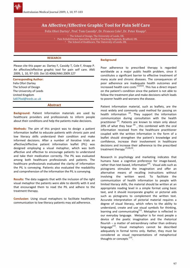
Australasian Medical Journal 2009, 1, 10, 97-103
97
RESEARCH
Please cite this paper as: Dartey F, Cassidy T, Cole F, Knapp P.
An affective/effective graphic tool for pain self care. AMJ
2009, 1, 10, 97-103. Doi 10.4066/AMJ.2009.127
Abstract
Background: Patient Information materials are used by
healthcare providers and professionals to inform people
about their conditions and help the patients make decisions.
Methods: The aim of this project was to design a patient
information leaflet to educate patients with chronic pain and
low literacy skills understand their condition and make
informed decisions. After a number of iterative trials an
affective/effective patient information leaflet (PIL) was
designed employing a visual metaphor, which was both
affective and effective to encourage patients to understand
and take their medication correctly. The PIL was evaluated
among both healthcare professionals and patients. The
healthcare professionals evaluated the clarity of information
the PIL is conveying. Patients also evaluated the readability
and comprehension of the information the PIL is conveying.
Results: The data suggests that with the inclusion of the right
visual metaphor the patients were able to identify with it and
that encouraged them to read the PIL and adhere to the
treatment therapy.
Conclusion: Using visual metaphors to facilitate healthcare
communication to low-literacy patients may aid adherence.
Background
Poor adherence to prescribed therapy is regarded
worldwide as a major public health problem, since it
constitutes a significant barrier to effective treatment of
many acute and chronic diseases. The consequences of
poor adherence are inadequate health outcomes and
increased health care costs [1][2][3]
. This has a direct impact
on the patient’s condition since the patient is not able to
follow the treatment plan and make decisions which leads
to poorer health and worsens the disease.
Patient information material, such as leaflets, are the
most widely and commonly used method for passing on
health information [4]
. They support the information
communication during consultation with the health
practitioner [5]
. Patients are known to retain only about
20% of what they hear [6]
, this combined with the oral
information received from the healthcare practitioner
coupled with the written information in the form of a
leaflet should strengthen the patient’s knowledge and
confidence, increase their involvement in healthcare
decisions and increase their adherence to the prescribed
treatment therapy [7],[8],[9]
.
Research
in psychology and marketing indicates that
humans have a cognitive
preference for image-based,
rather than text-based, information[10]
. Visual aids such as
pictograms stimulate the imagination and offer an
alternative means of recalling instructions without
involving the written word. To facilitate the
communication of health information to people with
limited literacy skills, the material should be written at an
appropriate reading level in a simple format using basic
text, and it should incorporate graphic or pictorial aids
such as pictograms to complement the written text.
Accurate interpretation of pictorial material requires a
degree of visual literacy, which refers to the ability to
understand, create and use visual symbols for thinking,
learning and communicating[11]
. Metaphor is reflected in
our everyday language. Metaphor is for most people a
device of the poetic imagination and the rhetorical
flourish – a matter of extraordinary rather than ordinary
language[12]
. Visual metaphors cannot be described
adequately in formal terms only. Rather, they must be
considered as visual
representations of metaphorical
thoughts or concepts [13]
.
An Affective/Effective Graphic Tool for Pain Self Care
Felix Ofori Dartey1, Prof. Tom Cassidy1, Dr. Frances Cole2, Dr. Peter Knapp3.
1 The School of Design, The University of Leeds, UK. 2 Pain Rehabilitation Specialist, Bradford Teaching Hospitals, Bradford, UK.
3 The School of Healthcare, The University of Leeds, UK.
Corresponding Author:
Felix Ofori Dartey
The School of Design
The University of Leeds
United Kingdom
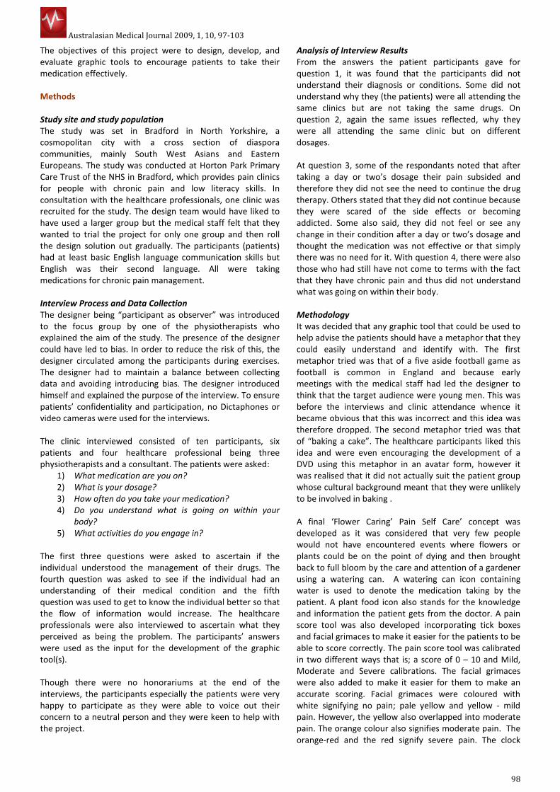
Australasian Medical Journal 2009, 1, 10, 97-103
98
The objectives of this project were to design, develop, and
evaluate graphic tools to encourage patients to take their
medication effectively.
Methods
Study site and study population
The study was set in Bradford in North Yorkshire, a
cosmopolitan city with a cross section of diaspora
communities, mainly South West Asians and Eastern
Europeans. The study was conducted at Horton Park Primary
Care Trust of the NHS in Bradford, which provides pain clinics
for people with chronic pain and low literacy skills. In
consultation with the healthcare professionals, one clinic was
recruited for the study. The design team would have liked to
have used a larger group but the medical staff felt that they
wanted to trial the project for only one group and then roll
the design solution out gradually. The participants (patients)
had at least basic English language communication skills but
English was their second language. All were taking
medications for chronic pain management.
Interview Process and Data Collection
The designer being “participant as observer” was introduced
to the focus group by one of the physiotherapists who
explained the aim of the study. The presence of the designer
could have led to bias. In order to reduce the risk of this, the
designer circulated among the participants during exercises.
The designer had to maintain a balance between collecting
data and avoiding introducing bias. The designer introduced
himself and explained the purpose of the interview. To ensure
patients’ confidentiality and participation, no Dictaphones or
video cameras were used for the interviews.
The clinic interviewed consisted of ten participants, six
patients and four healthcare professional being three
physiotherapists and a consultant. The patients were asked:
1) What medication are you on?
2) What is your dosage?
3) How often do you take your medication?
4) Do you understand what is going on within your
body?
5) What activities do you engage in?
The first three questions were asked to ascertain if the
individual understood the management of their drugs. The
fourth question was asked to see if the individual had an
understanding of their medical condition and the fifth
question was used to get to know the individual better so that
the flow of information would increase. The healthcare
professionals were also interviewed to ascertain what they
perceived as being the problem. The participants’ answers
were used as the input for the development of the graphic
tool(s).
Though there were no honorariums at the end of the
interviews, the participants especially the patients were very
happy to participate as they were able to voice out their
concern to a neutral person and they were keen to help with
the project.
Analysis of Interview Results
From the answers the patient participants gave for
question 1, it was found that the participants did not
understand their diagnosis or conditions. Some did not
understand why they (the patients) were all attending the
same clinics but are not taking the same drugs. On
question 2, again the same issues reflected, why they
were all attending the same clinic but on different
dosages.
At question 3, some of the respondants noted that after
taking a day or two’s dosage their pain subsided and
therefore they did not see the need to continue the drug
therapy. Others stated that they did not continue because
they were scared of the side effects or becoming
addicted. Some also said, they did not feel or see any
change in their condition after a day or two’s dosage and
thought the medication was not effective or that simply
there was no need for it. With question 4, there were also
those who had still have not come to terms with the fact
that they have chronic pain and thus did not understand
what was going on within their body.
Methodology
It was decided that any graphic tool that could be used to
help advise the patients should have a metaphor that they
could easily understand and identify with. The first
metaphor tried was that of a five aside football game as
football is common in England and because early
meetings with the medical staff had led the designer to
think that the target audience were young men. This was
before the interviews and clinic attendance whence it
became obvious that this was incorrect and this idea was
therefore dropped. The second metaphor tried was that
of “baking a cake”. The healthcare participants liked this
idea and were even encouraging the development of a
DVD using this metaphor in an avatar form, however it
was realised that it did not actually suit the patient group
whose cultural background meant that they were unlikely
to be involved in baking .
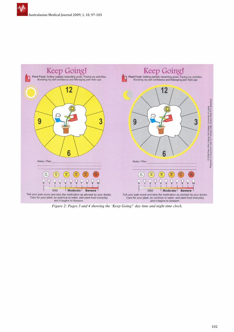
A final ‘Flower Caring’ Pain Self Care’ concept was
developed as it was considered that very few people
would not have encountered events where flowers or
plants could be on the point of dying and then brought
back to full bloom by the care and attention of a gardener
using a watering can. A watering can icon containing
water is used to denote the medication taking by the
patient. A plant food icon also stands for the knowledge
and information the patient gets from the doctor. A pain
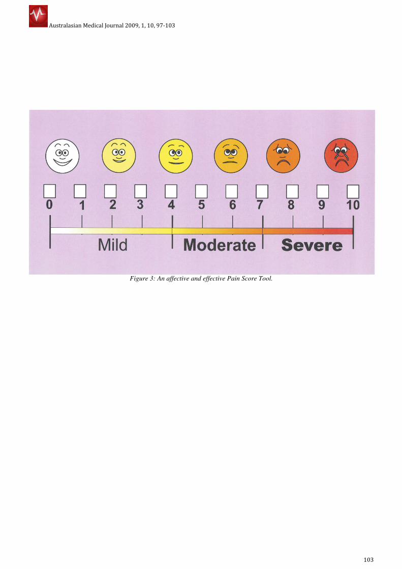
score tool was also developed incorporating tick boxes
and facial grimaces to make it easier for the patients to be
able to score correctly. The pain score tool was calibrated
in two different ways that is; a score of 0 – 10 and Mild,
Moderate and Severe calibrations. The facial grimaces
were also added to make it easier for them to make an
accurate scoring. Facial grimaces were coloured with
white signifying no pain; pale yellow and yellow - mild
pain. However, the yellow also overlapped into moderate
pain. The orange colour also signifies moderate pain. The
orange-red and the red signify severe pain. The clock

Australasian Medical Journal 2009, 1, 10, 97-103
99
faces were separated to enable the doctors to write down the
medication at the times they want the patients to take them.
This concept was developed into a leaflet which folds into A5
size. The front page consists of the ‘Starting your drug’ day
clock face and a pain score tool. The inside front page also
contain the ‘Starting your drug’ night clock face and a pain
score tool as well. Pages 3 and 4 are a repeat of the process
under the title ‘Keep Going’. Starting their medication,
together with the patient, the healthcare professional
determine the pain score of the patient and the right
medication is prescribed and the time for taking them marked
on the clock faces. Day dosage marked on the day clock face
and night on night clock face. The night before their next
clinic, the patient marks his/her pain score on the pain score
tool and takes it to the clinic. The process is repeated for
other half of the leaflet being ‘Keep Going’ with your
medication. Depending on the score of the patient the correct
medication and dosage is prescribed.
Results and Discussion
The feedback from the consultant and a number of her
colleagues who have used this tool was:
• It helps patients to see when they currently take their
medication, so timing and what relationship it has
with their pain levels. They can see the way they take
the medication is unhelpful e.g. they put off taking
the medication before the pain levels get too high or
already high and then wait even longer before they
take medication.
• It helps to improve the timing of the medication in
relationship to their changing pain levels so they can
be ahead of the rising pain levels.
• It helps them to understand the use of medication
over a 24-hour period: a day and a night.
• It helps the conversation between the clinician and
the patients about timings of taking different types of
drugs and forms of drugs for pain.
• It helps patients see that helpful behaviour such as
better pacing of activities would also help; so reduce
their unhelpful behaviour so improve self
management.
• It works well in clinician time scales of ten minutes or
so.
The study indicates that the use of visual metaphor had a
significantly positive influence on patients understanding of
instructions and hence adherence to treatment therapy. The
affective and effective graphic tools enabled the patients to
realize that their timing for taking medication was not helpful
and that, they have to adhere to the prescribed treatment
therapy. The affective and effective pain score tool helped the
patients visualize their pain levels effectively and encouraged
them to take the medication on time. From the study, it could
be deduced that the tools helped the conversation between
the clinicians and the patients about timing. The tool (the
patient information leaflet) also helped to reveal to the
patients helpful behaviour such as better timing of activities.
Conclusion
In this study, attention was paid to educating the patients
about their diagnosis and what adhering to medication
treatment therapy does to their conditions. Though many
patient information leaflets have sought to do this, the
success of this study was influenced by the incorporation
of the right visual metaphor which engaged the patients
thus enabling them to understand their condition and
relate to it and also encouraged them to adhere to the
prescribed drug treatment therapy. The journey towards
the right metaphor was both challenging and interesting
and offered the design team and the medical staff great
opportunities for collaborative creative thinking and
innovation. Using visual metaphors to facilitate healthcare
communication to low-literacy patients stimulates the
mind and aids adherence, however, it requires verbal
explanation from the health professionals. It should also
be developed in collaboration with the target community
taking into account their cultural settings.
References
1. Adherence to long-term therapies: Evidence for
Action. World Health Organization 2003 p 13.
2. Nichols-English, G. & Poirier, S. (2000) Optimizing
Adherence to pharmaceutical care plans. Journal of
American Pharmacist Association, 40, p475 - 485
3. Dowse, R. and Ehlers, M. (2001) Medicine labels
incorporating pictograms: do they influence
understanding and adherence?
(http://eprints.ru.ac.za/576/01/Medicine-labels.pdf
accessed 07/11/2009)
4. Dowse R. and Mansoor, L.E. (2003) Effect of
Pictograms on Readability of Patient Information
Materials. The Annals of Pharmacotherapy.
(http://www.theannals.com/cgi/content/full/37/7/10
03.pdf accessed 07/11/2008)
5. Kenny, T., Wilson, R.G., Purves, I.N., Clark, J. S.,
Newton, L.D. Newton, D.P. & Moseley, D.V. (1998) A
PIL for every ill? Patient information leaflets (PILs): a
review of past, present and future use. Family
Practice. Vol 15, pp. 471-479
6. Communicating with patients who have limited
literacy skills. Report of the National Work Group on
Literacy and Health (1998). The Journal of Family
Practice. Vol 46. Dowden Publishing Co., Inc. USA pp.
168-176
7. Kitching J.B. (1990) Patient Information leaflets – the
state of the art. Journal of Royal Society of Medicine.
1990 May; 83(5): pp. 298–300.
8. Dowse R. and Mansoor, L.E. (2003) Effect of
Pictograms on Readability of Patient Information
Materials. The Annals of Pharmacotherapy.
9. Katz, M. G., Kripalani, S. & Weiss, B. D. (2006) Use of
pictorial aids in medication instructions: A review of
the literature. American Journal of Health-System
Pharmacy, Vol. 63, Issue 23, pp2391-2397.
10. Doak, C.C., Doak, L.G. & Root, J.H. (1996) Teaching
Patients with Low-literacy Skills, Second Edition, J.B.
Lippincott, Philadelphia, pp91-128.
Australasian Medical Journal 2009, 1, 10, 97-103
100
11. Lakoff, G & Johnson, M.(1980) Metaphors we live by.
University of Chicago Press. Chicago
12. El Refaie E. (2003) Understanding visual metaphor: the
example of newspaper cartoons, Visual Communication,
Vol. 2, No. 1, pp75-95.
13. Dickinson, D., Raynor, D.K. & Duman, M. (2001) Patient
Information leaflet for medicines: using consumer testing
to determine the most effective design. Patient Education
Counseling, Elsevier, Vol. 43. pp 147-159
AUTHORS’ CONTRIBUTIONS
All authors contributed equally to all aspects of the study.
PEER REVIEW
Not commissioned; externally peer reviewed
CONFLICT OF INTEREST
The authors declare that they have no competing interests

Australasian Medical Journal 2009, 1, 10, 97-103
101
Figure 1: Pages 1 and 2 showing the ‘Starting your drugs’ day time and night time clocks.
Australasian Medical Journal 2009, 1, 10, 97-103
102
Figure 2: Pages 3 and 4 showing the ‘Keep Going!’ day time and night time clock.
Australasian Medical Journal 2009, 1, 10, 97-103
103
Figure 3: An affective and effective Pain Score Tool.