Educational/informational posters on graphic design
73
Rochester Institute of Technology Rochester Institute of Technology RIT Scholar Works RIT Scholar Works Theses 6-1-1987 Educational/informational posters on graphic design Educational/informational posters on graphic design Sister Mary Kay Neff S.C. Follow this and additional works at: https://scholarworks.rit.edu/theses Recommended Citation Recommended Citation Neff, Sister Mary Kay S.C., "Educational/informational posters on graphic design" (1987). Thesis. Rochester Institute of Technology. Accessed from This Thesis is brought to you for free and open access by RIT Scholar Works. It has been accepted for inclusion in Theses by an authorized administrator of RIT Scholar Works. For more information, please contact [email protected].
-
Upload
khangminh22 -
Category
Documents
-
view
1 -
download
0
Transcript of Educational/informational posters on graphic design

Rochester Institute of Technology Rochester Institute of Technology
RIT Scholar Works RIT Scholar Works
Theses
6-1-1987
Educational/informational posters on graphic design Educational/informational posters on graphic design
Sister Mary Kay Neff S.C.
Follow this and additional works at: https://scholarworks.rit.edu/theses
Recommended Citation Recommended Citation Neff, Sister Mary Kay S.C., "Educational/informational posters on graphic design" (1987). Thesis. Rochester Institute of Technology. Accessed from
This Thesis is brought to you for free and open access by RIT Scholar Works. It has been accepted for inclusion in Theses by an authorized administrator of RIT Scholar Works. For more information, please contact [email protected].

Rochester Institute ofTechnology
A Thesis Submitted to the Faculty of
The College ofFine and Applied Arts
in Candidacy for the Degree of
MASTER OF FINE ARTS
Educational/Informational Posters On Graphic Design
By
Sr. Mary Kay Neff, S.C.
June 1987

Adviser:
Approvals
R. Roger Remington
Date: b / ('9=/ £9=Associate Adviser: Bernadette Merkel
Date: t· /? J'7Associate Adviser: Esther Kurti
2
Special Assistant
to the Dean for
Graduate Affairs: Philip Bornarth,
Date:----+u~. \~ I \1\t '1
Date:__------=G':.....1~~Z=-2--_I_/..:::..!-7~ I
Dean, College of
Fine & Applied
Arts: Dr. Robert Johnston
Date: ~!1J-l..u?1=-L-------
I, , hereby grant permission to the/
Wallace Memorial'Library/ofR~to reproduce my thesis in whole or in part
Any reproduction will not be for commercial use or profit.
Date: (p 117If7I 7

Acknowledgements
For their ideas and suggestions, I would like to thank my thesis
committee members Roger Remington,Bemadette Merkel, and Esther Kurti.
For his help and use of typesetting equipment I would like to thank J.
C. McCracken and the RIT Newspaper Production Lab. I would like to express
a special note of thanks to John Kulak for his generous help and time in the
production ofmy thesis.
To my community who made my two years of study at RIT possible
and especially to Judy, thank you.
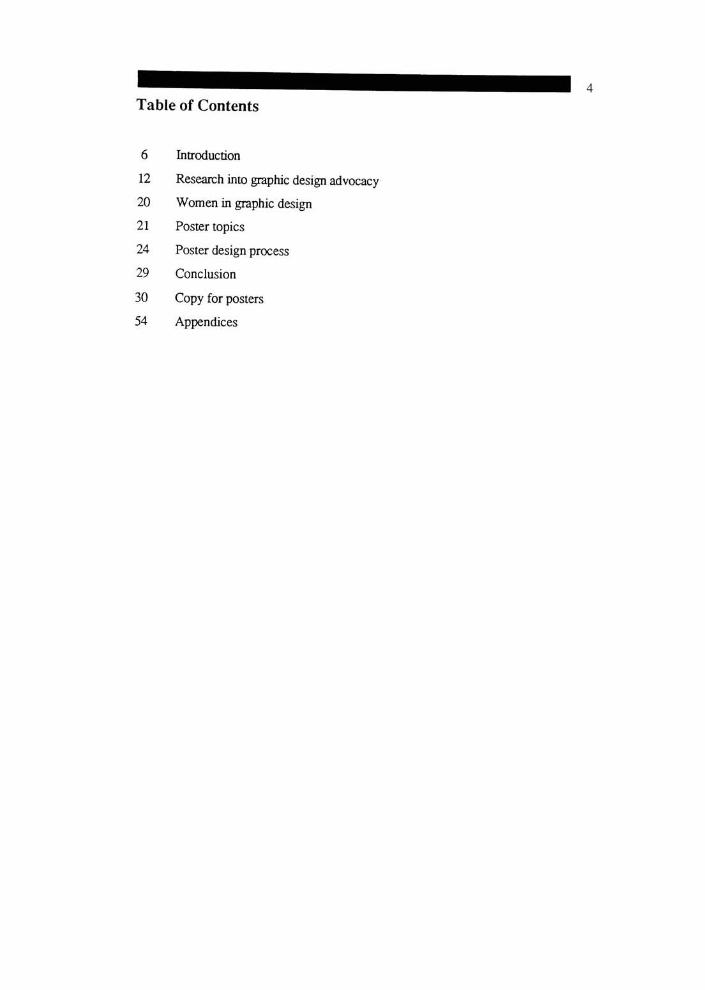
Table of Contents
6 Introduction
12 Research into graphic design advocacy
20 Women in graphic design
21 Poster topics
24 Poster design process
29 Conclusion
30 Copy for posters
54 Appendices

"Design is directed toward human beings. To design is to solve human
problems by identifying them, examining the alternativesolutions."
Ivan Chermayeff

Introduction
This section will contain thesis proposal, function, audience, and
innovative aspects of the thesis posters.
Proposal
This thesis stemmed from my interest in graphic design education,
concern for graphic design advocacy, and a desire to personalize the vocabulary
of graphic design.
My own undergraduate experience with graphic design courses plus
input from other students and instructors, led me to believe there was a need for
better understanding of the field of graphic design, i.e., what is involved in
graphic design, who are the professionals in the field, what is the history and
what areas relate to graphic design.
I thought about approaching this task in two ways. My first idea was to
design a study guide/reference tool for students of graphic design, listing and
explaining key theories in graphic design. In this guide I would cover the
following:
semiotics
syntax
semantics
pragmatics
visual translations
relativity
visual form
kenetics
value
space
consociation
mutuality
intermittance
successiveness
typography
weight
style
Interspacing
wordspacing
posture
color
warmth
whiteness
luminosity
organization methods
grids
modular
unit
constructional
Gestalt principles
figure-ground
common contour
proximity
similarity
continuity
closure
fixation
zeigamic effect
information graphics

My second ideawas to design a series of educational/informational posters to
aid in the study of graphic design. Some of the topics to be dealtwith in the
posters would include the following:
typography
definition
parts of the letterforrn
classification
typographic measurements
type family
history of graphic design
highlight several key designers or movements in
the history of graphic design
perceptual principles
Gestalt principles
identification
symbols
logos
marks
After studying the feasibility of each topic and on the recommendation
ofmy chief adviser, I decided to pursueeducational/informational posters. This
project was realistic in terms of time and scale.
Thesis Proposal
I intended to design a series of orientation posters to be used as
educationatyinformational aids in the study of graphic design.
These posters might deal with the following topics:
-introduction to graphic design
-tools of graphic design
-history of graphic design
-organizational and perceptual principles
-typography
-image formulation
-applications of graphic design

10
Audience and Function
Having decided upon a topic, I needed to determine the audience and
function of the posters. I decided the posters would be targeted at undergraduate
art students, specifically women in a small liberal arts college. Ideally, the
posters would result instudents'
increased awareness and understanding of
graphic design.
These posters would deal with the following topics:
-introduction to graphic design
-tools of graphic design
-history of graphic design
-organizational and perceptual principles
-typography
-image formulation
-applications of graphic design
The posters were designed to be hung and viewed in the sequence listed
above; however, each poster will be capable of existing independently of the
other six. They are to be hung in a design studio or classroom.
Proposed size of the posters is18"
x 24".

11
Innovative Function of the Posters
The innovative function of the posters is integral to the target audience -
undergraduate art students, specifically women in a small liberal arts college.
The posters will highlight women designers who could serve as role models for
young women interested in graphic design as a career.

12
Research into Graphic Design Advocacy
Realizing my posters would be a form of graphic design advocacy, I
decided to research what others have done to promote understanding of the
profession of graphic design.
During my research I found three areas of graphic design advocacy which
directly related to graphic design education and my project. They are, the
American Institute ofGraphic Arts (AIGA) paper on graphic design education
titled, "What Should A Basic Graphic Design Education Encompass?";
Professor Robert Swinehart's "DiscoverDesign"
program; Sharon Heyenck's
thesis called "The Graphic Design CareerKit"

13
"What Should a Basic Graphic Design EducationEncompass?"
The American Institute ofGraphic Arts is the national non-profit
organization of graphic design and graphic arts professionals. AIGA sponsors
competitions, exhibitions, publications, educational activities and projects in
the public interest to promote excellence in, as well as advancement of, the
graphic design profession. The AIGA Education Committee has put forth a draft
on what a basic graphic design education should encompass. The following ten
points are taken from this draft:
1. Aesthetics, Perception, and Visual Configuration
Graphic designers should be sensitive to visual forms and their aesthetic
functions. These forms include point, line, plane, volume, perspective,
area, texture, color, figure-ground, sequence, rhythm, module,
proportion, symmetry, Gestalt, program and hierarchy. Since they are
elemental they are studied throughout the curriculum.
2. Process and Techniques ofVisualizing, Form
Development, and Craftsmanship
Graphic designers should be familiar with the basic tools, techniques,
and processes to generate or produce images, sketches, models, and
finished artwork. They should use tools with skill and sensitivity for
craftsmanship.
3. Materials, Tools, and Technology
In the process of design, in the production of objects, and in the
methods for the visual transmittal of information, technology plays a
constant role. Graphic designers are responsible for the visual translation
of ideas into two and three dimensions, environments, and computerized
and projected systems. The graphic designermust be aware of the
potentials and uses of relevantmaterials, media, and technologies- for
production and communication.

14
4. Visual Communications
Graphic designers address communication problems. They interpret
human communications, and contribute to systems for communication
and their advancement
5. DesignMethods, Planning, andManagement
Graphic designers serve to objectively determine design priorities and
alternatives; they help clients determine needs. They research, define, and
evaluate criteria and requirements. They develop and refine concepts, and
present these through sketches and models. They coordinate diverse
aspects (including production requirements, design management, and
sometimes marketing strategies) to unify results.
While problem solving is essential to any design situation, it can vary
in scope, method, and application. To manage complexity effectively
the graphic designer should understand these processes on many levels,
from form production to professional practice.
6. Communicating Concepts andRequirements
Graphic designers communicate both concepts and requirements to the
client, to production specialists, to other professionals who contribute
to the design process, and to members of the broader society. This
communication involves expression and transmittal as well as reception
and evaluation of information. They are expected to have the skills to
communicate at all stages of the design process.
7. History
Graphic designers should have a sense of their work in relation to
history, particularly knowledge of facts, trends and sequences of the
historical developments in visual communication design and
technology. Exposure to significant contributors and movements
provide both a framework within which graphic design can be examined
and the work of role models studied.
15
8.Business andProfessional Practices
The graphic design profession works with other design professionals,
artisitc disciplines, technical/production specialists, social scientists, and
other professionals such as those ofbusiness and law. As partners of the
world of business and society they accept a professional responsibility
and ethical stewardship that relates to the cultural, social, legal,
economic, technological and environmental well-being. They have skills
to work effectively and to negotiate with others. They understand the
role of the graphic designer in the process ofwhich design production
occurs. They are able to comprehend the contribution of relevant
disciplines.
9. Some GraphicDesign Topics
letterform
typography
type and image
visual translation
symbol design
folders/brochures/catalogues
environmental graphics
color communication
graphic arts technology
information design
film/animated graphics
multi-media/audiovisual
computer interface design
design research
book design
exhibition & display graphics
design management/business
identity system
design systems
design standards
diagrams & graphics
publication design
architectural signing
poster design
visible language
photographic
design evaluation
video graphics
computer graphics
design criticism
design internship
package graphics
design methods
advertising design
10. The Learning Environment: Studio Practice, Design Theory,
Humanities and Sciences
The concrete environment is important to graphic design education (i.e.
16
studio set-up, relations among students and faculty.) Design theory (i.e.,
principles, universals, and abstractions) builds a framework that presents
principles that demonstrate interrelation and organization of specifics,
enhancing generative operations. Designers need a broad cultural
understanding in order to successfully collaborate with humanists,
scientists business people and other design professionals.
Graphic design, as interpreters of human communications should have a
thorough understanding of the intricacies of human relations.
I found the AIGA paper very helpful in drawing up the topic outline for
my thesis posters.
1AIGA Education Committee, "What Should A Basic Graphic Design
Education Encompass?", (forthcoming).

17
Discover Design
Discover Design was a program undertaken by Professor Robert
Swinehart ofCarnegie-Mellon University. Discover Design was created to
provide high school students with a better appreciation and knowledge of
design. In this he was trying to full the educational void that existed concerning
the design profession.
Professor Swinehart chose the poster as the medium to accomplish his
task for a number of reasons. Posters have great appeal (especially to young
people); they are an effectivemedium when used to reach a large number of
people when displayed on the art room wall. Posters are cost effective. At the
time Discover Design posters were produced (late 1970's and early 1980's) the
concept of using the poster as a revival ofChinese wall posters/newspapers was
new in this country. Now the use of posters in this manner is widely accepted.
I wrote to Professor Swinehart concerning his program and he sent me
copies ofDiscover Design posters #1 and #3. 1 was most interested in poster
#1. It was intended to introduce the purpose of the project and present a
potpourri of design related subjects with visuals that might enlighten the
student and encourage discussion and a desire for more information.
Poster #2, currently out ofprint was produced as a centerfold for the
October '80 issue of School Arts magazine. The topic was visual notation and
visual ideation. The established format was modified for this special issue (18
1/2 x 22 3/8").
Poster #3 was supported by the Society of Typographic Arts (STA) in
Chicago and specifically addressed creativity, the theme of their fall 1980
conference. Each speaker was asked to contribute a short written statement and
provide some visuals. The posters were handed out to all who attended the
conference.
I liked the idea of informational posters in the tradition of the Chinese
poster/newspaper. Informational posters which are hung in strategic locations
are an excellent way to provide a large amount of information to a great number
of people. I also took special notice of the organizational method (grid) used in
poster #1 to group the information in the poster.

18
The Graphic Design Career Kit
Out of a desire to synthesize graphic design with art education and the
graphic design advocacy ofProfessor RogerRemington, Susan Heyenck
developed her thesis. She felt there was a need for graphic design career
materials to be used as a teaching tool for high school teachers.
While designed primarily as a career information kit for high school
students, Sharon Heyenck saw other educational uses for the Graphic Design
Career Kit Among them was its use in 2 and 4 year educational institutions as
an orientation program for potential graphic design students. It could also be
shown and discussed at conferences andworkshops by a professional art
association such as theNew York State Art Teachers Association.
Sharon Heyenck's program has four parts; the poster, the slide
presentation, the brochure and the information page.
The materials give very basic information about graphic design job
opportunities, salary scale, and guide a student toward more in-depth
information.
My posters differ significantly from Sharon Heyenck's work in the
following ways:
-my posters discuss in-depth areas of graphic design theory, and history
-my target audience is smaller. The intended audience for my posters is
undergraduate art students, especially women.
2Sharon Heyenck, "The Graphic Design Career
Kit"
(M.F.A. thesis,
Rochester Institute of Technology, 1981).

19
Other Materials
In my search for graphic design advocacy materials, I found two
publications by Rochester Institute of Technology to be interesting and helpful
in forming my posters. They are, "A Career Guide to GraphicDesign"
and "A
Guide to GraphicDesign."
Both publications are brochures which fold out to
form a poster and offer specific information on some of the history of graphic
design as well as an overview of some of the theory of graphic design.

Women in Graphic Design
The profession of graphic design is relatively young and therefore does
not have a long history. Its past is spread through the histories of art,
typography, architecture, printing, photography and advertising. In researching
the history of graphic design it is rare to find women designers mentioned, let
alone women who have made outstanding contributions to the field until recent
years. Today there are several outstanding women designers recognized for the
quality of their work.
As a woman designer interested in graphic design education, I feel it is
important to acquaint young women with role models because they will find
very few in graphic design history.
It is also to that end that I wrote to the following women working in
the field andmaking significant contributions to it
Sheila Levrant de Bretteville
April Greiman
KatherineMcCoy
Paula Scher
Sharon Poggenphol
Barbara Stauffacher Solomon
I asked each of the designers for biographical information, articles and
samples of their work for inclusion in my thesis posters. I received information
from all women except for the last two mentioned. From the articles and
biographical information sent to me, I was able to abstract quotes about or from
each of the women. I also used examples of their work from the reproductions
sent to me.

Poster Topics
For presentation to my thesis committee members in early December
1986, 1 prepared a topic outline for each poster as shown below.
21
/RAfT
? ro no s ed to nlc outline for each poster:
Poster 1. Introduction to graphic design
-Introduction and definition of zraDhic desifm
Poster 2. Tools of graphic desir-n
-oho to.^raDhy
-black and wnlte/color, continuous tone,
hltrh contrast, montage, collate
-computer
-hand skills
Poster 3. History of araphlc deslm
-hl^hlleht several key designers/movements In
the history of granhic design
Foster *+ . Organization and oerceotual principles in graphic design
-e-estalt principles
-f ia-ure/i-round, common contour, proximity,
similarity, closure, Isomorphic correspondence
-crids
-textural, patternistlc
, skeletal, compositional,
constructional, typographic unit grid
Poster 5- TyposraDhy-definition
-Darts of letterforms
-classification/measurement
-type family
-letterspacinc, wordspaclng, line spacing, column width
Poster 6. Image formulation
-visualizingtechniques
-marks
-symbols
-lotros
-olc tocraphs
-translations
Poster 7. Amplications of zrachic d'eslfm
-corporate identity
-diagrams a craohs
-Duplication desltm
-folders /brochure s /catalo ere s
-cook deslm
-adverti sine design
-envlornmen tal graphics
-poster design

22
Many changes in the topic outline resulted from discussion during the
first meeting. Among those changes were elimination of two posters by
combining topics. The poster on applications would be included in the first
poster (introduction) and would highlight women in the profession. The poster
on typography would be included in the poster on tools of graphic design. The
poster on image formulation would also include process with special concern
for the whole.
The revised topic outline would appear as follows:
Poster #1 Introduction to GraphicDesign
-definition
-women in graphic design
-applications of graphic design
Poster #2 History ofGraphicDesign
-highlight several key designers/movements in the history of
graphic design
Poster #3 Organization andPerceptual Principles in GraphicDesign
Gestalt principles
-figure-ground
-common contour
-proximity
-similarity
-closure
-isomorphic correspondence
Grids
-textural
-patternistic
-skeletal
-compositional
-typographic unit grid
Poster #4 Tools/Typography
-photography
-computer
-handskills

23
-definition of typography
-parts of letterforms
-classification/measurement
-type family
-letterspacing/wordspacing
-linespacing/column width
Poster #5 Image Formulation/Process
-visualizing techniques
-marks
-symbols
-logos
-pictographs
-translations
At a later date the wording of the heading for the posters changed again.
Poster #1 was originally called "Introduction to Graphic Design". This heading
is rather obvious and did not really describe the contents of the poster. The
poster answers the question, what is graphic design and gives examples of
designers and their work. The title, "The Profession ofGraphicDesign"
proved
to be a better heading for poster #1.
Poster #2 deals with the subject of where graphic design came from. The
history of graphic design is discussed in a chronological way. The heading
chosen for this copy is "Tracing the History ofGraphicDesign."
Poster #3 and #4 are related in that both depict/discuss the principles or
rules of graphic design; in other words, the grammar of graphic design. Poster
#3 will have the heading, "The Grammar ofGraphic Design: Organizational
and PerceptualPrinciples."
Poster #4 will be titled "The Grammar ofGraphic
Design: Tools andTypography."
Poster #5 deals with image formulation and process in graphic design.
The heading "The Process of GraphicDesign"
aptly describes the contents.

24
Poster Design Process
All posters were designed together because they are to be viewed as a
whole.
The first design consideration for the posters was to devise a grid that
would easily accommodate the copy, heading, photographs, titles and images in
each poster. In addition to organizing specific content, the grid would help in
building a sequential relationship between posters. In constructing the grid, I
chose to use the typographic unit grid. The type size (10 point plus 2 points
of spacing) determined the size of the units (12 points). The unit grid was then
divided into a series of larger rectangles of recurring size (modules). After some
experimentation, I found a five column horizontal format would work best The
columns were broken down into eleven modules, (see pg. 55)

25
Framework and Treatment Plan
Once the grid was established, I then set up a framework for each poster.
In this framework I listed the objectives of each poster which allowed me to
predetermine all formal aspects of the design process. I set up a variable list for
each poster predetermining texture, amount of imagery, tonality, functional or
experimental qualities and line systems. This variable list enabled me to
establish locations for smaller or larger amounts of copy, which posters would
appear individually and as a group.
ABA form*was also considered and used in the overall conception of
the series and in each individual poster to achieve repetition and contrast, (see pg. 58)
"Visual relationships exist within an observable framework of repetition
and contrast. In typographic communication, this famework provides a method
for interpreting visual form. It is through the principles of repetition and
contrast that the typographic designer creates visual order . . . The viewer seeks
a varity that stimulates both eye and mind, while structuring the
communication experience. This is the dual basis ofABA form.
*"
ABA form is comprised of both simple and complex patterns that
give both order and emphasis to the visual linking of typographic elements.
These are not fixed systems but are a way of understanding the
interrelationships of typographic form.While ABA form is characterized by the
repetition and contrast of typographic elements, in the typographic grid there is
a purposeful regularity in the division of space. ABA structures govern the
relationship of parts one to another; the grid determinestheir ordered locations
3on the printed page . .
I decided to have the most complex poster in the center of the series of
five. The amount of copy and visuals would also make this thelogical location
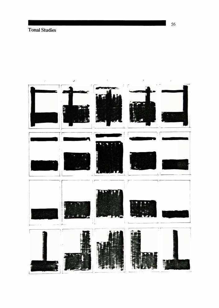
for the poster darkest in tonality. I did a series of tonality studies, (see pg. 56-57) I
perceived the posters in tone as going from lighter on either end to darker in the
middle. In relation to tonality, the posters also will go from having a simple
texture to complex texture and back to simple texture.
3Rob Carter, Ben Day and Philip Meggs, Typographic Design:
Form and Communication (New York: Van Nostrand Reinhold Co., Inc.,
1985), pp 62-67.

26
Type
I chose Helvetica type for the body copy in my posters primarily
because of its readibility. Designed by MaxMiedinger, Helvetica is a
contemporary sans serif typeface widely used for its clean design and legibility.
The heading type is Rockwell. This type can be characterized as an
Egyptian type design. The letterforms have heavy slab serifs and show very
tittle contrast between thick and thin strokes.
Many type styles were considered and tried for use in the headings.
Univers italic with an initial oversized capital letter was first tried and rejected
because it gave the posters a"corporate"
look which was not fitting for their
use within the classroom.
Next Goudy and Bodoni styles were tried in an attempt to soften the
overall appearance while Bodoni was too "classical". Rockwell, with its heavy
serifs provided a good visual compromise between the corporate and the
classical look.

27
Color
A warm, rich red (Pantone Warm Red) was chosen as the color for the
headings and black for the body copy. The red was used to draw attention to the
headings.
The color for the final posters is done by Chromatec.

28
Visuals Used
I chose images that would clearly illuminate verbal ideas in the copy.
They often depict actual work of the designers mentioned in the copy.

29
Conclusion
This thesis project involved many different aspects of graphic design-
education, theory of graphic design, application, history of graphic design, and
current trends in graphic design.
I found this project immediately helpful to me by personalizing the
vocabulary of graphic design. The posters will also be helpful as a teaching tool
in graphic design education.
It is my hope that young art students, especially women interested in
graphic design as a career, will find the posters informative and inspire them to
consider the place of design in their lives.

30
Copy for Poster #1
The Profession ofGraphic Design

31
At its core graphic design is visual communication. It is highly
personal communication. The graphic designer is concerned with a one-to
-one process of communication. As radically different as an album cover and a
corporate design manual might be, both are to communicate to a group made
up of individuals. Graphic designers communicate visually through type,
symbols, illustration, photographs and computer graphics. The graphic designer
is called upon to integrate human factors, technology and aesthetics.
Graphic designers apply their talents to the world. The graphic designers
field is related to many others such as audio visual, architecture, computer
graphics and copywriter to name a few. The study ofgraphic design can lead to
work in many allied occupations.
Graphic designers are visual problem solvers interested in the highest
level of informational and aesthetical quality. In graphic design, the problems
usually originate in the clients mind. Design must grow out of an
understanding of those problems, goals and aspirations. Designers must
maintain an unrelenting interest in the problem at hand because once a
problem is truly described, the solution comes along with the description.
Good graphic design depends on the ablility of the designer to act
according to the structure determined by the nature of the problem and not run
counter to it. Good design can be judged by the following standards:
There are sound, proven criteria for judging design effectiveness.
Design is an urgent requirement, not a cosmetic addition.
Design can save money.
Design can save time by presenting informationmore clearly.
Design enhances communication by helping people understand a given meaning.
Design simplifies use, manufacture and maintenance.
Design is needed in all areas of life, not to design is to suffer design by default.
The goal of design is performance.
Graphic design at its best provides visual solutions to problems that are
functional, aesthetically pleasing , appropriate, simple andeconomical.
A good way to understand graphicdesign is to look at people in the
field; to look at their visual solutions to client problems.
"Design is directed
toward human beings. To
design is to solve human
problems by identifying
them, examining the
alternativesolutions."
Ivan Chermayejf
"Graphic design is a
fusion of information and
inspiration, of the conscious
and the unconscious, of
yesterday and today, work
and play, craft andart."
Paul Rand

Sheila Levrant de Bretteville
Trained as a graphic designer at YaleUniversity, Sheila de Bretteville
designed books atYale, Stanford and Chantileer Presses. She worked for
Olivetti in Milan, Italy.
Ms. de Bretteville has received awards of excellence from the American
Institute ofGraphic Arts, New York Type Directors Club, the Society of
Publication Designers and has been chosen as outstanding educator of the year.
She co-founded theWoman's Building in Los Angeles in 1973 which
houses theWomen's Graphic Center and the Feminist Studio Workshop.
Sheila de Bretteville runs an architectural and design practice with her
husband in Los Angeles.
April Greiman
April Greiman established a studio in Los Angeles after studying in
Basel, Switzerland. She has taken ideas developed in Basel in a new direction
particularly in her use of color and photographs. She evolved a new attitude
toward space. Typography, traditionally two dimensional, gains a sense of depth
in her work. Overlapping forms, diagional lines of perspective, moving gestural
strokes and floating forms that cast shadows move across the surface of her
work. Often tactile sense is highlighted in her designs.
April Greiman has worked for clients such as Esprit, Xerox
Corporation, Los Angeles Times and Sasson. She has designed for television,
record companies and magazines. Her work has been included in many books
such as A History of Graphic Design and Seven Graphic
Designers.
April was director of the program in Visual Communication at
California Institute of the Arts.
32
"Forme, it has been this
integral relationship between
individual creativity and
social responsibility
that has drawnme to the
design arts. It ispossible and
profitable to reinforce
existing values through
design. In my work,
however, I try to project
alternative values ofmy
ownchoosing."
SheilaLevrant de Bretteville
"April Greiman's work
is literally explosive. In her
hands graphic design is
communication art, and as in
art it appears to transcend
mundane needs, while
performing itstask."
Massimo Vignelli
Katherine McCoy
Kathy McCoy is actively involved in design communication, writing,
editing activities and design education.
Her work has been exhibited internationally. It has appeared in many

33
books and publications and has won more than 150 awards from Industrial
Design, Progressive Architecture, InteriorsMagazine and others.
Ms. McCoy was a designerwith Unimark International, Detroit;
Omnigraphics, Boston; Chrysler Corporation, Detroit; andDesigners and
Partners, Detroit; prior to her position as cochair of the department of design at
Cranbrook Academy ofArt. She is also partners inMcCoy andMcCoy,
consultants in graphic, industrial, furniture and interior design.
Paula Scher
Paula Scher spentmuch of her career prior to starting the design firm of
Koppel and Scher as an art director for CBS records where her designs won four
Grammy nominations and awards in every major graphic design annual. She
has authored and designed books, written a number of articles on design which
have appeared in Adweek, Print AIGA Journal and currently teaches a portfolio
class at The School of the Visual Arts.
Ms. Scher has received other medals and awards from such groups as the
Art Directors Club ofNew York, Communication Arts, and Graphis.
Her designs have been collected by theMuseum ofModern Art, Library
of Congress and Beaubony Museum, Paris.
"Now I'm interested in
obscuring themessage
just until thepoint where it
becomes incomprehensible.
It involves some thinking
on the readerspart, but
can bemore engaging
than big, cleartype."
Kathy McCoy
"There's a core, a
literate reasonwhy we did
something the way wedid.
When you look at it, you
may think it's great, or you
may not like it, or whatever,
but there is a pun, a piece of
wit, a reason for it. Take
Mahattan Records. It's
really a visualpun because
it'sMondrian. The painting
wasBroadway
Boogie-Woogie and
Manhattan isBroadway."
PaulaScher

34
Copy for Poster #2
Tracing the History ofGraphic Design

35
The history of modern visual communication, what we have called
graphic design, can be spanned by living memory. Modern graphic design
derives many of its principles from the great revolutionary thinking of painters,
architects and philosophers in the early 1900's.
Avant Garde in Europe
Five movements in western Europe had strong impact in shaping
modem graphic design. They are Futurism, Dada, de Stijl, Constructivism and
Bauhaus.
Futurism
Futurist thought was proclaimed in 1909 with the FuturistManifesto
written by Filippo Marinetti. Futurists praised technology, violence, danger,
movement and speed. This sense of dynamic action took two dimensional form
in the successive overlapping of images they used.
Marinetti transformed these into some of the most revolutionary
typography of the 20th century. Marinetti and all the Futurists destained what
typography had become; a decorative art removed from the realities of the time.
They sought to intensify meaning and form in typography and to make it not
only read but seen, heard, felt and totally experienced.
Dada
The Dadamovement shattered traditional assumptions and broke all
rules concerned with book design and typography. KurtSchwitters'
andWieland
Herzfelde's work exemplified Dada's interest in freeing typography from its
rectilinear restrictions. Dada taught that humor, shock and surprise could help to
overcome viewer apathy.
de Stijl
At the same time Dada was taking hold, de Stijl ideas were being
championed by Theo Van Doesburg. De Stijl involved the complete
elimination of any reference to objects in nature. De Stijl artists sought
harmony through composition unhampered by association with objects in the
world. They wanted to create a new harmony between life and art. Their
complete abstraction took the form of straight lines, right angles and the use of
three primary colors (red, yellow, and blue.) The de Stijl movement had strong

36
influence on the International Style, Swiss graphics and the Bauhaus.
Constructivists
The Constructivists profoundly influenced the course of graphic design.
They sought to create a richer environment through a unity between art and
technology. They combined words and images into a simultaneous experience
on the printed page. The work of a designer named El Lissitsky best realized the
Constructivists ideas. He blended Constructivists design experiments with the
developing ideas of the western European Avant Garde. El Lissitsky pushed the
potential of montage and photomontage to create complex communication
messages.
Bauhaus
Also at this time, design education began with the opening of the
Bauhaus, a school dedicated to new training of the arts. The Bauhaus dealt with
the creative relationships between art and technology. The Bauhaus became a
gathering place that brought together the accumulated ideas of the first and
second decades of the twentieth century. They extended the constructivists and de
Stijl ideas into all aspects of visual communication. One of the well known
teachers at the Bauhaus, LaszloMoholy-Nagy, had great interest in photography
which lead to the marriage of photography and type.
Jan Tschichold
This brief history ofWestern European influences on contemporary
graphic design could not be complete without amention of one of the most
ardent and uncompromising advocates ofmodern typography, Jan Tschichold.
He worked independently of art movements and the Bauhaus making significant
achievements in developing "the new typography". He applied the innovations
taking place in form and visual theory and applied them to graphic design.
Through articles and books he explained and demonstrated asymmetrical
typography and design. Tschichold sought to express the spirit and lifeof his
day through lucid, clear design, devoid of decoration made only for rational
communication.
Swiss Style
During the 1950's a design style emerged in Switzerland known as the
International Typographic Style or Swiss Style. This style remained as a major
37
force for more than twenty years and was characterized by objective clarity. The
style is based on asymmetrical organization of elements which is built from a
mathematically drawn grid. Other recognizable elements in the style are the use
of sans serif type (Helvetica mostly), type set flush left and ragged right and the
use of objective photography. The underlying principle of the International
Typographic Style is that design is a socially useful and important activity
when it expresses clarity and order.
A leading figure in the International Typographic Style was Josef
Muller-Brockmann. He sought and achieved an absolute and universal graphic
expression in his work without the interference of the designers subjective
feelings. His graphic designs are fresh and powerful and communicate with
intensity and clarity.
Graphic Design in America
The excellence ofmodern design in America was a direct result of the
immigration of talented designers from Europe escaping the political climate
before and duringWorldWar II.
In the 1940's, New York became the center of design and the first steps
toward and original American design were made. These designers had seen the
work done by the European AvantGarde in America. They borrowed the form
they used while at the same time inventing new forms.While the European
designers emphasized theory and structure, American designers used intuitive
and informal approach to organization. The American idea of using design to
increase sales was bom.
Among these American designers are Paul Rand, Saul Bass, George
Lois, HerbertLubalin and Lou Dorfsman.
Paul Rand's work was instrumental in developing the American graphic
design approach. His work is characterized by playfulness and is visually
dynamic. Rand has the extraordinary ability to use the ordinary, universally
understood signs and symbols as powerful tools for communication.
Saul Bass frequently reduced his graphic design to a single dominant
image positioned in the center of the page. He strips a graphic design problem
to the essence by reducing communication to a single image. Unlike other
"PaulRand is an
idealist and a realist, one
who uses the language of the
poet and the businessman.
He thinks in terms ofneed
andfunction but hisfantasy
is boundless."
LaszloMoholy-Nagy

38
minimalist statements, his work is marked by energy and a casual quality. He is
well known for his mastery of film titles and posters.
An important figure in concept and advertising, George Lois, fully
integrated visual/verbal concepts in communication. His designs are simple,
directmemorable. Lois designed numerous covers for Esquire magazine which
invited the audience to directly participate in photographs depicting timely
issues and people.
Herb Lubalin mastered the use of expressive typography by using
letterforms as images. He looked at the alphabet characters as both visual form
andmessage communication. His designs are practical examples of using visual
form as a concept ormessage.
By the 1940's design was seen as a way to develop corporate image and
identity among the public.William Golden, at this time, created one of the
most successful trademarks of the twentieth century, the CBS eye. Lou
Dorfsman continued the tradition of design quality at CBS by applying these
standards to film, print material and computer animation.

39
Copy for Poster #3
The Grammar ofGraphic Design: Organizational Principles

40
Gestalt perceptual principles and grids answer the question of how to
group and organize ourwork as graphic designers. It is the task of the graphic
designer to visually organize existing elements of a design so as to create a
comprehensible whole. The simpler the visual form, the clearer and easier will
be its perception.
Gestalt
Gestalt is a holistic style of psychology which orginated in Germany
prior toWorldWar I. Gestalt is aGerman word meaning structure and
arrangement in the process of seeing. All of us have a desire for unity and
harmony. In the Gestalt understanding of seeing, images are first perceived as
unified wholes before they are perceived as parts. (Thewhole is greater than the
sum of its parts.)
The eye has the capacity to absorb only a limited number of unrelated
units. If confronted with too many unrelated units, the eye/brain attempts to
simplify the information by organizing the units into a manageable whole.
When this is not possible, the image will appear unorganized or chaotic.
An image is organized by control and application of the following
primary principles ofGestalt:
Figure-Ground
The principle of figure-ground states any visual field must have two
features: a figure (usually, but not always the small area of the field) and ground
(usually the larger area of the field.) The figure will appear closer than the
ground. Figure and ground cannot be seen simultaneously.
Proximity
Proximity means that objects near to one another seem to belong
together. The closer two or more visual elements are, the greater is the
probability that they will be seen as a group or a pattern.
Similarity
Visual elements that are similar tend to be seen as related. When we see
things that are related we naturally group them and therefore see them as
patterns. Elements can be related in a number of ways such as size, shape,
volume, direction, color or value. Similarity is sometimes called similarity
'There is no thing, no
event, save in relation to
other things and events. .
"
Alan W. Watts
'The principle: the
material contains usefulness,
the immaterial imparts
essence."
Lao-Tse

41
grouping or perceptual grouping.
Continuity
Visual elements that require the fewest number of interruptions will be
grouped to form continuous straight or curved lines.
Closure
The human eye will tend to close gaps. A common method of visual
grouping is based on the human ability to complete partial images. The artist
creates clues and gaps. The mind finishes what is not complete, to see as
continuous units things which have been broken or which are in part concealed.
Isomorphic Correspondence
Graphic form is capable of communicating a message that is strongly
emotional or psychological, for example, the Christian cross or the Nazi
swastika
"These principles suggest
that ifwe want toproduce
compelling art, we should
never spell things out, that
lasting art is always
perturbing orpuzzling."
Ray R. Behrens
Visual Organization and Grids
Gestalt data indicates that viewers like organized visual and verbal
material.When two or more elements are alligned in a gestalt, they combine to
create another organizational tool for the graphic designer. Grids are based on
this principle. A grid is a network of uniformly spaced horizontal and
perpendicular lines for locating points by means of coordinates. Other benefits
of the grid besides suggestion of a rational approach for visual problems, is
unity. Grids can unify complex visual material and make the information
presented more understandable. Grids are valuable for building a family
resemblance into a series of visual pieces.
Visual Texture
A visual texture is created by any number of a single type of elements
that are repeated. Visual texture may be arranged in a random organization or in
a more predictable sequence.
Pattern
Pattern occurs when there is equal legibility between individual
modules and a group concept. Pattern deals with modules that are equal. Equal
modules give a compositional grid. This is the unifying principle that uses the
modules in terms of organizing the space.
"Although disciplinary
in nature, themodular grid is
not as restrictive as itmay at
first seem. Rather, it is a
guide whichfrees the
designerfrom the need to
make tiresome and often
arbitrary decisions so that
the designermay work
logically andmethodically,
while he explores the
possibilities ofchoices and
chances."
PaulRand

Compositional Grid
Compositional grids are used to fit elements to an existing format.
42
Typographic Unit Grid
This grid is composed of a network of small squares which cover the
entire working surface. The size of the squares is determined by the type size
and line spacing of the typeface selected for the job. The unit grid is then
divided into a series of larger rectangles of recurring size ormodules.
The form the grid finally assumes will depend largely on an analysis of
both the content and the function of the piece in question.
Constructional Grid
This grid involves identifying the elements by studying their inherent
proportional relationships and building a composition from their interlocking
parts.
"Ordermakes it
possible tofocus on what is
alike andwhat is different,
what belongs together and
what is segregated.
RudolfArnheim
"Design is ameans of
ordering visual and
emotional experience to give
unity and consistency to a
work ofart."
RL. Wickiser

43
Copy for Poster #4
The Grammar ofGraphic Design: Tools & Typography
44
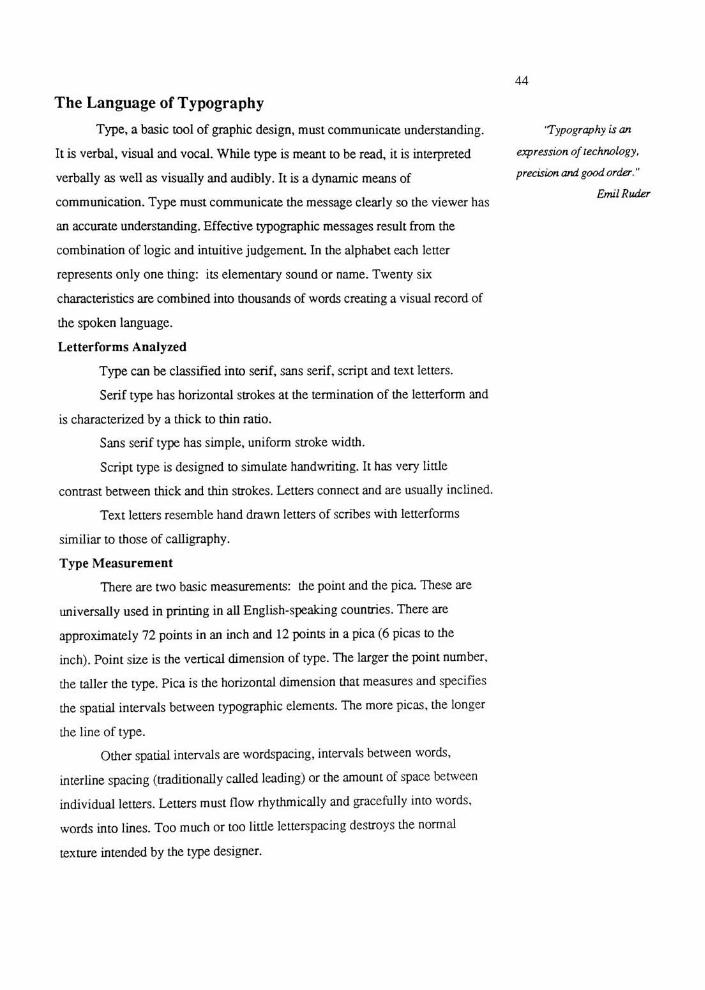
The Language ofTypography
Type, a basic tool of graphic design, must communicate understanding.
It is verbal, visual and vocal. While type is meant to be read, it is interpreted
verbally as well as visually and audibly. It is a dynamic means of
communication. Type must communicate the message clearly so the viewer has
an accurate understanding. Effective typographic messages result from the
combination of logic and intuitive judgement In the alphabet each letter
represents only one thing: its elementary sound or name. Twenty six
characteristics are combined into thousands ofwords creating a visual record of
the spoken language.
Letterforms Analyzed
Type can be classified into serif, sans serif, script and text letters.
Serif type has horizontal strokes at the termination of the letterform and
is characterized by a thick to thin ratio.
Sans serif type has simple, uniform stroke width.
Script type is designed to simulate handwriting. It has very little
contrast between thick and thin strokes. Letters connect and are usually inclined.
Text letters resemble hand drawn letters of scribes with letterforms
similiar to those of calligraphy.
TypeMeasurement
There are two basic measurements: the point and the pica These are
universally used in printing in all English-speaking countries. There are
approximately 72 points in an inch and 12 points in a pica (6 picas to the
inch). Point size is the vertical dimension of type. The larger the point number,
the taller the type. Pica is the horizontal dimension that measures and specifies
the spatial intervals between typographic elements. The more picas, the longer
the line of type.
Other spatial intervals are wordspacing, intervals between words,
interline spacing (traditionally called leading) or theamount of space between
individual letters. Letters must flow rhythmically and gracefully into words,
words into lines. Too much or too little Interspacing destroys the normal
texture intended by the type designer.
'Typography is an
expression of technology,
precision and goodorder."
EmilRuder

45
Type Family
The type family consists of a group of related typefaces unified by
similar design characteristics. Type families consist of three fonts; the regular
roman face, a bolder version and an italic. There may be different weigtht
changes within a type family. Fourweights - light, regular or book, medium
and bold - are sufficient formost uses.
Legibility
Legibility in type is the quality and attribute that make type readable.
The most legible typefaces have three qualities: contrast simplicity and
proportion. Effective type also depends upon the contrast, subtle adjustments of
letterforms and spatial relationships. Letters set in all capitals are harder to read
than upper and lower case letters because upper and lower case irregular shapes
makes it more recognizable. Type that is excessively light ot heavy will
diminish legiblility, however typographers sometimes alter traditional criteria
of legibility for expressive purposes.
Tools of the Graphic Designer
Photography
Photography is of great importance to the graphic designer. Designing
with photographs requires a knowledge of the photographic process as well as
being able to judge a photograph's content in relation to the communication
objectives at hand. The graphic designermust be able to evaluate the design
value and contrast within a photograph. When more than one photograph is
used, the graphic designermust be able to use photographs in combination.
Understanding how photographs work together, how they relate in value and
how their forms will relate when they are positioned next to each other will
help create successful designs.
Photographs used in graphic design are either taken for a specific
assignment and shot to comply with a predetermined layout or they are used
from existing sources. The designer uses the photograph to bring out the
positive aesthetic values already present in the photograph. The graphic designer
must learn to work with photographers, remembering they are also trained
visual communicators.

46
Selection of photographs is based on relevance to the communication
problem, relation to the overall design, and intuitive response to the
photograph. The photograph that holds one's vision on a contact sheet will
probably attract the readers attention on the printed page.
Photographic Effects
There are many special effects that can be created with unusual camera
lenses and darkroom techniques. The following are a few techniques available.
Superimposition is two or more overlapping images created by double
exposure or by a combined printing of more than one negative to create a single
Montage is combining two or more images by printing them separately
andmounting them into a single composition.
Photograms are made by placing objects on a sheet of photographic
sensitized paper and manipulating and exposing it to the light.
Solorization is a method of changing the texture of the printed surface
by amomentary second exposure to light. Adaptations of this process are used
to turn halftone images into values with the tones reduced to a texture in pure
black and white.
Illustration
From the 1930's and the rapid advance of photography, the use of
illustration has changed in design. By the 1970's illustration was moving in
many different directions. Among them, Art Nouveau and the Surrealist
approach to illustration were strong. Designers/illustrators understand the need
for simplicity and unified concept that isessential to modem design. Today they
tie illustration to the overall design considerations of the page.
Graphic Illustration
Graphic illustration responds to the need for design solutions to
informational, technological and scientific problems. It requires understanding
of the intricacies of statistical, tabular and analytical content and
communication of the material in a clear, graphic form. Graphic illustration
requires an unusual degree of general knowledge, sense of logicin problem
solving and strong senseof visual organization.

47
Computer Graphic Design
Science and technology present new problems in graphic design and
allow us to broaden our field ofpictorial language. Computers can be used in
design projects in many different ways. Artists working with computers need
not be systems programmers or experts in mathematics.
Computer graphics techniques can be divided into two-dimensional and
three-dimensional and each has its advantages and limitations.
The computer is a tool. Once the designer has mastered a practical
knowledge of graphic computer capabilities, the computer can serve the designer
with its speed and expanding capabilities.

48
Copy for Poster #5
The Process ofGraphic Design
49
The moment of illumination when an idea surfaces is a rewarding but
difficult part of the design process to understand or explain. This is often
described as creative talent or the capacity to use imagination and discover fresh
or original concepts. Both intellect and feeling are involved in finding solutions
to client problems in graphic design.
An Outline of the Creative Process
There are four generally accepted steps in the creative process: analysis,
incubation, inspiration and verification.
Analysis is easy to understand because this activity is centered in the
deductive or rational part of the mind. It involves, for example, doing research
on a problem.
The term incubation is used to describe a period of dormancy in which
an idea is being formed without the aid of deductive thinking. The inspiration
phase is a direct result of the incubation period. This is where intuition and
rational analysis blend to arrive at a design concept.
Verification is the final test to see if the creative solution is appropriate
to the problem.
Play can also be an important part of the creative process. As seen in
the play of children, the objective and verbal is set aside for the intuitive and
visual.
Production Steps: A Practical Approach
The graphic design process can be simple or complex. It can involve
one choice or multiple choices.
Each problem in design has its unique differences yet certain
commonalities help to structure an attack on a problem. Any problem has an
infinite number of solutions. The greater number of alternatives, the broader the
scope of visual choices will be for the designer.
'The creative process is
notperformed by the skilled
hand alone, or by the
intellect alone, butmust be a
unifiedprocess inwhich
head, heart and handplay a
simultaneousrole."
HerbertBayer
"Graphic designwhich
fulfills aesthetic needs,
complies with the laws of
form and the exigencies of
two-dimensional space;
which speaks in semiotics,
sans serif, and geometries;
which abstracts, transforms,
translates, rotates, dilates,
repeats, mirrors, groups and
regroups is not good design
if it isirrelevant."
PaulRand
AWay to Begin
The first step toward a working solution to theproblem is to define the
needs inherent in the problem and gather pertinent data. Once the problem has
50
been identified and understood then preliminary ideas are the first translation of
research into visual form. Thumbnails are visual ideas on paper; they are quick
ideas. As many thumbnails as possible should be made to get all ideas on
paper. They allow the designer to explore alternative concepts and compare
them quickly with a minimum amount of work.
The next step is to refine a smaller number of thumbnails that show
potential. These are called "roughs". At this point the graphic designer
reevaluates, enlarges and reexamines the thumbnails by testing color, type and
illustraion alternatives.
Comprehensives are final sketches and are the first visual ideas presented
to the client. Once the client has accepted one of the comprehensives, the
process can continue. Otherwise, the designer must go back and repeat the
preceeding steps. The comprehensive is a highly finished mock-up of a printed
piece. The comprehensive might include color indication, transfer type, PMT
stats, etc. The comprehensives should clearly reflect the designer's two or three
best ideas. Simulate the "inuse"
situation wherever possible. For example,
show an ad in a newspaper page.
Once the comprehensive has been approved it must be converted into
black and white art for reproduction. This is called camera ready art or layout or
mechanical art It is extremely precise and carries instructions for printing.
Printing is the final step. This phase must be carefully controlled to
insure fidelity of concept
Being open to chance is important to the creative process. There are two
levels of chance that can influence concept formulation. The first is pure chance
or accident. The second is controlled accident where design sets the stage for
chance. Both can bring about good results in a designers work.
"Before the type can be
determined, the designer
must know how much text
and illustrativemattermust
be accomodated in theprinted
work he has to design
and ofwhat nature it is.He
should have an idea ofwhat
his answer to the problem
should look like overall and
in detail. The designer is
well advised to make his
small scale sketches as
accurate aspossible."
JosefMuller-Brockmann
"Ideas comefrom
anywhere, anything,
anytime, anyplace. Without
a harvest ofvisual
experiences he (the designer)
would be unable to cope
with the plethora of
problems, mundane or
otherwise, that confronts
him in his daily work. Ideas
may also grow out of the
problem itself, which in turn
becomespart ofthe
solution."
PaulRand

51
Bibliography
AIGA Education Committee. "What Should A Basic Graphic Design Education
Encompass?", AIGA, New York, NY, (paper,)
Behrens, Ray R. Design In the Visual Arts. Prentice-Hall Inc.,
Englewood Cliffs, NJ, 1984.
Berryman, Gregg. Notes On Graphic Design And Visual
Communication.William Kayman Inc., Los Altos, CA, 1979.
Blanchard, Russell. Graphic Design. Prentice-Hall Inc. Englewood Cliffs,
NJ, 1981.
Braybrook, Susan, "Cranbrook AtSixty."
Print Magazine XXXIXVI
(November/December 1985): 77-89.
Carter, Rob; Day, Ben; Meggs, Philip. Typographic Design: Form And
Communication. Van Nostrand Reinhold Co., NY, 1985.
Cheatham, Frank; Cheatham, Jane; Haler, Sheryl. Design Concepts And
Applications. Prentice-Hall Inc., Englewood Cliffs, NJ, 1983.
Coyne, Dick, "Koppel &Scher."
Communication Arts Vo.28, No.2
(May/June 1986): 42-51.
Craig, James. DesigningWith Type. Watson-Guptill Publications,
NY,1980.
Friedman, Mildred, editor. DeStijl 1917-1931: Visions ofUtopia.
Abbeville Press, NY, 1982.

52
Hamilton, Edward A. Graphic Design For The Computer Age. Van
Nostrand Reinhold Co., NY, 1970.
Heyenck, Sharon. "The Graphic Design Career Kit". M.F.A. thesis, Rochester
Institute of Technology, Rochester, NY, 1981.
Hogben, Lancelot From Cave Painting To The Computer Age.
Chanticleer Press, NY, 1949.
Hurlburt, Alan. Layout: The Design OfThe Printed Page.
Watson-Guptill Publishers NY, 1970.
Hurlburt, Alan. The Design Concept.Watson-Guptill Publishers, NY,
1981.
Kerlow, Isaac Victor, "ComputerGraphics."
HowMagazine Vol. 1, No.3
(March/April 1986): 64-69.
Maier, Manfred. Basic Principles OfDesign. Van Nostrand Reinhold,
Co., NY, 1980.
Meggs, Philip. A History OfGraphic Design. Van Nostrand Reinhold
Co., NY, 1983.
Muller-Brockmann, Josef. A History Of Visual Communication.Visual
Communication Books, Hasting House Publications, NY, 1971.
Muller-Brockmann, Josef. Grid Systems. Visual Communication Books,
Hasting House Publications, NY, 1981.
Rand, Paul. Paul Rand: A Designers Art. Yale University Press, New
Haven CONN, 1985.
53
Richardson,Margaret, "Manhattan OnRecord."
HowMagazine Vol.1, No.
6 (September/October 1986): 20-29.
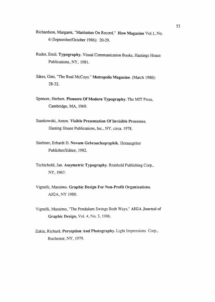
Ruder, Emil. Typography. Visual Communication Books, Hastings House
Publications, NY, 1981.
Sikes, Gini, "The RealMcCoys."
Metropolis Magazine. (March 1986):
28-32.
Spencer, Herbert. Pioneers OfModern Typography. The MTT Press,
Cambridge, MA, 1969.
Stankowski, Anton. Visible Presentation Of Invisible Processes.
Hasting House Publications, Inc., NY, circa. 1978.
Stiebner, Erhardt D. Novum Gebrauchsqraphik. Herausgeber
Publisher/Editor, 1982.
Tschichold, Jan. Assymetric Typography. Reinhold Publishing Corp.,
NY, 1967.
Vignelli, Massimo. Graphic Design For Non-Profit Organizations.
AIGA, NY 1980.
Vignelli, Massimo, "The Pendulum Swings BothWays."
AIGA Journal of
Graphic Design, Vol. 4, No. 3, 1986.
Zakia, Richard. Perception And Photography. Light Impressions Corp.,
Rochester, NY, 1979.

54
Appendices

55
Grid
Tonal Studies
"'tt^tir

57

Framework
58
Ji-fl
&^l"f
1-kyCu.
A fz
a.-rre. I
$i*Aj.t -h&i*-
OZ]| 1
HI
Rss-n
iw.T*. Z--1.
1 iiCCL
FA"
1 1
\ ; fl'i
'
cerz ll i ;l_
M II .=
~rJ '-""^
;...-.. ,,^.( .

Preliminary Sketches
59
p--
0-
60
Roughs

61
^Tracing theHistory ofGraphic Design
/s St
"HI f5E
f *fc=-i C=r 1 1 -
_.
Jj=U 1===; 21--'
WS S=- Jt-. -
XSrsr- YI-
JI-. _
^m
1
SfBBBS4BS

62
r\ rganizational andPerceptual Principles
63
^Typography/Tools ofGraphicDesign

K, '. -,vj . binro* a
'he Creative Process
t M-Vt r. XI .: I '.OI .n U/71 -rt fir
64
R*>
tike

65
The Process ofGraphic Design
comtwii 10 fieioimm poci Itgumooioaut ermi
Ur tirun* M nunim vimim. Quirroifajd iifi^ii
El hlnjrTM] liftud flcihl III Bf fMMOU <MlincL
icnm c-Utratcct^nM^i ..-..uuji fen
ermwi uvuuiun far (tmoMmv h In moaj*mo*i *i ruxrr nan,,!tv&r*\iMi>t,A timia
KW.aiWW. ,,. ,1 .:., , WIM
-,10..tW,,lnlo,r
KHUU noon tligtnl OBI-1 eongulMM ii <moM,i
rw.guud CUDWIH qui) lull. Mud wn umo.nl
'^.r^!^t^^^'m'*,!,^

The Process of
Graphic Design
66
R2
6
O'lf* A
M0THER
:<

67
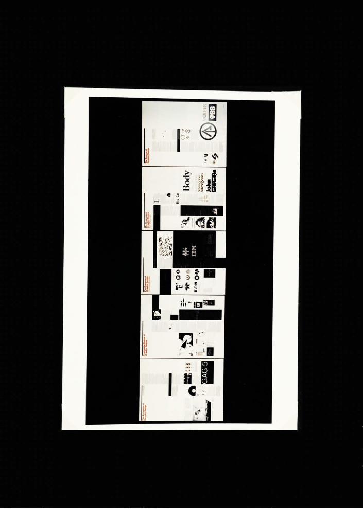
Final Posters
The Profession of
GraphicDesignSrfitci Tft* 1'*on>c *BVOi '.
vj*>iWioqI imiMOffflMmi
is-iio"> 0fo/*<muti pn..ni
| sxr |
CABLE
Wilde
>>uiiScnn
GAG 5

68
Tracing the History ofGraphic Design
11/ I *t
**7 E> lT> aa
E> E> I
K+

69
TheGrammar of
Graphic Design:Organizational Principles
^O
w W
F.T-N Q #3
1V
mu s i caV
a
11
5="
^i^&.-

TheGrammar of
Graphic Design:Tools & Typography
70
S
fl
Bb Cc
18 Point
24 Point
30 Point
Point
42 Point
Bodyblaomingdole's
blGDmingdole's
btomingclQle's
John

71
The Process of
Graphic Design
M0THER