Regionalism in Graphic Design
274
Running Header: REGIONALISM IN GRAPHIC DESIGN 1 Regionalism in Graphic Design A Case Study in Event Design: the 2010 International Viola Congress A thesis submitted to the Division of Research and Advanced Studies of the University of Cincinnati in partial fulfillment of the requirements for the degree of Master of Design in the School of Design of the College of Design, Architecture, Art, and Planning 2013 by Darrin Scott Hunter B.Arch., University of Cincinnati, 1997 Committee: J. A. Chewning (Chair, DAAP), Catharine Carroll (CCM)
-
Upload
independent -
Category
Documents
-
view
1 -
download
0
Transcript of Regionalism in Graphic Design

Running Header: REGIONALISM IN GRAPHIC DESIGN 1
Regionalism in Graphic Design
A Case Study in Event Design: the 2010 International Viola Congress
A thesis submitted to the
Division of Research and Advanced Studies
of the University of Cincinnati
in partial fulfillment of the
requirements for the degree of
Master of Design
in the School of Design
of the College of Design, Architecture, Art, and Planning
2013
by
Darrin Scott Hunter
B.Arch., University of Cincinnati, 1997
Committee: J. A. Chewning (Chair, DAAP), Catharine Carroll (CCM)

REGIONALISM IN GRAPHIC DESIGN 2
Abstract
Regionalism arose in the 1980s as a design theory meant to address growing discomfort
with perceived placelessness and lack of identity in modernist and postmodernist architecture.
The modernist movement’s original ideals were to create environments that improved the
quality of life for everyone using universal design principles which could ostensibly be employed
anywhere with equal success. But many theorists have rightly pointed to the modernist project’s
failure to create such universal places that are also affordable, humane, and relevant to local
cultures. It is a question, in the words of French philosopher Paul Ricoeur, of “how to become
modern and to return to sources; how to revive an old, dormant civilization and take part in
universal civilization.” Even though a great deal of inquiry from various writers and
practitioners benefits the field of architecture, almost nothing has been written about how to
promote regionalism as a basis for resistant critical practice for visual communicators. In short,
there is no theory of regionalism for graphic designers.
This research attempts to lay modest groundwork for regionalist practice in graphic
design, including discussion of a specific case study: the design of event graphics for the 2010
International Viola Congress held at the University of Cincinnati. Graphic design at first appears
to be resistant to such ideas, given that its lifeblood tends to be the visual planning of mass
distributed and increasingly digital media products for companies who carefully cultivate
universally extensible and placeless “brand space” that is indifferent to geographic and cultural
barriers. What is needed to formulate a critical regionalist practice are ways for graphic design
to be rooted in a specific place (“sited”) while still harnessing the power of mass
communications and serving client needs.
REGIONALISM IN GRAPHIC DESIGN 3
Copyright © 2013 Darrin Scott Hunter. All rights reserved.

REGIONALISM IN GRAPHIC DESIGN 4
Acknowledgments
I would like to thank all the faculty members at the University of Cincinnati who
helped to shape and guide my graduate studies, foremost my thesis committee: J.
Chewning as chair from DAAP’s School of Design along with Catharine Carroll,
professor of viola at CCM. J’s mentorship to myself and all the graduate students
through his seminars was invaluable, and this thesis project would never have happened
without Catharine’s trust in my undertaking such a large design project for CCM single-
handedly.
I was also lucky to participate as an assistant in grant-funded research projects
with Brian Davies, Valerie Kremer, and Ericka Hedgecock in areas directly related to my
interests—a pleasure and rare luxury for a graduate student. I thank Dennis Puhalla for
lending wise ears and eyes through numerous long, waxing, and philosophical
discussions about design (and for publishing the IVC cover!) Thanks to Kristin Cullen
for her perky chats and brilliant typography instruction (I still want to be a roadie on the
Design Is Pretty Tour), and to Robert Probst for our summer of fun with Abraham. And
finally, thanks to my partner, Roger, for great company on the long journey.
REGIONALISM IN GRAPHIC DESIGN 5
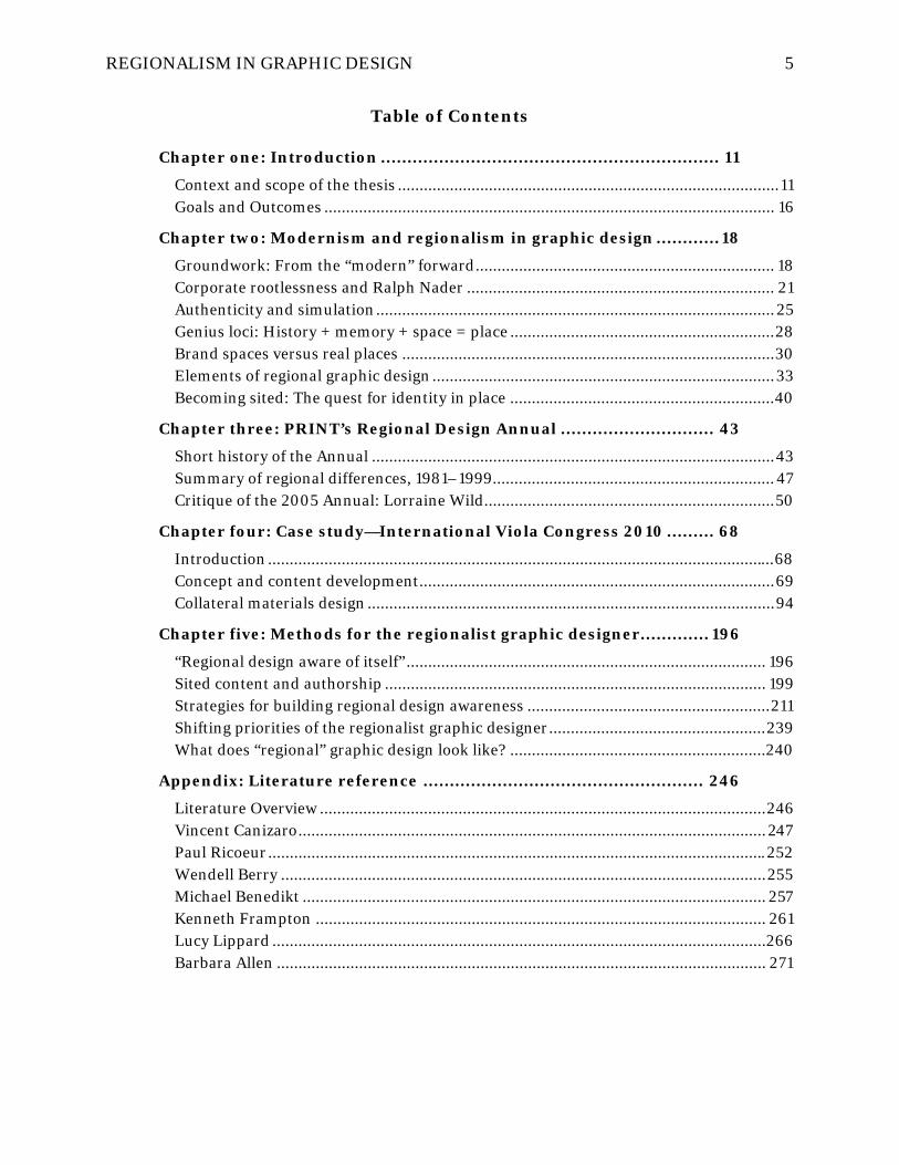
Table of Contents
Chapter one: Introduction ................................................................ 11
Context and scope of the thesis ........................................................................................ 11 Goals and Outcomes ........................................................................................................ 16
Chapter two: Modernism and regionalism in graphic design ............ 18
Groundwork: From the “modern” forward ..................................................................... 18 Corporate rootlessness and Ralph Nader ....................................................................... 21 Authenticity and simulation ............................................................................................ 25 Genius loci: History + memory + space = place ............................................................. 28 Brand spaces versus real places ...................................................................................... 30 Elements of regional graphic design ............................................................................... 33 Becoming sited: The quest for identity in place ............................................................. 40
Chapter three: PRINT’s Regional Design Annual ............................. 43
Short history of the Annual ............................................................................................. 43 Summary of regional differences, 1981–1999................................................................. 47 Critique of the 2005 Annual: Lorraine Wild ................................................................... 50
Chapter four: Case study—International Viola Congress 2010 ......... 68
Introduction ..................................................................................................................... 68 Concept and content development .................................................................................. 69 Collateral materials design .............................................................................................. 94
Chapter five: Methods for the regionalist graphic designer ............. 196
“Regional design aware of itself” ................................................................................... 196 Sited content and authorship ........................................................................................ 199 Strategies for building regional design awareness ........................................................ 211 Shifting priorities of the regionalist graphic designer .................................................. 239 What does “regional” graphic design look like? ........................................................... 240
Appendix: Literature reference ..................................................... 246
Literature Overview ....................................................................................................... 246 Vincent Canizaro ............................................................................................................ 247 Paul Ricoeur ................................................................................................................... 252 Wendell Berry ................................................................................................................ 255 Michael Benedikt ........................................................................................................... 257 Kenneth Frampton ........................................................................................................ 261 Lucy Lippard .................................................................................................................. 266 Barbara Allen ................................................................................................................. 271

REGIONALISM IN GRAPHIC DESIGN 6
List of figures
Figure 1: Aerial view of Paris .................................................................................................................................. 35 Figure 2: Similar balcony railings geo-located throughout Paris ..........................................................................36 Figure 3: Similar balcony across cities eliminates it as a distinctly ‘regional’ detail ............................................. 37 Figure 4: PRINT magazine Regional Design Annual covers, 1996-2006 ..............................................................43 Figure 5: First PRINT RDA cover, 1981 ................................................................................................................. 44 Figure 6: PRINT RDA 1981, Midwest - Minnesota ............................................................................................... 46 Figure 7: PRINT Regional Design Annual 2005, Minnesota ................................................................................. 52 Figure 8: PRINT Regional Design Annual 2005, Wisconsin ................................................................................. 54 Figure 9: CCM village at night, site of IVC 2010 ................................................................................................... 69 Figure 10: Cincinnati Bengals football stadium ..................................................................................................... 71 Figure 11: Rome’s Coliseum .................................................................................................................................... 71 Figure 12: CCM’s skylight ‘oculis’ ........................................................................................................................... 72 Figure 13: Rome’s Pantheon with oculis ................................................................................................................ 72 Figure 14: CCM’s new plaza grand stair ................................................................................................................. 73 Figure 15: Rome’s Campidoglio .............................................................................................................................. 73 Figure 16: CCM - old and new literally connected .................................................................................................. 75 Figure 17: CCM plaza above substructure parking ................................................................................................. 76 Figure 18: CCM village in UC campus context ....................................................................................................... 77 Figure 19: CCM Werner Recital Hall lobby ............................................................................................................ 78 Figure 20: CCM Alumni Garden ............................................................................................................................. 78 Figure 21: Old reflected in new outside Mary Emery Hall ..................................................................................... 79 Figure 22: Old framed by the new above Werner Hall ........................................................................................... 79 Figure 23: Werner Recital Hall interior ................................................................................................................ 80 Figure 24: CCM auditorium / classroom ............................................................................................................... 80 Figure 25: Main Corbett Auditorium interior ....................................................................................................... 80 Figure 26: Corbett Auditorium lobby .................................................................................................................... 80 Figure 27: “Classical” CCM buildings to house “Classical” music .......................................................................... 81 Figure 28: Pediment ornament, Dieterle Vocal Arts Center ................................................................................. 82 Figure 29: Entrance ornament, Dieterle Vocal Arts Center .................................................................................. 82 Figure 30: Ornament, Memorial Hall ................................................................................................................... 82 Figure 31: Gargoyle, Memorial Hall ...................................................................................................................... 82 Figure 32: Janus – old & young ............................................................................................................................. 84 Figure 33: Arch of Janus, Rome ............................................................................................................................ 84 Figure 34: Janus coin ............................................................................................................................................. 86 Figure 35: Janus, both bearded ............................................................................................................................. 86 Figure 36: Traditional conception of white antiquity against the reconstructed painted reality .......................... 87 Figure 37: Classical column and entablature as reconstructed in color ............................................................... 88 Figure 38: Sculpture with paint remnants intact .................................................................................................. 89

REGIONALISM IN GRAPHIC DESIGN 7
Figure 39: Boy’s face reconstructed in color ......................................................................................................... 89 Figure 40: Decorative tablet showing vase before and after color reconstruction ............................................... 89 Figure 41: Roman wall mosaic ............................................................................................................................... 92 Figure 42: Cincinnati Union Terminal mosaic detail ............................................................................................ 92 Figure 43: Roman floor mosaic ............................................................................................................................. 92 Figure 44: modern Rookwood tilework ................................................................................................................. 92 Figure 45: Charlie Harper’s Peck Federal Building animal mosaic in downtown Cincinnati ...............................93 Figure 46: Harper mosaic detail 1 ..........................................................................................................................93 Figure 47: Harper mosaic detail 2 ..........................................................................................................................93 Figure 48: Union Terminal brilliant polychrome interior with vast Art Deco glass mosaics ............................... 94 Figure 49: Janus arch, coins, bust, and graphic translation .................................................................................. 95 Figure 50: Janus icons, Janus phases - metaphorical ‘mythology’ ....................................................................... 96 Figure 51: Janus typography new / old constructions ........................................................................................... 97 Figure 52: IVC Mark – String instrument F-holes ................................................................................................ 99 Figure 53: IVC mark construction ........................................................................................................................ 101 Figure 54: IVC ‘secondary architecture’ assets and primary mark crop fragments ............................................. 102 Figure 55: IVC primary mark with polychrome treatment .................................................................................. 103 Figure 56: UC website showing red/black and “swoop” theme ........................................................................... 105 Figure 57: The UC Branding Standards manual .................................................................................................. 106 Figure 58: IVC stationery as reinterpreted UC brand identity without direct reference ..................................... 107 Figure 59: IVC color palette .................................................................................................................................. 109 Figure 60: View of Cincinnati’s Over-the-Rhine district looking toward UC’s campus atop Clifton hill ............ 110 Figure 61: Findlay Market’s polychrome palette ................................................................................................... 111 Figure 62: Victorian townhouses in Over-the-Rhine ........................................................................................... 112 Figure 63: Union Terminal lobby showing polychrome “sun” ............................................................................. 112 Figure 64: IVC website Artists duotone mosaic ................................................................................................... 113 Figure 65: IVC poster typographic color .............................................................................................................. 113 Figure 66: IVC poster polychrome type ................................................................................................................ 114 Figure 67: IVC poster polychrome mark with UC logo ........................................................................................ 114 Figure 68: IVC program book polychrome mark ................................................................................................. 114 Figure 69: Didot specimen, H&FJ – New York .................................................................................................... 116 Figure 70: Gotham specimen, H&FJ – New York ................................................................................................. 117 Figure 71: Alright Sans specimen, Okay Type ...................................................................................................... 118 Figure 72: Sentinel specimen, H&FJ – New York ................................................................................................ 119 Figure 73: Didot uses multiple optical sizes to keep hairlines thin at any point size .......................................... 121 Figure 74: Didot specimen setting IVC-specific text content ............................................................................... 122 Figure 75: Didot, developed by H&FJ for the redesign of Harper’s Bazaar ......................................................... 123 Figure 76: Didot on the covers of Bazaar & Vogue in Japan, UK, Spanish & Turkish versions .......................... 124 Figure 77: Didot in historic editions and modern musical scores ........................................................................ 125 Figure 78: 1811 example of Didot in use ............................................................................................................... 126
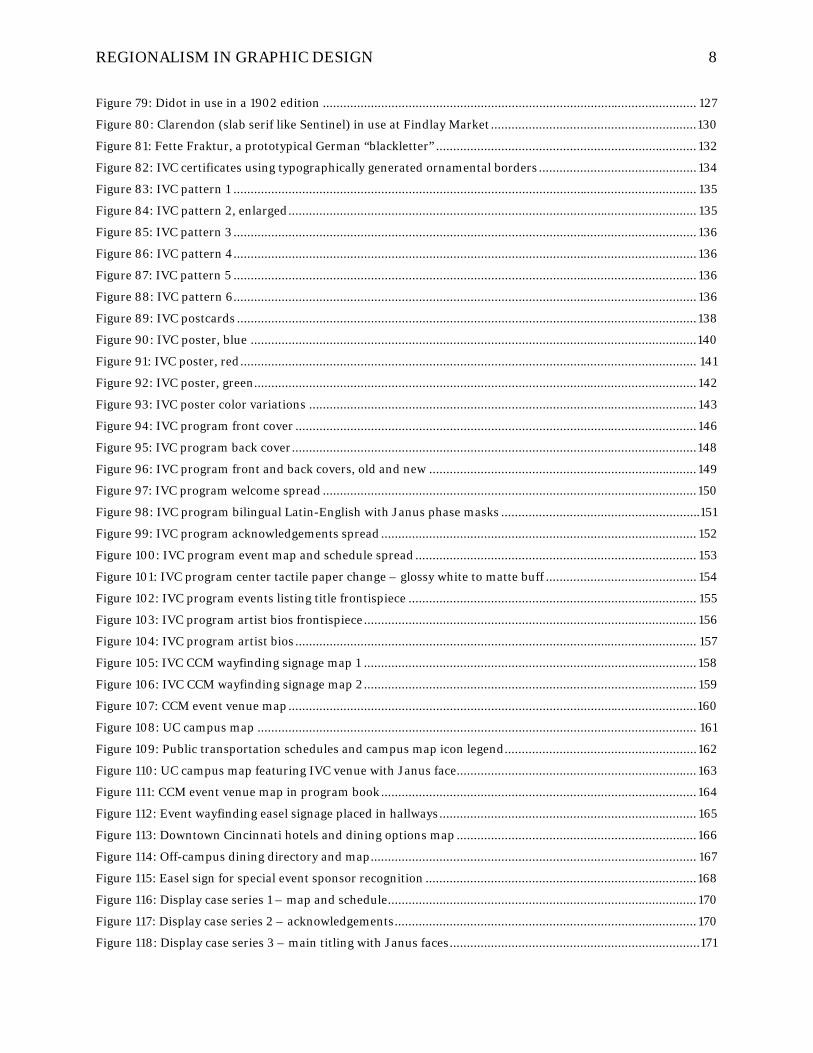
REGIONALISM IN GRAPHIC DESIGN 8
Figure 79: Didot in use in a 1902 edition ............................................................................................................. 127 Figure 80: Clarendon (slab serif like Sentinel) in use at Findlay Market ............................................................ 130 Figure 81: Fette Fraktur, a prototypical German “blackletter” ............................................................................ 132 Figure 82: IVC certificates using typographically generated ornamental borders .............................................. 134 Figure 83: IVC pattern 1 ....................................................................................................................................... 135 Figure 84: IVC pattern 2, enlarged ....................................................................................................................... 135 Figure 85: IVC pattern 3 ....................................................................................................................................... 136 Figure 86: IVC pattern 4 ....................................................................................................................................... 136 Figure 87: IVC pattern 5 ....................................................................................................................................... 136 Figure 88: IVC pattern 6 ....................................................................................................................................... 136 Figure 89: IVC postcards ...................................................................................................................................... 138 Figure 90: IVC poster, blue .................................................................................................................................. 140 Figure 91: IVC poster, red ..................................................................................................................................... 141 Figure 92: IVC poster, green ................................................................................................................................. 142 Figure 93: IVC poster color variations ................................................................................................................. 143 Figure 94: IVC program front cover ..................................................................................................................... 146 Figure 95: IVC program back cover ...................................................................................................................... 148 Figure 96: IVC program front and back covers, old and new .............................................................................. 149 Figure 97: IVC program welcome spread ............................................................................................................. 150 Figure 98: IVC program bilingual Latin-English with Janus phase masks ..........................................................151 Figure 99: IVC program acknowledgements spread ............................................................................................ 152 Figure 100: IVC program event map and schedule spread .................................................................................. 153 Figure 101: IVC program center tactile paper change – glossy white to matte buff ............................................ 154 Figure 102: IVC program events listing title frontispiece .................................................................................... 155 Figure 103: IVC program artist bios frontispiece ................................................................................................. 156 Figure 104: IVC program artist bios ..................................................................................................................... 157 Figure 105: IVC CCM wayfinding signage map 1 ................................................................................................. 158 Figure 106: IVC CCM wayfinding signage map 2 ................................................................................................. 159 Figure 107: CCM event venue map ....................................................................................................................... 160 Figure 108: UC campus map ................................................................................................................................ 161 Figure 109: Public transportation schedules and campus map icon legend ........................................................ 162 Figure 110: UC campus map featuring IVC venue with Janus face...................................................................... 163 Figure 111: CCM event venue map in program book ............................................................................................ 164 Figure 112: Event wayfinding easel signage placed in hallways ........................................................................... 165 Figure 113: Downtown Cincinnati hotels and dining options map ...................................................................... 166 Figure 114: Off-campus dining directory and map ............................................................................................... 167 Figure 115: Easel sign for special event sponsor recognition ............................................................................... 168 Figure 116: Display case series 1 – map and schedule .......................................................................................... 170 Figure 117: Display case series 2 – acknowledgements ........................................................................................ 170 Figure 118: Display case series 3 – main titling with Janus faces ......................................................................... 171

REGIONALISM IN GRAPHIC DESIGN 9
Figure 119; Display case series 1 installed ............................................................................................................. 171 Figure 120: Display case series 2 installed ........................................................................................................... 172 Figure 121: Display case series 3 installed, showing all three sets ....................................................................... 172 Figure 122: UC Event Services staff at IVC registration ....................................................................................... 174 Figure 123: IVC merchandise and nametags ........................................................................................................ 174 Figure 124: IVC event tickets and postcards ........................................................................................................ 175 Figure 125: IVC event tickets ................................................................................................................................ 176 Figure 126: IVC concert programs, tickets, and musician rosters ....................................................................... 177 Figure 127: IVC recording list, certificates, and table cards ................................................................................. 178 Figure 128: IVC website home page, full .............................................................................................................. 180 Figure 129: IVC website home page, enlarged ..................................................................................................... 181 Figure 130: IVC website home page feature article headers ................................................................................ 182 Figure 131: IVC website polychrome article header system ................................................................................. 183 Figure 132: IVC website banner ads for sponsors ................................................................................................ 184 Figure 133: IVC video page, full ............................................................................................................................ 185 Figure 134: IVC artist bios, full ............................................................................................................................. 185 Figure 135: Blogging team training ...................................................................................................................... 187 Figure 136: Blogging team up and running .......................................................................................................... 187 Figure 137: IVC mobile web poster ....................................................................................................................... 187 Figure 138: IVC native mobile web menu system ................................................................................................ 187 Figure 139: IVC website blog articles ................................................................................................................... 189 Figure 140: Masao Kawasaki and Catharine Carroll open the IVC 2010 ............................................................. 191 Figure 141: Dieterle Vocal Arts Center is transformed into exhibition hall ......................................................... 191 Figure 142: The crowd begins to fill the auditorium for a gala recital ................................................................. 191 Figure 143: Roberto Diaz plays demo excerpts on many viola maker’s instruments for an audience ................ 192 Figure 144: Luthiers’ wares on display ................................................................................................................. 192 Figure 145: Discussing proper posture ................................................................................................................. 192 Figure 146: Onlookers watch a master class......................................................................................................... 193 Figure 147: Student workshop on bowing technique ........................................................................................... 193 Figure 148: A lecture / workshop session gets participants involved .................................................................. 194 Figure 149: A roundtable discussion session ....................................................................................................... 194 Figure 150: An accompanied master class ........................................................................................................... 195 Figure 151: The IVC gala banquet ......................................................................................................................... 195 Figure 152: World-class performers filled the IVC roster .................................................................................... 195 Figure 153: Tadanori Yokoo - Japan ..................................................................................................................... 196 Figure 154: Itu Chaudhuri - India ......................................................................................................................... 199 Figure 155: Saki Mafundikwa - Zimbabwe ........................................................................................................... 201 Figure 156: Majid Abbasi - Iran ........................................................................................................................... 202 Figure 157: Memed Erdener - Turkey .................................................................................................................. 204 Figure 158: Segun Olude - Nigeria....................................................................................................................... 206

REGIONALISM IN GRAPHIC DESIGN 10
Figure 159: U.G. Sato - Japan .............................................................................................................................. 206 Figure 160: Frank Lloyd Wright – Falling Water ................................................................................................ 207 Figure 161: LeCorbusier - Villa Savoye ................................................................................................................ 207 Figure 162:Paula Scher - Bring In ‘Da Noise ....................................................................................................... 208 Figure 163: Josef Müller-Brockmann – Beethoven poster ................................................................................. 208 Figure 164: Colorist, cover .................................................................................................................................... 211 Figure 165: Colorist, color matrix ......................................................................................................................... 212 Figure 166: Colorist, color preference types ......................................................................................................... 213 Figure 167: Colorist, checklist of color skills ........................................................................................................ 214 Figure 168: Colorist, regional colors, deep ........................................................................................................... 215 Figure 169: Colorist, building materials ............................................................................................................... 216 Figure 170: Colorist, naturals ............................................................................................................................... 217 Figure 171: Colorist, greens ................................................................................................................................... 218 Figure 172: Colorist, blues .................................................................................................................................... 219 Figure 173: Colorist, white ................................................................................................................................... 220 Figure 174: Colorist, Black .................................................................................................................................... 221 Figure 175: Colorist, methodology for researching and recording local color .................................................... 222 Figure 176: Colorist, city color surveys 1 ............................................................................................................. 223 Figure 177: Colorist, city color surveys 2 ............................................................................................................. 224 Figure 178: Colorist, city identity in color ............................................................................................................ 225 Figure 179: National type quiz: guess the country of origin for these 2012 fonts ................................................ 231 Figure 180: Answers to national type quiz .......................................................................................................... 232 Figure 181: Spatial Sync Chart, overall view ......................................................................................................... 237 Figure 182: Spatial sync graph view .................................................................................................................... 238 Figure 183: Spatial sync sparklines ..................................................................................................................... 239 Figure 184: The shifting priorities of regionalist versus modernist design ........................................................ 240

REGIONALISM IN GRAPHIC DESIGN 11
Chapter one: Introduction
Context and scope of the thesis
This thesis investigation arose from a design opportunity that came to me in late
2008 through a contact at the University of Cincinnati’s College-Conservatory of Music
(CCM). I had previously designed a number of small graphic projects for CCM, and the
school was planning an international music conference for the summer of 2010, the
International Viola Congress (IVC). I was only told that they needed a graphic designer
to help with the promotions and event program book. Soon, I met with Catharine
Carroll, professor of viola, and her graduate assistant, Dominic DeStefano, who were
planning the event, and came to discover the true scale of the undertaking. It was going
to be a large international music conference with hundreds of attendees and nearly a
hundred world-famous guest artists from across the globe! I realized they would need a
lot more than a poster and program to pull it off, and I probably should have started
rallying design support from trepidation at that point.
But, as the discussions progressed, it became clear that their budget would not
allow for the kind of design team effort such an event would require if produced outside
of an academic environment. And, the challenge turned out to be uniquely suited to my
background. I was originally trained as an architect at the University of Cincinnati’s
College of Design, Architecture, Art, and Planning (DAAP), and I had recently
completed nearly all of the coursework for the Master of Design program (focusing on
environmental graphics) in the same college ten years after graduating architecture
school. Before architecture school, I had studied piano at the University of Akron
following a musical training throughout my childhood in piano and French Horn.
Having this understanding of music, training in graphic design, and a sensitivity to the

REGIONALISM IN GRAPHIC DESIGN 12
architectural site of the upcoming conference all felt like signs that I should get involved.
I saw clearly that the power of design could help to organize and transform the event,
and it seemed a shame to let typical event planning, budget, and resource issues prevent
CCM from realizing the potential of such a great roster of visiting scholars and
musicians. Besides, Catharine was also kind (or naïve) enough to put her trust in me to
help them single-handedly. So, I decided to offer my help in full and throw caution to
the wind, regardless of the work involved.
Throughout our graduate school seminar program, J Chewning (my thesis
committee chair) focused our readings and discussions less on aesthetic concerns
usually emphasized in undergraduate design training and more on design’s role in the
emerging digitally connected and globalized culture. We wrote peer-reviewed essays and
enjoyed long roundtable debates about provocative readings that outlined the
responsibilities and challenges designers now face in a globalized economy and
increasingly flattened social landscape. It was exactly what I needed after ten years of
fruitful but rather deadening corporate design work at a large architecture-engineering
firm to refill my tanks, broaden my perspective, and help me to develop a framework for
my own critical design practice.
It struck me immediately that the IVC 2010 event drew together many of these
design issues on a site perfectly suited as a backdrop to the theoretical debate about
globalism and modernity. Not only did the event focus on the viola—often neglected as a
second sister to the more glamorous violin—and the current state of classical music, but
the architecture of the CCM village campus had recently been overhauled by the major
international architectural design firm of Pei, Cobb, Freed. Their design faced the
conundrum of blending traditional with modern building head-on by renovating two

REGIONALISM IN GRAPHIC DESIGN 13
existing neo-classical and neo-gothic structures, constructing a new modern main hall,
and stitching them all together with a unified substructure parking deck that created a
common outdoor circular plaza on top. Add to this stage a mixture of regional and
national music students (mostly from the Midwest) and a group of musical stars of
international repute traveling from four continents to discuss the current state of the
centuries-old Western musical tradition, and the content and themes of the conference
practically started to design themselves!
It was only long after the conference had completed that I realized it would make
a strong case study to revisit critically for insights into the position of “regionalism” and
“sited” visual communications within graphic design practice. The concept has barely
made a dent in the profession as a whole, and almost nothing has been written about it
in a sustained or cohesive way beyond occasional references to regional work in design
periodicals (case in point: the Regional Design Annual issue of PRINT magazine). Given
my background, I once again felt that I could make a contribution by simply attempting
to port over to graphic design even a small amount of the theoretical groundwork
already laid down by many writers and designers in urban planning and architecture
over the last fifty years. It is surprising to me that there has been to date so little
crossover of these ideas into other design disciplines, given the enormous mass of
debate and writing in the environmental design disciplines.
If this investigation only begins to illuminate how graphic designers might
incorporate regional sensitivities into their work in a contemporary and considered
way, I would call it a success. The full scope of such “translational” research (a term
used more precisely by the hard sciences, particularly medicine, in bringing “basic”
research to market in usable products or processes) is far beyond what I could hope to

REGIONALISM IN GRAPHIC DESIGN 14
accomplish with one thesis, in fact, far beyond what one person could do with an entire
career. It would take a full-fledged movement to germinate regional ideas within graphic
design. But I believe the broader framework of ideas that regionalism offers could prove
immensely useful in guiding the profession through the emerging maze of globalized
economic and social forces to which it has become an alternating dependent, lover,
captive, promoter, observer, reveler, enabler, and critic.
Finally, in part, this is a personal exploration for me (I know—a cliché among
thesis documents) into why I’ve stayed where I am for so long. I remember my senior
year of architecture school when thoughts were turning to life after graduation, and
professors were imparting last thoughts and advice before christening us into
professional practice. After hearing that I had accepted a job offer from a large
architecture/engineering firm here in Cincinnati, two of them came to me separately
and said outright that they thought it was a mistake. They felt I needed to go to a big-
name design firm in a style center like New York with a ‘signature’ design lead partner
where “good” design was being done in order to further my career. I took it for the
compliment it was at the time, the assumed implication being that they thought I had
enough potential as a designer that it would be wasted on such a provincial job and city
as the one I accepted in Cincinnati.
I continued in that job for a decade, admittedly about five years longer than I
probably should have for various reasons in hindsight, and then returned to graduate
school at the same college of UC-DAAP, albeit in another school within the college
(which might as well have been another planet with entirely different faculty voices and
positions about design.) And then I taught at the same school for five years in various
capacities, still living in the very same apartment downtown whose lease I took over
REGIONALISM IN GRAPHIC DESIGN 15
from my best friend in undergraduate school fifteen years earlier. As of this writing, I’m
still there, still in Cincinnati, still designing, still learning and discovering areas I want
to explore, but never once finding enough temptation to pack up and leave town like I
did so many times as an itinerant architectural co-op student (Boston, Nashville,
Atlanta, Cincinnati…all within the six-year program).
I’ve tried to think about why this is: perhaps I am just a homebody and content
with life wherever it finds me, or just too humble and lazy to change. Indeed, I’ve never
felt compelled to uproot for a bigger city in order to work. I’ve always felt I could do
good design work from wherever I please, that it’s not the place that makes the design,
but the designer. Upon further reflection, I think that’s wrong, in part. Place does
matter, but not for the reasons those two professors seemed to believe. I think their
comments were very in line with standard views about living away from the major
cultural centers that seem to shine outward from themselves some sort of inferiority
complex laser beam that strikes outliers and paradoxically gets stronger with distance
until overwhelmed by the influence of the same laser beams radiating from the next
cultural center. It’s an entirely imaginary net of feeling bad about ourselves for not being
ambitious enough to flock somewhere like the Big Apple since “we can make it
anywhere” later, if we survive.
Instead, I’m beginning to awaken to the possibility that I’m simply a designer
who sees value in remaining grounded in a specific environment and finding a source of
not only comfort, but also power in gaining detailed knowledge of life in the place where
I am. The rootlessness that comes from the remarkable mobility of which Americans are
capable is something I’ve assiduously avoided, and I’m starting to think it’s something of
a kryptonite against good design. I have long held a joke about my love-hate (and

REGIONALISM IN GRAPHIC DESIGN 16
sometimes hate-hate) relationship with Cincinnati that says it is the city where
“ambition comes to die, but turns into comfort.” On first glance, that seems harsh, but at
least there’s comfort involved! I still believe the statement holds true, but I don’t
necessarily think it’s merely a backhanded compliment anymore.
I think in most cases, ambition should die. Frankly, I have always held an active
disdain for those who willingly display their ambition since it’s been my experience that
they are usually prideful and vainglorious people who are oblivious to the consequences
for others of being so driven. Ambition is one of those words, like “pride,” whose once
negative meaning has become positive through connotation (don’t we tell all kids in
school they should be “proud” of themselves, if only to inure them to the dreadful global
competition they face?) We need to take that language back and restore some humanist
values in order to face cultural challenges like our current fetish-obsession with personal
gadget technology and maintain some balance between what is real and what will always
remain simulated. And I think regionalism just might help.
Goals and Outcomes
I undertake this writing in the hopes that I’m right about my hunch that
regionalism holds promise for graphic design practice (and life in general in post-
Facebook America). A major goal is simply to draw from sources outside of visual
communications (architecture, planning, art criticism, and philosophy) and provide
some theoretical groundwork for a regionalist mode of practice in graphic design. For
that to occur, there need to be new connections and vocabulary between visual and
environmental design disciplines to better foster collaborative work with common
cultural goals. If nothing else, I hope I can provoke discussion among designers about

REGIONALISM IN GRAPHIC DESIGN 17
“sited” design and ultimately give them tools which promote sensitivity to place and
regional values and which help them to project an authentic voice.

REGIONALISM IN GRAPHIC DESIGN 18
Chapter two: Modernism and regionalism in graphic design
Groundwork: From the “modern” forward
Regardless of discipline, every graduate of an American or European design
school must at some level come to terms with their cultural inheritance from the
modern movement. It simply can’t be ignored, if only because it has been the dominant
theoretical framework around which design education and critique have been conducted
for nearly a century. In a revealing and pertinent interview granted to the Creators
Project by contemporary graphic designer Stefan Sagmeister, he describes his (at least
partial) disenchantment with the essentially modernist training he received in art
school:
The Creators Project (CP): Your work is very different from the rest of the graphic
design landscape. It’s more organic and more controversial in a lot of ways.
Stefan Sagmeister (SS): For a long time we’ve tried to make design that’s
somehow more personal, possibly more human-centered, more organic, more
handmade, less objective, and more subjective. At the advent of modernism in the
1920s, the human being was designed out of design—not just in graphics, but also in
architecture and product design. The new machine age was so exciting to designers
and architects that they wanted to get rid of everything organic, down to the very
essentials. A fellow Austrian even wrote a book called Ornament and Crime [Adolf
Loos], arguing that people like sailors who adorn themselves with tattoos are
criminal to begin with, and that the pure soul of course goes for something that’s
much more distilled. Now, of course we’ve had almost 100 years of modernism, and
like any historic state, it’s become stale and boring. There are plenty of possibilities
and areas where modernist thinking makes a whole lot of sense, including stuff
we’ve done in the studio here that works quite well. I just think as a overall all-
encompassing movement modernism does not have all the answers in 2010…
CP: What are some of the differences between the way you run things and a
traditional design firm?

REGIONALISM IN GRAPHIC DESIGN 19
SS: One of the differences is that we don’t, or have not in the past, shied away from
the personal. So many designers when they come out of school have this feeling
that, you know, form follows function. It always has to come exactly out of the
functionality of the thing. Often, taking a complete reverse approach is very
advantageous. I think beauty is not just in function. There is beauty in non-
functionality.
Since the modern experiment extended its tentacles into so many cultural areas
of production, coming to terms with it in contemporary practice often entails tracing
one or more of its tangled arms back in order to strike at its core with a current
perspective. Every trained designer has, consciously or not, felt this angst and struggle
in adapting what we know are rules about good design (inherited from education) with
what we believe, feel, and currently experience, almost a century after the modern rift
opened. And on a broader cultural scale, it appears that we may be at several
simultaneous tipping points toward regionalist resurging against corporate modernism,
namely the “local food” movement, the emergence of DIY design against impersonal
mass-production processes, and the explosion of sustainability as more than just an
abstract idea but a holistic outlook and tenable way of life.
But to begin moving forward from modernism and forming a theory of
regionalism that can apply to graphic design, we must first begin charting possible
definitions of what “regions” even are. Canizaro offers the following epigrams as
opening shots across the bow:
Regionalism is not a fixed concept. No region, whether natural or cultural, is stable.
—Felix Frankfurter
as quoted in Merrill Jensen, ed., Regionalism in America (Madison: Univ. of
Wisconsin Press, 1965), xvi.

REGIONALISM IN GRAPHIC DESIGN 20
In other words, the nature of a “region” varies with the needs, purposes, and
standards of those using the concept.
—Merrill Johnson (ibid)
Regionalism suggests a cure for many current ills. Focused in the region, sharpened
for the more definite enhancement of life, every activity, cultural or practical, menial
or liberal, becomes necessary and significant; divorced from this context, and
dedicated to archaic or abstract schemes of salvation and happiness, even the finest
activities seem futile and meaningless; they are lost and swallowed in a vast
indefiniteness.
—Lewis Mumford
(“The Theory and Practice of Regionalism,” Sociological Review 20 (April
1928): 140.
To expand possible ideas of “region” along a spectrum, Canizaro writes:
A region is, first, a large area with boundaries determined by a range of cultural and
natural criteria. At the extreme cultural end, visible in the etymology of the term,
political control or the establishment of jurisdictions is the criterion. At the opposite
end, region is determined by naturally occurring physical features. (Canizaro, 2007,
p. 18)
Barbara Allen focuses instead on the purely social aspect of “region”:
A region is a socially constructed concept. I define a region as a collection of shared
geographically located identities. It is a locale in which people share an identity, or at
least participate in compatible social practices. (Allen, 2007, p. 422)
Whatever definitions of “region” with which one chooses to align, it must serve to
orient one to a specific place, and this is often at odds with the cultural inheritance we
received from the modern movement’s ideals and with the unchecked expansion of
unrooted, supranational corporate ‘brand’ spaces.

REGIONALISM IN GRAPHIC DESIGN 21
Corporate rootlessness and Ralph Nader
Stuck in the middle of modernism and its attendant ‘international style’ and the
idea of regionalism is the intermediate nationalism (sometimes mistaken for
patriotism.) People in the past were far more allegiant to the concept of the nation-state
than today, and probably so since the idea has always been filled with discomfort and
outright hostility. “A Nation,” so goes a rueful European saying, “is a group of persons
united by a common error about their ancestry and a common dislike of their
neighbors.” (Deutsch, 1969, p. 3)
The “International Style” was created at a time when being “international”
required an entirely different set of cultural and technological criteria. Many of today’s
kids are interacting on an international stage several times before breakfast each day on
Twitter. People’s allegiances today tend toward the cosmopolitan cities they inhabit or
love most to visit, and their alignment with global brand “tribes” (a rather gross
characterization of consumers by corporate brand designers—akin to the ‘noble savages’
of 19th century imperialist Europeans.)
To further this, it is corporate America that has steadfastly dismantled a sense of
national allegiances in order to compete in global markets and transcend nationalist
political limitations by becoming “citizens of the world.” And graphic design cannot but
follow closely behind the feeding trough. It is only natural for graphic designers to shed
their local and regional roots when serving multinational corporations in their quest to
expand geographic reach beyond national borders. Frampton offers:
Among the disturbing structural changes taking place is the ever-expanding power of
the multinational corporations; we should not deceive ourselves for a moment as to
the relative indifference of these conglomerates to the welfare of the society in which
they happen to be based. Under their hegemony, patriotism is transformed into an

REGIONALISM IN GRAPHIC DESIGN 22
absurdity and regional differentiation is a factor to be eliminated. What they value
most is a universal, undifferentiated abacus upon which the ebb and flow of value-
free exchange and profit can be facilitated and maintained. (Frampton, 2007, p 376)
In a rather blunt media stunt carried out directly to this point, Ralph Nader sent
a letter to the top 100 American companies’ CEOs in 1998 that asked them if they would
consider reciting the Pledge of Allegiance to the United States flag in the name of their
companies to start their respective stockholder meetings. He told them that he would
await their responses and that they would be published on his website on July 4th of that
year. Most companies completely ignored it, and a few sent terse or even hostile replies.
It is interesting that only a Cincinnati company, Federated Department Stores,
responded that they would indeed consider it and thought it would be a good idea.
Nader repeated the same letter writing campaign in June of 2012, much to the
same effect, only more silence in return. Here is the complete 2012 letter along with a
response to the original 1998 letter by the conservative Alan Keyes, a former Reagan-era
diplomat.
Ralph Nader, Corporate Pledge of Allegiance Letter, 2012 June 22
Letter sent to:
1. ExxonMobil
2. Wal-Mart Stores
3. Chevron
4. Conoco Phillips
5. General Motors
6. General Electric
7. Cardinal Health
8. Fannie Mae
9. Ford Motor
10. Hewlett-Packard

REGIONALISM IN GRAPHIC DESIGN 23
11. AT&T
12. Valero Energy
13. Bank of America Corp.
14. McKesson
15. Verizon Communications
16. J.P. Morgan Chase & Co.
17. Apple
18. CVS Caremark
19. International Business Machines
20. Citigroup
June 20, 2012
“…with liberty and justice for all.”
Dear CEO,
Corporations and their attorneys like to be judged as “persons” under our
constitutions and laws. So it is entirely appropriate to judge the character of a U.S.
chartered corporation by the measure of corporate patriotism – especially if it is
operating worldwide. Here is a start.
Do you think it desirable to have you and your president at your annual shareholders
meetings stand up on the stage and, in the name of your company (not your diverse
board of directors), pledge allegiance to our flag* that is completed by the ringing
phrase “with liberty and justice for all?”
About 15 years ago I wrote to the CEOs of the top 100 U.S. corporations urging
them to take the occasion of the annual shareholders meeting to pledge, in the name
of their U.S. chartered corporate entity, allegiance to the flag. The responses were
instructive. Many said they would review the request, some turned it down, while
others were ambiguous, misconstruing the request as requesting the Board of
Directors instead of the U.S. chartered corporate entity. Federated Department
Stores expressly thought it was a good suggestion. Wal-Mart replied that they would
“give it every consideration.” Citicorp (now Citigroup) wrote that it is “not our
practice to respond.”
In the years since, Americans have wondered about where U.S. companies, who
grew to success with American workers and were given bailouts and subsidies from

REGIONALISM IN GRAPHIC DESIGN 24
American taxpayers, stood on this cardinal issue of corporate patriotism. Too many
American jobs and industries have been sent abroad to dictatorial regimes and
oligarchic societies to dispel the impression of abandoning America for greater profits
and greater license in these “serf-labor,” anti-independent trade union, nations.
Having due regard to millions of loyal, hard-working American workers, who have
lost a great deal, if not everything, in this global economy is long overdue. Their
sense of betrayal is palpable. It would be an expression of respect to assert an
allegiance to the country of your company’s birth and the laborers who made your
company into an economic power.
Please respond to the bracketed question above, as soon as possible, at any of the
contact points below. We are going to release all of the responses and non-responses
on the Fourth of July.
Thank you.
Sincerely yours,
Ralph Nader
* The phrasing is obvious: “The General Motors (or Exxon or Citigroup or DuPont
etc.) corporation pledges allegiance to the Flag of the United States of America, and
the Republic for which it stands, one Nation under God, indivisible, with liberty and
justice for all.” (Nader, 2013)
Alan Keyes’ response to Nader’s original letter in 1998:
“What ever happened to national allegiance?”
We would be unwise to overlook the serious implications of this dissolution of
national allegiance, so deftly revealed by Nader’s letter to the corporations…Part of
the answer is clear. The sectors of the corporate world that are openly without
national allegiance of any kind participate in our national political process without
identifying with the Republic or its people. And the money deployed by such
corporations in pursuit of their international economic benefit can quite effectively
entangle politicians in precisely this culture of independence from any national
allegiance.

REGIONALISM IN GRAPHIC DESIGN 25
This danger is one of the reasons that the best thing we could do to clean up
campaigns and campaign finance would be to make sure that nobody who doesn’t
have a ballot vote has a dollar vote. We should exclude all corporations, unions, and
other organizations from making financial contributions in the political sector. Only
individuals who are allowed to vote should be allowed to contribute. This would at
least begin to alleviate the detrimental influence of that part of the corporate sector
which no longer feels that it is part of America. (Keyes, 2013)
(Keep in mind that this is a staunch high-ranking Reagan administration
diplomat criticizing Republicans for enabling the whole-hearted corporate sector
embrace of globalism at the expense of national identity!)
Authenticity and simulation
If a priority for real experiences to connect people to regional sensibilities is to be
established, a sense of authenticity needs to be cultivated in the places we value and the
life—and life-informed work—that is inseparable from them. Canizaro has this to say:
I contend that authenticity is a quality of engagement between people and things or
people and places. It is not a property inherent to things or places but a measure of
our connection to them. Architectural theorist Kim Dovey suggests that the authentic
object or environment must be “of undisputed origin,” its form should be connected
to its process of creation; it must be genuine, things are what they appear to be or
what one expects them to be; and it must be reliable, it should continue to function
over time. [“The Quest for Authenticity and the Replication of Environmental
Meaning,” in David Seamon and Robert Mugerauer, eds., Dwelling, Place &
Environment. New York: Columbia University Press, 1985. 3-49.] Satisfaction of
these three conditions results in what Dovey refers to as “experiential depth,” which
is connectedness without deception—when one’s knowledge of a thing or place is
backed up by its reality. (Canizaro, 2007, p. 26-27)
Michael Benedikt’s moving and passionate case for turning away from the
abstractions of the modern movement and toward what he calls “direct aesthetic
experiences of the real” are at once poetic and profound:

REGIONALISM IN GRAPHIC DESIGN 26
There are valued times in almost everyone’s existence when the world is perceived
afresh: perhaps after a rain as the sun glistens on the streets and windows catch a
departing cloud, or, alone, when one sees again the roundness of an apple. At these
times our perceptions are not at all sentimental. They are, rather, matter of fact,
neutral and undesiring—yet suffused with an unreasoned joy at the simple
correspondence of appearance and reality, at the evident rightness of things as they
are. (Benedikt, 1987, p. 2)
Such experiences, such privileged moments, can be profoundly moving; and
precisely from such moments, I believe, we build our best and necessary sense of an
independent yet meaningful reality. I should like to call them direct aesthetic
experiences of the real and to suggest the following: in our media-saturated times it
falls to architecture to have the direct aesthetic experience of the real at the center
of its concerns. (Benedikt, 1987, p. 3)
We seem to fear that unless we keep talking and calling upon the world to talk, we
will be overcome by the dread muteness of objects and by the heedlessness of
nature, that we might awaken to our “true” condition as “strangers in a strange
land.”…we need not fear. On to any moment of perception—instantly, inevitably and
without bidding—the perspective of an entire cultural and biological heritage is
brought to bear. Our uprightness is in every tree, rocks divide themselves into the
throwable and the not, the future is always ahead.
Even, or especially, when the world is seen most sensitively, vividly and
dispassionately, our humanness is already soaked into it. Just as whipping around to
see your back in a mirror is futile, so no objective—that is, non-human—viewpoint,
no matter how brief, can be taken with respect to reality. You cannot catch the world
unaware and naked of meaning. (Benedikt, 1987, p. 10)
Philosopher Paul Ricouer lays much of the blame for a lack of authenticity in
contemporary culture at the feet of consumerism:
We have the feeling that this single world civilization at the same time exerts a sort
of attrition or wearing away at the expense of the cultural resources which have
made the great civilizations of the past…Everywhere throughout the world, one finds
the same bad movie, the same slot machines, the same plastic or aluminum
atrocities, the same twisting of language by propaganda, etc. It seems as if
mankind, by approaching en masse a basic consumer culture, were also stopped en

REGIONALISM IN GRAPHIC DESIGN 27
masse at a subcultural level…It is a fact: every culture cannot sustain and absorb the
shock of modem civilization. There is the paradox: how to become modem and to
return to sources; how to revive an old, dormant civilization and take part in
universal civilization.
The assessment according to French theorist Jean Baudrillard is more grim and
more damning to graphic design since advertising is still its primary occupation:
Today what we are experiencing is the absorption of all virtual modes of expression
into that of advertising. All original cultural forms, all determined languages are
absorbed in advertising because it has no depth, it is instantaneous and
instantaneously forgotten. Triumph of superficial form, of the smallest common
denominator of all signification, degree zero of meaning, triumph of entropy over all
possible tropes. The lowest form of energy of the sign. This unarticulated,
instantaneous form, without a past, without a future, without the possibility of
metamorphosis, has power over all the others…Thus the form of advertising has
imposed itself and developed at the expense of all the other languages as an
increasingly neutral, equivalent rhetoric, without affects, as an “asyntactic
nebula”…which envelopes us from every side. (Baudrillard, 1994, p. 87-88)
Kenneth Frampton, probably the primary figure associated with regionalism in
architecture due to his early development of the idea of “critical regionalism,” also
focuses much of the blame for a loss of reality on our media-saturated culture:
In general, we have begun to lose our capacity for distinguishing between
information and experience, not only in architecture, but in everything else as well.
Reality and irreality are deliberately confused and fused together. We oscillate
between the soap opera and world destruction. We are switched, whether we like it
or not, between the blandishments of the commercial and the irreality of terrorism…
I dwell on the media because of the extent to which we are conditioned by them,
consciously or otherwise, so much so that we often read buildings as picturesque
images of structures, rather than opening ourselves to a direct experience of their
corporeal form. (Frampton, 2007, p. 381)
REGIONALISM IN GRAPHIC DESIGN 28
After the rush to globalize, expand networks, open markets, tear down barriers,
and gain interconnected digital access to more information about our accumulated lives
than has ever existed before in history, we have perhaps flown too far past the coop to
stay grounded. It seems that we are simultaneously now in a phase of readjustment in
the same corporate realm that slashed and burned this new cultural landscape. The
pendulum may well be swinging back toward a realization that newly accessible local
markets across the globe are thornier to conquer than expected with data and market
expansion alone. This is making designers with intensive regional knowledge valuable
and leaving it to the profession to search for more ways toward understanding the
influence of place in design practice.
Genius loci: History + memory + space = place
Christian Norberg-Schulz’s Genius Loci: Towards a Phenomenology of
Architecture has been required reading in architecture schools across the nation since
its publication in 1980. By extending the philosophy of Martin Heidegger, Norberg-
Schulz creates a phenomenological foothold for restoring our sense of reality to the
direct experience of place:
Man dwells when he can orientate himself within and identify himself with an
environment, or, in short, when he experiences the environment as meaningful.
Dwelling therefore implies something more than “shelter.” It implies that the spaces
where life occurs are places, in the true sense of the word. A place is a space which
has a distinct character. Since ancient times the genius loci, or “spirit of place,” has
been recognized as the concrete reality man has to face and come to terms with in
his daily life. Architecture means to visualize the genius loci, and the task of the
architect is to create meaningful places, whereby he helps man to dwell. (Norberg-
Shulz, 1980, p. 5)
REGIONALISM IN GRAPHIC DESIGN 29
A fundamental poverty of much graphic design today is that designers tend to
think of their works as “self-siting” or wholly self-contained and portable within a
universal space (the page, the screen), equally taken in Paris as in Lima, and especially
so in the digital realm where the only prerequisite is an internet connection and
browsing device. The assumption is that their limit of responsibility is the format’s edge,
and then the world drops off into a nothingness beyond their influence. Relationships
between color, form, content development and to space beyond the format, if they are
created consciously at all, are contrived in relation to placeless corporate brand spaces.
My guess is that many graphic designers fully expect that their audience is so engrossed
in the reading or viewing experience so carefully crafted for them, that they become
immersed in the self-referencing world the designer has established and the world
around fades away.
I get the distinct impression that most designers’ greatest wish is to share this
fantasy world they’ve invested such time and thought in making with a reader who
equally values the portal directly into the content-land that’s been provided. It’s not
necessarily a selfish wish; in fact, I think it’s usually quite well-meaning and generous at
heart. Designers on the whole want to do good things, but their frame of reference for
how their work is fully received in a sited place by their human audience is usually
painfully narrow. The highest praise any book designer of a strictly modernist art
monograph (think Phaidon) can achieve is the exalted solo placement at a 30 degree
angle, precisely adjusted to look as if haphazard, on a concrete and glass coffee table in
the architectural photo of a Boho-chic Manhattan loft (and who really cares what’s
inside those books?...it’s the promise of them that matters.)

REGIONALISM IN GRAPHIC DESIGN 30
The reality is that when I pick up a junk mail brochure from my mailbox and see
its message for the few seconds before I throw it away, a whole host of real, sited events
took place and intervened in the transaction: a car horn distracted me while I read the
title, I looked down to find the first step up my stairs and then forgot my phone’s ringer
wasn’t on before I caught a glimpse of the photo placed in the corner…In short, the
process made me take myself out of the place where I am and live and into the self-
referencing world of the communication piece and evaluate whether it’s a place wherein
I want to spend any more time than I already have, or if it feels at all relevant to my life.
Depending on the design, that can be a long journey. My point is that a modernist or
universal design does very little to meet me halfway in this transaction because it’s
equally well-tuned to be received by anyone else. It’s my choice and then responsibility
to join it out in the neutral ether of its own invention. Meanwhile, a regionalist design
coming from a practitioner who has intimate knowledge of the language I tend hear on
the street, the colors in my part of the world, the thoughts and values our region instills
through its permanent and rooted institutions, and who may likely be employing these
things on behalf of an entity which is itself invested in the health and life of the area, has
already come a long way to meet me. I no longer need a matted border of clean white
negative space around its edges to block out the peripheral world so I can concentrate
and enter its place undistracted. It has come toward my world already a native speaker
of a dialect I recognize, and I can lose its trompe l'oeil edges against any glimpse of my
neighborhood wherein I first encounter it.
Brand spaces versus real places
Many theorists would argue that the word “site” can be used equally when
discussing regional physical space as when discussing virtual web space, pointing to the

REGIONALISM IN GRAPHIC DESIGN 31
online virtual community of Second Life and the like. And indeed, brand spaces may
have the ability to be “mapped” using abstracted data sets like brand confidence ratings,
qualitative focus group surveys that identify brand value across multiple axes, and
consumer data that shows overlap in target demographic market segments.
In trying to discuss brands with students at DAAP over the years, I have adopted
a definition of the word “brand” as “mental real estate,” not only because it is succinct
and provocative, but because its metaphor is that of land use, farcically connecting it to
regionalism through planning, even though the stuff of brands themselves is entirely
immaterial. The corporate office campus of Google or any given Apple Store is merely
“brand-ed” space, not the brand space in which each company’s main value lies.
Brand spaces do not possess contiguity, persistence, or experiential
completeness.
They can be measured against each other with metrics, and one might be able to
visualize their cartography as zones on a graph while a given brand takes over another’s
market territory over time, much like the pieces on a Risk gameboard. But, these
visualizations are always mere abstractions. A brand must always be rendered visual to
be seen, and that’s exactly what commercial graphic design does: it gives tangible,
corporeal substance to the immaterial brand values floating through our collective
neurons. Brands are essentially discrete virtual realms that compete for mindspace
within each consumer on an individual basis. Every member of a “brand tribe” has a
different mental map of that space, and the residue of its character is as quicksilver as a
Twitter flock. Physical land, on the other hand, is a devastating repository of both our
collective memory and the marks we leave upon the land through its use, preservation,

REGIONALISM IN GRAPHIC DESIGN 32
exploitation, and destruction. Physical places are persistent records of their own
thingness and our being inside them.
Yet to many young people today, there is a blurring of difference, legitimacy, and
emotional investment between real and virtual spaces which imperils their sensitivity to
grounded and sited experiences. When trying to coax apart the tangled perceptions I
have of real and virtual spaces in our culture, I am reminded of these heavy, grounding
words in Rilke’s first Duino Elegy (1923), which seem as remarkably prescient when
taken in the context of Facebook today as when taken in the context of meditation on
love and loss nearly a century ago:
…the knowing animals are aware / that we are not really at home in / our interpreted
world. Perhaps there remains for us / some tree on a hillside, which every day we
can take / into our vision; there remains for us yesterday’s street / and the loyalty of
a habit so much at ease / when it stayed with us that it moved in and never left.
(Rilke & Mitchell, 1982, p. 151)
And later in his second Elegy:
…For it seems that everything / hides us. Look: trees do exist; the houses / that we
live in still stand. We alone / fly past all things, as fugitive as the wind. / And all
things conspire to keep silent about us, half / out of shame perhaps, half as
unutterable hope. (Rilke, p. 159)
Our cultural drift away from what is real has not, however, gone unchallenged in
the public sphere. The tagline of Adbusters magazine—“Journal of the Mental
Environment”—reveals their primary tactic in thwarting the marketing ploys of the
world’s major brands with spoof advertisements that employ the same tools of
persuasion. Called “culture jamming,” the subversive acts incited by the editorial staff
among their readership to expose corporate pretense about the legitimacy of brand
space amount to a rare and persistent cultural critique on the affects of abstracted

REGIONALISM IN GRAPHIC DESIGN 33
modern globalism in our mundane, sited lives. Love its message or hate it, one must
acknowledge that Adbusters doggedly illustrates our ultimate inheritance from the
modernist experiment—a flat, digital, and social media-driven diaspora from which our
young will find themselves challenged to reassemble sensitivity to the nuances of
personal, local, and regional experience. It is precisely these mercurial layers of
individual and collective meaning embedded, however imperceptibly to us, in our
memories and in our daily life that can become such a potent source of self identity and
content for regionalist designers.
Elements of regional graphic design
Nationalist identity in letterforms. Design students today tend to study the
classic, “workhorse” typefaces as though they are canon handed down from their
forebears without regard to the sited identities of the letterforms. Typefaces of the past
have often been connected to national identities of the type designers who created them.
But, this is not necessarily to say that letterforms themselves can be culturally unique or
specific to nation-states. The explosion of digital font technologies have created a
complete cultural mélange in typography, more than any other area of graphic design
practice. The technology directly enables this since fonts are something you use
immediately and very tangibly through desktop publishing platforms. Formal styles of
graphic design involving idiosyncratic use of form, color, and message which emerge
through global publication channels require imitation to spread, and that takes time—it
is several layers of cognitive work and processing removed from the original.
Without doubt, letterforms in the past were far more intimately tied to regional
place than today. They spread throughout Europe rather slowly due to the difficulty in
traveling and transporting large cases of lead type from country to country. Most
REGIONALISM IN GRAPHIC DESIGN 34
printers and type foundries up to the industrial era were reticent to create extra sets of
their metal faces to sell, out of the sheer labor involved and also out of preserving their
proprietary type styles. A few of the strongest national identity associations with fonts
still with us due to a long tradition of use are: Helvetica–Switzerland, Baskerville–
England, Didot & Garamond–France, Futura–Germany, and Blackletter–Germany.
For a detailed and interesting history of the connections between type and
national identities, see Modern Typography (Kinross, 1992), Blackletter: Type and
National History (Bain, Shaw, & Cooper Union for the Advancement of Science and Art,
1998), and Mexican Blackletter (Paoli, 2007).
Regional form & ornament. We tend to have an intuitive understanding of
what our places in the world look and feel like, and sometimes due to overfamiliarity, a
blindness, too. A part of regional identity is certainly the character of its forms in
landscape and architecture. But what precisely are these characteristics and can they be
measured?

REGIONALISM IN GRAPHIC DESIGN 35
Figure 1: Aerial view of Paris
In a fascinating 2012 project submitted and presented to the Association for
Computing Machinery’s Special Interest Group on Computer Graphics and Interactive
Techniques (SIGGRAPH), five computer scientists created an image-matching software
program that would catalog, compare, and isolate unique urban architectural elements
from major urban centers by scouring hundreds of thousands of images embedded in
the databases of Google Street View (Doersch, Singh, Gupta, Sivic, & Efros, 2012).

REGIONALISM IN GRAPHIC DESIGN 36
Figure 2: Similar balcony railings geo-located throughout Paris
They determined that for building elements to be useful in characterizing a
region, they had to display two qualities: they needed to be both highly “frequent” and
highly “discriminative”, meaning the element in comparison (say, a certain type of
window moulding) needed to appear a number of times within a certain distance of each
other, and they needed to appear in only those areas and not in other cities being
compared. Perhaps using methods like this in the future, researchers will be able to put
real numbers and analytical metrics on what designers have intuitively felt and
transmitted to each other through the generations by example and experience.

REGIONALISM IN GRAPHIC DESIGN 37
Figure 3: Similar balcony across cities eliminates it as a distinctly ‘regional’ detail
Not only is this an exciting prospect for regionalist researchers of the built
environment, but of all design fields, because the storehouse of imagery contained in the
landscape and built places of a region are the primary repository of human form-making
with which an authentic and distinct regional vocabulary of forms that translate across
disciplinary boundaries can be generated.
Design training and discipline
The design world seems to turns away from the local and toward the universally
marketable at nearly every opportunity. It religiously worships the star system of its own
making, which promotes the ego-driven personalities of ‘signature’ designers as
transcendent of place, cultural boundary, or even disciplinary boundary. And the
educational system has done little to dissuade star-struck students from aspiring toward
promoting themselves as more than the sum of their training and experience, but rather
as complete lifestyle brands. The star system purports that once a designer has made a
REGIONALISM IN GRAPHIC DESIGN 38
splash large enough in, say, graphic design, it follows that he or she is perfectly entitled
to design teapots for Target, a fashion line for QVC, cocktails for Absolut, or host a
design reality show to spawn their own prodigies in front of an international audience,
and on, and on. Never mind that designers, artists, and craftspeople have spent lifetimes
dedicated to deep knowledge and expertise of any one of these given disciplines.
If design has fidgeted against modernism’s outward aesthetic agendas with
successive waves of stylistic reaction and counter-reaction, the core principles of
universal access to content that transcends human difference remains untouched as a
core principle which enables contemporary practice in a tightly networked global
market. In design’s voracious search for valuable content, it’s not about what can be
mined of reality in a search for meaning or empathic truths, but rather what can be
dredged in order to be pushed with least resistance. Successful designers have no
incentive to turn away from the core modernist programs which enable their status.
Auden said in the prologue to The Dyer’s Hand that “no poet or novelist [substitute
‘designer’ here] wishes he were the only one who ever lived, but most of them wish they
were the only one alive, and quite a number fondly believe their wish has been granted”
(Auden, 1962, p. 14).
I can say that it is not a popular idea to college design students to tell them that
an ideal career would be spending thirty years making things that help people live better
lives but to do so enjoying almost complete anonymity in the process! Learning the
universal modernist language gives them access to jobs at big branding firms—skills and
a design vocabulary that are translatable, extensible, and commutable. They are not
encouraged to develop voices that draw heavily on their own experience and history and

REGIONALISM IN GRAPHIC DESIGN 39
sitedness, and would likely rebel if pushed to do so, citing irrelevance to their degree and
career goals.
The modernist agenda also plays directly into students’ academic rewards by
prioritizing clarity above emotive or personal content. Teachers love to teach
modernism because it’s just easier than picking through a student’s emotional and
historical baggage. Most design problems taught in schools emphasis rigorous logic and
methodology in order to ascertain the student’s ability to conceptualize clearly and then
execute a successful solution. If the pieces all wind up fitting in the box, the students are
usually patted on the head and left to their own devices to apply these skills to the
challenges of their careers employing whatever content they see fit. Addressing
individual identity—so necessary to a regionalist understanding of voice—is deemed as
being beyond the call of duty to design teachers. A teacher in my undergraduate
architectural education exclaimed one day in lecture, “Clarity is Intellectual Morality!” A
clearer warning bell for disallowing emotion in the creative work of students could
hardly be tolled by a professor, even if the point is well taken for someone still
developing their conceptual design skills.
Perhaps Charles Wright said it most eloquently in his introduction to the Best
American Poetry series, provocatively titled, “Improvisations on Profligacy and
Restraint,” when he wrote:
It’s difficult to be both clear and emotionally resonant. Perhaps that’s one of the
reasons the younger generations are anxious to excise emotion and its intensity out
of their poems [or designs, etc.] But cleverness is not what endures. Only pain
endures. And the rhythm of pain. (Wright & Lehman, 2008, p. xvii)

REGIONALISM IN GRAPHIC DESIGN 40
Becoming sited: The quest for identity in place
The sited Me. Ortega y Gasset’s famous philosophical exclamation, “I am
myself plus my circumstance” goes straight to the heart of being a regionalist. Of course,
it applies to more holistic aspects of modern life, but in the regionalist sense, one cannot
formulate self identity without factoring in place. There is no such thing as ego without
site. While they can be separately analyzed and discussed as discrete entities, they are in
reality an inseparable admixture. And, of course, simply making the statement (say it
aloud to yourself) focuses your awareness on the place your feet are touching and its
critical importance to your well-being. We are always sited, even if the site shifts often,
and patterns elude our consciousness. Any sense of one’s self as divorced from place and
worldly circumstance, able to freely negotiate a universal space and exert agency across
sociocultural and economic boundaries, is simply a mirage and one of the failed
promises of the modernist dialectic. This principle of not having a frame of reference
through which to see yourself without place is a powerful one. Ortega was a harbinger of
the environmentalist movement to come.
Lippard describes the process of “becoming sited” when life as an artist is
inevitably peripatetic (as is the case with the ‘visiting artist’ who must readjust to place
in order to create):
Most artists today come from a lot of places. Some are confused by this situation and
turn to the international styles that claim to transcend it; others make the most of
their multicenteredness. Some of the best regional art is made by transients who
bring fresh eyes to the place where they have landed. They may be only in
temporary exile from the centers (usually through a teaching job), but they tend not
to waste their time bewailing their present location or getting away whenever
possible. They are challenged by new surroundings and new cultures and bring new
material into their art. As Ellen Dissanayake has observed, the function of art is to

REGIONALISM IN GRAPHIC DESIGN 41
“make special”; as such, it can raise the “special” qualities of place embedded in
everyday life, restoring them to those who created them. Yet modernist and some
postmodernist art, skeptical of “authenticity,” prides itself on departing from the
original voices. (Lippard, 1997, p. 36)
She continues, later, in a discussion about visiting commissioned artists:
A “place ethic” demands a respect for a place that is rooted more deeply than an
aesthetic version of “the tourist gaze” provided by imported artists whose real
concerns lie elsewhere or back in their studios. Suzanne Lacy describes a spectrum
of artists’ roles from private to public as experiencer, reporter, analyst, and activist.
But to make an effective art of place, an artist must be all of these things. The field
is necessarily interdisciplinary. (Lippard, 1997, p. 278)
Not that all ‘outsider’ art is bad, says Barbara Allen, and not that all design work
done for remote clients in areas unfamiliar to the designer is bad. In fact, there are times
when having an outsider’s eyes can be useful:
…”performative” regionalism emphasizes the fact that architects often come to
projects as outsiders, not part of the culture for which they design. Requiring a
deeply cultural and perceptive understanding of everyday life as part of the design
process expands opportunities for cultural insight on the part of designers. Often
when one is inside one's own culture, its norms are invisible. It is difficult to see the
things that define us. It can take an outsider, a "valuable stranger," to see the
cultural behaviors that locals do not. (Allen, 2007, p. 426)
This is of particular interest to the graphic designer as well. Since graphic design
as a discipline has little content of its own (as opposed to architecture), designers are
usually outsiders, “content vampires” who reconfigure the messages most often
provided by a client, but sometimes co-authored by the designers, to produce a new
visual communication. It is to be assumed, then, that graphic designers must always be
honing their skills of observation to these cultural behaviors outside of one’s immediate
region and always be developing deeply cultural perceptions about everyday life for

REGIONALISM IN GRAPHIC DESIGN 42
others to whom they may not immediately relate in order to be successful at this kind of
nomadic design practice that is “performative.” She alludes that this may indeed be a
viable middle ground for regionalist practice in a globalized and networked world.
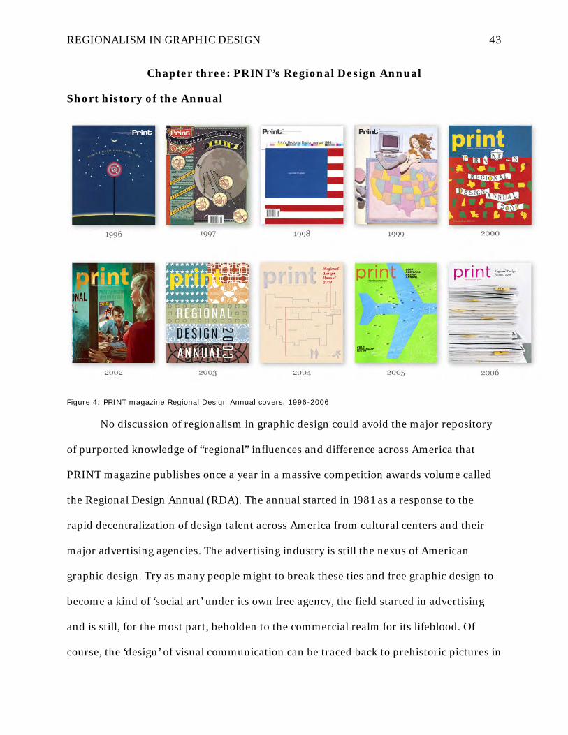
REGIONALISM IN GRAPHIC DESIGN 43
Chapter three: PRINT’s Regional Design Annual
Short history of the Annual
Figure 4: PRINT magazine Regional Design Annual covers, 1996-2006
No discussion of regionalism in graphic design could avoid the major repository
of purported knowledge of “regional” influences and difference across America that
PRINT magazine publishes once a year in a massive competition awards volume called
the Regional Design Annual (RDA). The annual started in 1981 as a response to the
rapid decentralization of design talent across America from cultural centers and their
major advertising agencies. The advertising industry is still the nexus of American
graphic design. Try as many people might to break these ties and free graphic design to
become a kind of ‘social art’ under its own free agency, the field started in advertising
and is still, for the most part, beholden to the commercial realm for its lifeblood. Of
course, the ‘design’ of visual communication can be traced back to prehistoric pictures in

REGIONALISM IN GRAPHIC DESIGN 44
caves and probably beyond, but advertising is where graphic design became a modern
profession.
Figure 5: First PRINT RDA cover, 1981
The RDA was established to begin to track this emigration of designers to all
reaches of the country and catalog their work by location. This has been the primary
differentiator of the RDA from other annual design competitions—that it’s work is not
grouped by categories like brochures, annual reports, websites, packaging. Rather, by
grouping the work of designers whose home bases are situated in specific regions, the

REGIONALISM IN GRAPHIC DESIGN 45
RDA has become both an archive of tracings of ‘regional’ work and a useful resource for
designers and potential clients who are looking to either find a job or find a designer to
hire in a specific area. Joyce Rutter Kaye, PRINT’s editor, writes in the introduction to a
retrospective DVD of the RDA from 1996-2006:
PRINT’s Regional Design Annual is the first and only comprehensive survey of
graphic design organized by location. The Annual was conceived in 1981 to address
the rapid decentralization of the advertising and design industries that were taking
place at that time. Reports in early issues of PRINT illuminate how quickly talent
dispersed from large design centers to smaller ones across the country, and how
dramatically this creative diaspora redefined the work being produced. This
phenomenon was mostly due to large, influential ad agencies spawning numerous
local spinoffs, startups, and imitators, but it also resulted from the effect of having
that distinctive “style” captured, all in one place, in the pages of a national
magazine.
Over the years, the forward march of technology and globalization enabled agencies
and design firms to become less reliant on local clients, and the awareness of
international design trends expanded their vocabulary of creative references. Despite
this smoothing out of boundaries and borders, however, regional differences have
always remained distinctive, as have the ways that designers respond to the
particular demands of their local markets. Year after year, following the trajectory of
local activities has allowed us to gain invaluable insights into design’s big picture.
The sheer volume of competition entries to the Annual—25,000 pieces in a typical
year—yields a fairly accurate barometer of emerging trends, stylistic shifts, and
conceptual conceits being practiced regionally and nationally. (Kaye, 2007)
It is precisely these “regional differences” and “ways that designers respond to
the particular demands of the market” in Kaye’s notes that are of interest here. If the
RDA was originally meant to track regional design’s distinctive flavors that are sited in
place across the country, the questions remain: (1) what exactly are the differences such
a comprehensive annual survey of work has recorded? (2) how have designers’
‘responses to local market demands’ shifted over the 30+ years of the RDA? (3) is

REGIONALISM IN GRAPHIC DESIGN 46
anybody going the other way and narrowing their vocabulary of creative references,
perhaps to become more regionally specific?...the possible questions arising from such a
goldmine of visual data from years of RDA entries is lengthy but the answers are rather
opaque. Except for introductory ‘analysis’ texts before each region’s entries, written by
hired freelance writers each year who focus on one region each, it is left for the viewer of
the RDA to sift through the years of published winners to extract their own answers to
these questions based solely on what the work looks like (hardly the only, or even best,
criteria with which to holistically judge design work and its impact).
Figure 6: PRINT RDA 1981, Midwest - Minnesota
In fact, many designers have wondered whether the RDA needs to exist in its
present form at all anymore. Many feel that the usefulness of regional categorization of
selected entries has long since past because there is little to no perceptible difference in

REGIONALISM IN GRAPHIC DESIGN 47
the work (see the following discussion of Lorraine Wild’s critique of the RDA). The
theory goes that if you covered up the location heading on the page and the text
descriptions of the design submissions, you would be very hard pressed to name any of
the regions from which any of the submissions emerged. That is testament to what Kaye
claims is happening in regard to globalization—the forward march of technology allows
designers to be less reliant on local clients and smooths out boundaries and borders
while international awareness allows designers to expand their vocabulary of creative
references. These have seemed like positive things to designers over the years, allowing
them to compete on an ever-growing stage. But the point can also be made that it is the
quest for universal visual language inherited directly from modernism by which they can
compete with broadened geographic reach, and this enables and even promotes a
divorce between designer and place while sterilizing the visual cultural landscape of the
regional differences Kaye claims to still exist.
Summary of regional differences, 1981–1999
Luckily, the former 40-year editor of PRINT, Martin Fox (who won the 2004
AIGA Medal for his years of service to the graphic design industry), took it upon himself
to assemble a summary of regional difference notes in his introduction to the 1999 RDA
issue. It was the last issue of the millennium, and like many others who were inspired by
the momentous date shift, he wanted to do something to look back before wondering
what was ahead. Instead of writing the usual yearly summary, he decided to hand-pick
statements from all of the introductory texts that had been written for the RDA from
1981–1999, specifically looking for nuggets of wisdom that described the regional
differences in graphic design noticed by the RDA’s judging panels over the years.

REGIONALISM IN GRAPHIC DESIGN 48
In planning the first RDA issue in 1981, PRINT conducted conversations with a
number of designers to find out what they would want to see in such an issue and how
they felt about the regionally grouped content. Fox’s findings are remarkably frank
about designer’s attitudes toward regionalism:
Regional characteristics? “The conventional wisdom today is that there are none,” we
stated in the introduction [of the first 1981 RDA], “at least not at the highest levels.
‘Regional’ is viewed by many as a pejorative term, meaning insular, unsophisticated,
corny—adjectives which might apply to work turned out by hacks but never by
designers and illustrators of the first rank. These top-level people are considered
supra-regional; they have the talent, confidence, and authority to compete nationally
or internationally with their peers from New York, Chicago, Los Angeles, or anywhere
else on the globe. And what presumably enhances their ability to do so is the fact
that they have divested their work of any ‘regional’ characteristics that might give a
client pause.” (Fox, 1999, p. 69)
There couldn’t be a more point-blank admission that competition on any supra-
regional scale coerces designers into adopting ‘universal’ visual language (read:
modernism)! Fox goes on to select a year-by-year selection of trends, some of which are
excerpted here, culled for their direct relation to ideas of regionalism (Fox, 1999, p. 69-
72):
1981. California North: “Design as practiced in San Francisco and the Bay Area
tends to be more cerebral, more introspective, and more decorative than in Southern
California. There is a sense of the artist’s hand as opposed to the mechanized
impersonality of the airbrush (which can render many illustrators interchangeable).”
Dallas: “The design, neat, clean, and hard-edged, is notably rich in detail. Despite
the rigorous technical control, it is imbued with a sunny, buoyant quality that makes it
fun to look at; it entertains.”

REGIONALISM IN GRAPHIC DESIGN 49
1982. “While cowboy culture, Texas chic, and the prairie look may constitute the
Southwestern style in many eyes, these fashionable fixations are waning.”
“One development still too much in its infancy to have had any overt effect in the
look of Eastern graphics is the gradual involvement of designers with computer
technology.”
1984. “Fred Woodward, current art director of Texas Monthly magazine,
observes that ‘in spite of the decline of “Texas chic,” the most effective thing you can do
here is tap into that Texas mythology of cowboys, cafes, and the dusty trail.’
Interestingly, it is the persistence of these icons that encourages designers like
Woodward to look to illustrators in different parts of the country. ‘The only way to
present this mythology in a fresh way,’ Woodward explains, ‘is to bring in people who
have never done it before.’”
1988. “Although some work from the Southwest is imbued with local imagery—
cacti, jalapeño peppers, and cowboy hats—design in the region is becoming increasingly
impersonal and pragmatic—just what the client wants. The ‘Dallas look,’ which once
predominated, has virtually disappeared.”
“Much-lauded Minneapolis advertising, with its recognizable style (pithy
headlines, arresting visuals) yet variety of approaches, has drawn many creatives from
outside the area to this city once considered ‘isolated.’”
1991. “The most important story of the first years of the last decade of the
century is the dispersal of design and its practitioners, which shows every sign of
continuing into the decade, and at such a pace that one wonders whether, some years
hence, the term ‘major design center’ will have any but the most nominal meaning. The
high-tech revolution has fueled the geographic revolution, if it can be so termed. The

REGIONALISM IN GRAPHIC DESIGN 50
ubiquitous fax machine and the computerization of design offices, to the point where
designers can communicate with clients modem to modem, rendering geography
irrelevant, have shaken the field free of its traditional moorings and turned it into a kind
of cottage industry.”
1992. “Computers—or rather the irresponsible use of same by designers who
should know better—are also being blamed for a certain amount of visual pollution.
Designers note that typographic quality has suffered serious setbacks and that there is a
growing backlash against the computer-generated look.”
1996. “The advent of digital technology and its instantaneous links to the rest of
the world has seemingly heralded the retreat of the regional esthetic. ‘I don’t believe
such a thing exists,’ says Mark Schwartz of Columbus, Ohio-based Nesnadny+Schwartz.
‘Communications and technology are too fast these days.’”
1998. “The much-vaunted electronic communications boom has profoundly
affected the Midwest region. Designers not based in major centers like Chicago or
Minneapolis no longer feel at a disadvantage. Dory Colbert in Columbia, Missouri,
states, ‘Technology helps me work out of my home with clients all over the country.’
Sonia Greteman in Wichita, Kansas, has also expanded her client base with a little help
from e-mail. ‘Because we’re living in an electronic age, we can stay competitive, even
though we’re in the middle of the Middle West,’ she says. ‘I have clients as far away as
Nicaragua and Costa Rica.’”
Critique of the 2005 Annual: Lorraine Wild
The sheer size of the RDA competition dwarfs that of all the other annual graphic
design shows in America. It is an enormous undertaking for the PRINT editorial staff,
and it takes months to catalog the work, go through first rounds of in-house judging to

REGIONALISM IN GRAPHIC DESIGN 51
narrow the selections down to a third or fourth round before bringing in a guest panel of
celebrity judges for a weekend of final selections. This methodology is, of course, open to
criticism of its own in bringing potential anti-regionalist bias into the process before
final selections are even made by visiting judges. One can only assume that the criteria
being used by in-house PRINT editorial staff to cull the weakest work out and winnow
the enormous pile into something manageable each year has been not only variable
based on the staff involved, but also probably biased toward the modernist interpretive
agenda that favors rationalism over emotionalism and neutral universal visual language
over that which is subjective, personal, or vernacular in nature.
Whether educated designers actually create works in a neo-modernist vein or not,
they still overwhelmingly adopt its rational principles in criticizing the work of others.
Design schools across the country have made quite sure of that! The Bauhaus still looms
very large in the planning and evaluation of creative work in classrooms from coast to
coast because it remains the most predominant, coherent, and complete theoretical
system by which supposedly ‘objective’ criteria can be transmitted to students and
subsequently used in checklist fashion to grade the resulting work. It just makes things
easier for teachers who would prefer not to get involved in students’ “personal journeys”
toward voices that may be more authentic to their own grounded experiences and deep
knowledge. To most design teachers, that should be left for the therapist’s couch; it has
nothing to do with the tidy rules of square against circle, pica against point size.

REGIONALISM IN GRAPHIC DESIGN 52
Figure 7: PRINT Regional Design Annual 2005, Minnesota
It was precisely these kinds of enigmas and frustrations that prompted Los
Angeles designer and educator, Lorraine Wild, to write a rather scathing critique of the
RDA published on the influential Design Observer blog on November 27th, 2005 after
reading the issue while on an airplane (Figure 7). All of the following excerpts are from
this blog post, and her critical analysis is followed by a spirited response from a number
of luminary designers whose names are listed with their comments. Their discussion

REGIONALISM IN GRAPHIC DESIGN 53
reveals a great deal about prevailing attitudes towards regionalism and its value among
leading design practitioners (Wild, 2013).
Lorraine Wild, posted 11.27.05 :
Flying from New York to Los Angeles last week, I spent the long hours at 35,000 feet
doing something I had not done in years: I read Print Magazine's "2005 Regional
Design Annual" cover to cover. Here are some of the things I learned:
• Tech has re-bounded in Utah.
• North Carolina is home to designers who emphasize the importance of offering a
comprehensive branding program.
• San Diego is home to the most consistently happy designers from year to year.
• Firms that aren't “weighed down by a large number of employees” are doing well
in Virginia.
• And ... Indie rock band posters are channeling Marcel Dzama and Edward Gorey,
no matter where they're from.
Why did I even bother?
Editor Kaye offers a sort of editorial disclaimer in her introduction: "Technology and
globalization," she writes, "has enabled agencies and design firms to become less
reliant on local clients, and the awareness of international design trends has
expanded their vocabulary of creative references." Such a cultural climate, let alone
a tacit admission of this new, globalized state of affairs, would seem to trump the
very "regional" particularities that Print's editors want to believe they're defining for
us—a fact that's perhaps most evident in the actual entries themselves.
…
Today, designers and their clients identify themselves by engaging in practices that
are framed by "regional" issues, yet their business is often directed, ultimately, at
bigger audiences; the success of those regional designers depends on their ability to
visually communicate on a national or even international level. It may be, too, that
the designers or agencies who enter competitions like the Print "Regional Annual" are
already within a subset of designers deeply invested in working at the national/global
level. Or maybe that's just the work that Print's in-house team responds to, since it's
"professional" and appeals to contemporary, even more visually-savvy audiences.
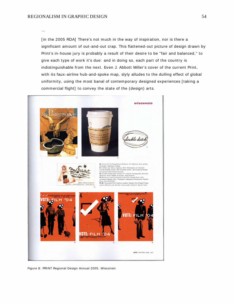
REGIONALISM IN GRAPHIC DESIGN 54
…
[in the 2005 RDA] There's not much in the way of inspiration, nor is there a
significant amount of out-and-out crap. This flattened-out picture of design drawn by
Print's in-house jury is probably a result of their desire to be "fair and balanced," to
give each type of work it's due: and in doing so, each part of the country is
indistinguishable from the next. Even J. Abbott Miller's cover of the current Print,
with its faux-airline hub-and-spoke map, slyly alludes to the dulling effect of global
uniformity, using the most banal of contemporary designed experiences [taking a
commercial flight] to convey the state of the (design) arts.
Figure 8: PRINT Regional Design Annual 2005, Wisconsin

REGIONALISM IN GRAPHIC DESIGN 55
Wild finishes by suggesting some changes to the annual that might improve its
relevance among designers, including: (1) group the work by genre instead of region
where the designer is based to illustrate the diversity of practices (as opposed to just the
resulting creative works) rather than their uniformity, (2) arrange the works selected for
the annual by more descriptive categories for better comparison, say all insurance
company communications together or all wedding invitations. Her last suggestion is the
most relevant here:
…assign each area a single writer who hails from that particular region, and give
them the freedom to capture the gestures, the nuances, the cultural specifics that
frame the work — if indeed they do. Of course, in the end it will still all be fictional,
but no more so than the idea that designers who live in Kansas City are any different
from those who live in Brooklyn.
The following excerpts are the responses that various designers contributed to
the conversation over the course of about two months after the original post. Their
names and post dates are provided, and the conversation reveals mostly denial that
regionalism even exists in graphic design, if not doubt that it is even a compatible idea.
The opinions conveyed reveal an underlying preoccupation with visual style that is
typical of the field, but also occasional suggestions for bringing content and the holistic
client service cycle into the evaluation process:
aj. 11.28.05 at 12:45
Great summing-up of what, I suspect, all too many designers think when they pick
up the regional design annual, myself included. There is some value in seeing how
other designers approach a particular challenge, and when you're, say, a one-man
home-based design studio, you might not have time to see what your peers are
doing.

REGIONALISM IN GRAPHIC DESIGN 56
As the Internet did to music (and now television), the need for self-appointed
gatekeepers like Print cannot help but be diminished by its ability to directly connect
creative people together - through portfolio sites, blogs like this one, Flickr, even
Google Image Search.
Michael Bierut. 11.28.05 at 09:39
The Print Regional Annual is flawed in the ways that Lorraine describes, but because
has the advantage of working like a quota system, you will see work that that you
won't see anywhere else (and sometimes shouldn't see anywhere at all.) For all its
problems, we really don't have a better snapshot of where the national graphic
design scene is in any given year.
I agree that the attempt to discuss the work in terms of regionalism is futile at this
point. [my emphasis] I was interviewed by a good writer (DO's own Tom Vanderbilt)
for the text for the New York section, and I was embarassed [sic] by my inability to
draw any kinds of coherent conclusions about "trends in the New York design scene."
It didn't help that the few regional trends I was able to conjure up—the design
enthusiasms of the Bloomberg administration, for instance, as evidenced by the
excellent design surrounding the city's (failed) bid for the 2012 Ollympics [sic]—were
nowhere illustrated in the pictured selections. This is always the flaw in attempting to
"curate" a competition when you don't control the submissions.
I also agree with Design Maven about the myth of New York dominance, although
Print certainly bought it back in the day. As I recall, the original Regional Design
Annual didn't have a section on New York. I guess the theory was that all the other
issues during the [year] were “special New York issues” by default.
DC1974. 11.28.05 at 01:20
I agree that there has been a flattening of design, where things that I would have
identified as so NorCal -- graf influence, hand drawn type -- several years ago are
popping up in New York, Philly and Baltimore. I do think that there are regional
trends, because of the influence of schools and the local scene. Designers may be
connected via the internet, but in the end we respond to our immediate colleagues

REGIONALISM IN GRAPHIC DESIGN 57
and peers locally are doing. And that is how we take global trends and put our local
spin on it. Globalization is a myth. [my emphasis] The idea that you aren't influenced
by that sign you read every day on the way to work, that there aren't local music
cultures (hey, when was the last time you heard Go-Go outside of DC?) and other
specific spacial [sic] and regional concerns and constraints.
Look at Tennessee for instance in 2005 Regional Design Review, here's a whole state
that has been incredibly influenced by traditional graphic printing and typography.
Yee-Haw in Knoxville and the traditional printing background of Nashville has been
enormously influential in attracting people to the region. When I look back 20 years
ago and think of what I think of as quintessential 80s design (when I was just an
elementary school student), I realize now that much of that "look": torn paper, neon
was coming out of Northern California, but I had associated it with a national trend.
Having a "Regional" issue then reminds of us again that we aren't as globalized as
we fictionalize and that ideas have a starting point. (And for those of us who are just
starting are careers, it's also a great phone book, of where to send our portfolios if
say we want to leave Northern California and move to Philly.)
Joyce Rutter Kaye. 11.28.05 at 03:23
Thank you, DC 1974, for pointing out that regional styles do exist (and continue to
emerge) and affect design culture in a powerful way. And thank you, Michael, for
pointing out the value in having a national snapshot once a year.
I suppose if the RDA's value to designers is declining, we'd see it in the numbers, but
it's actually our best-selling issue of the year. Last year, we sold 75% of copies we
placed on the newsstand (a 50% sell-through is considered excellent). I don't deny
that teasing out regional differences is becoming more and more of a challenge for
us, but I do think that many designers across the country are still very interested in
seeing who's doing what in their local community, as well as seeing what's being
done elsewhere.
Derrick Schultz. 11.28.05 at 03:40

REGIONALISM IN GRAPHIC DESIGN 58
My issue with the Regional Annual has never been the Regional, but rather the
Annual. While I realize the business community moves much faster than it used to,
the difference from year to year never seems very drastic, especially when it comes
to the writing portion (which i find far more interesting than the work showcase).
If I were to take Lorraine's approach and offer a solution, I would rather see the
Regional annual be done every two years, with the opposite year devoted to the
European Annual. It would show a larger shift in "style" and probably more
segregation in economic outlook.
And while I’m in a dreamers mood, perhaps developing the European Annual into an
International Annual. I feel there’s [sic] far more cultural aspects that could be
written about in a full-on world annual and it would showcase more diversity that
would really challenge design instead of being just a showcase. (I realize I have
neither the budget or time constraints Print works with.)
Samuel E. Vazquez. 11.28.05 at 06:53
I have to agree, in part, with Ms. Wild. I too picked up a copy of Print Regional
Design Annual and was quick to put it back on the rack. Not much in it was inspiring.
Yes, there's a lot of work done these days but that's where it ends. I rather read
about functionality and how the work impacts the desired audience. I realized years
ago that design is not about me. The moment you see me in the work I do, I've done
a bad job. It's about the client and its audience. Designers basically interpret the
way information is presented. If you want to see design at its best look at European
design. They don't scream "look at me -- I need glitter to look pretty -- please stroke
my ego." They do what they do and don't make a big deal about it. They don't
obsess about it.
p.berkbigler. 11.29.05 at 10:43
I'd think the other important trends to watch within the magazine are the body of
contributors that just seem to make it in year after year without much question - is
this simply an instance of Print officially deciding which designers / firms they know

REGIONALISM IN GRAPHIC DESIGN 59
have a good track record and are "safe" bets, is it recognition of tenure within the
field, or is it just boring judging on the part of Print and their annual judges?
It's clear that Print is still including names that haven't appeared before, but I'd be
seriously curious to know what the ratio of design standards / stand-bys vs. new and
notables is within the past 25 years worth of publication...
Joyce Rutter Kaye. 11.29.05 at 11:55
The goal of the Annual is to provide a comprehensive overview of design being done
in this country. When judging the 25,000 entries over the course of 3 months, we
are not choosing work based on any particular agenda—we are not trying to favor
past winners, nor are we sifting through to find work with a specific regional flavor.
We are merely trying to find the best work possible from the work that's submitted,
period. We actually do not divide work into regions until the third and final round of
judging. if a particular region in the book shrinks in size from one year to the next,
it's because fewer viable entries were submitted from that region—we don't fill pages
for the sake of filling them.
Considering the sheer volume of the entries, and the relatively few that make it in
(1200 or so), it's actually a pretty selective annual, and I think it stands as a fairly
accurate barometer of the quality-level of work being done in this country. Is it
perfect? No, but we're always trying to make improvements, in the way we solicit
entries, select the finalists, and report on the regions. It's five solid months of hard
work for a team of only seven people, and I think it works pretty well.
marian bantjes. 11.30.05 at 03:32
There seem to be 2 basic tracks of complaint in the commentary here. One versus
Regional, the other versus Annual.
Myself, I'm more interested in the regional.
[quoting Joyce Rutter Kaye above] nor are we sifting through to find work
with a specific regional flavor. We are merely trying to find the best work
possible from the work that's submitted, period. We actually do not divide
work into regions until the third and final round of judging.

REGIONALISM IN GRAPHIC DESIGN 60
This is, I think, what dilutes what little regionality there is [reported to be]. I actually
think, from a regional perspective, that it would be more interesting to represent the
Good, the Bad and the Ugly from each area to see if any patterns emerge. I suspect
that it's at the smaller, local level that any regionalism might be evident. It might be
the perception of "excellence" that doesn't recognize quirky, individualistic work.
I'm intersted in the regional thing because we at the GDC were recently looking at
the entries to our Graphex awards for any sign of Canadian influence. I also hosted a
panel with the judges (Rick Poynor, Debbie Millman, Tan Le, Min Wang, Robert
Sarner) on the topic (Nov. 18), and received a surprising amount of hostility from
the audience (both during and after the event) for even asking the question.
Canadians, it seems, are desperate to be so worldly that their work is
indistinguishable from anyone else's. I find this a pity...and very Canadian.
But still I have to wonder how living in a specific culture, with specific politics, local
religions and ethics, a generality of types of business and industry, plus schools and
leaders in the design community can not affect the way we work and the way we
choose to represent our local clients.
Although our panel and the Graphex judges' largely failed to turn up anything
peculiar to Canadian design (in the all of 36 hours they had to think about it), the
emphasis of the judging, as in Print, was on "excellence" in general.
So if I have advice for Print, it would be, next time do focus on regionalism and see
what happens. I think it might provide a more interesting issue.
Lorraine Wild. 11.30.05 at 10:08
I was somewhat surprised that Joyce Rutter Kaye revealed that they only sort the
work out by regions after they have culled the work to be published. Thinking of that
giant pile of 25,000 entries, I understand their practical reasons for doing this, but it
seems like it has to be part of the problem, at least the one I'm the most interested
in, which is the "regionality" of the Print Regional Annual. The process of simply
ordering their edited choices geographically clearly doesn't yield a "regional" picture
that is very convincing.
I don't think that there is anything crooked about the jurying of the Print Regional
Annual; in fact, if anything, I think it isn't manipulated enough to deliver a more

REGIONALISM IN GRAPHIC DESIGN 61
vivid picture of what may in fact be going on in Las Vegas, Louisville, or even New
York. It is not a surprise that the issue sells well, because the prospect of looking at
design regionally remains interesting. But for Print to actually deliver on that
premise, a degree of creative strategy beyond what the editor describes as their
current process seems necessary. (What that strategy should be is, of course, a
question).
Joyce Rutter Kaye. 11.30.05 at 10:22
If you're seeking excellence during judging, the regional influences that do exist in a
given area will naturally emerge. I think it's dangerous to apply preconceived notions
to an area of what its regional characteristics are. If we were looking hard for
sunshine and oranges in Florida, for example, we'd be missing the recent emergence
of screenprinted rock posters in Orlando. Selecting work that adheres to regional
clichés over work that shows a higher level of design would be doing readers a
disservice, in my opinion.
marian bantjes. 11.30.05 at 12:16
Joyce: I, for one, am not advocating applying preconceived notions of a region to the
collection of work, but rather looking at the work for patterns or themes that might
then be identified as coming from that region.
For instance in Graphex, Tan Le noted that Canadians do a lot of Government work;
he and Debbie both noted a use of unusually bright colours; and everyone noted that
the work coming from Quebec was riskier and more conceptually driven than from
anywhere else in Canada (to the point that one could take one look at the piece and
immediately guess it was from Quebec—even without an indication of French
language).
I would like to think that a judge from outside a region could look at something and
say "That's unusual, I don't think that would work too well in [LA]." and the regional
judge could say, "Really? I see stuff like this all the time." or, "Well, that's a direct
reference to [something locally cultural]."

REGIONALISM IN GRAPHIC DESIGN 62
Patrick Larson. 11.30.05 at 01:24
I wholeheartedly agree with Lorraine and Art in the fact that the regional annual is
simply a mishmash of those wanting to enter another contest regardless of where
they are from.
I don’t think globalization has anything to do with it but rather the design shops
culling from annuals to create their direction (read: copy)
I think regional design annuals should be limited to smaller shops in smaller
markets. Like Duffy and Anderson did with Minneapolis/Midwest in the early 90's and
Modern Dog/Sub Pop in Seattle/Northwest in the late 90s.
I don’t see regions really defining themselves in the larger markets such as NY &
California & Chicago since shops in those areas tend to have a more multi-cultural
influence (and client base) therefore the influences are broader in general. But, I
suppose, that may make for a pretty small annual.
JosiahQ. 12.01.05 at 08:13
I think local AIGA chapters should take over responsibility of submitting samplings of
area design work to Print.
The problem in my mind with something like Print is that relying on "submissions"
from the individual designer or agency means your sampling pool is inherently
limited.
By extending the responsibility of pulling in samples to the local AIGA chapters (who
then in effect function as small editorial boards), you can create a tradition of
chapters seeing their work represented nationally in comparison with the work of
other chapters in other regions.
Analysis of the designs as they relate to regions would occur, of course, by the Print
editorial staff, but not the choice of what items are shown in the annual.

REGIONALISM IN GRAPHIC DESIGN 63
Lorraine Wild. 12.01.05 at 12:58
…[I] am a new (or new-old) subscriber to Print, having also recognized that the
editorial direction of the magazine has been re-energized under Joyce Rutter Kaye: I
guess that's what led me recently to check out this latest RDA so closely. I
respectfully suggest that the RDA is another aspect of the magazine that needs fresh
thinking. There has to be something between their current process described and
defended by the editor (but which ends up looking just too random) and the reliance
on pre-conceived notions or local visual cliché. As this thread has gone on, I am
thinking that the answer lies somewhere in regional reportage that is focused, and
which helps guide the selections. It also might mean actually pursuing entries
pertinent to an idea rather than just relying on what comes through the mail slot, if
only to re-invigorate the issue.
Patrick Larson. 12.01.05 at 01:59
…is there some way that regionalism can be demonstrated on a global scale? I know
there are international annuals but I think on the local levels there is just too much
cross pollination from various areas to make a viable excuse for such specificity.
greg. 12.01.05 at 02:56
Regarding the question of global regionalism, I've found myself pretty impressed by
the original work coming out of Print's European Annual, when compared to the
American one. Maybe American design is going through a dry spell right now. Maybe
I'm part of the problem. My wife loves me anyway...
Scott Bower. 12.18.05 at 01:16
I think an international annual would be much more interesting, especially since so
many of my designer friends were kicked out of the country in the last 3 years and
have taken what they learned here back to Thailand, Japan, South America, and
Eastern Europe…

REGIONALISM IN GRAPHIC DESIGN 64
It seems designers are doing more and more work that tackles problems with
information systems design which has nothing to do with the style. Like an accurate
visualization of a trade going through the New York Stock Exchange. Would that ever
make it into Print's annual? No. The design firm was in Atlanta, the client was in New
York, and I live in a remote third world country (Kansas City).
How does globalization and universal access to our toolsets effect design? Well, it
means that I was outbid on designing Bangkok's Fashion Week because they found a
local rock star designer to do it for a fraction of what I bid, and it was at a discount.
Physical location means nothing now, even on small projects.
Ellen Lupton. 01.12.06 at 05:58
I don't understand the nostalgia for an authentic regionalism. Too bad, isn't it, that
people got their phones, cars, computers, FedEx, and NetFlicks [sic]. It's a shame,
but there's no going back. It's these things that allow me to live in Baltimore but
work in New York City (well, maybe not the NetFlicks).
An important function of the Print Regional Annual is to help people who are looking
for design firms (for a job, for a client, for a designer) in a particular location. Not
that location matters all that much any more, but some people do want to live
somewhere where there are other designers.
It seems clear from the conversation above that graphic designers do not take the
same view of the content of their field that architects do of their own. Plainly, I think
architects believe in the power of place more than graphic designers, probably because
they spend their time making them and graphic designers largely do not, but it’s more
than that. There is a conviction among environmental designers that placemaking is
integral to the actual content of the design—not a shell to hold or present it—but actually
steeped in its material substance. And it’s about social justice and responsibility, even
legal responsibility which graphic designers do not bear. It is disappointing to me that

REGIONALISM IN GRAPHIC DESIGN 65
most graphic designers don’t seem to believe that their work can be rooted in a place,
streetwise down to a neighborhood block, and still cosmopolitan enough to read as well
in Europe as it does here. It seems as though the idea of format is as far toward place as
they are willing to go when other concerns are higher priorities.
Perhaps it is simply the permanence of a building and its primal connection to
very innate human instincts to shelter our lives that makes architects and planners
concerned about philosophical issues related to reality, simulation, and place. In reading
the bulk of writing done about graphic design, one can surmise that, as a profession, it
rests on the depths of most intellectual inquiry and resulting critical practice on
concepts like the user, the interface, authorship, and their impact on form. One cannot
excuse graphic design for its part in perpetuating placelessness in our culture through
its relentless promotion of commercial brand spaces which by nature tend to marshal
our senses away from deep connection to real places simply because the profession is so
integrally tied to commerce for its survival. Architecture, too, is hugely economically
driven, only the stakes are much higher on multi-million dollar building projects, the
stakeholders more varied, and the politics far more complex. By that measure, architects
should chuck “place” like a bucket of nails and head for the nearest design-build exit to
cash in. But they do not. The tradition of phenomenological inquiry that runs from
Heidegger through Christian Norberg-Schulz, Christopher Alexander, Kenneth
Frampton, Kevin Lynch, Jane Jacobs, Edward Relph and others is as strong as ever in
architectural theory circles. And in light of our newfound preoccupations with virtual
space, this tradition is becoming reenergized as an antidote to cultural drift.
I want to insist to graphic designers that place does matter, that where you come
from as a designer matters because it enriches the very identity against which your

REGIONALISM IN GRAPHIC DESIGN 66
internal creative forces push. Most importantly, I want to say to graphic designers that
they are so preoccupied with what design looks like that they fail to recognize how
deeply the rooted knowledge of life in a place affects your ability to process content and
create a meaningful marriage between content and visual form—the primary activity
which cuts across all modes and categories of graphic design. Perhaps the “regional”
differences we should be looking for in a publication like the RDA are not so easily seen
on the surface, and perhaps can’t be seen at all, outside of the time and place when the
piece was initially active within a particular cultural circumstance which has since
changed and which skews our perception of its communicative power. What about
looking for how designers in a specific place harness literary and rhetorical devices to
connect texts to imagery? Perhaps in the Midwest, and for certain industries, this tends
to be done in a very earnest and warm way whereas in California, a slicker and more
bitingly humorous approach tends to be preferred. This might say as much about the
regional people as the visual style involved, and indeed, in the words of Wendell Berry,
regionalism pertains to life as much as creative work and it pertains to life before
creative work.
It should be added that the place in which your design will be received matters,
too; that your knowledge of the place your clients inhabit matters if you want to
represent them in a deeply intuitive way, and that the places we collectively promote
with our creative works as allied designers across disciplines matter greatly to our
culture as a whole.
We have largely allowed both the internet and networked global economic
systems to flatten sociocultural diversity and to weaken our sense of rootedness as
people before we are designers, and the myth that designing for anyone anywhere in a

REGIONALISM IN GRAPHIC DESIGN 67
virtually interconnected world represents limitless opportunity is an illusion of abstract
market systems. The hidden truth is that it also represents profound and grave
challenges. Buying into the power politics of globalization in order to compete only
advances the erosion and commoditization of design services across the globe by
coaxing designers to abandon their uniquely sited personal perspectives and wisdom in
favor of cranking out more universally translatable products that will continue to get
them far-flung jobs. That cycle is vicious and insatiable. This is the cultural inheritance
modernism has left us in a globalized world, not the utopian and fundamentally
optimistic wish for all people it once was. But we have the ability to step back from these
abstractions and deepen our roots in the real world without hiding our heads in the sand
to ignore technological advance. Ricoeur teaches us that the only way to survive the
violence of globalization is to encounter other civilizations in our most fully creative and
flourishing state, which doesn’t start over there. It starts here, the place your feet are
touching right now.
REGIONALISM IN GRAPHIC DESIGN 68
Chapter four: Case study—International Viola Congress 2010
Introduction
The case study graphics shown here were designed by me over the course of
about eighteen months from late 2008 through the event in June of 2010 under the
direct guidance of the IVC’s coordinators, Catharine Carroll and Dominic DeStefano.
The project is not offered as an illustration of ‘best practices’ in regional design per se,
for indeed, I had to make choices due to practical constraints at times that are at odds
with a regional approach to the work. Rather I offer it as a vehicle for discussion and
critique since it was an event sited in the region I know best (Midwest / Cincinnati), and
the content and venue lent ideal conditions in which to explore the typical conflicts
designers face between local content, voice, and global audience. With the perspective I
have now on the design work shown here and the theoretical issues discussed in the
present writing, I can revisit the design concepts, content development, and project
management factors with fresh eyes. Here I can share my recollected internal thought
processes in the hopes that it might spur other designers to construct similar narratives
of their work against their own experiences and inspirational sources.

REGIONALISM IN GRAPHIC DESIGN 69
Figure 9: CCM village at night, site of IVC 2010
Concept and content development
The 38th annual IVC 2010. After my initial meetings with Catharine and
Dominic, I began to review the event itself. The International Viola Congress has a long
and rich history of exciting venues across the globe. Not only has the event been held in
many far-flung and exotic locations (often a different continent every year over thirty
eight years!), but it also seems to continually draw an impressive roster of world-class
musicians, regardless of the travel demands involved. I wondered at first how such a

REGIONALISM IN GRAPHIC DESIGN 70
conference could manage to sustain itself given the rather paltry salaries musicians
suffer in the United States, much less that of students who regularly attend for the
chance to win scholarships to major music festivals and the invaluable master classes
with famous teachers.
I soon realized that this event is held dear to the participants not in small part
due to the very instrument they play. The viola is slightly larger than the violin but
smaller than both the cello and double bass which are played upright instead of on the
shoulder. And it has suffered the brunt of many jokes over the years due to its second-
class status among soloist ranks to the higher-pitched and more glamorous violin. There
are very, very few solo vehicles across the major orchestral repertoire written for viola.
In fact, many players wind up playing pieces originally written for other instruments on
the viola (Bach’s Cello Suites, for example). And so, for viola devotees, it becomes a
question at these conferences of how to keep such a small repertoire fresh, to take an
aging and rather static body of works and inject them with new energy for the next
generation of string players who might also discover the viola’s charms.
The English composer and violist, Cecil Forsyth (b. 1870–d. 1941), explained that
in the old days, “viola players were selected merely because they were too wicked or
senile to play the violin. Those days are happily gone forever” (Forsyth, 1914). In a witty
counterpoint, the great Scottish viola soloist and teacher, William Primrose, famously
shortened his previously long-winded explanation of the differences between violin and
viola to a tart catch phrase: “The viola is a violin with a college education.” It is a little-
known testament to the viola’s status as the soul of the string section that many of
history’s greatest composers preferred to play it instead of the violin when performing
ensemble music, including Bach, Beethoven, Mozart, Haydn, Schubert, Mendelssohn,
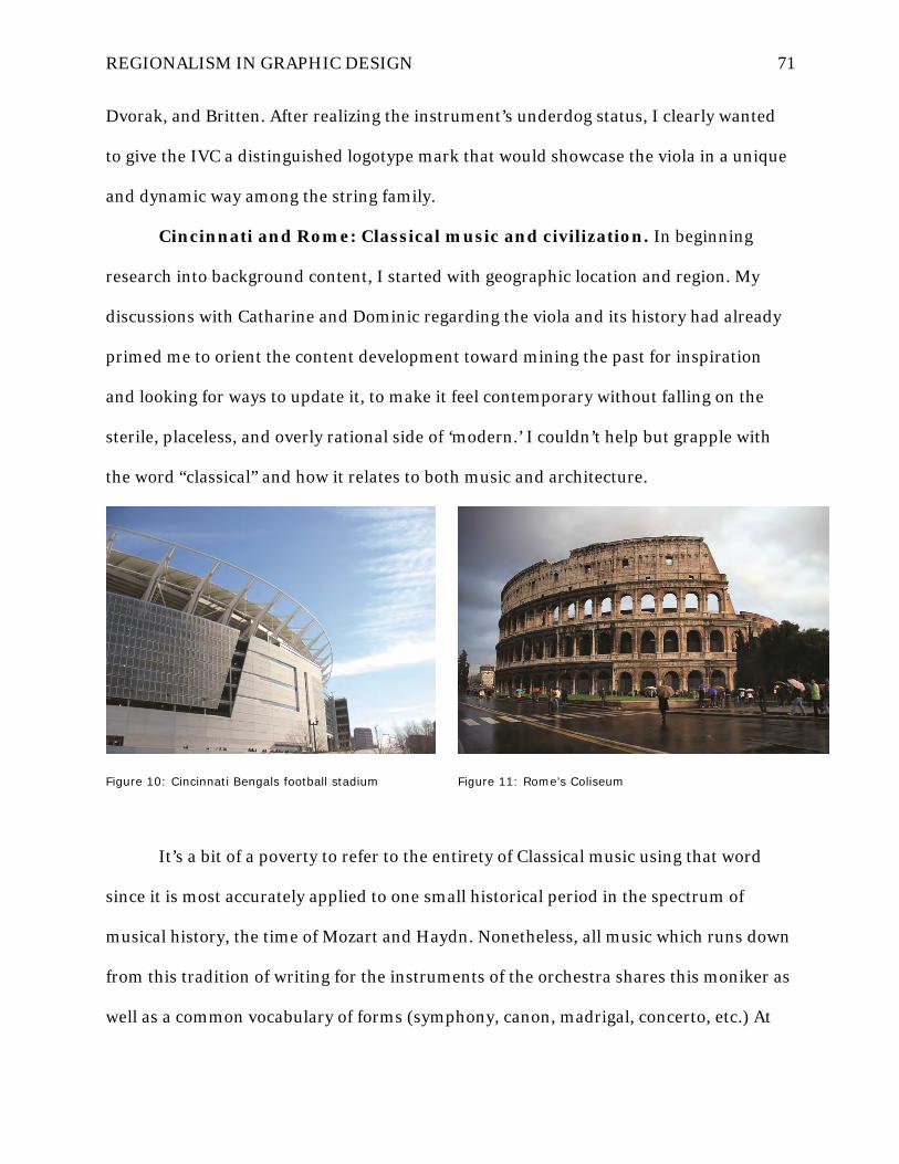
REGIONALISM IN GRAPHIC DESIGN 71
Dvorak, and Britten. After realizing the instrument’s underdog status, I clearly wanted
to give the IVC a distinguished logotype mark that would showcase the viola in a unique
and dynamic way among the string family.
Cincinnati and Rome: Classical music and civilization. In beginning
research into background content, I started with geographic location and region. My
discussions with Catharine and Dominic regarding the viola and its history had already
primed me to orient the content development toward mining the past for inspiration
and looking for ways to update it, to make it feel contemporary without falling on the
sterile, placeless, and overly rational side of ‘modern.’ I couldn’t help but grapple with
the word “classical” and how it relates to both music and architecture.
Figure 10: Cincinnati Bengals football stadium
Figure 11: Rome’s Coliseum
It’s a bit of a poverty to refer to the entirety of Classical music using that word
since it is most accurately applied to one small historical period in the spectrum of
musical history, the time of Mozart and Haydn. Nonetheless, all music which runs down
from this tradition of writing for the instruments of the orchestra shares this moniker as
well as a common vocabulary of forms (symphony, canon, madrigal, concerto, etc.) At

REGIONALISM IN GRAPHIC DESIGN 72
the same time, the word “classical” in architecture, at least in the Western tradition,
refers back to the architectural language and forms of ancient Greece and Rome. There
is a remarkable overlap in conceptual content and even the terminology used to access
similar concepts between the fields of music. Common concepts between the fields with
the very same names include pitch, rhythm, articulation, scale, intonation…Indeed, the
famous American architect Louis Kahn was famously quoted as saying, “an architect is a
composer.” (He spent his young days making money playing piano to accompany silent
films and once told his mistress, Harriet Pattison, that if things hadn’t worked out for
him in architecture or piano, he thought he might have made a very good composer.)
Figure 12: CCM’s skylight ‘oculis’
Figure 13: Rome’s Pantheon with oculis

REGIONALISM IN GRAPHIC DESIGN 73
And so, Rome came into my view as a connective tissue that binds Cincinnati to
the musical content of the IVC and to the site where it would be held. It turns out that
Rome and Cincinnati have a remarkable amount in common. The two are sister cities,
both built, according to folklore, on seven hills. There are a number of cities with a claim
to being built on seven hills, but the connection here goes further in that Cincinnati is, in
fact, named after the famous Roman countryman farmer, Cincinnatus, who became the
temporary ruler of Rome twice in moments of need during wartime, but abdicated the
attendant power and status that went with the office to return to his regional way of life.
It couldn’t be more appropriate to the content here, in light of Regionalism, to leverage
these Cincinnati–Rome ties to metaphorically represent “the old becoming new again.”
Figure 14: CCM’s new plaza grand stair
Figure 15: Rome’s Campidoglio

REGIONALISM IN GRAPHIC DESIGN 74
I managed to find the original article that explained the “City of Seven Hills”
nickname for Cincinnati in the June 1853 edition of the West American Review, which
listed the seven specific hills that made a rough crescent shape around the growing city
as: Mount Adams, Walnut Hills, Mount Auburn, Vine Street Hill, College Hill, Fairmont
(now rendered as Fairmount), and Mount Harrison (now known as Price Hill)
(Anonymous, 1853). Initially, the seven hills of Rome were occupied by small
settlements and not yet grouped or recognized as a city. The residents of the seven hills
began to participate in a series of religious games which started to bond the groups
together. The city of Rome evolved as these disparate settlements began acting as a
group, draining the marshy valleys between them and turning them into markets and
public open spaces. Of the seven hills of current Rome, five (Aventine, Caelian,
Esquiline, Quirinal and Viminal hills) are populated with monuments, buildings, and
parks. The Capitoline now hosts the Municipality of Rome, and the Palatine Hill is an
archaeological area. The now-famous Vatican Hill (Latin Collis Vaticanus) is northwest
of the Tiber and is not one of the Seven Hills of Rome. Likewise, the Pincian Hill (Latin,
Mons Pincius), to the north, and the Janiculum Hill (Latin, Ianiculum), to the west, are
not counted among the traditional Seven Hills either. The connections outlined here in
the physical site of the conference and its sister city, Rome, the seat of classical
civilization in our collective American memory, could provide interesting sidebar
content running through the conference collateral materials and potential for unique
naming opportunities of event venues throughout the connected building complexes.
The CCM village: Study in old and new. The immediate site of the
conference was the College-Conservatory of Music (CCM) “village” campus on the south
edge of the University of Cincinnati’s urban Uptown campus. It is a site I knew well

REGIONALISM IN GRAPHIC DESIGN 75
since my days as an undergraduate architecture student across the same campus in the
Design, Architecture, Art, and Planning college building, also a famous landmark
building by Peter Eisenman. The CCM complex was constructed by the firm of Pei Cobb
Freed, with partner Henry Freed leading the design team, in six phases over a seven year
period ending in 1999 (Figure 16). It had been under construction during nearly my
entire undergraduate tenure from 1991-1997, so I was aware of the project’s design
intent (I had seen renderings) and could track its progress whenever I visited the
building for concerts. For an architecture student, I spent a fair amount of time there
because I took piano lessons, music history, and opera classes during my first year and
was a regular attendee of student recitals and the free orchestra concerts.
Figure 16: CCM - old and new literally connected
I remember clearly being interested in the project for the way it eschewed the
predilection most builders have for demolition and starting over with a blank site.

REGIONALISM IN GRAPHIC DESIGN 76
Instead, Cobb determined that some of the existing campus fabric should remain, and
they should instead build only one major new building, leaving essentially three others
to be stitched together by a large substructural parking deck that created a large
irregular circular plaza on top:
Critical analysis determined that existing performance and support spaces should be
renovated, the existing academic wing replaced, and an abandoned gymnasium and
obsolete dormitory rehabilitated for use by the school. This strategy permitted a new
academic wing to frame one side of a new courtyard, creating the spatial focus for
the buildings, new and old, which now constitute CCM's "village" within the larger
campus. (Pei Cobb Freed and Partners, 2013)
Figure 17: CCM plaza above substructure parking
But, perhaps I was at first a little disappointed as a design student that the
complex seemed rather “tame,” and that no big architecture statement was being made.
Cincinnati is a very conservative town and is notorious for disallowing architectural
projects deemed too progressive from penetrating the urban fabric, especially if the
materials don’t defer to its masonry-laden history. Even the great Frank Gehry was
forced to produce his signature swooping curved surfaces normally rendered in titanium

REGIONALISM IN GRAPHIC DESIGN 77
panels instead in brick for his Vontz Center for Molecular Studies which opened on UC’s
East Medical Campus in 1999 along with the CCM village. I guess I wanted fireworks,
and the Cobb CCM design seemed so quiet. Now I see that the incursion Cobb made into
the site was a quite tricky balancing act between the needs of the college, an enormously
complicated site condition that incorporates many grade changes, the desire to preserve
what fabric was solid and would provide continuity in the memory of the community
who inhabits it, but also an injection of new and contemporary architectural vocabulary.
Two fundamental ideas govern the design: a) the environmental quality of a campus
— indeed of any community — can be significantly enhanced by the imaginative
reuse of existing buildings together with new construction; and b) the first obligation
of any campus building project, beyond providing required facilities, is to shape
attractive gathering places, interior and exterior, that will engender a sense of
community and shared purpose among all who experience them. (Pei Cobb Freed
and Partners, 2013)
Figure 18: CCM village in UC campus context

REGIONALISM IN GRAPHIC DESIGN 78
Figure 19: CCM Werner Recital Hall lobby Figure 20: CCM Alumni Garden
It is rare for signature designers who have access to international clientele to
advocate in raw terms for the ‘imaginative reuse of existing buildings together with new
construction’ in order to preserve a local and regional character, but that is precisely
what they managed to achieve, and the American Institute of Architects (AIA) agreed,
giving the project a 2001 National Honor Award:
The AIA jury called the CCM Village “an imaginative reuse of existing buildings that
provides an attractive interior and exterior gathering place for performing arts. A
complex program is given urban form through a simple yet strong design…details of
public circulation spaces are effective through the restrained palette of materials and
colors used.” (Throm, 2013)
When asked for a statement by the awards jury, Cobb offered:
“When I first visited CCM, I was struck by the extraordinary vitality of the life there
and the equally extraordinary miserableness of the environment," notes Henry N.
Cobb. "It seemed a great shame that activities so inherently and exuberantly
creative, so life-enhancing, should be taking place in such a deadly environment. In
creating a new campus village for CCM, we've ended up converting what was one of
the worst places on the campus into one of the best. This transformation is what I'm
most proud of, because we created something positive for the whole University, not
just CCM.” (Throm, 2013)

REGIONALISM IN GRAPHIC DESIGN 79
Figure 21: Old reflected in new outside Mary Emery Hall Figure 22: Old framed by the new above Werner Hall
It is precisely this kind of staging for the activities of life which architects discuss
in a regionalist way that is missing from contemporary graphic design debate—the effect
of place on the life of those sited there who are not transient and gain intimate
knowledge through repeated experience. It is true that most graphic products are meant
to operate on a far shorter time scale than that of architecture and usually to be far more
disposable, but their drawing directly from regional life and cultural identity need not be
any less deliberate, supportive, or profound.

REGIONALISM IN GRAPHIC DESIGN 80
Figure 23: Werner Recital Hall interior Figure 24: CCM auditorium / classroom
Figure 25: Main Corbett Auditorium interior Figure 26: Corbett Auditorium lobby
Janus & polychromy: Gods in color. I began to revisit the CCM campus at
the beginning of the IVC design process and look closely again at the physical space and

REGIONALISM IN GRAPHIC DESIGN 81
watch people use it: their walking patterns across the public plaza, the shadows cast
across the brick pavers surrounding the central tree by the modern spherical traffic
bollards that govern pedestrian to car interaction, the places along hallways where
students chose to sit and rest with a book bag or cell phone. It occurred to me that most
of the existing architectural fabric that Cobb chose to retain in the renovation amounted
to a typical vague mélange of “college Gothic” brick buildings peppered with watered-
down classicist ornament so often seen in American architecture without exhibiting any
cohesive allegiance to the classical language in a holistic sense (Figure 27), tied to
planning, elevation construction, and spatial sequences, much less the classical Orders
(Tuscan, Doric, Ionic, Corinthian, Composite). In short, they are kind of “fauxthentic”
classical structures in revival styles from throughout the centuries. It’s really all mid-
century construction with a fair amount of white stone thrown in to “make pretty.”
Figure 27: “Classical” CCM buildings to house “Classical” music
I wanted to see how I could use graphic design to reinject a strong dose of
“classicism” back into the content development—in effect, to amp up the existing

REGIONALISM IN GRAPHIC DESIGN 82
classical vocabulary shared by the renovated parts of the conference site’s fabric so they
can more effectively balance the modern underpinning of the new village complex and
reassert a new sense of classical music and its potential within contemporary culture.
The question was what ‘classical’ even means anymore and whether that language could
be presented in a way so as not to be lost on a contemporary audience completely.
Figure 28: Pediment ornament, Dieterle Vocal Arts Center
Figure 29: Entrance ornament, Dieterle Vocal Arts Center
Figure 30: Ornament, Memorial Hall Figure 31: Gargoyle, Memorial Hall

REGIONALISM IN GRAPHIC DESIGN 83
So, I asked myself what these buildings might have been like if they really existed
back in the Roman empire. How would the community have used them, and what gods
might they serve? In looking at the moulding carvings for clues (Figure 31), I stopped at
the heavy gargoyles carved into the former Memorial Hall dormitory building that now
houses musical practice rooms and offices and immediately thought of Janus, the
Roman god of doorways. Janus was the only two-faced god because he could look
backward into the past and forward into the future at the same time, and Roman
builders would often place his bust sculpture above doorways on both sides with a
different countenance on each. He was essentially the controller of comings and goings,
of the transitions among seasons, the keeper of peach and opener of gates. His unique
capabilities and perspective made him the perfect patron saint for IVC, so I adopted him
and decided to develop a secondary Janus mark that would embody the emerging theme
of renewing the old and the dormant in the conference.

REGIONALISM IN GRAPHIC DESIGN 84
Figure 32: Janus – old & young Figure 33: Arch of Janus, Rome
This passage from A. S. Kline’s (2004) translation of Ovid’s Fasti sheds light on
the ancient Romans’ understanding of the god Janus:
Book I: January 1: Kalends
...
Two-headed Janus, source of the silently gliding year,
The only god who is able to see behind him,
Be favourable to the leaders, whose labours win
Peace for the fertile earth, peace for the seas:
…
The ancients called me Chaos (since I am of the first world):
Note the long ages past of which I shall tell.
The clear air, and the three other elements,
Fire, water, earth, were heaped together as one.
When, through the discord of its components,

REGIONALISM IN GRAPHIC DESIGN 85
The mass dissolved, and scattered to new regions,
…
Whatever you see: sky, sea, clouds, earth,
All things are begun and ended by my hand.
Care of the vast world is in my hands alone,
And mine the governance of the turning pole.
When I choose to send Peace, from tranquil houses,
Freely she walks the roads, and ceaselessly:
...
I sit at Heaven’s Gate with the gentle Hours,
Jupiter himself comes and goes at my discretion.
So I’m called Janus.
…
We praise the past, but experience our own times:
Yet both are ways worthy of being cultivated.’
(Kline, 2008)
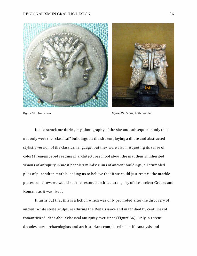
REGIONALISM IN GRAPHIC DESIGN 86
Figure 34: Janus coin Figure 35: Janus, both bearded
It also struck me during my photography of the site and subsequent study that
not only were the “classical” buildings on the site employing a dilute and abstracted
stylistic version of the classical language, but they were also misquoting its sense of
color! I remembered reading in architecture school about the inauthentic inherited
visions of antiquity in most people’s minds: ruins of ancient buildings, all crumbled
piles of pure white marble leading us to believe that if we could just restack the marble
pieces somehow, we would see the restored architectural glory of the ancient Greeks and
Romans as it was lived.
It turns out that this is a fiction which was only promoted after the discovery of
ancient white stone sculptures during the Renaissance and magnified by centuries of
romanticized ideas about classical antiquity ever since (Figure 36). Only in recent
decades have archaeologists and art historians completed scientific analysis and

REGIONALISM IN GRAPHIC DESIGN 87
reconstructions of what ancient classical sculptures and buildings really looked like
when they were new, and it’s rather shocking to our contemporary eyes! (Figure 37)
They were incredibly bright and saturated with color painted onto their materials using
earthen mineral pigments.
Figure 36: Traditional conception of white antiquity against the reconstructed painted reality

REGIONALISM IN GRAPHIC DESIGN 88
Figure 37: Classical column and entablature as reconstructed in color

REGIONALISM IN GRAPHIC DESIGN 89
Figure 38: Sculpture with paint remnants intact
Figure 39: Boy’s face reconstructed in color
Figure 40: Decorative tablet showing vase before and after color reconstruction
The following passage from the program written for a massive 2008 Harvard
University Art Museum exhibition of these classical polychromy reconstructions makes
clear the mistaken sense we still hold about the past (Karl Deutsch’s definition of a
nation) which we inherited in such a distorted and incomplete way. For a thoroughly
detailed discussion of the polychromy debate, imagery of the Harvard reconstructions,
and scientific analysis, see the book Gods in Color (Brinkmann et al., 2007).
“When asked which of his works in marble he liked the most, Praxiteles used to say:
‘Those to which Nikias has set his hand’—so highly did he esteem his coloring of the
surface.” This anecdote by the Roman writer Pliny about the fourth-century BC Greek
sculptor Praxiteles reveals that it was common practice in ancient Greece to finish
marble statues with paint. It also indicates that the painted decoration was
considered an integral part of the sculpture, and that it could be carried out by
skilled painters.
…
The written testimony about painted stone sculpture and statues made of bronze as
well as gold and ivory undermines the notions of white marble sculpture and pure
form traditionally associated with classical antiquity. Past and present archaeological
and scientific observations point in the same direction, and lay the basis for
increasingly plausible reconstructions of the colorful appearance of ancient sculpture.
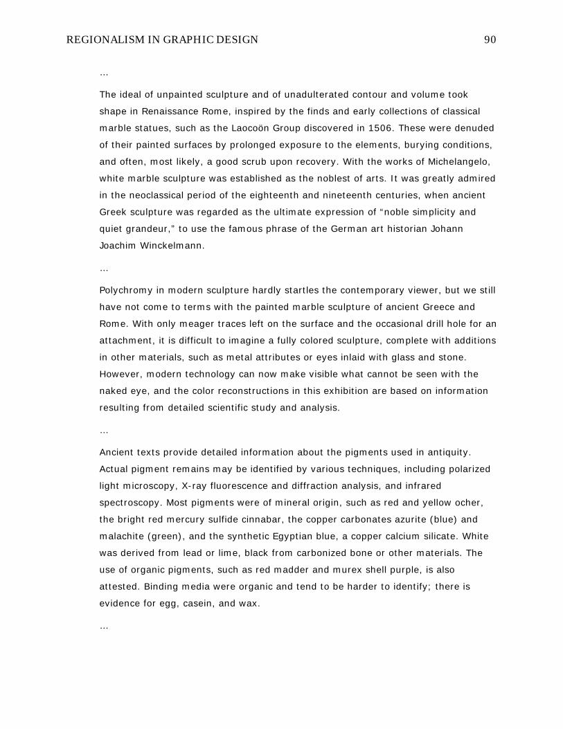
REGIONALISM IN GRAPHIC DESIGN 90
…
The ideal of unpainted sculpture and of unadulterated contour and volume took
shape in Renaissance Rome, inspired by the finds and early collections of classical
marble statues, such as the Laocoön Group discovered in 1506. These were denuded
of their painted surfaces by prolonged exposure to the elements, burying conditions,
and often, most likely, a good scrub upon recovery. With the works of Michelangelo,
white marble sculpture was established as the noblest of arts. It was greatly admired
in the neoclassical period of the eighteenth and nineteenth centuries, when ancient
Greek sculpture was regarded as the ultimate expression of “noble simplicity and
quiet grandeur,” to use the famous phrase of the German art historian Johann
Joachim Winckelmann.
…
Polychromy in modern sculpture hardly startles the contemporary viewer, but we still
have not come to terms with the painted marble sculpture of ancient Greece and
Rome. With only meager traces left on the surface and the occasional drill hole for an
attachment, it is difficult to imagine a fully colored sculpture, complete with additions
in other materials, such as metal attributes or eyes inlaid with glass and stone.
However, modern technology can now make visible what cannot be seen with the
naked eye, and the color reconstructions in this exhibition are based on information
resulting from detailed scientific study and analysis.
…
Ancient texts provide detailed information about the pigments used in antiquity.
Actual pigment remains may be identified by various techniques, including polarized
light microscopy, X-ray fluorescence and diffraction analysis, and infrared
spectroscopy. Most pigments were of mineral origin, such as red and yellow ocher,
the bright red mercury sulfide cinnabar, the copper carbonates azurite (blue) and
malachite (green), and the synthetic Egyptian blue, a copper calcium silicate. White
was derived from lead or lime, black from carbonized bone or other materials. The
use of organic pigments, such as red madder and murex shell purple, is also
attested. Binding media were organic and tend to be harder to identify; there is
evidence for egg, casein, and wax.
…

REGIONALISM IN GRAPHIC DESIGN 91
When inspired by nature, color adds a lifelike quality to sculpture. In the ancient
world, this quality was also desired for statues of bronze: overlays of reddish copper
accentuated lips and nipples, silver covered teeth and nails, and gold highlighted
ornamental details. Color further characterized body and costume, and, in the case
of reliefs, enhanced the contrast between figure and background. At least for stone
sculpture, the Greeks followed the Egyptian convention of depicting women with
lighter and men with darker skin. For Greeks and Romans, dazzling colors were an
essential ingredient of the trouser suits of Persians and other Eastern barbarians,
just as the prestigious purple denoted the dress of rulers, for example the military
cloak of the Roman emperor. As sculptors often left details to be rendered entirely in
paint, reconstructing the original surface may provide important clues to the
meaning of a work.
…
Most ancient sculpture, whether depicting human or divine subjects, is incomplete
without color. Only with the Renaissance did white or monochrome sculpture become
a paradigmatic form of artistic expression. As we now know, this phenomenon would
have startled ancient sculptors such as Praxiteles—just as the color reconstructions
of ancient statues startle us today.
(Ebbinghaus, 2007, p. 1-7.)

REGIONALISM IN GRAPHIC DESIGN 92
Figure 41: Roman wall mosaic Figure 42: Cincinnati Union Terminal mosaic detail
Figure 43: Roman floor mosaic Figure 44: modern Rookwood tilework
The polychromy of sculpture that was incorporated into architecture with the
magnificent classical freizes of antiquity also extended into housewares and decorative
arts like pottery and mosaic (Figure 41). Here again, there is a connection in the
traditions of Rome and Cincinnati (Figure 42). The intricate mosaic tile installations
uncovered throughout the Roman empire by archaeologists form the canonical roots of
Cincinnati artisan works like the famous Rookwood pottery company’s brightly colored
(and now very valuable) tile housewares and public mosaics (Figure 44), a little-known

REGIONALISM IN GRAPHIC DESIGN 93
mosaic installation in the Peck Federal Building in downtown Cincinnati by graphic
artist Charlie Harper (Figure 45), and the enormous Art Deco mosaics of American
workers that line the blazing polychrome interior rotunda of Union Terminal (Figure
48).
Figure 45: Charlie Harper’s Peck Federal Building animal mosaic in downtown Cincinnati
Figure 46: Harper mosaic detail 1
Figure 47: Harper mosaic detail 2

REGIONALISM IN GRAPHIC DESIGN 94
Figure 48: Union Terminal brilliant polychrome interior with vast Art Deco glass mosaics
Collateral materials design
The mark and identity system development. When starting out to design
the IVC logotypes that would be used in collateral material to identity the event, I
wanted to create a system with enough flexibility to accommodate any last-minute needs
with ease but that also gave the viola the kind of dignified status it deserves but does not
enjoy. I decided that the “secondary architecture” of the system would probably need to
play a near-equal role in the materials as the primary logotype and so I left the Janus
head (Figure 50) to play that swing role while setting out to design a primary mark.

REGIONALISM IN GRAPHIC DESIGN 95
Figure 49: Janus arch, coins, bust, and graphic translation

REGIONALISM IN GRAPHIC DESIGN 96
Figure 50: Janus icons, Janus phases - metaphorical ‘mythology’

REGIONALISM IN GRAPHIC DESIGN 97
Figure 51: Janus typography new / old constructions

REGIONALISM IN GRAPHIC DESIGN 98
My attention turned toward the instrument itself and the iconography associated
with it. I researched the craft of “luthiers” (makers of guitars and string instruments)
and found a set of measured scale drawings of three very famous and priceless
Stradivarius instruments, which piqued my interest given my architectural background.
I wanted to see the construction drawings of the viola in detail. The feature that most
interested me was the “f-hole” which allows air to escape the instrument as it resonates
with sound waves. It is a very specific shape that has been experimented with endlessly
by craftspeople, but has attained a certain standardization through trial-and-error.

REGIONALISM IN GRAPHIC DESIGN 99
Figure 52: IVC Mark – String instrument F-holes

REGIONALISM IN GRAPHIC DESIGN 100
I precisely traced the f-holes of all three—a violin, a viola, and a cello—so I could
study them comparatively (Figure 52). I began by comparing their sizes and stacking
them to look for variations or interesting interplay of their shapes when juxtaposed in
layers. The size of the violin and viola f-holes are quite close to each other, while the
cello f-hole is far larger, which stands to reason given the much larger size of a cello. I
decided to focus the viewer on the viola mark and have the violin and cello play
supporting roles for a change by leaving the viola f-hole solid while using outlined
versions of the violin and cello f-holes. Since the cello mark was so much larger, I cut out
much of its midsection and left the more active ball terminals at the end, and finally
allowed fragments and echoes of the violin and cello marks to weave over and under
each other and the viola mark, sometimes solid outlines and sometimes reversed
outlines from the solid viola mark below. This created a dynamic and vibrating
collection of related linear and curved elements (Figure 53) that could be cropped and
magnified to create ‘secondary architecture’ asset forms of the mark (Figure 54) for
different applications like business cards and letterhead. The alternate forms were
distributed throughout the individual application pieces so as to create enough levels of
variety that viewers could only experience the entire system with repeated exposures in
different formats over time. Finally, the primary mark was revisited and rendered in a
polychrome treatment according to the IVC color palette (Figure 55).

REGIONALISM IN GRAPHIC DESIGN 101
Figure 53: IVC mark construction

REGIONALISM IN GRAPHIC DESIGN 102
Figure 54: IVC ‘secondary architecture’ assets and primary mark crop fragments

REGIONALISM IN GRAPHIC DESIGN 103
Figure 55: IVC primary mark with polychrome treatment

REGIONALISM IN GRAPHIC DESIGN 104
Walking the line: UC’s brand identity. As with most major college
campuses, a brand identity system is in place at the University of Cincinnati that
dictates certain non-negotiable guidelines for the use of the university’s logo, color, and
naming components. They are usually rather dry, miserable affairs focused more on
raising the level of compliance to basic minimum standards of communications quality
from the lowest performers throughout the organization than they are on inspiring the
higher performers to capture the spirit of the institution in creative or dynamic ways. It’s
usually about the “branding police” mentality long before it’s about giving identity
stakeholders guidance on visual tone of voice that encourages pushing boundaries.
Of course, the problem with such systems is that they inherit a lot of the
hegemonies of the international style’s system thinking in perpetuating the myth that
merely slapping the same logo on every communications piece in the same corner in the
same colors and using the same font will create “identity” that is not only accurate but
that builds community, invokes rich traditions, and draws out latent alumnal memories.
In practice, branding guidelines tend to lobotomize their users into resigning the
presentational and design aspects of communication to the nameless automatons who
bore the rules and go haywire when they’re broken. It’s a disease of thinking that
spreads throughout an organization when enforced from the top down rather than
collectively built from the bottom up each and every day.
Fortunately, the IVC event was being funded through external channels and
CCM’s own general fund rather than university monies, so the UC Creative Services
(a.k.a. the “branding police” in this scenario) did not hold much jurisdiction in this case,
other than that the university’s facilities were being used for the event. Nevertheless, my
intimate familiarity with the UC Brand Guidelines (Figure 57) after years of designing

REGIONALISM IN GRAPHIC DESIGN 105
graphics for the DAAP program in various capacities was useful in reinterpreting the UC
identity along the IVC identity system’s lines and ensuring that the UC logo and name
assets were used in a way that was compliant to the letter of the law, but also aspired to
uphold its intended spirit in a fresh way.
Figure 56: UC website showing red/black and “swoop” theme

REGIONALISM IN GRAPHIC DESIGN 106
Figure 57: The UC Branding Standards manual
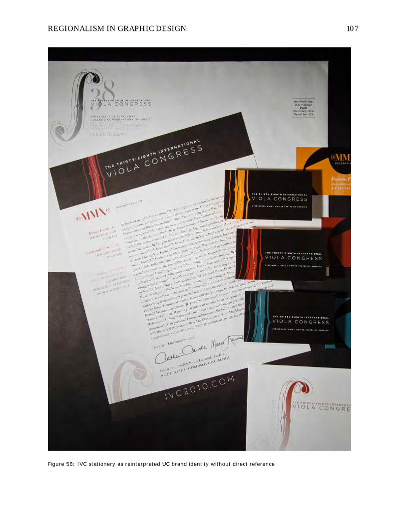
REGIONALISM IN GRAPHIC DESIGN 107
Figure 58: IVC stationery as reinterpreted UC brand identity without direct reference

REGIONALISM IN GRAPHIC DESIGN 108
Color palette. As described in the debate about classical polychromy in
sculpture and architecture, the color palette adopted for IVC is one that could have been
achieved by ancient techniques of crushing natural minerals into durable pigments that
would be painted onto the pristine white surfaces we still tend to think of as “classical.”
The modernist palette we have inherited from the international style tends toward
neutrals and stark contrasts, with isolated “pop” colors used for accent, especially red.
It’s no mistake that more architecture firms throughout history have used red and black
as identity colors than any other combination. And, surprise—UC’s primary colors are
red and black.
The IVC color palette inspired by this research into classical decorative arts
exhibits a connection to earth and materiality that supports the regionalist mission of
connecting to place in a quite literal way (Figure 59). Color throughout the ancient
world could only have been “regionalist” in that modern technology for standardizing
color reproduction didn’t yet exist. Predominant regional colors would have varied with
the available natural materials found there and with the seasons as organic sources
bloomed and faded.

REGIONALISM IN GRAPHIC DESIGN 109
Figure 59: IVC color palette

REGIONALISM IN GRAPHIC DESIGN 110
The particular colors adopted here for IVC were sampled directly from the
brilliant digital catalog reproductions of Harvard’s “Gods in Color” exhibition whose
images would surely have been produced with relatively accurate reproduction methods
since color was the main content of the research driving the exhibition. They exhibit
what one would probably describe as a certain grayness or flatness compared to super-
saturated primary Crayola colors of today’s modern color imagination, which helps
mitigate their unbridled application across the poster, business cards, and event
program’s backgrounds and information graphics.
Figure 60: View of Cincinnati’s Over-the-Rhine district looking toward UC’s campus atop Clifton hill
Since Cincinnati is filled mostly with traditional masonry construction (Figure
60), the earthen character of the classical palette derived from natural pigments much
the same way we still make brick is entirely appropriate. The “brilliants” palette of
ancient colors reference very directly the unique architectural assets found in

REGIONALISM IN GRAPHIC DESIGN 111
Cincinnati: the downtown Findlay Market (Figure 61), many Victorian rowhouses in the
Over-the-Rhine district (Figure 62), and the rotunda of the Union Terminal building
(Figure 63).
Figure 61: Findlay Market’s polychrome palette

REGIONALISM IN GRAPHIC DESIGN 112
Figure 62: Victorian townhouses in Over-the-Rhine
Figure 63: Union Terminal lobby showing polychrome “sun”

REGIONALISM IN GRAPHIC DESIGN 113
The guest artist’s headshots were also duotoned in the range of natural colors
from the IVC color palette and placed in a grid on the website’s “artists” page to
resemble a long mosaic tile installation (Figure 64) reminiscent of the Cincinnati-Rome
connections and also representing a scaled metaphor to the digital pixel as a unit of
information. The poster application also provided an opportunity to apply this brilliant
color palette across the typography system in an unusually energetic way (Figure 65).
Figure 64: IVC website Artists duotone mosaic Figure 65: IVC poster typographic color

REGIONALISM IN GRAPHIC DESIGN 114
Figure 66: IVC poster polychrome type Figure 67: IVC poster polychrome mark with UC logo
Figure 68: IVC program book polychrome mark

REGIONALISM IN GRAPHIC DESIGN 115
Typography palette. The typography palette adopted for IVC was a source of
internal debate and struggle, but also delight in exploration and application since
typography is probably my first love in graphic design. I instinctively wanted to develop
a type system for the event that would be recognizable and comfortable with an
international classical music audience, but that would also somehow embody the
Midwestern ethos of humility and practicality, a quiet elegance rather than haute
couture glamour.
I settled on two main “display” typefaces for conveying the conceptual identity
components of the system and another two “text” faces for much of the heavy
information lifting in the program book and concert programs where most of the
conference’s lengthiest texts would reside. The two display faces were Didot (Figure 69),
designed in digital form by the New York foundry of Hoefler and Frere-Jones (H&FJ)
based on the early 19th century “modern” French types of Firmin Didot (modern in the
sense of typographic history going back six centuries), and Gotham (Figure 70), also
design by H&FJ and modeled after the original hand-painted directional sign lettering
found in New York City’s subway system. The two text faces were Alright Sans (Figure
71), designed by Jackson Cavanaugh of Okay Type Foundry and Sentinel (Figure 72),
another H&FJ face inspired by the class of fonts known generically by the name of
“Clarendons.”

REGIONALISM IN GRAPHIC DESIGN 116
Figure 69: Didot specimen, H&FJ – New York

REGIONALISM IN GRAPHIC DESIGN 117
Figure 70: Gotham specimen, H&FJ – New York
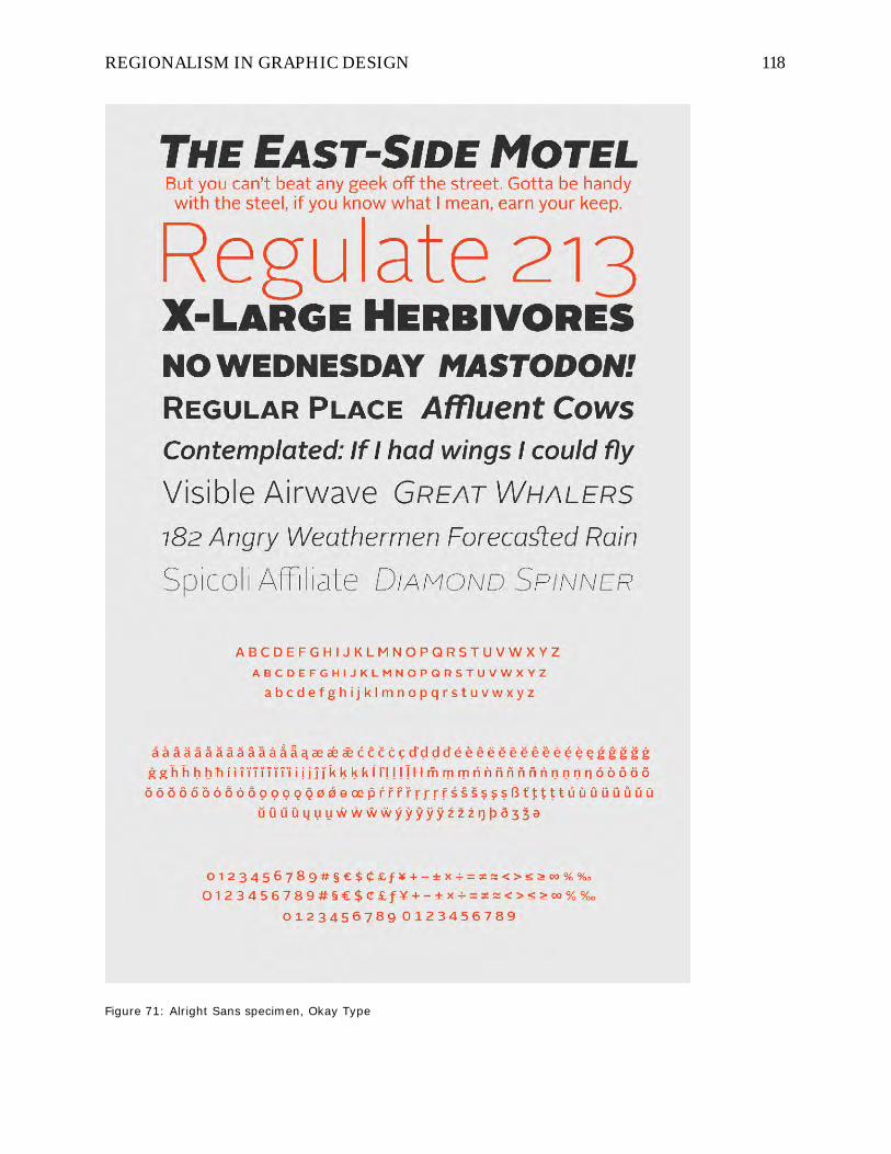
REGIONALISM IN GRAPHIC DESIGN 118
Figure 71: Alright Sans specimen, Okay Type

REGIONALISM IN GRAPHIC DESIGN 119
Figure 72: Sentinel specimen, H&FJ – New York
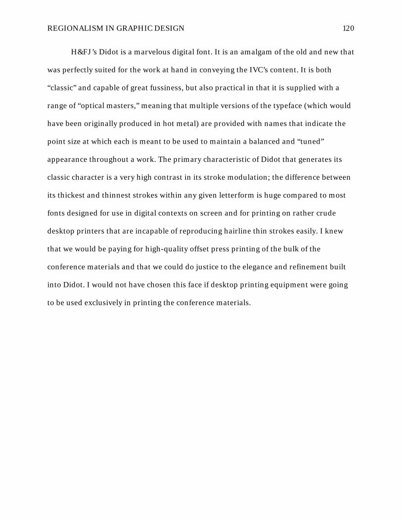
REGIONALISM IN GRAPHIC DESIGN 120
H&FJ’s Didot is a marvelous digital font. It is an amalgam of the old and new that
was perfectly suited for the work at hand in conveying the IVC’s content. It is both
“classic” and capable of great fussiness, but also practical in that it is supplied with a
range of “optical masters,” meaning that multiple versions of the typeface (which would
have been originally produced in hot metal) are provided with names that indicate the
point size at which each is meant to be used to maintain a balanced and “tuned”
appearance throughout a work. The primary characteristic of Didot that generates its
classic character is a very high contrast in its stroke modulation; the difference between
its thickest and thinnest strokes within any given letterform is huge compared to most
fonts designed for use in digital contexts on screen and for printing on rather crude
desktop printers that are incapable of reproducing hairline thin strokes easily. I knew
that we would be paying for high-quality offset press printing of the bulk of the
conference materials and that we could do justice to the elegance and refinement built
into Didot. I would not have chosen this face if desktop printing equipment were going
to be used exclusively in printing the conference materials.

REGIONALISM IN GRAPHIC DESIGN 121
Figure 73: Didot uses multiple optical sizes to keep hairlines thin at any point size

REGIONALISM IN GRAPHIC DESIGN 122
Figure 74: Didot specimen setting IVC-specific text content

REGIONALISM IN GRAPHIC DESIGN 123
I also knew that many conference attendees would recognize Didot intuitively
through its associations with the high fashion world through art director Fabien Baron’s
legendary commissioning of H&FJ’s original design to be used in the overhaul of
Harper’s Bazaar magazine (Figure 75). In line with the international stature of the IVC
guest artists roster, Bazaar uses Didot to grace its covers in every foreign language
edition across the globe! (Figure 76) Perhaps more directly related to the IVC audience,
I also knew they would be familiar with typefaces very similar to Didot called “Bodoni”
types that are used throughout the musical publishing business in the scores and
manuscripts they are used to reading and using in rehearsal, particularly the staunchly
classic and ubiquitous “Urtext” editions published by the German house of G. Henle
Verlag (Figure 77).
Figure 75: Didot, developed by H&FJ for the redesign of Harper’s Bazaar

REGIONALISM IN GRAPHIC DESIGN 124
Figure 76: Didot on the covers of Bazaar & Vogue in Japan, UK, Spanish & Turkish versions

REGIONALISM IN GRAPHIC DESIGN 125
Figure 77: Didot in historic editions and modern musical scores
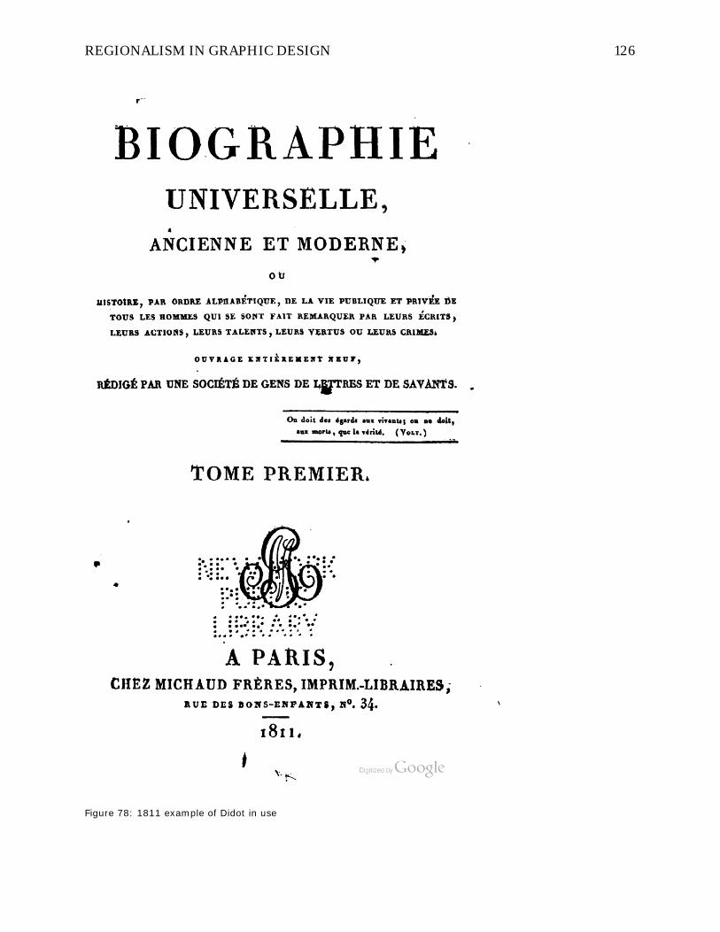
REGIONALISM IN GRAPHIC DESIGN 126
Figure 78: 1811 example of Didot in use
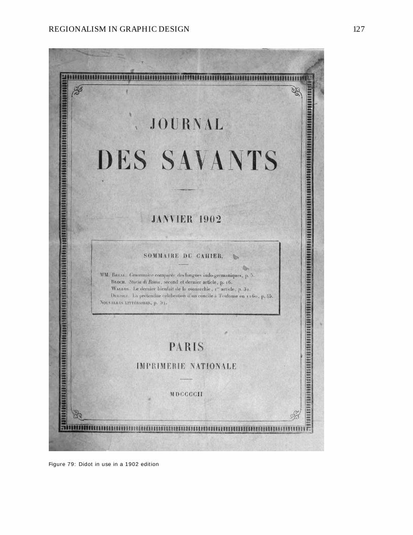
REGIONALISM IN GRAPHIC DESIGN 127
Figure 79: Didot in use in a 1902 edition

REGIONALISM IN GRAPHIC DESIGN 128
Gotham is one of those typefaces that has very quietly assumed a dominant role
in American graphic communications over the last decade. Its origin in the humble,
blue-collar sign painter’s letters in the New York subway lends the face its direct and
very unfussy appeal to contrast Didot almost as far as one could possibly contrast in
demeanor and outlook. Didot and Gotham together are rather like Cinderella and an oil
field roughneck going to the ball. Graphic designers love Gotham because it can carry so
many different kinds of text with equal earnestness, and every letter in the font is
eminently “usable”— there are no “wordstoppers” with so much personality that they
catch a reader’s eye as it trips over them. Designers love Didot because it automatically
grants class and establishment elegance to a message and also because it has a ravishing
italic.
Alright Sans is related to Gotham in that it is remarkably humble and
unassuming. Although its lowercase shapes are a bit closer to the Gothic (think Franklin
or News Gothic) than Gotham’s (no pun intended), its uppercase letters are nearly
identical to Gotham’s. One could almost use them interchangeably without distraction. I
decided to use Alright for the copy texts and leave Gotham for uppercase titling because
the lowercase of Gotham has always felt just too wide to me for comfort (a fact H&FJ
recognized by later releasing ‘condensed’ widths of Gotham), and it’s not a particularly
full-featured digital font for lengthy text setting. Alright picks up where Gotham leaves
off by sitting on the page in a more comfortable width and offering a full complement of
characters including small caps, automatic ligatures, and “ranging figures” (numbers
that go up and down like lowercase letters).
Sentinel is a reinterpretation and extension of the logic of “slab-serif” fonts like
Clarendon or “Egyptian” typefaces popularized in the early 1800s in Europe,

REGIONALISM IN GRAPHIC DESIGN 129
particularly London. Clarendons have a long history of use in America—the first
McGuffy Reader schoolbooks used a slab serif, and children’s wood block alphabets are
usually rendered in a Clarendon—and their affable, spirited nature but relatively clean
and simple construction makes them easy to pair with modern typefaces to add some
personality to what might otherwise be a stark or rather lifeless mixture of voices.
Sentinel was adopted for IVC because it fixes many of the difficulties in working with
Clarendon, namely the lack of different weights, lack of special characters like small caps
and tabular numeral sets, and worst of all, the lack of an italic counterpart. These added
features in Sentinel make setting complex texts far easier than with other slab serif
faces, but still retains their inherent charm. Clarendon has been used to very
appropriate effect in Cincinnati in the identity and promotional materials for Findlay
Market (many of which I have also designed over the years), the central downtown
farmer’s market where local foodies can socialize and shop in a truly regional experience
(Figure 80). For a complete history of Sentinel’s origins, the H&FJ website contains a
lively illustrated history of the functional problems they meant to solve with Sentinel’s
design. (Hoefler & Frere-Jones, 2013)

REGIONALISM IN GRAPHIC DESIGN 130
Figure 80: Clarendon (slab serif like Sentinel) in use at Findlay Market

REGIONALISM IN GRAPHIC DESIGN 131
As a regional side note to the story of IVC’s typography, I intentionally chose to
avoid the use of “blackletter” typefaces (the original “Gothic” calligraphic letters as
opposed to the more recent sans-serif “gothics”), perhaps best typified by Fette Fraktur
and often linked to Cincinnati’s local character through its strong German immigrant
heritage (Figure 81). Many designers looking for a way to connect to local cultural
history would jump on the idea of using blackletter much in the same way it is often
used in retail design settings for beer packaging and the like to play on consumers’
stereotyped sense of nostalgia. While it’s true that blackletter can be found throughout
the city in stone markers and building inscriptions still today, I feel that the best
arguments about the German use of blackletter long after it had fallen out of favor in the
rest of Europe rest mostly on the gothic letter’s functional rather than cultural identity
attributes. Its narrow width on the page made it ideal for setting German texts which
tend to have very long, compound words that lead to many lines ending in hyphenated
words when set in standard roman faces. Since no German texts would be included in
the IVC materials, the functional argument for its use was moot. And if so, why subject
international readers to the legibility difficulties inherent in setting event texts (except
perhaps a very few ‘display’ examples) in a script with which they are probably
unfamiliar?

REGIONALISM IN GRAPHIC DESIGN 132
Figure 81: Fette Fraktur, a prototypical German “blackletter”
But, more difficult and thorny was the issue of the cultural connotations now
attached to blackletter. Warranted or not, its reputation as being associated with Nazis,
skateborders, “goth” subcultures, Mexican storefront signs, and tattoo parlors is a result
of the tangled and confused history of its popular use (Bain et al., 1998). This reading
might be altogether different (in a good or bad way) among IVC attendees coming from

REGIONALISM IN GRAPHIC DESIGN 133
Europe where the history involved could run much closer to their personal experiences
than to mine growing up in rural Ohio. I wanted to avoid the cultural blurring and
potentially negative readings its use might impart on the text content of the conference
as well as to avoid pandering to a lowest common denominator of nostalgic clichés that
fall in line with Wendell Berry’s description of a regionalism based on pride and
predatory tourism.
Ornament and pattern. The history of H&FJ’s faces, especially the Hoefler
typeface, includes a great many fonts that celebrate their “ornaments”—characters
sometimes called fleurons or dingbats that can be typed in repeated patterns to create
decorative border elements like those often seen surrounding the title pages of classical
books and manuscripts. I viewed this ornamental typographic tradition as another
powerful tool, along with a polychromatic revival, for injecting the “classical” back into
CCM and the IVC identity system. I knew that I wanted to pay tribute to the long and
ravishing history of classic 18th and 19th century book printing by weaving ornamental
patterns through the program book and collateral materials like certificates and
individual concert programs (Figure 82).

REGIONALISM IN GRAPHIC DESIGN 134
Figure 82: IVC certificates using typographically generated ornamental borders

REGIONALISM IN GRAPHIC DESIGN 135
This part of the design process may have been the most unbridled fun for me as I
got lost for hours constructing fanciful interlocking and repeating patterns with
typographic characters in myriad configurations, including both halves of the Janus face
playfully tucked inside (Figure 83). The borders were useful on the collateral pieces that
I wanted to skew toward an “old” or “traditional” reading according to the IVC’s themes,
and the repeating surface patterns proved very useful in creating backgrounds to lay
under advertisements throughout the program book in order to unify and bind together
what would otherwise have been a cacophony of commercial messages, each with their
own visual domain on the page.
Figure 83: IVC pattern 1 Figure 84: IVC pattern 2, enlarged

REGIONALISM IN GRAPHIC DESIGN 136
Figure 85: IVC pattern 3
Figure 86: IVC pattern 4
Figure 87: IVC pattern 5
Figure 88: IVC pattern 6
Poster and postcard development. The poster was the first real promotional
collateral needed for early marketing of the event to music schools and teachers all over
the country. And of course, it needed to be splashy enough to create desire and buzz
among viewers to be effective at garnering interest that actually converted to attendees.
We needed to send it out at least six months ahead of the event so the poster could hang
in public bulletin board areas, mostly in music schools to attract the attention of
students who would potentially pay (or get a school to sponsor them) to attend. This

REGIONALISM IN GRAPHIC DESIGN 137
presented the content development problem of having enough information to explain
and promote the best features planned for the event, but not overcommitted to events or
guests that may by adjusted or canceled by the opening date.
I was photographing Dominic’s own personal viola one day in the viola teaching
studio at CCM when I noticed the ultra-polished finish on the black baby grand piano in
the room. I had the thought to place his viola on the piano and start to photograph it in
tight crops that would eliminate the room background. I quickly recognized the
connection to the Janus theme in the doppleganger images of the viola that resulted: the
neck, tuning pegs, and scroll of the instrument were seen coming in from the edge of the
frame while the dark and less detailed underside of the instrument was clearly reflected
in the piano lid. The reverse image of the scroll perfectly mirrored its counterpart where
the viola and piano touched, precisely the way the Janus head is composed of two
opposing faces connected back-to-back. I knew instantly it would be the major image
that anchored the poster, and I would place the Janus seal directly over the contact
point between light and darkness, image and void.

REGIONALISM IN GRAPHIC DESIGN 138
Figure 89: IVC postcards

REGIONALISM IN GRAPHIC DESIGN 139
I carefully masked the image so it could float over a field of strong color and
placed a slightly diagonal “sash” shape across the poster to allude to a sense of royal
dignity and also to functionally designate a zone for the main titling separate from the
remainder text zone below. I also knew that I wanted to incorporate the f-hole mark at a
very large scale so that the nuances of its delicate interplay of echoing and fractured
shapes could be seen more clearly than when used at a normal size on the page. I placed
it in the color field background with a gradient fill that created shifting contrast from the
top of the poster to the bottom and also interacted with the sash element as if through a
spatially ambiguous prism. The color palette was drawn from the studied examples of
classical mineral pigment polychromy, and the chromatic effects were carried through
the typography of event and guest artist listings at the poster’s bottom. This final poster
format was repeated in multiple polychromatic color versions, and the design was scaled
down and the text reconfigured for production at postcard size for reaching larger
secondary mailing lists as well.

REGIONALISM IN GRAPHIC DESIGN 140
Figure 90: IVC poster, blue

REGIONALISM IN GRAPHIC DESIGN 141
Figure 91: IVC poster, red

REGIONALISM IN GRAPHIC DESIGN 142
Figure 92: IVC poster, green

REGIONALISM IN GRAPHIC DESIGN 143
Figure 93: IVC poster color variations

REGIONALISM IN GRAPHIC DESIGN 144
Program book development. The program book represented the greatest
technical challenge of the entire project. It is almost always the most difficult piece in
any event’s design scheme to create due to its large amount of content, coordination
with contributors, cost of production, and technical design requirements. The
conference program book essentially acts as a stand-in valet to the attendee when live
help isn’t available: it must wear many hats in as few pages as possible to keep costs
down but still provide conference attendees with all the information they need:
• Most attendees would not be familiar with the University of Cincinnati
campus or city setting, so maps, wayfinding, and public transportation
options not only around the campus, but also to off-campus hotels and
local / downtown entertainment and restaurants had to be provided.
• All of the conference offerings had to be organized in a master schedule
(which inevitably shifts up to the last minute before printing, and even
afterward!) with enough information to clarify each session’s content but
still be compact enough for easy reference and display in multiple sizes
and formats (an information design challenge).
• All of the conference’s many illustrious star musicians needed biography
listings, which presented a language barrier for many who provided quite
‘broken English’ texts that needed rewriting and editing.
• All of the event’s many sponsors and advertisers had to be accommodated
with ad space within the book (and many times, completely redesigned ads
commensurate with the aesthetic standards set for the event) without
destroying or disjointing the continuity of the reading experience and
hindering easy access to needed resources for readers.

REGIONALISM IN GRAPHIC DESIGN 145
• The entire program of thematic content underpinning the event had to be
evoked in the text, color, layout, information graphics, and printed feel of
the book.
• Beyond merely being functional, it must be interesting and hopefully
attractive enough to serve as a coveted keepsake souvenir of the
conference experience.
The first impression of the book made by the outer covers is critical since it sets
the tone for the reader’s initial contact with the event’s content. The front cover (Figure
94) is quite modern in its handling of layout geometry and typography, while still
incorporating overtones of ornamental borders and evoking common memory of the
classical past using a semi-transparent photograph underlay of the dual Janus viola
image (seen earlier by attendees in the postcard campaign). The use of the Didot
typeface at display size lends it sophistication and stateliness to the conference titling,
and Gotham, given its blue-collar roots, does the heavy information lifting. Also
depicted are the heads of Janus looking toward the left into the past and into the ceiling
of the Pantheon in Rome with its skylight ‘oculis’ or eye of God, and simultaneously
looking into the future toward the right and into a comparative photograph of a skylight
in the new CCM building by Pei Cobb Freed with its triangular skylight serving the same
ocular function in angular geometries centuries later. A full-spectrum gradient color
wash suffuses both “old” and “new” skylight photographs to tie them together
metaphorically into a continuous timeline in which present conference attendees can
visually situate themselves as not only observers, but active participants and
contributors.

REGIONALISM IN GRAPHIC DESIGN 146
Figure 94: IVC program front cover

REGIONALISM IN GRAPHIC DESIGN 147
The layout geometries of the front cover of the IVC2010 program was critiqued
and published in Dennis Puhalla’s 2011 book Design Elements: Form & Space where he
writes:
On the cover brochure for the Thirty-Eighth International Viola Congress, the image
area is defined by a strong vertical rectangle. Internally, a set of four squares defines
a larger square within the image area rectangle. With the inclusion of images,
typography, symbology, color, line, and shape elements, the content drives the
message. As in a musical score, the image reflects an underlying ordering system of
repetition, contrasts, and surprise. (Puhalla, 2011, p. 21)
The back cover was reserved, as is customary, for the premier full-page sponsor
advertisement area. This ad was custom-designed by me for the sponsor who submitted
only their contact information, and it was folded into the programmatic content of the
IVC by representing the “old” half of the theme’s duality while the front cover
represented the “new” and forward-looking thrust of the conference. I intentionally
modeled the back cover after 19th century book frontispieces, complete with their very
traditional centered titling schemes and florid typographic ornamental borders and a
flat, solid color scheme of sage green and gold, both earthen hues evocative of Greek
mineral pigments. Flipping the closed IVC program book back and forth in your hand
clearly illustrates the stark contrast of the duality set up in the content for the
conference—front cover: new, colorful, and dynamic—back cover: old, subdued and
traditional—while still leaving room for cohesive connections through color and type,
and not editing out contradiction or surprise.

REGIONALISM IN GRAPHIC DESIGN 148
Figure 95: IVC program back cover

REGIONALISM IN GRAPHIC DESIGN 149
Figure 96: IVC program front and back covers, old and new
The rest of the program book contains the bulk of the conference content: (1)
acknowledgements to sponsor, exhibitors, and organizers, (2) threads of content about
the connections between the IVC site in Cincinnati and its sister city Rome and the ties
between classical civilization and music and modernity, (3) complete information for
new visitors to UC and Cincinnati including transportation maps, (4) the master
conference schedule grid, (5) advertisements with custom page color backgrounds and
borders using IVC graphics, (6) information about the mobile-ready interactive
conference website, (7) complete guest artist bios, (8) complete musical concert
programs, and (9) blank space for note-taking during conference sessions.

REGIONALISM IN GRAPHIC DESIGN 150
The front matter uses a large-scale Janus mask and the small Janus phases icons
(Figure 99) to introduce the symbol that will bee seen around the CCM village campus
during the event on wayfinding signage and as a marker the event maps. It also
incorporates bilingual heading texts, in English and Latin, to further reinforce the
connections to antiquity (Figure 98). Throughout the rest of the conference materials,
bilingual treatments of headings, especially months and days of the week, are rendered
bilingually, paired with the Janus face to reinforce the old/new theme.
Figure 97: IVC program welcome spread

REGIONALISM IN GRAPHIC DESIGN 151
Figure 98: IVC program bilingual Latin-English with Janus phase masks

REGIONALISM IN GRAPHIC DESIGN 152
Figure 99: IVC program acknowledgements spread
The main conference schedule is where the connection to polychromy most
strongly intersects with the functioning of the program book. Along with featured
sidebar content about startlingly-colored classical sculptures, the schedule grid borrows
the ancient mineral pigment color palette to code events in the grid by type for easy
separation of the information layers presented. One can view the key to find the color of
all lecture events, concerts, or master classes, and then easily scan the program grid for
only those events that are most interesting (Figure 100).

REGIONALISM IN GRAPHIC DESIGN 153
Figure 100: IVC program event map and schedule spread
The first half of the program book was also printed, quite intentionally, in full
color on a glossy magazine paperstock to represent the modern tactile feel of a current
publication (Figure 101). The second half of the program was then printed with black ink
only on a cream-colored matte linen paperstock that evokes the tactile feel of a musical
manuscript. Again, the conference themes of history, memory (however mistaken or
conflated), and modernity are embodied by the physical corporeality of the book in
itself. This was not only an aesthetic choice, tied intimately to the content development
process, but also an experiential one stemming from my personal love of the feeling of
flipping through musical manuscripts with their smooth calendered high-quality acid-
free papers and beautiful high-resolution engraving. It became a touchstone for my own
personal recollection of a musical childhood filled by a great many joyful and engrossing

REGIONALISM IN GRAPHIC DESIGN 154
hours spent at the piano keyboard and later in school band rehearsals and the thrill of
drum and bugle corps competition fields.
Figure 101: IVC program center tactile paper change – glossy white to matte buff
The split nature of the book also directly connected it to the Janus head by
representing a technological fissure directly down the middle of the book’s content, the
first half being primarily about the present conference’s events still to come, and the
second half being about the listing of historical works to be played in the concerts,
information about their composers, and historical biographies of the past
accomplishments of the guest artists. And indeed, it was a very intentional economic
choice as a method of cutting cost in printing the program books—the most expensive
piece in the collateral system—since black and white printing on uncoated stock is so
much cheaper.
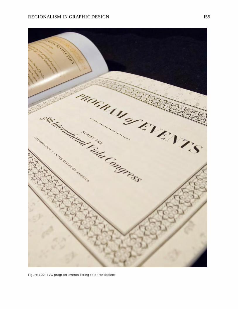
REGIONALISM IN GRAPHIC DESIGN 155
Figure 102: IVC program events listing title frontispiece

REGIONALISM IN GRAPHIC DESIGN 156
Figure 103: IVC program artist bios frontispiece

REGIONALISM IN GRAPHIC DESIGN 157
Figure 104: IVC program artist bios

REGIONALISM IN GRAPHIC DESIGN 158
Space and wayfinding. The environmental graphic designer in me was right at
home with the challenges of providing first-time visitors to IVC and the UC campus with
resources to find their way more effectively. There were many needs, including UC
campus maps, downtown maps and indexes of restaurants, a CCM village / IVC event
venues map, hallway directional signage throughout CCM’s three main buildings,
hallway display windows with schedule and map information, and connections to local
transportation from both campus and the conference hotel site on UC’s East Campus.
Figure 105: IVC CCM wayfinding signage map 1

REGIONALISM IN GRAPHIC DESIGN 159
Figure 106: IVC CCM wayfinding signage map 2
Most existing campus and CCM maps were either lacking in enough detail to be
used, or there was no existing digital original. So, almost every map used had to be
created by hand, and their labeled resources had to be researched through the UC and
various downtown Cincinnati websites. The CCM village complex also needed to be
walked to see every event site personally so I could understand common and easiest
routes to explain for conference visitors. Signage plans for the buildings had to be drawn
up and the required messages for each location written before design could begin
(Figure 105). The large easel-mounted hall directional signs that were left up for the five
days of the conference (Figure 112) and the easel signs placed outside the entrance doors
to each major nightly event (Figure 115) ultimately proved to be a great canvas for all the
work I had done in creating a neo-classical vocabulary for the event, complete with

REGIONALISM IN GRAPHIC DESIGN 160
background patterns and ornamental borders. They were seen enough and at such a
large scale that they helped to draw out and explain their use in smaller scales inside the
program book and in the subtle backgrounds of other collateral pieces like concert
tickets.
Figure 107: CCM event venue map

REGIONALISM IN GRAPHIC DESIGN 161
Figure 108: UC campus map

REGIONALISM IN GRAPHIC DESIGN 162
Figure 109: Public transportation schedules and campus map icon legend

REGIONALISM IN GRAPHIC DESIGN 163
Figure 110: UC campus map featuring IVC venue with Janus face

REGIONALISM IN GRAPHIC DESIGN 164
Figure 111: CCM event venue map in program book

REGIONALISM IN GRAPHIC DESIGN 165
Figure 112: Event wayfinding easel signage placed in hallways

REGIONALISM IN GRAPHIC DESIGN 166
Figure 113: Downtown Cincinnati hotels and dining options map

REGIONALISM IN GRAPHIC DESIGN 167
Figure 114: Off-campus dining directory and map

REGIONALISM IN GRAPHIC DESIGN 168
Figure 115: Easel sign for special event sponsor recognition

REGIONALISM IN GRAPHIC DESIGN 169
We were lucky in that CCM already had three sets of five large wall-inset display
cases along the main hallway of the conference which faced the most commonly used
rooms for seminars, lectures, and roundtable discussions. CCM was initially hesitant to
let us use these cases for IVC since they were each designated to different CCM
constituent groups and were already full of many small display materials that would be
difficult to remove and replace in exactly the same way. I developed the perfect solution
in measuring each door’s inset glass carefully and using a very inexpensive black and
white engineering plotter which prints on lightweight opaque bond paper to create
prints exactly the size of the display case door openings and then taping the prints
directly to the inside of each door frame (Figure 116). This completely covered the
contents of each case, and the backlighting diffused across the paper surface to
illuminate the graphics for viewers without disturbing the contents inside the cases in
any way. It provided a remarkably cheap and huge amount of surface area across the
fifteen display cases to thank sponsors and exhibitors for their participation, and
provide an enlarged CCM village map and IVC event schedule for reference each time
the hallways filled with attendees in between sessions.

REGIONALISM IN GRAPHIC DESIGN 170
Figure 116: Display case series 1 – map and schedule
Figure 117: Display case series 2 – acknowledgements

REGIONALISM IN GRAPHIC DESIGN 171
Figure 118: Display case series 3 – main titling with Janus faces
Figure 119; Display case series 1 installed

REGIONALISM IN GRAPHIC DESIGN 172
Figure 120: Display case series 2 installed
Figure 121: Display case series 3 installed, showing all three sets

REGIONALISM IN GRAPHIC DESIGN 173
Collateral event materials. The IVC demanded a great deal of collateral
support pieces beyond the initial marketing blitz of posters, letters, and postcards
mailed to schools and individual teachers across the country and also advertisements
placed in the major string magazines and journals six months leading up to the event.
To run an event with so many attendees from distant places required a full team of UC’s
event planning staff and CCM graduate students (Figure 122), and an array of printed
materials and merchandise including: concert programs, registration forms, swag
backpack bags, water bottles, paid event tickets that would be collected by volunteers,
banquet dinner table centerpieces, scholarship and competition winner certificates, and
staff nametags. All of these materials had to be designed and printed on an absolute
shoestring budget, so the university’s own in-house offset printing shop was used to
produce the program books while other collateral was either produced more
inexpensively online or printing manually (and often cut down by hand) by me on
desktop equipment.

REGIONALISM IN GRAPHIC DESIGN 174
Figure 122: UC Event Services staff at IVC registration
Figure 123: IVC merchandise and nametags
REGIONALISM IN GRAPHIC DESIGN 175
Figure 124: IVC event tickets and postcards
REGIONALISM IN GRAPHIC DESIGN 176
Figure 125: IVC event tickets

REGIONALISM IN GRAPHIC DESIGN 177
Figure 126: IVC concert programs, tickets, and musician rosters

REGIONALISM IN GRAPHIC DESIGN 178
Figure 127: IVC recording list, certificates, and table cards

REGIONALISM IN GRAPHIC DESIGN 179
Web design and event interactivity. The online and interactive strategy of
the IVC event was an area that wound up constituting a much larger portion of the
overall work than originally planned in design and implementation. Past IVC events had
used rather basic websites for the mostly administrative functions such events require
like marketing text of the event, advertising, online registration, and payment
processing. In planning the website and other materials with Catharine and Dominic, I
realized that we had the opportunity to help the IVC franchise take a quantum leap into
the digitally connected present. I saw that by leveraging the website (Figure 128) for far
more interactivity with conference attendees than ever before, we could not only enrich
their experience on site, but also provide a platform for extending the discussions
beyond the five day event timeframe and follow them back to their homes across the
globe with resources they could share with students and colleagues who were unable to
attend the event.
I knew that I couldn’t pull all of that off myself…I would need help! So, I planned
a strategy with Catharine and Dominic to assemble a group of tech-savvy graduate
students in the CCM music school who were already planning to attend and volunteer
for the event to become the blogging team (Figure 135). This meant that I had to
consider other administrative users of the website beyond myself, and that changed
everything in terms of design strategy. I could not afford to custom-design the site using
design tools that would render its update impossible for people without the same digital
skills and software. So, I had to design using the now-ubiquitous Wordpress Content
Management System (CMS), which would provide an easy-to-use administrative back-
end control panel that even uninitiated team members could be taught to use effectively
in only a few hours of training.

REGIONALISM IN GRAPHIC DESIGN 180
Figure 128: IVC website home page, full

REGIONALISM IN GRAPHIC DESIGN 181
Figure 129: IVC website home page, enlarged
REGIONALISM IN GRAPHIC DESIGN 182
Figure 130: IVC website home page feature article headers

REGIONALISM IN GRAPHIC DESIGN 183
Figure 131: IVC website polychrome article header system

REGIONALISM IN GRAPHIC DESIGN 184
Figure 132: IVC website banner ads for sponsors

REGIONALISM IN GRAPHIC DESIGN 185
Figure 133: IVC video page, full
Figure 134: IVC artist bios, full

REGIONALISM IN GRAPHIC DESIGN 186
The other advantage Wordpress provided was a huge number of existing users
who program and offer free plug-ins to the platform that could extend its functionality
with very little work on my part. For example, I was able to easily incorporate YouTube
videos and audio clips from master classes without having to worry about the browser
plug-ins end viewers of the website might have installed on their local systems. The
complex programming work to accommodate nearly every existing video / audio player
in use had already been done by scores of volunteer Wordpress community volunteers.
Perhaps more importantly, resources already existed to make the entire website
“responsive” to the wildly differing screen sizes of various mobile devices that might be
used to access the site. This means that when a viewer accesses the site on a cell phone,
its browser does not have to display a very tiny scaled-down version of what the site
would look like on a desktop computer’s large monitor, causing the user to zoom in and
scroll around to find content. Instead, the website would dynamically recognize the
screen size of every device trying to access the site, and send versions of each page that
changed the widths of text columns and the display of photographs to match (Figure
138), including “native” text that could be magnified according to the viewer’s
preferences for easy reading on a small device.

REGIONALISM IN GRAPHIC DESIGN 187
Figure 135: Blogging team training
Figure 136: Blogging team up and running
Figure 137: IVC mobile web poster Figure 138: IVC native mobile web menu system

REGIONALISM IN GRAPHIC DESIGN 188
The amount of content packed into the site wound up being enormous (Figure
139). For example, the guest artist listing page alone was almost a week’s work in
assembling! Every artist had a headshot that needed to be processed and sized for
perfect display, and multiple links to their artist management and personal websites
with biography information and audio recordings had to be manually assembled since
they did not provide it to the IVC, or did so in sporadic fashion. The blogging team
attended events and reported on their content as post articles in the blog, photo galleries
were uploaded and synchronized with Flickr (an online photo site), and session videos
were edited and posted to YouTube with links back to the IVC site (Figure 133).

REGIONALISM IN GRAPHIC DESIGN 189
Figure 139: IVC website blog articles
REGIONALISM IN GRAPHIC DESIGN 190
All of this content provided the opportunity to reinforce the IVC’s graphic themes
of old / new, classicism / modernism, and polychromy in antiquity. The backgrounds of
the site were assembled in both brightly colored and monochrome earth toned patches
of “digital mosaics” or tiles of color that metaphorically represented both the mosaic arts
connection between Cincinnati and Rome and the smallest unit of visual web page
information, the pixel. Different areas of the page displayed these ‘mosaic’ backgrounds
at different scales (Figure 139), lending the impression of spatial layering either closer to
the viewer or further away.
The guest artists bio page (Figure 134) was incorporated into this mosaic theme
by manually hand crafting “duotones” of every headshot using the IVC color palette
derived from polychrome classical antiquity. A duotone is a black and white image that
is also printed with one color of ‘ink’, usually on a printing press, so that the effect is one
of a ‘colorized’ photos much like that of a ‘sepia’ or brownish photo that is usually
associated with historic photography. Not only did this connect the headshots to the
idea of mosaics, history, and memory, but it provided a long and colorful tapestry of the
event’s roster which spoke to their rich array of experiences and perspectives the event
hoped to capture and share with attendees.
Event photos and video. Once all of the work designing the event was finished
and the event was underway, it was up to me, our team of graduate student bloggers,
and several UC audio engineers and technicians to document the conference sessions in
photographs and video. This was the fun part! We could participate in finally seeing the
event come to life and record it for sharing on the web. The following is a selection of
views representing the broad array of activities the IVC provided for attendees.
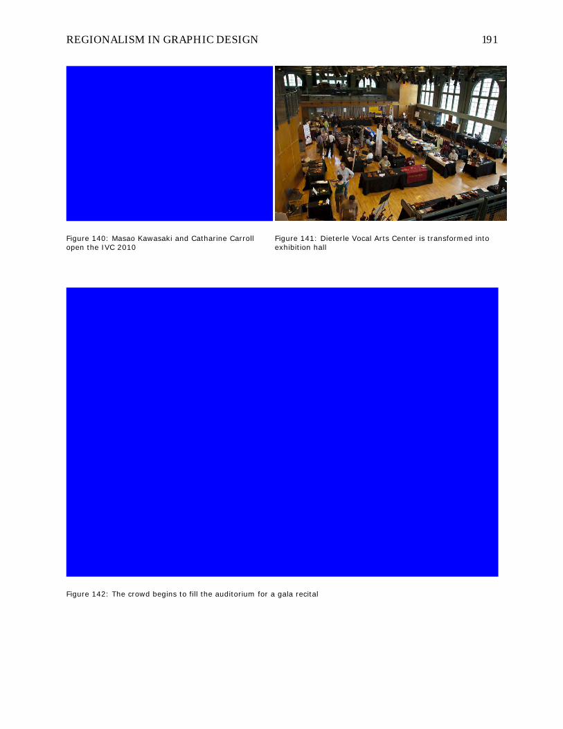
REGIONALISM IN GRAPHIC DESIGN 191
Figure 140: Masao Kawasaki and Catharine Carroll open the IVC 2010
Figure 141: Dieterle Vocal Arts Center is transformed into exhibition hall
Figure 142: The crowd begins to fill the auditorium for a gala recital

REGIONALISM IN GRAPHIC DESIGN 192
Figure 143: Roberto Diaz plays demo excerpts on many viola maker’s instruments for an audience
Figure 144: Luthiers’ wares on display
Figure 145: Discussing proper posture

REGIONALISM IN GRAPHIC DESIGN 193
Figure 146: Onlookers watch a master class
Figure 147: Student workshop on bowing technique

REGIONALISM IN GRAPHIC DESIGN 194
Figure 148: A lecture / workshop session gets participants involved
Figure 149: A roundtable discussion session

REGIONALISM IN GRAPHIC DESIGN 195
Figure 150: An accompanied master class
Figure 151: The IVC gala banquet
Figure 152: World-class performers filled the IVC roster

REGIONALISM IN GRAPHIC DESIGN 196
Chapter five: Methods for the regionalist graphic designer
Figure 153: Tadanori Yokoo - Japan
“Regional design aware of itself”
When asking how one can (or should) adopt regionalist principles, the obvious
question is where to start. My answer is that it starts not in the graphic design work at
hand, nor in the place where one lives, but in the mindset. I am essentially advocating
for a considered way of life in design as much as a regional movement. Berry relates
that regionalism pertains to life as much as to any creative work, and it pertains to life
REGIONALISM IN GRAPHIC DESIGN 197
before it pertains to the work. One must consciously identify with a place (Ortega’s
‘myself plus my circumstance’) and be aware of it as it is brought to bear on creative
output in order to explore the potential of regional design. Simply becoming more aware
of your surroundings is not enough; it must be applied and integrated, and waiting until
you need it as a sundae topping for your next project is too late. It needs to be there as
an awareness when you, say, prefer to shop at your local farmer’s market for produce
grown in your area instead of at a national supermarket chain so that the food takes on a
story, a sitedness, a person who you can actually see and know that grows it. Once you
can recognize Benedikt’s significance in the places where your creative energy dwells,
only then will you have the ability to call on it more effectively as a source—it will
become located for you.
Understanding local and regional life requires (1) a conscious and deliberate
reorienting away from remote cultural trend centers as predominant guides and toward
the immediate and directly experienced environment, (2) an increased sensitivity to the
constantly negotiated territory between physical and virtual experiences, (3) looking
closely at physical surroundings and evidence of social patterns compared to the
prevalent perceived stereotypes about the place, (4) recording and documenting
discoveries to cement conscious awareness of regional life and to share and discuss
them with like-minded regional designers in working toward regional community, and
(5) using this sensitivity toward local region in your design work and content
development process for clients.
Lippard quotes Michael Martone’s essay “The Flatness” regarding sensory
understanding of place and region:

REGIONALISM IN GRAPHIC DESIGN 198
The Midwest is too big to be seen [as the Heartland]…I think of it more as a web of
tissue, a membrane, a skin. And the way I feel about the Midwest is the way my skin
feels and the way I feel about my own skin…the Midwest is hide, an organ of sense
and not power, delicate and coarse at the same time…(Lippard, 1997, p. 34)
Design writers continue to claim that the problems future designers will face are
far more global, interconnected, and layered with complexity than those their teachers
and forebears face today. If so, then designers who are intimately knowledgeable about
local and regional life will be needed to translate and situate one-size-fits-all design
solutions into community fabrics in a way that is both functional and palatable to local
residents. Ironically, corporations that have transcended global political boundaries to
optimize their competitive advantage but who have also seen that the goods and services
they offer are not equally received by consumers across all cultures and regions, will
now need to rely on exactly the kind of sensitivities that regionalist designers cultivate.
This need to think global but adapt and sell local will also continue to expand the
collaboration between designers and social scientists like ethnographers. But, there are
critical differences between those who study a local or regional culture and those who
live within that culture.

REGIONALISM IN GRAPHIC DESIGN 199
Figure 154: Itu Chaudhuri - India
To this, Lippard adds Kent Ryden’s explanation in Mapping the Invisible
Landscape of sensing place as “a specific genre of regional folklore” which describes:
…four layers of meaning familiar to local residents but invisible to visitors,
cartographers, and even scholars: local and material lore including local names for
flora, fauna, and topography; handed-down history, much of it intimate, some of it
apochryphal; group identity and place-based individual identity; and the emotions or
affective bonds attached to place… (Lippard, 1997, p. 34)
Sited content and authorship
When asking what it means to author “sited” content as a graphic designer, this
quote from Lippard bears repeating:

REGIONALISM IN GRAPHIC DESIGN 200
If art is defined as “universal,” and form is routinely favored over content, then
artists are encouraged to transcend their immediate locales. But if content is
considered the prime component of art, and lived experience is seen as a prime
material, then regionalism is not a limitation but an advantage, a welcome base that
need not exclude outside influences but sifts them through a local filter. Good
regional art has both roots and reach. (Lippard, 1997, p. 37)
Cultivating a knack for regionalist authorship and sited content is not more
complicated than developing a deep knowledge of the place in which you live and work—
its local ornamental traditions, public space aesthetic, local population demographics
and temperaments—but no less complicated than this, because there are no shortcuts
without lapsing into Berry’s “regionalisms of condescension” that act like “exploitive
industries.” In discussing how to create regional design, it is easier to discuss it in terms
of “world” graphic design (meaning anything that doesn’t come directly out of the
European modernist tradition, or a reaction to it) due to modernism’s pervasive reach.
Geoffrey Caban’s World Graphic Design: Contemporary Graphics from Africa, the Far
East, Latin America, and the Middle East attempts to catalog the richness of graphic
voices that are rooted in non-Western cultures and finds the same problem:
It is difficult to find examples of visual communication that have not been touched in
some way by new technologies and international design approaches. Many of the
designers whose work is represented in this book felt it necessary, for various
reasons, to undertake their design education abroad. Some completed their studies
at leading design schools in the USA, Europe, and the UK before returning to practice
in their own countries. Having honed their skills and acquired a grasp of international
approaches and technologies, they were often disappointed to find on their return
that many of the visual traditions of their homeland were being lost. (Caban, 2004,
p. 8)

REGIONALISM IN GRAPHIC DESIGN 201
Figure 155: Saki Mafundikwa - Zimbabwe
Still, after many interviews with graphic designers around the world, much like
what the PRINT Regional Design Annual attempts to do in America, Caban has distilled
some general insights into regional influences on the world designers whose work he
features:
Designers from Iran speak of the thousands of years of visual traditions that have
shaped contemporary approaches to design in their country, and give as examples
the calligraphy and textile patterns of pre-Islamic civilizations, as well as miniature
painting, ceramic tiles and Persian carpets. In China Fang Chen’s design for a pack of
modern playing cards was inspired by the Figure Cards of Heroes of the Water
Margin Chronicles by the seventeenth-century Chinese painter Lao-lian Chen.
Taiwanese design Su Tsung-Hsiung has drawn upon the cursive style of Hsing Tsao,
a Taiwanese calligrapher from the Ching dynasty, while the posters of U.G. Sato of
Japan have been influenced greatly by the Ukiyo-e woodcut painting of the Edo
period.
Indigenous influences on designers from Latin America have come from pre-Hispanic
native ornament and handicrafts, African art, and more recent iconology such as the
gauchos and the mate of Argentina. According to Zimbabwean designer Saki

REGIONALISM IN GRAPHIC DESIGN 202
Mafundikwa, Picasso’s inspiration for Cubism sprang from the traditional masks of
Africa, and this was the beginning of modern graphic design. (Caban, 2004, p. 9)
Figure 156: Majid Abbasi - Iran
To illustrate Berry’s “exploitive industrial regionalism,” a typically cynical
corporate advertising example from Designing Across Cultures of how one can avoid
regionalist design principles and focus instead on “targeting” an “ethnic” audience for
purely commercial purposes should suffice:
Stay on Target
There are various levels of targeting ethnic groups. As a rule, the targeting gets
more effective—and more expensive—with each level.
1. Just adding subtitles to a general-market ad (no one recommends that).

REGIONALISM IN GRAPHIC DESIGN 203
2. Changing the language in typesetting or voice-overs (called “localization,” it’s
a little better.
3. Adding Pan-Asian or Pan-Hispanic models.
4. Also (or only, if there aren’t people in the design) changing other visual cues
to appeal to specific groups.
5. Designing a different ad for each ethnic subgroup you want to reach,
including a different model, altered message, relevant attitudes. It’s not just
recommended because ad agencies like huge budgets, but because
advertising is about building relevance. And although there are commonalities
to be drawn among ethnic groups (and all people, for that matter), in many
cases, the most relevant designs are those that can capture what’s unique
about the consumer. (Lipton, 2002, p. 11)
One can imagine a brand manager at P&G charged with “building brand
relevance” and “capturing unique consumer attributes” who has this list laminated and
taped behind the monitor in his cubicle. Why bother getting to know the folks in Asia for
whom you’re designing? Just use a “Pan-Asian” model! That’ll get ‘em to buy. And if
that’s not enough to get the ‘market shift’ needed, you can “change other visual cues.”
The sad thing about a list like this is that it’s a distillation of an entire mindset that has
been systematically rolled out across entire industries to pander to lowest common
denominators of Pavlovian audience response toward text and image rather than to
empathize, embolden, or ennoble. It is a poverty to graphic design’s true power. There is
a photo stylist somewhere who works with an art director who follows this list; that
stylist has a trunk full of “other visual cues” that are supposedly Pan-African, Pan-
Appalachian, or Pan-Hyde Park as the need arises. What are they? A black hand fan with
ebony inlay, a sofa painting with wild pack horses running across a hillside, and a gilded
floor-length rococo mirror, respectively?

REGIONALISM IN GRAPHIC DESIGN 204
Should all graphic design be regional? Of course not. The best balance of
regional and international focus in any given project usually lies more in the client’s and
audience’s needs than in the designer or content. There are certainly messages that
warrant and even demand an internationally neutral approach. The question becomes
one of specificity. Is it appropriate to use imagery, writing, and colors that are locally
sited in a graphic work meant for cross-cultural distribution where any ambiguity or
potential connotative misreadings can hinder the communication goals? This is where
the methods and the legacy of modernism are most at home: the realm of virtual brand
spaces owned and meticulously cultivated by multinational corporations.
Figure 157: Memed Erdener - Turkey
But there is an ironic twist to the question of specificity and its interplay with
style. When designing something that tries to be everything to everyone, it tends to wind

REGIONALISM IN GRAPHIC DESIGN 205
up being nothing to anyone—the more universal the approach, the more bland the
outcome. Often, things designed from a strongly individual perspective that might
appear at first to be inappropriately specific in tone of voice wind up having the broadest
appeal even if not the most flexible function. This is because things that tend toward the
personal and specific often wind up evoking a compelling self confidence that is
contagious and attractive, even to those who may be outside the narrow intended
audience—people can tell it’s something that knows what it is and why it exists; it has
identity, and it’s convincing. I would like to see more designers with modernist
predilections experiment with adopting more intensely personal responses to content
development and authorship if not form, color, and layout—even when it seems that
neutrality is required—if only to see if this ironic twist of personal authenticity can be
exploited.

REGIONALISM IN GRAPHIC DESIGN 206
Figure 158: Segun Olude - Nigeria
Figure 159: U.G. Sato - Japan
If we define legibility by the question, “Can you read me?” and readability by the
question, “Do you want to read me?” then modernism clearly prefers to honor legibility
while regionalism prefers to honor readability. The modernist approach relies most
heavily on abstraction as its primary design development method, and while this lends
it great power in crafting singular images that can cross cultural barriers easily and
systems templates that can hold myriad plug-and-play messages, abstraction also
hinders its ability to convey messages so finely tailored to a specific audience that it can
assimilate into a place completely under the radar and become sited. Modernist works
tend to remain, at their deepest existential cores, exiles and émigrés. It is the
quintessential illustration of these ideas to place Frank Lloyd Wright’s Falling Water
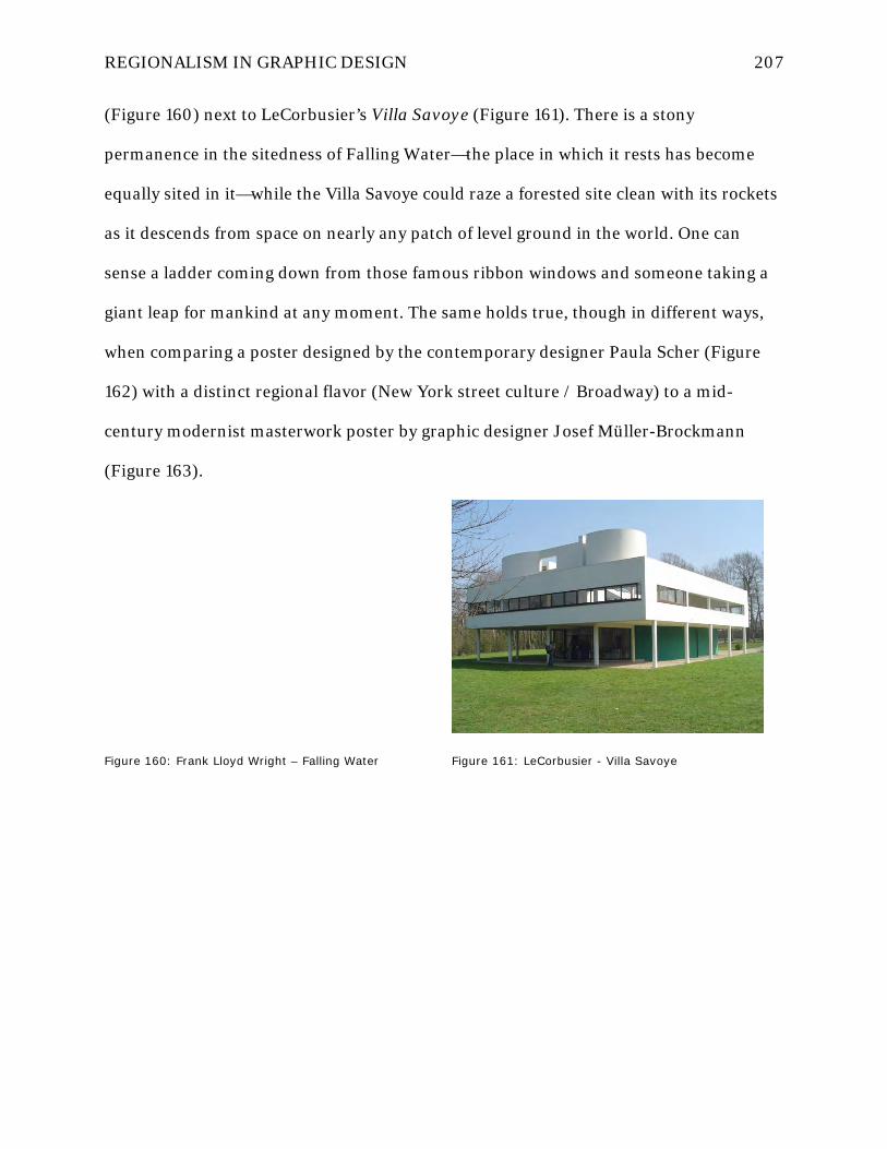
REGIONALISM IN GRAPHIC DESIGN 207
(Figure 160) next to LeCorbusier’s Villa Savoye (Figure 161). There is a stony
permanence in the sitedness of Falling Water—the place in which it rests has become
equally sited in it—while the Villa Savoye could raze a forested site clean with its rockets
as it descends from space on nearly any patch of level ground in the world. One can
sense a ladder coming down from those famous ribbon windows and someone taking a
giant leap for mankind at any moment. The same holds true, though in different ways,
when comparing a poster designed by the contemporary designer Paula Scher (Figure
162) with a distinct regional flavor (New York street culture / Broadway) to a mid-
century modernist masterwork poster by graphic designer Josef Müller-Brockmann
(Figure 163).
Figure 160: Frank Lloyd Wright – Falling Water
Figure 161: LeCorbusier - Villa Savoye

REGIONALISM IN GRAPHIC DESIGN 208
Figure 162:Paula Scher - Bring In ‘Da Noise
Figure 163: Josef Müller-Brockmann – Beethoven poster
A related set of questions about regionalism.
1. Shouldn’t all good design respond to content and client needs coming from
a distinctive perspective?
2. Is it even necessary to distinguish regional practice as such?
3. Isn’t it just bleary-eyed nostalgia to want to be regional?
These are common and mostly pejorative reactions to the idea of regionalism
across all the arts, including the graphic arts. There is a similar debate in the design
world about sustainability as a professional priority and educational mandate. There are
some who say it should be taught as a ‘special topic’ and others say it should be
assimilated into design curricula simply as an expected component of all “good” design
henceforth. The answers here are subjective and dependent mostly on audience. It is my

REGIONALISM IN GRAPHIC DESIGN 209
assertion that (1) yes, all good design should convey distinct perspective, even that along
modernist lines, even though this simply isn’t the case when looking across the bulk of
contemporary practice, (2) yes, it is necessary to distinguish regional practice because
consciousness in this case creates the act!—not self-consciousness that is an ego-driven
quest for recognition and a strong presence in the reader’s experience, but rather a
conscious choice to shift awareness during the design process to regional perspectives
and away from universality, and (3) words like ‘nostalgia’ and ‘provincialism’ have
always been used to denigrate the concerns of those outside cultural style trend centers
like New York, even though the work happening in those centers is often quite
provincial and isolated in its own way, regardless of how close it is to the very sources
which it devours:
In fact, though, all art is regional, including that made in our “art capital,” New York
City. In itself extremely provincial, New York’s art world is rarely considered
“regional” because it directly receives and transmits international influences. The
difference between New York and “local” art scenes is that other places know what
New York is up to but New York remains divinely oblivious to what’s happening off
the market and reviewing map. Yet, paradoxically, when the most sophisticated
visitors from the coasts come to “the sticks,” they often prefer local folk art and
“naïve” artists to warmed-over syntheses of current big-time styles. (Lippard, 1997,
p. 36)
Quick litmus test for regionalism. Can a finished piece be used as a
template? If so, it’s probably not unique to any given perspective or region. Could you
simply open a digital file of an event poster or graphic—something that’s tied to a
specific place or time—change its title at the top, swap out a few photos, and reuse it for
another sited event elsewhere to equal effect? If so, it’s probably much closer to the
modernist language and rational mindset which claims that aspiring to universality is

REGIONALISM IN GRAPHIC DESIGN 210
the foundation of good communication. Site-specificity is a prerequisite of regional
design (in physical sitedness or spirit). It is anathema to most modernism, but
fundamentally, the two are not mutually exclusive.

REGIONALISM IN GRAPHIC DESIGN 211
Strategies for building regional design awareness
Figure 164: Colorist, cover
Colorist by Kobayashi. A sadly out-of-print book by Shigenobu Kobayashi
called “Colorist” (Kobayashi, 1998) provides a simple and clear methodology for
awakening to regional color and documenting it wherever one might live or travel. The
following pages from the book will give you a sense of the methodology which could be
adapted in any number of ways to make it practical for one’s own circumstance or
technological choices. The most useful aspect of the work is his simple color
arrangement matrix that can be used to categorize and place colors in context to each
other for at least pseudo-quantitative comparative analysis. Also helpful are the
checklist of skills to become a sensitive colorist, and methodology for researching
regional colors.

REGIONALISM IN GRAPHIC DESIGN 212
Figure 165: Colorist, color matrix

REGIONALISM IN GRAPHIC DESIGN 213
Figure 166: Colorist, color preference types

REGIONALISM IN GRAPHIC DESIGN 214
Figure 167: Colorist, checklist of color skills

REGIONALISM IN GRAPHIC DESIGN 215
Figure 168: Colorist, regional colors, deep

REGIONALISM IN GRAPHIC DESIGN 216
Figure 169: Colorist, building materials

REGIONALISM IN GRAPHIC DESIGN 217
Figure 170: Colorist, naturals

REGIONALISM IN GRAPHIC DESIGN 218
Figure 171: Colorist, greens

REGIONALISM IN GRAPHIC DESIGN 219
Figure 172: Colorist, blues

REGIONALISM IN GRAPHIC DESIGN 220
Figure 173: Colorist, white

REGIONALISM IN GRAPHIC DESIGN 221
Figure 174: Colorist, Black

REGIONALISM IN GRAPHIC DESIGN 222
Figure 175: Colorist, methodology for researching and recording local color

REGIONALISM IN GRAPHIC DESIGN 223
Figure 176: Colorist, city color surveys 1

REGIONALISM IN GRAPHIC DESIGN 224
Figure 177: Colorist, city color surveys 2

REGIONALISM IN GRAPHIC DESIGN 225
Figure 178: Colorist, city identity in color

REGIONALISM IN GRAPHIC DESIGN 226
Local / regional form and ornament. If form is the stuff of what we see in
graphic design, then it goes directly to what regional graphic design looks like to be
concerned with local and regional forms in making regional graphic design. I have often
referred in my teaching to the primary criteria of all good design across disciplines as
the “meaningful marriage of form and content.” It sounds simple but is a sometimes
elusive mixture to achieve. Nevertheless, if there is anything graphic designers love, it’s
what something looks like, and sensitivity to, research about, and the cataloging of local
and regional forms should be right up the alley of most designers with graphic training.
The question here is where to look for specifically regional forms upon which a
graphic designer can draw. Because forms have been largely standardized and
homogenized by the modernist movement over the years, one potential answer lies not
necessarily in form directly, but in ornament. Form (and specifically structural form)
and ornament have had a contentious relationship throughout architectural theory’s
history. Alternately celebrated and reviled, ornament has come to be viewed as an
integral part of many culture’s creative output, and indispensable, regardless of the
modernist tendency away from its use. Leopold Mozart was once quoted as saying, ‘even
the peasant song is softened with graces.’
Ornament has often been seen as something superadded to utility, that it is
essentially functionless and unnecessary, even criminal and indicative of a degenerate
culture (Adolph Loos). Others point to its oneiric function in enriching our dreams of
the places we inhabit. Farshid Moussavi argues, in fact, that ornament is quite necessary
and functional in his Function of Ornament:
Ornament is the figure that emerges from the material substrate, the expression of
embedded forces through processes of construction, assembly and growth. It is

REGIONALISM IN GRAPHIC DESIGN 227
through ornament that material transmits affects. Ornament is therefore necessary
and inseparable from the object. It is not a mask determined a priori to create
specific meanings (as in Postmodernism), even though it does contribute to
contingent or involuntary signification (a characteristic of all forms.) It has no
intention to decorate, and there is in it no hidden meaning. At the best of times,
ornament becomes and “empty sign” capable of generating an unlimited number of
resonances…Decoration is contingent and produces “communication” and
resemblance. Ornament is necessary and produces affects and resonance. (Moussavi
& Kubo, 2006, p.8)
One of the more compelling arguments for the use of ornament, beyond its
obvious cultural significance to many people, is that it is an antidote to the failed
aesthetic goals of the modern movement itself. The extreme construction demands and
tight tolerances for flush, clean, architectonic surfaces promoted by the International
Style eventually separated it from the very masses to which it was originally supposed to
provide liberation. What most modernist apologists have refused to admit it that it just
cost too much for normal people to afford. It feel into the same trap of most arts against
which it first raged in becoming yet another ‘style’ for the rich and elite. What ornament
offers instead, is forgiveness—surfaces that can be adorned are often able to cover
minor imperfections and take up slack in tolerances with grace and even relish, an effect
closer to decoupage than to precise metal sculpture.
James Trilling writes about our need to regain ‘the lost art of seeing’ ornament in
the Language of Ornament in order to appreciate its potential in our aesthetic
understanding of the places we inhabit:
Irrespective of medium, provenance, period, or style, ornament has the power to
give our surroundings a new dimension of pleasure, provided we know where and
how to look…Ornament is a way of creating, but it is also a way of seeing. Seeing
ornamentally is really four separate skills. We need to recognize ornament when we
see it, to recognize motifs and patterns, to understand the relation of ornament to

REGIONALISM IN GRAPHIC DESIGN 228
functional form, and to identify ornamental styles. The best way to learn these skills
is to study ornament as closely as possible, analyzing every detail, first in isolation,
then in relation to the whole. (Trilling, 2001, p. 22-23)
So the question remains, how to look for form and ornament in a region? Lippard
suggests we start very close to home and that which we already know intimately:
A starting point, for artists or for anyone else, might be simply learning to look
around where you live now. What Native peoples first inhabited this place? When
was your house built? What’s the history of the land use around it? How does it fit
into the history of the area? Who lived there before? What changes have been made
or have you made? If you’ve always lived there, what is different now from when you
were young? If you haven’t, what’s different from where you were raised and from
when you moved there? What is your house’s relation to others near it and the
people live in them? How does its interior relate to the exterior? Does the style and
decoration of either reflect your family’s cultural background, the places from which
your people came? If not, why not? Is there a garage? Is there a lawn? a garden?
Have you cut down trees or planted them? Is the vegetation local or imported? Is
there water to sustain it? Do any animals live there? Have they always been there?
Are there more or less of them? What do you see from your favorite window? What
does the view mean to you? How does it change with seasons and time? And so on
and on. (Lippard, 1997, p. 25)
Landscape and architecture. For the designer looking to reconnect to
regional place in order to tap into the richness of content and context it can offer, few
elements are better to study than the natural landscape and architecture. These things
operate on the longest time scale and are therefore often the best repository of formal
vocabulary which remains meaningful and relevant to a region. Graphic design and
fashion tend to work very closely together at the other end of the spectrum, with major
industry stylistic shifts sometimes occurring quite literally by the season.
Lippard promotes landscape as more than just a primary container of regional
identity, but also a way of seeing:

REGIONALISM IN GRAPHIC DESIGN 229
If landscape is a way of seeing, there are potentially as many landscapes as
individual ways of seeing, or at least as many as cultural ways of seeing—although
some people seem threatened by this degree of multiplicity. Otherness and
familiarity are reinforced by impressions of landscape. Backgrounds inevitably affect
foregrounds. Part of the yearning for a homeland left behind is a sense of space and
place that differs from the hybrid one that has come to be seen as generically
“American.” Given a choice, people often immigrate to geographies that remind them
of home. (Lippard, 1997, p. 61)
If we are obsessed with constantly modifying our built world, and it takes huge
resources to make widespread changes to our infrastructure, then nature always follows
behind and seams itself back into the gaps as the marks we make fade and time passes.
We cannot outpace nature, try as we might. Sensitivity to change on this time scale can
be wonderfully enriching to a designer or artist living in any given region, and it can
infuse creative work with great wisdom. But this requires a studied patience and
dedication to rootedness to collect—as Berry states, this kind of regionalism requires a
“particular knowledge of the life of the place one lives in and intends to continue to live
in.”
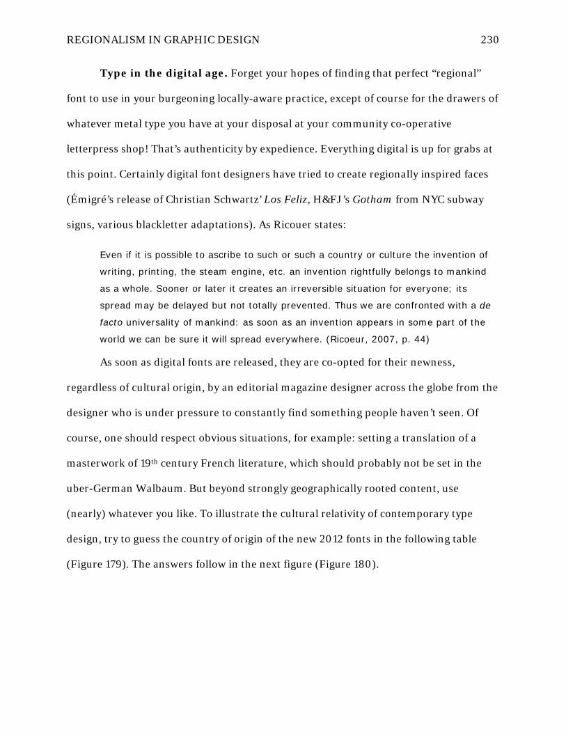
REGIONALISM IN GRAPHIC DESIGN 230
Type in the digital age. Forget your hopes of finding that perfect “regional”
font to use in your burgeoning locally-aware practice, except of course for the drawers of
whatever metal type you have at your disposal at your community co-operative
letterpress shop! That’s authenticity by expedience. Everything digital is up for grabs at
this point. Certainly digital font designers have tried to create regionally inspired faces
(Émigré’s release of Christian Schwartz’ Los Feliz, H&FJ’s Gotham from NYC subway
signs, various blackletter adaptations). As Ricouer states:
Even if it is possible to ascribe to such or such a country or culture the invention of
writing, printing, the steam engine, etc. an invention rightfully belongs to mankind
as a whole. Sooner or later it creates an irreversible situation for everyone; its
spread may be delayed but not totally prevented. Thus we are confronted with a de
facto universality of mankind: as soon as an invention appears in some part of the
world we can be sure it will spread everywhere. (Ricoeur, 2007, p. 44)
As soon as digital fonts are released, they are co-opted for their newness,
regardless of cultural origin, by an editorial magazine designer across the globe from the
designer who is under pressure to constantly find something people haven’t seen. Of
course, one should respect obvious situations, for example: setting a translation of a
masterwork of 19th century French literature, which should probably not be set in the
uber-German Walbaum. But beyond strongly geographically rooted content, use
(nearly) whatever you like. To illustrate the cultural relativity of contemporary type
design, try to guess the country of origin of the new 2012 fonts in the following table
(Figure 179). The answers follow in the next figure (Figure 180).

REGIONALISM IN GRAPHIC DESIGN 231
Figure 179: National type quiz: guess the country of origin for these 2012 fonts

REGIONALISM IN GRAPHIC DESIGN 232
JAPAN “Quintet”
Designer:
Kunihiko Okano
NETHERLANDS “Bery”
Designer:
Fred Smeijers
U.S.A. “Harriet”
Designer:
Jackson Cavanaugh
ARGENTINA “Alegreya”
Designer:
Juan Pablo del Peral
FRANCE “Macula”
Designer:
Jacques Le Bailly
FRANCE “Eskapade”
Designer:
Alisa Nowak Figure 180: Answers to national type quiz
Local materials and sustainability. Developing a sensitivity to place must
certainly lead to a changing relationship with your community neighbors and to its
natural resources as well. Berry instructs us that:
If the land is made fit for human habitation by memory and "old association," it is
also true that by memory and association men are made fit to inhabit the
land…Without a complex knowledge of one's place, and without the faithfulness to
one's place on which such knowledge depends, it is inevitable that the place will be
used carelessly, and eventually destroyed. Without such knowledge and faithfulness,
moreover, the culture of a country will be superficial and decorative, functional only
insofar as it may be a symbol of prestige, the affectation of an elite or "in" group.
And so I look upon the sort of regionalism that I am talking about not just as a
recurrent literary phenomenon, but as a necessity of civilization and of survival.
(Berry, 2007, p. 40)
Sustainability has almost become an empty catch word at this point (many design
students today are “LEED-accredited professionals” before they are even professionals!)
Design pundits are expecting that it will fall away as a ‘special topic’ within educational

REGIONALISM IN GRAPHIC DESIGN 233
and professional circles, and simply become an expected parameter of all ‘good’ design
in the future, and perhaps this is best. But the kind of ethical practice to what Berry
alludes goes deeper than graphic design, but into ways of life that must be shared and
supported by more than one alone—it must be a conscious community endeavor to work
and to keep working.
Developing regional relationships as a designer can be about more than just
learning your sitedness: it is an essential part of ‘networking’ in the business sense, too,
and this can be fruitful from a sustainability standpoint. People who know each other
and understand common missions tend to share seemingly worthless resources that
might otherwise go to waste. A great example is getting to know your local print shops
and what kind of work they do. A great way to find cheap or even free materials, as well
as some creative challenges to your resourcefulness, would be using and reusing printer
overruns and scraps, industrial supply waste, and unique regional bioproducts.
Physical and virtual sitedness. The enormous interactive online potential of
event planning as connected to ideas of universal access, modernism, and regionalism
explored here is an exciting area for further inquiry. I cannot stress enough how this
area of design research and innovation has the potential to revolutionize an
understanding of what it means to be “sited” in an event’s physical location, but also
connect and interact with distant virtual participants in a way that is still authentic to
place and context-aware. It is far beyond the scope of this present thesis to flesh out
potential avenues, but two quick illustrations may lead to further exploration by others
in the future:
1. Physically and temporally sited events are inherently inconvenient and
exclusive since they require attendees to put aside other scheduled
REGIONALISM IN GRAPHIC DESIGN 234
engagements and pay the money to travel. Inevitably, all those who might
wish to attend cannot, and given the technology we have now, there is no
reason that substitutes can’t be provided. An event like IVC could easily
have gone further and sold web-based subscriptions to the conference so
virtual attendees could stream live audio and video from anywhere on the
globe and access it either live or on-demand for a period of time after the
event. This, of course, requires a good deal of technological capability on
the part of the event planners and their facilities, although these
limitations are quickly becoming less burdensome. “Livecasting” video and
audio solutions that are portable and inexpensive are on the way to the
market and will transform event planning as such in the future.
2. Perhaps more germane to the current discussion of regionalism is the
possibility inherent in “sitecasting” interactive events. An argument could
be made that promoting the advance of web interactivity through events
like the IVC might lead similar future events to cancel live attendance
altogether and simply exist only on the web. But, using local-area
networking (LAN) strategies, distributed digital networks can be created
using broadcasting equipment that remains site-specific and can only be
viewed when physically located close enough to the area to pick up the
LAN signal. Anyone who has a wireless network connected to their home
computer system to enable the networked use of mobile devices like cell
phones and digital tablets already understands the sitecasting concept.
Once you’re out of range of the signal, you’re out of luck…you have to find
another “hotspot.” This raises an enormous amount of interesting

REGIONALISM IN GRAPHIC DESIGN 235
theoretical potential for event interactivity that is physically sited, specific
to the cultural and regional influences of real places, but yet also rich with
layered virtual interactive potential among participants. Certain feeds
could be blocked to those who have not paid for access to those resources.
Different access rights levels could allow for mobile event staff to provide
tailored and context-specific support to an event in real time based on
current GPS locations of attendees, and yet be invisible to other networked
users in the physical area, while everyone involved are experiencing the
same physical environment (albeit, overlaid with different layers of
attendant digital information).
Spatial Sync Chart. In 2006, I produced a graphic exploration (Figure 181) of
the relationship between physical and virtual experiences as part of a graduate seminar
assignment that yielded interesting and relevant results to this regionalism discussion. I
simply tracked my activities for a full day in detailed journal entries, and then analyzed
those activities as an information design exercise along two axes: the physical and
synchronous. Because these are the two primary characteristics of any event that have a
direct impact on their sited character, it could prove to be a useful approach to event
planning and place awareness among designers. The idea was to subjectively rate each
activity in which I participated as to (1) the physical versus virtual space in which it was
performed and (2) the synchronous or asynchronous nature of its interactivity with
others. I then plotted these data points on a graph (Figure 182), entered their scaled
ratings into tables, and analyzed the statistical results to create profiles of the
synchronicity and physicality of my activities in “sparkline” graphics (Figure 183).

REGIONALISM IN GRAPHIC DESIGN 236
What might come of such an exercise? I can envision example applications where
the analysis results may help people understand (1) how they spend their time, (2) how
it is skewed toward either virtual spaces or asynchronous scheduling among family
members or coworkers, (3) how little they interact with the physical places in which they
live, and (4) how little they directly physically and temporally interact with the people in
their lives. All of these could speak directly to the inevitable need to reexamine the roles
of virtual and social technologies in our lives and their impact on our sensitivity to place.

REGIONALISM IN GRAPHIC DESIGN 237
Figure 181: Spatial Sync Chart, overall view

REGIONALISM IN GRAPHIC DESIGN 238
Figure 182: Spatial sync graph view

REGIONALISM IN GRAPHIC DESIGN 239
Figure 183: Spatial sync sparklines
Shifting priorities of the regionalist graphic designer
I read an interesting article many years ago in a journal for professional
musicians that discussed performance temperament and overcoming stage fright. The
name of the article and the journal escapes me now, but the part I remember clearly was
a discussion of the differences between live musical experience and that of listening to

REGIONALISM IN GRAPHIC DESIGN 240
recorded music. The article presented a list of performance priorities for musicians who
play live versus the priorities of those who work in studios producing recordings. The
interesting thing about the list was that the priorities were the same, only in reverse. At
the top of the list of priorities for the live musician was “connecting emotionally with the
audience,” while this was the lowest priority for the studio recording musician. The top
priority listed for recording session artists was “interpretive vision” and “error-free
performance” since recordings tend to become standard references for those musicians
researching a work later.
Much in the same vein, I present here a subjective and highly contestable list of
priorities (Figure 184) for the regionalist designer as opposed to the modernist in the
hopes that it will provoke personal responses and help practitioners to reassess and
experiment with their mindset leading up to a regionalist design effort.
Modernism's Priorities Regionalism's Priorities
Conceptual clarity Authentic and embodied voice and perspective
Neutral interpretation and rendering of content Audience analysis
Defined formal composition principles Emotional connection to audience
Cross-cultural legibility Sitedness of content, color, and form
Mass-production and multimedia optimization Overt appeals to value systems
Audience analysis Conceptual clarity
Emotional connection to audience Cross-cultural legibility
Authentic and embodied voice and perspective Defined formal composition principles
Overt appeals to value systems Neutral interpretation and rendering of content
Sitedness of content, color, and form Mass-production and multimedia optimization
Figure 184: The shifting priorities of regionalist versus modernist design
What does “regional” graphic design look like?
Since it is usually the last word among graphic artists about how theories like this
“regionalism” actually apply to them, and because those who may not have the patience
for regionalist practice have probably turned to this back page to find out how to use or

REGIONALISM IN GRAPHIC DESIGN 241
at least mimic it, I’ll finish by addressing the elephant in the room semi-directly. I’m
frankly so sick of graphic designers’ preoccupation with what things look like that I’m
inclined to offer an answer to this all-important question in verse:
Regional graphic design looks like
what you fail to remember smelling
at the café where you first saw it
Regional graphic design looks like
the poster idea you loved so much
before school beat it out of you
Regional graphic design looks like
every cultural cliché peddler’s
mailbox and sock drawer
Regional graphic design looks like
the home that modernism made
by the woods for retirement
Regional graphic design looks like
what multinational corporations
can’t take away from you
Regional graphic design looks like
what you and your Man Friday drew
in the sand and it saved your life
REGIONALISM IN GRAPHIC DESIGN 242
References
Allen, B. (2007). On performative regionalism. In V. B. Canizaro (Ed.), Architectural
regionalism: Collected writings on place, identity, modernity, and tradition (pp.
376). New York: Princeton Architectural Press.
Anonymous. (1853). Cincinnati: Its relations to the West and South. West American
Review, (June), Article III.
Auden, W. H. (1962). The dyer's hand. New York: Vintage.
Bain, P., Shaw, P., & Cooper Union for the Advancement of Science and Art. (1998).
Blackletter: Type and national identity. New York: Princeton Architectural Press.
Baudrillard, J. (1994). Simulacra & simulation [Simulacres et simulation.English] (S. F.
Glaser Trans.). Ann Arbor: University of Michigan Press.
Benedikt, M. (1987). For an architecture of reality. New York: Lumen Books.
Berry, W. (2007). The regional motive. In V. B. Canizaro (Ed.), Architectural
regionalism: Collected writings on place, identity, modernity, and tradition (pp.
37). New York: Princeton Architectural Press.
Brinkmann, V., Wünsche, R., Koch-Brinkmann, U., Kellner Sylvia, Köttl, J., Herzog, O., .
. . Stiftung Archäologie (Munich, G. (2007). Gods in color: Painted sculpture of
classical antiquity. Munich: Stiftung Archaologie.
Caban, G. (2004). World graphic design: Contemporary graphics from Africa, the
Arab world, the Far East and Latin America

REGIONALISM IN GRAPHIC DESIGN 243
Canizaro, V. B. (2007). Introduction. In V. B. Canizaro (Ed.), Architectural regionalism:
Collected writings on place, identity, modernity, and tradition (pp. 16). New York:
Princeton Architectural Press.
Doersch, C., Singh, S., Gupta, A., Sivic, J., & Efros, A. A. (2012). What makes Paris look
like Paris? ACM Transactions on Graphics (SIGGRAPH), 31(4)
Ebbinghaus, S. (2007). Gods in color: Painted sculpture of classical antiquity. Harvard
University Art Museums Gallery Series, (57)
Forsyth, C. (1914). Orchestration. London: Macmillan and Co., Ltd.
Fox, M. (1999). Print's Regional Design Annual 1999. Print, 53(5), 69.
Frampton, K. (2007). Ten points on an architecture of regionalism: A provisional
polemic. In V. B. Canizaro (Ed.), Architectural regionalism: Collected writings on
place, identity, modernity, and tradition (pp. 376). New York: Princeton
Architectural Press.
Hoefler, J., & Frere-Jones, T. (2013). Sentinel: History. Retrieved 01/20, 2013, from
http://www.typography.com/fonts/font_history.php?historyItemID=2&productLin
eID=100034
Kaye, J. R. (2007). Print: the regional design annual 11 year perspective, 1996-2006.
New York, NY: F+W Publications.
Keyes, A. (2013). What ever happened to national allegiance? Retrieved 3/20, 2013,
from http://www.wnd.com/1998/07/5244/

REGIONALISM IN GRAPHIC DESIGN 244
Kinross, R. (1992). Modern typography: an essay in critical history. London: Hyphen
Press.
Kline, A. S. (2008). Ovid: Fasti, book one. Retrieved 12/16, 2008, from
http://www.poetryintranslation.com/PITBR/Latin/OvidFastiBkOne.htm
Kobayashi, S. (1998). Colorist: A practical handbook for personal and professional use.
Tokyo, Japan: Kodansha International, Ltd.
Lippard, L. R. (1997). The lure of the local: Senses of place in a multicentered society.
New York: New Press.
Lipton, R. (2002). Designing across cultures. Cincinnati, Ohio: HOW Design Books.
Moussavi, F., & Kubo, M. (2006). The function of ornament. Barcelona: Harvard
University, Graduate School of Design.
Nader, R. (2013). Corporate pledge of allegiance letter. Retrieved 3/21, 2013, from
http://nader.org/wp-content/uploads/2012/06/Corporation-Letter-and-List2.pdf
Norberg-Shulz, C. (1980). Genius loci: towards a phenomenology of architecture. New
York: Rizzoli.
Paoli, C. (2007). Mexican blackletter. New York, N.Y: Mark Batty.
Pei Cobb Freed and Partners. (2013). College-Conservatory of Music, University of
Cincinnati. Retrieved 01/15, 2013, from http://www.pcf-p.com/a/p/9211/s.html
REGIONALISM IN GRAPHIC DESIGN 245
Puhalla, D. (2011). Design elements: Form & space. Beverly, Massachusetts: Rockport
Publishers.
Ricoeur, P. (2007). Universal civilization and national cultures. In V. B. Canizaro (Ed.),
Architectural regionalism: Collected writings on place, identity, modernity, and
tradition (pp. 43). New York: Princeton Architectural Press.
Rilke, R. M., & Mitchell, S. (1982). The selected poetry of Rainer Maria Rilke. New
York: Random House.
Throm, C. (2013). CCM village receives 2001 National Honor Award from American
Institute of Architects. Retrieved 01/15, 2013, from
http://www.uc.edu/news/ccmvill.htm
Trilling, J. (2001). The language of ornament. New York: Thames & Hudson.
Wild, L. (2013). Think regional, act annual. Retrieved 01/20, 2013, from
http://observatory.designobserver.com/entry.html?entry=3877
Wright, C., & Lehman, D. (Eds.). (2008). Best American poetry 2008. New York:
Scribner Poetry.

REGIONALISM IN GRAPHIC DESIGN 246
Appendix: Literature reference
Literature Overview
I am including the major writers who have influenced the ideas in this thesis
investigation together here so as to provide a condensed reference of the most germane
passages which I have excerpted from their works. Even a reader new to the ideas of
regionalism will be able to read these passages straight through and gain exposure to the
concepts in relatively linear fashion. I also decided to collect excerpts here by author in
chronological order of their original writing so that readers could refer back from any
section of the thesis and reread that writer’s complete excerpts. I find this helps to gain a
sense of each writer’s fuller message and place along a spectrum than trying to piece it
together gradually from disparate quotes embedded in a narrative.
The 2007 publication of Vincent Canizaro’s Architectural Regionalism: Collected
Writings on Place, Identity, Modernity, and Tradition is a watershed moment in
architectural (and design) education about regionalism. Long overdue, it is a single
volume that collects most of the major touchstone writings that influenced the shaping
of regionalist theories in architecture over the past century. There are many academic
edited volumes aimed at the education and scholarly market, but this one was very
useful to my research in two ways: (1) Canizaro wrote a wonderful introduction that
succinctly draws the strands of thought from various and philosophically disparate
writers on regionalism together into a coherent thread which is easy to follow, eminently
teachable, and a worthy contribution to the theory in its own right, and (2) he decided to
include the works selected in their entirety without editing and also provided the
original bibliography information of all the works featured. When these authors are
referenced in the body of the thesis, it is very helpful if the reader has consulted the full

REGIONALISM IN GRAPHIC DESIGN 247
excerpts included here to gain a better understanding of the text within the larger
cultural debate about regionalism.
Vincent Canizaro
Canizaro is currently on architecture faculty at the University of Texas in San
Antonio. He holds baccalaureate and doctoral degrees in architecture from Texas A&M
and a master’s from UC Berkeley. He has long been a champion of regionalist causes
and teaches courses at UTSA in sustainability and environmental architectural design.
He also has industry experience as a practitioner and is active in his local AIA chapter,
practicing what he preaches in regards to regionalism. His excerpts are provided first
since they summarize the collected essays in his excellent 2007 edited volume,
“Architectural Regionalism” (even though they were published most recently and the
rest of the excerpts here are presented in chronological order of publication.)
Three epigrams (Canizaro, 2007, p. 17):
Regionalism is not a fixed concept. No region, whether natural or cultural, is stable.
—Felix Frankfurter
as quoted in Merrill Jensen, ed., Regionalism in America (Madison: Univ. of
Wisconsin Press, 1965), xvi.
In other words, the nature of a “region” varies with the needs, purposes, and
standards of those using the concept.
—Merrill Johnson (ibid)
Regionalism suggests a cure for many current ills. Focused in the region, sharpened
for the more definite enhancement of life, every activity, cultural or practical, menial
or liberal, becomes necessary and significant; divorced from this context, and
dedicated to archaic or abstract schemes of salvation and happiness, even the finest

REGIONALISM IN GRAPHIC DESIGN 248
activities seem futile and meaningless; they are lost and swallowed in a vast
indefiniteness.
—Lewis Mumford
(“The Theory and Practice of Regionalism,” Sociological Review 20 (April
1928): 140.
As a theory about connectedness to place it [regionalism] is situated among other
theories of place such as contextualism, site-specificity in art and design, landscape
urbanism, and planning. It is allied with other disciplines concerned with spatial
phenomena such as cultural geography, cartography, folklore, and historical studies,
but it differs from these in scale and application. At the scale of a region, issues and
concerns emerge that are not available at the immediate site or context. (Canizaro,
2007, p. 17)
A region is, first, a large area with boundaries determined by a range of cultural and
natural criteria. At the extreme cultural end, visible in the etymology of the term,
political control or the establishment of jurisdictions is the criterion. At the opposite
end, region is determined by naturally occurring physical features. (Canizaro, 2007,
p.18)
Regionalism is a habit of thought or a prejudice in favor of persons and practices
found in one’s general vicinity. Its meaning is similar to that of provincialism,
although regionalism lacks this word’s connotation of small-mindedness and lack of
sophistication.
—Jonathan Smith (Canizaro, 2007, p.20)
Regionalism is variously a concept, strategy, tool, technique, attitude, ideology, or
habit of thought. Despite its many manifestations, collectively it is a theory that
supports resistance to various forms of hegemonic, universal, or otherwise
standardizing structures that would diminish local differentiation. These theories
propose alternatives in the form of methods and criteria for the respect,

REGIONALISM IN GRAPHIC DESIGN 249
revitalization, and, if necessary, reconstruction of life along regionally determined
lines. It is a self-conscious set of theories, which distinguishes it from the
vernacular—the response to local conditions by necessity, not by choice. The
vernacular is often characterized dubiously as “unconscious,” which is meant to
suggest that it is not purposely regional, but only accidental; in fact, settlers and
other pioneers very scrupulously and consciously adapted the architecture they knew
to the places they chose to settle. Regionalism is voluntary; alongside being self-
conscious, it is a choice made by a practitioner (planner, architect, or politician)
among alternatives, including competing theories of regionalism. (Canizaro, 2007,
p.20)
In cultural affairs, provincialism has a predominantly negative association, shared by
regionalism in some critiques, referring to work that is limited or unsophisticated.
Provincial works, Treib asserts [Marc Treib], are distinct from regional ones in that
provincial works are limited by their distance from a cultural center, such as New
York or Los Angeles, in which the standards for excellence are set. Regionalism is the
opposite, in that it resists the values of the centers of standardization and taste,
actively promoting the local—“the regional is fertilized by its locale.” (Canizaro,
2007, p. 21)
It [regionalism] is an architectural theory, informed by particularist values, that
borders on ideology. These values range from the desire to preserve a region’s
cultural heritage to the desire to manifest a new social and political order drawn
along regional distinctions. The latter aims to facilitate a restructured and more
vibrant social life; the former, an ideology of resistance to both the homogenization
of building culture and/of centralized, absolutist controls…consistent themes are
resistance to standard forms (preferring a balance between universal and local), a
concern for authenticity (the key to cultural and personal identity), and the fostering
of connectedness among people of the specific culture, history, identity, and ecology
of their region. (Canizaro, 2007, p. 21)
Regionalist resistance can be political and representational, concerned with the
maintenance of personal or local identity through form…Modern resistance continues

REGIONALISM IN GRAPHIC DESIGN 250
this tradition, but instead of a pope or king, the dominant force has become the
changing structure of society and the built environment under disinterested central
organizations, industrialization, modern technology, and globalization. Each has
enabled the erosion of valued practices and places against which engagement—
relating to one’s place through participatory design—or designs that foster local
material and social connections serve as the resistant means. (Canizaro, 2007, p.
22)
For our purposes, modernity is a mode of social life in which the establishment of the
“new” is a driving force. “Being modern” often requires the attenuation of tradition
and continuity to attain the fruits of progress and innovation. But jettisoning these
cultural structures has negative consequences. The modern world is rife with what
Giddens [sociologist Anthony Giddens] calls “disembedding mechanisms” that, while
aimed at achieving a better quality of life, also lift social relations from their local
contexts through ease of travel, communications, and trade. (Canizaro, 2007, p. 23)
Regionalist practice strives to establish connectedness between people and
place…But, in “accepting the universal order of the machine,” said Lewis Mumford,
we still “have the duty to make it human and see that it incorporates more, not less,
of those social and esthetic elements that bind people sentimentally to their homes
and their regions.” [The South in Architecture. New York: Harcourt, Brace, 1941.
119.] As professionals [designers] we must seek to balance the universal with the
regional and be aware of our unique culpability in creating a gap between our clients
and their places. At a minimum this realization should serve as a note of caution
about whose view of the region should be dominant, if any. (Canizaro, 2007, p. 25-
26)
I [Vincent Canizaro] contend that authenticity is a quality of engagement between
people and things or people and places. It is not a property inherent to things or
places but a measure of our connection to them. Architectural theorist Kim Dovey
suggests that the authentic object or environment must be “of undisputed origin,” its
form should be connected to its process of creation; it must be genuine, things are
what they appear to be or what one expects them to be; and it must be reliable, it

REGIONALISM IN GRAPHIC DESIGN 251
should continue to function over time. [“The Quest for Authenticity and the
Replication of Environmental Meaning,” in David Seamon and Robert Mugerauer,
eds., Dwelling, Place & Environment. New York: Columbia University Press, 1985. 3-
49.] Satisfaction of these three conditions results in what Dovey refers to as
“experiential depth,” which is connectedness without deception—when one’s
knowledge of a thing or place is backed up by its reality. (Canizaro, 2007, p. 26-27)
Edward Relph [Canadian geographer, author of Place and Placelessness, 1977]
similarly sees authenticity as a particular order of relation between people, things,
and places—an order measured in degrees of participation. The more we are able to
participate, the more authentic the connection or relation. Lack of participation leads
to a lack of direct experience, which results in detachment…
Dean MacCannell’s analysis of tourist experiences demonstrates another facet of
authenticity. Seeking “authentic experiences,” tourists participate in a structure of
“fronts” and “backs.” The front is the public face of a place, and the back is the space
of both privacy and functionality—where “things really happen.” “Behind-the-scenes”
adventures are sought after because they promise to show the traveler life as it is
lived by locals. Authenticity is determined by the degree of access…Some referential
regionalist architects present fronts as backs or use the imagery or motifs of
authentically regional buildings on modern buildings so they will appear more
regional. Like tourist destinations, which stage “authentic” experiences, they trade
on the desire for authenticity to engender a false sense of belonging. [Many modern
designers] argue for a wider consideration of the “back” in architecture, one that
expands its role beyond the internal discourse of architects and theorists; one
interwoven with the local history, meaning, and expression of a region—with its
cultural landscape; one that provides for participation, experiential depth, and
connectedness to life and how it is lived in that place or region. (Canizaro, 2007, p.
27)
Critical regionalism is an approach to architectural production aimed at resisting a
number of physical, cultural, and social changes thought to limit the quality of
modern life and architecture. It is a theory and practice of resistance that seeks to
establish a dialectic between an increasingly globalized civilization and the local
traditions found in regions, without resorting to romanticism or nostalgia. Aimed to
REGIONALISM IN GRAPHIC DESIGN 252
resist the homogenization of the physical and social environment, it is for the
production of experientially diverse environments. It is against the casual and
irresponsible use of cultural symbols, and for thoughtful consideration. It is against
the use of standardized construction methods and materials, and for local materials
and building traditions. It is against the sense of relativism in modern culture, and
for situated, but not dogmatic, knowledge and experience. The leveling forces of
commercialization, by which everything can be devalued to a “price point” are
processes its methods seek to ameliorate. (Canizaro, 2007, p. 32)
Paul Ricoeur
Paul Ricoeur (1913–2005) was one of the 20th century’s most influential
philosophers. His writings from the Sorbonne in Paris and the University of Chicago
addressed the various effects of modernization upon cultures due to changes in
technology, free-market capitalism, and industrialization. His thought built upon the
earlier traditions of phenomenology by Heidegger and Hans-Georg Gadamer and
combined them with hermeneutical methods and a humanist outlook on the
interpretation of culture’s systems and symbols.
From “Universal Civilization and National Cultures,” originally from: History
and Truth (Evanston, IL: Northwestern University Press, 1965), 271-84.
The problem is this: mankind as a whole is on the brink of a single world civilization
representing at once a gigantic progress for everyone and an overwhelming task of
survival and adapting our cultural heritage to this new setting. To some extent, and
in varying ways, everyone experiences the tension between the necessity for the free
access to progress and, on the other hand, the exigency of safeguarding our
heritage.
…
How can we characterize this universal world civilization? Some have hastily
characterized it as a technical civilization. Yet technics is not the decisive and
fundamental factor; for the source of the spread of technics is the scientific spirit

REGIONALISM IN GRAPHIC DESIGN 253
itself. Primarily, this is what unifies mankind at a very abstract and purely rational
level, and which, on that basis, endows civilization with its universal character.
(Ricoeur, 2007, p. 43)
These tools [technics], which belong to the primitive resources of mankind, have in
themselves a very great inertia. Left to themselves they tend to coagulate in solid
traditions. They are not transformed by something intrinsic to them, but by the
repercussions of scientific knowledge; tools are revolutionized and become machines
by means of thought.
…
Even if it is possible to ascribe to such or such a country or culture the invention of
writing, printing, the steam engine, etc. an invention rightfully belongs to mankind
as a whole. Sooner or later it creates an irreversible situation for everyone; its
spread may be delayed but not totally prevented. Thus we are confronted with a de
facto universality of mankind: as soon as an invention appears in some part of the
world we can be sure it will spread everywhere. Technical revolutions mount up and
because they do, they escape cultural isolation. We can say that in spite of delays in
certain parts of the world there is a single, world-wide technics. That is why national
or nationalistic revolutions, in making a nation approach modernization, at the same
time make it approach a certain cosmopolitanism. Even if—and we shall come back
to this presently—the scope is national or nationalistic it is still a factor of
communication to the extent that it is a factor of industrialization, for this makes it
share in the universal technical civilization. (Ricoeur, 2007, p. 44)
Lastly, it can be said that throughout the world an equally universal way of living
unfolds. This way of living is manifested by the unavoidable standardization of
housing and clothing. These phenomena derive from the fact that ways of living are
themselves rationalized by techniques which concern not only production but also
transportation, human relationships, comfort, leisure, and news programming as
well. Let us also mention the various techniques of elementary culture of
consumption of world-wide dimensions, displaying a way of living which has a
universal character. (Ricoeur, 2007, p. 45)

REGIONALISM IN GRAPHIC DESIGN 254
We have the feeling that this single world civilization at the same time exerts a sort
of attrition or wearing away at the expense of the cultural resources which have
made the great civilizations of the past…Everywhere throughout the world, one finds
the same bad movie, the same slot machines, the same plastic or aluminum
atrocities, the same twisting of language by propaganda, etc. It seems as if
mankind, by approaching en masse a basic consumer culture, were also stopped en
masse at a subcultural level.
…
It is a fact: every culture cannot sustain and absorb the shock of modem civilization.
There is the paradox: how to become modem and to return to sources; how to
revive an old, dormant civilization and take part in universal civilization. (Ricoeur,
2007, p. 47)
It is not easy to remain yourself and to practice tolerance toward other civilizations.
However much we may be inclined toward foreign cultures…the discovery of the
plurality of cultures is never a harmless experience…When we discover that there are
several cultures instead of just one and consequently at the time when we
acknowledge the end of a sort of cultural monopoly, be it illusory or real, we are
threatened with destruction by our own discovery. Suddenly it becomes possible that
there are just others, that we ourselves are an "other" among others. All meaning
and every goal having disappeared, it becomes possible to wander through
civilizations as if through vestiges and ruins…At this extreme point, the triumph of
the consumer culture, universally identical and wholly anonymous, would represent
the lowest degree of creative culture. It would be skepticism on a world-wide scale,
absolute nihilism in the triumph of comfort. (Ricoeur, 2007, p. 48)
What happens to my values when I understand those of other nations?
Understanding is a dangerous venture in which all cultural heritages risk being
swallowed up in a vague syncretism. Nevertheless, it seems to me that we have
given here the elements of a frail and provisional reply: only a living culture, at once
faithful to its origins and ready for creativity on the levels of art, literature,
philosophy, and spirituality, is capable of sustaining the encounter of other cultures-

REGIONALISM IN GRAPHIC DESIGN 255
not merely capable of sustaining but also of giving meaning to that encounter…In
order to confront a self other than one's own self, one must first have a self.
…
At bottom, syncretisms are always residual phenomena; they do not involve
anything creative; they are mere historical formations. Syncretisms must be opposed
by communication, that is, a dramatic relation in which I affirm myself in my origins
and give myself to another's imagination in accordance with his different civilization.
Human truth lies only in this process in which civilizations confront each other more
and more with what is most living and creative in them. Man's history will
progressively become a vast explanation in which each civilization will work out its
perception of the world by confronting all others…No one can say what will become
of our civilization when it has really met different civilizations by means other than
the shock of conquest and domination. (Ricoeur, 2007, p. 52)
Wendell Berry
Wendell Berry is an interesting blend of pragmatist and theorist—he is a writer
and practicing farmer in rural Kentucky, and has published more than thirty books of
poetry, fiction, and essays. His writings have been a clarion call to return to lives
connected to place and community. He makes eloquent agrarian arguments for the
preservation of the environment and for ethical citizenship.
From “The Regional Motive”, originally published in : A Continuous Harmony;
Essays Cultural and Agricultural (New York: Harcourt Brace Jovanovich, 1972), 63-70.
There is, for instance, a "regionalism" based upon pride, which behaves like
nationalism. And there is a "regionalism" based upon condescension, which
specializes in the quaint and the eccentric and the picturesque, and which behaves in
general like an exploitive industry [especially tourism]. These varieties, and their
kindred, have in common a dependence on false mythology that tends to generalize

REGIONALISM IN GRAPHIC DESIGN 256
and stereotype the life of a region. That is to say it tends to impose false literary or
cultural generalizations upon false geographical generalizations. (Berry, 2007, p. 37)
The regional motive is false when the myths and abstractions of a place are valued
apart from the place itself; that is regionalism as nationalism. It is also false when
the region is made the standard of its own experience-when, that is, perspective is
narrowed by condescension or pride so that a man is unable to bring to bear on the
life of his place as much as he is able to know. That is exploitive regionalism. (Berry,
2007, p. 38)
The regionalism that I adhere to could be defined simply as local life aware of
itself. It would tend to substitute for the myths and stereotypes of a region a
particular knowledge of the life of the place one lives in and intends to continue to
live in. It pertains to living as much as to writing, and it pertains to living
before it pertains to writing. The motive of such regionalism is the awareness that
local life is intricately dependent, for its quality but also for its continuance, upon
local knowledge. [my emphasis] (Berry, 2007, p. 39)
…in a letter to H. Rider Haggard about the effects of the migration of the English
working people, [the writer Thomas] Hardy wrote that, "there being no continuity of
environment in their lives, there is no continuity of information, the names, stories,
and relics of one place being speedily forgotten under the incoming facts of the
next."
From the perspective of the environmental crisis of our own time, I think we have to
add to Hardy's remarks a further realization: if the land is made fit for human
habitation by memory and "old association," it is also true that by memory and
association men are made fit to inhabit the land.
…
Without a complex knowledge of one's place, and without the faithfulness to one's
place on which such knowledge depends, it is inevitable that the place will be used
carelessly, and eventually destroyed. Without such knowledge and faithfulness,
moreover, the culture of a country will be superficial and decorative, functional only

REGIONALISM IN GRAPHIC DESIGN 257
insofar as it may be a symbol of prestige, the affectation of an elite or "in" group.
And so I look upon the sort of regionalism that I am talking about not just as a
recurrent literary phenomenon, but as a necessity of civilization and of survival.
(Berry, 2007, p. 40)
Michael Benedikt
Benedikt is a dedicated urbanist, holding a distinguished professor chair at the
University of Texas at Austin. His books carry on a long line of thought valuing real
phenomenological connections to the experience of place that runs through Heidegger
and Christian Norberg-Schulz. His most recent works, some unpublished or self-
published on his own website at http://www.mbenedikt.com, address the concept of
value in economic and environmental design systems.
There are valued times in almost everyone’s existence when the world is perceived
afresh: perhaps after a rain as the sun glistens on the streets and windows catch a
departing cloud, or, alone, when one sees again the roundness of an apple. At these
times our perceptions are not at all sentimental. They are, rather, matter of fact,
neutral and undesiring—yet suffused with an unreasoned joy at the simple
correspondence of appearance and reality, at the evident rightness of things as they
are. (Benedikt, 1987, p. 2)
Such experiences, such privileged moments, can be profoundly moving; and
precisely from such moments, I believe, we build our best and necessary sense of an
independent yet meaningful reality. I should like to call them direct aesthetic
experiences of the real and to suggest the following: in our media-saturated times it
falls to architecture to have the direct aesthetic experience of the real at the center
of its concerns. (Benedikt, 1987, p. 3)

REGIONALISM IN GRAPHIC DESIGN 258
We seem to fear that unless we keep talking and calling upon the world to talk, we
will be overcome by the dread muteness of objects and by the heedlessness of
nature, that we might awaken to our “true” condition as “strangers in a strange
land.”…we need not fear. On to any moment of perception—instantly, inevitably and
without bidding—the perspective of an entire cultural and biological heritage is
brought to bear. Our uprightness is in every tree, rocks divide themselves into the
throwable and the not, the future is always ahead.
Even, or especially, when the world is seen most sensitively, vividly and
dispassionately, our humanness is already soaked into it. Just as whipping around to
see your back in a mirror is futile, so no objective—that is, non-human—viewpoint,
no matter how brief, can be taken with respect to reality. You cannot catch the world
unaware and naked of meaning. (Benedikt, 1987, p. 10)
Realness, I think, can be divided into four components, the last one of which has two
aspects:
(a) presence
(b) significance
(c) materiality
(d) emptiness (Benedikt, 1987, p. 32)
Presence may be understood in the trivial sense. After all, if you can see it and touch
it, it has presence in as much as it exists to the senses…Implied is a certain tautness,
attentiveness, assertiveness.
A building with presence, for example, is not apologetic, but asserts itself as
architecture, having a right to be here…[it] is not one that would wish to disappear
(as do underground, camouflage/contextual, and some mirror-glass buildings); nor is
it coy, silly, garbled, embarrassed, referential, nervous, joking, or illusory—all
attempts at getting away from being here now. (Benedikt, 1987, p. 34)
If presence is largely a perceptual matter, significance is a cognitive
one…Significance is not achieved by the display of icons, signs and symbols—no
matter how “appropriate”—but by how buildings actually come to be and how they
continue to be part of the lives of the people who dream them, draw them, build

REGIONALISM IN GRAPHIC DESIGN 259
them, own them, and use them…Symbols and icons function in the context of ritual;
significant objects and places need not be so framed. (Benedikt, 1987, p. 38)
Iconic scenography as a mode of architectural design rests on cynicism about the
very possibility of authenticity. When inauthenticity is seen as harmless and/or as
the inevitable outcome of applying creative energy to a design problem, then
cynicism becomes a necessary professional posture never quite cloaked by any
amount of wit and winsomeness…
Buildings with significance show a fundamental seriousness—even when they are
“follies”—and a sense of magnitude independent of their actual size…Effort, care,
ingenuity (rather than cleverness), knowledge, ambition—these traits of its creators
“come through” in a building and tell us how it is to be taken. (Benedikt, 1987, p.
40)
One can see how buildings constructed rapidly by indifferent men with indifferent
plans, using remotely made and general parts, are bound to create indifference—at
best—in the population at large, let alone in those actually involved. These buildings
lack significance to anyone, and are the less real for it. (Benedikt, 1987, p. 42)
Materiality is probably the least problematic of the four components. It reflects our
intuition that for something to be real it ought to be made of “stuff,” material having
a palpability, a temperature, a weight and inertia, an inherent strength…
Veneers are fake if and when they suggest solidity and consistency of material
throughout the piece…Most plastic veneers are doubly fake: they disguise not only
the lack of correspondence between surface and interior, but also the nature of the
material in the first place, like a decoy.
The ubiquity of gypsum wallboard (“drywall”) construction derives, of course, from
the speed, economy, and formal freedom with which walls and ceilings of eye-fooling
substantiality can be made. Essential to its success, however, is drywall’s visual
similarity to plastered masonry (still, somehow, the “real thing” even after all these
years) and the face that we cannot tirelessly remain aware of the difference.
(Benedikt, 1987, p. 44)

REGIONALISM IN GRAPHIC DESIGN 260
The forces of economics, [and] the age-old desire of clients to have more precious
materials and effects than they can afford…make an insistence on authenticity in
materials somewhat quixotic. There are three ways “out”:
The first is to follow the 1915 advice of Geoffrey Scott, who seemed to recognize the
impending renewal of the problem’s importance. He simply advised moderation and
common sense [use just enough of good materials to do them justice, but not every
bit the visual affect might imply was needed]…
The [second] is to use materials, no matter how allusive, as allusive, and to seize
upon the genuinely unique properties of the material: to show the thickness of the
veneer, the hollowness of gypsum-board walls, the marvel of formica marble, the
freedom and power of paint. This addresses the issue of authenticity by framing, by
making fakery honest, as it were. (One must be wary, however, of covertly believing
the lie while overtly admitting deceit.)
The [third] strategy consists in (a) eschewing materials that do not behave like what
they are, (b) using materials that have keen tactile, visual, and kinesthetic
qualities—shiny or veined or sawn, (c) structurally stressing materials so that, in
feeling “their pain,” we are drawn to consider their substance, and (d) not using
materials that look or feel like nothing in particular (whose material is immaterial, as
it were). The last point is important. For indeterminacy of materials detracts from
realness as much as fakery. The term “ticky-tacky” expresses well not only our
disdain for the (supposed) cheapness of a material, but our defeat at identifying it.
(Benedikt, 1987, p. 46-48)
What is meant by emptiness here is rather more like…silence, clarity, and
transparency. Emptiness may resound without sound, may be filled by its potential
to be filled, and make open what is complete…Very much an intuition, it can be
analyzed only up to a point, and suggestiveness in the language is more necessary
than ever. (Benedikt, 1987, p. 50)
Nature is patient, ever-productive, and disinterested in the results the way no man
or woman can be. This lends to natural objects the paradoxical qualities of both
arbitrariness and inevitability…the flower does not bloom so that we can enjoy its
fragrance, nor does it rain in order to slake the thirst of animals. As the Zen haiku

REGIONALISM IN GRAPHIC DESIGN 261
has it:
departing geese do
not intend their reflection
in the lake below.
(Benedikt, 1987, p. 52)
Emptiness, component of realness that it is, is more like life as we find it, and points
us towards the beauty in life’s openness and beckoning: in window gleam, in dust
motes on an oak table. Architecture with emptiness is thus always unfinished: if not
literally, then by the space it makes and the potential it shows. We become engaged
with the intervals and open ends. (Benedikt, 1987, p. 58)
[on Modernism:] Having strayed from a long and venerable course, the efforts of the
Moderns to be of or ahead of their time—to re-think architecture, its ends and
means—have come to be seen as the very cause of their demise, and it is small
wonder that eclecticism and historicism and “mythicism” now tempt us…
While it may be argued that ironic poses and movie-set history, allegories and
recondite allusions, reflect most accurately and properly our information and
entertainment oriented culture, they can also be seen as a defeat: a sliding of
architecture into the world of television. For it can be argued equally well than an
architecture that stands against, or in contrast to, the culture-wide trend to
ephemeralization and relativism—as a kind of last bastion of dumb reality and foil to
it all—constitutes the more appropriate, timely, and potentially more esthetic
response. This, of course, if my position, and my plea. (Benedikt, 1987, p. 64)
Kenneth Frampton
Frampton (b. 1930) is a British architect and writer who has been a passionate
advocate for what he calls “critical regionalism” for over thirty years (a reconsidered
regionalism that transcends supposedly ‘unconscious’ or provincial design while still
connecting place to its cultural legacy.) His publication of “Towards a Critical

REGIONALISM IN GRAPHIC DESIGN 262
Regionalism” in The Anti-Aesthetic by Hal Foster in 1983 caused a sensation in
architectural theory circles, with spin-off debates among writers that continue to this
day. He has revised his ideas often, and the excerpts here are from a later revision of his
‘six points for an architecture of resistance,’ expanded to ten points.
From “Ten Points on an Architecture of Regionalism: A Provisional Polemic,”
originally from: Center 3: New Regionalism (1987): 20-27. The Center for American
Architecture and Design, School of Architecture, The University of Texas at Austin.
…the reduction of building to the maximizing of economic criteria and to the adoption
of normative plans and construction methods reducing architecture to the provision
of an aesthetic skin—the packaging, in fact, of nothing more than a large commodity
in order to facilitate its marketing. This means that the scope of activity available to
the potential "regionalist" is interstitial rather than global in nature, which may be
seen by some as a decided advantage.
…
Among the disturbing structural changes taking place is the ever-expanding power of
the multinational corporations; we should not deceive ourselves for a moment as to
the relative indifference of these conglomerates to the welfare of the society in which
they happen to be based. Under their hegemony, patriotism is transformed into an
absurdity and regional differentiation is a factor to be eliminated. What they value
most is a universal, undifferentiated abacus upon which the ebb and flow of value-
free exchange and profit can be facilitated and maintained. (Frampton, 2007, p. 376)
Regionalism should not be sentimentally identified with the vernacular. By definition,
critical regionalism is a recuperative, self-conscious, critical endeavor, and nothing
can be further from the vernacular in the initial sense of the term. Adolf Loos surely
had the last aphoristic word in this regard more than 70 years ago when he wrote:
"The peasant builds a roof. Is it a beautiful roof or an ugly roof? He doesn't know—it
is the roof. It is the roof as his father, grandfather, and great grandfather had built
the roof before him." In other words, the roof and hence the vernacular lies beyond
any kind of evaluation in terms of bourgeois aesthetics. In fact, one of the problems

REGIONALISM IN GRAPHIC DESIGN 263
with the term regionalism arises out of the affix ism since this patently implies the
postulation of a style, that is, of a received set of aesthetic preferences. Critical
regionalism should, in my view, lie beyond style. It should devote itself in the last
analysis to establishment of bounded domains and tactile presences with which to
resist the dissolution of the late-modern world. (Frampton, 2007, p. 376)
I would like to suggest that critically resistant "regions," like "schools," have to be
created. They are, in this sense, necessary myths, as any self-consciously created
culture must be. Far from being merely an illusion, a myth can become a critical and
creative force…Innumerable examples of consciously evoked subcultures may be
drawn from the distant and recent past, from the recent Ticinese school of Mario
Botta et al. to the chain Palladian architecture of the Veneto region; from Wright's
Prairie Style to the second Southern Californian School of Gregory Ain, J. R.
Davidson, H. H. Harris, and Raphael Soriano; from the long history of the
architectural school in Porto of which Alvaro Siza is the most prominent
representative to the young California minimalist-constructivists of today. (Frampton,
2007, p. 380)
In general, we have begun to lose our capacity for distinguishing between
information and experience, not only in architecture, but in everything else as well.
Reality and irreality are deliberately confused and fused together. We oscillate
between the soap opera and world destruction. We are switched, whether we like it
or not, between the blandishments of the commercial and the irreality of terrorism.
…
I dwell on the media because of the extent to which we are conditioned by them,
consciously or otherwise, so much so that we often read buildings as picturesque
images of structures, rather than opening ourselves to a direct experience of their
corporeal form. (Frampton, 2007, p. 381)
…modern urban development has favored the proliferation of a universal, privatized,
placeless domain. I am referring to the universal phenomenon of the Megalopolis,
which was first enthusiastically recognized as such by the French geographer Jean

REGIONALISM IN GRAPHIC DESIGN 264
Gottman. He saw it as the characteristic pattern of urban development throughout
the Northeastern seaboard of the United States and elsewhere. And it was this same
phenomenon that led the planner Melvin Webber to coin such terms as "community
without propinquity" or "non-place urban realm" as slogans with which to rationalize
the total loss of the civic domain in modern society. (Frampton, 2007, p. 382)
Typology is a term that pertains to both civilization and culture. It is clear, for
instance, that the building types of the Enlightenment…were relatively universal.
They were gridded, rational matrices, capable of admitting a wide range of
institutional programs and were applicable to almost any regular site…Topography,
on the other hand, is unequivocally site-specific. It is, so to speak, the concrete
appearance of rootedness itself. Nature, even the manipulated man-made nature, is
the precondition for its being. (Frampton, 2007, p. 382)
…the generic term "architectonic" refers not only to the technical means of
supporting the building but also to the mythic reality of this structural achievement;
that is, it should display the way in which the artifice interacts with nature, not only
in terms of gravity, but also in terms of its durability with regard to the agencies of
climate and time…Scenography, on the other hand, comes from the Latin word scena
and from frons scenae, meaning scene, and is thus essentially representational in
nature…we can easily see how the current tendency to reduce built form to images
or scenography only serves to further an imagistic reception and perception of the
built form. As Marco Frascari reminds us, the suppression of construction through the
elimination of framework or the masking of the joints deprives architecture of its
expressiveness, so that the architectonic significance of the work becomes
obfuscated and mute. (Frampton, 2007, p. 383)
Architecture possesses a marked capacity for being experienced by the entire
sensorium; that is to say, senses other than the optic nerve are involved in
experiencing architecture. Under most circumstances, materials and surfaces can be
as much a part of an overall perception of architecture as the presence of visual
form. Air movement, acoustics, ambient temperature and smell-all these factors
affect our experience of space. (Frampton, 2007, p. 384)

REGIONALISM IN GRAPHIC DESIGN 265
…biological privilege accorded to sight is complemented by strong tactile
experiences…the stress placed upon rationalized sight in the evolution of
Renaissance architecture, i.e., perspective. After the 15th century, the triumphant
legacy of this intellectual construct would exercise a strong hold over the
development of Western space. At its most reductive, this mode of perception tends
to place undue stress on the formal representation. This is often achieved, in our
time, at the expense of tactility. (Frampton, 2007, p. 385)
Post-Modernism and Regionalism
The protagonists of Post-Modernity—that is to say, those who are convinced that the
heroic period of the Modem Movement has come to an end—seem to fall into two
groups: the Neo-Historicists and the Neo-Avant-Gardists. The first, who seem to be
the more prominent in the eyes of the popular press, are those who feel that the
entire apparatus of the avant-garde has been discredited and that no choice remains
but to abandon this ostensibly radical discourse and to return to tradition. The
second, while repudiating global utopias, seem to welcome nonetheless the
continuing escalation of modernization as an inevitable process. They see this
process positively as one which, despite its predominantly technical character,
contains within its nature the liberative and "creative" forms of the future. Of the two
groups it may be claimed that the second is the more realistic and consistent in that
modernization continues in any case…Regionalism, in my view, constitutes the
potential, interstitial middle ground between these two irreconcilable "Post-Modem"
positions…it does nonetheless offer a critical basis from which to evolve a
contemporary architecture of resistance—that is, a culture of dissent free from
fashionable stylistic conventions, an architecture of place rather than space, and a
way of building sensitive to the vicissitudes of time and climate. Above all, it is a
concept of the environment where the body as a whole is seen as being essential to
the manner in which it is experienced. (Frampton, 2007, p. 385)

REGIONALISM IN GRAPHIC DESIGN 266
Lucy Lippard
Lippard (b. 1937) has been an international art critic and historian since the mid-
1960s, focusing mostly on feminist and theoretical issues in contemporary art. She has
published over twenty books, including volumes that address art in the way it connects
to places and politics. Her career also includes personal activism, editorship, curatorial
work, and performance art. The Lure of the Local puts regionalist art production in the
context of larger questions in contemporary art, usually skewering the hegemony of the
cultural elites located in cultural capitals.
Lippard, L. R. (1997). The lure of the local: Senses of place in a multicentered
society. New York: New Press.
Community is as elusive a concept as home in this millennial culture. The word
community is often used as a euphemism for poor neighborhoods and small towns,
the false assumption being that people are huddled together there with nobody to
depend upon but each other, and that they all get along more or less fine. Yet
community can also be denied those deemed too poor, ignorant, or criminal to
support each other—hardworking families living in the South Bronx, for instance. In
fact, community can be created, and denied, anywhere. The struggle for survival can
set communities at each other’s throats; neighborhoods can cover the absence of
“community” by creating its façade through social conventions. The Boy Scouts, PTA,
Rotary Club, Masons, Elks, golf and bridge clubs may simulate communal elements
even as members prefer to stay out of their neighbors’ business (the Kitty Genovese
syndrome) and to have the world’s business stay out of their neighborhoods (the
NIMBY or “Not In My Backyard” syndrome). (Lippard, 1997, p. 23)
I often find myself conflating place and community. Although they are not the same
thing, they coexist. A peopled place is not always a community, but regardless of the
bonds formed within it, or not, a common history is being lived out. Like the places
they inhabit, communities are bumpily layered and mixed, exposing hybrid stories
that cannot be seen in a linear fashion, aside from those “preserved” examples which

REGIONALISM IN GRAPHIC DESIGN 267
usually stereotype and oversimplify the past. As community artists can testify, it
takes a while to get people to discard their rose-colored glasses and the fictional
veneer of received “truths.” Community doesn’t mean understanding everything
about everybody and resolving all the differences; it means knowing how to work
within differences as they change and evolve. (Lippard, 1997, p. 24)
A starting point, for artists or for anyone else, might be simply learning to look
around where you live now. What Native peoples first inhabited this place? When
was your house built? What’s the history of the land use around it? How does it fit
into the history of the area? Who lived there before? What changes have been made
or have you made? If you’ve always lived there, what is different now from when you
were young? If you haven’t, what’s different from where you were raised and from
when you moved there? What is your house’s relation to others near it and the
people live in them? How does its interior relate to the exterior? Does the style and
decoration of either reflect your family’s cultural background, the places from which
your people came? If not, why not? Is there a garage? Is there a lawn? a garden?
Have you cut down trees or planted them? Is the vegetation local or imported? Is
there water to sustain it? Do any animals live there? Have they always been there?
Are there more or less of them? What do you see from your favorite window? What
does the view mean to you? How does it change with seasons and time? And so on
and on. (Lippard, 1997, p. 25)
Place is most often examined from the subjective viewpoint of individual or
community, while “region” has traditionally been more of an objective geographic
term, later kidnapped by folklorists. In the fifties, a region was academically defined
as a geographic center surrounded by “an area where nature acts in a roughly
uniform manner.” Today a region is generally understood not as a politically or
geographically delimited space but one determined by stories, loyalties, group
identity, common experiences and histories (often unrecorded), a state of mind
rather than a place on a map. Perhaps the most accurate definition of a region,
although the loosest, is Michael Steiner’s; “the largest unit of territory about which a
person can grasp ‘the concrete realities of the land,’ or which can be contained in a
person’s genuine sense of place.” (Lippard, 1997, p. 34)

REGIONALISM IN GRAPHIC DESIGN 268
“Regionalism”—named and practiced as either a generalized, idealized “all-
Americanism” or a progressive social realism—was most popular in the thirties when,
thanks to hard times, Americans moved voluntarily around the country less than
they had in the twenties or would in the fifties. During the Great Depression, the
faces and voices of “ordinary people” became visible and audible, through art,
photographs, and journalism, and had a profound effect on New Deal government
policy. John Dewey and other scholars recognized that local life became all the more
intense as the nation’s identity became more confusingly diverse and harder to
grasp…The preoccupation with regionalism was a “search for the primal spatial
structure of the country…[for] the true underlying fault lines of American culture.”
(Lippard, 1997, p. 34)
In the art world, the conservative fifties saw regionalism denigrated and dismissed,
in part because of its political associations with the radical thirties, in part because
its narrative optimism, didactic oversimplification, and populist accessibility was
incompatible with the Cold War and out of sync with the sophisticated, individualist
Abstract Expressionist movement, just then being discovered as the tool with which
to wrench modern art away from Parisian dominance. Today the term regionalism,
most often applied to conventional mediums such as painting and printmaking,
continues to be used pejoratively, to mean corny backwater art flowing from the
tributaries that might eventually reach the mainstream but is currently stagnating
out there in the boondocks. (Lippard, 1997, p. 35)
In fact, though, all art is regional, including that made in our “art capital,” New York
City. In itself extremely provincial, New York’s art world is rarely considered
“regional” because it directly receives and transmits international influences. The
difference between New York and “local” art scenes is that other places know what
New York is up to but New York remains divinely oblivious to what’s happening off
the market and reviewing map. Yet, paradoxically, when the most sophisticated
visitors from the coasts come to “the sticks,” they often prefer local folk art and
“naïve” artists to warmed-over syntheses of current big-time styles. (Lippard, 1997,
p. 36)

REGIONALISM IN GRAPHIC DESIGN 269
Why does this very local art often speak so much more directly to those who look at
a lot of art all over the place? What many of us find interesting and energetic in the
“regions” is a certain “foreignness” (a variation on the Exotic Other) that, on further
scrutiny, may really be an unexpected familiarity, emerging from half-forgotten
sources in our own local popular cultures. Perhaps it is condescending to say that a
regional art is often at its best when it is not reacting to current marketplace trends
but simply acting on its own instincts; the word “innocent” is often used. But it can
also be a matter of self-determination. Artists are stronger when they control their
own destinies and respond to what they know best—which is not necessarily related
to place. Sometimes significant work is done by those who have never (or rarely)
budged from their place, who are satisfied with their lives, and work out from there,
looking around with added intensity and depth because they are already familiar with
the surface. These artists may seem marginal even to their local art world, but not to
their own audiences and communities. (Lippard, 1997, p. 36)
It has been argued that there is no such thing as regionalism in our homogenized,
peripatetic electronic culture, where all citizens have theoretically equal access to the
public library’s copy of Art in America if not to the Museum of Modern Art (which
costs as much as a movie). On another level altogether, middle-class museum-goers
living out of the centers do become placeless as they try to improve and appreciate,
and in the process learn to distrust their own locally acquired tastes. They are
usually unaware that mainstream art in fact borrows incessantly from locally rooted
imagery as well as from the much-maligned mass cultures—from Navajo blankets to
Roman Catholic icons to Elvis to Disney. (Lippard, 1997, p. 36)
Most artists today come from a lot of places. Some are confused by this situation and
turn to the international styles that claim to transcend it; others make the most of
their multicenteredness. Some of the best regional art is made by transients who
bring fresh eyes to the place where they have landed. They may be only in
temporary exile from the centers (usually through a teaching job), but they tend not
to waste their time bewailing their present location or getting away whenever
possible. They are challenged by new surroundings and new cultures and bring new

REGIONALISM IN GRAPHIC DESIGN 270
material into their art. As Ellen Dissanayake has observed, the function of art is to
“make special”; as such, it can raise the “special” qualities of place embedded in
everyday life, restoring them to those who created them. Yet modernist and some
postmodernist art, skeptical of “authenticity,” prides itself on departing from the
original voices. (Lippard, 1997, p. 36)
If art is defined as “universal,” and form is routinely favored over content, then
artists are encouraged to transcend their immediate locales. But if content is
considered the prime component of art, and lived experience is seen as a prime
material, then regionalism is not a limitation but an advantage, a welcome base that
need not exclude outside influences but sifts them through a local filter. Good
regional art has both roots and reach. (Lippard, 1997, p. 37)
If landscape is a way of seeing, there are potentially as many landscapes as
individual ways of seeing, or at least as many as cultural ways of seeing—although
some people seem threatened by this degree of multiplicity. Otherness and
familiarity are reinforced by impressions of landscape. Backgrounds inevitably affect
foregrounds. Part of the yearning for a homeland left behind is a sense of space and
place that differs from the hybrid one that has come to be seen as generically
“American.” Given a choice, people often immigrate to geographies that remind them
of home. (Lippard, 1997, p. 61)
While the notion of place in art has become more broadly interesting to artists and
institutions in the last few years, it is applied so generally as to become locally
meaningless. Everything from art criticism to cultural representations to conventional
paintings is embraced as a “place”; “location” has become as abstracted as identity
and culture, just as the word site has long since departed the geographical realm for
that of the broadly understood “social site” [and now, ‘web site’]. Borders,
boundaries, margins, peripheries, migrations, and centers have become ubiquitous
terms and are bandied about with little connection to lived experience. In fact, this
phenomenon could be read as part of the deracinating process by which art, like its
makers, has been cut loose from any real location and has been forced to create its
own. (Lippard, 1997, p. 277)

REGIONALISM IN GRAPHIC DESIGN 271
…a profoundly local public art has not caught on in the mainstream because in order
to attract sufficient buyers in the current system of distribution, art must be
relatively generalized, detachable from politics and pain (not to mention ugliness).
Yet an exhibition about place which ignores its location is a masquerade. We need
[at least] some artists to draw back from abstractions and consider shared
experiences. (Lippard, 1997, p. 278)
A “place ethic” demands a respect for a place that is rooted more deeply than an
aesthetic version of “the tourist gaze” provided by imported artists whose real
concerns lie elsewhere or back in their studios. Suzanne Lacy describes a spectrum
of artists’ roles from private to public as experiencer, reporter, analyst, and activist.
But to make an effective art of place, an artist must be all of these things. The field
is necessarily interdisciplinary. In conventional theme shows about place, outsiders
may bring fresh eyes and insights, and they can make wonderful things that have
little to do with the host site. Such works might qualify as significant art about place
but certainly not art of place. Even Lacy’s description of the culturally democratic
approach involuntarily exposes the shortcomings of a “visiting artist”: “The artist
enters, like a subjective anthropologist, the territory of the other, and presents
observations of people and places through an awareness of her own interiority. In
this way the artist becomes a conduit for the experience of many others, and the
work a metaphor for relationship.” (Lippard, 1997, p. 278)
Barbara Allen
Allen (b. 1956), director of the graduate program in Science and Technology
Studies at Virginia Tech, draws on the work of French social philosopher Pierre
Bourdieu and performance studies to place “regionalism” on a spectrum of active and
performative constructions of identity and to expose the biases (particular gender
biases) inherent in those actions. She argues that formal issues play too large a role in
the dominant understanding of “critical regionalism” and that deemphasizing the very

REGIONALISM IN GRAPHIC DESIGN 272
cultural practices which create the conditions for such regionalism to be possible
prevents design from accessing and preparing a stage for the things which make
regional life meaningful to people.
“On Performative Regionalism” was first published here in V. B. Canizaro (Ed.),
Architectural regionalism: collected writings on place, identity, modernity, and
tradition (2007). New York: Princeton Architectural Press.
Broadly speaking, culture is the totality of our behaviors, beliefs, customs, habits,
and knowledge…Given this definition of culture, I argue that regionalism in
architecture should be, in large part, based on the spatial dimensions of people's
practices and normative behaviors. So any investigation of regionalism must begin
with an investigation into what people actually do in that region that marks them as
part of that place.
A region is a socially constructed concept. I define a region as a collection of shared
geographically located identities. It is a locale in which people share an identity, or at
least participate in compatible social practices. (Allen, 2007, p. 422)
Regionalism can be thought of in the active sense as a relationship between people
and their place of performance…"A performative act," according to the literary
definition, "is one which brings into being or enacts that which it names, and so
marks the constitutive or productive power of the discourse." Thus performativity is
defined by iterative acts, verbal and physical, that serve to instill norms, at the same
time concealing the conventions or Foucauldian power force behind the acts.
[Examples of the above:]
…Once a statement is released forecasting certain economic futures, these futures
are often manifest as the result of the economists' statements. Thus economics could
be said to be self-constituted via its own performance, which, in turn, also neatly
conceals the power structures behind the forecasts…Gender is not an inherent
characteristic or a by-product of one's biological sex, but instead is the performance
of a gender role, the fulfillment of a social or cultural definition of a gender…So our
REGIONALISM IN GRAPHIC DESIGN 273
identity can be understood as constituted by our actions and behavior, and those
actions and behaviors are influenced by the places and cultures from which we
come—it is a reflexive process. (Allen, 2007, p. 422)
A second helpful conceptual lens through which to read regionalism is Pierre
Bourdieu's habitus…Habitus is a "durably installed generative principle of regulated
improvisations [that] produces practices which tend to reproduce the regularities" in
social life…Habitus is best understood as part of a field of variables and dynamic
interactions that would also include the physical space in which practices and social
norms take place.
…But does regionalism have to apply to broad geographic parts of a nation or state,
or can we have micro-regions within cities? Can parts of a metropolis defined by
ethnic and racial differences be defined as regions of a city? For purposes of inclusion
the answer would be "yes." But there are deeper reasons why these micro-regions
should be considered very important in the landscape of regional thought. The
overarching concept that permeates regionalism is inherently conservative. It can
serve as a ubiquitous norm that is applied everywhere even though there is no set of
rules or laws enforcing the norm or way of life. The statement "that's how we do
things around here" captures this subtle social force. Sometimes, such regional or
local norms serve to make invisible and unchangeable inherently unjust local ways of
life. (Allen, 2007, p. 423)
Once the spatial dimensions of human activities are satisfied, the visual appearance
of the built environment is open. Some think regionalism is equivalent to a sort of
sentimental style. Far from it. Style, understood performatively, is an open domain.
Designing with a reference to a region's architectural history and traditional building
materials should be considered, but what architects can bring to a place and people
can go much deeper. Performative regionalism provides an understanding of the
interaction of people and place that allows architecture to be understood as, in part,
an enabler of cultural practices.
…performative regionalism emphasizes the fact that architects often come to projects
as outsiders, not part of the culture for which they design. Requiring a deeply
cultural and perceptive understanding of everyday life as part of the design process

REGIONALISM IN GRAPHIC DESIGN 274
expands opportunities for cultural insight on the part of designers. Often when one is
inside one's own culture, its norms are invisible. It is difficult to see the things that
define us. It can take an outsider, a "valuable stranger," to see the cultural behaviors
that locals do not. (Allen, 2007, p. 426)