Fall 2012 - Graphic Impressions
20
Graphic Impressions The Newsletter of SGC International Fall 2012 In this issue: Letter from the President Beth Grabowski/ Letter from Editor Liz Klimek/ Artist Printmaker Research Collection by Peter Briggs/ Interview with Ruth Lingen by Georgia Deal/ Rebuilding Lives After 9/11 by Carrie Sheppard/ Vitreographs from Littleton Studios by Andy Owen/ Stippel’s Direct Image Technique by Craig Krug/ International Focus - Afro: Black Identity in America and Brazil by Shelly Smith from the Tamarind Institute/ Impact 8 update/ SGCI Conference update/ Student Focus by Sidney Webb/ In Memorium: John David Boyd/ Announcements
-
Upload
khangminh22 -
Category
Documents
-
view
2 -
download
0
Transcript of Fall 2012 - Graphic Impressions

Graphic Impressions The Newsletter of SGC International Fall 2012
In this issue: Letter from the President Beth Grabowski/ Letter from Editor Liz Klimek/ Artist Printmaker Research Collection by Peter Briggs/ Interview with Ruth Lingen by Georgia Deal/ Rebuilding Lives After 9/11 by Carrie Sheppard/ Vitreographs from Littleton Studios by Andy Owen/ Stippel’s Direct Image Technique by Craig Krug/ International Focus - Afro: Black Identity in America and Brazil by Shelly Smith from the Tamarind Institute/ Impact 8 update/ SGCI Conference update/ Student Focus by Sidney Webb/ In Memorium: John David Boyd/ Announcements

PresidentBeth GrabowskiUniversity of North Carolina at Chapel [email protected]
Vice President of Internal AffairsMichael BarnesNorthern Illinois University [email protected]
Vice President of OutreachKarla HackenmillerOhio [email protected]
TreasurerStephanie [email protected]
SecretaryJustin DiggleUniversity of [email protected]
Member at LargeDavid JonesColumbia [email protected]
International Member at LargeRobert TruszkowskiUniversity of Regina, [email protected]
Technology CoordinatorJon GoebelUniversity of South [email protected]
DC Area Member at LargeJennifer Anderson Hollins [email protected]
Milwaukee Conference LiaisonsJessica Meuninick-GrangerUniversity of [email protected]
Rina YoonMilwaukee Institute of Art & [email protected]
One- Year Student LiaisonYoko HattoriUniversity of Wisconsin - [email protected]
Student Member at LargeSydney WebbUniversity of Texas at [email protected]
Membership ChairEun LeeSavannah College of Art & [email protected]
Archive LiaisonSandra MurchisonMillsaps [email protected]
Newsletter EditorElizabeth KlimekCorcoran College of Art + [email protected]
BOARD OF DIRECTORS
Letter from the EditorElizabeth Klimek
Dear SGCI members,
Fall is my favorite time of the year. The temperature in the studio is not unbear-ably hot, or worse, cold (because IT thinks that freezing temperatures are bet-ter for the computers), and a new school year starts. It may sound nerdy, but I love education. I still get the flutters in my stomach on the first day of class. The new cans of ink are perfect and un-gouged, the intoxicating smell of the disinfectant in the halls, and the thought of all that potential as my students are about to launch themselves into new projects and challenges, and I feel privileged to be a part of it all. Like I said, nerdy. But I am a congenital optimist, and I think that most of us who create must be optimistic to a degree. Otherwise why would we bother to do what we do: make images, and pass on how.
I also had the unexpected pleasure last month of meeting up with my former mentor Sergio Soave at the Roy Lichtenstein retrospec-tive at the National Gallery here in DC. We had a great time remi-niscing and catching up on what each of us had been up to. Oddly enough we ran into more former colleagues from West Virginia University at the same time their on a field trip, so it turned into one big party in the National Gallery café that day. As I looked around the table, I was very appreciative of the people I have known and had the privilege to work with, both as a student and a professional educator.
Many articles in this issue reflect the mentor/ mentee relation-ship. Our members are teachers, activists, independent artists, and students, and luckily for us, share their experiences. Some of what we have to offer in this issue is as follows: America’s Camp: Re-building Lives After 9/11 by Traci Molloy, an interview with Ruth Lingen by Georgia Deal, a peek into the Artist Printmaker Research Collection at Texas Tech University, and Sidney Webb, our student member at large, shares her experiences at Hatch Show Print in Nashville. We also mourn the passing of John David Boyd, Profes-sor Emeritus of Art in Printmaking at Wichita State University.
Please enjoy this issue of Graphic Impressions, and consider sub-mitting an article in the future.
Cheers,
Liz Klimek, [email protected]
2
Sophie Lipman, Richard, Drypoint, 12” x 13” each, 2011 Cover Image: Brian Johnson, Aristabulus Bragg (American Stain), serigraph, 13” x 18”, 2012

Letter from the PresidentBeth Grabowski
3
This edition of Graphic Impressions is a bit later than usual due to the fact that our ever-efficient editor, Liz Klimek, has been waiting on this letter from me. My delay is somewhat intentional, though. By waiting an extra bit, I am able to report much of what the SGCI board is up to. Thanks for your patience!
Even though the calendar discloses that I have already served one fourth of my term as SGCI president, I am still filling in details in my understanding of where this organization is. My biggest realization is that the scale and complexity has grown significantly since my last stint on the SGC board in the mid 1990’s. Over the sum-mer, as I was catching up with all that has happened, one of the statistics that caught my attention is the large percentage of students that make up the SGCI membership. While the people who define this demographic might fluctuate, it reminds me that our organization is one of the first touchstones of professional identity for young print artists. I am always rewarded when my own students come back from a conference, buzzing with a sense of possibility and motivation for printmaking that transcends the specific tasks of any class that they take with me. The rich conversations and debates that are the substance of our conferences offer a window on the incredible depth and variety of explorations in our discipline. And it is not only students who get this shot of inspiration. I know most of us “lifers” also welcome the charge that comes from our three days together. Since the SGCI Executive board held its mid-year meeting in Milwaukee on October 19 and 20, we got a taste of what is before us for our upcoming conference this spring. We arrived on Friday and were fortunate to be met with glorious weather, allowing us to get a wonderful preview of the art and energy of Milwaukee. The planning team, headed up by Rina Yoon at MIAD and Jessica Meuninck Ganger at the Peck School of Art at UW-Milwaukee have done an amazing job, and this promises to be a fantastic event. One very nice thing about Milwaukee is that it is a very affordable city. I am hopeful that this will enable many students, new and return-ing, to make the trek.
We got down to business for our mid-year meeting and put in a marathon day on Saturday working on ongoing SGCI business well in to the evening. One of the ongoing projects that we are working on is the consolidation and relocation of the SGCI Archives. I want to thank Boyd Saunders for facilitating the Inkubator session on the Archives in New Orleans. That conversation identified the many things that we must consider in this enter-prise, which allowed the board to develop a structure for making decisions and timetable for moving forward. We are hopeful that we will have some proposals to present to the membership in March.
The New Orleans conference impacted our mid-year meeting in many other ways. It was the first conference that was SGCI-hosted, meaning that the organization assumed the financial risk, but that the profit from the conference came back to the organization. And I am very happy to report that we did quite well, thanks in large part to the efforts of the previous board, especially president Eun Lee, and treasurer David Jones whose frugal-ity and sweat equity allowed us to bring home the bacon.
Dear SGCI Members,

This financial stability has definitely been a huge gift to the current board in that we are in the position to seri-ously consider some initiatives that have been on the wish list for a while as well as some new opportunities. First, an update and re-design of our website is one of the highest priorities. We are also looking in to additional ways to support student-members and international members of SGCI. Being financially stable also allows us to consider financial support to worthy print-related causes. We are developing protocols and criteria that will govern our decision-making when considering financial assistance to such projects important to our discipline. At the mid-year board meeting we did decide that we were in the position to fund one such endeavor, the Mid-west Matrix project, organized by Susan Goldman (http://midwestmatrix.info/index.html).
The other kind of stability that SGCI needs is an operational stability. Given the size of our organization now and the scale of the initiatives we have in mind, it is increasingly difficult for this to be an entirely volunteer organization. The board believes that it is time to begin thinking about having paid administrative staff. Such a position would provide continuity of mission and the practical dimension of organizational management. These are some of the big ideas that we are looking in to, all the while keeping an eye toward fiscal sustain-ability. It is my goal to continue on this path. So… What is ahead? San Francisco in 2014, Knoxville in 2015. We’re looking for the location for our next SGCI-hosted conference in 2016. Print awesomeness, anyone? It is an exciting time to be the president of SGCI. Our potential is enormous. But thinking about where we are going simultaneously conjures the image of where we have been and the serendipity of a small gathering in New Orleans at the St James Hotel, replete with that infamous bottle of Jack Daniels. I want to close with a toast to one of those founders, Roger Steele, who passed away in September. Always ready to offer advice, assistance and support to this organization, he will be supremely missed. In honor of his contributions to SGC International, the board as made a donation to the scholarship fund in his name at the University of South Carolina-Beaufort.
As always, I am very interested in hearing form the membership about your visions for the future of SGC Inter-national. If you are interested in being involved or have some great ideas, please get in touch!
Beth GrabowskiSGCI President, 2012-14
4
Jenie Gao, Metal Rabbit, woodcut on paper, 2012 Larry Schulte, Untitled 6, screenprint, unique (edition of 1), 11.5” x 11.5”, 2010

The Artist Printmaker Research Collection (AP/RC)Shaping the History of 20th and 21st century American Printmakingby Peter S. Briggs
The Art Division of the Museum of Texas Tech University launched the Artist Printmaker Research Collection (AP/RC) in 2006. This specialized collection evolved from documenting and collecting prints from ColorPrint USA, a series of exhibitions, workshops and lectures directed by Lynwood Kreneck and hosted in Lubbock, Texas between 1969 and 2004. Working on the ColorPrint project and documenting the work of over 700 participating printmakers underscored an obser-vation: many, actually most, post-World War II American printmakers do not have a plan to archive their artworks. The AP/RC materialized to confront this oversight and, in the process, created an institutional resource—a museum-based collection—that provides a dedicated environment to collect and research original prints and archives.
The AP/RC is a collection of prints unlike most others. It highlights comprehensive collections by individual artist-printmakers, specifically those artists who perform every phase of the printmaking process from developing the image, fixing the im-age on a matrix, and printing the image. The collection has a regional emphasis and concentrates (but by no means exclusively) on artists who have lived or worked in the Southwest, intermountain regions and the western Plains of the United States. Graduate students in the Museum of Texas Tech’s Museum Science program assist the Art Division curator in cataloging and storage preparation.
The research direction and sweeping potential of AP/RC has encouraged acceler-ated growth. Our comprehensive-minded collecting strategy encompasses persistent efforts to collect at least one of every editioned print by each participating artist. But our dogged collecting focuses on much more: drawings, photographs, mylars, print matrices, tools, trial proofs, color proofs, experimental proofs, failed proofs, rejected prints, any resources used in the development of a print; and papers, catalogs, brochures, correspondence; and oral and video interviews with artists; and non-editioned or unique art works...essentially anything that connects to the creative life of participating printmakers finds a home in the AP/RC. Currently we work with about thirty individual artists and between four and seven are added each year.
The collection errs on the side of inclusiveness and we make no qualitative judg-ments about individual works from participating artists. If the artist made or used it and it is available, it has a place in the collection...whatever it might be...as long as it relates in some way to a participating artist’s work. The breadth and elasticity of this collection creates a rich foundation to advance research, provide access to unique materials, develop exhibitions and organize interpretive projects of con-sequence to histories of American art and printmaking. In addition to its research collections, the AP/RC also has a broad representation of European and American prints from the 16th through 21st centuries.
Efforts directed toward building this collection depend on cooperative, meaning-ful and positive relationships with each participating artist. The printmakers donate their works and archives to the AP/RC. This is asking a lot, especially given current regressive U.S. tax law on such donations. However, the consequences are substan-tial and benefit the artist as well as the AP/RC. If an artist’s work is not collected within an institutional setting, the chances of that work having impact or relevance in the future diminishes. A museum, especially a public university-based museum, dedicates itself to management and curation of collections. It maintains an environ-ment that attempts to insure the preservation of each artwork in perpetuity. The mu-seum provides environmentally controlled storage, supervised access, opportunities for exhibition and publication and a central location for research. The collaboration is simple and constructive: each artist provides artworks and related materials and
A glimpse into the flat file storage of the Artist Printmaker Research Collection at the Museum of Texas Tech University. Credit: Art Division, MoTTU ©MoTTU
Nancy Palmeri, Revenge Day, 2000Reduction woodcut (410x555 mm)© Nancy PalmeriImage courtesy of MoTTU Division of Art
A view of the storage and study area of the Artist Printmaker Research Collection at the Museum of Texas Tech University. Credit: Art Division, MoTTU, ©MoTTU
5

the museum makes a legal, ethical and financial commitment to preserve them for the future. Instead of facing a dumpster archive, the AP/RC creates a practical, long-lived and access-oriented alternative.
Among the many thousands of works currently in the AP/RC are prints and archives by Jane Abrams, Robert Dale Anderson, Richard Martin Ash III, Eric Avery, Karin Broker, Penny Cerling, Catherine Chauvin, Eldon (EC) Cunningham, Kenneth Dix-on, Spencer Fidler, Ron Fundingsland, Linda Guy, Kenneth Hale, Timothy High, Bess Hubbard, Wayne Kimball, Gene Kloss, Lynwood Kreneck, Katherine Liontas-Warren, Merritt Mauzey, Kathryn Maxwell, David Newman, James Pace, Nancy Palmeri, Brian Paulsen, Andrew Polk, Kathryn Polk, Don Schol, Thomas Seawell, Barbara Payne Ward, Melanie Yazzie and many others. Approximately 10% of the artists included in the archive are now deceased.
Building the AP/RC is not without problems. Contemporary printmakers work in a variety of media and formats. They create work that is not editioned. Some artists meticulously organize their work and records and others tend toward an entropic model of record keeping. Some artists have given up printmaking for other pursuits and some have begun printmaking late in their creative lives. Some glue their prints to their paintings, while others make prints on the sides of buildings. Among par-ticipating artists are painters or sculptors or installation artists or performance artists or video artists who are also printmakers. The AP/RC embraces all such idiosyn-crasies. Indeed, the richness of variation among printmakers and prints prevails as a focus of the AP/RC. Rather than extolling one or a few solutions to what prints are, how they are made, or what a printmaker is or ought to be, we explore with all the artists how to represent accurately and completely their creative lives in printmak-ing.
The AP/RC currently has a regional emphasis to its collection. This might change. An alternative to expanding the geographic focus of the AP/RC is to encourage similar collecting strategies at other museums. Because of the research-focus of col-lections like the AP/RC, the strategy is particularly well received by university and college administrations. Printmakers tend to have a strong sense of identity, make multiples and possess a good measure of historical consciousness about their art. As a result, they partner well with research art collections.
The collaboration between printmakers and the AP/RC thrives at the Museum of Texas Tech University. We manage to balance access with preservation of the art works. The collections are focused, growing and unique. Our relationships with art-ists or their heirs is professional, friendly, straightforward and serious. We have the space and reasonable resources to meet the needs of this growing collection. And we have the institutional support and curatorial leadership to continue. Our web site will soon be available. For more information do not hesitate to contact us. Start with an email to [email protected].
Peter S Briggs is the Helen Devitt Jones Curator of Art at the Museum of Texas Tech University in Lubbock, TX
Lynwood KreneckStitched Up Man (Movement on the Border), Screen print and sewing (693x573 mm)© Lynwood KreneckImage courtesy of MoTTU Division of Art
Karin Broker, Bad Girl, 1995Linocut (1804x920 mm), © Karin BrokerImage courtesy of MoTTU Division of Art
6

7
l i n k s
printmke2013.org
facebook.com/print.mke
www4.uwm.edu/psoa/
www.miad.edu
s p e c i a l g u e st s
Lesley Dill, Margo Humphrey, Frances Myers, Alison Saar, Judith Solodkin, and artists and printers from Justseeds, La Ceiba Grafica, David Krut Print Workshop, and more!
p r o g r a m h i g h l i g h t s
Makers in Print: International Exhibition (featuring contemporary printmaking from Argentina, China, Mexico, Poland, South Africa, and South Korea)
Milwaukee Arts District Gallery Night, featuring over 50 citywide exhibitions including Haggerty Museum of Art, Milwaukee Art Museum (MAM), Walker’s Point Center for the Arts, and more
Special events including MAM After Dark and the Awards Celebration at Discovery World (DJ, live jazz bands, DIY demos, and gallery talks)
Student driven events
Bus tours to regional attractions including RedLine Milwaukee, Haggerty Museum of Art, Walker’s Point Center for the Arts, Latino Community Center, & more
s c g i n t e r n at i o n a l 41st c o n f e r e n c e
r e c o g n i z i n g m a k i n g a n d h o n o r i n g t h e m a k e r s i n p r i n t !
m a r c h 20-23, 2013
Look for our web s i te coming in November:www.pr intmke2013.orgVis i t us now on facebook:www.facebook.com/print .mke
m k e

printmke2013.org
facebook.com/print.mke
www4.uwm.edu/psoa/
www.miad.edu
Lessons from the Masters: An interview with Ruth Lingenby Georgia DealA visit with master printmaker/ papermaker, Ruth Lingen of Pace Prints at their Gowanus (Brooklyn) studio last Fall led to this interview. Ruth had spoken earlier that year to our Printmaking students at the Corcoran for the Exhibition, CHUCK CLOSE PRINTS: Process & Collaboration, where she had collaborated in the making of many of the prints and works on paper. I found Ruth’s humility and sense of humor refreshing and her energy and enthusiasm for her work inspir-ing.
Georgia Deal: With a large number of the SGC audience be-ing print educators, what are your thoughts and recollections of working with Walter Hamady at Madison? He “spawned” so many talented printers, papermakers, and book artists. What are some particulars of his studio practice that influ-enced you?
Ruth Lingen: Walter Hamady was, in my recollection, noth-ing short of brilliant, in the way he talked, lived and made his work. He was fearless, and seemed to thrive on insane challenges. I think he ‘spawned’ so much talent because he inspired us so much. No matter that he didn’t like your type choice, or pointed out your poor letter spacing or printing, there was real weight and gravitas to his work that always stood behind him. To this day, I get queasy from looking at one of the Gabberjabbs with justified 6 point type. (The Interminable Gabberjabbs , are a series of eight artist books now widely collected, where Hamady used free-associ-ation, found imagery, advertising ephemera poking fun at his own and others’ artistic seriousness.) He has done consis-tently amazing things visually within the parameters of the book form, which he always referred to as the ‘Trojan horse of art’. His steady evolution of stylistic choices confirmed to us he was thinking critically and never solving problems rote. His interest in new writers and artists was and is constant. He was hugely compassionate in several times of trial for me, and his wry sense of humor always helped. His studio practices were those of precision, immaculate neatness, and most of all, thoughtfulness and sensitivity in the creative process.
GD.: Following up on the question above, what about your working / mentoring relationship with Joe Wilfer who taught at Madison while you were in grad school? RL: Joe ...my relationship with Joe Wilfer was so many things. Joe was the fun-loving, hard working, supremely generous man I worked with for 8 years at Pace Editions, and before that for a semester at the University of Wisconsin. His ability to solve creative problems opened up the world of collaboration to me. He made it fun, easy and rewarding in all the ways that matter. He was very kind, and introduced me to everyone in the art world, most importantly for me, Chuck Close. I had basically moved to New York to get Joe to hire me, and I spent a year convincing him, mostly because I was so in awe of the paper collaborations he’d been doing with Chuck in the early 80s. To work with the two of them on paper editions was really a high point in my life.
GD: Did you go through undergraduate school knowing this (printmaking) was going to be your life’s work? Did you work in other media before discovering printmaking and papermak-ing? Was there an “ aha!” moment at some point in your education?
RL: In undergrad, I began with painting and drawing, and the last two years I was studying Graphic Design, typography and Letterpress with John Risseeuw and printmaking with Lloyd Menard. I credit my bookmaking semester with John and my final year with Lloyd as sealing my future. Lloyd, at that time, brought in other outside printmakers to work, and he enabled a student to take a one-credit class where you worked intensely with them on a print edition. I particularly remem-ber Clare Romano doing a collagraph edition, with each of us students printing one of the elements. That is when I first learned about using a timer when you’re editioning, much to the chagrin of many coworkers over the years! I think it was really those experiences that were my “aha” moment.
GD: Talk about Poote Press? Was it started alongside your working with Joe Wilfer at the Spring Street Studio when you left graduate school, or earlier?
Did you take on projects of a different sort at this Press then you were doing with Joe? Are you still publishing under that press name?
8
Ruth Lingen at Pace Prints. Photo credit: Georgia Deal

RL: Poote Press was begun in my Madison grad school years, as Hamady had encouraged us all to come up with press names. At that time, I was really into the little cherubic putti and embellishing them, so Poote became a typographical derivation of that. Unfortunately, also somewhat confusing to pronounce, so I finally abandoned that name and adopted Picture Books. As I tend to make visually elaborate books, I like the reference to both simple kids’ books, and the implied dependence on the visual throughout.All the books I published under these names reflect what I was interested in at the time; artist sketchbooks, typography, col-laboration, and great visuals.
GD:. Having read the Genevieve Wood’s interview with you from several years back, (Hand Papermaking’s ON issue Sum-mer 2009 www.handpapermaking.org ) about collaboration, and your thoughts about the roles of the printer and artist, what projects stick in your mind as particularly rich and where you “inhabit” the collaboration , as you have stated?
RL: I tend to get so involved in collaborative projects that I always think the current project is the best! That said, I am working currently with Leonardo Drew on a group of hand-made paper pieces that I am super excited about. Because of the nature of his intensive working method, it’s imperative to inhabit the collaboration, to be in it and present, 100%, he thinks and moves quickly and in a cumulative way, so you don’t want to be left behind! The prints I worked on with Robert Ryman have always stayed with me, because they were both challenging and elusive. Also, “Led Almost by my Tie”, with Jessica Stockholder and poet Jeremy Sigler, which defined for me the word collabora-tion.
GD: Your references in the Genevieve Wood interview about (good) collaborations being similar to the chemistry between actors resonates with me. Actors often talk about having to “trust” their partner; that establishing trust is paramount. Is it the same with artists collaboratins?
RL: As in any relationship, getting to know someone hap-pens in degrees. I think the deeper your knowledge and trust of a person, the further you can go into your shared experi-mentation. Obviously chemistry comes into it...do you like the person? Having fun with them while you’re working is obviously extremely important! Equality of power comes into it... true collaboration means 50/50, or something close to that, which is rare. I know when I publish books, I want that extra 1% at the end to finish it just the way I want!
GD: Can you describe / explain how print projects come to you at PACE? How is it decided what given to the PACE/ Chelsea studio and what do you will take on at the Gowanus studio? Is it simply the artist’s interest in incorporating hand-made paper?But you work in SO MANY print media: etching , litho, let-terpress etc.? Other reasons? Established relationships with particular artists?
RL: At Pace, print projects come to me mainly through presi-dent Richard Solomon or gallery directors Jacob Lewis and Kristin Heming. I can initiate ideas for new people to work with, especially projects with artists we’ve worked with a lot over the years, like Donald Baechler, or Pace gallery artists like Jim Dine or Chuck Close. Generally projects come to Gowanus that involve handmade paper, often combined with printing. Projects that involve etching generally go to Pace in Chelsea. The workload at each studio is considered. If it’s a new artist to Pace, they will visit the studios, look at prints made at each location, and decide where their interest is at that moment. That’s what happened with Shepard Fairey last year, and we now have a show up of 26 editions we made with him! Obviously, established working relationships are very important, as the work goes much more quickly once you understand someone’s working method.
GL: Can you speak to your projects and relationship with Jim Dine and the work you’ve done with him over the years?
RL: Jim Dine is an artist I’ve worked with a lot over the past six years, and I have great respect for him as a printmaker. As I like to say to him, “Jim, you’ve forgotten more about printmaking than I’ll ever know!” It always gets a laugh out of him, but it’s true to a certain degree!He is such a natural talent, and extremely hardworking. He has that rare ability to not overwork his prints. They always look fresh, even if they are 35 color runs, or went through 10 states. For the past 5 years I’ve worked for him at his print shop in Walla Walla, WA where we have two intensive 1-month sessions a year. He has a large Conrad etching press and a large Takach litho press. We do a lot of big prints, over-size hand printed woodblocks, and combination prints, my particular favorites. Those are always a challenge to register! We’ve also worked on 4 book projects: “Kali” and “DonkeyChuck Close, Roy, Stenciled handmade paper, 35 1/2 x 28 1/2
inches, Published by Pace Editions, Inc. © Chuck Close.
9

in the Sea Before Us” both using prints and his own poems; “Pictures”, with his prints and poems by Robert Creeley; and a recent charity endeavor, “The Lunchbox Fund Cookbook”, with 8 of his linocuts and recipes by Mario Batali. Jim is a lot of fun to work with, but you have to be ready to work hard!
GD: In seeing some of the technical challenges you face in working with an artist, (particularly referring to the Leonardo Drew pieces in the studio when we visited, with the cast pa-per attachments) do you ever feel you “hit a wall”, and have to step back awhile? Do you find you ever have to “give up” on a project, knowing the limitations of a particular medium, or do you attempt to find a way to get the artist to reconsider his approach or ideas?
RL: Yes, technical challenges force aesthetics sometimes. It’s true that you sometimes feel you can’t push something any further than you have. Then it’s time to switch mediums or add a combination to them. Currently there is one artist we are really struggling with...because we pushed the medium into very tight, specific amazing results, which I’m not sure can go further. At that point, I like to just put everything away for a while.
GD: I was interested in the Donald Baechler prints you showed us on the vintage Japanese papers. When do you promote working on such substrates rather than making cus-tom papers to the artist’s specifications? Where do you find these kinds of papers, or do they come to you from various sources??
RL: We let Donald use those vintage japanese papers be-cause he loved them so much, for their age, color and general feel. They became mono prints that we eventually editioned, onto our own handmade paper we made to mimic that paper. Those papers actually came from Joe Wilfer, we still have odds and ends left behind by him. I have found vintage papers from other printers or artists. I’ve hoarded some old handmade paper, bought some from Simon Barcham Green,
Leonardo Drew, 20P, 2012Handmade papers with stenciled pigment36 x 72 inches Published by Pace Editions, Inc. © Leonardo Drew.
etc. You have to be diligent in searching them out from places like that. They’re not easy to come across.
GD: Finally, are there particular artists you most enjoy work-ing with? I’m assuming it’s the ones where your voice is most “active” in their work, in the collaboration? Any stories to share? You’ve worked with so many A-listers, but do you have a “bucket list” of artists you still hope to collaborate with?
RL: I enjoy working with anyone who is curious, reasonably decisive, open to experimentation, and has a sense of humor. Basically anyone who wants to create something new as op-posed to copying something that’s already been done. An artist both Joe and I always dreamed of working with was the late Robert Rauschenberg. I would love to work with Lynda Benglis. Dana Schutz, Amy Sillman, Francesco Clem-ente, Alex Katz, Matthew Day Robinson, Ed Ruscha and the list goes on...Stories! We need to have some beers for that!
Finally, I wanted to follow this thread of the master-ap-prentice influence, and sought out Leah Matthews, a former Corcoran student, who just completed her MFA from Pratt Institute this past Spring, and had the opportunity to work with Ruth as an Intern at Pace, assisting in projects with Jim Dine, Donald Baechler and Leonardo Drew.Leah’s words echo the same work ethic that Walter Hamady and Joe Wilfer imparted to Ruth years earlier. “Ruth taught me the importance of pride and quality control. Take the time to do things right….as a collaborative print/paper artist, Ruth is receptive to the artist’s vision, and never prescrip-tive. She has taught me humility, to slow down and take your time. What I learned from Ruth was that quality is essential, it separates the fine from the not so fine art.”
Georgia Deal is a Professor of Art at the Corcoran College of Art + Design in Washington, DC.
10

America’s Camp: Rebuilding Lives After 9/11by Carrie Sheppard
“For me, teaching is a form of social and cultural activism, a way of creating change at the most basic level.” Traci Molloy, artist, educator, activist The first time I met Traci Molloy, she smiled her dimpled smile while holding her then four-month-old son, and spoke to me about children, art, and the potential that is unlocked when those two things are brought together. She has a resume that reads like a list of good deeds that we would all like to claim as our own, and, perhaps, show to our parents when they look doubtful about our artistic futures. Art Explorers Club, a program that served at risk youth that she developed in partnership with the Boys & Girls Clubs of Metro Atlanta and the High Museum; the United Nations commissioned mural, Peace, Justice, and Freedom, created with youth to honor the 50th Anniversary of the Declaration of Human Rights; and her time spent running programs for underserved adolescents in Bronx schools with the Studio Museum in Harlem, are just a few of the experiences that create a line to what Traci, herself, considers the most important professional collaborative experience she has ever had: her years working as the Artist-in-Residence for America’s Camp. America’s Camp was created in response to the terror attacks of September 11th, 2001. Started in 2002, America’s Camp (AC) ran for ten years as a haven for children who lost parents and loved ones in the violent attacks. It was a place where the children’s tragic experiences became a collective loss, rather than an isolating one. That feeling of community became the impetus for the five collab-orative artworks that were created by the children and Molloy, acting as the Artistic Director, from 2003 to 2007. For the first project, Molloy looked around at other large collaborative group work, and found the AIDS quilt, with its ability to ex-press individuals’ thoughts, struggles, and emotions, while creating a visual sense of community, was the right starting place. Amer-ica’s Camp staff and campers each contributed a square to the 35’x5’ tapestry entitled Quilt Slam: Through Their Eyes in the summer of 2003. “I would let the children guide me artistically by listening to their ideas, bearing witness to their stories. These conversations would in-turn direct the projects to come,” Traci said when explaining the inspiration behind 2004’s follow-up collaboration The Sky Project. One camper’s ritual of looking up to the sky to talk to her deceased father was represented in her picture of a night sky for the 2003 tapestry. This contribution and the discussion Molloy had with her, led into the 2004 summer’s 20’x8’ mixed media mural. Campers and staff filled the mural’s sky and ground line with images of important people and memories.
Apollo’s Ascent in 2005 featured the sky in a different way. A series of ‘postcards’ created from mono-prints and Styrofoam relief prints made by the AC community were attached to three biodegradable weather balloons. Released during that summer’s closing ceremony, postcards containing messages to lost parents and loved ones, rose into the air. One of the balloons eventually returned to the ground hundreds of miles away in the yard of a volunteer firefighter. The power of that ceremony was on Traci’s mind as she returned home to Brooklyn. An image of a phoenix on a postcard in Apollo’s Ascent helped Mol-loy determine what the next project was to be - a bird born from its own ashes, and thus, never dead. Molloy spent the winter discussing with fellow artists and members of the America’s Camp community just how to build that bird. The Feathers of the Phoenix, 2006, features drawings-turned-feathers honoring a person important to each of the now over 350 collaborating children and staff. During the closing ceremony, as the 15’x20’x8’ bird ‘flew-upward’ on a pulley system, Traci’s assistants turned off the spotlights, the room’s sole source of light, and to the children’s surprise their painted images (the feathers) glowed into the darkness. It is a memory that still dampens Traci’s eyes when she tells me about it. A subtle shift was perceptible in the individual pieces that made up The Phoenix. Campers and campers-turned-counselors artwork, initially full of pain, began showing signs of prevailing hope.
It became time to create a collaborative piece that acknowledged the life, love, and hope that survived the tragedy of September 11th. Pandora’s Lantern, 2007, became that project. An accordion style lantern that measures 9’x10’x10’, the work is made up of panels that give voice to each artist’s interpretation of hope. The Feathers of the Phoenix, 2006, 15’ x 20’ x 8’.
Image courtesy of Traci Molloy.
11

An audio component, within the lantern’s center, allows the viewer to hear each camper name their lost loved-one and what it is that they themselves hope for.
“This is a beautiful exhibit that teaches us about grief, loss, and the resiliency of children. We can learn from them;” was a comment written in the viewer log of the Norman Rockwell Museum in 2007. Four of the collaborative art projects were exhibited there during that summer and fall. I met with Traci on her son’s first day of preschool to discuss the work she has done. As she talked about her collaboration with the campers, I realized this is the type of opportunity Traci is speaking to when she says education is activism. Turning violent tragedy into a wellspring for hope, using art as a catalyst for this directional change, it is quite simply the best form of action. It is action with positive momentum not just for the campers of AC, but for Molloy’s own art making as well. When looking at the sliver of Manhattan skyline seen from the roof of her own home in Brooklyn, Molloy realized she was not just seeing New York City, that seemingly endless row of skyscrapers. What she was seeing was the very specific absence of two twin towers. To understand what that absence meant to her as a mother, as an artist, and as a human being she photographed the void for three-hundred nonconsecutive days. Then she turned those images into postcards conceptually similar to the ones from Apollo’s Ascent. This time the postcards, emblematic of 10% of the nearly 3,000 people that perished in the attacks and their 3,000 surviving children, are marked with the surviving child’s name and the familial identity of the lost parent. Inscriptions read: “Aidan’s Father”, “Marie’s Mother”, or “Amy’s Father”…. In an exhibition of the work at Space in Pittsburgh the viewer was called upon to be more than just a tourist shopping for a memento of New York and its history. The viewer was asked to participate, to take a postcard from the wall, to carry the tangible memory away with them. On Absence (10%), 2011, is a piece Molloy could not have made without her connection to America’s Camp. Her experiences, and what Traci learned from them, certainly continues to influence her studio prac-tices, as exemplified by this summer’s residency at the Center for Contemporary Printmaking in Norwalk, Connecticut.
Quilt Slam: Through Their Eyes, The Sky Project, Apollo’s Ascent, The Feathers of the Phoenix, and Pandora’s Lantern, continues to not only impact the America’s Camp community, but also a growing viewing audience. The works have traveled on to another place deeply and directly affected by the September attack. For the first time in a public venue all five pieces, digitally replicated with ac-companying wall text, are on exhibit at the Pentagon. Eleven years after a plane crashed into its walls, the public is invited to walk the hallways of the Pentagon and witness the transformation these images make as anger and grief transition into hope, love, and remembrance. After December 2012, the exhibition, America’s Camp: Rebuilding Lives After 9/11, will travel to Depauw University in Indiana, and then onto the University of Southern Maine, in Portland. Of the five original pieces, now part of the National September 11th Memorial and Museum’s Permanent Collection in New York City, Traci Molloy said in a speech during the Dedication Ceremony at the Pentagon exhibition: “People have often asked me what America’s Camp was like. I can tell by their questioning, they believe it must have been a placed filled with immense sorrow. Sorrow may have brought everyone to America’s Camp, but love brought America’s Camp to life...{We} have made something special, something that wasn’t just for the children of America’s Camp, but for all of us. For the citizens of this wonderful country, and for the people from around the world that have lost loved ones to terrorism and acts of violence. As we would say at America’s Camp - It is better to light a candle, than to curse the darkness.”
To find out more information on Traci Mol-loy’s artwork or her collaborative work, please visit www.tracimolloy.com or www.tracimolloycollaborations.com. To see the exhibit, America’s Camp: Rebuilding Lives After 9/11 at the Pentagon, go to http://pentagon.osd.mil/tour-selection.html to request a tour. All tours are free and open to the public, but must be scheduled in advance.
Carrie Sheppard is a freelance writer based in Brooklyn, NY.
Absence (10%), 2011Image courtesy of Traci Molloy
12

“2012 marks the 50th anniversay of the American Studio Glass Movement. In addition to the great innovations Harvey Littleton brought to studio glass, he also broke ground in developing the potential for glass as a printmaking matrix. This process, known as Vitreography , has added in significant ways to the tools available for contemporary printmakers to bring their ideas to fruition.
The first thing I thought was “Won’t the plate break?” I was interviewing for a job as a master printer with interna-tionally known artist Harvey Littleton. We would be creating vitreographs, intaglio prints from glass in a research studio devoted to printmaking he owned in Spruce Pine, North Carolina.
Mr. Littleton’s enthusiasm for the process filled the room. “Glass is an amazing material”, he explained, ”and can withstand a great amount of compression. It’s tension that can break glass under pressure. As long as the plate and press bed are absolutely clean, glass plates can withstand the pressure of printing and never wear down like a traditional copper or zinc plate. And the color….the color is pure and brilliant!” Mr. Littleton walked me to the print studio, gave me a plate to be printed and left me alone to discover the beauty of working with glass as a printing matrix. It was a plate created by Ken-nith Kerslake, Professor Emeritus at the University of Florida. The image had been created using a combination of sandblast-ing and engraved line on a sheet of 3/8 inch thick float glass. I was immediately aware of the variety of texture and tone that had been created by sandblasting the image into the plate. Printing is done using an intaglio process, applying ink onto a glass plate and then wiping the ink off until it remains only in the lines and textures that have been incised into the surface. As I carefully inked the plate the image became alive. The transparency of the glass made preparing the plate for printing easy when compared to a copper or zinc. With great trepidation, I ran the palm of my hand across the back of the plate, making sure that there were no traces of ink a grain of sand left on the surface. I checked the bed of the press, again making sure that it was clean, any irregularities could cause enough tension to break the plate under the pressure of the press during the printing . Once I was sure that the surfaces were clean, I placed a piece of damp rag paper over the plate and ran it through the press, waiting for the sound of breaking glass.
That was 20 years ago. Littleton Studios continued to work with visiting artists on an ongoing basis, creating a significant body of work. Visiting artists, invited by Mr. Littleton, would stay in the guesthouse outside the studio and collaborate with the master printer to create a series of images. Each artist ar-rived with their own vocabulary and set of demands. Collabo-rating with the master printer and motivated by Mr. Littleton’s passion for the process and it’s potential, discoveries were made on a daily basis. A number of qualities unique to this process have surfaced in beautiful ways. Glass is inert, no
oxidation takes place as with metal plates. The colors remain pure. Sandblasting creates a random dot matrix that holds ink and prints like an aquatint. The transparency of the glass leads to developing multiple plates and layering colors, resulting in rich values and extraordinary color. Using a dremel drill and diamond bits artists can engrave directly onto the plate. There is a directness to the process that many artists respond to and shows in the work.
As research into the printing potential of glass continued, Littleton Studios also found that glass could be used in a planographic process called siligraphy. Different from the intaglio process used in the vitreographs, siligraphs use the glass like a lithographic stone. Using water based materials on a grained glass plate silicone is applied, buffed to a thin coat and the plate is washed out in a process similar to working on a stone lithograph. Ink is then rolled onto to the plate and the image is printed.
Harvey Littleton devoted fifty years to revealing the potential of glass as a medium for artistic expression. His vision and enthusiasm led to led to collaborating with more than 100 artists who have created compelling images while pioneering this process Littleton has created a body of work which dem-onstrates the beautiful qualities this medium offers. As many printmakers begin to look toward acid free approaches to their own studio practice, printing with glass provides a wonderful range of artistic expression to be explored. Andy Owen is an Assistant Professor of Art at Florida Gulf Coast University.
13
Kennith Kerslake, Sunlight Blues,Vitreograph, 24” x 19”Courtesy of Littleton Studios
Luminous Impressions: Vitreographs from Littleton Studiosby Andy Owen

Sippel’s Direct Image Techniqueby Craig Krug
14
This is a monotype process ideal for artists/ printmakers, who want to create both colorful and complex imagery without the need of a well equipped printmaking studio. Besides it’s simplicity and directness, the SDIT can yield a print that contains qualities that are very similar to a lithograph, since it has the ability to capture a wide range of value. The technique has an added benefit in that a finished print can be produced very quickly.
Jeff Sippel, Educational Director at the Tamarind Institute UNM Albuquerque, gave me the idea while I was editioning litho-graphs on Cornell Street, during the fall of 1991. Jeff’s information on the process was cryptic saying only, “pastel and silk-screen”.
About five years ago (2007), I began a series of quick experiments to determine if the process Jeff vaguely described was at all feasible. I had limited success early on, but continued to improve the technique with each of my attempts.Process:
All pertinent safety precautions should be used while printing and clean up of screens and drying of prints since this process uses volatile oil based inks and solvents.
Supplies you will need include clean silk screens (no ghost images), of 120-155 mesh count, oil pastels, Naz-Dar 5500 series transparent base and a good squeegee with a hard, sharp type blade, solvent and rags for cleanup.
Image creation on the silkscreen is pretty straight forward with the image created on the bottom verses the top of the silk screen mesh. This is done so that a more complete transfer of the pastel crayon to paper can be achieved through direct contact between print paper and pastel drawing. Make sure to mask off any areas of the silk screen where you do not want crayon or ink to trans-fer over to your final print, such as borders (do this with tape, paper stencil or a photo stencil).
Use Naz-Dar 5500 series transparent base ink thinned with mineral spirits or a viscosity reducer (no clog varnish works well). This is important since Naz-Dar transparent base ink, not reduced is very difficult to squeegee evenly across the entire surface of the silk screen.
Before printing, wipe lightly the printing side of the silk screen with a clean shop rag or paper towel. By doing this it will help keep down contamination by loose crayon particles from the creation of the drawing or image on the screen surface. Printing of the image should be done in an off contact manner with a space between the silkscreen and printmaking paper or other substrate. The image can bleed or smear if not careful during the printing process. Begin with a heavy flood type stroke over entire image area. Allow the flooded ink to sit over image for a minute or two, this will allow the transparent base ink to partially dissolve the drawing that was created on the silk screen. Then transfer the pastel image over to the substrate with a second printing type stroke. It is important to use the sharp edge of the squeegee with firm pressure to fully transfer the image. I usually do this with two printing strokes. Be careful not to use the contaminated ink from first printing stroke on the second pass, since this can leave color streaks or give an overall color tint to your final print.
Prints dry usually within an hour so successive layers of color or images can be added very quickly. You can speed the drying of your prints with use of a hair dryer or fan.
Craig Krug is an Adjunct Professor at Labette Community College in Parsons, Kansas
Flood stroke of Naz- Dar 5500 Transparent Base, to partially dissolve oil pastel prior to printing.
Craig Krug, NOVA Sippel’s Direct Image Technique 2012 9.5” X 11”

Announcements
15
Harold Cohen, Struggling 3, collograph, 2009
John Gall, The Happy Wanderer on the Dead Tree Path, 2011, 20”x16” Intaglio and chine colle.
Call for Entries
The 53rd Annual Japan Print Society Exhibition juried show, deadline Nov 12, 2012, for more information go to http://nipponhanga.jp/English2012.html.
Exhibitions
John D. Gall, Truth and Fantasy, Waterworks Visual ArtsCen-ter, Salisbury, NC, August18-November 10. This show is one of five under a facility wide event called: The Vocabulary of Printmaking: Its Origins and Techniques”.
Dog Head Stew Portfolio, Truckee Meadows Community College Gallery, Reno, NV, Oct 15, 2012 – Jan 15, 2013. Curator, Elizabeth Klimek. This exhibition is in conjunction with the “Mixed Blessings”, a multicultural symposium, Nov 8-10, 2012. http://www.tmcc.edu/dss/speakers/2012/mixed-blessings/
PRINTIVALE! — Exhibition runs September 7 – October 27Opening Reception on Friday, September 7, 5-7pmAt the Exhibition Gallery, 30 Grove St., Peterborough, NH http://www.sharonarts.org/printivale.htmlThe Monotype Guild of New England: Small Works Exhibi-tion, Bob Adams Gallery, Lexington, MA, Sept 15 – Oct. 28. www.munroecenter.org
Symposiums
Midwest Matrix, University of Iowa – Iowa CityExhibitions/Symposium/Film World Premiere/Visiting Artists/UI Students/Iowa Print Fair, December 1 + 2, 2012Lectures and Presentations by Kathy Edwards, Stephen God-dard, Susan Goldman, Joni Kinsey, JoAnn Moser, Rudy Poz-zatti, Wallace Tomassini, and more. Free to the public.For more information: http://uima.uiowa.edu/[email protected]
Panels
The 101st Annual CAA Conference SGCI Panel - 2013 Roster: Reproducing AuthenticityHilton, New York, 1335 Avenue of the Americas, New York, from February 13–16, 2013. Date & Time: Saturday, Febru-ary 16, 12:30 PM-2:00 PMLocation: Sutton Parlor Center, 2nd FloorParticipants: Beauvais Lyons, Julia V. Hendrickson, Lauran van Haaften-Schick, and Lisa Bulawsky

Residencies/ Opportunities
Auckland Print Studio is pleased to announce its open call for the 3rd International Artist in Residence programme. Residency dates: 16th December 2012 - 20th January 2013 (5 weeks).Deadline: 31st October 2012Notification: 5th November 2012Application and Residency Information:http://www.aucklandprintstudio.com/air.html
Applications are due Feb 1 for Tamarind’s Professional Printer Training Program, and 2013 Summer Lithography Workshop. The Printer Training Program runs from August 19, 2013 through May 17, 2014, and is an intensive program designed for students who wish to pursue careers in teaching or as collaborative printers. The four-week summer workhop, geared towards teachers and students of lithography, will take place July 8 – August 2, 2013. More information and applica-tions are available online at http://tamarind.unm.edu.
New Products
Longtime printmaker and teacher Dwight Pogue and longtime printing plate engineer Skip Klepacki joined forces in 2009 to try to find new and safer ways for college and university printmakers and their students to make prints. For more in-formation on innovative, green, bio-based and bio-degradable technologies, visit their new web site: http://www.cspoguegraphics.com, or email Dwight Pogue at: [email protected], or Skip Klepacki at: [email protected].
Book Release
Know That You Are Lucky, a memoir by Kathan Brown, founding director of Crown Point Press. Order atwww.crownpoint.com
Catherine Freudenberg, Ocean Floor at 3000m, 14” x 20”, Monotype
Cindy Tidler, Untitled (Ibex), Stone Lithograph, 16” x 20”, 2012
16
Alexandra Emberley, Fur Remnant 6 (Tied), photopolymer film etching & chine-collé on rag,
18 x 24”, 2012

17
This summer, six artists in bi-national pairs, created lithographs in the Tamarind workshop that explored issues such as equality, inclusion, and identity in Brazil and the United States.
The artists included Rosana Paulino, Tiago Gualberto and Sidney Amaral from Brazil, and Alison Saar, Willie Cole and Toyin Odutola from the United States. Work by all six artists was on display in the Tamarind Gallery in an exhibition titled Afro: Black Identity in America and Brazil, which attracted a record-breaking number of visitors. Tamarind Institute has a long history of bringing together diverse groups of people to share in this collaborative form of printmaking. This particular project was funded in part by U.S. Department of State Bureau of Western Hemisphere Affairs, Office of Public Diplomacy and Public Affairs. The full exhibition is online at http://tamarind.unm.edu.
Shelly Smith works in Development and Marketing at Tamarind InstitutePhoto courtesy of the Tamarind Institute
International Focus: Afro: Black Identity in America and Brazil,by Shelly Smith

Letter from the Student Member At LargeSydney Webb
18
Printmaking in New Light
The historic Hatch Show Print was my home away from home this summer. Located in the heart of downtown Nashville, Hatch, now owned and operated by the Country Music Hall of Fame & Museum, has been cranking presses and making prints for 133 years. I was fortunate to be accepted to into their internship program for the month of July and a little bit of August. While there I was exposed to yet another side of printmaking once again reaffirming my love for all things print.
Being new to the shop and new to how they make prints we started with the basics of putting type away. Which proved no easy feat, as Hatch is literally loaded down with type. After many days of wondering and asking lots of questions, we slowly began to feel our way around the shop. It also acted as an important lesson in the intricacies of type. By the end of the second week we were chanting .918 in our sleep and I began to notice the subtle differences that distinguish one typeface from another. More importantly we were introduced to the importance and power of choosing the right type and imagery for each job.
Before we were allowed to design our own posters we learned to set type by restriking other designer’s jobs. By carefully measuring and matching typefaces, dingbats and layout we worked to construct the look of a Hatch poster. As we progressed in our time there, we were taught to operate platen and flatbed presses. Through the process of printing other designer’s jobs we learned proper inking and printing pressure for a letterpress poster and by the fourth week were given our own jobs to design and print.
As an artist with a printmaking background now working in a variety of media, I have always found myself to be grounded in the characteristics of print, the multiple, layering and the idea of dissemination. Hatch’s get it done attitude showed me how to apply these principles at what felt like light speed compared to my usual practice. Each intern went through the process of researching, sketching, typesetting, proofing and printing two jobs in our final two weeks. Our job folders contained little more than a print out of the copy to be used.
Printing literally under pressure, helped change my perspective of art. For a long time I thought the design and art worlds were separate. Working alongside a group of people who whole-heartedly believe in what they’re doing was an inspiring experience for me, and for any printer or designer because at Hatch both are just artists working towards a common goal, to make the best product every time.
For more info visit: http://countrymusichalloffame.org/our-work/
Student Focus
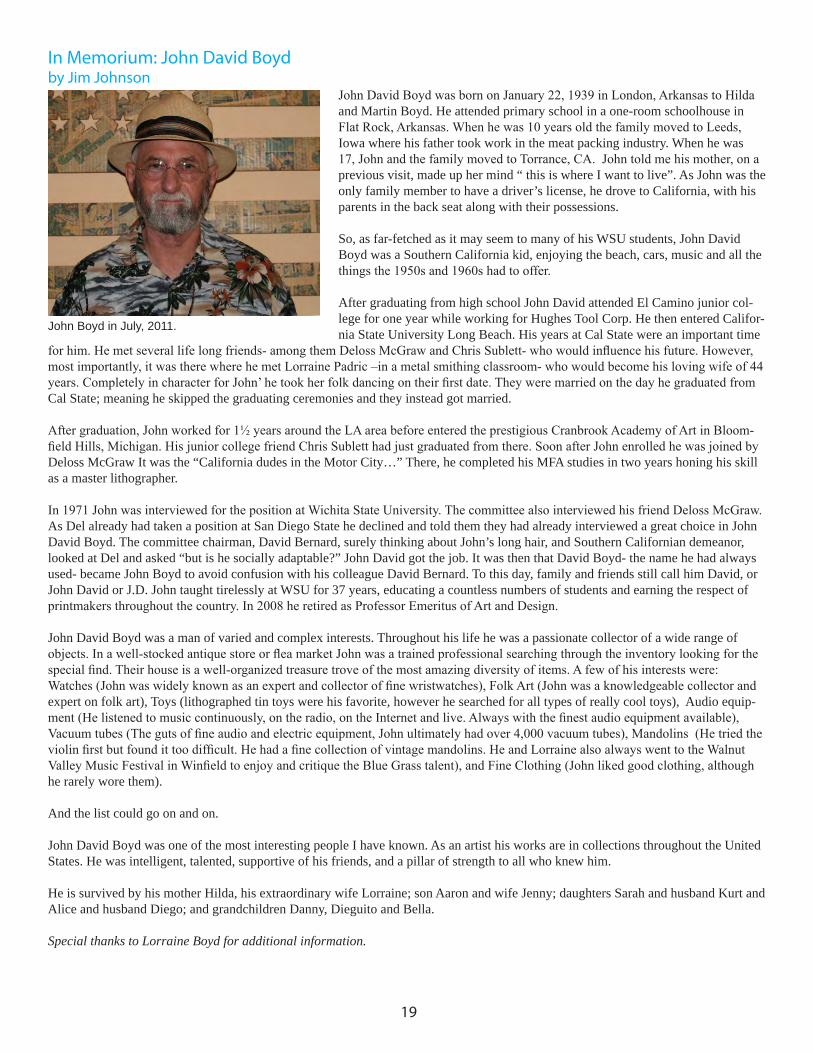
In Memorium: John David Boydby Jim Johnson
John David Boyd was born on January 22, 1939 in London, Arkansas to Hilda and Martin Boyd. He attended primary school in a one-room schoolhouse in Flat Rock, Arkansas. When he was 10 years old the family moved to Leeds, Iowa where his father took work in the meat packing industry. When he was 17, John and the family moved to Torrance, CA. John told me his mother, on a previous visit, made up her mind “ this is where I want to live”. As John was the only family member to have a driver’s license, he drove to California, with his parents in the back seat along with their possessions.
So, as far-fetched as it may seem to many of his WSU students, John David Boyd was a Southern California kid, enjoying the beach, cars, music and all the things the 1950s and 1960s had to offer.
After graduating from high school John David attended El Camino junior col-lege for one year while working for Hughes Tool Corp. He then entered Califor-nia State University Long Beach. His years at Cal State were an important time
for him. He met several life long friends- among them Deloss McGraw and Chris Sublett- who would influence his future. However, most importantly, it was there where he met Lorraine Padric –in a metal smithing classroom- who would become his loving wife of 44 years. Completely in character for John’ he took her folk dancing on their first date. They were married on the day he graduated from Cal State; meaning he skipped the graduating ceremonies and they instead got married.
After graduation, John worked for 1½ years around the LA area before entered the prestigious Cranbrook Academy of Art in Bloom-field Hills, Michigan. His junior college friend Chris Sublett had just graduated from there. Soon after John enrolled he was joined by Deloss McGraw It was the “California dudes in the Motor City…” There, he completed his MFA studies in two years honing his skill as a master lithographer.
In 1971 John was interviewed for the position at Wichita State University. The committee also interviewed his friend Deloss McGraw. As Del already had taken a position at San Diego State he declined and told them they had already interviewed a great choice in John David Boyd. The committee chairman, David Bernard, surely thinking about John’s long hair, and Southern Californian demeanor, looked at Del and asked “but is he socially adaptable?” John David got the job. It was then that David Boyd- the name he had always used- became John Boyd to avoid confusion with his colleague David Bernard. To this day, family and friends still call him David, or John David or J.D. John taught tirelessly at WSU for 37 years, educating a countless numbers of students and earning the respect of printmakers throughout the country. In 2008 he retired as Professor Emeritus of Art and Design.
John David Boyd was a man of varied and complex interests. Throughout his life he was a passionate collector of a wide range of objects. In a well-stocked antique store or flea market John was a trained professional searching through the inventory looking for the special find. Their house is a well-organized treasure trove of the most amazing diversity of items. A few of his interests were:Watches (John was widely known as an expert and collector of fine wristwatches), Folk Art (John was a knowledgeable collector and expert on folk art), Toys (lithographed tin toys were his favorite, however he searched for all types of really cool toys), Audio equip-ment (He listened to music continuously, on the radio, on the Internet and live. Always with the finest audio equipment available), Vacuum tubes (The guts of fine audio and electric equipment, John ultimately had over 4,000 vacuum tubes), Mandolins (He tried the violin first but found it too difficult. He had a fine collection of vintage mandolins. He and Lorraine also always went to the Walnut Valley Music Festival in Winfield to enjoy and critique the Blue Grass talent), and Fine Clothing (John liked good clothing, although he rarely wore them).
And the list could go on and on.
John David Boyd was one of the most interesting people I have known. As an artist his works are in collections throughout the United States. He was intelligent, talented, supportive of his friends, and a pillar of strength to all who knew him.
He is survived by his mother Hilda, his extraordinary wife Lorraine; son Aaron and wife Jenny; daughters Sarah and husband Kurt and Alice and husband Diego; and grandchildren Danny, Dieguito and Bella.
Special thanks to Lorraine Boyd for additional information.
John Boyd in July, 2011.
19

SUPPORT SGC INTERNATIONAL : JOIN OR RENEW YOUR MEMBERSHIP
Help us support our annual conference, publish the newsletter, underwrite our traveling show, act as a network for the membership and be a better resource for you. Students must include a photo-copy of their current ID. PLEASE PRINT LEGIBLY!
NAME INSTITUTION/AFFILIATION (if any)______________________________________________________________________
ADDRESS_________________________________________________________________________________
CITY/STATE/COUNTRY/ZIP-PLUS FOUR_____________________________________________________
PHONE_______________________________________
E-MAIL_______________________________________ PLEASE CIRCLE: $50 REGULAR MEMBERSHIP $25 STUDENT MEMBERSHIP NEW RENEWAL
Inquiries for Institutional and Lifetime Memberships are Encouraged
SEND THIS FORM WITH A CHECK PAYABLE TO “SGCInternational” TO:
Stephanie StandishTreasurer SGCInternational2030 South Center StTerre Haute, IN 47802
OR JOIN/RENEW ONLINE AT WWW.SCGINTERNATIONAL.ORG
20
Rachel Singel, Nest, 22” x 30”. intaglio, 2012Mike Houston, Please Stop Emailing Me,Cannonball Press, 18” x 24”,woodcut/letterpress on paper2012