Australia's Graphic Gift
24
SAGE Publications (Los Angeles, London, New Delhi, Singapore and Washington DC: http://vcj.sagepub.com) Copyright © The Author(s), 2015. Reprints and permissions: http://www.sagepub.co.uk/journalspermissions.nav/ Vol 14(1): 97–120 DOI 10.1177/1470357214542191 visual communication Australia’s graphic gift KATE DILANCHIAN University of Technology Sydney, Australia ABSTRACT This article examines the shape of the map of Australia, and analyses how its inherent visual qualities contribute to its recognition and ubiquity as a symbol. It is argued that the effectiveness of the map of Australia as a widely used graphic symbol stems from the characteristics of its shape, and that its attributes reflect those fundamentals of form and composition com- monly accepted by graphic designers as necessary for creating an effective design. The author presents an analytical framework that initially identifies how the visual uniqueness of a cartographic map creates a recognizable and memorable form, and then applies the principles of design in an original approach towards reaching an understanding of how and why the map of Australia serves as an effective graphic symbol. KEYWORDS Australian map • graphic symbol • logo • maps • national symbol • visual communication Since the early 20th century, Australians have used the map of their continent as a symbol in numerous contexts, from economic to social/cultural, and it continues to be a familiar presence in the current Australian visual landscape. e reasons for this have only ever been understood from a social science per- spective, and even then, rarely. is article demonstrates the inherent visual qualities of the map of Australia and suggests that they contribute significantly to its recognition and ubiquity as a symbol. is, it is argued, is because its attributes reflect those fundamentals of form and composition commonly accepted by graphic designers as necessary for creating an effective design. IDENTIFYING AN INSUFFICIENTLY EXPLAINED PHENOMENON As an American graphic designer moving to Australia, I was immediately fascinated by the many distinctive graphic devices employed to represent 54219research-article 2015 ARTICLE at University of Technology Sydney on February 7, 2015 vcj.sagepub.com Downloaded from
Transcript of Australia's Graphic Gift

SAGE Publications (Los Angeles, London, New Delhi, Singapore and Washington DC: http://vcj.sagepub.com) Copyright © The Author(s), 2015.
Reprints and permissions: http://www.sagepub.co.uk/journalspermissions.nav/Vol 14(1): 97 –120 DOI 10.1177/1470357214542191
v i s u a l c o m m u n i c a t i o n
Australia’s graphic gift
K A T E D I L A N C h I A NUniversity of Technology Sydney, Australia
A b S T R A C T
This article examines the shape of the map of Australia, and analyses how its inherent visual qualities contribute to its recognition and ubiquity as a symbol. It is argued that the effectiveness of the map of Australia as a widely used graphic symbol stems from the characteristics of its shape, and that its attributes reflect those fundamentals of form and composition com-monly accepted by graphic designers as necessary for creating an effective design. The author presents an analytical framework that initially identifies how the visual uniqueness of a cartographic map creates a recognizable and memorable form, and then applies the principles of design in an original approach towards reaching an understanding of how and why the map of Australia serves as an effective graphic symbol.
K E y W O R D S
Australian map • graphic symbol • logo • maps • national symbol • visual communication
Since the early 20th century, Australians have used the map of their continent as a symbol in numerous contexts, from economic to social/cultural, and it continues to be a familiar presence in the current Australian visual landscape. The reasons for this have only ever been understood from a social science per-spective, and even then, rarely. This article demonstrates the inherent visual qualities of the map of Australia and suggests that they contribute significantly to its recognition and ubiquity as a symbol. This, it is argued, is because its attributes reflect those fundamentals of form and composition commonly accepted by graphic designers as necessary for creating an effective design.
I D E N T I f y I N G A N I N S U f f I C I E N T L y E x P L A I N E D P h E N O m E N O N
As an American graphic designer moving to Australia, I was immediately fascinated by the many distinctive graphic devices employed to represent
54219 research-article2015
A R T I C L E
at University of Technology Sydney on February 7, 2015vcj.sagepub.comDownloaded from

98 1 4 ( 1 )
the nation, from kangaroos and koalas to rosellas and gum leaves, boomer-angs, the Opera House and Uluru. Yet over time it was the widespread use of the map of Australia as a symbol that captured my attention. The sight of Australia’s cartographic outline on many products appeared to me to be an unusual use of imagery, and I was intrigued by the ability of one single image to appear in such a diverse range of permutations, from the conventional through the creative to the quirky, and yet still represent the nation. Viewing this phenomenon as an outsider, I saw the use of the map as a different strategy for national identification to the one I was familiar with in the United States, where nationhood is represented by the widespread use of the red, white and blue of the flag and its stars and stripes. I wanted to establish whether this use of the map was due to more design-related factors.
On investigation, it became apparent that there was a paucity of litera-ture that discussed maps, in general, and specifically the map of Australia as graphic symbols. Some cartographers and those in affiliated disciplines have hinted at the potential of shape as a contributing element in the recognition of maps as symbols (Atkinson, 2010; Francaviglia, 1995; Willis, 1993), but they lack any particular insight into how the characteristics of shape relate to the effectiveness of a symbol. Even the most recent publication, Symbols of Australia (Harper and White, 2010), which explores 26 of Australia’s many national symbols, only hints at the map’s graphic qualities. In his chapter on the map, Atkinson (2010: 40) writes: ‘The simplicity of its shape meant that the map of Australia could be very small and still recognizable, at the same time summarising an object and an idea of dazzling dimensions.’ He goes on to recognize the importance of the distinctive outline, noting that by the early 19th century it was the ‘duty of all Australians to know by heart the main bumps and indents of the continent’ (p. 39). Atkinson concludes by observ-ing that more than 100 years after Federation, there is ‘no longer any need to drive the image home or to stress enchantment. The map, in broad outline, is so familiar that the vaguest approximation – the merest abstraction – is easily picked up’ (p. 43). He therefore briefly addresses why the map is so commonly used from a cultural and historical perspective, but offers virtually no explana-tion as to how the graphic qualities of its shape may contribute to its use.
Similarly another researcher, Anne-Marie Willis (1993), also lightly touches on the topic of the map as a symbol in her book Illusions of Identity: The Art of Nation. She observes that:
Its prolific use as a sign probably has a lot to do with its adaptability as a graphic form. Its distinctiveness and relative symmetry allow it to be abstracted, stretched in all directions, appear in all colours and sizes and still be recognised as a sign of Australia. (p. 15)
On the subject of why and how maps in general are used as graphic symbols, I could find only one reference, that of Richard Francaviglia in The
at University of Technology Sydney on February 7, 2015vcj.sagepub.comDownloaded from

99
Shape of Texas (1995). He outlines some of the visual qualities that support shape recognition, from the size of the state, to the variety of its contour and its strategic location. His fundamental argument is that the simplicity and dis-tinct features of the outline are the essential qualities in the shape recognition (p. 87), but this analysis is undertaken from a cartographer’s perspective and so lacks insights into how the specific characteristics of the shape contribute to its effectiveness as a symbol.
T h E R I S E O f T h E m A P O f A U S T R A L I A A S A S y m b O L
Australians, like others, need symbols to feel a sense of national pride and unity. Yet as Willis (1993: 156) states: ‘There is no single source for the pro-duction of imagery of nation.’ For many countries the flag, its colours or some other iconic symbol externalize identity, but the map is not usually exploited so readily. Perhaps this can be attributed in many instances to the changing shapes of maps over the centuries as the result of wars and conquest. Only islands are usually immune from such change. But it could very well be attrib-uted to a country’s lack of a distinctive shape that offers instant recognition and appreciation. This is particularly significant to the premise of this article and is demonstrated in the following analysis.
For Australians, the shape of the map strongly communicates national identity, and conveys an emotive power that can express feelings of national pride and can also represent the country’s strength, independence and unity. One might question how the cartographic shape of the country synthesizes all of Australia within one symbol. Quite simply it cannot, but what it can do is convey the cultural links of its geographic location, history and cultural experience as an independent nation, creating an interconnection between the country’s past and present.
Australia was originally perceived as a country of immigrants (ignor-ing the Indigenous presence) and therefore in need of ways in which to distin-guish its identity from the lands which had supplied the majority of the settlers (primarily the UK and Ireland). Being a new country, it possessed a limited history to draw from, and therefore some of the first symbols to represent the country came from the natural landscape: the kangaroo, emu, koala and kookaburra, to flora and fauna, yet the map became the most common and the Southern Cross the most inspirational of symbols (Harper and White, 2010: 4). The map of Australia as a symbol of the country emerged in the mid-19th century, with the early settlers and explorers. Its value was quickly recognized, with state figures such as Western Australian premier John Forrest believing it necessary that ‘The map of Australia … must be familiar to all persons who claim Australia as their home’ (p. 39).
The country’s uniqueness as an island continent and the mapping of its coastline initially lent great significance to the geographical situation of
at University of Technology Sydney on February 7, 2015vcj.sagepub.comDownloaded from

100 1 4 ( 1 )
Australia, but it was eventually through the development of literacy and par-ticularly an understanding of cartography and an awareness of the location, size, and shape of the country (p. 40) that the map was increasingly recognized as a symbol of Australia. Atkinson (2010: 40) explains that ‘Cartography was a way of holding and fixing the imagination on something beyond ready com-prehension, which is how all good symbols operate.’
Around 1906–1908, shortly after the Federation of Australia in 1901, which marked the uniting of the six independent British colonies into states and hence one nation, there was evidence of the map’s acceptance as a sym-bol of Australia, as logos that incorporated the map with the words ‘Made in Australia’ and ‘Australian First’ started to emerge. Yet it was only through the great human loss in World War I and specifically at Gallipoli that a sense of national unity and national identity was really established. Willis (1993: 159) observes that: ‘World War I provided the state with the first significant opportunity for the widespread public mobilisation of nationalistic rhetoric and the “testing” of citizens’ belief in the new nation of Australia.’ For much of the decade following the war, Australia experienced considerable economic growth and development in manufacturing, such as the large-scale concerns of Broken Hill Propriety Ltd (BHP) now known as BHPBilliton, manufactur-ing iron and steel, and the primary wool and apple export industries, each notably employing the map of Australia in their logos from inception until current times. During this time of growth in manufacturing, the opportunity to use patriotism escalated as businesses recognized its promotional (or mar-keting) value (p. 163).
In 1924, the ‘Australian-Made Preference League’ and their ‘Buy Australian’ campaign that was designed to raise the profile of Australian manufacturers, employed the silhouette of the map on their badges and in marketing material to promote the campaign. The League was based on ‘sane and practical patriotism’; it held that if Australians ‘exercised a little practi-cal patriotism in [their] daily purchases and gave a definite preference to “Australian-Made” goods, the inevitable result would be augmented industry and general prosperity’ (Exhibition Document, Sydney, 1926: 16–17). Even before the government sponsored the ‘Australian-Made Preference League’, there had already been official recognition of the need to promote Australian goods and tourism, and of the value of the image of the map in doing so. In 1913, the shape of Australia was incorporated onto an Australian postage stamp. The first Australian Postmaster-General appointed after Federation, Charles Frazer, was strongly committed to the promotion of Australia through philately, believing that ‘a postage stamp is one of the best advertising medi-ums the country can have. “Every letter leaving our shores bears an advertise-ment for the country on its stamp”’ (Cowles and Walker, 2005: 67).
The bicentennial year of 1988 can be seen as a culmination of the Australianization of the country with the ‘exploitation of nationalist imagery reaching a pinnacle with the bicentennial celebrations’ (Allen, 2008: 24), and
at University of Technology Sydney on February 7, 2015vcj.sagepub.comDownloaded from

101
the use of the map in the bicentennial logo is formalized at this point by the government as a symbol representing the nation.
The adoption of the map of Australia as a visual symbol of the nation that had begun in the 19th century was by then completely embedded in the Australian visual landscape with ever greater diversity.
Over several generations, the map of Australia, drawn and redrawn, read and re-read, has done something similar for Australians. It was taken up in the late nineteenth century as a symbol of themselves. Now it is much more than a symbol. It has become part of what they are. (Atkinson, 2010: 43)
The following is a selection of logos dating from the early 20th century up to the present that have been designed to promote a sense of national pride, and to support economic and commercial interests (figure 1). While these logos contribute towards an understanding of the country’s visual history and the rise of the map as a significant national symbol, they are also interesting for their historical value and their visual content.
G R A P h I C S y m b O L S A N D L O G O D E S I G N S
The focus of this article is on the map of Australia as a symbol, but more spe-cifically on how its inherent visual qualities contribute to its recognition and ubiquity as a symbol. As a means of demonstrating this, the analysis draws on the map’s symbolic use in logos, as both the logo and symbol share an intimate relationship with each other. As an accessible form of communica-tion, a logo can be applied to anything from a business card to a multinational branding campaign, and is used by individuals and businesses alike. Logos are also found everywhere in the modern world. Therefore my research has been focused on logos which incorporate the map as symbol, as this offers a wide platform from which to explore the way Australia uses the map as a form of visual shorthand.
figure 1. A selection of logos that incorporate the map of Australia dating from the early 20th century up to the present. Images courtesy of Mimmo Cozzolino from Symbols of Australia (Cozzolino and Rutherford, 1990).
at University of Technology Sydney on February 7, 2015vcj.sagepub.comDownloaded from

102 1 4 ( 1 )
A graphic symbol is an image that conveys some form of meaning and emotional connection with its audience. In a design context, this emotive aspect can be a significant element in a response to a logo. As Fritz Gottschalk notes: ‘Emotions are a strong driver in decision making, and the success or failure of a logo. This emotional connection is the piece that makes the differ-ence between a flat and unremarkable logo, and a successful and memorable logo’ (cited in Adams, 2008: 14). At the same time, a logo needs to commu-nicate some form of commercial connection or association in order for the design to be effective in its meaning. Logos are therefore usually based on a combination of symbol and text (usually the company or product name). Here, however, many of the logos are presented without the accompanying text and illustrate the symbolic map image on its own.
E V A L U A T I N G T h E G R A P h I C E f f E C T I V E N E S S O f T h E m A P O f A U S T R A L I A
The first part of this article addressed the rise of the map as a recognizable and emotive symbol. This second part is an attempt to widen understanding of the map’s application as a symbol, and to address the perception and visual aesthetics of the map in general. The analysis1 is based on the principles of design, namely balance, rhythm, contrast, scale and unity2 as a means of ana-lysing the map’s shape in terms of its graphic effectiveness as a symbol. These principles are used to evaluate the visual structure of the map, and to demon-strate how the unique qualities of the map’s shape contribute to its recogni-tion and retention.
Designed as a visual essay, and guided by the principles of design as a tool for analysis, this section starts by analysing the basic structure of the map. Such a reduction of form reveals the fundamental framework of the map and highlights the distinct characteristics that aid in its recognition.
In order to understand the possible elements that underlie the recog-nition and retention of a cartographic form along with its visual aesthetics (which contributes to the commercial value of the image), the notions of sim-plicity, distinctiveness of features, scale and geometric qualities become cen-tral to the argument.
balanceAs designers, we seek visual balance in the designs we create to anchor and activate the elements in a composition and to create stability in a design (Lupton and Phillips, 2008). This stability can be displayed through either a symmetrical or an asymmetrical relationship, and, depending on its use or nat-ural existence (or attributes), the dynamics of an image can be altered. Many classic logos demonstrate symmetrical balance through the use of archetypal shapes – circle, square, triangle, diamond or star. These geometric shapes add a high degree of symmetry or proportionality, displaying a mirrored image
at University of Technology Sydney on February 7, 2015vcj.sagepub.comDownloaded from
103
along either side of the dividing axes; either left to right, top to bottom or diagonal.
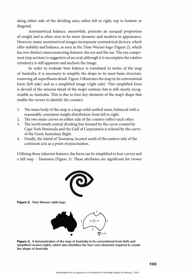
Asymmetrical balance, meanwhile, presents an unequal proportion of weight and is often seen to be more dynamic and modern in appearance. However, many asymmetrical images incorporate symmetrical devices, which offer stability and balance, as seen in the Time Warner logo (Figure 2), which has two distinct interconnecting features: the eye and the ear. The eye compo-nent (top section) is suggestive of an oval; although it is incomplete the relative symmetry is still apparent and anchors the image.
In order to evaluate how balance is translated in terms of the map of Australia, it is necessary to simplify the shape to its most basic structure, removing all superfluous detail. Figure 3 illustrates the map in its conventional form (left side) and as a simplified image (right side). This simplified form is devoid of the sinuous detail of the map’s contour, but is still clearly recog-nizable as Australia. This is due to four key elements of the map’s shape that enable the viewer to identify the country:
1. The main body of the map is a large solid unified mass, balanced with a reasonably consistent weight distribution from left to right.
2. The two main curves on either side of the country reflect each other.3. The north/south central dividing line formed by the curve created by
Cape York Peninsula and the Gulf of Carpentaria is echoed by the curve of the Great Australian Bight.
4. Finally, the island of Tasmania, located south of the eastern side of the continent acts as a point of punctuation.
Utilizing these inherent features, the form can be simplified to four curves and a full stop – Tasmania (Figure 3). These attributes are significant for viewer
figure 2. Time Warner cable logo.
figure 3. A demonstration of the map of Australia in its conventional form (left) and simplified version (right), which also identifies the four core elements required to create the shape of Australia.
at University of Technology Sydney on February 7, 2015vcj.sagepub.comDownloaded from

104 1 4 ( 1 )
recognition and recall. They also reveal how the concept of balance is evident in the map’s shape and how it enables the shape to be transformed from an asymmetrical to a symmetrical form. Such versatility contributes significantly to the map’s value as a symbol, as it allows for various graphic interpretations.
To test this premise, I conducted two visual surveys. The first draws on a study conducted by Sanders and Porters (1974) on the connection between a geographical image and how shape recognition can be associated with known objects or with geometric shapes as a means of memorizing the form (Francaviglia, 1995; Jacob, 2006; Sanders and Porter, 1974). Sanders and Porter (1974) demonstrated this by analysing how precisely a geographical outline is retained as a mental image. Geography students were asked to draw the coastline of Africa based on recall from their mental image of the shape. This task was designed to compare the hand-drawn outlines with those of the cartographic representation in order to make a psychological study of the map’s shape and meaning, while ascertaining the spatial accuracy of each drawing. Their intention was to probe ‘the geography in men’s minds’ (p. 258) from a spatial rather than a textual perspective, intending to show that ‘shape as an attribute of portrayed mental maps can be evaluated.’
Their findings that the brain establishes meaning by identifying asso-ciations with the shape’s contour confirms the recognition in design thinking and practice that certain distinct features of shape affect the recognition of a form. That is to say, a map is most easily recognized if it has simple, geometric shapes, even if it involves reduction. This conclusion is supported by Gestalt theories of perception, which state that people prefer the most straightforward shape, and that simplicity is therefore a strong feature in the recognition of an image (Lidwell et al., 2003). Simplicity is also one of the most common qualities that designers seek in the quest for clarity (see the simplicity diagram below).
I conducted a similar analysis designed to verify the accuracy of my theory that two sets of reflective curves plus Tasmania facilitate instant recog-nition of the Australian map. Participants were asked to visualize the outline of Australia and to then draw how it appeared to them on a blank piece of paper. Figure 4 presents 35 of these drawings. By viewing them collectively, one can observe three significant features: the reliance on the two sets of reflective curves (with the exception of no. 6), Tasmania (with the exception of nos 6 and 25), and finally the overall shape configuration presented with
at University of Technology Sydney on February 7, 2015vcj.sagepub.comDownloaded from

105
a greater width than height. There is no evidence of the sinuous detail of the map’s contour. Nor did anyone represent the tilt of its form (the west side of the country extends further north than the east side of the country). Despite this, these simplified versions are clearly recognizable as Australia. While some are stronger geographic representations of the outline than others, the
figure 4. Selection of hand drawings of the map of Australia from the visual survey, which reflect the visualization of the two sets of reflective curves and Tasmania to develop the structure.
at University of Technology Sydney on February 7, 2015vcj.sagepub.comDownloaded from

106 1 4 ( 1 )
results demonstrate that these four key elements (stated previously) were used as mental guides in constructing the map.
The second study set out to determine if the map can be represented as a symmetrical form and still remain recognizable. This analysis consists of two parts. The first section considers the recognizability of the map once the coast-lines are mirrored, creating an equally balanced shape (not including Tasmania). Figures 5 and 6 represent mirrored images of the west and east coast. In analys-ing the readability and recognition of these images, I perceive the west coast ver-sion (Figure 5) to be more acceptable than the east coast one (Figure 6). Initially, perhaps because the east coast version reminded me of the Batman symbol, my initial capacity to recognize it as the shape of Australia was diminished. Once the two shapes were compared to my data collection, it was clear that the west coast version (Figure 5) was replicated more readily. But what is clear from this analysis is that the map can be represented as a symmetrical configuration.
The following sequence, Figure 7, illustrates a typology of shapes devel-oped from the components of logos from my personal database. It demon-strates the systematic abstraction of the map’s outline from a literal representa-tion (shape 1) to a full abstraction (shapes 4 and 5). These five basic structures demonstrate the versatility of the shape to transform from an asymmetrical to a symmetrical image, which also demonstrates how flexible the map is as a graphic form.
Figure 7 provides a visual overview of the five basic structures identi-fied in the visual database and how each has been interpreted in graphic logos of Australia (Figure 8).
The majority of logos in the database use the map in a literal, sim-plified or asymmetrical configuration (rows 1, 2 and 3 – Figure 8), while fewer rely on abstract or organic forms. The meanings that are implied by the various uses of the Australian map vary from the literal stamp of national
figure 5. Map of Australia, mirrored west coast.
figure 6. Map of Australia, mirrored east coast.
at University of Technology Sydney on February 7, 2015vcj.sagepub.comDownloaded from

107
identification, by which the only thing you really learn is that this is Australia, to logos that employ more abstract depictions of the map, through an expres-sive, individual and unique approach, thus integrating the idea of the com-pany concerned with that of Australia. A particularly interesting example of this synergy between shape and national identity is seen in the Diversity Council logo (Figure 9). The logo was the initiative of designer Geordie McKenzie, who explained in an interview that the design development origi-nated from a desire to use ribbons and material to create the basis of the con-cept. He recalled that while he was laying out three ribbons next to each other he realized they could very well represent the map of Australia. He followed that line of thinking and produced a very effective mark that incorporated the work of the Council (through the use of various ribbons and textures),
figure 7. Shape 1 represents a literal representation of the map with its unequal balance. Shape 2 demonstrates an asymmetrical configuration. By altering the shift in weight from right to left, Shape 3 reveals a symmetrical form, with both a horizontal and vertical axis. Except for Tasmania, the shape reveals a mirror image. Finally shapes 4 and 5 are further abstractions however ambiguous, their structure is still derived from the same key principles.
figure 8. Selection of logos that identify how the five basic structures are interpreted.
at University of Technology Sydney on February 7, 2015vcj.sagepub.comDownloaded from

108 1 4 ( 1 )
while also including a national agenda. The Communications Director of the Diversity Council, Catherine Petterson, noted that the design was popular with its member organizations, and that ‘the use of the map in the logo … identifies us as a national organization which is one of the key messages for our stakeholders’ (email: 7 October 2009).
Balance, then, is a natural characteristic of the map’s shape and is dem-onstrated through the reflective curves of its form, creating stability, but it also offers versatility to transform the shape from an asymmetrical to a symmetri-cal image and to introduce further abstraction.
RhythmIn graphic design terms, rhythm refers to a repeating pattern, either consis-tent or varied in formation, which is used to create a sense of movement and to highlight specific focal points. While rhythm is a commonly understood device in graphic design, it is normally more accurate to describe it as the navigational flow of elements that lead a viewer’s eye through or across a page, and is less applicable to a single graphic such as a symbol or logo. However, I argue that within a single image there can still be elements that have attributes creating rhythm. These are referred to as Repetition of Shape and Inherent Characteristics of Shape. Rhythm in either of these forms contributes to the impact, flow and movement of the design.
Repetition of Shape is the most commonly understood method of creat-ing rhythm, and can be achieved by combining repetitive elements in either a consistent or progressive sequence. Consistent rhythm is created by presenting identical or similar elements in an even repetitive format. This conveys a sense of order and harmony, and indicates a defined sense of direction, and is usually created through the use of identical elements in a rhythmic arrangement to form a whole shape (Figure 10). Progressive rhythm is created by the increase or decrease of a repeated element, and depends on the visual characteristics of the shape being repeated (Figure 11). Both forms of rhythm can equally hold a viewer’s attention long enough to make a memorable impression.
Repetition of shape can also be created through the use of repetitive patterns within a single shape, and is used to transform an otherwise simple form into a distinctive, engaging and rhythmical image.
However, the type of rhythm that pertains more closely to a carto-graphic form is based on the inherent characteristics of a shape, which involve
figure 9. Diversity Council Australia logo.
at University of Technology Sydney on February 7, 2015vcj.sagepub.comDownloaded from

109
the natural repetition of its form, the flow of its contour and directional indi-cations. This form of rhythm is generally found in organic images, as they are intrinsically more rhythmic than their geometric counterparts. Furthermore, rhythm is also established through the repetition of a shape or pattern inher-ent in a form. Each repeating element offers a sense of movement, but also expresses continuity in the image as a whole.
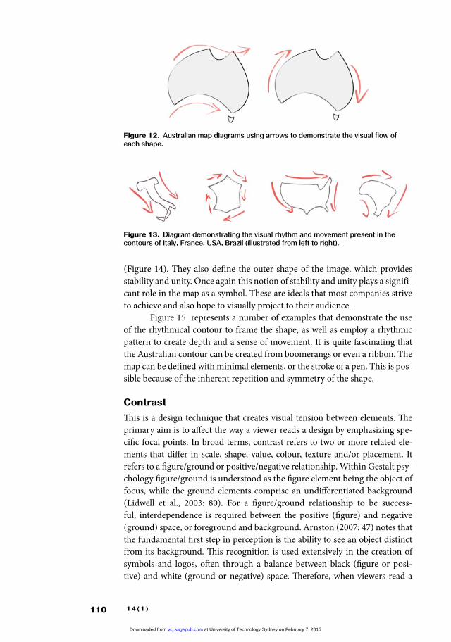
In most cases the outline of a country is considered curvilinear or ‘organic’ in form. While many organic forms are considered to possess a ‘free-form’ configuration, this does not guarantee that the shape of every country will represent a rhythmical arrangement. Graphic rhythm requires a sense of movement that maintains a consistent rhythm, not simply curved lines. In figure 12, the map diagrams of Australia use arrows to demonstrate how the eye naturally traces the outline, in a rhythmic movement from left to right as well as in a circular progression.
As a way to demonstrate the fluidity of the directional movement in the curves of the Australian map, here is a comparison with the visual rhythm in the contours of Italy, France, USA and Brazil. Each country’s shape dem-onstrates some level of rhythm, although France is the only form that exhibits a continual directional movement (Figure 13). This can be attributed to its hexagonal configuration, but the rhythmic consistency is not fluid or smooth, but rather angular.
Within the map of Australia there are also repetitive elements that create a pattern. The two main curves on either side of the country (2) and top and bottom (3) are repetitive shapes that offer consistency to the shape
figure 10. Macquarie Telecom logo.
figure 11. Skischuler logo.
at University of Technology Sydney on February 7, 2015vcj.sagepub.comDownloaded from
110 1 4 ( 1 )
(Figure 14). They also define the outer shape of the image, which provides stability and unity. Once again this notion of stability and unity plays a signifi-cant role in the map as a symbol. These are ideals that most companies strive to achieve and also hope to visually project to their audience.
Figure 15 represents a number of examples that demonstrate the use of the rhythmical contour to frame the shape, as well as employ a rhythmic pattern to create depth and a sense of movement. It is quite fascinating that the Australian contour can be created from boomerangs or even a ribbon. The map can be defined with minimal elements, or the stroke of a pen. This is pos-sible because of the inherent repetition and symmetry of the shape.
ContrastThis is a design technique that creates visual tension between elements. The primary aim is to affect the way a viewer reads a design by emphasizing spe-cific focal points. In broad terms, contrast refers to two or more related ele-ments that differ in scale, shape, value, colour, texture and/or placement. It refers to a figure/ground or positive/negative relationship. Within Gestalt psy-chology figure/ground is understood as the figure element being the object of focus, while the ground elements comprise an undifferentiated background (Lidwell et al., 2003: 80). For a figure/ground relationship to be success-ful, interdependence is required between the positive (figure) and negative (ground) space, or foreground and background. Arnston (2007: 47) notes that the fundamental first step in perception is the ability to see an object distinct from its background. This recognition is used extensively in the creation of symbols and logos, often through a balance between black (figure or posi-tive) and white (ground or negative) space. Therefore, when viewers read a
figure 12. Australian map diagrams using arrows to demonstrate the visual flow of each shape.
figure 13. Diagram demonstrating the visual rhythm and movement present in the contours of Italy, France, USA, Brazil (illustrated from left to right).
at University of Technology Sydney on February 7, 2015vcj.sagepub.comDownloaded from

111
symbol they instinctively look at the black area first, while the white becomes the background. It is also possible for this relationship to be reversed, with the white area being perceived as the figure of focus (positive), and the black as the background (negative).
The figure/ground relationship used in design is classified into three categories: stable, reversible, and ambiguous (Lupton and Phillips, 2008: 98). Stable and reversible relationships are the most commonly used form of fig-ure/ground when creating symbols and logos. Stable figure/ground exists when a form or figure stands clearly apart from its background. Reversible fig-ure/ground occurs when positive and negative elements attract our attention equally and alternatively, coming forward, then receding, as our eyes perceive one first as dominant and the next as subordinate. Ambiguous figure/ground challenges the viewer to find a focal point, yet in the context of a symbol an ambiguous relationship is not relevant, as it contradicts what a logo or symbol represents, clarity, impact and communication.
What makes a stable figure/ground relationship work effectively is the relationship created through the clear separation between the form or figure and its background (Lupton and Phillips, 2008: 86). In order for this process
figure 14. Diagram that represents repetitive shapes in the map of Australia.
figure 15. A selection of logos from the database that demonstrate rhythm: top row, left to right: AusBiotech, Queensland Rail, Austsafe Super, Aus Flag; bottom row, left to right: Australian Legal Information Institution, Centenary of Federation, Austroads, Capricorn Liquorice.
at University of Technology Sydney on February 7, 2015vcj.sagepub.comDownloaded from

112 1 4 ( 1 )
figure 17. Dartington Plus logo designed by OneMethod, Inc and modified by Landor Associates (1986).
to work effectively, the symbol needs to be an identifiable shape and to possess formal qualities that facilitate simplification without loss of detail and clarity.
The striking WWF logo (Figure 16) uses the contrast of positive and negative to illustrate a stylized panda. The viewer immediately focuses on the black shape of the figure, as it makes up the majority of the image, and the white space recedes to become the background. Although the image is not complete, there is a perceived closure of the form. Figure 17 demonstrates the reverse relationship, where the black area is perceived as the background allow-ing the white space to come forward and be viewed as the focus of the image.
Alternatively, contrast can be used to illustrate a reversible figure/ground relationship, developed through a shift from the figure (positive) to the ground (negative), revealing two or more distinct images within one form. Each image attracts the viewer’s attention alternatively, but as both cannot be perceived as figures simultaneously, one image must always be dominant. These examples illustrate the fundamental principle of creating this interplay between images by fluctuating figure and ground. Figure 18 uses the com-monly understood ‘OK’ hand sign but changes the ‘O’ to illustrate a house. This alternative is possible due to the simplicity of the geometric house shape and the letter ‘O’. The structure is based on archetypal shapes that can easily be manipulated because of their high degree of symmetry.
The way the distinct characteristics of the map of Australia’s contour contribute to the shape’s recognition has already been demonstrated. Foremost is the natural silhouette created by the country’s uniqueness as an island conti-nent. From a design perspective, the surrounding waters can be described as a background element whose role is to accentuate the form. This highlights the shape’s two sets of distinct curves and Tasmania – the key attributes that sup-port viewer recognition and recall of the country’s shape. The size and solid
mass of the main body of the map also commands strong recognition.figure 16. WWF logo designed by Sir Peter Scott (1961).
at University of Technology Sydney on February 7, 2015vcj.sagepub.comDownloaded from

113
The shape also possesses formal qualities that facilitate simplification of the map through the two sets of reflective curves without loss of detail and clarity. These reflective elements visually suggest a circular configuration, which offers a natural framing of the map. This is significant since a reversible figure/ground relationship is achieved in many instances through the framing of an image, which requires reflective elements.
All of this leads to the question of whether the map’s shape permits the creation of a clear separation between the figure and the background. Figure 19 is a powerful and distinctive logo for Landcare Australia, created by two hands framing the map of Australia. Not only is this a skilful and creative use of contrast, it also reinforces the message of Landcare, caring for the land. This is achieved by alternating the dominance between the figure and the ground. But what is quite fascinating about this logo is that the map of Australia can fit reasonably naturally into the hands with only a little artistic licence. Even the map of Tasmania is included as a knuckle on the thumb. It is hard to imagine that this would be possible with any other country shape. The Yoga Australia logo (Figure 20) also uses the natural form of the body to define the map’s shape. These two marks clearly demonstrate a strong separation between fig-ure and ground. They also convey an inseparable connection between form and content, whilst communicating a single message.
ScaleThe concept of scale refers to both size and proportion. Since graphic symbols are used in a variety of design contexts, from large applications such as bill-boards to the smaller format of a business card, it is essential that whatever their scale, when enlarged or reduced, they maintain their clarity of form and visual impact.
There are two significant factors which contribute to these fundamen-tal qualities. The first is the unity of the shape. As Gestalt theory has shown us, images that form a homogeneous whole in terms of shape and form are seen as unified images. The understanding is that a cohesive or unified shape will have visual clarity and a greater impact than images that are composed of separate parts or shapes. The second factor involves the proportion(s) of the image, in particular the relationship between width and height. The following
figure 18. Advantage Home Inspection logo designed by 300million (2005).
at University of Technology Sydney on February 7, 2015vcj.sagepub.comDownloaded from

114 1 4 ( 1 )
analysis illustrates how scale through the unity and the proportion of shape, is specifically applicable to the map of Australia as an effective graphic symbol.
Among the Gestalt principles of perception of specific relevance is the Law of Pragnanz or simplicity, which states that people prefer the simplest and most straightforward message, so that simplicity is a strong feature in the recognition of an image. Simplicity also contributes to the ability of an image in regard to its ability to be enlarged or reduced whilst maintaining clarity of form. Clarity of form depends on whether any parts or elements of a shape ‘close up’ when it is reduced to a small size or ‘break up’ when it is enlarged.
Figure 21 presents nine silhouettes of national maps that represent compact, fragmented and elongated confirmations, in order to consider the cohesiveness of each map’s shape upon reduction. The smallest map repre-sents the size of a logo as it appears on the information bar of a web browser. Each map is portrayed in its conventional cartographic representation without simplification of detail, relying on the inherent qualities of the shape.
From a graphic design perspective, the shapes of Australia, China, US, France and Germany provide clear visual forms that retain recognition when reduced. This is due to their unified configurations, devoid of small details or separate elements. In comparison, the shapes of the UK, Italy, Japan and New Zealand, with their narrow configurations and small details, barely retain a visual presence when reduced. Similarly, when the image is enlarged, these same elements and details will cause the shape to separate.
figure 19. Landcare Australia designed by Cliff Burke & Associates.
figure 20. Yoga Australia designed by Roy Smith.
at University of Technology Sydney on February 7, 2015vcj.sagepub.comDownloaded from

115
The proportions of the shape also have a significant influence on the visual impact of an image. This relates to the width of a figure in relation to its height. Designers seek proportions that achieve visual balance and preferably maintain geometric qualities to create stability in the design. A well-balanced symbol can also provide a useful background in the creation of a logo design where type or other images are overlaid.
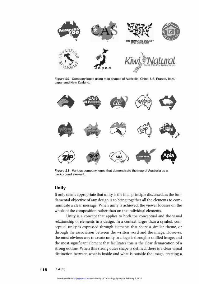
Figure 22 illustrates the use of the map shapes of Australia, China, US, France, Italy, Japan and New Zealand as a graphic device within logo designs. The maps are employed as a graphic element, to represent either a background shape for information or as an individual component within the design. Clearly the maps that possess a bolder more compact form create a stronger visual presence than do the shapes of Italy, Japan and New Zealand, which demonstrate a lack of visual impact, and do not create a sense of cohesion within the overall design, appearing detached or fragmented. It must be noted, however, that not all images that possess a solid form translate effectively into graphic devices, since there are other contributing factors, particularly balance in the effectiveness of a shape.
The map of Australia, with greater width than height (reminiscent of a shield) is a shape that suggests strength and stability, and offers a strong visual presence. The simplicity of its form allows the map to be effectively scaled to varied sizes, whilst maintaining clarity of shape and visual impact, along with the ability to be used as a background to text or other images. Figure 23 is a selection of logos that use the map of Australia as a background, incorporat-ing image or text in a cohesive relationship. They also signify the concept of ‘wholeness’, an image that can contain an idea within its borders.
figure 21. Comparison of country map shapes.
at University of Technology Sydney on February 7, 2015vcj.sagepub.comDownloaded from
116 1 4 ( 1 )
figure 23. Various company logos that demonstrate the map of Australia as a background element.
UnityIt only seems appropriate that unity is the final principle discussed, as the fun-damental objective of any design is to bring together all the elements to com-municate a clear message. When unity is achieved, the viewer focuses on the whole of the composition rather than on the individual elements.
Unity is a concept that applies to both the conceptual and the visual relationship of elements in a design. In a context larger than a symbol, con-ceptual unity is expressed through elements that share a similar theme, or through the association between the written word and the image. However, the most obvious way to create unity in a logo is through a unified image, and the most significant element that facilitates this is the clear demarcation of a strong outline. When this strong outer shape is defined, there is a clear visual distinction between what is inside and what is outside the image, creating a
figure 22. Company logos using map shapes of Australia, China, US, France, Italy, Japan and New Zealand.
at University of Technology Sydney on February 7, 2015vcj.sagepub.comDownloaded from

117
unified form. Understanding unity means being able to harness elements into a cohesive whole, or presenting a single shape as a complete unit.
C O N C L U S I O N
In summary, the map of Australia as a graphic form represents a compelling and easily recognizable national symbol. The use of the map as part of a logo is not only effective in terms of the way it connects the idea of the Australian nation to the institution or organization represented, but also in its ability to visually stimulate and motivate by tapping into often unconscious national feelings. The value of the map as a symbol is thus enhanced by its versatility as a shape, and by its accidental adherence to the formal design qualities of bal-ance, rhythm, contrast, scale and unity.
My research was originally motivated by a personal curiosity to inves-tigate something culturally specific that contrasted with my previous expe-rience, namely the United States’ widespread use of the flag to represent nationhood. Through a designer’s lens I have attempted to bring a particu-lar perspective to an area that has been occasionally identified and exploited by designers, but never analysed. I have offered an interpretation of how the graphic features of the map are a gift to graphic designers, who are able to communicate not only the concept of the organization represented, but more significantly to tap into the national feelings of the target audience. My hope is that at the very least this research will generate debate regarding the map’s use as a symbol of nationhood within Australian culture, and perhaps also that it will open up broader discussions of visual culture and the map of Australia, particularly in relation to the notion of branding a nation. While this can be understood to have effectively occurred since the early 20th century, it is never more relevant than now with government and affiliated organizations using the map so widely. Australia Unlimited, which was launched in 2010 and aims to build Australia’s international image for exporters (Figure 24), and the more recent South Australian state logo (Figure 25), are only two of many examples that represent the use of the map of Australia to express the national identity of the country.
figure 24. Australia Unlimited Logo.
figure 25. South Australia logo.
at University of Technology Sydney on February 7, 2015vcj.sagepub.comDownloaded from

118 1 4 ( 1 )
figure 26. The adaptability of the map of Australia unique cartographic form.
I conclude with a selection of logos that demonstrate the map’s versatil-ity and adaptability, and the many instances of the clever and humorous use of the map’s shape as a graphic form.
A C K N O W L E D G E m E N T S
I wish to offer my most sincere thanks Dr Louise McWhinnie and Dr Kate Sweetapple for their constructive and positive support.
f U N D I N G
This research received no specific grant from any funding agency in the public, com-mercial or not-for-profit sectors.
at University of Technology Sydney on February 7, 2015vcj.sagepub.comDownloaded from

119
N O T E S1. This section is based on my Masters thesis: ‘The graphic gift: A study of
the visual qualities of the map of Australia’, UTS, Sydney, 2012.2. Whilst the basic design principles are widely discussed, not all designers
agree on which concepts are the most significant. Nevertheless, through a review of a number of respected designers and institutions in the graphic design industry, I found the most commonly acknowledged principles to be balance, rhythm, scale, contrast and unity (Landa, 2006; Lupton and Phillips, 2008; McClurg-Genevese, 2005; Pipes, 2008; Resnick, 2003; State of Ohio Visual Communications, nd; Swinburne University of Technology, nd; White, 2002).
R E f E R E N C E S
Adams, S. (2008) Masters of Design: Logos & Identity. Gloucester, MA: Rockport Publishers.
Allen, T. (2008) Homesickness: Nationalism in Australian Visual Culture. South Yarra, Victoria: Palgrave Macmillan.
Arnston, A.E. (2007) Graphic Design Basics, 5th edn. Belmont, CA: Thomson Wadsworth.
Atkinson, A. (2010) Map. In: Harper, M. and White, R. (eds) Symbols of Australia: Uncovering the Stories Behind the Myths. Sydney: University of New South Wales Press/National Museum of Australia Press.
Cowles, C. and Walker, D. (2005) The Art of Apple Branding: Australian Apple Case Labels and the Industry since 1788. Hobart, Tasmania: Apples from Oz.
Cozzolino, M. and Rutherford, G.F. (1990) Symbols of Australia. Carlton, Victoria: Penguin Books Australia.
Dilanchian, K. (2011) The graphic gift: A study of the map of Australia’s visual qualities. Masters dissertation, MDes (Res), University of Technology Sydney.
Exhibition Document (1926) Souvenir of the Australian Made Preference League and the Great White Exhibition Train. Sydney: Simmons.
Francaviglia, R.V. (1995) The Shape of Texas: Maps as Metaphors. College Station: Texas A&M University Press
Harper, M. and White, R. (2010) Symbols of Australia: Uncovering the Stories behind the Myths. Sydney: University of New South Wales Press/National Museum of Australia Press.
Jacob, C. (2006) The Sovereign Map: Theoretical Approaches in Cartography throughout History. Chicago: University of Chicago Press.
Landa, R. (2006) Graphic Design Solutions. New York: Thomson Delmar Learning.
Lidwell, W., Holden, K. and Butler, J. (2003) Universal Principles of Design: A Cross-Disciplinary Reference. Gloucester, MA: Rockport Publishers.
Lupton, E. and Phillips, J.C. (2008) Graphic Design: The New Basics. New York: Princeton Architectural Press.
at University of Technology Sydney on February 7, 2015vcj.sagepub.comDownloaded from

120 1 4 ( 1 )
McClurg-Genevese, J.D. (2005) The principles of design. Digital Web Magazine. Available at: http://www.digital-web.com/articles/principles_of_design (accessed 25 June 2014).
Pipes, A. (2008) Foundations of Art and Design, 2nd edn. London: Laurence King.
Resnick, E. (2003) Design for Communication: Conceptual Graphic Design Basics. Hoboken, NJ: John Wiley.
Sanders, R.A. and Porter, P.W. (1974) Shape in revealed mental maps. Annals of the Association of American Geographers 64(2): 258–267.
State of Ohio States Forms Management (1990) Visual Communications Forms Design, Paper No 3, Columbus, OH.
Swinburne University of Technology (nd) Available at: http://www.swinburne.edu.au/design/tutorials/P-design/T-Basic-Design-Principles/ID-70/ (accessed 4 August 2011).
White, A.W. (2002) The Elements of Graphic Design. New York: Allworth Press.Willis, A-M. (1993) Illusions of Identity: The Art of Nation. Sydney: Hale &
Iremonger.
b I O G R A P h I C A L N O T E
KATE DILANCHIAN is an independent graphic designer who specializes in corporate identity and branding. She is affiliated with the School of Design, at the University of Technology, Sydney Australia where she teaches visual communications. Her current research focuses on the map’s use as a symbol of nationhood within the Australian culture, and how it embodies the notion of Branding Australia. Address: University of Technology Sydney, 15 Broadway, Ulitmo, Sydney 2007, New South Wales, Australia. [email: [email protected]]
at University of Technology Sydney on February 7, 2015vcj.sagepub.comDownloaded from