
Visual Statistics Use R! - LibreTexts
199
VISUAL STATISTICS USE R! Alexey Shipunov Minot State University
-
Upload
khangminh22 -
Category
Documents
-
view
0 -
download
0
Transcript of Visual Statistics Use R! - LibreTexts

VISUAL STATISTICS USE R!
Alexey ShipunovMinot State University

Minot State University
Visual Statistics Use R!
Alexey Shipunov

This text is disseminated via the Open Education Resource (OER) LibreTexts Project (https://LibreTexts.org) and like the hundredsof other texts available within this powerful platform, it is freely available for reading, printing and "consuming." Most, but not all,pages in the library have licenses that may allow individuals to make changes, save, and print this book. Carefullyconsult the applicable license(s) before pursuing such effects.
Instructors can adopt existing LibreTexts texts or Remix them to quickly build course-specific resources to meet the needs of theirstudents. Unlike traditional textbooks, LibreTexts’ web based origins allow powerful integration of advanced features and newtechnologies to support learning.
The LibreTexts mission is to unite students, faculty and scholars in a cooperative effort to develop an easy-to-use online platformfor the construction, customization, and dissemination of OER content to reduce the burdens of unreasonable textbook costs to ourstudents and society. The LibreTexts project is a multi-institutional collaborative venture to develop the next generation of open-access texts to improve postsecondary education at all levels of higher learning by developing an Open Access Resourceenvironment. The project currently consists of 14 independently operating and interconnected libraries that are constantly beingoptimized by students, faculty, and outside experts to supplant conventional paper-based books. These free textbook alternatives areorganized within a central environment that is both vertically (from advance to basic level) and horizontally (across different fields)integrated.
The LibreTexts libraries are Powered by MindTouch and are supported by the Department of Education Open Textbook PilotProject, the UC Davis Office of the Provost, the UC Davis Library, the California State University Affordable Learning SolutionsProgram, and Merlot. This material is based upon work supported by the National Science Foundation under Grant No. 1246120,1525057, and 1413739. Unless otherwise noted, LibreTexts content is licensed by CC BY-NC-SA 3.0.
Any opinions, findings, and conclusions or recommendations expressed in this material are those of the author(s) and do notnecessarily reflect the views of the National Science Foundation nor the US Department of Education.
Have questions or comments? For information about adoptions or adaptions contact [email protected]. More information on ouractivities can be found via Facebook (https://facebook.com/Libretexts), Twitter (https://twitter.com/libretexts), or our blog(http://Blog.Libretexts.org).
This text was compiled on 08/24/2022
®

1
TABLE OF CONTENTS
The ignorance of the statistical methods can lead to mistakes and misinterpretations. Unfortunately, understanding of these methodsis far from common. Many college majors require a course in probability theory and mathematical statistics, but all many of usremember from these courses is horror and/or frustration at complex mathematical formulas filled with Greek letters, some of themwearing hats. It is true that probability theory forms the basis of most data analysis methods but on the other hand, most people usefridge without knowledge about thermodynamics and Carnot cycle. For the practical purposes of analyzing data, you do not have tobe fully fluent in mathematical statistics and probability theory.
Forward
1: Data
1.1: Origin of the data1.2: Population and sample1.3: How to obtain the data1.4: What to find in the data1.5: Answers to exercises
2: How to process the data
2.1: General purpose software2.2: Statistical software2.3: The very short history of the S and R2.4: Use, advantages and disadvantages of the R2.5: How to download and install R2.6: How to start with R2.7: R and Data2.8: R graphics2.9: Answers to exercises
3: Types of Data
3.1: Degrees, hours and kilometers- measurement data3.2: Grades and t-shirts- ranked data3.3: Colors, Names and Sexes - Nominal Data3.4: Fractions, counts and ranks- secondary data3.5: Missing data3.6: Outliers, and how to find them3.7: Changing data- basics of transformations3.8: Inside R3.9: Answers to exercises
4: One-Dimensional Data
4.1: How to Estimate General Tendencies4.2: 1-Dimensional Plots4.3: Confidence intervals4.4: Normality4.5: How to create your own functions

2
4.6: How good is the proportion?4.7: Answers to exercises
5: Two-Dimensional Data - Differences
5.1: What is a statistical test?5.2: Is there a difference? Comparing two samples5.3: If there are More than Two Samples - ANOVA5.4: Is there an association? Analysis of tables5.5: Answers to exercises
6: Two-Dimensional Data - Models
6.1: Analysis of Correlation6.2: Analysis of regression6.3: Probability of the success- logistic regression6.4: Answers to exercises
7: Multidimensional Data - Analysis of Structure
7.1: How to draw the multivariate data7.2: Classification without learning7.3: Machine learning7.4: Semi-supervised learning7.5: Deep Learning7.6: How to choose the right method7.7: Answers to exercises
8: Appendix A- Example of R session
8.1: Starting...8.2: Describing...8.3: Plotting...8.4: Testing...8.5: Finishing...8.6: Answers to exercises
9: Appendix B- Ten Years Later, or use R script
9.1: How to make your first R script9.2: My R script does not work!9.3: Common pitfalls in R scripting9.4: Good, Bad, and Not-too-bad9.5: Answers to exercises
10: Appendix C- R fragments
10.1: R and databases10.2: R and time10.3: R and Bootstrapping10.4: R and shape10.5: R and Bayes

3
10.6: R, DNA and evolution10.7: R and reporting10.8: Answers to exercises
Index
Appendix D - Most essential R commands
Appendix E - The short R glossary
References and Reference Cards
This page titled Book: Visual Statistics Use R! (Shipunov) is shared under a Public Domain license and was authored, remixed, and/or curated byAlexey Shipunov via source content that was edited to the style and standards of the LibreTexts platform; a detailed edit history is available uponrequest.

1 https://stats.libretexts.org/@go/page/3932
ForwardThis book is written for those who want to learn how to analyze data. This challenge arises frequently when you need to determinea previously unknown fact. For example: does this new medicine have an effect on a patient’s symptoms? Or: Is there a differencebetween the public’s rating of two politicians? Or: how will the oil prices change in the next week? You might think that you canfind the answer to such a question simply by looking at the numbers. Unfortunately this is often not the case.
After surveying 262 people exiting a polling site, it was found that 52% voted for candidate A and 48% for candidate B.
Solution
Thinking about it, many would say “yes,” and then, considering it for a moment, “Well, I don’t know, maybe?” But there is asimple (from the point of view of modern computer programs) “proportion test” that tells you not only the answer (in this case,“No, the results of the exit poll do not indicate that Candidate A won the election”) but also allows you to calculate how manypeople you would need to survey to be able to answer that question. In this case, the answer would be “about 5,000 people”—see the explanation at the end of the chapter about one-dimensional data.
The ignorance of the statistical methods can lead to mistakes and misinterpretations. Unfortunately, understanding of these methodsis far from common. Many college majors require a course in probability theory and mathematical statistics, but all many of usremember from these courses is horror and/or frustration at complex mathematical formulas filled with Greek letters, some of themwearing hats.
It is true that probability theory forms the basis of most data analysis methods but on the other hand, most people use fridgewithout knowledge about thermodynamics and Carnot cycle. For the practical purposes of analyzing data, you do not have to befully fluent in mathematical statistics and probability theory. Therefore, we tried to follow Steven Hawking who in the “A BriefHistory of Time” stated that “... someone told me that each equation I included in the book would halve the sales. I thereforeresolved not to have any equations at all ..”. Consequently, there is only one equation in this book. By the way, an interestingexercise is just to find it. Even better, almost ideal approach would be the book close to R. Munroe’s “Thing Explainer” wherecomplicated concepts are explained using dictionary of 1,000 most frequent English words.
All in all, this book is the sort of “statistic without math”, but with R.
Some caution is required, though, for readers of such books: many methods of statistical analysis have, so to speak, a false bottom.You can apply these methods without delving too deeply into the underlying principles, get results, and discuss these results in yourreport. But you might find one day that a given method was totally unsuitable for the data you had, and therefore your conclusionsare invalid. You must be careful and aware of the limitations of any method you try to use and determine whether they areapplicable to your situation.
On examples: This book is based on a software which runs data files, and we have made most of the data files used here availableto download from
http://ashipunov.info/data
We recommend to copy data files to the data subdirectory of your working directory; one of possible methods is to open this URLin browser and download all files. Then all code examples should work without Internet connection.
However, you can load data directly from the URL above. If you decide to work online, then the convention is that when the bookssays "data/...", replace it with "http://ashipunov.info/data/...".
Some data is available also from from author’s open repository at
http://ashipunov.info/shipunov/open
Most example problems in this book can and should be reproduced independently. These examples are written in typewriter fontand begin with the > symbol. If an example does not fit on one line, a + sign indicates the line’s continuation—so do not type the +(and >) signs when reproducing the code!
All commands used in the text of this book are downloadable as one big Rscript (collection of text commands) fromhttp://ashipunov.info/shipunov/school/biol_240/en/visual_statistics.r.
Do the results of this exit poll tell you that candidate A won the election?
(1)

2 https://stats.libretexts.org/@go/page/3932
The book also contain supplements, they are presented both as zipped and non-zipped folders here:
http://ashipunov.info/shipunov/school/biol_240/en/supp
Custom functions used in this book could be loaded using base URL
http://ashipunov.info/shipunov/r/
In the text, all these functions are commented with a name of file to source, like
Therefore, if you see this label and want to load asmisc.r, run the following:
(More explanations will follow.)
Other files like gmoon.r and recode.r should be loaded the similar way.
If you want to load all custom functions together, load one file shipunov.r from the same base URL.
Now about how this book is structured. The first chapter is almost entirely theoretical. If you do not feel like reading thesediscussions, you can skip it to the next chapter. But the first chapter contains information that will help you avoid many commonpitfalls. In the second chapter, the most important sections are those beginning with “How to download and install R,” whichexplain how to work with R. Mastering the material in these sections is therefore crucial. We recommend carefully reading andworking through all the problems in this section. Subsequent chapters make up the core of the book, explaining data analysis ofuni- and two-dimensional data.
Very big chapter, almost a separate book, is devoted to “machine learning”, multidimensional data.
Every appendix is a small handbook that can be used more or less independently from the rest of the book. And on the very end ofthe book, there are two attachments, the one-page R reference card (“cheat sheet”), and also the reference card to custom functions.
Of course, many statistical methods, including quite important, are not discussed in this book. We almost completely neglectstatistical modeling, do not discuss contrasts, do not examine standard distributions besides the normal, do not cover survivalcurves, factor analysis, geostatistics, we do not talk about how to do multi-factorial or block analysis of variation, multivariate andordinal regression, design of experiments, and much else. The goal is to explain fundamentals of statistical analysis (with emphasison biological problems). Having mastered the basics, more advanced methods can be grasped without much difficulty with the helpof the scholarly literature, internal documentation, and on-line resources.
This book was first written and published in Russian. The leading author (Alexey Shipunov) is extremely grateful to all whoparticipated in writing, editing and translating. Some names are listed below: Eugene Baldin, Polina Volkova, Anton Korobeinikov,Sofia Nazarova, Sergei Petrov, Vadim Sufijanov, Alexandra Mushegjan. And many thanks to the editor, Yuta Tamberg who did agreat job of the improving and clarifying the text.
Please note that book is under development. If you obtained it from somewhere else, do not hesitate to check for the update fromthe main location (look on the second page for URL).
References
1. https://xkcd.com/thing-explainer

1
CHAPTER OVERVIEW
1: Data1.1: Origin of the data1.2: Population and sample1.3: How to obtain the data1.4: What to find in the data1.5: Answers to exercises
This page titled 1: Data is shared under a Public Domain license and was authored, remixed, and/or curated by Alexey Shipunov via sourcecontent that was edited to the style and standards of the LibreTexts platform; a detailed edit history is available upon request.

1.1.1 https://stats.libretexts.org/@go/page/3673
1.1: Origin of the dataHe who would catch fish must find the water first, they say. If you want to analyze data, you need to obtain them. There are manyways of obtaining data but the most important are observation and experiment.
Observation is the method when observer has the least possible influence on the observed. It is important to understand that zeroinfluence is practically impossible because the observer will always change the environment.
Experiment approaches the nature the other way. In the experiment, influence(s) are strictly controlled. Very important here areprecise measurements of effects, removal of all interacting factors and (related) contrasting design. The latter means that oneexperimental group has no sense, there must be at least two, experiment (influence) and control (no influence). Only then we canequalize all possibly interacting factors and take into account solely the results of our influence. Again, no interaction is practicallyimpossible since everything around us is structurally too complicated. One of the most complicated things are we humans, and thisis why several special research methods like blind (when patients do not know what they receive, drug or placebo) or even doubleblind (when doctor also does not know that) were invented.
This page titled 1.1: Origin of the data is shared under a Public Domain license and was authored, remixed, and/or curated by Alexey Shipunovvia source content that was edited to the style and standards of the LibreTexts platform; a detailed edit history is available upon request.

1.2.1 https://stats.libretexts.org/@go/page/3674
1.2: Population and sampleLet us research the simple case: which of two ice-creams is more popular? It would be relatively easy to gather all information if allthese ice-creams sold in one shop. However, the situation is usually different and there are many different sellers which are reallyhard to control. In situation like that, the best choice is sampling. We cannot control everybody but we can control somebody.Sampling is also cheaper, more robust to errors and gives us free hands to perform more data collection and analyses. However,when we receive the information from sampling, another problem will become apparent—how representative are these results? Is itpossible to estimate the small piece of sampled information to the whole big population (this is not a biological term) of ice-creamdata? Statistics (mathematical statistics, including the theory of sampling) could answer this question.
It is interesting that sampling could be more precise than the total investigation. Not only because it is hard to control all variety ofcases, and some data will be inevitably mistaken. There are many situations when the smaller size of sample allows to obtain moredetailed information. For example, in XIX century many Russian peasants did not remember their age, and all age-related totalcensus data was rounded to tens. However, in this case selective but more thorough sampling (using documents and cross-questioning) could produce better result.
And philosophically, full investigation is impossible. Even most complete research is a subset, sample of something bigger.
This page titled 1.2: Population and sample is shared under a Public Domain license and was authored, remixed, and/or curated by AlexeyShipunov via source content that was edited to the style and standards of the LibreTexts platform; a detailed edit history is available upon request.

1.3.1 https://stats.libretexts.org/@go/page/3675
1.3: How to obtain the dataThere are two main principles of sampling: replication and randomization.
Replication suggests that the same effect will be researched several times. This idea derived from the cornerstone math “bignumbers” postulate which in simple words is “the more, the better”. When you count replicates, remember that they must beindependent. For example, if you research how light influences the plant growth and use five growing chambers, each with tenplants, then number of replicates is five, not fifty. This is because plants withing each chamber are not independent as they all growin the same environment but we research differences between environments. Five chambers are replicates whereas fifty plants arepseudoreplicates.
Repeated measurements is another complication. For example, in a study of short-term visual memory ten volunteers were plannedto look on the same specific object multiple times. The problem here is that people may remember the object and recall it fastertowards the end of a sequence. As a result, these multiple times are not replicates, they are repeated measurements which could tellsomething about learning but not about memory itself. There are only ten true replicates.
Another important question is how many replicates should be collected. There is the immense amount of publications about it, butin essence, there are two answers: (a) as many as possible and (b) 30. Second answer looks a bit funny but this rule of thumb is theresult of many years of experience. Typically, samples which size is less than 30, considered to be a small. Nevertheless, evenminuscule samples could be useful, and there are methods of data analysis which work with five and even with three replicates.There are also special methods (power analysis) which allow to estimate how many objects to collect (we will give one exampledue course).
Randomization tells among other that every object should have the equal chances to go into the sample. Quite frequently,researchers think that data was randomized while it was not actually collected in the random way.
For example, how to select the sample of 100 trees in the big forest? If we try simply to walk and select trees which somehowattracted the attention, this sample will not be random because these trees are somehow deviated and this is why we spotted them.Since one of the best ways of randomization is to introduce the order which is knowingly absent in nature (or at least not relatedwith the study question), the reliable method is, for example, to use a detailed map of the forest, select two random coordinates, andfind the tree which is closest to the selected point. However, trees are not growing homogeneously, some of them (like spruces)tend to grow together whereas others (like oaks) prefer to stay apart. With the method described above, spruces will have a betterchance to come into sample so that breaks the rule of randomization. We might employ the second method and make a transectthrough the forest using rope, then select all trees touched with it, and then select, saying, every fifth tree to make a total ofhundred.
Now you know enough to answer another question:
Once upon a time, there was an experiment with a goal to research the effect of different chemical poisons to weevils. Weevilswere hold in jars, chemicals were put on fragments of filter paper. Researcher opened the jar, then picked up the weevil whichfirst came out of jar, put it on the filter paper and waited until weevil died. Then researcher changed chemical, and start thesecond run of experiment in the same dish, and so on. But for some unknown reason, the first chemical used was always thestrongest (weevils died very fast). Why? How to organize this experiment better?
This page titled 1.3: How to obtain the data is shared under a Public Domain license and was authored, remixed, and/or curated by AlexeyShipunov via source content that was edited to the style and standards of the LibreTexts platform; a detailed edit history is available upon request.
Is the last (second) method appropriate? How to improve it?

1.4.1 https://stats.libretexts.org/@go/page/3676
1.4: What to find in the data
Why we need the data analysisWell, if everything is so complicated, why to analyze data? It is frequently evident the one shop has more customers than the other,or one drug is more effective, and so on... —This is correct, but only to the some extent. For example, this data
run restart restart & run all
is more or less self-explanatory. It is easy to say that here is a tendency, and this tendency is most likely 2. Actually, it is easy to usejust a brain to analyze data which contains 5–9 objects. But what about this data?
run restart restart & run all
(This is the real-word example of some flowers measurements in orchids, you can download it from the book data folder asdact.txt.)It is much harder to say anything about tendency without calculations: there are too many objects. However, sometimes the bigsample is easy enough to understand:
run restart restart & run all
Here everything is so similar than again, methods of data analysis would be redundant.As a conclusion, we might say that statistical methods are wanted in cases of (1) numerous objects and/or (2) when data is notuniform. And of course, if there are not one (like in examples above) but several variables, our brain does not handle them easilyand we again need statistics.
What data analysis can do1. First of all, data analysis can characterize samples, reveal central tendency (of course, if it is here) and variation. You may think
of them as about target and deviations.2. Then, data analysis reveals differences between samples (usually two samples). For example, in medicine it is very important to
understand if there is a difference between physiological characteristics of two groups of patients: those who received the drugof question, and those who received the placebo. There is no other way to understand if the drug works. Statistical tests andeffect size estimations will help to understand the reliability of difference numerically.
3. Data analysis might help in understanding relations within data. There plenty of relation types. For example, association is thesituation when two things frequently occur together (like lightning and thunder). The other type is correlation where is the way
2 3 4 2 1 2 2 0
88 22 52 31 51 63 32 57 68 27 15
20 26 3 33 7 35 17 28 32 8 19
60 18 30 104 0 72 51 66 22 44 75
87 95 65 77 34 47 108 9 105 24 29
31 65 12 82
2 2 2 2 2 2 2 2 2 2 2 2 2 2 2 2 2 2 2 2 2 2 2
2 2 2 2 2 2 2 2 2 2 2 2 2 2 2 2 2 2 2 2 2 2 2
1 2 2 2 2 2 2 2 2 2 2 2 2 2 2 2 3 2 2 2 2 2 2
2 2 2 2 2 2 2 2 2 2 2 2 2 2 2 2 2 2 2 2 2 2 2
2 2 2 2 2 2 2 2

1.4.2 https://stats.libretexts.org/@go/page/3676
to measure the strength and sign (positive or negative) of relation. And finally, dependencies allow not only to spot theirpresence and to measure their strength but also to understand direction and predict the value of effect in unknown situations(this is a statistical model).
4. Finally, data analysis might help in understating the structure of data. This is the most complicated part of statistics becausestructure includes multiple objects and multiple variables. The most important outcome of the analysis of structure isclassification which, in simple words, is an ultimate tool to understand world around us. Without proper classification, most ofproblems is impossible to resolve.
All of the methods above include both description (visualization) methods—which explain the situation, and inferential methods—which employ probability theory and other math. Inferential methods include many varieties (some of them explained below inmain text and in appendices), e.g., parametric and nonparametric methods, robust methods and re-sampling methods. There arealso analyses which fall into several of these categories.
What data analysis cannot do1. Data analysis cannot read your mind. You should start data analysis only if you know what is your data, and which exact
questions you need to answer.2. Data analysis cannot give you certainty. Most inferential methods are based on the theory of probability.3. Data analysis does not reflect the world perfectly. It is always based on a sample.
This page titled 1.4: What to find in the data is shared under a Public Domain license and was authored, remixed, and/or curated by AlexeyShipunov via source content that was edited to the style and standards of the LibreTexts platform; a detailed edit history is available upon request.

1.5.1 https://stats.libretexts.org/@go/page/3677
1.5: Answers to exercisesAnswer to the exercise about tree sampling. In case of transect, spruces still have a better chance to be selected. Also, this forestcould have some specific structure along the transect. So to improve method, one can use several transects and increase distancesbetween selected trees.
Answer to the weevil question. In that case, first were always most active insects which piked the lethal dose of the chemical mushfaster than less active individuals. Rule of replication was also broken here because one dish was used for the sequence ofexperiments. We think that if you read this explanation and understand it, it already became clear how to improve the experiment.
This page titled 1.5: Answers to exercises is shared under a Public Domain license and was authored, remixed, and/or curated by AlexeyShipunov via source content that was edited to the style and standards of the LibreTexts platform; a detailed edit history is available upon request.

1
CHAPTER OVERVIEW
2: How to process the dataGenerally, you do not need a computer to process the data. However, contemporary statistics is “heavy” and almost always requiresthe technical help from some kind of software.
2.1: General purpose software2.2: Statistical software2.3: The very short history of the S and R2.4: Use, advantages and disadvantages of the R2.5: How to download and install R2.6: How to start with R2.7: R and Data2.8: R graphics2.9: Answers to exercises
This page titled 2: How to process the data is shared under a Public Domain license and was authored, remixed, and/or curated by AlexeyShipunov via source content that was edited to the style and standards of the LibreTexts platform; a detailed edit history is available upon request.

2.1.1 https://stats.libretexts.org/@go/page/3547
2.1: General purpose softwareAlmost every computer or smart phone has the calculator. Typically, it can do simple arithmetics, sometimes also square roots anddegrees. This is enough for the basic data processing. However, to do any statistical analysis, such calculator will need statisticaltables which give approximate values of statistics, special characteristics of data distribution. Exact calculation of these statistics istoo complicated (for example, it might require integration) and most programs use embedded statistical tables. Calculators usuallydo not have these tables. Even more important disadvantage of the calculator is absence of the ability to work with sequences ofnumbers.
To deal with many numbers at once, spreadsheets were invented. The power of spreadsheet is in data visualization. From thespreadsheet, it is easy to estimate the main parameters of data (especially if the data is small). In addition, spreadsheets havemultiple ways to help with entering and converting data. However, as spreadsheets were initially created for the accounting, theyoriented still to the tasks typical to that field. If even they have statistical functions, most of them are not contemporary and are notsupported well. Multivariate methods are frequently absent, realization of procedures is not optimal (and frequently hidden fromthe user), there is no specialized reporting system, and so on.
And thinking of data visualization in spreadsheets—what if the data do not fit the window? In that case, the spreadsheet will start toprevent the understanding of data instead of helping it.
Another example—what if you need to work simultaneously with three non-neighboring columns of data? This is also extremelycomplicated in spreadsheets.
This is why specialized statistical software come to the scene.
This page titled 2.1: General purpose software is shared under a Public Domain license and was authored, remixed, and/or curated by AlexeyShipunov via source content that was edited to the style and standards of the LibreTexts platform; a detailed edit history is available upon request.

2.2.1 https://stats.libretexts.org/@go/page/3548
2.2: Statistical software
Graphical systems
There are two groups of statistical software. First, graphical systems which at a glance do not differ much from spreadsheets butsupplied with much more statistical functions and have the powerful graphical and report modules. The typical examples are SPSSand MiniTab.
As all visual systems, they are flexible but only within the given range. If you need something new (new kind of plot, new type ofcalculation, unusual type of data input), the only possibility is to switch to non-visual side and use macros or sub-programs. Buteven more important is that visual ideology is not working well with more than one user, and does not help if the calculation shouldbe repeated in different place with different people or several years after. That breaks reproducibility, one of the most importantprinciple of science. Last but not least, in visual software statistical algorithms are hidden from end-user so if even you find thename of procedure you want, it is not exactly clear what program is going to do.
Statistical environments
This second group of programs uses the command-line interface (CLI). User enters commands, the system reacts. Sounds simple,but in practice, statistical environments belong to the most complicated systems of data analysis. Generally speaking, CLI hasmany disadvantages. It is impossible, for example, to choose available command from the menu. Instead, user must rememberwhich commands are available. Also, this method is so similar to programming that users of statistical environments need to havesome programming skills.
As a reward, the user has the full control over the system: combine all types of analysis, write command sequences into scriptswhich could be run later at any time, modify graphic output, easily extend the system and if the system is open source, modify thecore statistical environment. The difference between statistical environment and graphical system is like the difference betweensupermarket and vending machine!
SAS is the one of the most advanced and powerful statistical environments. This commercial system has extensive help and thelong history of development. Unfortunately, SAS is frequently overcomplicated even for the experienced programmer, has many“vestiges” of 1970s (when it was written), closed-source and extremely expensive...
This page titled 2.2: Statistical software is shared under a Public Domain license and was authored, remixed, and/or curated by Alexey Shipunovvia source content that was edited to the style and standards of the LibreTexts platform; a detailed edit history is available upon request.

2.3.1 https://stats.libretexts.org/@go/page/3549
2.3: The very short history of the S and RR is the statistical environment. In was created as a freeware analog of commercial S-Plus which is in turn was implementation ofthe S language concept. The S language was first created in 1976 in Bell Labs, and its name was inspired by famous C language(from same Bell Labs). S-Plus started in the end of 1980s, and as many statistical software, was seriously expensive. In August1993, two New Zealand scientists, Robert Gentleman and Ross Ihaka, decided to make R(this name was, in turn, inspired by S).The idea was to make independent realization of S language concept which would differ from S-Plus in some details (for example,in the way it works with local and global variables).
Practically, R is not an imitation of S-Plus but the new “branch” in the family of S software. In 1990s, R was developing slowly,but when users finally realized its truly amazing opportunities (like the system of R extensions—packages, or libraries) and startedto migrate from other statistical systems, R started to grow exponentially. Now, there are thousands of R packages, and R is usedalmost everywhere! Without any exaggeration, R is now the most important software tool for data analysis.
This page titled 2.3: The very short history of the S and R is shared under a Public Domain license and was authored, remixed, and/or curated byAlexey Shipunov via source content that was edited to the style and standards of the LibreTexts platform; a detailed edit history is available uponrequest.

2.4.1 https://stats.libretexts.org/@go/page/3550
2.4: Use, advantages and disadvantages of the RR is used everywhere to work with any kind of data. R is capable to do not only “statistics” in the strict sense but also all kinds ofdata analysis (like visualization plots), data operations (similar to databasing) and even machine learning and advancedmathematical modeling (which is the niche of other software like Python modules, Octave or MATLAB).
There are several extremely useful features of R: flexibility, reproducibility, open source code and (yes!) command-line interface.Flexibility allows to create extension packages almost for all purposes. For the common user, it means that almost everythingwhich was described in statistical literature as a method, is available in R. And people who professionally work in the creation ofstatistical methods, use R for their research. And (this is rare case) if the method is not available, it is possible to write yourselfcommands implementing it.
Reproducibility allow to repeat the same analysis, without much additional efforts, with the updated data, or ten years later, or inother institutions.
Openness means that it is always possible to look inside the code and find out how exactly the particular procedure wasimplemented. It is also possible to correct mistakes in the code (since everything made by humans have mistakes and R is not anexception) in Wikipedia-like communal way.
Command-line interface (CLI) of R is in truth, superior way over GUI (graphical user interface) of other software. User of GUI isjust like the ordinary worker whereas CLI user is more similar to foreman who leaves the “dirty work” to the computer, and this isexactly what computers were invented for. CLI also allows to make interfaces, connect R with almost any software.
There is also the R“dark side”. R is difficult to learn. This is why you are reading this book. After you install R, you see thewelcome screen with a > prompt, and that is it. Many commands are hard to remember, and there are no of almost no menus.Sometimes, it is really complicated to find how to do something particular.
As a difference from S-Plus, R makes all calculations in the operational memory. Therefore if you accidentally power off thecomputer, all results not written on disk intentionally, will be lost .
References1. There is however the SOAR package which overrides this behavior.
This page titled 2.4: Use, advantages and disadvantages of the R is shared under a Public Domain license and was authored, remixed, and/orcurated by Alexey Shipunov via source content that was edited to the style and standards of the LibreTexts platform; a detailed edit history isavailable upon request.
[1]

2.5.1 https://stats.libretexts.org/@go/page/3551
2.5: How to download and install RSince R is free, it is possible to download and install it without any additional procedures. There are several ways to do thatdepending on your operation system, but generally one need to google the uppercase letter “R” which will give the link to the siteof R project. Next step is to find there “CRAN”, the on-line repository of all R-related software. In fact, there are multiplerepositories (mirrors) so next step is to choose the nearest mirror. Then everything is straightforward, links will finally get you tothe downloading page.
If your operating system has the package manager, software center of similar, installing R is even simpler. All that you need is tofind R from within the manager and click install .
It is also possible to install R and run it from iPhone, iPad and Android phones. However, it is recommended to have for R a full-featured computer since statistical calculations might consume plenty of resources.
Under Windows, R might be installed in two different modes, “one big window with smaller windows inside” (MDI) or “multipleindependent windows” (SDI). We recommended to use the second (SDI) as R in other operating systems can work only in SDImode. It is better to determine the mode during the installation: to make this choice, choose “Custom installation” from the one offirst screens. If for some reason, you skipped it, it may be done later, through the menu (R GUI options).
On macOS, in addition to the core R, it is recommended to install also XQuartz software.
Apart from “graphical” R, both Windows and macOS have terminal R applications. While the functionality of Windows terminalprograms is limited, on macOS it runs in a way similar to Linux and therefore makes the appropriate alternative. There are usefulfeatures in macOS graphical R, but also restrictions, especially with saving history of commands (see below). To start using thisterminal R application in macOS, user should run any available terminal (like Terminal.app) first.
References
1. If you do not use these managers or centers, it is recommended to regularly update your R, at least once a year.
This page titled 2.5: How to download and install R is shared under a Public Domain license and was authored, remixed, and/or curated byAlexey Shipunov via source content that was edited to the style and standards of the LibreTexts platform; a detailed edit history is available uponrequest.
[1]

2.6.1 https://stats.libretexts.org/@go/page/3552
2.6: How to start with R
Launching RTypically, you launch R from the desktop icon or application menu. To launch R from the terminal, type:—and you will see the R screen.It is even possible to launch R on the remote UNIX server without any graphical system running. In that case, all plots will bewritten in one PDF file, Rplots.pdf which will appear in the working directoryIf you know how to work with R, it is a good idea to check the fresh installation typing, for example, plot(1:20) to check if graphicsworks. If you are a novice to R, proceed to the next section.
First stepsAfter you successfully opened R, it is good to understand how to exit. After entering empty parentheses, be sure to press Enter andanswer “n” or “No” on the question:This simple example already shows that any command (or function, this is almost the same) in R has an argument inside roundbrackets, parentheses. If there is no argument, you still need these parentheses. If you forget them, R will show the definition of thefunction instead of quitting:(For the curious, “bytecode” means that this function was compiled for speed, “environment” shows the way to call this function. Ifyou want to know the function code, it is not always work to call it without parentheses; see the reference card for more advancedmethods.)How to know more about function? Call the help:or simply
Now back to the ?q. If you read this help text thoroughly, you might conclude that to quit Rwithout being asked anything, you maywant to enter q("no"). Please try it."no" is the argument of the exit function q(). Actually, not exactly the argument but its value, because in some cases you can skipthe name of argument. The name of argument is save so you can type q(save="no"). In fact, most of R functions look likefunction(name="value"); see more detail in Figure .
Figure Structure of R command.
R is pretty liberal about arguments. You will receive same answers if you enter any of these variants:( As you see, arguments are matched by name and/or by position. In output, R frequently prints something like [1], it is just anindex of resulted number(s). What is round()? Run ?round to find out.)It is possible to mess with arguments as long as R“understands” what you want. Please experiment more yourself and find out whythisgives the value you probably do not want.If you want to know arguments of some function, together with their default values, run args():There is also an example() function which is quite useful, especially when you learn plotting with R. To run examples suppliedwith the function, type example(function). Also do not forget to check demo() function which outputs the list of possibledemonstrations, some of them are really handy, saying, demo(colors).Here R shows one of its basic principles which came from Perl language: there always more than one way to do it. There are manyways to receive a help in R!So default is to ask the “save” question on exit. But why does R ask it? And what will happen if you answer “yes”? In that case,two files will be written into the R working directory: binary file .RData and textual file .Rhistory (yes, their names start with adot). First contains all objects you created during the R session. Second contains the full history of entered commands. These fileswill be loaded automatically if you start R from the same directory, and the following message will appear:[Previously saved workspace restored]
.)
2.6.1
2.6.1
[2]

2.6.2 https://stats.libretexts.org/@go/page/3552
Frequently, this is not a desirable behavior, especially if you are just learning R and therefore often make mistakes. As long as youstudy with this book, we strongly recommend to answer “no”.If you by chance answered “yes” on the question in the end of the previous R session, you might want to remove unwanted files:(Be extremely careful here because R deletes files silently! On macOS, file names might be different; in addition, it is better touncheck Read history file on startup in the Preferences menu.)If you are bored from answering questions again and again, and at the same time do not want to enter q("no"), there is a third way.Supply R starting command with option –no-save (it could be done differently on different operation systems), and you will get ridof it .
How to typeWhen you work in R, the previous command could be called if you press “arrow up” key ( ). This is extremely useful and savesplenty of time, especially when you need to run the command similar to the preceding. On some systems, there is also backwardsearch (Ctrl+R on Linux) which is even more efficient than arrow up.If you mistakenly typed the long command and want to wipe it without supplying to R, there is Ctrl+U key (works on Linux andWindows).If you run R in the terminal which has no apparent way to scroll, use Shift+PgUp and Shift+PgDn.Another really helpful key is the Tab. To see how it works, start to type long command like read.t... and then press Tab. It will callcompletion with suggests how to continue. Completion works not only for commands, but also for objects, command argumentsand even for file names! To invoke the latter, start to type read.table(" and then press Tab once or twice; all files in the workingdirectory will be shown.Remember that all brackets (braces, parentheses) and quotes must be always closed. One of the best ways to make sure of it is toenter opening and closing brackets together, and then return your cursor into the middle. Actually, graphic R on macOS does thisby default.Pair also all quotes. R accepts two types of quotes, single ’...’ and double "..." but they must be paired with quote of the same type.Good question is when do you need quotes. In general, quotes belong to character strings. Rule of thumb is that objects external toR need quotes whereas internal objects could be called without quotes.R is sensitive to the case of symbols. Commands ls() and Ls() are different! However, spaces do not play any role. Thesecommands are the same:Do not be afraid of making errors. On the contrary,Make as many mistakes as possible!The more mistakes you do when you learn, the less you do when you start to work with R on your own.R is frequently literal when it sees a mistake, and its error messages will help you to decipher it. Conversely, R is perfectly silentwhen you do well. If your input has no errors, R usually says nothing.It is by the way really hard to crash R. If nevertheless your R seems to hang, press Esc button (on Linux, try Ctrl+C instead).Yet another appeal to users of this book:Experiment!Try unknown commands, change options, numbers, names, remove parentheses, load any data, run code from Internet, from help,from your brain. The more you experiment, the better you learn R.
How to play with RNow, when we know basics, it is time to do something more interesting in R. Here is the simple task: convert the sequence ofnumbers from 1 to 9 into the table with three columns. In the spreadsheet or visual statistical software, there will be several steps:(1) make two new columns, (2–3) copy the two pieces into clipboard and paste them and (4) delete extra rows. In R, this is just onecommand:(Symbol <- is an assignment operator, it is read from right to left. bb is a new R object (it is a good custom to name objects withdouble letters, less chances to intersect with existent R oblects). But what is 1:9? Find it yourself. Hint: it is explained in fewpages from this one.)Again from the above: How to select the sample of 100 trees in the big forest? If you remember, our answer was to produce 100random pairs of the coordinates. If this forest is split into 10,000 squares ( ), then required sample might look like:(First, expand.grid() was used above to create all 10,000 combinations of square numbers. Then, powerful sample() commandrandomly selects 100 rows from whatever number of rows is in the table coordinates. Note that your results will be likely differentsince sample() uses the random number generator. Finally, this samples.rows was used as an index to randomly select 100 rows(pairs of coordinates) from 10,000 combinations. What is left for you now is to go to the forest and find these trees :-))
[3]
↑
[4]
100 ×100

2.6.3 https://stats.libretexts.org/@go/page/3552
Let us now play dice and cards with R:(Note here outer() command which combines values, paste() which joins into the text, rep() which repeats some values, and alsothe replace=TRUE argument (by default, replace is FALSE). What is replace=FALSE? Please find out. Again, your results could bedifferent from what is shown here. Note also that TRUE or FALSE must always be fully uppercased.)
Overgrown calculatorBut the most simple way is to use R as an advanced calculator:(Note that you can skip leading zero in decimal numbers.)The more complicated example, “log10(((sqrt(sum(c(2, 2))))^2)*2.5)” will be calculated as follows:
1. The vector will me created from two twos: c(2, 2).2. The sum of its elements will be counted: 2+2=4.3. Square root calculated: sqrt(4)=2.4. It is raised to the power of 2: 2^2=4.5. The result is multiplied by 2.5: 4*2.5=10.6. Decimal logarithm is calculated: log10(10)=1.
As you see, it is possible to embed pairs of parentheses. It is a good idea to count opening and closing parentheses before you pressEnter; these numbers must be equal. After submission, R will open them, pair by pair, from the deepest pair to the most externalone.So R expressions are in some way similar to Russian doll, or to onion, or to artichoke (Figure ), and to analyze them, oneshould peel it.
Figure You may think of R syntax as of “artichoke”.
Here is also important to say that R(similar to its TeX friend) belongs to one of the most deeply thought software. In essence,R“base” package covers almost 95% needs of the common statistical and data handling work and therefore external tools are oftenredundant. It is wise to keep things simple with R.If there are no parentheses, R will use precedence rules which are similar to the rules known from the middle school.For example, in 2+3*5 R will multiply first (3*5=15), and only then calculate the sum (2+15=17). Please check it in R yourself.How to make the result 25? Add parentheses.Let us feed something mathematically illegal to R. For example, square root or logarithm of :If you thought that R will crash, that was wrong. It makes NaN instead. NaN is not a number, one of reserved words.What about division by zero?
References1. There is command Xpager() in the asmisc.r collection of commands, it allows to see help in the separate window even if youwork in terminal.2. Within parentheses immediately after example, we are going to provide comments.3. By the way, on Linux systems you may exit R also with Ctrl+D key, and on Windows with Crtl+Z key.4. Usually, small exercises are boldfaced.
This page titled 2.6: How to start with R is shared under a Public Domain license and was authored, remixed, and/or curated by Alexey Shipunovvia source content that was edited to the style and standards of the LibreTexts platform; a detailed edit history is available upon request.
2.6.2
2.6.2
−1

2.7.1 https://stats.libretexts.org/@go/page/3895
2.7: R and Data
How to enter the data from within RWe now need to know how to enter data into R. Basic command is c() (shortcut of the word concatenate):However, in that way your numbers will be forgotten because R does not remember anything which is not saved into object:(Here we created an object aa, assigned to it vector of numbers from one to five, and then printed object with typing its name.)If you want to create and print object simultaneously, use external parentheses:(By the way, here we created aa object again, and R silently re-wrote it. R never gives a warning if object already exists!)In addition to c(), we can use commands rep(), seq(), and also the colon (:) operator:
How to name your objectsR has no strict rules on the naming your objects, but it is better to follow some guidelines:
1. Keep in mind that R is case-sensitive, and, for example, X and x are different names.2. For objects, use only English letters, numbers, dot and (possibly) underscore. Do not put numbers and dots in the beginning of
the name. One of recommended approaches is double-letter (or triple-letter) when you name objects like aa, jjj, xx and so on.3. In data frames, we recommend to name your columns (characters) with uppercase letters and dots. The examples are
throughout of this book.4. Do not reassign names already given to popular functions (like c()), reserved words (especially T, F, NA, NaN, Inf and NULL)
and predefined objects like pi , LETTERS and letters. If you accidentally did it, there is conflict() function to help in thesesituations. To see all reserved words, type ?Reserved.
How to load the text dataIn essence, data which need to be processed could be of two kinds: text and binary. To avoid unnecessary details, we will accepthere that text data is something which you can read and edit in the simple text editor like Geany . But if you want to edit thebinary data, you typically need a program which outputted this file in the past. Without the specific software, the binary data is noteasy to read.Text data for the statistical processing is usually text tables where every row corresponds with the table row, and columns areseparated with delimiters, either invisible, like spaces or tab symbols, or visible, like commas or semicolons. If you want R to“ingest” this kind of data, is is necessary to make sure first that the data file is located within the same directory which R regards asa working directory:If this is not the directory you want, you can change it with the command:Note how R works with backslashes under Windows. Instead of one backslash, you need to enter two. Only in that case R underWindows will understand it. It is also possible to use slashes under Windows, similar to Linux and macOS:Please always start each of your R session from changing working directory. Actually, it is not absolutely necessary to rememberlong paths. You can copy it from your file manager into R. Then, graphical R under Windows and macOS have rudimentary menusystem, and it is sometimes easier to change working directory though the menu. Finally, collection asmisc.r contains functionFiles() which is the textual file browser, so it is possible to run setwd(Files()) and then follow screen instructions .The next step after you got sure that the working directory is correct, is to check if your data file is in place, with dir() command:It is really handy to separate data from all other stuff. Therefore, we assumed above that you have subdirectory data in you workingdirectory, and your data files (including mydata.txt) are in that subdirectory. Please create it (and of course, create the workingdirectory) if you do not have it yet. You can create these with your file manager, or even with R itself:Now you can load your data with read.table() command. But wait a minute! You need to understand the structure of your file first.Command read.table() is sophisticated but it is not smart enough to determine the data structure on the fly . This is why you needto check data. You can open it in any available simple text editor, in your Web browser, or even from inside R with file.show() orurl.show() command. It outputs the data “as is”. This is what you will see:(By the way, if you type file.show("data/my and press Tab, completion will show you if your file is here—if it is really here. Thiswill save both typing file name and checking the presence with dir().)How did the file mydata.txt appear in your data subdirectory? We assume that you already downloaded it from the repositorymentioned in the foreword. If you did not do it, please do it now. It is possible to perform with any browser and even with R:(Within parentheses, left part is for URL whereas right tells R how to place and name the downloaded file.)Alternatively, you can check your file directly from the URL with url.show() and then use read.table() from the same URL.
[1]
[2]
[3]
[4]

2.7.2 https://stats.libretexts.org/@go/page/3895
Now time finally came to load data into R. We know that all columns have names, and therefore use head=TRUE, and also knowthat the delimiter is the semicolon, this is why we use sep=";":Immediately after we loaded the data, we must check the new object. There are three ways:Third way is to simply type mydata but this is not optimal since when data is large, your computer screen will be messed withcontent. Commands head() and str() are much more efficient.To summarize, local data file should be loaded into R in three steps:
1. Make sure that you data is in place, with dir() command, Tab completion or through Web browser;2. Take a look on data with file.show() or url.show() command and determine its structure;3. Load it with read.table() command using appropriate options (see below).
How to load data from InternetLoading remote data takes same three steps from above. However, as the data is not on disk but somewhere else, to check itspresence, the best way is to open it in the Internet browser using URL which should be given to you; this also makes the secondstep because you will see its structure in the browser window. It is also possible to check the structure with the command:Then you can run read.table() but with URL instead of the file name:(Here and below we will sometimes skip creation of new object step. However, remember that you must create new object if youwant to use the data in R later. Otherwise, the content will be shown and immediately forgotten.)
How to use read.table()Sometimes, you want R to “ingest” not only column names but also row names:(File mydata1.txt is constructed in the unusual way: its first row has three items whereas all other rows each have four itemsdelimited with the tab symbol—“big invisible space”. Please do not forget to check that beforehand, for example using file.show()or url.show() command.)Sometimes, there are both spaces (inside cells) and tabs (between cells):If we run read.table() without sep="\t" option (which is “separator is a tab”), R will give an error. Try it. But why did it work formydata1.txt? This is because the default separator is both space and/or tab. If one of them used as the part of data, the other must bestated as separator explicitly.Note also that since row names contain quote, quoting must be disabled, otherwise data will silently read in a wrong way.How to know what separator is here, tab or space? This is usually simple as most editors, browsers and file.show() / url.show()commands visualize tab as a space which is much broader than single letter. However, do not forget to use monospaced font in yoursoftware, other fonts might be deceiving.Sometimes, numbers have comma as a decimal separator (this is another worldwide standard). To input this kind of data, use decoption:(Please note the shortcuts. Shortcuts save typing but could be dangerous if they match several possible names. There are only oneread.table() argument which starts with se, but several of them start with s (e.g., skip); therefore it is impossible to reduce se further,into s. Note also that TRUE and FALSE are possible to shrink into T and F, respectively (but this is the only possible way); we willavoid this in the book though.)When read.table() sees character columns, it converts them into factors (see below). To avoid this behavior, use as.is=TRUEoption.Command scan() is similar to read.table() but reads all data into only one “column” (one vector). It has, however, one uniquefeature:(What did happen here? First, we entered scan() with empty first argument, and R changed its prompt to numbers allowing to typenumerical data in, element after element. To finish, enter empty row\(^{[6]}. One can paste here even numbers from the clipboard!)
How to load binary dataFunctions from the foreign package (it is installed by default) can read data in MiniTab, S, SAS, SPSS, Stata, Systat, and FoxProDBF binary formats. To find out more, you may want to call it first with command library(foreign) and then call help about all itscommands help(package=foreign).R can upload images. There are multiple packages for this, one of the most developed is pixmap. R can also upload GIS maps ofdifferent formats including ArcInfo (packages maps, maptools and others).R has its own binary format. It is very fast to write and to load (useful for big data) but impossible to use with any program otherthan R:
[5]
[7]

2.7.3 https://stats.libretexts.org/@go/page/3895
(Here we used several new commands. To save and to load binary files, one needs save() and load() commands, respectively; toremove the object, there is rm() command. To show you that the object was deleted, we used exists() command.)Note also that everything which is written after “#” symbol on the same text string is a comment. R skips all comments withoutreading.There are many interfaces which connect R to databases including MySQL, PostgresSQL and sqlite (it is possible to call the lastone directly from inside R see the documentation for RSQLite and sqldf packages).But what most users actually need is to load the spreadsheet data made with MS Excel or similar programs (like Gnumeric orLibreOffice Calc). There are three ways.First way we recommend to all users of this book: convert Excel file into the text, and then proceed with read.table() commandexplained above . On macOS, the best way is likely to save data from spreadsheet as tab-delimited text file. On Windows andLinux, if you copy any piece of spreadsheet into clipboard and then paste it into text editor (including R script editor), it becomesthe tab-delimited text. The same is possible in macOS but you will need to use some terminal editor (like nano).Another way is to use external packages which convert binary spreadsheets “on the fly”. One is readxl package with maincommand read_excel(), another is xlsx package with main command read.xlsx(). Please note that these packages are not availableby default so you need to download and install them (see below for the explanations).
How to load data from clipboardThird way is to use clipboard. It is easy enough: on Linux or Windows you will need to select data in the open spreadsheet, copy itto clipboard, and then in R window type command like:On macOS, this is slightly different:(Ignore warnings about “incomplete lines” or “closed connection”. Package clipr unifies the work with clipboard on main OSes.)“Clipboard way” is especially good when your data come out of non-typical software. Note also that entering scan() and thenpasting from clipboard (see above) work the same way on all systems.Summarizing the above, recommended data workflow in R might look like:
1. Enter data into the spreadsheet;2. Save it as a text file with known delimiters (tab and semicolon are preferable), headers and row names (if needed);3. Load it into R with read.table();4. If you must change the data in R, write it afterwards to the external file using write.table() command (see below);5. Open it in the spreadsheet program again and proceed to the next round.
One of its big pluses of this workflow is the separation between data editing and data processing.
How to edit data in RIf there is a need to change existing objects, you could edit them through R. We do not recommend this though, spreadsheets andtext editors are much more advanced then R internal tools.Nevertheless, there is a spreadsheet sub-program embedded into R which is set to edit table-like objects (matrices or data frames).To start it on bb matrix (see above), enter command fix(bb) and edit “in place”. Everything which you enter will immediatelychange your object. This is somewhat contradictory with R principles so there is the similar function edit() which does not changethe object but outputs the result to the R window.For other types of objects (not table-like), commands fix() / edit() call internal (on Windows or macOS) or external (on Linux) texteditor. To use external editor, you might need to supply an additional argument, edit(..., editor="name") where name could be anytext editor which is available in the system.R on Linux has vi editor as a default but it is too advanced for the beginner ; we recommend to use nano instead . Also, there isa pico() command which is usually equal to edit(..., editor="nano"). nano editor is usually available also through the macOSterminal.
How to save the resultsBeginners in R simply copy results of the work (like outputs from statistical tests) from the R console into some text file. This isenough if you are the beginner. Earlier or later, however, it becomes necessary to save larger objects (like data frames):(File trees.txt, which is made from the internal trees data frame, will be written into the working directory.)Please be really careful with write.table() as R is perfectly silent if the file with the same name trees.txt is already here. Instead ofgiving you any warning, it simply overwrites it!
[8]
[9] [10]

2.7.4 https://stats.libretexts.org/@go/page/3895
By the way, “internal data” means that it is accessible from inside R directly, without preliminary loading. You may want to checkwhich internal data is available with command data().While a scan() is a single-vector variant of read.table(), write() command is the single-vector variant of write.table().It is now a good time to speak about file name conventions in this book. We highly recommend to follow these simply rules:
1. Use only lowercase English letters, numbers and underscore for the file and directory names (and also dot, but only toseparate file extension).
2. Do not use uppercase letters, spaces and other symbols!3. Make your names short, preferably shorter than 15–20 symbols.4. For R command (script) files, use extension *.r
By the way, for the comfortable work in R, it is strongly recommended to change those options of your operating system whichallow it to hide file extensions. On macOS, go to Finder preferences, choose Advanced tab and select the appropriate box. OnWindows, click View tab in File Explorer, choose Options, then View again, unselect appropriate box and apply this to all folders.Linux, as a rule, does not hide file extensions.But what if we need to write into the external file our results (like the output from statistical test)? There is the sink() command:(Here the string “[1] 4” will be written to the external file.),We specified split=TRUE argument because we wanted to see the result on the screen. Specify also append=TRUE if you want toadd output to the existing file. To stop sinking, use sink() without arguments. Be sure that you always close sink()!There are many tools and external packages which enhance R to behave like full-featured report system which is not onlycalculates something for you but also helps you to write the results. One of the simplest is Rresults shell script(http://ashipunov.info/shipunov/r) which works on macOS and Linux. The appendix of the book explains Sweave system. There arealso knitr and much more.
History and scriptsTo see what you typed during the current R session, run history() :If you want to save your history of commands, use savehistory() with the appropriate file name (in quotes) as argument\(^{[12]}).While you work with this book, it is a good idea to use savehistory() and save all commands from each R session in the file named,saying, by the date (like 20170116.r) and store this file in your working folder.To do that on macOS, use menu R -> Preferences -> Startup -> History, uncheck Read history file on startup and and enter thename of today’s history file. When you close R, file will appear in your working directory.To save all objects in the binary file, type save.image(). You may want to use it if, for example, you are experimenting with R.R allows to create scripts which might be run later to reproduce your work. Actually, R scripts could be written in any text editor
.In the appendix, there is much more about R scripts, but the following will help you to create your own first one:
1. Open the text editor, or just type file.edit("hello.r")2. Write there the string print("Hello, world!")3. Save the file under hello.r name in your working directory4. Call it from R using the command source("hello.r")5. ... and you will see [1] "Hello, world!" in R console as if you typed it.
(In fact, you can even type in the script "Hello world!" without print(), R will understand what to do.)Then, every time you add any R command to the hello.r, you will see more and more output. Try it.To see input (commands) and output (results) together, type source("hello.r", echo=TRUE).Scripting is the “killer feature” of R. If all your data files are in place, and the R script is made, you may easily return to yourcalculations years later! Moreover, others can do exactly the same with your data and therefore your research becomes fullyreproducible. Even more, if you find that your data must be changed, you run the same script and it will output results which takeall changes into account.Command source() allows to load commands not only from local file but also from Internet. You only need to replace file namewith URL.
References1. By the way, if you want the Euler number, e, type exp(1).
[11]
[13]
[14]

2.7.5 https://stats.libretexts.org/@go/page/3895
2. And also like editor which is embedded into R for Windows or into R macOS GUI, or the editor from rite R package, but notoffice software like MS Word or Excel!3. Yet another possibility is to set working directory in preferences (this is quite different between op- erating systems) but this isnot the best solution because you might (and likely will) want different working directories for different tasks.4. There is rio package which can determine the structure of data.5. Again, download it from Internet to data subdirectory first. Alternatively, replace subdirectory with URL and load it into Rdirectly—of course, after you check the structure.6. On macOS, type Enter twice.7. With commands dput() and dget(), R also saves and loads textual representations of objects.8. This is a bit similar to the joke about mathematician who, in order to boil the kettle full with water, would empty it first andtherefore reduce the problem to one which was already solved!9. If, by chance, it started and you have no idea how to quit, press uppercase ZQ.10. Within nano, use Ctrl+O to save your edits and Ctrl+X to exit.11. Does not work on graphical macOS.12. Under graphical macOS, this command is not accessible, and you need to use application menu.13. You can also use savehistory() command to make a “starter” script.14. On Windows and macOS, this will open internal editor; on Linux, it is better to set editor optionmanually,e.g.,file.edit("hello.r", editor="geany").
2.7: R and Data is shared under a Public Domain license and was authored, remixed, and/or curated by LibreTexts.

2.8.1 https://stats.libretexts.org/@go/page/3900
2.8: R graphics
Graphical systemsOne of the most valuable part of every statistical software is the ability to make diverse plots. R sets here almost a record. In thebase, default installation, several dozens of plot types are already present, more are from recommended lattice package, and muchmore are in the external packages from CRAN where more than a half of them (several thousands!) is able to produce at least oneunique type of plot. Therefore, there are several thousands plot types in R. But this is not all. All these plots could be enhanced byuser! Here we will try to describe fundamental principles of R graphics.Let us look on this example (Figure ):(Curious reader will find here many things to experiment with. What, for example, is pch? Change its number in the second rowand find out. What if you supply 20:1 instead of 1:20? Please discover and explain.)Command plot() draws the basic plot whereas the legend() adds some details to the already drawn output. These commandsrepresent two basic types of R plotting commands:
Figure Example of the plot with title and legend.
1. high-level commands which create new plot, and2. low-level commands which add features to the existing plot.
Consider the following example:(These commands make almost the same plot as above! Why? Please find out. And what is different?)Note also that type argument of the plot() command has many values, and some produce interesting and potentially useful output.To know more, try p, l, c, s, h and b types; check also what example(plot) shows.Naturally, the most important plotting command is the plot(). This is a “smart” command . It means that plot() “understands” thetype of the supplied object, and draws accordingly. For example, 1:20 is a sequence of numbers (numeric vector, see below formore explanation), and plot() “knows” that it requires dots with coordinates corresponding to their indices (x axis) and actualvalues (y axis). If you supply to the plot() something else, the result most likely would be different. Here is an example (Figure
):Here commands of both types are here again, but they were issued in a slightly different way. cars is an embedded dataset (you maywant to call ?cars which give you more information). This data is not a vector but data frame (sort of table) with two columns,speed and distance (actually, stopping distance). Function plot() chooses the scatterplot as a best way to represent this kind of data.On that scatterplot, x axis corresponds with the first column, and y axis—with the second.We recommend to check what will happen if you supply the data frame with three columns (e.g., embedded trees data) orcontingency table (like embedded Titanic or HairEyeColor data) to the plot().There are innumerable ways to alter the plot. For example, this is a bit more fancy “twenty points”:(Please run this example yourself. What are col and pch? What will happen if you set pch=0? If you set col=0? Why?)Sometimes, default R plots are considered to be “too laconic”. This is simply wrong. Plotting system in R is inherited from S whereit was thoroughly developed on the base of systematic research made by W.S. Cleveland and others in Bell Labs. There were many
2.8.1
2.8.1
[1]
2.8.2

2.8.2 https://stats.libretexts.org/@go/page/3900
experiments . For example, in order to understand which plot types are easier to catch, they presented different plots and thenasked to reproduce data numerically. The research resulted in recommendations of how to make graphic
Figure Example of plot showing cars data.
output more understandable and easy to read (please note that it is not always “more attractive”!)In particular, they ended up with the conclusion that elementary graphical perception tasks should be arranged from easiest tohardest like: position along a scale length angle and slope area volume color hue, color saturation and density. So itis easy to lie with statistics, if your plot employs perception tasks mostly from the right site of this sequence. (Do you see now whypie charts are particularly bad?)They applied this paradigm to S and consequently, in R almost everything (point shapes, colors, axes labels, plotting size) in defaultplots is based on the idea of intelligible graphics. Moreover, even the order of point and color types represents the sequence fromthe most easily perceived to less easily perceived features.
Figure Exercise: which commands were used to make this plot?
Many packages extend the graphical capacities of R. Second well-known R graphical subsystem comes from the lattice package(Figure ):
[2]
2.8.2
→ → → → →
Look on the plot from Figure . Guess how was it done, which commands were used?2.8.3
2.8.3
2.8.4

2.8.3 https://stats.libretexts.org/@go/page/3900
Figure Example of plot with a title made with xyplot() command from lattice package.
(We repeated 1:20 twice and added tilde because xyplot() works slightly differently from the plot(). By default, lattice should bealready installed in your system. )Package lattice is by default already installed on your system. To know which packages are already installed, type library().Next, below is what will happen with the same 1:20 data if we apply function qplot() from the third popular R graphic subsystem,ggplot2 package (Figure ):
Figure Example of plot with a title made with qplot() command from ggplot2 package.
We already mentioned above that library() command loads the package. But what if this package is absent in your installation?ggplot2 is not installed by default.In that case, you will need to download it from Internet R archive (CRAN) and install. This could be done withinstall.packages("ggplot2") command (note plural in the command name and quotes in argument). During installation, you will beasked first about preferable Internet mirror (it is usually good idea to choose the first).Then, you may be asked about local or system-wide installation (local one works in most cases).Finally, R for Windows or macOS will simply unpack the downloaded archive whereas R on Linux will compile the package fromsource. This takes a bit more time and also could require some additional software to be installed. Actually, some packages wantadditional software regardless to the system.Maximal length and maximal width of birds’ eggs are likely related. Please make a plot from eggs.txt data and confirm (or deny)this hypothesis. Explanations of characters are in companion eggs_c.txt file.
Graphical devicesThis is the second important concept of R graphics. When you enter plot(), R opens screen graphical device and starts to drawthere. If the next command is of the same type, R will erase the content of the device and start the new plot. If the next command isthe “adding” one, like text(), R will add something to the existing plot. Finally, if the next command is dev.off(), R will close thedevice.Most of times, you do not need to call screen devices explicitly. They will open automatically when you type any of main plottingcommands (like plot()). However, sometimes you need more than one graphical window. In that case, open additional device with
2.8.4
[3]
[4] 2.8.5
2.8.5

2.8.4 https://stats.libretexts.org/@go/page/3900
dev.new() command.Apart from the screen device, there are many other graphical devices in R, and you will need to remember the most useful. Theywork as follows:png() command opens the graphical device with the same name, and you may apply some options specific to PNG, e.g.,transparency (useful when you want to put the image on the Web page with some background). Then you type all your plottingcommands without seeing the result because it is now redirected to PNG file connection. When you finally enter dev.off(),connection and device will close, and file with a name 01_20.png will appear in the working directory on disk. Note that R does itsilently so if there was the file with the same name, it will be overwritten!So saving plots in R is as simple as to put elephant into the fridge in three steps (Remember? Open fridge – put elephant – closefridge.) This “triple approach” (open device – plot – close device) is the most universal way to save graphics from R. It works on allsystems and (what is really important), from the R scripts.For the beginner, however, difficult is that R is here tacit and does not output anything until the very end. Therefore, it isrecommended first to enter plotting commands in a common way, and check what is going on the screen graphic device. Then entername of file graphic device (like png()), and using arrow up, repeat commands in proper sequence. Finally, enter dev.off().png() is good for, saying, Web pages but outputs only raster images which do not scale well. It is frequently recommended to usevector images like PDF:(Traditionally, PDF width is measured in inches. Since default is 7 inches, the command above makes a bit wider PDF.)(Above, we used “quaternary approach” because after high-level command, we added some low-level ones. This is also notdifficult to remember, and as simple as putting hippo into the fridge in four steps: open fridge – take elephant – put hippo – closefridge.)R also can produce files of SVG (scalable vector graphics) format .Important is to always close the device! If you did not, there could be strange consequences: for example, new plots do not appearor some files on disk become inaccessible. If you suspect that it is the case, repeat dev.off() several times until you receive an errorlike:(This is not a dangerous error.)It usually helps.Please create the R script which will make PDF plot by itself.
Graphical optionsWe already said that R graphics could be tuned in the almost infinite number of ways. One way of the customization is themodification of graphical options which are preset in R. This is how you, for example, can draw two plots, one under another, inthe one window. To do it, change graphical options first (Figure ):
Figure Two histograms on the one plot.
(hist() command creates histogram plots, which break data into bins and then count number of data points in each bin. See moredetailed explanations at the end of “one-dimensional” data chapter.)
[5]
2.8.6
2.8.6

2.8.5 https://stats.libretexts.org/@go/page/3900
The key command here is par(). First, we changed one of its parameters, namely mfrow which regulates number and position ofplots within the plotting region. By default mfrow is c(1, 1) which means “one plot vertically and one horizontally”. To protect theolder value of par(), we saved them in the object old.par. At the end, we changed par() again to initial values.The separate task is to overlay plots. That may be done in several ways, and one of them is to change the default par(new=...) valuefrom FALSE to TRUE. Then next high-level plotting command will not erase the content of window but draw over the existedcontent. Here you should be careful and avoid intersecting axes:(Try this plot yourself.)
Interactive graphicsInteractive graphics enhances the data analysis. Interactive tools trace particular points on the plot to their origins in a data, addobjects to the arbitrary spots, follow one particular data point across different plots (“brushing”), enhance visualization ofmultidimensional data, and much more.The core of R graphical system is not very interactive. Only two interactive commands, identify() and locator() come with thedefault installation.With identify(), R displays information about the data point on the plot. In this mode, the click on the default (left on Windows andLinux) mouse button near the dot reveals its row number in the dataset. This continues until you right-click the mouse (orCommand-Click on macOS).Identifying points in 1:20 is practically useless. Consider the following:By default, plot() does not name states, only print dots. Yes, this is possible to print all state names but this will flood plot windowwith names. Command identify() will help if you want to see just outliers.Command locator() returns coordinates of clicked points. With locator() you can add text, points or lines to the plot with the mouse
. By default, output goes to the console, but with the little trick you can direct it to the plot:(Again, left click (Linux & Windows) or click (macOS) will mark places; when you stop this with the right click (Linux &Windows) or Command+Click (macOS), the text will appear in previously marked place(s).)How to save the plot which was modified interactively? The “triple approach” explained above will not work because it does notallow interaction. When your plot is ready on the screen, use the following:This pair of commands (concatenated with command delimiter, semicolon, for the compactness) copy existing plot into thespecified file.Plenty of interactive graphics is now available in R through the external packages like iplot, loon, manipulate, playwith, rggobi,rpanel, TeachingDemos and many others.
References1. The better term is generic command.2. Cleveland W. S., McGill R. 1985. Graphical perception and graphical methods for analyzing scientific data. Science. 229(4716):828–833.3. lattice came out of later ideas of W.S. Cleveland, trellis (conditional) plots (see below for more examples).4. ggplot2 is now most fashionable R graphic system. Note, however, that it is based on the different “ideology” which relatedmore with SYSTAT visual statistic software and therefore is alien to R.5. By the way, both PDF and SVG could be opened and edited with the freely available vector editorInkscape.6. Collection gmoon.r has game-like command Miney(), based on locator(); it partly imitates the famous “minesweeper” game.
2.8: R graphics is shared under a Public Domain license and was authored, remixed, and/or curated by LibreTexts.
[6]

2.9.1 https://stats.libretexts.org/@go/page/3901
2.9: Answers to exercisesAnswer to the question of how to find the R command if you know only what it should do (e.g., “anova”). In order to find this fromwithin R, you may go in several ways. First is to use double question marks command ??:(Output might be long because it includes all installed packages. Pay attention to rows started with “base” and “stats”.)Similar result might be achieved if you start the interactive (Web browser-based) help with help.start() and then enter “anova” intothe search box.Second, even simpler way, is to use apropos():Sometimes, nothing helps:Then start to search in the Internet. It might be done from within R:In the Web browser, you should see the new tab (or window) with the query results.If nothing helps, as the R community. Command help.request() will guide you through posting sequence.Answer to the plot question (Figure 2.8.4):(Here empty xlab and ylab were used to remove axes labels. Note that pch=0 is the rectangle.)Instead of col="green", one can use col=3. See below palette() command to understand how it works. To know all color names,type colors(). Argument col could also have multiple values. Check what happen if you supply, saying, col=1:3 (pay attention to thevery last dots).To know available point types, run example(points) and skip several plots to see the table of points; or simply look on Figure A.1.1in this book (and read comments how it was made).Answer to the question about eggs. First, let us load the data file. To use read.table() command, we need to know file structure. Toknow the structure, (1) we need to look on this file from R with url.show() (or without R, in the Internet browser), and also (2) tolook on the companion file, eggs_c.txt.From (1) and (2), we conclude that file has three nameless columns from which we will need first and second (egg length and widthin mm, respectively). Columns are separated with large space, most likely the Tab symbol. Now we can run read.table():Next step is always to check the structure of new object:It is also the good idea to look on first rows of data:Our first and second variables received names V1 (length) and V2 (width). Now we need to plot variables to see possible relation.The best plot in that case is a scatterplot, and to make scatterplot in R, we simply use plot() command:(Command plot(y ~ x) uses Rformula interface. It is almost the same as plot(x, y) ; but note the different order in arguments.)Resulted “cloud” is definitely elongated and slanted as it should be in case of dependence. What would make this more clear, issome kind of the “average” line showing the direction of the relation. As usual, there are several possibilities in R (Figure ):(Note use of line(), lines() and abline()—all three are really different commands. lines() and abline() are low-level graphiccommands which add line(s) to the existing plot. First uses coordinates while the second uses coefficients. line() and loess.smooth()do not draw, they calculate numbers to use with drawing commands. To see this in more details, run help() for every command.)First line() approach uses John Tukey’s algorithm based on medians (see below) whereas loess.smooth() uses more complicatednon-linear LOESS (LOcally wEighted Scatterplot Smoothing) which estimates the overall shape of the curve . Both areapproximate but robust, exactly what we need to answer the question. Yes, there is a dependence between egg maximal width andegg maximal length.There is one problem though. Look on the Figure : many “eggs” are overlaid with other points which have exact samelocation, and it is not easy to see how many data belong to one point. We will try to access this in next chapter.Answer to the R script question. It is enough to create (with any text editor) the text file and name it, for example, my_script1.r.Inside, type the following:
[1]
2.9.1
[2]
2.9.1

2.9.2 https://stats.libretexts.org/@go/page/3901
Figure Cloud of eggs: scatterplot.
pdf("my_plot1.pdf") plot(1:20) dev.off()Create the subdirectory test and copy your script there. Then close R as usual, open it again, direct it (through the menu or withsetwd() command) to make the test subdirectory the working directory, and run:If everything is correct, then the file my_plot1.pdf will appear in the test directory. Please do not forget to check it: open it withyour PDF viewer. If anything went wrong, it is recommended to delete directory test along with all content, modify the master copyof script and repeat the cycle again, until results become satisfactory.
References1. In the case of our eggs data frame, the command of second style would be plot(eggs[, 1:2]) or plot(eggs$V1,eggs$V2),seemoreexplanationsinthenextchapter.2. Another variant is to use high-level scatter.smooth() function which replaces plot(). Third alternative is a cubic smoothersmooth.spline() which calculates numbers to use with lines().
2.9: Answers to exercises is shared under a Public Domain license and was authored, remixed, and/or curated by LibreTexts.
2.9.1

1
CHAPTER OVERVIEW
3: Types of DataTo process data it is not enough just to obtain them. You need to convert it to the appropriate format, typically to numbers. SinceGalileo Galilei, who urged to “measure what can be measured, and make measurable what cannot be measured”, European scienceaggregated tremendous experience in transferring surrounding events into numbers. Most of our instruments are devices whichtranslate environment features (e.g., temperature, distance) to the numerical language.
3.1: Degrees, hours and kilometers- measurement data3.2: Grades and t-shirts- ranked data3.3: Colors, Names and Sexes - Nominal Data3.4: Fractions, counts and ranks- secondary data3.5: Missing data3.6: Outliers, and how to find them3.7: Changing data- basics of transformations3.8: Inside R3.9: Answers to exercises
This page titled 3: Types of Data is shared under a Public Domain license and was authored, remixed, and/or curated by Alexey Shipunov viasource content that was edited to the style and standards of the LibreTexts platform; a detailed edit history is available upon request.

3.1.1 https://stats.libretexts.org/@go/page/3554
3.1: Degrees, hours and kilometers- measurement dataIt is extremely important that temperature and distance change smoothly and continuously. This means, that if we have twodifferent measures of the temperature, we can always imagine an intermediate value. Any two temperature or distancemeasurements form an interval including an infinite amount of other possible values. Thus, our first data type is calledmeasurement, or interval. Measurement data is similar to the ideal endless ruler where every tick mark corresponds to a realnumber.However, measurement data do not always change smoothly and continuously from negative infinity to positive infinity. Forexample, temperature corresponds to a ray and not a line since it is limited with an absolute zero ( K), and the agreement is thatbelow it no temperature is possible. But the rest of the temperature points along its range are still comparable with real numbers.It is even more interesting to measure angles. Angles change continuously, but after 359 goes 0 ! Instead of a line, there is asegment with only positive values. This is why exists a special circular statistics that deals with angles.Sometimes, collecting measurement data requires expensive or rare equipment and complex protocols. For example, to estimate thecolors of flowers as a continuous variable, you would (as minimum) have to use spectrophotometer to measure the wavelength ofthe reflected light (a numerical representation of visible color).Now let us consider another example. Say, we are counting the customers in a shop. If on one day there were 947 people, and 832on another, we can easily imagine values in between. It is also evident that on the first day there were more customers. However,the analogy breaks when we consider two consecutive numbers (like 832 and 831) because, since people are not counted infractions, there is no intermediate. Therefore, these data correspond better to natural then to real numbers. These numbers areordered, but not always allow intermediates and are always non-negative. They belong to a different type of measurement data—not continuous, but discreteI .Related with definition of measurement data is the idea of parametricity. With that approach, inferential statistical methods aredivided into parametric and nonparametric. Parametric methods are working well if:
1. Data type is continuous measurement.2. Sample size is large enough (usually no less then 30 individual observations).3. Data distribution is normal or close to it. This data is often called “normal”, and this feature—“normality”.
Should at least one of the above assumptions to be violated, the data usually requires nonparametric methods. An importantadvantage of nonparametric tests is their ability to deal with data without prior assumptions about the distribution. On the otherhand, parametric methods are more powerful: the chance of find an existing pattern is higher because nonparametric algorithmstend to “mask” differences by combining individual observations into groups. In addition, nonparametric methods for two andmore samples often suffer from sensitivity to the inequality of sample distributions.Let us create normal and non-normal data artificially:(First command creates 10 random numbers which come from normal distribution. Second creates numbers from uniformdistribution Whereas first set of numbers are concentrated around zero, like in darts game, second set are more or less equallyspaced.)But how to tell normal from non-normal? Most simple is the visual way, with appropriate plots (Figure ):(Do you see the difference? Histograms are good to check normality but there are better plots—see next chapter for more advancedmethods.)Note again that nonparametric methods are applicable to both “nonparametric” and “parametric” data whereas the opposite is nottrue (Figure ).By the way, this last figure (Euler diagram) was created with R by typing the following commands:(We used plotrix package which has the draw.circle() command defined. As you see, one may use R even for these exotic purposes.However, diagrams are better to draw in specialized applications like Inkscape.)Measurement data are usually presented in R as numerical vectors. Often, one vector corresponds with one sample. Imagine thatwe have data on heights (in cm) of the seven employees in a small firm. Here is how we create a simple vector:
0∘
∘ ∘
[1]
[2]
3.1.1
3.1.2

3.1.2 https://stats.libretexts.org/@go/page/3554
Figure Histograms of normal and non-normal data.
As you learned from the previous chapter, x is the name of the R object, <- is an assignment operator, and c() is a function to createvector. Every R object has a structure:Function str() shows that x is a num, numerical vector. Here is the way to check if an object is a vector:There are many is.something()-like functions in R, for example:There are also multiple as.something()-like conversion functions.
Figure Applicability of parametric and nonparametric methods: the Euler diagram.
To sort heights from smallest to biggest, use:To reverse results, use:Measurement data is somehow similar to the common ruler, and R package vegan has a ruler-like linestack() plot useful for plottinglinear vectors:One of simple but useful plots is the linestack() timeline plot from vegan package (Figure ):
3.1.1
3.1.2
3.1.3

3.1.3 https://stats.libretexts.org/@go/page/3554
Figure Timeline (Mya) of phanerozoic geological periods.
In the open repository, file compositae.txt contains results of flowering heads measurements for many species of aster family(Compositae). In particular, we measured the overall diameter of heads (variable HEAD.D) and counted number of rays (“petals”,variable RAYS, see Figure ). Please explore part of this data graphically, with scatterplot(s) and find out if three species(yellow chamomile, Anthemis tinctoria; garden cosmos, Cosmos bipinnatus; and false chamomile, Tripleurospermum inodorum)are different by combination of diameter of heads and number of rays.
Figure Chamomille, Tripleurospermum.: leaves and head (diameter shown) with 15 rays.
References1. Discrete measurement data are in fact more handy to computers: as you might know, processors are based on 0/1 logic and donot readily understand non-integral, floating numbers.2. For unfamiliar words, please refer to the glossary in the end of book.
This page titled 3.1: Degrees, hours and kilometers- measurement data is shared under a Public Domain license and was authored, remixed, and/orcurated by Alexey Shipunov via source content that was edited to the style and standards of the LibreTexts platform; a detailed edit history isavailable upon request.
3.1.3
3.1.4
3.1.4

3.2.1 https://stats.libretexts.org/@go/page/3555
3.2: Grades and t-shirts- ranked dataRanked (or ordinal) data do not come directly from measurements and do not easily correspond to numbers.For example, quality of mattresses could be estimated with some numbers, from bad (“0”), to excellent (“5”). These assignednumbers are a matter of convenience. They may be anything. However, they maintain a relationship and continuity. If we grade themost comfortable one as “5”, and somewhat less comfortable as “4”, it is possible to imagine what is “4.5”. This is why manymethods designed for measurement variables are applicable to ranked data. Still, we recommend to treat results with caution andkeep in mind that these grades are arbitrary.By default, R will identify ranked data as a regular numerical vector. Here are seven employees ranked by their heights:Object rr is the same numerical vector, but numbers “1”, “2” and “3” are not measurements, they are ranks, “places”. For example,“3” means that this person belongs to the tallest group.Function cut() helps to make above three groups automatically:Result is the ordered factor (see below for more explanations). Note that cut() is irreversible operation, and “numbers” which youreceive are not numbers (heights) you start from:Ranked data always require nonparametric methods. If we still want to use parametric methods, we have to obtain the measurementdata (which usually means designing the study differently) and also check it for the normality. However, there is a possibility to re-encode ranked data into the measurement. For example, with the appropriate care the color description could be encoded as red,green and blue channel intensity.Suppose, we examine the average building height in various cities of the world. Straightforward thing to do would be to put namesof places under the variable “city” (nominal data). It is, of cause, the easiest way, but such variable would be almost useless instatistical analysis. Alternatively, we may encode the cities with letters moving from north to south. This way we obtain the rankeddata, open for many nonparametric methods. Finally, we may record geographical coordinates of each city. This we obtain themeasurement data, which might be suitable for parametric methods of the analysis.
This page titled 3.2: Grades and t-shirts- ranked data is shared under a Public Domain license and was authored, remixed, and/or curated byAlexey Shipunov via source content that was edited to the style and standards of the LibreTexts platform; a detailed edit history is available uponrequest.

3.3.1 https://stats.libretexts.org/@go/page/3556
3.3: Colors, Names and Sexes - Nominal DataNominal, or categorical, data, unlike ranked, are impossible to order or align. They are even farther away from numbers. Forexample, if we assign numerical values to males and females (say, “1” and “2”), it would not imply that one sex is somehow“larger” then the other. An intermediate value (like “1.5”) is also hard to imagine. Consequently, nominal indices may be labeledwith any letters, words or special characters—it does not matter.Regular numerical methods are just not applicable to nominal data. There are, however, ways around. The simplest one is counting,calculating frequencies for each level of nominal variable. These counts, and other derived measures, are easier to analyze.
Character vectorsR has several ways to store nominal data. First is a character (textual) vector:(Please note the function str() again. It is must be used each time when you deal with new objects!)By the way, to enter character strings manually, it is easier to start with something like aa <- c(""""), then insert commas andspaces: aa <- c("", "") and finally insert values: aa <- c("b", "c").Another option is to enter scan(what="char") and then type characters without quotes and commas; at the end, enter empty string.Let us suppose that vector sex records sexes of employees in a small firm. This is how R displays its content:To select elements from the vector, use square brackets:Yes, square brackets are the command! They are used to index vectors and other R objects. To prove it, run ?"[". Another way tocheck that is with backticks which allow to use non-trivial calls which are illegal otherwise:Smart, object-oriented functions in R may “understand” something about object sex:Command table() counts items of each type and outputs the table, which is one of few numerical ways to work with nominal data(next section tells more about counts).
FactorsBut plot() could do nothing with the character vector (check it yourself). To plot the nominal data, we are to inform R first that thisvector has to be treated as factor:Now plot() will “see” what to do. It will invisibly count items and draw a barplot (Figure ):It happened because character vector was transformed into an object of a type specific to categorical data, a factor with two levels:
Figure This is how plot() plots a factor.
In R, many functions (including plot()) prefer factors to character vectors. Some of them could even transform character into factor,but some not. Therefore, be careful!There are some other facts to keep in mind.First (and most important), factors, unlike character vectors, allow for easy transformation into numbers:But why is female 1 and male 2? Answer is really simple: because “female” is the first in alphabetical order. R uses this order everytime when factors have to be converted into numbers.
3.3.1
3.3.1

3.3.2 https://stats.libretexts.org/@go/page/3556
Reasons for such transformation become transparent in a following example. Suppose, we also measured weights of the employeesfrom a previous example:We may wish to plot all three variables: height, weight and sex. Here is one possible way (Figure ):
Figure A plot with three variables.Parameters pch (from “print character”) and col (from “color”) define shape and color of the characters displayed in the plot.Depending on the value of the variable sex, data point is displayed as a circle or triangle, and also in black or in red. In general, it isenough to use either shape, or color to distinguish between levels.Note that colors were printed from numbers in accordance with the current palette. To see which numbers mean which colors, type:It is possible to change the default palette using this function with argument. For example, palette(rainbow(8)) will replace defaultwith 8 new “rainbow” colors. To return, type palette("default"). It is also possible to create your own palette, for example withfunction colorRampPalette() (see examples in next chapters) or using the separate package (like RColorBrewer or cetcolor, the lastallows to create perceptually uniform palettes).
If your factor is made from numbers and you want to convert it back into numbers (this task is not rare!), convert it first to thecharacters vector, and only then—to numbers:Next important feature of factors is that subset of a factor retains by default the original number of levels, even if some of the levelsare not here anymore. Compare:There are several ways to exclude the unused levels, e.g. with droplevels() command, with drop argument, or by “back and forth”(factor to character to factor) transformation of the data:Third, we may order factors. Let us introduce a fourth variable—T-shirt sizes for these seven hypothetical employees:Here levels follow alphabetical order, which is not appropriate because we want S (small) to be the first. Therefore, we must tell Rthat these data are ordered:(Now R recognizes relationships between sizes, and m.o variable could be treated as ranked.)In this section, we created quite a few new R objects. One of skills to develop is to understand which objects are present in yoursession at the moment. To see them, you might want to list objects:If you want all objects together with their structure, use ls.str() command.There is also a more sophisticated version of object listing, which reports objects in a table:Ls() is also handy when you start to work with large objects: it helps to clean R memory .
Logical vectors and binary dataBinary data (do not mix with a binary file format) are a special case related with both nominal and ranked data. A good examplewould be “yes” of “no” reply in a questionnaire, or presence vs. absence of something. Sometimes, binary data may be ordered (as
3.3.2
3.3.2
How to color barplot from Figure in black (female) and red (male)?3.3.1
[1]

3.3.3 https://stats.libretexts.org/@go/page/3556
with presence/absence), sometimes not (as with right or wrong answers). Binary data may be presented either as 0/1 numbers, or aslogical vector which is the string of TRUE or FALSE values.Imagine that we asked seven employees if they like pizza and encoded their “yes”/“no” answers into TRUE or FALSE:Resulted vector is not character or factor, it is logical. One of interesting features is that logical vectors participate in arithmeticaloperations without problems. It is also easy to convert them into numbers directly with as.numeric(), as well as to convert numbersinto logical with as.logical():This is the most useful feature of binary data. All other types of data, from measurement to nominal (the last is most useful), couldbe converted into logical, and logical is easy to convert into 0/1 numbers:Afterwards, many specialized methods, such as logistic regression or binary similarity metrics, will become available even to thatinitially nominal data.As an example, this is how to convert the character sex vector into logical:(We applied logical expression on the right side of assignment using “is equal?” double equation symbol operator. This is thesecond numerical way to work with nominal data. Note that one character vector with two types of values became two logicalvectors.)Logical vectors are useful also for indexing:(First, we applied logical expression with greater sign to create the logical vector. Second, we used square brackets to index heightsvector; in other words, we selected those heights which are greater than 170 cm.)Apart from greater and equal signs, there are many other logical operators which allow to create logical expressions in R(see Table
):
== EQUAL
<= EQUAL OR LESS
>= EQUAL OR MORE
& AND
| OR
! NOT
!= NOT EQUAL
%in% MATCH
Table Some logical operators and how to understand them.AND and OR operators (& and |) help to build truly advanced and highly useful logical expressions:(Here we selected only those people which height is less than 170 cm or weight is 70 kg or less, these people must also be eitherfemales or bear small size T-shirts. Note that use of parentheses allows to control the order of calculations and also makesexpression more understandable.)Logical expressions are even more powerful if you learn how to use them together with command ifelse() and operator if (the last isfrequently supplied with else):(Command ifelse() is vectorized so it goes through multiple conditions at once. Operator if takes only one condition.)Note the use of curly braces it the last rows. Curly braces turn a number of expressions into a single (combined) expression. Whenthere is only a single command, the curly braces are optional. Curly braces may contain two commands on one row if they areseparated with semicolon.
References1. By default, Ls() does not output functions. If required, this behavior could be changed withLs(exclude="none").
This page titled 3.3: Colors, Names and Sexes - Nominal Data is shared under a Public Domain license and was authored, remixed, and/or curatedby Alexey Shipunov via source content that was edited to the style and standards of the LibreTexts platform; a detailed edit history is availableupon request.
3.3.1
3.3.1

3.4.1 https://stats.libretexts.org/@go/page/3557
3.4: Fractions, counts and ranks- secondary dataThese data types arise from modification of the “primary”, original data, mostly from ranked or nominal data that cannot beanalyzed head-on. Close to secondary data is an idea of compositional data which are quantitative descriptions of the parts of thewhole (probabilities, proportions, percentages etc.)Percentages, proportions and fractions (ratios) are pretty common and do not need detailed explanation. This is how to calculatepercentages (rounded to whole numbers) for our sex data:Since it is so easy to lie with proportions, they must be always supplied with the original data. For example, 50% mortality looksextremely high but if it is discovered that there was only 2 patients, then impression is completely different.Ratios are particularly handy when measured objects have widely varying absolute values. For example, weight is not very usefulin medicine while the height-to-weight ratio allows successful diagnostics.Counts are just numbers of individual elements inside categories. In R, the easiest way to obtain counts is the table() command.There are many ways to visualize counts and percentages. Bu default, R plots one-dimensional tables (counts) with simple verticallines (try plot(sex.t) yourself).More popular are pie-charts and barplots. However, they represent data badly. There were multiple experiments when people wereasked to look on different kinds of plots, and then to report numbers they actually remember. You can run this experiment yourself.Figure is a barplot of top twelve R commands:(We load()’ed binary file to avoid using commands which we did not yet learn; to load binary file from Internet, use load(url(...)).To make bar labels look better, we applied here the “trick” with rotation. Much more simple but less aesthetic solution isbarplot(com12, las=2).)
In many experiments like this, researchers found that the most accurately understood graphical feature is the position along theaxis, whereas length, angle, area, density and color are each less and less appropriate. This is why from the beginning of R history,pie-charts and barplots were recommended to replace with dotcharts (Figure ):We hope you would agree that the dotchart is easier both to understand and to remember. (Of course, it is possible to make this ploteven more understandable with sorting like dotchart(rev(sort(com12)))—try it yourself. It is also possible to sort bars, but evensorted barplot is worse then dotchart.)Another useful plot for counts is the word cloud, the image where every item is magnified in accordance with its frequency. Thisidea came out of text mining tools. To make word clouds in R, one might use the wordcloud package (Figure ):
Figure Barplot of 12 most frequent R commands.
(New com80 object is a data frame with two columns—check it with str() command. Since wordcloud() “wants” words andfrequencies separately, we supplied columns of com80 individually to each argument. To select column, we used square bracketswith two arguments: e.g., com80[, 1] is the first column. See more about this in the “Inside R” section.)
3.4.1
Try looking at this barplot for 3–5 minutes, then withdraw from this book and report numbers seen there, fromlargest to smallest. Compare with the answer from the end of the chapter.
3.4.2
3.4.3
3.4.1

3.4.2 https://stats.libretexts.org/@go/page/3557
Command set.seed() needs more explanation. It freezes random number generator in such a way that immediately after its first useall random numbers are the same on different computers. Word cloud plot uses random numbers, therefore in order to have plotssimilar between Figure and your computer, it is better run set.seed()
Figure Dotchart, or Cleveland dot plot of 12 most frequent R commands.
immediately before plotting. Its argument should be single integer value, same on all computers. To re-initialize random numbers,run set.seed(NULL).By the way, NULL object is not just an emptiness, it is a really useful tool. For example, it is easy to remove columns from dataframe with command like trees[, 3] <- NULL. If some command “wants” to plot but you do not need this feature, suppress plottingwith pdf(file=NULL) command (do not forget to close device with dev.off()).Compare with your results:
Figure Example of word cloud: 80 important R commands.
Word cloud is a fashionable way to show counts but it has one big minus: whereas it possible to tell which word in more frequent,it is impossible to tell how frequent it is. Dotchart of com80 needs more space (it is better to plot is as big PDF) but there will beboth relative and absolute frequencies visible. Try it yourself:(We used logarithmic scale to make counts less dispersed and cex parameter to decrease font size.)While counts and percentages usually come from categorical (nominal) data, ranks usually come from the measurement data, likeour heights:(The “trick” here was to use names to represent ranks. All R objects, along with values, might bear names.)Not only integers, but fractions too may serve as rank; the latter happens when there is an even number of equal measurements (i.e.,some items are duplicated):
3.4.2
3.4.2
3.4.3

3.4.3 https://stats.libretexts.org/@go/page/3557
In general, identical original measurements receive identical ranks. This situation is called a “tie”, just as in sport. Ties mayinterfere with some nonparametric tests and other calculations based on ranks:(If you did not see Rwarnings before, remember that they might appear even if there is nothing wrong. Therefore, ignore them ifyou do not understand them. However, sometimes warnings bring useful information.)R always returns a warning if there are ties. It is possible to avoid ties adding small random noise with jitter() command (exampleswill follow.)Ranks are widely used in statistics. For example, the popular measure of central tendency, median (see later) is calculated usingranks. They are especially suited for ranked and nonparametric measurement data. Analyses based on ranks are usually more robustbut less sensitive.
This page titled 3.4: Fractions, counts and ranks- secondary data is shared under a Public Domain license and was authored, remixed, and/orcurated by Alexey Shipunov via source content that was edited to the style and standards of the LibreTexts platform; a detailed edit history isavailable upon request.

3.5.1 https://stats.libretexts.org/@go/page/3558
3.5: Missing dataThere is no such thing as a perfect observation, much less a perfect experiment. The larger is the data, the higher is the chance ofirregularities. Missing data arises from the almost every source due to imperfect methods, accidents during data recording, faults ofcomputer programs, and many other reasons.Strictly speaking, there are several types of missing data. The easiest to understand is “unknown”, datum that was either notrecorded, or even lost. Another type, “both” is a case when condition fits to more then one level. Imagine that we observed theweather and registered sunny days as ones and overcast days with zeros. Intermittent clouds would, in this scheme, fit into bothcategories. As you see, the presence of “both” data usually indicate poorly constructed methods. Finally, “not applicable”, animpossible or forbidden value, arises when we meet something logically inconsistent with a study framework. Imagine that westudy birdhouses and measure beak lengths in birds found there, but suddenly found a squirrel within one of the boxes. No beak,therefore no beak length is possible. Beak length is “not applicable” for the squirrel.In R, all kinds of missing data are denoted with two uppercase letters NA.Imagine, for example, that we asked the seven employees about their typical sleeping hours. Five named the average number ofhours they sleep, one person refused to answer, another replied “I do not know” and yet another was not at work at the time. As aresult, three NA ’s appeared in the data:We entered NA without quotation marks and R correctly recognizes it among the numbers. Note that multiple kinds of missing datawe had were all labeled identically.An attempt to just calculate an average (with a function mean()), will lead to this:Philosophically, this is a correct result because it is unclear without further instructions how to calculate average of eight values ifthree of them are not in place. If we still need the numerical value, we can provide one of the following:Here we selected from hh values that satisfy condition is.na() and permanently replaced them with a sample mean. To keep theoriginal data, we saved it in a vector with the other name (hh.old). There are many other ways to impute missing data, morecomplicated are based on bootstrap, regression and/or discriminant analysis. Some are implemented in packages mice and cat.Collection asmisc.r supplied with this book, has Missing.map() function which is useful to determine the “missingness” (volumeand relative location of missing data) in big datasets.
This page titled 3.5: Missing data is shared under a Public Domain license and was authored, remixed, and/or curated by Alexey Shipunov viasource content that was edited to the style and standards of the LibreTexts platform; a detailed edit history is available upon request.

3.6.1 https://stats.libretexts.org/@go/page/3559
3.6: Outliers, and how to find themProblems arising while typing in data are not limited to empty cells. Mistypes and other kinds of errors are also common, andamong them most notorious are outliers, highly deviated data values. Some outliers could not be even mistypes, they come fromthe highly heterogeneous data. Regardless of the origin, they significantly hinder the data analysis as many statistical methods aresimply not applicable to the sets with outliers.The easiest way to catch outliers is to look at maximum and minimum for numerical variables, and at the frequency table forcharacter variables. This could be done with handy summary() function. Among plotting methods, boxplot() (and relatedboxplot.stats()) is probably the best method to visualize outliers.While if it is easy enough to spot a value which differs from the normal range of measurements by an order of magnitude, say “17”instead of “170” cm of height, a typing mistake of “171” instead of “170” is nearly impossible to find. Here we rely on thestatistical nature of the data—the more measurements we have, the less any individual mistake will matter.There are multiple robust statistical procedures which are not so influenced from outliers. Many of them are also nonparametric,i.e. not sensitive to assumptions about the distribution of data. We will discuss some robust methods later.Related with outliers is the common mistake in loading data—ignoring headers when they actually exist:Command read.table() converts whole columns to factors (or character vectors) even if one data value is not a proper number. Thisbehavior is useful to identify mistypes, like “O” (letter O) instead of “0” (zero), but will lead to problems if headers are not definedexplicitly. To diagnose problem, use str(), it helps to distinguish between the wrong and correct way. Do not forget to use str() allthe time while you work in R!
This page titled 3.6: Outliers, and how to find them is shared under a Public Domain license and was authored, remixed, and/or curated by AlexeyShipunov via source content that was edited to the style and standards of the LibreTexts platform; a detailed edit history is available upon request.

3.7.1 https://stats.libretexts.org/@go/page/3910
3.7: Changing data- basics of transformationsIn complicated studies involving many data types: measurements and ranks, percentages and counts, parametric, nonparametric andnominal, it is useful to unify them. Sometimes such transformations are easy. Even nominal data may be understood as continuous,given enough information. For example, sex may be recorded as continuous variable of blood testosterone level, possibly withadditional measurements. Another, more common way, is to treat discrete data as continuous—it is usually safe, but sometimesmay lead to unpleasant surprises.Another possibility is to transform measurement data into ranked. R function cut() allows to perform this operation and createordered factors.What is completely unacceptable is transforming common nominal data into ranks. If values are not, by their nature, ordered,imposing an artificial order can make the results meaningless.Data are often transformed to make them closer to parametric and to homogenize standard deviations. Distributions with long tails,or only somewhat bell-shaped (as in Figure 4.2.5), might be log-transformed. It is perhaps the most common transformation.There is even a special argument plot(..., log="axis"), where "axis" should be substituted with x or y, presenting it in (natural)logarithmic scale. Another variant is to simply calculate logarithm on the fly like plot(log(...).Consider some widely used transformations and their implications in R(we assume that your measurements are recorded in thevector data):
Logarithmic: log(data + 1). It may normalize distributions with positive skew (right-tailed), bring relationships betweenvariables closer to linear and equalize variances. It cannot handle zeros, this is why we added a single digit.Square root: sqrt(data). It is similar to logarithmic in its effects, but cannot handle negatives.Inverse: 1/(data + 1). This one stabilizes variances, cannot handle zeros.Square: data^2. Together with square root, belongs to family of power transformations. It may normalize data with negativeskew (left-tailed) data, bring relationships between variables closer to linear and equalize variances.Logit: log(p/(1-p)). It is mostly used on proportions to linearize S-shaped, or sigmoid, curves. Along with logit, these types ofdata are sometimes treated with arcsine transformation which is asin(sqrt(p)). In both cases, p must be between 0 and 1.
While working with multiple variables, keep track of their dimensions. Try not to mix them up, recording one variable inmillimeters, and another in centimeters. Nevertheless, in multivariate statistics even data measured in common units might havedifferent nature. In this case, variables are often standardized, e.g. brought to the same mean and/or the same variance with scale()function. Embedded trees data is a good example:At the end of data types explanation, we recommend to review a small chart which could be helpful for the determination of datatype (Figure ).
Figure How to tell the kind of data.
3.7: Changing data- basics of transformations is shared under a Public Domain license and was authored, remixed, and/or curated by LibreTexts.
3.7.1
3.7.1

3.8.1 https://stats.libretexts.org/@go/page/3912
3.8: Inside RVectors in numeric, logical or character modes and factors are enough to represent simple data. However, if the data is structuredand/or variable, there is frequently a need for more complicated R objects: matrices, lists and data frames.
MatricesMatrix is a popular way of presenting tabular data. There are two important things to know about them in R. First, they may havevarious dimensions. And second—there are, in fact, no true matrices in R.We begin with the second statement. Matrix in R is just a specialized type of vector with additional attributes that help to identifyvalues as belonging to rows and columns. Here we create the simple matrix from the numerical vector:In looks like a trick but underlying reason is simple. We assign attribute dim (“dimensions”, size) to the vector mb and state thevalue of the attribute as c(2, 2), as 2 rows and 2 columns.Why are matrices mb and ma different?Another popular way to create matrices is binding vectors as columns or rows with cbind() and rbind(). Related command t() isused to transpose the matrix, turn it clockwise by .To index a matrix, use square brackets:The rule here is simple: within brackets, first goes first dimension (rows), and second to columns. So to index, use matrix[rows,columns]. The same rule is applicable to data frames (see below).Empty index is equivalent to all values:Common ways of indexing matrix do not allow to select diagonal, let alone L-shaped (“knight’s move”) or sparse selection.However, R will satisfy even these exotic needs. Let us select the diagonal values of ma:(Here mi is an indexing matrix. To index 2-dimensional object, it must have two columns. Each row of indexing matrix describesposition of the element to select. For example, the second row of mi is equivalent of [2, 2]. As an alternative, there is diag()command but it works only for diagonals.)Much less exotic is the indexing with logical matrix. We already did similar indexing in the example of missing data imputation.This is how it works in matrices:Two-dimensional matrices are most popular, but there are also multidimensional arrays:(Instead of attr(..., "dim") we used analogous dim(...) command.)m3 is an array, “3D matrix”. It cannot be displayed as a single table, and R returns it as a series of tables. There are arrays of higherdimensionality; for example, the bui db">Titatic is the 4D array. To index arrays, R requires same square brackets but with three ormore elements within.
ListsList is essentially the collection of anything:Here we see that list is a composite thing. Vectors and matrices may only include elements of the same type while listsaccommodate anything, including other lists.List elements could have names:Names feature is not unique to lists as many other types of R objects could also have named elements. Values inside vectors, androws and columns of matrices can have their own unique names:
> > Rick Amanda Peter Alex Kathryn Ben George 69 68 93 87 59 82 72 > col1 col2 row1 1 2 row2 3 4
To remove names, use:Let us now to index a list. As you remember, we extracted elements from vectors with square brackets:For matrices/arrays, we used several arguments, in case of two-dimensional ones they are row and column numbers:Now, there are at least three ways to get elements from lists. First, we may use the same square brackets:Here the resulting object is also a list. Second, we may use double square brackets:
2 ×2
90∘

3.8.2 https://stats.libretexts.org/@go/page/3912
After this operation we obtain the content of the sub-list, object of the type it had prior to joining into the list. The first object inthis example is a character vector, while the fifth is itself a list.Metaphorically, square brackets take egg out of the basket whereas double square brackets will also shell it.Third, we may create names for the elements of the list and then call these names with dollar sign:Dollar sign is a syntactic sugar that allows to write l$first instead of more complicated l. That last R piece might be regarded as afourth way to index list, with character vector of names.Now consider the following example:This happens because dollar sign (and default [[ too) allow for partial matching in the way similar to function arguments. Thissaves typing time but could potentially be dangerous.With a dollar sign or character vector, the object we obtain by indexing retains its original type, just as with double square bracket.Note that indexing with dollar sign works only in lists. If you have to index other objects with named elements, use square bracketswith character vectors:
> names(w) <- c("Rick", "Amanda", "Peter", "Alex", "Kathryn", + "Ben", "George") > Jenny 68
Lists are so important to learn because many functions in Rstore their output as lists:Therefore, if we want to extract any piece of the output (like p-value, see more in next chapters), we need to use the list indexingprinciples from the above:
Data framesNow let us turn to the one most important type of data representation, data frames. They bear the closest resemblance withspreadsheets and its kind, and they are most commonly used in R. Data frame is a “hybrid”, “chimeric” type of R objects,unidimensional list of same length vectors. In other words, data frame is a list of vectors-columns .Each column of the data frame must contain data of the same type (like in vectors), but columns themselves may be of differenttypes (like in lists). Let us create a data frame from our existing vectors:(It was not absolutely necessary to enter row.names() since our w object could still retain names and they, by rule, will become rownames of the whole data frame.)This data frame represents data in short form, with many columns-features. Long form of the same data could, for example, looklike:
Rick weight 69 Rick height 174.0 Rick size L Rick sex male Amanda weight 68 ...
In long form, features are mixed in one column, whereas the other column specifies feature id. This is really useful when we finallycome to the two-dimensional data analysis.Commands row.names() or rownames() specify names of data frame rows (objects). For data frame columns (variables), usenames() or colnames().Alternatively, especially if objects w, x, m.o, or sex.f are for some reason absent from the workspace, you can type:... and then immediately check the structure:Since the data frame is in fact a list, we may successfully apply to it all indexing methods for lists. More then that, data framesavailable for indexing also as two-dimensional matrices:To be absolutely sure that any of two these methods output the same, run:To select several columns (all these methods give same results):(Three of these methods work also for this data frame rows. Try all of them and find which are not applicable. Note also thatnegative selection works only for numerical vectors; to use several negative values, type something like d[, -c(2:4)]. Think why thecolon is not enough and you need c() here.)
[1]

3.8.3 https://stats.libretexts.org/@go/page/3912
Among all these ways, the most popular is the dollar sign and square brackets (Figure ). While first is shorter, the second ismore universal.
Figure Two most important ways to select from data frame.Selection by column indices is easy and saves space but it requires to remember these numbers. Here could help the Str() command(note the uppercase) which replaces dollar signs with column numbers (and also indicates with star* sign the presence of NAs, plusshows row names if they are not default):(see Code (R):)
'data.frame': 7 obs. of 4 variables: 1 weight: int 69 68 93 87 59 82 72 2 height: num 174 162 188 192 165 ... 3 size : Ord.factor w/ 5 levels "S"<"M"<"L"<"XL"<..: 3 1 4 4 sex : Factor w/ 2 levels "female","male": 2 1 2 2 1 2 2 row.names [1:7] "Rick" "Amanda" "Peter" "Alex" "Kathryn" ...
Now, how to make a subset, select several objects (rows) which have particular features? One way is through logical vectors.Imagine that we are interesting only in the values obtained from females:(To select only rows, we used the logical expression d$sex==female before the comma.)By itself, the above expression returns a logical vector:This is why R selected only the rows which correspond to TRUE: 2nd and 5th rows. The result is just the same as:Logical expressions could be used to select whole rows and/or columns:It is also possible to apply more complicated logical expressions:(Second example shows how to compare with several character values at once.)If the process of selection with square bracket, dollar sign and comma looks too complicated, there is another way, with subset()command:However, “classic selection” with [ is preferable (see the more detailed explanation in ?subset).Selection does not only extract the part of data frame, it also allows to replace existing values:(Now weight is in pounds.)Partial matching does not work with the replacement, but there is another interesting effect:(A bit mysterious, is not it? However, rules are simple. As usual, expression works from right to left. When we called d.new$he onthe right, independent partial matching substituted it with d.new$height and converted centimeters to feet. Then replacement starts.It does not understand partial matching and therefore d.new$he on the left returns NULL. In that case, the new column (variable) issilently created. This is because subscripting with $ returns NULL if subscript is unknown, creating a powerful method to addcolumns to the existing data frame.)Another example of “data frame magic” is recycling. Data frame accumulates shorter objects if they evenly fit the data frame afterbeing repeated several times:The following table (Table ) provides a summary of R subscripting with “[”:
subscript effect positive numeric
vector selects items with those indices negative numeric
vector selects all but those indices character
vector selects items with those names (or dimnames) logical
vector selects the TRUE (and NA) items
missing selects all
Table Subscription with “[”.Command sort() does not work for data frames. To sort values in a d data frame, saying, first with sex and then with height, wehave to use more complicated operation:The order() command creates a numerical, not logical, vector with the future order of the rows:
3.8.1
3.8.1
3.8.24
3.8.1
3.8.1

3.8.4 https://stats.libretexts.org/@go/page/3912
Use order() to arrange the columns of the d matrix in alphabetic order.
Overview of data types and modesThis simple table (Table ) shows the four basic R objects:
linear rectangular
all the same type vector matrix
mixed type list data frame
Table Basic ojects.(Most, but not all, vectors are also atomic, check it with is.atomic().)You must know the type (matrix, data frame etc.) and mode (numerical, character etc.) of object you work with. Command str() isespecially good for that.If any procedure wants object of some specific mode or type, it is usually easy to convert into it with as.<something>() command.Sometimes, you do not need the conversion at all. For example, matrices are already vectors, and all data frames are already lists(but the reverse is not correct!). On the next page, there is a table (Table ) which overviews R internal data types and lists theirmost important features.
Data type and mode What is it? How to subset? How to convert?
Vector: numeric, character, orlogical
Sequence of numbers, characterstrings, or TRUE/FALSE. Madewith c(), colon operator :, scan(),
rep(), seq() etc.
With numbers like vector[1].Withnames (if named) like
vector["Name"].With logicalexpression like vector[vector > 3].
matrix(), rbind(), cbind(), t() tomatrix; as.numeric() and
as.character() convert modes
Vector: factorWay of encoding vectors. Hasvalues and levels (codes), and
sometimes also names.
Just like vector. Factors could bealso re-leveled or ordered with
factor().
c() to numeric vector, droplevels()removes unused levels
Matrix
Vector with two dimensions. Allelements must be of the samemode. Made with matrix(),
cbind() etc.
matrix[2, 3] is a cell; matrix[2:3, ]or matrix[matrix[, 1] > 3, ] rows;
matrix[, 3] column
Matrix is a vector; c() or dim(...)<- NULL removes dimensions
List
Collection of anything. Could benested (hierarchical). Made withlist(). Most of statistical outputs
are lists.
list[2] or (if named) list["Name"]is element; list or list$Name
content of the element
unlist() to vector, data.frame() onlyif all elements have same length
Data frame
Named list of anything of samelengths but (possibly) differentmodes. Data could be short (ids
are columns) and/or long (ids arerows). Made with read.table(),
data.frame() etc.
Like matrix: df[2, 3] (withnumbers) or df[, "Name"] (with
names) or df[df[, 1] > 3, ](logical).Like list: df[1] or
df$Name.Also possible: subset(df,Name > 3)
Data frame is a list; matrix()converts to matrix (modes will be
unified); t() transposes andconverts to matrix
Table Overview of the most important R internal data types and ways to work with them.
References1. In fact, columns of data frames might be also matrices or other data frames, but this feature is rarely useful.
3.8: Inside R is shared under a Public Domain license and was authored, remixed, and/or curated by LibreTexts.
3.8.2
3.8.2
3.8.3
3.8.3

3.9.1 https://stats.libretexts.org/@go/page/3914
3.9: Answers to exercisesAnswers to the barplot coloring question:or(Please try these commands yourself. The second answer is preferable because it will work even in cases when factor has more thantwo levels.)Answers to the barplot counts question. To see frequencies, from highest to smallest, run:orAnswer to flowering heads question. First, we need to load the file into R. With url.show() or simply by examining the file in thebrowser window, we reveal that file has multiple columns divided with wide spaces (likely Tab symbols) and that the first columncontains species names with spaces. Therefore, header and separator should be defined explicitly:Next step is always to check the structure of new object:Two columns (including species) are factors, others are numerical (integer or not). The resulted object is a data frame.Next is to select our species and remove unused levels:To select tree species in one command, we used logical expression made with %in% operator (please see how it works with?"%in%" command).Removal of redundant levels will help to use species names for scatterplot:Please make this plot yourself. The key is to use SPECIES factor as number, with as.numeric() command. Function with() allowsto ignore cc$ and therefore saves typing.However, there is one big problem which at first is not easy to recognize: in many places, points overlay each other and thereforeamount of visible data points is much less then in the data file. What is worse, we cannot say if first and third species are well ornot well segregated because we do not see how many data values are located on the “border” between them. This scatterplotproblem is well known and there are workarounds:Please run this code yourself. Function jitter() adds random noise to variables and shits points allowing to see what is below.However, it is still hard to understand the amount of overplotted values.There are also:(Try these variants yourself. When you run the first line of code, you will see sunflower plot, developed exactly to such“overplotting cases”. It reflects how many points are overlaid. However, it is not easy to make sunflowerplot() show overplottingseparately for each species. The other approach, smoothScatter() suffers from the same problem .)To overcome this, we developed PPoints() function (Figure ):
Figure Scatterplot which shows density of data points for each species.
Finally, the answer. As one might see, garden cosmos is really separate from two other species which in turn could be distinguishedwith some certainty, mostly because number of rays in the yellow chamomile is more than 20. This approach is possible toimprove. “Data mining” chapter tells how to do that.Answer to the matrix question. While creating matrix ma, we defined byrow=TRUE, i.e. indicated that elements should be joinedinto a matrix row by row. In case of byrow=FALSE (default) we would have obtained the matrix identical to mb:
[1]
3.9.1
3.9.1

3.9.2 https://stats.libretexts.org/@go/page/3914
Answer to the sorting exercise. To work with columns, we have to use square brackets with a comma and place commands to theright:Please note that we cannot just type order() after the comma. This command returns the new order of columns, thus we gave it ourcolumn names (names() returns column names for a given data frame). By the way, sort() would have worked here too, since weonly needed to rearrange a single vector.
References1. There is also hexbin package which used hexagonal shapes and color shading.
3.9: Answers to exercises is shared under a Public Domain license and was authored, remixed, and/or curated by LibreTexts.

1
CHAPTER OVERVIEW
4: One-Dimensional Data4.1: How to Estimate General Tendencies4.2: 1-Dimensional Plots4.3: Confidence intervals4.4: Normality4.5: How to create your own functions4.6: How good is the proportion?4.7: Answers to exercises
This page titled 4: One-Dimensional Data is shared under a Public Domain license and was authored, remixed, and/or curated by AlexeyShipunov via source content that was edited to the style and standards of the LibreTexts platform; a detailed edit history is available upon request.

4.1.1 https://stats.libretexts.org/@go/page/3561
4.1: How to Estimate General TendenciesIt is always tempting to describe the sample with just one number “to rule them all”. Or only few numbers... This idea is behindcentral moments, two (or sometimes four) numbers which represent the center or central tendency of sample and its scale(variation, variability, instability, dispersion: there are many synonyms).Third and fourth central moments are not frequently used, they represent asymmetry (shift, skewness) and sharpness (“tailedness”,kurtosis), respectively.
Median is the bestMean is a parametric method whereas median depends less on the shape of distribution. Consequently, median is more stable, morerobust. Let us go back to our seven hypothetical employees. Here are their salaries (thousands per year):Dramatic differences in salaries could be explained by fact that Alex is the custodian whereas Kathryn is the owner of company.We can see that mean does not reflect typical wages very well—it is influenced by higher Kathryn’s salary. Median does a betterjob because it is calculated in a way radically different from mean. Median is a value that cuts off a half of ordered sample. Toillustrate the point, let us make another vector, similar to our salary:Vector salary1 contains an even number of values, eight, so its median lies in the middle, between two central values (21 and 22).There is also a way to make mean more robust to outliers, trimmed mean which is calculated after removal of marginal values:This trimmed mean is calculated after 10% of data was taken from each end and it is significantly closer to the median.There is another measure of central tendency aside from median and mean. It is mode, the most frequent value in the sample. It israrely used, and mostly applied to nominal data. Here is an example (we took the variable sex from the last chapter):Here the most common value is male .Often we face the task of calculating mean (or median) for the data frames. There are at least three different ways:The first way uses attach() and adds columns from the table to the list of “visible” variables. Now we can address these variablesusing their names only, omitting the name of the data frame. If you choose to use this command, do not forget to detach() the table.Otherwise, there is a risk of loosing track of what is and is not attached. It is particularly problematic if variable names repeatacross different data frames. Note that any changes made to variables will be forgotten after you detach().The second way uses with()) which is similar to attaching, only here attachment happens within the function body:The third way uses the fact that a data frame is just a list of columns. It uses grouping functions from apply() family , forexample, sapply() (“apply and simplify”):What if you must supply an argument to the function which is inside sapply()? For example, missing data will return NA withoutproper argument. In many cases this is possible to specify directly:In more complicated cases, you might want to define anonymous function (see below).
Quartiles and quantilesQuartiles are useful in describing sample variability. Quartiles are values cutting the sample at points of 0%, 25%, 50%, 75% and100% of the total distribution . Median is nothing else then the third quartile (50%). The first and the fifth quartiles are minimumand maximum of the sample.The concept of quartiles may be expanded to obtain cut-off points at any desired interval. Such measures are called quantiles (fromquantum, an increment), with many special cases, e.g. percentiles for percentages. Quantiles are used also to check the normality(see later). This will calculate quartiles:Another way to calculate them:(These two functions sometimes output slightly different results, but this is insignificant for the research. To know more, use help.Boxplots (see below) use fivenum().)The third and most commonly used way is to run summary():summary() function is generic so it returns different results for different object types (e.g., for data frames, for measurement dataand nominal data):In addition, summary() shows the number of missing data values:Command summary() is also very useful at the first stage of analysis, for example, when we check the quality of data. It showsmissing values and returns minimum and maximum:We read the data file into a table and check its structure with str(). We see that variable AGE (which must be the number) hasunexpectedly turned into a factor. Output of the summary() explains why: one of age measures was mistyped as a letter a.Moreover, one of the names is empty—apparently, it should have contained NA. Finally, the minimum height is 16.1 cm! This isquite impossible even for the newborns. Most likely, the decimal point was misplaced.
[1]
[2]
[3]

4.1.2 https://stats.libretexts.org/@go/page/3561
VariationMost common parametric measures of variation are variance and standard deviation:(As you see, standard deviation is simply the square root of variance; in fact, this function was absent from S language.)Useful non-parametric variation measures are IQR and MAD:The first measure, inter-quartile range (IQR), the distance between the second and the fourth quartiles. Second robust measurementof the dispersion is median absolute deviation, which is based on the median of absolute differences between each value andsample median.To report central value and variability together, one of frequent approaches is to use “center ± variation”. Sometimes, they do mean± standard deviation (which mistakenly called “SEM”, ambiguous term which must be avoided), but this is not robust. Non-parametric, robust methods are always preferable, therefore “median ± IQR” or “median ± MAD” will do the best:To report variation only, there are more ways. For example, one can use the interval where 95% of sample lays:Note that this is not a confidence interval because quantiles and all other descriptive statistics are about sample, not aboutpopulation! However, bootstrap (described in Appendix) might help to use 95% quantiles to estimate confidence interval.... or 95% range together with a median:... or scatter of “whiskers” from the boxplot:Related with scale measures are maximum and minimum. They are easy to obtain with range() or separate min() and max()functions. Taking alone, they are not so useful because of possible outliers, but together with other measures they might beincluded in the report:(Here boxplot hinges were used for the main interval.)The figure (Figure ) summarizes most important ways to report central tendency and variation with the same Euler diagramwhich was used to show relation between parametric and nonparametric approaches (Figure 3.1.2).
Figure How to report center and variation in parametric (smaller circle) and all other cases (bigger circle).To compare the variability of characters (especially measured in different units) one may use a dimensionless coefficient ofvariation. It has a straightforward calculation: standard deviation divided by mean and multiplied by 100%. Here are variationcoefficients for trees characteristics from a bui db">trees):(To make things simpler, we used colMeans() which calculated means for each column. It comes from a family of similarcommands with self-explanatory names: rowMeans(), colSums() and rowSums().)
This page titled 4.1: How to Estimate General Tendencies is shared under a Public Domain license and was authored, remixed, and/or curated byAlexey Shipunov via source content that was edited to the style and standards of the LibreTexts platform; a detailed edit history is available uponrequest.
4.1.1
4.1.1

4.2.1 https://stats.libretexts.org/@go/page/3562
4.2: 1-Dimensional PlotsOur firm has just seven workers. How to analyze the bigger data? Let us first imagine that our hypothetical company prospers andhired one thousand new workers! We add them to our seven data points, with their salaries drawn randomly from interquartilerange of the original sample (Figure ):In a code above we also see an example of data generation. Function sample() draws values randomly from a distribution orinterval. Here we used replace=TRUE, since we needed to pick a lot of values from a much smaller sample. (The argumentreplace=FALSE might be needed for imitation of a card game, where each card may only be drawn from a deck once.) Please keepin mind that sampling is random and therefore each iteration will give slightly different results.
Figure The boxplot.
Let us look at the plot. This is the boxplot (“box-and-whiskers” plot). Kathryn’s salary is the highest dot. It is so high, in fact, thatwe had to add the parameter log="y" to better visualize the rest of the values. The box (main rectangle) itself is bound by secondand fourth quartiles, so that its height equals IQR. Thick line in the middle is a median. By default, the “whiskers” extend to themost extreme data point which is no more than 1.5 times the interquartile range from the box. Values that lay farther away aredrawn as separate points and are considered outliers. The scheme (Figure ) might help in understanding boxplots.
Figure The structure of the boxplot (“box-and-whiskers” plot).
Numbers which make the boxplot might be returned with fivenum() command. Boxplot representation was created by a famousAmerican mathematician John W. Tukey as a quick, powerful and consistent way of reflecting main distribution-independentcharacteristics of the sample. In R, boxplot() is vectorized so we can draw several boxplots at once (Figure ):(Parameters of trees were measured in different units, therefore we scale()’d them.)
4.2.1
4.2.1
4.2.2
4.2.2
4.2.3

4.2.2 https://stats.libretexts.org/@go/page/3562
Histogram is another graphical representation of the sample where range is divided into intervals (bins), and consecutive bars aredrawn with their height proportional to the count of values in each bin (Figure ):(By default, the command hist() would have divided the range into 10 bins, but here we needed 20 and therefore set them manually.Histogram is sometimes a rather cryptic way to display the data. Commands Histp() and Histr() from the asmisc.r will plothistograms together with percentages on the top of each bar, or overlaid with normal curve (or density—see below), respectively.Please try them yourself.)A numerical analog of a histogram is the function cut():There are other graphical functions, conceptually similar to histograms. The first is stem-and-leaf plot. stem() is a kind ofpseudograph, text histogram. Let us see how it treats the original vector salary:
Figure Three boxplots, each of them represents one column of the data.
The bar | symbol is a “stem” of the graph. The numbers in front of it are leading digits of the raw values. As you remember, ouroriginal data ranged from 11 to 102—therefore we got leading digits from 1 to 10. Each number to the left comes from the nextdigit of a datum. When we have several values with identical leading digit, like 11 and 19, we place their last digits in a sequence,as “leafs”, to the left of the “stem”. As you see, there are two values between 10 and 20, five values between 20 and 30, etc. Asidefrom a histogram-like appearance, this function performs an efficient ordering.
4.2.4
4.2.3

4.2.3 https://stats.libretexts.org/@go/page/3562
Figure Histogram of the 1007 hypothetical employees’ salaries.
Another univariate instrument requires more sophisticated calculations. It is a graph of distribution density, density plot (Figure ):
CodeBox (R) : Density Plots(We used an additional graphic function rug() which supplies an existing plot with a “ruler” which marks areas of highest datadensity.)Here the histogram is smoothed, turned into a continuous function. The degree to which it is “rounded” depends on the parameteradjust. Aside from boxplots and a variety of histograms and alike, R and external packages provide many more instruments forunivariate plotting.
Figure Distribution density of the 1007 hypothetical employees’ salaries.
One of simplest is the stripchart. To make stripchart more interesting, we complicated it below using its ability to show individualdata points:(By default, stripchart is horizontal. We used method="jitter" to avoid overplotting, and also scaled all characters to make theirdistributions comparable. One of stripchart features is that col argument colorizes columns whereas bg argument (which worksonly for pch from 21 to 25) colorizes rows. We split trees into 3 classes of thickness, and applied these classes as dots background.Note that if data points are shown with multiple colors and/or multiple point types, the legend is always necessary.‘)
4.2.4
4.2.5
4.2.6
4.2.5

4.2.4 https://stats.libretexts.org/@go/page/3562
Figure Stripchart for modified trees data.Beeswarm plot requires the external package. It is similar to stripchart but has several advanced methods to disperse points, plus anability to control the type of individual points (Figure ):
Figure Beeswarm plot with boxplot lines.
(Here with bxplot() command we added boxplot lines to a beehive graph in order to visualize quartiles and medians. To overlay, weused an argument add=TRUE.)And one more useful 1-dimensional plot. It is a similar to both boxplot and density plot (Figure ):
4.2.6
4.2.7
4.2.7
4.2.8

4.2.5 https://stats.libretexts.org/@go/page/3562
Figure Bean plot with overall line and median lines (default lines are means).
This page titled 4.2: 1-Dimensional Plots is shared under a Public Domain license and was authored, remixed, and/or curated by Alexey Shipunovvia source content that was edited to the style and standards of the LibreTexts platform; a detailed edit history is available upon request.
4.2.8

4.3.1 https://stats.libretexts.org/@go/page/3563
4.3: Confidence intervalsWe are ready now to make the first step in the world of inferential statistics and use statistical tests. They were invented to solvethe main question of statistical analysis (Figure ): how to estimate anything about population using only its sample? Thissounds like a magic. How to estimate the whole population if we know nothing about it? However, it is possible if we know somedata law, feature which our population should follow. For example, the population could exhibit one of standard data distributions.
Figure Graphic representation of the main statistical question: how to estimate population (blue) from sample (red)? Redarrow relates with the confidence interval. To answer “big red” question, one needs the p-value.
Let us first to calculate confidence interval. This interval predict with a given probability (usually 95%) where the particular centraltendency (mean or median) is located within population. Do not mix it with the 95% quantiles, these measures have a differentnature.We start from checking the hypothesis that the population mean is equal to 0. This is our null hypothesis, H , that we wish toaccept or reject based on the test results.Here we used a variant of t-test for univariate data which in turn uses the standard Student’s t-distribution. First, this test obtains aspecific statistic from the original data set, so-called t-statistic. The test statistic is a single measure of some attribute of a sample; itreduces all the data to one value and with a help of standard distribution, allows to re-create the “virtual population”.Student test comes with some price: you should assume that your population is “parametric”, “normal”, i.e. interpretable with anormal distribution (dart game distribution, see the glossary).Second, this test estimates if the statistic derived from our data can reasonably come from the distribution defined by our originalassumption. This principle lies at the heart of calculating p-value. The latter is the probability of obtaining our test statistic if theinitial assumption, null hypothesis was true (in the above case, mean tree height equals 0).What do we see in the output of the test? t-statistic equals 66.41 at 30 degrees of freedom (df ). P-value is really low (
), almost zero, and definitely much lower then the “sacred” confidence level of 0.05.Therefore, we reject the null hypothesis, or our initial assumption that mean tree height equals to 0 and consequently, go with thealternative hypothesis which is a logical opposite of our initial assumption (i.e., “height is not equal to 0”):However, what is really important at the moment, is the confidence interval—a range into which the true, population mean shouldfall with given probability (95%). Here it is narrow, spanning from 73.7 to 78.3 and does not include zero. The last means againthat null hypothesis is not supported.
If your data does not go well with normal distribution, you need more universal (but less powerful) Wilcoxon rank-sum test. It usesmedian instead of mean to calculate the test statistic V. Our null hypothesis will be that population median is equal to zero:(Please ignore warning messages, they simply say that our data has ties: two salaries are identical.)Here we will also reject our null hypothesis with a high degree of certainty. Passing an argument conf.int=TRUE will return theconfidence interval for population median—it is broad (because sample size is small) but does not include zero.
4.3.1
4.3.1
0
= 30
2.2 ×e−16

4.3.2 https://stats.libretexts.org/@go/page/3563
This page titled 4.3: Confidence intervals is shared under a Public Domain license and was authored, remixed, and/or curated by Alexey Shipunovvia source content that was edited to the style and standards of the LibreTexts platform; a detailed edit history is available upon request.

4.4.1 https://stats.libretexts.org/@go/page/3564
4.4: NormalityHow to decide which test to use, parametric or non-parametric, t-test or Wilcoxon? We need to know if the distribution follows orat least approaches normality. This could be checked visually (Figure ):How does QQ plot work? First, data points are ordered and each one is assigned to a quantile. Second, a set of theoretical quantiles—positions that data points should have occupied in a normal distribution—is calculated. Finally, theoretical and empiricalquantiles are paired off and plotted.We have overlaid the plot with a line coming through quartiles. When the dots follow the line closely, the empirical distribution isnormal. Here a lot of dots at the tails are far. Again, we conclude, that the original distribution is not normal.R also offers numerical instruments that check for normality. The first among them is Shapiro-Wilk test (please run this codeyourself):Here the output is rather terse. P-values are small, but what was the null hypothesis? Even the built-in help does not state it. Tounderstand, we may run a simple experiment:The command rnorm() generates random numbers that follow normal distribution, as many of them as stated in the argument. Herewe have obtained a p-value approaching unity. Clearly, the null hypothesis was “the empirical distribution is normal”.
Figure Graphical check for the normality.Armed with this little experiment, we may conclude that distributions of both salary and salary2 are not normal.Kolmogorov-Smirnov test works with two distributions. The null hypothesis is that both samples came from the same population.If we want to test one distribution against normal, second argument should be pnorm:(The result is comparable with the result of Shapiro-Wilk test. We scaled data because by default, the second argument uses scalednormal distribution.)Function ks.test() accepts any type of the second argument and therefore could be used to check how reliable is to approximatecurrent distribution with any theoretical distribution, not necessarily normal. However, Kolmogorov-Smirnov test often returns thewrong answer for samples which size is , so it is less powerful then Shapiro-Wilks test.2.2e-16 us so-called exponential notation, the way to show really small numbers like this one ( ). If this notation is notcomfortable to you, there is a way to get rid of it:(Option scipen equals to the maximal allowable number of zeros.)Most of times these three ways to determine normality are in agreement, but this is not a surprise if they return different results.Normality check is not a death sentence, it is just an opinion based on probability.Again, if sample size is small, statistical tests and even quantile-quantile plots frequently fail to detect non-normality. In thesecases, simpler tools like stem plot or histogram, would provide a better help.
This page titled 4.4: Normality is shared under a Public Domain license and was authored, remixed, and/or curated by Alexey Shipunov viasource content that was edited to the style and standards of the LibreTexts platform; a detailed edit history is available upon request.
4.4.1
4.4.1
< 50
2.2 ×10⁻¹⁶

4.5.1 https://stats.libretexts.org/@go/page/3565
4.5: How to create your own functionsShapiro-Wilk test is probably the fastest way to check normality but its output is not immediately understandable. It is also not easyto apply for whole data frames. Let us create the function which overcomes these problems:(We used here the fact that in R, test output is usually a list and each component is possible to extract using $ -name approachdescribed in previous chapter. How to know what to extract? Save test output into object and run str(obj)!)Collection asmisc.r contains slightly more advanced version of the Normality() which takes into account that Shapiro-Wilks test isnot so reliable for small size ( ) samples.To make this Normality() function work, you need to copy the above text into R console, or into the separate file (preferably with*.r extension), and then load it with source() command. Next step is to call the function:(Note that logarithmic conversion could change the normality. Check yourself if square root does the same.)This function not only runs Shapiro-Wilks test several times but also outputs an easily readable result. Most important is the thirdrow which uses p-value extracted from the test results. Extraction procedure is based on the knowledge of the internal structure ofshapiro.test() output.
In many cases, “stationary”, named function is not necessary as user need some piece of code which runs only once (but runs inrelatively complicated way). Here helps the anonymous function. It is especially useful within functions of apply() family. This ishow to calculate mode simultaneously in multiple columns:(Here we followed the agreement that in the anonymous functions, argument names must start with a dot.)Even more useful—simultaneous confidence intervals:(Here we suppressed multiple “ties” warnings. Do not do it yourself without a strong reason!)
This page titled 4.5: How to create your own functions is shared under a Public Domain license and was authored, remixed, and/or curated byAlexey Shipunov via source content that was edited to the style and standards of the LibreTexts platform; a detailed edit history is available uponrequest.
< 25
output object without going into help?
in the open data repository contains measurements of several birch morphological characters. Are there anycharacters which could be analyzed with parametric methods?
contains explanation of variables.)
description characteristics as possible, calculate the appropriate confidence interval and plot this data.
) distinguish these species most. Provide the answer in the form “if the character is ..., then species is ..”..

4.6.1 https://stats.libretexts.org/@go/page/3566
4.6: How good is the proportion?Proportions are frequent in the data analysis, especially for categorical variables. How to check how well the sample proportioncorresponds with population proportion?Here is an example. In hospital, there was a group of 476 patients undergoing specific treatment and 356 among them are smokers(this is the old data). In average, proportion of smokers is slightly less than in our group (70% versus 75%, respectively). To checkif this difference is real, we can run the proportions test:(We used two.sided option to check both variants of inequality: larger and smaller. To check one of them (“one tail”), we needgreater or less .)Confidence interval is narrow. Since the null hypothesis was that “true probability of is equal to 0.7” and p-value was less than0.05, we reject it in favor to alternative hypothesis, “true probability of is not equal to 0.7”. Consequently, proportion of smokers inour group is different from their proportion in the whole hospital.Now to the example from foreword. Which candidate won, A or B? Here the proportion test will help again :According to the confidence interval, the real proportion of people voted for candidate A varies from 100% to 47%. This mightchange completely the result of elections!Large p-value suggests also that we cannot reject the null hypothesis. We must conclude that “true p is not greater then 0.5”.Therefore, using only that data it is impossible to tell if candidate A won the elections.
This exercise is related with phyllotaxis (Figure 4.7.1), botanical phenomenon when leaves on the branch are distributed inaccordance with the particular rule. Most amazingly, this rule (formulas of phyllotaxis) is quite often the Fibonacci rule, kindof fraction where numerators and denominators are members of the famous Fibonacci sequence. We made R functionPhyllotaxis() which produces these fractions:In the open repository, there is a data file phyllotaxis.txt which contains measurements of phyllotaxis in nature. VariablesN.CIRCLES and N.LEAVES are numerator and denominator, respectively. Variable FAMILY is the name of plant family.Many formulas in this data file belong to “classic” Fibonacci group (see above), but some do not. Please count proportions ofnon-classic formulas per family, determine which family is the most deviated and check if the proportion of non-classicformulas in this family is statistically different from the average proportion (calculated from the whole data).
This page titled 4.6: How good is the proportion? is shared under a Public Domain license and was authored, remixed, and/or curated by AlexeyShipunov via source content that was edited to the style and standards of the LibreTexts platform; a detailed edit history is available upon request.
[1]
[2]

4.7.1 https://stats.libretexts.org/@go/page/3926
4.7: Answers to exercisesAnswer to the question of shapiro.test() output structure. First, we need to recollect that almost everything what we see on the Rconsole, is the result of print()’ing some lists. To extract the component from a list, we can call it by dollar sign and name, or bysquare brackets and number (if component is not named). Let us check the structure with str():
Figure Phyllotaxis. From left to right: leaves arranged by 1/2, 1/3 and 2/5 formulas of phyllotaxis.
Well, p-value most likely comes from the p.value component, this is easy. Check it:This is what we want. Now we can insert it into the body of our function.Answer to the “birch normality” exercise. First, we need to check the data and understand its structure, for example withurl.show(). Then we can read it into R, check its variables and apply Normality() function to all appropriate columns:(Note how only non-categorical columns were selected for the normality check. We used Str() because it helps to check numbers ofvariables, and shows that two variables, LOBES and WINGS have missing data. There is no problem in using str() instead.)Only CATKIN (length of female catkin) is available to parametric methods here. It is a frequent case in biological data.What about the graphical check for the normality, histogram or QQ plot? Yes, it should work but we need to repeat it 5 times.However, lattice package allows to make it in two steps and fit on one trellis plot (Figure ):(Library lattice requires long data format where all columns stacked into one and data supplied with identifier column, this is whywe used stack() function and formula interface.There are many trellis plots. Please check the trellis histogram yourself:(There was also an example of how to apply grayscale theme to these plots.)
Figure Normality QQ trellis plots for the five measurement variables in betula dataset (variables should be read from bottomto top).
As one can see, SCALE.L could be also accepted as “approximately normal”. Among others, LEAF.MAXW is “least normal”.
4.7.1
4.7.2
4.7.2

4.7.2 https://stats.libretexts.org/@go/page/3926
Answer to the birch characters variability exercise. To create a function, it is good to start from prototype:This prototype does nothing, but on the next step you can improve it, for example, with fix(CV) command. Then test CV() withsome simple argument. If the result is not satisfactory, fix(CV) again. At the end of this process, your function (actually, it “wraps”CV calculation explained above) might look like:Then sapply() could be used to check variability of each measurement column:As one can see, LEAF.MAXW (location of the maximal leaf width) has the biggest variability. In the asmisc.r, there is CVs()function which implements this and three other measurements of relative variation.Answer to question about dact.txt data. Companion file dact_c.txt describes it as a random extract from some plant measurements.From the first chapter, we know that it is just one sequence of numbers. Consequently, scan() would be better than read.table().First, load and check:Now, we can check the normality with our new function:Consequently, we must apply to dact only those analyses and characteristics which are robust to non-normality:Confidence interval for the median:(Using the idea that every test output is a list, we extracted the confidence interval from output directly. Of course, we knewbeforehand that name of a component we need is conf.int; this knowledge could be obtained from the function help (section“Value”). The resulted interval is broad.)To plot single numeric data, histogram (Figure ) is preferable (boxplots are better for comparison between variables):
Figure Histogram with overlaid normal distribution curve for dact data.
Similar to histogram is the steam-and-leaf plot:In addition, here we will calculate skewness and kurtosis, third and fourth central moments (Figure ). Skewness is a measureof how asymmetric is the distribution, kurtosis is a measure of how spiky is it. Normal distribution has both skewness and kurtosiszero whereas “flat” uniform distribution has skewness zero and kurtosis approximately (check it yourself).
4.7.3
4.7.3
4.7.4
−1.2

4.7.3 https://stats.libretexts.org/@go/page/3926
Figure Central moments (left to right, top to bottom): default, different scale, different skewness, different kurtosis.
What about dact data? From the histogram (Figure ) and stem-and-leaf we can predict positive skewness (asymmetricity ofdistribution) and negative kurtosis (distribution flatter than normal). To check, one need to load library e1071 first:Answer to the question about water lilies. First, we need to check the data, load it into R and check the resulted object:(Function Str() shows column numbers and the presence of NA.)One of possible ways to proceed is to examine differences between species by each character, with four paired boxplots. To makethem in one row, we will employ for() cycle:(Not here, but in many other cases, for() in R is better to replace with commands of apply() family. Boxplot function accepts“ordinary” arguments but in this case, formula interface with tilde is much more handy.)Please review this plot yourself.It is even better, however, to compare scaled characters in the one plot. First variant is to load lattice library and create trellis plotsimilar to Figure 7.1.8 or Figure 7.1.7:(As usual, trellis plots “want” long form and formula interface.)Please check this plot yourself.Alternative is the Boxplots() (Figure ) command. It is not a trellis plot, but designed with a similar goal to compare manythings at once:(By default, Boxplots() rotates character labels, but this behavior is not necessary with 4 characters. This plot uses scale() so y-axisis, by default, not provided.)
Figure Grouped boxplots with Boxplots() function.
Or, with even more crisp Linechart() (Figure ):(Sometimes, IQRs are better to percept if you add grid() to the plot. Try it yourself.)
4.7.4
4.7.3
4.7.5
4.7.5
4.7.6

4.7.4 https://stats.libretexts.org/@go/page/3926
Figure Grouped medians and IQRs with Linechart() function.
Evidently (after SEPALS), PETALS and STAMENS make the best species resolution. To obtain numerical values, it is better tocheck the normality first.Note that species identity is the natural, internal feature of our data. Therefore, it is theoretically possible that the same character inone species exhibit normal distribution whereas in another species does not. This is why normality should be checked per characterper species. This idea is close to the concept of fixed effects which are so useful in linear models (see next chapters). Fixed effectsoppose the random effects which are not natural to the objects studied (for example, if we sample only one species of water lilies inthe lake two times).(Function aggregate() does not only apply anonymous function to all elements of its argument, but also splits it on the fly with bylist of factor(s). Similar is tapply() but it works only with one vector. Another variant is to use split() and then apply() reportingfunction to the each part separately.)By the way, the code above is good for learning but in our particular case, normality check is not required! This is because numbersof petals and stamens are discrete characters and therefore must be treated with nonparametric methods by definition.Thus, for confidence intervals, we should proceed with nonparametric methods:Confidence intervals reflect the possible location of central value (here median). But we still need to report our centers and ranges(confidence interval is not a range!). We can use either summary() (try it yourself), or some customized output which, for example,can employ median absolute deviation:Now we can give the answer like “if there are 12–16 petals and 100–120 stamens, this is likely a yellow water lily, otherwise, ifthere are 23–29 petals and 66–88 stamens, this is likely a white water lily”.Answer to the question about phyllotaxis. First, we need to look on the data file, either with url.show(), or in the browser windowand determine its structure. There are four tab-separated columns with headers, and at least the second column contains spaces.Consequently, we need to tell read.table() about both separator and headers and then immediately check the “anatomy” of newobject:As you see, we have 11 families and therefore 11 proportions to create and analyze:
4.7.6

4.7.5 https://stats.libretexts.org/@go/page/3926
Figure Dotchart shows proportions of non-classic formulas of phyllotaxis.
Here we created 10 first classic phyllotaxis formulas (ten is enough since higher order formulas are extremely rare), then madethese formulas (classic and non-classic) from data and finally made a table from the logical expression which checks if real worldformulas are present in the artificially made classic sequence. Dotchart (Figure ) is probably the best way to visualize thistable. Evidently, Onagraceae (evening primrose family) has the highest proportion of FALSE’s. Now we need actual proportionsand finally, proportion test:As you see, proportion of non-classic formulas in Onagraceae (almost 77%) is statistically different from the average proportion of27%.Answer to the exit poll question from the “Foreword”. Here is the way to calculate how many people we might want to ask to besure that our sample 48% and 52% are “real” (represent the population):We need to ask almost 5,000 people!To calculate this, we used a kind of power test which are frequently used for planning experiments. We made power=0.8 since it isthe typical value of power used in social sciences. The next chapter gives definition of power (as a statistical term) and some moreinformation about power test output.
4.7: Answers to exercises is shared under a Public Domain license and was authored, remixed, and/or curated by LibreTexts.
4.7.7
4.7.7

1
CHAPTER OVERVIEW
5: Two-Dimensional Data - DifferencesAll methods covered in this chapter based on the idea of statistical test and side-by-side comparison. If even there are methodswhich seemingly accept multiple samples (like ANOVA or analysis of tables), they internally do the same: compare two pooledvariations, or expected and observed frequencies.
5.1: What is a statistical test?5.2: Is there a difference? Comparing two samples5.3: If there are More than Two Samples - ANOVA5.4: Is there an association? Analysis of tables5.5: Answers to exercises
This page titled 5: Two-Dimensional Data - Differences is shared under a Public Domain license and was authored, remixed, and/or curated byAlexey Shipunov via source content that was edited to the style and standards of the LibreTexts platform; a detailed edit history is available uponrequest.
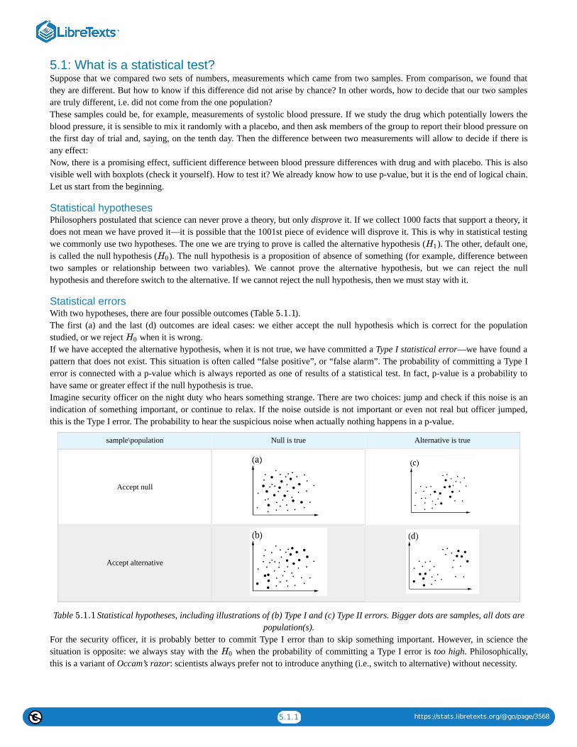
5.1.1 https://stats.libretexts.org/@go/page/3568
5.1: What is a statistical test?Suppose that we compared two sets of numbers, measurements which came from two samples. From comparison, we found thatthey are different. But how to know if this difference did not arise by chance? In other words, how to decide that our two samplesare truly different, i.e. did not come from the one population?These samples could be, for example, measurements of systolic blood pressure. If we study the drug which potentially lowers theblood pressure, it is sensible to mix it randomly with a placebo, and then ask members of the group to report their blood pressure onthe first day of trial and, saying, on the tenth day. Then the difference between two measurements will allow to decide if there isany effect:Now, there is a promising effect, sufficient difference between blood pressure differences with drug and with placebo. This is alsovisible well with boxplots (check it yourself). How to test it? We already know how to use p-value, but it is the end of logical chain.Let us start from the beginning.
Statistical hypothesesPhilosophers postulated that science can never prove a theory, but only disprove it. If we collect 1000 facts that support a theory, itdoes not mean we have proved it—it is possible that the 1001st piece of evidence will disprove it. This is why in statistical testingwe commonly use two hypotheses. The one we are trying to prove is called the alternative hypothesis ( ). The other, default one,is called the null hypothesis ( ). The null hypothesis is a proposition of absence of something (for example, difference betweentwo samples or relationship between two variables). We cannot prove the alternative hypothesis, but we can reject the nullhypothesis and therefore switch to the alternative. If we cannot reject the null hypothesis, then we must stay with it.
Statistical errorsWith two hypotheses, there are four possible outcomes (Table ).The first (a) and the last (d) outcomes are ideal cases: we either accept the null hypothesis which is correct for the populationstudied, or we reject when it is wrong.If we have accepted the alternative hypothesis, when it is not true, we have committed a Type I statistical error—we have found apattern that does not exist. This situation is often called “false positive”, or “false alarm”. The probability of committing a Type Ierror is connected with a p-value which is always reported as one of results of a statistical test. In fact, p-value is a probability tohave same or greater effect if the null hypothesis is true.Imagine security officer on the night duty who hears something strange. There are two choices: jump and check if this noise is anindication of something important, or continue to relax. If the noise outside is not important or even not real but officer jumped,this is the Type I error. The probability to hear the suspicious noise when actually nothing happens in a p-value.
sample\population Null is true Alternative is true
Accept null
Accept alternative
Table Statistical hypotheses, including illustrations of (b) Type I and (c) Type II errors. Bigger dots are samples, all dots arepopulation(s).
For the security officer, it is probably better to commit Type I error than to skip something important. However, in science thesituation is opposite: we always stay with the when the probability of committing a Type I error is too high. Philosophically,this is a variant of Occam’s razor: scientists always prefer not to introduce anything (i.e., switch to alternative) without necessity.
H1
H0
5.1.1
H0
5.1.1
H0

5.1.2 https://stats.libretexts.org/@go/page/3568
This approach could be found also in other spheres of our life. Read the Wikipedia article about Stanislav Petrov(https://en.Wikipedia.org/wiki/Stanislav_Petrov); this is another example when false alarm is too costly.
The obvious question is what probability is “too high”? The conventional answer places that threshold at 0.05—the alternativehypothesis is accepted if the p-value is less than 5% (more than 95% confidence level). In medicine, with human lives as stake, thethresholds are set even more strictly, at 1% or even 0.1%. Contrary, in social sciences, it is frequent to accept 10% as a threshold.Whatever was chosen as a threshold, it must be set a priori, before any test. It is not allowed to modify threshold in order to find anexcuse for statistical decision in mind.
Figure Scheme of statistical decision (for 1-tailed test). is the probability of Type I error, —of Type II error. Before thetest, we must set , usually to 0.05. Then we use original data to calculate statistic (guess location of black vertical line). Next, weuse statistic to calculate p-value. Finally, if p-value is less then , we reject the null hypothesis.
Accept the null hypothesis when in fact the alternative is true is a Type II statistical error—failure to detect a pattern that actuallyexists. This is called “false negative”, “carelessness”. If the careless security officer did not jump when the noise outside is reallyimportant, this is Type II error. Probability of committing type II error is expressed as power of the statistical test (Figure ).The smaller is this probability, the more powerful is the test.
This page titled 5.1: What is a statistical test? is shared under a Public Domain license and was authored, remixed, and/or curated by AlexeyShipunov via source content that was edited to the style and standards of the LibreTexts platform; a detailed edit history is available upon request.
the man who single-handedly saved the world from nuclear war
5.1.1 α βα
α
5.1.1

5.2.1 https://stats.libretexts.org/@go/page/3569
5.2: Is there a difference? Comparing two samples
Two-sample TestsStudying two samples, we use the same approach with two hypotheses. The typical null hypothesis is “there is no differencebetween these two samples”—in other words, they are both drawn from the same population. The alternative hypothesis is “there isa difference between these two samples”. There are many other ways to say that:
Null: difference equal to 0 samples similar samples related samples came from the same populationAlternative: difference not equal to 0 samples different samples non-related samples came from different populations
And, in terms of p-value:If the data are “parametric”, then a parametric t-test is required. If the variables that we want to compare were obtained on differentobjects, we will use a two-sample t-test for independent variables, which is called with the command t.test():There is a long output. Please note the following:
Apart from the normality, there is a second assumption of the classic t-test, homogeneity of variances. However, R by defaultperforms more complicated Welch test which does not require homogeneity. This is why degrees of freedom are not a wholenumber.t is a t statistic and df are degrees of freedom (related with number of cases), they both needed to calculate the p-value.Confidence interval is the second most important output of the R t.test(). It is recommended to supply confidence intervals andeffect sizes (see below) wherever possible. If zero is within the confidence interval, there is a difference.p-value is small, therefore the probability to “raise the false alarm” when “nothing happens” is also small. Consequently, wereject the null hypothesis (“nothing happens”, “no difference”, “no effect”) and therefore switch to the alternative hypothesis(“there is a difference between drugs”.)
We can use the following order from most to least important:1. p-value is first because it helps to make decision;2. confidence interval;3. t statistic;4. degrees of freedom.
Results of t-test did not come out of nowhere. Let us calculate the same thing manually (actually, half-manually because we willuse degrees of freedom from the above test results):(Function pt() calculates values of the Student distribution, the one which is used for t-test. Actually, instead of direct calculation,this and similar functions estimate p-values using tables and approximate formulas. This is because the direct calculation of exactprobability requires integration, determining the square under the curve, like from Figure 5.1.1.)Using t statistic and degrees of freedom, one can calculate p-value without running test. This is why to report result of t-test (andrelated Wilcoxon test, see later), most researchers list statistic, degrees of freedom (for t-test only) and p-value.Instead of “short form” from above, you can use a “long form” when the first column of the data frame contains all data, and thesecond indicates groups:(Note the formula interface which usually comes together with a long form.)Long form is handy also for plotting and data manipulations (check the plot yourself):Another example of long form is the embedded beaver2 data:(Check the boxplot yourself. We assumed that temperature was measured randomly.)Again, p-value is much less than 0.05, and we must reject the null hypothesis that temperatures are not different when beaver isactive or not.To convert long form into short, use unstack() function:(Note that result is a list because numbers of observations for active and inactive beaver are different. This is another plus of longform: it can handle subsets of unequal size.)If measurements were obtained on one object, a paired t-test should be used. In fact, it is just one-sample t-test applied todifferences between each pair of measurements. To do paired t-test in R, use the parameter paired=TRUE. It is not illegal to choosecommon t-test for paired data, but paired tests are usually more powerful:If the case of blood pressure measurements, common t-test does not “know” which factor is responsible more for the differences:drug influence or individual variation between people. Paired t-test excludes individual variation and allows each person to serve asits own control, this is why it is more precise.
≈ ≈ ≈
≈ ≈ ≈
α

5.2.2 https://stats.libretexts.org/@go/page/3569
Also more precise (if the alternative hypothesis is correctly specified) are one-tailed tests:(Here we used another alternative hypothesis: instead of guessing difference, we guessed that blood pressure in “placebo” groupwas greater on 10th day.)Highly important note: all decisions related with the statistical tests (parametric or nonparametric, paired or non-paired, one-sidedor two-sided, 0.05 or 0.01) must be done a priori, before the analysis. The “hunting for the p-value” is illegal!If we work with nonparametric data, nonparametric Wilcoxon test (also known as a Mann-Whitney test) is required, under thecommand wilcox.test():(Please run the boxplot code and note the use of notches. It is commonly accepted that overlapping notches is a sign of nodifference. And yes, Wilcoxon test supports that. Notches are not default because in many cases, boxplots are visually notoverlapped. By the way, we assumed here that only supp variable is present and ignored dose (see ?ToothGrowth for more details).)And yes, it is really tempting to conclude something except “stay with null” if p-value is 0.06 (Figure ) but no. This is notallowed.Like in the t-test, paired data requires the parameter paired=TRUE:(Chicken weights are really different between hatching and second day! Please check the boxplot yourself.)
Figure How not to interpret p-values (taken from XKCD, https://xkcd.com/1478/)
Nonparametric tests are generally more universal since they do not assume any particular distribution. However, they are lesspowerful (prone to Type II error, “carelessness”). Moreover, nonparametric tests based on ranks (like Wilcoxon test) are sensitive tothe heterogeneity of variances . All in all, parametric tests are preferable when data comply with their assumptions. Table summarizes this simple procedure.
Table : How to choose two-sample test in R. This table should be read from the top right cell.Paired: one object, two measures Non-paired
Normal t.test(..., paired=TRUE) t.test(...)
Non-normal wilcox.test(..., paired=TRUE) wilcox.test(...)
Embedded in R is the classic data set used in the original work of Student (the pseudonym of mathematician William Sealy Gossettwho worked for Guinness brewery and was not allowed to use his real name for publications). This work was concerned withcomparing the effects of two drugs on the duration of sleep for 10 patients.In R these data are available under the name sleep (Figure shows corresponding boxplots). The data is in the long form:column extra contains the increase of the sleep times (in hours, positive or negative) while the column group indicates the group(type of drug).
5.2.1
5.2.1
[1] 5.2.1
5.2.1
5.2.2

5.2.3 https://stats.libretexts.org/@go/page/3569
Figure The average increase of the sleep with two drugs.
(Plotting uses the “model formula”: in this case, extra ~ group. R is smart enough to understand that group is the “splitting” factorand should be used to make two boxplots.)The effect of each drug on each person is individual, but the average length by which the drug prolongs sleep can be considered areasonable representation of the “strength” of the drug. With this assumption, we will attempt to use a two sample test to determinewhether there is a significant difference between the means of the two samples corresponding to the two drugs. First, we need todetermine which test to use:(Data in the long form is perfectly suitable for tapply() which splits first argument in accordance with second, and then apply thethird argument to all subsets.)Since the data comply with the normality assumption, we can now employ parametric paired t-test:(Yes, we should reject null hypothesis about no difference.)How about the probability of Type II errors (false negatives)? It is related with statistical power, and could be calculated throughpower test:Therefore, if we want the level of significance 0.05, sample size 10 and the effect (difference between means) 1.58, then probabilityof false negatives should be approximately which is really low. Altogether, this makes close to 100% our positivepredictive value (PPV), probability of our positive result (observed difference) to be truly positive for the whole statisticalpopulation. Package caret is able to calculate PPV and other values related with statistical power.It is sometimes said that t-test can handle the number of samples as low as just four. This is not absolutely correct since the poweris suffering from small sample sizes, but it is true that main reason to invent t-test was to work with small samples, smaller then“rule of 30” discussed in first chapter.Both t-test and Wilcoxon test check for differences only between measures of central tendency (for example, means). Thesehomogeneous sampleshave the same mean but different variances (check it yourself), and thus the difference would not be detected with t-test orWilcoxon test. Of course, tests for scale measures (like var.test()) also exist, and they might find the difference. You might try themyourself. The third homogeneous sample complements the case:as differences in centers, not in ranges, will now be detected (check it).There are many other two sample tests. One of these, the sign test, is so simple that it does not exist in R by default. The sign testfirst calculates differences between every pair of elements in two samples of equal size (it is a paired test). Then, it considers onlythe positive values and disregards others. The idea is that if samples were taken from the same distribution, then approximately halfthe differences should be positive, and the proportions test will not find a significant difference between 50% and the proportion ofpositive differences. If the samples are different, then the proportion of positive differences should be significantly more or lessthan half.
5.2.2
1 −0.92 = 0.08

5.2.4 https://stats.libretexts.org/@go/page/3569
The standard data set airquality contains information about the amount of ozone in the atmosphere around New York City fromMay to September 1973. The concentration of ozone is presented as a rounded mean for every day. To analyze it conservatively, weuse nonparametric methods.
Let us test the hypothesis that ozone levels in May and August were the same:(Since Month is a discrete variable as the “number” simply represents the month, the values of Ozone will be grouped by month.We used the parameter subset with the operator %in%, which chooses May and August, the 5th and 8th month. To obtain theconfidence interval, we used the additional parameter conf.int. is the statistic employed in the calculation of p-values. Finally,there were warning messages about ties which we ignored.)The test rejects the null hypothesis, of equality between the distribution of ozone concentrations in May and August, fairlyconfidently. This is plausible because the ozone level in the atmosphere strongly depends on solar activity, temperature and wind.Differences between samples are well represented by box plots (Figure ):
Figure Distribution of ozone in May and June.
(Note that in the boxplot() command we use the same formula as the statistical model. Option subset is alternative way to selectfrom data frame.)
It is conventionally considered that if the boxes overlap by more than a third of their length, the samples are not significantlydifferent.The last example in this section is related with the discovery of argon. At first, there was no understanding that inert gases exist innature as they are really hard to discover chemically. But in the end of XIX century, data start to accumulate that something iswrong with nitrogen gas (N ). Physicist Lord Rayleigh presented data which show that densities of nitrogen gas produced fromammonia and nitrogen gas produced from air are different:As one might see, the difference is really small. However, it was enough for chemist Sir William Ramsay to accept it as achallenge. Both scientists performed series of advanced experiments which finally resulted in the discovery of new gas, argon. In1904, they received two Nobel Prizes, one in physical science and one in chemistry. From the statistical point of view, most strikingis how the visualization methods perform with this data:The Figure shows as clear as possible that boxplots have great advantage over traditional barplots, especially in cases of two-sample comparison.We recommend therefore to avoid barplots, and by all means avoid so-called “dynamite plots” (barplots with error bars on tops).Beware of dynamite!
Come up with R code to carry out sign test, and test two samples that were mentioned at the beginning of thesection.
Determine how close to normally distributed the monthly concentration measurements are.
W
5.2.3
5.2.3
2
5.2.4

5.2.5 https://stats.libretexts.org/@go/page/3569
Their most important disadvantages are (1) they hide primary data (so they are not exploratory), and in the same time, do notillustrate any statistical test (so they are not inferential); (2) they (frequently wrongly) assume that data is symmetric andparametric; (3) they use space inefficiently, have low data-to-ink ratio; (4) they cause an optical illusion in which the reader addssome of the error bar to the height of the main bar when trying to judge the heights of the main bars; (5) the standard deviationerror bar (typical there) has no direct relation even with comparing two samples (see above how t-test works), and has almostnothing to do with comparison of multiple samples (see below how ANOVA works). And, of course, they do not help LordRayleigh and Sir William Ramsay to receive their Nobel prizes.
Figure Which of these two plots would help Lord Rayleigh and Sir William Ramsay more to receive their Nobel Prizes? (Theidea from Tukey, 1977.)
Please check the Lord Rayleigh data with the appropriate statistical test and report results.
So what to do with dynamite plots? Replace them with boxplots. The only disadvantage of boxplots is that they are harder to drawwith hand which sounds funny in the era of computers. This, by the way, explains partly why there are so many dynamite around:they are sort of legacy pre-computer times.
Effect sizesStatistical tests allow to make decisions but do not show how different are samples. Consider the following examples:(Here difference decreases but p-value does not grow!)One of the beginner’s mistakes is to think that p-values measure differences, but this is really wrong.P-values are probabilities and are not supposed to measure anything. They could be used only in one, binary, yes/no way: to helpwith statistical decisions.In addition, the researcher can almost always obtain a reasonably good p-value, even if effect is minuscule, like in the secondexample above.To estimate the extent of differences between populations, effect sizes were invented. They are strongly recommended to reporttogether with p-values.Package effsize calculates several effect size metrics and provides interpretations of their magnitude.Cohen’s d is the parametric effect size metric which indicates difference between two means:(Note that in the last example, effect size is large with confidence interval including zero; this spoils the “large” effect.)If the data is nonparametric, it is better to use Cliff’s Delta:Now we have quite a few measurements to keep in memory. The simple table below emphasizes most frequently used ones:
Center Scale Test Effect
Parametric Mean Standard deviation t-test Cohen’s D
5.2.4
A supermarket has two cashiers. To analyze their work efficiency, the length of the line at each of their registersis recorded several times a day. The data are recorded in kass.txt. Which cashier processes customers morequickly?

5.2.6 https://stats.libretexts.org/@go/page/3569
Non-parametric Median IQR, MAD Wilcoxon test Cliff’s Delta
Table : Most frequently used numerical tools, both for one and two samples.There are many measures of effect sizes. In biology, useful is coefficient of divergence ( ) discovered by Alexander Lyubishchevin 1959, and related with the recently introduced squared strictly standardized mean difference (SSSMD):Lyubishchev noted that good biological species should have , this means no transgression.Coefficient of divergence is robust to allometric changes:There is also MAD-based nonparametric variant of :
References1. There is a workaround though, robust rank order test, look for the function Rro.test() in theasmisc.r.
This page titled 5.2: Is there a difference? Comparing two samples is shared under a Public Domain license and was authored, remixed, and/orcurated by Alexey Shipunov via source content that was edited to the style and standards of the LibreTexts platform; a detailed edit history isavailable upon request.
5.2.2
K
K > 18
K
In the data file grades.txt are the grades of a particular group of students for the first exam (in the columnlabeled A1) and the second exam (A2), as well as the grades of a second group of students for the first exam(B1). Do the A class grades for the first and second exams differ? Which class did better in the first exam, A orB? Report significances, confidence intervals and effect sizes.
In the open repository, file aegopodium.txt contains measurements of leaves of sun and shade Aegopodiumpodagraria (ground elder) plants. Please find the character which is most different between sun and shade andapply the appropriate statistical test to find if this difference is significant. Report also the confidence intervaland effect size.

5.3.1 https://stats.libretexts.org/@go/page/3570
5.3: If there are More than Two Samples - ANOVA
One wayWhat if we need to know if there are differences between three samples? The first idea might be to make the series of statisticaltests between each pair of the sample. In case of three samples, we will need three t-tests or Wilcoxon tests. What is unfortunate isthat number of required tests will grow dramatically with the number of samples. For example, to compare six samples we willneed to perform 15 tests!Even more serious problem is that all tests are based on the idea of probability. Consequently, the chance to make of the Type Ierror (false alarm) will grow every time we perform more simultaneous tests on the same sample.For example, in one test, if null hypothesis is true, there is usually only a 5% chance to reject it by mistake. However, with 20 tests(Figure E.2), if all corresponding null hypotheses are true, the expected number of incorrect rejections is 1! This is called theproblem of multiple comparisons.One of most striking examples of multiple comparisons is a “dead salmon case”. In 2009, group of researches published results ofMRI testing which detected the brain activity in a dead fish! But that was simply because they purposely did not account formultiple comparisons .The special technique, ANalysis Of VAriance (ANOVA) was invented to avoid multiple comparisons in case of more than twosamples.In R formula language, ANOVA might be described as
response ~ factorwhere response is the measurement variable. Note that the only difference from two-sample case above is that factor in ANOVAhas more then two levels.The null hypothesis here is that all samples belong to the same population (“are not different”), and the alternative hypothesis isthat at least one sample is divergent, does not belong to the same population (“samples are different”).In terms of p-values:
Figure explains it on example of multiple apple samples mixed with divergent tomato sample.
If any sample came from different population, then variance between samples should be at least comparable with (or larger then)variation within samples; in other words, F-value (or F-ratio) should be . To check that inferentially, F-test is applied. If p-valueis small enough, then at least one sample (subset, column) is divergent.ANOVA does not reveal which sample is different. This is because variances in ANOVA are pooled. But what if we still need toknow that? Then we should apply post hoc tests. In is not required to run them after ANOVA; what is required is to perform themcarefully and always apply p-value adjustment for multiple comparisons. This adjustment typically increases p-value to avoidaccumulation from multiple tests. ANOVA and post hoc tests answer different research questions, therefore this is up to theresearcher to decide which and when to perform.ANOVA is a parametric method, and this typically goes well with its first assumption, normal distribution of residuals (deviationsbetween observed and expected values). Typically, we check normality of the whole dataset because ANOVA uses pooled dataanyway. It is also possible to check normality of residuals directly (see below). Please note that ANOVA tolerates mild deviationsfrom normality, both in data and in residuals. But if the data is clearly nonparametric, it is recommended to use other methods (seebelow).
[1]
5.3.1
≥ 1

5.3.2 https://stats.libretexts.org/@go/page/3570
Figure Core idea of ANOVA: compare within and between variances.
Second assumption is homogeinety of variance (homoscedasticity), or, simpler, similarity of variances. This is more important andmeans that sub-samples were collected with similar methods.Third assumption is more general. It was already described in the first chapter: independence of samples. “Repeated measurementsANOVA” is however possible, but requires more specific approach.All assumptions must be checked before analysis.The best way of data organization for the ANOVA is the long form explained above: two variables, one of them contains numericaldata, whereas the other describes grouping (in R terminology, it is a factor). Below, we create the artificial data which describesthree types of hair color, height (in cm) and weight (in kg) of 90 persons: (Note that notches and other “bells and whistles” do not help here because we want to estimate joint differences; raw boxplot isprobably the best choice.)(Note the use of double sapply() to check normality only for measurement columns.)It looks like both assumptions are met: variance is at least similar, and variables are normal. Now we run the core ANOVA:This output is slightly more complicated then output from two-sample tests, but contains similar elements (from most to leastimportant):
1. p-value (expressed as Pr(>F)) and its significance;2. statistic (F value);3. degrees of freedom (Df)
All above numbers should go to the report. In addition, there are also:
1. variance within columns (Sum Sq for Residuals);2. variance between columns (Sum Sq for COLOR);3. mean variances (Sum Sq divided by Df)
(Grand variance is just a sum of variances between and within columns.)If degrees of freedom are already known, it is easy enough to calculate F value and p-value manually, step by step:Of course, R calculates all of that automatically, plus also takes into account all possible variants of calculations, required for datawith another structure. Related to the above example is also that to report ANOVA, most researches list three things: two values fordegrees of freedom, F value and, of course, p-value.All in all, this ANOVA p-value is so small that H should be rejected in favor of the hypothesis that at least one sample is different.Remember, ANOVA does not tell which sample is it, but boxplots (Figure ) suggest that this might be people with black hairs.To check the second assumption of ANOVA, that variances should be at least similar, homogeneous, it is sometimes enough tolook on the variance of each group with tapply() as above or with aggregate():
5.3.1
0
5.3.2

5.3.3 https://stats.libretexts.org/@go/page/3570
Figure Is there a weight difference between people with different hair color? (Artificial data.)
But better is to test if variances are equal with, for example, bartlett.test() which has the same formula interface:(The null hypothesis of the Bartlett test is the equality of variances.)Alternative is nonparametric Fligner-Killeen test:(Null is the same as in Bartlett test.)The first assumption of ANOVA could also be checked here directly:Effect size of ANOVA is called (eta squared). There are many ways to calculate eta squared but simplest is derived from thelinear model (see in next sections). It is handy to define as a function:and then use it for results of both classic ANOVA and one-way test (see below):The second function is an interpreter for and similar effect size measures (like correlation coefficient or R from linearmodel).If there is a need to calculate effect sizes for each pair of groups, two-sample effect size measurements like coefficient ofdivergence (Lyubishchev’s K) are applicable.One more example of classic one-way ANOVA comes from the data embedded in R(make boxplot yourself):Consequently, there is a very high difference between weights of chickens on different diets.If there is a goal to find the divergent sample(s) statistically, one can use post hoc pairwise t-test which takes into account theproblem of multiple comparisons described above; this is just a compact way to run many t-tests and adjust resulted p-values:(This test uses by default the Holm method of p-value correction. Another way is Bonferroni correction explained below. Allavailable ways of correction are accessible trough the p.adjust() function.)Similar to the result of pairwise t-test (but more detailed) is the result of Tukey Honest Significant Differences test (Tukey HSD):
Post hoc tests output p-values so they do not measure anything. If there is a need to calculate group-to-group effect sizes, twosamples effect measures (like Lyubishchev’s K) are generally applicable. To understand pairwise effects, you might want to use thecustom function pairwise.Eff() which is based on double sapply():Next example is again from the embedded data (make boxplot yourself):As a result, yields of plants from two treatment condition are different, but there is no difference between each of them and thecontrol. However, the overall effect size if this experiment is high.If variances are not similar, then oneway.test() will replace the simple (one-way) ANOVA:(Here we used another data file where variables are normal but group variances are not homogeneous. Please make boxplot andcheck results of post hoc test yourself.)What if the data is not normal?The first workaround is to apply some transformation which might convert data into normal:However, the same transformation could influence variance:Frequently, it is better to use the nonparametric ANOVA replacement, Kruskall-Wallis test:
5.3.2
η2
η2
η2
r2
Are our groups different also by heights? If yes, are black-haired still different?

5.3.4 https://stats.libretexts.org/@go/page/3570
(Again, another variant of the data file was used, here variables are not even normal. Please make boxplot yourself.)Effect size of Kruskall-Wallis test could be calculated with :The overall efefct size is high, it also visible well on the boxplot (make it yourself):To find out which sample is deviated, use nonparametric post hoc test:(There are multiple warnings about ties. To get rid of them, replace the first argument with jitter(hwc3$HEIGHT). However, sincejitter() adds random noise, it is better to be careful and repeat the analysis several times if p-values are close to the threshold likehere.)Another post hoc test for nonparametric one-way layout is Dunn’s test. There is a separate dunn.test package:(Output is more advanced but overall results are similar. More post hoc tests like Dunnett’s test exist in the multcomp package.)It is not necessary to check homogeneity of variance before Kruskall-Wallis test, but please note that it assumes that distributionshapes are not radically different between samples. If it is not the case, one of workarounds is to transform the data first, eitherlogarithmically or with square root, or to the ranks , or even in the more sophisticated way. Another option is to apply permutationtests (see Appendix). As a post hoc test, is is possible to use pairwise.Rro.test() from asmisc.r which does not assume similarity ofdistributions.Next figure (Figure ) contains the Euler diagram which summarizes what was said above about different assumptions andways of simple ANOVA-like analyses. Please note that there are much more post hoc tests procedures then listed, and many ofthem are implemented in various R packages.The typical sequence of procedures related with one-way analysis is listed below:
Check if data structure is suitable (head(), str(), summary()), is it long or shortPlot (e.g., boxplot(), beanplot())Normality, with plot or Normality()-like functionHomogeneity of variance (homoscedasticity) (with bartlett.test() or fligner.test())Core procedure (classic aov(), oneway.test() or kruskal.test())Optionally, effect size ( or with appropriate formula)Post hoc test, for example TukeyHSD(), pairwise.t.test(), dunn.test() or pairwise.wilcox.test()
Figure Applicability of different ANOVA-like procedures and related post hoc. tests. Please read it from bottom to the top.
In the open repository, data file melampyrum.txt contains results of cow-wheat (Melampyrum spp.) measurements in multiplelocalities. Please find if there is a difference in plant height and leaf length between plants from different localities. Which localitiesare divergent in each case? To understand the structure of data, use companion file melampyrum_c.txt.All in all, if you have two or more samples represented with measurement data, the following table will help to researchdifferences:
More then one waySimple, one-way ANOVA uses only one factor in formula. Frequently, however, we need to analyze results of more sophisticatedexperiments or observations, when data is split two or more times and possibly by different principles.Our book is not intended to go deeper, and the following is just an introduction to the world of design and analysis of experiment.Some terms, however, are important to explain:
ϵ2
[2]
5.3.3
η2 ϵ2
5.3.3

5.3.5 https://stats.libretexts.org/@go/page/3570
two samples more then two samples
Step 1. Graphic boxplot(); beanplot()
Step 2. Normality etc. Normality(); hist(); qqnorm() and qqine(); optionally: bartlett. test() or flingner.test()
Step 3. Test t.test(); wilcoxon.test() aov(); oneway.test(); kruskal.test()
Step 4. Effect cohen.d(); cliff.delta() optionally: Eta2(); Epsilon2()
Step 5. Pairwise NA TukeyHSD(); pairwise.t.test(); dunn.test()
Table How to research differences between numerical samples in R.Two-way
This is when data contains two independent factors. See, for example, ?ToothGrowth data embedded in R. With more factors,three- and more ways layouts are possible.
Repeated measurementsThis is analogous to paired two-sample cases, but with three and more measurements on each subject. This type of layoutmight require specific approaches. See ?Orange or ?Loblolly data.
UnbalancedWhen groups have different sizes and/or some factor combinations are absent, then design is unbalanced; this sometimescomplicates calculations.
InteractionIf there are more than one factor, they could work together (interact) to produce response. Consequently, with two factors,analysis should include statistics for each of them plus separate statistic for interaction, three values in total. We will return tointeraction later, in section about ANCOVA (“Many lines”). Here we only mention the useful way to show interactionsvisually, with interaction plot (Figure ):(It is, for example, easy to see from this interaction plot that with dose 2, type of supplement does not matter.)
Random and fixed effectsSome factors are irrelevant to the research but participate in response, therefore they must be included into analysis. Otherfactors are planned and intentional.
Figure Interaction plot for ToothGrowth data.Respectively, they are called random and fixed effects. This difference also influences calculations.
References1. Bennett C.M., Wolford G.L., Miller M.B. 2009. The principled control of false positives in neuroimag- ing. Social cognitive andaffective neuroscience 4(4): 417–422, https://www.ncbi.nlm.nih.gov/ pmc/articles/PMC2799957/2. Like it is implemented in the ARTool package; there also possible to use multi-way nonparametric designs.
5.3.1
5.3.4
5.3.4

5.3.6 https://stats.libretexts.org/@go/page/3570
This page titled 5.3: If there are More than Two Samples - ANOVA is shared under a Public Domain license and was authored, remixed, and/orcurated by Alexey Shipunov via source content that was edited to the style and standards of the LibreTexts platform; a detailed edit history isavailable upon request.

5.4.1 https://stats.libretexts.org/@go/page/3571
5.4: Is there an association? Analysis of tables
Contingency tablesHow do you compare samples of categorical data? These frequently are text only, there are have no numbers, like in classic“Fisher’s tea drinker” example . A British woman claimed to be able to distinguish whether milk or tea was added to the cup first.To test, she was given 8 cups of tea, in four of which milk was added first:The only way is to convert it to numbers, and the best way to convert is to count cases, make contingency table:Contingency table is not a matrix or data frame, it is the special type of R object called “table”.In R formula language, contingency tables are described with simple formula~ factor(s)To use this formula approach, run xtabs() command:(More than one factors have to be connected with + sign.)If there are more than two factors, R can build a multidimensional table and print it as a series of two-dimensional tables. Pleasecall the embedded Titanic data to see how 3-dimensional contingency table looks. A “flat” contingency table can be built if all thefactors except one are combined into one multidimensional factor. To do this, use the command ftable():The function table can be used simply for calculation of frequencies (including missing data, if needed):The function mosaicplot() creates a graphical representation of a contingency table (Figure ):(We used mosaicplot() command because apply() outputted a matrix. If the data is a “table” with more than one dimension, object,plot() command will output mosaic plot by default.)
Figure Survived on the “Titanic”
Contingency tables are easy enough to make even from numerical data. Suppose that we need to look on association betweenmonth and comfortable temperatures in New York. If the temperatures from 64 to 86°F (from 18 to 30°C) are comforttemperatures, then:Now we have two categorical variables, comfort and airquality$Month and can proceed to the table:Spine plot (Figure ) is good for this kind of table, it looks like a visually advanced “hybrid” between histogram, barplot andmosaic plot:
[1]
5.4.1
5.4.1
5.4.2

5.4.2 https://stats.libretexts.org/@go/page/3571
Figure Spine plot: when is better to visit New York City.(Another variant to plot these two-dimensional tables is the dotchart(), please try it yourself. Dotchart is good also for 1-dimensional tables, but sometimes you might need to use the replacement Dotchart1() from asmisc.r—it keeps space for y axislabel.)
Table testsTo find if there is an association in a table, one should compare two frequencies in each cell: predicted (theoretical) and observed.The serious difference is the sign of association. Null and alternative hypotheses pairs are typically:
Null: independent distribution of factors no pattern present no association presentAlternative: concerted distribution of factors pattern present there is an association
In terms of p-values:
Function chisq.test() runs a chi-squared test, one of two most frequently used tests for contingency tables. Two-sample chi-squared(or ) test requires either contingency table or two factors of the same length (to calculate table from them first).Now, what about the table of temperature comfort? assocplot(comf.month) shows some “suspicious” deviations. To check if theseare statistically significant:No, they are not associated. As before, there is nothing mysterious in these numbers. Everything is based on differences betweenexpected and observed values:(Note how expected values calculated and how they look: expected (null) are equal proportions between both rows and columns.June and September have 30 days each, hence slight differences in values—but not in expected proportions.)Let us see now whether hair color and eye color from the 3-dimensional embedded HairEyeColor data are associated. First, we canexamine associations graphically with assocplot() (Figure ):(Instead of apply() used in the previous example, we employed margin.table() which essentially did the same job.)Association plot shows several things: the height of bars reflects the contribution of each cell into the total chi-squared, this allows,for example, to detect outliers. Square of rectangle corresponds with difference between observed and expected value, thus big tall
5.4.1
≈ ≈
≈ ≈
χ2
5.4.3

5.4.3 https://stats.libretexts.org/@go/page/3571
rectangles indicate more association (to understand this better, compare this current plot with assocplot(comf.month)). Color andposition of rectangle show the sign of the difference.Overall, it is likely that there is an association. Now we need to check this hypothesis with a test:
Figure Association between hair color and eye color.
The chi-squared test takes as null hypothesis “no pattern”, “no association”. Therefore, in our example, since we reject the nullhypothesis, we find that the factors are associated.And what about survival on the “Titanic”?Yes (as reader might remember from the famous movie), survival was associated with being in the particular class.General chi-squared test shows only if asymmetry presents anywhere in the table. This means that if it is significant, then at leastone group of passengers has the difference in survival. Like ANOVA, test does not show which one. Post hoc, or pairwise table testis able do show this:From the table of p-values, it is apparent that 3rd class and crew members were not different by survival rates. Note that post hoctests apply p-value adjustment for multiple comparisons; practically, it means that because 7 tests were performed simultaneously,p-values were magnified with some method (here, Benjamini & Hochberg method is default).
Let us examine now the more complicated example. A large group of epidemiologists gathered for a party. The next morning, manywoke up with symptoms of food poisoning. Because they were epidemiologists, they decided to remember what each of them ate atthe banquet, and thus determine what was the cause of the illness. The gathered data take the following format:(We used head() here because the table is really long.)The first variable (ILL) tells whether the participant got sick or not (1 or 2 respectively); the remaining variables correspond todifferent foods.A simple glance at the data will not reveal anything, as the banquet had 45 participants and 13 different foods. Therefore, statisticalmethods must be used. Since the data are nominal, we will use contingency tables:(First, we ran ILL variable against every column and made a list of small contingency tables. Second, we converted list into 3-dimensional array, just like the Titanic data is, and also made sensible names of dimensions.)Now our data consists of small contingency tables which are elements of array:(Note two commas which needed to tell R that we want the third dimension of the array.)Now we need a kind of stratified (with every type of food) table analysis. Since every element in the tox.2 is table, fourfoldplot will visualize this data well (Figure ):(In fourfold plots, association corresponds with the difference between two pairs of diagonal sectors. Since we test multiple times,confidence rings are suppressed.)
5.4.3
The file seedlings.txt contains results of an experiment examining germination of seeds infected with differenttypes of fungi. In all, three fungi were tested, 20 seeds were tested for each fungus, and therefore with thecontrols 80 seeds were tested. Do the germination rates of the infected seeds differ?
2 ×2
5.4.4

5.4.4 https://stats.libretexts.org/@go/page/3571
There are some apparent differences, especially for CAESAR, BREAD and TOMATO. To check their significance, we will at firstapply chi-squared test multiple times and check out p-values:
Figure Association between food taken and illness.
(An apply() allows us not to write the code for the test 13 times. You may omit cbind() since it used only to make output prettier.There were multiple warnings, and we will return to them soon.)The result is that two foods exhibit significant associations with illness—Caesar salad and tomatoes. The culprit is identified!Almost. After all, it is unlikely that both dishes were contaminated. Now we must try to determine what was the main cause of thefood poisoning. We will return to this subject later.
Let us discuss one more detail. Above, we applied chi-squared test simultaneously several times. To account for multiplecomparisons, we must adjust p-values, magnify them in accordance with the particular rule, for example, with widely knownBonferroni correction rule, or with (more reliable) Benjamini and Hochberg correction rule like in the following example:Now you know how to apply p-value corrections for multiple comparisons. Try to do this for our toxicity data. Maybe, it willhelp to identify the culprit?
The special case of chi-squared test is the goodness-of-fit test, or G-test. We will apply it to the famous data, results of GregorMendel first experiment. In this experiment, he crossed pea plants which grew out of round and angled seeds. When he countedseeds from the first generation of hybrids, he found that among 7,324 seeds, 5,474 were round and 1850 were angled. Mendelguessed that true ratio in this and six other experiments is 3:1 :Goodness-of-fit test uses the null that frequencies in the first argument (interpreted as one-dimensional contingency table) are notdifferent from probabilities in the second argument. Therefore, 3:1 ratio is statistically supported. As you might note, it is notradically different from the proportion test explained in the previous chapter.Without p parameter, G-test simply checks if probabilities are equal. Let us check, for example, if numbers of species insupergroups of living organisms on Earth are equal:Naturally, numbers of species are not equal between supergroups. Some of them like bacteria (supergroup Monera) havesurprisingly low number of species, others like insects (supergroup Ecdysozoa)—really large number (Figure ).Chi-squared test works well when the number of cases per cell is more then 5. If there are less cases, R gives at least threeworkarounds.
5.4.4
[2]
5.4.5

5.4.5 https://stats.libretexts.org/@go/page/3571
First, instead of p-value estimated from the theoretical distribution, there is a way to calculate it directly, with Fisher exact test. Teadrinker table contains less then 5 cases per cell so it is a good example:
Figure Numbers of species in supergroups of living organisms.
Fisher test checks the null if odds ratio is just one. Although in this case, calculation gives odds ratio , there areonly 8 observations, and confidence interval still includes one. Therefore, contrary to the first impression, the test does not supportthe idea that aforementioned woman is a good guesser.Fourfold plot (please check it yourself) gives the similar result:While there is apparent difference between diagonals, confidence rings significantly intersect.Fisher test is computationally intensive so it is not recommended to use it for large number of cases.The second workaround is the Yates continuity correction which in R is default for chi-squared test on 22 tables. We use now datafrom the original Yates (1934) publication, data is taken from study of the influence of breast and artificial feeding on teethformation:(Note the warning in the end.)Yates correction is not a default for the summary.table() function:(Note different p-value: this is an effect of no correction. For all other kind of tables (e.g., non ), results of chisq.test() andsummary.table() should be similar.)The third way is to simulate chi-squared test p-value with replication:(Note that since this algorithm is based on random procedure, p-values might differ.)How to calculate an effect size for the association of categorical variables? One of them is odds ratio from the Fisher test (seeabove). There are also several different effect size measures changing from 0 (no association) to (theoretically) 1 (which is anextremely strong association). If you do not want to use external packages, one of them, coefficient is easy to calculate from the
-squared statistic. coefficient works only for two binary variables. If variables are not binary, there are Tschuprow’s T and Cramer’s V coefficients.
Now it is better to use the external code from the asmisc.r distributing with this book:R package vcd has function assocstats() which calculates odds ratio, , Cramer’s V and several other effect measures.
There are many table tests. For example, test of proportions from the previous chapter could be easily extended for two samplesand therefore could be used as a table test. There is also mcnemar.test() which is used to compare proportions when they belong tosame objects (paired proportions). You might want to check the help (and especially examples) in order to understand how theywork.
5.4.5
(3 : 1)/(1 : 3) = 9
[3]
2 ×2
ϕ
χ
Φ
ϕ
In the open repository, file cochlearia.txt contains measurements of morphological characters in severalpopulations (locations) of scurvy-grass, Cochlearia. One of characters, binary IS.CREEPING reflects the plantlife form: creeping or upright stem. Please check if numbers of creeping plants are different between locations,provide effect sizes and p-values.

5.4.6 https://stats.libretexts.org/@go/page/3571
The typical sequence of procedures related with analysis of tables is listed below:
Check the phenomenon of association: table(), xtabs()Plot it first: mosaicplot(), spineplot(), assocplot()Decide is association is statistically significant: chisq.test(), fisher.test()Measure how strong is an association: VTCoeffs()Optionally, if there are more then two groups per case involved, run post hoc pairise tests with the appropriate correction:pairwise.Table2.test()
To conclude this “differences” chapter, here is the Table which will guide the reader through most frequently used types ofanalysis. Please note also the much more detailed Table 6.1.1 in the appendix.
NormalNon-normal
measurement or ranked nominal
samples Student’s test Wilcoxon testChi-squared test (+ post-hoc test) samples ANOVA or one-way
+ some post hoc testKruskall-Wallis
+ some post hoc test
Table : Methods, most frequently used to analyze differences and patterns. This is the simplified variant of Table 6.1.1.
References1. Fisher R.A. 1971. The design of experiments. 9th ed. P. 11.2. Mendel G. 1866. Versuche über Pflanzen-Hybriden. Verhandlungen des naturforschenden Vereines in Brünn. Bd. 4,Abhandlungen: 12. http://biodiversitylibrary.org/page/401647503. Yates F. 1934. Contingency tables involving small numbers and the test. Journal of the Royal Statistical Society. 1(2): 217–235.
This page titled 5.4: Is there an association? Analysis of tables is shared under a Public Domain license and was authored, remixed, and/or curatedby Alexey Shipunov via source content that was edited to the style and standards of the LibreTexts platform; a detailed edit history is availableupon request.
In the betula (see above) data, there are two binary characters: LOBES (position of lobes on the flower bract)and WINGS (the relative size of fruit wings). Please find if proportions of plants with 0 and 1 values of LOBESare different between location 1 and location 2.
Are proportions of LOBES and WING values different in the whole dataset?
5.4.1
= 2
> 2
5.4.1
x2

5.5.1 https://stats.libretexts.org/@go/page/3572
5.5: Answers to exercises
Two sample tests, effect sizesAnswer to the sign test question. It is enough to write:Here the sign test failed to find obvious differences because (like t-test and Wilcoxon test) it considers only central values.Answer to the ozone question. To know if our data are normally distributed, we can apply the Normality() function:(Here we applied unstack() function which segregated our data by months.)Answer to the argon question. First, we need to check assumptions:It is clear that in this case, nonparametric test will work better:(We used jitter() to break ties. However, be careful and try to check if this random noise does not influence the p-value. Here, itdoes not.)And yes, boxplots (Figure 5.2.4) told the truth: there is a statistical difference between two set of numbers.Answer to the cashiers question. Check normality first:Now, we can compare means:It is likely that first cashier has generally bigger lines:The difference is not significant.Answer to the grades question. First, check the normality:(Function split() created three new variables in accordance with the grouping factor; it is similar to unstack() from previous answerbut can accept groups of unequal size.)Check data (it is also possible to plot boxplots):It is likely that the first class has results similar between exams but in the first exam, the second group might have better grades.Since data is not normal, we will use nonparametric methods:For the first class, we applied the paired test since grades in first and second exams belong to the same people. To see if differencesbetween different classes exist, we used one-sided alternative hypothesis because we needed to understand not if the second class isdifferent, but if it is better.As a result, grades of the first class are not significantly different between exams, but the second class performed significantlybetter than first. First confidence interval includes zero (as it should be in the case of no difference), and second is not of much use.Now effect sizes with suitable nonparametric Cliff’s Delta:Therefore, results of the second class are only slightly better which could even be negligible since confidence interval includes 0.Answer to the question about ground elder leaves (Figure ).
Figure Leaf of Aegopodium podagraria., ground elder. Scale bar is approximately 10 mm.
First, check data, load it and check the object:(We also converted SUN variable into factor and supplied the proper labels.)Let us check the data for the normality and for the most different character (Figure ):TERM.L (length of the terminal leaflet, it is the rightmost one on Figure ), is likely most different between sun and shade.Since this character is normal, we will run more precise parametric test:To report t-test result, one needs to provide degrees of freedom, statistic and p-value, e.g., like “in a Welch test, t statistic is 14.85on 63.69 degrees of freedom, p-value is close to zero, thus we rejected the null hypothesis”.Effect sizes are usually concerted with p-values but provide additional useful information about the magnitude of differences:
5.5.1
5.5.1
5.5.2
5.5.1

5.5.2 https://stats.libretexts.org/@go/page/3572
Figure Medians with MADs in leaves data.
Both Cohen’s d and Lyubishchev’s K (coefficient of divergence) are large.
ANOVAAnswer to the height and color questions. Yes on both questions:There are significant differences between all three groups.Answer to the question about differences between cow-wheats (Figure ) from seven locations.Load the data and check its structure:
Figure Top of the cow-wheat plant, Melampyrum sp. Size of fragment is approximately 10 cm.Plot it first (Figure ):Check assumptions:Consequently, leaf length must be analyzed with non-parametric procedure, and plant height—with parametric which does notassume homogeneity of variance (one-way test):
5.5.2
5.5.3
5.5.3
5.5.4

5.5.3 https://stats.libretexts.org/@go/page/3572
Figure Cow-wheat stem heights (top) and leaf lengths (bottom) across seven different locations.
Now the leaf length:All in all, location pairs 2–4 and 4–6 are divergent statistically in both cases. This is visible also on boxplots (Figure ). Thereare more significant differences in plant heights, location #6, in particular, is quite outstanding.
Contingency tablesAnswer to the seedlings question. Load data and check its structure:Now, what we need is to examine the table because both variables only look like numbers; in fact, they are categorical. Dotchart(Figure ) is a good way to explore 2-dimensional table:
Figure Dotchart to explore table made from seedlings data.
To explore possible associations visually, we employ vcd package:
5.5.4
5.5.5
5.5.5
5.5.5

5.5.4 https://stats.libretexts.org/@go/page/3572
Figure Advanced association plot of seedlings data.
Both table output and vcd association plot (Figure ) suggest some asymmetry (especially for CID80) which is a sign ofpossible association. Let us check it numerically, with the chi-squared test:Yes, there is an association between fungus (or their absence) and germination. How to know differences between particularsamples? Here we need a post hoc test:(Exact Fisher test was used because some counts were really small.)It is now clear that germination patterns form two fungal infections, CID80 and CID105, are significantly different fromgermination in the control (CID0). Also, significant association was found in the every comparison between three infections; thismeans that all three germination patterns are statistically different. Finally, one fungus, CID63 produces germination pattern whichis not statistically different from the control.Answer to the question about multiple comparisons of toxicity. Here we will go the slightly different way. Instead of using array,we will extract p-values right from the original data, and will avoid warnings with the exact test:(We cannot use pairwise.Table2.test() from the previous answer since our comparisons have different structure. But we used exacttest to avoid warnings related with small numbers of counts.)Now we can adjust p-values:Well, now we can say that Caesar salad and tomatoes are statistically supported as culprits. But why table tests always show us twofactors? This could be due to the interaction: in simple words, it means that people who took the salad, frequently took tomatoeswith it.Answer to the scurvy-grass question. Check the data file, load and check result:(In addition, we converted LOC and IS.CREEPING to factors and provided new level labels.)Next step is the visual analysis (Figure ):Some locations look different. To analyze, we need contingency table:Now the test and effect size:
5.5.6
5.5.6
5.5.7

5.5.5 https://stats.libretexts.org/@go/page/3572
Figure Spine plot: locality vs. life form of scurvy-grass.(Run pairwise.Table2.test(cc.lc) yourself to understand differences in details.)Yes, there is a large, statistically significant association between locality and life form of scurvy-grass.Answer to the question about equality of proportions of LOBES character in two birch localities. First, we need to select these twolocalities (1 and 2) and count proportions there. The shortest way is to use the table() function:Spine plot (Figure ) helps to make differences in the table even more apparent:(Please also note how to create two colors intermediate between black and dark green.)The most natural choice is prop.test() which is applicable directly to the table() output:Instead of proportion test, we can use Fisher exact:
Figure Spine plot of two birch characters.
... or chi-squared with simulation (note that one cell has only 4 cases), or with default Yates’ correction:All in all, yes, proportions of plants with different position of lobes are different between location 1 and 2.And what about effect size of this association?Answer to the question about proportion equality in the whole betula dataset. First, make table:There is no apparent asymmetry. Since betula.lw is table, we can apply fourfold plot. It shows differences not only asdifferent sizes of sectors, but also allows to check 95% confidence interval with marginal rings (Figure ):Also not suggestive... Finally, we need to test the association, if any. Noe that samples are related. This is because LOBES andWINGS were measured on the same plants. Therefore, instead of the chi-squared or proportion test we should run McNemar’s test:
5.5.7
5.5.8
5.5.8
2 ×2
5.5.9

5.5.6 https://stats.libretexts.org/@go/page/3572
We conclude that proportions of two character states in each of characters are not statistically different.
Figure Fourfold plot of two birch characters.
This page titled 5.5: Answers to exercises is shared under a Public Domain license and was authored, remixed, and/or curated by AlexeyShipunov via source content that was edited to the style and standards of the LibreTexts platform; a detailed edit history is available upon request.
5.5.9

1
CHAPTER OVERVIEW
6: Two-Dimensional Data - ModelsHere we finally come to the world of statistical models, the study of not just differences but how exactly things are related. One ofthe most important features of models is an ability to predict results. Modeling expands into thousands of varieties, there areexperiment planning, Bayesian methods, maximal likelihood, and many others—but we will limit ourself with correlation, corelinear regression, analysis of covariation, and introduction to logistic models.
6.1: Analysis of Correlation6.2: Analysis of regression6.3: Probability of the success- logistic regression6.4: Answers to exercises
This page titled 6: Two-Dimensional Data - Models is shared under a Public Domain license and was authored, remixed, and/or curated byAlexey Shipunov via source content that was edited to the style and standards of the LibreTexts platform; a detailed edit history is available uponrequest.

6.1.1 https://stats.libretexts.org/@go/page/3575
6.1: Analysis of CorrelationTo start with relationships, one need first to find a correlation, e.g., to measure the extent and sign of relation, and to prove if this isstatistically reliable.Note that correlation does not reflect the nature of relationship (Figure ). If we find a significant correlation betweenvariables, this could mean that A depends on B, B depends on A, A and B depend on each other, or A and B depend on a thirdvariable C but have no relation to each other. A famous example is the correlation between ice cream sales and home fires. It wouldbe strange to suggest that eating ice cream causes people to start fires, or that experiencing fires causes people to buy ice cream. Infact, both of these parameters depend on air temperature .
Figure Correlation and causation (taken from XKCD, http://xkcd.com/552/).
Numbers alone could be misleading, so there is a simple rule: plot it first.
Plot it firstThe most striking example of relationships where numbers alone do to provide a reliable answer, is the Anscombe’s quartet, foursets of two variables which have almost identical means and standard deviations:(Data anscombe is embedded into R. To compact input and output, several tricks were used. Please find them yourself.)Linear model coefficients (see below) are also quite similar but if we plot these data, the picture (Figure ) is radically differentfrom what is reflected in numbers:(For aesthetic purposes, we put all four plots on the same figure. Note the for operator which produces cycle repeating onesequence of commands four times. To know more, check ?"for".)To the credit of nonparametric and/or robust numerical methods, they are not so easy to deceive:
Figure Anscombe’s quartet, plotted together with lines from linear models.
This is correct to guess that boxplots should also show the difference. Please try to plot them yourself.
6.1.1
[1]
6.1.1
6.1.2
6.1.2

6.1.2 https://stats.libretexts.org/@go/page/3575
CorrelationTo measure the extent and sign of linear relationship, we need to calculate correlation coefficient. The absolute value of thecorrelation coefficient varies from 0 to 1. Zero means that the values of one variable are unconnected with the values of the othervariable. A correlation coefficient of or is an evidence of a linear relationship between two variables. A positive value ofmeans the correlation is positive (the higher the value of one variable, the higher the value of the other), while negative valuesmean the correlation is negative (the higher the value of one, the lower of the other).It is easy to calculate correlation coefficient in R:(By default, R calculates the parametric Pearson correlation coefficient .)In the simplest case, it is given two arguments (vectors of equal length). It can also be called with one argument if using a matrix ordata frame. In this case, the function cor() calculates a correlation matrix, composed of correlation coefficients between all pairs ofdata columns.As correlation is in fact the effect size of covariance, joint variation of two variables, to calculate it manually, one needs to knowindividual variances and variance of the difference between variables:Another way is to use cov() function which calculates covariance directly:To interpret correlation coefficient values, we can use either symnum() or Topm() functions (see below), or Mag() together withapply():If the numbers of observations in the columns are unequal (some columns have missing data), the parameter use becomesimportant. Default is everything which returns NA whenever there are any missing values in a dataset. If the parameter use is set tocomplete.obs, observations with missing data are automatically excluded. Sometimes, missing data values are so dispersed thatcomplete.obs will not leave much of it. In that last case, use pairwise.complete.obs which removes missing values pair by pair.Pearson’s parametric correlation coefficients characteristically fail with the Anscombe’s data:To overcome the problem, one can use Spearman’s (“rho”, or rank correlation coefficient) which is most frequently usednonparametric correlation coefficient:(Spearman’s correlation is definitely more robust!)The third kind of correlation coefficient in R is nonparametric Kendall’s (“tau”):It is often used to measure association between two ranked or binary variables, i.e. as an alternative to effect sizes of the associationin contingency tables.How to check if correlation is statistically significant? As a null hypothesis, we could accept that correlation coefficient is equal tozero (no correlation). If the null is rejected, then correlation is significant:The logic of cor.test() is the same as in tests before (Table 5.1.1, Figure 5.1.1). In terms of p-value:
The probability of obtaining the test statistic (correlation coefficient), given the initial assumption of zero correlation between thedata is very low—about 0.3%. We would reject H and therefore accept an alternative hypothesis that correlation between variablesis present. Please note the confidence interval, it indicates here that the true value of the coefficient lies between 0.2 and 0.7. with95% probability.It is not always easy to read the big correlation table, like in the following example of longley macroeconomic data. Fortunately,there are several workarounds, for example, the symnum() function which replaces numbers with letters or symbols in accordanceto their value:The second way is to represent the correlation matrix with a plot. For example, we may use the heatmap: split everything from to into equal intervals, assign the color for each interval and show these colors (Figure ):(We shortened here long names with the abbreviate() command.)The other interesting way of representing correlations are correlation ellipses (from ellipse package). In that case, correlationcoefficients are shown as variously compressed ellipses; when coefficient is close to or , ellipse is more narrow (Figure
). The slope of ellipse represents the sign of correlation (negative or positive):Several useful ways to visualize and analyze correlations present in the asmisc.r file supplied with this book:
1 −1
r
ρ
τ
0
−1
+1 6.1.3
−1 +1
6.1.4

6.1.3 https://stats.libretexts.org/@go/page/3575
We calculated here Kendall’s correlation coefficient for the binary toxicity data to make the picture used on the title page. Pleiad()not only showed (Figure ) that illness is associated with tomato and Caesar salad, but also found two other correlation pleiads:coffee/rice and crab dip/crisps. (By the way, pleiads show one more application of R: analysis of networks.)
Figure Heatmap: graphical representation of the correlation matrix.
Function Cor() outputs correlation matrix together with asterisks for the significant correlation tests:
Figure Correlation coefficients as ellipses.
Finally, function Topm() shows largest correlations by rows:Data file traits.txt contains results of the survey where most genetically apparent human phenotype characters were recorded frommany individuals. Explanation of these characters are in trait_c.txt file. Please analyze this data with correlation methods.
6.1.5
6.1.3
6.1.4

6.1.4 https://stats.libretexts.org/@go/page/3575
Figure Correlation pleiads for the toxicity data.
References1. There are, however, advanced techniques with the goal to understand the difference between causation and correlation: forexample, those implemented in bnlearn package.
This page titled 6.1: Analysis of Correlation is shared under a Public Domain license and was authored, remixed, and/or curated by AlexeyShipunov via source content that was edited to the style and standards of the LibreTexts platform; a detailed edit history is available upon request.
6.1.5

6.2.1 https://stats.libretexts.org/@go/page/3576
6.2: Analysis of regression
Single lineAnalysis of correlation allows to determine if variables are dependent and calculate the strength and sign of the dependence.However, if the goal is to understand the other features of dependence (like direction), and, even more important, predict(extrapolate) results (Figure ) we need another kind of analysis, the analysis of regression.
Figure Extrapolation (taken from XKCD, http://xkcd.com/605/).
It gives much more information on the relationship, but requires us to assign variables beforehand to one of two categories:influence (predictor) or response. This approach is rooted in the nature of the data: for example, we may use air temperature topredict ice cream sales, but hardly the other way around.The most well-known example is a simple linear regression:
or, in R formula language, even simpler:response ~ influence
That model estimates the average value of response if the value of influence is known (note that both effect and influence aremeasurement variables). The differences between observed and predicted values are model errors (or, better, residuals). The goal isto minimize residuals (Figure ); since residuals could be both positive and negative, it is typically done via squared values, thismethod is called least squares.Ideally, residuals should have the normal distribution with zero mean and constant variance which is not dependent on effect andinfluence. In that case, residuals are homogeneous. In other cases, residuals could show heterogeneity. And if there is thedependence between residuals and influence, then most likely the overall model should be non-linear and therefore requires theother kind of analysis.Linear regression model is based on the several assumptions:
Linearity of the relationship. It means that for a unit change in influence, there should always be a corresponding changein effect. Units of change in response variable should retain the same size and sign throughout the range of influence.Normality of residuals. Please note that normality of data is not an assumption! However, if you want to get rid of mostother assumptions, you might want to use other regression methods like LOESS.Homoscedasticity of residuals. Variability within residuals should remain constant across the whole range of influence, orelse we could not predict the effect reliably.
The null hypothesis states that nothing in the variability of response is explained by the model. Numerically, R-squared coefficientis the the degree to which the variability of response is explained by the model, therefore null hypothesis is that R-squared equalszero, this approach uses F-statistics (Fisher’s statistics), like in ANOVA. There are also checks of additional null hypotheses thatboth intercept and slope are zeros. If all three p-values are smaller than the level of significance (0.05), the whole model isstatistically significant.Here is an example. The embedded women data contains observations on the height and weight of 15 women. We will try tounderstand the dependence between weight and height, graphically at first (Figure ):(Here we used function Cladd() which adds confidence bands to the plot .)Let us visualize residuals better (Figure ):To look on the results of model analysis, we can employ summary():
6.2.1
6.2.1
response = intercept +slope ×influence
6.2.3
6.2.2[1]
6.2.3

6.2.2 https://stats.libretexts.org/@go/page/3576
Figure The relation between height and weight.
Figure Residuals of the women weight vs. height linear model.This long output is better to read from bottom to the top. We can say that:
The significance of relation (reflected with R-squared) is high from the statistical point of view: F-statistics is withoverall p-value: 1.091e-14.The R-squared (use Adjusted R-squared because this is better suited for the model) is really big, . Thismeans that almost all variation in response variable (weight) is explained by predictor (height).R-squared is related with the coefficient of correlation and might be used as the measure of effect size. Since it is squared,high values start from 0.25:
Both coefficients are statistically different from zero, this might be seen via “stars” (like ***), and also via actual p-valuesPr(>|t|): 1.71e-09 for intercept, and 1.09e-14 for height, which represents the slope.To calculate slope in degrees, one might run:
Overall, our model is:
Weight (estimated) = -87.51667 + 3.45 * Height,so if the height grows by 4 inches, the weight will grow on approximately 14 pounds.
The maximal positive residual is lb, maximal negative is lb.
6.2.2
6.2.3
1433
= 0.9903R2
3.1167 −1.7333

6.2.3 https://stats.libretexts.org/@go/page/3576
Half of residuals are quite close to the median (within approximately interval).
On the first glance, the model summary looks fine. However, before making any conclusions, we must also check assumptions ofthe model. The command plot(women.lm) returns four consecutive plots:
First plot, residuals vs. fitted values, is most important. Ideally, it should show no structure (uniform variation and notrend); this satisfies both linearity and homoscedascicity assumptions.Unfortunately, women.lm model has an obvious trend which indicates non-linearity. Residuals are positive when fittedvalues are small, negative for fitted values in the mid-range, and positive again for large fitted values. Clearly, the firstassumption of the linear regression analysis is violated.
To understand residuals vs. fitted plots better, please run the following code yourself and look on the resulted plots:On the the next plot, standardized residuals do not follow the normal line perfectly (see the explanation of the QQ plot inthe previous chapter), but they are “good enough”. To review different variants of these plots, run the following codeyourself:
Test for the normality should also work:
The third, Scale-Location plot, is similar to the residuals vs. fitted, but instead of “raw” residuals it uses the square rootsof their standardized values. It is also used to reveal trends in the magnitudes of residuals. In a good model, these valuesshould be more or less randomly distributed.Finally, the last plot demonstrates which values exert most influence over the final shape of the model. Here the twovalues with most leverage are the first and the last measurements, those, in fact, that stay furtherest away from linearity.
(If you need to know more about summary and plotting of linear models, check help pages with commands ?summary.lm and ?plot.lm. By the way, as ANOVA has many similarities to the linear model analysis, in R you can run same diagnostic plots for anyANOVA model.)Now it is clear that our first linear model does not work well for our data which is likely non-linear. While there are many non-linear regression methods, let us modify it first in a more simple way to introduce non-linearity. One of simple ways is to add thecubed term, because weight relates with volume, and volume is a cube of linear sizes:(Function I() was used to tell R that height^3 is arithmetical operation and not the part of model formula.)The quick look on the residuals vs. fitted plot (Figure ) shows that this second model fits much better! Confidence bands andpredicted line are also look more appropriate :
Figure Residuals vs. fitted plot for the women height/weight model with the cubed term.
You may want also to see the confidence intervals for linear model parameters. For that purpose, use confint(women.lm).Another example is from egg data studied graphically in the second chapter (Figure 2.9.1). Does the length of the egg linearlyrelate with with of the egg?We can analyze the assumptions first:
±1
6.2.4
6.2.4

6.2.4 https://stats.libretexts.org/@go/page/3576
The most important, residuals vs. fitted is not perfect but could be considered as “good enough” (please check it yourself): there isno obvious trend, and residuals seem to be more or less equally spread (homoscedasticity is fulfilled). Distribution of residuals isclose to normal. Now we can interpret the model summary:Significance of the slope means that the line is definitely slanted (this is actually what is called “relation” in common language).However, intercept is not significantly different from zero:(Confidence interval for intercept includes zero.)To check the magnitude of effect size, one can use:This is a really large effect.Third example is based on a simple idea to check if the success in multiple choice test depends on time spent with it. Data presentsin exams.txt file which contains results of two multiple choice tests in a large class:First variable is the number of test, two others are order of finishing the work, and resulted number of points (out of 50). Weassume here that the order reflects the time spent on test. Select one of two exams:... and plot it first (please check this plot yourself):Well, no visible relation occurs. Now we approach it inferentially:As usual, this output is read from bottom to the top. First, statistical significance of the relation is absent, and relation (adjusted R-squared) itself is almost zero. Even if intercept is significant, slope is not and therefore could easily be zero. There is no relationbetween time spent and result of the test.To double check if the linear model approach was at all applicable in this case, run diagnostic plots yourself:And as the final touch, try the regression line and confidence bands:Almost horizontal—no relation. It is also interesting to check if the other exam went the same way. Please find out yourself.
As the linear models and ANOVA have many in common, there is no problem in the analysis of multiple groups with the defaultlinear regression methods. Consider our ANOVA data:This example shows few additional “tricks”. First, this is how to analyze several response variables at once. This is applicable alsoto aov()—try it yourself.Next, it shows how to re-level factor putting one of proximal levels first. That helps to compare coefficients. In our case, it showsthat blonds do not differ from browns by weight. Note that “intercepts” here have no clear relation with plotting linearrelationships.It is also easy to calculate the effect size because R-squared is the effect size.Last but not least, please check assumptions of the linear model with plot(lm(...)). At the moment in R, this works only for singularresponse.Is there the linear relation between the weight and height in our ANOVA hwc data?
Many linesSometimes, there is a need to analyze not just linear relationships between variables, but to answer second order question: compareseveral regression lines.In formula language, this is described as
response ~ influence * factorwhere factor is a categorical variable responsible for the distinction between regression lines, and star (*) indicates that we aresimultaneously checking (1) response from influence (predictor), (2) response from factor and (3) response from interactionbetween influence and factor.This kind of analysis is frequently called ANCOVA, “ANalysis of COVAriation”. The ANCOVA will check if there is anydifference between intercept and slope of the first regression line and intercepts and slopes of all other regression lines where eachline corresponds with one factor level.Let us start from the example borrowed from M.J. Crawley’s “R Book”. 40 plants were treated in two groups: grazed (in first twoweeks of the cultivation) and not grazed. Rootstock diameter was also measured. At the end of season, dry fruit production wasmeasured from both groups. First, we analyze the data graphically:
). Please find which morphological measurement characters are most correlated, and check the linear model oftheir relationships.
) plant. Please find which pair of morphological characters is most correlated and analyze the linear modelwhich includes these characters. Also, check if length of leaf is different between the three biggest populationsof sundew.

6.2.5 https://stats.libretexts.org/@go/page/3576
As it is seen on the plot (Figure ), regression lines for grazed and non-grazed plants are likely different. Now to the ANCOVAmodel:
Figure Grazed vs. non-grazed plants: linear models.
Model output is similar to the linear model but one more term is present. This term indicated interaction which labeled with colon.Since Grazing factor has two level arranged alphabetically, first level (Grazed) used as default and therefore (Intercept) belongs tograzed plants group. The intercept of non-grazed group is labeled as GrazingUngrazed. In fact, this is not even an intercept butdifference between intercept of non-grazed group and intercept of grazed group. Analogously, slope for grazed is labeled as Root,and difference between slopes of non-grazed and grazed labeled as Root:GrazingUngrazed. This difference is interaction, or howgrazing affects the shape of relation between rootstock size and fruit weight. To convert this output into regression formulas, somecalculation will be needed:
Fruit = -125.174 + 23.24 * Root (grazed) Fruit = (-125.174 + 30.806) + (23.24 + 0.756) * Root (non-grazed)Note that difference between slopes is not significant. Therefore, interaction could be ignored. Let us check if this is true:First, we updated our first model by removing the interaction term. This is the additive model. Then summary() told us that allcoefficients are now significant (check its output yourself). This is definitely better. Finally, we employed AIC (Akaike’sInformation Criterion). AIC came from the theory of information and typically reflects the entropy, in other words, adequacy of themodel. The smaller is AIC, the better is a model. Then the second model is the unmistakable winner.By the way, we could specify the same additive model using plus sign instead of star in the model formula.What will the AIC tell about our previous example, women data models?Again, the second model (with the cubed term) is better.It is well known that in the analysis of voting results, dependence between attendance and the number of people voted for theparticular candidate, plays a great role. It is possible, for example, to elucidate if elections were falsified. Here we will use theelections.txt data file containing voting results for three different Russian parties in more than 100 districts:To simplify typing, we will attach() the data frame (if you do the same, do not forget to detach() it at the end) and calculateproportions of voters and the overall attendance:Now we will look on the dependence between attendance and voting graphically (Figure ):So the third party had a voting process which was suspiciously different from voting processes for two other parties. It was cleareven from the graphical analysis but we might want to test it inferentially, using ANCOVA:
6.2.5
6.2.5
6.2.6

6.2.6 https://stats.libretexts.org/@go/page/3576
Figure Voting results vs. attendance for every party.(Here we created and checked the new data frame. In elections2, all variables are now stack()’ed in two columns, and the thirdcolumn contains the party code.)Here (Intercept) belongs specifically to the model for first party. Its p-value indicates if it differs significantly from zero. Secondcoefficient, atten, belongs to the continuous predictor, attendance. It is not an intercept but slope of a regression. It is also comparedto zero.Next four rows represent differences from the first party, two for intercepts and two for slopes (this is the traditional way tostructure output in R). Last two items represent interactions. We were most interested if there is an interaction between attendanceand voting for the third party, this interaction is common in case of falsifications and our results support this idea.
Figure Heterostyly in primroses: flowers from the different plants of one population.
More then one way, againArmed with the knowledge about AIC, multiplicative and additive models, we can return now to the ANOVA two-way layouts,briefly mentioned before. Consider the following example:(To start, we converted dose into factor. Otherwise, our model will be ANCOVA instead of ANOVA.)Assumptions met, now the core analysis:Now we see what was already visible on the interaction plot (Figure 5.3.4: model with interactions is better, and significant are allthree terms: dose, supplement, and interaction between them.Effect size is really high:Post hoc tests are typically more dangerous in two-way analysis, simply because there are much more comparisons. However, it ispossible to run TukeyHSD():The rest of comparisons is here omitted, but TukeyHSD() has plotting method allowing to plot the single or last element (Figure6.3.1):
References1. Function Cladd() is applicable only to simple linear models. If you want confidence bands in more complex cases, check theCladd() code to see what it does exactly.
This page titled 6.2: Analysis of regression is shared under a Public Domain license and was authored, remixed, and/or curated by AlexeyShipunov via source content that was edited to the style and standards of the LibreTexts platform; a detailed edit history is available upon request.
6.2.6
6.2.7

6.3.1 https://stats.libretexts.org/@go/page/3577
6.3: Probability of the success- logistic regressionThere are a few analytical methods working with categorical variables. Practically, we are restricted here with proportion tests andchi-squared. However, the goal sometimes is more complicated as we may want to check not only the presence of thecorrespondence but also its features—something like regression analysis but for the nominal data. In formula language, this mightbe described as
factor ~ influenceBelow is an example using data from hiring interviews. Programmers with different months of professional experience were askedto write a program on paper. Then the program was entered into the memory of a computer and if it worked, the case was markedwith “S” (success) and “F” (failure) otherwise:
Figure TukeyHSD() plot for supplement-dose multiple comparisons (ToothGrowth data).
It is more or less obvious more experienced programmers are more successful. This is even possible to check visually, with cdplot()(Figure ):But is it possible to determine numerically the dependence between years of experience and programming success? Contingencytables is not a good solution because V1 is a measurement variable. Linear regression will not work because the response here is afactor. But there is a solution. We can research the model where the response is not a success/failure but the probability of success(which, as all probabilities is a measurement variable changing from 0 to 1):
Figure Conditional density plot shows the probability of programmer’s success.
6.3.1
6.3.2
6.3.1

6.3.2 https://stats.libretexts.org/@go/page/3577
Not going deeply into details, we can see here that both parameters of the regression are significant since p-values are small. This isenough to say that the experience influences the programming success.The file seeing.txt came from the results of the following experiment. People were demonstrated some objects for the short time,and later they were asked to describe these objects. First column of the data file contains the person ID, second—the number ofobject (five objects were shown to each person in sequence) and the third column is the success/failure of description (in binary 0/1format). Is there dependence between the object number and the success?The output of summary.glm() contains the AIC value. It is accepted that smaller AIC corresponds with the more optimal model. Toshow it, we will return to the intoxication example from the previous chapter. Tomatoes or salad?At first, we created the logistic regression model. Since it “needs” the binary response, we subtracted the ILL value from 2 so theillness became encoded as 0 and no illness as 1. I() function was used to avoid the subtraction to be interpret as a model formula,and our minus symbol had only arithmetical meaning. On the next step, we used update() to modify the starting model removingtomatoes, then we removed the salad (dots mean that we use all initial influences and responses). Now to the AIC:The model without tomatoes but with salad is the most optimal. It means that the poisoning agent was most likely the Caesar saladalone.Now, for the sake of completeness, readers might have question if there are methods similar to logistic regression but using not twobut many factor levels as response? And methods using ranked (ordinal) variables as response? (As a reminder, measurementvariable as a response is a property of linear regression and similar.) Their names are multinomial regression and ordinalregression, and appropriate functions exist in several R packages, e.g., nnet, rms and ordinal.File juniperus.txt in the open repository contains measurements of morphological and ecological characters in several Arcticpopulations of junipers (Juniperus). Please analyze how measurements are distributed among populations, and check specifically ifthe needle length is different between locations.Another problem is that junipers of smaller size (height less than 1 m) and with shorter needles (less than 8 mm) were frequentlyseparated from the common juniper (Juniperus communis) into another species, J. sibirica. Please check if plants with J. sibiricacharacters present in data, and does the probability of being J. sibirica depends on the amount of shading pine trees in vicinity(character PINE.N).
This page titled 6.3: Probability of the success- logistic regression is shared under a Public Domain license and was authored, remixed, and/orcurated by Alexey Shipunov via source content that was edited to the style and standards of the LibreTexts platform; a detailed edit history isavailable upon request.

6.4.1 https://stats.libretexts.org/@go/page/3578
6.4: Answers to exercises
Correlation and linear modelsAnswer to the question of human traits. Inspect the data, load it and check the object:Data is binary, so Kendall’s correlation is most natural:We will visualize correlation with Pleiad(), one of advantages of it is to show which correlations are connected, grouped—so-called“correlation pleiads”:(Look on the title page to see correlations. One pleiad, CHIN, TONGUE and THUMB is the most apparent.)Answer to the question of the linear dependence between height and weight for the artificial data. Correlation is present but thedependence is weak (Figure ):
Figure The dependence of weight from height (artificial data)
The conclusion about weak dependence was made because of low R-squared which means that predictor variable, height, does notexplain much of the dependent variable, weight. In addition, many residuals are located outside of IQR. This is also easy to see onthe plot where many data points are distant from the regression line and even from 95% confidence bands.Answer to spring draba question. Check file, load and check the object:Now, check normality and correlations with the appropriate method:Therefore, FRUIT.L and FRUIT.MAXW are best candidates for linear model analysis. We will plot it first (Figure ):(Points() is a “single” variant of PPoints() from the above, and was used because there are multiple overlaid data points.)Finally, check the linear model and assumptions:
6.4.1
6.4.1
6.4.2

6.4.2 https://stats.libretexts.org/@go/page/3578
Figure Linear relationship between fruit characteristics of spring draba.
There is a reliable model (p-value: < 2.2e-16) which has a high R-squared value (sqrt(0.4651) = 0.6819824). Slope coefficient issignificant whereas intercept is not. Homogeneity of residuals is apparent, their normality is also out of question:Answer to the heterostyly question. First, inspect the file, load the data and check it:This is how to visualize the phenomenon of heterostyly for all data:(Please review this plot yourself.)Now we need to visualize linear relationships of question. There are many overlaid data points so the best way is to employ thePPoints() function (Figure ):
Figure Linear relationships within flowers of two primrose species. Heterostyly is visible as two dense “clouds” of datapoints.
Now to the models. We will assume that length of stamens is the independent variable. Explore, check assumptions and AIC for thefull model:Reduced (additive) model:
6.4.2
6.4.3
6.4.3

6.4.3 https://stats.libretexts.org/@go/page/3578
Full model is better, most likely because of strong interactions. To check interactions graphically is possible also with theinteraction plot which will treat independent variable as factor:This technical plot (check it yourself) shows the reliable differences between lines of different species. This differences are biggerwhen stamens are longer. This plot is more suitable for the complex ANOVA but as you see, works also for linear models.Answer to the question about sundew (Drosera) populations. First, inspect the file, then load it and check the structure of object:Since we a required to calculate correlation, check the normality first:Well, to this data we can apply only nonparametric methods:(Note that "pairwise" was employed, there are many NAs.)
Figure Correlations in sundew data.The last plot (Figure ) shows two most important correlation pleiads: one related with leaf size, and another—withinflorescence.Since we know now which characters are most correlated, proceed to linear model. Since in the development of sundews stalkformed first, let us accept STALK.L as independent variable (influence), and INFL.L as dependent variable (response):Reliable model with high R-squared. However, normality of residuals is not perfect (please check model plots yourself).Now to the analysis of leaf length. Determine which three populations are largest and subset the data:Now we need to plot them and check if there are visual differences:Yes, they probably exist (please check the plot yourself.)It is worth to look on similarity of ranges:The robust range statistic, MAD (median absolute deviation) shows that variations are similar. We also ran the nonparametricanalog of Bartlett test to see the statistical significance of this similarity. Yes, variances are statistically similar.Since we have three populations to analyze, we will need something ANOVA-like, but nonparametric:Yes, there is at least one population where leaf length is different from all others. To see which, we need a post hoc, pairwise test:Population N1 is most divergent whereas Q1 is not really different from L.
Logistic regressionAnswer to the question about demonstration of objects. We will go the same way as in the example about programmers. Afterloading data, we attach it for simplicity:Check the model:(Calling variables, we took into account the fact that R assign names like V1, V2, V3 etc. to “anonymous” columns.)As one can see, the model is significant. It means that some learning takes place within the experiment.It is possible to represent the logistic model graphically (Figure ):We used predict() function to calculate probabilities of success for non-existed attempts, and also added small random noise withfunction jitter() to avoid the overlap.Answer to the juniper questions. Check file, load it, check the object:
6.4.4
6.4.4
6.4.5
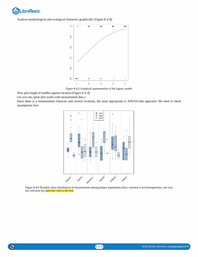
6.4.4 https://stats.libretexts.org/@go/page/3578
Analyze morphological and ecological characters graphically (Figure ):
Figure Graphical representation of the logistic model.Now plot length of needles against location (Figure ):(As you see, spine plot works with measurement data.)Since there is a measurement character and several locations, the most appropriate is ANOVA-like approach. We need to checkassumptions first:
Figure Boxplots show distribution of measurements among juniper populations.Since variation is not homogeneous, one-waytest with post hoc pairwise t-test is the best:
6.4.6
6.4.5
6.4.7
6.4.6

6.4.5 https://stats.libretexts.org/@go/page/3578
Figure Spine plot: locality vs. needle length of junipers.
(Note how we calculated eta-squared, the effect size of ANOVA. As you see, this could be done through linear model.)There is significant difference between the second and two other locations.And to the second problem. First, we make new variable based on logical expression of character differences:There are both “species” in the data. Now, we plot conditional density and analyze logistic regression:
Figure Conditional density of being Juniperus sibirica with the presence of some pine trees.Conditional density plot (Figure ) shows an apparent tendency, and model summary outputs significance for slope coefficient.On the next page, there is a table (Table ) with a key which could help to choose the right inferential method if you knownumber of samples and type of the data.
Type of data One variable Two variables Many variables
6.4.7
6.4.8
6.4.8
6.4.1

6.4.6 https://stats.libretexts.org/@go/page/3578
Type of data One variable Two variables Many variables
Measurement, normallydistributed
t-test
Difference: t-test (paired and non-paired), F-test (scale)Effect size: Cohen's d,
Lyubishchev's KRelation: correlation, linear
models
Linear models, ANOVA, one-waytest, Bartlett test (scale)
Post hoc: pairwise-test, TukeyHSD
Effect size: R-squared
Measurement and ranked Wilcoxon test, Shapiro-Wilk test
Difference: Wilcoxon test (pairedand non-paired), sign test, robust
rank irder test, Ansari-Bradley test(scale)
Effect size: Cliff's delta,Lyubishchev's K
Relation: nonparametriccorrelation
Linear models, LOESS, Kruskal-Wallis test, Friedman test, Fligner-
Killeen test (scale)Post hoc: pairwise Wilcoxon test,
pairwise robust rank order testEffect size: R-squared
Categorical One sample test of proportions,goodness-of-fit test
Association: Chi-squared test,Fisher's exact test, test of
proportions, G-test, McNemar'stest (paired)
Effect size: Cramer's V,Tschuprow's T, odds ratio
Association tests (see on the left);generalized linear models ofbinomial family (= logistic
regression)Post hoc: pairwise table test
Table Key to the most important inferential statistical methods (except multivariate). After you narrow the search with coupleof methods, proceed to the main text.
This page titled 6.4: Answers to exercises is shared under a Public Domain license and was authored, remixed, and/or curated by AlexeyShipunov via source content that was edited to the style and standards of the LibreTexts platform; a detailed edit history is available upon request.
6.4.1

1
CHAPTER OVERVIEW
7: Multidimensional Data - Analysis of Structure“Data Mining”, “Big Data”, “Machine Learning”, “Pattern Recognition” phrases often mean all statistical methods, analytical andvisual which help to understand the structure of data. Data might be of any kind, but it is usually multidimensional, which is bestrepresented with the table of multiple columns a.k.a. variables (which might be of different types: measurement, ranked orcategorical) and rows a.k.a objects. So more traditional name for these methods is “multivariate data analysis” or “multivariatestatistics”.
Data mining is often based on the idea of classification, arrange objects into non-intersecting, frequently hierarchical groups. Weuse classification all the time (but sometimes do not realize it). We open the door and enter the room, the first thing is to recognize(classify) what is inside. Our brain has the outstanding power of classification, but computers and software are speedily advancingand becoming more brain-like. This is why data mining is related with artificial intelligence. There are even methods calling“neural networks”!
Figure Flowers of irises from the iris data (from left to right): Iris setosa Pall.,I. versicolor L. and I. virginica. L. Scale bar isapproximately 10 mm.
In this chapter, along with the other data, we will frequently use the embedded iris data taken from works of Ronald Fisher .There are four characters measured on three species of irises (Figure ), and fifth column is the species name.
References
1. Fisher R.A. 1936. The use of multiple measurements in taxonomic problems. Annals of Eugenics. 7(2): 179–188.
7.1: How to draw the multivariate data7.2: Classification without learning7.3: Machine learning7.4: Semi-supervised learning7.5: Deep Learning7.6: How to choose the right method7.7: Answers to exercises
This page titled 7: Multidimensional Data - Analysis of Structure is shared under a Public Domain license and was authored, remixed, and/orcurated by Alexey Shipunov via source content that was edited to the style and standards of the LibreTexts platform; a detailed edit history isavailable upon request.
7.1
[1]
7.1

7.1.1 https://stats.libretexts.org/@go/page/3582
7.1: How to draw the multivariate dataThe most simple operation with multidimensional data is to draw it.
PictographsPictograph is a plot where each element represents one of objects, and every feature of the element corresponds with one characterof the primary object. If the every row of data is unique, pictographs might be useful. Here is the star plot (Figure ) example:
Figure Stars show different horsetail species.
(We made every element to represent the species of horsetails, and length of the particular ray corresponds with somemorphological characters. It is easy to see, as an example, similarities between Equisetum litorale and E. fluviatile.)Slightly more exotic pictograph is Chernoff’s faces where features of elements are shown as human face characters (Figure ):(Original Chernoff’s faces have been implemented in the faces2() function, there is also another variant in symbols() package.)
Figure Chernoff’s faces show different horsetail species.
7.1.1
7.1.1
×
7.1.1
7.1.2

7.1.2 https://stats.libretexts.org/@go/page/3582
Related to pictographs are ways to overview the whole numeric dataset, matrix or data frame. First, command image() allows forplots like on Figure :(This is a “portrait” or iris matrix, not extremely informative but useful in many ways. For example, it is well visible that highest,most red, values of Pt.L (abbreviated from Petal.Length) correspond with lowest values of Sp.W (Sepal.Width). It is possible evento spot 3-species structure of this data.)
Figure Results of plotting iris data with the image() command. Redder colors correspond with higher values of scaledcharacters.
More advanced is the parallel coordinates plot (Figure ):
Figure Parallel coordinates plot.
This is somewhat like the multidimensional stripchart. Every character is represented with one axis which has its values from allplants. Then, for every plant, these values were connected with lines. There are many interesting things which could be spottedfrom this plot. For example, it is clear that petal characters are more distinguishing than sepal. It is also visible that Iris setosa ismore distinct from two other species, and so on.
7.1.3
7.1.3
7.1.4
7.1.4

7.1.3 https://stats.libretexts.org/@go/page/3582
Grouped plotsEven boxplots and dotcharts could represent multiple characters of multiple groups, but you will need to scale them first and thenmanually control positions of plotted elements, or use Boxplots() and Linechart() described in the previous chapter:(Please try these plots yourself.)Function matplot() allows to place multiple scatterplots in one frame, symbols() allows to place multiple smaller plots in desiredlocations, and function pairs() allows to show multiple scatterplots as a matrix (Figure ).(This matrix plot shows dependencies between each possible pair of five variables simultaneously.)Matrix plot is just one of the big variety of R trellis plots. Many of them are in the lattice package (Figure ):(Note how to use make.groups() and do.call() to stack all columns into the long variable (it is also possible to use stack(), seeabove). When LOC was added to temporary dataset, it was recycled five times—exactly what we need.)Library lattice offers multiple trellis variants of common R plots. For example, one could make the trellis dotchart which will showdifferences between horsetail species (Figure )
Figure Matrix plot.
(Here we stacked all numerical columns into one with stack().)Few trellis plots are available in the core R. This is our election data from previous chapter (Figure ):
7.1.5
7.1.6
7.1.7
7.1.5
7.1.8

7.1.4 https://stats.libretexts.org/@go/page/3582
Figure The example of trellis plot: for each measurement character, boxplots represent differences between locations.
3D plotsIf there just three numerical variables, we can try to plot all of them with 3-axis plots. Frequently seen in geology, metallurgy andsome other fields are ternary plots. They implemented, for example, in the vcd package. They use triangle coordinate system whichallows to reflect simultaneously three measurement variables and some more categorical characters (via colors, point types etc.):
Figure Trellis dotchart of the horsetail species (character values are scaled). These plots are typically read from the bottom.
The “brick” 3D plot could be done, for example, with the package scatterplot3d (Figure ):
7.1.6
7.1.7
7.1.10

7.1.5 https://stats.libretexts.org/@go/page/3582
Figure Voting data from previous chapter represented with coplot() function.
(Here some additional efforts were used to make y-axis label slanted.)These 3D scatterplots look attractive, but what if some points were hidden from the view? How to rotate and find the bestprojection? Library RGL will help to create the dynamic 3D plot:Please run these commands yourself. The size of window and projection in RGL plots are controlled with mouse. That will help tounderstand better the position of every point. In case of iris data, it is visible clearly that one of the species (Iris setosa) is moredistinct than two others, and the most “splitting” character is the length of petals (Petal.Length). There are four characters on theplot, because color was used to distinguish species. To save current RGL plot, you will need to run rgl.snapshot() or rgl.postscript()function. Please also note that RGL package depends on the external OpenGL library and therefore on some systems, additionalinstallations might be required.
Figure Ternary plot for iris data.
Another 3D possibility is cloud() from lattice package. It is a static plot with the relatively heavy code but important is that user canuse different rotations (Figure 7.2.1):
7.1.8
7.1.9

7.1.6 https://stats.libretexts.org/@go/page/3582
Figure Static 3D scatterplot of iris data.
This page titled 7.1: How to draw the multivariate data is shared under a Public Domain license and was authored, remixed, and/or curated byAlexey Shipunov via source content that was edited to the style and standards of the LibreTexts platform; a detailed edit history is available uponrequest.
7.1.10

7.2.1 https://stats.libretexts.org/@go/page/3583
7.2: Classification without learningWe see that plotting of multivariate data always has two problems: either there are too many elements (e.g., in parallel coordinates)which are hard to understand, or there is a need of some grouping operation (e.g., median or range) which will result in the lost ofinformation. What will be really helpful is to safely process the data first, for example, to reduce dimensions—from many to 2 or 3.These techniques are described in this section.Apart from (a) reduction of dimensionality (projection pursuit), the following methods help to (b) find groups (clusters) in data, (c)discover hidden factors (latent variables) and understand variable importance (feature selection ), (d) recognize objects (e.g.,complicated shapes) within data, typically using densities and hiatus (gaps) in multidimensional space, and (e) unmix signals.
Figure Static 3D cloud plot of iris data with several rotations.
Classification with primary dataPrimary is what come directly from observation, and did not yet processes in any way (to make secondary data).
Shadows of hyper clouds: PCARGL (see above) allows to find the best projection manually, with a mouse. However, it is possible to do programmatically, withprincipal component analysis, PCA. It belongs to the family of non-supervised methods, methods of classification withoutlearning, or ordination.PCA treats the data as points in the virtual multidimensional space where every dimension is the one character. These points maketogether the multidimensional cloud. The goal of the analysis is to find a line which crosses this cloud along its most elongatedpart, like pear on the stick (Figure ). This is the first principal component. The second line is perpendicular to the first andagain span the second most elongated part of the cloud. These two lines make the plane on which every point is projected.
Figure Principal component analysis is like the pear on the stick.
Let us prove this practically. We will load the two-dimensional (hence only two principal components) black and white pear imageand see what PCA does with it:PCA is related with a task of finding the “most average person”. The simple combination of averages will not work, which is wellexplained in Todd Rose’s “The End of Average” book. However, it is usually possible to find in the hyperspace the configuration ofparameters which will suit most of people, and this is what PCA is for.
[1]
7.2.1
7.2.2
7.2.2
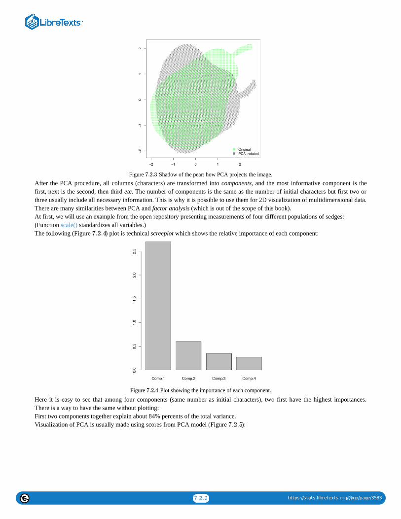
7.2.2 https://stats.libretexts.org/@go/page/3583
Figure Shadow of the pear: how PCA projects the image.After the PCA procedure, all columns (characters) are transformed into components, and the most informative component is thefirst, next is the second, then third etc. The number of components is the same as the number of initial characters but first two orthree usually include all necessary information. This is why it is possible to use them for 2D visualization of multidimensional data.There are many similarities between PCA and factor analysis (which is out of the scope of this book).At first, we will use an example from the open repository presenting measurements of four different populations of sedges:(Function scale() standardizes all variables.)The following (Figure ) plot is technical screeplot which shows the relative importance of each component:
Figure Plot showing the importance of each component.
Here it is easy to see that among four components (same number as initial characters), two first have the highest importances.There is a way to have the same without plotting:First two components together explain about 84% percents of the total variance.Visualization of PCA is usually made using scores from PCA model (Figure ):
7.2.3
7.2.4
7.2.4
7.2.5
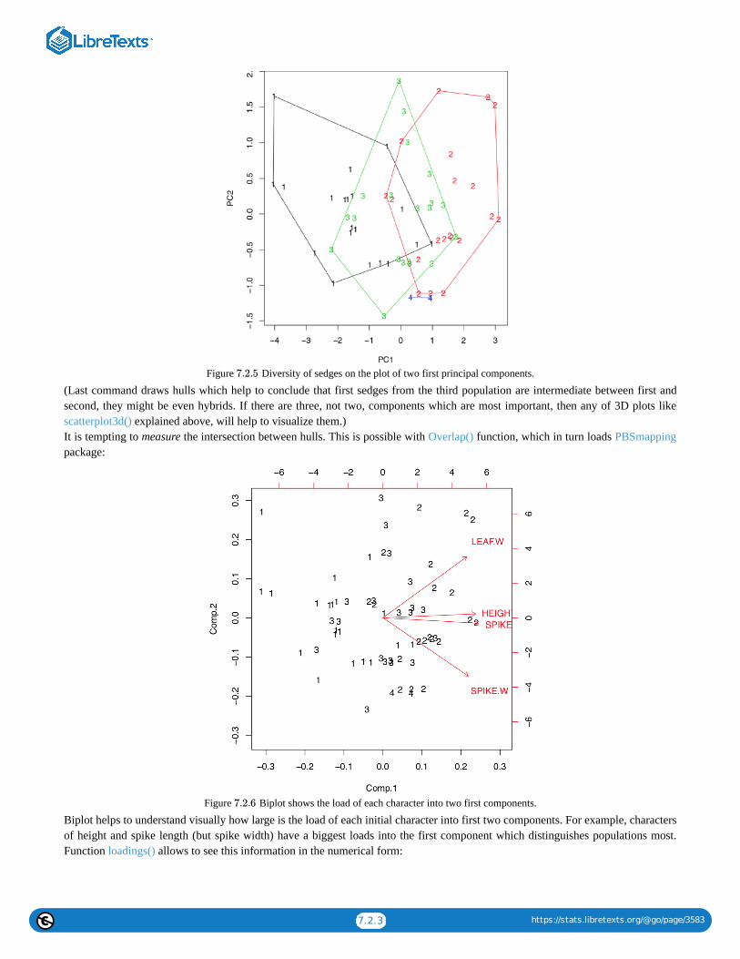
7.2.3 https://stats.libretexts.org/@go/page/3583
Figure Diversity of sedges on the plot of two first principal components.
(Last command draws hulls which help to conclude that first sedges from the third population are intermediate between first andsecond, they might be even hybrids. If there are three, not two, components which are most important, then any of 3D plots likescatterplot3d() explained above, will help to visualize them.)It is tempting to measure the intersection between hulls. This is possible with Overlap() function, which in turn loads PBSmappingpackage:
Figure Biplot shows the load of each character into two first components.
Biplot helps to understand visually how large is the load of each initial character into first two components. For example, charactersof height and spike length (but spike width) have a biggest loads into the first component which distinguishes populations most.Function loadings() allows to see this information in the numerical form:
7.2.5
7.2.6

7.2.4 https://stats.libretexts.org/@go/page/3583
R has two variants of PCA calculation, first (already discussed) with princomp(), and second with prcomp(). The difference lays inthe way how exactly components are calculated. First way is traditional, but second is recommended:Example above shows some differences between two PCA methods. First, prcomp() conveniently accepts scale option. Second,loadings are taken from the rotation element. Third, scores are in the the element with x name. Please run the code yourself to seehow to add 95% confidence ellipses to the 2D ordination plot. One might see that Iris setosa (letter “s” on the plot) is seriouslydivergent from two other species, Iris versicolor (“v”) and Iris virginica (“a”).Packages ade4 and vegan offer many variants of PCA (Figure ):
Figure Diversity of irises on the plot of two first principal components (ade4 package)
(The plot is similar to the shown on Figure ; however, the differences between groups are here more clear.)In addition, this is possible to use the inferential approach for the PCA:Monte-Carlo randomization allows to understand numerically how well are Iris species separated with this PCA. The highObservation value (72.2% which is larger than 50%) is the sign of reliable differences.There are other variants of permutation tests for PCA, for example, with anosim() from the vegan package.Please note that principal component analysis is in general a linear technique similar to the analysis of correlations, and it can failin some complicated cases.
Data solitaire: SOMThere are several other techniques which allow unsupervised classification of primary data. Self-organizing maps (SOM) is atechnique somewhat similar to breaking the deck of cards into several piles:The resulted plot (Figure ) contains graphical representation of character values, together with the placement of actual datapoints.
7.2.7
7.2.7
7.2.5
7.2.8

7.2.5 https://stats.libretexts.org/@go/page/3583
Figure Self-organizing map for iris data. Both character values (codes) and data placement is shown.
In fact, SOM is the non-learning neural network. More advanced Growing Neural Gas (GNG) algorithm uses ideas similar toSOM.
Data density: t-SNEWith the really big number of samples, t-SNE algorithm (name stands for “t-Distributed Stochastic Neighbor Embedding”)performs better than classical PCA. t-SNE is frequently used for the shape recognition. It is easy enough to employ it in R(Figure
):
Figure t-SNE algorithm splits the iris data.
Classification with correspondenceCorrespondence analysis is the family of techniques similar to PCA, but applicable to categorical data (primary or in contingencytables). Simple variant of the correspondence analysis is implemented in corresp() from MASS package (Figure ) whichworks with contingency tables:(We converted here “table” object HE into the data frame. xpd=TRUE was used to allow text to go out of the plotting box.)
7.2.8
7.2.9
7.2.9
7.2.10

7.2.6 https://stats.libretexts.org/@go/page/3583
Figure Correspondence plot of contingency table.
This example uses HairEyeColor data from previous chapter. Plot visualizes both parameters so if the particular combination ofcolors is more frequent, then positions of corresponding words is closer. For example, black hairs and brown eyes frequently occurtogether. The position of these words is more distant from the center (designated with cross) because numerical values of thesecharacters are remote.This possibility to visualize several character sets simultaneously on the one plot is the impressive feature of correspondenceanalysis (Figure ):This is much more advanced than biplot. Data used here contained both abiotic (ecotopes) and biotic factors (plant species), plusthe geography of some Arctic islands: were these lake islands or sea islands. The plot was able to arrange all of these data: forabiotic factors, it used arrows, for biotic—pluses, and for sites (islands themselves as characterized by the sum of all availablefactors, biotic and abiotic)—squares of different color, depending on geographic origin. All pluses could be identified with theinteractive identify(plot.all.cca, "species") command. We did it just for one most outstanding species, Carex lasiocarpa (woolly-fruit sedge) which is clearly associated with lake islands, and also with swamps.
Classification with distancesImportant way of non-supervised classification is to work with distances instead of original data. Distance-based methods need thedissimilarities between each pair of objects to be calculated first. Advantage of these methods is that dissimilarities could becalculated from data of any type: measurement, ranked or nominal.
DistancesThere are myriads of ways to calculate dissimilarity (or similarity which is essentially the reverse dissimilarity) . One of theseways already explained above is a (reverse absolute) correlation. Other popular ways are Euclidean (square) distance andManhattan (block) distance. Both of them (Figure ) are useful for measurement variables.
7.2.10
7.2.11
[2]
7.2.12

7.2.7 https://stats.libretexts.org/@go/page/3583
Figure Canonical correlation analysis plot showing Arctic islands (squares), species (crosses) and habitat factors (arrows)
Manhattan distances are similar to driving distances, especially when there are not many roads available. The example below aredriving distances between biggest North Dakota towns:
Figure Euclidean (1) and Manhattan (2) distances between A and B
In most cases, we need to convert raw variables into distance matrix. The basic way is to use dist(). Note that ranked and binaryvariables usually require different approaches which are implemented in the vegan (function vegdist()) and cluster packages(function daisy()). The last function recognizes the type of variable and applies the most appropriate metric (including the universalGower distance); it also accepts the metric specified by user:In biology, one can use Smirnov taxonomic distances, available from smirnov package. In the following example, we use plantspecies distribution data on small islands.The next plot intends to help the reader to understand them better. It is just a kind of map which shows geographical locations andsizes of islands:(Please plot it yourself.)Now we will calculate and visualize Smirnov’s distances:Smirnov’s distances have an interesting feature: instead of 0 or 1, diagonal of the similarity matrix is filled with the coefficient ofuniqueness values (Txx):This means that Verik island is a most unique in regards to plant species occurrence.
Making maps: multidimensional scalingThere are many things to do with the distance matrix. One of most straightforward is the multidimensional scaling, MDS (the othername is “principal coordinate analysis”, PCoA):
7.2.11
7.2.12

7.2.8 https://stats.libretexts.org/@go/page/3583
Figure It is not a map of North Dakota towns but the plot of cmdscale() output from the driving distance data.
Compare the plot (Figure ) it with any geographical map. If you do not have a map of North Dakota but have these drivingdistances, cmdscale() allows to re-create the map!So in essence, MDS is a task reverse to navigation (finding driving directions from map): it uses “driving directions” and makes amap from them.Another, less impressive but more useful example (Figure ) is from raw data of Fisher’s irises:
Figure The result of the multidimensional scaling of the iris. data. Visualization uses the estimation of density.
(There is no real difference from PCA because metric multidimensional scaling is related to principal component analysis; also, theinternal structure of data is the same.)To make the plot “prettier”, we added here density lines of point closeness estimated with bkde2D() function from the KernSmoothpackage. Another way to show density is to plot 3D surface like (Figure ):
7.2.13
7.2.13
7.2.14
7.2.14
7.2.15

7.2.9 https://stats.libretexts.org/@go/page/3583
Figure 3D density surface of multidimensionally scaled iris data.In addition to cmdscale(), MASS package (functions isoMDS() and sammon()) implements the non-metric multidimensionalscaling, and package vegan has the advanced non-metric metaMDS(). Non-metric multidimensional scaling does not have analogsto PCA loadings (importances of variables) and proportion of variance explained by component, but it is possible to calculatesurrogate metrics:Consequently (and similarly to PCA), sepal width character influences second dimension much more than three other characters.We can also guess that within this non-metric solution, first dimension takes almost 98% of variance.
Making trees: hierarchical clusteringThe other way to process the distance matrix is to perform hierarchical clustering which produces dendrograms, or trees, which are“one and a half dimensional” plots (Figure ):Ward’s method of clustering is well known to produce sharp, well-separated clusters (this, however, might lead to false conclusionsif data has no apparent structure). Distant planets are most similar (on the height ), similarity between Venus and Mars is alsohigh (dissimilarity is ). Earth is more outstanding, similarity with Mercury is lower, on the height ; but since Mercury hasno true atmosphere, it could be ignored.The following classification could be produced from this plot:
Earth group: Venus, Mars, Earth, [Mercury]Jupiter group: Jupiter, Saturn, Uranus, Neptune
Instead of this “speculative” approach, one can use cutree() function to produce classification explicitly; this requires the hclust()object and number of desired clusters:
7.2.15
7.2.16
≈ 25
≈ 0 ≈ 100

7.2.10 https://stats.libretexts.org/@go/page/3583
Figure Dendrogram reflecting similarities between atmospheres of Solar system planets.
To check how well the selected method performs classification, we wrote the custom function Misclass(). This function calculatesthe confusion matrix. Please note that Misclass() assumes predicted and observed groups in the same order, see also below forfanny() function results.Confusion matrix is a simple way to assess the predictive power of the model. More advanced technique of same sort is calledcross-validation. As an example, user might splut data into 10 equal parts (e.g., with cut()) and then in turn, make each part an“unknown” whereas the rest will become training subset.As you can see from the table, 32% of Iris virginica were misclassified. The last is possible to improve, if we change eitherdistance metric, or clustering method. For example, Ward’s method of clustering gives more separated clusters and slightly bettermisclassification rates. Please try it yourself.Hierarchical clustering does not by default return any variable importance. However, it is still possible to assist the feature selectionwith clustering heatmap (Figure ):(Here we also used cetcolor package which allows to create perceptually uniform color palettes.)Heatmap separately clusters rows and columns and places result of the image() function in the center. Then it become visible whichcharacters influence which object clusters and vice versa. On this heatmap, for example, Mars and Venus cluster together mostlybecause of similar levels of carbon dioxide.There are too many irises to plot the resulted dendrogram in the common way. One workaround is to select only some irises (seebelow). Another method is to use function Ploth() (Figure ):
7.2.16
7.2.17
7.2.18

7.2.11 https://stats.libretexts.org/@go/page/3583
Figure Clustering heatmap for atmosphere data.
Ploth() is useful also if one need simply to rotate the dendrogram. Please check the following yourself:(This is also a demonstration of how to use correlation for the distance. As you will see, the same connection between Caesar salad,tomatoes and illness could be visualized with dendrogram. There visible also some other interesting relations.)
Figure Hierarchical clustering of iris data.
7.2.17
7.2.18

7.2.12 https://stats.libretexts.org/@go/page/3583
Planet Aqua is entirely covered by shallow water. This ocean is inhabited with various flat organisms (Figure ). Thesecreatures (we call them “kubricks”) can photosynthesize and/or eat other organisms or their parts (which match with the shapeof their mouths), and move (only if they have no stalks). Provide the dendrogram for kubrick species based on result ofhierarchical clustering.
Figure Eight species of kubricks.
How to know the best clustering methodHierarchical cluster analysis and relatives (e.g., phylogeny trees) are visually appealing, but there are three important questionswhich need to be solved: (1) which distance is the best (this also relevant to other distance-based methods); (2) which hierarchicalclustering method is the best; and (3) how to assess stability of clusters.Second question is relatively easy to answer. Function Co.test(dist, tree) from asmisc.r reveals consistency between distance objectand hierachical clusterization. It is essentially correlation test between initial distances and distances revealed from copheneticstructure of the dendrogram.Cophenetic distances are useful in many ways. For example, to choose the best clusterization method and therefore answer thesecond question, one might use cophenetic-based(Make and review this plot yourself. Which clustering is better?)Note, however, these “best” scores are not always best for you. For example, one might still decide to use ward.D because it makesclusters sharp and visually separated.To choose the best distance method, one might use the visually similar approach:(Again, please review the plot yourself.)In fact, it just visualizes the correlation between multidimensional scaling of distances and principal component analysis of rawdata. Nevertheless, it is still useful.
How to compare clusteringsHierarchical clustering are dendrograms and it is not easy to compare them “out of the box”. Several different methods allow tocompare two trees.We can employ methods associated with biological phylogenies (these trees are essentially dendrograms).Suppose that there are two clusterings:Library ape has dist.topo() function which calculates topological distance between trees, and library phangorn calculates severalthose indexes:Next possibility is to plot two trees side-by-side and show differences with lines connecting same tips (Figure ):
file.
7.2.19
7.2.19
7.2.20

7.2.13 https://stats.libretexts.org/@go/page/3583
(Note that sometimes you might need to rotate branch with rotate() function. Rotation does not change dendrogram.)
Figure Side-by-side dendrogram plot for athmosphere data.
There is also possible to plot consensus tree which shows only those clusters which appear in both clusterings:(Please make this plot yourself.)Heatmap could also be used to visualize similarities between two dendrograms:(Hclust.match() counts matches between two dendrograms (which based on the same data) and then heatmap() plots these counts ascolors, and also supplies the consensus configuration as two identical dendrograms on the top and on the left. Please make this plotyourself.)Both multidimendional scaling and hierarchical clustering are distance-based methods. Please make and review the following plot(from the vegan3d package) to understand how to compare them:
How good are resulted clustersThere are several ways to check how good are resulted clusters, and many are based on the bootstrap replication (see Appendix).Function Jclust() presents a method to bootstrap bipartitions and plot consensus tree with support values (Figure :
7.2.20
7.2.21

7.2.14 https://stats.libretexts.org/@go/page/3583
Figure Bootstrap stability of 3-cluster solution for lake islands data (1000 iterations)
(Note that Jclust() uses cutree() and therefore works only if it “knows” the number of desired clusters. Since consensus resultrelates with cluster number, plots with different numbers of clusters will be different.)Another way is to use pvclust package which has an ability to calculate the support for clusters via bootstrap (Figure ):
Figure Dendrogram with supporting values (pvclust package)(Function pvclust() clusterizes columns, not rows, so we have to transpose data again. On the plot, numerical values of clusterstability (au) are located above each node. The closer are these values to 100, the better.)There is also BootA() function in asmisc.r set which allows to bootstrap clustering with methods from phylogenetic package ape:(This method requires to make an anonymous function which uses methods you want. It also plots both consensus tree (withoutsupport values) and original tree with support values. Please make these trees. Note that by default, only support values greater then50% are shown.)
7.2.21
7.2.22
7.2.22

7.2.15 https://stats.libretexts.org/@go/page/3583
Making groups: k-means and friendsApart from hierarchical, there are many other ways of clustering. Typically, they do not return any ordination (“map”) and provideonly cluster membership. For example, k-means clustering tries to obtain the a priori specified number of clusters from the rawdata (it does not need the distance matrix to be supplied):K-means clustering does not plot trees; instead, for every object it returns the number of its cluster:(As you see, misclassification errors are low.)Instead of a priori cluster number, function kmeans() also accepts row numbers of cluster centers.Spectral clustering from kernlab package is superficially similar method capable to separate really tangled elements:
Figure Kernel-based spectral clustering is capable to separate two spirals.
Kernel methods (like spectral clustering) recalculate the primary data to make it more suitable for the analysis. Support vectormachines (SVM, see below) is another example. There is also kernel PCA (function kpca() in kernlab package).Next group of clustering methods is based on fuzzy logic and takes into account the fuzziness of relations. There is always thepossibility that particular object classified in the cluster A belongs to the different cluster B, and fuzzy clustering tries to measurethis possibility:Textual part of the fanny() output is most interesting. Every row contains multiple membership values which represent theprobability of this object to be in the particular cluster. For example, sixth plant most likely belongs to the first cluster but there isalso visible attraction to the third cluster. In addition, fanny() can round memberships and produce hard clustering like other clustermethods:(We had to re-level the Species variable because fanny() gives number 2 to the Iris virginica cluster.)
How to know cluster numbersAll “k-means and friends” methods want to know the number of clusters before they start. So how to know a priori how manyclusters present in data? This question is one of the most important in clustering, both practically and theoretically.The visual analysis of banner plot (invented by Kaufman & Rousseeuw, 1990) could predict this number (Figure ):
7.2.23
7.2.24

7.2.16 https://stats.libretexts.org/@go/page/3583
Figure Banner plot. White bars suggest possible cluster partitions.
White bars on the left represent unclustered data, maroon lines on the right show height of possible clusters. Therefore, two clustersis the most natural solution, four clusters should be the next possible option.Model-based clustering allows to determine how many clusters present in data and also cluster membership. The method assumesthat clusters have the particular nature and multidimensional shapes:(As you see, it reveals two clusters only. This is explanable because in iris data two species are much more similar then the thirdone.)DBSCAN is the powerful algorithm for the big data (like raster images which consist of billions of pixels) and there is the Rpackage with the same name (in lowercase). DBSCAN reveals how many clusters are in data at particular resolution:(Plots are not shown, please make then yourself. First plot helps to find the size of neighborhood (look on the knee). The secondillustrates results. Similar to model-based clustering, DBSCAN by default reveals only two clusters in iris data.)Note that while DBSCAN was not able to recover all three species, it recovered clouds, and also places marginal points in the“noise” group. DBSCAN, as you see, is useful for smoothing, important part of image recognition. Parameter eps allows to change“resolution” of clustering and to find more, or less, clusters. DBSCAN relates with t-SNE (see above) and with supervised methodsbased on proximity (like kNN, see below). It can also be supervised itself and predict clusters for new points. Note that k-meansand DBSCAN are based on specifically calculated proximities, not directly on distances.
Data stars contains information about 50 brightest stars in the night sky, their location and constellations. Please use DBSCANto make artificial constellations on the base of star proximity. How are they related to real constellations?Note that location (right ascension and declination) is given in degrees or hours (sexagesimal system), they must be convertedinto decimals.
“Mean-shift” method searches for modes within data, which in essence, is similar to finding proximities. The core mean-shiftalgotithm is slow so approximate “blurring” version is typically preferable:Another approach to find cluster number is similar to the PCA screeplot:(Please check this plot yourself. As on the banner plot, it visible that highest relative “cliffs” are after 1 and 4 cluster numbers.)Collection asmisc.r contains function Peaks() which helps to find local maxima in simple data sequence. Number of these peaks onthe histogram (with the sensible number of breaks) should point on the number of clusters:
>
[1] 3
(“Three” is the first number of peaks after “one” and does not change when 8 < breaks < 22.)
7.2.25

7.2.17 https://stats.libretexts.org/@go/page/3583
Finally, the integrative package NbClust allows to use diverse methods to assess the putative number of clusters:
How to compare different ordinationsMost of classification methods result in some ordination, 2D plot which includes all data points. This allow to compare them withProcrustes analysis (see Appendix for more details) which rotates ans scales one data matrix to make in maximally similar with thesecond (target) one. Let us compare results of classic PCA and t-SNE:Resulted plot (Figure 7.3.1) shows how dense are points in t-SNE and how PCA spreads them. Which of methods makes bettergrouping? Find it yourself.
References1. Package Boruta is especially god for all relevant feature selection.
This page titled 7.2: Classification without learning is shared under a Public Domain license and was authored, remixed, and/or curated by AlexeyShipunov via source content that was edited to the style and standards of the LibreTexts platform; a detailed edit history is available upon request.

7.3.1 https://stats.libretexts.org/@go/page/3584
7.3: Machine learningMethods explained in this section are not only visualizations. Together, they frequently called “classification with learning”,“supervised classification”, “machine learning”, or just “classification”. All of them are based on the idea of learning:
... He scrambled through and rose to his feet. ... He saw nothing but colours—colours that refused to form themselvesinto things. Moreover, he knew nothing yet well enough to see it: you cannot see things till you know roughly what theyare . His first impression was of a bright, pale world—a watercolour world out
Figure Procrustes plot which show t-SNE ordination against the target PCA ordination.
of a child’s paint-box; a moment later he recognized the flat belt of light blue as a sheet of water, or of something likewater, which came nearly to his feet. They were on the shore of a lake or river...
C.S.Lewis. Out of the Silent Planet.
First, small part of data where identity is already known (training dataset) used to develop (fit) the model of classification (Figure ). On the next step, this model is used to classify objects with unknown identity (testing dataset). In most of these methods, it
is possible to estimate the quality of the classification and also assess the significance of the every character.Let us create training and testing datasets from iris data:
Figure Graphic representation of the statistical machine learning. Blue is a training dataset, red lines is classification model,green is a testing dataset, dashed lines show prediction (estimation) process.
[1]
7.3.1
7.3.2
7.3.2

7.3.2 https://stats.libretexts.org/@go/page/3584
(iris.unknown is of course the fake unknown so to use it properly, we must specify iris.unknown[, -5]. On the other hand, speciesinformation will help to create misclassification table (confusion matrix, see below).)
Learning with regression
Linear discriminant analysisOne of the simplest methods of classification is the linear discriminant analysis (LDA). The basic idea is to create the set of linearfunctions which “decide” how to classify the particular object.Training resulted in the hypothesis which allowed almost all plants (with an exception of seven Iris virginica) to be placed into theproper group. Please note that LDA does not require scaling of variables.It is possible to check LDA results with inferential methods. Multidimensional analysis of variation (MANOVA) allows tounderstand the relation between data and model (classification from LDA):Important here are both p-value based on Fisher statistics, and also the value of Wilks’ statistics which is the likelihood ratio (in ourcase, the probability that groups are not different).It is possible to check the relative importance of every character in LDA with ANOVA-like techniques:(This idea is applicable to other classification methods too.)... and also visualize LDA results (Figure ):(Please note 95% confidence ellipses with centers.)
Figure Graphical representation of the linear discriminant analysis results. 95% confidence ellipses and their centers addedwith Ellipses() function.
To place all points on the plot, we simply used all data as training. Note the good discrimination (higher than in PCA, MDS orclustering), even between close Iris versicolor and I. virginica. This is because LDA frequently overestimates the differencesbetween groups. This feature, and also the parametricity and linearity of LDA made it less used over the last years.With LDA, it is easy to illustrate one more important concept of machine learning: quality of training. Consider the followingexample:Misclassification error here almost two times bigger! Why?Well, using sample() (and particular set.seed() value) resulted in biased training sample, this is why our second model was trainedso poorly. Our first way to sample (every 5th iris) was better, and if there is a need to use sample(), consider to sample each speciesseparately.Now, return to the default random number generator settings:Please note that it is widely known that while LDA was developed on biological material, this kind of data rarely meets two keyassumptions of this method: (1) multivariate normality and (2) multivariate homoscedasticity. Amazingly, even Fisher’s Iris data
7.3.3
7.3.3

7.3.3 https://stats.libretexts.org/@go/page/3584
with which LDA was invented, does not meet these assumptions! Therefore, we do not recommend to use LDA and keep it heremostly for teaching purposes.
Recursive partitioningTo replace linear discriminant analysis, multiple methods with similar background ideas were invented. Recursive partitioning, ordecision trees (regression trees, classification trees), allow, among other, to make and visualize the sort of discrimination key whereevery step results in splitting objects in two groups (Figure ):We loaded first the tree package containing tree() function (rpart is another package which makes classification trees). Then weagain used the whole dataset as training data. The plot shows that all plants with petal length less than 2.45 cm belong to Irissetosa, and from the rest those plants which have petal width less than 1.75 cm and petal length more than 4.95 cm, are I.versicolor; all other irises belong to I. virginica.In fact, these trees are result of something similar to “hierarchical discriminant analysis”, and it is possible to use them for thesupervised classification:
Figure Classification tree for the iris data from tree package.
Try to find out which characters distinguish species of horsetails described in eq.txt data file. File eq_c.txt contains the descriptionof characters.Package party offers sophisticated recursive partitioning methods together with advanced tree plots (Figure ):(For species names, we used one-letter abbreviations.)
Ensemble learnig
Random ForestThe other method, internally similar to regression trees, rapidly gains popularity. This is the Random Forest. Its name came fromthe ability to use numerous decision trees and build the complex classification model. Random Forest belongs to bagging ensemblemethods; it uses bootstrap (see in Appendix) to multiply the number of trees in the model (hence “forest”). Below is an example ofRandom Forest classifier made from the iris data:
7.3.4
7.3.4
7.3.5

7.3.4 https://stats.libretexts.org/@go/page/3584
Figure Classification tree for the iris data from party package.Here results are similar to LDA but Random Forest allows for more. For example, it can clarify the importance of each character(with function importance() ), and reveal classification distances (proximities) between all objects of training subset (thesedistances could be in turn used for clustering). Random Forest could also visualize the multidimensional dataset (Figure ):(We applied several tricks to show convex hulls and their centroids.)
Figure Visualization of iris data with the help of “Random Forest”. Hulls and their centroids added with Hulls() function.
Package ranger implements even faster variant of Random Forest algorithm, it also can employ parallel calculations.
Gradient boostingThere are many weak classification methods which typically make high misclassification errors. However, many of them are alsoultra-fast. So, is it possible to combine many weak learners to make the strong one? Yes! This is what boosting methods do.Gradient boosting employs multi-step optimization and is now among most frequently using learning techniques. In R, there areseveral gradient boosting packages, for example, xgboost and gbm:(Plot is purely technical; in the above form, it will show the marginal effect (effect on membership) of the 1st variable. Please makeit yourself. “Membership trick” selects the “best species” from three alternatives as gbm() reports classification result in fuzzyform.)
7.3.5
7.3.6
7.3.6

7.3.5 https://stats.libretexts.org/@go/page/3584
Learning with proximityk-Nearest Neighbors algorithm (or kNN) is the “lazy classifier” because it does not work until unknown data is supplied:kNN is based on distance calculation and “voting”. It calculates distances from every unknown object to the every object of thetraining set. Next, it considers several (5 in the case above) nearest neighbors with known identity and finds which id is prevalent.This prevalent id assigned to the unknown member. Function knn() uses Euclidean distances but in principle, any distance wouldwork for kNN.To illustrate idea of nearest neighbors, we use Voronoi decomposition, the technique which is close to both kNN and distancecalculation:The plot (Figure ) contains multiple cells which represent neighborhoods of training sample (big dots). This is not exactlywhat kNN does, but idea is just the same. In fact, Voronoi plot is a good tool to visualize any distance-based approach.Depth classification based on how close an arbitrary point of the space is located to an implicitly defined center of amultidimensional data cloud:
Figure Visualization of training data points neighborhoods with Voronoi decomposition.
Learning with rulesNaïve Bayes classifier is one of the simplest machine learning algorithms which tries to classify objects based on the probabilitiesof previously seen attributes. Quite unexpectedly, it is typically a good classifier:Note that Naïve Bayes classifier could use not only numerical like above, but also nominal predictors (which is similar tocorrespondence analysis.)Apriori method is similar to regression trees but instead of classifying objects, it researches association rules between classes ofobjects. This method could be used not only to find these rules but also to make classification. Note that measurement iris data isless suitable for association rules then nominal data, and it needs discretization first:(Rules are self-explanatory. What do you think, does this method performs better for the nominal data? Please find it out.)
Learning from the black boxFamous SVM, Support Vector Machines is a kernel technique which calculates parameters of the hyper-planes dividing multiplegroups in the multidimensional space of characters:Classification, or prediction grid often helps to illustrate the SVM method. Data points are arranged with PCA to reducedimensionality, and then classifier predicts the identity for the every point in the artificially made grid (Figure ). This ispossible to perform manually but Gradd() function simplifies plotting:And finally, neural networks! This name is used for the statistical technique based on some features of neural cells, neurons. First,we need to prepare data and convert categorical variable Species into three logical dummy variables:Now, we call neuralnet package and proceed to the main calculation. The package “wants” to supply all terms in the modelexplicitly:
7.3.7
7.3.7
7.3.8

7.3.6 https://stats.libretexts.org/@go/page/3584
Figure Classification grid which illustrates the SVM algorithm. Data points are arranged with PCA.
(Note use of set.seed(), this is to make your results similar to presented here.)Now predict (with compute() function) and check misclassification:Results of neural network prediction are fuzzy, similar to the results of fuzzy clustering or regression trees, this is why which.max()was applied for every row. As you see, this is one of the lowest misclassification errors.It is possible to plot the actual network:The plot (Figure 7.4.1) is a bit esoteric for the newbie, but hopefully will introduce into the method because there is an apparentmulti-layered structure which is used for neural networks decisions.
References1. Emphasis mine.
This page titled 7.3: Machine learning is shared under a Public Domain license and was authored, remixed, and/or curated by Alexey Shipunovvia source content that was edited to the style and standards of the LibreTexts platform; a detailed edit history is available upon request.
7.3.8
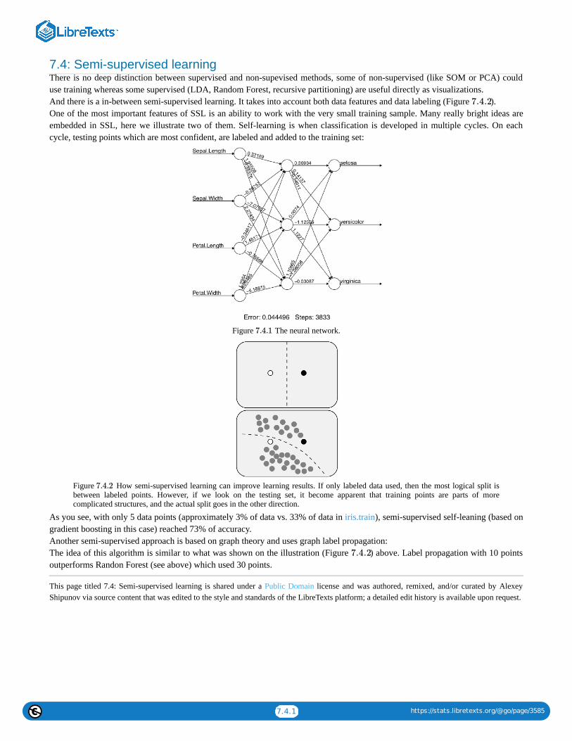
7.4.1 https://stats.libretexts.org/@go/page/3585
7.4: Semi-supervised learningThere is no deep distinction between supervised and non-supevised methods, some of non-supervised (like SOM or PCA) coulduse training whereas some supervised (LDA, Random Forest, recursive partitioning) are useful directly as visualizations.And there is a in-between semi-supervised learning. It takes into account both data features and data labeling (Figure ).One of the most important features of SSL is an ability to work with the very small training sample. Many really bright ideas areembedded in SSL, here we illustrate two of them. Self-learning is when classification is developed in multiple cycles. On eachcycle, testing points which are most confident, are labeled and added to the training set:
Figure The neural network.
Figure How semi-supervised learning can improve learning results. If only labeled data used, then the most logical split isbetween labeled points. However, if we look on the testing set, it become apparent that training points are parts of morecomplicated structures, and the actual split goes in the other direction.
As you see, with only 5 data points (approximately 3% of data vs. 33% of data in iris.train), semi-supervised self-leaning (based ongradient boosting in this case) reached 73% of accuracy.Another semi-supervised approach is based on graph theory and uses graph label propagation:The idea of this algorithm is similar to what was shown on the illustration (Figure ) above. Label propagation with 10 pointsoutperforms Randon Forest (see above) which used 30 points.
This page titled 7.4: Semi-supervised learning is shared under a Public Domain license and was authored, remixed, and/or curated by AlexeyShipunov via source content that was edited to the style and standards of the LibreTexts platform; a detailed edit history is available upon request.
7.4.2
7.4.1
7.4.2
7.4.2

7.5.1 https://stats.libretexts.org/@go/page/3586
7.5: Deep LearningNowadays, “deep learning” is a bit of buzzword which used to designate software packages including multiple classificationmethods, and among the always some complicated neural networks (multi-layered, recurrent etc.) In that sense, R with necessarypackages is a deep learning system. What is missed (actually, not), is a common interface to all “animals” in this zoo of methods.Package mlr was created to unify the learning interface in R:In addition, R now has interfaces (ways to connect with) to (almost) all famous “deep learning” software systems, namelyTensorFlow, H2O, Keras, Caffe and MXNet.
This page titled 7.5: Deep Learning is shared under a Public Domain license and was authored, remixed, and/or curated by Alexey Shipunov viasource content that was edited to the style and standards of the LibreTexts platform; a detailed edit history is available upon request.

7.6.1 https://stats.libretexts.org/@go/page/3587
7.6: How to choose the right methodSo which classification method to use? There are generally two answers: (1) this (these) which work(s) best with your data and (2)as many as possible. The second makes the perfect sense because human perception works the same way, using all possible modelsuntil it reaches stability in recognition. Remember some optical illusions (e.g., the famous duck-rabbit image, Figure ) andRorschach inkblot test. They illustrate how flexible is human cognition and how many models we really use to recognize objects.
Figure Duck-rabbit image presents two alternative recognition models.
At the end of the chapter, we decided to place the decision tree (Figure ) which allows to select some most importantmultivariate methods. Please note that if you decide to transform your data (for example, make a distance matrix from it), then youmight access other methods:
Figure How to find the correct multivariate method.
This page titled 7.6: How to choose the right method is shared under a Public Domain license and was authored, remixed, and/or curated byAlexey Shipunov via source content that was edited to the style and standards of the LibreTexts platform; a detailed edit history is available uponrequest.
7.6.1
7.6.1
7.6.2
7.6.2

7.7.1 https://stats.libretexts.org/@go/page/4161
7.7: Answers to exercisesAnswer to the stars question.First, load the data and as suggested above, convert coordinates into decimals:Next, some preliminary plots (please make them yourself):Now, load dbscan package and try to find where number of “constellations” is maximal:Plot the prettified “night sky” (Figure ) with found constellations:dev.off()To access agreement between two classifications (two systems of constellations) we might use adjusted Rand index which countscorrespondences:
Figure Fifty brightest stars with “constellations” found with DBSCAN.
(It is of course, low.)Answer to the beer classification exercise. To make hierarchical classification, we need first to make the distance matrix. Let uslook on the data:Data is binary and therefore we need the specific method of distance calculation. We will use here Jaccard distance implemented invegdist() function from the vegan package. It is also possible to use here other methods like “binary” from the core dist() function.Next step would be the construction of dendrogram (Figure ):
7.7.1
7.7.1
7.7.2

7.7.2 https://stats.libretexts.org/@go/page/4161
Figure Hierarchical classification of Russian beer types.
There are two big groups (on about 1.7 dissimilarity level), we can call them “Baltika” and “Budweiser”. On the next split(approximately on 1.4 dissimilarity), there are two subgroups in each group. All other splits are significantly deeper. Therefore, it ispossible to make the following hierarchical classification:
Baltika groupBaltika subgroup: Baltika.6, Baltika.9, Ochak.dark, Afanas.light, Sibirskoe, Tula.hardTula subgroup: Zhigulevsk, Khamovn, Tula.arsenal, Tula.orig
Budweiser groupBudweiser subgroup: Sinebryukh, Vena.porter, Sokol.soft, Budweiser, Sokol.lightOchak subgroup: Baltika.3, Klinsk.dark, Oldm.light, Vena.peterg, Ochak.class, Ochak.special, Klinsk.gold, Sibir.orig,Efes, Bochk.light, Heineken
It is also a good idea to check the resulted classification with any other classification method, like non-hierarchical clustering,multidimensional scaling or even PCA. The more consistent is the above classification with this second approach, the better.Answer to the plant species classification tree exercise. The tree is self-explanatory but we need to build it first (Figure ):Answer to the kubricks (Figure ) question. This is just a plan as you will still need to perform these steps individually:
1. Open R, open Excel or any spreadsheet software and create the data file. This data file should be the table where kubrickspecies are rows and characters are columns (variables). Every row should start with a name of kubrick (i.e., letter), andevery column should have a header (name of character). For characters, short uppercased names with no spaces arepreferable.
7.7.2
7.7.3
7.7.3

7.7.3 https://stats.libretexts.org/@go/page/4161
Figure Classification tree shows that two horsetail species differ by N.REB character (number of stem ridges)
Topleft cell might stay empty. In every other cell, there should be either 1 (character present) or 0 (character absent). For thecharacter, you might use “presence of stalk” or “presence of three mouths”, or “ability to make photosynthesis”, orsomething alike. Since there are 8 kubricks, it is recommended to invent (in this case, 9) characters.2. Save your table as a text file, preferably tab-separated (use approaches described in the second chapter), then load it into Rwith read.table(.., h=TRUE, row.names=1).3. Apply hierarchical clustering with the distance method applicable for binary (0/1) data, for example binary from dist() oranother method (like Jaccard) from the vegan::vegdist().4. Make the dendrogram with hclust() using the appropriate clustering algorithm.
In the data directory, there is a data file, kubricks.txt. It is just an example so it is not necessarily correct and does not containdescriptions of characters. Since it is pretty obvious how to perform hierarchical clustering (see the “beer” example above), wepresent below two other possibilities.First, we use MDS plus the MST, minimum spanning tree, the set of lines which show the shortest path connecting all objects onthe ordination plot (Figure ):
Figure Minimum spanning tree of kubricks.
Second, we can take into account that kubricks are biological objects. Therefore, with the help of packages ape and phangorn wecan try to construct the most parsimonious (i.e., shortest) phylogeny tree for kubricks. Let us accept that kubrick H is the outgroup,the most primitive one:(Make and review this plot yourself.)
7.7: Answers to exercises is shared under a not declared license and was authored, remixed, and/or curated by LibreTexts.
7.7.3
N +1
7.7.4
7.7.4

1
CHAPTER OVERVIEW
8: Appendix A- Example of R sessionThe following is for impatient readers who prefer to learn R in a speedy way. They will need to type all commands listed below.Please do not copy-paste them but exactly type from the keyboard: that way, they will be much easier to remember andconsequently to learn. For each command, we recommend to read the help (call it with ?command). As an exception from mostothers parts of this book, R output and plots are generally not shown below. You will need to check and get them yourself. Westrongly recommend also to “play” with commands: modify them and look how they work.
All of the following relates with an imaginary data file containing information about some insects. Data file is a table of fourcolumns separated with tabs:
SEX COLOR WEIGHT LENGTH
0 1 10.68 9.43
1 1 10.02 10.66
0 2 10.18 10.41
1 1 8.01 9
0 3 10.23 8.98
1 3 9.7 9.71
1 2 9.73 9.09
0 3 11.22 9.23
1 1 9.19 8.97
1 2 11.45 10.34
Companion file bugs_c.txt contains information about these characters:
# Imaginary insects SEX females 0, males 1 COLOR red 1, blue 2, green 3 LENGTH length of the insect in millimeters
8.1: Starting...8.2: Describing...8.3: Plotting...8.4: Testing...8.5: Finishing...8.6: Answers to exercises
This page titled 8: Appendix A- Example of R session is shared under a Public Domain license and was authored, remixed, and/or curated byAlexey Shipunov via source content that was edited to the style and standards of the LibreTexts platform; a detailed edit history is available uponrequest.

8.1.1 https://stats.libretexts.org/@go/page/3596
8.1: Starting...If you download your data file from Internet, go to the read.table() step. Otherwise, proceed as described.Create the working directory on the disk (using only lowercase English letters, numbers and underscore symbols for the name);inside working directory, create the directory data. Copy into it the data file with *.txt extension and Tab delimiter into it (this filecould be made in Excel or similar via Save as...). Name file as bugs.txt.Open R. Using setwd() command (with the full path and / slashes as argument), change working directory to the directory wherebugs.txt is located.To check location, type... and press ENTER key (press it on the end of every command). Among other, this command should output the name of file,bugs.txt.Now read the data file and create in R memory the object data which will be the working copy of the data file. Type:If you use online approach, replace data with URL (see the foreword).Look on the data file:Attention! If anything looks wrong, note that it is not quite handy to change data from inside R. The more sensible approach is tochange the initial text file (for example, in Excel) and then read.table() it from disk again.Look on the data structure: how many characters (variables, columns), how many observations, what are names of characters andwhat is their type and order:Please note that SEX and COLOR are represented with numbers whereas they are categorical variables.Create new object which contains data only about females (SEX is 0):Now—the object containing data about big (more than 10 mm) males:By the way, this command is easier not to type but create from the previous command (this way is preferable in R). To repeat theprevious command, press “ ” key on the keyboard.“==” and “&” are logical statements “equal to” and “and”, respectively. They were used for data selection. Selection also requiressquare brackets, and if the data is tabular (like our data), there should be a comma inside square brackets which separatesstatements about rows from statements concerning columns.Add new character (columns) to the data file: the relative weight of bug (the ratio between weight and length)— WEIGHT.R:Check new character using str() (use “ ”!)This new character was added only to the memory copy of your data file. It will disappear when you close R. You may want to savenew version of the data file under the new name bugs_new.txt in your data subdirectory:
This page titled 8.1: Starting... is shared under a Public Domain license and was authored, remixed, and/or curated by Alexey Shipunov via sourcecontent that was edited to the style and standards of the LibreTexts platform; a detailed edit history is available upon request.
↑
↑

8.2.1 https://stats.libretexts.org/@go/page/3597
8.2: Describing...Firstly, look on the basic characteristics of every character:Since SEX and COLOR are categorical, the output in these columns has no sense, but you may want to convert these columns into“true” categorical data. There are multiple possibilities but the simplest is the conversion into factor:(To retain the original data, we copied it first into new object data1. Please check it now with summary() yourself.)summary() command is applicable not only to the whole data frame but also to individual characters (or variables, or columns):It is possible to calculate characteristics from summary() one by one. Maximum and minimum:... median:... mean for WEIGHT and for each character:and... and also round the result to one decimal place:(Again, the output of colMeans() has no sense for SEX and COLOR.)Unfortunately, the commands above (but not summary()) do not work if the data have missed values (NA):To calculate mean without noticing missing data, enterAnother way is to remove rows with NA from the data with:Then, data2.o will be free from missing values.Sometimes, you need to calculate the sum of all character values:... or the sum of all values in one row (we will try the second row):... or the sum of all values for every row:(These summarizing exercises are here for training purposes only.)For the categorical data, it is sensible to look how many times every value appear in the data file (and that also help to know allvalues of the character):Now transform frequencies into percents (100% is the total number of bugs):One of the most important characteristics of data variability is the standard deviation:Calculate standard deviation for each numerical column (columns 3 and 4):If you want to do the same for data with a missed value, you need something like:Calculate also the coefficient of variation (CV):We can calculate any characteristic separately for males and females. Means for insect weights:How many individuals of each color are among males and females?(Rows are colors, columns are males and females.)Now the same in percents:Finally, calculate mean values of weight separately for every combination of color and sex (i.e., for red males, red females, greenmales, green females, and so on):
This page titled 8.2: Describing... is shared under a Public Domain license and was authored, remixed, and/or curated by Alexey Shipunov viasource content that was edited to the style and standards of the LibreTexts platform; a detailed edit history is available upon request.

8.3.1 https://stats.libretexts.org/@go/page/3598
8.3: Plotting...At the beginning, visually check the distribution of data. Make histogram:(To see more detailed histogram, increase the number of breaks.)If for the histogram you want to split data in the specific way (for example, by 20 units, starting from 0 and ending in 100), type:Boxplots show outliers, maximum, minimum, quartile range and median for any measurement variable:... now for males and females separately, using formula interface:There are two commands which together help to check normality of the character:(These two separate commands work together to make a single plot, this is why we used semicolon. The more dots on the resultingplot are deviated from the line, the more non-normal is the data.)Make scatterplot where all bugs represented with small circles. X axis will represent the length whereas Y axis—the weight:(type="p" is the default for plot(), therefore it is usually omitted.)It is possible to change the size of dots varying the cex parameter. ComparewithHow to compare? The best way is to have more than one graphical window on the desktop. To start new window, type dev.new().It is also possible to change the type of plotting symbol. Figure shows their numbers. If you want this table on the computer,you can run:
Figure Point types in R standard plots. For types 21–25, it is possible to specify different background and frame colors.
To obtain similar graphic examples about types of lines, default colors, font faces and plot types, load the gmoon.r and run:Use symbol 2 (empty triangle):Use text codes (0/1) for the SEX instead of graphical symbol:(Here both commands make one plot together. The first one plots the empty field with axes, the second add there text symbols.)The same plot is possible to make with the single command, but this works only for one-letter labels:If we want these numbers to have different colors, type:(Again, both commands make one plot. We added +1 because otherwise female signs would be of 0 color, which is “invisible”.)Different symbols for males and females:The more complicated variant—use symbols from Hershey fonts which are internal in R(Figure ):(Note also how expression() was employed to make advanced axes labels. Inside expression(), different parts are joined with star *.To know more, run ?plotmath.)
8.3.1
8.3.1[1]
[2] 8.3.2

8.3.2 https://stats.libretexts.org/@go/page/3598
Figure Distribution of male and female bugs by size and weight (Hershey fonts used)We can paint symbols with different colors:Finally, it is good to have a legend:And then save the plot as PDF file:Attention! Saving into the external file, never forget to type dev.off()!If you do not want any of axis and main labels, insert options main="", xlab="", ylab="" into your plot() command.There is also a better way to save plots because it does not duplicate to screen and therefore works better in R scripts:(Please note here that R issues no warning if the file with the same name is already exist on the disk, it simply erases it and savesthe new one. Be careful!)
References1. With command source("ashipunov.info/r/gmoon.r").2. To know which symbols are available, run demo(Hershey).
This page titled 8.3: Plotting... is shared under a Public Domain license and was authored, remixed, and/or curated by Alexey Shipunov via sourcecontent that was edited to the style and standards of the LibreTexts platform; a detailed edit history is available upon request.
8.3.2

8.4.1 https://stats.libretexts.org/@go/page/3599
8.4: Testing...The significance of difference between means for paired parametric data (t-test for paired data):... t-test for independent data:(Last example is for learning purpose only because our data is paired since every row corresponds with one animal. Also,"paired=FALSE" is the default for the t.test(), therefore one can skip it.)Here is how to compare values of one character between two groups using formula interface:Formula was used because our weight/sex data is in the long form:Convert weight/sex data into the short form and test:(Note that test results are exactly the same. Only format was different.)If the p-value is equal or less than 0.05, then the difference is statistically supported. R does not require you to check if thedispersion is the same.Nonparametric Wilcoxon test for the differences:One-way test for the differences between three and more groups (the simple variant of ANOVA, analysis of variation):Which pair(s) are significantly different?(We used Bonferroni correction for multiple comparisons.)Nonparametric Kruskal-Wallis test for differences between three and more groups:Which pairs are significantly different in this nonparametric test?The significance of the correspondence between categorical data (nonparametric Pearson chi-squared, or test):The significance of proportions (nonparametric):(Here we checked if this is true that the proportion of male is different from 50%.)The significance of linear correlation between variables, parametric way (Pearson correlation test):... and nonparametric way (Spearman’s correlation test):The significance (and many more) of the linear model describing relation of one variable on another:... and analysis of variation (ANOVA) based on the linear model:
This page titled 8.4: Testing... is shared under a Public Domain license and was authored, remixed, and/or curated by Alexey Shipunov via sourcecontent that was edited to the style and standards of the LibreTexts platform; a detailed edit history is available upon request.
χ2

8.5.1 https://stats.libretexts.org/@go/page/3600
8.5: Finishing...Save command history from the menu (on macOS) or with command(on Windows or Linux.)Attention! Always save everything which you did in R!Quit R typingLater, you can open the saved bugs.r in any text editor, change it, remove possible mistakes and redundancies, add more commandsto it, copy fragments from it into the R window, and finally, run this file as R script, either from within R, with commandsource("bugs.r", echo=TRUE), or even without starting the interactive R session, typing in the console window something likeRscript bugs.r.
This page titled 8.5: Finishing... is shared under a Public Domain license and was authored, remixed, and/or curated by Alexey Shipunov viasource content that was edited to the style and standards of the LibreTexts platform; a detailed edit history is available upon request.
mistake in this chapter. Please find it. Do not look on the next page.

8.6.1 https://stats.libretexts.org/@go/page/3601
8.6: Answers to exercisesAnswer to the question about mistake. This is it:Here should beBy the way, non-paired brackets (and also non-paired quotes) are among the most frequent mistakes in R.Even more, function seq() makes vector so function c() is unnecessary and the better variant of the same command isNow the truth is that there are two mistakes in the text. We are sorry about it, but we believe it will help you to understand R codebetter. Second is not syntactic mistake, it is more like inconsistency between the text and example. Please find it yourself.
This page titled 8.6: Answers to exercises is shared under a Public Domain license and was authored, remixed, and/or curated by AlexeyShipunov via source content that was edited to the style and standards of the LibreTexts platform; a detailed edit history is available upon request.

1
CHAPTER OVERVIEW
9: Appendix B- Ten Years Later, or use R script
Once upon a time there was a master student. He studied kubricks, and published a nice paper with many plots made in R.Then he graduated, started a family, and they lived happily ever after until ... ten years later, some new kubricks were
discovered and he was asked to update his old plots with new data!(By the way, the intro image was made with R! Here is how—thanks to Paul Murrell’s “R Graphics” book and his grid package:)There are recommendations for those R users who want to make their research reproducible in different labs, on differentcomputers, and also on your own computer but 10 years later (or sometimes just 10 days after). How to proceed?Use R script!
9.1: How to make your first R script9.2: My R script does not work!9.3: Common pitfalls in R scripting9.4: Good, Bad, and Not-too-bad9.5: Answers to exercises
This page titled 9: Appendix B- Ten Years Later, or use R script is shared under a Public Domain license and was authored, remixed, and/orcurated by Alexey Shipunov via source content that was edited to the style and standards of the LibreTexts platform; a detailed edit history isavailable upon request.

9.1.1 https://stats.libretexts.org/@go/page/3603
9.1: How to make your first R scriptScript is a core tool for reproducible, evaluable data analysis. Every R user must know how to make scripts.
This is a short instruction for unexperienced user:
1. Save your history of commands, just in case.
2. Then copy-paste all necessary commands from your R console into the text editor (e.g., open blank file in R editor withfile.edit() command .
Notes:
(a) Interactive commands which need user input, like help(), identify(), install.packages(), or url.show()) should not gointo the script.
(b) All plotting commands should be within pdf(...) / dev.off() or similar.
(c) It is also a good idea to place your package/script loading commands first, then your data loading commands likeread.table() and finally actual calculations and plotting.
(d) To add the single function, you may (1) type function name without parentheses, (2) copy-paste function name andoutput into the script and (3) after the name of function, insert assignment operator.
(e) Try to optimize your script (Figure ), e.g., to remove all unnecessary commands. For example, pay attention tothose which do not assign or plot anything. Some of them, however, might be useful to show your results on thescreen.
(f) To learn how to write your scripts better, read style guides, e.g., Google’s R Style Guide ongoogle.github.io/styleguide/....xml .
3. Save your script. We recommend .r extension, there are also other opinions like .R or .Rscript. Anyway, please do notforget to tell your OS to show file extensions, this could be really important.
4. Close R, do not save workspace.
5. Make a test directory inside your working directory, or (if it already exists) delete it (with all contents) and then makeagain from scratch.
6. Copy your script into test directory. Note that the master version of script (were you will insert changes) should stayoutside of test directory.
7. Start R, make test the working directory.
8. Run your script from within R via source(script_name.r, echo=TRUE).
Note that: (a) R runs your script two times, first it checks for errors, second performs commands; and (b) all warnings willconcentrate at the end of output (so please do not worry).
It is really important to check your script exactly as descried above, because in this case commands and objects saved in a previoussession will not interfere with your script commands. Alternatively you can use non-interactive way with Rresults shell script (seebelow).
If everything is well (please check especially if all plot files exist and open correctly in your independent viewer), then script isready.
If not, open script in the editor and try to find a mistake (see below), then correct, close R, re-create (delete old and make new) testdirectory and repeat.
[1]
9.1.1
[2]

9.1.2 https://stats.libretexts.org/@go/page/3603
Figure Automation (taken from XKCD, http://xkcd.com/1319/).
When your script is ready, you may use it as the most convenient way to protocol and even to report your work. The mostimportant is that your script is self-sufficient, downloads all data, loads all packages and makes all plots itself.
Actually, this book is the one giant R script. When I run it, all R plots are re-created. This is the first plus: the exact correspondencebetween code and plots. Second plus is that all code is checked with R, and if there is a mistake, it will simply stop. I do not controltextual output because I want to modify it, e.g., to make it fit better with the text.
References1. Linux users might want to add option editor=.
2. Package lintr contains lint() command which checks R scripts.
This page titled 9.1: How to make your first R script is shared under a Public Domain license and was authored, remixed, and/or curated byAlexey Shipunov via source content that was edited to the style and standards of the LibreTexts platform; a detailed edit history is available uponrequest.
9.1.1
. Can you find it?

9.2.1 https://stats.libretexts.org/@go/page/3604
9.2: My R script does not work!What if your script does not work?Most likely, there is some message (which you probably do not understand) but outputs nothing or something inappropriate. Youwill need to debug your script!
First is to find where exactly your script fails. If you run source() command with echo=TRUE option, this ispossible just by looking into output. If this is still not clear, run the script piece by piece: open it in any simple texteditor and copy-paste pieces of the script from the beginning to the end into the R window.Above mentioned is related with one of the most important principles of debugging: minimize your code as muchas possible, and find the minimal example which still does not work. It is likely that you will see the mistake afterminimization. If not, that minimal example will be appropriate to post somewhere with a question.Related with the above is that if you want to ask somebody else about your R problem, make not only minimal, butminimal self-contained example. If your script loads some data, attach it to your question, or use some embedded Rdata (like trees or iris), or generate data with sample(), runif(), seq(), rep(), rnorm() or other command. Even Rexperts are unable to answer questions without data.Back to the script. In R, many expressions are “Russian dolls” so to understand how they work (or why they do notwork), you will need to take them to pieces, “undress”, removing parentheses from the outside and going deeper tothe core of expression like:
To make smaller script, do not remove pieces forever. Use commenting instead, both one-line and multi-line. The last is notdefined in R directly but one can use:
If your problem is likely within the large function, especially within the cycle, use some way to “look inside”. Forexample, with print():
The most common problems are mismatched parentheses or square brackets, and missing commas. Using a text editorwith syntax highlighting can eliminate many of these problems. One of useful precautions is always count open and closebrackets. These counts should be equal.Scripts or command sets downloaded from Internet could suffer from automatic tools which, for example, convert quotesinto quotes-like (but not readable in R) symbols. The only solution is to carefully replace them with the correct R quotes.By the way, this is another reason why not to use office document editors for R.Sometimes, your script does not work because your data changed and now conflicts with your script.This should not happen if your script was made using “paranoid mode”, commands which are generally safe for all kindsof data, like mat.or.vec() which makes vector if only one column is specified, and matrix otherwise.Another useful “paranoid” custom is to make checks like if(is.matrix) { ... } everywhere. These precautions allow toavoid situations when you updated data start to be of another type, for example, you had in the past one column, and nowyou have two.Of course, something always should be left to chance, but this means that you should be ready to conflicts of this sort.Sometimes, script does not work because there were changes in R.For example, in the beginning of its history, R used underscore (_) for the left assignment, together with <-. The story iswhen S language was in development, on some keyboards underscore was located where on other keyboards there wasleft arrow (as one symbol). These two assignment operators were inherited in R. Later, R team decided to get rid ofunderscore as an assignment. Therefore, older scripts might not work in newer R.Another, more recent example was to change clustering method="ward" to method="ward.D". This was because initialimplementation of Ward’s method worked well but did not reflect the original description. Consequently, in olderversions of R newer scripts might stop to work.Fortunately, in R cases like first (broken backward compatibility) or second (broken forward compatibility) are rare. Theyare more frequent in R packages though.If you downloaded the script and do not understand what it is doing, use minimization and other principles explainedabove. But even more important is to play with a script, change options, change order of commands, feed it with differentdata, and so on. Remember that (almost) everything what is made by one human could be deciphered by another one.
This page titled 9.2: My R script does not work! is shared under a Public Domain license and was authored, remixed, and/or curated by AlexeyShipunov via source content that was edited to the style and standards of the LibreTexts platform; a detailed edit history is available upon request.

9.3.1 https://stats.libretexts.org/@go/page/3605
9.3: Common pitfalls in R scriptingPatient: Doc, it hurts when I do this.
Doctor: Don’t do that.To those readers who want to dig deeper, this section continues to explain why R scripts do not sometimes work, and how to solvethese problems.
AdvicesUse the Source, Luke!..The most effective way to know what is going on is to look on the source of R function of interest.Simplest way to access source is to type function name without paretheses. If the function is buried deeper, then try to usemethods() and getAnywhere().In some cases, functions are actually not R code, but C or even Fortran. Download R source, open it and find out. This last method(download source) works well for simpler cases too.Keep it simpleTry not to use any external packages, any complicated plots, any custom functions and even some basic functions (like subset())without absolute need. This increases reproducibility and makes your life easier.Analogously, it is better to avoid running R through any external system. Even macOS R shell can bring problems (rememberhistory issues?). RStudio is a great piece of software but it is prone to the same problem.Learn to love errors and warningsThey help! If the code issues error or warning, it is a symptom of something wrong. Much worse is when the code does not issueanything but produce unreliable results.However, warnings sometimes are really boring, especially if you know what is going on and why do you have them. On macOS itis even worse because they colored in red... So use suppressWarnings() function, but again, only when you know what you aredoing. You can think of it as of headache pills: useful but potentially dangerous.Subselect by names, not numbersSelecting columns by numbers (like trees[, 2:3]) is convenient but dangerous if you changed your object from the original one. It isalways better to use longer approach and select by names, likeWhen you select by name, be aware of two things. First, selection by one name will return NULL and can make new column ifaything assigned on the right side. This works only for [[ and $:Second, negative selection works only with numbers:Try to avoid name your objects with reserved words (?Reserved). Be especially careful with T, F, and return. If you assign them toany other object, consequences could be unpredictable. This is, by the way another good reason to write TRUE instead of T andFALSE instead of F (you cannot assign anything to TRUE and FALSE).It is also a really bad idea to assign anything to .Last.value. However, using the default .Last.value (it is not a function, see?.Last.value) could be a fruitful idea.If you modified internal data and want to restore it, use something like data(trees).
The Case-book of Advanced R userThe Adventure of the Factor StringBy default, R converts textual string into factors. It is usefult to make contrasts but bring problems into many other applications.To avoid this behavior in read.table(), use as.is=TRUE option, and in data frame operations, use stringsAsFactors=FALSE (or thesame name global option). Also, always control mode of your objects with str().A Case of Were-objectsWhen R object undergoes some automatic changes, sooner or later you will see that it changes the type, mode or structure andtherefore escapes from your control. Typically, it happens when you make an object smaller:Data frames and matrices normally drop dimensions after reduction. To prevent this, use [, , drop=FALSE] argument. There is evenfunction mat.or.vec(), please check how it works.Factors, on other hand, do not drop levels after reductions. To prevent, use [, drop= TRUE].Empty zombie objects appear when you apply malformed selection condition:To avoid such situations (there are more pitfalls of this kind), try to use str() (or Str() from asmisc.r) every time you create newobject.A Case of Missing Compare

9.3.2 https://stats.libretexts.org/@go/page/3605
If missing data are present, comparisons should be thought carefully:A Case of Outlaw ParametersConsider the following:Problem is that R frequently ignores illegal parameters. In some cases, this makes debugging difficult.However, not all functions are equal:And some functions are even more weird:The general reason of all these different behaviors is that functions above are internally different. The first case is especiallyharmful because R does not react on your misprints. Be careful.A Case of IdentitySimilar by consequences is an example when something was selected from list but the name was mistyped:This is not a bug but a feature of lists and data frames. For example, it will allow to grow them seamlessly. However, mistypes donot raise any errors and therefore this might be a problem when you debug.The Adventure of the Floating PointThis is well known to all computer scientists but could be new to unexperienced users:What is going on? Elementary, my dear reader. Computers work only with 0 and 1 and do not know about floating points numbers.Instead of exact comparison, use “near exact” all.equal() which is aware of this situation:A Case of Twin FilesDo this small exercise, preferably on two computers, one under Windows and another under Linux:On Linux, there are two files with proper numbers of dots in each, but on Windows, there is only one file named Ex.pdf but withthree dots! This is even worse on macOS, because typical installation behaves like Windows but there are other variants too.Do not use uppercase in file names. And do not use any other symbols (including spaces) except lowercase ASCII letters,underscore, 0–9 numbers, and dot for extension. This will help to make your work portable.A Case of Bad GrammarThe style of your scripts could be the matter of taste, but not always. Consider the following:This could be interpreted as eitherorAlways keep spaces around assignments. Spaces after commas are not so important but they will help to read your script.A Case of Double DippingDouble comparisons do not work! Use logical concatenation instead.There is no c() for factors in R, result will be not a factor but numerical codes. This is concerted with a nature of factors.However, if you really want to concatenate factors and return result as a factor, ?c help page recommends:A Case of Bad FontHere is a particularly nasty error:Unfortunately, well-known problem. It is always better to use good, visually discernible monospaced font. Avoid also lowercase“l”, just in case. Use “j” instead, it is much easier to spot.By the way, error message shows the problem because it stops printing exactly where is something wrong.
This page titled 9.3: Common pitfalls in R scripting is shared under a Public Domain license and was authored, remixed, and/or curated byAlexey Shipunov via source content that was edited to the style and standards of the LibreTexts platform; a detailed edit history is available uponrequest.

9.4.1 https://stats.libretexts.org/@go/page/3606
9.4: Good, Bad, and Not-too-badThis last section is even more practical. Let us discuss several R scripts.
GoodThis is an example of (almost) ideal R script:Its main features:
clearly separated parts: loading of external material (lines 1–12) and processing of the data itself (lines 13–26)package(s) first (line 3), then custom functions (line 5–7), then data (line 9)data is checked (lines 16–18) with str() and then checked for normalityafter checks, data was plotted first (lines 21–23), then analyzed (line 26)acceptable styleevery step is commented
To see how it works, change working directory to where script is located, then load this script into R with:Another variant is non-interactive and therefore faster and cleaner. Use Rresults script (works on macOS and Linux) like:
BadNow consider the following script:It is really bad, it simply does not work. Problems start on the first line, and both interactive (with source()) and non-interactive(with Rresults) ways will show it like:Something is really wrong and you will need to find and correct (debug) it. And since code was not commented, you have to guesswhat author(s) actually wanted.Other negative features:
no parts, no proper order of loading, checking and plottinginteractive url.show() will block non-interactive applications and therefore is potentially harmful (not a mistake though)bad style: in particular, no spaces around assignments and no spaces after commasvery long object names (hard to type)
Debugging process will consist of multiple tries until we make the working (preferably in the sensible way), “not-too-bad” script.This could be prettified later, most important is to make it work.There are many ways to debug. For example, you can open (1) R in the terminal, (2) text editor with your script and probablyalso some advanced (3) file manager. Run the script first to see the problem. Then copy-paste from R to editor and back again.Let us go to the first line problem first. Message is cryptic, but likely this is some conflict between read.table() and the actual data.Therefore, you need to look on data and if you do, you will find that data contains both spaces and tabs. This is why R wasconfused. You should tell it to use tabs:First line starts to work. This way, step by step, you will come to the next stage.
Not too badThis is result of debugging. It is not yet fully prettified, there are no chapters and comments. However, it works and likely in theway implied by authors.What was changed
custom commands moved up to line 3 (not to the proper place, better would be line 1, but this position garantrees work)url.show() commented outchecks added (lines 5–6)names shortened a bit and style improved (not very important but useful)plotting now plots to file, not just to screen deviceobject willows appeared out of nowhere, therefore we had to guess what is it, why it was used, and then somehowrecreate it (lines 8–9)
[2]

9.4.2 https://stats.libretexts.org/@go/page/3606
References1. There is, by the way, a life-hack for lazy reader: all plots which you need to make yourself are actually present in the output PDFfile.2. Among text editors, Geany is one of the most universal, fast, free and works on most operation sys- tems.
This page titled 9.4: Good, Bad, and Not-too-bad is shared under a Public Domain license and was authored, remixed, and/or curated by AlexeyShipunov via source content that was edited to the style and standards of the LibreTexts platform; a detailed edit history is available upon request.
object but it is not the same as in initial script. What is different? Is it possible to make them the same?

9.5.1 https://stats.libretexts.org/@go/page/3607
9.5: Answers to exercisesAnswer to question about book code. If you are really attentive, you might find that some lines of code are preceded by spacebefore greater sign. For example, q() in the second chapter. Of course, I do not want R to exit so early. This is why this code isnot processed.Now you can find other examples and think why they do not go trough R.Answer to question about recreating the object impied in “bad” script. Our new object apparently is a list and requires subsettingwith double brackets whereas original object was likely a matrix, with two columns, each representing one species.We can stack() our list and make it the data frame, but this will not help us to subset exaclty like in original version.The other way is to make both species parts exactly equal lengths and then it is easy to make (e.g., with cbind()) a matrix whichwill consist of two columns-species. However, this will result in loosing some data. Maybe, they did use some different version ofdata? It is hard to tell. Do not make bad scripts!
(And this concluding image was made with command:)
This page titled 9.5: Answers to exercises is shared under a Public Domain license and was authored, remixed, and/or curated by AlexeyShipunov via source content that was edited to the style and standards of the LibreTexts platform; a detailed edit history is available upon request.

1
CHAPTER OVERVIEW
10: Appendix C- R fragments10.1: R and databases10.2: R and time10.3: R and Bootstrapping10.4: R and shape10.5: R and Bayes10.6: R, DNA and evolution10.7: R and reporting10.8: Answers to exercises
This page titled 10: Appendix C- R fragments is shared under a Public Domain license and was authored, remixed, and/or curated by AlexeyShipunov via source content that was edited to the style and standards of the LibreTexts platform; a detailed edit history is available upon request.

10.1.1 https://stats.libretexts.org/@go/page/3610
10.1: R and databasesThere are many interfaces which connect R with different database management software and there is even package sqldf whichallows to work with R data frames through commands from SQL language. However, the R core also can work in the database-likeway, even without serious extension. The Table shows the correspondence between SQL operators and commands of R.
SELECT [, subset()
JOIN merge()
GROUP BY aggregate(), tapply()
DISTINCT unique(), duplicated()
ORDER BY order(), sort(), rev()
WHERE which(), %in%, ==
LIKE grep()
INSERT rbind()
EXCEPT ! and -
Table Approximate correspondence between SQL operators and R functions.One of the most significant disadvantages there is that many of these R commands (like merge()) are slow. Below are examples ofthe user functions which work much faster:Now we can operate with multiple data frames as with one. This is important if data is organized hierarchically. For example, if weare measuring plants in different regions, we might want to have two tables: the first with regional data, and the second with resultsof measurements. To connect these two tables, we need a key, the same column which presents in both tables:Here was shown how to work with two related tables and Recode() command. First table contains locations, the second—measurements. Species names are only in the first table. If we want to know the correspondence between species and characters,we might want to merge these tables. The key is N.POP column (location ID).The recode.r collection of R functions distributed with this book contains ready-to-use Recode() function and related useful tools.There is another feature related with databasing: quite frequently, there is a need to convert “text to columns”. This is especiallyimportant when data contains pieces of text instead of single words:(Vectorized function call do.call() constructs a function call its arguments.)There is also the data encoding operation which converts categorical data into binary (0/1) form. Several ways are possible:R and TeX are friendly software so it is possible to make them work together in order to automate book processing. Such bookswill be “semi-static” where starting data comes from the regularly updated database, and then R scripts and TeX work to createtypographically complicated documents.Flora and fauna manuals and checklists are perfect candidates for these semi-static manuals. This book supplements contain thearchived folder manual.zip which illustrates how this approach works on example of imaginary “kubricks” (see above).
This page titled 10.1: R and databases is shared under a Public Domain license and was authored, remixed, and/or curated by Alexey Shipunovvia source content that was edited to the style and standards of the LibreTexts platform; a detailed edit history is available upon request.
10.1.1
10.1.1

10.2.1 https://stats.libretexts.org/@go/page/3611
10.2: R and timeIf we measure same object multiple times, especially at regular (sampling) intervals, we will finally have the time series, specifictype of measurement data. While many common options of data analysis are applicable to time series, there are multiple specificmethods and plots.Time series frequently have two components, non-random and random. The first could in turn contain the seasonal componentwhich is related with time periodically, like year seasons or day and night. The trend is the second part of non-random component,it is both no-random and non-periodical.If time series has the non-random component, the later values should correlate with earlier values. This is autocorrelation.Autocorrelation has lags, intervals of time where correlation is maximal. These lags could be organized hierarchically.Different time series could be cross-correlated if they are related.If the goal is to analyze the time series and (1) fill the gaps within (interpolation) or (2) make forecast (extrapolation), then oneneed to create the time series model (for example, with arima() function).But before the start, one will need to convert the ordinary data frame or vector into time series. Conversion of dates is probablymost complicated:In that example, we showed how to use as.Data() function to convert one type to another. Actually, our recommendation is to usethe fully numerical date:The advantage of this system is that dates here are accessible (for example, for sorting) both as numbers and as dates.And here is how to create time series of the regular type:(If the time series is irregular, one may want to apply its() from the its package.)It is possible to convert the whole matrix. In that case, every column will become the time series:Generic plot() function “knows” how to show the time series (Figure :(There is also specialized ts.plot() function.)
Figure Three time series with a common time.There are numerous analytical methods applicable to time series. We will show some of them on the example of “non-stop”observations on carnivorous plant—sundew (Drosera rotundifolia). In nature, leaves of sundew are constantly open and close inhope to catch and then digest the insect prey (Figure ). File sundew.txt contains results of observations related with the fourthleaf of the second plant in the group observed. The leaf condition was noted every 40 minutes, and there were 36 observations per24 hours. We will try to make the time series from SHAPE column which encodes the shape of leaf blade (1 flat, 2 concave), it isthe ranked data since it is possible to imagine the SHAPE . Command file.show() reveals this structure:
10.2.1
10.2.1
10.2.2
= 1.5

10.2.2 https://stats.libretexts.org/@go/page/3611
Figure Sundew, Drosera rotundifolia. These carnivorous plants know their time to eat.
WET;SHAPE 2;1 1;1 1;1 ...
Now we can read the file and check it:Everything looks fine, there are no visible errors or outliers. Now convert the SHAPE variable into time series:Let us check it:Looks perfect because our observations lasted for slightly more than 3 days. Now access the periodicity of the time series (seasonalcomponent) and check out the possible trend (Figure ):(Please note also how expression() was used to make part of the title italic, like it is traditional in biology.)Command acf() (auto-correlation function) outputs coefficients of autocorrelation and also draws the autocorrelation plot. In ourcase, significant periodicity is absent because almost all pikes lay within the confidence interval. Only first tree pikes are outside,these correspond with lags lower than 0.05 day (about 1 hour or less). It means that within one hour, the leaf shape will stay thesame. On larger intervals (we have 24 h period), these predictions are not quite possible.
Figure Autocorrelation plot for the sundew leaf.
However, there is a tendency in pikes: they are much smaller to the right. It could be the sign of trend. Check it (Figure ):
10.2.2
10.2.3
10.2.3
10.2.4

10.2.3 https://stats.libretexts.org/@go/page/3611
WET is the second character in our sundew dataset. It shows the wetness of the leaf. Does wetness have the same periodicity andtrend as the leaf shape?
Figure Seasonal decomposition plot for the leaf of sundew. The possible trend is shown in the middle.
This page titled 10.2: R and time is shared under a Public Domain license and was authored, remixed, and/or curated by Alexey Shipunov viasource content that was edited to the style and standards of the LibreTexts platform; a detailed edit history is available upon request.
10.2.4

10.3.1 https://stats.libretexts.org/@go/page/3612
10.3: R and BootstrappingAll generalities like standard deviation and mean are normally taken from sample but meant to represent the whole statisticalpopulation. Therefore, it is possible that these estimations could be seriously wrong. Statistical techniques like bootstrapping weredesigned to minimize the risk of these errors. Bootstrap is based only on the given sample but try to estimate the whole population.The idea of bootstrap was inspired by from Buerger and Raspe “Baron Munchausen’s miraculous adventures”, where the maincharacter pulls himself (along with his horse) out of a swamp by his hair (Figure ). Statistical bootstrap was activelypromoted by Bradley Efron since 1970s but was not used frequently until 2000s because it is computationally intensive. In essence,bootstrap is the re-sampling strategy which replaces part of sample with the subsample of its own. In R, we can simply sample()our data with the replacement.
Figure Baron Munchausen pulls himself out of swamp. (Illustration of Gustave Doré.)First, we will bootstrap the mean (Figure ) using the advanced boot package:(Note that here and in many other places in this book number of replicates is 100. For the working purposes, however, werecommend it to be at least 1,000.)Package boot allows to calculate the 95% confidence interval:More basic bootstrap package bootstraps in a simpler way. To demonstrate, we will use the spur.txt data file. This data is a result ofmeasurements of spur length on 1511 Dactylorhiza orchid flowers. The length of spur is important because only pollinators withmouth parts comparable to spur length can successfully pollinate these flowers.
Figure Graphical representation of bootstrapping sample median.Jackknife is similar to the bootstrap but in that case observations will be taking out of the sample one by one without replacement:
10.3.1
10.3.1
10.3.2
10.3.2

10.3.2 https://stats.libretexts.org/@go/page/3612
This is possible to bootstrap standard deviation and mean of this data even without any extra package, with for cycle and sample():(Alternatively, tt could be an empty data frame, but this way takes more computer time which is important for bootstrap. What wedid above, is the pre-allocation, useful way to save time and memory.)Actually, spur length distribution does not follow the normal law (check it yourself). It is better then to estimate median and medianabsolute deviation (instead of mean and standard deviation), or median and 95% range:(Note the use of replicate() function, this is another member of apply() family.)This approach allows also to bootstrap almost any measures. Let us, for example, bootstrap 95% confidence interval forLyubishchev’s K:Bootstrap and jackknife are related with numerous resampling techniques. There are multiple R packages (like coin) providingresampling tests and related procedures:Bootstrap is also widely used in the machine learning. Above there was an example of Jclust() function from the asmisc.r set. Therealso are BootA(), BootRF() and BootKNN() to boorstrap non-supervised and supervised results.
This page titled 10.3: R and Bootstrapping is shared under a Public Domain license and was authored, remixed, and/or curated by AlexeyShipunov via source content that was edited to the style and standards of the LibreTexts platform; a detailed edit history is available upon request.
) plants. Use bootstrap and resampling methods.

10.4.1 https://stats.libretexts.org/@go/page/3613
10.4: R and shapeAnalysis of biological shape is a really useful technique. Inspired with highly influential works of D’Arcy Thompson , it takesinto account not the linear measurements but the whole shape of the object: contours of teeth, bones, leaves, flower petals, and even3D objects like skulls or beaks.Naturally, shape is not exactly measurement data, it should be analyzed with special approaches. There are methods based on theanalysis of curves (namely, Fourier coefficients) and methods which use landmarks and thin-plate splines (TPS). The last methodallows to visualize aligned shapes with PCA (in so-called tangent space) and plot transformation grids.In R, several packages capable to perform this statistical analysis of shape, or geometric morphometry. Fourier analysis is possiblewith momocs, and landmark analysis used below with geomorph package:(One additional function was defined to simplify the workflow.)Data comes out of leaf measures of alder tree. There are two data files: classic morphometric dataset with multiple linearmeasurements, and geometric morphometric dataset:
Figure Example of three alder leaf contours with landmark locations.
Next, PNG images were supplied to tpsDig and went through landmark mapping . In total, there were 12 landmarks: top, base,and endpoints of the first (lower) five pairs of primary leaf veins (Figure ). Note that in geometric morphometry, preferablenumber of cases should be > 11 times bigger then number of variables.Next step is the Generalized Procrustes Analysis (GPA). The name refers to bandit from Greek mythology who made his victims fithis bed either by stretching their limbs or cutting them off (Figure ). GPA aligns all images together:
Figure Theseus and Procrustes (from Attic red-figure neck-amphora, 470–460 BC).
... and next—principal component analysis on GPA results:(Check the PCA screeplot yourself.)Now we can plot the results (Figure ). For example, let us check if leaves from top branches (high P.1 indices) differ in theirshape from leaves of lower branches (small P.1 indices):Well, the difference, if even exists, is small.Now plot consensus shapes of top and lower leaves. First, we need mean shapes for the whole dataset and separately for lower andtop branches, and then links to connect landmarks:Finally, we plot D’Arcy Thompson’s transformation grids (Figure C.5.1):
[1]
10.4.1
[3]
10.4.1
10.4.2
10.4.2
10.4.3

10.4.2 https://stats.libretexts.org/@go/page/3613
Figure Alder leaves shapes in two-dimensional tangent space made with Procrustes analysis.
Small difference is clearly visible and could be the starting point for the further research.
References1. Thompson D. W. 1945. On growth and form. Cambridge, New York. 1140 pp.2. Rohlf F.J. tpsDig. Department of Ecology and Evolution, State University of New York at Stony Brook. Freely available atlife.bio.sunysb.edu/morph/3. Actually, geomorph package is capable to digitize images with digitize2d() function but it works only with JPEG images.
This page titled 10.4: R and shape is shared under a Public Domain license and was authored, remixed, and/or curated by Alexey Shipunov viasource content that was edited to the style and standards of the LibreTexts platform; a detailed edit history is available upon request.
10.4.3

10.5.1 https://stats.libretexts.org/@go/page/3614
10.5: R and BayesMost of statistical test and many methods use “throwing coin” assumption; however long we throw the coin, probability to see theface is always .
Figure D’Arcy Thompson’s transformation grids (referenced to the overall mean shape) for alder leaves.
There is another approach, “apple bag”. Suppose we have closed, non-transparent bag full of red and green apples. We took the firstapple. It was red. We took the second one. It was red again. Third time: red again. And again.This means that red apples are likely dominate in the bag. It is because the apple bag is not a coin: it is possible to take all applesfrom bag and leave it empty but it is impossible to spend all coin throws. Coin throwing is unlimited, apple bag is limited.So if you like to know proportion of red to green apples in a bag after you took several apples out of it, you need to know somepriors: (1) how many apples you took, (2) how many red apples you took, (3) how many apples are in your bag, and then (4)calculate proportions of everything in accordance with particular formula. This formula is a famous Bayes formula but we do notuse formulas in this book (except one, and it is already spent).All in all, Bayesian algorithms use conditional models like our apple bag above. Note that, as with apple bag we need to take applesfirst and then calculate proportions, in Bayesian algorithms we always need sampling. This is why these algorithms are complicatedand were never developed well in pre-computer era.Below, Bayesian approach exemplified with Bayes factor which in some way is a replacement to p-value.Whereas p-value approach allows only to reject or fail-to-reject null, Bayes factors allow to express preference (higher degree ofbelief) towards one of two hypotheses.If there are two hypotheses, M1 and M2, then Bayes factor of:< 0 negative (support M2)0–5 negligible5–10 substantial10–15 strong15–20 very strong> 20 decisiveSo unlike p-value, Bayes factor is also an effect measure, not just a threshold.To calculate Bayes factor in R, one should be careful because there are plenty of hidden rocks in Bayesian statistics. However,some simple examples will work:Following is an example of typical two-sample test, traditional and Bayesian:Many more examples are at http://bayesfactorpcl.r-forge.r-project.org/
This page titled 10.5: R and Bayes is shared under a Public Domain license and was authored, remixed, and/or curated by Alexey Shipunov viasource content that was edited to the style and standards of the LibreTexts platform; a detailed edit history is available upon request.
frac12
10.5.1

10.6.1 https://stats.libretexts.org/@go/page/3615
10.6: R, DNA and evolutionIn biology, majority of research is now related with DNA-based phylogenetic studies. R is aware of these methods, and one ofexamples (morphological though) was presented above. DNA phylogeny research includes numerous steps, and the scripting powerof R could be used to automate procedures by joining them in a sort of workflow which we call Ripeline.
Book supplements contain archived folder ripeline.zip which includes R scripts and data illustrating work with DNA tabulardatabase, FASTA operations, DNA alignment, flank removal, gapcoding, concatenation, and examples of how to use internal andexternal tree estimators.
This page titled 10.6: R, DNA and evolution is shared under a Public Domain license and was authored, remixed, and/or curated by AlexeyShipunov via source content that was edited to the style and standards of the LibreTexts platform; a detailed edit history is available upon request.

10.7.1 https://stats.libretexts.org/@go/page/4325
10.7: R and reportingLiteral programming, the idea of famous Donald Knuth, is the way to interleave the code and explanatory comments. Resulteddocument is the living report: when you change your code or your data, it will be immediately reflected in the report. There manyways to create living reports in R using various office document formats but the most natural way is to use LaTeX. Let us create thetext file and call it, for example, test_sweave.rnw:On the next step, this file should be “fed” to the R:After that, you will have the new LaTeX file, test_sweave.tex. Finally, with a help of pdfLaTeX you can obtain the PDF which isshown on the Figure C.8.1.
10.7: R and reporting is shared under a not declared license and was authored, remixed, and/or curated by LibreTexts.

10.8.1 https://stats.libretexts.org/@go/page/4327
10.8: Answers to exercisesAnswer to the sundew wetness question. Let us apply the approach we used for the leaf shape:(Plots are not shown, please make them yourself.)There is some periodicity with 0.2 (5 hours) period. However, trend is likely absent.Answer to the dodder infestation question. Inspect the data, load and check:
Figure The example of Sweave() report.
(Note that two last columns are ranked. Consequently, only nonparametric methods are applicable here.)Then we need to select two hosts of question and drop unused levels:It is better to convert this to the short form:No look on these samples graphically:There is a prominent difference. Now to numbers:Interesting! Despite on the difference between medians and large effect size, Wilcoxon test failed to support it statistically. Why?Were shapes of distributions similar?(Please note how to make complex layout with layout() command. This commands takes matrix as argument, and then simply placeplot number something to the position where this number occurs in the matrix. After layout was created, you can check it withcommand layout.show(la).)
10.8.1

10.8.2 https://stats.libretexts.org/@go/page/4327
Figure Histograms of two sample distributions, plus beswarm plot with boxplot lines.As both Ansari-Bradley test and plots suggest, distributions are really different (Figure ). One workaround is to use robustrank order test which is not so sensitive to the differences in variation:This test found the significance.Now we will try to bootstrap the difference between medians:(Please note how strata was applied to avoid mixing of two different hosts.)This is not dissimilar to what we saw above in the effect size output: large difference but 0 included. This could be described as“prominent but unstable” difference.That was not asked in assignment but how to analyze whole data in case of so different shapes of distributions. One possibility isthe Kruskal test with Monte-Carlo replications. By default, it makes 1000 tries:There is no overall significance. It is not a surprise, ANOVA-like tests could sometimes contradict with individual or pairwise.Another possibility is a post hoc robust rank order test:Now it found some significant differences but did not reveal it for our marginal, unstable case of Alchemilla and Knautia.
10.8: Answers to exercises is shared under a not declared license and was authored, remixed, and/or curated by LibreTexts.
10.8.2
10.8.2

1 https://stats.libretexts.org/@go/page/9144
IndexAalternative hypothesis
5.1: What is a statistical test?
BBootstrapping
10.3: R and Bootstrapping
Ccontingency table
5.4: Is there an association? Analysis of tables correlation
6.1: Analysis of Correlation correlation coefficient
6.1: Analysis of Correlation Covariance
6.1: Analysis of Correlation
DDeep Learning
7.5: Deep Learning
Nnominal data
3.3: Colors, Names and Sexes - Nominal Data Normality
4.4: Normality null hypothesis
5.1: What is a statistical test?
PPearson's correlation
6.1: Analysis of Correlation power of the test
5.1: What is a statistical test?
Rrandomization
1.3: How to obtain the data Replication
1.3: How to obtain the data
SSpearman's Rho
6.1: Analysis of Correlation statistical tests
4.3: Confidence intervals
Ttype I error
5.1: What is a statistical test? type II error
5.1: What is a statistical test?

1 https://stats.libretexts.org/@go/page/3623
Appendix D - Most essential R commandsThis is the short collection of the most frequently used R commands based on the analysis of almost 500 scripts (Figure 3.4.2). Forthe longer list, check R reference card attached to this book, or R help and manuals.
?
Help
<-
Assign right to left
[
Select part of object
$
Call list element by name
abline()
Add the line from linear regression model
aov()
Analysis of variation
as.character()
Convert to text
as.numeric()
Convert to number
as.matrix()
Convert to matrix
boxplot()
Boxplot
c()
Join into vector
cbind()
Join columns into matrix
chisq.test()
Chi-squared test
cor()
Correlation of multiple variables
colSums()
Sum every column
cor.test()
Correlation test
data.frame()
Make data frame
dev.off()
Close current graphic device

2 https://stats.libretexts.org/@go/page/3623
dotchart()
Replacement for “pie” chart
example()
Call example of command
factor()
Convert to factor, modify factor
file.show()
Show file from disk
function() ...
Make new function
head()
Show first rows of data frame
help()
Help
hist()
Histogram
ifelse()
Vectorized condition
legend()
Add legend to the plot
library()
Load the installed package
length()
Length (number of items) of variable
list()
Make list object
lines()
Add lines to the plot
lm()
Linear model
log()
Natural logarithm
log10()
Decimal logarithm
max()
Maximal value
mean()
Mean
median()
Median

3 https://stats.libretexts.org/@go/page/3623
min()
Minimal value
NA
Missed value
na.omit
Skip missing values
names()
Show names of elements
nrow()
How many rows?
order()
Create order of objects
paste()
Concatenate two strings
par()
Set graphic parameters
pdf()
Open PDF device
plot()
Graph
points()
Add points (dots) to the plot
predict()
Predict values
q("no")
Quit R and do not save workspace
qqnorm(); qqline()
Visual check for the normality
rbind()
Join into matrix by rows
read.table()
Read data file from disk into R
rep()
Repeat
sample()
Random selection
savehistory()
Save history of commands (does not work under macOS GUI)
scale()
Make all variables comparable

4 https://stats.libretexts.org/@go/page/3623
sd()
Standard deviation
source()
Run script
str()
Structure of object
summary()
Explain the object, e.g., return main description statistics
t()
Transpose matrix (rotate on right angle)
t.test()
Student test (t-test)
table()
Make contingency table
text()
Add text to the plot
url.show()
Show the Internet file
wilcox.test()
Wilcoxon test
write.table()
Write to disk

1 https://stats.libretexts.org/@go/page/3630
Appendix E - The short R glossaryThis very short glossary will help to find the corresponding R command for the most widespread statistical terms. This is similar tothe “reverse index” which might be useful when you know what to do but do not know which R command to use.Akaike’s Information Criterion, AIC – AIC() – criterion of the model optimality; the best model usually corresponds with minimalAIC.analysis of variance, ANOVA – aov() – the family of parametric tests, used to compare multiple samples.analysis of covariance, ANCOVA – lm(response ~ influence*factor) – just another variant of linear models, compares severalregression lines.“apply family” – aggregate(), apply(), lapply(), sapply(), tapply() and others — R functions which help to avoid loops, repeats ofthe same sequence of commands. Differences between most frequently used functions from this family (applied on data frame) areshown on Figure .
Figure Five frequently used finctions from “apply family”.arithmetic mean, mean, average – mean() – sum of all sample values divides to their number.bar plot – barplot() – the diagram to represent several numeric values (e.g., counts).Bartlett test – bartlett.test() – checks the null if variances of samples are equal (ANOVA assumption).bootstrap – sample() and many others – technique of sample sub-sampling to estimate population statistics.boxplot – boxplot() – the diagram to represent main features of one or several samples.Chi-squared test – chisq.test() – helps to check if there is a association between rows and columns in the contingency table.cluster analisys, hierarchical – hclust() – visualization of objects’ dissimilarities as dendrogram (tree).confidence interval – the range where some population value (mean, median etc.) might be located with given probability.correlation analysis – cor.test() – group of methods which allow to describe the determination between several samples.correlation matrix – cor() – returns correlation coefficients for all pairs of samples.data types – there is a list (with synonyms):
measurement:continuous;meristic, discrete, discontinuous;
ranked, ordinal;categorical, nominal.
distance matrix – dist(), daisy(), vegdist() – calculates distance (dissimilarity) between objects.distribution – the “layout”, the “shape” of data; theoretical distribution shows how data should look whereas sample distributionshows how data looks in reality.F-test – var.test() – parametric test used to compare variations in two samples.Fisher’s exact test – fisher.test() – similar to chi-squared but calculates (not estimates) p-value; recommended for small data.generalized linear models – glm() – extension of linear models allowing (for example) the binary response; the latter is the logisticregression.histogram – hist() – diagram to show frequencies of different values in the sample.interquartile range – IQR() – the distance between second and fourth quartile, the robust method to show variability.Kolmogorov-Smirnov test – ks.test() – used to compare two distributions, including comparison between sample distribution andnormal distribution.Kruskal-Wallis test – kruskal.test() – used to compare multiple samples, this is nonparametric replacement of ANOVA.linear discriminant analysis – lda() – multivariate method, allows to create classification based on the training sample.
1
1

2 https://stats.libretexts.org/@go/page/3630
linear regression – lm() – researches linear relationship (linear regression) between objects.long form – stack(); unstack() – the variant of data representation where group (feature) IDs and data are both vertical, in columns:
SEX SIZE M 1 M 1 F 2 F 1
LOESS – loess.smooth() – Locally wEighted Scatterplot Smoothing.McNemar’s test – mcnemar.test() – similar to chi-squared but allows to check association in case of paired observations.Mann-Whitney test – wilcox.test() – see the Wilcoxon test.median – median() – the value splitting sample in two halves.model formulas – formula() – the way to describe the statistical model briefly:
response ~ influence: analysis of the regression;response ~ influence1 + influence2: analysis of multiple regression, additive model;response ~ factor: one-factor ANOVA;response ~ factor1 + factor2: multi-factor ANOVA;response ~ influence * factor: analysis of covariation, model with interactions, expands into “ response ~ influence + influence :factor”.Operators used in formulas:
all predictors (influences and factors) from the previous model (used together with update());adds factor or influence;removes factor or influence;interaction;all logical combinations of factors and influences;inclusion, “ factor1 / factor2” means that factor2 is embedded in factor1 (like street is “embedded” in district, and district incity);condition, “ factor1 | factor2” means “split factor1 by the levels of factor2”;intercept, so response ~ influence - 1 means linear model without intercept;returns arithmetical values for everything in parentheses. It is also used in data.frame() command to skip conversion intofactor for character columns.
multidimensional scaling, MDS – cmdscale() – builds something like a map from the distance matrix.multiple comparisons – p.adjust() – see XKCD comic for the best explanation (Figure ).nonparametric – not related with a specific theoretical distribution, useful for the analysis of arbitrary data.normal distribution plot – plot(density(rnorm(1000000))) – “bell”, “hat” (Figure ).normal distribution – rnorm() – the most important theoretical distribution, the basement of parametric methods; appears, forexample if one will shot into the target for a long time and then measure all distances to the center (Figure ):
2
3
4

3 https://stats.libretexts.org/@go/page/3630
Figure Multiple comparisons (taken from XKCD, http://xkcd.com/882/).
Figure Normal distribution plot.one-way test – oneway.test() – similar to simple ANOVA but omits the homogeneity of variances assumption.pairwise t-test – pairwise.t.test() – parametric post hoc test with adjustment for multiple comparisons.pairwise Wilcoxon test – pairwise.wilcox.test() – nonparametric post hoc test with adjustment for multiple comparisons.parametric – corresponding with the known (in this book: normal, see) distribution, suitable to the analysis of the normallydistributed data.
2
3

4 https://stats.libretexts.org/@go/page/3630
Figure Similar to shooting practice results? But this is made in R using two normal distributions (see the code above)!
post hoc – tests which check all groups pairwise; contrary to the name, it is not necessary to run them after something else.principal component analysis – princomp(), prcomp() – multivariate method “projected” multivariate cloud onto the plane ofprincipal components.proportion test – prop.test() – checks if proportions are equal.p-value – probability to obtain the estimated value if the null hypothesis is true; if p-value is below the threshold then nullhypothesis should be rejected (see the “two-dimensional data” chapter for the explanation about statistical hypotheses).robust – not so sensitive to outliers, many robust methods are also nonparametric.quantile – quantile() – returns values of quantiles (by default, values which cut off 0, 25, 50, 75 and 100% of the sample).scatterplot – plot(x, y) – plot showing the correspondence between two variables.Shapiro-Wilk test – shapiro.test() – test for checking the normality of the sample.short form – stack(); unstack() – the variant of data representation where group IDs are horizontal (they are columns):
M.SIZE F.SIZE 1 2 1 1
standard deviation – sd() – square root of the variance.standard error, SE – sd(x)/sqrt(length(x)) – normalized variance.stem-and-leaf plot – stem() – textual plot showing frequencies of values in the sample, alternative for histogram.t-test – t.test() – the family of parametric tests which are used to estimate and/or compare mean values from one or two samples.Tukey HSD – TukeyHSD() – parametric post hoc test for multiple comparisons which calculates Tukey Honest SignificantDifferences (confidence intervals).Tukey’s line – line() – linear relation fit robustly, with medians of subgroups.uniform distribution – runif() – distribution where every value has the same probability.variance – var() – the averaged difference between mean and all other sample values.Wilcoxon test – wilcox.test() – used to estimate and/or compare medians from one or two samples, this is the nonparametricreplacement of the t-test.
4

1 https://stats.libretexts.org/@go/page/3637
References and Reference CardsThere are oceans of literature about statistics, about R and about both. Below is a small selection of publications which are eithermentioned in the text, or could be really useful (as we think) to readers of this book.
2em-2em1ex
Cleveland W. S. 1985. The elements of graphing data. Wandsworth Advanced Books and Software. 323 p.
Crawley M. 2007. R Book. John Whiley & Sons. 942 p.
Dalgaard P. 2008. Introductory statistics with R. 2 ed. Springer Science Business Media. 363 p.
Efron B. 1979. Bootstrap Methods: Another Look at the Jackknife. Ann. Statist. 7(1): 1–26.
Gonick L., Smith W. 1993. The cartoon guide to statistics. HarperCollins. 230 p.
Kaufman L., Rousseeuw P. J. 1990. Finding groups in data: an introduction to cluster analysis. Wiley-Interscience. 355 p.
Kimble G. A. 1978. How to use (and misuse) statistics. Prentice Hall. 290 p.
Li Ray. Top 10 data mining algorithms in plain English. URL: http://rayli.net/blog/data/top-10-data-mining-algorithms-in-plain-english/
Li Ray. Top 10 data mining algorithms in plain R. URL: http://rayli.net/blog/data/top-10-data-mining-algorithms-in-plain-r/
Marriott F. H. C. 1974. The interpretation of multiple observations. Academic Press. 117 p.
McKillup S. 2011. Statistics explained. An introductory guide for life scientists. Cambridge University Press. 403 p.
Murrell P. 2006. R Graphics. Chapman & Hall/CRC. 293 p.
Petrie A., Sabin C. 2005. Medical statistics at a glance. John Wiley & Sons. 157 p.
R Development Core Team. R: A language and environment for statistical computing. R Foundation for Statistical Computing,Vienna, Austria.
Rowntree D. 2000. Statistics without tears. Clays. 195 p.
Sokal R. R., Rolf F. J. 2012. Biometry. The principles and practice of statistics in biological research. W.H. Freeman andCompany. 937 p.
Sprent P. 1977. Statistics in Action. Penguin Books. 240 p.
Tukey J. W. 1977. Exploratory Data Analysis. Pearson. 688 p.
Venables W. N., Ripley B. D. 2002. Modern applied statistics with S. 4th ed. Springer. 495 p.
Happy Data Analysis!
And just a reminder: if you use R and like it, do not forget to cite it. Run citation() command to see how.
Reference cards are attached to the very end of the book. They have a different page format, more suitable for printing. The firstone was is actually one-page “cheatsheet”; we recommend to print is and use while you learn R.
1. https://xkcd.com/thing-explainer/↩2. There is however the SOAR package which overrides this behavior.↩3. If you do not use these managers or centers, it is recommended to regularly update your R, at least once a year.↩4. There is command Xpager() in the asmisc.r collection of commands, it allows to see help in the separate window
even if you work in terminal.↩5. Within parentheses immediately after example, we are going to provide comments.↩6. By the way, on Linux systems you may exit R also with Ctrl+D key, and on Windows with Crtl+Z key.↩7. Usually, small exercises are boldfaced.↩8. By the way, if you want the Euler number, , type exp(1) .↩9. And also like editor which is embedded into R for Windows or into RmacOS GUI, or the editor from rite R package, but
not office software like MS Word or Excel!↩
e

2 https://stats.libretexts.org/@go/page/3637
10. Yet another possibility is to set working directory in preferences (this is quite different between operating systems) but this isnot the best solution because you might (and likely will) want different working directories for different tasks.↩
11. There is rio package which can determine the structure of data.↩12. Again, download it from Internet to data subdirectory first. Alternatively, replace subdirectory with URL and load it into R
directly—of course, after you check the structure.↩13. On macOS, type Enter twice.↩14. With commands dput() and dget() , R also saves and loads textual representations of objects.↩15. This is a bit similar to the joke about mathematician who, in order to boil the kettle full with water, would empty it first and
therefore reduce the problem to one which was already solved!↩16. If, by chance, it started and you have no idea how to quit, press uppercase ZQ .↩17. Within nano, use Ctrl+O to save your edits and Ctrl+X to exit.↩18. Does not work on graphical macOS.↩19. Under graphical macOS, this command is not accessible, and you need to use application menu.↩20. You can also use savehistory() command to make a “starter” script.↩21. On Windows and macOS, this will open internal editor; on Linux, it is better to set editor option manually, e.g.,
file.edit("hello.r", editor="geany") .↩22. The better term is generic command.↩23. Cleveland W. S., McGill R. 1985. Graphical perception and graphical methods for analyzing scientific data. Science.
229(4716): 828–833.↩24. lattice came out of later ideas of W.S. Cleveland, trellis (conditional) plots (see below for more examples).↩25. ggplot2 is now most fashionable R graphic system. Note, however, that it is based on the different “ideology” which
related more with SYSTAT visual statistic software and therefore is alien to R.↩26. By the way, both PDF and SVG could be opened and edited with the freely available vector editor Inkscape.↩27. Collection gmoon.r has game-like command Miney() , based on locator() ; it partly imitates the famous
“minesweeper” game.↩28. In the case of our eggs data frame, the command of second style would be plot(eggs[, 1:2]) or
plot(eggs$V1, eggs$V2) , see more explanations in the next chapter.↩29. Another variant is to use high-level scatter.smooth() function which replaces plot() . Third alternative is a
cubic smoother smooth.spline() which calculates numbers to use with lines() .↩30. Discrete measurement data are in fact more handy to computers: as you might know, processors are based on 0/1 logic and do
not readily understand non-integral, floating numbers.↩31. For unfamiliar words, please refer to the glossary in the end of book.↩32. By default, Ls() does not output functions. If required, this behavior could be changed with Ls(exclude="none")
.↩33. In fact, columns of data frames might be also matrices or other data frames, but this feature is rarely useful.↩34. There is also hexbin package which used hexagonal shapes and color shading.↩35. Package DescTools has the handy Mode() function to calculate mode.↩36. While it is possible to run here a cycle using for operator, apply -like functions are always preferable.↩37. In the book, we include minimum and maximum into quartiles.↩38. Note that these options must be set a priori, before you run the test. It is not allowed to change alternatives in order to find a
better p-values.↩39. Look also into the end of this chapter.↩40. There is a workaround though, robust rank order test, look for the function Rro.test() in the asmisc.r .↩41. Bennett C.M., Wolford G.L., Miller M.B. 2009. The principled control of false positives in neuroimaging. Social cognitive and
affective neuroscience 4(4): 417–422, https://www.ncbi.nlm.nih.gov/pmc/articles/PMC2799957/↩42. Like it is implemented in the ARTool package; there also possible to use multi-way nonparametric designs.↩43. Fisher R.A. 1971. The design of experiments. 9th ed. P. 11.↩44. Mendel G. 1866. Versuche über Pflanzen-Hybriden. Verhandlungen des naturforschenden Vereines in Brünn. Bd. 4,
Abhandlungen: 12. http://biodiversitylibrary.org/page/40164750↩45. Yates F. 1934. Contingency tables involving small numbers and the test. Journal of the Royal Statistical Society. 1(2): 217–
235.↩χ
2

3 https://stats.libretexts.org/@go/page/3637
46. There are, however, advanced techniques with the goal to understand the difference between causation and correlation: forexample, those implemented in bnlearn package.↩
47. Function Cladd() is applicable only to simple linear models. If you want confidence bands in more complex cases, checkthe Cladd() code to see what it does exactly.↩
48. Fisher R.A. 1936. The use of multiple measurements in taxonomic problems. Annals of Eugenics. 7(2): 179–188.↩49. Package Boruta is especially god for all relevant feature selection.↩50. For example, “Encyclopedia of Distances” (2009) mentions about 1,500!↩51. Emphasis mine.↩52. With command source("ashipunov.info/r/gmoon.r") .↩53. To know which symbols are available, run demo(Hershey) .↩54. Linux users might want to add option editor= .↩55. Package lintr contains lint() command which checks R scripts.↩56. There is, by the way, a life-hack for lazy reader: all plots which you need to make yourself are actually present in the output
PDF file.↩57. Among text editors, Geany is one of the most universal, fast, free and works on most operation systems.↩58. Thompson D. W. 1945. On growth and form. Cambridge, New York. 1140 pp.↩59. Rohlf F.J. tpsDig. Department of Ecology and Evolution, State University of New York at Stony Brook. Freely available at
life.bio.sunysb.edu/morph/↩60. Actually, geomorph package is capable to digitize images with digitize2d() function but it works only with JPEG
images.↩