Via Afrika Mathematical Literacy
245
Maths Literacy Via Afrika Mathematical Literacy
-
Upload
khangminh22 -
Category
Documents
-
view
2 -
download
0
Transcript of Via Afrika Mathematical Literacy

Maths Literacy
Via Afrika Mathematical
Literacy

CHAPTER 1 PATTERNS, RELATIONSHIPS AND REPRESENTATIONS ........................ 2
Section 1 Types of relationships … ............................................................. 3
Section 2 Working with two relationships on a set of axes …… .................. 7
CHAPTER 2 MEASUREMENT (CONVERSIONS AND TIME) ……………………… ... 15
Section 1 Conversions ………………………………………………..….. ..... 16
Section 2 Converting between liquid and solid quantities ........................ 17
Section 3 Time …………………………………………………… .................. 26
CHAPTER 3 FINANCE ……………………………………… ............................... 31
SECTION 1 FINANCIAL DOCUMENTS ……………………………………………… 31
Section 2 Budgets and statements of income and expenditure ………… . 35
Section 3 Cost price and selling price ……………………… ...................... 38
Section 4 Break-even analysis ………………………………… .................. 41
Section 5 Tariff systems ……………………………………… ..................... 49
CHAPTER 4 FINANCE …………………………………………… ........................ 61
Section 1 Interest …………………………………………………….. ............ 61
Section 2 Banking …………………………………………….. ..................... 67
Section 3 Inflation ………………………………………. .............................. 71
CHAPTER 5 MEASUREMENT ………………………… ....................................... 79
Section 2 Working with weight …………………………………… ............... 79
Section 4 Measuring temperature ……………………………… ................. 82
CHAPTER 6 MAPS, PLANS AND OTHER REPRESENTATIONS ......................... ....... 85
Section 1 Maps that help you find your way ……………………… ............. 86
Section 2 Maps that provide information about an event ………………… 98
CHAPTER 7 MEASUREMENT ………………………… ..................................... 104
Section 1 Surface area …………………………………………………… ... 105
Section 2 Volume …………………………………………………………. ... 105
CHAPTER 8 MAPS, PLANS AND OTHER REPRESENTATIONS …………………… . 120
Section 1 Floor and elevation plans ……………………… ....................... 121
Section 2 Design drawings …………………………………… ................... 121
Section 3 Drawing scaled plans ………………………………… ............... 125
Section 4 Working with models ……………………………… ................... 127
CHAPTER 9 FINANCE (TAXATION AND UIF) ………………………… ................ 128
Section 1 Understanding UIF ………………………………… ................... 131
Section 2 Calculating UIF ………………………………………… ............. 131

Chapter 10 Probability ……………………………………… ......................... 133
Section 1 Expressions of probability …………………………………… .... 134
Section 2 Representations for determining possible outcomes ............... 136
Section 3 Prediction ................................................................................ 140
CHAPTER 11 FINANCE (EXCHANGE RATES) …………………………………… ... 148
Section 1 What are exchange rates? ...................................................... 149
Section 2 Working with exchange rate values ......................................... 150
Section 3 Understanding the value of a currency in relation to other
currencies................................................................................ 152
CHAPTER 12 DATA HANDLING......................................................................... 158
Section 1 Collecting data to answer questions ........................................ 160
Section 2 Organising data…………………………………………… .......... 169
Section 3 Displaying data …………………………………………… .......... 177
Section 4 Summarising data ………………………………………… ......... 192
Part 2 Exam analysis ……………………………………………………. 201
REQUIRED STRUCTURE OF EXAMINATIONS ……… ............................................... 198
Paper 1 ................................................................................................ 205
Paper 1 Marking guidelines ………………………………… ............................ 211
Paper 2 ................................................................................................ 221
Paper 2 Marking guidelines …………………………… .................................... 228

The purpose of this study guide is to provide further explanation and consolidation
of the concepts explained in the Via Afrika Grade 11 Mathematical Literacy
Learner‟s Book. This guide is not a substitute or a replacement for the Learners‟
Book and should not be used in isolation of the Learner‟s Book. Rather, this guide
aims to provide further explanation of the key concepts dealt with in each chapter in
the Learner‟s Book and more opportunity for practice and consolidation through the
inclusion of additional questions. These questions will still draw on the contexts and
resources used in the Learner‟s Book but focus on different areas of application.
This guide will also make more explicit the connection between the contents of
each chapter in the Learner‟s Book and the curriculum as outlined in the CAPS
document. In this regard the study guide will help teachers to become more familiar
with the contents of the CAPS curriculum document.
The study guide is made up of two parts.
Part 1 provides additional explanation of the concepts, skills and contexts
discussed in the teaching/theory component of the Learner‟s Book. Additional
questions and exercises for consolidation of the selected concepts, skills and
contexts discussed are also included.
Part 2 provides an analysis of the Paper 1 and Paper 2 practice examinations
included on pages 290-297 in the Learner‟s Book.

The contents of this chapter form part of the Basic Skills Topics. As such, it is
expected that the contents of this chapter will be used throughout the remainder of
the curriculum and the chapters in the Learner‟s Book in order to help in making
sense of the contexts encountered in the various Application Topics.
The primary focus in this Basic Skills Topic Grade 11 includes the ability to work
with a variety of non-linear graphs, to work with two graphs drawn on a set of axes,
identifying the point of intersection of those graphs, and to identify the meaning of
the regions on the graph surrounding the point of intersection.
The contexts specified for this topic can include any contexts that are relevant
to the Application Topics of Finance, Measurement, Maps and Plans, Data
Handling and Probability.
In working through the contents of this chapter it is essential that learners are
able to draw and interpret linear and constant graphs (as taught in Grade 10).

The content of this section on Types of relationships, as part of the Patterns,
relationships and representations Basic Skills Topic, is drawn from page 38 in the
CAPS document. The specific skills associated with working with these different
types of relationships is described on pages 39-43 of the CAPS document.
Primary focus in this section is on introducing learners to a variety of non-linear
graphs, including:
graphs showing a constant ratio relationship;
graphs that are made up of a combination of relationships;
graphs that represent step-function relationships;
graphs for which a pattern, relationship or equation is not immediately obvious.
Learners need to be able to draw graphs to represent these types of relationships
and interpret and analyse those graphs. Importantly, the motivation for drawing a
graph must be to facilitate a deeper understanding of a real-world situation.
Consider a scenario where the monthly cost of food purchases in a household is
predicted to increase at a rate of 7,4% per year.
Monthly food cost in 2011 = R3 000,00
Monthly food cost in 2012 = R3 000,00 + (7,4% × R3 000,00)
= R3 000,00 + R222,00
= R3 222,00
Monthly food cost in 2013 = R3 222,00 + (7,4% × R3 222,00)
= R3 222,00 + R238,43
= R3 460,43

By continuing in this way we could construct the following table of values:
And from this table of values the following graph could be constructed:
A constant ratio relationship occurs when a value is increased by a factor (i.e. is
multiplied by an amount) or a percentage, and then this new increased value is
again increased by the factor or percentage, and so the process is repeated. This
happened in the calculations on the previous page where every year a bigger
amount was multiplied and increased by the factor of 7,4%.
Importantly, notice that this graph of the constant ratio relationship is not a straight
line but, rather, is getting steeper at a faster and faster rate. As such, for every time
period or every change, the new value is always being calculated on a bigger and
bigger value. We say that the graph is increasing at an increasing rate.
The table below shows the cost of making calls on a particular cell phone contract.

The result of plotting these
values on a set of axes is the
following graph:
Notice that the graph is made
up of two very different
components:
a flat linear portion;
and an increasing portion
that is also linear.
In relation to the specific context of the cell phone contract:
the flat portion represents the fact that there is a fixed monthly subscription fee
of R169,00 on this contract but that the contract also comes with 100 free
minutes (off-peak). As such, for the first 100 minutes no calls are charged for
and only the fixed subscription fee is payable.
after 100 minutes, however, an additional fee is payable for the calls made.
From the table we can see that this additional charge is R0,95 per minute. This
additional charge is represented by the increasing portion of the graph. It is
increasing because the call costs increased by R0,95 for every minute of talk
time that passes; and it is linear because the increase in price is a constant
value of R0,95 per minute.
What the discussion above illustrates is that the different portions of the graph,
which are different types of graphs/relationships, have different meanings in
relation to the cell phone context.
The table below shows the parking fees at a supermarket.
Notice that for any time value less than 1 hour (e.g. 15 minutes, 35 minutes, 59
minutes, etc) the same fee of R1,00 will be charged. It is only when the time
reaches 1 hour that a new fee is charged; and then this new fee applies to any time
between 1 hour and 2 hours.

Plotting these values on a set of axes gives the following graph:
This type of relationship is called a „step function‟ because when plotted as a
graph the image created looks like a series of steps. The „steps‟ or jumps from
one portion of the graph to another indicate that different fees are charged for
different time intervals, but that within a time interval the same fee is charged
for a number of different time values (for example, the cost of parking for
1 hour 10 minutes and 1 hour 50 minutes is the same).
Also notice that the different „steps‟ or segments in the graph are not joined.
This indicates that as you move out of one time interval into a different time
interval then a completely different fee is charged that is not related to the
previous fee.
The Learner‟s Book also contains a discussion that illustrates how sometimes
drawing a graph of an unfamiliar situation – even though no specific formula for the
situation may be known or no patterns are immediately obvious – makes it possible
to make sense of the situation and to see patterns and trends in the situation that
were not possible to see without the graph. In other words, it is important to be able
to draw and interpret graphs of any situation and not simply of those situations for
which formula or patterns are available / visible.

The content of this section, as part of the Patterns, relationships and
representations Basic Skills Topic, is drawn from page 44 in the CAPS document.
Primary focus in this section is on: identifying the point of intersection of two graphs;
understanding the significance of the point of intersection in specific relation to
the context represented in the graphs;
understanding the significance of the regions on either side of the point of
intersection in relation to the context represented in the graphs.
Apart from identifying the point of intersection of two graphs from the graphs, it is
also important to be able to estimate the point of intersection of two relationships
using the process of trial and improvement (and not accurate algebraic
manipulation) with the equations for the relationships.

The graph below shows the cost of electricity on two different types of electricity
tariff systems.
The place where the two graphs cut (labelled A) is called the „point of intersection‟
of the two graphs. At this point the two graphs are exactly equal. As such, in
relation to the comparison of the cost of electricity on the different electricity
systems, this „point of intersection‟ indicates the point at which the cost of electricity
on the two different systems is the same.
Importantly, the point of intersection is always made up of two values:
one value is always read from the horizontal axis → in reference to the graph
on the previous page, this horizontal value is the number of units of electricity
that must be used for the cost to be the same ≈ 720 units;
one value is always read from the vertical axis → in reference to the graph on
the previous page, this vertical value is the amount of money that must be
spent on electricity every month for the cost to be the same ≈ R720,00.
A

Another way to work out the values for which two relationships are equal is to use
equations to the relationships and through the process of trial and improvement to
substitute values into the equations repeatedly until a value can be found which
gives the same answer for both equations.
The following two equations represent the cost of electricity on the Postpaid and
Prepaid systems shown on the graphs on the previous page:
Postpaid: Total Cost = R291,80 + (R0,589699/unit × units used)
Prepaid: Total Cost = R9,955025/unit × units used
We see from the graph that the graphs cross at a value slightly larger than 700
units of electricity, so let us substitute a value:
Try 710 units: Postpaid: Total Cost = R291,80 + (R0,589699 × 710) = R710,49
Prepaid: Total Cost = R9,55025 × 710 = R706,47
Try 715 units: Postpaid: Total Cost = R291,80 + (R0,589699 × 715) = R713,43
Prepaid: Total Cost = R9,55025 × 715 = R711,44
Try720 units: Postpaid: Total Cost = R291,80 + (R0,589699 × 720) = R716,38
Prepaid: Total Cost = R9,55025 × 720 = R716,72
With more trial and improvement, it is possible to calculate that both options have
the same value of R719,91 for 719,9 units, but 720 units is accurate enough to
make decisions about which option is cheaper.
Importantly, trial-and-improvement is not simply guessing. Rather, it involves
substituting a value and then comparing the answer in both equations to inform
what value to substitute next, and then doing this again and again until equal
values are determined.

R1 400,00 in salaries
R5,20 per washed car, for water, soap and electricity.
Milton charges R25,00 per car for a wash and vacuum.

Sandy‟s trip: Distance = 100km/h × time (hours) 400 km
Matselidiso‟s trip: Distance = 120 km/h × time (hours) 720 km


The content of this section on Conversions, as part of the Measurement Application
Topic, is drawn from page 63 in the CAPS document.
As stipulated in the CAPS document, Grade 11 learners need specifically to be
able to convert between different systems of measurement – for example, from
imperial to metric units, from degrees Celsius to degrees Fahrenheit, or from grams
to millilitres.
Learners need to be able to work in the context of larger projects that take
place in the household, school or wider community. This could include baking
or catering projects or construction projects (e.g. making clothes, or building a
bicycle ramp).
Calculations involving conversions, especially between different systems, make
use of the concept of rates as found in the Basic Skills Topic on Numbers and
calculations with numbers.

This section deals with:
For these types of conversions the conversion factor will always be given(for
example: 1 kg ≈ 2,206 pounds).
To solve problems involving conversions the method of working with rates is
required:
If 1 kg ≈ 2,206 pounds, then 78 kg ≈ 2,206 pounds × 78
≈ 172,1 pounds
(rounded off to 1 decimal place)
Similarly: 1 kg ≈ 2,206 pounds→ 1 pound ≈ 1 kg † 2,206
150 pounds ≈ 1 kg – 2,206 × 150 ≈ 68 kg
ᵒ ᵒ
For these types of conversions the following conversion formulas will always be
given:
°F = (1,8 × °C) + 32°
°C = (°F - 32°) ÷ 1,8
To solve problems involving temperature conversion the method of substitution
into equations is required:
Converting 35°C to °F gives: °F = (1,8 × 35°) + 32°= 95°

This section demonstrates how to perform conversions between different types of
solid and liquid quantities and the units that are required in these conversions. The
content and contexts to which the conversions relate include:
baking projects where items are packages according to weight (kg or g) and
need to be measured in ml for a recipe.
construction projects where volume values are calculated using dimensions
given in mm, cm or m but where liquid quantities of materials are needed.
These types of conversions involve converting from cubic units (m3, cm3 or
mm3) to millilitres or litres.
A useful conversion is that a box with a volume of 1 m3 will hold 1 litre of water:
or that a box with a volume of 1 cm3 will hold 1 ml of water.
construction projects where surface areas are calculated using dimensions
given in mm, cm or m but where liquid quantities of materials (e.g. paint) are
needed to cover the area. These types of conversions involve converting from
square units (m2, cm2 or mm2) to millilitres or litres.
Whenever such conversions are required the necessary conversion factor will be
provided.
A person buys a 500 g bag of sugar.
If a recipe asks for 750 ml of sugar, will this 500 g bag be big enough or will more
sugar need to be bought?
Using the fact that 4 g of sugar is equal to approximately 5 ml, we can answer this
question as follows: 4 g → 5 ml
1 g → 5 ml † 4
500 g → 5 ml † 4 × 500 = 625 ml
So the 500 g bag only holds an equivalent of 625 ml of sugar. As such, more sugar
will need to be bought.

Note that we could also have solved this problem by working in the other direction:
5 ml → 4 g so: 1 ml → 4 g † 5
750 ml → 4 g † 5 × 750 = 600 g
So, 750 ml is equivalent to approximately 600 g of sugar. Therefore the 500 g bag
will not be big enough.
A wall has dimensions of approximately 6 m by 5 m. The painter thus estimates
that the surface area of the wall is approximately 30 m2. The paint that the painter
will be using to paint the wall has a conversion factor (spread rate) of 9 m2 per litre.
This means that 1 ℓ of paint will cover approximately 9 m2 of wall space.
How many litres of paint might the painter need to paint this wall?
Spread rate: 9 m2 → 1 ℓ
1 m2 → 1 ℓ † 9
30 m2 → 1 ℓ † 9 × 30 ≈ 3,3 ℓ
This tells us that the painter will need more than 3 ℓ and so will have to buy at least
4 full litres. However, the actual quantity of paint that he buys may depend on the
tin sizes that the paint is available in (e.g. 1 ℓ tin, or 5 ℓ tin, etc).

ℓ
ℓ ℓ
ℓ
ℓ
ℓ

The table on the next page shows various conversion factors for converting from
solid to liquid quantities (i.e. from grams to ml) for different ingredients. Use the
table to answer the following questions:


ℓ
ℓ
ℓ ℓ
ℓ ℓ

ℓ ℓ ℓ
ℓ ℓ ℓ
ℓ ℓ ℓ ℓ
ℓ ℓ ℓ
ℓ

ℓ ℓ
ℓ
ℓ ℓ
ℓ ℓ ℓ
ℓ ℓ
ℓ ℓ ℓ ℓ
ℓ
ℓ
ℓ
ℓ ℓ
ℓ ℓ
ℓ ℓ
ℓ
ℓ ℓ
ℓ
ℓ ℓ ℓ
ℓ
ℓ
ℓ ℓ
ℓ
ℓ ℓ
ℓ ℓ
ℓ

ℓ ℓ ℓ
ℓ ℓ
ℓ ℓ ℓ ℓ
ℓ ℓ ℓ ℓ
ℓ
7
1 ℓ ℓ
ℓ
ℓ
ℓ
10
1 ℓ ℓ
ℓ
ℓ
ℓ ℓ

The content of this section on Time, as part of the Measurement Application Topic,
is drawn from page 70 in the CAPS document.
As stipulated in the CAPS document, Grade 11 learners need specifically to be
able to:
work with time recording values containing a record of hours, minutes and
seconds;
use study and examination timetables in order to plan and complete activities
successfully.
Learners need to be able to work in the context of larger projects that take
place in the household, school or wider community. This could include an
athletics meeting at a school, or a cycling race in the community.
It is important that learners are already familiar with different time formats (e.g.
digital and analogue) and calculations involving elapsed time. These were
covered in Grade 10.

In the section on time the following three concepts are dealt with:
interpreting time recording values;
performing calculations involving time recording values;
designing and making sense of study, lesson and exam timetables.
A time recording value is a time value that has been recorded on a stopwatch or
some other time recording instrument.
For example, the picture given alongside appears on
page 44 in the Learner‟s Book. The stopwatch shown in the
picture includes a recorded time value of 1:09:26. This time
value can be expressed as
1 hour, 9 minutes and 26 seconds.
It is important to be able to convert this time value into a
single unit of time.
Converting 1 hour 9 min 26 sec into seconds only:
9 min = 9 min × 60 sec/min = 540 sec
1 hour = 60 min = 60 min × 60 sec/min = 3 600 sec
So, 1 hour 9 min 26 sec becomes 3 600 sec + 540 sec + 26 sec = 4 166 sec
Similarly, but now converting to hours only: 1 hour 9 min 26 sec
9 min = 9 min ÷ 60 min/hour = 0,15 hours
26 sec = 26 sec † 60 sec/min ≈ 0,433 min
= 0,433 min † 60 min/hour ≈ 0,0072 hours
So, 1 hour 9 min 26 sec becomes 1 hour + 0,15 hours + 0,0072 hours
≈ 1,1572 hours

This sub-section in the Learner‟s Book explains how to determine differences
in time between different time recording values.
Since the time values can potentially include hour, minute and second values,
any calculations performed will need to consider how the time values have
changes with respect to all three components.
Consider an athlete who runs through a marker at 1:27:48 and then through
another marker at 2:06:13. To determine the time taken to run between these
markers the following method can be used:
Time from 1 h 27 min 48 sec to 2 hours:
12 seconds takes the time to 28 minutes
From 28 minutes to 1 hour = 32 minutes
So, the time taken from 1 h 27 min 48 sec to 2 hours = 32 min 28 seconds
Time taken from 2 hours to 2 h 6 min 13 sec = 6 min 13 sec
So, total time from 1 h 27 min 48 sec to 2 h 6 min 13 sec
= 32 min 28 sec + 6 min 13 sec
= 38 min 41 sec
Notice that the method used here is to first work out the amount of time that has
passed to the next minute, then to the next hour, and finally to the required time.

The following timetable appears on page 47 in the Learner‟s Book.
In making sense of this timetable it is important for learners who are using this
timetable to be able to identify the following information:
the week in which an exam is being written;
the dates on which the exams applicable to the learner are taking place;
the time of day and the venue in which the applicable exams are taking place.

The teachers in the school could also be given a similar timetable, but with
additional information relating specifically to the roles of the teachers in the
examinations (see below):
The teachers in the school would have to use this alternative timetable to identify
for which subject and on which date they are on invigilation duty and to which
teacher in charge they would need to report.
In summary, both the learners and the teachers would need to be able to use the
timetables in order to plan their lives and in order to complete tasks successfully.

The content of this section on Financial documents, as part of the Finance
Application Topic, is drawn from pages 49-50 in the CAPS document.
As stipulated in the CAPS document, Grade 11 learners need specifically to be
able to:
make sense of the terminology used in various financial documents;
be able to explain and/or demonstrate how the values in the financial
documents have been determined.
The scope of the financial documents relates primarily to business and/or
workplace documents, including payslips, invoices, quotations, etc.
Some of the documents will contain references to VAT, Tax and UIF – which
are drawn from the section on Taxation in the Finance topic.

The table below provides descriptions of some of the key features of different types
of documents dealt with in the Learner‟s Book:
Basic salary → the employee‟s salary
excluding any additional income or
deductions.
Gross salary → the total of all the income
sources of the employee.
Taxable income → the portion of an
employee‟s salary on which tax is
calculated.
Deductions → items such as Medical Aid
and Pension for which a payment is
required from the employee and, so, money
is deducted from the employee‟s salary to
pay for these items.
Net Pay → the difference between the
gross salary and the total deductions and
reflects the actual amount of money that the
employee will receive at the end of the
month.
Quantity → the number of items being
bought.
Unit price → the price of each individual
item.

In working with financial documents the following skills are required:
Being able to understand and explain the different terms used in the
documents.
Being able to explain and demonstrate how different values in the documents
have been determined.
The example on the next page will demonstrate how these two skills can be
employed when working with a document.
The following payslip appears on page 58 in the Learner‟s Book.
The following questions and answers would draw on this skill:

The following questions and answers would draw on this skill:

The content of this section on Statements of income-and-expenditure and budgets,
as part of the Finance Application Topic, is drawn from pages 51-52 in the CAPS
document.
As stipulated in the CAPS document, Grade 11 learners need specifically to be
able to:
work with income-and-expenditure statements showing a comparison of
income-and-expenditure for two time periods;
work with budgets showing a comparison of predicted versus actual values.
The scope of the income-and-expenditure statements and budgets relates
primarily to business and/or workplace contexts.
A budget shows predicted income and expenditure items for an event,
business or organisation → i.e. the budget describes what the business,
organisation or organisers of an event predict the income and expenditure for
the business, organisation or event will be in the future.
As such, budgets are important tools for planning the future finances of an
event, business or organisation.
The following budget appears on page 60 in the Learner‟s Book:

In accordance with the requirement for Grade 11, notice the following:
The budget shows both predicted income and expenditure values as well as a
summary of actual income and expenditure values.
This inclusion of both predicted versus actual makes it possible to see how the
business actually performed compared to how it was planned or predicted the
business would perform.
The inclusion of actual for 2010 and predicted for 2011 also makes it possible
to see how the predictions for 2011 were not simply „guesses‟. Rather, the
predictions were based on observation of what actually happened in 2010.
A statement of income-and-expenditure shows a summary of actual income
and expenditure items for an event, business or organisation → i.e. the
statement of income-and-expenditure describes what the business,
organisation or organisers of an event have actually spent / earned in a
business, organisation or event that has already taken place.
As such, budgets are important tools for describing the current finances of an
event, business or organisation.
The following statement of income-and-expenditure appears on page 61 in the
Learner‟s Book:

In accordance with the requirement for Grade 11, notice the following:
The budget shows a summary of income and expenditure values for two
different time periods, together with a comparison of the performance over
these time periods (shown in the „Change‟ values).
This inclusion of values for two different time periods makes it possible to see
how the income and expenditure of the business has changed and whether
there has been an improvement or decline in the performance of the business.

The content of this section on Cost price and selling price, as part of the Finance
Application Topic, is drawn from page 52 in the CAPS document.
As stipulated in the CAPS document, Grade 11 learners need specifically to be
able to:
identify the costs involved in manufacturing an item or providing a service for a
small business or organisation or home industry;
determine the cost price for manufacturing an item or providing a service;
determine an appropriate selling price for an item or service.
Determination of cost and selling prices is limite
d to contexts involving small businesses or organisations (e.g. home industry).
The „cost price‟ of an item/service refers to the total cost involved in making the
item or providing the service.
Understanding the cost price is essential in order to determine how much the item
must be sold for or how much must be charged for the service in order to cover the
costs involved in making the item / service.
The following table appears on page 65 in the Learner‟s Book and shows the
following information:
Column 2 → the quantity of ingredients needed for a batch of 24 doughnuts.
Column 3 → the available packet size and price of these ingredients in the
shops.
Column 4 → the cost of the specific quantity of each ingredient needed for the
batch of doughnuts.

The „cost per batch‟ values in the last column are the important values with respect
to determining the cost price of the ingredients of the doughnuts since they reflect
the cost of the required quantity of each ingredient needed for one whole batch.
These values have been determined as follows:
Flour
Quantity needed for one batch = 960 g Available size in shops = 1 kg at R10,50
i.e. 1 000 g = R10,50
1 g = R10,50 ÷ 1 000 → 960 g = R10,50 † 1 000 × 960 = R10,08
The same method can be used to determine the cost of the quantity of each
ingredient required for one batch.
Totalling the cost of the ingredients for one batch gives R27,80.
And since there are 24 doughnuts in a batch, the cost price of each doughnut can
be worked out easily as: Cost price per doughnut = R27,80 † 24 ≈ R1,16

Importantly, this cost price only includes consideration of the cost of the
ingredients. It does not include electricity and water costs, or possible rental costs.
It also only considers the cost of the ingredients bought in specific quantity
bags/containers.This cost price could change if different sized quantities of
ingredients (at different prices) were bought.
It is for this reason that in the Learner‟s Book this cost price of R1,16 is increased
to an approximate cost of R1,30 per doughnut to account for other costs that have
not been considered.
The „selling price‟ is the price at which an item will be sold or a service
provided.
This selling price needs to be higher than the cost price if all of the costs
involved in making the item or supplying the service are to be covered and a
loss is to be avoided.
The Learner‟s Book makes the point that an appropriate selling price is not simply
determined by „guessing‟ or by choosing a much higher price than the cost price in
order to make as big a profit as possible. Rather, the selling price must be guided
by the cost price, and must also be informed by how much a similar item sells for at
other shops.
For example, if a doughnut sells for an average price of R5,00 at several other
shops, then it does not make sense to sell the doughnut for R15,00 because the
buyers will feel that this is very expensive. A more appropriate selling price might
be R5,00 or even R7,50, or something similar that is not significantly different from
the prices in other shops.

The content of this section on Break-even analysis, as part of the Finance
Application Topic, is drawn from page 53 in the CAPS document.
As stipulated in the CAPS document, Grade 11 learners need specifically to be
able to:
determine the break-even value for a business by:
drawing two graphs and identifying the point of intersection of the graphs;
using trial and improvement with appropriate equations.
make sense of the break-even value with respect to the context for which the
break-even value has been determined.
Determination of break-even analysis is limited to contexts involving small
businesses or organisations (e.g. home industry).
There is integration of content from the Basic Skills Topic of Patterns,
relationships and representations with respect to drawing and interpreting
graphs and using equations.
The break-even value in a business or organisation refers to the amount of income
that the business/organisation must make in order to cover all expenses incurred in
the running of the business.
In other words, the break-even point gives an indication of how much money a
business/organisation must make in order to make a profit.
Outside of a business context, the term „break-even‟ is used to refer to the values
for which two things are equal: for example, the number of minutes of talk time for
which the cost of talking on two different cell phone contracts is equal; or the
number of units of electricity that must be used on two different systems for the cost
of that usage to be equal.

The following graph appears on page 69 in the Learner‟s Book and shows the costs
involved in making doughnuts (at a cost price of ≈ R1,30 per doughnut) and the
income generated from the sale of those doughnuts (at a sale price of R5,00 per
doughnut).
On the graph the break-even point is indicated as the point at which the two graphs
cut each other (i.e. the point at which the cost and income are equal).
Importantly, notice that the break-even value is made up of two values:
In any situation, the break-even value will always be made up of two values: one
value is read from the horizontal axis on the graph (e.g. number of doughnuts) and
the other from the vertical axis of the graph (e.g. income/cost amount).
Break-Even

There are two methods for determining the break-even value:
The first method has already been shown in the graph on the previous page.
The second method of trial and improvement is as follows:
From previous calculations we know that:
Income = R5,00 per doughnut
Cost = R250,00 + R1,30 per doughnut (the R250,00 is a fixed cost for renting a
stall at a local market → see page 69-70 in the Learner‟s Book).
By substituting values into both of these equations and calculating we can try to
determine how many doughnuts must be sold in order for the cost and income to
be the same:
Try 100 doughnuts:
Income = R500,00
Cost = R380,00
Try 50 doughnuts:
Income = R250,00
Cost = R315,00
By continuing to use this method of „intelligent guessing‟ or trial and improvement
we can determine accurately that making and selling 68 doughnuts will enable the
person to make just enough money to break even and cover all costs involved in
making and selling the doughnuts.

Rent for stall space ---- R80,00 Rent for chair ---- R35,00 Polish 7 tins R12,20 per tin
Shoe-Shine Brushes 2 R8,50 per brush
Cloths 10 R0,85 per cloth
Rental of Hot-Dog Cart (including gas cooker) R420,00 per day
Rolls R5,70 for 6 rolls
Vienna Sausages R47,00 for 20 sausages
Tomato Sauce R20,00 for a 2 litre bottle:
≈ 20 ml for needed each hotdog


The content of this section on Tariff systems, as part of the Finance Application
Topic, is drawn from page 50 in the CAPS document.
As stipulated in the CAPS document, Grade 11 learners need specifically to be
able to:
compare the costs associated with two tariff systems, using graphs if
necessary.
determine costs on water tariff systems and interpret graphs of these types of
tariff systems.
There is integration of content from the Basic Skills Topic of Patterns,
relationships and representations with respect to drawing and interpreting
graphs and using equations.
Water tariff systems are an example of an „incremental‟ tariff system.
This means that different portions of a quantity of water used are charged at
different rates rather than the whole quantity being charged at the same rate.
The following table of water tariffs for Cape Town appears in the Learner‟s Book on
page 74.

R10,51
R15,57
R18,99
R25,37
The following method is used to determine the cost of using 25 litres of water (using
the 2011 rates):
Cost of using first 6 ℓ = R0,00
Cost of using next 4,5 ℓ (from 6 to 10,5 ℓ) = R4,92/ℓ × 4,5 ℓ = R22,14
Cost of using next 9,5 ℓ (from 10,5 to 20 ℓ) = R10,51/ℓ × 9,5 ℓ = R99,85
Cost of using the last 5 ℓ (from 20 to 25 ℓ) = R15,57/ℓ × 5 ℓ = R77,85
Total cost of using 25 ℓ = R0,00 (6 ℓ) + R22,14 (4,5 ℓ) + R99,85 (9,5 ℓ) + R77,85
(5 ℓ)
= R199,84
Notice that when we draw a
graph to show the tariff structure
(alongside) we get a „step-
function‟. This is because the
same tariff is charged for water
consumption within a certain
bracket and then a new tariff is
charged as the consumption
shifts to a new bracket.
The graph showing the cost of
water consumption for varying
consumption values (alongside)
is a graph that increases and
becomes steeper and steeper.
This indicates that the more
water that is used, the higher the
tariff that is charged and, so, the
higher the cost.

The second thing that is required when working with tariff systems in Grade 11 is to
be able to compare tariffs on different tariff systems. The easiest way to do this is to
draw a graph to represent the different tariff system and then to see whether the
graphs intersect and what this intersection (or lack thereof) says about the costs
involved on the tariff system under different conditions.
The graph below, which appears on page 73 in the Learner‟s Book, shows a
comparison of the costs involved in making calls on two different cell-phone
contracts.
The break-even value for the contracts is 40 minutes of talk time at a cost of
R100,00. What this means is that for a person who uses less than 40 minutes of
talk time per week, it is cheaper to be on the LG Allweek 100 contact. However, for
a talk time usage of more than 40 minutes per week, it becomes much cheaper to
be on the Nokia ControlChat contract.

The table below shows the non-seasonal electricity tariffs for households (domestic
users) in the Johannesburg Municipality. The table contains the tariffs for both pre-
paid and non-prepaid (billed) electricity systems.
(Source: Johannesburg City Power website − http://www.citypower.co.za/customer_tariff.html.
Sourced 12 April 2010)

Use the example to calculate the monthly cost of using the following amounts of
electricity on a pre-paid system during the month:

Graph B
Graph A

ℓ
ℓ
ℓ


ℓ
ℓ ℓ
ℓ ℓ ℓ ℓ
ℓ
ℓ ℓ ℓ
ℓ
ℓ


The content of this section on Interest, as part of the Finance Application Topic, is
drawn from page 54 in the CAPS document.
As stipulated in the CAPS document, Grade 11 learners need specifically to be
able to:
understand the difference between simple and compound interest;
perform simple and compound interest calculations manually and without the
use of formula;
make sense of graphs drawn to represent simple and compound interest
scenarios.
In other words, the focus in this section is on helping learners to develop an
understanding of the concepts of simple and compound interest and how the
calculation of each type of interest differs, rather than the ability to use formula.
Learners need to be able to work in the context relating to banking and small loan
agreements.

The graphs alongside (from
page 90 in the Learner‟s
Book) show a graphical
representation of simple and
compound interest scenarios.
A graph drawn to
represent simple interest
will always be a linear
(straight line) graph. This
is because the interest
added is always the
same amount and so the money will increase by a constant increase.
A graph drawn to represent compound interest will always increase at an
increasing rate. This is because the interest added is always changing and
growing bigger, and so the money will increase at an ever increasing rate.


A = P(1 + i)n

Note: Assume that:
the rate at which interest is calculated on the simple interest
scenario and the compound interest scenario is the same;
interest is calculated every month.
1.


The content of this section on Banking, as part of the Finance Application Topic, is
drawn from pages 55-57 in the CAPS document.
As stipulated in the CAPS document, Grade 11 learners need specifically to be
able to:
understand how interest is calculated on different types of bank accounts;
understand how small loan and hire purchase agreements work;
compare bank charges for different types of accounts.
Learners need to be able to work in contexts relating to banking, bank accounts,
and small loan and hire-purchase agreements.

2. Hire purchase and loans
The following terms must be understood with respect to hire-purchase and loan
agreements:
Buying on credit
Deposit
Monthly payment or monthly repayment
Interest
Total cost (including the deposit and any interest paid)
Length or life of the loan or agreement
The intention of this component in the Learner‟s Book is the following:
To use different bank fee formulae to compare bank charges on different types
of transactions.
To make sense of graphs drawn to represent different types of bank charges.
To make decisions regarding the cost of different types of transactions at
different banks.

Three different types/structures of bank fee formula are shown in the table of bank
fees provided in the Learner‟s Book:
0,75% of the transaction
value is calculated and
added to the fixed cost of
R3,90.
Check the solution to see
if it is less than the
maximum fee of R17,00.
If the fee is more than
the maximum fee, then it
is replaced by the
maximum.
= R3,75 + 0,75% ×
R20 000
= R3,75 + R150,00
= R153,75
→ This is much higher
than the maximum fee of
R17,00, so the maximum
fee is charged.

Will give a linear graph, increasing at a rate of 0,75% or R0,75 for every R100,00 on the
horizontal axis and starting at R3,75 on the vertical axis.
Also, the graph will become a flat (horizontal line) when the maximum fee of R17,00 is reached.
A „step function‟.
A new step will start every time the transaction value passes into a new hundred category and
every new step will increase by R1,05 from the previous step.


Inflation is the general increase in the price of goods and services over a
period of time.
The rate of inflation is expressed as a percentage and represents the average
increase in the cost of goods and services from onetime period to another.
Because inflation represents the increase in prices, the impact of an increase
in inflation is a reduction in buying power: i.e. if things become more expensive
then you can buy less with the money that you have – unless your money
increases at the rate of inflation.
When determining how prices will change when affected by inflation, the calculation
used is a compound calculation that involves increasing a value by a percentage.
Car prices will often increase in value as a new model of car is released. Consider
a model of a particular type of car priced at R80 000,00 that increases by 5,5% in
one year and by 8,2% in the next year. We can predict what the value of a new
model of the same car will be after two years as follows:
Value after 1 year = R80 000,00 + 5,5% × R80 000,00
= R80 000,00 + R4 400,00
= R84 400,00
Value after 2 years = value after 1 year + 8,2% increase
= R84 400,00 + 8,2% × R84 400,00
= R84 400,00 + R6920,80
= R91320,80

Notice how the inflation calculation above involves:
A compounding calculation → i.e. the value for year 2 is dependent on the
value for year 1; and the value for year 1 is dependent on the original value.
A calculation that involves increasing a value by a percentage → i.e. for every
calculation, a percentage is calculated of a value and then the answer to this
calculation is added to the value.

Study the extract carefully and then try to answer the following questions:


= R99 900,00 − (20% × R99 900,00) = R99 900,00 − R19 980,00
= R79 920,00
New Price - Old Price
Old Price
R175,00 R160,00
R160,00
R15,00
R160,00
R181,00 R157,00
R157,00
R24,00
R157,00

R197,00 R182,00
R182,00
R15,00
R182,00

There is very little new content relating to Measuring length and distance and
Measuring volume in Grade 11 compared to the Grade 10 curriculum. The main
difference in these sections is that in Grade 11 the skills of being able to work with
measuring lengths and distances in contexts that require substantial
lengths/distances must be developed. Measuring the dimensions of a field would
be an example. Similarly for volume, it is expected that larger volumes of quantities
will be determined – for example, measuring the volume of concrete needed using
a wheelbarrow as a measuring instrument. Sections 1 and 3 in the Learner‟s Book)
will not be revisited in this study guide.
By contrast, in the sections on Measuring weight and Measuring temperature there
is new content. The new content of these sections will be explored below.

The content of this section on Measuring weight, as part of the Measurement
Application Topic, is drawn from pages 65-66 in the CAPS document.
As stipulated in the CAPS document, Grade 11 learners need specifically to be
able to:
use recorded weight and height values together with a given formula to
determine the Body Mass Index values and corresponding weight category
status of an adult.
There is integration of content from the Basic Skills Topic of Patterns, relationships
and representations with respect to interpreting graphs and using equations.

Body Mass Index (BMI) is a calculated value that takes into account the height and
weight of an adult and can be used to determine the weight status of the adult. The
formula for calculating BMI is:
Notice that the units for a BMI value are kg/m2 → “kilograms per square metres”. In
other words, BMI represents a comparison of an adult‟s weight to the surface area
(i.e. m2) of their body.
The following table of BMI intervals and corresponding weight status categories can
then be used to determine the weight status of an adult with a particular BMI value:
Consider an adult with a height of 1,75 m and a weight of 82 kg.
BMI =
=
≈ 26,8 kg/m2 (rounded off to one decimal
place).
According to the table of BMI intervals and weight status categories above, this
adult would be classified as being overweight.

Charts can also be used to determine the weight status of an adult, where plotting
the height and weight of an adult on the chart provides an indication of the possible
weight status of the adult. Using such charts eliminates the need to calculate a BMI
value for the
adult.

The content of this section on Measuring temperature, as part of the Measurement
Application Topic, is drawn from pages 67-68 in the CAPS document.
As stipulated in the CAPS document, Grade 11 learners need specifically to be
able to:
convert from degrees Celsius to degrees Fahrenheit using given formula.
interpret temperature values to plan trips.
There is integration of content from:
Basic Skills Topic of Patterns, relationships and representations with respect to
using equations;
Application topic of Measurement with respect to converting units between
different systems.
The following formulas make it possible to convert from degrees Celsius to degrees
Fahrenheit, and vice-versa.
ᵒ ᵒ ᵒ ᵒ ᵒ ᵒ
ᵒ ᵒ
ᵒ ᵒ ᵒ
ᵒ ᵒ
ᵒ ᵒ
ᵒ
ᵒ ᵒ
ᵒ ᵒ ᵒ
ᵒ ᵒ
ᵒ
ᵒ
Note that an equivalent temperature in degrees Fahrenheit will always be a much
bigger value that a temperature value in degrees Celsius.

One of the ways in which this type of calculation is useful is for planning a trip,
especially when the trip is to another country where temperatures are given in a
different unit.
The chart below shows a weather report for New York in the United States of
America. Notice that the temperatures are all given in degrees Fahrenheit.
Consider a person travelling from South Africa – where temperature is given in
degrees Celsius – to New York. In order to plan their trip and to know what type of
clothes to pack, whether to organise outdoor trips, etc., the person would need to
make sense of the temperature values on this weather report. One way to do this is
to convert the temperature values into degrees Celsius since this is the
measurement system that they are possibly more familiar with.
September 17
September 18
September 19
September 20
September 21

ᵒ ᵒ ᵒ
ᵒ ᵒ
ᵒ ᵒ ᵒ
ᵒ ᵒ
ᵒ
ᵒ
ᵒ ᵒ
ᵒ ᵒ ᵒ
ᵒ ᵒ
ᵒ
ᵒ
Based on these conversions, the maximum temperature will be fairly cool and so
the traveller should probably pack warm clothes as well as clothes that can cope
with the rain (from the indication given about thunderstorms).

This chapter in the Learner‟s Book is divided into two sections:
Section 1 deals with maps that help you to find your way. This includes:
National road maps
Strip charts
Street maps
Housing complex maps
Section 2 deals with maps that provide information about an event. This
includes:
Route maps
Elevation maps
It is important to notice that the maps in Section 1 all relate to the types of maps
that are be used when travelling and/or navigating to a destination. The maps in
Section 2, on the other hand, are maps that provide information about an event,
particularly a description of what the route for an event looks like as shown from
two different perspectives: from above – a route map; and from the side – an
elevation map.
It is important to see and understand the different functions of the maps included in
Sections 1 and 2.

The content of this section, as part of the Maps, plans and other representations of
the physical world Application Topic, is drawn from pages 73-74 in the CAPS
document.
As stipulated in the CAPS document, Grade 11 learners need specifically to be
able to:
make sense of the information shown on various maps
follow and describe directions
Use grid reference systems
use scales (number and bar) to estimate distances
plan trips, including estimating travelling times, travelling costs and travelling
speeds.
The maps in this section are limited to:
National road maps; Strip charts; Street maps; Housing complex maps
There is integration of content from the Application topic of Measurement with
respect to measuring lengths and distances.
It is not the intention and purpose of this study guide to simply recap the same
content as is included in the Learner‟s Book. Rather, the study guide is meant to
provide additional information or clarity regarding the content included in the
Learner‟s Book. As such, the discussion below will highlight key concepts covered
in working with the different types of maps rather than revisiting the specific maps
that appear in the Learner‟s Book.
Before summarising the key concepts dealt with in the context of exploring each
map it is essential to see that there is a deliberate and specific progression that
occurs with the different maps used in the section. Namely:

The first map dealt with – the National Road map – shows a very large area of
land but only includes limited detail.
The next map – the Strip Chart – shows information on a smaller area of land
(i.e. a specific section of road between two towns). It includes much more detail
about the route than is visible on the National Road map.
The next map – the Street Map – shows information on a much smaller area of
land but with significantly more detail, detail that is not visible on any of the
other maps.
Finally, the Housing Complex map shows information about a very small
area of land and shows detail that is not visible on any of the other maps.
This progression between the maps is intentional in the sense that it is intended to
illustrate how people will often make use of maps when travelling. Namely, they will
start with a map that shows the total route they have to travel, and then navigate
using smaller and smaller maps as they require more detail about specific sections
of the route and about the place that they are travelling to.
The key concepts dealt with when working with each map are summarised in the
following table.

Deciding on the most
appropriate route to
travel between two or
more destinations and
the total distance to be
travelled.
Estimating travelling
costs and travelling
times.
Planning possible
stopping points over the
whole journey for
accommodation or for
breaks/petrol.
Making use of a
distance table.

2.
Determining more
accurate travelling
distances on a section
of a specific route to be
travelled.
Deciding on appropriate
stopping points to fill up
with petrol or to stop for
accommodation or to
take a break.
Estimating travelling
costs and travelling
times.
Making use of distance
markers given in the
margins of the charts as
well as distance
indicators given on the
roads shown on the
chart.

3.
Being able to identify
locations on the map by
referring to symbols
used.
Being able to follow and
provide directions that
draw on street names
and directional
indicators (e.g. left,
right) to travel to a
destination shown on
the map.
Being able to use a grid
reference system
together with the street
index pages given at the
back of a map book to
find the location of a
specific street both in
the map book and on
the page in which the
relevant map is located.
4.
Being able to work with
a map that shows a
small area but without
too much detail about
that area being
provided.
Being able to follow and
describe directions to
travel to a specific
location within a housing
complex.

For all of the maps above there is an expectation that the user of a map must be able to
use a given scale to estimate travelling distances (when a distance table or distance
markers are not provided).
It is essential to understand that in most cases it is only possible to estimate distances on
a map using a scale and not to determine distances accurately. This is because there
are many factors – including accurate measurement, where in the city/town a person is
travelling to, etc. – that can affect the accuracy of a distance calculation on a map.
There are two types of scale calculations required in Grade 11:
Calculation type 1 → measure a distance on a map and use a given scale to
determine what this measurement translates to in actual distance.
Calculation type 2 → use a known actual distance value and a given scale to
determine how long a distance must be drawn on a map.
The following example illustrates the two different types of calculations involving scale
required in Grade 11.
Calculation type 1:
A measurement of 13,7 cm is made on a map. If the scale of the map is 1 : 50 000, how
much does this distance amount to in actual distance (in kilometres)?
Answer: Scale → 1 : 50 000
This means that the actual distance is 50 000 times bigger than the measurement on the
map: Actual distance = 13,7 cm × 50 000 = 685 000 cm
= 6 850 m = 6,85 km
Notice how the actual distance value is expressed in km or in m, while the measured
value is expressed in cm or mm.

Calculation type 2:
The distance between two towns along a road is 12 km. If the road between these two
towns is shown on a map with a scale of 1 : 50 000, how long will the road measure on
the map (in cm)?
Answer: Scale → 1 : 50 000
This means that the measured length on the map is 50 000 times smaller than the actual
distance: Measured length = 12 km ÷ 50 000 = 0,00024 km
= 0,24 m
= 24 cm
There are two different types of scales that can be included on maps: Number scales
and Bar scales
A number scale is expressed in the format 1 : 50 000 (i.e. the scale contains only
numbers).As was shown in the example above, this scale shows a specific
relationship between the size of the area of land as drawn on the map and the actual
size of that area of land.
The approach taken in the Learner‟s Book is to express this relationship as one of
enlargement or reduction: i.e. the scale of 1 : 50 000 means that the plan is 50 000
times smaller than the actual size; or that the actual size is 50 000 times bigger than
the plan.
Thinking about the scale in this way makes any calculations using the number scale
relatively straight-forward. When converting from a plan measure to an actual
distance, the value must be enlarged by a factor of 50 000 (or by whatever the scale
is).When converting from an actual distance to a plan measure, the value must be
reduced by a factor of 50 000 (or whatever the scale is).
Refer back to the example above for an illustration of how to use a number scale to
determine actual distances or plan measurements.
Notice that because a number scale shows a very specific relationship in size between
an area of land and the size of the picture drawn to represent that area of land, as soon
as a map is resized then the original number scale is no longer valid and a new number
scale must be determined.

For example, is a map has a scale of 1 : 50 000 (and, so, the map is 50 000 times
smaller than the actual area of land), then if the map is resized is will no longer be
50 000 times smaller than the actual area of land. Rather, it will not be even smaller
(perhaps 60 000 times, or 100 000 times smaller).
A bar scale is different to a number scale in that the number on the bar show the
relationship between measured length and actual distance.
Measuring with a ruler on the bar scale shows how many measured units are equal to
actual distance.
This is different to a number scale in that it does not state how many times smaller the
map is from the actual. Rather, it states how many measured units are equal to a specific
number of actual units.
As an example, consider the bar scale below.
The white rectangle (from 0 m to 200 m) is exactly 2 cm long.
The black rectangle (from 200 m to 400 m) is also 2 cm long.
This means that the whole length (from 0 m to 400 m) is 4 cm long.
In other words, the bar scale is telling us that:
2 cm measured on the map is equivalent to 200 m in actual distance;
or that 4 cm measured on the map is equivalent to 400 m in actual distance.
Once we know this relationship between measured length and actual distance we can
determine distances on the map as follows:
200 m
2 cm 2 cm

Question:
Using this bar scale, how long will a measured length of 15,5 cm amount to in actual
distance?
Answer:
Measuring on the bar scale shows that 2 cm = 200 m → so 1 cm = 100 m.
Therefore 15,5 cm is equivalent to 100 m × 15,5 = 1 550 m
= 1,55 km
Note that the bar scale does not become inaccurate if the size of the map is changed (as
happens with a number scale). This is because the bar scale already shows a specific
relationship between a measured length and an actual distance and if the map is resized,
then the bar scale is also resized by the same proportion and so the relationship
between measured length and actual size also changes proportionately.

0 m 5 m 10 m

Example of method used to determine the values in the table:
Example of method used to determine the values in the table:
Scale: 1 : 20 → this means that the measure on the plan is 20 times smaller than the
actual measure.
Actual wall length = 8 m
Wall length on plan = 20 times smaller = 8 m ÷ 20 = 0,4 m = 40 cm
0 m 5 m 10 m

The content of this section, as part of the Maps, plans and other representations of
the physical world Application Topic, is drawn from page 73 in the CAPS document.
As stipulated in the CAPS document, Grade 11 learners need specifically to be
able to:
interpret elevation and route maps of an event in order to plan for and complete
an event.
The contexts in this section are limited to maps showing route and elevation
profiles for different cycling, running and/or other sporting events.
The key differences between route and elevation maps, together with concepts dealt with
when working with each type of map, are described below.

The key concepts dealt with in working with the different maps, plus examples of
questions that address these key concepts, are as follows:

In March of every year the Cape Argus Cycle Race takes place in Cape Town.
An elevation map of the route of the Cape Argus Cycle Tour is given on the next page.
The elevation map shows the height above sea level of certain places on the route of the
cycle race.
.


4 k
m -
Top o
f H
ospital H
ill
7 k
m –
Rhod
es M
em
ori
al H
ill
12 k
m –
Top o
f E
din
burg
h D
rive
50 k
m -
To
p o
f S
mitsw
inkel H
ill
63 k
m –
Mis
ty C
liffs
68 k
m -
Soetw
ate
r H
ill
82 k
m –
Cha
pm
an‟s
Pe
ak
93 k
m -
Suik
erb
ossie
104 k
m –
Mald
en
‟s C
ove
0 k
m -
Sta
rt
Heig
ht a
bove S
ea L
eve
l (m
etr
es)
76 k
m -
Noord
hoek
24 k
m -
Lakesid
e
88 k
m –
Hou
tBay
Cape Argus Cycle Race - Elevation Map
0
10
20
30
40
50
60
70
80
90
100
110
120
130
140
150
160
170
180
Dis
tance (
kilom
etr
es)
109 k
m -
Fin
ish
A
B

27941
18411

The content of this chapter, as part of the Measurement Application Topic, is drawn
from pages 68-69 in the CAPS document.
As stipulated in the CAPS document, Grade 11 learners need specifically to be
able to:
calculate surface areas and volumes of 3-dimensional objects.
use surface area and volume calculations to complete tasks (e.g. to determine
costs in a building process).
The contexts in this section are limited to larger projects situated in familiar
contexts (e.g. school or classroom).
Chapter 5 also dealt with area and volume, but with a specific focus on measuring
areas and volumes using appropriate measuring instruments. This chapter shifts
focus to the calculation of area and volume.
Furthermore, primary focus in Grade 11 is on the calculation of area and volume for
3-dimensional objects (as opposed to the 2-dimensional object dealt with in Grade
10). As such, area calculations involve primarily considerations of surface area.
This chapter is divided into two sections:
Section 1 deals with calculating the surface area of 3-dimensional objects
Section 2 deals with calculating the volumes of 3-dimensional objects
The following table shows a summary of the key concepts covered in each of these
sections:

the total area of all of the surfaces of an
object.
the amount of space inside a hollow 3-
dimensional object (or the amount that can
fit inside a 3-dimensional hollow object);
the amount of space that a solid 3-
dimensional object takes up.
Importantly, often when performing surface area and volume calculations, the
values used in the calculations have been measured in cm, mm or m. As such,
surface area values often end up being expressed in square units such as mm2,
cm2 or m2. However, when needing to paint a wall, paint is sold in litres and not in
square units. As such, there must be a way to convert from square units to litres.
Similarly, volume values are most commonly calculated in cubic units such as mm3,
cm3 or m3, but volume values are more commonly measured in liquid measures of
millilitres or litres. As such, a method for converting from cubic units to liquid
measures is also required for volume.

The table below shows some common conversion ratios for surface area and
volume:
1 m3 can hold 1 000 ℓ
(i.e. a square hole with dimensions 1 m × 1
m × 1 m will hold 1 000 ℓ of water.)
1 cm3 = 1 mℓ
(i.e. a square hole with dimensions 1 cm × 1
cm × 1 cm will hold 1 mℓ of water.)
As a final comment with respect to the units of area and volume values in square
and cubic units, even though 1 m = 100 cm, this does not mean that 1 m2 = 100
cm2 or that 1 m3 = 100 cm3 (or that 1 cm2 = 10 mm2, and so on).
To understand why, consider the following:
1 m3 means 1 m × 1 m × 1 m = 100 cm × 100 cm × 100 cm
= 1 000 000 cm3
Similarly, 1 cm2 means 1 cm × 1 cm = 10 mm × 10 mm = 100 mm2

2.1.1 2.1.2 2.1.3


The distance from the middle of the rondavel to the outside of the
foundation trench is 3 m.
The distance from the middle of the rondavel to the inside of the
foundation trench is 2,4 m.
The foundation trench is 0,5 m deep.


ℓ

c
b
a
C


2
diameter
2
36
= 400 mm2 + 200 mm2 + 100 mm2 = 700 mm2
2
1
2
1

Diameter of pole = 24 cm = 0,24 m Radius of pole = 12 cm = 0,12 m

100
10
= π × (3 m)2 × 0,5 m = π 9 m2 0,5 m = 14,137 m3 (rounded off to three decimal places)
100
10

ℓ
ℓ

3,5 m 1,2 m
2 m
A B
3,5 m 1,2 m
2 m
3,5m
0,8 m
2 m
C
2 m
3,5 m
D
2 m
2
1
2
1
2
1

ℓ
ℓ ℓ ℓ
4
1
ℓ
ℓ

This chapter in the Learner’s Book is divided into four sections: Section 1 deals with floor and elevation plans.
Section 2 deals with design drawings.
Section 3 deals with drawing scaled plans.
Section 4 deals with constructing models.
It is important to understand that although Sections 1 and 2 deal with different types
of plans, the common skill underpinning engagement with each type of plan
involves making sense of 2-dimensional pictures drawn of 3-dimensional objects. In
other words, in each of these sections there is the expectation that you will be able
to interpret and analyse 2-dimensional pictures/plans and use these plans to
describe, understand and make sense of 3-dimensional structures. For this reason,
Sections 1 and 2 will be dealt with together in the discussion below.
Section 3, by comparison, explores the process of drawing scaled plans and
Section 4 deals with the construction of 3-dimensional models from 2-dimensional
nets or plans of those models.

The content of these sections on floor, elevation and design plans, as part of the
Maps, plans and other representations of the physical world Application Topic, are
drawn from pages 77-78 in the CAPS document.
As stipulated in the CAPS document, Grade 11 learners need specifically to be
able to:
work with elevation, floor and design plans.
make sense of the information shown on the plans.
make connections between different plan views of an object.
use given scale to determine dimensions and lengths on the plan.
The plans in these sections are limited to:
Floor and elevation plans of small structures such as classroom, office
space, tool shed.
Design drawings of furniture, clothing, etc.
There is integration of content from the section on Scale in the topic Maps,
plans and other representations of the physical world and Measuring lengths
and distances in the topic Measurement.

The table below shows a comparison of the different types of plans dealt with in
Sections 1 and 2 in the Learner‟s Book:
When dealing with floor and elevation plans the following key concepts are
essential:

The following basic principles apply to different types of elevation plans.
The side of a building shown on a North-Elevation plan is the side of the
building that is facing North.
In other words, if you are standing outside the house and looking at the side
that is labelled North-Elevation on the plan then you are actually facing South;
or if you are standing inside the house and looking outside through a window
on the side of the house shown on the North-Elevation plan then you will be
looking North. The same principle applies to all other sides of the house shown
on the other elevation plans.
Many houses are built facing North in order to maximise the amount of sun that
the house receives in winter.


In the previous sections, when working with scale, the primary focus was on using
a given scale and measurement on the plan to determine actual dimensions of
objects shown on the plan. For example: measure the length of the window on the
plan and use the given scale to determine the actual dimension of the window. In
other words, in this type of calculation the movement is from plan measure to actual
dimension. This is the type of calculation that a homeowner or builder using a plan
would do to make sense of features of the building shown on the plan.
In this section, focus shifts to a second type of calculation involving scale, namely:
using a given scale and a known actual dimension to determine the length on which
to draw an object on a plan. In other words, in this type of calculation the movement
is from actual dimension to plan measure.
The content of this section on drawing plans is drawn from page 78 in the CAPS
document.
As stipulated in the CAPS document, Grade 11 learners need specifically to be
able to:
use a given scale to determine lengths in which a plan must be drawn and then
to draw an accurate scaled plan using these lengths.
The plans in these sections are limited to:
Floor and elevation plans of small structures such as classroom, office
space, tool shed.
Design drawings of furniture, clothing, etc.
There is integration of content from the section on Scale in the topic Maps,
plans and other representations of the physical world and Measuring lengths
and distances in the topic Measurement.

This is the type of calculation that an architect or draftsman would do when
designing a house/object and/or drawing the plans for the house/object.
The height of a door is 2,1 m. To represent the height of this door on a plan that is
to be drawn on the scale 1 : 75 the following calculation can be performed:
Actual door height = 2,1 m
Scale: 1 : 75 → this means that the actual door height is 75 times larger than the
length that the door must be drawn on the plan; or that the plan measure must be
75 times smaller than this actual height.
i.e. Plan measure = 2,1 m ÷ 75 = 0,028 m
= 2,8 cm or 28 mm
Actual dimension Scale Plan
measurement =

The content of this section on models, as part of the Maps, plans and other
representations of the physical world Application Topic, is drawn from pages79-80
in the CAPS document.
As stipulated in the CAPS document, Grade 11 learners need specifically to be
able to:
build 3-dimensional models from 2-dimensional plans/nets.
draw 2-dimensional plans/nets of 3-dimensional models.
use models to investigate various problems involving packaging, perimeter,
area and volume.
There is integration of content from the section on Calculating perimeter, area
and volume in the topic Measurement.
The primary purpose of this section is to provide an opportunity to move between 2-
and 3-dimensional representations of objects. i.e. to move from a 2-dimensional
drawing to a 3-dimensional construction of the object; and to move from a 3-
dimensional model to a 2-dimensional drawings/nets/plans of the model.
The drawings on the next page show a variety of different „nets‟ from those
provided in the Learner‟s Book which can be used to explore this movement from
2-dimensional plans/nets to 3-dimensional models. Cut out the shapes and then
figure out how to fold them to make the 3-dimensional shapes.


The content of this section on Taxation, as part of the Finance Application Topic, is
drawn from page 58 in the CAPS document.
As stipulated in the CAPS document, Grade 11 learners need to be able to do the
following with respect specifically to the Unemployment Insurance Fund (UIF):
understand what UIF is and why it is important.
understand how UIF is calculated.
Learners need to be able to work in the contexts of payslips. This requires
revision or integration with the contents of Section 1: Financial Documents in
Chapter 3 in the Learners‟ Book(see page 54 in the LB).
The ability to perform calculations involving percentages and to interpret
graphs from the Basic Skills Topics of Numbers and Patterns will also be
utilised.

UIF stands for Unemployment Insurance Fund
UIF is an insurance that is deducted from an employee‟s salary or wages in
case the employee loses his/her job. If this happens, then the employee can
claim an allowance from the Unemployment Insurance Fund for a certain
period or until they find another job.
The amount of money that must be deducted from an employee‟s
salary or wages is calculated as a percentage of their gross salary →
i.e. 1% of gross salary.
But, the employer must also contribute a further 1% to the fund on behalf of each
employee. So employers must pay a total contribution of 2% of each worker‟s pay
per month to the unemployment insurance fund (UIF).
Consider a person who earns a gross salary of R10 000,00 per month.
Amount to be deducted from the employee‟s salary = 1% × gross salary
= 1% × R10 000,00 = R100,00
This is the amount that the employee will have to pay. The employer will also have
to match this amount and pay an additional R100,00.
So the total amount paid to the Unemployment Insurance Fund on behalf of this
employee is R200.
Reminder: Gross salary is the total amount of income that an individual earns before any deductions are made on the income.

There is a salary ceiling of R12 478,00 per month when calculating UIF. This
means that for a salary which is higher than R12 478,00 per month, UIF will only be
calculated on the first R12 478,00 of that salary. As such, the maximum UIF
amount that can be deducted from an employee‟s salary is 1% × R12
478,00=R124,78
irrespective of how much higher than R12 478,00 per month the salary is.
We can illustrate this condition
on the following graph
The flat (horizontal) portion of
the graph represents the
situation where the same
(maximum) UIF amount is
charged for any salary higher
than R12 478,00.
R12 478,00

The content of this Application Topic on Probability is drawn from pages 90-95 in
the CAPS document.
There are three sections in the Probability topic that are relevant to Grade 11
learners:
Section 1: Expressions of probability → this section requires that learners
understand and can make sense of the different ways (notation) in which
probability values are expressed.
Section 2: Determining possible outcomes → this section requires that learners
understand how to use tree diagrams and two-way tables in order to determine
possible outcomes for multiple events.
Section 3: Prediction → this section requires that learners understand the
different ways in which probability values are determined and how probability
values are used to describe the prediction for an event.
The following contexts are applicable for the exploration of probability in Grade 11:
Tests where there is the chance of inaccurate results (e.g. pregnancy test; drug
test);
Products making statements regarding probability (e.g. a cosmetic products);
Tables and graphs containing data and statistics.
An understanding of the concepts of ratio, decimal notation, and percentage
calculations from the Basic Skills Topic of Numbers and calculations with numbers
is important.

Page 93 in the CAPS document reflects the contents of this section.
The probability value for an event is simply a value that describes the likelihood that
an event may occur. It is essential to understand that this probability value is simply
a prediction of what might or could happen, but that there is no guarantee or
certainty that this is precisely what will happen.
So, just because a weather report states that there is a 30% chance of rain does
not mean that it will definitely rain. However, what this probability value does tell us
is that there is a chance that it might rain and although the chance it not too high,
there is still the possibility. This statement of „30% chance of rain‟, then, is a
prediction.
The following method is used to describe the probability of an event:
P(event) =
From this method we can choose to express probability values in three different
formats:
1. Fraction format 2. Percentage format 3. Decimal format
The fraction format is always the original format for a probability value. This is
because the method shown above always results in a fraction that compares
the ways in which a specific event can occur to the total possible outcomes for
the event.
By dividing the values in the fraction a decimal format can be determined. This
decimal will always be smaller than 1, because the probability of an event must
lie between 0 (0%) and 1 (100%).
The fraction value can also be converted to a percentage by multiplying the
computed fraction by 100.

Let us apply this understanding to the contents of the Learner‟s Book where three
different contexts/resources are shown.
Resource 1 is a newspaper article referring to the likelihood of a false positive
or false negative in a pregnancy test → notice how in this resource the
probability value is expressed as a percentage.
Resource 2 is an advert showing the details for a beauty product → notice how
in this resource a probability value is used to describe the likelihood of using
the beauty product and experiencing improved skin quality. In this context the
probability value is expressed through a statement in the form “8 in 10” which
could be written as a fraction or as a percentage of 80%. It is important to
see that this statement of 8 in 10 is not the original probability value but, rather,
is a simplified statement of an unspecified number of woman (and not 8) out of
a total of 32 women (and not 10).
Resource 3 is a table of statistics or data showing information on the number of
crashes involving different types of vehicles in each of the different provinces in
South Africa. What is important to notice is that this table contains actual
values, unlike in the previous two resources in which the computed probability
values were given. As such, when working with this resource it is necessary to
use the given actual values to first construct probability values, and then to use
those values in order to make predictions.

Page 93 in the CAPS document reflects the contents of this section. In particular,
learners need to be able to do the following:
It is important to understand that both tree-diagrams and two-way (contingency)
tables are simply tools that can be used to develop a better understanding of a
situation involving probabilities where more than one event is occurring and, so, for
determining all of the possible outcomes for these events. In other words, it is not
enough to simply learn how to draw tree-diagrams and two-way tables; what is
more important is to be able to use these tools in order to make sense of real-world
situations (like the pregnancy test).
In light of this, the approach adopted in the Learner‟s Book is to show how tree
diagrams and two-way tables can be used to make sense of some of the resources
that were introduced in Section 1.

The following tree diagram is provided in the Learners‟ Book:
Note the following:
The tree diagram gives us a visual tool – a picture or diagram – that can help
us to make sense of a situation involving more than one event and where it is
difficult to know what all of the possible outcomes for the event will be.
There are two sets of branches because the pregnancy test was conducted
twice. If the test had been conducted three times then there would have been
three branches.
Each branch is made up of two lines, with each line representing a different
possible outcome for the event. In the case of the pregnancy test, the test
could be either positive or negative → and, so, there is a sub-branch for
positive and negative.
Not only is each sub-branch given a label (e.g. Accurate), but the probability
value for the event is also included (e.g. 97%). This makes it easy to see
precisely what the probability values are for each event.
Finally, also notice that all possible outcomes for the two events are then listed
at the end of the diagram. In doing so we have now used the diagram to
determine every possible thing that could possibly occur. We could then use
this information further to start to work out the probabilities of each outcome (as
is shown in the Learner‟s Book).
Accurate (97%)
Test 1
Inaccurate (3%)
Test 2 Accurate (97%)
Inaccurate (3%)
Accurate (97%)
Inaccurate (3%)
Outcomes
Accurate & Accurate
Accurate & Inaccurate
Inaccurate & Accurate
Inaccurate & Inaccurate

A two-way table is simply a table of data that contains a comparison of two different
variables and can therefore be read in two different directions. For example, the
two-way table in the Learner‟s Book shows information on the variables of „Vehicle
Type‟ and „Provinces‟ and allows us to see information not only on the different
types of vehicles involved in crashes, but also to see how vehicle crashes differ
across the provinces in South Africa.
Note that you probably worked with two-way tables frequently in Chapter 12: Data
Handling. The difference here is that we intend to use these tables in order to
determine probability values and therefore be able to make predictions about the
likelihood of certain events occurring. If you intend to use a two-way table to
determine probability values, then the recommended approach shown in the
Learner‟s Book is to convert all of the values in the table into percentage probability
values so that it is easier to work with the table without having to first perform a
calculation.
Actual Values
Probability values
Converting actual values into percentage probability values to be included in a two-
way table, simply involves a calculation involving expressing a value as a
percentage. For example, converting the value of 969 for Motorcars in the Eastern
Cape into a probability value involves the following calculation: × 100 =
6,3%.

Here is something to look out for when converting a two-way table into percentage
probability values:
The table of percentage values on the previous page represents percentages
out of the total value of 15 318 vehicles.
It would be possible for the values in each column to be expressed as
percentages of the total of each column, but this would change what the values
in the table represent completely (see below):
Vehicle Type EC FS GA KZ LI MP NC NW WC RSA
Motorcars 68.2% 68.7% 69.4% 61.1% 69.3% 65.3% 77.6% 71.0% 66.7% 67.1%
Minibuses 11.5% 10.8% 8.8% 13.0% 9.4% 8.2% 5.5% 9.1% 7.5% 9.7%
Buses 4.6% 1.1% 1.9% 1.3% 2.1% 3.3% 1.7% 2.1% 2.7% 2.3%
Motorcycles 1.1% 1.6% 3.7% 1.5% 0.7% 1.2% 2.3% 2.1% 4.4% 2.2%
Trucks 7.8% 12.0% 5.8% 9.5% 8.9% 14.8% 7.3% 7.9% 8.2% 9.1%
Other and unknown 6.7% 5.8% 10.3% 13.6% 9.6% 7.3% 5.5% 7.9% 10.5% 9.6%
Total Motorised 100% 100% 100.0% 100.0% 100.0% 100.0% 100.0% 100.0% 100.0% 100.0%
In other words, always make sure that you know precisely out of which total
value you will be expressing the probability values, since this will affect what
the values in the table represent and how they can be used for purposes of
prediction.

Page 92 in the CAPS document reflects the contents of this section. According to
this page, Grade 11 learners specifically need to be able to recognise that
probability values:
are determined by observing and identifying trends in events that have
happened in the past. The evidence from these past events then makes it
possible to predict what might happen in the future.
describe the likelihood of a prediction over a period of time and not necessarily
for each individual event. For example, we could toss a coin 10 times and the
coin could land on heads every time. However, if we were to toss the coin
thousands of times, then we would probably find that the probability of the coin
landing on heads is closer to 50% (which is what is commonly known as the
probability values for a tossed coin landing on heads).
In light of this, the approach adopted in the Learner‟s Book uses an advert showing
car insurance rates for females and males. The important thing to notice is that
although the profiles of the females and males are the same, the insurance rate for
the females is lower than for the males. This is because males in certain age
groups are considered to be a higher risk (of having an accident) than females in
the same age group. And this is information determined by insurance companies
keeping track of the number of accidents involving females and males in different
age groups over time and then using these statistics to predict what might happen
in the future. Based on these future predictions, the insurance companies charge
higher rates for males than for females because there is a higher likelihood of the
males being involved in an accident.
Importantly, there is no guarantee that if a male driver falls in a certain age group
then he will definitely have an accident. But, based on historical statistical
information from the past, the male is more likely to have an accident. In other
words, probability is a prediction and not a certainty. And people like insurance
companies use prediction to inform how people might act in certain situations.

The example and discussion in the Learner‟s Book is an example of how historical
events are used to predict future events and how although probability values are
used for prediction, they do not guarantee certainty.
If the numbers on the two dice add up to an even number John wins;
If the two numbers are the same Samantha wins.

Of the total 8 050 people who live in the town, 5 225 people voted.
Of the people who voted, 3720 were black voters, 420 were Indian voters, and
the remainder were white voters.
Of the black voters, 1973 voted for partyA, 745 voted for party B, and the
remainder voted for party C.
Of the Indian voters, 112 voted for partyA, 278 voted for party C, and the
remainder voted for party B.
Of the white voters, 450 voted for party B, 80 voted for party C, and the
remainder voted for party A.

4.1 Use the given information to complete the following contingency table.

×
x
36
18
2
1
36
6
6
1

500
150
500
50
500
75
500
200
500
150
500
350

500
110115
500
225
0508
2255
2255
7203
2255
6402
2255
30
0508
3601
2255
3601

2
1
6
1
12
1
2
1
6
1
12
112
2
12
1
12
1
12
2
12
1
12
1
12
2
12
1
12
1
12
2
12
1
12
1
12
2
12
1
12
1
12
2
12
6
12
6
12
12
6
1
12
1
12
1
12
1
12
1
12
3
4
1
12
3
12
1
12
4
3
1

The content of this section on Exchange Rates, as part of the Finance Application
Topic, is drawn from page 60 in the CAPS document.
As stipulated in the CAPS document, Grade 11 learners need to be able to do the
following with respect to Exchange Rates:
estimate conversions between different currencies.
understand the terms „strong‟ and „weak‟ when comparing currencies.
understand the „buying power‟ of a currency.
In working with exchange rates, learners will be required to draw on their
knowledge of rates and proportion from the Basic Skills Topic of Numbers and
calculations with numbers.

An exchange rate is a rate that is used to show a comparison of the value of one
currency in relation to another currency. The exchange rate is most commonly
expressed by showing how many units of one currency is equal to a certain number
of units of another currency.
For example:
The exchange rate between the Rand and the American Dollar was R7,00 to $1,00.
This could also be expressed as a rate between the Dollar and Rand as $0,14 to
R1,00.
Importantly, the exchange rates between different currencies will change on a daily
basis and sometimes even several times during the course of a day.
The most common usage of exchange rates is for people who are travelling to
another country and who need to „buy‟ the currency of that other country so that
they can buy things when they are in the country. Companies who import and
export goods from other countries also make use of exchange rates.

A currency conversion involves converting a certain amount of one type of currency
into another type of currency. The exchange rate between the two currencies gives
an indication of how this conversion should take place.
There are two ways of converting currencies that are dealt with in the Learner’s Book:
Estimation
Accurate calculation
Estimating currency conversions is the method commonly employed by many
people who travel to different countries.They only need a general idea of the
amount of currency that will be exchanged.
Consider a person who wants to exchange R1 000,00 into American Dollars ($) at
an exchange rate of R7,9050 : $1,00.This exchange rate tells us that approximately
R8,00 is needed for $1,00.
So: R80,00 will give ≈ $10,00 → R800,00 will give ≈ $100,00
So, R1 000,00 will give approximately $125,00.
Importantly, since the exchange rate is just less than R8,00 for $1,00, we might
need to readjust this estimate slightly in our own heads to understand that
R1 000,00 will give us just more than $1250,00.

However, if a person is running a business where they import or export goods into /
out of the country, then they may need to be able to perform currency conversions
accurately since this will impact on precisely how much they will have to pay or
charge for the goods.
Consider a person from South Africa who wants to buy something from America
that is selling for $245,00. Using the exchange rate of R7,9050 : $1,00 we can work
out the exact amount that this item will cost in Rands in the following way:
$1,00 : R7,9050→ $245,00 = R7,9050 × 245
= R1 936,73(rounded off to two decimal places)
Although this is how much the item costs when converted to Rands, there may be
extra fees payable for delivery or for having to convert currency from Rand into
Dollars when paying for the item. In reality, the person will probably end up paying
more than this amount of R1 936,73 for the item.

There are two things that need to be understood when comparing the values of two
different currencies:
The „strength‟ of a currency
The „buying power‟ of a currency
We can determine the „strength‟ of a currency in relation to another currency by
looking at the exchange rate between the two currencies. For example, consider
the exchange rate of R7,9050 : $1,00.
Here, approximately 8 units of South African currency (Rands) are needed to
exchange for one unit of American Currency (Dollars).
Since so many more units of Rands are needed for one unit of Dollars, we say
that the Dollar currency is stronger than the Rand.
Now consider the exchange rate value of the Rand to the Zambian Kwacha of
R1,00 : R395,3663.
Here, approximately 400 Kwacha are needed for one unit of Rand → so, the Rand is
stronger than the Kwacha.
Stronger currency → if one unit of a currency exchanges for more than one unit
of another currency.
Weaker currency → if one unit of a currency exchanges for less than one unit
of another currency.
Consider the exchange rate of the Rand to the Dollar of R7,9050 : $1,00. Because
approximately R8,00 is needed for every $1,00, it might appear that when a South
African travels to America they will have to have lots of money to spend because
everything will be so „expensive‟ because when converting to a Rand value it will

always be 8 times more. So, a can of cool drink that costs $2,00 would be
equivalent to a can of cool drink costing R16,00 in South Africa – which is really
expensive.
But it is actually not correct to say that things are more expensive in another
country simply because a person has to buy things with a weaker currency. The
only way to determine how expensive things are in a particular country is to
compare the cost of an item to the amount of money that a person earns in that
country.
Consider a teacher in South Africa who earns a monthly salary of R12 500,00 and
who buys a television priced at R5 000,00. The ratio of the price of the television to
the person‟s salary (as a percentage) is: R5 000,00 ÷ R12 500,00 × 100 ≈ 40%
So the teacher has to pay 40% of his/her monthly salary to buy the television.
Now consider a teacher in America who earns a monthly salary of $2 000,00 and
buys the same television priced at $750,00 (R5 928,75,00 in Rand value).
The ratio of the price of the television to the person‟s salary (as a percentage) is:
$750,00 ÷ $2 000,00 × 100 ≈ 37,5%
So, even though it appears that the television is more expensive in Dollar currency
(only because the person is converting the price into the weaker Rand currency),
when compared to the amount of money people earn, the price actually amounts to
a smaller percentage of the teacher‟s salary.

₤

$ 500,00 = R7,4768 × 500 = R3 738,40
→ R500,00 = $1,00 ÷ 7,4768 × 500
≈ $66,87 (rounded off to two decimal places)
₤ ₤
₤

₤ ₤ ₤
₤ ₤

In working with data handling, the following processes of the statistical cycle need
to be understood and engaged with:
Stage 1 → Posing questions Stage 2 → Collecting data
Stage 3 → Organising the data
Stage 4 → Representing the organised data graphically
Stage 5 → Measuring the data
Stage 6 → Analysing the var ous representations of the data in order to find
answers to the questions posed at the beginning of the statistical process
In Grade 11 the following specifications apply:
Two sets of data or data with two different categories, and comparisons of the
data / categories, must be dealt with.
Data must be collected on contexts relating to the wider community (as
opposed to the personal lives of the learners which was the scope in Grade
10).
In light of the above, the approach taken in the Learner‟s Book is to engage with a
table of data relating to the weights and heights of a group of adults. The Body
Mass Index (BMI) values of these adults are also determined. This approach has
been taken for two reasons:
Firstly, the data relates to concepts that the learners can relate to – i.e. height
and weight − and which they can work with and experience in the context of
their classroom.
Secondly, the context of BMI overlaps with the contents of the section on
Measuring Weight in the Measurement Application Topic.
In meeting the specification that two sets of data or data with two categories must
be dealt with, the approach taken in the Learner‟s Book is to collect, organise,
represent and analyse data relating to a comparison of the heights and weights of
the female and male patients. In other words, the Learner‟s Book illustrates how to
compare and analyse two different categories (females and males) within a single
set of collected data.

The content of this section on Collecting data, as part of the Data Handling
Application Topic, is drawn from page 87 in the CAPS document.
Importantly, interpreting and analysing data is not something that occurs as a
separate stage in the statistics process. Rather, data must be constantly analysed
and interpreted throughout every stage of the statistical process. Analysing and
interpreting data involves asking questions about:
what types of questions should be included on a data collection instrument;
the most appropriate type of data collection instrument for a particular set of
data;
the most suitable sample if bias is to be minimised;
the best way in which to sort/arrange data;
the types of intervals that must be used when constructing a frequency table;
whether percentage values must be included in a frequency table;
the most appropriate graph to use to represent data;
the most appropriate measure of central tendency and measure of spread to
use to generate a reliable measure of the data;
what the specific values of the measures of central tendency and spread
indicate about the data;
any trends that are identifiable within the data as shown in the frequency
tables, graphs and/or measures;
what information the tables, graphs and measures tell us regarding the
questions that were posed at the beginning of the data collection process.
In light of the above, it is essential that analysis and interpretation must occur
whenever the data is transformed in any way and the analysis and interpretation
must always be directed backwards towards trying to understand what the data
tells us about the original questions that guided the data collection process.

The content of this section on Collecting data, as part of the Data Handling
Application Topic, is drawn from page 83 in the CAPS document.
As stipulated in the CAPS document, Grade 11 learners need to be able to:
pose questions that require the collection of two sets of data or data that
contains two categories.
use a variety of data collection instruments (e.g. questionnaires, surveys,
interviews, etc) to collect the required data.
There is no new content in this section from the Grade 10 curriculum. Rather, it is
expected that the skills and knowledge taught in Grade 10 must now be used in
order to collect either two sets of data or a single set of data that comprises of two
categories, drawn from potentially less familiar contexts relating to the wider
community.
The first stage in any statistical process is to pose questions. These questions will
provide a reason for collecting the data, will affect the type of data that needs to be
collected, and will inform the way in which the data is collected, organised,
represented and measured.

Consider a teacher who wants to make sense of the results in his class. To do this
he could pose the following questions relating to their marks:
How did the class perform as a whole?
Did the female students perform better than the male students?
Did the class perform better than the other classes in the same grade?
These questions will inform the way in which the teacher collects information on the
marks of his students, the way he organises those marks, and the best types of
graphs and measures that he can use to make sense of the marks
A house owner wants to reduce the amount of electricity that is used in the home
and the amount of money that has to be paid for that electricity. The home owner
may pose the following questions to help decide how to reduce the electricity
consumption:
How many units of electricity am I using, on average, per month?
How much am I paying for electricity, on average, per month?
Which appliances in my household use the most electricity?
Which appliances can I use less often in order to reduce my electricity
consumption and cost?
As with the teacher, these questions will inform the type of information that the
homeowner collects with respect to electricity usage and the types of tools that they
make use of in collecting, organising and making sense of the information.
In collecting data it is important to consider: The type of data collection tool that will be the most effective for collecting the
data.
The nature of the group of people / objects from which the data will be
collected.

Data may be obtained from a number of sources, including people, animals, plants,
databases, etc. When collecting data from any of these sources it is important to
distinguish between the population and the sample. The diagram on the next
page provides an explanation of the difference between these two groups:
If data is being collected on the most popular mode of transport used by learners of
a school:
“population” = the entire student body of the school;
“sample” = a smaller number of students comprising students from the
different grades in the school and both male and female students who can be
interviewed about the mode of transport that they use to travel to school.
If data is being collected on the number of people in South Africa who have/have
had Malaria:
“population” = the entire population of South Africa;
“sample” = collection of female and male South African citizens from each of
the different provinces and different racial groups who could be interviewed
about Malaria.
The population is the entire group about which data is being collected. A population may be big or it may also be small, depending on the situation for which data is being collected and the size of the group
being dealt with.400 m
If a population is very large, it is often costly, impractical, and sometimes impossible to collect data from the entire population. Rather, a collection of people are chosen from this population to represent the population − called the sample. Any decisions or conclusions that are made about the sample are then taken to apply for the entire population. The process of collecting data from a sample (or a population)
is called a survey.0 m
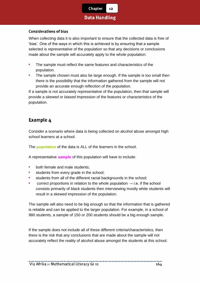
When collecting data it is also important to ensure that the collected data is free of
„bias‟. One of the ways in which this is achieved is by ensuring that a sample
selected is representative of the population so that any decisions or conclusions
made about the sample will accurately apply to the whole population:
The sample must reflect the same features and characteristics of the
population.
The sample chosen must also be large enough. If the sample is too small then
there is the possibility that the information gathered from the sample will not
provide an accurate enough reflection of the population.
If a sample is not accurately representative of the population, then that sample will
provide a skewed or biased impression of the features or characteristics of the
population.
Consider a scenario where data is being collected on alcohol abuse amongst high
school learners at a school.
The population of the data is ALL of the learners in the school.
A representative sample of this population will have to include:
both female and male students;
students from every grade in the school;
students from all of the different racial backgrounds in the school;
correct proportions in relation to the whole population → i.e. if the school
consists primarily of black students then interviewing mostly white students will
result in a skewed impression of the population.
The sample will also need to be big enough so that the information that is gathered
is reliable and can be applied to the larger population. For example, in a school of
980 students, a sample of 150 or 200 students should be a big enough sample.
If the sample does not include all of these different criteria/characteristics, then
there is the risk that any conclusions that are made about the sample will not
accurately reflect the reality of alcohol abuse amongst the students at this school.

Having considered issues regarding who the data will be collected from and how to
ensure that the collected data is free of bias, it then becomes possible to design an
appropriate data collection tool. The two most common tools are:
Questionnaire → a document containing a list of questions submitted to a
group of people (to fill in by themselves or to be filled in by an interviewer) to
gather information about the group or the opinions of the group on a particular
topic or issue.
Recording sheet → a document that is used to record how often aparticular
event occurs, how long different events take, or the particularfeatures of
different events. A recording sheet is almost always filled outonly by the person
conducting the research.
The following document is provided on page 251 in the Learner‟s Book and
illustrates a type of questionnaire that could be used to collect information on
patients who visit a clinic.
Note that:
this questionnaire can be completed either by a nurse or by the patient
themselves.
there are multiple categories of information on the questionnaire, including age,
gender, height and weight, and so on. This will enable the person collecting the
data to do comparisons across different categories, most especially between
the female and male patients.

The chart below shows an example of a recording sheet used by an employee at a
Post Office to keep track of the number of visitors to the post office at different
times of the day.
Note that:
the post office employee will complete this recording sheet himself and the
visitors to the post office may not even be aware that such a sheet is being
kept.
the information on the sheet can then be used to inform decisions regarding
how many employees must be on duty at a particular time of the day, when the
most appropriate time would be for the employees to take breaks for lunch and
tea, and other decisions which affect the functioning of the post office.

From the data that we have collected we concluded that
Toyota is the most popular car in our town.

300
18
56
33
200
100 50
100 50
50
50
26 13%
174 87%
Based on the information collected in my survey, I have concluded that the
statistic given in the newspaper is unrealistically high and that only about 13% of
high school learners smoke cigarettes regularly.
Is Xolani’s conclusion valid, or did he collect a biased sample? Explain..

1.1 Population = All of the learners in Philemon’s school.
2
1

The content of this section on Collecting data, as part of the Data Handling
Application Topic, is drawn from page 83 in the CAPS document.
As stipulated in the CAPS document, Grade 11 learners need to be able to:
sort data according to two conditions.
group two sets of collected data or two categories of data using appropriate
intervals.
organise two sets of data or two categories of data in frequency tables; and
include percentage values in the frequency tables in order to make
comparisons of the data/categories possible.
Data can be organised in two different ways:
sorting the data in a particular order;
organising the data into frequency tables often containing class intervals.
Sorting data involves putting the data in a particular order. When dealing with
numbers, this could involve putting the data in order from smallest to biggest (or
biggest to smallest); when dealing with categorical data (e.g. different types of fruit)
this could involve arranging the data in alphabetical order.
We sort data because by putting it in a particular order. It then makes it easier to
make sense of the data.
The primary focus in Grade 11 is on sorting data according to two criteria.
For example, one way in which the height-weight data shown in the Learner‟s Book
(page 252) could be sorted according to two criteria `is to separate the height
values for the females and the males and then to sort the height values for each
gender group separately. As such, the height values are being sorted according to
two criteria → gender and height.

The table below shows how the data for the females and males have been
separated and then sorted separately for each group according to height.

A frequency value is a value that indicates how often a particular piece of data
appears in a data set.
We make use of frequency tables to summarise how often different values
appear in a data set. This allows us to compare the frequency of different
components of the data.
In order to make it easier to organise sets of data that contain large numbers of
very different values, class intervals are often used as a way to „group‟ the data
into more manageable categories.
The table below shows a frequency table (similar to the one on page 254 in the
Learner‟s Book) showing the number (frequency) of females and males with
heights that fall in different height categories.
When constructing frequency tables to summarise and organise data that shows a
comparison of two different categories, it is often necessary to include columns in
the table that contain percentage values to represent the frequency values.
This is particularly important when the two categories of data contain a different
number of data values, which makes it difficult to compare the frequency values.
Converting the frequency values to percentage values is effectively converting
every value to the same unit of measurement (since every value is now out of a
total of 100 and no longer out of different totals), which then makes comparison of
the values more accurate and reliable.
These class interval categories have been used to make the height data easier to organise.
These values are the „frequency‟ values that represent the number of females and males with heights that fall in each of the height interval categories.
Notice how separate columns have been included for the females and males. This is because the height data was sorted separately for the males and females and we want to be able to compare the heights of the females and males.
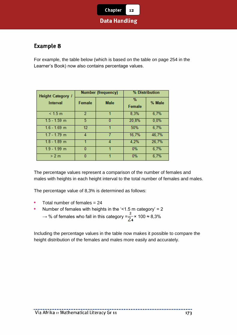
For example, the table below (which is based on the table on page 254 in the
Learner‟s Book) now also contains percentage values.
The percentage values represent a comparison of the number of females and
males with heights in each height interval to the total number of females and males.
The percentage value of 8,3% is determined as follows:
Total number of females = 24
Number of females with heights in the „<1.5 m category‟ = 2
→ % of females who fall in this category = × 100 ≈ 8,3%
Including the percentage values in the table now makes it possible to compare the
height distribution of the females and males more easily and accurately.

The table below contains data showing heights and weights of females and males.


…


The content of this section is drawn from page 86 in the CAPS document.
As stipulated in the CAPS document, Grade 11 learners need to be able to draw
and interpret a variety of graphs suitable for showing a comparison of two different
categories of data or of two different sets of data. These graphs include:
Compound bar graphs, including:
Double bar graphs
Vertical stack graphs
Pie-of-pie and bar-of-pie graphs
Two line graphs on the same set of axes
Scatter plot graphs
The scope of the contexts from which the data is drawn must relate to issues
involving the wider community.
All of the graphs that are discussed in the Learner‟s Book are specifically directed
towards representing either two categories of data or two sets of data and
facilitating a comparison between the categories or sets.
Contain two bars for each
interval, with each bar
representing a separate
category of the data.
The height of each bar
represents the frequency of
a category, as summarised
in the frequency table.
These graphs are useful for
showing a comparison
between the frequency values for different categories over different intervals.

Contains two bars for
each interval that are
stacked on top of each
other (i.e. stacked
vertically).
The two parts of each
bar represent a different
category within the data
(e.g. males and females).
Importantly, the height of the bars does not represent the frequency of each
interval → rather, height of each of the two sections of the bar must be equal to
the frequency values that were recorded in the frequency table.
These graphs are useful when it is necessary to show the total frequency of
two categories combined as well as an illustration of the different components
that make up this total frequency.
For example, the vertical stack graph above shows the total number of patients
with heights <1.5 m as well as the number of females and males that make up
the total for this interval.
The graph below shows an example of a bar-of-pie chart.
A bar-of-pie chart is made up of a pie chart that shows a comparison between
two different categories of data and then stacked bars that show the different
components of each of the categories.
A pie-of-pie chart would simply have pie-charts showing the components of the
main categories shown in a bigger pie chart.
Importantly, the bars represent a portion or percentage of a specific category within
the data and do not represent a portion or percentage of the whole of the data.

These graphs are useful when it is necessary to show a comparison between
different components of data and when each component is made up of more
categories.
For example, the bar-of-pie chart shown on the previous page shows – firstly – a
comparison of the number of the female patients to male patients, and – secondly –
a comparison of the number of females and males in each of the height intervals
that make up the bigger female and male groups.
Line graphs are most effective
for showing how changes
occur in a data set over time
and therefore for identifying
trends in the data.
Placing two line graphs on a
single set of axes thus makes
it possible to compare how
changes in different data sets
will change over time and will
change differently to each other.
For example, the line graphs above show a comparison of the trends in the
numbers of females and males visiting the clinic at different times of day. From the
graph we can see how the number of visitors for each gender group changes
during the course of the day, together with maximum and minimum visitors for each
group.

These types of graphs are useful
for comparing the type of
relationship that exists between
two different variables or
quantities for which no obvious
pattern is visible.
These graphs are constructed by
plotting points on a set of axes,
with each point made up of two
different values for the two
different variables or quantities.
For example, on the graph above, the point (1.2 m, 60 kg) contains both a height
value (shown on the horizontal axis) and a weight value (shown on the vertical
axis).
By looking at how the points are scattered on the graph we can then get a sense of
whether there is a pattern in the way in which the different variables or quantities
are related, and whether this pattern shows a close relationship, or a weak
relationship, or even no relationship.
The word „correlation‟ is the word that is used to describe whether there is a
relationship or patterns between the variables:
weak correlation indicates that there is only a weak pattern;
strong correlation indicates a strong pattern/relationship.
For example, in the graph above most of the points are clustered fairly closely
together. Also, the taller the height the heavier the weight. This suggests that there
is a reasonably strong correlation between an individual‟s height and weight.
However, there are also some points that do not fit in this general patterns → these
points are called „outliers‟. The outliers signal that although a general pattern does
exist, there are also instances where the pattern is not valid.


55+ 7% 7%

the coordinates of the outliers;
whether there is a positive, negative or no association between the variables
whether the association between the variables is weak or strong.


Teachers
Pupils

11
%4,70%3,73%9,68%7,61%9,57%9,48%3,49%4,47%4,54%4,53%58
11
%6,643


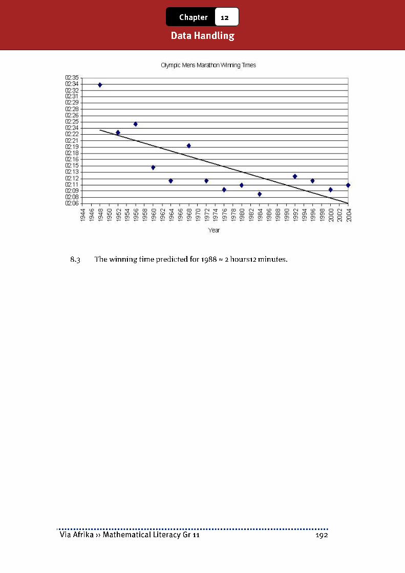

The content of this section on Displaying Data, as part of the Data Handling
Application Topic, is drawn from page 84 in the CAPS document.
As stipulated in the CAPS document, Grade 11 learners need to be able to:
calculate measures of central tendency (mean, median and mode) for two sets
of data and compare the measures to explain differences between the data
sets.
calculate measures of spread (range) for two sets of data and compare the
measures to explain differences between the data sets.
decide which measure of central tendency is the most appropriate under a
given set of circumstances.
understand the impact of outliers on the accuracy of a measure of central
tendency and/or spread.
Primary focus in Grade 10 was on learning how to calculate the measures of
central tendency and spread. Primary focus in Grade 11 is now on using measures
of central tendency and spread to compare different data sets or different
components within a data set and to make deductions about the data.
Reminder: mean, median and mode provide an indication of the „centre‟ of a
data set, or an indication of the „average‟ value in a data set – namely, a value
in the data set that can be seen to be representative and stand for the majority
of the values in the data set.
Depending on the type of data being dealt with and the nature of the data,
sometimes the mean is more appropriate than the others, but sometimes one
of the others is more appropriate than the mean.

The Range of a data set provides an indication of how spread out the values in a
data set are.
However, it only becomes possible to see if the values in a data set are widely
spread out when it becomes possible to compare the range for that data set to
another data set. The spread of the values in a data set can provide important
information about trends that exist within the data set – particularly about
whether the values in the data set are quite similar or whether they are vastly
different.
The table on the next page shows some things to consider when trying to
determine which measure – the mean, median or mode – provides the most
accurate representation of the „average‟ of a set of data:
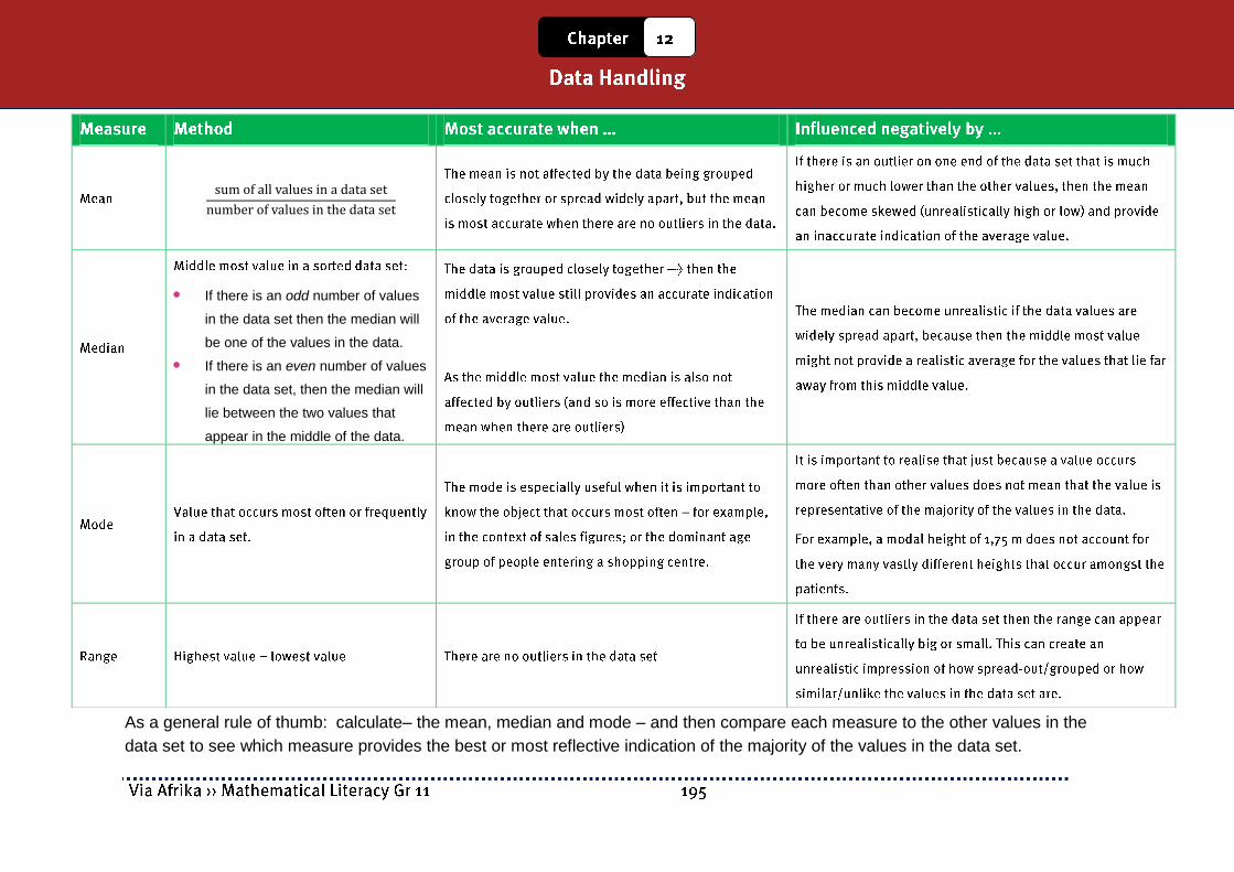
As a general rule of thumb: calculate– the mean, median and mode – and then compare each measure to the other values in the
data set to see which measure provides the best or most reflective indication of the majority of the values in the data set.
If there is an odd number of values
in the data set then the median will
be one of the values in the data.
If there is an even number of values
in the data set, then the median will
lie between the two values that
appear in the middle of the data.

Determine the mean annual school fees in South Africa. (Assume for the purposes of this exercise that all the provinces have an equal number of schools.)

In preparation for a party, Mrs.Ntuli asks her family and friends what their favourite food is.
This will give Mrs.Ntuli an idea of what she should cook. The table below contains the
responses of Mrs.Ntuli‟s family and friends.


9
7003701201509519583090220
9
2770
30
364038...15224837182544
30
937
30
433027...37294145381517
30
980
%10050
23,31
%10050
67,32
10
240200260250250260520200275250
10
7052

9
92202812

→ The median number of teachers is 956 836.

In this part of the study guide you will be provided with an analysis of the Paper 1
and Paper 2 practice examination papers provided on pages 290-297 in the
Learner‟s Book. The intention of this exam analysis is to provide you with insight
into
how the examination papers for this subject are structured,
how the different levels of the Mathematical Literacy taxonomy are used to
inform the structure of the examinations, and
how to determine the intention of each question and the content and method
needed to complete each question.
Before the exam analysis is provided, the discussion below will first highlight the structure of the examination papers in Mathematical Literacy.
There are two examination papers in Grade 11 in Mathematical Literacy. These two
examinations are differentiated according to difficulty (i.e. cognitive demand):
Paper 1 is a „basic skills‟ paper and the intention of this paper is to assess
whether learners understand basic concepts and skills. The contexts used in
this paper must be drawn from the contexts described in the CAPS curriculum
document.
The Paper 1 examination paper in the Learner‟s Book appears on pages 290-
293.
Paper 2 is an „applications‟ paper and the intention of this paper is to assess
whether learners can use their knowledge and skills in order to make sense of
a variety of real-world contexts. The contexts used in this paper can be drawn
from any scenario, including those listed in the CAPS curriculum document.
The Paper 2 examination paper in the Learner‟s Book appears on pages 294-
297.
In Mathematical Literacy there is a four-level taxonomy that determines the level of
cognitive demand of a question in an examination. The table on the next page
shows the percentage of marks in the Paper 1 and Paper 2 examination papers
that must be allocated to each of levels of the taxonomy.

Notice that Paper 1 contains questions positioned primarily at the two lowest levels
(Level 1 and Level 2) of the taxonomy. This is why the paper is classified as a basic
skills paper. Paper 2 contains questions positioned primarily at the two highest
levels of the taxonomy (Levels 3 and 4), which is why the paper is classified as an
applications paper. However, Paper 2 also contains a smaller percentage of
questions positioned at Level 2 of the taxonomy, designed to provide scaffolding
and facilitate access to the more complex Level 3 and 4 questions.
The diagrams below illustrate the structure of the Paper 1 and 2 examinations.
In Paper 1 there must be a question allocated to each of the first four Application
Topics outlined in the curriculum. The final question must then draw on content and
contexts integrated from a range of different Application Topics. The topic of
Probability must be assessed in the context of one or more of the other questions.
And the Basic Skills Topics will be assessed in the context of the other questions
and no individual questions are allocated to the assessment of the contents of the
Basic Skills Topics.

In Paper 2 each question must draw on integrated content, contexts and skills
drawn from across the various Application Topics. As in Paper 1, the Basic Skills
Topics will be assessed in the context of the other questions and no individual
questions are allocated to the assessment of the contents of the Basic Skills
Topics.
The table below shows the mark and time stipulations for Mathematical Literacy
examinations in Grades 10, 11 and 12.
The examination papers in the Learner‟s Book reflect the structure of end-of-year
examination papers for Grade 11. The examination papers are both out of
100 marks with a time allocation of 2 hours per paper. The examination papers also
assess the content covered for the whole curriculum (and/or for the contents of the
whole Learner‟s Book).
An exam analysis is provided in the pages that follow. This exam analysis will
provide guidance on:
the topic and section to which each question relates in the curriculum;
the content, skills or contexts required to answer each question;
the taxonomy level (level of difficulty or cognitive demand) of each question;
the mark allocation of each question.
To begin with, it is useful to consider the following table which shows the
percentage of marks allocated to each of the levels of the taxonomy in both
examination papers.

Analysis of the values in this table reveals the following:
In Paper 1:
The allocation of Level 1 questions is below the required percentage.
The allocation of Level 2 questions is quite high above the required
percentage.
This suggests that the examination paper is possibly more difficult than it
should be.
In Paper 2:
There is an allocation of marks to Level 1 questions, which should not be in
the paper.
The allocation of Level 3 questions is significantly below the required
percentage.
This suggests that the examination paper is possibly easier than it should
be.
Both papers combined:
Although the information in the analysis grid above suggests that Paper 1
is slightly more difficult and Paper 2 slightly easier than they ideally should
be, the combination of the two papers gives an allocation of marks at the
different levels of the taxonomy that falls within the required stipulations.
This suggests that when the marks for both papers are combined the result
should be a reasonably accurate reflection of the ability / performance of
the learners.

100 Marks 2 Hours
Read these instructions carefully.
Answer all the questions.
It is advisable to show all working and to work neatly.
You may use a calculator.
Drawings are NOT to scale (unless otherwise stated).
This is Solomon‟s salary slip. There seems to be something wrong with the payslip
programme which has affected the
deductions.
Answer the following questions in order
to calculate the missing information:
1.1 Explain the difference between Gross Salary (Earnings) and Net Salary. [2]
1.2 1.2.1 Show that Solomon‟s total annual gross salary is R91 440,00. [2]
Clothing Connection Payslip
Employee: S. Mbanje Pay Period: Oct. 2011 ID No: 7215128002080 Pay cycle: Monthly Bank Details: Go Bank a/c no: 456 8796 566 Tax number: 22356894
arnings Amount Deductions Amount Basic Salary
R 7 620,00 Income Tax UIF
Xmas Fund
X&%^&& **()$%% R 80.00
Gross Earnings
R 7 620,00
Total Deductions
**&*&^^
NET SALARY TRANSFERRED *&&%%^^

1.2.2 Income tax on Solomon‟s salary is worked out according to the
following equation:
Calculate Solomon‟s total annual income tax using the above formula.
[3]
1.2.3 Calculate the amount that will appear on his payslip as his monthly
income tax deduction. [2]
1.3 1.3.1 The employee UIF contribution is calculated at 1% of gross monthly
salary for Solomon. Calculate the amount that will be deducted from his salary
per month for UIF.
[2]
1.3.2 Using your previous answers, calculate the Net Salary that will be
transferred into Solomon‟s account.
[3]
1.4 When an employee claims UIF, they are paid a daily benefit based on their
salary and an IRR (Income Replacement Rate) factor. The IRR factor can be
read off the following graph:
1.4.1 Read off the approximate IRR value for a person who earnsR6 000,00
per month. [2]
1.4.2 There is a
minimum IRR value that
applies to all people with
high monthly salaries.
Use the graph to
determine the
approximate value of this
IRR rate. [2]
1.4.3 Solomon‟s IRR value is 38,388%. If he were to be unemployed, he
would beable to claim a monthly amount calculated as follows:
Calculate the monthly income that Solomon would receive from the
UIF.
[3]

1.4.4 According to the UIF rules, you may claim one day‟s income for every
six days that you have worked. For how many days could Solomon claim if
he has worked for his company for a total of 852 days?
[2]
[23]
1 inch = 2,54 cm 1 fl. Oz = 29,57353 mℓ
2 m
50 m
25 m

ℓ
ℓ
Bo
ok
shel
f
Pot Plant
Kim
berley
Mo
dd
errivier
T-Ju
nctio
n
T-Ju
nctio
n
Ho
peto
wn
Strayd
enb
urg
Britstw
on
Victo
ria West
Th
ree Sisters
Beau
fort W
est
36 km 22 km 64 km 20 km 53 km 76 km 105 km 61 km 82 km


Harrison Gumede (Hairy Harry to his friends) is planning to set up a male haircutting booth near a local taxi rank. He needs to analyse whether it is a viable business or not. Sources: arjay.typepad.com; http://www.gandhiappliances.com

The following table shows the percentage of marks allocated to each of the levels of
the taxonomy in this Paper 1 examination paper.
Testing understanding of the term “annual”.

Testing understanding of
UIF and how to calculate a
UIF value.
Understanding of
percentage calculations
also required.
This question is testing ability to read information from a financial graph.

Topic → Finance; Section
→ Taxation
Topic → Numbers; Section
→ Number operations
Topic → Numbers; Section → Number formats
Testing understanding
of different number
formats and how to
translate from words
to numbers.
Topic → Measurement;
Section → Calculating
volume
Topic → Numbers; Section
→ Number operations

ℓ
Topic → Numbers; Section
→ Number operations
Topic → Measurement;
Section → Conversions
calculate a percentage of a
value;
convert between different
systems of measurement
using a given conversion
factor.
ℓ Topic → Measurement;
Section → Conversions

Topic → Maps, plans and
other representations;
Section → Maps
Topic → Numbers; Section
→Rates (i.e. speed)
Topic → Measurement;

Section → Conversions

Interpreting
and reading
information
from a vertical
stack bar
graph.
Using this
information
and the
percentage
calculation
involving
expressing a
comparison of
values as a
percentage to
make
deductions
about a data
set.
Interpreting
and reading
information
from a vertical
stack bar
graph.
Adding
together the
different
components
for one

category of the
data.
Using this
information
and the
percentage
calculation
involving
expressing a
comparison of
values as a
percentage.
Interpreting
and reading
information
from a vertical
stack bar
graph.
Using the
notion of
proportion to
determine an
answer that is
dependent on
a larger value
that is not
shown on the
graph.

Topic → Numbers; Section → Number formats Topic → Finance; Section → Tariff systems (electricity)

Testing understanding of
what profit is and how to
calculate profit.
Plus testing understanding
of how to determine
percentage profit using a
number calculation
involving expressing a
comparison of two values
as a percentage.

100 Marks 2 Hours
Read these instructions carefully.
Answer all the questions.
It is advisable to show all working and to work neatly.
You may use a calculator.
Drawings are NOT to scale (unless otherwise stated).
Monwa wants to start a taxi business. He can buy a
second-hand taxi for R 180 000 from a friend and operate
the taxi himself. First he needs to check whether it will be a
viable business.
1.1
1.1.1 He will need to know the total distance for his route. Explain how he would [2]
= Taxi rank 500 m
= Proposed route

use the map above to work out the total distance of his route.
1.1.2 The speed limit in town is 60 km/h, but he will probably only be able to
travel at an average speed of 30 km/h even though there is nothing wrong
with his vehicle. What could cause him to travel so much slower than the
speed limit? Give TWO reasons. [2]
1.1.3 He calculates that his route is approximately 4,5 km long. Calculate how
long one trip from one taxi rank to the other will take at an average speed
of 30 km/h. Answer to the nearest minute. [3]
1.2 Monwa calculates that he will have to drive approximately 150 km per day in his
taxi. He plans to operate his taxi 5 days per week for the whole year. Calculate
the total distance that he will drive in his taxi in a year.
[3]

Mr. Moloi is making a new mailbox. It is made out of wood with a sloped lid which is attached
with hinges.
30 cm
20 cm
22 cm
40 cm
Closed
30 cm
20 cm
22 cm
a
b
c

ℓ
ℓ
4 cm
10 cm
80 mm
30 cm A B C D E F

When a cricket team tours South Africa, the captain who wins a toss of the coin before the
match has to choose whether to bat first or bowl first. Here is a summary of the number of
times a team has won when batting first or second at the major cricket grounds in South
Africa:
Source: www.espncricinfo.com (ODI match statistics sourced 19 December 2011)
The graph alongside shows the inflation rates for
consumer prices from 1980 to 2010. Use it to
answer the questions which follow:

Source: www.fnb.co.za/downloads/home - July indices (sourced: 19 December
2011)

Source: www.harcourts.co.za (sourced 19 December 2011)
₤

The following table shows the percentage of marks allocated to each of the levels of
the taxonomy in this Paper 2 examination paper.
Topic → Maps, plans …;
Section → Map work
Topic → Numbers; Section
→ Rates (speed)
Topic → Measurement;
Section → Time

Topic → Maps, plans …;
Section → Map work
Topic → Measurement;
Section → Time
Topic → Numbers; Section
→ Operations
Topic → Finance; Section
→ Income and
Expenditure
Topic → Patterns, …;
Section → Equations

Topic → Finance; Section
→ Income and
Expenditure
Topic → Patterns, …;
Section → Equations
Topic → Finance; Section
→ Income and expenditure
Topic → Patterns, …;
Section → Drawing
Graphs
This question tests ability
to construct two linear
functions on a set of axes
and to locate the point of
intersection of the two
functions.
Importantly, notice that
one of the functions starts
at the origin (i.e. 0 on the
vertical axis) while the
other starts at a higher
value on the vertical axes.

Topic → Finance; Section
→ Income and expenditure
Topic → Patterns, …;
Section → Interpreting
graphs
Topic → Finance; Section
→ Income and expenditure
Topic → Interpreting and
communicating answers
and calculations

Topic → Maps, plan and
other representations;
Sections → Plans and
Models
Maps, plan and other
representations; Sections
→ Plans and Models
Topic → Measurement;
Section → Calculating
perimeter, area and
volume

Maps, plan and other
representations; Sections
→ Plans and Models
Topic → Measurement;
Section → Measuring
lengths and distances
Topic → Patterns, …;
Section → Equations

Maps, plan and other
representations; Sections
→ Plans and Models
Topic → Measurement;
Section → Calculating
perimeter, area and
volume
This question tests
understanding of the
process involved in
converting from cm2 to m2
and, particularly, tests
whether learners
understand that just
because 1 m = 100 cm this
does not mean that 1 m2 ≠
100 cm2.
Maps, plan and other
representations; Sections
→ Plans and Models
Topic → Measurement;
Section → Calculating
perimeter, area and
volume

ℓ
ℓ
ℓ

Both Questions 3.2 and 3.3 test ability to:

Topic → Finance; Section
→ Inflation
Topic → Patterns, …;
Section → Interpreting
graphs
Topic → Finance; Section
→ Inflation
Topic → Patterns, …;
Section → Interpreting
graphs
Topic → Interpreting
answers and calculations

Topic → Finance; Section
→ Inflation
Topic → Patterns, …;
Section → Interpreting
graphs
Topic → Interpreting
answers and calculations
This question tests ability to:
1. make sense of information
regarding a salary
increase;
2. compare this salary increase
percentage to the inflation rate
for the same period;
3. interpret the difference
between salary increase
rate and inflation rate in
order to provide an opinion
or make a decision.
Notice that the type of calculation used here is simply ‘increasing a value by a percentage’.
Topic → Finance; Section
→ Inflation
Topic → Interpreting
answers and calculations


Topic → Data Handling;
Section → Summarising
Topic → Data; Section →
Summarising data
Topic → Data; Section →
Analysing data
Topic → Data; Section →
Summarising data
Topic → Data; Section →
Analysing data
Topic → Data; Section →
Summarising data
Topic → Data; Section →
Analysing data

₤