USER INTERFACES AND DIFFERENCE VISUALIZATIONS FOR ...
197
USER INTERFACES AND DIFFERENCE VISUALIZATIONS FOR ALTERNATIVES LOUTFOUZ ZAMAN A DISSERTATION SUBMITTED TO THE FACULTY OF GRADUATE STUDIES IN PARTIAL FULFILLMENT OF THE REQUIREMENTS FOR THE DEGREE OF DOCTOR OF PHILOSOPHY GRADUATE PROGRAMME IN COMPUTER SCIENCE & ENGINEERING YORK UNIVERSITY TORONTO, ONTARIO JUNE 2015 © LOUTFOUZ ZAMAN, 2015
-
Upload
khangminh22 -
Category
Documents
-
view
5 -
download
0
Transcript of USER INTERFACES AND DIFFERENCE VISUALIZATIONS FOR ...

USER INTERFACES AND DIFFERENCE VISUALIZATIONS
FOR ALTERNATIVES
LOUTFOUZ ZAMAN
A DISSERTATION SUBMITTED TO THE FACULTY OF GRADUATE STUDIES
IN PARTIAL FULFILLMENT OF THE REQUIREMENTS FOR THE DEGREE OF
DOCTOR OF PHILOSOPHY
GRADUATE PROGRAMME IN COMPUTER SCIENCE & ENGINEERING YORK UNIVERSITY
TORONTO, ONTARIO
JUNE 2015
© LOUTFOUZ ZAMAN, 2015
ii
ABSTRACT
Designers often create multiple iterations to evaluate alternatives. Today’s computer-
based tools do not support such easy exploration of a design space, despite the fact that
such support has been advocated. The contributions of this dissertation are centered on
this.
I begin by investigating the effectiveness of various forms of difference visualizations
and support for merging changes within a system targeted at diagrams with node and
edge attributes. I evaluated the benefits of the introduced difference visualization
techniques in two user studies. I found that the basic side-by-side juxtaposition
visualization was not effective and also not well received. For comparing diagrams with
matching node positions, participants preferred the side-by-side option with a difference
layer. For diagrams with non-matching positions animation was beneficial, but the
combination with a difference layer was preferred. Thus, the difference layer technique
was useful and a good complement to animation.
I continue by investigating if explicit support for design alternatives better supports
exploration and creativity in a generative design system. Generative design—a design
method in which the output is generated by a set of rules or an algorithm—builds on
computer-aided design systems that provide tools to vary designs beyond direct
manipulation of specific design elements. To investigate the new techniques to better
support exploration, I built a new system that supports parallel exploration of alternative
designs and generation of new structural combinations. I investigate the usefulness of my
prototype in two user studies and interviews. The results and feedback suggest and
confirm that supporting design alternatives explicitly enables designers to work more
creatively.
Generative models are often represented as DAGs (directed acyclic graphs) in a
dataflow programming environment. Existing approaches to compare such DAGs do not
generalize to multiple alternatives. Informed by and building on the first part of my

iii
dissertation, I introduce a novel user interface that enables visual differencing and editing
alternative graphs—specifically more than two alternatives simultaneously, something
that has not been presented before. I also explore multi-monitor support to demonstrate
that the difference visualization technique scales well to up to 18 alternatives. The novel
jamming space feature makes organizing alternatives on a 2×3 monitor system easier. To
investigate the usability of the new difference visualization method I conducted an
exploratory interview with three expert designers. The received comments confirmed that
it meets their design goals.

iv
ACKNOWLEDGEMENTS
I would like to express my sincerest gratitude to my supervisor, Wolfgang Stuerzlinger,
for his knowledge, guidance and outstanding commitment to support and steer me away
from trouble until the end of my journey as a PhD student. His generous funding though
GRAND NCE and NSERC grants made this research possible. I’m also very thankful for
him giving me an opportunity to supervise three international undergraduate student
interns. I also appreciate him to successfully nominate me for a student volunteer at CHI
2015 and to serve on the program committee of DChanges 2015. I’m also very thankful
to him for a granting me the exclusive access to the beautiful latest Mac Pro workstation
with a 2×3 multi-monitor setup throughout the final year of my studies. Also, I would
like to thank him for all other favours, which I likely forgot to mention, as there have
been far too many throughout the years and it’s hard to keep track of them all.
I would like to thank Vassilios Tzerpos and Burton Ma for taking time from their
busy schedule to serve on my supervisory committee, read my reports and my
dissertation, and to provide valuable feedback. I would like to thank Jia Xu, Burton Ma,
David Gelb and Ramesh Krishnamurti for taking time from their busy schedule to read
my dissertation, provide feedback, and serve on my examination committee on very short
notice.
I would like to thank Ashish Kalra and Christian Neugebauer for their outstanding
dedication to their work as interns. I would like to thank Robert Woodbury and Michael
Terry for their knowledge, guidance and valuable feedback on GEM-NI. I would also like
to thank Robert Woodbury for his invaluable help with organizing the workshops and for
ranking the quality of the participants’ designs. I would like to thank Brady Peters for
organizing the workshop at the University of Toronto with his students and for ranking
the quality of their designs. I would like to thank David Gelb for ranking these designs as
well. Thanks to Naghmi Shireen and Maher Elkhaldi for travelling all the way from

v
Vancouver to give me feedback on GEM-NI. Also I would like to thank them for their
contributions towards GEM-NI and help with running the workshop at Simon Fraser
University. Thanks to Maher Elkhaldi for his invaluable assistance with conducting
lengthy in-depth interviews after the workshop. Thanks to Jeffrey Guenther, Siniša
Kolarić and Halil Erhan for their insightful feedback.
Thanks to Scott MacKenzie for encouraging me to publish the research that I did as a
project for his class. Thanks to his expertise I learned a lot about writing an HCI paper
through multiple iterations of editing our paper. Thanks also to him for funding my visit
to the conference to present this paper. Thanks to Dmitri Shuralyov for his help with
setting up the input devices for a 3D UI evaluation experiment. Thanks to Ouma Jaipaul
Gill for her guidance with administrative procedures, and Susan Cameron for ensuring I
received reimbursement for conference, travel and user study expenses as soon as
possible. Thanks to Foad Hamidi, Steven Castellucci, Robert Teather for their
constructive feedback on my research throughout the years. Thanks to Jaroslaw Szlichta
for opening up the world of adventure board sports to me on land and on water, which
diluted my unhealthy sedentary PhD life with these very demanding, exciting, mood
lifting, therapeutic and rewarding activities.
Finally, and most importantly, I would like to acknowledge the support of my family.
Thanks to my wife Salma, for continuous encouragement and support no matter what.
Thanks to my parents Marina and Asad for their support.
This dissertation would not have been possible without the contributions from all of
these people mentioned above.

vi
DISSEMINATION OF THIS DISSERTATION
The following chapters of this dissertation have been previously published as peer-reviewed papers:
Chapter 3: Zaman, L., Kalra, A., and Stuerzlinger, W. 2011. The effect of animation, dual view, difference layers, and relative re-layout in hierarchical diagram differencing. In Proceedings of Graphics Interface 2011 (GI '11). Canadian Human-Computer Communications Society, School of Computer Science, University of Waterloo, Waterloo, Ontario, Canada, 183-190.
Chapter 4: Zaman, L., Stuerzlinger W., Woodbury R., Neugebauer C., Elkhaldi M.,
Shireen N., Terry M., 2015. GEM-NI: A system for creating and managing alternatives in generative design, In Proceedings of the 33rd Annual ACM Conference on Human Factors in Computing Systems – CHI ’15, pages 1201–1210, ACM, New York, NY, USA.
The following chapter is currently in preparation: Chapter 5: Zaman, L., Stuerzlinger W., Neugebauer C., (in preparation), MACE: A
New Interface for Comparing and Editing of Multiple Alternatives. Additionally, the following extended abstract is based on this work: Zaman, L., Kalra, A., and Stuerzlinger, W. 2011. DARLS: differencing and merging diagrams using dual view, animation, re-layout, layers and a storyboard. CHI '11 Extended Abstracts on Human Factors in Computing Systems (CHI EA '11). ACM, New York, NY, USA, 1657-1662. Two more journal articles that are currently in preparation: Zaman, L., Stuerzlinger W., Woodbury R., Neugebauer C., Elkhaldi M., Shireen N., Terry M., Peters B., (in preparation), Evaluation of GEM-NI: A system for creating and managing alternatives in generative design. Woodbury R., Elkhaldi M., Erhan H., Guenther J., Kolaric S., Sanchez R., Shaw C., Shireen N., Stuerzlinger W., Zaman L., (in preparation), Interacting with Alternatives: Survey and Synthesis.

vii
TABLE OF CONTENTSAbstract ............................................................................................................................... ii
Acknowledgements ............................................................................................................ iv
Dissemination of This Dissertation .................................................................................... vi
Table of Contents .............................................................................................................. vii
List of Tables .................................................................................................................... xii
List of Figures .................................................................................................................. xiii
Chapter 1 Introduction ..................................................................................................... 1
1.1 Objectives ............................................................................................................... 9
1.2 Contributions ........................................................................................................ 12
1.3 Outline .................................................................................................................. 14
Chapter 2 Related Work ................................................................................................ 16
2.1 Difference and History Visualization for Graphs ................................................. 16
2.1.1 Mental Map ..................................................................................................... 16
2.1.2 Difference Map ............................................................................................... 17
2.1.3 Static Techniques for Comparison .................................................................. 18
2.1.4 Animation & Small Multiples ......................................................................... 21
2.1.5 Techniques to Access Versions ...................................................................... 24
2.1.6 Generic and UML Diagram Differencing and Merging ................................. 25
2.2 Graphical Operation History ................................................................................ 26
2.3 Design Space Exploration .................................................................................... 27
2.4 Interacting with Alternatives ................................................................................ 29
2.5 Multi-Monitor User Interfaces .............................................................................. 31
Chapter 3 The Effect of Animation, Dual View, Difference Layers, and Relative
Re-Layout in Hierarchical Diagram Differencing ............................................................ 34

viii
3.1 Motivation ............................................................................................................ 34
3.2 The DARLS System .............................................................................................. 35
3.2.1 Accessing Versions and Navigating the Views .............................................. 35
3.2.2 The Difference Layer ...................................................................................... 36
3.2.3 Version Merging using Selection .................................................................... 37
3.2.4 Animation and Other Techniques ................................................................... 37
3.2.5 Relative Graph Re-Layout .............................................................................. 38
3.2.6 Differencing UML Class Diagrams ................................................................ 40
3.3 User Studies .......................................................................................................... 40
3.3.1 The Diagrams .................................................................................................. 41
3.3.2 Statistical Models ............................................................................................ 42
3.3.3 Participants ...................................................................................................... 43
3.3.4 Apparatus ........................................................................................................ 43
3.3.5 Pilot Study ....................................................................................................... 43
3.3.6 User Study I .................................................................................................... 44
3.3.6.1 Experimental Design ................................................................................ 44
3.3.6.2 Procedure ................................................................................................. 44
3.3.6.3 Results ...................................................................................................... 46
3.3.6.4 Feedback from Participants ...................................................................... 48
3.3.6.5 Discussion ................................................................................................ 48
3.3.7 User Study II ................................................................................................... 49
3.3.7.1 Experimental Design ................................................................................ 50
3.3.7.2 Procedure ................................................................................................. 50
3.3.7.3 Results ...................................................................................................... 51
3.3.7.4 Feedback from Participants ...................................................................... 52
3.3.7.5 Discussion ................................................................................................ 53
3.3.8 Overall Discussion .......................................................................................... 53

ix
3.4 Summary ............................................................................................................... 54
Chapter 4 GEM-NI: A System For Creating and Managing Alternatives In Generative
Design 56
4.1 GEM-NI ................................................................................................................ 57
4.1.1 Parallel Editing ................................................................................................ 59
4.1.2 Local and Global Undo ................................................................................... 60
4.1.3 Selective Merging ........................................................................................... 61
4.1.4 Creating Alternatives ...................................................................................... 64
4.1.4.1 Branches ................................................................................................... 65
4.1.4.2 Resurrection from History ....................................................................... 66
4.1.4.3 Design Gallery ......................................................................................... 66
4.2 Evaluating GEM-NI ............................................................................................. 73
4.3 User Study I .......................................................................................................... 74
4.3.1 Participants ...................................................................................................... 74
4.3.2 Apparatus and Procedure ................................................................................ 75
4.3.3 The Workshop ................................................................................................. 75
4.3.3.1 Results ...................................................................................................... 76
4.3.3.2 Results of the CSI Questionnaire and Discussion .................................... 77
4.3.4 In-Depth Interviews ........................................................................................ 78
4.4 Discussion ............................................................................................................. 80
4.5 User Study II ......................................................................................................... 81
4.5.1 Participants ...................................................................................................... 82
4.5.2 Apparatus ........................................................................................................ 83
4.5.3 Procedure ........................................................................................................ 83
4.5.3.1 L-system ................................................................................................... 84
4.5.4 Results ............................................................................................................. 85
4.5.5 Discussion ....................................................................................................... 90

x
4.5.5.1 Results of the CSI Questionnaire ............................................................. 93
4.5.5.2 Freeform Feedback .................................................................................. 95
4.5.5.3 Design Quality ......................................................................................... 96
4.6 Overall Discussion ................................................................................................ 98
4.7 Summary ............................................................................................................. 100
Chapter 5 MACE: A New Interface for Comparing and Editing of Multiple Alternatives
102
5.1 MACE ................................................................................................................. 103
5.1.1 Design Motivation ........................................................................................ 103
5.1.2 Mechanisms to Facilitate Comparison of Alternatives ................................. 105
5.1.3 Difference Visualization ............................................................................... 106
5.1.3.1 Network View ........................................................................................ 107
5.1.3.2 Node-focused Difference Visualization ................................................. 113
5.1.3.3 Parameter View ...................................................................................... 113
5.1.3.4 Output View ........................................................................................... 113
5.1.3.5 Recursive Group Node Difference Visualization .................................. 114
5.1.4 Editing Alternatives in Diff Mode ................................................................ 119
5.1.4.1 Autosandboxing ..................................................................................... 119
5.1.4.2 Reveal-To-Edit ....................................................................................... 121
5.1.4.3 Parameter Synching ............................................................................... 121
5.2 Multi-Monitor Support ....................................................................................... 122
5.2.1 Managing Alternatives in Multi-Monitor Environment ............................... 123
5.2.2 Jamming Spaces ............................................................................................ 124
5.2.3 Limitations .................................................................................................... 124
5.3 Implementation ................................................................................................... 125
5.4 Discussion ........................................................................................................... 125
5.5 Summary ............................................................................................................. 129

xi
Chapter 6 Additional Discussion ................................................................................. 131
6.1 Parallel Exploration of Alternatives in GEM-NI ................................................ 131
6.2 GEM-NI as a Subjunctive Interface .................................................................... 134
6.3 Revision Control ................................................................................................. 134
6.4 Guidelines for Re-implementation: .................................................................... 134
Chapter 7 Conclusions ................................................................................................. 138
7.1 Generalization of the Introduced Approaches .................................................... 140
7.2 Limitations and Future Work ............................................................................. 141
7.2.1 DARLS ......................................................................................................... 141
7.2.2 GEM-NI ........................................................................................................ 142
7.2.3 MACE ........................................................................................................... 142
References ....................................................................................................................... 144
Appendix A Version Pairs of a Course Prerequisites Diagram Used in the DARLS
User Studies 154
Most Frequent False Negatives in User Study I .......................................................... 154
Optimal Layout Heuristics ........................................................................................... 155
Version Pair Summary ................................................................................................. 156
Optimal Layout Snapshots ........................................................................................... 157
Incremental Layout Snapshots ..................................................................................... 163
Appendix B Noteworthy Designs of the Workshop Participants with Difference
Visualizations 169

xii
LIST OF TABLES
Table 4-1. User Study I: Average results from first task using NodeBox (top); second task
using GEM-NI (bottom). ................................................................................................... 77
Table 4-2. Summary of number of created alternatives with NodeBox (NDB – task 1) and
GEM-NI (GMN - task 2). The larger of the two results per participant is highlighted in
red. .................................................................................................................................... 87
Table 4-3. Summary of different methods for creating alternatives participants employed
in GEM-NI in task 2. A ‘*’ designates that the participant used the feature but did not
create any alternatives with it. Data for participant 10 indicates the minimum number of
alternatives created based on the data recorded before a logging failure. ........................ 88
Table 4-4. Total number of revisited alternatives by participant. .................................... 88
Table 4-5. Summary of other features employed by participants in GEM-NI in task 2.
Available data for participant 10 indicates the minimum number of times that the feature
was used based on the data recorded before the logging failure. ...................................... 89
Table 4-6. User Study II: Average results from first task using NodeBox (top); second
task using GEM-NI (bottom). ........................................................................................... 93
Table A-1. Most frequent false negative nodes. ............................................................. 154
Table A-2. Most frequent false negative edges. ............................................................. 154
Table A-3. Summary of optimal layouter heuristics that were used during the User Study
I. ...................................................................................................................................... 155
Table A-4. Version Pair Summary. ................................................................................. 156

xiii
LIST OF FIGURES
Figure 1-1. An example of a sketch provided by http://www.idsketching.com. ................ 3
Figure 1-2. Conjectural sketches created using an existing CAD tool, http://rocker-
lange.com. ........................................................................................................................... 6
Figure 1-3. An example of a design created in Grasshopper 3D provided by
http://digitalsubstance.wordpress.com. ............................................................................... 9
Figure 3-1. DARLS showing two versions of a diagram, which visualizes course pre-
requisites for an undergraduate computer science program. The visualization shows a
difference layer and uses the relative optimal re-layout. .................................................. 34
Figure 3-2. The state of the diagrams after the reject operation in Figure 1 is invoked. .. 37
Figure 3-3. (a) Incremental layout, (b) Optimal layout. ................................................... 39
Figure 3-4. Differencing UML class diagrams. ................................................................ 40
Figure 3-5. Mean time in seconds and error rate for the techniques in User Study I. Error
bars: ±1 SE. ....................................................................................................................... 47
Figure 3-6. Mean time in seconds and error rate for the techniques in User Study II. Error
bars: ±1 SE. ....................................................................................................................... 51
Figure 3-7. Participants’ ranking of the differencing techniques in User Study I (left),
User Study II (right). Error bars: ±1 SE. ........................................................................... 52
Figure 4-1. GEM-NI enables users to work with alternative generative designs
simultaneously. Specifically, GEM-NI provides tools to manage the set of alternatives
affected by edit operations, post-hoc merging of (parts of) alternatives, and several ways
to create new alternatives, such as resurrection of past states with full undo lineage
duplication or selection from an enhanced design gallery implementation. The leftmost
alternative is the original design and is active, the center one is passive, and the rightmost
one is idle. ......................................................................................................................... 56
Figure 4-2. The original interface of NodeBox 3. ............................................................. 58

xiv
Figure 4-3. The alternative on the right is sandboxed. The first two alternatives are
therefore idle. .................................................................................................................... 60
Figure 4-4. Merging and parallel editing: (a) Initial state with highlighted nodes selected
for merging. (b) Merging replicates new nodes and connections into all other alternatives
and overwrites parameters of existing nodes. The user then globally changes NUMBER1 to
15....................................................................................................................................... 62
Figure 4-5. Merging and parallel editing: (a) Initial state with new, selected node
highlighted. (b) Merging replicates the node and connections into all other alternatives.
The user then changed the parameter to 20. ..................................................................... 63
Figure 4-6. Dialog for creating an alternative from history: the history list on the left and
the state of the alternative at that time on the right. The current entry is highlighted. The
state can be selected from the list directly or by dragging the slider. ............................... 65
Figure 4-7. Cartesian product dialog. (a) Cartesian product menu: all nodes of the
alternatives are in a nested list, second level denotes the parameters; (b)
inclusion/exclusion of parameters in Amount; (c) specifying range for Margin. ............. 68
Figure 4-8. Design gallery. (a) two previewed designs selected in the default network; (b)
two previewed designs selected in a network resulted from the product of all three
generative networks. ......................................................................................................... 69
Figure 4-9. The dialog for retrieving minimized alternatives. .......................................... 82
Figure 4-10. Parameter values of the LRULES (left) and LGEOMETRY (right) nodes for the
Sierpinski Triangle. ........................................................................................................... 85
Figure 4-11. The L-System examples that were available to participants for re-use in their
designs. The examples are (from left to right): Pythagoras Tree, Koch Curve, Sierpinski
Triangle, Dragon Curve, Fractal Plant #1, Fractal Plant #2. The Sierpinski Triangle was
also the final artefact that participants recreated during the training phase of the
workshop. .......................................................................................................................... 85

xv
Figure 4-12. Overall and protean quality ratings of participants’ designs by each of the
experts (E1-3). Higher is better. ........................................................................................ 97
Figure 4-13. Average overall and protean design quality rankings by the three experts
(higher is better). Error Bars: ±1 SE. ................................................................................ 98
Figure 5-1. GEM-NI enables users to work with alternative generative designs
simultaneously. The leftmost alternative is active, the center one is passive, and the
rightmost one is idle. ....................................................................................................... 102
Figure 5-2. a) Node-focused difference visualization of SHAPE_ON_PATH. Left
document is the reference and is also active. (b) Difference visualization for the network
panels of the same content without node focusing. ........................................................ 106
Figure 5-3. Difference visualization for changed connections. (a) no difference
visualization, (b) diff mode, (c) diff exclusion with cross-alternative connectors turned
off, middle alternative is active, (d) diff exclusion with cross-alternative connectors
turned off, right alternative is active. .............................................................................. 109
Figure 5-4. Three alternatives of Flower of Life. The design differs in the POLYGONS node
at level 1. ......................................................................................................................... 115
Figure 5-5. Difference visualization at level 3 inside POLYGONS node. .......................... 116
Figure 5-6. Difference visualization at level 2 inside POLYGON2_3 node. The right panel
is disabled, because the corresponding node does not exist in the network. .................. 117
Figure 5-7. Reveal-to-edit feature. (a) Initial state. (b) A common node, highlighted in
brown (de-saturated red) is revealed via a clicking with a modifier key in the alternative
on the right. That (compared) alternative is then active and the reference is made idle
through autosandboxing. (c) A parameter change results in a red difference visualization.
......................................................................................................................................... 120
Figure 5-8: My 2×3 multi-monitor setup displaying a total of 14 alternatives in a
difference visualization relative to the top middle (reference) alternative. .................... 122

xvi
Figure 5-9. The same example as in Figure 5-8 with the bottom left monitor jammed into
an un-editable state and the bottom right monitor jammed into the state where cross-
alternative connectors are not displayed. ........................................................................ 125
Figure A-1. Optimal Layout, Version Pair #1 (1→3). .................................................... 157
Figure A-2. Optimal Layout, Version Pair #2 (3→4). .................................................... 158
Figure A-3. Optimal Layout, Version Pair #3 (4→5). .................................................... 159
Figure A-4. Optimal Layout, Version Pair #4 (5→8). .................................................... 160
Figure A-5. Optimal Layout, Version Pair #5 (8→10). .................................................. 161
Figure A-6. Optimal Layout, Version Pair #6 (10→12). ................................................ 162
Figure A-7. Incremental Layout, Version Pair #1 (1→3). .............................................. 163
Figure A-8. Incremental Layout, Version Pair #2 (3→4). .............................................. 164
Figure A-9. Incremental Layout, Version Pair #3 (4→5). .............................................. 165
Figure A-10. Incremental Layout, Version Pair #4 (5→8). ............................................ 166
Figure A-11. Incremental Layout, Version Pair #5 (8→10). .......................................... 167
Figure A-12. Incremental Layout, Version Pair #6 (10→12). ........................................ 168
Figure B-1. Design 1: unenhanced view. ........................................................................ 170
Figure B-2. Design 1: difference visualization view (with subtractive encoding). ........ 171
Figure B-3. Design 2: unenhanced view. ........................................................................ 173
Figure B-4. Design 2: difference visualization view (with subtractive encoding). ........ 174
Figure B-5. Design 3: unenhanced view. ........................................................................ 174
Figure B-6. Design 3: difference visualization view (with subtractive encoding). ........ 175
Figure B-7. Design 4: unenhanced view. ........................................................................ 176
Figure B-8. Design 4: difference visualization view (with subtractive encoding). ........ 178
Figure B-9. Design 5: unenhanced view. ........................................................................ 178
Figure B-10. Design 5: difference visualization view (with subtractive encoding). ...... 179
Figure B-11. Design 6: unenhanced view. ...................................................................... 180
Figure B-12. Design 6: difference visualization view (with subtractive encoding). ...... 181

1
Chapter 1 Introduction
Looking at multiple documents or objects for making a comparison is a common human
activity, used in many areas, typically to decide among different alternatives. Humans relied
on visual comparison, what they are able to observe directly, prior to the invention of
computers. Thus, it was only a matter of time before computers would be used for this
purpose. The first computer-based tools were targeted at text differencing. As technology
advanced, comparison of graphical data, such as graphical hierarchies and vector graphics,
became possible. One application area where comparing and managing multiple graphical
instances is particularly important is design, as this discipline involves creating various
alternative solutions to a given problem and then evaluating them against the design goals
[100]. In my context I refer to difference visualization as a visual display of two or more
artefacts (or their subsets) using techniques to support and facilitate the comparison of these
artefacts to each other. Here I present new methods for difference visualization, but also look
at their usage in design. Moreover, I also present a new system that makes it easier for users
to generate and manage multiple alternatives in generative design.
The first robust differencing tool was the Unix diff tool [58]. Modern tools for text
differencing are much more user-friendly, incorporate visual interfaces and side-by-side
views, and enable history tracking and merging. One example of such interfaces is the use of
highlighting. Another, more recent feature, is the use of animation [25]. Also, there are many
publicly available tools, such as GNU Emacs1, Kompare2, WinMerge3, Araxis Merge4, and
Scooter Software Beyond Compare5. Some of these are not only capable of comparing plain 1 http://www.gnu.org/software/emacs/ 2 http://www.caffeinated.me.uk/kompare/ 3 http://winmerge.org/ 4 http://www.araxis.com/ 5 http://scootersoftware.com/

2
text, but can also deal with XML documents, file directory structures, and even binary files.
Since then, approaches for difference visualizations of graphical hierarchies and other forms
of graphics have also been developed, see the previous work section (Chapter 2). One
important application area for difference visualizations is all kinds of processes where
multiple alternatives are routinely considered, such as many forms of decision-making and
design.
The development of a design is conceptually a process where many threads of
possibilities are developed in parallel. These concepts are then abandoned or re-combined
until a satisfactory scheme emerges out of the exercise. Often, this exploration is directed by
the outcomes of previous explorations [75]—a key characteristic of emergence [65] and of
the personal history of the designer [93]. Thus, the search for alternatives and the
exploration of the design space have very important roles in the design process. Indeed,
experts typically generate sets of alternative solutions when solving ill-defined problems
[100]. This has been shown to result in higher quality outcomes [30]. For example, it is
common practice for web designers [78], architects [1,75] and software engineers [103] to
generate alternatives of potential designs as they solve problems.

3
Figure 1-1. An example of a sketch provided by http://www.idsketching.com.
Traditionally, sketching [2] is used in many disciplines to explore alternatives during the
design process (e.g., Figure 1-1). Buxton [21] (p. 111) describes eleven qualities that define
sketches. They should:
• be quick to make, • be cheap to make, • be disposable, • be plentiful, • be distinguishable from other types of renderings, • be open and free rather than tight and precise, • be minimal, • provide appropriate degree of refinement, • suggest and explore rather than confirm, • be ambiguous, • be provided when needed.
Figure 1-2 shows conjectural sketches created using an existing CAD tool. Sketches help
designers externalize knowledge, better understand the problem, and explore the space of

4
potential solutions [2]. Sketching also facilitates what is now known as visual
reasoning [84]. The existence of high level cognitive structures such as schemas and
prototypes that help designers think visually has been experimentally verified [84].
Computer-based conceptual design systems often do not support these qualities
adequately, which has been shown experimentally, e.g., in the domain of Computer-Aided
Design (CAD) [61]. The main obstacles for such support have been identified by Krish [65]
as follows:
• The invasiveness of frameworks impedes the thinking effort making it difficult to
automate conceptual design.
• CAD in its current form is unsuitable for representing and considering vague concepts
and forms.
• CAD does not provide the creative stimulation that designers derive from the process
such as hand sketching. Essentially the tools ignore that designs are developed based on
reactions to previously generated concepts.
• Design is an iterative process of searching the design problem space as well as the
solution space. Designs and solutions co-evolve, during the design process. This is not
supported.
• Many possibilities are considered and most of them are discarded at the early stages of
design. In this context, designers need to represent a wide range of concepts efficiently.
They are, therefore, reluctant to invest the additional effort required to represent such
concepts in CAD.
Despite these challenges, such conceptual design systems have nonetheless been widely
advocated for. For example, Shneiderman [99] summarized design principles for creativity
support tools: support for exploratory search, enabling collaboration, rich history-keeping
and support of “design with low thresholds, high ceilings, and wide walls”. Shneiderman
further emphasized the importance of exploring design solutions (what-if tools) and
“reviewing and replaying session histories” as activities for creativity that should be
adequately supported by computational tools. Besides emergence, Krish [65] also identifies

5
support for chaotic and unstructured work processes as a requirement that needs to be met
for CAD to support conceptual design. Besides, studies have shown that parallel prototyping
produces better design [30,31]. Despite many methods proposed by researchers for the use of
CAD in early stage conceptual design [57,110], CAD is still mostly used in the final stages
of design, though this is changing [113]. Due to this fact, an entire dimension of how
designers actually work is largely missing from such tools, thus narrowing their scope of
effective usage. It is possible to address one important aspect of conceptual design, namely,
the parallel exploration of alternatives, in current CAD systems. However, this is not well
supported in current tools. Typically, designers get around this limitation by various idioms
of use, such as saving multiple files one for each different variations or exploring multiple
ideas within the same document through conditional execution. Yet, designers already plan
for and create alternatives with current tools, as this dissertation will demonstrate (Chapter
4). In fact, CAMBRIA [64] is at the moment the only system that provides full explicit
support for alternatives. Parallel exploration of alternatives is somewhat related to sketches
with pencil and paper. However, the alternative documents explored in the systems such as
CAMBRIA do not qualify as true sketches as characterized above as they lack some key
qualities, namely they are neither open, nor minimal, nor ambiguous. Similarly, the
alternatives that are explored in this work are not true sketches, either.

6
Figure 1-2. Conjectural sketches created using an existing CAD tool, http://rocker-
lange.com.
In my work, I target CAD tools in the category of generative design as such tools include
features that make the exploration of a design space easier. Generative design is a design
method in which the output is generated by a set of rules or an algorithm. According to
Krish [65] the generative process involves the following:
• a design schema, i.e., a model,
• a means of creating variations,
• a means of selecting desirable outcomes.
Generative design enables designers to create design variations based on a model. This
model can vary just in parameters, be expressed as a network of computational nodes and/or
constraints, or even full algorithms as in e.g., the earliest versions of NodeBox6 or the
Processing programming language7. Because the system generates the solution from a
model, the design process based on generative models is often referred to as generative
design. By structuring design concepts as models, it is possible to explore a much larger
6 http://www.emrg.be/software/nodebox-1.html 7 http://processing.org

7
number of viable design options compared to what is manually possible. Generative
modeling is a rapid method for exploring many design possibilities and is used in various
design fields such as art, architecture, and product design. Adoption is widespread in avant-
garde practice and design schools and there are established textbooks and professional
development courses.
Generative design qualitatively changes the design process. The inherent capabilities of
such systems also create new opportunities for design support tools. With generative design,
it is possible to easily create a very large set of viable design options that satisfy a given set
of constraints, as defined in the model. These options, the number of which is much larger
compared to what is manually possible, represent points in a high-dimensional design space
that must then be explored, narrowed, and filtered. The central role of the designer involves
continuously modifying the generative model based on the resultant outcomes. Through this
the designer navigates the solutions space in search of viable design solutions. A very simple
approach is to just have the user repeatedly select attractive solutions to zero in on desirable
options [73]. Better approaches give more control to the user. One of the key challenges in
generative design is to facilitate the use of alternatives.
In generative modeling, exploration of forms takes place within design spaces [113].
There, alternatives are defined as “structurally different solutions to a design”, while
variations are “design solutions with identical model structure, but having different values
assigned to parameters”. To compensate for the lack of adequate software features to support
an easier, more efficient exploration of the design space, current designers rely on strategies,
referred to as idioms of use [113]. Some common idioms for creating, comparing and
managing design alternatives are opening file versions in different windows, copying within
the same file, or using layers [107]. However, current computational design tools still do not
support managing, viewing, exploring or comparing alternative solutions in an adequate
manner. Moreover, these adaptations of the traditional workflow sometimes create more
problems than they solve, e.g., when the file naming and window management overhead
becomes large. In my work here, I argue for the explicit use of alternatives, instead.

8
Generative models require a computer-aided design system that provides tools to vary
designs beyond direct manipulation of specific design elements. Such systems can be
understood as lying along a spectrum from direct manipulation to fully automatic design.
Thus I consider variational modeling, where changing parameters is a tool on top of manual
model construction, to be a minimal generative system leaving most control with the
designer. Genetic algorithms form an opposite and delegate exploration to the computer,
while permitting user selection only at intermediary generations [117]. Here, I focus on the
direct manipulation end of the spectrum, enabling designers to interactively control design
decisions and provide “power tools” to make, modify, track, evaluate and visualize their
work and to explore a larger number of design options.
Due to the ease with which parameters can be varied, variational modeling, where
solutions are represented as models, is a particularly compelling technology to assist in
exploring a design space. A variational model represents the structure and hierarchy of a
solution, the result of which is determined by relationships, constraints, and choices of
parameter values at a given time. While building such models requires more effort,
variational modeling systems make variations easier and are now used in various domains. A
prominent example is architectural design, as in the construction of the International
Terminal Waterloo in London, England [113], pp. 43-45.
Current systems represent generative models as DAGs as in, e.g., CATIA8, Inventor9,
ProENGINEER 10 , and SpaceClaim 11 , or as networks of operations in a dataflow
programming environment, as in, e.g., Grasshopper 3D 12 (Figure 1-3), Max/MSP 13 ,
8 http://www.3ds.com/products-services/catia/ 9 http://www.autodesk.com/products/inventor/ 10 http://www.ptc.com/product/creo/proengineer 11 http://www.spaceclaim.com/ 12 http://www.grasshopper3d.com 13 http://cycling74.com/products/max/

9
Houdini14 , GenerativeComponents15 , Dynamo16 and NodeBox 3 17 . Such network-based
dataflow-programming systems are what my work focuses on.
How alternatives should be supported in generative design, how they affect creativity,
how designers navigate through a large space of design options produced by generative
design systems, and how they evaluate alternatives has not been investigated in detail.
Moreover, to my knowledge there are currently no tools that allow users to explicitly
compare these design options. No tools currently exist to compare dataflow networks, either.
The work described here addresses these questions.
Figure 1-3. An example of a design created in Grasshopper 3D provided by
http://digitalsubstance.wordpress.com.
1.1 Objectives
As discussed above design is an iterative process of searching the design problem space as
well as the solution space where solutions co-evolve during the design process. In other
14 http://www.sidefx.com 15 http://www.bentley.com/ 16 http://dynamobim.com 17 http://www.nodebox.net

10
words, it is also a parallel process where concepts are abandoned or re-combined until a
satisfactory scheme emerges out of the exercise, where, often, this exploration is directed by
the outcomes of the previous ones. All this indicates that design space exploration is an
important part of the design process. The primary objective of this dissertation is thus to
facilitate this part of the design process. I accomplish this by investigating if the introduction
of various forms of exploration with design alternatives into generative design, results in
better support of creativity. As discussed above, support for such functionality is missing in
today’s tools. One of the key challenges is to facilitate the fluidity of the design process
where many threads of possibilities are developed in parallel. Another challenge is to keep a
balance of features, user interactions, and workflows to enable designers to focus on
exploring alternatives, as opposed to just managing them. To address this, I introduce these
techniques in GEM-NI – a graph-based generative-design tool that I built. The system
supports parallel exploration of alternative designs and is representative of a typical
generative design system with a dataflow-programming environment. The new interaction
techniques are parallel editing, recalling history, branching, merging, comparing, and
Cartesian products of and for alternatives. Further, I introduce a modal graphical user
interface and a design gallery, which both allow designers to control and manage their
design exploration. Many of these introduced techniques are novel in the context of
generative design and also in general. By introducing explicit support for parallel exploration
of alternatives, GEM-NI comes one step closer towards to supporting conceptual design.
Because of this, unsurprisingly, GEM-NI complies with all six key requirements that need to
be met for CAD to support conceptual design as identified by Krish [65], namely:
• makes minimal demands on and minimal disruption to designer’s work processes.
• is flexible in allowing the designers to navigate the design space in the way they see fit.
• is able to support chaotic and unstructured work processes.
• is structured as an assistive tool, giving the designer the choice to either use it or not use
it.
• supports and enables emergence in order to stimulate the creativity of the designer.

11
• enables an efficient transition of design content to the detailed design phase.
GEM-NI also addresses identified problems with user interfaces that directly hinder
creative needs in design exploration tasks [106]. Further, I investigate the usefulness of my
approach in two user studies.
Managing, keeping track of and comparing multiple generative design solutions to each
other becomes increasingly difficult as the number of them grows. Thus enhancing these
processes is an important problem in generative design. I accomplish this by introducing
MACE, – a new user interface for interactive comparisons of multiple alternatives in the
context of generative design systems that use generative networks. The solution revolves
around on the expectation that there is more similarity among the alternatives than there are
differences. I confirm the validity of this assumption by performing a similarity analysis on
the alternatives obtained from the participants of the second user study with GEM-NI.
The growing number of design alternatives makes it also difficult to fit them onto a
single monitor, if all alternatives are still to be view- and editable. As a solution to this issue,
I extend GEM-NI and MACE to support multiple monitors to help the designer keep the
overview of all alternatives.
Part of my solutions for enhancing managing and comparing of design comparisons
emerged through my earlier experiments with generic diagram differencing techniques. In
those experiments my primary goal was to address the lack of previous quantitative research
on diagram difference visualizations and on visualizations that support merging of diagram
versions. For this, I built and evaluated a new system for differencing and merging diagrams
that make use of Dual View, Animation, Re-Layout, Layers and a Storyboard, abbreviated as
DARLS. The system is targeted at diagrams with node and edge attributes. Such diagrams are
used frequently in architecture, information and concept visualization, software engineering,
e.g., for UML diagrams, and in generative design as networks for dataflow programming.
One can use the system to track the evolution of a course dependency diagram over the
years, a particular course in a prerequisite visualization, or to visualize the evolution of any

12
diagram in general. It also can be used to merge versions of a diagram and to perform
selective undo.
1.2 Contributions
In the scope of this dissertation, I implemented two systems DARLS, GEM-NI, and added the
MACE interface as an extension of GEM-NI. Further, I conducted user studies and expert
interviews to investigate the effectiveness of the introduced solutions. DARLS enables users
to:
• create new versions of graph, editing existing versions, and committing back into the
repository,
• access versions directly in the scrolling storyboard,
• perform differencing of diagrams using dual views, animation, layering and toggling,
with synchronized zooming and panning,
• perform relative graph re-layout using two heuristic approaches: optimal and
incremental,
• perform version merging using selection through a context-sensitive right-click menu.
I ran two user studies to investigate the benefits of the introduced difference visualization
techniques and found that the basic dual-view visualization was not well received. The dual-
view option with a difference layer was most preferred for comparing diagrams with
matching node positions. For diagrams with non-matching positions, I found evidence that
animation is beneficial, but that the combination with a difference layer was liked best. In
summary, I can say that the difference layer technique is useful and a good complement to
animation for showing changes. This supports diagram merging in DARLS.
GEM-NI is a graph-based 2D design tool that supports the exploration of design
alternatives in various ways. GEM-NI is built as a branch of NodeBox 3, a vector graphics
generative design tool that uses graphs to express the computation behind the design.
NodeBox has been used for visualization and generative art. Examples include visualizations
of real-time data, evolutionary art installations that react to users, documents in a single

13
visual style but with variations across pages, and customized wallpapers based on e-mail
spam [101]. GEM-NI adds several novel features:
• interactive, selective post-hoc merging in alternatives;
• an enhanced interactive design gallery that explores ranges of parameters and structural
changes to the model.
In the context of generative design, GEM-NI presents the following new features:
• methods to control parallel/linked editing: checkmarks and sandboxes;
• a non-destructive method for resurrecting past states from history with undo lineage, via
enhanced “skating” [107];
• methods to quickly generate alternatives via branching;
• local and global undo;
• tools to manage alternatives and visually compare them;
GEM-NI’s design gallery interface, described later, employs elements of genetic algorithms,
but enhances them through Cartesian products of generative networks. The exploration
facilities of GEM-NI, also described later, enable designers, to explore a much larger number
of design options than what is possible through manual interaction. To investigate my design
choices, I evaluated my system with moderately and highly skilled users. Informed by the
lessons learned from DARLS, GEM-NI also uses stable layouts to facilitate visual
comparison of alternatives.
Existing approaches to compare graphs do not generalize to multiple alternatives,
because practically all of them compare only two graphs at a time. Animation can be used to
compare the linear evolution of a graph. But this also does not apply to alternatives because
alternatives do not necessarily evolve linearly with time. To address this issue, I introduce a
technique that allows the visual comparison of more than two alternatives without using
animation. This new difference visualization technique is fully interactive. As a result,
MACE enhances GEM-NI’s approach with the following new contributions:
• a new difference visualization that simultaneously compares more than one DAG
against a given reference;

14
• subtractive encoding to hide common elements for better difference readability,
encoding as well as scalability;
• node-focused difference visualization for selected node(s) and a “diff exclusion” view
to give the user the control over visual clutter;
• a “reveal-to-edit” feature for difference visualizations;
• group node difference visualization to enable scalability to larger networks;
I also include the following minor enhancements: emphasizing differences in parameters
using transparency for difference visualization of non-numerical data types; post-hoc
merging of the state of a parameter across a set of alternatives; and multi-monitor support to
show how my techniques scale to up to 20 alternatives. Multi-monitor support also includes
a new technique called jamming spaces for designation of monitors to certain states to make
organization of a large workspace easier.
With these techniques MACE supports the non-linear evolution of alternatives in
generative design by facilitating the comparison, management and editing of more than two
alternatives. For the MACE interface, I re-implemented a variant of DARLS’s difference
layer visualization within GEM-NI to enable the user to visually compare alternatives. Given
that the networks used in generative design use directed edges to represent the data flow, my
work in DARLS formed a good basis for MACE.
1.3 Outline
The outline of this dissertation is as follows. Chapter 2 provides an overview of literature
related to difference and history visualization for graphs, generative design, graphical
operation history, design space exploration, interacting with alternatives and multi-monitor
user interfaces. These are concepts directly related to the topics in this dissertation. Chapter 3
introduces DARLS. It then describes the objectives of the user studies, which I conducted to
evaluate diagram-differencing techniques. The chapter concludes with the findings. Chapter
4 introduces GEM-NI. It discusses how to evaluate open-ended creative tasks and reports the
findings of two user studies and of an interview. Chapter 5 introduces the MACE interface. It

15
describes the rationale for the design choices made behind the interface backed by previous
research and results of an informal exploratory interview with the expert users. The chapter
also describes the multi-monitor interface, designed to address the scalability of the
difference visualization in MACE. It also introduces the concept of jamming spaces to
facilitate the organization of alternatives on multi-monitor systems. Chapter 6 engages in
overall discussion. Chapter 7 concludes by highlighting the major contributions of this work.
It proposes areas for future work. Appendix A shows the version pairs of a course
prerequisites diagram that were used in the user studies with the DARLS system described in
Chapter 3. Appendix B presents some of the interesting designs that were created by the
participants of the second user study described in Chapter 4.

16
Chapter 2 Related Work
Here I discuss previous work relevant to this dissertation. To clarify the contributions better,
I mention at the end of each subsection the differences of my work relative to the discussed
previous work.
2.1 Difference and History Visualization for Graphs
Dynamic graph drawing deals with the problem of visualizing a graph that evolves over
time. Therefore, dynamic graph drawing is directly related to the work in DARLS. MACE
employs graph difference techniques to illustrate changes between alternatives in the
dataflow networks and, therefore, it’s related to dynamic graph drawing as well. The
concepts in dynamic graph drawing such as mental map and animation are relevant to my
work in DARLS, time slice and difference map are also relevant to my work in both DARLS
and MACE. Also, my work builds on side-by-side views for visual comparison (DARLS and
MACE), storyboards for non-linear access (DARLS), as well as text and UML diagrams
versioning (DARLS).
2.1.1 Mental Map
Graph layouts aim to preserve the user’s mental map, which refers to the structural cognitive
information a user creates internally when observing the layout of a graph [27]. A mental
map then facilitates navigation in the graph or comparison of it and other graphs. Purchase et
al. [86] examined the effect of mental map preservation on dynamic graph readability for
directed acyclic graphs drawn in a hierarchical manner. The authors found that the mental
map was important for questions that required nodes of the graph to be identified by name,
but less important for questions that focus on edges or do not require nodes to be
differentiated. Maier and Minas [71] demonstrated that it is meaningful to define incremental

17
layout algorithms for visual languages with both graph-like and non-graph-like features,
such as class diagrams. For other work on mental maps see, e.g., [87,91].
The findings of Purchase et al. and Maier and Minas motivated my use of relative graph
re-layout in DARLS, as I target the same kind of diagrams. For the same reasons I also used
incremental layout methods, instead of automatic (global) re-layouting, for differencing
diagrams.
2.1.2 Difference Map
A difference map is a graph that encodes all of the differences between the node and edge
sets between two graphs [7]. It presents the union of all nodes and edges in the two graphs
for two different time slices [7,8]. Difference maps [8] were found to produce significantly
fewer errors when determining the number of edges inserted or removed from a graph
evolving over time. They were also significantly preferred on all tasks. Graham and
Kennedy [41] summarize work on multi-tree visualization in their survey. They distinguish
five methods of comparing nodes in two trees: edge drawing, coloring, animation, matrix
representation, and agglomeration.
The following work was published after DARLS but nonetheless is worth mentioning.
Gleicher et al. [39] proposed a general taxonomy of visual designs for comparison that
groups designs into three basic categories, which can be combined. They provide a survey of
work in information visualization related to comparison. They conclude that all visual
designs are assembled from the building blocks of juxtaposition, superposition and explicit
encodings. Recently, Alper et al. [4] evaluated two techniques for weighted graphs
comparison. Their results indicate that matrix representations are more effective than node-
link diagrams. Bach et al. [11] also explored matrix representations with their Matrix Cube
visual representation and navigation model targeted at dynamic networks with undirected
edges. They also describe Cubix—an interactive system for the exploration of Matrix Cubes.
It visualizes dynamic networks by decomposing the cubes into meaningful 2D views. They

18
received positive feedback from the two domain experts who used Cubix to explore and
report on their own network data.
The difference visualization technique in MACE can be seen as a new variant of a
difference map, which excludes nodes and edges common to the compared graphs. MACE
employs, among other techniques, edge drawing and coloring for difference visualization.
DARLS uses coloring and animation, which were identified to be critical by Graham and
Kennedy [41]. Edge drawing and coloring are used in MACE. Although Graham and
Kennedy present these techniques only for multi-tree visualization, the approaches are also
directly applicable for the visualization of changes in DAGs (directed acyclic graphs), which
define the data-flow networks in GEM-NI.
In my research with DARLS, I explore the effect of using juxtaposition with stable
layouts and superposition. A hybrid approach of juxtaposition and explicit encodings is used
in the design of the MACE interface. From explicit encodings identified by Gleicher et al.
[39] I use highlighting of the corresponding nodes. Gleicher et al. [39] also identified
additive encoding, where the members of the intersection are added to one of the graphs. In
contrast, I use subtractive encoding, where the members of the intersection are removed
from one of the graphs. This is a reasonable choice, as I expect that there will be fewer
differences among data-flow network of alternatives compared to the number of similarities.
As a result, this improves the readability of my difference encoding by keeping visual clutter
low. Since DARLS involves only unweighted graphs and MACE further uses only directed
edges, Alper et al.’s techniques are not an appropriate design choice for my context. Bach et
al.’s [11] Matrix Cube approach is also not appropriate as it cannot handle directed edges.
2.1.3 Static Techniques for Comparison
Layering is commonly used in diagram differencing and merging, e.g., [26]. The layering
technique superimposes multiple graphs, but can only handle a very small number
simultaneously. Thus it is most useful to show pair-wise differences. A generalized approach
to depict evolution of a dynamic graph in more than two versions is by using time slices. In

19
dynamic graph drawing, time slices display dynamically evolving data via a matrix of
images that visualizes the differences between objects. Each image is a time slice [9].
Side-by-side views have been used for visual comparison of objects long before
computers were invented. One popular modern adaptation is a side-by-side view for
comparing text documents. There are many publicly available tools, such as GNU Emacs,
Kompare, WinMerge, Araxis Merge, and Scooter Software Beyond Compare. Some of these
are not only capable of comparing plain text, but can also deal with XML documents, file
directory structures, and even binary files.
Side-by-side views are a special case of time slice visualization, which show only two
versions. DualNet [77] visualizes sub-networks of node-link diagrams in side-by-side views.
The work cited below, however, focuses only on trees, rather than graphs. As a result, most
of these methods are not directly applicable to my context. TreeJuxtaposer [76] targets the
comparison of large trees with side-by-side views. TreeVersity [47–50] is an interactive
information visualization tool for comparing trees by showing changes in topology and node
values. The system uses carefully designed color palettes to show positive/negative,
absolute, and relative value changes; and glyphs that pre-attentively show these changes.
TreeVersity also highlights created and removed nodes. TreeVersity2 [50,51] is an
interactive data visualization tool that allows the exploration of changes in trees over time
addressing the direction of a change, if it is an actual or relative change, starting and ending
values, created and removed nodes, and inner nodes’ values, while keeping the hierarchy
context. TreeVersity2 allows the exploration of change over time in trees using a novel
interactive data visualizations for exploring changes in the tree between two time points
(e.g., two years) coordinated with time based visualizations to explore the time context.
Guerra-Gomez et al. [50] identified and classified the following five types of tree
comparisons:
• Type 0: topological differences between two trees where the nodes only contain a
label,

20
• Type 1: positive and negative changes in leaf node values with aggregated values in
the interior nodes (i.e., trees that can be visualized with a treemap) and no changes in
topology,
• Type 2: positive and negative changes in leaves and interior node values with no
changes in topology,
• Type 3: positive and negative changes in leaf node values with aggregated values in
the interior nodes and with changes in topology,
• Type 4: positive and negative changes in leaves and interior node values, with
changes in topology.
With the exception of type 0 none of these directly apply to the DAGs in GEM-NI. For
type 0, instead of topological differences I identify structural differences between two or
more DAGs in MACE. Guerra-Gomez et al. identify nodes as being 1) uniquely labeled in
the tree, 2) contain one or more numeric variables, with values changing over time and 3)
contain one or more categorical attributes that might have more than one value. This does
not correspond to my work: Firstly, nodes in GEM-NI do not have categorical attributes in
the same sense. Group nodes can be considered as categorical attributes, but in DAGs their
use is optional. Moreover, I propose a special difference visualization technique for multi-
group-node difference visualization (see 5.1.3.5). Secondly, in addition to numeric values,
the nodes in the DAGs I target contain set, string, Boolean, point, color or custom defined
type values. As a result the techniques for numeric variables are not applicable for my
context. Finally, while branches can be compared in trees, as they are distinct, in DAGs they
are not distinct and thus solutions designed for trees will also not work.
Another approach in the category of static visualization techniques is agglomeration.
Graham and Kennedy [40] presented a DAG visualisation designed to allow interaction with
a set of multiple classification trees to find overlaps and differences between groups of trees
and individual trees. It merges the trees into a unified structure whilst preserving a global
parent-child orientation of the nodes. This method of overlaying classifications allows nodes
to be seen in the context of multiple trees, without the shrinking space problems of the small
21
multiple design. In one of the examples they were able to compare six classifications.
Zoomology [56] compares two classification datasets where two trees are merged into a
single overview. Isenberg and Carpendale [59] presented a new system that facilitates
hierarchical data comparison in co-located collaborative environment using structural
comparison through overlay. Their system dealt with up to six trees. CandidTree [68] that
merges two trees into one and visualizes two types of structural uncertainty: location and
sub-tree structure uncertainty. Yet, agglomeration is not applicable to (generative design)
networks, as neither individual nodes nor sub-networks can be combined meaningfully into a
hierarchy in DAGs.
My new layering technique in DARLS is related to the concept of a difference map in
dynamic graph drawing where two versions of a graph are compared to each other. In
DARLS, layering is used in the side-by-side views. A layering technique depicting missing
nodes is employed in MACE. In DARLS, the side-by-side views can be thought of as a base
case of time slices, whereas in MACE multiple time slices are normally compared. However,
in MACE I do not think of the diagrams as time slices but rather as of alternatives without
time related semantics. Similar to previous work in this area, I use side-by-side views in
MACE, but generalize previous work to the simultaneous comparison of more than one
alternative against a given reference.
2.1.4 Animation & Small Multiples
Today, many visual systems utilize animation to help the user understand transitions. It has
been shown that animation facilitates text document comparison [25], and enables users to
better identify changes between versions. Examples include changes in node-link diagrams
and structural relationships [95], perception of statistical data visualizations [55], and
dynamically evolving data in graphs. A number of papers support the idea that animation can
be beneficial for the purposes of visualization, e.g., [14,111]. The utility of animation has
been questioned by Tversky etal. [109], yet it was acknowledged that animation may be an
effective way of presenting transitions. Robertson et al. [89] compared animation, trace line,

22
and small multiples visualization on multi-dimensional data. Animation was found least
effective, whereas small multiples and trace lines were faster than animation, and small
multiples were more accurate. Griffen et al. [43] suggest that animation can be helpful in
discovering space-time clusters.
Animation has also been used for communicating dynamically evolving data in graphs,
which is directly related to my work. I’m aware of three user studies that explored the effects
of difference maps, small multiples, slide shows, and mental map preservation. Farrugia et
al. [36] compared animation and small multiples on two dynamic graph series. Small
multiples were faster for most tasks. Archambault et al. [9] performed a user study where
they investigated the effect of animation, small multiples, and mental map preservation for
reading graphs that evolve over time. The study found that overall small multiples gave
better performance than animation, but animation had fewer errors for some tasks. No effect
for preserving the mental map was found, but this study used graphs with unlabeled nodes.
The same authors also conducted a study to evaluate the effectiveness of difference maps in
comparison
to presenting the evolution of a dynamic graph over time in three interfaces (animation,
slide show, and small multiples) [8]. Evidence was found that difference maps produced
fewer errors when determining the number of edges inserted or removed from a graph as it
evolves over time. Also, difference maps were preferred on all tasks.
In Chapter 3 I investigate usefulness of animation for showing differences between
graphs with matching and non-matching layouts. The following works were published after
DARLS and are worth mentioning. Bach et al. [12] presented GraphDiaries, a visual
interface designed to improve support for identifying, tracking and understanding changes in
dynamic networks. The techniques in GraphDiaries were evaluated against techniques
commonly found in visualization systems for temporal graph navigation. A minor increase
was observed in task completion time that is compensated by a significant decrease in error
rate in favor of animated transitions. The latter improve the perception of changes and
provide users with a rich set of exploration strategies. Bach et al. [10] also presented a

23
review of techniques for temporally changing data by describing them as series of operations
performed on a conceptual space-time cube. They introduced a taxonomy of elementary
space-time cube operations, and explained how they can be combined to turn a three-
dimensional space-time cube into an easily-readable two-dimensional visualization. This
model can describe many forms of difference visualization for graphs. Rufiange and
McGuffin [90] presented DiffAni, a system that allows a graph to be visualized as a sequence
of three kinds of tiles: diff tiles that show difference maps over some time interval,
animation tiles that show the evolution of the graph over some time interval, and small
multiple tiles that show the graph state at an individual time slice. This sequence of tiles is
ordered by time and covers all time slices in the data. An experimental evaluation of DiffAni
shows that their hybrid approach has advantages over non-hybrid techniques in certain cases.
Small multiples have also been used for visualization of non-graph data. One of the recent
examples is the work of Van den Elzen and van Wijk [34] who introduced a new visual
exploration method for multivariate data analysis using small multiples. It is based on
alternation between large singles and small multiples. They produced small multiples by
applying split operations on large singles and also introduced a navigation mechanism based
on explicitly showing the visual history of the exploration path. They tested the effectiveness
of the exploration method in a user study comparing four different interaction methods.
Their work did not find a significant difference for execution time of tasks and the number
of errors that were made. However, they found users needed fewer steps in answering
questions about the data and also explored a significantly larger part of the state space in the
same amount of time. Overall, participants preferred the small multiple interaction methods
rating them the most useful and easiest to use. Participants were faster without using the
visual history.
I use animation in DARLS. The technique is used with the full set of features for
comparing diagrams with non-matching layouts. Fading only is used for matching layouts.
In DARLS, animation can be used in conjunction with layering. Animation, however, is not
appropriate for multi-graph difference visualization in MACE, as node positions are

24
synchronized across alternatives. More importantly, in GEM-NI alternatives can be created
non-linearly and the user can create multiple, potentially fully independent alternatives.
Thus, they cannot be thought of as time slices. Animation is best used for showing gradual
transitions, i.e., it is suited to show successive graphs that represent an evolving change of a
single data set. This has been previously pointed out, e.g., in [40]. Due to the unique features
of sets of alternative solutions, I have to deal with situations well beyond the evolution of a
single graph. Thus, I needed to extend previous work. The closest relevant work compares
multiple graphs at the same time. It is important to highlight that in generative design non-
linear creation and editing of alternatives is the norm. In other words, generative design
typically is ill described by a linear time flow. Thus time/history-based difference
visualization techniques such as animation and small multiples are not directly applicable to
the comparison of alternative designs. MACE employs new graph difference techniques to
illustrate the changes between alternatives. Also, with respect to Bach et al.’s [10] taxonomy
of data visualization, DARLS’s basic visualization uses juxtaposition, and a compound
operation of time cutting, space scaling, space shifting, time flattening. However, this does
not apply to the technique in MACE, where the compared artifacts are not temporal, due to
the non-linear design process.
2.1.5 Techniques to Access Versions
A time slider can provide interactive access to different versions over time. This technique is
used in the Diffamation System for text version differencing [25] and in TimeTree [22] for
navigating hierarchies changing over time. Su [104,105] introduced a new interaction
metaphor and visualization of the operation history for 2D illustrations, i.e., drawings
changing over time. These are called storyboards. The user has access to the history via
graphical depictions at the top of the document. Other approaches to storyboards have been
presented as well [66].

25
Unlike the Diffamation System I use a scrollable storyboard in DARLS instead to enable
the user to access all versions. In DARLS, the storyboard can be thought of as time slices
(along with the side-by-side views discussed above).
2.1.6 Generic and UML Diagram Differencing and Merging
Difference visualization is also used in software engineering, typically for UML diagrams.
Software engineering research on UML model versioning is extensive, e.g., [3,62,79,116].
However, this work focuses more on theoretical foundations, efficiency, robustness, and
correctness. Often, the work is backed up by case studies using evolving software projects.
Such work is typically not concerned with user interface issues, a gap that I am trying to
address. Visual comparison of UML diagrams is rarely investigated. Nonetheless, Förtsch et
al. [37] presented a survey on differencing and merging of software diagrams and listed
requirements for UML diagram versioning tools. One of the main requirements identified is
a user-friendly representation. They also point out that it is desirable for diagrams to be
displayed side-by-side with differences marked graphically. If not enough space is available,
a unified diagram may be constructed instead. Ohst et al. [82,83] introduced a unified
document approach that highlights common and specific parts of two diagrams.
Girschick [38] introduced a similar system using a unified approach, where eight colors were
used to visualize eight different types of changes in class diagrams. As part of the work on
the Pounamu system [74], the authors conducted a user survey and got positive feedback for
response time for their difference visualization, the support for incremental changes,
merging, and the overall support for diagram-based design activities.
A single unified diagram for graph comparison was studied by Dadgari et al. [26]. They
evaluated multiple graph differencing and merging techniques qualitatively with a
questionnaire. A translucent layer approach was preferred for the simple examples they
considered. Shireen et al.’s [97] conceptual prototype of a user interface for parallel work
with design alternatives included a difference visualization.

26
Ohst’s approach, where graphs are displayed side by side with differences marked,
influenced my decision to try side-by-side views for diagram versioning in DARLS. Most
mentioned approaches for UML diagram differencing are applicable to other forms of node-
link diagrams and graphs. This is why in DARLS, differencing of generic diagrams is also
supported in addition to UML diagrams. In contrast to Dadgari et al.’s work in DARLS, I
present a side-by-side approach for graph differencing. DARLS displays two versions of a
diagram side-by-side with differences marked appropriately, even if a node was moved. The
system offers functionality to re-layout one version of the diagram relative to the other with
stable node positions between the two versions. Moreover, DARLS offered the ability to
accept/reject individual changes to facilitate reconciliation. In Shireen et al.’s work, they
only showed nodes that are common. Also, they employed a concept of dragging of nodes to
reveal them for editing. Yet, dragging of objects has a different meaning in GUIs and does
not scale to multiple alternatives. MACE extends Shireen’s concept and previous work on
layering by emphasizing (un)changed, added or subtracted nodes and edges using
highlighting as in e.g., [38] and [82]. MACE also supports nested group nodes. To reveal
(common) nodes that are omitted from the visualization, I present a new “reveal-to-edit” user
interface technique. In summary, most previous work addresses the problem of showing
pair-wise differences reasonably well. Animation and small multiples are used for visual
comparisons of more than two DAGs. This is only effective for content that has evolved
linearly, such as in DARLS. None of these approaches can handle the visual comparison of
up to 20 data-flow networks that have evolved non-linearly or in parallel as in GEM-NI.
Moreover, none of the above approaches supports editing in a difference visualization mode.
2.2 Graphical Operation History
According to Shneiderman [98], history mechanisms can play an important part in the design
process, supporting iterative analysis by enabling users to review, retrieve, and revisit
visualization states. Many recent systems provide history-keeping mechanisms in the form
of a timeline [63]. Moreover, history tools can help users to create reports or presentations,

27
facilitating communication. When interactive [33], graphical histories can amplify the
exploration capabilities of a system. Users then can not only go back in time [44] and defer
decisions [114]; they have a mechanism to try out variations [107] by creating revisions [23]
and versions [32,67] of the timeline. Heer et al. [54] and Grossman et al. [44] together
provide a comprehensive survey from an HCI perspective. Here I focus mainly on works that
employ time sliders, graphical histories and histories of diagrams, as they are most relevant
to histories that can be used in variational design.
One of the earliest examples of graphical history is Chimera [66], which features an
editable graphical history through panels depicting the results of each user operation.
Chronicle [44] is a sophisticated system for exploring a document’s history via a zoomable
and track-based video playback metaphor. The Diffamation System for text version
differencing [25] employs a time slider that permits the user to explore differences over time.
Diffamation [25], a system for text version differencing employs a time slider that permits
the user to explore differences over time. Su [104,105] presented new pictorial visualizations
for the operation history of 2D vector illustrations as interactive storyboards.
GEM-NI keeps a history for each alternative and maintains it during cloning or a new
feature that permits (non-destructive) resurrection of past states as new alternatives through a
simple GUI that enables the user to scroll through previews of past states or to select specific
operations.
2.3 Design Space Exploration
Woodbury and Burrow [115] argue that design activity is well-modeled by a network
structure. This network reflects the strategies and structure of the designer’s exploration.
They introduce the notion of design hysteresis, which points out that insights are discovered
not just by explicitly visiting parts of a design space, but also through re-combination of
visited alternatives in said hysterical design space. The term hysteresis refers to the lagged
entry of an effect into a system. There, information needed to form a state exists in prior
discovered states, which causes said lag. Design Galleries [73] explores the hysterical design

28
space by automatically generating and organizing variations of graphics or animations
produced by a parametric model. Ma [72] introduces an interactive and dynamic graph
representation of a database, which represents relationships between nodes, and argued that
this type of visualization enhances the user experience in exploring the data. It presents
multiple views of the data such as a local, global and summary view. Jankun-Kelly and
Ma [60] introduce a 2D spreadsheet data visualization for multi-dimensional database
exploration. Terry et al.‘s Parallel Pies [107] enhance the user experience in generating and
comparing alternatives by displaying several alternatives of a model simultaneously. The
system enables variation and alternative generation by changing the parameters. Lunzer and
Hornbæk [70] propose a novel subjunctive interface where GUI elements can assume
multiple states simultaneously. The three design principles on which the subjunctive
interface is built on are as follows:
• enable setting several, perhaps totally different scenarios independently;
• display multiple scenarios simultaneously to facilitate comparison;
• synchronous adjustment of multiple scenarios to escalate the exploration process.
The authors realized these principles by presenting an interface with multiple sliders for each
parameter with multiple handles each representing a different input value for the respective
parameter resulting in multiple scenarios. Experimental results indicated higher user
satisfaction, and shorter (up to 27%) task completion times. For this, they propose an
interface with several multi-state sliders for each GUI element parameter.
Sheikholeslami [96] implemented the Dialer interface in Bentley Systems’
GenerativeComponents. This interface is used for interacting with the hysterical space. The
Dialer comprises concentric interactive rings where each ring represents one parameter and
the divisions of the ring correspond to the explored values of that parameter. The outermost
ring illustrates the items of the hysterical space. This is a compact visualization, but limited
in the number of divisions that can be displayed and the number of parameters that can be
visualized.

29
GEM-NI provides for design space exploration through an interactive design gallery to
explore changes to both the parameters as well as the structure of the generative model. This
interface improves previous work [96], by enabling users to select which parameters and/or
parts of the generative network to use for populating the design gallery. Moreover, the
design gallery of GEM-NI also supports ranges, in addition to sets, and network
substitutions. Furthermore, I added the ability to create new alternatives from the product of
generative networks. GEM-NI is the first system that does this allowing designers to explore
the design space more quickly and widely than with other approaches. I believe this is a
great addition to the design space exploration tools in GEM-NI.
2.4 Interacting with Alternatives
Minimal support for alternatives is found in industry tools such as Autodesk’s Showcase and
Dassault Systèmes SolidWorks ([113], pp. 276-277). Both focus mainly on supporting
alternatives through configuration management, alternative lineup features and side-by-side
spreadsheet-like user interfaces. CATIA by Dassault Systèmes shows alternatives in
Catalogs, a static gallery of assemblies and parts. It does not support interactive exploration.
Work on subjunctive interfaces [70] introduced interaction techniques for side-by-side
exploratory analysis. Their system supports viewing and editing of parallel parametric
models with a multi-handle slider user interface.
Terry et al. [106] presented techniques to better support systems for parametric
variations; side views – an on-demand command preview, the parameter spectrum – a
replacement for the traditional slider control to display a range of possible results, and the
design horizon – a complementary design space visualization.
In contrast to Heer et al.’s work [54], which describes branching history as a way to
remember operations that have been undone, Terry et al. [107] describe undo as a tool for
reflection-in-action, in other words, for exploring variations. In their Parallel Paths, when
users duplicate a particular variation, its lineage is also duplicated. The copied history
enables users to create variations after applying a command: when a result is not what was

30
anticipated, but still worth keeping, users can duplicate the current state then non-
destructively return to a previous state. They call this function skating. Skating also reduces
ambiguity when working with multiple variations in the same workspace. The Parallel Paths
model was implemented in Parallel Pies, a user interface for image manipulation that also
supports side-by-side comparisons. GEM-NI supports a number of ways to create
alternatives. In GEM-NI, I introduced a new method for creating alternatives from a
graphical history via skating with support for lineage duplication, where previous states can
be accessed and instantiated non-destructively. The method is the first of its kind in
generative design and improves over previous work by providing previews.
Hartmann et al.'s [53] Juxtapose presents a parallel code editor and a runtime parameter
tuning environment for exploration of interaction design alternatives. The system enables its
users to write sets of programs that can be executed in parallel. When alternatives are linked,
any block of code written in one alternative is shared among the rest. The idea of being able
to work with multiple linked programs is very exciting, but requires strong coding skills.
Bueno et al. [20] propose a technique for managing variations and explorations of a design,
via the metaphor of rewriting history. They demonstrate this by enabling users to change the
design’s history, with common use cases of merging, generalizing and specializing.
Alternatives, together with revision control, change tracking and annotations, feature in
the design of the d.note tool [52]. In d.note, users can introduce alternatives, represented by
duplicating the original state and visually encapsulating both the original and alternative.
Smith et al. [102] conducted a user study on computational sketching tools. For this, they
compared the effects of three interaction models for working with design alternatives in the
early design stage: a tab interface, a layered canvas, and spatial maps. They found that
spatial maps better support idea reflection, as they permit side-by-side comparisons.
Shireen et al. [97] presented a conceptual prototype, a “sketch”, of a user interface to
enable parallel generation and editing of design alternatives as an extension to existing
variational CAD tools. It includes a dependency graph to enable simultaneous work on
multiple design variations and difference visualization for alternatives.

31
GEM-NI enables interaction with multiple alternatives through parallel editing, history
keeping, cloning, support for non-destructive resurrection, and new methods for easy
management of alternatives. Parallel editing has been previously used for managing
duplicated code in Codelink [108]. To enable designers to reuse their work more easily,
GEM-NI adds a new method for post-hoc merging of (parts of) divergent alternatives.
Moreover, GEM-NI is the first system to realize concepts proposed by Shireen et al. and to
improve and extend this work in several ways.
2.5 Multi-Monitor User Interfaces
Many studies have investigated the effectiveness of large or multiple monitors in comparison
to small or single screens. Grudin [45] emphasized the need to partition our digital world. He
conducted a user study with various multi-monitor configurations and observed, among
other things, that participants use one monitor for their primary task and treated a second
monitor as additional space.
Ball and North [13] analyzed the use of a large 3×3 tiled display in a longitudinal study.
They identified a decrease in cognitive load in specific tasks due to the possibility of
glancing at secondary information. Another example of decreased cognitive load is viewing
large images and/or visualizations, due to the reduced need for navigation. With a large
display there is no (or less) need to navigate, as the entire data set might be visible. After
using the system for some time, users tended to dedicate certain regions of the screen for
particular applications, such as e-mail, and then rely on spatial memory. The benefits of
spatial memory were already explored in Robertson’s Data Mountain [88].
Andrews et al. [5] examined how increased space affects the way displays are regarded
and used for cognitively demanding sense making. Their work demonstrated how the spatial
environment supports sense making, by providing both external memory and a semantic
layer. With naïve users, they found a number of key behavioral differences suggesting a
multi-monitor workstation to be more useful. With professional analysts, they identified
clear evidence for users using the additional space both as a form of rapid access external

32
memory and as an added semantic layer in which meaning was encoded in the spatial
relationships between data, documents, display, and analyst. Andrews et al. claim that even
though the task was specific, the actual activities that they observed were primarily reading,
identifying important information, categorizing, and arranging; common tasks across many
domains.
Bi et al. [16] conducted three controlled experiments to investigate how interior bezels on
tiled-monitor large displays affect user performance and various tasks. They concluded,
among other things, that tiled-monitor large displays are suitable for visual search tasks.
However, if high accuracy is required, objects should not be placed across bezels. Bi et al.
[18] also conducted a longitudinal diary study of a very large display (4.88m×1.83m) in
comparison to single and dual monitors. The participants performed 3D modeling and
graphical drawing activities in addition to a typical daily task. They found a strong
preference for the large display. A subset of participants reported mentally partitioning the
screen real estate into focal and peripheral regions when managing various windows. All
participants tended to use more windows on the large display because it improved their
workflow for complex, multi-window tasks, such as programming and graphic drawing.
Guided by these results, Bi et al. [17] designed a set of interaction techniques that provide
greater flexibility in managing multiple windows. Their Spread technique is of particular
interest to the context of my work. A primary document is placed at the center and
surrounded by supporting ones in a tiled layout.
Multi-tiled visualizations have been proposed in the past. The following two are some of
the examples: one early and one latest. Sandstrom et al. [92] presented the hyperwall, a
visualization cluster that uses coordinated visualizations for interactive exploration of
multidimensional data and simulations. Beaudouin-Lafon et al. [15] presented a multi-
surface interaction system for large datasets. It enables multiple users to easily and
seamlessly create, share and manipulate digital content. Some of the uses for the system
were identified to be comparison of large number of related images and juxtaposition of a
variety of heterogeneous forms of data.

33
Based on the above-mentioned findings and with the intent of reducing window
management overhead further, I designed GEM-NI to use a tiled user interface that presents
many alternatives simultaneously in a tiled arrangement. My new user interface uses the
structure of the tiled multi-monitor display and facilitates designation of particular monitors
for particular functions. My space redistribution feature is a generalization of the Spread
method of Bi et al. [17] to tiled display arrangements. And the extension of the MACE
interface for multi-tile visualization is a form of enhanced juxtaposition for the purpose of
comparing multiple alternatives.

34
Chapter 3 The Effect of Animation, Dual View, Difference Layers, and Relative Re-Layout in Hierarchical Diagram Differencing
Figure 3-1. DARLS showing two versions of a diagram, which visualizes course pre-requisites for an undergraduate computer science program. The visualization shows a
difference layer and uses the relative optimal re-layout.
3.1 Motivation
A number of algorithms and interaction techniques have been proposed for effective
dynamic graph visualization. Recently, user studies were conducted to evaluate these [8,9].
However, these user studies focused on generic graphs where attribute values associated
with nodes or edges are irrelevant. Only a small fraction of research addresses diagrams
where nodes in the graph are identified by name, see Purchase et al. [86]. Also, dynamic
graph visualization research primarily targets differencing alone, and to my knowledge, no

35
previous quantitative research exists on visualizations that support merging of diagram
versions.
To address these shortcomings, I introduce a system for differencing and merging
diagrams, that makes use of Dual View, Animation, Re-Layout, Layers and a Storyboard,
abbreviated as DARLS. The system is targeted at diagrams with node and edge attributes.
Such diagrams are used frequently in architecture, design, information and concept
visualization, and in software engineering, i.e., software documents such as UML diagrams.
For example, the system can be used to track the evolution of class dependency diagram
over releases, a particular course in the prerequisite visualization, or to visualize the
evolution of any diagram in general. It also can be used to merge versions of a diagram and
to perform selective undo.
3.2 The DARLS System
I developed a new system capable of versioning and visualizing differences between
diagrams with a number of techniques. Nodes and edges are disambiguated with unique
identifiers. The system currently supports differencing and merging of generic and UML
class diagrams. It was implemented in Java using the yFiles18. To illustrate the user interface,
see Figure 3-1, where I use two versions of a course prerequisite diagram from two
subsequent years as an example.
3.2.1 Accessing Versions and Navigating the Views
The system features side-by-side views of two versions of a diagram. Zooming with the
mouse wheel and panning with the scroll bars is synchronized between the two main views.
Buttons on the panel allow toggling between the editing and selection modes. Diagram
repositories are accessed through the file menu. Both side-by-side graphs can be edited and
committed back into the repository. The user can directly access ten versions of the diagram
in the scrolling storyboard. Any version can be compared against any other version in a 18 http://yworks.com

36
repository. Selecting a version from the storyboard and clicking on the arrow button pointing
to the desired view loads a version into that view.
3.2.2 The Difference Layer
Here, the differences between the two diagrams in the side-by-side views are visualized
using a transparent underlay pane in the background of either view, which shows the other
diagram. I call this a difference layer. This is similar to previous work on single-view
differencing [26], but different from Pounamu [74], which uses also a single merged view,
yet where the objects common to both compared diagrams are not shown. My difference
layer is also different from difference maps [8], as it displays the common nodes and edges
between two versions, even if a node was moved. The rationale is to also enable
accept/reject of node movements. A configuration dialog accommodates different color
schemes. If the visualization gets too cluttered, the types of objects displayed in the
difference layers can be customized, or they can be disabled completely.
By default, all missing nodes and edges for a diagram are shown in neutral transparent
grey in the difference layer. See e.g., COMP 3212 in the right view in Figure 3-1. Nodes that
are common to both diagrams but shifted, resized, or morphed are visualized with reduced
transparency, e.g., MAST 2090. This implicitly visualizes all differences between the
diagrams, as deleted nodes show up semi-transparent in the right diagram and changed nodes
are visualized with reduced transparency.
Moreover, if the user selects a node in the right view, the corresponding node in the left
view is shown selected as well, with different styles depending if the node exists in the other
diagram. The user can customize this, so that either the node on the foreground and the
difference layer is selected, or only the node on the foreground of the left view is selected.
Nodes in the difference layer in the right view also can be selected by clicking. This is used
for version merging see the next section. Also, everything described applies to edges as well.

37
3.2.3 Version Merging using Selection
The ability to accept and reject graph edits was previously presented in Pounamu [74]. In my
system, a context-sensitive right-click menu provides easier access to this functionality. See
the popup next to COMP 3211 in the right view in Figure 3-1. In my system, a reject
operation can undo the creation or deletion of nodes and/or edges, shifting, and morph/resize
operations on nodes. For example, if the user “rejects” the change in Figure 3-1, node
COMP 3211 and its adjacent edge connecting to node COMP 2021 will be re-instantiated in
version 14. As other nodes are also selected, COMP 3530 will be re-instantiated and MAST
2090 will be shifted down to the same location as in version 13. Figure 3-2 shows the state
of the diagrams after the reject operation.
Figure 3-2. The state of the diagrams after the reject operation in Figure 1 is invoked.
3.2.4 Animation and Other Techniques
When the play/pause button is pressed in the top panel the differences between the diagrams
in the two views are animated in three phases. First, removed objects fade out, then moved
objects are shifted from the old to their new locations with morphed changes in shape and
color, and finally new nodes and edges fade in. The sequence and concurrency of these
events can be customized. Also, the system can highlight new nodes and edges with another
distinct color (blue by default), once all animations end, to assist the user in identifying
changes. Nodes that changed labels, such as COMP 3201/ENGR 3201, have a call-out added
for the change. An additional option gives access to an animation where new nodes and

38
edges blink in a distinct color (red by default), once the first animation ends. Previously,
Plaisant et al. [85] proposed decomposing animation in their SpaceTree system into three
steps: trim, translate, and grow, which is similar to my method. Heer et al. [55] demonstrated
that staged animations are favored over “all at once” animations for statistical visualizations.
3.2.5 Relative Graph Re-Layout
As more nodes and edges are added to later versions of a diagram it may get difficult to
differentiate and merge different versions, even if the user has access to all provided
features, as the layout of the graph may have changed (too) much. Therefore, I added an
option to interactively re-layout a diagram relative to another to minimize visual differences
between them. I implemented two relative re-layout algorithms: incremental (Figure 3-3a),
which preserves the locations of nodes, and optimal (Figure 3-3b), which rearranges nodes to
better use the screen space and minimize edge crossings. The optimal layout thus minimizes
the need for zooming and panning. Through this, the algorithm creates a visual “rhyme” that
may help the user to better understand the structure of the dependency graph. Both layout
methods keep the positions of nodes and edges common to both diagrams stable and thus
preserve the mental map. I based my implementation on the hierarchic and incremental
hierarchic layouters in yFiles and adapted these to my diagram-differencing task as follows.
By default, I re-layout the left diagram relative to the right because I assume the diagram
in the right is the latest version. The incremental re-layout algorithm first adds all nodes
from the left graph that are missing in the right graph, to that right graph to generate a
composite graph. It then partitions space into horizontal lanes and fixes the positions of the
common and newly added nodes. The remaining nodes are assigned to these lanes so that the
number of edges pointing upward is minimized, while keeping the edges short. Then these
nodes are arranged within their lanes so that the number of edge crossings is also minimized,
and finally, they are arranged to minimize edge bends. Then the layout of the composite
graph is copied to the left and right graphs, but only for those nodes and edges that “belong”
to the respective graph.

39
The optimal re-layout algorithm is similar to the one described above but with two
differences: nodes are not fixed in place and node and edge placement heuristics can be
specified through a menu. Figure 3-1 demonstrates two diagrams where optimal re-layout
was performed. Please note that COMP 2021 and MAST 2090 were manually raised higher
after the re-layout.
Currently, there is no propagation effect to keep the layout consistent across versions if
merging or other editing occurs.
(a)
(b)
Figure 3-3. (a) Incremental layout, (b) Optimal layout.

40
3.2.6 Differencing UML Class Diagrams
Figure 3-4. Differencing UML class diagrams.
DARLS also allows UML class diagrams differencing. Here I used text differencing
techniques (strikethrough and underline) as well. Changes in association type, such as from
aggregation to composition, are visualized by highlighting edges in a different color. Classes
common to two diagrams are shown in one color, newly added ones – in another. Colors can
be customized and changes can again be animated. Deleted classes are displayed in the
difference layer with reduced transparency. New attributes and methods are highlighted in
red and underlined. Deleted ones are crossed out. The user can customize the differences to
be displayed in either view or both. Figure 3-4 demonstrates differences displayed in the
right view. Currently, my system can visualize class diagrams generated from any Java
application, with the help of a freely available UML diagram extractor.
3.3 User Studies
I ran two user studies on the new system. Both revolved around diagram differencing using
the techniques described above. There were a number of goals for the studies. The primary

41
goal was to investigate the fitness of difference layers for diagram merging. In contrast to
previous work [26], I also wanted to quantify the user performance of diagram differencing
techniques. I also wanted to investigate the incremental and optimal re-layout techniques.
Finally, I wanted to confirm the validity of the proposed requirement by Förtsch et al. [37],
which states that diagrams should be displayed side-by-side with marked differences.
A secondary consideration was that the study by Archambault et al. [9] was performed
on graphs with no node or edge titles. Moreover, participants had to answer multiple-choice
questions, instead of asking participants to select nodes and edges directly. This effectively
removed any visual search time. The authors argued that such questions are preferable as
animated nodes may move rapidly, which would disadvantage some layouts. Therefore, and
as confirmed by the authors, their results cannot be generalized to tasks that involve named
nodes. I wanted to address this limitation, as named nodes are important in many
applications. The unenhanced dual view technique in my first user study targets this visual
search time issue.
Previous studies also investigated effects globally across multiple versions of a graph by
displaying everything simultaneously. My new difference layering technique compares only
two versions of a diagram. With my incremental layout the locations of nodes remain stable
across different versions. Hence, I investigate the effect of presenting the version pairs
sequentially in this condition, to see if participants can better trace the evolution of the
graph. In the first user study, I also ask participants to select nodes and edges, as I want to
observe how the techniques affect the understanding of the variations in layout. Finally,
unenhanced side-by-side text differencing is tedious and I wanted to investigate if this is also
true for diagrams.
3.3.1 The Diagrams
In both studies I used versions of a diagram, which depicts the evolution of a subset of
course prerequisites in Computer Science program at York University over the past two
decades. This is a classic real-world application for diagram evolution. I excluded almost all

42
instances without a change in prerequisites, but kept one to serve as a control. In total, I
ended up with 12 versions of the diagram. From among these I selected a set of six version
pairs, which cover all qualities, such as the magnitude of change in the number of nodes and
edges: 1→3, 3→4, 4→5, 5→8, 8→10, 10→12. For brevity, I will refer to them as pairs 1 to
6 from here on. The second pair did not have any changes and is designed as a control. The
diagrams appearing in the left view had on average 26.5 nodes (δ = 1.52) and 23.66 edges
(δ = 1.21), and 27.33 nodes (δ = 1.21) and 24.17 edges (δ = 1.47) in the right. Figures of
diagram pairs for both optimal and incremental layouts are included in Appendix A. Videos
of the tasks are available at the DARLS website19. As I wanted to focus on the understanding
of graph structure, I did not include changes in node titles in the studies.
3.3.2 Statistical Models
Analysis of variance (ANOVA) is a collection of statistical models and their associated
procedures, in which the observed variance is partitioned into components due to different
explanatory variables. In all the analyses that appear in this chapter, I used a repeated
measures ANOVA model with significance level of 0.05 (α=0.05), i.e., a chance of 1 in 20
of making a type I error, i.e., incorrectly rejecting a true null hypothesis. This is the norm for
the field of Human-Computer Interaction research. The result of an ANOVA is based on the
F statistic, named after Sir Ronald A. Fisher, and the corresponding probability value p. If a
test of significance gives a p value lower than the α-level, the null hypothesis is rejected.
Such results are informally referred to as “statistically significant”. The Tukey–Kramer
method is a single-step post-hoc multiple comparison procedure and statistical test generally
used in conjunction with an ANOVA to identify which means are significantly different
from one another. It compares all possible pairs of means and identifies where the difference
between two means is greater than the standard error would be expected to allow. In my
analyses we used the Tukey-Kramer post-hoc test to reveal groupings, whenever the
ANOVA results were significant. 19 http://sites.google.com/site/thedarlssystem

43
3.3.3 Participants
Sixteen participants (five females) were recruited for both studies. The participants were
between 18 and 35 years old with an average of 23.82. Four participants were left-handed
but all chose to use their right hand for the experiments. Seven participants indicated that
they were aware or had previous experience with text, diagram, source code differencing, or
versioning tools. One participant used them regularly. None of the participants had previous
experience with DARLS. None of the participants were color-blind or had difficulty reading
small text. Participants reported an average of 6.1 hours (δ = 2.8) of daily mouse use.
All participants performed both studies in counterbalanced order, but due to an
implementation issue, the data for the first four participants in the second study had to be
discarded.
3.3.4 Apparatus
The user study was conducted using a high-end laptop with a USB wheel mouse and a 22”
external display at 1920×1080 in full-screen mode. All events, timings and responses were
logged.
3.3.5 Pilot Study
In a pilot study, I asked four unpaid participants to select objects that were added in a newer
version of the diagram, similar to User Study I below. The results indicated that the dual-
view condition without layering was the slowest overall. Direct change highlighting was the
best, but here the task degenerated to selecting all highlighted targets, without requiring any
understanding of the diagram evolution. Hence, I removed this condition from User Study I.
This may limit ecological validity, as one wants the system to highlight differences, but I am
unaware of a good way to avoid this degeneration issue in experiments.
I also observed that when participants did not read the node labels, certain tasks became
unsolvable. A good example is the unenhanced pair 4 in the optimal layout, where the added
MAST 1090 node was often confused with the deleted MAST 2090 node due to both nodes

44
appearing at the same level next to each other and having the same number of edges. As the
result, some participants could not identify the change. Hence, I instructed participants to
carefully pay attention to node labels in the studies.
3.3.6 User Study I
This user study investigated how different visualization techniques help in understanding the
evolution of diagrams with matching layout. At any time, two versions of a diagram were
shown and participants were asked to select all nodes and edges that were added to the newer
version relative to the older one.
3.3.6.1 Experimental Design
I used a 4×2×6 repeated measures design (4 differencing techniques, 2 layouts, 6 version
pairs). The four tested differencing techniques were single view with animation, single view
with toggling between versions, dual view with difference layer, dual view without
difference layer. The layouts used were incremental and optimal. In the incremental
condition, I used the layout as created by the original designer of the diagrams and only re-
arranged changes incrementally while keeping the original node positions. As the original
layouts were created manually in an incremental fashion, the node positions for any pair
matched in sequence. The optimal method re-arranged the whole layout and the settings for
that method are summarized on the DARLS website.
The intent was to compare four distinct differencing techniques in a use case with
matching node positions, while also investigating the effect of layout techniques. Especially
in the dual view technique with no difference layer, no visual aids were available to
participants, and any effect of layout should thus be most prominent in this condition.
3.3.6.2 Procedure
When the experiment started, all layouts for all version pairs were calculated and the zoom
level was set so that zooming and/or panning was not necessary. In fact, it was disabled to
remove a potential confound. This also guaranteed consistent size of nodes and edges across

45
all layouts and diagrams. In the incremental layout condition, I presented pairs sequentially
to allow participants to trace the evolution since this is complimentary to fixing the node
positions. Otherwise, version pairs were presented randomly without replacement to combat
learning effects. Technique and layout were also counterbalanced, but I blocked the order of
techniques to reduce participant confusion.
In the single-view animation condition participants were asked to click on the nodes and
edges that were new to the latest version of the two diagrams displayed. Participants could
click on an object again to toggle selection. Moreover, a “deselect all” button was available
in the top panel. Rectangle and lasso selection methods were not available to limit the effect
of different experience and/or selection strategies. For the animation condition new nodes
and edges were faded in and the deleted ones faded out automatically upon first display. A
re-play of the animation happened whenever the users pressed the <Left Arrow> key.
Pausing was not provided due to the short animation duration. Selection of nodes and edges
was enabled even during the animation. During the pilot study all animations lasted about
2 seconds, and users found this duration appropriate. In all single-view conditions only the
right view was used and nothing was displayed on the left side. At any given time, no more
than 12 objects were animated (see the DARLS website for details).
In the single-view toggling condition, holding the <Left Arrow> key down switched the
right view to display the previous version of the diagram. Just like in the animation
condition, participants were allowed to toggle between versions as many times as needed.
Participants were instructed to select new nodes and edges when the newer version was
displayed. The dual-view without difference layer condition was basically the dual-view
equivalent of single-view toggling. The two versions of the diagram were displayed side-by-
side and participants had to select the new nodes in the right view. The dual-view with
difference layer condition featured a difference layer in both views, which illustrated all
differences. Since the positions of common nodes matched due to the relative re-layout, only
added and deleted objects were displayed on the difference layer. Moved, i.e., shifted nodes,
were excluded. When the participant clicked on any object in the right view, which was

46
visible in the difference layer in the left view, the selection state was also shown on that left
view.
Participants were asked to press the <Right Arrow> key when they thought that they
were done with the task. If the current state did not match the expected result, the window
blinked red and a sound was played. Participants would then have to modify their selection
and submit the result again. I logged every such attempt. The submit key was disabled unless
at least one change to the selection was made to prevent abuse of this feature. Based on
observations from the pilot and if a participant was not able to complete the task within 2
minutes, the right side view would blink in yellow, a different sound would play and the next
task would start. If a participant selected everything correctly, the right view would blink in
green upon the key press and the next task would start. Whenever there was a change in the
differencing technique an appropriate message box would pop up with instructions.
Participants were allowed to take a break during that time. Logging only resumed once they
clicked the <OK> button.
In the pilot study, I found that it is important to inform the participants before the study
that there be could a situation when there is no change in the diagram, such as version pair 2,
and I informed participants accordingly. I also stressed in the initial training that common
nodes always had matching positions.
3.3.6.3 Results
No ordering effects were observed. For brevity, insignificant results or groupings are
reported only selectively below. The main effects of differencing technique,
F3,45 = 104.06, p < .0001, and version pairs, F5,75 = 53.15, p < .0001 on task completion time
were significant. The layout factor was insignificant, F1,15 = 0.03, ns. There was also a
significant interaction between differencing technique and version pair,
F15,225 = 6.93, p < .0001 and layout technique and version pair, F5,75 = 14.90, p < .0001. The
interaction between differencing technique and layout was not significant,
F3,45 = 1.18, p > .05, thus any hypothesis about the potential effect of layouts was not
confirmed.

47
Figure 3-5. Mean time in seconds and error rate for the techniques in User Study I. Error bars: ±1 SE.
A Tukey-Kramer analysis revealed that dual view with no difference layer was
significantly slower (average 65.5 s) than any of dual view with difference layer (18.3 s),
toggling (21.4 s) and single view with animation (23.3 s). See Figure 3-5 (left). Another
Tukey-Kramer analysis was performed to detect version pair groupings. Pair 2 (10.7 s), i.e.,
the unchanged one, was the fastest and different from the group of pairs 3 (21.4 s) and 5
(30.3 s), which again was different from the group with pairs 1 (50.6 s), 4 (50.7 s) and 6
(43.7 s). An analysis on the interaction between differencing technique and version pairs
revealed that the dual view without differences was slowest overall, except for pair 2.
A Tukey-Kramer analysis on the interaction between layout technique and version pair
revealed no difference between incremental (6.1 s) and optimal (7.2 s) layouts on pair 2, the
one without differences. However, pair 6 showed a marked interaction effect. Here,
incremental layout was significantly slower (40.2 s) than the optimal one (30.9 s). To
investigate this in more detail, I analysed the frequency of false negatives for each of the two
layouts. I found that for the incremental layout of pair 6, the top-ranked false negative nodes
were COMP 3403 (64 counts), COMP 3481 (47) and COMP 3214 (45). The same nodes in
the optimal layout were also ranked at the top, but with exactly 12 counts each. The top-
ranked false negative edges in the incremental layout were: COMP 2031→3215 (40 counts),
COMP 3213→ 3481 (32). The same edges in the optimal layout were also at the top and had
Animation TogglingDual viewDiff. layer
70
10
20
30
40
50
60
0
Differencing Technique
Mea
nTi
me
Animation Diff. layer Dual view Toggling0.0
0.5
1.0
1.5
Differencing Technique
Mea
n E
rror
s

48
counts of 21 and 28, respectively. I did not perform the same analysis on false positive nodes
and edges due to insufficient sample size.
I used the number of “submit” attempts as a measure of error rate. For these, the main
effect of differencing technique, F3,45 = 25, p < .0001 was significant, but layout was not,
F1,15 = 0.06, ns. Tukey-Kramer revealed that dual-view with no difference layer had the most
attempts (1.16) on average, which was different from the group of dual view with difference
layer (0.23), toggling (0.43), and animation (0.43). See Figure 3-5 (right).
3.3.6.4 Feedback from Participants
Participants were asked to rank each of the four diagram differencing techniques on a Likert
scale from 1 to 7 (7 being the best). The results are summarized in Figure 3-7 (left).
In freeform feedback I received several interesting comments. One participant pointed
out that when the conditions changed, it took a few trials to get used to the new one, despite
the explicit instructions on each condition change. Another stated that the greyed-out objects
in the difference layer “caught his eye”, but that he found animation confusing. Yet another
identified the dual-view condition without a difference layer as particularly hard, but got
only gradually used to the difference layer visualization. One participant pointed out that
toggling was somewhat confusing. Another participant said that the dual view with the
difference layer was the easiest to use, as it was easier to see what was missing. The same
participant also stated that toggling made it easier to identify missing parts and animation
was sometimes confusing. Another found animation more difficult as he kept choosing the
nodes that were removed instead of the new nodes.
3.3.6.5 Discussion
Dual view without difference layer was the slowest technique, which is not surprising.
Similar to text differencing, showing two versions side-by-side does not make it easy to spot
differences. On the other hand and as underscored by the pilot, highlighting differences
makes identifying them easy, but helps little for understanding changes. Overall, the results
illustrate that toggling and animation are good techniques which are well liked, but not by

49
everybody. For example, I noticed that some participants got confused about which state
permitted selection in the toggling condition. This was also reported in the feedback.
No significance was found for the layout factor. Thus, presenting pairs sequentially with
incremental layout either did not help or had only an insignificant effect. The effect of
differencing techniques on layout was also insignificant. The significant interaction with the
version pairs indicates that rigourously preserving node positions may even be detrimental to
understanding diagram evolution. One issue is that this can cause node overlap, which leads
to participant complaints. However, diagram creators may need this option, so it cannot be
discounted completely. To investigate the interaction of layout and version pair, I took a
closer look at pair 6 diagrams and found that participants missed the same nodes and edges
more often than any other pair in both layouts. However, the frequency of misses was much
higher with the incremental layout. The two most frequently missed nodes had no edges
attached. In the optimal layout, these two nodes were placed in a very conspicuous cluster at
the bottom. For edges the same pattern was observed. I speculate that the longer average
edge length in the incremental layout and/or more edge crossings and/or the absence of edge
bridge connectors resulted in higher miss rates. Yet, this may also point to fundamental
limitations of incremental layout techniques.
In hindsight, I should have considered shorter animations. Transition intervals of 0.25 to
1s have been found insignificant in zooming interfaces [94]. This finding may apply to my
tasks, too.
3.3.7 User Study II
This user study compared two visualization techniques to identify shifted nodes in two
versions of a diagram with non-matching layout. Participants were asked to select nodes that
moved in the newer version of the diagram relative to the older version. Here, selecting
edges was not investigated.

50
3.3.7.1 Experimental Design
I used a 3×2×6 repeated measures design (3 techniques, 2 node randomization levels, 6
version sets). The 3 tested techniques were single-view animation, dual view with difference
layer, and the combination of dual view with difference layer with animation. The
motivation for including the difference layer is the reject/accept technique in DARLS. Unlike
the first user study I did not include view toggling or unenhanced dual views as initial
evaluations showed that those conditions take too much time to be used in my experiment.
For this study, I first laid out each diagram with the optimal hierarchical re-layout algorithm
with the same node placement heuristics as in the first user study. Then I used a graph
randomization algorithm, which shifts a percentage of random nodes in random directions
while retaining a minimal distance constraint between nodes to prevent overlap. For
simplicity, my algorithm does not employ any node placement heuristics and does not
optimize for edge crossings or bends. However, I do not believe this is a major issue since
my goal was to simulate scenarios when a user rearranges nodes in a diagram, which may
generate substantial edge crossings. I shifted 22% or 44% of all nodes. I used the same six
version sets as in the first study. I also used the same randomization seeds for all layouts to
keep them consistent across participants. Counterbalancing was done similarly as in the first
user study.
The intent of the design was to compare my difference layer method with animation and
to see if participants would use my method if given the choice between the two. Initially, I
intended to include more randomization levels but in the interest of keeping the experiment
length reasonable I selected to use only two.
3.3.7.2 Procedure
Similar to the first user study, participants were allowed to select nodes while they were
being animated. The <Left Arrow> key was also available for (re-)playing the animation in
the single and dual-view animation conditions. The dual-view with difference layer
condition was the same as in the first study. I informed participants during the training
session that one possible strategy is to use the difference layer to match the selection of the

51
nodes on the foreground in the right view with the reduced yellow color nodes on the
background in the left view. Pair 2 was the one with the no structural changes and had 28
common nodes. This means that at any given time no more than 28 × 44% = 12 nodes were
animated. In the combined condition, animation played automatically when new diagrams
were loaded to remind participants that they could use animation. All the remaining aspects
of the procedure were identical to the first user study.
Figure 3-6. Mean time in seconds and error rate for the techniques in User Study II.
Error bars: ±1 SE.
3.3.7.3 Results
No ordering effects were observed. The main effects of technique F2,22 = 11.08, p < .0005,
randomization level, F1,11 = 11.57, p < .001, and version pair, F5,55 = 4.15, p < .005 on task
completion time were significant. The interaction between randomization level and
technique was also significant, F5,55 = 4.94, p < .001. A Tukey-Kramer analysis revealed that
the difference layer alone (average 28.9 s) was slower than both animation (15 s) and
animation with difference layer (14.3 s). The 22% node randomization level (14.5 s) was
different from the 44% level (24.3 s), see Figure 3-6 (left). The error rate data in this
experiment was not normally distributed, therefore I decided to just report the averages, see
Figure 3-6 (right).
I used a Kruskal-Wallis test on the number of re-play key presses for both animated
conditions, as this data was not normally distributed. This identified a significant difference,
Animation Combined Diff. layer
Differencing Technique
10
20
30
0
Mea
nTi
me
Mea
n E
rror
s
0.00
0.25
0.50
0.75
Animation Combined Diff. Layer
Differencing Technique
1.00

52
H1 = 38.09, p < .0001. Animation alone had an average of 174 button presses while the
animation with difference layer had 114.
3.3.7.4 Feedback from Participants
Participants were asked to rank the techniques similar to User Study I. The results are
summarized in Figure 3-7 (right).
Figure 3-7. Participants’ ranking of the differencing techniques in User Study I (left),
User Study II (right). Error bars: ±1 SE. Here are some of the most mention-worthy comments from the freeform feedback. One
participant stated that animation helped to see the changes and moving objects could be
identified even when he was not directly looking at them. Another participant found it
difficult in the difference layer condition to find a node shifted slightly because the
background node would be hidden under the foreground node due to overlap. Others pointed
out that nodes that moved a little in the animation condition were harder to identify as well.
Several participants said that for selecting the moved nodes it was easiest to use animation.
They also clicked on nodes as they moved. Relative to that they pointed out that the
difference layer method was harder to use, but still allowed one to check the “results” of the
animation. One participant found the animation speed a bit slow. Another participant said
that it would be nice to have a “shadowed” mouse cursor in the “dual-view” panel.
Animation Diff. layer Dual view TogglingDifferencing Technique
1
7
6
5
4
3
2
Mea
n R
ank
Animation Combined Diff. layer
Differencing Technique
1
7
6
5
4
2
3Mea
n R
ank

53
3.3.7.5 Discussion
Although the difference layer method itself was the slowest, it still contributed positively
overall, as the combined method was both fastest overall, although not significantly so, and
most preferred. Another indication for the benefits of the difference layer is the result on the
re-play key presses. Also, and as revealed by the rankings, some participants found this to be
the easiest technique.
During the experiment, I noted that some participants were confused about how to use
the difference layer and were either trying to select objects on the background of the right
view or objects that were not different. This indicates that this method might not work well if
both views are fully interactive. On the other hand, I also saw that animation alone is not a
perfect solution to easily identify nodes that moved just a little. To investigate this, I
analysed all instances where participants failed to identify a moved node. For all 679 false
negatives, the average movement distance was 83 pixels while the median was only 69
pixels. A node in the experiment was 30×80 pixels large. Since the median is smaller than
the mean I can argue that participants had more trouble with nodes that moved less. This
indicates that none of the techniques are perfect in isolation.
3.3.8 Overall Discussion
In my first experiment where node positions matched, the dual-view technique with
difference visualization was the fastest technique overall and had the least amount of errors.
It was also ranked highest in terms of user preferences. In my second study with partially
non-matching node positions, animation and the combination with the difference
visualization technique was best.
It is not easy to compare my work directly with Archambault et al. [8,9], as many details
are different. But I do not believe that my findings contradict their work. The participants,
for example, also preferred the difference layers in the first study and made fewer errors with
them. However, the difference layer was not preferred in my second experiment.
Archambault et al. also stated in earlier work that a small number of timeslices (such as two)

54
are not enough to represent the evolution of a graph adequately. My findings generalize this
insight to diagrams with named nodes.
Both of my layout methods were designed to preserve the mental map. The optimal
layout was based on aesthetics, but the incremental layout preserved the mental map more
faithfully. Hence, the incremental condition in the first study would show the effect of
mental map preservation best in my context. However, and as I did not find significant
effects of layout, this suggests that mental map preservation is not effective, similar to [9].
Heer and Robertson [55] found that animated transitions between statistical
visualizations work well and that staged transitions are preferred. Similarly, my first study
suggests that animated transitions in diagram differencing tasks are preferred.
Naturally, the results of the first user study are only directly valid for hierarchical
diagrams laid out top to bottom. My results may not generalize to other types of diagrams.
Many other factors can influence the results and I even observed an interaction between
layout and the version pair. On the other hand, I believe the results of the second study are
more generalizable, because they depend less on the layout technique.
3.4 Summary
In this chapter, I presented a new system for diagram difference visualization and
merging. It uses animation, dual views, a storyboard, relative re-layout, and difference
layers. I ran two user studies to investigate the benefits of the system and found that naïve
dual-view visualization is not desirable. The dual-view option with a difference layer was
most preferred for comparing diagrams with matching node positions. For diagrams with
non-matching positions, I found evidence that animation is beneficial, but that the
combination with a difference layer was liked best. In summary, I can say that my difference
layer technique is useful and is a good complement to animation. This has positive
implications for the diagram merging method introduced above. To better support dataflow
programming for alternatives, I re-implemented this method in GEM-NI. The findings of the
user studies here favour approaches that use a stable layout, which again informed their

55
usage in GEM-NI. I also later adopted the difference layer with translucency technique for
difference visualizations in the subtractive encoding in MACE.

56
Chapter 4 GEM-NI: A System For Creating and Managing Alternatives In Generative Design
Figure 4-1. GEM-NI enables users to work with alternative generative designs
simultaneously. Specifically, GEM-NI provides tools to manage the set of alternatives affected by edit operations, post-hoc merging of (parts of) alternatives, and several ways to create new alternatives, such as resurrection of past states with full undo
lineage duplication or selection from an enhanced design gallery implementation. The leftmost alternative is the original design and is active, the center one is passive, and the
rightmost one is idle. In this section, I describe the GEM-NI system and my findings from its evaluations.
Using the example in Figure 4-1 I demonstrate the capabilities of GEM-NI. Imagine that
Ann, a designer, is tasked with creating a design for a book cover. To match the book
content, she initially selects the “Seed of Life” pattern and recreates it in GEM-NI, by using
three nodes (SAMPLE1, COORDNIATES1, CONNECT1) to create a circle. She then distributes
copies of the circle along the same circular path (SHAPE_ON_PATH1), Figure 4-1 left. As the
result does not seem complex enough, she goes back in the operation history and generates a
new clone from an earlier state. After some parameter variation, she arrives at the “Tube
Torus” design shown in Figure 4-1 center. Not entirely satisfied, she branches this design

57
again to create a third, where she uses repeated polygons to arrange the circles in a more
complex pattern, the “Flower of Life”. She could also have initiated this design as a branch
from the history of the left-most design, which would then constitute a non-linear design
process. Next, Ann creates several more alternatives using the Cartesian product (not shown
in Figure 4-1) and uses individual and linked editing to tune the designs’ parameters and
manages them in the workspace. Throughout this, she uses local and global undo to correct
mistakes. Merging is illustrated with another worked example below.
Encouraging exploration of a design space with parallel alternatives in design tools is a
subject of current research. Outside of generative design, some of the concepts used in
GEM-NI, such as parallel editing, checking and sandboxing, were introduced in the recently
presented CAMBRIA system [64], where the authors apply these ideas to regular 2D vector
graphics design. However, I am not aware of any mainstream end-user tools that support this
approach to design exploration for generative design. Thus, I ran a user study with
moderately and highly skilled users to investigate the appropriateness of my approach by
gathering feedback and understanding the implications of parallel editing on their design
process.
4.1 GEM-NI
The name GEM-NI, Generative Many-Nodes Interpreter, is inspired by the many-worlds
interpretation in quantum physics. It implies that all possible alternative histories and futures
are real, each representing an actual “world”. I focused on 2D graphics, a domain that offers
sufficient complexity for common issues and patterns in generative modeling to emerge, yet
still practical for user studies. Also, GEM-NI supports exploratory design tasks widely used
in the design literature and in HCI in Green’s cognitive dimensions of notations [42].

58
Figure 4-2. The original interface of NodeBox 3.
GEM-NI is capable of handling a large number of alternatives, the exploration of which
is only limited by screen size, processing power and memory. It is also limited by the
complexity of the models and the size of the dependency graphs. Each alternative is hosted
in a panel. Panels are contained in one or more workspace(s), which can be saved. Figure 4-1
shows such a workspace with three alternatives. Multiple workspaces may be open at the
same time. The panel for each alternative consists of three views: output, parameter, and
network view. To facilitate side-by-side viewing of alternatives, GEM-NI’s panel layout
differs from that of NodeBox 3 (Figure 4-2). In GEM-NI views are stacked vertically: output
on top, parameters in the middle, and network view at the bottom. The order in which
alternatives appear on screen can be re-arranged by drag and drop using a modifier key, with
preview and target location highlighting. In the conceptual design phase, designers routinely
generate dozens of sketches. That amount of content is difficult to fit onto a single monitor,
if all alternatives are still to be viewable and editable. To aid the designer in keeping an
overview of all considered alternatives, to organize them, and to view them side-by-side for
visual comparison, I support multi-monitor setups in GEM-NI. In a preferences menu, the
user can select from 1×1 to (currently) 2×3 monitors. The workspace is then re-arranged to
spread all alternatives as evenly as possible for the chosen monitor arrangement. Within each
monitor, horizontal space is evenly distributed.

59
In GEM-NI the creation of nodes, their positions, parameter values as well as selection
state are synchronized by default across all editable alternatives. Thus, moving a node or
changing a node parameter affects all of its instances in other editable alternatives. Such
parallel editing can be enabled or disabled, see below. I found that uniformity in network
layout makes it easier for designers to identify common elements and to compare networks
visually across alternatives. E.g., SHAPE_ON_PATH1 in Figure 4-1 was selected in the
leftmost alternative and is now selected everywhere with the corresponding parameter views.
For the same reasons, zooming and panning on the network and output view are also
synchronized. Every operation is accessible through the menu bar. Important ones are also
accessible through GUI buttons or keyboard shortcuts.
4.1.1 Parallel Editing
The most common use case for parallel editing is parameter variation in a design. Ann might
use parallel editing to change the size of multiple alternatives, which saves having to repeat
the operation in each one. Or she might add a new node that adds a background rectangle to
all designs. In GEM-NI she can control which alternatives are idle, i.e., non-editable, through
checkmarks. Selecting an alternative makes it active. All other checked alternatives are
passive and thus subject to parallel edits. Often, Ann wants to focus only on a single
alternative, i.e., work in a sandbox.
A workspace typically contains multiple passive and idle alternatives. The active one,
Figure 4-1 left, is shown in bright gray. Passive alternatives, Figure 4-1 middle, are shown in
a mid-tone gray, and idle (unchecked) ones are dark gray, Figure 4-1 right. An alternative is
activated simply by clicking anywhere on its panel, or by switching to it via the TAB key.
Newly created alternatives are set to passive, permitting parallel editing. Editing an
alternative makes it active and pushes changes to all passive alternatives. Idle alternatives
remain unchanged. Pushed changes include all operations in the network view (e.g., creating,
renaming, deleting, connecting or disconnecting a node), all operations in the parameter
view (e.g., tweaking a parameter of the node), and all operations in the output view (e.g.,

60
moving or resizing a shape by direct manipulation). Sandboxing addresses the case when the
designer wants to focus her edits on only a single alternative (Figure 4-3). This functionality
simply idles (unchecks) all other alternatives. Both checkmarks and sandboxing are
accessible through GUI buttons ( and , see Figure 4-3) or through modifier keys when
clicking on an alternative. The “mute” and “solo” buttons in audio and video software, such
as Adobe Audition CC and Apple Final Cut Pro X, inspired my checkmarks and sandboxing.
Figure 4-3. The alternative on the right is sandboxed. The first two alternatives are
therefore idle.
4.1.2 Local and Global Undo
GEM-NI supports two types of undo: local and global. Local undo refers to undo in the
currently active alternative. Global undo undoes in all checked alternatives in the workspace.
A dedicated global undo and redo stack, in addition to local undo and redo stack, is used to
ensure the correct parallel sequence of local undo and redo operations on each involved
alternative, which compose the global undo or redo operation. Performing local undo or redo

61
clears the global undo stack to avoid undo synchronization problems. A more powerful undo
system, e.g., [33], could address this limitation. I did not implement this for simplicity.
4.1.3 Selective Merging
Designers frequently branch out to explore different alternatives. Sometimes they then want
to re-use new parts in other alternatives. Figure 4-4 illustrates a merging scenario in GEM-
NI. Inspired by Brownian motion, Ann first created a grid with randomly displaced ellipses
(Figure 4-4a left). She then created an alternative that uses a compound of an ellipse and a
circle (center). Subsequently, she created a slightly more structured 10×10 grid of compound
circles (right). Looking at this, she likes the result of the GRID1, WIGGLE1, and ELLIPSE1
nodes in the right design as well as the capability of varying the size of the grid through the
new NUMBER1 node. Thus, she merges these four nodes into the other two alternatives. This
overwrites the parameters of existing nodes and creates the NUMBER1 node with connections
to GRID1 in the other two alternatives. Note that a copy operation would not recreate these
specific connections. She then changes the size of the grid in all three alternatives to 15×15
(Figure 4-4b) with parallel editing.
Consider another simple merging scenario in GEM-NI. Ann first created the color
spectrum design on the left in a 5×5 grid (Figure 4-5a). Subsequently she created two
gridded color palettes, each branching from the previous alternative. When working on the
last one in sandbox mode, Ann realizes that she can re-use the same number (5) as input for
five nodes. Thus, she creates the number node ROWS (highlighted with a red ellipse) and
connects it appropriately. This enables Ann to control the grid size and the detail level of her
design simultaneously. Instead of manually recreating this node in other alternatives, she
merges the change into the other ones. This creates ROWS in all other alternatives and also
connects it to all common nodes. Note that a copy operation would not recreate these
connections. A parallel edit of ROWS to 20 then creates a finer spectrum and palettes (Figure
4-5b).

62
(a)
(b)
Figure 4-4. Merging and parallel editing: (a) Initial state with highlighted nodes selected for merging. (b) Merging replicates new nodes and connections into all other
alternatives and overwrites parameters of existing nodes. The user then globally changes NUMBER1 to 15.

63
(a)
(b)
Figure 4-5. Merging and parallel editing: (a) Initial state with new, selected node highlighted. (b) Merging replicates the node and connections into all other alternatives.
The user then changed the parameter to 20. Selective merging is a new mechanism to ensure that parts of a design can be post-hoc
integrated into other alternatives. GEM-NI implements this by overwriting the state of the
selected nodes across all passive alternatives. This is different from standard copy & paste,
which will duplicate existing nodes. When merging, nodes that do not exist are created and

64
connected suitably in the passive alternatives. Parameters of common nodes are overwritten
from the active alternative. This may create conflicts, which the user needs to address later.
Performing merging on the complete network essentially turns all alternatives into clones
(with potentially different undo history stacks). Ability to selectively overwrite individual
parameter states is also supported (see 5.1.4.3). My technique is inspired by the
corresponding functionality in source code management, mainly Git.
Below is pseudo code for the selective merging algorithm, without undo handling.
1: procedure merge()
2: for all passive alternatives passive
3: for all selected nodes node in passive
4: if passive is not idle
5: comment: overriding parameters and adding nodes and connectors
6: if node already exists in passive alternative
7: update node in passive alternative by overriding parameters
8: else
9: instantiate a new copy of the node (and its children, if applicable) in passive
alternative
10: end if
11: comment: connect this node
12: for all inbound or outbound connections of the node in the active alternative
13: duplicate connections in passive alternative
14: end for
15: end if
16: end for
17: end for
18: end procedure
4.1.4 Creating Alternatives
Creating new empty alternatives is standard functionality. During branching/cloning, and in
contrast to most other work, GEM-NI preserves the undo stack, which enables Ann to undo
operations in both alternatives. In the example in Figure 4-1, Ann branched an alternative
design from an intermediate version of her initial one. Usually this meant either relying on
intermediate saves or using (destructive) undo to go back in time. In GEM-NI, she can use
the resurrection dialog to scroll back in time and select a starting point for a new exploration.

65
Also, the enhanced interactive design gallery in GEM-NI enables Ann not only to explore the
variational design space but also to create new variations for the structure of the network.
This makes it easier for Ann to quickly explore a larger set of designs.
Figure 4-6. Dialog for creating an alternative from history: the history list on the left
and the state of the alternative at that time on the right. The current entry is highlighted. The state can be selected from the list directly or by dragging the slider.
4.1.4.1 Branches
An alternative can be created as a branch through cloning, where the entire network from the
active alternative is copied to the newly created alternative, along with its undo lineage. This
can be interpreted as an adaptation of skating [107] to generative design. The new alternative
then appears to the right of the active one. Preserving the undo stack upon cloning enables
new use cases, as the user can now undo operations in both alternatives.

66
4.1.4.2 Resurrection from History
Creating alternatives from history, i.e., resurrecting past states, enables Ann to look through
her past work and to select particular points in time from which she intends to “branch out”
and to explore new alternatives. This happens in GEM-NI through a dialog (Figure 4-6).
There, all states from the undo history are listed on the left, with a time slider on the bottom.
Clicking on a list item or scrolling shows a preview of the corresponding state on the right.
Clicking the “Create Alternative” button then instantiates the selected state as a new
alternative in the workspace next to the active alternative. In Figure 4-6, the past state in the
history of the left design of Figure 4-1 is highlighted, from which the second alternative was
branched out. The dialog enables the user to create more than one alternative at a time. As
with branching, GEM-NI clones the history stack on a resurrection from history. Together
with the history previews this provides an enhanced form of skating [107].
4.1.4.3 Design Gallery
I implemented an interface for creating alternatives from a design gallery, inspired by the
parametric Cartesian product in Dialer [96]. My interface extends Dialer in several ways,
most importantly by supporting structural products. Figure 4-7 shows the Cartesian product
dialog and Figure 4-8 shows a design gallery for Figure 4-1. Starting with the scenario in
Figure 4-1, Ann now wants to explore the design space more widely. For this, Ann first
selects (with a modifier key) two or more alternatives as the basis for the Cartesian product.
This outlines these alternatives with a red frame. In the example in Figure 4-7 and Figure 4-8
all three alternatives from Figure 4-1 are included in the product. Upon modifier key release,
the main dialog appears (Figure 4-7a), which shows Ann all nodes of the alternatives in a
nested list, with the second level denoting the parameters. To streamline the workflow, only
common nodes whose parameters differ between the selected alternatives are selected for the
product by default and expanded. SHAPE_ON_PATH1 is the only common node with different
parameters (Amount and Margin) in the three alternatives in Figure 4-1. The GUI elements
then permit Ann to include or exclude nodes. Similar to Dialer [96], it also permits her to
include or exclude parameter values from the set of values that were identified as different

67
among the three alternatives that were included in the Cartesian product. Clicking on the list
menu corresponding to the identified differing parameter displays the differing values
(Figure 4-7b). In this example Amount is differing in all three alternatives, so there are three
values to choose from for inclusion/exclusion in the Cartesian product. This mechanism is
similar to Dialer [96]. To give Ann an idea of how many potential results to expect, GEM-NI
shows the number of designs that would be generated at the bottom left. In Figure 4-7b, Ann
can expect a total of nine alternatives in the hysterical space, which is produced by matching
three values for Amount {6, 7, 12} with thee values for Margin {0, 25, 50}. Thus the
hysterical space H in this case is
𝐻 = 6, 0 , 6, 25 , 6, 50 , 7, 0 , 7, 25 , 7, 50 , 12, 0 , 12, 25 , 12, 50 . Going beyond
Dialer [96], GEM-NI also enables Ann to specify the range over which parameters should
vary. For ranges she can configure the minimum, maximum and step size. In Figure 4-7c,
Ann specifies a range of 0 to 50 with step 1 for Margin, instead of the initially detected set
{0, 25, 50}. Note that the number of expected alternatives has increased substantially to
𝐻 = 51×3 = 153. In general the algorithm for finding the hysterical space is described
below:
1: procedure findHystericalSpace()
2: Initialize set 𝐻 = ∅
3: Initialize set 𝑃 = ∅
4: find set 𝑁 of nodes 𝜈 ∈ 𝜈: 𝑣 ∈ 𝑁 such that 𝑁 = 𝑁!!!!! , 𝑁! ∈ 𝐺! , where 𝐺 is a set of 𝑛 networks 𝐺! that were preselected for
inclusion in the Cartesian product
5: for each node 𝜈 ∈ 𝜈: 𝑣 ∈ 𝑁
6: for each parameter 𝑝 ∈ 𝑝: 𝑝 ∈ 𝑝𝑎𝑟𝑎𝑚𝑒𝑡𝑒𝑟𝑂𝑓(𝑣)
7: Find a subset 𝐺! ⊆ 𝐺, 𝐺! ≥ 2 of all networks 𝐺! each having unique 𝑣𝑎𝑙𝑢𝑒𝑂𝑓 𝑝
8: Initialize set 𝑆 = ∅
9: for each 𝛾 ∈ 𝐺!
10: 𝑆. 𝑎𝑑𝑑( 𝛾. 𝑣𝑎𝑙𝑢𝑒𝑂𝑓 𝑝 )
11: end for
12: 𝑃. 𝑎𝑑𝑑(𝑆)
13: end for
14: end for
15: Build hysterical space H by matching each element of 𝑆 ∈ 𝑃 to the other element of 𝑆 ∈ 𝑃 uniquely for all members of P.
16: end procedure

68
(a)
(b)
(c)
Figure 4-7. Cartesian product dialog. (a) Cartesian product menu: all nodes of the alternatives are in a nested list, second level denotes the parameters; (b)
inclusion/exclusion of parameters in Amount; (c) specifying range for Margin.

69
(d)
(e)
Figure 4-8. Design gallery. (a) two previewed designs selected in the default network; (b) two previewed designs selected in a network resulted from the product of all three
generative networks. When satisfied with the settings, Ann presses the “Show gallery” button, which displays the
results of the Cartesian product (Figure 4-8a) in a dialog that enables the user to scroll

70
through all pages of results with the “Previous” and “Next” buttons. She then selects two
previewed designs by clicking on them and presses the “Create” button to instantiate the
selected designs as new alternatives, which appends them as the last alternatives on the right
side of the workspace. For reference, the design gallery shows the network of the first
selected alternative in the middle, but enables Ann also to view other selected networks.
Optionally, the GEM-NI design gallery can be invoked on a single alternative. In this case
the gallery will operate in range only mode.
Finally, Ann can explore even more potential designs by exploring different structures
for the networks of the generative model. In other words, Ann can create candidates not only
for products on parameter values, but also for products of generative networks. For this my
new Cartesian product algorithm first identifies all nodes that are different in the
alternatives. Then GEM-NI constructs their power set and substitutes each into the network
common to the alternatives. I implemented this algorithm as follows. In order to create a
product of two networks G and their nodes N and edges E, 𝐺! = 𝑁! ,𝐸! , I create the union
𝑁!"## = 𝑁!\𝑁! ∪ 𝑁!\𝑁! of the two sets of node differences 𝑁!\𝑁! = 𝜈: 𝑣 ∈ 𝑁!, 𝑣 ∉ 𝑁!
and 𝑁!\𝑁! = 𝜈: 𝑣 ∉ 𝑁!, 𝑣 ∈ 𝑁! . I then calculate 𝑁!"## ’s power set ℘ 𝑁!"## of size
2 !!"## . Then, for each node in the set 𝜈! ∈ 𝑆: 𝑆 ∈ ℘ 𝑁!"## , I construct a generative
network 𝛾! ∈ 𝐺!×𝐺!, where we recreate connections via 𝑐𝑜𝑛𝑛𝑒𝑐𝑡 𝐺! ∪ 𝐺! − 𝜈! . The
𝑐𝑜𝑛𝑛𝑒𝑐𝑡 procedure attempts to create connections from every port
𝑝! ∈ {𝜈!: 𝜈! ∈ 𝑖𝑛𝑝𝑢𝑡𝑁𝑜𝑑𝑒(𝜈!)} to all compatible ports 𝑝! ∈ {𝜈!: 𝜈! ∈ 𝑜𝑢𝑡𝑝𝑢𝑡𝑁𝑜𝑑𝑒𝑠(𝜈!)}.
This procedure generalizes to more than two networks via 𝑁!"## = 𝑁!\𝑁! ∪ 𝑁!\𝑁!!!!! (all
differences are determined relative to the first network 𝐺!) , 𝛾! ∈ 𝐺!!!!! , and
𝑐𝑜𝑛𝑛𝑒𝑐𝑡 𝐺!!!!! − 𝜈! . It’s worth mentioning that group nodes, which represent sub-
networks, are treated as completely different nodes between two or more alternatives, if at
least one difference in the parameter or structure of the sub-network or sub-sub-network (and
so on) is detected. Therefore, they are also part of 𝑁!"##. The cross product then substitutes
them just like any other node from 𝑁!"##. Since there are a total of six node differences

71
among the three alternatives in Figure 4-1, 2! = 64 networks are created. Ann can then
scroll through all designs generated by varying both the network as well as the parameters or
select a specific network from a drop-down list. E.g., in Figure 4-8b, she has selected a
generated network that consists of three substituted nodes: POLYGON1, COPY1, POLYGON2,
and ROTATE1. In the example shown in Figure 4-8 there are 64 generated networks with 153
parameter variations. Thus this design gallery contains over ten thousand potential
alternatives.
Below is the pseudo code for the implementation of this algorithm in GEM-NI. This code
omits the generation of names for each new network created. The implementation consists of
two methods, which were added to the code base of NodeBox 3. These are
createPowerSets(), which create power set of alternatives from Cartesian products of
networks of selected alternatives, and deleteAndReconnect(), a method which deletes a given
nodes and reconnects its incoming and outgoing connectors to other nodes whenever
possible.

72
1: procedure createPowerSets()
2: Initialize empty sets newSet, missingSet and diffGroupSet, which will contain new nodes, missing nodes, and group nodes that
changed.
3: Initialize a pointer to referenceAlternative, arbitrarily picked from the Cartesian product list of alternatives.
4: Initialize an empty set powerSetAlternatives, which will contain the result
5: for all selected alternatives alternative in Cartesian product other than the referenceAlternative
6: copyOfAlternative = make a copy of alternative;
7: Identify all new, missing nodes and changed group nodes of the copyOfAlternative relative to referenceAlternative
8: for all new nodes n
9: comment: re-use of the selective merging method
10: 𝑐𝑜𝑝𝑦𝑂𝑓𝐴𝑙𝑡𝑒𝑟𝑛𝑎𝑡𝑖𝑣𝑒. overrideAndAddNodesAndConnectors 𝑟𝑒𝑓𝑒𝑟𝑒𝑛𝑐𝑒𝐴𝑙𝑡𝑒𝑟𝑛𝑎𝑡𝑖𝑣𝑒,𝑛
11: Add the found new, missing and changed group nodes to the sets initialized in the beginning (newSet, missingSet and
diffGroupSet)
12: Calculate the power set ℘ 𝑁!"## of changed group nodes.
13: Initialize groupNodeOccurences hashtable to keep track of group nodes with identical UUIDs.
14: for all sets of nodes 𝜈! in the power set ℘ 𝑁!"##
15: if this is a group node with previously encountered UUID
16: update groupNodeOccurences
17: continue
18: else
19: initialize groupNodeOccurences
20: copyOfReferenceAlternative = make a copy of referenceAlternatve;
21: for all nodes n in 𝜈!
22: if n is not a group node
23: 𝑐𝑜𝑝𝑦𝑂𝑓𝑅𝑒𝑓𝑒𝑟𝑒𝑛𝑐𝑒𝐴𝑙𝑡𝑒𝑟𝑛𝑎𝑡𝑖𝑣𝑒. deleteAndReconnect(𝑛)
24: else
25: Replace the node with the same name as n in copyOfReferenceAlternative with n
26: 𝑝𝑜𝑤𝑒𝑟𝑆𝑒𝑡𝐴𝑙𝑡𝑒𝑟𝑛𝑎𝑡𝑖𝑣𝑒𝑠. add(𝑐𝑜𝑝𝑦𝑂𝑓𝑅𝑒𝑓𝑒𝑟𝑒𝑛𝑐𝑒𝐴𝑙𝑡𝑒𝑟𝑛𝑎𝑡𝑖𝑣𝑒)
27: return powerSetAlternatives;

73
1: procedure deleteAndReconnect(Node 𝑛𝑜𝑑𝑒)
2: connections = get all connections for this network
3: comment: trying to connect as many connections as possible from the deleted to the new node
4: for all c in connections in this network
5: comment: incoming connections
6: if 𝑐. input() == 𝑛𝑜𝑑𝑒
7: comment: for all outgoing connectors
8: for all c2 in connections in this network
9: if 𝑐2. output() == 𝑛𝑜𝑑𝑒
10: try connect(𝑐. output(), 𝑐2. input())
11: comment: outgoing connections
12: else if 𝑐. output() == 𝑛𝑜𝑑𝑒
13: comment: for all incoming connectors
14: for all c2 in connections in this network
15: if 𝑐2. input() == 𝑛𝑜𝑑𝑒
16: try connect(𝑐2. output(), 𝑐. input())
17: removeNode(𝑛𝑜𝑑𝑒)
4.2 Evaluating GEM-NI
Evaluating specific features of the system, such as e.g., the difference visualization
techniques does little to confirm external validity and the benefits of the system as a tool for
generative design and creative work, as these are non-linear processes with a strong creative
component. Comparing each new feature in GEM-NI with the corresponding feature in
existing tools, similar to an evaluation of a new CAD system against another one (e.g., as in
[81]), does not seem possible because there is currently no roughly comparable system. So
one could only compare against the traditional workflow, where I hypothesize that dealing
with alternatives is associated with an increased workload due to the higher
management/interaction effort. This becomes evident when one considers the number of
operations necessary to achieve tasks associated with creating and managing several
alternatives simultaneously.
A more systematic approach for the evaluation of creative work systems has been
proposed by Cherry and Latulipe [24]. They developed the Creativity Support Index (CSI), a
psychometric survey designed for evaluating the ability of a creativity support tool to assist a
user engaged in creative work. It consists of a rating scale section and a paired-factor

74
comparison section. The scale section of the CSI measures six factors of creativity support:
Exploration, Expressiveness, Immersion, Enjoyment, Results Worth Effort, and
Collaboration. For each factor, there are two agreement statements. Having two statements
per factor improves the statistical power of this survey, as it allows researchers to look at the
reliability for each factor by examining the similarity of the scores across the two different
statements. The paired-factor comparison section consists of each factor paired against every
other factor for a total of 15 comparisons. It is designed to reveal important factors.
Therefore, the CSI enables researchers to understand not just how well a tool supports
creative work overall, but what aspects of creativity support may need attention. From
among the CSI usage scenarios identified by Cherry and Latulipe, in my evaluation I am
using the scenario of tool comparison, same task, repeated measures. I designed a study in
which participants complete a somewhat similar creative task using NodeBox 3 and GEM-
NI. Participants complete the CSI’s agreement statements after completing the task in each
tool and complete the paired-comparison section once, at the end of the study.
4.3 User Study I
To confirm the appropriateness of the presented techniques for the design process, I
evaluated GEM-NI in two steps: a workshop with an exploratory design study, and follow-up
in-depth interviews. The workshop introduced NodeBox 3 and had the goal to gather
feedback on GEM-NI from a user group moderately experienced in generative design.
4.3.1 Participants
Five unpaid participants (2 female) from graduate students were recruited through a “session
on new generative design tools” announcement at Simon Fraser University. I targeted
participants experienced with generative design, since NodeBox is challenging to use for
non-designers. Coffee and cookies were offered as incentive. Participants design
backgrounds were: architectural, sound, visual, and information design, as well as arts. One
participant had to withdraw during the workshop due to an appointment. The participants

75
were between 21 and 31 years old (µ=27.2). All were experienced designers (µ=5.7 years).
One participant reported experience with generative design tools, namely Grasshopper,
another knew Processing. None knew NodeBox. In the pre-questionnaire, all reported that
they routinely create multiple alternative designs as opposed to a single solution. All stated
that when they design, they regularly keep track of, review, and revisit their design
iterations. For that, participants reported the following methods: saving multiple files (even
for minor changes), creating files from scratch for major conceptual changes, using a stylus
with a note taking application, various combinations of shuffling between files, sketches,
tracing paper, and images, and keeping everything in a notebook and/or printouts, including
intermediate artifacts.
4.3.2 Apparatus and Procedure
Workstations with dual monitors running Windows 7 were used. Blank sketch sheets and
pens were supplied. The workshop was split into two phases, followed by a one-on-one in-
depth interview with participants at a later date. Along with logging and interviews, I used
the Creativity Support Index (CSI), a quantitative, psychometric tool in form of a survey to
assess how well both systems assist creativity in the design process. In both phases
participants completed the CSI questionnaire after the creative task. Collaboration was not
rated.
4.3.3 The Workshop
In the first workshop phase participants were taught a basic version of GEM-NI, feature-wise
equivalent to NodeBox 3, i.e., without my new contributions, and called NodeBox for the
remainder of this section. I picked examples from a generative design book [19] as tasks. I
first demonstrated how to create six designs and asked participants to recreate them on their
workstations. This took about one hour. This familiarized participants with the system to
enable them to perform the main creative task. Said task was a design scenario, where
participants had a client that wanted them to come up with an “algorithmic shapes” design

76
for a small front door window, about 20×20 cm. The client expected options to choose from.
Participants then used NodeBox to create a number of alternative designs and saved them as
different files. Participants were free to sketch with pen and paper, as necessary, and were
given 30 minutes for the task.
In the second phase, participants first learned how to use GEM-NI. All above-presented
features of the system were demonstrated on the example in Figure 4-1, which they recreated
from scratch. This took one hour. The second task stipulated that their client saw the
alternative designs for the door window and liked the designs so much that she asked the
participants to extend these designs to cover the entire door. Participants could reuse their
designs from the first task. This scenario was chosen for the task because it highlights the
iterative nature of the design process, since the designers in this case are required to re-
iterate on their previous creations through the feedback from their client. They were given 30
minutes to complete the task and again permitted to sketch. After completing the second CSI
questionnaire they also filled the paired comparison part of the CSI. Since the tasks in my
study were similar enough, I performed the CSI evaluation as a within subject tool
comparison with the same task.
4.3.3.1 Results
The small number of participants limits the strength of my results. Also, I evaluated the tools
in a fixed order. Yet, counterbalancing is difficult, as GEM-NI is based on NodeBox.
Looking at the first phase, I noted that several participants had already created alternatives in
a single document in NodeBox (without prompting!) through the ability to create multiple
output nodes. This likely reduces the “cool tool” bias and verifies that designers already plan
for alternatives, even in current tools. These participants had primed themselves to learn
GEM-NI quickly. Two participants, P1 and P4 created four alternatives with GEM-NI. All
designs of P1 differed only in parameters, but not structurally. P4 came up with several
designs that were structurally different. The logs showed that both P1 and P4 used branching
to create their alternatives and worked non-linearly, i.e., went back and forth between
alternatives. I also logged five instances where P1 rearranged the order of alternatives.

77
Another participant, P3, created two alternatives and accessed the history and design gallery,
but did not create alternatives with those methods. Only one person was observed to use pen
and paper briefly.
4.3.3.2 Results of the CSI Questionnaire and Discussion
Task Factor \ Scale Enjoyment Exploration Expressiveness Immersion Results worth effort
1 Avg. Factor
counts (σ)
2.5 (1.7) 3.8 (1.5) 4.0 (0.8) 2.3 (1.3) 2.5 (1.3)
1 Avg. Factor
score (σ)
13 (2.5) 11.3 (2.5) 9.0 (4.3) 6.5 (1.3) 11.5 (2.4)
1 Avg. Weighted
factor score (σ)
34.8 (30.6) 41.0 (15.5) 36.5 (18.4) 15.3 (9.6) 27.0 (11.2)
2 Avg. Factor
counts (σ)
2.5 (1.7) 3.8 (1.5) 4.0 (0.8) 2.3 (1.3) 2.5 (1.3)
2 Avg. Factor
score (σ)
14.8 (2.8) 15.8 (1.5) 14.0 (3.2) 10.0 (7.1) 13.3 (5.0)
2 Avg. Weighted
factor score (σ)
37.0 (28.9) 59.8 (25.5) 56.8 (20.5) 28.8 (34.8) 32.3 (20.1)
Table 4-1. User Study I: Average results from first task using NodeBox (top); second task using GEM-NI (bottom). The CSI analysis, revealed an average score of 51.5 (σ = 13.5) in the first task and a
substantially higher score, 71.5 (σ = 12.84), for the one where GEM-NI was used (N = 4 for
both tasks). These results depend to some degree on individual’s preferences and their level
of expertise with the tool. Similar to [24], I report the results with respect to average factor
counts, factor score and weighted factor score (Table 4-1). Average counts express the
number of times that participants chose a particular factor as important to the task.
Expressiveness and exploration were ranked as most important. The factor score sums both
agreement statement responses for a factor. A higher number indicates better supports.
Weighted factor scores are more sensitive to the factors that are the most important ones for

78
the given task. In both dimensions, GEM-NI scored again much higher for expressiveness
and exploration.
4.3.4 In-Depth Interviews
I ran in-depth interviews with three of the participants (P1-3) in the days after the workshop.
At the start of the interview, participants were given a short review of the features of
NodeBox and GEM-NI. Then they were asked to continue working on the second task with
GEM-NI. In a variant of a think-aloud protocol, I asked participants to express their opinions
during this, to make comments on the tools, to provide feedback on the overall workflow and
experience, and to explain why they made their decisions. P1 and P2 completed the interview
in a little over two hours. Participant P3 was only able to dedicate 30 minutes. Overall,
participants used many more features of GEM-NI.
P1 created two alternatives from history. When asked about this feature, P1 pointed out
“creating alternatives from history is superior because I like the idea of being able to pick
something from the actual history, which could contain ideas that were not further
developed”. This is in contrast to the alternative workflow of branching and deleting of
unwanted parts of the graph, where he added “[with this] some steps might not be captured,
such as creation and deletion of connectors and partial editing of nodes”. During the
interview, P1 produced designs that were different both structurally and in parameters. In the
end, P1 created seven designs in a non-linear way through branching. He also created an
alternative from a design gallery and two from scratch. I logged deletion of six alternatives.
He re-ordered alternatives 30 times and used global undo once. P2 created five designs in
two workspaces and saved some of his alternatives individually and then opened them in a
new workspace. He re-ordered alternatives seven times, created two alternatives from
scratch and five non-linearly as branches and used merging. P2 deleted six alternatives. P2
was not able to leverage design galleries, as his design had very subtle variations in only two
parameters and thus “the results shown in the gallery were [almost] identical”. P3 created
five alternatives in a single workspace in a short time, through a design gallery, which P3

79
found to be “a great way to explore possibilities”. P3 deleted one alternative and rearranged
alternatives 21 times.
All participants were observed using the two available monitors. It was important to their
workflow to focus on a single alternative. Therefore, all dragged idle and passive alternatives
to the secondary monitor, to increase the workspace for the active alternative. This generated
many instances of rearranging. P1 and P2 had programming skills and stated: “GEM-NI is
like version control [systems]”. They drew on their experience with Git and used GEM-NI
somewhat like a version control system for design, which enabled them to experiment more.
P3 was not familiar with software version control and thus did not have the corresponding
mental model. P2 demonstrated an unexpected use of my system. He created multiple sub-
graphs as alternatives, where the output of all sub-graphs was rendered inside a single
GEM-NI alternative. Then, he started using the panels as means to explore even further
alternatives. In the freeform feedback, he later wrote: “I encountered some unexpected
designs while using [GEM-NI], which made things much more interesting than I had first
imagined. Interactive [parallel] editing had very interesting results”. P2 worked always on a
single alternative at a time and perceived parallel editing of multiple alternatives at the same
time “to be hard”, likely due to the increased cognitive effort required for such parallel tasks.
This corresponds to the experience with Juxtapose [53], which requires strong coding skills.
Only one participant was observed to use global undo.
All participants complained about aspects of NodeBox and to a lesser degree about
GEM-NI’s features. Most criticism revolved around the fact that focusing is not automated
enough. They found rearranging panels to be hard and wished for an easier workflow. I did
not focus on streamlining this specific task. Participants also asked for some difference
visualization that “would highlight changes in the rendered geometry and network”. They
also preferred that sandboxing be the default work mode, and that parallel editing only be
available on demand (opposite to my default). Finally, participants P2 and P3 wanted to
minimize or collapse alternatives, instead of being confronted with all of them
simultaneously. They suggested a side window or panel that “shows alternatives in a way

80
similar to the design gallery”. They also identified that they would like alternatives that are
collapsed to automatically turn idle.
4.4 Discussion
Here I discuss some of the consequences of the design decisions behind GEM-NI, as backed
by the outcomes of the workshop and the in-depth interviews. GEM-NI supports a number of
ways to create alternatives. I include adapted and enhanced variations of results from
previous work, such as Parallel Pies [107]. I also introduced a new method for creating
alternatives from a graphical history with support for lineage duplication, i.e., graphical
skating, for generative design tools. The in-depth interviews indicate that this is an ideal
feature to easily explore what-if scenarios. Another noteworthy way of creating alternatives
in GEM-NI is the design gallery. This interface improves previous work [96], by enabling
users to select an arbitrary range of parameters and/or parts of the generative network to use.
Furthermore, I added the new ability to create alternatives from the product of generative
networks, which I believe to be a great addition to design space exploration tools and found
to be useful in my evaluation. Notably, participants stated that “[they] arrived at designs that
they did not expect or foresee directly”. They attributed this to both the design gallery and to
parallel editing. To control the scope of parallel editing, GEM-NI provides checkmarks and
sandboxing, which participants found very useful during my evaluation.
In GEM-NI, I also introduced a novel method for post-hoc merging of alternatives,
inspired by branch merging in Git. With post-hoc merging, a designer can easily “import”
the knowledge embedded in a sub-network into another alternative. Post-hoc merging is
particularly useful when a designer does not remember how he/she arrived at a particular
state or if someone else modified the design. Yet, I only observed and logged one participant
using the technique, potentially due to the limited design complexity explored in my
evaluation. Still, I believe that with time, users will realize the full potential of this feature,
similar to its pervasiveness in software projects.

81
Two participants rearranged alternatives extensively to focus on a single one on one
monitor. This justifies my decision to support multi-monitors and to use such systems in the
evaluation. Participants requested minimizing and other methods to manage alternatives on
dual monitors. Participants also requested difference visualizations for alternatives, and
overlaid history steps. Such features have been advocated before [70]. GEM-NI was
implemented as a branch of NodeBox 3 by adding multiple-document model support via
universal unique identifiers. This enables consistent relationships between alternatives to
persist even when they are kept offline. Alternatives can then safely be included back into
the workspace at a later stage, without naming conflicts. GEM-NI supports versioning in this
way and P2 used this during the evaluation.
While the sample size of my evaluation is small, I believe it to be representative for what
moderately experienced designers can achieve with GEM-NI compared to traditional
solutions, in terms of better exploration of a design space and expressiveness. The fact that
participants even created alternative-supporting schemes in existing tools, underlines the
need for GEM-NI’s approach in generative design tools.
4.5 User Study II
My primary motivation to conduct another evaluation was to address the issue of the small
sample size in the first study. I also implemented several new features, some of which were
requested by participants in the first evaluation. The first feature adds the ability to minimize
alternatives and to later retrieve them again through a dialog. Some participants expressed
that this would help avoid being confronted with all (or too many) alternatives at once. This
dialog shows alternatives in a way similar to the design gallery (Figure 4-9). The second
feature enlarges the selected, currently active alternative by redistributing the horizontal
space within a monitor, so that the selected alternative occupies a larger part of the space,
more concretely, twice as much as other alternatives. This permits users to better focus on a
specific alternative. I also added support for L-systems [69], a powerful form of generative
graphics, to GEM-NI. In the evaluation described below I investigate the usefulness of these

82
three features. This evaluation was conducted in the similar fashion to the first user study,
namely, as part of a workshop. In-depth interviews were not performed due to time
constraints. The goal of the workshop was to gather feedback from a group of users,
moderately experienced in generative design.
Figure 4-9. The dialog for retrieving minimized alternatives.
4.5.1 Participants
Ten unpaid participants (4 females) were recruited for the workshop from an advanced-level
generative design course for graduate students in architecture at the University of Toronto.
The workshop was conducted during the lab time of this class. Prior to the workshop, the
course instructor notified the participants that they would use a novel generative design tool,
perform tasks, and provide feedback. Coffee and cookies were offered as an incentive. The
students were targeted because of their experience with design in general and generative

83
design in particular. One participant could not attend the first part of the workshop due to
other commitments, so I could not collect his feedback on NodeBox. The participants were
between 22 and 39 years of age (µ= 27.4). All were experienced with design (µ=8.5 years)
and generative design (µ=2.8 years). All were experienced with Grasshopper, two with
Processing. Some were experienced with Solid Edge, Inventor, CATIA, NX, Solid Works,
Rhino, RhinoPython, RhinoScript, ParaCloud Gem, Revit, Kangaroo, and Weaverbird. None
knew NodeBox. This is particularly important because NodeBox is easier to use for those
familiar with the concept of visual data-flow programming environments, as implemented in
systems such as Grasshopper 3D. In the pre-questionnaire, 8 participants reported that they
routinely create multiple alternative designs, and only 2 reported that they normally create a
single solution. All reported that when they design, they keep track, review and revisit their
design iterations. For such design iterations, participants reported the following methods:
creating scripted outputs of images and model files for later reference, paper and pencil,
saving multiple files (mentioned 4 times), saving files with different parameters or
definitions, saving multiple files with organized naming conventions to track the history
without opening every file, using sketch drawing, recording, pictures, 3D modelling, saving
multiple files, drawings, versioning of files, “baking multiple iterations in Grasshopper
[3D]”, as well as creating a play script with changing parameters in Rhino.
4.5.2 Apparatus
We used workstations with dual monitors running Windows 8.
4.5.3 Procedure
The workshop followed the same procedure as in User Study I (4.3), with the exception that
the last demonstrated example involved the use of an L-system. The teaching sessions also
took one hour and the tasks 30 minutes each.

84
4.5.3.1 L-system
During the first phase of the workshop, the last artefact that I asked participants to recreate
involved a generative network with two custom nodes (LRULES and LGEOMETRY) that
generate an L-system [69]. In the LRULES node, the user specifies the number of generations,
a starting premise and up to three rules. In the LGEOMETRY node, the user specifies position,
angle and length of the segment, and the scale for angle, length and segment thickness.
Figure 4-10 illustrates this with parameters values for LRULES and LGEOMETRY nodes to
generate the Sierpinski Triangle.
My L-system implementation is based on an existing implementation for NodeBox 2
available on GitHub20. I made the L-system nodes available to participants because they
force the user to come up with recursive designs. This imposes further constraints on the
creative task and may further increase the internal validity of the experiment. I showed the
participants how to generate the Sierpinski Triangle and provided them with a set of other
examples: Pythagoras Tree, Koch Curve, Dragon Curve, and two variations of a fractal
plant (Figure 4-11). I encouraged them to use these examples as starting points in their
designs, from which they could branch out. Although all the participants were familiar with
L-systems, I recognized that requiring them to use L-systems in all their designs could
potentially frustrate them. Thus, although I encouraged them to use the L-system nodes in
their design, I explicitly identified that this was not required in this study.
20 http://github.com/nodebox/nodebox/issues/332

85
Figure 4-10. Parameter values of the LRULES (left) and LGEOMETRY (right) nodes for
the Sierpinski Triangle.
Figure 4-11. The L-System examples that were available to participants for re-use in
their designs. The examples are (from left to right): Pythagoras Tree, Koch Curve, Sierpinski Triangle, Dragon Curve, Fractal Plant #1, Fractal Plant #2. The Sierpinski Triangle was also the final artefact that participants recreated during the training
phase of the workshop.
4.5.4 Results
With NodeBox, participants created 2.11 (σ=0.78) alternatives on average. This number
excludes all alternatives that were ultimately discarded. Almost all, 6 of 7 (86%),
participants created alternatives that were all structurally different, i.e., differed not only in

86
node parameter values but also in the graph structure as well. Two of the three alternatives
created by P8 were also structurally different. So, all participants created structurally
different alternatives one way or the other. The L-system was used by 6 of 9 (67%)
participants. Almost half, 4 of 9 (44%), participants simulated some or all of their
alternatives with multiple render nodes and sub-graphs.

87
Participa
nt No.↓
Total
number of
alternatives
Number of
structurally
different
alternatives
L-system
used in
alternatives
Creation of
alternatives via
multiple rendered
nodes in same
document
System→ ND
B
GM
N
NDB GMN ND
B
GMN NDB
1 2 4 All 0 0 0 Yes
2 2 3 All All 0 0 Yes
3 N/A 3 N/A 1 N/A 0 N/A
4 3 5 All 2 1 0 No
5 3 8 All 0 3 8 No
6 1 2 N/A All 1 2 No
7 1 2 N/A All 0 2 No
8 3 3 2 2 3 3 No
9 2 3 All All 1 3 Yes
10 2 8 All All 1 0 Yes
µ 2.11 4.22
σ 0.78 2.33
Summary 7 of 7 8 of 10 6 of
9
5 of
10
4 of 9
Table 4-2. Summary of number of created alternatives with NodeBox (NDB – task 1) and GEM-NI (GMN - task 2). The larger of the two results per participant is
highlighted in red.

88
Participant No.
From branching
Non-linear
branching
From scratch
By pre-loading
from task 1
From history
From Design Gallery
1 0 0 1 4 6 2 1 0 1 1 2 * 3 0 1 0 1 1 4 4 All 1 6 0 * 5 0 0 5 0 1 6 0 2 2 2 * 7 0 0 6 1 * 8 0 0 6 * 3 9 3 0 0 1 0 0 10 N/A N/A N/A N/A N/A 1
Summary 3 of 9 1 of 3 4 of 9 8 of 9 6 of 9 5 of 10 Table 4-3. Summary of different methods for creating alternatives participants
employed in GEM-NI in task 2. A ‘*’ designates that the participant used the feature but did not create any alternatives with it. Data for participant 10 indicates the
minimum number of alternatives created based on the data recorded before a logging failure.
Participant No.
1 2 3 4 5 6 7 8 9 10
Total Number of Revisited Alternatives
1 3 1 1 3 0 0 6 1 0
Table 4-4. Total number of revisited alternatives by participant.

89
Partici-
pant No.
Merg-
ing
Globa
l
Undo
Sand-
Boxin
g
Chec
kmar
ks
Dual
monito
rs
Rearr
angin
g
Min-
imizi
ng
Max-
imizi
ng
Focusi
ng
1 1 0 3 13 No 0 0 0 0
2 0 8 9 2 Yes 1 0 0 0
3 2 0 0 3 Yes 1 0 0 0
4 0 0 15 29 No 1 3 0 0
5 0 0 6 2 Yes 3 0 0 0
6 0 0 7 1 No 1 1 0 0
7 0 0 4 4 Yes 1 1 0 0
8 1 0 0 31 Yes 3 0 0 0
9 0 0 9 2 Yes 3 0 0 1
10 N/A N/A 1 7 Yes 6 7 N/A 0
Summa
ry
3 of 9 1 of 9 8 of
10
All 7 of 10 9 of
10
4 of
10
0 of 9 1 of 9
Table 4-5. Summary of other features employed by participants in GEM-NI in task 2. Available data for participant 10 indicates the minimum number of times that the
feature was used based on the data recorded before the logging failure.
Participant (P3), who could not attend the first part of the workshop, is not included in the
results for the first task (NodeBox). So all the results in this sub-section are for N=9. See
Table 4-2.
With GEM-NI, participants created 4.22 (σ=2.33) alternatives on average. A malfunction
occurred on the workstation of participant P10 during the second task and I could only
recover that participants’ session log partially. Therefore, some of the results for the second
task with GEM-NI, are also reported only for N=9. The partial results for this participant
indicate a conservative estimate of the minimum number of alternatives that were created
using the corresponding method (Table 4-3) and minimum numbers of times features were
used (Table 4-5).

90
Almost all, 8 of 9 (89%), participants pre-loaded their designs from the first phase as a
starting point for the second task. Analysing the logs further reveals that some participants
abandoned their designs from the first tasks and created completely new content for the
second task.
Creating of alternatives: Branching was used by 3 of 9 participants (33%). Out of these 3
participants, one participant created all his branching alternatives in a non-linear fashion, i.e.,
branched all designs from a single source. Less than half, 4 of 9 (44%), participants created
some of their alternatives from scratch. More than half, 5 of 9 (56%), participants created
some of their alternatives from history, and an additional participant used the history, but did
not create any alternatives with it. Half, 5 of 10 (50%), created some of their alternatives via
the design gallery. Four additional participants were logged using it, without creating any
alternatives. Thus, only one participant did not show interest in the feature. See Table 4-3.
Besides counting incidents of non-linear branching, another way to observe non-linearity is
through the total number of times a participant abandoned an alternative and later revisited it
with further editing. Thanks to the checkmarks and sandbox functionality, tracing this
activity in the logs is easy. Table 4-4 summarizes such occurrences for each participant.
Overall, 7 of 10 (70%) participants revisited alternatives that they temporarily put on hold.
Managing alternatives: Merging was used by 3 of 9 (33%) participants. Global undo was
used rarely, by 1 of 9 (11%) participants. Sandboxing was used by most, 8 of 10 (80%),
participants, and checkmarks by all (100%). Dual monitors were used by 7 of 10 (70%)
participants. Alternatives were re-arranged by dragging at least once by almost all, 9 of 10
(90%), participants. Minimizing was used by 4 of 10 (40%) participants, however no
maximizing actions occurred. Only a single participant used focusing once. See Table 4-5.
4.5.5 Discussion
With GEM-NI, participants created more alternatives (µ=4.22, σ=2.33) than with NodeBox
(µ=2.11, σ=0.78). A repeated-measures ANOVA test indicates a significant effect of the tool
used, with Wilks’ Lamba = .45, F1,8 = 9.75, p < .05, η2 = .55, and observed power = .78. The

91
data shown in Table 4-2 also confirms, as 7 of 9 participants created more alternatives
(highlighted in blue) with GEM-NI. Consistent with my first study, almost half (4 of 9)
participants created multiple alternatives even in the first task, where they were not prompted
to create alternatives. While only one of the tree participants who used branching used the
technique non-linearly (and also created all the alternatives that way), a majority of
participants (70%) revisited designs that they had worked on previously. This confirms that
designers do work non-linearly and that GEM-NI is able to support this type of workflow.
The number of structurally different alternatives created is overall consistent between the
two tasks. Proportionally they were slightly more popular in the first task with NodeBox, but
not significantly so. One possible explanation could be that due to the nature of NodeBox,
only a single alternative at a time can be created. Its interface may thus encourage creating
different designs, because participants may be more inclined not to consult previous design.
Another reason could be that in the second task, I logged that most of the participants, 89%,
pre-loaded existing designs into GEM-NI. Thus it is possible that this pre-loading approach
could have encouraged the creation of variations rather than structurally different
alternatives.
Only three participants did not use the L-system nodes. Those participants who used the
L-system in both tasks did create more alternatives with GEM-NI than with NodeBox. I made
L-systems available to the participants because this imposes further constraints on the
creative task. This could increase the internal validity of the experiment as participants, in
this case, are forced to use a variety of recursive approaches to design. It is fair to note that
because of the way I implemented the L-system in GEM-NI participants could not take full
advantage of the system’s comparing features when comparing the networks to each other,
since the major components of the L-system, namely the LRULES and LGEOMETRY nodes,
retain identical network structure. Using such an implementation of an L-system also limits
the usefulness of the MACE interface (Chapter 5). However, due to the limiting way
NodeBox handles support for extensions, I could not come up with a better way to
implement L-systems. This also weakened my ability to demonstrate that participants

92
approach design non-linearly in GEM-NI: participants 6 and 7 used the L-system nodes, but
did not revisit their designs (see Table 4-4). At this moment I do not have sufficient
information to tell if this is a causal relation or not. It is also worth mentioning that, despite
all the limitations of the implementation of L-systems, one participant used the L-system
with other nodes, resulting in more diverse networks (see Appendix B).
The three most commonly used approaches to creating alternatives in GEM-NI turned out
to be the design gallery, the history dialog, and creation from scratch. The design gallery was
undoubtedly the approach that drew the most curiosity: 90% participants were logged using
it. Overall, most alternatives were created using this method (11 of 29, i.e., 38%). A total of
10 alternatives were created from history. Creating alternatives as a branch proved to be a bit
less moderately popular (28% of created alternatives). This did not confirm my expectations
for this approach. Possibly, participants preferred using the history dialog to branching, as
both can achieve the same result. The preference could be due to the ability to go back in
time and select past states, rather than planning ahead when to branch out. Another possible
approach would be to first branch out and then use undo or deletion to get the desired state.
Yet, the data I collected suggests that most participants branch out (through history) only in
a post-hoc manner, likely after reflection around their designs.
While I did not have high expectations for the merging feature, due to the relative
novelty of the concept, merging was interestingly used by at least a third of the participants.
This indicates the usefulness of such a feature for the design process. On the other hand,
global undo and focusing did not prove to be popular in the study. The same was true for
focusing, even though participants in the first user study had requested it. Minimizing,
another requested feature, was moderately popular, but none of the participants ever
retrieved their alternatives after minimizing. This indicates that participants used this mainly
as a lightweight mechanism for storage. It is not surprising to see that checkmarks and
sandboxing were used extensively, as these are the mechanisms in GEM-NI to control which
alternatives are affected by pushed edits. The fact that the majority of the participants used
both monitors and re-arranged and minimized alternatives frequently indicates that designers

93
may benefit from more displays than afforded by the dual-monitor setups used during the
workshop. This is consistent with Grudin’s work [45]. Unsurprisingly, I also logged that
participants who created more alternatives tended to also minimize more of them, likely to
manage their limited space. This justifies my choice for adding support for up to six
monitors in the current version of GEM-NI. The popularity of dual-monitor use and re-
arranging also confirms previous findings that users tend to dedicate certain regions of the
screen for categories [13] and spatial memory [88].
4.5.5.1 Results of the CSI Questionnaire
The CSI questionnaire analysis revealed an average score of 55.7 (σ=13.1) in the first task of
this workshop and a higher score, 63.6 (σ=12.1), for the second task where GEM-NI was
used. Similar to [24], I report the results with respect to average factor counts, factor score
and weighted factor score (Table 4-6).
Task Factor \ Scale Enjoyment Exploration Expressiveness Immersion Results worth effort
1 Avg. Factor
counts (σ)
1.78 (1.39) 3.78 (1.30) 3.67 (1.22) 2.44 (0.88) 2.78 (0.83)
1 Avg. Factor
score (σ)
12.44 (2.55) 12 (3.50) 11.56 (2.88) 9.89 (2.76) 12.11 (3.22)
1 Avg. Weighted
factor score (σ)
22.12 (14.44) 44.11 (17.77) 42.89 (20.62) 24.44 (10.62) 34.67 (16.56)
2 Avg. Factor
counts (σ)
1.90 (1.37) 3.90 (1.29) 3.40 (1.43) 2.40 (0.84) 2.90 (0.88)
2 Avg. Factor
score (σ)
13.10 (3.03) 14.50 (2.46) 12.90 (2.13) 8.90 (4.09) 13.80 (2.20)
2 Avg. Weighted
factor score (σ)
24.89 (13.74) 56.55 (22.90) 43.86 (23.56) 21.36 (13.01) 40.02 (15.07)
Table 4-6. User Study II: Average results from first task using NodeBox (top); second task using GEM-NI (bottom).

94
The average counts are the number of times that participants choose a particular factor as
important to the task. The maximum possible for each factor count is 5. Exploration and
expressiveness were ranked as the more important factors. The factor score on the other hand
represents the sum of multiple agreement statement responses for a factor. A higher number
indicates that the tool better supports that factor. The maximum factor score is 20. Both tools
appear to support the factors fairly. GEM-NI, however appears to support exploration better.
Weighted factor scores are calculated by multiplying a participant’s factor agreement scale
score by the factor count, in order to make the weighted factor score more sensitive to the
factors that are the most important to the given task. The maximum possible weighted factor
score is 100. Here again, exploration scored higher with GEM-NI. These more qualitative
results are consistent with the quantitative results above, such as that more alternatives were
created with GEM-NI, where the design gallery and history were the most popular
techniques for creating alternatives. This further supports the higher ranking of GEM-NI’s
ability to support exploration.
Even though expressiveness was ranked as important, I argue that the reason this factor
was not ranked higher for GEM-NI is that participants had different expectations for the tool.
Given that my participants work primarily in the architectural domain, they expect more
from the tool, such as the ability to create 3D models. This can be contrasted with the results
of the first user study where participants from various backgrounds were recruited. Yet,
because of the small sample size, I cannot infer this to be a strong conclusion. Yet, GEM-NI
and NodeBox, both are limited to 2D domain. This was confirmed as an issue in the freeform
feedback, as discussed below. Results Worth Effort was ranked fairly high in GEM-NI. This
factor is associated with effort, work, productivity, performance and reward [24]. Arguably,
this factor does not directly affect creativity, but does so indirectly by contributing to the
motivation of a designer to purpose a task.
In addition to the CSI questionnaire I also added another post questionnaire, where I
asked the participants to contrast NodeBox with GEM-NI. Specifically, I asked how well
each tool supports the task with the set of features that were available in each tool.
95
Participants ranked each tool on a Likert scale from 1 to 9 (1 being poor support, 9 being
excellent support). NodeBox was ranked on average 6 (σ=1.66), and GEM-NI 6.7 (σ=0.82)
out of 9.
4.5.5.2 Freeform Feedback
In the freeform feedback section on the post questionnaire I received mostly positive
comments. Three participants expressed that they would like to see the functionality
available in the tools that they use everyday and are more familiar with. The first participant
said: “[It] was very nice to see all options at the same time, but [I] couldn't help but feel that
the improvements made on NodeBox were significantly more useful than NodeBox itself. I
would love to see this type of design-space exploration in, say, Grasshopper - the 2D nature
of NodeBox is a little limiting.“ Another one speculated: “not sure if it works on 3D, which I
am interested most.” Yet another one stated: “there is a robust environment for non-
destructive editing and versioning based on history, which I have not experienced in other
software, but would be a desirable feature to aid in my workflow. I appreciate [GEM-NI’s]
feature of side-by-side viewing and capability of editing of multiple alternatives.
Additionally, the gallery view and outputs of multiple iterations streamlines an otherwise
tedious process of generating options, which tends to be an important part of my workflow
when using generative design software”.
Two other comments were also positive in general: “The idea is excellent … it would be
an extremely useful application”, “[These are] very useful tools to produce several case
studies with the different parameters”.
Three comments were more critical: “It was easy to create designs based on the functions
demonstrated in the tutorial; however, I struggled with using new functions and getting them
to generate the designs I wanted.” This comment may indicate that the learning curve
involved may be an obstacle. Another participant said: “I am very interested in the gallery
feature of the [GEM-NI]. It really allows designers to test out various combinations of
parameter settings. I think the user interface is a little less intuitive than ideal, and to have a
clear workflow is so important in the production process that the user really need[s] to have

96
very high level of understanding of the program to maximize the power of it. I see a lot of
potential in this program overall! Thanks for showing us this!” This also emphasizes the
need to make a tool easy to learn. Yet another said: "if the multiple iterations can be changed
more intuitive[ly] that would be great. Thanks! "
4.5.5.3 Design Quality
Similarly to previous work [80,81], I recruited three experts to rate the designs produced by
each participant for quality. All were expert designers in academia with at least a decade of
experience in practicing design and with grading student work. The designs were ranked by
overall and protean design quality. Protean means “being able to change easily” or that a
design is versatile. Essentially, this quality is used in design to classify how worthy
something is to build upon. Ratings ranged from 0 to 5, with 5 being best. The results are
summarized in Figure 4-12. Figure 4-13 depicts the averages of these results. The overall
design quality of the outcomes with both systems was similar, which may be a consequence
of the limited time that participants had to work on their designs. Yet, Interestingly, the
results achieved with GEM-NI were ranked overall higher in terms of being protean, which I
interpret that their creativity potential is higher.

97
Figure 4-12. Overall and protean quality ratings of participants’ designs by each of the
experts (E1-3). Higher is better.
0
1
2
3
4
5
1 2 3 4 5 6 7 8 9 10
Ran
k
Participant
Design Quality Ratings
E1 Overall NodeBox
E1 Overall GEM-NI
E1 Protean NodeBox
E1 Protean GEM-NI
E2 Overall NodeBox
E2 Overall GEM-NI
E2 Protean NodeBox
E2 Protean GEM-NI
E3 Overall NodeBox
E3 Overall GEM-NI
E3 Protean NodeBox
E3 Protean GEM-NI

98
Figure 4-13. Average overall and protean design quality rankings by the three experts
(higher is better). Error Bars: ±1 SE.
4.6 Overall Discussion
The results of the second user study shine more light on issues revealed in the first user
study. With a larger sample size, GEM-NI was confirmed to support exploration better with
the new features, as also supported by the results from the CSI questionnaire as well. As in
the first user study, a number of participants created alternatives in the first task, where they
did not know about GEM-NI’s features, without prompting. In the freeform feedback three
participants expressed that they wished they had the features of GEM-NI available in the
generative design tools they use daily. All this supports my initial hypothesis for the need for
GEM-NI’s approach in current generative design tools. Some freeform feedback revealed
that the learning curve for using a system that fully enables exploration through alternatives,
such as GEM-NI, is a potential issue.
Interestingly, some features that participants identified as desirable in the interviews in
the first study, such as focusing, did not prove to be popular with the participants in the
0
1
2
NodeBox GEM-NI NodeBox GEM-NI
Overall Overall Protean Protean
Ran
k
Ranking Category and System
Average Design Quality Rankings

99
second user study. On the other hand, minimizing, one of the suggested features, was used at
least by a part of the participants. This underlines that user interface designers should
approach all requested features critically and consider them thoroughly. In contrast, the
major features that I decided to implement within GEM-NI proved to be more useful, with
the exception of global undo. The fact that global undo was not popular may potentially be
explained by the fact that few people can simultaneously design multiple alternatives in
parallel, due to the increased complexity of such a task. On the other hand, the ability to
perform post-hoc merging and resurrection from history was confirmed as useful, which
points out that considering multiple alternatives in linear or potentially non-linear fashion is
much more realistic. A participant from the interview in the first user study expressed
exactly this insight. In hindsight, I believe that if I had designed the user study and logging
specifically to reveal instances when parallel editing occurred and contributed to the design,
I would be able to state this more confidently. From the current logs it is difficult to say
whether parallel editing or global undo was accidental or desired. Merging, a concept novel
for generative design, but common in software development as part of version control (e.g.,
Git), received some interest. But as in the first user study only few used it in the second one.
One reason could be that the participants I worked with in the second study were not familiar
with the concept. In hindsight, I should have asked about experience with version control
systems in the pre-questionnaire. That might have enabled me to better analyze this issue. It
is also interesting to point out that beyond exploring alternatives, the mechanisms introduced
in GEM-NI permit designers to use the system as a version control system. Like in source
code version control systems, designers do not need to create multiple files and are not
restricted by the limitations of copy and paste. As in source code systems, branching and
borrowing of ideas is facilitated with the ability to resurrect from history. Through merging,
designers can save time by re-using existing parts of the design. I also can point out that in
GEM-NI alternatives and version control are effectively integrated into one user interface.
Based on these findings I speculate that the user interface of GEM-NI for managing
alternatives is not specific to generic design. All the newly introduced techniques can be

100
applied to other design workflows. At least one of the participants already expressed the
wish that the alternative management techniques should be available in their more familiar
3D parametric modeling workflow. Though, adopting a design gallery into a system like
Processing, which is purely code-based, would arguably require a new interface.
I also believe that the techniques that were popular in GEM-NI in the evaluations will
likely also be popular in domains outside of design that involve problem solving, such as
visual analytics. Similarly, I expect the unpopular techniques (such as global undo) to be
unpopular in other domains as well. Finally, and beside all the benefits of the new
techniques, I expect that the obstacles that GEM-NI’s interface encountered to transfer as
well. For example, parallel editing should not be the default, regardless of domain.
Both user studies may suffer from a hidden skill transfer effect, because NodeBox was
presented and evaluated first and GEM-NI second. However, it is not easy to use
counterbalancing with a between-subject study since the two tasks used here are not exactly
the same. Moreover, if participants are alerted to the use of alternatives in the first phase
through GEM-NI, this would likely bias the results for NodeBox as well.
4.7 Summary
In this chapter I presented GEM-NI—a new system for creating and managing alternatives in
generative design. The system supports parallel editing via checkmarks and sandboxing, two
new methods to control which alternatives are affected by a parallel edit. Also, I introduced a
novel method for post-hoc merging of alternatives. Moreover, GEM-NI provides several
methods to create alternatives, including a new method for resurrecting alternatives from a
graphical history with previews, with full lineage preservation. Another way to create
alternatives is with a new design gallery, which enables users to select which ranges of
parameters and/or parts of the generative network model to use for exploration. Moreover,
my design gallery supports a new method to explore products of generative networks.
I also conducted two user studies to explore usefulness of the system. These user studies
were conducted as part of a workshop where participants first learned how to use the tool.

101
The feedback from participants in the first workshop and in-depth interviews suggest that
GEM-NI, and more broadly the approach behind it, indeed enables designers to work more
creatively. The results indicate the direct applicability of the presented techniques for the
design process also via the CSI questionnaire. While the sample size of my user study is
small, it identified the potential for better creativity support through alternatives in design
tools. In the second user study, the tasks were refined and revisited with a larger sample of
participants. The results resolved the issues raised by the first user study. GEM-NI was found
to support exploration better due to the newly introduced features, which was also supported
through the CSI questionnaire. In the freeform feedback three participants expressed that
they wished they had the features of GEM-NI available in the generative design tools they
use daily. Three expert designers in academia evaluated the quality of the participants’
designs. I interpret the rankings as suggesting that the creativity potential of the results is
higher with the designs produced with GEM-NI.

102
Chapter 5 MACE: A New Interface for Comparing and Editing of Multiple Alternatives
Figure 5-1. GEM-NI enables users to work with alternative generative designs
simultaneously. The leftmost alternative is active, the center one is passive, and the rightmost one is idle.
In this chapter I present a new interface for interactive comparisons and editing of multiple
alternatives in generative design. The interface is part of GEM-NI, a graph-based 2D design
tool that supports the exploration of design alternatives in various ways. GEM-NI is built on
NodeBox 3, a graph-based 2D generative design tool. GEM-NI adds to NodeBox 3 a number
of novel features and interactions that enable users, among other things, to quickly generate
sets of alternative solutions using a variety of mechanisms. GEM-NI is described in Chapter
4.
Here, I enhance GEM-NI with a novel difference visualization technique, which allows
users to compare more than two alternatives at a time. Moreover, my difference visualization
technique is fully interactive. To enable editing in difference visualizations, I introduce a
new “reveal-to-edit” feature, which I designed to improve parallel editing in GEM-NI. I
named this interface MACE (Multiple Alternatives – Comparing and Editing).

103
5.1 MACE
I use a design with three alternatives in Figure 5-1 as the main example throughout this
paper to demonstrate the features of my system. Yet, MACE and GEM-NI are capable of
handling a much larger number of alternatives, limited only by screen estate, processing
power and memory. More examples of difference visualizations are presented in Appendix
B.
5.1.1 Design Motivation
Almost all previous approaches to graph differencing discussed in Chapter 2 reduce the
problem to showing at most pairwise differences. When timelines are compared in dynamic
graph drawing the differencing problem also reduces essentially to such pairwise
comparisons. Animation is one option that can be used to trace the evolution of a graph.
There, it may appear as if multiple graphs are compared. Yet, animation relies on the ability
of the user to memorize previous frames (time slices), since only a single frame can be
displayed at a time and compared against the time frames in the user’s memory. Another
option is to use superposition for comparing multiple graphs, even for graphs that have not
necessarily evolved linearly. Yet, displaying differences between more than two graphs in
the same non-partitioned space will result in a scalability problem, even for alternatives. The
approach I propose in this thesis is essentially a variation of aggregation where parts that are
different from the reference graph are displayed in different partitions or “lanes”
corresponding to the alternative, which is compared against the reference graph. This
difference visualization technique I present here has its roots in Shireen et al.’s [97] concept
for parallel generation and editing of alternatives. Yet, Shireen et al.’s interface was not
explicitly intended for difference visualization and misses a visualization of deleted and
common nodes and edges. I extend their original concept and thus enable full difference
visualization across multiple data-flow networks, i.e., DAGs. Still, the question remains if

104
visualizing all differences across all alternatives at once is overall usable and can scale. I
employ subtractive encoding—a complementary approach to the additive encoding
identified by Gleicher et al. [39]. Subtractive encoding removes common nodes from the
compared graphs. This technique reduces visual clutter in the compared view and also
reveals and/or highlights changed, unchanged, added and removed nodes in the compared
network view relative to the reference. As a result, if there are no differences between a
reference and compared network and there is nothing to show in the compared view, visual
clutter is non-existent or minimal. On the other hand, if the overall number of changes is too
large, then the difference visualization might visually “overwhelm” the content. To
characterize this, I use the relative percentage of nodes shown in a given difference
visualization between two alternatives in MACE as an approximation for readability, R:
𝑅 = 1−min (𝑛!"# ,𝑛! + 𝑛! + 𝑛! + 𝑛!)
𝑛!"#
where n! is the number of changed, n!—the unchanged, n!—the added and n!—the
removed nodes in the compared view, and n!"# is the total number of nodes in the reference
view. If the number of displayed nodes in the compared view is equal to or exceeds the
number of nodes in the reference view, readability becomes zero. If the number of
differences is small readability will approach one.
In order for my technique to be effective, the average readability R of typical designs
must be high. I believe that alternatives for a design problem will likely show substantial
similarities due to the shared goal. As a result, I expect fewer differences among data-flow
networks of alternatives compared to the number of similarities. To test this hypothesis I
measured the average readability R from the dataset of the User Study II (see 3.3.7). For the
outcomes I performed all pairwise comparisons of all their alternatives in both orders. Thus,
for a participant that generated 𝑛 alternatives, I performed 2 !! comparisons and calculated
their average readability R. Averaging across all participants yielded a fairly high average
readability of 𝜇!=.68, 𝜎!=.26, 𝑁=146. Given that 68% is substantially closer to one, this

105
motivates that showing differences instead of commonalities is an appropriate design choice
for difference visualization across multiple alternatives.
Beyond this I also explore node-focused difference visualization, i.e., showing
differences for a single node. This is unlikely to suffer from scalability issues, since only the
differences for a single node are shown at a given time.
5.1.2 Mechanisms to Facilitate Comparison of Alternatives
In my implementation, the positions of group nodes are synchronized by default across
alternatives. Thus, moving a node in one alternative also moves it in all other alternatives, if
it exists. This affects even alternatives that are not editable. In early pilot studies I identified
that the uniformity in network layout makes it much easier to visually compare networks
across multiple (read more than two) alternatives. The default is to keep this feature on. To
accommodate use cases where this is undesirable, the user can toggle this feature with a
button. One of the scenarios where turning this feature off could be useful is a situation
where the user compares networks with a lot of nodes on a small screen. In this case the
screen space may not be sufficient to show all encodings without zooming out substantially
beyond the threshold of being able to read node labels. In this case moving nodes around,
i.e., manual re-layout, at a moderate zoom level could solve this issue to some degree,
However, this is an exceptional scenario because I do not expect alternatives to have a lot of
changes. And even if a lot of changes appear, I expect the user to use node grouping to
reduce the visual complexity of the networks.
Selecting a node in one alternative also selects it in all other alternatives if the node exists
there, again to make it easy to identify commonalities. It also brings up the parameter view
for the selected node everywhere as well. In Figure 5-1 the node SHAPE_ON_PATH was
selected in the leftmost alternative and is thus selected in all other ones as well. The
corresponding parameter views are also shown. This also makes it easier for the user to
identify common elements between alternatives. Zooming and panning operations on the
network view and output view are also linked, again to facilitate visual comparison.
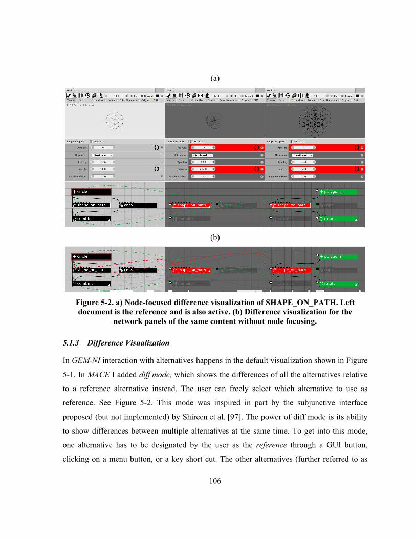
106
(a)
(b)
Figure 5-2. a) Node-focused difference visualization of SHAPE_ON_PATH. Left document is the reference and is also active. (b) Difference visualization for the
network panels of the same content without node focusing.
5.1.3 Difference Visualization
In GEM-NI interaction with alternatives happens in the default visualization shown in Figure
5-1. In MACE I added diff mode, which shows the differences of all the alternatives relative
to a reference alternative instead. The user can freely select which alternative to use as
reference. See Figure 5-2. This mode was inspired in part by the subjunctive interface
proposed (but not implemented) by Shireen et al. [97]. The power of diff mode is its ability
to show differences between multiple alternatives at the same time. To get into this mode,
one alternative has to be designated by the user as the reference through a GUI button,
clicking on a menu button, or a key short cut. The other alternatives (further referred to as

107
compared alternatives) are then compared to it. In diff mode, differences are visualized in all
three views (output, parameter and network), as applicable. While Shireen et al.’s proposed
GUI shows differences only for nodes that are common, my implementation also visualizes
nodes and edges that have been added or deleted.
In Figure 5-2a, the leftmost alternative was chosen as reference. Its network starts with a
group node CIRCLE that is fed as both shape and path to the SHAPE_ON_PATH node generating
a circular formation of six circles. Moreover, two copies of the circle are then created at the
center, one of which is scaled up to form the outline of the design. The output of
SHAPE_ON_PATH and COPY are then combined into a single design through the COMBINE
node, which is the rendered node.
The center alternative starts with the same CIRCLE. This node is unchanged and thus is
not shown (as described below). The generative model increases the number of circles to 12
in SHAPE_ON_PATH, which now shows up as a changed node. The COPY and COMBINE nodes
were removed in this design, leaving the SHAPE_ON_PATH node as the rendered node. The
right alternative substitutes the path input of SHAPE_ON_PATH node (and only that input) with
a triple-recursive hexagon arrangement (shown in green with group node POLYGONS).
Instead of the COMBINE node, the whole design is also rotated by 30° with a final ROTATE
node.
5.1.3.1 Network View
Nodes common to the reference and at least one other alternative are only shown in the
reference. Phrased differently, for every compared alternative and in the network views, all
nodes that are common with the reference and which have identical parameter values are not
shown to reduce visual clutter. This potentially hides entire unmodified sub-graphs. In
Figure 5-2, the CIRCLE node is an example. It exists in all three alternatives. Common nodes
are highlighted with a brown (de-saturated red) outline in the reference.
Nodes that are common with the reference but have one or more different parameter value
appear in red color. A “≠” sign is displayed to the top left of the node to emphasize this
further through an inequality metaphor. If such a node has any incoming or outgoing

108
connectors, they are connected to the corresponding nodes in the reference with lines that
cross the panels. The connectors are displayed in the same red color and appear as a dashed
curve. This style differentiates them from solid “within-document” connectors. In Figure
5-2a, node SHAPE_ON_PATH in both compared alternatives is an example for a node with
changed parameters.
This also works for group nodes, which contain sub-networks. If at least one difference
in either a parameter or structure exists between the sub-networks, then in the corresponding
compared views these group nodes also appear highlighted in red with a “≠” displayed next
to them. If a group node contains another group node, the same technique is applied
recursively. This is described in more detail in 5.1.3.5.
Nodes that do not exist in the reference are highlighted with a green color and are again
connected with dashed connectors to the reference. A “+” sign is displayed in the top left of
the node to emphasize this through an addition metaphor. In Figure 5-2a, nodes POLYGONS
and ROTATE in the rightmost alternative are such additions.
Nodes that exist in the reference, but don’t exist in a compared alternative are displayed
in a background semi-transparent layer and are connected with semi-transparent connectors
to the reference. A “−” sign in the top left of the node emphasize this further through a
reduction/subtraction metaphor. In Figure 5-2a, COPY and COMBINE in both compared
alternatives demonstrate this visualization technique.

109
(a)
(b)
(c)
(d)
Figure 5-3. Difference visualization for changed connections. (a) no difference visualization, (b) diff mode, (c) diff exclusion with cross-alternative connectors turned
off, middle alternative is active, (d) diff exclusion with cross-alternative connectors turned off, right alternative is active.
I also implemented a new technique to illustrate differences in connections between
nodes. In this visualization, I highlight unchanged, common nodes that have one or more
changed connections, in brown (de-saturated red) color. An “=” sign is displayed in the top
left of such nodes to emphasize their unmodified state further. Figure 5-3 shows this
technique using dummy nodes. In this figure, four views of the network are presented as
follows: In the default mode shown in Figure 5-3a, the unenhanced networks of three
alternatives are presented. In Figure 5-3a, I show a scenario without difference visualization,

110
where one of the connectors exists only in the reference, while others exist only in the
compared alternatives in the middle respectively right. In Figure 5-3b-d, I illustrate two
variants of my new connector difference visualization technique. In Figure 5-3b, the diff
mode visualization, the alternative on the left is the reference. All the cross-alternative
connectors are displayed. In diff mode, all three nodes are identified as common in the
middle and right alternatives. The changed connectors are then shown as dashed connectors
across panels. While this presentation emphasizes all the differences in connectors in the
three networks, it may appear confusing due to the number of cross-alternative connectors.
This leads to a more and more cluttered display with an increasing number of alternatives.
Below is the pseudo code for the implementation of the difference visualization in GEM-
NI. Cross-alternative connectors are painted onto the Java GlassPane, which is in front of
all GUI elements. The new method is paintGlassConnections(). The pseudo code
omits the details of the (earlier) creation of various sets of nodes, i.e.,
sameNodesInReference, newNodes, sameNodesThatChanged and
missingNodes. The pseudo code also handles the implementation of node-focused
difference visualisation, a feature that is described below.

111
/** * This method paints cross alternative connectors with node-focused visualization. */ void paintGlassConnections(){ Initialize pointer to singleNodeSelectedSomewhere. Non-null means active node-focused difference visualization. //this segment is for cases of node-focused difference visualization if active alternative ≠ reference { // singleNodeSelectedSomewhere is empty but a single node is selected if selectedNodes.size() == 1 and singleNodeSelectedSomewhere == null { Reinitialize newNodes, sameNodesThatChanged, missingNodes, missingNodes, and draggedNodesThatDidntChange to empty sets add the selected node appropriate sets and update singleNodeSelectedSomewhere. } // singleNodeSelectedSomewhere is not empty, sets needs to be re-initialzed else if singleNodeSelectedSomewhere ≠ null { Reinitialize newNodes, sameNodesThatChanged, missingNodes, missingNodes, and draggedNodesThatDidntChange to empty sets add singleNodeSelectedSomewhere to appropriate sets. } } //the actual visualization of differences of connectors for new, changed and dragged nodes for all connections c in the network { for all nodes n in sameNodesInReference{ //input in newNodes if c.output()== n{ //output is in reference Set connection color to NEW_NODE_COLOR Draw connection to the node output in reference for all newNodes Set connection color to CHANGED_NODE_COLOR Draw connection to the node output in reference for all sameNodesThatChanged Set connection color to DRAGGED_NODE_COLOR Draw connection to the node output in reference for all draggedNodesThatDidntChange } //input in newNode if c.input()== n{ //input is in reference Set connection color to NEW_NODE_COLOR Draw connection to the node input in reference for all newNodes Set connection color to CHANGED_NODE_COLOR Draw connection to the node input in reference for all sameNodesThatChanged Set connection color to DRAGGED_NODE_COLOR Draw connection node to the input in reference for all draggedNodesThatDidntChange } } } //the actual visualization of differences of connectors for missing nodes for all connections c in reference{ for all nodes n in reference { //input in missingNodes if c.output() == n { //output is in reference Draw a connection to the node output in reference for all missingNodes } //output in missingNodes if c.input()== n { //input is in reference Draw a connection to the node input in reference for all missingNodes } } }
}

112
Certain changes such as, e.g., a change in the reference relative to all other alternatives
(in other words when the user modified the reference without pushing changes to all other
alternatives) create visual clutter proportional to the number of alternatives in the
visualization. To address this kind of visual clutter, we designed a new variant, called diff
exclusion, accessible through a GUI button or a shortcut. This mode does not show all cross-
alternative connectors to and from the excluded alternative. This makes missing connectors
more visible and we show them transparently in the compared alternatives relative to the
reference and other missing elements. Figure 5-3b, illustrates the clutter created by cross-
alternative connectors. In Figure 5-3c,d the missing connectors between NODE1 and NODE2
in the compared alternatives relative to the reference are more visible when diff exclusion is
applied to both compared alternatives. Another use case for diff exclusion is if the user
wants to see all differences between a small, say up to three, set of alternatives. Otherwise,
the user can temporarily hide undesired alternatives in the difference visualization or
compare one node at a time with node-focused difference visualization (described below).
Another option is to use group nodes, but this changes the structure of the network.
One way to see missing connectors in the reference relative to the compared alternative is
to select one of the compared alternatives as reference. To remove this extra step of
switching the reference, I implemented another technique where the system shows missing
connectors in the reference instead. The user simply switches the active alternative to the
desired compared alternative against which s/he wants to see missing connectors in the
reference. The missing connectors in the references, if such exist, are then shown
transparently. In Figure 5-3c, the middle alternative was set as active. The missing connector
between NODE2 and NODE3 is displayed transparently in the reference (on the left). In Figure
5-3d, the compared alternative on the right was set as active. The missing connector between
NODE1 and NODE3 is displayed transparently in the reference. While the idea of showing
missing connections was previously presented in the DARLS system (Chapter 3), that
technique could only handle two graphs at a time. The new diff mode and diff exclusion
techniques presented here generalize DARLS methods to more than two networks.

113
To further reduce visual clutter, I do not show connections between all combinations of
deleted and common nodes inside each compared alternative. E.g., the connector between
COPY and COMBINE is not shown in the compared alternatives in Figure 5-2a (and b). The
user can toggle this via a menu command.
5.1.3.2 Node-focused Difference Visualization
Graham and Kennedy [41] point out that a potential disadvantage of using edges for a visual
comparison of two trees is that if there are too many lines displayed at once then individual
edges become impossible to distinguish from the mass of drawn lines. Such visual clutter is
a known concern in graph visualization. MACE includes a novel interaction method to
overcome this problem. Whenever the user selects a node (via clicking on it) in diff mode,
the system hides all the cross-alternative connectors that are not connected to the selected
node. Figure 5-2a illustrates an example where SHAPE_ON_PATH is selected in the reference
alternative. Thus, only connectors involving the SHAPE_ON_PATH node in the reference are
shown. If there are still too many dependencies visible, the user can apply diff exclusion to
exclude certain unwanted alternatives to reduce visual clutter further. Deselecting the node
(by clicking on any empty area) then shows all other connectors again. See Figure 5-2b.
5.1.3.3 Parameter View
In the parameter view, I emphasize parameters changed relative to the reference for the
currently selected node. For this, each changed parameter “row” is highlighted in the
compared alternatives. In Figure 5-2a, the “Amount” and “Margin” parameters are different
in both alternatives relative to the reference and are thus highlighted in red.
5.1.3.4 Output View
To illustrate the differences in the output of the generative design, the geometry produced by
the rendered node of the reference is displayed transparently in the output view in a bottom
layer for all compared alternatives. This directly superimposes the geometry of compared
alternatives over the reference to enable simple visual comparisons. To deal with cases

114
where this is visually too intrusive, I provide an option to disable this functionality by
unchecking the corresponding “diff” checkbox. Figure 5-2a shows a case where the direct
overlap of the curves makes it advisable to turn this feature off. Figure 5-7c shows a case
where the difference visualization in the output view is not as intrusive. Here the offset
parameter of the WIGGLE node was changed. The default option is to keep this checkbox on.
I leave it up to the user to determine when this feature gets too intrusive since it depends on
the content that the user is working with.
5.1.3.5 Recursive Group Node Difference Visualization
I implemented a technique to visualize differences between group nodes. The technique
supports visualization of differences between recursive/nested variations of these nodes as
well. Figure 5-4 demonstrates an example where three alternatives were created from an
earlier “Flower of Life” design from Figure 5-1. The top part of the figure shows the status
of the workspace with difference visualization turned off. The bottom part of the figure
shows a difference visualization highlighting the node POLYGONS in the network view as
described above. This indicates that there is a difference between these nodes. However, on
this level, it is not revealed. Entering the POLYGONS presents the view in Figure 5-5. All three
views are now displaying the contents of the POLYGONS node in each alternative. The top
part of the figure shows contents with difference visualizing turned off. The bottom part
shows a difference visualization highlighting the node POLYGON1 and POLYGON2_3.
POLYGON1 appears in all three alternatives and is also selected, which enables node-focused
difference visualization on it. This highlights the “Sides” parameter emphasizing that the
value of 3 is different from the reference value of 6. The “Sides” parameter of POLYGON2_3
also has the same value of 3 in the middle alternative (not shown). POLYGON2_3 is the last
network not in this branch. Entering it presents the view in Figure 5-6. Here, the right
alternative is completely disabled because the node doesn’t exist there. This is indicated by
highlighting the whole alternative in red. Note that the alternative is highlighted in both the
regular mode (shown on top) and the difference visualization mode (shown at the bottom).

115
Figure 5-4. Three alternatives of Flower of Life. The design differs in the POLYGONS
node at level 1.

116
Figure 5-5. Difference visualization at level 3 inside POLYGONS node.

117
Figure 5-6. Difference visualization at level 2 inside POLYGON2_3 node. The right panel
is disabled, because the corresponding node does not exist in the network. Below is the pseudo code for the implementation of the recursive comparison method for
group nodes in GEM-NI. The code consists of a single static method
groupNodesEqual(), which was added to the code base of NodeBox 3.

118
/** * The method compares if the two group nodes are identical, or there exist difference in at least one parameter of a node, or missing/new node or connection * @param groupNode1 is in the compared alternative * @param groupNode2 is the reference */ boolean groupNodesEqual(Node groupNode1, Node groupNode2) { Initialize empty sets: newNodesInGroup1, changedNodesInGroup1, missingNodesInGroup1 Initialize subgroupNodesEqual = true; //initially we assume that subSubNetworks are equal //look for new and changed nodes for all nodes group1Node in groupNode1.getChildren() { // all nodes in this groupNode1 Initialize foundSameNode = false; for all nodes group2Node in groupNode2.getChildren()) { // all nodes in groupNode2 if UUID of group1Node == UUID of group2Node{ Initialize foundSameNodeThatChanged = false; for all nodes inputs g2Input of group2Node { If g1Input not g2Input{ foundSameNodeThatChanged = true; break; //node was matched } } if (not foundSameNodeThatChanged) { changedNodesInGroup1.add(group1Node);
} else if (group1Node is a group node) {
subgroupNodesEqual &= groupNodesEqual(group1Node,group2Node); } foundSameNode = true; break;
} }
if (not foundSameNode) { newNodesInGroup1.add(group1Node); } } //looking for missing nodes for all children of group2Node { //for all nodes in reference document Initialize found = false; for all children of group1Node { //for all nodes in this network view if UUID of group1Node.child == UUID of group2Node.child { found = true; break; } } if (not found){ missingNodesInGroup1.add(group2Node); } }
// comparing connections connectionsNewInGroup2 = Find all connections that are in groupNode1 but not in groupNode2 connectionsNewInGroup1 = Find all connections that are in groupNode2 but not in groupNode1
return subgroupNodesEqual and newNodesInGroup1.isEmpty() and changedNodesInGroup1.isEmpty() and missingNodesInGroup1.isEmpty() and connectionsNewInGroup1.isEmpty() and connectionsNewInGroup2.isEmpty(); }

119
5.1.4 Editing Alternatives in Diff Mode
My difference visualization mode is fully interactive. This means that all above-mentioned
visualizations are not just static, but can be used directly during parallel editing.
5.1.4.1 Autosandboxing
In diff mode, switching to another alternative automatically sandboxes the newly active
alternative (making all others idle). This feature can be enabled in the preferences.
Autosandboxing saves the user an extra step when editing alternatives in diff mode.
Currently, the default is to keep this feature turned on, because many users work with one
alternative at a time. After all, non-sandboxed, i.e., parallel editing is more challenging.
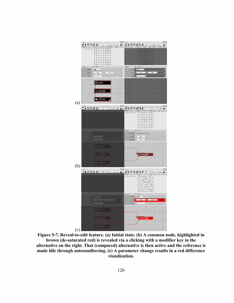
120
(a)
(b)
(c) Figure 5-7. Reveal-to-edit feature. (a) Initial state. (b) A common node, highlighted in
brown (de-saturated red) is revealed via a clicking with a modifier key in the alternative on the right. That (compared) alternative is then active and the reference is made idle through autosandboxing. (c) A parameter change results in a red difference
visualization.

121
5.1.4.2 Reveal-To-Edit
One drawback of any difference visualization that hides common nodes is that these nodes
are then inaccessible for editing and other operations. To address this shortcoming and
inspired by the user interface concept proposed by Shireen et al.’s [97], I implemented a new
reveal-to-edit feature. Shireen’s concept used dragging of nodes to reveal them. Yet,
dragging of objects has a different meaning in GUI’s and does not scale well to multiple
alternatives and monitors. Thus, I implemented a new reveal-to-edit feature through clicking
while holding down a modifier key in a compared alternative. This action shows the selected
nodes in the active and compared alternatives (temporarily) in brown (de-saturated red) and
with a ‘=’ sign in the top right to emphasize the commonality. This visualization is
consistent with other visualizations of common nodes mentioned above. Alternatively, the
user can click while holding the modifier key on nodes in the reference alternative to reveal
the selected nodes in all alternatives. This interface is only accessible in diff mode.
Consider the following typical scenario. The user starts with a design consisting of three
nodes: GRID, WIGGLE and ELLIPSE connected to each other in a chain. This network produces
a 10×10 grid of ellipses. The user then creates a clone through branching and enables the diff
editing mode with the alternative on the left as reference. As a result, all the elements of the
cloned alternative become hidden (as described above). See Figure 5-7a. To edit the
parameter for the selected WIGGLE node in the other alternative, the user then clicks in the
compared (right-hand) alternative while holding the modifier key. This then changes the
display to Figure 5-7b, also because autosandboxing makes the reference alternative idle.
Subsequently, the user can now edit the “offset” parameter of the WIGGLE node of the
compared alternative on the right (Figure 5-7c). In this scenario, only the WIGGLE node is
revealed because it is the only selected node in the reference alternative.
5.1.4.3 Parameter Synching
To facilitate post-hoc (re-)synchronization of parameters, I offer a simple shortcut for nodes
with changed parameters. For each changed parameter, a “sync” button is shown to the right
of the field (Figure 5-2a). Clicking it synchronizes the state in all passive alternatives to the

122
state of the current alternative. Higher level synchronization on the structure of the graph is
possible through merging and is described in Chapter 4.
5.2 Multi-Monitor Support
Figure 5-8: My 2×3 multi-monitor setup displaying a total of 14 alternatives in a
difference visualization relative to the top middle (reference) alternative.
In the conceptual design phase, designers routinely generate dozens of alternatives. That
amount of content is difficult to fit onto a single monitor, if all alternatives are still to be
view- and editable. Consequently, I extended GEM-NI to support multiple monitors to help
the designer keep the overview of all alternatives they are considering. Multi-monitor
support in MACE helps to support scalability as more alternatives can be shown at full scale
at the same time.
I enhanced GEM-NI to take advantage of the increasingly popular multi-monitor setups.
In the preferences menu, the user can select the preferred monitor usage from between 1×1
and (currently up to) 2×3 monitors. The workspace is then re-arranged to spread all
alternatives as evenly as possible according to the newly chosen monitor arrangement.
Within each monitor, horizontal space is evenly redistributed depending on the number of
alternatives in that monitor. In a sense, this is an adaptation of the Spread technique of Bi et

123
al. [17] to tiled applications. The user still has thus the flexibility of using only a subset of
available monitors.
For all monitor layouts with two rows, i.e., 2×1, 2×2 and 2×3, the model and network
views are swapped on the bottom row. That way, cross-alternative node connectors in diff
mode do not cross the model and parameter views of the bottom row alternatives.
To demonstrate how GEM-NI works on more than one monitor, I created a multi-monitor
setup with six Dell U2414H monitors, in a 2×3 formation in an Ergotech multi-monitor stand
(Figure 5-8) with a total resolution of 5760×2160 pixels. These monitors have thin bezels on
three sides. To minimize the overall seams, I rotated the top row of monitors 180°. In Figure
5-8, 14 alternatives are being edited in GEM-NI on this system.
5.2.1 Managing Alternatives in Multi-Monitor Environment
Alternatives can be dragged across different monitors to rearrange the layout. Each time an
alternative is dragged between monitors, the horizontal space in the two involved monitors
gets redistributed accordingly. When an alternative is dragged from a monitor on the top to a
monitor at the bottom and vice versa, the model and network views swap places. If all
alternatives are dragged out of a monitor, or if a setup in the preferences is chosen leaving
some monitors empty, a plus sign is displayed in the middle of the empty monitor. This
widget enables quick creation of a new empty alternative. Instead, an alternative from
another monitor can be dragged into this empty area.
Figure 5-8 shows an example when an alternative in the middle was chosen as reference.
This reference is the Seed of Life from Figure 4-1, which was initially positioned as the first
alternative in the top left corner. In fact, this alternative was first dragged to the middle to
demonstrate how placing the reference alternative in the middle makes it easier to compare it
against all others in the diff mode.

124
5.2.2 Jamming Spaces
Ball and North [13] identified that users tend to dedicate certain regions of a large display
for certain applications and then rely on spatial memory. I believe this can be generalized to
how screen space can be used for alternatives in GEM-NI and consequently implemented a
corresponding feature that supports the adaptation of the space to the current use case.
Moreover, space is an important resource in parallel exploration tasks. In GEM-NI, I permit
users to “jam spaces”, i.e., monitors, into the following states: idle/non-idle; enable/disable
display of cross-alternative node connectors; and all combinations thereof.
This functionality is available through a menu and directly affects all alternatives in a
given monitor. When a monitor is jammed, a red frame is displayed around the border as a
visual clue (Figure 5-9). Dragging an alternative into a “jammed” monitor affects the state of
said alternative corresponding to the “jam” settings. In Figure 5-9 the two monitors at the
left and right bottom respectively are both jammed. The one on the left is jammed in an idle
state. The one on the right is jammed in the state where cross-alternative node connectors are
not displayed.
5.2.3 Limitations
It is important to point out that the approach for multi-monitor support in GEM-NI and
MACE does not scale to a large number of alternatives, say substantially more than 20. The
reason for this is the physical limitations of the average user to see sufficient detail. Objects
appear smaller proportionally to their distance from the user due to perspective. Thus, a user
can only keep track visually of all alternatives that appear in the center of the field of view.
In order to accommodate hundreds of alternatives, a different interface will be necessary.

125
Figure 5-9. The same example as in Figure 5-8 with the bottom left monitor jammed into an un-editable state and the bottom right monitor jammed into the state where
cross-alternative connectors are not displayed.
5.3 Implementation
MACE builds on GEM-NI, which in turn was implemented as a major branch of NodeBox 3
by adding support for a multiple-document model based on universal unique identifiers
(UUIDs) for nodes. Such UUIDs enable us to perform robust comparisons and difference
visualization between alternatives. UUIDs also enable consistent relationships between
alternatives to persist even in the situation when certain alternatives are kept “offline” (i.e.,
stored on disk during editing sessions). These stored alternatives can then safely be re-
included in the workspace at a later stage without naming conflicts.
5.4 Discussion
Here I discuss the differences to previous work and the consequences of the design decisions
behind the difference visualization interface of MACE in more detail.
The problem of showing differences is important for generative design because designers
typically create several alternatives based on a single idea, which they use as a reference.
Designers also tend to work on multiple design alternatives concurrently [70]. Then

126
management of these alternatives becomes an issue. Transferring ideas among alternatives
and saving multiple files or creating multiple designs in a single document are current
solutions for this. Yet, these approaches make it harder for the designer to compare designs.
MACE presents a solution to difference visualization for alternative graphs: added, deleted,
(un)changed and recursive group nodes in both the reference and all compared graphs as
well as added and deleted connections. As my technique is fully interactive, it permits
editing directly in the difference visualization, which reduces the number of mode switches.
I have previously presented pair-wise difference visualization for directed graphs with
nodes identifiable by name in DARLS (Chapter 3). Comparing more than two such graphs of
the evolution of a single data set can be done with animation and/or time slices, e.g., [90]. In
generative design where parallel and non-linear creation and editing of alternatives is the
norm we deal with situations well beyond the evolution of a single graph. Thus animation
and other traditional techniques are not directly applicable. Agglomeration is also not
appropriate because I am dealing with DAGs, not trees. My work is the first to propose a
solution to the problem of showing differences between more than two such graphs. In other
words, MACE’s approach extends a) the layering approach used in several instances of
previous work, such as [6,26] and DARLS, by hiding unchanged nodes to reduce clutter and
drawing connectors to the reference to enhance juxtaposition; b) side-by-side views
[46,76,77] by going beyond pair-wise comparisons; c) existing work on subjunctive
interfaces [97], TreeVersity [47–50] and TreeVersity2 [50,51] to show a larger variety of
difference visualizations; and d) the parallel editing interface of GEM-NI (see 4.1.1) to allow
the user to keep difference visualization enabled during editing. MACE also shows a
difference visualization of multiple group nodes. This supports scalability to generative
networks with many nodes, where node grouping becomes a necessity as otherwise the
graph becomes much too large for a single screen.
Also, my technique proposes subtractive encoding—a new form of explicit encoding
where members of the intersection are removed from the compared graph. This extends
Gleicher et al.’s taxonomy work [39]. As a result, this improves the readability of my

127
difference encoding by keeping visual clutter low. Subtractive encoding is as an extension to
Shireen et al.’s [97] concept for parallel creation and editing of alternatives. Given that
alternatives for a design problem will likely be similar due to the shared goal, I expect fewer
differences among the data-flow networks of alternatives compared to the number of
similarities. This assumption underlies the design of the MACE interface. I performed an
analysis on the alternatives obtained through a user study to test this assumption. Using an
introduced readability measure, based on the measuring the similarity of the alternatives
networks, I obtained a fair degree of readability of the difference visualizations, which
confirms the appropriateness of the design choice of the technique (for at least this dataset). I
also presented a new user interface mechanism to interact with omitted unchanged nodes in
difference view visualizations, via a “reveal-to-edit” feature. In part, these techniques were
inspired by Shireen et al.’s [97] conceptual sketch of a user interface to enable parallel
generation and editing of design alternatives as an extension to existing variational CAD
tools. MACE is the first realization of these concepts and includes several substantial
extensions. Shireen et al.’s prototype only concentrated on changed nodes. Their work was
focused on the creation of alternatives and not truly on visualizing differences. MACE
suggests a solution to both issues and thus can be used for creating alternatives and for
visualizing differences or both together. I also introduced new difference visualizations for
edges and parameters as well as a parameter post-hoc synching method within the difference
visualization. In MACE differences are illustrated in all: the output, parameter and network
views in different ways. The “reveal-to-edit” feature is also an improvement relative to
Shireen et al.’s work, as it avoids the problem that dragging of nodes to reveal them does not
scale to multiple alternatives. Clicking while holding a modifier key is a better option and is
also more consistent with standard conventions. Creating and editing alternatives via the
MACE interface has the advantage over the visually unenhanced parallel editing (see 4.1.1)
in that the differences between the original (reference alternative) and the compared
alternative are immediately visible. Finally, by tuning the interface for multi-monitor setups
I demonstrate that our approach is scalable.

128
In my difference visualization technique, nodes in a compared alternative view with any
type of change (new, deleted or modified) are connected with the corresponding nodes in the
reference view. Unless a connector to an unchanged node is added or removed (relative to
the reference), I chose to omit unchanged nodes from the difference visualization, as we
expect more commonalities among the alternatives compared to differences. After all, a
designer will generally work on alternatives for a single design goal. I believe that this
design choice, along with synchronized node positioning, zooming and panning,
substantially reduces the eccentricity effect [112] when comparing networks. This effect
suggests that the farther two pieces of information are from each other in the visual field, the
harder it is to divide attention between them. In multi-monitor environments, compared
alternatives may be located far apart from each other. This effect was also one of the
motivations why I reversed the positioning of the network and output views in the bottom
monitor row. By favoring close positioning of networks, I put the output views at a relative
disadvantage because they are now further apart. The ability to re-arrange the alternatives
suggests a solution to this problem when side-by-side comparison of models is needed.
The difference visualization technique that I propose here can scale to displaying
differences of many alternatives with any number of changes, thanks to the node-focused
visualization and diff exclusion. However, the effectiveness of the approach decreases as the
number of changes and alternatives increases because of the clutter that is generated as a
result of comparing many alternatives with multiple changes. The user still can perform
comparisons but may be required to use the node-focused visualization and diff exclusion
extensively.
To investigate the usability of my approach I conducted an exploratory interview with
three expert designers having 5–30 years of experience in generative design on an earlier
version of MACE. I first introduced the interface and its components, let them experiment
with it, and then asked for feedback on each feature. Most of their feedback was positive and
confirmatory towards the major motivations for this system. A number of issues were
pointed out, which were addressed. These included the need for fine-tuning of the GUI. One

129
expert suggested that beyond node coloring it would be nice to add “+” and “-” symbols, for
added and removed nodes respectively. I took this thought further and added the “=” and “≠”
symbols to highlight parameter changes better. This then supports red-green colorblind users
as well. When playing with the reveal-to-edit and other features of our interface, one of the
users pointed out that parameter synching at the node level would be useful and I added this
feature. All the experts rearranged the alternatives within the workspace and selected
different alternatives and/or nodes to more rapidly identify differences between the models.
The idea of jamming spaces as realized in our system was also very well received. Users
more or less immediately identified how this was useful to their workflow. One commented:
“This way I can easily focus only on a subset and don’t have to see every [difference] at the
same time”.
I believe that the ideas behind MACE generalize to other visual programming
environments, including 3D modeling (e.g., Grasshopper 3D, Houdini). For other types of
media, such as video or audio (e.g., Max/MSP), a different approach to illustrating
differences may be necessary.
5.5 Summary
In this chapter I presented MACE—novel interface for differencing and editing alternatives
in a generative design system. This was implemented as an extension of GEM-NI—a system
for creating and managing alternatives in generative design. My new difference visualization
technique enables comparison of more than two alternatives at a time. The technique is
based on the idea of subtractive encoding which I identified as being useful in data that has
more similarities than the differences, such as alternatives. I used a readability measure to
confirm the appropriateness of the approach for at least one dataset of alternatives produced
by designers. My new user interface enables the user to interact with omitted unchanged
nodes in difference view visualizations, via a new “reveal-to-edit” feature. This feature
improves parallel editing in that the differences between the original (reference alternative)
and a clone are immediately visible during editing. The autosandboxing further facilitates

130
alternative exploration I introduced new ways to emphasize added, deleted, (un)changed
nodes, recursive group nodes, as well as edges. Finally, I implemented multi-monitor
support to demonstrate that my difference visualization technique scales well to up to 20
alternatives. Finally, I introduced a new “jamming spaces” technique for assigning
individual monitors into different visualization states. This makes organization of a large
workspace easier.

131
Chapter 6 Additional Discussion
Beyond the discussions mentioned in the above chapters, I discuss here a couple of
additional insights from my presented work.
6.1 Parallel Exploration of Alternatives in GEM-NI
In Chapter 1 as identified by Krish [65], I stated that GEM-NI (together with the MACE
interface) through explicit support for parallel exploration of alternatives complies with all
the requirements that need to be met for computer-aided design tools to support conceptual
design. Here, I clarify how I achieved this.
• GEM-NI makes minimal demands on and minimal disruption to the designer’s work
processes. Alternative creation, checkmarks and sandboxes along with merging,
minimizing and retrieval are mechanisms that are minimally intrusive to the designer’s
workflow for alternatives. While in my findings checkmarks and sandboxes happen to
be used quite extensively, this could potentially become intrusive. But this issue can be
resolved (see Section 6.4)
• GEM-NI is flexible in allowing the designers to navigate the design space in the way
they see fit. The decision to use stable network layouts with synched zooming and
panning enable seamless navigation of many design options simultaneously. The MACE
interface further makes comparison of these design options much easier. The ability to
quickly generate new alternatives, to minimize and retrieve them as well as the multi-
monitor support facilitates the organization of the workspace. The design gallery and
history interfaces further enable easy exploration of “what if” scenarios without
commitment.
• GEM-NI is able to support chaotic and unstructured work processes. GEM-NI
supports such non-linear processes by enabling the generation of alternatives through
branching and resurrection from history. Merging further enables post-hoc reintegration

132
of changes across alternatives. All these mechanisms support unstructured work
processes in a seamless manner.
• GEM-NI is an assistive tool, giving the designer the choice to either use it or not use
it. All the features that define GEM-NI and MACE do not interfere if the designer
chooses to use the tool for creating a single design document, i.e., if s/he chooses not to
take advantage of the explicit alternatives support the tool provides.
• GEM-NI supports and enables emergence in order to stimulate the creativity of the
designer. In the second user study, participants created more alternatives with GEM-NI.
The analysis of the CSI questionnaires in the user studies underscored that GEM-NI was
particularly highly ranked for exploration. It can be argued, that this in turn enables
emergence. Another feature that supports emergence is the novel design gallery.
• GEM-NI enables an efficient transition of design content from the conceptual to the
detailed design phase. Elements of the conceptual design process are supported in
GEM-NI through the support of alternatives. Nodebox, and consequently GEM-NI,
which inherits its functionality inherently supports detailed designs. First, it is fairly
easy to construct simple designs. Yet, the large palette of computational nodes in
NodeBox 3 together with the seemingly limitless possibility for combinations enables
almost limitless refinement of any given design. Furthermore, the ability to implement
custom nodes with Python scripting permits users of GEM-NI to create even more
detailed designs. In fact, the L-system functionality described in Chapter 4 is an
example where custom created extensions were employed. Appendix B presents
examples of some of the noteworthy designs that were created by participants in a short
amount of time allocated for the workshop. Some of them already show signs of
detailed design.
Besides, GEM-NI through explicit support for parallel exploration of alternatives addresses
the following obstacles for conceptual design support of computer-aided design as also
identified by Krish [65]:

133
• The invasiveness of frameworks impedes the thinking effort making it difficult to
automate conceptual design. To counter this, GEM-NI gives the designer the “freedom
to create, modify and discard” (Krish [65]). Freedom to create is enhanced with a
selection of alternative generation methods. Editing is enhanced with merging and the
MACE interface. GEM-NI supports both: destructive discarding and non-destructive
minimizing of currently unwanted content.
• CAD in its current form is unsuitable for representing and considering vague
concepts and forms. GEM-NI introduces support for creating and managing multiple
alternatives, which reduces the need for premature commitment. Yet, I acknowledge
that the system in its current form cannot yet approach the vagueness of sketching.
• CAD does not provide the creative stimulation that designers derive from the process
of hand sketching. Essentially the tools ignore that designs are developed based on
reactions to previously generated concepts. GEM-NI addresses this by supporting a
highly non-linear workflow through branching, resurrection from history, the design
gallery and merging. All these features are used to enable designers to react to and build
on previously generated concepts.
• Design is an iterative process of searching the design problem space as well as the
solution space. Designs and solutions co-evolve, during the design process. This is not
supported. GEM-NI supports iterative and parallel exploration of design options. The
link between the design and solution spaces is always guaranteed, as changes to the
model always immediately update the output view. GEM-NI supports iterative
exploration through its ability to branch off, merge, and reorganize alternatives, as well
as their minimization and retrieval.
• Many possibilities are considered and most of them are discarded at the early stages
of design. In this context, designers need to represent a wide range of concepts
efficiently. They are, therefore reluctant to invest the additional effort required to
represent such concepts in CAD. History, branching, the design gallery and merging

134
are the mechanisms that aim to ensure that concepts created with GEM-NI are “cheap”
to create in terms of effort.
6.2 GEM-NI as a Subjunctive Interface
GEM-NI also supports the three design principles on which subjunctive interfaces are built,
as identified by Lunzer and Hornbæk [70]:
• Enabling setting several, perhaps totally different scenarios independently. This is
primarily achieved through the support for multiple alternatives, which can potentially
be totally independent. In fact, one of GEM-NI’s strengths is that it seamlessly supports
the full spectrum from completely independent to fully identical alternatives.
• Displaying multiple scenarios simultaneously to facilitate comparison. This is
supported explicitly through juxtaposition. Moreover, the MACE interface is designed
to further facilitate comparison.
• Synchronous adjustment of multiple scenarios to escalate the exploration process.
This is achieved through parallel editing, using checkmarks and sandboxes.
6.3 Revision Control
GEM-NI was designed with the goal of supporting alternatives. However, the same ideas can
also be used for revision control, similar to Doboš and Steed’s [28,29] approach for 3D
models and Chen et al.’s [23] approach for images. In this sense, alternatives can be thought
of as significant events, which can be committed. Workspaces are then equivalent to
repositories. The MACE interface, designed to compare alternatives, can then be re-
envisioned as a tool to compare versions.
6.4 Guidelines for Re-implementation:
GEM-NI and the MACE interface were implemented as a branch NodeBox 3. For
convenience, I chose NodeBox 3 as a foundation because of the many provided features.
NodeBox 3 is representative of a generative design system. It uses dataflow programming. It

135
has been previously used for visualization and generative art [101]. This choice enables the
potential use of my results in a wider spectrum of applications, compared to a tool more
targeted at a single domain.
Unsurprisingly, NodeBox 3 was not designed with supporting alternatives in mind. The
code follows, what Terry and Mynatt [106] refer to as, the single state document interaction
model which recognizes and requires a document to be in one, and only one, state at any
particular time. This is a poor match to the non-linear, experimental processes characteristic
of creative endeavours [106]. To work around this limitation, I had to implement the features
of GEM-NI and MACE in an intrusive manner, where I sometimes had to violate good
software-engineering principles. E.g., each method that affects the state of the document had
to be modified to push changes to all alternatives. This was further made worse by the fact
that some alternatives may be idle. Global undo adds another layer of complexity. As a
result, the implementation was not efficient. Because NodeBox 3 follows the single
document state model, I also had to introduce UUIDs for the nodes to distinguish the states
of nodes in different alternatives. In hindsight, this approach is only suitable for retrofitting
into existing systems.
A better approach is to design the system from scratch by including support for
alternatives from the start. One example of such an approach, currently work-in-progress, is
the Shiro21 dataflow programming language designed to be embedded into applications that
support reuse and the exploration of alternatives. The language provides designers with
syntax to describe alternative designs or analysis solutions. In Shiro nodes can be
subjunctive, i.e., exist in multiple states. This allows a cleaner implementation with less
shared data. This approach should be considered by those re-implementing GEM-NI’s
approach in their application domain.
NodeBox 3 utilizes the standard undo manager from javax.swing.undo. To enable
undo history duplication, I created a custom undo manager, which supports duplication of
the undo stack. This functionality is used when creating branches and alternatives from 21 http://github.com/jrguenther/shiro

136
history. To support global undo, I use another stack, which keeps track of every undoable
operation that was done and the alternatives that were affected by this to enable me to
identify potential undo conflicts and to clear the global undo stack if such a conflict occurs.
This is a simplified implementation that may not handle all use cases. Yet, in the user
studies, global undo was used only infrequently, also because participants did little parallel
editing. Thus, I currently see little need for a more sophisticated global undo/redo-method in
a system such as GEM-NI. The majority of the participants focussed on one design at a time,
and if necessary, re-integrated ideas from previous work through merging. Thus, I believe
that one area for future development in GEM-NI should focus on better methods for post-hoc
merging, e.g., by coming up with visualizations that identify which parts of the merge could
not be completed.
During the workshops some participants pointed out that GEM-NI’s interface is
unintuitive with regards to parallel editing. In a future re-implementation parallel editing
should be offered as an option rather than imposed on the user. Passive alternatives should
appear only when desired explicitly by the user and not by default. This will leave merging
as the main mechanism of pushing changes. To make the merging mechanism more
versatile, future implementations should introduce the concept of a timeline and allow the
user to merge the timeline of one alternative with that of one or more other(s). The history
mechanism is currently limiting in that it only permits the creation of alternatives from
history and not the merging of parts of history. Also history is based on undo and, as a result,
the history of edits from earlier application sessions is not available, as the undo stack is
currently not preserved during saving and re-opening.
Finally, there are limitations in NodeBox 3 that future implementations should address.
One example is the inability to embed recursion into the data-flow programming model that
is employed in NodeBox 3. As discussed in Section 4.5.5 this prevented me from taking full
advantage of the GEM-NI’s comparison features when relating networks with recursive
nodes to each other. Moreover, NodeBox contributors decided to abandon the support for the
“tweaking” of existing nodes since version 3. In NodeBox 2, it was possible to directly

137
modify and display the python code, which stands behind each node in the system. Although
I acknowledge that this may not be a feature that the majority of designers must have, I
disagree that it was necessary to remove this feature from the latest version. Power users
generally appreciate such a feature and use it to solve many interesting problems. In addition
to that, I could have added in GEM-NI the ability to merge differences between different
alternatives directly in python code. Then, I could also have augmented the MACE interface
to perform difference visualization also on the code of the python-based nodes.

138
Chapter 7 Conclusions
The work towards this dissertation started with the objective to address the lack of previous
quantitative research on generic diagram visualizations that support merging of diagram
versions. To investigate this, I introduced a new system for differencing and merging
diagrams that use of Dual View, Animation, Re-Layout, Layers and a Storyboard,
abbreviated DARLS. The system is targeted at diagrams with node and edge attributes. Such
diagrams, among other areas, are used frequently in generative design for dataflow
programming. I ran two user studies to investigate the benefits of the introduced difference
visualization techniques and found that naïve dual-view visualization was not well received.
The dual-view option with a difference layer was most preferred for comparing diagrams
with matching node positions. For diagrams with non-matching positions, I found evidence
that animation is beneficial, but that the combination with a difference layer was liked best.
In summary, this dissertation reveals that the difference layer technique is useful and a good
complement to animation. This had positive implications for the diagram merging method
that was introduced. The findings of the user studies suggested that stable layouts across the
network views of alternatives in GEM-NI should be used for facilitating comparison of
dataflow programming. As a result, I implemented this technique. Also, I implemented the
merging method of DARLS in GEM-NI in the context of generative design and multiple
alternatives to support merging of dataflow programming models. I evaluate the technique
later. The evaluation revealed that the technique could be useful for complex models. The
layering technique that I explored with DARLS I revisited in MACE and adopted it for
showing differences for more than two alternatives.
This dissertation investigated how introducing various forms of exploration with design
alternatives into generative design seen in manual sketching affects creativity support. To
address this, I introduced the techniques in GEM-NI—a graph-based generative-design tool
that I built, which supports parallel exploration of alternative designs. These techniques

139
were: parallel editing, recalling history, branching, merging, comparing, and Cartesian
products of and for alternatives. Further, I introduce a modal graphical user interface and a
design gallery, which both allow designers to control and manage their design exploration.
Many of the introduced techniques are novel in the context of generative design and in
general. I investigated the usefulness of my approach through user studies and interviews.
The feedback from participants in the first study and in-depth interviews suggest that
GEM-NI, and more broadly the approach behind it, indeed enables designers to work more
creatively. The results indicate the direct applicability of the presented techniques for the
design process also via the CSI questionnaire. While the sample size of my first user study
was small, it identified the potential for better creativity support through alternatives in
design tools. I repeated the study with a larger sample of participants. GEM-NI was found to
support exploration better with the new features. This was clarified in the CSI questionnaire.
In the freeform feedback, three participants expressed that they wished they had the features
of GEM-NI available in the generative design tools they use daily.
One of the missing features that I identified early on as necessary in GEM-NI was the
ability to compare alternatives effectively and easily. I identified that it would be useful to
have the ability to compare more than two alternatives at the same time because in the open-
ended design tasks a lot of alternatives are created and being able to compare and edit them
in an interactive manner is important. To offer a solution to this I extended GEM-NI with
MACE – novel interface for differencing and editing alternatives in a generative design
system. My new difference visualization technique enables comparison of more than two
alternatives at a time. Using an introduced measure I confirmed the appropriateness of the
approach for at least the dataset of alternatives produced by designers in my studies. My new
user interface enables the user to interact with omitted unchanged nodes in difference view
visualizations, via a new “reveal-to-edit” feature. This feature improves parallel editing in
that the differences between the original (reference alternative) and a clone are immediately
visible during editing. The autosandboxing further facilitates alternative exploration. I
introduced new ways to emphasize added, deleted nodes, (un)changed nodes, recursive

140
group nodes, as well as edges. Here, my work builds on a previously introduced, but never
implemented concept [97]. The approach extends previous approaches for layering, side-by-
side views by going beyond pair-wise comparisons, and shows larger variety of difference
visualizations. It also improves my previous parallel editing approach by allowing parallel
editing and difference visualization simultaneously in an interactive manner. In the second
user study involving GEM-NI, I found evidence that users might benefit from more display
space than afforded by a dual-monitor setup. As a result, I implemented multi-monitor
support in MACE to demonstrate that my difference visualization technique scales well to up
to 20 alternatives. My novel jamming space feature takes advantage of the multi-monitor
support to ease organizing a large workspace by assigning individual monitors into different
states. It has been already known that users tend to organize their space [13,88]. The
jamming space technique, therefore, takes this natural human behaviour to the next level by
supporting forced states to enable better organization. To investigate the usability of my
approach I conducted an exploratory interview with three expert designers having 5-30 years
of experience in generative design on an earlier version of MACE. The comments I received
were confirmatory towards the major motivations of the interface. Their feedback resulted in
the addition of the sandboxing, autosandboxing, parameter synching and the improvement of
the visualization that addresses color-blind users.
7.1 Generalization of the Introduced Approaches
I am confident that the techniques introduced in this work can be used not only for
generative design in 2D vector graphics, but in other domains as well. This has been
confirmed in the second user study of GEM-NI, since some participants expressed their
desire to have the features available in their everyday workflow. This, first of all, applies to
visual programming environments in 3D modeling (e.g., Grasshopper 3D, Houdini and
GenerativeComponents). Here, different visualization techniques would have to be
employed for comparing the 3D output. Generally speaking, any system where graph driven
visual programming is used, including multimedia (e.g., Max/MSP), could benefit from my

141
approach. But for comparing other types of media, such as audio or video, a different
approach to output difference visualization may be necessary.
Moreover, outside generative design, some of the concepts used here, such as e.g.,
parallel editing, checking and sandboxing can be used in other domains as well. In fact,
recently a system called CAMBRIA [64] has been introduced, where the authors apply the
idea to regular 2D vector graphics design.
7.2 Limitations and Future Work
I envision several extensions as follows.
7.2.1 DARLS
Some of my findings indicate that the interaction between differencing techniques and
layouts is a rich area for future work. In other words, a closer look is needed at the combined
effect of layout techniques, such as my optimal layout method, and specific visualization
features. Another direction is the generalization of the work to UML diagrams, with their
information-rich nodes and edges. The storyboard can be investigated in more details, e.g., if
it can be directly used for difference visualization, similar to small multiples. One idea is to
use highlighting on the small views in combination with difference layers in the large ones.
Yet another direction is to investigate merging. My findings are positive for animation, but
more can be done. With larger sets of changes, animating all changes at once may be
counterproductive. It can also be investigated whether it makes general sense to break
change visualizations into smaller sets for easier comprehension. Currently the system is
targeted at diagrams with up to 50 nodes. However, I do not see any major obstacles to
enhancing the system to deal with larger diagrams, such as the hierarchies described in
[22,76].

142
7.2.2 GEM-NI
Currently, the network layout is not kept consistent across versions if merging or other
editing occurs. The design gallery creates far too many candidates that are too similar. One
solution could be to filter candidates by structure and visual similarity. It would also help to
display the design gallery next to the Cartesian product menu, so that the changes in the
Cartesian product are reflected interactively instead of switching between the two views.
Erhan et al. [35] proposed a method based on similarity metrics for making it easier to
manage the design space. The method includes parameter selection, computation of
similarity between pairs of design alternatives and visualization of their similarity on various
forms, clustering and applying filters on the clusters to narrow the scope. One future option
is to integrate this method into the system. Also, the multi-monitor aspects of GEM-NI can
be evaluated on a 2×3 multi-monitor setup through further experiments and interviews.
One direction of future research could be to investigate how versioning can be made
more explicit and integrated with alternatives in a design system. One idea is to show the
history of how alternatives were created through a tree visualization.
Currently, GEM-NI allows parallel editing of all operations and selective merging of all
types of states. While all of these operations and types of merging are usable, it remains an
open question if supporting all of them makes sense. Future research can target this question.
It would also be interesting to investigate how to deal with merging conflicts, and if
detecting them helps the users.
7.2.3 MACE
Given that my preliminary usability analysis produced confirmatory results towards the
major design decisions, I believe that investigating the effect of the difference visualization
techniques in MACE would most likely produce trivial results. Also, I had already learned
from the user studies with DARLS that unenhanced juxtaposition is less effective than
highlighting. Moreover, most of the features in MACE explicitly highlight things that are
otherwise not easily visible and/or have to be understood by repeatedly glancing back and

143
forth, which is less efficient. One potentially interesting user study would be to investigate
the scalability of the difference visualization technique to more than 18 alternatives. This
number corresponds to three alternatives each, on 2×3 monitors. On the other hand, I believe
that such large numbers of alternatives are not that frequent in design. In my user studies, for
example, I observed that eight was the maximum number of alternatives participants
produced. However, in a different context, such as longer design sessions, the number of
alternatives may well exceed this. Another potential study could also investigate if and how
the effectiveness of the basic juxtaposition visualization, the diff visualization with and
without node focusing, as well as the diff exclusion mode all deteriorate as the number of
alternatives increases. Yet another study could investigate the effectiveness of the edge
drawing technique in MACE that shows connectors back to the reference alternative in
comparison to the side-by-side visualization technique with highlighting in DARLS.
However, this last technique would need to be generalized to more than two views. Another
idea is to evaluate the usefulness of the reveal-to-edit approach when creating alternatives.

144
References
1. Ömer Akin. 1978. How do architects design? Artificial Intelligence and Pattern Recognition in Computer Aided Design: 65–103.
2. Ömer Akin. 2001. Variants in design cognition. Design knowing and learning: Cognition in design education: 105–124.
3. Marcus Alanen and Ivan Porres. 2003. Difference and Union of Models. In «UML» 2003 - The Unified Modeling Language. Modeling Languages and Applications, Perdita Stevens, Jon Whittle and Grady Booch (eds.). Springer Berlin / Heidelberg, 2–17. Retrieved from http://dx.doi.org/10.1007/978-3-540-45221-8_2
4. Basak Alper, Benjamin Bach, Nathalie Henry Riche, Tobias Isenberg, and Jean-Daniel Fekete. 2013. Weighted Graph Comparison Techniques for Brain Connectivity Analysis. Proceedings of the SIGCHI Conference on Human Factors in Computing Systems, ACM, 483–492. http://doi.org/10.1145/2470654.2470724
5. Christopher Andrews, Alex Endert, and Chris North. 2010. Space to Think: Large High-resolution Displays for Sensemaking. CHI 2010, ACM, 55–64. http://doi.org/10.1145/1753326.1753336
6. K. Andrews, M. Wohlfahrt, and G. Wurzinger. 2009. Visual Graph Comparison. Information Visualisation, 2009 13th International Conference, 62–67. http://doi.org/10.1109/IV.2009.108
7. Daniel Archambault. 2009. Structural differences between two graphs through hierarchies. Graphics Interface 2009, 87–94. Retrieved July 11, 2011 from http://portal.acm.org/citation.cfm?id=1555880.1555905
8. Daniel Archambault, Helen C. Purchase, and Bruno Pinaud. 2011. Difference Map Readability for Dynamic Graphs. In Graph Drawing, Ulrik Brandes and Sabine Cornelsen (eds.). Springer Berlin Heidelberg, Berlin, Heidelberg, 50–61. Retrieved July 11, 2011 from http://www.springerlink.com/content/j31w7820351x1l34/
9. Daniel Archambault, Helen Purchase, and Bruno Pinaud. 2011. Animation, Small Multiples, and the Effect of Mental Map Preservation in Dynamic Graphs. IEEE Transactions on Visualization and Computer Graphics 17, 4: 539–552. http://doi.org/10.1109/TVCG.2010.78
10. Benjamin Bach, Pierre Dragicevic, Daniel Archambault, Christophe Hurter, and Sheelagh Carpendale. 2014. A review of temporal data visualizations based on space-time cube operations. Eurographics Conference on Visualization.
11. Benjamin Bach, Emmanuel Pietriga, and Jean-Daniel Fekete. 2014. Visualizing Dynamic Networks with Matrix Cubes. Proceedings of the SIGCHI Conference on Human Factors in Computing Systems, ACM, 877–886. http://doi.org/10.1145/2556288.2557010

145
12. Benjamin Bach, Emmanuel Pietriga, and Jean-Daniel Fekete. 2014. GraphDiaries: Animated Transitions and Temporal Navigation for Dynamic Networks. IEEE Transactions on Visualization and Computer Graphics 20, 5: 740–754. http://doi.org/10.1109/TVCG.2013.254
13. Robert Ball and Chris North. 2005. Analysis of User Behavior on High-resolution Tiled Displays. INTERACT ’05, Springer-Verlag, 350–363. http://doi.org/10.1007/11555261_30
14. Lyn Bartram and Colin Ware. 2002. Filtering and brushing with motion. Information Visualization 1, 1: 66–79. http://doi.org/10.1057/palgrave/ivs/9500005
15. Michel Beaudouin-Lafon, Stéphane Huot, Mathieu Nancel, et al. 2012. Multisurface interaction in the WILD room. Computer 45, 4: 48–56.
16. Xiaojun Bi, Seok-Hyung Bae, and Ravin Balakrishnan. 2010. Effects of Interior Bezels of Tiled-monitor Large Displays on Visual Search, Tunnel Steering, and Target Selection. CHI 2010, ACM, 65–74. http://doi.org/10.1145/1753326.1753337
17. Xiaojun Bi, Seok-Hyung Bae, and Ravin Balakrishnan. 2014. WallTop: Managing Overflowing Windows on a Large Display. Human–Computer Interaction 29, 2: 153–203.
18. Xiaojun Bi and Ravin Balakrishnan. 2009. Comparing Usage of a Large High-resolution Display to Single or Dual Desktop Displays for Daily Work. CHI 2009, ACM, 1005–1014. http://doi.org/10.1145/1518701.1518855
19. Hartmut Bohnacker. 2012. Generative Design: Visualize, Program, and Create with Processing. Princeton Architectural Press, New York.
20. Carlo Bueno, Sarah Crossland, Christof Lutteroth, and Gerald Weber. Rewriting History: More Power to Creative People. OzCHI 2011, 62–71.
21. Bill Buxton. 2007. Sketching User Experiences: Getting the Design Right and the Right Design. Morgan & Kaufmann.
22. S. K Card, Bongwon Sun, B. A Pendleton, J. Heer, and J. W Bodnar. 2006. Time Tree: Exploring Time Changing Hierarchies. Visual Analytics Science and Technology, 2006 IEEE Symposium On, IEEE, 3–10. http://doi.org/10.1109/VAST.2006.261450
23. Hsiang-Ting Chen, Li-Yi Wei, and Chun-Fa Chang. 2011. Nonlinear revision control for images. ACM SIGGRAPH 2011 papers, ACM, 105:1–105:10. http://doi.org/10.1145/1964921.1965000
24. Erin Cherry and Celine Latulipe. 2014. Quantifying the Creativity Support of Digital Tools Through the Creativity Support Index. TOCHI 2014 21, 4: 21:1–21:25. http://doi.org/10.1145/2617588
25. Fanny Chevalier, Pierre Dragicevic, Anastasia Bezerianos, and Jean-Daniel Fekete. 2010. Using text animated transitions to support navigation in document histories. CHI 2010, ACM, 683–692. http://doi.org/10.1145/1753326.1753427

146
26. Darius Dadgari and Wolfgang Stuerzlinger. 2010. Novel User Interfaces for Diagram Versioning and Differencing. British HCI.
27. Stephan Diehl and Carsten Görg. 2002. Graphs, They Are Changing. Revised Papers from the 10th International Symposium on Graph Drawing, Springer-Verlag, 23–30. Retrieved July 11, 2011 from http://portal.acm.org/citation.cfm?id=647554.729718
28. Jozef Doboš and Anthony Steed. 2012. 3D Revision Control Framework. Proceedings of the 17th International Conference on 3D Web Technology, ACM, 121–129. http://doi.org/10.1145/2338714.2338736
29. Jozef Doboš and Anthony Steed. 2012. 3D Diff: An Interactive Approach to Mesh Differencing and Conflict Resolution. SIGGRAPH Asia 2012 Technical Briefs, ACM, 20:1–20:4. http://doi.org/10.1145/2407746.2407766
30. Steven Dow, Julie Fortuna, Dan Schwartz, Beth Altringer, Daniel Schwartz, and Scott Klemmer. 2011. Prototyping Dynamics: Sharing Multiple Designs Improves Exploration, Group Rapport, and Results. Proceedings of the SIGCHI Conference on Human Factors in Computing Systems, ACM, 2807–2816. http://doi.org/10.1145/1978942.1979359
31. Steven P. Dow, Alana Glassco, Jonathan Kass, Melissa Schwarz, Daniel L. Schwartz, and Scott R. Klemmer. 2010. Parallel Prototyping Leads to Better Design Results, More Divergence, and Increased Self-efficacy. ACM Trans. Comput.-Hum. Interact. 17, 4: 18:1–18:24. http://doi.org/10.1145/1879831.1879836
32. Steven M. Drucker, Georg Petschnigg, and Maneesh Agrawala. 2006. Comparing and managing multiple versions of slide presentations. UIST 2006, ACM, 47–56. http://doi.org/10.1145/1166253.1166263
33. W. Keith Edwards, Takeo Igarashi, Anthony LaMarca, and Elizabeth D. Mynatt. 2000. A temporal model for multi-level undo and redo. UIST 2000, ACM, 31–40.
34. Stef van den Elzen and Jarke J. van Wijk. 2013. Small Multiples, Large Singles: A New Approach for Visual Data Exploration. Proceedings of the 15th Eurographics Conference on Visualization, Eurographics Association, 191–200. http://doi.org/10.1111/cgf.12106
35. Halil Erhan, Ivy Wang, and Naghmi Shireen. Harnessing Design Space: A Similarity-Based Exploration Method for Generative Design. International Journal of Architectural Computing 12, 4: 217–236.
36. Michael Farrugia and Aaron Quigley. 2011. Effective Temporal Graph Layout: A Comparative Study of Animation versus Static Display Methods. Information Visualization 10, 1: 47–64. http://doi.org/10.1057/ivs.2010.10
37. Sabrina Förtsch and Bernhard Westfechtel. 2007. Differencing and Merging of Software Diagrams - State of the Art and Challenges. ICSOFT (SE), INSTICC Press, 90–99. Retrieved from http://dblp.uni-trier.de/db/conf/icsoft/icsoft2007-2.html#FortschW07

147
38. Martin Girschick. 2006. Difference Detection and Visualization in UML Class Diagrams. TU Darmstadt. Retrieved from internal-pdf://difference detection and visualization in UML class diagrams-3293822208/difference detection and visualization in UML class diagrams.pdf
39. Michael Gleicher, Danielle Albers, Rick Walker, Ilir Jusufi, Charles D. Hansen, and Jonathan C. Roberts. 2011. Visual comparison for information visualization. Information Visualization 10, 4: 289–309. http://doi.org/10.1177/1473871611416549
40. Martin Graham and Jessie Kennedy. 2007. Exploring multiple trees through DAG representations. IEEE transactions on visualization and computer graphics 13, 6: 1294–1301. http://doi.org/10.1109/TVCG.2007.70556
41. Martin Graham and Jessie Kennedy. 2010. A survey of multiple tree visualisation. Information Visualization 9, 4: 235–252. http://doi.org/http://dx.doi.org/10.1057/ivs.2009.29
42. Thomas RG Green. 1989. Cognitive dimensions of notations. People and computers V: 443–460.
43. Amy L. Griffin, Alan M. MacEachren, Frank Hardisty, Erik Steiner, and Bonan Li. 2010. A Comparison of Animated Maps with Static Small-Multiple Maps for Visually Identifying Space-Time Clusters. Annals of the Association of American Geographers 96, 4: 740–753.
44. Tovi Grossman, Justin Matejka, and George Fitzmaurice. 2010. Chronicle: capture, exploration, and playback of document workflow histories. UIST 2010, ACM, 143–152. http://doi.org/http://doi.acm.org.proxy.lib.sfu.ca/10.1145/1866029.1866054
45. Jonathan Grudin. 2001. Partitioning digital worlds: focal and peripheral awareness in multiple monitor use. CHI 2001, ACM, 458–465.
46. John Alexis Guerra Gómez. Exploring Differences in Multivariate Datasets Using Hierarchies: An Interactive Information Visualization Approach. Retrieved February 25, 2014 from http://hcil2.cs.umd.edu/trs/2013-12/2013-12.pdf
47. John Alexis Guerra-Gómez, A. Buck-Coleman, C. Plaisant, and B. Shneiderman. 2011. TreeVersity: Comparing tree structures by topology and node’s attributes differences. 2011 IEEE Conference on Visual Analytics Science and Technology (VAST), 275–276. http://doi.org/10.1109/VAST.2011.6102471
48. John Alexis Guerra-Gómez, Audra Buck-coleman, Michael L. Pack, Catherine Plaisant, and Ben Shneiderman. 2013. TreeVersity: Interactive Visualizations for Comparing Hierarchical Datasets. Transportation Research Record (TRR), Journal of the Transportation Research Board (2013): 21.
49. John Alexis Guerra-Gómez, Audra Buck-coleman, Catherine Plaisant, and Ben Shneiderman. 2012. TreeVersity: Visualizing Hierarchal Data for Value with Topology Changes. Proceedings of the Digital Research Society 2012 2: 640–653.

148
50. John Alexis Guerra-Gómez, Michael L. Pack, Catherine Plaisant, and Ben Shneiderman. 2013. Visualizing Change over Time Using Dynamic Hierarchies: TreeVersity2 and the StemView. IEEE Transactions on Visualization and Computer Graphics 19, 12: 2566–2575. http://doi.org/10.1109/TVCG.2013.231
51. John Alexis Guerra-Gómez, M. L. Pack, C. Plaisant, and B. Shneiderman. 2013. Discovering temporal changes in hierarchical transportation data: Visual analytic & text reporting tools. Transportation Research Part C: Emerging Technologies 51: 167–179.
52. Björn Hartmann, Sean Follmer, Antonio Ricciardi, Timothy Cardenas, and Scott R Klemmer. 2010. d.note: revising user interfaces through change tracking, annotations, and alternatives. CHI 2010, ACM, 493–502. http://doi.org/10.1145/1753326.1753400
53. Björn Hartmann, Loren Yu, Abel Allison, Yeonsoo Yang, and Scott R Klemmer. 2008. Design as exploration: creating interface alternatives through parallel authoring and runtime tuning. UIST 2008, ACM, 91–100. http://doi.org/http://doi.acm.org.proxy.lib.sfu.ca/10.1145/1449715.1449732
54. Jeffrey Heer, Jock Mackinlay, Chris Stolte, and Maneesh Agrawala. 2008. Graphical histories for visualization: supporting analysis, communication, and evaluation. TVCG 14, 6: 1189–1196. http://doi.org/10.1109/TVCG.2008.137
55. J. Heer and G. G Robertson. 2007. Animated Transitions in Statistical Data Graphics. IEEE Transactions on Visualization and Computer Graphics 13, 6: 1240–1247. http://doi.org/10.1109/TVCG.2007.70539
56. Jin Young Hong, Jonathan D’Andries, Mark Richman, and Maryann Westfall. 2003. Zoomology: ComparingTwo Large Hierarchical Trees. Poster at Compendium of InfoVis 2003: 120–121.
57. Wynne Hsu and Irene M. Y. Woon. 1998. Current research in the conceptual design of mechanical products. Computer-Aided Design 30, 5: 377 – 389. http://doi.org/http://dx.doi.org/10.1016/S0010-4485(97)00101-2
58. James W. Hunt and Douglas McIlroy. 1976. An algorithm for differential file comparison. AT&T Bell Laboratories, Murray Hill, NJ.
59. Petra Isenberg and Sheelagh Carpendale. 2007. Interactive Tree Comparison for Co-located Collaborative Information Visualization. IEEE Transactions on Visualization and Computer Graphics 13, 6: 1232–1239. http://doi.org/10.1109/TVCG.2007.70568
60. T. J. Jankun-Kelly and Kwan-Liu Ma. 2000. A spreadsheet interface for visualization exploration. Visualization ’00, IEEE Computer Society Press, 69–76. Retrieved April 12, 2014 from http://dl.acm.org/citation.cfm?id=375213.375220
61. H. J. Jun and J. S. Gero. 1998. Emergence of shape semantics of architectural shapes. Environment and Planning B: Planning and Design 25, 4: 577 – 600. http://doi.org/10.1068/b250577

149
62. Udo Kelter and Maik Schmidt. 2008. Comparing state machines. Workshop on Comparison and versioning of software models, ACM, 1–6. Retrieved from internal-pdf://p1-kelter-2831806464/p1-kelter.pdf
63. Scott R. Klemmer, Michael Thomsen, Ethan Phelps-Goodman, Robert Lee, and James A. Landay. 2002. Where do web sites come from?: capturing and interacting with design history. CHI 2002, ACM, 1–8. http://doi.org/http://doi.acm.org/10.1145/503376.503378
64. Siniša Kolarić, Robert Woodbury, and Halil Erhan. 2014. CAMBRIA: A Tool for Managing Multiple Design Alternatives. Proceedings of the 2014 Companion Publication on Designing Interactive Systems, ACM, 81–84. http://doi.org/10.1145/2598784.2602788
65. Sivam Krish. 2011. A practical generative design method. Computer-Aided Design 43: 88–100. http://doi.org/http://dx.doi.org.proxy.lib.sfu.ca/10.1016/j.cad.2010.09.009
66. David Kurlander and Steven Feiner. 1990. A visual language for browsing, undoing, and redoing graphical interface commands. In S. K. Chang (ed.). ed. Plenum Press, NY, 257–275.
67. Sandeep K. Kuttal, Anita Sarma, and Gregg Rothermel. 2014. On the benefits of providing versioning support for end users: an empirical study. ACM TOCHI 21, 2: 9:1–9:43. http://doi.org/10.1145/2560016
68. Bongshin Lee, George G. Robertson, Mary Czerwinski, and Cynthia Sims Parr. 2007. CandidTree: Visualizing Structural Uncertainty in Similar Hierarchies. In Human-Computer Interaction – INTERACT 2007, Cécilia Baranauskas, Philippe Palanque, Julio Abascal and Simone Diniz Junqueira Barbosa (eds.). Springer Berlin Heidelberg, 250–263. Retrieved March 10, 2015 from http://link.springer.com/chapter/10.1007/978-3-540-74800-7_20
69. Aristid Lindenmayer. 1968. Mathematical models for cellular interactions in development II. Simple and branching filaments with two-sided inputs. Journal of Theoretical Biology 18, 3: 300–315. http://doi.org/10.1016/0022-5193(68)90080-5
70. Aran Lunzer and Kasper Hornbæk. 2008. Subjunctive Interfaces: Extending Applications to Support Parallel Setup, Viewing and Control of Alternative Scenarios. ACM TOCHI 14, 4: 17:1–17:44. http://doi.org/10.1145/1314683.1314685
71. Sonja Maier and Mark Minas. 2010. Interactive diagram layout. Extended Abstracts of the ACM Conference on Human Factors in Computing Systems - CHI 2010, ACM, 4111–4116. http://doi.org/10.1145/1753846.1754111
72. Kwan-Liu Ma. 1999. Image graphs - a novel approach to visual data exploration. Visualization ’99, 81–88. http://doi.org/10.1109/VISUAL.1999.809871
73. J. Marks, B. Andalman, P. A. Beardsley, et al. 1997. Design galleries: a general approach to setting parameters for computer graphics and animation. SIGGRAPH ’97, ACM, 389–400. http://doi.org/10.1145/258734.258887

150
74. Akhil Mehra, John Grundy, and John Hosking. 2005. A generic approach to supporting diagram differencing and merging for collaborative design. ASE 2005, ACM, 204–213. http://doi.org/10.1145/1101908.1101940
75. Alexandre Menezes and Bryan Lawson. 2006. How designers perceive sketches. Design Studies 27, 5: 571–585. http://doi.org/10.1016/j.destud.2006.02.001
76. Tamara Munzner, François Guimbretière, Serdar Tasiran, Li Zhang, and Yunhong Zhou. 2003. TreeJuxtaposer: scalable tree comparison using Focus+Context with guaranteed visibility. SIGGRAPH 2003 22, 3: 453–462. http://doi.org/10.1145/882262.882291
77. Galileo Mark Namata, Brian Staats, Lise Getoor, and Ben Shneiderman. 2007. A dual-view approach to interactive network visualization. CIKM 2007, ACM, 939–942. http://doi.org/10.1145/1321440.1321580
78. Mark W. Newman and James A. Landay. 2000. Sitemaps, Storyboards, and Specifications: A Sketch of Web Site Design Practice. DIS 2000, ACM, 263–274. http://doi.org/10.1145/347642.347758
79. E. Ogasawara, P. Rangel, L. Murta, C. Werner, and M. Mattoso. 2009. Comparison and versioning of scientific workflows. ICSE Workshop on Comparison and Versioning of Software Models, 2009. CVSM ’09, IEEE, 25–30. http://doi.org/10.1109/CVSM.2009.5071718
80. Ji-Young Oh, Wolfgang Stuerzlinger, and John Danahy. 2005. Comparing SESAME and Sketching for Conceptual 3D Design. Sketch Based Interfaces and Modeling, 81–88.
81. Ji-Young Oh, Wolfgang Stuerzlinger, and John Danahy. 2006. SESAME: Towards Better 3D Conceptual Design Systems. Proceedings of the 6th Conference on Designing Interactive Systems, ACM, 80–89. http://doi.org/10.1145/1142405.1142419
82. Dirk Ohst, Michael Welle, and Udo Kelter. 2003. Differences between versions of UML diagrams. ACM SIGSOFT Software Engineering Notes 28, 5: 227–236. http://doi.org/10.1145/949952.940102
83. Dirk Ohst, Michael Welle, and Udo Kelter. Difference tools for analysis and design documents. International Conference on Software Maintenance 2003 ICSM 2003 Proceedings: 13–22. http://doi.org/10.1109/ICSM.2003.1235402
84. Rivka Oxman. 2002. The thinking eye: visual re-cognition in design emergence. Design Studies 23, 2: 135–164. http://doi.org/10.1016/S0142-694X(01)00026-6
85. Catherine Plaisant, Jesse Grosjean, and Benjamin B Bederson. 2002. SpaceTree: Supporting Exploration in Large Node Link Tree, Design Evolution and Empirical Evaluation. Proceedings of the IEEE Symposium on Information Visualization (InfoVis’02), IEEE, 57–64. Retrieved July 12, 2011 from http://portal.acm.org/citation.cfm?id=857191.857752
86. Helen C Purchase, Eve Hoggan, and Carsten Görg. 2007. How important is the “Mental map”?: an empirical investigation of a dynamic graph layout algorithm. Proceedings of

151
the 14th International Conference on Graph Drawing, Springer-Verlag, 184–195. Retrieved July 12, 2011 from http://portal.acm.org/citation.cfm?id=1758612.1758633
87. Helen C Purchase and Amanjit Samra. 2008. Extremes Are Better: Investigating Mental Map Preservation in Dynamic Graphs. Proceedings of the 5th International Conference on Diagrammatic Representation and Inference, Springer-Verlag, 60–73. http://doi.org/http://dx.doi.org/10.1007/978-3-540-87730-1_9
88. George Robertson, Mary Czerwinski, Kevin Larson, Daniel C. Robbins, David Thiel, and Maarten van Dantzich. 1998. Data Mountain: Using Spatial Memory for Document Management. UIST ’98, ACM, 153–162. http://doi.org/10.1145/288392.288596
89. G. Robertson, R. Fernandez, D. Fisher, B. Lee, and J. Stasko. 2008. Effectiveness of Animation in Trend Visualization. IEEE Transactions on Visualization and Computer Graphics 14, 6: 1325–1332. http://doi.org/10.1109/TVCG.2008.125
90. S. Rufiange and M.J. McGuffin. 2013. DiffAni: Visualizing Dynamic Graphs with a Hybrid of Difference Maps and Animation. IEEE Transactions on Visualization and Computer Graphics 19, 12: 2556–2565. http://doi.org/10.1109/TVCG.2013.149
91. Peter Saffrey and Helen Purchase. 2008. The “mental map” versus “static aesthetic” compromise in dynamic graphs: a user study. Proceedings of the Ninth Conference on Australasian User Interface - Volume 76, Australian Computer Society, Inc., 85–93. Retrieved July 11, 2011 from http://portal.acm.org/citation.cfm?id=1378337.1378354
92. Timothy A. Sandstrom, Chris Henze, and Creon Levit. 2003. The Hyperwall. Proceedings of the Conference on Coordinated and Multiple Views In Exploratory Visualization, IEEE Computer Society, 124–. Retrieved January 28, 2015 from http://dl.acm.org/citation.cfm?id=937938.937953
93. Donald A. Schon. 1984. The Reflective Practitioner: How Professionals Think In Action. Basic Books.
94. Maruthappan Shanmugasundaram and Pourang Irani. 2008. The effect of animated transitions in zooming interfaces. Proceedings of the Working Conference on Advanced Visual Interfaces, ACM, 396–399. http://doi.org/10.1145/1385569.1385642
95. Maruthappan Shanmugasundaram, Pourang Irani, and Carl Gutwin. 2007. Can smooth view transitions facilitate perceptual constancy in node-link diagrams? Proceedings of Graphics Interface 2007, ACM, 71–78. http://doi.org/10.1145/1268517.1268531
96. Mehdi Sheikholeslami. 2011. You can get more than you make. Retrieved from www.synergiescanada.org/theses/bvas/11176
97. Naghmi Shireen, Halil Erhan, David Botta, and Robert Woodbury. 2012. Parallel development of parametric design models using subjunctive dependency graphs. ACADIA 2012, 57–66.
98. Ben Shneiderman. 1996. The eyes have it: a task by data type taxonomy for information visualizations. Visual Languages 1996, IEEE, 336–343. Retrieved July 18, 2011 from http://portal.acm.org/citation.cfm?id=832277.834354

152
99. Ben Shneiderman. 2000. Creating creativity: user interfaces for supporting innovation. ACM Trans. Comput.-Hum. Interact. 7, 1: 114–138. http://doi.org/10.1145/344949.345077
100. Herbert Alexander Simon. 1996. The sciences of the artificial. MIT press. 101. Tom De Smedt, Ludivine Lechat, and Walter Daelemans. 2011. Generative Art
Inspired by Nature, Using NodeBox. In Applications of Evolutionary Computation, Cecilia Di Chio, Anthony Brabazon, Gianni A. Di Caro, et al. (eds.). Springer Berlin Heidelberg, 264–272. Retrieved February 27, 2014 from http://link.springer.com/chapter/10.1007/978-3-642-20520-0_27
102. Brittany N Smith, Anbang Xu, and Brian P Bailey. 2010. Improving interaction models for generating and managing alternative ideas during early design work. Graphics Interface 2010, 121–128. Retrieved April 25, 2011 from http://portal.acm.org.proxy.lib.sfu.c℀itation.cfm?id=1839214.1839236
103. Matthew Stephan and James R Cordy. 2013. A survey of model comparison approaches and applications. Conference on Model-Driven Engineering and Software Development: 265–277.
104. Sara L Su. 2007. Visualizing, editing, and inferring structure in 2D graphics. Adjunct UIST 2007, ACM, 29–32.
105. Sara L Su, Sylvain Paris, Frederick Aliaga, Craig Scull, Steve Johnson, and Fredo Durand. 2009. Interactive Visual Histories for Vector Graphics. MIT. Retrieved July 11, 2011 from http://dspace.mit.edu/handle/1721.1/45600
106. Michael Terry and Elizabeth D Mynatt. 2002. Recognizing creative needs in user interface design. Creativity and Cognition 2002, ACM, 38–44. http://doi.org/10.1145/581710.581718
107. Michael Terry, Elizabeth D. Mynatt, Kumiyo Nakakoji, and Yasuhiro Yamamoto. 2004. Variation in element and action: supporting simultaneous development of alternative solutions. CHI 2004, ACM, 711–718. http://doi.org/10.1145/985692.985782
108. M. Toomim, A. Begel, and S.L. Graham. 2004. Managing Duplicated Code with Linked Editing. 2004 IEEE Symposium on Visual Languages and Human Centric Computing, 173–180. http://doi.org/10.1109/VLHCC.2004.35
109. Barbara Tversky, Julie Bauer Morrison, and Mireille Betrancourt. 2002. Animation: can it facilitate? International Journal of Human-Computer Studies - Special Issue: Interactive Graphical Communication 57, 4: 247–262. http://doi.org/10.1006/ijhc.2002.1017
110. Lihui Wang, Weiming Shen, Helen Xie, Joseph Neelamkavil, and Ajit Pardasani. 2002. Collaborative conceptual design—state of the art and future trends. Computer-Aided Design 34, 13: 981 – 996. http://doi.org/http://dx.doi.org/10.1016/S0010-4485(01)00157-9

153
111. Colin Ware and Robert Bobrow. 2004. Motion to support rapid interactive queries on node–link diagrams. ACM Transactions on Applied Perception (TAP) 1, 1: 3–18. http://doi.org/10.1145/1008722.1008724
112. Jeremy M Wolfe, Patricia O’Neill, and Sara C Bennett. 1998. Why are there eccentricity effects in visual search? Visual and attentional hypotheses. Perception & Psychophysics 60, 1: 140–156.
113. Robert Woodbury. 2010. Elements of Parametric Design. Routledge. 114. Robert Woodbury, Sambit Datta, and Andrew Burrow. 2000. Erasure in Design
Space Exploration. In AID ’00, John S. Gero (ed.). Springer Netherlands, 521–543. Retrieved February 24, 2014 from http://link.springer.com/chapter/10.1007/978-94-011-4154-3_26
115. Robert F. Woodbury and Andrew L. Burrow. 2006. Whither design space? Artif. Intell. Eng. Des. Anal. Manuf. 20, 2: 63–82. http://doi.org/10.1017/S0890060406060057
116. Zhenchang Xing and Eleni Stroulia. 2007. Differencing logical UML models. Automated Software Engineering 14, 2: 215–259.
117. Kai Xu, Hao Zhang, Daniel Cohen-Or, and Baoquan Chen. 2012. Fit and diverse: set evolution for inspiring 3D shape galleries. SIGGRAPH 31, 4: 57:1–57:10.

154
Appendix A Version Pairs of a Course Prerequisites Diagram Used in the DARLS User Studies
Most Frequent False Negatives in User Study I
Incremental Layout Optimal Layout
Node Frequency Node Frequency
COMP 3403 64 COMP 3403 12
COMP 3481 47 COMP 3481 12
COMP 3214 45 COMP 3214 12
COMP 3431 18 MAST 1025 10
MAST 1025 13 COMP 3431 10
MAST 1310 10 MAST 1310 10
ENGR 3150 2
COMP 3215 2
Table A-1. Most frequent false negative nodes.
Incremental Layout Optimal Layout
Edge Frequency Edge Frequency
COMP 2031 -> COMP 3215 40 COMP 3213 -> COMP 3481 28
COMP 3213 -> COMP 3481 32 COMP 2031 -> COMP 3215 21
MAST 1025 -> COMP 3431 20 MAST 1025 -> COMP 3431 19
MAST 1310 -> COMP 3101 10 MAST 1310 -> COMP 3451 18
MAST 1310 -> COMP 3451 8 MAST 1310 -> COMP 3213 18
MAST 1310 -> COMP 3213 5 MAST 1310 -> COMP 3101 14
COMP 3201 -> COMP 3215 2
ENGR 3150 -> COMP 3201 2
Table A-2. Most frequent false negative edges.

155
Optimal Layout Heuristics
Heuristic Value
Minimal Node
Distance
20 (pixels)
Minimal Edge
Distance
10 (pixels)
First Minimal
Segment Length
20 (pixels)
Orientation Top to Bottom
Node Placement Linear Segments
Node Ranking Policy Hierarchical – Tight
Tree
Node Order Weight Barycenter
Transposition Yes
Removed False
Crossings
Yes
Randomization
Rounds
40
Table A-3. Summary of optimal layouter heuristics that were used during the User Study I.

156
Version Pair Summary
No. 1 2 3 4 5 6 Version Pair 1→3 3→4 4→5 5→8 8→10 10→12 Num. of Node in Left View 24 28 28 26 27 26 Num. of Edges in Left View 23 25 25 22 24 23 Num. of Nodes in Right View 28 28 26 27 26 29 Num. of Edges in Right View 25 25 22 24 23 26 Num. of Common Nodes 23 28 25 23 26 23 Num. of Common Edges 23 25 25 23 26 23 Num. of New Nodes 5 0 1 4 0 6 Num. of New Edges 5 0 0 4 2 6 Num. of Deleted Nodes 1 0 3 3 1 3 Num. of Deleted Edges 3 0 3 4 3 3 Total Added 10 0 1 8 2 12 Total Deleted 4 0 6 7 4 6
Table A-4. Version Pair Summary.

157
Optimal Layout Snapshots
Figure A-1. Optimal Layout, Version Pair #1 (1→3).

158
Figure A-2. Optimal Layout, Version Pair #2 (3→4).

159
Figure A-3. Optimal Layout, Version Pair #3 (4→5).

160
Figure A-4. Optimal Layout, Version Pair #4 (5→8).

161
Figure A-5. Optimal Layout, Version Pair #5 (8→10).

162
Figure A-6. Optimal Layout, Version Pair #6 (10→12).

163
Incremental Layout Snapshots
Figure A-7. Incremental Layout, Version Pair #1 (1→3).

164
Figure A-8. Incremental Layout, Version Pair #2 (3→4).

165
Figure A-9. Incremental Layout, Version Pair #3 (4→5).

166
Figure A-10. Incremental Layout, Version Pair #4 (5→8).

167
Figure A-11. Incremental Layout, Version Pair #5 (8→10).

168
Figure A-12. Incremental Layout, Version Pair #6 (10→12).

169
Appendix B Noteworthy Designs of the Workshop Participants with Difference Visualizations

170
Figure B-1. Design 1: unenhanced view.

171
Figure B-2. Design 1: difference visualization view (with subtractive encoding).

172

173
Figure B-3. Design 2: unenhanced view.

174
Figure B-4. Design 2: difference visualization view (with subtractive encoding).
Figure B-5. Design 3: unenhanced view.
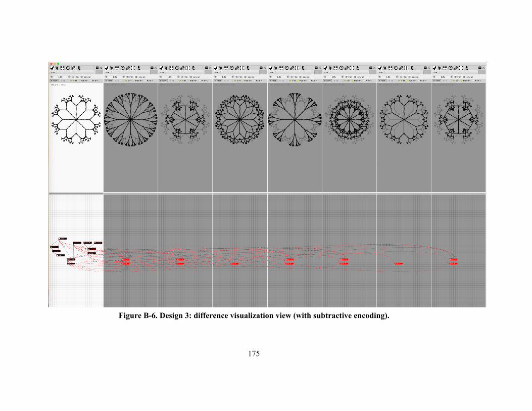
175
Figure B-6. Design 3: difference visualization view (with subtractive encoding).

176
Figure B-7. Design 4: unenhanced view.

177

178
Figure B-8. Design 4: difference visualization view (with subtractive encoding).
Figure B-9. Design 5: unenhanced view.

179
Figure B-10. Design 5: difference visualization view (with subtractive encoding).

180
Figure B-11. Design 6: unenhanced view.

181
Figure B-12. Design 6: difference visualization view (with subtractive encoding).