interactive visualizations to improve bayesian reasoning - CORE
100
INTERACTIVE VISUALIZATIONS TO IMPROVE BAYESIAN REASONING BY JENNIFER E. TSAI DISSERTATION Submitted in partial fulfillment of the requirements for the degree of Doctor of Philosophy in Psychology in the Graduate College of the University of Illinois at Urbana-Champaign, 2012 Urbana, Illinois Doctoral Committee: Professor Alex Kirlik, Chair Assistant Professor Wai-Tat Fu Associate Professor Alejandro Lleras Professor Daniel Morrow Professor Daniel Simons
-
Upload
khangminh22 -
Category
Documents
-
view
3 -
download
0
Transcript of interactive visualizations to improve bayesian reasoning - CORE

INTERACTIVE VISUALIZATIONS TO IMPROVE BAYESIAN REASONING
BY
JENNIFER E. TSAI
DISSERTATION
Submitted in partial fulfillment of the requirements for the degree of Doctor of Philosophy in Psychology
in the Graduate College of the University of Illinois at Urbana-Champaign, 2012
Urbana, Illinois Doctoral Committee: Professor Alex Kirlik, Chair
Assistant Professor Wai-Tat Fu Associate Professor Alejandro Lleras Professor Daniel Morrow Professor Daniel Simons

ii
ABSTRACT
Proper Bayesian reasoning is critical across a broad swath of domains that require
practitioners to make predictions about the probability of events contingent upon earlier actions
or events. However, much research on judgment has shown that people who are unfamiliar with
Bayes’ Theorem often reason quite poorly with conditional probabilities due to various cognitive
biases. As such, this dissertation chronicles the development and evaluation of an interactive
visualization designed to aid Bayes-naïve people in solving conditional probability problems, in
part by leveraging its graphical properties to head off the occurrence of biases.
In three experiments, the visualization was tested with different classes of Bayesian
problems. Experiment 1 showed that participants using the interactive visualization substantially
improved their reasoning performance above that of previous debiasing methods for common,
academic elementary Bayesian problems. Experiment 2 suggests that some measure of this
improvement is retained for more complicated chains of reasoning Bayesian problems, with the
majority of benefit going to those participants who self-assess themselves to be better in math
ability than their peers. Experiment 3 showed that in real-time prediction/updating with a
concrete, to-be-resolved Bayesian problem tied to a sporting event, participants using the
visualization achieved better reasoning performance, seemed to suffer less from detrimental
effects of overconfidence, and had internal reasoning accuracy that was solidly predictive of their
accuracy with respect to matching the external event/world – a desirable property that allows for
estimations of judges’ outcome performance, based on readily available process information.
Altogether, findings from three experiments point to visualizations being a rich area to
mine, and prime candidate for expanding the toolbox of techniques that can be used to more
accurately elicit the predictions of judges whose expertise lies beyond the realm of statistics.

iii
ACKNOWLEDGEMENTS
I would like to extend my warmest gratitude to those individuals without whom this
dissertation and the work behind it could never have been accomplished. First and foremost
thanks goes to my advisor Dr. Alex Kirlik, a beacon in the stormy waters of graduate research
who guided me surely and steadily through the unexplored territory of intellectual destinations
unknown. More thanks go to my committee members Drs. Wai-Tat Fu, Alejandro Lleras, Dan
Morrow, and Dan Simons for their insightful questions and helpful suggestions.
I would also like to thank Drs. Sarah Miller and Cliff Forlines, as well as the rest of the
Human-Systems Collaboration Group over at Draper Laboratory in Cambridge, MA, who
welcomed me into their offices two summers in a row and let me borrow on invaluable moral,
technical, financial, and crack programming support.
Shout-outs go to Sid Gandhi and Reggie Tabachnick for programming support and blind
coding help, respectively. And much appreciation to Kelly Steelman, who paved the way as the
first of our cohort to graduate and then patiently answered my many questions about the process.
Some very special people have come into my life these past few years, and my world is
immeasurably better for having met them. Along with various friends from psychology, human
factors, and elsewhere, I will forever be grateful to Hengqing Chu for being my late-nights-in-
the-office buddy, Deepak Jaiswal for getting the coffee when I ran out of time to get it myself,
and Tatyana Kim for being the reason I would ever have 25 Kazakhs in my living room at once.
And though I knew them before, Boston would not have been the same without Jessica and
Emmy Wu’s generous hospitality.
Last but not least, thanks to my parents, who got me to this point, so now I can take care
of the rest.

iv
TABLE OF CONTENTS
CHAPTER 1: INTRODUCTION ................................................................................................... 1
1.1 Research Overview ............................................................................................................. 4
1.2 Outline................................................................................................................................. 5
CHAPTER 2: LITERATURE REVIEW ........................................................................................ 6
2.1 Bayesian Reasoning ............................................................................................................ 6
2.2 Biases in Judgment ............................................................................................................. 8
2.2.1 Heuristics and Biases ............................................................................................ 8
2.2.2 Overconfidence Bias ........................................................................................... 10
2.2.3 Regression Bias ................................................................................................... 11
2.2.4 Base Rate Neglect ............................................................................................... 12
2.2.5 Fast-and-Frugal Heuristics .................................................................................. 13
2.3 Debiasing Techniques ....................................................................................................... 15
2.3.1 Frequency Formats .............................................................................................. 17
2.3.2 Visualization Techniques .................................................................................... 19
CHAPTER 3: VISUALIZATION APPROACH .......................................................................... 24
3.1 Bayes’ Theorem ................................................................................................................ 24
3.2 Example Problem .............................................................................................................. 26
CHAPTER 4: EXPERIMENT 1 ................................................................................................... 29
4.1 Method .............................................................................................................................. 29
4.1.1 Participants .......................................................................................................... 29
4.1.2 Task Design ......................................................................................................... 29
4.2 Interactive Visualizations.................................................................................................. 30
4.3 Procedure .......................................................................................................................... 33
4.4 Results ............................................................................................................................... 35
4.4.1 Accuracy of Bayesian Reasoning, Overall .......................................................... 36
4.4.2 Accuracy of Bayesian Reasoning, Individual Problems ..................................... 37

v
4.4.3 Write-aloud Protocols ......................................................................................... 38
4.5 Discussion ......................................................................................................................... 39
CHAPTER 5: EXPERIMENT 2 ................................................................................................... 41
5.1 Motivation ......................................................................................................................... 41
5.2 Chains of Reasoning ......................................................................................................... 41
5.3 Visualization Framework .................................................................................................. 44
5.4 Method .............................................................................................................................. 46
5.4.1 Participants .......................................................................................................... 46
5.4.2 Design.................................................................................................................. 46
5.5 Interactive Visualization ................................................................................................... 46
5.6 Procedure .......................................................................................................................... 49
5.7 Results ............................................................................................................................... 55
5.7.1 Accuracy of Bayesian Reasoning, Overall .......................................................... 56
5.7.2 Accuracy of Bayesian Reasoning, Individual Problems ..................................... 57
5.7.3 Self-Assessed Math Ability ................................................................................. 58
5.7.4 Write-aloud Protocols ......................................................................................... 60
5.8 Discussion ......................................................................................................................... 61
CHAPTER 6: EXPERIMENT 3 ................................................................................................... 63
6.1 Motivation ......................................................................................................................... 63
6.2 Coherence and Correspondence ........................................................................................ 63
6.3 The Brier Score ................................................................................................................. 66
6.4 Method .............................................................................................................................. 67
6.4.1 Participants .......................................................................................................... 68
6.4.2 Design.................................................................................................................. 68
6.5 Interactive Visualizations.................................................................................................. 70
6.6 Procedure .......................................................................................................................... 73
6.7 Results ............................................................................................................................... 73
6.7.1 Coherence and Correspondence .......................................................................... 74
6.7.2 Coherence × Correspondence ............................................................................. 76
6.7.3 Aggregation Techniques ..................................................................................... 77

vi
6.7.4 Knowledge-Based Questions .............................................................................. 79
6.7.5 Write-aloud Protocols and Strategies .................................................................. 83
6.7.6 Accuracy of Bayesian Reasoning ........................................................................ 83
6.8 Discussion ......................................................................................................................... 84
CHAPTER 7: GENERAL DISCUSSION .................................................................................... 86
REFERENCES ............................................................................................................................. 89

1
CHAPTER 1: INTRODUCTION
Picture this scenario: You sit ensconced in a private exam room, awaiting a checkup from
your physician. On edge, you pace the floor, fingers twitching nervously as you attempt to pass
the time by reading one of the many medical posters plastered to the wall. But no text seems to
travel past the rods and cones of your visual pathway. After many eternal moments, the door
swings ajar and your doctor hurriedly enters. The results are in. The ELISA test results. They are
positive. Color drains from your face. I have HIV… Or do you? Why is my doctor telling me not
to worry yet – that I need another test? She told me this ELISA test is 99.9% accurate, I took the
test, and it says I have HIV. So I have HIV, right? What is going on? Do I have HIV or not?
From the doctor’s actions, the reader could come to the conclusion that results of the first
test notwithstanding, this patient may or may not have HIV (the ordering of a second test being
an indication that the results of the first test are not to be accepted as definitive). Therefore, the
patient’s potential HIV status could be thought of as a probability, and within this scenario is the
classic problem of forecasting the probability of some event, given that you have information or
evidence related to that event. The ELISA test, with its sky-high accuracy rate, claims that the
patient has HIV. This verdict must have some value, some force of evidence, though clearly it is
not to be trusted completely if a second test is warranted. Given that this patient has a positive
ELISA result then, what, really, is the probability that he has HIV? How worried should he be?
This mold of question crops up constantly in everyday life in all sorts of contexts,
mundane and critical. Having an estimate of the probability with which an event is true/will
occur (or is not true/will not occur) is useful, the point of such, ultimately being to inform action
on it one way or another. If you know that a category 5 hurricane will hit your hometown, then it
is painfully clear that the correct course of action is to flee. If you know that the hurricane will

2
not hit your town, then it is similarly clear to stay. If you know that the Chicago Cubs will, by
some miracle of God, win the 2012 Major League Baseball (MLB) World Series, then go all out
placing your bets. However, in life, we are not often so lucky as to know such things with
complete certainty. Many times, the best we might do are probabilities, on which to base our
actions. That being said, by no means should we consign ourselves to accept anything less than
the best of quality probability estimates.
From the starting HIV example, among others (see Gigerenzer et al., 2008), there is no
doubt as to why it might be important from an applied standpoint for patients and their doctors to
understand what such test results mean and how to interpret them. With the diagnosis of any
medical catastrophe comes the pressing need to execute an exhaustive slew of medical, financial,
and personal actions in preparation for what is to come, actions that could be put off indefinitely
given a clean bill of health. And at the time of this writing, Spring 2012, some of the most
pressing issues facing the world today are political and economic contributors to the potential
rise and fall of nations. What is the probability that Israel will launch an attack on Iranian nuclear
capabilities? Given that an attack occurs, what is the probability that the United States will be
drawn into the conflict? Given U.S. involvement, what is the probability that the conflict will
evolve into another decade-long bleed-out of a war? In order to better decide on a course of
action, there is vital need to know what is in the realm of the possible, and just how possible
those things might be. Military leaders play war games such as Internal Look in order to consider
the possibilities (Mazzetti & Shanker, 2012).
Forecasting the probability of events conditional upon evidence/information/other events
is also interesting from a purely psychological perspective. How people interpret probabilistic
events, or more often misinterpret them, tells researchers something about the way people think,

3
how they judge, how they estimate and combine probability numbers, or ignore them altogether.
In fact, within the starting HIV example is also the classic human error well-known to occur
during conditional probability estimates – base rate bias (Tversky & Kahneman, 1974). This bias
explains why patients and sometimes even doctors fail to understand how a diagnostic test with
extremely high accuracy might misclassify so many cases – in other words, why it is not a sure
thing that you have HIV when the 99.9% accurate ELISA test says so. Whole error classification
systems and entire research programs have sprung up from the fertile ground of cognitive biases
and human use of shortcut modes of thinking known as heuristics (e.g. Tversky & Kahneman,
1974; Arkes, 1991; Gigerenzer et al., 1999), some of which will be elaborated on in a later
chapter of this dissertation.
What should follow naturally, closely on the heels of understanding is the issue of aiding,
with the former making way for the latter. As researchers are armed with a bevy of information
on biases, so too can people be armed with ways to improve their performance in these types of
problems for their own sake, and in service of the science of developing theoretical tools that can
be successfully and robustly implemented to combat biases across a variety of domains.
However, only a cursory glance at the literature is necessary for one to come away with the
distinct impression that not enough time has passed to amass a critical amount of studies in this
area, and/or perhaps psychologists have not found it so natural to proceed from understanding to
aiding. There exist hundreds of publications demonstrating the failures or biases of human nature
and reasoning for every one publication demonstrating how reasoning can be enhanced. Rather
than citing a never-ending list of scholarly references, the fact that the study of biases has grown
so large as to spill over far beyond the confines of scholarly research (and into the popular realm)
means this point can be made exceedingly clear in laymen’s terms with a simple Google search

4
of “cognitive biases,” which returns as the second result Wikipedia’s “List of cognitive biases” –
a daunting article of well over 100 entries with an, perhaps unusually for Wikipedia, equally
daunting references section (“List of cognitive biases,” 2012). For even more depth, a Google
search of “judgment biases” returns a first entry from the consulting/business world containing a
detailed, stylized chart of bias names, types, and examples (Merkhofer, 2012). Clearly there are
comprehensive frameworks within which to understand cognitive biases, even amongst non-
psychologists (thus the admittedly unorthodox nod to the decidedly unscholarly Wikipedia). But
under no uncertain terms, will you find nearly the same level of coverage – popular or academic
– for aiding human cognition. Try whatever search terms you might – combinations of aiding,
supporting, improving, debiasing, humans, judgment, cognition, reasoning. Returned results are
scant journal articles, academic presentations, and the like.
Yet, it would be a great shame to overlook this area under the assumption that only
human factors professionals, cognitive engineers, and their ilk need concern themselves with
enhancing human judgment. Just as a theory about a cognitive bias tells us something about
people, so too, does a theory about how to defeat a particular cognitive bias. Both are equally
psychological/theoretical problems. This lopsidedness in coverage then, is exactly the gap in the
literature this dissertation aims to address.
1.1 Research Overview
Given the importance of being able to reason with conditional probabilities, combined
with the seeming human inability to intuitively do so without succumbing to cognitive biases,
this dissertation offers a visualization framework solution to this quandary as contribution to the
literature. Three experiments chronicle the development and evaluation of an interactive

5
visualization designed to aid people who are unfamiliar with conditional probabilities, in the task
of making more accurate probability estimates. This is accomplished in part by leveraging the
visual properties of such a tool to head off the occurrence of biases. The visualization framework
is tested in three different probabilistic problem environments, and related issues stemming from
the unique characteristics of each environment are explored.
Overall, this dissertation will cover three main goals with respect to improving human
performance in forecasting conditional probabilities. The first goal is to design and develop an
interactive visualization to aid judges in reasoning more accurately with conditional probability
problems where there is a single new piece of evidence introduced, leading to one updated
probability estimate. The second goal is to build on the previous visualization in order to aid
performance in a more complicated form of problem where there are multiple pieces of evidence
introduced, which necessitates a cascade of updated probability estimates. The third goal is to
evaluate the visualization with a real-time prediction event occurring in the world that not only
has a theoretically/mathematically correct answer, but will also eventually have an actual correct
answer to compare to.
1.2 Outline
The remaining parts of this dissertation are organized as follows: Chapter 2 provides a
review of relevant literature. Chapter 3 describes the research approach and details the theoretical
framework from which the visualizations to be used in the subsequent experiments are derived.
Chapters 4-6 delve into the three experiments that were conducted to test these visualizations in
the three different problem environments. Chapter 7 concludes with general discussion.

6
CHAPTER 2: LITERATURE REVIEW
2.1 Bayesian Reasoning
In the simplest form of conditional probability problem, a judge tries to forecast the
probability of an event or action, conditional upon a single piece of information that exerts some
force of evidence on that event/action. Depending on the direction of that force, the information
makes the event/action either more or less probable than before, when the judge was unaware of
or did not have access to that piece of information. This type of problem is formally known as an
elementary Bayesian reasoning problem, where receipt of evidence prompts the judge to perform
a one-time update on a prior probability, to transform it into a posterior probability.
Bayesian reasoning problems are surprisingly common in everyday life. For example,
they have recently become front and center in the medical field – specifically, the interpretation
of health statistics by doctors and their patients. It has been demonstrated many times over that
the doctors who administer all sorts of diagnostic tests often have very little understanding of
what exactly a positive test result means (Hoffrage & Gigerenzer, 1998). This lack of
understanding is then passed on to the patient, who must make potentially life-altering medical
and personal decisions based on an incomplete and often incorrect understanding of the results.
Sometimes the outcomes are devastatingly tragic, such as when it was reported at an AIDS
conference in 1987 that out of 22 Florida blood donors who had tested positive for AIDS based
on one diagnostic test, 7 had committed suicide (Gigerenzer et al., 2008). These patients could
not have known that even if the results of two different AIDS tests had come back positive, their
chance of infection was still only 50-50.
Other domains where Bayesian problems are commonly observable include weather
forecasting and intelligence analysis. For example in hurricane prediction, the numbers given for

7
the chances of a hurricane striking a particular area of land are often interpreted differently by
meteorologists versus laypeople, which can result in massive loss of life when forecasting
experts and residents view the same evidence, but disagree on the urgency of calls for evacuation
(Dow & Cutter, 2008). Intelligence analysts are often charged with judging the probability of
critical global events that are conditional upon earlier events and actions (Matheny, 2010). For
example, an analyst might be asked to estimate the probability that there will be a military coup
in some foreign country, given that a particular candidate wins the upcoming presidential
election in that country. Or even more relevant to current news, one could imagine the utility in
being able to accurately predict the probability with which the United States will be drawn into
war again, assuming Israel launches a strike on Iranian nuclear capabilities (Mazzetti & Shanker,
2012).
Given the vast national and international consequence of such problems that span a wide
range of fields, it is clearly of great importance that people are able to make correct and timely
Bayesian inferences when called for. Unfortunately, an abundance of previous research suggests
that the ability to do so would seem to require possessing an amount of statistical knowledge so
large, as to exclude the majority of even college-educated people (including patients, physicians,
and politicians, notably) from successful Bayesian reasoning (see Gigerenzer et al., 2008 for
examples). Potential dilemmas arise in that in many work domains, the judges tasked with
solving these problems are exactly the people who may not necessarily possess a high level of
expertise in mathematics or statistics. Physicians aside, even in domains with highly quantitative
aspects such as meteorology and hurricane forecasting, these judges may have limited-to-no
experience with thinking specifically in terms of prior probabilities and base rates, converting
their knowledge into numerical probabilities, or aggregating and combining probabilities, and

8
may even disagree amongst themselves what exactly certain probabilistic statements mean
(Handmer & Proudley, 2007). Compounding the problem is that explicitly teaching concepts
such as Bayes’ Theorem – the mathematical theory and equation behind Bayesian reasoning – is
a daunting task, as many a statistics educator can vouch for, and there is often little time for
students to learn how to properly use and interpret such complex numerical concepts. Scientific
studies utilizing corrective feedback and a veritable rainbow of training methods were similarly
unsuccessful at instilling proper Bayesian inference (Peterson, Ducharme, & Edwards, 1968;
Schaefer, 1976; Lindeman, van Den Brink, & Hoogstraten, 1988; Fong, Lurigio, Stalans, 1990).
2.2 Biases in Judgment
In addition to application concerns, issues related to Bayesian reasoning are also of
interest from a purely scientific perspective in the sense that the mistakes people make when
attempting to do these problems give researchers a figurative peek into their working minds. In
particular, a whole host of previous research has been conducted on the concepts of heuristics
and cognitive biases – modes of thinking that are often shortcuts, sometimes adaptive, and
occasionally suboptimal. This last characteristic is why these two constructs are commonly
blamed for irrational or maladaptive behavior in general, as well as human inability to intuitively
reason with conditional probabilities specifically. An introduction to this research tradition and
several common heuristics and biases most relevant to this dissertation are described next.
2.2.1 Heuristics and Biases
The heuristics and biases research tradition kicked off with Tversky and Kahneman’s
seminal (1974) paper about judgment under uncertainty, which detailed their findings on three
key heuristics that are used in the prediction of probabilities and values. The representativeness

9
heuristic refers to people evaluating probabilities by the degree to which an object A is
representative of class B, or in other words, the degree to which A resembles B. For example if
Linda is a single, outspoken, and bright philosophy major with a deep interest in social justice
and issues of discrimination, then a person using the representativeness heuristic would judge it
to be more probable that Linda is a bank teller and is active in the feminist movement, than that
Linda is a bank teller period, despite the mathematical fact that the probability of two events
together cannot exceed the probability of one of these events occurring alone (Tversky &
Kahneman, 1983). This particular bias is termed the conjunction fallacy. Next, the availability
heuristic has people judging the probability of an event based on how easily or readily they can
think of occurrences or instances of that event in mind. For example, many people believe that
commercial flying is a more dangerous mode of travel than motor vehicles, because airplane
crashes tend to be events of catastrophic proportions that leave an indelible mark in memory, as
opposed to more mundane car accidents. This leads to biases of retrievability and imaginability,
among others, and the high saliency of rare airliner crashes trumping far more numerous lethal
car crashes. Lastly, the adjustment and anchoring heuristic is where people start by making an
initial probability estimate, and then perform adjustments on that estimate to yield a final answer,
usually failing to adjust adequately because they anchor too heavily to the initial estimate value.
All three of these heuristics are human tendencies and ways of thinking that came into
existence via their adaptive characteristics (Gigerenzer & Goldstein, 1996). Their quick and dirty
nature is designed to capitalize on the fact that cognitive effort is expensive, but the world is
often ordered. In other words, based on the regularities of the world, they trade on slight
decreases in accuracy for great increases in speed and cognitive currency. However, in some

10
cases where the world (environment) is irregular, these same heuristics result in maladaptive
biases, and the loss of accuracy can be acute (Reason, 1990).
2.2.2 Overconfidence Bias
One bias of note is the overconfidence bias, where a person’s subjective confidence in
their judgments is greater than their objective accuracy warrants (Lichtenstein, Fischoff, &
Phillips, 1982). In other words, they are incorrectly calibrated with respect to their abilities or
knowledge. The most common way of eliciting this bias is to ask someone for an answer to a
general knowledge question, and require them to assign a percent level of confidence to their
answer. If a person were perfectly calibrated, then answers assigned an X percent confidence
level should be correct X percent of the time. Rather what has been found is that people tend to
be correct at significantly lower percentage rates, than their confidence levels. For example when
Adams and Adams (1960) used a spelling task, their participants correct about 80% of the time
when they were 100% certain.
Koriat, Lichtenstein, and Fischhoff (1980) suggest that the reason overconfidence bias
occurs is because people can generate supporting reasons for their decisions much more readily
than contradictory ones, an explanation reminiscent of the availability heuristic. Essentially, after
an answer to a general knowledge question has been picked, the person then begins searching for
confirming evidence as to why their picked answer is the correct one, never considering evidence
to the contrary, or for the unpicked alternative answer. Arkes (1991) argues that this makes
overconfidence an association-based error, which also makes it extremely resistant to common
debiasing interventions such as offering incentives (which would only make people perform the
suboptimal association error with more gusto), or warning people of the existence of such a bias

11
(Please “abort a cognitive process that occurs outside of [your] awareness… Prevent associated
items from influencing your thinking” (p. 493)).
2.2.3 Regression Bias
Another bias involves ignorance of the statistical phenomenon of regression towards the
mean, where an observation of extreme performance, either high or low, is more likely to be
followed by an observation closer to the average. A popularly used example of this bias at work
is the Sports Illustrated Jinx, where people believe that an athlete who achieves the honor of
being on the cover of the magazine is now “jinxed,” and will surely suffer great misfortune not
long after their achievement. This belief can be considered a demonstration of confirmation bias,
as there are an abundance of athletes whose performance did not suffer after being featured (i.e.
Michael Jordan), but rather it is easier to think of instances where the “jinx” did happen (Zahn,
2002). Viewing the jinx within the framework of the regression bias, the notion is that a person
who would be given the honor of appearing on the cover of Sports Illustrated is currently at the
extreme high end of performance, and will soon regress toward the mean and slide back closer to
mediocrity (Gilovich, 1996).
In uncertain judgment environments, one must balance the use of information about the
population mean, and case-specific information (Miller, 2008). When a judgment environment is
uncertain, it is best to regress probability estimates towards the mean. If asked today to predict
the weather of March 27, 2013, approximately a year from now, a judge would do best by
predicting the average weather that has occurred over the years on previous March 27’s. When a
judgment environment is certain, it is best to base probability estimates on as much case-specific
information as possible. If asked right now, to predict the future weather 5 minutes from now, a

12
judge would do best by predicting whatever the weather is right now, regardless of whatever it
was in previous years on this day. Regression bias occurs when judges fail to adequately regress
to the mean in the face of environmental uncertainty, or vice versa, they overuse case-specific
information in an attempt to match the vagaries of an environment too uncertain to be matched
(Horrey et al., 2006; Kirlik & Strauss, 2006; Strauss & Kirlik, 2006).
2.2.4 Base Rate Neglect
Specifically in the context of reasoning with conditional probabilities, several decades
worth of psychological research has shown that people who are unfamiliar with Bayes’ Theorem
(the advanced mathematical concept underlying conditional probabilities) often perform quite
poorly, owing to the cognitive bias of base rate neglect. In their (1974) research, Tversky and
Kahneman describe base rate neglect as an insensitivity to prior outcomes. In detail, it occurs
when an inaccurate judgment is made on the conditional probability of an event given some
evidence, due to the judge not having taken into account the prior probability (base rate) of that
event. Bar-Hillel (1980) considers it the pitting of seemingly low-relevance base rate information
against more specific, causal case information, with the base rates losing the battle. For example,
one might ruminate on the case of Steve, a shy and withdrawn but helpful person, with little
interest in the outside world or other people, a passion for detail, and a need for order and
structure (Tversky & Kahneman, 1974). Is Steve more likely to be a farmer or a librarian? In
consideration of this question, for an estimate borne of reason, one should take into account the
fact that there are many more farmers than librarians in the population. However, as with Linda
the feminist bank teller, people generally solve these types of problems by invoking the
representativeness heuristic, and thus considering case-specific information (Steve’s personal

13
characteristics) too heavily. And unfortunately, Steve’s degree of similarity to farmers and
librarians is insensitive to the base rate at which each of these vocations occur in the population.
But no matter how closely Steve may resemble a librarian, the prescriptions of Bayes’ Theorem
dictate that fewer librarians in the population should depress any initial probability estimate of
him being a librarian.
Similarly, let us revisit the initial example at the beginning of this dissertation. Why is it
not a sure thing that you have HIV, when the 99.9% accurate ELISA test says that you do? The
answer is that the base rate of HIV infection in the general population is so infinitesimally low
that even after considering the strong force of evidence that is the positive diagnostic test result,
the small base rate still deeply depresses the posterior probability that a person is infected. In
such a lopsided population, even a diagnostic test with extremely high sensitivity (ability to
identify true positives) and specificity (ability to identify true negatives) will generate a much
larger proportion of false alarms (healthy people diagnosed as infected) than hits (sick people
diagnosed as infected). By being unaware of, or alternatively not giving enough consideration to
the base rate, a person committing base rate neglect/bias could never hope to understand the
interwoven intricacies of diagnostic test statistics and disease prevalence in a population.
2.2.5 Fast-and-Frugal Heuristics
Tversky and Kahneman’s (1974) heuristics and biases approach made a point of
demonstrating how humans engage in seemingly irrational behavior by way of using heuristics,
rather than more comprehensive modes of thought. In part as a reaction to this, Gigerenzer et al.
(1999) developed their fast-and-frugal heuristics research program, which emphasized that
despite violating fundamental tenets of classical rationality, heuristics can be as accurate and

14
effective as strategies that use all available information and expensive computation. The central
claim is that cognitive mechanisms capable of successful performance in the real world need not
satisfy the classical norms of rational inference. Heuristics are fast and frugal usually by ignoring
the majority of potential predictors in the space of all available cues (Gigerenzer & Goldstein,
1996). It may seem self-defeating to ignore data out in the world, but in many instances, either
the ignored data were so low in validity as to be virtually irrelevant to the final judgment, the
data that were attended were so high in validity that they swamped out the effect of all other cues
combined, or time pressure meant that the normative method of exhaustive cue consideration
was truncated too early to have the desired benefit. So then, searching for only a portion of the
available information actually serves to streamline the judgment process by limiting the number
of cues that need be evaluated, easing both time and cognitive pressures. It is a rational strategy
in its own way, not the normative way.
The focus of this dissertation is on tools to allow people to reason in a normatively
rational Bayesian way, which at first may seem in conflict with the tenets of the fast-and-frugal
program. However, this dissertation will leverage some key concepts from this tradition and
make them its own. Specifically, the idea of the mind as an adaptive toolbox (Gigerenzer, 2001)
filled with fast-and-frugal heuristics that operate with differential success in different judgment
environments will be invoked in later sections as a theoretical metaphor for having a toolbox of
debiasing techniques suitable for targeting a range of judgment situations. Additionally, this
dissertation also takes the more favorable view of humans as mostly well-adapted beings,
capable of rational thought, who sometimes just need a little “nudge” (Thaler & Sunstein, 2008)
in the right direction.

15
2.3 Debiasing Techniques
Use of heuristics and the resulting biases notwithstanding, it is unquestionable that people
offer knowledge that serves as both necessary and valuable input for forecasting scenarios. For
instance, human judgment is potentially more flexible and adaptable to situational changes than
math models alone, by being able to take into account the newest of information (such as
“broken leg cues”) that has yet to be incorporated into the models (Hansell, 2008; Meehl, 1954).
And as comprehensive as the Bayes’ Theorem equation might be, the probability inputs for a
problem must still be given by humans (Gelman, 2008). In addition, there will always be
situations where it is considered socially and/or morally unacceptable to completely remove
humans from the reasoning loop. The principal goal then, is to tap into the expertise of people in
the judgment process, without introducing possible negative effects from the cognitive biases
they bring with them.
With an ample body of research on the causes of biases, the logical next step is to expand
the literature with respect to cures. Debiasing techniques for improving human judgment are
important not only for the sake of anyone who benefits from more accurate performance.
Successful techniques built upon conceptual understanding of a bias serve to validate those
conceptions, or sometimes even deepen them, informing about biases in ways never before
known (as will be elaborated upon in section 2.3.1). In this manner, developing theoretical tools
that can be successfully and robustly implemented to combat biases across a variety of domains
serves both man and science.
And yet, such techniques are in disturbingly short supply. It is only recently that research
programs have gone beyond trying to understand cognitive biases, to investigating methods to
reduce, eliminate, or mitigate them. Debiasing research (e.g., Arkes, 1991; Larrick, 2004) has put

16
forth techniques such as “consider the opposite,” in which people are prompted to consider
knowledge that was previously overlooked or ignored by asking them to think of reasons why
their first judgment might be wrong. For eliciting confidence intervals that bracket a target
number, Soll and Klayman (2004) suggest a stepwise technique where participants are asked to
estimate one boundary first, and only then the other, arguing that such a procedure encourages
people to “sample their knowledge twice” (p. 300). Techniques like these, among others, have
been shown to reduce overconfidence and result in better calibrated judgments. Dialectical
bootstrapping (Herzog & Hertwig, 2009), where two non-redundant estimates based on different
knowledge from a single judge are averaged to produce a single estimate, can be considered an
intersection of this line of research and the work on aggregating many judgments from
independent judges, or the wisdom of crowds (Surowiecki, 2004).
Besides elicitation-based techniques, debiasing techniques that alter the way problem
content is externally framed or presented without altering its internal identity, have also
experienced a surge in popularity. The origins of these techniques can likely be traced back to
the original research on biases showing that framing the same problem in different formats can
result in wildly different judgment performance, such as with Kahneman and Tversky’s (1979)
prospect theory in which people can be made to flip their choice of two identical gambling
situations, based on whether one of those gambles is framed in terms of a loss or a gain. Though
this classic line of research was mainly meant to demonstrate irrationalities in human behavior, it
follows that the same ideas could possibly be used in more benevolent fashion. If reframing a
problem can impel changes in judgment performance, then there is no inherent reason why that
change must be one for the worse, as opposed to one for the better.

17
In a more recent study, Klayman and Brown (1993) take this exact approach by
attempting to debias the environment, instead of the person/judge. They presented the same
medical disease information to participants in two different ways – the traditional independent
format common in medical schools where each disease is learned about separately, and their
newly-proposed contrastive format where two diseases are juxtaposed to highlight contrastive
features. It was found that the contrastive format discouraged people from judging the likelihood
of a diagnostic category based on the presence/absence of features that are typical of the category
– a known failing of the representativeness heuristic in the case of diagnostic medicine. Instead,
it encouraged judgments based on the presence/absence of features that are diagnostic of a
category, resulting in diagnoses that were much closer to the statistically prescribed judgments.
2.3.1 Frequency Formats
To date, one of the most successful debiasing techniques for aiding judges specifically in
the context of Bayesian reasoning is the use of frequency formats, whereby the probabilities in a
Bayesian estimation problem are reframed in terms of natural frequencies (Gigerenzer &
Hoffrage, 1995). This essentially involves converting a phrase such as, “the probability of being
HIV+ is 0.1%,” into the analogous phrase, “1 out of every 1000 people is HIV+.” While the
mathematical underpinnings of the problem remain the same, judges appear to perceive the two
framings in very different psychological manner. Ordinarily when Bayes-naïve people attempt to
solve Bayesian problems where the provided statistics are framed, as is usual, in terms of
probabilities, they can only do so approximately 16% of the time. With frequency formats
however, reframing the statistics of the problems in terms of natural frequencies boosts accuracy
up to about 46%.

18
How can merely swapping out a few words and numbers accomplish such a feat? Natural
frequency formats seem to work for three main reasons. First, Gigerenzer and Hoffrage (1995)
argue that the human species has adapted over eons, experiencing the world in terms of counting
occurrences and natural frequencies. Abstract probability, in contrast, is a relatively much newer
and historically younger concept. Natural frequencies also discourage base rate neglect because
they intrinsically carry information about base rates, whereas probabilities do not. Lastly, natural
frequencies simplify the computations of Bayes’ Theorem by pre-calculating a number of the
necessary terms that serve as input for the equation. Figure 1 depicts this simplification.
Figure 1. Bayes’ Theorem computation – natural frequencies vs. probabilities, from Gigerenzer & Hoffrage (1995).
The natural frequency format finding, seemingly so simple, was a revolutionary way of
thinking about human ability to be normative, and an important example of how theoretical,
psychological study of debiasing techniques is necessary and can inform researchers about the
human mind above and beyond when the focus is strictly on understanding biases. Thus in the
case of Bayesian reasoning, it is not that humans will behave in unfailingly biased ways when
confronted with conditional probabilities, that “[man] is not Bayesian at all” (Kahneman &
Tversky, 1972, p. 450), that “the genuineness, the robustness, and the generality of the base-rate

19
fallacy are matters of established fact” (Bar-Hillel, 1980, p. 215), or that “our minds are not
built… to work by the rules of probability” (Gould, 1992, p. 469). Rather, Gigerenzer and
Hoffrage (1995) strongly argue that cognitive algorithms (i.e. human Bayesian reasoning) are
inextricably married to information formats (i.e. probability and natural frequency formats), and
that understanding of the former will always be incomplete without study of the latter.
2.3.2 Visualization Techniques
While frequency formats demonstrate an obvious and marked improvement over
probability formats, one might still notice and object to the fact that a 46% accuracy rate of
elicited judgments is nevertheless strikingly suboptimal, especially when considering the gravity
of the events and actions people such as intelligence analysts or hurricane forecasters could be
required to make predictions about. And from a scientific curiosity standpoint, one wonders just
how other knowledge about human reasoning out there can be used to achieve even higher
accuracy.
The concept of creating and leveraging external visual aids to support and improve
human performance in complex tasks is pivotal to fields such as human factors and human-
computer interaction (see Vicente’s (2006) retelling of the story behind Leo Beltracchi’s
innovative temperature-entropy diagram showing the saturation properties of water, created in
response to the Three Mile Island disaster and implemented in several major nuclear facilities
today). In terms of representing aggregated data, visualizations provide a way to potentially
communicate not only more than the raw data alone, but to also do so in a way that makes the
compiled data simpler, easier to manipulate/read, and sometimes even draws attention to
important areas and patterns in the data. One could say a characteristic all good visualizations

20
share is that they have the ability to convert near-meaningless mass data into highly meaningful
targeted information.
Existing techniques span a wide range of fields, from computer science (Pang,
Wittenbrink, & Lodha, 1997), to national intelligence (NIE, 2007), to weather forecasting. A
number are specifically tailored to express uncertainty in judgment environments, such as
Lefevre et al. (2005)’s modification of a visualization to aid forecasting of cloud ceilings, which
uses hue to represent the height of clouds, and a sliding scale from transparency to opaqueness to
represent the uncertainty level of forecasts. Another example is Finger and Bisantz’s (2002)
investigation of the use of degraded icons to model the amount of uncertainty in an enemy threat
assessment task, where they found that participants were significantly better at classifying icons
as hostile or friendly based on degraded icons alone, when no numerical probability information
was provided. Visualizations have also begun to appear more frequently in the medical field.
Ancker et al. (2011) compared static vs. interactive graphics for helping patients to understand
disease risks described as statistical percentages. Their interactive graphic was a grid of squares,
and when an individual square was clicked with a mouse, it revealed either empty space, or a
stick figure underneath, with the proportion of each possible reveal dependent upon the risk level
of the disease. They found that while there was no main effect of graphic format on risk
perceptions, the interactive graphic did seem to reduce differences between patients with high
numeracy (ability to reason with numbers) and those with low numeracy. Smith et al. (2006)
looked at whether an interactive booklet decision aid designed for low literacy adults could
support better choices in decisions about bowel cancer screening. The booklet included a figure
to convey the fact that for 1000 men with a weak family history of bowel cancer, only 1 less man
will die from the cancer with regular screening. They found that the whole aid led to higher

21
levels of knowledge about bowel cancer screening, more informed choice, less positive attitudes
towards screening, and less decisional conflict about the screening decision. Figure 2 shows
some of the visualizations described above.
Figure 2. From left to right, and top to bottom, interactive graphics from Lefevre et al. (2005), Ancker et al. (2011),
Finger & Bisantz (2000), Smith et al. (2006).

22
Specific to the original, single-point estimation Bayesian problems framed in terms of
probabilities, Burns (2004) proposed the concept of Bayesian Boxes, which subdivide and use
different axis dimensions of a square to represent numerical probabilities. However, these boxes
only work for the subset of Bayes problems where the sensitivity and specificity of the test/
evidence are precisely equal. For frequency-formatted Bayesian problems, and without value
constraints on sensitivity or specificity, a small number of studies tested whether training
participants by showing them how to solve problems represented by one of two different
frequency-based, static visualizations, could improve their judgment performance in a
subsequent testing session where the participants received probability-formatted problems (e.g.
Sedlmeier & Gigerenzer, 2001). These visualizations included a frequency tree diagram, and a
frequency grid, a box-based diagram that was essentially squares composed of grids of smaller
squares, some of which might be shaded or otherwise marked to denote different values.
However, the training manipulation in this study necessitated a 1-2 hour period prior to the
testing phase, the visualizations were not provided during testing, and the primary aim of these
studies was to improve performance on probability-formatted problems, an unwieldy framing
that has already been shown time and again to be detrimental to human Bayesian reasoning.
Figure 3 shows some of these Bayesian visualizations.
Figure 3. From left to right, Burns’ (2004) Bayesian Box, Sedlmeier and Gigerenzer’s (2001) frequency grid.
23
Similar to past studies of frequency formats, the primary goal in this dissertation was to
encourage Bayes-naïve judges to reason in a Bayesian manner at the highest accuracy rate
achievable. In contrast however, the proposal is to go beyond the 46% benchmark set by the
frequency format intervention via the introduction of interactive visualization techniques, while
also adhering to a number of operating constraints. Owing to the conditions and time limits under
which many judges such as intelligence analysts and weather forecasters must operate, any
general-use visual aid would have to be easily understood and intuitive enough so that there
would be no need for a lengthy training period, for learning either the intricacies of Bayes’
Theorem, or understanding any operational or representational aspects of the visualization. In
addition, it would need to be flexible enough to accommodate and represent the large space of
potential problems that could occur in the world.

24
CHAPTER 3: VISUALIZATION APPROACH
3.1 Bayes’ Theorem
Bayesian reasoning presents a valuable opportunity for aiding that is often absent in
many other skilled domains, in the form of a known normative approach: Bayes’ Theorem, a
concept first proposed by the reverend Thomas Bayes and later developed and refined by his
colleague during the 18th century (Bayes & Price, 1763). In probability theory, it links a
conditional probability to its inverse, and can be thought of as a method to combine the initial
uncertainty in a modeled situation with newly collected evidence pertaining to the situation (in
support of, or refuting), in order to yield an optimal updated uncertainty, now having taken the
evidence into account. The Bayes’ Theorem equation appears in one of its many forms below:
𝑝(𝐻|𝐷) = 𝑝(𝐻)𝑝(𝐷|𝐻)𝑃(𝐻)𝑝(𝐷|𝐻)+𝑝(~𝐻)𝑝(𝐷|~𝐻)
Equation 1
H represents the hypothesis or situation in question that is being modeled, and D represents the
evidence upon which to update the estimated probability/uncertainty of the hypothesis. Thus, the
prior probability of the hypothesis is characterized by the term p(H), while p(H|D) represents the
posterior probability. The terms p(D|H) and p(D|~H) refer to the strength of the evidence
pertaining to the situation, whether in support of, or refuting it.
The approach taken in this dissertation is based upon a larger research framework that
can be illustrated as Figure 4. Beginning from psychology research on heuristics and cognitive
biases, the goal is to overcome these sometimes unfavorable traits of human judgment via
measures such as task redesign, information visualization, and computational techniques (Miller,
2010). Having achieved this, it is hoped that whatever expertise possessed by knowledgeable
judges can then be utilized to its fullest extent. The research to follow in this proposal is intended

25
to leverage information visualization and Bayes’ Theorem to allow statistically naïve people to
benefit from theory without requiring them to become statistical experts.
Figure 4. Research framework for overcoming biases and eliciting expertise.
Given that there exists an optimal math solution to the Bayesian problems of interest
here, one might wonder why anyone should be concerned with trying to improve human
performance in such situations, rather than letting the math models be. The answer to this was
established earlier in this manuscript in that in certain situations, social and ethical mores will
always preclude removing the human from the loop, and regardless of cultural reasons, people
offer knowledge and skills different from those of math models, and categorically removing that
potential contribution without assessment of its possible utility would seem hasty at best.
But even retaining people in the process, why go beyond teaching them to implement the
Bayes’ Theorem equation? A significant motivator of the work presented here is how difficult it
is to teach Bayes’ Theorem to students, a process which often necessitates a long learning time
that may not be available, only to garner sometimes questionable results (see Chapter 2, section
2.1 for references list). Many learners never go beyond the plug-and-chug stage (Berry, 1997).
While this level of learning might be sufficient for acing a single statistics exam, it is

26
unfortunately not very generalizable and surely defeated by other forms of Bayesian problems
that do not fit quite so neatly into the elementary Bayes’ Theorem equation. And one should also
hope that doctors, world leaders, and the like would have a deeper understanding of the problems
they face. For these reasons, it would surely be beneficial if there was a way to make Bayes’
Theorem easier, more intuitive, for people who deal with these types of problems but either
never learned how, do not have the time to learn now, or just plain forgot over time. And given
that the computations of Bayes’ Theorem can be so unwieldy in form and overwhelming in data,
it follows that visualization techniques might be a well-suited solution for simplifying Bayes – in
essence, translating some of the complex, meaningless gibberish into a simpler, more widely
understood and meaningful language.
3.2 Example Problem
Suppose an outbreak has resulted in 1% of the University of Illinois student population
being infected with deadly disease D. There is a known symptom associated with the disease. If
you have the disease, there is an 80% chance you exhibit the symptom. If you do not have the
disease, there is a 9.6% chance you exhibit the symptom (i.e., the symptom is a “false alarm”).
Given that you find that you have the symptom, what is the probability you have the disease?
If you at all like the typical respondent, your answer might be something along the lines
of, “I exhibit symptom S. There is an 80% chance I have disease D,” followed by frantic seeking
of medical treatment. However, were you able and willing to apply the optimal Bayes’ Theorem
to this problem, you would find that the actual probability of having the disease, given that you
exhibit the symptom, is a mere 7.8% – certainly nowhere near the 80% or other similarly high
numbers that up to 90% of people are likely to answer with (i.e. Hoffrage & Gigerenzer, 1998).

27
When confronted with this result, most people are happy first, that impending death is not at their
door. And then, they are not so happy in that applying the Bayes’ Theorem equation to this
problem is messy at best, and to a Bayes-naïve person, the equation might as well be a black box,
as the answer it churns out makes absolutely no intuitive sense.
So then, it would appear that a different approach is called for. Instead of trying to
compute an answer within the head in a single jump, let us try to visualize the problem first. The
explanation to follow accompanies the six-paneled Figure 5 below.
Figure 5. A series of hypothetical visualizations for an example Bayesian problem.

28
First, we start with a box that represents all the students at the University of Illinois, panel
1. In panel 2, we draw a single vertical line to separate along the x-axis, the 1% of students in the
example problem who are infected with disease D, and the 99% who are not. In panel 3, we draw
a small horizontal line in the area of the 1% of students, delineating within this group, the 80% of
infected individuals who exhibit symptom S, and the 20% of infected individuals who do not.
We continue with panel 4 where another horizontal line, drawn in the area of the 99% uninfected
students, separates the 9.6% who nevertheless exhibit the symptom, and the 90.4% who do not.
At this point, the whole box has been subdivided into the four possible combinations obtained
from crossing infection status with symptom presentation, and is a complete representation of the
example problem. Now revisiting what answer the problem is asking for, we want to know the
probability with which a student has the disease, given that he/she exhibits the symptom. The
two areas of the box representing symptomatic individuals – the only areas we care about at this
point of the problem – are hashed in panel 5. A narrowed look in panel 6 reveals that of these
areas, the only part where students are actually infected with the disease is the vertical sliver on
the left. From visual inspection alone, one can see quite clearly that it constitutes a very small
fraction of the entire hashed area. And suddenly, what was opaque from the equation form of
Bayes’ Theorem has become clear in its visualization form, and it that much more intuitive now,
that maybe you just might not be dying so soon.
This visualization framework is simple yet flexible – it is just a partitioned box
representing the different components of a Bayesian problem, yet it can represent any Bayesian
problem of this form, of which there are many. It forms the backbone upon which the individual
approaches taken in the three experiments of this dissertation are based. The next section will
describe the first test of an approach.

29
CHAPTER 4: EXPERIMENT 1
Experiment 1 was conducted to see whether participants who are unfamiliar with Bayes’
Theorem would be able to make real-time use of interactive computer visualizations to help them
more accurately solve conditional probability problems framed in terms of natural frequencies –
the best format known for inducing Bayesian reasoning in Bayes-naïve judges at this time. The
specific aim was to try to beat the 46% accuracy benchmark set by the natural frequency format.
4.1 Method
4.1.1 Participants
Forty-five participants from several neighboring universities and local communities in the
Cambridge, MA area were recruited to participate in this study. Their ages ranged from 18-32
years, and most had completed a college education. They were recruited for a single one hour
session and were paid $10 for their time and effort. None of the participants were knowledgeable
about conditional probability or Bayes’ Theorem.
4.1.2 Task Design
Participants were tasked with solving six conditional probability problems, adapted from
Gigerenzer and Hoffrage (1995), which spanned a variety of surface topics and base rate values.
The problems were printed on paper, one to a page, and participants were asked to use a “write-
aloud” protocol while working through each problem. A “write-aloud” protocol essentially
consists of writing down thoughts, calculations, diagrams, or any other tools used to find a
solution, in the blank space below each printed problem. The purpose of the protocol was to be
able to better track the process by which participants arrived at their answers, and to make sure

30
when participants were actually using algorithms derived from Bayes’ Theorem, rather than
arriving at correct or nearly-correct answers by chance/guessing.
The study was a between-subjects design that included 12 participants in each of three
conditions. Two of these were the standard probability and natural frequency formats, where the
statistics in the six problems were either framed all in terms of probabilities, or all in terms of
natural frequencies. For the third condition, the six problems were also framed in terms of
natural frequencies, but these participants also received accompanying interactive computer
visualizations, one for each problem, to aid them in their judgments.
4.2 Interactive Visualizations
The visualizations, one per problem plus an example for demonstration purposes, were
created in Microsoft Excel 2007 using VBA macros. Each was intended to help judges literally
see the relationships between the different components of the Bayesian problem represented. On
the surface, they share minor similarities with the static frequency grid training tool in Sedlmeier
and Gigerenzer (2001), though the graphics in this dissertation were created independently and
contain interactive properties, as well as are used in very different manner due to differences in
study rationale and design. The fundamental basis behind the visualization is a large frequency
box diagram, subdivided into many smaller squares that symbolize the entire population or event
of interest in the problem. In other words, if a certain population of people is of interest, then
each small box within the larger one can be viewed as representing one person in that population.
Figure 6 is the exact visualization used in this study for the example problem of the
number of actual HIV+ patients, given a sample of patients with positive diagnostic test results.
It is a 10 × 10 box which represents a group of 100 patients. In addition to the smaller square

31
units, darker lines within the box demarcate the different major components of the problem,
which are in turn color-coded to aid in their visual separation. Areas where there is overlap
between a represented group (i.e. HIV+ patients) and a given property of interest (i.e. a positive
diagnostic test result) are bicolored in a diagonal striped pattern, with one color belonging to the
basis group, and the other belonging to the property of interest.
Figure 6. Visualization for the example problem of the number of actual HIV+ patients, given a sample of patients
with positive diagnostic test results.
A critical component of the visualizations is their capacity for interactivity. Rather than
being just a set of passive, completed pictures with accompanying legends, a set of checkboxes
to the right of each diagram allows for active toggling on/off of the components of a problem in
any order or combination. At start, all checkboxes except the one representing the entire group
are unchecked. The diagram is completely grayed out (Figure 7).
The diagram can then be incrementally colored in by checking each checkbox that
corresponds to a section of the diagram. For example, checking the “HIV+” checkbox in Figure
7 will highlight the 10 patients who have HIV out of the entire sample of 100 patients. Checking

32
Figure 7. Visualization for the example with all checkboxes unchecked (except for the default 0th box).
the “(+) test result & HIV+” checkbox will highlight the 8 patients who have HIV and also
received a positive test result, out of the sample of 10 patients who have HIV. Checking these
two checkboxes, along with the “HIV-” one, would result in Figure 8.
Figure 8. Visualization for the example with “HIV+,” “HIV-,” and “(+) test result & HIV+” checkboxes checked.
Though the initial tendency might be to go straight down the line checking the
checkboxes, the boxes can actually be checked and unchecked in any order or combination, a
fact that participants were made aware of. For example, checking only the “(+) test result &
HIV+” and “(+) test result & HIV-” checkboxes would result in Figure 9.

33
Figure 9. Visualization for the example with “(+) test result & HIV+” and “(+) test result & HIV-” checked.
This type of visualization is relatively simple. Since the diagram is only visualizing the
different components of a conditional probability problem, this simplicity allows it to be adapted
to the large variety of problems and topics that fit into the traditional Bayes’ Theorem problem
mold, and additionally, should shorten the time needed for first-time users to understand what the
parts of the visualization mean and how they work.
4.3 Procedure
Immediately prior to beginning the study, participants in all three conditions were briefed
on the example problem, which they were not required to solve, and were not provided the
answer to. The exact text of this problem is reprinted below in both probability, and frequency/
visualization format.
Probability: “A person in a moderately high-risk population for HIV visits his doctor. The
doctor informs him that the probability of a patient like him having HIV is 10%. The
doctor also tells him that if a patient has HIV, the probability that an HIV test will
correctly identify him as being HIV positive is 80%. However, if a patient does not have

34
HIV, the probability that the test will incorrectly identify him as being HIV positive is
10%. Imagine a patient with a similar lifestyle to this person. This patient takes the HIV
test, and the result comes back positive. What is the probability that the patient is actually
infected with HIV?”
Frequency/Visualization: “A person in a moderately high-risk population for HIV visits
his doctor. The doctor informs this person that the probability of him having HIV is about
10 out of every 100 patients. The doctor also tells him that out of those 10 patients with
HIV, an HIV test will correctly identify 8 of them as being HIV positive. However, out of
the 90 patients who do not have HIV, the test will also incorrectly identify 9 of them as
being HIV positive. Imagine a group of patients with similar lifestyles to this person.
They take the HIV test, and all of their results come back positive. How many of these
patients are actually infected with HIV?”
Participants in the visualization condition also received the accompanying visualization
for this example problem (Figure 6) and a short explanation lasting 1-2 minutes on how to use
the interactive aspects, as well as the meaning behind the different parts of the diagram. Since the
visualizations for each of the six test problems were of the same general format as the example
visualization, no further instruction was provided for any of the test visualizations.
Participants in all three conditions were told to work the problems in the order in which
they appeared in their paper packets. Ordering of problems was randomized. Participants were
also told that they would not be timed, and that they should try to solve the problems to the best
of their ability.

35
4.4 Results
Participants’ write-aloud protocols were examined to confirm the presence or absence of
normative Bayesian reasoning processes. If the protocol for an answer did not adhere to some
form of proper Bayesian reasoning, then the answer was counted as incorrect. This criterion
disallows final answers that are close to being correct merely by chance, while allowing answers
with some measure of calculation or rounding error, provided that a Bayesian algorithm was
demonstrated. Note that this answer correctness judgment is purely objective. Test questions
have explicitly defined probabilities or frequencies; thus, solutions are well-defined from the
equation of Bayes’ Theorem – for each problem, there is only one correct answer, and one
mathematically correct way to reach it (there may be several mathematically equivalent ways,
but only one general way, such as in the sense that 2+2=4 ≈ 4/2+4/2=4). A protocol constitutes
evidence of Bayesian reasoning if only if it contains the exact math necessary to normatively
solve the problem.
Participants’ protocols were first scored by the experimenter, and then separately re-
scored by a blind coder who had no prior involvement with the experiment in order to avert
issues with experimenter bias. Problem-by-problem, there was 95% overall agreement between
the two sets of scores. Scoring for the frequency and visualization conditions was virtually
indistinguishable, and nearly all of the disagreement was attributable to the probability condition,
where messy write-aloud protocols with large amounts of text and scratch-outs (see section
4.4.3) likely contributed to the higher scoring variation. However, because the deviation in
probability scoring did not significantly alter any of the following results to be presented, only
numbers and test statistics based on the experimenter scoring are shown (with the exception of
overall Bayesian reasoning accuracy, where the blind coder scoring is included in parentheses).

36
4.4.1 Accuracy of Bayesian Reasoning, Overall
Results of Experiment 1 show that participants who had natural frequency-formatted
problems demonstrated a higher proportion of correct Bayesian judgments than those who had
probability-formatted problems, and participants who additionally had use of the visualization
demonstrated an even higher proportion of correct judgments on top of those who only had the
benefit of frequency format: 73% for visualization (72% for blind coder), 49% (49%) for
frequency, and 30% (36%) for probability (Figure 10). Due to the normality assumption not
being sound for this data, non-parametric tests are preferable. The Kruskal-Wallis test yielded
significant differences in performance between the three conditions (p < 0.05). For pairwise
comparisons, the Mann-Whitney test yielded significant differences between the probability and
visualization conditions, and the frequency and visualization conditions (p < 0.05), as well as a
marginally significant difference between the probability and frequency conditions (p = 0.08).
Figure 10. Percent accuracy of Bayesian reasoning, by condition.
Note that though the probability vs. frequency condition comparison was only marginally
significant, this is likely due to the study sample size being several times smaller than those used
30
49
73
0
20
40
60
80
100
Probability Frequency Visualization
% C
orre
ct
Experiment 1: Accuracy of Bayesian Reasoning

37
in previous frequency format studies (e.g. Gigerenzer & Hoffrage, 1995; Sedlemeier &
Gigerenzer, 2001). To date, no one questions the repeatedly proven effectiveness of frequency
formats over probability formats.
4.4.2 Accuracy of Bayesian Reasoning, Individual Problems
The evidence for a corrective effect of frequency format over probability format, and a
further corrective effect of visualization format over frequency format, becomes even stronger
upon viewing Figure 11, which shows percentage of accurate Bayesian judgments, broken down
by individual test problem. From this figure, it can be seen that the directional data trend by
Figure 11. Percent accuracy of Bayesian reasoning, broken down by individual test problem. The problems are
ordered, left to right, from smallest (0.05%) to largest (36%) base rate.
condition is perfectly consistent across all six problems, with probability being the worst,
frequency being better, and visualization being the best. The six problems in this study were also
specifically chosen to span a large range of base rates, from 0.05% (Wall St Exec) to 36%
0
20
40
60
80
100
Wall St Exec Fetal Alcohol Car Accident Bad Posture ChoosingCourses
SchoolAdmission
% C
orre
ct
Problem
Experiment 1: Accuracy of Bayesian Reasoning, Split by Problem
Probability Frequency Visualization

38
(School Admission). However, the various base rates do not appear to have resulted in any
noticeable trend of performance differences.
4.4.3 Write-aloud Protocols
Some subjective observations could be made from participants’ write-aloud protocols.
Not many probability condition subjects were able to answer the questions correctly, but of the
ones who did, many needed to write down a lot of text, numbers, and calculations, usually filling
up the entire blank space beneath a problem with no room to spare. But mostly, these subjects
just got everything wrong, with large sections of scratch-outs being a common sight. The
exception to this was if a participant spontaneously tried to convert the probabilities to natural
frequencies, and/or draw a picture. For example, a few drew frequency trees, in which case they
were much more likely to get the problems right (this observation also held for natural frequency
condition participants). But some who tried to draw out the problems drew incorrect pictures,
such as pie charts with erroneous divisions.
In contrast, visualization condition participants often did not write much at all, as the
natural frequency problem format combined with the visualization meant that the information
was already organized in a way where many operations were, in effect, pre-calculated. Ironically,
of the participants who did write more, they often wrote that they felt the visualization did not
actually help them to solve the problems better, but rather they would have been able to solve the
problems fine without it, and the only purpose it served was to confirm their own “correct”
answers/intuitions.

39
4.5 Discussion
In summary, the results of Experiment 1 wholly corroborate the predicted ordering of
probability being worst, frequency in the middle, and visualization being best, for every problem
tested. Perhaps a bit surprisingly, the overall difference between the probability and frequency
conditions failed to reach significance, though the consensus of results from previous research
and the consistency of the directional trends for the six individual problems in this study lend
support to the notion of this being a minor statistical power issue.
Why might the use of simple interactive visualizations so consistently and so readily
boost judges’ Bayesian reasoning accuracy? The particular visualizations used in this study did
not contain any information additional to or beyond what was provided in the problem texts of
the probability and frequency format conditions. All numbers appearing beside checkboxes in a
visualization are directly readable from the frequency version problem text, and appear as
probabilities in the probability version problem text. However, actually being able to see these
numbers and manipulate them in the visualizations may provide visual reinforcement of verbal/
textual understandings of their relations, or perhaps even help people to understand problem
components they might not have comprehended otherwise from text alone.
When one observes the two shaded sections of Figure 9, it is visibly apparent from the
comparative areas of the two sections that the number of patients with a positive test result who
are actually infected with HIV is roughly equal to the number of patients with a positive test
result who are not actually infected with HIV. The observation of this relation effectively
eliminates incorrect intuitions that a test having relatively high sensitivity and specificity must
also have a high degree of accuracy. Providing opportunity for judges to observe these visibly
apparent relations is arguably, precisely the benefit of visualizations. Moreover, the beneficial

40
effect seems impressively robust, with visualizations apparently able to improve reasoning
performance even under conditions where judges receive minimal training in using them.
Experiment 1 represents a novel attempt to use visualization techniques, on top of other
previously proven methods, to maximize the accuracy of Bayesian reasoning exhibited by
Bayes-naïve judges under conditions of minimal training time. In sum, it was found that: 1)
interactive visualizations can be used to improve even further upon the already-strong corrective
effects of natural frequency formats, 2) it is unnecessary to spend large amounts of time teaching
judges to use the visualizations prior to eliciting their probability estimates, and 3) it can be
concluded that visualizations can indeed be used to more efficiently and more accurately elicit
Bayesian reasoning from Bayes-naïve judges.

41
CHAPTER 5: EXPERIMENT 2
5.1 Motivation
In Experiment 1, it was found that visualizations can serve as useful correctives on top of
natural frequency formats for improving accuracy of Bayesian reasoning. One might note that
the types of problems the visualizations were tested on in Experiment 1 were all of a particular
sort. Indeed, these are specifically known as elementary Bayesian problems, where the objective
is to infer a single-point posterior probability for one of two mutually exclusive and exhaustive
hypotheses, based on one observation/piece of evidence. While ubiquitous in psychological
research – being the subject of almost all experimental studies on Bayesian inference in the last
40 years (Gigerenzer & Hoffrage, 1995) – as well as enjoying natural prominence out in the
world, elementary Bayesian problems are by no means the only type of Bayesian problem in
existence, nor are they probably even the most common form of Bayesian inference.
With the rise of modern society and explosive growth of technology (Kirlik, 2005), it
should not be surprising that new layers of complexity are constantly being added to human
lives, that must be accounted for. In many domains now, there is a new call to address problems
that cannot be neatly packaged as simple inference, where one proceeds in a single step from one
piece of evidence to one conclusion about a hypothesis. Following Experiment 1 then, a logical
next question to ask is whether the beneficial effects of visualizations, observed so strongly in
elementary problems, might extend to Bayesian problems of more complicated form.
5.2 Chains of Reasoning
One class of more complicated Bayesian reasoning problems that is of interest now is
chains of reasoning problems – cases where there are multiple pieces of diagnostic information

42
in service of one hypothesis, necessitating a series of several Bayesian inferences/updates and
terminating in a judgment of the likelihood of an ultimate hypothesis (Schum, 1999). This form
is chain-like in the sense that one must handle and integrate information through multiple
sequential applications of Bayes’ Theorem, rather than in a single shot. Despite being similarly
Bayesian in nature, these multistage inference problems give rise to their own unique empirical
issues, which can make them substantially more difficult for people to deal with than the
elementary Bayesian form.
Imagine a physician observing an initial presentation of a patient's symptoms. The
physician combines this information with knowledge of the prior probability of a choice
diagnosis, and then orders a sequence of medical tests. As each individual test result trickles in
from the lab, it constitutes additional evidence used to eventually reach a conclusion about the
probability of the patient having the choice disease. What this example illustrates is the process
of combining multiple pieces of diagnostic information (e.g. symptom presentation, test result
#1, test result #2, etc.), all in service of one hypothesis (is it disease X?).
This type of problem can be further subdivided into independent and dependent cases.
However, the more common model assumes that the individual pieces of evidence are marginally
and conditionally independent. That is to say, the value of one piece of evidence has no bearing
on the value of another piece of evidence, except to the extent that they are linked only through
the diseases that cause them. This situation is somewhat uncharitably referred to as Idiot Bayes
or Naïve Bayes, the reason being that it is the most simplistic form of multistage Bayesian
reasoning (i.e. Szolovits, 1995). Here, elementary Bayes’ Theorem is applied iteratively to the
hypothesis, with the initial prior probability being updated by the force of the first piece of
evidence to become the posterior, and then that posterior becoming the new prior to be updated

43
by the second piece of evidence, etc., for however many pieces of evidence there are (Schum,
1999). The math notation for the probability of the hypothesis would be P(H | E1 ∩ E2 ∩ … En)
where n is the number of evidence pieces, and one could conceivably illustrate this chain as in
Figure 12 below. In this figure, Hn represents the hypothesis in question that is being continually
updated by new pieces of evidence, En+1, coming in. Each newly-updated posterior Hn+1 becomes
the new prior hypothesis, to be updated by the next incoming piece of evidence En+2.
H0 + E1
H1 + E2
H2 + E3
H3
Figure 12. Graphical representation of a multistage Bayesian problem assuming conditional independence.
Idiot Bayes has received a fair amount of attention in literature as a statistical model (i.e.
Hand & Yu, 2001), but thus far, there have been few, if any attempts made to aid or support a
human engaged in this type of chain reasoning. Previous studies of any kind seem rare, but
existing ones have primarily been conducted with other aims in mind. For example, some studies
sought to understand cognitive phenomena associated with it, such as attempting to explain
unsuccessful chaining performance with the notion of conservatism, where people fail to
aggregate information so that they modify their probability estimates as much as the data justify
(Edwards et al., 1968). Still others sought to supplant the human altogether (beyond having them
provide likelihood inputs) by delegating the information integration part of the Bayesian task
over to automation (Abramson et al., 1996).

44
5.3 Visualization Framework
In addition to the issues described above that are unique to multistage inferences, it
stands that the same issues responsible for marring performance in single-stage inferences (e.g.
cognitive biases, abstruse math) would still be present, and perhaps even compounded due to the
additional stages, which makes aiding and supporting such problems all the more crucial.
Despite the added layer of complexity however, it would seem fairly straightforward to extend
the visualizations created for Experiment 1 to support a person engaged in a chain of reasoning
problem. Since multiple pieces of independent information can be reduced to the sequential
application of elementary Bayes’ Theorem, then sequential application of the natural frequency
format should follow as a first step. While even Gigerenzer and Hoffrage’s (1995) frequency
format camp + colleagues have never tested this type of iterative problem, Krauss, Martignon,
and Hoffrage (1999) have shown that the effect of natural frequencies remains as strong with two
pieces of information as it is with one, which indicates promise for this approach.
Next, a simple way to extend the visualizations from the first study to these scenarios is
to have a chain of frequency box visualizations, one for each piece of evidence, serving as a
reasoning aid for that step of the process. The output of the first box visualization would become
the base rate used by the next box, and so on. For example (see Figure 13), one could imagine a
situation of predicting the probability of HIV infection, given diagnostic results from both the
ELISA and Western blot tests. Using made-up example statistics, we might combine a high-risk
base rate for HIV infection of 10% and a positive ELISA result (assuming 80% sensitivity, 90%
specificity) to yield a posterior probability of 47%. This output would then become the new base
rate for the next box, as if 47 out of 100 such tested people are infected with HIV. Combining
this new base rate with a positive Western blot test (assuming the same sensitivity/specificity as

45
the ELISA test) would yield a final posterior probability of P(HIV | (+) ELISA ∩ (+) Western
blot) = 88%.
Figure 13. Successive frequency box visualizations for a two-step Bayesian problem.
Note that the example above assumes conditional independence. Cases of such exist in
the world, but this assumption is also commonly made in service of simplifying the mathematics
of Bayes’ Theorem, rather than because all the evidence is truly independent (Adams, 1976). To
date, it remains somewhat of an open question what the precise impact of making this
independence assumption under conditions of nonindependence is. Some studies seem to find
little loss of accuracy, while others find large losses, and still others argue that relegating a
complex interdependent system to an independent caricature robs Bayes’ Theorem of the chance
to capture exquisite environmental subtleties, regardless of outcome (Schum, 1999). Somewhat
akin to the evolution of heuristics-and-biases to fast-and-frugal heuristics though, the most recent
research seems to land more squarely in favor of the Idiot Bayes model being surprisingly robust
and effective, oftentimes even beating far more sophisticated rules by virtue of its simplicity
leading to low variance in its probability estimates, and an abundance of natural situations where
there existed some selection process that reduced the interdependencies of variables (Hand &
Yu, 2001). For the purposes of Experiment 2, conditional independence is assumed.
88 + 9
= 47%

46
5.4 Method
5.4.1 Participants
Forty-five participants from several neighboring universities and local communities in the
Cambridge, MA area were recruited to participate in this study. Their ages ranged from 18-32
years, with about half still being in college and the rest having completed a college education.
They were recruited for a single 1.5 hour session and were paid $20 for their time and effort.
None of the participants were knowledgeable about conditional probability or Bayes’ Theorem.
5.4.2 Design
Participants were tasked with solving three conditional probability problems that were
expressly created to span a large range of surface topics and initial base rate values. These
problems were similar in format to the problems from Experiment 1 except that instead of there
being just one part per problem, each problem was instead made up of three interconnected parts
that followed one after another within the story – in other words, a total of three pieces of
evidence introduced. The problems were printed on paper, one part to a page, and participants
were asked to use a “write-aloud” protocol while working through each problem. The study was
a between-subjects design that included 15 participants in each of three conditions: probability,
frequency, and visualization.
5.5 Interactive Visualization
In order to achieve a more powerful and flexible tool than the Excel visualizations
created for Experiment 1, the visualizations for Experiment 2 were programmed in Java and run
within the Eclipse runtime environment. There were four visualizations total (one per test

47
Figure 14. A series of three chained-together visualizations for a three-part Bayesian problem.
Initial base rate
Part 1 answer becomes part 2 base rate
Part 2 answer becomes part 3 base rate
Final answer

48
problem + an example), each consisting of a series of three interactive frequency boxes chained
together (one box per problem part, see Figure 14). Aside from the chaining together of multiple
boxes, the Java visualizations were meant to be similar in form and function to the Excel ones
from the first study, though ultimately there were some noticeable differences between the two
versions after translating from one programming language to another.
The fundamental basis behind the Java visualization is still the large frequency box
diagram, subdivided into the four major possible components of a Bayesian problem after new
evidence has been introduced. In addition, it also makes use of pie graphs, the first of which
shows the initial base rate and feeds into the first frequency box. Past part one of a problem,
these pies become a way to input and display the judge’s answer for the previous part, before
becoming the new base rate representation for the next part. At any one point in time, judges
could only see one frequency box and its base rate pie, and were required to scroll to see the
subsequent parts of the visualization.
Figure 15 is the exact visualization used in this second study for part 1 of the example
problem: the number of actual HIV+ patients given a sample of patients with positive diagnostic
test results for the ELISA test (scrolling down would reveal the equivalent pies + boxes for the
Western Blot and Rapid Antibody test results – incidentally, parts 2 and 3 of the example).
Unlike with the Excel visualizations, the Java ones have their checkboxes in a control panel area
at the bottom of the computer screen. Also featured in this area are a group of sliders, color- and
texture-coded to match their respective box parts, that can be used to manipulate the frequencies
represented within the box. Thus with these Java visualizations, it is possible for a person to
adjust these values and build their own representation of any problem they are faced with, rather
than being bound to a single problem.

49
Figure 15. The base rate pie + frequency box and control panel for the first part of the example problem.
5.6 Procedure
Immediately prior to beginning the study, participants in all three conditions were briefed
on the example problem, which they were not required to solve, and were not provided the
answer to. The 3-part text of this problem is reprinted below in both probability and frequency/
visualization format.
Probability:
“Part 1: A patient in a moderately high-risk population for HIV visits his doctor to
be tested for the virus. The doctor informs this patient that before any testing, the
probability of a person such as him having HIV is 15%. The doctor first orders an ELISA
diagnostic test on the patient. If a person has HIV, the probability that the ELISA test will

50
correctly identify him as being HIV+ is 92%. However, if a person does not have HIV,
the probability that the test will also incorrectly identify him as being HIV+ is 22%. The
ELISA test comes back positive for the patient having HIV. At this point, imagine a
person like this patient, for whom the results of ELISA tests came back positive for him.
What is the probability that he is actually HIV+?
“Part 2: Having tested positive on the ELISA test, standard protocol for
diagnosing HIV requires that the patient undergo a second test: the Western Blot test. If a
person has HIV, the probability that the Western Blot test will correctly identify him as
being HIV+ is 86%. However, if a person does not have HIV, the probability that the test
will also incorrectly identify him as being HIV+ is 11%. The Western Blot comes back
positive for the patient. At this point, imagine a person like this patient, for whom the
results of an ELISA test came back positive for him, and now the results of a Western
Blot test have also came back positive for him. What is the probability that he is actually
HIV+?
“Part 3: Despite having tested positive on both ELISA and Western Blot, the
doctor decides to run one last test on the patient – the Rapid Antibody test. If a person has
HIV, the probability that the Rapid Antibody test will correctly identify him as being
HIV+ is 79%. However, if a person does not have HIV, the probability that the test will
also incorrectly identify him as being HIV+ is 14%. The Rapid Antibody comes back
positive for the patient. At this point, imagine a person like this patient, for whom the
results of an ELISA test came back positive for him, the results of a Western Blot test
also came back positive for him, and now the results of a Rapid Antibody test have also
come back positive for him. What is the probability that he is actually HIV+?”

51
Frequency/Visualization:
“Part 1: A patient in a moderately high-risk population for HIV visits his doctor to
be tested for the virus. The doctor informs this patient that before any testing, the
likelihood of a person such as him having HIV is 15 out of every 100 people. The doctor
first orders an ELISA diagnostic test on the patient. For every 100 people with HIV, an
ELISA test will correctly identify 92 of them as being HIV+. However, for every 100
people who do not have HIV, the test will also incorrectly identify 22 of them as being
HIV+. The ELISA test comes back positive for the patient having HIV. At this point,
imagine a group of people like this patient, for whom the results of ELISA tests came
back positive for all of them. How many of these people are actually HIV+?
“Part 2: Having tested positive on the ELISA test, standard protocol for
diagnosing HIV requires that the patient undergo a second test: the Western Blot test. For
every 100 people with HIV, a Western Blot test will correctly identify 86 of them as
being HIV+. However, for every 100 people who do not have HIV, the test will also
incorrectly identify 11 of them as being HIV+. The Western Blot comes back positive for
the patient. At this point, imagine a group of people like this patient, for whom the results
of ELISA tests came back positive for all of them, and now the results of Western Blot
tests have also came back positive for all of them. How many of these people are actually
HIV+?
“Part 3: Despite having tested positive on both ELISA and Western Blot, the
doctor decides to run one last test on the patient – the Rapid Antibody test. For every 100
people with HIV, a Rapid Antibody test will correctly identify 79 of them as being HIV+.
However, for every 100 people who do not have HIV, the test will also incorrectly

52
identify 14 of them as being HIV+. The Rapid Antibody comes back positive for the
patient. At this point, imagine a group of people like this patient, for whom the results of
ELISA tests came back positive for all of them, the results of Western Blot tests also
came back positive for all of them, and now the results of Rapid Antibody tests have also
come back positive for all of them. How many of these people are actually HIV+?”
Participants in the visualization condition additionally received the accompanying
visualization for this example problem (Figures 14, 15). However, due to the chains of reasoning
format, an issue arose that necessitated a change in the way the problem texts were phrased
between Experiments 1 and 2, and a longer training time for the Java visualizations compared to
the 1-2 minutes the Excel visualizations required.
Note that for this example problem in frequency/visualization format, the sentences that
express the strength of the evidence in support of the hypothesis are all stated as ratios with
denominators of 100. This can be contrasted with the example frequency/visualization problem
text from Experiment 1 in Chapter 4, section 4.3, where the evidence statements are expressed as
ratios with denominators of the base rate, and 1 minus the base rate (i.e. with base rate of 10/100
and 1 minus the base rate of 90/100: “The doctor also tells him that out of those 10 patients with
HIV, an HIV test will correctly identify 8 of them as being HIV positive. However, out of the 90
patients who do not have HIV, the test will also incorrectly identify 9 of them as being HIV
positive.”). Were part 1 of the multistage example problem with base rate of 15/100 and 1 minus
the base rate of 85/100 to be stated in equivalent format, it would be to say “For every 15 people
with HIV, an ELISA test will correctly identify 14 of them as being HIV+. However, for every
85 people who do not have HIV, the test will also incorrectly identify 19 of them as being HIV+”

53
– essentially, 92% of 15 and 22% of 85, rather than the “92 of 100” and “22 of 100” that is
currently in the text.
Why was this change in problem text between Experiments 1 and 2 necessary? The
reason is because due to the joining of multiple problem parts, it turns out that for parts 2 and 3
of a three-part problem, expressing the evidence information in terms of the base rate, as
opposed to out of 100 (or any other number besides the base rate), would be highly suggestive to
the participants of what the correct answer for the previous problem part (1 or 2) should be,
because the base rate of the subsequent part is equal to the answer of the previous part. With all
the denominators relegated to 100, it is worth noting that this expression of the problem text now
makes use of relative frequencies, as opposed to natural frequencies, and previous research has
indicated that relative frequencies are not nearly as helpful as natural frequencies, and perhaps
provide little to no benefit over probability formats (Gigerenzer & Hoffrage, 1999).
However, decoupling the evidence statements for part 2 from the answer for part 1 (and
the evidence statements for part 3 from the answer for part 2) by standardizing the denominators
to 100 raised some new issues for the visualization. Because the base rates for parts 2 and 3 (the
location of the vertical line within the frequency boxes for those parts) would be set by the
participant-provided answers for parts 1 and 2 respectively, there was no guarantee that the base
rate and 1 minus the base rate of a box would be 100. In other words, despite the problem text
evidence statements being out of 100, the visualization components representing these statements
might not show them as 100. And if the visualization denominator is not 100, then the numerator
provided in the problem text, which assumes a denominator of 100, no longer fits.
It would seem arbitrary to participants to just have the visualization automatically provide
them with the exact numerator number needed to make the correct ratio with the visualization

54
denominator, plus it would be unfair to probability and frequency condition participants, who
could not similarly be provided this number. Thus to work around these issues, participants were
given a visualization that was not yet a finished representation of the problem, but rather, they
had to adjust the visualization via the sliders in the control panel in order to shape it to conform
to the problem specifications. It was decided that the numerator numbers for the evidence
statements (the location of the two horizontal lines within the frequency box) would be set to a
default value of half whatever the denominator was, and then the participant would be made to
adjust the visualization him/herself in order to figure out what the numerator numbers should be,
in order to make the correct ratio as specified by the problem text. Essentially, participants had to
work to get the numbers needed to make the visualization whole.
As it turns out, shaping a visualization to conform to problem specifications can be done
through a lengthy but straightforward procedural process. The sliders in the control panel allow
for “adjusting” the different dividing lines within a frequency box without compromising the
ratios of the panes (it does this “adjustment” by increasing or decreasing the total number of
cases represented by the full box, i.e. an n = 40 box divided into 4 equal parts of 10, 10, 10, and
10 has the same internal ratios as an n = 80 box divided into 4 equal parts of 20, 20, 20, and 20).
For example, if the answer for part 1 yielded a base rate number for part 2 that is less than 100,
then one could increase the total number of cases represented by the whole box, until the point
where the base rate number is equal to 100, all without damaging the starting base rate/(1 minus
the base rate) ratio. From there, it is only a matter of using a slider to adjust the numerator to the
exact number specified within the problem text, since the visualization denominator is now 100.
With the extra time needed to explain to participants this adjustment procedure, the training
period for the chained-together visualizations lasted up to 20 minutes.

55
Participants in all three conditions were told to work the problems in the order in which
they appeared in their paper packets. Ordering of problems was randomized, though parts within
a problem were always in the same order. Participants were also told that they would not be
timed, and that they should try to solve the problems to the best of their ability.
5.7 Results
Because of the need for an adjustment procedure, participants in the visualization
condition received a longer training time on the visualization (and consequently the example
problem it represented) compared to participants in the probability or frequency conditions.
Without controlling for this factor, it would be difficult to say exactly the extent to which this
extra time affected task performance. However, it should be noted that this extra time was
wholly dedicated to the mechanics of how to adjust the default visualization to make it conform
to the specifications of the problem text, rather than how to use the visualization to solve the
problem. Thus it would not be out of the realm of possibility for the influence of this extra time
to be minimal.
Write-aloud protocols were examined to confirm the presence/absence of normative
Bayesian reasoning processes. If the protocol for an answer did not adhere to some form of
proper Bayesian reasoning, then the answer was counted as incorrect. Participants’ protocols
were scored by the experimenter. Unfortunately, a subsequent blind coding at a later date was
not done for Experiment 2 as it was for Experiment 1, the reason being that during the course of
review, it was discovered that the integrity of the Experiment 2 data was compromised by the
experimenter’s writings on the protocols. Given this and the working timeframe, it became
impractical to attempt a blind coding at this point in time.

56
5.7.1 Accuracy of Bayesian Reasoning, Overall
Results of Experiment 2 seemingly indicate that participants using the relative frequency
format demonstrated a slightly higher proportion of correct Bayesian judgments than those using
the probability format, and participants using the visualization format demonstrated a slightly
higher proportion of correct judgments on top of those using the frequency format: 40% for
visualization, 21% for frequency, and 9% for probability (Figure 16). Due to the normality
assumption not being sound for this data, non-parametric tests are preferable. The Kruskal-
Wallis test yielded significant differences in performance between the three conditions (p <
0.05). For pairwise comparisons, the Mann-Whitney test yielded a significant difference between
the probability and visualization conditions (p < 0.05), as well as a marginally significant
difference between the probability and frequency conditions (p = 0.10). The difference between
the frequency and visualization conditions just missed the marginal mark (p = 0.12).
Figure 16. Percent accuracy of Bayesian reasoning, by condition.
9
21
40
0
20
40
60
80
100
Probability Frequency Visualization
% C
orre
ct
Experiment 2: Accuracy of Bayesian Reasoning

57
5.7.2 Accuracy of Bayesian Reasoning, Individual Problems
The same perfectly consistent directional trend of probability being the worst, frequency
in the middle, and visualization being best emerges when accuracy is broken down by individual
problem/parts (Figure 17). The three problems in this study were specifically created to span a
large range of base rates – from 10% (Job) to 72% (Court), though this span does not seem to
have resulted in any performance differences. Across all conditions and problems, there is also a
significant difference in which accuracy is higher for part 1’s, and then falls off a bit to equally
low levels for part 2’s and 3’s (p < 0.05). This is likely due to some participants being able to
solve a one-step Bayesian problem, as in the elementary Bayesian problems from Experiment 1
(which is essentially what part 1 of a chains of reasoning problem is); however, trouble arises
when these participants then attempt to join their answer for part 1 together with the new
question prompt for part 2, and then their answer for part 2 together with part 3. Essentially this
result reflects something going wrong in the chaining process.
Figure 17. Percent accuracy of Bayesian reasoning, broken down by individual problem/parts. The problems are
ordered, left to right, from smallest (Job, 10%) to largest (Court, 72%) base rate.
0
20
40
60
80
100
Job1 Job2 Job3 Drugs1 Drugs2 Drugs3 Court1 Court2 Court3
% C
orre
ct
Problem
Experiment 2: Accuracy of Bayesian Reasoning, Split by Problem
Probability Frequency Visualization

58
5.7.3 Self-Assessed Math Ability
Thus far in Experiments 1 and 2, the participant groups comprising each condition were
treated as more or less homogeneous. However, previous studies have indirectly revealed marked
individual differences in Bayesian reasoning, while paying almost no attention to the nature of
these differences. For example, base rate neglect is often presumed to be a robust and virtually
unavoidable aspect of the human condition. However, in nearly all studies of base rate problems,
some 10-30% of participants will still give the correct normative Bayesian response. These
studies have been mostly silent on what differentiates these participants from the rest. To address
this gap, Stanovich and West (1999) specifically sought to examine individual differences in
Bayesian reasoning by having their participants perform a Bayesian selection task where they
had to select which of four pieces of information related to disease D and symptom S (p(D),
p(~D), p(D|S), and p(D|~S)) were necessary in order to determine whether a hypothetical patient
had disease D. Stanovich and West then correlated these results with various other tests and
measures of cognitive ability such as the SAT, finding a weak but significant effect for those
participants who selected diagnostic information p(D|~S) among their choices having higher
cognitive ability and exhibiting more efficient, proper reasoning in other domains. In contrast,
there was no link between cognitive ability and those participants who selected the base rate
p(D) as one of their choices.
In the chains of reasoning experiment, during the process of instructing visualization
condition participants how to adjust the visualizations to fit problem specifications, a sharp
dichotomy was observed between those participants who quickly understood the procedure and
were able to execute it flawlessly, and participants who appeared to be intimidated by the
visualizations and the procedure, and required much longer time to reach a tentative

59
understanding. Motivated by this observation, as well as evidence from individual differences
findings that cognitive ability may be related to better Bayesian reasoning (at least in the ability
to recognize the importance of necessary diagnostic information, if not the base rate), an analysis
was performed to see whether participants’ math ability might moderate any beneficial effects of
the visualizations. For each condition, a median split was done based on a combined measure of
self-reported math, probability, and statistics ability. Figure 18 shows percent correct Bayesian
reasoning for the bottom 7 (left bar) and top 8 (right bar) participants, by condition. The split is
Figure 18. Percent accuracy for top 8/bottom 7 of n=15 per condition participants in self-assessed math ability.
uneven because there were n=15 subjects per condition, and the resulting graph does not change
much if the split is taken as the bottom 8/top 7. The interaction is significant (p < 0.05), meaning
if a participant self-assessed him/herself to not be good at math, then the visualization did
nothing to improve their performance. But for participants who self-assessed themselves to be
good at math, the visualization benefitted them a lot, whereas for the probability and frequency
conditions, higher self-assessed math ability did nothing to improve performance, and
13 18
8 4
21
67
0
20
40
60
80
100
Probability Frequency Visualization
% C
orre
ct
Experiment 2: Accuracy for Top 8/Bottom 7 Participants in Self-assessed Math Ability
Bottom 7 participants Top 8 participants

60
directionally, even seemed to hurt performance in the probability condition. However, a caveat
should be noted in that this analysis was performed using self-reported participant data, the
validity of which is known to be questionable when it comes to personal assessments of skilled
abilities, because unskilled people may not possess sufficient metacognitive ability to recognize
their own lack of skill (Kruger & Dunning, 1999). For future studies, objective tests of math
ability may be preferable.
5.7.4 Write-aloud Protocols
A number of interesting subjective observations can be made from participants’ write-
aloud protocols. Given that Experiment 2 dealt with Bayesian updating problems much like
Experiment 1, it is not surprising that many of the same observations from the first study carry
on over to the second, such as attempts at simple math operations to somehow incorporate or
combine all the numbers appearing in the problem text (with most attempts being incorrect).
However, the chains of reasoning format introduces some new tangles. For example, many
participants wrote about knowing that they should use the same strategy for all the parts of a
problem. However, what often happened was that an incorrect strategy would seem to work fine
for part 1 or even part 2 of a problem, but then continuing it for part 3 would yield a probability
estimate greater than 100%. At this point the participant realizes something is very wrong, but
does not know how to go back to fix the previous parts, so instead switches to a completely
different strategy for part 3, if only to be able to generate an answer less than 100% (though one
participant did insist on providing an answer in excess of 100%). And then some participants did
not realize that the problem parts should carry over somehow and attempted to treat them all as
separate questions, an approach which might work for part 1 of a problem, but never for parts 2
and 3.

61
5.8 Discussion
Experiment 2 results are considerably lower across the board compared to the results
from Experiment 1, most likely owing to several factors. First and foremost, there were clearly
noticeable differences between the interactive visualizations of the two experiments. Hardly any
participant in Experiment 2 was observed to use the checkboxes of the Java visualizations, in
stark contrast with the heavy usage this feature got in the Excel visualizations. This lack of usage
was likely due to the checkboxes being small in size relative to the rest of the features of the Java
visualizations, and being relegated to a somewhat de-emphasized position towards the very
bottom-left side of the screen. Another difference was the addition of a control panel area at the
bottom of the screen, which served to consolidate the interactive features of the visualization, but
unfortunately also resulted in the most important controls being located far from the frequency
box, requiring eye or head movements of much larger scale to match the pictured frequency box
with the controls, as compared to the checkboxes in the Excel visualizations being directly to the
right of their frequency boxes.
Experiment 2 also differed from Experiment 1 in several ways other than the interactive
visualizations, including the evidence statements being framed as a ratio with denominator 100,
rather than the base rate and one minus the base rate. It is likely that this change somewhat
negated the beneficial effect of frequency formats, as relative frequencies destroy the base rate
information inherent in natural frequencies (Gigerenzer & Hoffrage, 1999). Indeed, from the
written protocols it could be observed that many frequency condition participants seemed
inclined to reconvert the relative frequencies back into probabilities while attempting to solve the
problems. Additionally, for participants in the visualization condition, this change in frequency
format and problem text necessitated the long procedure of using the sliders to adjust the

62
visualization to accurately represent the evidence statements in the problem before they could
even begin using it to help them solve the problem – an extra set of steps that likely took
resources and attention away from their actual solving attempts.
In certain respects though, the lower accuracy results for Experiment 2 should not be
surprising because chains of reasoning problems, with their large amount of problem text to
parse through and need for a strategy to combine successive parts, are undoubtedly just more
difficult to solve than elementary Bayesian problems.
Experiment 2 was a novel attempt to use visualization techniques to maximize the
accuracy of Bayesian reasoning exhibited by Bayes-naïve judges, in chains of reasoning
problems involving multiple pieces of evidence. With some caveats, the evidence suggests
interactive visualizations seem to have a corrective effect for these problems above that of
relative frequency formats and the standard probability format, but perhaps only for people who
are equipped with the ability to handle a certain amount of problem complexity to begin with.
Combined with those of Experiment 1, these results make a strong case for considering
interactive visualizations as a formidable debiasing technique, to be added to the toolbox of
techniques that can be used to more accurately elicit predictions and forecasts from judges whose
expertise may lie beyond the realm of statistics.

63
CHAPTER 6: EXPERIMENT 3
6.1 Motivation
Experiments 1 and 2 were situated squarely in the realm of academic Bayesian problems
where the correct answer was judged to be the normative response as prescribed by the Bayes’
Theorem equation, whether applied once for elementary problems, or several times for chains of
reasoning problems. In none of these problems, was there ever an actual correct answer to deal
with. There were no real patients waiting for the results of HIV diagnostic tests (example), no
children whose posture may or may not be affected by carrying heavy books (Experiment 1), and
no potential drug runners slipping by several strings of Mexican airport security measures
(Experiment 2). So then, how can we really know how many people are infected with HIV, how
many kids will have humped backs, or how many pounds of drugs are being illegally trafficked?
Experiment 3 aims to address this issue by testing the visualization within a Bayesian problem
environment where there is both a theoretically correct answer, and also a real correct answer
that can be known and measured. Note then, that this will be somewhat of a departure, a slight
change in direction from Experiments 1 and 2 if you will, that ushers in new ideas and measures.
6.2 Coherence and Correspondence
One potentially useful concept that arises in the elicitation and aggregation of real
probabilistic forecasts, and the issue of reasoning under uncertainty more generally, concerns
Hammond’s (1996) distinction between coherence and correspondence competence and
performance (this distinction is also discussed by Tetlock, 2005). Coherence competency is what
the previous experiments of this dissertation have been dealing with thus far – it refers to the
ability to reason correctly according to the prescriptions of the probability calculus. For example,

64
the probability of the occurrence of joint events such as thunder and lightning should be assigned
to be no higher than the probability of the occurrence of either event individually (Tversky &
Kahneman, 1983); judgments should be revised according to the prescriptions of Bayes’ theorem
when appropriate; and so forth. In contrast, correspondence competence is mute on the issue of
how one arrives at a judgment or forecast, and evaluates only its empirical accuracy: did the
event that was predicted to occur actually occur or not? This is the new dimension that
Experiment 3 adds.
One reason this distinction is of importance is that it may be possible to measure the
coherence of a forecaster’s reasoning prior to learning the correspondence of his/her forecasts, as
measured in terms of an empirical distance measure such as Mean Squared Error (MSE) or the
Brier score (more on this in section 6.3). Measuring coherence in this manner is straightforward.
Measuring correspondence in this manner requires the forecast problem to resolve (i.e. the
answer to become known), and in the case of multiple forecasters of variable characteristics,
ideally one wants to determine how to weight and combine plural forecasts prior to the time of
resolution. As such, in this study, a laboratory experiment is yoked to an actually occurring
world event – the Major League Baseball (MLB) 2011 World Series. If evidence could be found
suggesting that forecasters who scored higher on coherence competence measures (collected
prior to the resolution of the final World Series outcome) also performed better on
correspondence competence, then this finding would support the idea of developing aggregation
techniques that elicit early measures of forecaster coherence competence, which could then be
leveraged in an aggregation scheme.
In the current study, for all probability forecasts participants were asked to make, not
only was there a theoretically correct (i.e., coherent) answer, but there was also ultimately an

65
empirically correct (i.e., corresponding) answer. With the assistance of Bayes’ Theorem and
historical statistics on over 100 years of MLB World Series outcomes (“WhoWins: Best-of-7
historical victory probabilities,” 2012), it is possible to calculate the ideal Bayesian way that a
judge should be optimally updating his/her “probability of winning” forecasts after the
conclusion of each non-deciding World Series game, and see how well participants are able to
match these optimal updates in the first part of the study elicitation process (there will also be a
second part where participants are allowed to adjust their first part theoretical answers as per
their desires). This is a coherence-based measure, wherein the accuracy of a judgment is entirely
based upon the internal theoretical consistency of the answer, with no attention paid to its
empirical accuracy.
At the end of the Series, it will be known with certainty the actual outcome of which team
won, regardless of history, math, and theory. Thus, the other interesting prospect for data
analysis in this study would be to compare the accuracy of both the participants’ adjusted
judgments, and the theoretical Bayes’ Theorem-calculated judgments, with ground truth. This is
a correspondence-based measure, wherein the internal processes of the judgment are de-
emphasized in favor of an appeal to empirical accuracy. This would be one way to see whether
people, namely domain experts, can bring something to the table beyond generalized statistics.
As usual, the primary goal is to test the visualization within this judgment environment
until its conclusion, at which point, participants’ predictions can be evaluated against both a
Bayesian and an outcome criterion. And since we would have experts who were aided by the
visualization and experts who were not, we would also be able to compare adjusted probability
predictions between these two groups to see if the visualizations had any sort of debiasing effect
or otherwise on this second part of the elicitation process. However, for any of these analyses to

66
happen, there must be a way to score how far each of these sets of judgments, Bayesian and
human, deviates from truth.
6.3 The Brier Score
The Brier score is a proper scoring function that measures the accuracy of a set of
probability assessments (Brier, 1950). It is reserved primarily for binary events, and calculated as
the average squared deviation between predicted probabilities for a set of events and their
outcomes. Being that it is a measure of error, a lower Brier score corresponds to higher accuracy
of predictions, while a higher Brier score corresponds to lower accuracy of predictions. The most
common formulation of the Brier score is as follows:
𝐵𝑆 = 1𝑁∑ (𝑓𝑡 − 𝑜𝑡)2𝑁𝑡=1 Equation 2
The term ft represents the predicted probability, ot is the actual outcome of the event (0/1,
i.e. did not/did happen), and N is the number of probability assessments made. The Brier score is
often used to assess events like whether there was rainfall or not on a certain day. For example if
you forecast rain with certain probability, p(rain) = 1.0, on a day and it actually rains, then your
Brier score is 0, meaning the best accuracy possible. On the other hand, a forecast of no rain with
certain probability, p(rain) = 0.0, would yield of Brier score of 1, the worst accuracy possible.
It is fairly straightforward to use the Brier score to assess the degree of correspondence
error in a set of probability estimates for a Bayes problem, given a real-world outcome to
compare the estimates to. Because the outcome of a Bayes problem is not usually something that
repeatedly occurs and fluctuates within the relatively short time spans we are concerned with, it
does not make sense to sample this outcome repeatedly over time. Thus the subscript of the

67
actual outcome term from Equation 2, ot, drops. To calculate correspondence error in a Bayes
problem, the Brier score equation, with more natural wording, can be recast as:
𝐵𝑆 = 1𝑁∑ (𝑦𝑜𝑢𝑟_𝑓𝑜𝑟𝑒𝑐𝑎𝑠𝑡𝑡 − 𝑅𝑒𝑎𝑙_𝑤𝑜𝑟𝑙𝑑_𝑜𝑢𝑡𝑐𝑜𝑚𝑒)2𝑁𝑡=1 Equation 3
It is also possible to use another slightly modified version of Equation 2 to assess the
degree of coherence error. This merely requires replacing the actual outcome term, ot, with
another term signifying the ideal estimate or forecast, which in a Bayes problem, would be the
one that adheres to the dictates of Bayes’ theorem. Thus this computation is possible given the
existence of a set of Bayesian ideal estimates to compare a judge’s estimates to. To calculate
coherence error in a Bayes problem, the Brier score equation would be:
BS = 1N∑ �your_forecastt-Bayesian_forecastt�
2Nt=1 Equation 4
With an objective, consistent metric for both coherence and correspondence, it is possible
to examine each separately, as well as any possible relationship between the two concepts in a
real Bayesian probability estimation task.
6.4 Method
The 2011 Major League Baseball (MLB) World Series was chosen as the setting for this
study due to the availability of experts on a college campus, the natural fashion in which their
expertise is acquired, and knowledge from prior studies that such experts perform categorically
better than novices on a variety of domain-related tasks (Tsai et al., 2008). This championship
sports series is structured as a best-of-7 games format in which of the two competing teams, the
first team to reach 4 game wins, wins the entire Series. This means that MLB Series in general
can last as few as 4 games, if one team successively wins the first four games, or as many as 7
games, if the two teams have a tendency to alternate wins and losses. The 2011 MLB Series saw

68
two reasonably-matched teams pitted against one another – the St. Louis Cardinals vs. the Texas
Rangers.
The Bayesian prediction question posed to participants in this study was as follows: of
the two competing teams, which team do you believe will win the 2011 MLB World Series, and
at what probability? The multiple-game-formatted Series encourages repeat answers to this
question at several discrete points in time, including a baseline estimate before the start of the
Series, and then once after the conclusion of each individual game that does not decide the Series
winner (with the outcome of each game constituting new evidence on which to base an updated
estimate of your chosen team’s Series win probability).
6.4.1 Participants
Participants were 56 students from a large Midwestern university, all of whom were
considered baseball domain “experts” as per the standard psychological definition with 10 or
more years of experience watching baseball (Ericsson et al., 1993). All were unfamiliar with
Bayesian reasoning.
6.4.2 Design
The study was a between-subjects design with three conditions.
The Control condition (n = 18) was intended to simulate a naturalistic environment that a
sports fan might encounter, for example in a sports bar, in which participants were simply asked
the Bayesian prediction question at the different pre-specified points in time with no other
information, aid, prodding, or guidance (i.e. for an update after game 1 in which the Cardinals
won, and a pre-Series win estimate of 60%: “Prior to game 1, you stated that you believed the
probability of the Cardinals winning the 2011 World Series was 60%. Now, the Cardinals have

69
won game 1 and are up 1-0. At this point, what do you personally believe is the probability that
the Cardinals will win the 2011 World Series?”).
The Probability condition (n = 18) provided participants with historical MLB statistics
relevant to the Bayesian prediction question, framed in terms of probabilities (i.e. “Prior to game
1, you stated that you believed the probability of the Cardinals winning the 2011 World Series
was 60%. Now, the Cardinals have won game 1 and are up 1-0. Based on real, aggregate,
historical MLB data, we know the following: if a team eventually goes on to win their World
Series, the probability that they won game 1 and are up 1-0 is 63%. If a team eventually goes on
to lose their World Series, the probability that they won game 1 and are up 1-0 is 37%. Imagine a
team just like the 2011 Cardinals, who have now won game 1 and are up 1-0. What is the
probability that this team will actually go on to win their World Series?”). Participants were
instructed to use these statistics to help them generate their probability estimate answers.
The Visualization condition (n = 20) provided participants with historical MLB statistics
relevant to the Bayesian prediction question, framed in terms of natural frequencies (i.e. “Prior to
game 1, you stated that you believed the likelihood of the Cardinals winning the 2011 World
Series was 60 out of 100 teams. Now, the Cardinals have won game 1 and are up 1-0. Based on
real, aggregate, historical MLB data, we know the following: of the 60 teams that eventually go
on to win their World Series, 38 of them won game 1 and are up 1-0. Of the remaining 40 teams
that eventually go on to lose their World Series, 15 of them won game 1 and are up 1-0. Imagine
a group of teams just like the 2011 Cardinals, who have now won their game 1’s and are up 1-0.
How many of these teams will actually go on to win their World Series?”). Participants were
instructed to use these statistics to help them generate their answers.

70
6.5 Interactive Visualizations
Additionally, these participants were able to view and manipulate an interactive
visualization that graphically depicted the Bayesian prediction task. The visualization is a large
square subdivided into the four major components of the MLB Worlds Series prediction question
that are obtained by crossing the win-loss results of the current game within a Series, and the
win-loss results of the entire Series: 1) teams that won the current game and eventually won their
Series, 2) teams that won the current game and eventually lost their Series, 3) teams that lost the
current game and eventually won their Series, and 4) teams that lost the current game and
eventually lost their Series. Sizes of components are determined by a combination of the
participant’s win probability estimate prior to this update, and the historical MLB statistics for
the current win-loss record of the Series. A set of checkboxes to the right of the square can be
used to toggle on/off the problem components in any order or combination. Figure 19 shows the
visualization at start, with all checkboxes unchecked.
Figure 19. Interactive visualization of an MLB World Series Bayesian problem with all checkboxes unchecked.

71
As it is, this example visualization could be said to belong to a participant who thought
their favored team (assume Cardinals for this example) would win at probability 60%. This
becomes clear after checking the “Win Series” box, whereupon the left portion, at 60% of the
entire box, fills in green (Figure 20).
Figure 20. Interactive visualization with “Win Series” checkbox checked.
Now if starting again from a blank, unchecked visualization, checking the “Won game 1
and up 1-0 & Win Series” checkbox results in its respective area of the square being colored in
green with vertical stripes (Figure 21).
Adding a check for “Won game 1 and up 1-0 & Lose Series” results in its area of the
square being colored in red with vertical stripes (Figure 22). With these two areas filled in, it is
possible to answer the Bayesian prediction question by literally seeing that of 53 teams who won
their game 1’s and are up 1-0 just like the 2011 Cardinals (green + red), 38 of those teams will
actually go on to win their World Series (green).

72
Figure 21. Interactive visualization with “Won game 1 and up 1-0 & Win Series” checkbox checked.
Figure 22. Interactive visualization with “Won game 1 and up 1-0 & Win Series” and “Won game 1 and up 1-0 &
Lose Series” checkboxes checked.
73
6.6 Procedure
In order to facilitate data collection, the majority of this experiment was conducted
online, with participants being presented their Bayesian prediction problems via webpages. In a
brief session prior to the start of the World Series, participants were given blank sheets of paper
and asked to use a “write-aloud” protocol while working through each problem. The “write-
aloud” protocol essentially consisted of writing down thoughts, calculations, diagrams, or any
other tools used to find a solution. Participants in the visualization condition were also provided
a 1-2 minute explanation for an example problem at this time, which did not include answers or
instructions on how to solve the problem. Then after the identities of the final two teams were
known, but before the start of the World Series, participants were directed to a webpage where
they were asked to fill in their choice for which of the two teams they believed would win, and at
what probability. After the conclusion of Game 1, they were directed to another webpage to give
answers for their respective Bayesian updating questions. For probability and visualization
condition participants, this was a two-part process wherein they first gave their theoretical
estimate based on the provided historical statistics, and then were allowed to adjust this answer
according to any of their own reasons. This process was repeated after each game that did not
decide a Series winner (Games 2, 3, 4, 5, and 6).
6.7 Results
The 2011 MLB World Series turned out to be a neck and neck race that lasted all 7
possible games, with the eventual winner being the St. Louis Cardinals. Thus, all participants in
the study made 7 predictions total – 1 baseline before the Series, and 6 updates, one after each of
the six non-deciding games.

74
0.27 0.3 0.29
0
0.1
0.2
0.3
0.4
Control Probability Visualization
Brie
r Err
or S
core
Experiment 3: Correspondence
6.7.1 Coherence and Correspondence
Data analysis made use of the Brier score as described above, with each participant’s win
probability estimates scored for degree of coherence error with respect to the ideal Bayesian
estimates (based on their individual inputs plus the historical MLB statistics), as well as
correspondence error with respect to the final outcome of the Cardinals being the Series winner.
Each participant had one coherence error Brier score calculated as in the equation:
𝐵𝑆 = 16∑ (𝑠𝑢𝑏𝑗𝑒𝑐𝑡′𝑠_𝑢𝑝𝑑𝑎𝑡𝑒𝑡 − 𝐵𝑎𝑦𝑒𝑠𝑖𝑎𝑛_𝑢𝑝𝑑𝑎𝑡𝑒𝑡)26𝑡=1 Equation 5
Only the 6 updates were taken into account for coherence Brier scores, because there is no well-
agreed-upon Bayesian ideal for the pre-Series estimate.
Each participant also had one correspondence error Brier score calculated as:
𝐵𝑆 = 17∑ (𝑠𝑢𝑏𝑗𝑒𝑐𝑡′𝑠_𝑒𝑠𝑡𝑖𝑚𝑎𝑡𝑒_𝑜𝑓_𝐶𝑎𝑟𝑑𝑖𝑛𝑎𝑙𝑠_𝑤𝑖𝑛𝑡 − 1)27𝑡=1 Equation 6
This score does take into account all 7 estimates made by a participant. Coherence and
correspondence error Brier scores were then averaged across all participants by condition, and
are presented in the following two graphs (Figure 23).
Figure 23. Coherence and correspondence Brier error scores, by condition.
0.016
0.039 0.031
0
0.01
0.02
0.03
0.04
0.05
0.06
Control Probability Visualization
Brie
r Err
or S
core
Experiment 3: Coherence

75
Due to the normality assumption not being sound for this data, non-parametric tests are
preferable. For coherence error Brier scores, the Kruskal-Wallis test revealed a significant
difference between the three conditions: 0.016 for control, 0.031 for visualization, and 0.039 for
probability (p < 0.05). Despite never even being provided the historical MLB statistics, control
condition participants’ estimates adhered most closely to the Bayesian ideal estimates on
average, followed by estimates from the visualization condition participants, and lastly those
from the probability condition participants. The difference between the control condition and the
probability condition was significant as per the Mann-Whitney test (p < 0.05). It would appear
that the naturalistic setting of the control condition was able to successfully elicit the Bayesian
intuitions of baseball experts, while it is possible that the probability and natural frequency-
formatted statistics of the other two conditions were unwieldy in this particular domain and only
served to obfuscate the problem for those participants (in the case of natural frequencies, it is
somewhat strange to think of there being multiple hypothetical 2011 MLB World Series). There
is a trend for control being better than visualization, but this difference was not significant (p >
0.05). The trend for visualization being better than probability was also not significant. As
gauged by the Brier score distance measure, it would seem that the baseball environment is
rather forgiving, friendly even, towards in-the-ballpark answers generated via non-Bayesian
modes of reasoning, which would explain why there appears to be no differences in coherence
here between probability condition and visualization condition participants. It is likely that a
more traditional percent correct analysis that strictly evaluates the presence or absence of
Bayesian reasoning would reveal the existence of huge differences between these two conditions
(see section 6.7.6 for more details).
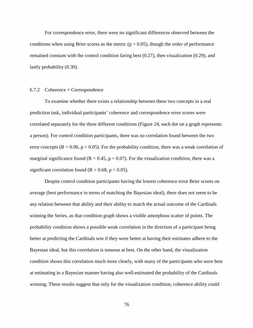
76
For correspondence error, there were no significant differences observed between the
conditions when using Brier scores as the metric (p > 0.05), though the order of performance
remained constant with the control condition faring best (0.27), then visualization (0.29), and
lastly probability (0.30).
6.7.2 Coherence × Correspondence
To examine whether there exists a relationship between these two concepts in a real
prediction task, individual participants’ coherence and correspondence error scores were
correlated separately for the three different conditions (Figure 24, each dot on a graph represents
a person). For control condition participants, there was no correlation found between the two
error concepts (R = 0.06, p > 0.05). For the probability condition, there was a weak correlation of
marginal significance found (R = 0.45, p < 0.07). For the visualization condition, there was a
significant correlation found (R = 0.68, p < 0.05).
Despite control condition participants having the lowest coherence error Brier scores on
average (best performance in terms of matching the Bayesian ideal), there does not seem to be
any relation between that ability and their ability to match the actual outcome of the Cardinals
winning the Series, as that condition graph shows a visible amorphous scatter of points. The
probability condition shows a possible weak correlation in the direction of a participant being
better at predicting the Cardinals win if they were better at having their estimates adhere to the
Bayesian ideal, but this correlation is tenuous at best. On the other hand, the visualization
condition shows this correlation much more clearly, with many of the participants who were best
at estimating in a Bayesian manner having also well-estimated the probability of the Cardinals
winning. These results suggest that only for the visualization condition, coherence ability could

77
R² = 0.4593
00.10.20.30.40.50.60.7
0 0.02 0.04 0.06 0.08 0.1 0.12
Corr
espo
nden
ce E
rror
(Brie
r)
Coherence Error (Brier)
Visualization Condition
be taken as a true and good predictor of correspondence ability in this World Series probability
estimation task.
Figure 24. Coherence × correspondence correlations, by condition.
6.7.3 Aggregation Techniques
Three aggregation techniques were used to post-process the data, the correspondence
error results of which, were pitted against the (un-weighted, un-aggregated) group means per
condition that were presented earlier in section 6.6.1, Figure 23. The first technique was the
standard “wisdom of the crowd” (Surowiecki, 2004) in which for each condition, all those
R² = 0.0031
00.10.20.30.40.50.60.7
0 0.02 0.04 0.06 0.08 0.1 0.12
Corr
espo
nden
ce E
rror
(Brie
r)
Coherence Error (Brier)
Control Condition
R² = 0.1984
00.10.20.30.40.50.60.7
0 0.02 0.04 0.06 0.08 0.1 0.12
Corr
espo
nden
ce E
rror
(Brie
r)
Coherence Error (Brier)
Probability Condition
Experiment 3: Coherence × Correspondence, Split by Condition

78
participants’ win probability estimates for each game were averaged together to create a crowd
probability estimate, and then Brier score analysis was performed on these crowd estimates.
Inspired by the notion of coherence possibly being a true and good predictor of correspondence,
the second technique was a weighted average by coherence competence. In other words, for each
condition, a weighted average was taken of all those participants’ win probability estimates, with
more weight given to the probability estimates of those participants whose answers adhered more
closely to Bayesian ideals, and less weight given to the probability estimates of those participants
whose answers were farther from the Bayesian ideals, and then Brier score analysis was
performed on these weighted crowd estimates. The last technique was an average where for each
condition, only win probability estimates from the top 3 performers in terms of coherence
competence (the top 3 people who were best at matching their answers to the Bayesian ideals)
were averaged together, and then Brier score analysis was performed on these averages. The
following graph shows the correspondence error results for the un-aggregated/ unweighted group
means, and the three aggregation techniques, per condition (Figure 25). The three aggregation
techniques do not have error bars because they are single data points.
Figure 25. Correspondence Brier error scores for unweighted group means + 3 aggregation techniques.
00.05
0.10.15
0.20.25
0.30.35
0.4
Control Probability Visualization
Corr
espo
nden
ce E
rror
(Brie
r)
Experiment 3: Aggregation by Coherence Competence
Unweighted Group Mean Wisdom of the Crowd Weighted Avg by Coherence Avg Top 3 by Coherence

79
For all conditions, there does not seem to be much difference between the un-aggregated/
unweighted group mean, wisdom of the crowd, and weighted average by coherence. The 95%
confidence intervals indicate that there is a slight difference between the unweighted group mean
and the top 3 by coherence for the control and probability conditions, but it is in the visualization
condition that this difference becomes obvious, meaning that the top 3 performers in terms of
coherence in this condition were markedly better at predicting the Cardinals’ World Series win,
compared to the rest of their participant group. This follows from the previous results of
correlating the coherence and correspondence measures where a solid correlation existed only for
the visualization condition, indicating a positive relationship between ability to adhere to the
Bayesian ideal and ability to perform the MLB World Series prediction task well.
6.7.4 Knowledge-Based Questions
Upon conclusion of testing, all participants were quizzed on two sets of knowledge-based
questions. The first set contained questions pertaining to specifics of the 2011 MLB World
Series, such as ones asking for descriptions of anomalous events that occurred during the games,
the names of starting pitcher matchups, how many innings a certain game lasted, etc. The second
set assessed more general baseball knowledge, asking questions about terminology, MLB teams
other than the two competing in the World Series, division structure, etc. Participants were
scored on both sets of questions, and their scores for the two sets ended up being correlated fairly
highly at (R = 0.723, p < 0.05). Thus for the following analyses, a single composite score that
incorporates both sets is used.
The composite knowledge-based questions score was correlated with correspondence
Brier error scores for all participants across the three conditions (Figure 26, each dot represents

80
one participant), the result being a small but significant positive correlation, R = 0.283, p < 0.05.
In other words, a better composite knowledge score meant a higher Brier correspondence score.
However, because the Brier score is measuring error, this actually means that the more general
baseball + specific-to-2011-Series knowledge a participant had, the worse predictions they made
of who would win the Series. How could more knowledge result in worse performance? A good
candidate explanation might be that in this MLB World Series task, perhaps well-documented
performance-harming phenomena related to the overconfidence bias (Lichtenstein, Fischoff, &
Phillips, 1982) could be at work. For example, a participant’s overconfidence might cause
him/her to be more extreme in predicting an outcome than either the amount of his/her personal
knowledge, or the amount information that is knowable about the situation warrants. And by
nature, the mathematics of the Brier score heavily punishes extreme wrong answers more than it
rewards extreme correct answers.
Figure 26. Composite Knowledge × Correspondence correlation, collapsed across all 3 conditions.
The composite knowledge score and correspondence Brier error score correlation was
split by the three conditions (Figure 27), yielding marginal positive correlations for the control
R = 0.283, p < .05
0
0.1
0.2
0.3
0.4
0.5
0.6
0 2 4 6 8 10 12 14 16 18 20
Corr
espo
nden
ce E
rror
(Brie
r)
Composite Knowledge Score
Experiment 3: Knowledge × Correspondence

81
R = -0.026, p > .05
0
0.1
0.2
0.3
0.4
0.5
0.6
0 2 4 6 8 10 12 14 16 18 20
Corr
espo
nden
ce E
rror
(Brie
r)
Composite Knowledge Score
Visualization
condition (R = 0.412, p < 0.09) and probability condition (R = 0.430, p < 0.08) (slightly higher
than the collapsed-across-three-conditions results above), but no correlation for the visualization
condition (R = -0.026, p > 0.05). In other words, for the probability and control conditions, the
detrimental effect on task performance of having more baseball knowledge remains. In fact, it
would appear that this unfavorable correlation is entirely driven by the control and probability
conditions. In contrast, for participants who had use of the visualization, this correlation was
completely erased. This result would seem to imply that the visualization somehow corrects for
any overconfidence bias from having more knowledge.
Figure 27. Composite Knowledge × Correspondence correlations, by condition.
R = 0.412, p < .09
0
0.1
0.2
0.3
0.4
0.5
0.6
0 2 4 6 8 10 12 14 16 18 20
Corr
espo
nden
ce E
rror
(Brie
r)
Composite Knowledge Score
Control
R = 0.430, p < .08
0
0.1
0.2
0.3
0.4
0.5
0.6
0 2 4 6 8 10 12 14 16 18 20
Corr
espo
nden
ce E
rror
(Brie
r)
Composite Knowledge Score
Probability
Experiment 3: Knowledge × Correspondence, Split by Condition

82
How might it accomplish this? One possible explanation is that going through the process
of using the visualization to try to come up with an answer equalized the playing field by
nudging participants to also remember external task factors that influence the outcome, and rely
less on internal information such as their perceptions about their knowledge – somewhat akin to
how consider-the-opposite debiasing techniques encourage consideration of outside factors one
did not previously consider. Or perhaps the more abstract nature of the visualization caused
participants to realize that they should not depend so much on their case-specific information in
an uncertain environment, but should instead regress their judgments closer to the mean – a
lessening of regression bias and extreme probability estimates.
Whatever explanation may be the case, it is undeniable that the visualization manages to
mitigate the vexing, and at first glance, unintuitive problem of more knowledge leading to worse
judgment performance. The ideal case has always been to capitalize on a wealth of domain
knowledge and use it to facilitate performance in that domain. However, the ideal has too often
been hampered by the reality of an ensuing need to skirt the various cognitive biases that having
more knowledge can engender. The ability to tamp down these biases, as the visualization
apparently did in this experiment, is a helpful property of great potential and invaluable use in
the aiding of human judgment.
Correlating the composite knowledge score with coherence Brier error scores produced
no significant differences, whether done across all three conditions, or split by the conditions
individually (p > 0.05). This finding is unsurprising in that knowledge about baseball should not
affect ability to reason in a Bayesian manner.

83
6.7.5 Write-aloud Protocols and Strategies
Several interesting observations could be gleaned from the probability and visualization
condition participants’ write-aloud protocols. Though it did not happen often in an absolute
sense, probability condition participants were more likely to ignore answers they calculated
based on the historical statistics, when those answers did not seem to be within the ballpark of
reality (i.e. a calculated win probability of 10% when a team is winning 4-2 in a Series). When
this happened, some would just go with their own intuitions, many of which were based on
reasonable ideas such as the probability of a team winning being 50% when the win-loss record
is tied. Many more probability participants also wrote explanations in their protocols that seemed
completely random or were indeterminate. The different conditions tended to foster different
common wrong strategies. Probability participants were most likely to use the wrong strategy
p(H|E) = p(E|H), which ironically often gave more accurate answers in the MLB World Series
task than the most likely wrong strategy for visualization participants: p(H|E) = p(E|H)/p(H),
where H is the hypothesis of the team winning and E is the win-loss record evidence.
6.7.6 Accuracy of Bayesian Reasoning
Because Experiment 3 was mainly focused on the relationship between coherence and
correspondence (due to the introduction of a real-time task where matching the state of the world
became of utmost importance), the Brier score was newly presented as a continuous measure that
could singly score participants on both constructs. However, the degree to which participants
could reason in a Bayesian manner (coherence) was assessed in quite different manner for the
previous two experiments (when correspondence was not at stake). For the sake of completeness,
this method was also re-used on the data from Experiment 3.

84
Write-aloud protocols from the probability and visualization conditions were examined to
confirm the presence/absence of normative Bayesian reasoning processes. If the protocol for an
answer did not adhere to some form of proper Bayesian reasoning, then the answer was counted
as incorrect. Participants’ protocols were scored by the experimenter. As with Experiment 2, a
subsequent blind coding at a later date was not attempted due to the impracticality of this course
of action given the working timeframe, and the integrity of the data being compromised by the
experimenter’s writings on the protocols.
The control condition was excluded from this analysis because those participants did not
have written protocols. Results show that participants who had use of the visualization
demonstrated a higher proportion of correct Bayesian judgments than those who had probability-
formatted problems: 35% for visualization and 0% for probability (p < 0.05 as per the Kruskal-
Wallis test). Thus even though there were no differences between conditions in coherence
competence as measured by the Brier score, there is a clear difference in coherence between the
probability and visualization conditions as measured by the traditional percent correct method of
assessment. These numbers are low for both conditions especially compared to Experiment 1,
likely because the online format of the study procedure meant that participants spent much
shorter time on each problem – mere minutes, as can be confirmed by the timestamps of their
submitted answers.
6.8 Discussion
Experiment 3 situated the visualization framework in the world of real-time prediction of
a concrete, to-be-resolved, probability estimation/updating Bayesian problem. This design
carried forth the theoretical underpinnings of the first two experiments while additionally

85
allowing for a specific test case, under conditions of real-world-level uncertainty, of the
heretofore tacit assumption that coherence competency, a judge’s ability to reason correctly
according to the prescriptions demanded by the problem (Bayes’ Theorem in this case) directly
yields correspondence competency, or harmony between what the judge predicts and what
actually happens in the world.
In sum, it was found that use of the visualization moderated several beneficial effects in
performance for participants doing the MLB World Series baseball task. It likely allowed them
to reason more accurately in a Bayesian manner (according to the results of the stringent write-
aloud protocol analysis from section 6.7.6, but not according to the Brier score analysis from
section 6.7.1), nullified the negative effects of overconfidence, and fostered coherence
competency that soundly predicted correspondence competency – in other words, with this
subset of participants, knowing that someone could reason in a Bayesian manner while using the
visualization meant that it could also be reasonably known that that person will be good at
predicting who will win the 2011 MLB World Series, before the fact. This finding would seem to
lend support to the idea of developing aggregation techniques that elicit early measures of judge
coherence competence during properly aided forecasting, which could then be leveraged in a
successful aggregation scheme.

86
CHAPTER 7: GENERAL DISCUSSION
People are frequently required to make timely and accurate Bayesian judgments, despite
a rather large body of research trumpeting human inability to do so. However, all is not lost. As
with heuristics and biases, and its counterpoint, fast-and-frugal heuristics, sometimes one need
only discover the silver lining within a sea of dark clouds. Either we stop at the declaration that
people are irrational, or we continue on to find that rationality is but a skip away. As such, this
dissertation details three experiments that were conducted to evaluate the efficacy of individual
instantiations of a visualization framework, for aiding human performance (nudging people to
behave as intuitive Bayesians) in three different types of Bayesian problem environments.
Experiment 1 tested the visualization in elementary Bayesian problems, where one piece
of evidence prompts one update of a prior probability to a posterior probability. In an attempt to
beat the benchmark of debiasing performance set by natural frequency formats, it was found that
this improvement can indeed be drastically bolstered via the introduction of interactive computer
visualizations to help judges literally see and manipulate the different parts of a Bayesian
probability problem. In addition, it is not necessary to spend large amounts of time teaching
judges to use these visualizations prior to eliciting their contingent judgments – simply supplying
a visualization and short explanation of its parts, without ever showing the judge how to use it to
solve a problem, can be sufficient.
Experiment 2 tested the visualization with chains of reasoning problems, where multiple
independent pieces of evidence affect the prior probability and necessitate a sequence of updates
in order to reach a final posterior probability. The visualization from Experiment 1 was extended
to accommodate this new form of problem by translating it into a more flexible programming
language, although this change also, in part, prompted the necessity of a longer training time. It

87
was found that performance across the board was depressed by the added complexity of chain
problems, but that improvement via interactive visualizations was still possible, though it appears
to be restricted to judges who possess high enough numeracy to make good use of them.
In Experiment 3, participants who were experienced and knowledgeable baseball fans
predicted the probability with which their favored team would win the 2011 Major League
Baseball World Series, giving an initial prior probability shortly before the start of the Series,
and then sequentially updating their answer as the individual games unfolded over time. Results
suggest the visualization might be helpful in alleviating detrimental effects of overconfidence.
Participants using the visualization also achieved better coherence than their peers that went
without, though there was no difference in correspondence with the actual outcome of the 2011
MLB World Series. However, only with those participants who used the visualization, it could
be demonstrated that coherence competence predicted correspondence competence – a useful
relationship for aggregation purposes, as well as for other reasons.
Altogether, findings from three experiments point to visualizations being a rich area to
mine, with significant implications for expanding the toolbox of techniques that can be used to
more accurately elicit judges’ predictions in Bayesian reasoning problems, as well as potentially
allow for informed a priori forecasts of the amount of agreement between judges’ predictions
and ground truth – the elusive prediction of correspondence competence after the fact, based on
more readily available coherence competence information before the fact.
The visualizations documented here all stem from a single framework that, at its core, is
based on frequency boxes. A new direction that might be interesting to explore is visualizations
based on other types of shapes. For example, some studies have made good use of tree formats to
display the branching out nature of Bayesian frequencies (Sedlmeier & Gigerenzer, 2001). There
88
are also other kinds of Bayesian problems occurring in the world that were not tested here, but
that are just as important and worthy of aid. Chains of reasoning problems with dependencies in
the evidence are a prime candidate, given that they are almost impossible to reason about on an
intuitive level. It is also the case that in some instances, the probability numbers in a Bayes
problem are not point estimates, but rather come from distributions. Such problems would
require further tailoring of the current visualization to accommodate this aspect, or perhaps even
creation of new visualizations based on what set of features would be best suited. An alternative
direction that retains the original visualizations of this set of studies would be to test for learning
effects, rather than on-the-fly usage. The present studies did not examine the issue of whether the
visualizations might serve well as training tools, either via deliberate training or passive
experience. It could be the case that after using the visualizations, people are able to develop
good intuitions about Bayesian reasoning to a point where they can then transfer those intuitions
to another set of problems where use of visualizations is restricted, or perhaps even further, to
probability-formatted problems. Such results would only add to the value of visualizations for
assisting human Bayesian reasoning.

89
REFERENCES
Abramson, B., Brown, J., Edwards, W., Murphy, A. H., & Winkler, R. L.(1996). HAILFINDER: A Bayesian system for predicting extreme weather. International Journal of Forecasting, 7, 57-78.
Adams, J. B. (1976). A probability model of medical reasoning and the MYCIN model. Mathematical Biosciences, 32, 177-186.
Adams, P. A., & Adams, J. K. (1960). Confidence in the recognition and reproduction of words difficult to spell. The American Journal of Psychology, 73, 544-552.
Ancker, J. S., Weber, E. U., & Kukafka, R. (2011). Effects of game-like interactive graphics on risk perceptions and decisions. Medical Decision Making, 31, 130-142.
Arkes, H. R. (1991). Costs and benefits of judgment errors: Implications for debiasing. Psychological Bulletin, 110, 486-498.
Bar-Hillel, M. (1980). The base-rate fallacy in probability judgments. Acta Psychologica, 44, 211-213.
Bayes, T., & Price, R. (1763). An essay towards solving a problem in the doctrine of chance. By the late Rev. Mr. Bayes, communicated by Mr. Price, in a letter to John Canton, M. A. and F. R. S. Philosophical Transactions of the Royal Society of London, 53, 370-418.
Berry, D. A. (1997). Teaching elementary Bayesian statistics with real applications in science. The American Statistician, 51, 241-246.
Brier, G. W. (1950). Verification of forecasts expressed in terms of probability. Monthly Weather Review, 78, 1-3.
Burns, K. (2004). Bayesian boxes: A colored calculator for picturing posteriors. In A. Blackwell, K. Marriott, & A. Shimojima (Eds.), Diagrams 2004 - Diagrammatic Representation and Inference - Third International Conference, March 22-24, 2004, Cambridge, UK. pp. 382-384.
Dow, K., & Cutter, S. L. (2008). Crying wolf: Repeated responses to hurricane evacuation orders. Coastal Management, 26, 237-252.
Edwards, W, Phillips, L.D., Hays, W.L., & Goodman, B.C. (1968). Probabilistic information processing systems: Design and evaluation. IEEE Transactions on Systems Science and Cybernetics, SSC-4, 248-265.
Ericsson, K. A., Krampe, R. Th., & Tesch-Roemer, C. (1993). The role of deliberate practice in the acquisition of expert performance. Psychological Review, 100, 363-406.

90
Finger, R. A., & Bisantz, A. M. (2002). Utilizing graphical formats to convey uncertainty in a decision-making task. Theoretical Issues in Ergonomics Science, 3, 1-25.
Fong, G. T., Lurigio, A. J., &. Stalans, L. J. (1990). Improving probation decisions through statistical training. Criminal Justice and Behavior, 17, 370-388.
Gelman, A. (2008). Objection to Bayesian statistics (with discussion). Bayesian Analysis 3, 445-478.
Gigerenzer, G. (2001). The adaptive toolbox. In G. Gigerenzer, & Selten, R. (Eds.), Bounded rationality: The adaptive toolbox (pp. 37-50). Cambridge, MA: MIT Press.
Gigerenzer, G., Gaissmaier, W., Kurz-Milcke, E., Schwartz, L. M., & Woloshin, S. (2008). Helping doctors and patients make sense of health statistics. Psychological Science in the Public Interest, 8, 53-96.
Gigerenzer, G., & Goldstein, D. G. (1996). Reasoning the fast and frugal way: Models of bounded rationality. Psychological Review, 103, 650-669.
Gigerenzer, G. & Hoffrage, U. (1995). How to improve Bayesian reasoning without instruction: Frequency formats. Psychological Review, 102, 684-704.
Gigerenzer, G., & Hoffrage, U. (1999). Overcoming difficulties in Bayesian reasoning: A reply to Lewis and Keren (1999) and Mellers and McGraw (1999). Psychological Review, 106, 425-430.
Gigerenzer, G., Todd, P. M., & the ABC Research Group. (1999). Simple heuristics that make us smart. New York: Oxford University Press.
Gilovich, T. (1991). How We Know What Isn’t So: The Fallibility of Human Reason In Everyday Life. New York: Free Press.
Gould, S. J. (1992). Bully for Brontosaurus: Further reflections in natural history. New York: Penguin Books.
Hammond, K. R. (1996). Human judgment and social policy: Irreducible uncertainty, inevitable error, unavailable injustice. New York: Oxford University Press.
Hand, D. J., & Yu, K. (2001). Idiot’s Bayes: Not so stupid after all? International Statistical Review, 69, 385-398.
Handmer, J., & Proudley, P. (2007. Communicating uncertainty via probabilities: The case of weather forecasts. Environmental Hazards, 7, 79-87.
Hansell, S. (2008, September 18). How wall street lied to its computers. New York Times.

91
Herzog, S. M., & Hertwig, R. (2009). The wisdom of many in one mind: Improving individual judgments with dialectical bootstrapping. Psychological Science, 20, 231-237.
Hoffrage, U., & Gigerenzer, G. (1998). Using natural frequencies to improve diagnostic inferences. Academic Medicine, 73, 538-540.
Horrey, W. J., Wickens, C. D., Strauss, R. A., Kirlik, A., & Stewart, T. R. (2006). Supporting situation assessment through attention guidance and diagnostic aiding: The benefits and costs of display enhancement on judgment skill. In A. Kirlik (Ed.), Adaptive perspectives on human-technology interaction (pp. 55-70). New York: Oxford University Press.
Kahneman, D., & Tversky, A. (1972). Subjective probability: A judgment of representativeness. Cognitive Psychology, 3, 430-454.
Kahneman, D., & Tversky, A. (1979). Prospect theory: An analysis of decision under risk. Econometrica, 47, 263-291.
Kirlik, A. (2005). Work in progress: Intelligence for an invented world. In R. J. Sternberg, & D. D. Preiss (Eds.), Intelligence and technology: The impact of tools on the nature and development of human abilities (pp. 105-133). Mahwah, New Jersey: Lawrence Erlbaum Associates.
Kirlik, A., & Strauss, R. A. (2006). Situation awareness as judgment I: Statistical modeling and measurement. International Journal of Industrial Ergonomics, 36, 463-474.
Klayman, J., & Brown, K. (1993). Debias the environment instead of the judge: An alternative approach to reducing error in diagnostic (and other) judgments. Cognition, 49, 97-122.
Kruger, J., & Dunning, D. (1999). Unskilled and unaware of it: How difficulties in recognizing one’s own incompetence lead to inflated self-assessments. Journal of Personality and Social Psychology, 77, 1121-1134.
Koriat, A., Lichtenstein, S., & Fischhoff, B. (1980). Reasons for confidence. Journal of Experimental Psychology: Human Learning and Memory, 6, 107-118.
Krauss, S., Martignon, L., Hoffrage, U. (1999). Simplifying Bayesian inference. In L. Magnani, N. Nersessian, & N. Thagard (Eds.), Model-based reasoning in scientific discovery (pp. 165-179). New York: Plenum Press.
Larrick, R. P. (2004). Debiasing. In D. Koehler & N. Harvey (Eds.), Blackwell handbook of judgment and decision making (pp. 316-337). Oxford, England: Blackwell.

92
Lefevre, R. J., Pfautz, J., & Jones, K. (2005). Weather forecast uncertainty management and display. Paper presented at the 21st International Conference on Interactive Information Processing Systems (UPS) for Meteorology, Oceanography, and Hydrology, San Diego, CA.
Lichtenstein, S., Fischhoff, B., & Phillips, L. D. (1982). Calibration of probabilities: The state of the art to 1980. In Kahneman, D, Slovic, R, & Tversky, A. (Eds.), Judgment under uncertainly: Heuristics and biases (pp. 306-354). Cambridge, England: Cambridge University Press.
Lindeman, S. T., van den Brink, W. P., & Hoogstraten, J. (1988). Effect of feedback on base-rate utilization. Perceptual and Motor Skills, 67, 343-350.
List of cognitive biases. (n.d.). In Wikipedia. Retrieved April 8, 2012, from http://en.wikipedia.org/wiki/List_of_cognitive_biases
Matheny, J. G. (2010, June 30). Aggregative contingent estimation (ACE) program - Broad agency announcement (BAA). The Intelligence Advanced Research Projects Activity. Retrieved from http://www.iarpa.gov/solicitations_ace.html.
Mazzetti, M., & Shanker, T. (2012, March 19). U.S. war game sees perils of Israeli strike against Iran. The New York Times. Retrieved from http://www.nytimes.com.
Meehl, P. E. (1954). Clinical versus statistical prediction: A theoretical analysis and a review of the evidence. Minneapolis, MN: University of Minnesota Press.
Merkhofer, M. W. (n.d.). Part 1: Errors and biases in judgment. Retrieved April 8, 2012, from http://www.prioritysystem.com/reasons1.html
Miller, S. M. (2008). Supporting joint human-computer judgment under uncertainty (Doctoral dissertation). University of Illinois at Urbana-Champaign, Urbana, IL.
Miller, S. M. (2010, July 1). A bat and a ball. PowerPoint lecture presented in The Charles Stark Draper Laboratory. Cambridge, MA.
NIE. (2007). Iran: Nuclear intentions and capabilities.
Pang, A. T., Wittenbrink, C. M., & Lodha, S. K. (1997). Approaches to uncertainty visualization. The Visual Computer, 13, 370-390.
Peterson, C. R., DuCharme, W. M., & Edwards, W. (1968). Sampling distributions and probability revision. Journal of Experimental Psychology, 76, 236-243.
Reason, J. (1990). Human error. Cambridge, UK: Cambridge University Press.

93
Schaefer, R. E. (1976). The evaluation of individual and aggregated subjective probability distributions. Organizational Behavior and Human Performance, 17, 199-210.
Schum, D. A. (1999). Probabilistic reasoning and the science of complexity. In J. Shanteau, B. A. Mellers, & D. A. Schum (Eds.), Decision science and technology: Reflections on the contributions of Ward Edwards (pp. 183-210). Norwell, MA: Kluwer Academic Publishers.
Sedlmeier, P. & Gigerenzer, G. (2001). Teaching Bayesian reasoning in less than two hours. Journal of Experimental Psychology: General, 130, 380-400.
Smith, S. K., Trevena, L. Simpson, J. M., Barratt, A., Nutbeam, D., & McCaffery, K. J. (2006). A decision aid to support informed choices about bowel cancer screening among adults with low education: Randomised controlled trial. BMJ, 341, 1-13.
Soll, J. B., & Klayman, J. (2004). Overconfidence in interval estimates. Journal of Experimental Psychology: Learning, Memory, and Cognition, 30, 229-314.
Stanovich, K. E., & West, R. F. (1999). Who uses base rates and P(D|~H)? An analysis of individual differences. Memory & Cognition, 26, 161-179.
Strauss, R. A., & Kirlik, A. (2006). Situation awareness as judgment II: Experimental demonstration. International Journal of Industrial Ergonomics, 34, 475-484.
Surowiecki, J. (2004). The wisdom of crowds. New York: Doubleday.
Szolovits, P. (1995). Uncertainty and decisions in medical informatics. Methods of Information in Medicine, 34, 111-121.
Tetlock, P. E. (2005). Expert political judgment: How good is it? How can we know? Princeton, New Jersey: Princeton University Press.
Thaler, R., & Sunstein, C. (2008). Nudge: Improving decisions about health, wealth, and happiness. New Haven, CT: Yale University Press.
Tsai, J., Kirlik, A., Miller, S., & Kosorukoff, A. (2008). Rule and instance based strategies in expert judgment. Proceedings of the Human Factors and Ergonomics Society 52nd Annual Meeting. New York, NY.
Tversky, A., & Kahneman, D. (1983). Extension versus intuitive reasoning: The conjunction fallacy in probability judgment. Psychological Review, 90, 293-315.
Tversky, A., & Kahneman, D. (1974). Judgment under uncertainty: Heuristics and biases. Science, 185, 112-1131.
Vicente, K. (2006). The human factor. New York, NY: Taylor & Francis Group.

94
“WhoWins: Best-of-7 historical victory probabilities.” (n.d.). Retrieved October 30, 2011, from WhoWins: Best-of-7: http://www.whowins.com/
Zahn, P. (2002). Is their (sic) a “Sports Illustrated” cover jinx? CNN. Retrieved from http://transcripts.cnn.com/TRANSCRIPTS/0201/25/ltm.01.html.