Untitled - Dan Ben-David
511
≤∞±¥
-
Upload
khangminh22 -
Category
Documents
-
view
2 -
download
0
Transcript of Untitled - Dan Ben-David

≤∞±¥

STATE OF THE
NATION REPORT
Society, Economy and Policy in Israel
2014

This publication is dedicated,
in loving memory, to
Ralph I. Goldman z”l
a Taub Center founder, Board Member, dear friend, trusted
advisor and guiding light.

The Herbert M. Singer Annual Report Series
STATE OF THE NATION REPORT
Society, Economy and Policy in Israel
2014
Dan Ben-David, Editor
Taub Center for Social Policy Studies in Israel
Jerusalem, December 2014

Taub Center for Social Policy Studies in Israel
Established in 1982 under the leadership and vision of Herbert M. Singer,
Henry Taub, and the American Jewish Joint Distribution Committee (JDC),
the Center is funded by a permanent endowment created by the Henry and
Marilyn Taub Foundation, the Herbert M. and Nell Singer Foundation, Jane
and John Colman, the Kolker-Saxon-Hallock Family Foundation, the Milton
A. and Roslyn Z. Wolf Family Foundation, and the JDC.
The Taub Center is an independent, nonpartisan, socioeconomic research
institute based in Jerusalem. The Center conducts quality, impartial research
on socioeconomic conditions in Israel, and develops innovative, equitable
and practical options for macro public policies that advance the well-being of
Israelis. The Center strives to influence public policy through direct
communications with policy makers and by enriching the public debate that
accompanies the decision making process.
This volume, like all Center publications, represents the views of its
authors only, and they alone are responsible for its contents. Nothing stated
in this book creates an obligation on the part of the Center, its Board of
Directors, its employees, other affiliated persons, or those who support its
activities.
Editing and lay-out: Laura Brass, Inbal Gafni
Graphics: Yulia Cogan
Translation: Raphael Blumberg, Ruvik Danieli, Shoshana London-Sappir,
Julie Rosenzweig/Sagir International Translations Ltd., Ziona
Sasson
Copyright © 2014 by the Taub Center for Social Policy Studies in Israel
All rights reserved
Center address:
15 Ha’ari Street, Jerusalem, Israel
Tel: 972 2 567 1818 Fax: 972 2 567 1919
Email: [email protected] Website: www.taubcenter.org.il
Printed at Printiv, Jerusalem

Board of Directors
Chairman: Greg Rosshandler
Helen Abeles, Jim Angell, Penny Blumenstein, Stuart Brown, John Davison,
Alan Gill, Ellen M. Heller, Benny Landa, Stephen Lieberman, Shula
Recanati, Michael Saxon, Michael Steinhardt, Caryn Wolf Wechsler, Joyce
Zeff
International Advisory Council Henry Aaron (Brookings Institution), David Autor (MIT), Mario Blejer
(Banco Hipotecario), Aaron Ciechanover (Technion), Stuart Eizenstat
(Covington), Han Entzinger (Erasmus University), Adam Gamoran
(University of Wisconsin), Eric Hanushek (Stanford University), James J.
Heckman (University of Chicago), Peter Heller (Johns Hopkins University),
Daniel Kahneman (Princeton University), Robert Litan (Brookings
Institution), Janet Rothenberg-Pack (University of Pennsylvania), Burton A.
Weisbrod (Northwestern University)
Center Staff
Executive Director: Dan Ben-David
Deputy Director and Labor Policy Program Chair: Ayal Kimhi
Managing Director: Suzanne Patt Benvenisti
Kasanesh Ambao (Housekeeping), Sagit Azary-Viesel (Researcher), Gal Ben
Dor (Director of Marketing and Communication), Nachum Blass (Senior
Researcher), Haim Bleikh (Researcher), Liora Bowers (Director of Policy),
Gilad Brand (Researcher), Laura Brass (Publications), Dov Chernichovsky
(Health Policy Program Chair), Yulia Cogan (Researcher), Aharon Cohen
(Maintenance), Tova Cohen (Intern), Maya Dolgin (Strategic Partnerships
Officer), Hedva Elmackias (Office Manager), Hadas Fuchs (Researcher),
Inbal Gafni (Publications Editor), Noam Gruber (Senior Researcher), Nofar
Gueta (Intern), Moshe Hazan (Economics Policy Program Chair), Shavit
Madhala (Researcher), Eitan Regev (Researcher), Tzlil Renassia (Intern),
Michal Rubin (Director of Strategic Partnerships), Yossi Shavit (Education
Policy Program Chair), Kyrill Shraberman (Researcher), Haya Stier (Social
Welfare Policy Program Chair)
Past Directors: Israel Katz (z”l), Yaakov Kop

Policy Program Fellows
Economics Policy Program Moshe Hazan, Chair, Yarom Ariav, Adi Brender, David Brodet, Doron Cohen,
Reuben Gronau, Jack Habib, Shuki Oren, Dan Peled, Assaf Razin, Haim Shani,
Eytan Sheshinski, Shmuel Slavin, Avia Spivak, Michel Strawczynski, Shlomo
Yitzhaki, Ben Zion Zilberfarb
Education Policy Program Yossi Shavit, Chair, Khaled Abu-Asba, Ismael Abu Saad, Chaim Adler, Shlomit
Amichai, Chana Ayalon, Shlomo Beck, Gila Ben Har, Yair Berson, Carmel
Blank, Avital Darmon, Inas Deeb, Yigal Douchan, Dalia Fadila, Yariv Feniger,
Isaac Friedman, Yossi Gidanian, Eli Isenberg, Meir Kraus, David Maagan,
Zemira Mevarech, Yael Navon, David Nevo, Sephi Pumpian, Dimitri Romanov,
Analia Schlosser, Rita Sever, Yehudit Shalvi, Shimshon Shoshani, Kemal
Shufniyah, Sidney Strauss, Rami Sulimani, Yuval Vurgan, Zvi Yanai, Miri
Yemini, Michael Yodovitsky, Noam Zussman
Health Policy Program Dov Chernichovsky, Chair, Alexander Aviram, Uri Aviram, Ran Balicer,
Shlomo Barnoon, Roi Ben Moshe, Nakhle Beshara, Bishara Bisharat, Adi
Brender, Shay Brill, David Chinitz, Chaim Doron, Asher Elhayany, Leon
Epstein, Gideon Eshet, Zeev Feldman, Ronni Gamzu, Iris Ginzburg, Dan
Greenberg, Eitan Hai-Am, Jonathan Halevy, Eran Halperin, Avi Israeli, Orit
Jacobson, Avigdor Kaplan, Rachel Kaye, Jacob Menczel, Meir Oren, Baruch
Ovadia, Eran Politzer, Haim Reuveni, Yair Shapiro, Amir Shmueli, Yohanan
Stessman, Yona Vaisbuch
Labor Policy Program Ayal Kimhi, Chair, Hagai Atkas, Daniel Gottleib, Eric Gould, Nitza Kasir, Shelly
Levi, Hagay Levine, Yaakov Loupo, Miki Malul, Guy Mundlak, Dalia Narkiss,
Tali Regev, Dimitri Romanov, Moshe Semyonov, Ofer Setty, Sigal Shelach,
Arie Syvan, Yossi Tamir, Aviad Tur-Sinai, Eran Yashiv
Social Welfare Policy Program Haya Stier, Chair, Mimi Ajzenstadt, Michal Almog-Bar, Dorit Altschuler, Uri
Aviram, Shirley Avrami, Roni Barzuri, Yigal Ben-Shalom, Israel Doron, Johnny
Gal, Boni Goldberg, Chana Katz, Lihi Lahat, Yoav Lavee, Alisa Lewin, Ibrahim
Mahajne, Miki Malul, Menachem Monnickendam, Baruch Ovadiah, Amir Paz-
Fuchs, Michael Shalev, Sigal Shelach, Roni Strier, Yossi Tamir, Idit Weiss-Gal,
Meir Yaish, Uri Yanay

IX Table of Contents
STATE OF THE NATION REPORT
Society, Economy and Policy in Israel
2014
Table of Contents
Foreword 13
I. THE COST OF LIVING
Making Ends Meet – Household Income, Expenditures
and Savings in Israel
19
Eitan Regev
Introduction 20
1. Household Income 21
2. Household Expenditures 33
3. Household Savings 42
4. Sources of the Gap Between Reported Income and
Expenditures of Haredi Households
65
Spotlight: How Haredi Families Contend with Rising House
Prices, Ayal Kimhi, Nachum Blass and Haim Bleikh
75
5. Summary and Conclusions 78
Appendices 80
The Israeli Housing Market 91
Noam Gruber
Introduction 92
1. Characteristics of the Housing Market 92
2. Estimating Housing Prices 96
3. Social Impact of the Rise in Housing Prices 100
4. Impact of Interest Rates on Housing Demand 111
5. Taxing Rental Income 122
6. Housing Supply 127
7. Limits on Israel’s Housing Supply 133
8. Summary and Conclusions 155
Appendix 159

X The State of the Nation Report 2014
Appendix 298
II. MACRO AND LABOR MARKET
Labor Market Reform in Israel and the Flexicurity Option 171
Dan Ben-David and Liora Bowers
Introduction 172
1. The Danish Example 173
2. Defining Flexicurity 177
Spotlight A: The Dutch Flexibility and Security Law 177
3. Classification of Developed Countries by
Flexicurity Parameters
181
Spotlight B: Flexicurity and the Great Recession 183
4. Flexicurity Countries Compared to Others 184
Spotlight C: External Flexibility in the Public Sector 186
5. A Comparison of Macroeconomic Performance Between
Flexicurity Countries and Other Countries
192
6. Moving Towards a Flexicurity Model in Israel:
Considerations and Recommendations
201
7. Paying for Flexicurity in Israel 210
8. Conclusion 214
Appendices 218
Labor Income Inequality Trends in Israel 225
Ayal Kimhi and Kyrill Shraberman
Introduction 226
1. International Comparisons of Wage Differences 227
2. Changes in the Wage Distribution 234
3. The Reasons for Wage Distribution Changes 238
4. Summary and Conclusions 254
Appendix 259
The Shadow Economy in Israel 263
Noam Gruber
Introduction 264
1. Main Reasons for the Shadow Economy 267
2. Mandatory Tax Filing 286
3. Electronic Money, Reduced Use of Cash and
Automatic Transaction Reporting
292
4. Summary and Conclusions 295

XI Table of Contents
Social Expenditure Tables 303
Sagit Azary-Viesel and Yulia Cogan
III. EDUCATION
Integration of Arab Israelis and Jews in Schools in Israel 323
Uri Shwed, Yossi Shavit, Maisalon Dellashi, and Moran Ofek
Introduction 324
1. Historical Background 325
2. Integration in the Education System, 2003-2013 328
3. Conclusion 342
Trends in the Development of the Education System 347
Nachum Blass
1. Demographic Trends 348
2. Resources Available to the Education System 350
3. International Comparison of Education System
Developments
356
4. Work Force 360
5. Learning Achievements 364
6. The Environment and Learning Atmosphere in Schools 380
7. Summary 383
Appendices 384
IV. POVERTY AND WELFARE
Poverty Within the Elderly Population in Israel 393
Haya Stier and Haim Bleikh
Introduction 394
1. Characteristics of Households in Which the Elderly Reside 396
2. Income Sources of the Elderly Population in Israel 401
3. Heterogeneity Among the Elderly 406
4. Living Arrangements Among the Elderly Population 413
Spotlight: International Comparisons of Poverty
Among the Elderly
421
5. Conclusion 427
Appendices 429

XII The State of the Nation Report 2014
Welfare Budgets for Israel’s Elderly Population 435
Sagit Azary-Viesel and Haya Stier
Introduction 436
1. National Insurance Institute Benefits 437
2. The Ministry of Social Affairs and Social Services –
The Service for the Elderly 448
3. Additional Services for the Elderly Provided
by Government Ministries 452
Patterns of Expenditure on Food in Israel 469
Dov Chernichovsky and Eitan Regev
Introduction 470
1. Data on Food Expenditure in Israel 470
2. Summary 485
Appendix 486
V. HEALTHCARE
Financing and Work Force Issues in Israel’s
Healthcare System
491
Dov Chernichovsky and Eitan Regev
1. National Expenditure on Healthcare Services and the
Composition of the System’s Funding
492
2. The Demographic Distribution of the Physician Population 497
3. Conclusion 502
Health Status and Healthcare System Budgeting in Israel in
the Context of Disability-Adjusted Life Years (DALYs)
505
Dov Chernichovsky and Liora Bowers
1. The DALY Metric 506
2. Causes of Death and Disease Burden in Israel 508
3. Resource Allocation to the Healthcare System in the Context
of Disability-Adjusted Life Years (DALYs)
511
4. Conclusions 519

13
Foreword
his was a year of challenging national security issues, and Israeli
society was once again forced to deal with crisis situations and
heavy losses. Nevertheless, key socioeconomic issues still managed to
rise above the winds of war. From protests on high dairy prices to the
controversial proposal to eliminate value added taxes on apartments for
young people and through the storm surrounding approval of the
country’s budget, the issue of the cost of living – its determinants and
impact – continues to remain among the primary issues at the top of the
country’s agenda.
The chapters of this State of the Nation Report 2014 offer an in-depth,
professional and accessible presentation of some of the socioeconomic
issues that appear regularly in the news: the latest trends in the housing
market (Gruber); food insecurity in Israel (Chernichovsky and Regev);
labor income inequality (Kimhi and Shraberman); and the magnitude and
impact of the shadow economy (Gruber). Special attention is given in this
year’s Report to the elderly population in Israel, which is examined from
two perspectives: the extent of poverty in this population group (Stier and
Bleikh) and the welfare benefits this group receives (Azary-Viesel and
Stier). In addition, the Report looks at trends in the education system
(Blass), and particularly at the integration of Jews and Arab Israelis in the
school system (Shwed et al.). The Report also focuses on developments
in the Israeli health care system (Chernichovsky and Regev). The
relationship (or lack thereof) between expenditure and income amongst
Israeli households is examined in a chapter by Regev, with an emphasis
on the Haredi population.
T

14 State of the Nation Report 2014
In addition to these issues, Center researchers also provide a
comprehensive look at policy measures from around the world and offer
policy insights on some of Israel’s primary socioeconomic challenges.
One chapter, written by Bowers and myself, examines the Flexicurity
labor market model adopted by Nordic countries. It suggests elements
that may be relevant for implementation in Israel to strengthen employer
flexibility in hiring and firing while also improving workers’ skills and
strengthening the social safety net that assists the unemployed. The
chapter by Chernichovsky and Bowers focuses on the issue of budgeting
for healthcare on the basis of health status. It compares between an
approach called Disability-Adjusted Life Years (DALYs) that takes into
consideration quality of life and disability measures for funding and the
current life-expectancy based system of budgeting.
This has been another year in which the Center has continued to
expand and grow with the addition of researchers Shavit Madhala and
Gilad Brand and Strategic Partnerships Officer Maya Dolgin. The Center
is also benefitting from a new team of dedicated interns, Nofar Gueta and
Tzlil Renassia from the Rothschild Ambassadors program, as well as
Tova Cohen from the Israel Institute in cooperation with the Steinhardt
Foundation. This year, Dr. Moshe Hazan joined the Taub Center as the
Chair of the Economics Policy Program and Michael Saxon joined the
Center’s Board of Directors. The addition of new researchers and staff
enable the Center to widen and deepen its research activities as well as its
dissemination of findings. They augment one of the most dedicated,
motivated and gifted group of individuals that I have ever had the
pleasure to work with and allows us to deepen and strengthen our
research and the production and dissemination of our findings. A special
thanks goes to Liora Bowers, Hadas Fuchs, Suzanne Patt Benvenisti, and
Eitan Regev, whose invaluable comments and corrections contributed
greatly to the editing of this book.

15 Foreword
The studies included in this Report, as well as in the other Taub
Center publications and events, reflect our continuing efforts at creating
broad evidence-based foundations providing objective and accessible
examinations of Israel’s key socioeconomic issues. We disseminate these
research findings as widely as possible in an attempt to give the Israeli
public – and its policy makers – a better understanding of the nature and
implications of the country’s long-run socioeconomic trajectories.
Prof. Dan Ben-David
Taub Center Executive Director

I. THE COST OF LIVING

19
Making Ends Meet – Household Income, Expenditures and Savings
in Israel
Eitan Regev*
Abstract
This chapter surveys the balance of household income, expenditures and
savings in various population groups and at various income levels, with
special attention to the patterns of consumption and savings in the Haredi
(ultra-Orthodox Jewish) sector and its activity in real estate. A large part of
this chapter is devoted to the way the purchase of apartments is financed
among the Haredi population in the face of its limited resources. The data
indicate that the average Haredi household has a structural deficit of over
NIS 3,000 a month between its income and expenditures (about a quarter of
its expenditures), which is partially financed via extensive loans – thus
generating a constant increase in Haredi households’ indebtedness to banks
and other lenders (such as benefit society funds). Haredi households’
monthly mortgage payments rose by 72 percent in real terms over the last
decade, and the share of Haredim with mortgages and the extent of their
investment in real estate rose substantially, as well. It appears that a large
part of the financing for these investments has its origin in “black” capital
from foreign sources, and the proliferation of such investments might have a
non-negligible effect on the demand for apartments (and apartments for
investment, in particular) and their prices. An examination of the balance of
income and expenditures in all sectors reveals a disturbing picture: the
average household is unable to buy an apartment without assistance, usually
from their parents’ savings which are constantly dwindling.
Eitan Regev, researcher, Taub Center; doctoral candidate, Department of
Economics, The Hebrew University. I wish to thank Dan Ben-David and

State of the Nation Report 2014 20
Introduction
This chapter presents, in great detail, the components of income,
expenditures and savings of households in Israel, divided according to
population groups and income levels. The data presented are based on the
Central Bureau of Statistics’ Household Expenditure Survey for the years
2003-2012, although most of the figures refer to the year 2011.
The chapter consists of four main sections. The first and second
sections examine monthly household income and expenditures in Israel,
respectively. The third section surveys household savings and also
focuses on investments in housing. A large part of this section is devoted
to the Haredi (ultra-Orthodox) sector’s activity in the field of real estate,
and to the question regarding how Haredi households are able to buy
apartments in view of their limited resources. The fourth section
investigates the causes for the large gap between the reported income and
expenditures in Haredi households, with reference to the sources of black
capital income.
The overview provided in sections 1-3 proceeds top-down, that is, at
the start of each section, the major components of the total income,
expenditures or savings are presented, after which the secondary
components of each of the major components are detailed. At the end of
the third section, the detailed balances of household cash income and
expenditures (and the gaps between them) are presented according to
various population groups and income levels (see Figures 26A and 26B).
These balances show which population groups in Israel find it harder than
others “to make ends meet.”
Ayal Kimhi for their guidance and assistance in formalizing the research
framework; Noam Gruber for his good advice and for providing essential
data; and Ben Richardson for his important insights, which contributed to an
understanding of the bigger picture underlying the research.

21 Making Ends Meet – Household Income, Expenditures and Savings
1. Household Income
Household income derives from five primary sources: work, capital
(including in-kind income1 from ownership of a residential apartment),
benefits and support, pensions and provident funds, and the redemption
of tax-free savings funds (kranot hishtalmut in Hebrew). While the first
four sources reflect a monthly flow of income, the redemption of tax-free
savings funds occurs once every number of years and does not appear in
the Central Bureau of Statistics’ Household Expenditure Survey; it was
therefore necessary to estimate it indirectly on the basis of households’
monthly deposits in tax-free savings funds (which do appear in the
survey).2
The average gross income from work per household in 2011 was NIS
12,057. The income from capital, most of it stemming from in-kind
income due to owner-occupancy of an apartment, was NIS 3,687 on
average. The income from benefits and support was NIS 1,999, and the
income from pensions and provident funds was NIS 1,102. The (one-
1 In-kind income from ownership of an apartment is not actual income, but the
virtual crediting of income based on the (hypothetical) amount of rent the
household would have had to pay if it did not own the apartment. In other
words, the in-kind income from ownership of an apartment is actually the
monthly expenditure that the household saves by virtue of ownership; or
alternatively, the amount the household would receive if the apartment were
rented out to another family. 2 The estimate of the amount received (on a monthly basis) from the
redemption of tax-free savings funds is calculated by multiplying the sum of
monthly deposits by the worker in these funds by five, in order to also take
into account the employer’s contributions to the fund and the yield on capital
until the time of redemption. (The employer’s contributions are three times
greater than those of the worker, and therefore the employer and worker
contributions combined are four times greater than the contributions of the
worker. Added to that is the fund’s yield until the time of redemption, which
usually occurs after six years. This yield is estimated at about 25 percent, and
therefore the sum of the worker and the employer contributions has to be
multiplied by 1.25 (1.25*[1+3]=5).)

State of the Nation Report 2014 22
time) income from redemption of advanced study funds translates into an
average monthly income of NIS 808 (Figure 1).
Income by Quintiles
Upon examination of the gaps in gross income between the different
income quintiles, it is seen that the average household income in the top
quintile is almost double the average income in the fourth quintile, and
* Tax-free savings funds are kranot hishtalmut in Hebrew
Source: Eitan Regev, Taub Center for Social Policy Studies in Israel
Data: Central Bureau of Statistics, Household Expenditure Survey
Figure 1
Composition of household income
average of all households, in shekels, 2011
Redemption of tax-free
savings funds* Pensions and
provident funds
Income from work
(gross)
12,057Income from capital
3,687
Benefits/
support
1,102808
61%19%
6%4%

23 Making Ends Meet – Household Income, Expenditures and Savings
six times greater than the average in the bottom quintile (Figure 2).3 Most
of the gap stems from significant gaps in gross pay, which narrow when
compulsory payments (income tax, health tax and social security
contributions) are deducted from income.4 Nonetheless, a substantial part
of the gap in income stems from the fact that among households in the
top quintile, the in-kind income from ownership of an apartment is much
higher than that of households in the lower quintiles, as is income from
pensions and provident funds, and from redemption of tax-free savings
funds.
3 Most of the analyses presented in this chapter are by population groups. A
detailed breakdown by income quintiles is given in the graphs in the
appendices. 4 A detailed breakdown of compulsory payments by population groups is
shown in Figure 11. Compulsory payments by income quintiles are shown in
Appendix Figure 4.

State of the Nation Report 2014 24
The major part of the analysis in this chapter is conducted by dividing
the population into five groups: non-Haredi Jews, Haredi Jews,5 Muslims,
5 Households were defined as Haredi if they did not own a television set and at
least one of the household members had attended a high yeshiva as the last
institution of learning. The data from the 2011 Social Survey show that 97
percent of the Haredim that attended a great yeshiva do not watch television at
all (and another 3 percent watch less than an hour a day). In contrast, about 60
percent of the (non-Haredi) religiously observant Jews who attended a great
* Calculated according to employee contributions to tax-free savings funds and
multiplied by 5 (in order to account for the employer’s contribution to the fund and
the interest until redemption). Tax-free savings funds are kranot hishtalmut in Hebrew.
** Income from interest and dividends; in-kind income from car ownership; income
from pension and property; in-kind income from apartment ownership
Source: Eitan Regev, Taub Center for Social Policy Studies in Israel
Data: Central Bureau of Statistics, Household Expenditure Survey
Figure 2
Distribution of gross monthly household income
by income quintiles, in shekels, 2011
3,012
6,156
10,235
15,063
25,663
1,454
2,473
3,187
4,240
7,217
2,448
2,200
1,827
1,697
1,863
666
1,350
3,219
1,056
2,183
Bottom quintile 2 3 4 Top quintile
Income from work
Income from capital**
Benefits and support
Pensions and provident funds
Redemption of tax-free savings funds*
7
7
94
06
40,145
Income quintiles

25 Making Ends Meet – Household Income, Expenditures and Savings
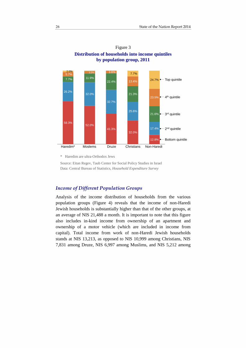
Druze and Christians.6 There are substantial differences between the
household income levels of the various population groups, and these
differences have a large influence on patterns of consumption and saving
in each group. As shown in Figure 3, which presents the distribution of
households into income quintiles by population groups, the income
distribution in each group is quite different. Of the Haredi households,
58.3 percent belong to the bottom quintile, as opposed to only 12.8
percent of non-Haredi Jewish households. Among non-Haredi Jews,
about a quarter of households belong to the top quintile, whereas among
Haredim, Muslims and Druze, only a negligible percentage of households
belong to that quintile. These differences, as noted, are of major
importance for the interpretation of the findings that follow.
yeshiva do watch television. Therefore, households that have yeshiva students
among their members and own a television set are almost certainly non-
Haredi. 6 About 75 percent of the Christian households are Arab, and about 25 percent
are immigrants from the former Soviet Union.
State of the Nation Report 2014 26
Income of Different Population Groups
Analysis of the income distribution of households from the various
population groups (Figure 4) reveals that the income of non-Haredi
Jewish households is substantially higher than that of the other groups, at
an average of NIS 21,488 a month. It is important to note that this figure
also includes in-kind income from ownership of an apartment and
ownership of a motor vehicle (which are included in income from
capital). Total income from work of non-Haredi Jewish households
stands at NIS 13,213, as opposed to NIS 10,999 among Christians, NIS
7,831 among Druze, NIS 6,997 among Muslims, and NIS 5,212 among
Figure 3
Distribution of households into income quintiles
by population group, 2011
12.8%
32.0%41.3%
52.0%58.3%
17.4%
25.6%
32.7%
32.0%26.2%
21.6%
21.3%
22.4%
11.9%7.7%
23.5%
13.4%
3.6%3.2%5.7%
24.7%
7.7%
Non-Haredi
Jews
ChristiansDruzeMoslemsHaredim*
Top quintile
4th quintile
3rd quintile
Bottom quintile
2.0%
2nd quintile
* Haredim are ultra-Orthodox Jews
Source: Eitan Regev, Taub Center for Social Policy Studies in Israel
Data: Central Bureau of Statistics, Household Expenditure Survey

27 Making Ends Meet – Household Income, Expenditures and Savings
Haredim. Even though the income of Haredi households from work is the
lowest, their total income is higher than that of Muslim households. The
two income sources that lead to this outcome are benefits and support and
income from capital (mainly in-kind income from ownership of an
apartment). While the income from capital of non-Jewish households
ranges from NIS 2,300 to NIS 2,600, the income from capital of Haredi
households stands at NIS 3,395. The gap in income from benefits and
support is even wider. The income of Haredi households from benefits
and support stands at 3,256 NIS, as opposed to NIS 2,000 among non-
Haredi Jews, Christians, and Muslims, and NIS 1,555 among Druze.
* Calculated according to employee contributions to tax-free savings funds and multiplied
by 5 (in order to account for the employer’s contribution to the fund and the interest until redemption). Tax-free savings funds are kranot hishtalmut in Hebrew.
** Income from interest and dividends; in-kind income from car ownership; income from pension and property; in-kind income from apartment ownership
*** Haredim are ultra-Orthodox Jews
Source: Eitan Regev, Taub Center for Social Policy Studies in Israel
Data: Central Bureau of Statistics, Household Expenditure Survey
Figure 4
Distribution of gross monthly household income
by population group, in shekels, 2011
6,9975,212
7,831
10,999
13,213
2,294
3,395
2,585
2,319
4,026
1,993 3,2561,555
1,980
1,964
770
442
1,337
438
430
948
Muslims Haredim*** Druze Christians Non-Haredi
Jews
Income from work
Income from capital**
Benefits and support
Pensions and provident funds
Redemption of tax-free savings funds*
State of the Nation Report 2014 28
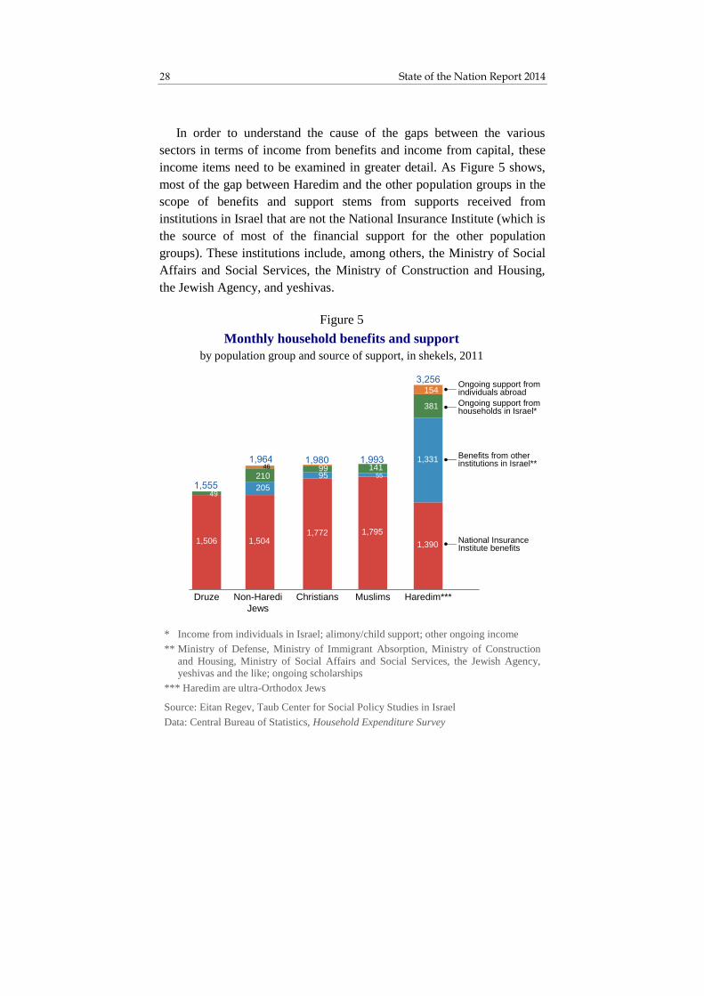
In order to understand the cause of the gaps between the various
sectors in terms of income from benefits and income from capital, these
income items need to be examined in greater detail. As Figure 5 shows,
most of the gap between Haredim and the other population groups in the
scope of benefits and support stems from supports received from
institutions in Israel that are not the National Insurance Institute (which is
the source of most of the financial support for the other population
groups). These institutions include, among others, the Ministry of Social
Affairs and Social Services, the Ministry of Construction and Housing,
the Jewish Agency, and yeshivas.
* Income from individuals in Israel; alimony/child support; other ongoing income
** Ministry of Defense, Ministry of Immigrant Absorption, Ministry of Construction
and Housing, Ministry of Social Affairs and Social Services, the Jewish Agency, yeshivas and the like; ongoing scholarships
*** Haredim are ultra-Orthodox Jews
Source: Eitan Regev, Taub Center for Social Policy Studies in Israel
Data: Central Bureau of Statistics, Household Expenditure Survey
Figure 5
Monthly household benefits and support
by population group and source of support, in shekels, 2011
Ongoing support from individuals abroad
Ongoing support from households in Israel*
Benefits from other institutions in Israel**
National Insurance Institute benefits
1,506 1,5041,772 1,795
1,390
205
95 55
1,331
49
21099 141
381
46
154
Druze Non-Haredi
Jews
Christians Muslims Haredim***
29 Making Ends Meet – Household Income, Expenditures and Savings
The average Haredi household receives support from these institutions
at a level of NIS 1,331 a month on average. In addition, Haredi
households receive financial support from other households in Israel
totaling NIS 381 a month, and from abroad totaling NIS 154. The extent
of monthly support that an average Haredi household receives amounts to
NIS 3,256 – a sum that is NIS 805 higher than the support received by the
average household in the bottom quintile (Appendix Figure 1).
Haredi households receive support from the National Insurance
Institute at a slightly lower level than the other population groups. There
are several reasons for this. The main reason is the age composition of
this group. It is a very young population – about 60 percent are below the
age of 20. As a result, although the extent of child benefits to the Haredi
sector is the highest among all population groups, the extent of old-age
benefits and disability benefits is the lowest (Figure 6). While the average
benefit per child in Israel stands at NIS 140, the average old-age benefit
received by an elderly individual in 2012 amounts to NIS 2,109. The
share of elderly persons in the Haredi sector is relatively low, and
therefore, so is the share of old-age benefit recipients. Furthermore, a
very young population is characterized by low rates of disabled persons,
and, as a result, the share of disability benefit recipients is also lower
among the Haredim. The rate of unemployment benefit recipients in the
Haredi sector is also low compared to the other groups, most likely
because unemployment stemming from the choice of a life of Torah study
does not carry eligibility for unemployment benefits. Likewise, unlike the
other population groups, many Torah scholars receive income support
from the Ministry of Education (and not from the National Insurance
Institute). This income is included under the item “support from other
institutions in Israel” which appears in Figure 5 and in greater detail in
Figure 7.

State of the Nation Report 2014 30
* Haredim are ultra-Orthodox Jews
Source: Eitan Regev, Taub Center for Social Policy Studies in Israel
Data: Central Bureau of Statistics, Household Expenditure Survey
Figure 6
Monthly household benefits from the
National Insurance Institute
by population group and type of benefit, in shekels, 2011
Non-Haredi
Jews
Other benefitsWork injury benefitSurvivor’s insurance
Income support
Unemployment
Old-age benefit
Disability/mobility allowance
Child allowances
692
174
390
205
494
243
301
609
509
406
135
658
229694 321
78
137
150
247
106
62
58
98205
83
84
55 77
204
115
61
Haredim* Druze Christians Muslims

31 Making Ends Meet – Household Income, Expenditures and Savings
When the components of the income from capital (Figure 8) are
examined, it is evident that the gap between the income of Haredim from
capital and the income of non-Jews from capital stems mainly from in-
kind income from housing, that is, the crediting of income from
ownership of an apartment. Among Haredim, the average income
credited due to ownership of an apartment is NIS 2,837, while among
non-Jews, it ranges between NIS 1,950 and NIS 2,500. The remainder of
the gap stems from income from rent and property, which is a substantial
income source for Haredim, but not for non-Jews. Income from capital
* Ministry of Immigrant Absorption, Ministry of Construction and Housing, Ministry of Social Affairs and Social Services, the Jewish Agency, yeshivas and the like
** Haredim are ultra-Orthodox Jews
Source: Eitan Regev, Taub Center for Social Policy Studies in Israel
Data: Central Bureau of Statistics, Household Expenditure Survey
Figure 7
Monthly household benefits and support from institutions
other than National Insurance Institute
by population group and source of support, in shekels, 2011
Ministry of Defense benefits
Ongoing scholarships
Benefits from other institutions*
1,178
8939
140
2392
Haredim**Non-Haredi
Jews
ChristiansMuslimsDruze
4856
55

State of the Nation Report 2014 32
appears to be a component that contributes significantly to the income
gaps between households in different quintiles (Appendix Figure 2).
* Interest on short-term deposits; interest on long-term savings plans (i.e., over a year); interest on bonds; dividends
** Income from house, apartment or room rental or from rental of other property
*** In-kind income from car ownership or use of a company car
**** In-kind income from homeownership, key-money or free housing
§ Haredim are ultra-Orthodox Jews
Source: Eitan Regev, Taub Center for Social Policy Studies in Israel
Data: Central Bureau of Statistics, Household Expenditure Survey
Figure 8
Monthly household income from capital
by population group and source of income, in shekels, 2011
2,1821,976
2,4562,837 2,863
90173
129
63419
169
481
553
191
Muslims Christians Druze Haredim Non-Haredi
Jews
Income from interest
and dividends*
In-kind income from
car ownership***
Income from rent and
property**
In-kind income
from apartment
ownership****

33 Making Ends Meet – Household Income, Expenditures and Savings
2. Household Expenditures
Household expenditures in Israel can be broken down into four major
items: consumption, compulsory payments, acquisition of assets
(financial or real estate), and transfers to other households (e.g., alimony
or child support payments). The main expenditure item is, of course,
consumption, and the average monthly expenditure on this item in 2011
was NIS 13,967 (Figure 9). This sum also includes in-kind consumption
from ownership of an apartment or a motor vehicle, and is therefore
roughly NIS 3,000 higher than the pecuniary expenditure on
consumption. 7 Compulsory payments per household in Israel in 2011 on
average stood at NIS 2,563, of which NIS 1,448 were paid in income
taxes, NIS 568 in healthcare taxes, and NIS 547 to the National Insurance
Institute. On average, financial transfers to other households amounted to
NIS 444, of which NIS 406 was to households in Israel and NIS 38 to
households abroad.
The average monthly investment in real estate and financial assets
(which is defined by the Central Bureau of Statistics as “savings”) in
2011 amounted to NIS 3,622. This sum includes allocations (by the
worker) for pensions, executive insurance8, provident funds and tax-free
savings funds, as well as net investments in real estate (the value of
apartments purchased minus the loans taken to finance their purchase). 9
7 The details regarding total pecuniary expenditures, which refers to monetary
expenditures or total expenditures minus in-kind expenditures, are presented
in Figures 26A and 26B. 8 Executive insurance refers to a type of pension savings arrangement with an
annuity coefficient that is guaranteed at the time of registration for the plan. 9 Since buying an apartment is a single large expenditure, and only a relatively
small number of households buy an apartment each year, it is necessary to
translate this expenditure into terms of average monthly expenditure per
household. This is done by dividing the total net sum of purchases in a given
year by the total number of households (including those that did not buy an
apartment in that year) – i.e., the spreading of housing expenditures in a given
year over all households – in order to obtain the average yearly expenditure

State of the Nation Report 2014 34
Not surprisingly, the lion’s share of household savings is directed towards
the purchase of an apartment.10
per household on the purchase of housing. That amount is then divided by 12
to obtain the average monthly expenditure. 10
The term "savings" here refers only to investment in physical property (e.g.,
real estate) or a financial asset (e.g., tax-free savings funds). It does not
include bank savings plans because there are no direct data on these, and their
size can only be estimated on the basis of the gap between monetary income
and expenditures (as will be shown in this chapter).
* Calculated according to the average for all households
Source: Eitan Regev, Taub Center for Social Policy Studies in Israel
Data: Central Bureau of Statistics, Household Expenditure Survey
Figure 9
Composition of household expenditures*,
in shekels, 2011
Taxes and
compulsory
payments
2,563
Consumption
13,967
Savings(purchase of assets)
3,622
Transfers to other households
444
68
12
2

35 Making Ends Meet – Household Income, Expenditures and Savings
Consumption Expenditures
The distribution of consumption expenditures varies among the
population groups, and can therefore shed light on the differences in their
priorities. In all population groups (non-Haredi Jews, Haredim, Muslims,
Christians, and Druze) the five main expenditure items are housing,
transportation and communication, food, education (including culture and
entertainment), and household maintenance. Nonetheless, the priorities
and the relative size of each of these expenditure items vary from group
to group (Figure 10A).
* Haredim are ultra-Orthodox Jews
Source: Eitan Regev, Taub Center for Social Policy Studies in Israel
Data: Central Bureau of Statistics, Household Expenditure Survey
Figure 10A (continued on next pages)
Distribution of household consumption expenditures
by population group, in shekels, 2011
2,4783,490
2,360 2,460
3,753
2,7811,596
2,3602,730
2,943
2,213 2,086 2,7712,289
2,1881,037 1,610 1,206 972
1,868
1,0721,059 1,159 1,685
1,356
529 495 455606
811
315524 844
710
547
400395
521 288
429
591552
783 924
608
Christians Haredim* Muslims Druze Non-Haredi
Jews
Housing
Transportation/ communication
Food
Education, culture and entertainment
Home maintenance
Furniture/home goodsClothing/shoesOther products and services
Healthcare

State of the Nation Report 2014 36
In three of the five population groups, the main expenditure item is
housing. The expenditure on housing stands at NIS 3,753 among non-
Haredi Jewish households and at NIS 3,490 among Haredi households,
whereas among non-Jewish (Muslim, Christian and Druze) households,
the expenditure on housing ranges from NIS 2,360 to NIS 2,480. It is
important to note that the percentage rate of apartment ownership among
non-Jewish families is significantly higher than among both non-Haredi
Jews and Haredim (see Figure 14). Nonetheless, the value of these
apartments seems to be lower in comparison to the value of apartments in
the Jewish sector, and therefore non-Jews are credited with a lower in-
kind expenditure on housing. Furthermore, as noted, only a small
percentage of non-Jewish families live in rented apartments, and
therefore the average expenditure on rent is significantly lower in this
group.
A comparison of the composition of expenditures of Haredi families
with that of non-Jewish families is especially interesting, since the total
expenditure levels are rather similar but their composition is very
different – which attests to significant differences in needs and priorities.
Non-Jewish families spend about NIS 2,500 a month on transportation
and communication, as opposed to only NIS 1,596 among Haredi
families. The gap stems mainly from the fact that Haredi families use
public transportation much more and private vehicles much less, but also
from less consumption of communications content, such as cable
television and internet, by Haredim.
It is interesting to note that among all population groups, except for
the Muslims, the monthly expenditure on food is rather similar, standing
at NIS 2,000 to NIS 2,300 per household. In the Muslim sector, that
expenditure is significantly higher, standing at NIS 2,771. Most of the
gap is explained by the relatively high expenditure of Muslim households
on meat and poultry – about NIS 730, as opposed to about NIS 350 in the
other sectors; and also by the higher expenditure on fresh vegetables –
about NIS 215, as opposed to about NIS 150 in the other sectors.
The expenditure on education, culture and entertainment among
Jewish households is significantly higher relative to non-Jews. While

37 Making Ends Meet – Household Income, Expenditures and Savings
non-Haredi Jews spend an average of NIS 1,868 a month on education
and Haredim spend NIS 1,610, Muslims spend NIS 1,206, Christians
spend NIS 1,037, and Druze spend only NIS 972. It is important to recall
that the total expenditure on education, like the expenditure on food,
depends on the number of household members; therefore per capita
figures (as presented further in this chapter), provide a more accurate
picture.
The expenditures on home maintenance (which include, among other
things, municipal taxes, water, electricity, gas and fuel for domestic use,
and expenditures on home maintenance and improvement) are rather
similar among Haredim, Muslims and Christians, standing at about NIS
1,100 a month. Among non-Haredi Jews, the costs of home maintenance
amounts to NIS 1,356 (mainly due to higher municipal taxes); among the
Druze, they amount to NIS 1,685 (mainly due to the high expenditures on
gas and fuel, and on home maintenance and improvement).
The overall expenditure on consumption of an average Haredi
household amounts to NIS 11,807 a month – a level of expenditure
similar to that of the second quintile (Appendix Figure 3A). As
mentioned previously, however, the average number of members in a
Haredi family is higher than that of other population groups, and that has
an impact on the level of expenditures.
When one examines the distribution of household expenditures
adjusted per capita11 (Figure 10B), a clearer picture emerges. The
expenditure per standardized person among Haredi households is the
11
Per capita adjusted is a computational concept. The number of people in a
household affects the standard of living that can be sustained by a given
income, although it is customary to assume that not each additional person to
a household consistently and equally impacts the possible standard of living,
since the addition of one family member does not necessarily entail a
proportional increase in expenditures. To establish a basis for comparison, the
per capita adjusted calculation was performed according to a uniform scale.
The scale sets as its basic unit a household of two persons; the more members
are added, the less marginal weight is assigned to each new member of the
household – and the figure obtained is the adjusted number of persons
(according to the Central Bureau of Statistics website).

State of the Nation Report 2014 38
lowest, standing at NIS 3,280 as opposed to NIS 3,800 among Muslims
and Druze, NIS 4,054 among Christians, and NIS 6,101 among non-
Haredi Jews. The expenditure per standardized person among Haredim is
similar to the equivalent expenditure in the bottom quintile, which stands
at NIS 3,157 (Appendix Figure 3b). This outcome is, of course, a
consequence of the relatively high number of members in Haredi
families, and to a lesser extent also in Druze and Muslim families.
Nonetheless, there are some items in which the per capita adjusted
expenditure of Haredi households is higher than that of non-Jews –
* Haredim are ultra-Orthodox Jews
Source: Eitan Regev, Taub Center for Social Policy Studies in Israel
Data: Central Bureau of Statistics, Household Expenditure Survey
Figure 10B (continued from previous pages)
Distribution of consumption expenditures
per standardized person
by population group, in shekels, 2011
Housing
Transportation/ communication
Food
Education, culture and entertainment
Home maintenance
Furniture/home goods
Clothing/shoes
Other products and services
Healthcare
979766 744
925
1,646
443 809 768
974
1,249
554674 800
745
882
459299
376
385
759
288477 348
376
558
137
166 140
185
352
162
198 250
124
222
104
83 158
132
168
153
235 263207
266
Haredim* Druze Muslims Christians Non-Haredi
Jews
39 Making Ends Meet – Household Income, Expenditures and Savings
namely, education and housing. The expenditure per standardized person
on housing amounts to NIS 979 among Haredim, as opposed to NIS 744
among Muslims and NIS 766 among Druze. On education, Haredi
households spend NIS 459 a month per standardized person, as opposed
to Christian, Muslim and Druze households that spend NIS 385, NIS 376
and NIS 299, respectively. The relatively high per capita adjusted
expenditure on housing and education among Haredi households is thus
balanced by relatively low expenditures on transportation and
communications, as well as on food and on home maintenance.
Taxes and Other Compulsory Payments
Israeli households’ monthly compulsory payments are comprised of
income tax, healthcare tax and National Insurance Institute payments.
There are significant differences between the average per-household
sums of compulsory payments in the different sectors. On average, non-
Haredi Jewish households pay NIS 2,955 a month in taxes and other
compulsory payments, as opposed to NIS 1,947 for Christian households,
NIS 842 for Muslims, and NIS 705 for Haredim (Figure 11). These
differences stem mainly from gaps in income from work – the average
incomes of non-Haredi Jewish households are the highest, and their
payments are therefore significantly higher than those of other sectors.
The average sum of monthly taxes and payments among non-Haredi Jews
is similar to that of the fourth quintile among the general population,
while among Haredim it is similar to that of the second quintile
(Appendix Figure 4).
A comparison of the components of the compulsory payments made
by non-Haredi Jewish households to those of Christian households
reveals that the gaps in payments for the healthcare tax and National
Insurance are small, but the gaps in payments for income tax are very
substantial. This stems from the progressive nature of the Israeli tax

State of the Nation Report 2014 40
system.12 The difference between the average income from work of
Christian households and that of non-Haredi Jewish households is only
about 20 percent (Figure 4 previously); however, non-Haredi Jewish
households appear to reach the higher tax brackets, and therefore the gap
in these two groups’ respective income tax payments is much wider: 83
percent.
12
A progressive tax is one whose rate as a percentage of income rises with
income; that is, those with higher income pay a higher tax rate than that paid
by those with lower income.
* Haredim are ultra-Orthodox Jews
Source: Eitan Regev, Taub Center for Social Policy Studies in Israel
Data: Central Bureau of Statistics, Household Expenditure Survey
Figure 11
Monthly household compulsory payments
by population group, in shekels, 2011
226 262540
941
1,721
171 228
312
471
619
308352
411
535
616
Haredim* Muslims Druze Christians Non-Haredi
Jews
Income tax
National Insurance
Institute fees
Health tax
As a percent of gross income from work

41 Making Ends Meet – Household Income, Expenditures and Savings
Transfers to Other Households
Another expenditure item, which sometimes tends to be forgotten when
computing the total balance of expenditures, is transfers to other
households (in Israel and abroad). Transfers to households abroad are
negligible, amounting to only a few dozen shekels a month. Transfers to
households in Israel include ongoing financial assistance to other
households (including family), alimony or child support payments,
monetary gifts at special occasions, and other monetary gifts. For non-
Haredi Jews, this amounts to the non-negligible sum of NIS 478 a month
– three times more than in other sectors (Figure 12). Almost half of this
sum is devoted to monetary gifts at events such as weddings,
circumcisions and bar mitzvahs. Not surprisingly, most of the transfers
are made by households belonging to the top quintile, which transfer to
other households in Israel and abroad on average NIS 1,228 each month –
more than all the other households combined (Appendix Figure 5).
* Ongoing transfers in Israel including alimony/child support, monetary gifts for
special occasions, monetary gifts of less than NIS 100
** Haredim are ultra-Orthodox Jews
Source: Eitan Regev, Taub Center for Social Policy Studies in Israel
Data: Central Bureau of Statistics, Household Expenditure Survey
Figure 12
Transfers to other households
by population group, in shekels, 2011
134173
148 166
478
4137
34
Haredim** Druze Muslims Christians Non-Haredi
Jews
Transfers to
household abroad
Transfers to
households in Israel*
1.5% %
As a percent of total net cash income

State of the Nation Report 2014 42
3. Household Savings
Households’ monthly savings are defined here (in accordance with the
definition of the Central Bureau of Statistics) as the sum of payments
directed by household members into tangible and defined savings
channels. These channels are divided into three main categories: 1)
contractual (financial) savings, comprised of medium-term and long-term
financial savings channels – provident funds, tax-free savings funds,
pension funds, executive insurance, life insurance premiums, and
mortgage payments (principal and interest); 2) investment in real estate;
and 3) other savings (including the purchase of a motor vehicle, debt
flows, and the monetary difference from the sale and purchase of
furniture, equipment and motor vehicles). Financial savings, as defined in
the Central Bureau of Statistics’ Household Expenditure Survey, do not
include financial savings accruing in bank accounts in months when total
income is higher than total expenditures, since tracking these savings is
complex and households’ willingness to share information about them is
relatively low. Nonetheless, the extent of the monthly changes in these
savings can be estimated as the gap between net monetary income and the
sum of all monetary expenditures (i.e., expenditure on consumption and
transfers to other households and allocations to the reported savings
components). Such an estimate will be presented below.
With regard to the reported savings components (Figure 13), it is
evident that for most population groups the most significant savings
channel is investment in real estate, which manifests in purchasing an
apartment for residential purposes, purchasing an apartment as an
investment, or investing in an existing apartment (renovation or
expansion). Haredi households stand out by virtue of their high
investment in real estate, at NIS 2,766 a month on average, as opposed to
NIS 2,618 among non-Haredi Jews, NIS 859 among Christians, and NIS
415 among Muslims. Nonetheless, a large part of this investment is
financed by accumulating debt. The “other savings” of Haredi households
(which include negative savings due to taking mortgages and other loans
in order to buy an apartment) are in a negative balance of NIS 1,234. It is
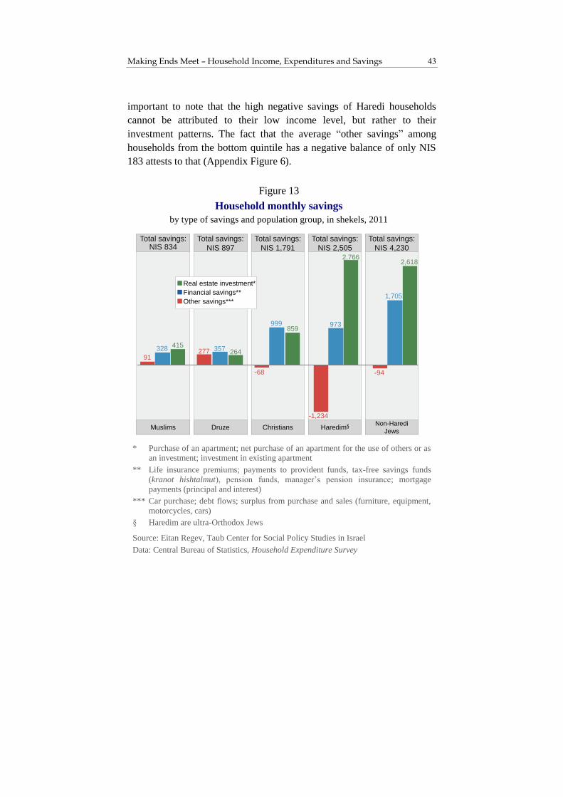
43 Making Ends Meet – Household Income, Expenditures and Savings
important to note that the high negative savings of Haredi households
cannot be attributed to their low income level, but rather to their
investment patterns. The fact that the average “other savings” among
households from the bottom quintile has a negative balance of only NIS
183 attests to that (Appendix Figure 6).
* Purchase of an apartment; net purchase of an apartment for the use of others or as an investment; investment in existing apartment
** Life insurance premiums; payments to provident funds, tax-free savings funds
(kranot hishtalmut), pension funds, manager’s pension insurance; mortgage payments (principal and interest)
*** Car purchase; debt flows; surplus from purchase and sales (furniture, equipment,
motorcycles, cars)
§ Haredim are ultra-Orthodox Jews
Source: Eitan Regev, Taub Center for Social Policy Studies in Israel
Data: Central Bureau of Statistics, Household Expenditure Survey
Figure 13
Household monthly savings
by type of savings and population group, in shekels, 2011
91277
-68
-1,234
328 357
999 973
1,705
415264
859
2,7662,618
-94
Muslims
Total savings: NIS 834
Druze
Total savings:
NIS 897
Christians
Total savings:
NIS 1,791
Haredim
Total savings:
NIS 2,505
Non-Haredi
Jews
Total savings:
NIS 4,230
Financial savings**
Real estate investment*
Other savings***

State of the Nation Report 2014 44
Despite the low annual investment of non-Jewish households in real
estate, their rate of homeownership is higher in comparison to Jewish
households (Figure 14). This is especially striking among the younger
population (ages 21-40), where the apartment ownership rate among non-
Jews is 72 percent, as opposed to 62 percent among Haredim and 49
percent among non-Haredi Jews. However, in the middle age group (41-
60) the apartment ownership rate among Haredim is the highest – 89
percent, as opposed to 80 percent in the other sectors. Among the elderly
population (61 and over) a different picture emerges: the highest
ownership rate is found among non-Haredi Jews, and the lowest among
Haredim (61 percent).
* Haredim are ultra-Orthodox Jews
Source: Eitan Regev, Taub Center for Social Policy Studies in Israel
Data: Central Bureau of Statistics, Household Expenditure Survey
Figure 14
Homeownership rates
by age and population group, as percent of all
households in each group, 2011
Non-Haredi Jews Haredim* Non-Jews
49%
78% 78%
62%
89%
61%
72%
80%
73%
Ages
21-40
Ages
41-60
Ages
Ages
21-40
Ages
41-60
Ages
Ages
21-40
Ages
41-60
Ages

45 Making Ends Meet – Household Income, Expenditures and Savings
It appears that in the different population groups, there are
generational changes in the pattern of home ownership, which may have
stemmed from the demographic and socioeconomic changes that
occurred in each group. Nonetheless, part of the difference in ownership
rates between the various age groups may be attributed to the fact that
among Haredim, marriage at a younger age leads to apartment purchases
at an earlier stage (on average) in comparison to non-Haredi Jews, but the
higher income levels (on average) among non-Haredi Jews leads at a later
stage to a narrowing of the gap in apartment ownership, due to superior
resources.
Patterns of Apartment Purchases in the Haredi Sector
Focusing on the components of investment in real estate clarifies the
source of the gap in investment between Haredim and the other sectors,
non-Haredi Jews in particular. While the average monthly expenditure of
Haredi households on the purchase of apartments for residential purposes
is slightly lower than among non-Haredi Jews (NIS 1,495 versus NIS
1,864, respectively), the expenditures of Haredi households on
apartments that do not serve as residence for the household itself are
much higher than those of non-Haredi Jews (NIS 1,182 versus NIS 425,
respectively). In fact, the investments of Haredi households in apartments
that do not serve as the family residence are high even in comparison to
the average in the top quintile (NIS 996). This is surprising in view of the
fact that in the top quintile, the average monthly investment in real estate
(including the purchase of apartments to live in) amounts to NIS 6,008–
2.2 times the average among Haredim (Appendix Figure 7).
This discrepancy stems in part from the fact that the practice of buying
apartments for investment purposes is more common in the Haredi sector,
and in part from the fact that most Haredi parents are inclined to buy
apartments for their children in anticipation of their marriages.
Importantly, in this context, note that although the apartments that Haredi
parents buy for their children are usually registered under the children’s
name (and not the parents’), the expenditure itself is recorded in the

State of the Nation Report 2014 46
Central Bureau of Statistics Household Expenditure Survey as an
expenditure of the parents – that is, the acquisition of an apartment not
for self-residential purposes. From this, it may be inferred that in the
Haredi sector, the purchase of an apartment not for one’s own dewelling
is usually due to the purchase of an apartment for one’s children.
However, in discussions with knowledgeable individuals in the Haredi
world, the argument has also been made that the practice of buying
apartments for investment purposes is rather widespread in this sector,
and that many Torah scholars try to make a living through speculative
real estate investments. The data seem to support that argument.
* Averages include households that did not invest in real estate in 2011
** The difference between the apartment purchase price and the apartment sale price (which was for use by others or for investment purposes)
*** Haredim are ultra-Orthodox Jews
Source: Eitan Regev, Taub Center for Social Policy Studies in Israel
Data: Central Bureau of Statistics, Household Expenditure Survey
Figure 15
Average monthly household investment in real estate*
by population group and investment type, in shekels, 2011
Investment in
existing apartment
Net purchase of an
apartment for use by
others or as an
investment**
Purchase of an
apartment to live in
41
512
1,864
1,495
59
300
425 1,182
264315
47
329
89
Druze Muslims Christians Non-Haredi
Jews
Haredim***

47 Making Ends Meet – Household Income, Expenditures and Savings
It is important to note that the reliability of the data on apartment
purchases in the Household Expenditure Survey is limited due to the
small number of observations, which stems from the fact that only a small
percentage of the sample population bought an apartment in the year in
which the survey was conducted. Therefore, in order to obtain a more
reliable picture regarding the patterns of real estate acquisition among
Haredim, it is necessary to use multi-year averages. Figure 16 presents
the average percentage of households that bought an apartment to live in
and the percentage of households that bought an apartment not for their
own use, among Haredim and non-Haredi Jews in the years 2003-2012.13
As can be seen, while the rate of buyers of an apartment for their own use
is rather similar in the two groups (2.11 percent among Haredim, and
2.03 percent among non-Haredi Jews), the rate of buyers of an apartment
not for their own residence among Haredim is more than double the rate
among non-Haredi Jews (1.34 percent versus 0.63 percent, respectively).
In other words, Haredim indeed do purchase apartments for the use of
others (as investments or for their children’s residence) at a very high
rate.
13
The average percentage of households that bought an apartment in a given
year was calculated as a simple average of households’ apartment purchase
rates in each year from 2003 to 2012.

State of the Nation Report 2014 48
The question that arises is where the money for apartment purchases
comes from, and how Haredi households are able to invest such large
sums in real estate given their relatively low income. An answer to the
question is to some extent provided in Figure 17, which presents the
components of “other savings” in the various sectors. It is easy to see that
among Haredi households the negative savings component – which stems
from an increase in liabilities due to the purchasing of apartments – is
very high, standing at NIS 1,389, as opposed to only NIS 440 among
* Haredim are ultra-Orthodox Jews
Source: Eitan Regev, Taub Center for Social Policy Studies in Israel
Data: Central Bureau of Statistics, Household Expenditure Survey
Figure 16
Percent of households that purchased an
apartment in a given year
apartments to live in or for use by others,
by population group, average for 2003-2012
0.63%
2.03%
1.34%
2.11%
Purchased apartment
for use by others
or as an investment
Purchased
apartment to live in
Non-Haredi
Jews Haredim*
Non-Haredi
Jews Haredim

49 Making Ends Meet – Household Income, Expenditures and Savings
non-Haredi Jews. The meaning of this is most likely that Haredi
households are willing to go deep into debt in order to buy apartments.
* Monthly value of a car that was purchased in the past 12 months less monthly depreciation
** Other housing loans; surplus from purchase and sales (furniture, equipment, motorcycles, cars); advances and other loan repayments
*** Growth in debt flows during the past 12 months for loans taken to purchase or build a home
§ Haredim are ultra-Orthodox Jews
Source: Eitan Regev, Taub Center for Social Policy Studies in Israel
Data: Central Bureau of Statistics, Household Expenditure Survey
Figure 17
Other monthly savings
by savings type and population group, in shekels, 2011
-1,389
-440
-569
-17-34
271337
79
362
189
75164
29
-86
Haredim
Total savings:
NIS -1,234
Non-Haredi
Jews
Total savings:
NIS -94
Christians
Total savings:
NIS -68
Muslims
Total savings:
NIS 91
Druze
Total savings:
NIS 277
Car savings*
Other**
Debt flows for apartment purchase***

State of the Nation Report 2014 50
Focusing on the components of financial savings (Figure 18) provides
additional insights regarding how Haredi couples are able to buy
apartments despite their limited resources. Whereas non-Haredi Jewish
households on average spend NIS 933 on mortgage payments,14 Haredi
households on average spend only NIS 724 – despite the fact that in the
two sectors the average number of rooms was quite similar (an average of
3.9 rooms in 2012). This may be attributed to protracted mortgage
payment periods, as well as to the purchase of apartments in cheaper
localities and as an organized purchasing group, which may serve to
lower the price of the transaction.
The total financial savings of Haredi households are lower than those
of the third quintile, and their allocations to tax-free savings funds and
pension savings are lower than those of the second quintile (Appendix
Figure 8). This is a direct result of their low income from work.
14
The figure regarding mortgage payments refers to an average that includes all
the households (including those that have not taken out a mortgage).

51 Making Ends Meet – Household Income, Expenditures and Savings
The average price of apartments bought by Haredim is indeed
substantially lower in comparison to the non-Haredi Jewish sector, and it
has remained rather stable in the last decade – as opposed to a substantial
rise in prices paid by non-Haredi Jews (Figure 19). In the non-Haredi
Jewish sector, there has been a real increase of 34.3 percent in the
average apartment purchase price in the last decade (from NIS 910,989 to
* Only the employee’s payments to pension funds, tax-free savings funds (kranot
hishtalmut), executive insurance, and provident funds are shown. Employer contributions are not included.
** Executive insurance refers to a type of pension savings arrangement with an annuity coefficient that is guaranteed at the time of registration for the plan.
*** Tax-free savings funds are kranot hishtalmut in Hebrew.
§ Haredim are ultra-Orthodox Jews
Source: Eitan Regev, Taub Center for Social Policy Studies in Israel
Data: Central Bureau of Statistics, Household Expenditure Survey
Figure 18
Monthly financial savings*
by savings type and population group, in shekels, 2011
Payments to pension funds
Payments to tax-free savings funds***
Payments to executive insurance**
Payments to provident funds
Life insurance premiums
Mortgage payments (principal and interest)
65 50
724
484
933
11283
100
155
247
73 113
52
114
184
48
74
147
105
117
67
77
Muslims Druze Haredim Christians Non-Haredi
Jews

State of the Nation Report 2014 52
NIS 1,223,331). In contrast, among Haredim, there has been a rise of only
6.2 percent in the average purchase price over the same period (from NIS
741,483 to NIS 787,376). In other words, Haredim were buying cheaper
apartments than non-Haredi Jews were even a decade ago, but the gap has
grown much wider since. The relative stability of purchase prices in the
Haredi sector may perhaps be attributed to a shift in purchase patterns
towards apartments in relatively cheap periphery localities and a gradual
distancing from the large Haredi centers (Jerusalem and Bnei Brak), in
light of the substantial price rises in these areas.
Figure 19
Average price of an apartment*, 2003-2012
by population group, in 2012 shekels
910,989
1,223,331
741,483
787,376
400,000
600,000
800,000
1,000,000
1,200,000
2003 2004 2005 2006 2007 2008 2009 2010 2011 2012
Non-Haredi Jews
Haredim**
* The average price paid for an apartment in each year, by Haredim and non-Haredi Jews.
** Haredim are ultra-Orthodox Jews
Source: Eitan Regev, Taub Center for Social Policy Studies in Israel
Data: Central Bureau of Statistics, Household Expenditure Survey
53 Making Ends Meet – Household Income, Expenditures and Savings
Despite this, the prevalent financing method in the Haredi sector, in
which apartments are purchased via consistent increases in the extent of
debts and liabilities, seems to be unsustainable over time given the
current economic reality. This becomes very prominent when one
examines the changes that have occurred in the patterns of financing
apartment purchases in the Haredi sector over the last decade (Figure 20).
Among non-Haredi Jews, the share of households making mortgage
payments dropped in the last decade from 37.3 percent to 32.7 percent – a
substantial decline that may stem from flexible demand that is negatively
influenced by rising housing prices. In contrast, among Haredim, this
share rose from 34.7 percent to 41.4 percent – even though during this
period, as mentioned above, there was no substantial change in the prices
of the apartments they bought. In other words, more Haredi households
require loans today in order to buy an apartment at a given price. This
trend may stem from two factors: on one hand, in the Haredi sector it is
customary to buy an apartment at the time of marriage, and therefore the
demand for apartments from Haredi couples is relatively inflexible; on
the other hand, however, the economic resources available to them have
dwindled. This assumption is supported also by the figures in Figure 17
above, which show that Haredi households’ “other savings” are negative.
It is impossible to ignore the steep (and temporary) drop in the rate of
Haredi households with a mortgage in the years 2008-2009 – the years of
the subprime crisis abroad (Figure 20). This timing is no coincidence and
is only one indication of the reliance of many Haredi households on
economic assistance from abroad, in order to raise the down payment
needed when applying for a mortgage.
In light of the above, the question arises: how do the banks continue to
grant these families mortgages? From the banks’ perspective, the
mortgaged apartments serve as good securities for the return of the loan.
The initial down payment that households are required to place (at least
30 percent of the cost of the apartment) serves to mitigate risk for the
banks and ensures with high probability that they will not incur losses
even in extreme cases where they might be forced to foreclose and sell
the apartment at below the original purchase price.

State of the Nation Report 2014 54
Furthermore, the data and the interviews conducted with
knowledgeable individuals in the Haredi sector15 indicate that until now,
the mortgage payment ethic among Haredi households, given their low
income, has been relatively reasonable. In 2013, about 15 percent of
Haredi mortgage-holders were behind in their mortgage payments – a
high rate as compared to 8 percent among non-Haredi Jews, but low in
comparison to the 23 percent rate among non-Jews (Appendix Figure 9).
Fifteen percent is a non-negligible default rate, but according to
testimonies, in extreme cases where a Haredi family is in danger of losing
its apartment due to its inability to make timely mortgage payments, the
community is likely to intervene and assist the family financially in order
to prevent this outcome. Nonetheless, Haredi households’ dwindling
15
For details of the individuals interviewed, see footnote 23.
Figure 20
Percent of households with a mortgage
by population group, 2003-2012
37.3%
32.7%
34.7%
41.4%
30.0%
34.0%
38.0%
42.0%
2003 2004 2005 2006 2007 2008 2009 2010 2011 2012
Non-Haredi Jews
Haredim*
* Haredim are ultra-Orthodox Jews
Source: Eitan Regev, Taub Center for Social Policy Studies in Israel
Data: Central Bureau of Statistics, Household Expenditure Survey

55 Making Ends Meet – Household Income, Expenditures and Savings
resources and increasing liabilities in recent years put their future ability
to afford their growing mortgage payments in question.
As Figure 21 shows, the average monthly mortgage payment has risen
(in real terms) over the last decade by about NIS 800 among non-Haredi
Jewish households (an increase of 31 percent), and by about NIS 900
among Haredi households (an increase of 72 percent). Among non-
Haredi Jews, this trend aligns with the large rise in apartment prices in
the last decade – apartment prices rose by 34 percent, and accordingly
mortgage payments rose by 31 percent and the share of those taking out
mortgages declined (due to flexible demand). Among the Haredim,
however, a completely different picture emerges: the prices of the
apartments they purchased rose by only 6 percent, but the average
monthly mortgage payment increased by 72 percent, and the rate of those
taking out mortgages rose as well (due to more inflexible demand and
dwindling resources).
Figure 21
Average monthly mortgage*, 2003-2012
by population group, in 2012 shekels
2,482
3,253
1,197
2,062
1,000
1,500
2,000
2,500
3,000
3,500
2003 2004 2005 2006 2007 2008 2009 2010 2011 2012
Non-Haredi Jews
Haredim**
* Averages do not include households without a mortgage
** Haredim are ultra-Orthodox Jews
Source: Eitan Regev, Taub Center for Social Policy Studies in Israel
Data: Central Bureau of Statistics, Household Expenditure Survey

State of the Nation Report 2014 56
Nonetheless, the inflexible demand and dwindling resources appear to
provide only a partial explanation for this trend, and the big picture is
more complex. In fact, over the course of the last decade, there has been a
pronounced increase in the share of Haredi households purchasing an
apartment in a given year (Figure 22). Again, note that the yearly data
regarding apartment purchases are quite volatile, since only a small
percentage of households buy an apartment in a given year. Despite that,
the general trend is relatively clear – a non-negligible rise in the rate of
Haredi apartment buyers, as opposed to stability, and perhaps even a
certain decline, among non-Haredi Jews.
Figure 22
Percent of households purchasing an apartment in a given year
by population group, 2003-2012
2.24%
2.19%2.10%
3.48%
1%
2%
3%
4%
5%
6%
2003 2004 2005 2006 2007 2008 2009 2010 2011 2012
Non-Haredi Jews
Haredim*
* Haredim are ultra-Orthodox Jews
Source: Eitan Regev, Taub Center for Social Policy Studies in Israel
Data: Central Bureau of Statistics, Household Expenditure Survey

57 Making Ends Meet – Household Income, Expenditures and Savings
It might be reasonable to speculate that changes in the age
composition of the Haredi population, that is, a rise in the share of young
couples, are what led to the rise in the rate of apartment buyers – but the
data show that the opposite is true. As can be seen in Figure 23 (which is
based on data from the Social Survey, in which Haredim are identified by
self-definition), the share of those aged 20 to 49 in the Haredi population
aged 20 and over dropped in the last decade from 84.0 percent to 77.5
percent. In other words, the changes in the age composition of the Haredi
population cannot explain the sharp rise in the rate of Haredi apartment
buyers.
Figure 23
Share of 20-49-year-olds in the Haredi* adult population
among those age 20 and over, 2002-2012
76%
78%
80%
82%
84%
86%
2002 2003 2004 2005 2006 2007 2008 2009 2010 2011 2012
84.0%
77.5%
* Haredim are ultra-Orthodox Jews
Source: Eitan Regev, Taub Center for Social Policy Studies in Israel
Data: Central Bureau of Statistics, Social Surveys 2002-2012

State of the Nation Report 2014 58
The findings thus far suggest that Haredi households are investing in
real estate much more today than they did in the past. The trends shown
in Figure 24 lend credence to this supposition. As can be seen, the
average monthly investment in real estate16 among Haredi households
jumped (in real terms) from NIS 1,374 in 2007 to NIS 3,190 in 2012. In
contrast, among non-Haredi Jews there was only a moderate rise: from
NIS 1,407 to NIS 1,847. Although the data here are rather volatile, it is
still clear that the increase in Haredi investment in real estate is very
substantial. But where does the money for these investments come from?
16
The average monthly investment in real estate was calculated for all
households, including those that did not invest in real estate in that year.
Figure 24
Average* monthly investment in real estate by population group
in 2012 shekels, 2007-2012
1,407 1,847
3,190
500
1,500
2,500
3,500
2007 2008 2009 2010 2011 2012
1,3
Non-Haredi Jews
Haredim**
* Average monthly investment in real estate is calculated for all households,
including those that did not invest in the given year
** Haredim are ultra-Orthodox Jews
Source: Eitan Regev, Taub Center for Social Policy Studies in Israel
Data: Central Bureau of Statistics, Household Expenditure Survey

59 Making Ends Meet – Household Income, Expenditures and Savings
The answer to that question is given in Figure 25. As noted
previously, amongst Jewish households, debt flows related to the
purchase of an apartment (i.e., an increase or decrease of the debt) is the
most substantial component in the savings category defined as “other
savings” (according to the Central Bureau of Statistics’ definition). When
debt flows in a certain year are negative, it means that the household’s
indebtedness (to banks or to other lenders) has increased. For example,
when a household buys an apartment with the help of a mortgage or other
loan, the flow of its debts in that year will be negative; but if in a certain
year a household repays a large part of the debt to the bank (e.g.,
repayment of a balloon loan17), the flow of its debts in that year will be
positive.18 As can be seen, the average flow of debts in recent years has
been negative for Haredi households. This means that their debts to banks
and other lenders are growing, and that their increased investment in real
estate is speculative and financed by debt. A similar phenomenon was
observed in the United States in 2007, on the eve of the big mortgage
crisis. Ostensibly these are different cases, since many of the mortgages
that were given then in the United States did not require any down
payment, whereas in Israel the down payment required in order to be
granted a mortgage is at least 30 percent of the apartment’s value. Many
Haredi households, however, have the option of taking loans from benefit
societies19 and using them as down payments for the purpose of taking
out a mortgage.20 In other words, the total amount of loans that a Haredi
17
A balloon loan is one that is repaid not in installments but at the end of the
loan period, i.e., during the borrowing period the borrowers pay nothing at all,
but at the end of the period, they pay the principal in full plus interest and
indexation. 18
Monthly mortgage payments are not listed under "other savings" as positive
debt flows, but under "Financial Savings" as the repayment of mortgages
(principal and interest). Therefore, positive debt flows refer mainly to the
repayment of one-time large sums, like a balloon loan. 19
A detailed explanation concerning these institutions appears on page 66. 20
In addition, until 2008 it was possible to make use of the services of mortgage
insurance companies in order to take out a mortgage with a down payment of
less than 30 percent.

State of the Nation Report 2014 60
household takes for the purpose of buying an apartment can reach 100
percent of the purchase price – as was the case in the United States prior
to the subprime crisis.
In recent years, there has been a substantial increase in the share of
poor households in the Haredi sector (Ben-David and Bleikh, 2013). This
trend can be attributed in part to the cuts in state-funded financial support
that began in 2003. The new economic reality for Haredim required the
development of new sources of income in view of the growing population
and dwindling resources (both internal and external) and posed a great
Figure 25
Monthly debt flows for apartment purchase*, 2007-2012
by population group, in 2012 shekels
73
221
371
-1,413
-1,050
-1,500
-1,000
-500
500
Non-Haredi Jews
Haredim**
2007 2012
* Average monthly debt flows for an apartment purchase also includes households
that did not purchase an apartment in the given year, that is, it is the average for all households.
** Haredim are ultra-Orthodox Jews
Source: Eitan Regev, Taub Center for Social Policy Studies in Israel
Data: Central Bureau of Statistics, Household Expenditure Survey

61 Making Ends Meet – Household Income, Expenditures and Savings
challenge to earning a sufficient livelihood while preserving the Torah-
study lifestyle. As a result, many Haredim searched for income channels
that would allow them to continue devoting the bulk of their time to
Torah study, and thus many turned to the real estate field.
In order to invest in real estate, however, significant initial capital is
necessary, which is not easy to obtain when earning a livelihood is
already challenging. Due to that, there was a substantial rise in the size
and extent of the loans taken by Haredi households. While there were
some that did have sufficient initial capital, and have done well in real
estate investments, there were many others who bought apartments using
over-leveraged loan money, at great risk of insolvency.
The money used by Haredim to buy apartments comes from several
sources. A good share of the loans comes from banks (as attested to by
the rise in mortgage payments by Haredim), but it is reasonable to assume
that loans from benefit societies, friends and family members are non-
negligible sources of funding as well. Nonetheless, these resources are
also limited, and therefore the continued increase in indebtedness of
Haredi households without sufficient sources of repayment is
unsustainable over time. When the flow of expenditures is larger than the
flow of income over time, economic collapse is eventually inevitable.
This is true for Haredi as well as non-Haredi households. While high
housing prices are a heavy burden that make it difficult for all population
groups to make ends meet, among Haredi households, the large
investments in real estate and shortage of income from other sources give
rise to large structural gaps between total income and total expenditures.
Financial Balance
Figures 26A and 26B present the balance of household monetary income
and expenditures (not including in-kind income and in-kind expenditures)
by population groups and income quintiles. Income includes gross wages
and financial income from capital, from benefits and support, and from
pensions and provident funds. Income also includes the redemption of
tax-free savings funds, calculated on the basis of employee allocations to

State of the Nation Report 2014 62
these funds. Total monetary expenditures include financial expenditures
on consumption (not including consumption in-kind), compulsory
payments (income tax, health tax and National Insurance Institute
contributions), transfers to other households, and the tangible components
of savings (financial, real estate, and other).21 The gap shown (in red) in
Figures 26A and 26B reflects the average monthly gap between
household income and expenditures. This gap can also be thought of as
the household monthly balance (monthly surplus or deficit) in the bank.
Although it is reasonable to assume that some households do not report
all of their income – and some of the expenditures are perhaps not
reported either, to avoid paying tax on the purchases – this comparison
(of reported income to reported expenditures) can still yield important
insights regarding the economic challenges with which Israeli households
contend.
As can be seen, there is a negative gap between income and
expenditures in all the sectors (i.e., expenditures are higher). Nonetheless,
whereas among non-Haredi Jews, the gap is only NIS 864, among
Haredim it reaches NIS 3,209 a month – a third of a Haredi household’s
reported income. This is a high figure even in comparison to Muslim
households, where the negative gap stands at NIS 1,919.22 Such a wide
gap between reported expenditures and reported income may attest to
under-reporting of income and a large-scale shadow economy.
Nonetheless, this is not the full picture. As was shown also in Figure 21,
the large gap between income and expenditures among Haredim attests as
21
In order to calculate the tangible components of savings, components defined
as depreciation (on a motor vehicle or apartment) have to be deducted from
the total savings, because depreciation does not constitute a financial
expenditure and therefore doesn’t directly affect the monthly financial
balance. 22
The gap between monetary income and expenditures may be slightly smaller
since monetary gifts at events are counted on the expenditure side, but not on
the income side. This amounts to an additional income of NIS 200 a month
per household (for the entire population), but it is impossible to determine
what the relevant sum is for each sector, since monetary gifts are also
exchanged between households from different sectors.

63 Making Ends Meet – Household Income, Expenditures and Savings
well to their constantly growing indebtedness for the purpose of
purchasing apartments.
* Mortgage payments; payments to provident funds, tax-free savings funds (kranot hishtalmut), executive insurance, pension funds, life insurance
** Income tax, health tax and National Insurance Institute payments
*** Calculated according to employee contributions to tax-free savings funds multiplied by 5
(to account for employer contributions and for returns on the principal until redemption)
§ Haredim are ultra-Orthodox Jews
Source: Eitan Regev, Taub Center for Social Policy Studies in Israel
Data: Central Bureau of Statistics, Household Expenditure Survey
Figure 26 (continued over next pages)
A. Household incomes and expenditures by population group
2007-2012 average, in 2012 shekels
9,350 8,930 9,590 9,312 11,043
1,087771
1,358 1,694
3,156
713 1,897
1,221 1,056
2,784
262
929479 939
1,804
287
216 271393
471
Muslims Haredim Druze Christians Non-Haredi
Jews
9,498 9,251 10,355 12,293 17,447
282 284
438
430
948
Transfers to other households
Payments and deductions to financial savings*
Real estate and car investment + debt flows
Taxes and
compulsory
payments**
Cash consumption expenditures (not including in-kind
consumption)
Monthly gross cash income (not including in-kind income)
Redemption of tax-free savings funds***
9, 9,
10,
,
Exp
en
ditu
res
Inco
me
Exp
en
ditu
res
Incom
e
Exp
en
ditu
res
Inco
me
Exp
en
ditu
res
Inco
me
Exp
en
ditu
res
Inco
me
-Christians
-Non-Haredi Jews
-Haredim
-Moslems
-Druze
End of month bank balance (difference between income and expenditures)

State of the Nation Report 2014 64
It is important to note that purchasing an apartment by means of down
payment and monthly mortgage payments is indeed a savings channel
that, with time, awards the buyer ownership of significant property of
high value. However, this does not change the fact that at the monthly
level, in terms of cash flows, the average household in each population
group has a negative balance and is unable to make ends meet. Gruber
(2014) shows that in the last decade, there has been a real increase of NIS
100 billion in household debt due to housing loans – which stands today
at NIS 280 billion. In the last five years (during which housing prices
soared) the share of total household debt due to housing loans increased
as well, from 67 percent to 70.5 percent (Gruber, 2014).
These data demonstrate how difficult the housing crisis has made it
for Israeli households to achieve an economic balance. For non-Haredi
Jews, the investment in buying an apartment (to live in) is what drags
them into the red from a positive monthly balance. Simply put, high
housing prices are apparently the principal factor causing the average
Israeli family to be unable to make ends meet.
A worrying picture also emerges when the financial balance of
households in Israel by quintiles is examined (Figure 26B). Although the
balance of households in the top quintile is positive, households in the
other four quintiles exhibit a negative financial balance. Among
households belonging to the bottom quintile, income is substantially
lower than expenditures on consumption, and for the second lowest
quintile gross monetary income is lower than consumption expenditure
and compulsory taxes. For Quintiles 3 and 4, it is the purchase of an
apartment that puts them into the red.
As mentioned, there are several possible explanations for these data,
including the shadow economy or the existence of additional assets or
other (legal) income sources that households participating in the
Household Expenditure Survey choose not to divulge. However, if these
possible factors are insufficient to explain such large gaps, it is very
likely that households today – and young couples in particular – are
forced to resort to the savings accumulated by their parents over the years
in order to be able to buy apartments. If this is indeed the situation, it

65 Making Ends Meet – Household Income, Expenditures and Savings
means that the flow of savings, which in the past was positive, has turned
negative; that is, the financial savings of the average household in Israel
are dwindling. Furthermore, it seems that when young couples have no
possibility of assistance from parents, purchasing an apartment usually
becomes an unrealistic option.
* Mortgage payments; payments to provident funds, tax-free savings funds (kranot
hishtalmut), executive insurance, pension funds, life insurance
** Income tax, health tax and National Insurance Institute payments
*** Calculated according to employee contributions to tax-free savings funds multiplied by 5
(to account for employer contributions and for returns on the principal until redemption)
Source: Eitan Regev, Taub Center for Social Policy Studies in Israel
Data: Central Bureau of Statistics, Household Expenditure Survey
Figure 26B (continued from previous pages)
Household incomes and expenditures by income quintiles
2007-2012 average, in 2012 shekels
6,9578,432
9,999 12,045 15,923768
1,501
2,921
8,232
1,200
1,832
3,052
5,511
2,031
3,166
1,081
Bottom quintile 2 3 4 Top quintile
5,314 8,848
13,049
18,539
34,048
1,056
Exp
en
ditu
res
Inco
me
Exp
en
ditu
res
Inco
me
Exp
en
ditu
res
Inco
me
Exp
en
ditu
res
Inco
me
Exp
enditu
re
Inco
me
Income quintiles
Redemption of tax-free savings funds***
Monthly gross cash income (not including in-kind income)
-9224th quintile
2,3175th quintile
-2,3262nd quintile
-2,9271st quintile
-1,4523rd quintile
End of month bank balance (difference between income and expenditures)
Transfers to other households
Payments and deductions to financial savings*
Real estate and car investment + debt flows
Taxes and
compulsory
payments**
Cash consumption expenditures (not including in-kind
consumption)
1,426

State of the Nation Report 2014 66
4. Sources of the Gap Between Reported Income and Expenditures of Haredi Households
As shown in Figure 26A, the gap between the reported income and
expenditures of Haredi households is exceptional in comparison to the
other population groups, and it implies a monthly deficit of NIS 3,209 per
household.
Such a large gap is liable to stem in part from unreported work,
although that does not seem to explain it entirely. The gap between
income and expenditures among non-Jews is only about NIS 2,000, but
there is no apparent reason to assume that the extent of unreported labor
income among them is smaller than among Haredim (and it is not
unlikely for the opposite to be true). It is therefore reasonable to assume
that Haredi households have additional unreported sources of income.
In this context, benefit society institutions and associations, which
apparently play an important role in the economics of Haredi households,
require special consideration. For that purpose, several interviews were
conducted with Haredi insiders, and with non-Haredi individuals who are
familiar with the sector and with the benefit society institutions.23 The
following are the main points revealed from those interviews.
Benefit Society Institutions (Gemilut Chasadim)
Benefit society institutions operate as nonprofit organizations and loan
money to Haredi households at no interest. Nonetheless, these are loans
that must be repaid (and not grants). The benefit societies, like banks,
have collection mechanisms. There are guarantors for the loans, and
when a borrower defaults on repayment, the money is collected from
23
The individuals interviewed were Uriel Lederberg – Managing Director of the
"Pa’amonim" Association; Ben Richardson – a formerly Haredi British Jew,
economist in the banking field, and graduate of Cambridge University; C.S. –
a Haredi entrepreneur; Yonatan Lahmi – a Haredi student at the Hebrew
University; and Y. – a young Haredi, educational rabbi at a yeshiva, and
researcher at a social research institute.

67 Making Ends Meet – Household Income, Expenditures and Savings
them. The practice of rotating loans from one benefit society to another is
also very common in such cases. Despite this, however, not all the loans
are repaid in full and there are certainly cases in which the benefit society
agrees to forgive or reduce the debt of certain borrowers who are in
particularly dire straits. According to the estimates of some of the
interviewees, 10-20 percent of the loan funds distributed by the benefit
societies are never repaid.
Haredi households borrow money from benefit societies to put up the
down payment necessary to take out a mortgage. This is especially
common when the head of the family has to buy an apartment due to his
daughter’s marriage. Nonetheless, the fact that the loan does not bear any
interest and the debt forgiveness rate is relatively high is also an incentive
for Haredi real estate investors to buy apartments for financial purposes
using initial capital provided by benefit societies (with the remainder
financed by a mortgage), and to enjoy the difference between the
standard interest rate and the zero interest on benefit society loans. As
previously mentioned, this has become a widespread phenomenon in
recent years (as evident in Figures 15, 16, 22 and 24).
Figure 27 presents the share of adult individuals (age 20 and above)
who received financial assistance in 2013, by population group and
assistance source. As can be seen, 11 percent of adult Haredi individuals
received financial assistance, and about 9 percent received financial
assistance from organizations, as opposed to only 2.8 percent of non-Jews
and 0.9 percent of non-Haredi Jews who received financial assistance
from organizations. These gaps among population groups not only stem
from the high share of poor people in the Haredi sector; they persist also
when examining the share of recipients of financial assistance from
organizations among the low-income earners (less than NIS 2,000 per
capita). Fifteen percent of the Haredim in this group received financial
assistance, as opposed to 4.7 percent of low-income non-Jews and 3
percent among low-income non-Haredi Jews. In other words, the scope of
financial assistance from organizations is much greater in the Haredi
sector than in the other sectors, even when adjusted for the differences in
income.

State of the Nation Report 2014 68
In fact, about a third of adult individuals (age 20 and above) who
received financial support in 2013 were Haredim, despite the fact that
their share of this age group is only 7.1 percent (Figure 28).
* Haredim are ultra-Orthodox Jews
Source: Eitan Regev, Taub Center for Social Policy Studies in Israel
Data: Central Bureau of Statistics, Social Survey 2013
Figure 27
Share of adults receiving financial assistance, 2013
by population group and source of aid, ages 20 and over
Non-Haredi
Jews
4. %
0.9%
2.7%
4.1%
2.5%
0.8%
Haredim*Non-Jews
Aid from private
volunteers
Aid from charity organizations and a private volunteer
Aid from charity
organizations

69 Making Ends Meet – Household Income, Expenditures and Savings
It is important to note that in the Haredi sector, the extent of donations
to non-profit and charitable organizations is also substantially greater
relative to the other population groups. Ninety percent of adult Haredim
percent donated money in 2013 (and 85 percent donated money to
organizations) – as opposed to 66 percent of non-Haredi Jews and 41
percent of non-Jews (Figure 29). The average donation was also higher
among Haredim: 42 percent of them donated over NIS 1,000 in 2013, as
opposed to 10.2 percent of non-Haredi Jews and 5.4 percent of non-Jews.
* Haredim are ultra-Orthodox Jews
Source: Eitan Regev, Taub Center for Social Policy Studies in Israel
Data: Central Bureau of Statistics, Social Survey 2013
Figure 28
Distribution of financial assistance recipients
versus population distribution
by population group, ages 20 and over, 2013
72 %
35.5%
31.4%
7.1%
33.1%
Population
distribution
Distribution of
aid recipients
Haredim*
Non-Jews
Non-Haredi Jews

State of the Nation Report 2014 70
Nonetheless, even the extent of donations to associations, which is
relatively large among Haredim in Israel, cannot on its own explain the
wide gap between the reported income and expenditures of Haredi
households, which currently stands at NIS 3,209 a month. Even if all the
money that is donated to Haredi benefit societies finds its way back to
Haredi households and constitutes income that is not reported in the
Household Expenditure Survey, a large gap is still left between income
and expenditures. As shown in Figure 30, in recent years, the average
monthly donations of Haredi families ranged between NIS 175 and NIS
306 – and the general trend is one of decline (providing another
* Haredim are ultra-Orthodox Jews
Source: Eitan Regev, Taub Center for Social Policy Studies in Israel
Data: Central Bureau of Statistics, Social Survey 2013
Figure 29
Share of adults making donations, 2013
by population group and destination of donations,
ages 20 and over
Donations to private individuals
Donations to organizations and
institutions
Donations to both organizations and institutions and individuals
59%
19%11%
27%
39%
15%
4%
8%
15%
Haredim*Non-Haredi
Jews
Non-Jews
41
66
90

71 Making Ends Meet – Household Income, Expenditures and Savings
indication of the dwindling of resources of Haredi households). On the
one hand, it is easy to see that the amounts donated by Israeli Haredim to
charitable organizations can explain only a very small part of the gap
between income and expenditures. On the other hand, all the interviews
and data point to the benefit societies as the main unreported income
source that allows many Haredi households to make ends meet. From
this, it may be inferred that the lion’s share of benefit society money
comes from abroad (this is also confirmed in the interviews).
Figure 30
Average monthly household donation* to
organizations and institutions, 2008-2012
by population group, in 2012 shekels
7283
306
175
100
200
300
2008 2009 2010 2011 2012
Non-Haredi Jews
Haredim**
* Averages include households that did not make a donation
** Haredim are ultra-Orthodox Jews
Source: Eitan Regev, Taub Center for Social Policy Studies in Israel
Data: Central Bureau of Statistics, Household Expenditure Survey

State of the Nation Report 2014 72
Financing Sources of Benefit Society Institutions
According to those interviewed, part of the benefit society money comes
from donations by wealthy Haredim; in general, it is more customary in
Haredi society for the rich to share their wealth with others. Nonetheless,
most of the interviewees agree that most of the money originates from
loans received disguised as donations and that the benefit societies are in
every respect a business. They conduct widespread money-laundering
activities, and most of the money that flows into them (black capital)
comes in the form of loans from Jews living abroad or from Haredim
living in Israel but considered foreign residents. They transfer the money
to the benefit societies from foreign accounts, and money flows are very
difficult to track.
In 2009, the FBI conducted a wave of arrests among senior members
of the Syrian-Jewish (Halabi) community in New Jersey, on suspicion of
breaking money-laundering related laws. It also considered taking legal
action against several institution leaders and yeshiva heads in Israel
suspected of belonging to the second circle of the money-laundering
operation (Erlich, 2009). In September 2014, the Israel Police’s Lahav
433 unit, in coordination with law enforcement agencies in the United
States and Europe, exposed a worldwide money-laundering network that
had been funneling hundreds of millions of shekels. Israeli citizens and
residents, some of them Haredi, had taken high commissions on money-
laundering deals for the benefit of criminals abroad. The Haredi members
of the network exploited their ability to move the money from place to
place by means of couriers and Torah scholars who fly frequently around
the world in order to transfer the “dirty” money between countries in
Europe, through Israel, and then back to Europe or the United States
(Levy-Weinreb, 2014).
According to some of the interviewees, the money-laundering
mechanism is very complex and includes an extensive network of
institutions and contacts in Israel and abroad. For instance, an American
tax offender interested in laundering $100,000 can divide the sum into ten
parts and transfer them to Jewish contacts or intermediaries of his

73 Making Ends Meet – Household Income, Expenditures and Savings
community. Each of those intermediaries then transfers the sum received
(minus a small commission for the service rendered) to a benefit society
institution in Israel as a private donation (but in effect it is a loan).
Because the large sum has been divided into relatively small money
transfers, it does not arouse suspicion. The benefit society institutions
lend this money (at no interest) to Haredi households in Israel, and as
mentioned above, their collection mechanisms ensure that most of the
money will be repaid to them, so only 10-20 percent of loan funds are
forgiven. For money-launderers abroad, that is a low price to pay for
laundering relative to other alternatives.
When the benefit society institution has to return the loans received
from abroad (minus 10-20 percent), an entire network of contacts and
intermediaries swings into operation. The benefit institution may divide
the amount and transfer it (in parts) to several contacts in the relevant
community in Israel (i.e., the Haredi sect which that benefit society
serves). Each of those contacts then donates the money received from the
benefit society to one of the senior rabbis of that sect. That rabbi donates
the money to several charity organizations in Israel (belonging to that
sect), and those charity organizations donate the money to charity
organizations abroad.24
In the last stage, the charity organizations abroad must find ways to
transfer the money back to the original lender without arousing the
authorities’ suspicion. One such way consists of ordering services from
the lender himself at inflated prices, so that the payment will include both
the cost of the services and the original amount of the loan. The entire
process is intricate and sophisticated, and the method works well by
virtue of the cooperation and mutual trust among all sides involved.
24
Since there is little governmental oversight of charity organizations in Israel,
it is very difficult to track the money. It may go through 20 different channels
before returning to the original lender.

State of the Nation Report 2014 74
The Effect of “Black” Capital25 on the Real Estate Market in Israel
According to the estimates of the State Revenue Administration, a large
part of the market for real estate for investment purposes in Israel is based
on black capital that is invested in the purchasing of apartments. Senior
officials of the Tax Authority have declared that they are aware that
considerable amounts of black capital are smuggled into Israel and
laundered by means of real estate transactions. According to the study
conducted by the State Revenue Administration, the gross monthly
income of 18 percent of the households that bought an apartment for
investment purposes in the years 2012-2014 was lower than NIS 7,000. It
does not stand to reason that such a high percentage of households with
such low income are purchasing apartments for investment purposes. It is
more reasonable to assume that their reported income is only part of their
real income, or that they are serving as cover for the real apartment buyer
who is trying to avoid paying tax or revealing information on his capital
assets (Mirovsky, 2014). As noted, these data align with the findings in
Figure 26A, which shows that when Haredi households’ expenditures on
housing are taken into account, their total monthly expenditures are much
higher than their reported income.
It seems that the flow of black capital from abroad, together with
extensive money-laundering activity assisted by benefit society
institutions, is what allows many Haredi households to buy apartments
despite their low income. This is manifested by the purchase of
apartments not only for residential but for investment purposes as well –
while exploiting the no-interest loans and the frequency of debt
forgiveness. The effect of this phenomenon on real estate prices in Israel
deserves a deeper examination.
25
Clack capital refers to money that has its sources in criminal activity such as
tax evasion or illegal trade.

75 Making Ends Meet – Household Income, Expenditures and Savings
S
Spotlight: How Haredi Families Contend with Rising House Prices
Ayal Kimhi, Nachum Blass and Haim Bleikh
Between 2003 and 2012, there was a 34 percent rise in the prices of
apartments whose buyers were non-Haredi Jewish households, but the
prices of apartments bought by Haredim rose by only 6 percent during the
same period. One of the explanations for this gap is that young Haredi
families find housing solutions in areas where housing is particularly
cheap, even subsidized.
To test this hypothesis, the change in the number of Jewish pupils in
primary schools in various districts, by the type of school supervision
(State, State-religious or Haredi) was examined. In general, there are
various methods for identifying Haredi households in datasets, none of
which is perfect. In contrast, the education system facilitates the precise
identification of pupils attending Haredi schools, making it possible to
track the demographic trends within the Haredi population with greater
accuracy.
Table 1 presents the changes in the numbers of Jewish pupils
attending grades 1-6 between 2000 and 2014, by type of supervision and
by geographic district. The overall growth of the Haredi population is
evident, manifested by the 80 percent increase in the number of pupils in
Haredi schools, as opposed to increases of 23 percent in the state-
religious schools and only 9 percent in the state schools. The breakdown
by districts shows an increase at double the average national rate (160
percent) in Haredi schools in the central district, and at quadruple the
average national rate (371 percent) in Judea and Samaria. Not
surprisingly, these are the two districts with the highest growth rate in the
total number of pupils (of all supervisory types): 36 percent and 120
percent, respectively. (continued on next page)

State of the Nation Report 2014 76
(continued from previous page)
Table 1. Changes in the number of Jewish pupils in grades 1-6
between 2000 and 2014, by type of supervision and
geographic district
In effect, 65 percent of the increase in the number of Jewish pupils in
grades 1-6 in the West Bank district was registered in the Haredi sector.
Whereas 21 percent of Jewish pupils in grades 1-6 in the Judea and
Samaria district attended Haredi schools in 2000, by 2014 that rate more
than doubled to 45 percent.
That is not an indication of a process of growing Haredization of the
population of this area. It is more reasonable to suppose that it concerns
young Haredi families moving outwards in search of cheap housing
solutions. Support for this notion can be found in the fact that in Ma’ale
Adumim and Ariel, two relatively large localities with a mixed
population of secular and national-religious Jews, there was a population
. (continued on next page)
Supervision
District State State-
religious
Haredi Total
South -3% +11% +79% +12%
Haifa -2% -3% +62% +3%
Jerusalem -12% +26% +56% +29%
Center +27% +23% +160% +36%
Tel Aviv +9% -1% +25% +12%
North +1% +21% +47% +9%
Judea/Samaria +13% +80% +371% +120%
Total +9% +23% +80% +24%
Source: Kimhi, Blass and Bleikh, Taub Center
Data: Ministry of Education

77 Making Ends Meet – Household Income, Expenditures and Savings
(continued from previous page)
increase of 30 percent from 2002 to 2012, while in Modi’in Illit and
Beitar Illit, the two large Haredi localities, population growth reached
130 percent in the same period.
Figure 31 shows that housing prices in the West Bank district are
substantially lower than in the districts of Tel Aviv, Jerusalem, Haifa and
the Center. The conclusion is that the Haredi population responds more to
the price differentials than other populations, whether due to residential
preferences that differ from those of the rest of the population or due to a
lack of choice. In any event, it appears that moving to areas where
apartments are cheaper is one of the ways, if not the principal way, in
which the Haredi population contends with the high cost of living in
general, and soaring housing prices in particular.
Source: Ayal Kimhi, Nachum Blass and Haim Bleikh, Taub Center
Data: www.madlan.co.il
Figure 31
Apartment prices
price in shekels per square meter for new and
second-hand apartments, 2014
Tel Aviv
Jerusalem
Center
Haifa
South
North
Judea/
Samaria

State of the Nation Report 2014 78
5. Summary and Conclusions
This chapter has surveyed the components of household income,
expenditures and savings in Israel, and examined the differences between
the various sectors and between households at different income levels.
Special attention was devoted to the changes in the patterns of
consumption and savings in the Haredi sector, with an emphasis on the
real estate field. The findings reveal that in all of the sectors there are
substantial gaps between the average reported financial expenditures and
the average reported financial income. The gap is especially wide in the
Haredi sector, amounting to NIS 3,209 a month (average for the years
2007-2012).
The existence of a shadow economy may explain part of the gap, but
certainly not all of it. Based on the data, it stands to reason that besides
the black capital from work and the flow of black capital from abroad,
there is also a structural deficit that is causing a constant increase in
Haredi households’ indebtedness to banks and other lenders. The scope of
Haredi households’ debts due to the purchase of apartments has grown
considerably in recent years; their monthly mortgage payments rose by
72 percent (in real terms) in the last decade, and the rate of Haredi
mortgage holders rose from 34.7 percent to 41.4 percent. In contrast, the
rate of mortgage holders among non-Haredi Jews declined.
Despite the rise in real estate prices, the scope of investment in real
estate in the Haredi sector has only grown. The share of Haredi
households buying an apartment for investment purposes stands at 1.34
percent a year, as opposed to only 0.63 percent among non-Haredi Jews
(average for the years 2007-2012), and Haredi households’ average
monthly investment in real estate jumped from NIS 1,374 in 2007 to NIS
3,190 in 2012. In recent years the real estate investment field seems to
have become entrenched in the Haredi sector and increasingly perceived
as a channel which, on the one hand makes it possible to maintain a
Torah-study lifestyle, and on the other hand yields a sufficient livelihood.

79 Making Ends Meet – Household Income, Expenditures and Savings
However, the trends revealed by the data raise considerable doubt
regarding the long-term sustainability of this situation. The increase in
loans and indebtedness points to a constant dwindling of the resources
available to Haredi families and a growing dependency on external
assistance. Although investment in real estate may indeed yield some
investors a handsome income, investing by means of overleveraging and
assuming heavy debts is dangerous and liable to have devastating
consequences for the borrowers. Furthermore, in the Haredi sector, there
seems to be an extensive flow of black capital originating from abroad –
which reaches the Israeli real estate market through benefit society
institutions and Haredi households. The effect of this phenomenon on real
estate prices in Israel deserves a deeper examination. The high real estate
prices constitute a significant economic hardship for other population
groups as well.
A glance at the balance of income and expenditures across all sectors
reveals a disturbing picture, according to which the average household in
Israel is unable to buy an apartment without assistance (usually from
parents) that originates from previous savings. In other words, the flow of
financial savings is negative and the financial savings of the parents’
generation are depleted in order to provide their children with real estate
savings – the purchase of an apartment. It is doubtful whether this
situation is sustainable in the long term either, for current apartment
prices are making it very difficult for the younger generation to
accumulate financial savings that would allow them – when the time
comes – to help their children in a similar manner.
State of the Nation Report 2014 80
Appendices
* Income from individuals in Israel; alimony/child support; other ongoing support
** Ministry of Defense, Ministry of Immigrant Absorption, Ministry of Construction
and Housing, Ministry of Social Affairs and Social Services, the Jewish Agency,
yeshivas and the like; ongoing scholarships
Source: Eitan Regev, Taub Center for Social Policy Studies in Israel
Data: Central Bureau of Statistics, Household Expenditure Survey
Appendix Figure 1
Monthly household benefits and support
by income quintiles and source of support, in shekels, 2011
Ongoing support from individuals abroad
Ongoing support from households in Israel*
Benefits from other institutions in Israel**
National Insurance Institute benefits
1,891 1,771
1,4471,333
1,256
323
180
91199 294
189
238
196121
257
Bottom quintile 2 3 4 Top quintile
1
6
1,8041,686
1,849
Income quintiles

81 Making Ends Meet – Household Income, Expenditures and Savings
* Interest on short-term deposits; interest on savings plans for over a year; interest on bonds; dividends
** Income from house, apartment or room rental or from rental of other property
*** In-kind income from car ownership or use of a company car
§ Income in-kind from homeownership, key-money or free housing
Source: Eitan Regev, Taub Center for Social Policy Studies in Israel
Data: Central Bureau of Statistics, Household Expenditure Survey
Appendix Figure 2
Monthly household income from capital
by income quintiles and source of income, in shekels, 2011
1,329
2,1922,728
3,3124,048
192
436
1,003
190
422
1,508
640
Bottom quintile 2 3 4 Top quintile
Income from interest
and dividends*
In-kind income
from car***
Income from pensions
and property**
In-kind income
from housing 6
3
58
4
0
Income quintiles

State of the Nation Report 2014 82
Source for both: Eitan Regev, Taub Center for Social Policy Studies in Israel
Data for both: Central Bureau of Statistics, Household Expenditure Survey
Appendix Figure 3
A. Distribution of household consumption expenditures
by income quintiles, in shekels, 2011
Income quintiles
2,1202,906 3,476 4,012
4,9941,850
2,2852,632
3,184
4,134
1,886
2,0232,082
2,428
2,835
1,235
1,456
1,730
2,047
2,193
841
1,027
1,213
1,459
1,995
540
685
931
1,187
477
557
645
883
367
537
611
570
592
618
735
Bottom quintile 2 3 4 Top quintile
4
3
4
0
67
627
Other products and services
Housing
Transportation/ communication
Food
Education, culture and entertainment
Home maintenance
Furniture/home goods
Clothing/shoes
Healthcare
B. Distribution of consumption expenditures
per standardized person
by income quintiles, in shekels, 2011
Income quintilesBottom quintile
8,836
7001,166 1,451 1,702
2,352655
8951,055
1,282
1,854
593
713
781
939
1,239
438
547
680
795
947
264
366
472
579
885
281
380
546
244
398
203
260
239
261
354
2 3 4 Top quintile
,157
4,425
5,295
85
Other products and services
Housing
Transportation/ communication
Food
Education, culture and entertainment
Home maintenance
Furniture/home goodsClothing/shoes
Healthcare

83 Making Ends Meet – Household Income, Expenditures and Savings
Appendix Figure 4
Monthly household compulsory payments
by income quintiles, in shekels, 2011
195578
1,461
4,980
180
372
664
1,433
323
470
681
1,142
Bottom quintile 2 3 4 Top quintile
225
Income tax
National
Insurance
Institute
Health tax
Income quintiles
11.1% 18.6% As a percent of gross income from work
Source: Eitan Regev, Taub Center for Social Policy Studies in Israel
Data: Central Bureau of Statistics, Household Expenditure Survey

State of the Nation Report 2014 84
* Ongoing transfers in Israel including alimony/child support; monetary
gifts for special occasions; monetary gifts of less than NIS 100
Source: Eitan Regev, Taub Center for Social Policy Studies in Israel
Data: Central Bureau of Statistics, Household Expenditure Survey
Appendix Figure 5
Monthly transfers to other households
by income quintiles, in shekels, 2011
8 178
242
391
1,140
42
47
88
Bottom quintile 2 3 4 Top quintile
Transfers to
households abroad
Transfers to
households in Israel*
Income quintiles
2.3% 2.6% 4.3%
As percent of net cash income

85 Making Ends Meet – Household Income, Expenditures and Savings
* Purchase of an apartment; net purchase of an apartment for use by others or as an investment; investment in existing apartment
** Life insurance premiums; payments to provident funds, tax-free savings funds
(kranot hishtalmut), pension funds, executive insurance; mortgage payments (principal and interest)
*** Car purchase; debt flows; surplus from purchase and sales (furniture, equipment, motorcycles, cars)
Source: Eitan Regev, Taub Center for Social Policy Studies in Israel
Data: Central Bureau of Statistics, Household Expenditure Survey
Appendix Figure 6
Household monthly savings
by type of savings and income quintiles, in shekels, 2011
Financial savings**
Real estate investment*
Other savings***
-183
117
-146 -164 -143
320
772
1,382
2,064
2,858
586
963
1,665
2,014
6,008
Bottom quintile 2 3 4 Top quintileIncome quintiles
3,914
4th quintile
8,723
Top quintile
1,852
2nd quintile
724
Bottom quintile
2,902
3rd quintileTotal monthly household savings

State of the Nation Report 2014 86
* Averages include households that did not invest in real estate in 2011
** Haredim are ultra-Orthodox Jews
Source: Eitan Regev, Taub Center for Social Policy Studies in Israel
Data: Central Bureau of Statistics, Household Expenditure Survey
Appendix Figure 7
Average monthly household investment in real estate*
by income quintiles and investment type, in shekels, 2011
346 458
1,173 1,298
4,490
146220
212379
996
286
280
337
522
Bottom quintile 2 3 4 Top quintile
Income quintiles
Investment in
existing apartment
Net purchase of an
apartment for use by
others or as an
investment
Purchase of an
apartment to live in

87 Making Ends Meet – Household Income, Expenditures and Savings
* Only the employee’s payments to pension funds, tax-free savings funds (kranot
hishtalmut), executive insurance, and provident funds are shown. The employer’s contribution is not included.
** Executive insurance refers to a type of pension savings arrangement with an annuity coefficient that is guaranteed at the time of registration for the plan.
*** Tax-free savings funds are kranot hishtalmut in Hebrew
Source: Eitan Regev, Taub Center for Social Policy Studies in Israel
Data: Central Bureau of Statistics, Household Expenditure Survey
Appendix Figure 8
Monthly financial savings*
by income quintiles and savings type, in shekels, 2011
238
496
860
1,187 1,230
42
117
209
300438
52
112
213
420
76
140
345
68
129
269
92
154
Bottom quintile 2 3 4 Top quintile
Income quintiles
Payments to pension funds
Payments to tax-free savings funds***
Payments to executive insurance**
Payments to provident funds
Life insurance premiums
Mortgage payments (principal and interest)

State of the Nation Report 2014 88
* Haredim are ultra-Orthodox Jews
Source: Eitan Regev, Taub Center for Social Policy Studies in Israel
Data: Central Bureau of Statistics, Social Survey 2013
Appendix Figure 9
Share of households that are behind on rent
or mortgage payments
by population group, age 20 and over, 2013
24%
16%
22%
15%
8%
23%
Haredim*Non-Haredi Jews Non-Jews
Behind on mortgage payment(for mortgage holders)
Behind on rent payment(for renters)
89 Making Ends Meet – Household Income, Expenditures and Savings
References
English
Ben-David and Haim Bleikh (2013), “Poverty and Inequality Over Time: In
Israel and the OECD,” in Dan Ben-David (ed.), State of the Nation
Report: Society, Economy and Policy 2013, Taub Center for Social Policy
Studies in Israel, pp. 17-72.
Gruber, Noam (2014), “The Israeli Housing Market,” in Dan Ben-David
(ed.), State of the Nation Report: Society, Economy and Policy 2014,
Taub Center for Social Policy Studies in Israel, pp. 91-168.
Levy-Weinreb, Ella (2014), “International money laundering ring arrested,”
Globes, September 30, globes.co.il/en/article-intl-money-laundering-ring-
arrested-1000975365.
Mirovsky, Arik (2014), “Israeli housing prices: Skyrocketing on fuel of
undeclared income,” Ha’aretz, September 11,
haaretz.com/business/premium-1.615296.
Hebrew
Central Bureau of Statistics, Household Expenditure Survey, various years.
Central Bureau of Statistics, Social Survey, various years.
Erlich, Nitzan (2009), “Heavy suspicion: The FBI follows the heads of
yeshivas in Israel,” Kikar Hashabbat, July 26.

91
The Israeli Housing Market
Noam Gruber*
Abstract
Israeli housing prices have risen precipitously in recent years. The rising
prices are due both to increased demand – driven mainly by low interest
rates and preferential tax treatment – and to rigid supply, rooted in
bureaucratic complications of the construction process, an inherent
conflict of interest at the local level, and a high prevalence of
condominium apartment living in Israel, which poses an obstacle to
urban renewal. In the short term, in order to reduce demand, it is
recommended that rental income be taxed in a manner similar to capital
market income. In the long term, in order to foster greater housing-supply
flexibility and reduce the housing market’s high volatility, it is suggested
that construction-related planning, approval and supervisory processes be
simplified and decentralized, that income from development and the
responsibility for laying the infrastructure necessary for that development
be transferred to local authorities, and that the sale of apartment
buildings based on tenant supermajority be authorized as an alternative
to National Outline Plan 38 (known in Hebrew as TAMA 38) and
vacate-and-build (known as pinui-binui) programs. It would also be
desirable – so long as there is no negative impact on the environment or
on the construction of future national infrastructure – to transfer the
property rights to a large share of the country’s available land to local
authorities and private entities.
Dr. Noam Gruber, senior researcher, Taub Center for Social Policy Studies in
Israel. I thank Daniel Premisler for his extensive assistance in processing the
data. I am also grateful to Dan Ben-David and to Ayal Kimhi for their useful
comments.

State of the Nation Report 2014 92
Introduction
The more than 50 percent increase in housing prices that occurred during
the period 2007-2013 (in real terms) is at present the main barrier to
buying a home for many families and especially for younger and lower-
income households. A steep decline in interest rates due to the global
economic crisis, combined with capital-market taxation practices that
created a comparative advantage for real estate investment, led to a sharp
rise in the demand for housing. Rigid systemic barriers kept the housing
supply from increasing in a manner commensurate with demand,
resulting in competition between investors and young households for the
limited supply of new residences. The outcome has been a price increase
and the consequent crowding out of less-affluent households, which are
compelled to rent from these same investors. The expectation that
housing prices will remain high and keep rising in the foreseeable future
has become a self-fulfilling prophecy and created the present housing
bubble. Despite the government’s efforts to bolster supply, the Israeli
public is highly skeptical both of the state’s professed desire to bring
about a substantial drop in prices, and of its actual ability to do so. The
aim of this chapter is to identify the causes of the housing price increase,
analyze its impact on Israeli society, and review the policy measures that
should be taken to address it.
1. Characteristics of the Housing Market
The lengthy period necessary to build an apartment distinguishes the
housing market from other markets, in which supply is able to adapt to
demand within relatively short time frames. This distinction is
particularly relevant to Israel, where bureaucratic red tape leads to delays
on both the national and local levels. Rigid supply means that prices are
set in the short term by the demand side. In a functioning market,
however, supply should gradually reduce housing prices to the range of
their total construction cost – since as long as apartment prices exceed the

93 The Israeli Housing Market
sum total of the costs entailed by their construction, it would be profitable
for contractors to keep building. Thus, a rise in demand brings about a
rise in prices, which should, in turn, expand the scope of construction and
thereby of supply, up to the point where prices reach their natural level.1
At times, however, this can be a long-term process, given how hard it is
to significantly increase the housing supply within a short period, the
time it takes to build, the need for appropriate infrastructure, and
bureaucracy.
The more rigid the supply of housing, the more extreme and
prolonged is the reaction of prices to changes in demand. This reaction is
liable to be further exacerbated through buyer leveraging (increasing the
mortgage payment to household income ratio) and investment entry and
exit, to a point where a destructive cycle is created. For example, when
prices rise, households leverage themselves to an ever-greater extent in
order to afford them, meaning that more and more capital enters the real
estate investment market; prices then continue to rise, and so on until the
painful collapse occurs. This housing bubble phenomenon is much more
prevalent in areas where supply is very rigid, as shown by Glaeser et al.
(2008), because in these areas the expectation that prices will continue to
rise is rational and self-fulfilling. Although opinions differ regarding the
contention that there is a housing bubble in Israel,2 it is clear that the
rapid and ongoing rise in prices took place concomitantly with a major
increase in real estate acquisitions for investment purposes, and that
greater flexibility in the supply of apartments relative to price would
stimulate construction on a larger scale and reduce price volatility in the
housing market. As shown by Caldera Sanchez and Johansson (2011) in
an international comparison, Israel’s housing supply has a low elasticity
1 The term “natural price level” refers to the level of prices at long-term
equilibrium, reflecting the total construction cost plus reasonable profit for the
developer. 2 For example, Nagar and Segal (2011) and Dovman et al. (2011) find no real
housing bubble, at least as of 2010. On the other hand, an International
Monetary Fund report notes that Israeli housing prices are 25 percent higher
than their natural level (IMF, 2014).

State of the Nation Report 2014 94
in relation to price (Figure 1). In Israel, a 1 percent increase in housing
prices brings about a 0.38 percent increase in supply – a much lower ratio
than in countries such as Canada and Denmark (1.2 percent), Sweden (1.4
percent) and the United States (2 percent). This characteristically Israeli
phenomenon – price increases not accompanied by a commensurate
expansion of the housing supply – produces the conditions in which a
housing bubble can emerge, in contrast to countries where rising prices
drive a steep increase in supply.
Figure 1
Percent rise in the supply of new housing units
in response to 1 percent rise in housing price
Austria
UK
Australia
0.15%
0.19%
0.23%0.26%
0.32%
0.36%
0.38%
0.40%
0.43%0.44%
0.45%
0.49%
0.53%
0.63%0.65%
0.71%
0.99%
0.99%
1.19%
1.21%1.38%
2.01%
Switzerland
Netherlands
Italy
Belgium
France
Israel
Germany
Poland
SpainNorway
Ireland
Average*
New Zealand
FinlandJapan
Canada
Denmark
Sweden
USA
* Average of all countries in the figure
Source: Noam Gruber, Taub Center for Social Policy Studies in Israel
Data: Caldera Sanchez and Johansson, 2011

95 The Israeli Housing Market
In an efficiently functioning market, rising demand should generate a
rise in prices that in turn leads, within a relatively short timeframe, to a
construction boom. When accompanied by the alleviation of
transportation bottlenecks and the acceleration of regional development, a
surge in construction can enlarge the supply and improve the quality of
housing in a given market. Instead of this happening in Israel, however,
recent years have witnessed a situation in which the initial price rise
generated by limited supply continues indefinitely due to over-leveraging
of buyers and investors, creating a speculative bubble. Soaring housing
prices prompt calls for emergency measures on the part of the
government, mainly in the form of large-scale construction projects. Yet
these kinds of projects – having bypassed the planning authorities – are
liable to put tremendous pressure on infrastructure, and to cause major
environmental damage. The elevated prices encourage high-rise
construction in places where there is no long-term justification for it,3 and
the large gap that ensues between demand and supply results in low
construction standards, since developers have less need to compete for
buyers.4 Furthermore, direct government involvement in housing
construction is liable to be a factor in the high proportion of poor-quality
construction that so often characterizes public housing.5
Ultimately, high prices, buyer overleveraging and huge state
construction projects increase the likelihood of a housing market
collapse. In a pessimistic yet altogether plausible “doomsday” scenario,
rising interest rates would lead to higher mortgage payments and lower
housing demand. Meanwhile, public housing developers would flood the
market with apartments. Investors – who have real estate on their hands
that is losing its value at a time when they can see the potential for higher
yields in the capital market – would hasten to sell the properties in their
3 Professor Rachel Alterman explains that the burdensome cost of maintaining
high-rises makes them suitable for luxury apartments only (Shauli, 2014). 4 A study by Yehiel Rosenfeld and Hanan Ben Oz calls attention to Israel’s low
construction standards (Smolsky, 2014). 5 As happened in the 1990s (Mirovsky, 2014).

State of the Nation Report 2014 96
possession. Households that bought apartments to live in and are tied to
variable-rate mortgages with growing payments6 would also wish to sell
their homes so as to pay off their debt and purchase similar or better
apartments at lower prices, once prices ceased dropping. These factors
would drive prices still lower, in a vicious cycle. Construction would halt
completely, at least in the private sector, and the construction industry
would suffer mass layoffs and widespread bankruptcies.
2. Estimating Housing Prices
Israeli public debate draws on several different kinds of housing price
estimates. The Ministry of Finance (2013) reports on the ratio of
mean/median apartment price to mean/median household income; the
Ministry of Construction and Housing (2013) focuses on mean apartment
prices in general and on the breakdown between new and secondhand
units, as well as the breakdown by number of rooms; the Chief
Government Appraiser (Ministry of Justice, 2013) examines changes in
the average price of 4-room (3-bedroom) apartments, per unit sold and by
city. By contrast, the Interdisciplinary Center’s Gazit-Globe Real Estate
Institute publishes its GGII index, based on secondhand apartment repeat
sales, similar to the American Case-Shiller Index; and finally, the Central
Bureau of Statistics publishes a housing price index based on the hedonic
pricing method – that is, accounting for the effects of housing quality on
price. The Central Bureau of Statistics also conducts a household
expenditure survey that includes data on the value of homes owned by
households, as estimated by the households themselves. The world’s
leading indices in terms of their ability to account for differences between
residential units over time when calculating price changes, are the repeat-
sales indices (Case-Shiller; GGII) and the hedonic indices, as used by the
Central Bureau of Statistics. Each of these indices has its own drawbacks,
6 Variable-rate mortgages accounted for 80 percent of all mortgages in 2011,
when the Supervisor of Banks limited the variable rate component of
mortgage loans (Benita and Naor, 2013).

97 The Israeli Housing Market
but the picture they provide regarding the price increases of recent years
is nearly identical (Gazit-Globe Real Estate Institute, 2012). This chapter
relies on the Central Bureau of Statistics’ housing price index, except
where otherwise indicated.
As may be seen in Figure 2, nominal housing prices, (i.e., prices not
adjusted for changes in the Consumer Price Index) remained stable and
even declined from the early 2000s to the beginning of 2008. Essentially,
the June 2008 housing price index returned to its nominal level of
January 2000. After adjusting for CPI increases during this period, the
picture obtained is one of a real decline in housing prices during most of
the 2000s. The housing price index caught up with the CPI index rise
only in November 2009. Starting in early 2008, the housing price trend
changed; prices began a steep and continuous ascent which, except for a
brief drop in the second half of 2011, is ongoing. From the low point of
April 2007 to June 2011, housing prices increased nominally by 84
percent, or by 53 percent in real terms adjusting for the change in CPI.
* Data are for January in each year
Source: Noam Gruber, Taub Center for Social Policy Studies in Israel
Data: Central Bureau of Statistics
Figure 2
Changes in housing price indices, 2000-2014*
Index: January 2000=100 Housing Price Index
Consumer Price Index
60
80
100
120
140
160
Cost of Building Index
Rental Price Index
2000 2002 2004 2006 2008 2010 2012 201

State of the Nation Report 2014 98
As can be seen in Figure 3, the rise in housing prices is a nationwide
phenomenon; it reached northern Israel with nearly a year’s delay, but
from early 2009 on, the trend has encompassed that region as well.
Based on a comparison of the Housing Price Index to the Cost of
Building Index, which represents construction costs of labor and
materials but not the cost of land (Figure 2 previously), it appears that
building input prices do not play a major role in the housing price rise, as
there is no correlation between the two metrics.
* Owner-occupied apartments
** Data are for January in each year
Source: Noam Gruber, Taub Center for Social Policy Studies in Israel
Data: Central Bureau of Statistics
Figure 3
Housing Price Index for 3.5-4 room apartments*, by district
Index: First quarter of 2000=100, in current prices, 2000-2014**
0
50
100
150
200
250
Jerusalem
Haifa
CenterSouth
North
Tel Aviv
Total
2000 2002 2004 2006 2008 2010 2012 201

99 The Israeli Housing Market
By contrast, the change in land prices between 1998 and 2012 closely
corresponds to the rise in housing prices, at least in central Israel
(Zussman, 2013). When one looks at the correlation between the change
in land prices and the change in housing prices, and at the substantial
regional price disparities, one finds that the primary cause of the housing
price increase is the shortage of land for construction, rather than the
impact of any other inputs. This hypothesis is also supported by Eckstein
et al. (2012), who show that despite requiring similar inputs, commercial
real estate prices have not increased alongside residential prices, as
commercial real estate has not faced similar permit constraints to
residential real estate.
The two main barriers behind the rigid supply, as reported by
construction companies (Figure 4), are a lack of available land and permit
delays. The companies also point to a shortage of skilled workers and to
credit difficulties, although to a lesser degree.
* Wet work includes foundation, plastering and flooring
Source: Noam Gruber, Taub Center for Social Policy Studies in Israel
Data: Central Bureau of Statistics, Business Tendency Survey
Figure 4
Severe constraints reported by construction companies
percent of all construction companies, by type of constraint, October 2013
8.6%9.5%
17.3%
23.1%
26.4%
31.9%
37.7%38.1%
Shortage of
available
building
land
Delays in
licensing/
permits
Shortage
of skilled
workers
(wet
work*)
Shortage
of skilled
workers
(non-wet
work*)
Difficulty
obtaining
non-bank
credit
Difficulty
obtaining
Israeli
bank credit
Low
demand
Shortage
of unskilled
workers
State of the Nation Report 2014 100
Since December 2010, when the Central Bureau of Statistics began
conducting the Business Tendency Survey, and October 2013, there has
been an improvement in the availability of skilled workers – a reduction
from 43.5 percent to 31.9 percent in the share of construction firms
reporting a severe shortage of skilled labor in wet work (foundation,
plastering and flooring), and a reduction from 36.1 percent to 26.4
percent in the share of companies reporting a severe shortage of non-wet
work labor. In contrast, the percentage of construction firms reporting
that land shortages and permit delays are severely constraining their
activity remained virtually unchanged during this period. The conclusion
that can be drawn is that in order to increase housing supply flexibility,
the government should now focus on shortening and simplifying the
bureaucratic process involved in obtaining building permits.7
3. Social Impact of the Rise in Housing Prices
As noted by Andrews and Sanchez (2011), home ownership, whose rates
have increased gradually in many OECD countries over recent decades, is
regarded as a positive socioeconomic factor that enables households to
accumulate assets while also fostering their community involvement and
their children’s scholastic achievements. Israeli homeownership rates are
moderate by international comparison, although similar to the rates of
most developed countries. Former Eastern bloc countries actually enjoy
the highest homeownership rates, due to the transfer of residential unit
ownership to tenants when the Communist era ended (Figure 5).
7 For a discussion of the construction industry’s skilled labor shortage, see the
Appendix.

101 The Israeli Housing Market
Despite the escalating prices of recent years, the percentage of Israeli
households that do not own an apartment of any kind (whether occupied
by them or not) actually declined from 27.7 percent in 2006 to 26.5
* Not including apartment owners who are not living in the apartment that they own
** Data for the following years: Japan and Brazil (2008); Mexico
(2009); Turkey, Australia, Canada, and India (2011); New Zealand, USA, Latvia, and Singapore (2013)
Source: Noam Gruber, Taub Center for Social Policy Studies in Israel
Data: Caldera Sanchez and Johansson, 2011
Figure 5
Owner-occupier households*
as percent of all households, 2012
96.6%91.9%90.5%90.5%90.4%90.0%89.5%
87.4%86.6%
84.8%84.0%
82.4%82.2%81.8%81.2%80.4%80.0%80.0%78.9%
77.3%76.2%75.9%74.5%74.4%73.9%73.2%72.3%
70.8%70.1%69.0%
67.5%67.0%66.7%
65.2%64.8%64.3%63.7%
61.6%60.0%
57.5%54.2%53.3%
43.9%
67.9%
RomaniaLithuaniaHungary
Singapore**Slovakia
ChinaCroatia
BulgariaIndia**
NorwayRussiaPolandEstonia
MaltaLatvia**
Czech RepublicMexico**
ItalySpain
IcelandSloveniaGreece
PortugalBrazil**FinlandCyprus
BelgiumLuxembourg
SwedenCanada**
IsraelNetherlands
Australia**UK
USA**New Zealand**
DenmarkFranceJapan**
Turkey**Austria
South KoreaGermany
Switzerland

State of the Nation Report 2014 102
percent in 2012 (Figure 6).8 Overall, what stands out in recent years is a
dramatic rise in the percentage of households that own two or more
apartments:9 from 2.1 percent in 2006 to 8.1 percent in 2012 – a nearly
fourfold increase.
8 Of the households that do not own apartments, most (87 percent in 2012) rent
apartments, while the rest live in apartments that do not belong to them –
usually properties owned by relatives, employers or kibbutzim. 9 A household that owns at least two apartments is defined here as a household
with one owner-occupied apartment and at least one additional apartment. The
Central Bureau of Statistics’ expenditure survey does not provide data on the
exact number of additional apartments owned by each household; thus, a
household that does not reside in an apartment that it owns but that owns
additional apartments will be regarded as owning a single apartment.
* Head of household aged 25 and over
Source: Noam Gruber, Taub Center for Social Policy Studies in Israel
Data: Central Bureau of Statistics, Household Expenditure Survey
Figure 6
Distribution of households* by ownership category
25.5% 27.7% 27.9% 26.5%
71.2% 70.3% 67.9%65.4%
3.3% 2.1%4.2%
8.1%
2003 2006 2009 2012
2 or more
apartments
1 apartment
No apartment
103 The Israeli Housing Market
The rise in the percentage of households that own two or more
apartments reflects expanded investor activity in the real estate market –
from 22.5 percent of purchases in 2003 to 30.4 percent in 2008, as noted
by Ben Naim (2009). Bank of Israel Research Department data (2013)
show that the percentage of investment transactions out of total
residential transactions continued to rise during 2009 and 2010, but
declined sharply in early 2011; since then it has remained in the 23 to 25
percent range.10 This moderation may be attributed to efforts to raise the
purchase tax on residential investment properties – an increase that went
into effect in February 2011. It is also likely that the summer 2011
housing protest and ensuing uncertainty also helped drive down the share
of investment-related transactions.
The rise in the percentage of owners of two or more apartments during
a period when the percentage of non-homeowning households remained
steady would seem, at first glance, contradictory: why aren’t there more
households living in apartments that they do not own (either rented or
owned by relatives)? This phenomenon has two possible explanations: (1)
the number of those with only a few residential properties rose, but the
number of those with many such properties dropped because the large
real estate investors realized their holdings – meaning that investors in the
more-than-one-apartment category each owned fewer residential
properties on average in 2012 than they did in 2006; (2) the number of
vacant properties – those in which there is no one living on a permanent
basis – rose. In addition to their investment function, these properties also
serve as secondary residences for the wealthy. Based on Israel Electric
Corporation data, the Trajtenberg Committee estimated the number of
vacant apartments at 46,855 – a number that exceeds annual construction
at the present rate.
As noted, despite the rise in the percentage of those who own at least
two residential properties, the percentage of those who own at least one
10
According to Ministry of Construction and Housing data, 24.4 percent of total
residential property transactions in the period between June 2012 and
February 2013 were for investment purposes (21.6 percent of transactions
were by local investors and 2.8 percent were by foreign investors).

State of the Nation Report 2014 104
apartment remained virtually unchanged over the past decade, even when
examining a breakdown by income level (Figure 7). The homeownership
rate for the lowest-income quintile, Quintile 1, ranged from 50-55
percent, while for quintiles 2 to 5, the range was 70 percent (Quintile 2)
to 85 percent (Quintile 5).
Moreover, the average number of rooms per apartment has been rising
steadily for most income quintiles (2 to 5), as presented in Figure 8, and
the price rise does not appear to be curbing this trend. Only for the
bottom income quintile is there a trend toward fewer rooms on average,
from 3.7 in 2009 to 3.6 in 2012.
* Ownership of one or more apartments, regardless of whether owner lives in it.
Head of household aged 25 and over
Source: Noam Gruber, Taub Center for Social Policy Studies in Israel
Data: Central Bureau of Statistics, Household Expenditure Survey
Figure 7
Home ownership rate* by household income quintile
Total
74.5%72.3%
72.1%73.5%
20
03
20
06
20
09
2012
53.6%
72.4%
76.2%
84.6%85.9%
51.0%
68.6%
75.4%
83.1% 83.5%
50.6%
66.6%
76.1%
80.7%
86.5%
53.7%
68.7%
74.9%
83.4%
86.6%
Bottom
quintile
2nd quintile 3rd quintile 4th quintile
20
03
20
06
20
09
2012
20
03
20
06
20
09
20
12
20
03
20
06
20
09
20
12
20
03
20
06
20
09
20
12
20
03
20
06
20
09
20
12
Top
quintileIncome quintiles

105 The Israeli Housing Market
The picture changes when households are divided by age of the head
of household (Figure 9). Over the past decade, the percentage of young
households in the 25-34 age range that do not own homes increased by 20
percent (from 43 percent in 2003 to 54 percent in 2012). However, this is
a long-term trend and is likely also rooted in demographic shifts, such as
a rise in the average marriage age, and is not necessarily due to an
increase in housing prices. For example, even in 2007, before the price
rise began, 51 percent of young Israeli households did not own homes.
Although it stands to reason that the housing price increase would have
had less impact on the homeownership rate among older households –
those that already owned homes before prices started to rise – and a
greater impact on younger households who still have the home purchase
* Head of household aged 25 and over
Source: Noam Gruber, Taub Center for Social Policy Studies in Israel
Data: Central Bureau of Statistics, Household Expenditure Survey
Figure 8
Average number of rooms in owner-occupied apartments
by household income quintile*, selected years
Total
2003
2006
2009
2012
4.0
Bottom
quintile
2nd quintile 3rd quintile 4th quintile Top
quintile
2003
2006
2009
2012
2003
2006
2009
2012
2003
2006
2009
2012
2003
2006
2009
2012
2003
2006
2009
2012
Income quintiles
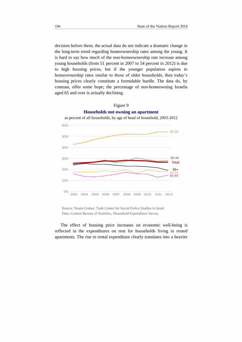
State of the Nation Report 2014 106
decision before them, the actual data do not indicate a dramatic change in
the long-term trend regarding homeownership rates among the young. It
is hard to say how much of the non-homeownership rate increase among
young households (from 51 percent in 2007 to 54 percent in 2012) is due
to high housing prices, but if the younger population aspires to
homeownership rates similar to those of older households, then today’s
housing prices clearly constitute a formidable hurdle. The data do, by
contrast, offer some hope; the percentage of non-homeowning Israelis
aged 65 and over is actually declining.
The effect of housing price increases on economic well-being is
reflected in the expenditures on rent for households living in rented
apartments. The rise in rental expenditure clearly translates into a heavier
Source: Noam Gruber, Taub Center for Social Policy Studies in Israel
Data: Central Bureau of Statistics, Household Expenditure Survey
Figure 9
Households not owning an apartment
as percent of all households, by age of head of household, 2003-2012
0%
10%
20%
30%
40%
50%
60%
2003 2004 2005 2006 2007 2008 2009 2010 2011 2012
25-34
35-44
45-5455-64
65+
Total

107 The Israeli Housing Market
economic burden and, as seen in Figure 10, those hardest hit are the
youngest and oldest renting households. These households lost about 5
percent of their disposable income during the period 2008-2011 due to
the increased rent burden. It should be noted, however, that overall by
2011, the share of rent out of household income had returned to a level
similar to that of 2003.
The negative impact on renters’ economic well-being can also be seen
in a breakdown by income quintiles (Figure 11). The increased share of
rent out of household expenditures is most evident among low-income
renters (the two lowest quintiles). Younger and lower-income households
that have not bought apartments, whether by choice or because high
housing prices have made the option unattainable, have been obliged in
recent years to spend a higher (though not unprecedented) proportion of
Source: Noam Gruber, Taub Center for Social Policy Studies in Israel
Data: Central Bureau of Statistics, Household Expenditure Survey
Figure 10
Share of rental expenditure out of household income
median rent expenditure out of net cash income
among renting households, by age group, 2003-2012
15%
17%
19%
21%
23%
25%
27%
29%
2003 2004 2005 2006 2007 2008 2009 2010 2011 2012
35-44
45-54
55-64
Total25-34
65+

State of the Nation Report 2014 108
their income on rent. Beyond the difficulty of buying a home at current
prices, one may assume that high housing costs make it hard for
households to save money and delay any future home purchase even
further. If this trend within the young-household population continues, it
could well have a long-term negative impact on Israeli homeownership
rates.
Entirely different trends are clearly discerned among households that
own more than one residential property. Especially apparent is a rise in
real estate holdings beginning in 2006. Although this increase is common
to nearly all age and income groups, it particularly stands out among
older households (Figure 12) and those with high incomes (Figure 13).
* Head of household aged 25 and over
Source: Noam Gruber, Taub Center for Social Policy Studies in Israel
Data: Central Bureau of Statistics, Household Expenditure Survey
Figure 11
Share of rental expenditure out of household income
median rate expenditure out of net cash income
among renting households*, by age group
32%
29%
22%
%
16%
2 %
21%
18% %
15%
3 %
26%
22%
18%
16%
20
03
20
08
20
12
Bottom
quintile
2nd quintile 3rd quintile 4th quintile Top
quintile
20
03
20
08
20
12
20
03
20
08
20
12
20
03
20
08
20
12
20
03
20
08
20
12
Total
24%
%
23%
20
03
2008
20
12
Income quintiles
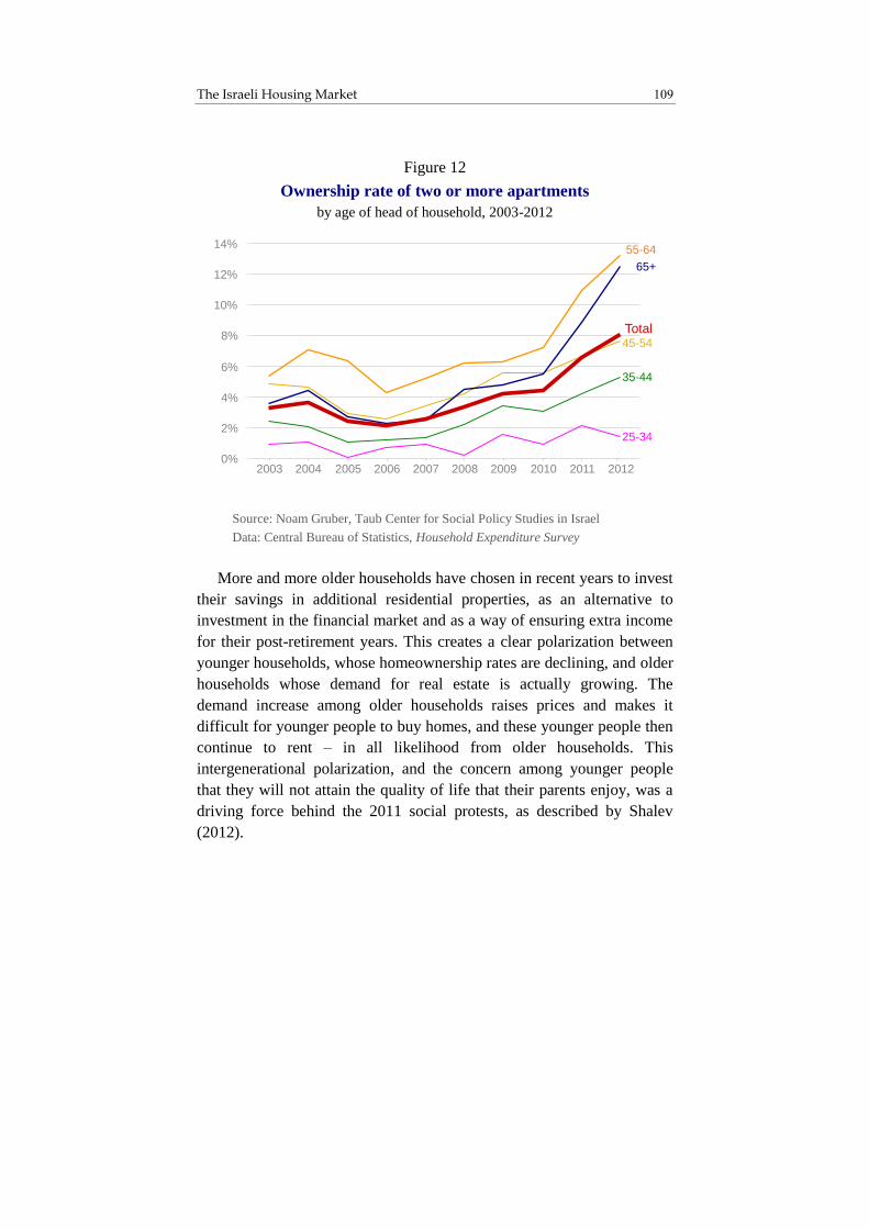
109 The Israeli Housing Market
More and more older households have chosen in recent years to invest
their savings in additional residential properties, as an alternative to
investment in the financial market and as a way of ensuring extra income
for their post-retirement years. This creates a clear polarization between
younger households, whose homeownership rates are declining, and older
households whose demand for real estate is actually growing. The
demand increase among older households raises prices and makes it
difficult for younger people to buy homes, and these younger people then
continue to rent – in all likelihood from older households. This
intergenerational polarization, and the concern among younger people
that they will not attain the quality of life that their parents enjoy, was a
driving force behind the 2011 social protests, as described by Shalev
(2012).
Source: Noam Gruber, Taub Center for Social Policy Studies in Israel
Data: Central Bureau of Statistics, Household Expenditure Survey
Figure 12
Ownership rate of two or more apartments
by age of head of household, 2003-2012
0%
2%
4%
6%
8%
10%
12%
14%
20042003 2005 2006 2007 2008 2009 2010 2011 2012
Total
25-34
35-44
45-54
55-64
65+

State of the Nation Report 2014 110
A similar polarization can also be seen between income levels.11 High-
income households, which owned more apartments to begin with, have
benefited more from the rise in prices. The percentage of households in
the highest quintile that own two or more residential properties has
increased by 16 percentage points – from 6 percent in 2006 to 22 percent
in 2012. The multiple-apartment ownership rate rose for all income
groups, but it is clear that high-income households, those with more funds
available for real estate investment, have seen the highest growth.
11
This, however, is unsurprising, given the correlation between age and income
and between extent of assets, age and income.
* Head of household aged 25 and over
Source: Noam Gruber, Taub Center for Social Policy Studies in Israel
Data: Central Bureau of Statistics, Household Expenditure Survey
Figure 13
Ownership rate of two or more apartments
by household income quintiles*, 2003-2012
0%
5%
10%
15%
20%
25%
2003 2004 2005 2006 2007 2008 2009 2010 2011 2012
Bottom quintile
2nd quintile
3rd quintile
4th quintile
Top quintile
Total

111 The Israeli Housing Market
4. Impact of Interest Rates on Housing Demand
The worldwide recession that came about in the wake of the sub-prime
crisis in the United States caused interest rates to fall dramatically across
the globe, including in Israel. In response to the crisis, the Bank of Israel
was forced to lower interest rates in order to spur local demand and avoid
a recession, and especially in order to prevent a harsh blow to exports due
to the strengthening of the shekel, which would have resulted from an
influx of foreign capital in search of high returns on investment.
Low interest rates also had a major impact on housing demand, both
by enhancing homebuyers’ ability to pay and by making real estate
investment more feasible compared to other investment options. Lower
interest rates decrease monthly mortgage payments relative to the total
mortgage amount, meaning that homebuyers can commit to a larger
mortgage at the same monthly repayment rate, or reduce the monthly
payment for the same size mortgage. This situation made it possible to
afford more expensive properties and may have led renting households to
choose to buy. Low interest rates also lessen the return on financial
investments, such as bonds, and make real estate investment more
attractive, relatively speaking. This effect is intensified by the tax
preference granted to real estate versus financial investment. The
distinction between those who buy real estate for residential purposes and
those who purchase it as an investment is somewhat artificial, given that
investment considerations such as low yield in the financial market and
expectations of housing price increases may also incentivize renting
households to buy properties to live in.

State of the Nation Report 2014 112
As seen in Figure 14, there is a strong negative correlation between
expected real interest rates and housing price changes. The very high
correlation between three factors – expected real interest rate, level of
real bond yield, and the mean interest rate on index-linked mortgages12 –
reflects the impact of the prevailing interest rate on household purchasing
power (via mortgages) and on the relative attractiveness of real estate
investment as compared with investment in the financial market.
12
The interest rate on index-linked mortgages better reflects the real cost of the
mortgage, since it adjusts for inflation.
* Bank of Israel interest rate less average projected inflation rate
** 10-month moving average: January 1 in each year, the four previous months and the five following months
Source: Noam Gruber, Taub Center for Social Policy Studies in Israel
Data: Central Bureau of Statistics, Bank of Israel
Figure 14
Expected real interest rates and changes in apartment prices
percent, 2000-2013
-4%
-2%
0%
2%
4%
6%
8%
-1.0%
-0.5%
0.0%
0.5%
1.0%
1.5%
2.0%
Expected real interest rate**
Monthly change in apartment prices*
Expected real
interest rate*
Monthly change in
apartment prices**
Oct
2013

113 The Israeli Housing Market
In the early 2000s, when interest rates were high – up to 7 percent –
housing prices were stagnant. When interest rates began to drop toward
the end of 2006, housing prices started trending upward, peaking in late
2009 when prices were rising at a monthly rate of over 1.5 percent. The
temporary interest rate hike in late 2009 was accompanied by a halt in the
housing price increase during the same period; when interest rates were
lowered once again, housing prices rose accordingly. Figure 14 supports
the view that housing prices are, in the short term, determined by the
demand side, and that low interest rates are a major cause of rapid
housing price increases.13
As noted, low interest rates enable households to take out larger
mortgages at the same monthly repayment rate. There is also a sense that
the current cheap credit environment could potentially cause many
households to leverage themselves even further, that is, to increase the
size of the mortgage relative to their income by increasing their monthly
payments or prolonging the mortgage term. The low interest rates further
increase the amount households are willing and able to pay for home
purchases.
As presented in Figure 15, the combination of the aforementioned
factors – lower interest rates, higher ratio of mortgage payment to
household income, and extended mortgage repayment periods –
dramatically enlarges the mortgages that households can commit to. In
Case A, with an annual interest rate of 7 percent – like that of the early
2000s – a household with a monthly income of NIS 10,000 that chooses a
monthly payment of 25 percent of its income for a period of 10 years will
be granted a mortgage of NIS 217,000. In Case B – with an annual
interest rate of 2.5 percent, like that of the past five years – a household
can get a NIS 265,000 mortgage at the same monthly payment rate and
over the same term. Should the household decide to increase its payment
rate to a 35 percent share of its monthly income at the same interest rate
(Case C), it will get a NIS 372,000 mortgage. By comparison, if instead
13
Nagar and Segal (2011) also find that interest rates are the main factor behind
the rise in Israeli housing prices.

State of the Nation Report 2014 114
of increasing its monthly payment, the household chooses to extend the
mortgage term from 10 to 20 years and to pay 3.5 percent interest14 (Case
D), then the household will be able to obtain a NIS 433,000 mortgage.
Finally, in Case E – 3.5 percent annual interest, 35 percent share of
monthly income and 20-year repayment period – a household with the
same income can get a NIS 606,000 mortgage, nearly three times that
obtained in Case A.
If the household can make a down payment of NIS 200,000, then in
Case A, it could buy a home whose price is slightly more than NIS
400,000, at a loan-to-value (LTV) ratio of about 50 percent. By contrast,
in Case E the household will purchase an apartment that costs at least
twice as much – over NIS 800,000 – at an LTV of about 75 percent. As
the supply of residential properties in the NIS 800,000 price range is
currently minimal, this numerical example drives home just how far from
affordable today’s actual housing prices are for many Israeli families.
Only households with substantial assets, or those with high incomes
willing to commit to long-term mortgages at high monthly payment rates,
are currently able to purchase apartments.
14
According to Bank of Israel data, the average interest on index-linked
mortgages with terms of 15-20 years is about 1 percentage point higher than
the interest on 5-10 year mortgages.
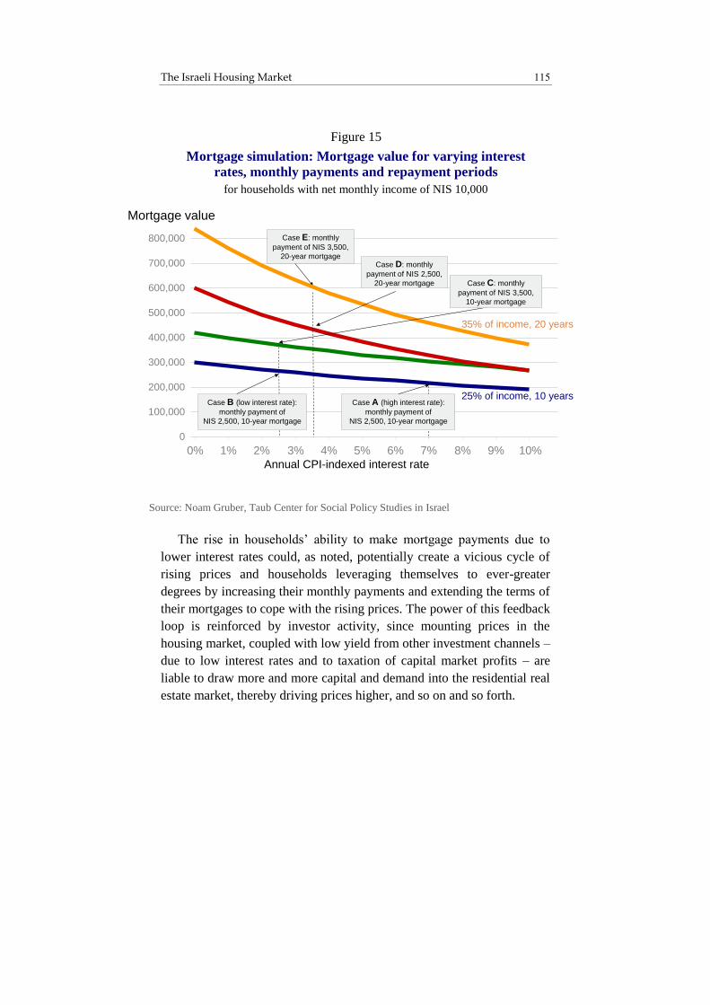
115 The Israeli Housing Market
The rise in households’ ability to make mortgage payments due to
lower interest rates could, as noted, potentially create a vicious cycle of
rising prices and households leveraging themselves to ever-greater
degrees by increasing their monthly payments and extending the terms of
their mortgages to cope with the rising prices. The power of this feedback
loop is reinforced by investor activity, since mounting prices in the
housing market, coupled with low yield from other investment channels –
due to low interest rates and to taxation of capital market profits – are
liable to draw more and more capital and demand into the residential real
estate market, thereby driving prices higher, and so on and so forth.
Source: Noam Gruber, Taub Center for Social Policy Studies in Israel
Figure 15
Mortgage simulation: Mortgage value for varying interest
rates, monthly payments and repayment periods
for households with net monthly income of NIS 10,000
0
100,000
200,000
300,000
400,000
500,000
600,000
700,000
800,000
0% 1% 2% 3% 4% 5% 6% 7% 8% 9% 10%
Annual CPI-indexed interest rate
Mortgage value
25% of income, 10 years
35% of income, 20 years
Case B (low interest rate):
monthly payment of
NIS 2,500, 10-year mortgage
Case A (high interest rate):
monthly payment of
NIS 2,500, 10-year mortgage
Case E: monthly
payment of NIS 3,500,
20-year mortgage
Case C: monthly
payment of NIS 3,500,
10-year mortgage
Case D: monthly
payment of NIS 2,500,
20-year mortgage

State of the Nation Report 2014 116
Figure 16 shows that household mortgages, both in absolute numbers
and as a share of all household debt, have been trending steadily upward
since the beginning of 2008, at the same time as the rise in housing
prices. This correlation between debt and rise in prices can be interpreted
as a representation of increased household leveraging – which is itself
both an outcome of the housing price increase and a factor in its
continuation.
Source: Noam Gruber, Taub Center for Social Policy Studies in Israel
Data: Bank of Israel (Reports of the Supervisor of Banks and Information and
Statistics Department), Central Bureau of Statistics
Figure 16
Mortgage debt, 2000-2013
as a percent of all household debt
and in billions of shekels (January 2013 prices)
64%
66%
68%
70%
72%
74%
76%
140
160
180
200
220
240
260
280
300
Share of mortgages out of
total household debt
Amount of
mortgages
Amount of mortgages
Mortgage share

117 The Israeli Housing Market
One reservation regarding the foregoing is that the ratio of mortgage
debt to total household debt, which amounts to a little over 70 percent, is
not high relative to the levels of the first half of the 2000s. Moreover,
household leverage rates, as reflected in mortgage size relative to asset
value (LTV) and in monthly payment rates as a percentage of income,
have not risen appreciably (Figures 17 and 18).
* Average weighted by mortgage size
** Presented by quarters until July 2013
Source: Noam Gruber, Taub Center for Social Policy Studies in Israel
Data: Bank of Israel
Figure 17
Mortgage characteristics
by month of mortgage issue, 2011-2013
%
%
%
%
%
%
%
%
% Share of mortgages of 60% or more of the property value*
Rate of repayment from income*
Share of total mortgage credit that has a
payment period of more than 15 years**

State of the Nation Report 2014 118
Unfortunately, the Bank of Israel began gathering and publishing
detailed mortgage data only in 2011, meaning that no figures are
available regarding changes in the LTV, average payment to income
ratio, or length of mortgage terms during the period of rising prices
between 2008 and 2010. In April 2011 – the point from which mortgage
data are available – the picture indeed indicates relatively high
leveraging; 43 percent of the mortgage credit issued was for mortgages in
excess of 60 percent of the asset, while the average payment as a share of
household income was 35 percent (Figure 17). The high leverage rate
raises the risk of default, as in situations where a wage earner within the
household loses his/her job. These data for 2011 thus point to a large
proportion of high-risk mortgages.
In an effort to calculate mortgage characteristics for the period before
precise data became available, Benita and Naor (2013) estimate the
average financing rate (ratio of total loans to total assets sold) for the
entire real estate market from 2002 on, by crossing data from the Bank of
Israel, the Ministry of Finance and the Central Bureau of Statistics –
demonstrating an overall upward trend, from 30 percent in 2002 to 45
percent in 2012. It should be emphasized that these data refer to the
average financing rate for the entire real estate market, not just for those
with mortgages (LTV), since some real estate transactions take place
without mortgages. Additionally, Benita and Naor (2013) estimate the
average payment to income ratio, and find a sharp rise over the years
2009-2010 – from 23 percent at the beginning of 2009 to over 30 percent
in 2010.
In contrast to Benita and Naor’s estimates, Figure 17 shows that over
the past two years, there has been a decline both in the proportion of
mortgages that exceed 60 percent of asset value – from 43.2 percent in
April 2011 to 34.8 percent in December 2013 – and in the average
payment to income ratio: from 34.5 percent in April 2011 to 28 percent in

119 The Israeli Housing Market
December 2013.15 The Central Bureau of Statistics’ expenditure survey
data are also inconsistent with Benita and Naor’s assessments; they
actually point to a decline in the mortgage payment to income ratio over
the past decade (Figure 18).16,17
15
The discrepancy in these figures may be due to Benita and Naor’s use of
average mortgage rates, as opposed to Bank of Israel data which are based on
weighted averages, by mortgage size. 16
It should be noted that for households paying off older mortgages, the interest
rate decline could have led to a drop in monthly payments, whether due to the
mortgage’s variable-rate component or to mortgage refinancing (i.e., taking
out a new mortgage under improved conditions), meaning that examining an
average of all mortgage-paying households would not be representative of the
burden on households obtaining new mortgages. Furthermore, Benita and
Naor (2013) focus on ratios of mean mortgage payments to mean income,
rather than on the mean of the ratios between these factors. They justify their
choice by contending that this ratio is biased downward, stemming from their
assumption that the payment to income ratio declines with income. Although
this is true for those with mortgages (per an analysis of the expenditure survey
data conducted by the author), it is clear that the percentage of renters (who
have no mortgage payments) actually declines with income (see Figure 6),
meaning that this premise is not necessarily valid. 17
Use of the median rate rather than the mean is meant to neutralize the effect of
extreme cases, such as households whose income is very low relative to their
mortgage. When extreme outliers are removed, the mean and median trends
are similar.

State of the Nation Report 2014 120
Some declines in the leverage rate (LTV) and in the payment to
income ratio (Figure 17) can be attributed to restrictions instituted by the
Supervisor of Banks, out of a desire to limit risk in the housing credit
market and circumvent any threat to the financial system’s stability
should a large number of households go into default, as happened in the
United States during the sub-prime crisis period. Another (undeclared)
objective of the Supervisor of Banks is to restrain the housing price
upsurge and weaken the effect of interest rates on housing demand –
given that the relationship between interest rates and housing prices could
potentially limit the Bank of Israel’s ability to bring interest rates down
further in order to weaken the shekel against other currencies.
Source: Noam Gruber, Taub Center for Social Policy Studies in Israel
Data: Central Bureau of Statistics, Household Expenditure Survey
Figure 18
Median mortgage payment as percent of income
among all households paying a mortgage,
by age of head of household, 2003-2012
6%
8%
10%
12%
14%
16%
18%
20%
22%
2003 2004 2005 2006 2007 2008 2009 2010 2011 2012
25-34
35-44
45-54
55-64
65+
Total
121 The Israeli Housing Market
On November 1, 2012, differential limits were imposed on mortgage
LTV: 75 percent for first-time homebuyers, 70 percent for home
“upgraders” and 50 percent for investors. Since these restrictions were
instituted there has been a consistent decline in leverage rates of more
than 60 percent of asset value, and thus the limits appear to have achieved
their goal of reducing the proportion of high-risk loans (Figure 17).
Additional restrictions imposed by the Supervisor of Banks on
September 1, 2013 prohibit the granting of mortgages at payment rates
exceeding 50 percent of household income, while instituting stricter
reserve requirements for mortgages with payment-to-income ratios of 40-
50 percent, limiting the variable-rate component within loans to no more
than 66.7 percent,18 and prohibiting loan repayment periods in excess of
30 years. As seen in Figure 17, there was indeed a certain decrease in
average payment as a share of income during the final months of 2013,
but this came in exchange for a substantial increase in the payback period
length. Thus, the percentage of mortgages with terms in excess of 15
years more than doubled within three months – from 10 percent in
August to 22.6 percent in November, the last month for which data are
available. It is altogether unclear whether the payment to income ratio
limitations, which drove many households to extend their mortgage
repayment terms so as to reduce their monthly payments, did indeed
lower their mortgage risk. Firstly, when a household burdened with a
high mortgage payment has trouble making its monthly payments, it
already has the option of refinancing its mortgage (i.e., covering the
payments by means of a second mortgage with better terms), and thereby
extending the payback period and reducing the monthly payment.
Secondly, according to the Bank of Israel Supervisor of Banks data, the
longer the mortgage term, the higher the interest rate charged, meaning
that the overall burden is greater and the household is exposed to risks
such as unemployment and interest fluctuations over a longer period. The
18
This restriction is in addition to a May 2011 Supervisor of Banks directive,
which limited to one-third the share of the loan that can have interest vary
more frequently than every five years.

State of the Nation Report 2014 122
Supervisor of Banks would do well to focus on limiting the ratio between
household income and total mortgage value, and let households strike the
balance between mortgage term length and monthly payment rate as they
see fit.
5. Taxing Rental Income
As discussed previously, the rise in housing prices of the last few years
stemmed from increased demand due to low interest rates and a
preferential taxation structure, as well as to supply-side failures.
Addressing the demand side is easier, and will produce results within a
shorter time frame.
Since Israel is a small and open economy, local control over interest
rates is limited. However, taxation is under greater control. As explained
by Sarel (2014), the capital gains tax that was instituted in Israel in 2003
created preference towards real estate investment. Sarel focuses on the
advantage that emerged for those living in self-owned properties vis-à-vis
renters, and argues that this advantage is the source of heightened
demand for residential properties and for the rising price of such
properties. This effect ought to have increased the homeownership rate,
but that did not occur; rather, the homeownership rate for households in
the 25-34 age range (Figures 7 and 9) actually continued its downward
trend. As may be seen, Israeli households that have the ability to buy
homes do so at high rates, meaning that the additional incentive of a tax
advantage vis-à-vis capital market investments did not bring about a
change in trend. However, when the choice between investing in the
financial market or in real estate is at issue, this advantage turns out to be
highly significant.
Real estate investment yields two types of profit: a rise in the value of
the asset, on which a betterment tax is charged when the asset is sold; and
rental income.19 At present, rental income, which is concentrated in the
19
The betterment tax on the sale of residential properties is merely a
supplemental measure, not an alternative to a tax on rental income, inasmuch

123 The Israeli Housing Market
hands of the wealthy (Figure 13), is largely tax exempt,20 unlike income
from labor or financial capital. According to 2012 data – and current
figures may be assumed to be higher – there are 640,000 residential units
being rented, at an average monthly sum of NIS 2,500. This amounts to
NIS 20 billion in rental payments per year, which are taxed at a low rate
if at all – since it is unclear to what degree taxation is actually enforced
for those monthly rents higher than NIS 5,080. Given that most rental
income is concentrated in the hands of high-income households, rental
income ought to be taxed at a higher rate. First of all, rental income
should be subject to a value added tax. Additionally, it could be argued
that this kind of income should be taxed at a fixed rate of 25 percent, like
capital gains. Alternatively, rental income could be taxed at the marginal
income tax rate of the property owner, as with labor income – which
would ease the burden on retired people who derive most of their income
from a single rental property. Depending on the taxation approach, it may
be estimated that the state is currently foregoing income in the region of
NIS 6-8 billion per year. This is a regressive distortion of the tax system,
which creates excess demand for real estate assets while amplifying the
impact of interest rates on the demand for those assets.
Some might argue that taxing rental income would simply cause
landlords to pass their income loss on to tenants, thereby driving rents
even higher. This claim, however, does not stand up to close
examination; in the short term, rental market supply is rigid, meaning that
there is a fixed number of units available for rent, and rents are
determined by demand, meaning that landlords are already demanding
the highest possible rent that they can get from their tenants (Figure 19).
as it does not tax rental income. It should be noted, moreover, that its ability
to deter long-term investment in residential properties is very limited, since it
can be deferred indefinitely, so long as the property is not sold. 20
Rental apartment income under NIS 5,080 per month (according to 2014 data)
is tax exempt.

State of the Nation Report 2014 124
Over time, taxing rental income would reduce the supply of rental
apartments, since the return on such assets would decline. Rental
apartments would not, of course, disappear from the market but would,
instead, be sold by investors to households that previously owned no
apartments, i.e., to renters (investor-to-investor property sales would not
reduce the supply of rental apartments). Taxing rental income would thus
decrease both supply and demand in the rental housing market in a
balanced manner, without affecting rent levels in the medium term, when
investor-owned apartments would be sold (Figure 20).21 When they
21
One reservation to be noted is that a tax on rental income, which reduced the
demand for residential investment properties, would lead to less housing
construction and reduce the supply of rental apartments in the long term.
Source: Noam Gruber, Taub Center for Social Policy Studies in Israel
Figure 19
Rental market in the short term
before and after implementing tax on rental income
Stock of
rental apartments(640,000 in 2012)
Rental price
Demand for
rental properties
Without tax:
All of the rent
remains with
landlord
With tax:
NIS 2,500
average in 2012
Share of rent
remaining with
landlord
Equilibrium point
remains unchanged
Share of rent
going to taxes

125 The Israeli Housing Market
bought their properties, investors drove less affluent households to the
rental market and thus increased the demand for rental housing, meaning
that expanding the supply of rental units did not cause rents to drop.
Similarly, the sale of investor-owned apartments and a reduced supply of
such apartments would not cause rents to rise, since this trend would be
counterbalanced by a simultaneous trend toward reduced rental demand.
At the same time, the sale of investor-owned residential units would
cause prices to drop.
It is clear that today’s de facto exemption from tax on rental income is
mainly a boon to landlords – who, as Figure 13 shows, already constitute,
by and large, a high-income group. This regressive distortion of the tax
system benefits the wealthy and raises both demand for housing and
housing prices; moreover, it blocks off the rental housing market from
companies that specialize in this area because tax-wise, they are
disadvantaged vis-à-vis individuals. Companies’ income from rental
housing is subject to VAT, corporate tax and dividends tax (if paid). This
greatly reduces companies’ profit margins compared with private
landlords and keeps them from competing effectively – despite their
importance to the long-term rental market.

State of the Nation Report 2014 126
A proposal is currently under consideration to amend the Rental and
Borrowing Law, which would require the existence of at least a three-
year lease in order for private landlords to receive the rental income tax
exemption for rents below NIS 5,080 (Bousso, 2014a). On the face of it,
this is a step in the right direction, one that expands the tax base and
forces the Israel Tax Authority to monitor rental transactions. However,
the tax rate would still be only 10 percent – significantly lower than the
rate for capital gains, and it can be evaded by means of a long-term lease.
As noted, if the tax on rental income were brought into line with that on
capital gains, companies would be better able to compete in the rental
housing market and create a supply of long-term rental housing.
Source: Noam Gruber, Taub Center for Social Policy Studies in Israel
Figure 20
Rental market over time
before and after implementing tax on rental income
Stock of rental apartments
Supply and demand
decline equally
Rental price
Rental
apartments
Without tax:
All of rent
remains with
landlord
With tax:
Share of rent
remaining with
landlord
Demand for
rental
properties
Share of rent
going to taxes

127 The Israeli Housing Market
Should the state declare its intention to tax rental housing income
within the next few years, that in and of itself could foster an immediate
drop in the demand for investment properties, as well as in their prices.
There can be no doubt that landlords would want to pass the cost of the
tax on to tenants but, as noted, their ability to do this would be minimal,
since the tax would not directly affect the supply-demand balance in the
rental market.
It should, however, be noted that it would not be desirable to impose a
rental income tax on households that rent out one apartment while
themselves living in another rented apartment, since that would penalize
geographic mobility. Additionally, if real estate taxes were to be brought
in line with those on financial capital, it would be appropriate to annul the
purchase tax.22
6. Housing Supply
In short-term housing market fluctuations, it is demand that dictates
prices. By contrast, in the long-term, prices are determined by
construction costs, and the likelihood of extreme fluctuations in the form
of real estate bubbles or housing market “crashes” is affected by supply
elasticity, (i.e., by the rate at which supply increases in response to
increasing prices).
Figure 21 presents a clear correlation between housing prices and the
number of housing starts in Israel. In the early 2000s, there was a steep
decline in housing starts, with approximately 1,000 fewer housing starts
per month. The probable cause of this decline was housing market
saturation and an expectation that prices would continue to drop for a
long time, as they indeed did. It is also likely that the economic crisis set
in motion by the Second (al-Aqsa) Intifada also played a role. Housing
22
State income from the purchase tax on residential properties amounted to NIS
2.2 billion in 2011 (Ben Naim, 2013). If the purchase tax were annulled, this
income would be deducted from the additional revenues anticipated from the
tax on rental income.

State of the Nation Report 2014 128
starts remained low until 2008, when housing prices began to recover –
due, as noted previously, to falling interest rates – and this was
accompanied by a rise in the number of housing starts, which quickly
returned to the early 2000s level. The upward trend was halted, even
reversed, in mid-2011. It may well be that the housing protest, which
peaked during this period, generated uncertainty and an expectation of
lower prices due to government intervention – leading, paradoxically, to a
decline in housing starts, which have yet to return to their pre-protest
levels. A decline in the planning stock may perhaps also be implicated in
the housing-start drop. One way or another, despite an additional rise in
housing prices in 2012-2013, the number of housing starts has remained
steady – at 3,500 per month, or 42,000 per year.
It should again be clarified that current housing prices, which
represent supply-demand equilibrium in the housing market, are a
symptom, not the cause, of a problem: excess demand. In competitive
markets, a price rise is followed by increased supply, leading to a
sufficient increase in the number of apartments in the market and
ultimately, in the long term, to a drop in prices to their natural level, close
to that of construction costs. The problem starts when supply-side barriers
keep housing starts from rising sufficiently, and the supply-demand gap
fails to close, prices do not drop, and a vicious cycle begins, culminating
in a housing bubble.

129 The Israeli Housing Market
As indicated by Figure 22, the Israeli economy could build residential
units on a much larger scale than it does at present. In the mid-1990s,
subsequent to the wave of immigration from the former Soviet Union, the
pace of construction accelerated greatly, via both public and private
initiatives. In 1995, the construction of nearly 73,000 apartments
commenced – a much higher figure than that of 2011, the past decade’s
peak housing-start year, when construction began on only 46,000
apartments. If the waiting period for building permits in high-demand
areas were shorter, current prices would likely drive construction at a
much faster pace, thereby closing the gap between demand and supply
and, consequently, bringing prices down.
* January 2000=100
** Monthly figure, seasonally adjusted
Source: Noam Gruber, Taub Center for Social Policy Studies in Israel
Data: Central Bureau of Statistics
Figure 21
Apartment prices and housing starts, 2000-2013
1,500
2,000
2,500
3,000
3,500
4,000
4,500
Number of housing starts**
70
80
90
100
110
120
130
Real price index for apartments*
Housing starts
Real price index for apartments
1/2000 10/2002 7/2005 4/2008 1/2011 /201

State of the Nation Report 2014 130
The supply-demand disparities are also reflected in changes in the
stock of new properties, that is, residential units whose construction has
been completed but which have not yet been sold – though the
relationship is relatively complicated. The existence of housing stock is a
function of the time it takes to sell apartments. Thus, the size of the stock
is proportional both to the scope of construction and to the pace with
which units offered on the market are sold. For example, the drop in
demand for housing in the early 2000s led to a decline in the number of
housing starts and, consequently, to a gradual contraction of the housing
stock – from over 30,000 units in late 2000 to 19,000 at the end of 2005
(Figure 23).
Source: Noam Gruber, Taub Center for Social Policy Studies in Israel
Data: Central Bureau of Statistics
Figure 22
Annual housing starts, 1995-2012
10,000
20,000
30,000
40,000
50,000
60,000
70,000
01996 1998 2000 2002 2004 2006 2008 2010 2012

131 The Israeli Housing Market
However, the upsurge in demand that started in 2008 also caused a
decline in the housing stock: from 18,000 units in 2008 to 15,000 units in
2009, per Ministry of Construction and Housing data (or to 13,000 units
per the Central Bureau of Statistics). The reason for this is that, in the
construction field, supply does not increase immediately in response to
rising demand, meaning that the extent of construction remains small
while the time it takes to sell is shortened. Thus, during 2009-2010,
alongside the dramatic rise in housing prices, the stock of residential units
contracted to 15,000 – less than half of the stock available at the end of
2000. It is likely that, in addition to the low prevailing interest rates, the
limited inventory also contributed to the price increase that took place
during this high-demand period. Throughout 2011, when housing prices
temporarily stabilized, there was a notable increase of 6,000 in the stock
of new units, and the stock has remained at the 21,000-unit level until the
Source: Noam Gruber, Taub Center for Social Policy Studies in Israel
Data: Ministry of Construction and Housing
Figure 23
Stock of new apartments nationwide, 2000-2013
0
5,000
10,000
15,000
20,000
25,000
30,000

State of the Nation Report 2014 132
time of this writing. The stable stock of new apartment units over the past
three years points to a pace of construction that is successfully meeting
demand at current price levels, but is, again, insufficient to bring about a
price drop.
The residential-unit stock expansion in 2011 meant a return to the
range of the period 2002-2006. The stock gradually grew in all parts of
the country, especially in the central district, though some of the
impressive increase in central and southern Israel was offset by a decline
in the period March 2012 to July 2013, as shown in Figure 24.
* Data are for July of each year and January for 2014
Source: Noam Gruber, Taub Center for Social Policy Studies in Israel
Data: Central Bureau of Statistics
Figure 24
Stock of new apartments for sale
by district, 2009-2013
0
2,000
4,000
6,000
8,000
10,000Center
Tel AvivSouth
Jerusalem
HaifaNorth
Judea and Samaria
*

133 The Israeli Housing Market
The present period is characterized by relative price and stock
stability, notwithstanding the high price levels; this is also reflected in
construction company forecasts.23
This situation is expected to continue for as long as there is no real
change on the demand side – a rise in interest rates or a recession – or on
the supply side, that is, the a removal of administrative barriers or
massive state construction in high-demand areas. However, the current
stability could be misleading, as the rising share of Israeli real estate
investors points to a bubble-like dynamic and to a possible price free-fall
should the bubble burst and investors try to sell their assets. Alongside
the urgent need for a housing price drop, there is also a need for systemic
change that would keep the present crisis from repeating itself. Although
direct governmental intervention could be justified in light of current
prices, it would be preferable for a more elastic supply to keep prices
from rising in the first place because, as noted in the introduction, when
supply is rigid, the risk of a real estate bubble greatly increases.
7. Limits on Israel’s Housing Supply
The main constraints on the supply side, as reported by construction
companies (Figure 4), are a shortage of land on which to build and permit
delays; the companies also note, to a lesser degree, a shortage of skilled
workers and credit. The land shortage and permit delays are due to a
complex bureaucratic structure, over-centralization on the national level,
an inherent conflict of interest on the local level, and a high prevalence of
condominium apartment buildings.
23
As the Central Bureau of Statistics Business Tendency Survey from October
2013 shows, most (75.7 percent) construction companies expected prices to
remain the same for the following three months. Of the rest, the share of
companies that expected prices to increase (11.3 percent) or increase by a lot
(2 percent) was very similar to the share of companies that expected prices to
decrease (9.2 percent) or decrease by a lot (1.8 percent).

State of the Nation Report 2014 134
Figure 25 presents the procedural stages along the way to obtaining a
permit for residential construction in Israel. The figure shows that the
process in Israel takes, on average, 13 years. Actual construction accounts
for two of those years,24 while the remaining 11 are devoted to
bureaucratic proceedings – assuming the construction plans are ultimately
approved. The stages that stand out for their length are those of district
committee approval (five years on average) and local committee approval
(three years on average). By comparison, in most European Union
countries, the maximum amount of time needed to obtain a building
permit is 8-12 weeks (Pedro et al., 2011). These lengthy wait periods are
clearly reflected in the rigidity of the Israeli housing market supply.
When the building permit process takes this long, it is not surprising that
people have trouble believing that real estate prices will drop in the
foreseeable future.
24
To compare, according to 2013 data, average construction time in the United
States for a building with 20 residential units was a year and a half (U.S.
Census Bureau, 2013).

135 The Israeli Housing Market
Figure 26 presents the stages leading to district committee approval of
a building plan (the five years shown in Figure 25).25 Most of the delay
associated with the district committee is at the stages of fulfilling
25
As shown in Figure 25, it takes five years on average to obtain district
committee authorization, but due to differences between the sources of data
on the various stages of the process, Figure 26 shows the length of this stage
to be a little over 4 years (49.4 months). Additional data on district committee
processes are found in Planning Administration, Ministry of the Interior
(2013).
Figure 25
Duration of the construction process in Israel
by stages, in years
0
2
4
6
8
10
12
14
Years
Building time
Feasibility study and plan preparation
for district committee
District committee license
Development plans
Marketing**
Building permits*
* Permit from the local committee
** Tender publication and decision regarding the winner
Source: Noam Gruber, Taub Center for Social Policy Studies in Israel
Data: Bank of Israel (2012)

State of the Nation Report 2014 136
submission conditions (17 months on average) and fulfilling licensing
conditions (13 months on average). These delays are due to a broad
variety of reasons, the most notable of which are insufficient
infrastructure and stakeholder opposition (Han, 2010).
Source: Noam Gruber, Taub Center for Social Policy Studies in Israel
Data: Ministry of the Interior (2013)
Figure 26
Duration of district committee licensing process
by stages, in months
Months
Checking prerequisites
Preliminary plan checks
Fulfilling conditions for
submission of plans
Plan public review period
Approval process
Fulfilling licensing conditions
0

137 The Israeli Housing Market
Constraints on the National Level
On the national level, the state owns – directly or through the Jewish
National Fund (JNF) – 93 percent of the country’s land. Out of 22 million
dunams,26 including the Golan Heights and East Jerusalem, 20 million are
administered by the Israel Lands Authority and the JNF, while 410,000
dunams represents non-regulated land, that is, land for which no legally-
mandated surveying process has been carried out (the latter is also state-
owned land). About 7 percent of the country’s land, 1.5 million dunams,
is privately-owned (Israel Lands Administration, 2013). Despite the fact
that most of the country’s land is state land, 50 percent of construction
takes places on private land.27 On the face of it, there is no lack of land
for construction – as evidenced by the fact that urban and rural
development reserves in the district outline plans (985,000 dunams) are
larger than the country’s built-up area (875,000 dunams), meaning that
there is enough land to double the built-up area (Cohen et al., 2010). In
reality, however, most of the land available for construction is in the
periphery, far from the areas of high demand. Some 63 percent of district
outline plan reserves for urban and rural development are in the southern
and northern districts (excluding Haifa); by contrast, construction on
reserves in the high-demand areas was severely limited by National
Outline Plan 35 (NOP, the National Outline Plan constitutes a binding
comprehensive framework for plans at the district and local levels, known
in Hebrew as TAMA). Among the declared goals of NOP 35 were
curtailing suburbanization in the center and populating Israel’s
periphery.28
26
A dunam is a land measurement unit equaling 1,000 square meters. 27
Some 49 percent of housing starts during January-September 2013 were on
State land (Ministry of Construction and Housing, 2013). Part of the reason
for the high proportion of construction on private land is the fact that private
land is concentrated mainly in the central region, where most demand lies. 28
Regarding the effort to prevent suburbanization, see Administration of
Planning, Ministry of the Interior (2005), p. 163. On limiting construction in
the center and populating the periphery, see the same source, pp. 95, 103.

State of the Nation Report 2014 138
The authors of NOP 35 were unquestionably aware of the need to
improve employment opportunities, transportation infrastructure and
quality of education in the periphery so as to attract a strong population to
these areas,29 yet chose to disregard the formidable political and
budgetary constraints that make these objectives so difficult to achieve.
Moreover, by focusing on a long-term vision, the NOP authors chose to
ignore the fact that even if the state actually had the financial resources
and political will to advance the development of the periphery, the
processes involved would extend over varying time periods of
unforeseeable length – while restrictions on building would likely exert
an impact in the shorter term, causing great hardship to the population in
the meantime, as indeed happened. It is also clear that should the
aspiration to improve living conditions in the periphery be realized, the
periphery would then become more attractive and increase its population
share even without the “stick” of construction restrictions in the center.
Finally, the authors of NOP 35 gave no consideration to a prediction that
came to be fulfilled, namely, that they would ultimately be enriching the
owners of real estate in central Israel and making the residents of the
periphery poorer by comparison. It is not rare in Israel for people
originally from the periphery to live for periods of time in the center of
the country, for study or work purposes, and then to return to the
periphery. The heightened cost of living in the center relative to the
periphery, in which housing plays a key role, undermines the physical
and social mobility of those in Israel’s geographic periphery.30
The centralized planning process and the state ownership of most
available land is usually rationalized in terms of the desire to protect the
country’s natural/scenic treasures and agricultural sector, as well as the
need to retain land reserves for planning future infrastructure. In reality,
Israel’s planning bodies have addressed neither objective, have
29
See Administration of Planning, Ministry of the Interior (2005) pp. 124, 172,
216. 30
In connection to this issue, see Andrews et al. (2011), who find that strict
housing policies impair labor mobility.

139 The Israeli Housing Market
indefinitely delayed final zoning of most of the land and, in the
meantime, have been releasing land for development in very small
increments. This is a comfortable arrangement for both the planning
bodies and the real estate developers, as it enables the former to retain
control over state land while ensuring for the latter, who are already
highly experienced in interacting with the planning authorities, reduced
competition due to the shortage of land available for construction. The
outcome is very high residential density, reflected in a low number of
rooms per person by international comparison (Figure 27) – even relative
to countries with higher population densities,31 such as Korea and the
Netherlands, or similar population densities, such as Belgium and Japan.
The problematic aspects of state intervention in, and over-
centralization of, land management has been clear for some time.32 The
current real estate crisis has put pressure on the establishment to address
the dilemma, resulting in the institution of several reforms. In 2012, a
streamlining and reorganization process for the Israel Lands
Administration began, under which it was accorded “authority” status.33
Many organizational changes were made to the Ministry of the Interior’s
Planning Administration, aimed at accelerating the planning process
(Planning Administration, Ministry of the Interior, 2013). A substantive
change to the Planning and Building Law – the “pergola reform” – came
into effect in August 2014.34 At the same time, two “bureaucratic bypass”
mechanisms were created: national housing committees, a fast-track
planning framework within the Ministry of the Interior; and the
31
Population density is measured in terms of number of people per square
kilometer. 32
The Ministry of Finance website contained committee reports and research
studies on the topic, but the relevant webpage has been removed. A copy is
still available at:
http://web.archive.org/web/20120128173355/http://www.mof.gov.il/BudgetSi
te/Reform/Pages/LandsReform2009.aspx 33
About the transition from administration to authority and its impact, see Israel
Land Administration (2013). 34
For information on the reform, see the Ministry of the Interior website:
http://www.moin.gov.il/Subjects/BuildingReform/Pages/default.aspx.

State of the Nation Report 2014 140
Figure 27
Average number of rooms per person, 2011*
0.90.9
111
1.21.2
1.31.41.41.41.41.4
1.61.61.6
1.71.7
1.81.81.81.81.81.8
1.91.91.9
22
2.12.2
2.32.32.3
2.6
1.1
1.6
RussiaTurkeyMexico
HungaryPoland
IsraelGreece
SlovakiaChile
Czech RepublicItaly
SloveniaBrazilKorea
EstoniaIceland
PortugalOECD average
AustriaSweden
SwitzerlandGermany
SpainFrance
UKJapan
DenmarkFinland
LuxembourgNetherlands
NorwayIreland
BelgiumUSA
New ZealandAustraliaCanada
* For those countries without data from 2011, the most recent data
available was used
Source: Noam Gruber, Taub Center for Social Policy Studies in Israel
Data: OECD (2013)
Committee for the Preferred Housing Program, a trans-ministerial entity
authorized to enable quick approval of construction plans on a large scale
and to expropriate farmland for development purposes.
These are welcome measures, but one must be wary of magic bullets.
The issue of how to balance the environmental-protection imperative and
the needs of the agricultural sector vis-à-vis housing density and the cost
of living within Israel’s order of priorities is an important one that must
not be treated lightly, but rather addressed earnestly and from a long-term
perspective. This insight itself should lead us to reconsider the state’s role
in land ownership and in the initiation and approval of building plans,

141 The Israeli Housing Market
since governmental failures in this arena are creating barriers to supply,
and the resulting housing bubble and widespread distress could
potentially overshadow longer-term considerations and bring about major
damage to Israel’s natural resources.
Constraints at the Local Level
As noted in the report of the Public Committee to Examine
Administrative and Organizational Constraints in the Sphere of Planning
and Building (Ministry of the Interior, 2011), and by Han (2010; 2013),
national-scale barriers are by no means solely to blame for the limits on
Israel’s housing supply. Significant constraints exist at the local level and
are keeping many projects that have already been approved at the national
level from getting off the ground. Barriers affecting Israel’s high-demand
areas are primarily municipal ones, stemming for the most part from an
inherent conflict of interest between developers and local authorities.
High-density construction on a massive scale requires suitable
infrastructure investment – roads, parking, sewage, educational and
health facilities, playgrounds and parks. In the absence of such
infrastructure and amenities, construction places a heavy burden on the
residential environment, with negative outcomes for both long-time
occupants and future residents of the new housing. High-density
construction entails great expenditures at the land-unit level, which are by
no means covered by development fees and additional property tax
revenues, at least in the short term. The state bears responsibility for
building or funding some of this infrastructure, but since numerous
government bodies have a hand in the various forms of infrastructure,35
35
These include the Ministry of Construction and Housing, which is responsible
for funding infrastructure in localities that rank low socioeconomically; the
Ministry of Education, which is responsible for building schools; the Ministry
of Transport and Road Safety, which bears responsibility for some
transportation infrastructure, such as the interchanges that connect the national
road network; the Ministry of National Infrastructure, which is charged with
appropriate development of electricity, water and sewage infrastructure; and

State of the Nation Report 2014 142
delays in the transfer of funds and in infrastructure development are par
for the course. In reality, a great deal of the burden falls on the local
authorities.36
Figure 28 shows that residential construction generates income both
for the central government (through the sale of government land and tax
revenues), and for local governments (through development and rezoning
fees). The central government’s land-tax income goes into the state
budget, accounting for a relatively small share of total government
revenue. From there, the budget is divided among various ministries,
which spend it in accordance with their specific priorities. Since the
budget of the ministries is not conditional upon the implementation of
construction projects, government ministries do not, when formulating
their priorities, take into account the income that the state would
ultimately receive should the ministries establish the infrastructure they
are responsible for and thus enable such projects to proceed. Local
government revenues are insufficient to meet the cost of the infrastructure
for which localities are responsible and, as noted in the Report of the
Public Committee to Examine Administrative and Organizational
Barriers in the Sphere of Planning and Building (2011), local
government is limited in its ability to increase development fees as
needed or to require developers to fund infrastructure out of their own
pocket. Thus, although real estate development generates considerable
revenue for the state, a market failure has emerged in which this revenue
is not being channeled efficiently toward the establishment of
infrastructure that would facilitate such development.
the Ministry of Health, which is responsible for increasing the capacity of
existing health facilities and creating new ones. 36
This is especially evident when one looks at the burden on pre-existing
infrastructure near new residential projects. Construction of a new
neighborhood will, for example, increase traffic on the roads leading to it –
which often pass through older neighborhoods.

143 The Israeli Housing Market
The outcome is a conflict of interests between the developer who
wants to build and earn a profit – especially when housing prices are high
– and the local authority, which has no way of passing on to the
developer the costs that development imposes upon it. This state of
affairs is highly reminiscent of a market failure due to the existence of a
negative externality, but with this difference: if the tax receipts generated
by real estate development were used to fund the necessary infrastructure,
the local authority would be spared many costs and delays and market
failure would be prevented.
Under the current circumstances, it is hardly surprising that many
Israeli mayors have no desire to significantly increase the population of
their cities. It is in the local authority’s interest to keep high-density
Source: Noam Gruber, Taub Center for Social Policy Studies in Israel
Figure 28
Infrastructure budgeting process for residential building
Residential
building
Prerequisite for
building:
construction of
infrastructures
Local authority State budget
Various gov’t
ministries
Proceeds from sale
of gov’t land, sales
tax, betterment tax,
VAT, direct tax
Other
budgetary
sources
Ministry
budgets
Allocations of
ministries for
infrastructures
under their
respective
responsibilities
Development
and rezoning
fees
Local
financing

State of the Nation Report 2014 144
development at bay while pursuing an opposite course – that of
increasing municipal revenue by encouraging the construction of low-
density luxury housing and commercial and industrial projects, which
require little in the way of infrastructure investment but generate more
property-tax revenue. As shown by Eckstein et al. (2012), the price per
square meter of commercial or industrial space has barely risen over the
past decade, and stands at about half the level of residential prices. Since
the construction inputs are very similar, the explanation for this huge gap
is the local authorities’ tendency to prefer commercial and industrial land
uses for approval. Another testament to local authorities’ interest in
curtailing high-density construction is the rise in the price of small
apartments relative to large ones (Figure 29).
Figure 29
Prices of 2.5-3 room apartments
relative to 4.5-5 room apartments
owner-occupied apartments, by region, 2005-2012
40%
42%
44%
46%
48%
50%
52%
54%
56%
58%
60%
2005 2006 2007 2008 2009 2010 2011 2012
Sharon
Center
Tel Aviv
Jerusalem
Total
Source: Noam Gruber, Taub Center for Social Policy Studies in Israel
Data: Central Bureau of Statistics

145 The Israeli Housing Market
In recent years the share of small apartments in the construction mix
has dwindled greatly. The fact that their relative price increased while
their share in the construction mix declined points to constraints on the
supply side – local authorities simply are not interested in such projects
and thwart their approval by the local committees. If the decline in small-
unit construction were due solely to falling demand for this housing type,
one would expect the price of small apartments to drop vis-à-vis large
apartments.
Israel's ministries are well aware of these problems, and in order to
foster large-scale residential construction, they have reinstated what are
called “blanket agreements” – agreements between government
ministries, first and foremost the Ministry of Finance, and the local
authorities on whose land projects are slated for construction.37 Via these
agreements, the state provides generous funding on the order of billions
of shekels, to establish needed infrastructure even before projects
commence. The relevant government ministries commit to laying the
infrastructure for which they are responsible by a predetermined date, and
in return, the local authority commits to advancing the project without
delays. Blanket agreements of this kind are in place for Kiryat Gat (7,000
residential units), Modi’in-Maccabim-Re’ut (11,800 residential units),
and Rosh Ha’Ayin (15,700 units), while agreements regarding
construction on a similar scale are slated for Kiryat Bialik, Rishon
LeZion, Herzliya, Yavne, and Beer Sheba.38 In the negotiations regarding
a given project’s size, density and the amount of government funding to
be provided, local authorities are, of course, interested in limiting the
extent of building and in increasing the amount of government funding
(Bousso, 2014b; 2014c). Government funding for the blanket agreements
is supposed to be repaid, at least partially, in the form of state revenue
37
See a detailed discussion on the Israel Lands Authority website:
http://www.mmi.gov.il/shivukweb/pages/mainProject1.html. 38
See Ministry of Construction and Housing press release of February 4, 2014:
http://www.moch.gov.il/Spokesman/Pages/DoverListItem.aspx?ListID=5b390
c93-15b2-4841-87e3-abf31c1af63d&WebId=fe384cf7-21cd-49eb-8bbb-
71ed64f47de0&ItemID=567.

State of the Nation Report 2014 146
from the land sales and from taxes paid on the sale of the final product. It
can be said that under blanket agreements, the money travels a long,
circuitous route, from real estate transactions to the state coffers and back
to funding the needed infrastructure; along the way it provides
employment within the government apparatus.
The blanket-agreement framework is one way of resolving the conflict
of interests that exists between the developer and local authority, as the
additional funding covers the cost of building infrastructure; however,
this is a crisis measure. Blanket agreements entail large advance
expenditures on the part of the state, which can be expected to make such
commitments only when housing prices have spun out of control and
public pressure is sufficiently strong. Furthermore, the framework is
suited specifically to large-scale projects. For many small transactions,
the need to coordinate between the various government ministries and to
negotiate with the local authorities would still result in major delays.
In reality, competition is emerging between local authorities, which
want to increase their share both of industrial/commercial development
and of low-density luxury housing aimed at attracting the affluent. Local
authorities have an incentive to reduce their share of high-density housing
and small apartments, as that would keep weaker populations away. The
conflicting interests of developers (who want to build high-density
housing in high-demand areas, so as to extract more profit from the same
land area), and of local authorities (which oppose this kind of building
due to its infrastructure demands) are a recipe for corruption in the form
of permit-buying, meaning that some developer profits find their way to
the private pockets of planning committee members rather than to
funding needed development. Local authorities should be in competition
with each other to attract developers, but under the current circumstances,
it is actually the developers who compete for limited building-permit
quotas. The outcome is curtailed construction, insufficient infrastructure
and corruption.
Rather than funds meandering through the complex channels of
government bureaucracy before finally returning to the localities as
development budgets (in the best-case scenario), or finding their way, as

147 The Israeli Housing Market
they often do, into the pockets of the local-authority functionaries who
control the various processes involved in approving projects, local
authorities ought to be allowed to directly and transparently impose
higher development and rezoning fees and taxes upon all land-sale
transactions that have been approved for construction,39 while the amount
of tax revenue collected by the central government should be reduced.
This would increase local-authority motivation to advance real estate
transactions, especially for high-density construction. Moreover, because
real estate values are directly linked to the quality of local infrastructure,
this would create another incentive for local authorities to improve
infrastructure that lies within their jurisdiction, so as to increase their tax
revenue from real estate. The competition that would emerge between
local authorities for construction projects is what would limit the amount
of the fees being charged.40
This approach makes blanket agreements superfluous, is also well-
suited to small-scale projects, works in reaction to demand change and
without involvement of the central government, and has the potential to
improve municipal infrastructure quality. The budgetary cost is minimal,
given that the funds in question are already meant to be invested in
infrastructure development, with the state transferring its responsibility to
the local authority. Concentrating responsibility for all types of local
infrastructure in the hands of a single entity – the local authority – would
streamline and accelerate the process, and would free central government
bodies to address infrastructure on a national scale. One way of making
this happen is to transfer the property rights to land in their jurisdiction to
39
As the Ministry of the Interior has indeed proposed, in a planned continuation
of the Planning and Building Law reform (the Pergola Reform). See Bousso
(2014d). 40
Clearly, the more in-demand local authorities would be able to charge higher
development and betterment taxes. This raises concerns about a poverty trap,
in which weaker local authorities are unable to improve their infrastructure
and attract stronger populations because they cannot impose fees at a
meaningful level. The central government could assist local authorities in this
situation by means of balancing grants.

State of the Nation Report 2014 148
the local authorities, and to enable them to use revenue from land
development for infrastructure-building, after taxes have been paid to the
state. Local authorities should not be allowed to increase their
development fees without a corresponding state renouncement of its land-
development revenues, since that would constitute an additional tax on
real estate projects and impair their feasibility.
Constraints to Urban Renewal
Israel’s urban landscape has enormous potential for renewal and
densification. Replacing old, neglected 2-4 story buildings with modern,
higher-occupancy buildings would greatly increase the housing supply in
high-demand areas. At the same time, residents would benefit from living
in state-of-the-art, technologically-advanced living environments
featuring modern architectural design – and all without appreciably
harming the environment. Given both the enormous demand for urban
housing and the concern that large-scale construction in Israel’s open
areas could be environmentally detrimental, urban renewal
(encompassing urban densification) would appear to be the perfect
solution. In reality, however, construction based on existing buildings
(NOP 38 and “vacate-and-build” or pinui-binui) accounted for only a
small proportion of total residential construction during the period 1997-
2008, at a national average of 4 percent (Cohen et al., 2010).
Two main barriers stand in the way of urban renewal and are
responsible for the current situation. The first is municipal opposition due
to the burden on infrastructure as discussed. Boosting density within
urban boundaries entails a corresponding investment in infrastructure,
which is especially difficult and expensive to install in already built-up
areas. Here as well, if local government’s share of direct income from
renewal projects were to be increased at the expense of central
government revenues, one would expect projects to go forward much
more quickly. Moreover, in areas that are especially dense such as Gush
Dan (Tel Aviv metropolitan area), major improvements to the
transportation infrastructure are needed (e.g., subways) so as to facilitate

149 The Israeli Housing Market
additional large-scale construction. The second barrier is the high
prevalence of cooperative housing in Israel. Cooperative buildings pose
the problem of multiple rights to a single property; because the consent of
multiple unit owners is needed, it is hard to advance redevelopment
projects. In many situations, a conflict arises between the general good –
that of most residents, not to mention the national interest in urban
renewal and a larger housing supply – and individual rights, since for
certain residents the envisioned transaction might be undesirable. Also,
when unanimous consent is required, there is sometimes a temptation to
be the lone holdout, so as to extort better conditions for oneself, in
exchange for one’s consent. This is a challenge faced by cities around the
world where condominium living is common, but the situation in Israeli
cities is particularly acute.
The first attempt to address the problem was part of an effort to
rehabilitate poor and disenfranchised neighborhoods. Within the
framework of the Building and Vacating of Renewal Areas Law (1965)
an unsuccessful attempt was made to evacuate poor neighborhoods by
force. On the basis of this law, a vacate-and-build mechanism was created
in which the Ministry of Construction and Housing designates a site for
redevelopment, with the residents being eligible, via a supermajority
(currently 80 percent), to accept a developer’s proposal to tear down the
building and erect another in its place. The specific terms of the deal are
determined through negotiation between the developer and the residents,
but in most cases, the transaction would promise each apartment owner in
the building a new and larger unit to be built within three years, with the
developer paying the residents’ rent during the construction period. In
2006, the Vacate and Build (Compensation) Law was passed, making
holdouts responsible for compensating their fellow residents for the
financial harm caused by delaying redevelopment, should their refusal be
deemed inappropriate.41 The vacate-and-build mechanism was not very
41
For more information, see the Ministry of Construction and Housing website:
http://www.moch.gov.il/shikum_vehitchadshut/hitchadshut_ironit/Pages/dayy
arim_sarvanim.aspx.

State of the Nation Report 2014 150
successful, due to bureaucratic red tape. As with new construction, cities
have little interest in advancing projects of this kind due both to the
pressure they put on infrastructure, and to their cumbersome nature.
Residents have to move homes twice – from the building designated for
demolition to a rental apartment and then to the new building on the
original site – while the developer has to pay the residents’ rent during
the interim period – a burden that makes the project less feasible for the
developer.
NOP 38 is another mechanism for urban renewal in a condominium
framework. The plan was intended to facilitate the reinforcement of older
buildings against earthquakes. According to the original plan (38/1),
residents are eligible to hire a developer to renovate an old building (one
built before 1980) that is not earthquake-resistant, reinforce it, add a “safe
room” to each apartment and make the building accessible by installing
an elevator. In return, the developer receives the right to add units to the
building. At first, rights were granted for a single additional story , but the
passing of Amendment 3 to the NOP (38/3) expanded the entitlement to
2.5 stories. NOP 38/1 requires a majority of only 66 percent of residents
in order to implement a project. This mechanism (38/1, Reinforcement of
an Existing Building) bypasses the complications inherent in the vacate-
and-build model, as residents need not move to rented apartments and
then return. They are, however, obliged to live for significant periods of
time in a construction site – itself a heavy price to pay. The ability to add
stories is limited as well, both by the NOP regulations and by the existing
building’s limited stability, lot size, and the local infrastructure’s
capacity.
In recent years, as housing prices have soared, NOP 38 projects have
become more common (Figure 30). It is not surprising that most NOP 38
projects are concentrated in high-demand areas – more than half of them
in the Tel Aviv district – since the feasibility of such projects for
developers depends on the value of the new apartments that will be
available to them in the buildings. Clearly, NOP 38 is insufficient as a
means of reinforcing buildings against earthquakes, as there is no
financial incentive to implement the program in Israel’s periphery; by

151 The Israeli Housing Market
contrast, it has advantages as a mechanism for urban renewal and for
increasing the supply of apartments in high-demand areas.
Another amendment to NOP 38 (38/2) provides the option of tearing
down a building and erecting another in its place – a kind of fast-track,
small-scale, vacate-and-build mechanism. In this instance as well, as in
the original vacate-and-build mechanism (not within the framework of
NOP 38), an 80 percent majority of residents is required. Figure 31
presents the distribution of NOP 38 requests by the share of requests
referring to Amendment 38/2 (demolition and rebuilding) versus those
referring to Amendment 38/1 (reinforcement of an existing building).
Source: Noam Gruber, Taub Center for Social Policy Studies in Israel
Data: Ministry of the Interior
Figure 30
Number of applications for NOP 38
by district, 2010-2013
1 6 630
Jerusalem
41 33
94
185
Center
19 1832
South
937
7493
225
Haifa
73
191
341
570
Tel Aviv0 0 4
17
North
2010
2011
2012
2013
161
324
556
1,059
Total

State of the Nation Report 2014 152
Despite the growing number of urban renewal projects, the potential is
clearly far from having been exhausted. Recently, a problematic proposal
by the 90-days housing team42 for yet another type of urban renewal was
approved – “build-vacate-build.” This is a multi-stage exchange deal in
which a new building is constructed on vacant land, the residents of an
old building move into it, a new building is erected in place of the old one
42
An inter-ministerial government team charged with addressing the housing
problem, established at the beginning of the present administration.
Figure 31
Number of applications for National Outline Plan 38
by application type, 2010-2013
144
284
446
675
17
40
110
384
2010 2011 2012 2013
Rebuilding
Reinforcing existing
structure
Source: Noam Gruber, Taub Center for Social Policy Studies in Israel
Data: Ministry of the Interior

153 The Israeli Housing Market
and so on.43 This mechanism is meant to spare the residents of the older
building the move to a rental apartment during the interim period and
thereby raise their consent rate, while also increasing the project’s
feasibility for the developers. However, the mechanism’s complex nature
would require the government to play a dominant role, to the point of
taking on the developer function. Moreover, the exchange transaction’s
serial character would greatly limit the scale of construction, as it would
be impossible to tear down a building and construct another in its place
until the new apartments were ready for the old building’s residents.
A simple alternative to these awkward barter transactions would be to
let residents of the old building decide, by supermajority, to sell the
building to the developer as is. This would enable them to buy apartments
of their own choosing, without any interim rental period. In such a
transaction, the developer would not have to cover anyone’s rent,
meaning that he could pay a higher price for the old building. Moreover,
it would not be necessary to wait until one building had been completed
in order to tear down the next, as in the build-vacate-build model; it
would be possible to demolish and erect several buildings
simultaneously, in accordance with demand. This option does not
undermine individual rights, as the sale requires a supermajority, just as
in the regular vacate-and-build mechanism. The option is already being
implemented in several places where condominium living is prevalent.
For example, in Singapore, 90 percent of whose residents live in
condominiums, a resident supermajority of 90 percent is needed to sell an
apartment building that was built within the last 10 years, and an 80
percent supermajority is required for the sale of an older building.44
To conclude, the cumbersome nature of today’s vacate-and-build
mechanisms constitutes a barrier to urban renewal and to enlarging the
43
For details on the program, see the following Ministry of Construction and
Housing press release:
http://www.moch.gov.il/Spokesman/Pages/DoverListItem.aspx?ListID=5b390
c93-15b2-4841-87e3-abf31c1af63d&WebId=fe384cf7-21cd-49eb-8bbb-
71ed64f47de0&ItemID=551. 44
See: http://www.mnd.gov.sg/stb/typesofapplicationannex1.html.

State of the Nation Report 2014 154
housing supply in built-up areas. Two recommendations whose adoption
would greatly facilitate urban renewal – a process that is also important in
terms of enhancing housing-supply flexibility in response to price
changes are: (1) transferring a portion of vacate-and-build transaction
profits to the local authority where the project is being carried out, for
purposes of infrastructure improvement as needed to support the
increased density; (2) giving residents of condominium buildings the
right to sell the entire property to a developer via a supermajority, while
imposing a defined legal responsibility on holdouts.
Table 1. Supermajorities required for the sale of a cooperative
building, international comparison
Location Supermajority required for sale
Alberta, Canada 75%
Guangzhou and Shanghai, China 66.7% of owners accounting for
66.7% of the property
Hong Kong, China 80%
Japan (except Tokyo) 80%
New South Wales, Australia* 66.7%
New York City and Washington D.C. 80%
New Zealand 75%
Singapore 90% for buildings up to 10 years old
80% for buildings older than 10
years
Taipei, Taiwan Urban development fast track
area: 50% of owners accounting for
50% of the property
Urban development priority area:
60% of owners accounting for 66.7%
of the property
Other areas: 66.7% of owners
accounting for 75% of the property
Tokyo 66.7%
* Proposed legislation
Source: Noam Gruber, Taub Center for Social Policy Studies in Israel
Data: Legislative Council Secretariat, 2010; New South Wales Ministry of Fair Trading, 2013
155 The Israeli Housing Market
8. Summary and Conclusions
Israel in 2014 is more polarized than ever between rich and poor, between
the haves and the have-nots. Those who own residential properties –
especially older and higher-income households – have benefited in recent
years from an impressive rise in property values; some have invested a
portion of their financial assets in real estate so as to benefit even more
from the price hike. By contrast, those who do not own apartments –
mainly younger and lower-income households – have been forced to
choose between burdensome mortgages and soaring rents that take up a
large share of their income, making it hard for them to save and turning
the idea of a home of their own into a distant dream. Continuation of the
price rise would further exacerbate the economic disparities between rich
and poor and between the younger and the older generations. However,
should prices drop precipitously – should the housing bubble burst – the
outcome would not be entirely positive; non-homeowning households
would benefit, but households that had invested in residential units would
be hurt, as would construction companies and construction-sector
workers. In an especially undesirable scenario, it would even undermine
the stability of the banks and of the Israeli economy as a whole – as
happened with the last recession in the United States.
The initial cause of Israel’s housing price surge was the low interest
rates that were instituted in the wake of the global economic crisis. A
small and open economy such as Israel’s cannot deviate far from the
international interest-rate environment without suffering from dramatic
changes in the exchange rate. Like other economies worldwide that were
not affected by the recession but were, however, forced to drop their
interest rates, Israel also experienced a rise in the prices of yield-bearing
assets, including real estate. However, the extent of the housing price
increase and the fact that it is still going on may be attributed both to a
tax regime that favors real estate investment (which has intensified the
effect of lower interest rates on housing-market demand), and to rigid
constraints hindering expansion of the housing supply.

State of the Nation Report 2014 156
In order to address the present real estate price bubble in the short
term, the existing tax system distortion must be corrected, and income
from rent and income from financial assets must be taxed equally. More
equal taxation would reduce the demand for real estate investment
properties and enable companies specializing in rental apartments to enter
the market – thereby developing a supply of long-term rental units.
In the long term, in order to reduce housing prices, curb volatility and
keep new housing bubbles from forming, a systemic approach should be
taken to supply-side constraints.
On the national level, state control of land and a highly-centralized
planning process have made Israel’s residential density one of the highest
in the developed world. The state should relinquish control of the nation’s
land, and retain only those areas slated for infrastructure development on
a national scale or that are crucial for protecting the country’s natural
resources.
In the local arena, the high cost of infrastructure development causes
local authorities to oppose high-density construction, which is costly for
them. Resources, expenditures and power should therefore be
concentrated at the local level; local authorities should become “one-stop
shops” for all aspects of land development, leaving central government
entities responsible only for supervision and coordination on a national
scale. A framework in which the power to approve development, the
income from development and the responsibility for establishing suitable
infrastructure are all concentrated in one place would help shorten the
bureaucratic process and accelerate construction in response to rising
demand.
In addition to these supply barriers, the condominium buildings that
are very common in Israel constitute an impediment to urban renewal, a
process that has the potential to greatly increase the housing supply in
high-demand areas. Urban densification through vacate-and-build
projects or through the reinforcement and expansion of existing buildings
(NOP 38) cause considerable disruption to residents who must either rent
apartments while the new building is being constructed (vacate-and-
build) or live in construction sites for extended periods (NOP 38/1). For

157 The Israeli Housing Market
many residents, especially the elderly and people with disabilities, this is
not feasible. It is therefore recommended that another option be created,
that of selling a building via resident supermajority – a system that is
employed in many places around the world where condominium living is
prevalent. The legal infrastructure for vacate-and-build could be adapted
to such a framework, which calls for a supermajority decision and the
assignment of legal responsibility to holdout residents. Moreover, if
meaningful urban densification is to happen in Gush Dan, Jerusalem and
Haifa, an efficient and accessible public transit system suited to the
density and needs of the population must be created.
Finally, Israel must invest in improving education and job
opportunities in the periphery and in connecting the periphery to existing
urban centers by means of appropriate transportation infrastructure. Care
must be taken not to repeat the unfortunate mistakes of NOP 35, which
aspired in vain to strengthen the periphery by limiting the housing supply
in central Israel.
The current housing crisis has generated an array of policy initiatives.
Some are worthwhile measures that aim to resolve various housing-
supply bottlenecks (e.g., reforms relating to the Israel Land Authority the
Administration of Planning and building law). Other measures are marred
by high costs and dubious benefits. The plan calling for zero VAT on
apartments for young households may be seen as a legitimate political
decision, one that takes an affirmative-action approach toward young
non-homeowners vis-à-vis older people upgrading their housing and real
estate investors. However, this program does not address barriers on the
supply side, meaning that it is not a useful means of bringing the present
crisis to an end or of preventing the next crisis. Moreover, in
circumstances of rigid supply, a major portion of the VAT discount
would ultimately, in all likelihood, reach the pockets of developers.
In contrast to the zero-VAT program, the target-price program (in
which the government grants land at a discounted price to developers,
who in turn pledge to sell residential housing at a discount relative to
local market prices) has no political-ideological justification; its sole
purpose is to generate competition between contractors that would

State of the Nation Report 2014 158
translate into lower prices for buyers. However, there is great concern
that lower prices would come at the expense of construction quality and
amenities. It is unlikely that this artificial mechanism, which seeks to
mimic competition via bureaucratic means rather than by removing the
obstacles that inhibit it, will be of any real use.
The current housing crisis is not a matter of fate. Limiting demand by
means of a tax on rental income, while also removing constraints on the
supply side, would help bring prices down, improve construction quality
and keep similar crises from occurring in the future. The housing
question has to be addressed carefully and in depth, as measures that
would result in poor-quality construction, with no provision for suitable
infrastructure or preventing environmental damage, would do more harm
than good.

159 The Israeli Housing Market
Appendix
Training Workers for the Construction Industry
As noted, the recent increase in housing prices was not caused by a labor
shortage, but rather by a rise in demand coupled with a rigid supply of
land approved for development. Nevertheless, the growing scope of
construction has brought about a concomitant rise in the demand for
skilled labor, meaning that a potential shortage of workers would slow
the pace of development and cause a further surge in housing prices.
The construction industry bears a stigma, especially in the eyes of
Jewish Israelis, and this state of affairs tends to be taken as a given.
Raising the quota of foreign laborers and Palestinian workers is
consequently thought of as a necessary evil, one that cannot be avoided if
the pace of construction is to be accelerated (Appendix Figure 1).
Scholars have already noted the absurdity of a situation in which Israel –
a country that has an overabundance of low-skilled workers – must
import more and more such workers (Ben-David, 2013). There are
objective reasons why jobseekers are deterred from entering the
construction industry, and Israel needs to address them, rather than
continuing to rely on labor migration and on Palestinian workers.

State of the Nation Report 2014 160
There are a number of factors behind Israeli jobseekers’ aversion to
entering the construction industry. Firstly, as shown by Appendix Figure
2, the wages in this sector are below average.
Source: Noam Gruber, Taub Center for Social Policy Studies in Israel
Data: Ministry of Construction and Housing (2013)
Appendix Figure 1
Official number of employees in the construction industry
in thousands, 2007-2013
Foreign workers
Palestinian workers
Israeli citizens
2007 2008 2009 2010 2011 2012 20130
50
100
150
200

161 The Israeli Housing Market
Appendix Figure 3 presents the mean wages of a range of sectors for
males with 11-12 years of schooling. For this segment of the population,
construction-industry wages are higher only than those of the hospitality
and food services industry.
These low wages reflect productivity levels (output per work hour) in
the construction industry; productivity is low compared both to other
sectors in the Israeli economy and to the construction industry in
European countries (Ben-David, 2013). Productivity is low because Israel
relies on low-wage labor rather than investing in automation of the sector
and in advanced construction technologies.
Source: Noam Gruber, Taub Center for Social Policy Studies in Israel
Data: Ministry of Construction and Housing (2013)
Appendix Figure 2
Average monthly wage for construction industry employees
in shekels, 2013
7,137
8,488
9,203
Foreign workers and
Palestinian workers
in construction
sector
Israelis in
construction
sector
Average
wage in
Israel labor
market

State of the Nation Report 2014 162
There appear, however, to be other major factors besides the low
wages that make employment in construction so unattractive: (1)
Construction industry work generally takes place in difficult physical
conditions and involves significant risk of injury or even death;45 (2) The
construction industry also has the negative image of an unregulated
industry, major segments of which operate as part of the shadow
economy, meaning that no social benefits are offered to workers;46 and
45
Over half of work-accident fatalities in 2012 were in the construction industry
(Occupational Safety and Health Administration, 2012). 46
It should be noted that informal labor does not benefit the unskilled worker –
who in any case would be paying low taxes but would at least benefit from
* Not including foreign and Palestinian workers
Source: Noam Gruber, Taub Center for Social Policy Studies in Israel
Data: Central Bureau of Statistics, Business Tendency Survey
Appendix Figure 3
Wages for full-time employed men*, 2012 average monthly wage, in shekels, by sector,
men with 11-12 years of schooling
19,677
12,552
10,6889,503
8,850 8,782 8,518 8,430 8,020 7,787 7,7317,215
5,962
Electricity, water
Banking, insurance, financial
institutions
Public services
Transport,
storage,
communi-
cation
Com-munity, social,
personal services
Manu-facturing, mining,
production
Business services
Agricul-
ture
Health, welfare, nursing services
Education Whole-sale, retail,
repairs
Con-
struction
Hospitality, food
services
163 The Israeli Housing Market
(3) The sector lacks a clear, recognized career-advancement path, from
laborer to skilled worker or foreman.
Low wages, physically-demanding work, limited protection in cases
of work-related disability – especially in informal employment
environments – and unclear career advancement opportunities all deter
people from seeking work in construction and give the industry a
negative public image.
The challenges faced by the government are therefore many:
Encourage automation of the construction industry, which is
expected to increase the sector’s productivity and mean wage while
also helping to ease the physical labor aspect of construction work.
Reinforce safety supervision and eradicate the plague of informal
labor in the industry, so as to lower the risks involved in
construction work and improve workers’ level of social protection.
Subsidize in-service training for workers in the sector, based on
seniority; this would enable the construction workforce to advance and
professionalize. Despite both worker and employer demand, prior efforts
to train Israelis failed, due mainly to a lack of long-term commitment on
the part of the state to reduce reliance on imported labor in the sector, and
to an increased supply of Israeli workers (Heruti-Sover, 2014). Special
note should be taken of the potential for workers among the Haredi (ultra-
Orthodox) community, which has trouble finding work in other industries
due to lack of suitable education (Regev, 2013). A new program to train
Haredim for the construction industry was launched not long ago at
HaBonim College in Ashdod, and the hopes are that this program and
others like it will be able to bridge the need for paid employment among
Haredim with the growing demand for construction workers, while
enabling Israel to break its dependence on migrant labor and Palestinian
workers (Glick, 2014). Consideration could also be given to recognizing
construction work and other necessary occupations as a form of civil
social protection if his employment was official – but rather his employer,
who conceals his activity and evades tax on his profits.
State of the Nation Report 2014 164
service that, for some sectors of society, could be an alternative to
military service (Gruber, 2012).
Israel’s construction industry has relied for many years on cheap labor
– at first on Palestinian workers and later on foreign workers as well. The
industry should be weaned from this harmful dependence. Other
countries’ experience indicates that investing in automation and
switching to technologically advanced construction methods hastens the
building process, improves construction quality and ultimately increases
labor productivity – a positive development that would drive wages
higher. The Israeli government should consistently strive to reduce the
number of foreign workers in the industry (even in the face of pressure
from construction companies), ensure proper supervision and
safeguarding of worker safety and rights, and subsidize vocational and in-
service training in the construction industry.

165 The Israeli Housing Market
References
English
Andrews, Dan and Aida C. Sanchez (2011), “The Evolution of
Homeownership Rates in Selected OECD Countries: Demographic and
Public Policy Influences,” OECD Journal: Economic Studies.
Andrews, Dan, Aida C. Sanchez, and Åsa Johansson (2011), Housing
Markets and Structural Policies in OECD Countries, OECD Economics
Department Working Papers, No. 836.
Ben-David, Dan (2013), “Labor Productivity in Israel,” in Dan Ben-David
(ed.), State of the Nation Report: Society, Economy and Policy in Israel
2013, Taub Center for Social Policy Studies in Israel, pp. 95-116.
Caldera Sanchez, Aida and Åsa Johansson (2011), The Price Responsiveness
of Housing Supply in OECD Countries, OECD Economics Department
Working Paper No. 837.
Glaeser, Edward L., Joseph Gyourko, and Albert Saiz (2008), “Housing
Supply and Housing Bubbles,” Journal of Urban Economics, 2, No. 64,
pp. 198-217.
IMF (2014), IMF Country Report, No. 14/48.
Legislative Council Secretariat (2010), Fact Sheet - Collective Sales in
Singapore, Legislative Council of Hong Kong, Fact Sheet 29/09-10.
New South Wales Ministry of Fair Trading (2013), Strata Title Law Reform,
Position Paper,
fairtrading.nsw.gov.au/biz_res/ftweb/pdfs/About_us/Have_your_say/Strat
a_title_law_reform_position_paper.pdf.
OECD (2011), “Housing and the Economy: Policies for Renovation,”
Economic Policy Reforms 2011 - Going for Growth, OECD Publications.
OECD (2013), How's Life? 2013: Measuring Well-Being, OECD Publishing.
Pedro, João Branco, Frits Meijer, and Hans Visscher (2011), Comparison of
Building Permit Procedures in European Union Countries, Royal
Institution of Chartered Surveyors, Conference Paper.

State of the Nation Report 2014 166
Regev, Eitan (2013), “Education and Employment in the Haredi Sector,” in
Dan Ben-David (ed.), State of the Nation Report: Society, Economy and
Policy in Israel 2013, Taub Center for Social Policy Studies in Israel, pp.
119-162.
Shalev, Michael (2012), “The Economic Background of the Social Protests
of Summer 2011,” in Dan Ben-David (ed.), State of the Nation Report:
Society, Economy and Policy in Israel 2011-2012, Taub Center for Social
Policy Studies in Israel, pp.161-220.
US Census Bureau (2013), Online Database,
census.gov/construction/nrc/lengthoftime.html.
Hebrew
Administration of Planning, Ministry of the Interior (2005), TAMA 35 –
Main Points.
Administration of Planning, Ministry of the Interior (2013), Annual Planning
Report 2012.
Bank of Israel (2012), Annual Report.
Bank of Israel (2013), “Patterns of Flat Purchase by Local Investors 2003-
2012,” Economic Developments in the Past Few Months, 136, Bank of
Israel Research Department, pp. 30-35.
Bank of Israel (2014), Monetary Policy Report, The Second Half of 2013.
Ben Naim, Galit (2009), “Investment Property Owners – Characteristics and
Trends,” Chapter 19, Report of the State Revenue Division 2008, Ministry
of Finance, pp. 423-442.
Ben Naim, Galit (2013), “Collecting Property Tax and the Home Real Estate
Division,” Chapter 10, Report of the State Revenue Division 2011-2012,
Ministry of Finance, pp. 226-254.
Benita, Golan and Ziv Naor (2013), Dangers to Borrowers in the Mortgage
Market: The Historical Development and Evaluations of Several
Scenarios, Bank of Israel.
Bousso, Nimrod (2014a), “Owners of rental flats will pay tax – unless the
contract is for 3 years,” The Marker, June 26.

167 The Israeli Housing Market
Bousso, Nimrod (2014b), “Modi'in municipality bends to the state: the
agreement on housing limits is signed after a reduction of thousands of
flats,” The Marker, January 23.
Bousso, Nimrod (2014c), “The state wants to promote thousands of flats in
the center, and has been forced to finance projects in strong
municipalities,” The Marker, August 8.
Bousso, Nimrod (2014d), “The second part of the pergola reform is creating
problem in the housing market and will result in higher prices,” The
Marker, May 23.
Cohen, Ari, Yaron Turel, and Moti Kaplan (2010), TAMA 35: Accompanying
the Process, Follow-Up and Adjustment, Third Stage Report,
Administration of Planning, Ministry of the Interior.
Dovman, Polina, Yossi Yakhin, and Sigal Ribon (2011), “The Housing
Market in Israel 2008-2010: Are House Prices a ‘Bubble’?” Bank of
Israel Survey, 85, pp. 61-101.
Eckstein, Zvi, Efrat Tolkovsky, and Nitzan Tsur (2012), Are Housing Prices
in Israel High Due to Small Housing Inventory? Haim Katzman Gazit
Globe Real Estate Institute.
Glick, Avi (2014), “Learn to plaster: A new Haredi venture in the
construction sector,” The Inner Sanctum, April 10,
bhol.co.il/article.aspx?id=67055.
Gruber, Noam (2012), “To create a service that everyone accepts,” The
Marker, March 5.
Han, Iris (2010), Needs Analysis and the Impact of the Planning Reform
Recommendation, The Open Landscape Institute.
Han, Iris (2013), Steps to Increase the Supply of Flats in the Short-Term
Without Damaging Quality of Life and the Environment, Society for the
Protection of Nature and the Open Landscape Institute.
Haim Katzman Gazit Globe Real Estate Institute (2012), The Gazit Globe
Measure for Housing Prices GGII, The Interdisciplinary Center Herzliya.
Heruti-Sover, Tali (2014), “Who’s afraid of hard work? Work that will bring
in up to NIS 22,000 per month,” The Marker, February 20,
themarker.com/career/1.2248972.

State of the Nation Report 2014 168
Israel Land Administration (2013), Report of the Israel Land Administration
for Budget Year 2012.
Ministry of Construction and Housing (2013), Construction Sector in Israel
– Economic Analysis, Second Quarter, Third Quarter and Summary.
Ministry of Finance (2013), Residential Real Estate Sector – Third Quarter
Summary.
Ministry of the Interior (2011), Report of the Public Committee to Examine
Administrative and Organizational Impediments to Planning and
Building.
Ministry of the Interior (2013), Bi-Annual Report on the Implementation of
the National Housing Law to Accelerate the Design and Construction of
Residential Building, No. 6.
Ministry of Justice (2013), Survey of Changes in Housing Prices in the
Second Quarter of 2013, Chief Government Appraiser.
Mirovsky, Arik (2014), “The broken real estate legacy of Ariel Sharon,” The
Marker, January 14.
Nagar, Weitzman and Guy Segal (2011), What Explains Apartment Prices
and Rental Prices in Israel 1999-2010? Bank of Israel Survey, 85, pp. 7-
59.
Occupational Safety and Health Administration (2012), Work Accidents that
Ended in Death, Ministry of Industry, Trade and Labor.
Sarel, Michael (2014), The Demand for Flats and the Desirable Taxation
Policy, Position Paper for Knesset discussions on a set of steps in the area
of housing.
Shauli, Alfi (2014), “Have we gone too high? The high-rise fever in Israel,”
Ynet, February 21.
Smolsky, Raz (2014), “Technion researchers: There are building defects in
100% of the new apartments in Israel,” The Marker, February 13.
Zussman, Noam (2013), “Developments in the Prices of Residential Land
1998-2012,” Real Estate, 12, No. 5, pp. 85-97.

II. MACRO AND
LABOR MARKET


171
220
17
1
Labor Market Reform in Israel and the Flexicurity Option
Dan Ben-David and Liora Bowers*
Abstract
Flexicurity is the name commonly ascribed to a set of labor market and
welfare policies, adopted primarily by Nordic countries, providing
relatively high levels of hiring and firing flexibility to employers alongside
a financial safety net and employability for workers. Flexicurity countries
have higher levels and faster growth in labor productivity and the gap
between these countries and Israel has been increasing for decades. These
countries are also characterized by higher rates of employment and lower
rates of poverty and income inequality than Israel – which raises a
number of questions, chief among them: is the better socioeconomic
performance in flexicurity countries due to flexicurity policies and could
this approach be a viable option for Israel? This chapter explores these
questions through an examination of the various attributes of flexicurity
policies and a comparison of socioeconomic outcomes in flexicurity
countries, other country groupings and Israel, and concludes with some
relevant policy recommendations.
Prof. Dan Ben-David, Executive Director, Taub Center for Social Policy
Studies in Israel; Department of Public Policy, Tel Aviv University; Research
Fellow, CEPR, London. Liora Bowers, Director of Policy, Taub Center.
The idea for this study emanated from a presentation of the Taub Center’s
State of the Nation Report 2013 before the senior staff at the Prime Minister’s
Office and a subsequent request by that Office for an examination of
Flexicurity’s possible applicability for Israel. Previous versions of this project
were presented in sessions with various members of the Prime Minister’s

State of the Nation Report 2014 172
Introduction
Combining some of the developed world’s lowest productivity levels
with its highest rates of poverty and income inequality, Israel is situated
on socioeconomic trajectories that are unsustainable in the long run. On
the other hand, Israel continues to have some of the world’s best
universities and a highly innovative high tech sector. Foreign direct
investments and venture capital continue to stream in at rates that provide
only a hint of the country’s tremendous potential – if, and when, it will be
able to channel the knowledge that it already possesses towards a much
larger share of its population. Israel’s rapidly changing demographic
landscape still provides a window of opportunity, albeit a steadily
narrowing one, for harnessing the country’s unique resources before it
crosses a point beyond which it will be unable to adopt policies that are
already challenging to implement today.
The country is in urgent need of a systemic reset of its national
priorities, from its current acquiescence to sectoral, business and personal
pressures and interests towards a comprehensive plan targeted at its core
challenges and their underlying determinants. Ben-David (2014) provides
an outline of what such a plan should entail. It is based on three policy
spheres that together require general budgetary reprioritization. The first
policy sphere focuses on the need to restructure incentives – from non-
work to pro-work incentives, and for employers to hire from the existing
pool of Israelis as opposed to importing unskilled and uneducated
workers from abroad – while providing a comprehensive employment
package yielding the skills necessary for contending in an open economy.
Office, cabinet ministries and the Bank of Israel. We would like to thank Adi
Brender, Roie Dror, Haggay Etkes, Michal Fink, Eugene Kandel, Ayal Kimhi,
Lilach Lurie, Guy Mundlak, Ehud Praver and Michal Tzuk for their useful
comments and suggestions and Hadas Fuchs and Kyrill Shraberman for data
assistance. The final determination of what to include in this chapter and the
recommendations in it were made by the authors alone.

173 Labor Market Reform in Israel and the Flexicurity Option
The second policy sphere addresses the need to create a supportive
surrounding environment for those whose incentive structures have
changed, and who have picked up elementary skills that can enable them
to put their foot in the economic door and gradually open it further. The
third policy sphere emphasizes the strategic perspective, including, but
not limited to: budget transparency to enable a rechanneling of scarce
resources; fundamental educational reform ranging from implementation
of a considerably upgraded core curriculum that effectively prepares
individuals for entry into a fiercely competitive global labor market and a
modern democratic society to improved methods for selection, training
and compensation of teachers; and heightened law enforcement aimed at
reducing a shadow economy currently estimated at over one-fifth of
Israel’s GDP (Gruber, 2014).
This chapter delves deeper into elements highlighted in Ben-David’s
(2014) first policy sphere in the comprehensive plan, analyzing possible
policy routes in this vein. Specifically, the objective here is examine the
applicability for Israel of a concept commonly known as flexicurity, a
strategy intended to increase labor market flexibility for employers while
providing financial security and employability for labor force participants
(not to be confused with job protection in a specific place of work). This
is a system currently in place – in one form or another – in Nordic
countries and in the Netherlands (together, the “Flexicurity countries” or
“Flexicurity model”). Along with providing history and background on
flexicurity, this chapter classifies Israel and other Western countries
according to various flexicurity indicators and discusses relevant social
and policy implications for Israel if it were to adopt aspects of the
traditional flexicurity system.
1. The Danish Example
One of the Nordic countries, Denmark, has in fact become somewhat of a
poster country for the flexicurity system. A socioeconomic comparison of
Denmark to Israel using a number of different measures (Figure 1)

State of the Nation Report 2014 174
provides a glimpse of the differences between the two countries.
Employment rates among prime working-age men aged 35-54 in
Denmark are 8 percent higher than in Israel. A larger labor force means
greater output for the same population, which in turn translates into
higher GDP per capita (i.e., higher living standards for the Danish
population).
Not only are Danish employment rates higher, so is labor productivity,
which is defined as GDP produced per hour worked. The average Danish
worker produced 63 percent more than the average Israeli worker during
each hour worked in 2012. This finding has two major implications. First
of all, while addressing business cycles (recessionary periods versus
* Calculated as the percent difference in the measures for Denmark minus the measures for Israel
Source: Dan Ben-David and Liora Bowers, Taub Center
Data: OECD
Figure 1
A socioeconomic comparison of Denmark and Israel
percent differences between Denmark and Israel*
8%
63%57%
-33%
-62%
Poverty rates
in disposable
income
(2010)
Inequality in
disposable
incomes
(Gini Index, 2010)
Average annual
wages (2012)
Labor
productivity
(2012)
Employment rates
among 35-54
year-olds
(2012)

175 Labor Market Reform in Israel and the Flexicurity Option
inflationary periods) around the long run trend is important, the primary
determinant of the entire trend – i.e., the main factor determining the
height and the slope of a country’s long run multi-decade economic
growth trajectory – is productivity. A key measure of productivity is
labor productivity, which is the focus here and which has a direct link to
wages. If a worker does not produce much per hour (that is, low worker
labor productivity), then it is not possible for that worker to receive high
wages since there is no source from which to draw upon to provide high
wages. Though high productivity is insufficient for guaranteeing high
wages, rising productivity is certainly a necessary condition for incomes
to rise. Hence, it should come as no surprise that Danish wages are 57
percent higher than Israeli wages.
While faster growth and higher incomes must be a major policy
objective, the question is whether these come at the expense of higher
income gaps within a country. As the Danish example highlights, this
need not be the case. Income inequality in Denmark is considerably lower
than it is in Israel. The Gini coefficient of disposable incomes (that is,
after accounting for the deduction of taxes and the addition of welfare
payments) is a full one-third lower in Denmark than in Israel. The share
of Danish households living below the disposable income poverty line is
62 percent below the share in Israel, that is, Denmark has a poverty rate
that is roughly one-third that of Israel.
The bottom line is that it is possible to have both much higher
incomes and economic growth and much lower rates of income inequality
and poverty. The question is how these twin outcomes might be
accomplished, how the system of flexicurity is related to these differences
in economic performance, and what aspects of the system might be
applicable for Israel?
The primary question is whether flexicurity is a win-win (i.e., Pareto
improving) set of policies in which both employers and workers end up
better off, or is one group better off at the expense of the other (i.e., zero-
sum game)? The fact that the Flexicurity countries have relatively high
productivity, high living standards, and high employment rates is not an
indication that flexicurity is a win-win because there is a serious absence

State of the Nation Report 2014 176
of counterfactuals (or understanding of how the outcomes in Flexicurity
countries would have been different if flexicurity were not the policy). In
other words, the high government expenditures needed to fund flexicurity
policies require higher taxes – or reduction of other expenditures – which
reduces the incentive to invest and to work, which in turn reduce
productivity and employment. So had there been lower taxes in the
Flexicurity countries, could productivity and employment rates there have
been even higher than they currently are? One of the primary difficulties
in this realm is isolating the impact of flexicurity policies on
socioeconomic outcomes. To our knowledge, there does not exist even
one rigorous econometric study providing such an examination of
statistically significant relationships, let alone causal links. Given the
huge number of factors at play, it may not be too surprising that no such
findings can be found.
In lieu of empirical research testing to examine whether flexicurity is
a win-win, the second best approach then arises. Specifically, even if one
could say that the Danes (for example) could have had even higher
productivity and employment rates without flexicurity, the fact that they
already have some of the highest rates could be considered sufficient in
light of the perceived benefits resulting from the employment flexibility
and personal security that they have.
The question is whether it might be possible to replicate the Danish
example in Israel? To be able to better respond to this question, there is a
need to understand the underlying reasons why these two countries have
such differences in productivity and employment rates, as well as in
wages and in income inequality. How much of these differences are
structural (e.g., educational quality, quantity and disparity; physical
infrastructure; competition) and how much are behavioral (e.g., formation
and enforcement of laws, rules and regulations). The objective here is to
examine the potential contributions and applicability of flexicurity
policies in Israel.

177 Labor Market Reform in Israel and the Flexicurity Option
2. Defining Flexicurity
Starting in the 1980s, the debate between hiring/firing flexibility sought
by employers and employment protection legislation demanded by trade
unions in Europe became louder. The strong economic performance of
Anglo countries including the United States, Canada and the United
Kingdom, as well as the “Dutch miracle” of the 1990s (a quick recovery
from slow growth and high unemployment as a result of labor market
reform), convinced some policy makers of the importance of deregulating
labor markets. They believed that improved productivity, economic
growth and a stronger labor market would ensue from employment
flexibility. Simultaneously, labor groups expressed concern regarding
workers’ rights and financial security. The term flexicurity, a strategy to
increase both flexibility within labor markets and individual security,
emerged in the mid-1990s in the Netherlands (Tangian, 2008). Spotlight
A describes the Dutch “Flexibility and Security Law” that represented a
major milestone in the implementation of flexicurity policies in the
Netherlands.
Spotlight A: The Dutch Flexibility and Security Law
The Dutch Flexibility and Security Law and accompanying legislation
(“the Law”), enacted in the late 1990s, represented a monumental shift
towards flexicurity via labor regulation in the Netherlands. Prior to the
law, employers had to navigate a cumbersome process to receive
permission from a regional employment office in order to dismiss a
worker. By the mid-1990s many employers were circumventing this
requirement by asking civil courts to dissolve employment contracts
(Houwing, 2010). (continued on next page)

State of the Nation Report 2014 178
(continued from previous page)
The Law simplified and sped up the procedures for dismissing regular
employees and shortened the required notice period for dismissal. The
Law also implemented the “3-3-3” rule for fixed-term contracts, allowing
employers to hire a worker for up to three consecutive fixed-term
contracts for a total of three years, at which point they were required to
offer an open-ended contract. The Law considered contracts to be
consecutive if they were renewed within three months, which prevented
employers from indefinitely rehiring workers on limited term contracts
and preventing them from obtaining the full benefits and security of
regular employment. Simultaneously, in order to increase access to
temporary workers, the Law also liberalized rules on temporary work
agencies, removing their licensing requirement.
Various measures were implemented to improve security for non-
regular employees, including: 1) the presumption that the relationship
between employers and employees implies the existence of an
employment contract for workers, subject to labor laws, even if one does
not formally exist; 2) a guarantee of a minimum three hours pay when on-
call workers are called to work; 3) a limit of a one-month trial period for
contracts lasting up to two years; 4) coverage of temporary workers by a
legal employment contract that allows for benefits such as pension and
sick leave, albeit with more flexibility than a standard contract.
It is important to note, however, that the Law allows for deviation
from these regulations through Collective Labor Agreements.
By the early 2000s, the concept of flexicurity had gained traction
throughout Europe. It was defined as a policy that aimed to “enhance the
flexibility of labor markets, work organization and labor relations on the
one hand, and to enhance security – employment security and social
security – notably for weaker groups in and outside the labor market, on
the other hand” (Wilthagen and Tros, 2004).
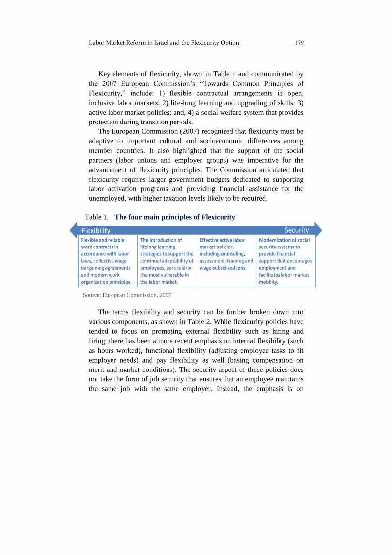
179 Labor Market Reform in Israel and the Flexicurity Option
Key elements of flexicurity, shown in Table 1 and communicated by
the 2007 European Commission’s “Towards Common Principles of
Flexicurity,” include: 1) flexible contractual arrangements in open,
inclusive labor markets; 2) life-long learning and upgrading of skills; 3)
active labor market policies; and, 4) a social welfare system that provides
protection during transition periods.
The European Commission (2007) recognized that flexicurity must be
adaptive to important cultural and socioeconomic differences among
member countries. It also highlighted that the support of the social
partners (labor unions and employer groups) was imperative for the
advancement of flexicurity principles. The Commission articulated that
flexicurity requires larger government budgets dedicated to supporting
labor activation programs and providing financial assistance for the
unemployed, with higher taxation levels likely to be required.
The terms flexibility and security can be further broken down into
various components, as shown in Table 2. While flexicurity policies have
tended to focus on promoting external flexibility such as hiring and
firing, there has been a more recent emphasis on internal flexibility (such
as hours worked), functional flexibility (adjusting employee tasks to fit
employer needs) and pay flexibility as well (basing compensation on
merit and market conditions). The security aspect of these policies does
not take the form of job security that ensures that an employee maintains
the same job with the same employer. Instead, the emphasis is on
Source: European Commission, 2007
SecurityFlexibilityFlexible and reliable work contracts in accordance with labor laws, collective wage bargaining agreements and modern work organization principles.
The introduction of lifelong learning strategies to support the continual adaptability of employees, particularly the most vulnerable in the labor market.
Effective active labor market policies, including counseling, assessment, training and wage-subsidized jobs.
Modernization of social security systems to provide financial support that encourages employment and facilitates labor market mobility.
Table 1. The four main principles of Flexicurity

State of the Nation Report 2014 180
increasing the likelihood of individuals remaining employable, ensuring
sufficient income during transition and unemployment periods, and
enabling individuals to better combine their work responsibilities with
their family commitments.
Table 2. Key elements of Flexicurity
Flexibility
External Ease of adjusting number of workers, including hiring and
firing (e.g., dismissal notice periods and procedures, required
severance payments) and flexible contract forms
Internal Ease of adjusting work intensity, including overtime, part-time,
weekend work, or use of flexible working-time schemes
Functional Ease of adjusting employee tasks to fit current needs, including
job rotation, muti-tasking, increased employee autonomy and
decision making responsibility
Pay Ease of adjusting worker pay based on results, performance and
the market
Security
Employment Heightened likelihood of remaining employable and being able
to find work
Income Heightened likelihood of receiving sufficient and consistent
income in periods of transition or unemployment
Combination Heightened likelihood that a person can combine work with
private responsibilties and commitments, such as family
Aside from the advantages to employers, there are two notable
benefits of flexibility for workers. One important goal of flexibility is to
promote lifecycle transitions, helping individuals move more seamlessly
through educational and training paths and various career positions.
Flexibility is intended to encourage upward mobility along with talent
and skill development, which also heighten employability.
Source: Wilthagen and Tros, 2004

181 Labor Market Reform in Israel and the Flexicurity Option
Second, flexibility in the labor market for employees on regular, open-
ended contracts is also intended to reduce labor market segmentation
between regular and non-regular (temporary agency or fixed-term
contract) workers.1 Such labor market segmentation can lead to vast
differences between the protection, rights and social security benefits of
regular and non-regular employees. Where significant segmentation
exists, workers can get trapped in a cycle of ongoing work relationships
that exclude them from collective wage bargaining agreements, employee
learning and investment, social security and other benefits (European
Commission, 2007).
3. Classification of Developed Countries by Flexicurity Parameters
There have been many efforts to classify countries according to labor
market and social policies, particularly within the flexicurity framework.
Studies utilize a broad range of indicators that are aggregated and
analyzed in various ways. Nonetheless, the results tend to be similar, with
general consensus on five major country categories across the developed
world. These categories are as follows:
Anglo-Saxon countries (Australia, Canada, Ireland, New Zealand,
UK, USA), characterized by high labor market flexibility, low
security relative to Western European countries and low taxation
Flexicurity countries (Denmark, Finland, the Netherlands, Norway,
Sweden), defined by high security, medium labor market
flexibility and high taxation
1 Temporary workers are those workers who are paid through an employment
agency/labor firm. Fixed-term contracts entail those employees working on a
contract of fixed duration and excludes employees paid by an employment
agency/labor firm.

State of the Nation Report 2014 182
Continental countries (Austria, Belgium, France, Germany),
characterized by relatively low labor market flexibility, medium-
to-high security and relatively high taxation
Mediterranean countries (Greece, Italy, Portugal, Spain),
considered to have fairly rigid labor markets with lower security
than Western European countries and mixed patterns of taxation
Eastern European countries (Czech Republic, Estonia, Hungary,
Poland, Slovakia), characterized by low security, medium
flexibility and relatively low taxation
Both the Anglo-Saxon and the Flexicurity countries have historically
had high rates of labor market participation and relatively low
unemployment. The Flexicurity model, with medium levels of flexibility,
places a considerable emphasis on lifelong learning, vocational training
and labor activation policies. Over the long term, it has enjoyed strong
innovation and productivity outcomes, good working conditions (based
on high marks from employees on job satisfaction and work-life balance)
and particularly low rates of poverty and income inequality. The Anglo-
Saxon model is notable for its high external flexibility (including high
labor mobility and low labor market segmentation). It is characterized by
high rates of secondary education coupled with moderate levels of
vocational training and little investment in labor activation. The model
thus entails lower taxes and lower budget spending on transfers than in
the Flexicurity countries (European Commission, 2007).
Nonetheless, given historical, cultural and major socioeconomic
differences among the countries analyzed, it is challenging to attribute
specific social and economic results solely to labor flexibility and labor
activation or to income security policies. As described in Spotlight B, the
Great Recession in recent years has also played out differently across the
different systems.

183 Labor Market Reform in Israel and the Flexicurity Option
Spotlight B: Flexicurity and the Great Recession
The severe recession beginning in 2008 affected different European
countries in different ways. With a very low unemployment rate prior to
the crisis, Denmark witnessed a relatively large increase in
unemployment between 2007 and 2009. Germany was an anomaly during
the crisis and saw unemployment rates decrease. The German response to
the crisis entailed a reliance on internal flexibility, with almost one-third
of firms implementing reduced work hours, rather than a reduction in
workers. With the exception of high crisis countries such as Portugal and
Spain, those countries with stricter employment protection legislation,
such as Austria and Belgium, tended to reduce work hours rather than the
number of employees during the recession. Nonetheless, because of
greater job creation and destruction in higher flexibility labor markets, the
number of unemployed tended to be higher but the duration shorter in
Flexicurity model countries (Andersen, 2011; Schmitt, 2011).
The outgoing head of the Danish Federation of Trade Unions noted
(Bredgaard and Daemmrich, 2013): “When I was young, security meant
having a good, solid job. This was not very exciting – but in a way, it was
very safe. This security disappeared as globalization emerged. Security is
no longer to hold on desperately to the same job throughout your life.
Security is to stay cool when you hear rumors of outsourcing from the
boardroom. Because deep down you know that you have solid skills and
that you will quickly be able to find a new job if the old one is relocated.
Security is not to be able to stay on. Security is to be able to move. It is
precisely this new security through training and education that we have
now embarked on creating for every worker.”

State of the Nation Report 2014 184
4. Flexicurity Countries Compared to Others
A comparison of the five country groupings described above, together
with Israel, on a number of indicators relating to flexibility, security and
the labor market is provided in Appendix Table 1. Labor market
flexibility is assessed using OECD employment protection legislation
indices for regular workers (those with open-ended contracts) and for
those workers with temporary contracts, including both workers hired
through temporary work agencies and with fixed-term contracts. The
index for regular workers considers expenses and procedures incurred in
dismissing an individual or group of workers with typical open-ended
contracts. A higher index score indicates a more rigid labor market where
it is harder to hire and dismiss workers.
Israel scores relatively low on the Employment Protection Legislation
Index. While not as flexible as the Anglo-Saxon countries (for example,
Israel has particularly high mandatory severance pay requirements), it has
short notification periods and low procedural barriers for individual
dismissal. Dismissal of a larger number of workers entails an additional
notification requirement to the Israeli Employment Service Bureau, but
unlike many other OECD countries, this does not involve additional costs
(OECD, 2013a).
Using the Employment Protection Legislation Indices, Figure 2
provides a visualization of Israel relative to the various country groupings
with regard to employer hiring flexibility. It shows the spread within the
country groupings for both regular workers (those with open-ended
contracts) and workers with temporary or fixed-term contracts.
While Israel appears to be quite similar to the OECD average with
regard to regular workers – and more flexible for temporary/fixed-term
contract workers – such a comparison blurs the picture somewhat because
averages do not show the differences between different country
groupings. The Index ranges for regular workers are fairly similar for the
various European groupings and Mediterranean countries while the
Anglo-Saxon nations have considerably greater hiring and firing
flexibility for such workers. Israel is situated between the Anglo-Saxon

185 Labor Market Reform in Israel and the Flexicurity Option
group and the other groups, with less flexibility than the Anglo-Saxon
countries and greater flexibility than the other groups.
With regard to temporary/fixed-term contract workers, there is greater
within-group variation, although the position of the various groups
relative to others remains unchanged. Here, too, Israel’s employers have
Figure 2
Hiring flexibility for employers
Employment Protection Legislation Index*, 2013
0.5
1.0
1.5
2.0
2.5
3.0
3.5
4.0
0
Degree of
restrictiveness
Anglo-
Saxon
countries
Continental
countries
Eastern
European
countries
Mediter-
ranean
countries
Flexicurity
countriesIsrael OECD
average
regular workers**
temporary workers**
* The OECD’s Employment Protection Legislation Index ranges from 0 (the least restrictive) to 6 (the most restrictive).
** The index for regular workers measures how strict regulations are for
employers to dismiss workers with open-ended contracts. The index for
temporary contracts measures how strict the regulations are on the use of
temporary or fixed-term contract workers.
Source: Dan Ben-David and Liora Bowers, Taub Center
Data: OECD

State of the Nation Report 2014 186
greater flexibility with respect to nearly all of the European countries, but
less hiring flexibility than all of the Anglo-Saxon ones.
Like the Anglo-Saxon countries and several others, Israel does not
limit the types of work that can be done by temporary workers. However,
Israel’s authorization and reporting requirements on temporary work, as
well as limits on the number of renewals of temporary worker
assignments, are considered of medium strictness. When it comes to the
fixed-term contracts, Israel is again aligned with the Anglo-Saxon
countries. There are no significant restrictions on what circumstances or
for what type of work fixed-term contracts can be used, nor the duration
or number of such contracts an employer can sign with an employee
(OECD, 2013a). It is important to note, however, that Israel’s public
sector is much less flexible than either the private sector in Israel or the
public sectors in the Flexicurity and Anglo-Saxon countries. (See
Spotlight C for more details).
Spotlight C: External Flexibility in the Public Sector
Although the public sector is an important part of the overall work force
in Western countries, the flexicurity discussion largely focuses on the
private sector. The public sector across countries tends to be less
externally flexible than the private sector, and focuses more on internal
mobility within the government.
Nonetheless, there does appear to be some correlation between external
flexibility in the private and public sectors. For example, the Flexicurity
(continued on next page)

187 Labor Market Reform in Israel and the Flexicurity Option
(continued from previous page)
countries have a public sector that is considered a “position-based”
system, characterized by hiring based on openings for specific positions
that are broadly accessible to both internal and external candidates.
Such a system shows greater mobility between the public and private
sectors, and greater managerial flexibility and delegation, as agencies
often determine their own human resource management rules and
employees’ rights are more aligned with their individual performance
(Kuperus and Rode, 2010). With the exception of Ireland, the Anglo-
Saxon countries also tend to be more position-based systems (OECD,
2014).
The public sector in Israel operates mainly as a career-based system,
characterized by specific entry criteria that are decided centrally rather
than at the managerial/departmental level, and continuous career
development and job protection that supports lifelong civil service
employment. This structure is reminiscent of the systems in the
Continental countries.
The OECD Recruitment Index that ranges from 0 (an externally less
flexible system) to 1 (a more externally flexible system) takes into
account the entry mechanisms, external recruitment methods, and
selection processes of senior civil servants. This index gives Israel a score
of 0.35, well below the OECD average of 0.5 on this index, reflecting a
less flexible and more career-based system (OECD, 2014). The Israeli
public sector employs about 19 percent of the labor force, slightly above
the OECD average but much lower than the 28 percent average of the
Flexicurity countries (Central Bureau of Statistics, 2013).
There is far less external flexibility in Israel’s public sector than the
private sector. A 2013 report by the Civil Service Reform Commission
identified the lack of performance evaluations in determining
advancement or pay together with little turnover among managers and
lengthy hiring periods as key problems in the civil service (Dayan, 2013;
Bassok, 2013).

State of the Nation Report 2014 188
Panels A-C in Figure 3 provide comparisons of the security picture for
employees – where it is important to remember that this refers to national
safety net attributes rather than to job security in a particular place of
employment. Panel A displays the share of unemployed persons receiving
unemployment benefits. Israel places quite a bit below the OECD
average, and below all but two of the countries in the figure, with only 27
percent of the unemployed in Israel actually receiving unemployment
benefits (International Labor Organization, 2011). One of the reasons for
this is that many of Israel’s longer-term unemployed have exhausted their
benefits, which cover a relatively short period of time. Others may not
receive such benefits because they are new entrants to the labor market or
because they recently entered the labor market and did not accumulate
sufficient working days to meet the requirements for benefits.
In 2011, Israel spent only 0.6 percent of its GDP on unemployment
insurance and income support for the unemployed, which is among the
lowest OECD outlays in this regard. The low spending, however, may be
a positive indicator partly related to Israel’s low unemployment rate.
Consequently, it should come as no surprise that Israel’s net income
replacement rate (the amount that the unemployed receive as a percent of
their disposable income – i.e., after taxes and transfers – during their
previous employment) is also relatively low (Panel B). On average,
considering various earnings levels and family situations, an adult in
Israel can expect to have a net replacement rate of 41 percent via
unemployment and social support programs in the five years following
unemployment. This is among the lowest income replacement rates in the
OECD. It is important to note, however, that individuals’ personal
situations greatly affect their replacement rates. For example, Israelis who
are married with children tend to have replacement rates that are closer to
the OECD average. Furthermore, initial replacement rates for those who
lose their job in Israel are actually quite high relative to the OECD, but
the financial support does not last very long.
Finally, active labor market policies, which include job placement,
training and job creation policies, are important for both flexibility and
security of the work force. These programs are designed to help workers

189 Labor Market Reform in Israel and the Flexicurity Option
develop new skills, retrain or connect with open job opportunities.
Countries often make participation in such programs mandatory in order
to receive unemployment benefits which also serves as a motivator to
counter the disincentives to work that come from receiving income
support. As shown in Panel C of Figure 3, active labor market policies are
used extensively in the Flexicurity countries, which spend an average
1.37 percent of their GDP on these efforts. At 0.18 percent of GDP, Israel
spends well below the OECD average on such programs and is situated at
the bottom end of all of the countries in the figure.
Figure 3 (continued on next page)
Security for employees
Panel A: Share of unemployed receiving unemployment benefits, 2006-2008*
100%
0
20%
40%
60%
80%
Anglo-
Saxon
countries
Continental
countries
Eastern
European
countries
Mediter-
ranean
countries
Flexicurity
countriesIsrael OECD
average
* Data not available for select countries
Source: Dan Ben-David and Liora Bowers, Taub Center
Data: International Labor Organization (2011)

State of the Nation Report 2014 190
100%
0
20%
40%
60%
80%
Anglo-
Saxon
countries
Continental
countries
Eastern
European
countries
Mediter-
ranean
countries
Flexicurity
countriesIsrael OECD
average
* Data not available for select countries
* Net income replacement rate as percent of previous income earned (after taxes and
transfers); averaged across various wage rates and family situations; includes
social support and other means-tested benefits; average of first 60 months following unemployment
** Active labor market policies include job placement, training and job creation
policies. Data not available for select countries.
Source for both: Dan Ben-David and Liora Bowers, Taub Center
Data for both: OECD
Figure 3 (continued from previous page)
Security for employees
Panel B: Net income replacement rate for unemployed*, 2011
Panel C: Expenditures on active labor market policies as percent of GDP**, 2011
0
0.5
1.0%
1.5%
2.0%
2.5%
3.0%
Anglo-
Saxon
countries
Continental
countries
Eastern
European
countries
Mediter-
ranean
countries
Flexicurity
countriesIsrael OECD
average

191 Labor Market Reform in Israel and the Flexicurity Option
To sustain large government support in labor and other welfare
policies, taxation levels are much higher in the Flexicurity countries –
averaging 43 percent of GDP versus 29 percent and 33 percent of GDP in
the Anglo-Saxon countries and Israel, respectively. In order to sustain the
flexicurity model of a substantial, generous safety-net, the model relies
on a high rate of employment. As Appendix Table 1 shows, Flexicurity
countries have higher labor force participation and lower unemployment
rates among working-age adults than the other four country groupings.
Israel also has relatively low unemployment rates, but its labor force
participation rate is around the OECD average.
While Appendix Table 1 provides the country group averages –
together with Israel’s scores – on various measures of employment
flexibility and security, Figure 4 merges a number of relevant indicators
to create a composite index showing the relative positioning of the five
country groups and Israel with regards to flexibility and security. The
figure highlights Israel’s unique position, characterized by a somewhat
higher level of flexibility (slightly higher than the Flexicurity country
average as indicated by its position on the vertical axis), but a low
security level, even in comparison to the Eastern European and Anglo-
Saxon countries (its location on the horizontal axis).
The picture that arises from the figure is not complete, since it shows
the extent of the national safety net (in terms of provision of financial
security and employability for individuals) in all of the sectors, while
Israel’s private and public sectors are distinguished by varying degrees of
labor market flexibility within each of them. In other words, the private
and public sectors in Israel are arrayed along the red dotted line in Figure
4 and the challenge that the country faces is how to move the entire
dotted line rightwards and upwards in the direction of greater security
together with greater flexibility (i.e., shortening the dotted line and
moving it from Quadrants I and III to Quadrant II in Figure 4).

State of the Nation Report 2014 192
5. A Comparison of Macroeconomic Performance Between Flexicurity Countries and Other Countries
To what extent are the countries that are characterized by the different
policies described above distinguished in their relative macroeconomic
performances and are the various country groupings also distinguishable
in this regard? Do the Flexicurity countries stand out in terms of
macroeconomic outcomes? While the following analysis should not be
* Security and flexibility are measured relative to OECD averages based on
the two flexibility indices (Employment Protection Legislation Indices for
regular workers and for temporary workers) and four security indicators
(active labor market spending, net income replacement rate, unemployment
insurance spending, and percent receiving unemployment benefits).
Source: Dan Ben-David and Liora Bowers, Taub Center
Data: OECD
Figure 4
Classification of countries
by degree of employment flexibility and security*, various years
Low flexibility
Low
security
High
security
High flexibility
Anglo-
Saxon
Continental
Eastern
European
Mediterranean
Flexicurity
Israel
I II
III IV

193 Labor Market Reform in Israel and the Flexicurity Option
considered as suggestive of causal effects of the policies, it is nonetheless
useful in determining the degree of delineation between the groups,
where this exists, while providing a basis for comparison to Israel.
Wages and labor productivity in Flexicurity countries are high and
similar to Continental and Anglo-Saxon countries. The position of the
wage range in the Anglo-Saxon countries is the highest, with wage ranges
in all three of the groups positioned above the OECD average (Figure 5).
Wages in the Eastern European and Mediterranean countries are all
below the OECD average, with the former group below the rest. The
average annual wage in Israel is below the OECD average and, in fact,
below nearly all of the Western countries in Figure 5.
Figure 5
Average annual wages*, 2012
15,000
20,000
25,000
30,000
35,000
40,000
45,000
50,000
55,000
Anglo-
Saxon
countries
Continental
countries
Eastern
European
countries
Mediter-
ranean
countries
Flexicurity
countriesIsrael OECD
average
* In PPP dollars
Source: Dan Ben-David and Liora Bowers, Taub Center
Data: OECD

State of the Nation Report 2014 194
The productivity picture is similar to that of the wages (Figure 6),
although the spread between the countries is a bit greater. While the data
underlying Figure 6 is the most recent available at the time of this
writing, it is nonetheless susceptible to the fact that many of these
countries have still not emerged from their worst recession since the
1930s. To enable a broader, long-run perspective of the country
groupings’ relative positions over time, Figure 7 (and Appendix Figures
1-4) provides data on these groups extending as far back as possible for
each of the variables examined below.
Figure 6
Labor productivity
GDP per hour worked*, 2012
20
30
40
50
60
70
80
90
Anglo-
Saxon
countries
Continental
countries
Eastern
European
countries
Mediter-
ranean
countries
Flexicurity
countriesIsrael OECD
average
* In PPP dollars
Source: Dan Ben-David and Liora Bowers, Taub Center
Data: OECD

195 Labor Market Reform in Israel and the Flexicurity Option
The long-run labor productivity trends in Figure 7 show that the
relative productivity levels of the groups to one another have been fairly
consistent for decades. Productivity levels in the Flexicurity and
Continental European countries were similar to the Anglo-Saxon
countries in 1970. Since then, the productivity of the two former groups
has risen steadily above the latter group, with nearly identical
productivity levels between them for over four decades. After exhibiting
slower productivity growth until the early 1990s, the Anglo-Saxon
countries returned to a growth path that was roughly parallel with the
Flexicurity and Continental European countries – albeit below them.
* In 2005 PPP dollars
Source: Dan Ben-David and Liora Bowers, Taub Center
Data: OECD
Figure 7
Labor productivity
GDP per hour worked*, 1970-2013
0
10
20
30
40
50
1970 1975 1980 1985 1990 1995 2000 2005 2013
Anglo-Saxon
Continental
Eastern European
Mediterranean
Flexicurity
Israel

State of the Nation Report 2014 196
Israel’s productivity path has been similar to that of the Mediterranean
countries since 1980, although slightly below those countries for most of
this period. These paths are not only at lower productivity levels than the
Flexicurity, Continental and Anglo-Saxon groups, they are also flatter
(with the exception of the recent major recession years), indicating that
the Mediterranean countries and Israel have been falling further and
further behind the leading developed countries for decades.
Employment rates of 25-54-year-olds are high and similar among the
Flexicurity countries – and they are relatively comparable to rates of
employment in the Continental European countries (Figure 8).
Figure 8
Employment rates
25-54-year-olds, 2012
60%
65%
70%
75%
80%
85%
90%
Anglo-
Saxon
countries
Continental
countries
Eastern
European
countries
Mediter-
ranean
countries
Flexicurity
countriesIsrael OECD
average
Source: Dan Ben-David and Liora Bowers, Taub Center
Data: OECD

197 Labor Market Reform in Israel and the Flexicurity Option
Employment rates in Eastern European and Anglo-Saxon countries
tend to be lower than in the Flexicurity and Continental European
countries, with the Mediterranean countries exhibiting the lowest rates
among the groups. Israel’s employment rate in 2012 was slightly above
the OECD average for this age group, though it is clear that this apparent
resemblance to the OECD is simply a facet of averaging across relatively
different country groupings. Israel’s employment rate is below the rates
in all of the Flexicurity and Continental countries and above all of the
Mediterranean countries.
As shown in Appendix Figure 1, the Flexicurity countries have
consistently had the highest employment rates among all of the groups
since the early 1980s, with the Continental countries steadily catching up
to them together with the Anglo-Saxon countries. However, the severe
recession of the past half-decade had a major negative impact on the
Anglo-Saxon countries, causing their employment rates to drop
considerably in recent years. Israel’s employment rates have consistently
been at the bottom, together with the Mediterranean countries, until the
onset of Israel’s major recession at the beginning of the last decade. After
falling behind initially, Israel’s post-2002 recession recovery period led
to employment increases while the recent Great Recession in the West
coincided with a sharp drop in Mediterranean country employment to
below Israeli levels.
Cross-country comparisons of income inequality (Figure 9) and
poverty (Figure 10) are fairly similar, with the Flexicurity and
Continental European countries displaying the lowest rates and the
Eastern European countries not far behind them. Anglo-Saxon and
Mediterranean countries exhibit substantially higher rates of inequality
and poverty. In both instances, Israel is characterized by greater
inequality and poverty than all of the other countries except the United
States. The relative positions of these different country groupings – and
Israel’s – have been fairly steady since the mid-1980s (Appendix Figures
2 and 3).

State of the Nation Report 2014 198
Figure 9
Income inequality, 2010
Gini Index of disposable incomes among working age population: ages 18-65
0.22
0.24
0.26
0.28
0.30
0.32
0.34
0.36
0.38
0.40
Anglo-
Saxon
countries
Continental
countries
Eastern
European
countries
Mediter-
ranean
countries
Flexicurity
countriesIsrael OECD
average
Figure 10
Poverty rates*, 2010
in disposable income for 18-65 age group
4%
6%
8%
10%
12%
14%
16%
18%
20%
Anglo-
Saxon
countries
Continental
countries
Eastern
European
countries
Mediter-
ranean
countries
Flexicurity
countriesIsrael OECD
average
* Poverty line is 50 percent of median income
Source for both: Dan Ben-David and Liora Bowers, Taub Center
Data for both: OECD

199 Labor Market Reform in Israel and the Flexicurity Option
The duration of periods of unemployment within a country provides
an indication of, among other things, the generosity of the unemployment
compensation on the one hand, and the ability to find employment and
the flexibility of employers to hire and fire as needed, on the other hand.
The share of unemployed persons in the Flexicurity countries who
remained unemployed for less than one year is among the highest in the
developed world. The flip side of this is that the share of unemployed
persons in these countries who were unemployed for one year or more is
among the lowest (Figure 11), a finding that is both interesting and
instructive.
Figure 11
Percent unemployed for 1 year or more, 2012
as share of total unemployed, 25-54-year-olds
0
10%
20%
30%
40%
50%
60%
70%
Anglo-
Saxon
countries
Continental
countries
Eastern
European
countries
Mediter-
ranean
countries
Flexicurity
countriesIsrael OECD
average
Source: Dan Ben-David and Liora Bowers, Taub Center
Data: OECD

State of the Nation Report 2014 200
The fact that this trend in the Flexicurity countries has been fairly
consistent over the past two decades (Appendix Figure 4) makes it easier
to understand the degree of worker satisfaction with flexicurity in these
countries. They are given many months to do what is needed to find
employment, while benefitting from relatively high unemployment
compensation together with active labor market policies encouraging
employment skills training to help them turn things around. The fact that
the picture is reversed for unemployment duration lasting one year and
over, and the fact that employment rates in Flexicurity countries are
consistently very high in any event, is an indication that these policies –
generous as they may be – are not open -ended.
Israel, as indicated previously, does not stand out in terms of the
generosity of its unemployment assistance package and has relatively
high flexibility for employers. As such, the percent of those unemployed
less than one year in Israel is above the OECD average while the share of
unemployed one year and over is among the lowest in the developed
world since the mid-1990s (Appendix Figure 4).
The above indicators suggest some fairly substantial socioeconomic
success among Flexicurity countries. Productivity and employment rates
are high in these countries while rates of poverty and income inequality
are relatively low. As noted before, it is hard to determine the specific
contribution of flexicurity policies to the outcomes – particularly in view
of the fact that non-flexicurity Continental European countries often
display similar socioeconomic outcomes. That said, it is still noteworthy
that it is possible to adopt successful policies that both encourage growth
and provide security for employees, not in terms of protected
employment in the same position but rather in the sense of a strong social
safety net and labor activation programs that will catch those who fall and
help put them back on their feet within the span of a year.

201 Labor Market Reform in Israel and the Flexicurity Option
6. Moving Towards a Flexicurity Model in Israel: Considerations and Recommendations
The underlying system of labor relations is considered a key contributor
to the socioeconomic success of flexicurity. Denmark has almost 70
percent union membership among employees, one of the highest rates in
the OECD, with the vast majority of employees covered by collective
bargaining agreements. Instead of focusing on employment protection,
though, Danish unions have used their strong influence to improve
working conditions, wages and training and are supportive partners to
Danish flexicurity (Mailand, 2009).
The near universal representation of workers and employers in unions
and employer associations, respectively, allows these groups to transcend
narrow, particularistic demands and focus on collective needs. This has
contributed to what might be considered a sense of social responsibility
for the overall well-being of the country, even to the point that unions
exert a moderating effect on wage increases. There is an emphasis on
increasing productivity and efficiency with the belief that both employers
and workers will benefit from these.
In Israel, roughly 65-75 percent of the work force is in the private
sector, which is generally characterized by low employment protection
for regular and temporary workers,2 while the remainder of the country’s
work force are in the public sector that is characterized by very little or
no flexibility. Among workers who have little employment protection, the
required notification period for termination of employment is relatively
short and the procedural barriers to employment termination are also low.
Aside from notification requirements, there are next to no additional costs
incurred in the dismissal of larger groups of workers. In the case of
temporary workers, there is no limit on types of work, with some
reporting requirements and limits on the renewals of temporary work
2 This is not always the case, with the banking sector being one major
exception.

State of the Nation Report 2014 202
assignments. There is no restriction on the number of renewals for fixed-
term contracts.
Figure 12 shows the share of Israeli workers in each economic sector.
These shares are further divided by the proportion covered under
collective bargaining agreements and the remainder who are not covered.
It is important to note that the collective agreement coverage data shown
here is self-reported, while in practice it is assumed that this rate is
slightly higher as not all individuals are aware of their coverage status.
Sectors with high levels of job protection are public administration; water
and electricity; education, health and social services; finance; community
services; transportation and communications; and portions of
manufacturing.
* Distribution of the labor market represents Israelis aged 25-64. Collective coverage
rates are based on 2012 self-reported data, and all together represent about one-third
of workers. However, experts in the field estimate that actual collective agreement
coverage rates are closer to 50 percent.
Source: Dan Ben-David, Liora Bowers and Kyrill Shraberman, Taub Center
Data: OECD, International Labor Organization
Figure 12
Distribution of workers by economic sector and collective
agreement coverage rates in Israel*
2011 (distribution of workers) and 2012 (coverage rates)
Under collective agreement
Not under collective agreement
0% 2% 4% 6% 8% 10% 12% 14% 16%
Education
Manufacturing
Public administration
Transport, storage and communication
Real estate, renting and business activities
Banking, insurance
Community, social and other services
Wholesale and retail trade
Electricity and water supply
Construction
Lodging services and restaurants
Agriculture
Health services, welfare, social work

203 Labor Market Reform in Israel and the Flexicurity Option
As noted in the discussion on Figure 4, Israel’s private and public sectors
are arrayed along the dotted red line extending from Quadrant I to
Quadrant III with varying degrees of flexibility. One possible proxy for
flexibility is the rate of collective agreement coverage detailed in Figure
12. The positive relationship between this coverage rate and hourly wages
can be seen in Figure 13 (the sizes of the various sectors are depicted by
the size of the circles in the figure). On the lower left side of the figure,
with the lowest rates of collective agreement coverage and lowest
average hourly wages are workers in hotels and restaurants. Close by are
the agriculture and construction sectors with low coverage rates and low
hourly wages. At the top far right of the figure are the electricity and
water workers. This sector comprises a relatively small number of
workers; nearly all are covered by collective agreements and their
average wages are the highest of all the sectors.
While the positive link between collective agreement coverage and
hourly wages appears to be quite strong, this relationship should
nonetheless be qualified. For example, hourly wages are also linked to
education levels and there tends to be a positive relationship – albeit a
somewhat weaker one than in Figure 13 – between number of years of
education and coverage rates as well as between the share of academics
in each sector and coverage rates. On the other hand, it is not obvious that
this link is due to higher productivity, since Israeli collective bargaining
agreements invariably contain clauses providing for higher wages to
individuals with academic degrees regardless of whether the academic
education is even related to their work and actually increases
productivity.

State of the Nation Report 2014 204
An estimated 50 percent of Israeli employees are covered by
collective agreements. Of these, it is estimated that 50-70 percent are
more difficult to dismiss (to varying degrees). The remainder (i.e., those
covered by collective agreements but who are still relatively easy to
* Collective coverage rates are based on 2012 self-reported data, and all together represent
about one-third of workers. However, experts in the field estimate that actual collective
agreement coverage rates are closer to 50 percent. Size of bubble represents relative size of
the sector by share of 25-64-year-old employees.
Source: Dan Ben-David, Liora Bowers and Kyrill Shraberman, Taub Center
Data: Central Bureau of Statistics (2011), Bank of Israel (2012)
Figure 13
Collective agreement coverage rates* and hourly wages
hourly wage, distribution of workers and coverage rates, by economic sector
Hourly wage in shekels (2011)
Collective agreement
coverage rate (2012)
0%
10%
20%
30%
40%
50%
60%
70%
80%
90%
100%
30 35 40 45 50 55 60 65 70 75
Community,
social & other
services
Health services,
welfare, social work
Education
Public
administration
Real estate, renting
& business activities
Banking &
insurance
Transport,
storage &
communication
Hotels &
restaurants
Wholesale &
retail trade
Construction
Electricity
& water
Manufacturing
Agriculture

205 Labor Market Reform in Israel and the Flexicurity Option
dismiss) include some specific groups such as privatized social workers,
temporary workers, security guards, etc. In general, Israeli collective
agreements include provisions for tenure. While on paper it is not so
difficult to dismiss individuals with tenure, there are nonetheless barriers
to dismissal in the form of work place norms, practices and worker
committees.3
Moving Israel towards a flexicurity model entails various benefits as
well as challenges. Flexicurity’s promise of a dynamic, competitive and
adaptable labor market could greatly benefit Israel in the many sectors
that are quite the opposite. It would be highly beneficial to implement
policies that would improve the country’s competitiveness, including
substantially spurring its currently low labor productivity. Improvements
in the social welfare system that would be reflected in lower rates of
poverty and income inequality are particularly essential given Israel’s
weak performance in this area, although there is concern about the
possible adverse effects on employment if these changes are not part of a
comprehensive policy.
Another benefit of a flexicurity model is the promotion of broad
participation in the labor market, including among women and older
adults. As Israel seeks to address its rapidly aging population (it is
currently relatively young, but its rate of aging is relatively high) and
increase employment rates among the 55+ age group, lifelong training
and skills adaptation, along with working hours flexibility, can help attain
this goal.
A major concern regarding the active pursuit of flexicurity policies
relates to the feasibility of truly replicating the Flexicurity model. Many
European governments attempting to introduce labor reforms have faced
significant challenges and social turmoil. Consequently, the current
thinking is that countries such as the Netherlands and Denmark that have
been more effective in these areas likely enjoyed particularly supportive
historical circumstances. In fact, it has been argued that the Danish model
3 Information and estimates in this paragraph were provided by Guy Mundlak,
Tel Aviv University.
* Collective coverage rates are based on 2012 self-reported data, and all together represent
about one-third of workers. However, experts in the field estimate that actual collective
agreement coverage rates are closer to 50 percent. Size of bubble represents relative size of the sector by share of 25-64-year-old employees.
Source: Dan Ben-David, Liora Bowers and Kyrill Shraberman, Taub Center
Data: Central Bureau of Statistics (2011), Bank of Israel (2012)
Figure 13
Collective agreement coverage rates* and hourly wages
hourly wage, distribution of workers and coverage rates, by economic sector
Hourly wage in shekels (2011)
Collective agreement
coverage rate (2012)
0%
10%
20%
30%
40%
50%
60%
70%
80%
90%
100%
30 35 40 45 50 55 60 65 70 75
Community,
social & other
services
Health services,
welfare, social work
Education
Public
administration
Real estate, renting
& business activities
Banking &
insurance
Transport,
storage &
communication
Hotels &
restaurants
Wholesale &
retail trade
Construction
Electricity
& water
Manufacturing
Agriculture

State of the Nation Report 2014 206
is not the result of carefully crafted policies around a long-term strategy,
but rather, the result of historical processes with roots in the late 1800s
and mid-1900s’ institutional structure and social agreements over time
(Zhou, 2007). Since an historic agreement in 1899, collective bargaining
rather than the courts or government has been the main platform for
dispute resolution between employers and employees in Denmark.
Danish unions accepted the right of employers to hire and fire as needed,
in exchange for employers accepting organized labor’s right to negotiate
and strike on issues related to wages, benefits and working conditions.
External flexibility, alongside an emphasis on improved working
conditions, has thus been a long-standing feature of the Danish system of
employer-union relations (Bredgaard and Daemmrich, 2013). Danish
trade unions also chose not to fight against the growing globalization or
free trade of the 1990s, but pushed harder for continued training and
education for both employed and unemployed workers. A 2005
Eurobarometer survey showed that 70 percent of Danes agreed that it is
“good for people to change jobs every few years,” while less than 30
percent of their German or Austrian counterparts felt the same way.
Danes likewise were twice as likely as the average European to view the
impact of globalization on domestic companies and job growth as
positive (Bredgaard and Daemmrich, 2013).
An influential study by Algan and Cahuc (2006) showed much higher
rates of public spiritedness – that is, people believing it is wrong to claim
government benefits to which one does not have a right – in Flexicurity
countries versus other developed countries. This study argues that
countries with weak public spiritedness would have a hard time
implementing flexicurity policies that may further incentivize people to
take advantage of government benefits.
In Israel, various incentives exist for non-participation in the labor
market, such as universal child allowances and benefits given to Haredim
(ultra-Orthodox Jews) studying in a yeshiva. Long-lasting incentives
towards non-participation in the labor force alongside potentially lower
levels of public spiritedness (as evidenced by the Israel’s very large
shadow economy – see Gruber, 2014) may challenge attempts to develop

207 Labor Market Reform in Israel and the Flexicurity Option
an effective flexicurity system. In light of its historical evolution, both in
terms of employer-employee relations and the welfare state compared to
the Flexicurity countries, it is unclear whether Israel would be able to
effectively replicate the various components of flexicurity. Furthermore,
flexicurity itself was never a deliberate policy package in the countries
where it exists. Instead, it culminated from evolution of employee-
employer relations, alongside supportive legislation.
Just as important is the ongoing debate about the sustainability and
perseverance of flexicurity under difficult economic times. As the
socioeconomic indicators examined in this chapter suggest, it does not
appear that the Flexicurity countries fared worse than other developed
Western European countries during the massive recession of recent years.
If anything, they appear to have done better in some instances.
Nonetheless, large increases in unemployment during the Great
Recession increased budgetary spending as a result of rising
unemployment and social support costs, challenging the quality and
resources of labor activation programs (Andersen, 2011). That said, while
business cycles exist and must be accounted for, Israel must design its
policies on the basis of a long-term perspective. In moving forward with a
flexicurity approach, the following recommendations are important for
policy makers and the general public in Israel to consider:
1. The Flexicurity model requires significant budgetary
expenditures in both income security measures and labor
activation policies. For Israel, this means much greater
expenditure on welfare alongside the initiation of new labor
activation programs, such as a revamped “Wisconsin program”
meant to train and connect the unemployed with new
opportunities. Ensuring the continued availability of childcare,
which is relatively accessible in Israel – and growing with the
expansion of universal preschool starting at age three – is an
important contributor to labor market participation.
2. The Flexicurity model involves high levels of direct taxation and
its generous income support benefits create adverse incentives for

State of the Nation Report 2014 208
prompt re-entry into the labor market. Denmark counters these
disincentives with labor activation policies and monitoring
systems to ensure continued employment search by the
unemployed. For example, in certain cases, unemployed Danes
are required to accept job offers outside of their primary
occupation after three months of unemployment benefits, and
failure to be activated (e.g., refusing employment or not
participating in training programs) results in benefit loss (Zhou,
2007). The impact of these measures was shown previously in
Figure 11, where among the unemployed, Denmark (and the
other Flexicurity countries) has a relatively high share that are
unemployed for a period of less than one year, but relatively low
unemployment duration for one year and over. In Israel, policies
such as a more substantial negative income tax could help
provide incentives to work. Improved enforcement of existing
labor laws (notably on minimum wage, working hours and
discrimination) is imperative to encourage labor market
participation by and provide security for lower-skilled workers.
3. The obligation of the government, employers and individuals to
lifelong learning is a core principle of the flexicurity system.
Employment contracts stipulating continued learning, and
government-supported career guidance, training and education
opportunities are an important policy response to increased job
insecurity (Sultana, 2012). For example, employers and unions in
Denmark are very involved in designing and participating in
continuing vocational training, which is largely financed by the
government (Bredgaard and Larsen, 2007). Almost a third of
Danish working-age adults participated in education and training
in 2011, a high rate among European countries, approached only
by Finland and Sweden (Eurostat, 2011). Employers provide the
time, as collective agreements generally grant employees the
right to take 1-2 weeks off with pay in order to participate
(Jørgensen, 2009). Developing supportive cultural attitudes and

209 Labor Market Reform in Israel and the Flexicurity Option
implementing policies at the government and employer level that
promote lifelong learning are essential for creating a robust
flexicurity system in Israel.
4. Israel already has relatively low employment protection for non-
regular workers, particularly those on fixed-term contracts. There
is concern that increasing flexibility “at the margins” would
increase segmentation and cement gaps between regular and non-
regular workers, particularly hurting women and minorities.
Emphasis on flexibility within Israeli labor markets should thus
focus on regular workers, particularly increasing the flexibility
within organizations in areas such as work hours, schedules and
tasks.
5. Israel stands out from the Flexicurity and Anglo-Saxon countries
with regard to having particularly low external flexibility in the
public sector relative to the private sector. To move towards the
Flexicurity model entails a shift away from career-based to
position-based public sector employment. This requires more
flexibility in hiring and firing, the hiring of individuals on the
basis of credentials and merit for specific positions, and greater
mobility between the private and public sector. It also requires
decentralization and delegation of work on the basis of
performance results.
The bottom line is that much of Israel’s private sector already has
considerable employer flexibility, so it is unclear what could be given to
these employers to encourage them to support a stronger safety net and
lifelong learning for employees. On the other hand, there are some sectors
– private as well as public – in which employees have so much job
protection (i.e., low employer flexibility) that there appears to be little
incentive for them to give up this job protection in order to provide
employers with more flexibility. In light of both of these obstacles, it
appears that the primary areas that Israel needs to concentrate on are:

State of the Nation Report 2014 210
The enhancement of labor productivity – which will yield higher
profits (good for firms) and higher wages (good for employees)
The adoption of flexicurity-type labor activation policies that
include upgrading of skills alongside providing adequate income
replacement to ensure financial security for a limited period of time
Better schools and the encouragement and promotion of lifelong
learning and continued on-the-job training, which could benefit
both employers and employees
The combination of these improvements will yield higher incomes –
that is, win-win for all – in conjunction with the provision of improved
coping mechanisms for workers to deal with the hiring flexibility
required for greater productivity. The Israeli government’s role in this
regard requires it to focus on:
Greater enforcement of existing employment laws and regulations
that protect workers while lowering the burden of rigid stipulations
that reduce employment flexibility
Provision of much-improved labor activation policies and income
support in times of transition to help employees adapt more quickly
to changing economic circumstances while reducing anxiety levels
that promote resistance to employer flexibility
7. Paying for Flexicurity in Israel
Adoption of the flexicurity policies recommended in this chapter will
require considerably greater government spending on these issues than in
the past. There is a question of where the money will come from. A
comparison of tax revenues – or what is commonly referred to as tax
burdens – across the various country groupings (Figure 14) shows that the
Flexicurity countries are characterized by relatively high levels of
taxation, closely followed by the Continental European countries. The
fact that the Eastern European countries have considerably lower tax

211 Labor Market Reform in Israel and the Flexicurity Option
burdens, with yet even lower tax burdens among several Anglo-Saxon
countries yields an average OECD tax burden that is only slightly greater
than Israel’s. However, the figure clearly indicates how low Israel’s tax
burden is in comparison to the flexicurity countries. In addition, Israel
spends much more than all of the other countries (as a share of its GDP)
on defense and interest payments on its debt, so it has considerably less
left over to finance flexicurity policies under the current state of affairs.
If greater expenditures are needed, where can the resources come
from? One option that might emerge from a comparison of Israel and the
Flexicurity countries is to simply increase the Israeli tax burden. This
then leads to the question: which taxes should be raised? Compared to the
OECD, Israel already bases a disproportionate share of its income on
Figure 14
Tax revenue
as percent of GDP, 2011
20%
25%
30%
35%
40%
45%
50%
Anglo-
Saxon
countries
Continental
countries
Eastern
European
countries
Mediter-
ranean
countries
Flexicurity
countriesIsrael OECD
average
Source: Dan Ben-David and Liora Bowers, Taub Center
Data: OECD

State of the Nation Report 2014 212
indirect taxation, including VAT, sales taxes and customs (Figure 15).4
Indirect taxes are considered regressive taxes in that they are shouldered
more heavily – as a share of income – by the poor than by the wealthy.5
Thus, a further raising of indirect taxes would place an even greater
burden on Israel’s poor.
4 The lower revenues from social security taxes in Israel are the result of low
contributions from Israeli employers (1.5 percent of GDP in Israel compared
to 4.8 percent of GDP in the OECD in 2011). On the other hand, social
security taxes paid by Israeli wage earners are 3.8 percent of GDP, compared
with 3.1 percent of GDP in the OECD. 5 The poor spend a much greater share of their income on consumption than do
Source: Ministry of Finance
Figure 15
Distribution of total national tax revenues
by tax type, 2011
Income
tax
Social
security
VAT,
sales taxes
and customs
Property
taxes
8.2%9.5%
OECD Israel
Other
3.6%
6.6%
OECD Israel
28.0%
OECD
17.2%
Israel
23.6%
OECD
36.7%
Israel
36.6%
OECD
30.1%
Israel

213 Labor Market Reform in Israel and the Flexicurity Option
The logical conclusion may then be to increase the government’s
revenues from direct taxation by increasing income tax rates. However,
this route for raising government tax revenues is not quite as obvious as it
may initially appear. On the one hand, the share of Israeli government
revenues raised from direct taxes is a sixth lower than the OECD average
– which would appear to indicate that there is room to raise these. On the
other hand, revenues from direct taxation have an extremely skewed
distribution in Israel (Figure 16).
the wealthy. Consequently, indirect taxes such as VAT comprise a greater
share of the poor’s income than that of the wealthiest – hence, the term
“regressive tax” is applied to them.
Source: Dan Ben-David, A Picture of the Nation 2014, Taub Center
Data: Ministry of Finance
Figure 16
Share of total national revenue from direct taxes
originating from each income decile, 2011
0.4% 0.9% 1.5% 2.1% 3.0%5.0%
7.7%
12.0%
20.1%
47.2%
0.0% 0.0% 0.0% 0.0% 0.3% 1.2%2.7%
6.6%
16.3%
72.9%
Gross income deciles
Bottom
decile
2 3 4 5 6 7 8 9 Top
decile
Share of total revenue from social security and health taxes
Share of total revenue from income taxes

State of the Nation Report 2014 214
A full 90 percent of the country’s entire income tax revenue comes
from just the top two income deciles, that is, 20 percent of the population
contributes 90 percent of the income tax revenues. At the same time, the
huge income gaps within Israel are reflected in the fact that a full half of
the country does not pay any income tax at all because their incomes are
so low that they do not reach the bottom income tax bracket. As a result,
there is a serious question about whether it would be possible to further
increase the direct tax burden on the few who already shoulder it.
The above two constraints (difficulty in raising the already high
indirect taxes any further, and the difficulty in raising income taxes from
poor, or increasing the tax burden even further on the very few who
actually bear it) are substantial, but not insurmountable. These constraints
require a shift in focus from the tax income side to the budget expenditure
side. Specifically, a country facing the extreme budget constraints that
Israel has to contend with must find the political wherewithal to distribute
its limited non-defense budgetary resources with greater efficiency than
other developed countries. National priorities need to shift towards
budgetary allocations that benefit a greater part of society rather than
sectoral, business or personal interests. This is not a pipe dream but an
attainable policy option that requires considerably improved budget
transparency and substantially improved collection efforts, which in turn
require a concerted effort to reduce the shadow economy (Gruber, 2014).
8. Conclusion
Flexicurity emerged as a powerful policy concept in the mid-1990s in
Europe, as the debate raged about the effects of job protection on
economic growth and social welfare systems. The general requirements
for success of flexicurity are flexible labor markets, lifelong learning for
employees, active labor market policies and social security systems that
provide financial support during transition periods.
Countries with flexicurity are characterized by advantages for
employers, such as flexibility in adjustment to competitive demands,

215 Labor Market Reform in Israel and the Flexicurity Option
access to a skilled work force and low labor relations strife. Advantages
for employees include good working conditions, training and upgrading
of skills, options for transition and mobility throughout the career cycle,
financial security in times of transition and a reduction in labor market
segmentation between regular and temporary/fixed-contract workers.
For flexicurity to succeed, both the public and private sectors should
be more aligned with regard to employment flexibility. This would
require greater flexibility in the public sector, including such practices as:
facilitation of hiring from outside the public sector and greater mobility
between the public and private sectors; decentralization of human
resources management to provide departments and managers with greater
discretion; and a closer connection between individual performance and
their compensation and promotion. To more closely align with much of
the private sector, the public sector (and more inflexible parts of the
private sector, such as banking/insurance) also need to move away from
the norm of lifelong employment and rigid dismissal and tenure policies.
Substantial budgetary expenditures are required for welfare state and
labor activation policies to support and sustain the security aspect of the
system. The model places a major emphasis on labor activation to deal
more effectively with unemployment. This includes required participation
in training or education programs after a short period of unemployment.
Likewise, workers are required to accept job offers after a given period of
unemployment. Reliance on decentralization is an important facet of the
policy, using private sector job training and partnership between the
government and employers. In short, flexicurity entails
a major emphasis on lifelong learning,
employment contracts that stipulate continued learning,
career guidance, training and education that is government-
supported with employers providing time off,
and the joint involvement of employers and unions in designing
and participating in continued vocational training.

State of the Nation Report 2014 216
Flexicurity reflects an attempt at finding a win-win arrangement
between workers, employers and policy makers. Productivity
improvements need to be a fundamental facet of such policies, since these
pave the way for higher living standards that enable – among other things
– the substantial budgetary costs that accompany their implementation.
Therefore, such a solution needs to encompass flexibility in the labor
markets, along with financial support for the unemployed (limited in
time) and continuous training provided by the government and
employers.
Five developed country groupings based on distinct labor and social
welfare systems have been identified based on flexicurity indicators
(Flexicurity, Anglo-Saxon, Continental European, Eastern Europe, and
Mediterranean countries). The Flexicurity countries are characterized by
a relative ease of hiring/firing workers and income and employability
security. These countries have generally had very good macroeconomic
outcomes and low rates of poverty and inequality. The Anglo-Saxon
countries have also been recognized as having good economic results,
based on a combination of a highly flexible labor market and lower levels
of security. It is important to note that both the Flexicurity and Anglo-
Saxon countries experienced larger drops in employment during the Great
Recession than the Continental countries that have less flexible labor
markets. This put significant budgetary pressure on the already high
financial and occupational assistance packages provided to the
unemployed in the Flexicurity countries.
Based on flexicurity indicators, Israel falls in a unique position of
having higher flexibility than the Flexicurity countries, but even lower
levels of security and less investment in active assistance (job placement,
training) from the government in case of unemployment than the Anglo-
Saxon countries. If Israel wants to move towards greater flexicurity,
significant budgetary outlays would have to be made to assist the
unemployed, both financially and with training and job placement
assistance. Labor activation policies and monitoring systems to counter
the disincentives to employment must be put in place.

217 Labor Market Reform in Israel and the Flexicurity Option
Labor activation policies should provide incentives to work – both
financially through a more substantial negative income tax, targeted at
specific populations such as lower-income families, and through stronger
enforcement of existing labor protections such as minimum wage and
anti-discrimination laws. Investments by the government in infrastructure
and transportation, as well as increasing the resources and responsibility
of municipalities with regard to local employment will assist Israelis,
particularly those in the periphery, in terms of job mobility. Finally, a
major opportunity for increased flexibility lies in the public sector, where
entry and exit of employees is particularly constrained.
In sectors where unions dominate, employers and unions should
collaborate to improve working conditions, benefits and continued
education and focus less on job protection. For the benefit of the entire
population, there should be much greater commitment by the government
and employers to lifelong training. Employers should also encourage
internal (adjustable work schedules) and functional (multi-tasking and
autonomy) flexibility. Finally, there is a need to reduce labor market
segmentation between regular and non-regular (temporary agency or
fixed-term contract) workers which often leads to vast differences in
protection under the law, as well as the rights and social benefits that
each group receives.
In summary, while implementation of comprehensive flexicurity
policy in Israel is not a politically feasible or economically viable option,
there are certainly facets of the system that the country can and should
implement. The overarching policy goal should be to enhance
productivity, growth and employment while providing a serious social
safety net that offers Israelis adequate financial peace of mind during
transition periods and assistance in improving job skills. These policy
options are indeed possible, but their implementation will require an
extensive and systemic reassessment of Israel’s national priorities.

State of the Nation Report 2014 218
Appendices
Appendix Figure 1
Employment rates
25-54-year-olds, 1983-2012
60%
65%
70%
75%
80%
85%
90%
1983 1990 1995 2000 2005 2012
Anglo-Saxon
Continental
Eastern European
Mediterranean
Flexicurity
Israel
Source for both: Dan Ben-David and Liora Bowers, Taub Center
Data for both: OECD
Appendix Figure 2
Income inequality
Gini Index of disposable incomes, 1985-2012
0.20
0.25
0.30
0.35
0.40
1985 1990 1995 2000 2005 2012
Anglo-Saxon
Continental
Eastern European
Mediterranean
Flexicurity
Israel

219 Labor Market Reform in Israel and the Flexicurity Option
Appendix Figure 3
Poverty rates
in disposable incomes, 1985-2012
0%
5%
10%
15%
20%
25%
1985 1990 1995 2000 2005 2012
Anglo-Saxon
Continental
Eastern European
Mediterranean
Flexicurity
Israel
Source for both: Dan Ben-David and Liora Bowers, Taub Center
Data for both: OECD
Appendix Figure 4
Percent unemployed 1 year and over
as share of total unemployed, 25-54-year-olds, 1983-2012
0%
10%
20%
30%
40%
50%
60%
70%
80%
1983 1990 1995 2000 2005 2012
Anglo-Saxon
Continental
Eastern EuropeanMediterranean
Flexicurity
Israel

220
32
5
Appendix Table 1. Flexicurity data on selected indicators in Israel, relative to country groupings
Index Anglo-
Saxon (1)
Flexi-
curity (2)
Conti-
nental (3)
Eastern
Europe (4)
Mediter-
ranean (5) OECD Israel
Flexibility
Employment Protection Legislation Index (2013)*
Regular workers 1.55 2.45 2.80 2.29 2.54 2.29 2.20
Temporary contracts 0.71 1.88 2.52 2.38 2.78 2.08 1.58
Security
Net income replacement rate for unemployed** (2011) 50% 64% 57% 43% 39% 50% 41%
Unemployment benefits/income support
(% of GDP, 2011)***
0.54% 1.16% 1.45% 0.45% 1.84% 0.86% 0.60%
Active labor market policies (% of GDP, 2011)*** 0.24% 1.37% 1.02% 0.32% 0.63% 0.58% 0.18%
% of unemployed receiving unemployment benefits
(2006-2008)***
49.7% 67.6% 84.3% 30.2% 53.4% 46.1% 26.6%
Other measures
Labor force participation rate (2012)**** 79.3% 83.0% 78.7% 77.3% 76.4% 78.4% 78.7%
Unemployment rate (2012)**** 6.8% 5.1% 5.9% 9.1% 17.2% 7.5% 5.9%
Total tax revenue (as % of GDP, 2011) 29.3% 43.3% 41.8% 33.1% 35.1% 34.1% 32.6%
(1) Australia, Canada, Ireland, New Zealand, UK, USA; (2) Denmark, Finland, Netherlands, Sweden, Norway; (3) Austria, Belgium, France, Germany; (4) Czech Republic, Estonia, Hungary, Poland, Slovak Republic; (5) Greece, Italy, Portugal, Spain
* The OECD’s Employment Protection Legislation Index is on a scale of 0-6 (0 being least restrictive, 6 being most restrictive). The index for
regular workers measures how strict regulations are for employers to dismiss workers with open-ended contracts. The index for temporary contracts measures how strict the regulations are on the use of temporary or fixed-term contract workers.
** Net income replacement rate as percent of previous income earned (after taxes and transfers); averaged across various wage rates and family situations; includes social support and other means-tested benefits; average of first 60 months following unemployment.
*** Data not available for select countries.
**** Labor force participation and unemployment rates are for the population aged 25-64.
Data: OECD; International Labor Organization (2011)

221 Labor Market Reform in Israel and the Flexicurity Option
References
English
Algan, Yann and Pierre Cahuc (2006), Civic Attitudes and the Design of
Labor Market Institutions: Which Countries Can Implement the Danish
Flexicurity Model? Institute for the Study of Labor, Discussion Paper
Series, IZA DP No. 1928.
Andersen, Torben M. (2011), A Flexicurity Labour Market in the Great
Recession: The Case of Denmark, Institute for the Study of Labor,
Discussion Paper Series, IZA DP No. 5710.
Bassok, Moti (2013), “Toughen standards for civil service tenure, reform
panel recommends,” Ha’aretz, June 27.
Ben-David, Dan (2014), Outline for Systemic Treatment of Israel’s Primary
Socioeconomic Challenges, Policy Brief, Taub Center for Social Policy
Studies in Israel.
Bredgaard, Thomas and Arthur Daemmrich (2013), “The Welfare State as an
Investment Strategy: Denmark’s Flexicurity Policies,” in Ashok Bardhan,
Dwight Jaffee, and Cynthia Kroll (eds.), The Oxford Handbook of
Offshoring and Global Employment, Chapter 7, Oxford University Press,
pp. 159-179.
Bredgaard, Thomas and Flemming Larsen (2007), Comparing Flexicurity in
Denmark and Japan, Centre for Labour Market Research, Aalborg
University.
European Commission (2007), Employment in Europe 2007, Directorate-
General for Employment, Social Affairs and Equal Opportunities Unit
D.1.
Eurostat (2011), Percent of the Population 25-64 Participating in Education
and Training.
Gruber, Noam (2014), “The Shadow Economy in Israel,” in Dan Ben-David
(ed.), State of the Nation Report: Society, Economy and Policy in Israel
2014, Taub Center for Social Policy Studies in Israel, pp. 263-302.

State of the Nation Report 2014 222
Houwing, Hester (2010), A Dutch Approach to Flexicurity? Negotiated
Change in the Organization of Temporary Work, Doctoral Thesis,
University of Amsterdam.
International Labor Organization (2011), Unemployed Receiving
Unemployment Benefits, Selected Countries.
Jørgensen, Carsten (2009), Denmark: Collective Bargaining and Continuous
Vocational Training, European Industrial Relations Observatory.
Kuperus, Herma and Anita Rode (2010), More Efficient Civil Services in
Times of Economic Recession and Beyond: Can a Flexicurity Approach
Help? EIPA Scope 2010/1.
Mailand, Mikkel (2009), “Denmark: Flexicurity and Industrial Relations,”
European Industrial Relations Observatory On-Line.
OECD (2011), “Employment in General Government and Public
Corporations,” Government at a Glance 2011.
OECD (2013a), “Detailed Description of Employment Protection
Legislation, 2012-2013,” OECD EPL Database.
OECD (2013b), “Net Replacement Rates for Six Family Types: Initial Phase
of Employment,” OECD, Tax-Benefit Models, 2013.
OECD (2013c), OECD Employment Outlook 2013, OECD Publications.
OECD (2014), various statistics downloaded in 2014, OECD iLibrary,
oecd.org/employment/pem/acquiringcapacity.htm.
Schmitt, John (2011), Labor Market Policy in the Great Recession: Some
Lessons from Denmark and Germany, Center for Economic and Policy
Research, CEPR.
Sultana, Ronald G. (2012), Flexicurity: Implications for Lifelong Career
Guidance, European Lifelong Guidance Policy Network, Concept Note
No. 1.
Tangian, Andranik (2008), Towards Consistent Principles of Flexicurity,
Wirtschafts- und Sozialwissenschaftliches Institut in der Hans-Bockler-
Stiftung, WSI Discussion Paper No. 159.

223 Labor Market Reform in Israel and the Flexicurity Option
Wilthagen, Ton and Frank Tros (2004), “The Concept of ‘Flexicurity’: A
New Approach to Regulating Employment and Labour Markets,”
Transfer: European Review of Labour and Research, 10, No.166,
European Trade Union Institute, Sage Publications.
Zhou, Jianping (2007), Danish for All? Balancing Flexibility with Security:
The Flexicurity Model, IMF Working Paper, European Department,
WP/07/36.
Hebrew
Bank of Israel (2013), Worker Unionization in the Israeli Market: The
Situation in 2012.
Central Bureau of Statistics (2011), Income and Labor Force Surveys.
Central Bureau of Statistics (2013), Statistical Abstract of Israel, Section 12.
Dayan, Moshe, et al. (2013), Report of the Civil Service Reform Commission.


225
Labor Income Inequality Trends in Israel
Ayal Kimhi and Kyrill Shraberman*
Abstract
This study examines developments with regard to wage disparities in
Israel during the period 1997 to 2011. This period witnessed a growing
return, or yield, on education, a factor which could lead to a rise in labor
income inequality. Israeli labor income gaps actually declined somewhat,
though, due to the fact that low-wage earners improved their status
relative to higher-wage earners. One possible factor in the narrowing of
labor income disparities was the rise in the minimum wage. Workers in
income Deciles 7 and 8 experienced a wage decline, relative to lower- and
higher-wage workers, and this led to a more polarized labor income
distribution. This polarization trend is also evident in the distribution of
work-hours by occupation; occupations associated with both low and high
wages witnessed an increase in work-hours relative to work-hours in
occupations characterized by mid-range wages. A breakdown by
occupation shows that the education wage premium for low-income
occupations increased, while for high-wage occupations there was a
decline in the return on education. This fact may also explain the relative
wage increase experienced by low-wage earners. These trends indicate
that higher education is now becoming economically advantageous to
those in low-wage occupations.
Prof. Ayal Kimhi, Deputy Director and Chair, Taub Center for Social Policy
Studies in Israel Labor Policy Program; Associate Professor, Department of
Agricultural Economics and Management, The Hebrew University. Kyrill
Shraberman, researcher, Taub Center for Social Policy Studies in Israel.

State of the Nation Report 2014 226
Introduction
Much has been said and written about the problem of income inequality
in Israel. Ben-David and Bleikh (2013) showed that disposable income
inequality in Israel1 is among the highest in the OECD, while the Israeli
taxation and social services system is among the least effective in the
OECD in terms of reducing inequality. Rising income inequality is a
global phenomenon; however, even in international comparisons, Israel
lies in the upper part of the distribution. Market income inequality in
Israel grew substantially until 2002, but since then, has shown a moderate
downward trend. Still, this moderate decline in market income inequality
is not reflected in the figures for disposable income inequality due mainly
to the social benefit cutbacks of a decade ago, which primarily hurt
weaker socioeconomic groups.
About 60 percent of the average Israeli household’s per capita income
comes from employment (Figure 1). A prior study (Kimhi, 2009) found
that labor income contributes a large share to income inequality relative
to its share in total income. It is therefore useful in the course of this
discussion on income inequality to call special attention to the issue of
income from employment.2
1 Disposable income refers to “net” income, that is, market income (income
from labor, capital and pension) after taxes, with the addition of benefits and
other transfer payments. 2 This chapter focuses on hourly wage rather than total income from work,
inasmuch as hourly wage more accurately reflects a worker’s relative value
and controls for workers’ decisions regarding the number of hours that they
work. However, Heathcote et al. (2010) found that wage distribution changes
are the main factor behind changes in working hour distribution and,
accordingly, in the distribution of labor income.

227 Labor Income Inequality Trends in Israel
1. International Comparisons of Wage Differences
Kimhi (2011) looked at wage inequality vis-à-vis income inequality and
found that Israel leads the OECD countries in inequality, and that
inequality within the upper portion of the wage distribution scale is
substantially greater than in the lower portion, with the gap being much
larger than that of other countries.3 A review of more current figures
3 Wage inequality is commonly measured in terms of the ratio between the
wage of employees in the 90th percentile and that of employees in the 10th
percentile (the 90/10 income inequality ratio). Similarly, inequality in the
Source: Ayal Kimhi and Kyrill Shraberman, Taub Center
Data: Central Bureau of Statistics, Income Survey
Figure 1
Gross per capita income distribution
for average household, by sources of income, 2011
Capital
Paid employment
Self-employed
Pension
Transfer
payments

State of the Nation Report 2014 228
paints a similar picture: according to 2010 data, Israel ranks second
among the OECD countries in terms of wage disparities, after the United
States (Figure 2).
Nevertheless, examining wage gaps over time (Figure 3) shows a
downward trend in Israel – from a six-fold disparity between the 10th and
upper part of the distribution is measured in terms of a 90/50 ratio, while
inequality in the lower portion of the distribution is measured in terms of a
50/10 ratio.
Source: Ayal Kimhi and Kyrill Shraberman, Taub Center
Data: Central Bureau of Statistics, Income Survey; OECD
Figure 2
Ratio of wages of the 90th percentile
to the 10th percentile in the OECD
gross monthly wages for full-time salaried employees, 2010
ItalySwedenNorwayBelgiumFinland
SwitzerlandDenmark
New ZealandNetherlands
IcelandJapan
FranceLuxembourg
GreeceSlovenia
SpainAustraliaGermany
AustriaCzech Republic
PolandUK
IrelandSlovakiaPortugalCanadaEstonia
HungaryKorea
TurkeyIsraelUSA

229 Labor Income Inequality Trends in Israel
the 90th percentiles in 1997 – a much higher ratio than in any the other
OECD country – to a less than five-fold disparity in 2011, during a period
characterized by growing wage gaps in most OECD countries. The
United States, for example, experienced a widening gap between the 10th
and the 90th percentiles – from 4.5-fold in 1997 to over 5-fold in 2011.
Figure 4 shows that the wage disparities in the upper portion of
Israel’s wage distribution (90/50 ratio) are significantly higher than those
of the other OECD countries. As with the 90/10 ratio, the 90/50 ratio has
also been trending downward over the past decade and a half, in contrast
to the upward trend observed for this ratio in other countries during the
Figure 3
Ratio of wages of the 90th percentile
to the 10th percentile in the OECD
gross monthly wages for full-time salaried employees, 1997-2011
Israel
Japan
UK
USA
Canada
Australia
Czech Republic
FinlandDenmark
FranceGermany
Hungary
Korea
New Zealand
Norway
Sweden
Source: Ayal Kimhi and Kyrill Shraberman, Taub Center
Data: Central Bureau of Statistics, Income Survey; OECD

State of the Nation Report 2014 230
same period. However, this decline is quite moderate compared with that
of the 90/10 ratio – a finding that points toward a more meaningful wage-
gap reduction within the lower portion of the wage distribution.
Figure 5 shows that wage disparities within the lower part of the
distribution scale declined sharply between 1997 and 2011. In 1997,
Israel led the OECD in terms of its 50/10 ratio, while by 2011, five other
countries had larger wage gaps than Israel in the lower part of the
distribution.
Source: Ayal Kimhi and Kyrill Shraberman, Taub Center
Data: Central Bureau of Statistics, Income Survey; OECD
Figure 4
Ratio of wages of the 90th percentile to the
50th percentile in the OECD
gross monthly wages for full-time salaried employees, 1997-2011
Israel
USA
Canada
HungaryKorea
Japan
AustraliaCzech RepublicFrance
Germany
New Zealand
FinlandDenmark
Norway
Sweden
UK

231 Labor Income Inequality Trends in Israel
It is interesting to note that the Scandinavian countries, despite their
reputation as welfare states, also have relatively low gross wage
disparities, in both the upper and lower parts of the wage distribution.
This would seem to indicate that the Scandinavian countries’ labor
markets are equitable in and of themselves, even before state intervention
through the taxation and social benefit system. Clearly, it is easier to
maintain a generous welfare system when the labor market is relatively
equitable to begin with.
In most OECD countries, the wage disparities in the upper part of the
distribution are larger than those in the lower part. This is a well-known
Figure 5
Ratio of wages of the 50th percentile
to the 10th percentile in the OECD
gross monthly wages for full-time salaried employees, 1997-2011
Israel
USA
Canada
Hungary
Korea
Japan
Australia
Czech Republic
France
Germany
New Zealand
Finland
Denmark
Norway
Sweden
UK
Source: Ayal Kimhi and Kyrill Shraberman, Taub Center
Data: Central Bureau of Statistics, Income Survey; OECD

State of the Nation Report 2014 232
feature of wage distributions, especially in the many countries where an
effective minimum wage is in place. An exception is the United
Kingdom, whose 50/10 wage gap is larger than its 90/50 gap. In Norway,
the 90/50 disparity was greater than the 50/10 disparity in the late 1990s,
but the country’s positioning changed over the past decade as wage gaps
in the lower portion of the distribution grew significantly, while
disparities in the upper part of the distribution grew much more
moderately.
To examine the various aspects of Israel’s wage-gap decline from
another angle, the cumulative change in real hourly wage since 1997 for
three representative wage percentiles – the 10th percentile, the 50th
percentile (the median wage), and the 90th percentile – is presented in
Figure 6. The changes that have taken place in Israel are compared with
changes in the United States, as reported by Acemoglu and Autor (2012).
With regard to the American wage changes (Figure 6), wages in the 10th
percentile increased by a little over 10 percent between 1997 and 2008.
During the same period the median wage rose by over 15 percent, while
wages in the 90th percentile increased by over 20 percent. These changes
indicate a widening of wage gaps in the U.S., within both the upper and
the lower parts of the wage distribution, as presented in Figures 4 and 5.
In Israel, the picture is entirely different; between 1997 and 2001, the
median wage increased by 11 percent, while wages in the 90th percentile
grew by 12 percent. By contrast, wages in the 10th percentile increased
by 18 percent.4 During the recession years of 2001-2003, the median
wage fell by 6 percent, while the 90th percentile wage fell even more. By
contrast, the 10th percentile wage continued to rise even during this
period, although at a more moderate rate than in the preceding years.
From 2003 to 2011, the wages of all three percentiles experienced no
substantial changes, although there were fluctuations from year to year.
Ultimately, during the period 1997-2011, the 50th percentile and 90th
4 Most of the rise in the 10th percentile wage relative to the median wage
occurred between 1997-1998, while the period 1998-2001 witnessed similar
rates of wage increases for all three percentiles.

233 Labor Income Inequality Trends in Israel
percentile wages grew by 4 percent, while the 10th percentile wage
showed a cumulative increase of 18 percent.
These trends clearly support the conclusion that, in Israel, wage gaps
in the upper part of the distribution did not change during the period in
question, while they narrowed considerably in the lower portion of the
distribution.5 Possible reasons for these changes in wage disparity will be
discussed, including changes in the minimum wage and in the return on
5 The data used in Figure 6 differs slightly from that of Figures 3-5. Figure 6
data are presented in terms of the hourly wage of all salaried employees, while
Figures 3-5 present OECD data that refer to the monthly wage of full-time
salaried employees only.
Source: Israel: Ayal Kimhi and Kyrill Shraberman, Taub Center; USA: Acemoglu
and Autor (2012)
Data: Central Bureau of Statistics, Income Survey
Figure 6
Cumulative change in real hourly wage, by wage percentile
salaried employees aged 25-64, Israel (1997-2011) versus USA (1997-2008)
Israel, 10th percentile
USA, 10th percentile
Israel, 90th percentile
Israel, 50th percentile
USA, 50th percentile
USA, 90th percentile

State of the Nation Report 2014 234
education, as well as phenomena related to wage behavior during periods
of economic recession.
2. Changes in the Wage Distribution
In order to obtain a complete picture of the changes in wage distribution,
the average annual change in real wage per hour for each wage percentile
relative to the median is presented (Figure 7). A change of 1 percent, for
example, means that the wage of the percentile in question increased by 1
percent beyond the change in the median wage. In the curve representing
the United States, a relative wage increase in the upper part of the
distribution is seen, that is, in the percentiles above the median, such that,
from approximately the 57th percentile on, wages rise gradually moving
up the scale.
Thus, the expansion of wage inequality in the United States within the
upper part of the distribution extends across all wage levels, and is not
merely the result of a rise in the wage of the uppermost 1 percentile, as is
commonly thought. In the lower part of the U.S. wage distribution, no
significant changes occurred, except for a relatively moderate wage
increase relative to the median for the bottom 14 percentiles.

235 Labor Income Inequality Trends in Israel
The changes in Israel’s wage distribution are nearly the reverse of
those in the United States. The distribution’s lower portion actually
witnessed a gradual wage increase relative to the median wage, a trend
that reflects the significant decline in wage inequality within this portion
of the distribution. In the upper part of the distribution, there is an
interesting phenomenon. While no real change occurred in the wage of
percentiles 85-95 compared with the median wage, the wage of
percentiles 50-85 declined relative to the median. Essentially, it can be
said that while the lower part of the wage distribution improved its
relative status and approached the median from below, percentiles 50-85
approached the median from above – a trend that points to a relative wage
Figure 7
Average annual change in the real hourly
wage relative to the median wage
by wage percentiles, salaried employees aged 25-64, Israel versus USA
Wage percentile
-0.4%
-0.2%
Israel (1997-2011)
USA (1988-2008)
Source: Ayal Kimhi and Kyrill Shraberman, Taub Center (Israel); Acemoglu and Autor (2012) (USA)
Data: Central Bureau of Statistics, Income Survey

State of the Nation Report 2014 236
decline for this group. In general, it appears that income Deciles 7 and 8
of the wage distribution are the main losers from the labor market
changes that took place between 1997 and 2011. If workers in Deciles 6-8
may be regarded as the middle or upper-middle class of salaried
employees, the conclusion is that the disparity between the middle and
lower classes has narrowed, while the gap between the middle and the
upper classes has widened.
While Figure 6 showed that the relative changes in wage were not
consistent across the period under study, Figure 8 looks at the relative
changes in wage that occurred across the distribution (as in Figure 7)
during three sub-periods: 1997-2001, 2001-2003 and 2003-2011.6 It can
be seen that the period 1997-2001 witnessed nearly a 1 percent average
annual increase in the wage of the highest wage-earners relative to the
median, and a nearly 2 percent increase in the wage of the lowest-paid
workers. This is an indication of the relative weakening of the middle
class. During the period 2001-2003, the wage of the lowest-paid workers
showed a two-fold increase vis-à-vis the preceding period – nearly 4
percent – while the wage of the highest earners declined relative to the
median wage. The most notable phenomenon of the period is thus the
wage-gap reduction that occurred across the entire distribution. During
these years, the Israeli economy experienced a deep recession, and it is
clear that workers’ wage decreases were in direct relation to their pre-
recession wages. It could be that during the recession, employers cut back
on flexible components of their employees’ wages – overtime for workers
at mid-range and high salaries and bonus payments for managerial
personnel – so as to avoid dismissing these workers; whereas, if the need
arose to reduce expenses associated with low-wage employees, there was
almost no alternative but to dismiss them.
During the third sub-period, 2003-2011, changes in wage distribution
were slight. This is rather surprising given that the employment rate was
6 These sub-periods were chosen following several different attempts to divide
the time period as a whole. This was the division that yielded the most
prominent differences.

237 Labor Income Inequality Trends in Israel
trending upward during this period, and the trend was at least partly
attributable to policy changes such as social benefit cutbacks and
programs aimed at encouraging employment. It would be possible to
assume that the workers who joined the labor market due to the policy
changes were from the lower portion of the wage distribution, and this is
perhaps the reason that the median wage remained more or less stable
during this period (Figure 6). Nevertheless, wages of workers at both
ends of the distribution remained stable.
Figure 8
Average annual change in the real
hourly wage relative to the median wage
by wage percentiles, salaried employees aged 25-64,
Israel, by sub-periods
Wage percentile
-2%
-1%
1997-2001
2001-2003
2003-2011
Source: Ayal Kimhi and Kyrill Shraberman, Taub Center
Data: Central Bureau of Statistics, Income Survey

State of the Nation Report 2014 238
3. The Reasons for Wage Distribution Changes
One possible reason for the wage-gap reduction in general, and for the
wage increase experienced by the lowest wage-earners in particular, is the
rise in the minimum wage. When changes in minimum wage are
examined in real terms (Figure 9), it is found that the minimum wage rose
substantially during the period 1997-2001, at an average annual rate of
6.3 percent. This fact explains, at least in part, the average annual wage
increase of 4.4 percent enjoyed by the 10th percentile during that same
period. By contrast, during the years 2001-2005, there was almost no
increase in the minimum wage in real terms nor, as Figure 6 shows, did
the wages of workers in the 10th percentile rise during this period.
Another significant minimum wage increase took place in 2006-2007,
and here, as well, impact on the wages of workers in the 10th percentile
can be seen. However, the median wage also rose at the same time, as did
the wage of workers in the 90th percentile, meaning that this minimum
wage increase had no impact on wage disparities.
To conclude, the minimum wage increase likely explains the reduction
in wage disparities during the 5-year period of 1997-2001; however, the
more dramatic reduction that took place during 2001-2003 appears to
have had other causes. As noted, one possible cause is the reaction of
employers to the recession of that period.7
7 There may, of course, be other reasons as well. For example, a comprehensive
OECD study (2011) found changes in labor laws to have been a major cause
of wage-gap changes in the organization member states.

239 Labor Income Inequality Trends in Israel
Previous studies have shown that wage gaps are largely determined by
the education wage premium, which is the wage gap between more
educated and less educated workers (Kimhi, 2011; 2012). This finding
points to the likelihood that changes in the education wage premium
contributed to the Israeli wage disparity changes that have been noted.
Since education is correlated with higher pay, one would expect to find a
decline in the education wage premium during the years when wage gaps
narrowed.
Figure 10 presents the wage disparities that prevail between those with
16 or more years of schooling and those with no more than a secondary
Source: Ayal Kimhi and Kyrill Shraberman, Taub Center
Data: National Insurance Institute
Figure 9
Minimum hourly wage in shekels
2011 prices

State of the Nation Report 2014 240
education.8 The figure shows the moderate rise that occurred in the
education wage premium for all salaried employees, from 83 percent in
1997 to 88 percent in 2011. It also shows the higher education wage
premium for men relative to women and that the rise in the education
wage premium during this period was enjoyed almost exclusively by
men. A closer look at short-term trends in the education wage premium
reveals that it declined during the period 2002-2003, and there was a
similar decline in wage disparities in those same years. Building on the
earlier argument, the steep minimum-wage increase that occurred
between 1997 and 2001 brought with it a narrowing of wage gaps despite
the moderate rise in the education wage premium that characterized those
years – while between 2001 and 2003, when the minimum wage
remained virtually unchanged, the continued narrowing of wage gaps
appears to have resulted from a decline in the education wage premium.
The fact that wage gaps narrowed to a more moderate degree during the
period 1997-2001 is explained by the conflicting impact of the minimum
wage increase versus the education wage premium increase, while the
wage disparity standstill that characterized the years 2003-2011 appears
to have resulted from the fact that the period’s relatively moderate
minimum wage increase was counteracted by a rise in the education wage
premium.9
8 The education wage premium was also examined by adjusting for the
demographic changes that took place during the period in question. For this
purpose the salaried-employee population at each level of educational
attainment was divided into groups by gender and potential experience (age
minus years of schooling minus 6), and for each group the average hourly
wage was calculated, as well as the group’s share in the population. The
average wage for each educational level was calculated as the average of the
average wage of each group, adjusted for the groups’ average share over the
years. In this way the changes in population composition over the period
under investigation are controlled for. Measured in this way, the education
wage premium was slightly lower than that in Figure 10, while the rate of
increase in the premium was slightly higher. 9 Moretti (2013) found that although better-educated workers tend to
concentrate in metropolitan areas, the cost of living is also higher in those

241 Labor Income Inequality Trends in Israel
The rise in the education wage premium took place alongside a rise in
the share of more educated workers in the Israeli labor market. Figure 11
presents the total number of work-hours of employed persons with 16
years of schooling or more compared with the total number of work-
hours of employed persons with no more than 12 years of schooling. The
ratio trend is presented by gender, for workers with no more than 10
years of potential experience and for workers with at least 11 years of
potential experience. For example, in 1997, the total number of work-
areas. Accordingly, when geographic differences are offset by price levels,
more moderate changes in wage disparity are seen.
Figure 10
Trends in the return on higher education, by gender
differences in hourly wage between salaried employees with
16+ years of schooling and those with 0-12 years of schooling
Men
Women
All salaried
employees
Source: Ayal Kimhi and Kyrill Shraberman, Taub Center
Data: Central Bureau of Statistics, Income Survey

State of the Nation Report 2014 242
hours of males with a relatively high degree of seniority (11 or more
years of experience) and a high degree of educational attainment was
over 60 percent lower than the total number of work-hours of males with
relatively high seniority and low educational attainment, but this gap had
narrowed to 45 percent by 2011. For women with relatively high
seniority, the gap is smaller than for men, although the trend is similar.
Figure 11
Difference in work-hours between individuals
with 16+ years of schooling and individuals
with up to 12 years of schooling*
ages 25-64, 1997-2011
-80%
-40%
Women, 0-10 yrs experience
Women, 11+ yrs experience
Men, 11+ yrs experience
Men, 0-10 yrs experience
* Numbers on the vertical axis show in percentages the greater number of work hours
of those with 16+ years of schooling versus those with 0-12 years of schooling
Source: Ayal Kimhi and Kyrill Shraberman, Taub Center
Data: Central Bureau of Statistics, Labor Force Survey

243 Labor Income Inequality Trends in Israel
The disparity trend for relatively young males (those with no more
than 10 years of experience) reverses itself from 2000 on; starting in 2004
the total number of work-hours of more educated younger males is 40-60
percent higher than that of the less educated. As with older workers, in
the case of relatively young workers, the gaps are larger and also widen at
a faster rate for women. The total number of work-hours of relatively
young and more educated women was over 40 percent higher than the
total number of work-hours of relatively young, less educated women in
1997. This gap widened to 260 percent in 2006, then narrowed slightly in
the following years. These figures reinforce earlier findings with regard
to rising educational attainment levels within the population (Shavit and
Bronstein, 2011) and declining employment rates among the less
educated populations (Ben-David, 2011) over the years.10
However, education is not the sole factor, and may not even be the
main factor, in wage disparities. Kimhi (2012) found, for example,
significant wage gaps between workers in different occupations. An
examination of the explanatory power of wages as a function of number
of years of schooling (Figure 12)11 indicates that differences in years of
schooling explain 16 to 20 percent of salaried employees’ wage
differences during the period 1997-2005. From that time on, the
explanatory power of wage as a function of years of schooling gradually
increased, so that in 2011, years of schooling explained 23 percent of the
wage differences among salaried employees. The rise in explanatory
power of years of schooling underscores the growing importance of
10
No satisfactory explanation was found for the fact that the rise in the relative
number of work hours of more educated workers within the younger
population halted during the middle of the last decade. 11
“Explanatory power” is R2 divided by the variable under investigation (years
of schooling, occupation, industry sector and their interactions) in log (wage)
regression, which, in addition to that factor, also included a fourth-degree
polynomial of potential experience (age minus years of schooling minus 6 or
age minus 17, whichever is smaller). Years of schooling were divided into
three groups: 0-12, 13-15, and 16 or more.

State of the Nation Report 2014 244
education in determining workers’ earning power, in a manner similar to
what was found regarding the education wage premium (Figure 10).
Despite education’s growing importance, the explanatory power of
occupation during the sample period is significantly greater, hovering at
around 30 percent. In this context, however, the relatively high
correlation between educational attainment level and occupation must be
taken into account (Figure 13). Adding in years of schooling to
occupation does not, therefore, significantly increase the explanatory
power on wages. On the other hand, a worker’s industry sector on its own
* Percentages reflect the extent to which explanatory variables explain wage
differences, after accounting for the influence of differences in potential experience
(age minus age at end of formal education). Adding together two or three variables
reflects the cumulative explanatory value of the variables.
Source: Ayal Kimhi and Kyrill Shraberman, Taub Center
Data: Central Bureau of Statistics, Income Survey
Figure 12
Explanatory variables for wage differences
employees aged 25-64, 1997-2011*
Years of schooling + occupation + industry
Years of schooling + occupation
Occupation
Years of schooling
Industry

245 Labor Income Inequality Trends in Israel
does not predict wage as much as schooling and occupation do, and its
explanatory power ranges from 5 to 10 percent. The correlation between
industry sector and occupation and years of schooling is lower, meaning
that its addition to years of schooling and occupation significantly
increases the explanatory power of wage.
In order to examine the correlation between a worker’s level of
educational attainment and occupation, Figure 13 presents the distribution
of workers by years of schooling for each of seven occupational groups.
Figure 13
Relation between education and occupation,
employed persons aged 25-64
distribution of work-hours by education in each occupational category*
0-12 yrs of schooling 13-15 yrs of schooling 16+ yrs of schooling
ManagersClerical
workers
Agents, sales
and service
workers
77% 75%67%
59%
77%73%
61%
46%
18%14%
2% 1%
34%25%
16% 17%
22%
28%
17%20%
27%
34%
47%
40%
17% 16%
30%
27%
6% 8% 11% 14%6% 7%
13%20%
36%
46%
81% 83%
36%
48%
1997 2011 1997 2011 1997 2011 1997 2011 1997 2011 1997 20111997 2011
Associate
professionals
and technicians
Unskilled
workersAcademic
professionals
Skilled workers
in manufacturing,
construction, and
other sectors
* Occupational categories are arranged from left to right by increasing order
of average wages for the years 1997-2011
Source: Ayal Kimhi and Kyrill Shraberman, Taub Center
Data: Central Bureau of Statistics, Labor Force Surveys

State of the Nation Report 2014 246
The occupations are listed from left to right by their average wage (from
low to high wages). The figure clearly shows that, in the three relatively
low-wage occupations, between half and three-quarters of work-hours
come from those workers with no more than 12 years of schooling, while
workers of this education level account for no more than a third of the
work-hours in the three relatively high-wage occupations. In general,
wage and educational attainment are consistently linked across
occupations, except in two instances: agents and sales and service
workers are, on average, more highly educated than skilled workers, but
their wages are lower on average. On the other hand, managers are less
educated than those in the academic professions although their wages are
higher.
Each of the occupational groups shows a rise in the average level of
educational attainment among its workers over the years. The most
moderate increases were found in occupations associated with lower
levels of educational attainment, among unskilled and skilled workers,
and among those in occupations associated with the highest educational
attainment level – those in academic occupations, nearly all of whom by
definition have pursued higher education.
Figure 14 presents the changes in hourly wage that took place between
1997 and 2011 by educational attainment level, broken down by
occupation and wage level.12 One can see that the education wage
premium, as reflected in the wage gap between highly educated workers
and less educated workers, declined in the high-wage occupations, due
primarily to a drop in the wages of those with 16 or more years of
schooling. By contrast, the education wage premium rose in the low-
wage occupations, due mainly to a rise in the wages of those with post-
secondary education. The conclusion is that the rise in the education
wage premium over the years, as reflected in Figure 10, is mainly the
12
A less aggregated occupational breakdown indicated similar though less
precise trends, due to a scarcity of highly educated people in low-wage
occupations and a lack of less educated people in high-wage occupations.

247 Labor Income Inequality Trends in Israel
result of an increase in the education wage premium for those employed
in low-wage occupations.
At the same time, there is a downward trend in the percentage of
skilled workers in manufacturing, construction, agriculture, and the like
(Figure 15) – sectors that account for the majority of low-wage
occupations. By contrast, an upturn was seen in the percentage of workers
at the higher wage levels, a process that has also contributed to the
education wage premium increase.
The trend toward rising education wage premiums in low-wage
occupations is of great importance with regard to the continued
* Skilled workers, agents, sales and service workers, unskilled workers
** Managers, academic professionals, associate professionals and technicians,
and clerical workers
Source: Ayal Kimhi and Kyrill Shraberman, Taub Center
Data: Central Bureau of Statistics, Income Survey
Figure 14
Changes in hourly wage between 1997 and 2011
by occupation and years of schooling, in fixed prices
Low wage occupations* High wage occupations**
-1%
+1%
+6%
-1%
+4%
-9%
0-12 yrs of schooling 13-15 yrs of schooling 16+ yrs of schooling

State of the Nation Report 2014 248
narrowing of wage gaps in the economy as a whole – especially given
that worker educational levels continue to trend upward. Even when
highly educated workers are not hired for work in high-wage occupations,
their educational investment does not go to waste – not even when they
are employed in low-wage occupations. The employment of highly
educated workers in low-wage occupations likely increases labor
productivity, meaning that the wages of those working in these
occupations will continue to rise.
Figure 15 presents the total work-hour distribution in the economy by
occupational group. The work-hours of skilled workers, the largest group
of workers, declined significantly relative to the other occupations. A
much more moderate decline was also found in the work-hours of clerical
workers. It should be noted that these two occupations mainly employ
workers who were situated in the middle of the 1997 wage distribution,
between the bottom of the second quintile and the bottom of the fourth
quintile. The 9 percentage points of work-hours that these two
occupations lost were taken up, in part, by lower-wage occupations such
as agents and sales and service workers (3 percentage points), with the
majority going to higher-wage occupations. This hints at increasing
polarization in the occupational distribution, and at a decline in the
relative weight of those occupations situated in the middle of the wage
distribution.

249 Labor Income Inequality Trends in Israel
The decline in the relative weight of the middle class raises the
question of how that decline is related to that observed in the wage
distribution by percentile (Figure 7). Figure 16 presents the change in the
relative share of each occupation with regard to total number of work-
hours, alongside the change in real average hourly wage of workers
employed in that occupation. Comparing these two changes facilitates an
understanding of their causes. If each occupational group can be regarded
as a separate labor market, the changes in work-hours and in hourly wage
are the outcome of changes in labor supply on the part of workers in the
given occupation, and of changes in the demand for these workers’ labor.
* Occupational categories are arranged by average hourly wage in 2011
shekels (the number at the bottom of the column)
Source: Ayal Kimhi and Kyrill Shraberman, Taub Center
Data: Central Bureau of Statistics, Labor Force Survey
Figure 15
Distribution of work-hours by occupation
employees aged 25-64, as percent of total work hours*
ManagersAssociate
professionals
and
technicians
Clerical
workers
Agents, sales
and service
workers
Unskilled
workers
Academic
professionals
Skilled workers in
manufacturing,
construction, and
other sectors
1997 2011
1997 2011 1997 2011 1997 2011 1997 2011 1997 2011 1997 2011

State of the Nation Report 2014 250
On the assumption that each labor market of this kind starts out at
equilibrium, then a rise in labor supply and demand at the same rate will
produce an increase in the total number of work-hours, with no change in
wage. Looking at Figure 16, it may be concluded that this is the situation
in the labor market for associate professionals and technicians and for
managers. In the case of agents and sales and service workers, there is a
notable rise in both employment and wages. This situation is
characteristic of a rise in demand for these workers, over and above a rise
in supply. In the case of clerical workers, the situation is reversed; there is
a simultaneous decline in employment and in wages due, apparently, to a
clear decline in demand for these workers.
Opposite changes with regard to employment and wage attest to the
dominant impact of changes in labor supply as compared to demand. In
the case of those employed in academic occupations, the trend toward
increased employment and a simultaneous decrease in wages points to a
larger rise in the supply of labor relative to demand, while a trend toward
declining employment and a simultaneous rise in wages among skilled
workers indicates a larger decline in the labor supply relative to demand.
This analysis aligns with the overall rise in the share of more educated
workers (Figure 13). Naturally, more educated people prefer to enter
high-wage occupations, leading to a rise in labor supply in these
occupations. When demand rises simultaneously, as in the case of
managers and associate professionals and technicians, the surplus supply
is readily absorbed and the change in wage is minimal. When demand
does not rise at the same rate, as in the case of those in academic
occupations, some of the increased supply is absorbed by the market, but
this comes at the price of a significant decline in the labor wage.
Obviously an increased supply of labor in certain occupations entails a
relative decline in supply in other occupations. In the case of clerical
workers, even though there was a decline in the supply of these workers,
the drop in demand was even sharper, meaning that the level of
employment declined and, at the same time, there was a drop in wage
levels. The situation of agents and sales and service workers is the
opposite; the demand for these workers grew and, accordingly, both

251 Labor Income Inequality Trends in Israel
employment rates and wages rose. Regarding skilled workers, the decline
in supply appears to have been the steepest and, in any case, more
precipitous than any possible decline in the demand for workers.
Following this, employment declined and wages rose. The decline in the
supply of skilled workers is substantiated by employers’ commonly-
voiced claim that Israelis no longer want to work in “blue-collar” jobs.
Source: Ayal Kimhi and Kyrill Shraberman, Taub Center
Data: Central Bureau of Statistics, Labor Force Survey and Income Survey
Figure 16
Changes in share of work-hours and in real hourly
wage in each occupation group between 1997 and 2011
salaried employees aged 25-64
Decrease in labor supply is larger
than the decrease in labor demand
Decrease in labor demand is larger than the decrease
in labor supply
-6%
-4%
-2%
-8% -6% -4% -2%
Unskilled workers
(low wage)
Skilled workers in
manufacturing, construction,
and other sectors
(middle/low wage)
Clerical workers
(middle wage)
Managers
(high wage)
Associate
professionals and
technicians
(middle/high wage)
Agents and sales and
service workers
(middle/low wage)
Academic
professionals
(high wage)
Increase in labor demand is larger than the increase
in labor supply
Increase in labor supply is larger
than the increase in labor demand
Changes in share
of work-hours out
of total work-
hours

State of the Nation Report 2014 252
Figure 16 offers a possible explanation of the narrowed wage-gap
phenomenon, as shown in Figure 3. Figure 16 demonstrates the wage
decrease experienced by clerical workers and associate professionals and
technicians as well as academic professionals situated within the upper
part of the wage distribution, in contrast to the rise in wages enjoyed by
agents and sales and service workers, and by skilled workers, situated in
the lower portion of the distribution. The data in parentheses in the figure
show that those occupations that lost workers (i.e., the skilled workers
and to a lesser degree, clerical workers) are situated in the central part of
the wage distribution, a fact that contributes to the deteriorating status of
mid-level salaried employees.
In order to present this outcome in a more intuitive way, Figure 17
shows the changes in the relative share of work-hours for each work-hour
decile between 1997 and 2011. Work-hour deciles were determined on
the basis of each of the occupation groups that appear in Figure 16. A
more detailed breakdown of occupations (according to Central Bureau of
Statistics definitions) within each occupational group was examined and
arranged in ascending order by average wage. Afterward, proceeding
through the detailed occupational list as arranged by average wage, the
total number of work-hours was divided into deciles so that each decile
contains a tenth of the total number of work-hours (see the appendix for a
more detailed explanation of the division into deciles). According to the
figure, the reduction in number of work-hours was particularly notable in
Deciles 3-5 and, to a lesser degree, in Decile 6.13 If this is added to the
fact that the deterioration in wages was especially profound in wage
Deciles 6-8 (Figure 7), it is found that a particularly broad range of
13
A similar phenomenon was also documented in the United States, where the
number of work-hours was found to have declined primarily in jobs of a
routine nature (Jaimovich and Siu, 2012). A few studies have found that one
of the main causes of this phenomenon is technological advancement in the
high-tech industries (Autor and Dorn, 2013; Michaels et al., 2014). Another
study points to changes in the composition of demand due to population aging
as another possible cause (Moreno-Galbis and Sopraseuth, 2014), though not
one that is relevant to Israel.

253 Labor Income Inequality Trends in Israel
workers situated in the central portion of the wage distribution have
potentially been hurt by the labor market changes due to a relative decline
in their wage and number of work-hours. It is clear that, over the years,
some of these workers switched to different occupations and that these
other occupations therefore experienced a relative increase in number of
work-hours and/or a wage increase. While in the absence of a database
that traces workers’ employment and wage data over time there is no way
of identifying and characterizing the worker groups most adversely
affected, one can nevertheless say, with a greater degree of certainty, that
workers situated at the ends of the distribution scale were not hurt, and
that their status actually improved.
* In each occupational group (Central Bureau of Statistics categorization),
detailed occupations were ranked by average wage and then divided into deciles
by number of work-hours. For a full explanation, see the appendix to this
chapter.
Source: Ayal Kimhi and Kyrill Shraberman, Taub Center
Data: Central Bureau of Statistics, Labor Force Survey and Income Survey
Figure 17
Changes in share of work-hours by deciles of work-hours
by occupation*, out of total work-hours
difference between 1997 and 2011, workers aged 25-64
1.8%
-2.9% -3.0%
-2.3%
-0.3%
1.1%
2.2%1.9%
1.2%
Decile of work-hours by occupation, in ascending order of average wage

State of the Nation Report 2014 254
4. Summary and Conclusions
This chapter looked at the development of wage gaps in Israel during the
period 1997-2011. One of the findings presented is that the education
wage premium increased over this period. This fact, in and of itself, could
potentially contribute to larger wage disparities between workers on a
variety of characteristics. It turns out, however, that wage disparities
narrowed somewhat, in light of the trend toward improved status of
workers in the low-wage deciles relative to those in the higher-wage
deciles. This trend runs counter to the prevailing trend in other developed
countries during the period in question. At least some of the improvement
in the status of low-wage workers may be attributed to a trend toward
gradual increases in the minimum wage. At the same time, workers in
Deciles 7-8 experienced a wage decline relative to lower- and higher-
wage workers. The wage distribution thus became more polarized
between the wealthiest and everyone else.
A breakdown by occupation showed that the education wage premium
in low-wage occupations had increased, likely due to technological
progress in those industries where such occupations are numerous. An
opposite trend was seen in higher-wage occupations, where the return on
education declined. An analysis of these opposing trends may explain the
relative wage increase enjoyed by workers in low-wage occupations.
Higher education is, in effect, becoming economically valuable even in
occupations characterized by low wages.
The distribution of work-hours by occupation also reflects a
polarization trend; work-hours in both low-wage and high-wage
occupations increased relative to work-hours in middle-wage occupations
which primarily employ skilled workers in manufacturing, construction
and agriculture. An integrated analysis of the changes in wage and
employment by occupation indicates that labor supply grew in education-
intensive occupations which, naturally, are characterized by relatively
high wages. But while demand for the labor of managers and associate
professionals and technicians increased at the same time, demand for
workers in the academic occupations did not keep up with the supply of

255 Labor Income Inequality Trends in Israel
such workers, resulting in a relative real wage decline for academic
professionals. Data in the lower part of the wage distribution attest to a
drop in demand for clerical workers relative to the supply of such
workers, which resulted in a downward trend in wages of clerical
workers. By contrast, the wages of agents and sales and service workers
rose thanks to rising demand for these workers; likewise, skilled workers’
wages increased due to a significant decline in their supply. All of these
findings indicate that the wage-gap reduction may be attributed both to
changes in the supply of workers in certain occupations, due apparently
to more widespread pursuit of post-secondary education, and to changes
in demand for these or other occupations, stemming from changes in
technology or in product demand.
The narrowing of wage gaps is, in and of itself, good news, but by no
means justifies complacency. First, wage gaps, especially in the upper
part of the distribution, are still very large by international standards.
Second, the status deterioration suffered by workers in the middle part of
the wage distribution – both in terms of employment possibilities
available to these workers and in terms of the wage they receive for their
labor – attests to growing polarization within the labor market, and that
can hardly be regarded as good news. Finally, it should be remembered
that the gaps have narrowed only with regard to labor income which
constitutes, at most, 60 percent of average household income.
Thus, it is also important to know how income from other sources is
distributed. Although this discussion deviates from the present study’s
objectives, it may be assumed with a high degree of certainty that income
from capital is distributed much less equally than is income from labor; in
other words, most capital income is in the hands of the higher income
deciles (see Regev, 2014). From this perspective, it is interesting to
examine what happened to capital income’s share of the national income
pie.
Figure 18 shows that, according to the national accounts of the late
1990s and the early 2000s, income from labor accounted for two-thirds of
Israel’s national income. Starting in 2001, labor’s share of the national-
income pie showed a downward trend, reaching 62 percent in 2011. A

State of the Nation Report 2014 256
similar trend could be observed in most of the G-7 countries; however,
the decline in Israel was more substantial than in all other countries
except Japan. What this means is that a smaller amount of national
income is transferred to workers as income from labor, while a larger
portion is transferred to the wealthy. The fact that capital income is
concentrated in the hands of the upper deciles intensifies the labor
market’s already-existing polarization. The bottom line is that low-wage
workers enjoyed a rise in the minimum wage, the affluent enjoyed a rise
in capital income, and the middle class was left behind.
Figure 18
The share of labor earnings in national income
Israel and G-7 countries, 1995-2011
Israel
Japan
UK
USA
Canada
France
GermanyItaly
Source: Ayal Kimhi and Daniel Premisler, Taub Center
Data: OECD

257 Labor Income Inequality Trends in Israel
In the past decade, much attention has been paid to the problem of the
working poor (Stier, 2011). Policy measures such as raising the minimum
wage and instituting a negative income tax aimed to address this problem,
at least in part. The present study has shown that the increased minimum
wage has served the purpose for which it was intended. By contrast, less
attention has been paid to middle-class income levels, despite the fact that
a relative decline in the income of young families, along with the cost of
living, played an important role in the 2011 social protests (Shalev,
2012). As shown in this chapter, the middle class, by way of shifts in the
demand for workers, has also been negatively affected by labor market
changes that resulted from both technological developments in Israel and
globally as well as from changing demand for different types of products
and services.
The Israeli labor market is flexible in some ways and rigid in others.
For example, the Bank of Israel (2014) found that workers tend to keep
their jobs even during periods of structural change, while wages tend to
rise or drop in accordance with the state of the market. There is nothing
worrisome about this so long as the changes are cyclical; however, when
they constitute trends, the question arises of whether institutional change
is required in order to enhance occupational flexibility. Clearly, wage
changes in specific occupations are partly due to the retirement or
dismissal of workers at a certain wage level and the hiring of new
workers at other wage levels; it may be, however, that wage change is
also due to changes in the pay of existing workers. The question needs to
be asked: why don’t workers whose wage has eroded find other
employment? In this context, it is worth examining the need for improved
placement and vocational training services to help workers change their
occupation in accordance with structural shifts in the labor market.
The chapter cannot come to an end without a discussion of the issue of
education. The trend in recent years toward a higher share of academic
degree holders in the labor force has led to a decline in the education
wage premium. Highly educated workers are holding jobs that in the past
were held by less educated workers – the reason being, apparently, that
not all academic degree holders manage to find jobs commensurate with

State of the Nation Report 2014 258
their expectations, and as a result, some find themselves in lower-wage
occupations. In this context, it should be noted that the education wage
premium actually rose in occupations that employ less educated and
lower-wage workers, meaning that the human capital investment
represented by an academic degree is still worthwhile, not only from the
state’s perspective but from the individual’s perspective, as well.
Nevertheless, it should be noted that academic degrees are not
homogeneous. Degree-holders come from institutions that differ in
quality and in the range of study disciplines that they offer; the labor
market cannot be expected to compensate everyone in an identical
manner. This may translate into erosion of the economic value of
academic degrees whose supply has risen sharply in recent years –
meaning that students need to be aware of the labor market value of the
study programs that they choose. An academic degree in and of itself
does not guarantee a high wage, although it does usually guarantee a
wage higher than that of workers in the same occupation who do not hold
an academic degree.

259 Labor Income Inequality Trends in Israel
Appendix
An Example of How Work-Hours Were Divided into Deciles (Figure 17)
The market’s total number of work-hours was divided into deciles as
follows:
The occupation groups (see Figure 16) were ranked by average wage
during the period 1997-2011, from lowest to highest.
Each occupational group was further divided into more detailed
occupational categories, which are arranged in order of average wage,
from lowest to highest.
For each detailed occupation category, the average annual total
aggregate work-hours for the period 1997-2011 is given.
The total work-hours were divided into deciles, via proceeding
through the list of detailed occupations as arranged by wage, such that
each decile accounts for a tenth of the total work-hours.
The following example presents the allocation of occupations to work-
hour deciles for two relatively low-wage occupation groups: (1) unskilled
workers; (2) agents and sales and service workers.
The example in Appendix Table 1 shows that Decile 1 includes all
unskilled workers, as well as caregivers, who are the lowest paid detailed
occupation category within the agents and sales and service workers
occupational group. The remaining detailed occupations that fall into the
agents and sales and service workers group are in Decile 2, except for
wholesale and commercial agents (the highest-paying detailed occupation
category among the latter), who are in Decile 3.

State of the Nation Report 2014 260
Appendix Table 1. An example of dividing occupational deciles by
hourly wage
Occupation (Central Bureau of Statistics) Hourly
wage*
Decile
Unskilled workers
Unskilled workers in agricultural picking,
packaging, sorting, and stocking
25.3 1
Building cleaners, kitchen and laundry workers 26.3 1
Guards, messengers, ushers and others 27.9 1
Other unskilled workers 28.1 1
Unskilled workers in ground preparation
and road work 29.7 1
Porters and longshoremen 34.1 1
Janitors, nightwatchmen, and
other cleaning workers
38.3 1
Agents and sales and service workers
Caregivers 25.4 1
Other service employees 29.6 2
Sales, shop assistants and models 31.1 2
Workers in hospitality 34.4 2
Tour guides and stewards 42.9 2
Financial and business agents 53.1 2
Wholesale and commercial agents 53.3 3
* Hourly wage (in shekels) represents the average for 1997-2011, in 2011 prices
Source: Ayal Kimhi and Kyrill Shraberman, Taub Center

261 Labor Income Inequality Trends in Israel
References
English
Acemoglu, Daron and David Autor (2012), “What Does Human Capital Do?
A Review of Goldin and Katz’s The Race between Education and
Technology,” Journal of Economic Literature, 50, No. 2, pp. 426-463.
Autor, David H. and David Dorn (2013), “The Growth of Low-Skill Service
Jobs and the Polarization of the US Labor Market,” American Economic
Review, 103, No. 5, pp. 1553-1597.
Ben-David, Dan (2011), “Foreword,” in Dan Ben-David (ed.), State of the
Nation Report: Society, Economy and Policy 2010, Taub Center for
Social Policy Studies in Israel, pp. 11-18.
Ben-David, Dan and Haim Bleikh (2013), “Poverty and Inequality Over
Time: In Israel and the OECD,” in Dan Ben-David (ed.), State of the
Nation Report: Society, Economy and Policy 2010, Taub Center for
Social Policy Studies in Israel, pp. 17-72.
Heathcote, Jonathan, Kjetil Storesletten, and Giovanni L. Violante (2010),
“The Macroeconomic Implications of Rising Wage Inequality in the
United States,” Journal of Political Economy, 118, pp. 681-722.
Jaimovich, Nir and Henry E. Siu (2012), The Trend is the Cycle: Job
Polarization and Jobless Recoveries, NBER Working Paper No. 18334.
Kimhi, Ayal (2009), “Male Income, Female Income, and Household Income
Inequality in Israel: A Decomposition Analysis,” Journal of Income
Distribution, 18, No. 3-4, pp. 34-48.
Kimhi, Ayal (2011), “Income Inequality in Israel,” in Dan Ben-David (ed.),
State of the Nation Report: Society, Economy and Policy 2010, Taub
Center for Social Policy Studies in Israel, pp. 113-151.
Kimhi, Ayal (2012), “Labor Market Trends: Employment Rate and Wage
Disparities,” in Dan Ben-David (ed.), State of the Nation Report: Society,
Economy and Policy 2011-2012, Taub Center for Social Policy Studies in
Israel, pp. 123-160.

State of the Nation Report 2014 262
Michaels, Guy, Ashwini Natraj, and John Van Reenen (2014), “Has ICT
Polarized Skill Demand? Evidence from Eleven Countries over 25 years,”
The Review of Economics and Statistics, 96, No. 1, pp. 60-77.
Moreno-Galbis, Eva and Thepthida Sopraseuth (2014), “Job Polarization in
Aging Economies,” Labour Economics, 27, pp. 44-55.
Moretti, Enrico (2013), “Real Wage Inequality,” American Economic
Journal: Applied Economics, 5, pp. 65-103.
OECD (2011), “The Impact of Economic Globalisation and Changes in
Policies and Institutions on Rising Earnings Inequality,” in Divided We
Stand: Why Inequality Keeps Rising, OECD Publishing, Chapter 2, pp.
109-142.
Regev, Eitan (2014), “Making Ends Meet – Household Income, Expenditures
and Savings in Israel,” in Dan Ben-David (ed.), State of the Nation
Report: Society, Economy and Policy 2014, Taub Center for Social Policy
Studies in Israel, pp. 19-89.
Shalev, Michael (2012), “The Economic Background of the Social Protest of
Summer 2011,” in Dan Ben-David (ed.), State of the Nation Report:
Society, Economy and Policy 2011-2012, Taub Center for Social Policy
Studies in Israel, pp. 161-220.
Shavit, Yossi and Vicki Bronstein (2011), “Education Reform and
Narrowing Educational Gaps in Israel,” in Dan Ben-David (ed.), State of
the Nation Report: Society, Economy and Policy 2010, Taub Center for
Social Policy Studies in Israel, pp. 283-302.
Stier, Haya (2011), “Working and Poor,” in Dan Ben-David (ed.), State of
the Nation Report: Society, Economy and Policy 2010, Taub Center for
Social Policy Studies in Israel, pp. 153-203.
Hebrew
Bank of Israel (2014), “Labor Market: Systemic Processes,” Annual Report
2013, pp. 105-122.
Central Bureau of Statistics, Income Survey, various years.
Central Bureau of Statistics, Labor Force Survey, various years.

263
The Shadow Economy in Israel
Noam Gruber*
Abstract
The size of the shadow economy in Israel is estimated at about 20 percent
of GDP, double that of more advanced countries. It is estimated that
halving the size of the shadow economy would increase state revenues by
3-4 percent of GDP, about NIS 30-40 billion. With this additional
income, the government would be able to increase public spending, reduce
the tax burden and lower the national debt. The primary factors
encouraging the shadow economy include a high marginal tax rate,
cumbersome bureaucracy, insufficient enforcement, and flawed reporting
norms. In order to reduce the size of the phenomenon, it is necessary to
focus on three main areas: (1) improving the enforcement process: it is
recommended that goals be set for the Israel Tax Authority both in terms
of enforcement and in terms of improved service and more streamlined
reporting, and that norms of transparency be applied with regard to
meeting these goals; (2) changing the collection method: to make it more
difficult for citizens to evade taxes, it is recommended that tax filing be
made mandatory, that the system move to taxation on the basis of
households (rather than individuals) and that it recognize expenses, and
that information technology is leveraged to facilitate automated reporting
and regulation; and (3) reducing the tax burden: it is recommended that
tax rates be lowered for small businesses that use electronic means of
reporting income in order to reduce incentives to conceal income.
Dr. Noam Gruber, senior researcher, Taub Center for Social Policy Studies in
Israel. The author is grateful to Dan Ben-David, Ayal Kimhi and Kyrill
Shraberman of the Taub Center for Social Policy Studies in Israel for their
useful comments.

State of the Nation Report 2014 264
Introduction
The shadow economy arises from the concealment of income from legal
economic activity. It is concentrated mainly in the self-employed and
small business sectors. For example, plumbers, farmers, shop owners, or
salaried employees who do not report income to the tax authorities are all
part of the shadow economy. The definition of the shadow economy does
not include income from illegal activity, such as drug dealing, extortion
or prostitution, although these cases also concern unreported income.
Individuals and companies that evade taxes through legal loopholes, for
example by means of wallet companies1, are not included in the definition
of the shadow economy either, as long as their income reporting is
honest. Since employees in large companies usually do not have much
opportunity to avoid paying income taxes, and since the risks of tax
evasion are generally greater than the benefits for large companies, tax
evasion is likely most common among the self-employed, small
businesses and those they employ (OECD, 2013c).
Income that is required to be reported to the tax authorities, but does
not get reported avoids being taxed according to the law and thus the state
is deprived of revenues estimated at tens of billions of shekels. In
addition to the harm caused to the state from the loss of revenues from
taxes, those involved in the shadow economy may be harmed personally
because they do not enjoy the protection of the law.2
1 A wallet company is formed for the benefit of its owner’s tax-planning, and it
does not conduct any independent economic activity. The company provides
the same service that its owner would provide if he were a hired employee,
and its main purpose is to reduce its owner’s tax burden. 2 For example, workers who collude in the concealment of their income may
find themselves earning less than the minimum wage, without receiving any
social benefits stipulated by law, such as deductions for pension and
severance pay. Businesses in the shadow economy will find it hard to defend
themselves against crime, such as extortion, fraud or theft, because turning to
the authorities may expose their concealment of income.

265 The Shadow Economy in Israel
Enforcement efforts by the Tax Authority provide a partial glimpse
into the size of the shadow economy,3 but this phenomenon’s very nature
makes it difficult to estimate its exact proportions. There are a range of
estimation methods, from anonymous income surveys, to the use of
indirect economic indicators such as electricity consumption or the cash
stock circulating in the economy, through to economic models based on
theoretical assumptions.4
According to Buehn and Schneider (2011) and Elgin and Oztunali
(2012), the size of the shadow economy in Israel is slightly more than
one-fifth of GDP, which is currently about NIS 200 billion. For
comparison, the size of the shadow economy is estimated to be 16-17
percent of GDP on average for the OECD countries; and in the United
States, Japan, and the most advanced European countries, it is estimated
at about 10 percent of GDP.
3 See the Tax Authority’s website:
http://taxes.gov.il/EnforcementAndDeterrence/Pages/EnforcementHodaot.aspx 4 For a survey of the methods in the relevant economics literature, see Elgin and
Oztunali (2012) and Schneider and Buehn (2013).

State of the Nation Report 2014 266
The potential to increase state revenues by reducing the size of the
shadow economy in Israel is clear. Reducing the scope of concealed
income by 10 percentage points, that is, almost by half, (at an assumed
average tax rate of 30-40 percent5), would increase state revenues by 3-4
percent of GDP, or NIS 30-40 billion. This amount is equivalent to the
5 The rate of the state’s revenues from taxes in Israel is about 30 percent of
GDP. Since the motivation for concealing income is to avoid paying taxes,
despite the risk involved, it may be assumed that the unreported income likely
would have been taxed at a high rate.
Source: Noam Gruber, Taub Center for Social Policy Studies in Israel
Data: Buehn and Schneider, 2012
Figure 1
Shadow economy in Israel and the OECD
as percent of GDP, 2007
8.1%8.4%
9.4%9.5%
10.3%12.0%12.2%
13.0%13.5%
14.7%15.0%15.3%15.3%15.4%
16.8%16.9%17.0%17.0%
17.9%18.0%
18.5%20.7%
21.3%22.2%
23.0%23.7%
24.7%25.6%
26.0%26.5%26.8%
28.8%29.1%
29.5%
SwitzerlandUSA
LuxembourgAustriaJapan
New ZealandUK
NetherlandsAustralia
FranceIceland
GermanyCanadaIreland
SlovakiaDenmark
FinlandCzech Republic
SwedenNorway
ChileIsrael
BelgiumSpain
PortugalHungarySlovenia
KoreaPolandGreece
ItalyMexicoTurkey
Estonia

267 The Shadow Economy in Israel
budget of the Ministry of Education. Along with increasing the state’s
revenues from taxes, reducing the size of the shadow economy would
allow for a more equitable and just taxation system, by both taxing
income that is currently concealed and reducing tax rates for all
taxpayers. Furthermore, on the assumption that many of those who
conceal income also receive social assistance on the basis of self-reported
false income data, reducing the size of this phenomenon would free
resources for the benefit of those who truly need them.
What, then, are the reasons underlying the shadow economy
phenomenon, and what are options for addressing it?
1. Main Reasons for the Shadow Economy
The reasons for the shadow economy can be classified into several main
categories:6
The Tax Burden
Clearly the tax burden is a primary motivation for tax evasion. The
marginal tax rate is an important consideration in the decision to conceal
income, and the higher the rate, the greater the motivation to do so. In
Israel, as in many other countries, a business owner may pay taxes as a
self-employed individual (“authorized dealer”) or as a limited liability
company. As a company, the owner pays tax on profits at a uniform rate
of 48.55 percent (57.8 percent inclusive of value-added tax (VAT)).7
6 For an academic discussion of the reasons for the shadow economy, see
Schneider and Buehn (2012); for a survey of the literature presenting
examples from the OECD countries, see OECD (2010). 7 For every 1 shekel of income inclusive of VAT, the state currently collects 18
agorot (i.e., NIS 0.18) in VAT. Of the 82 agorot remaining, 26.5 percent in
corporate tax, or an additional 22 agorot, is collected, leaving 60 agorot.
When these profits are drawn, 30 percent, or another 18 agorot, will be
collected as the dividend tax of an interest-holder. At the end of the process,
42 agorot remain, which puts the overall tax rate at 58 percent.

State of the Nation Report 2014 268
Starting at monthly taxable income of NIS 14,000, the marginal tax rate
(income tax and National Insurance Institute contributions) of an
authorized dealer is similar, at about 47 percent, as shown in Figure 2.
For example, the tax on a transaction between a consumer and a self-
employed service-provider in Israel will generally be the VAT8 (currently
18 percent) as well as the marginal tax rate applied to the service-
provider, which together can reach almost 60 percent for monthly income
above NIS 14,000.9 At such a tax rate, there is growing temptation not to
report the transaction. Aside from taxation, it is necessary to add the
benefits of transfer payments received by low-income earners, mainly
unemployment benefits, income supplements and negative income tax.
The higher these payments, the greater the temptation is to conceal
income in order to receive them. As such, increasing the tax rate
contributes to enlarging the shadow economy in addition to harming
economic activity. In light of this, raising tax rates too high may even
diminish the state’s total revenues from taxes.
8 Since an authorized dealer or limited liability company is entitled to
reimbursement for the VAT they paid, VAT is actually collected only on the
added value or operational profit of the transaction. 9 For example, a self-employed worker whose monthly income is between NIS
14,000-20,000: for every 1 shekel, the state collects 18 agorot VAT. Of the
remaining 82 agorot, 47 percent (income tax and national insurance for self-
employed), or an additional 39 agorot, is collected. Of the original 1 shekel,
about 43 agorot remain, so the overall tax rate for self-employed is 57 percent.

269 The Shadow Economy in Israel
An international comparison of the tax burden as calculated, inclusive
of VAT, shows that the tax rate for small businesses in Israel is relatively
high (Figure 3).
* The calculations assume 2.25 credit points of about NIS 218 per point. For the self-
employed, the rate includes income tax and National Insurance Institute contributions,
without negative income tax. For Israeli corporations, the rate includes income tax and
dividend tax for controlling owners. For details of tax rates see Appendix Table 1.
Source: Noam Gruber, Taub Center for Social Policy Studies in Israel
Data: Tax Authority
Figure 2
Tax rates for self-employed and companies in Israel*
0%
10%
20%
30%
40%
50%
60%
0 10,000 20,000 30,000 40,000 50,000 60,000 70,000
Monthly income in shekels
Tax rate
Marginal tax for self-employed
Average tax for self-employed
Corporate tax

State of the Nation Report 2014 270
The complexity and transparency of the taxation system also have a
substantial influence on the extent of concealment. More complicated and
costly reporting and greater uncertainty regarding the tax to be assessed is
likely to result in a greater reluctance to report. The bureaucratic burden
facing lawful businesses (and the scope of institutional corruption, if such
exists) can be considered another type of tax that drives businesses to
* Calculation include preferential tax for small businesses
** Average of all the states
Source: Noam Gruber, Taub Center for Social Policy Studies in Israel
Data: OECD
Figure 3
Effective tax rate for small businesses
in Israel (2014) and OECD countries (2013), as percent of income
VAT/Sales tax
Corporate tax
Dividend tax
Japan*EstoniaMexico
Switzerland
New Zealand
SlovakiaHungary*
Czech Republic
TurkeyKorea*Greece
PolandUSA*,**Slovenia
Luxembourg*
ChileOECD average
AustraliaIceland
Netherlands*
Canada
Spain*
Italy
AustriaFinland
UK*
Belgium*
IsraelGermanySweden
NorwayFrance*Portugal
Ireland
Denmark

271 The Shadow Economy in Israel
operate in the shadows. If on the other hand, state institutions were to
assist with business activity, it would provide an incentive for those
concealing income to join the formal economy. The connection between
tax rates, the complexity of the collection and payment system, and the
estimated size of the shadow economy is supported empirically by a large
number of economic studies. More recent studies on this subject include
Gorodnichenko et al. (2009), Peter (2009), and Schneider and Buehn
(2012).
According to the World Bank, in 2012, a company in Israel had to
spend an average of 235 working hours (about 20 hours a month) to
complete the required tax filing process, as opposed to an average of 163
hours in the European Union, 175 hours in the United States, and less
than 100 hours in some other countries (Luxembourg, Switzerland, Hong
Kong, Ireland, Estonia, Norway, and Finland). Such a bureaucratic
burden is even more onerous to small businesses, which are already prone
to conceal income, due to its high cost relative to the businesses’ revenue
and particularly their profit. Furthermore, the relative size of a small
business often does not warrant using the services of a professional to
interface with the tax authorities and sometimes does not even
economically justify the use of accounting services. The OECD data
clearly show the correlation between the time required to file corporate
tax reports and the size of the shadow economy (Figure 4).

State of the Nation Report 2014 272
There is a clear trend in the developed world wherein tax authorities
treat small businesses and their tax advisers as they would clients, and are
investing resources in streamlining and automating the reporting interface
with the aim of simplifying the process.10 Accordingly, the tax agencies
establish goals for improving satisfaction with the collection process, and
assess whether they have met these goals through periodic questionnaires
10
This policy is called Engagement and Involvement. See for example, the
OECD survey in this field (OECD, 2013c), the HMRC report in Britain
(HMRC, 2013a), and tools for involvement in the United States:
http://www.irs.gov/uac/Get-Involved
Source: Noam Gruber, Taub Center for Social Policy Studies in Israel
Data: World Bank, Buehn and Schneider (2011)
Figure 4
Relation between time needed to file corporate
tax reports and size of shadow economy
Israel
Austria
Australia
Italy
icelandIreland
Estonia
USA
Belgium
Germany
Denmark
Holland
Hungary
UK
Turkey
JapanLuxembourg
Mexico
New Zealand
Slovenia
Slovakia
Spain
Poland
Portugal
Finland
Chile
Czech Republic
France
Korea
Canada
Sweden
Switzerland
0
5
10
15
20
25
30
0 50 100 150 200 250 300 350 400 450
Number of hours required to complete tax reports (2012)
Shadow economy
as share of GDP (2007)

273 The Shadow Economy in Israel
and even individual interviews, which allow small businesses to provide
suggestions for improvement. Meanwhile, it is evident that countries such
as the Netherlands and Denmark are progressing towards full automation
of the taxation process for small businesses, whereby electronic tax
payments are calculated and processed by computer, without any active
involvement by the business itself. In Israel, too, progress can and should
be made in these directions.
Relieving the complexity of the reporting process may reduce not only
the size of the shadow economy, but also the cost of tax collection to the
state. As Figure 5 shows, there is a correlation between the cost of tax
collection and the time required to report income.
Source: Noam Gruber, Taub Center for Social Policy Studies in Israel
Data: World Bank, OECD
Figure 5
Relation between time needed to file tax reports
and tax collection costs
Austria
Australia Italy
Italy
Ireland
Estonia
USA
Belgium
UK
Germany
Denmark
Holland
Hungary
Turkey
Japan
Israel
Luxembourg Mexico
New ZealandSlovenia
Slovakia
Spain
Poland
Portugal
Finland
Chile
Czech Republic
France
Korea
Canada
Sweden
Switzerland
0
0.5
1
1.5
2
2.5
3
0 50 100 150 200 250 300 350 400 450
Number of hours required to file tax reports (2012)
Tax collection costs as share
of tax revenues (2011)

State of the Nation Report 2014 274
Enforcement and Punishment
Efficiency of regulation and severity of punishment may deter people
from concealing income and thereby reduce the size of the shadow
economy. The greater the probability of being caught by the tax
authorities and paying a steep fine, the less attractive concealment
becomes. The harder it is to discover the concealed income – for
example, in a transaction between a supplier and a client where the sides
agree, explicitly or implicitly, to withhold tax and split the profit among
themselves in the form of a “cash discount” – and the more infrequent
and the less thorough the monitoring by tax agencies, the less effective is
the deterrence. In such cases, reporting becomes dependent on the
goodwill and moral integrity of the parties to the transaction. The
deterrent effect that is achieved by active enforcement and effective
punishment is supported by studies such as Andreoni et al. (1998),
Slemrod (2007), and Blackwell (2007).
The Israel Tax Authority publicly reports on only a small portion of its
monitoring and enforcement operations. Unlike its counterparts in other
countries, such as the American Internal Revenue Service (IRS) and Her
Majesty’s Revenue and Customs in Britain (HMRC), it does not publish
regular and comparable statistics about the annual scope of this activity,
even though such reporting was explicitly recommended in 2000 as part
of the conclusions of the Ben Bassat Committee.
As shown in Table 1, in the fiscal year 2013, the IRS conducted 5,314
criminal investigations, filed 3,865 indictments, and won 3,311
convictions. Of the convicted tax offenders, 80.1 percent were sent to
prison. In 2012, $5.3 billion, or 44 percent of the IRS budget of $12.1
billion was invested in enforcement. Of that sum, $645.6 million (5.3
percent) was allocated to investigations, and about $4.5 billion (37.25
percent) was invested in inspections. The $5.3 billion that was invested in
enforcement yielded the collection of a total $31.1 billion from unpaid
taxes or reporting errors (IRS, 2013).
In the United Kingdom (Great Britain and Northern Ireland), in the
fiscal year 2011-2012, more than one-quarter of the HMRC budget (£1.0

275 The Shadow Economy in Israel
billion out of £3.8 billion) was invested in enforcement and compliance
activities. Total revenues from taxes came to £474 billion, of which £16.7
billion was collected by means of enforcement activity. This activity
included, among other things, the filing of 545 indictments and the
obtaining of 413 convictions, which yielded more than £1 billion, as well
as the prevention of mistakes and fraud in negative income tax to the
extent of £1.5 billion. Enforcement activity in the UK continues to grow,
and from January through November 2013, there were 690 convictions in
cases brought by HMRC against assessed taxpayers for the concealment
of income which corresponded to a total of 355 years’ imprisonment.
HMRC has announced its goal of more than 1,000 indictments in 2014
(HMRC, 2013b; 2013c).
Table 1. Performance of tax collection agencies in the USA and UK
Performance
measures
Internal Revenue
Service (IRS),
USA*
Her Majesty’s
Revenue and
Customs (HMRC),
UK**
Israel Tax
Authority
Share of budget
spent on
enforcement
44%
($5.3 billion)
26%
(£1 billion)
Data not published
Indictments 3,865 545 Data not published
Convictions 3,311 413 Data not published
Revenue from
enforcement activity
$31.1 billion £16.7 billion Data not published
* Data for fiscal year 2013
** Data for fiscal year 2011-2012 (the UK includes Britain and Northern Ireland)
Source: Noam Gruber, Taub Center for Social Policy Studies in Israel
Data: IRS, HMRC (2013b, 2013c)

State of the Nation Report 2014 276
Given the lack of reporting in Israel, it is not possible to properly
compare the activity of the Israel Tax Authority in the fields of
enforcement and collection with that of their counterparts in other
countries. Since 2009, the Tax Authority has ceased publishing annual
reports on its activity (although reports in the past also did not include
data on the scope of enforcement activity and its results). The yearly
report published by the Tax Authority’s own Unit for Implementation of
the Freedom of Information Law includes only partial data on the
Authority’s activity and budget, from which it may be concluded that the
Tax Authority spent NIS 1.67 billion in 2012. The expenditures on
operations and information-gathering amounted to NIS 6.5 million, and
spending by the Unit for Fighting Crime came to NIS 8.3 million.
According to this data, the Tax Authority allocated less than 1 percent of
its budget to enforcement, although this finding is dependent upon the
definition of various expenditures.
In an interview conducted upon his retirement, former Tax Authority
director (2007-2011) Yehuda Nasardishi revealed that the sampling rate
of tax returns dropped dramatically over the last decade, from 8.8 percent
in 2004 to 2.4 percent in 2011 (Bassok, 2011). The Tax Authority website
lists four convictions for tax offenses in 2011, five in 2012, and four in
2013, with some of these cases being appeals. However, a search of
online judicial decision databases shows a far larger number of tax
offense files.11 With regard to the Israel Tax Authority, then, the
preliminary picture that emerges is one of lack of transparency and an
absence of clear goals in the area of enforcement.
Not only are very few resources allocated to the identification of
unpaid taxes, but the punishment does not serve as effective deterrence
either. Although the Tax Authority has the power to impose stiff
punishment, the use of such sanctions is rare. In the years 2006-2010,
according to Or’s study (2013), on average 27 percent of private
11
See, for example,
http://www.takdin.co.il/searchg/%D7%94%D7%A2%D7%9C%D7%9E%D7
%AA%C2%A0%D7%9E%D7%A1.html (in Hebrew)

277 The Shadow Economy in Israel
companies had not filed an income report to the Tax Authority as of three
months following the deadline set by law, but punitive action was taken
against only 8 percent of these companies. A relatively low
administrative fine was imposed on 3.1 percent of them, and an
investigation that could lead to a criminal proceeding was launched
against 4.5 percent. About 20 percent of the companies that did not file
on time did not file at all throughout the five-year period of the research,
so there was no possibility of making an assessment and collecting tax
from them. Proceedings were undertaken against only 12.5 percent of
these companies.12 Or’s findings on geographical distribution show an
especially low tax filing rate in two sectors: Arab localities and Jewish
settlements beyond the Green Line.
Faced with such light enforcement, even the self-employed and
businesses that choose to file a tax report may nonetheless try to conceal
income. Those caught concealing income for the first time can usually
avoid criminal proceeding by paying a fine, generally 20-40 percent of
the concealed income, in addition to the tax due. The overburdening of
the judicial system has also led to the creation of an administrative
punitive procedure as an alternative to criminal proceedings, with the
latter being undertaken only as a last resort in the most serious cases.13
As noted, the marginal tax rate in Israel for a company or the self-
employed with a monthly income that reaches NIS 14,000 is almost 60
percent. This means that a business owner who has not yet been caught
concealing income, can assume that, if caught, he will be given the option
of paying 30 percent of the amount concealed or a similar fine assessed
by administrative procedure. The business owner will thus prefer to
conceal income as long as he estimates that there is less than a two-thirds
probability of being caught.
12
Before the Knesset’s Finance Committee on February 3, 2014, Tax Authority
representatives argued that a considerable share of the companies that failed to
report were in the process of dissolution at the time. Or disputes this claim. 13
Or (2013) shows that relatively little use is made of the administrative
procedure.

State of the Nation Report 2014 278
Under these conditions – when very few of those who choose to report
are audited, and of those who are audited and caught, many can choose an
administrative rather than criminal proceeding – the evasion of tax
payment is especially appealing.
Reporting Norms
The more the concealment of income from the tax authorities is
considered commonplace and legitimate by the public, the greater the
chances that an individual will choose not to report income. Public
perception of the justice and equality of the taxation system also impacts
the magnitude of concealment of taxable income – with the feeling “If the
rich hardly pay any taxes, why should I pay?”14 – as does the perception
of the returns to tax, in terms of the quality of public services for the
individual and the fair distribution of these services among the entire
population. It appears then, that fairness, transparency and consistency in
the collection of taxes and a public emphasis on good governance may in
and of themselves contribute to an increase in the state’s revenues. The
role and importance of reporting norms have been investigated in studies
such as Feld and Frey (2007) and Torgler and Scheider (2009).
With regard to the taxation of companies in Israel, it is hard to argue
that small businesses, whose ability to conceal income is relatively great,
are accorded equal treatment in taxation. As Ben Naim and Gedalia
(2013) show, the share of companies that are awarded preferential
taxation status through the Encouragement of Capital Investments Law
increases the larger the company. When companies are divided into
percentiles by revenue size, the share of companies awarded preferential
status in the 1st to 75th percentile is very low (only a few percentage
points), while preferential status jumps to about 20 percent in the upper
quartile.
In 2014, companies that have been awarded the status of “preferred
business” through the Encouragement of Capital Investments Law,
14
This attitude is well reflected in Alon’s (2013) opinion piece.

279 The Shadow Economy in Israel
according to the criterion of exporting at least one-quarter of their
production, had a 10.5 percentage point reduction in corporate tax and a 5
percentage point reduction in dividend tax (tax assessed on profits
distributed among company shareholders) compared to a regular
company.15 Companies of this status located in national priority areas16
pay corporate tax at a rate of only 9 percent (up from 7 percent in 2013),
about one-third that of a regular company. Large companies that are
awarded the status of “special preferred business” receive additional
significant benefits, as shown in Figure 6, which presents the taxation
rates according to the Encouragement of Capital Investments Law. The
international comparison conducted by Ben Naim and Gedalia (2013)
shows that, unlike in Israel, tax benefits elsewhere around the world are
not conditional on the share of exports, but rather on meeting investment
and employment goals.17 Additional concerns are highlighted by the
remarks made by the State Comptroller in his last annual report (2013):
“[…] the cost of the Law has been rapidly growing in recent years, but
there has been no thorough examination of its benefit to the economy.”
15
These gaps have narrowed from 2013, when the difference in corporate tax
was 12.5 percentage points and the difference in dividend tax was 10
percentage points. 16
Government-defined development zones, mostly in the northern and southern
regions of Israel. 17
Furthermore, it bears mention that Israel is a signatory to the World Trade
Organization charter, which prohibits the encouragement of exports. The
Encouragement of Capital Investments Law in its present form contravenes
the charter.

State of the Nation Report 2014 280
Approved enterprises are also entitled to investment participation and
accelerated depreciation grants, and the larger ones among them may
obtain, through direct negotiation, special grants for billions of shekels.
According to the State Revenue Division’s report, the cost of the income
tax benefit stemming from the Encouragement of Capital Investments
Law rose from NIS 2.3 billion in 2003 to about NIS 7.2 billion in 2011,
even though during those years the regular corporate tax rate dropped
from 36 percent to 24 percent (Ben Naim and Gedalia, 2013). For the
sake of comparison, in 2011, a total of NIS 26.7 billion in corporate taxes
was collected; the cost of the tax benefit by means of the Encouragement
of Capital Investments Law constituted 27 percent of that revenue. It
could be argued that the State Revenue Division’s calculation
overestimates the Law’s cost, as it assumes zero flexibility in corporate
Source: Noam Gruber, Taub Center for Social Policy Studies in Israel
Data: Ministry of Finance, Ministry of Economy
Figure 6
Comparison of tax rates in the
Encouragement of Capital Investments Law
dividend and corporate tax rates, by company status, 2014
26.5%
16.0%
9.0%8.0%
5.0%
25.0%
20.0% 20.0%
15.0% 15.0%
Corp
ora
te
tax
Div
ide
nd
ta
x
Company with
no preferential
status
Preferred
business
Preferred
business in
Priority area A
Special
preferred
business
Special preferred
business in
Priority area AC
orp
ora
te ta
x
Div
ide
nd
ta
x
Co
rpo
rate
ta
x
Div
ide
nd
ta
x
Co
rpo
rate
ta
x
Div
ide
nd
ta
x
Co
rpo
rate
ta
x
Div
ide
nd
ta
x

281 The Shadow Economy in Israel
profits, (i.e., that companies’ activity and profits remain the same even at
different tax rates), whereas it is reasonable to assume that profits would
decrease if companies were required to pay the full tax. However, it could
also be argued to the contrary that the calculation is in fact an
underestimation, since it does not include the cost of the dividend tax and
accelerated depreciation benefits and special grants, or the issue of
trapped profits,18 which saved some corporate giants billions of shekels in
tax payments in recent years.
Tax exemptions given by the law are extremely biased in favor of
larger companies. For example, the one-tenth of companies that had the
highest income among the approved enterprises (the top decile) received
92 percent of the benefits, and the four largest companies,19 which
constitute only 0.5 percent of the 829 approved enterprises, received
almost 60 percent of the benefits. As shown in Figure 7, not only are the
benefits to the corporate giants larger, but there is also an inverse relation
between the effective corporate tax rate and company size: among
companies with preferential status, the top decile by corporate revenue
paid an effective tax rate of 6.8 percent, less than half the rate paid by the
bottom decile (17.6 percent).
18
In the framework of the Encouragement of Capital Investments Law,
companies enjoyed an exemption from tax on profits reinvested in Israel.
Profits that were neither distributed nor reinvested, (i.e., trapped profits),
enjoyed this exemption until such time as they were distributed or reinvested,
as the state was interested in encouraging reinvestment in Israel. A 2012
amendment to the Law required companies that had received an exemption
from tax on trapped profits to begin to pay tax on these profits. The
amendment allowed significant tax benefits on trapped profits, with the aim of
encouraging companies to distribute the trapped profits and pay tax on them. 19
Teva, Intel, ICL, and Checkpoint.

State of the Nation Report 2014 282
A comparison of the taxes collected from companies that enjoy
preferential status (corporate tax and wage taxes) and the cost to the state
of the benefits, shows that the large companies are able to exploit their
bargaining power vis-à-vis the state and to pay less taxes relative to
benefits (Figure 8) to such an extent that, in effect, the tax revenues from
the top revenue decile of preferential status companies are lower than the
cost of the benefits received by them.
* According to Encouragement of Capital Investments Law
Source: Noam Gruber, Taub Center for Social Policy Studies in Israel
Data: Ben Naim and Gedalia (2013)
Figure 7
Effective corporate tax rate for companies with preferential
status*
by company income decile, 2011
24.0%
17.6%16.8%
15.3%
12.0%12.2%12.3%12.4%11.2%11.0%
6.8%5.7%
Bottom
decile
2 3 4 5 6 7 8 9 Top
decile
Top 1
percentile
Revenue decile of companies with preferential status
Company with
no preferential
status

283 The Shadow Economy in Israel
Besides the Encouragement of Capital Investments Law, grants and
benefits to the extent of NIS 1.5 billion are awarded by the Chief
Scientist, which are not relevant to small businesses because they
generally are not technology-intensive and do not have the resources to
fulfill all the grant requirements. In total, then, each year the State of
Israel awards at least NIS 9 billion to big businesses.20 For the sake of
comparison, total revenues from corporate income tax came to NIS 26
20
The Encouragement of Capital Investment Law awards NIS 7.2 billion in
corporate tax reductions, plus dividend tax reductions, investment grants and
directly negotiated grants. On top of that, the Chief Scientist awarded NIS 1.5
billion worth of grants. NIS 9 billion is a rough total estimate.
* According to Encouragement of Capital Investments Law
Source: Noam Gruber, Taub Center for Social Policy Studies in Israel
Data: Ben Naim and Gedalia (2013)
Figure 8
Ratio between tax revenues and benefits
for companies with preferential status*, by company revenue decile, 2011
22.6
35.7
10.2
8.1
4.55.5
4.1 3.62.6
0.9 0.5
Bottom
decile2 3 4 5 6 7 8 9 Top
decile
Top 1
percentile
Revenue deciles for companies with preferential status

State of the Nation Report 2014 284
billion in 2012, while those from self-employed income tax came to
about NIS 11 billion. There is no doubt that the effective tax rates for
large companies are much lower than those set by law, and that reducing
the magnitude of grants and benefits to such companies could go a long
way toward financing a significant easing of tax rates for small
businesses and the self-employed.
It can be asserted, then, that taxation policy in Israel is more severe
when it comes to small businesses than to larger ones. Since the
discrimination against small businesses clearly provides a justification for
the norm of concealing income, and since eliminating it would allow for
decreasing the tax burden – which in turn would reduce the incentive to
conceal income – it is necessary to examine whether this discrimination is
justified from economic considerations of profit and loss to the state. In
other words, are small businesses being treated properly by the state,
especially considering the fact that they do not have much power to stand
up to or bargain with the authorities? As Figure 9 shows, businesses
employing up to four workers (defined as “very small businesses”) and
those employing 5-19 workers (“small businesses”) together employ
about 30 percent of the wage workers in the commercial sector.
According to The Small and Medium Businesses Agency in Israel, 99.3
percent of all the businesses in Israel are small and medium-sized
businesses that employ up to 100 workers. Fifty-five percent of all
employees work in such businesses, which represent about 45 percent of
GDP (The Small and Medium Businesses Agency in Israel (2013)21).
21
It should be noted that data from The Small and Medium Businesses Agency
in Israel does not match that of the OECD, according to which in 2009, 15
percent of workers were employed in businesses with 0-9 workers; about 10
percent in businesses with 10-19 workers; about 23 percent in businesses with
20-49 workers; about 15 percent in businesses with 50-249 workers; and
about 37 percent in businesses with more than 250 workers (OECD, 2013c).

285 The Shadow Economy in Israel
The tax environment for small businesses has a known impact on key
economic variables in the entire economy: 1) cost of living – businesses
pass on their costs to customers; 2) dynamics of the economy – low
taxation encourages the establishment of new businesses and expansion
of existing ones; 3) economic stability – small businesses, which are
among the largest employers in the economy overall, are the most
vulnerable to variations in the business cycle. There is no economic logic
behind the discrimination against small businesses when eliminating such
discrimination and reducing the tax burden on them would limit the size
of the shadow economy and lead to an improvement in reporting norms
in the long run, which in turn might contribute to a rise in total state
revenues. In 11 of the OECD countries, small businesses enjoy
Source: Noam Gruber, Taub Center for Social Policy Studies in Israel
Data: Ben Naim and Gedalia (2013)
Figure 9
Distribution of employees in the business sector
by number of company employees, 2008
23
7
11
16
43
0-9
employees
10-19
employees
20-49
employees50-249
employees
250+
employees

State of the Nation Report 2014 286
preferential taxation.22 Such preference should be considered in Israel as
well, especially in the context of a transition to an electronic transaction
reporting system, as will be detailed.
2. Mandatory Tax Filing
The call for implementing mandatory tax filing in Israel has been raised
several times in the past: in the Ben Shachar Committee (1975), in the
Sheshinsky Committee (1988), in the report of the State Revenue
Division (1997), and in the report of the Ben Bassat Committee (2000).23
According to the proposal, each year every resident in Israel, whether
salaried or self-employed, would be required to declare income from all
sources. This move is mainly aimed at reducing the concealment of
income in Israel and at reducing the size of the shadow economy. An
additional aim is to make it possible to conduct more in-depth income
audits, and to thereby ensure that government assistance reaches only
those who are truly in need.
However, assuming that mandatory filing will reduce the size of the
shadow economy is not a foregone conclusion. After all, those who
withhold tax clearly know that they are breaking the law. Furthermore, as
discussed previously, the potential for tax evasion is higher among the
self-employed and small businesses, which are already required to report
income. Why, then, should there be an expectation of improved collection
if the reporting obligation is extended to the entire population? As
discussed in the report of the Ben Bassat Committee (Chapter 11),
mandatory filing would allow the transition to a different taxation model,
more like the one employed in the United States. In such a model, the tax
paid by a household is determined on the basis of the combined income
22
For details, see Tzadik (2012). 23
The Ben Bassat Committee recommended applying a general reporting
obligation in stages, starting with assessed taxpayers with a high income as
well as “high-risk” taxpayers — certain professionals and households whose
expenditures and property do not align with their income (Ben Bassat, 2000).

287 The Shadow Economy in Israel
of the two partners, including entitlements to deductions for specific
expenses on the basis of tax receipts. Since this approach focuses on
household income, it is easier to verify the income data against the
consumption and property data as a control for the truthfulness of the
reporting. Thus, when one household reports low income but has
considerable property, while another household reports that it is renting
an apartment from the first household, the first household would be
required to explain the discrepancy between its low income, high
expenditures, and expensive property. Furthermore, a system of
deductions that requires proof of expenditure incentivizes households to
demand and keep receipts and to report expenditures, so concealment
becomes more difficult. Entitlement to deductions for expenditures such
as housing, household upkeep and repair, automobile maintenance, and
education and childcare services is expected to greatly diminish the
concealment of income in these areas, and to make transactions without a
receipt generally less acceptable. Additionally, the taxation procedure in
general will become simpler and include income from a variety of
sources that are taxed uniformly according to the tax bracket of each
household – instead of the current assessment of different tax rates on
selected sources of income, which favors some sources over others.
Simplifying the taxation system by eliminating the different tax rates may
even lower the costs of enforcement.
The recurring proposals to implement mandatory filing have been met
by stiff opposition, led by the Tax Authority. One State Revenue Division
report asserts: “This step involves not insignificant costs to the tax
authorities and the assessed taxpayers, will increase friction between the
citizen and the authorities, especially among populations that are not
relevant to the tax authorities, and is liable to encounter widespread
noncompliance” (State Revenue Division Report, 1997, Chapter 18; from
Zussman and Romanov, 1998).
The Tax Authority’s opposition to mandatory filing, joined with fears
of its considerable costs, widespread public indignation and an explosive
confrontation between the state and certain populations, has made
mandatory filing politically unfeasible in the past. Nonetheless, it is a step

State of the Nation Report 2014 288
that is still being considered. The chapter on the taxation system in the
report of the Trajtenberg Committee for Socioeconomic Change refrained
from recommending the institution of mandatory filing, emphasizing
instead increased enforcement by existing means. On the other hand, the
Arbeli Committee for Fighting Black Capital, which was established as a
continuation of the work of the Trajtenberg Committee, strongly
recommends its implementation. This is a highly important
recommendation, considering that the Arbeli Committee is an internal
committee of the Tax Authority, which has led the opposition to
mandatory filing (Arlosoroff, 2013).
It is, therefore, a good time to examine to what extent, if any,
mandatory filing would reduce the size of the shadow economy in Israel.
Likewise, the expected costs should be clarified and weighed against the
anticipated benefits.
For the sake of comparison, OECD countries are classified into two
categories: countries such as Israel that have not implemented mandatory
filing for salaried employees, and countries where there is such an
obligation.24
The OECD countries that have mandatory filing are: Australia,
Austria, Belgium, Canada, Chile, Denmark, Estonia, France, Germany,
Great Britain, Iceland, Ireland, Italy, Netherlands, New Zealand, Norway
(no data on collection costs), Portugal, Spain, Sweden, Switzerland, and
the United States.
The OECD countries that do not have mandatory filing are: the Czech
Republic, Finland, Greece (no data on collection costs), Hungary, Israel,
Japan, Luxembourg, Mexico, Poland, Slovakia, Slovenia, South Korea,
and Turkey.
24
For the purpose of classifying the countries, data were used from several
information sources: 1. Effective rates of tax payment channels in the
OECD,.oecd.org/site/ctpfta/Table-7-4.xlsx; 2. Worldwide-tax.com;
3. Europa.eu; 4. Kpmg.com

289 The Shadow Economy in Israel
Of the 10 OECD countries in which the size of the shadow economy
is extremely small, only Japan and Luxembourg do not have mandatory
filing. It is hard to compare Luxembourg, a tiny and rich country that is in
effect a city-state, with other countries. In Japan, although the shadow
economy is small even in the absence of mandatory filing, collection
costs are the highest of all the OECD countries that did not belong to the
former Communist Bloc. It would seem that the small size of the shadow
economy in Japan is achieved by, among other things, exceptionally
intensive enforcement.
Source: Noam Gruber, Taub Center for Social Policy Studies in Israel
Data: World Bank, Buehn and Schneider (2012)
Figure 10
The shadow economy as a share of GDP and
collection costs as a share of tax revenues
according to whether or not tax filing is mandatory,
average for OECD countries
1.29%
21.2%
0.87%
16.5%Countries with no required tax filing
Countries that require tax filing
Shadow economy size
as percent of GDP (2007)
Collection costs as percent
of tax revenues (2011)

State of the Nation Report 2014 290
On average, in the OECD countries that do not have mandatory filing,
collection costs amount to 1.29 percent of revenues, that is, on average to
collect 1 shekel in taxes, 1.29 agorot must be invested. Slovakia and
Poland stand out for their high collection costs. The average estimated
size of the shadow economy in countries without mandatory filing is 21.2
percent, slightly higher than the estimate for Israel, and ranges from about
10 percent in Luxembourg and Japan to almost 30 percent in Turkey and
Mexico.
In terms of economic development, the countries that do not have
mandatory tax reporting are very diverse. The per capita GDP in Turkey
and Mexico, about $17,00025 in 2012, is among the lowest in the OECD,
while the per capita GDP in Finland, about $38,000, is higher than the
OECD average, and the per capita GDP in Luxembourg, about $91,000,
is among the highest in the world.
For the sake of comparison, the 21 of 34 (61 percent) OECD countries
that have mandatory filing are characterized by a higher than average
level of economic development, as well as by a smaller shadow economy
(16.5 percent of GDP on average, about 5 percentage points less than in
countries that do not have mandatory filing) and lower collection costs
(0.87 percent of revenues on average – lower by 0.4 percentage points, or
about one-third, than in countries that do not have mandatory filing). The
tax authorities in countries with mandatory filing must handle and
process many more yearly reports, and therefore the fact that their
collection costs are lower is slightly surprising. This may indicate a lack
of efficiency on the part of the collection agencies in some of the
countries that do not have mandatory reporting.26
In this context, it is important to note that the costs of collection by
means of mandatory filing, as presented here, are the costs to state
25
American dollars weighted by purchasing power. 26
In this regard, Blass (2013) argues that the significantly higher number of Tax
Authority workers in Israel relative to the entire population as compared to the
United States attests to inefficiency. It should be noted that collection costs’
share of tax revenues in Israel, 0.68 percent, is in fact relatively low,
especially compared to countries that do not have mandatory filing.

291 The Shadow Economy in Israel
institutions only, and do not include the costs to taxpayers in terms of
time, effort invested, and payment for tax counseling services. Those
costs constitute another reason why it is necessary to simplify and
streamline the income tax laws in Israel, and to eliminate the exemptions
and reductions currently given, which contribute to distorting the entire
collection procedure and making it more expensive.27 However, the data
clearly do not support the Tax Authority’s claim that the implementation
of mandatory filing necessarily entails high costs. It is reasonable,
though, to expect that the change in the reporting system will entail
exceptional expenditures in the initial period, both for training personnel
and outreach and for a “trial period” of strict enforcement, which is
necessary for generating sufficient response and habit changes from the
public. Nonetheless, as emerges from the data presented in Figure 10, the
claim that a transition to mandatory filing would increase collection costs
in the long term has no grounding. If mandatory filing would facilitate a
reduction in the size of the shadow economy in Israel, then it would seem
quite logical to impose such a reporting obligation.
The intelligent use of modern technology can certainly lower the costs
of the transition, both to the authorities and to citizens. According to
OECD data, one of the prominent developments of the last decade in the
tax field has been the creation of computerized systems, which leverage
vast information accumulated from a variety of sources on the known
incomes of a household for the purpose of creating pre-completed tax
reports (OECD, 2013b). The household receives a yearly report, usually
electronic, on its income and taxes, and it must correct the report and add
any unlisted income, as well as submit receipts against expenditures for
tax deductions. The entire reporting procedure is made accessible and can
be performed online, simply and quickly. The more information that
authorities can collect ahead of time to create pre-completed tax reports,
the more blurred becomes the distinction between general reporting and
taxing at the source, and accordingly, the lower the reporting burden on
27
In this context, it is not surprising to discover that the Tax Counselors’ Bureau
in Israel supports the implementation of mandatory filing (Ozeri, 2012).

State of the Nation Report 2014 292
households. This is especially so for salaried employees, since their entire
income is automatically reported to the authorities. In combination with
data on property and expenditures, the concentration of information
makes it possible for the tax authorities to conduct automatic searches for
suspect households, the veracity of whose reports should be inspected.
There is no doubt that the State of Israel’s technological capabilities
allow the automation of the tax system so that oversight will increase,
whether by means of a broader reporting obligation and enhanced
deterrence or by means of computerized searches for tax evaders, without
significantly increasing the costs of the process either to the authorities or
to the taxpayers.
A proposal currently under discussion in the Knesset, would make tax
evasion a criminal offense under the Prohibition on Money Laundering
Law. This initiative may provide the Tax Authority with a variety of tools
against tax evaders, such as the power to prevent individuals from exiting
Israel and the impoundment of vehicles. More importantly, it would
allow the Tax Authority (Ministry of Finance) and the Money Laundering
and Terror Financing Prohibition Authority (Ministry of Justice) to pool
their information, thus providing a more robust infrastructure for
identifying tax offenders. The concentration of information on household
income and expenditures is vital, then, to an efficient monitoring system
and reducing tax evasion.
3. Electronic Money, Reduced Use of Cash and Automatic Transaction Reporting
In May 2013, Visa Europe issued a report promoting the company’s
electronic payment system as a means of reducing the use of cash, with
the aim of decreasing the size of the shadow economy in Europe (Visa
Europe et al., 2013). Following this initiative, such a step was also
discussed in Israel (Kaneh, 2013).
Cash transactions leave no trace, and are therefore most difficult to
discover and tax. The relative extent of the use of cash is considered a

293 The Shadow Economy in Israel
leading indicator for shadow economy activity. In countries characterized
by a large shadow economy, the amount of cash in circulation relative to
the total amount of cash and liquid deposits is higher, and vice versa – the
lower the rate of income concealment, and the better the infrastructure for
electronic payments, the less cash is used.
Cash, therefore, fulfills a dual role: on the one hand, it facilitates the
creation of a shadow economy in that it allows transactions to be
concealed from the authorities; while on the other hand, it serves as an
indicator for the existence of the phenomenon. The more convenient and
accepted electronic payments become, the more efficiently the authorities
are able to monitor large movements of cash, thus limiting unreported
transactions. It is clear, however, that as long as non-reporting remains
the norm and cash transactions remain common and profitable as a simple
way of concealing income, electronic payments will not replace the use
of cash sufficiently enough to impact the shadow economy. It seems that
the power of prohibiting large cash transactions in order to deter those
who, from the outset, intend to break the law and conceal income is
extremely limited. Any radical measure to significantly reduce the supply
of cash would harm all who use it, for legal purposes or otherwise, and
might cause economic damage and spark a public outcry. Ultimately, the
outcome may be the use of cash in the form of foreign currencies as a
substitute for the local currency. In Sweden, the country closest to the
ideal of a “cashless society,” the transition to electronic methods of
payment was entirely voluntary, with no coercion.
The concern is that the regulator, the Israeli government, will be too
hasty to use the stick – punitive actions against the possession of cash,
which could cause more harm than good – instead of focusing on the
carrot – improving the electronic money infrastructure in Israel and
rewarding individuals and businesses that choose to use it. The Antitrust
Authority and the Bank of Israel have taken action recently against the
credit card clearance monopoly and the arbitrary commissions, totaling
about NIS 3 billion a year, charged to businesses for the use of credit
instead of debit (Izasco and Koren, 2013). However, much more can be
done to encourage electronic payment. Given that the relative cost of

State of the Nation Report 2014 294
reporting income is higher for small businesses, the electronic reporting
of their transactions to the tax authorities should be made more accessible
through the computerized taxation of their income and deductions. This
would greatly relieve them of the bureaucratic burden of reporting, in
terms of both time and accounting expenses. Such systems, which were
designed in consultation between the tax authorities and the taxpayers,
are already being implemented in the Netherlands and Denmark. An
OECD (2013b) report describes the Danish project as follows:
“The central idea is the automatic flow of information on
transactions between the business, its bank, the accounting system,
and the collection agency. Thus, small business owners will no
longer have to understand (and concern themselves with) complex
tax regulations. Instead, they will be able to focus on their
expertise, while the collection agency will have better certainty
regarding the quality of their reports.”
As previously stated, the high tax rate on small businesses as
compared with that on large companies creates an ostensible justification
for the concealment of taxable income, and there is no reason to believe
that the differential taxes are economically efficient. Furthermore, it can
be reasonably expected that automatic taxation of small businesses will
also save substantial costs for the Tax Authority, and provides
justification for considering a significant tax discount on the income of
small businesses who use automatically reported transactions. With
regard to the implementation of mandatory filing, electronic receipts from
such an system could entitle households to receive automatic tax
deductions computed by pre-completed tax reports. This benefit could
incentivize both small businesses and households to prefer electronic
payments over cash transactions, thus reducing the extent of such
transactions and making progress towards changing the norm.

295 The Shadow Economy in Israel
4. Summary and Conclusions
The moral objective of shrinking the shadow economy is to distribute the
tax burden more fairly, and the utilitarian objective is to simultaneously
increase public spending, lower taxes, and reduce the national debt. The
conditions for achieving these objectives are simple: eradicate the factors
that incentivize taxpayers to conceal taxable income, enhance deterrence
against the concealment of income, and change the social norms that
regard the phenomenon with understanding and forgiveness.
Contending with the factors that incentivize taxpayers to conceal
income demands a lowering of the tax rates for small businesses on the
one hand, and a streamlining of the reporting process and a view of the
taxpayer as a client on the other hand. When someone earning NIS
14,000 a month faces a marginal tax rate of almost 60 percent (including
VAT), and is also forced to spend 20 hours a month dealing with the
bureaucracy that surrounds the reporting, the temptation to conceal
income is considerable. The tax authorities in the advanced countries
establish clear goals for improving service quality and taxpayer
satisfaction, and publish their performance on a yearly basis. These
authorities conduct an ongoing dialogue with the tax-paying public, in
particular with the owners of small businesses. This communication
allows for organizational and technological improvements that streamline
the reporting and collection process and contribute to the user experience.
Alongside easing the bureaucratic burden for truthful reporters,
enhanced deterrence demands efficient and firm enforcement against
evaders, far beyond what currently exists. It is necessary to root out the
impression, which is largely justified today, that the chances of getting
caught for tax evasion are low and that, even if concealment is
discovered, the treatment of the offense will be forgiving. The high cost
of the criminal procedure in terms of time and money has led to a decline
in its use and the rise of several administrative alternatives, which
themselves are hardly utilized (Or, 2013). It seems, however, that the
short-run savings to the state in the costs of enforcement and punitive
measures have led to a long-run loss, due to the debasement of reporting

State of the Nation Report 2014 296
norms. Serious crime demands scrupulous enforcement, and the
performance of the advanced countries’ tax authorities attests to the fact
that there is no substitute for the deterrence that such enforcement
produces. To that end, transparency regarding the scope of the Tax
Authority’s activity is required, as are clear punitive goals, immediate
fines for any unauthorized delay in filing tax reports, as well as yearly
monetary goals regarding the discovery of withheld taxes – as is
customary in counterpart systems such as the American IRS or British
HMRC. It is likewise necessary to reduce the bottlenecks in the judicial
system by strengthening the taxation and economic departments in the
State Attorney’s Office, and by establishing a court for tax affairs with
expert judges. There is great potential for leveraging information
technology both to provide relief to taxpayers and to aid enforcement
efforts. Such technology would allow merging and cross-referencing data
from a variety of sources, so that a large number of files can be swiftly
audited for suspicious patterns. These data can also be used to create pre-
completed tax reports, which would greatly streamline the reporting
process for households and facilitate the transition to mandatory filing
with minimal burden. An electronic payment system that interfaces with
the Tax Authority’s computers would allow both the automatic taxation
of businesses (saving costs for both the Tax Authority and the
businesses), as well as automatic deductions to households for recognized
expenses. The advantages of using electronic payments will induce both
businesses and households to substitute them more and more for the use
of cash.
In addition to easing the tax process and intensifying enforcement,
changing public norms requires a public perception of tax collection as
fair and expenditures as efficient. In Israel, it is commonly believed that
taxes are invested in an inefficient and inequitable manner, so that
powerful groups in and out of the public sector benefit more. The
question regarding the efficiency of expenditures is beyond the scope of
this work, but an important step in this area would be for all public
entities to set measurable goals for improvement in efficiency and service
to the public.

297 The Shadow Economy in Israel
With regard to the fairness of tax collection, the public has a
(justified) perception of inequality in the tax system, whereby the strong
use their power to obtain tax relief, whether through tax planning or
through the Encouragement of Capital Investments Law, the Office of the
Chief Scientist, or direct bargaining with the government. To change the
situation, it is necessary to promote transparency in the tax system,
simplify the system and make it more accessible to taxpayers, fight
aggressive tax planning, and implement a more reasonable distribution of
the tax burden between small and large businesses. Small businesses have
no real lobby nor do they have bargaining power, but they are very
important to employment, competition and the growth of the economy.
The Encouragement of Capital Investments Law needs to be amended to
encourage investment and employment in both small and large
businesses, as is customary in many countries. The preferential taxation
of small businesses could be limited to income reported through the
electronic payment system as described in this chapter, thus encouraging
businesses to participate.
The size of the shadow economy in Israel reflects problematic norms
among the tax-paying public, but also significant failures of the taxation
system and regulation. Improving the functioning of the Tax Authority,
leveraging information technology, easing the tax burden of small
businesses, and transitioning to mandatory filing are necessary and
possible steps that can dramatically diminish the phenomenon of tax
evasion in Israel and increase available public resources.

State of the Nation Report 2014 298
Appendix
Appendix Table 1. Tax rates for self-employed in Israel*, 2014
Tax brackets
(NIS)
Marginal
income
tax
(%)
National
Insurance
(%)
Total
marginal
tax
(%)
Actual
tax
(NIS)
Average
tax rate
(%)
5,280 10 9.8 19.8 556 10.5
9,010 14 16.2 30.2 1,684 18.7
14,000 21 16.2 37.2 3,541 25.3
20,000 31 16.2 47.2 6,375 31.9
41,830 34 16.2 50.2 17,340 41.5
67,630 48 0.0 48.0 29,724 44.0
More than 67,630 50 0.0 50.0 ‒ ‒
* 2.25 deduction points at a value of NIS 218 per point. Note the lack of correspondence
between the income tax rates and the National Insurance rates (a reduced rate up to NIS
5,297 and collection ceiling at NIS 42,435.
Source: Noam Gruber, Taub Center for Social Policy Studies in Israel
Data: Israel Tax Authority

299 The Shadow Economy in Israel
References
English
Alm, James, Jorge Martinez-Vazquez, and Benno Torgler (eds.) (2010),
Developing Alternative Frameworks for Explaining Tax Compliance,
Routledge International Studies in Money and Banking.
Andreoni, James, Brian Erard and Jonathan Feinstein (1998), “Tax
Compliance,” Journal of Economic Literature, 36, No. 2 (June), pp. 818-
860.
Blackwell, Calvin (2007), A Meta-Analysis of Tax Compliance Experiments,
Andrew Young School of Policy Studies Annual Conference on Public
Finance Issues.
Blass, Asher (2013), “Expand the Tax Authority? Bad idea,” The Times of
Israel, April 2.
Buehn, Andreas and Friedrich Schneider (2011), Shadow Economies Around
the World: Novel Insights, Accepted Knowledge, and New Estimates,
Springer Science+Business Media.
Elgin, Ceyhun and Oguz Oztunali (2012), Shadow Economies All Around the
World: Model-Based Estimates, voxeu.org/article/shadow-economies-
around-world-model-based-estimates.
Feld, Lars P. and Bruno S. Frey (2007), “Tax Compliance as the Result of a
Psychological Tax Contract: The Role of Incentives and Responsive
Regulation,” Law and Policy, 29, No. 1.
Feld, Lars P. and Friedrich Schneider (2010), Survey on the Shadow
Economy and Undeclared Earnings in OECD Countries,
econ.jku.at/members/schneider/files/publications/latestresearch2010/surv
eyshadecontaxevasion.pdf.
Gorodnichenko, Yuriy, Jorge Martinez-Vazquez, and Klara Sabirianova
Peter (2009), Myth and Reality of Flat Tax Reform: Micro Estimates of
Tax Evasion Response and Welfare Effects in Russia, NBER Working
paper No. 18719.

State of the Nation Report 2014 300
HM Revenue and Customs (2013a), HMRC Annual Report and Accounts
2012-2013, gov.uk.
HM Revenue and Customs (2013b), Levelling the Tax Playing Field:
Compliance Progress Report – March 2013,
hmrc.gov.uk/budget2013/level-tax-playing-field.pdf.
HM Revenue and Customs (2013c), Supporting Small Business: Making Tax
Easier, Quicker and Simpler,
gov.uk/government/uploads/system/uploads/attachment_data/file/263367/
4019_Small_Business_Update_v5_accessible.pdf.
Internal Revenue Service (2013), SOI Tax Stats, IRS Data Book 2013,
http://www.irs.gov/uac/SOI-Tax-Stats-IRS-Data-Book
OECD (2007), Tax Administration in OECD and Selected Non-OECD
Countries: Comparative Information Series (2006), Forum on Tax
Administration, OECD Publications.
OECD (2009), Withholding and Information Reporting Regimes for
Small/Medium-Sized Businesses and Self-Employed Taxpayers, Forum on
Tax Administration: Compliance Sub-Group, Information Note.
OECD (2010), Understanding and Influencing Taxpayers’ Compliance
Behaviour, Forum on Tax Administration: Small/Medium Enterprise
(SME) Compliance Subgroup, Information Note.
OECD (2013a), Entrepreneurship at a Glance 2013, OECD Publications.
OECD (2013b), Tax Administration 2013, Comparative Information on
OECD and Other Advanced and Emerging Economies, OECD
Publications.
OECD (2013c), Together for Better Outcomes: Engaging and Involving SME
Taxpayers and Stakeholders, OECD Publications.
Peter, Klara Sabirianova (2009), Income Tax Flattening: Does It Help to
Reduce the Shadow Economy? Andrew Young School of Policy Studies
Research Paper Series No. 08-09, SSRN.
Schneider, Friedrich and Andreas Buehn (2012), Shadow Economies in
Highly Developed OECD Countries: What Are the Driving Forces? IZA
Discussion Paper No. 6891, SSRN.

301 The Shadow Economy in Israel
Schneider, Friedrich and Andreas Buehn (2013), Estimating the Size of the
Shadow Economy: Methods, Problems and Open Questions, CESifo
Working Paper Series No. 4448, SSRN.
Schneider, Friedrich, Andreas Buehn, and Claudio E. Montenegro (2010),
Shadow Economies All Over the World, New Estimates for 162 Countries
from 1999 to 2007, The World Bank Development Research Group
Poverty and Inequality Team and Europe and Central Asia Region
Human Development Economics Unit, Policy Research Working Paper
5356.
Schneider, Friedrich and Colin C. Williams (2013), The Shadow Economy,
The Institute of Economic Affairs.
Slemrod, Joel (2007), “Cheating Ourselves: The Economics of Tax Evasion,”
Journal of Economic Perspectives, 21, No. 1, pp. 25-48.
Torgler, Benno and Friedrich Schneider (2009), “The Impact of Tax Morale
and Institutional Quality on the Shadow Economy,” Journal of Economic
Psychology, 30, No. 2, pp. 228-245.
Visa Europe, Friedrich Schneider, and A. T. Kearney (2013), The Shadow
Economy in Europe, 2013, atkearney.com/financial-institutions/featured-
article/-/asset_publisher/j8IucAqMqEhB/content/the-shadow-economy-
in-europe-2013/10192.
Hebrew
Alon, Dan (2013), “Black market saves you from poverty,” Ynet, September
15.
Arlosoroff, Meirav (2013), “Head of the Tax Authority: Fight the black
market with mandatory reporting,” The Marker, February 14.
Bassok, Moti (2011), “Nasradishi: With another 200 employees we could
increase collection by a billion shekels,” The Marker, November 16.
Ben Naim, Galit and Tamir Gedalia (2013), Report of the State Revenue
Division 2011-2102, Chapter 9, Ministry of Finance.
Ben Bassat, Avi (2000), Report of the Public Committee for Income Tax
Reform, Ben Bassat Committee.

State of the Nation Report 2014 302
Izasko, Sivan and Ora Koren (2013), “The bank’s money shakedown: This is
how they stop us from paying with cheap credit cards,” The Marker,
December 3.
Kaneh, Hadar (2013), “Visa Europe has pushed the country’s initiative to
limit the use of cash,” Calcalist, September 15.
Lavon, Avi (2013), “International Comparisons,” Chapter 19, Report of the
State Revenue Division 2011-2012, Ministry of Finance.
Or, Eli (2013), Trends in Administrative Adherence to Tax Laws, thesis, The
College of Management Academic Studies.
Ozeri, Ram (2012), “Response of tax consultants to tax collection expansion:
‘Begin mandatory reporting’,” The Marker, June 18.
State Comptroller (2013), Annual Report 64A.
The Small and Medium Businesses Agency (2013), Periodic Report on
Small and Medium Businesses in Israel, Ministry of Economy.
Tzadik, Ami (2012), Differential Corporate Tax by Company Size in
Developed Countries, Research and Information Center, Knesset.
Zussman, Noam and Dmitri Romanov (1998), Report of the State Revenue
Division, Chapter 18, Ministry of Finance.

303
Social Expenditure Tables
Sagit Azary-Viesel and Yulia Cogan
The Taub Center Appendix tables*
as complete and continuous time series
are available as Excel files
on the Center website:
www.taubcenter.org.il
* All tables show final budget figures except for 2014

Social Expenditure Tables 305
Table 1. Social services expenditures
total expenditure and expenditure in current budget, 1980-2014
As percent of government
expenditure
As percent of
GDP
Total excl. debt repayment
1. Total budget: current and development
1980 23.9 31.7 17.8
1985 18.2 32.1 15.5
1989 26.1 42.0 16.4
1996 36.8 53.2 19.9
2000 38.4 54.9 18.1
2005 35.3 51.6 16.4
2006 34.3 50.6 15.1
2007 34.3 50.8 14.6
2008 34.8 51.4 14.5
2009 35.9 51.7 14.8
2010 36.1 53.1 14.9
2011 35.9 53.4 14.7
2012 35.9 53.7 14.9
2013 37.2 54.1 15.1
2014 36.7 53.5 14.7
2. Current budget
1980 26.4 30.4 15.1
1985 24.6 32.3 14.4
1989 34.0 42.8 15.6
1996 43.4 51.3 16.9
2000 45.9 54.2 16.4
2005 43.9 52.1 15.4
2006 43.3 51.3 14.4
2007 43.7 51.4 13.9
2008 45.1 52.5 13.9
2009 46.0 53.2 14.3
2010 47.6 54.9 14.4
2011 48.1 55.5 14.3
2012 48.5 55.8 14.4
2013 49.0 55.9 14.6
2014 49.1 56.4 14.2

306 State of the Nation Report 2014
Table 2. Government expenditures, by use
Total
expenditure
Of this:
Debt repayment
Total excluding debt repayment
Total
Social
services Defense Other
1. Total budget (current and development, in percent) 1980 100.0 24.5 100.0 31.7 39.5 28.8
1985 100.0 43.4 100.0 32.1 40.2 27.7
1989 100.0 37.8 100.0 42.0 33.1 24.9
1996 100.0 30.8 100.0 53.2 24.5 22.3
2000 100.0 30.0 100.0 54.9 24.0 21.1
2005 100.0 31.6 100.0 51.6 25.3 23.1
2006 100.0 32.1 100.0 50.6 25.7 23.7
2007 100.0 32.5 100.0 50.8 25.8 23.4
2008 100.0 32.3 100.0 51.4 24.8 23.8
2009 100.0 30.6 100.0 51.7 23.8 24.4
2010 100.0 32.0 100.0 53.1 23.3 23.6
2011 100.0 32.8 100.0 53.4 22.5 24.1
2012 100.0 33.2 100.0 53.7 22.0 24.3
2013 100.0 31.2 100.0 54.1 21.3 24.6
2014 100.0 31.3 100.0 53.5 19.0 27.6
2. Current budget (in percent)
1980 100.0 13.3 100.0 30.4 44.5 25.0
1985 100.0 24.1 100.0 32.3 43.6 24.1
1989 100.0 20.6 100.0 42.8 35.4 21.8
1996 100.0 15.5 100.0 51.3 27.6 21.0
2000 100.0 15.4 100.0 54.2 26.1 19.7
2005 100.0 15.8 100.0 52.1 27.2 20.7
2006 100.0 15.7 100.0 51.3 27.4 21.3
2007 100.0 15.0 100.0 51.4 27.5 21.1
2008 100.0 14.1 100.0 52.5 26.4 21.1
2009 100.0 13.5 100.0 53.2 25.4 21.4
2010 100.0 13.3 100.0 54.9 24.8 20.3
2011 100.0 13.2 100.0 55.5 24.0 20.5
2012 100.0 13.0 100.0 55.8 23.6 20.7
2013 100.0 12.3 100.0 55.9 22.8 21.3
2014 100.0 13.0 100.0 56.4 20.7 22.9

Social Expenditure Tables 307
* Primarily personal social services, absorption, and housing
Table 3. Social services expenditures
Total Income
security
Direct services
Total Education Health Other*
1. Total budget (current and development, in percent) 1980 100.0 30.7 69.3 30.9 21.1 17.3
1985 100.0 41.0 59.0 28.6 19.9 10.5
1989 100.0 42.4 57.6 28.4 19.0 10.1
1996 100.0 33.4 66.6 30.3 17.4 18.8
2000 100.0 39.3 60.7 30.4 15.0 15.3
2005 100.0 39.5 60.5 30.4 17.2 12.9
2006 100.0 40.2 59.8 30.4 17.4 12.0
2007 100.0 39.8 60.2 31.7 16.2 12.4
2008 100.0 40.3 59.7 31.3 16.7 11.7
2009 100.0 41.1 58.9 31.3 16.6 11.0
2010 100.0 41.0 59.0 31.9 17.0 10.1
2011 100.0 41.2 58.8 32.3 16.5 10.0
2012 100.0 40.2 59.8 32.8 16.5 10.5
2013 100.0 38.6 61.4 32.7 17.7 11.0
2014 100.0 38.0 62.0 33.1 17.5 11.4
2. Current budget (in percent)
1980 100.0 36.0 64.0 34.5 23.7 5.8
1985 100.0 44.2 55.8 30.2 20.9 4.8
1989 100.0 44.5 55.5 29.3 19.7 6.6
1996 100.0 39.1 60.9 33.9 19.3 7.7
2000 100.0 43.3 56.7 32.3 16.1 8.3
2005 100.0 42.0 58.0 31.7 18.1 8.2
2006 100.0 42.2 57.8 31.3 18.0 8.5
2007 100.0 41.8 58.2 32.7 16.8 8.6
2008 100.0 42.1 57.9 32.0 17.2 8.7
2009 100.0 42.7 57.3 31.8 16.9 8.6
2010 100.0 42.2 57.8 32.0 17.1 8.6
2011 100.0 42.3 57.7 32.4 16.6 8.6
2012 100.0 41.5 58.5 32.9 16.8 8.8
2013 100.0 39.9 60.1 33.1 18.0 9.1
2014 100.0 39.3 60.7 33.4 17.8 9.5

308 State of the Nation Report 2014
Table 4. Social services expenditures, by main components* (continued on next page)
Total Income
security
In-kind services
Total Education Health Welfare Labor Absorp-
tion Housing
1. Total budget: current and development (in million shekels, 2013 prices)
1980 55,905 13,279 42,626 20,284 13,893 2,393 340 382 5,333
1985 56,320 17,317 39,003 19,538 13,544 2,094 327 430 3,070
1989 65,365 23,257 42,108 21,097 14,144 2,917 477 916 2,556
1996 116,888 36,059 80,829 36,506 20,987 4,424 611 2,468 15,833
2000 127,666 47,788 79,877 39,545 19,468 5,916 774 2,739 11,435
2005 122,425 47,303 75,122 37,729 21,294 6,797 947 1,538 6,817
2006 122,940 48,812 74,128 37,731 21,563 6,979 1,173 1,640 5,043
2007 126,602 49,752 76,850 40,551 20,672 7,574 1,269 1,446 5,339
2008 127,858 50,850 77,008 40,452 21,648 7,847 1,330 1,449 4,281
2009 135,374 54,274 81,100 43,152 22,877 8,402 1,364 1,421 3,884
2010 140,603 56,518 84,085 45,503 24,233 8,913 1,339 1,432 2,665
2011 143,432 57,985 85,447 46,948 23,990 9,121 1,412 1,433 2,543
2012 151,114 60,479 90,635 49,694 25,069 9,715 1,598 1,419 3,139
2013 157,717 61,221 96,497 51,913 27,053 10,432 2,106 1,397 3,595
2014 158,544 60,454 98,091 52,307 27,665 10,745 2,416 1,377 3,582
Average annual percent change
1980-1985 0.1 5.5 -1.8 -0.8 -0.5 -2.6 -0.8 2.4 -10.5
1985-1989 3.8 7.7 1.9 1.9 1.1 8.6 9.9 20.8 -4.5
1989-1996 8.7 6.5 9.8 8.20 5.8 6.1 3.6 15.2 29.8
1996-2000 2.2 7.3 -0.3 2.0 -1.9 7.5 6.1 2.6 -7.8
2000-2005 -0.8 -0.2 -1.2 -0.9 1.8 2.8 4.1 -10.9 -9.8
2005-2010 2.8 3.6 2.3 3.8 2.6 5.6 7.2 -1.4 -17.1
2010-2014 3.0 1.7 3.9 3.5 3.4 4.8 15.9 -1.0 7.7
* Income security expenditure is deflated by the Consumer Price Index. All other
expenditures in the Current Budget are deflated by the Public Civilian Consumer Price
Index; the Development Budget expenditures are deflated by the Construction Price Index.

Social Expenditure Tables 309
Table 4. (continued from previous page) Social services expenditures, by
main components
Total Income
security
Direct services
Total Education Health Welfare Labor
Absorp-
tion Housing
2. Current budget only (in million shekels, 2013 prices)
1980 49,790 13,279 36,511 19,681 13,517 2,354 340 382 237
1985 52,868 17,317 35,551 19,224 13,299 2,065 327 430 206
1989 62,702 23,257 39,444 20,811 13,971 2,893 477 916 376
1996 98,453 36,059 62,394 34,760 19,763 4,367 611 2,468 425
2000 114,353 47,788 66,565 37,967 18,870 5,868 774 2,739 347
2005 114,863 47,303 67,560 36,971 21,069 6,776 947 1,538 260
2006 117,156 48,812 68,344 37,053 21,261 6,964 1,173 1,640 254
2007 120,530 49,752 70,779 39,831 20.428 8.573 1.270 1.447 243
2008 122,759 50,850 71,909 39,720 21,352 7,830 1,330 1,449 227
2009 130,448 54,274 76,174 42,291 22,482 8,377 1,364 1,421 238
2010 136,364 56,518 79,846 44,273 23,683 8,875 1,339 1,432 244
2011 139,427 57,985 81,442 45,780 23,473 9,100 1,412 1,433 244
2012 146,468 60,479 85,988 48,349 24,708 9,679 1,598 1,419 237
2013 153,482 61,221 92,261 50,756 27,595 10,213 2,106 1,397 194
2014 153,354 60,454 92,900 51,150 27,251 10,526 2,416 1,377 181
Average annual change (percent)
1980-1985 1.2 5.5 -0.5 -0.5 -0.3 -2.6 -0.8 2.4 -2.7
1985-1989 4.4 7.7 2.6 2.0 1.2 8.8 9.9 20.8 16.2
1989-1996 6.7 6.5 6.8 7.6 5.1 6.1 3.6 15.2 1.8
1996-2000 3.8 7.3 1.6 2.2 -1.1 7.7 6.1 2.6 -4.9
2000-2005 0.1 -0.2 0.3 -0.5 2.2 2.9 4.1 -10.9 -5.6
2005-2010 3.5 3.6 3.4 3.7 2.4 5.5 7.2 -1.4 -1.3
2010-2014 3.0 1.7 3.9 3.7 3.6 4.4 15.9 -1.0 -7.2

310 State of the Nation Report 2014
Table 5. Social services expenditures per capita,
by main components* (continued on next page)
Total Income
security
Direct services
Total Education Health Welfare Labor
Absorp-
tion Housing
1. Total budget: current and development (in shekels, 2013 prices)
1980 14,417 3,424 10,993 5,231 3,583 617 88 99 1,375
1985 13,305 4,091 9,214 4,616 3,200 495 77 102 725
1989 14,467 5,147 9,320 4,669 3,131 646 106 203 566
1996 20,560 6,343 14,218 6,421 3,692 778 107 434 2,785
2000 20,299 7,599 12,701 6,288 3,096 941 123 436 1,818
2005 17,666 6,826 10,840 5,444 3,073 981 137 222 984
2006 17,429 6,920 10,509 5,349 3.057 989 166 233 715
2007 17,632 6,929 10,703 5,648 2,879 1,055 177 201 744
2008 17,494 6,957 10,536 5,535 2,962 1,074 183 198 586
2009 18,085 7,250 10,834 5,765 3,056 1,122 182 190 519
2010 18,443 7,414 11,030 5,969 3,179 1,169 176 188 350
2011 18,470 7,467 11,003 6,045 3,089 1,174 182 184 328
2012 19,103 7,645 11,457 6,282 3,169 1,228 202 179 397
2013 19,506 7,526 11,980 6,382 3,443 1,283 259 174 442
2014 19,281 7,352 11,929 6,361 3,364 1,307 294 167 436
Average annual change (percent)
1980-1985 -1.6 3.6 -3.5 -2.5 -2.2 -4.3 -2.5 0.6 -12.0
1985-1989 2.1 5.9 0.3 0.3 -0.5 6.9 8.1 18.9 -6.0
1989-1996 5.1 3.0 6.2 4.7 2.4 2.7 0.2 11.5 25.6
1996-2000 -0.3 4.6 -2.8 -0.5 -4.3 4.8 3.4 0.1 -10.1
2000-2005 -2.7 -2.1 -3.1 -2.8 -0.2 0.8 2.1 -12.6 -11.6
2005-2010 0.9 1.7 0.3 1.9 0.7 3.6 5.2 -3.3 -18.7
2010-2014 1.1 -0.2 2.0 1.6 1.4 2.8 13.7 -2.8 5.7
* Income maintenance expenditure is deflated by the Consumer Price Index. All other
expenditures in the Current Budget are deflated by the Public Civilian Consumer Price
Index; the Development Budget expenditures are deflated by the Construction Price Index.

Social Expenditure Tables 311
Table 5. (continued from previous page) Social services expenditures
per capita, by main components*
Total Income
security
Direct services
Total Education Health Welfare Labor
Absorp-
tion Housing
2. Current budget only (in shekels, 2013 prices)
1980 12,840 3,424 9,416 5,075 3,486 607 88 99 61
1985 12,489 4,091 8,398 4,541 3,142 488 77 102 49
1989 13,878 5,147 8,730 4,606 3,092 640 10 203 83
1996 17,318 6,343 10,975 6,114 3,467 668 107 434 75
2000 18,182 7,599 10,584 6,037 3,000 933 123 436 55
2005 16,575 6,826 9,749 5,335 3,040 978 137 222 38
2006 16,609 6,920 9,689 5,253 3,014 987 166 233 36
2007 16,787 6,929 9,858 5,547 2,845 1,053 177 201 34
2008 16,796 6,957 9,839 5,435 2,921 1,071 182 198 31
2009 17,427 7,250 10,176 5,650 3,003 1,119 182 190 32
2010 17,887 7,414 10,474 5,807 3,107 1,164 176 188 32
2011 17,954 7,467 10,487 5,895 3,023 1,176 182 184 31
2012 18,516 7,645 10,870 6,112 3,123 1,224 202 179 30
2013 18,868 7,526 11,342 6,240 3,392 1,256 259 172 24
2014 18,650 7,352 11,298 6,221 3,314 1,280 294 1671 22
Average annual change (percent)
1980-1985 -0.6 3.6 -2.3 -2.2 -2.1 -4.3 -2.5 0.6 -4.4
1985-1989 2.7 5.9 1.0 0.4 -0.4 7.0 8.1 18.9 14.4
1989-1996 3.2 3.0 3.3 4.1 1.7 2.6 0.2 11.5 -1.5
1996-2000 1.2 4.6 -0.9 -0.3 -3.6 5.0 3.4 0.1 -7.3
2000-2005 -1.8 -2.1 -1.6 -2.4 0.3 0.9 2.1 -12.6 -7.4
2005-2010 1.5 1.7 1.4 1.7 0.4 3.6 5.2 -3.3 -3.1
2010-2014 1.0 -0.2 1.9 1.7 1.6 2.4 13.7 -2.8 -8.9

312 State of the Nation Report 2014
Table 6. Income security expenditure, by main components*
Total
Old-age
and
survivors
Child
allowances
General
disability
Unem-
ployment
Income
support
Other
NII
Nazi
victims
In million shekels, 2013 prices
1980 13,279 5,968 4,010 1,460 241 0 1,179 421
1985 17,317 7,983 4,478 2,261 452 578 1,230 336
1989 23,257 10,140 5,358 2,703 1,734 707 2,081 534
1996 36,059 14,270 8,000 4,326 2,497 2,124 3,704 1,137
2000 47,788 17,857 9,194 6,570 3,918 3,807 4,913 1,528
2005 47,303 19,833 5,470 9,144 2,431 3,368 5,544 1,513
2006 48,812 20,509 5,941 9,679 2,338 3,134 5,656 1,554
2007 49,752 20,696 5,909 10,419 2,089 2,875 6,075 1,688
2008 50,850 20,939 5,807 10,602 2,091 2,718 6,556 2,137
2009 54,274 21,942 6,136 10,983 3,330 2,731 6,853 2,300
2010 56,518 23,350 6,645 11,555 2,715 2,707 7,131 2,416
2011 57,985 24,089 7,136 11,689 2,587 2,562 7,342 2,581
2012 60,479 25,011 7,375 12,352 2,890 2,538 7,778 2,535
2013 61,221 25,722 6,390 12,691 3,176 2,583 8,138 2,521
2014 60,454 26,557 4,697 13,309 3,357 1,712 8,543 2,279
Average annual percent changes
1980-1985 5.5 6.0 2.2 9.1 13.3 0.9 -4.4
1985-1989 7.7 6.2 4.6 4.6 40.0 5.2 14.0 12.3
1989-1996 6.5 5.0 5.9 7.0 5.3 17.0 8.6 11.4
1996-2000 7.3 5.8 3.5 11.0 11.9 15.7 7.3 7.7
2000-2005 -0.2 2.1 -9.9 6.8 -9.1 -2.4 2.4 -0.2
2005-2010 3.6 3.3 4.0 4.8 2.2 -4.3 5.2 9.8
2010-2014 1.7 3.3 -8.3 3.6 5.5 -10.8 4.6 -1.5
* Deflated by the Consumer Price Index

Social Expenditure Tables 313
Table 7. Income security expenditures, by main components (percent)
Total
Old-age
and
survivors
Child
allowances
General
disability
Unem-
ployment
Income
support
Other
NII
Nazi
victims
1980 100.0 44.9 30.2 11.0 1.8 0.0 8.9 3.2
1985 100.0 46.1 25.9 13.1 2.6 3.3 7.1 1.9
1989 100.0 43.6 23.0 11.6 7.5 3.0 8.9 2.3
1996 100.0 39.6 22.2 12.0 6.9 5.9 10.3 3.2
2000 100.0 37.4 19.2 13.7 8.2 8.0 10.3 3.2
2005 100.0 41.9 11.6 19.3 5.1 7.1 11.7 3.2
2006 100.0 42.0 12.2 19.8 4.8 6.4 11.6 3.2
2007 100.0 41.6 11.9 20.9 4.2 5.8 12.2 3.4
2008 100.0 41.2 11.4 20.8 4.1 5.3 12.9 4.2
2009 100.0 40.4 11.3 20.2 6.1 5.0 12.6 4.2
2010 100.0 41.3 11.8 20.4 4.8 4.8 12.6 4.3
2011 100.0 41.5 12.3 20.2 4.5 4.4 12.7 4.5
2012 100.0 41.4 12.2 20.4 4.8 4.2 12.9 4.2
2013 100.0 42.9 10.4 20.7 5.2 4.2 13.3 4.1
2014 100.0 43.9 7.8 22.0 5.6 2.8 14.1 3.8

314 State of the Nation Report 2014
Table 8. Education expenditures in current budget, by main
components*
Total General
Pre-
schools
Primary
education
Secondary
education
**Post-
secondary
education
Tertiary
education
Vocational
training Yeshivas
In million shekels, 2013 prices
1980 19,681 2,056 673 5,598 4,929 901 4,412 679 344
1985 19,224 1,812 911 4,919 5,258 971 3,970 651 733
1989 20,811 1,573 1,051 5,478 6,112 1,185 3,774 642 996
1996 34,760 2,481 1,929 9,270 10,256 2,077 6,230 1,000 1,517
2000 37,967 2,689 2,350 10,080 11,053 2,275 6,986 982 1,553
2005 36,971 2,654 2,732 10,869 10,656 1,911 6,652 708 769
2006 37,053 2,457 2,873 11,216 10,402 2,043 6,586 632 843
2007 39,831 2,501 2,897 12,658 10,614 2,165 7,228 616 1,151
2008 39,720 2,354 3,124 12,900 10,919 2,174 6,575 546 1,128
2009 42,291 2,513 3,354 13,146 11,133 2,231 7,889 620 1,404
2010 44,273 3,289 2,948 14,964 11,269 2,050 7,672 698 1,383
2011 45,780 3,307 3,090 15,895 11,788 2,014 7,699 704 1,284
2012 48,349 3,320 3,409 16,341 12,750 2,545 8,000 750 1,233
2013 50,756 3,344 5,270 17,354 13,575 1,275 8,406 671 860
2014 51,150 3,161 5,243 17,974 14,082 1,197 8,069 797 628
Average annual change (percent)
1980-1985 -0.5 -2.5 3.6 -2.6 1.3 1.5 -2.1 -0.8 16.3
1985-1989 2.0 -1.3 -0.3 8.0
1989-1996 7.6 6.7 9.1 7.8 7.7 8.3 7.4 6.5 6.2
1996-2000 2.2 2.0 5.1 2.1 1.9 2.3 2.9 -0.5 0.6
2000-2005 -0.5 -0.3 3.1 1.5 -0.7 -3.4 -0.9 -6.3 -13.1
2005-2010 3.7 4.4 1.5 6.6 1.1 1.4 2.8 -0.3 12.5
2010-2014 3.7 -1.0 15.5 4.7 5.7 -12.6 1.3 3.4 -17.9
* Deflated by the Consumer Price Index
** Including teacher training and continuing education
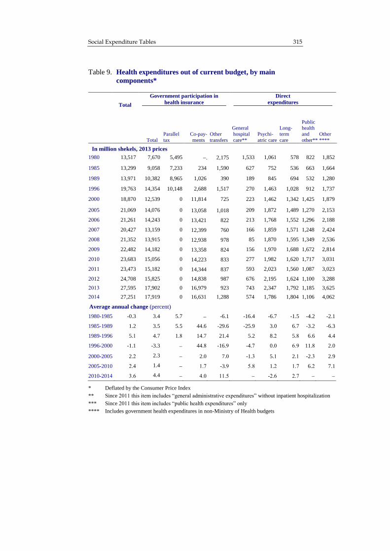
Social Expenditure Tables 315
Table 9. Health expenditures out of current budget, by main
components*
Total
Government participation in
health insurance
Direct
expenditures
Total
Parallel
tax
Co-pay-
ments
Other
transfers
General
hospital
care**
Psychi-
atric care
Long-
term
care
Public health
and
other***
Other
****
In million shekels, 2013 prices
1980 13,517 7,670 5,495 . 2,175 1,533 1,061 578 822 1,852
1985 13,299 9,058 7,233 234 1,590 627 752 536 663 1,664
1989 13,971 10,382 8,965 1,026 390 189 845 694 532 1,280
1996 19,763 14,354 10,148 2,688 1,517 270 1,463 1,028 912 1,737
2000 18,870 12,539 0 11,814 725 223 1,462 1,342 1,425 1,879
2005 21,069 14,076 0 13,058 1,018 209 1,872 1,489 1,270 2,153
2006 21,261 14,243 0 13,421 822 213 1,768 1,552 1,296 2,188
2007 20,427 13,159 0 12,399 760 166 1,859 1,571 1,248 2,424
2008 21,352 13,915 0 12,938 978 85 1,870 1,595 1,349 2,536
2009 22,482 14,182 0 13,358 824 156 1,970 1,688 1,672 2,814
2010 23,683 15,056 0 14,223 833 277 1,982 1,620 1,717 3,031
2011 23,473 15,182 0 14,344 837 593 2,023 1,560 1,087 3,023
2012 24,708 15,825 0 14,838 987 676 2,195 1,624 1,100 3,288
2013 27,595 17,902 0 16,979 923 743 2,347 1,792 1,185 3,625
2014 27,251 17,919 0 16,631 1,288 574 1,786 1,804 1,106 4,062
Average annual change (percent)
1980-1985 -0.3 3.4 5.7 -6.1 -16.4 -6.7 -1.5 -4.2 -2.1
1985-1989 1.2 3.5 5.5 44.6 -29.6 -25.9 3.0 6.7 -3.2 -6.3
1989-1996 5.1 4.7 1.8 14.7 21.4 5.2 8.2 5.8 6.6 4.4
1996-2000 -1.1 -3.3 44.8 -16.9 -4.7 0.0 6.9 11.8 2.0
2000-2005 2.2 2.3 2.0 7.0 -1.3 5.1 2.1 -2.3 2.9
2005-2010 2.4 1.4 1.7 -3.9 5.8 1.2 1.7 6.2 7.1
2010-2014 3.6 4.4 4.0 11.5 -2.6 2.7
* Deflated by the Consumer Price Index
** Since 2011 this item includes “general administrative expenditures” without inpatient hospitalization
*** Since 2011 this item includes “public health expenditures” only
**** Includes government health expenditures in non-Ministry of Health budgets
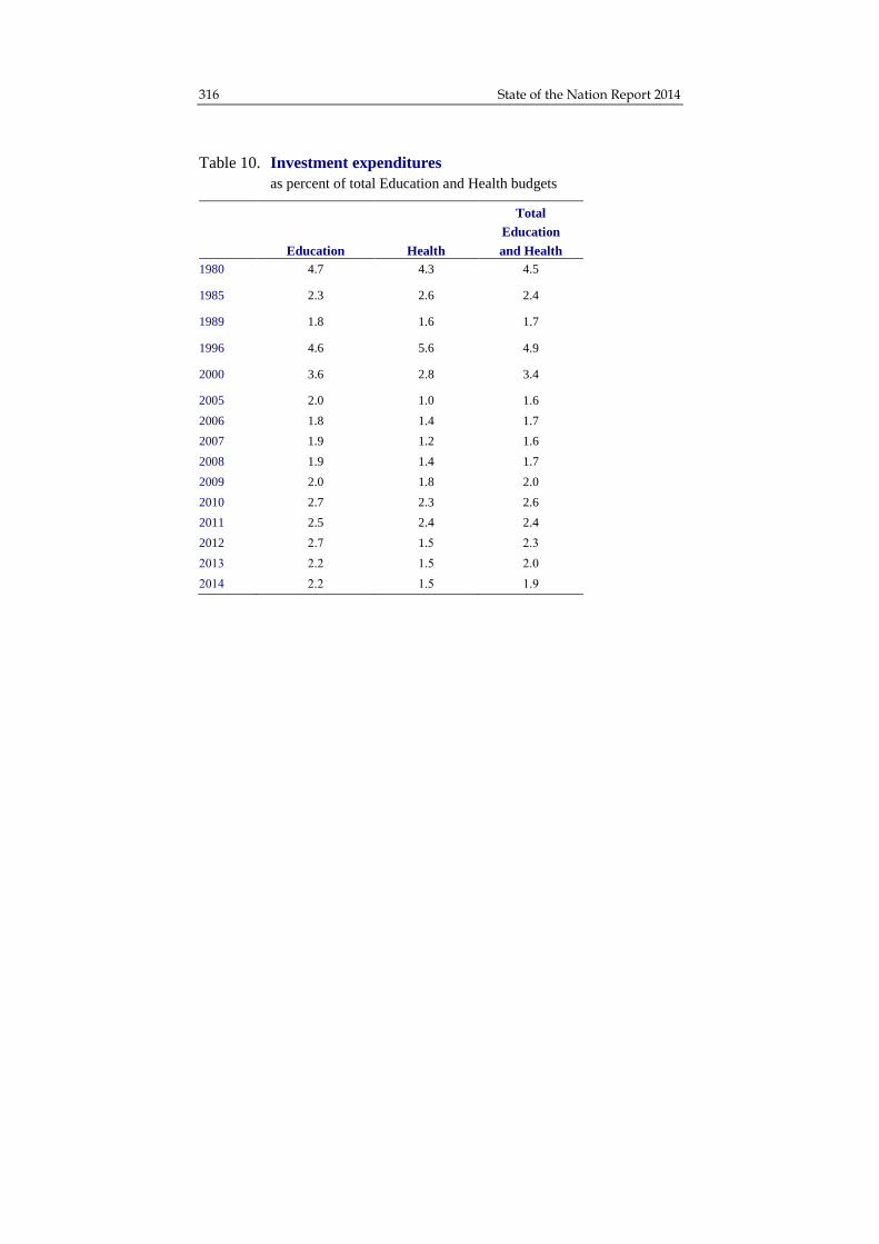
316 State of the Nation Report 2014
Table 10. Investment expenditures
as percent of total Education and Health budgets
Total
Education
Education Health and Health
1980 4.7 4.3 4.5
1985 2.3 2.6 2.4
1989 1.8 1.6 1.7
1996 4.6 5.6 4.9
2000 3.6 2.8 3.4
2005 2.0 1.0 1.6
2006 1.8 1.4 1.7
2007 1.9 1.2 1.6
2008 1.9 1.4 1.7
2009 2.0 1.8 2.0
2010 2.7 2.3 2.6
2011 2.5 2.4 2.4
2012 2.7 1.5 2.3
2013 2.2 1.5 2.0
2014 2.2 1.5 1.9

Social Expenditure Tables 317
Definitions and Sources
Definitions
Government social services expenditures include all expenditures on
education, health, income maintenance, welfare (personal social
services), housing, employment, and immigrant integration by
government ministries and agencies and by the National Insurance
Institute. The analysis in this book includes the current budget (current
expenditures) and the development budget (investments). Government
expenditures are treated in net terms, i.e., total expenditures less
earmarked revenues from outside agencies (such as co-payments from
recipients of services).
The focus is on total government expenditures on in-kind services
provided by the government (public consumption) and on subsidies and
transfers such as National Insurance allowances, government support of
non-governmental health institutions and support of non-governmental
schools. Thus, the data reflect the activity of the government as a funding
agent for the various social services, irrespective of the agency that
delivers them.
The expenditures pertain to fiscal years that correspond to calendar
years (January-December).1 Data are shown in constant 2013 prices. The
absolute figures were deflated by either the Consumer Price Index or by
an implicit price index for Civilian Public Consumption. Investment
expenditure, implemented through the development budget was deflated
by the Construction Inputs Price Index.
1 Until 1990, the fiscal year began on April 1 and ended at the end of the
following March. For the transition period – fiscal 1991 – a nine-month
budget (April-December) was approved. To facilitate comparison with data
from previous years, the 1991 budget expenditures were “translated” into full-
year terms by linear extrapolation.

318 State of the Nation Report 2011-2012
Classification of Social Expenditures
Social service expenditures were functionally classified by main fields
(education, health, etc.) irrespective of the agency that delivers the
service. This classification is different from that used conventionally in
the government budget and in the annual reports of the Accountant
General, which categorize expenditures by administrative units (e.g.,
ministries and departments). Below is a detailed list of items included in
each field.
Education. Education expenditures include Ministry of Education outlays
for school systems (pre-primary, primary, secondary, post-secondary),
general expenses for the education system, government participation in
higher education budgets, and government expenditures for vocational
training (Ministry of Economy formerly Ministry of Industry, Trade and
Labor). Transfers to secondary schools from education levy receipts were
also included until this was abolished in 1987.
Health. Health expenditures include Ministry of Health outlays for health
services (general inpatient, long-term, and psychiatric care; vocational
training; public health services; government participation in the funding
of National Health Insurance; and transfer payments to public medical
institutions), including Defense Ministry participation in the Health
Ministry budget. The National Insurance Institute health expenditures
(inpatient maternity care, medical care for work accidents, health outlays
under the Long-Term Care Insurance Law, and transfers to the health
funds from Parallel Tax receipts until this tax was abolished in 1997) are
also included, as are the health expenditures of the Unit for Care of
Victims of Nazi Persecution. To facilitate comparison with previous
years’ data, the health tax that citizens pay through the State Health
Insurance Law is treated as a substitute for the sick fund dues that
households remitted directly to the sick funds in earlier years and thus not
considered here government expenditure. In 2011 there was a structural
change to the budget of the Ministry of Health. The change is expressed
in two appendixes of direct expenditures – the general inpatient line no

Social Expenditure Tables 319
longer includes inpatient hospitalization expenditures rather spending on
general administration and the public health service outlays no longer
includes additional outlays.
The Social Security System. Social Security System expenditures include
all transfers from the National Insurance Institute (with the exception of
reserve duty compensation and expenditures explicitly included in other
social service fields) and benefits for victims of Nazi persecution.
Other social services. These include government outlays for personal
social services (expenditures by the Ministry of Social Affairs and Social
Services for the care of children, the elderly, the disabled, and the
mentally disabled; community work; and, most expenditures by the
National Insurance Institute on account of the Long-Term Care Insurance
Law); housing (expenditures by the Ministry of Construction and
Housing); employment (expenditures by the Ministry of Economy for
labor relations, personnel planning and referral, occupational safety, and
employment grant programs); and immigrant integration (expenditures by
the Ministry of Immigrant Absorption).

320 State of the Nation Report 2011-2012
Sources
The data on government expenditures for social services are based on the
government’s financial statements, prepared by the Accountant General
of the Finance Ministry (the 2013-2014 data are original budget data) and
on the Statistical Quarterlies of the National Insurance Institute. The
explanatory notes attached to the state budget and the Bank of Israel
Annual Report for the years at issue were also used. To compute real
expenditures, the appropriate price indices supplied by the Central
Bureau of Statistics were used.
Bank of Israel, Report of the Bank of Israel, various years.
Central Bureau of Statistics, Statistical Abstract of Israel, various years.
Central Bureau of Statistics, The Central Database, various volumes.
Ministry of Finance, Budget Proposal and Explanatory Notes, various years.
Ministry of Finance, The Accountant General, Financial Statements, various
years.
National Insurance Institute, Annual Survey, various years.
National Insurance Institute, Quarterly Statistics, various periods.
National Insurance Institute, Working Budget and Explanatory Notes,
various years.
Taub Center for Social Policy Studies in Israel, Israel’s Social Services,
Jerusalem, various years.

III. EDUCATION

323
Integration of Arab Israelis and Jews in Schools in Israel
Uri Shwed, Yossi Shavit, Maisalon Dellashi, and Moran Ofek*
Abstract
Israel’s citizen population in 2014 is about 75 percent Jewish and 20
percent Arab, but in most areas of life there is a sharp separation between
the two groups. An absolute majority of Israelis live in homogenous
Jewish or Arab localities, work in separate workplaces and attend separate
schools. Nonetheless, the reality of separation is changing, and more
integrative spaces are being created in various fields. This chapter focuses
on the education system in Israel, examining past and present separation
and integration between Jews and Arabs, and the reasons for and
challenges posed by such. Part 1 surveys the genesis of the separation
between Israel’s Arabs and Jews in the school system over the course of
the twentieth century. Part 2 presents contemporary data on the slowly
accelerating trend of integration over the past decade. Part 3 deals with
the motivations of parents when it comes to choosing an integrated school
for their children, and the conclusion touches briefly upon the challenges
that integration poses to the designers of education policy.
Dr. Uri Shwed, Department of Sociology and Anthropology, Ben-Gurion
University in the Negev. Prof. Yossi Shavit, Chair, Taub Center for Social
Policy Studies in Israel Education Policy Program; Department of Sociology
and Anthropology, Tel Aviv University. Maisalon Dellashi, Department of
Sociology and Anthropology, Tel Aviv University. Moran Ofek, Department

State of the Nation Report 2014 324
Introduction
Much has been written about the attempts at integration of pupils from
various ethnic backgrounds in Israel (e.g., Shavit, 1984; Mizrachi et al.,
2013; Resh and Kfir, 2004), but most of the studies in this field deal with
pupils from different ethnic backgrounds within Jewish society. In recent
years, a few studies have been published on bilingual schools that
integrate Arab1 and Jewish pupils, with the goal of educating them
towards equality and peaceful coexistence (Bekerman, 2008; Bekerman
and Horenczyk, 2004). These schools have also garnered some attention
in the media but they are very few in number; there are currently five
such schools and three such preschools in Israel.
However, a fair number of pupils attend Jewish schools where some
of the pupils are Arab, and the number of these schools has grown in the
past decade, albeit at a rather slow rate. The aim of this chapter is to
describe overall trends in the integration of Jews and Arabs in schools
through a historical survey of the separation, an investigation of the
trends in the field in recent years, an attempt to understand the
considerations of Arab and Jewish parents when it comes to sending their
children to these schools, and a brief discussion of the challenges facing
Jewish-Arab integration in schools.
of Sociology and Anthropology, Tel Aviv University; Yad Beyad, Center for
Jewish-Arab Israeli Education in Israel, Gan Haifa.
This chapter is part of a comprehensive study on mixed schools attended by
Arab and Jewish pupils in Israel. The study is funded by the Jacobs
Foundation through a research grant to Yossi Shavit and Uri Shwed, with the
approval of the Ministry of Education. We thank Noa Menashe for research
assistance. 1 The term Arab in this chapter always refers to Arab Israelis.

325 Integration of Arab Israelis and Jews in Schools in Israel
1. Historical Background
Israel’s society is comprised of various ethnic and cultural groups with
the most prominent distinction being between Jews and Arabs. Jews
account for about 75 percent of the state’s citizens and Arabs for about 20
percent. The majority of both Jews and Arabs live in nationally2 (Jewish
versus Arab) homogeneous localities, although the degree and nature of
the separation between the two groups have changed over the course of
time. During previous centuries, the small Jewish minority that lived in
then-Palestine resided almost entirely alongside the Arab population in
mixed towns. Starting at the end of the nineteenth century, and continuing
into the twentieth century (both before and during the course of the
British Mandate period), the Yishuv (the pre-statehood Jewish collective
and its institutions) grew significantly. Consequently, many new Jewish
localities were established, which intensified the separation between the
groups. In the wake of the violent events of 1929, the Jews left some of
the mixed towns and started to concentrate in Jewish neighborhoods and
localities. These processes further intensified the separation.
In the field of education, the separation was almost complete from the
beginning. During the British Mandate period, the schools – even those
operating in the mixed towns – were separate for Jews and Arabs, and
only a few of them integrated Jewish and Arab pupils. The end of the
Mandate and the circumstances surrounding the establishment of the
State of Israel intensified the separation between the two groups. Most of
the Arab inhabitants of the areas that were to become Israel left, and Jews
– mainly new immigrants – settled in some of these communities, as well
as in the towns that had been mixed before the war. Over the subsequent
years, hundreds more localities were established for the Jewish
population, while the natural increase of the Arab population remained
concentrated in the villages that had survived the war, which swelled into
large towns. Today, 90 percent of the Arab population resides in Arab
2 The Hebrew term “leom” is translated here as “national.” It distinguishes
between Arab and Jewish citizens of Israel.

State of the Nation Report 2014 326
localities, and most of the rest reside in Arab neighborhoods within
predominantly Jewish towns and cities (Smooha, 2012). Most Jews reside
in Jewish towns, and only 22 percent reside in mixed localities
(Khamaisi, 2009).3
Against this background of almost complete segregation in residential
areas, it is no surprise that the separation in the education system is also
severe. In order to understand the history of separation and integration in
education, it is necessary to examine the development of the education
system since Israel’s establishment.
In 1949, the Compulsory Education Law was enacted, which was
meant to ensure that every Israeli citizen, including Arabs, would receive
a primary education (Dror, 2007). Mar’i (1978) and Al Haj (1995) point
out that the implementation of this law among the Arab population in
Israel was problematic in light of the chaos in 1949, and note that the
shortage of classrooms and teachers led to the improvisation of makeshift
and partial solutions. In those days, the law was implemented only in part
(Al Haj, 1995; Mar’i, 1978). Furthermore, there was a blurring of
authority between the Ministry of Education and the military government
to which Israel’s Arabs were subject until 1966. The military government
sometimes interfered in decisions that were the responsibility of the
Ministry of Education, such as the physical location of schools and the
employment of teachers and principals (Al Haj, 1995).
In 1953, the State Education Law was enacted, which was meant to
eliminate the various educational streams and consolidate them under the
state’s auspices. The political power of the Haredi (ultra-Orthodox) and
national-religious parties ensured the autonomy or independence of their
populations’ educational streams. The Arab population, with its meager
political power, was unable to obtain such educational autonomy. This
gave rise to the peculiar situation that the Arab education system, which
differs significantly from all streams of Jewish education, remained under
3 For the sake of comparison, in the United States one-third of all African-Americans
reside in areas that are populated entirely by African-Americans, and one-half of all
whites reside in areas that are populated entirely by whites. The degree of residential separation in Israel is, then, very large relative to the American case.

327 Integration of Arab Israelis and Jews in Schools in Israel
secular state auspices while functioning as a separate unit within it (Al
Haj, 1995).
Al Haj points to three different approaches that were available to
decision makers in addressing the relationship between Arabs and Jews in
the education system: assimilation, separation and integration. The
minority in support of assimilation saw it as a means of promoting the
Zionist idea to the Arab minority and bringing this group within the
state’s embrace, while distancing it from the surrounding Arab world.
The proponents of separation argued that without the creation of an
encompassing Israeli identity, it would not be possible to integrate the
Arab minority into the Jewish majority, and since there was no intention
to develop a civil culture that was not Jewish-national, the integration
course was doomed. Abu-Asbeh (2007) even argued that the supporters
of separation between Jewish and Arab education sought to achieve a
twofold goal: to reduce the feeling of discrimination among the Arabs –
who in a separate system were granted a certain (albeit restricted)
measure of administrative and cultural autonomy – and at the same time
strengthen the state’s control of education (Al Haj, 1995).
The integration approach received very little support over the years
and almost no practical attempts were made to implement it. Opposition
to it aligned with the interests of various factors in civil society. Mar’i
(1978) writes, for example, that the attempt by the former mayor of
Haifa, Aba Hushi, to establish a mixed school in the city met with fierce
opposition from Jewish parents. According to him, Jewish parents were
afraid of intimate relations between young people, especially Jewish girls
and Arab boys. In Arab society, too, separation was usually viewed as
desirable, because the Arab education system was supposed to contribute
to the preservation of Palestinian national identity among Israel’s Arab
population (Mar’i, 1978).
Nonetheless, in recent years a change is evident in the trend of
separation between Jews and Arabs that has been prevalent in the Israeli
education system. The slow process of integration derives in part from
the increasing residential mixing between the two sectors in towns and
neighborhoods. Another force is the poor state of the Arab education

State of the Nation Report 2014 328
system, prompting certain Arab parents to prefer Jewish education, which
they see as being of higher quality. Lastly, the process should also be
attributed to the deliberate efforts of non-profits and parents’ groups
interested in affording their children a mixed and bilingual education.
This chapter presents an analysis of the Ministry of Education’s
registration data in order to understand the scope of the phenomenon. It
then proceeds to discuss the reasons for the current integration and its
implications for mixed schools based on about 30 interviews with
principals and other personnel in mixed schools.
2. Integration in the Education System, 2003-2013
In 2013, about 1.6 million pupils attended primary and secondary schools
in Israel. Of that number, 870,000 pupils attended schools without even a
single Arab pupil (over half of these pupils attended religious or Haredi
schools), and almost 330,000 attended schools without even one Jewish
pupil. In contrast, almost 395,000 pupils attended schools with at least
one Arab pupil or one Jewish pupil. This figure includes about 5,600
Arab pupils attending Jewish schools and 360 Jewish pupils attending
Arab schools. The rest of the 395,000 are either Jews attending a Jewish
school that also has an Arab minority, or Arabs attending an Arab school
that a few Jews also attend. Since one pupil of a different sector than the
majority does not suffice to define a school as “mixed,” in this paper the
definition of mixed schools is those in which more than 1 percent of the
pupils are Jews and more than 1 percent are Arabs. (This, too, is a very
liberal definition, and the integration between the two groups in schools
where the mixing is more numerically significant will also be examined.)
According to this 1 percent definition, almost 5,000 Arabs attended
mixed Jewish schools, while 177 Jews studied in Arab schools – one-
third of them in a bilingual school classified as Arab, and the rest in
prestigious church-run schools or schools for special education. The share
of Arabs in the Jewish mixed schools according to this definition ranged
from 1 percent to 81 percent (at the Special Education School for the

329 Integration of Arab Israelis and Jews in Schools in Israel
Deaf in Jerusalem) of all the pupils in the school, and was on average 7.6
percent. The share of Jews in the Arab mixed schools according to the
same definition ranged from 1 percent to 45 percent (at the Bilingual
School in Kfar Kara classified as Arab), and was on average 13.3 percent
of all the pupils in a school. It is important to bear in mind, of course, that
even a small number of pupils of a different nationality could grant all
pupils at the school some familiarity with the “Other.”
Figure 1 presents the number of pupils attending mixed schools during
the years 2003-2013. It shows a growing phenomenon: the population of
those attending mixed schools grew by 59 percent, from 68,000 in 2003
to 109,000 in 2013. During the same period, the population of those
attending a school without any Arab students grew by 9 percent, and the
population of those attending a school without any Jews grew by 33
percent. Most of the growth in mixed schools occurred until 2008, and
then the numbers stabilized. Nonetheless, a somewhat different picture
emerges when the growth patterns by age group are examined: middle
and upper secondary schools versus primary schools. The share of
secondary school pupils out of all the pupils at mixed schools increased
from 52 percent in 2003 to 58 percent in 2011. Most of the growth in the
population of mixed middle and upper secondary schools occurred
between 2004 and 2008, and since then there has been a slight decline in
the number of pupils attending them. However, most of the growth in the
population of the mixed primary schools occurred between 2006 and
2009.

State of the Nation Report 2014 330
Where do the pupils of mixed schools attend school? Figure 2 presents
the distribution of the 355 institutions at which Arabs and Jews learn side
by side according to the share of Arab students at the school and
according to educational sector (Arab versus Jewish). As the figure
shows, 334 (94 percent) of the schools belong to the Jewish sector, and
the rest belong to the Arab sector. In most of the mixed schools in Jewish
education, the share of Arabs is low: in 228 of them the share of Arabs is
no larger than 5 percent, in 48 schools the share ranges between 6 and 10
percent, and in 50 schools the share is 11-50 percent of the pupils.
Interestingly, note that in five Jewish schools the share of Arabs is 51-75
percent. These are the bilingual schools in Beer Sheva and Jerusalem, the
Weizmann School in Yafo (currently being closed), and two special
* A school is considered mixed if minority of its pupils (Jewish or Arab)
represents more than 1 percent of its pupil population.
Source: Shwed, Shavit, Dellashi, and Ofek, Taub Center
Data: Ministry of Education
Figure 1
Number of pupils in mixed schools
by education level, 2003-2013
0
20,000
40,000
60,000
80,000
100,000
120,000
2003 2004 2005 2006 2007 2008 2009 2010 2011 2012 2013
Middle and upper secondary
Primary

331 Integration of Arab Israelis and Jews in Schools in Israel
education schools in Jerusalem and Lod, respectively. In three of the
Jewish schools, the share of Arabs is even greater than 75 percent: the
bilingual Galil School located in Kibbutz Ashbal, an external high school
in Haifa, and the special education school for the deaf in Jerusalem.
Among the Arab mixed schools, in five of them the share of Jews is in
the range of 25-50 percent. These are the bilingual school in Kfar Kara4,
4 The Ministry of Education classifies schools by educational sector according
to its own considerations. For example, the school in Neve Shalom-Wahat el-
Salaam (a mixed community) is defined as a Jewish school while the bilingual
Gesher al Havadi School, located in the Arab local council of Kfar Kara, is
* A school is considered mixed if the minority of its pupils (Jewish or Arab) is greater than 1 percent of its pupil population.
** Arab refers to Arab Israelis
Source: Shwed, Shavit, Dellashi, and Ofek, Taub Center
Data: Ministry of Education
Figure 2
Distribution of mixed schools* by sector
by percent of Arab** pupils in the school, 2013
16
108
120
48
25 25
3
1-2% 3-5% 6-10% 11-20% 21-50% 51-75% 76-99%
Jewish Jewish Jewish Jewish Jewish Jewish Jewish Arab
Percent of Arab pupils in the school
Arab

State of the Nation Report 2014 332
an Armenian church school in Jerusalem, a special education school in
Haifa, and two international church schools in Yafo, most of whose
pupils who are classified as Jews are from the former Soviet Union and
attend them in order to acquire a high-quality European education. Of the
16 remaining Arab mixed schools that include a small minority of Jews
(more than 1 percent but less than 25 percent), four are special education
schools and the rest are most likely schools attended by children of mixed
families that reside in an Arab community, but who are classified by the
state as Jews.
Special education accounts for a significant portion of the mixed
schools. As Figure 3 shows, among mixed schools attended by up to 5
percent Arab pupils (228 schools), 49 are special education institutions
and 179 belong to general education. In the next three categories
combined (representing 6 to 50 percent Arab), special education schools
constitute the majority. Among the Arab Israeli schools with Jewish
pupils, about one-quarter are classified as special education.
officially classified as an Arab school. The Yad Beyad primary school in
Jerusalem is defined as Jewish, while its high school is defined as Arab.

333 Integration of Arab Israelis and Jews in Schools in Israel
Ostensibly, it would seem that special education pupils constitute a
significant portion of all the pupils at schools that integrate Jews and
Arabs, but Figure 4 shows that this assumption is false, since the schools
in special education are generally very small. The figure presents the
distribution of pupils (as opposed to schools) according to the same
categories presented in Figure 3. As can be seen, of the 108,872 pupils
attending mixed schools only 7,856 – about 7 percent – attend special
education schools. The factors that motivate mixing in special education
are likely different from those operating in general education. The
motivation for mixing in special education is due to the education
system’s efforts to concentrate pupils according to their special needs,
* A school is considered mixed if the minority of its pupils (Jewish or Arab)
represents more than 1 percent of its pupil population.
Source: Shwed, Shavit, Dellashi, and Ofek, Taub Center
Data: Ministry of Education
Figure 3
Number of mixed schools*
by percent of Arab pupils and school type, 2013
15
34
2015
19
3 5
93
86
28
106
7
14
1-2% 3-5% 6-10% 11-20% 21-50% 51-75% 76-99%
Percent of Arab pupils in the school
Special education
General education

State of the Nation Report 2014 334
irrespective of nationality. Since relatively few pupils are concerned,
henceforward those attending special education schools will not be
included in the calculations (pupils of special education classes in general
schools will continue to be included in the figures).
Analyzing the distribution of mixed schools according to the
socioeconomic level of the locality in which they are situated (excluding
special education schools) shows that they are prevalent in localities
populated mainly by members of the middle and upper-middle class.
Figure 5 presents the distribution of pupils among the schools by the level
of mixing, on the basis of the socioeconomic cluster associated with the
* A school is considered mixed if the minority of pupils (Jewish or Arab)
represents more than 1 percent of the school’s pupil population.
Source: Shwed, Shavit, Dellashi, and Ofek, Taub Center
Data: Ministry of Education
Figure 4
Distribution of pupils in mixed schools*
by percent of Arab pupils and school type, 2013
0
10,000
20,000
30,000
40,000
50,000
1-2% 3-5% 6-10% 11-20% 21-50% 51-75% 76-99%
Special education
General education
Percent of Arab pupils in the school

335 Integration of Arab Israelis and Jews in Schools in Israel
school’s locality.5 The mixed schools are a minority, of course, in every
cluster. But in the lowest clusters – in which most of the localities are
predominantly Arab or disproportionately Haredi – there is not a single
mixed school. In clusters 3-4, nearly 5 percent of the pupils attend mixed
schools, versus almost 10 percent of the pupils in clusters 5-6 and 9
percent of the pupils in clusters 7-8, which belong to the upper-middle
class. Clusters 9-10 feature the largest share of pupils in mixed schools –
around 11 percent.
The mixed schools, then, are concentrated mainly in localities
belonging to socioeconomic clusters 5 and above. Importantly, though,
mixing is common mainly in the weakest neighborhoods in the various
localities. For example, in the Tel Aviv-Yafo municipality, the mixed
schools are situated in Yafo, the weaker of the two municipal partners
from a socioeconomic aspect.
5 The socioeconomic ranking of localities in Israel is calculated using the
socioeconomic measure of the Central Bureau of Statistics (CBS), which
consists of a combination of aggregate characteristics including:
demographics, education and higher education, employment, and standard of
living (income, number of cars, residential attributes). All the localities are
divided into ten clusters. Cluster 1 denotes the lowest socioeconomic level,
while cluster 10 comprises the group of localities with the highest
socioeconomic measure.

State of the Nation Report 2014 336
To summarize, the analysis of the Ministry of Education’s registration
figures suggests that the phenomenon of integration between Arabs and
Jews in schools is typical of non-religious state-run (mamlachti)
education, primarily in the Jewish sector. The phenomenon has expanded
in the last decade, initially in secondary schools and afterwards in
primary schools. It is not exceptionally characteristic of special
education, and extends mainly to localities belonging to the middle or
higher socioeconomic clusters albeit in schools that are located in less
affluent neighborhoods. In State-religious and Haredi education there is
no integration of Arab pupils whatsoever.
* A school is considered mixed if the minority of pupils (Jewish or Arab)
represents more than 1 percent of the school’s pupil population.
Source: Shwed, Shavit, Dellashi, and Ofek, Taub Center
Data: Ministry of Education
Figure 5
Distribution of pupils in schools
by level of mix and socioeconomic cluster of school location, 2013
36%46%
88% 89% 90%
50%
2%
4%10% 10%
Clusters 1+2(Lowest)
Clusters 3+4 Clusters 5+6 Clusters 7+8 Clusters 9+10(Highest)
64%
2%
9%
Schools with no Arab pupils
Schools with no Jewish pupils
Mixed schools*

337 Integration of Arab Israelis and Jews in Schools in Israel
Jewish Mixed Schools in Mixed Neighborhoods
The remainder of this chapter is based on the interviews that were
performed with principals and teachers in mixed schools. As noted
previously, the great majority of mixed schools are situated in mixed
neighborhoods of a low socioeconomic level. The share of Arab pupils in
these schools is relatively small. The population defined as “Jewish” in
these schools generally includes a large share of children of immigrants
from the former Soviet Union and Ethiopia, and lately also a few pupils
from Peru in South America. In some of these schools, there is no clear
majority group, and the school’s population resembles a mosaic of
various small ethnic and national groups. Besides the Jewish pupils, the
mixed schools are attended by both Muslim and Christian Arabs, as well
as a few Druze and Circassian pupils.6
In most of the schools studied, the principals noted that a large share
of their pupils comes from poor households, and only a few of them have
educated parents. This is true of members of all ethnic and national
groups in the schools. These schools are generally seen as relatively weak
and the average achievement level of their pupils, as measured by the
Meitzav tests (Hebrew acronym for Measures of School Efficiency and
Growth), is low relative to the nationwide level.
From a cultural and organizational aspect, mixed schools operate as
Jewish schools, and from an ideological-pedagogical aspect they are
Jewish-Zionist schools in every respect. In all of the schools included in
the study, the principals emphasized that the school was Jewish-Zionist in
terms of its identity and curriculum. The great majority of teachers are
Jewish, and if the school does employ Arab teachers, most of them teach
Arabic (although a small number of Arab teachers teach other subjects in
Jewish education). Nonetheless, these schools are distinct from each other
in their attitude towards their Arab student population. Some of the
schools emphasize tolerance, multiculturalism and acceptance of the
“Other” – including the Arab other – as a minority in the school, but most
6 The Circassian pupils are mainly from one village, Rekhaniya, in the Upper
Galilee.

State of the Nation Report 2014 338
of them have chosen a strategy of color-blindness7, that is, they disregard
the existence of Arab pupils at the school and treat them just like other
pupils. These schools, like most of the schools in mamlachti (state-run)
Jewish education, emphasize the values of “the Land of Israel for the
people of Israel” and celebrate military service, while ignoring the
conflict this raises among some of their Arab pupils. Several principals
even emphasized the importance they attribute to the fact that some Arab
pupils choose to serve in the military or to perform some other type of
national service.
In some of the mixed neighborhoods, Arab parents have a variety of
alternatives, such as mamlachti Arab schools and selective church
schools. If so, why do Arab parents send their children to the mixed
Jewish schools? The Jewish mixed schools’ principals were asked to
assess the reasons for this, and the following is a brief summary of their
answers. None of the principals cited a single and distinct reason, and
there appears to be a complex combination of factors involved.
The factor cited most often is Arab perceptions regarding the quality
of Jewish education. The Jewish schools are perceived by Arab parents as
being of higher quality than the mamalachti Arab schools. Some Arab
parents believe that the quality of the teachers and amount of resources at
mamlachti Arab schools are insufficient, and they are interested in
improving the quality of their children’s education. Beside the aspiration
to provide a quality education, a second factor is cultural capital. There
are Arab parents who are interested in having their children be educated
in Hebrew and study the Israeli (and in effect, Jewish) culture, because it
may help them get ahead in a society whose dominant culture is Jewish.
7 This is a term borrowed from the strategy of creating interracial equality
between whites and African-Americans in the United States, which means a
nominal disregard for ethnic or racial origin in the provision of civil services,
by eliminating the privileges awarded to whites and the racial discrimination
against African-Americans. This approach was considered a fundamental
reform in relation to the previous situation, but subsequently came under fire
from those arguing that such an approach veils covert and open racism that
continues to exist under the cover of “color-blindness” (e.g., Bonilla-Silva,
2003).

339 Integration of Arab Israelis and Jews in Schools in Israel
Another frequently cited factor relevant only to a limited number of
pupils is how the Jewish schools contend with special pupils. Certain
Arab parents are not satisfied with the way Arab schools manage their
children’s learning disabilities and adjustment difficulties, and hope that
the Jewish schools, which are perceived as more advanced, will better
handle their struggling children.
Another reason for preferring a mixed school is the existence of what
might be called liminal populations: children of Palestinian families that
collaborated with the Israeli security forces and children of mixed
couples. In most of the mixed schools, there is a small Arab minority of
children of “collaborator” families (Cohen, 2006). With state assistance,
these families have settled in mixed neighborhoods, but are sometimes
hesitant to send their children to Arab schools for fear of them being
harmed. The Jewish school serves as a relatively safe sanctuary for them.
In addition, some of the Arab pupils in the mixed schools are children of
mixed families. Such families mostly reside in an Arabic-speaking
community, but would like their children to know Hebrew and be
familiar with Jewish culture, to which the family of one of the parents
(usually the mother) belongs.
While Arab parents believe that these schools are preferable to the
state-run Arab schools from a learning perspective, many Jews view these
schools’ education level as low relative to other schools in Jewish
education. Higher-educated families among the Jews in mixed
neighborhoods (like all higher-educated families) are looking for higher-
quality solutions for their children, and some of them send their children
to better schools outside the neighborhood by changing their official
residential address in order to circumvent the registration area
requirements. Others seek solutions in special or regional schools in the
private sector, such as the Teva (nature) school in Yafo. Furthermore,
there are Jewish families that remove their children from schools that are
attended by Arab pupils. For example, at a primary school in Yafo, the
number of Jewish pupils kept dropping as the number of Arab pupils rose
(Levy and Shavit, in preparation). In the literature, this phenomenon is
termed “white flight,” referencing the flight of whites from

State of the Nation Report 2014 340
neighborhoods and schools which have seen an influx of minority
students. Some families have turned to schools in the State-religious or
even Haredi education system, because these schools do not accept non-
Jews at all.
Understandably, then, the motivations of Jewish parents to send their
children to mixed schools are fundamentally different from those of most
Arab families. Many of the Jewish pupils who remain in these schools are
sons and daughters of parents who are unable to find alternative
solutions. These are generally poor families lacking in higher education,
or immigrant families that are unfamiliar with the intricacies of the
education system and that do not know how to circumvent the registration
area requirements. It can be said, then, that the main reason that Jewish
pupils attend mixed schools is either a lack of information or an absence
of alternatives or initiative.
Bilingual Schools
There are five bilingual schools in Israel today, and these schools are
committed to equality and coexistence between Arabs and Jews in Israel.
Like many of the Haredi schools, these schools enjoy the formal status of
being “recognized but unofficial.” This means that they are subject to
supervision by the Ministry of Education and enjoy its budgetary support,
albeit at a lower rate (about 70 percent) than official state-run schools.
Since the bilingual schools insist on staffing each class with a pair of
teachers – Jewish and Arab– their operating costs are very high, and the
difference between the Ministry of Education’s allocation and actual
expenditures is made up by donations and tuition fees. Three of these
schools – Gesher al Havadi in Kfar Kara, Galil in Ashbal near Sakhnin,
and the bilingual school in Jerusalem – operate under the umbrella of the
non-profit organization Yad Beyad. The remaining two are the pioneering
bilingual school in Neve Shalom-Wahat el-Salaam and Deganya which is
located in Beer Sheva and operates with the support of the non-profit
organization Hagar. There are also three bilingual preschools that aspire
to grow into schools, in Yafo, Haifa and Heilf. These schools are

341 Integration of Arab Israelis and Jews in Schools in Israel
characterized by placing an equal emphasis on Jewish and Palestinian-
Arab language and culture.
The bilingual schools observe the holidays of the Jewish and Israeli
calendar and those of Islam and Christianity (depending on the pupils’
religion) as well as the Palestinian national holidays (including Nakba
Day). The Arab pupils are not a minority in the school, and among older
pupils they even constitute a majority.
The pupils at these bilingual schools generally come from established
and higher-educated households. Although their principals are insistent
that the schools are not elitist – for example, the school in Neve Shalom
is attended by pupils from the lower-class Rakevet neighborhood in Lod,
and the bilingual school in Jerusalem by lower-class Arab pupils from
East Jerusalem and lower-middle class Jewish pupils from the Pat
neighborhood in which it is located – actually such disadvantaged pupils
form only a small percentage of their populations.
With regard to the bilingual schools, too, there are noticeable
differences between the respective motivations of Arabs and Jews to
attend them. According to the principals, the level of study is a more
important issue for the Arab parents, while the ideology of integration
and coexistence is of greater importance for most of the Jewish parents.
This aligns with the findings of the study by Bekerman and Horenczyk
(2004), who studied these schools. Of course, the bilingual schools also
meet the needs of mixed couples. While putting their children into either
Jewish or Arab education entails renouncing certain components of
identity, the bilingual schools accommodate both components of a mixed
couple’s identity.

State of the Nation Report 2014 342
3. Conclusion
Israel appears to be in the midst of a slow process of reducing the
residential, occupational and educational separation between Jews and
Arabs. This chapter focuses on integration in the education system. From
a situation of almost complete separation between Jews and Arabs that
lasted for decades, recent years have seen a slowly developing trend of
integration in various schools. Although schools featuring a high rate of
integration are still rare, the data show that the integration trend is slowly
expanding, and it is important that it is brought to the attention of both
scholars and policy makers.
This chapter is a first attempt to examine the scope of the phenomenon
and its development in the last decade. The data show that about 109,000
pupils – about 6 percent of all the pupils in Israel, and almost 15 percent
of those in state-run Jewish education – attend schools in which some
encounter between pupils from the two groups takes place. That share
grew slowly during the first years of the previous decade and has since
stabilized.
The buds of integration in Israeli education for the most part do not
stem from any deliberate policy of the education system. Rather, they
have sprouted from below, from the parents themselves and from the
initiatives of organizations in civil society. One of the important factors
affecting the increase in the prevalence of integration is the proliferation
of mixed localities and neighborhoods, as growing numbers of Arabs
move into localities whose population was almost exclusively Jewish
since the State’s establishment (Nazareth Ilit, Beer Sheva, Hazor Haglilit,
Karmiel, and others). The mixing of Arabs and Jews in these localities
has led to a rise in the number of Arab families that choose to send their
children to Jewish schools. The motivations prompting them to do so are,
as noted, diverse: some of them believe that the quality of Jewish
education is higher. Others want their children to learn proper Hebrew,
which will help them integrate into Jewish-Israeli society. Still others see
Jewish education as a solution to their children’s special needs or as a
refuge from hostility and vengeance.

343 Integration of Arab Israelis and Jews in Schools in Israel
A more modest (from a numerical aspect) but very important role in
the mixing process is played by the non-profit organizations Yad Beyad,
Neve Shalom-Wahat el-Salaam, and Hagar. These organizations promote
bilingual and bicultural education with the aim of advancing equality,
understanding and social integration between the two national groups.
The considerations of parents who choose these schools are both similar
and different from those of parents who send their children to a mixed
school in Jewish education; they include a commitment to coexistence
and multiculturalism, as well as an attempt to escape from the state-run
education system with its various problems.
And what is the role of the Ministry of Education in this mixing
process? It is hard to say that the Ministry is enthusiastic about it. By law,
the Ministry and the local authorities allow Arab pupils to enroll at
Jewish schools in their place of residence. The Ministry also recognizes
the bilingual schools, just as it recognizes many other schools established
by parents’ organizations, and tolerates their existence. However, the
Ministry does not encourage mixed Jewish schools to adopt and integrate
multicultural elements in the curriculum. Its position seems to be that if
Arabs want to attend Jewish schools they are welcome to do so, but on
condition that they accept the schools’ Jewish-Zionist character and not
demand cultural concessions.
The impression gained from visits to the mixed Jewish schools is that
the great majority of them are not equipped with a suitable educational
toolbox for the supportive and respectful accommodation of cultural
differences. This manifests itself mainly during outbreaks of the conflict
between Israel and the Arab world and on the national holidays of Israel
and the Palestinian people (e.g., Independence Day, Remembrance Day
and Nakba Day). The absence of policy and appropriate training on the
part of the Ministry of Education leaves many principals and teachers to
deal with these difficult dilemmas on their own. Sometimes they manage
to find limited solutions to these challenges, but many ignore the
challenge as if it does not exist.

State of the Nation Report 2014 344
The increasing integration in the education system raises many
questions. What degree of social integration, in terms of friendships, is
achieved between Arab and Jewish pupils who attend mixed classes? Are
there differences among these schools in the degree of integration
attained? What are the school factors that promote or hinder integration?
What are the implications of mixed education for the pupils’ attitudes
towards the “Other” and towards the Israeli-Palestinian conflict? What
are the implications of Jewish education for the occupational
achievements of Arab pupils down the road? How do the pupils’ parents
regard mixing in the schools? Future researchers in this important field
face the challenge of investigating these questions in order to reach a
deeper understanding of the integration phenomenon in Israel’s education
system.

345 Integration of Arab Israelis and Jews in Schools in Israel
References
English
Al Haj, Majid (1995), Education, Empowerment, and Control: The Case of
the Arabs in Israel, SUNY Press.
Bekerman, Zvi (2008), “Shaping Reconciliatory Memory: Towards
Palestinian-Jewish Co-Existence Through Bilingual Education,” in
Yotam Benziman (ed.), Memory Games: Concepts of Time and Memory
in Jewish Culture, Van Leer Jerusalem Institute and Hakibbutz
Hameuchad Publishing House, pp. 231-249.
Bekerman, Zvi and Gabriel Horenczyk (2004), “Arab-Jewish Bilingual
Coeducation in Israel: A Long-Term Approach to Intergroup Conflict
Resolution,” Journal of Social Issues, 60, No. 2, pp. 389-404.
Bonilla-Silva, Eduardo (2003), Racism without Racists: Color-Blind Racism
and the Persistence of Racial Inequality in America, Rowman &
Littlefield Publishers.
Cohen, Hillel (2006), Good Arabs: The Israeli Security Agencies and the
Israeli Arabs, 1948-1967, University of California Press, Haim Watzman
(translator).
Marʼi, Sami Khalil (1978), Arab Education in Israel, Syracuse University
Press.
Shavit, Yossi (1984), “Tracking and Ethnicity in Israeli Secondary
Education,” American Sociological Review, 49, pp. 210-220.
Hebrew
Abu-Asbeh, Khaled (2007), The Arab Education in Israel: Dilemmas of a
National Minority, The Floersheimer Institute for Policy Studies.
Dror, Yuval (2007), National Education Through Mutually Supportive
Devices: The Zionist Story, The Hebrew University Magnes Press.
Khamaisi, Rassem (2009), “Introduction,” in Rassem Khamaisi (ed.), Arab
Society in Israel (3): Population, Society and Economy, Van Leer
Jerusalem Institute and Hakibbutz Hameuchad Publishing House.

State of the Nation Report 2014 346
Levy, Natalie and Yossi Shavit, Chronicles of Disappointment: Integration
of Arabs and Jews in Primary School, (in preparation).
Mizrachi, Nissim, Yehuda C. Goodman and Yariv Feniger (2013), “They’re
Freaks but We’re ‘Arsim’: Negation of Ethnicity and Class in the
Perception of Tracking in Israeli High Schools,” in Nissim Mizrachi,
Yossi Yonah and Yariv Feniger (eds.), The Practice of Difference in
Israeli Education, A View from Below, Van Leer Jerusalem Institute and
Hakibbutz Hameuchad Publishing House, pp. 83-107.
Resh, Nura and Drora Kfir (2004), “Educational Integration in Israel: Thirty
Years of Hesitant Policy in View of Changing Ideology,” Megamot, 43,
pp. 33-63.
Smooha, Sammy (2012), Still Playing by the Rules: The Index of Arab-
Jewish Relations in Israel 2012, The Israel Democracy Institute.

347
Trends in the Development of the Education System
Nachum Blass*
Abstract
In recent years, several important changes have taken place in the
education system: the trend in the demographic composition of pupils has
changed significantly; the resources at the disposal of the education system
have grown considerably; and with regards to the work force, all of the
primary and a large portion of post-primary education teachers are now
part of the most recent educational reforms (“New Horizon” and “Courage
to Change”). The professional education qualifications of teachers have
improved, and the great majority of them now have higher education. The
learning achievements of Israel’s pupils have also improved, as is evident
from the results of the Meitzav tests, matriculation exams and
international testing. Furthermore, the achievement gaps between pupil
populations have narrowed, including those between Jewish and Arab
Israeli pupils. Improvement is also evident in the educational environment
of schools. Despite these changes, the financial allocation per pupil in Israel
is still low relative to the OECD countries, and despite the narrowing of
gaps between various population groups, they remain among the largest of
the OECD countries. There is still a long way to go until the quality of
what the education system provides to its pupils and until pupil
achievement, in both learning and educational terms, meet the standards of
the countries that Israel seeks to emulate.
Nachum Blass, senior researcher, Taub Center for Social Policy Studies in
Israel.

State of the Nation Report 2014 348
1. Demographic Trends
In the past five years, there has been a decrease in the share of Arab-
Israeli and Haredi (ultra-Orthodox) pupils in the education system. Since
these two populations are characterized by weak socioeconomic
backgrounds, this change has had a large effect on the system. This
section will examine the effect of the demographic changes on preschools
and on primary education in light of the implementation of the
Trajtenberg Committee’s recommendations.
Preschools. In the past 15 years, there have been large changes in the
rates of Arab Israeli and Haredi children attending preschool. From 2000-
2010, there was an increase in the two groups’ share of the preschool
population mainly due to the Compulsory Education Law, which was first
implemented in weaker socioeconomic localities where many Arab
Israelis and Haredim reside. In contrast, during the last five years, the
share of Arab Israelis and Haredim in preschools has declined, due to a
combination of further implementation of the Trajtenberg Committee’s
recommendations as well as changes in natural growth patterns. The most
prominent change was recorded in 2013, when the number of children
attending State preschools rose by 22,000 – from 150,000 to 172,000.
Most of the increase in 2013 came from children who did not attend
preschool in the past, or who attended private preschools and transferred
to State preschools following the implementation of the Trajtenberg
Committee’s recommendations. Nonetheless, it should be noted that in
the three years prior to the recommendations’ implementation, there was
already an increase in the growth rate of enrollment in State education, as
opposed to a significant decline in the growth rate of enrollment in
Haredi preschools. Examining the period before implementation of the
Trajtenberg Committee’s recommendations shows that between 2000 and
2006, the number of pupils in Arab Israeli and Haredi preschools rose by
61 percent and 47 percent, respectively, whereas the number of pupils in
State and State-religious preschools rose by 1 percent and 6 percent,
respectively. In contrast, between 2006 and 2012, the number of pupils in

349 Trends in the Development of the Education System
Arab Israeli preschools declined by 1 percent and the number of pupils in
Haredi preschools rose by 16 percent, while the number of pupils rose by
20 percent in State preschools and by 22 percent in State-religious
preschools.
Grades 1-6. The picture in grades 1-61 points to a change of direction in
the composition of the primary education population. The change is
evident starting in 2010, and consists mainly of stabilization (and
indications of a slight increase) in the share of pupils in Jewish education,
and a decline in the share of pupils in Arab Israeli education. In
examining the share of Arab Israeli pupils in this age group, two distinct
periods can be discerned: between 1999 and 2008, there was an increase
from 24.2 percent to 28.2 percent, and between 2008 and 2013, there was
a drop from 28.2 percent to 26.4 percent. There are also two distinct
periods characterizing the share of pupils in Jewish State-run education: a
continuous decline from 47.7 percent in 1999 to 39.9 percent in 2011,
followed by a slight recovery and a rise to 40.7 percent in 2013. The
trends in State-religious education paralleled those of Jewish State
education. The share of pupils in Haredi education over the last three
years remained stable at 18.8 percent, in contrast to the continuous rise
between 1999 and 2011, when the share of pupils in Haredi education
grew from 13.4 percent to 18.8 percent. The data indicate that these
demographic changes are apparently not due to an exceptional change in
a single year, but rather, a trend that began near the end of the previous
decade and continues to the present. It goes without saying that this trend
may not continue, but these findings suggest that the rhetoric and tone of
the public discourse concerning the demographic composition of the
education system and its possible future consequences should adjust to
match the facts.
1 In Haredi education, primary education is customary through eighth grade, so
for comparison purposes, only grades 1-6 were examined.

State of the Nation Report 2014 350
2. Resources Available to the Education System
Budget
Since 2008, there has been a significant increase in the Ministry of
Education budget, including in the original budget, the amended budget
(i.e., in the budget as calculated at the end of the fiscal year, after all the
budget changes during the year are taken into account) and in the final
budget (i.e., the actual expenditure of funds). The increase is especially
prominent in the years 2013-2014, although data regarding actual
expenditures are not yet available for these years. The main reason for the
* Years relate to the year in which school ends
** Ministry of Education calculations
***Haredi are ultra-Orthodox Jews
Source: Nachum Blass and Haim Bleikh, Taub Center
Data: Ministry of Education
Figure 1
Distribution of pupils in grades 1-6
by population groups, school years 2000-2014*
Arab
Israeli
Haredi***
State-
religious
State-
Jewish
**

351 Trends in the Development of the Education System
change is most likely due to the wage agreements signed with the
Teachers’ Union and with the Teachers’ Organization. It is important to
emphasize that these wage agreements involved far-reaching changes in
the work patterns of teachers, which added hundreds of thousands of
working hours to the education system via additional classroom hours, a
reduction in the number of pupils per class, and an increase in the average
working hours for teachers (Blass, 2013).
In the period between 2008 and 2012, the amended budget and the
final budget increased by 23.0 percent and 23.2 percent, respectively
while the overall number of pupils rose by 10 percent (Figure 2)2.
2 The original budget for the years 2013-2014 increased by more than 33
percent as compared to the 2008 budget, but the data on changes in the
amended budget and the final budget for these years is not yet available.
Source: Yulia Cogan, Taub Center for Social Policy Studies in Israel
Data: Accountant General’s Report
Figure 2
Original, amended and final budget of the
Ministry of Education
in billions of shekels, 2011 prices
Original
education
budget
Amended
education
budget
Final
education
budget

State of the Nation Report 2014 352
The increased budget had many consequences in several important
areas:
Class size. The increased budget enabled partial implementation of the
section in the teacher wage agreement, which called for reducing average
class size. This implementation is evidenced by the fact that there was a
greater increase in the number of classes than in the number of pupils
(Figure 3). The increase in the pupil population between 2008 and 2013
occurred mainly in primary education (due to an increase in the number
of children in this age cohort) and in upper secondary schools (due to
increased attendance rates of those born in the relevant years). During the
same period, the number of classes in primary education grew by 16
percent, which contributed to a 4 percent drop in average class size. The
most prominent increase in the number of classes was in the lower
secondary schools, which manifested in an 11 percent drop in the average
class size between 2008 and 2013. The average number of pupils per
class in primary education dropped by 4 percent and in upper secondary
schools declined by 5 percent during the same period.
Although these findings represent an important development with
regards to class size, the situation is still far from the goal as outlined
several years ago. In October 2007, the Teachers’ Organization began
one of the hardest and longest strikes in the Israeli economy. The strike
ended in December 2007, and according to the Organization, one of its
major achievements was the government’s agreement, in principle, to
gradually reduce the number of pupils per class to 32, that is, by at least
20 percent.

353 Trends in the Development of the Education System
It appears, then, that the Ministry of Education did act to meet its
obligation, albeit very slowly.3 This action was possible mainly in light of
the increase in the Ministry’s budget, although the budgetary allocation in
this area was not fully utilized4 (Appendix Table 1). The State’s delay in
actually meeting its obligation eventually led to a protest on the part of
3 A previous publication by the Taub Center for Social Policy Studies in Israel
that dealt with this subject (Blass, 2008) anticipated there would be serious
difficulties in implementing the decision to reduce class size. 4 While it is possible that some of the funds from one budget line were
transferred for use in another budget line, there is no evidence in the
explanations to the budget or to the amended budget that this is in fact the
case. For a detailed discussion on the subject of the use of the budget in
general, and this item in particular, see Blass (2014).
Source: Nachum Blass, Taub Center for Social Policy Studies in Israel
Data: Central Bureau of Statistics
Figure 3
Change in the number of classes and pupils
by education level, between 2008 and 2013
Upper secondaryLower secondaryPrimary
-
-
-
Average pupils per
class
Average pupils
per class
No. of classes
No. of pupils
No. of pupils
No. of pupils
No. of classes
No. of classes
Average pupils
per class
State of the Nation Report 2014 354
those parents whose children were not yet part of the class size reform
and who remained in large classes – a protest that began at the end of the
2013-2014 school year, and was dubbed “the protest of the sardines.”
Teaching staff and weekly per class and per pupil hours5 in primary
education.6 As noted previously, the Ministry of Education budget grew
far beyond the increase in the number of pupils, and together with the
improvement in teachers’ wages, a reduction in class size was also
possible. The question arises as to whether the increased budget also
allowed for an increase in the number of weekly teaching hours allocated
to schools.
The “New Horizon” agreement brought about an essential change in
the structure of the teaching job. Before the signing of the agreement, a
full-time job was defined as 30 weekly working hours. However, due to
deductions in hours from the required teaching time (homeroom teaching,
reduced hours for new mothers, training time, and benefits to veteran
teachers), a full-time job was only 23 weekly teaching hours (including
hours of individual instruction, if such were included in the teaching
schedule). Following the agreement, a full-time job is defined as 36 hours
– of which 26 hours is frontal teaching, 5 hours is for individual
instruction in small groups, and another 5 hours is for other school-
related needs. Since veteran teachers and new mothers have retained
some of their benefits even after the agreement, teachers now work an
average 28.2 weekly hours. As such, there has been a 23 percent increase
5 The term “weekly hours” is a budgetary term, which denotes the number of
weekly hours that a teacher is required to work based on the cost of one
working hour by a teacher in the course of a year. 6 This part of the chapter deals only with primary schools for two reasons. The
first is that the major changes due to the new wage agreements have only been
completed in primary education; the second is because there have been
changes in how teaching staff are reported in the other educational levels
during this time period. In 2008, the reporting included all teachers teaching
in post-primary education, whereas in 2013, the lower secondary schools were
separated from the upper secondary schools. Since some teachers work in
both lower and upper secondary schools, it was not possible to compare the
data from the different years.

355 Trends in the Development of the Education System
in the average working hours since the signing of the “New Horizon”
agreement.7
Indeed, Table 1 clearly shows a 28 percent increase in teaching hours
allocated per pupil, and a 24 percent increase in hours per class. This is
an extremely significant increase, and if used wisely can be beneficial at
many levels.
Table 1. Pupil data, classes and teaching staff in primary schools,
2008 and 2013
2008 2013
Percent change
2008 to 2013
Number of pupils (A) 839,268 933,053 11%
Number of classes (B) 32,793 37,822 15%
Teaching staff* (C) 64,594 75,166 16%
Total weekly teaching hours (D) 1,485,504 2,118,030 43%
Weekly teaching hours per pupil
(D/A)
1.76 2.27 28%
Weekly teaching hours per class
(D/B)
45.3 56.0 24%
Average weekly teacher work
hours (D/C)
23.0 28.2 23%
* All teachers, irrespective of their weekly number of work hours
Source: Nachum Blass, Taub Center for Social Policy Studies in Israel
Data: Central Bureau of Statistics, various years
7 No data are available showing how the “New Horizon” agreement affected
teachers' average wage, due to the fact that the supplements were awarded
differentially based on tenure, number of continuing education courses
completed and pay rank.

State of the Nation Report 2014 356
3. International Comparison of Education System Developments
To obtain a complete picture of developments in Israel, it is interesting to
examine what happened during the same period in other countries in the
area of education expenditures. Table 2 shows the expenditure per pupil
in various OECD countries relative to Israel. However, it is important to
note that the picture arising from the data is incomplete, because the data
cover the years 1995-2010 (these are the most updated OECD data
available). The trends – a faster increase in OECD spending on the one
hand and a slower increase in Israeli spending on the other – were
reversed in the years 2010-2013. While the per pupil expenditure for
primary education in Israel increased dramatically in the last few years,
the level of investment in education was frozen in other OECD countries
due to the economic crisis. It is reasonable to assume that with the
completion of the reform in teacher working conditions in the coming
years, the figures for Israel will be much higher in forthcoming OECD
publications.
Table 2 clearly shows that from 2005-2010, the investment per pupil
in the education system grew more rapidly in Israel than in the OECD
countries on average8 and only six countries increased their investments
at a faster rate than Israel. In contrast, in previous periods, the per pupil
expenditure in Israel grew far less than the OECD average.
8 The average includes all the OECD member states.

357 Trends in the Development of the Education System
* OECD countries for which there is information for all of the years. In PPP dollars. Not including students.
** The table relates to different years than the text because these are the latest years when
data is available. As has been noted, it is important to emphasize that the per pupil
expenditure in Israel rose greatly in the years following those shown in the table.
Source: Nachum Blass, Taub Center for Social Policy Studies in Israel
Data: OECD (2013)
Table 2. Per pupil expenditure in Israel and OECD countries*
in fixed prices, ordered by change between 2005 and 2010**,
Base year: 2005=100
1995 2000 2010
Slovakia 62 68 159
Poland 50 78 153
Estonia 53 66 134
Ireland 53 69 133
Australia 73 88 131
Czech Republic 75 71 125
Israel 94 101 120
OECD average 73 84 117
Netherlands 73 87 113
Spain 73 87 113
USA 74 89 113
Sweden 84 90 113
Finland 81 85 112
Norway 86 92 111
Portugal 63 88 109
England 62 62 109
Japan 78 90 109
Switzerland 81 89 108
Mexico 74 85 104
Denmark 79 91 102
Italy 96 97 97
Hungary 61 64 95

State of the Nation Report 2014 358
It is necessary, however, to consider the data in Table 2 in the context
of the data shown in Table 3: expenditure per pupil in 2010 in primary
and post-primary education, and the size of expenditures relative to per
capita GDP. In this area, Israel is still at the bottom of the list. If countries
such as Turkey and Mexico are removed from the calculation, the picture
becomes even worse. In comparison to the OECD average (including
Turkey and Mexico), the gap between Israel and the OECD in the size of
expenditure per pupil relative to per capita GDP is not so large. However,
the expenditure per pupil in monetary terms (in purchasing power parity
dollars) is higher in the OECD than in Israel by 24 percent in primary
education and by 62 percent in post-primary education. Nonetheless, it is
important to emphasize that the situation has improved considerably since
2010, especially in primary education, and it is expected to improve in
post-primary education as well with the implementation of the latest
wage agreement.
Table 3. Per pupil expenditure on primary and post-primary education,
2010 (continued next page)
in PPP dollars and relative to per capita GDP, Israel and OECD countries,
ordered by total expenditure on primary education
Primary education Post-primary education
Relative to per
capita GDP PPP dollars Relative to per
capita GDP PPP dollars
Luxembourg 25.1% 21,240 20.8% 17,633
Norway 27.3% 12,255 30.9% 13,852
USA 24.1% 11,193 26.8% 12,464
Switzerland 24.5% 11,513 30.6% 14.972
Denmark 26.9% 10,935 28.9% 11,747
Austria 25.3% 10,244 31.1% 12,551
Sweden 25.4% 9,987 25.9% 10,185
Iceland 26.7% 9,483 22.1% 7,841
Australia 23.1% 9,463 25.4% 10,350

359 Trends in the Development of the Education System
Table 3. (continued from previous page) Per pupil expenditure on primary
and post-primary education, 2010
in PPP dollars and relative to per capita GDP, Israel and OECD countries,
ordered by total expenditure on primary education
Primary education Post-primary education
Relative to per
capita GDP PPP dollars
Relative to per
capita GDP PPP dollars
UK 26.5% 9,369 29.6% 10,452
Slovenia 33.5% 8,935 30.7% 8,187
Belgium 23.4% 8,852 29.1% 11,004
Italy 25.9% 8,296 26.8% 8,607
Ireland 20.4% 8,384 27.8% 11,380
Japan 23.7% 8,353 28.2% 9,957
Netherlands 19.1% 7,954 28.4% 11,838
Finland 21.2% 7,624 25.4% 9,162
Spain 23.1% 7,291 30.4% 9,608
OECD average 23.2% 7,155 26.5% 9,086
New Zealand 23.1% 6,842 27.6% 8,170
France 19.2% 6,622 31.6% 10,877
Korea 22.9% 6,601 28.0% 8,060
Poland 29.6% 5,937 27.4% 5,483
Portugal 23.2% 5,922 34.8% 8,882
Israel 21.7% 5,758 21.1% 5,616
Slovakia 24.7% 5,732 20.7% 4,806
Estonia 25.6% 5,140 32.1% 6,444
Hungary 22.7% 4,684 22.1% 4,553
Czech Republic 16.2% 4,120 25.8% 6,546
Chile 19.1% 3,301 18.0% 3,110
Mexico 15.3% 2,331 17.3% 2,632
Turkey 11.8% 1,860 15.7% 2,470
Source: Nachum Blass, Taub Center for Social Policy Studies in Israel
Data: OECD (2013)
State of the Nation Report 2014 360
4. Work Force
Table 1 shows that despite (and perhaps because of) the dramatic change
in the structure of the teaching job and the increase in the number of
teaching hours, the number of teachers in primary education rose by 16
percent between 2008 and 2013, while the number of pupils rose by only
11 percent during the same period. The unequivocal conclusion drawn
from these findings is that the fear that the signing of the “New Horizon”
agreement would lead to large-scale retirement among teachers was
unfounded. The assumption might be that the increase in the number of
teachers was made possible by a decrease in the average size of a
teaching position, since the variable examined is teaching work force, i.e.
the number of teachers and not the number of job positions. It turns out,
however, not only did the average teaching position in primary education
not decline, it grew slightly (from 76.6 percent before the signing of the
agreement – about three-quarters of a full-time job – to 78.3 percent
afterwards).
Table 4 points to improvement in other respects relating to the work
force in the education system:
Curtailing the feminization of the profession: Between 2008 and
2013, there was a slight decline in the share of women teachers in
Jewish education. While there was a slight increase in the share of
women teachers in Arab Israeli education during this period, since
overall there are more teachers in Jewish education, the overall
share of women in the teaching force declined.9
9 The decline in the share of women in the teaching work force is seen as an
improvement for two main reasons: first, since half of the pupils are boys, an
increase in the number of male teachers means an improvement in teachers’
ability to serve as gender-specific role models. Second, in light of the fact that
men’s professional bargaining power is greater, an increase in the number of
male teachers enhances teachers’ ability to gain better working conditions and
pay.

361 Trends in the Development of the Education System
Source: Nachum Blass, Taub Center for Social Policy Studies in Israel
Data: Central Bureau of Statistics
A slowing down of the aging of the teaching staff in the Jewish
education system:10 In 2013, the share of young teachers stood at
12.9 percent, as opposed to 12.8 percent in 2008 and 12.3 percent
in 2010. Relative to previous years, this is a substantial slowdown
of the trend towards older teachers in the teaching work force.
There is no evidence of a similar phenomenon in the Arab Israeli
education system, since the growth rate of teachers in this system
has slowed considerably.
Continuing the academization of teaching work force: In the years
2008-2013, the number of teachers who held academic degrees,
both first and second degrees, grew considerably. In Arab Israeli
education, where the trend is particularly prominent, the share of
teachers with academic degrees is already larger than the share in
the Jewish education system. This apparently stems from a surplus
of Arab Israeli teachers and the limited employment opportunities
available to Arab Israeli degree holders in other fields.
Table 4. Primary school teaching work force characteristics by
population groups, 2008 and 2013
Jews Arab Israelis
2008 2013 2008 2013
Women 87.9% 86.1% 74.6% 76.8%
Aged 29 or less 12.8% 12.9% 28.6% 20.3%
Aged 50 or over 25.1% 25.8% 12.7% 13.8%
Academic degree 70.5% 81.5% 72.9% 89.3%
Of these: with a second degree 18.4% 22.4% 7.0% 13.2%
Average weekly work hours 22.6 27.5 24.1 30.1
Average years of teaching tenure 15.8 15.8 12.0 13.3
10
The Central Bureau of Statistics does not publish this data according to the
type of supervisory authority in Jewish education (State, State-religious, or
Haredi), so it is not possible to examine whether there are differences among
the types of supervisory authority in this context.

State of the Nation Report 2014 362
In summary, it can be said that in the wake of the signing of the “New
Horizon” agreement, the expected negative consequences did not
materialize, and instead, several positive developments have taken place
with regards to the quality of the teaching work force, as measured by
accepted indices.
International Comparison of Teachers’ Wages
Since the signing of the “New Horizon” agreement in primary education
and in some of the lower secondary schools, teachers’ employment terms
have somewhat improved. Table 5 shows that, for most teachers, salaries
hardly improved between 2000 and 2005. In contrast, in the years after
the agreement, salaries in primary education increased more rapidly than
in other countries (and more rapidly than the OECD average).
Furthermore, since the latest data are for 2010, the situation of teachers in
primary education today is even better than indicated by the table. The
2011 data point to a 40 percent increase in wages since 2000, and it may
be assumed that the data for 2012, the year in which the transition of all
teachers to the “New Horizon” wage agreement was completed, will be
even higher.

363 Trends in the Development of the Education System
Table 5. Comparison of teacher’s wages, 2005 and 2010
with an academic degree and 15 years of seniority, in fixed prices
Base year: 2000=100
Primary
Lower secondary Upper
secondary
2005 2010 2005 2010 2005 2010
Australia 108 111 108 111 108 111
Austria 111 115 115 120 106 111
Belgium (Flemish) 109 110 103 105 103 105
Belgium (French) 106 111 101 104 101 104
Czech Republic 180 201 180 204 150 178
Italy 106 105 105 105 105 105
Denmark 107 127 107 127 111 126
Iceland 112 116 112 116 111 99
England 109 109 109 109 109 109
Estonia 119 169 119 169 119 169
Finland 117 121 108 111 109 112
France 95 92 95 93 96 93
Greece 113 104 113 104 113 104
Hungary 159 125 159 125 158 117
Ireland 117 135 115 133 115 133
Israel 100 134 1,090 111 99 102
Japan 99 92 99 92 99 92
Korea 125 117 126 117 126 117
Mexico 104 108 105 109 ‒ ‒
New Zealand 102 107 102 109 102 112
OECD average 116 122 113 117 115 119
Portugal 114 125 114 125 114 125
Scotland 123 122 123 122 123 122
Spain 105 113 109 116 104 110
Switzerland 103 103 98 98 96 96
USA 104 103 105 103 98 103
Source: Nachum Blass, Taub Center for Social Policy Studies in Israel
Data: OECD (2013)

State of the Nation Report 2014 364
In the lower secondary schools as well, where only some of the
teachers joined the agreement, the rate of change in teachers’ wages has
been more rapid than in the OECD countries. In the upper secondary
schools, Israeli teachers still lag behind their OECD counterparts, but in
light of the fact that they, too, signed a labor agreement very similar to
“New Horizon” in 2011, the data for 2013 and 2014 will almost certainly
show an increase (also the budgetary data for these years, as noted in
Appendix Table 1, imply the same result).
5. Learning Achievements
The Meitzav Exams11
An improvement in the results of the Meitzav exams is evident between
2008 and 2013 in all subjects – both among Hebrew speakers (not
including Haredim, who do not take the Meitzav exams) and among
Arabic speakers, both in the fifth grade and in the eighth grade. Figure 4,
which is taken from Ben-David (2014), shows the improvement trends in
the scores. Cumulatively, there was a 10.5 percent improvement among
Arabic speakers in the eighth grade in science and technology between
2008 and 2013, and a 9.5 percent improvement among Hebrew speakers
during the same years. In the same subject in the fifth grade, the
cumulative changes amounted to 13 percent among Arabic speakers and
4.5 percent among Hebrew speakers. In the eighth grade, the cumulative
improvement in the mathematics score was 3 percent among Arabic
speakers and 3.5 percent among Hebrew speakers, while in the fifth
grade, it was 12 percent and 6.5 percent, respectively. Those familiar with
11
Meitzav is a Hebrew acronym for Measurement of School Growth and
Efficiency. These tests are calibrated to allow a comparison over time, and
every effort is made to ensure the quality of their administration and
reliability. It is, of course, possible that schools today are making a greater
effort than in the past to succeed on them, but there is no proof of that.

365 Trends in the Development of the Education System
the education field know that an improvement of this scale is no doubt
significant, regardless of the question regarding its cause.
Despite this change, significant gaps were found in the achievements
between schools in all the subjects, in all classes, and in every year.
Nonetheless, among pupils of a middle-class socioeconomic background,
the Arabic-speakers’ achievements in a portion of the tests are higher
than those of Hebrew-speakers.12
12
It is a legitimate question which part of the improvement in achievement
stems from the contribution of the education system, and which part can be
attributed to the change in the socioeconomic and demographic structure of
society in Israel (Hanushek, 2003; Shavit and Bronstein, 2011; Zussman and
Tsur, 2008). However, deciding this question is of no significance to the
present discussion for three reasons. First, the discussion deals with a
relatively very short period of time, in which it would be difficult for changes
in the social structure to be seen. Second, Haredi pupils do not participate in
the Meitzav tests. And third, the data show that there has been improvement
both in Jewish education and in Arab Israeli education – and the improvement
among Arab Israelis is greater.

State of the Nation Report 2014 366
Matriculation Exams
According to Ministry of Education data, the share of those eligible for
matriculation out of the entire age cohort rose from about 46.3 percent for
the school year ending in 2007 to 48.6 percent at the end of the 2012
school year (Ministry of Education and Culture, 2013). This may appear
to be negligible, but it should be seen in the context of the large increase
in the number of boys and girls who do not study the Israeli core
curriculum and do not take the matriculation exams (in particular,
Haredim and Arab Israelis in East Jerusalem, whose combined share of
the entire population rose from 15.1 percent in 2007 to 19 percent in
* Does not include Haredim (ultra-Orthodox)
** Measures of School Efficiency and Growth
Source: Dan Ben-David, State of the Nation Report 2014, Taub Center
Data: National Authority for Measurement and Evaluation in Education (RAMA)
Figure 4
Improvements in achievement in core subjects
average annual change in Meitzav** exam scores, 2008-2013
1.0%1.1%
1.3%
0.9%
2.3%
1.3%
2.4%
2.6%
Native
language
EnglishMathScience/
Technology
5th grade 8th grade
1.2%
0.6%0.7%
1.9%
1.5%
0.7%
0.6%
2.1%
Native
language
EnglishMathScience/
Technology
Hebrew speakers*
Arabic speakers

367 Trends in the Development of the Education System
2012). Among the main groups of pupils who do take the matriculation
exams (pupils in State and State-religious education, both Jews and Arab
Israelis, and Haredim attending institutions that offer matriculation to
their pupils), the eligibility rate rose from 59.1 percent in 2007 to 66.6
percent for non-Haredi Jews in 2012, and from 35.5 percent to 42.4
percent for Arab Israelis (Figure 5).
It is important to emphasize that the share of eligibility for
matriculation that is measured at the end of secondary school studies as
of 2012 stands at 62.4 percent of all pupils in the twelfth grade and, as
noted, at 49.8 percent of the entire age cohort (not shown in the figure) is
not the final figure. A large portion (25 percent) of those who failed the
matriculation exams at the end of their secondary school studies continue
to complete the exams and are eligible for a certificate in the years
following secondary school. Relying on figures from the past, the final
matriculation qualification rate should have an additional 6 percent added
for those completing the exams after twelfth grade as well as another 1-
1.5 percent for those who took the matriculation exams as external
students. Ultimately, the eligibility rate that correctly reflects the trends in
the education system is in the range of 60 percent.13
13
To this figure, the 1-1.5 percent of those eligible for matriculation who take
external exams should also be added.

State of the Nation Report 2014 368
There are those who claim that the rise in the eligibility rate stems
from a decline in the exams’ difficulty level, but this has yet to be shown
by the research. On the other hand, it is known that the share of pupils
who study for a larger number of matriculation units has grown over the
years. There are also those who argue that the number of pupils studying
sciences and technology, and their share among all students taking the
matriculation exams, is declining. On this issue too, however, the data
show that the reality differs from the perception. While from 1995 to
* Does not include East Jerusalem
** Haredim are ultra-Orthodox Jews
Source: Nachum Blass, Taub Center for Social Policy Studies in Israel
Data: Ministry of Education
Figure 5
Distribution of 12th grade age cohort
by population group and matriculation status
Hebrew speakersnon-Haredim**
Hebrew speakersHaredim**
Arabic speakers*
0
10,000
20,000
30,000
40,000
50,000
60,000
70,000
2007 2012
Did not take matriculation exams
Failed matriculation examsPassed matriculation exams
2007 20122007 2012
59.1%
28.8%
12.2%
66.6%
21.2%
12.2%
78.5% 78.2%
13.6%8.2%12.7%8.8%
25.8%
24.6%
38.6%
32.9%
35.5% 42.4%
The vertical axis shows the total number of 18-year-olds
within each population group.
The percentages reflect the share of each matriculation
classification within each population group.
Number of
18-year-olds

369 Trends in the Development of the Education System
2010, the number of pupils rose by only 14 percent, the rates of those
eligible for matriculation in mathematics, physics and biology increased
far beyond this figure (Blass, 2014).14 Considering the changes that have
occurred in the demographic composition of the pupil population, there
has been significant progress that contradicts the public perception of
deficits in the teaching of the sciences.
Despite this positive data, the State Comptroller has pointed to a
worrying phenomenon, namely a decline in the number and rate of pupils
who take the exams in mathematics at the four or five unit level (Figure
6). However, these data should be seen in relation to the demographic
changes in the twelfth-grade pupil population during this period.
According to Ministry of Education data, the number of Jewish pupils in
State and State-religious schools (the population group in which the share
of those taking the matriculation exams is relatively high) declined by
about 3,000 from 2007 to 2012 and the number of pupils declined by a
similar number. In contrast, the number of Haredi pupils attending the
twelfth grade (the vast majority of whom do not take the mathematics
exams at the five-unit level) rose by 4,500 between 2007 and 2012, and
the number of non-Jewish pupils (whose matriculation achievements are
lower) also rose by about 3,000. (In other words, between 2007 and 2012,
the number of “strong” pupils fell by about 3,000 and the number of
“weak” pupils rose by about 7,500.)15
14
There is no detailed data for pupils taking the matriculation exams in the
sciences because the Ministry of Education has stopped publishing these
numbers. According to the Central Bureau of Statistics, the number taking the
exams at a level that includes at least two science and/or technology units has
remained the same (22.9 percent in 2013 versus 23.2 percent in 2006), while
the number of those taking the exams with an emphasis on technological
studies (more units in technology than in humanities), rose from 17.6 percent
to 21.2 percent. 15
It goes without saying that not all the pupils in State and State-religious
education are “strong,” and not all pupils in Arab Israeli and Haredi education
are “weak.” Nonetheless, this generalization regarding pupils’ ability to
succeed in the matriculation exam in mathematics at the five-unit level
according to their education system is very close to the reality.

State of the Nation Report 2014 370
These developments at least in part explain the decline in the rate of
those taking and completing the matriculation exams at the five-unit level
for mathematics (Figure 6). Even if the demographic trends are taken into
consideration, the question arises: Why is the rate of pupils who choose
not to study at the higher unit levels rising? The answer may lie in two
approaches: on the one hand, there is a growing tendency to judge the
school’s quality by its matriculation eligibility rates, which greatly
influences the policy of both school principals and teachers; and on the
other hand, there is a rise in a more functional approach to taking the
matriculation exams that gives greater importance to the overall average
score. Pupils and teachers calculate and consider what is best for them: a
relatively high score at a low examination level or a low score at a high
Examinees at 3
units of study
Examinees at 4
units of study
Examinees at 5
units of study
Figure 6
Distribution of examinees in math
by matriculation units of study
as percent of all examinees, 2006 and 2011
Source: Nachum Blass, Taub Center for Social Policy Studies in Israel
Data: State Comptroller’s Report 2014

371 Trends in the Development of the Education System
examination level. Such calculations were also done in the past, but they
seem to be gaining in popularity.16
International Tests
Many believe that Israel’s performance in international exams attests to
the poor level of education in Israel, and even more so, to the lower
chances of successful integration into the world economy in the future. In
contrast, others are opposed to drawing such conclusions from the scores
on these tests, and especially to the ranking of countries according to the
average achievement level of their pupils. (Recently, 101 educational
international scholars wrote an open letter to the administrator of the
PISA tests, demanding that the tests in 2015 be cancelled because of the
damage they were causing to national education systems, and the
overblown significance the heads of those systems were ascribing to
these tests; The Guardian, 2014.)
This current discussion does not deal with the importance of
international tests and their national significance, but only with the issue
of whether Israeli pupils’ achievements on these tests have improved
during the period under study. The answer to that question is
16
After the completion of this chapter, the results of the 2013 matriculation
exams were made public (without details of the data by subject matter or
socioeconomic classification of the school location. The reasons for this are
unclear). The authors of this chapter feel that the most significant trend in the
2013 data is not the steep rise in the rate of those qualifying in each sector
(although this is quite important in and of itself), but the impressive rate of
those completing twelfth grade and the rate of those taking the matriculation
exams. The rise in the matriculation qualifying rate, which has reached over
50 percent of the age group for the first time since the establishment of the
State (and not for the first time in 20 years as was written in the press release)
can be attributed to a drop in the level of the tests – which has never been
proven – or to a rise in the number of pupils taking the exams. The Ministry of
Education is to be commended for this. A rise of more than 3 percent in the
number of pupils taking the matriculation exams is a significant
accomplishment when this group includes pupils from the weakest sectors of
the population.

State of the Nation Report 2014 372
unequivocal: Israeli pupils improved their achievements considerably.
When their achievements are compared to those of pupils in all the
participating countries, a very positive picture emerges regarding Israel’s
progress, both with regards to overall scores and in the reduction of the
share of weak pupils and increase in the share of strong pupils.
TIMSS test.17 Between 2007 and 2011, there was a dramatic
improvement in Israeli pupil achievement on the TIMSS test, both in
terms of the score itself and Israel’s international ranking (Table 6). Such
large increases in scores and ranking are very rare, and often are not
repeated on subsequent tests. With the publication of the results, a bitter
argument erupted (exacerbated in light of the fact that the publication
occurred shortly before elections to the Knesset) concerning what caused
the leap: could it be attributed to the policy undertaken by the heads of
the system, or were other factors that had nothing to do with ongoing
educational activity responsible? In retrospect, the truth appears to lie
somewhere in the middle: the Ministry of Education and RAMA (Hebrew
acronym for National Authority for Measurement and Evaluation) have
strengthened Israeli pupil achievement, and the critics’ claim that the
results are unreliable was overblown. The 2007 data were exceptionally
low for various reasons, including the fact that the test was administered
during the great teachers’ strike. The 2011 data, however, were
apparently bolstered by changes in translation, better pupil preparation
through adjusting educational material specifically to the subjects
examined on the TIMSS tests, and additional teaching hours (all of which
are entirely legitimate means).
A look at the results presented in Table 6 shows that of the 21
countries that participated in all the TIMSS tests for the eighth grade
since 1999 – including individual states in the United States
(Massachusetts) and provinces in Canada (Ontario and Quebec) – Israel
had the largest increase in its average score. The country’s place in the
17
The Trends in International Mathematics and Science Study (TIMSS) is the
oldest of the international tests. Fourth and eighth graders are examined in
sciences and mathematics. In Israel, only eighth graders take the test.

373 Trends in the Development of the Education System
ranking also had the steepest rise.18 While the achievement level of Israeli
pupils is not spectacular in comparison to that of pupils in other countries,
the improved achievements in Israel are certainly impressive (the
standard deviation has hardly changed, standing at 99 points in 2011
versus 98 points in 2007).
Table 6. Comparison of achievements on TIMSS test by country,
2007 and 2011 (continued on next page)
average score on science and math in eighth grade in all countries that
gave the tests continuously from 1999 to 2011, ordered by change in
rank
2007 2011
Score Rank Score Rank
Difference
in score
Difference
in rank
Israel 463 16 514 9 51 7
Russia 512 11 539 7 27 4
Romania 431 18 458 16 27 2
USA 508 12 509 11 1 1
Singapore 593 3 611 2 18 1
Korea 597 2 613 1 16 1
Iran 403 21 415 21 12 0
Hong Kong 572 4 586 4 14 0
Japan 570 5 570 5 0 0
Massachusetts* 547 6 561 6 14 0
Tunisia 420 20 425 20 5 0
Italy 480 14 498 15 18 -1
18
In the same context, it bears mention that the share of weak pupils in Israel
dropped from 25 percent in 2007 to 13 percent in 2011, with a corresponding
drop in the percentage of weak students taking the PISA tests (see data in
Table 9).

State of the Nation Report 2014 374
Table 6. (continued from previous page) Comparison of achievements on
TIMSS test by country, 2007 and 2011
average score on science and math in eight grade in all countries that
gave the tests continuously from 1999, ordered by change in rank
2007 2011
Score Rank Score Rank
Difference
in score
Difference
in rank
Lithuania 506 13 502 14 -4 -1
Quebec* 528 7 532 8 4 -1
Ontario* 517 8 512 10 -5 -2
England 513 10 507 12 -6 -2
Taiwan 598 1 609 3 11 -2
Malaysia 474 15 440 17 -34 -2
Thailand 441 17 427 19 -14 -2
Jordan 427 19 406 22 -21 -3
Hungary 517 9 505 13 -12 -4
PIRLS tests.19 The results of the PIRLS tests for 2011 were similar to the
results of the TIMSS test conducted the same year. Israel placed second
after Iran in terms of its improved score, and third after England and the
United States in terms of its improved ranking (Table 7). Here too,
Israel’s achievements remained low relative to most of the countries, but
a process of improvement is certainly evident.
19
The Progress in International Reading Literacy Study (PIRLS) tests examine
literacy for fourth and fifth graders.
* State or territory in the USA/Canada
Source: Nachum Blass, Taub Center for Social Policy Studies in Israel
Data: TIMSS 2007 and TIMSS 2011 Reports

375 Trends in the Development of the Education System
Table 7. Comparison of achievements on the PIRLS tests by country,
2006 and 2011
average score in reading and language skills in countries that
participated in the tests, ordered by change in rank
2006 2011 Difference Difference
Score Rank Score Rank in score in rank
England 539 12 552 5 13 7
USA 540 11 556 4 16 7
Israel 512 18 541 12 29 6
Quebec* 533 13 548 7 15 6
Hong Kong 564 2 571 1 7 1
Slovakia 531 15 535 14 4 1
Singapore 558 3 567 3 9 0
Ontario* 554 5 548 6 -6 -1
Iran 421 21 457 22 36 -1
Morocco 323 22 310 23 -13 -1
Norway 498 19 507 20 9 -1
Slovenia 522 16 530 17 8 -1
Romania 439 20 502 21 13 -1
Russia 565 1 568 2 3 -1
Sweden 549 8 542 9 -7 -1
New Zealand 532 14 531 16 -1 -2
France 522 17 520 19 -2 -2
Italy 551 6 541 10 -10 -4
Netherlands 557 4 546 8 -11 -4
Bulgaria 547 10 532 15 -15 -5
Hungary 551 7 539 13 -12 -6
* Territory in Canada
Source: Nachum Blass, Taub Center for Social Policy Studies in Israel
Data: PIRLS 2006 and 2011 Reports

State of the Nation Report 2014 376
PISA tests.20 On the PISA tests administered in 2012, Israel ranked in
second place with regards to the improved average score of its pupils, and
was among only 10 countries that improved their scores relative to 2009
(out of 26 countries that participated in both tests). With regard to the
improvement in ranking, Israel placed tenth (Table 8).
Among the prominent low-ranked countries were Australia – whose
pupils’ scores dropped by 10 points between 2009 and 2012, and whose
ranking fell from 8th to 9th place – and New Zealand –whose pupils’
scores dropped by 19 points, and whose ranking fell from 6th to 11th
place. Since the early 1990s, both of these countries have undergone far-
reaching neoliberal educational reforms: more decentralization,
independent management, reduction of Ministry of Education
bureaucracy, and the like.21 The achievements of pupils in the United
States also dropped by 6 points, and the country’s ranking fell from 20th
to 21st place, despite all the efforts invested in the framework of the No
Child Left Behind Act (NCLB). During the same period, Finnish pupils’
scores dropped by 22 points, and the country fell from 2nd to 4th place in
the achievements ranking.
Furthermore, Israel significantly reduced the share of pupils scoring in
the lowest levels in the sciences, (third-highest improvement following
Turkey and Poland) (Table 9). From among 34 countries, Israel had the
eleventh largest improvement in the share of pupils whose scores were at
the highest levels.
20
The Programme for International Student Assessment (PISA) aims to evaluate
education systems worldwide by testing the skills and knowledge of 15-year-
old students. 21
It is interesting to note that Poland, the country that advanced the most on the
PISA tests, underwent a far-reaching reform very similar to the reform in
Israel in 1967, which included the establishment of lower secondary schools
and comprehensive schools.

377 Trends in the Development of the Education System
Table 8. Comparison of achievements on PISA exams by country,
2009 and 2012
average score in math in all countries that participated in the tests,
ordered by change in rank
2009 2012
Score Rank Score Rank
Difference
in score
Difference
in rank
Ireland 487 19 501 10 14 9
Poland 495 14 518 6 23 8
Austria 496 13 506 8 10 5
Italy 483 23 485 19 2 4
Czech Republic 493 16 499 13 6 3
Portugal 487 21 487 18 0 3
Japan 529 4 536 2 7 2
Luxembourg 489 18 490 16 1 2
Spain 483 22 484 20 1 2
Israel 447 25 466 24 19 1
Belgium 515 7 515 7 0 0
Mexico 419 26 413 26 -6 0
Korea 546 1 546 1 0 0
Canada 527 5 518 5 -9 0
Switzerland 534 3 531 3 -3 0
Australia 514 8 504 9 -10 -1
USA 487 20 481 21 -6 -1
Greece 466 24 453 25 -13 -1
France 497 12 495 14 -2 -2
Denmark 503 10 500 12 -3 -2
Finland 541 2 519 4 -22 -2
New Zealand 519 6 500 11 -19 -5
Norway 498 11 489 17 -9 -6
Iceland 507 9 493 15 -14 -6
Hungary 490 17 477 23 -13 -6
Sweden 494 15 478 22 -16 -7
Source: Nachum Blass, Taub Center for Social Policy Studies in Israel
Data: PISA 2009 and 2012 Reports

State of the Nation Report 2014 378
Table 9. Percent of strong and weak science pupils on the PISA exams
(continued on next page)
in all countries that participated in the testing in the relevant years, ordered
by change between 2006 and 2012 in percentage of weak pupils*
% of strong pupils
(over Level 5 out of 6 levels)
% of weak pupils
(below Level 2 out of 6 levels)
2006 2012
Difference
between
2006 and
2012 2006 2012
Difference
between
2006 and
2012
Turkey 0.9% 1.8% 0.9% 46.6% 26.4% -20.2%
Poland 6.8% 10.8% 4.0% 17.0% 9.0% -8.0%
Israel 5.2% 5.8% 0.6% 36.1% 28.9% -7.2%
Italy 4.6% 6.1% 1.5% 25.3% 18.7% -6.6%
USA 9.1% 7.5% -1.6% 24.4% 18.1% -6.3%
Portugal 3.1% 4.5% 1.4% 24.5% 19.0% -5.5%
Chile 1.9% 1.0% -0.9% 39.7% 34.5% -5.2%
Korea 10.3% 11.7% 1.4% 11.2% 6.6% -4.6%
Ireland 9.4% 10.7% 1.3% 15.5% 11.1% -4.4%
Mexico 0.3% 0.1% -0.2% 50.9% 47.0% -3.9%
Spain 4.9% 4.8% -0.1% 19.6% 15.7% -3.9%
Japan 15.1% 18.2% 3.1% 12.0% 8.5% -3.5%
Switzerland 10.5% 9.3% -1.2% 16.1% 12.8% -3.3%
Germany 11.8% 12.2% 0.4% 15.4% 12.2% -3.2%
Estonia 11.5% 12.8% 1.3% 7.7% 5.0% -2.7%
France 8.0% 7.9% -0.1% 21.2% 18.7% -2.4%
OECD average 8.9% 8.4% -0.5% 19.8% 17.8% -2.01%
England 13.7% 11.2% -2.5% 16.7% 15.0% -1.7%
Czech Republic 11.6% 7.6% -4.0% 15.5% 13.8% -1.7%
Denmark 6.8% 6.8% 0.0% 18.4% 16.7% -1.7%
Norway 6.1% 7.5% 1.4% 21.1% 19.6% -1.5%
Slovenia 12.9% 9.6% -3.3% 13.9% 12.9% -1.0%
Austria 10.0% 7.9% -2.1% 16.3% 15.8% -0.5%
Luxembourg 5.9% 8.2% 2.3% 22.1% 22.2% 0.1%

379 Trends in the Development of the Education System
Table 9. (continued from previous page) Percent of strong and weak science
pupils on the PISA exams
in all countries that participated in the testing in the relevant years, ordered
by change between 2006 and 2012 in percent of weak pupils*
% of strong pupils
(over Level 5 out of 6 levels)
% of weak pupils
(below Level 2 out of 6 levels)
2006 2012
Difference
between
2006 and
2012 2006 2012
Difference
between
2006 and
2012
Netherlands 13.1% 11.8% -1.3% 13.0% 13.1% 0.1%
Canada 14.4% 11.3% -3.1% 10.0% 10.4% 0.4%
Belgium 10.1% 9.1% -1.0% 17.0% 17.7% 0.7%
Australia 14.6% 13.6% -1.0% 12.9% 13.6% 0.7%
Greece 3.4% 2.5% -0.9% 24.0% 25.5% 1.5%
New Zealand 17.6% 13.4% -4.2% 13.7% 16.3% 2.6%
Hungary 6.9% 5.9% -1.0% 15.0% 18.0% 3.0%
Iceland 6.3% 5.2% -1.1% 20.6% 24.0% 3.4%
Finland 20.9% 17.1% -3.8% 4.1% 0.7% 3.6%
Sweden 7.9% 6.3% -1.6% 16.4% 22.2% 5.8%
Slovakia 5.8% 4.9% -0.9% 20.2% 26.9% 6.7%
In light of all of this, it appears that Israel’s situation, which was poor
in terms of pupil achievement relative to other countries in the early
2000s, has not worsened and perhaps has even improved.
* Results on these tests are divided into 6 levels (or 7, when the first level is divided into two). Pupils
scoring at or below 262 points are considered to be in Level 1, while pupils scoring at or above 698 are considered to be in Level 6. The average score is 500.
Source: Nachum Blass, Taub Center for Social Policy Studies in Israel
Data: PISA (2012)

State of the Nation Report 2014 380
6. The Environment and Learning Atmosphere in Schools
The learning atmosphere in schools is a topic of no less importance than
learning achievements, and has received considerable media attention.
This attention has focused often more on serious cases of violence among
pupils and between pupils and teachers. The pupil and teacher
questionnaires in the Meitzav tests afford a glimpse beyond the serious
and exceptional incidents, and allow for focus on the ongoing trends
(although in some cases, the improvement is still insufficient). This
section presents some of the findings related to learning atmosphere
during the years 2008-2013:22
With regards to pupils’ general attitude towards school, there has
been a rise in the rates of those reporting a generally positive
attitude. Among teachers, the level of satisfaction has remained
stable at 70 percent.
An improvement is evident in the relations between teachers and
pupils at all age levels, in both Jewish and Arab-Israeli education
(with the exception of Arab Israeli upper secondary schools).
There has been a downward trend in the share of students reporting
a lack of feeling safe at school (except among tenth and eleventh
graders), and there has been a moderate drop in the share of fifth
and sixth graders reporting involvement in violent incidents.
There has been a drop in the share of teachers reporting feeling a
lack of safety at school.
The trend shows an improvement in appropriate behavior in classes
at all age levels, in both Jewish and Arab Israeli education (except
among Arab Israeli tenth- and eleventh-grade pupils, where the
situation is stable).
22
All of the findings appear in the summary report for 2013 on the RAMA
website.

381 Trends in the Development of the Education System
These findings were verified and confirmed in another large study
(RAMA, 2014), which was devoted entirely to monitoring school
violence. The study included over 20,000 pupils in primary, lower and
upper secondary education, and showed that between 2009 and 2013,
there was improvement in most measures (i.e., there was a drop in reports
of violence), and there was no worsening in any of the indicators. The
declines in the rate of pupils reporting aggravated violence, social
violence, violence on the part of teaching staff and towards teaching staff,
sexual violence, violence on buses, and alcohol abuse were particularly
prominent. This trend encompasses all age groups, but is especially
prominent in primary education – where the level of violence, both in the
past and present, is the highest. There has also been improvement in the
lower secondary schools. In the upper secondary schools, some measures
have shown improvement while others have remained stable. The
improvement is evident in both Jewish and Arab-Israeli education, but is
especially striking in the Arab-Israeli schools.23
Narrowing the Gaps Between Jewish and Arab-Israeli Education
One of the most serious, ongoing failures of the education system in
Israel is the vast gap between the resources allocated to Jewish education
and those allocated to Arab Israeli education, as well as pupil
achievement in each of these education systems. This grave failure has
cast a long shadow over the policy of the Ministry of Education
throughout the years. Nonetheless, in this area, too, there has been
improvement in recent years with regards to the resources allocated to the
Arab Israeli education system, its work force, and pupil achievement.
As noted, the education system has enjoyed a significant increase in
the resources at its disposal in recent years. Figure 7 shows that
23
Major improvement was noted between the first two measurement periods
(between 2009 and 2011). When the results of the third measurement period
(2013) are compared to those of the second measurement period (2011), the
data generally show stability, albeit with a slight drop in the primary schools.

State of the Nation Report 2014 382
differential use has been made of these resources, which has compensated
somewhat for the continued discrimination. In primary education, the per
class budget, expressed by the weekly teaching hours allocated to each
class, was already higher in Arab Israeli education in 2005, but the per
pupil budget was significantly lower (the reason being that the average
class size in Arab Israeli education was much larger). Due to the increase
in resources allocated to the primary education system, the increase in
weekly hours per class was similar in the Arab and Jewish education
systems. In contrast, the per pupil allocation in Arab Israeli education was
much larger, mainly as a result of a reduction in class size, which was
made possible by new construction and a decline in the natural growth
rate. A similar process is taking place in post-primary education, although
there the allocation per pupil in the Arab Israeli system is still lower than
the allocation in Jewish education.
Source: Nachum Blass, Taub Center for Social Policy Studies in Israel
Data: Central Bureau of Statistics
Figure 7
Changes in weekly study hours per class and pupil
by education level, between 2005 and 2013
Weekly hours per pupilWeekly hours per class
JewsJews
Arab
Israelis
Arab
Israelis
Primary Upper
secondary
Lower
secondary
-
Primary Lower
secondary
Upper
secondary
Jews Jews Jews Jews
Arab
Israelis
Arab
Israelis
Arab
Israelis
Arab
Israelis

383 Trends in the Development of the Education System
With regards to teaching work force, there have been impressive
developments in both primary and post-primary education. The attributes
of the work force in the Arab-Israeli system are becoming more and more
similar to those in the Jewish system (see Section 4 on the topic of work
force and Appendix Table 2).
In the area of learning achievements, while the gaps remain very large,
the pupils in Arab-Israeli education are making faster progress than the
pupils in Jewish education. This is true in both the fifth and eighth grades,
as shown in Figure 5 previously. Nonetheless, the progress in these
younger age groups is not manifested in the attendance rates in post-
primary education or in the percentage eligible for matriculation. Despite
the overall progress, gaps remain.
7. Summary
The findings of this chapter clearly indicate that in the areas where the
system aims to improve – teacher working conditions and their
professional educational level, achievements on national and international
tests, the gaps between Jewish and Arab Israeli pupils in both resource
allocation and achievements, and school environment – there has been
improvement. Nonetheless, the improvements are still far from
satisfactory in these areas as well as in other areas of education that do
not garner the same attention (see the declaration of goals in the State
Education Law in Appendix 3). As shown in this chapter, the general
improvement indicates that the efforts have paid off, and thus similar
efforts should be demanded in other areas where improvement is needed.
Some of the most pressing needs include: changing the education system
budgetary method to be based on differential budgeting according to
socioeconomic background data, improving the quality of teaching, and
putting greater emphasis on improving the school environment, especially
in relations between pupils, and between teachers, pupils, and parents.

State of the Nation Report 2014 384
Appendices
Appendix Table 1. Allocation to decrease pupils per class, 2009-2012
in original, amended and final budget
(2012 prices, in thousands)
Year Original budget Amended budget Final budget
Primary
2009* 71,635 0 0
2010 57,571 3 3
2011 56,687 0 0
2012 262,686 0 0
Total Primary 448,583 3 3
Post-primary
2010 53,417 66,850 66,850
2011 118,507 106,286 102,492
2012 139,577 104,643 104,471
Total post-
primary
311,501 277,779 273,813
Overall total 760,084 277,782 273,816
* There is no 2009 data for “decreasing class size in post-primary schools.” Although
other budget lines were involved in this issue, there were no monies allocated in any of
the budgets in that year.
Source: Nachum Blass, Taub Center for Social Policy Studies in Israel
Data: Ministry of Finance

385 Trends in the Development of the Education System
Appendix Table 2. Distribution of teaching work force in secondary
education by selected characteristics
by level of education and population groups, 2005 and 2013
Jewish system Arab Israeli system
2005 2013 2005 2013
Lower secondary
Women 83.3% 80.1% 51.0% 65.6%
Under 29-years-old 6.0% 6.6% 24.4% 18.0%
Over 50-years-old 31.5% 34.7% 12.7% 14.4%
Academic pay grade 87.9% 92.8% 79.4% 95.6%
MA level pay grade
or higher
32.5% 41.7% 15.2% 23.2%
Average weekly work
hours
20.9 19.0 21.2 27.2
Average years of
seniority in teaching
18.1 18.5 13.4 13.7
Upper secondary
Women 70.7% 73.4% 40.5% 50.5%
Under 29-years-old 7.6% 6.8% 21.0% 17.5%
Over 50-years-old 36.6% 39.0% 14.5% 20.0%
Academic pay grade 81.3% 87.2% 80.7% 89.7%
MA level pay grade
or higher
33.2% 41.1% 20.8% 28.9%
Average weekly work
hours
18.7 19.9 22.5 25.9
Average years of
seniority in teaching
19.6 19.5 13.4 14.3
Source: Nachum Blass, Taub Center for Social Policy Studies in Israel
Data: Ministry of Education

State of the Nation Report 2014 386
Appendix 3. State Education Law (2000 Amendment)
The goals of State education are:
1. To educate a person to love his fellow man, his nation and his
country, to be a loyal citizen of the State of Israel, who respects his
parents and his family, his heritage, his cultural identity and his
tongue;
2. To inculcate the principles in the Declaration of the State of Israel’s
Establishment and the values of the State of Israel as a Jewish and
democratic state and to develop an attitude of respect for human
rights, for the basic freedoms, for democratic values, for obeying the
law, and for the culture and opinions of others; and also to educate
toward striving for peace and tolerance in the relations between
persons and between nations;
3. To teach the history of the Land of Israel and the State of Israel;
4. To teach the Torah of Israel, the history of the Jewish people, the
heritage of Israel and Jewish tradition; to inculcate a consciousness
and respect for the memory of the Holocaust and the Heroism;
5. To develop the character of the boy and girl, their creativity and their
various talents, towards the full exploitation of their ability as human
beings living a life of quality and meaning;
6. To acquaint boy and girl with the various fields of knowledge and
science, with all types of human accomplishment from the past to the
present, and with the basic skills they will need in their lives as
adults in a free society; and to encourage physical activity and leisure
culture.
7. To strengthen the faculty of judgment and critique, to cultivate
intellectual curiosity, independent thinking and initiative, and to
develop an awareness of changes and innovations;

387 Trends in the Development of the Education System
8. To grant equality of opportunity to every boy and girl, to enable
them to develop in their own way, and to foster an atmosphere that
encourages and supports diversity;
9. To cultivate involvement in Israeli social life, a willingness to accept
responsibilities and dispatch them with devotion and accountability,
a desire for mutual assistance, contributing to the community,
volunteerism, and striving for social justice in the State of Israel;
10. To develop an attitude of respect and responsibility towards the
natural environment and a bond with the land, its landscapes, the
animals that inhabit it, and what grows upon it;
11. To be familiar with the language, culture, history, heritage and
unique tradition of the Arab population and of other population
groups in the State of Israel, and to recognize the equal rights of all
Israel’s citizens.

State of the Nation Report 2014 388
References
English
Andrews, Paul et al. (2014), “OECD and PISA tests are damaging education
worldwide – academics,” The Guardian, May 5, 2014,
theguardian.com/education/2014/may/06/oecd-pisa-tests-damaging-
education-academics.
Ben-David, Dan (2014), A Picture of the Nation 2014, Taub Center for
Social Policy Studies in Israel.
Blass, Nachum (2013), “Trends in the Development of the Education
System: Pupils and Teachers,” in Dan Ben-David (ed.), State of the
Nation Report: Society, Economy and Policy 2013, Taub Center for
Social Policy Studies in Israel, pp. 277-299.
Blass, Nachum (2014), Bagrut Exams: Issues and Recommendations for
Reform, Policy Paper 2014.02, Taub Center for Social Policy Studies in
Israel.
Hanushek, Eric (2003), “The Toughest Battleground: Schools,” in Mark A.
Wynne, Harvey Rosenblum and Robert L. Formaini (eds.), The Legacy of
Milton and Rose Friedman’s Free to Choose: Economic Liberalism at the
Turn of the 21st Century, Federal Reserve Bank of Dallas.
OECD (2012), Education at a Glance, OECD data base.
PISA data source, various years, OECD publications, oecd.org/pisa/.
PIRLS data source, various years,
timssandpirls.bc.edu/pirls2011/international-database.html.
Shavit, Yossi and Vicki Bronstein (2011), “Education Reform and
Narrowing Educational Gaps in Israel,” in Dan Ben-David (ed.), State of
the Nation Report: Society, Economy and Policy 2010, Taub Center for
Social Policy Studies in Israel, pp. 283-302.
TIMSS data source, various years,
timssandpirls.bc.edu/pirls2011/international-database.html.

389 Trends in the Development of the Education System
Hebrew
Blass, Nachum (2008), Class Size Reduction Reform: Budgetary and
Educational Implications, Policy Paper, Taub Center for Social Policy
Studies in Israel.
Central Bureau of Statistics, Statistical Abstract of Israel, various years.
Ministry of Education (2013), Presentation of Data on Pupils Passing
Bagrut Exams 2011-2012, Ministry of Education website.
RAMA (National Authority for Measurement and Evaluation in Education)
(2014), Monitoring the Level of Violence in Schools by Pupil Reports:
Data from Surveys of Monitoring Violence, 2012-2013, 2010-2011, 2008-
2009.
State Comptroller (2014), Annual Report 64C.
Zussman, Noam and Shay Tsur (2008), The Effect of Israeli Students’
Socioeconomic Background on Their Achievements in the Matriculation
Examinations, Discussion Paper 2008.11, Bank of Israel.

IV. POVERTY AND WELFARE

393
Poverty Within the Elderly Population in Israel
Haya Stier and Haim Bleikh*
Abstract
This chapter examines the risk of poverty among the elderly in Israel.
While there has been an increase in poverty among the general
population, the findings point to a decline in poverty rates among the
elderly over time. These lower poverty rates relative to the younger
population are achieved primarily through the National Insurance
Institute old-age benefits that constitute a safety net for many people, as
well as through income from retirement pensions. In practice, poverty
rates among those entitled to pensions are extremely low. When the
elderly population is broken down into three groups, long-term residents,
immigrants from the former Soviet Union and Arab Israelis, poverty
rates were found to be higher among the two groups with low pension
entitlement – immigrants and Arab Israelis. One way that some of the
elderly deal with poverty and hardship is to live with younger, working
family members. Such living arrangements are especially typical among
Arab Israelis and Russian immigrants, granting them a higher economic
standing than they would have living on their own and helping them
avoid poverty.
Prof. Haya Stier, Chair, Taub Center for Social Policy Studies in Israel Social
Welfare Policy Program; Department of Sociology and Anthropology, Tel
Aviv University. Haim Bleikh, researcher, Taub Center for Social Policy
Studies in Israel.

State of the Nation Report 2014 394
Introduction
Poverty rates in Israel are amongst the highest in the West, a problem
examined previously by researchers (Ben-David and Bleikh, 2013) and
policy makers (OECD, 2011). Research in this realm points to work force
participation as one of the central factors linked to poverty. Indeed,
individuals who do not work are in danger of poverty and dependence on
the welfare system. The elderly represent a population group that has
largely ceased working due to its age; hence they face a relatively high
risk of poverty and economic hardship. Some among this population
succeed in living comfortably even after retiring from the work force, in
most cases due to pensions accumulated and savings set aside during their
working years. Yet many elderly fall within vulnerable population
groups: people who worked throughout their lives under employment
conditions that did not provide for a pension or immigrants who arrived
in Israel at a later age and did not accrue pension rights. They are left, in
practice, without a private source of income and are entirely dependent
on government institutions and the welfare system.
In Western countries, the average age is consistently rising due to
declining fertility rates on the one hand, and increasing life expectancy on
the other (Wray, 2006). The aging process impacts poverty and inequality
since most of the elderly no longer participate in the labor force and
instead subsist largely on their savings – capital savings or employment
pensions – or on welfare system entitlements. Thus, a heavy burden is
placed on the economic systems of Western countries, which has led
many countries to change their systems and raise the retirement age. The
problem of poverty and inequality amongst the elderly is at the heart of
the public discourse in many countries. Unlike other population groups
whose entitlement to government assistance is open to debate, there is a
general consensus that the elderly population is entitled to assistance.
They are not expected to seek income through work because they are
often not capable of doing so. At the same time, as much research shows,
the share of adults over age 65 who remain in the work force for

395 Poverty Within the Elderly Population in Israel
increasingly longer periods, whether for economic or other reasons, is
rising steadily (Kimhi and Shraberman, 2013).
Many countries seek to decrease poverty rates among the elderly
through government pensions and allowances and other forms of support,
each country according to its own pension agreements and the nature of
its welfare system. In Israel as well, much attention is being paid to the
economic plight of the elderly. Israel is a country with a relatively young
population, chiefly due to high fertility rates that help maintain a younger
age structure. At the same time, the percentage of people 65 and older
amongst the overall population is rising steadily: from 6.7 percent in
1970 to 10.4 percent today. The percentage of people 75 and older has
risen from 1.9 percent to 4.8 percent over the last forty years (Central
Bureau of Statistics, 2013). The increase in the elderly population, along
with the special needs of these individuals – especially following their
departure from the work force – has intensified the need for a discussion
on the economic condition of the elderly and on the governmental and
private resources available to them.
Israeli poverty rates are linked to the labor force participation of the
head of household, as well as to a variety of demographic factors,
including family size and the composition of the household’s wage
earners (Stier, 2011). The elderly population faces a high risk of poverty
due to limited income sources and because not everyone can draw on
savings or employment pensions. Many depend on government
allowances. Comparative studies indicate that in countries awarding
generous government pensions and other forms of support to the elderly,
poverty rates amongst the elderly are low (Kangas and Palme, 2000).
There are other factors that facilitate a better economic situation for
elderly households relative to the general population, such as the fact that
most of the elderly live as couples or alone as single individuals.
Furthermore, in these smaller family units, the level of needs is also low,
and several studies show that the elderly are not necessarily the age group
that suffers the most from economic hardship (Stier and Lewin, 2013).
This chapter presents a picture of poverty within various types of
elderly households in Israel, with reference to their income sources and

State of the Nation Report 2014 396
the high degree of variation among those sources. To facilitate an
examination of their economic situation, the elderly population in Israel is
defined as those above the current retirement age, at which point the
majority of this population no longer participates in the labor force. The
retirement age in Israel, which affords entitlement to an old-age benefit,
has risen over the years. Until 2004 it was 65 for men, and 60 for women.
Since then, the retirement age has risen to 67 for men and 62 for women.
1. Characteristics of Households in Which the Elderly Reside
Since poverty is measured in terms of households, a picture of the
households in which the elderly reside must first be presented. Data about
elderly households, such as National Insurance Institute (NII) poverty
figures, reflect that most of the elderly live in households headed by
persons who have reached retirement age. Yet there are also “mixed”
households, or “extended” households, in which elderly persons who
have left the work force live together with younger people who are still
economically active. For example, there are middle-aged families with
children who also live with their elderly parents. These living
arrangements affect the poverty picture and impact the differences
between the various social groups.
Figure 1 presents poverty figures in Israel1 between 1997 and 2011,
distinguishing between three types of households: (1) households in
which the head of the household or spouse has reached retirement age
(henceforth: retirement-age head of household); (2) households with
members who have reached retirement age – whether as heads of the
household or as part of an extended family such that this household
includes the first group as well; (3) “young” households, containing no
1 Poverty rates are calculated according to income after tax deductions and
transfers, adjusted according to household size.

397 Poverty Within the Elderly Population in Israel
individuals of retirement age. For parallel poverty figures by individuals
rather than households, see Appendix Figure 4.
In 26 percent of Israeli households, there are elderly household
members who have reached the retirement age. About 18 percent of
households are headed by an elderly member. The elderly in Israel
constitute 10 percent of the population, and most of them (71 percent)
live in a household that they head.2
2 Even when calculating according to the retirement age in practice before 2004
(60 for women and 65 for men), the data point to similar trends. See Appendix
Figure 1.
* Data for 2000-2001 do not include residents of East Jerusalem
Source: Haya Stier and Haim Bleikh, Taub Center
Data: Central Bureau of Statistics
Figure 1
Percent of households below the poverty line
by household type and ages of its members, 1997-2011*
Retirement-age head of household
All household members
under retirement age
Households with
retirement-age members

State of the Nation Report 2014 398
Several interesting conclusions emerge from comparing these three
types of households. A comparison between households with elderly
members and younger households shows that in the late 1990s, poverty
rates in households with elderly members were noticeably higher than
those of younger households. In 1997, the difference was about 22
percent to about 15.5 percent. Poverty rates became more unstable during
this period, both among the general population and among the elderly.
Since 2003, economic instability, changes in welfare policy and in the
level of general inequality in Israel have exacerbated this volatility. For
example, the elderly experienced changes in government allowances
during this time. Over the long term, these allowances have increased, but
between 2002 and 2004, there were cutbacks, which were then followed
by increases (Azary-Viesel and Stier, 2014; NII, 2012).
One result of these changes was a reversal in poverty-level trends.
Poverty rates particularly increased amongst younger people from the end
of the 1990s until the middle of the last decade, and then they stabilized.
The picture among the elderly is different. At the start of the period,
poverty rates in households with elderly members (about 22 percent in
1997) were higher than those of younger households. In 2001, the trend
changed, reaching about 16 percent for elderly households versus 19
percent for younger households in 2002. Since then, there has been a rise
in poverty rates for both groups, although it has been more rapid among
the younger population. Today, 17 percent of households with elderly
members live below the poverty line, versus 21 percent among
households that have no elderly members.
A comparison between households headed by an elderly person and
all households with elderly members shows a similar trend of changing
poverty rates over time. Yet poverty rates in households headed by a
retirement-age person are consistently higher, with the exception of 2009.
Thus it seems that the elderly who live with other family members in the
work force are more able to avoid poverty and manage economic
hardships. This comparison suggests that the official data of the NII
regarding poverty amongst the elderly (for example, as presented in the
annual survey results) is somewhat biased since it only shows the

399 Poverty Within the Elderly Population in Israel
households headed by the elderly, and ignores the sizable share of elderly
who live with younger family members.
As noted, the relatively low poverty rate among the elderly as
compared to the young is likely due to a combination of factors such as
the composition of the households in which they live, the level of
government support they receive, their entitlement to employment
pensions, and their continued economic activity in the work force. These
assumptions will be discussed in greater depth.
Many studies show that the “poverty line” is only one parameter to
describe the economic situation, and that there is great variety within the
population defined as poor, that is, those who live below the poverty line
(see, for example, NII, 2013). In order to more accurately assess the
situation of the poor, the “depth of poverty” must be examined to
estimate just how far below the poverty line various population groups
fall. Depth of poverty is measured in terms of “the poverty gap ratio” –
the percentage gap between the average income of poor households and
the poverty line (NII, 2013). The greater this gap, the lower one’s
placement below the poverty line, attesting to greater poverty. Figure 2
presents the average depth of poverty in households without retirement-
age members versus households with at least one retirement-age member.
The lines present the distance of each of the two types of households
from the poverty line in percentages.

State of the Nation Report 2014 400
The picture of the poverty gap raises two important findings. First,
poverty is less deep for households with elderly members than for those
with no elderly members. Thus, for example, in 2011, the average income
for poor households with elderly members was 24 percent below the
poverty line, as opposed to homes without elderly members, where it was
36 percent below the poverty line. Relatively small gaps were registered
between the two types of households at the start of the period (1997) – 20
percent versus 29 percent respectively. That small gap can, on the one
hand, be attributed to the universal old-age benefit and the income
supplement that enabled most of the elderly, even those who did not
succeed in escaping poverty, to enjoy a standard of living resembling that
Figure 2
Depth of poverty
the gap between average income of poor households and the poverty
line, in percent, by household composition, 1997-2011*
All household members under retirement age
Households with retirement-age members
* Data for 2000-2001 do not include residents of East Jerusalem
Source: Haya Stier and Haim Bleikh, Taub Center
Data: Central Bureau of Statistics

401 Poverty Within the Elderly Population in Israel
of households not having any elderly members. On the other hand, the
existence of a gap in favor of the elderly could also be attributed to the
fact that most elderly households are smaller than those of the younger
population.
Yet the two types of households have both seen an increase in the
depth of poverty over the years. The average depth of poverty among
younger households has grown from 29 percent beneath the poverty line
in 1997 to 36 percent today. Among households with elderly members,
poverty has deepened from 20 percent to 24 percent beneath the poverty
line. In other words, among younger households, not only has the depth
of poverty increased over time, but the gap relative to elderly households
has also grown. Among the elderly, while there has been a noticeable
decrease in poverty rates, the poverty gap ratio for those under the
poverty line has increased. It can be concluded that despite the decline in
elderly poverty rates, and despite the increase in government transfers to
the elderly – most of which, as noted, are universal – the plight of those
elderly persons classified as poor is worse than in the past, on average. To
understand the factors behind this deterioration, within the context of the
general decline in poverty rates of the elderly, the social characteristics of
this population as well as their income sources must be examined and
will be further discussed in the proceeding section.
2. Income Sources of the Elderly Population in Israel
The discussion in this section will focus on income sources of the elderly
population in Israel and on the extent to which changes in poverty rates
and in depth of poverty can be attributed to changes in income sources.
Households with elderly members have three main income sources: (a)
government support, particularly the old-age benefit paid to the general
elderly population; (b) employment pensions; and (c) work income from
those elderly those are still active in the work force or from other
household members of working age who contribute economically.

State of the Nation Report 2014 402
Another possible income source for these households is capital income.
Over the years, several important changes have occurred regarding
income sources in households with elderly members: (a) the percentage
of elderly living in households that receive income from employment
pensions is on the rise. Employment pensions were paid to 48 percent of
those reaching retirement age in 1999, in comparison to 51 percent in
2011 (Figure 7); (b) over the years, there has been a rise in the percentage
of workers who do not leave the work force upon reaching retirement
age. Kimhi and Shraberman (2013) show that work orce participation
amongst 65-74-year-old men rose from 20 percent in 2000 to 30 percent
in 2011; and, at the same time, participation in the work force by women
in that same age range rose from 7 percent to 12 percent. While part of
that increase, particularly among men, is a result of the rise in the
retirement age, nonetheless, many elderly persons who have reached
retirement age are still involved in economic activity. In the wake of this
activity, there has been a rise in the labor income of the elderly
population; (c) the old-age benefit paid to those of retirement age has
increased (NII, 2012).
Figure 3 presents the income sources of households with retirement-
age members in 1997 and 2011. The figure relates to gross income per
standardized person in 2011 prices, such that incomes for the two time
periods can be compared.

403 Poverty Within the Elderly Population in Israel
The figure indicates three income sources of similar weight among
households with retirement-age members: labor income, employment
pensions and government benefits. These three components have each
grown over time with the rise in the standard of living, yet the relative
weight of each remains similar. Pensions reflected 27 percent of gross
income per standardized person in 1997, and their weight had risen to 28
percent in 2011. Employment income was 36 percent of the total gross
income per standardized person in 1997, and decreased to 33 percent in
2011. Government support accounted for 33 percent of gross income per
standardized person in both periods. Over time, income from capital rose
somewhat as well. The rise in every income source points to an
Source: Haya Stier and Haim Bleikh, Taub Center
Data: Central Bureau of Statistics
Figure 3
Gross monthly household income
per standardized person, in 2011 shekels, by household type
and source of income, 1997 and 2011
Income from work
Income from pensions
Income from capital
Income from benefits
Households with retirement-age
members
All household
members under retirement age
342
165
Income from work
Income from pensions
Income from benefits
Households with retirement-
age members:
All household members under
retirement age:
Income from work
Major changes in income
sources 1997 to 2011

State of the Nation Report 2014 404
improvement in the economic status of households with elderly members,
and to a great extent also explains the decrease in poverty rates.
In comparison to households with elderly members, there have been
minor changes in income per standardized person in younger households.
As expected, in these households, most of the income comes from labor,
as these households have members of working age. Only a minority of
income comes from government or other sources. An interesting point is
that while there has been a noticeable rise in income per standardized
person in elderly households, the rise in younger households has been
more modest and comes entirely from changes in labor income. The
government has not increased support during this time period, and has
even cut back on major allowances to this population, such as the child
allowance. A final analysis shows a very similar income level between
younger households and those of the elderly in 2011, due to increased
income for the elderly. Figure 3 shows that the increase in income of
elderly households between 1997 and 2011 comes mainly from the
increase in pensions (by 47 percent) and government support (by 37
percent).
As noted, most of the elderly do not participate in the work force, and
their main income comes from employment pensions and government
allowances. As the data shows, government support, namely old-age
benefits, reflect about a third of the income to elderly households in both
time periods. The increase in government support brings with it an
increased standard of living and a decrease in poverty in some
households.
Indeed, within the elderly population, there is great importance to
government support, especially since a sizable segment of this population
has no other income source. Figure 4 presents the decline in poverty rates
after transfer payments and tax deductions for retirement-age individuals
relative to pre-retirement-age individuals, and for households with elderly
members as compared to those without. In other words, the percentages
shown represent the decrease in poverty accounted for by transfer
payments and tax deductions for each population group.

405 Poverty Within the Elderly Population in Israel
The figure shows that transfer payments and tax deductions reduce
poverty substantially more among the elderly than among the younger
population. Thus, for example, in 2011, allowances and tax breaks
contributed to a 65 percent reduction in poverty rates among the elderly,
whereas among the younger population, allowances and tax breaks
decreased poverty rates by only about 20 percent for households and even
less than that for younger individuals. Even when examining long-term
trends, the government’s effectiveness in reducing poverty for the elderly
is fairly stable. In contrast, over the course of time, different trends are
reflected among younger households. Specifically, it appears that the
* Data for 2000-2001 do not include residents of East Jerusalem
Source: Haya Stier and Haim Bleikh, Taub Center
Data: Central Bureau of Statistics
Figure 4
Percent decline in poverty rate in market income
versus disposable income poverty rate
among individuals and households, 1997-2011*
Individuals under retirement age
Individuals – general populationAll household members
under retirement age
Households – general population
Households with
retirement-age members
Retirement-age
individuals

State of the Nation Report 2014 406
government’s influence in decreasing poverty among the younger
population has been declining. While the taxation system and government
transfers contributed to reducing poverty for the younger population by
about 38 percent in 1997, the decrease was only about 20 percent in 2011.
These differences are due in large part to reductions in child allowances
and other benefits to the younger population. Social characteristics, such
as family size, place those under retirement age at a higher risk of poverty
(NII, 2012).
In conclusion, poverty rates among the elderly population in Israel are
low in comparison to those of the younger population. Thanks to
universal allowances and government support of those elderly who lack
other income sources, the welfare system succeeds in decreasing the
poverty for this population more than it does for the younger population.
3. Heterogeneity Among the Elderly
Just as with the general population, there is great variety in the social
characteristics of the elderly and their households. That variety is highly
linked to differences in the availability of income sources and to the risk
of poverty for household members. In this section, three segments of the
elderly population are examined in detail: (1) “long-time residents,”
consisting of Jews who were born in Israel or who arrived before 1989;
(2) the population that moved to Israel from the former Soviet Union
after 1989; (3) the Arab Israeli population.
Figure 5 presents the breakdown of these three groups at two time
periods: 1997 and 2011. In recent decades, the relative percentage of
elderly Jewish long-time residents in Israel has decreased: from 74
percent of the total elderly population in 1997 to 65 percent today. In
contrast, the relative percentage of the other two groups among the
elderly population has increased: from 18 to 21 percent for immigrants
from the former Soviet Union, most of whom arrived prior to 2005; and
from 6 to 8 percent for the Arab Israeli population.

407 Poverty Within the Elderly Population in Israel
These demographic changes influence the picture of poverty and
inequality in the elderly population, inasmuch as a sizable portion of the
immigrants from the 1990s arrived in Israel at an older age and did not
have enough time in Israel to qualify for any meaningful pension. The
increased share of immigrants from the former Soviet Union among the
elderly population greatly increases the share of the population that relies
primarily on government support. This group is also characterized by low
employment rates and by a low income level relative to the long-time
resident group (Kimhi and Shraberman, 2013). Among the Arab Israeli
population, the share of elderly people is very low, due, on the one hand,
to high fertility rates, and on the other, to low life expectancy among their
elderly (Central Bureau of Statistics, 2013). The Arab Israeli population
* Data do not include immigrants from other countries
Source: Haya Stier and Haim Bleikh, Taub Center
Data: Central Bureau of Statistics
Figure 5
Distribution of retirement-age individuals
by population group, 1997 and 2011
Long-time residents FSU immigrants* Arab Israelis

State of the Nation Report 2014 408
thus reflects a small minority out of the elderly population in Israel. At
the same time, since poverty rates amongst Arab Israelis are very high,
one can assume that their elderly face more severe economic difficulties
than do the elderly of the other two groups. Likewise, this group has the
lowest rates of participation in the work force beyond retirement age,
compared to the other two elderly population groups in Israel (Kimhi and
Shraberman, 2013).
An examination of poverty rates among the elderly3 in the three
groups between 1997-2011 (Figure 6) shows substantial differences
among them, both in the rates themselves and in the long-term trends.
Poverty rates among elderly Arab Israelis are the highest: about 60
percent live below the poverty line, compared to considerably lower
levels among the Jewish population. About 18 percent of immigrants
from the former Soviet Union live below the poverty line, similar to the
general elderly population average. Only 11 percent of long-time Jewish
residents fall below the poverty line. With regards to long-term trends,
there has been a slight decline in poverty rates among long-time
residents, and, in recent years, also among immigrants from the former
Soviet Union. By contrast, among the elderly Arab Israeli population,
poverty rates are high and stable – about 50 percent in most years,
although decreases were recorded early in this time period, followed by
an increase to 60 percent in 2010 and a small decrease since then.
3 From among all the retirement-age elderly, including those living in
households headed by a working-age individual.

409 Poverty Within the Elderly Population in Israel
The decrease in poverty rates among households of long-time
residents apparently reflects the increasing share of elderly persons who
have accumulated pensions during their lifetimes. Figure 7 presents the
percentage of elderly, from retirement age and up, who live in households
with income from employment pensions.4 This figure accentuates the
sizable difference between the three groups – about two-thirds of all
4 Employment pensions are generally paid out to those who have stopped work
in order to retire; however households can also include individuals who have
not yet reached retirement age and who receive employment pensions, living
together in the household with an elderly person who has no employment
pension. Moreover, entitlement data for pensions are lower in practice than
those shown in Figure 7, for not all elderly persons in the household are
necessarily entitled to employment pensions.
* Data for 2000-2001 do not include residents of East Jerusalem
Source: Haya Stier and Haim Bleikh, Taub Center
Data: Central Bureau of Statistics
Figure 6
Percent of retirement-age individuals below the poverty line
by population group, 1997-2011*
Long-time residents
Arab Israelis
FSU immigrants
General population

State of the Nation Report 2014 410
elderly Jewish long-time residents benefit from a pension component to
their household income, a rise of about 2.5 percentage points since 1999.
By contrast, only 20 percent of immigrants from the former Soviet Union,
and less than 15 percent of elderly Arab Israelis, live in households that
benefit from any pension payments. There is a noticeable rise in the
percentage of immigrants entitled to pension payments, in accordance
with the growing number of years they lived in Israel and their
accumulated rights over that time. It is harder to reach any conclusion
about the Arab Israeli elderly population due to its relatively small size,
although the figure suggests a fairly low rate of pension recipients
amongst elderly Arab Israelis. The low rate of pension coverage of Arab
Israelis derives from the ongoing difficulties of this population in the
work force, and its particular vulnerability. In the past, Arab Israelis did
not have high employment rates in organizations bound by collective
wage and pension arrangements. It may well be that changes in
employment arrangements, particularly the transition to employment
through temporary employment agencies, the decrease in the employment
of blue-collar workers, and the decreased power of organized labor in
general hurt Arab Israelis more than other groups.

411 Poverty Within the Elderly Population in Israel
One of the central factors in preventing poverty among the elderly is
pension eligibility. The poverty rate among all households with at least
one elderly member entitled to a pension stands at 2 percent.5 By contrast,
in households with elderly members and no pension income, poverty
rates are relatively high, even though these households may have other
forms of income, such as income from work or from capital, as was
shown in Figure 3. Figure 8 shows trends in poverty rates for the years
1997-2011 among the elderly for the three population groups in question,
as compared to the general elderly population. The figure shows that
among Arab Israelis who live in households without pension income,
poverty rates stand between 65 and 75 percent, with small changes over
5 Due to the low number of observations, poverty rates among those entitled to
pensions in the three population groups are not presented.
Source: Haya Stier and Haim Bleikh, Taub Center
Data: Central Bureau of Statistics
Figure 7
Percent of retirement-age individuals living in a
household receiving income from pensions
out of all retirement-age individuals, 1999 and 2011
Long-time
residents
FSU immigrants Arab Israelis
Total

State of the Nation Report 2014 412
the period. Among long-time residents and immigrants from the former
Soviet Union, poverty rates stood at 31 percent and 24 percent,
respectively, in 2011. The relatively low poverty rate in this group
derives from the eligibility of immigrants from the former Soviet Union
for income supplements and others forms of support. Among the general
elderly population, there was a rise in poverty rates at the beginning of
the 2000s, yet similar to the trend for long-time residents, there has been
a decrease in poverty in recent years.
* Data for 2000-2001 do not include residents of East Jerusalem
Source: Haya Stier and Haim Bleikh, Taub Center
Data: Central Bureau of Statistics
Figure 8
Poverty rates among retirement-age individuals
living in households with no income from pensions
out of all retirement-age individuals in households without income
from pensions, by population group, 1997-2011*
Long-time residents
Arab Israelis
FSU immigrants
General population
413 Poverty Within the Elderly Population in Israel
4. Living Arrangements Among the Elderly Population
One method of dealing with poverty and economic need, as well as with
the physical and social hardships that often accompany the elderly, is
shared living arrangements with working-age relatives (Phua, McNally
and Park, 2007; Lee, 2009). Most of the elderly in Israel maintain
independent households, and most own their own apartments. In about 80
percent of elderly households, the head of the house or spouse has
reached retirement age.6 Conversely, 20 percent of households with
elderly members are households headed by a younger person, that is,
households headed by a working-age individual.7
Figure 9 compares the share of households with elderly members that
are headed by a working-age individual for two time periods (1997-1998
and 2010-2011), among the three elderly population groups under
discussion – long-time residents, immigrants from the former Soviet
Union and Arab Israelis. According to the figure, during this period, there
was a 5 percentage point decline in the share of all households that are
headed by a working-age individual and have an elderly person living
with them. A sizable percentage of this decline can be attributed to the
change in living arrangements of immigrants from the former Soviet
6 A household in which only one person within a couple has reached retirement
age is also defined as having a “retirement-age head of household.” The head
of the household is determined by the degree of involvement in the work
force. In some households, for example, the elderly man has ceased working,
but the woman is still in the work force and is thus considered the head of the
household. The reverse is also the case if a man is still in the work force and
the woman has ceased working. 7 “Households headed by a working-age individual” are households headed by
someone who works and has not yet reached retirement age, and in which at
least one household member is of retirement age and is not married to the
head of the household. An example of such a household would be a young
couple who lives with their children and the parent of one member of the
couple. Such a household is defined as an “extended family” or “extended
household.”
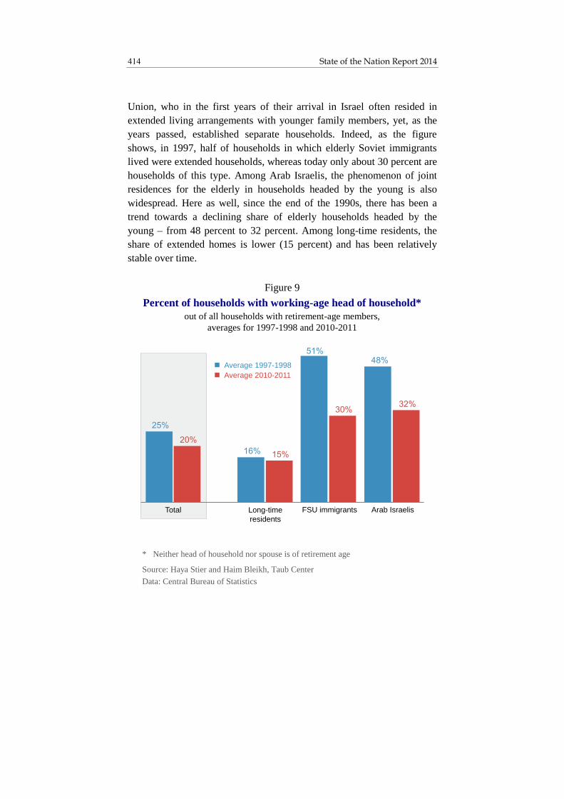
State of the Nation Report 2014 414
Union, who in the first years of their arrival in Israel often resided in
extended living arrangements with younger family members, yet, as the
years passed, established separate households. Indeed, as the figure
shows, in 1997, half of households in which elderly Soviet immigrants
lived were extended households, whereas today only about 30 percent are
households of this type. Among Arab Israelis, the phenomenon of joint
residences for the elderly in households headed by the young is also
widespread. Here as well, since the end of the 1990s, there has been a
trend towards a declining share of elderly households headed by the
young – from 48 percent to 32 percent. Among long-time residents, the
share of extended homes is lower (15 percent) and has been relatively
stable over time.
* Neither head of household nor spouse is of retirement age
Source: Haya Stier and Haim Bleikh, Taub Center
Data: Central Bureau of Statistics
Figure 9
Percent of households with working-age head of household*
out of all households with retirement-age members,
averages for 1997-1998 and 2010-2011
Long-time
residents
FSU immigrants Arab IsraelisTotal
Average 1997-1998
Average 2010-2011
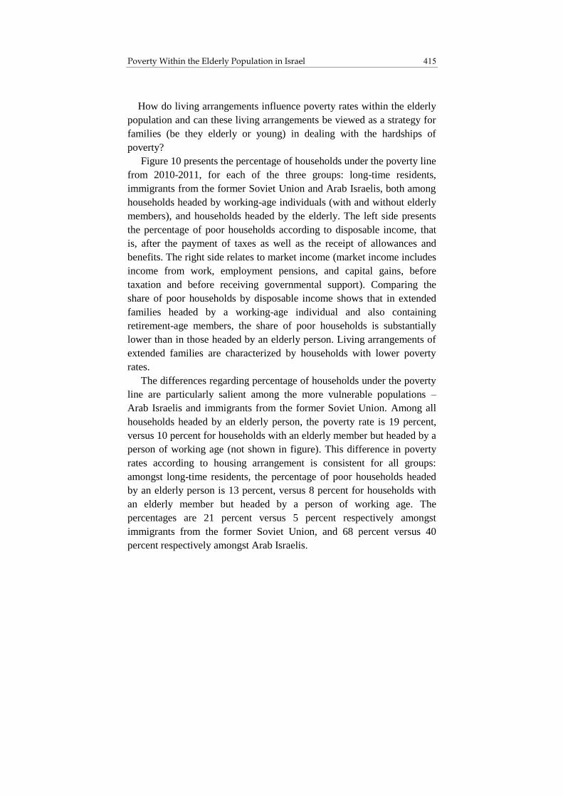
415 Poverty Within the Elderly Population in Israel
How do living arrangements influence poverty rates within the elderly
population and can these living arrangements be viewed as a strategy for
families (be they elderly or young) in dealing with the hardships of
poverty?
Figure 10 presents the percentage of households under the poverty line
from 2010-2011, for each of the three groups: long-time residents,
immigrants from the former Soviet Union and Arab Israelis, both among
households headed by working-age individuals (with and without elderly
members), and households headed by the elderly. The left side presents
the percentage of poor households according to disposable income, that
is, after the payment of taxes as well as the receipt of allowances and
benefits. The right side relates to market income (market income includes
income from work, employment pensions, and capital gains, before
taxation and before receiving governmental support). Comparing the
share of poor households by disposable income shows that in extended
families headed by a working-age individual and also containing
retirement-age members, the share of poor households is substantially
lower than in those headed by an elderly person. Living arrangements of
extended families are characterized by households with lower poverty
rates.
The differences regarding percentage of households under the poverty
line are particularly salient among the more vulnerable populations –
Arab Israelis and immigrants from the former Soviet Union. Among all
households headed by an elderly person, the poverty rate is 19 percent,
versus 10 percent for households with an elderly member but headed by a
person of working age (not shown in figure). This difference in poverty
rates according to housing arrangement is consistent for all groups:
amongst long-time residents, the percentage of poor households headed
by an elderly person is 13 percent, versus 8 percent for households with
an elderly member but headed by a person of working age. The
percentages are 21 percent versus 5 percent respectively amongst
immigrants from the former Soviet Union, and 68 percent versus 40
percent respectively amongst Arab Israelis.
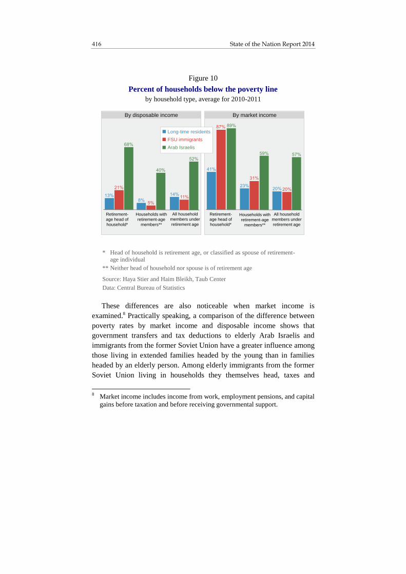
State of the Nation Report 2014 416
These differences are also noticeable when market income is
examined.8 Practically speaking, a comparison of the difference between
poverty rates by market income and disposable income shows that
government transfers and tax deductions to elderly Arab Israelis and
immigrants from the former Soviet Union have a greater influence among
those living in extended families headed by the young than in families
headed by an elderly person. Among elderly immigrants from the former
Soviet Union living in households they themselves head, taxes and
8 Market income includes income from work, employment pensions, and capital
gains before taxation and before receiving governmental support.
* Head of household is retirement age, or classified as spouse of retirement-age individual
** Neither head of household nor spouse is of retirement age
Source: Haya Stier and Haim Bleikh, Taub Center
Data: Central Bureau of Statistics
Figure 10
Percent of households below the poverty line
by household type, average for 2010-2011
By market income
All household
members under
retirement age
All household
members under
retirement age
Retirement-
age head of
household*
By disposable income
Long-time residents
Arab Israelis
FSU immigrants
Retirement-
age head of
household*
Households with
retirement-age
members**
Households with
retirement-age
members**

417 Poverty Within the Elderly Population in Israel
government allowances decrease the rate of poverty by 76 percent,
whereas amongst elderly persons who reside in households headed by
young people, the decrease is 85 percent. Among Arab Israelis, the
decrease is noticeably less in both types of families, although the trend is
similar – 23 percent and 32 percent respectively. Among long-time
residents, there is no actual difference in the decrease in poverty between
household types – 69 percent and 67 percent respectively.
An examination of income sources for both groups – households
headed by an elderly person and those headed by the young – points to
the importance of housing arrangements, especially within a population
entirely dependent on government allowances. Income sources for each
of the three elderly population groups examined are presented in Figure
11. The figure shows that the main sources of income in retirement-age
headed households are pensions and government support. A smaller
portion of income is from work or from capital gains. Figure 11 also
shows that among certain populations, retirement-age individuals living
in households they themselves head are more likely to live under the
poverty line than if they live in extended families.
Among the long-time resident Jewish population, the income from
pensions in households headed by an elderly person reaches an average of
NIS 2,309 per month per standardized person, versus NIS 1,036 in
households with elderly members headed by working-age persons. Sixty-
two percent of households headed by an elderly person have some
income from pensions, which account for an average NIS 3,984 in total
household income (see Appendix Figures 2 and 3). Only 54 percent of
extended households have pension income, which accounts for an
average NIS 2,877 in total income. In other words, those elderly who live
in extended families have relatively lower pension incomes. It can thus be
assumed that if they were to establish their own, independent households,
their standard of living would be lower still. This is especially likely
considering that the general standard of living of households headed by
an elderly person among the long-time resident population is higher than
that of households with elderly members headed by younger persons. The
average income per standardized person in households headed by an

State of the Nation Report 2014 418
elderly person is NIS 6,600 per month versus NIS 5,600 in households
that also have an elderly resident headed by a younger person. In
households headed by an elderly person, income from government
support is larger, both due to a higher percentage of both spouses
receiving an old-age benefit, and because on average, these elderly
persons have accumulated a higher level old-age benefit (for details on
eligibility for old-age benefits, see Azary-Viesel and Stier, 2014; NII,
2012). Also their income derived from capital gains is higher. By
contrast, as expected, the income from work is higher in households
headed by a working-age person.
* Head of household is retirement age, or classified as spouse of retirement-age individual
** Neither head of household nor spouse is of retirement age
Source: Haya Stier and Haim Bleikh, Taub Center
Data: Central Bureau of Statistics
Figure 11
Gross monthly household income
per standardized person, by household type,
population group and income source, 2011
All household members under retirement age
Households with retirement-age members**
Retirement-age head of household*
Long-time
residents
Arab
Israelis
Long-time
residents
Arab
Israelis
Long-time
residents
FSU
immi-
grants
Arab
Israelis
FSU
immi-
grants
FSU
immi-
grants
Income from pensionIncome from work
Income from capitalIncome from benefits
Income from pensions

419 Poverty Within the Elderly Population in Israel
The picture is somewht different for the other two population groups,
in which, a priori, their eligibility for a pension and the size of their
pensions are recognizably lower than that of long-time residents (see
Appendix Figures 2 and 3). Among immigrants from the former Soviet
Union, there is almost no difference in pension income per standardized
person between the two types of households, and even though
government support is higher amongst households headed by a
retirement-age person, their standard of living falls below that of families
headed by a person of working age, in which the main income source is
from work. Also, among the Arab Israeli population, the standard of
living for extended family households is higher than for households
headed by an elderly person. While there is higher income from pensions,
capital gains and government benefits in households headed by an elderly
person, the standard of living of such households nonetheless falls well
below that of households headed by persons of working age: an average
of NIS 2,500 per standardized person versus NIS 3,000.
Interesting differences arise when comparing households with
retirement-age individuals to households headed by individuals of
working age and with no elderly members. Among the Jewish long-time
resident population, households without retirement-age individuals enjoy
a higher income level, most of which derives from employment. Their
standard of living resembles that of elderly persons who head their own
households and is higher than that of extended households. The
difference between young and extended family households is particularly
notable regarding work income – NIS 5,743 per standardized person in
young households, versus NIS 3,062 per standardized person in extended
households. A similar picture is seen regarding nominal incomes (see
Appendix Figure 2). When examining households of immigrants from the
former Soviet Union and of Arab Israelis, it can be concluded that shared
housing affords the younger household members a higher standard of
living on average. With a relatively low addition of individuals, such
households enjoy a higher level of government support. For both
population groups, income from employment in extended households
falls below that of households in which there are no elderly individuals,

State of the Nation Report 2014 420
but the level of government support is notably higher in extended
households, and compensates for the lower level of labor income. Thus
the two types of households achieve a similar income. Among Arab
Israelis, the extended family achieves a higher standard of living than that
of the other two types of households.
It can be concluded that extended living arrangements, which are
apparently more prevalent among low-income families, make a
substantial contribution to improving the living conditions of the elderly
population in economically vulnerable groups – in this case Arab Israelis
and immigrants, groups that have not established pension rights as a
considerable income source. This is also true, when it is considered that
amongst these groups, a sizable share of households headed by the young
with elderly members are not necessarily well off. As was shown, the
income level per standardized person is lower amongst Arab Israeli and
immigrant households in each type of household than it is for Jewish
long-time residents. Moreover, it is assumed that an extended household
contributes not only to raising the living standard of elderly individuals
but that of the younger family, which benefits both from additional
pension income and government support. This residential arrangement
can be viewed a strategy for avoiding poverty for the entire family, young
and old alike.
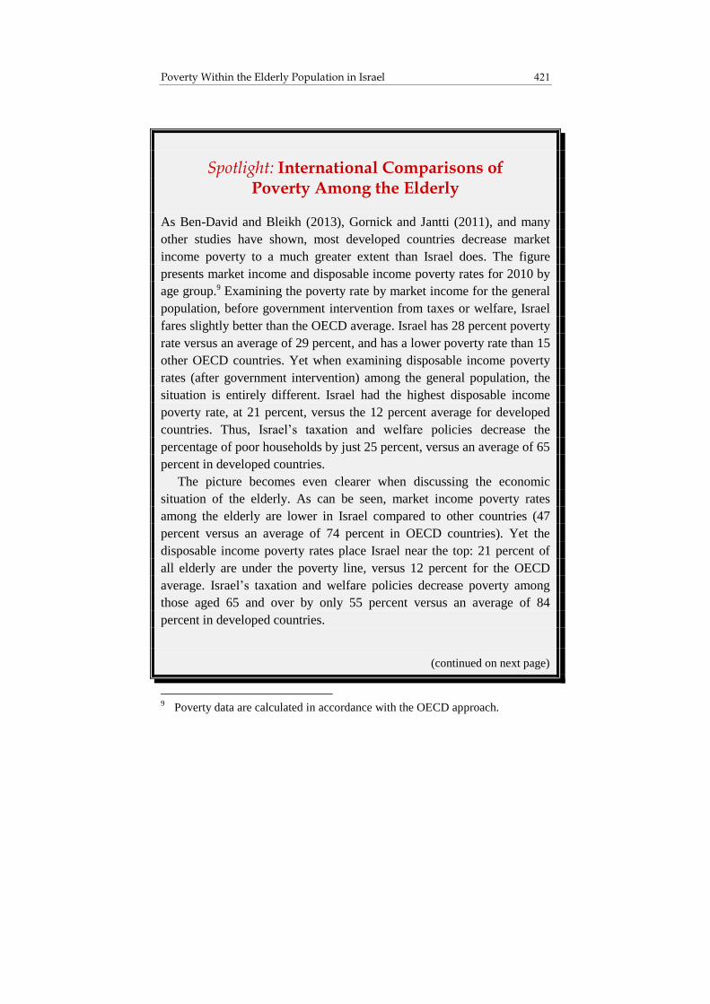
421 Poverty Within the Elderly Population in Israel
Spotlight: International Comparisons of Poverty Among the Elderly
As Ben-David and Bleikh (2013), Gornick and Jantti (2011), and many
other studies have shown, most developed countries decrease market
income poverty to a much greater extent than Israel does. The figure
presents market income and disposable income poverty rates for 2010 by
age group.9 Examining the poverty rate by market income for the general
population, before government intervention from taxes or welfare, Israel
fares slightly better than the OECD average. Israel has 28 percent poverty
rate versus an average of 29 percent, and has a lower poverty rate than 15
other OECD countries. Yet when examining disposable income poverty
rates (after government intervention) among the general population, the
situation is entirely different. Israel had the highest disposable income
poverty rate, at 21 percent, versus the 12 percent average for developed
countries. Thus, Israel’s taxation and welfare policies decrease the
percentage of poor households by just 25 percent, versus an average of 65
percent in developed countries.
The picture becomes even clearer when discussing the economic
situation of the elderly. As can be seen, market income poverty rates
among the elderly are lower in Israel compared to other countries (47
percent versus an average of 74 percent in OECD countries). Yet the
disposable income poverty rates place Israel near the top: 21 percent of
all elderly are under the poverty line, versus 12 percent for the OECD
average. Israel’s taxation and welfare policies decrease poverty among
those aged 65 and over by only 55 percent versus an average of 84
percent in developed countries.
(continued on next page)
9 Poverty data are calculated in accordance with the OECD approach.

State of the Nation Report 2014 422
(continued from previous page)
Can it be concluded that Israel’s welfare policy is inefficient even
with regards to the elderly population? The answer to this question is
complex, as the market income structure in every country must first be
considered. When dealing with the working-age population, market
income is mostly composed of income derived from work, a fact that
applies for all countries.
(continued on next page)
* OECD calculations are based on those countries which have data available
for both the elderly and general population
Source: Haya Stier and Haim Bleikh, Taub Center
Data: OECD
Figure 12
Percent of individuals under the poverty line
by age of head of household and by income type, 2010*
Out of population aged 65+Out of general population
Israel OECD average Israel OECD average
-
-
-
-
By
disposable
income
By
disposable
income
By
disposable
income
By
disposable
income
By
market
income
By
market
income
By
market
income
By
market
income

423 Poverty Within the Elderly Population in Israel
(continued from previous page)
By contrast, there is a great difference in the market income structure
of the elderly population, stemming from unique pension and allowance
arrangements in each country (Bowers, 2014).
The pension system in Israel is composed of three levels: the first is
based on NII allowances, including a universal old-age allowance, and an
income supplement to ensure a minimal level of subsistence after
retirement age. The second is composed of an employment pensions,
amassed over the course of an individual’s employment.10 The third level
depends on an individual’s own initiative and on his ability to amass
additional savings beyond the employment pension (Achdut and Spivak,
2010). In 2008, a reform was initiated in Israel requiring employers and
workers to set aside money from wages into a pension fund. Nonetheless,
most of today’s pension income derives from employment pension
arrangements that predate this reform. Unlike in Israel, most developed
countries have a pension system based largely on universal government
social insurance. Thus, the importance of employment pension plans
differs between countries, and in some, is relatively small.11 In countries
where financial support for retirement-age individuals is chiefly
communal, the share of market income out of total income for the elderly
is low. Therefore, market income poverty rates among the elderly are
considerably larger in those countries than in Israel, as shown in the
figure.
(continued on next page)
10
Budgetary pensions arrangements refer to the defined-benefit pensions paid
out of the state budget and provided to veteran state employees, such as
teachers, military, police, and local authorities. 11
In a few countries, employment pension plans have been in force over the
years, but in most cases they do not apply to the elderly but to younger people
who have not yet retired.

State of the Nation Report 2014 424
(continued from previous page)
To assess the efficiency of the governmental transfer system, the
impact of the size of the elderly population relative to the general
population, must be examined. Israel is characterized by a relatively
young population. The percent of people 65 and over within the
population is relatively lower than in other countries. According to
OECD data, people 65 and over account for about 10 percent of Israel’s
population, versus the OECD average of about 16 percent. The
composition of the population influences poverty rates for market
income. In countries where market income of the elderly is low or
negligible compared to other incomes sources (due to the country’s
pension policy), and the elderly make up a large share of the population,
market income poverty rates will be high across the general population as
well, and vice versa12.
(continued on next page)
12
This can be described by way of an equation for calculating market income
poverty rates as a weighted average of poverty rates in sub-populations – the
population of those over the age of 65 and the population of those below age
65: P1m*S1+P2m*S2=Pm.
Pm is the share of poor people by market income across the entire population:
P1m is the share of poor people by market income among those 65 and older.
S1 is the share of those 65 and older within the general population. P2m is the
share of poor people by market income among the population under age 65.
S2 is the share of those under age 65 within the general population. Thus, for
example, the contribution of the elderly population to market income poverty
rates in the OECD countries is 11.8 percent, whereas the market income
poverty rate in the general population is 29 percent:
P1m*S1=74%*16%=11.8%.
According to that same calculation, the contribution of the elderly in Israel to
poverty rates is just 4.7 percent :
P1m*S1=47%*10%=4.7%

425 Poverty Within the Elderly Population in Israel
(continued from previous page)
Considering that market income poverty rates for the general
population in Israel (28 percent) are similar to those in developed
countries (29 percent), it is easy to see that the contribution of those 65
and over to the market income poverty rate of the general population is
significantly higher in developed countries than in Israel. Regarding
market income, the difference between Israel and the developed countries
vis-à-vis the composition of poor populations helps explain the array of
considerations and constraints faced by decision makers regarding
policies for reducing poverty. Thus, for example, the developed countries
are faced with an elderly population that is consistently increasing and
that constitutes a large electoral power; a working-age population that is
decreasing in size, chiefly due to low birthrates; and a historic social
contract according to which the state has a central and important role in
funding old-age pensions by way of contributions by the employed. In
contrast, Israeli decision makers are faced with an elderly population
whose relative percentage – and perhaps relative political power as well –
is small, coupled with high poverty rates among working-age families,
particularly among large families.
This picture in Israel is entirely different from that of the developed
countries, and suggests a different approach to reducing poverty. For
example, the developed countries are committed to maintaining a similar
level of universal pensions for the current generation of the elderly, even
though this is likely to increase the ongoing financial burden on the
younger generation. This is the policy because the current elderly
population has no other income sources, nor is there any expectation that
it will join the work force. Moreover, the array of pension payments is
socially embedded and accepted as a behavioral norm. Changes involving
sharp cuts in universal pensions are liable to contribute to political
pressure and social unrest. Thus, poverty data points to a great emphasis
(continued on next page)

State of the Nation Report 2014 426
(continued from previous page)
on lowering poverty rates among those 65 and older (by 84 percent) in
developed countries. Taking into account the large share of elderly in the
general population, overall disposable income poverty rates are likewise
substantially reduced.
By contrast, the challenges regarding poverty in Israel are different in
many ways. Large families constitute a substantial portion of the poor
population. From an economic standpoint, it is harder to support large
families than smaller ones, such as elderly households.13 From this
perspective, Israel’s welfare system has a hard time greatly reducing
poverty. Therefore, the degree to which government intervention reduces
poverty among the general population is also much lower in Israel than in
developed countries.
In conclusion, the social safety net of developed countries – which for
many in Israel are a model worth emulating – are effective in reducing
the degree of market income poverty, yet they do not succeed in
addressing the fundamental demographic problems that threaten their
economic stability. The difference between Israel and these developed
countries is due to differences in the composition of the poor population
and in pension policy regarding the elderly. In light of this, it is very
likely that an international comparison of poverty indices will present a
partial or slanted picture of the gaps that actually exist.
13
There is constant tension between the size of allocations to working-age
families and the negative incentive that these allowances are liable to create
with regards to joining the labor force. Additionally, the size of the household
influences the degree of effectiveness of transfer payments in lifting the
household from below the poverty line.

427 Poverty Within the Elderly Population in Israel
5. Conclusion
This chapter surveyed the economic situation of the elderly population in
Israel with the aim of understanding to what degree that group is
successfully lifted from poverty. The chapter also examined differences
between social groups within the elderly population. From the findings, it
is evident that poverty rates within the retirement-age population are
lower than those in the general population and in the younger population
in Israel. The welfare system, particularly the system of old-age benefits
granted to all those who cease work at retirement age, operates as an
efficient mechanism for rescuing elderly people from poverty, as opposed
to other support systems granted to the younger population. This finding
shows that old-age benefits in Israel are efficient at extricating people
from poverty and at improving the standard of living of this vulnerable
population group, both because they cover the entire elderly population
and because they have been less eroded than other benefits over the years.
At the same time, despite the entitlement to old-age benefits, not all
elderly populations succeed in living above the poverty line. The main
finding of this research is the fact that income from pensions is the most
central component to improving the standard of living within the elderly
population, and in affording economic security during old age. Among
elderly persons living in households enjoying pension income, poverty
rates are extremely low. Lack of a pension largely explains the economic
vulnerability of immigrants from the former Soviet Union – many of
whom have been unable to accumulate pension savings during their time
living in Israel – and of Arab Israelis, who have worked predominantly in
workplaces that do not offer pensions. Presumably now that pension
contributions are mandatory in Israel, the economic standing of future
generations of elderly people will improve, although it must be noted that
the size of pension savings is a direct result of a worker’s wage levels and
employment history.
State of the Nation Report 2014 428
This chapter points to the great importance of living arrangements
among the elderly population, an issue often ignored when the economic
condition of this population is being examined. Thus, for example,
Israel’s official data (the data of NII, as compiled from their annual
surveys), describes to households headed by the elderly or to households
headed by working-age individuals, but does not relate to the extended
group of mixed elderly and young households. International research has
similarly found that shared residences are an effective strategy for
overcoming economic difficulties, both for younger people and for the
elderly (Phua et al., 2007; Lee, 2009; Isengard and Szydlic, 2012). This
sort of living arrangement allows elderly persons with a paucity of
income sources, especially those lacking pension income or income from
work, to improve their standard of living when they would otherwise be
exposed to poverty and economic hardship. The combination of labor
income contributed by younger people living in the household and
government support received by the elderly helps raise the standard of
living for the entire household. This strategy of extended residences is
more widespread among groups that are economically vulnerable – Arab
Israelis and immigrants from the former Soviet Union (Burr et al., 2012).
At the same time, there may well be other reasons for shared residences
beyond the economic motive, such as cultural, health or social factors. It
appears, however, that government support on its own cannot guarantee
economic security to those elderly persons who lack income from
pensions or other sources.

429 Poverty Within the Elderly Population in Israel
Appendices
Appendix Figure 1
Share of households and individuals below the poverty line
by household type, 1997-2011*
Households with retirement-age
members
Man 65+ or woman 60+ head of household
Man 65+ and/or woman 60+ in household headed by man 65+
or women 60+
Retirement-age
individuals
* Data for 2000-2001 do not include residents of East Jerusalem
Source: Haya Stier and Haim Bleikh, Taub Center
Data: Central Bureau of Statistics

State of the Nation Report 2014 430
* Head of household is retirement age, or classified as spouse of retirement-age individual
** Neither head of household nor spouse is of retirement age
Source: Haya Stier and Haim Bleikh, Taub Center
Data: Central Bureau of Statistics
Appendix Figure 2
Gross monthly household income
by household type, population group and income source, 2011
All household members
under retirement age
Households with
retirement-age members**
Retirement-age head of
household*
Long-time
residents
Arab
Israelis
Long-time
residents
Arab
Israelis
Long-time
residents
Arab
Israelis
FSU
immi-
grants
FSU
immi-
grants
FSU
immi-
grants
Income from work
Income from capital
Income from benefits
Income from pensions

431 Poverty Within the Elderly Population in Israel
* Head of household is retirement age, or classified as spouse of retirement-age individual
** Neither head of household nor spouse is of retirement age
Source: Haya Stier and Haim Bleikh, Taub Center
Data: Central Bureau of Statistics
Appendix Figure 3
Share of households with income from pensions
by household type and population group, 2011
Retirement-age
head of household*
Households with
retirement-age members**
Long-
time
residents
Arab
Israelis
Long-
time
residents
FSU
immi-
grants
Arab
Israelis
FSU
immi-
grants

State of the Nation Report 2014 432
Appendix Figure 4
A. Share of households below the poverty line
by household type, 1997-2011*
All household members under retirement age
Households –general
population
Households with retirement-age
members
B. Share of individuals below the poverty line
by age, 1997-2011*
Individuals under
retirement age
Individuals –general population
Retirement-age
individuals
* Data for 2000-2001 do not include residents of East Jerusalem
Source for both: Haya Stier and Haim Bleikh, Taub Center
Data for both: Central Bureau of Statistics

433 Poverty Within the Elderly Population in Israel
References
English
Azary-Viesel, Sagit and Haya Stier (2014), “Welfare Budgets for Israel’s
Elderly Population,” in Dan Ben-David (ed.), State of the Nation Report:
Society, Economy and Policy in Israel 2014, Taub Center for Social
Policy Studies in Israel, pp. 435-468.
Ben-David, Dan and Haim Bleikh (2013), “Poverty and Inequality Over
Time: In Israel and the OECD,” in Dan Ben-David (ed.), State of the
Nation Report: Society, Economy and Policy in Israel 2013, Taub Center
for Social Policy Studies in Israel, pp. 17-72.
Bowers, Liora (2014), Pensions, Poverty, and the Elderly in Israel, Policy
Brief, Taub Center for Social Policy Studies in Israel.
Burr, Jeffrey A., Ariela Lowenstein, Jane L. Tavares, Caitlin Coyle, Jan E.
Mutchler, Ruth Katz and Galina Khatutsky (2012), “The Living
Arrangements of Older Immigrants from the Former Soviet Union: A
Comparison of Israel and the United States,” Journal of Aging Studies,
26, pp. 401-409.
Gornick, Janet C. and Markus Jantti (2011), “Child Poverty in Comparative
Perspective: Assessing the Role of Family Structure and Parental
Education and Employment,” Luxemburg Income Study (LIS) Working
Paper Series no. 570.
Isengard, Bettina and Marc Szydlic (2012), “Living Apart (or) Together?
Coresidence of Elderly Parents and Their Adult Children in Europe,”
Research on Aging, 34, pp. 449-474.
Kangas, Oli and Joachim Palme (2000), “Does Social Policy Matter? Poverty
Cycles in OECD Countries,” International Journal of Health Services,
30, No. 2, pp. 335-352.
Kimhi, Ayal and Kyrill Shraberman (2013), “Employment and Income
Trends Among Older Israelis,” in Dan Ben-David (ed.), State of the
Nation Report: Society, Economy and Policy in Israel 2013, Taub Center
for Social Policy Studies in Israel, pp. 119-162.

State of the Nation Report 2014 434
Lee, Sunhwa (2009), “Racial and Ethnic Differences in Women’s Retirement
Security,” Journal of Women, Politics and Policy, 30, No. 2-3, pp. 141-
172.
OECD (2011), Economic Review of Israel.
OECD (2014), Poverty Rate (indicator), doi: 10.1787/0fe1315d-en.
Phua, Voon Chin, James W. McNally, and Keong-Suk Park (2007), “Poverty
among Elderly Asian Americans in the Twenty-First Century,” Journal of
Poverty, 11, No. 2, pp. 73-92.
Stier, Haya (2011), “Working and Poor,” in in Dan Ben-David (ed.), State of
the Nation Report: Society, Economy and Policy in Israel 2010, Taub
Center for Social Policy Studies in Israel, pp. 153-203.
Stier, Haya and Alisa Lewin (2013), “Material Hardship in Israel,” in Dan
Ben-David (ed.), State of the Nation Report: Society, Economy and Policy
in Israel 2013, Taub Center for Social Policy Studies in Israel, pp. 313-
333.
Wray, L. Randall (2006), Global Demographic Trends and Provisioning for
the Future, SSRN Working Paper Series.
Hebrew
Achdut, Leah and Avia Spivak (2010), The Pension System in Israel After 15
Years of Reform, Van Leer Institute Jerusalem.
Central Bureau of Statistics (2013), Statistical Abstract of Israel 2013.
National Insurance Institute (2012), Annual Survey.
National Insurance Institute (2013), Annual Survey.

435
Welfare Budgets for Israel’s Elderly Population
Sagit Azary-Viesel and Haya Stier*
Abstract
This chapter reviews the budgets allocated to the care of Israel’s elderly
population and the various allowances and services intended for them.
The review points to an increase in the allowances provided by the
National Insurance Institute and the success of these benefits in
distancing the elderly from the poverty line. Yet, the level of transfer
allowances has deteriorated over time in relation to the rise in the
standard of living in the economy. Along with the allowances, many
services are provided for the elderly, some of which serve a large portion of
the elderly population (i.e., long-term care benefits), while others, such as
assistance with housing, are intended for more specific groups. The
dispersion of budgets and services intended for the elderly among different
government ministries adversely affects the ability to follow up on the
implementation of funding, leads to wasted resources and causes
incomplete utilization of benefits by the intended beneficiaries of the
allowances and services.
Sagit Azary-Viesel, researcher, Taub Center for Social Policy Studies in
Israel; doctoral candidate in Public Policy, Tel Aviv University. Prof. Haya
Stier, Taub Center for Social Policy Studies in Israel Social Welfare Policy
Program Chair; Department of Sociology and Anthropology, Tel Aviv
University.

State of the Nation Report 2014 436
Introduction
Israel is a country characterized by a relatively young population, with
the elderly constituting about 10 percent of the overall population
(Central Bureau of Statistics, 2013). Yet, in Israel, too, this population
group is on the rise. The aging population and growing share of the
elderly in the population, typical of the Western world, has broad
implications for social policy. These processes require greater allocation
of resources for the elderly, sometimes coming at the expense of budgets
for other populations that are also in need of assistance (Brooks and
Manza, 2006). Various welfare policies in many countries are even
perceived as biased to the benefit of the elderly population, due to diverse
political and ideological reasons (Tepe and Vanhuysse, 2010). The aging
of the population thus has important implications for the manner in which
public resources are allocated and the need for long-term strategic
planning for the elderly population.
This chapter presents a survey of the overall public resources invested
by Israel in its elderly population, as well as trends over time in this
regard. There are two major goals for this study: (1) to examine the extent
of assistance provided to the elderly by the country’s support network,
with particular attention to its efficacy in maintaining the elderly above
the poverty line. In this regard, allowances from the National Insurance
Institute (NII) and changes in them over time will be reviewed; (2) to
map out the services and benefits for the elderly population provided by
government ministries. This topic raises questions regarding the manner
of budgeting, its necessity, and mainly the extent to which the benefits
and services offered are actually utilized by the target population. The
chapter concludes with an analysis of most of the public budgets
allocated to Israel’s elderly population on two levels: budgets distributed
as monetary benefits and budgets allocated as in-kind services (non-cash
social services such as community-based services). These budgets include
old-age benefits, income supplement and long-term care benefits paid by
the NII; the expenditures of government ministries, including the
Ministry of Social Affairs and Social Services, the Ministry for Pensioner

437 Welfare Budgets for Israel’s Elderly Population
Affairs, the Ministry of Construction and Housing; construction and
housing grants; and other subsidies and transfer allowances.
1. National Insurance Institute Benefits
The National Insurance Institute provides Israel’s elderly population,
upon reaching the official retirement age, with a variety of allowances
whose purpose is to ensure a basic income for those who have retired
from active employment. The old-age benefit and survivor insurance are
the major components of the social security allowances, and constitute
about 37 percent of the total allowance payments of the NII. The old-age
benefit alone constitutes about 26 percent of the total allowances paid out
by the NII, and it is expected that the share of old-age and survivor
insurance will increase as the population continues to age.
Old-Age Benefits
The old-age benefit in Israel is the most basic level of allowance at
retirement and is universally granted to each insured person. This
allowance guarantees a set monthly income at retirement age and is
determined by the age of the applicant, his employment status and
whether he was insured by the National Insurance Institute for the
required time period set by law. The law differentiates between “absolute
age,” in which the allowance is paid to every insured person regardless of
income, and “conditional age,” which is based on meeting the minimum
retirement age and is means-tested. In defining the retirement age, some
changes have been introduced since June 2004. Until June 30, 2004, the
retirement age was 65 for men and 60 for women. As of July 1, 2004, the
retirement age began increasing by annually by four-month increments,
and currently is 67 for men and 62 for women. For men, the absolute age
of eligibility for the old-age benefit, regardless of income or employment
status, has remained constant at age 70. For women, the absolute age of

State of the Nation Report 2014 438
retirement is increasing gradually, with the age ultimately set to increase
from 65 to 70 for all those born after May 1950 (NII, 2013).
Every insured person who reaches the official retirement age is thus
entitled to the basic allowance, but this entitlement is conditional upon a
means test.1 An insured person who continues to work past retirement age
and whose income is higher than the official upper limit for allowance
eligibility, or, a person with a high income from sources other than the
allowance is entitled to the old-age benefit at the absolute age. In addition
to the basic old-age benefit, payments are made for one’s spouse and
children as well as for seniority supplements to those who have received
an old-age allowance and survivor insurance for over ten years. There is
also a postponement supplement for those who postpone receiving an
allowance until they reach the absolute age for retirement, due to work or
high income. An individual who lives solely from the old-age benefit or
on a very low income is eligible under certain circumstances to receive an
additional income supplement.2 By special arrangement with the Ministry
of Finance, an old-age benefit is granted to new immigrants who came to
Israel at retirement age and were unable to accumulate insurance benefits
with the NII.3
Figure 1 shows the changes in the average old-age benefit per capita
and the average elderly income supplement per capita (without burial
allowance and without survivor insurance) over the last 30 years. That is,
1 According to the means test, an individual whose earnings from work (not
including allowance payments from his workplace) total no more than NIS
5,032 per month and no more than NIS 10,064 per month from non-
employment-based income (interest, rental income, etc.) is entitled to an
allowance at retirement age. Not included in the means test is income from
German reparation payments, differences due to indexing of loans, deposits,
or savings plans provided they are exempt from income tax. 2 The income supplement is given to an individual, yet takes into consideration
the spouse's income. For the complete criteria of entitlement see the NII
website: btl.gov.il/benefits/old_age/hashHachZ/Pages/tnaiZakautTosefet.aspx 3 An Israeli resident who is ineligible for the old-age benefit because he came to
Israel past the age of 60-62, receives a special allowance from the National
Insurance Institute, funded by the Ministry of Finance.

439 Welfare Budgets for Israel’s Elderly Population
it shows the total old-age benefits payments and the total income
supplement payments divided by the number of recipients of each type of
benefit.
In 2013, the basic old-age benefit for an individual beneficiary who
had not yet reached the age of 70 was about NIS 1,500 per month. The
basic elderly income supplement for a single eligible beneficiary totaled
about NIS 1,200 per month. As previously noted, in addition to the basic
allowance, there are supplements based on seniority, age and children.
Since the 1980s, there has been a clear upward trend in the allowance
levels. There are some notable landmarks in this regard. The start of the
21st century saw a substantial increase in the allowance levels, but this
increase later eroded following changes in economic policy and in the
allowance linkage mechanism (i.e., until 2003 allowances were linked to
the average earnings in the market; since 2003 they have been linked to
the consumer price index). According to data from the National Insurance
Institute (NII, 2007), old-age benefits were not updated between 2002
and 2004 and were even lowered in 2004. Altogether, the basic old-age
benefit lost about 10 percent of its real value between 2001 and 2004.
The elderly income supplement level was not harmed by these changes,
as can be seen from the figure.
In 2004, it was decided to gradually increase the age of entitlement for
an allowance over a six-year period – from 2004 to 2009. In accordance
with the Economic Efficiency Law (2009), it was determined that the
basic old-age and survivor insurance benefit would gradually rise by 7.3
percent by 2011. Indeed, in 2009 the old-age and survivor insurance
benefit had already increased by 3 percent, and in line with the plan, in
January 2011, the 7.3 percent increase was completed (Horev, Keidar and
Hershkovich, 2011).
Figure 1 also presents changes in the elderly income supplement,
which is paid to those retirees of limited means as an additional
supplement. Analysis of the data in real terms (Figure 1) shows that this
supplement increased substantially between 2004 and 2006 (17 percent),
whereas from 2006 to 2012, there was only a 1.8 percent increase.

State of the Nation Report 2014 440
Figure 2 presents changes in the size of the old-age allowance during
the past two decades (1995-2012), relative to the per capita income and
the average wage in the economy. Generally, from 1995 to 2008, some
stability is evident in the size of the allowance as a percent of average
earnings, except for a sharp decline in 2000. In 2009, however, there was
substantial improvement and the size of the allowance increased from 25
percent of average earnings in 2008 to 27.6 percent in 2010, and has since
remained stable at that level. In contrast, when measuring the average
allowance as a percent of per capita income for the same time period, a
reverse trend is noted from 2002 onward. Assuming that per capita
income serves as a standard-of-living index, it can be argued that the old-
age benefit does not succeed in staying consistent with the population’s
average standard of living. In this sense, the elderly population’s
Source: Sagit Azary-Viesel and Haya Stier, Taub Center
Data: National Insurance Institute
Figure 1
Old-age benefits and income supplements
for the elderly, 1980-2012
in 2012 shekels
,
,
,
Old-age benefits
(without income supplement)
Income supplements
(average for single recipient)

441 Welfare Budgets for Israel’s Elderly Population
condition has worsened since 2002, especially for those whose major
source of income is the allowance from the NII. In that year, the
allowance stood at 27.1 percent of per capita income, and by 2012, it had
declined to about 24 percent. The data clearly show that, relative to the
increase in the standard of living in the economy, the allowance has been
continually eroding.
Figure 2
Old-age benefits
as percent of per capita GDP and of the average
market wage for employees, 1995-2012
As percent of average wage for employees
As percent of per capita GDP
Source: Sagit Azary-Viesel and Haya Stier, Taub Center
Data: National Insurance Institute, Central Bureau of Statistics

State of the Nation Report 2014 442
Figure 3 presents the percent of actual recipients of the elderly income
supplement out of the population of old-age benefit recipients. The figure
reflects a downward trend – from about 45 percent in 1980 to about 23
percent in 2012 – explained by an increase in the number of the elderly
still employed along with an increase in their incomes from allowances
and other sources (Kimhi and Shraberman, 2013). At the same time, there
was a decline in the number of immigrants who received the elderly
income supplement, which is provided outside of the National Insurance
law through an agreement with the Ministry of Finance (NII, 2007). In
general, it can be concluded that the decline in the number of recipients
of the elderly income supplement was the result of changes within the
elderly population itself and did not reflect a change in eligibility
conditions.
Source: Sagit Azary-Viesel and Haya Stier, Taub Center
Data: National Insurance Institute
Figure 3
Recipients of income supplements
as percent of old-age benefit recipients, 1980-2012
20%
25%
30%
35%
40%
45%

443 Welfare Budgets for Israel’s Elderly Population
One of the goals of the old-age benefit and the elderly income
supplement is to guarantee a minimum standard of living for the
population of retirees (Cohen and Antler, 1985). Therefore, one of the
important questions is to what extent the old-age benefit in fact succeeds
in preventing poverty among its target population. Figure 4 shows the
level of old-age benefits for a single elderly person over a ten-year period
as compared to the per capita poverty line income.
The figure illustrates the degree of success of government policy in
rescuing from poverty those elderly individuals who have no income
other than the old-age benefit or the income supplement. Nevertheless,
the allowances cannot save this entire population from poverty, as is
evidenced by the fact that about 17 percent of elderly households live
under the poverty line (Stier and Bleikh, 2014). The poverty line is based
on per capita income adjusted to the size of the household. It is important
to note that some of the elderly live with their spouses or with other
family members, and the allowance itself is insufficient to fully prevent
poverty in every existing household structure. Over the years, old-age
benefits have increased, widening the gap between these benefits and the
per capita poverty line income – which confirms that the allowance has
succeeded in distancing the elderly from the poverty line. Although
extrication from poverty does not indicate the general standard of living
of the elderly, it does constitute an important dimension in the support of
the elderly. Further on, this chapter will survey additional benefits
provided for this population, including expenditures on in-kind services
that offer a solution for a variety of the elderly population’s needs.

State of the Nation Report 2014 444
Long-Term Care Benefits
Beyond the universal old-age benefit and support for those of limited
means, the NII provides additional help to the elderly who have difficulty
with daily functioning and living skills and require supervisory care. The
Long-Term Care Law, passed in 1980, was designed to provide
individual care for the elderly population within the community
framework and applies to all old-age benefit and survivor insurance
recipients, and not necessarily to those who are needy. Residents of Israel
who have reached retirement age and are dependent upon others for their
daily activities or need supervisory care are entitled to the long-term care
Figure 4
Poverty line income and old-age benefits
for the elderly, 2000-2011
monthly figures, in 2011 shekels
1 500
1 600
1 700
1 800
1 900
2 000
2 100
2 200
2000 2001 2002 2003 2004 2005 2006 2007 2008 2009 2010 2011
Old-age benefits
(including income supplements)
Poverty line income
(per standardized person)
Source: Sagit Azary-Viesel and Haya Stier, Taub Center
Data: National Insurance Institute

445 Welfare Budgets for Israel’s Elderly Population
benefits of the NII, as determined by law and according to certain
conditions and basic principles. Entitlement to this benefit is determined
through administration of a test to ascertain the level of independent
functioning on activities of daily living, carried out by a NII
representative (a nurse or physiotherapist) during a home visit (Reut
Eshel, 2014). The long-term care benefit is intended solely for the elderly
who live at home or in assisted living, and by definition, its purpose is to
provide assistance for the elderly within the community and not those
residing in institutions. The benefit is also conditional upon a means test,
and the entitlement and amount are determined by the NII. In the event
that an elderly person’s income is above the determined upper limit,
taking into consideration the spouse’s income as well, only half the
benefit is approved, or it is not granted at all.4 Moreover, entitlement to
this benefit is limited to the elderly who are not receiving special service
benefits from the NII or general assistance allowances from the Ministry
of Defense.
The total spending on long-term care benefits stands at about 0.5
percent of GDP per year, and in 2012 was estimated at NIS 4.6 billion.
Figure 5 shows the average per capita expenditure for long-term care
benefits, that is, the total expenditure of the National Insurance Institute
for long-term care benefits for all recipients from 1990-2012 (in 2012
prices) divided by the number of recipients. The figure clearly shows that
the long-term care benefit is on the rise – from NIS 1,859 per month at
the beginning of the period to NIS 2,561 in 2012.
4 For example, an individual with an income of up to NIS 9,000 receives the
full benefit, whereas one with an income between NIS 9,000 and NIS 13,600
receives half the benefit.

State of the Nation Report 2014 446
The number of those eligible for the long-term care benefit has also
increased over the years, despite the rise in the entitlement age. From
1991 to 2012, this number increased nearly five-fold – a dramatic
increase, even in relation to the rise in the size of the elderly population
during that time. The proportion of those in the over-65 population
receiving the long-term care benefit stood at 21 percent in 2012,
compared to 8.3 percent in 1991. There are several reasons for this
increase. First, there has been a significant increase in the life expectancy
of the elderly. For example, the portion of the over-65 population who
were 85 and older was 8.6 percent in 1996, whereas it had increased to
approximately 13.3 percent by 2012 (according to the data of the Central
Bureau of Statistics). Moreover, the availability of the long-term care
Source: Sagit Azary-Viesel and Haya Stier, Taub Center
Data: National Insurance Institute
Figure 5
Average expenditure on long-term care benefits for
a single elderly recipient, 1995-2012
monthly figures, in 2012 shekels

447 Welfare Budgets for Israel’s Elderly Population
benefit seems to have influenced the preference of the elderly to receive
home care and remain in the community rather than moving to
institutional care. Some changes in legislation, such as concessions in the
dependency evaluation process, have also contributed to the increase in
the number of entitled elderly persons. Since 2012, a “temporary fast
track” of the evaluation process has also been offered, with the degree of
dependency determined on the basis of medical documents. This is
intended for those who, due to a sudden medical event, become
temporarily dependent on others for a period of up to two months, and
require assistance in carrying out basic every-day functions (NII, 2012).
An additional legislative change has enabled those who have reached the
age of 90 to receive the benefit, based on the opinion of a doctor of their
choosing who specializes in geriatrics, without the dependency test
administered by the inspectors of the NII. At the same time, perhaps the
increased utilization of the entitlement is also the result of a growing
awareness among the public of its existence in recent years.
A 2008 study by the NII regarding the share of the elderly population
in Israel entitled to a public subsidy for long-term care services relative to
17 OECD countries revealed that Israel was first in its support of the
elderly population in nearly all the categories reviewed, or shared first
place with another country or countries. One possible conclusion is that
the conditions for entitlement to the long-term care benefit in Israel
enable the inclusion of a significant share of the elderly within its
framework (NII, 2012). In this regard, it is noteworthy that over the
years, due to the increase in the life expectancy, there has also been an
increase in the length of time for which individuals receive the long-term
care benefit. It is estimated that the average life span of an elderly person,
from the moment that long-term care is required, has increased two-fold
in the past two decades – from 18 months during the 1990’s to about 36
months today (Horev, Keider, and Hershkovich, 2011).
In addition to the direct subsidies offered to the elderly population in
Israel through the NII, many other services are available to the elderly,
most of which include public expenditures for “in-kind services” and are
mainly financed by various government ministries including the Ministry

State of the Nation Report 2014 448
of Social Affairs and Social Services, the Ministry of Finance, the
Ministry for Pensioner Affairs, and the Ministry of Construction and
Housing. The next section reviews the ministry budgets allocations to the
elderly population. For this purpose, several concepts should be
differentiated:
A. Net budget versus gross budget: The net budget represents the
total financial resources allocated by the government to the
ministry (the original budget), whereas the “gross budget” also
includes the “income-dependent expenditure,” that is, the total
financial resources at the ministry’s disposal – which includes
funding from national resources and funding from external bodies,
especially the local authorities and public institutions such as day
care centers and rehabilitation centers.
B. The original budget, the amended budget and the final budget:
The original budget is the basic budget (the budget prepared by the
Ministry of Finance along with all the other ministries) brought to
the Knesset for approval. In contrast, the amended budget is
dynamic and changes throughout the year in accordance with
legislation, revisions approved by the Knesset Finance Committee,
the transfer of budget surplus, and other factors. At the year’s end,
the budget includes all the modifications carried out throughout the
year. The final budget refers to funds that were actually spent.
2. The Ministry of Social Affairs and Social Services – The Service for the Elderly
The Unit of Service to the Elderly operates under the auspices of the
Division for Individual and Social Services of the Ministry of Social
Affairs and Social Services. Its purpose is to provide personal and social
services to the elderly in the community and in community centers, along
with supervision of these services.

449 Welfare Budgets for Israel’s Elderly Population
An analysis of the unit’s budget reveals several trends over the years
2005-2012 (Figure 6).
A. A decline in the original budget and the approved budget as
compared to an increase in the final budget. A significant
decline is evident in the original budget and in the approved budget
of the unit throughout the time period, as compared to a rather
consistent increase of 23 percent cumulatively in the period
between 2005 and 2012 in the final budget.
In 2012, the Ministry’s original budget was estimated at NIS 409
million, as compared to NIS 471 million in 2005. The approved
budget was estimated at NIS 454 million as opposed to NIS 519
million in 2005, whereas the final budget showed a clear upward
trend – from NIS 172 million in 2005 to NIS 211 million in 2012.
B. A gap of tens of percentage points between the original and
approved budgets and the spending in practice. There is a gap
of tens of percentage points between the basic budget (the original
budget and the approved budget) and actual spending, although an
upward trend in the final budget is clear (as discussed in paragraph
A). The budget that was actually utilized in 2012 was estimated at
46 percent of the approved budget at the disposal of the Division
for Social and Individual Services that year; in 2005, 33 percent
was utilized.
There are several possible explanations for the low level of utilization
of the budget over the years. (1) The manner of transferring funds
through the local authorities: the budget for services for the elderly is
managed by the Division for Individual and Social Services, and nearly
all of it is transferred to the local authorities. However, because the local
authorities are then required to finance 25 percent of their welfare
budgets, those local authorities that are financially weak often lack the
means to match their portion of the expenditures and, for that reason, may
not fully utilize the allocation in each of the budget items (State
Comptroller’s Report, 2001). (2) The manner of decision making and

State of the Nation Report 2014 450
budget approval: there are years in which the budget is not approved on
time, such that the fiscal year begins without an approved budget and
spending for each month is based on the previous year’s budget, which in
most cases is lower than the final approved budget. An alternative
explanation is that many changes are introduced during the course of the
fiscal year, and by year’s end, there are resources in the ministry’s budget
that can no longer be utilized and thus budget surpluses remain.
Therefore, in many cases the final budget reported at the end of the year
is lower than the original and approved budgets.
Figure 6
Ministry budget for the Service for the Elderly, 2005-2012
in 2012 million shekels, by type of budget
Original budget
Amended budget
Final budget
Source: Sagit Azary-Viesel and Haya Stier, Taub Center
Data: Budget Department, Ministry of Finance

451 Welfare Budgets for Israel’s Elderly Population
Figure 7 presents a general upward trend in actual spending (final
budget) on services for the elderly for the years 2005 to 2012, adjusted to
the size of the assisted population (that is, the budget divided by the total
number of benefit recipients). Thus, the per capita budget increased in
real prices from NIS 680 in 2005 to NIS 788 in 2012, despite the
dramatic drop in the per capita budget in the years 2010-2011. The
increase is explained mainly by a greater allocation of resources to those
services provided mostly within the community framework: day care
centers, clubs and supportive communities, some of which enjoy financial
support from the Ministry and are under its supervision. Thus, during the
past decade, a sharp upward trend was noted in the number of supportive
communities5 from 28 in 1998 to 253 in 2011; from 6,400 households
that were part of these communities at the beginning of the previous
decade to 37,097 towards the end of the decade.
Additionally, a substantial increase was noted in the number of the
elderly who attended day care centers, corresponding with the increase in
the number of new day care centers built for this population. In the early
1990s, there were 53 centers that served about 3,700 elderly people, and
by the end of 2008, the centers numbered 172 and served about 15,400
elderly people.
5 The growth of supportive communities, located in areas where there is a high
proportion of elderly, is an interesting development in the field of elderly
services over the past decade. Within the framework of the supportive
community, elderly members of the community receive a variety of services:
distress buttons, help from the community’s housefather, emergency medical
services as needed, and participation in social activities. These communities
were developed through the initiative of the Reut Eshel Organization in the
years 1995-1996 (Tyne, 2008).

State of the Nation Report 2014 452
3. Additional Services for the Elderly Provided by Government Ministries
The Prime Minister’s Office – The Bureau for Senior Citizens
The Bureau for Senior Citizens was established in 2007 to serve as
government headquarters for developing programs and services for the
elderly population. Its purpose is to lead and implement projects,
legislation and changes in the public agenda, with its main objective
being to improve the quality of life of Israel’s senior citizens. Since its
inception, this government office has worked to strengthen and promote
Figure 7
Final Ministry budget for the Service for the Elderly, 2005-2012
per person allocation, in 2012 shekels
Source: Sagit Azary-Viesel and Haya Stier, Taub Center
Data: Budget Department, Ministry of Finance

453 Welfare Budgets for Israel’s Elderly Population
the status of senior citizens through empowerment as well as through
enhancing their influence and prominence in society. The data indicate
that about 830,000 senior citizens living today in Israel enjoy the
programs developed by this office and benefit from the services it
provides.
Among the fields of activity and programs under the auspices of the
Bureau are: a national hotline for senior citizen inquiries; a government
information center for Holocaust survivors; projects for Holocaust
survivors; the “Tehila” program – completing elementary education for
adults; lecture series and continuing education courses; the government
program to fight violence towards the elderly; “The Elderly in
Movement” – activities of youth movements in cooperation with senior
citizens; students on behalf of senior citizens; a research fund; and a
prevention program addressing suicidal tendencies and suicide.
The Bureau’s final budget, as presented in Figure 8, indicates an
increase in the resources allocated to senior citizens. Yet, there are no
details of the services provided by the Bureau at the individual or
program level, nor is it possible to know how many senior citizens enjoy
each program.

State of the Nation Report 2014 454
The Ministry of Communications – Discounts on “Bezek” Phone Line Fees
The Ministry of Communications provides a discount on the fixed usage
charges of the “Bezek” phone company for recipients of both the old-age
benefit and of either the elderly income supplement or the additional
disability allowance. Eligible recipients are entitled to a 50 percent
discount on their telephone (landline) fees. Figure 9 presents the trend in
the budget that finances this discount for the years 2005-2012, showing a
clear decline in financing for this discount, from nearly NIS 400,000 in
2005 to less than a quarter of that amount today.
Figure 8
Ministry of Pensioner Affairs budget –
final budget figures, 2007-2012
in 2012 million shekels
Source: Sagit Azary-Viesel and Haya Stier, Taub Center
Data: Budget Department, Ministry of Finance

455 Welfare Budgets for Israel’s Elderly Population
The decline in the actual financing of the discount stems from the
substantial decline in the number of people receiving this benefit due to
two reasons. First, the expansion of competition within the
communications sector has served to lower the user fees for Bezek lines
by tens of percentage points, and has even led some customers to switch
to less expensive Bezek packages or to competing companies offering
lower prices, without the need for this discount. Second, there has been a
decline in the number of recipients eligible for the elderly income
supplement, from 194,000 in 2005 to 186,000 in 2012, and since this is
the population that is automatically eligible for the discount, the budget
for discounts naturally declined.6 No data is available, however, for the
6 Discounts are granted by Bezek according to lists of beneficiaries that the
company receives from the National Insurance Institute.
Source: Sagit Azary-Viesel and Haya Stier, Taub Center
Data: Budget Department, Ministry of Finance
Figure 9
Budget for discounts on landline telephone charges, 2005-2012
in 2012 thousand shekels

State of the Nation Report 2014 456
number of recipients of the old-age benefit who are also recipients of a
disability allowance and are therefore eligible for the Bezek discount.
The Ministry of Transport and Road Safety – Various Budget Line Subsidies
One of the benefits that every senior citizen is eligible to receive is a
“senior citizen card,” that provides a 50 percent discount on public
transportation. According to data from the “Or Yarok” organization (a
non-profit organizations whose name means Green Light), about 33
percent of Israel’s elderly population uses public transportation. Figure
10 illustrates the cost of this public transportation subsidy, showing a
decline in the total subsidy in real terms. In 2005, the subsidy cost was
estimated at NIS 250 million, whereas in 2012, the cost declined to about
NIS 235 million (in 2012 prices). It could be asked whether the
expenditure declined due to a decrease in the number of beneficiaries, a
change in the amount of the subsidy or for some other reason. An
examination of the data indicates that the subsidy remained constant at 50
percent for the years 2005-2012. There is no direct data regarding the
percentage of elderly who receive the subsidy on public transportation,
although it may be assumed that the level of public transportation use by
seniors would correspond to the general increase among all public
transportation users (about 3 percent annually, according to data of the
Knesset Research and Information Center). It seems, therefore, that the
decline in the total expenditure on public transportation subsidies was
apparently not the result of a drop in the subsidy or in the percentage of
users, but was the result of the reform in public transportation that
contributed to a 37-50 percent savings on operational costs, thereby
allowing for a drop in the level of subsidies required (Ida and Talit,
2014).

457 Welfare Budgets for Israel’s Elderly Population
The Ministry of Construction and Housing
Budgets for support and assistance
The Ministry of Construction and Housing also allocates part of its
budget to the elderly population. In Israel, the homeownership rate
among the elderly is quite high. In 2012, 79 percent of elderly households
owned a home, compared to an average of 76 percent in the OECD
countries (OECD, 2013). It follows then that among households headed
by the elderly, about 21 percent do not own a home and are in need of
other housing solutions: rentals in public housing, private rentals or
Figure 10
Amount of subsidies for public transportation
for elderly citizens, 2005-2012
in 2012 million shekels
Source: Sagit Azary-Viesel and Haya Stier, Taub Center
Data: Budget Department, Ministry of Finance

State of the Nation Report 2014 458
assisted living. The Housing Ministry’s assistance is aimed at both those
who purchase a home and those who rent, and development budgets are
also available for those residing in assisted living frameworks, as will be
described in further detail.
The Ministry of Construction and Housing support budgets are
divided into three major tracks:
A. Help with mortgage payments for the elderly of up to NIS 300
per month. This support went into effect in April 2010 in
accordance with several conditions.7
B. Rental payment assistance grants. This program is intended to
assist the elderly who live on the NII’s old-age benefit and income
supplement, and is part of a general rental assistance program for
Israel’s population. The elderly population constitutes about 40
percent of the recipients of this benefit, with the level of assistance
based on the individual’s age, physical condition, and place of
residence, as well as other special considerations for certain
recipients including Holocaust survivors and disabled war veterans.
Thus, for example, an elderly couple 70-74 years of age who lives
alone in a small locality outside of a national priority area is
entitled to receive about NIS 1,200 per month, compared to a
single elderly man with the same profile who is entitled to NIS
890.8
Figure 11 shows the level of the average rental assistance given
to an eligible recipient, relative to average rental costs in the
market. Since no long-term series data on the average assistance to
7 Assistance is limited to those elderly who receive the old-age benefit,
including the income supplement or the allowance for victims of Nazi
persecution, and who obtained a mortgage for residential purposes up until
November 4, 2007, with restrictions on the price of the apartment. 8 Within this program, rental assistance is also provided for elderly new
immigrants living with their families. Elderly Holocaust survivors, World War
II veterans and Chernobyl reactor neutralizers are entitled to an additional
assistance of 10 percent on top of the amounts quoted above.

459 Welfare Budgets for Israel’s Elderly Population
Source: Sagit Azary-Viesel and Haya Stier, Taub Center
Data: Ministry of Construction and Housing; Budget Department, Ministry of Finance
Figure 11
Average rent assistance
as percent of average rental price, 2005-2012
the entitled elderly population is available, average assistance was
calculated for all entitled recipients, including new immigrants and
other specific populations.9 From 2005 to 2012, it is clear that the
level of assistance decreased significantly, from 40 percent of the
average rent costs in 2005 to 25 percent of the average rent costs in
2012. The sharp decline in 2006 stems from an increase in
entitlement, which was amended in 2007. The overall decline
stems mainly from a significant increase in rent costs, at an average
of about 5 percent per year, as compared to a very moderate
increase, even at times a decline, in the rate of assistance – an
average of about 0.3 percent per year, in real terms (according to
data from the Ministry of Construction and Housing).
9 In this section, in addition to the budget data, data from the population
division of the Ministry of Construction and Housing was used.

State of the Nation Report 2014 460
Eligibility for Public Housing. Elderly individuals who do not own a
home and whose only source of income is an old-age benefit and income
supplement from the NII, or those who have exhausted their earning
capacity and have very low income, are eligible for public housing with
rent subsidies. Figure 12 shows the share of the over-65 population
residing in public housing. There is a clear general downward trend –
from 13.6 percent in 2003 to 11.4 percent in 2011 – although, during this
time period, increases have also been noted from time to time in the share
of the elderly population who reside in public housing with rent
subsidies.
Figure 12
Elderly living in public rental housing
as percent of all those aged 65 and over, 2003-2011
Source: Sagit Azary-Viesel and Haya Stier, Taub Center
Data: Central Bureau of Statistics, Household Expenditure Survey

461 Welfare Budgets for Israel’s Elderly Population
The Development Budget
Budget for housing for the elderly. The Ministry of Construction and
Housing also budgets for constructing housing units for the elderly,
operating assisted living for the elderly, and maintaining and renovating
assisted living facilities for the elderly. The development budget for
public assisted living is earmarked mainly for the elderly population with
a low income who have no other permanent housing solution. This
budget line does not include about 3 percent of all those aged 65 and
older who reside in long-term care centers, mostly nursing homes10 and
long-term care units or hospitals for the chronically ill. All of these are
financed by the Ministry of Health’s budget. Financial assistance is given
on the basis of the individual’s financial status as well as on the basis of
unique needs (Reut Eshel, 2012).
Figure 13 indicates that the development budget for assisted living
using public funds has declined, although there was some improvement in
2012 – from about NIS 106 million in 2005 to about NIS 65 million (in
2012 prices).
In this section, no adjustment was made for the number of elderly
recipients supported by the budgetary clause under discussion since the
data refer to the elderly in all assisted living frameworks – both private
and public.11 Due to a lack of detailed data, it is problematic to analyze
public policies for the elderly population in Israel, and the need to collect
data from all assisted living facilities must be emphasized.
10
Nursing homes operate under the auspices of the Ministry of Welfare or the
Ministry of Health, and offer services targeted at elderly individuals that need
assistance in managing their daily lives. 11
About 4.3 percent of those 65 years old and older reside in assisted living
facilities, both public and private. Nearly half of them (48 percent) are
subsidized. There has been an increase in the number of elderly living in
assisted living facilities – from 21,315 in 2004 to 23,043 in 2012 (Central
Bureau of Statistics, 2011).

State of the Nation Report 2014 462
Additional General Benefits
In addition to the defined budgets presented in this chapter, the elderly
are also entitled to discounts on municipal taxes, electricity bills, water
bills from the Water Authority, and medications, and they are exempt
from the requirement to obtain a public television license.12 No data were
found detailing the total amount of these entitlements and their total cost
to the various ministries. In an attempt to estimate the benefits package to
12
These discounts are intended for the elderly who receive the old-age benefit
along with the income supplement or disability allowance, although some
elderly people receiving the old-age allowance alone are entitled to a partial
discount on municipal taxes.
Figure 13
Government budget for elderly assisted
living housing, 2005-2012
in 2012 million shekels
Source: Sagit Azary-Viesel and Haya Stier, Taub Center
Data: Budget Department, Ministry of Finance

463 Welfare Budgets for Israel’s Elderly Population
which the elderly are entitled, an evaluation was undertaken, which
included the old-age benefit, elderly income supplement, long-term care
benefit, municipal tax discount, discounts on electricity and water
payments, exemption from the television license, discounts from Bezek,
discounts on public transportation, and rental assistance for those eligible.
The benefits package was calculated in order to clarify the extent of
government support, as shown in Table 1. Calculations are based on the
comparison between three different elderly populations, based on their
socioeconomic characteristics: (1) the over-75 population who are not
dependent at all on government assistance, who have income from a
pension and own a home, and are not in need of long-term care benefits;
(2) the over-75 population who own a home, do not have income from a
pension and are not in need of long-term care benefits; and (3) the over-
75 population who are fully dependent on government assistance, have no
income from a pension, do not own a home and are eligible for long-term
care benefits.
The table shows a substantial gap between the independent elderly
person who is not dependent on NII allowances and the elderly person
who is fully dependent upon the system. For example, a single elderly
person, 75 years or older, who lives alone, owns a home and receives
income from a pension, will receive a benefits package with an average
value of NIS 2,454 a month. In contrast, a single elderly person in the
same age bracket who owns a home and has no income from a pension or
other sources will receive a benefits package with an average value of
NIS 3,324. A single elderly person in the same age bracket who is in need
of full support from the government – who has disabilities and is eligible
for long-term care benefits, who has no income from a pension or other
sources and who does not own a home – will receive a benefits package
with an average value of NIS 6,908.

State of the Nation Report 2014 464
Table 1. Monthly basket of benefits to the elderly divided into three
socioeconomic groups, for those aged 75 and over living alone
(in shekels)
Independent,
apartment owner,
with pension
Independent,
apartment owner,
without pension
or other income
source
Non-apartment
owner, no
pension, in need
of long-term-care
benefit
Old-age benefits* (including
seniority supplement)
2,296 2,887 2,887
Income supplement Included in old-
age benefits
Included in old-
age benefits
Long-term care 2,561
Municipal tax discount
(monthly calculation)**
74 88-294*** 206
Electricity discount 120 120
Water discount 19
Television license exemption 30 30 30
Telephone landline discount 30 30
Public transportation
discount
55 55 55
Rent assistance 1,000****
Total 2,454 3,324 6,908
4. Summary and Conclusions
This chapter reviewed the budgets allocated to care for Israel’s elderly
population, the allowances paid to them and the services provided to
assist them.
* Includes an additional of 50 percent for the maximum seniority level, on the assumption that the elderly
individual was insured for at least 35 years. ** Based on the average municipal tax payment per
elderly person, according to the Central Bureau of Statistics Household Expenditure Survey. *** Dependent on the local authority and the amount of discount. **** Large residential area.
Source: Sagit Azary-Viesel and Haya Stier, Taub Center
Data: Kol Zchut website; various government ministry websites; Central Bureau of Statistics, Household
Expenditure Survey 2012

465 Welfare Budgets for Israel’s Elderly Population
The review indicates a policy of increasing the allowances received by
Israel’s elderly population from the National Insurance Institute. For
example, in 2005, an elderly person subsisting on NII allowances – the
old-age benefit, elderly income supplement and long-term care benefit –
received allowances and services equivalent to an average of NIS 5,015
per month as compared to NIS 5,677 per month in 2012 (in 2012 prices).
This policy has resulted in successfully raising the elderly living on
government allowances above the poverty line (Stier and Bleikh, 2014).
The rate of poverty among the elderly population has declined over time,
and it is safe to assume that, to some extent, this can be explained by the
improvement in the allowances and budgets allocated to them.
The poverty and inequality indices relate to the income variable only,
and so are not adjusted for the level of services provided to Israel’s
elderly. However, an increase in the total budget allocated to the elderly
population is noted – from about NIS 19.8 billion in 2005 to about NIS
25.9 billion in 2012 (in 2012 prices). A more detailed examination of the
assistance provided through various programs indicates a measure of
budgetary erosion in some, as in housing, for example. The amount of
rental assistance for the eligible elderly population has deteriorated
relative to the average rent costs in the economy. Additionally, budgets
for assisted living have declined with time, even though the population is
increasingly growing older and this is the group for which this assistance
is intended. Therefore, thought should be given to housing arrangements
and the changing needs of this population group. Housing support is of
major importance in old age even though it does not guarantee the
continued ability of an elderly individual to live at home, or cope with
changes resulting from disability and the resulting need for assistance or
care, and cannot prevent the need to perhaps even move to an assisted
living facility or institution.
An additional issue that the analysis reveals is the lack of data on the
number of the elderly entitled to assistance, especially with regards to
housing. This raises difficulties in the attempt to conduct an analysis of
policies in this area.

State of the Nation Report 2014 466
An analysis of the budgets for assisting Israel’s elderly population
raises some important points. First of all, services are provided under the
auspices of several ministries. This situation is not unique to Israel; in
Australia, for example, all the services for the elderly population are
provided via a large number of government programs on a federal,
national and regional scale. In contrast, in Ireland, a complete benefits
package is provided, contingent upon a means test for those aged 65-69
and available to all those aged 70 and over (OECD, 2013). The diffusion
among the ministries in Israel makes it difficult to carry out any follow-
up, especially on a long-term basis, of the services provided to various
population groups. This situation may hamper the complete utilization
and maximization of these benefits among the relevant populations.
Therefore, it is important to unite all the services under the umbrella of
one ministry that will be responsible for budget allocations for the various
activities, for informing the eligible public and for increasing the target
population’s ability to maximize its use of entitlements. The dispersion of
budgets on the one hand and the various methods of assistance on the
other hand leads to duplication and waste of resources, especially with
regards to eligibility assessments. It makes the process of receiving
assistance difficult and can lead to a lack of information and to confusion,
resulting in diminished use of the elderly population’s entitlements.
Except for the budgets of the National Insurance Institute, there is a
clear under-performance in budget expenditure for elderly services. This
is partially due to diminished use of services that are less relevant today,
such as discounts for phone services, and partially due to bureaucratic
issues that should be addressed within the various ministries. Implications
on the level of services provided for the elderly population and the
manner in which budgets are managed should be studied. There is also
the need for renewed thinking about the needs of the elderly population
and ways of reaching those who have difficulty in maximizing their
entitlements. The issues of services and benefits carry implications of
great importance, as their erosion or lack of use mainly harm the poor,
who are more dependent than others on the benefits to which they are
entitled.

467 Welfare Budgets for Israel’s Elderly Population
References
English
Andrews, Dan and Aida Caldera Sánchez (2011), “The Evolution of
Homeownership Rates in Selected OECD Countries: Demographic and
Public Policy Influences,” Economic Studies, 2011/1, OECD Journal.
Brooks, Clem and Jeff Manza (2006), “Social Policy Responsiveness in
Developed Democracies,” American Sociological Review, 71, No. 3, pp.
474-494.
Gal, John (2010), “Personal Social Services,” in Dan Ben-David (ed.), State
of the Nation Report: Society, Economy and Policy in Israel 2009, Taub
Center for Social Policy Studies in Israel, pp. 311-334.
OECD (2013), Pensions at a Glance 2013, OECD Publications.
Stier, Haya and Haim Bleikh (2014), “Poverty Among the Elderly Population
of Israel,” in Dan Ben-David (ed.), State of the Nation Report: Society,
Economy and Policy in Israel 2014, Taub Center for Social Policy
Studies in Israel, pp. 393-434.
Tepe, Markus and Pieter Vanhuysse (2010), “Elderly Bias, New Social Risks
and Social Spending: Change and Timing in Eight Programs Across Four
Worlds of Welfare, 1980–2003,” Journal of European Social Policy, 20,
No. 217, pp. 217-234.
Hebrew
Central Bureau of Statistics, Expenditure Survey, various years.
Central Bureau of Statistics (2013), Statistical Abstract of Israel 2012.
Central Bureau of Statistics, Statistical Abstract of Israel, various years.
Cohen, Shlomo and Yacob Antler (1985), “The Pension System in Israel,”
Social Security, 27, pp. 5-33.
Horev, Tuvia, Nir Keidar, and Idan Hershkovich (2011), Public Insurance
for Nursing Care – A Draft for Reform, Ministry of Health.

State of the Nation Report 2014 468
Ida, Yoram and Gal Talit (2014), “Regulation of public transport services in
Israel,” Van Leer Institute, Jerusalem.
Ministry of Finance, Budget Department, State Budget Implementation
Reports, 2005-2012.
National Insurance Institute (2007), Annual Survey 2006.
National Insurance Institute (2012), Annual Survey 2012.
Reut Eshel (2014), The Association for Planning and Development of
Services for the Aged, website.
Tyne, Shalom (2004), Supportive Communities – Growing Old in the
Community in Israel, Reut Eshel, The Association for Planning and
Development of Services for the Aged.

469
Patterns of Expenditure on Food in Israel
Dov Chernichovsky and Eitan Regev*
Abstract
The issue of food insecurity is at the top of the public agenda in Israel.
This chapter attempts to define the normative per capita expenditure on
food in Israel; the normative expenditure refers to one that is neither
insufficient nor excessive. It also examines the composition of food
expenditure by income levels in order to assess the possible consequences
of that composition on nutrition. In this manner, the chapter aims to help
formulate policies that could alleviate the distress of households that are
unable to meet the normative expenditure. The findings indicate that the
normative per capita expenditure on food in Israel – not including the
costs of “dining out” and alcoholic beverages – is about NIS 600 monthly.
Families in the lowest decile need an additional NIS 170 per capita per
month to reach this amount, while families in the second lowest decile
need about NIS 90 to reach it. Likewise, differences were found in the
various foods that were avoided when necessary. As per person income
declines, households tend to maintain their expenditures on meat and
poultry, bread and baked goods, and vegetable oils at a relatively stable
level, but tend to forgo eggs, milk and dairy products, and especially fruit
and vegetables, even though they constitute the basis for a healthy
Mediterranean diet.
Prof. Dov Chernichovsky, Chair, Taub Center for Social Policy Studies in
Israel Health Policy Program; Chair, National Council for Food Security;
Department of Health Systems Management, Ben-Gurion University of the
Negev. Eitan Regev, researcher, Taub Center for Social Policy Studies in
Israel; doctoral candidate, Department of Economics, The Hebrew University.

State of the Nation Report 2014 470
Introduction
The issue of food insecurity has been greatly discussed in Israel, both in
the context of poverty and on its own. According to statistics from the
National Insurance Institute, about 320,000 households in Israel – nearly
a million people – suffer from food insecurity (Endeweld et al., 2012).
The National Council for Food Security estimates that, based on objective
eligibility tests, about 110,000 households are eligible for support in
purchasing food (National Council for Food Security, 2014). The recently
published State Comptroller’s Report (2014) also refers to the state’s
responsibility in this area.
This chapter attempts to examine the subject using data from the 2011
Household Expenditure Survey conducted by the Central Bureau of
Statistics (CBS), and thus to help formulate a policy for alleviating this
type of distress by defining the minimum normative per capita
expenditure on food in Israel. From the perspective of the entire
consumer public, this expenditure should be sufficient but not include
luxury foods.1 Once a normative level has been defined, it is easier to
examine the extent and characteristics of food insecurity in Israel in terms
of expenditure, and to contend with it using appropriate tools related to
guaranteed income and food prices.
1. Data on Food Expenditure in Israel
The average monthly per capita expenditure on food in Israel is about
NIS 800 and the average monthly household expenditure is NIS 2,260.
This sum amounts to 17.1 percent of total net household income, and to
21.4 percent of overall household expenditure.2 In the distribution among
1 A definition from a subjective viewpoint lies at the basis of defining relative
poverty – in contrast to absolute poverty, which is determined by income level
(Chernichovsky and Navon, 2012). This also applies to food insecurity. 2 Net cash income and expenditures (not including in-kind income and
expenditure for homeownership).

471 Patterns of Expenditure on Food in Israel
food groups, expenditure on fruit and vegetables is the highest at 18
percent of total food expenditures. It is followed by the expenditure on
dining out (17 percent), meat and poultry (15 percent), eggs, milk and
dairy products (14 percent), and bread, grains and baked goods (13
percent) (Figure 1).
Source: Dov Chernichovsky and Eitan Regev, Taub Center
Data: Central Bureau of Statistics, Household Expenditure Survey 2011
Figure 1
Monthly per person food expenditure by food group
in shekels and as a percent of all household expenditure on food, 2011
Alcohol Oil/fats Sugar/ sweets
Fish Beverages Other Dining out
Dairy/ eggs
Bread/ grains
Meat/ poultry
Fruit/ vegetables
16 17
27 29 29
60
106112
118
134
147
(2.1%) (2.2%)
(3.4%) (3.6%) (3.7%)
(7.6%)
(13.3%)(14.1%)
14.8%)
(16.8%)
(18.4%)
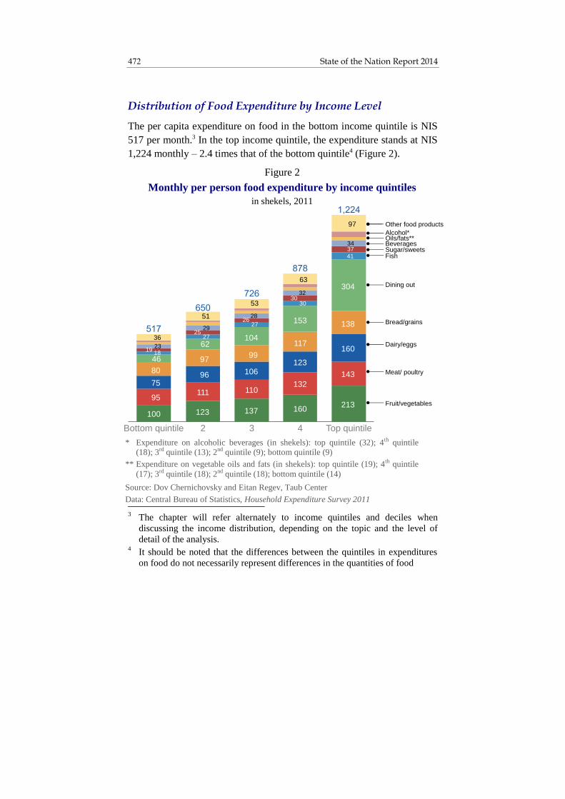
State of the Nation Report 2014 472
* Expenditure on alcoholic beverages (in shekels): top quintile (32); 4th quintile (18); 3rd quintile (13); 2nd quintile (9); bottom quintile (9)
** Expenditure on vegetable oils and fats (in shekels): top quintile (19); 4th quintile
(17); 3rd quintile (18); 2nd quintile (18); bottom quintile (14)
Source: Dov Chernichovsky and Eitan Regev, Taub Center
Data: Central Bureau of Statistics, Household Expenditure Survey 2011
Figure 2
Monthly per person food expenditure by income quintiles
in shekels, 2011
Bottom quintile 2 3 4 Top quintile
Bread/grains
Fruit/vegetables
Meat/ poultry
Dairy/eggs
Dining out
Sugar/sweetsBeveragesOils/fats**Alcohol*
Other food products
Fish
100 123 137 160213
95111 110
132
14375
96 106123
160
80
9799
117
138
46
62104
153
304
18
27
27
19
25
26
30
37
23
29
28
32
34
36
51
53
63
97
30
41
Distribution of Food Expenditure by Income Level
The per capita expenditure on food in the bottom income quintile is NIS
517 per month.3 In the top income quintile, the expenditure stands at NIS
1,224 monthly – 2.4 times that of the bottom quintile4 (Figure 2).
3 The chapter will refer alternately to income quintiles and deciles when
discussing the income distribution, depending on the topic and the level of
detail of the analysis. 4 It should be noted that the differences between the quintiles in expenditures
on food do not necessarily represent differences in the quantities of food

473 Patterns of Expenditure on Food in Israel
As expected, in the lower income quintiles, the expenditure on food
constitutes a larger part of both income and expenditures. Households in
the bottom quintile spend about 36.4 percent of their income on food –
3.5 times more than households in the top quintile, which spend only
about 11.2 percent of their income on food (Figure 3).
consumed; they are also dependent on food prices, including different kinds of
foods in the same group (e.g., various types of bread). Nonetheless, it is
assumed that there is a certain correspondence between the amount of the
expenditure and the quantities of food purchased, especially when the
different quintiles’ expenditures in each of the food groups are compared. 5 These terms are equivalent to elasticity in economics. For details of the
measurement method, see the appendix.
* Net cash income and expenditures (not including income from in-kind services)
Source for both figures: Dov Chernichovsky and Eitan Regev, Taub Center
Data for both figures: Central Bureau of Statistics, Household Expenditure Survey 2011
Figure 3
Food expenditure as percent of income and expenditures*
by household, by income quintiles, 2011
21.4%
26.9%
23.4%
21.2%20.1%
18.7%17.1%
36.4%
25.1%
18.1%
15.5%
11.2%
Total Bottom
quintile
2 3 4 Top
quintile
As percent of expenditure
As percent of income
Income quintiles

State of the Nation Report 2014 474
The distribution of expenditure by food groups reveals that
households in the top quintile tend to spend relatively large sums on
dining out, whereas in the lower quintiles (1-3), this expenditure is
relatively small. The top quintile’s expenditure on food products such as
fruit and vegetables, eggs and dairy products, bread, grains and baked
goods are also high relative to that of the bottom quintile – differences in
expenditure of 113, 113, and 73 percent, respectively.
“Essential Expenditure” on Food
Expenditure on food varies greatly and includes the purchase of staples,
as well as expenditure on what can be considered luxuries, such as dining
out in restaurants or buying food products that might be considered
extravagant. In order to assess the necessity of the expenditure by food
items from the perspective of the average household in Israel, the effect
of household income and size on both the total food expenditure and the
expenditure on various food groups was examined. That is, the extent to
which expenditure on various food groups changes due to changes in the
income or size of the household was examined.5 Expenditure items that
change relatively little when there is a change in income, but change a
great deal when there is a change in the number of household members
were defined as essential expenditure items. This approach assumes that
if despite a drop in income of a household of a given size, the household
nonetheless does not reduce its expenditure on a certain food group, then
it perceives the expenditure on this food group as an essential
expenditure. Likewise, if a household grows in size and the expenditure
also increases (i.e., the increase in the number of household members
does not significantly reduce the per capita expenditure on a certain food
group), that food group is considered an essential expenditure.6
5 These terms are equivalent to elasticity in economics. For details of the
measurement method, see the appendix. 6 Obviously a household may change the composition of the expenditure to
cheaper products, almost certainly within the same food group.

475 Patterns of Expenditure on Food in Israel
In accordance with these assumptions, a summary measure of the two
effects – the effect of income and the effect of household size – was
defined for the purchase of food in general, and for the various food
groups in particular. The measure presents the relative necessity of an
expenditure as the ratio between the extent to which it is affected by
household size and the extent to which it is affected by income level.7 A
higher score on the measure attests to a greater effect of household size
relative to a smaller effect of income – that is, it represents a more
essential expenditure.
Table 1 presents the effects of household income and family size on
various expenditure items, as well as the Essential Expenditure Measure.8
The calculation was done for a 10 percent change in the average
household income (NIS 13,136) and average household size (3.2
members). Full details of the methodology are presented in the appendix
to this chapter. As can be seen, an increase of 10 percent in income
prompts an increase of 4.6 percent in food expenditure.
With regard to the various food groups, the effect of income on
expenditure on meat, poultry and fish seems to be relatively small.
Similarly, the expenditure on cooking oils is affected only slightly by
income level. In contrast, the relatively large effect of income on the
expenditure on fruit and vegetables, as well as on milk, dairy products
and eggs is noteworthy.
7 For more on this, see Chernichovsky (in preparation).
8 The full estimates on which these data are based are presented in detail in
Chernichovsky and Regev (in preparation).

State of the Nation Report 2014 476
* Percent change in expenditure for a 10 percent change in income or household size
** Effect of household size divided by effect of income
Source: Dov Chernichovsky and Eitan Regev, Taub Center
Data: Central Bureau of Statistics, Household Expenditure Survey 2011
Table 1. Effects of household income and size on food expenditure and
Essential Expenditure Measure by food group
Food group
Effect of
household
income*
Effect of
household size*
Essential
Expenditure
Measure**
Total food expenditure 4.6% 4.1% 0.89
Meat/poultry 1.6% 5.2% 3.06
Bread/baked goods 2.6% 7.1% 2.72
Vegetable oils 1.0% 2.2% 2.24
Beverages 1.6% 3.5% 2.24
Milk, dairy and eggs 3.0% 5.7% 1.85
Fish 1.7% 2.8% 1.56
Fruit/vegetables 3.3% 4.9% 1.45
Sugar/sweets 2.7% 3.2% 1.17
Other food products 3.2% 3.1% 0.95
Dining out 9.0% -4.3% ‒
Alcohol 3.5% -2.1% ‒
At the same time, the elasticity of the total expenditure on food
relative to the number of household members is 0.41. That is, on average,
an increase of 10 percent in the number of household members leads to
an increase of 4.1 percent in total household food expenditure. The
explanation for this lies in the advantage of size and in the change in the
components of the food basket for larger families. For example, the
expenditure on bread and baked goods is affected to a relatively large
extent by family size (an average increase of 7.2 percent in expenditure
with an increase of 10 percent in household size), as is the expenditure on
meat and poultry (5.0 percent), and dairy products and eggs (5.6 percent).
In contrast, the expenditure on dining out is negatively and significantly

477 Patterns of Expenditure on Food in Israel
affected by family size (-4.3 percent). In other words, when all other
household characteristics are the same, as household size increases,
expenditure on bread and dairy products rises while expenditure on
dining out declines.
The leading expenditure items on the Essential Expenditure Measure
are meat and poultry, bread and baked goods, cooking oils, and
beverages; alcoholic beverages and dining out are ranked at the bottom of
the list. The expenditure items ranked in the middle are milk and dairy
products, fish, and fruit and vegetables. The significance of these findings
is that as per capita income declines, there is a greater tendency to forgo
milk and dairy products, fish, and fruit and vegetables. In contrast,
spending on meat and poultry, bread and baked goods, cooking oils, and
beverages9 remains relatively stable.
The tendency for poorer households to forego dairy products and fish
appears to stem from the substantial price rises in these food categories
over the past few years (Figure 4). In 2005, most food products in Israel
were less expensive relative to the OECD, however in just six years, all
food categories in Israel, except for fruit and vegetables, have become
more expensive. Dairy products were only 6 percent more expensive in
2005, yet in 2011, they reached a price level 51 percent higher than the
OECD average. Fish were 30 percent cheaper in 2005, but in 2011 they
were 25 percent more expensive than the OECD average. As noted, fruit
and vegetables remained less expensive relative to the OECD, however,
in 2005, they were considerably cheaper (40 percent) while in 2011, they
were only 15 percent cheaper. While the price of most vegetables sold in
Israel is relatively low, the price of many fruits is not cheap, especially
those that are on the one hand expensive to grow in Israel and on the
other hand not imported from other countries. This is appears to be the
reason that the expenditure on fruit and vegetables in Israel is especially
sensitive to income level – poorer families buy mainly cheaper
9 Although beverages are not an essential food group from a nutritional aspect,
it would appear that Israeli households consider them a subjectively important
item, as expenditure on beverages remains rather stable among lower-income
households, as well.

State of the Nation Report 2014 478
vegetables, while more well-off families also buy expensive fruits. From
a broader perspective, it is apparent that the substantial rise in food prices
over the past few years in Israel has also had a negative effect on the
composition of food consumption – especially among poorer families.
Figure 4
Differences in food prices between Israel and the OECD average*
2005 and 2011
33%
-15%
19%21%
25% 26%28%
40%
51%56%
-40%
-16%
-8%
-30%
-19%
-8%
-1% -3%
6%10%
20112005
Total food
and
beveragesFruit/
vegetables
Meat/
poultry Fish
Bread/
grains Other**
Alcoholic
drinks
Oils/
fats
Dairy/
eggs Beverages
* The difference between prices in Israel and the average OECD price
** Other foods: instant food mixes, prepared meals (frozen or dried), granola, baking
aids, baby food, deliveries of prepared food, chewing gum, milk and soy desserts,
dried beans and legumes, coffee and tea, sauces, spices, meat and cheese substitutes
Source: Dov Chernichovsky and Eitan Regev, Taub Center
Data: OECD

479 Patterns of Expenditure on Food in Israel
Normative Expenditure
In order to determine the normative expenditure on items with a positive
value on the Essential Expenditure Measure, the average monthly
expenditure (in 2011) in each food group was examined by income
deciles (Figures 5A-5D). The purpose was to ascertain in which income
ranges the per capita expenditure remains relatively fixed even when per
capita income changes.10 The assumption is that expenditure will remain
fixed in those income ranges where the household income is high enough
to purchase all the food that the household requires, but not high enough
to purchase food that would be defined as a luxury in terms of quality and
quantity. The logic behind this assumption is that if household income is
insufficient to buy all the food that the household requires, a rise in
income may be expected to prompt an increase in expenditure on food.
Similarly, if household income is high enough to purchase luxury food, a
rise in income may also be expected to prompt an increase in expenditure.
However, when the expenditure on food does not change within a certain
income range, it is reasonable to assume that the income of households in
this range is high enough to purchase all the food that they require, but
not high enough to purchase luxury food. In other words, the expenditure
that remains fixed within a broad enough income range represents the
normative, or broadly accepted, essential expenditure. In the absence of
sufficient data on quantities, prices and quality of food products
consumed by households, there is no way to directly determine which
part of the population forgoes a certain food (or compromises on its
quality) and to what extent. Nonetheless, finding the income range in
which the expenditure on a certain food is relatively stable makes it
possible to determine with high probability that the households located
below this range are forced to make certain concessions in food
consumption (in quantity, quality, or both). Furthermore, this approach
makes it possible to calculate the monetary value of these concessions.
10
The examination is done by income deciles rather than quintiles, in order to
get a more detailed picture of the expenditure patterns according to income.

State of the Nation Report 2014 480
In Figures 5A-5D, the normative expenditure range is indicated in green,
the food insecurity range in red, and the luxury range in blue.
Starting with a comprehensive view on total food spending, the
average monthly per capita expenditure stabilizes at around NIS 662
(Figure 5A).11 As the figure shows, the second decile’s expenditure on
food is lower by NIS 99 per month than the normative expenditure, while
the lowest decile spends NIS 192 less than the normative expenditure on
food. When unnecessary items (i.e., dining out and alcoholic beverages)
are eliminated from the analysis, the gaps are NIS 90 and NIS 169,
respectively, as detailed in Table 2.
Normative expenditures for specific food groups were also determined
using this same method (Table 2). The food items for which the
normative expenditures were the highest (in absolute amounts) were fruit
and vegetables – NIS 137; meat and poultry – NIS 110; and milk, dairy
products and eggs – NIS 101.
In the meat and poultry category, the second decile appears to spend a
sum close to the normative expenditure, while the lowest decile lacks NIS
27 per capita per month for this item – which accounts for 25 percent of
the normative expenditure (Figure 5B). In contrast, it is evident that the
lowest two deciles, which are below the poverty line, make a relatively
significant concession in their expenditures on dairy products and eggs;
the average expenditure of households in the second decile on food items
in this group is NIS 22 lower than the normative expenditure (a
concession of 22 percent), while the lowest decile’s expenditure is NIS
29 lower (a concession of 29 percent). An even more significant
concession is evident in the category of fruit and vegetables, where the
second decile lacked NIS 25 (a concession of 18 percent) to match the
normative expenditure, and the lowest decile lacked NIS 48 (35 percent
of the normative expenditure) (Figures 5C and 5D). Thus, with respect to
11
Stabilization of food expenditure is defined as occurring when the differences
in expenditure between adjacent deciles are minimal.

481 Patterns of Expenditure on Food in Israel
these food groups, a picture emerges of insufficiency within the lowest
two deciles and relative stability from the third decile upwards.12
12
It is important to note that regarding certain food items, expenditure stabilizes
only in the fourth decile (e.g., milk and dairy products), whereas regarding
other food groups, expenditure stabilizes by the second decile (e.g., meat and
poultry). As noted, stabilization of expenditure for a certain food category in
the second or third deciles indicates that – from the households’ perspective –
this food group is essential, or one that is hard to go without.
* The normative expenditure range is defined as the lowest group of income
deciles with minimal differences in food expenditures.
Source: Dov Chernichovsky and Eitan Regev, Taub Center
Data: Central Bureau of Statistics, Household Expenditure Survey 2011
Figure 5 (continued on next pages)
A. Average monthly per person expenditure on food
by income deciles, in shekels, 2011
470
563639 658 688
758829
920
1,011
1 427
Bottom
decile
2 3 4 5 6 7 8 9 Top
decile
Luxury expenditure range
Food insecurity range
Normative expenditure range*
Income deciles

State of the Nation Report 2014 482
Figure 5 (continued from previous page)
B. Average monthly per person expenditure on meat and poultry
by income deciles, in shekels, 2011
83
103108
113
127
136 133
152
Bottom
decile
2 3 4 5 6 7 8 9 Top
decile
108
118
Income deciles
Luxury expenditure range
Food insecurity range
Normative expenditure range*
* The normative expenditure range is defined as the lowest group of income
deciles with minimal differences in food expenditures.
Source for both: Dov Chernichovsky and Eitan Regev, Taub Center
Data for both: Central Bureau of Statistics, Household Expenditure Survey 2011
C. Average monthly per person expenditure on
dairy products and eggs
by income deciles, in shekels, 2011
7279
91101 102
111120
127136
184
Bottom
decile
2 3 4 5 6 7 8 9 Top
decileIncome deciles
Luxury expenditure range
Food insecurity range
Normative expenditure range*

483 Patterns of Expenditure on Food in Israel
* The normative expenditure range is defined as the lowest group of income
deciles with minimal differences in food expenditures.
Source: Dov Chernichovsky and Eitan Regev, Taub Center
Data: Central Bureau of Statistics, Household Expenditure Survey 2011
Figure 5 (continued from previous pages)
D. Average monthly per person expenditure on fruit and vegetables
by income deciles, in shekels, 2011
89
112119
126135 140
152
168
184
242
Bottom
decile
2 3 4 5 6 7 8 9 Top
decileIncome deciles
Luxury expenditure range
Food insecurity range
Normative expenditure range*

State of the Nation Report 2014 484
Table 2. Normative expenditure on food and its difference from the
expenditures of the lowest two income deciles
by food groups, 2011
Food group
Normative
expenditure
Difference between
normative
expenditure and
expenditure of 2nd
lowest income decile
Difference between
normative
expenditure and
expenditure of
lowest income decile
NIS* NIS NIS
Total food expenditure 662 99 192
Meat/poultry 110 2 27
Bread/baked goods 95 10 12
Vegetable oils 19 3 6
Beverages 29 5 8
Milk, dairy and eggs 101 22 29
Fish 27 6 11
Fruit/vegetables 137 25 48
Sugar/sweets 26 6 8
Other food products 52 11 20
Total without dining
out and alcohol
596 90 169
* Normative expenditure is the average expenditure of the deciles marked in green in Figures 4A-4D.
For more detail regarding food groups not included in these figures, see Chernichovsky and Regev
(in preparation).

485 Patterns of Expenditure on Food in Israel
2. Summary
The pattern of food expenditure in relation to income among Israeli
households is unsurprising. The share of expenditure on food in relation
to income is greater the lower the per capita household income level.
Nonetheless, the changes that occur in the composition of food
expenditure when there are changes in household income and size are
interesting and somewhat surprising. The burden is especially great
regarding those products that households regard as most essential (i.e.,
items for which households do not decrease their consumption despite a
decline in per capita income): principally meat and poultry, bread and
baked goods, and vegetable oils. In contrast, there are food groups that
households “cut back” on relative to others when there is a decline in
income or an increase in household size: milk, dairy products and eggs,
and especially fruit and vegetables. In effect, the expenditure on fruit and
vegetables exhibits a pattern similar to that of spending on luxury foods.
In the absence of sufficient knowledge concerning the cost of food for
the various income groups (since food prices vary from one place to
another, as does the quality of the purchased products), it is difficult to
assess precisely the full significance of this study’s findings with regard
to the quantity and quality of actual food consumption. Nonetheless, it
may be assumed that these patterns of expenditure are liable to have
nutritional consequences relating to poverty – especially when comparing
the middle deciles to the two deciles that are below the poverty line. With
the decline in income, households tend to continue consuming protein
from meat and poultry, carbohydrates from bread, baked goods and
vegetable oils, but are likely to find it challenging to consume sufficient
amounts of milk and dairy products, and especially fruit and vegetables,
which are the basis for a healthy Mediterranean diet. The findings also
align with public sentiment regarding the high cost of food, which has
been expressed in, among other things, the “cottage cheese protest” and
other attempts to lower fruit and vegetable prices through public protests
and independent organizing efforts by citizens.

State of the Nation Report 2014 486
Appendix
Method of Calculating Elasticity in Food Expenditure
The elasticity figures shown in Table 1 are based on an analysis of the
Central Bureau of Statistics’ 2011 Household Expenditures Survey. The
analysis includes OLS regressions, in which the explained variable (for
all food categories) is the household’s log monthly expenditure on the
relevant food category (Chernichovsky and Regev, in preparation). The
explanatory variables are various household characteristics: log net
income, log number of household members, log age of head of
household, home ownership, whether the head of household is female,
whether the family is Haredi, whether the family is Arab Israeli, and
whether the family resides in the country’s geographic periphery.
The effect of the household characteristics on the level of food
expenditure is different for each food group. Nonetheless, when the effect
of these characteristics on total food expenditure is examined, the bigger
picture becomes somewhat clearer. As can be seen in Tables 1 and 2, the
elasticity of the total expenditure on food relative to income is about 46
percent, and the elasticity relative to family size is about 41 percent. As
expected, these two variables are very distinct (for all the food
categories). The elasticity of expenditure relative to age of head of
household is about 10 percent.
Interestingly, when household income and size are taken into account,
the sex of the head of household has no distinct effect on the level of food
expenditure, nor does belonging to the Haredi sector. In contrast, it
appears that belonging to the Muslim or Druze sector increases a
household’s food expenditure by about 21 percent – mainly because of
greater expenditure on meat products among these populations (Regev,
2014). Residing in the periphery also increases the expenditure on food
by about 6 percent. Somewhat surprisingly, home ownership (without a
mortgage) does not increase food expenditure in comparison to renting,
while home ownership (with a mortgage) reduces expenditure by about 9
percent. The fact that homeowners do not spend more on food than

487 Patterns of Expenditure on Food in Israel
renters may reflect the overall budgetary constraints in place after buying
a home which are necessary in order to meet the payments and
commitments that go along with such a purchase.

State of the Nation Report 2014 488
References
English
Chernichovksy, Dov, Mirror, Mirror on the Wall: Policy Implications of
Household Discretionary Expenditure on Medical Care, Policy Paper,
Taub Center for Social Policy Studies in Israel (in preparation.)
Chernichovsky, Dov and Eitan Regev, Patterns of Expenditure on Food in
Israel, Policy Paper, Taub Center for Social Policy Studies in Israel (in
preparation).
Regev, Eitan (2014), “Making Ends Meet – Household Income, Expenditures
and Savings in Israel,” in Dan Ben-David (ed.), State of the Nation
Report: Society, Economy and Policy in Israel 2014, Taub Center for
Social Policy Studies in Israel, pp. 19-89.
Hebrew
Central Bureau of Statistics (2012), Household Expenditure Survey 2011.
Chernichovsky, Dov and Guy Navon (2012), Private Expenditure on
Medical Services in Israel, Discussion Paper 2012.13, Bank of Israel.
Endeweld, Miri, Netanela Barkali, Alexander Fruman, Alexander Gealia, and
Daniel Gottlieb (2012), Food Security 2011, The Course of the Survey
and Main Findings, Research Paper 108, National Insurance Institute.
National Council for Food Security (2014), A National Plan for Food
Security for Households in Israel.
State Comptroller (2014), Special Report – The Government’s Efforts to
Advance Food Security, State Comptroller’s Office.

V. HEALTHCARE

491
Financing and Work Force Issues in Israel’s Healthcare System
Dov Chernichovsky and Eitan Regev*
Abstract
This chapter will discuss two structural problems in the healthcare system:
the continued downward trend in the share of public funding for the
system and the ongoing decline in the supply of the physician work force
relative to the population, with particular emphasis on the aging of the
physician population. Both of these problems pose a risk to Israel's good
performance with regard to its population’s health. In contrast to the
trends in the healthcare systems of other developed countries, including the
United States, there is a continuing shift towards greater private funding
in the Israeli healthcare system. This trend widens the disparities in access
to health services and widens overall gaps between income groups. These
changes in the healthcare system are the result not only of the diminishing
share of public funding, but are also due to the fact that a large portion of
private financing occurs via out-of-pocket expenditure. Although some 80
percent of the population has supplemental insurance in Israel, this
insurance does not contribute sufficiently to reducing direct out-of-pocket
expenditure, unlike in other countries where the private insurance system
is more developed. The aging of the physician population is another issue.
While it is beneficial that older physicians bring with them greater
experience to the healthcare system, considering the overall decline in the
number of physicians relative to the population in Israel, this trend could
lead to a further drop in the supply of practicing physicians.
Prof. Dov Chernichovsky, Chair, Taub Center for Social Policy Studies in
Israel Health Policy Program; Department of Health Systems Management,
Ben-Gurion University of the Negev. Eitan Regev, researcher, Taub Center;
doctoral candidate, Department of Economics, The Hebrew University.

State of the Nation Report 2014 492
1. National Expenditure on Healthcare Services and the Composition of the System’s Funding
Total Expenditure on Healthcare Services
The national expenditure on healthcare services in Israel, including public
and private spending, was NIS 73.8 billion in 2012, which is 7.7 percent
of GDP (Figure 1). Even when taking into account the differences in each
country’s age distribution (Israel has a relatively low rate of elderly in the
population – only 10 percent compared to 16 percent in Western Europe
and the United States), Israel’s healthcare spending is at a low level
compared to other developed countries with national health insurance
systems.
Figure 1
National healthcare expenditure*
as percent of GDP, 1995-2012
* Adjusted for standardized person using Israeli risk adjustment terms (old capitation method) as percent of GDP
** Average for 23 OECD countries (excluding USA)
Source: Dov Chernichovsky and Eitan Regev, Taub Center
Data: Central Bureau of Statistics, OECD
6%
8%
10%
12%
14%
16%
USA
Israel
OECD**
1995 1997 1999 2001 2003 2005 2007 2009 201

493 Financing and Work force Issues in Israel’s Healthcare System
Israel’s level of national healthcare expenditure relative to Israel’s
GDP is lower than the average expenditure in the 23 most developed
countries in the OECD, which stands at 8.7 percent of GDP. Furthermore,
Israel demonstrates a relatively consistent trend of a diminishing share of
healthcare expenditure in contrast to the developed OECD countries and
the United States, which continues to stand out as an exception with its
high level of health spending relative to its GDP at 15.5 percent.
The Composition of National Expenditure for Healthcare
In Israel, the downward trend in the share of public financing out of total
healthcare expenditure continues (Figure 2). In 2012, public financing
represented 60.1 percent of all healthcare expenditure, compared to 61.0
percent in 2011. This share is low compared to the average share of
public financing in the 23 most developed countries in the OECD, which
is 76.1 percent (excluding the U.S., whose share is 47.8 percent).
Figure 2
Public healthcare expenditure*
as percent of national expenditure on healthcare, 1995-2012
* Adjusted for standardized person using Israeli risk adjustment terms (old capitation method) as percent of GDP
** Average for 23 OECD countries (excluding USA)
Source: Dov Chernichovsky and Eitan Regev, Taub Center
Data: Central Bureau of Statistics, OECD
1995 1997 1999 2001 2003 2005 2007 2009 201
USA
Israel
OECD**
40%
50%
60%
70%
80%

State of the Nation Report 2014 494
The drop in the share of public financing for healthcare is especially
evident when measuring healthcare expenditure as a percent of GDP. As
Figure 3 shows, the publicly financed share of healthcare expenditure in
relation to GDP has been dropping over the years in Israel and remains
low compared to the U.S. and to the OECD average, even after adjusting
for the different age distributions in these countries. This means that
relative to its resources, Israel devotes a very low share of its economic
output to the public financing of healthcare relative to the OECD average
and the United States.
Figure 3
Public healthcare expenditure*
as percent of GDP, 1995-2012
* Adjusted for standardized person using Israeli risk adjustment terms (old capitation method) as percent of GDP
** Average for 23 OECD countries (excluding USA)
Source: Dov Chernichovsky and Eitan Regev, Taub Center
Data: Central Bureau of Statistics, OECD
4%
5%
6%
7%
8%
Israel
OECD**
USA
1995 1997 1999 2001 2003 2005 2007 2009 201

495 Financing and Work force Issues in Israel’s Healthcare System
This situation is reflected in the trend towards increasing per capita
private spending on healthcare. Public expenditure per capita has grown
by only 20.8 percent cumulatively from 1995 to 2011: from NIS 3,902 to
NIS 4,715 (in 2005 prices) – an average increase of 1.2 percent per year.
Meanwhile, private per capita spending during these years grew by 69.5
percent: from NIS 1,735 to NIS 2,940 – an annual average growth rate of
3.4 percent (Figure 4).
These figures have an impact on household budgets: they lead to an
increase in the regressivity of healthcare financing, contribute to a
widening of gaps in income distribution, and reduce the security of
household budgets with regards to medical expenditures while increasing
disparities in access to healthcare services (Chernichovsky and Navon,
2012).
Figure 4
Per capita healthcare expenditure – public versus private
in 2005 shekels, 1995-2012
Source: Dov Chernichovsky and Eitan Regev, Taub Center
Data: Central Bureau of Statistics, OECD
1,500
2,500
3,500
4,500
Private expenditure
Public expenditure
,
,
,
,
1995 1997 1999 2001 2003 2005 2007 2009 2011

State of the Nation Report 2014 496
The Composition of Private Expenditure for Healthcare
Figure 5 presents the distribution of private financing for medical
services as a share of GDP. In Israel, the total expenditure for private
financing is 3 percent of GDP. Expenditure on private insurance is 0.82
percent of GDP, compared to only 0.45 percent of GDP in the OECD and
5.24 percent in the United States. Direct out-of-pocket expenditure in
Israel is much higher, at 2.05 percent of GDP, as compared to 1.47
percent in the OECD and 1.80 percent in the United States.
Figure 5
Distribution of private healthcare expenditure*
as percent of GDP, 2011
* Adjusted for standardized person using Israeli risk adjustment terms (old capitation method) as percent of GDP
** Other: includes not-for-profit organizations that contribute to households
(not including health funds); corporations (that do not supply health insurance)
***Average for 20 OECD countries (excluding USA)
Source: Dov Chernichovsky and Eitan Regev, Taub Center
Data: Central Bureau of Statistics, OECD
1.80%
1.47%
2.05%
5.24%
0.45%
0.82%1.05%
0.19% 0.13%
Other**
Private insurance
Out-of-pocket expenditure
USA OECD*** Israel

497 Financing and Work force Issues in Israel’s Healthcare System
These figures indicate that the importance of private insurance in
Israel, as compared to public insurance, is greater than in the OECD, but
less than in the United States. On this issue, Israel falls in between the
OECD and the United States, due to the relative decline in public
financing and public insurance expenditure. With regards to the burden
on household budgets, Israel is in a less favorable situation since the
share of direct out-of-pocket expenditure in Israel is higher than in both
the OECD countires and the United States.
2. The Demographic Distribution of the Physician Population
The sharp decline in the physician work force in Israel (relative to its
population) is the result of a fundamental structural problem in the
system, and the consequences of this decline are worsening as demand
increases. This increase partially stems from the aging of the general
population, but also from the change in the structure of demand: as the
demand for privately-financed healthcare is allowed and encouraged to
increase, it leads to an increase in overall demand for healthcare services
(Chernichovsky and Regev, 2013).
As previous research has shown, there has been a sharp decline in the
number of physicians per 1,000 people in Israel while other countries
have experienced a rise (Chernichovsky and Regev, 2013). A
demographic analysis of the composition of the physician population by
age and gender indicates an even more acute problem than that indicated
by the raw data alone.
The Age Composition of Physicians in Israel
As of 2012, about 35,000 certified physicians were registered in Israel
(some are not practicing).1 Over the last three decades, there has been a
1 The data presented in Figure 6 refers only to practicing physicians.

State of the Nation Report 2014 498
60 percent drop in the share of young physicians (under 35) in the
population: in 1980 there were 0.96 young physicians per 1,000 people,
compared to 0.39 today. Meanwhile, there was a 95 percent rise in the
share of older physicians (aged 65 and up) in the population, from 0.58
per 1,000 people in 1980 to 1.13 in 2012 (Figure 6).
The share of physicians aged 35-44 in the population rose from 0.80
physicians per 1,000 people in 1980 to 1.36 in 1995. That rise is a result
of the influx of physicians who immigrated to Israel from the former
Soviet Union in the early 1990s. However, in recent years, the share of
physicians in that age group has fallen again, returning to a share of 0.80
physicians per 1,000 people in 2012. Meanwhile, the share of physicians
aged 55 and over rose from 1.44 physicians per 1,000 people in 1995 to
Source: Dov Chernichovsky and Eitan Regev, Taub Center
Data: Central Bureau of Statistics, OECD
Figure 6
Certified physicians per 1,000 population
by age groups: under 35; 65 and over, 1980-2012
0.35
0.55
0.75
0.95
1.15
1980 1984 1988 1992 1996 2000 2004 2008 2012
Under 35
Age 65 and over
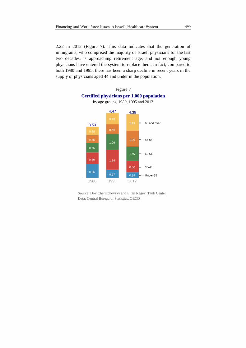
499 Financing and Work force Issues in Israel’s Healthcare System
2.22 in 2012 (Figure 7). This data indicates that the generation of
immigrants, who comprised the majority of Israeli physicians for the last
two decades, is approaching retirement age, and not enough young
physicians have entered the system to replace them. In fact, compared to
both 1980 and 1995, there has been a sharp decline in recent years in the
supply of physicians aged 44 and under in the population.
Figure 7
Certified physicians per 1,000 population
by age groups, 1980, 1995 and 2012
Source: Dov Chernichovsky and Eitan Regev, Taub Center
Data: Central Bureau of Statistics, OECD
0.960.57 0.39
0.80 1.36
0.80
0.65
1.09
0.97
0.55
0.66
1.09
0.58
0.78
1.13
1980 1995 2012
65 and over
55-64
45-54
35-44
Under 35

State of the Nation Report 2014 500
The Gender Distribution of Physicians
Alongside the changes in the age structure of physicians in Israel, there
have been changes in the gender distribution over the years. Between the
years 1980 and 2012, the share of female physicians in the population
almost doubled, from 1.04 per 1,000 people to 1.80 (Figure 8). During
that period there was relative stability in the number of male physicians
per capita. It is noteworthy that the rise in the share of women in the
physician work force somewhat moderated the aging of that population in
recent years.
The aging of the physician population has an important qualitative
dimension: older physicians bring with them more experience.
Furthermore, the greater equality between the sexes in the system is
Figure 8
Certified physicians per 1,000 population
by gender and age group, 1980, 1995 and 2012
Source: Dov Chernichovsky and Eitan Regev, Taub Center
Data: Central Bureau of Statistics, OECD
`
0.71
0.320.20
0.58
0.87
0.43
0.410.75
0.56
0.35
0.39
0.69
0.44
0.50
0.71
1980 1995 2012
0.25 0.26 0.19
0.220.49
0.37
0.24
0.34
0.410.20
0.27 0.40
0.14
0.280.43
MenWomenMenWomenMenWomen
65 and over
55-64
45-54
35-44
Under 35

501 Financing and Work force Issues in Israel’s Healthcare System
certainly encouraging. However, considering the demographic
composition of the physician work force in Israel, the challenge facing
the system is more serious than the raw numbers show, and the findings
in this area cast a harsher light on the neglect in the planning of the
physician work force in Israel.
The entry of young physicians into the system is important on several
levels. From the qualitative aspect, it it worth noting that a young work
force is innovative and its knowledge base is current. This is an essential
element in modern medicine, given the rapid pace of development, and is
also of significance given that there is no ongoing testing to ensure that
physicians stay up-to-date in their field. Furthermore, the economic
aspect cannot be ignored either: inasmuch as it is justified, older
physicians cost the system more because they generally receive higher
salaries.
The most important aspect of the decline in the number of young
physicians compared to the population is a reduction in the effective work
force. The number of retiring physicians is growing at a relatively rapid
pace, especially among male physicians. The relative rise in the share of
elderly physicians, like the share of women, is likely to be manifested not
only in a reduction in the number of practicing physicians but also by a
drop in the labor force participation levels of the remaining physicians,
since young physicians, especially interns, tend to work longer hours than
older physicians.
There is no doubt that the efforts made in recent years to increase
physician training programs, including the new medical school in Safed
and the recruitment of medical students and physicians from abroad, are
steps in the right direction. Considering the lack of planning for the future
and insufficient preparation in the past, though, Israel is facing a drop in
the effective supply of physician work force. Even if in the near future
there is rapid entry of young physicians into the system at the end of their
training, Israel can expect a period of some 20 years in which it will
experience a low supply of physicians aged 40-60 – the most productive
age group, in terms of experience and work productivity.

State of the Nation Report 2014 502
3. Conclusion
The privatization process of the Israeli healthcare system continues,
contrary to the trend in the OECD countries and the United States. The
reduction in the share of public financing, along with the fact that private
financing comes mainly from out-of-pocket expenditure and not from
private insurance, leads to a continued widening of the disparities in
access to health services and increases inequality between income deciles
in general.
As for the demographic composition of the physician population, two
significant changes have occurred: an increase in the share of women out
of the total physician population, and a drop in the share of young
physicians. Despite the advantages of more experienced physicians, the
aging of the physician population could have severe implications for the
effective physician labor force, and Israel might experience a significant
shortage of middle-aged physicians. Furthermore, the shortage in the
physician work force will be felt even more strongly as the trend of
increased demand grows, partly as an outcome of the increase in the share
of private financing of the healthcare system.

503 Financing and Work force Issues in Israel’s Healthcare System
References
English
Chernichovsky, Dov and Eitan Regev (2013), “Trends in Israel’s Healthcare
System,” in Dan Ben-David (ed.), State of the Nation Report: Society,
Economy and Policy in Israel 2013, Taub Center for Social Policy
Studies in Israel, pp. 355-382.
Hebrew
Chernichovsky, Dov and Guy Navon (2012), Private Expenditure on
Medical Services in Israel, Discussion Paper 2012.13, Bank of Israel.

505
Health Status and Healthcare System Budgeting in Israel in the Context of
Disability-Adjusted Life Years (DALYs)
Dov Chernichovsky and Liora Bowers*
Abstract
This chapter briefly presents Israel’s healthcare system in the context of the
Disability-Adjusted Life Years (DALYs) metric. While accepted metrics in
the healthcare system in Israel and in general often evaluate mortality, the
Disability-Adjusted Life Years measure estimates disease burden that is
caused either by premature death or by morbidity and disability, thus giving
a more complete picture of health status in the country. An examination of
the health status of Israelis shows that while cardiovascular diseases and
major cancers are responsible for 42 percent of mortality, their contribution
to overall disease burden as measured by DALYs stands at only 18 percent.
In contrast, orthopedic problems and major depressive disorders, which
contribute to 19 percent of overall disease burden, are almost non-existent
among the causes of death. In terms of budgeting for the public healthcare
system, current allocations for the 15-54 year-old age groups, populations
which are very important in terms of their role within households and in the
labor market, are relatively low compared to this group’s share of disease
burden. This study also found that the Health Basket Committee dedicates
almost half of its annual budget to cancer-related illnesses and treatment,
which are among the main causes of mortality. Nonetheless, new funding for
treatment of orthopedic disorders and mental health issues is minimal due,
in part, to the narrow mandate of this committee.
Prof. Dov Chernichovsky, Chair, Taub Center for Social Policy Studies in
Israel Health Policy Program; Department of Health Systems Management,
Ben-Gurion University of the Negev. Liora Bowers, Director of Policy, Taub
Center for Social Policy Studies in Israel.

State of the Nation Report 2014 506
1. The DALY Metric
Traditional metrics for examining health status and the quality of
healthcare in various countries have generally been based on mortality
rates. Mainly due to technological advances, modern medicine has
unprecedented opportunities to extend life, although this does not always
ensure a high level of functioning or good quality of life. In light of this,
since the 1990s, various measures have been developed that attempt to
measure life years in terms of “quality.” These measures are an effort to
give a value to levels of everyday functioning and a sense of enjoyment
in life, and among other things, to allow for a broader perspective on the
potential of modern medicine to contribute to the welfare of society.
One accepted method for capturing overall disease burden and quality
of life uses Disability-Adjusted Life Years (DALYs). An important
milestone in quantifying disease burden occurred with the release of the
1993 annual World Bank report (World Bank, 1993) which examined the
burden of morbidity on the population. Today, there is an international
project led by the Institute for Health Metrics and Evaluation at the
University of Washington, which is coordinating this effort among 500
researchers at 300 institutions in 50 countries.
DALYs measure both the number of life years lost due to premature
death1, and the partial loss of function due to disease or disability. The
concept of Disability-Adjusted Life Years among the population is the
“burden of disease” on the population. Simply put, this burden can be
thought of as the difference between the current health status of the
population and the situation in which the population is at its full life
potential, free of loss of function due to premature death, disease or
1 The researchers leading the DALYs project at the Institute for Health Metrics
and Evaluation established a life expectancy of 86 years for analytical
purposes – a rather old age relative to the average life expectancy in
developed countries – which is only reached by the leading group in terms of
life expectancy in the world, Japanese women. Age 86 is thus used as the
potential life expectancy for all individuals and any death younger than this
age is considered premature.

507 Health Status and Healthcare System Budgeting Using DALYs
disability. As such, Disability-Adjusted Life Years are defined as the total
number of life years lost due to premature death (YLL – Years of Life
Lost) plus the total number of life years without a certain amount of
function (YLD – Years Lost due to Disability). That is,
DALYs = YLL + YLD
The DALYs metric is just one method within a family of metrics
known as HALYs – Health-Adjusted Life Years – whose purpose is to
quantify the quality of each year of life according to the possibility to
derive enjoyment from it and experience full functioning (Chernichovsky,
in preparation; Gold et al., 2002). All of these methods, including the
attempt to apply them to Israel, are based on developing models, the
latest data regarding incidence of disease, and estimates of the impact of
various diseases, injuries or disabilities in terms of functioning ability.
The major advantage of the DALYs measure relative to other similar
methods is that it allows a comparison of data between different countries
and areas.2
Using a method that is still in the process of development and
refinement means that estimates of DALYs for Israel can change in the
future. Nevertheless, it is reasonable to assume that the overall picture
will not change in a meaningful way since the DALYs method relates to
risk factors, diseases and injuries that affect functioning and that are not
explicitly accounted for in other currently used health metrics, which are
strictly based on mortality and are thus perhaps insufficient. In other
words, the findings presented in the chapter are not greatly affected by
the accuracy of the specific data or figures but rather by the method itself.
2 A comparative analysis between Israel and other countries over time will
appear in a future publication on this topic.

State of the Nation Report 2014 508
Data3
Mortality data comes from Israel’s vital registry database. Morbidity
estimates – including disease and injury incidence, prevalence, duration,
and remission – are based on meta-regressions applied to data that comes
from various sources, including household surveys, disease registries and
monitoring data, and hospitalization and out-patient records, for 21
regions in the world (Israel is included in the Western Europe region).
The weight or degree of disability assigned to a particular patient
condition or impairment is based on surveys of the general public
conducted in five countries (Murray et al., 2012). These surveys
examined the public’s perception of the extent of health impairment with
regard to a variety of medical conditions. The results across the different
countries showed that people’s perceptions were relatively similar
regarding the level of impairment caused by diseases and various
disabilities (Murray et al., 2012).
2. Causes of Death and Disease Burden in Israel
The data presented in Figure 1 show considerable differences between the
top 15 causes of mortality and the top 15 causes of overall disease
burden, as measured by DALYs, (for a total of 21 causes) in Israel. The
main causes of death are cardiovascular and circulatory diseases and
cancer while main drivers of disease burden (that do not lead to death) are
lower back pain, major depressive disorders and migraines. The top
causes of death – cardiovascular and circulatory diseases (together, 28
percent of total deaths) and major cancers (14 percent of total deaths) –
contribute only 11 percent and 7 percent to overall disease burden,
respectively. Orthopedic problems and depression are together
responsible for about 19 percent of overall disease burden, but are almost
negligible in their contribution to mortality rates.
3 The analyses in this chapter are based on data from the Institute for Health
Metrics and Evaluation.

509 Health Status and Healthcare System Budgeting Using DALYs
Death and Disease Burden in Various Age Groups
Figure 2 shows the distribution of the causes of disease burden, as
measured by DALYs, across various age groups. As expected, the main
causes of disease burden in the older age groups, such as cancers and
vascular diseases, are also the causes of death. In contrast, the disease
* The top 15 causes of death and top 15 causes of disease burden (some of the causes overlap)
** Disease burden is measured via the Disability-Adjusted Life Years (DALYs) indicator, which
accounts for both deaths and disability
Source: Dov Chernichovsky and Liora Bowers, Taub Center
Data: Institute of Health Metrics and Evaluation, Global Burden of Disease collaboration
Figure 1
Main causes* of death and disease burden**, 2010
0.5%
0.5%
0.7%
1.1%
1.4%
1.6%
1.8%
1.8%
1.8%
1.9%
2.2%
2.5%
2.8%
2.9%
2.9%
2.9%
3.0%
4.3%
4.8%
6.7%
8.0%
Ischemic heart disease
Cerebrovascular disease
Diabetes mellitus
Chronic kidney diseases
Colon and rectal cancers
Chronic obstructive pulmonary diseases
Lower respiratory infections
Other cardiovascular and circulatory diseases
Alzheimer’s disease and other dementias
Breast cancer
Pancreatic cancer
Road injury
Liver cirrhosis
Prostate cancer
Lower back pain
Major depressive disorder
Neck pain
Falls
Other musculoskeletal disorders
Migraine
Trachea, bronchus and lung cancers
2.0%
1.4%
1.4%
3.3%
2.6%
2.5%
2.6%
4.0%
4.4%
0.0%
4.0%
3.5%
0.4%
0.9%
7.7%
1.7%
0.0%
6.1%
0.0%
17.6%
0.0%
0% 2% 4% 6% 8% 10% 12% 14% 16% 18% 20%
Disease burden**
Deaths
Share that each cause represents out of overall:

State of the Nation Report 2014 510
burden among younger age groups is concentrated in conditions that are
not fatal, like orthopedic and mental health issues. Likewise, in the
younger ages, the disease burden from accidents is also high. That is, the
DALYs measure gives more weight, relative to the current methodology
based on mortality, to poor health among younger age groups.
* Disease burden is measured via the Disability-Adjusted Life Years (DALYs) indicator, which accounts for both deaths and disability.
** “Other” includes (the numbers in parentheses represent the range, across the various
age groups, of the share of disease burden): accidents (3-6%); road injury (1-9%);
childhood diseases (0-38%); infectious diseases (1-9%); deliberate injury (0-7%);
digestive disorders (1-2%); malnutrition (0-5%); all other causes (0-2%)
Source: Dov Chernichovsky and Liora Bowers, Taub Center
Data: Institute of Health Metrics and Evaluation, Global Burden of Disease collaboration
Figure 2
Distribution of the causes of disease burden*
by age groups, 2010
7%
19%
20%
19%
22%
24%
24%
23%
22%
20%
17%
18%
16%
14%
11%
9%
6%
6%
4%
3%
3%
3%
5%
7%
11%
15%
19%
23%
23%
24%
25%
23%
21%
13%
19%
25%
27%
30%
30%
28%
24%
20%
17%
13%
9%
10%
7%
5%
3%
3%
2%
13%
12%
7%
4%
4%
5%
6%
7%
7%
8%
9%
11%
10%
12%
12%
13%
13%
13%
24%
15%
14%
10%
6%
6%
6%
6%
6%
6%
6%
6%
6%
6%
6%
6%
6%
6%
2%
4%
6%
7%
7%
6%
6%
6%
5%
4%
4%
4%
4%
4%
4%
4%
6%
10%
1%
9%
9%
5%
4%
4%
3%
3%
3%
4%
4%
4%
4%
4%
5%
5%
5%
5%
55%
26%
16%
22%
24%
21%
20%
18%
17%
16%
14%
12%
12%
12%
11%
12%
12%
14%
1%
0% 10% 20% 30% 40% 50% 60% 70% 80% 90% 100%
0-4
5-9
10-14
15-19
20-24
25-29
30-34
35-39
40-44
45-49
50-54
50-69
55-59
60-64
65-69
70-74
75-79
80+
%
%
%
%
%
%
%
%
%
%
%
%
%
%
%
2%
1%
1%
2%
2%
3%
4%
6%
8%
11%
14%
13%
16%
18%
22%
26%
31%
2%2%
Neurological diseases
Chronic respiratory diseases
Other**
Orthopedic disorders
Cancers
Cardiovascular diseases Other non-infectious diseases
Mental health disorders
Diabetes

511 Health Status and Healthcare System Budgeting Using DALYs
3. Resource Allocation to the Healthcare System in the Context of Disability-Adjusted Life Years (DALYs)
In Israel, there are three integrated mechanisms for resource allocation to
the public health system:
A. Allocation through the capitation mechanism. This allocation is
designed to fund general medical care provided through the health
funds. The central component in this mechanism is the capitation
formula, which calculates a relative weight for each individual based
on his age and gender, and also provides an addition for residents in
the periphery of the country. According to this mechanism, money is
distributed to the health funds for each insured member
(Chernichovsky, 2011). About 72 percent of public financing for
health services – some 34 billion shekels in 2010 – were allocated to
the health funds via this mechanism.
B. Allocations through the government budget. This allocation is
designed to fund Ministry of Health activities; namely preventive
medicine, mental health and long-term care. This allocation accounts
for about 28 percent of total public healthcare expenditure.4
C. Allocation through the Health Basket Committee. This allocation
– totaling 300 million shekels in the latest budget – is designed to
finance new technologies such as medications and medical devices.5
4 This figure also includes funding for maternity care and work-related injuries
through National Insurance Institute taxes. 5 In this context, it is important to note that there is a lack of congruence
between decisions of the Health Basket Committee and changes in the
capitation mechanism. While it might be expected that the capitation
mechanism would be adjusted according to the decisions of the Committee,
such is not the case. If the capitation mechanism were to include, for example,
some components related to disease burden, medication and hospitalization, as
it does in other Western European countries, the adjustment would be, in part,
automatic (Chernichovsky, 2011).

State of the Nation Report 2014 512
This mechanism has a special significance despite its relatively small
size, because this allocation is added annually to the other two
allocations and helps determine the direction of the system from a
technology perspective.
It is interesting to examine how the Israeli healthcare budgeting
system aligns with both the current health metrics used in the country and
with the DALYs metric that estimates overall disease burden. In this
section, two comparisons will be drawn: a comparison between the actual
capitation formula and the distribution of disease burden by age groups,
and a comparison between the Health Basket Committee allocation and
the distribution of disease burden by medical conditions.
Allocation Based on the Capitation Formula Versus Based on Disease Burden
In order to compare between the actual allocation based on the capitation
formula and the distribution of disease burden using DALYs, the basic
capitation formula was recalculated. The calculated capitation formula for
this analysis also includes the allocation for services provided directly by
the Ministry of Health and not just those provided by the health funds.
Such adjustments for direct Ministry of Health services include
accounting for the child health allocation (ages 0-4) and long-term care
funding for those aged 65 and older.
It is important to remember that the capitation formula is based on the
relationship between the expected allocation per individual in a given age
group as compared with the expected allocation per individual in the
baseline age group (generally age 35-44). The assumption is that, on
average, the actual allocation for each age group will equal the
predetermined allocation that is based on the capitation formula. The
formula expresses both the system’s estimates of healthcare costs as well
as societal preferences regarding the level of allocation for various age
groups.

513 Health Status and Healthcare System Budgeting Using DALYs
Figure 3 shows the distribution of mortality, disease burden (using
DALYs) and the healthcare budget based on the capitation formula, by
age group. For example, those aged 85 and over account for 34 percent of
mortality and 7 percent of disease burden in Israel. This group receives 5
percent of healthcare funding according to the capitation formula. In
contrast, those aged 1-4 account for a negligible share of mortality, while
they account for 4 percent of disease burden and 9 percent of the budget
via the capitation formula.
* The health budget shown here is based on allocation via the capitation formula, which includes Ministry of Health direct expenditures and Health Basket expenditures.
** Disease burden is measured via the Disability-Adjusted Life Years (DALYs) indicator,
which accounts for both deaths and disability.
Source: Dov Chernichovsky and Liora Bowers, Taub Center
Data: Institute of Health Metrics and Evaluation, Global Burden of Disease collaboration
Figure 3
Distribution of the health budget*, disease burden** and deaths
by age groups, 2010
Share that each age group represents out of overall:
Disease burden**
Deaths
4%
9%8%
6%
8% 8%
11%
15% 14%
12%
5%
1%
4%5%
8%10%
10%
12%
15%
13% 14%
7%
2%0% 0%
1% 1%2%
4%
10%
15%
30%
34%
0-1 1-4 5-14 15-24 25-34 35-44 45-54 55-64 65-74 75-84 85+
Health budget*

State of the Nation Report 2014 514
Figure 4 shows the ratio between the allocation according to the
capitation formula (including the Ministry of Health’s direct spending on
the various age groups) and the distribution of disease burden by DALYs.
The correlation coefficient between the budget allocation based on the
capitation formula and the distribution of disease burden by age group is
0.84; the correlation between allocation based on the capitation formula
and distribution of mortality rates by age group (not shown in figure) is
0.16. This means that the capitation formula in Israel yields allocations
that are much more aligned with disease burden, as measured by DALYs,
than they are with mortality rates. That is, the current allocation system is
relatively well-matched to the public needs in terms of disease burden.
* The amount allocated to each age group as a percent of the entire healthcare budget
(according to the adjusted capitation formula) in ratio to the percent of the overall
disease burden in each age group. For example, a figure of 1.0 would mean that an age
group receives a budget allocation (as a share of the total budget) that is exactly equal to
its share of the overall disease burden in Israel. Disease burden is measured via the
Disability-Adjusted Life Years (DALYs) indicator, which accounts for both deaths and disability.
Source: Dov Chernichovsky and Liora Bowers, Taub Center
Data: Institute of Health Metrics and Evaluation, Global Burden of Disease collaboration
Figure 4
Ratio of the share of the healthcare budget to
the share of overall disease burden*
by age group, 2010
3.3
2.1
1.6
0.70.9 0.8 0.9 1.0
1.10.9 0.8
0-1 1-4 5-14 15-24 25-34 35-44 45-54 55-64 65-74 75-84 85+

515 Health Status and Healthcare System Budgeting Using DALYs
Nevertheless, the data shown in Figures 3 and 4 indicate that the actual
budget allocation for the younger age groups (0-15 year olds) is larger
than their share of disease burden in the distribution (from a ratio of 3.3 at
age 0-1 to a ratio of 1.6 for ages 5-14), while the actual budget allocation
to all other age groups – except ages 55-74 – is lower than their share of
disease burden in the distribution. The relatively low allocation of the
capitation formula relative to the disease burden (based on DALYs) for
the age groups 15-54 is noteworthy.
The differences between the actual allocation based on the capitation
formula and the distribution of disease burden shed light on both the
government priorities in healthcare, even if they are not explicitly stated,
as well as the limitations of the DALYs metric from a policymaking
perspective. For example, the relatively high actual allocation for children
according to the capitation formula reflects the decision by policymakers
to invest relatively heavily in prevention. The DALYs metric, however,
does not take into consideration the benefits of such prevention.
Nevertheless, it is possible that a disease burden perspective could
encourage different policies with regard to prevention than those in place
today. For example, it is possible that a system that prioritizes the
treatment of leading causes of disease burden would invest more in
preventing problems like orthopedic and mental health issues early on.
The relatively low allocation for those aged 85 and over shows a
government policy, although not explicit, that recognizes the limitations
of dealing with death, and that is unwilling to invest unlimited amounts
towards coping with mortality among the elderly. However, it is
important to note that while those ages 85 and over represent a very high
share of mortality in the country, they account for a much more modest
share of the overall disease burden in the country. As such, while the
allocation based on the capitation formula to those ages 85 and over is
particularly low compared to their mortality rates, their allocation relative
to disease burden is relatively similar to that of age groups 15-54.
The relatively low investment according to the capitation formula for
ages 15-54 is also noteworthy, especially among the younger ages in this
cohort. These groups are particularly likely to suffer from medical

State of the Nation Report 2014 516
conditions that are unrelated to death; as such, it would be appropriate to
adjust their allocation accordingly – especially because of their relative
importance with regard to household functioning and labor market
participation.
Health Basket Committee Allocation Versus Disease Burden Distribution
As has been stated, the decisions of the Health Basket Committee impact
only a small share of the healthcare system budget (the annual addition to
the existing budget). Nevertheless, this component is of great significance
since it reflects the additional amounts invested in new healthcare
technologies, whose combined impact over time has the potential to
determine the character of the system in the long term.
Making comparisons between the Health Basket Committee allocation
and the distribution of disease burden, as measured by DALYs should be
done with caution. The DALYs metric is static – it paints a picture of the
health status of the population today, without providing any insight
regarding those factors that lead to changes in disease burden. Taking
such factors into consideration could lead to a different picture than the
one presented solely by the metric itself. For example, even though
mental health problems contribute greatly to disease burden in Israel
today, their importance might be mitigated when considering that such
problems are more prevalent among younger age groups, and
demographic changes are leading to an aging population.
Nonetheless, there is value in comparing the Health Basket Committee
allocation with both mortality rates and disease burden (as measured by
DALYs) for each age group, in order to see how the Health Basket
Committee allocation aligns with each metric and accordingly, what this
indicates with regard to developments in the healthcare system over the
long term. In terms of both promoting efficiency in healthcare budgeting
and given the trend in the modern world towards using metrics such as
DALYs, it is expected that the Health Basket Committee would allocate

517 Health Status and Healthcare System Budgeting Using DALYs
money for technologies that would have the most impact on disease
burden – as opposed to the most impact on preventing death.
Figure 5 presents a comparison of the share of funding allocated by
the Health Basket Committee for 2014 to various medical conditions with
the share of mortality and disease burden (DALYs) caused by such
conditions.6 Almost half of the Committee’s allocation was devoted to
cancer treatments, which is a major cause of death. In contrast,
orthopedic and mental health problems, which contribute greatly to
disease burden, received minimal additional allocation from the Health
Basket Committee.
To some extent, these findings support the assumption that the Health
Basket Committee has narrowed its focus towards life-saving medicines
and mortality prevention, and does not give sufficient weight to disease
burden stemming from poor health. This situation arises due to the
narrow mandate of this Committee, which is limited to adopting new
technologies – a scope that does not necessarily align with an approach
that advocates for achieving the maximum health improvement from each
additional shekel invested, based on the DALYs metric. For example, the
Health Basket Committee cannot recommend using its budget to expand
existing treatments to populations that currently do not benefit from them,
such as expanding subsidized dental treatment to populations over the age
of 11. Furthermore, the Committee cannot allocate more towards treating
orthopedic problems using effective and innovative methods that are
currently available but that do not involve adopting new technologies.
That is, the Committee has no mandate to encourage new treatment
approaches unless they are based on new technologies, even if such
technologies are not necessarily proven yet.
6 Ministry of Health, the Recommendations of the Public Committee to
Increase the Basket of Healthcare Services, 2014 update
health.gov.il/Services/Committee/vsal/HBS2014/Pages/default.aspx.

State of the Nation Report 2014 518
* Disease burden is measured via the Disability-Adjusted Life Years (DALYs) indicator,
which accounts for both deaths and disability.
** Conditions are listed in order of those receiving the highest budget allocation by the
Health Basket Committee; not all medical conditions budgeted by the Health Basket
Committee appear in this figure.
Source: Dov Chernichovsky and Liora Bowers, Taub Center
Data: Institute of Health Metrics and Evaluation, Global Burden of Disease collaboration
Figure 5
Distribution of Health Basket Committee budget
as compared to distribution of deaths and disease burden*,
by select medical condition**, 2010
Cardio-
vascular
diseases
Cancers Urinary
tract
diseases
Pulmo-
nary
diseases
Neurological
diseases
Mental
health
disorders
Orthopedic
disorders
Digestive
tract
diseases
Gyneco-
logical
disorders
Skin
diseasesOpthomo-
logical
diseases
Dental
problems
Diabetes
mellitus
5
1
3 2 1 1 1 1
2 1
3 1
0
14
Deaths
Disease burden*
Health basket budget
Share that each condition represents out of overall:

519 Health Status and Healthcare System Budgeting Using DALYs
4. Conclusions
The DALYs metric presents an alternative to metrics based on mortality
rates or life expectancy alone. When health status in Israel is examined,
significant differences are found between the impact of various medical
conditions on mortality rates and their impact on overall disease burden
as measured by DALYs.
Actual healthcare system budgeting according to the capitation
formula (which takes into consideration age and gender and allocates
more to those living in the geographic periphery), reflects a government
policy that is more aligned with addressing disease burden than
preventing death. As such, the healthcare system has been relatively
successful with regard to matching funding with the needs of the public
in terms of disease burden. However, the actual budget allocates more to
the youngest age groups (0-15) than they would receive if allocation were
based on disease burden (DALYs), while the actual allocation to the other
age groups – except those ages 55-74 – is lower than it would be if
allocation were based on disease burden. The relatively low allocation
granted to the age groups 15-54 based on the capitation formula is
particularly noteworthy given the importance of this age cohort to
households’ functioning and to the labor market.
Comparing the allocation through the Health Basket Committee to the
distribution of disease burden as measured by DALYs shows that almost
half of the Health Basket Committee’s allocation is devoted to treatment
for causes of death (namely cancer treatments). In contrast, the major
contributors to disease burden, like orthopedic issues, receive almost no
additional allocated funds. These results support the assumption that the
Committee has a narrow vision focused on life-saving medications and
technologies, and does not encourage innovative approaches to reduce
disease burden from conditions that do not lead to death.
Beyond offering a new and thought-provoking approach to examining
the health status of the population, this discussion presents some
questions for policymakers in the health system. First, it is important to
examine the issue of the large allocation granted to children according to

State of the Nation Report 2014 520
the capitation formula, which is not substantiated when assessing the
distribution of disease burden via DALYs. Second, it should be assessed
how the investment in the most productive age groups – ages 15-54 – can
be bolstered, given that the distribution of disease burden suggests that
these groups’ actual allocation is lacking. Third, the possibility of
changing the Health Basket Committee’s mandate should be examined, to
allow the Committee to examine the system from the perspective of
disease burden and not just death prevention. In addition, it is important
to explore the possibility of giving the Committee a wider mandate to
allocate additional resources to the system (to widen current eligibility,
for example, to dental care to include additional age groups) and to
implement methods and innovative treatment approaches that are not
specifically life-saving.

521 Health Status and Healthcare System Budgeting Using DALYs
References
English
Chernichovsky, Dov and Eitan Regev (2014), “Financing and Work Force
Issues in Israel’s Healthcare System,” in Dan Ben-David (ed.), State of
the Nation Report: Society, Economy and Policy in Israel 2014, Taub
Center for Social Policy Studies in Israel, pp. 491-503.
Gold, Marthe R., David Stevenson, and Dennis G. Fryback (2002), “HALYs
and QALYs and DALYs, Oh My: Similarities and Differences in
Summary Measures of Population Health,” Annual Review of Public
Health, 23, pp. 115-134.
Murray, Christopher J.L., Majid Ezzati, Abraham D. Flaxman, Stephen Lim,
Rafael Lozano, Catherine Michaud, Mohsen Naghavi, Joshua A.
Salomon, Kenji Shibuya, Theo Vos, Daniel Wikler, Alan D. Lopez
(2012), “GBD 2010: Design, Definitions, and Metrics,” The Lancet, 380,
No. 9859, pp. 2063-2066.
World Bank (1993), World Development Report: Investing in Health.
Hebrew
Chernichovsky, Dov (2011), Changes in Healthcare System Allocation to
Promote Equality Between the Center and the Periphery. Is It for Real?
Policy Paper, Taub Center for Social Policy Studies in Israel.
Chernichovsky, Dov, Principles in Health Economics and Medical Services
(in preparation).