The Design of a Machine Status Management Tool
73
0 The Design of a Machine Status Management Tool Creative Technology Student Wouter Koning Supervisor Job Zwiers Critical Observer Demitriana Minassian July 2, 2021
-
Upload
khangminh22 -
Category
Documents
-
view
4 -
download
0
Transcript of The Design of a Machine Status Management Tool

0
The Design of a
Machine Status
Management Tool
Creative Technology
Student
Wouter Koning
Supervisor
Job Zwiers
Critical Observer
Demitriana Minassian
July 2, 2021

1
ABSTRACT
A lot of advancements are happening at the moment in the manufacturing industry, one of which being
that data-driven applications are on a rise. This report describes the development of an interface design made to
show the status of machines on a shopfloor, and to provide an insight into their performance for Fraunhofer
Project Center (FPC). Additionally, maintenance information and product information are displayed. The users
for this interface are clients and visitors, management, and engineers. The research question for this report is
“How can an interface be designed such that it shows the status of the various machines around the shopfloor?”
with sub-questions relating to what information to display, how to display this information, and how the user
should get to this information.
This interface is realized using an iterative design process and the Moscow method to prioritize tasks and
is designed in Adobe XD. This resulted in a visualization of the machines using 3D-models, which had coloured
roofs according to their status. Selecting a machine would allow the user to inspect parameters of the machine,
including historical data, past failures, maintenance information, as well as its capabilities. The final design was
evaluated using both a questionnaire and a semi-structured interview. The result of this evaluation is that the
participants found the interface very self-explanatory and found the visualizations clear. The iconography used
throughout the design was also understood well according to the questionnaire. Though, it was lacking in user
experience due to the development taking place during the coronavirus pandemic. Further research and
development of this interface should be focussed on developing the user experience. Research should be done
towards whether it would not be better to develop separate interfaces for the separate users. Development of the
back end that would support this interface is also recommended.

2
ACKNOWLEDGEMENTS
I want to thank my supervisor Job Zwiers for his continuous support, advice, and feedback throughout the
process of this project. I also want to thank my critical observer Demitriana Minassian for everything she has
done through the process. Furthermore, I would like to thank Angus Fitzpatrick and Gijs Beumkes for their
continuous support, motivational boosts, time, and guidance throughout the process. Last but not least, I would
like to thank my friends and family for their support and help throughout this process, especially Ewout van der
Wal.

3
TABLE OF CONTENTS
Abstract ................................................................................................................................................................................ 1
1. Introduction ..................................................................................................................................................................... 5
2. Background ..................................................................................................................................................................... 6
2.1 Dashboards ................................................................................................................................................................. 6
2.2 Performance Analyzer ................................................................................................................................................. 7
2.3 Data Formatting .......................................................................................................................................................... 7
2.4 State of the Art ............................................................................................................................................................ 8
2.5 Conclusion from State of the Art ............................................................................................................................... 10
3. Ideation .......................................................................................................................................................................... 10
3.1 Phase One ................................................................................................................................................................. 11
3.2 Phase Two ................................................................................................................................................................. 11
3.3 Phase Three ............................................................................................................................................................... 12
3.4 Ideation Phase Conclusion ........................................................................................................................................ 12
4. Requirements Capture ................................................................................................................................................. 13
4.1 Use Cases .................................................................................................................................................................. 13
4.2 Project Details ........................................................................................................................................................... 13
5. Realization ..................................................................................................................................................................... 14
5.1 Methodology ............................................................................................................................................................. 14
5.2 First iteration ............................................................................................................................................................. 14
5.3 Second Iteration ........................................................................................................................................................ 21
5.4 Third Iteration ........................................................................................................................................................... 26
5.5 Fourth Iteration ......................................................................................................................................................... 29
5.6 Final Iteration ............................................................................................................................................................ 33
6. Evaluation ...................................................................................................................................................................... 35
6.1 Interpretations and Expectations .............................................................................................................................. 35
6.2 Usability .................................................................................................................................................................... 36
6.3 Limitations ................................................................................................................................................................. 36
6.4 Discussion .................................................................................................................................................................. 37
7. Conclusion ...................................................................................................................................................................... 38
8. Recommendations ......................................................................................................................................................... 39
Appendix ............................................................................................................................................................................ 40
Appendix A ...................................................................................................................................................................... 40
Appendix B ...................................................................................................................................................................... 41
Appendix C ...................................................................................................................................................................... 42
Appendix D ...................................................................................................................................................................... 42
Appendix E....................................................................................................................................................................... 43
Appendix F ....................................................................................................................................................................... 44
Appendix G ...................................................................................................................................................................... 46

4
Appendix H ...................................................................................................................................................................... 47
Appendix I ....................................................................................................................................................................... 48
Appendix J ....................................................................................................................................................................... 49
Appendix K ...................................................................................................................................................................... 50
Appendix L ....................................................................................................................................................................... 51
Appendix M ..................................................................................................................................................................... 52
Appendix N ...................................................................................................................................................................... 53
Appendix O ...................................................................................................................................................................... 54
Appendix P ...................................................................................................................................................................... 63
References .......................................................................................................................................................................... 70

5
1. INTRODUCTION
Fraunhofer Project Center (FPC) has a central task of transferring current research in advanced
manufacturing directly into industrial practise. Together with the manufacturing industry, FPC builds synergies
to achieve high-tech excellence within the fourth industrial revolution. FPC, together with regional partners,
will develop the Advanced Manufacturing Center (AMC). The AMC facilitate multi-disciplinary interlinking
technologies through demonstrators and testbeds for advancing manufacturing technologies. One of these
technologies will be a shopfloor. This shopfloor will be centred around the fourth industrial revolution, by
collecting and processing data to create all kinds of purposeful insights into the manufacturing environment.
As a part of industry 4.0 where manufacturing data is increasingly available and data-driven applications
are increasingly common, equipment maintenance has also grown to be a data-driven task [1]. The collection,
evaluation, and comprehension of large data sets is seen as one of the nine pillars of industry 4.0 [2]. These large
data sets contain fairly complex data and thus have to be visualized in such a way that it is made understandable.
Performance and utilization of a machine is one of the things that needs to be visualized out of large data sets.
Machine utilization is of particular importance for the production technique used.
Equipment maintenance is a part of that manufacturing environment, which is of a vital role in
manufacturing. Inappropriate maintenance of equipment can lead to a shorter lifespan, inefficiencies and even
safety issues. However, the majority of manufacturers are still practising calendar based preventative
maintenance [3]. This strategy often leads to either over-maintaining the equipment, as to make sure the
equipment does not fail; or undermaintaining the equipment, as it is almost impossible to cater to the exact needs
of a machine. For this reason, a data-driven condition monitoring system is in demand, as to be able to service
a machine whenever there is a need for it.
The challenge that will be tackled in this report will be in the area of displaying information about a typical
shopfloor. Specifically, how the various machines on the shopfloor are performing. The main research question
is therefore: “How can an interface be designed such that it shows the status of the various machines around the
shopfloor?”. In order to answer this question, sub-questions have been formulated, all departing from the
assumption that an interface can be displayed on a large display:
1. What information should the dashboard display?
2. How should the information on the dashboard be displayed?
3. How should the user obtain the information that is present within the dashboard?
In this report the design and the development process of a shopfloor status manager is described and will
have the following structure. First, chapter 2 describes the background research, consisting of a literature review
and products that provide a similar function. Chapter 3 describes the ideation phase, during which broad ideas
are developed and worked out. In chapter 4, requirements for building the prototype are captured. Chapter 5
describes the realization phase, during which the prototype is developed. Chapter 6 is about the evaluation of
the final product using a questionnaire and discusses the limitations of the project. Chapter 7 states the
conclusion, and chapter 8 states recommendations for future work. The report ends with the appendices and
references used in the report.

6
2. BACKGROUND
2.1 DASHBOARDS
Dashboards are intended to convey and communicate information to users through graphical means,
enabling users of the dashboard to understand the meaning behind all of the data. In an organisation, a dashboard
is often used for decision making [4]. Effective data visualisations can help the user of a dashboard to interpret
and extract important values from complex and multi-dimensional data [5]. To start designing a dashboard, the
designer has to have a clear goal in mind for as what they want to visualize. However, choosing a good
visualisation goal can be a difficult task, and therefore a guideline can be followed, as can be seen in Figure 1
[6].
Figure 1. Guidelines to help a non-expert user to define visualization goals according to [6].
Another way to lay a foundation for a dashboard is using Goal-Question-Measurement (GQM) models [7].
A GQM model is defined on three different levels. The goal is defined as to what we want to study and why.
The questions define what information is relevant, and what parts of this information are used to characterize
what we are trying to achieve the related goal. The measures define which data has to be collected to be able to
objectively answer the questions [4].
Once a visualization goal has been selected, the designer can start thinking about the implementation of
the dashboard. There are two scenarios for a dashboard, being “pull” and “push” [8]. In the scenario of a pull
dashboard, the user wants to get specific information, and uses the dashboard to obtain this information. In the
pull scenario, the user actively uses the dashboard to seek out information, and actively looks for this
information. In the push scenario, the dashboard is designed such that it captures the user’s attention when

7
important information is available to the user. In this case, the dashboard is used passively, and the attention of
the user needs to be captured or brought to a specific element within the dashboard. The difference between the
two scenarios can thus be found in how the dashboard is designed to be used.
A method for capturing the user’s attention is through a technique called pre-attentive processing. This is
a technique that allows people to process information before they start paying conscious attention to it [9]. Pre-
attentive process is the process of fading out other elements, or highlighting the element(s) in question, such
that it the relevant elements in the design stand out more than others. This can for example be done through the
usage of colour, size, texture, opacity, or even by making certain elements glow.
When the status of an object has to be conveyed to the user, it is advised to use colour coding based upon
the colours red, yellow, and green, respectfully meaning that there is a serious problem, action is required, and
that everything is fine [4].
2.2 PERFORMANCE ANALYZER
Performance analysis is an important feature in production planning software [10, 11]. This performance
analyser should be able to give managers, as well as operators on the shopfloor itself, an insight into how well
the shop floor is performing. This analysis should then be visualized in such a way that it is clear to the user
what the conclusion of the analysis is.
There are multiple ways in which performance can be measured. How the performance is measured is
entirely dependent on the nature of the shopfloor. For example, the number of products produced can be a good
indicator if that is the goal. However, if the shopfloor produces various types of products, the workload of a
production cell could be a good indicator [12]. However, the most important key performance indicator for a
company is whether a profit is being made, though for this project this is not the case. For this project, the most
important KPIs are the ones that indicate the status of the machine. Other KPIs which can be considered are
number of products produced, hours of cutting time, or number of linear feats performed [12]. The most
important KPI that is specific for the use case of FPC is machine utilisation, with cycle time being another
relevant KPI. [11, 13, 14].
There are also KPIs to consider that are more specific to the machine itself. These machine KPIs includes
machining time, operation costs, availability, and performance [15, 16, 17]. However, Koren et al. [18] is the
only one mentioning that reliability and finish quality are important factors to consider.
2.3 DATA FORMATTING
Simulation is seen as one of the nine technologies that form the foundation of industry 4.0 [2]. However,
for a simulation to work and run, data is required to feed into that simulation and will have to be formatted such
that it is both legible for a human as well as the computer. Choosing a good data format is important, as a good
data format can house all of the relevant information and relations. Terkaj and Urgo [19] state that to create a
successful simulation explicit modelling of possible states of a resource, as well as hierarchical nesting is
required. Additionally, historical data and characteristics of the machine are also relevant [20].
Laemmle and Gust [21] did research regarding what the correct data format is for manufacturing system
simulation and evaluation. They consider multiple types of data formats; Text-based, table-based, XML-based,
8
geometry based, and graphic-basic. XML-based data formats are deemed the best and specifically
AutomationML. A correct data format is not only important for a visualisation of the data, but also as a basis
for creating a data model, and as a solid foundation for simulation software [19, 20].
2.4 STATE OF THE ART
Well-known simulation tools for industrial production planning include Tecnomatrix by Siemens [22],
IMK EMA [23], and Visual Components by KUKA [24]. However, these are all largely companies which focus
on simulation of a digital system, rather than evaluation of the physical system. Katana [25] is a product that is
focussed on the evaluation of a system that is already in place. The most notable things about Katana are that
they have a very friendly looking interface, which is easy to understand and is intuitive, as is visible in Figure
2. Inventory control and shopfloor control for workshop users are interesting features found within Katana.
These features allow users of Katana to see the progress of their orders, as well as view and control the shopfloor
from an online environment.
Figure 2. the interface of Katana
Seiki Systems also produces a software solution for performance analytics [26]. The notable things about
Seiki are that their interface design is a lot less friendly to look at, but still provides a clear overview of relevant
data. A notable feature they have is one that allows for inspection of products which are linked to production
batches.
Another company which produces performance analytics software for shopfloor is MachineMetrics [27].
What is noticeable about MachineMetrics is that their software solution is a cloud-based solution, as well as that
this software is capable of machine monitoring and condition monitoring. Machine monitoring means that an
overview is created that allows the identification of bottlenecks and inefficiencies. Condition monitoring allows
for the monitoring of the health of the equipment on the shopfloor, and thus allows for preventative maintenance.
MachineMetrics also gives actionable feedback to the users of their platform.

9
FreedomIoT [28], TeamViewer [29], and Evocon [30], MaintainX [31], The Asset Guardian [32], UpKeep
[33], and Wats [34] also produce production analytics software, but do not have any interesting features that are
important to this research. Evocon, Katana, MaintainX, and UpKeep do have a clear looking design of their
interface.
As to provide a summary of what design highlights that are common across asset performance management
systems, a simple coloured background with brightly coloured highlights is a common design feature, as is seen
in Figure 2. In terms of design style, there seems to be a great divide. It would seem that most systems look
either very modern with rounded edges, friendly looking shapes, and minimalist design elements, as can be seen
in Figure 4. The other style that systems go for seems to be an older style, one that is reminiscent of the ages of
windows XP, as is visible Figure 3. These systems tend to have more blocky design features, with sharp edges
and simpler data visualisations. Additionally, it is common practise to use a lot of tables as data visualisations.
Figure 4. The interface of Evocon
Figure 3. The interface of Wats

10
Common features that are found within asset performance management systems are being able to send a
repair work-order from within the same interface as the status overview interface. Another feature that is
commonly found is being able to customize the dashboard however the user wants. The customization of the
dashboard can range from re-organizing the location of dashboard components to only being able to filter data
the data in the dashboard. The last, and also most noticeable feature is being able to see whether spare parts are
available for a machine. This would mean that the inventory management system is also tied into the same
system.
2.5 CONCLUSION FROM STATE OF THE ART
To conclude this chapter, there are multiple requirements for the project that should be considered during
the ideation phase. Firstly, what design elements should be considered. Most of the state of the art uses brightly
coloured highlights as to either indicate a problem with an element in the system, or as a design feature. These
highlights are to be implemented with a colour that differs enough from the background colour in both hue and
saturation, such that it becomes an element that stands out. Besides this, a consistent style is to be used
throughout the product. Style consistency not only looks more appealing, but also makes the interactions for the
user clearer. By using the same elements to go back to a previous menu or close a menu for example, the
interface becomes much easier to use. Styles that are commonly used within the state of the art are either a
modern style with rounded design elements, or a style with more blocky design elements. Lastly, since the
project is about displaying the status of a machine, it is advised to use the colours red, orange, and green to
indicate the status of the object. This respectively means needs immediate attention, warning, and operational.
Secondly, an analysis is done to find features that are found to be important. These features are being able
to change the data displayed on the dashboard, all the while keeping the dashboard looking the same or similar
looking as it did before. Filtering data that is available on the dashboard is also a common feature among
dashboards. This feature enables the user to only view the data they are interested in. Additionally, being able
to view historical data is also a very common, as well as prized feature in dashboards. Historical data can allow
the user to gain an insight into why and how things might have developed as they did. Furthermore, being able
to view characteristics of a machine is also an appreciated feature. This feature would allow the user to see what
a machine is capable of, as well as what process it enables. The conclusions drawn from this chapter can be used
in developing the project.
3. IDEATION
This chapter describes the ideation phase, during which broad ideas are developed for the project. The
development of broad ideas was developed in phases. At the end of every phase, the ideas was pitched to FPC
and feedback was received about ideas, as well as that more information was obtained about the project in the
shape of requirements and insights into the bigger picture in which this project can take place.
11
3.1 PHASE ONE
At the very start of the project, the project was presented in a very different light than it is now. The most
important requirement that was set then was to lower the human error and time spent on production planning,
and to show off what the client is capable of doing with their showcase production floor. A brainstorm was held
to come up with ideas for the project, this brainstorm can be seen in Appendix A. The outcome of this brainstorm
was rather inconclusive, and a lot of questions arose from the brainstorm about the requirements and about the
project. Reading up about layout problems, process planning, and layout optimization was done to be able draw
up a correct reference frame. Thereafter, two ideas were worked out in more detail.
The first idea that was worked out was called “Providing a Clear Overview”. This idea was to provide an
overview of what machines are present on the shopfloor, where they are positioned, and produce an interface
which allows you to interact with the overview and see details about machines. This would be visualized using
a two-dimensional view of the shopfloor, an impression of which can be seen in Figure 5. For this idea, a lot of
inspiration was drawn from the top-down factory building simulator game Factorio [35].
The second idea that was thought of was called “Looks of the Building”. This idea had a very strong look
on how the building and shopfloor looks. This was supposed to especially appeal to the requirement that it was
supposed to show off what the client is capable of doing through presenting this through very high-quality 3D
models and visualisations. This would bring across the feeling of how the shopfloor looks and feels. This would
be visualized with a 3D animated rendering of the shopfloor, an impression of which can be seen in Figure 6.
3.2 PHASE TWO
The second phase of ideation started after the first phase was presented to the client, and with that feedback
and more specific information about the project. It turned out that the ideas that were presented were not relevant
enough to the project, and thus different ideas needed to be produced. The ideas of phase one were not relevant
Figure 5. An impression of how the first idea would look like.
Figure 6. An impression of how the second idea would look like.

12
enough due to the fact that they did not see any interaction with the production technique that is being used. The
most important thing in this phase was coming up with an idea that is in line with process optimization. The
idea that was produced in this phase was a program with two main features.
The first feature is called a “production line manager”. This would allow the user to specify how a product
is made, which is done by linking up a series of machines which would define the order of production. Estimates
are put in regarding how long an operation would take on every machine. After the user has put in all of the
products that are to be produced, the shopfloor can be simulated, and bottlenecks can be identified and correctly
dealt with in the simulation before anything would be physically produced.
The second feature is called the “Floor planner”. This would allow the user to simulate an optimal layout
for the products that are being produced. This would then determine the physical location of every machine, and
what an optimal layout would be in terms of machine placement. This feature is intertwined with the production
line manager. This feature would produce a map where a machine would look like the sketch made in Figure 7,
in which an identifier is placed such that the layout can be physically reproduced.
3.3 PHASE THREE
After presenting the idea of phase two, feedback was received that this idea would be too complicated for
a bachelor graduation project, as this is an idea that goes more towards applied mathematics, with a
specialisation in Operations Research. Therefore, we switched to a less demanding and more realistic idea that
allows the user to assess how well the shopfloor is performing, instead of optimizing the production process.
This would allow the user to see how well the shopfloor is performing and would be done from serious gaming
perspective. This would mean that an interface would be created which has gaming elements in it. This would
make the interface more fun to use, and thus encourage the user to use the interface to further optimize the
layout. Additionally, a list of features will be created that is required to make process optimization happen and
find out what kind of data is required per feature.
This was however found to be too much for the project, and a preference for only working out a single
feature was preferred. It was quickly decided upon that the project was now going to be in the direction of
creating an interface which would show the capabilities and limitations of the machines on the shopfloor.
3.4 IDEATION PHASE CONCLUSION
The ideation phase was concluded with that the third phase of ideation left a lot of questions unanswered
about what exactly the requirements were for the project, as well as that the design goal of the project was not
Figure 7. A sketch of how a single machine would look like in the second ideation phase.

13
quite satisfactory. Although, there was already a clear direction the project was going in, which is displaying
information about a shopfloor. This would be different than the initial perspective on the project, where this
project would be about providing feedback to the shopfloor managers, rather than attempting to optimize the
production process itself. Thus, a discussion was had with the client to talk about the details of the project, and
what exactly this project would entail, what the new design goal is, and what the new requirements will be are
discussed in chapter 4.
4. REQUIREMENTS CAPTURE
The requirements which form the basis for this project are described in this chapter. The requirements are
captured through a semi-structured interview. The chapter describes the use cases for this interface, as well as
further details about the project.
4.1 USE CASES
It became clear that the users of this product will be created are not yet present, as the factory in which this
product will be used is not yet built. However, the stakeholders for the project could be identified in more general
terms, FPC, a theoretical production manager, management, as well as visitors of the AMC. Of which the
production manager, management, and the visitors of the AMC will be users, and where FPC is invested in this
as a company.
During the interview it also became clear that this is a project that is meant to show off to outsiders what
the AMC is capable of doing, as well as what they do. Though the combination of users this interface will have,
the most important requirements being that the interface should look appealing and convey a high-tech feeling
towards customers but should also be ready for daily use by a production manager and management. The fact
that this interface will be used by such a wide variety of users poses a challenge for the designer and will most
likely mean that some compromises have to be made to be able to satisfy all users as much as possible.
4.2 PROJECT DETAILS
When asked what the exact purpose of the project is, it was made clear that this would need to become an
interactive tool that can be used to show to people what AMC is capable of doing towards customers, as well as
showing that AMC is working on the cutting edge of manufacturing technology. Besides this, it should also be
used by a production manager to give an overview of the statuses of the machines on the shopfloor, of which
there will be 16. The tool will also be used by engineers and management of FPC, meaning that this tool will be
used in the top and the bottom of the business. The tool should also provide an insight into why a machine is
performing the way it is, whether that be good or bad performance. Besides providing an insight into the
machine’s performance, it should also be a tool that allows for predictive maintenance. Predictive maintenance
is being able to perform maintenance based upon sensor data of the machine, such that a machine is neither
over-maintained nor under-maintained.

14
5. REALIZATION
Now that the direction of the project has been specified in Chapter 4, it is time to realize ideas within the
constraints of the requirements. This chapter will explain the methodology, as well as all the iterations that have
taken place.
5.1 METHODOLOGY
The development of the tool will be done using an iterative method called iterative design. It has been
recognized that that user interfaces should be designed iteratively, because designing a user interface without
usability problems from the start is virtually impossible [36]. Iterative development involves improvements of
a design based on user testing and other evaluation methods. These improvements are specifically aimed at the
problems and suggestions encountered in the previous iteration. The evaluation methods used in this iterative
design will be user testing, as well as semi-structured interviews.
When an iteration has concluded, a series of problems and suggestions are defined, which in turn will be
prioritized using the MoSCoW method [37]. This prioritization method is used as to make sure that the most
important tasks get done, and since there will always be more tasks to do than can possibly get done. This is a
prioritization technique that lists items in various categories, depending on their respective priority. The
categories are “must have”, “should have”, “could have”, and “won’t have”, all of which have self-explanatory
names.
5.2 FIRST ITERATION
The first iteration of this project was intentionally meant to give the client a very broad selection of
prototypes, which all have their own strong points. The requirements at the start of this iteration were the
requirements that were specified in chapter 4. The prototypes in this iteration were produced with the purpose
of trying to extract more information about the use case, as well as trying to find elements which the client
would like and appreciate in this design.
Figure 8. Morphological overview of the project

15
To come up with a broad range of designs, a brainstorm was held to come up with different kinds of ways
to show an overview of the machines, as well as different ways of showing the status of the machines. After the
brainstorm, this was combined into a morphological analysis that can be seen in Figure 8. These different
elements were combined to create four different prototypes. All of the prototypes in this iteration use the colours
red, orange, and green, as is found to be the best colours of displaying status according to Janes et al. [4]. This
would respectively mean that a machine is broken down, has a warning, or is operating well.
To produce the prototypes, it was chosen for to develop these prototypes using the Apple iPad application
ProCreate. This application was chosen as presenting the prototypes would all have to be done online, due to
the Corona pandemic. Using this application was found to be the best way to mimic the usage of paper prototypes
that would normally be used to change things during the presentation of the prototypes. To present the prototypes
to the client, another application would be used to mirror the screen of the iPad to the computer to be able to
present the prototypes, as well as edit the prototypes on the fly.
5.2.1 FIRST PROTOTYPE
The first combination that was used was the Grid View, together with the various ways of showing the
status of the machine. This would be done by dividing the screen up into 16 equally sized rectangles, which
would then house the information of the relevant machine. As one of the requirements was that a production
floor manager should be able to get an insight into why a machine is performing the way it is, an interaction
needed to be thought of as well that would change the screen and provide more information to the user somehow.
This would be done by selecting one of the machine tiles, and having it expand, where it overlaps other machine
tiles. This prototype was envisioned to look like Figure 9.
This prototype has a number of advantages and disadvantages. The first of which is that it is good that the
user can, immediately see all kinds of parameters of the machine. However, this does mean that the user will
have a lot of information on the screen, and therefore the screen will be quite cluttered. Another benefit of this
prototype is that is a very scalable design and would therefor allow for the creation of mobile applications that
Figure 9. The first prototype of the first iteration

16
look very similar to the desktop application. This would create great uniformity amongst the different
applications AMC could be using for shopfloor status management. However, a big disadvantage of this design
is that once one of the machines is selected, as can be seen in Figure 10, not all of the 16 machines are visible
anymore. When one of the machines is selected, as can be seen in Figure 10, the other machines have a less
vibrant colour, and thus pre-attentive processing is applied in this prototype, which focusses the attention of the
user on what is important on the screen.
5.2.2 SECOND PROTOTYPE
The second prototype combined a three-dimensional view, together with showing using a colour to display
the status of the machines. In this prototype, a 2-point perspective is used to show the machines on the shopfloor,
and having the machines also be positioned as they would be on the shopfloor. This would not only visually
appeal to customers and visitors of AMC by looking attractive, but also it would also provide a good overview
to the production floor manager about what machine might have broken down or needs attention. However, this
Figure 10. The first protype of the first iteration, after clicking on one of the machine tiles
Figure 11. Second prototype of the first iteration

17
would be a very space-inefficient way of showing multiple machines and is not very flexible for adding on more
machines than the current 16. The visualisation of the machines can be seen in Figure 11.
This visualisation, as is pictured like this would leave a lot of space to the right side of the screen. This
space is thought of to be used for information about the machine. However, this side could also be used for more
things than just the machines information. This side menu could also offer up much more functionality, such as
maintenance information or order information. The worked-out idea can be seen in Figure 12.
Once a machine is selected, information about the machine should be displayed as well. This information
will also appeal over to the right side of the screen. It is displayed on the right side of the screen, as the user will
expect more information to be displayed there, because of the presence of the side-menu. This side-menu
therefore also helps to create an expectation of where information is going to appear, thus making the interaction
smoother. This idea can be seen in Figure 13.
Once the user is on this screen, a production floor manager might want to find out why a machine has
failed, and when this machine started to fail. This can be done through analysing the historical data of a variable.
Figure 12. Second prototype of the first iteration, with the side menu showing
Figure 13. Second prototype of the first iteration, with the machine information screen showing

18
This was envisioned to be displayed in a graph, which can be displayed once a user has selected a variable of
the machine. This graph would then be displayed either overlapping the variables, or on the bottom of the side-
menu, as can be seen in Figure 14.
5.2.3 THIRD PROTOTYPE
The third prototype combines the grid view, as well as various ways of showing the status of the machines.
In terms of choices from the morphological analysis this prototype is very similar to the first prototype.
However, this differs much in thought behind this design. This prototype did not compromise upon the fact that
a user will not be able to see all the different machines once one is selected. This prototype used much of a
similar side-menu style idea as the first prototype. This design however was thought of to be well usable on
mobile devices such as tablets and mobile phones. With this design, as can be seen in Figure 15, allows for great
scalability between devices because of the square machine tiles. Various ways of showing status are used, which
are colour, pie chart, OEE with percentage, and OEE without percentage. Additionally, what was thought of is
that if a machine is performing as it should, nothing is displayed on the machine tile. However, when there is
(a) (b)
Figure 14. Second prototype of the first iteration with historical data where (a) is overlapping and (b) is on the bottom of the side-menu
Figure 15. Third prototype of the first iteration

19
an issue with the machine, this is displayed to the user by using icons. If the user decides that they do not want
to see any statistic, but would rather see an identifier, the user can customize the dashboard such that the machine
tile shows the name of the machine.
For when a user does not have a machine selected, the right-most side of the dashboard would not be
visible. However, since showing no information on that side would be a waste of space, other information can
be displayed there. This information can vary from maintenance, product, or order information, as can be seen
in Figure 16.
5.2.4 FOURTH PROTOTYPE
The fourth and last prototype created in this iteration was a combination of the showing the machines
through a table and displaying the status both through colour and through percentages and numbers. This is very
efficient in showing the user what is wrong with a machine, and where that problem lies. This is a prototype
that scales the best of all prototypes in this iteration in the number of machines. However, due to the fact that
this is displayed to the user with a table, it does not portray well that AMC is on the cutting edge of technology,
as that would require a more advanced visualisation than a table. Neither does this prototype provide the
overview that someone from management would be looking for. This prototype was both produced for
completionism, as well as seeking to see what the reactions are to this prototype, as this can provoke some
responses which the client might see as insignificant but can be very significant for the design process. This
prototype can be seen in Figure 17.
(a) (b)
Figure 16. Third prototype of the first iteration with other side information being displayed where (a) displays order information and (b) displays maintenance information
Figure 17. The fourth prototype of the first iteration Figure 18. The fourth prototype of the first iteration, showing more information about the selected machine

20
A definite drawback of this prototype is the fact that a lot of information is shown on screen at the same
time. To also imagine that this data is live, and therefore does change all the time, this can be imagined as very
cluttered. However, this is a great tool for acquiring data as a user without having to click on anywhere, as the
most common failing variables are shown directly on screen. However, if the user is curious about historical
data, or wants to see more variables about this machine, the user would be able to interact with the tool and click
on one of the rows. This will show the user Figure 18. On this screen, the user will be able to view more in-
depth data about the machine.
5.2.5 EVALUATION FIRST ITERATION
At the end of the first iteration, additional requirements were found out through a series of questions and
discussions. All of the prototypes of the first iteration were also shown to the client, about which constructive
feedback was given about every design.
The first prototype was presented, on which the feedback that was received was that this was not something
that the client had envisioned. This was mostly because of that the requirement that this should show that AMC
is on the cutting edge of technology was not met well enough with this concept. However, this was agreed upon
that this would be a good basis for a design for a mobile application to review the status of the machines. It also
became quite clear that the client sought out for not only something functional, but also something aesthetically
pleasing.
The second prototype presented was received with a lot more positive feedback. This prototype was almost
what the client had hoped for to be created. The side-menu that was introduced in this prototype was also very
much liked, as this offered up a lot of potential for the future development of this project. During this
presentation, a discussion arose about what the additional content of the side-menu should be, which indicated
that this was a feature that was really liked by the client, and that this was something to be kept. Another point
of feedback that was given about this prototype is that ideally the boxes would ideally be looking like the actual
machines that are on the shopfloor.
The third prototype presented received very similar feedback to the first prototype but was liked more than
the first prototype. This was found to be the better option for mobile devices, as this allows for good cross-
compatibility if this were to be developed into a web application. However, this was not liked for the purpose
of this project, as this is prototype is also looking too basic, and was specifically said that this prototype is not
showy enough. If this were to be developed further into a mobile application, it was mentioned that names of
the machines are desired in the tiles, as being able to identify the machines is most important.
The fourth concept presented was met not met with a lot of positive feedback, as it had become clear that
being visually pleasing as well as functional was what the client was looking for. Though, this was found to be
very practical in the use case that a maintenance engineer is performing maintenance on a machine and is thus
quickly able to look at the different parameters of the machines. This was also found to possibly be a good
alternative view for engineers as this provides a clear overview of the parameters of the machines on the
shopfloor.
Next to the prototypes being shown, additional requirements were found out through a series of questions,
discussions, and responses to the prototypes. The first of which is that the use case of this project became clearer

21
for the client and visitor stakeholder. The use case of the tool being developed is that it will be used as a main
display piece for the shopfloor. This tool will create both an overview of the shopfloor, as well as to provide
insightful information to the user of the interface. This will be displayed on a very large touch-screen television
in the welcome hall of AMC. This screen will be, as described by the client, the eye catcher when you enter the
building. This screen will be located next to a glass wall overlooking the shopfloor. As the second prototype
would satisfy all of the users the best, this was chosen as the basis of the design for future iterations. This
overview allows for the insight that the engineer is looking for, the overview that management would like to
see, as well as that it looks high-tech and is representable enough to show a customer or client.
5.3 SECOND ITERATION
The second iteration started with deciding on which software product would be used to develop the further
prototypes. It was quickly upon that Adobe XD would be used to develop the interface for this tool. Adobe XD
was chosen as it allows for tremendous amounts of freedom in the design, as well as that it has a lot of handy
plugins which allow can serve a multitude of features. Besides this, Adobe XD allows for the re-usability of
design elements, such that only the parent element has to be edited to affect all child elements. Adobe XD also
has very good integration with Adobe Illustrator and Adobe Photoshop, both of which have more extensive
features for vector art creation and image editing, as well as being used previously by the designer. Two
prototypes were developed for this iteration.
5.3.1 FIRST PROTOTYPE
As the first prototype, a digitalization of the first iteration was made with some minor adjustments, such
that the side-menu now consisted of rectangles with rounded edges, as to give a more friendly look, as well as
that the letters PFC were put on one of the walls. These letters were put on the wall both to fill up the empty
space on the wall and to make this design something that is clearly targeted to FPC. The colour of the FPC
letters was extracted from the backdrop of one of the individuals with which meetings were held from the client.
Figure 19. The first prototype of the second iteration

22
On this backdrop there would be huge letters, saying “FPC” in this colour blue in the office of FPC. Furthermore,
it was chosen for this perspective, to be able to see the right side of the machine as this feels most natural to
people that have a native language that reads from left to right [38]. In Figure 19 the starting screen of the
interface can be seen.
Once a machine is selected by clicking on it, the user will be able see the screen as seen in Figure 20. In
this screen, an overview of presented of all the parameters of the machine, with warning triangles next to the
problematic parameters. The background colour of the parameter is also changed to an orange, as to give another
visual cue to the user. Pre-attentive process is also applied, as the machine that is selected is also highlighted.
On the top-left of the side-menu, the user is able to select the return button, which returns the user to the screen
present in Figure 20Error! Reference source not found.. The design of this was intentionally chosen to be
very minimalistic, as that would fit the font that is picked as the title of the side-menu, as this also constitutes
as a modern design. The font of the title of the side-menu is chosen as an all-caps font with thin sharp lines, and
big open areas inside of the letters. Additionally, the font exists out of a lot of straight lines, where curves are
kept are there, but all have very small radii. These are all aspects of a modern looking font, which aligns well
with the requirement set that this should look like AMC is on the cutting edge of technology. The same font is
chosen for the sub-title, which describes the function of the machine. The colour of the sub-title is chosen to a
grey at about 20% brightness, as this does not take the attention away from the title. By aligning the left sides
of the title and sub-title, as well as putting a division line underneath of the sub-title, this indicated clearly that
this is a part of the header of the side-menu, and that all information displayed below this line is details about
what is inside of the header.
Regarding the design of the parameters displayed within the side-menu, rows are drawn. Within a single
row there exists a parameter and a value, without any separating character, but rather using space between the
parameter and the value to indicate they are separate entities. However, due to the colour of the row present, it
is clear that they belong together. A decision was made to not implement a separating character, as this would
Figure 20. The first prototype of the second iteration when a machine is selected

23
not align with the modern and minimalistic style that was chosen for both the font and the design of the return
button.
When a user selects one of the parameters, a graph is presented to the user, as can be seen in Figure 21
which presents the user with historical data about that parameter compared to the OEE at that time. For
producing the graph, the plugin VizzyCharts is used. On the graph, there is an exit button present, that is within
the same style as the previously described return button. A line is used to separate the chart area from the header
area.
5.3.2 SECOND PROTOTYPE
The second prototype was designed much like the first prototype of this iteration, apart from that it used a
two-and-a-half dimensional way of representing the machines. The functionality is the same as the first
prototype, but the design elements are different. The two-and-a-half dimensional machines and the side menu
design of this prototype can be seen in Figure 23. The design of the side-menu has been changed in this design,
as this now has sharp edges. It was expected that the client would prefer the rounded edges over the sharp edges.
However, as this is also a very viable option to go for, it should also be presented to the client. A zoomed-in
image of a single side-menu tab can be seen in Appendix B.
Figure 21. The first prototype of the second iteration when looking at historical data of a machine parameter

24
Once a machine is selected, pre-attentive processing is applied by highlighting the currently selected
machine, as can be seen in Figure 22. This also displays various parameters about the machine on the right side
of the screen. This design of the side-menu includes the manufacturer of the machine in a different location to
a in a small font, to the right-hand side under the name of the machine. In this design another font is used that
is also thought to be liked by the client and fits the same requirements as the header font chosen for the first
prototype, apart from that this font is not an all-caps font.
Regarding how the parameters are displayed, the same font and spacing options were chosen as in the first
prototype of this iteration. However, how the rows of the different parameters look are changed. For this
prototype, rectangles with rounded corners are made. The decision to make the rows shaped like this was made
to see whether the client would prefer this over the design used in the first prototype.
Figure 23. The second prototype of the second iteration on its starting screen
Figure 22. The second prototype of the second iteration with a machine selected and its parameters showing

25
When a machine has been selected, a parameter can be selected to show historical data of this parameter,
as is shown in Figure 24. In this prototype only Power and Vibrations were able to show graphs. The user would
also be able to show Power and Vibrations within one and the same graph, as such the user would be able to
inspect multiple parameters within a singular plot. This would especially be helpful to see whether there are
parameters that have a relation between them when it comes to problem detection within the machine itself.
5.3.3 CONCLUSION SECOND ITERATION
At the end of this iteration, the product was shown to the client, after which more requirements were found
out, preferences were expressed, and discussions were had about the development of the product. What was
discussed are the way to visualize the machines, feature requests and changes, as well as generally applicable
comments on the design.
The way to visualize the machines was done in two ways this iteration. The first of which is a three-
dimensional, and the other is in a two-and-a-half dimensional way. A big preference was expressed for the three-
dimensional visualisation. The three-dimensional representation of the machines conveys the same amount of
information as the two-and-a-half dimensional way, but look better and more high-tech. This related back to the
requirements set in Chapter 4, in which it was found to be important that the interface gives off a high-tech
feeling towards the customers and clients.
The first of the features which requires attention is the graphs of the individual machines. Requested
features are to be able to open more than one graph, and not to have multiple parameters in a single graph. It
was also desired to drag the graphs across the screen, so that the user can position the graph in a location that
works best for them.
The second of feature that requires mostly addition is the tabs on the side-menu. A discussion was held
about what these tabs should be, as well as what information should be contained within these tabs. One tab
would be dedicated to providing an overview of the entire shopfloor. Various parameters can be selected, such
that for example the total power usage can be seen, or the average workload of the machines on the shopfloor.
The second tab on the side-menu would be a tab dedicated to maintenance. This tab would contain information
Figure 24. Second prototype of the second iteration with historical data showing of vibrations and power
26
about when the next maintenance is planned for the total shopfloor, providing chronologically ordered list of
scheduled maintenances. This tab would also contain of past maintenance jobs that have been done on every
machine. The third tab on the side-menu would a tab that would contain information about all the products that
are currently being produced. However, as further design of this would be outside of the scope of this project,
simply creating a placeholder is all that is required.
Another feature requested is simply a placeholder, but desired either way. This is a feature that would allow
the user to toggle live data received on or off. Turning this toggle on would show the different machines working,
as well as see robots driving around on the shopfloor. However, as implementation of this feature is far outside
of the scope of this project, a simple placeholder button is all that is required.
The final feature to be changed is the models of the machines. At the moment only the problematic
machines allow for an interaction, but in the end all of the machines would require to be clickable. There was
also a discussion about whether there should be icons on top of the problematic machines, such that a user would
be able to identify what is wrong with a machine without having to have further interaction with the tool.
Additionally, it is desired to be able to also recognize the machines without having to interact with the tool.
Another placeholder button is desired for the machine information screen, which is to have a button which
shows the specifications of the machine. This would include the workable area, what materials it can process,
and so on. However, designing this is outside of the scope of the project, and therefore will simply be
implemented as a placeholder button.
As general comments about the design for this iteration, the first of which being that the triangle next to a
problematic variable is liked a lot. It grabs the attention of the user very well. The FPC text is also very much
liked on the wall, as this brands the tool very well. Another comment that was made is that some of the hitboxes
of the machines were off, as you would be able to select a machine, while the user is not hovering over that
machine.
5.4 THIRD ITERATION
The third iteration of the project was an iteration which did not add a lot of features, but rather improved
upon the already existing features. In this iteration, only a single prototype was produced, as there was a very
clear preference expressed in the previous iteration on various designs. Thus, there was no need to produce
multiple prototypes, as time would be better spent upon improving the chosen for prototype and design elements.
5.4.1 PROTOTYPE DEVELOPMENT
The start screen of the third iteration can be seen in Figure 26, which houses a lot of new changes. The
collapsed side-menu was improved to use icons instead of the usage of words. This change was made to both
make the side-menu less prominently visible on the start screen, as well as to move in the direction of a sleek
and modern design, which uses well-chosen icons to represent words. All of the symbols that are used were
found within the Adobe XD plugin Auto Icon, after which some were edited to make them suit the design of the
product. The three side-menu buttons can also be seen in Appendix C.

27
A lot of placeholder buttons were designed and placed in this iteration. The live data button that was
requested in the previous iteration was implemented, of which the two states can be seen in Appendix D. The
blue selected for the on button was found on the Apple human interface guidelines page for colours, for which
the dark cyan was chosen after experimenting with the various colours present on the web page [39]. A blue
colour was chosen as to not conflict with the rest of the colours on the screen. This blue colour is used through
various parts of the design.
Furthermore, there was a request to be able to recognize what is wrong with a machine without interaction.
This why there are symbols located on top of the machines. A series of icons were placed on top of the machines
Figure 26. The start screen of the third iteration
Figure 25. Once a machine has been selected in the third iteration

28
to give the client an impression of how this would look like. If this idea is liked by the client at the end of the
iteration, an entire series of icons would be designed to represent the various problems a machine could have.
Another change made is the logo of FPC on the back wall of the design. The client mentioned that they
prefer to have this logo on the wall rather than just the FPC text. However, due to the fact that this logo is rather
large, the logo disappears the moment that the side-menu is expanded, such as can be seen in Figure 25.
Additionally, once a machine is selected two more buttons are presented to the user in the form of an information
button and a spanner in the header of the side-meu. Both of these are placeholder buttons and are not to be
implemented. However, when the user hovers over the buttons with their mouse, the button turns a darker grey,
providing feedback to the user that they are in fact hovering over that button and conveying to the user that this
is a clickable item.
Furthermore, the side-menu tab which provides an overview of the entire shopfloor has also created, as
can be seen in Figure 27. In this menu, a parameter can be selected, which provides an overview of the total
parameter. For example, this would show a graph of the total power used, or average workload of the shopfloor.
In this menu, the icon of the side-menu tab is added at the end of the title of the header as to help the user more
quickly identify on which tab, they are by adding in an additional visual cue besides the highlighted side-menu
tab and the title of the header. The graph that was implemented is the same design as was found in the second
iteration. Both the product and maintenance tab were left empty, as it was unclear what exact information the
client would want to see in these tabs.
5.4.2 CONCLUSION THIRD ITERATION
At the end of this iteration, the product was shown to the client, after which various changes and additions
were thought to be desirable for the end-product. What was discussed were all the new ways additions in this
iteration, as well as the discussion of reworking of some components of the design.
Figure 27. The overview tab as it is made in the third iteration

29
The first of which was discussed was the visualisation of a machine, which at the moment is a very simple
three-dimensional box. Ideally every machine would be modelled after the actual machine that is also located
on the shopfloor. Here, new requirements were set for the visualisations of the machines, which is to make the
machines look more high-tech, as well as really make it come across that AMC is on the cutting edge of
technology.
Second thing discussed was the symbols on top of the machines to represent the reason of failure or warning
of a machine. This idea was liked quite a lot, but after a short discussion it was thought to look too busy if the
machines were to also be reworked. It was concluded that this should not be in the final product of this project,
as this would most likely take away from the high-tech looking rework of the machines.
Thirdly, the reworked side-menu navigation bar was also very welcome. The reworked side-menu buttons
can be seen in Appendix C. It was both clear what the meanings behind the icons were, as well as that the
interaction was more satisfying according to the client.
As fourth, a discussion was held about what to include in the maintenance tab. The desired functionality
of this tab would be to create an overview of when a machine would have to undergo maintenance. This would
preferably be in a chronologically ordered list in which all of the machines are present. Specific information
about the maintenance order would be desired to present to the user once a planned maintenance order is
selected.
Furthermore, there were a handful of features that were to be changed or added. The first of which being
that it is thought that the machines that are in red are thought to present different information in the machine
details menu. This would come down to showing the user something that would make it clear that this machine
is not functioning anymore.
Further features that requested for the machine information screen is presenting the user with a small image
of the machine in the header. Additionally, a failure log per machine is also desired. This would show when a
machine has failed and what the reason for the failure was.
5.5 FOURTH ITERATION
The fourth iteration of this project was much about applying refinements from the previous iterations. The
largest part of this iteration was the rework of the machines and further development of the prototype within
Adobe XD. As this iteration was, just like the third iteration, much about refining the current work that has
already been done, no additional prototypes were created.
5.5.1 MACHINE VISUALISATION REWORK
The visualisations of the machines were modelled after the actual machines that would be placed on the
shopfloor. To start off with this, all of the potential machines that will be placed on the shopfloor were looked
at and taken as inspiration for a series of prototype drawings, as an example with a bending cell, laser cutting
cell and milling machine are used [40, 41, 42]. A list of potential equipment can be found in Appendix E. These
were drawn on paper to be able to quickly make changes more quickly, as well as leaving some space for
imagination. All of the drawings can be found in Appendix F, and the highlights of these can be seen in Figure

30
28. After the highlights were presented to the client, there was a strong liking towards the fourth drawing.
However, the rest of them were liked a lot.
The next step would be to make a digital model of these drawings. It was decided to model the machines
after the actual machines that would be placed on the shopfloor. The machines were modelled after the Trumpf
TruLaser Cell 5030 [40], Makino D500 [41], and Trumpf TruBend Cell 7000 [42]. To not make the models too
detailed and cluttered, the majorly defining components of the machines were selected and used in the model.
To model the machines, Fusion 360 from AutoDesk was used [43]. This program was chosen as this it allows
for rendering models in varying amounts of quality, the friendly usage of the program, as well as that I have
previous experience with Fusion 360. While creating the models of the machines, an effort was made to make
all the machines be similarly styled. This made is so that not all of the machines have realistic physical ratios
but was kept to a minimum. Only for the model of the bending cell a non-existing feature was added, being a
white strip. This was done to make it look similarly styled to the other models, as well as to make it look more
high-tech, as was requested by the client. The models that were produced can be found in Appendix G.
In order to show the status of the machines, the top of the models are given a colour. In order to not make
this look like it is part of the design of the machine, notches were created on the models of the bending cell and
laser cutting cell. Due to the fact that this did not look natural on the model of the milling machine, another
approach was taken. This was done by making a roof appear on top of the machines in a way that looked most
natural. The thought behind this roof was to make it appear so that the part of the machine that is coloured is a
part that was naturally formed due to the construction of the machine.
Figure 28. The highlights of the paper prototypes of the machine visualization rework
31
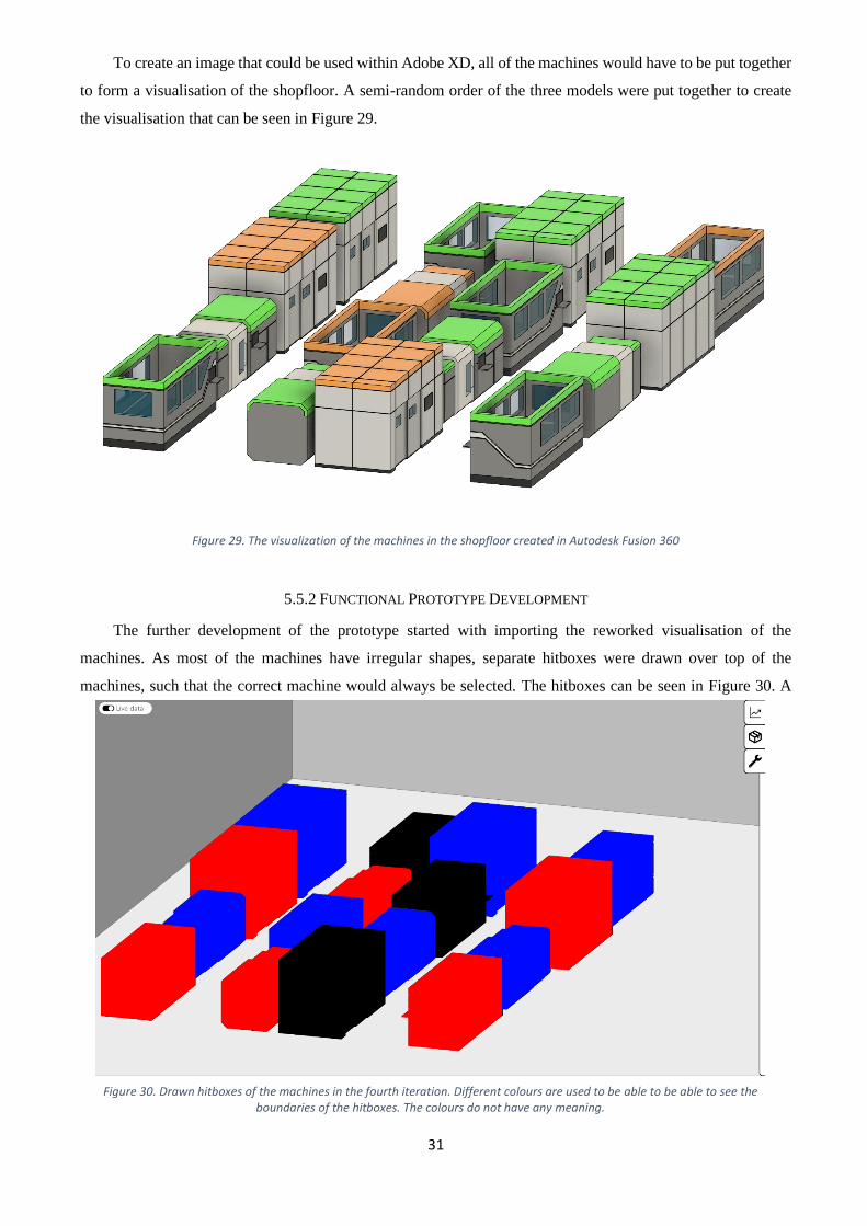
To create an image that could be used within Adobe XD, all of the machines would have to be put together
to form a visualisation of the shopfloor. A semi-random order of the three models were put together to create
the visualisation that can be seen in Figure 29.
5.5.2 FUNCTIONAL PROTOTYPE DEVELOPMENT
The further development of the prototype started with importing the reworked visualisation of the
machines. As most of the machines have irregular shapes, separate hitboxes were drawn over top of the
machines, such that the correct machine would always be selected. The hitboxes can be seen in Figure 30. A
Figure 29. The visualization of the machines in the shopfloor created in Autodesk Fusion 360
Figure 30. Drawn hitboxes of the machines in the fourth iteration. Different colours are used to be able to be able to see the boundaries of the hitboxes. The colours do not have any meaning.

32
long-lasting bug of this project was also fixed this way through that in previous iterations had overlapping
hitboxes, which would make it so that a machine was selected the user did not mean to click on.
Further development was done in the machine information screen. This screen was reworked to house new
features, as well as to look more in line with the modern look of the tool. Instead of separation lines between
design elements, shadows were used to create a look that more closely resembles the modern looking Material
Design by Google [44]. This was only implemented in some parts of the prototype, as to see whether the client
likes this direction of the project, and so that the client could easily compare between the two styles. This rework
of the machine information menu can be seen in Appendix H. As can be seen, the different machines also all
have a rendered image in the header of how the machine looks like.
Additionally, a failure log button has been created. To create this button, the Auto Icon plugin has been
used again to find both a cog and a warning triangle, which has been coloured red. The colour red has been
chosen as this is also the colour of the machines when they fail. What also has been reworked is how the machine
parameters are displayed. The parameter names are now right aligned, and the parameter values are left aligned.
More space has been created in between the different parameters, and the background of the rows has been
removed. This makes it so that it still provides a clear overview of the different parameters, while also fitting
better with the overall design of the product more because of a more minimalistic and modern design. This
button also becomes a darker colour when the user hovers over it, conveying to the user that it is a clickable
item.
The same design style was applied to the overview tab, in which the background of the rows was removed
to have a better with the overall product, as can be seen in Appendix H. Additionally, a drop shadow was added
on the graph, to make it fit with the overall design better, as well as to make it look as if the graph is floating
above all of the menus. It was designed this way with a stroke around as well as a drop shadow on the graph to
make it appear to be movable, as that was a design feature the client had requested. Unfortunately, moving a
window around is not possible within Adobe XD but it can be considered in the design of the tool. As can be
seen in Appendix I, the header of the overview tab has remained the same as the last iteration. This was to show
the client the difference between the two different styles and help them decide upon what they like better.
The maintenance tab also had content added to it. As was discussed in the last iteration, the client had
provided information about what functionality was expected from this tab. This functionality was added by
creating rectangles with rounded edges, as to fit with the style that includes rounded edges. Within these
rectangles, the manufacturer, machine name, and date are shown, as can be seen in Appendix J. Every
maintenance log entry has a button next it to bring the user to a screen that provides more in-depth information
about the maintenance entry. However, that is not implemented in this iteration. This button becomes a darker
colour once a user hovers their mouse over top of it, conveying to the user that this is a clickable item.
5.5.3 CONCLUSION FOURTH ITERATION
At the end of this iteration, the prototype was shown to the client to seek out additional requirements, as
well as to see how the client likes the rework of the prototype. First of all, the rework of the machine information
screen. This rework was very much liked by the client, as it gives the interface a three-dimensional feeling.
Additionally, the way that the parameters are displayed is also very much liked by the client, as to their opinion

33
it works well with the new style that uses shadows rather than lines to define design elements. It is now desired
that for the next iteration, the parameters that are being displayed will be realistic parameters, and so a list of
realistic parameters is provided by the client that can be seen in Appendix K. The failure log button that was
added to this menu was also appreciated, though it was thought that the red rectangle of the button would
disappear if the machine was fully functional.
The rework of the machine visualisations was liked a lot. The machines now looked like how the client
had hoped it would be displayed and reworked, thus expectations were met. According to the client, this gives
much more of a high-tech feeling to the tool.
The overview tab was also reworked in a similar style as the machine information screen. The reworked
design of this menu was also liked a lot. The client liked the new look of how the graph that is displayed to look
like it is floating on top of the rest of the interface. This is exactly as it was designed.
The newly filled in maintenance tab was also much liked, especially that it is possible to scroll through the
maintenance orders. A feature was requested for this part of the product, which is that if the button on a
maintenance order is clicked, the rectangle that houses the button expands to provide the user more information
about the maintenance order. Even though this would be a good feature to implement, implementing this feature
would be too complex due to the limitations of the program and the time that is remaining for this project.
The product menu was not filled yet for this iteration, as this is outside of the scope of this project.
However, the client requested it to be filled in a similar way to the maintenance tab. However, the client stressed
that this is not a big priority, nor that a lot of time would have to be spent on this part of the project. For this
reason, the products menu will largely be a placeholder.
Lastly, there were some general remarks. The first of which being that the graphs in the machine
information screen was not yet working and is seen as a core feature. This is a feature that will be a high priority
to re-implement for the next and final iteration. Lastly, the client said that they wanted to a machine in the
visualization that is non-functional. The client would want this to be added to prototype to have a complete
image of all of the functionality that this tool offers.
5.6 FINAL ITERATION
For the final iteration, just like in the previous iterations, changes and additions were implemented based
upon the feedback of the previous iteration. This iteration was mostly fixing the final few things and putting the
finishing touches on the prototype.
For the final iteration, the machine information screen has received realistic parameters names. This was
formatted in such a way that relevant parameters are grouped together though the usage of both spacing of the
parameters from each other, as well as different font sizes. The implementation of this can be found in Appendix
L. As can be seen, the various gasses, liquids and power variables are all categorized under their own respective
categories. OEE and workload are also grouped together through the usage of spacing, as both of them have a
percentage as a unit, where the same goes for the parameters uptime and maintenance. As requested, the user is
now also able to click on the various parameters, which will bring up a graph that shows the usage of the
parameter selected. An example can be seen in Figure 32. As also can be seen, a scrollbar appears on the side
of the machine parameters, indicating to the user that they can still scroll to view and select other parameters.

34
At the end of the previous iteration, it was also desired that a non-functioning, and thus red, machine would
be added to the visualisation of the shopfloor. This was done by first creating a model in Fusion 360, after which
the new model was implemented into the Adobe XD prototype. As was also requested by the client, is that the
preview image of the machine would change if the machine was non-functioning. This caused a minor addition
and change in the machine information screen, as can be seen in Figure 31. There is now a translucent red
warning triangle overlapping the preview image on the top right of the screen. Additionally, red warning
triangles are added next to the problematic parameters of a non-functioning machine, whereas for an “orange”
Figure 32. The workload parameter has been selected on the machine information screen
Figure 31. The screen once the non-functioning machine has been selected

35
machine, these would be orange. Especially the large warning triangle through the preview image is supposed
to heavily introduce the colour red on the machine information screen, as to give the user more visual cues that
the machine is not functioning.
The product menu has also received some attention. As this part of the interface is largely outside of the
scope of this project a prototypical fill-in of this menu would suffice. A very similar style has been applied as
has been applied to the maintenance tab, where rectangles with rounded corners are used, in which a small
preview image can be found, as well as the name of the product. The realization of this menu can be found in
Appendix M.
The overview menu also has also been partially reworked. As the machine information screen has received
realistic parameters, so should the overview menu. The overview menu has received all of the parameters that
a machine also has, apart from that the overview menu provides a global overview of the entire shopfloor. How
this has been realized can be found in Appendix N. Once a parameter has been selected, a graph appears in the
bottom right corner, which overlaps with a part of the parameters. Therefore, a scrollbar appears to the right of
the parameters, indicating that they can be selected. This iteration is evaluated in Chapter 6, since it is the final
iteration.
6. EVALUATION
A questionnaire was made to see how the interface is received by people who have not interacted with it
yet, and only have heard very little about the development of the interface. However, since this is a product that
will be used within FPC, the questionnaire was only sent to people that work in FPC, and thus are also aware of
the projects that FPC is carrying out in more detail. It was chosen to not send this questionnaire to people outside
of FPC, as there was little question about whether the interface functions, but more about how well the interface
is received within FPC. All of the questions that were asked can be found in Appendix O, where the results of
the questionnaire can be found in Appendix P. The questions were aimed to evaluate what the users thought of
the look of the interface, what is expected from certain functions or buttons, as well as seeing whether the
interface is self-explanatory enough.
6.1 INTERPRETATIONS AND EXPECTATIONS
A series of questions were about the functionality the user expected to see behind certain buttons, as well
as how some of the placeholders and icons were interpreted. This was asked before the user could interact with
the interface in a web application provided by Adobe XD. The expectations behind the first menu item were
very accurate, being that it provides an overview of the shopfloor in the shape of various graphs. The first menu
item was thus very well understood. The second menu item, being the product overview, was very poorly
understood. Expectations ranged from that this menu-item would provide the user with an insight into a specific
machine, to stock availability. The third menu item was not understood well either, but the only two things that
were expected is that this menu would either provide the user with an overview of maintenance activities or
settings. However, as this interface will most likely have a settings button somewhere in a future version, it is
expected that this confusion will disappear once that has been implemented.

36
The content of the overview menu was received well. The content of the product menu was liked as far as
was developed, as “The image of the product makes it very clear what the product is at the glimpse of an eye”,
as was mentioned by one of the participants. Lasty the button in the top left corner to toggle live data, of which
the imagined functionality is that it would show the user what machines are working at the moment, as well as
having AGVs driving around the virtual shopfloor based on their actual location. This was also a well understood
feature, as the majority of the participants understood the feature as intended. A couple of participants
interpreted it differently, thinking it would provide a provide the user with a camera feed of the shopfloor.
6.2 USABILITY
In order to evaluate on the usability of the prototype, a series of questions were formulated about the
usability of the tool in the questionnaire. The first of which being whether the very core of the concept was
conveyed in an effective way to the user, being that the machines are coloured depending on their status. From
the answers of the questionnaire, this was conveyed well and in such a way that the participants thought that the
colours of the machines were meant to show the status of the machines.
Another point of usability was whether this style of interface actually suits within FPC, which mostly
received negative answers. How the interface is built up with its various icons, as well as the modern style that
was chosen does fit FPC. However, as multiple participants said, the interface lacks the branding of FPC. This
would be implementing the logo of FPC in the interface. What would also help to make this more in the style
of FPC would be to use fonts that are often used within FPC. Also, the accent colour of green could possibly be
implemented as an accent colour, as that is the colour of FPC.
The user interaction when trying to view historical data of a parameter of a machine was not good. This
was a feature that was often not found out. This can be linked to the fact that when the user mouses over a
parameter of a machine name, the background nor text changes colour, shape, or size. The only thing that would
change would be that the mouse cursor would turn into a hand cursor. Neither do the parameters look
“clickable”, which could be done by putting an option button, radio button, or checkbox in front of the parameter,
which would make the user think that this is something that can be selected. Once a parameter has been selected,
a graph shows up to show this historical data. A significant number of participants said that they would want to
drag this graph to another place on the interface. The fact that this was considered when the interface was
designed is a good sign, as this shows that the desire is there to essentially customize the layout of the screen.
6.3 LIMITATIONS
There was a number of limitations within Adobe XD that are worth mentioning. A number of times
throughout the design process, a desire was expressed by both client and designer to have moving images in the
design. However, this could not be easily realized within Adobe XD, which made it so that it became a much
lower priority, and therefore never executed. It was found to be possible, but the difficulty of getting this plugin
to work well with the design already developed, and therefore the idea of implementing moving images was
scrapped. This required the redesign of many already developed elements in Adobe XD to suit the format that
the plugin requires and was thus found to be not worth it. Further limitations found within the software was
found in the shape of not being able to have a number of interactions that were desired by the client. All of these

37
interactions came down to the same thing, which was being able to drag a screen around the interface, and thus
place this screen wherever the user would want in the interface.
Another limitation of this design is that due to the way interactions and hitboxes work within this software
product, a lot of hitbox related bugs were introduced. This would for example be the case that a machine could
be selected by clicking in the correct place on another machine or on the side-menu. The fact that these bugs
were present could have affected the user tests performed during the evaluation steps of the various iterations,
as well as the questionnaire.
Adobe XD also does not allow for importing 3D-objects in the design. This made it so that all of the
machine visualisations that were implemented in the end were based off of a render made within 3D modelling
software. A desire was also expressed early on in the design phase that a desirable feature would be to change
the perspective of the shopfloor. However, this could not be realized through this.
The current situation with the coronavirus pandemic also resulted in a couple of limitations. The first of
which being that design evaluations were harder to do, as this all had to happen online. This was especially a
problem for the first two prototypes, where it was hard to present to the client what I wanted. Instead, a lot of
time was spent on digitalizing the first prototypes and finding out a setup which would allow for small on-the-
fly adjustments. Due to the fact that evaluations were done online, user testing was very hard to do and was
therefore hardly tested. Another limitation due to the coronavirus was that there was no possibility to test the
interface that was designed on a large touch screen, as that would be one of the use cases. This also meant that
no designing was done on a large screen, as that was not available.
Lastly, the questionnaire received a low number of responses. This was expected, but the fact that only
eight people filled in the questionnaire means that no reliable conclusions can be drawn from the questionnaire
and can only provide estimates of those conclusions.
6.4 DISCUSSION
The final design of this product is of course not without its flaws, mistakes, and imperfections. As a first,
the user experience is quite poor. It was very difficult to develop the user experience in any meaningful way due
to the coronavirus pandemic. All evaluations of prototypes were done online, which makes it difficult to evaluate
the user experience. The lack of user experience development is especially present in the machine information
screen and the overview screen. Another point of improvement is that there is a lack of branding present in the
interface. As this is a product that is owned and produced for FPC, with the requirements found out together
with FPC implemented, it should also reflect that it is a product of FPC.
The results that were obtained from the questionnaire were all from FPC employees. All of these people
are people that have a connection to the manufacturing industry, and it could therefore be argued that it this
interface design is more intuitive for them. Some users of this interface will be clients and visitors of the AMC,
who might not know a lot about the manufacturing industry, to which this interface could very well not be
intuitive to use. This means that the results from the questionnaire are biased towards people that have some
connection to the manufacturing industry.
It can also be argued that the generalist approach that is taken throughout this project was the wrong way
to about it in the first place. As there are three main users, which are management, client and visitors, and

38
engineers, a separate interface design could be made for all of them. As this design combines all of the
requirements of the different users, some compromises have to be made. For example, an engineer might not
care about the visualisation of the shopfloor as much and would therefore prefer a two-dimensional grid-like
visualisation of the machines. As the engineers do not have to be impressed with what FPC is capable of doing,
excessively fancy visualisations are not needed when the engineer is the user.
7. CONCLUSION
The purpose of this project was to answer the research question “How can an interface be designed such
that it shows the status of various machines around the shopfloor?” through the use of three sub-questions. These
sub-questions were centred around what content to display, how to display this content, and how the user gets
to this content.
First of all, what information to display in the interface. The main focus of the project is to display the
status of the machines on te shopfloor, so naturally this comes first. Up next is the parameters of a machine, and
historical data of those parameters. The list of parameters can be found in Appendix K that are used for this
prototype. Historical data of the various parameters is represented in a line graph, as this provides the best insight
into the data. Additionally, the physical location of the machines also has to be displayed to the user, as well as
upcoming maintenance jobs, maintenance history for a specific machine, a register of when the machines has
failed and why, and the capabilities of the machine. Other information that is to be displayed is which products
the shopfloor is producing, as well as what the machines look like.
How to display was found out using an iterative design process. The status of the machines, the physical
location of them, and how the machines look like are combined into a single design element in the interface.
3D-models have been made of the machines, which are then placed in the same way relative to each other as
they are on the shopfloor. This combines the information of how they look like and the physical location on the
shopfloor. The roofs of the machines are coloured to indicate the status they have, which is either red, orange,
or green. This means broken down, has a warning, or is fully functional respectively.
A side-menu has been made where various pieces of information can be viewed. The menu where machine
information can be viewed has at the very top identifiers of the machine, which are a 3D-model render of the
machine, the manufacturer, model, as well as the function of the machine. One of the pieces of information that
can be shown in this area is information about a specific machine. The machine parameters are placed in a list,
and the parameters that are related are grouped together through the usage of differences in font sizes, as well
as white spaces between the variables, as can be seen in Appendix L. Additionally, a button to a register of
machine failures, maintenance information about that machine, as well as capabilities of the machine are
displayed in this screen through the usage of buttons. These buttons take the user to another screen that displays
the relevant information.
Collective maintenance information is placed in a separate side-menu. This menu displays all of the
upcoming and historical maintenance jobs. The information that is seen without any further interaction is the
manufacturer and model of the machine, as well as the date on which the maintenance job is performed. The
products that are being produced by the shopfloor are presented in a similar way to the maintenance information,
where a simple image of the product and the name of the product is seen in a list-like menu.

39
How the user should get to the content previously described has been done in such a way that a minimal
number of clicks are required to access any information. As such, a machine can be selected during at any time,
which will provide the user with the machine information screen. Historical data of the machine can be viewed
by selecting a parameter of that machine, which will make a graph that partially overlaps with the parameters.
To access other parameters the user might need to scroll through the list of parameters to select the one the user
wants to, depending on where the parameter is positioned in the list.
8. RECOMMENDATIONS
As this is only the start of the development of an interface that allow the user to see what is going on in the
AMC, a lot of work still has to be done. First of all, to replace all of the placeholder items with actual content.
What this content will be, should be found out through elicitation with FPC. This means that further development
will take place of the products menu, maintenance menu, as well as the content of the placeholder buttons in the
machine information header.
Research should also be done to see whether it would not be better to use separate interfaces for the
different users. As the range of users is very large, it is possible that more effective designs can be made by
developing separate interfaces for the different users. However, it could be possible that engineers and
management use the same interface, whereas the clients and visitors will get a different design interface. The
fact that outsiders will be using the same interface as the people working in the company might bring privacy
or transparency related issues with it.
Further design development should also be done to improve the user experience. As this was hardly
possible due to the coronavirus pandemic during the development of this interface, it is likely that a lot of the
interface needs changing to improve the user experience. Things that should be taken a look at especially are
the interaction that non-expert of the manufacturing industry have with this interface. Since some of the users
of this interface will be non-experts of the manufacturing industry, it is important that those users also find this
interface to be self-explanatory enough to use. Furthermore, the branding of FPC should be incorporated. As
this is a product of FPC, their branding should be used as well. This can be in the shape of their logo or through
incorporating the colour palette of FPC.
Lastly, more technical development should take place. The back end would have to be developed for this
interface. Research would have to be done when a machine turns from a fully functioning ‘green’ to a poorly
functioning ‘orange’ machine, as well as what the conditions are for a non-functioning and thus ‘red’ machine.
Not only does the back end have to be developed for this interface, but as this is a prototype that is built in
Adobe XD, the entire interface will also have to be built as a web-based application such that it can be connected
to a database and back end.

40
APPENDIX
APPENDIX A
Brainstorm Ideas
Figure 33. The hand-written brainstorm about ideas for the project

41
APPENDIX B
Detailed view of the side-menu
Figure 34. A zoomed-in image of the side menu on the second prototype of the
second iteration

42
APPENDIX C
Side Menu Buttons
APPENDIX D
Live Data Button
(a) (b) (c) (d)
Figure 35. The side menu button as of the third iteration where (a) has nothing selected, (b) has overview selected, (c) has product selected, and (d) has
maintenance selected
(b)
(b)
Figure 36. The live data button used where (a) has the button turned on and (b) has the
button turned off

43
APPENDIX E
List of Potential Equipment
Manufacturer Model Link
Additive Industries MetalFab 1 Metalfab1
Makino D500 D500
Trumpf TruLaser Cell 5030 TruLaser
ABB 3DIQ 3DQI
ABB FlexArc 500B FlexArc 500B
Schuler MSC-2000
Trumpf TruBend Cell 7000 TruBend 7000
Everising Column Type H-5550 H-5550
AIXEMTEC XT-FAS 500 XT-FAS 500
Delta LC 500 Rotary Table Surface Grinding Machine With Vertical Spindle
LC-500

44
APPENDIX F
Machine Rework Drawings
Figure 37. The first page of drawings for reworking the way the machines are visualized of the fourth iteration
Figure 38. The second page of drawings for reworking the way the machines are visualized of the fourth iteration

45
Figure 39. The third page of drawings for reworking the way the machines are visualized of the fourth iteration

46
APPENDIX G
Machine Rework 3D Models
Figure 40. The 3D model of the bending machine
Figure 41. The 3D model of the laser cutting machine Figure 42. The 3D model of the milling machine
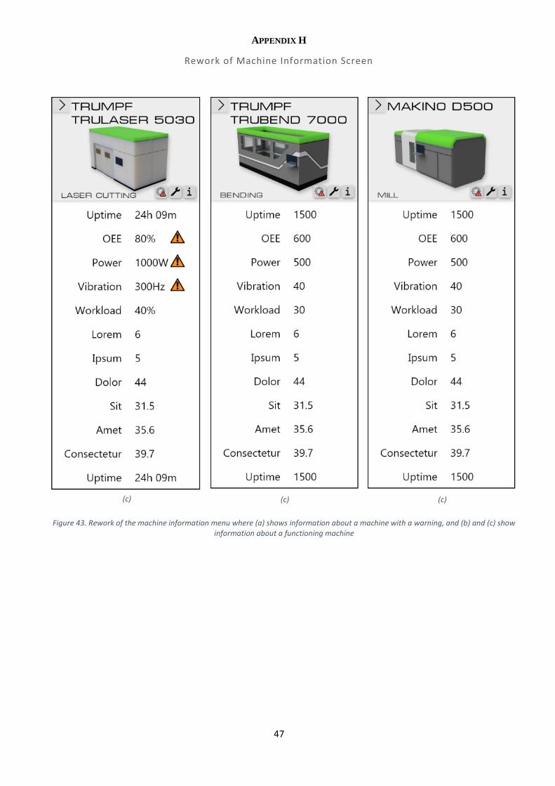
47
APPENDIX H
Rework of Machine Information Screen
(c) (c) (c)
Figure 43. Rework of the machine information menu where (a) shows information about a machine with a warning, and (b) and (c) show information about a functioning machine

48
APPENDIX I
Overview Tab Rework
Figure 44. The rework of the overview tab as of the fourth iteration

49
APPENDIX J
Maintenance Tab Rework
Figure 45. The maintenance tab as of the fourth iteration

50
APPENDIX K
Parameter Table
Table 1. Parameters to be added to the machine information screen
Parameter Unit
Part being worked on -
Material -
Maintenance interval days
Power W
Voltage V
Amperage A
Oxygen L/s
Air L/s
Nitrogen L/s
Water L/s
Oil L/s
Coolant L/s

51
APPENDIX L
Finalized Machine Information Screen
Figure 46. The finalized machine information screen

52
APPENDIX M
Finalized Product Menu
Figure 47.
The finalized product menu with a prototypical fill-in for the menu

53
APPENDIX N
Finalized Overview Menu
Figure 48. The finalized overview menu

54
APPENDIX O
Questionnaire
Information Hello everyone filling in this questionnaire!
I am Wouter Koning, and I am nearing the end of my graduation project of my Bachelor Creative Technology for AMC.
For my graduation project, I have been developing an interface to display the status of the machines that will be
present on the matrix production shopfloor, in addition to a couple of extra features.
For this questionnaire I have a series of questions for you, all of which will be about the design and expected
use of the interface. This questionnaire is made to evaluate upon my work, as well as provide a better list of
recommendations towards AMC regarding this design. This questionnaire is not compulsory to fill in and is
entirely voluntary to fill in.
No names or personal information that will be able to be linked to an individual will be asked. All of the data that
is collected will be deleted after the graduation project has been finished.
If you have any questions, email me at [email protected].
1. I understand and I want to participate in the questionnaire! *
Mark only one oval.
Yes, I understand what I have read above and I would like to fill in the questionnaire!
Questionnaire
Introduction Below, a picture of the starting screen can be found of the starting screen of the interface.
Thank you for participating in this questionnaire! A link will be provided whenever
it is necessary to be interact with the interface.

55
2. A button stating "live data" is shown in the top left corner. What do you think this
button does? Leave blank in case you do not know.
3. The machines that are represented in this interface all have a colour. What do you think
that this colour means? Leave blank in case you do not know.
Menu
4. On the top right, a menu can be found, that can also be found below. If you click on this
menu, what menu do you imagine to get? If you don't know, answer "no" *
The following questions are about the menu that can be found on the right side of the interface.

56
5. What will you be able to see in this menu? Leave blank in case you do not know.
6. On the top right, a menu can be found, that can also be found below. What menu do
you think this will bring you to? If you don't know, answer "no" *

57
7. What will you be able to see in this menu? Leave blank in case you do not know.
8. On the top right, a menu can be found, that can also be found below. What menu do you
think this will bring you to? If you don't know, answer "no" *
9. What will you be able to see in this menu? Leave blank in case you do not know.
Interaction
Link to the interface! It is finally time to interact with what I have produced. To be able to see what I have produced and interact with it,
click the following link. Please interact with it for a minute, and try to seek out its features. After you have done
that, please continue with the questions.
https://xd.adobe.com/view/80675d9a-6889-49fe-aa5e-0012660bc6c8-d534/?fullscreen&hints=off
This link will be provided plenty throughout this questionnaire, so do not worry about accidentally clicking away the
tab.
10. I feel like I have interacted enough with the interface and I am ready to answer

58
questions about this interface. *
Mark only one oval.
Yes, I have interacted with the interface
Disclaimer This is a prototype, therefor numbers might not represent reality. This interface is designed to provide the
foundation for a tool that would use actual data to display the status of machines. Keep this in mind while
interacting with the interface.
11. I understand that this is a prototype, and might not represent realistic figures. *
Mark only one oval.
Yes, I understand this is prototype that might not represent realistic figures.
12. Anything you would like to get off your chest before we continue with the
questions regarding the interface or this questionnaire?
Machines
13. When you select a machine, was it clear what machine has been selected? *
Mark only one oval.
Link to the interface:
fullscreen&hints=off
This link will be provided plenty throughout this questionnaire, so do not worry about
accidentally clicking away the tab.

59
Yes No
Other:
14. When a machine has been selected, the menu on the side expands. Did you find out that
you could see historical data of machine parameter before reading this question? *
Mark only one oval.
Yes
No
If you have not found the graph If you have not found a graph, please go back to the interface and select a machine parameter to make the graph
appear.
15. Would you want to drag this window to another place on the interface? *
Mark only one oval.
Yes
No
Other:
16. Anything else you would like to say about this part of the interface?
Side-menu items
Link to the interface:
fullscreen&hints=off

60
First menu item The following questions will be about the first menu item called "Overview".
17. The goal of this menu is to provide the user with a global overview of the
shopfloor. Was this clear before reading this question? *
Mark only one oval.
Yes No
Other:
18. Do you have any other comments about the "Overview" menu?
Second menu item The following questions are about the second menu item called "Products".
This menu describes all of the products that are being produced on the shopfloor. This menu is largely a placeholder,
as this fell outside of the scope of the project. However, this is a great item for recommendations for future work.
19. In this menu, a button is placed with a clipboard icon. What information do you expect
to see behind this placeholder? *
20. Do you have any other comments about the "Product" menu?

61
Third menu item The following questions are about the third menu item called "Maintenance".
21. Information about the machine (manufacturer and model) as well as a date is shown
for every maintenence order. What other information would you like to see at the
blink of an eye? *
Mark only one oval.
None
Other:
22. In this menu, a button is placed with a clipboard icon. What information do you expect
to see behind this placeholder?
23. Do you have any other comments about the "Maintenance" menu?
General
Questions
24. Do you think the style of interface suits FPC? *
Mark only one oval.
Yes
No
25. Elaborate on your previous answer *
Link to the interface:
fullscreen&hints=off

62
26. Did you want to have certain information displayed that was not displayed in this
interface? Leave blank if the answer is no
27. Now that we have looked through every menu, would you use this interface for
monitoring the status of machines and troubleshooting their problems? *
Mark only one oval.
Yes No
Other:
Thank you!
28. Would you like to receive further updates about this graduation project?
Check all that apply.
Yes, I am interested in the thesis
Yes, I am interested in the grade you receive
Yes, I would like to attend the presentation (there is uncertainty about how many people
can be invited)
29. If you answered yes to the above question, mention your email-adress so I can send
you the relevant information
You have directly contributed to quality of my thesis by filling in this questionnaire!
63
APPENDIX P
Results of Questionnaire
A button stating "live data" is shown in the top left corner. What do you think this button does? Leave blank in case you do not know.
Realtime status of the machines
Update the model with live data coming from the field. For e.g. If there are moving objects like AGVs, the model will be updated with its location data and change the AGV to its current position.
Provides live feedback from Camera in the shopfloor
If activated, it shows the machineries that are connected to network and from which, perhaps, it is possible to show/extract live data on their status.
Turn on the live data
Display the live camera feed connected to actual shop floor
Show the current status of the machines.
That data on the machines is being updated live
The machines that are represented in this interface all have a colour. What do you think that this colour means? Leave blank in case you do not know.
It should indicate the status of the machines but this is not how is done in production interfaces
Showing the status of the units for e.g. green is in operation currently, Orange is in idle state and red has an alarm or error.
Categorizing machines based on common function
The type of rules/risks associated to that category of machines.
green: active, orange; waiting; red; erro
Depicting machines contains common functionality or do generate identical product output.
Green: good operation condition, Orange: Might be something at stake, Red: Error/Downtime
how efficient they are running/uptime on the machine
On the top right, a menu can be found, that can also be found below. If you click on this menu, what menu do you imagine to get? If you don't know, answer "no"
Report
Showing data analytics tool.
No
Current status
graphs
Status of process
Trend of the status of the machinery over time
a dashboard with data representations
What will you be able to see in this menu? Leave blank in case you do not know.
Report around the status of the machines

64
Plot various parameter graphs / data analytics of the shop floor for e.g. machine utilization throughout the year or energy consumption etc.
Busy, not busy. Current data from the running processes (e.g. is 50% of a running 3D print job done? How long will it take to be completed? Current number of layer?). Specific and total energy/gas/water consumptions.
graphs and statistics of the flow of the process
Overview table or chart containing information about the status of all the machines and job progress
Graphs (vibration, pressure, temperature, ... )
production data
On the top right, a menu can be found, that can also be found below. What menu do you think this will bring you to? If you don't know, answer "no"
Packeging or product
View toolbox.
Machine status
Data transferring
storage
Specific Machine
Product information
no
What will you be able to see in this menu? Leave blank in case you do not know.
Info about the product or packege
Different viewing options such as from different angle and different zoom levels. We can perhaps also switch from the complete shop floor to one manufacturing cell.
Which machines in the workfloor is being used and which ones are idle
Data to send and contacts.
how much stock there is avaialble
Current status and operation for a specific machine
Information about the products/processes that are made/performed by the machines.
On the top right, a menu can be found, that can also be found below. What menu do you think this will bring you to? If you don't know, answer "no"
Mentinance
Settings
Settings
Settings
maintenacne
Settings
Maintenance activities
system settings

65
What will you be able to see in this menu? Leave blank in case you do not know.
Info about the machines under mentainence
Possibility to change some settings of the model such as color schemes, font size etc.
Specific settings (e.g. what process parameters are being used by the 3D printer while it is working? Laser power/speed? Chamber/Baseplate temperature? etc. )
if there are maintenance actions coming up
Settings for machine operations
Maintenance schedule
settings for the application like ui color
Anything you would like to get off your chest before we continue with the questions regarding the interface or this questionnaire?
Why i can not see the shopfloor from diffrent views or even interact with it
Compared to my initial guess, this is better. I like the structure of the menu. Nevertheless, I still wish to see data transferring capabilities (e.g. being able to produce and send reports)
It looks very good (better than other MES interfaces I have seen)
so far everything is very generic and high level.
When you select a machine, was it clear what machine has been selected?
No
Yes
Yes
Yes
Yes
Yes
Yes
No
When a machine has been selected, the menu on the side expands. Did you find out that you could see historical data of machine parameter before reading this question?
Yes
No
No
No
Yes
Yes
Yes
Yes

66
Would you want to drag this window to another place on the interface?
Yes
No
No
Yes
Yes
No
Yes
just make it a bit more energy dense and smaller
Anything else you would like to say about this part of the interface?
Higlight the problem if there is one in the reports interface. It should be clear very fast for the user what is good and what is wrong.
it loads quite slowly,
Would be nice to actually see it change. It is now a static graph to which no data is being added.
The goal of this menu is to provide the user with a global overview of the shopfloor. Was this clear before reading this question?
No
Yes
Yes
Yes
Yes
Yes
Yes
No
Do you have any other comments about the "Overview" menu?
Change the icon
I did not find out what does live data do.
No
1. Icon next to the word "OVERVIEW" is missing. 2. Perhaps Temperature can be displayed as a variable as well.
data items are unclear what they relate to
In this menu, a button is placed with a clipboard icon. What information do you expect to see behind this placeholder?
Detail info about the specific machine

67
perhaps the status of the product in the shop floor for e.g. currently the product is on which machine.
The status of the production process , parameters used , machine used , time left to be manufactured
A report of the product (e.g. production time, cost, purpose/customer, needed post-processing operations, handling operations, a specific code/number, etc.)
resource requirements, amount of hours needed to be produced, capacity required, drawings
Product specifications and requirements
Subitems/parts
a todo list for service/maintenance
Do you have any other comments about the "Product" menu?
Change the icon it reminds of packeging also
No.
No
The image of the product makes clear what it is in a glimpse of an eye.
I can't see in what stage the product is in the production line so it tells me very little about the actual state of the system
Information about the machine (manufacturer and model) as well as a date is shown for every maintenence order. What other information would you like to see at the blink of an eye?
Reason for mentainance date when it had defect and vendor for the parts, status when the parts were replaced etc
its good
Due date for maintenance
A red/orange/green color scale (based on the level of importance of that specific action) that tells you if maintenance is required according to each machine's schedule.
efficiency
None
Next time till maintenance.
last and next moment of maintenance, current efficiency
Do you have any other comments about the "Maintenance" menu?
No
No
It would be nice to see when the next maintenance activities are planned.
In this menu, a button is placed with a clipboard icon. What information do you expect to see behind this placeholder?
Detail info about the specific mentaiance report
The maintenance history (planned and unplanned), the information regarding regular maintenance such as oil change/filters etc. the sensors that need to be monitored for certain predictive maintenance (or the live data from those sensors can also be good).

68
Due date , maitenace schedule , in charge for maintenance
Who did the maintenance, type (e.g. 3 levels: urgent/important/attention, expected or not) details on that operation (what and for how long), if and when a similar action is to be repeated, special comments
the software running, resource usage, task it is performing
Specification on the machines
Log of the maintenance activities.
Do you think the style of interface suits FPC?
No
No
Yes
Yes
No
No
Yes
No
Elaborate on your previous answer
Use the FPC colours we have a specific colour pallet / add the logo
We have a certain color theme and branding. It doesn't show that branding.
The style provide information on overall status of machines in the workfloor and it is easy to follow with a the minimalistic interface
The pure layout (lines, icons, how the machines look like) suits FPC style. Nevertheless, I would add some of the characteristic green color of FPC (or whatever it will be) to the gray background (both machine area and menu).
with the right font, and the actual logo somewhere it would beter suit
As the colors represented are in green, which can be closely approximated to depict FPC. Is there a possibility of improving color ?
Elegant yet simple. It really gives you a feeling of digitalization of a shopfloor. And it is way nicer to look at over the current MES interfaces that are being used.
To me it matches on almost none of the stylistic aspects....
Did you want to have certain information displayed that was not displayed in this interface? Leave blank if the answer is no
Yes some icons indicating the status of the machines when they are selected
On the model there must be a time/date indication
Current version of the installed interface software :)
Timeline / Schedule of the products that are being made.
depends on what I need to do with this interface... If it is only for an overview then it's oke I guess

69
Now that we have looked through every menu, would you use this interface for monitoring the status of machines and troubleshooting their problems?
No
May be. Not so sure. I have to see the full model with live data coming in.
No
Yes
Yes
Yes
Yes
How would I ever use this interface to troubleshoot problems? It will only tell me (I presume) when a machine has an error.

70
REFERENCES
[1] S. Vaidya, P. Ambad and S. Bhosle, "Industry 4.0 - A Glimpse," in International Conference on Materials
Manufacturing and Design Engineering, Beijing , 2018.
[2] M. Rüßmann, M. Lorenz, P. Gerbert, M. Waldner, P. Engel, M. Harnisch and J. Justus, "Industry 4.0: The
Future of Productivity and Growth in Manufacturing Industries," Boston Consulting Group, 2015.
[3] K. Martin, "A review by discussion of condition monitoring and fault diagnosis in machine tools,"
International Journal of Machine Tools and Manufacture, vol. 34, no. 4, pp. 527-551, 1993.
[4] A. Janes, A. Sillitti and G. Succi, "Effective Dashboard Design," Cutter IT, vol. 26, no. 1, pp. 17-24, 2013.
[5] H.-N. Dai, H. Wang, G. Xu, J. Wan and M. Imran, "Big Data analytics for Manufacturing Internet of Things:
Opportunities, Challenges and Enabling Technologies," Enterprise Information Systems, vol. 14, no. 9-10,
pp. 1279-1303, 2019.
[6] A. Lavalle, M. A. Teruel, A. Maté and J. Trujillo, "Fostering Sustainability through Visualization Techniques
for Real-Time IoT Data: A Case Study based on Gas Turbines for Electricity Production," Sensors, vol. 20,
no. 16, p. 4556, 2020.
[7] V. R. Basili, J. Heidrich, M. Lindvall, J. Münch, M. Regardie, D. Rombach, C. Seaman and A. Trendowicz,
"Linking Software Development and Business Strategy Through Measurement," Computer, vol. 43, no. 4,
pp. 57-65, 2010.
[8] A. Janes and G. Succi, "To pull or not to pull," in Object-Oriented Programming, Systems, Languages &
Applications, Orlando, FL, 2009.
[9] C. Ware, Information Visualization 3rd Edition, Durham: Morgan Kaufmann, 2012.
[10] Y. Koren, X. Gu and W. Guo, "Reconfigerable Manufacturing Systems: Principles, Design and future
trends," in Frontiers of Mechanical Engineering, 2017.
[11] M. C. May, S. Schmidt, A. Kuhnle, N. Stricker and G. Lanza, "Product Generation Module: Automated
Production Planning for optimized workload and increased efficiency in Matrix," in CIRP Global Web
Conference – Flexible Mass Customisation, Online, 2021.
[12] J. Zenger, J. Carr and E. Fogg, How a Former Machinist is Seeking to Empower the Shop Floor: Machine
Monitoring with MachineMetrics, Making Chips, 2020.
[13] P. Greschkea, M. Schönemanna, S. Thiedea and C. Herrmanna, "Matrix structures for high volumes and
flexibility in production systems," in Variety Management in Manufacturing, Windsor, 2014.
[14] M. Schönemann, C. Herrmann, P. Greschke and S. Thiede, "Simulation of matrix-structured
manufacturing systems," Journal of Manufacturing Systems, vol. 37, no. 1, pp. 104-111, 2015.
[15] A. Hees and G. Reinhart, "Approach for production planning in reconfigurable manufacturing systems," in
Conference on Intelligent Computation in Manufacturing Engineering, Capri, 2015.
[16] C. Cristea and M. Cristea, "KPIs for Operational Performance Assessment in Flexible," Sustainability, vol.
13, no. 6, p. 3498, 2021.
71
[17] M. Trstenjak and P. Cosic, "Process Planning in Industry 4.0 Environment," in 27th International
Conference on Flexible Automation and Intelligent Manufacturing, Modena, Italy, 2017.
[18] Y. Koren, S. J. Hu and T. W. Weber, "Impact of Manufacturing System Configuration on Performance," in
CIRP Annals, 1998.
[19] W. Terkaj and M. Urgo, "A Virtual Factory Data Model as a support tool for the simulation of
manufacturing systems," in 3rd CIRP Global Web Conference - Production Engineering Research, 2015.
[20] F. Boschi, G. Tavola and M. Taisch, "A Description and Analysis Method for Reconfigurable Production
Systems Based on Finite State Automaton," in Service Orientation in Holonic and Multi-Agent
Manufacturing, Springer, Cham, 2017.
[21] A. Laemmle and S. Gust, "Automatic layout generation of robotic production cells in a 3D manufacturing
simulation environment," in Procedia CIRP, Póvoa de Varzim, Portugal, 2019.
[22] Siemens, "Tecnomatrix," Siemens, [Online]. Available:
https://www.plm.automation.siemens.com/global/en/products/tecnomatix/. [Accessed 16 04 2021].
[23] EMA IMK, "EMA IMK website," EMA IMK, [Online]. Available: https://imk-ema.com/ema-software-suite-
en.html. [Accessed 04 16 2021].
[24] Visual Components, "Visual Components website," Visual Components, [Online]. Available:
https://www.visualcomponents.com/. [Accessed 14 04 2021].
[25] Katana, "Katana website," Katana, [Online]. Available: https://katanamrp.com/. [Accessed 04 16 2021].
[26] Seiki Systems, "Seiki Software," Seiki Systems, [Online]. Available: https://www.seikisystems.co.uk/.
[Accessed 16 04 2021].
[27] MachineMetrics, "MachineMetrics," MachineMetrics, [Online]. Available:
https://www.machinemetrics.com/. [Accessed 16 04 2021].
[28] FreedomIoT, "FreedomIoT website," FreedomIoT, [Online]. Available: https://freedomiot.com/.
[Accessed 04 16 2021].
[29] TeamViewer, "TeamViewer IoT website," TeamViewer, [Online]. Available:
https://www.teamviewer.com/en/iot/. [Accessed 16 04 2021].
[30] Evocon, "Evocon website," Evocon, [Online]. Available: https://evocon.com/product/. [Accessed 04 16
2021].
[31] MaintainX, "MaintainX," MaintainX, [Online]. Available: getmaintainx.com. [Accessed 04 05 2021].
[32] The Asset Guardian, "TAG The Asset Guardian," The Asset Guardian, [Online]. Available:
https://theassetguardian.com/. [Accessed 04 05 2021].
[33] UpKeep, "UpKeep," UpKeep, [Online]. Available: https://www.onupkeep.com/. [Accessed 04 05 2021].
[34] Wats, "Wats," Wats, [Online]. Available: https://wats.com/. [Accessed 04 05 2021].

72
[35] Wube Software, "Factorio," Wube Software, [Online]. Available: https://www.factorio.com/. [Accessed
15 03 2021].
[36] J. Nielsen, "Iterative user-interface design," Computer, vol. 26, no. 11, pp. 32-41, 1993.
[37] Agile Business, "Chapter 10: MoSCoW Prioritisation," Agile Business, [Online]. Available:
https://www.agilebusiness.org/page/ProjectFramework_10_MoSCoWPrioritisation. [Accessed 19 04
2021].
[38] S. A.K., S. J.R., W. B. and E. L.J., "Is there an artistry to lighting? The complexity of illuminating three-
dimensional artworks.," Psychology of Aesthetics, Creativity, and the Arts, vol. 15, no. 1, pp. 20-27, 2021.
[39] Apple, "Color - Visual Design - iOS - Human Interface Guidelines," Apple, [Online]. Available:
https://developer.apple.com/design/human-interface-guidelines/ios/visual-design/color/. [Accessed 23
5 2021].
[40] Trumpf, "TruLaser Cell 5030," Trumpf, [Online]. Available:
https://www.trumpf.com/nl_NL/producten/machines-systemen/3d-lasersnijmachines/trulaser-cell-
5030/. [Accessed 25 05 2021].
[41] Makino, "D500 | Makino," Makino, [Online]. Available: https://www.makino.com/en-us/machine-
technology/machines/vertical-5-axis/d500. [Accessed 25 05 2021].
[42] Trumpf, "TruBend Cell 7000," Trumpf, [Online]. Available:
https://www.trumpf.com/nl_NL/producten/machines-systemen/buigmachines/trubend-cell-7000/.
[Accessed 25 05 2021].
[43] Autodesk, "Fusion 360," Autodesk, [Online]. Available: https://www.autodesk.eu/products/fusion-
360/overview.
[44] Google, "Material Design - Using Material Theming," Google, [Online]. Available:
https://material.io/design/material-theming/overview.html#material-theming. [Accessed 02 06 2021].