SIXTEENTH-CENTURY PRINT CULTURE IN THE KINGDOM ...
204
SIXTEENTH-CENTURY PRINT CULTURE IN THE KINGDOM OF PORTUGAL A STUDY ON TYPOGRAPHICAL SPECIMENS USED IN THE PRINTING HOUSES OF JOO DE BARREIRA AND JOO ÁLVARES CELESTE MARIA LOURENÇO DA SILVA DE OLIVEIRA PEDRO TESE DE DOUTORAMENTO APRESENTADA À FACULDADE DE BELAS ARTES DA UNIVERSIDADE DO PORTO PROGRAMA DOUTORAL EM DESIGN
-
Upload
khangminh22 -
Category
Documents
-
view
6 -
download
0
Transcript of SIXTEENTH-CENTURY PRINT CULTURE IN THE KINGDOM ...
SIXTEENTH-CENTURY PRINT CULTURE IN THE KINGDOM OF PORTUGALA STUDY ON TYPOGRAPHICAL SPECIMENS USED IN THE PRINTING HOUSES OF JOAO DE BARREIRA AND JOAO ÁLVARES
CELESTE MARIA LOURENÇO DA SILVA DE OLIVEIRA PEDRO
TESE DE DOUTORAMENTO APRESENTADA
À FACULDADE DE BELAS ARTES DA UNIVERSIDADE DO PORTO
PROGRAMA DOUTORAL EM DESIGN

PhD Program in Design 2013/17
Faculdade de Belas Artes da Universidade do Porto
Sixteenth-century Print Culturein the Kingdom of PortugalA study on typographical specimens used in the
printing houses of Joao de Barreira and Joao Álvares
Thesis submitted for the award
of Ph.D degree in Design by:
Celeste Maria Lourenço da Silva de Oliveira Pedro
[email protected] - 00351 963711310
Supervisor: José Meirinhos (University of Porto)
Co-supervisors: Outi Merisalo (University of Jyvaskyla) & Enric Tormo (University of Barcelona)
July 2018

IV Faculdade de Belas Artes da Universidade do Porto
CELESTE MARIA LOURENÇO DA SILVA DE OLIVEIRA PEDRO
VFaculdade de Belas Artes da Universidade do Porto
SIXTEENTH-CENTURY PRINT CULTURE IN THE KINGDOM OF PORTUGAL
DEDICATIONS AND ACKNOWLEDGMENTS
Professor José Meirinhos, Professor Outi Merisalo & Professor Enric Tormo
Aos meus orientadores, sem dúvida os melhores, dedico o fruto do meu trabalho. Foram porto
seguro durante as minhas derivas e críticos ternos como só os bons professores conseguem ser.
Ana Bandeira
Foi extraordinário poder contar com a sua amizade nos últimos anos; uma amizade nascida no
berço do amor pelos livros e pela história da imprensa.
Professor Telmo Verdelho
Quanta humildade e simpatia me esperavam em cada conversa; a face brilhante da academia!
Lucinda Oliveira & Dr. Sílvio Costa
Sem o vosso apoio e conhecimento, desenvolver este trabalho teria sido bem menos interes-
sante e, ainda, pelo vosso carinho em todas as visitas, um agradecimento profundo.
A vós devo o meu crescimento. Tudo me deram e tudo espero retribuir em igual medida.
PhD Design Program
Aos professores que possibilitaram a existência deste trabalho e aos meus colegas de doutora-
mento, amigos e companheiros, com quem tanto aprendi.
Friends & Family:
Cabem aqui todos, os que estao perto e os que estao longe; os que acompanharam esta aven-
tura! Para a minha mae, que acreditou e exigiu de mim sempre mais: és o melhor exemplo.
Um agradecimento especial a ti, Sandra, querida amiga, que conheces esta tese como poucos,
e que estiveste sempre disponível para uma leitura e para um elogio.
Biblioteca Pública Municipal do Porto; Biblioteca Geral da Universidade de Coimbra; Biblioteca da Fa-
culdade de Letras da Universidade de Lisboa
Aos técnicos e especialistas que me acolheram nestas casas dos livros, muito obrigada pela vossa
disponibilidade e pelo interesse no trabalho que foi desenvolvido.
VI Faculdade de Belas Artes da Universidade do Porto
CELESTE MARIA LOURENÇO DA SILVA DE OLIVEIRA PEDRO
ABSTRACT
The separation noted between theoretical and practical studies about books, between bibliography and typography or between history of the book and design has left a gap in the knowledge acquired by researchers. Just as the parts cannot reveal the whole, we believe a better understanding of print culture can be obtained when all aspects of the object are considered. The expressive shape of letters should be intertwined with the analysis of texts; the material and the conceptual as part of the same program of meaning-making potential.
This thesis focuses on a selected corpus to evaluate the relationship between printers, writers and readers as agents in developing a sixteenth century specific print culture in the Kingdom of Portugal. The corpus (a selection of Jeronimo Cardoso’s dictionaries and grammars, printed by Joao Álvares and Joao de Barreira) tries to converge attrib-utes which are explicit in different interpretive perspectives, and thus validate inquiries regarding the printers’ work, the composition and edition of lexicographical texts and what they reveal about the author’s intentions, his readers and the communicative role of typography in the composition of dictionaries. This study also provides an organ-ised set of approaches into materials and concepts that can be analysed and compared diachronically and synchronically, enabling an overall view on the ways in which old books are material witnesses on the subject matter of print culture.
This research explores three main dimensions in order to highlight the methodo-logical possibilities of a comprehensive study on print culture: the revision of historical data and archival documents in establishing new facts, reinterpreting or disproving known facts about the printers’ business (chapter 1); the scrutiny of paratexts as infor-mal carriers of information (chapter 3); and the study of the typographical elements as they appear in the corpus’ books in order to highlight the technical possibilities of this period (chapters 2, 4 and 5).
Although not focusing on the study of micro typographical details of each alphabet per se, the research also presents an extensive photographical record of the corpus and the types used to print the books. Furthermore, a corresponding database was put on-line, aiming to actuate further studies on the subject of historical typography.
Keywords: History of Typography, Paratexts, Dictionaries, Alphabets of type, Digital Archives
VIIFaculdade de Belas Artes da Universidade do Porto
SIXTEENTH-CENTURY PRINT CULTURE IN THE KINGDOM OF PORTUGAL
RESUMO
A separaçao que se verifica entre estudos teóricos e práticos sobre os livros - entre bibliografia e tipografia ou entre história do livro e design - tem deixado lacunas no conhecimento adquirido pelos investigadores. Tal como as partes nao revelam o todo, acreditamos ser possível aprofundar o estudo da cultura impressa quando todos os as-pectos do objecto livro sejam tidos em conta. A forma expressiva das letras deve ser in-terligada com uma análise textual: o material e o conceptual como parte de um mesmo programa de potencial de criaçao de significado.
Esta tese centra-se num corpus específico de forma a avaliar a relaçao entre impresso-res, escritores e leitores, enquanto agentes do desenvolvimento de uma cultura impressa específica ao Reino de Portugal no século XVI. O corpus (uma selecçao de dicioná-rios e gramáticas de Jerónimo Cardoso, impressos por Joao Álvares e Joao de Barreira) procura fazer convergir atributos que sao explícitos em diferentes perspectivas de in-terpretaçao, validando assim a investigaçao relacionada com o trabalho dos impres- -sores, com a composiçao e ediçao de textos lexicográficos e o que estes revelam sobre as intenções do autor, sobre os seus leitores e sobre o papel comunicativo da tipografia na composiçao de dicionários. Este estudo expõe um conjunto organizado de aborda-gens aos materiais e aos conceitos que podem ser analisados e comparados diacronica-mente e sincronicamente, possibilitanto uma visao alargada sobre as formas como os livros antigos podem ser testemunhas essenciais na matéria da cultura impressa.
Esta tese explora três dimensões principais com o objectivo de realçar as possibili-dades metodológicas de um estudo abrangente sobre a cultura impressa: a revisao de dados históricos e documentos de arquivo para o estabelecimento de novos factos e para a reintrepertaçao ou refutaçao de factos conhecidos sobre o ofício dos impressores (capítulo 1); o escrutínio de paratextos enquanto portadores informais de informaçao (capítulo 3); e o estudo de elementos tipográficos, tal como aparecem nos livros do corpus, para evidênciar as possibilidades técnicas deste período (capítulos 2, 4 e 5).
Embora este estudo nao se foque em detalhes micro-tipográficos de cada alfabeto, per se, é apresentado um extenso registo fotográfico do corpus e dos tipos usados para imprimir os livros. Ademais, foi colocada online uma base de dados daí resultante, com o objectivo de impulsionar novos estudos sobre tipografia histórica.
Keywords: História da Tipografia, Para-textos, Dicionários, Alfabetos de tipos, Arquivos digitais
VIII Faculdade de Belas Artes da Universidade do Porto
CELESTE MARIA LOURENÇO DA SILVA DE OLIVEIRA PEDRO

IXFaculdade de Belas Artes da Universidade do Porto
SIXTEENTH-CENTURY PRINT CULTURE IN THE KINGDOM OF PORTUGAL
INDEX
Dedications and Acknowledgments
Abstract/Resumo
Preliminary Notes
Illustrations
Abbreviations
THE OBJECT OF RESEARCH
Introduction
HISTORICAL CONTEXT
Chapter 1a) The context
b) The printers
c) Typographical Materials
d) The author
THE CORPUS I
Chapter 2a) The Works
b) Bibliographical Description
THE CORPUS II
Chapter 3a) Paratext Analysis
TYPOGRAPHICAL ANALYSIS
Chapter 4a) Macro-typographical Description
b) Lexicography and Typography
c) Dictionaries
V
VI
XI
XI
XI
14
20
21
25
33
40
44
45
52
64
65
86
87
98
101
X Faculdade de Belas Artes da Universidade do Porto
CELESTE MARIA LOURENÇO DA SILVA DE OLIVEIRA PEDRO
THE ARCHIVE OF TYPEFACES
Chapter 5a) Images of Type
b) The Photographical Survey
c) Organizing and Archiving
d) Findings
e) The Archive Objects
THE TYPEFACE DATABASE
Chapter 6a) Generating the Information Structure and Interface
CONCLUSIONS
Chapter 7a) Sixteenth-century Print Culture in the Kingdom of Portugal
b) Further Work
ANNEXES
APPENDICES
BIBLIOGRAPHY
108
109
113
115
118
126
156
157
164
165
170
172
178
192
XIFaculdade de Belas Artes da Universidade do Porto
SIXTEENTH-CENTURY PRINT CULTURE IN THE KINGDOM OF PORTUGAL
PRELIMINARY NOTES
This thesis was developed in the context of the PhD Program in Design created in partnership
by the University of Porto and the University of Aveiro, with the support of the Rectory of
the University of Porto and with the scientific guidance of the Research Institute for Design,
Media and Culture. This thesis was funded by the Foundation for Science and Tecnology.
ILLUSTRATIONS
The images that illustrate the opening page of each chapter and/or section of this thesis are
used for layout composition purposes only. They were taken during the photographic sessions
that constitute the core of this thesis and are not referred to in any part of the text.
All other images presented that do not belong to the original core of the photographical
survey were taken from purl.pt and are object of a juxtaposed description in the body of the
chapters themselves. The images presented in the Annexes and Appendices belong to different
sources and are credited accordingly.
ABBREVIATIONS
AUC Arquivo da Universidade de Coimbra
BFLUL Biblioteca da Faculdade de Letras da Universidade de Lisboa
BGUC Biblioteca Geral da Universidade de Coimbra
BNP Biblioteca Nacional de Portugsl
BPMP Biblioteca Pública Municipal do Porto
J.A. Joao Álvares
J.B. Joao de Barreira
J.A.&J.B. Joao Álvares and Joao de Barreira
J.C. Jerónimo Cardoso

13Faculdade de Belas Artes da Universidade do Porto
SIXTEENTH-CENTURY PRINT CULTURE IN THE KINGDOM OF PORTUGAL
Sixteenth-century Print Culturein the Kingdom of PortugalA study on typographical specimens used in the
printing houses of Joao de Barreira and Joao Álvares

14 Faculdade de Belas Artes da Universidade do Porto
CELESTE MARIA LOURENÇO DA SILVA DE OLIVEIRA PEDRO
THE OBJECT OFRESEARCH

15Faculdade de Belas Artes da Universidade do Porto
SIXTEENTH-CENTURY PRINT CULTURE IN THE KINGDOM OF PORTUGAL
IntroductionWhat is Print Culture?
The term ‘print culture’ defines a paradigm shift that occurred in the act of written communication with the introduction of the printing press in the fifteenth centu-ry. This shift encompasses a change in oral tradition that was far more affected by print than by manuscript production. This took place because, together with a larger availability of literature (in number and at lower prices, although this argument is debatable), came a widespread educational transformation. However, the two events (increased number of books and increased number of readers) cannot be seen as sim-ple cause and effect: the early modern age was complex in all dimensions of life, a complexity that will be theoretically mirrored in the various approaches to the object of this research.
In order to pinpoint moments and actions in the lives of people or institutions that can contribute to an understanding of an identifiable print culture context, the fol-lowing research was conducted.
We decided to delimit this research to a time and place in history. In all cross-disci-plinary approaches, the identification of a particular context can be used to prove or disprove a priori prejudices of the contemporary mind concerning the typographical history of that specific time period. The timeframe for this work is, therefore, as is made clear in the title, the sixteenth century.
Why this particular time? Print was introduced in the Kingdom of Portugal relatively late compared to most of Europe.1 The corpus available to us from the fifteenth centu-ry is quite manageable and has been addressed in many academic studies. Most of the typeface specimens found in such books are categorised and have fairly well-identified origins; although there are no documents proving beyond any doubts the specific or-igins of the typographical material, we can account for possible provenances based on graphical analyses and records of the printers’ lives and intentions. The century that followed, however, experienced a burst of new workshops that boosted the market. The reasons for this are many, all inf luenced by and revealing of the cultural, economic and political environment of the time. It is thus much more difficult to establish site-specific trade practices and type design authorship for this period, so the aim in this work was to tackle the object of research through the analysis of a corpus.
1 The earliest know print is the Pentateuco, printed in Faro in 1487, and the earliest known print in Portuguese is the Sumario das graças, printed c. April 1488 ( Jüsten, 2009).

16 Faculdade de Belas Artes da Universidade do Porto
CELESTE MARIA LOURENÇO DA SILVA DE OLIVEIRA PEDRO
One of the most inf luential events for the business of print in the sixteenth century was the reformation of the Portuguese University in Coimbra from the 1530s on-wards. This reformation included the creation and regulation of book production and availability for academic needs, growing larger every year until the number of books printed in Coimbra became about half that of the capital, Lisbon, a centrepiece in Eu-ropean commerce that, unsurprisingly, attracted a large number of printers and book-sellers, authors and typographical materials traders. However, unlike Lisbon, printing in Coimbra was concentrated in a very small number of workshops that have become invaluable for our research. The printing house of Joao Álvares and Joao de Barreira, bound to the university by contract, is a fertile space for information gathering, not only due to the variety and quantity of books still available to us, but also because of the many archival records related to them and to the materials the printers had at hand. It is also relevant that these printers had, at the same time, a second printing business in the capital; in this regard, it is important that we search for the reasons for this dispersion of resources.
This starting point (the relevance of their printing houses) interplays almost perfectly with another grounding for our research, one that has begun to be formulated in pre-vious work: the specific graphical layout of certain kinds of books can provide useful and creative examples of alternative typographical compositions in order to visually communicate information. The printed book is laid out as a result of the interplay of typographical solutions and the content of the text. That the two should complement one another has always been carefully sought after, irrespective of the time period.
It is the way in which communication occurs in any given situation that reveals the boundaries of this relationship. The boundaries are of many kinds and it is there that we have found clues for the whys of these historical human activities. A printing house dedicated to the production of lexicographical and para-lexicographical texts necessarily uses different visual (and economical) solutions when printing, say, a trea-ty on astronomy. Choosing one of many solutions already involves tampering with visual communication. The most elementary solutions have to do with type. Such a small detail as choosing a typeface can dictate the entirety of the printing process. The very existence of choices foresaw the continuum of the history of type, long be-fore printing came to its digital form at present. The structure of the book’s content itself communicates. Certain parts of this structure are unrelated to the main text itself, but to the book as an object, such as licences, dedications or printing rights that have been grouped under the designation of paratexts. Different books are expected to contain different structures destined for different readers in different contexts.
17Faculdade de Belas Artes da Universidade do Porto
SIXTEENTH-CENTURY PRINT CULTURE IN THE KINGDOM OF PORTUGAL
Scrutinising the main texts of this corpus is not our objective, but reviewing the paratexts is. We are not concerned here with the author as the creator of the original content, but instead with the author as a part of the printing business playing a role in the book market, as well as with readers who anticipate and shape the reception of those books. This dissection of the structure of the book informs us about the readers as a whole, and about the author. The readers represent the cultural environment of the trade of books. In this particular case, related to the realm of education.
Chapter 1 presents the chronological and geographical limits of our investigation. The limits of our observations have been defined in the following manner:
a) The timeframe is stricter than the entire sixteenth century due to the existence of a printing house that laboured for more than fifty years under the supervision of the same printers. This printing house became our case study because it also had qualities relevant to historical reconstruction other than just a considerable operating timeframe. One such quality is the fact that its presses produced more books with lexicographical themes than any other. This is important as it opens the spectrum of investigative opportunities by tunnelling our focus even further, thus connecting a concrete example of a printing house to a concrete type of book and to its readers and buyers.
b) The historical overview presented here embodies the basis of the vision that kick-started this project. A cycle set in motion by particular contexts and inf luenced by multiple agents allowed us to create a clearer view of the hows and whats of a par-ticular print culture.
A considerable part of this chapter will be dedicated to the main personalities linked to these contexts, other than the printers themselves; in particular Jerónimo Cardoso and his social context (with regards to his literary works, there is an extensive study by Telmo Reis in Cardoso, Obra Literária, Tomo I and II, 2009).
The information necessary for the unfolding of the proposed historical reconstruc-tion was gathered in the course of the investigation through the combination of primary and secondary sources and it is presented and analysed at length. The study of documents related to Joao Álvares and Joao de Barreira’s printing business, locat-ed in the Archives of the University of Coimbra (Appendices 1# to 4#), helped in establishing essential facts and were the subject of original transcription. Most of the historical reconstructing necessary for the contextualisation of these materials is pre-sented in this chapter in relation to technology, skill and business.
18 Faculdade de Belas Artes da Universidade do Porto
CELESTE MARIA LOURENÇO DA SILVA DE OLIVEIRA PEDRO
Chapter 2 then proceeds with the identification and contextualisation of the corpus and the bibliographical descriptions of the selected books are presented.
Chapter 3 continues the analysis of the corpus with an extensive review of the pa-ratexts present in each book. Some of the original texts and Portuguese translations have already been published by Telmo Reis (Cardoso, 2009), but most of them are transcripts that have been translated to Portuguese and English for the first time for this work. The information contained in these paratexts provides historical context as to the purpose of the editions and the intended target audience. It also provides an insight into the role of the king and his judges in the market and business of print.
In Chapter 4, macro-typographical details will be addressed, highlighting the spe-cificities of lexicographical works, with practical examples from our corpus. Chapter 4 begins with an analysis of the page composition or layouts and comprises a literature review that is aimed at consubstantiating the role of type design and layout composi-tion in communication efficiency, opening ground for the analysis of dictionaries as a specific genre of editorial design and for the explanation of the typographical choices Joao Álvares and Joao de Barreira made when composing Jerónimo Cardoso’s books.
Chapter 5 begins by introducing the methodology for the construction of the image archive and by presenting micro-typographical details: considering how they inter-play in the creation of structure, style and meaning.
There were, from the outset, two major areas that justified the creation of a pho-tographical collection of the typefaces used by Joao Álvares and Joao de Barreira in these books. First and foremost, an image archive would allow for a more rigorous framework for documenting letter shapes and their common uses. In turn, the num-ber of diverse alphabets of type could also account for stronger considerations of the printing practices of the sixteenth century. Secondly, the attention to detail in relation to the scale of individual letter shapes would convey the possibility of a richer analysis of the printers’ general day-to-day contingencies.
As a natural result of the archive of typefaces, the database presented in chapter 6 was created in collaboration with specialists in the area of information sciences. This aims to provide a digital reconstruction of the collection of typographical alphabets used by Joao Álvares and Joao de Barreira and to convey all the relevant information related to each book in the corpus. However, its most pertinent aspect is the visual engagement with the users of the database. Its structure was developed bearing in mind the usabil-
19Faculdade de Belas Artes da Universidade do Porto
SIXTEENTH-CENTURY PRINT CULTURE IN THE KINGDOM OF PORTUGAL
ity of the files and metadata and the ability to look closer at letter shapes and printed matter, comparing shapes that were used decades apart in a single glance, browsing them as one sees fit and thereby enhancing our perception and our creativity.
The final chapter is dedicated to the ref lections that this thesis prompted and to all the questions raised in the process of interpreting the data. All unattended research possi-bilities will be summed up and considered for the sake of a broader view of the thesis.
In the annexes, there are two types of information: second-hand transcripts of min-utes from the sixteenth century concerning the work/responsibilities of the book-keeper of the university, Fernao Lopes de Castanheda; and images of appearances of Jerónimo Cardoso’s books in library catalogues outside Portugal.
The archive documents mentioned in the thesis are presented in the Appendices and they are fully transcribed in that section; these are of the utmost importance for the unveiling of the history of Portuguese typography. All relevant information contained in them is accounted for in the first chapter. Extensive tables with general information about names, dates and references to printers, and a list of Joao Álvares’ and Joao de Barreira’s production summarising year, printer and location have also been allocated to the Appendices.
The chapters were such organised to easily communicate the methodological view that guided the investigation: all aspects of the books were to be revised in the most practical way possible within the scope of bibliography and typography, albeit not fo-cusing on the explanation of technological details of type or composition. The corpus was thus analysed from different points of view, starting with the historical contex-tualisation of its production; the study of the physical attributes and visual analysis of the books; the scrutiny of its content (paratexts); the inspection of the conformity be-tween design and editorial purpose; and the collection of digital images of the printed signs in order to valuate the typographical materials and printing practices related to the making of the books. The most important contribute this research aims to achieve is to present an array of different perspectives with which to observe typographical objects, providing the reader global and meaningful information about print culture.

20 Faculdade de Belas Artes da Universidade do Porto
CELESTE MARIA LOURENÇO DA SILVA DE OLIVEIRA PEDRO
HISTORICALCONTEXT

21Faculdade de Belas Artes da Universidade do Porto
SIXTEENTH-CENTURY PRINT CULTURE IN THE KINGDOM OF PORTUGAL
Chapter 1Sixteenth-century print culture in the Kingdom of Portugal
a) The Context
The early print business was, for the most part, a private endeavour, although it was a very carefully planned one. Most printers spent their lives striving with difficulty; so much so that many of them printed only a handful of books, or are known only because their names appear in one or two books that survive to the present day. Possibly, former journeyman who ventured to establish small businesses (Febvre and Martin, 2010: 136).
In some occasions, printers were supported by an external investor – an editor/pub-lisher, bookseller or a patron – who normally contributed to the patronage of single editions (Meirinhos, 2006: 22). Their investment could materialise in different forms: for example, providing the printer with the necessary raw materials or by assuring the purchase of a specific number of copies, or even both (Fonseca, 2001: 29). Neverthe-less, it was the typographer’s duty to set up the printing house, to furnish it with print-ing tools, metals and to pay the journeyman. The latter, ‘obreiros’, were often unskilled workers who, unfortunately more often than not, contributed to a less than perfect outcome: ‘Cum excetra non cum homine bellum gessimus: quandiu cum typographo insigniter artis eius ignaro remque per pueros indisciplinatos et ignauas operas agente nobis colluctandum fuit.’ (Breuiarium eborense, 1547: f l. 549).
Only a few printing houses would have endured for more than a generation. Those that did followed a pattern common throughout Europe: the typographer’s sons, and in some cases their widows, kept the workshop, as well as maintaining its alliances, partnerships and acquired privileges. When this did not happen, however, their print-ing houses and their typographical materials, too valuable to be simply disposed of, would pass to someone else – thus establishing a visual continuum that can also be seen and studied through printed books.
Nevertheless, printing was a promising business, which explains why we can ac-count for more than forty printers operating in sixteenth-century Lisbon alone. Be-ing a printer, bookseller or editor/publisher, especially of foreign origins, opened the doors to some court privileges (Fonseca, 2014: 22-26). Lisbon had become one of the major European metropolises by the middle of the century, growing to a population of around 100,000 (Fonseca, 2014: 91). Coimbra, the academic city, also grew, dou-bling its population in a few decades, although on a smaller scale and mainly due to its

22 Faculdade de Belas Artes da Universidade do Porto
CELESTE MARIA LOURENÇO DA SILVA DE OLIVEIRA PEDRO
university community. This number would drastically fall, though, between 1599 and 1602, due to plague, which had a huge impact on the university itself, with staff and students relocating to safer villages in the meantime (Rodrigues, no date: 23).
From the sixteenth century, more than seventy names, relevant enough to be ac-knowledged for posterity, can be identified as master printers or printing houses’ em-ployees. A seventh of them printed in more than one place, ref lecting a common practice of the early days of print: its mobility (see Appendices 8#). Mobile presses were a frequent strategy for printers and clients alike in the first centuries of printing. Having branches of a business in more than one city was also something that became more common by the end of the sixteenth century. However, in some cases, it is not verifiable whether the place of print was real or if it was put there at the client’s request or for the printer’s benefit (Meirinhos, 2006).
With a few exceptions, the longest-lasting print businesses were operating in the second half of the century (see Appendices 8#). This may be explained through the political and cultural developments that shaped the Early Modern Period. On the one hand, an increasing number of people were able to read and to buy books. There were more educated, economically successful people in the Kingdom, including a continual large number of foreigners attracted by the Kingdom’s economic prosperity, which was still on the rise due to discoveries and new commercial routes. Furthermore, printed books were by then cheaper than manuscripts, and simple inventions, like spectacles, helped to make the act of reading more enjoyable. On the other hand, the consequences of the Reformation and the Council of Trent (for which books were essential in defining and imposing the rules and codes that began a strong ecclesiastical unification as well as specific diversifications) made it imperative to make use of print for ensuring the effective spread of their goals.
Royal involvement was also significant. Following the support that King Manuel I gave to printers’ establishment (1) and King John III’s attention to typography and edu-cational affairs (2), King Sebastian favoured both literature and the Church. The Jesuits in particular received patronage, as they were a great aid in ensuring the consolidation of the empire. In doing so, the Portuguese typography was spread as far as India, China and Japan before the end of the century (Joao de Quinquenio was the first printer to have an establishment in Goa with Joao de Endem, followed by Joao Blávio, in the beginning of the 1560s; the Jesuits started printing in Macau in 1588). It was also due to the Jesuits missions that the first Chinese characters were printed in Europe, in Coimbra, by Antó-nio de Mariz: Cartas que os padres e irmãos da Companhia de Iesus, 1570 (Alves Dias, 2014).

23Faculdade de Belas Artes da Universidade do Porto
SIXTEENTH-CENTURY PRINT CULTURE IN THE KINGDOM OF PORTUGAL
(1) ‘concedendo a Cromberger e a todos os impressores (...) todas as graças, privilégios, li-berdades e honras que então haviam os cavaleiros da Casa Real.’ (transcript by Sampaio, 1932: x)
(2) ‘(...) fui a Paris buscar estampas, caratules de letras, oficiais e outras cousas convenientes à impressam, as quais não são de menos primor e qualidade que as de Itália, França e Alema-nha, onde mais esta arte f loresce, como Vossa Alteza pode ver pela obra que tenho assentada nesta cidade, e não com pequeno contentamento, por me parecer que Vossa Alteza nisto leva gosto, como se mostrou pela mercês que me tem feitas e espero que me faça.’ (Luís Rodrigues in Preste Joam das Índias, transcript by Anselmo, 1997: 80)
The cosmopolitan outlook in Europe was boosted particularly by travelling. In addi-tion to the overseas riches that awaited royal houses and private entrepreneurs, the ear-ly modern person was thirsty for novelty. Significant for the rise of authors and printers in the Kingdom of Portugal was that, for obvious reasons, they had the upper hand when it came to satisfying this target audience. Both literature and illustration became less symbolic and more descriptive as wonder and curiosity filled people’s minds. The Church itself was not harmed by this rationalisation of the world, instead taking the opportunity to exalt God’s mysterious ways, for the more was discovered, the stranger the world looked. King Manuel I’s embassy to Pope Leo X in 1514, of which its exotic animals were the main attraction, was a revealing display affirming the Kingdom’s and the Church’s interest in these maritime ventures (Margarido, 1994).
On the instructions of a succession of Portuguese kings and businessman, many envoys were sent to obtain fauna and f lora specimens as well as full descriptions of the habits and traditions of the locals back from their travels to Africa, America and Asia (Ferronha et al., 1993). All of these fed a prolific and profitable print market, and authors took advantage of such opportunities and became quite famous. In addition to referencing Camões, other authors and their works need to be mentioned also: Per-egrinação by Fernao Mendes Pinto, Relação da Primeira Viagem de Vasco da Gama à Índia by Álvaro Velho, Carta de Achamento do Brasil by Pêro Vaz de Caminha, Informação do Preste João das Índias by Father Francisco Álvares, Auto da Índia by Gil Vicente, Fernao Lopes de Castanheda, Damiao de Gois, Joao de Barros, José de Anchieta, along a myr-iad of dozens of other names and works explored the themes of the journeys through the world’s vast seas and lands.
The Royal Portuguese Factory in Antwerp was the central point of trade for the products arriving from the Americas, Africa, India and the Indies. There, Portuguese

24 Faculdade de Belas Artes da Universidade do Porto
CELESTE MARIA LOURENÇO DA SILVA DE OLIVEIRA PEDRO
traders, as well as authors, scholars and diplomats, were able to have a rich contact with European elites, and this was ref lected back into the Kingdom’s social and cul-tural development.
THE UNIVERSITY
In 1537, the decision was finally made to transfer the University from the capital of the kingdom to the city of Coimbra.1 This was not without many disputes, first raised by the Lisbon professors who contested the change of location and the pro-gramme changes that took place. Then, later that century, there were the struggles between the apologists of the bordelais and of the parisiens (a political but also personal conf lict that found a scapegoat in religion). The fear of the intrusion of Lutheran ideas into the University made it quite difficult for professors (both Portuguese and foreign) who had come to teach from other European universities (Louvain, Paris or Bologna) to be able to concentrate their efforts on a truly humanist teaching. The quarrels between wider society and students were also as old as the university itself and were, sometimes, the main reason for its movement. The academic community was given special treatment and over time laws were needed to regulate many aspects of academic life, such as the ones printed by Joao Álvares in 1539: Ordenaçam pera os estudantes da vniversidade de Coimbra sobre os criados, bestas, & trajos, & outras cousas.
The two centuries from 1537 to the Reforma Pombalina are considered to be the third period of the university’s history, where it was to be subjected to much more rigorous oversight and underwent an intellectual rebirth. King John III actively took part in endowing the University with new statutes, of 1544 (Vasconcelos, 1991: 9). Around twelve years before, the king was already envisioning and preparing for the university’s move to Coimbra. The first step was the opening of the college of Saint Michel (for noblemen) and the college of All Saints (for the poor), for preparatory studies. Also, in 1537 the colleges for the studio generali (Saint Augustine and Saint John the Baptist) were created under the umbrella of the Monastery of Santa Cruz (founded by the community of Canons regular four centuries before).
These studio would become organically separated from the University in 1544, which would, from then onwards, function entirely in the Paços do Rei. Although
1 It was not the f irst time this happened since its creation in 1290, but it would be the last (Lisbon 1290-1308 / Coimbra 1308-1338 / Lisbon 1338-1354 / Coimbra 1354-1377 /Lisbon 1377-1536 / Coimbra 1537-present day).

25Faculdade de Belas Artes da Universidade do Porto
SIXTEENTH-CENTURY PRINT CULTURE IN THE KINGDOM OF PORTUGAL
this separation was not welcomed by the priests as it represented a loss of status and income, the king continued to patronise the Santa Cruz community. It was there that the first printing house in Coimbra was set up, with the help of Germao Galhardo, by order of John, who furnished it with the best sorts of type. A very famous Descripçam of the monks at work in the printing facilities of the monastery shows us how serious the job was for the monks (Fonseca, 2001).
In total, the king would come to patronise three different printing houses in Coim-bra: at Santa Cruz, at the university and at the royal colleges, all aimed at better serv-ing the students, teachers and professors. John chose the best printing materials and the best printers he could. The economic effort required to do so can be seen in the care that was put into preserving and accounting for the whereabouts of the materials. Many of the records related to the printing houses are connected to Fernao Lopes de Castanheda, a person to whom many responsibilities were given and who enjoyed a special status. A loyal servant of the king and a respected author, he was engaged in writing the history of the kingdom. His book, História do descobrimento & conquista da India pelos portugueses, was translated into French, English, Spanish and Italian by 1600. Having spent many years in Goa, he returned to Portugal in 1539, but with diminished finances. As a reward for his assignment overseeing the recording/writing of all things related to the conquest and administrations of territories, he was given the office of bedel at the University of Coimbra, where he later became the keeper of the university’s registry and bookshop, as well as corrector of print. Although not initially mentioned in his professional contract, he was also given the job of guardi-anship of the typographical materials of the university and their preservation. From Fernao Lopes’ numerous petitions about his professional responsibilities, a significant amount of information can be gathered about how the printing business was con-ducted at and by the University of Coimbra, today available at the university archives.
b) The Printers
The universities in European kingdoms soon realised the advantages associated with having either an in loco printing press, or contracts with specific printing houses. Then, as today, they were attracted by the prospects of a steady production of texts to be reproduced in large numbers, and having a regular supplier was more profitable than having to constantly negotiate prices and deadlines. Most of these contracts were made on the assumption that they were also very important for a handful of printers themselves, so a kind of mutually beneficial contract became customary. The printers

26 Faculdade de Belas Artes da Universidade do Porto
CELESTE MARIA LOURENÇO DA SILVA DE OLIVEIRA PEDRO
were free to keep their private business and profits, but had to be available to print at the university’s demands, and sometimes, as is the case here, with the university’s printing materials. In return, the university gave them a fixed allowance and a steady f low of work.
The first printers to operate under these terms for the University of Coimbra were Joao Álvares and Joao de Barreira, who offer prolific cases for observation. These two printers can be investigated under from different angles, though much will always be left unsaid and open to future interpretation. The following descriptions touch the most transparent pieces of evidence provided by previous research, as well as new material apparatuses focused on the written word and graphical elements.
JOÃO ÁLVARES (1536 - 1587) AND JOÃO DE BARREIRA (1542 - 1590)
Bibliographical variations:
Joannem Barreruium
Ioannem Barrerium
Ioannis Barrerij
Ioannes Barrerius
Ioanis Barrerae
Ioam da Barreyra
Iuan de Barrera
Ioao de Barreira
Ioao de Barreyra
Ioa de Barreira
Ioannem Aluarum
Ioanem Aluarum
Ioannes Alvarus
Ioanes Aluarus
Ioannis Aluari
Ioannis Aluares
Ioan Aluarez
Ioao Aluarez
Ioannem Barrerium et Ioannem Aluarum
Ioanem Barrerium [et] Ioannem Aluarez
Ioannes Barrerius & Io. Aluarez
Ioannes Barrerius & Ioannes Aluarus
Iohannes Barrerius et Ioh. Aluarez
Johannis aluari & Johannis Barrerii
Iohanis Aluari & Iohanis Barrerij
Iuan dela Barrera y Iuan Aluares
Iuan de Barrera y Iuan Aluarez
Ioam da Barreyra & Ioa Aluares
Ioa da Barreyra & Ioa Aluares
Joao Álvares’s signature: Mosteiro de Santa Cruz de Coimbra (F); Livros de Notas (SR), t. 14, liv. 38, f l. 81v – cota AUC – III-1.ªD-10-2-14
Joao de Barreira’s signature: cota AUC - IV-1ªE-14-1-21_f l_24v

27Faculdade de Belas Artes da Universidade do Porto
SIXTEENTH-CENTURY PRINT CULTURE IN THE KINGDOM OF PORTUGAL
Joao Álvares ( J.A.) and Joao de Barreira ( J.B.) are frequently mentioned in books and articles related to the history of typography in Portugal. Nevertheless, no more than a page is dedicated to their biography and we find that the available information is sometimes simply repeated, decade after decade, often with small errors present. This study attempts to review every element of previously presented evidence along-side new and relevant information. Some of the observations were obtained by inter-connecting scattered data; the investigation was guided by the systematisation of first and second-hand witnesses, by the printers’ known bibliographical production and by attempts to compare other printers’ work with theirs.
Very early in the study, while creating an overview towards a definition of a starting point for an historical description, the challenge of constructing a correct picture of these two printers’ partnership became apparent. Most authors agree that they worked together, but the information is always individually presented in the following order: printer 1/printer 2/printers 1&2. The fact that they signed their prints both individual-ly and in association makes it difficult to be sure about how decisions were made relat-ing to what projects to take on individually or in partnership, what were the variables that would affect the definition of the professional authorship of either or both men and, even more difficult, to be sure about their personal or professional relationship.
The online catalogue of the Biblioteca Nacional (http://catalogo.bnportugal.pt/) contains a total of 181 entries, of which only 170 correspond to individual items at-tributed to Joao de Barreira and/or Joao Álvares. Of these, 34 correspond to J.A. alone and 86 to J.B.; 50 bear the names of or are attributed to both ( J.A.&J.B.). However, A. Anselmo (1926) lists 54 works by J.A.; 119 by J.B. and 57 by J.A.&J.B.: a total of 230.
In both the library catalogue and Anselmo, the two printers are, by far, the most prolific and the most resilient in sixteenth-century Portugal. Their work is compara-ble (in quantity) only to Germao Galhardo (c. 120 prints, mainly in the first half of the century) and António de Mariz (c. 90 prints, in the second half of the century). Although these numbers are significant, it must not be forgotten that the prints we know of do not correspond to all that was printed. Many exemplars might be lost and many might still be waiting to be discovered in private and ecclesiastical libraries that have not yet been catalogued and made public, despite the great efforts and progress made in recent digital database projects and investigations.
Joao Álvares’s business began in Lisbon, where he printed his first books. There is no doubt that he started first and was alone at the time. The first referenced print

28 Faculdade de Belas Artes da Universidade do Porto
CELESTE MARIA LOURENÇO DA SILVA DE OLIVEIRA PEDRO
dates to 1536, in Lisbon. He is said to have been born in Aveiro, roughly 260km north of Lisbon,) but this information could not be confirmed. By 1542, Joao de Barreira had also started printing in Lisbon. That same year, the two initiated a collaboration in Coimbra. In the following decade, almost all books were printed or signed by the two. Editions where the two names are mentioned are, in contrast, rare from the mid-fifties onwards: only two are known, from 1560 and 1565 (see Appendices: 7#).
Joao Álvares, when printing under his name alone, used almost exclusively the title of printer of the King (empressor del Rey). Conversely, Joao de Barreira uses both the titles of printer of the king and printer of the University with the same frequency; the same occurs in the editions signed by the two. Both use words such as typographum regium/typographi regij, cum privilegio regio and impressor/imprimidor del rey nosso senhor. When no mention of titles is expressed, the most frequent words that precede their names are apud, por/per, excudebat/excudebant/excussit, and impresso por.
More significant than the title of printer of the King was, most certainly, that of the title of printer of the University. Many printers could use the first, but only those who had the privilege of having a contract with that academic institution could use the latter, employed solely for editions printed in Coimbra. The most frequent wording was: imprimidor/impressor del Rey na vniversidade de Coimbra; empremidor da vniversidade; typographum academicum; Architypographi Vniversitatis and chalcographi Academici. Their social status and even their professional verification was indicated through such ex-pressions. This raise some questions: what reasons defined which title to use? Why were they also using this title in books that were not commissioned by professors or the institution itself, as is the case of the 1587 Dictionarium Iuuentuti Studiosae by Jerón-imo Cardoso?
In a 1551 edition of André de Resende’s new academic year Oratio, the printers used the term socios (partners in business) together with the category of royal printers. This shows that they had a certain freedom in choosing which title to employ.
The contract with the University was signed a few years after their arrival in Coim-bra. Scholarship disagrees upon a definite date, since the actual contract is yet to be
Oratio habita Conimbricae in Gymnasio Regio anniuersario dedicationis eius die. - Conimbricae : apud Ioannem Barrerium & Ioannem Aluarum, quarto Calendas Iulij 1551 [28 Junho 1551]. - [14] f. ; 4º (22 cm)

29Faculdade de Belas Artes da Universidade do Porto
SIXTEENTH-CENTURY PRINT CULTURE IN THE KINGDOM OF PORTUGAL
found, but generally point to sometime between 1546 and 1548 because it is men-tioned in a document from March 1548 that confirms the agreement and stipulates the payment of 12.000 reis to the printers. Nevertheless, the first books they signed as typographers of the University dates to 1547.
The printers seem to have moved freely and frequently between Lisbon and Coim-bra, but Lisbon represents only around 20% of all of Joao Alvares’s and Joao de Bar-reira’s production.2 It is important to mention that from the late-fifties until mid-sev-enties, the two printers probably divided the work between them, one would stay in Coimbra while the other in Lisbon and that that might be why they no longer signed the books as a pair (see Appendices: 7#).
Their printing house in Lisbon was situated by the Arco de Sao Mamede. However, it is not mentioned in the public survey, Livro de Lançamento, compiled between the years 1565 and 1567 under orders of Cardinal Henrique (Brito, 1911). In it is a ros-ter of booksellers and printers that accounting for the value of their business for the fixation of taxes. Sao Mamede street is not mentioned at all, which is puzzling, as it was very close to the other printers and booksellers accounted for. The reference to a printing house in the street or arch of Sao Mamede is referenced only in two of J.B.’s books that we know of, in the year 1563.
Nevertheless, with no reference to a specific place other than the name of the city, Joao de Barreira and Joao Álvares, use the expressions ‘in the house of ’: em casa de and ‘in/of the workshop of ’: in/ex officina, throughout the decades. But since they printed only around 20 books in Lisbon, it could indicate that they shared the workshop with other printers, or used a Lisbon workshop only when convenient, something that was not unusual at the time. Any conclusions based on what can be read in their books must be limited to the following observations: a) The range of dates in which they use
Tratado que compôs o nobre & notauel capitao Antonio Galuao... - [Lisboa] : impressa em casa de Ioam da Barreira, na Rua de sa Mamede, 15 Dezembro 1563. - [4], 80 f. ; 8º (17 cm)
Dialogo de Ioam de Barros com dous f ilhos... - Em Lisboa, ao Arco de Sam Mamede : por Ioam de Barreira, 20 Agosto 1563. - [26] f. : il, diagr. desdobr. ; 4º (21 cm)
2 Following the Roman/medieval routes, the distance between the two cities comprises more than 200 km. On a horse’s or a donkey’s back, with a cart and possibly with heavy cargo (considering the weight of a com-plete sort of matrices), some efficiency management would be required.
30 Faculdade de Belas Artes da Universidade do Porto
CELESTE MARIA LOURENÇO DA SILVA DE OLIVEIRA PEDRO
words related to the ownership of a printing house points towards the actual posses-sion of printing houses in Lisbon as well as in Coimbra, covering the whole of their careers; b) The printing house in Lisbon was situated by the Arch of Saint Mamas, it can be assumed that, in both cases (individually and in partnership), they always refer to the same printing house throughout their careers. In our literature review, no au-thor points to a different possibility; c) It is not possible, according to extant evidence, to have an idea of the real value (and size) of their businesses in Lisbon or Coimbra.
Regarding Coimbra, evidence suggests the printers had their own workshop, and at least for some time, they also ran a printing house in the university (Fonseca, 2001).
From the frontispieces and introductory texts, we can also observe their prints were often granted with a royal or ecclesiastical printing privilege. This often included the costs of illegal printing/trading, and/or the existence of inquisitorial approvals.
For the sake of a better understanding, the examples below were chosen based on the relevance of their words:
João Álvares:
a) Soares, Fr. Joao, 1554. Cartinha para ensinar a ler, e escrever com os mysterios de Nossa Santa Fé. Coimbra. ‘Foy impressa (...) em caza de Ioam Alvares impressor polo Rev-erendissimo Señor D. Joam Soares Bispo de Coimbra. Impressa com alvará de sua Senhoria em que manda que nenhuma pessoa insine por outra alguma Cartinha em todo o seu Bispado, se não por esta sob pena de trinta cruzados para as obras da Sé, e meyrinho, e a terça para quem os acusar.’The charter mentioned above was conceded not by the King, but by the bishop of
Coimbra (who is the author and most likely the patron) and it refers to the prohibition to use any other book of the sort in the teaching of young men in the region under the Bishops’ rule. The applicable fine was to be divided in three: for the See, for the tipstaff and for the accuser (these kinds of fines frequently mention reward to the accuser, which was an easy way to monitor the implementation of the law without extra costs).
b) 1554. Livro primeyro da primeira parte dos Triunfos de Sagramor (...). Coimbra. ‘Im-presso em Coimbra Com privilegio real por dez annos que ninguem a possa imprimir sopena de cincoenta cruzados.’This is the typical form of a printing privilege in J.A and J.B prints: it mentions the
duration of the privilege (10 years) and the value of the fine (fifty cruzados).
31Faculdade de Belas Artes da Universidade do Porto
SIXTEENTH-CENTURY PRINT CULTURE IN THE KINGDOM OF PORTUGAL
c) Vicente, Gil, 1562. Copilacam de todalas obras de Gil Vicente, a qval se reparte em cinco livros. Coimbra. ‘Uam nestes cabos assinados todos os liuros por Luis vicente, por se nã poderem empremir nem vender outros per outras pessoas que nam tem o priuilegio de sua alteza que no principio vay impresso, porque soomente os que forem assinados se conheceram serem desta impressam e per licença da pessoa a quem se o priuilegio concedeu (...)’This is an unusual form of warning against forgery of copies: all books are signed by
the author’s son and thus certified and certifying both the printing house or bookshop that owns the printing and selling privileges.
João de Barreira:
d) Barros, Joao de (translator), 1555. A primeyra parte da Cronica do Emperador Clarimundo (...). Coimbra. ‘(...) com priuilegio que ninguem a possa emprimir nem trazer for a do reyno em outro lingoagem so pena de perder os liuros.’Another form of fine, linked to uncharted copies, is the loss of all books found
that do not conform with the privilege. In this case it also includes a reference to the prohibition of selling or printing copies of the work in any language.
e) Granateñ, R. P. F. Ludovico, 1575. Primvs tomvs concionvm de tempore (...). Lisbon. ‘Con priuilegio de Castilla, y Aragon.’Very rare in the editions by these printers is the reference to privileges granted by
foreign entities, in this case, the Kingdom of Castille and Aragon.
João Álvares & João de Barreira:
f) Dona Leonor (translator), 1550. Coronica geral de Marco Antonio Cocio Sabelico (...). Coimbra. ‘Foy visto e examinado este capitulo e tractado da historia de Iob, pelo doutor mestre Diogo de Gouueia per mãdado especial do senhor Cardeal Infante inquisidor geral nestes reynos e senhorios de portugal.’An inquisitorial review and approval normally identifies the representative of the
Church to whom those powers were given. In this case, we can read that the Cardinal Henrique, chief inquisitor (and future King), gave a special order of examination to Diogo Gouveia, Professor, and one of the personalities involved in the inquisitorial trials that shook the University’s life in the second half of the sixteenth century.
The commissioning of print projects followed predictable models. It involved time, money and personality: the Church and the nobleman involved had to be up to date
32 Faculdade de Belas Artes da Universidade do Porto
CELESTE MARIA LOURENÇO DA SILVA DE OLIVEIRA PEDRO
with the technology and have a fair knowledge of what was being printed outside the Kingdom’s borders. One significant client was Dona Leonor de Noronha, a no-blewoman who not only promoted the publication of books but was also a respected author and translator.
Another one of Joao Alvares’ and Joao de Barreira’s main clients was the Bishop of Coimbra, D. Joao Soares. Like him, other bishops and canons patroned religious editions, such as: D. Gonçalo Pinheiro (Bishop of Évora), D. Lopo de Barros (canon and judge), D. Brás (Bishop of Leiria), D. Manuel de Noronha (Bishop of Lamego). Furthermore, half a dozen books were commissioned by cloistered nuns, including 1566 Officivm de glorioso & diuino nomine Iesv (...). Coimbra. ‘Vendo que por falta de officios se deixou té agora de fazer este na nossa ordem, mandey emprimir quinhentos, pera os repartir pellas casas delle (...) Dona Gregoria Amriquez.’
It is not surprising that the biggest of all clients was the University—or rather, the University’s professors; Inácio de Morais and Martim de Azepilcueta were, without doubt, the most represented of all faculty in the editions by the two men.
The clients all took advantage of the protectionism associated with the duo’s print-ing privileges but also envisioned the foreign interest and the open market that were unlocked by Portuguese colonialism, as well as the opportunities seen in the frequent travels of Portuguese professors, students, and other noblemen. In this context, Latin remained a lingua franca. Nevertheless, many translations into vernacular were also being printed.
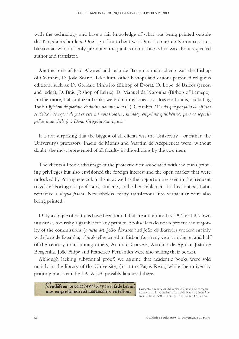
Only a couple of editions have been found that are announced as J.A.’s or J.B.’s own initiative, too risky a gamble for any printer. Booksellers do not represent the major-ity of the commissions (à custa de). Joao Álvares and Joao de Barreira worked mainly with Joao de Espanha, a bookseller based in Lisbon for many years, in the second half of the century (but, among others, António Corvete, António de Aguiar, Joao de Borgonha, Joao Filipe and Francisco Fernandes were also selling their books).
Although lacking substantial proof, we assume that academic books were sold mainly in the library of the University, (or at the Paços Reais) while the university printing house run by J.A. & J.B. possibly laboured there.
Cõmento o repeticion del capitulo Quando de consecra-tione distin. I. [Coimbra] : Iuan dela Barrera y Iuan Alu-ares, 10 Iulio 1550. - [4 br., 52], 476, [2] p. ; 8º (17 cm)
33Faculdade de Belas Artes da Universidade do Porto
SIXTEENTH-CENTURY PRINT CULTURE IN THE KINGDOM OF PORTUGAL
Concerning the prices of books, there is no regularity in the type of coin used: reis, maravedis, tostões, ducados, vinténs and cruzados appear here and there in books. Unfor-tunately, the space for recording the amounts was left blank in most cases. It has been difficult to make a comparison using known numbers and quantity of folios, because the price was fixed according to the amount of paper used for each book; a reasonable conclusion could not be reached (a dedicated study would be necessary and there ap-pears to be no literature on this matter apart from Noronha, 1874). It is worth noting, however, what seems to be a necessity to justify the prices charged for the books with these not infrequent expressions: ‘Tassada en. l. marauedis por ser el papel grande. y la letra pequenna’ (rated at 50 maravedis (Spanish coin) because the paper is big and the letters are small). This example also shows that books written in Spanish were printed in the kingdom to be sold in Spain, or in both countries (the same was certainly also hap-pening the other way round) but no printing privilege has been found to explain this, apart from the example above (line e)).
Joao Álvares died c. 1587 and his successor was ultimately António de Barreira, Joao de Barreira’s son. In 1590, Joao de Barreira died and was succeeded by António de Mariz (who had been in his workshop in Coimbra since 1556) as printer of the Uni-versity. António de Mariz, married to Joao Álvares’ daughter, was also a very prolific printer, an editor and a bookseller (Anselmo, 1926). He worked for the University even before he became one of its official printers (the reason for this is uncertain). Since the beginning, there were always two printers at the University, but it was only in the statutes of 1591 that such a title was added to the University’s list of workers. In the statutes of 1597, along with two printers, four booksellers were added (Gonçalves, 2010). By 1600, Diogo Gomes de Loureiro succeeded his father-in-law, António de Mariz. Again here it can be seen how family bonds and nepotism ruled the most sig-nificant Portuguese printing business, enabling their continuity.
c) Typographical Materials
The size of the folios is available for the majority of the digital library’s (purl.pt) entries: printing in 12º or 16º is limited, 2º represent around 22%, 4º 43% and 8º 29%. The choice of folio size points rather towards a concern with content vs po-tential buyers, where patrons’ interest and production costs are ref lected in foreseen incomes or investment risks. Most of the 2º are used for printing laws, special editions and works by prominent authors, and there is no correlation between these sizes and printing houses (Coimbra or Lisbon), or printer ( J.A. or J.B. or J.A.&J.B.) Most likely
34 Faculdade de Belas Artes da Universidade do Porto
CELESTE MARIA LOURENÇO DA SILVA DE OLIVEIRA PEDRO
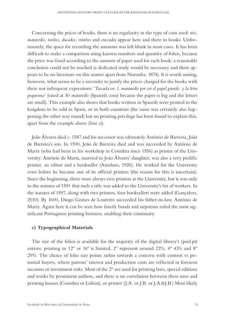
both workshops were equipped with similar engravings, types and tools. If not, at least a certain ‘transhumance’ of the printing materials was in place. Even a super-ficial observation of the frontispieces hints towards this possibility, where the same typographic alphabets and engravings were used in both cities and the same authors would print in both cities.
METAL TYPES AND MIUDANÇAS
The inquiry on the typographical materials used by J.A. and J.B has been conduct-ed in two main sources: printed books and archival records. Printed books provide strong visual evidence of the quantity and quality of the materials, and many times even their provenance. They do not reveal their original provenance unfortunately, in this case – but through comparative studies there is some light that can be shed on borrowing habits and passing on from typographer to typographer in cases of death or business resolution. Archival records, on the other hand, account for additional information on the kind of transactions, contracts, petitions and even relationships printers had with their colleagues, patrons, the university and the market in general.
Dialogo de Ioam de Barros com dous f ilhos... - Em Lisboa, ao Arco de Sam Mamede : por Ioam de Barreira, 20 Agosto 1563. - 4º (21 cm)
Primera parte de las Sentencias... - Coimbra : por Ioan Aluarez, 1554. - 340, [2] p. ; 4º (21 cm)
O primeiro Cerco que os turcos puserao há fortaleza de Diu... por Francisco Dandrada. - Em Coimbra : [ Joao de Barreira], 1589. - [2], 109 f. : 1 il. ; 4º (23 cm)
Liuro primeyro.... - Coymbra : per Ioa Aluarez, 1556. - 2º (31 cm)
História do descobrimento... - Coimbra, 1552-1561. - 8 vol. ; 2º (28 cm)
[Copilacam de todalas obras de Gil Vicente]. - [Lixboa] : [em casa de Ioam Aluarez], [1562]. - CCXLIX f. : il. ; 2º (28 cm)

35Faculdade de Belas Artes da Universidade do Porto
SIXTEENTH-CENTURY PRINT CULTURE IN THE KINGDOM OF PORTUGAL
In 1546, King John III commissioned the purchase of all necessary typographical materials for the functioning of a printing house under the university’s supervision: Joao Álvares was to buy them in Lisbon, at a fair price. This purchase and the overall arrangement of how it was to be managed must have occurred swiftly, because: a) in 1547, as mentioned before, J.A.&J.B. were already printing under the title of typog-raphers of the university; b) in July 1548, Fernao Lopes de Castanheda petitioned the university for a raise on his salary based on the quantity of unforeseen (not initially contracted) work he had had because of the University’s printing affairs (see Annexes 1# and 2#) and c) in July 1548 a provision was signed by the University’s council ordering the payment of arrears to the printers (Fonseca, 2001: 14).
Also in a petition by Fernao Lopes’s in March 1548 is information about the mone-tary value of the printing materials that Joao Álvares acquired for the University. The sum of 760,000 reis is mentioned (idem: 16/17) and in two of the charters of obligation of 1560 that became necessary after Fernao Lopes’ death, there is a description of those materials (see Appendices 3# and 4#). We cannot, however, directly match all the materials of the obligation charters with the 760,000 reis, because in 1555 (upon the transference of the royal colleges to the hands of the Jesuits) Fernao Lopes was ordered to gather the printing materials of these colleges as well and to keep them with him (see Appendices 2#). This information is confusing. A closer look at both obligation manuscripts reveals more information than is explained here (the royal colleges had a printing house where Francisco Correia worked from 1549 to 1555, later he moved to Lisbon where he rented the houses of Joao Blávio). It makes it even harder to evaluate what is what in the middle of all the different collections of materials in use.
One thing is certain, it is not possible that there was a disruption involving the ma-terials belonging to the Monastery of Santa Cruz. Their printing house was in opera-tion until 1563, and in 1577, the transfer of their printing materials to Lisbon (to Sao Vicente de Fora) was put in place. To make things even more difficult, somewhere along the way, J.A. and J.B. took possession of yet another collection of materials that had belonged to Luís Rodrigues. There is no information about the location of Rod-rigues’ printing house in Lisbon, or even whether he was a typographer or simply the owner of the business between the years 1539 and 1549 (Anselmo, 1993). It would not be too far-fetched to think that he shared it with J.A & J.B. What we do know is that after the latter date J.A. & J.B. started using his printer mark and his engravings. Of his types, it seems that they used his gothic and italic types too, but this cannot be confirmed with certainty.

36 Faculdade de Belas Artes da Universidade do Porto
CELESTE MARIA LOURENÇO DA SILVA DE OLIVEIRA PEDRO
The above is a concise outline of the different collections of typographical materials that related, in some form, to the work of J.A. and J.B. and the university. Consid-ering how varied the provenances and the quantity of materials that seem to have been used by J.A. and J.B. (or J.A.&J.B) were, the size of their business must have been considerable. Unfortunately, no information has been found as to the number of workers or even the actual number of presses that operated in the Coimbra or Lisbon printing houses.
What is made perfectly clear is that it was not an isolated or individual’s practice. Survival was most likely assured by these habits and traditions within the trade itself. Forgery, counterfeit or imitation and under-the-radar printing were also everyday events and at the time there was little or no protection against misuses of intellectual property; the sheer conception of authorship outside the realms of literature or the fine arts was a very vague concept, if it existed at all. Very rarely would a type or an engraving designed for a particular book/author not be used again, including by different printers.
Concerning the materials of the University, in the first 1560s charter, Joao Álvares and Joao de Barreira give a separate account of what materials were in whose posses-sion (see Appendices 3#). Did Joao Álvares keep the University’s materials and Joao de Barreira the royal colleges’ materials (or vice-versa)? Could this mean that, al-though working in the same facilities, they ran their businesses independently? Could it mean that they signed together only when a printing project was too big or more resources were needed?
In 1560, Joao Álvares is linked to 1 press + 8 boxes + 714 tin letters for titles and chapter openings + 10 quintais of tin + 5 quintais of little pieces and frames. Joao de Barreira had 1 press + 4 boxes for letters + 5 arrobas of tin + 2,5 arrobas of little pieces
1530 - 1540 - 1550 - 1560 - 1570 - 1580 - 1590
Holy Cross Monastery
João Álvares (Coimbra)
João de Barreira (Coimbra)
Francisco Correia / Royal Colleges
University
João Álvares (Lisbon)
João de Barreira (Lisbon)
Luís Rodrigues
Germão Galharde
1530-1563
1542-1587
1536-1587
1542-1590
1542-1590
1539-1549-1590
1509?-1561
since 1546
1549- since 1555
37Faculdade de Belas Artes da Universidade do Porto
SIXTEENTH-CENTURY PRINT CULTURE IN THE KINGDOM OF PORTUGAL
and frames. The printers were at that moment and for the time being the safe-keepers of those materials. They were to give them back to the University if required and were obliged to reset the original amount that was entrusted to them: 2 quintais and 3 arrobas of tin that were missing in order to complete the original 14 arrobas. The maths does not add up, although not all the facts are known. The important thing is what comes next in the document: the printers protested against these amounts because some of the tin was always lost in the founding process. This means that they were casting the characters at their workshops, or if not, at least they knew the process well. Could it be that they did it with tin alone, which was not the norm in the sixteenth century? The right metal alloy for a good casting and a good type du-rability was composed of tin, antimony and lead. Nevertheless, an ‘impression that tin was the main ingredient in early type, and sometimes the sole ingredient, is conveyed by early documents and colophons’ (Carter, 1966: 22). Tin mines existed in the Portuguese King-dom (Fernandes, 2008) and its exclusive use to cast the university’s characters could be explained as a safeguard against its misuse by the printers: as tin characters would not support the printing of more than one edition.
On the other hand, the second charter of obligation (see Appendices 4#) of Gaspar de Seixas (the new husband of Fernao Lope’s widow) accounts not for what he had but for what was missing from the original list of materials (a list that this research has not been able to find). This included: a printing mark + a foundry apparatus evalu-ated in 20,000 reis + all the printing materials that belonged to the royal college: 6 matrixes of ‘Gripho’ letters + 14 arráteis of cast letters + four ‘legs’ of tin of the same weight and price as the other four that had already been returned + a piece of lead that had not been weighted.
This offers other pieces of evidence about the metal alloys, as lead is mentioned. In addition, the existence of matrices of italic alphabets and the price of a foundry set is discernible in the charter. Yet there is still no answer as to the correspondence of the materials with the two different possible sources (the University’s or the royal colleg-es’ materials). Concerning quantities, the quintal is a weight measurement that, at the time, corresponded to roughly 58.8 kg. A arroba is a fourth the weight of the quintal: c. 14.7 kg. The arrátel is around 450 g.
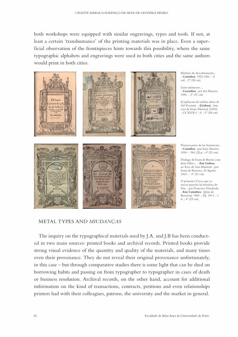
A great freedom in composition defines the uses of frames and engravings. In the examples discussed later in this chapter, the printers combined parts from another ty-pographer mentioned before, Germao Galharde. Borrowing and reusing were com-
38 Faculdade de Belas Artes da Universidade do Porto
CELESTE MARIA LOURENÇO DA SILVA DE OLIVEIRA PEDRO
mon practices: the bottom [L] bellow would later also be used by Nicolau de Carval-ho, in the beginning of the seventeenth century in Coimbra (Gonçalves, 2010: 245).
COMPOSITION AND ELEMENTS’ ARRANGMENTS
About Joao Álvares and Joao de Barreira’s composition methods and layouts, we can say that regularity was at the heart of their daily routines. Their books are graphically
Regra e statutos da ordem de Samtiago. - Lixboa : per Germão Galharde, 24 Setem-bro 1540. - [4], 40, 36, [6, últ. br.] : il. ; 4º
Esta he a segunda parte.... - Coimbra : por Ioão de Barreyra, 8 Dagosto 1554. - cxlix [i.é 141] p. ; 4º (20 cm)
Ioachimi Ringelbergij.... - Conimbricae : apud Ioannem Barrerium et Ioannem Alua-rum, 1550. - 56 p. ; 8º (15 cm)
Norte de cõfessores... - [Lisboa] : en casa d`Luis Rodriguez, 12 Mayo 1546. - [75, 8 br.] f. ; 8º (17 cm)
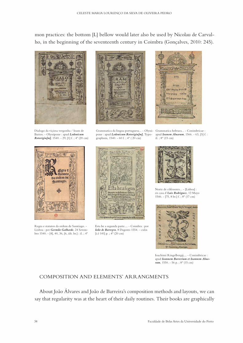
Dialogo da viçiosa vergonha / Ioam de Barros. - Olyssipone : apud Lodouicum Rotorigiu[m], 1540. - 29, [1] f. ; 4º (20 cm)
Grammatica hebraea... - Conimbricae : apud Ioanem Aluarum, 1566. - 63, [5] f. : il. ; 8º (15 cm)
Grammatica da lingua portuguesa... - Olyssi-pone : apud Lodouicum Rotorigiu[m], Typo-graphum, 1540. - 60 f. ; 4º ( 20 cm)
39Faculdade de Belas Artes da Universidade do Porto
SIXTEENTH-CENTURY PRINT CULTURE IN THE KINGDOM OF PORTUGAL
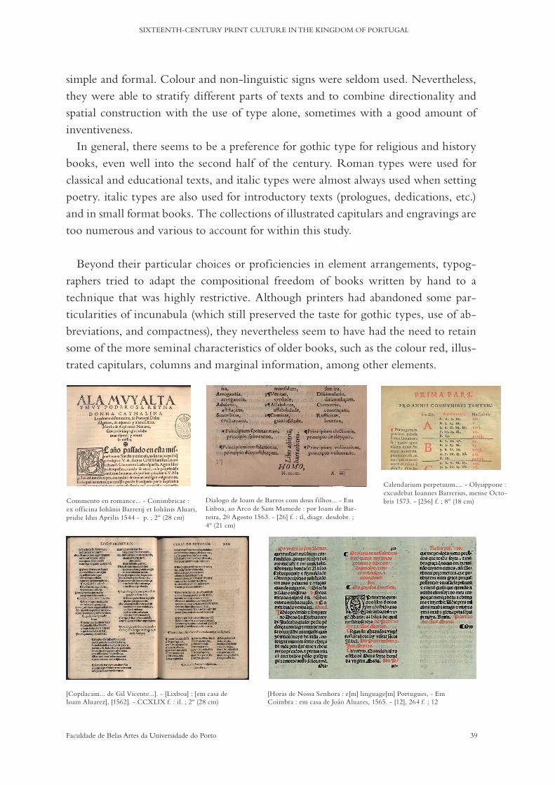
simple and formal. Colour and non-linguistic signs were seldom used. Nevertheless, they were able to stratify different parts of texts and to combine directionality and spatial construction with the use of type alone, sometimes with a good amount of inventiveness.
In general, there seems to be a preference for gothic type for religious and history books, even well into the second half of the century. Roman types were used for classical and educational texts, and italic types were almost always used when setting poetry. italic types are also used for introductory texts (prologues, dedications, etc.) and in small format books. The collections of illustrated capitulars and engravings are too numerous and various to account for within this study.
Beyond their particular choices or proficiencies in element arrangements, typog-raphers tried to adapt the compositional freedom of books written by hand to a technique that was highly restrictive. Although printers had abandoned some par-ticularities of incunabula (which still preserved the taste for gothic types, use of ab-breviations, and compactness), they nevertheless seem to have had the need to retain some of the more seminal characteristics of older books, such as the colour red, illus-trated capitulars, columns and marginal information, among other elements.
Dialogo de Ioam de Barros com dous f ilhos... - Em Lisboa, ao Arco de Sam Mamede : por Ioam de Bar-reira, 20 Agosto 1563. - [26] f. : il, diagr. desdobr. ; 4º (21 cm)
Commento en romance... - Conimbricae : ex officina Iohanis Barrerij et Iohanis Aluari, pridie Idus Aprilis 1544 - p. ; 2º (28 cm)
Calendarium perpetuum.... - Olysippone : excudebat Ioannes Barrerius, mense Octo-bris 1573. - [256] f. ; 8º (18 cm)
[Copilacam... de Gil Vicente...]. - [Lixboa] : [em casa de Ioam Aluarez], [1562]. - CCXLIX f. : il. ; 2º (28 cm)
[Horas de Nossa Senhora : e[m] linguage[m] Portugues, - Em Coimbra : em casa de Joao Aluares, 1565. - [12], 264 f. ; 12

40 Faculdade de Belas Artes da Universidade do Porto
CELESTE MARIA LOURENÇO DA SILVA DE OLIVEIRA PEDRO
Towards the end of the sixteenth century, master printers, and most especially the correctors of print, started to write about their skills and their pride. New standards of precision and beauty were in place, both in terms of orthography and of compo-sition, such as Hornschuch’s Orthotypographia. The advantages of this new culture of correctness were not alien to King John III or to King Sebastian’s patronage when it came to assuring its implementation on books published by and for the University’s professors and students.
THE CORRECTOR OF PRINT
Soon after the University of Coimbra had an arrangement with J.A. and J.B., the existence of a corrector of print working for the University became utterly necessary. If the University was to control not only what was printed but also the quality of what was printed, it had to carefully choose the person in charge of those matters. The role of the corrector of print was officialy created in late 1549 or the 1st of January of 1550 by order of King John III: ‘que na dita universidade ouvese hum correitor da inpresam della que tevesse cargo de ver, emmendar & prover toda a escritura que se houvesse de inprimir na dita inpresam de maneira que se inprimisse & acabasse com toda a perfeição que deve ser.’ (transcribed by Fonseca, 2001: 36) [that in the university there were a corrector of print, in charge of seeing, making corrections and providing all the writtings that were to be printed in the printing house, in such a way that it would be done and finished with most perfection’ (Author’s translation)]
Fernao Lopes de Castanheda was appointed as corrector sometime before 1547. He was followed by Fernao Oliveira, nominated in 1554. Fernao de Oliveira was, howev-er, arrested by the Inquisition and succeeded by Cristóvao Nunes eleven months later ‘per papeis da dita inpressão que tomou em sua mão & os emmendou e corregeo’ (idem). Sebastiao Stochamer was the next corrector of the University (from 1557). He was to be central in the reviewing and editing of what is considered to be the first dictionary of the Portuguese language, the most important work by Jerónimo Cardoso, printed by J.B.
d) The Author
Of the dozens of authors whose works J.A. and J.B. printed, Jerónimo Cardoso ( J.C.) stood out, as his books fitted perfectly into our understanding of what could become an organised corpus of study. Besides the close to one hundred published letters, elegies, and silvae printed in his lifetime, Cardoso mastered the teaching of Latin grammar and his devotion to his students resulted in the production of the first
41Faculdade de Belas Artes da Universidade do Porto
SIXTEENTH-CENTURY PRINT CULTURE IN THE KINGDOM OF PORTUGAL
dictionaries of the Portuguese language. Bilingual, as expected, these dictionaries nevertheless started the codification of that vernacular language that had been used (even in the most formal environments) for the preceding three hundred years. Dic-tionaries, as we will see, represent also a particular case in the history of typography and, as such, they were chosen as the primary sources of material investigation.
JERÓNIMO CARDOSO
Bibliographical variations:
Cardoso, Jeronymo
Cardoso, Hieronymo
Cardosus, Hieronymus
Cardosi, Hieronymi
(Cordosum/i, Hieronimum/i) Lusitanum / Lamacensis
The date of Cardoso’s birth is still debated. Authors situate it between 1506 and 1510 based on secondary evidence: mainly letters and poems written (and edited) by family and friends. His death is not fully attested either, but a date of c. 1569 is more agreed upon. He was born in Lamego, a locality older than the Roman settlement in the peninsula that gained religious significance in the Visigoth period and become part of the Kingdom’s history from Afonso Henrique’s acclamation as king. Lamego had a thriving Jewish community in the fifteenth century, but by the sixteenth things had changed. Cardoso was one of nine brothers and sisters from a converted family (cristãos-novos). Following his preparatory studies, he moved to Spain to study Law at the University of Salamanca as his father wished, but his personal interest soon re-vealed to be of a different kind. Having left Salamanca most likely in 1530 as a Bacha-rel in Canon Law he moved to Lisbon. By that same year, Jerónimo is known to have opened a public school in Lisbon called Cardosanus Ludus where he taught Latin and grammar (Reis, 2013). The date of his arrival to Lisbon is also based on his writings, in this case, the Libellus de terrae motu, that describes an event that occurred in 1531.
J.C. maintained close relationships with many of his contemporaries and former students, embodying a humanistic spirit not only in the pursuit of philological and lit-erary knowledge but also in his dedication to intellectual debates. One of his students was Aquiles Estaço, to whom Cardoso dedicated a couple of poems in the Syluarum liber unus and Elegiarum Liber II. Two works by Jerónimo were identified as part of
42 Faculdade de Belas Artes da Universidade do Porto
CELESTE MARIA LOURENÇO DA SILVA DE OLIVEIRA PEDRO
Estaço’s famous personal library in the B. Vallicelliana. One of them could have been acquired prior to his final settlement in Rome, but the Dictionarium ex Lusitanicum, printed in 1562, proves he maintained some contact or interest in his former teacher’s works and that Jeronimo s books travelled across Europe.
Another important figure in J.C.’s life was Inácio de Morais, an aristocrat from the north of the kingdom, who had studied in Paris and Louvain. Also a teacher in Humanities, he integrated the Faculty of Arts in Coimbra by provision of King John III, c. 1541. The correspondence between the two is rich and revealing, full of praise, intellectual questioning and literary advice.
In 1536 (the year the university moved to Coimbra) J.C. was asked to open the academic year with an Oratio pro Rostris which would then be printed in Coimbra in 1550. The Oratio hints to Cardoso’s reputation in the academic world, since that honour was normally given only to university professors, which he never was. But its printing occurred rather late, as did the printing of the Silvae in 1564 after John III’s death, which praises the professors of Lisbon. Moreira de Sá (1983: 261) argues this late printing was due to the difficult relationship between John III and the professors from the University’s pre-Coimbra period.
His other editions became, on the other hand, commercial successes, as editions of lexicographical texts were thought to be of great educational and scientific value. This didactic production began in 1551 and ended in 1569 with the Dictionarium Latino Lusitanico which would have twelve reeditions, the last being printed in 1695.
‘O assinalável sucesso de Jerónimo Cardoso ficou ainda a dever-se ao sentido prático da sua realização. A experiência docente e o reconhecimento das dificuldades dos alunos devem ter motivado o autor para a elaboração de um dicionário com estrutura simplificada e muito esquemática, característica de um prontuário que procura responder directamente às solicitações elementares dos utilizadores.’ (Verdelho, 2007: 99)
[The remarkable success of Jerónimo Cardoso was also due to the practical sense of his work. The teaching experience and the recognition of the students shortcomings must have motivated the author to elaborate a dictionary with a simplified and very schematic structure, character-istics of a handbook that aims to answer straightforwardly to the elementary solicitations of its users. (Author’s translation)]
In his many printed works, in prose and in verse, and all his lexicographical and para-lexicographical editions, there is no information that could be useful to the un-
43Faculdade de Belas Artes da Universidade do Porto
SIXTEENTH-CENTURY PRINT CULTURE IN THE KINGDOM OF PORTUGAL
derstanding of his personal relationship with printers, apart from some very fragile observations. Cardoso’s trips to Coimbra, lacking any other practical or professional reason, must have been related to either the books J.A. and J.B. printed or to Inácio de Morais, with whom he discussed many editorial details. Furthermore, in a corre-spondence with António Pimenta, (letter no. 41 of the Epistolarum Familiarum Libellus, 1556) Cardoso mentions the printing of a part of a grammar book that he believes might be useful to António’s students, asking his friend to assess the interest and the value by which the books should be sold to them: ‘De há dias para cá, andámos a preparar para a imprensa um livrinho acerca do uso dos pretéritos e dos supinos como auxiliar do meu trabalho e do dos meus discípulos. (...) Se este trabalho obtiver a tua aceitação, enviar-te-ei alguns exemplares que poderás vender aos teus alunos pelo preço que achares bem (...)’ (Almei-da, 2002: 6). [As of some days, we have been preparing a little book about the uses of the past and the supine as auxiliar to my work and that of my students. If this work come to have your acceptance, I shall send you some examplars that you can sell to your students for the price you see fit. (Author’s translation)]
If this is true, then three conclusions can be made, albeit with reservations: a.1) The prices of books were f lexible and were not all set by the judges. In this case, the fact that it was presumably part of larger a book might mean that it did not need to follow the established ways. a.2) Cardoso was most likely paying for the printing himself. a.3) Since this is believed to be the third part of a grammar book (Institutiones in linguam Latinam—the first edition under this name was printed in 1557 but it is itself a reedi-tion of the Grammaticae introdutiones breviores, 1552), and that parts of books were sometimes also sold individually even before being printed as a complete set, they could serve, possibly, as test runs for the reception of the actual book. a.4) Jerónimo uses the first person plural: ‘we are preparing a small book’, showing us that this was the result of a collaboration of individuals, either him and the printers, or him and his students, or even him and his family.
Unlike J.C.’s social relationships, of his personal familiar life, little is known. In the 1569/70 Dictionarium, his wife reveals some details and in his late life he himself mentions the effects of sickness and poverty as the burdens of old age (Cardoso, 2009).

44 Faculdade de Belas Artes da Universidade do Porto
CELESTE MARIA LOURENÇO DA SILVA DE OLIVEIRA PEDRO
THE CORPUS I

45Faculdade de Belas Artes da Universidade do Porto
SIXTEENTH-CENTURY PRINT CULTURE IN THE KINGDOM OF PORTUGAL
Chapter 2a) The Works
In order to define a corpus for a typographical analysis of the printing materials of Joao Álvares and Joao de Barreira a strategy was devised based on the significance of some of the exemplars that came out of their printing presses. This significance was evaluated, as pointed out in the Introduction text, on the grounds of graphical layout specificities. We sourced these in (although not exclusively) Jerónimo’s dictionaries and grammars.
This research proceeds according to two parameters: the wide time-frame these works could offer (in terms of dates of print: from 1551 to 1587) and the number of different type sets used in their making (c. 30). These two parameters provided evi-dential samples that enabled us the construction of an explanatory thesis on the im-portance of a visually-focused typographical analysis on the subject of print culture. The intention is not to provide definitive answers to such a wide scope of inquiry, but to search for a starting point of analyses focused on the history of type.
In order to position the corpus within a chronology, the following inventory describes the production of lexical and para-lexicographical works printed in the Kingdom of Portugal in the sixteenth century. The bibliographical control of the inventory was based primarly on printed catalogues: Bibliografia das obras impressas em Portugal no século XVI, Impressos do século XVI and Tipografia portuguesa do séc. XVI; secondly scientific and academic writings on Jerónimo de Cardoso’s work was sur-veyed (Cardoso, 2009; Reis, 2013; Verdelho and Silvestre, 2007) and then a thor-ough search through online resources was conducted - Purl (http://purl.pt/index/geral/PT/index.html), Gallica (https://gallica.bnf.fr/accueil/?mode=desktop), Ibe-rianbooks (http://iberian.ucd.ie/) and Worlcat (http://www.worldcat.org/) among other digital catalogues, in the course of four years. The control of bibliographical references was focused mainly on J.A., J.B. and J.C. and the subsequent research (the typographical study) was based on items part of the sections from 1.1.1 to 1.4.2.
This list, in particular, demonstrates that J.A. and J.B. were, in fact, printing many more editions of this kind than any other Portuguese printer that century (almost half of what survives from the Kingdom’s production). It shows also that no other author in the sixteenth century edited so many different books related to lexicography as Jerónimo Cardoso did.

46 Faculdade de Belas Artes da Universidade do Porto
CELESTE MARIA LOURENÇO DA SILVA DE OLIVEIRA PEDRO
Besides the following list, note that in the Annexes (4#) you can find samples of digital catalogues entries and digitised copies of printed and manuscript catalogue en-tries of J.C.’s books in libraries around the world, collected after an intense search. All can be said to prove that his dictionaries (especially the 1569/70 Dictionarium) were widely spread.
It can also be mentioned that most of the works indexed below relate to the learn-ing of Latin and/or the systematisation of the Portuguese language (although Spanish, Greek and Hebrew are also part of the list). Juan de Pastrana’s grammar was popular at the beginning of the century but so were Despautério’s grammar and Nebrija’s dictionary (although the latter was never printed in the Portuguese Kingdom). Nev-ertheless, Jeronimo’s works became and remained relevant for many years, especially for the teaching of the vernacular. The 1569/70 Dictionarium was the one piece of vernacular autoritas for well over a century.
Furthermore, works such as De Institutione Grammatica libri tres by Manuel Álvares, Rector at Évora in the second half of the century, became crucial for the reform of all Jesuit schools. The text was fixed rather early in a Roman edition (1584), produced after the author’s death. It became the official teaching manual in the Ratio Studiorum in 1599, reaching more than 500 reeditions around the world.
Valignano, an Italian Jesuit missionary concerned with the teaching of Latin in Ja-pan, wrote ‘a letter to Diogo de Mesquita, dated Cochin, 25 December 1584, he urged Mesqui-ta to acquire Emmanvelis Alvari e Societate Iesv, De Institutione Grammatica Libri Tres by the Portuguese Jesuit, Manuel Álvares (Vrst edn, Lisbon, 1572, with many subsequent ones), which was used widely in Jesuit colleges, and dictionaries by Jerónimo Cardoso. The latter included Hi-eronymi Cardosi Lamacensis Dictionarium ex Lusitanico in latinum sermonem (Lisbon 1562); Dictionarium iuventuti studiosae admodum frugiferum (2nd edn, Coimbra, 1562) and Dictionar-ium latinolusitanicvm et vice versa Lusitanicolatinvm (Coimbra, 1570).’ (Massarella, 2012: 16)
Jerónimo’s dictionaries were, no doubt, still relevant by the end of the century, despite the competition.
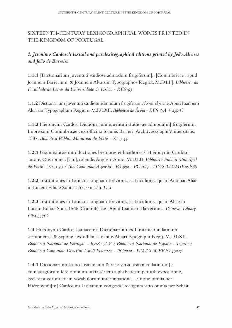
47Faculdade de Belas Artes da Universidade do Porto
SIXTEENTH-CENTURY PRINT CULTURE IN THE KINGDOM OF PORTUGAL
SIXTEENTH-CENTURY LEXICOGRAPHICAL WORKS PRINTED IN THE KINGDOM OF PORTUGAL
1. Jerónimo Cardoso’s lexical and paralexicographical editions printed by João Alvares
and João de Barreira
1.1.1 [Dictionarium juventuti studiose admodum frugiferum], [Conimbricae : apud Joannem Barrerium, & Joannem Alvarum Typographos Regios, M.D.LI.]. Biblioteca da Faculdade de Letras da Universidade de Lisboa - RES-93
1.1.2 Dictionarium juventuti studiose admodum frugiferum. Conimbricae. Apud Ioannem Aluarum Typographum Regium, M.D.LXII. Biblioteca de Évora - RES 8-A + 259-C
1.1.3 Hieronymi Cardosi Dictionarium iuuentuti studiosae admodu[m] frugiferum, Impressum Conimbricae : ex officina Ioannis Barrerij Architypographi Vniuersitatis, 1587. Biblioteca Pública Municipal do Porto - X1-3-44
1.2.1 Grammaticae introductiones breuiores et lucidiores / Hieronymo Cardoso autore, Olissipone : [s.n.], calendis Augusti. Anno. M.D.LII. Biblioteca Pública Municipal do Porto - X1-3-43 / Bib. Comunale Augusta - Perugia - PG0109 - IT\CCU\UM1E\016781
1.2.2 Institutiones in Latinam Linguam Breviores, et Lucidiores, quam Antehac Aliae in Lucem Editae Sunt, 1557, s/n, s/n. Lost
1.2.3 Institutiones in Latinam Linguam Breviores, et Lucidiores, quam Aliae in Lucem Editae Sunt, 1566, Conimbricæ : Apud Ioannem Barrerium. Beinecke Library Gk4 547Cc
1.3 Hieronymi Cardosi Lamacensis Dictionarium ex Lusitanico in latinum sermonem, Ulissypone : ex officina Ioannis Aluari typographi Regij, M.D.LXII. Biblioteca Nacional de Portugal - RES 276 V / Biblioteca Nacional de España - 3/3010 / Biblioteca Comunale Passerini-Landi Piacenza - PC0030 - IT\CCU\CERE\049047
1.4.1 Dictionarium latino lusitanicum & vice versa lusitanico latinu[m] : cum adagiorum feré omnium iuxta seriem alphabeticam perutili expositione, ecclesiasticorum etiam vocabulorum interpretatione... / noué omnia per Hieronymu[m] Cardosum Lusitanum congesta ; recognita vero omnia per Sebast.
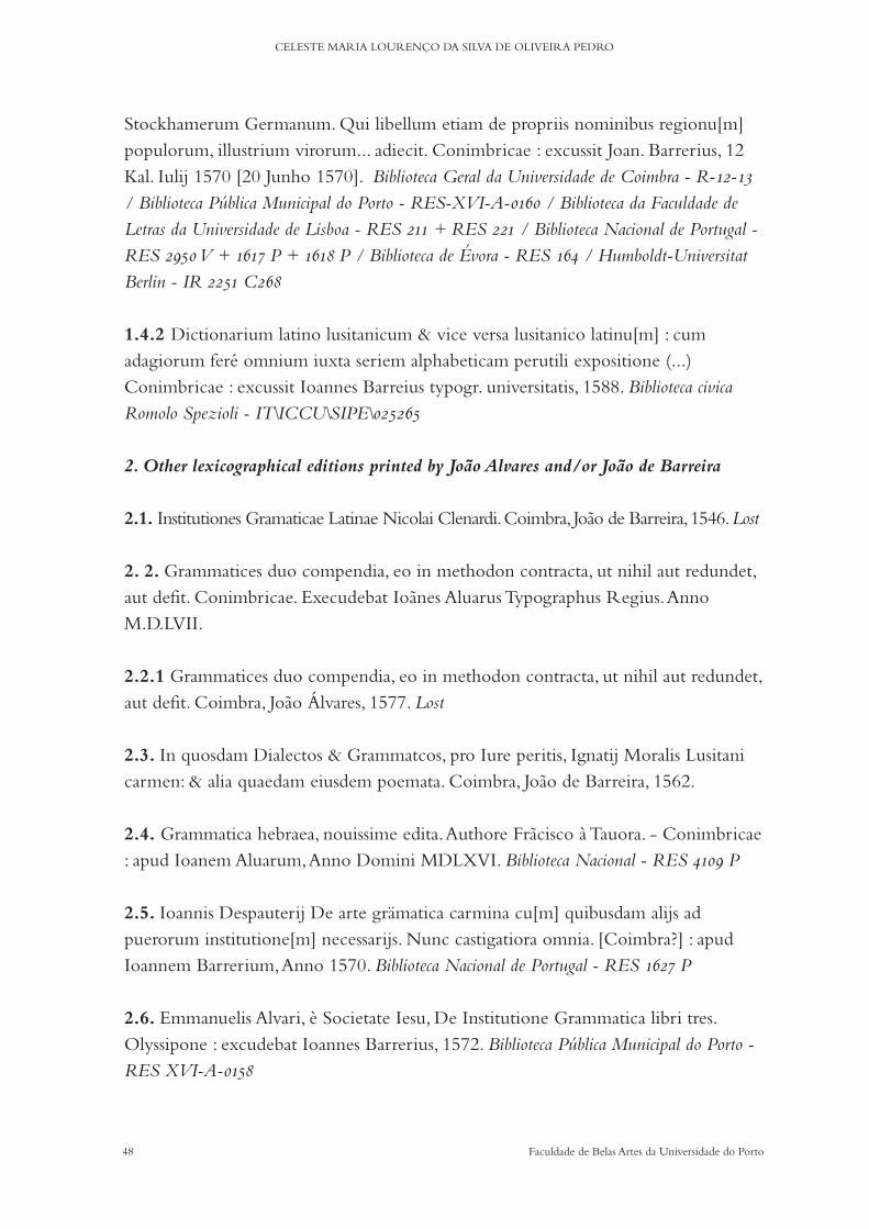
48 Faculdade de Belas Artes da Universidade do Porto
CELESTE MARIA LOURENÇO DA SILVA DE OLIVEIRA PEDRO
Stockhamerum Germanum. Qui libellum etiam de propriis nominibus regionu[m] populorum, illustrium virorum... adiecit. Conimbricae : excussit Joan. Barrerius, 12 Kal. Iulij 1570 [20 Junho 1570]. Biblioteca Geral da Universidade de Coimbra - R-12-13 / Biblioteca Pública Municipal do Porto - RES-XVI-A-0160 / Biblioteca da Faculdade de Letras da Universidade de Lisboa - RES 211 + RES 221 / Biblioteca Nacional de Portugal - RES 2950 V + 1617 P + 1618 P / Biblioteca de Évora - RES 164 / Humboldt-Universitat Berlin - IR 2251 C268
1.4.2 Dictionarium latino lusitanicum & vice versa lusitanico latinu[m] : cum adagiorum feré omnium iuxta seriem alphabeticam perutili expositione (...) Conimbricae : excussit Ioannes Barreius typogr. universitatis, 1588. Biblioteca civica Romolo Spezioli - IT\ICCU\SIPE\025265
2. Other lexicographical editions printed by João Alvares and/or João de Barreira
2.1. Institutiones Gramaticae Latinae Nicolai Clenardi. Coimbra, Joao de Barreira, 1546. Lost
2. 2. Grammatices duo compendia, eo in methodon contracta, ut nihil aut redundet, aut defit. Conimbricae. Execudebat Ioanes Aluarus Typographus Regius. Anno M.D.LVII.
2.2.1 Grammatices duo compendia, eo in methodon contracta, ut nihil aut redundet, aut defit. Coimbra, Joao Álvares, 1577. Lost
2.3. In quosdam Dialectos & Grammatcos, pro Iure peritis, Ignatij Moralis Lusitani carmen: & alia quaedam eiusdem poemata. Coimbra, Joao de Barreira, 1562.
2.4. Grammatica hebraea, nouissime edita. Authore Fracisco à Tauora. - Conimbricae : apud Ioanem Aluarum, Anno Domini MDLXVI. Biblioteca Nacional - RES 4109 P
2.5. Ioannis Despauterij De arte grämatica carmina cu[m] quibusdam alijs ad puerorum institutione[m] necessarijs. Nunc castigatiora omnia. [Coimbra?] : apud Ioannem Barrerium, Anno 1570. Biblioteca Nacional de Portugal - RES 1627 P
2.6. Emmanuelis Alvari, è Societate Iesu, De Institutione Grammatica libri tres. Olyssipone : excudebat Ioannes Barrerius, 1572. Biblioteca Pública Municipal do Porto - RES XVI-A-0158

49Faculdade de Belas Artes da Universidade do Porto
SIXTEENTH-CENTURY PRINT CULTURE IN THE KINGDOM OF PORTUGAL
2.7. Grammaticae institutiones a Roderico Lopez a Sigura nuper aeditae. Lisboa, Joao Álvares, 1573. Lost
2.8. Orthographia da lingoa portuguesa : obra vtil & necessaria assi pera bem screuer a lingoa Hespanhol como a Latina & quaesquer outras que da Latina teem origem ; Item hum tractado dos pontos das clausulas / pelo licenciado Duarte Nunez do Liao. Em Lisboa : per Ioao de Barreira impressor del Rey N.S., M.D.LXXVI. Biblioteca Nacional de Portugal - RES 277 2 V + RES 1605 P + RES 1606 P + RES 1909 P / Biblioteca Pública Municipal do Porto - RES XVI-A-0162 + RES XVI-A-0189(3)
3. Other Jerónimo Cardoso’s editions printed by João Alvares and/or João de Barreira
3.1. Hieronymi Cardosi Lusitani, Libellus De terrae motu. De vario amore aegogla. De disciplinarum omnium laudibus. Oratio. Conimbricae : Apud Ioannem Barrerium, & Ioannem Aluarum Typographos Regios, M.D.L., Biblioteca de Évora - RES Séc. XVI, 6098 / Biblioteca Pública Municipal do Porto - RES XVI-a-0473(1) / Biblioteca Nacional de Portugal - RES 4702 P
3.2. Ad Hieronymum Cardosum epistola. Vlyssipone, s.n., 1555.
3.3. Hieronymi Cardosi Lusitani de Monetis ta[m] Graecis qua[m] Latinis. Item de Ponderibus & Mensuris ad presentem usum redactis, Anacaephaleosis. Conimbricae. Apud Ioannem Aluarum Typographum Regium, M.D.LXI. Biblioteca de Évora - RES 259-D
3.4. (Elegiarum libri duo). Olyssipone : Apud Joannem Barrerium, 1563. Biblioteca de Évora - RES 303-C
3.5. Hieronymi Cardosi Lamacensis syluarum liber unos. (...). Ulyssipone : Apud Ioannem Barrerium, 1564. Biblioteca de Évora - RES Séc. XVI. 6095
4. Other Jerónimo Cardoso’s editions printed in the sixteenth-century
4.1. Hieronimi Cardosi lusitani Apologus de morte & pastore cum aliis elegiacis. Olyssipone : Ioannis Blauij, 1558. Biblioteca Pública Municipal do Porto - RES XVI-a-0473(2).
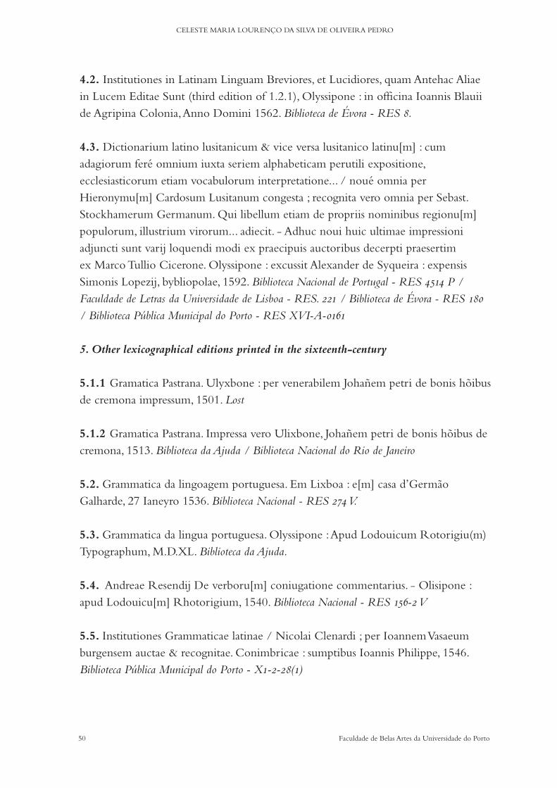
50 Faculdade de Belas Artes da Universidade do Porto
CELESTE MARIA LOURENÇO DA SILVA DE OLIVEIRA PEDRO
4.2. Institutiones in Latinam Linguam Breviores, et Lucidiores, quam Antehac Aliae in Lucem Editae Sunt (third edition of 1.2.1), Olyssipone : in officina Ioannis Blauii de Agripina Colonia, Anno Domini 1562. Biblioteca de Évora - RES 8.
4.3. Dictionarium latino lusitanicum & vice versa lusitanico latinu[m] : cum adagiorum feré omnium iuxta seriem alphabeticam perutili expositione, ecclesiasticorum etiam vocabulorum interpretatione... / noué omnia per Hieronymu[m] Cardosum Lusitanum congesta ; recognita vero omnia per Sebast. Stockhamerum Germanum. Qui libellum etiam de propriis nominibus regionu[m] populorum, illustrium virorum... adiecit. - Adhuc noui huic ultimae impressioni adjuncti sunt varij loquendi modi ex praecipuis auctoribus decerpti praesertim ex Marco Tullio Cicerone. Olyssipone : excussit Alexander de Syqueira : expensis Simonis Lopezij, bybliopolae, 1592. Biblioteca Nacional de Portugal - RES 4514 P / Faculdade de Letras da Universidade de Lisboa - RES. 221 / Biblioteca de Évora - RES 180 / Biblioteca Pública Municipal do Porto - RES XVI-A-0161
5. Other lexicographical editions printed in the sixteenth-century
5.1.1 Gramatica Pastrana. Ulyxbone : per venerabilem Johañem petri de bonis hõibus de cremona impressum, 1501. Lost
5.1.2 Gramatica Pastrana. Impressa vero Ulixbone, Johañem petri de bonis hõibus de cremona, 1513. Biblioteca da Ajuda / Biblioteca Nacional do Rio de Janeiro
5.2. Grammatica da lingoagem portuguesa. Em Lixboa : e[m] casa d’Germao Galharde, 27 Ianeyro 1536. Biblioteca Nacional - RES 274 V.
5.3. Grammatica da lingua portuguesa. Olyssipone : Apud Lodouicum Rotorigiu(m) Typographum, M.D.XL. Biblioteca da Ajuda.
5.4. Andreae Resendij De verboru[m] coniugatione commentarius. - Olisipone : apud Lodouicu[m] Rhotorigium, 1540. Biblioteca Nacional - RES 156-2 V
5.5. Institutiones Grammaticae latinae / Nicolai Clenardi ; per Ioannem Vasaeum burgensem auctae & recognitae. Conimbricae : sumptibus Ioannis Philippe, 1546. Biblioteca Pública Municipal do Porto - X1-2-28(1)
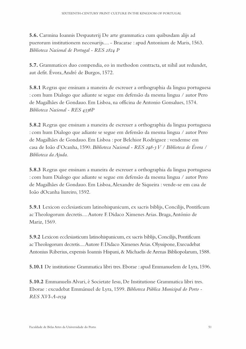
51Faculdade de Belas Artes da Universidade do Porto
SIXTEENTH-CENTURY PRINT CULTURE IN THE KINGDOM OF PORTUGAL
5.6. Carmina Ioannis Despauterij De arte grammatica cum quibusdam alijs ad puerorum institutionem necessarijs.... - Bracarae : apud Antonium de Maris, 1563. Biblioteca Nacional de Portugal - RES 2824 P
5.7. Grammatices duo compendia, eo in methodon contracta, ut nihil aut redundet, aut defit. Évora, André de Burgos, 1572.
5.8.1 Regras que ensinam a maneira de escreuer a orthographia da lingua portuguesa : com hum Dialogo que adiante se segue em defensao da mesma lingua / autor Pero de Magalhaes de Gondauo. Em Lisboa, na officina de Antonio Gonsalues, 1574. Biblioteca Nacional - RES 4336P
5.8.2 Regras que ensinam a maneira de escreuer a orthographia da lingua portuguesa : com hum Dialogo que adiante se segue em defensao da mesma lingua / autor Pero de Magalhaes de Gondauo. Em Lisboa : por Belchior Rodriguez : vendemse em casa de Ioao d’Ocanha, 1590. Biblioteca Nacional - RES 298-3 V / Biblioteca de Évora / Biblioteca da Ajuda.
5.8.3 Regras que ensinam a maneira de escreuer a orthographia da lingua portuguesa : com hum Dialogo que adiante se segue em defensao da mesma lingua / autor Pero de Magalhaes de Gondauo. Em Lisboa, Alexandre de Siqueira : vende-se em casa de Ioao dOcanha liureiro, 1592.
5.9.1 Lexicon ecclesiasticum latinohispanicum, ex sacris biblijs, Concilijs, Pontificum ac Theologorum decretis.... Autore F. Didaco Ximenes Arias. Braga, António de Mariz, 1569.
5.9.2 Lexicon ecclesiasticum latinohispanicum, ex sacris biblijs, Concilijs, Pontificum ac Theologorum decretis.... Autore F. Didaco Ximenes Arias. Olyssipone, Execudebat Antonius Riberius, expensis Ioannis Hispani, & Michaelis de Arenas Bibliopolarum, 1588.
5.10.1 De institutione Grammatica libri tres. Eborae : apud Emmanuelem de Lyra, 1596.
5.10.2 Emmanuelis Alvari, è Societate Iesu, De Institutione Grammatica libri tres. Eborae : excudebat Emmánuel de Lyra, 1599. Biblioteca Pública Municipal do Porto - RES XVI-A-0159
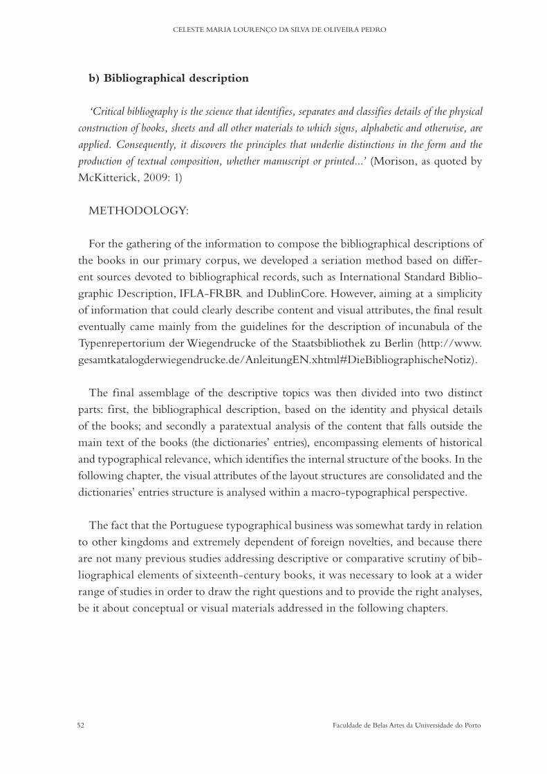
52 Faculdade de Belas Artes da Universidade do Porto
CELESTE MARIA LOURENÇO DA SILVA DE OLIVEIRA PEDRO
b) Bibliographical description
‘Critical bibliography is the science that identifies, separates and classifies details of the physical construction of books, sheets and all other materials to which signs, alphabetic and otherwise, are applied. Consequently, it discovers the principles that underlie distinctions in the form and the production of textual composition, whether manuscript or printed...’ (Morison, as quoted by McKitterick, 2009: 1)
METHODOLOGY:
For the gathering of the information to compose the bibliographical descriptions of the books in our primary corpus, we developed a seriation method based on differ-ent sources devoted to bibliographical records, such as International Standard Biblio-graphic Description, IFLA-FRBR and DublinCore. However, aiming at a simplicity of information that could clearly describe content and visual attributes, the final result eventually came mainly from the guidelines for the description of incunabula of the Typenrepertorium der Wiegendrucke of the Staatsbibliothek zu Berlin (http://www.gesamtkatalogderwiegendrucke.de/AnleitungEN.xhtml#DieBibliographischeNotiz).
The final assemblage of the descriptive topics was then divided into two distinct parts: first, the bibliographical description, based on the identity and physical details of the books; and secondly a paratextual analysis of the content that falls outside the main text of the books (the dictionaries’ entries), encompassing elements of historical and typographical relevance, which identifies the internal structure of the books. In the following chapter, the visual attributes of the layout structures are consolidated and the dictionaries’ entries structure is analysed within a macro-typographical perspective.
The fact that the Portuguese typographical business was somewhat tardy in relation to other kingdoms and extremely dependent of foreign novelties, and because there are not many previous studies addressing descriptive or comparative scrutiny of bib-liographical elements of sixteenth-century books, it was necessary to look at a wider range of studies in order to draw the right questions and to provide the right analyses, be it about conceptual or visual materials addressed in the following chapters.
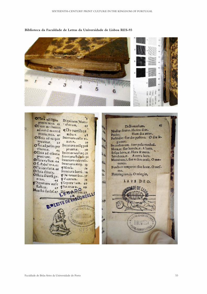
53Faculdade de Belas Artes da Universidade do Porto
SIXTEENTH-CENTURY PRINT CULTURE IN THE KINGDOM OF PORTUGAL
Biblioteca da Faculdade de Letras da Universidade de Lisboa RES-93

54 Faculdade de Belas Artes da Universidade do Porto
CELESTE MARIA LOURENÇO DA SILVA DE OLIVEIRA PEDRO
1.1.1 [Dictionarium juventuti studiose admodum frugiferum], [Conimbricae : apud Joannem Barrerium, & Joannem Alvarum Typographos Regios, M.D.LI.].
Author: Jerónimo CardosoEditor: not identifiedTranslator: non applicableCorrector: not identifiedShort Title: Dictionarium Iuventuti StudiosePlace of Print: [Coimbra]Printer/s: [ Joao de Barreira & Joao Álvares]Publisher: not identifiedDate of Print: [1551]Ownership Marks: Leite de Vasconcelos (manuscript on the board/pastedown)List of Contents: Index (at signature Aiii) + DictionariumColophon: not identified - ends with LAVS DEO.Paper: very thin - head, fore and foot hedge in redPage Size: 12º cut to 60x120 mm Column Area: 48x105mmPrinting Area: 33 lines of textQuires: 6 (2 folios missing in the beginning; last quire incomplete)Signatures: Aiii - F numbered on rectosGuide Letters: non existentWoodcuts: Yes / monkey sitting on pot on folio 3r, barred f lower motif on 65r +
one illustrated capitular CCopperplates: non existantIllustrations: non existantPrinting Colour: BlackCatchwords: Yes Marginalia: non existantInterlinear Glosses: non existantLanguage/s: LatinType/s: Roman + Inclined capitalsIndentation: Index = 1em / Dictionarium = 2emEditions: 1551 / 1562 / 1587Location of Copies: 1551 Biblioteca da Faculdade de Letras da Universidade de Lisboa -
RES-93 / 1562 - Biblioteca de Évora - RES 8-A + 259-C / 1587 Biblioteca Pública Municipal do Porto - X1-3-44
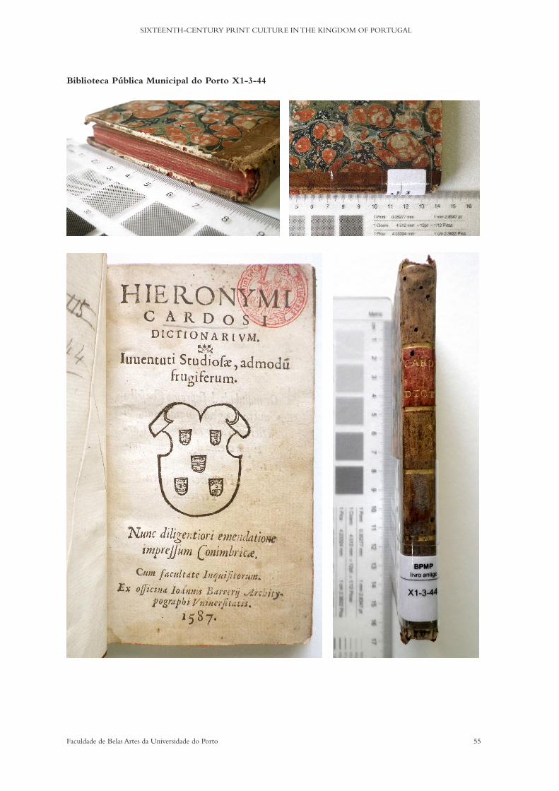
55Faculdade de Belas Artes da Universidade do Porto
SIXTEENTH-CENTURY PRINT CULTURE IN THE KINGDOM OF PORTUGAL
Biblioteca Pública Municipal do Porto X1-3-44

56 Faculdade de Belas Artes da Universidade do Porto
CELESTE MARIA LOURENÇO DA SILVA DE OLIVEIRA PEDRO
1.1.3 Hieronymi Cardosi Dictionarium iuuentuti studiosae admodu[m] frugiferum, Impressum Conimbricae : ex officina Ioannis Barrerij Architypographi Vniuersitatis, 1587.
Author: Jerónimo CardosoEditor: not identifiedTranslator: non applicableCorrector: not identifiedShort Title: Dictionarivm Iuventuti StudiosaePlace of Print: CoimbraPrinter/s: Joao de BarreiraPublisher: not identifiedDate of Print: 1587Ownership Marks: NoList of Contents: Frontispiece 1r / Authorization 1v / Index 2r / De corpore 3r /
De Partibus 46v / De temporibus 60rColophon: Ex officina Ioannis Barrerij Architypographi VniuersitatisPaper: Very Thin - head, fore and foot hedge in redPage Size: 12º - cut to 78x137 mmColumn/text Area: 64x130 mmPrinting Area: 32 lines of textQuires: 5 - 12 folios + 4Signatures: A - F numbered on rectosGuide Letters: non existentWoodcuts: Yes - Seal on frontispiece + 3 illustrated capitularsCopperplates: non existantIllustrations: non existantPrinting Colour: BlackCatchwords: YesMarginalia: non existantInterlinear Glosses: non existantLanguage/s: Latin + PortugueseType/s: Roman + ItalicIndentation: Index = 1em / text = 2 and 3emEditions: 1551 / 1562 / 1587Location of Copies: 1551 - Biblioteca da Faculdade de Letras da Universidade de Lisboa -
RES-93 / 1562 - Biblioteca de Évora - RES 8-A + 259-C / 1587 - Biblioteca Pública Municipal do Porto - X1-3-44
57Faculdade de Belas Artes da Universidade do Porto
SIXTEENTH-CENTURY PRINT CULTURE IN THE KINGDOM OF PORTUGAL
Biblioteca Pública Municipal do Porto X1-3-43
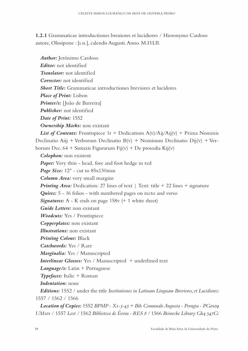
58 Faculdade de Belas Artes da Universidade do Porto
CELESTE MARIA LOURENÇO DA SILVA DE OLIVEIRA PEDRO
1.2.1 Grammaticae introductiones breuiores et lucidiores / Hieronymo Cardoso autore, Olissipone : [s.n.], calendis Augusti. Anno. M.D.LII.
Author: Jerónimo Cardoso Editor: not identifiedTranslator: not identifiedCorrector: not identifiedShort Title: Grammaticae introductiones breviores et lucidoresPlace of Print: LisbonPrinter/s: [ Joao de Barreira]Publisher: not identifiedDate of Print: 1552Ownership Marks: non existantList of Contents: Frontispiece 1r + Dedications A(v)/Aij/Aij(v) + Prima Nominis
Declinatio Aiij + Verborum Declinatio B(v) + Nominum Declinatio Dij(v) + Ver-borum Dec. 64 + Sintaxis Figurarum Fij(v) + De prosodia Kij(v)
Colophon: non existentPaper: Very thin - head, fore and foot hedge in redPage Size: 12º - cut to 85x130mmColumn Area: very small marginsPrinting Area: Dedication: 27 lines of text | Text: title + 22 lines + signatureQuires: 5 - 16 folios - with numbered pages on recto and versoSignatures: A - K ends on page 158v (+ 1 white sheet)Guide Letters: non existantWoodcuts: Yes / FrontispieceCopperplates: non existant Illustrations: non existantPrinting Colour: BlackCatchwords: Yes / RareMarginalia: Yes / ManuscriptedInterlinear Glosses: Yes / Manuscripted + underlined textLanguage/s: Latin + PortugueseTypefaces: Italic + RomanIndentation: noneEditions: 1552 / under the title Institutiones in Latinam Linguam Breviores, et Lucidiores:
1557 / 1562 / 1566Location of Copies: 1552 BPMP - X1-3-43 + Bib. Comunale Augusta - Perugia - PG0109
UM101 / 1557 Lost / 1562 Biblioteca de Évora - RES 8 / 1566 Beinecke Library Gk4 547Cc
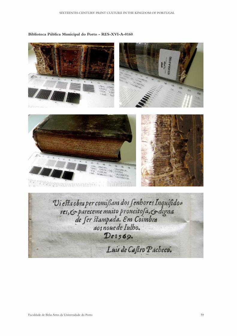
59Faculdade de Belas Artes da Universidade do Porto
SIXTEENTH-CENTURY PRINT CULTURE IN THE KINGDOM OF PORTUGAL
Biblioteca Pública Municipal do Porto - RES-XVI-A-0160
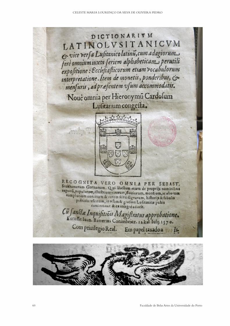
60 Faculdade de Belas Artes da Universidade do Porto
CELESTE MARIA LOURENÇO DA SILVA DE OLIVEIRA PEDRO
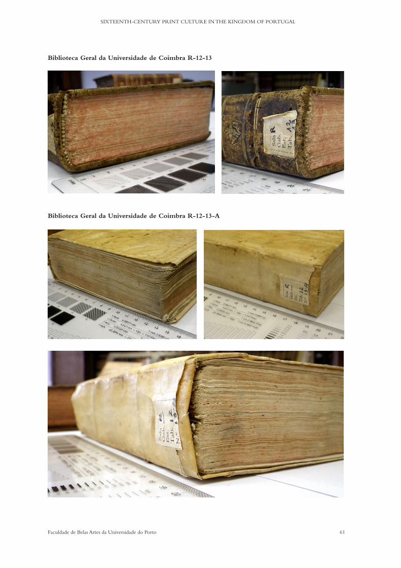
61Faculdade de Belas Artes da Universidade do Porto
SIXTEENTH-CENTURY PRINT CULTURE IN THE KINGDOM OF PORTUGAL
Biblioteca Geral da Universidade de Coimbra R-12-13
Biblioteca Geral da Universidade de Coimbra R-12-13-A

62 Faculdade de Belas Artes da Universidade do Porto
CELESTE MARIA LOURENÇO DA SILVA DE OLIVEIRA PEDRO
Biblioteca Geral da Universidade de Coimbra R-12-13-B
Biblioteca da Faculdade de Letras da Universidade de Lisboa RES 211
63Faculdade de Belas Artes da Universidade do Porto
SIXTEENTH-CENTURY PRINT CULTURE IN THE KINGDOM OF PORTUGAL
1.4.1 Dictionarium latino lusitanicum & vice versa lusitanico latinu[m] : Conimbricae : excussit Joan. Barrerius, 12 Kal. Iulij 1570 [20 Junho 1570].
Author: Jerónimo Cardoso & Sebastiao StockamerEditor: Sebastiao StockamerTranslator: non applicableCorrector: Sebastiao StockamerShort Title: Dictionarium latino lusitanicum & vice versa lusitanico latinumPlace of Print: CoimbraPrinter/s: Joao de BarreiraPublisher: not identifiedDate of Print: 1569/70Ownership Marks: On Res 211 - Leite de Vasconcelos’ Ex-libris / on R-12-13A Car-
melitas Descalços de Coimbra (manuscript)List of Contents: Frontispiece 1r / Authorization 1v / Privilege 2r / Dedication 3r /
Dictionarium 5r / Breve dictionarium 85r / Elegy 94v / De monetis 95r / Colophon 96v / Frontispiece Dictionarium aliud 97r
Colophon: Conimbricae Apud Ioannem Barrerium septimus idus iulii MDLXIXPaper: Very irregular thickness - head, fore and foot hedge in redPage Size: 4º - 145 x 195 mmColumn Area: 59 x 164 mmPrinting Area: 123 x 170 mm / 41 lines of textQuires: 54Signatures: A - Z + Aa - Kk / A - M / A - GGuide Letters: non existantWoodcuts: Illustrated capitularsCopperplates: non existantIllustrations: non existantPrinting Colour: BlackCatchwords: YesMarginalia: Yes / ManuscriptedInterlinear Glosses: non existantLanguage/s: Latin + PortugueseType/s: Roman + ItalicIndentation: Paratexts = 1em / Dictionarium = 2emEditions: 12 - from 1569/70 to 1694Location of Copies: (before 1600) BGUC - R-12-13 + R-12-13A + R-12-13B / BPMP - RES-
-XVI-A-0160 / BFLUL - RES 211 + RES 221 / BNP - RES 2950 V + 1617 P + 1618 P / BE - RES 164
64 Faculdade de Belas Artes da Universidade do Porto
CELESTE MARIA LOURENÇO DA SILVA DE OLIVEIRA PEDRO
THE CORPUS II

65Faculdade de Belas Artes da Universidade do Porto
SIXTEENTH-CENTURY PRINT CULTURE IN THE KINGDOM OF PORTUGAL
Chapter 3a) Paratext analysis
The importance of paratexts for the history of typography is undeniable. Precious in-formation as to the purpose of the books/texts, the granting of privileges and how they worked, inquisitorial approvals and dedications, for example, can be traced and assem-bled fairly easily in them. If sometimes Latin texts can detain us from a quick read, it is nevertheless worth spending time on them. The simple difference as to which texts are printed in what language can have a defined purpose. If in some paratexts the purpose is clearly pragmatic or professional/legislative, in others we find an extension of the au-thor’s mind or the intent to prove his skills.
In the case of our corpus, the structure and the binding of the various texts in the books seem quite formal and regular. ‘Expectable’ might be the better word. Jerónimo is a pedagogue and a lover of fine letters, and he clearly shows us that when he adds dedica-tion poems. In one particular example, that of the 1569 Dictionarium, printed just after his death, we gain an insight into his personal background. Because of these and other small particularities, which will be explained on a case-by-case basis, we believe that the analy-sis of the paratexts of these books is essential for a more rational unveiling of the different contexts in and around a tentative explanation of the sixteenth-century print culture.
The structure of the descriptions comprises the following: i) A transcription from the originalTranscriptions are presented just as the texts have been printed, with notations as to the changing of lines and abbreviations; printing errors are included. ii) A Portuguese translationWhere the original is in Latin, we have translated the text into Portuguese and English. For some of the translations, we have used the versions available at Tomo I & II of Obra Literária, translated by Telmo Corujo Reis, which are duly credited. Where the original is in Portuguese, we have updated the language, to make it more accessible. iii) English translationThe English translations are presented as aids for the understanding of the information that is considered relevant. We do not intend for the presented English translation to be a model or a fixed translation. iv) InterpretationIn order to highlight which information is more relevant to the research, synthetic interpretation of the texts is provided, with some historical contextualisation.

66 Faculdade de Belas Artes da Universidade do Porto
CELESTE MARIA LOURENÇO DA SILVA DE OLIVEIRA PEDRO
1.1.1 [Dictionarium juventuti studiose admodum frugiferum],
[Conimbricae : apud Joannem Barrerium, & Joannem Alvarum
Typographos Regios, M.D.LI.].
CONTENT STRUCTURE
The first dictionary by Jerónimo Cardoso is a very small-sized student manual. The only known surviving copy is now part of the spolio of the BFLUL and it lacks the first four pages. There is, therefore, no frontispiece or authorisation available (nor dedication: see page 90). The index is organised alphabetically, but only one page is still bound (Aiii).
Binding:
0. Possession marks
1. Index
2. Dictionarium Juventuti Studiose admodum Frugiferum
0. Possession marks
Pertence ao / Dr Je Leite de Vasconcelos
=
Oferta do Cónego Bragançano /
Augusto José da Rocha
=
Deve ser o Dictionarium / Frugiferum
Creio que nao é, pelo / menos, a ed. de / 1562
Belongs to Dr. José Leite de Vasconcelos
=
A gift by the Canon of Bragança
Augusto José da Rocha
=
It must be the Dictionarium Frugiferum
I believe it is not, however, the 1562 edition
(Author’s translation)
67Faculdade de Belas Artes da Universidade do Porto
SIXTEENTH-CENTURY PRINT CULTURE IN THE KINGDOM OF PORTUGAL
J.L. de Vasconcelos (1858-1941) was a Portuguese ethnographer with a special in-terest in languages. He soon developed an academic speciality in linguistics and left a vast bibliography dedicated to philology. In his will, he left his library in the care of the National Museum of Archaeology.
A number of his books were to be part of the Library of the Faculty of Letters of the University of Lisbon. It was there that this small book was ‘discovered’ a few years ago and it is now available in digital form at: http://bibliotecadigital.fl.ul.pt/ULFL036809/ULFL036809_item1/index.html
1.1.3 Hieronymi Cardosi Dictionarium iuuentuti studiosae admodu[m] frugi-
ferum, Impressum Conimbricae : ex officina Ioannis Barrerij Architypographi
Vniuersitatis, 1587.
CONTENT STRUCTURE
The 1587 edition (third edition) of the Iuuentuti Studiosae is a slightly bigger edition in size and volume to the first edition in 1551, but it can still be considered a pocket book, perfect for students to carry around. It retains its simplicity after 36 years, prov-ing its adequacy to the content’s purpose and intended target. The second edition was printed in 1562, by Joao Álvares in Coimbra.
This edition’s purpose is to make available a print with ‘attentive’ corrections, as mentioned in the frontispiece. Since it is a posthumous print, there is reason to believe that the publishing initiative lies solely with the printer himself, since its target is not likely to be university students.
Binding:
1. Frontispiece
2. Authorization
3. Vocabulorum Index
4. De corpore
5. De partibus
6. De temporibus
68 Faculdade de Belas Artes da Universidade do Porto
CELESTE MARIA LOURENÇO DA SILVA DE OLIVEIRA PEDRO
1. HIERONYMI / CARDOSI / DICTIONARIVUM / Iuuentuti Studiosae, admodum /
frugiferum / Nunc diligentiori emendatione / impressum Conimbricae. / Cum facultate
inquisitorum. / Ex officina Ioannis Barrerij Archity- / pographi Vniuersitatis. / 1587
Dicionário de Jerónimo Cardoso para jovens estudantes, muito fértil. Agora corrigido com diligência,
impresso em Coimbra. Com autorização da Inquisição. Na oficina de João de Barreira Arqui-tipógrafo
da Universidade. 1587 (Author’s translation)
Jerónimo Cardoso’s dictionary for young students, very rich in detail. Now accurately corrected, prin-
ted in Coimbra. With inquisitorial approval. In the workshop of João de Barreira Arch Typographer of
the University. 1587 (Author’s translation)
2. P[capital]Or mandado do supremo Conselho / da Sancta & géral Inquisiçam, vi / este
Dictionarium de Hieronymo Car- / doso. E pareceme digno que se im- / prima. / Frei
Bartolomeu / Ferreira.
By order of the supreme Council of the Holy and General Inquisition, I have seen this Dictionary by
Jerónimo Cardoso. And it seems to me it is worthy of being printed. Friar Bartolomeu Ferreira.
(Author’s translation)
1.2.1 Grammaticae introductiones breuiores et lucidiores / Hieronymo
Cardoso autore, Olissipone : [s.n.], calendis Augusti. Anno. M.D.LII.
CONTENT STRUCTURE
Binding:
1. Frontispiece
2. Dedication - D. Joãni Menesio Vasconselio
3. Dedication - Ad eundem
4. Prima nominis declinatio
5. De verborum
1. GRAMMATI / cae introductiones breuio / res & lucidiores , quam an / te hac aliae in lu-
cem editae / sunt ad clarissimum puerum / D. Ioannem menesium praestan / tissimi viri.
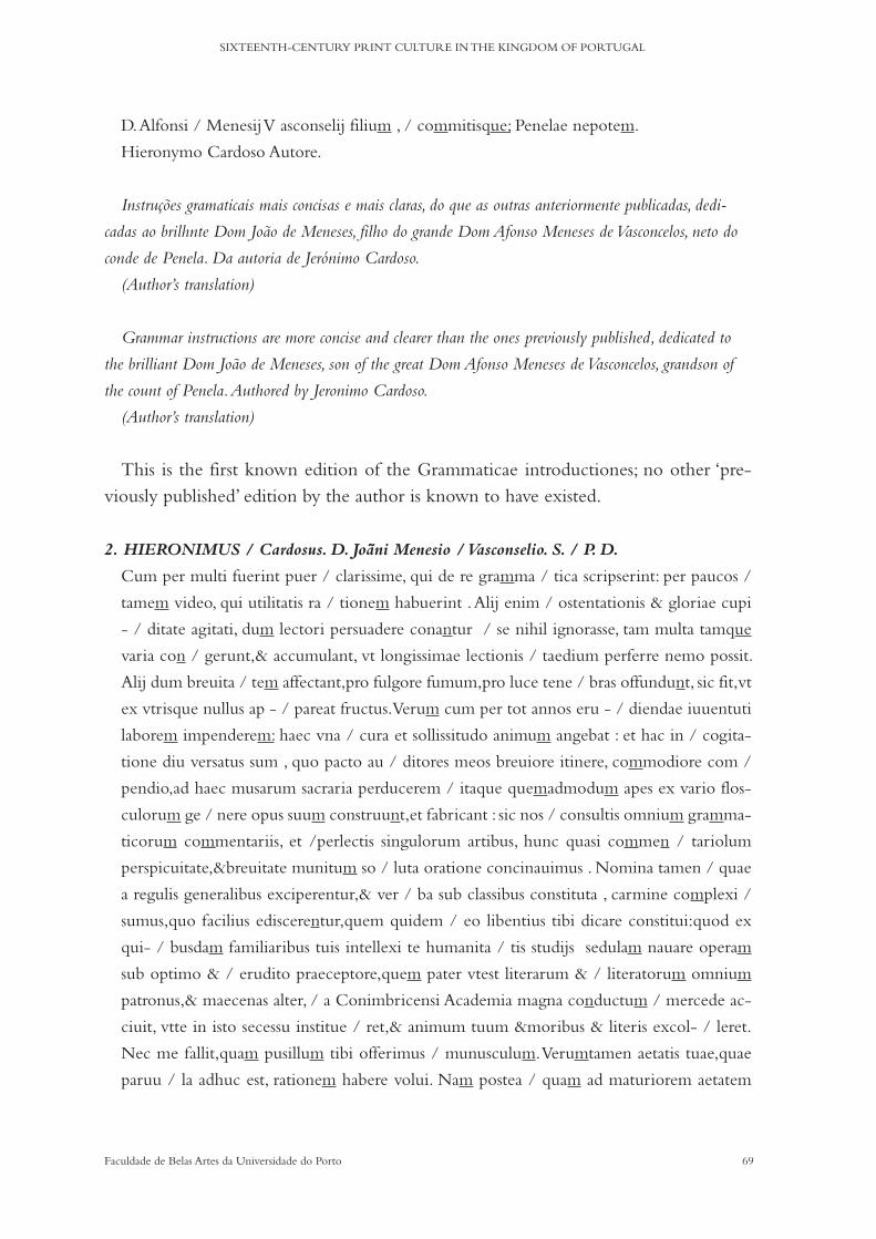
69Faculdade de Belas Artes da Universidade do Porto
SIXTEENTH-CENTURY PRINT CULTURE IN THE KINGDOM OF PORTUGAL
D. Alfonsi / Menesij V asconselij filium , / commitisque; Penelae nepotem.
Hieronymo Cardoso Autore.
Instruções gramaticais mais concisas e mais claras, do que as outras anteriormente publicadas, dedi-
cadas ao brilhnte Dom João de Meneses, filho do grande Dom Afonso Meneses de Vasconcelos, neto do
conde de Penela. Da autoria de Jerónimo Cardoso.
(Author’s translation)
Grammar instructions are more concise and clearer than the ones previously published, dedicated to
the brilliant Dom João de Meneses, son of the great Dom Afonso Meneses de Vasconcelos, grandson of
the count of Penela. Authored by Jeronimo Cardoso.
(Author’s translation)
This is the first known edition of the Grammaticae introductiones; no other ‘pre-viously published’ edition by the author is known to have existed.
2. HIERONIMUS / Cardosus. D. Joãni Menesio / Vasconselio. S. / P. D.
Cum per multi fuerint puer / clarissime, qui de re gramma / tica scripserint: per paucos /
tamem video, qui utilitatis ra / tionem habuerint . Alij enim / ostentationis & gloriae cupi
- / ditate agitati, dum lectori persuadere conantur / se nihil ignorasse, tam multa tamque
varia con / gerunt,& accumulant, vt longissimae lectionis / taedium perferre nemo possit.
Alij dum breuita / tem affectant,pro fulgore fumum,pro luce tene / bras offundunt, sic fit,vt
ex vtrisque nullus ap - / pareat fructus. Verum cum per tot annos eru - / diendae iuuentuti
laborem impenderem: haec vna / cura et sollissitudo animum angebat : et hac in / cogita-
tione diu versatus sum , quo pacto au / ditores meos breuiore itinere, commodiore com /
pendio,ad haec musarum sacraria perducerem / itaque quemadmodum apes ex vario flos-
culorum ge / nere opus suum construunt,et fabricant : sic nos / consultis omnium gramma-
ticorum commentariis, et /perlectis singulorum artibus, hunc quasi commen / tariolum
perspicuitate,&breuitate munitum so / luta oratione concinauimus . Nomina tamen / quae
a regulis generalibus exciperentur,& ver / ba sub classibus constituta , carmine complexi /
sumus,quo facilius ediscerentur,quem quidem / eo libentius tibi dicare constitui:quod ex
qui- / busdam familiaribus tuis intellexi te humanita / tis studijs sedulam nauare operam
sub optimo & / erudito praeceptore,quem pater vtest literarum & / literatorum omnium
patronus,& maecenas alter, / a Conimbricensi Academia magna conductum / mercede ac-
ciuit, vtte in isto secessu institue / ret,& animum tuum &moribus & literis excol- / leret.
Nec me fallit,quam pusillum tibi offerimus / munusculum. Verumtamen aetatis tuae,quae
paruu / la adhuc est, rationem habere volui. Nam postea / quam ad maturiorem aetatem
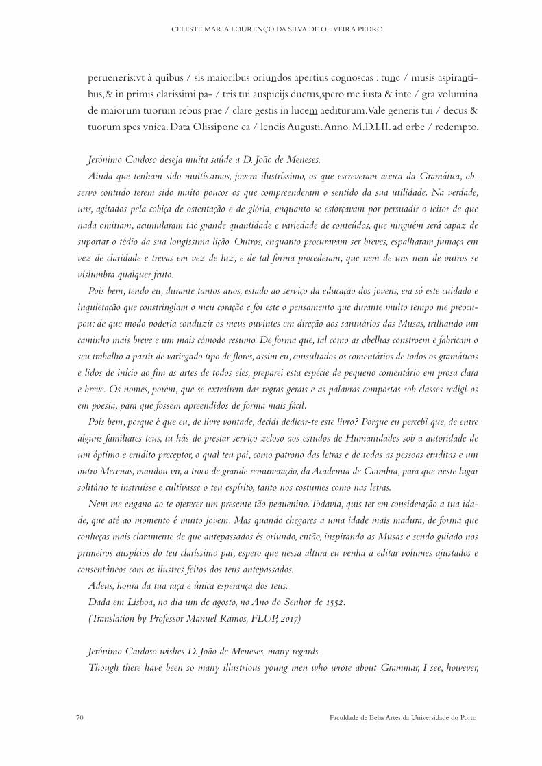
70 Faculdade de Belas Artes da Universidade do Porto
CELESTE MARIA LOURENÇO DA SILVA DE OLIVEIRA PEDRO
perueneris:vt à quibus / sis maioribus oriundos apertius cognoscas : tunc / musis aspiranti-
bus,& in primis clarissimi pa- / tris tui auspicijs ductus,spero me iusta & inte / gra volumina
de maiorum tuorum rebus prae / clare gestis in lucem aediturum. Vale generis tui / decus &
tuorum spes vnica. Data Olissipone ca / lendis Augusti. Anno. M.D.LII. ad orbe / redempto.
Jerónimo Cardoso deseja muita saúde a D. João de Meneses.
Ainda que tenham sido muitíssimos, jovem ilustríssimo, os que escreveram acerca da Gramática, ob-
servo contudo terem sido muito poucos os que compreenderam o sentido da sua utilidade. Na verdade,
uns, agitados pela cobiça de ostentação e de glória, enquanto se esforçavam por persuadir o leitor de que
nada omitiam, acumularam tão grande quantidade e variedade de conteúdos, que ninguém será capaz de
suportar o tédio da sua longíssima lição. Outros, enquanto procuravam ser breves, espalharam fumaça em
vez de claridade e trevas em vez de luz; e de tal forma procederam, que nem de uns nem de outros se
vislumbra qualquer fruto.
Pois bem, tendo eu, durante tantos anos, estado ao serviço da educação dos jovens, era só este cuidado e
inquietação que constringiam o meu coração e foi este o pensamento que durante muito tempo me preocu-
pou: de que modo poderia conduzir os meus ouvintes em direção aos santuários das Musas, trilhando um
caminho mais breve e um mais cómodo resumo. De forma que, tal como as abelhas constroem e fabricam o
seu trabalho a partir de variegado tipo de flores, assim eu, consultados os comentários de todos os gramáticos
e lidos de início ao fim as artes de todos eles, preparei esta espécie de pequeno comentário em prosa clara
e breve. Os nomes, porém, que se extraírem das regras gerais e as palavras compostas sob classes redigi-os
em poesia, para que fossem apreendidos de forma mais fácil.
Pois bem, porque é que eu, de livre vontade, decidi dedicar-te este livro? Porque eu percebi que, de entre
alguns familiares teus, tu hás-de prestar serviço zeloso aos estudos de Humanidades sob a autoridade de
um óptimo e erudito preceptor, o qual teu pai, como patrono das letras e de todas as pessoas eruditas e um
outro Mecenas, mandou vir, a troco de grande remuneração, da Academia de Coimbra, para que neste lugar
solitário te instruísse e cultivasse o teu espírito, tanto nos costumes como nas letras.
Nem me engano ao te oferecer um presente tão pequenino. Todavia, quis ter em consideração a tua ida-
de, que até ao momento é muito jovem. Mas quando chegares a uma idade mais madura, de forma que
conheças mais claramente de que antepassados és oriundo, então, inspirando as Musas e sendo guiado nos
primeiros auspícios do teu claríssimo pai, espero que nessa altura eu venha a editar volumes ajustados e
consentâneos com os ilustres feitos dos teus antepassados.
Adeus, honra da tua raça e única esperança dos teus.
Dada em Lisboa, no dia um de agosto, no Ano do Senhor de 1552.
(Translation by Professor Manuel Ramos, FLUP, 2017)
Jerónimo Cardoso wishes D. João de Meneses, many regards.
Though there have been so many illustrious young men who wrote about Grammar, I see, however,
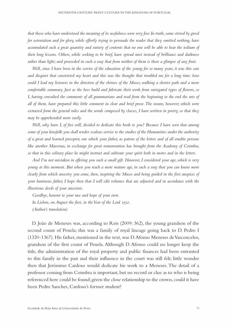
71Faculdade de Belas Artes da Universidade do Porto
SIXTEENTH-CENTURY PRINT CULTURE IN THE KINGDOM OF PORTUGAL
that those who have understood the meaning of its usefulness were very few. In truth, some stirred by greed
for ostentation and for glory, while effortly trying to persuade the reader that they omitted nothing, have
accumulated such a great quantity and variety of contents that no one will be able to bear the tedium of
their long lessons. Others, while seeking to be brief, have spread mist instead of brilliance and darkness
rather than light; and proceeded in such a way that from neither of them is there a glimpse of any fruit.
Well, since I have been in the service of the education of the young for so many years, it was this care
and disquiet that constricted my heart and this was the thought that troubled me for a long time: how
could I lead my listeners in the direction of the shrines of the Muses, walking a shorter path and a more
comfortable summary. Just as the bees build and fabricate their work from variegated types of flowers, so
I, having consulted the comments of all grammarians and read from the beginning to the end the arts of
all of them, have prepared this little comment in clear and brief prose. The nouns, however, which were
extracted from the general rules and the words composed by classes, I have written in poetry, so that they
may be apprehended more easily.
Well, why have I, of free will, decided to dedicate this book to you? Because I have seen that among
some of your kinsfolk you shall render zealous service to the studies of the Humanities under the authority
of a great and learned preceptor, one which your father, as patron of the letters and of all erudite persons
like another Maecenas, in exchange for great remuneration has brought from the Academy of Coimbra,
so that in this solitary place he might instruct and cultivate your spirit both in mores and in the letters.
And I’m not mistaken in offering you such a small gift. However, I considered your age, which is very
young at this moment. But when you reach a more mature age, in such a way that you can know more
clearly from which ancestry you come, then, inspiring the Muses and being guided in the first auspices of
your luminous father, I hope then that I will edit volumes that are adjusted and in accordance with the
illustrious deeds of your ancestors.
Goodbye, honour to your race and hope of your own.
In Lisbon, on August the first, in the Year of the Lord 1552.
(Author’s translation)
D. Joao de Meneses was, according to Reis (2009: 362), the young grandson of the second count of Penela; this was a family of royal lineage going back to D. Pedro I (1320-1367). His father, mentioned in the text, was D. Afonso Meneses de Vasconcelos, grandson of the first count of Penela. Although D. Afonso could no longer keep the title, the administration of the royal property and public finances had been entrusted to this family in the past and their influence in the court was still felt; little wonder then that Jerónimo Cardoso would dedicate his work to a Meneses. The detail of a professor coming from Coimbra is important, but no record or clue as to who is being referenced here could be found; given the close relationship to the crown, could it have been Pedro Sanches, Cardoso’s former student?

72 Faculdade de Belas Artes da Universidade do Porto
CELESTE MARIA LOURENÇO DA SILVA DE OLIVEIRA PEDRO
3. Ad eundem.
Ars mea quàm nimio genuipeperique labore,
Heu qui tecasus,quaeque pericla manent.
Oceam nigras cum sis latura procellas ,
Et Borae rabiem saeuitiamque noti,
Hinc te scylla rapax, hinc te implacata charibdis,
Obsidet:haec ut te sorbeat,atque voret.
Illa ut te laceret, canibusque; immitat edendam
U t iam de tota nil superesse queat.
Hanc licet effugias ,superant Simplegadesatrae,
Et lybicae syrtes Ioniumque furens.
Sed quia Ioannes generosa stirpe creatus:
Dux & rector adest,sydera dextra ferens,
Pone metum, contenne minas Aquilonis et Austri,
Ille erit aesonides, typhis & ille tibi.
Ao mesmo
Minha querida obra, que eu, com esforço desmedido, gerei e dei à luz,
Ai que desgraça e que perigos te estão reservados!
Pois que hás-de sofrer. do Oceano, as negras procelas
E do Bóreas a fúria e a violência do Noto.
Dum lado Cila rapace, doutro a insaciável Caríbdis
Te cercam: esta para te sorver e devorar,
Aquela para te espedaçar e lançar às fauces dos cães,
Para que de ti já não possa restar nada.
Ainda que escapes a esta, vencem-te as escuras Simplégades
E as Sirtes da Líboa e o impetuoso Mar Iónio.
| Mas porque de João nasceu uma nobre estirpe: (Author’s translation)|
Te assiste como guia e condutor, indicando astros favoráveis,
Afasta o teu receio, ignora as ameaças do Aquilão e do Austro:
Aquela será para ti um filho de Éson será umTífis.
(Cardoso, Tomo II, 2009: 112, translation by Telmo Reis)
To the same
My beloved work, which I, with immeasurable effort, have bred and given birth to,
Oh what misfortune and what dangers are reserved for you!
For you shall suffer, from the Oceanus, the black torments
1
5
10
1
5
10
1

73Faculdade de Belas Artes da Universidade do Porto
SIXTEENTH-CENTURY PRINT CULTURE IN THE KINGDOM OF PORTUGAL
And from Boreas, the fury and the violence of Notus.
On one side the thief Scylla, on the other the insatiable Charybdis
Surround you: the latter to engulf and devour you,
The other to tear you apart and throw you into the jaws of dogs,
So that nothing remains of you.
Even if you escape it, the dark Symplegades will win you over
And the Syrtes of Libya and the impetuous Ionian Sea.
But because from John a noble race was born:
He assists you as a guide and conductor, indicating favourable stars,
Do away your fear, ignore the threats of the Aquilonis and the Austri:
She will be for you a son of Aeson, will also be a Tiphys.
(Author’s translation)
The poem above was first printed in this edition, then again in the 1557 edition that is still considered lost (Cardoso, 2009: 359) and later in 1562 in the Institutiones In Linguam Latinam, in Lisbon by Joao Blávio, the relevant exceptions being the title, Ad artem suam and verse 11: Sed, quia Lysiadum rex inclitus atque benignus (Cardoso, 2009: 113). Why Jerónimo Cardoso dedicated the same poem to two different persons is un-clear, the second of whom is the king.
It is embedded with classical references: the voyages of the Argonauts serve as a framework for explaining the adventures and misfortunes of a writer’s work as well as a proof of the author’s knowledge of Greek mythology. The works of both Gaius Valerius Flaccus and Apollonius of Rhodes were certainly known in the kingdom since they had been circulating in print since the fifteenth century.
1.4.1 Dictionarium latino lusitanicum & vice versa lusitanico latinu[m] :
Conimbricae : excussit Joan. Barrerius, 12 Kal. Iulij 1570 [20 Junho 1570].
CONTENT STRUCTURE
By first examining the dates of each of the paratexts, it becomes quite clear that there is a date that stands out (in the Eulogy: 1561) but that might be explained by it being a re-edition of that text. All the other dates refer to July 1569, with the exception of the date of the frontispiece, July 1570, which is probably the date of the conclusion of the labour of printing (or the release to the market; or a mistake). If we assume these dates to be close to the reality, we can also assume that the formalities required for this
5
10
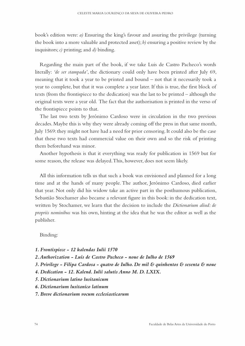
74 Faculdade de Belas Artes da Universidade do Porto
CELESTE MARIA LOURENÇO DA SILVA DE OLIVEIRA PEDRO
book’s edition were: a) Ensuring the king’s favour and assuring the privilege (turning the book into a more valuable and protected asset); b) ensuring a positive review by the inquisitors; c) printing; and d) binding.
Regarding the main part of the book, if we take Luis de Castro Pacheco’s words literally: ‘de ser stampada’, the dictionary could only have been printed after July 69, meaning that it took a year to be printed and bound – not that it necessarily took a year to complete, but that it was complete a year later. If this is true, the first block of texts (from the frontispiece to the dedication) was the last to be printed – although the original texts were a year old. The fact that the authorisation is printed in the verso of the frontispiece points to that.
The last two texts by Jerónimo Cardoso were in circulation in the two previous decades. Maybe this is why they were already coming off the press in that same month, July 1569: they might not have had a need for prior censoring. It could also be the case that these two texts had commercial value on their own and so the risk of printing them beforehand was minor.
Another hypothesis is that it everything was ready for publication in 1569 but for some reason, the release was delayed. This, however, does not seem likely.
All this information tells us that such a book was envisioned and planned for a long time and at the hands of many people. The author, Jerónimo Cardoso, died earlier that year. Not only did his widow take an active part in the posthumous publication, Sebastiao Stochamer also became a relevant figure in this book: in the dedication text, written by Stochamer, we learn that the decision to include the Dictionarium aliud: de propriis nominibus was his own, hinting at the idea that he was the editor as well as the publisher.
Binding:
1. Frontispiece - 12 kalendas Iulii 1570
2. Authorization - Luís de Castro Pacheco - noue de Iulho de 1569
3. Privilege - Filipa Cardosa - quatro de Iulho. De mil & quinhentos & sesenta & noue
4. Dedication - 12. Kalend. Iulii salutis Anno M. D. LXIX.
5. Dictionarium latino lusitanicum
6. Dictionarium lusitanico latinum
7. Breve dictionarium vocum ecclesiasticarum
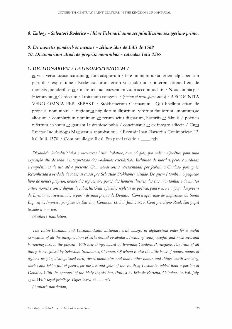
75Faculdade de Belas Artes da Universidade do Porto
SIXTEENTH-CENTURY PRINT CULTURE IN THE KINGDOM OF PORTUGAL
8. Eulogy - Salvatori Roderico - idibus Februarii anno sesquimillesimo sexagesimo primo.
9. De monetis ponderib et mensur - sétimo idus de Iulii de 1569
10. Dictionarium aliud: de propriis nominibus - calendas Iulii 1569
1. DICTIONARIVM / LATINOLVSITANICVM /
et vice versa Lusitanicolatinum,cum adagiorum / ferè omnium iuxta feriem alphabeticam
perutili / expositione : Ecclesiasticorum etiam vocabulorum / interpretatione. Item de
monetis , ponderibus, et / mensuris , ad praesentem vsum accommodatis. / Noue omnia per
Hieronymum Cardosum / Lusitanum congesta. / (stamp of portuguese arms) / RECOGNITA
VERO OMNIA PER SEBAST. / Stokhamerum Germanum . Qui libellum etiam de
propriis nominibus / regionum,populorum,illustrium virorum,fluuiorum, montium,ac
aliorum / complurium nominum et rerum scitu dignarum, historiis et fabulis / poéticis
refertum, in vsum et gratiam Lusitanicae pubis / concinnauit et ex integro adiecit. / Cum
Sanctae Inquisitionis Magistratus approbatione. / Excussit Ioan. Barrerius Conimbricae. 12.
kal. Iulii. 1570. / Com preuilegio Real. Em papel taxado a ____ reis.
Dicionário latinolusitânico e vice-versa lusitanicolatino, com adágios, por ordem alfabética para uma
exposição útil de toda a interpretação dos vocábulos eclesiásticos. Incluindo de moedas, pesos e medidas,
e empréstimos de uso até o presente. Com novas coisas acrescentadas por Jerónimo Cardoso, português.
Reconhecida a verdade de todas as coisas por Sebastião Stokhamer, alemão. De quem é também o pequeno
livro de nomes próprios, nomes das regiões, dos povos, dos homens ilustres, dos rios, montanhas e de muitos
outros nomes e coisas dignas de saber, histórias e fábulas repletas de poética, para o uso e a graça dos jovens
da Lusitânia, acrescentados a partir de uma porção de Donatus. Com a aprovação do majistrado da Santa
Inquisição. Impresso por João de Barreira, Coimbra. 12. kal. Julho. 1570. Com previlégio Real. Em papel
taxado a ---- reis.
(Author’s translation)
The Latin-Lusitanic and Lusitanic-Latin dictionary with adages in alphabetical order for a useful
exposition of all the interpretation of ecclesiastical vocabulary. Including coins, weights and measures, and
borrowing uses to the present. With new things added by Jerónimo Cardoso, Portuguese. The truth of all
things is recognised by Sebastian Stokhamer, German. Of whom is also the little book of names, names of
regions, peoples, distinguished men, rivers, mountains and many other names and things worth knowing,
stories and fables full of poetry, for the use and grace of the youth of Lusitania, added from a portion of
Donatus. With the approval of the Holy Inquisition. Printed by João de Barreira. Coimbra. 12. kal. July.
1570. With royal privilege. Paper taxed at ---- reis.
(Author’s translation)

76 Faculdade de Belas Artes da Universidade do Porto
CELESTE MARIA LOURENÇO DA SILVA DE OLIVEIRA PEDRO
The text on the frontispiece is a descriptive summary of the content of the book. It highlights the variety of the content and the existence of new additions and it reveals the importance of the contribution of Sebastian Stokhamer. It does so also by the use of majuscules, which in turn also highlights the role of the corrector of the university: recognita vero omnia.
Of the specimens studied, only one has the price of the book, 300 reis, written by hand. We cannot be sure about when this price was written down (no other copy that we had access to bears any price), but considering other known examples, it could be the price at which it was sold at the time (Noronha, 1874).
2. Ui esta obra per comissam dos senhores Inquisido= / res,& pareceme muito proueitosa,&
digna / de ser stampada. Em Coimbra / aos noue de Iulho. / De 1569. / Luis de Castro Pacheco.
Vi esta obra por ordem dos senhores Inquisidores, e parece-me muito proveitosa e digna de ser impressa.
Em Coimbra, a nove de Julho de 1569. Luís de Castro Pacheco.
(Author’s translation)
I have seen this work by order of the Inquisitors, and it seems very fruitful and worthy of being printed.
In Coimbra, July 9th 1569. Luis de Castro Pacheco.
(Author’s translation)
Luis de Castro Pacheco, lente de Vespera de Canones, lecturer of the Canons, was responsible for the censorship review of the book’s content. The expression used to justify the content approval, ‘muito proueitosa, & digna’ is in line with the one used in the privileged text, and one can suspect that given the efforts of the king’s father at reforming the schooling system, such a singular project as this would not have had any problem with censorship by the inquisition.
3. Priuilegio que el Rey nosso Senhor deu / pera este Uocabulario.
Eu el Rey faço saber aos que este aluará virem, que / Felippa Cardosa viuua,molher que
foi do Bacha- / rel Hieronymo cardoso me fez a petiça seguinte. / ¶ Felippa Cardosa
viuua,molher que foi do ba / charel Hieronymo Cardoso,faz saber a V.A.que por morte / do
dito seu marido lhe ficou hum liuro de vocabulos Portu- / queses reduzidos em latim:o qual
liuro V.A. mandou ver, / &visto mandou que se impremisse, porquanto era necessa- / rio &
proueitoso pera o bem comum. E porque o autor delle / gastou trinta & seis annos em o
fazer, & ella ser viuua, po- / bre & com filhas,pede a V.A.mande passar prouisam na / forma
acostumada,que nenhuma pessoa possa impremir,nem / trazer de fora a vender,sem licença
da suplicante.E na mes / ma prouisam conceda mais outro tanto tempo em huma ar / te que

77Faculdade de Belas Artes da Universidade do Porto
SIXTEENTH-CENTURY PRINT CULTURE IN THE KINGDOM OF PORTUGAL
ho Autor tambem fez,de que tem provisam,& está / hum anno por correr somente della,no
que receberá esmo / la & merce. ¶ E auendo respeito ao que a dita Felippa Car / dosa na
dita petiçam diz.Ey por bem & me praz,que por / tempo de oito annos, que começaram
da feitura deste, / pessoa alguma sem sua licença nam possa impremir,nem ven / der,nem
trazer de fora ho Vocabulario e arte,de que na / dita petiçam faz mençam,sob pena de perder
todos os vo- / lumes que dos ditos liuros lhe forem achados pera a dita / Felippa Cardosa,&
pagar cincoenta cruzados,a metade pe / ra a minha camara & a outra metade pera quem
accusar. / E despois que os ditos liuros forem impressos,se trará hum / delles á mesa do
despacho dos desembargadores do paço, / pera por elles ser taxado o preço per que ham de
ser ven- / didos. E mando ás justiças a que este Aluará for mostrado / que ho cumprao,&
façam inteiramente cumprir como se / nelle contem.O qual se treladará no principio,ou no
fim / dos ditos liuros.E hei por bem que valha,posto que o effei / to delle aja de durar mais
de hum anno,sem embargo da / Ordenaçam do segundo liuro,titolo vinte,que o / contrairo
dispõe. Belchior da Costa o fez / em Lisboa,a quatro de Iulho. / De mil & quinhentos / &
sesenta & / noue. / Baltasar da Costa o fez escrever. / Rey.
Privilegio que el Rey nosso Senhor deu pera este Vocabulário.
Eu el Rey faço saber aos que este alvará virem, que Felipa Cardosa viúva, mulher que foi do Bacharel
Jerónimo Cardoso me fez a petição seguinte.
Felipa Cardosa viúva, mulher que foi do bacharel Jerónimo Cardoso, faz saber a V.A. que por morte
do dito seu marido lhe ficou um livro de vocábulos Portuqueses traduzidos em latim: o qual livro V.A.
mandou ver, e visto mandou que se imprimisse, porquanto era necessário e proveitoso para o bem comum.
E porque o autor dele gastou trinta e seis anos para o fazer, e ela ser viúva, pobre e com filhas, pede a
V.A. que mande passar provisão na forma costumada, que nenhuma pessoa possa imprimir, nem trazer de
fora a vender, sem licença da suplicante. E na mesma provisão conceda mais outro tanto tempo para uma
arte que o autor também fez, de que tem provisão, e está um ano por correr somente dela, no que receberá
esmola e mercê. E havendo respeito ao que a dita Felipa Cardosa na dita petição diz. Hei por bem e me
apraz, que por tempo de oito anos, que começaram da feitura deste, pessoa alguma sem sua licença não
possa imprimir, nem vender, nem trazer de fora o Vocabulário e arte, de que na dita petição faz menção, sob
pena de perder todos os volumes que dos ditos livros lhe forem achados para a dita Felipa Cardosa, e pagar
cinquenta cruzados, a metade para a minha câmara e a outra metade para quem acusar. E depois que os
ditos livros forem impressos, se trará um deles à mesa do despacho dos desembargadores do paço, para por
eles ser taxado o preço por que hão-de ser vendidos. E mando às justiças a que este Alvará for mostrado
que o cumpram, e façam inteiramente cumprir como nele se contém. O qual se trasladará no princípio, ou
no fim dos ditos livros. E hei por bem que valha, posto que o efeito dele haja de durar mais de um ano,
sem embargo da Ordenação do segundo livro, título vinte, que o contrário dispõe. Belchior da Costa o fez
em Lisboa, a quatro de Julho. De mil e quinhentos e sessenta e nove. Baltasar da Costa o fez escrever. Rey.
(Author’s translation)
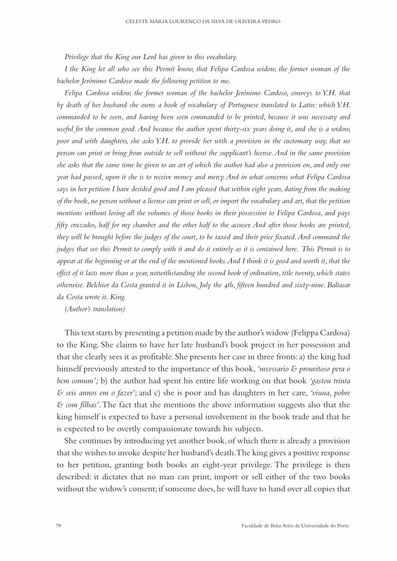
78 Faculdade de Belas Artes da Universidade do Porto
CELESTE MARIA LOURENÇO DA SILVA DE OLIVEIRA PEDRO
Privilege that the King our Lord has given to this vocabulary.
I the King let all who see this Permit know, that Felipa Cardosa widow, the former woman of the
bachelor Jerónimo Cardoso made the following petition to me.
Felipa Cardosa widow, the former woman of the bachelor Jerónimo Cardoso, conveys to Y.H. that
by death of her husband she owns a book of vocabulary of Portuguese translated to Latin: which Y.H.
commanded to be seen, and having been seen commanded to be printed, because it was necessary and
useful for the common good. And because the author spent thirty-six years doing it, and she is a widow,
poor and with daughters, she asks Y.H. to provide her with a provision in the customary way, that no
person can print or bring from outside to sell without the supplicant’s license. And in the same provision
she asks that the same time be given to an art of which the author had also a provision on, and only one
year had passed, upon it she is to receive money and mercy. And in what concerns what Felipa Cardosa
says in her petition I have decided good and I am pleased that within eight years, dating from the making
of the book, no person without a license can print or sell, or import the vocabulary and art, that the petition
mentions without losing all the volumes of those books in their possession to Felipa Cardosa, and pays
fifty cruzados, half for my chamber and the other half to the accuser. And after those books are printed,
they will be brought before the judges of the court, to be taxed and their price fixated. And command the
judges that see this Permit to comply with it and do it entirely as it is contained here. This Permit is to
appear at the beginning or at the end of the mentioned books. And I think it is good and worth it, that the
effect of it lasts more than a year, notwithstanding the second book of ordination, title twenty, which states
otherwise. Belchior da Costa granted it in Lisbon, July the 4th, fifteen hundred and sixty-nine. Baltasar
da Costa wrote it. King.
(Author’s translation)
This text starts by presenting a petition made by the author’s widow (Felippa Cardosa) to the King. She claims to have her late husband’s book project in her possession and that she clearly sees it as profitable. She presents her case in three fronts: a) the king had himself previously attested to the importance of this book, ‘necessario & proueitoso pera o bem comum’; b) the author had spent his entire life working on that book ‘gastou trinta & seis annos em o fazer’; and c) she is poor and has daughters in her care, ‘viuua, pobre & com filhas’. The fact that she mentions the above information suggests also that the king himself is expected to have a personal involvement in the book trade and that he is expected to be overtly compassionate towards his subjects.
She continues by introducing yet another book, of which there is already a provision that she wishes to invoke despite her husband’s death. The king gives a positive response to her petition, granting both books an eight-year privilege. The privilege is then described: it dictates that no man can print, import or sell either of the two books without the widow’s consent; if someone does, he will have to hand over all copies that
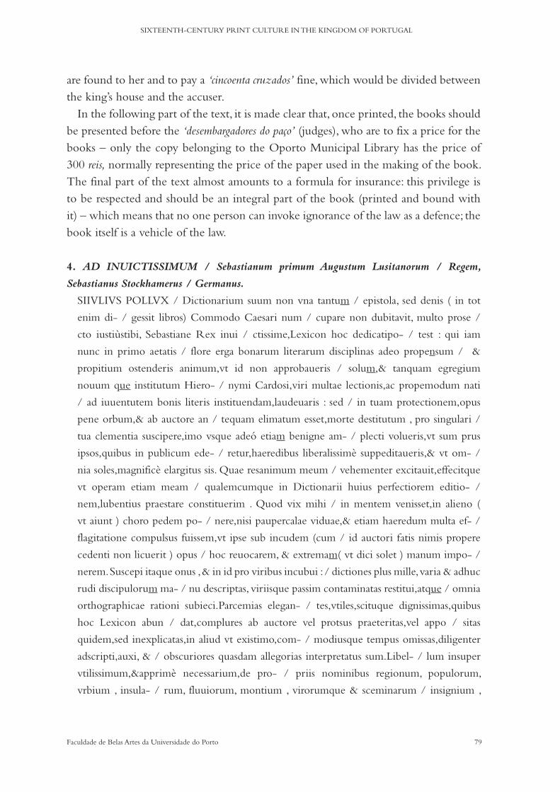
79Faculdade de Belas Artes da Universidade do Porto
SIXTEENTH-CENTURY PRINT CULTURE IN THE KINGDOM OF PORTUGAL
are found to her and to pay a ‘cincoenta cruzados’ fine, which would be divided between the king’s house and the accuser.
In the following part of the text, it is made clear that, once printed, the books should be presented before the ‘desembargadores do paço’ (judges), who are to fix a price for the books – only the copy belonging to the Oporto Municipal Library has the price of 300 reis, normally representing the price of the paper used in the making of the book. The final part of the text almost amounts to a formula for insurance: this privilege is to be respected and should be an integral part of the book (printed and bound with it) – which means that no one person can invoke ignorance of the law as a defence; the book itself is a vehicle of the law.
4. AD INUICTISSIMUM / Sebastianum primum Augustum Lusitanorum / Regem,
Sebastianus Stockhamerus / Germanus.
SIIVLIVS POLLVX / Dictionarium suum non vna tantum / epistola, sed denis ( in tot
enim di- / gessit libros) Commodo Caesari num / cupare non dubitavit, multo prose /
cto iustiùstibi, Sebastiane Rex inui / ctissime,Lexicon hoc dedicatipo- / test : qui iam
nunc in primo aetatis / flore erga bonarum literarum disciplinas adeo propensum / &
propitium ostenderis animum,vt id non approbaueris / solum,& tanquam egregium
nouum que institutum Hiero- / nymi Cardosi,viri multae lectionis,ac propemodum nati
/ ad iuuentutem bonis literis instituendam,laudeuaris : sed / in tuam protectionem,opus
pene orbum,& ab auctore an / tequam elimatum esset,morte destitutum , pro singulari /
tua clementia suscipere,imo vsque adeó etiam benigne am- / plecti volueris,vt sum prus
ipsos,quibus in publicum ede- / retur,haeredibus liberalissimè suppeditaueris,& vt om- /
nia soles,magnificè elargitus sis. Quae resanimum meum / vehementer excitauit,effecitque
vt operam etiam meam / qualemcumque in Dictionarii huius perfectiorem editio- /
nem,lubentius praestare constituerim . Quod vix mihi / in mentem venisset,in alieno (
vt aiunt ) choro pedem po- / nere,nisi paupercalae viduae,& etiam haeredum multa ef- /
flagitatione compulsus fuissem,vt ipse sub incudem (cum / id auctori fatis nimis propere
cedenti non licuerit ) opus / hoc reuocarem, & extremam( vt dici solet ) manum impo- /
nerem. Suscepi itaque onus , & in id pro viribus incubui : / dictiones plus mille, varia & adhuc
rudi discipulorum ma- / nu descriptas, viriisque passim contaminatas restitui,atque / omnia
orthographicae rationi subieci.Parcemias elegan- / tes,vtiles,scituque dignissimas,quibus
hoc Lexicon abun / dat,complures ab auctore vel protsus praeteritas,vel appo / sitas
quidem,sed inexplicatas,in aliud vt existimo,com- / modiusque tempus omissas,diligenter
adscripti,auxi, & / obscuriores quasdam allegorias interpretatus sum.Libel- / lum insuper
vtilissimum,&apprimè necessarium,de pro- / priis nominibus regionum, populorum,
vrbium , insula- / rum, fluuiorum, montium , virorumque & sceminarum / insignium ,

80 Faculdade de Belas Artes da Universidade do Porto
CELESTE MARIA LOURENÇO DA SILVA DE OLIVEIRA PEDRO
historiis,& fabulis poéticis quam fieri potuit / succinctè conscriptum,ex integro adieci:vt ita
perfectius, / & omnibus numeris absolutius Lexicon prodiret. /
Duplici itaque ratione meritò Lusitanicae Iuuentuti gra- / tulandum censeo,cum quam
eius studiis, quod ad voces Lati- / nas propriè vernacula lingua exprimendas attiuet, adeò
/ pulchrè hac opera consultum sit:tum verò maximè quod / non Regem solum longe
potentissimum,sed patrem si- / mul patriae per benignum , eumque literarum alumnum
/ habeat munificentissimum.Quem vt princeps ille mun- / di Deus,huius regni clauum
tenere voluit ,ita om- / nibus diuinis mneribus & donis cumula- / tum, diu saluum &
incolumem / conseruet. / Conimbricae 12. Kalend. Iulii salutis / Anno M. D. LXIX.
‘Ao Invictíssimo D. Sebastião Primeiro
Augusto Rei dos Lusitanos, o alemão Sebastião Stochamer
Se Júlio Pólux não exitou em dedicar ao Imperador Cómodo, não apenas com uma carta, mas com dez
(pois em tantos livros o diviviu), o seu dicionário, com muito mais justiça, seguramente, pode este léxico ser
dedicado a ti, Sebastião, invictíssimo Rei, que já agora, na primeira flor da idade, terás dado mostras de
um espírito por tal forma propenso e favorável com respeito às ciências das belas-letras, que não só o fizeste
aprovar e elogiaste como um distinto e inovador projecto de Jerónimo Cardoso, homem de abundantes
leituras e quase nascido para instruir a juventude nas belas-letras, mas quiseste, em razão da tua singular
clemência, acolher sob a tua protecção, ou melhor, abraçar até de um modo benevolente um trabalho quase
órfão e abandonado, por motivo de morte, antes que fosse limado pelo seu autor, de tal maneira que muito
generosamente financiaste aos seus herdeiros os próprios gastos, para que ele fosse publicado, e, como em
tudo fazer costumas, com largueza os prodigalizaste. Gesto que vivamente inflamou o meu espírito e
conseguiu que eu resolvesse, da melhor vontade, prestar também os meus serviços, quaisquer que eles
fossem, para uma mais perfeita edição deste dicionário.
Quanto a este facto, dificilmente me teria ocorrido meter a foice, como se diz, em seara alheia, se não
tivesse sido obrigado pelo insistente pedido da pobre viúva e também dos seus herdeiros a eu próprio (já
que isto não foi possível ao seu autor, que conheceu uma morte demasiado prematura) fazer retornar este
trabalho à bigorna e, como costuma dizer-se, dar-lhe os últimos retoques.
Arrostei, por conseguinte, este fardo e para tal apliquei-me, segundo as minhas forças, sobre mais de mil
entradas, transcritas pela mão variada e ainda inculta dos seus alunos e corrigi as que estavam manchadas de
erros a cada passo e tudo submeti à norma ortográfica. Os adágios, elegantes, proveitosos e muito dignos de ser
conhecidos, que este léxico apresenta em abundância, muitos deles ou completamente omitidos pelo autor ou
efectivamente apresentados, mas não interpretados, postos de lado, segundo creio, para uma ocasião diferente e
mais apropriada, escrupulosamente acrescentei, desenvolvi e interpretei algumas alegorias mais obscuras.
Além disso, ajuntei de novo um livrinho muito útil e acima de tudo necessário, acerca dos nomes
próprios de regiões, povos, cidades, ilhas, rios, montes e homens e mulheres notáveis, histórias e fábulas
poéticas, redigido quão sucintamente foi possível fazer-se, para que, desta maneira, o léxico viesse a público
mais perfeito e mais completo em todas as suas partes.

81Faculdade de Belas Artes da Universidade do Porto
SIXTEENTH-CENTURY PRINT CULTURE IN THE KINGDOM OF PORTUGAL
Assim pois, sou de opinião que, com justiça, se deve felicitar a juventude lusitana, por uma dupla razão:
tanto porque, nos seus estudos, no que se refere propriamente ao traduzir em língua vernácula as palavras
latinas, este trabalho é tão belamente a resposta de um oráculo; como, sem dúvida, sobretudo porque tem
não apenas um rei, de longe o mais poderoso, mas ao mesmo tempo um muito benevolente pai da pátria
e além disso um muito generoso discípulo das belas-letras, o qual, assim como aquela soberano, Deus do
Universo, desejou que governasse o leme deste reino assim o conserve, cumulado de todas as graças e bens
divinos, são e salvo durante muito tempo.
Em Coimbra, doze dias antes das Calendas de Julho, no ano da nossa salvação de 1569.’
(Cardoso, Tomo I, 2009: 28-29, translated by Telmo Reis)
To the Most Invincible D. Sebastião I
Augusto King of the Lusitanos, from the German Sebastião Stochamer
If Julio Pollux did not hesitate to dedicate to the Commodus Emperor, not only with a letter, but with
ten (for in so many books he had divided it), his dictionary; with much more justice, surely, can this lexicon
be dedicated to you, Sebastião, most invincible King, who already, in the first flower of your age, have
shown signs of a spirit in such a prone and favourable way with respect to the sciences of the fine-letters,
you have not only approved and praised this distinct and innovative project of Jerónimo Cardoso, a man of
abundant readings and almost born to instruct the youth in fine-letters, but also wanted, by virtue of your
singular clemency, to welcome under your protection, or rather to embrace in a benevolent way, an almost
orphaned and abandoned work, by reason of his death, before it was refined by its author, in such a way
that you have so generously financed his heirs with the costs so that it could be published, and, as is usual
in you, you gave them great prodigality. A gesture that vividly inflamed my spirit and got me to decide,
willingly, also to render my services, whatever they might be, for a more perfect edition of this dictionary.
As for this fact, it would have hardly occurred to me to meddle, as they say, in someone else’s business,
if I had not been compelled by the insistent request that the poor widow and also her heirs made to me
(since this was not possible to its author, who met a too premature death) to take this work in hands and,
as it is said, to give it the finishing touches.
I therefore brought up this burden, and applied myself according to my own strengths, on more than a
thousand entries, transcribed by the varied and still uneducated hand of his pupils, and correcting those
which were stained with errors at every step, and all I submitted to the Orthographic norm. The adages,
elegant, useful and very worthy to be known, which this lexicon presents in abundance, many of them
either completely omitted by the author or although presented not interpreted, put aside, I believe for a
different and more appropriate occasion. I added scrupulously, developed and interpreted some more obscure
allegories.
Moreover, I have added once more a very useful and above all necessary little book on the names of
regions, peoples, cities, islands, rivers, mountains, and remarkable men and women, poetic stories and fables,
written as succinctly as possible, so that in this manner the lexicon could become public more perfect and
more complete in all its parts.

82 Faculdade de Belas Artes da Universidade do Porto
CELESTE MARIA LOURENÇO DA SILVA DE OLIVEIRA PEDRO
I am therefore of the opinion that, in fairness, the Lusitanian youth should be congratulated for a double
reason: both because, in their studies, in what concerns the translation of Latin words into vernacular, this
work is so beautifully the answer from an oracle; As, undoubtedly, above all because it has not only a king,
by far the most powerful, but at the same time a very benevolent father of the fatherland, and, moreover, a
very generous disciple of the fine-letters, who, like that sovereign, God of the Universe, wished him to rule
the helm of this kingdom so to preserve it, cumulated with all graces and divine goods, safe and sound for
a long time.
In Coimbra, twelve days before the Calendas of July, in the year of our salvation of 1569.
(Author’s translation)
King Sebastian (the Desired) was 15 years of age when this text was composed. He, like many before him, was the preferred target of dedicatory texts since he was in his mother’s womb – the more so since his father died before he was born and all the kingdom’s hopes of keeping the crown safe from his Spanish relatives rested upon him. These kinds of texts not only enhanced (in a praiseworthy manner) his personal qualities but also, in a way, functioned as a moral framing to what was expected of him and of the early modern society as well. In this case, Sebastiao Stokhamer flatters the young king, exhorting his dedication to the fine letters and the benevolence he showed towards the widow and heirs of Jerónimo Cardoso. Sebastiao dedicates this work also to Jerónimo’s students (and Portuguese students in general) for their efforts in translating Latin into the vernacular, whilst diverting part of the attention to his own efforts in the editorial arrangements.
8. HIERONYMUS CARDOSVS, SALVA- / tori Roderico Medicae candidato / S.P.D.
CUM Budei opus de asse dies aliquot dili- / genter euoluerem,paucula qu.edam anditori- /
bus meis , & aliis etiam studiosis hominibus / magno vsui futura collegi.Ex quibus libellus /
hic,vel potius index conflatus est. Sed cum eo / tempore classis Indica iam pene instructa&ad /
carsum parari caepta esset:eum tibi dicandum / existimaui.Primum quòdlibellus diues nemi-
/ ni iustius dicari debuit quàm tibi:qui diuitem animum,& variis discipli- / nis imbutum,&
loculos nummis benerefertos sortitus sis.Deinde quod ist bic / crebrior monetarum &
ponderum quàm hic,sit vsus. Accipe igitur hoc / quicquid est munusculi,quod tibi pro
mutua necessitudine gratius futu / rum spero:quàm si hinc vestes bombicinas ac purpureas
, aut permultas / olei & vini cretici amphoras & alias nostrates merces ad temitteerem:li- /
bellus tamen inuitus mittibur:Mare enim longinquum, nequam & pro / cellosum,ac tot
insulas & bonae spei promontorium traiecturus, per hor / rescit:& quod in eam regionem sit
peruenturus, vbi hostium clamor,ar- / morum strepitus,tormenta instar fulminum saepius
quam scholaerum pro- / fessores,aut theatrorum plausus exaudiuntur. Caeterum cum

83Faculdade de Belas Artes da Universidade do Porto
SIXTEENTH-CENTURY PRINT CULTURE IN THE KINGDOM OF PORTUGAL
intellexit / se tibi doctissimo homini tradendum,teque unumomnium eruditorum / instar
esse,paulisper deleitus est. vale:dataVlyssipponeidibus Februarii / anno sesquimillesimo
sexagesimo primo.
‘Jerónimo Cardoso a Salvador Rodrigues, licenciado em Ciência Médica, envia muitas saudações.
Compulsando eu cuidadosamente, durante alguns dias, a obra de Budé Acerca do Asse, coligi algumas
muito poucas anotações, que hão-de ser de grande proveito para os meus alunos e também para outras
pessoas interessadas. Delas foi composto o presente livrinho ou, de preferência, tabela.
Mas dado que, por esta altura, a armada da Índia já quase tinha sido construída e tinha começado a ser
preparada para a viagem, considerei que ele te devia der dedicado, em primeiro lugar, porque um livrinho
rico a ninguém com mais justiça deveria ser dedicado do que a ti, que obtiveste por sorte um espírito rico e
instruído em várias ciências e uns cofres bem recheados de dinheiro; em segundo lugar, porque aí há uma
utilização de moedas e de pesos mais frequente do que aqui. Aceita, portanto, este presentinho, qualquer
que seja o seu valor, o qual eu espero que te venha a ser, pela nossa mútua amizade, mais agradável do
que se enviasse daqui vestes de seda e de cor de púrpura ou um grande número de ânforas cheias de azeite
e de vinho de Creta e outras mercadorias da nossa terra.
O livrinho, no entanto, é enviado contra a sua vontade. Realmente, ele treme de pavor com a ideia de
ter de passar o mar extenso, agitado e tempestuoso, e um tão grande número de ilhas e o cabo da Boa
Esperança treme de pavor, e também por há-de chegar a esta região, onde são bem ouvidos o clamor dos
inimigos, o estrépito dos combates, à semelhança de uma trovoada, muitas mais vezes do que os professores
das escolas ou os aplausos das assembleias. De resto, no momento em que compreendeu que devia ser
confiado a ti, um homem de grande saber, e que tu és como o primeiro de entre todos os sábios, em pouco
tempo se acalmou.
Passa bem.
Dada em Lisboa, nos Idos de Fevereiro, no ano de 1561.’
(Cardoso, Tomo II, 2009: 84, translated by Telmo Reis)
Jerónimo Cardoso sends Salvador Rodrigues, graduate in Medical Sciences, many regards.
Compulsively and carefully I, for a few days, read the work of Budé ‘About Asse’ and have written
some very few annotations, that will be of great worth to my students and also to other interested persons.
From them was this little book composed, or, preferably, tabela.
But given that, by this time, the Indian Armada was almost built and that it started to be prepared for
the voyage, I considered that it should be dedicated most of all to you, because this rich little book to no
one other than you should be dedicated, you who got by luck a rich spirit and instruction in many sciences
and a wealthy vault of money; in second place, because you can find the use of coins and weights more
frequently useful there than here. Take, therefore, this little gift, whatever its value might be, that which
I hope it be, because of our mutual friendship, more pleasant than silk and purpura garments, or a great
number of bouls full with olive oil and Cretan wine and other merchandises of our land.
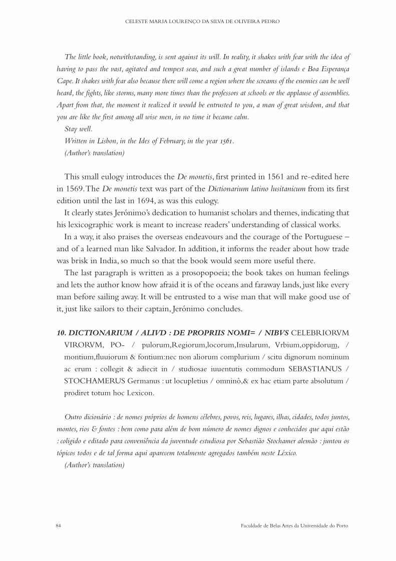
84 Faculdade de Belas Artes da Universidade do Porto
CELESTE MARIA LOURENÇO DA SILVA DE OLIVEIRA PEDRO
The little book, notwithstanding, is sent against its will. In reality, it shakes with fear with the idea of
having to pass the vast, agitated and tempest seas, and such a great number of islands e Boa Esperança
Cape. It shakes with fear also because there will come a region where the screams of the enemies can be well
heard, the fights, like storms, many more times than the professors at schools or the applause of assemblies.
Apart from that, the moment it realized it would be entrusted to you, a man of great wisdom, and that
you are like the first among all wise men, in no time it became calm.
Stay well.
Written in Lisbon, in the Ides of February, in the year 1561.
(Author’s translation)
This small eulogy introduces the De monetis, first printed in 1561 and re-edited here in 1569. The De monetis text was part of the Dictionarium latino lusitanicum from its first edition until the last in 1694, as was this eulogy.
It clearly states Jerónimo’s dedication to humanist scholars and themes, indicating that his lexicographic work is meant to increase readers’ understanding of classical works.
In a way, it also praises the overseas endeavours and the courage of the Portuguese – and of a learned man like Salvador. In addition, it informs the reader about how trade was brisk in India, so much so that the book would seem more useful there.
The last paragraph is written as a prosopopoeia; the book takes on human feelings and lets the author know how afraid it is of the oceans and faraway lands, just like every man before sailing away. It will be entrusted to a wise man that will make good use of it, just like sailors to their captain, Jerónimo concludes.
10. DICTIONARIUM / ALIVD : DE PROPRIIS NOMI= / NIBVS CELEBRIORVM
VIRORVM, PO- / pulorum,Regiorum,locorum,Insularum, Vrbium,oppidorum, /
montium,fluuiorum & fontium:nec non aliorum complurium / scitu dignorum nominum
ac erum : collegit & adiecit in / studiosae iuuentutis commodum SEBASTIANUS /
STOCHAMERUS Germanus : ut locupletius / omninò,& ex hac etiam parte absolutum /
prodiret totum hoc Lexicon.
Outro dicionário : de nomes próprios de homens célebres, povos, reis, lugares, ilhas, cidades, todos juntos,
montes, rios & fontes : bem como para além de bom número de nomes dignos e conhecidos que aqui estão
: coligido e editado para conveniência da juventude estudiosa por Sebastião Stochamer alemão : juntou os
tópicos todos e de tal forma aqui aparecem totalmente agregados também neste Léxico.
(Author’s translation)

85Faculdade de Belas Artes da Universidade do Porto
SIXTEENTH-CENTURY PRINT CULTURE IN THE KINGDOM OF PORTUGAL
Another dictionary: of names of famous men, peoples, kings, places, islands, cities, all together, hills, rivers
and fountains: here are as well as besides a good number of worthy and known names: collected and edited
for the convenience of the studious youth by Sebastião Stochamer German : collected and edited all the
topics and as such here they appear totally aggregated in this Lexicon.
(Author’s translation)
Sebastiao Stochamer reinforces here his role as editor and again mentions the role of this book in the education of the youth of the Kingdom.
The Dictionarium 1569/70 is a large piece, as dictionaries normally are. The goal of language comprehensiveness and of its economic value is enhanced by the inclusion of Sebastiao’s Dictionarium Aliud.
The paratexts found in these books are divided mainly into four types: frontispiec-es (and/or colophons); authorizations (sometimes part of the frontispiece); privileges; and dedications. They provide rich information about law affairs, commercial affairs, politics, social relationships (often in the form of self-promotion texts) and more im-portantly they state the purpose of the books: ‘so that in this manner the lexicon could become public more perfect and more complete in all its parts.’ (1569), they anticipate who the expected reader is: ‘collected and edited for the convenience of the studious youth’ (1569); and the intentions of the author (why the book was written): ‘how could I lead my listeners in the direction of the shrines of the Muses, walking a shorter path and a more comfortable summary’ (1552). In terms of pertinent typographical information, paratexts revealed details such as to the organization of the contents: ‘This Permit is to appear at the beginning or at the end of the mentioned books.’ (1569); references to unknown publications: ‘more concise and clearer than the ones previously published’ (1552); print-specific regulations: ‘I have decided good and I am pleased that within eight years, dating from the making of the book, no person with-out a license can print or sell, or import the vocabulary and art’ (1569) and even posthumous privileges given to the heirs of the author: to provide her with a provision in the customary way, that no person can print or bring from outside to sell without the supplicant’s license’ (1569).
No doubt, this study confirms Anderson’s remarks on paratexts: ‘These subliminal – or, if you like, transliminal – features of the Renaissance book significantly encode in bibliographical artefacts the essential issues of patronage, dissemination, demographics, and stylization of audience status. And further encoded in this distension of text and disposition of space and resources are matters of hermeneutic and structural, as well as economic, consequence.’ (2008: 643-644).
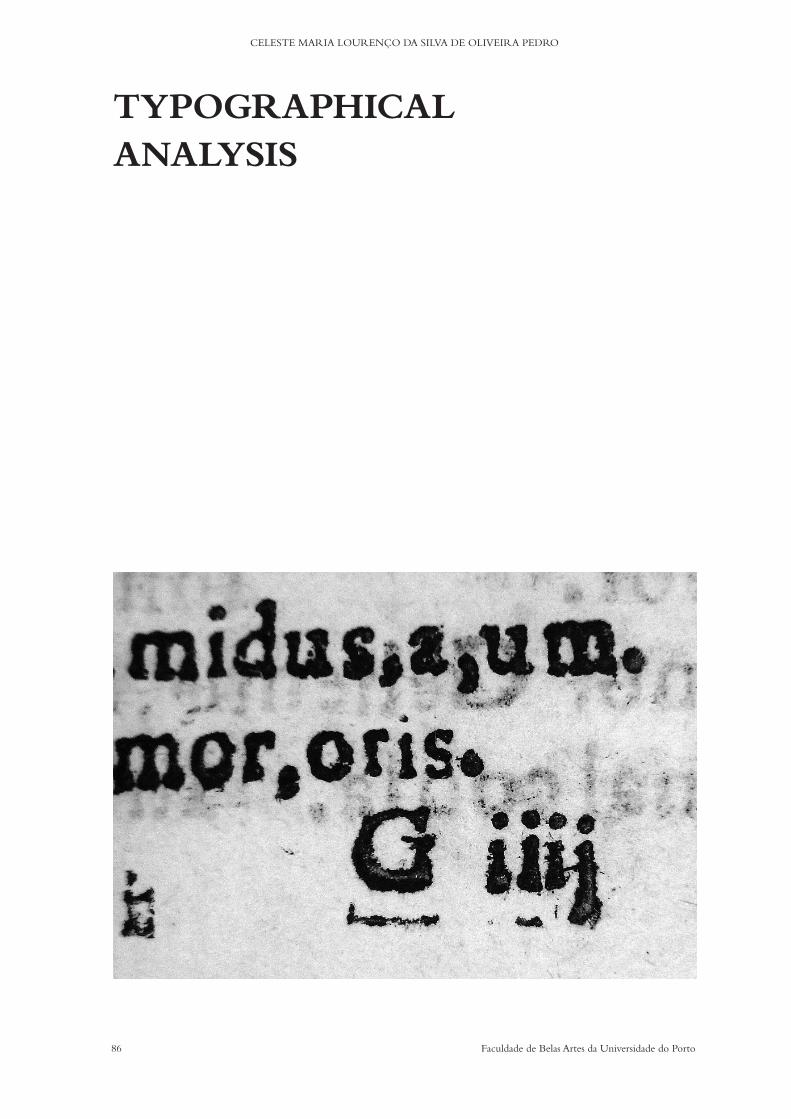
86 Faculdade de Belas Artes da Universidade do Porto
CELESTE MARIA LOURENÇO DA SILVA DE OLIVEIRA PEDRO
TYPOGRAPHICALANALYSIS

87Faculdade de Belas Artes da Universidade do Porto
SIXTEENTH-CENTURY PRINT CULTURE IN THE KINGDOM OF PORTUGAL
Chapter 4a) Macrotypographical description
‘(...) macrotypography – the typographical layout – is concerned with the format of the printed matter, with the size and position of the columns of type and illustrations, with the organization of the hierarchy of headings, subheadings and captions (...)’ (Hochuli, 2009: 7)
This research is based on the assumption that macro-typography is an essential part of a complete bibliographical analysis of printed books. As such, this chapter comple-ments the descriptions found in the previous chapters, focusing on two poles – layout structure and theoretical implications of the layout arrangements – contextualising both through concrete examples.
Sixteenth-century printed books, in general, define the transition from the medie-val layout to a new typographical arrangement of elements; gothic styles progressing into humanistic trends: ‘Nearly all humanist manuscripts are written in well-spaced long lines rather than the two or more columns frequent in Gothic manuscripts. The majority are on vellum carefully ruled with a hard point, the writing (in prose texts) extending to an even right margin by ‘justification’, another trait passed on to print.’ (Davies, 2004: 49)
These changes are visually apprehended by the gradual reduction in the use of cer-tain types and layouts, but mainly, and more importantly, in the standardisation of hier-archical elements. Indexes and page numbering or chapters, for example, were a major advance made common by print; the whole standardised look of the page is related directly to the greater importance and presence printed books had in the early mod-ern age: ‘Standardization of reference, and ease of actually finding one’s way around a text with printed headlines, chapter sections, foliation and eventually pagination, were important advances for scholarship. None of these devices was unknown to the manuscript world, but in the nature of the case they were sporadic, inconsistent and individual in their application.’ (idem: 55)
Macro-typographical design is most visible in the texture of the written/printed area, which can, in turn, be dependent on the white space of the page. The two dance together in order to create an image. Some areas are darker than others, but it is the relationship between printed and non-printed areas that defines the adequacy of the chosen layout to the conceptual content and to the purpose of the texts. The user will respond more rapidly, or make better use of, the text if there is a visual balance between the whole and the parts, even more so when it comes to books such as dic-tionaries, grammar texts or encyclopaedias.
88 Faculdade de Belas Artes da Universidade do Porto
CELESTE MARIA LOURENÇO DA SILVA DE OLIVEIRA PEDRO
‘(...) a densidade da textura de uma página escrita ou composta é chamada de cor. Isso nada tem a ver com tintas verdes ou vermelhas; refere-se apenas à escuridão da massa de tipos. Uma vez satisfeitas as demandas de legibilidade e de ordenação lógica, a homogeneidade da cor é o objectivo mais comum almejado pelo tipógrafo. E isso depende de quatro fatores: o desenho do tipo, o espacejamento das letras, das palavras e das linhas. Nenhum é independente do outro.’ (Bringhurst, 2005: 32) [The density of the texture of a written or of a composed page is called colour. This has nothing to do with green or red inks; it has only to do with the darkness of the massiness of type. Once the demands of legibility and logical ordering have been met, colour homogeneity is the most common goal sought by the typographer. And that depends on four factors: the type design, the kerning of letters, words and lines. None of which is independent of the other. (Author’s translation)]
The manipulation of signs, letters or others, grants an extra level of interpretation and many solutions may be needed in the same book: the typographer should have enough sensibility to choose the right types and layouts.
Bigelow (1989 – digital version blog: 2012) defines two fundamental typographi-cal principles: size (of the letters) and combination (of letters). These affect both the qualitative and the quantitative aspects of the form, pattern and texture of texts: the typographical image. Size is defined by physical scale, linear and optical, and context, a change in technology provided for the possibility of a continuous mathematical scale, but the ‘human visual system has non-linear sensitivity to visual features of different special fre-quencies’. Combination is defined by the nature of languages, mirroring the repetition and recombination of graphemes and morphemes in the text. Bigelow proceeds with a rather visual explanation of the components of the typographical image, starting with the large scale of the form of the letter and its geometry, the abstract or contemplation level. This is followed by the pattern, constructed on the pillars of letter combination, thus defining the medium or periodic scale of form and counter-form in letters, words, lines and columns, as well as texture, the small scale, where patterns aggregate in com-plexity: ‘The typographical image comprises distinct levels of different aesthetical and functional qualities’.
The following pages present visual details of the composition of the pages (highlight-ed by small added signs in each image) and provide a generic description of macro-ty-pographical characteristics of the books of the corpus: overall appearance of the pages, how varied the layouts are, the types used or the existence of certain graphical elements to indicate the flow of the information, for example.
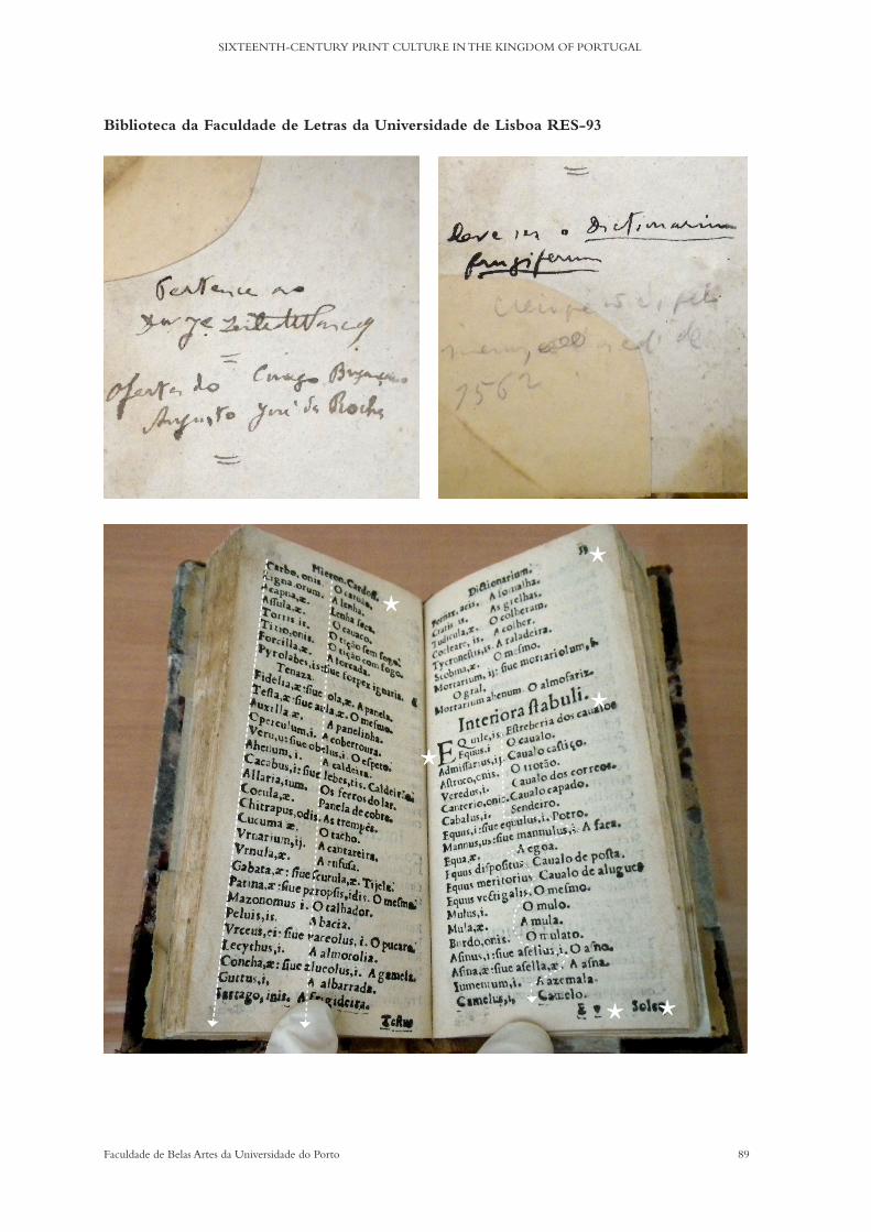
89Faculdade de Belas Artes da Universidade do Porto
SIXTEENTH-CENTURY PRINT CULTURE IN THE KINGDOM OF PORTUGAL
Biblioteca da Faculdade de Letras da Universidade de Lisboa RES-93
*
*
* *
**
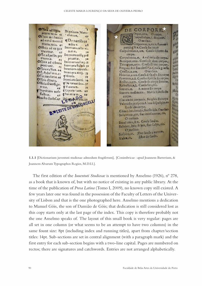
90 Faculdade de Belas Artes da Universidade do Porto
CELESTE MARIA LOURENÇO DA SILVA DE OLIVEIRA PEDRO
1.1.1 [Dictionarium juventuti studiosae admodum frugiferum], [Conimbricae : apud Joannem Barrerium, &
Joannem Alvarum Typographos Regios, M.D.LI.].
The first edition of the Iuuentuti Studiosae is mentioned by Anselmo (1926), nº 278, as a book that is known of, but with no notice of existing in any public library. At the time of the publication of Prosa Latina (Tomo I, 2009), no known copy still existed. A few years later one was found in the possession of the Faculty of Letters of the Univer-sity of Lisbon and that is the one photographed here. Anselmo mentions a dedication to Manuel Góis, the son of Damiao de Góis; that dedication is still considered lost as this copy starts only at the last page of the index. This copy is therefore probably not the one Anselmo speaks of. The layout of this small book is very regular: pages are all set in one column (or what seems to be an attempt to have two columns) in the same fount size: 8pt (including index and running titles), apart from chapter/section titles: 14pt. Sub-sections are set in central alignment (with a paragraph mark) and the first entry for each sub-section begins with a two-line capital. Pages are numbered on rectos; there are signatures and catchwords. Entries are not arranged alphabetically.
**

91Faculdade de Belas Artes da Universidade do Porto
SIXTEENTH-CENTURY PRINT CULTURE IN THE KINGDOM OF PORTUGAL
Biblioteca Pública Municipal do Porto X1-3-44
* *
**
**
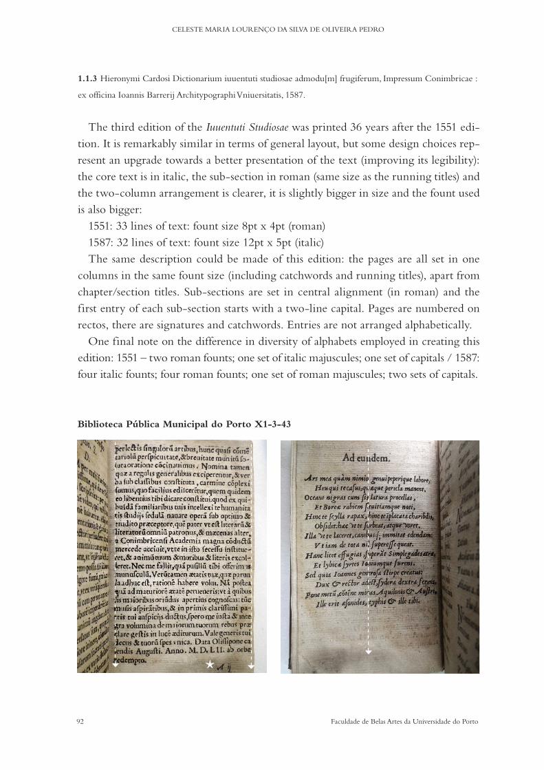
92 Faculdade de Belas Artes da Universidade do Porto
CELESTE MARIA LOURENÇO DA SILVA DE OLIVEIRA PEDRO
1.1.3 Hieronymi Cardosi Dictionarium iuuentuti studiosae admodu[m] frugiferum, Impressum Conimbricae :
ex officina Ioannis Barrerij Architypographi Vniuersitatis, 1587.
The third edition of the Iuuentuti Studiosae was printed 36 years after the 1551 edi-tion. It is remarkably similar in terms of general layout, but some design choices rep-resent an upgrade towards a better presentation of the text (improving its legibility): the core text is in italic, the sub-section in roman (same size as the running titles) and the two-column arrangement is clearer, it is slightly bigger in size and the fount used is also bigger:
1551: 33 lines of text: fount size 8pt x 4pt (roman)1587: 32 lines of text: fount size 12pt x 5pt (italic)The same description could be made of this edition: the pages are all set in one
columns in the same fount size (including catchwords and running titles), apart from chapter/section titles. Sub-sections are set in central alignment (in roman) and the first entry of each sub-section starts with a two-line capital. Pages are numbered on rectos, there are signatures and catchwords. Entries are not arranged alphabetically.
One final note on the difference in diversity of alphabets employed in creating this edition: 1551 – two roman founts; one set of italic majuscules; one set of capitals / 1587: four italic founts; four roman founts; one set of roman majuscules; two sets of capitals.
Biblioteca Pública Municipal do Porto X1-3-43
*
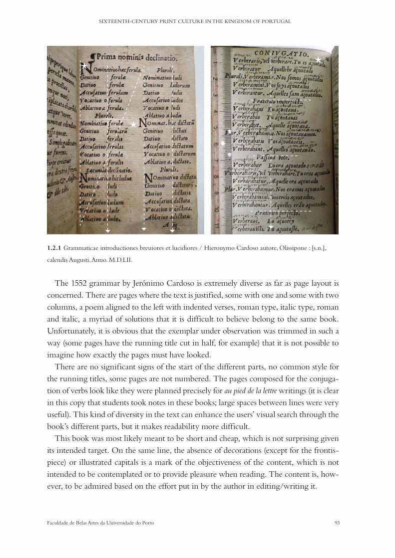
93Faculdade de Belas Artes da Universidade do Porto
SIXTEENTH-CENTURY PRINT CULTURE IN THE KINGDOM OF PORTUGAL
**
*
1.2.1 Grammaticae introductiones breuiores et lucidiores / Hieronymo Cardoso autore, Olissipone : [s.n.],
calendis Augusti. Anno. M.D.LII.
The 1552 grammar by Jerónimo Cardoso is extremely diverse as far as page layout is concerned. There are pages where the text is justified, some with one and some with two columns, a poem aligned to the left with indented verses, roman type, italic type, roman and italic, a myriad of solutions that it is difficult to believe belong to the same book. Unfortunately, it is obvious that the exemplar under observation was trimmed in such a way (some pages have the running title cut in half, for example) that it is not possible to imagine how exactly the pages must have looked.
There are no significant signs of the start of the different parts, no common style for the running titles, some pages are not numbered. The pages composed for the conjuga-tion of verbs look like they were planned precisely for au pied de la lettre writings (it is clear in this copy that students took notes in these books; large spaces between lines were very useful). This kind of diversity in the text can enhance the users’ visual search through the book’s different parts, but it makes readability more difficult.
This book was most likely meant to be short and cheap, which is not surprising given its intended target. On the same line, the absence of decorations (except for the frontis-piece) or illustrated capitals is a mark of the objectiveness of the content, which is not intended to be contemplated or to provide pleasure when reading. The content is, how-ever, to be admired based on the effort put in by the author in editing/writing it.

94 Faculdade de Belas Artes da Universidade do Porto
CELESTE MARIA LOURENÇO DA SILVA DE OLIVEIRA PEDRO
Biblioteca Pública Municipal do Porto - RES-XVI-A-0160
*
*
*

95Faculdade de Belas Artes da Universidade do Porto
SIXTEENTH-CENTURY PRINT CULTURE IN THE KINGDOM OF PORTUGAL
Biblioteca Geral da Universidade de Coimbra R-12-13+A+B
*
*
*
*
*

96 Faculdade de Belas Artes da Universidade do Porto
CELESTE MARIA LOURENÇO DA SILVA DE OLIVEIRA PEDRO
*
* * *
Biblioteca da Faculdade de Letras da Universidade de Lisboa RES 211
*
*
97Faculdade de Belas Artes da Universidade do Porto
SIXTEENTH-CENTURY PRINT CULTURE IN THE KINGDOM OF PORTUGAL
1.4.1 Dictionarium latino lusitanicum & vice versa lusitanico latinu[m] : Conimbricae : excussit Joan.
Barrerius, 12 Kal. Iulij 1570 [20 Junho 1570].
The first edition of the Dictionarium Latino Lusitanicum is, in fact, a collection of four works: Dictionarium latino lusitanicum & vice versa lusitanico latinum; Breve Dictionarivm Vocum Ecclesiasticarum; De Monetis ponderib et mensur; and Dictionarivm alivd : de propriis nominibvs. The paratexts being printed last, the signatures reveal that the books were printed in 3 parts, as follows: Dictionarium Latino Lusitanicum (signatures from A to Kk); Dictionarium Lusitanicuo Latinum + Breve Dictionarium + Elegy + De monetis (signatures from A to M); and Dictionarium Aliud (signatures from A to G).
The layouts of each part/book are very similar from one book to the other (although the actual size of the grids vary): they keep the same two-column arrangement (that in some cases appears as four columns because of the dichotomy entry=definition/translation); the same form of titles; and running titles, capitals and illustrated capitals are identical throughout the edition. Only the paratexts break the regularity of the layout. The colophon appears at the end of the second part (the first and second are Jerónimo Cardoso’s) with the date Septimo Idus Ivlii and Stockmer’s book follows with the date Calend. Iul..
Pages are numbered on rectos, there are signatures in the customary way (Gaskell, 1972) and catchwords.
Entries are arranged alphabetically (limited to the first three letters).On all reviewed copies the final page of the privilege text finishes with a round seal
(a heart with the initials A and G, surmounted by a cross: see previous page) that was imprinted posteriorly. It was not possible to ascertain the origin or ownership of the seal or why it was used.
98 Faculdade de Belas Artes da Universidade do Porto
CELESTE MARIA LOURENÇO DA SILVA DE OLIVEIRA PEDRO
b) Lexicography and typography
INFORMATION, STRUCTURE AND TYPOGRAPHY
The communicative role of different letter shapes and type designs has been an ad hoc fact for centuries. But just how far the processes of visual engagement are consciously used/apprehended by both printer/designer and reader/audience has been a matter of scientific debate, mostly in the past decades with the development of the discipline of communication sciences and semiology.
‘(…) en todo documento textual el mensaje se materializa tanto visual y tipográficamente, como lingüísticamente, con independencia de su canal de transmisión. Por otro lado, subrayan que la interpretación del mensaje es un proceso activo y dinámico en todo tipo de documento textual, surgiendo la comprensión del mensaje de la interacción entre el propio documento y el destinatario, quien aporta al proceso de interpretación y compresión un objetivo informativo, y su bagaje de experiencias, expectativas y conocimientos’ (Montesi, 2009: 93) [In every textual document, the message is materialised both visually and typographically, as well as lin-guistically, independently of its transmission channel. On the other hand, the emphasis is that the interpretation of the message is an active and dynamic process in any type of a textual doc-ument. The comprehension of the message emerges from the interaction between the document itself and the recipient, who carries an informative purpose and his own experiences, expecta-tions and knowledge to the process of interpretation and comprehension. (Author’s translation)]
Information design, when applied to the editorial field, aims for effective transmis-sion, visual quality and the efficiency of texts. Considering readability and legibility, two of the most common visual features in a text, one needs linguistics and typo-graphical studies in order to account for the total meaning of a document. Monte-si’s article (2009) refers to different ways in which the visual and the verbal interact and inf luence the meaning and the general perception of the content: redundancy, complementary, supplementary, juxtaposition and stage setting. The author’s model for this multimodal analysis is structural and contemplates the role and interplay of typographical elements and how the mechanisms of production and consumption restrict and individualise the nature of different documents. This model could be apt for an analysis of dictionaries: it contemplates the structure of content, the rhetorical structure of the communicative process, layout and composition, navigation within the document and the linguistic structure.
Van Leeuwen (2006), a scholar who is constantly revisited on the subject of multi-

99Faculdade de Belas Artes da Universidade do Porto
SIXTEENTH-CENTURY PRINT CULTURE IN THE KINGDOM OF PORTUGAL
modality, proposes to look at typography beyond the spectre of legibility, describing it as a semiotic mode able to perform different and simultaneous communicative meta-functions.
When distinctive features of letterforms and visual resources are combined, they have semiotic implications in reading and, thus, on the ability to gather information from the text: readability. In typography, two key concepts should be functional and applicable to other semiotic modes, salience, that is, ‘making a given text element stand out from its immediate textual environment’, and framing, that is, ‘the demarcation of the elements of text’. In asserting whether these modes realise communicative functions, there is a need to step outside of linguistics and to ‘incorporate (them) into a broader theory of multimodality’.
Rossum (1998), in turn, believes that legibility studies can help type designers in determining the most useful visual parameters to be used (taken into consideration) when designing a fount. Reading speed, fixation, saccades, vision angles, acuity, in-teraction effects, comprehension of the text and eye fatigue can be tested using visual features such as colour, contrast, line length, size, leading, x-height, inclination and serif, thus combining vision science with multimodality.
In 2009, Norgaard acknowledged the meaning-potential of the visual features of printed matter in a framework of semiotic and methodological considerations. When looking at typography using a multimodal approach, Norgaard proposed the develop-ment of a systematic description of the meaning-making apparatus of printed verbal language, but failed to provide for the answers needed here: When and to what ex-tent is the typography of a given text meaning-making in its own right? What is the meaning created by the visual aspects of letterforms? How was it created?
The author takes Van Leeuwen’s system into consideration, proposing a deeper ex-planation of connotation and metaphor and marks the importance of the description of choices, patterns and discourse in typographical analysis. A step further from letter form descriptions, in which meaning making is highly circumstantial; these semiot-ic principles are based on experience and knowledge and, thus, also on convention: ‘The visual side of verbal language may be seen as one continuous semiotic system stretching from strokes whose origin is that of bodily motion to strokes displaying no remnants of manual acts of sign-making.’
Kurz (2011) openly critiqued Norgaard’s approach, proposing a finer approach on the subjects she failed to consider in her theory of ‘multimodal discourse’. Kurz’s cri-tiques are pinpointed in the synchronic view of typography, where he proposed ap-

100 Faculdade de Belas Artes da Universidade do Porto
CELESTE MARIA LOURENÇO DA SILVA DE OLIVEIRA PEDRO
plying the same principles throughout the history of typography; the non-existence of a comparative analysis of the digital versus letterpress technologies, and the fact that her article is not sufficiently supplied with examples of the significant visual variety in typography. The author believes print culture was and still is in constant change; it was and ‘is adaptive and highly responsive’: the creation of the how, what and when of a semiotic resource is dependent on its historical context. The author agrees that the iconic meaning-potential of type is an important part of her theory because its em-phasis on print and on the history of print bring relativity into context, but: ‘My own approach would be to contextualise as much as possible, to try to find out what the specificities of one given typographical property of a text have been at a certain period of time, to combine it with first- and second-hand accounts of the production cycle of the book or the book-like artefact in question, and only then try to discuss the meaning that the choice of a particular typographical property might (or might not!) have added to the finished product.’
Another contributor to the debate is Serafini (2012), who, while revisiting the long-held debate on multimodality, explains how visual elements can be seen as modes of communication, thus becoming semiotic resources that can embed the text with socially and culturally shaped meanings. Sign systems interplay in multimodal texts with their own grammars of space, time and sequence, materialising written language and integrating the narrative.
Stressing the importance of typography in the expression of the content of a text, Serafini believes type only became a meaningful resource for communication after the invention of lithography: at first, typography was made to be invisible and then it became a visual thing. But when presenting the case for the existence of convention-alised meaning in particular founts, it no longer makes sense to divide eras in print, he thinks. But the typographical features Serafini attributes to contemporary type are also true and work on the same processes as early printed characters: weight, colour, size, slant, framing, formality and f lourishes.
The debate on ‘visible’ and ‘invisible’ typography (the role of type within a text) still has a resonance today thanks to Beat rice Warde’s “The Crys tal Gob let”. But t er-ick (2016) is just one of many, as shown in the latter examples, who disagrees with her metaphor, he thinks: ‘The rea son we care about cloth ing and speak ing style—and ty pog-ra phy—is be cause they’re all part of the pre sen ta tion of an ar gu ment. And pre sen ta tion mat ters specif i cally be cause it’s not mean ing less. It re in forces our core mes sage by adding its own com ple-men tary meaning.’
101Faculdade de Belas Artes da Universidade do Porto
SIXTEENTH-CENTURY PRINT CULTURE IN THE KINGDOM OF PORTUGAL
When looking at this research’s corpus, the argument is not so apparent because the message is most of all utilitarian; dictionaries’ structures and visual appearance are meant to be read fast and accurately.
Going back to some of the questions raised above, it is clear that early printers used different alphabets to create a dynamic of saliences and connotations, not only in dif-ferentiating obvious parts, like titles and subtitles, but also in less obvious structures, such as dialogues in theatre pieces or different languages in the same paragraphs. ‘While Aldus and the other printers of the first half of the sixteenth century regarded Italic as an independent book type, later on, from the middle of the sixteenth century to the present day, it was increasingly used mainly for emphasis.’ (Hochuli, 2009: 21)
It seems fair to say that the creation of a type design style or of visual structural cons-tructions comes with time and uses, that is, experience conveys creativity and meaning is created through experiments.
There are some examples in Joao Álvares and Joao de Barreira’s printed books of the use of the colour red, for example. But composing pages with more than one colour was not easy. These are books with a small number of pages but some seem remarkably well composed (e.g. Sanctae Elizabet Portugaliae quondam reginae officium / Resendio auctore. - Conimbricae : [ Joao de Barreira e Joao Álvares?], 1551. - [8] f.; 8º (16 cm)). The use of red to highlight paragraphs or internal structure in texts is a remnant of the medieval book; however, in the sixteenth century, ‘(...) books were produced that worked very well by using typographic devices instead of colour to help readers find their way around even extremely complex texts’ (Twyman, 1998: 30). A few examples of that can be seen on page 39, some more f lamboyant than others, such as text orienta-tion or highly illustrative charts.
c) Dictionaries
‘Firstly, the bibliographical study of books and other printed documents, of texts and of im-ages, has to do with the manipulation of alpha-numeric signs or of pictures as they are applied by compositors, pressman and others involved in the recreation and reproduction of texts (...)’ (McKitterick, 2006: 5)
Dictionaries are full of features that enhance the objectives of the content transmis-sion. In lexicographical works salience and framing are essential, given the necessity to immediately identify the structure of the content, e.i. entry = definition/translation.

102 Faculdade de Belas Artes da Universidade do Porto
CELESTE MARIA LOURENÇO DA SILVA DE OLIVEIRA PEDRO
The arrangements of micro- and macro-typographical details ensure a definite visual organisation that is crowded with significance and is more than a simple readability issue.
The standardisation of information layout and the existence of navigation facilita-tors can be combined in numerous ways to aid the reader. As time goes by more and more standards are created and experimented.
By conducting a survey of the typographical resources available to the printers, a better picture can be provided of their own understanding of the purpose of diction-aries and how they were to be perceived by the intended audience: ‘The configuration that this involves is usually a list structure with various nested sublists. The artefact structure is provided at the macro-typographical level by the alphabetic sequence and page elements (alpha-betic sections, headlines, headwords) which assist overall navigation and the location of entries, and at the micro-typographical level by the differentiation of elements within an entry.’ (Luna, 2004: 848)
Dictionaries have a clear structure (more or less complicated) that can be made more accessible to their users by the use of visual diversity. In this diversity, we can include type design, type size, interlineage, kerning, signs, figures, etc. But mastering of this chaos of graphical forms needs technical control and expectations knowledge. These are books intended to aid and inform the reader whilst requiring a very short time for consultation.
An intuitive economy of visual signifiers that enhance navigation is a crucial char-acteristic in dictionaries because each entry needs to express different levels and dif-ferent kinds of information while keeping regularity within any given synchronic form or standard of information (Thomson, 2005).
‘Trata-se de indexar as unidades lexicais de modo a corresponder a uma procura rápida e a oferecer um acesso fácil. Pode recorrer-se, para esse efeito, a um ou a vários critérios de ordenação (alfabéticos, semânticos, gramaticais, ou ainda pelo universo de referência). A eficácia desses critérios avalia-se, não só pela sua coerência, mas também pela possibilidade de distinguir e reconhecer todas as unidades diferentes, pela facilidade da sua utilização e ainda pela transpa-rência informativa.’ (Verdelho, 2003: 416)
[It is a matter of indexing lexical units in order to correspond to a fast search and to offer easy access. For that purpose, one can resort to one or several ordering criteria (alphabetical, semantic or grammatical, or even to a referential universe). The effectiveness of those criteria is assessed not only by its coherence, but also by the possibility to distinguish and recognise all the different units by their easiness and by their informative transparency. (Author’s translation)]

103Faculdade de Belas Artes da Universidade do Porto
SIXTEENTH-CENTURY PRINT CULTURE IN THE KINGDOM OF PORTUGAL
Even when considering the visual simplicity of the information structure that shapes entries from the medieval and early modern dictionary forms when compared to today’s intricate graphical displays, the organisation of typographical concepts has always been related by editorial ‘mannerisms. These were, and are in no way exces-sive; on the contrary, they are needed. In the sixteenth century, typographers could not resort to bold or condensed typefaces, for example, as these variations did not ex-ist. Different sizes in the body of the text were also extremely rare because the process was very time consuming. The distinction between headwords, entries, meanings (or translations) or alternative expressions for example, had to be made in a much more simplistic way, but that is not to say less effective, for effectiveness was the soul of composing a dictionary.
‘Within lexicography there is a detail area somewhere between orthography and typography, which is concerned with how certain common elements are expressed typographically. What do small capitals mean, or Italics? What is the relationship between the information and the typographic language in which it is expressed?’ (Thomson, 2005)
There is an extra level of difficulty in these books because the aim is to finetune legibility and readability using a, sometimes extravagant, economy of visual expres-sions: an informative transparency as Verdelho puts it, but that is not to say that ty-pography should be invisible. Some of the most important typographical features in the relationship between entries and their definitions are indentation and the use of pointers to indicate special meanings such as variants of the same expressions: they enhance both legibility as well as readability, especially when definitions are longer.
1.4.1 Dictionarium latino lusitanicum & vice versa lusitanico latinu[m], 12 Kal. Iulij 1570
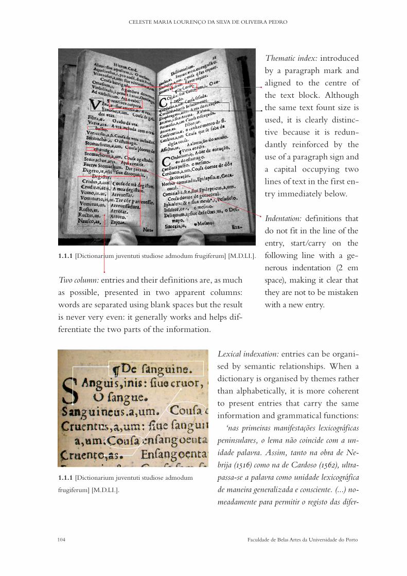
104 Faculdade de Belas Artes da Universidade do Porto
CELESTE MARIA LOURENÇO DA SILVA DE OLIVEIRA PEDRO
Lexical indexation: entries can be organi-sed by semantic relationships. When a dictionary is organised by themes rather than alphabetically, it is more coherent to present entries that carry the same information and grammatical functions:
‘nas primeiras manifestações lexicográficas peninsulares, o lema não coincide com a un-idade palavra. Assim, tanto na obra de Ne-brija (1516) como na de Cardoso (1562), ultra-passa-se a palavra como unidade lexicográfica de maneira generalizada e consciente. (...) no-meadamente para permitir o registo das difer-
Thematic index: introduced by a paragraph mark and aligned to the centre of the text block. Although the same text fount size is used, it is clearly distinc-tive because it is redun-dantly reinforced by the use of a paragraph sign and a capital occupying two lines of text in the first en-try immediately below.
Indentation: definitions that do not fit in the line of the entry, start/carry on the following line with a ge-nerous indentation (2 em space), making it clear that they are not to be mistaken with a new entry.
Two column: entries and their definitions are, as much as possible, presented in two apparent columns: words are separated using blank spaces but the result is never very even: it generally works and helps dif-ferentiate the two parts of the information.
1.1.1 [Dictionarium juventuti studiose admodum frugiferum] [M.D.LI.].
1.1.1 [Dictionarium juventuti studiose admodum
frugiferum] [M.D.LI.].
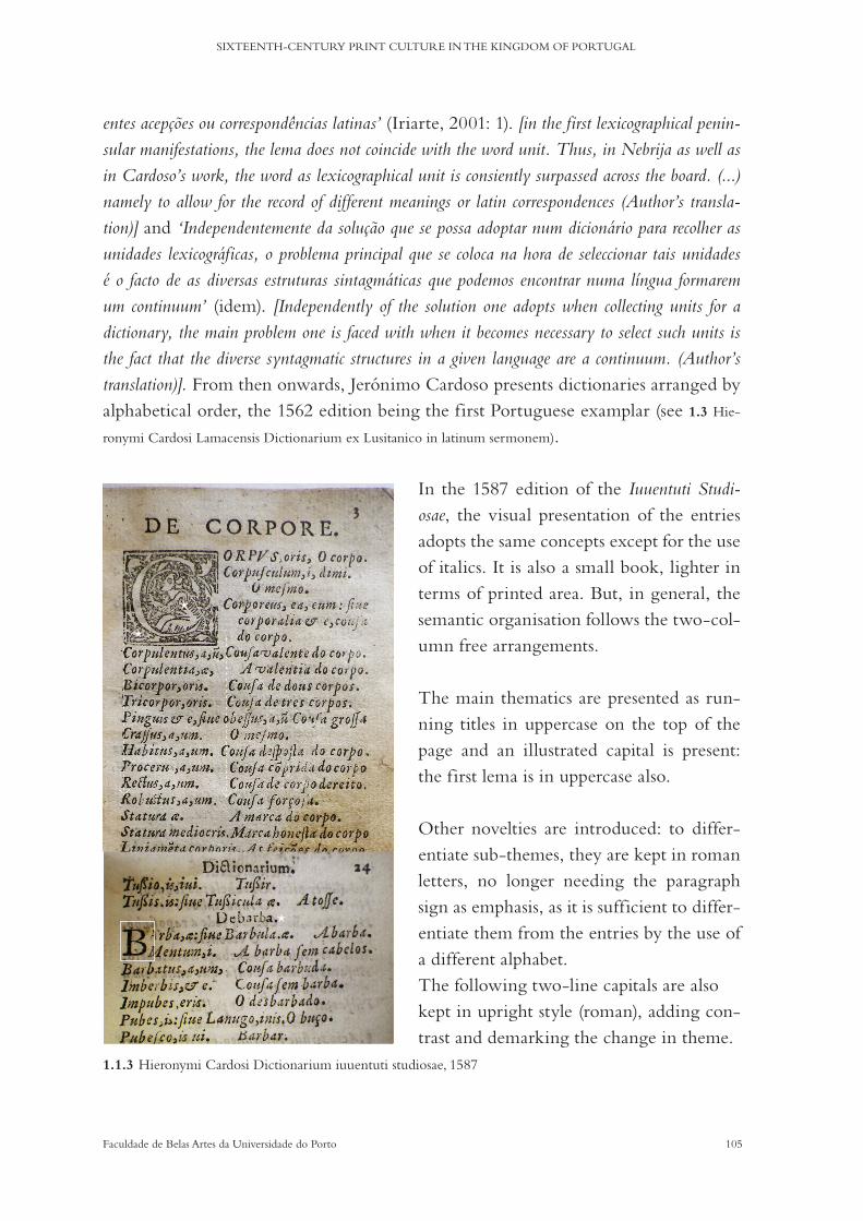
105Faculdade de Belas Artes da Universidade do Porto
SIXTEENTH-CENTURY PRINT CULTURE IN THE KINGDOM OF PORTUGAL
entes acepções ou correspondências latinas’ (Iriarte, 2001: 1). [in the first lexicographical penin-sular manifestations, the lema does not coincide with the word unit. Thus, in Nebrija as well as in Cardoso’s work, the word as lexicographical unit is consiently surpassed across the board. (...) namely to allow for the record of different meanings or latin correspondences (Author’s transla-tion)] and ‘Independentemente da solução que se possa adoptar num dicionário para recolher as unidades lexicográficas, o problema principal que se coloca na hora de seleccionar tais unidades é o facto de as diversas estruturas sintagmáticas que podemos encontrar numa língua formarem um continuum’ (idem). [Independently of the solution one adopts when collecting units for a dictionary, the main problem one is faced with when it becomes necessary to select such units is the fact that the diverse syntagmatic structures in a given language are a continuum. (Author’s translation)]. From then onwards, Jerónimo Cardoso presents dictionaries arranged by alphabetical order, the 1562 edition being the first Portuguese examplar (see 1.3 Hie-
ronymi Cardosi Lamacensis Dictionarium ex Lusitanico in latinum sermonem).
In the 1587 edition of the Iuuentuti Studi-osae, the visual presentation of the entries adopts the same concepts except for the use of italics. It is also a small book, lighter in terms of printed area. But, in general, the semantic organisation follows the two-col-umn free arrangements.
The main thematics are presented as run-ning titles in uppercase on the top of the page and an illustrated capital is present: the first lema is in uppercase also.
Other novelties are introduced: to differ-entiate sub-themes, they are kept in roman letters, no longer needing the paragraph sign as emphasis, as it is sufficient to differ-entiate them from the entries by the use of a different alphabet. The following two-line capitals are also kept in upright style (roman), adding con-trast and demarking the change in theme.
*
*
*
1.1.3 Hieronymi Cardosi Dictionarium iuuentuti studiosae, 1587
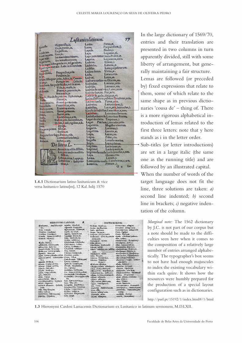
106 Faculdade de Belas Artes da Universidade do Porto
CELESTE MARIA LOURENÇO DA SILVA DE OLIVEIRA PEDRO
In the large dictionary of 1569/70, entries and their translation are presented in two columns in turn apparently divided, still with some liberty of arrangement, but gene-rally maintaining a fair structure. Lemas are followed (or preceded by) fixed expressions that relate to them, some of which relate to the same shape as in previous dictio-naries ‘cousa de’ – thing of. There is a more rigorous alphabetical in-troduction of lemas related to the first three letters: note that y here stands as i in the letter order.Sub-titles (or letter introductions) are set in a large italic (the same one as the running title) and are followed by an illustrated capital. When the number of words of the target language does not fit the line, three solutions are taken: a) second line indented; b) second line in brackets; c) negative inden-tation of the column.
Marginal note: The 1562 dictionary by J.C. is not part of our corpus but a note should be made to the diffi-culties seen here when it comes to the composition of a relatively large number of entries arranged alphabe-tically. The typographer’s box seems to not have had enough majuscules to index the existing vocabulary wi-thin each quire. It shows how the resources were humbly prepared for the production of a special layout configuration such as in dictionaries.
1.4.1 Dictionarium latino lusitanicum & vice versa lusitanico latinu[m], 12 Kal. Iulij 1570
1.3 Hieronymi Cardosi Lamacensis Dictionarium ex Lusitanico in latinum sermonem, M.D.LXII.
http://purl.pt/15192/1/index.html#/1/html

107Faculdade de Belas Artes da Universidade do Porto
SIXTEENTH-CENTURY PRINT CULTURE IN THE KINGDOM OF PORTUGAL
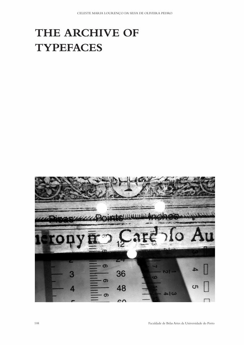
108 Faculdade de Belas Artes da Universidade do Porto
CELESTE MARIA LOURENÇO DA SILVA DE OLIVEIRA PEDRO
THE ARCHIVE OF TYPEFACES

109Faculdade de Belas Artes da Universidade do Porto
SIXTEENTH-CENTURY PRINT CULTURE IN THE KINGDOM OF PORTUGAL
Chapter 5a) Images of Type
The large majority of printed typefaces found in books from the sixteenth century are all that is left from the actual metal characters: type.
The object is gone; an image of it is left. It is obvious that the two are quite differ-ent; it is a dimensional difference: ‘The sixteenth-century punchcutter supplied a product whose final purpose was to print: to give a two-dimensional image. But in making punches, the punchcutter had to think about letters three-dimensionally.’ (Smeijers, 2011: 84).
The images of entire typographical families and character sorts are now like spec-trums – all around the world, on numerous pages – of these main tools of what would turn out to be a revolutionary new technology: the ars artium omnium conservatrix.
In the Portuguese case, historians frequently lament the scarcity of sources and the absolute lack of specimens of early print metal characters: ‘Pensemos em registos notariais e alfandegários que se perderam, pensemos no descaso com que foram tratados os caixotins de tipografias extintas, pensemos na destruição das xilogravuras, pensemos na presteza com que se deitaram ao lixo os arquivos dos nossos editores desaparecidos (...)’ (Anselmo, 1997: 19) [Let us think about the notarial and customs records that were lost, let us think about the carelessness with which type boxes from extinct printing houses were treated, let us think about the destruc-tion of woodcuttings, let us think about the promptness with which the archives of our departed editors were thrown out as rubbish. (Author’s translation)]
But the product made with type (books and other print forms) remains, as do, to an enormously smaller proportion, some few other tools essential to the business, such as presses, moulds, matrixes or punches, in a few territories where print made its early appearance. But type itself, too fragile and valuable, almost does not (some beauti-fully preserved rare examples of both type and tools can be observed at the Museum Plantin Moretus, for example).
Something new could become of them and so it was the case. Type was generally melted and recast continuously, until necessity and changing tastes rendered old or broken metal characters dispensable, together with their matrixes and their punches. Many were the reasons; even certain payments could be made in old type because tin and antimony were hard to get (Carter, 1966: 10). Printed books are, thus, and still, the main witnesses of those days’ finer typographical objects.
110 Faculdade de Belas Artes da Universidade do Porto
CELESTE MARIA LOURENÇO DA SILVA DE OLIVEIRA PEDRO
What books can tell goes beyond the texts themselves. It is not only colophons or printers’ marks that communicate to a type historian. Every letter is an individuality, with its materiality being utterly apparent in its micro-typographical details.
When we look beyond the text image and focus on that tiny square of space each letter occupies, we see the clear impression mark type left on the paper fibres (because both the ink and the force applied distort the surface) and we also see, at the same time, something that is not there: the object that was pressed. A form of positive and negative mechanics, or, if you will, the first steps of a kind of intellectual possibility of reconstruction, like a reversed engineering process, we can try to walk on punchcut-ters’ shoes, envisioning the metal characters’ form from its final results. Immediately we enter the realm of the hows: how much ink, how much pressure, how perfect or imperfect the shape or the metal alloy, the quality of the paper.
It is these details that transport us in time and make us think about the people who designed and made the types and how the making processes are ref lected in their final printed image. After five centuries, and without any further evidence, we can get closer to these agents of history by trying to find particularities that function as fingerprints of their designing sensibilities.
Although we present here a different approach from that of Smeijers (who puts punchcutting practice as the starting point of his analysis), we position ourselves along the investigative vision of the author: ‘Talking like this with colleagues from the past has nothing to do with sentimentality or nostalgia or a useless search for craftsmanship. It has however everything to do with bringing back knowledge that can serve as a mirror for ourselves and our technical achievements’ (Smeijers, 2011: 9).
This thesis’ main view is that the images of type have communicative value insofar as they can be the objects of visual inquiry; that by grouping certain visual charac-teristics, we come a step closer to presenting a better refined description of them and contributing to the attribution of authorship to the printed typefaces. Attributing authorship is the hardest of all tasks, but in this context, it can also be given as a visual classification. Classification and graphical description in typography have changed through the centuries. Investigating the meaning and the manners of those classifica-tions is still pertinent to understanding history.
‘(...) Bibliography, therefore, requires an exact study of the calligraphical and typographical aspects of the composition, and the creation of a consistent terminology for the variations in let-ter-forms as they appear in manuscript and print.’ (Morison, 2009: 19): in this chapter, we
111Faculdade de Belas Artes da Universidade do Porto
SIXTEENTH-CENTURY PRINT CULTURE IN THE KINGDOM OF PORTUGAL
propose to focus on the letter-forms present on our corpus of J.C.’s works printed by J.A and J.B.
The challenges:
‘(...) it is safest to measure the face of a fount, which you can do if you have a powerful mag-nifying-glass and a fine scale and measure from the top of b to the bottom of the p or the extent of an Italic f. This, called the gauge of the face, cannot vary.’ (Carter, 1966: 23)
We believed that we could contribute to typographical studies by introducing a form of analysis that takes advantage of today’s technological devices and by cata-loguing typefaces according to their visual descriptions. In doing so, we were aim-ing to follow the advice of scholars that had shaped academic views on typography and of those that now engage in new projects with a technological basis:
‘The application of photography to zincography, and hence to the first conventionally print-ed photographic facsimiles of printed books and manuscripts (...) under the aegis of Sir Henry James and others in the early 1860’s had an immediate and lasting effect on historical un-derstanding among members of the general public. (...) In 1892, the very year in which the Bibliographic Society was founded, Konrad Burger began to issue his series of photographs of fifteenth-century printing types.’ (McKitterick, 2006: 10)
‘Over the course of two days, 345 images were captured. All the pages were photographed in full and then using raking light, other details such as pricking marks, illustrations, sketches and paint fragments were photographed in great detail. (...) to such an extent that we now have high definition zoomable views of the pages which reveal the incredible detail captured by the camera and allows the user to examine conservation issues.’ (https://www.abdn.ac.uk/bestiary/introduction)
Despite the so many efforts in type studies, even though faintly described here, there are still few examples of studies that look to photography (or even high-quality dig-itising) as a tool. Facsimile (or sometimes, plain photocopy) is still the main aid of the academics engaged in typographical studies whereas a magnifying lens on an original page can be more helpful for detailed analysis than all the facsimiles combined.
The ever-growing quality and quantity of digitised collections have been mainly focused on manuscripts or illustrated books. For the most part, regular library collec-tions still simply offer the user basic quality versions for printed books. Text content is still the most important feature to be analysed in printed copies, not typography. Unfortunately, not all specimens are accessible to the average user and sometimes not even to the researcher. Nevertheless, it is not only optimistic but realistic to think
112 Faculdade de Belas Artes da Universidade do Porto
CELESTE MARIA LOURENÇO DA SILVA DE OLIVEIRA PEDRO
that this problem will soon be surpassed, considering the day-to-day announcements of high resolution new digital collections developed with the most recent techniques.
Most of the time, this lack of available tools for the production of high-quality im-ages has to do with the lack of resources our libraries have been subjected to. Some-times it comes from a lack of vision for the future, a deficient awareness of the role that institutions have in preserving culture, cooperation and open access, both public and private. Recent projects are the result of large collaborations between institutions.
In what concerns our project, only part of the books we wanted to analyse were already digitised and available, and not with a sufficient depth of detail (zooming into the letter level was not viable). For an exhaustive analysis of the typographical details, as we saw it, we would manifestly need to conduct a photographic survey focused on macro imaging. For the time period we were investigating, there were no resources we could use but the ones we could develop ourselves.
A photographic survey, carefully designed for the purpose of extracting as much detail as possible, could enable the configuration of a holistic methodology that could hopefully then encompass the process of selecting and archiving type families, leading to a greater accessibility of the visual information. The advantages of a visual analysis based on the construction and organisation of a photographic archive would allow for a broader understanding of the particularities of each typographical solution: ‘(...) the correctness of the text, the arrangements of the letters and lines, and their spacing, will continue in the future, as in the past, to prove whether a printer has a thorough understanding of his function’ (Morison, 2009: 19).
It was with these thoughts in mind that the endeavour of photographing each letter of all the type sorts used in the books of our corpus started and of describing the ty-pographical visual solutions that are found in them.
In order to do that, after identifying the whereabouts of the copies of Jerónimo Cardoso’s dictionaries and specifying which were accessible, the following step was the presentation of the objectives of the photo sessions to each of the institutions to whom the books belonged to, in order to establish their interest and the feasibility of our intent, in a joint effort to smoothly conduct the study.
That done, the digital organisation of the archive and the manipulation of the imag-es were put in motion. Such manipulation was needed so that colour and scales could be controlled and levelled.

113Faculdade de Belas Artes da Universidade do Porto
SIXTEENTH-CENTURY PRINT CULTURE IN THE KINGDOM OF PORTUGAL
Then each image was given a name and assigned its own descriptive metadata. This process allowed for a new perception of the resulting collection.
b) Photographical survey
METHODOLOGY: An important methodological decision guided the first steps of the archive of type-
faces that support this work: the decision was based on the fact that despite the ever greater availability of digitised editions from the old book’s collections of Portuguese libraries, not all books in the corpus are digitised and the ones that are do not offer a good enough quality imagery that could serve our intents – certainly a digital archive could still be made from them, but the study required more: the possibility to have the chance to see and feel the materiality of the object and to produce images that would reflect the three dimensions of print for posterity and not only in our imagination.
The discussion about the importance of the quality of the digitisation available to the greater audience in libraries’ databases is one that has started fairly recently in different academic and professional study groups.
It would be, of course, unrealistic to reshape the directories of the existing digitising methods because we lacked the resources, both human and material, and it was not our aim to develop any sort of guidelines for such a paramount endeavour.
What could be done – and we tried our best to develop – was an alternative image collecting method that would fit our own purposes. If it actually proved feasible and added value, then it could drive the project to become enlarged with time and become a true depository of sixteenth-century type, with many and different contributors, focused on other printing houses and covering other time frames, and maybe then it could also become a standard for other similar projects.
In general, the aims were varied and it was necessary to consider various work fronts:
Initial aims:
1. Collecting high-resolution images of individual printed letters in order to create (as far as possible) complete sorts’ collections or alphabets of type.
2. Creating a digital archive of those alphabets that could represent a large enough compilation of samples for graphical and bibliographical analysis.
114 Faculdade de Belas Artes da Universidade do Porto
CELESTE MARIA LOURENÇO DA SILVA DE OLIVEIRA PEDRO
Subsequent aims:
3. Developing a methodology for image collecting, editing and archiving so that other contributors could replicate the work.
4. Defining clear classification and description standards.
Work fronts:
a) Working with the originals:Handling sixteenth-century books that are part of reserved collections of national
libraries involves overcoming some predictable obstacles: institutional permission is needed to physically handle the books and the researcher needs either prior knowledge or technical assistance when confronted with delicate objects that he wishes to manip-ulate or interfere with. We were grateful that this study was able to rely on the support from the staff of each of the institutions we worked with.
b) Using the right equipment:Due to budget limitations, the first decisions that needed to be made were in regard to
the ideal equipment versus the best possible equipment. We chose the PENTAX WG-10 (RICOH) because of the macro shooting mode possible up to the distance of 1cm (with a recorded size fixed at 2.0 megapixels - 16:9) and because it uses 5 LEDs placed around the lens, thus avoiding the use of normal flashlight and of a light control stage setting, of which the UV emissions could be harmful to the pigments of old paper. Together with the Pentax camera, a type ruler was necessary for the proper scaling of type sizes on print-ed sheets. For the books’ proper conditioning and handling during the photo shoots, the libraries’ materials were used, such as book pillows, gloves, snake weights and weight bags.
c) Having a checklist for the information that has to be collected:Having a central thread of the proposed aims regarding data during the photographic
sessions was of the utmost importance. Each object/book had its particularities and woke us up to different details. The fact that the sessions were dispersed in time and place further enhanced the need for a checklist: appendices 5# and 6#.
d) Evaluating the data at hand (images, measurements, bibliographical information):Lastly, the work proceeded to the final check-up of what was collected and the quality
of what was collected. Much of the information had to be revised more than once, in loco.
PHOTO SHOOTS After the aims were established a first trial was conducted at the BPMP, with the help
of the conservationists and with the previously obtained consent of the director of the Old Books Department. During this first photographic session, we experimented with

115Faculdade de Belas Artes da Universidade do Porto
SIXTEENTH-CENTURY PRINT CULTURE IN THE KINGDOM OF PORTUGAL
scales, lighting and checklists efficiency. The obtained pictures were serialised, cata-logued and then manipulated to a standardised or uniformed sizing and levelled blacks and whites on Photoshop, which was the logical choice for image processing and, in addition, it allowed for easy and immediate metadata insertion into the file.
The final results were used as a portfolio intended to help obtaining the approval of other institutions where there was the wish to conduct the same type of photo shoots.
BPMP’s corpus was revisited at a later stage, and two other important institutions were added to the work plan: BFLUL and BGUC The work done at the three libraries combined to the works of 9 books (4 different works/editions of which 5 were copies of the Dictionarium Lusitanicvm), 310 generic images of bibliographical interest and c. 1500 workable images of letters and other signs that resulted in 30 alphabets and 12 as-sorted sets (in the assorted sets we included figures, capitulars, woodcuts and other signs).
c) Organising and archiving
METHODOLOGY: Each alphabet of type was put together by photographing a good available printed
example in each book. Character sets are composed of alphabetic signs and divided in three categories: Uppercase/majuscules, lowercase/minuscules and complementary signs. The latter, in turn, comprise ligatures, alternative characters (such as long s or ç) abbreviations and punctuation. Part of the alphabets are represented only by a handful of letters or signs and remained incomplete, either because there was only one case available or because only a certain number of letters were needed or used in the text.
Figures were archived as independent sets, even when cast in matchable sizes to the type alphabets. Illustrated capitulars were grouped according to style and size (line oc-cupation). Random signs, woodcuts and other decorative particularities have also been archived individually as already mentioned.
There were many other difficulties to overcome while organising the alphabets: most had to do with the quality of the prints we were photographing, some had to do with the proper identification of styles or ‘designs’, and some with size variations.
The poor quality of the paper used by these printers on these books (and its shrink-age over time) inhibited the taking of good quality photography, especially in small-sized typefaces: five centuries later, the ink absorption and the worn surface had also become our enemies.

116 Faculdade de Belas Artes da Universidade do Porto
CELESTE MARIA LOURENÇO DA SILVA DE OLIVEIRA PEDRO
The archiving of all the alphabets of type was a challenge both theoretically and pragmatically. It was necessary not only to properly identify (and create a correspon-ding metadata) the character sets and assorted sets, but also devote attention to each character or sign itself (while creating file standards as well as identifying shapes).
The proper archiving of the collection began with the attempts to classify and descri-be each set as a group. In order to achieve that goal, the research started with a review of articles and other published works related to bibliography and palaeography, the history of typography and micro-typography. Furthermore, at a later stage it was necessary to evaluate the uses of these character sets within each book layout and for that we looked also to more recent studies on the communicative role of typography and graphic de-sign as a tool for visual analysis (these were reviewed in the previous chapter).
CLASSIFICATION / IDENTIFICATION
‘It is evident that in considering the face of a fount of type we are in a world of art, styles, difficulty of saying what styles, inherited forms, human hands (...) Whoever makes letters for printers must know what sort of letters to make. The potentially limitless freedom of the punchcutter is restricted by the nature of letters, which is conventional, and their function, which is to be instantly recognized.’ (Carter, 1969: 24)
Together with an appreciation of the shape – a morphological description of a char-acter set (whatever the scale: letter, pattern or texture), printing sizes are of extreme importance in trying to understand the role a certain book played in a given cultural environment: its function. Size is also a key factor in the classification of designs, es-pecially when digging into the beginning of print history.
The sixteenth century was marked by considerable expansion in the designs avail-able to printers. As the century progressed, the different jobs that served the business of print became more specialised and outsourcing became the norm.
In the Portuguese case, all evidence (or lack thereof ) indicates that the workshops were equipped with foundries and that the punchcutter was either an anonymous in-house worker or the punches or matrices were always bought abroad (this means that the printers possessed moulds, metals and type casters). There is reason to believe that matrices rather than punches were brought to Portuguese presses. What this im-plies with regard to the research goals is that it is extremely difficult to associate or attribute a type design in use by Joao Álvares and Joao de Barreira to a punchcutter.

117Faculdade de Belas Artes da Universidade do Porto
SIXTEENTH-CENTURY PRINT CULTURE IN THE KINGDOM OF PORTUGAL
Describing the fount, therefore, involves more than classifying and describing the style and particular attributes: rather than associating a size with a printer, a design or a place of print, it is important to consider that the life of a set of matrices integrated accidents and resourcefulness in its everyday usage. This means that in some cases, we cannot be one hundred percent sure of the correctness of the inclusion of certain characters within each of the sets we archived under each ID (alphabet identification or identity). ‘(...) the inclusion or exclusion of certain peripheral sorts, such as small capitals, spaces, ligatures, punctuation or numerals, which, in the sixteenth century, were not always includ-ed in a bill-of-fount.’ (Vervliet, 2008: 2). This matter will also be addressed with regard to practical cases.
The creation of an identification method for the alphabets of type in this archive was based on the items in Vervliet’s descriptions (idem). As far as they could be achieved, the following instructions were observed:
Name of the type– a set of letters that belong to the same alphabet, cast on the same size, as shown by its print image:
‘the letter family’: roman, italic, greek (sets of capitals that show no minuscules being used in the same book, illustrated capitals, figures and assorted signs were grouped separately).‘the siglum and mm measurements’ and ‘the body size in old English and French’: since most specimens were set in texts smaller than 20 lines of text, the size presented here is based on the gauge of the faces (ph-measure or ƒ-measure) and the x-height. Values are approximate (as moulds, paper and ink can change the apparent size of the printed typeface) and they were measured with a modern type ruler as shown below.
Name of the type: – the alphabets are grouped by date/book photographed and are named simply by their letter family and measurements in didot points. When preparing the metadata of the images of individual letters for the online database, a more specific naming system was developed.
118 Faculdade de Belas Artes da Universidade do Porto
CELESTE MARIA LOURENÇO DA SILVA DE OLIVEIRA PEDRO
‘the punchcutter or an eponym’: was not possible to determine (apart from the date of the book in which they were used).‘first occurrence’/‘early appearances’: as sizes and designs show no direct relation in the corpus, no useful data can be extracted.‘artefacts’: none survive.‘key/variant letters’: some characteristics that can be observed in a few alphabets of type are remarkable enough to conduct a specific visual appreciation. These cases are analysed further below.‘contemporary attributions’/‘secondary literature’: none were found.‘facsimile reproduction’: here presented as a photographic archive.
d) Findings:
THE DIVERSITY OF ALPHABETS
By the time roman types were finally introduced in the presses of the kingdom, the general audience must have been already quite accustomed to their use in imported books, especially those available at the university and in noble circles.
Ecclesiastic environments, however, still preferred gothic types; although it is curi-ous that the first roman alphabets were imported for the use of the Santa Cruz press in the third decade of the sixteenth century. Probably the fact that it was a French printer that was assigned by a king to help start that press had also something to do with the case. There are other examples, such as that of Luís Rodrigues, that trav-elled to Paris in order to buy typographical materials and to hire workman in 1540 (Anselmo, 1991), that show that the French market was the preferred source for the import of aesthetical inf luences.
Joao Álvares and Joao de Barreira used mainly roman types, but kept a place for gothic types in many works for many decades. We normally find that the exclusive use of the gothic or italic is rare; sometimes gothics are used in the frontispiece but not in the text at all. italics, as mentioned already, were mostly used for titles and for paratexts (preambles, introductions, dedications, etc.). Greek characters appear very seldomly and there is one book from their press that deserves a study of its own; un-fortunately, it did not fall into our scope of research: it is a Hebrew grammar and it might be interesting to find out where those types came from.

119Faculdade de Belas Artes da Universidade do Porto
SIXTEENTH-CENTURY PRINT CULTURE IN THE KINGDOM OF PORTUGAL
In total, in this study, four individual works were photographed, one of which is represented by five copies found in three libraries: a total of eight books.
1551—RES-93—BFLUL; 1552—X1-3-43—BPMP; 1570—RES-211—BFLUL; 1570—
RES-XVI-A-0160—BPMP; 1569/70—R-12-13—BGUC; 1569/70—R-12-13A—BGUC;
1569/70—R-12-13B—BGUC; 1587—X1-3-44—BPMP
It was surprising to see that such a small quantity of books could produce such a variety of designs and sizes. The choice of dictionaries seems to have been proven correct. The diversity of designs in use in frontispieces at the time was a common feature, easily reaching half a dozen different sizes (on average) between the roman, italic and gothic alphabets (Curralo, 2012: 196-198). In J.A. and J.B. this is also the case: in the three frontispieces of our study (please note that the 1551 dictionary does not have a frontispiece), we find: a) 1552 - 2; b) 1569 - 6 / 5; c) 1587 - 5.
1#
1#
2#
2#
4#
5#
3#
2#
1#
4#
2#
2#
3#
3#5#
6#
1#
2#
3#4#
5#

120 Faculdade de Belas Artes da Universidade do Porto
CELESTE MARIA LOURENÇO DA SILVA DE OLIVEIRA PEDRO
Joao Álvares and Joao de Barreira worked more with romans than italics in the books reviewed here and if we add in the capitals this makes the difference even big-ger. Nonetheless, however great the number of typefaces, the designs are very similar across the 36 years that separate the books of this corpus. italic majuscules are for the most part simply inclined romans and, in some cases, the sets look like a mixture of full italic and inclined majuscules. ‘The essential alphabets are three, the formal and infor-mal minuscules and the capitals, which serve both. Another alphabet, of inclined capitals, was introduced in 1524’ (Carter, 1969: 45). See Italic Alphabet 2# 12pt x4pt, on page 131.
Regarding roman minuscules, the images below were reduced to the same size in order to show the design similarities between lowercase roman types in the archive.
‘(...) we tend to assume that a typeface for a small body needs to be wider than the one for a larger body’ (Smeijers, 2011: 142). Although the quality of the prints can not show the clear limits of the shapes, in these examples we see that this is not so.
1551 RO Ami 8pt x4pt 1552 RO Ami 12pt x4pt
1569 RO Ami 10pt x4pt
1587 RO Ami 8pt x4pt 1587 RO Ami 10pt x4pt 1587 RO Ami 14pt x6pt 1587 RO Ami 16pt x6pt
1569 RO 1# Ami 16pt x6pt 1569 RO 2# Ami 16pt x6pt 1569 RO Ami 20pt x8pt
1552 RO Ami 16pt x6pt1551 RO Ami 14pt x6pt

121Faculdade de Belas Artes da Universidade do Porto
SIXTEENTH-CENTURY PRINT CULTURE IN THE KINGDOM OF PORTUGAL
With regard to the variety of sizes (not considering capitals, illustrated capitals, figures and assorted signs) in the 1551 Dictionarium – the smaller book in the corpus – both the roman and the italic alphabets in use are 8pt in size (for the titles, a 14pt roman is used); the 1552 grammar main texts are composed with a 12pt italics; the Dictionarium of 1569/70 is set in 10pt roman and a variety of five different romans and italics in 16pt and 20pt are used in paratexts and titles; and the 1587 Dictionarium is by far the one with the largest number of faces used, in roman and italics, sized 8pt, 10pt, 12pt, 14pt and 16pt.
Considering the x-hight of the faces in this archive, this is the relation:Face ~ x-height8pt ~ 4pt / 10pt ~ 4pt / 12pt ~ 4pt / 12pt ~ 5pt / 14pt ~ 6pt / 16pt ~ 6pt / 20pt ~ 8pt
Legge and Bigelow (2011) introduce the hypothesis that the sizes of type in print have a close connection with the psychophysical range of f luent print sizes – ‘the range over which text can be read at maximum speed’ – since the very beginning of print in the fifteenth century. Their study contains relevant approaches regarding typographical practices and reading performance, combining characters’ characteristics (i.e. style, x-height size, spacing and contrast) with visual constraints (i.e. angular size, visual acuity and letter recognition). The authors believe type sizes in print have been stable since the sixteenth century and that the economics of paper usage, refractive correc-tion in vision and social changes (religious, political, demographical and technologi-cal) led not only to a greater variety in sizes (especially smaller ones) but also in letter shape and preference of character style according to particular uses. The results of this study regarding the inquiring of French text types define the critical print size – ‘the smallest character size for which reading is possible at maximum speed’ for the sixteenth cen-tury – to be in the interval 0.8-2.5mm/2.27-7.09pts (x-height) and 0.11o-0.35o (the visual angle set for 40cm reading distance).
In our corpus, the smallest types used to set core texts are 8pt.
8pt
10pt
12pt
14pt
16pt
20p
Roman Italic
8pt
10pt
12pt
14pt
16pt
20p
X
X
1551 1551
X
X
X
1552 1552
XX
X
X
X
XX
X
1569 1569
X
X
X
X
X
X
1587 1587
X
X
X
X

122 Faculdade de Belas Artes da Universidade do Porto
CELESTE MARIA LOURENÇO DA SILVA DE OLIVEIRA PEDRO
PRACTICAL CASES
Although it is possible at this point to as-sume that the printers had many alphabets of type at hand, in the Dictionarium of 1587 it is clear that, most certainly, there were not enough italic uppercase characters to compose new pages while others were be-ing returned to the chases and others being printed. Or maybe the compositors paid lit-tle attention to an exclusive use of a style or design within each text block, as there does not seem to be a linguistic reason for this. Was the corrector not interested in such details? As years passed by, the cases were perhaps neglected in number of characters available, as we can not say they were, at that moment, still unprepared for such work (see note on page 106). While it does not inf luence legibility, it draws too much at-tention and inf luences readability.
‘(...) with metal type it was impossible or technically problematic to reduce the gaps that appear between some capitals and the following lowercase letters (...) The letter itself has an additional space left and right, which are so determined that the letter will fit well in most combinations (...)’ (Hochuli, 2009: 27)
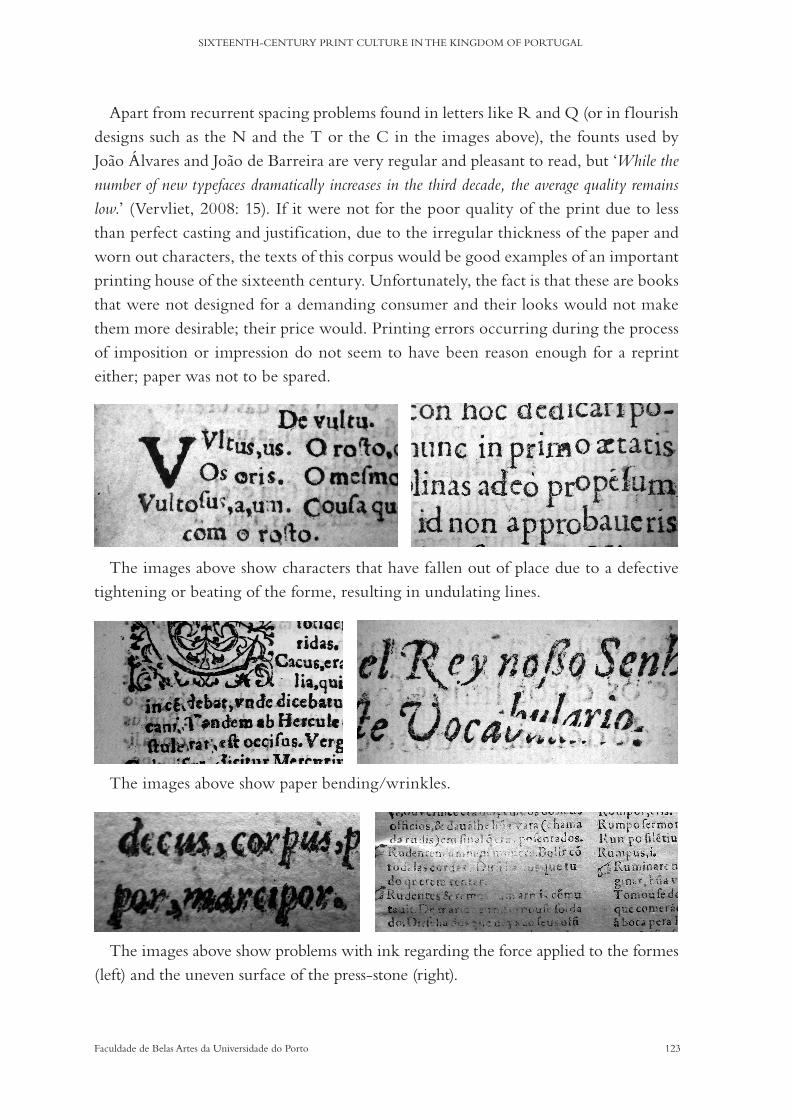
123Faculdade de Belas Artes da Universidade do Porto
SIXTEENTH-CENTURY PRINT CULTURE IN THE KINGDOM OF PORTUGAL
Apart from recurrent spacing problems found in letters like R and Q (or in f lourish designs such as the N and the T or the C in the images above), the founts used by Joao Álvares and Joao de Barreira are very regular and pleasant to read, but ‘While the number of new typefaces dramatically increases in the third decade, the average quality remains low.’ (Vervliet, 2008: 15). If it were not for the poor quality of the print due to less than perfect casting and justification, due to the irregular thickness of the paper and worn out characters, the texts of this corpus would be good examples of an important printing house of the sixteenth century. Unfortunately, the fact is that these are books that were not designed for a demanding consumer and their looks would not make them more desirable; their price would. Printing errors occurring during the process of imposition or impression do not seem to have been reason enough for a reprint either; paper was not to be spared.
The images above show characters that have fallen out of place due to a defective tightening or beating of the forme, resulting in undulating lines.
The images above show paper bending/wrinkles.
The images above show problems with ink regarding the force applied to the formes (left) and the uneven surface of the press-stone (right).
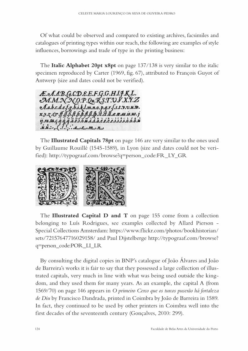
124 Faculdade de Belas Artes da Universidade do Porto
CELESTE MARIA LOURENÇO DA SILVA DE OLIVEIRA PEDRO
Of what could be observed and compared to existing archives, facsimiles and catalogues of printing types within our reach, the following are examples of style influences, borrowings and trade of type in the printing business:
The Italic Alphabet 20pt x8pt on page 137/138 is very similar to the italic specimen reproduced by Carter (1969, fig. 67), attributed to François Guyot of Antwerp (size and dates could not be verified).
The Illustrated Capitals 78pt on page 146 are very similar to the ones used
by Guillaume Rouillé (1545-1589), in Lyon (size and dates could not be veri-fied): http://typograaf.com/browse?q=person_code:FR_LY_GR
The Illustrated Capital D and T on page 155 come from a collection belonging to Luís Rodrigues, see examples collected by Allard Pierson - Special Collections Amsterdam: https://www.f lickr.com/photos/bookhistorian/sets/72157647716029158/ and Paul Dijstelberge http://typograaf.com/browse?q=person_code:POR_LI_LR
By consulting the digital copies in BNP’s catalogue of Joao Álvares and Joao de Barreira’s works it is fair to say that they possessed a large collection of illus-trated capitals, very much in line with what was being used outside the king-dom, and they used them for many years. As an example, the capital A (from 1569/70) on page 146 appears in O primeiro Cerco que os turcos puserão há fortaleza de Diu by Francisco Dandrada, printed in Coimbra by Joao de Barreira in 1589. In fact, they continued to be used by other printers in Coimbra well into the first decades of the seventeenth century (Gonçalves, 2010: 299).

125Faculdade de Belas Artes da Universidade do Porto
SIXTEENTH-CENTURY PRINT CULTURE IN THE KINGDOM OF PORTUGAL
If it is unlikely that there were punchcutters working in the kingdom, and, if there were, they remain completely anonymous, the same cannot be said for wood engravers, although it is very uncommon to find signed samples. The illustrated capital I on page 147 bears the initials HB, but they could not be identified during this research. This same capital appears in a page on Reuerendi patris Fratris Hieronymi ab Oleastro Lusitani, Praedicatorij Ordinis by Jerónimo de Azambuja, printed in Coimbra by Joao de Barreira in 1556.
With regard to the trading of materials, it is certain that Luís Rodrigues bought engravings in Paris from the heirs of Geoffroy Tory after Tory’s death in 1533 (Anselmo, 1993: 371). These later became part of Joao Álvares and Joao de Barreira’s typographical materials, some of which can be seen on page 38.
Regarding the sorts of type, the sets of punches or matrices designed in French-speaking territories were particularly useful because they were com-posed of signs that were used in the Portuguese language, such as ç or vowels with accents (i.e. á, â or é). The abbreviations used for Latin are also used for the sounds and syllables of the vernacular: the a, for example, the abbreviation sign of am/an is a common accented vowel for the sound and for the diphthong ãe or ão: w. In the case of double s, the italic 2# 12pt (1552), the italic 16pt (1569/70) and the italic 12pt (1587) have both the ligature composed of double long s and the grapheme eszett, which are used indiscriminately in the texts.
The most complete sorts (with majuscules, minuscules, accented letters, ab-breviations and ligatures) collected here are a 1551 roman 8pt: 60 sorts, a 1569 roman 10pt: 72 sorts, and a 1569 roman 1# 16pt: 59 sorts; a 1552 italic 2# 12pt: 73 sorts, a 1569 italic 16pt: 53 sorts and a 1569 italic 20pt: 62 sorts; and a 1587 italic 12pt: 70 sorts. A fount of roman type normally consisted of 150 sorts (Gaskell, 1972: 33).
Within the various designs that have enough letters and other signs to be con-vincingly compared, there is no correspondence from one book to the other, either roman or italic.
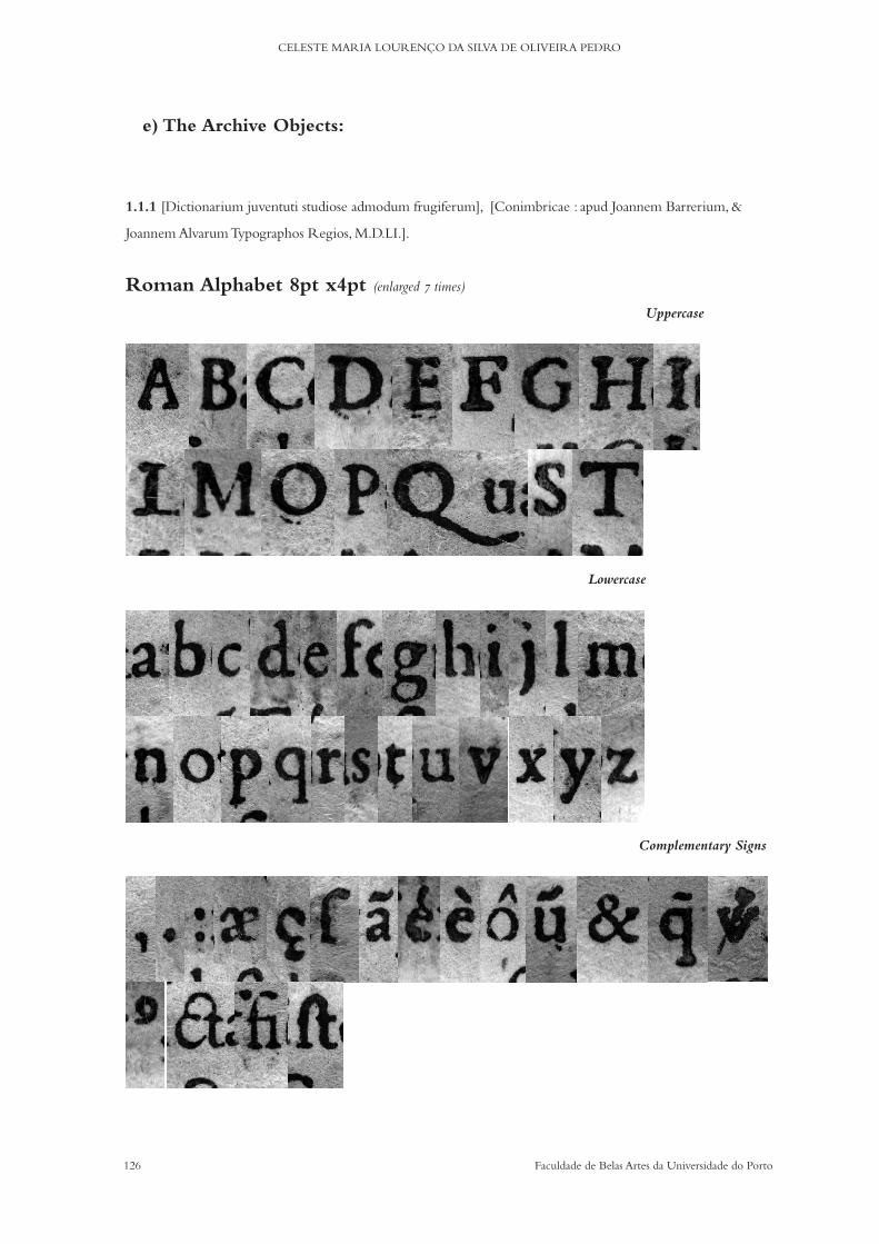
126 Faculdade de Belas Artes da Universidade do Porto
CELESTE MARIA LOURENÇO DA SILVA DE OLIVEIRA PEDRO
1.1.1 [Dictionarium juventuti studiose admodum frugiferum], [Conimbricae : apud Joannem Barrerium, &
Joannem Alvarum Typographos Regios, M.D.LI.].
Roman Alphabet 8pt x4pt (enlarged 7 times)
Uppercase
Lowercase
Complementary Signs
e) The Archive Objects:

127Faculdade de Belas Artes da Universidade do Porto
SIXTEENTH-CENTURY PRINT CULTURE IN THE KINGDOM OF PORTUGAL
Roman Alphabet 14pt x6pt (enlarged 7 times)
Uppercase
Lowercase
Complementary Signs

128 Faculdade de Belas Artes da Universidade do Porto
CELESTE MARIA LOURENÇO DA SILVA DE OLIVEIRA PEDRO
Italic Majuscules 8pt (enlarged 7 times)
Uppercase
Roman Capitals 20pt (enlarged 3.5 times)
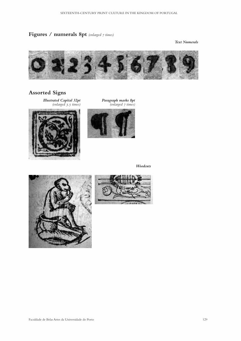
129Faculdade de Belas Artes da Universidade do Porto
SIXTEENTH-CENTURY PRINT CULTURE IN THE KINGDOM OF PORTUGAL
Assorted Signs Illustrated Capital 32pt
(enlarged 3.5 times) Paragraph marks 8pt
(enlarged 7 times)
Woodcuts
Figures / numerals 8pt (enlarged 7 times) Text Numerals
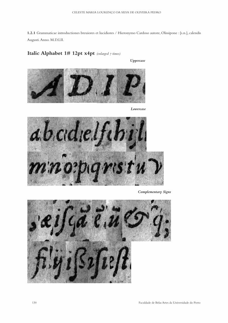
130 Faculdade de Belas Artes da Universidade do Porto
CELESTE MARIA LOURENÇO DA SILVA DE OLIVEIRA PEDRO
1.2.1 Grammaticae introductiones breuiores et lucidiores / Hieronymo Cardoso autore, Olissipone : [s.n.], calendis
Augusti. Anno. M.D.LII.
Italic Alphabet 1# 12pt x4pt (enlarged 7 times)
Uppercase
Lowercase
Complementary Signs
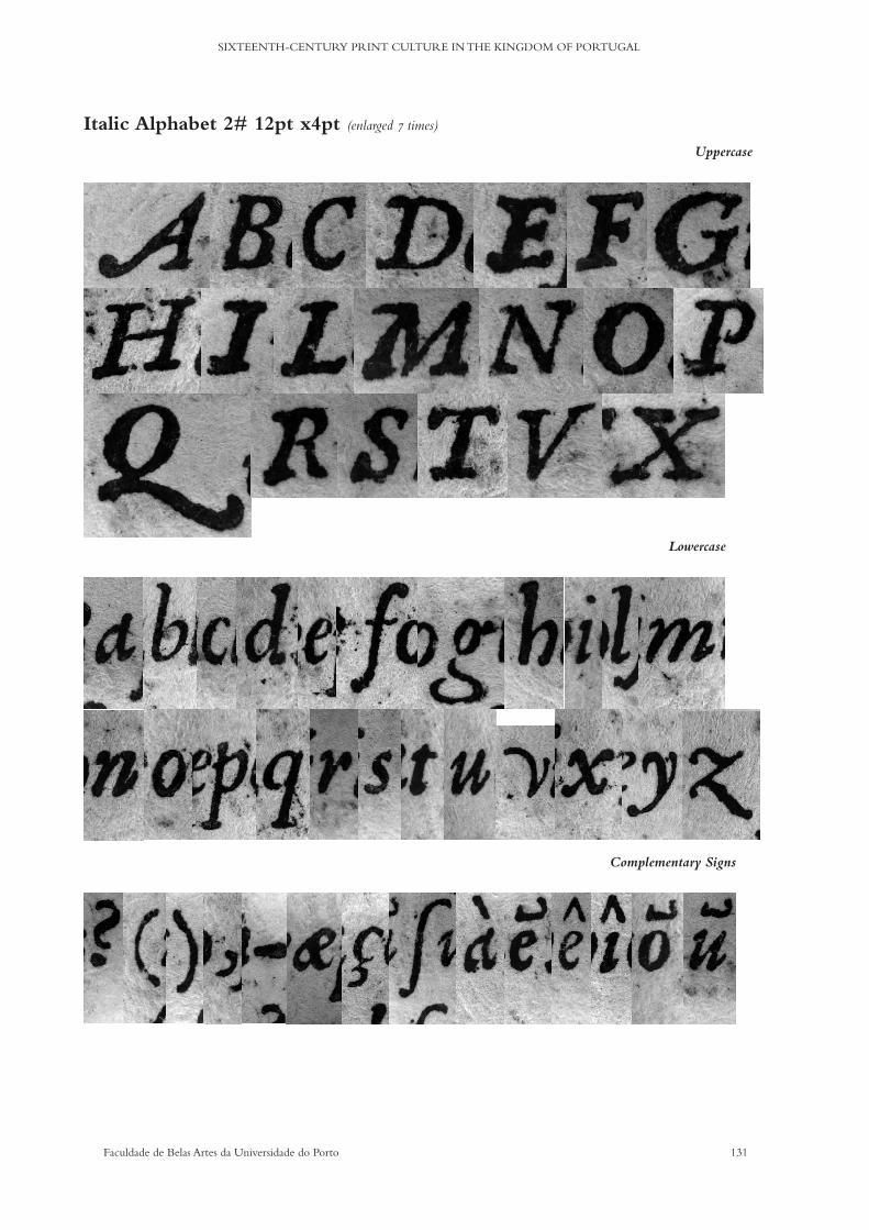
131Faculdade de Belas Artes da Universidade do Porto
SIXTEENTH-CENTURY PRINT CULTURE IN THE KINGDOM OF PORTUGAL
Italic Alphabet 2# 12pt x4pt (enlarged 7 times)
Uppercase
Lowercase
Complementary Signs

132 Faculdade de Belas Artes da Universidade do Porto
CELESTE MARIA LOURENÇO DA SILVA DE OLIVEIRA PEDRO
Italic Alphabet 14pt x6pt (enlarged 7 times)
Uppercase
Lowercase
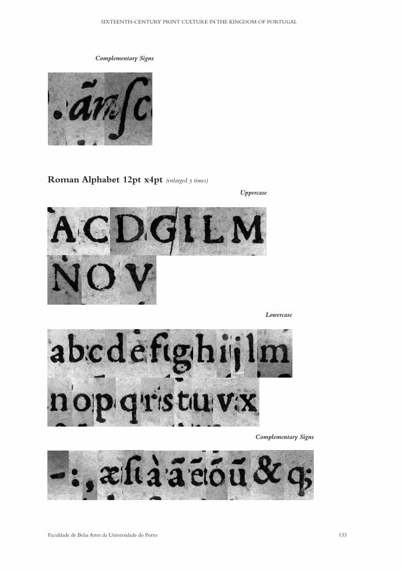
133Faculdade de Belas Artes da Universidade do Porto
SIXTEENTH-CENTURY PRINT CULTURE IN THE KINGDOM OF PORTUGAL
Complementary Signs
Roman Alphabet 12pt x4pt (enlarged 5 times) Uppercase
Lowercase
Complementary Signs

134 Faculdade de Belas Artes da Universidade do Porto
CELESTE MARIA LOURENÇO DA SILVA DE OLIVEIRA PEDRO
Roman Alphabet 16pt x6pt (enlarged 5 times)
Uppercase
Lowercase
Complementary Signs

135Faculdade de Belas Artes da Universidade do Porto
SIXTEENTH-CENTURY PRINT CULTURE IN THE KINGDOM OF PORTUGAL
Roman Capitals 24pt (enlarged 3.5 times)
Roman Capitals 72pt (enlarged 2 times)
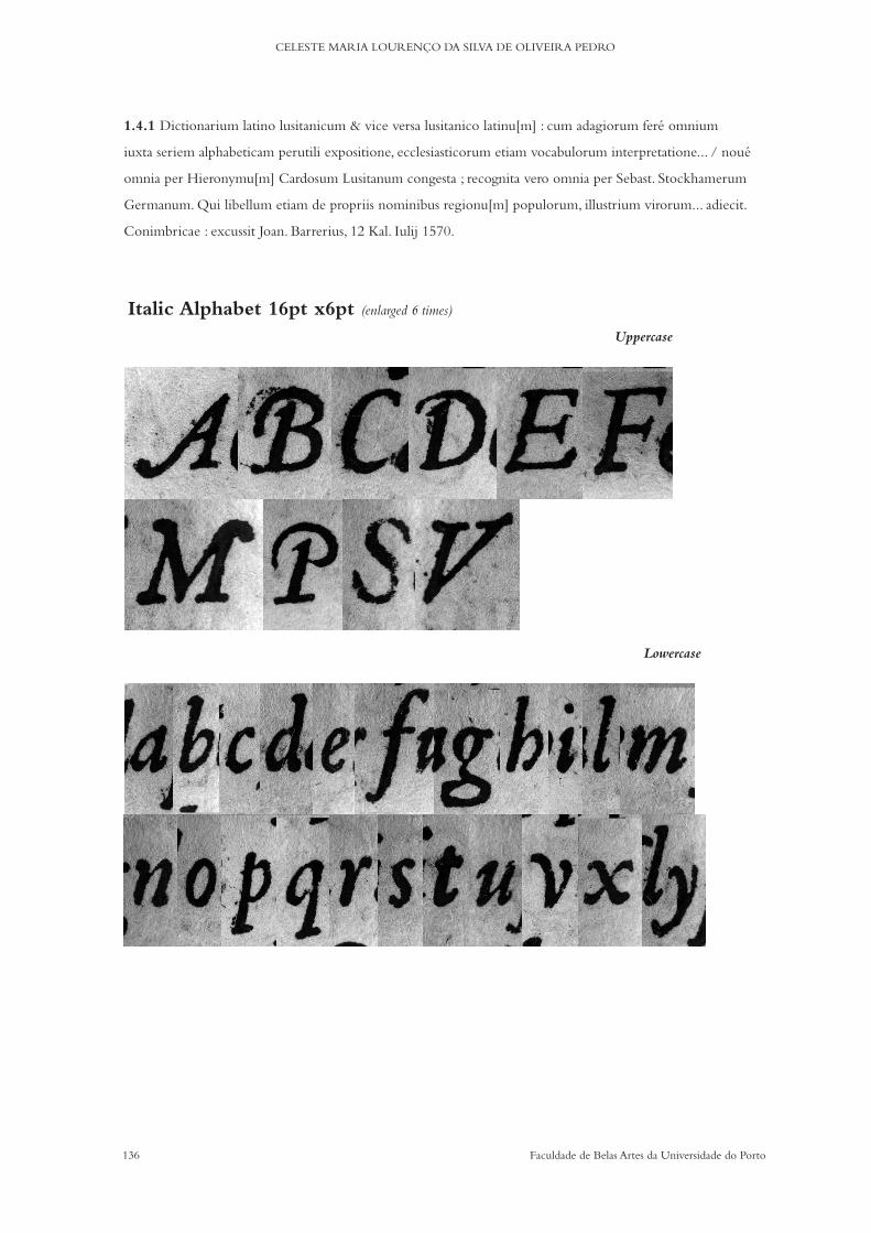
136 Faculdade de Belas Artes da Universidade do Porto
CELESTE MARIA LOURENÇO DA SILVA DE OLIVEIRA PEDRO
1.4.1 Dictionarium latino lusitanicum & vice versa lusitanico latinu[m] : cum adagiorum feré omnium
iuxta seriem alphabeticam perutili expositione, ecclesiasticorum etiam vocabulorum interpretatione... / noué
omnia per Hieronymu[m] Cardosum Lusitanum congesta ; recognita vero omnia per Sebast. Stockhamerum
Germanum. Qui libellum etiam de propriis nominibus regionu[m] populorum, illustrium virorum... adiecit.
Conimbricae : excussit Joan. Barrerius, 12 Kal. Iulij 1570.
Italic Alphabet 16pt x6pt (enlarged 6 times)
Uppercase
Lowercase
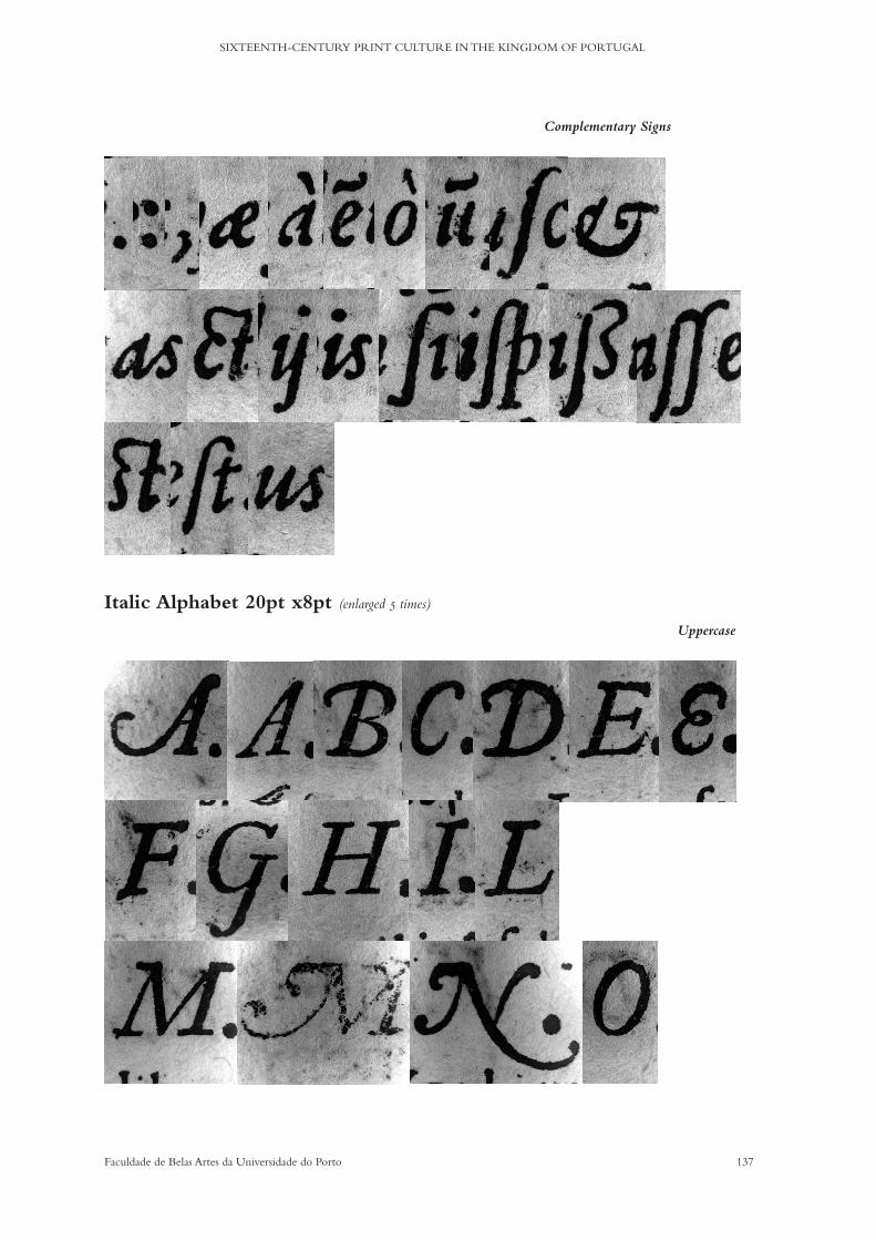
137Faculdade de Belas Artes da Universidade do Porto
SIXTEENTH-CENTURY PRINT CULTURE IN THE KINGDOM OF PORTUGAL
Complementary Signs
Italic Alphabet 20pt x8pt (enlarged 5 times)
Uppercase

138 Faculdade de Belas Artes da Universidade do Porto
CELESTE MARIA LOURENÇO DA SILVA DE OLIVEIRA PEDRO
Lowercase
Complementary Signs
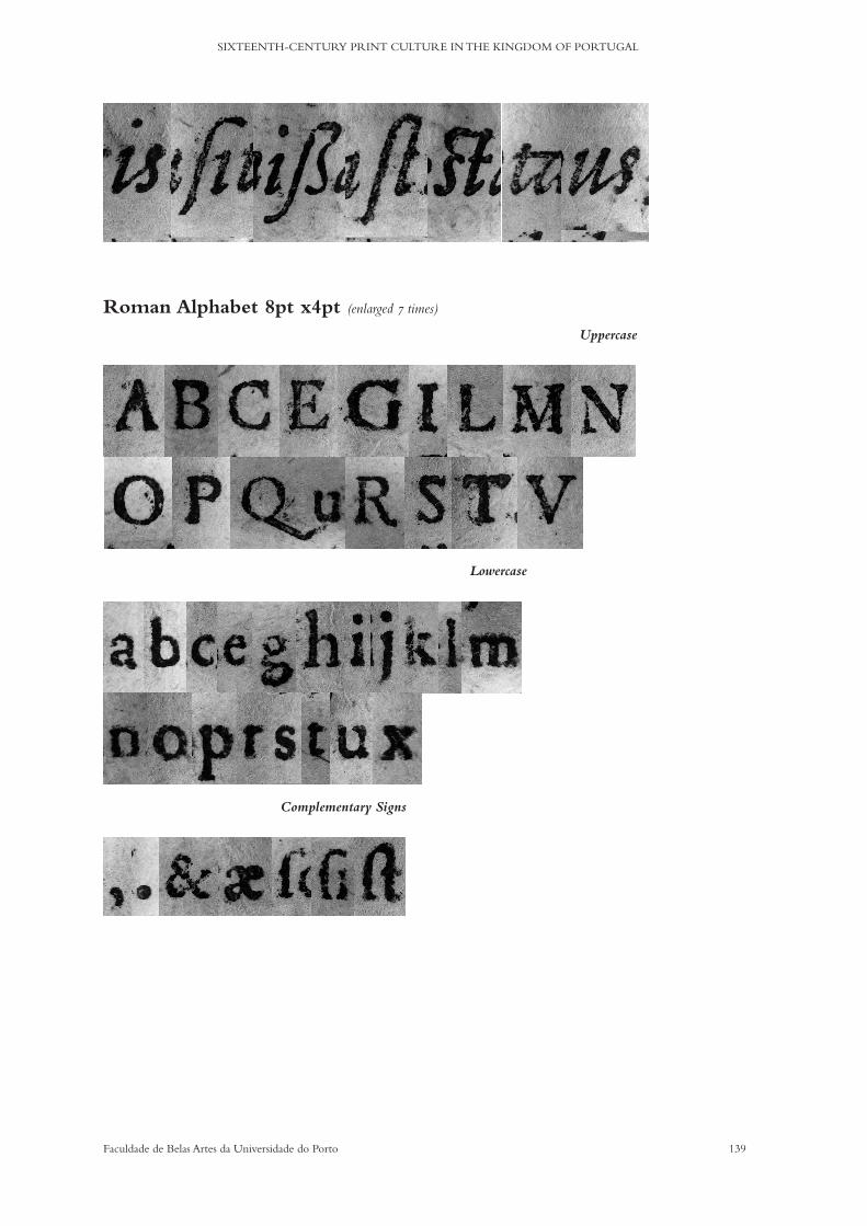
139Faculdade de Belas Artes da Universidade do Porto
SIXTEENTH-CENTURY PRINT CULTURE IN THE KINGDOM OF PORTUGAL
Uppercase
Lowercase
Complementary Signs
Roman Alphabet 8pt x4pt (enlarged 7 times)

140 Faculdade de Belas Artes da Universidade do Porto
CELESTE MARIA LOURENÇO DA SILVA DE OLIVEIRA PEDRO
Roman Alphabet 10pt x4pt (enlarged 7 times)
Uppercase
Lowercase

141Faculdade de Belas Artes da Universidade do Porto
SIXTEENTH-CENTURY PRINT CULTURE IN THE KINGDOM OF PORTUGAL
Complementary Signs
Roman Alphabet 1# 16pt x6pt (enlarged 5 times)
Uppercase

142 Faculdade de Belas Artes da Universidade do Porto
CELESTE MARIA LOURENÇO DA SILVA DE OLIVEIRA PEDRO
Lowercase
Complementary Signs
Roman Alphabet 2# 16pt x6pt (enlarged 5 times)
Complementary SignsUppercase

143Faculdade de Belas Artes da Universidade do Porto
SIXTEENTH-CENTURY PRINT CULTURE IN THE KINGDOM OF PORTUGAL
Lowercase
Roman Alphabet 20pt x8pt (enlarged 5 times)
Uppercase
Lowercase

144 Faculdade de Belas Artes da Universidade do Porto
CELESTE MARIA LOURENÇO DA SILVA DE OLIVEIRA PEDRO
Complementary Signs
Greek Alphabet 10pt x4pt (enlarged 7 times) Uppercase
Uppercase
Lowercase
Complementary Signs
Roman Alphabet 10pt (enlarged 6 times)

145Faculdade de Belas Artes da Universidade do Porto
SIXTEENTH-CENTURY PRINT CULTURE IN THE KINGDOM OF PORTUGAL
Roman Capitals 36pt (enlarged 2 times)
Illustrated Capitals Illustrated Capital 60pt
(real size)
Figures/numerals 16pt (enlarged 3.5 times)

146 Faculdade de Belas Artes da Universidade do Porto
CELESTE MARIA LOURENÇO DA SILVA DE OLIVEIRA PEDRO
Illustrated Capital 66pt (real size)
Illustrated Capital 72pt (real size)
Illustrated Capital 78pt (real size)

147Faculdade de Belas Artes da Universidade do Porto
SIXTEENTH-CENTURY PRINT CULTURE IN THE KINGDOM OF PORTUGAL
Illustrated Capitals 84pt (real size)
Illustrated Capital 128pt (real size)
Illustrated Capital 116pt (real size)
Assorted signs Other marks
(enlarged 3.5 times) Pointer
(enlarged 6 times) Paragraph marks 10pt
(enlarged 3.5 times) Paragraph marks 16pt
(enlarged 3.5 times)
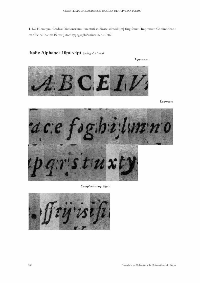
148 Faculdade de Belas Artes da Universidade do Porto
CELESTE MARIA LOURENÇO DA SILVA DE OLIVEIRA PEDRO
1.1.3 Hieronymi Cardosi Dictionarium iuuentuti studiosae admodu[m] frugiferum, Impressum Conimbricae :
ex officina Ioannis Barrerij Architypographi Vniuersitatis, 1587.
Italic Alphabet 10pt x4pt (enlarged 7 times)
Uppercase
Lowercase
Complementary Signs
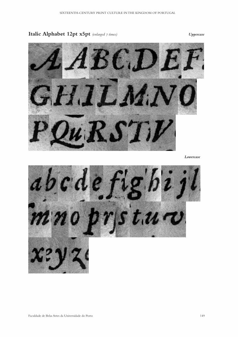
149Faculdade de Belas Artes da Universidade do Porto
SIXTEENTH-CENTURY PRINT CULTURE IN THE KINGDOM OF PORTUGAL
Italic Alphabet 12pt x5pt (enlarged 7 times) Uppercase
Lowercase
Other linguistic signs

150 Faculdade de Belas Artes da Universidade do Porto
CELESTE MARIA LOURENÇO DA SILVA DE OLIVEIRA PEDRO
Italic Alphabet 14pt x6pt (enlarged 7 times) Uppercase
Lowercase
Complementary Signs
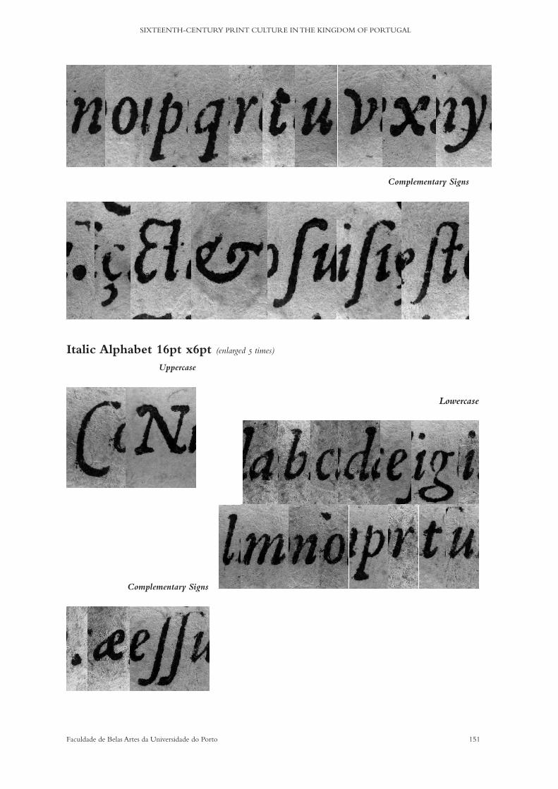
151Faculdade de Belas Artes da Universidade do Porto
SIXTEENTH-CENTURY PRINT CULTURE IN THE KINGDOM OF PORTUGAL
Complementary Signs
Italic Alphabet 16pt x6pt (enlarged 5 times)
Uppercase
Lowercase
Complementary Signs
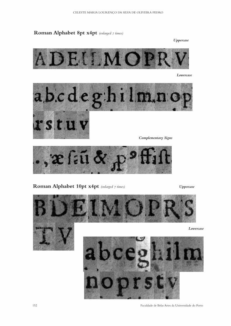
152 Faculdade de Belas Artes da Universidade do Porto
CELESTE MARIA LOURENÇO DA SILVA DE OLIVEIRA PEDRO
Roman Alphabet 10pt x4pt (enlarged 7 times) Uppercase
Lowercase
Roman Alphabet 8pt x4pt (enlarged 7 times)
Uppercase
Lowercase
Complementary Signs
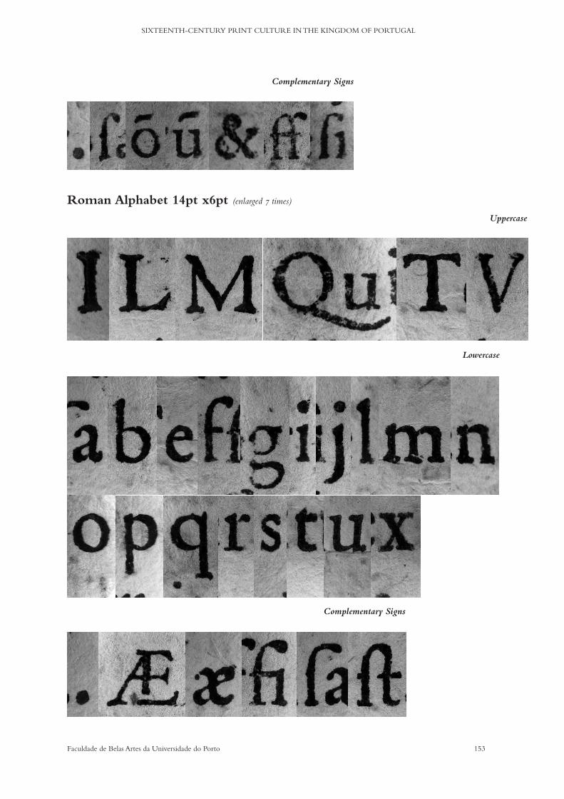
153Faculdade de Belas Artes da Universidade do Porto
SIXTEENTH-CENTURY PRINT CULTURE IN THE KINGDOM OF PORTUGAL
Complementary Signs
Roman Alphabet 14pt x6pt (enlarged 7 times)
Uppercase
Lowercase
Complementary Signs

154 Faculdade de Belas Artes da Universidade do Porto
CELESTE MARIA LOURENÇO DA SILVA DE OLIVEIRA PEDRO
Roman Capitals 18pt (enlarged 3 times)
Roman Alphabet 8pt (enlarged 5 times) Uppercase
Roman Alphabet 16pt x6pt (enlarged 6 times)
Uppercase
Lowercase
Other Linguistic Signs
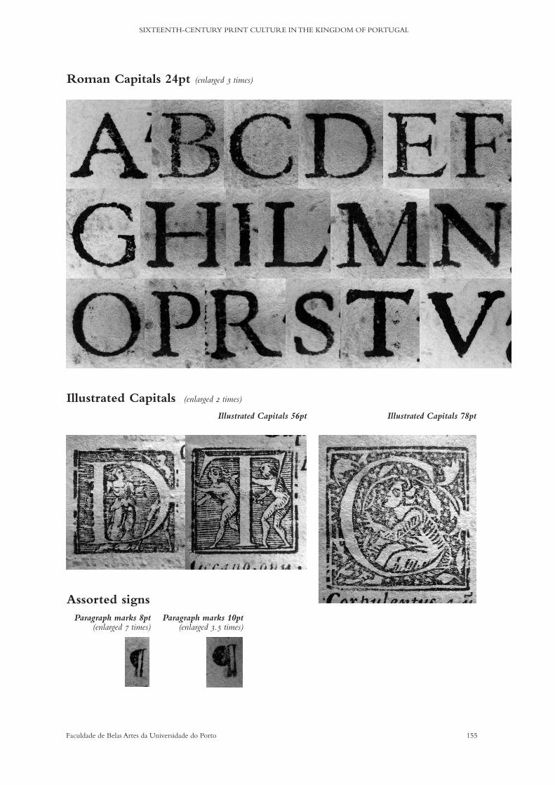
155Faculdade de Belas Artes da Universidade do Porto
SIXTEENTH-CENTURY PRINT CULTURE IN THE KINGDOM OF PORTUGAL
Roman Capitals 24pt (enlarged 3 times)
Illustrated Capitals (enlarged 2 times)
Assorted signs
Illustrated Capitals 78ptIllustrated Capitals 56pt
Paragraph marks 8pt (enlarged 7 times)
Paragraph marks 10pt (enlarged 3.5 times)

156 Faculdade de Belas Artes da Universidade do Porto
CELESTE MARIA LOURENÇO DA SILVA DE OLIVEIRA PEDRO
THE TYPEFACE DATABASE

157Faculdade de Belas Artes da Universidade do Porto
SIXTEENTH-CENTURY PRINT CULTURE IN THE KINGDOM OF PORTUGAL
Chapter 6a) Generating the Information Structure and Interface
Once the typeface archive was compiled and organised and Items (Alphabets) were classified, it was imperative that the information was made available to researchers and general public. A printed archive would become stagnant and unproductive consider-ing the greater utility and availability of nowadays online resources, the existence of dedicated and free software and overall interest on the subject. It was thus reasonable to consider that the creation of an online database should be part of the project.
For the moment, few historical typefaces’ archives exist online. The following were examined and considered as benchmarks for the validation of this project as a tool for researchers and general public alike. These three examples also validate the database potential for continuous development, for the search for institutional collaborations and for the attention paid to the interoperability of the contents.
Typenrepertorium der Wiegendrucke
http://tw.staatsbibliothek-berlin.de/The Typenrepertorium is a database of typographical material, organised by
printing workshop, developed by the Berlin State Library. It presents over 6000 samples of the incunabular period. In also records about 4400 capitals, nearly 700 printers and/or publishing houses and about 350 titles made of woodcuts. It is a work in progress and aims to describe all printing types of the fifteenth-century: their distinctive features, the similarities to other printers types, and to supplement these with images or links to digitized incunabula.
BaTyR
http://www.bvh.univ-tours.fr/batyr/beta/index.phpBaTyR project started ten years ago and is part of Bibliothèques Virtuelles Human-
istes developed by the Centre d’Etudes Supérieures de la Renaissance. It assembles photographical data related to materials used in printers’ houses during the Renais-sance. It aims to provide scientific documentation on engraved and cast ornaments, and type sorts. It was designed to help locate different occurrences of the same ornament by describing copies and iconographic motifs similarities. BaTyR also pro-vides identification of signatures and possession marks in the engraved woodcuts. By March 2018, BaTyR had archived 7535 ornaments (13958 occurrences in 608 works)

158 Faculdade de Belas Artes da Universidade do Porto
CELESTE MARIA LOURENÇO DA SILVA DE OLIVEIRA PEDRO
Typograaf
https://earlymoderntypography.com/ and http://typograaf.com/Developed by Professor Paul Dijstelberge, of the University of Amsterdam.Typograaf is an ongoing project that started more than two decades ago focused
on the early modern book history. It presents high-resolution images of type spec-imens, illustrated capitals, ornaments, woodcuts and more, in a current total of 35197 items, organised by printer and place of print.
Earlymoderntypography is the Blog/Flickr version by the same author.
All projects mentioned above are the result of either many years of research and/or of the work of many contributors. The database developed for this archive is intended to be open to improvement and to be augmented in terms of collections available. The goals of creating an online database with the digital images of the archive were:
a) free availability (high-resolution download) of the collected alphabets; b) dissemination of the knowledge acquired and promoting the visibility of Portuguese print culture history - working towards the implementation of FCT’s Open Access directories;c) focus on the usability and interoperability of the contents - generating data and metadata that meets international standards.
In order to meet these goals, two websites were designed: historicaltype.eu is ded-icated to the database of digital images of the alphabets and corresponding context description and metadata; and historicaltype.pt will present and share the dissertation and the partners involved
For the development of historicaltype.eu a project was launched for MA students of Information Sciences at the Faculty of Engineering of the University of Porto. The student Pedro Martins applied and started developing his work based on the presented briefing: it consisted firstly on evaluating software or platforms that met all the initial requirements: easy to develop, easy to use, easy to share.
Regarding the evaluation of available software, a survey study was conducted con-templating existing open access applications. It helped shape the structure of the fu-ture database and the inclusion/exclusion of information, as well as helping in choos-ing a format for meta-data. The chosen application was Omeka because it ‘is a free, f lexible, and open source web-publishing platform for the display of library, museum, archives, and scholarly collections and exhibitions.’
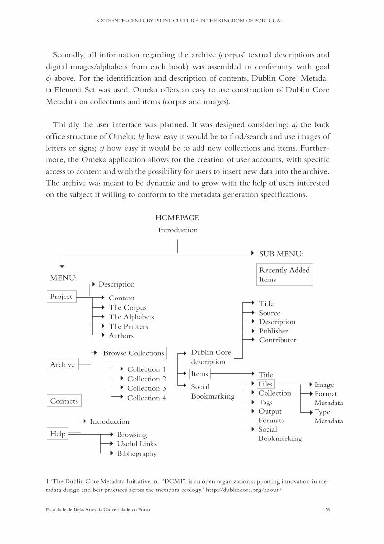
159Faculdade de Belas Artes da Universidade do Porto
SIXTEENTH-CENTURY PRINT CULTURE IN THE KINGDOM OF PORTUGAL
Secondly, all information regarding the archive (corpus’ textual descriptions and digital images/alphabets from each book) was assembled in conformity with goal c) above. For the identification and description of contents, Dublin Core1 Metada-ta Element Set was used. Omeka offers an easy to use construction of Dublin Core Metadata on collections and items (corpus and images).
Thirdly the user interface was planned. It was designed considering: a) the back office structure of Omeka; b) how easy it would be to find/search and use images of letters or signs; c) how easy it would be to add new collections and items. Further-more, the Omeka application allows for the creation of user accounts, with specific access to content and with the possibility for users to insert new data into the archive. The archive was meant to be dynamic and to grow with the help of users interested on the subject if willing to conform to the metadata generation specifications.
HOMEPAGE
Introduction
MENU:
SUB MENU:
Project
Description
Recently Added Items
Browse Collections
Introduction
Context
Collection 1
Dublin Core description
TitleSourceDescriptionPublisherContributer
TitleFilesCollectionTagsOutput FormatsSocial Bookmarking
ImageFormat MetadataType Metadata
Browsing
The Corpus
Collection 2Items
Social Bookmarking
Useful Links
The Alphabets
Collection 3
Bibliography
The Printers
Collection 4
Authors
Archive
Contacts
Help
1 ‘The Dublin Core Metadata Initiative, or “DCMI”, is an open organization supporting innovation in me-tadata design and best practices across the metadata ecology.’ http://dublincore.org/about/
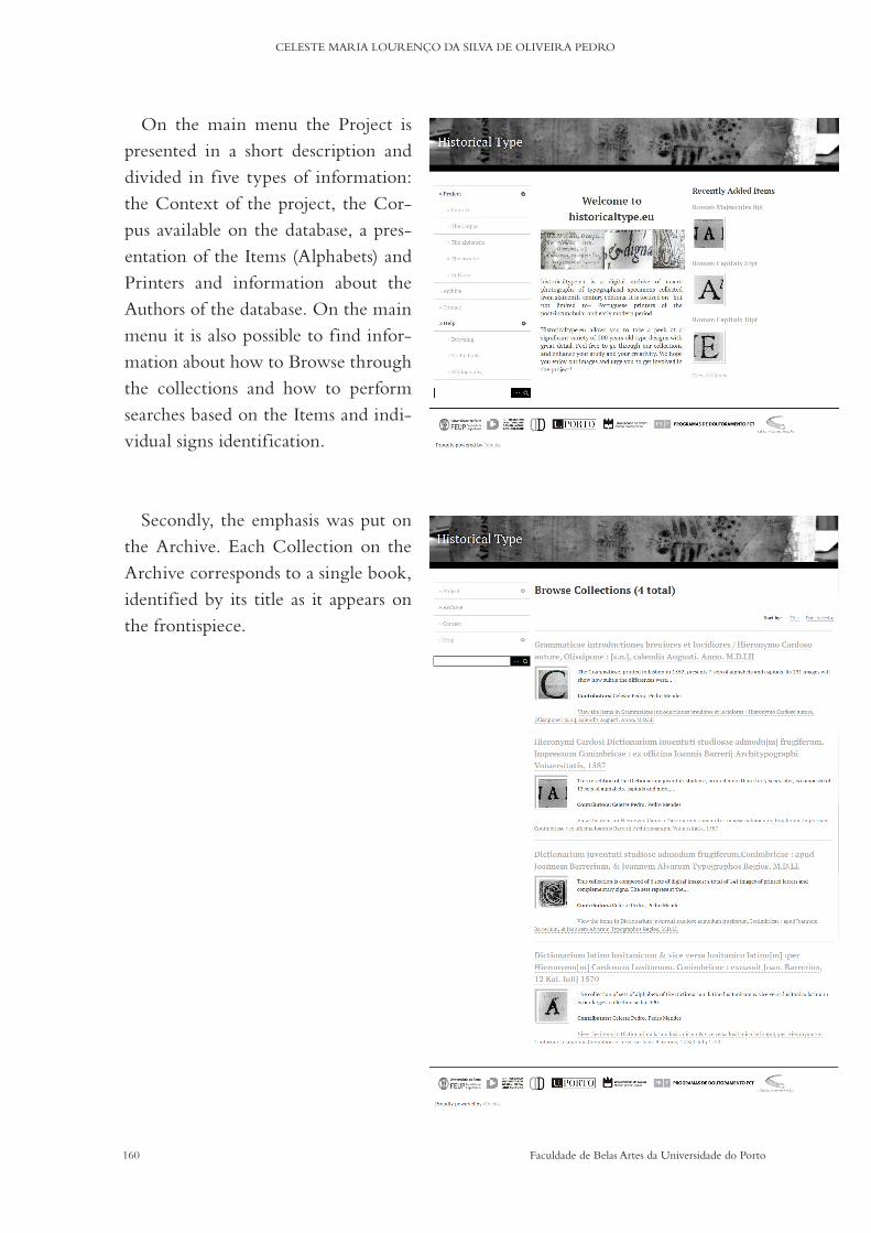
160 Faculdade de Belas Artes da Universidade do Porto
CELESTE MARIA LOURENÇO DA SILVA DE OLIVEIRA PEDRO
On the main menu the Project is presented in a short description and divided in five types of information: the Context of the project, the Cor-pus available on the database, a pres-entation of the Items (Alphabets) and Printers and information about the Authors of the database. On the main menu it is also possible to find infor-mation about how to Browse through the collections and how to perform searches based on the Items and indi-vidual signs identification.
Secondly, the emphasis was put on the Archive. Each Collection on the Archive corresponds to a single book, identified by its title as it appears on the frontispiece.

161Faculdade de Belas Artes da Universidade do Porto
SIXTEENTH-CENTURY PRINT CULTURE IN THE KINGDOM OF PORTUGAL
Collection 1 - 1551Assorted Signs
Italic Majuscules 8pt
Numerals 8pt
Roman Alphabet 8pt
Roman Alphabet 14pt
Roman Capitals 20pt
Collection 2 - 1552Italic Alphabet 1# 12pt
Italic Alphabet 2# 12pt
Italic Alphabet 14pt
Roman Alphabet 12pt
Roman Alphabet 16pt
Roman Capitals 24pt Roman
Capitals 72pt
Collection 3 - 1569Assorted Signs
Greek Alphabet 10pt
Illustrated Capitals
Italic Alphabet 16pt
Italic Alphabet 20pt
Numerals 16pt
Roman Alphabet 8pt
Roman Alphabet 10pt
Roman Alphabet 1# 16pt
Roman Alphabet 2# 16pt
Roman Capitals 20pt
Roman Capitals 36pt
Roman Majuscules 10pt
Collection 4 - 1587Assorted Signs
Illustrated Capitals
Italic Alphabet 10pt
Italic Alphabet 12pt
Italic Alphabet 14pt
Italic Alphabet 16pt
Roman Alphabet 8pt
Roman Alphabet 10pt
Roman Alphabet 14pt
Roman Alphabet 16pt
Roman Capitals 18pt
Roman Capitals 24pt
Roman Majuscules 8pt
Within each Collection, the Items (Alphabets) are displayed with a title (style and size) and an illustrative image.

162 Faculdade de Belas Artes da Universidade do Porto
CELESTE MARIA LOURENÇO DA SILVA DE OLIVEIRA PEDRO
Within each Item individual imag-es are displayed by alphabetical order. Each image has its own description and metadata and can be downloaded in full resolution.
The process of the construction of the identification of Items was very important to the correct presentation of images and to an effective search parametrification, including the asso-ciation of tags to each Item.
IMAGE RIGHTS
The images available for download are, as mentioned before, the result of a photo-graphical survey done in loco, at three distinct libraries. The books in the corpus are pub-lic domain and for that reason so are the digital images of the typographical signs found in them. Nevertheless, an informal auhorisation for public release was requested to each institution, and kindly granted.
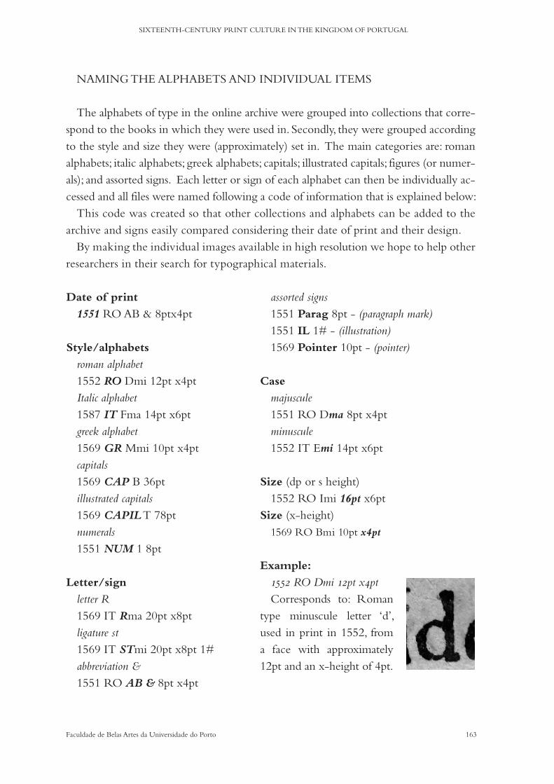
163Faculdade de Belas Artes da Universidade do Porto
SIXTEENTH-CENTURY PRINT CULTURE IN THE KINGDOM OF PORTUGAL
assorted signs 1551 Parag 8pt - (paragraph mark)1551 IL 1# - (illustration)1569 Pointer 10pt - (pointer)
Case
majuscule1551 RO Dma 8pt x4ptminuscule1552 IT Emi 14pt x6pt
Size (dp or s height)1552 RO Imi 16pt x6pt
Size (x-height)1569 RO Bmi 10pt x4pt
Example:
1552 RO Dmi 12pt x4ptCorresponds to: Roman
type minuscule letter ‘d’, used in print in 1552, from a face with approximately 12pt and an x-height of 4pt.
Date of print
1551 RO AB & 8ptx4pt
Style/alphabets
roman alphabet1552 RO Dmi 12pt x4ptItalic alphabet1587 IT Fma 14pt x6ptgreek alphabet1569 GR Mmi 10pt x4ptcapitals1569 CAP B 36ptillustrated capitals1569 CAPIL T 78ptnumerals1551 NUM 1 8pt
Letter/sign
letter R1569 IT Rma 20pt x8ptligature st1569 IT STmi 20pt x8pt 1#abbreviation &1551 RO AB & 8pt x4pt
NAMING THE ALPHABETS AND INDIVIDUAL ITEMS
The alphabets of type in the online archive were grouped into collections that corre-spond to the books in which they were used in. Secondly, they were grouped according to the style and size they were (approximately) set in. The main categories are: roman alphabets; italic alphabets; greek alphabets; capitals; illustrated capitals; figures (or numer-als); and assorted signs. Each letter or sign of each alphabet can then be individually ac-cessed and all files were named following a code of information that is explained below:
This code was created so that other collections and alphabets can be added to the archive and signs easily compared considering their date of print and their design.
By making the individual images available in high resolution we hope to help other researchers in their search for typographical materials.
164 Faculdade de Belas Artes da Universidade do Porto
CELESTE MARIA LOURENÇO DA SILVA DE OLIVEIRA PEDRO
CONCLUSIONS

165Faculdade de Belas Artes da Universidade do Porto
SIXTEENTH-CENTURY PRINT CULTURE IN THE KINGDOM OF PORTUGAL
Chapter 7a) Sixteenth-century Print Culture in the Kingdom of Portugal
The history of printing in Portugal was almost never considered by the great his-torians of type. Some studies have pointed out fifteenth-century printers or printers’ marks, such as Heabler (1897) or Roberts (1893), but the sixteenth century has only been a focus for Portuguese writers. From Updike (1922), to Carter (1969) or Norton (2010), a person might wonder if there was any printing in the Kingdom of Portugal at all. The impression this leaves is that it was an unremarkable history. Although the role of the Portuguese in spreading print to the Far East is sometimes referred to, the role of the Lisbon port is constantly forgotten (Martin and Febvre, 2010). Even Portu-guese authors devote only a few pages to some printers, never going too deep into facts or even visual analysis; they perpetuate errors, think too highly of a little number of accomplishments, or simply repeat what others have written. Going through Ribeiro dos Santos (1814), Noronha (1874), Aranha (1898), Viterbo (1924), Sampaio (1932), or, more recently, Pacheco (1988), it may be assumed that everything there is to write has been written. In fact, however, it seems that the very short catalogue of Portuguese incunabula is worth more articles and commemorative books than the whole of the sixteenth-century history of print. The longest and most comprehensive works on the subject are still the libraries’ catalogues. Pina Martins, Artur Anselmo and Joao Dias have written by far the most about the Portuguese history of the book and about print-ing materials. Occasional academic works have come to enrich our knowledge over the past few decades, but very few appear in dedicated bibliographies.
It was from this starting point that the research gained form: after an extensive lit-erature review, it was necessary to look at all historical records first hand, transcribing anew what could be found, analysing raw information such as catalogues and digitised books themselves. Some information was left aside, mainly biographical data (such as places of birth or matrimonial details) because it was too time-consuming and, in this case, of little interest. The results were satisfying and a bigger picture emerged before our eyes: Joao Álvares and Joao de Barreira had much to teach us about typography in its different aspects and this dedicated study has provided a greater insight into their work, and, by way of example, also into the work of sixteenth-century typographers in general. This is not so much a singular case as a case of adequation to a European movement. In this sense, their work is able to provide a comprehensive description of print culture in the Kingdom of Portugal.
166 Faculdade de Belas Artes da Universidade do Porto
CELESTE MARIA LOURENÇO DA SILVA DE OLIVEIRA PEDRO
The following research questions were designed to guide not only an overall under-standing of the professional context in which these printers worked and lived, but also to devise a specific case study involving the production and the reception of books. These questions have been addressed throughout the different chapters.
1. How were books conceived and valued in the minds and at the hands
of sixteenth-century typographers?
Joao Álvares and Joao de Barreira were given the privilege of being printers for the University at Coimbra, which came after the attribution of the title of Royal Print-ers. This privilege came with the responsibility of setting up a dedicated workshop and being available to print all books necessary for the professors and students while maintaining their own workshops that had already been operating for a decade. Al-though there are records concerning their patronship by the king for the purchase of the materials to run the university press, the printers would also have to hire a workforce, keep a supply of metals for constant casting/recasting and paper, and or-ganise the time between their own work and that of the university. In this research, we have concluded that they were responsible for at least three workshops (we have discarded the possibility of a workshop existing in Braga from the beginning): one in Lisbon and two in Coimbra. How big their workshops were and how many people they employed will continue to be a matter of debate (considering the array of mate-rials known to be part of the university’s materials, Joao Álvares and Joao de Barreira must have had at least 10 workers (Febvre and Martin, 2010: 137)), as will the exact timeline of a parallel existence for the two workshops in Coimbra.
It was not possible to prove whether the printers worked together on all projects or only on some and why, nor was it possible to theorise as to how/whether they ran all the workshops (in Coimbra and Lisbon) at the same time. Maintaining a work-shop for decades without a regular production seems unthinkable given the number of resources required for each project. In addition, there is no evidence of regu-lar workshop partnerships with other printers regarding the Lisbon printing house, which makes us believe that perhaps the houses were closed when printing was not occurring. Either this, or: a) the houses were used by other printers as well that we don’t know of (possibly Luís Rodrigues); or b) books whose colophons indicate that they have been printed in Coimbra were actually being printed in Lisbon. It seems unreasonable to suggest that printing materials were regularly being moved from one house to the other, but most certainly some projects made this necessary.
167Faculdade de Belas Artes da Universidade do Porto
SIXTEENTH-CENTURY PRINT CULTURE IN THE KINGDOM OF PORTUGAL
As some pieces from Luís Rodrigues appear in books printed in Coimbra, we can assume that his materials (once in the hands of Joao Álvares and Joao de Barreira) be-came scattered between the two cities. Regarding the university’s printing materials and the ones from the royal colleges, they must have always been in Coimbra because the printers were bound to keep them available upon request. As for what happened to the materials from the Lisbon workshop and to the workshop itself, this is an ab-solute unknown.
Regarding the provenance of the materials they used, despite the assembly of all recorded facts, no new information was discovered during the research but, as Dias states (1995: 13), the typographical materials (regarding the fifteenth century, and we believe also the sixteenth) could have reached the territory by land through the Span-ish Kingdoms, or by ship from Antwerp, Germany or Italy. In the 1546 procurement, Joao Álvares is sent to Lisbon to not only buy, but also to evaluate and consider a fair price for typographical materials (appendicea 1#); it can be suggested therefore that there were places to go to and prices to negotiate: a regular market. Such places were probably as regular as the market for books of national and international production, but there is no evidence of how the market itself functioned: was there a regular sup-ply and regular sellers, or, on the contrary, were there only occasional orders? Why were printers or booksellers like Luís Rodrigues going directly to Paris to buy their supply of materials instead of ordering a shipment directly to Lisbon? Further, it is worth pointing out that the printers were managing the foundry of the character sets they needed and there is evidence that they were also selling some of their books
Then, as today, some books were more important than others to the printers. This had to do with the status of the author/patron, with the target buyer and with the predicted profit. The choice of printing materials, layout, paper quality and number of copies would all be given consideration. The relationship between printers and authors was a matter of great importance. Printers’ titles were a considerable marketing tool in getting the best clients, but so was a portfolio; both who to print and what to print was important in getting more clients. This choice was also dependent on politics and re-ligion, though Joao Álvares and Joao de Barreira do not seem to have been implicated in the controversies that divided the university, nor on the printing of forbidden books.
By positioning themselves as printers for the university, the pair were also high-lighting their good experience in printing specific texts. Such was the case with lex-icographical works, as those by Jerónimo Cardoso. Although not exclusively, Jerón-imo Cardoso chose Joao Álvares and Joao de Barreira as his go-to printers. It is not

168 Faculdade de Belas Artes da Universidade do Porto
CELESTE MARIA LOURENÇO DA SILVA DE OLIVEIRA PEDRO
possible to ascertain if he ever went to the printers’ workshops in order to initiate, supervise or correct the printing of the dictionaries and grammar (or others’ works), but it seems likely that he must have had contact with them, mainly in Lisbon: he gave regular classes in the capital and was not a man of wealth or with a habit of trav-elling. As to the cost of printing his books, it is known that Pedro Sanches patroned at least one of his works, and it is believed he himself paid for part of Institutiones in linguam latinam.
It is not far-fetched to suggest that Jerónimo relied greatly on his relationships with his former students and with members of the court for the success of his editions—ei-ther in assuring patronship, in promoting editorial corrections or in asserting market f low, designing circles of inf luence and of literary discussion in order to maintain his presence as a respected teacher—as his vast editorial work proves and as we have seen in the analysis of his dedication texts on chapter 3.
2. How do we effectively ascertain the aesthetic traditions and technological con-
straints of early modern age printing presses through visual analysis?
Western civilisations in what concerns cultural identities are defined by factors generally typified in the form of written production and material legacy. Books are representative of both forms: they convey texts and, as objects to be looked at, they mirror visual arts’ tendencies and technological know-how. It is thus possible to study books from the point of view of their visual components in order to highlight dia-chronic and synchronic attributes that define a print culture. As we have seen, mainly in Chapter 3, even printing errors contribute to the entirety of the telltale signs of printing houses’ traditions.
By conducting a detailed photographical survey of the typefaces used in the se-lected corpus and a general overview of bibliographical characteristics, we were able to form a generic picture of the choices of layouts, page composition and materials available in the printers’ workshops. By doing so we have come closer to defining aes-thetic practices taking place in this printing house and how different materials were used, based on what is known to have been sixteenth-century methods. The online database that was developed will in turn make it possible to share the archive in such a way as to potentially increase the visual impact of historical faces in design studies.
The choice to analyse a specific type of books (lexicographical books) has made it possible to look at physical attributes such as the size of the pages, the quality of the
169Faculdade de Belas Artes da Universidade do Porto
SIXTEENTH-CENTURY PRINT CULTURE IN THE KINGDOM OF PORTUGAL
paper, the worn out surface of the characters, for example, and conclude that these were primarily intended for practical and heavy use. The author’s pride and the ty-pographers’ graphical accomplishments were secondary to the audience’s interest, both in terms of price and pragmatism. The array of paratexts available in these books (as extensively reviewed in Chapter 2) has also provided for two conclusions: in terms of graphical composition it is clear that they were treated independently and have systematic presentation styles; and in terms of textual content they provide pertinent cultural information beyond the core subject of each book.
While the printers seem to have had a large collection of sizes of alphabets and il-lustrated capitals at their disposal, the designs were not so varied. The same Roman and Italic faces were used throughout decades, constantly being recast. Regarding the university materials, there is no known order for the renewal of material stocks until the end of the century (the contracts made with subsequent printers do not mention them) and in the seventeenth century the remaining materials that belonged to Joao Álvares and Joao de Barreira appear scattered among the many typographers operat-ing in Coimbra. Some of them are easily identifiable and can be traced back to Luís Rodrigues and Germao Galharde.
3. What are the parallels between visual arrangements and communicational functions,
and how much did these influence the reception of books?
In chapter 3 we discussed how Joao Álvares and Joao de Barreira were determining the visual functions of typefaces and layout arrangements in fitting with the type of book that was being printed and with the readers’ expectations in mind.
The way in which graphical signs are arranged on a page, or in the entire book, can be various and will depend on their position and relationship to one another; the way they communicate the content of a text can also vary greatly. This is even more pronounced in books with specific textual programmes where typefaces can be used to help readers navigate the information in them in the way the writer/author or the printer wants them to. Not only will typefaces and other graphical elements help to reinforce how a book is to be read or used through the potential of meaning-making semiotic modes, they will also draw the reader’s attention to the hierarchical structure of the content by having the capacity to enhance both readability and legibility.
The composition of dictionaries and grammars is bound to a visual programme that is a subsidiary of the centuries-old manuscript and printed exemplars.
170 Faculdade de Belas Artes da Universidade do Porto
CELESTE MARIA LOURENÇO DA SILVA DE OLIVEIRA PEDRO
This programme is conventional for both the writers and the printers. The struc-ture of the information presentation in our corpus had much to do with how Jerón-imo Cardoso believed the contents would be most useful and practical for students to consult. The printers must have followed his manuscript at the level of the core arrangement, but they have also designed the full piece in accordance with the avail-ability of type materials and what they knew a dictionary or grammar book should look like.
b) Further work
If, to a small extent, we have seen that Joao Álvares and Joao de Barreira’s books seem to have no remarkable element of typographical originality, it is, nevertheless, valid to consider the importance of pinpointing how their technical and graphical modus operandi can be contextualised and discussed. Much remains unanswered re-garding the lives and work of Joao Álvares and Joao de Barreira. It would take a wider corpus and the joint effort of scholars and professionals to account for all their pro-ductions, to aggregate, classify and compare all the typefaces, illustrations, paratexts, archival records and all the bibliographical information available in their productions. The object of study we have dealt with, lexicographical editions, is in itself proof that it is worth conducting such an in-depth investigation.
In order to more broadly contextualise a print culture specific to the Portuguese Kingdom, a larger study should also be conducted comparing the visual character-istics of books printed elsewhere in the peninsula and in the rest of the European kingdoms at the time. Only by doing so can the questions related to the provenance of their materials be answered, if this is ever possible.
During our research, we came across visual evidance that points towards the possi-bility of a deeper relationship between the printer Luís Rodrigues and Joao Álvares and Joao de Barreira than previously regarded both in terms of professional partnership and the use of typographical material which we consider worth of further investigation.
As observed during this research, one form of practical assembly of signs for visual observation is the creation of archives that can then be subject to a comparative study with other archives being developed elsewhere, as was the case on chapter 5.
The comparative possibilities allowed by the existence of digital databases is even greater than by published printed archives because these require more time and more resources and are harder to update. We thus believe the creation of historicaltype.eu (described on chapter 6) as a parallel but indispensable part of this research, will be
171Faculdade de Belas Artes da Universidade do Porto
SIXTEENTH-CENTURY PRINT CULTURE IN THE KINGDOM OF PORTUGAL
most useful if it becomes an ongoing project and if it can also aggregate other forms of information, such as paratexts (which also have a high potential for transcultural comparative analysis). Further programming improvements, especially in what con-cerns more refined search methods, will enrich the objectives of this research and be of great use to investigators worldwide.
In addition, documental information such as archival records related to printers can also become an important feature of the database, thus aggregating all known data and enabling future research on Print Culture.
We hence believe this research to be open to new developments and strongly regard it as pertinent to the state of the art in the study of the History of Typography.

172 Faculdade de Belas Artes da Universidade do Porto
CELESTE MARIA LOURENÇO DA SILVA DE OLIVEIRA PEDRO
ANNEXES

173Faculdade de Belas Artes da Universidade do Porto
SIXTEENTH-CENTURY PRINT CULTURE IN THE KINGDOM OF PORTUGAL
1# Minute of a session of the deputy council (in Conselhos, vol. 1, cad. 3.º, fol. 83)
(18h of june, 1547)
Em os dezoyto dias de Junho de mil bc coreta e sete em a casa do conselho desta vnjuersydade
de coImbra sendo presente o snõr dom yº de portugal Rector e o doctor frey martinho e o doctor
nauarro e o ldo Symao de mjrada e ant.º vaz e yeronimo do sorjo e pero gomez dabreu e fernao Rib.ro
e o doctor manoel da costa e pero da sylua e manoel cerueyra e nuno alues e yohao fernadez deputados
e cõselheyros do dito estudo e foy apresentada per fernao lopez hua carta de Sua Alteza de guarda do
cartorjo e liurarja e foj lida e cõselho e pedio q lhe madase pagar o ordenado de prjncipio de março
pera ca q tinha tomado cargo da Impressao e tinha tomado a liuraria de nicolao leytao per virtude da
dita carta e foy ordenado q se lhe nõ paguase o salarjo ordenado do dito officio per quanto atee hora
nao constaua ser apresentada e cõselho ne ser Reçebjda e tambe elle atee hora nõ tinha serujdo o dito
offiçio/ e ordenarao q se o dito fernao lopez tinha feyto algu serviço extrahordinarjo ha vnjuersydade
q o pedise e lho satisfayrao
quintino martinz o escpreuj & asynarao
[Assinaturas:]
dom ymº de portugall ; fr. martinus doctor de ledesma ; m’ts de azpilcta
2# Minute of a session of the deputy council (in Conselhos, vol. 1, cad. 4.º, fol. 40-41 v.º)
(7th of july, 1548)
Aos sete dias de Julho de mil bc quareta & oito anõs na cidade de Coinbra nos pazos delRey nosso
Sor onde ora esta as acolas geraes na sala grande/estando presente o S.or dom Joham de portugal Reitor
& o doctor marcos Romeiro & o doctor Joha de morgovejo & o doctor manuel dandrade & o d. James
de moraes o do. Eitor Rõiz o d. aires pinhel o d. manuel da cõsta o Ldo gaspar glz’ paulo aº diogo soarez
antº Riz’ daraujo frco marquez o mestre Joham glz’ antº piz’ bulhao frco nunez antº da cruz / deputados
& cõselheiros juntos a cõselho & cõselho fazendo seu bõ costume /
apresentou no dito cõselho fernao lopez, bedel da faculdade das artes hua provisao de sua alteza per
q lhe faz mais mçe ale do ordenado q te de quatro mil rss’. polo caRego q te da inpresao. & lida no dito
cõselho a ovuerao por boa & madarao q se cõprise como se e ella cõte & eu diogo dazevedo a tinha
ja Registada /
Eu diogo dazevedo o screui.
[Assinaturas:]
dom Johã de portugall ; marcos romeiro.

174 Faculdade de Belas Artes da Universidade do Porto
CELESTE MARIA LOURENÇO DA SILVA DE OLIVEIRA PEDRO
3# Royal letter (Kind Sebastian, 11th of september, 1559 in Collecção de diplomas régios originais)
Rtor dº de teiue eu elRey vos Inuio mto saudar / mandouos que entreges ese collegio das artes e
governo delle Inteiramte ao padre dº mira provimcial da companhia de Ihu, o qual lhe asy entregareis
do primro dia do mes doutº que vem este anno presente de quynhentos e çinquoenta e çinquo em
diante por que asy o ey pr bem e meu seruiço como vos ja tenho escrito e cobrareis esta minha carta
com seu conhecimento pera vossa guarda. E asy entregareis os ornamentos e prata e mouel da capela
do collegio e as letras e matrizes que vos foram entregues A fernam lopez da castanheda guarda do
cartorio da vnyverssidade dessa çidade pera todo ter a bõ Recado até eu mamdar o que ouuer por meu
seruiço que se disso faca e cobrareis conheçimento em forma do dto fernam lopes ffeito pelo escriuam
de seu cargo, E asynado per ambos em que declare, que lhe ficam as taeis cousas carregadas em Receita
por que pelo dito cto em forma vos seram leuadas em conta. E per esta mando ao dito ffernam lopez
que as Reçeba e vos passe delas cto em forma. Jmº de seixas a fez em lxa a x dias de setembro de mil e
quinhentos çinquoenta e cinqº. manuel da costa o fez escreuer.
REY.
pera o dtor dº de teiue principal do collegio das artes da cidade de coimbra.
por el Rey
Ao dtor de teiue prynçipal do collegio das artes da cidade de coimbra.
4# Jeronimo Cardoso in catalogues outside Portugal
http://cataloghistorici.bdi.sbn.it/indice_cataloghi.php
4.1# (PC0030) Biblioteca comunale Passerini-Landi. Piacenza.
4.2# (BO0098) Biblioteca universitaria di Bologna. Bologna.
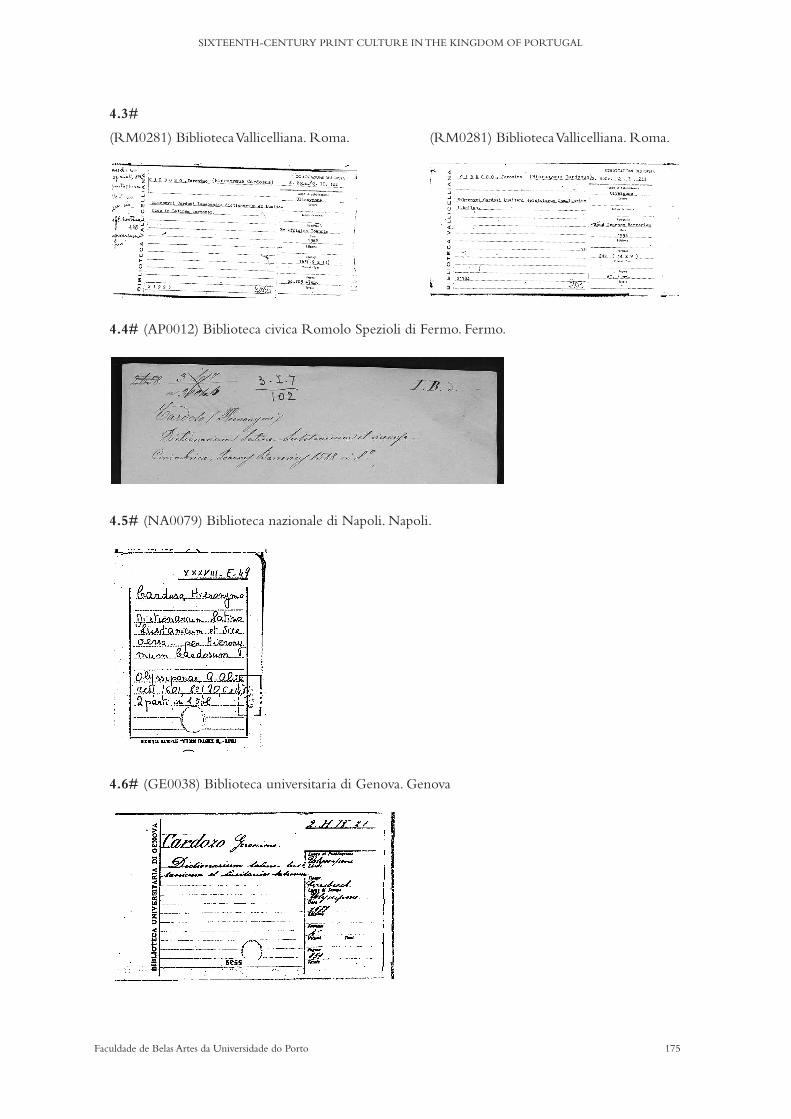
175Faculdade de Belas Artes da Universidade do Porto
SIXTEENTH-CENTURY PRINT CULTURE IN THE KINGDOM OF PORTUGAL
4.3#
(RM0281) Biblioteca Vallicelliana. Roma. (RM0281) Biblioteca Vallicelliana. Roma.
4.4# (AP0012) Biblioteca civica Romolo Spezioli di Fermo. Fermo.
4.5# (NA0079) Biblioteca nazionale di Napoli. Napoli.
4.6# (GE0038) Biblioteca universitaria di Genova. Genova
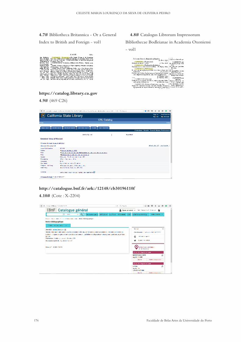
176 Faculdade de Belas Artes da Universidade do Porto
CELESTE MARIA LOURENÇO DA SILVA DE OLIVEIRA PEDRO
4.7# Bibliotheca Britannica - Or a General
Index to British and Foreign - vol1
https://catalog.library.ca.gov
4.9# (469 C26)
http://catalogue.bnf.fr/ark:/12148/cb30196110f
4.10# (Cote : X-2204)
4.8# Catalogus Librorum Impressorum
Bibliothecae Bodleianae in Academia Oxoniensi
- vol1
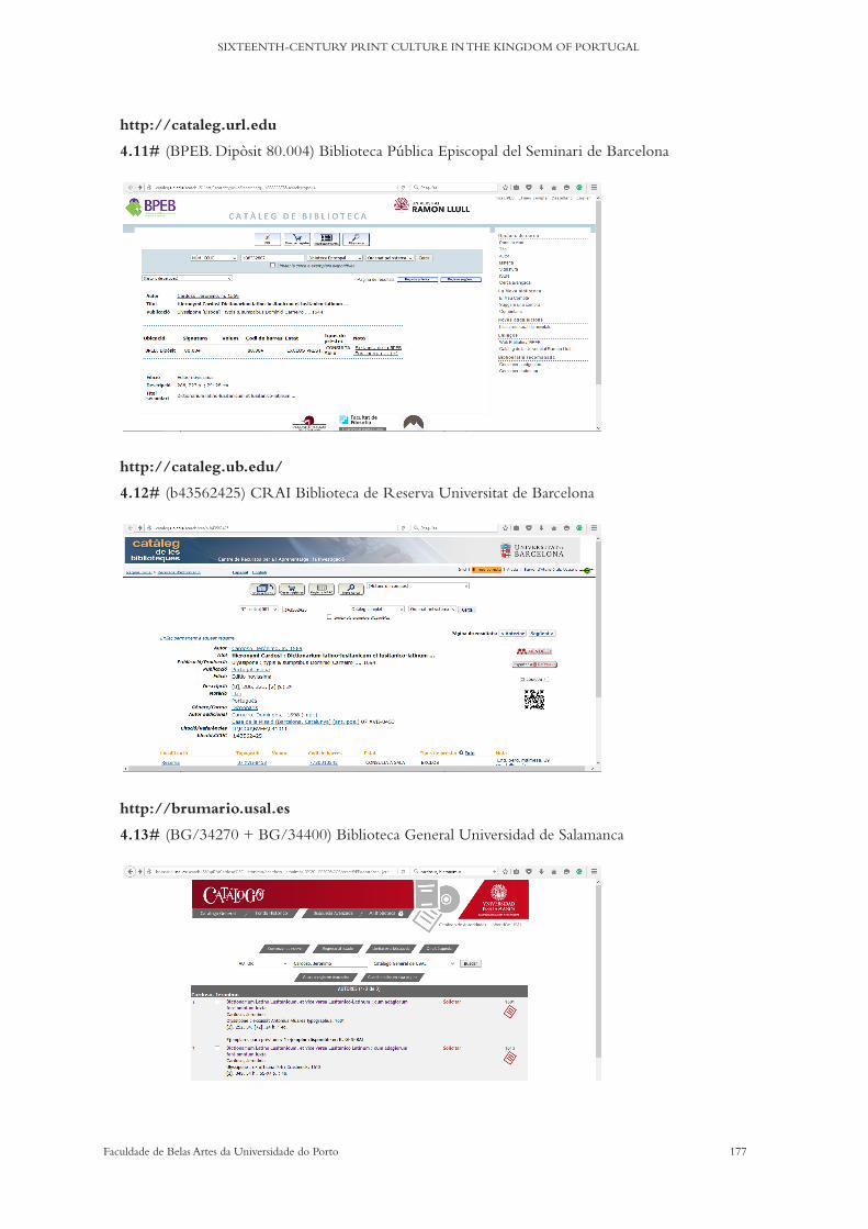
177Faculdade de Belas Artes da Universidade do Porto
SIXTEENTH-CENTURY PRINT CULTURE IN THE KINGDOM OF PORTUGAL
http://cataleg.url.edu
4.11# (BPEB. Dipòsit 80.004) Biblioteca Pública Episcopal del Seminari de Barcelona
http://cataleg.ub.edu/
4.12# (b43562425) CRAI Biblioteca de Reserva Universitat de Barcelona
http://brumario.usal.es
4.13# (BG/34270 + BG/34400) Biblioteca General Universidad de Salamanca

178 Faculdade de Belas Artes da Universidade do Porto
CELESTE MARIA LOURENÇO DA SILVA DE OLIVEIRA PEDRO
APPENDICES

179Faculdade de Belas Artes da Universidade do Porto
SIXTEENTH-CENTURY PRINT CULTURE IN THE KINGDOM OF PORTUGAL
Notes on the following transcripts (appendices 1# to 4#):
The spelling of all words has been updated, including updates of majuscules and minuscules, whenever applicable.
Punctuation and accentuation of words were used whenever applicable.Abbreviations have been expanded.Words unduly joined were separated and separate words were joined wherever
such situations were applicable.

180 Faculdade de Belas Artes da Universidade do Porto
CELESTE MARIA LOURENÇO DA SILVA DE OLIVEIRA PEDRO
1# Procuração a João Álvares imprimidor
(IV-1ªE-14-1-7_fl_15 & IV-1ªE-14-1-7_fl_15v)
Saibam os que este instrumento de procuraçao virem que no ano do nascimento de nosso senhor
Jesus Cristo de mil quinhentos e quarenta e seis anos, aos dois dias de Novembro, na cidade de Coimbra
na casa do conselho do estudo e Universidade da dita cidade, sendo presente o senhor Frei Diogo de
Murça Reitor e o doutor Paio Rodrigues e o doutor Joao de Morgovejo e o doutor Heitor Rodrigues,
e o doutor Rodrigo Reinoso e o licenciado Aires Pinhel e o bacharel James de Morais e o bacharel
Luís Machado, todos deputados no dito estudo e o bacharel Baltazar Pacheco e o bacharel Jorge Afonso
e o bacharel Francisco de Monforte e o mestre Cosme Lopes, conselheiros, e o licenciado Estevao
Nogueira síndico do dito estudo logo por eles todos foi dito que eles como corpo e Universidade
e em nome da dita Universidade faziam como de feito logo fizeram e ordenaram por seu certo e
abastante procurador a Joao [1] Álvares imprimidor, morador nesta cidade, para que ele em nome da dita
Universidade vá à cidade de Lisboa e arrecade e haja em sua mao toda impressao de que hora el Rei
nosso senhor fez mercê a este estudo para a trazer a ele e por esta lhe dao poder para a trazer e haver
em sua mao e a avaliar e lhe pôr os preços que justos forem e em testemunho de verdade mandaram
de ser feito este instrumento que foi feito e assinado no dia, mês e hora acima dito. Testemunhas que
presentes estavam e eu dito escrivao e Nuno Fernandez guarda dos estudos e António Pinto pajem do
senhor Reitor e assinaram segundo forma do estatuto. Quintino Nunes escrivao do conselho a fez. E
risquei onde diz doutor Cristo[1].
[Assinaturas]
Doutor Heitor Rodrigues (?); Frey Diogo de Murça Reitor;
Paio Rodrigues; António Pinto; Cosme Lopes (?)
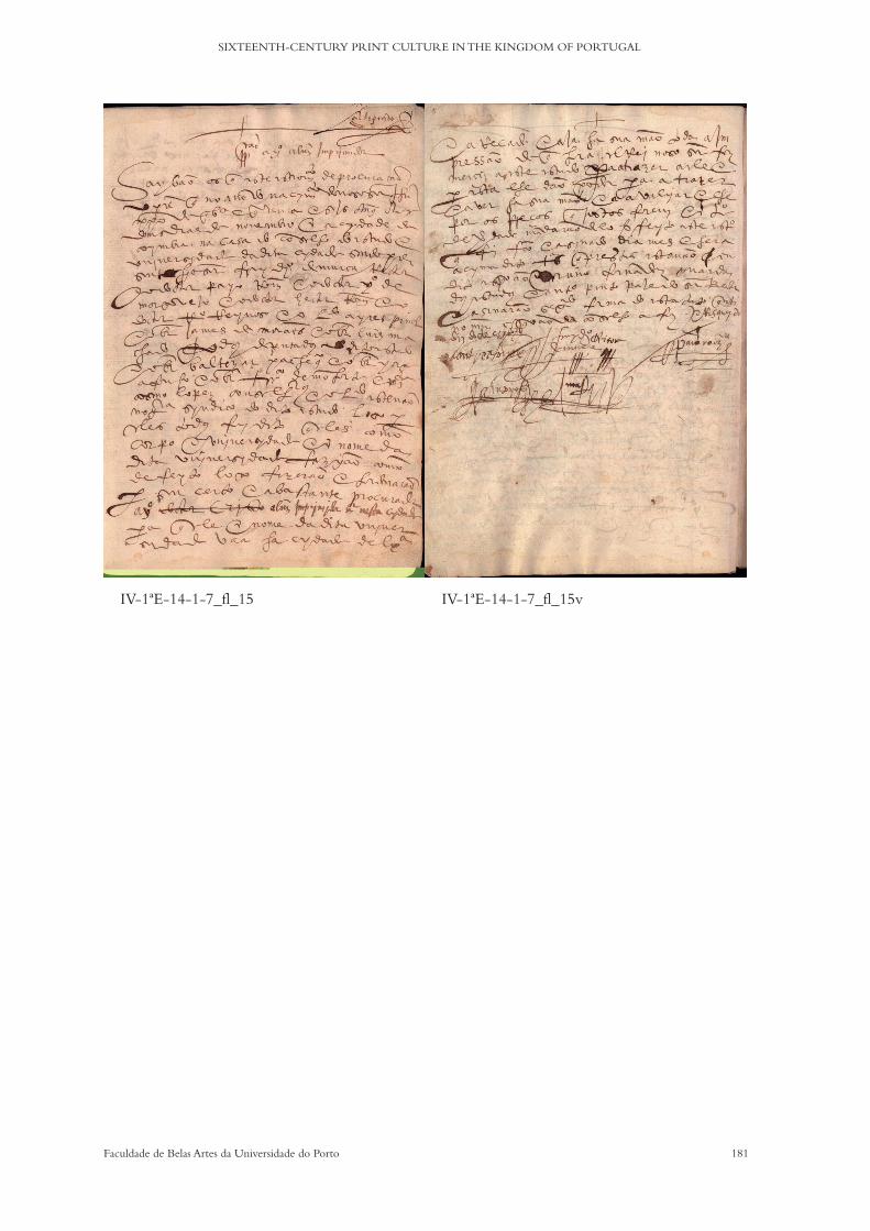
181Faculdade de Belas Artes da Universidade do Porto
SIXTEENTH-CENTURY PRINT CULTURE IN THE KINGDOM OF PORTUGAL
IV-1ªE-14-1-7_fl_15 IV-1ªE-14-1-7_fl_15v
182 Faculdade de Belas Artes da Universidade do Porto
CELESTE MARIA LOURENÇO DA SILVA DE OLIVEIRA PEDRO
2# Iº
(IV-1ªD-3-2-28_fl_91 & IV-1ªD-3-2-28_fl_91v)
Dom Sebastiao por graça de Deus Rei de Portugal e dos Algarves da quem e dalém mar em África
senhor de Guiné e da conquista navegaçao comércio da Etiópia Arábia Pérsia e da Índia etc. A todos
os corregedores ouvidores juízes e justiças oficiais e pessoas de meus reinos e senhorios, a que esta
minha carta testemunhável for mostrada saúde. Faço-vos a saber que o Reitor do colégio das Artes da
companhia de Jesus da cidade de Coimbra me enviou dizer que lhe era necessário o trelado de uma
carta que el Rei meu senhor e avô que está em glória escreveu ao doutor Diogo de Teive por que
lhe mandou que entregasse o dito colégio e governo dele ao padre mestre Diogo Mirao provincial da
companhia de Jesus. A qual carta me apresentou e me pediu lhe mandasse dar o trelado dela em esta
minha carta testemunhável. E o trelado da dita carta de verbo ad verbo hé este que se segue. Doutor
Diogo de Teive eu el Rei vos envio muito saudar, mando-vos que entregues esse colégio das artes e
governo dele Inteiramente ao padre Diogo Mirao provincial da companhia de Jesus, o qual lhe assim
entregareis do primeiro dia do mês de outubro que vem este ano presente de quinhentos e cinquenta
e cinco em diante por que assim o hei por bem e meu serviço como vos já tenho escrito e obrareis
esta minha carta com seu conhecimento para vossa guarda e assim entregareis os ornamentos e prata
e móvel da capela do colégio e as letras e matrizes que vos foram entregues por Fernao Lopes da
Castanheda guarda do cartório da Universidade dessa cidade para todo ter a bom recado até eu mandar
o que houver por meu serviço que se disso faça e cobrareis conhecimento em forma do dito Fernao
Lopes escrito polo escrivao de seu cargo. E assinado por ambos e que declare que lhe ficam as tais
cousas carregadas em receita porque pelo dito visto em forma vos serao levadas em conta. E por esta
vos mando pelo dito Fernao Lopes que as receba e vos passe delas certo em forma. Jerónimo de Seixas
a fez em Lisboa a dez dias de setembro de mil e quinhentos e cinquenta e cinco, Manuel da Costa o fez
escrever. Rei. Para o doutor Diogo de Teive principal do colégio das Artes da cidade de Coimbra. Por
el Rei. Ao doutor Diogo de Teive prinçipal do colégio das Artes da cidade de Coimbra.
E treladada a dita Carta, como dito é visto o que me o dito Reitor pedia mandei passar com o dito
trelado esta minha carta testemunhável pela qual vos mando que ao dito trelado seja dado Inteira fé e
autoridade por ser tirada do próprio original, que está pelo dito senhor assinada. O que assi cumpri.
E al non façais dada nesta minha cidade de Lisboa aos onze dias do mês de outubro El Rei o mandou
polo doutor Fernao de Magalhaes do seu desembargo e corregedor dos feitos cíveis nesta sua corte e
casa da suplicaçao. Jerónimo da Caria (?) por Filipe Pires a fez ano do nascimento do nosso senhor Jesus
Cristo de mil e quinhentos e cinquenta e nove.
[seguem-se cinco linhas de texto, de muito difícil leitura]
[Assinaturas] António Correa; António de Macedo; Martim Ferreira; ?; ?
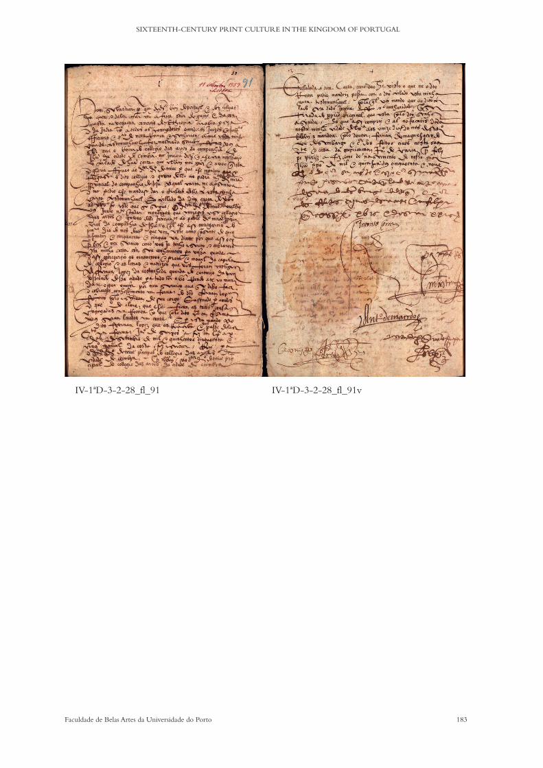
183Faculdade de Belas Artes da Universidade do Porto
SIXTEENTH-CENTURY PRINT CULTURE IN THE KINGDOM OF PORTUGAL
IV-1ªD-3-2-28_fl_91 IV-1ªD-3-2-28_fl_91v

184 Faculdade de Belas Artes da Universidade do Porto
CELESTE MARIA LOURENÇO DA SILVA DE OLIVEIRA PEDRO
3# Obrigação (João de Barreira & João Álvares)
(IV-1ªE-14-1-21_fl_23v; IV-1ªE-14-1-21_fl_24 & IV-1ªE-14-1-21_fl_24v)
Saibam quantos este instrumento de obrigaçao e fiança virem como aos seis dias do mês de Julho do
ano do nascimento de nosso senhor Jesus Cristo de 1560 anos na cidade de Coimbra e guarda roupa
dos Paços de El Rei nosso Senhor sendo aí presente o senhor doutor Manuel da Costa lente de prima
de leis e Joao Álvares e Joao de Barreira impressores da dita Universidade da dita cidade por eles Joao
Álvares e Joao de Barreira foi dito em presença de mim escrivao notário público e testemunhas adiante
nomeados que eles tinham em seu poder duas prensas perfeitas com todo o necessário e doze caixas
para pôr as letras e setecentas e catorze letras de estanho de títulos e começos de capítulos e catorze
quintais de estanho que pesaram as letras fundidas e miudanças e guarnições que tudo era fazenda
da Universidade e porque ela lhe pedia agora segurança da dita fazenda da dita fazenda diziam ele
Joao Álvares que tinha em seu poder das sobreditas peças uma prensa e oito caixas e as setecentas e
catorze letras de estanho de títulos e começo de capítulos e dez quintais de estanho e das miudanças e
guarnições a metade. E Joao de Barreira disse que tinha uma prensa e quatro caixas das letras e cinco
arrobas de estanho e a metade das miudanças e guarnições pelo que disseram que eles se obrigavam
como fiéis depositários a dar e a entregar à Universidade e a quem seu poder tiver as ditas coisas pela
maneira que as confessaram ter todas as vezes que por parte da dita Universidade lhes forem pedidas e
outrossi ambos e dois se obrigaram a entregar os dois quintais e três arrobas de estanho que faltam para
cumprimento das catorze arrobas que lhes foram entregues. E isto com protestaçao de nao renunciarem
a quebra de estanho que diminui na fundiçao. E para isto obrigaram suas pessoas bens e fazenda donde
quer que lhe for achada havida e por haver e deram para mais segurança da Universidade por seus
fiadores e principais pagadores e depositários das sobreditas coisas (scilicet) Joao Álvares deu a António
de Mariz seu genro e Joao de Barreira a Gaspar de Seixas ambos moradores nesta cidade os quais
disseram que se obrigavam pela dita maneira como principais e depositários a entregar as ditas coisas
à Universidade quando de sua parte lhe forem pedidas. Cada um pela parte por que se obriga. E para
isto obrigaram todos seus bens pessoas e fazenda havida e por haver para o que renunciaram Juiz de
seu foro e privilégios de rendeiros del Rei nosso senhor e de férias de pao e vinho e todos os mais que
em seu favor possam fazer e ficaram por qualquer coisa a este instrumento tocante responder diante
do conservador da Universidade sem poder declinar seu foro e juízo e o dito senhor doutor Manuel
da Costa que por comissao da Universidade entendeu na arrecadaçao desta fazenda disse que em
nome dela aceitava a dita obrigaçao e fiança e eu escrivao como pessoa pública estipulei e aceitei estas
obrigações em nome da dita Universidade tanto com direito posso. Em fé de verdade desta nota em
que assinarao mandaram dar um instrumento e os necessários à Universidade testemunhas que foram
presentes Simao Nunes guarda das escolas e Estevao Tavares bedel da Teologia e Sebastiao Stockamer
corrector da impressao e eu Diogo de Azevedo como o riscado dita [isto é a palavra riscada dita que
está na linha 9 do texto]
[Assinaturas] João de Barreira ; António de Mariz ; Gaspar de Seixas ; Estevão Tavares ;
Sebastião Stockamer ; Simão Nunes.

185Faculdade de Belas Artes da Universidade do Porto
SIXTEENTH-CENTURY PRINT CULTURE IN THE KINGDOM OF PORTUGAL
IV-1ªE-14-1-21_fl_23v
IV-1ªE-14-1-21_fl_24v
IV-1ªE-14-1-21_fl_24
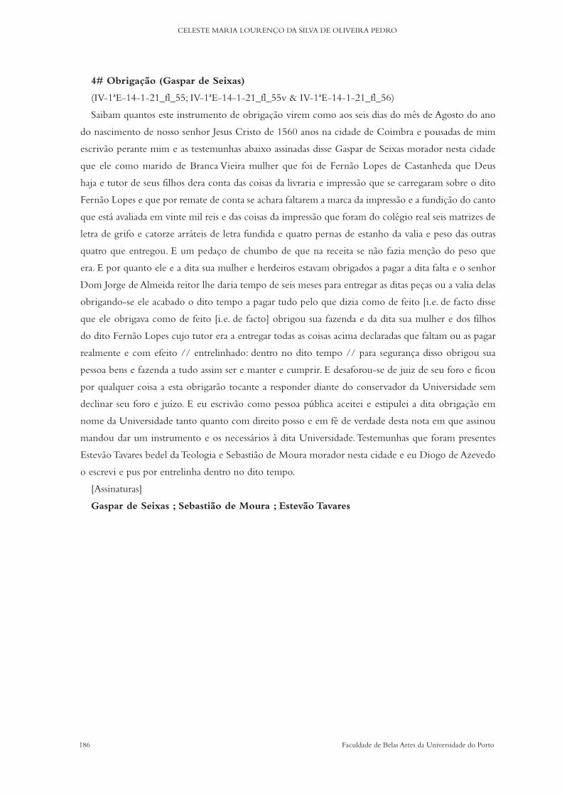
186 Faculdade de Belas Artes da Universidade do Porto
CELESTE MARIA LOURENÇO DA SILVA DE OLIVEIRA PEDRO
4# Obrigação (Gaspar de Seixas)
(IV-1ªE-14-1-21_fl_55; IV-1ªE-14-1-21_fl_55v & IV-1ªE-14-1-21_fl_56)
Saibam quantos este instrumento de obrigaçao virem como aos seis dias do mês de Agosto do ano
do nascimento de nosso senhor Jesus Cristo de 1560 anos na cidade de Coimbra e pousadas de mim
escrivao perante mim e as testemunhas abaixo assinadas disse Gaspar de Seixas morador nesta cidade
que ele como marido de Branca Vieira mulher que foi de Fernao Lopes de Castanheda que Deus
haja e tutor de seus filhos dera conta das coisas da livraria e impressao que se carregaram sobre o dito
Fernao Lopes e que por remate de conta se achara faltarem a marca da impressao e a fundiçao do canto
que está avaliada em vinte mil reis e das coisas da impressao que foram do colégio real seis matrizes de
letra de grifo e catorze arráteis de letra fundida e quatro pernas de estanho da valia e peso das outras
quatro que entregou. E um pedaço de chumbo de que na receita se nao fazia mençao do peso que
era. E por quanto ele e a dita sua mulher e herdeiros estavam obrigados a pagar a dita falta e o senhor
Dom Jorge de Almeida reitor lhe daria tempo de seis meses para entregar as ditas peças ou a valia delas
obrigando-se ele acabado o dito tempo a pagar tudo pelo que dizia como de feito [i.e. de facto disse
que ele obrigava como de feito [i.e. de facto] obrigou sua fazenda e da dita sua mulher e dos filhos
do dito Fernao Lopes cujo tutor era a entregar todas as coisas acima declaradas que faltam ou as pagar
realmente e com efeito // entrelinhado: dentro no dito tempo // para segurança disso obrigou sua
pessoa bens e fazenda a tudo assim ser e manter e cumprir. E desaforou-se de juiz de seu foro e ficou
por qualquer coisa a esta obrigarao tocante a responder diante do conservador da Universidade sem
declinar seu foro e juízo. E eu escrivao como pessoa pública aceitei e estipulei a dita obrigaçao em
nome da Universidade tanto quanto com direito posso e em fé de verdade desta nota em que assinou
mandou dar um instrumento e os necessários à dita Universidade. Testemunhas que foram presentes
Estevao Tavares bedel da Teologia e Sebastiao de Moura morador nesta cidade e eu Diogo de Azevedo
o escrevi e pus por entrelinha dentro no dito tempo.
[Assinaturas]
Gaspar de Seixas ; Sebastião de Moura ; Estevão Tavares

187Faculdade de Belas Artes da Universidade do Porto
SIXTEENTH-CENTURY PRINT CULTURE IN THE KINGDOM OF PORTUGAL
IV-1ªE-14-1-21_fl_55
IV-1ªE-14-1-21_fl_56
IV-1ªE-14-1-21_fl_55v

188 Faculdade de Belas Artes da Universidade do Porto
CELESTE MARIA LOURENÇO DA SILVA DE OLIVEIRA PEDRO
Bibliographic sheet Author:Place of Print:Editor:Printer/s:Publisher:Translator: Corrector:Date of Print:Colophon:Ownership marks:Format:Short Title:List of Contents: PAGE LAYOUT Size/Quire:Signatures:Foliation:Interlinear Glosses:Marginalia:Catchwords:Guide Letters:Text/Language:Woodcuts: Copperplates:Type Style/s: Indentation/Initials:Colour Printing: Editions: Location of Copies: Description of Content:
5#
Alphabet sheet Date of photoshoot: Library: Library Reference: Year of Print:Place of Print:Printer/s: Alphabet Reference:Pages (text range): Alphabet description: Size/Body: x Height:Leading: Columns: Lines of Text:
LETTER FORMS CHECKLIST Minuscule:
a b c d e f g h
i j k l m n o p q r s t u v w x z
Majucule
A B C D E F G H
I J K L M N O P Q R S T U V W X Z
Other characters:
Ligatures: Abbreviations:
Figures:
Ponctuation: Paragraph Marks:
6#
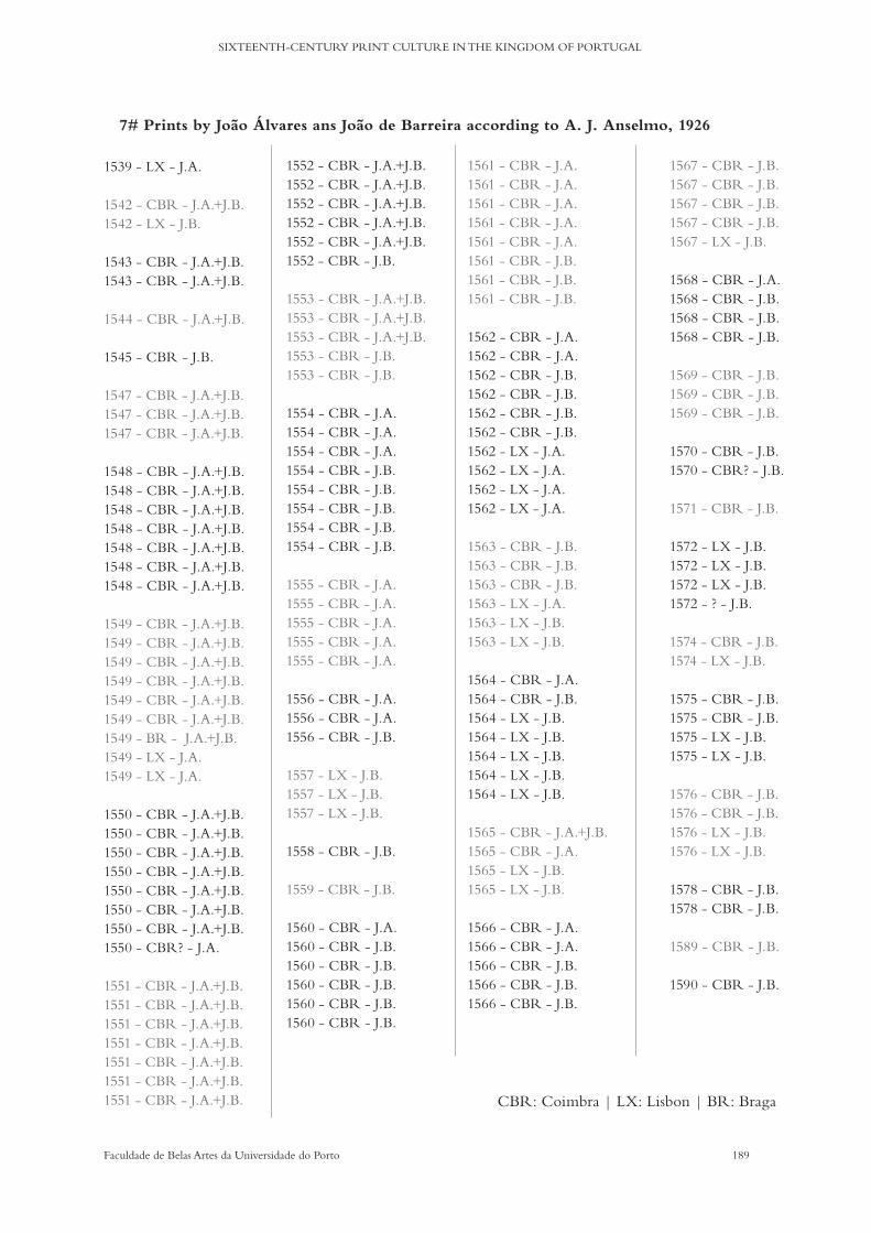
189Faculdade de Belas Artes da Universidade do Porto
SIXTEENTH-CENTURY PRINT CULTURE IN THE KINGDOM OF PORTUGAL
1539 - LX - J.A.
1542 - CBR - J.A.+J.B.1542 - LX - J.B.
1543 - CBR - J.A.+J.B.1543 - CBR - J.A.+J.B.
1544 - CBR - J.A.+J.B.
1545 - CBR - J.B.
1547 - CBR - J.A.+J.B.1547 - CBR - J.A.+J.B.1547 - CBR - J.A.+J.B.
1548 - CBR - J.A.+J.B.1548 - CBR - J.A.+J.B.1548 - CBR - J.A.+J.B.1548 - CBR - J.A.+J.B.1548 - CBR - J.A.+J.B.1548 - CBR - J.A.+J.B.1548 - CBR - J.A.+J.B.
1549 - CBR - J.A.+J.B.1549 - CBR - J.A.+J.B.1549 - CBR - J.A.+J.B.1549 - CBR - J.A.+J.B.1549 - CBR - J.A.+J.B.1549 - CBR - J.A.+J.B.1549 - BR - J.A.+J.B.1549 - LX - J.A.1549 - LX - J.A.
1550 - CBR - J.A.+J.B.1550 - CBR - J.A.+J.B.1550 - CBR - J.A.+J.B.1550 - CBR - J.A.+J.B.1550 - CBR - J.A.+J.B.1550 - CBR - J.A.+J.B.1550 - CBR - J.A.+J.B.1550 - CBR? - J.A.
1551 - CBR - J.A.+J.B.1551 - CBR - J.A.+J.B.1551 - CBR - J.A.+J.B.1551 - CBR - J.A.+J.B.1551 - CBR - J.A.+J.B.1551 - CBR - J.A.+J.B.1551 - CBR - J.A.+J.B.
1552 - CBR - J.A.+J.B.1552 - CBR - J.A.+J.B.1552 - CBR - J.A.+J.B.1552 - CBR - J.A.+J.B.1552 - CBR - J.A.+J.B.1552 - CBR - J.B.
1553 - CBR - J.A.+J.B.1553 - CBR - J.A.+J.B.1553 - CBR - J.A.+J.B.1553 - CBR - J.B.1553 - CBR - J.B.
1554 - CBR - J.A.1554 - CBR - J.A.1554 - CBR - J.A.1554 - CBR - J.B.1554 - CBR - J.B.1554 - CBR - J.B.1554 - CBR - J.B.1554 - CBR - J.B.
1555 - CBR - J.A. 1555 - CBR - J.A. 1555 - CBR - J.A. 1555 - CBR - J.A. 1555 - CBR - J.A.
1556 - CBR - J.A.1556 - CBR - J.A.1556 - CBR - J.B.
1557 - LX - J.B.1557 - LX - J.B.1557 - LX - J.B.
1558 - CBR - J.B.
1559 - CBR - J.B.
1560 - CBR - J.A. 1560 - CBR - J.B. 1560 - CBR - J.B. 1560 - CBR - J.B. 1560 - CBR - J.B. 1560 - CBR - J.B.
1561 - CBR - J.A. 1561 - CBR - J.A. 1561 - CBR - J.A. 1561 - CBR - J.A. 1561 - CBR - J.A. 1561 - CBR - J.B. 1561 - CBR - J.B. 1561 - CBR - J.B.
1562 - CBR - J.A. 1562 - CBR - J.A. 1562 - CBR - J.B. 1562 - CBR - J.B.1562 - CBR - J.B.1562 - CBR - J.B.1562 - LX - J.A. 1562 - LX - J.A. 1562 - LX - J.A. 1562 - LX - J.A.
1563 - CBR - J.B.1563 - CBR - J.B.1563 - CBR - J.B.1563 - LX - J.A.1563 - LX - J.B.1563 - LX - J.B.
1564 - CBR - J.A.1564 - CBR - J.B.1564 - LX - J.B. 1564 - LX - J.B. 1564 - LX - J.B. 1564 - LX - J.B.1564 - LX - J.B.
1565 - CBR - J.A.+J.B.1565 - CBR - J.A.1565 - LX - J.B.1565 - LX - J.B.
1566 - CBR - J.A.1566 - CBR - J.A.1566 - CBR - J.B.1566 - CBR - J.B.1566 - CBR - J.B.
1567 - CBR - J.B.1567 - CBR - J.B.1567 - CBR - J.B.1567 - CBR - J.B. 1567 - LX - J.B.
1568 - CBR - J.A.1568 - CBR - J.B.1568 - CBR - J.B.1568 - CBR - J.B.
1569 - CBR - J.B.1569 - CBR - J.B.1569 - CBR - J.B.
1570 - CBR - J.B.1570 - CBR? - J.B.
1571 - CBR - J.B.
1572 - LX - J.B. 1572 - LX - J.B. 1572 - LX - J.B. 1572 - ? - J.B.
1574 - CBR - J.B.1574 - LX - J.B.
1575 - CBR - J.B.1575 - CBR - J.B.1575 - LX - J.B.1575 - LX - J.B.
1576 - CBR - J.B.1576 - CBR - J.B.1576 - LX - J.B.1576 - LX - J.B.
1578 - CBR - J.B.1578 - CBR - J.B.
1589 - CBR - J.B.
1590 - CBR - J.B.
7# Prints by João Álvares ans João de Barreira according to A. J. Anselmo, 1926
CBR: Coimbra | LX: Lisbon | BR: Braga

190 Faculdade de Belas Artes da Universidade do Porto
CELESTE MARIA LOURENÇO DA SILVA DE OLIVEIRA PEDRO
Impressores Séc. XVI
AFONSO LOPESAFONSO FERNANDESALEXANDRE DE SIQUEIRAANNA PICAYA - viúva de Germao GalhardeANDRÉ DE AVELARANDRÉ DE BURGOS (Sevilha) + Herdeiros + viúvaANDRÉ LOBATO - LobutoANTONIO ALVARESANTÓNIO DE BARREIRAANTÓNIO CARNEIRO - ?ANTÓNIO CRAESBEECK DE MELO (séc. XVII)ANTÓNIO DE SANTILHANA (Santillana)ANTÓNIO GONÇALVES (princeps lusiadas)ANTÓNIO DE MARIZANTÓNIO RIBEIROBALTAZAR RIBEIRO (talvez f ilho de Ant. Ribeiro)BELCHIOR RIBEIRO - ?BELCHIOR RODRIGUESCÓNEGOS DE STA CRUZ (D. Estevao e D. Manuel)CRISTÓVÃO DE BURGOS - f ilho de André de BurgosDIOGO DE GOMES LOURENÇO (Diogo Gomes Loureiro???) genro de Ant. MarizDOMINGOS CARNEIRO (séc. XVII)FELIX TEIXEIRA E AFFONSO DE LUCENAFRANCISCO CORREIA (f icou c/ de Joao Blávio lx e índia)FRANCISCO GARCIAFRUTUOSO PIRESGERMÃO GALHARDEGONÇALO FERNANDESHERMAN DE KEMPIS - hermao de camposJACOB CROMBERGERJERÓNIMO DE MIRANDAJERÓNIMO DE OLEASTROJOÃO ALVARESJOÃO ANTUNES (séc. XVII)JOÃO BELTRÃO DA ROCHAJOÃO DE BARREIRAJOÃO DE BORGO - BorgesJOÃO DE ENDEM - oficinas de joao blávioJOÃO DE RIBEIRA - ?JOÃO BLAVIO DE COLONIAHERDEIROS DE JOÃO BLAVIO DE COLONIAJOÃO FERNANDESJOÃO KEMPISJOÃO LOPES - ?JOÃO PEDRO BONHOMINI de CREMONA - w c/ Valentim FJOÃO QUINQUENNIO DE CAMPANIA - oficinas de joao blávioJORGE ROBRIGUESLOURENÇO DE ANVERS (sec. XVII)LUIS CORREALUIS ROBRIGUES - livreiro-editor (oficina)MANUEL JOÃOMANUEL DE ARAÚJOMANUEL DE LYRA/LIRAMARCOS BORGESMARCOS JORGE - ?MARTIM DE BURGOS - f ilho de André de BurgosNICOLAU GAZINIPEDRO CRAESBEECK - discípulo de Cristóvao Plantino antuérpiaPEDRO (de la) DA ROCHAPEDRO DE MARIZ - f ilho de AntónioPEDRO GONÇALVES ALCOFORADOPERO ALBERTO - obreiroROBERTO REBELORODRIGO ALVARESSIMÃO LOPES tb editorTHOMÉ CARVALHOVALENTIM FERNANDES de Morávia VASCO DIAS TANCO DO FREXENALVICENTE ALVARESVICENTE FERNANDES PERES
Localidades
Lx?Lx / AlcobaçaLx?ÉvoraLxLx / AlcobaçaLx / Cbr
LxCbrLxCbr / Braga / Leiria /Cernache portátilLx / Almeirim / Vila Verde dos Francos portátilLx
LxCbrÉvoraCbr
LxAlmeirim portátilLx / Cbr (colégio real) / Prt / Índia / AlmeirimLxPrtLx / CbrBragaLx / Almeirim / Setúbal portátilLx / Évora / SevilhaLxLxLx / Cbr / BragaCbrBragaLx / Cbr / BragaLxGoaLxLxLxLxLx
LxGoaLxLxLXLxLx / ViseuCbrÉvora /Lx/ BragaLxLx / ViseuÉvoraLxLxBragaCernache portátilBragaLxLxPrtLxCbrLxPrt?Lx
Impressores régios/previlégios
•
• - Cardeal Infante•?Arcebispo Lisboa•? + UC
•• + UC• + arcebispo Lisboa
UC
• - Cardeal Infante
•Arcebispo Braga
•
UC
•? + UC
••
•
•• + Bispo D. Jorge de Ataíde
•
UE
8# Printers in the sixteenth century
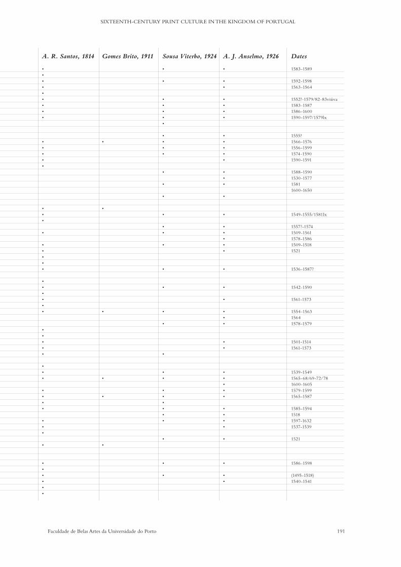
191Faculdade de Belas Artes da Universidade do Porto
SIXTEENTH-CENTURY PRINT CULTURE IN THE KINGDOM OF PORTUGAL
Impressores régios/previlégios
•
• - Cardeal Infante•?Arcebispo Lisboa•? + UC
•• + UC• + arcebispo Lisboa
UC
• - Cardeal Infante
•Arcebispo Braga
•
UC
•? + UC
••
•
•• + Bispo D. Jorge de Ataíde
•
UE
A. R. Santos, 1814
•••••••••
•••••
•••
•
•••••
••••••
•••••
•••
••••
•••
•
••••••
Gomes Brito, 1911
•
•
•
•
•
•
Sousa Viterbo, 1924
•
•
•••••
••••
•
•
•
•
••
•
•
•
•
•
•
••
••••••
•
•
•
A. J. Anselmo, 1926
•
••
••••
•••••
•••
•
•
•••••
•
•
•
•••
••
•••••
••••
•
•
••
Dates
1583-1589
1592-15981563-1564
1552?-1579/82-83viúva1583-15871586-16001590-1597/1579lx
1555?1566-15761556-15991574-15901590-1591
1588-15901530-157715811600-1650
1549-1555/1581lx
1557?-15741509-15611578-15861509-15181521
1536-1587?
1542-1590
1561-1573
1554-156315641578-1579
1501-15141561-1573
1539-15491565-68/69-72/781600-16051579-15991565-1587
1585-159415181597-16321537-1539
1521
1586-1598
(1495-1518)1540-1541
192 Faculdade de Belas Artes da Universidade do Porto
CELESTE MARIA LOURENÇO DA SILVA DE OLIVEIRA PEDRO
BIBLIOGRAPHY

193Faculdade de Belas Artes da Universidade do Porto
SIXTEENTH-CENTURY PRINT CULTURE IN THE KINGDOM OF PORTUGAL
Sources:
Cardoso, Jerónimo. (1551). Dictionarium juventuti studiose admodum frugiferum. Coimbra.
Cardoso, Jerónimo. (1552). Grammaticae introductiones breuiores et lucidiores. Lisboa.
Cardoso, Jerónimo. (1570). Dictionarium latino lusitanicum & vice versa lusitanico latinu[m]. Coimbra.
Cardoso, Jerónimo. (1587). Hieronymi Cardosi Dictionarium iuuentuti studiosae admodu[m] frugiferum. Coimbra.
Studies:
A Universidade de Coimbra e a Europa. (1987). Coimbra: Arquivo da Universidade de Coimbra.
Alaníz, Luz Maria. (2011). Del Arte de imprimir o la Biblia de 42 líneas: aportaciones de un estúdio crítico. Doctoral dissertation. Faculdad de Bellas Artes da Universidad de Barcelona.
Almeida, António. (w/d). A mobilidade do impressor quinhentista português António de Mariz. Porto: Faculdade de Letras da Universidade do Porto. Available at: http://www.cepese.pt/portal/pt/publicacoes/obras/artistas-e-artifices-e-sua-mobilidade-no-mundo-de-expressao-portuguesa/a-mobilidade-do-impressor-quinhentista-portugues-antonio-de-mariz
Almeida, Justino Mendes de. (2002). Jerónimo Cardoso, figura singular do Humanismo Português. Intervençao no Colóquio Internacional Humanismo Latino na Cultura Portuguesa. Porto: Faculdade de Letras da Universidade do Porto.
Alves Dias, Joao José (2014). ‘Os primeiros caracteres chineses impressos no Ocidente, 1570.’ Portugal-China: 500 anos. pp. 77-83. Available at https://unl-pt.academia.edu/JoaoJoséAlvesDias
Alves Dias, Joao José. (2014). ‘Os primeiros caracteres europeus impressos na China, 1588.’ Portugal-China: 500 anos. pp. 84-88.
Alves Dias, Joao José. (1994). Iniciação à Bibliofilia. Lisboa: Pró-Associaçao Portuguesa de Alfarabistas.
Alves Dias, Joao José. (1995). No quinto centenário da Vita Christi: os primeiros impressores alemães em Portugal. Lisboa: Biblioteca Nacional de Portugal.
Anderson, Randall. (2008). ‘The Rhetoric of Paratext in Early Printed Books’, The Cambridge History of the Book in Britain, volume. IV, pp. 636-644. Cambridge University Press.
Anselmo, Antonio Joaquim. (1977). Bibliografia das obras impressas em Portugal no século XVI. Lisboa: Biblioteca Nacional.
Anselmo, António Joaquim and Proença, Raul. (1926). Bibliografia das obras impressas em Portugal no século XVI. Lisboa: Oficinas gráficas da Biblioteca nacional.
194 Faculdade de Belas Artes da Universidade do Porto
CELESTE MARIA LOURENÇO DA SILVA DE OLIVEIRA PEDRO
Anselmo, Artur. (1993). ‘O Livreiro Luís Rodrigues, impressor de textos humanistas’. Actas do Congresso Internacional Humanismo Português na Epoca dos Descobrimentos. pp. 369-372. Coimbra: Faculdade de Letras da Universidade de Coimbra.
Anselmo, Artur. (1997). Estudos de história do livro. Lisboa: Guimaraes Editores.
Anselmo, Artur. (2002). Livros e mentalidades. Lisboa: Guimaraes Editores.
Anselmo, Artur. (2011). ‘Filogia e história do livro’, Cultura, volume. 28, pp. 15-21. Available at https://journals.openedition.org/cultura/105
Aranha, Pedro de Brito. (1898). A imprensa em Portugal nos séculos XV e XVI. Lisboa: Imprensa Nacional.
Bandeira, José Ramos. (1947). ‘Universidade de Coimbra. Tomo II’, Separata de o Boletim da Biblioteca da Universidade de Coimbra, volume XXII. Coimbra.
Bellini, Lígia. (1999). ‘Notas sobre cultura, política e sociedade no mundo português do século XVI’,Tempo, no 4.7, pp. 143-167.
Bigelow, Charles. (1989). ‘On Type Form, Pattern, & Texture in the Typographic Image. Blog entrie: available at http://bigelowandholmes.typepad.com/bigelow-holmes/2015/04/form-pattern-texture-in-the-typographic-image.html
Bringhurst, Robert. (2004). The Solid Form of Language. Kentville: Gaspereau Press.
Bringhurst, Robert. (2005). Elementos do Estilo Tipográfico (versão 3.0). Sao Paulo: Cosac Naify.
Brito, Gomes de. (1911). Notícia de livreiros e impressores em Lisbôa na 2ª metade do século XVI: composta em face de um códice da Camara Municipal desta cidade. Lisboa: Sociedade de Bibliophilos Barbosa Machado.
Buchanan, Richard. (1992). ‘Wicked Problems in Design Thinking’, Design Issues, volume. 8. no. 2. pp. 5-21.
Buescu, Ana Isabel. (1999). ‘Cultura Impressa e Cultura Manuscrita em Portugal na Época Moderna: uma sondagem’, Penélope: revista de história e ciências sociais, no. 21, pp. 11-32.
Butterick, Matthew. (2016). Drowning the Crystal Goblet. Blog entrie: available at http://practicaltypography.com/drowning-the-crystal-goblet.html
Cadafaz de Matos, Manuel. (1993). ‘A Tipografia Quinhentista de Expressao Cultural Portuguesa no Oriente Veículo de Propagaçao dos Ideais Humanísticos’, Humanismo português na época dos descobrimentos : actas/congresso internacional, Coimbra. pp. 153-171. Coimbra: Centro de Estudos Clássicos e Humanísticos.
Cadafaz de Matos, Manuel. (1995). ‘Leitura e Leitores de Cícero em Lisboa e Coimbra ao Tempo de D. Joao III (1534-1543)’, Hvmanitas, volume XLVII, pp. 739-776.
195Faculdade de Belas Artes da Universidade do Porto
SIXTEENTH-CENTURY PRINT CULTURE IN THE KINGDOM OF PORTUGAL
Cardoso, Jerónimo. (2009). Obra Literária. Tomo I. Prosa Latina. Introduction, translation and comments by Telmo Reis. Coimbra: Imprensa da Universidade de Coimbra.
— (2009). Obra Literária. Tomo II. Poesia Latina. Introduction, translation and comments by Telmo Reis. Coimbra: Imprensa da Universidade de Coimbra.
Carroll, Noel. (1999). Philosophy of art. London: Routledge.
Carrol, Noel. (2004). ‘Art and Human Nature’, The journal of Aesthetics and Art Criticism, volume. 62, no. 2.
Carter, Harry. (1969). A View of Early Typography up to About 1600. Oxford: Clarendon Press. [new edition: Carter, Harry and Mosley, James. (2002). A view of early typography up to about 1600. London: Hyphen].
Carvalho, J. M. (1868). Apontamentos para a Historia Contemporânea. Coimbra: Imprensa da Universidade de Coimbra.
Carvalho, J. M. (1922). A Universidade de Coimbra no século XVI. Coimbra: Imprensa da Universidade de Coimbra.
Catt, Isaac E. (2014). ‘The Two Sciences of Communication in Philosophical Context’, The Review of Communication. volume. 14. Issue 3-4 , pp. 201-228. Retrieved from https://www.tandfonline.com/doi/abs/10.1080/15358593.2014.986876
Cerello, Adriana. (2007). O livro nos textos jesuíticos do Século XVI. Edição, produção e circulação de livros nas cartas dos jesuítas na América portuguesa (1549-1563). Faculdade de Filosofia, Letras e Ciências Humanas da Universidade de Sao Paulo.
Corbeto, Albert. (2010). Especímenes tipogáficos españoles: Catalogación y estudio de las muestras de letras impresas hasta el año 1833. Madrid: Calambur.
Correia, Margarida. (2009). Os dicionários portugueses. Lisboa: Editorial Caminho.
Crubelati, Ariele Mazoti. (2013). Educação em Portugal no Século XVI: Criação e reforma do Real Colégio das Artes de Coimbra e a Companhia de Jesus. MA Dissertation. Maringá: Universidade Estatual de Maringá.
Davies, Martin. (2004). ‘Humanism in Script and Print in the Fifteenth Century’,The Cambridge Companion to Renaissance Humanism. pp. 47-62. Cambridge: Cambridge University Press.
Duque, Ana Lúcia. (2012). Arte de escribir: Exemplares de diversas sortes de letras de Manuel Barata (1590/1592). Doctoral dissertation. Universitat Politècnica de Valencia.
Earle, Tom. (2006). ‘Three Portuguese Best-Sellers in Early Modern Oxford and Cambridge, with a finding list’, The Treaty of Windsor (1386) and 620 Years of Anglo-Portuguese Relations. Edited by Teresa Pinto Coelho.
Febvre, Lucien and Martin, Henri-Jean. (2010).The Coming of the Book: The Impact of Printing, 1450-1800. London: Verso.
196 Faculdade de Belas Artes da Universidade do Porto
CELESTE MARIA LOURENÇO DA SILVA DE OLIVEIRA PEDRO
Fernandes, Celina Maria. (2008). As minas de Ervedosa (1906-1969) - Efígie de memória e narrativa. Doctoral dissertation. Universidade Autónoma de Lisboa.
Ferronha, António Luís, Bettencourt, Mariana and Loureiro, Rui. (1993). A fauna exótica dos Descobrimentos. Lisboa: Elo.
Fischer, Steven R.. (2001). A History of Writing. London: Reaktion.
Fonseca, Fernando, et al. (2001). Imprensa da Universidade de Coimbra: Uma história dentro da História. Coimbra: Imprensa da Universidade de Coimbra.
Fonseca, Jorge, Stols, Eddy and Manhaeghe. (2014). Lisboa em 1514. O relato de Jan Taccoen van Zillebeke. Centro de História da Cultura da Universidade Nova de Lisboa. Vila Nova de Famalicao: Edições Húmus.
Folsom, Ed. (2007). ‘Database as Genre: The Epic Transformation of Archives’, PMLA, volume. 122. no 5, October 2007, pp. 1571–1579(9).
Freedman, Jonathan et al.. (2007). ‘Responses to Ed Folsom’s ‘Database as Genre: The Epic Transformation of Archives’. PMLA, volume. 122. no 5, October 2007, pp. 1580–1612(33).
Gama, Angélica. (2011). ‘As Ordenações Manuelinas, a tipografia e os descobrimentos: a construçao de um ideal régio de justiça no governo do Império Ultramarino português’, Navigator: Subsidios para a História Marítima do Brasil. volume. 7. no 13. Diretoria do Patrimônio Histórico e Documentaçao da Marinha.
Garvao, Maria Helena. (2009). O livro de Marco Paulo impresso por Valentim Fernandes. Genealogia textual, leitura tipográfica e aspectos discursivos. Doctoral dissertation. Faculdade de Letras da Universidade de Lisboa.
Gascoigne, Bamber. (2004). How to Identify Prints. A complete guide to manual and mechanical processes from woodcut to inkjet. London: Thames & Hudson.
Gaskell, Philip. (1972). A New Introduction to Bibliography. New York: Oxford University Press.
Gaskell, Philip and Bradford, Patricia. (1972). Hornschuch’s Orthotypographia. Cambridge: University Library.
Gomes, Pinharanda. (2005). Os Conimbricenses. Lisbon: Guimaraes Editores.
Gonçalves, Ana Curralo. (2012). Classificação gráfica e tipográfica das folhas de rosto quinhentistas das obras impressas em Portugal. Doctoral dissertation. Faculdade de Belas Artes da Universidade do Porto.
Gonçalves, José Jorge. (2010). A imprensa em Coimbra no séc. XVII. Faculdade de Ciências Sociais e Humanas da Universidade Nova de Lisboa.
Hackerott, Maria. (2004). ‘Divergências entre os dicionários portugueses do século XVI ao início do século XX’, Historiografia da Lingüística Brasileira. pp. 147-163. Centro de Documentaçao em Historiografia da Lingüística.

197Faculdade de Belas Artes da Universidade do Porto
SIXTEENTH-CENTURY PRINT CULTURE IN THE KINGDOM OF PORTUGAL
Hauser, Arnold and Mendes, Berta. (w/d). História social da arte e da cultura. Lisboa: Vega e Estante.
Haebler, Konrad. (1897). The Early Printers of Spain and Portugal. London: Printed for the Bibliographical Society at the Chiswick Press.
Hochuli, Jost and Kinross, Robin. (2007). Designing Books. London: Hyphen Press.
Hochuli, Jost. (2009). Detail in Typography. A concise yet rich discussion of the small things that enhance the legibility of texts. London: Hyphen Press.
Humblé, Philippe. (2004). Dicionários e ensino de línguas. Universidade Federal de Santa Catarina. Retrieved from https://www.academia.edu/387232/Dicion%C3%A1rios_E_Ensino_De_L%C3%ADnguas
Iriarte, A. (2001). ‘A Palavra como Unidade Lexicográfica?’, Actas do XVI Encontro Nacional da Associação Portuguesa de Linguística (Coimbra, 2000). pp. 459-468. Available at RepositoriUM: http://hdl.handle.net/1822/3315
Jaca, Carlos, and Freitas, Jorge. (2007). Linhas gerais sobre a História da Universidade conimbricense. Das suas origens à Reforma Universitária Pombalina de 1772. Lisboa
Jüsten, Helga Maria. (2009). Incunábulos e Post-Incunábulos Portugueses (ca. 1488-1518). (Em redor do Material Tipográfico dos Impressos Portugueses). Lisboa: Centro de Estudos Históricos, Universidade Nova de Lisboa.
Kraye, Jill. (1996). The Cambridge Companion to Renaissance Humanism. Cambridge: Cambridge University Press.
Kurz. Stephan. (2011). ‘There’s More to It Already. Typography and Literature Studies: A Critique of Nina Nørgaard’s ‘The semiotics of typography in literary texts’ (2009)’. Orbis Litterarum. volume 66. Issue5. Available at https://doi.org/10.1111/j.1600-0730.2011.01028.x
Legge, G. E., & Bigelow, C. A. (2011). ‘Does Print Size Matter for Reading? A review of findings from vision science and typography’, Journal of Vision, 11(5):8, pp. 1–22. Available at http://jov.arvojournals.org/article.aspx?articleid=2191906
Lines, David. (2013). ‘Gabriele Paleotti and the University of Bologna: Documents from Bologna’s Archivio Arcivescovile’, Bologna. Cultural Crossroads from the Medieval to the Baroque: Recent Anglo-American Scholarship. Edited by Anselmi, Gian, Benedictis, Angela de and Nicholas Terpstra. Bologna: Bononia University Press.
Lopes, António Tavares. (2015). Novas ecologias do controlo bibliográfico: uma perspetiva sobre os futuros da informação bibliográfica nos meios digitais. Imprensa da Universidade de Coimbra.
Lopes, Marília. (2012). ‘Ao serviço do Império: a mobilizaçao de estrangeiros na corte joanina e manuelina’, Pequena nobreza nos impérios ibéricos de Antigo Regime, coord. Miguel Jasmins Rodrigues, Lisboa: IICT.
Loxley, Simon. (2006). Type. The Secret History of Letters. London: I.B. Tauris.

198 Faculdade de Belas Artes da Universidade do Porto
CELESTE MARIA LOURENÇO DA SILVA DE OLIVEIRA PEDRO
Luna, Paul. (2004). ‘Not Just a Pretty Face: the contribution of typography to lexicography’, 11th EURALEX International Congress, 6-10 July 2014, pp. 847-858. Retrieved from http://centaur. reading.ac.uk/21116
Machado, José Barbosa. (w/d). Press and Translation as a Changing Factor in the 15th Century Portuguese Language and Culture. Retrieved from https://www.researchgate.net/profile/Jose_Machado27
Margarido, Alfredo. (1994). As Surpresas da Flora no Tempo dos Descobrimentos. Lisboa: Elo.
Marques, A.H. Oliveira. (2002). Três fases na história da censura em Portugal. Intervençao no Colóquio Internacional Humanismo Latino na Cultura Portuguesa. Porto: Faculdade de Letras da Universidade do Porto.
Marques, Claudia, et al.. (2014). ‘As Faces do Design de Tipos: análise dos recursos tipográficos utilizados na produçao de livros do século XVI’, Proceedings of the 6th Information Design International Conference, 5th InfoDesign, 6th CONGIC. Organised by Coutinho, Solange G., et al Blucher Design Proceedings. volume. 1. no 2. Sao Paulo: Blucher.
Marques, Joao. (2010). ‘O livro religioso, em particular do âmbito da parenética e hagiologia, nos impressos do século XVI da Biblioteca Pública do Porto’. Revista da Faculdade de letras – HISTÓRIA – III, volume. II. pp. 293-303.
Marques José. (2003). ‘A Universidade de Salamanca e o Norte de Portugal, nos séculos XV-XVII’, Península. Revista de Estudos Ibéricos, no 0. pp. 87-105.
Martins, José V. de Pina. (1988). Incunábulos na Biblioteca Nacional. Lisboa: Biblioteca Nacional.
Massarella, Derek. (2012). Japanese Travellers in Sixteenth-Century Europe. A Dialogue Concerning the Mission of the Japanese Ambassadors to the Roman Curia (1590). Translated by J. F. Moran. Hakluyt Society, Series III, no 25. Farnham: Ashgate.
Meirinhos, José. (2006). ‘Editores, livros e leitores em Portugal no século XVI. A Colecçao de impressos Portugueses da BPMP’. Tipografia Portuguesa do séc. XVI nas colecções da BPMP. Catálogo. pp. 17-52.
Meirinhos, José. (2001). ‘A tipografia de Santa Cruz, 1530-1563’. Santa Cruz de Coimbra. A cultura portuguesa aberta à Europa na ldade Media. Catálogo. pp. 317-327.
Melo, Arnaldo Faria de Ataíde. (1926). O papel como elemento de identificação. Lisboa: Publicações da Biblioteca Nacional. (Offprint n. 17 e 18, 19 e 20, 21, 22 e 23 of Anais das Bibliotecas e Arquivos).
Merrilees, Brian. (1996). The Shape of the Medieval Dictionary Entry. Toronto: CHWP.
McKitterick, David. (2001). A History of Cambridge University Press. Volume one: Printing and the Book Trade in Cambridge, 1534 - 1698. Cambridge: Cambridge University Press.
McKitterick, David. (2006). Print, Manuscript, and the Search for Order, 1450-1830. Cambridge: Cambridge University Press.
199Faculdade de Belas Artes da Universidade do Porto
SIXTEENTH-CENTURY PRINT CULTURE IN THE KINGDOM OF PORTUGAL
Montesi, Michela. (2009). ‘Aproximación al documento textual desde la perspectiva de los estudios sobre el discurso’, Revista Española de Documentación Científica, 32, 4, octubre-diciembre, pp. 92-105.
Moreira de Sá, A.. (1983). Jerónimo Cardoso e os mestres da Universidade de Lisboa em 1536. Coimbra: Imprensa da Universidade de Coimbra.
Morison, Stanley and McKitterick, David John. (2009). Selected essays on the history of letter-forms in manuscript and print. Cambridge: Cambridge University Press.
Moura, Mário. (2011). O Big Book: Uma arqueologia do autor no design gráfico. Doctoral Dissertation. Faculdade de Belas Artes da Universidade do Porto.
Myers, Robin and Harris, Michael. (1998). Spreading the Word. Winchester, Hampshire: St. Paul’s Bibliographies.
Nemésio, Maria. (w/d). Índices de livros proibidos no século XVI em Portugal: à procura da “Literatura”. Universidade do Porto: CITCEM.
Noordzij, Gerrit. (2000). Letterletter. Point Roberts, WA: Hartley & Marks.
Noordzij, Gerrit. (2009). The Stroke: theory of writing. London: Hyphen.
NØrgaard, Nina. (2009). ‘The Semiotics of Typography in Literary Texts: A multimodal approach’. In Orbis Litterarum 64:2. pp. 141-160.
Noronha, Tito. (1874). A imprensa portugueza durante o século XVI. Porto: Imprensa Portuguesa.
Norton, F. J and Rojas, Fernando de. (2010). Printing in Spain, 1501-1520. Cambridge: Cambridge University Press.
Osório, José. (1976). Crítica e humanismo no Renascimento. Associaçao Portuguesa de Estudos Clássicos.
Piel, Joseph-Maria. (1989). ‘Origem e estruturaçao histórica do léxico português’. Estudos de Linguística Histórica Galego-Portuguesa. Lisbon: IN-CM. pp. 9-16.
Pacheco, José. (1988). A divina arte negra e o livro português: séculos XV e XVI. Lisbon: Vega.
Pacheco, José. (2013). As artes gráficas e imprensa em Portugal (séculos XV-XIX), volume I: Primeira parte (1487-1732). A arte das artes. Lisboa: Instituto Superior Manuel Teixeira Gomes - Portimao. (rare edition - not available at the time of thesis submission)
Plager, Federico. (2007). ‘Los dicionarios. Origen y producción’, Anales de la educación común. Educación y lenguajes. no. 6. pp. 126-131.
Pflughaupt, Laurent. (2007). Letter by Letter. New York: Princeton Architectural Press.

200 Faculdade de Belas Artes da Universidade do Porto
CELESTE MARIA LOURENÇO DA SILVA DE OLIVEIRA PEDRO
Ramalho, Américo da Costa. (1981). Alguns aspectos da vida universitária em Coimbra em meados do século XVI (1548 – 1554). Conferência na Associaçao Portuguesa de Estudos Clássicos. Coimbra. Available at https://digitalis.uc.pt/pt-pt/node/106201?hdl=29209
Reed, Talbot. (2010). A History of the Old English Letter Foundries. New York: Cambridge University Press.
Reis, Telmo. (2009). Jerónimo Cardoso e o humor dos humanistas. In JoLIE 2:2. Available at www.uab.ro/jolie/2009_2/8_corujo_reis_telmo.pdf
Reis, Telmo. (2013). ‘O acervo bibliográfico de Jerónimo Cardoso na Biblioteca Pública Municipal do Porto’, Humanismo, Diáspora e Ciência (séculos XVI e XVII): estudos, catálogo, exposição. Porto. Biblioteca Pública Municipal do Porto.
Roberts, William. (1893). Printer’s Marks. London [u.a.]: Bell.
Robinson, Andrew. (2009). Writing and Script. Oxford: Oxford University Press.
Rodrigues, Teresa. (w/d). ‘Portugal nos séculos XVI e XVII. Vicissitudes da dinâmica demográfica’. População e prospectiva - working papers. Centro de Estudos da Populaçao, Economia e Sociedade. Available at http://www.cepese.pt/portal/pt/publicacoes/colecoes/working-papers/populacao-e-prospectiva/portugal-nos-seculos-xvi-e-xvii.-vicissitudes-da-dinamica-demografica
Rodrigues, José Albertino. (1970). ‘Ecologia urbana de Lisboa na segunda metade do século XVI’. Análise Social, no 29, pp. 96-115.
Rodrigues, António Simões. (2007). História de Portugal em datas. Lisbon: Temas e Debates.
Rossum, M.C.W. (1998). Measuring Font Legibility. Available at from http://homepages.inf.ed.ac.uk/mvanross/reprints/legibility.pdf
Sacks, David. (2004). Letter Perfect. New York: Broadway Books.
Sampaio, Albino Forjaz. (1932). A tipografia portuguesa no século XVI. Lisboa: Emprêsa Nacional de Publicidade.
Santos, António Ribeiro dos. (1814). ‘Memória para a história da typografia portugueza do seculo XVI’. Memórias de literatura. volume. 8. Lisboa: Academia Real das Ciências.
Santos, Maria José Azevedo. (2000). Ler e compreender a escrita na Idade Média. Lisboa: Edições Colibri.
Serafini, Fran and Clausen, Jennifer. (2012). ‘Typography as Semiotic Resource’. Journal of Visual Literacy. volume. 31. no 2. pp. 22–38.
Serrao, Joaquim Veríssimo. (2001). História de Portugal. volume 3. Lisboa: Verbo.
Serrao, José. (1996). ‘Populaçao e rede urbana nos séculos XVI-XVIII’, História dos municípios e do poder local (dos finais da Idade Média à União Europeia). pp. 63-77. Lisboa: Círculo de Leitores.
201Faculdade de Belas Artes da Universidade do Porto
SIXTEENTH-CENTURY PRINT CULTURE IN THE KINGDOM OF PORTUGAL
Simões, Maria Alzira Proença. (1990). Catálogo dos impressos de tipografia portuguesa do século XVI a colecção da Biblioteca Nacional. Lisboa: Biblioteca Nacional.
Smeijers, Fred. (2011). Counterpunch: making type in the sixteenth-century, designing typefaces now. London: Hyphen Press.
Sousa, Lucinda Maria. (2013). Abrir o Livro (antigo): do Curriculum Vitae comentado ao Catálogo da Tipografia Portuguesa do Século XVI nas Colecções da Biblioteca Pública Municipal do Porto.Universidade Autónoma de Lisboa.
Thomson, Mark. (2004). Microtypography, Designing the New Collins Dictionaries. Talk at AtypI, Prague, September 2004. Available at https://www.typotheque.com/articles/microtypography_designing_the_new_collins_dictionaries
Twyman, Michael. (1998). The British Library Guide to Printing: history and techniques. London: The British Library.
Unna Buen, Jorge. (2003). A New Typometry. Lecture at ATypI International conference: Vancouver.
Undorf, Wolfgang. (2011). From Gutenberg to Luther: transnational print cultures in scandinavia 1450-1525. Doctoral Dissertation. Humboldt-Universität.
Updike, Daniel. (1922). Printing Types: their history, forms, and use. Cambridge: Harvard University Press.
Van Leeuwen, Theo. (2006). ‘Towards a Semiotics of Typography’, Information Design Journal, 14:2. pp. 139-155.
Vasconcelos, António de. (1991). O Arquivo da Universidade. Coimbra: Arquivo da Universidade de Coimbra.
Verdelho, Telmo. (1995). As origens da gramaticografia e da lexicografia latino-portuguesas. Aveiro: Instituto Nacional de Investigaçao Científica.
Verdelho, Telmo. (2003). Dicionários: testemunhos de memória linguística. Universidade de Aveiro.Available at http://ler.letras.up.pt/uploads/ficheiros/6300.pdf
Verdelho, Telmo dos Santos and Silvestre, Joao Paulo. (2007). Dicionarística portuguesa. Aveiro: Universidade de Aveiro.
Vervliet, Hendrik D. L. (2008). The Palaeotypography of the French Renaissance. Leiden: Brill.
Vilela, A. (1978). Cartilha de artes gráficas. Braga: STGRAMINHO.
Viñals, Oriol Moret. (2006). El mitjà tipogràfic. Doutororal Dissertation. Universitat de Barcelona. Departament de Disseny i Imatge.
Viterbo, Sousa. (1924). O movimento tipográfico em Portugal no século XVI. Coimbra Imprensa da Universidade.


THIS DISSERTATION
Typeface: Bembo
Printed in: Porto, Portugal
Designed by: Celeste Pedro