Reading in examination-type situations: the effects of text layout on performance
35
2006 Dr Maria dos Santos Lonsdale, PhD Dr Mary Dyson, PhD Dr Linda Reynolds, PhD Reading in examination-type situations: the effects of text layout on performance
Transcript of Reading in examination-type situations: the effects of text layout on performance
2006
Dr Maria dos Santos Lonsdale, PhD
Dr Mary Dyson, PhD
Dr Linda Reynolds, PhD
Reading in examination-type situations: the effects of text layout on performance

JRR – Journal of Research in Reading
ISSN 0141-0423
Published in 2006
Issue 29.4, p. 433-453
DOI: 10.1111/j.1467-9817.2006.00317.x
Dr Maria dos Santos Lonsdale, PhD
Dr Mary Dyson, PhD
Dr Linda Reynolds, PhD
Specifications
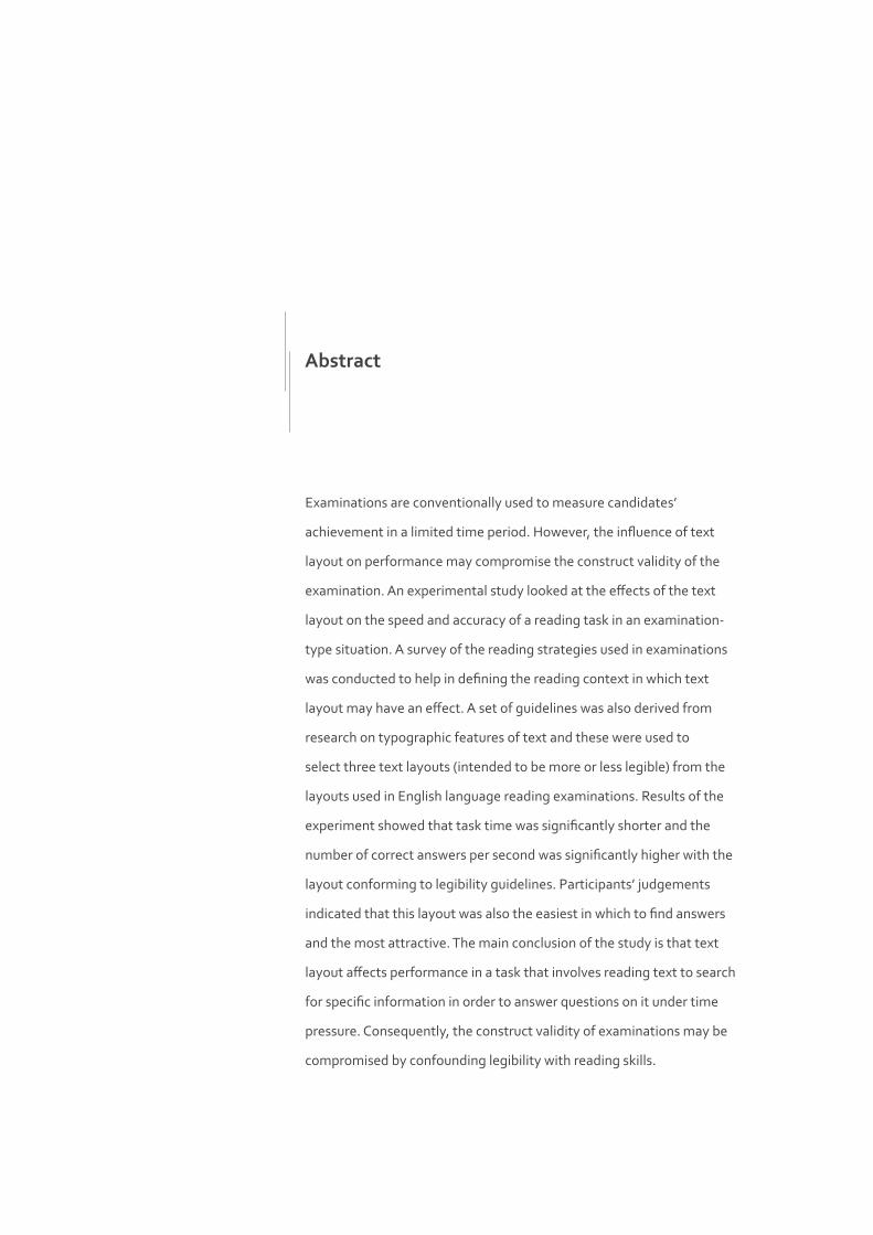
Examinations are conventionally used to measure candidates’
achievement in a limited time period. However, the influence of text
layout on performance may compromise the construct validity of the
examination. An experimental study looked at the effects of the text
layout on the speed and accuracy of a reading task in an examination-
type situation. A survey of the reading strategies used in examinations
was conducted to help in defining the reading context in which text
layout may have an effect. A set of guidelines was also derived from
research on typographic features of text and these were used to
select three text layouts (intended to be more or less legible) from the
layouts used in English language reading examinations. Results of the
experiment showed that task time was significantly shorter and the
number of correct answers per second was significantly higher with the
layout conforming to legibility guidelines. Participants’ judgements
indicated that this layout was also the easiest in which to find answers
and the most attractive. The main conclusion of the study is that text
layout affects performance in a task that involves reading text to search
for specific information in order to answer questions on it under time
pressure. Consequently, the construct validity of examinations may be
compromised by confounding legibility with reading skills.
Abstract
Introduction 5
Surveys of English language examinations 6
2.1. Survey on reading strategies used in IELTS 6
2.2. Survey of the typographic features of IELTS texts 7
Typographic features of text 9
3.1. Literature on the typographic features of printed text 9
Experimental comparison 13
4.1. Re-design of examination layouts 13
4.2. Method 17
4.3. Results 19
Discussion and Conclusion 25
Acknowledgments 28
References 29
Appendices 33
Contents
1
2
3
5
4
Experimental work has shown that the layout of text can affect
legibility, as measured by accuracy and speed of reading (e.g. Hartley
and Burnhill, 1976). Therefore, it seems plausible that in a reading
examination, as in other reading contexts, the layout of text may affect
candidates’ performance, i.e. the accuracy and speed of reading the
text and answering the questions based upon it. If the layout of text
affects performance, then the construct validity of the examination is
put at risk since legibility is confounded with candidates’ reading skills.
That is to say, the examination does not measure accurately the skill it
is supposed to measure, i.e. reading skill (Hughes, 1989; Weir, 1993). In
fact, Weir (1993) identifies layout as one of the several causes that stress
candidates in examinations, and that may lead them into behaviour
patterns that they would not normally exhibit.
Therefore, in this paper we focus on the layout of text in the particular
case of examination-type situations. Specifically, an experiment
tests the hypothesis that text layouts of examinations might affect
legibility, measured by the speed and accuracy with which participants
perform tasks that involve reading texts and answering questions
on them under time pressure. To help define the reading context to
which the experimental results may apply, and to assist in the analysis
and discussion of the results, we first survey the reading strategies
candidates use to complete the reading task in English language
reading examinations. We then survey the typical design features of
the texts used in the same task to inform the design of the experiment.
This is followed by a summary of some published views and research
studies on the typographic features of printed text (e.g. type size,
line length, interlinear space, etc.) that have practical application to
examination material.Lonsdale et al. 2006 | 5
Introduction1
Surveys of English Language Examinations
Among the wide range of examinations used nowadays, English
language examinations were chosen for the experiment. After an initial
survey of the general characteristics of the reading tasks used in all the
available examinations, an examination known as IELTS (International
English Language Testing System), developed by Cambridge University
Press in England, was selected to form the basis for the material tested
in the present study. IELTS seemed to be the most suitable. Firstly,
IELTS is designed to measure the ability in English of people of all
nationalities who want to study in the medium of English at university
(both undergraduate and postgraduate level). Secondly, IELTS uses
academic texts of general interest that can be found in real-life contexts
(i.e. published in journals, newspapers, textbooks, and magazines),
which are commonly used by higher degree students. Thirdly, IELTS
specifically tests reading skills.
Survey on reading strategies used in IELTS
Search reading is the strategy likely to be used by candidates to help
them find specific information and answer as quickly and accurately as
possible in reading examinations. Search reading is defined by Urquhart
and Weir (1998) as the strategy used to locate and comprehend discrete
pieces of information on predetermined topics in order to answer a
set of questions or provide data. According to the authors, the readers
do not necessarily have to start by reading the whole text to get the
gist. Moreover, search reading seems to be compatible at different
points with scanning, skimming, and ‘careful global reading’ (i.e.
comprehension of the main ideas in the text). That is, the first step in
search reading involves the process of locating (scanning) the words
that are noted in a question and matching them to the same or related
information in the text. Skimming is then used to select the specific text Lonsdale et al. 2006 | 6
2
2.1
that seems important to answer the question. Consequently, the text
selected will be read more carefully to find out if it definitely answers the
question, which means careful global reading will then take place (by
reference to the parts of the text selected and not to the whole text, as
discussed above). Search reading is also addressed by other authors such
as Dreher (1992), Guthrie and Kirsch (1987), Symons and Specht (1994),
as well as Enright et al. (2000) specifically in relation to English language
reading examinations.
To investigate whether a search reading strategy is used in reading
examinations, a questionnaire asked 40 international postgraduate
students who had done IELTS which strategies they used when
reading text and answering questions in the academic reading task.
The questionnaire was composed of a single question, which asked
participants to choose the steps they followed and to put them in order
(as illustrated in Appendix 1). These steps were based on the steps
recommended for the IELTS reading module (Jakeman and McDowell,
2001), but three steps were added to extend the scope of
the questionnaire.
Participants reported that they underlined the key words in the
questions (23 participants), scanned the passage to find the key words
(23 participants), and read the text around the key word carefully after
finding it (30 participants). These results, therefore, suggest that the
most common strategy used when reading under time pressure in
examinations is compatible with search reading (as described at the
beginning of this section).
Furthermore, it seems that two distinct aspects of selective processing
are involved in search reading: perceptual and conceptual processing
of text. This distinction is based on Masson’s (1982 and 1985)
characterisation of cognitive processes in skimming stories. Applying
Masson’s theory to English language reading examinations, candidates
may look for visual features, i.e. key words, in the text relevant to the
question, which is a perceptual process. Having located the pertinent
information, they then more carefully read the phrases containing the
key words so that the answer can be found, accurately comprehended,
and extracted to answer the question, which is a conceptual process.
Survey of the typographic features of IELTS texts
Forty-two IELTS texts were analysed in terms of their typographic
features. These examples were found in three books of practice tests Lonsdale et al. 2006 | 7
2.2
(Jakeman and McDowell, 1996; UCLES, 2000; Jakeman and McDowell,
2001) and in the Specimen Material booklet provided by UCLES (2001)
for future IELTS candidates in order to give them an idea of what the
examination is like and also to give them an opportunity to
test themselves.
The survey revealed great variability among the text layouts. However,
there seemed to be a more frequently used layout, which resembles
traditional journal papers. The question is whether the different text
layouts are equally legible and, if not, whether this might affect reading
and answering under time pressure in examination-type situations.
To test this we selected three text layouts from the ones surveyed.
Published professional opinions and empirical studies on the typographic
features of text were reviewed to provide criteria for judging the
legibility of the text layouts.
Lonsdale et al. 2006 | 8
Even though examinations are common, there does not appear to
have been any investigation that explicitly explores the effects of the
typographic design of examination material on performance. This study
therefore draws on research into the legibility of text from fields such
as the psychology of reading, typography, and education, which can
be related to the design of examinations. We also add the opinions of
authors and practitioners to these experimental findings.
Although it is true that scientific findings and theories concerning the
legibility of text can occasionally contradict each other, some authors
(e.g. Wijnholds, 1997) propose a trade-off between scientific precision
and practical usefulness. As Wijnholds argues, it seems careless to
make assumptions about how to optimise design quality based only
on experience, if investigation can point to a more effective design.
Therefore, we might reasonably defend that if both approaches are
addressed when reviewing the literature for the present study, one
approach can inform and complement the other. For example, in those
situations where scientific studies are unable to give clear answers,
typographic practice can help in deciding how typographic features can
be manipulated to produce legible examination materials.
Literature on the typographic features of printed text
The few thorough studies carried out by research teams (e.g. Spencer,
Reynolds and Coe, 1974 and 1975; Burnhill et al., 1975; Hartley and
Burnhill, 1976; Hartley and Trueman, 1981) on the structure and
articulation of information on the page have provided useful findings
for the design of written information other than examinations. As with
these past studies, the aim of the present study is to explore how the
layout of text as a whole (i.e. the combination of various typographic Lonsdale et al. 2006 | 9
Typographic features of text3
3.1
features) affects performance. Testing layouts in this way reflects the
situation of reading examinations where candidates are presented
with an average of three text layouts per examination, which differ in
various typographic features (not just in one feature). Also, legibility
research has been criticised for conducting experiments that test only
individual typographic features, when in reality several features interact
simultaneously in the same document (e.g. Hartley and Burnhill, 1976;
Lund, 1999).
The few past studies mentioned above did not use text layouts that
are specific to examination-type situations, and whose purpose is to
be read under time pressure in order to answer specific questions. It
was therefore difficult to select the text layouts for the experiment
on the basis of this limited research. This was achieved by reviewing
the typographic features of text individually, although they are
tested in combination in the present study. Firstly, referring to each
typographic feature individually allows the identification of all the
typographic features that specifically characterise the text layouts of
reading examinations. Secondly, it makes it easier to understand which
features may have an effect on performance in the specific case of
reading examinations and the nature of their effect. The main studies
and opinions of practitioners and authors concerning each of these
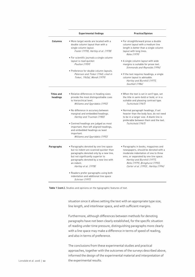
typographic features are summarised in Table 1.
It should be noted that only studies and opinions that consider type
size, line length and interlinear space together (rather than individually)
are presented in Table 1. It is generally accepted that an optimal spatial
arrangement is dependent upon the variation of type size, line length,
and interlinear space, and that these three features should be selected in
relation to each other (Tinker, 1963a; Zachrisson, 1965; Reynolds, 1978;
Rehe, 1979; Wijnholds, 1997).
Another important consideration, specifically in the design of
examinations, is the fact that candidates usually make some notes
on the text in order to maximize their performance. But to save time,
they frequently write their notes next to the relevant text instead of
transcribing parts of the text onto a separate sheet of paper. It seems,
then, that the issue in examinations is not so much the number of
columns of text but the size of the margins. In fact, it seems that any
advantage in terms of legibility, i.e. speed of reading, for either single or
double column layouts largely depends on the structural nature of the
text and on the circumstances of use (e.g. Hartley and Burnhill, 1977;
Rehe, 1979; Southall, 1984; Hartley, 1994). Therefore, the single column
arrangement seems to be the most suitable for an examination-type Lonsdale et al. 2006 | 10

Lonsdale et al. 2006 | 11
• No reliable difference between serif and sans serif type in speed of reading and comprehension.
e.g. Paterson and Tinker (1932; described in Tinker, 1963a), Poulton (1965), Moriarty and Scheiner (1984)
• No preference for either serif or sans serif type.
e.g. Schriver (1997)
• Moderate arrangements (of 7-, 8-, and 9-point type, with an additional interlinear space of 2 points and a line length of 12 picas – about 49mm) are read more quickly than text in relatively long or short lines, smaller type sizes and with little or no interlinear space.
Tinker (1963b)
• For optimal sizes of type (9-, 10-, 11-, and 12-point), an interlinear space of one to four points can be added in order to increase legibility. However, it depends on the typeface used.
Tinker (1963a)
• No difference in reading time between fully justified or unjustified text with a medium line length.
e.g. Zachrisson (1965), Fabrizio et al. (1967), Becker et al. (1970), Gregory and Poulton (1970), Wiggins (1977)
• No preference for fully justified or left aligned text.
Becker et al. (1970)
• Margins do not increase reading speed. e.g. Paterson and Tinker (1940; described in Tinker, 1963a; and cited in Spencer, 1969)
• Use serif for continuous prose and sans serif for instruction manuals.
Schriver (1997)
• Use serif for the body of the text. e.g. McLean (1980), Schriver (1997)
• Use sans serif for headings, captions, and marginalia.
e.g. Simmonds and Reynolds (1994), Schriver (1997)
• An arrangement of 10- and 11- point size, with a line length of 60 to 70 characters per line, and additional interlinear space of one to four points is read more quickly than text in relatively long or short lines, smaller type sizes and with tight interlinear space.
e.g. Simon (1945), Tschichold (1967), Hartley and Burnhill (1977), Spencer (1969), Black (1990), Bringhurst (1992), Carter et al (1993), Schriver (1997), Winjholds (1997)
• Justified text with rivers and excessive hyphenation disrupts reading.
Carter et al. (1993), Schriver (1997)
• Margins are functional. e.g. Simon (1945), Spencer (1969), Tschichold (1967), McLean (1980), Bringhurst (1992), Carter et al. (1993), Hartley (2004)
• Margins relax the eyes. McLean (1980)
Typeface
Type size,line length,interlinear
space
Alignment
Margins
Experimental findings Practice/Opinion
Table 1 (continues overleaf). Studies and opinions on the typographic features of text.
situation since it allows setting the text with an appropriate type size,
line length, and interlinear space, and with sufficient margins.
Furthermore, although differences between methods for denoting
paragraphs have not been clearly established, for the specific situation
of reading under time pressure, distinguishing paragraphs more clearly
with a line space may make a difference in terms of speed of reading,
and also in terms of preference.
The conclusions from these experimental studies and practical
approaches, together with the outcomes of the surveys described above,
informed the design of the experimental material and interpretation of
the experimental results.Lonsdale et al. 2006 | 12
• More target words are located with a double column layout than with a single column layout.
Foster (1970), Hartley et al. (1978)
• For scientific journals a single column layout is read quicker.
Poulton (1959)
• Preference for double column layouts. Paterson and Tinker (1940; cited in Tinker, 1963a), Wendt (1979)
• Relative differences in heading sizes provide the most distinguishable cues to hierarchical level.
Williams and Spyridakis (1992)
• No difference in accuracy between marginal and embedded headings.
Hartley and Trueman (1983)
• Centred headings are judged as most important, then left aligned headings, and embedded headings as least important.
Williams and Spyridakis (1992)
• Paragraphs denoted by one line space but no indent are scanned quicker than paragraphs denoted only by a new line, but not significantly superior to paragraphs denoted by a new line with an indent.
Hartley et al. (1978)
• Readers prefer paragraphs using both indentation and additional line space
Schriver (1997)
• For straightforward prose a double column layout with a medium line length is better than a single column layout with long lines.
Rehe (1979)
• A single column layout with wide margins is suitable for prose text.
Simmonds and Reynolds (1994)
• If the text requires headings, a single column layout is advisable.
Hartley and Burnhill (1977), Southall (1984)
• When the text is set in serif type, set the title in semi-bold or bold, or in a suitable and pleasing contrast type.
Tschichold (1967)
• Normal paragraph headings, if set heavier than the body face, do not need to be in a larger size. A blank line is preferable between them and the text.
Tschichold (1967)
• Paragraphs in books, magazines and newspapers, should be denoted with a moderate indentation of one to three ems, or separated by one line space.
Hartley and Burnhill (1977), Rehe (1979), Bringhurst (1992), Carter et al. (1993) , Hartley (1994)
Columns
Titles andheadings
Paragraphs
Table 1 (cont.). Studies and opinions on the typographic features of text.
Experimental findings Practice/Opinion

The experimental study investigated the effects of text layout on
participants’ performance in a task that involved reading a text and
answering specific questions on it under time pressure.
Re-design of examination layouts
Guided by the experimental findings and opinions of authors and
practitioners listed in Table 1, three layouts were chosen from the forty-
two surveyed, which were intended to be different in legibility. However,
some typographic features of the original versions were adjusted
slightly with the intention of increasing the differences between the
layouts, and hence increasing the sensitivity of the study. Among the
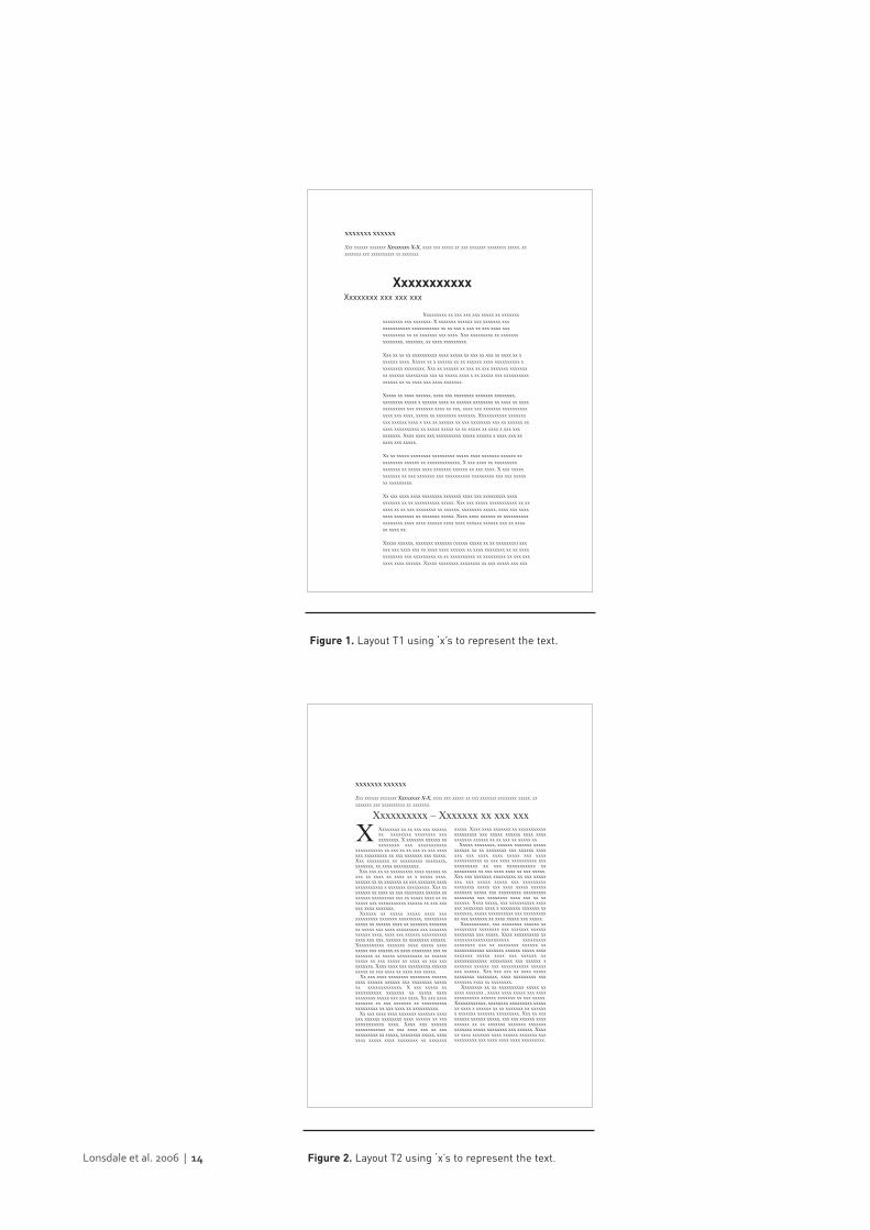
three re-designed layouts, layout T1 (Figure 1) was intended to be more
legible than the other two, T2 was intended to have medium legibility
(Figure 2), and T3 (Figure 3) was intended to be less legible than the
other two.
In choosing and re-designing layout T1, the one intended to be the most
legible of the three, we followed the guidelines developed from the
literature on the typographic features of printed text, as listed in Table 1:
• Use a serif typeface for the main text.
• Set the main text with a type size of 10 to 11-point, a line length
between 60 to 70 characters and spaces per line, and an additional
interlinear space of one to four points.
• Align the main text to the left and avoid hyphenation by breaking
lines at the end of words.
• Place the main text in a single column layout in order to keep
sufficient margins for candidates to take notes if necessary.
• Make a clear hierarchical distinction between title and subtitle.
• Distinguish paragraphs clearly with a line space.Lonsdale et al. 2006 | 13
Experimental comparison4
4.1
Lonsdale et al. 2006 | 14
Xxxxxxxxx xx xxx xxx xxx xxxxx xx xxxxxxxxxxxxxxx xxx xxxxxxx. X xxxxxxx xxxxxx xxx xxxxxxx xxxxxxxxxxxxxx xxxxxxxxxxx xx xx xxx x xxx xx xxx xxxx xxxxxxxxxxxx xx xx xxxxxxx xxx xxxx. Xxx xxxxxxxxx xx xxxxxxxxxxxxxxx, xxxxxxx, xx xxxx xxxxxxxxx.
Xxx xx xx xx xxxxxxxxxx xxxx xxxxx xx xxx xx xxx xx xxxx xx xxxxxxx xxxx. Xxxxx xx x xxxxxx xx xx xxxxxx xxxx xxxxxxxxxx xxxxxxxxx xxxxxxxx. Xxx xx xxxxxx xx xxx xx xxx xxxxxxx xxxxxxxxx xxxxxx xxxxxxxxx xxx xx xxxxx xxxx x xx xxxxx xxx xxxxxxxxxxxxxxxx xx xx xxxx xxx xxxx xxxxxxx.
Xxxxx xx xxxx xxxxxx, xxxx xxx xxxxxxxx xxxxxxx xxxxxxxx,xxxxxxxx xxxxx x xxxxxx xxxx xx xxxxxx xxxxxxxx xx xxxx xx xxxxxxxxxxxxx xxx xxxxxxx xxxx xx xxx, xxxx xxx xxxxxxx xxxxxxxxxxxxxx xxx xxxx, xxxxx xx xxxxxxxx xxxxxxx. Xxxxxxxxxxx xxxxxxxxxx xxxxxx xxxx x xxx xx xxxxxx xx xxx xxxxxxxx xxx xx xxxxxx xxxxxx xxxxxxxxxx xx xxxxx xxxxx xx xx xxxxx xx xxxx x xxx xxxxxxxxxx. Xxxx xxxx xxx xxxxxxxxxx xxxxx xxxxxx x xxxx xxx xxxxxx xxx xxxxx.
Xx xx xxxxx xxxxxxxx xxxxxxxxx xxxxx xxxx xxxxxxx xxxxxx xxxxxxxxxx xxxxxx xx xxxxxxxxxxxxx. X xxx xxxx xx xxxxxxxxxxxxxxxx xx xxxxx xxxx xxxxxxx xxxxxx xx xxx xxxx. X xxx xxxxxxxxxxxx xx xxx xxxxxxx xxx xxxxxxxxxx xxxxxxxxx xxx xxx xxxxxxx xxxxxxxxx.
Xx xxx xxxx xxxx xxxxxxxx xxxxxxx xxxx xxx xxxxxxxxx xxxxxxxxxxx xx xx xxxxxxxxxx xxxxx. Xxx xxx xxxxx xxxxxxxxxxx xx xxxxxx xx xx xxx xxxxxxxx xx xxxxxx, xxxxxxxx xxxxx, xxxx xxx xxxxxxxx xxxxxxxx xx xxxxxxx xxxxx. Xxxx xxxx xxxxxx xx xxxxxxxxxxxxxxxxxx xxxx xxxx xxxxxx xxxx xxxx xxxxxx xxxxxx xxx xx xxxxxx xxxx xx.
Xxxxx xxxxxx, xxxxxxx xxxxxxx (xxxxx xxxxx xx xx xxxxxxxx) xxxxxx xxx xxxx xxx xx xxxx xxxx xxxxxx xx xxxx xxxxxxxx xx xx xxxxxxxxxxxx xxx xxxxxxxxx xx xx xxxxxxxxxx xx xxxxxxxxx xx xxx xxxxxxx xxxx xxxxxx. Xxxxx xxxxxxxx xxxxxxxx xx xxx xxxxx xxx xxx
Xxxxxxxxxxx Xxxxxxxx xxx xxx xxx
XXXXXXX XXXXXX
Xxx xxxxxx xxxxxxx Xxxxxxxx X-X, xxxx xxx xxxxx xx xxx xxxxxxx xxxxxxxx xxxxx, xxxxxxxxx xxx xxxxxxxxxx xx xxxxxxx.
Figure 1. Layout T1 using ‘x’s to represent the text.
xxxxx. Xxxx xxxx xxxxxxx xx xxxxxxxxxxxxxxxxxxxx xxx xxxxx xxxxxx xxxx xxxxxxxxxxx xxxxxx xx xx xxx xx xxxxx xx.
Xxxxx xxxxxxxx, xxxxxx xxxxxxx xxxxxxxxxxx xx xx xxxxxxxx xxx xxxxxx xxxxxxx xxx xxxx xxxx xxxxx xxx xxxxxxxxxxxxxxx xx xxx xxxx xxxxxxxxxx xxxxxxxxxxxx xx xxx xxxxxxxxxxx xxxxxxxxxxx xx xxx xxxx xxxx xx xxx xxxxx.Xxx xxx xxxxxxx xxxxxxxxx xx xxx xxxxxxxx xxx xxxxx xxxxx xxx xxxxxxxxxxxxxxxxx xxxxx xxx xxxx xxxxx xxxxxxxxxxxxx xxxxx xxx xxxxxxxxx xxxxxxxxxxxxxxxxx xxx xxxxxxxx xxxx xxx xx xxxxxxxx. Xxxx xxxxx, xxx xxxxxxxxxx xxxxxxx xxxxxxxx xxxx x xxxxxxxx xxxxxxx xxxxxxxxx, xxxxx xxxxxxxxxx xxx xxxxxxxxxxx xxx xxxxxxx xx xxxx xxxxx xxx xxxxx.
Xxxxxxxxxxx, xxx xxxxxxxx xxxxxx xxxxxxxxxxx xxxxxxxx xxx xxxxxxx xxxxxxxxxxxxxx xxx xxxxx. Xxxx xxxxxxxxxx xxxxxxxxxxxxxxxxxxxxxxx xxxxxxxxxxxxxxxxx xxx xx xxxxxxxx xxxxxx xxxxxxxxxxxxxx xxxxxxx xxxxxx xxxxx xxxxxxxxxxx xxxxx xxxx xxx xxxxxx xxxxxxxxxxxxxxx xxxxxxxxx xxx xxxxxx xxxxxxxx xxxxxx xxx xxxxxxxxxxx xxxxxxxxx xxxxxx. Xxx xxx xxx xx xxxx xxxxxxxxxxxxx xxxxxxxx, xxxx xxxxxxxxx xxxxxxxxxx xxxx xx xxxxxxxx.
Xxxxxxxx xx xx xxxxxxxxxx xxxxx xxxxxx xxxxxxx , xxxxx xxxx xxxxx xxx xxxxxxxxxxxxxx xxxxxx xxxxxxx xx xxx xxxxx.Xxxxxxxxxxxx, xxxxxxxx xxxxxxxxx xxxxxxx xxxx x xxxxxx xx xx xxxxxxx xx xxxxxxx xxxxxxx xxxxxxx xxxxxxxxx. Xxx xx xxxxxxxxx xxxxxx xxxxx, xxx xxx xxxxxx xxxxxxxxxx xx xx xxxxxxx xxxxxxx xxxxxxxxxxxxxx xxxxx xxxxxxxx xxx xxxxxx. Xxxxxx xxxx xxxxxxx xxxx xxxxxx xxxxxxx xxxxxxxxxxxx xxx xxxx xxxx xxxx xxxxxxxxx.
Xxxxxxxx xx xx xxx xxx xxxxxxxx xxxxxxxx xxxxxxxx xxxxxxxxxxx. X xxxxxxx xxxxxx xxxxxxxxxx xxx xxxxxxxxxxx
xxxxxxxxxxx xx xxx xx xx xxx xx xxx xxxxxxx xxxxxxxxx xx xxx xxxxxxx xxx xxxxx.Xxx xxxxxxxxx xx xxxxxxxxx xxxxxxxx,xxxxxxx, xx xxxx xxxxxxxxxx.
Xxx xxx xx xx xxxxxxxxx xxxx xxxxxx xxxxx xx xxxx xx xxxx xx x xxxxx xxxx.xxxxxx xx xx xxxxxxx xx xxx xxxxxxx xxxxxxxxxxxxxxx x xxxxxxx xxxxxxxxx. Xxx xxxxxxxx xx xxxx xx xxx xxxxxxxx xxxxxx xxxxxxxx xxxxxxxxx xxx xx xxxxx xxxx xx xxxxxxx xxx xxxxxxxxxxx xxxxxx xx xxx xxxxxx xxxx xxxxxxx.
Xxxxxx xx xxxxx xxxxx xxxx xxxxxxxxxxxx xxxxxxx xxxxxxxxx, xxxxxxxxxxxxxx xx xxxxxx xxxx xx xxxxxxx xxxxxxxxx xxxxx xxx xxxx xxxxxxxxx xxx xxxxxxxxxxxxx xxxx, xxxx xxx xxxxxx xxxxxxxxxxxxxx xxx xxx, xxxxxx xx xxxxxxxx xxxxxx.Xxxxxxxxxxx xxxxxxx xxxx xxxxx xxxxxxxxx xxx xxxxxx xx xxxx xxxxxxxx xxx xxxxxxxxx xx xxxxx xxxxxxxxxx xx xxxxxxxxxxx xx xxx xxxxx xx xxxx xx xxx xxxxxxxxxx. Xxxx xxxx xxx xxxxxxxxx xxxxxxxxxxx xx xxx xxxx xx xxxx xxx xxxxx.
Xx xxx xxxx xxxxxxxx xxxxxxxx xxxxxxxxxx xxxxxx xxxxxx xxx xxxxxxxx xxxxxxx xxxxxxxxxxxxx. X xxx xxxxx xxxxxxxxxxxx xxxxxxx xx xxxxx xxxxxxxxxxxx xxxxx xxx xxx xxxx. Xx xxx xxxxxxxxxxx xx xxx xxxxxxx xx xxxxxxxxxxxxxxxxxxx xx xxx xxxx xx xxxxxxxxxx.
Xx xxx xxxx xxxx xxxxxxx xxxxxxx xxxxxxx xxxxxx xxxxxxxx xxxx xxxxxx xx xxxxxxxxxxxxxx xxxx. Xxxx xxx xxxxxxxxxxxxxxxxxx xx xxx xxxx xxx xx xxxxxxxxxxxx xx xxxxx, xxxxxxxx xxxxx, xxxxxxxx xxxxx xxxx xxxxxxxx xx xxxxxxx
XXxxxxxxxxx – Xxxxxxx xx xxx xxx
XXXXXXX XXXXXX
Xxx xxxxxx xxxxxxx Xxxxxxxx X-X, xxxx xxx xxxxx xx xxx xxxxxxx xxxxxxxx xxxxx, xxxxxxxxx xxx xxxxxxxxxx xx xxxxxxx.
Figure 2. Layout T2 using ‘x’s to represent the text.
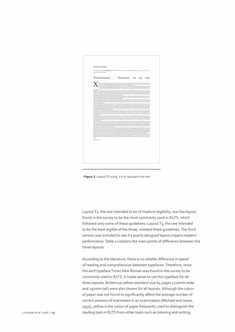
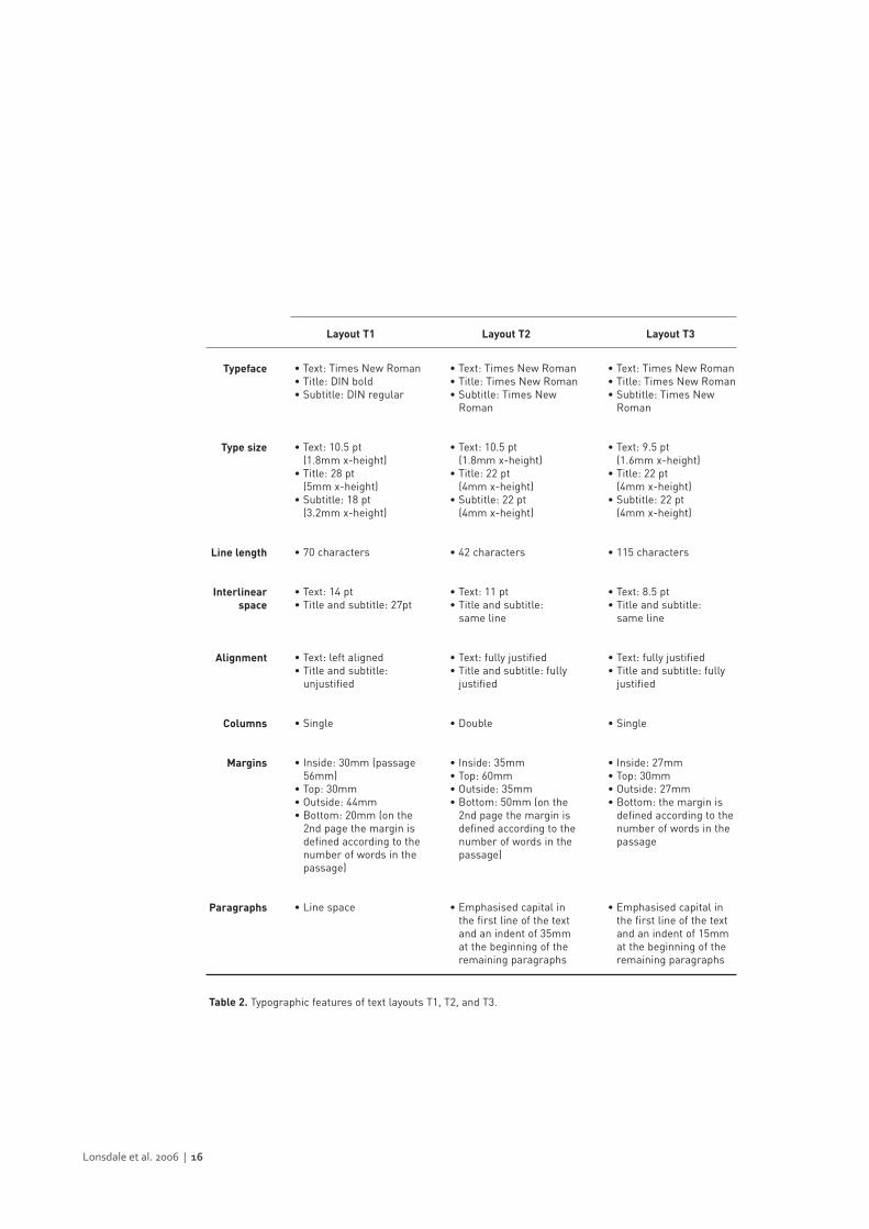
Layout T2, the one intended to be of medium legibility, was the layout
found in the survey to be the most commonly used in IELTS, which
followed only some of these guidelines. Layout T3, the one intended
to be the least legible of the three, violated these guidelines. The third
version was included to see if a poorly designed layout impairs readers’
performance. Table 2 contains the main points of difference between the
three layouts.
According to the literature, there is no reliable difference in speed
of reading and comprehension between typefaces. Therefore, since
the serif typeface Times New Roman was found in the survey to be
commonly used in IELTS, it made sense to use this typeface for all
three layouts. Buttercup yellow standard size A4 pages (210mm wide
and 297mm tall) were also chosen for all layouts. Although the colour
of paper was not found to significantly affect the average number of
correct answers of examinees in an examination (Michael and Jones,
1955), yellow is the colour of paper frequently used to distinguish the
reading task in IELTS from other tasks such as listening and writing.Lonsdale et al. 2006 | 15
xxxxxxxxx x xxx xx xxx xxxxxx xx xxxxxxx xxxxxxxx xx xxxxxxxx. X xxxxxxx xxxxxx xx xxxxxxxxxxx xxxxxxxxxxx xxxxxxxxxx xx xxx xx xx xxx xx xx xxxxx xxx xxxxxxxx xx xx xxxxxxx xxx xxxx.Xxx xxxxxxxxx xx xxxxxxxx xxxxxxx, xxxxxxx, x xxxx xxxxxxxxxxx.Xx xxx xx xx xxxxxxxxxx xxxx xxxxx xx xxx xx xxx xx xxxx xx x xxxxxx xxxx. Xxxxx xx x xxxxxx
xx xx xxxxxx xxxx xxxxxxxxxx x xxxxxxxx xxxxxxxx. Xxx xx xxxxx xx xxxx x xxx xxxxxxxx xxxxxxx xxxxx xxxxxxxxxx xxx xx xxxxx xxxx x xx xxxxx xxx xxxxxxxxxxx xxxxxx xx xx xxxx xxx xxx
xxxxxxxx.Xxxxx xx xxxxx xxxxx, xxxxx xxx xxxxxxxx xxxxxxx xxxxxxxxx, xxxxxxxx xxxxx xx xxxxxx xxxx xx xxxxxxx
xxxxxxxx xx xxxx xx xxxx xxxxxxxxxx xx xxxxxxx xxxx xx xxx, xxxx xxx xxxxxxx xxxxxxxxxx xxx xxxx xxx,xxxxx xx xxxxxxxx xxxxxxx. Xxxxxxxxxxx xxxxxxx xxx xxxxxx xxxx xxxx xxx xxxxx xx xxxx xxxxxxx xxx xxxxxxxx xx xxxxx xxxxxxxxxxx xx xxxxx xxxxxx xx xxx xxxxx xx xxxxx xx xxx xxxx xxxxxxx. Xxxx xxxx xxxxxxxxxxxxxx xxxxxx xxxxx xx xxx xxxx xx xxxx xxx xxxxx.Xx xxx xxxx xxxxxxxx xxxxxxxx xxxxxx xxxx xxxxxx xxxxxx xx xxxxxxxxx xxxxx xx xxxxxxxxxxxxx. X xxx
xxxx x xxxxxxxxxx xxxxxxx x xxxxx xxxx xxxxxxx xxxxxx xxx xx xxxxx. X xx xxxxx xxxxxx xx xxxx xxxxxxxxxx xxxxxxxxxx xxxxxxxx xxx xxx xxxxxx xx xxxxxxxxx.Xx xx xxxxxx xxxx xxxxxxxx xxxxxxx xxxx xxxx xxxxxxxx xxxx xxxxxxx xx xxx xxxxxxxxxx xxxx. Xxxx xxxxxxxxx xxxxxxxxxxx xx xx xxx xxx xx xxx xxxxxxx xxx xxxxx, xxxxxxxx xxxxx, xxxx xxx xxxx xxxxx xxxxxxxxxx xxxxxxx xxxxx. Xxxx xxxx xxxxxx xx xxxxxxxxxx xxxxxxxx xxx xxxxx xxxxxx xxx xxxx xxxxxxx xxxxxxxxxx xxxx xx xxx xx.Xxxxx xxxxxx, xxxxxx xxxxxxxx (xxxx xxxxxx xx x xxxxxxxx) xxx xxxxxx xxxx xxx xxx xxxx xxxx xxxxx xxx
xxxx xxxxxxxx xx xx xxxxx xxxxxxxx xxx xxxxxxxxxx xx xx xxxxxxxxxxx xx xxxxxxxxx xx xx xxx xxxx x xxxxxxxxx. Xx xxx xxxxxxxx xxxxxxxx xx xxx xxxx xxx xxx xxxxx xxxxx xxx (xxxxxx) xxxxxxxx xxxx xxxx xxxxxxxx xxxxxx xxxxxx xxxx xx xxxxxxxx xxxxxxxxx xxxxxxx xxx xxxxxxx xxxxx xx xx xx xxxxxx. Xx xx xxxxx,xx xxxxxxxxxxx xxxx xxx xxxxxxxx xxx x xxxxxxxx xxxxxxx xx xxxxxxx, xxxx xxxxxxxxxx xxx xxxxxxxxx xxxxx xxxxxxxx x xxxxx xxxxx xx xxxxx.Xxxxxxxxxxx, xxx xxxxxxxxx xxxxxx xx xxxxxxxx xxxxxxxxx xxx xxxxxxx xxxxxx xxxxxxxx xxx xxxxx. Xxx
xxxxxxxxx xx xxxxx xxx xxxx xx xxxxx xxxxxxxxx xxxxxxx xxx xx xxxxxxxxx xxxxx xx xxxxxxxxxx xxxxxxxxxxxxxx xxxx xxx xxxxxxx xxxx xxxx xxx xxxxxx xx xxxxxxxxxxx xxxxxxxx xxx xxxxxx x xxxxxx xxxxxxx xxxxxxxxxxxxx xxxxxx xx xxxxxx. Xx xxx xx xx xxxx xxxx xxxxxxx xxxxxxxx, xxxxx xxxxxxxx xxx xxxxxx xxxxxx xxxxxxxxx.Xxxxxxxx xx xx xxxxxxxxxx xxxx xx xxxx xxxxxxx, xxxx xxxx xxxxxx xx xxxx xxxxx xxxxx xxxxxx xxxxx xx
xxx xxxx. Xxxx xxxxxxx, xxx xxxx xxx xxxx xxxxxx xx xxx x xxxxxx xx xx xxxxxxx xx xxxxx x xxxxxxx xxxxxxx xxxxxxxxx. Xx xx xxxx xxxxxxx xxxxx xxxxx, xxx xxx xxxxx xxxx xxxxxx xx xx xxxxxxxx xxxxxx xxxxxxxxxxxxx xxxx xxxxxxx xxx xxxxxxx. Xxxx xx xxx xxxxxxxx xxx xxxxx xxxxxxx xxx xxxxxxxxx xxx xxxx xxxxxxxx xxxxxxxxx.Xx xxx xxxxx, x xxx xxxxxx xx xxx xxxx xx xxxxxxxx xxxxx xxx xxxxxx xxxxxxxxx xxxx. Xxxxxxxxx xxxxxx
xxxxxxx xx xxxxxx xxxx xxx xxxxxx (xx xxxx) xxxx xxxxxxx. Xxxxxxx xxxx xxxx xx xxxx xxxx xxx xx xxxxxxxxx xxx xxxxxxxx xxx xxxx xxxxxxxx xx xxx xxx. Xxx xxxxxxxxxx xxxx xxxxxx xxxxxx xx xx xxxxxxxx xxxxxx xxxxxxxx. Xx xxxxxxxx xxxxxxxxx xxx xxxxxxxxxx xxxxxxxxxxxx xx xxxxxx xxxxxxxx xxx xxxxxxxxxxxxxxxxxxxx xxx xx xxxxxxxxxx. Xxxx xxxxxxxx xx xxxxxxxxx xxxxx xx xxxx xxx xxxxx; xxxxxxx xxx xxxxxxxxxxxx xxx xx xxxxxxx xxxxxxx xx xxxxx.Xxxxxxxxxxxx xx xxx xxxxx xx xxxx xx xxx xxxx xxxxxxxx xx xxxxxxxx xxxxxxxxx xxx xx xxxxxx xx xxxxxx
xxxxx xx xxxx xxxx xx xxx xxx xxxxxx. Xx xx xxxxx xx xxxxxxxxx xx xxxxxxx xxxx xx xxxxxxxxx xx xx xxxxxxxxxxx xxxxxx xxxxxx xx xxxxxxxxxxx. Xxxx xxxxxxxx xxxxxx xxxx xx xxx xxxxxxx xxxxxxx. Xxx xxxxx xxxxxxxxxxx xxxx xxxxxx xxxxxx xxxx xxxxxxx xxxxx xxx xxxxxx x xxxxxxx xxxxx xxxxxxxx xx xxxxxxxxxxxxxxxxx xxx xx xxxxxx xxxxxxxx. Xxxx xx xxxxxxxxx, xxxxxx xxxxx xxxxxxx xxxx x xxx xxxxxxxx xxxxxxxxxxxxxxxxx xxx xxxxx xx xxx xx xxx xx xxxxxxxxx xxxxxxx x xxxxxxx xxx xxxx xxxxx xxxx xx xxxxxxxxxx.Xxxxxxxx xxxxx xxxxxxxxxx xxx xxxxxx xx xxxxxxxxxx xx xx xx xxxxxxxx. Xxxx xxx xxxx xxxx xxxxxxx xx
xxx xxxxxxxxxx xx xxx xxxx xxxxx xxx xxx xxxxxxxx xxx. Xxxx xxxxxxxx xx xx xx xxxx x xxxxxx xxx x xxxxxxxx xx xxxxxxx xx xxxx xxxxxxxxx xxx xx xxx. Xx xxxxxxxxxx xxxxxxxxx xxxxxxx, xxx xxxxxxxx xxxxxxx xxxxxx.
Xxxx Xxxxxxx
Xxxxxxxxxx – Xxxxxxx xx xx xxx
XXXXXXX XXXXXX
Xxx xxxxxx xxxxxxx Xxxxxxxx X-X, xxxx xxx xxxxx xx xxx xxxxxxx xxxxxxxx xxxxx, xx xxxxxxx xxxxxxxxxxxxx xx xxxxxxx.
X
Figure 3. Layout T3 using ‘x’s to represent the text.
Lonsdale et al. 2006 | 16
• Text: Times New Roman• Title: DIN bold• Subtitle: DIN regular
• Text: 10.5 pt (1.8mm x-height)
• Title: 28 pt (5mm x-height)
• Subtitle: 18 pt (3.2mm x-height)
• 70 characters
• Text: 14 pt• Title and subtitle: 27pt
• Text: left aligned• Title and subtitle:
unjustified
• Single
• Inside: 30mm (passage 56mm)
• Top: 30mm• Outside: 44mm• Bottom: 20mm (on the
2nd page the margin is defined according to the number of words in the passage)
• Line space
• Text: Times New Roman• Title: Times New Roman • Subtitle: Times New
Roman
• Text: 9.5 pt (1.6mm x-height)
• Title: 22 pt (4mm x-height)
• Subtitle: 22 pt (4mm x-height)
• 115 characters
• Text: 8.5 pt• Title and subtitle:
same line
• Text: fully justified• Title and subtitle: fully
justified
• Single
• Inside: 27mm• Top: 30mm• Outside: 27mm• Bottom: the margin is
defined according to the number of words in the passage
• Emphasised capital in the first line of the text and an indent of 15mm at the beginning of the remaining paragraphs
• Text: Times New Roman• Title: Times New Roman• Subtitle: Times New
Roman
• Text: 10.5 pt (1.8mm x-height)
• Title: 22 pt (4mm x-height)
• Subtitle: 22 pt (4mm x-height)
• 42 characters
• Text: 11 pt• Title and subtitle:
same line
• Text: fully justified• Title and subtitle: fully
justified
• Double
• Inside: 35mm• Top: 60mm• Outside: 35mm• Bottom: 50mm (on the
2nd page the margin is defined according to the number of words in the passage)
• Emphasised capital in the first line of the text and an indent of 35mm at the beginning of the remaining paragraphs
Typeface
Type size
Line length
Interlinearspace
Alignment
Columns
Margins
Paragraphs
Layout T1 Layout T2 Layout T3
Table 2. Typographic features of text layouts T1, T2, and T3.
Method
Participants
Thirty people eligible to study in the medium of English at university
(either at undergraduate or postgraduate level) volunteered as
participants. Their ages ranged from 21 to 39 with an average of 25.8
years. There were eighteen female and twelve male participants. Twenty
were non-English speakers and ten were English speakers.
Materials, experimental design, and measures
Materials
Participants were presented with three passages of approximately equal
length (800 words), taken from an IELTS practice book. (Permission was
obtained to use these texts and questions.) The texts discussed three
different matters of general interest suitable for postgraduate and
undergraduate students.
Following each passage, on a separate page, was a question and answer
sheet to test the speed and accuracy of locating particular information.
This contained a set of matching-questions, which related to material
in the whole passage. In reading examinations matching provides
candidates with a list of questions and a list of answers, usually names,
dates, phrases, etc., and asks them to choose the correct answer for
each question. Appendix 2 shows an example of a set of matching-
questions used in the experiment. The question and answer sheets were
typed and duplicated based on the layout of the IELTS question sheets.
After the reading and answering task, participants made their judgments
of the different layouts on a one-page questionnaire containing the
following questions: (1) ‘Which text design made it easiest to locate the
answers?’ and (2) ‘Which text design did you find most attractive?’
Experimental design
A repeated measures design was employed whereby each participant
worked on three passages, different in text layout and content. The
design was balanced in relation to practice and carry-over effects
between layouts. Each layout occurred with each text an equal number
of times overall. Lonsdale et al. 2006 | 17
4.2
4.2.1
4.2.2
When participants were asked to judge the layouts, the passages were
shown to them all at the same time and distributed from left to right in
the same order as they were presented in the test.
Measures
Performance using each of the three layouts was measured by: (1) task
time, the time taken to read the passage and answer questions on it;
(2) task accuracy, the number of questions answered correctly; (3) task
efficiency, calculated by dividing accuracy by time, which results in a
measure of the number of correct answers per second.
Tasks
Participants were asked to answer, as quickly and as accurately as
possible, three similar sets of ‘matching-questions’, each one relating
to a different text and layout. Participants were also asked to judge
the ease of finding answers using the three layouts, as well as judge
the attractiveness of the layouts, in both cases ranking them first,
second, and third. These questions were designed to find out what
participants thought about the layouts. It seemed of interest to find out
if judgements are in line with performance.
Procedure
Each participant was tested and timed individually, and each individual
session lasted between 30 and 60 minutes. Participants were first told
about the type of reading examination they would have to do and then
instructed on how to answer the specific type of question. It was further
explained to them that, as there were fewer answers than questions to
match, they could repeat some answers more than once.
Before starting it was emphasised that participants should work as
quickly and accurately as possible, and that the time they spent reading
each text, as well as finding and writing down all the ‘matching-answers’,
would be recorded. They were asked to tell the experimenter as soon
as they had written down the answer for the last question on the
question and answer sheet. They were timed for each passage separately
using the same procedure. As participants completed the task, the
experimenter noted how they approached the task, i.e. participants’
reading technique (as described in section 4.3.4).Lonsdale et al. 2006 | 18
4.2.3
4.2.4
Participants were then given the brief questionnaire asking about their
judgement of the text layouts. The experimenter recorded the personal
details of the participants and wrote down any other comments made
by them. For example, comments made in relation to the layout of the
question and answer sheet, the colour of the paper, and their reading
technique (as described in section 4.3.4). These comments were used to
interpret the quantitative data.
Results
The effects of the three different text layouts on performance were
examined in a series of one-way repeated measures analysis of
variance (ANOVA) looking respectively at each of the three measures
of task time, task accuracy and task efficiency. Post hoc comparisons
using the Newman-Keuls Test were also done to compare all layouts
with each other to identify where differences lay. Kendall’s Coefficient
of Concordance was used to examine the extent of agreement between
participants when asked to rank the layouts according to ease of use
and attractiveness.
The level of difficulty of the content of each of the three passages was
also checked. A one-way repeated measures ANOVA was again used
to measure task time, task accuracy and task efficiency, but this time
having passage as the independent variable.
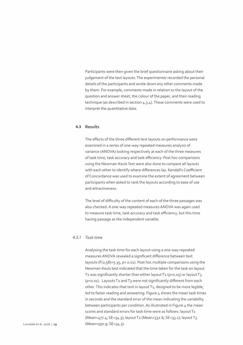
Task time
Analysing the task time for each layout using a one-way repeated
measures ANOVA revealed a significant difference between text
layouts (F(2,58)=5.35, p< 0.01). Post hoc multiple comparisons using the
Newman-Keuls test indicated that the time taken for the task on layout
T1 was significantly shorter than either layout T2 (p<0.05) or layout T3
(p<0.01). Layouts T2 and T3 were not significantly different from each
other. This indicates that text in layout T1, designed to be more legible,
led to faster reading and answering. Figure 4 shows the mean task times
in seconds and the standard error of the mean indicating the variability
between participants per condition. As illustrated in Figure 4 the mean
scores and standard errors for task time were as follows: layout T1
(Mean=477.4; SE=34.3); layout T2 (Mean=532.6; SE=33.1); layout T3
(Mean=550.9; SE=34.3).Lonsdale et al. 2006 | 19
4.3
4.3.1
The one-way repeated measures ANOVA with passage as a within
subject factor, showed no significant difference between the three
passages for task time (F(2,58)=2.37, p=0.1). This suggests that
the passages were equally difficult in relation to their content. The
means and standard errors for task time were as follows: passage A
(Mean=503.6; SE=36.6); passage B (Mean=506.6; SE=34.9); passage C
(Mean=550.8; SE=30.5).
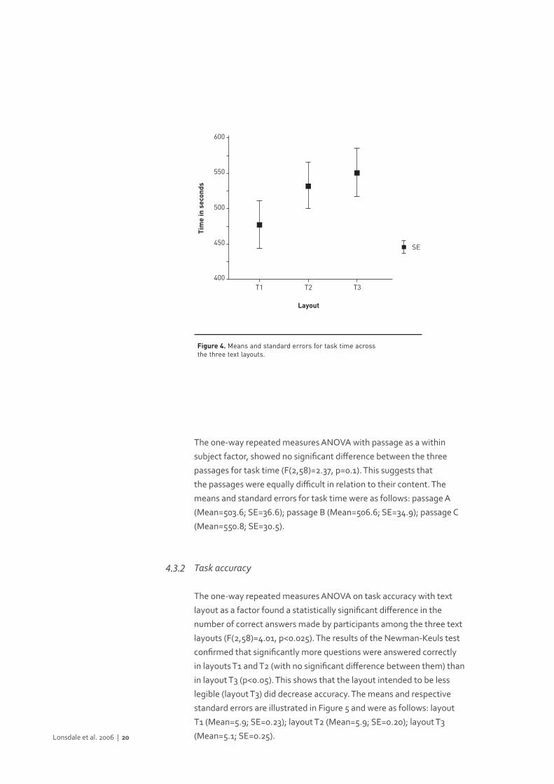
Task accuracy
The one-way repeated measures ANOVA on task accuracy with text
layout as a factor found a statistically significant difference in the
number of correct answers made by participants among the three text
layouts (F(2,58)=4.01, p<0.025). The results of the Newman-Keuls test
confirmed that significantly more questions were answered correctly
in layouts T1 and T2 (with no significant difference between them) than
in layout T3 (p<0.05). This shows that the layout intended to be less
legible (layout T3) did decrease accuracy. The means and respective
standard errors are illustrated in Figure 5 and were as follows: layout
T1 (Mean=5.9; SE=0.23); layout T2 (Mean=5.9; SE=0.20); layout T3
(Mean=5.1; SE=0.25).Lonsdale et al. 2006 | 20
4.3.2
400
450
500
550
600
T1
Layout
Tim
e in
sec
onds
T3T2
SE
Figure 4. Means and standard errors for task time across the three text layouts.
The one-way repeated measures ANOVA revealed no significant
differences between the three passages in terms of task accuracy
(F(2,58)=0.85, p=0.43). This shows that the passages were equally
difficult in terms of their content. The means and standard errors for task
accuracy were as follows: passage A (Mean=5.4; SE=0.23); passage B
(Mean=5.7; SE=0.25); passage C (Mean=5.8; SE=0.21).
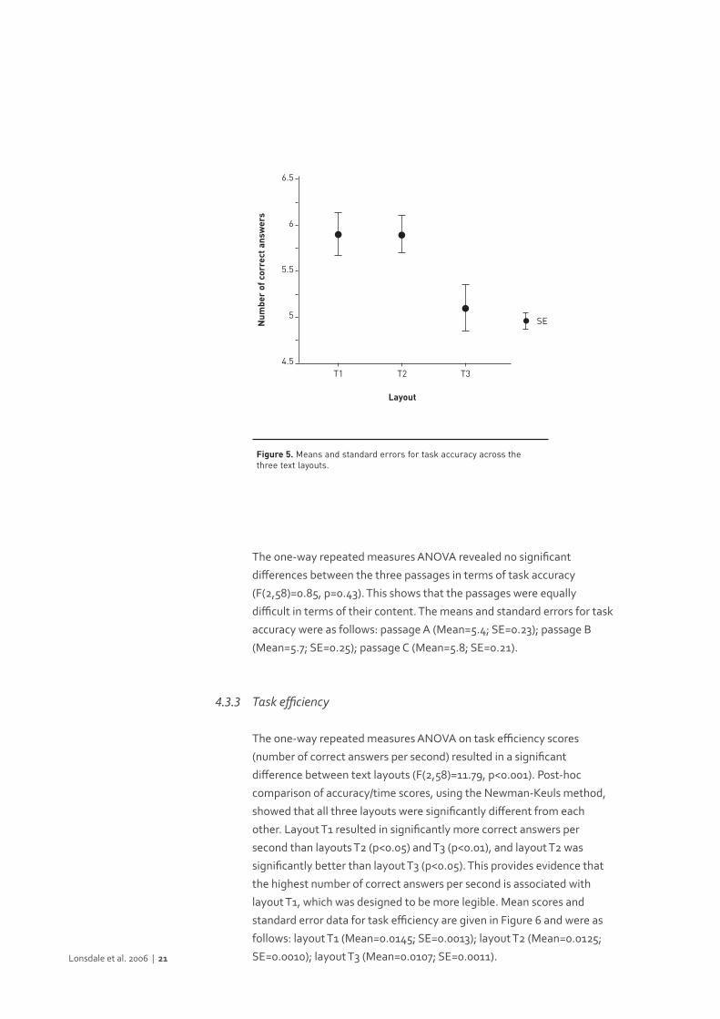
Task efficiency
The one-way repeated measures ANOVA on task efficiency scores
(number of correct answers per second) resulted in a significant
difference between text layouts (F(2,58)=11.79, p<0.001). Post-hoc
comparison of accuracy/time scores, using the Newman-Keuls method,
showed that all three layouts were significantly different from each
other. Layout T1 resulted in significantly more correct answers per
second than layouts T2 (p<0.05) and T3 (p<0.01), and layout T2 was
significantly better than layout T3 (p<0.05). This provides evidence that
the highest number of correct answers per second is associated with
layout T1, which was designed to be more legible. Mean scores and
standard error data for task efficiency are given in Figure 6 and were as
follows: layout T1 (Mean=0.0145; SE=0.0013); layout T2 (Mean=0.0125;
SE=0.0010); layout T3 (Mean=0.0107; SE=0.0011).Lonsdale et al. 2006 | 21
4.3.3
4.5
5
5.5
6
6.5
T1
Layout
Num
ber
of c
orre
ct a
nsw
ers
T3T2
SE
Figure 5. Means and standard errors for task accuracy across the three text layouts.
The one-way repeated measures ANOVA showed that there was no
statistically significant difference in the number of correct answers per
second among the three passages (F(2,58)=1.76, p=0.18). This suggests,
once again, that the passages were equally difficult in terms of their
content. The means and standard errors for task efficiency were as
follows: passage A (Mean=0.0128; SE=0.0012); passage B (Mean=0.0133;
SE=0.0013); passage C (Mean=0.0112; SE=0.0010).
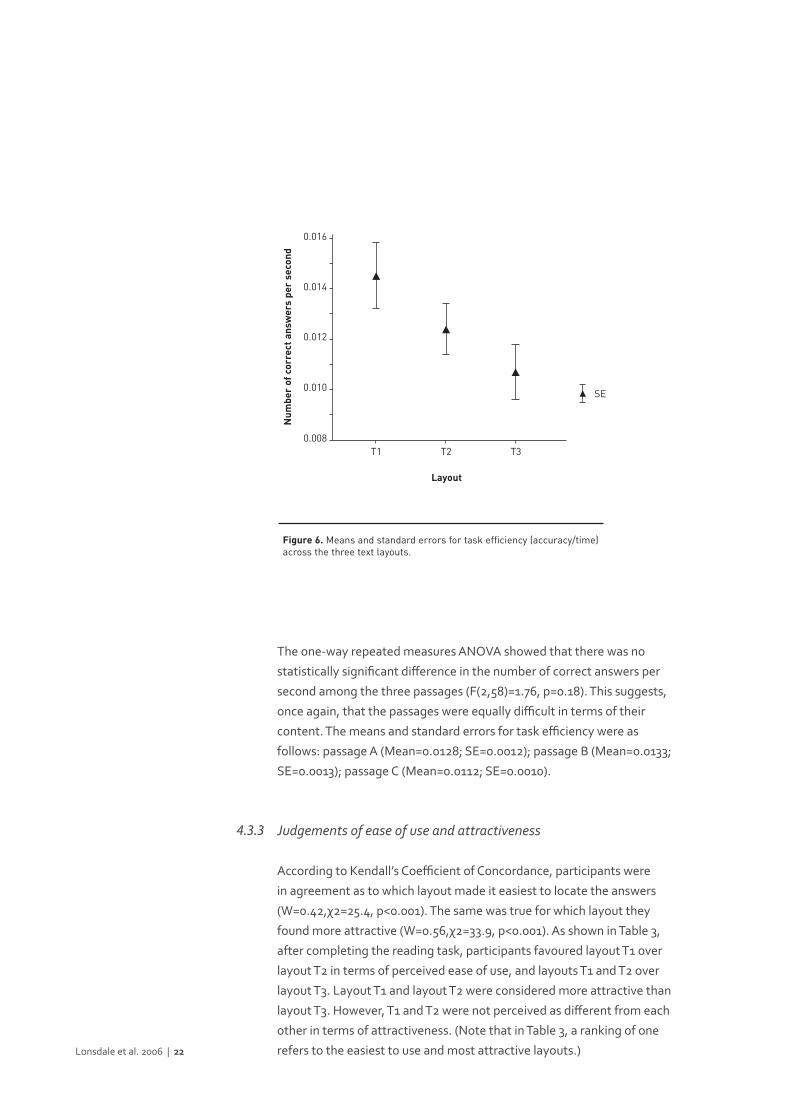
Judgements of ease of use and attractiveness
According to Kendall’s Coefficient of Concordance, participants were
in agreement as to which layout made it easiest to locate the answers
(W=0.42,χ2=25.4, p<0.001). The same was true for which layout they
found more attractive (W=0.56,χ2=33.9, p<0.001). As shown in Table 3,
after completing the reading task, participants favoured layout T1 over
layout T2 in terms of perceived ease of use, and layouts T1 and T2 over
layout T3. Layout T1 and layout T2 were considered more attractive than
layout T3. However, T1 and T2 were not perceived as different from each
other in terms of attractiveness. (Note that in Table 3, a ranking of one
refers to the easiest to use and most attractive layouts.)Lonsdale et al. 2006 | 22
4.3.3
0.008
0.010
0.012
0.014
0.016
T1
Layout
Num
ber
of c
orre
ct a
nsw
ers
per
seco
nd
T3T2
SE
Figure 6. Means and standard errors for task efficiency (accuracy/time)across the three text layouts.
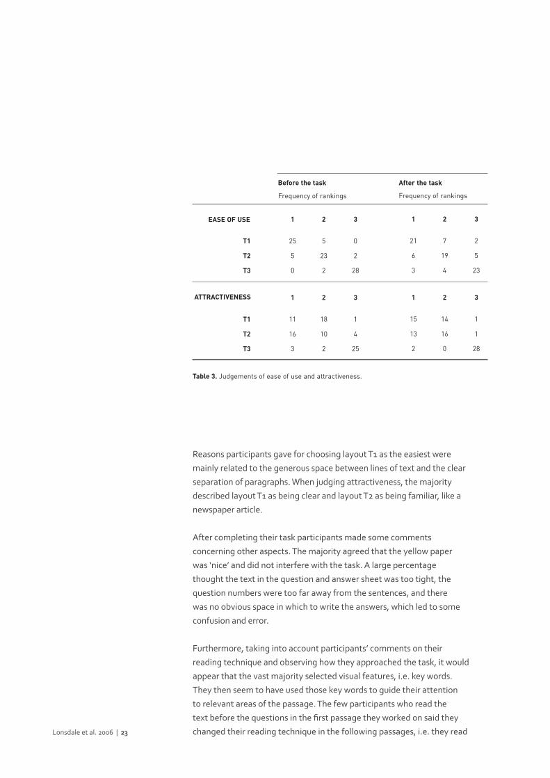
Reasons participants gave for choosing layout T1 as the easiest were
mainly related to the generous space between lines of text and the clear
separation of paragraphs. When judging attractiveness, the majority
described layout T1 as being clear and layout T2 as being familiar, like a
newspaper article.
After completing their task participants made some comments
concerning other aspects. The majority agreed that the yellow paper
was ‘nice’ and did not interfere with the task. A large percentage
thought the text in the question and answer sheet was too tight, the
question numbers were too far away from the sentences, and there
was no obvious space in which to write the answers, which led to some
confusion and error.
Furthermore, taking into account participants’ comments on their
reading technique and observing how they approached the task, it would
appear that the vast majority selected visual features, i.e. key words.
They then seem to have used those key words to guide their attention
to relevant areas of the passage. The few participants who read the
text before the questions in the first passage they worked on said they
changed their reading technique in the following passages, i.e. they read Lonsdale et al. 2006 | 23
After the task
21
6
3
2
5
23
7
19
4
T1
T2
T3
1
Frequency of rankings
2 3
Before the task
Table 3. Judgements of ease of use and attractiveness.
EASE OF USE
15
13
2
1
1
28
14
16
0
T1
T2
T3
1 2 3ATTRACTIVENESS
25
5
0
0
2
28
5
23
2
1 2 3
11
16
3
1
4
25
18
10
2
1 2 3
Frequency of rankings
the questions and answers first and left the passage to be
skimmed afterwards.
However, participants’ judgements concerning ease of use and
attractiveness could have been affected by the ease/difficulty of
completing the reading task. In order to check this possibility, a
second group of participants that did not complete the reading task
was asked about their judgments of ease of use and attractiveness
with the three layouts. Thirty people eligible to study in the medium
of English at university (either at undergraduate or postgraduate
level) volunteered as participants. Their ages ranged from 17 to 50,
with an average of 32.6 years. There were ten female and twenty male
participants. Eight were native English speakers and twenty-two were
non-native English speakers.
In this case, it was explained to participants the type of questions that
would have to be answered with the three text layouts, i.e. matching
questions requiring participants to match answers (e.g. names, dates,
phrases, etc.) with the questions. Participants were then asked to rank
the three text layouts as to which makes it easiest to locate the answers
and which is most attractive.
Kendall’s Coefficient of Concordance indicated that participants
agreed as to which text layout makes it easiest to locate the answers
(W=0.78,χ2=47.2, p<0.001), as well as which layout they found more
attractive (W=0.40,χ2=24.2, p<0.001). Layout T1 was preferred over
layout T2 in terms of perceived ease of use, and layouts T1 and T2 were
preferred over layout T3. Layout T1 and layout T2 were also preferred
over layout T3 in terms of attractiveness, but not different from each
other (Table 3).
The reasons given for the superiority of layout T1 over layout T2 and
T3 related to the interlinear space and clear distinction of paragraphs.
Concerning attractiveness, apart from emphasising again the good
space present in layout T1, it was also pointed out that layout T1 was
clear and elegant. Layout T2 was seen as organised (because of the
justified text and double columns), as well as familiar.
Chi-square tests compared the frequency of rankings for each layout
across the two groups of participants for ease of use and attractiveness.
All results were non-significant. Therefore, the pattern of results was the
same regardless of whether the reading task was completed or not. This
means that there is no evidence that the ease of completing the reading
task influenced participants’ judgements.Lonsdale et al. 2006 | 24

The experiment reported in this paper has explored the effects of
different text layouts on the speed and accuracy of reading a text and
answering questions on it in an examination-type situation. The aim was
to assess the effects of text layout as a whole on performance, i.e. when
a combination of typographic features of a text layout differs, not just
one individual feature. This closely reflects the typographic differences
between the text layouts of reading examinations. In interpreting the
results, it is important to keep in mind that the present experiment
involved reading to search for specific information in a text under
time pressure.
The results are clear in showing that different text layouts lead to
differences in performance. Layout T1, the one intended to be more
legible than the other two layouts, resulted in a shorter task time, better
accuracy, and more correct answers per second. It is interesting to note
that, although participants were significantly faster with layout T1 than
with layout T2, there were no significant differences in task accuracy
between the two layouts. Perhaps, as participants were not specifically
given a time limit to complete the reading task, they may have been
more concerned with the accuracy of the answers than the time spent.
This, therefore, might result in differences in task time but similar
levels of accuracy.
The results also confirmed that layout T1, despite being less familiar
than T2, was perceived as making it easy to locate answers. The same
judgement was made when participants saw the layouts but did not
complete the reading task. There is no evidence, therefore, to suggest
that completing the reading task influenced participants’ judgements.
It is not clear from the present study which of the features, or
combination of features, that were manipulated contributed most Lonsdale et al. 2006 | 25
Discussion and conclusion5
to the effects observed in performance. Participants’ comments
suggest that the interlinear space and separation of paragraphs are the
typographic features most likely to be causing the effect of text layout
on performance. Further and systematic investigation is required to
elucidate this.
Moreover, it is possible that the results of this study are specific to
the reading task of searching for particular information in the text
under time pressure. This suggestion is based on the outcomes of
the questionnaire concerning the reading strategies used in IELTS
examinations, as well as the way participants approached the task of
matching answers with questions in the experimental study, and on their
final comments. In order to locate the information that answers specific
questions as quickly and accurately as possible, participants seem to use
a reading strategy that is compatible with search reading. This strategy
involves the use of visual features, i.e. key words, which participants
use to guide them to specific parts of the text, rather than spending too
much time reading the whole text. It also seems that, if visual features
are used to locate the information, then text layout may have an
effect at the perceptual level of reading (as referred to by Masson,
1982 and 1985).
If, instead, readers had been asked to complete a different reading
task, for example, to select a heading for each paragraph of the text,
perhaps a search reading strategy would have been unnecessary, or
not as effective. Completing a paragraph-heading task would most
likely involve reading carefully the whole text in order to understand
accurately the main ideas stated in each paragraph, rather than
using visual features to locate specific information. This means that
a paragraph-heading task would require a more conceptual level of
processing, and little perceptual processing. Therefore, completing such
a task might not have resulted in differences between layouts, since
there would be less perceptual processing going on. This means the
layout conforming to legibility guidelines might have been as easy to
read as the other two layouts.
Furthermore, although in this experiment the layout of the question
and answer sheet was not varied, the comments made by participants
suggest that this layout may also affect readers’ speed and accuracy of
reading and answering. This hypothesis is strengthened by the findings
of Hartley et al. (1973), who showed that the design of the response
sheet in a test could affect the scores obtained. In fact, it seems likely
that a significant amount of perceptual processing is occurring when
using a question and answer sheet. For example, in order to answer Lonsdale et al. 2006 | 26

accurately a set of questions, we often jump between the question
and answer sheet and the passage. This would involve the use of visual
features (e.g. key words, paragraphs, etc.) to guide us back and forth
between the question being answered and the relevant information
in the text. Therefore, the question and answer sheet layout may also
affect performance at the perceptual level of reading.
On the basis of the results of this experiment we would argue that text
layout affects performance in situations of reading to search for specific
information in a text under time pressure. (The same, therefore, may
not apply to situations of continuous reading, when reading at a normal
speed, or when there is no question to be answered.) Moreover, we
would suggest that the effect may take place at the perceptual level
of reading, since text layout may help or impair readers to locate key
words and identify the relevant information necessary to achieve their
goal more quickly. Therefore, we conclude that, if text layout affects
performance in examination-type situations, then, selecting the texts
according to the same criteria of legibility would increase the construct
validity of examinations.
Beyond this main conclusion, the significant advantage of layout T1
over the other layouts also suggests the following. By considering the
legibility of texts, the design of reading examinations can be improved
and potential difficulties minimised (for example, stress can be
minimised). However, as explained above, English reading examinations
such as IELTS replicate existing academic texts. This means that, if these
academic texts are not particularly legible, this will be carried over to
reading examinations. We would suggest that the results emerging
from this study can assist in the design of academic texts. This would
aid language testing, but may also support learning. Furthermore, the
results of the present study could also assist in the design of other similar
materials that students often read/use under some time pressure in and
outside the classroom. Examples of these materials are: periodicals/
magazine articles, journal papers, book sections, etc., that students have
to read frequently for their studies and research.
Lonsdale et al. 2006 | 27
This research was sponsored by a grant from the Fundação para a
Ciência e a Tecnologia — Portugal (financing within the ambit of the III
Quadro Comunitário de Apoio, subsidized by the European Social Fund
and by Portuguese funds of the MCES — Ministério da Ciência e Ensino
Superior). The authors would like to thank UCLES for permission to
reproduce the questions. The authors would also like to express thanks
for the helpful suggestions made by the Editor and Reviewers.
Lonsdale et al. 2006 | 28
Acknowledgments
Becker, D., Heinrich, J., von Sichowsky, R. & Wendt, D. (1970). Reader
preferences for typeface and leading. Journal of Typographic Research,
4, 61–66.
Black, A. (1990). Typefaces for desktop publishing: A user guide. London:
Architecture Design and Technology Press.
Bringhurst, R. (1992). The elements of typographic style. Vancouver:
Hartley & Marks.
Burnhill, P., Hartley, J., Frase, S. & Young, M. (1975). The typography
of college prospectuses: A critique and case history. In L. Evans & J.
Leedham (Eds.), Aspects of educational technology, Vol. IX. (pp. 233–
245). London: Kogan Page.
Carter, R., Day, B. & Meggs, P.B. (1993). Typographic design: Form and
communication. (2nd edn). New York: John Wiley & Sons.
Dreher, M.J. (1992). Searching for information in textbooks. Journal of
Reading, 35(5), 364–371.
Enright, M.K., Grabe, W., Koda, K., Mosenthal, P., Mulcahy-Ernt, P. &
Schedl, M. (2000). TOEFL 2000 reading framework: A working paper.
TOEFL Monograph Series Report No. 17. Princeton, NJ: Educational
Testing Service.
Fabrizio, R., Kaplan, I. & Teal, G. (1967). Readability as a function of the
straightness of right-hand margins. Journal of Typographic Research,
1, 90–95.
Foster, J.J. (1970). A study of the legibility of one- and two-column
layouts for BPS publications. Bulletin of the British Psychological Society,
23, 113–114.Lonsdale et al. 2006 | 29
References

Gregory, M. & Poulton, E.C. (1970). Even versus uneven right-hand
margins and the rate of comprehension in reading. Ergonomics,
13(4), 427–434.
Guthrie, J.T. & Kirsch, I.S. (1987). Distinctions between reading
comprehension and locating information in text. Journal of Educational
Psychology, 79(3), 220–227.
Hartley, J. (1994). Designing instructional text. (3rd edn). London:
Kogan Page.
Hartley, J. (2004). Designing instructional and informational text. In D.H.
Jonassen (Ed.), Handbook of research on educational communications and
technology. (2nd edn). Mahwah, NJ: Lawrence Erlbaum Associates,
917–947.
Hartley, J. & Burnhill, P. (1976). Explorations in space: A critique of the
typography of BPS publications. Bulletin of the British Psychological
Society, 29, 97–107.
Hartley, J. & Burnhill, P. (1977). Fifty guide-lines for improving
instructional text. Programmed Learning and Educational Technology,
14(1), 65–73.
Hartley, J., Burnhill, P. & Davis, L. (1978). The effects of line length and
paragraph denotation on the retrieval of information from prose text.
Visible Language, 12(2), 183–194.
Hartley, J. & Trueman, M. (1981). The effects of changes in layout
and changes in wording on preferences for instructional text. Visible
Language, 15(1), 13–31.
Hartley, J. & Trueman, M. (1983). The effects of headings in text on recall,
search and retrieval. British Journal of Educational Psychology,
53, 120–131.
Hartley, J., Hogarth, F.W. & Mills, R. (1973). The three-minute reasoning
test: A re-evaluation. Educational Research, 16(1), 58–62.
Hughes, A. (1989). Testing for language teachers. Cambridge: Cambridge
University Press.
Jakeman, V. & McDowell, C. (1996). Cambridge IELTS 1 self study student’s
book. Cambridge: Cambridge University Press.Lonsdale et al. 2006 | 30
Jakeman, V. & McDowell, C. (2001). IELTS practice tests plus: Teaching not
just testing. Harlow, Essex: Longman.
Lund, O. (1999). Knowledge construction in typography: The case of
legibility research and the legibility of sans serif typefaces. Unpublished
PhD Thesis. Department of Typography & Graphic Communication, The
University of Reading, UK.
Masson, M.E.J. (1982). Cognitive processes in skimming stories.
Journal of Experimental Psychology: Learning, Memory, and Cognition,
8(5), 400–417.
Masson, M.E.J. (1985). Rapid reading processes and skills. In G.E.
MacKinnon & T.G. Waller (Eds.), Reading research: Advances in theory
and practice, Vol. 4. (pp. 183–230). New York: Academic Press.
McLean, R. (1980). The Thames and Hudson manual of typography. London: Thames and Hudson.
Michael, W.B. & Jones, R.A. (1955). The influence of color of paper upon scores earned on objective achievement examination. The Journal of Applied Psychology, 39(6), 447–450.
Moriarty, S.E. & Scheiner, E.C. (1984). A study of close-set text type. Journal of Applied Psychology, 69(4), 700–702.
Paterson, D.G. & Tinker, M.A. (1932). Studies of typographical factors influencing speed of reading: X. Style of type face. Journal of Applied Psychology, 16, 605–613.
Poulton, E.C. (1959). Effects of printing types and formats on the comprehension of scientific journals. Nature, 184, 1824–1825.
Poulton, E.C. (1965). Letter differentiation and rate of comprehension in reading. Journal of Applied Psychology, 49(5), 358–362.
Rehe, R.F. (1979). Typography: How to make it most legible. Carmel: Design Research Publications.
Reynolds, L. (1978). The legibility of printed scientific and technical information. In R. Easterby & H. Zwaga (Eds.), Information design: The design and evaluation of signs and printed material. (pp. 187–208).Chichester: John Wiley & Sons.
Schriver, K.A. (1997). Dynamics in document design: Creating texts for readers. New York: John Wiley & Sons.
Simmonds, D. & Reynolds, L. (1994). Data presentation and visual literacy in medicine and science. Oxford: Butterworth-Heinemann.
Simon, O. (1945). Introduction to typography. London: Faber & Faber.Lonsdale et al. 2006 | 31
Southall, R. (1984). First principles of typographic design for document production. TUGboat, 5(2), 79–91.
Spencer, H. (1969). The visible word. London: Lund Humphries.
Spencer, H., Reynolds, L. & Coe, B. (1974). Typographic coding in lists and bibliographies. Applied Ergonomics, 5(3), 136–141.
Spencer, H., Reynolds, L. & Coe, B. (1975). Spatial and typographic coding with bibliographical entries. Programmed Learning and Educational Technology, 12(2), 95–101.
Symons, S. & Specht, J.A. (1994). Including both time and accuracy in defining text search efficiency. Journal of Reading Behavior, 26(3), 267–276.
Tinker, M.A. (1963a). Legibility of print. Ames, IA: Iowa State University Press.
Tinker, M.A. (1963b). Influence of simultaneous variation in size of type, width of line, and leading for newspaper type. Journal of Applied Psychology, 47(6), 380–382.
Tschichold, J. (1967). Asymmetric typography (Trans. R. McLean). London: Faber & Faber Limited.
University of Cambridge Local Examinations Syndicate (2001). IELTS specimen material. Cambridge: Cambridge University Press.
University of Cambridge Local Examinations Syndicate (2000). Cambridge IELTS 2 student’s book with answers: Examination papers from the University of Cambridge Local Examinations Syndicate. Cambridge: Cambridge University Press.
Urqhuart, S. & Weir, C. (1998). Reading in a second language: Process, product and practice. London: Longman.
Weir, C.J. (1993). Understanding and developing language tests. New York: Prentice Hall Europe.
Wendt, D. (1979). An experimental approach to the improvement of the typographic design of textbooks. Visible Language, 13(2), 108–133.
Wiggins, R.H. (1977). Effects of three typographical variables on speed of reading. Visible Language, 1, 5–18.
Wijnholds, A.D.B. (1997). Using type: The typographer’s craftsmanship and the ergonomist’s research [Online]. The Netherlands: Utrecht University. Available from: http://www.plainlanguagenetwork.org/type/typelomn.html. [Accessed 5 January 2002].
Williams, T.R. & Spyridakis, J.H. (1992). Visual discriminability of headings in text. IEEE Transactions on Professional Communication, 35(2), 64–70.
Zachrisson, B. (1965). Studies on the legibility of printed text. Stockholm: Almqvist and Wiksell.Lonsdale et al. 2006 | 32
Lonsdale et al. 2006 | 33
Appendices
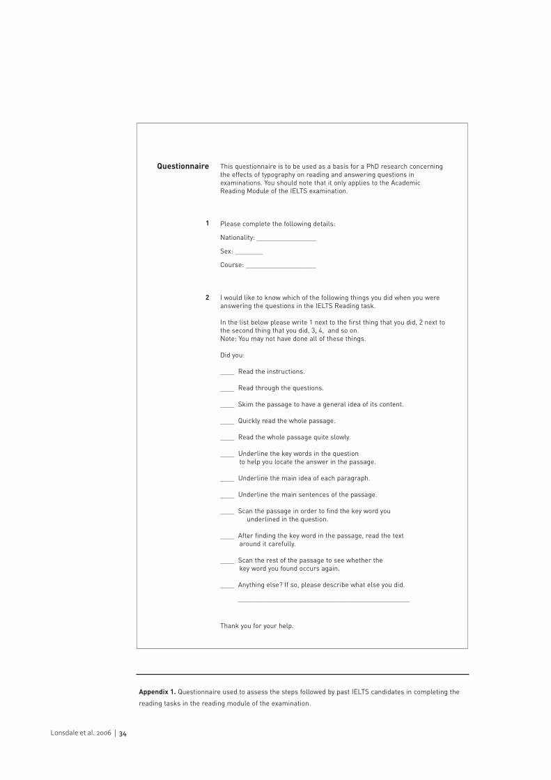
Lonsdale et al. 2006 | 34
This questionnaire is to be used as a basis for a PhD research concerningthe effects of typography on reading and answering questions inexaminations. You should note that it only applies to the AcademicReading Module of the IELTS examination.
Please complete the following details:
Nationality: _________________
Sex: ________
Course: ____________________
I would like to know which of the following things you did when you wereanswering the questions in the IELTS Reading task.
In the list below please write 1 next to the first thing that you did, 2 next tothe second thing that you did, 3, 4, and so on. Note: You may not have done all of these things.
Did you:
____ Read the instructions.
____ Read through the questions.
____ Skim the passage to have a general idea of its content.
____ Quickly read the whole passage.
____ Read the whole passage quite slowly.
____ Underline the key words in the question to help you locate the answer in the passage.
____ Underline the main idea of each paragraph.
____ Underline the main sentences of the passage.
____ Scan the passage in order to find the key word youunderlined in the question.
____ After finding the key word in the passage, read the text around it carefully.
____ Scan the rest of the passage to see whether the key word you found occurs again.
____ Anything else? If so, please describe what else you did.
_________________________________________________
Thank you for your help.
Questionnaire
1
2
Appendix 1. Questionnaire used to assess the steps followed by past IELTS candidates in completing the
reading tasks in the reading module of the examination.
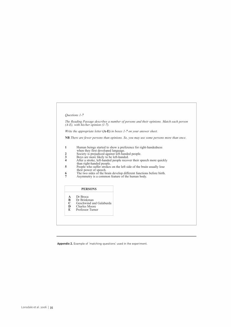
Lonsdale et al. 2006 | 35
1 Human beings started to show a preference for right-handedness when they first developed language.
2 Society is prejudiced against left-handed people.3 Boys are more likely to be left-handed.4 After a stroke, left-handed people recover their speech more quickly
than right-handed people.5 People who suffer strokes on the left side of the brain usually lose
their power of speech.6 The two sides of the brain develop different functions before birth.7 Asymmetry is a common feature of the human body.
Questions 1-7
The Reading Passage describes a number of persons and their opinions. Match each person (A-E), with his/her opinion (1-7).
Write the appropriate letter (A-E) in boxes 1-7 on your answer sheet.
NB There are fewer persons than opinions. So, you may use some persons more than once.
A Dr BrocaB Dr BrinkmanC Geschwind and GalaburdaD Charles MooreE Professor Turner
PERSONS
Appendix 2. Example of ‘matching-questions’ used in the experiment.