
Custom Layout
32
CUSTOM LAYOUT WHITE PAPER
-
Upload
khangminh22 -
Category
Documents
-
view
0 -
download
0
Transcript of Custom Layout

CUSTOM LAYOUT WHITE PAPER
Custom Layout (Version 22.2) June 14, 2019 Page i
Author: Martin Pronk
Creation Date: November 24, 2018
Last Updated: June 14, 2019
Version: 22.2
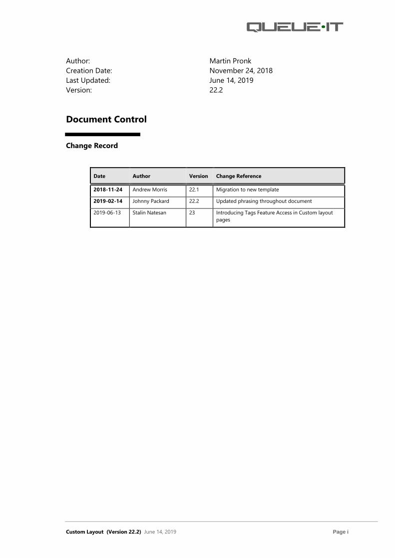
Document Control
Change Record
Date Author Version Change Reference
2018-11-24 Andrew Morris 22.1 Migration to new template
2019-02-14 Johnny Packard 22.2 Updated phrasing throughout document
2019-06-13 Stalin Natesan 23 Introducing Tags Feature Access in Custom layout
pages

Custom Layout (Version 22.2) June 14, 2019 Page ii
Table of Contents
1 Introduction ................................................................................................................................................ 1
1.1 Scope ......................................................................................................................................................1
1.2 Prerequisites for this Document ...................................................................................................1
1.3 Documentation Audience ...............................................................................................................1
1.4 Guide to this Document ..................................................................................................................1
1.5 Related Information ..........................................................................................................................2
2 Custom Stylesheet Concept .................................................................................................................. 3
2.1 Managing File Assets ........................................................................................................................4
2.2 Limitations ............................................................................................................................................4
3 Queue Number SRE (Screen Real Estate) ......................................................................................... 6
3.1 Background ..........................................................................................................................................7
3.2 Main ........................................................................................................................................................7
3.3 Minimum Display ...............................................................................................................................8
3.4 Sidebar (Optional)..............................................................................................................................9
3.5 Top (Optional) .....................................................................................................................................9
3.6 Bottom (Optional) ..............................................................................................................................9
3.7 Left (Optional) .....................................................................................................................................9
3.8 Middle (Optional) ...............................................................................................................................9
3.9 Right (Optional) ..................................................................................................................................9
4 Fields ............................................................................................................................................................ 10
4.1 Before Event Page ........................................................................................................................... 10
4.2 InQueue Page ................................................................................................................................... 10
4.2.1 Item .............................................................................................................................................. 10
4.2.2 Header ......................................................................................................................................... 11
4.2.3 Warning ...................................................................................................................................... 11
4.2.4 Process ........................................................................................................................................ 11
4.2.5 Time ............................................................................................................................................. 11
4.2.6 Reminder .................................................................................................................................... 12
4.2.7 Exit line ........................................................................................................................................ 12
4.2.8 Footer .......................................................................................................................................... 12
4.3 After Event Page .............................................................................................................................. 12

Custom Layout (Version 22.2) June 14, 2019 Page iii
4.4 Error Page .......................................................................................................................................... 12
4.5 Exit Line Page ................................................................................................................................... 13
5 Redesign the Layout Using css-file .................................................................................................. 13
5.1 Current Queue-it Default css Stylesheet ................................................................................ 14
5.2 Changing the Queue Page Using css ...................................................................................... 15
5.2.1 Step by Step Guide................................................................................................................. 15
5.3 Using JavaScript to Make Advanced Changes ..................................................................... 17
6 Queue-it JS SDK for Custom Layout ................................................................................................ 20
6.1 Integration with Queue-it sdk .................................................................................................... 20
7 Other Information on Preview ........................................................................................................... 23
8 Support ....................................................................................................................................................... 24
9 Custom Layout FAQs ............................................................................................................................. 25

Custom Layout (Version 22.2) June 14, 2019 Page 1
1 Introduction This whitepaper describes how Queue-it administrators can change the layout of the
end-user facing pages of the queue system.
The following sections describe the content and organization of the document:
• Scope
• Prerequisites for this Document
• Documentation Audience
• Guide to this Document
• Related Information
1.1 Scope
This document is designed for front end developers who want to customize the queue
page.
1.2 Prerequisites for this Document
Prior to reading this guide, you should understand the basic concepts of the queue. To
learn more about basic queue concepts, go to Help | Video Tutorials in the GO
Queue-it Platform.
1.3 Documentation Audience
This document is intended for the following audiences:
• Front End Developers—have in-depth knowledge of CSS and JavaScript
1.4 Guide to this Document
This document provides front end developers with the information needed to
customize queue pages. This document is organized as follows:
• Custom Stylesheet Concept. Overview of Custom Stylesheets
• Queue Number SRE (Screen Real Estate). Describes regions of Queue page
• Fields. Describes fields displayed on each of the end-user facing pages
• Redesign the Layout Using css-file. Pointers for updating CSS of pages
• Queue-it JS SDK for Custom Layout. Describes user info on pages
• Other Information on Preview. Overview of preview functionality
• Support. Best way to obtain support from Queue-it
• Custom Layout FAQs. General FAQs and helpful information

Custom Layout (Version 22.2) June 14, 2019 Page 2
1.5 Related Information
Additional documents include:
• jQuery—Overview of jQuery.
• w3schools—This site aids with jQuery and CSS.
Custom Layout (Version 22.2) June 14, 2019 Page 3
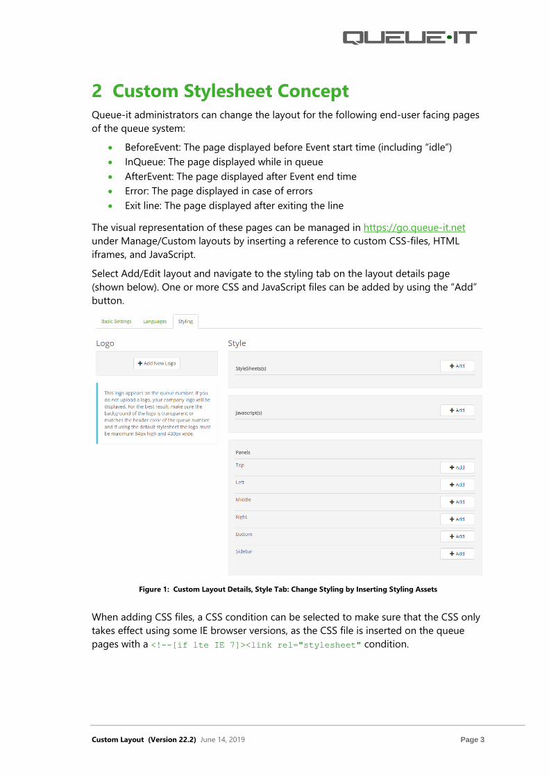
2 Custom Stylesheet Concept Queue-it administrators can change the layout for the following end-user facing pages
of the queue system:
• BeforeEvent: The page displayed before Event start time (including “idle”)
• InQueue: The page displayed while in queue
• AfterEvent: The page displayed after Event end time
• Error: The page displayed in case of errors
• Exit line: The page displayed after exiting the line
The visual representation of these pages can be managed in https://go.queue-it.net
under Manage/Custom layouts by inserting a reference to custom CSS-files, HTML
iframes, and JavaScript.
Select Add/Edit layout and navigate to the styling tab on the layout details page
(shown below). One or more CSS and JavaScript files can be added by using the “Add”
button.
Figure 1: Custom Layout Details, Style Tab: Change Styling by Inserting Styling Assets
When adding CSS files, a CSS condition can be selected to make sure that the CSS only
takes effect using some IE browser versions, as the CSS file is inserted on the queue
pages with a <!--[if lte IE 7]><link rel="stylesheet" condition.

Custom Layout (Version 22.2) June 14, 2019 Page 4
Figure 2: Add Browser Specific Stylesheets
2.1 Managing File Assets
Assets can be uploaded to Queue-it using “Account / Files” and organized into folders.
Figure 3: Managing Assets
PLEASE NOTE that all files are cached 24 hours on a Content Distribution Network
(CDN). Therefore, it will take up to 24 hours before overridden files are updated. As
such, it is recommended to version files using different file or folder names. All preview
functions will show the new files, but this does not indicate that changes are applied on
the actual queue page layout.
2.2 Limitations
The custom panels are inserted on the queue pages using iframes to ensure that the
central part of the pages will display even if the panels are inaccessible. The CSS files
will alter the central part of the queue pages and it is highly important that the changes
Custom Layout (Version 22.2) June 14, 2019 Page 5
are made in a way that do not hinder the display of the central elements on the queue
pages.
All layouts will include a Queue-it default stylesheet (CSS file), which ensures that they
start with a standard look and feel. By adding custom CSS files, you will be able to
override or alter this.
While the Custom Layout features offers great flexibility using custom CSS files, HTML
iframes and JavaScript, it is important to note the following limitations:
• All changes should be approved by Queue-it. Please contact support@queue-
it.net for approval before you start using a custom CSS file in production.
• All CSS files and direct / indirect referenced files must reside in a scalable
location, such as Amazon AWS or Akamai CDN. Queue-it can host your files.
Contact [email protected] to get the files uploaded to Amazon AWS.
• In accordance with standard agreement terms and conditions, “What is this” text
and the Queue-it logo with links shall remain on the queue pages (unless the
white label option is paid for).

Custom Layout (Version 22.2) June 14, 2019 Page 6
3 Queue Number SRE (Screen Real Estate) The high-level SRE (Screen Real Estate) contains the following elements:
• Background
• Main
• Minimum Display
• Sidebar (Optional)
• Top (Optional)
• Bottom (Optional)
• Left (Optional)
• Middle (Optional)
• Right (Optional)
The optional elements are inserted into the page as HTML iframes with a related CSS
div-tag. The iframe source is inserted as a reference.
Figure 4: Sidebar, Top, Bottom, Left, Middle, Right, and Bottom iFrame Source Reference
As shown in figure 5, each SRE area is described in subsequent sections.

Custom Layout (Version 22.2) June 14, 2019 Page 7
Figure 5: SRE
3.1 Background
Background is the canvas “Main” is placed on.
3.2 Main
Main contains the following vertically dynamic sizable sections (with a minimum
height):
• Item: Cookie status
• Top: Simple top image
• Header: Company / layout logo and header text
• Warning: Info or warning buttons
• Process: Progress information
• Time: Dynamic information
• Reminder: Reminder form
• Exit line: Exit line section
• Footer: Footer text with queue-ID and Queue-it logo
• Bottom: Simple bottom image
Main
Background
TOP
Bottom
Left Right
Sidebar
Middle

Custom Layout (Version 22.2) June 14, 2019 Page 8
Figure 6: Main Layout
3.3 Minimum Display
If all layout elements in the GO Queue-it Platform are unselected, the minimum display
will have the same sections as described above. Some will have a height of zero and
some will have a minimum height.
Figure 7: Minimum Display
Item
Top
Header
Warning
Process
Time
Reminder
Exit line
Footer
Bottom

Custom Layout (Version 22.2) June 14, 2019 Page 9
3.4 Sidebar (Optional)
The sidebar describes a 300px wide area that is right aligned on the UI.
Controlled by the sidebar div-tag:
• #sidebar
• #sidebar_iframe
3.5 Top (Optional)
Controlled by the toppanel div-tag, ex.:
• #toppanel{
margin: 0 0 0 0;
}
• #toppanel_iframe{
height: 110px;
width: 100%;
padding: 0;
}
3.6 Bottom (Optional)
Controlled by the bottompanel div-tag.
3.7 Left (Optional)
Controlled by the leftpanel div-tag.
3.8 Middle (Optional)
Controlled by the middlepanel div-tag.
3.9 Right (Optional)
Controlled by the rightpanel div-tag.

Custom Layout (Version 22.2) June 14, 2019 Page 10
4 Fields The fields displayed on each of the end-user facing parts of Queue-it are described in
this section.
Each field is displayed using a style from the stylesheet and the mapping between the
field and the used stylesheet is managed by Queue-it. Hence, it is not possible to
change this mapping, and only the character of the related style in the stylesheet may
be changed.
The best way to understand this mapping is by taking a detailed look into the HTML of
the queue number as described in section 5 of this document.
4.1 Before Event Page
The Before page contains a logo, explanatory text, and the event starting time in the
process section. The possibility exists to customize lbHeaderH2: H1 text from custom
layout, lbHeaderP: H2 text from custom layout texts in the GO Queue-it Platform.
Figure 8: Before Event Page
4.2 InQueue Page
The InQueue page contains a complex set of display options described below, which
are related to each section as described in section 3.2.
The actual fields are only displayed if they have been set as visible in Manage / Custom
layout (or the default setting).
4.2.1 Item
A cookie status is displayed as:
• lbCookieInfo:
• Cookie: You can leave this page without losing your place in line.
• NoCookie: You will lose your place in line if you leave this page!

Custom Layout (Version 22.2) June 14, 2019 Page 11
Both text options have a related tooltip.
4.2.2 Header
The header section contains the following fields:
• imgCustomerLogo: Customer or layout logo
• lbHeaderH2: H1 text from custom layout
• lbHeaderP: H2 text from custom layout
• ltThisIsQueueIt: A hardcoded text “What is this?” with a link to a static copy of a
page from Queue-it’s website (http://static.queue-
it.net/www/thisisqueueit.html). Please see section 2.2 for limitations on this field
4.2.3 Warning
The warning section contains the following fields:
• lbHighLoadLayoutText: High load text “There are less than {0} in line in front of
you” or “There are more than {0} in line in front of you”
• lbQueueNumberText: Hardcoded text “Your queue number:”
• lbQueueNumber: Actual queue number
4.2.4 Process
The process section contains the following fields:
• lbUsersInLineAheadOfYouText: “Users in line ahead of you:” text
• lbUsersInLineAheadOfYou: Number of users ahead
• lbExpectedServiceTimeText: “Expected service time:” text
• lbExpectedServiceTime: Expected service time
• lbWhichIsInText: “Which is in” text
• lbWhichIsIn: Estimate
• defaultViewPb1: Green blinking button
• lbLastUpdateTime: Last time backend was contacted for a new update
4.2.5 Time
The time section is used for displaying dynamic information and contains the following
fields:
• h2MessageOnQueueTicket: Header text incl. update time and dynamic
information source
• pMessageOnQueueTicket: The actual message
If there are no messages, the section is collapsed and not displayed.

Custom Layout (Version 22.2) June 14, 2019 Page 12
4.2.6 Reminder
The reminder section is used for displaying the reminder form and contains the
following fields:
• lbNotyfyMeText: “Please notify me when my turn is up:” text
• inpEmailAddress: Email input field
• Literal1: Text on the “notify me by email” button
• inpMobileNumber: SMS input field
• Literal3: Text on “notify me by SMS
4.2.7 Exit line
The exit line section contains the following fields:
• litExitLine: Exit line link with the “Exit line” text
• Literal2: “(You will lose your place)” text
4.2.8 Footer
The footer section contains the following fields:
• litDisclamer: “Queue ID:” text
• hlLinkToQueueTicket2: Link to the queue number and the “guid”
4.3 After Event Page
The After Event page contains a company logo and explanatory text. It is possible to
customize lbHeaderH2: H1 text from custom layout, lbHeaderP: H2 text from custom
layout texts in the GO Queue-it Platform.
Figure 9: After Event Page
4.4 Error Page
The Error page contains a company logo and explanatory text.

Custom Layout (Version 22.2) June 14, 2019 Page 13
Figure 10: Error page
4.5 Exit Line Page
The Exit line page contains a company logo, an explanatory text, and a “Click here to
get back in line” button in the Warning section.
Figure 11: Exit Line Page
5 Redesign the Layout Using css-file Queue-it can assist with a redesign of the queue pages. If you would like to administer
yourself, the best way would be to obtain a version of the HTML from the queue page,
(e.g. Copy it from the browser and saving it on your disk).
From “Custom layout → Preview Layout” click on “Open link in new window” to preview
layout in new tab or click “Copy Link” button to share or use it wherever you want to.
Please note that the link is valid for 30 days.
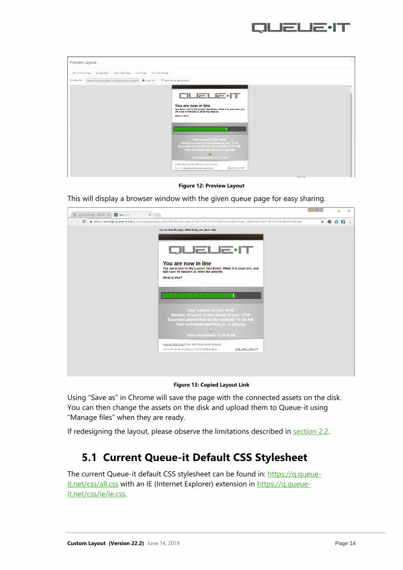
Custom Layout (Version 22.2) June 14, 2019 Page 14
Figure 12: Preview Layout
This will display a browser window with the given queue page for easy sharing.
Figure 13: Copied Layout Link
Using “Save as” in Chrome will save the page with the connected assets on the disk.
You can then change the assets on the disk and upload them to Queue-it using
“Manage files” when they are ready.
If redesigning the layout, please observe the limitations described in section 2.2.
5.1 Current Queue-it Default CSS Stylesheet
The current Queue-it default CSS stylesheet can be found in: https://q.queue-
it.net/css/all.css with an IE (Internet Explorer) extension in https://q.queue-
it.net/css/ie/ie.css.

Custom Layout (Version 22.2) June 14, 2019 Page 15
When the standard CSS files are inserted in the queue pages, they will be located on
Queue-it CloudFront CDN on assets.queue-it.net hostname and with a “//” prefix
(agnostic for http and https usage):
5.2 Changing the Queue Page Using CSS
The default queue page layout can be changed by adding a new CSS file containing
modifications of the existing Queue-it style.
5.2.1 Step by Step Guide
In this example, modifications are uploaded in modifydefault.css.
1. Make a local folder structure as shown here
2. Create a blank file called modifydefault.css in the css folder
<link rel="stylesheet" href="//assets.queue-
it.net/static/QueueFront/css/e08be5e2a467faef98fde5e316fbc2ad.css"
type="text/css" />
<!--[if lte IE 7]>
<link rel="stylesheet" href="//assets.queue-
it.net/static/QueueFront/css/ie/8b0a4e86e913c53edd9673903078deb8.css
" media="screen" type="text/css" />
<![endif]-->
Custom Layout (Version 22.2) June 14, 2019 Page 16
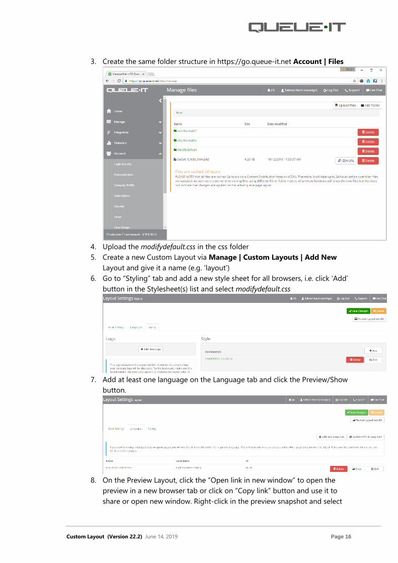
3. Create the same folder structure in https://go.queue-it.net Account | Files
4. Upload the modifydefault.css in the css folder
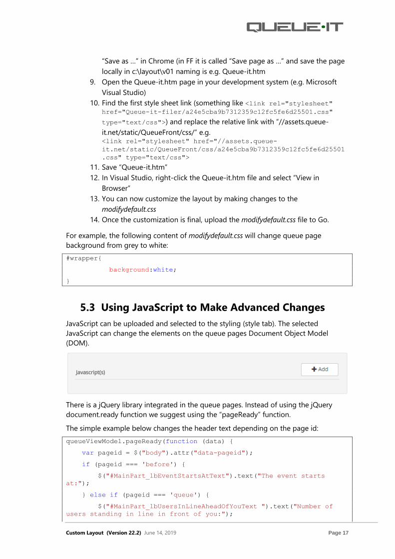
5. Create a new Custom Layout via Manage | Custom Layouts | Add New
Layout and give it a name (e.g. ‘layout’)
6. Go to “Styling” tab and add a new style sheet for all browsers, i.e. click ‘Add’
button in the Stylesheet(s) list and select modifydefault.css
7. Add at least one language on the Language tab and click the Preview/Show
button.
8. On the Preview Layout, click the “Open link in new window” to open the
preview in a new browser tab or click on “Copy link” button and use it to
share or open new window. Right-click in the preview snapshot and select
Custom Layout (Version 22.2) June 14, 2019 Page 17
“Save as …” in Chrome (in FF it is called “Save page as …” and save the page
locally in c:\layout\v01 naming is e.g. Queue-it.htm
9. Open the Queue-it.htm page in your development system (e.g. Microsoft
Visual Studio)
10. Find the first style sheet link (something like <link rel="stylesheet" href="Queue-it-filer/a24e5cba9b7312359c12fc5fe6d25501.css"
type="text/css">) and replace the relative link with “//assets.queue-
it.net/static/QueueFront/css/” e.g. <link rel="stylesheet" href="//assets.queue-
it.net/static/QueueFront/css/a24e5cba9b7312359c12fc5fe6d25501
.css" type="text/css">
11. Save “Queue-it.htm”
12. In Visual Studio, right-click the Queue-it.htm file and select “View in
Browser”
13. You can now customize the layout by making changes to the
modifydefault.css
14. Once the customization is final, upload the modifydefault.css file to Go.
For example, the following content of modifydefault.css will change queue page
background from grey to white:
#wrapper{
background:white;
}
5.3 Using JavaScript to Make Advanced Changes
JavaScript can be uploaded and selected to the styling (style tab). The selected
JavaScript can change the elements on the queue pages Document Object Model
(DOM).
There is a jQuery library integrated in the queue pages. Instead of using the jQuery
document.ready function we suggest using the “pageReady” function.
The simple example below changes the header text depending on the page id:
queueViewModel.pageReady(function (data) {
var pageid = $("body").attr("data-pageid");
if (pageid === 'before') {
$("#MainPart_lbEventStartsAtText").text("The event starts
at:");
} else if (pageid === 'queue') {
$("#MainPart_lbUsersInLineAheadOfYouText ").text("Number of
users standing in line in front of you:");

Custom Layout (Version 22.2) June 14, 2019 Page 18
} else if (pageid === 'after') {
$("#lbHeaderP").text("The event has ended");
} else if (pageid === 'exit') {
$("#lbHeaderH2").text("You have left the line");
} else if (pageid === 'error') {
$("#lbHeaderH2").text("Error");
}
});
The advanced example below changes the top / bottom iframe references depending
on the URL and a default text:
queueViewModel.pageReady(function (data) {
var culture = $("body").attr("data-culture");
if (!culture || culture != 'en-US') {
$('#MainPart_lbExpectedServiceTimeText').html('Heure
estimée pour l'accès au site Web:');
}
if (!culture)
return;
if (culture == 'en-US' || culture == 'en-GB') {
$('#toppanel_iframe').attr('src',
'https://d3mylukq1djzqd.cloudfront.net/accountid/userdata/assetgroup01
/v1/top-' + culture + '.html');
$('#bottompanel_iframe').attr('src',
'https://d3mylukq1djzqd.cloudfront.net/accountid/userdata/assetgroup01
/v1/bottom-' + culture + '.html');
}
});
queueViewModel.modelUpdated(function (data) {
if (!data.layout || !data.layout.toppanelIFrameSrc ||
!data.layout.bottompanelIFrameSrc)
return;
var culture = $("body").attr("data-culture");
return;
if (culture == 'en-US' || culture == 'en-GB') {
data.layout.toppanelIFrameSrc =
'https://d3mylukq1djzqd.cloudfront.net/accountid/userdata/assetgroup01
/v1/top-' + culture + '.html';

Custom Layout (Version 22.2) June 14, 2019 Page 19
data.layout.bottompanelIFrameSrc =
'https://d3mylukq1djzqd.cloudfront.net/accountid/userdata/assetgroup01
/v1/bottom-' + culture + '.html';
}
});

Custom Layout (Version 22.2) June 14, 2019 Page 20
6 Queue-it JS SDK for Custom Layout
6.1 Integration with Queue-it SDK
By including a reference to Queue-It JavaScript SDK, the following information can be
accessed from custom-built html pages (iframes):
• Customer Id (id of customer running the event)
• Event Id (id of currently running event)
• Queue Id (queue id issued for a given user)
• Page Id (id of the page currently displayed for a given user)
• Culture Id (ISO culture code currently selected by the users)
• Target URL Params (t_* query string parameters)
• Queue Number (the queue number of the queue id issued)
• Number Of Users In Front Of You (the number of queue ids in line in front of
the queue id)
• Tags (Set of key-value pairs configured on currently running event)
The Queue-it JS SDK can be included in the custom page using the Script tag element
in header section of the document as shown below,
<script src="https://assets.queue-it.net/script/customlayout.min.js"
type="text/javascript"></script>
Below is an example of a custom page (iframe) referencing Queue-it SDK
<!DOCTYPE html>
<html xmlns="http://www.w3.org/1999/xhtml">
<head>
<title></title>
<script
src="https://ajax.googleapis.com/ajax/libs/jquery/1.12.4/jquery.min.js
"></script>
<script src="https://assets.queue-
it.net/script/customlayout.min.js" type="text/javascript"></script>
</head>
<body>
<div id="customer-id"></div>
<div id="event-id"></div>
<div id="queue-id"></div>
<div id="page-id"></div>
<div id="culture-id"></div>

Custom Layout (Version 22.2) June 14, 2019 Page 21
<div id="target-url"></div>
<div id="target-url-params"></div>
<div id="queue-number"></div>
<div id="users-in-line-ahead-of-you"></div>
<div id="tags"></div>
<script type="text/javascript">
function setUsersInLineAheadOfYou(usersInLineAheadOfYou) {
$("#users-in-line-ahead-of-you").text("Users In Line Ahead
Of You: " + usersInLineAheadOfYou);
}
function setQueueNumber(queueNumber) {
$("#queue-number").text("Queue number: " + queueNumber);
}
function setPageId(pageId) {
$("#page-id").text("Page id: " + pageId);
}
function setTargetUrl(targetUrl) {
$("#target-url").text("Target url: " + targetUrl);
}
function setTargetUrlParams(targetUrlParams) {
$("#target-url-params").text("Target url params: " +
JSON.stringify(targetUrlParams));
//To get the targetURLParams from the settings
var value =
window.queueUserInfoClient.getTargetUrlParam("your-target-url-param-
key"); }
function setTags(tags) {
$("#tags").text("Tags: " + JSON.stringify(tags));
//To get the tag value from the settings
var value = window.queueUserInfoClient.getTag("your-tag-
key");
}
function setQueueId(queueId) {
$("#queue-id").text("Queue id: " +
window.queueUserInfoClient.getQueueId());
}
window.queueUserInfoClient.onUsersInLineAheadOfYouChanged =
setUsersInLineAheadOfYou;
window.queueUserInfoClient.onQueueNumberChanged =
setQueueNumber;
window.queueUserInfoClient.onPageIdChanged = setPageId;
window.queueUserInfoClient.onTargetUrlParamsChanged=
setTargetUrlParams;
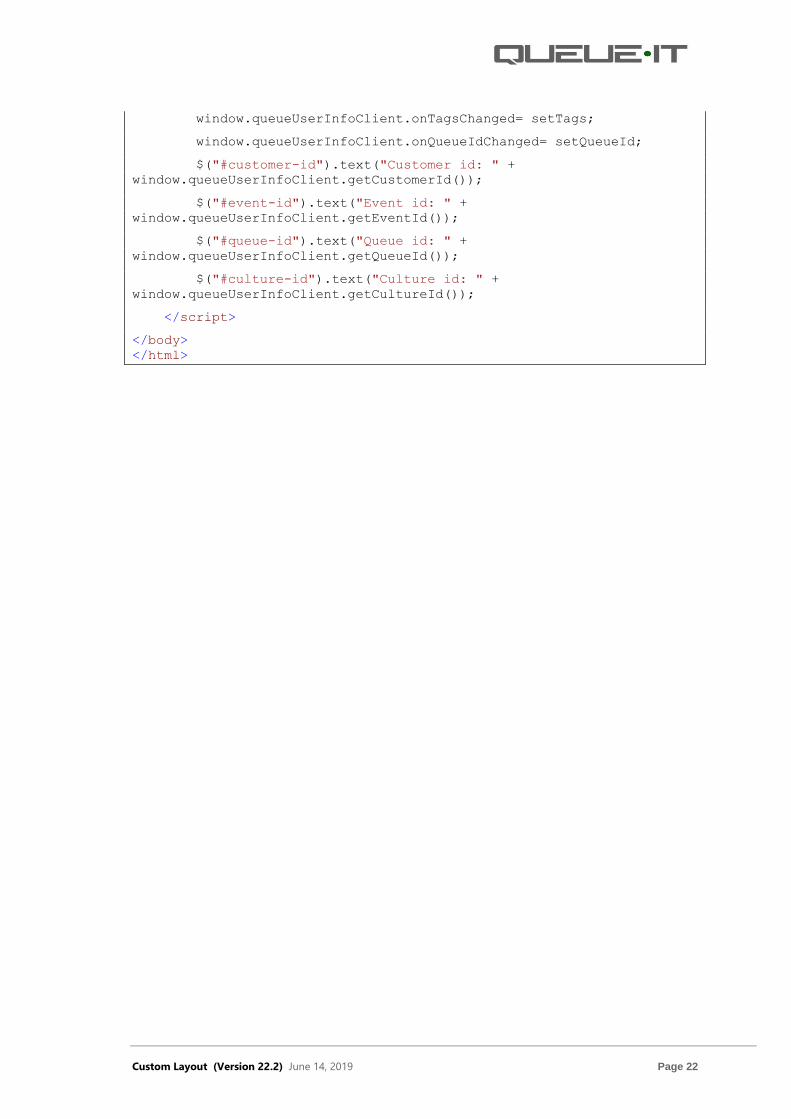
Custom Layout (Version 22.2) June 14, 2019 Page 22
window.queueUserInfoClient.onTagsChanged= setTags;
window.queueUserInfoClient.onQueueIdChanged= setQueueId;
$("#customer-id").text("Customer id: " +
window.queueUserInfoClient.getCustomerId());
$("#event-id").text("Event id: " +
window.queueUserInfoClient.getEventId());
$("#queue-id").text("Queue id: " +
window.queueUserInfoClient.getQueueId());
$("#culture-id").text("Culture id: " +
window.queueUserInfoClient.getCultureId());
</script>
</body>
</html>

Custom Layout (Version 22.2) June 14, 2019 Page 23
7 Other Information on Preview On the custom layout preview pages, there is an “Other information” window available.
This window is only visible on previews, and it will not be available on the running
queue. You can use it, in some cases, to preview different components that are visible
on the queue page. By hovering over the question mark icon next to each option, you
can see more information about it.
Figure 14: Other Information on Preview

Custom Layout (Version 22.2) June 14, 2019 Page 24
8 Support The best way to get support is to create a support ticket via the Support link in the
Queue-it GO (go.queue-it.net) Platform.
Figure 15: Support Link

Custom Layout (Version 22.2) June 14, 2019 Page 25
9 Custom Layout FAQs • What are the requirements needed for the Queue-it team to create custom
layouts?
Advised requirements to create custom layout for customers who provide
design:
- Design files created with Adobe Photoshop, Adobe Illustrator or
HTML/CSS files.
- If using Photoshop or Illustrator files for design, please use correct
specified element dimensions, font sizes etc.,
- Assets (logos, icons, images etc.,) attached separately if possible.
- If specific fonts are used, please provide font files in the following
formats: .eot, .ttf, .woff, .woff2, or in a web font link.
- Attached images should have a maximum file size of 100KB so that the
end-user’s queue page loads quickly and provides a good user
experience.
- There are NO specific sizes (width/height) for the custom layout or its
components.
- Queue-it’s default custom layout has 514 px width and height depends
on visible content. If all queue information is visible, height is
approximately 780px.
For customers that do not provide design:
- Provide a website/event page URL and the Queue-it team will create a
custom layout based on provided assets visible at the URL.
• What are the limitations when implementing a custom layout on a queue
page?
When implementing a custom layout, it is important to NOT remove or hide the
following queue components using CSS/JavaScript:
- Header section
It is possible to customize header text-content for Before, Queue, After
pages in GO Queue-it (go.queue-it.net) Platform. Component is shared
through all queue stages (Before, Queue, After, Error, Exit).
- Warning section
It is possible to customize between options to show or hide elements on
the Queue page in the GO Queue-it (go.queue-it.net) Platform. The
component is shared through the following queue stages (Before, Queue,
Error, Exit).
It is advised to use warning section elements, because it provides end-
users with information about event start time, queue progress, and
options to return to the queue in cases where that is necessary.

Custom Layout (Version 22.2) June 14, 2019 Page 26
- Process section
It is possible to customize between options to show or hide elements on
the Queue page in the GO Queue-it (go.queue-it.net) Platform. The
component is shared through the following queue stages (Before, Queue).
It is advised to have at least one of the options for end-users to know the
status of the queue.
- Dynamic message
It is possible to customize between options to show or hide a message on
the Before and Queue pages in the GO Queue-it (go.queue-it.net)
Platform. The component is shared through the following queue stages
(Before, Queue). If a dynamic message is selected in the layout display
options, the end-user won’t see the message in the running queue until
the message is written. The default displayed text in the dynamic message
is for preview purposes only.
- Email reminder section
It is possible to customize between options to show or hide the email
reminder on the Queue page in the GO Queue-it (go.queue-it.net)
Platform. It is available in the following queue stages (Queue).
- Footer section (Queue ID)
This is not customizable in the GO Queue-it (go.queue-it.net) Platform.
The component is shared through the following queue stages (Before,
Queue).
- “White Label” (‘What is this?’ link and Queue-it logo)
This is customizable in the GO Queue-it (go.queue-it.net) Platform, if the
feature is enabled. The components are shared through all queue stages
(Before, Queue, After, Error, Exit).
• Is it possible to customize queue components in terms of styling and
content that are shared between several queue stages?
Yes, it is possible. To style the component it is advised to use CSS. For the
content, customized JavaScript can be used if it’s not possible to use the GO
Queue-it (go.queue-it.net) Platform’s options for the intended purpose.
CSS syntax for shared queue components:
body.before #header { add styling here }
body.queue #header { add styling here }
body.after #header { add styling here }
body.error #header { add styling here }
body.exit #header { add styling here }
• How long does it take to implement a custom layout?

Custom Layout (Version 22.2) June 14, 2019 Page 27
If a custom layout design is provided by the customer, it depends on the
design’s complexity. Generally, its takes 2-3 weekdays to create a custom layout.
If the custom layout design is not provided by the customer, then a custom
layout proposal by the Queue-it team can be created in 1-2 weekdays.
• Does the custom layout support responsive design?
Yes, custom layouts are mobile friendly and support most of the older and
newer browsers.
• How and where are custom layouts customizable in terms of visual look,
content, and document structure?
The custom layout’s visual design can be customizable with CSS (Stylesheet).
Colors, fonts, sizes, images etc., can be styled with CSS.
When using HTML iframes (top, middle, bottom, left, right, side) it is advised
that styling is written as a style tag inside of a header in the HTML file or
separate CSS file is uploaded.
On the GO Queue-it (go.queue-it.net) Platform you can choose what elements
of the queue page will be displayed and it is also possible to change the header
text of the Before, Queue and After page. Beside the header text, other text can
be edited using the JavaScript.
With regards to the custom layout component’s placement and order, it is
possible to reorganize components in the custom layout by using JavaScript or
CSS, depending on the needed changes.
In terms of the custom layout document’s structure (main HTML), customization
is not available, but it’s possible to add extra content containers to the main
HTML, using JavaScript or separate HTML iframes from the main HTML
document.
• Is it possible to customize the progress bar on the queue page?
Yes, it is possible.
Customization options for the existing progress bar tiles:
- To change the progress tile color for the moving and static images.
For example, use Adobe Photoshop software to customize the tiles. (It is
not possible to change the tile color in the CSS).
- To change the size, slope etc., it is possible to use CSS or Adobe
photoshop software.
Currently, the progress tile size is 11px wide and 22px height.
• Is it possible to change the queue page sound?
It can only be changed as part of the “White Label” feature.
• Is it possible to remove the “What is this?” link and Queue-it logo?

Custom Layout (Version 22.2) June 14, 2019 Page 28
As the “What is this?” link and the Queue-it logo are part of the standard
agreement terms and conditions, it shall remain on the queue pages. It can only
be removed as part of the “White Label” feature.
• What is the reason to keep the Queue ID on the custom layout?
By keeping the Queue ID on the queue pages, we can easily follow up potential
issues, complaints and online posts containing the queue page screenshots by
end-users.
• What is the minimum queue information that is required to display when
queue is running?
For end-users to understand what is happening on the queue stages, see below
required information:
- Pre-queue (Before) stage:
Required to show at least one of the following, “The event will begin at:
XX:XX AM GMT” or “countdown timer”, for end-user to know when a certain
event will begin.
- In-queue (Queue) stage:
Required to show at least one of the following, “progress bar” or “Number
of users in line ahead of you: XXX”, for end-users to feel and understand
that there is an actual progress in the line.
- After event stage:
Required to show header information, for end-users to know that event is
ended.
- Error stage:
Required to show header information and button “Get a new place in line”,
for end-users to know that something has gone wrong during queue
process and they have possibility to get back in line.
- Exit stage:
Required to show header information and button “Click here to get back in
line”, for end-users to know that they have left the line and have possibility
to get back in line.
• Is it possible to add video, game, gallery, or other similar content on the
queue page?
Yes, it’s possible. To do so, please use one of the HTML iframes, such as middle,
top, bottom, left, right, side.
• Are there any examples of customer queue pages for inspiration?
Yes, examples are available here: https://queue-it.com/custom-queue-pages/