R-Map: A Map Metaphor for Visualizing Information Reposting ...
11
R-Map: A Map Metaphor for Visualizing Information Reposting Process in Social Media Shuai Chen, Sihang Li, Siming Chen, and Xiaoru Yuan, Senior Member, IEEE Abstract—We propose R-Map (Reposting Map), a visual analytical approach with a map metaphor to support interactive exploration and analysis of the information reposting process in social media. A single original social media post can cause large cascades of repostings (i.e., retweets) on online networks, involving thousands, even millions of people with different opinions. Such reposting behaviors form the reposting tree, in which a node represents a message and a link represents the reposting relation. In R-Map, the reposting tree structure can be spatialized with highlighted key players and tiled nodes. The important reposting behaviors, the following relations and the semantics relations are represented as rivers, routes and bridges, respectively, in a virtual geographical space. R-Map supports a scalable overview of a large number of information repostings with semantics. Additional interactions on the map are provided to support the investigation of temporal patterns and user behaviors in the information diffusion process. We evaluate the usability and effectiveness of our system with two use cases and a formal user study. Index Terms—Social Media, Information Diffusion, Map-like Visual Metaphor 1 I NTRODUCTION Social media has become an important platform allowing users to pub- lish, acquire and share information. People can not only post mes- sages, but can also reply or repost messages from others, thus acceler- ating the spread of information on social platforms. Once a message is posted (i.e., the original message), users can repost it with or with- out comments (i.e., reposting messages). Reposting messages convey a diverse variety of topics and sentiments of social media users. Key players such as opinion leaders may cause a lot of repostings, as they have many followers and are usually more influential. Information spreads via such reposting cascades, meaning that an original message can reach a broader range of social media users, who are not limited to the followers of the user posting the original message. Our work fo- cuses on investigating reposting behaviors in social media. We focus on analyzing the diverse reposting cascades with multiple levels and different semantics. Existing works focus on the structure [10, 32, 45, 48] or the seman- tics [7, 8, 51, 54] of reposting behaviors. It is challenging to design a visualization that supports an understanding of the multi-level struc- ture and the semantics at the same time. There are three main rea- sons for this. Firstly, the large extend of users’ participation requires a scalable visualization method to understand the structure of diffu- sion. Secondly, the semantics of the messages vary a great deal in the reposting structure. Different users play different roles in the repost- ing structure, and how to facilitate an understanding of these diverse semantics in the reposting structure is challenging. Thirdly, repost- ing behaviors and semantics vary over time, which makes the analysis even more complicated. To address the above challenges, we introduce R-Map, an interac- tive visualization with map symbols that can reveal the reposting pat- tern of an original message in a spatial context (Figure 5). In this map, key players are visualized as lakes, and users reposting them become • Shuai Chen, Sihang Li, and Xiaoru Yuan are with Key Laboratory of Machine Perception (Ministry of Education), School of EECS, Peking University. E-mail: {shuai.chen, lisihang, xiaoru.yuan}@pku.edu.cn. Xiaoru Yuan is also with National Engineering Laboratory for Big Data Analysis and Application, Peking University. Xiaoru Yuan is the corresponding author. • Siming Chen is with the Fraunhofer Institute IAIS and University of Bonn. E-mail: [email protected]. Manuscript received xx xxx. 201x; accepted xx xxx. 201x. Date of Publication xx xxx. 201x; date of current version xx xxx. 201x. For information on obtaining reprints of this article, please send e-mail to: [email protected]. Digital Object Identifier: xx.xxxx/TVCG.201x.xxxxxxx counties. Counties with similar topics form a region, while a lake and its surrounding counties form a country, which represents a subtree of the reposting tree. Connected countries form continents, and iso- lated islands represent messages that are different from the continents in topics. We use multiple connection symbols to represent different relations between key players. A river connecting lakes represents the reposting relations between key players. A route represents a repost- ing message that was not made by a follower, and a bridge represents a reposting message causing different repostings in semantics. Unlike previous map designs, we address the issue of scalability by trans- forming a multi-level reposting tree into a map. The map is enriched by the diverse semantic information, which is not addressed in previ- ous work. The key contributions in this paper include: • A Novel Visual Metaphor Design for Information Reposting. The reposting map provides an overview of the reposting pro- cess. It represents multi-faceted information using intuitive vi- sual metaphors to enable users to explore different patterns. • A Visual Analytics System to Explore User Reposting Behav- iors in Social Media. Different interactions are provided to help users interact with the map more easily, allowing users to under- stand the reposting process from different perspectives. The rest of this paper is organized as follows. We discuss related work in Section 2 and data in Section 3. We then describe the de- sign of R-Map and the construction method in Section 4, and give an introduction to the system introduction in Section 5. Two cases are presented to justify the usefulness of our method in Section 6. The results of a user study are reported in Section 7. Finally, we conclude with a discussion and directions for future work. 2 RELATED WORK The state-of-the-art works in social media visualization and visual an- alytics are summarized in [12, 50]. In this paper, we review related works in the fields of information diffusion, tree visualizations, and map-based visualizations. 2.1 Analysis of Information Diffusion Online social networks play a key role in the diffusion of informa- tion. Katz and Lazarsfeld propose the “two-step flow” theory of com- munication [24], which asserts that information from the mass media moves to opinion leaders, and then moves to a wider range of audi- ences. Opinion leaders are influential in the diffusion process and pass on their interpretations in addition to the original messages. In addition to modeling the process of information spreading [21, 22], other research studies have been conducted to predict the diffusion
-
Upload
khangminh22 -
Category
Documents
-
view
1 -
download
0
Transcript of R-Map: A Map Metaphor for Visualizing Information Reposting ...

R-Map: A Map Metaphor for Visualizing Information Reposting
Process in Social Media
Shuai Chen, Sihang Li, Siming Chen, and Xiaoru Yuan, Senior Member, IEEE
Abstract—We propose R-Map (Reposting Map), a visual analytical approach with a map metaphor to support interactive explorationand analysis of the information reposting process in social media. A single original social media post can cause large cascades ofrepostings (i.e., retweets) on online networks, involving thousands, even millions of people with different opinions. Such repostingbehaviors form the reposting tree, in which a node represents a message and a link represents the reposting relation. In R-Map,the reposting tree structure can be spatialized with highlighted key players and tiled nodes. The important reposting behaviors, thefollowing relations and the semantics relations are represented as rivers, routes and bridges, respectively, in a virtual geographicalspace. R-Map supports a scalable overview of a large number of information repostings with semantics. Additional interactions onthe map are provided to support the investigation of temporal patterns and user behaviors in the information diffusion process. Weevaluate the usability and effectiveness of our system with two use cases and a formal user study.
Index Terms—Social Media, Information Diffusion, Map-like Visual Metaphor
1 INTRODUCTION
Social media has become an important platform allowing users to pub-lish, acquire and share information. People can not only post mes-sages, but can also reply or repost messages from others, thus acceler-ating the spread of information on social platforms. Once a messageis posted (i.e., the original message), users can repost it with or with-out comments (i.e., reposting messages). Reposting messages conveya diverse variety of topics and sentiments of social media users. Keyplayers such as opinion leaders may cause a lot of repostings, as theyhave many followers and are usually more influential. Informationspreads via such reposting cascades, meaning that an original messagecan reach a broader range of social media users, who are not limitedto the followers of the user posting the original message. Our work fo-cuses on investigating reposting behaviors in social media. We focuson analyzing the diverse reposting cascades with multiple levels anddifferent semantics.
Existing works focus on the structure [10, 32, 45, 48] or the seman-tics [7, 8, 51, 54] of reposting behaviors. It is challenging to designa visualization that supports an understanding of the multi-level struc-ture and the semantics at the same time. There are three main rea-sons for this. Firstly, the large extend of users’ participation requiresa scalable visualization method to understand the structure of diffu-sion. Secondly, the semantics of the messages vary a great deal in thereposting structure. Different users play different roles in the repost-ing structure, and how to facilitate an understanding of these diversesemantics in the reposting structure is challenging. Thirdly, repost-ing behaviors and semantics vary over time, which makes the analysiseven more complicated.
To address the above challenges, we introduce R-Map, an interac-tive visualization with map symbols that can reveal the reposting pat-tern of an original message in a spatial context (Figure 5). In this map,key players are visualized as lakes, and users reposting them become
• Shuai Chen, Sihang Li, and Xiaoru Yuan are with Key Laboratory of
Machine Perception (Ministry of Education), School of EECS, Peking
University. E-mail: {shuai.chen, lisihang, xiaoru.yuan}@pku.edu.cn.
Xiaoru Yuan is also with National Engineering Laboratory for Big Data
Analysis and Application, Peking University. Xiaoru Yuan is the
corresponding author.
• Siming Chen is with the Fraunhofer Institute IAIS and University of Bonn.
E-mail: [email protected].
Manuscript received xx xxx. 201x; accepted xx xxx. 201x. Date of Publication
xx xxx. 201x; date of current version xx xxx. 201x. For information on
obtaining reprints of this article, please send e-mail to: [email protected].
Digital Object Identifier: xx.xxxx/TVCG.201x.xxxxxxx
counties. Counties with similar topics form a region, while a lake andits surrounding counties form a country, which represents a subtreeof the reposting tree. Connected countries form continents, and iso-lated islands represent messages that are different from the continentsin topics. We use multiple connection symbols to represent differentrelations between key players. A river connecting lakes represents thereposting relations between key players. A route represents a repost-ing message that was not made by a follower, and a bridge representsa reposting message causing different repostings in semantics. Unlikeprevious map designs, we address the issue of scalability by trans-forming a multi-level reposting tree into a map. The map is enrichedby the diverse semantic information, which is not addressed in previ-ous work.
The key contributions in this paper include:
• A Novel Visual Metaphor Design for Information Reposting.The reposting map provides an overview of the reposting pro-cess. It represents multi-faceted information using intuitive vi-sual metaphors to enable users to explore different patterns.
• A Visual Analytics System to Explore User Reposting Behav-iors in Social Media. Different interactions are provided to helpusers interact with the map more easily, allowing users to under-stand the reposting process from different perspectives.
The rest of this paper is organized as follows. We discuss relatedwork in Section 2 and data in Section 3. We then describe the de-sign of R-Map and the construction method in Section 4, and give anintroduction to the system introduction in Section 5. Two cases arepresented to justify the usefulness of our method in Section 6. Theresults of a user study are reported in Section 7. Finally, we concludewith a discussion and directions for future work.
2 RELATED WORK
The state-of-the-art works in social media visualization and visual an-alytics are summarized in [12, 50]. In this paper, we review relatedworks in the fields of information diffusion, tree visualizations, andmap-based visualizations.
2.1 Analysis of Information Diffusion
Online social networks play a key role in the diffusion of informa-tion. Katz and Lazarsfeld propose the “two-step flow” theory of com-munication [24], which asserts that information from the mass mediamoves to opinion leaders, and then moves to a wider range of audi-ences. Opinion leaders are influential in the diffusion process and passon their interpretations in addition to the original messages.
In addition to modeling the process of information spreading [21,22], other research studies have been conducted to predict the diffusion
of information [33, 53] and to detect diffusion patterns [40]. Unlikethese works, this paper utilizes visualization techniques to illustratethe diffusion process of information using a map metaphor.
2.2 Visual Analytics for Information Diffusion
Many types of visualizations have been proposed to reveal the dif-fusion patterns in social media. Many of these directly visualizethe reposting tree of a message with an improved node-link dia-gram [42, 32, 52]. WeiboEvents [32] provides four different layouts(tree, circular, sail, and curve layouts) to help users analyze the diffu-sion structure of a weibo. Cascade [45] monitors sharing activities onTwitter using a 3D visualization. Users can smoothly change to differ-ent views to explore different facets of the information. Chen et al. an-alyze information diffusion with the geographic facets [11]. However,these methods may not scale to large datasets. Revisit [42] displaysreposting chains using a focus+context timeline visualization, whichhides reposting relations that are out of focus. Google+ Ripples [48]uses a mixture of the node-and-link and circular treemap methods. Thegoal of R-Map is to provide a scalable visualization method for a largescale reposting tree with multi-faceted information, which is differentfrom previous works.
Other research studies focus on analyzing the diffusion patterns ofcollective messages, which often have the same topics. Whisper [7]can be used to monitor the information diffusion on a given topic inreal time. Zhao et al. designed FluxFlow [54], an interactive visualanalysis system to explore the anomalous spreading of information.E-Map [8] collects weibos and repostings on different stages about anevent to analyze the evolution patterns. All of these methods are suc-cessful designs in terms of revealing the information diffusion processfrom different perspectives, but the detailed propagation patterns of asingle message are neglected.
2.3 Tree Visualization
Over 300 tree visualization methods are collected at treevis.net [36].They are divided into explicit and implicit tree visualizations accord-ing to representation methods of parent-child relations [35]. Explicitnode-link diagrams using straight lines or curves are the most commontree visualization methods. Although they allow users to easily inter-pret the relations of nodes, node-link diagrams have a rather low spaceefficiency, which causes clutter when analyzing large scale repostingtrees.
For implicit tree visualizations, treemaps [23] and icicle plots [26]are two prominent methods. In treemaps, hierarchical relations arerepresented by nesting the children wthin the parent. Users can eas-ily compare the attributes of the data based on the sizes of nodes, butthe treemap imposes high burdens on users in terms of interpreting thetree structure [4]. Although various methods have been proposed tohelp users gain more insights from treemaps [47, 49, 48, 2, 27], theyare not intuitive to show the information diffusion structures. Icicleplots or sunburst [41] represent the parent/child relations through ad-jacency: the child nodes are placed adjacent to their parent. To ensurethe adjacency of parent and children, nodes vary greatly in size. Al-though many tree visualizations have been proposed, they focus onlyon showing the structure of trees. It is hard to create an intuitive wayof visualizing the features and relations of nodes in the reposting tree,which is the focus of our paper.
2.4 Map-Based Visualization for Relation Data
Maps are used to draw the surfaces of a region to represent the distri-bution of geographical features. Couclelis was among the earliest toinvestigate the potential of generating visualizations with geographi-cal metaphors [13]. The advantages of geographical metaphors are thegood user experience they offer and the solid theories of geographythat underpin them. Skupin et al. [37, 39] also discussed the carto-graphic research on transferring metaphors to non-geographical visu-alizations. They mapped conference abstracts onto a term-dominancelandscape [38]. The introduction of GMap [16] accelerated researchin this area. GMap transforms graphs into maps to highlight com-munities and this method has been applied in the analysis of network
communication [14], computer science literature [15] and video con-tent [30]. In the area of social media, Gansner et al. [17] proposeda dynamic map generation method to analyze evolving topics in real-time Twitter messages. CompactMap [28] uses a spiral-based layoutto generate a compact map for comparing cluster sizes of streamingtweets. Chen et al. [10] introduced D-Map, a hexagon-based map foranalyzing user-centric information diffusion patterns. Later, they pro-posed D-Map+ [9] and E-Map [8], which allowed users to conduct amulti-faceted analysis of event evolution on social media. However,these methods provide an aggregated view of the diffusion behaviorsof multiple source messages and omit the multi-level structure of re-postings.
3 SOCIAL MEDIA DATA
In this section, we introduce the data and summarize the importantfeatures in the reposting process.
3.1 Data Attributes
The data in this study are taken from Sina Weibo, a social media plat-form like Twitter that is widely used in China. Each weibo is similarto a tweet on Twitter. We focus on analyzing the reposting processof an original weibo. The following terms are defined to describe thereposting data:
• Root user is the creator of the original weibo.
• Repostings include both direct and indirect repostings. If aweibo reposts another weibo, it is a direct reposting. If a weiboreposts another reposted weibo, it is an indirect reposting of theoriginal weibo. The repostings of a given weibo are all weibosthat directly or indirectly repost it.
• Comments are added by social media users to give their opinionson the reposted weibo.
• Semantics-varying repostings are weibos creating repostingswith new topics compared to the reposted weibo.
• Non-follower repostings are weibos posted by users who do notfollow the creator of the reposted weibo.
• Key players are social media users who create large-scale re-postings to the original weibo.
A cascade of user repostings forms a tree. In this tree, the originalweibo is the root node, and all repostings are descendants nodes of theroot. Direct repostings of a node are its child nodes.
The characteristics of the dissemination of a given weibo messagecan be summarized using the following aspects.
• D1: Reposting Structure. Many users can participate in thereposting process, creating complicated tree structures.
• D2: Key Players. Users have different roles in the repostingprocess. Key players have a strong influence on shaping the re-posting tree structure and semantics.
• D3: Different Behaviors. Repostings may have different se-mantics or temporal features. Here, we explore the features ofreposting users as these may reveal the social mechanism under-lying the process.
• D4: Dynamic Diffusion. The life cycle of the dissemination ofa weibo has multiple stages, including its beginning, bursting,and dying. At each stage, there are different reposting behaviors,topics and key players.
3.2 Different Relations
We investigate three types of relations in our analysis of reposting be-haviors: follower-followee relations, key players’ reposting relations,and semantic relations.
Follower-followee relations. In social media, users’ messages arenormally reposted by their followers. In contrast, reposting by a non-follower may disseminate the message to a wider range of audiences,greatly changing the diffusion process. This relation (i.e., repostingbut not following) is specially addressed in R-Map.
Key players’ reposting relations. Reposting by key players oropinion leaders, exposes the message to the general public. Thus, we
are interested in the reposting chains of key players to understand howa message can reach these key players. The reposting patterns afterthe key players repost a message are also analyzed in depth.
Semantic relations. Social media users may express different at-titudes in their messages. These messages concern diverse topics in-volving different communities of social media users. The sentimentsexpressed in the reposting messages are also important in understand-ing users’ emotions towards the events.
4 VISUALIZATION DESIGN
In this section, we first discuss the motivation and design rationalesfor R-Map. We then present the visual encoding methods and steps inmap construction.
Region: Counties with
same semantics
Country: Counties with
same key player
River: Key player repost
Bridge: Semantics-varying repost
Route: Non-follower repost
Repost Level
Positive
Neutral
Negative
Sentiment
Lake: Key player
County: Repost user
Repost link
Source: Root user
Important County: Repost
user with higher influence
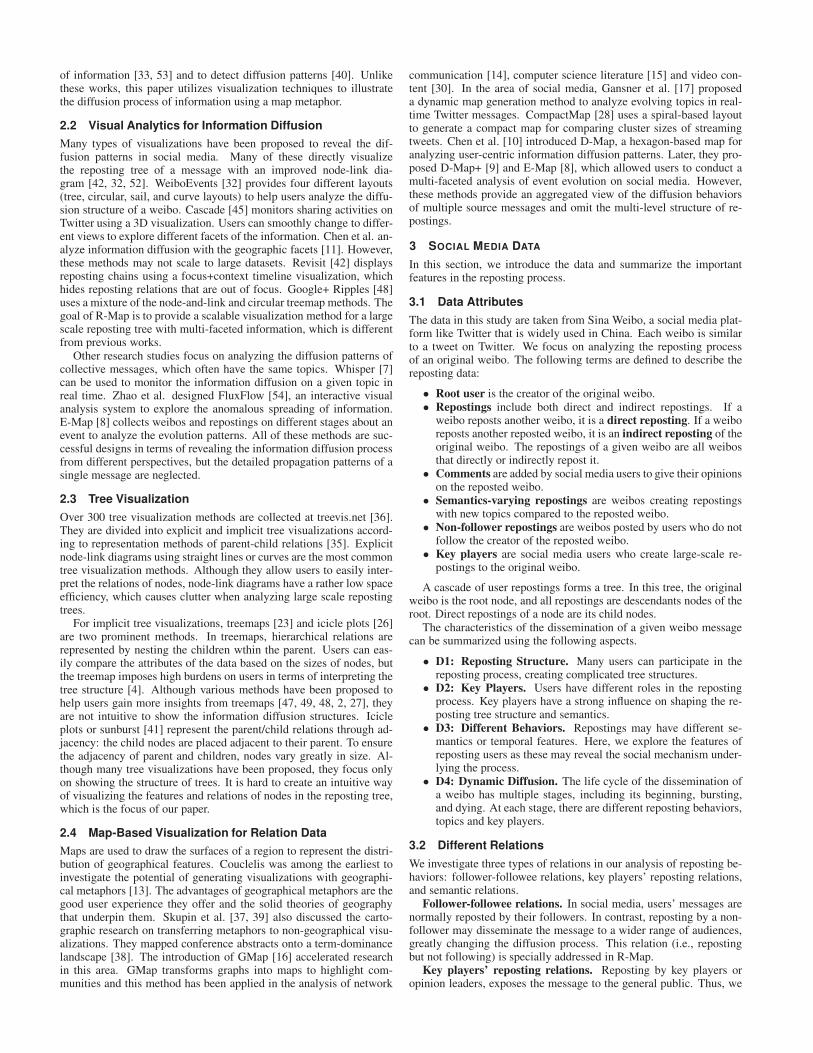
Fig. 1. Visual encodings of R-Map, which is constructed based on areposting tree.
4.1 Motivation: Semantic Map
Existing visualization methods fail to provide an intuitive represen-tation of the reposting tree and semantics, so a new visual design isneeded to address the challenges of visualizing a reposting tree. Mapsdescribe the physical living spaces of people. Since their emergence,many different types of maps have been created to show different kindsof information. Experts have confirmed that people generally learn toread maps in pre-school [5], and need little training in solving map-based visualization tasks. In our work, we use maps to organize in-formation derived from the reposting tree, and link them with spatialobjects such as continents, islands, countries, rivers, etc. The con-venience of maps in terms of cognition means that people can betterunderstand reposting data from multiple perspectives. Moreover, thespatialization of information in the map provides opportunities to vi-sualize both the structure and the semantics at the same time.
4.2 Design Rationale
Our analysis of reposting trees focuses on the reposting structure, theroles of users, and the evolution of the semantics. We summarize thefollowing requirements to present these key factors and their relations.
• R1: Providing an overview of the reposting structure. Themap should show the overall structure of the reposting tree tohelp people understand the diffusion process of the originalweibo (D1). The map should be easy to understand and shouldavoid visual clutter.
• R2: Identifying users with different roles and behaviors.Users play different roles and have different attitudes in the diffu-sion process. Key players should be differentiated from ordinaryusers (D2). We need to reveal users’ sentiments and opinions oftheir messages in the diffusion process (D3).
• R3: Revealing the dynamic diffusion process. The topics andthe sentiments of users may vary at different stages. The mes-sages of key players can create new opinions or topics, and mayhave a strong influence on the overall event (D4).
• R4: Coupling the analysis of reposting structure and seman-tics. The semantics of repostings affect the development of thereposting tree. These should be considered together in the designin order to reduce the analysis burden on users when switchingbetween different contexts.
4.3 Map Design and Visual Encoding
R-Map provides an overview of the structure and the semantics forthe diffusion of an original weibo. Reposting features are mappedto different metaphors on the map, including lakes, counties, regions,countries, continents, islands, rivers, routes, and bridges (Figure 1).We choose these metaphors because they are common in a real mapand can be linked in a meaningful way to the data features.
Lake: In the map, a lake represents a key player in the diffusionprocess. A lake is the origin of rivers, and thus irrigates the surround-ing land, in the same way as a key player disseminates information tousers who repost him/her weibos. The root user is placed in the centerof the country, and is distinguished from other nodes with an addi-tional stroke. For other key players, they are placed on the boundaryto show reposting relations (R1, R2).
County: A county on the map is a polygon representing a non-keyplayer weibo node in the reposting tree. A map can be divided intodifferent counties, just as a reposting tree consists of different nodes.Counties with higher influence are highlighted with a black stroke. Acounty is affiliated with a lake and belongs to a country (R1).
Region: Counties discussing similar topics form regions. The re-postings of a weibo may contain discussions of different topics bysocial media users. We group these repostings according to topics.Counties with the same topics form continuous regions on the map(R2, R4).
Country: A country on the map symbolizes a subtree rooted bya key player. All counties associated with the country are repostingnodes on the subtree. The position of a country is determined by a treelayout algorithm [19] and reveals the overall diffusion structure (R1).A country may have multiple regions.
Continent and Island: Large connected countries on the map forma continent. Smaller and isolated countries form islands. The con-nections between different countries represent different reposting re-lations (R1).
River, Route and Bridge: These features encode different repost-ing relations of the key players discussed in Section 3.2. Rivers con-nect different lakes on the continent, and represent the parent-child re-lations of key players, thus showing the skeleton of the reposting tree.Reposting often happens in a follower network [43] and indicates anagreement with the message content [31]. However, there are alwaysnon-follower repostings and semantics-varying repostings in the dif-fusion process. To highlight these special repostings for key players,we split the territories of key players from the continents in the formof islands. If a key player does not follow his/her parent, a curvedroute connects them; if the topics of the territories belonging to thekey player are different from his/her parent, a straight bridge connectsthem. Bridges and routes are common in a map and can be easily dis-tinguished. Both a bridge and a route can connect to an island at thesame time (R3, R4). Only the different relations among key playersare highlighted, as too many links will make the map degrade into anode-link tree with much visual clutter. Users can interactively checkthe reposting relations of other nodes in the system.
In the proposed map design, we omit most of the links of the origi-nal tree. To compensate for the loss of structural information (i.e., thelevel of the nodes in the tree), we use color to encode the level informa-tion. The reposting levels are mapped to colors with the same hue butwith monotonically increasing saturation values [44]. A green-scalecolor scheme is employed to make the map more intuitive and com-prehensible. The darker the color of the polygon, the deeper it is withinthe reposting tree structure (R1). An alternative color scheme is alsoprovided to represent the sentiment of each reposting: red, orange, andblue are used to represent negative, neutral and positive opinions, re-spectively (Figure 9). Repostings without comments are considered tobe neutral. The sentiment of each reposting is calculated using an on-

Bubble Layout
(a)
VoronoiPartition
(b)
Skeleton Layout Voronoi Grid Key Player Boundaries Continents and Islands
Key Player Key Player CircleReposting Non-follower Repost Semantics-Varying RepostData Legends
Skeleton Tree R-Map Layout
BoundaryErosion
(c)
PolygonAssignment
(d)
PolygonAjustment
(e)
NodeFilling
(f )
Map Boundary
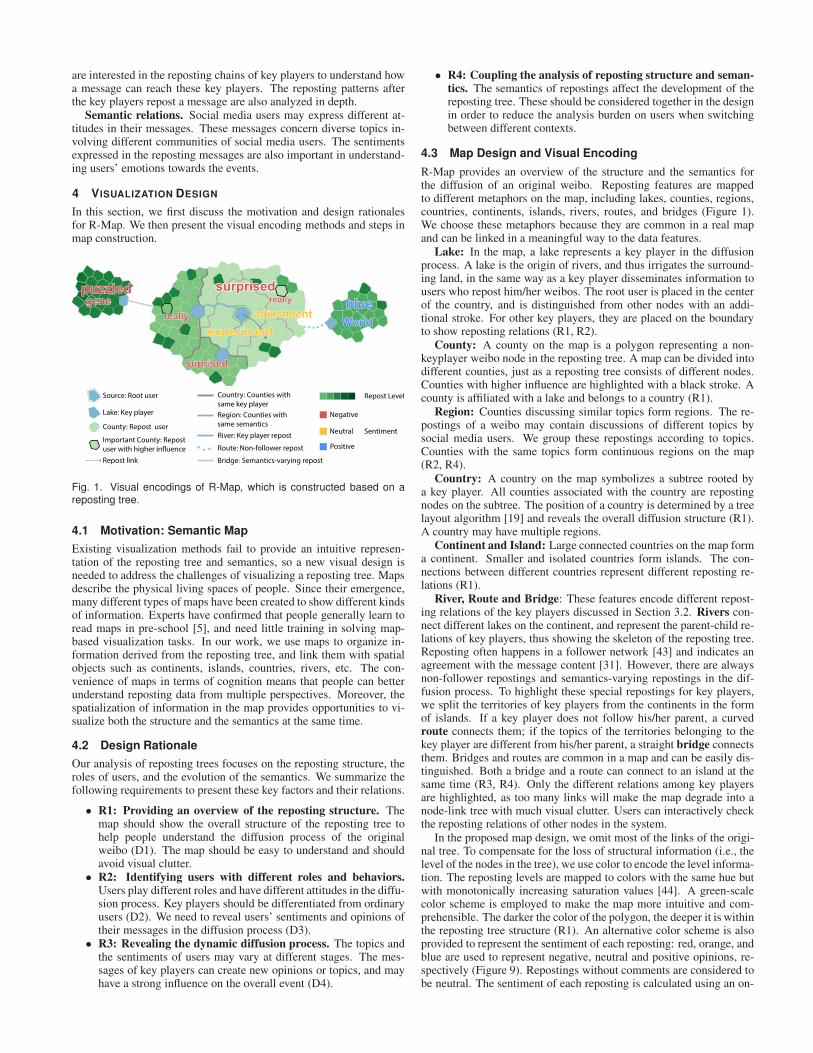
Fig. 2. R-Map construction. (a) The position of each key player node is calculated using a bubble tree layout method [19]. (b) The layout boundingbox is partitioned by a Voronoi Diagram. (c) The generated polygons are then filtered based on the density value given in Equation 3. (d) Eachpolygon is then assigned to a key player node based on the weighted distance function in Equation 4. (e) To get the final layout area, the polygonsassigned to each key player are adjusted further. (f) Finally, all nodes are filled into the calculated areas.
line Chinese sentiment analysis tool [1] (R3). The color coding meth-ods of map metaphors are based on guidance provided by the UnitedStates Department of the Interior [46] and the color scheme of GoogleMaps. Rivers, bridges, and routes are color-coded with blue, gray, andblue, respectively. To denote the boundaries of different countries,we use thick dark lines, and for regional boundaries, we use thinnergray lines to distinguish them from the country boundaries. The whitespace of the canvas is color-coded with light blue, similar to the colorof the ocean.
To enable a better understanding of the semantics in the diffusionprocess, keywords are overlapped on the map with color indicatingdifferent sentiments (R4).
4.4 R-Map Construction
The construction of R-Map first determines certain key nodes in thetree and then places the remaining nodes, in a similar way to existinggraph algorithms such as HDE [20] and Pivot MDS [6]. They are de-termined by a threshold value based on the number of the descendantnodes (repostings). We set the default threshold T as 5% of the totalnumber of the nodes after testing. Using this setting, if one node is akey node, its parent will also be considered a key node. We can extracta connected subtree from the original reposting tree. The subtree isconsidered to be the skeleton of the original tree. Similarly, countieswith higher influence within each country are nodes with repostingsmore than 1% of the total number of the nodes. Users can changethe threshold interactively in our system. The construction of R-Mapincludes two steps: skeleton layout and map layout (Figure 2).
4.4.1 Skeleton Layout
In this step, the skeleton layout determines the basic shape of the gen-erated map. The following layout requirements are considered. Firstly,the layout should show the tree structure clearly, and the path from theroot to a node should avoid a zigzag shape. Secondly, each key nodeshould be allocated a certain area, so that its descendant nodes canbe filled in. We adopt the bubble tree drawing algorithm proposed byGrivet et al. [19]. The radius (ri) of the circle for the key node (Ki) iscalculated as follows:
ri :=√
Ki.descendants.length, (1)
where Ki.descendants contains the descendant nodes of Ki, whichwill be placed in the circular area allocated to Ki. The descendantnodes of Ki do not include the descendant nodes of K j if K j is a childnode of Ki. In the original algorithm, circles with a parent-child rela-tion touch externally. However, in our method, to ensure the genera-tion of islands, an extra distance is added between two adjacent circleswith non-follower or semantics-varying relation (Figure 2c). The ex-tra distance value d is set as half of rm (the minimal radius value ofcircles) after tuning. For two key players with a parent-child relation,if the child does not follow the parent, the boundary distance betweenthem is set as d (the follower-followee relation). We calculate the key-word vector for each key player based on its messages and those ofits descendants. If the cosine distance between the parent and child isless than 0.5, this indicates they have a different topic distribution. Theboundary distance between them is also set as d (semantic relation).
4.4.2 Map Layout
After obtaining the positions of the key players, we calculate the po-sitions of the remaining nodes in the reposting trees. The input is thelayout of the skeleton tree, and the output is the position of each node
in the original reposting tree. Each node is represented as a polygonon the map.
Plane Partition: (Figure 2b) Based on the layout of the skeletontree, the bounding box of the drawing canvas is first calculated. Fol-lowing this, the plane is divided by a Voronoi Diagram. The VoronoiDiagram generates many polygons, which are used to encode nodeson the reposting tree. The Voronoi Diagram was chosen because it isirregular and similar to a real-world terrain. We randomly project theseed points into the bounding box and apply the Lloyd algorithm [29]to generate a relatively uniform size of polygons. The number of seedpoints (Ns) is calculated as:
Ns :=W ∗H/π, (2)
in which W and H are the width and height of the bounding boxsize, respectively. We set the area of each polygon as π in Equation 2,so that the number of polygons within a key player circle is almostequal to the number of its descendant nodes.
Boundary Erosion: (Figure 2c) Although the generated polygonscompletely occupy the plane, not all of them will be used. Based onthe positions of the key players, we carry out splatting of them into thepolygons using a Gaussian Kernel. The density value of each polygonin the Voronoi Diagram is calculated as:
D :=Nk
∑i=1
αnN (P|µi,σi2), (3)
where Nk is the number of key players. α is the weight of eachkey player, which corresponds to the number of descendants. µ is theposition of each key player and σ is the radius of the Gaussian Kernel.The splatting radius σ is equal to the radius of the key player circle.The density values of all polygons are then normalized. We set thethreshold value to 0.1 after tuning. All polygons with a density belowthe threshold are discarded. In this step, we obtain the basic shape ofthe map.
Polygon Assignment: (Figure 2d) After creating the shape of themap, each polygon is assigned to a key player node. We allocatepolygons based on a weighted distance function, in a similar way tothe Voronoi treemap construction method [3]. For each polygon, forwhich the center position is denoted as p, its distance to a key playernode with coordinate K.pos is:
distance(p,r,K.pos) := ||p−K.pos||− r, (4)
where r is the radius of the key player circle, which is used as aweight in the distance function. Each polygon is assigned to its nearestkey player node. The map is divided into different continuous areasafter this assignment.
Polygon Adjustment: (Figure 2e) We have allocated a differentnumber of polygons to each key player. However, the number of allo-cated polygons is not strictly equal to that of the nodes to be placed.The polygons and nodes of the reposting tree have a one-to-one map-ping. The extra polygons for some key players will leave blank areasinside the map, while some key players may have insufficient poly-gons to place their repostings. We apply a two-round iteration methodto adjust the allocation of polygons so that each key player node hasa number of polygons equal to the number of descendant nodes. Inthe first round, if the number of polygons allocated to a key player isinsufficient, its territories are expanded by adding polygons along theboundary. Once the allocated polygons are enough, their affiliationswill not change. In the second round, key players with extra polygonshave these polygons iteratively removed. In this step, we first identifykey players with territories that are land-locked by others. The extra
polygons are assigned to their neighboring key players. For other keyplayers, the polygons are removed along the boundary, according totheir distance from the center of the territory. The polygons furthestaway will be removed first. After the two rounds of adjustment, thewhole map is divided into continents and islands as designed.
Node Filling: (Figure 2f) After adjusting the polygons, the lake po-sition representing each key player is first determined. The root nodeis assigned the nearest polygon to its location. Other key player nodesare assigned the polygon on the boundary which is nearest to the po-sition of its parent polygon. The key player polygon on the boundaryserves as a port to the country in which it is located. The descendantnodes of each key player are then placed within each country.
BA
(a)
BA
(b)
BA
(c)
BA
(d)
Fig. 3. Chronological layout(a, b) and semantic layout (c, d). (a) Theoriginal reposting tree. (b) Nodes are placed chronologically aroundthe parent node. (c) Subtree B with similar semantics to subtree A, isadjusted in the layout sequence. (d) Subtrees A and B form a region onthe map.
For the descendant nodes of each key player, their layout shouldmaintain the reposting relations. Firstly, nodes with the same ancestorare placed within a continuous area. Secondly, nodes should be closeto their parents on the plane. In the Voronoi Diagram, a polygon hasa limited number of adjacent polygons, meaning that for a node withmany children, not all of the child polygons will be adjacent to theparent polygon; they are placed around the parent node, instead. Twolayout strategies are considered. In a chronological layout, We firstsort nodes on the same level chronologically. Then, when each nodehas been placed on the map, its child nodes are placed successively.This layout uses a depth-first strategy, so that a subtree can take up acontinuous area on the map, as shown in Figure 3b. In this method,the semantics of each node are not considered and no regions appearin the generated map. In the semantic layout, in order to reveal thegroup behaviors of nodes, nodes with similar keywords are placed to-gether in a region on the map. For each subtree rooted by a childnode of the key player, we extract keywords from the messages ofnodes and build a weighted vector using the Term Frequency-InverseDocument Frequency (TF-IDF) [34] method. We then apply k-meansclustering [29] to group subtrees into different clusters. The clusternumber k is determined by the elbow method [25]. Subtrees with-out comments in reposting are grouped and placed first, so that userscan compare the activeness of commenting behavior for different keyplayers. Other clusters are placed chronologically based on the aver-age reposting time. In Figure 3, subtrees rooted by A and B are placedtogether and form a region on the map (Figure 3d). Compared withthe chronological layout, the semantic layout highlights the diversedistribution of topics in the messages reposting key players.
4.4.3 Boundaries and Links
After generating the map layout, map metaphors, including bound-aries, rivers, routes and bridges, are created to highlight the repostingstructures on the map.
Boundary: Edges owned by two polygons of different countriesform the boundaries of countries. Edges owned by two polygons ofdifferent regions form the boundaries of regions.
River: Rivers connect two key players (lakes). Each river travelsalong the grid points of the polygons and it is the shortest path betweenthe source and target key players.
Route and Bridge: Routes and bridges connect different lands. Achild key player positioned at the coast is connected to the nearestpolygon on the coast of the parent key player territory.
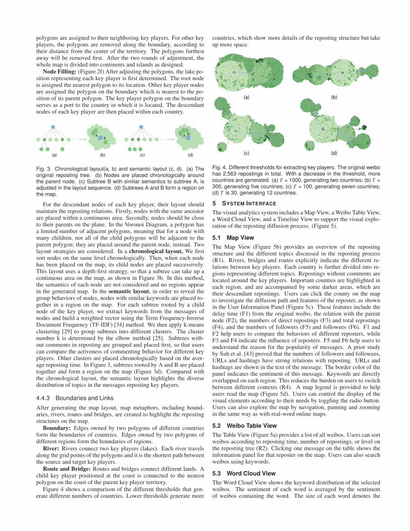
Figure 4 shows a comparison of the different thresholds that gen-erate different numbers of countries. Lower thresholds generate more
countries, which show more details of the reposting structure but takeup more space.
(d)(c)
(b)(a)
Fig. 4. Different thresholds for extracting key players. The original weibohas 2,563 repostings in total. With a decrease in the threshold, morecountries are generated. (a) T = 1000, generating two countries; (b) T =300, generating five countries; (c) T = 100, generating seven countries;(d) T is 30, generating 12 countries.
5 SYSTEM INTERFACE
The visual analytics system includes a Map View, a Weibo Table View,a Word Cloud View, and a Timeline View to support the visual explo-ration of the reposting diffusion process. (Figure 5).
5.1 Map View
The Map View (Figure 5b) provides an overview of the repostingstructure and the different topics discussed in the reposting process(R1). Rivers, bridges and routes explicitly indicate the different re-lations between key players. Each country is further divided into re-gions representing different topics. Repostings without comments arelocated around the key players. Important counties are highlighted ineach region, and are accompanied by some darker areas, which aretheir descendant repostings. Users can click the county on the mapto investigate the diffusion path and features of the reposter, as shownin the User Information Panel (Figure 5c). These features include thedelay time (F1) from the original weibo, the relation with the parentnode (F2), the numbers of direct repostings (F3) and total repostings(F4), and the numbers of followers (F5) and followees (F6). F1 andF2 help users to compare the behaviors of different reposters, whileF3 and F4 indicate the influence of reposters. F5 and F6 help users tounderstand the reason for the popularity of messages. A prior studyby Suh et al. [43] proved that the numbers of followers and followees,URLs and hashtags have strong relations with reposting. URLs andhashtags are shown in the text of the message. The border color of thepanel indicates the sentiment of this message. Keywords are directlyoverlapped on each region. This reduces the burden on users to switchbetween different contexts (R4). A map legend is provided to helpusers read the map (Figure 5d). Users can control the display of thevisual elements according to their needs by toggling the radio button.Users can also explore the map by navigation, panning and zoomingin the same way as with real-word online maps.
5.2 Weibo Table View
The Table View (Figure 5a) provides a list of all weibos. Users can sortweibos according to reposting time, number of repostings, or level onthe reposting tree (R2). Clicking one message on the table shows theinformation panel for that reposter on the map. Users can also searchweibos using keywords.
5.3 Word Cloud View
The Word Cloud View shows the keyword distribution of the selectedweibos. The sentiment of each word is averaged by the sentimentof weibos containing the word. The size of each word denotes the
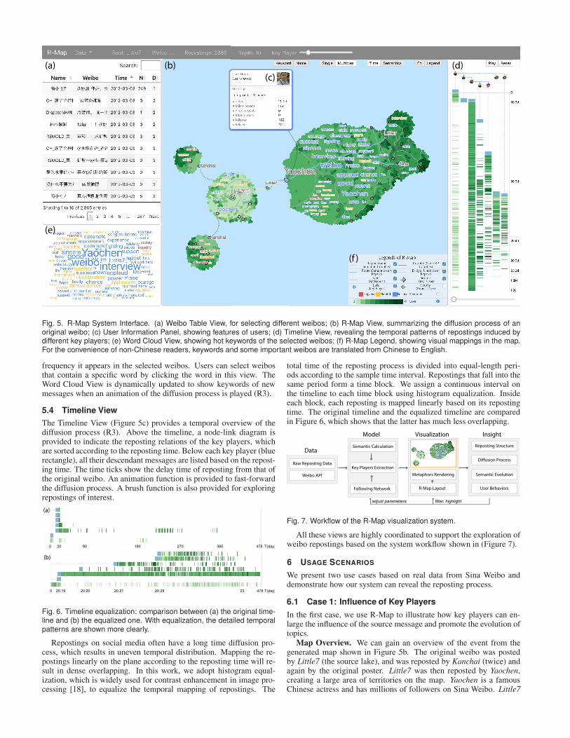
(a) (b)
(c)
(d)
(e)
(f )
Fig. 5. R-Map System Interface. (a) Weibo Table View, for selecting different weibos; (b) R-Map View, summarizing the diffusion process of anoriginal weibo; (c) User Information Panel, showing features of users; (d) Timeline View, revealing the temporal patterns of repostings induced bydifferent key players; (e) Word Cloud View, showing hot keywords of the selected weibos; (f) R-Map Legend, showing visual mappings in the map.For the convenience of non-Chinese readers, keywords and some important weibos are translated from Chinese to English.
frequency it appears in the selected weibos. Users can select weibosthat contain a specific word by clicking the word in this view. TheWord Cloud View is dynamically updated to show keywords of newmessages when an animation of the diffusion process is played (R3).
5.4 Timeline View
The Timeline View (Figure 5c) provides a temporal overview of thediffusion process (R3). Above the timeline, a node-link diagram isprovided to indicate the reposting relations of the key players, whichare sorted according to the reposting time. Below each key player (bluerectangle), all their descendant messages are listed based on the repost-ing time. The time ticks show the delay time of reposting from that ofthe original weibo. An animation function is provided to fast-forwardthe diffusion process. A brush function is also provided for exploringrepostings of interest.
20.19 20.20 20.21 20.290 23 478
0 20 90 270 478180 360
(a)
(b)
T(day)
T(day)
Fig. 6. Timeline equalization: comparison between (a) the original time-line and (b) the equalized one. With equalization, the detailed temporalpatterns are shown more clearly.
Repostings on social media often have a long time diffusion pro-cess, which results in uneven temporal distribution. Mapping the re-postings linearly on the plane according to the reposting time will re-sult in dense overlapping. In this work, we adopt histogram equal-ization, which is widely used for contrast enhancement in image pro-cessing [18], to equalize the temporal mapping of repostings. The
total time of the reposting process is divided into equal-length peri-ods according to the sample time interval. Repostings that fall into thesame period form a time block. We assign a continuous interval onthe timeline to each time block using histogram equalization. Insideeach block, each reposting is mapped linearly based on its repostingtime. The original timeline and the equalized timeline are comparedin Figure 6, which shows that the latter has much less overlapping.
Raw Reposting Data
Semantic Calculation
Key Players Extraction
Following Network User Behaviors
Diffusion Process
Reposting Structure
Semantic Evolution
filter, highlightadjust parameters
Model Insight
Data
R-Map Layout
Metaphors Rendering
Visualization
Weibo API
Fig. 7. Workflow of the R-Map visualization system.
All these views are highly coordinated to support the exploration ofweibo repostings based on the system workflow shown in (Figure 7).
6 USAGE SCENARIOS
We present two use cases based on real data from Sina Weibo anddemonstrate how our system can reveal the reposting process.
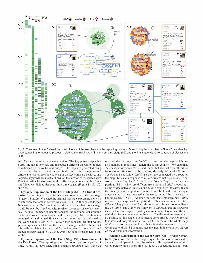
6.1 Case 1: Influence of Key Players
In the first case, we use R-Map to illustrate how key players can en-large the influence of the source message and promote the evolution oftopics.
Map Overview. We can gain an overview of the event from thegenerated map shown in Figure 5b. The original weibo was postedby Little7 (the source lake), and was reposted by Kanchai (twice) andagain by the original poster. Little7 was then reposted by Yaochen,creating a large area of territories on the map. Yaochen is a famousChinese actress and has millions of followers on Sina Weibo. Little7
4
3
S2
S1
S2
S3
0
20.2d
20.3d
1.3y
Little7 Yaochen Sina Kanchai
S1 1
1 4
4
5
2
2
3
3
2
S31
Fig. 8. The case of Little7, visualizing the influence of the key players in the reposting process. By exploring the map view in Figure 5, we identifiedthree stages in the reposting process, including the initial stage (S1), the bursting stage (S2) and the final stage with diverse range of discussions(S3).
and Sina also reposted Yaochen’s weibo. The key players repostingLittle7 did not follow her, and introduced different discussion topics,as indicated by the routes and bridges. The map was generated usingthe semantic layout. Countries are divided into different regions anddifferent keywords are shown. Most of the keywords are positive, andnegative keywords are mostly shown on the territories associated withKanchai. After fast-forwarding the diffusion process using the Time-line View, we divided the event into three stages (Figure 8 - S1, S2,and S3).
Dynamic Exploration of the Event Stage (S1) - An Initial Sce-nario. By brushing the Timeline View, we found that at the first stage(Figure 8-S1), Little7 posted the original message expressing her wishto interview the famous actress Yaochen (S1-1). Although she taggedYaochen with the “@” function, she did not expect that this messagewould be seen by Yaochen, who receives thousands of weibos everyday. A small number of people reposted the message, constructingthe terrain around the root node on the map (S1-3). Most of these en-couraged her and tagged Yaochen in their repostings, as indicated inthe Word Cloud View (S1-4). Little7 then reposted her first weibo,generating a second lake on the map. Clicking this lake shows thatthis weibo explained her proposal for the interview in more detail, andtagged Yaochen again (S1-2). However, few people responded to thisweibo.
Dynamic Exploration of the Event Stage (S2) - Involvement ofthe Key Player. The repostings then almost stopped for a period oftime. Almost 20 days later, things changed (Figure 8-S2). Yaochen
reposted the message from Little7, as shown on the map, which cre-ated numerous repostings, generating a big country. We examinedYaochen’s information (S2-2) and found that she had over 80 millionfollowers on Sina Weibo. In contrast, she only followed 471 users.Yaochen did not follow Little7, so they are connected by a route onthe map. Yaochen’s response to Little7 created hot discussions. Key-words such as “applaud”, “power” and “sincere” appear in these re-postings (S2-1), which are different from those in Little7’s repostings,as the bridge between Yaochen and Little7 explicitly indicates. Insidethe country, some important counties could be found. For example,a user called Yaxi was amazed at the story, saying “Persistence is thekey to success” (S2-3). Another fourteen users reposted her. Little7responded and expressed her gratitude to Yaochen within a short time(S2-4). A key player called Sina also reposted this news to its audience(S2-5). Little7 and Sina were followers of Yaochen, and the keywordsused in their message’s repostings were similar. Countries affiliatedwith them form a continent on the map. The discussions were almostall positive at this stage. Social media users praised Yaochen for herkindness and congratulated Little7 on her success. The whole stageof S2 lasted for only a few hours, but initiated numerous discussions.Compared with S1, S2 demonstrates the great influence of key playerson the diffusion of information.
Dynamic Exploration of the Event Stage (S3) - Diverse Seman-tic Exploration. At the last stage (Figure 8-S3), another user calledKanchai participated in the discussions. He reposted the originalweibo twice within a short time (S3-1, S3-2), generating two different

(a)
(d)
(b)(c)
Fig. 9. The case of semantic interpretation of weibos for gene-edited babies. Most of the repostings expressed negative or neutral attitudes. (a)The original message from Caijin, announcing that the world’s first gene-edited babies were born; (b, c) A special groups of people reposting withirony. (d) Discussion about ethic issues.
islands on the map (S3-3, S3-4). Both of these islands are connected toLittle7 by a route and a bridge, indicating that Kanchai did not followLittle7 and introduced new topics to the original weibo. We checkedhis weibos, and found that he criticized Little7 for showing a lack ofrespect to Yaochen. In one island, he pointed out that Little7 did notuse modest language in the original message (S3-2); in the other, hestated that the word “appreciate” was not suitable for a young girl touse to an older woman (S3-1). He had over 70,000 followers, andhis weibos raised arguments about equality and politeness in interper-sonal relationships. By coloring the map with sentiments, we foundthat negative sentiments dominated counties in these islands.
In this case, by analyzing a message from an ordinary person, wecan show how the original message diffused to a large number of peo-ple through reposting by key players, who not only change the tem-poral patterns of reposting but also introduce different sentiments andtopics. Compared with traditional tree visualization methods, R-Mapcan intuitively reveal semantic features in the reposting process whileshowing the diffusion tree structure.
6.2 Case 2: Sentiment and Semantics Interpretation
In the second case, we analyze the reposting process of a hot weibo.The map, which is color-coded by sentiment, gives us a sentimentoverview of the reposting process and the opinions of weibo users(Figure 9). There are few positive (blue) counties on the map, and mostpeople expressed negative (red) opinions. Three main branches extendout from the center of the map. By investigating the source lake, wefound that the root user Caijin with nearly 40 million followers, postedthe original weibo that the world’s first gene-edited babies were bornin China. This message initiated heated discussions and over 9,000people reposted this message within a short time.
Zoom in and Explore Detailed Topics on Demand - Continent.We zoomed into the map and found that keywords related to the eventsuch as “human”, “ethic”, and “gene” had a high frequency. Peo-
ple also showed surprise and concern in relation to this experiment(Figure 9a). After examining these keywords, related weibos wereidentified. One person posted “[Surprise] Is it a reality?” ([Surprise]indicates an emotion icon expressing surprise). Another person feltpuzzled, saying “How can it pass the ethical check?”. In contrast, fewrepostings had positive sentiments. One user reposted with the com-ment “This technique may be used for cancer treatment”.
Zoom in and Explore Detailed Topics on Demand - Islands. Wenavigated to two distant islands from the continent (Figure 9b, c).From the word clouds on both islands, we found that these two is-lands shared many common keywords, such as “world”, “blue” and“clean”, which are all rare positive words. Some users’ comments arevery similar, containing the phrase “For the preservation of our blueand pure world”. After further study, we found that this sentence wastaken from a comic called “GUNDAM SEED”, which tells the storyof a war between humans and coordinators, who are genetically modi-fied humans. When people used this sentence in their comments, theywere expressing concern and irony about this event.
Zoom in and Explore Detailed Topics on Demand - Behaviors ofKey Players. Further valuable information was found in the lower-leftcorner of the continent (Figure 9d). Following the rivers, we found akey player named DXY (a well-known medical group), with 1.2 mil-lion followers. It reposted the original weibo and questioned the eth-ical checks on this experiment. In the messages reposting it, a usercalled Ziling, who did not follow DXY, analyzed this event from a pro-fessional perspective, and stated that the experiment did not pass eth-ical checks. DXY then reposted his weibo and reported this fact to itsaudience. Although they were not followers of each other (connectedby a route), they had a heated discussion on this topic, which involvedmany people. Later, DXY reposted its previous weibo and added moreinformation about this study. The statement that “The ethics of thisstudy were approved by a Putian hospital” caused further discussionswith negative sentiments, since Putian has a bad reputation in China.
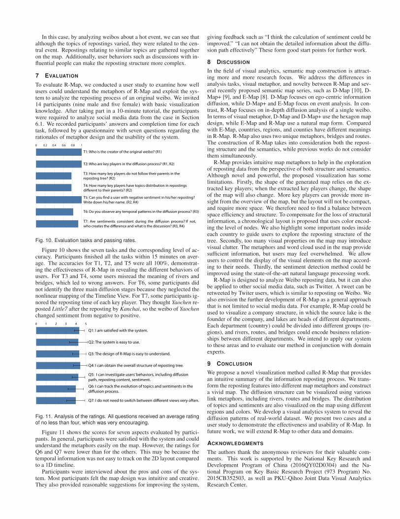
In this case, by analyzing weibos about a hot event, we can see thatalthough the topics of repostings varied, they were related to the cen-tral event. Repostings relating to similar topics are gathered togetheron the map. Additionally, user behaviors such as discussions with in-fluential people can make the reposting structure more complex.
7 EVALUATION
To evaluate R-Map, we conducted a user study to examine how wellusers could understand the metaphors of R-Map and exploit the sys-tem to analyze the reposting process of an original weibo. We invited14 participants (nine male and five female) with basic visualizationknowledge. After taking part in a 10-minute tutorial, the participantswere required to analyze social media data from the case in Section6.1. We recorded participants’ answers and completion time for eachtask, followed by a questionnaire with seven questions regarding therationales of metaphor design and the usability of the system.
0 0.2 0.4 0.6 0.8 1
T1: Who is the creator of the original weibo? (R1)
T2: Who are key players in the diffusion process? (R1, R2)
T3: How many key players do not follow their parents in the
reposting tree? (R2)
T4: How many key players have topics distribution in repostings
different to their parents? (R2)
T5: Can you find a user with negative sentiment in his/her reposting?
Write down his/her name. (R2, R4)
T6: Do you observe any temporal patterns in the diffusion process? (R3)
T7: Are sentiments consistent during the diffusion process? If not,
who creates the difference and what is the discussion? (R3, R4)
Fig. 10. Evaluation tasks and passing rates.
Figure 10 shows the seven tasks and the corresponding level of ac-curacy. Participants finished all the tasks within 15 minutes on aver-age. The accuracies for T1, T2, and T5 were all 100%, demonstrat-ing the effectiveness of R-Map in revealing the different behaviors ofusers. For T3 and T4, some users misread the meaning of rivers andbridges, which led to wrong answers. For T6, some participants didnot identify the three main diffusion stages because they neglected thenonlinear mapping of the Timeline View. For T7, some participants ig-nored the reposting time of each key player. They thought Yaochen re-posted Little7 after the reposting by Kanchai, so the weibo of Yaochenchanged sentiment from negative to positive.
0 1 2 3 54
Q1: I am satisfied with the system.
Q2: The system is easy to use.
Q3: The design of R-Map is easy to understand.
Q4: I can obtain the overall structure of reposting tree.
Q5: I can investigate users’ behaviors, including diffusion
path, reposting content, sentiment.
Q6: I can track the evolution of topics and sentiments in the
diffusion process.
Q7: I do not need to switch between different views very often.
Fig. 11. Analysis of the ratings. All questions received an average ratingof no less than four, which was very encouraging.
Figure 11 shows the scores for seven aspects evaluated by partici-pants. In general, participants were satisfied with the system and couldunderstand the metaphors easily on the map. However, the ratings forQ6 and Q7 were lower than for the others. This may be because thetemporal information was not easy to track on the 2D layout comparedto a 1D timeline.
Participants were interviewed about the pros and cons of the sys-tem. Most participants felt the map design was intuitive and creative.They also provided reasonable suggestions for improving the system,
giving feedback such as “I think the calculation of sentiment could beimproved.” “I can not obtain the detailed information about the diffu-sion path effectively” These form good start points for further work.
8 DISCUSSION
In the field of visual analytics, semantic map construction is attract-ing more and more research focus. We address the differences inanalysis tasks, visual metaphor, and novelty between R-Map and sev-eral recently proposed semantic map series, such as D-Map [10], D-Map+ [9], and E-Map [8]. D-Map focuses on ego-centric informationdiffusion, while D-Map+ and E-Map focus on event analysis. In con-trast, R-Map focuses on in-depth diffusion analysis of a single weibo.In terms of visual metaphor, D-Map and D-Map+ use the hexagon mapdesign, while E-Map and R-Map use a natural map form. Comparedwith E-Map, countries, regions, and counties have different meaningsin R-Map. R-Map also uses two unique metaphors, bridges and routes.The construction of R-Map takes into consideration both the repost-ing structure and the semantics, while previous works do not considerthem simultaneously.
R-Map provides intuitive map metaphors to help in the explorationof reposting data from the perspective of both structure and semantics.Although novel and powerful, the proposed visualization has somelimitations. Firstly, the shape of the generated map relies on the ex-tracted key players; when the extracted key players change, the shapeof the map will also change. More key players can provide more in-sight from the overview of the map, but the layout will not be compact,and require more space. We therefore need to find a balance betweenspace efficiency and structure. To compensate for the loss of structuralinformation, a chronological layout is proposed that uses color encod-ing the level of nodes. We also highlight some important nodes insideeach country to guide users to explore the reposting structure of thetree. Secondly, too many visual properties on the map may introducevisual clutter. The metaphors and word cloud used in the map providesufficient information, but users may feel overwhelmed. We allowusers to control the display of the visual elements on the map accord-ing to their needs. Thirdly, the sentiment detection method could beimproved using the state-of-the-art natural language processing work.
R-Map is designed to analyze Weibo reposting data, but it can alsobe applied to other social media data, such as Twitter. A tweet can beretweeted by Twiter users, which is similar to reposting on Weibo. Wealso envision the further development of R-Map as a general approachthat is not limited to social media data. For example, R-Map could beused to visualize a company structure, in which the source lake is thefounder of the company, and lakes are heads of different departments.Each department (country) could be divided into different groups (re-gions), and rivers, routes, and bridges could encode business relation-ships between different departments. We intend to apply our systemto these areas and to evaluate our method in conjunction with domainexperts.
9 CONCLUSION
We propose a novel visualization method called R-Map that providesan intuitive summary of the information reposting process. We trans-form the reposting features into different map metaphors and constructa vivid map. The diffusion structure can be visualized using variouslink metaphors, including rivers, routes and bridges. The distributionof topics and sentiments are also visualized on the map using differentregions and colors. We develop a visual analytics system to reveal thediffusion patterns of real-world dataset. We present two cases and auser study to demonstrate the effectiveness and usability of R-Map. Infuture work, we will extend R-Map to other data and domains.
ACKNOWLEDGMENTS
The authors thank the anonymous reviewers for their valuable com-ments. This work is supported by the National Key Research andDevelopment Program of China (2016QY02D0304) and the Na-tional Program on Key Basic Research Project (973 Program) No.2015CB352503, as well as PKU-Qihoo Joint Data Visual AnalyticsResearch Center.

REFERENCES
[1] Chinese sentiment analysis tool provided by baidu open platform.
http://ai.baidu.com/tech/nlp/sentiment classify.
[2] D. Auber, C. Huet, A. Lambert, B. Renoust, A. Sallaberry, and
A. Saulnier. Gospermap: Using a gosper curve for laying out hierar-
chical data. IEEE Transactions on Visualization and Computer Graphics,
19(11):1820–1832, 2013. doi: 10.1109/TVCG.2013.91
[3] M. Balzer and O. Deussen. Voronoi treemaps. In Proc. IEEE Symp. In-
formation Visualization (InfoVis), pp. 49–56, 2005. doi: 10.1109/INFVIS
.2005.1532128
[4] S. T. Barlow and P. Neville. A comparison of 2-d visualizations of hi-
erarchies. In Proc. IEEE Symp. Information Visualization (InfoVis), pp.
131–138, 2001. doi: 10.1109/INFVIS.2001.963290
[5] M. Blades, J. M. Blaut, Z. Darvizeh, S. Elguea, S. Sowden, D. Soni,
C. Spencer, D. Stea, R. Surajpaul, and D. Uttal. A cross-cultural study
of young children’s mapping abilities. Transactions of the Institute of
British Geographers, 23(2):269–277, 1998.
[6] U. Brandes and C. Pich. Eigensolver methods for progressive multidi-
mensional scaling of large data. In International Symposium on Graph
Drawing, pp. 42–53. Springer, 2006. doi: 10.1007/978-3-540-70904-6
[7] N. Cao, Y.-R. Lin, X. Sun, D. Lazer, S. Liu, and H. Qu. Whisper: Tracing
the spatiotemporal process of information diffusion in real time. IEEE
Transactions on Visualization and Computer Graphics, 18(12):2649–
2658, 2012. doi: 10.1109/TVCG.2012.291
[8] S. Chen, S. Chen, L. Lin, X. Yuan, J. Liang, and X. Zhang. E-map: A vi-
sual analytics approach for exploring significant event evolutions in social
media. In Proceedings of IEEE Conference on Visual Analytics Science
and Technology, pp. 36–47, 2017. doi: 10.1109/VAST.2017.8585638
[9] S. Chen, S. Chen, Z. Wang, J. Liang, Y. Wu, and X. Yuan. D-map+: In-
teractive visual analysis and exploration of ego-centric and event-centric
information diffusion patterns in social media. ACM TIST, 10(1):11:1–
11:26, 2019. doi: 10.1145/3183347
[10] S. Chen, S. Chen, Z. Wang, J. Liang, X. Yuan, N. Cao, and Y. Wu. D-
map: Visual analysis of ego-centric information diffusion patterns in so-
cial media. In 2016 IEEE Conference on Visual Analytics Science and
Technology, VAST 2016, Baltimore, MD, USA, October 23-28, 2016, pp.
41–50, 2016. doi: 10.1109/VAST.2016.7883510
[11] S. Chen, J. Li, G. Andrienko, N. Andrienko, Y. Wang, P. H. Nguyen,
and C. Turkay. Supporting story synthesis: Bridging the gap between
visual analytics and storytelling. IEEE transactions on visualization and
computer graphics, 2019. To Appear.
[12] S. Chen, L. Lin, and X. Yuan. Social media visual analytics. Computer
Graphics Forum, 36(3):563–587, 2017. doi: 10.1111/cgf.13211
[13] H. Couclelis. Worlds of information: The geographic metaphor in the
visualization of complex information. Cartography and geographic in-
formation systems, 25(4):209–220, 1998.
[14] J. J. Fowler, T. Johnson, P. Simonetto, M. Schneider, C. Acedo, S. G.
Kobourov, and L. Lazos. Imap: visualizing network activity over inter-
net maps. In Proceedings of the Eleventh Workshop on Visualization for
Cyber Security, pp. 80–87, 2014. doi: 10.1145/2671491.2671501
[15] D. Fried and S. G. Kobourov. Maps of computer science. CoRR,
abs/1304.2681, 2013.
[16] E. R. Gansner, Y. Hu, and S. G. Kobourov. Gmap: Visualizing graphs
and clusters as maps. In Proceedings of IEEE Pacific Visualization Sym-
posium, pp. 201–208, 2010. doi: 10.1109/PACIFICVIS.2010.5429590
[17] E. R. Gansner, Y. Hu, and S. North. Visualizing streaming text data with
dynamic graphs and maps. In Proceedings of Graph Drawing, pp. 439–
450, 2012.
[18] R. C. Gonzalez and R. E. Woods. Digital image processing, 3rd Edition.
Pearson Education, 2008.
[19] S. Grivet, D. Auber, J. Domenger, and G. Melancon. Bubble tree draw-
ing algorithm. In Proceedings of International Conference on Computer
Vision and Graphics, pp. 633–641, 2004. doi: 10.1007/1-4020-4179-9
[20] D. Harel and Y. Koren. Graph drawing by high-dimensional embedding.
In Proceedings of International Symposium on Graph Drawing, pp. 207–
219, 2002. doi: 10.1007/3-540-36151-0
[21] C. Ho, C. Li, and S. Lin. Modeling and visualizing information prop-
agation in a micro-blogging platform. In Proceedings of International
Conference on Advances in Social Networks Analysis and Mining, pp.
328–335, 2011. doi: 10.1109/ASONAM.2011.37
[22] Y. Hu, R. J. Song, and M. Chen. Modeling for information diffusion
in online social networks via hydrodynamics. IEEE Access, 5:128–135,
2017. doi: 10.1109/ACCESS.2016.2605009
[23] B. Johnson and B. Shneiderman. Tree maps: A space-filling approach to
the visualization of hierarchical information structures. In Proceedings
of IEEE Conference on Visualization, pp. 284–291, 1991. doi: 10.1109/
VISUAL.1991.175815
[24] E. Katz, P. F. Lazarsfeld, and E. Roper. Personal influence: The part
played by people in the flow of mass communications. Routledge, 2017.
[25] D. J. Ketchen and C. L. Shook. The application of cluster analysis in
strategic management research: an analysis and critique. Strategic Man-
agement Journal, 17(6):441–458, 1996.
[26] J. B. Kruskal and J. M. Landwehr. Icicle plots: Better displays for hier-
archical clustering. The American Statistician, 37(2):162–168, 1983.
[27] J. Liang, M. L. Huang, and Q. V. Nguyen. Navigation in large hierarchical
graph through chain-context views. Journal of Visualization, 19(3):543–
559, 2016. doi: 10.1007/s12650-015-0329-3
[28] X. Liu, Y. Hu, S. C. North, and H. Shen. Compactmap: A mental map
preserving visual interface for streaming text data. In Proceedings of
IEEE International Conference on Big Data, pp. 48–55, 2013. doi: 10.
1109/BigData.2013.6691714
[29] S. P. Lloyd. Least squares quantization in PCM. IEEE Transactions
on Information Theory, 28(2):129–136, 1982. doi: 10.1109/TIT.1982.
1056489
[30] C. Ma, Y. Liu, G. Zhao, and H. Wang. Visualizing and analyzing video
content with interactive scalable maps. IEEE Transactions on Multime-
dia, 18(11):2171–2183, 2016. doi: 10.1109/TMM.2016.2614229
[31] P. Metaxas, E. Mustafaraj, K. Wong, L. Zeng, M. O’Keefe, and S. Finn.
What do retweets indicate? results from user survey and meta-review of
research. In Proceedings of Ninth International AAAI Conference on Web
and Social Media, pp. 658–661, 2015.
[32] D. Ren, X. Zhang, Z. Wang, J. Li, and X. Yuan. Weiboevents: A crowd
sourcing weibo visual analytic system. In Proceedings of IEEE Pacific
Visualization Symposium, pp. 330–334, 2014. doi: 10.1109/PacificVis.
2014.38
[33] K. Saito, R. Nakano, and M. Kimura. Prediction of information diffusion
probabilities for independent cascade model. In Knowledge-Based In-
telligent Information and Engineering Systems, 12th International Con-
ference, KES 2008, Zagreb, Croatia, September 3-5, 2008, Proceedings,
Part III, pp. 67–75, 2008. doi: 10.1007/978-3-540-85567-5
[34] G. Salton and M. McGill. Introduction to Modern Information Retrieval.
McGraw-Hill Book Company, 1984.
[35] H. Schulz, S. Hadlak, and H. Schumann. The design space of implicit hi-
erarchy visualization: A survey. IEEE Transactions on Visualization and
Computer Graphics, 17(4):393–411, 2011. doi: 10.1109/TVCG.2010.79
[36] H. J. Schulz. Treevis.net: A tree visualization reference. IEEE Computer
Graphics and Applications, 31(6):11–15, 2011. doi: 10.1109/MCG.2011
.103
[37] A. Skupin. From metaphor to method: Cartographic perspectives on in-
formation visualization. In Proceedings of IEEE Symposium on Infor-
mation Visualization 2000, pp. 91–97, 2000. doi: 10.1109/INFVIS.2000
.885095
[38] A. Skupin. A cartographic approach to visualizing conference abstracts.
IEEE Computer Graphics and Applications, 22(1):50–58, 2002.
[39] A. Skupin and S. I. Fabrikant. Spatialization methods: a cartographic
research agenda for non-geographic information visualization. Cartogra-
phy and Geographic Information Science, 30(2):99–119, 2003.
[40] Y. Song, Z. Wen, C. Lin, and R. Davis. One-class conditional random
fields for sequential anomaly detection. In Proceedings of Joint Confer-
ence on Artificial Intelligence, pp. 1685–1691, 2013.
[41] J. T. Stasko and E. Zhang. Focus+context display and navigation tech-
niques for enhancing radial, space-filling hierarchy visualizations. In
Proceedings of IEEE Symposium on Information Visualization, pp. 57–
65, 2000. doi: 10.1109/INFVIS.2000.885091
[42] M. Stefaner. Revist. http://truth-and-beauty.net/projects/revisit/, [Online;
accessed 2019-03-31].
[43] B. Suh, L. Hong, P. Pirolli, and E. H. Chi. Want to be retweeted? large
scale analytics on factors impacting retweet in twitter network. In Pro-
ceedings of IEEE International Conference on Social Computing, pp.
177–184, 2010. doi: 10.1109/SocialCom.2010.33
[44] K. M. Thyng, C. A. Greene, R. D. Hetland, H. M. Zimmerle, and S. F.
DiMarco. True colors of oceanography: Guidelines for effective and ac-
curate colormap selection. Oceanography, 29(3):9–13, 2016.
[45] T. N. Y. Times. Cascade. http://nytlabs.com/projects/cascade.html, [On-
line; accessed 2019-03-31].

[46] USGS. Topographic map symbols.
https://pubs.usgs.gov/gip/topographicmapsymbols/topomapsymbols.pdf/,
[Online; accessed 2019-03-31].
[47] J. J. van Wijk and H. van de Wetering. Cushion treemaps: Visualiza-
tion of hierarchical information. In Proceedings of IEEE Symposium on
Information Visualization, pp. 73–78, 1999. doi: 10.1109/INFVIS.1999.
801860
[48] F. B. Viegas, M. Wattenberg, J. Hebert, G. Borggaard, A. Cichowlas,
J. Feinberg, J. Orwant, and C. R. Wren. Google+ripples: a native visu-
alization of information flow. In Proceedings of International Confer-
ence on World Wide Web, pp. 1389–1398, 2013. doi: 10.1145/2488388.
2488504
[49] W. Wang, H. H. Wang, G. Dai, and H. Wang. Visualization of large
hierarchical data by circle packing. In Proceedings of the SIGCHI con-
ference on Human Factors in computing systems, pp. 517–520, 2006. doi:
10.1145/1124772.1124851
[50] Y. Wu, N. Cao, D. Gotz, Y. Tan, and D. A. Keim. A survey on vi-
sual analytics of social media data. IEEE Transactions on Multimedia,
18(11):2135–2148, 2016. doi: 10.1109/TMM.2016.2614220
[51] Y. Wu, S. Liu, K. Yan, M. Liu, and F. Wu. Opinionflow: Visual analysis
of opinion diffusion on social media. IEEE Transactions on Visualization
and Computer Graphics, 20(12):1763–1772, 2014. doi: 10.1109/TVCG.
2014.2346920
[52] P. Ye, C. Wang, Y. Liu, Q. Zhu, and K. Zhang. Visual analysis of micro-
blog retweeting using an information diffusion function. Journal of Visu-
alization, 19(4):823–838, 2016. doi: 10.1007/s12650-016-0347-9
[53] J. Zhang, J. Tang, J. Li, Y. Liu, and C. Xing. Who influenced you? pre-
dicting retweet via social influence locality. ACM Transactions on Knowl-
edge Discovery from Data, 9(3):25:1–25:26, 2015. doi: 10.1145/2700398
[54] J. Zhao, N. Cao, Z. Wen, Y. Song, Y. Lin, and C. Collins. #fluxflow: Vi-
sual analysis of anomalous information spreading on social media. IEEE
Transactions on Visualization and Computer Graphics, 20(12):1773–
1782, 2014. doi: 10.1109/TVCG.2014.2346922