
Practical RichFaces - Hotfixed
251
Practical RichFaces ■■■ Max Katz
-
Upload
khangminh22 -
Category
Documents
-
view
5 -
download
0
Transcript of Practical RichFaces - Hotfixed

Practical RichFaces
■ ■ ■
Max Katz

Practical RichFaces
Copyright © 2008 by Max Katz
All rights reserved. No part of this work may be reproduced or transmitted in any form or by any means,
electronic or mechanical, including photocopying, recording, or by any information storage or retrieval
system, without the prior written permission of the copyright owner and the publisher.
ISBN-13 (paperback): 978-1-4302-1055-9
ISBN-13 (electronic): 978-1-4302-1056-6
Printed and bound in the United States of America (POD)
Trademarked names may appear in this book. Rather than use a trademark symbol with every occurrence
of a trademarked name, we use the names only in an editorial fashion and to the benefit of the trademark
owner, with no intention of infringement of the trademark.
Java™ and all Java-based marks are trademarks or registered trademarks of Sun Microsystems, Inc., in the
US and other countries. Apress, Inc., is not affiliated with Sun Microsystems, Inc., and this book was written
without endorsement from Sun Microsystems, Inc.
Lead Editor: Joseph Ottinger
Technical Reviewer: Jason Lee
Editorial Board: Clay Andres, Steve Anglin, Mark Beckner, Ewan Buckingham, Tony Campbell,
Gary Cornell, Jonathan Gennick, Michelle Lowman, Matthew Moodie, Jeffrey Pepper, Frank Pohlmann,
Ben Renow-Clarke, Dominic Shakeshaft, Matt Wade, Tom Welsh
Project Manager: Tracy Brown Collins
Copy Editor: Kim Wimpsett
Associate Production Director: Kari Brooks-Copony
Compositor: Susan Glinert Stevens
Indexer: Broccoli Information Management
Cover Designer: Kurt Krames
Manufacturing Director: Tom Debolski
Distributed to the book trade worldwide by Springer-Verlag New York, Inc., 233 Spring Street, 6th Floor,
New York, NY 10013. Phone 1-800-SPRINGER, fax 201-348-4505, e-mail [email protected], or
visit http://www.springeronline.com.
For information on translations, please contact Apress directly at 2855 Telegraph Avenue, Suite 600,
Berkeley, CA 94705. Phone 510-549-5930, fax 510-549-5939, e-mail [email protected], or visit
http://www.apress.com.
Apress and friends of ED books may be purchased in bulk for academic, corporate, or promotional use.
eBook versions and licenses are also available for most titles. For more information, reference our Special
Bulk Sales–eBook Licensing web page at http://www.apress.com/info/bulksales.
The information in this book is distributed on an “as is” basis, without warranty. Although every precaution
has been taken in the preparation of this work, neither the author(s) nor Apress shall have any liability to
any person or entity with respect to any loss or damage caused or alleged to be caused directly or indirectly
by the information contained in this work.
The source code for this book is available to readers at http://www.apress.com.

To Victoria, my best friend, partner, and wife.

v
Contents at a Glance
About the Author . . . . . . . . . . . . . . . . . . . . . . . . . . . . . . . . . . . . . . . . . . . . . . . . . . . . . . . . . . . . . . . xiii
Acknowledgments . . . . . . . . . . . . . . . . . . . . . . . . . . . . . . . . . . . . . . . . . . . . . . . . . . . . . . . . . . . . . xv
Introduction . . . . . . . . . . . . . . . . . . . . . . . . . . . . . . . . . . . . . . . . . . . . . . . . . . . . . . . . . . . . . . . . . . xvii
■CHAPTER 1 Introduction . . . . . . . . . . . . . . . . . . . . . . . . . . . . . . . . . . . . . . . . . . . . . . . . . . 1
■CHAPTER 2 Quick Start with JBoss RichFaces . . . . . . . . . . . . . . . . . . . . . . . . . . . . . 9
■CHAPTER 3 RichFaces Basic Concepts . . . . . . . . . . . . . . . . . . . . . . . . . . . . . . . . . . . 31
■CHAPTER 4 More a4j: Tags, Concepts, and Features . . . . . . . . . . . . . . . . . . . . . . 45
■CHAPTER 5 Input Components . . . . . . . . . . . . . . . . . . . . . . . . . . . . . . . . . . . . . . . . . . . 77
■CHAPTER 6 Output Components . . . . . . . . . . . . . . . . . . . . . . . . . . . . . . . . . . . . . . . . . 97
■CHAPTER 7 Data Iteration Components . . . . . . . . . . . . . . . . . . . . . . . . . . . . . . . . . . 135
■CHAPTER 8 Selection Components . . . . . . . . . . . . . . . . . . . . . . . . . . . . . . . . . . . . . . 159
■CHAPTER 9 Menu Components . . . . . . . . . . . . . . . . . . . . . . . . . . . . . . . . . . . . . . . . . 181
■CHAPTER 10 Scrollable Data Table and Tree . . . . . . . . . . . . . . . . . . . . . . . . . . . . . . 199
■CHAPTER 11 Skins . . . . . . . . . . . . . . . . . . . . . . . . . . . . . . . . . . . . . . . . . . . . . . . . . . . . . . 219
■■INDEX . . . . . . . . . . . . . . . . . . . . . . . . . . . . . . . . . . . . . . . . . . . . . . . . . . . . . . . . . . . . . . . . . . . 239

vii
Contents
About the Author . . . . . . . . . . . . . . . . . . . . . . . . . . . . . . . . . . . . . . . . . . . . . . . . . . . . . . . . . . . . . . . xiii
Acknowledgments . . . . . . . . . . . . . . . . . . . . . . . . . . . . . . . . . . . . . . . . . . . . . . . . . . . . . . . . . . . . . xv
Introduction . . . . . . . . . . . . . . . . . . . . . . . . . . . . . . . . . . . . . . . . . . . . . . . . . . . . . . . . . . . . . . . . . . xvii
■CHAPTER 1 Introduction . . . . . . . . . . . . . . . . . . . . . . . . . . . . . . . . . . . . . . . . . . . . . . . . 1
What Is JSF? . . . . . . . . . . . . . . . . . . . . . . . . . . . . . . . . . . . . . . . . . . . . . . . . . . 1
JSF Features . . . . . . . . . . . . . . . . . . . . . . . . . . . . . . . . . . . . . . . . . . . . . . 1
So, Why Use JSF? . . . . . . . . . . . . . . . . . . . . . . . . . . . . . . . . . . . . . . . . . . 4
The JSF Application Is Running on the Server. . . . . . . . . . . . . . . . . . . 4
Keep an Open Mind . . . . . . . . . . . . . . . . . . . . . . . . . . . . . . . . . . . . . . . . 5
JSF, Ajax, and RichFaces . . . . . . . . . . . . . . . . . . . . . . . . . . . . . . . . . . . . . . . . 5
Ajax4jsf and RichFaces . . . . . . . . . . . . . . . . . . . . . . . . . . . . . . . . . . . . . . . . . 6
RichFaces . . . . . . . . . . . . . . . . . . . . . . . . . . . . . . . . . . . . . . . . . . . . . . . . . . . . 7
Two Tag Libraries . . . . . . . . . . . . . . . . . . . . . . . . . . . . . . . . . . . . . . . . . . 7
Skinnability . . . . . . . . . . . . . . . . . . . . . . . . . . . . . . . . . . . . . . . . . . . . . . . 7
Component Development Kit . . . . . . . . . . . . . . . . . . . . . . . . . . . . . . . . . 7
JBoss Seam . . . . . . . . . . . . . . . . . . . . . . . . . . . . . . . . . . . . . . . . . . . . . . . . . . . 8
JSF 2.0 . . . . . . . . . . . . . . . . . . . . . . . . . . . . . . . . . . . . . . . . . . . . . . . . . . . . . . . 8
Summary . . . . . . . . . . . . . . . . . . . . . . . . . . . . . . . . . . . . . . . . . . . . . . . . . . . . . 8
■CHAPTER 2 Quick Start with JBoss RichFaces . . . . . . . . . . . . . . . . . . . . . . . . 9
Setting Up Your Development Environment . . . . . . . . . . . . . . . . . . . . . . . . . 9
Download and Installing Everything You Need . . . . . . . . . . . . . . . . . . 9
Setting Up and Testing JBoss Tools . . . . . . . . . . . . . . . . . . . . . . . . . . 11
Configuring RichFaces . . . . . . . . . . . . . . . . . . . . . . . . . . . . . . . . . . . . . . . . . 12
Downloading RichFaces . . . . . . . . . . . . . . . . . . . . . . . . . . . . . . . . . . . . 12
Installing RichFaces . . . . . . . . . . . . . . . . . . . . . . . . . . . . . . . . . . . . . . . 12
Setting Up the Tag Libraries . . . . . . . . . . . . . . . . . . . . . . . . . . . . . . . . 13

viii ■CO N T E N T S
Creating Your First RichFaces Application . . . . . . . . . . . . . . . . . . . . . . . . . 14
Creating a New Project . . . . . . . . . . . . . . . . . . . . . . . . . . . . . . . . . . . . 14
Building the User Interface . . . . . . . . . . . . . . . . . . . . . . . . . . . . . . . . . 14
Creating a Managed Bean . . . . . . . . . . . . . . . . . . . . . . . . . . . . . . . . . . 16
Adding a Button . . . . . . . . . . . . . . . . . . . . . . . . . . . . . . . . . . . . . . . . . . 18
Running the Application . . . . . . . . . . . . . . . . . . . . . . . . . . . . . . . . . . . . 18
Adding Ajax . . . . . . . . . . . . . . . . . . . . . . . . . . . . . . . . . . . . . . . . . . . . . . 18
Submitting via Ajax . . . . . . . . . . . . . . . . . . . . . . . . . . . . . . . . . . . . . . . . 19
Doing a Partial-Page Update . . . . . . . . . . . . . . . . . . . . . . . . . . . . . . . . 19
Using a4j:support . . . . . . . . . . . . . . . . . . . . . . . . . . . . . . . . . . . . . . . . . 20
Creating a Phase Listener . . . . . . . . . . . . . . . . . . . . . . . . . . . . . . . . . . 22
Adding Validation . . . . . . . . . . . . . . . . . . . . . . . . . . . . . . . . . . . . . . . . . 24
Displaying Content Not Rendered Before . . . . . . . . . . . . . . . . . . . . . . 25
Using <a4j:log> . . . . . . . . . . . . . . . . . . . . . . . . . . . . . . . . . . . . . . . . . . 26
Using Placeholders . . . . . . . . . . . . . . . . . . . . . . . . . . . . . . . . . . . . . . . . 27
Using <a4j:outputPanel> . . . . . . . . . . . . . . . . . . . . . . . . . . . . . . . . . . . 28
Summary . . . . . . . . . . . . . . . . . . . . . . . . . . . . . . . . . . . . . . . . . . . . . . . . . . . . 29
■CHAPTER 3 RichFaces Basic Concepts . . . . . . . . . . . . . . . . . . . . . . . . . . . . . . . 31
Sending an Ajax Request . . . . . . . . . . . . . . . . . . . . . . . . . . . . . . . . . . . . . . . 31
<a4j:commandLink> and <a4j:commandButton>. . . . . . . . . . . . . . 31
<a4j:support> . . . . . . . . . . . . . . . . . . . . . . . . . . . . . . . . . . . . . . . . . . . . 33
<a4j:poll> . . . . . . . . . . . . . . . . . . . . . . . . . . . . . . . . . . . . . . . . . . . . . . . 36
Using the limitToList Attribute . . . . . . . . . . . . . . . . . . . . . . . . . . . . . . . 38
Performing a Partial-Page Update . . . . . . . . . . . . . . . . . . . . . . . . . . . . . . . 38
Using the reRender Attribute . . . . . . . . . . . . . . . . . . . . . . . . . . . . . . . . 39
Using <a4j:outputPanel> . . . . . . . . . . . . . . . . . . . . . . . . . . . . . . . . . . . 40
Knowing What Data to Process . . . . . . . . . . . . . . . . . . . . . . . . . . . . . . . . . . 41
Using <a4j:region> . . . . . . . . . . . . . . . . . . . . . . . . . . . . . . . . . . . . . . . 41
Using the ajaxSingle Attribute . . . . . . . . . . . . . . . . . . . . . . . . . . . . . . . 42
Using the process Attribute . . . . . . . . . . . . . . . . . . . . . . . . . . . . . . . . . 43
Summary . . . . . . . . . . . . . . . . . . . . . . . . . . . . . . . . . . . . . . . . . . . . . . . . . . . . 44

■C ON TE N TS ix
■CHAPTER 4 More a4j: Tags, Concepts, and Features . . . . . . . . . . . . . . . . . 45
Controlling Traffic with Queues . . . . . . . . . . . . . . . . . . . . . . . . . . . . . . . . . . 45
JavaScript Interactions . . . . . . . . . . . . . . . . . . . . . . . . . . . . . . . . . . . . . . . . . 46
Performance Considerations . . . . . . . . . . . . . . . . . . . . . . . . . . . . . . . . . . . . 48
Using eventsQueue and requestDelay . . . . . . . . . . . . . . . . . . . . . . . . 48
Using bypassUpdates . . . . . . . . . . . . . . . . . . . . . . . . . . . . . . . . . . . . . . 48
Using <a4j:region> . . . . . . . . . . . . . . . . . . . . . . . . . . . . . . . . . . . . . . . 48
Validating User Input . . . . . . . . . . . . . . . . . . . . . . . . . . . . . . . . . . . . . . . . . . 49
Skipping Model Update During Validation . . . . . . . . . . . . . . . . . . . . . 54
Using <a4j:actionparam> . . . . . . . . . . . . . . . . . . . . . . . . . . . . . . . . . . . . . . 55
Using <a4j:repeat> . . . . . . . . . . . . . . . . . . . . . . . . . . . . . . . . . . . . . . . . . . . 56
Using the ajaxKeys Attribute . . . . . . . . . . . . . . . . . . . . . . . . . . . . . . . . 59
Using <a4j:status> . . . . . . . . . . . . . . . . . . . . . . . . . . . . . . . . . . . . . . . . . . . . 62
Using with Action Controls . . . . . . . . . . . . . . . . . . . . . . . . . . . . . . . . . . 63
Associating Status with a Region . . . . . . . . . . . . . . . . . . . . . . . . . . . . 66
Using <a4j:include> and <a4j:keepAlive> . . . . . . . . . . . . . . . . . . . . . . . . 67
Using <a4j:keepAlive>. . . . . . . . . . . . . . . . . . . . . . . . . . . . . . . . . . . . . 71
Using <a4j:jsFunction> . . . . . . . . . . . . . . . . . . . . . . . . . . . . . . . . . . . . . . . . 72
Using <a4j:ajaxListener> . . . . . . . . . . . . . . . . . . . . . . . . . . . . . . . . . . . . . . 74
Summary . . . . . . . . . . . . . . . . . . . . . . . . . . . . . . . . . . . . . . . . . . . . . . . . . . . . 75
■CHAPTER 5 Input Components . . . . . . . . . . . . . . . . . . . . . . . . . . . . . . . . . . . . . . . . 77
Using <rich:inplaceInput> . . . . . . . . . . . . . . . . . . . . . . . . . . . . . . . . . . . . . . 78
Using <rich:inplaceSelect> . . . . . . . . . . . . . . . . . . . . . . . . . . . . . . . . . . . . . 80
Using <rich:suggestionbox> . . . . . . . . . . . . . . . . . . . . . . . . . . . . . . . . . . . . 82
Adding More Columns . . . . . . . . . . . . . . . . . . . . . . . . . . . . . . . . . . . . . 86
Adding More Features . . . . . . . . . . . . . . . . . . . . . . . . . . . . . . . . . . . . . 87
Using <rich:comboBox> . . . . . . . . . . . . . . . . . . . . . . . . . . . . . . . . . . . . . . . 89
Adding More Input Components . . . . . . . . . . . . . . . . . . . . . . . . . . . . . 92
Using <rich:inputNumberSlider> . . . . . . . . . . . . . . . . . . . . . . . . . . . . . . . . 92
Using <rich:inputNumberSpinner> . . . . . . . . . . . . . . . . . . . . . . . . . . . . . . 93
Using <rich:calendar> . . . . . . . . . . . . . . . . . . . . . . . . . . . . . . . . . . . . . . . . . 94
Summary . . . . . . . . . . . . . . . . . . . . . . . . . . . . . . . . . . . . . . . . . . . . . . . . . . . . 95

x ■CO N T E N T S
■CHAPTER 6 Output Components . . . . . . . . . . . . . . . . . . . . . . . . . . . . . . . . . . . . . . . 97
Using <rich:panel> . . . . . . . . . . . . . . . . . . . . . . . . . . . . . . . . . . . . . . . . . . . . 97
Using <rich:simpleTogglePanel> . . . . . . . . . . . . . . . . . . . . . . . . . . . . . . . . 99
Using <rich:tabPanel> and <rich:tab> . . . . . . . . . . . . . . . . . . . . . . . . . . 100
Using <rich:panelBar> . . . . . . . . . . . . . . . . . . . . . . . . . . . . . . . . . . . . . . . . 104
Using <rich:panelMenu> . . . . . . . . . . . . . . . . . . . . . . . . . . . . . . . . . . . . . . 106
Using <rich:togglePanel> . . . . . . . . . . . . . . . . . . . . . . . . . . . . . . . . . . . . . 109
Using <rich:toolBar> . . . . . . . . . . . . . . . . . . . . . . . . . . . . . . . . . . . . . . . . . 114
Using <rich:separator> . . . . . . . . . . . . . . . . . . . . . . . . . . . . . . . . . . . . . . . 117
Using <rich:spacer> . . . . . . . . . . . . . . . . . . . . . . . . . . . . . . . . . . . . . . . . . 117
Using <rich:modalPanel> . . . . . . . . . . . . . . . . . . . . . . . . . . . . . . . . . . . . . 117
Opening and Closing the Modal Panel . . . . . . . . . . . . . . . . . . . . . . . 118
More Examples . . . . . . . . . . . . . . . . . . . . . . . . . . . . . . . . . . . . . . . . . . 120
Using <rich:toolTip> . . . . . . . . . . . . . . . . . . . . . . . . . . . . . . . . . . . . . . . . . 129
Using <rich:toolTip> with Data Iteration Components . . . . . . . . . . 132
Summary . . . . . . . . . . . . . . . . . . . . . . . . . . . . . . . . . . . . . . . . . . . . . . . . . . . 134
■CHAPTER 7 Data Iteration Components . . . . . . . . . . . . . . . . . . . . . . . . . . . . . . 135
Using <rich:dataTable> . . . . . . . . . . . . . . . . . . . . . . . . . . . . . . . . . . . . . . . 137
Using <rich:dataDefinitionList> . . . . . . . . . . . . . . . . . . . . . . . . . . . . . . . . 137
Using <rich:dataOrderedList> . . . . . . . . . . . . . . . . . . . . . . . . . . . . . . . . . . 138
Using <rich:dataList> . . . . . . . . . . . . . . . . . . . . . . . . . . . . . . . . . . . . . . . . 139
Using <rich:dataGrid> . . . . . . . . . . . . . . . . . . . . . . . . . . . . . . . . . . . . . . . . 139
Adding Pagination . . . . . . . . . . . . . . . . . . . . . . . . . . . . . . . . . . . . . . . . . . . . 140
Using <rich:datascroller> . . . . . . . . . . . . . . . . . . . . . . . . . . . . . . . . . 142
Using Other Data Components with <rich:datascroller> . . . . . . . . 147
Using JavaScript Events . . . . . . . . . . . . . . . . . . . . . . . . . . . . . . . . . . . . . . . 149
Performing Partial-Component Data Updates . . . . . . . . . . . . . . . . . . . . . 151
Creating Column and Row Spans . . . . . . . . . . . . . . . . . . . . . . . . . . . . . . . 155
Spanning Columns . . . . . . . . . . . . . . . . . . . . . . . . . . . . . . . . . . . . . . . 155
Spanning Rows . . . . . . . . . . . . . . . . . . . . . . . . . . . . . . . . . . . . . . . . . . 156
Summary . . . . . . . . . . . . . . . . . . . . . . . . . . . . . . . . . . . . . . . . . . . . . . . . . . . 158
■CHAPTER 8 Selection Components . . . . . . . . . . . . . . . . . . . . . . . . . . . . . . . . . . . 159
Using <rich:pickList> . . . . . . . . . . . . . . . . . . . . . . . . . . . . . . . . . . . . . . . . . 159
Using <rich:orderingList> . . . . . . . . . . . . . . . . . . . . . . . . . . . . . . . . . . . . . 164
Using <rich:listShuttle> . . . . . . . . . . . . . . . . . . . . . . . . . . . . . . . . . . . . . . . 173
Summary . . . . . . . . . . . . . . . . . . . . . . . . . . . . . . . . . . . . . . . . . . . . . . . . . . . 180

■C ON TE N TS xi
■CHAPTER 9 Menu Components . . . . . . . . . . . . . . . . . . . . . . . . . . . . . . . . . . . . . . . 181
Using <rich:dropDownMenu> . . . . . . . . . . . . . . . . . . . . . . . . . . . . . . . . . . 181
Using <rich:contextMenu> . . . . . . . . . . . . . . . . . . . . . . . . . . . . . . . . . . . . 186
Using <rich:contextMenu> with Tables . . . . . . . . . . . . . . . . . . . . . . 189
Using <rich:contextMenu> with <rich:componentControl> . . . . . 192
More <rich:componentControl> Examples . . . . . . . . . . . . . . . . . . . 195
Summary . . . . . . . . . . . . . . . . . . . . . . . . . . . . . . . . . . . . . . . . . . . . . . . . . . . 197
■CHAPTER 10 Scrollable Data Table and Tree . . . . . . . . . . . . . . . . . . . . . . . . . . 199
Using <rich: scrollableDataTable> . . . . . . . . . . . . . . . . . . . . . . . . . . . . . 199
Multiple Rows Selection . . . . . . . . . . . . . . . . . . . . . . . . . . . . . . . . . . . 203
Resizing Columns . . . . . . . . . . . . . . . . . . . . . . . . . . . . . . . . . . . . . . . . 206
Fixed Columns. . . . . . . . . . . . . . . . . . . . . . . . . . . . . . . . . . . . . . . . . . . 206
Sorting Columns . . . . . . . . . . . . . . . . . . . . . . . . . . . . . . . . . . . . . . . . . 207
Using <rich: tree> . . . . . . . . . . . . . . . . . . . . . . . . . . . . . . . . . . . . . . . . . . . 209
Selection Event Handling . . . . . . . . . . . . . . . . . . . . . . . . . . . . . . . . . . 212
Expansion Event Handling . . . . . . . . . . . . . . . . . . . . . . . . . . . . . . . . . 212
Using <rich:treeNode> . . . . . . . . . . . . . . . . . . . . . . . . . . . . . . . . . . . 213
Using <rich:treeNodeAdaptor> and
<rich: recursiveTreeNodesAdaptor> . . . . . . . . . . . . . . . . . . . . . . 215
Summary . . . . . . . . . . . . . . . . . . . . . . . . . . . . . . . . . . . . . . . . . . . . . . . . . . . 217
■CHAPTER 11 Skins . . . . . . . . . . . . . . . . . . . . . . . . . . . . . . . . . . . . . . . . . . . . . . . . . . . . . 219
Using Built-in Skins . . . . . . . . . . . . . . . . . . . . . . . . . . . . . . . . . . . . . . . . . . 219
How It Works . . . . . . . . . . . . . . . . . . . . . . . . . . . . . . . . . . . . . . . . . . . . 223
Creating Your Own Skins . . . . . . . . . . . . . . . . . . . . . . . . . . . . . . . . . . . . . . 223
Which Skin Parameter to Change? . . . . . . . . . . . . . . . . . . . . . . . . . . 225
Using Skinnability and CSS . . . . . . . . . . . . . . . . . . . . . . . . . . . . . . . . . . . . 226
Skin-Generated CSS . . . . . . . . . . . . . . . . . . . . . . . . . . . . . . . . . . . . . . 227
Redefining Skin-Generated CSS Classes . . . . . . . . . . . . . . . . . . . . . 227
User-Defined Style . . . . . . . . . . . . . . . . . . . . . . . . . . . . . . . . . . . . . . . 230
Dynamically Changing Skins . . . . . . . . . . . . . . . . . . . . . . . . . . . . . . . 231
Partial-Page Update and New Skins . . . . . . . . . . . . . . . . . . . . . . . . . 232
Using Skins with Nonskinnable Sections of Components . . . . . . . . . . . 232
More Standard Component Skinning . . . . . . . . . . . . . . . . . . . . . . . . 234
Summary . . . . . . . . . . . . . . . . . . . . . . . . . . . . . . . . . . . . . . . . . . . . . . . . . . . 237
■INDEX . . . . . . . . . . . . . . . . . . . . . . . . . . . . . . . . . . . . . . . . . . . . . . . . . . . . . . . . . . . . . . . . . . . . 239

xiii
About the Author
■MAX KATZ is a senior systems engineer at Exadel. He helps customers jumpstart their RIA devel-
opment and provides mentoring, consulting, and training. Max is a recognized subject matter
expert in the JSF developer community. He has provided JSF/RichFaces training for the past
three years, has presented at many conferences, and has written numerous published articles
on JSF-related topics. Max also leads Exadel’s RIA strategy and writes about RIA technologies in
his blog at http://mkblog.exadel.com. Max has a bachelor’s degree in computer science from
the University of California, Davis, and a master’s degree from Golden Gate University.

xv
Acknowledgments
I would like to thank Nikolay Belaevski, Alex Smirnov (the creator of RichFaces), Iliya Shaikovsky,
and Sergey Smirnov for always patiently answering my questions as well as providing technical
reviews of the book. I would also like to thank Iliya Shaikovsky for finding the time to write a full
chapter for this book (Chapter 10) in addition to answering all my questions and providing a tech-
nical review of the book. I would like to extend my gratitude to Lars Orta, Alexandr Areshchanka,
and Maxim Abukhovsky whose technical reviews added a great deal to the book. I am greatly
thankful to Charley Cowens for always being there to edit my materials and provide technical
writing support. Finally, I would like to thank everyone at Exadel for their support.

xvii
Introduction
After teaching RichFaces and JSF for a couple of years, I have realized that many people are
using RichFaces (and to some extent JSF) without really understanding the core features and
concepts. Without this understanding, you won’t be able to fully utilize the framework. After
some trial and error, almost everyone gets their application to work in some form eventually;
however, they often still don’t understand why it works.
That’s one of the reasons I wrote this book. This book covers all the most important concepts,
features, and components available in RichFaces that you need to know. The book doesn’t cover
every single component and its attributes, because with more than 100 components today and
each having at least 30 attributes, covering every component in detail would simply be impossible.
I focus in this book on demonstrating all the core concepts and features in RichFaces. Once you
have a grasp of the core features, I guarantee you will be able to use any RichFaces component.
Who Should Read This BookThe book is for anyone with a basic knowledge of JSF who wants to learn how to build Ajax-based
applications with RichFaces. If you are completely new to JSF, I recommend picking up a book
on JSF (make sure it’s for JSF 1.2) or using the thousands of resources available on the Internet.
Even if you have been using RichFaces already, this book will fill in many of the gaps. I’m sure
you will say at least once, “I didn’t know that was possible with RichFaces!” or “I didn’t know I
could do that!”
Enjoy!

1
■ ■ ■
C H A P T E R 1
Introduction
In this first chapter, I’ll give you a quick introduction to RichFaces. JBoss RichFaces is a rich
component library that works on top of standard JSF. Although having a good knowledge of JSF
is a prerequisite before reading this book, I’ll give you a quick overview of JSF here so that you
can smoothly transition to RichFaces. Let’s get started by looking briefly at the raison d’etre for
RichFaces.
What Is JSF?JSF is a Java framework for building browser-based user interfaces (UIs) out of reusable compo-
nents. The emphasis here is on UI components. You won’t be dealing with the markup (HTML)
directly as you are probably used to doing, because JSF components will provide all the necessary
user interface widgets to build the application.
Within the components themselves, renderers (Java classes for generating HTML) are
responsible for producing the appropriate markup. Because you are building web applications
and the client is basically the browser, the markup needed is HTML (although it can be anything
like WML, SGL, or even XML), so the components’ renderers will generate the HTML markup
that will be sent to the client (browser).
Finally, it’s important to point out that JSF is a standard technology for building web appli-
cations. It is part of the Java EE 5 stack.
JSF Features
JSF offers a long list of features. However, so as to not bore you by describing them all here (you
should already be familiar with them because you are reading this book), I will just cover the
two most important features: user interface components and events.
User Interface Components
UI components are the main feature of the JSF framework. JSF ships with 26 ready-to-use user
interface components. Usually referred to as standard components, they provide basic user
interface widgets for input, output, commands (buttons and links), labels, and layout, as well
as simple controls to display tabular data.

2 CH AP T E R 1 ■ I N TR O D U CT I ON
All JSF web applications are built out of components. A JSF component can be as simple
as an input field or as sophisticated as a tabbed panel or tree. For example, the following tag
represents an input component:
<h:inputText value="#{order.amount}"/>
This is an input component that is bound (connected) to some Java object. You would
place this tag on a JSF page instead of directly writing HTML code. The component behind the
tag knows how to generate all the necessary and correct HTML, CSS, and JavaScript.
Component Rendering
The JSF framework allows the separation of a component from how it is presented (encoding)
and how input is processed (decoding). The appearance of the component can be easily varied
for the type of display device available (for example, a mobile phone). For this book, you’ll work
only with the HTML 4.0.1 rendering kit that JSF provides out of the box.
The following list demonstrates some of the features renderers provide:
• Rendering can be done by the component itself or delegated to a special renderer class.
• HTML, XML, WML, and SGL are all possible targets for renderers.
• Standard JSF components come with an HTML 4.0.1 rendering kit.
To see how all this fits together, look at this image:

CH A PT E R 1 ■ I N T R OD U C T I ON 3
Let’s walk through the numbered parts of this figure:
1. This is a JSF page that consists of JSF tags. This looks like a JSP application, but that’s
where the similarities end. When the page is processed by JSF, these tags create JSF UI
components (Java classes) shown in the second part of the figure.
2. This is the JSF UI component tree that represents the components defined on the JSF
page. The component tree goes through a sophisticated life cycle where various things
happen such as conversion and validation. At the end, JSF will ask each component
renderer to render markup.
3. This is the generated markup as code and as displayed in a browser. This is just the
standard HTML 4.0.1 version.
As you see, you won’t be working with HTML markup directly. You will simply use compo-
nents that render all the necessary markup.
Events
JSF takes you beyond the request/response paradigm and provides a powerful event-based
model. The UI components that you use to build the user interface are sending events (when
activated or clicked) to the server. Listeners then process the events.
For example, clicking a button (which is a UI component) is an event that is processed by
an appropriate listener. (The JSF event-based model offers an approach to UI development
similar to other user interface frameworks such as Swing and Flex.) For instance, the following
method, save, is an action listener inside the simpleBean managed bean, which will be invoked
when the button is clicked:
<h:commandButton value="Submit" actionListener="#{simpleBean.save}"/>
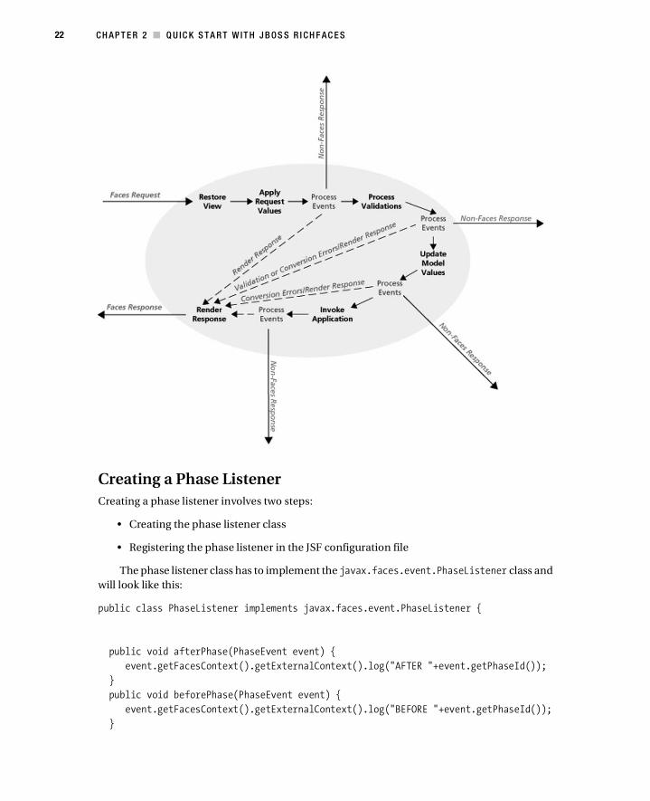
Before we continue, you need to be familiar with the JSF life-cycle phases shown in the
following image and need to understand what each phase does. I will be using this same diagram
to show RichFaces concepts. Make sure you understand what each phase does and what happens
to the flow in the case of a conversion/validation error or when using the immediate="true"
attribute. Understanding the life cycle can also help with debugging your JSF applications with
phase listeners. You will be using a phase listener later in this book. In case you need to brush
up on JSF phases, here is a good web site to do that: http://www.javabeat.net/articles/
54-request-processing-lifecycle-phases-in-jsf-1.html.

4 CH AP T E R 1 ■ I N TR O D U CT I ON
So, Why Use JSF?
Well, the shortest answer is that (after a short learning curve) JSF simplifies development. The
basic purpose of any framework is to simplify development by hiding the tasks that are common
to any application. JSF does exactly that. You don’t have to worry anymore about how to get
data from the request or how to define navigation or convert values. JSF provides all this and
more out of the box. If all the plumbing is covered by the framework, that leaves you more time
to work on the actual application. Finally, a JSF component approach makes it the perfect tech-
nology to be used with Ajax. I will introduce Ajax later in this chapter.
The JSF Application Is Running on the Server
Based on my experience teaching JSF, it is sometimes difficult for people who are new to JSF to
grasp the idea behind the JSF component tree and how it relates to what they see in the browser.
It’s important to keep in mind that JSF is a server-side framework. This means the application
is running on the server. This also means that any event processing will be done on the server.
Now, how does this all fit with what you see in the browser? The browser is basically a user-
readable view of the tree. It’s just a mirror image of the tree but in a format (the browser) you
can understand. When building a JSF application, it might help to think you are always working

CH A PT E R 1 ■ I N T R OD U C T I ON 5
with the JSF component tree. Anything you change or invoke is always on the component tree,
and the browser is just a client for displaying pages.
Keep an Open Mind
It’s not difficult to find forums, blog postings, and other resources from people who are just
starting with JSF and are dissatisfied with the framework. You must remember that most people
who are starting with JSF are coming from JSP, Struts, or a similar homegrown framework.
When they start evaluating JSF, they bring the same style and development approach to JSF
that they used with JSP and Struts. This is where all the problems start.
You can’t take that approach and use it with JSF. JSF provides a whole different paradigm
to web development—as I’ve explained, the user interface is developed from UI components.
It’s very different from what people are used to doing with JSP and Struts. So when they try to
do simple things in a JSP way in JSF, they fail and get frustrated. You might hear, “But I could
do this in JSP in about five minutes.” Of course, they probably could, but JSP is not really doing
anything more than mixing Java and HTML. JSP provides so little abstraction that you can do
basically anything—even if in most cases it isn’t done correctly, the key is that it was still accom-
plished one way or another.
This approach doesn’t work anymore in JSF. Before you become dissatisfied with JSF, it’s
important to spend at least some time learning the framework and understanding how it works
before actually evaluating it for a project. Put your JSP or Struts approach aside for a second,
and learn how to build web applications using UI components. I promise you, you will have
much more success with JSF this way.
JSF, Ajax, and RichFacesSo, why JSF and Ajax? Well, as it turns out, JSF and Ajax are a pretty good match. JSF has provided
a great new model for developing web application user interfaces. You don’t have to worry about
HTML markup anymore. Instead, you build the user interface out of JSF components. These
components—in most cases, the component renderers—will provide all the necessary HTML
markup. This model enables you to concentrate on the UI building and business logic implemen-
tation instead of messing with markup. Another way to look at it is as Swing-like development for
the Web.
Meanwhile, in the past couple of years, a great deal of buzz has emerged around Ajax. It’s
not about the cleaning stuff (or the soccer team from the Netherlands or the ancient Greek hero).
In this case, it means Asynchronous JavaScript and XML.
Ajax is not a framework but rather a technique (dating back to late 1990s) for building
much more interactive web applications than before. Ajax is a collection of existing technolo-
gies for delivering rich Internet applications inside a web browser. Ajax consists of DHTML,
XML, XMLHttpRequest, and the Document Object Model (DOM). Users don’t need to have
additional plug-ins or tools installed in their browsers to use it. An Ajax-based application is
delivered entirely inside any modern web browser.
Ajax-based applications are richer, more interactive, and faster. Such applications try to
join desktop-richness with the proven web application delivery method. The basic technique
behind rich Internet applications is that only the part of the page that has changed will be updated.
In other words, there is no need to reload the whole page. Such applications are sometimes
referred to as Web 2.0 applications.

6 CH AP T E R 1 ■ I N TR O D U CT I ON
Delving into the technologies that make up Ajax (DHTML, XML, XMLHttpRequest, and
DOM) is quite a task. Let me say it out loud: manual Ajax development is not easy. Yes, people
do Ajax development today, but, then again, there are also people who use the assembly language.
JavaScript has a number of shortcomings. It’s not uncommon to spend a significant amount of
time battling JavaScript browser incompatibilities instead of doing actual application develop-
ment. All browsers work with and support JavaScript a little bit differently, and that brings a lot
of challenges. (JavaScript incompatibility used to be significant. It is getting better, but it still
exists.) JavaScript debugging is challenging as well. A number of mature JavaScript libraries
provide a lot of the core features, but they still fall short with regard to JSF. Developing Ajax
manually or utilizing one of the JavaScript libraries is challenging, and ultimately, both are very
poor options for JSF. Finally, and probably most important, manual Ajax coding doesn’t fit the
JSF component model.
As it turns out, JSF and Ajax are an excellent match because of the JSF component model.
That’s where RichFaces comes in. RichFaces is a rich JSF component library that provides
components with Ajax support. Now we have JSF components that encapsulate all the necessary
JavaScript (and other parts that make Ajax work). RichFaces components hide all the complexities
of manual Ajax development. In addition, RichFaces components are tested and verified to
work in all the modern browsers, so you don’t have to do that.
When JSF 1.x was released, the term Ajax wasn’t widely used yet, and JavaScript was primarily
used to validate form fields. RichFaces doesn’t replace standard JSF; it is just a component
library on top of standard JSF. You can look at it as extra components with Ajax support.
Ajax4jsf and RichFacesI’ll now give you some background on how RichFaces was born and also tell you what Ajax4jsf is.
Ajax4jsf has its roots in RichFaces. The Ajax4jsf framework was created and designed by
Alexander Smirnov. In early 2005, he was looking to add a “hot” new technology along with the
associated experience to his résumé. Roughly at the same time, Jesse James Garrett was estab-
lishing the concept of Ajax. Meanwhile, JSF was starting to pick up steam. Alexander figured,
why not just merge the two so it would be easy to have Ajax functionality within a JSF application?
He started the project on SourceForge.net and called it Telamon (taken from the Shakespeare
play, Anthony and Cleopatra), and Ajax4jsf was born.
In the fall of that same year, Smirnov joined Exadel and continued to develop the frame-
work. Smirnov’s goal was to create a tool that was easy to use and that could be used with any
existing JSF component libraries.
The first version of what would become Ajax4jsf was released in March 2006. It wasn’t quite
a stand-alone thing yet. Rather, it was part of a product called Exadel RichFaces. Later in the
same year, RichFaces was split off, and the Ajax4jsf framework was born. While RichFaces provided
out-of-the-box components, or what’s called a component-centric Ajax approach (compo-
nents that do everything you need), Ajax4jsf provided what’s called page-wide Ajax support.
You as a developer specify what parts of the page should be processed on the server after some
client-side user actions and also what parts should be rendered back (rendering is happening
on the server and then partial DOM updating is happening on the client) after processing.
Ajax4jsf became an open source project hosted on Java.net, while RichFaces became a
commercial JSF component library.
Fast-forward to March 2007. JBoss and Exadel forged a partnership where Ajax4jsf and
RichFaces would be under the JBoss umbrella and be called JBoss Ajax4jsf and JBoss RichFaces.

CH A PT E R 1 ■ I N T R OD U C T I ON 7
RichFaces would also be open source and free. In September 2007, JBoss and Exadel decided to
recombine Ajax4jsf and RichFaces under the RichFaces name. This made sense because both
libraries were free and open source. Having just one product solved many version and compat-
ibility issues that existed before, such as figuring out which version of Ajax4jsf works with what
version of RichFaces.
Although today you will still see an a4j: namespace used, the product is now called JBoss
RichFaces.
RichFacesJBoss RichFaces is a rich component library for JSF. Now, RichFaces doesn’t replace the standard
JSF; you use RichFaces with either the Mojara JSF (Sun RI) implementation or the MyFaces
implementation. RichFaces simply provides ready-to-use Ajax components to enable building
Ajax-based applications. Another way to look at it is just as lots of extra JSF component beyond
what the standard JSF provides. These components provide all the necessary JavaScript, so you
almost never have to work with it directly.
Now, to take this one step further, RichFaces is actually a framework. One of its major features
is the rich components it offers. The components are divided into tag libraries. In addition,
RichFaces provides a skinnability (themes) feature and the Ajax4jsf Component Development
Kit (CDK).
Two Tag Libraries
Although the product is now called RichFaces, it still has two different tag libraries. One tag
library is called a4j:, and the other is called rich:. The a4j: tag library provides page-level Ajax
support. It basically provides foundation-like controls where you decide how to send a request,
what to send to the server, and what to update. This approach gives you a lot of power and flex-
ibility. The rich: tag library provides component-level Ajax support. Components from this
library provide all the functionality out of the box. In other words, you don’t need to decide
how to send a request and what to update.
Skinnability
Another major feature is skinnability, or themes. Any number of skins (defined via a property
file) can be created with different color schemas. When a particular skin is set, component
renders will refer to that skin and generate colors and styles based on that skin. This means you
can easily change the look and feel of the whole application by simply switching to a different
skin. I have dedicated Chapter 11 to this topic.
Component Development Kit
To close this chapter, I will reveal that RichFaces is more than just a rich component library.
RichFaces is actually a framework where the rich components and skinnability are part of the
framework. Another part of the framework is the Component Development Kit (CDK). The CDK
includes a code generation facility and a templating facility. These features enable a compo-
nent developer to avoid the routine process of component creation. The CDK greatly simplifies
and speeds up rich component development with built-in Ajax support. The CDK is not covered as

8 CH AP T E R 1 ■ I N TR O D U CT I ON
part of this book, but I thought it would be a good idea at least to mention that such a facility
exists in case you want to build your own custom rich components. To learn more about the
CDK, visit http://www.jboss.org/jbossrichfaces/docs/, and look for CDK guide.
JBoss SeamIf you have worked with JSF before or just starting, you have probably heard (or will hear)
about JBoss Seam. JBoss Seam greatly simplifies developing JSF applications with technologies
such as Hibernate, JPA, and EJB3. To learn more about JBoss Seam, you can go to http://
www.seamframework.org.
Although the examples in this book aren’t Seam-based (just to keep things a little bit simpler),
any example can be easily updated to use Seam components instead of JSF managed beans.
Seam improves JSF by filling in features that JSF is currently missing and greatly simplifies
development. Seam seamlessly unifies JSF with other technologies such as Hibernate, JPA, or
EJB3. Once you have a strong understanding of standard JSF, I recommend considering Seam
for your application. By first using the standard JSF, you will have a greater appreciation and
understanding of how Seam elegantly simplifies development.
I recommend the book Seam in Action by Dan Allen (Manning Publications, 2008) to learn
more about Seam.
JSF 2.0As of this writing, the JSF expert group is working on finalizing the features set for JSF 2.0 (JSR 314).
Everything you learn from this book you will be able to use with JSF 2.0 when it is released. Now
that you’re done with the introduction, you’re ready to start learning about RichFaces.
SummaryThis chapter briefly introduced JSF, Ajax, and JBoss RichFaces. The goal was to give you general
picture of how all these technologies fit together. In Chapter 2, you’ll install the tools you’ll use
in this book, and then you will jump into building your first RichFaces application.

9
■ ■ ■
C H A P T E R 2
Quick Start with JBoss RichFaces
In this chapter, you’ll set up all the tools you’ll be using for building RichFaces applications.
Then you will build an application that will cover a majority of RichFaces concepts. You will
then build on the application to demonstrate other RichFaces features and concepts. After
finishing this chapter, you should feel pretty comfortable using RichFaces on your own.
Setting Up Your Development EnvironmentAlthough it’s possible to build a JSF application with just Notepad (or vi), it’s not the best option.
You want an IDE that will help you with development, such as by providing content assist,
wizards, validation, and more. Many tools on the market today can help you build a JSF/RichFaces
application. However, one tool has significantly more support for RichFaces than any other—
JBoss Tools.
JBoss Tools is the free cousin of JBoss Developer Studio. JBoss Tools extends Eclipse and the
Web Tools Project (WTP) plug-ins by providing numerous visual, drag-and-drop, and source
features to assist with JSF/RichFaces development. It also ships with a RichFaces palette and allows
you to drag and drop components on the page. Additional features include Seam tools, Hibernate/
JPA tools, and much more. To learn more about JBoss Tools, visit http://www.jboss.org/tools/.
In this book, you’ll use the Tomcat server to deploy JSF/RichFaces applications. Tomcat is
fast and easy to use and perfect for learning RichFaces. Although you’ll be using Tomcat for the
examples in this book, you can easily deploy a RichFaces application to any other server of your
choice, such as Resin, JBoss Application Server, BEA, GlassFish, or any other.
Download and Installing Everything You Need
The following sections will outline the steps to download and install everything you need to
follow along with the examples in this book.
10 CH AP T E R 2 ■ Q U IC K S TA R T W IT H J B OS S R I CH F AC E S
Eclipse and Web Tools Project
To download Eclipse and WTP, follow these steps:
1. Create a new directory called richfaces on your drive. (Note the lack of spaces in the
directory name.)
2. Go to http://www.eclipse.org/downloads/packages/release/europa/winter, and select
to download the Eclipse IDE for Java EE developers. This distribution already includes
the Web Tools Project plug-ins. Even if you have Eclipse, it makes sense to have a separate
installation just for the training so it won’t affect any of your other work.
3. Unzip the downloaded file inside the richfaces directory you created.
Make sure you download the right Eclipse version according to Table 2-1.
As of this writing, JBoss Tools GA version isn’t yet available.
JBoss Tools
To download and install JBoss Tools, follow these steps:
1. Download JBoss Tools by going to http://labs.jboss.com/tools/download/. Look for
the latest 2.1.x GA version.
2. Click the link labeled All Plugins – Windows/Linux to download the file.
3. Unzip the file in the richfaces directory.
At the end of these steps, you should have the following structure:
richfaces
eclipse
Don’t start Eclipse yet; you have two more steps you need to complete: getting the project
templates and installing the Tomcat server.
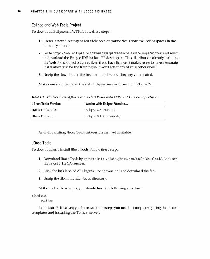
Table 2-1. The Versions of JBoss Tools That Work with Different Versions of Eclipse
JBoss Tools Version Works with Eclipse Version...
JBoss Tools 2.1.x Eclipse 3.3 (Europe)
JBoss Tools 3.x Eclipse 3.4 (Genymede)

C HA P TE R 2 ■ Q U I CK ST AR T W IT H J B O SS R IC HF A CE S 11
Project Templates
Project templates will allow you to quickly create a project with RichFaces already configured.
1. Download the rcbook-templates.zip file for this book (available on the Apress website).
2. Unzip the file, and copy the content to the following location:
<eclipse>\plugins\org.jboss.tools.common.projecttemplates_X.X.X
You will be warned that you are overwriting some files, which you can safely do.
Tomcat
Download Tomcat 5.5 or 6.0 from http://tomcat.apache.org/ to richfaces, and unzip it.
At the end of these steps, you should have the following structure:
richfaces
eclipse
apache-tomcat-X.X.X
Setting Up and Testing JBoss Tools
To set up and test JBoss Tools, follow these steps:
1. Launch Eclipse by running <richfaces>/eclipse/eclipse.exe.
2. When prompted to select a workspace, click the Browse button, create a new workspace
at <richfaces>/workspace, and check the Use This As the Default and Do Not Ask Again box.
3. You will see a welcome screen that you can close.
4. Select Window ➤ Open Perspective ➤ Other.
5. Select Web Development.
6. Select File ➤ New ➤ JSF Project.
7. Set the following values:
• Project Name: Enter richfaces-start.
• JSF Environment: Select JSF 1.2, Facelets, RichFaces.
• Template: Select RichFacesStart-Tomcat5.5 if you are planning to deploy to Tomcat 5.5,
or select RichFacesStart-Tomcat6 if you are planning to deploy to Tomcat 6.0.
8. Click Next.
9. Next to the Runtime field, click New.

12 CH AP T E R 2 ■ Q U IC K S TA R T W IT H J B OS S R I CH F AC E S
10. Select Apache ➤ Apache Tomcat v5.5 or Apache ➤ Apache Tomcat v6.0:
• If you are going to use Tomcat 5.5, then you need to use Servlet version 2.4.
• If you are going to use Tomcat 6.x, then you need to use Servlet version 2.5.
11. Select Also Create New Local Server.
12. Click Next.
13. Browse to the location where you copied the Tomcat server.
14. Click Finish, and click Finish again to create the project.
15. Right-click Project, and select Run As ➤ Run on Server.
16. Click Finish.
A browser window should open within Eclipse with a welcome page. You are up and running!
Configuring RichFacesAlthough you will use a project template with RichFaces that is installed already, it is important
to know what goes into installing and configuring RichFaces. You don’t need to do the steps in
the following sections; they are just for you to understand how RichFaces is configured.
Downloading RichFaces
If you need to download the latest version of RichFaces, go to http://labs.jboss.com/
jbossrichfaces/, and select the Download link.
Download and unzip richfaces-ui-3.2.x.GA-bin.zip.
Inside the lib directory, you will find three files for RichFaces:
• richfaces-api-3.2.x.jar
• richfaces-impl-3.2.x.jar
• richfaces-ui-3.2.x.jar
As of this writing, the latest is version 3.2.2.
Inside the application, the RichFaces libraries are placed in the WEB-INF\lib directory.
Installing RichFaces
Copy the files to WEB-INF/lib in your project.
Open web.xml in your project, and add the following:
<filter>
<display-name>RichFaces Filter</display-name>
<filter-name>richfaces</filter-name>
<filter-class>org.ajax4jsf.Filter</filter-class>
</filter>

C HA P TE R 2 ■ Q U I CK ST AR T W IT H J B O SS R IC HF A CE S 13
<filter-mapping>
<filter-name>richfaces</filter-name>
<servlet-name>Faces Servlet</servlet-name>
<dispatcher>REQUEST</dispatcher>
<dispatcher>FORWARD</dispatcher>
<dispatcher>INCLUDE</dispatcher>
</filter-mapping>
You are basically adding a filter to process Ajax actions.
Optionally, you can set which skin will be used:
<context-param>
<param-name>org.richfaces.SKIN</param-name>
<param-value>blueSky</param-value>
</context-param>
Other skin options are as follows:
• DEFAULT
• plain
• emeraldTown
• blueSky
• wine
• japanCherry
• ruby
• classic
• deepMarine
• NULL
• laguna
• darkX
• glassX
I’ll cover skins in details in Chapter 11.
If a newer version of RichFaces is available, you now know which files you need to update
and where.
Setting Up the Tag Libraries
Finally, you just need to add tag library declarations to the pages where RichFaces components
will be used. The declaration for XHTML pages looks like this:
xmlns:a4j="http://richfaces.org/a4j"
xmlns:rich="http://richfaces.org/rich"
Just in case you are using JSP, you would place the following taglib declarations:
<%@ taglib uri="http://richfaces.org/a4j" prefix="a4j"%>
<%@ taglib uri="http://richfaces.org/rich" prefix="rich"%>
14 CH AP T E R 2 ■ Q U IC K S TA R T W IT H J B OS S R I CH F AC E S
■Note All the examples in the book are based on Facelets. Adapting all examples to be used with JSPs
shouldn’t be a problem.
You are now finished. That’s all it takes to install and configure RichFaces. If you are starting
a new project or have an existing project, the previous steps will add RichFaces support to the
project. There are a few other configuration parameters, but I will mention them later in the book.
Creating Your First RichFaces ApplicationNow that you are done with all the setup, it’s time to roll up your sleeves. In the following sections,
you’ll build your first application that uses RichFaces components. Although the application is
not difficult, you will learn most of the major concepts behind RichFaces. That will enable you
to use most other RichFaces components.
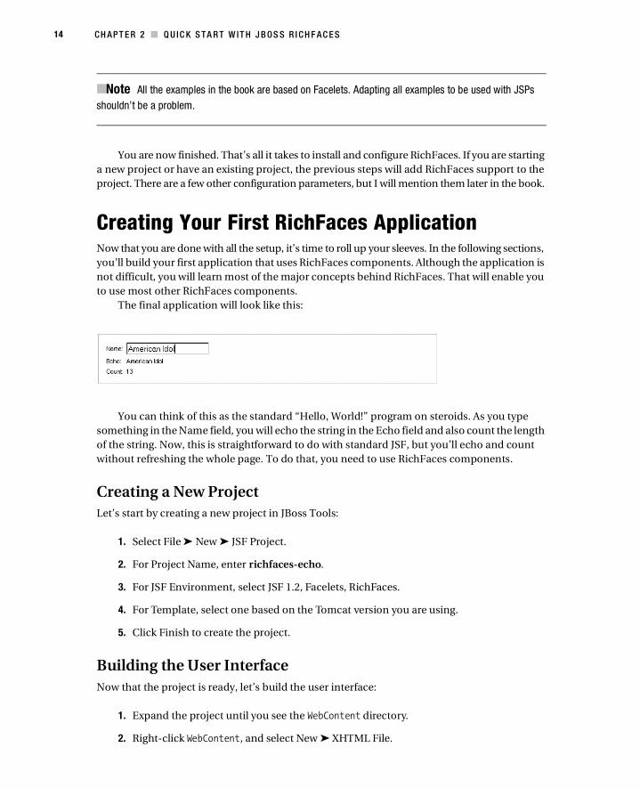
The final application will look like this:
You can think of this as the standard “Hello, World!” program on steroids. As you type
something in the Name field, you will echo the string in the Echo field and also count the length
of the string. Now, this is straightforward to do with standard JSF, but you’ll echo and count
without refreshing the whole page. To do that, you need to use RichFaces components.
Creating a New Project
Let’s start by creating a new project in JBoss Tools:
1. Select File ➤ New ➤ JSF Project.
2. For Project Name, enter richfaces-echo.
3. For JSF Environment, select JSF 1.2, Facelets, RichFaces.
4. For Template, select one based on the Tomcat version you are using.
5. Click Finish to create the project.
Building the User Interface
Now that the project is ready, let’s build the user interface:
1. Expand the project until you see the WebContent directory.
2. Right-click WebContent, and select New ➤ XHTML File.

C HA P TE R 2 ■ Q U I CK ST AR T W IT H J B O SS R IC HF A CE S 15
3. For Name, enter echo (you don’t need to enter the .xhtml extension).
4. For Template, select JSFRichFaces.xhtml.
5. Click Finish, and open the page.
6. Go to the Source tab.
When you open the page, it should look like this:
<!DOCTYPE html PUBLIC "-//W3C//DTD XHTML 1.0 Transitional//EN"
"http://www.w3.org/TR/xhtml1/DTD/xhtml1-transitional.dtd">
<html xmlns="http://www.w3.org/1999/xhtml"
xmlns:ui="http://java.sun.com/jsf/facelets"
xmlns:h="http://java.sun.com/jsf/html"
xmlns:f="http://java.sun.com/jsf/core"
xmlns:rich="http://richfaces.org/rich"
xmlns:a4j="http://richfaces.org/a4j">
<head></head>
<body>
</body
</html>
User interface components need to go in <body> tags; the final version will look like this:
<body>
<h:form>
<rich:panel style="width:50%">
<h:panelGrid columns="2">
<h:outputText value="Name:"/>
<h:inputText value=""/>
<h:outputText value="Echo:"/>
<h:outputText value=""/>
<h:outputText value="Count:"/>
<h:outputText value=""/>
</h:panelGrid>
</rich:panel>
</h:form>
</body>
You should be familiar with the tags on this page except <rich:panel>. The <rich:panel>
tag is a RichFaces component and acts as a container, which means you can place any other
number of components, including other <rich:panel> components, inside it.

16 CH AP T E R 2 ■ Q U IC K S TA R T W IT H J B OS S R I CH F AC E S
This code will produce the following:
The next step is to create a managed bean.
Creating a Managed Bean
The managed bean is basically the model to which you are going to bind the user interface
components:
1. Open the faces-config.xml page, and switch to the Tree tab.
2. Select the Managed Beans node, and click Add.
3. Set the following values:
• Scope: Enter request (the default value).
• Class: Enter echo.EchoBean.
• Name: Enter echoBean.
Notice that Generate Source Code is checked. You want the source code to be generated
because the Java class doesn’t actually exist. You are basically doing two things at once:
first generating the Java bean and second registering this bean to be a managed bean.
4. Click Finish.
Open faces-config.xml; you should see the managed bean declaration:
<managed-bean>
<managed-bean-name>echoBean</managed-bean-name>
<managed-bean-class>echo.EchoBean</managed-bean-class>
<managed-bean-scope>request</managed-bean-scope>
</managed-bean>
Open the generated Java bean; it should look like this:
package echo;
public class EchoBean {
public EchoBean() {
}
}

C HA P TE R 2 ■ Q U I CK ST AR T W IT H J B O SS R IC HF A CE S 17
Let’s now create the model. You need two properties: one is for the name you will enter,
and the second property will keep the length of the value entered. You also need an action
listener to do the actual counting.
Here is the final version of the EchoBean.java file with the changes shown in bold:
package echo;
import javax.faces.event.ActionEvent;
public class EchoBean {
private String name;
private Integer count;
public EchoBean() {}
public Integer getCount() {
return count;
}
public void setCount(Integer count) {
this.count = count;
}
public String getName() {
return name;
}
public void setName(String name) {
this.name = name;
}
public void countListener (ActionEvent event){
count = name.length();
}
}
There are two properties with getters and setters. There is also an action listener,
countListener, to count the length of the value entered.
Now that you have the managed bean and the user interface defined, let’s connect the user
interface components to the managed bean properties. The changes are shown in bold.
<h:form>
<rich:panel style="width:50%">
<h:panelGrid columns="2">
<h:outputText value="Name:"/>
<h:inputText value="#{echoBean.name}"/>
<h:outputText value="Echo:"/>
<h:outputText value="#{echoBean.name}"/>

18 CH AP T E R 2 ■ Q U IC K S TA R T W IT H J B OS S R I CH F AC E S
<h:outputText value="Count:"/>
<h:outputText value="#{echoBean.count}"/>
</h:panelGrid>
</rich:panel>
</h:form>
Adding a Button
Before you make this an Ajax application, let’s add a standard JSF button and bind it to the
action listener just to check that the application works correctly.
Place this button outside <h:panelGrid> but still inside <rich:panel>:
<h:commandButton value="Submit"
actionListener="#{echoBean.countListener}"/>
You don’t need to set the action attribute because you are staying on the same page. Not
setting the action attribute means you are reloading the same page.
Running the Application
Start the server by clicking the green arrow in the Servers view. You can launch the application
in a number of ways. The most obvious one is, once the server is running, to open any web
browser and enter the address manually:
http://localhost:8080/richfaces-echo/echo.jsf
Another option is to drag and drop echo.jsf on the Diagram view. Once the page has been
inserted, right-click, and select Run on Server. If dragging and dropping doesn’t work for some
reason, right-click anywhere on the diagram, and select Add View to insert the page.
And finally, it’s also possible to right-click the project and select Run As ➤ Run on Server.
No matter which launch method you select, you should be able to enter something in the
Name field, and after clicking Submit, the same value should be echoed on the next line as well
as the string length displayed.
Here’s the result:
Adding Ajax
As I said before, you want the Echo and Count fields to be updated without having to click
Submit each time. You can achieve that using Ajax. Basically, you want to update only the area
next to Echo and Count. Before you implement the echo-like functionality, let’s make the
existing button send an Ajax request and then update only the Echo and Count fields without
refreshing the whole page.

C HA P TE R 2 ■ Q U I CK ST AR T W IT H J B O SS R IC HF A CE S 19
The majority of time, when working with Ajax, you need to know how to do two things:
• How to send information to the server and invoke action using Ajax techniques
• How to specify which parts of the page to update
Luckily, RichFaces components will enable you to easily do both of these tasks.
Submitting via Ajax
RichFaces provides the <a4j:commandButton> component that is virtually identical to the standard
JSF button; however, as you have probably guessed, it allows you to send the request via Ajax.
All you have to do is change the tag library of the component.
<a4j:commandButton value="Submit"
actionListener="#{echoBean.countListener}"/>
That was pretty easy. This component will put in place all the necessary JavaScript to send
an Ajax request to the server without you having to deal with any JavaScript code. Do you want
to invoke the same action on the server? Absolutely. You are not changing how the back end
works. You are merely making the user interface more interactive.
The next thing you need to do is determine what parts of the page to update.
Doing a Partial-Page Update
Updating part of the page is very simple. Most components that allow sending an Ajax request
to the server allow specifying which parts—or, more correctly, which components—on the
page are to be updated. <a4j:commandButton> is no different.
The components to be updated are specified via the <a4j:commandButton> reRender attribute.
The reRender attribute points to IDs of components that need to be updated. You haven’t
specified any IDs, so let’s go ahead and do it:
<h:form>
<rich:panel style="width:50%">
<h:panelGrid columns="2">
<h:outputText value="Name:"/>
<h:inputText value="#{echoBean.name}"/>
<h:outputText value="Echo:"/>
<h:outputText id="echo" value="#{echoBean.name}"/>
<h:outputText value="Count:"/>
<h:outputText id="count" value="#{echoBean.count}"/>
</h:panelGrid>
<a4j:commandButton value="Submit"
actionListener="#{echoBean.countListener}"
reRender="echo, count"/>
</rich:panel>
</h:form>

20 CH AP T E R 2 ■ Q U IC K S TA R T W IT H J B OS S R I CH F AC E S
You’re done! Make sure everything is saved, republish the application, and run it. Notice
that when the button is clicked, fields are updated without refreshing the whole page.
Make sure you understand that partial-page update really means selecting which UI compo-
nents on the JSF component tree are to be rerendered back to the client (browser). Anytime I
say partial-page update, I mean that some components will be rerendered on the server, and
when the browser receives the response, a partial-page update will occur (in other words, part
of the DOM will be updated).
Let’s now go and make changes to the original echo application, where you don’t even
have to click the button, but as you type, the text is echoed, and the count is updated.
Using a4j:support
In the first part of the example, you sent an Ajax request when the button was clicked. You used
the onclick event to send the request. When you type in an input field, what kind of an event
can you use? You can use the onkeyup event. Note that this is just a standard DHTML event; it’s
not something RichFaces invented. You probably have seen or used it before.
So, as you type, you want to send an Ajax request, invoke the action on the server, and
update the components on the page. To do that, you need to use the <a4j:support> component.
This component enables you to add Ajax functionality to any standard JSF component after
adding it as a child component and defining an event on which to send the request.
Here is how it’s going to look:
. . .
<h:inputText value="#{echoBean.name}">
<a4j:support />
</h:inputText>
. . .
Notice again that the tag is enclosed in <h:inputText>.
Next you need to specify on which event to send an Ajax request. For that you are using
and setting the event attribute:
. . .
<h:inputText value="#{echoBean.name}">
<a4j:support event="onkeyup" />
</h:inputText>
. . .
And finally, you need to specify which components to update (or rerender in the compo-
nent tree) as before and invoke the countListener listener. Notice that the listener code stays
the same because you still want the same counting even though you are now using Ajax:

C HA P TE R 2 ■ Q U I CK ST AR T W IT H J B O SS R IC HF A CE S 21
. . .
<h:inputText value="#{echoBean.name}">
<a4j:support event="onkeyup" reRender="echo, count"
actionListener="#{echoBean.countListener}"/>
</h:inputText>
. . .
It’s important to point out that the onkeyup event you used is not just a random event I
decided to use. The underlying control (or HTML input field)—in our case, <h:inputText>—
has to support such an event. Additionally, if you were not using RichFaces components, then
you would write something like this:
<input type="text" onkeyup="some_javascript_function()" . . . />
In fact, that’s what is rendered when you look at the generated HTML:
<input type="text" name="j_id2:j_id6"
onkeyup="A4J.Ajax.Submit('_viewRoot','j_id2',event,{'parameters':
{'j_id2:j_id7':'j_id2:j_id7'} ,'actionUrl':'/echo/echo.jsf;
jsessionid=10BFCAAEED9997BADDB806021434784B'} )" />
So, as I’ve mentioned before, all the JavaScript you need to use in order to send Ajax requests
is generated automatically.
■Note The JavaScript function call shown in this source code isn’t intended to be used by end developers
directly. This API isn’t public and therefore not mentioned in the official documentation. RichFaces compo-
nents must be used in order to generate the correct Ajax request.
How Does It Work?
Every time a character is typed, a JSF-Ajax request is sent to the server. It goes through all the
JSF phases. During the Update Model phase, the name value is updated with whatever you
submitted, and during Render Response, the values are rendered back to the browser. As you
can see, RichFaces simply extends JSF with Ajax-based components. It fully leverages the stan-
dard JSF life cycle. It wouldn’t make sense to bypass the phases just because you use Ajax now.
To really confirm that all the phases are still used, let’s build a very simple phase listener
that will print information before and after each phase.
22 CH AP T E R 2 ■ Q U IC K S TA R T W IT H J B OS S R I CH F AC E S
Creating a Phase Listener
Creating a phase listener involves two steps:
• Creating the phase listener class
• Registering the phase listener in the JSF configuration file
The phase listener class has to implement the javax.faces.event.PhaseListener class and
will look like this:
public class PhaseListener implements javax.faces.event.PhaseListener {
public void afterPhase(PhaseEvent event) {
event.getFacesContext().getExternalContext().log("AFTER "+event.getPhaseId());
}
public void beforePhase(PhaseEvent event) {
event.getFacesContext().getExternalContext().log("BEFORE "+event.getPhaseId());
}

C HA P TE R 2 ■ Q U I CK ST AR T W IT H J B O SS R IC HF A CE S 23
public PhaseId getPhaseId() {
return PhaseId.ANY_PHASE;
}
}
Three methods need to be implemented. The first two, beforePhase() and afterPhase(),
define what to do before and after each phase. In our methods, we are just printing to the console.
The third, getPhaseId(), specifies for which phases to invoke this listener, and PhaseId.ANY_PHASE
means for all the phases.
The next step is to register the phase listener in a JSF configuration file. A quick way to do
it is as follows:
1. Go to faces-config.xml, and open the Tree tab.
2. Select the root node, and in the Lifecycle section, click Add.
3. For Phase-Listener, enter the class name example.PhaseListener, or browse for it.
4. Click Finish.
Switching to the Source tab will reveal the following:
<lifecycle>
<phase-listener>example.PhaseListener</phase-listener>
</lifecycle>
Republish the application, and run it. Every time you type a character, the following will be
printed to the console:
Jan 18, 2008 4:16:12 PM org.apache.catalina.core.ApplicationContext log
INFO: BEFORE RESTORE_VIEW 1
Jan 18, 2008 4:16:12 PM org.apache.catalina.core.ApplicationContext log
INFO: AFTER RESTORE_VIEW 1
Jan 18, 2008 4:16:12 PM org.apache.catalina.core.ApplicationContext log
INFO: BEFORE APPLY_REQUEST_VALUES 2
Jan 18, 2008 4:16:12 PM org.apache.catalina.core.ApplicationContext log
INFO: AFTER APPLY_REQUEST_VALUES 2
Jan 18, 2008 4:16:12 PM org.apache.catalina.core.ApplicationContext log
INFO: BEFORE PROCESS_VALIDATIONS 3
Jan 18, 2008 4:16:12 PM org.apache.catalina.core.ApplicationContext log
INFO: AFTER PROCESS_VALIDATIONS 3
Jan 18, 2008 4:16:12 PM org.apache.catalina.core.ApplicationContext log
INFO: BEFORE UPDATE_MODEL_VALUES 4
Jan 18, 2008 4:16:12 PM org.apache.catalina.core.ApplicationContext log
INFO: AFTER UPDATE_MODEL_VALUES 4
Jan 18, 2008 4:16:12 PM org.apache.catalina.core.ApplicationContext log
INFO: BEFORE INVOKE_APPLICATION 5
Jan 18, 2008 4:16:12 PM org.apache.catalina.core.ApplicationContext log
INFO: AFTER INVOKE_APPLICATION 5
Jan 18, 2008 4:16:12 PM org.apache.catalina.core.ApplicationContext log

24 CH AP T E R 2 ■ Q U IC K S TA R T W IT H J B OS S R I CH F AC E S
INFO: BEFORE RENDER_RESPONSE 6
Jan 18, 2008 4:16:12 PM org.apache.catalina.core.ApplicationContext log
INFO: AFTER RENDER_RESPONSE 6
This proves you are still using all the phases. Keep in mind this is just to show you how the
frameworks works. Sending a new request on each keystroke might not always be a good idea.
I will show you later in the book how to prevent a user from continuously submitting Ajax requests
to the server.
Adding Validation
As the next part of this application, let’s use one of the standard validators to check the length
of the name entered. Let’s say you want the Name entry to be at least three characters long.
The changes you need to make are shown here in bold. First you add an <f:validateLength>
validator. You also add a message tag in order to display any error messages. Because you have
inserted another component in <h:panelGrid>, you need to wrap the input field and error message
in <h:panelGroup> in order to keep the two columns in order.
<h:form>
<rich:panel style="width:50%">
<h:panelGrid columns="2">
<h:outputText value="Name:" />
<h:panelGroup>
<h:inputText id="name" value="#{echoBean.name}">
<a4j:support event="onkeyup" reRender="echo, count"
actionListener="#{echoBean.countListener}" />
<f:validateLength minimum="3" />
</h:inputText>
<h:message for="name" />
</h:panelGroup>
<h:outputText value="Echo:" />
<h:outputText id="echo" value="#{echoBean.name}" />
<h:outputText value="Count:" />
<h:outputText id="count" value="#{echoBean.count}" />
</h:panelGrid>
<h:commandButton value="Submit"
actionListener="#{echoBean.countListener}" />
</rich:panel>
</h:form>
At this point, save all the changes, and run the application.
You will probably notice a few strange things happening. First, the Echo and Count fields
are not updated unless you have more than three characters, and second, the error message is
not displayed at all. Don’t worry, this is the expected outcome; I will explain what’s happening.

C HA P TE R 2 ■ Q U I CK ST AR T W IT H J B O SS R IC HF A CE S 25
You can get additional information about what is happening if you look at what phases are
executed. Running the application and looking at the console should produce the following
output:
Jan 21, 2008 10:19:30 AM org.apache.catalina.core.ApplicationContext log
INFO: BEFORE RESTORE_VIEW 1
Jan 21, 2008 10:19:30 AM org.apache.catalina.core.ApplicationContext log
INFO: AFTER RESTORE_VIEW 1
Jan 21, 2008 10:19:30 AM org.apache.catalina.core.ApplicationContext log
INFO: BEFORE APPLY_REQUEST_VALUES 2
Jan 21, 2008 10:19:30 AM org.apache.catalina.core.ApplicationContext log
INFO: AFTER APPLY_REQUEST_VALUES 2
Jan 21, 2008 10:19:30 AM org.apache.catalina.core.ApplicationContext log
INFO: BEFORE PROCESS_VALIDATIONS 3
Jan 21, 2008 10:19:30 AM org.apache.catalina.core.ApplicationContext log
INFO: AFTER PROCESS_VALIDATIONS 3
Jan 21, 2008 10:19:30 AM org.apache.catalina.core.ApplicationContext log
INFO: BEFORE RENDER_RESPONSE 6
Jan 21, 2008 10:19:30 AM com.sun.faces.lifecycle.RenderResponsePhase execute
INFO: WARNING: FacesMessage(s) have been enqueued, but may not have been displayed.
sourceId=j_id2:name[severity=(ERROR 2), summary=(j_id2:name: Validation Error:
Value is less than allowable minimum of '3'),
detail=(j_id2:name: Validation Error: Value is less than allowable minimum of '3')]
Jan 21, 2008 10:19:30 AM org.apache.catalina.core.ApplicationContext log
INFO: AFTER RENDER_RESPONSE 6
Looking at the phases passed, you can see that after phase 3, Process Validations, you go to
the Render Response phase. That makes sense because validation fails. In JSF, when validation
fails, you don’t continue to the Update Model phase but instead go to the Render Response
phase. Because the Update Model phase is never executed, #{echoBean.name} is not set, and it
basically equals its default value, which is null. When you rerender #{echoBean.name}, it’s null,
and nothing is displayed. You still need to figure out why you are not seeing the error message,
though.
Displaying Content Not Rendered Before
Let’s figure out why the error messages are not rendered. Your first guess might be because you
are not rerendering <h:message for="name"/>. Even if you do something like this, it’s not going
to work, but it’s a good line of thought:

26 CH AP T E R 2 ■ Q U IC K S TA R T W IT H J B OS S R I CH F AC E S
<a4j:support event="onkeyup" reRender="echo, count, nameError"
actionListener="#{echoBean.countListener}"/>
. . .
. . .
. . .
<h:message id="nameError" for="name"/>
Let’s start by looking at the following. When the page is rendered for the first time, there
are no error messages. Although there is a message component in the JSF component tree, the
component doesn’t produce any markup. That means nothing is sent to the browser.
You have the page rendered and now start entering input. Let’s say you entered only two
characters, which means validation fails. When validation fails and an error message is queued,
execution goes to the Render Response phase.
The rendering phase slightly changes when working with Ajax. In a non-Ajax application, the
whole JSF component tree is rendered, and thus we get a full-page refresh. When working with
Ajax, you need to update only part of the page; thus, the rendering phase will rerender only compo-
nents specified via the reRender attribute (there are other ways to cause rendering; I will cover them
later in the book). Now that the message component has an error message and you have specified
the ID of <h:message/> to be rerendered, the rendered content is sent to the browser.
Part of RichFaces is a small JavaScript client that knows how to send an Ajax request and
knows how to update parts of the page (DOM tree) when the response returns. The JavaScript
client looks at the response received and tries to match IDs from the response against the IDs
in the DOM tree. Basically, it needs to know what part of the DOM tree to update. If it doesn’t
know what part to update, it doesn’t make sense to insert content somewhere randomly in the
tree. Where would you put it? The top, the middle, or the bottom of the tree?
If you recall, on the initial rendering, <h:messages/> didn’t produce any markup because
there were no error messages. But, this time, error message content is sent back. However,
when the JavaScript client tries to match its ID against an ID in the DOM tree, it can’t, because
no such ID exists. So, basically, the JavaScript client doesn’t know where to put the error message
content. That’s the reason we don’t see the error message displayed on the page.
Using <a4j:log>
To see this in action, you can use an <a4j:log>, which shows request data, response data, DOM tree
changes on update, and other useful debug information. When placed on the page, the control
doesn’t produce any visible output, but after hitting Ctrl+Shift+L (the default register hotkey), a
debug window will open. If for some reason a debug log window doesn’t open, change the hotkey
by setting the hotkey attribute to a letter of your choice, for example, <a4j:log hotkey="D"/>. Alter-
natively, it's possible to render the log inline <a4j:log popup="false"/>.
. . .
</rich:panel>
<a4j:log/>
</h:form>
</body>
</html>
C HA P TE R 2 ■ Q U I CK ST AR T W IT H J B O SS R IC HF A CE S 27
Run the application, and press Ctrl+Shift+L. A blank window will open. Type something in
the Name field, and observe the output in the log console. There is a lot of content, but let’s
look closer at the response. What is shown in bold are the IDs you want to update.
debug[17:29:25,925]: Full response content: <?xml version="1.0"?>
<html xmlns="http://www.w3.org/1999/xhtml">
<head><title></title><link type="text/css" rel="stylesheet"
href="/echo/a4j_3_1_2.GAcss/panel.xcss/DATB/eAEz3vGhHwAFZwJr.jsf" />
<script type="text/javascript"
src="/echo/a4j_3_1_2.GAorg.ajax4jsf.javascript.AjaxScript.jsf">
</script></head><body><span id="form:nameError">
form:name: Validation Error: Value is less than allowable
minimum of '3'</span><span id="form:echo">
</span><span id="form:count"></span>
<meta name="Ajax-Update-Ids" content="form:nameError,form:echo,form:count" />
<span id="Ajax-view-state"><input type="hidden"
name="javax.faces.ViewState" id="javax.faces.ViewState"
value="_id6" /></span><meta id="Ajax-Response"
name="Ajax-Response" content="true" /></body></html>
Looking a little bit later in the output, you will see the following line:
warn[17:29:26,035]: Node for replace by response with id form:nameError
not found in document
This basically means that no node was found with that ID in the DOM to replace. Let’s see
how to solve this problem.
Using Placeholders
So, how do we resolve this? You need to create a placeholder for the error message and
then point to that placeholder via the reRender attribute. The simplest component to use
is <h:panelGroup>:
<a4j:support event="onkeyup" reRender="echo, count, p_name"
actionListener="#{echoBean.countListener}"/>
. . .
. . .
. . .
<h:panelGroup id="p_name">
<h:message id="nameError" for="name"/>
</h:panelGroup>
The p_ stands for “panel” in this case. Using <h:panelGrid> will produce the same result.
Looking at the <a4j:log> output will now confirm that the JavaScript client is updating the area
with the ID of p_name:
28 CH AP T E R 2 ■ Q U IC K S TA R T W IT H J B OS S R I CH F AC E S
debug[17:36:20,040]: Attempt to update part of page for Id: form:p_name
debug[17:36:20,040]: call selectSingleNode for id= form:p_name
debug[17:36:20,060]: Replace content of node by outerHTML()
debug[17:36:20,060]: search for elements by name 'script' in element span
debug[17:36:20,070]: selectNodes found 0
debug[17:36:20,070]: Scripts in updated part count : 0
debug[17:36:20,070]: Update part of page for Id: form:p_name successful
Using <a4j:outputPanel>
There will be a situation where a particular component or a set of components must always be
updated. One way is of course to point to these components via the reRender attribute, but it’s
also possible to use a <a4j:outputPanel> component. By default, <a4j:outputPanel> renders a
<span> HTML tag and acts as a container (equivalent to setting layout="inline"). A <div> tag
can be rendered if layout="block" is set instead.
One way to use it is the same as <h:panelGroup> in the previous example:
<a4j:support event="onkeyup" reRender="echo, count, p_name"
actionListener="#{echoBean.countListener}"/>
. . .
. . .
. . .
<a4j:outputPanel id="p_name">
<h:message id="nameError" for="name"/>
</a4j:outputPanel>
This will produce the same result. So, what is the difference? <a4j:outputPanel> has a
special attribute called ajaxRendered, and when set to true, it will indicate that all components
inside will always be rerendered. This means you don’t have to use reRender. The components
inside <a4j:outputPanel ajaxRendered="true"> will always be updated.
Displaying an error message is a common task, so the RichFaces team built a component that
basically combines <a4j:outputPanel ajaxRendered="true"> and <h:message> (or <h:messages>).
The component is called <rich:message> (or <rich:messages>). What this means is that this
component will always be updated without you having to rerender it or put it inside a place-
holder. The changes to your application would be as follows. First, you delete <a4j:outputPanel>.
Then, you can delete p_name from the reRender list. Finally, let’s change <h:message> to
<rich:message>, keeping all attributes as they are:
<a4j:support event="onkeyup" reRender="echo, count"
actionListener="#{echoBean.countListener}"/>
. . .
. . .
. . .
<rich:message id="nameError" for="name"/>
Run the application, and it will work exactly the same way.

C HA P TE R 2 ■ Q U I CK ST AR T W IT H J B O SS R IC HF A CE S 29
SummaryThis chapter covered some of the most important concepts behind RichFaces. You started with
a standard JSF application and then learned how to use a RichFaces component to partially
update the page. You also now know how to call server-side listeners and, even more impor-
tant, how to work with components that were not rendered on the page before.
The next chapter will cover in detail how to send an Ajax request and how to update parts
of the page. However, even with just the information from this chapter, you should be able to
use most of the RichFaces components.
31
■ ■ ■
C H A P T E R 3
RichFaces Basic Concepts
This chapter will cover the following important concepts:
• Sending an Ajax request
• Doing partial-page updates
• Knowing what data to process
Sending an Ajax RequestFour basic RichFaces components exist that enable you to submit an Ajax request and then
allow for a partial-page update. The components are as follows:
• <a4j:commandLink>
• <a4j:commandButton>
• <a4j:support>
• <a4j:poll>
These four basic components are from the a4:j tag library. More components exist in the
rich: tag library that enable you to initiate an Ajax request, and the same concepts in this
chapter will apply to them.
I have already covered the first three in Chapter 2. You used <a4j:support>, but you didn’t
use <a4j:commandLink>. <a4j:commandLink> is basically the same as <a4j:commandButton>; it just
renders a link instead of a button. Even more, the first two are almost identical to the standard
<h:commandLink> and <h:commandButton> components. Obviously, the major difference is that
they produce an Ajax request, with a partial-page update.
<a4j:commandLink> and <a4j:commandButton>
Both <a4j:commandLink> and <a4j:commandButton> use the standard onclick DHTML event to
initiate the request.
Here is an example using <a4j:commandButton>. The only real thing you have to do differently
is specify which components to update.

32 CH AP T E R 3 ■ R I CH FA CE S B A S I C C ON CE P T S
<h:form>
<h:panelGrid columns="3">
<h:outputText value="Age:"/>
<h:inputText value="#{userBean.age}" size="4"/>
<a4j:commandButton value="Enter Age" reRender="age"/>
</h:panelGrid>
<h:panelGrid>
<h:outputText id="age" value="Your age: #{userBean.age}"/>
</h:panelGrid>
</h:form>
Here’s what this code produces:
Using <a4j:commandLink> will produce a link instead of a button:
<h:form>
<h:panelGrid columns="3">
<h:outputText value="Age:"/>
<h:inputText value="#{userBean.age}" size="4"/>
<a4j:commandLink value="Enter Age" reRender="age"/>
</h:panelGrid>
<h:panelGrid>
<h:outputText id="age" value="Your age: #{userBean.age}"/>
</h:panelGrid>
</h:form>
Here’s what this code produces:
In most situations, just submitting information to the server is not enough. You might
want to invoke an action or an action listener on the server. That’s easily done using the standard
action and actionListener attributes.
Notice that when using an action attribute to point to an action’s server-side method, the
method has to return null in order for a partial-page update to happen. Keep in mind that
the response returned will be used to update the browser DOM. Navigating to a different page
(view) will most likely result in completely different content being returned. For example:

C HA P TE R 3 ■ R IC HF AC E S B AS IC CO N C E P TS 33
<a4j:commandButton value="Submit" action="#{userBean.save}"/>
public String save () {
// do something
return null;
}
If you don’t want to specify component IDs via the reRender attribute, you can define
zones, which will always be updated using <a4j:outputPanel ajaxRendered="true">. I will
cover this component in more detail later in this chapter.
<a4j:support>
<a4j:support> adds Ajax functionality to any standard JSF component.
Although <a4j:commandLink> and <a4j:commandButton> use the onclick event to initiate an
Ajax request, <a4j:support> allows the developer to specify which event to use.
<a4j:support> should be attached (wrapped) as a direct child of a standard JSF compo-
nent. One of its key attributes is the DHTML event to which this Ajax request will be bound.
To return to the first application, where you used the onkeyup event to send an Ajax
request, <a4j:support> is attached to the parent component, which is <h:inputText>:
<h:inputText id="name" value="#{echoBean.name}">
<a4j:support event="onkeyup" reRender="echo, count, p_name"
actionListener="#{echoBean.countListener}" />
</h:inputText>
This means <h:inputText> must support the onkeyup event. The number of events you can
define are limited by the number of events the parent component supports. Another way to
look at the previous example is that you must be able to write it like this:
<h:inputText id="name" value="#{echoBean.name}"
onkeyup="some_js_function()">
...
</h:inputText>
If you look at the generated HTML code, it will look like this:
<input id="form:nameInput" type="text" name="form:nameInput"
onkeyup="A4J.Ajax.Submit('_viewRoot','form',event,{'parameters'
{'form:j_id4':'form:j_id4'} ,'actionUrl':'/rc
tabs/a4j/support.jsf;jsessionid=EC4E5A2309EA3008E80BCD4957A35EF5'} )"
/></td>
Looking at the onkeyup attribute, when the page is rendered, <a4j:support> attaches the
necessary JavaScript to this event.

34 CH AP T E R 3 ■ R I CH FA CE S B A S I C C ON CE P T S
Because <a4j:support> attaches to the parent event handler, the following will not work
because the literal value (alert('up')) takes precedence:
<h:inputText value="#{userBean.name}" onkeyup="alert('up')">
<a4j:support event="onkeyup" reRender="echo"/>
</h:inputText>
Here is another example, this time using <h:selectOneRadio> and the onclick event. In
this example, <h:selectOneRadio>, the parent component, supports the onclick event.
<h:panelGrid>
<h:selectOneRadio value="#{userBean.color}">
<f:selectItem itemLabel="Red" itemValue="Red"/>
<f:selectItem itemLabel="Blue" itemValue="Blue"/>
<f:selectItem itemLabel="Green" itemValue="Green"/>
<f:selectItem itemLabel="Yellow" itemValue="Yellow"/>
<a4j:support event="onclick" reRender="col"/>
</h:selectOneRadio>
<h:outputText id="col" value="Color: #{userBean.color}"/>
</h:panelGrid>
Here’s what this code produces:
Invoking an action or action listener is easily done by using the standard action and
actionListener attributes. Here is a modified example where an action listener is invoked
to count how many times a selection was made:
<h:panelGrid>
<h:selectOneRadio value="#{userBean.color}">
<f:selectItem itemLabel="Red" itemValue="Red"/>
<f:selectItem itemLabel="Blue" itemValue="Blue"/>
<f:selectItem itemLabel="Green" itemValue="Green"/>
<f:selectItem itemLabel="Yellow" itemValue="Yellow"/>
<a4j:support event="onclick" reRender="col"
actionListener="#{counterBean.count}"/>
</h:selectOneRadio>
<h:outputText id="col"
value="Color [#{counterBean.numOfSelections}]: #{userBean.color}"/>
</h:panelGrid>
Here’s what this code produces:

C HA P TE R 3 ■ R IC HF AC E S B AS IC CO N C E P TS 35
The managed bean counterBean is in session scope and looks like this:
public class CounterBean {
private Integer numOfSelections=0;
public void count (ActionEvent event) {
this.numOfSelections++;
}
// setter, getter method
}
If instead you want to use an action method, it would look like this:
<a4j:support event="onclick" reRender="col"
action="#{counterBean.countAction}"/>
The countAction method would look like this:
public String countAction () {
this.numOfSelections++;
return null;
}
Let’s look at one more example. It’s possible to combine multiple <a4j:support> elements,
with each supporting a different event. You are using onclick to select a value using the mouse
and two additional events, onkeydown and onkeyup, to allow the use of the keyboard to select a
value from the list.
<h:panelGrid>
<h:selectOneListbox value="#{userBean.color}" >
<f:selectItem itemLabel="Red" itemValue="Red"/>
<f:selectItem itemLabel="Blue" itemValue="Blue"/>
<f:selectItem itemLabel="Green" itemValue="Green"/>
<f:selectItem itemLabel="Yellow" itemValue="Yellow"/>
<a4j:support event="onclick" reRender="col"/>
<a4j:support event="onkeydown" reRender="col"/>
<a4j:support event="onkeyup" reRender="col"/>
</h:selectOneListbox>
<h:outputText id="col" value="Color: #{userBean.color}"/>
</h:panelGrid>
Here’s what this code produces:

36 CH AP T E R 3 ■ R I CH FA CE S B A S I C C ON CE P T S
<a4j:poll>
<a4j:poll> works in an almost identical fashion to all the other action components I have
discussed, but instead of having to click or type something to send a request, the component
will periodically send (poll) a request to the server. You can easily specify which components to
update via the reRender attribute and which actions or listeners to invoke.
Let’s walk through an example where you show the server time running. You will also be
able to stop and start the clock.
The application will look like the following when you run it. When the page is loaded for
the first time, the clock is off. You can then use the buttons to start or stop the clock.
The JSF page looks like this:
<h:form>
<a4j:poll id="poll" interval="500" enabled="#{clockBean.enabled}"
reRender="clock" />
</h:form>
<h:form>
<h:panelGrid columns="2">
<h:panelGrid columns="2">
<a4j:commandButton value="Start Clock"
action="#{clockBean.startClock}" reRender="poll"/>
<a4j:commandButton value="Stop Clock" action="#{clockBean.stopClock}"
reRender="poll"/>
</h:panelGrid>
<h:outputText id="clock" value="#{clockBean.now}" />
</h:panelGrid>
</h:form>
It has a couple of important attributes: interval defines how often a request will be sent
to the server, and enabled determines whether the component will send a request depending
on whether it’s set to true or false. You need to be able to stop or start the polling when some
condition happens.
When the page is loaded for the first time, enabled resolves to false, and thus the poll is
disabled. When the Start Clock button is clicked, startClock will set enabled to true, which enables
the polling. <a4j:poll> polls the server every 500 milliseconds and updates the component that
displays the time. When stopClock is clicked, enabled is set to false, which disables the polling.
Also notice that <a4j:poll> was placed in a separate form. This means that no other fields
will be included in the request and processed on the server. This is useful if you want to poll for
some condition without having to submit the entire form each time. Our example is rather
simple, and although <a4j:poll> can be placed in the same form, the concept can be applied
to a larger application.

C HA P TE R 3 ■ R IC HF AC E S B AS IC CO N C E P TS 37
As an alternative solution, you can place <a4j:poll> within an <a4j:region> or set the
ajaxSingle="true" attribute. I’ll cover both later in the book.
And finally, clockBean (in session scope) looks like this:
public class ClockBean {
private boolean enabled;
public ClockBean() {
}
public boolean isEnabled() {
return enabled;
}
public void setEnabled(boolean enabled) {
this.enabled = enabled;
}
public java.util.Date getNow() {
return new java.util.Date();
}
public String stopClock() {
enabled = false;
return null;
}
public String startClock() {
enabled = true;
return null;
}
}
Let’s make a small change; instead of using two buttons, let’s switch to just one button. Instead
of the <h:panelGrid> that contains the two buttons, you’ll now place one button. Because the same
button has to be able to stop and start polling, you use the <f:setPropertyActionListener> tag to
set the enabled value. You also have to change the label on the button based on the state of the
clock. Once the button is clicked, it’s updated to change the label.
<h:panelGrid columns="2">
<a4j:commandButton id="btn"
value="#{clockBean.enabled?'Stop':'Start'} Polling"
reRender="poll, btn">
<f:setPropertyActionListener value="#{!clockBean.enabled}"
target="#{clockBean.enabled}" />
</a4j:commandButton>
<h:outputText id="clock" value="#{clockBean.now}" />
</h:panelGrid>
Instead of <f:setPropertyActionListener>, you can use <a4j:actionparam>, which gives
you basically the same functionality:
38 CH AP T E R 3 ■ R I CH FA CE S B A S I C C ON CE P T S
<a4j:commandButton id="btn"
value="#{clockBean.enabled?'Stop':'Start'} Polling"
reRender="poll, btn">
<a4j:actionparam name="poll" value="#{!clockBean.enabled}"
assignTo="#{clockBean.enabled}"/>
</a4j:commandButton>
The name attribute is the name under which the passed value (#{!clickBean.enabled}) will
be placed in request scope and then assigned to (#{clickBean.enabled}).
Using the limitToList Attribute
An additional attribute that all action components (components that initiate Ajax requests)
share is limitToList. Setting this attribute to true will limit updates to only the components
specified in the reRender attribute. It doesn’t matter how many zones with <a4j:outputPanel
ajaxRendered="true"> a page has; only components pointed to by the current reRender will
be rerendered.
<h:form>
<h:panelGrid columns="2" border="1">
<a4j:commandButton value="Update #1" />
<a4j:commandButton value="Update #2" limitToList="true" reRender="now2" />
<a4j:outputPanel ajaxRendered="true">
<h:outputText id="now1" value="#{dateBean.now1}" />
</a4j:outputPanel>
<h:outputText id="now2" value="#{dateBean.now2}" />
</h:panelGrid>
</h:form>
In this example, the Update #1 button will update the area inside <a4j:outputPanel> because
ajaxRendered="true". The button labeled Update #2 will update only the component pointed
to by reRender because limitToList is set to true.
Performing a Partial-Page UpdateNow that you know how to send an Ajax request, let’s see how to do a partial-page update. After
all, that’s really one of the main features of Ajax. You can specify what to update on a page (JSF
component tree) in two ways. Saying which part of the page to update is OK, but because you
are using JSF, you are really going to be updating or rendering some components on the JSF
component tree. So, the two ways are as follows:
• Using the reRender attribute from action components (components that send an Ajax
request). reRender points to component(s) on a page that should be updated.
• Using <a4j:outputPanel ajaxRendered="true"> to define an area on the page that will
always be updated, even if reRender is not pointing to any components. To be slightly
more technically correct, this means the section surrounded by <a4j:outputPanel> in
the JSF component tree will always be rendered back (rerendered).

C HA P TE R 3 ■ R IC HF AC E S B AS IC CO N C E P TS 39
Using the reRender Attribute
Any of the action components (<a4j:commandLink>, <a4j:commandButton>, <a4j:support>,
<a4j:poll>, and some others from the rich: tag library) have the reRender attribute to specify
which components need to be updated. reRender points to IDs of components you intend to
update.
reRender can point to any number of comma-separated IDs:
. . .
<a4j:commandButton value="Update" reRender="user, status" />
. . .
<h:panelGrid id="user">
. . .
</h:panelGrid>
<h:outputText id="status" value="#{profile.status}">
Another option is to point to a container component. All components inside the container
will be updated.
. . .
<a4j:commandButton value="Update" reRender="info" />
. . .
<h:panelGrid id="info">
<h:panelGrid>
. . .
</h:panelGrid>
<h:outputText value="#{profile.status}">
</h:panelGrid>
reRender can also take an EL expression. The EL expression will resolve to a list of IDs that
need to be updated. This enables the list of components to be updated dynamically.
. . .
<a4j:commandButton value="Update" reRender="#{profile.renderList}" />
. . .
<h:panelGrid id="user">
. . .
</h:panelGrid>
<h:outputText id="status" value="#{profile.status}">
where renderList could be defined as follows:
java.util.Set <String>renderList ;
public java.util.Set<String> getRenderList() {
return renderList;
}
public void setRenderList(java.util.Set<String> renderList) {
this.renderList = renderList;
}

40 CH AP T E R 3 ■ R I CH FA CE S B A S I C C ON CE P T S
IDs of components to be rerendered can be added like this:
renderList.add("user");
renderList.add("status");
When using an EL expression with reRender, the expression will be resolved just before the
Render Response phase; in other words, the decision of what to update could be made inside
an action or action listener.
reRender can be bound to the following objects:
• java.util.Set
• java.util.List
• An array of strings
• A string (comma-separated IDs)
reRender uses the UIComponent.findComponent() method to find components to update.
The search for components to rerender will start from the top of the JSF component tree.
It’s also possible to use reRender as follows:
<h:form id="form1">
. . .
<a4j:commandButton value="Search" reRender=":infoBlock" />
. . .
</h:form>
Here the search will also start from the top of JSF component tree but will skip all naming
containers such as UIForm (<h:form>) or UIData (such as <h:dataTable> or <rich:dataTable>).
Using <a4j:outputPanel>
Using the reRender attribute gives you a lot of power and flexibility in deciding what compo-
nents to update. Another option is to mark an area on a page always to be updated without
having to use reRender. To mark such an area, you use the <a4j:outputPanel> component.
<a4j:outputPanel> by itself is not much different from <h:panelGroup>. You can still set
reRender to the panel’s ID:
<a4j:commandLink value="Send Quote" reRender="quote">
. . .
<a4j:outputPanel id="quote">
<h:panelGrid>
</h:panelGrid>
</a4j:outputPanel>
To make the area inside <a4j:outputPanel> updatable without using reRender, you can set
ajaxRendered="true":
C HA P TE R 3 ■ R IC HF AC E S B AS IC CO N C E P TS 41
<a4j:commandLink value="Send Quote">
. . .
<a4j:outputPanel ajaxRendered="true ">
<h:panelGrid>
</h:panelGrid>
</a4j:outputPanel>
Now all components inside the panel will always be updated.
If you remember from the first application, setting ajaxRendered to true is one way to solve
the problem with the <h:message> tag:
<a4j:outputPanel ajaxRendered="true">
<h:messages />
</a4j:outputPanel>
Knowing What Data to ProcessAt this point, you know how to send an Ajax request to the server and how to do partial-page
updates. One other piece of information is what data to process on the server. In a regular
(non-Ajax) application, the form is submitted, and all the fields inside that form are processed
during the Apply Request Values phase. Basically what happens is that the component renderers
look inside the incoming HTTP request and retrieve new values for their components. During
this phase, events are queued as well.
When working with Ajax, the full form is still submitted; however, it’s possible to specify
which controls should be processed. So far, you haven’t specifically specified what part you
want to process. In such a situation, the whole immediate form is processed.
Using <a4j:region>
The <a4j:region> tag lets you specify which components will be processed (processed includes
decoding, conversion, validation, and model updating) on the server. Keep in mind that the
full form is still submitted. But, only components inside this region will be processed:
<h:form>
<h:panelGrid>
</h:panelGrid>
<a4j:region>
<h:panelGrid>
. . .
</h:panelGrid>
<a4j:commandLink>
</a4j:region>
. . .
</h:form>

42 CH AP T E R 3 ■ R I CH FA CE S B A S I C C ON CE P T S
If you don’t specify a region, the whole page becomes a region, which means the full form
will be processed.
It’s also possible to nest regions. When regions are nested, the region that encloses the
Ajax component that initiated the request will be used. If the <a4j:commanButton> is clicked,
then <a4j:region id="region1"> will be processed, which includes the region with the ID
region2. If <a4j:commandLink> is clicked, then only <a4j:region id="region2"> will be processed
on the server.
<h:form>
<a4j:region id="region1">
<h:panelGrid>
</h:panelGrid>
<a4j:commandButton>
<a4j:region id=“region2“>
<h:panelGrid>
</h:panelGrid>
<a4j:commandLink>
</a4j:region>
</a4j:region>
. . .
</h:form>
Let’s look at another example:
<h:form>
<h:inputText/>
<a4j:commandLink id="one"/>
<a4j:region>
<h:inputText />
<a4j:commandLink id="two">
</a4j:region>
. . .
</h:form>
If command link two is clicked, only the input text within the immediate region will be
processed. Input text outside the immediate region will not be processed. There are actually
two regions on this page: one for the entire page and one explicitly specified. If command link
one outside the specified region is selected, all the input fields on the page will be processed.
A common mistake, probably due to the tag name, is to think that <a4j:region> defines
which components will be updated. <a4j:region> is used only to indicate which components
will be processed. Partial-page updating is still done with reRender or with <a4j:outputPanel
ajaxRendered="true">.
Using the ajaxSingle Attribute
Another way to control what components are processed on the server is to use the ajaxSingle
attribute. When ajaxSingle is set to true, it’s no different from wrapping the single control
within an <a4j:region>. The following:

C HA P TE R 3 ■ R IC HF AC E S B AS IC CO N C E P TS 43
<h:inputText value="#{profile.age}">
<a4j:support event="onblur" reRender="userInfo" ajaxSingle="true">
</h:inputText>
is equivalent to this:
<a4j:region>
<h:inputText value=”#{profile.age}”>
<a4j:support event=”onblur” reRender=”userInfo”>
</h:inputText>
</a4j:region>
Although ajaxSingle can be applied to only one component, <a4j:region> can surround
any number of components. Although ajaxSingle is available on any Ajax action component,
it is the most useful on input components.
The next chapter will show more examples of how to use the <a4j:region> tag and the
ajaxSingle attribute to create live user validation.
Using the process Attribute
I hope the idea behind regions is clear: regions basically allow you to specify which parts of
the component tree will be processed. A situation might arise where you need to process a
component (input field) that is outside the current region or to process some component
with ajaxSingle="true". In this case, the process attribute can be used to point to one or
more components to be processed outside the immediate region:
<h:inputText id="fsn" value="#{userBean.frequentShopperNumber}" required="true">
<a4j:support event="onkeyup" reRender="outtext" ajaxSingle="true"
process="code"/>
</h:inputText>
<h:inputText id="state" value="#{userBean.state}" required="true">
<a4j:support event="onkeyup" reRender="outtext" ajaxSingle="true"
process="code"/>
</h:inputText>
<h:inputText id="code" ajaxSingle="true"
value="#{userBean.promotionalCode}"/>
In the previous example, the first two input fields have ajaxSingle="true", which means
only that component will be decoded. However, let’s assume you also need to have code
component data available for server processing. Unless you put everything inside one region,
it’s not possible to access the code component data. If you point to the code component via the
process attribute, that component will also be processed. In this example, the components
decoded will be fsn and code.
This means you can assemble components to be processed. This kind of assembly starts
from the current component with ajaxSingle="true" (or even the current region) plus any
number of disparate components on the page pointed to by the process attribute.
44 CH AP T E R 3 ■ R I CH FA CE S B A S I C C ON CE P T S
The process attribute can be bound to the following objects:
• java.util.Set
• java.util.List
• An array of strings
• A string (comma-separated IDs)
I briefly mentioned that ajaxSingle can also be applied to the <a4j:commandButton> and
<a4j:commandLink> components. One variation is to use it together with the process attribute.
For example, having ajaxSingle="true" means that only this component will be processed:
<a4j:commandButton value="Submit"
ajaxSingle="true"
action="#{userProfile.action}"/>
This could be useful in some very specific case, but in most cases, you would want to
submit some input fields as well. Using the process attribute, it’s possible to assemble any
number of fields to be processed when this button is clicked:
<a4j:commandButton value="Submit"
ajaxSingle="true"
action="#{userProfile.action}"
process="id1, id3"/>
<h:inputText id="id1"/>
<h:inputText id="id2"/>
<h:inputText id="id3"/>
When the submit button is clicked, in addition to the button, inputs id1 and id3 will be
processed. Input field id2 will not be processed.
SummaryIn this chapter, I covered some of the major and most important features and concepts
in RichFaces. I covered enough for you to be pretty comfortable using the core features in
RichFaces. In the next chapter, you will continue exploring more a4j: tags, features, and
concepts as well as some advanced topics.

45
■ ■ ■
C H A P T E R 4
More a4j: Tags, Concepts, and Features
The previous chapter covered some of the most important concepts behind RichFaces. After
reading the chapter, you should be able to use pretty much any RichFaces component. This
chapter will cover more a4j: tags and some advanced concepts and features that you might
need as you develop your applications.
Controlling Traffic with QueuesLet’s review the following example:
<h:inputText value="#{shoppingCart.state}">
<a4j:support event="onkeyup" reRender="county" />
</h:inputText>
Because a new request is sent on each keystroke, it’s possible to start typing really fast and
flood the server with requests. That’s obviously something you want to know how to avoid.
Two attributes can help you with that: eventsQeueue and requestDelay. Both are available
in components that send an Ajax request (<a4j:commandLink>, <a4j:commandButton>,
<a4j:support>, and <a4j:poll>).
Defining an events queue is simple:
<h:inputText value="#{shoppingCart.state}">
<a4j:support event="onkeyup" eventsQueue="fooQueue" reRender="county" />
</h:inputText>
The next request put (or posted) in this queue will wait until the previous one is processed
and an Ajax response is returned. It’s also important that the queue has a size of 1. Suppose you
typed one letter in the input field; the data entered would be put in the queue and immediately
sent via an Ajax request to the server. Let’s assume it takes a few seconds for the server to respond
and for the response to come back. Let’s also say that, in the meantime, the user decided to
practice their typing skills and quickly entered eight more characters. This doesn’t mean you
now have a queue of size 8. What happens is that all eight characters together as a single request
are now queued and waiting for the previous request to be processed. Once the response comes
back, the eight characters will be sent to the server. In other words, any subsequent request put
into the queue will abort the earlier one that hasn’t been sent yet.

46 CH AP T E R 4 ■ M O R E A 4 J : T AG S , C ON CE P T S , A N D F E AT U R E S
Because the frameworks waits for the previous response to come back before sending a
new request, using queues is one way to prevent flooding the server with requests.
An additional measure to control the traffic is to set a requestDelay attribute, as shown in
the following code snippet. The requestDelay attribute defines the time (in milliseconds) that
the request will wait in the queue before it is ready to be sent.
<h:inputText value="#{shoppingCart.state}">
<a4j:support event="onkeyup"
eventsQueue="fooQueue"
requestDelay="3000"
reRender="county" />
</h:inputText>
First, whatever the user types will be put on the queue and be queued there for three seconds
(3,000 milliseconds). After three seconds, a request will be sent. If during that time the user has
enters more data, it will be again put on the queue. Two things now have to happen for this
request to be sent. First, the response has to come back. Second, three seconds need to pass.
For example, let’s say it takes five seconds for the response to come back. Because already
more than three seconds have passed, the request will be sent immediately. If the response
comes back within the three seconds, the framework waits until a full three seconds have
elapsed to send the request.
Another attribute is ingoreDupResponses. When set to true, the current Ajax response will
be ignored (not processed) if a new request has been queued from the same component. Keep
in mind that the original request has already been processed on the server and only the client
update or the response will not be processed.
<a4j:commandButton value="Submit" reRender="out"
ignoreDupResponses="true"/>
This works similarly to eventsQueue with one major difference. With eventsQueue, the response
will be processed, and the next queued request will be sent. With ingoreDupResponses, the
response will not be processed only if another request has been queued or already sent from
the same component. Once the response has been ignored, the waiting request is sent.
If ignoreDupResponse is set but eventsQueue is not specified, a default event queue will be
created using the component ID.
JavaScript InteractionsAlthough RichFaces shields you from writing JavaScript, sometimes you might want to invoke
a custom JavaScript function. Injecting custom JavaScript is possible by using the following
attributes on components that initiate an Ajax request:
• onsubmit: Just before Ajax request is sent
• onbeforedomupdate: Before any DOM updates are processed
• oncomplete: After DOM updates have been processed

CH AP T E R 4 ■ M O R E A 4 J : T AG S , C ON CE P T S , A N D F E AT U R E S 47
Here is an example using all three attributes:
<h:inputText id="nameInput" value="#{userBean.name}">
<a4j:support event="onkeyup" reRender="echo"
onsubmit="alert('Submitting..')"
oncomplete="alert('Done updating..')"
onbeforedomupdate="alert('Before DOM update..')"/>
</h:inputText>
The following images show how it looks graphically.
The following alert appears just before the Ajax request is sent:
The following alert appears just before the DOM update takes place. Notice that the echo
hasn’t been rerendered yet because this is before the DOM update.
The following alert appears after completing the request (the DOM update has been
completed, and the echo has been rerendered):
Another attribute is data, which allows you to get any additional data from the server during
an Ajax request. The data attribute can simply point to a bean property via EL, and the data will
be serialized in JSON format and available on the client side. Here’s an example:

48 CH AP T E R 4 ■ M O R E A 4 J : T AG S , C ON CE P T S , A N D F E AT U R E S
<a4j:commandButton value="Submit" reRender="out"
data="#{bean.text}"
oncomplete="alert(data)"/>
where text is as follows:
private String text = "Nice, I can get any data from the server";
When the button is clicked, the following alert will appear:
Besides using primitive types, it’s also possible to serialize complex types into JSON format
including arrays and collections. The beans should be serializable to be referred to by data.
Performance ConsiderationsAlthough Ajax is a user interface technique and will not improve performance if your database
is the bottleneck, you can nevertheless use a number of features to improve user interface
performance.
Using eventsQueue and requestDelay
Use the eventsQueue attribute when possible. When setting eventsQueue, the next request will
not be set until the previous request comes back (the response). To further control the sending
of requests, use requestDelay to delay the sending of a request by some number of milliseconds.
Using bypassUpdates
When just validating form values, set bypassUpdates="true". When set to true, the Update
Model and Invoke Application phases will not be invoked, improving response time.
Using <a4j:region>
Use <a4j:region> to limit what is processed on the server to improve performance.
renderRegionOnly
renderRegionOnly is an attribute on the <a4j:region> tag; when set to true, it will limit client
(browser) updates to the current region only (the region from which the request was initiated).
In other words, updates to parts of the page outside this region will not be processed. When
renderRegionOnly="true", only the current region’s components mentioned in reRender will
be rerendered. Any components outside the current region will not be rerendered.

CH AP T E R 4 ■ M O R E A 4 J : T AG S , C ON CE P T S , A N D F E AT U R E S 49
<a4j:region renderRegionOnly="true">
<h:inputText />
<a4j:commandButton reRender="out1, out2"/>
<h:outputText id="out1"/>
</a4j:region>
<h:outputText id="out2"/>
<a4j:outputPanel ajaxRendered="true">
<h:outputText id="out3"/>
</a4j:outputPanel>
In this example, because renderRegionOnly="true", only out1 will be updated. out2 and
out3 will not be updated because they are outside the region.
selfRendered
selfRendered is also an attribute on the <a4j:region> tag; when set to true, it will render page
markup directly from the component tree without rebuilding the tree from page code (in our
case a Facelet). This will work correctly only if the selfRendered region is built entirely out of
pure JSF components and doesn’t contain any transient components such as plain text and
HTML tags. Such elements will be lost after the Ajax request because such content is automat-
ically converted to a transient JSF component when a page is built from a Facelet.
Validating User InputOne area where Ajax is useful is validation. Using Ajax, it is possible to create what’s called live
validation; in other words, you give a user feedback about the correctness of the value as they
type a value into the field. This way, the user doesn’t have to fill out the entire form, click Submit,
and only then realize they made some mistakes. In general, this should create a much better
user experience.
Suppose you have the following page. Notice that the event on which an Ajax request is
sent is onblur. The onblur event means the user has to tab out of the current field or click some-
where else using the mouse. For validation, in most cases you don’t want to use onkeyup as the
event to send the request as, because it would be overkill. You want the user to enter the complete
value and then validate it. Here I’m also using <rich:message>, so I don’t have implicitly rerender
the component.
<h:form>
<h:outputText value="RichFaces Pub" />
<h:panelGrid columns="2">
<h:outputText value="Age:" />
<h:panelGroup>
<h:inputText id="age" value="#{userBean.age}"
size="4" required="true"
requiredMessage="Age required"
validatorMessage="You must be 21 or older to drink">
<f:validateLongRange minimum="21" />
<a4j:support event="onblur" />
</h:inputText>

50 CH AP T E R 4 ■ M O R E A 4 J : T AG S , C ON CE P T S , A N D F E AT U R E S
<rich:message for="age" />
</h:panelGroup>
<h:outputText value="Name:" />
<h:panelGroup>
<h:inputText id="name" value="#{userBean.name}" required="true"
requiredMessage="Name is required"
validatorMessage="Name is too short">
<f:validateLength minimum="3" />
<a4j:support event="onblur" />
</h:inputText>
<rich:message for="name"/>
</h:panelGroup>
</h:panelGrid>
<h:commandButton action="enterpub" value="Let me in!"></h:commandButton>
</h:form>
When you run this application, one problem you will notice is that when you tab out (or
click somewhere else) from the first input, the second field is validated as well. Well, this is the
correct behavior. The complete form is submitted no matter from which field you tab out of.
Basically, the whole page is a region (<a4j:region>), which means that all the components will
be processed on the server. So, the other component is validated, and you get an error message. In
addition, because you use the <rich:message> component, the component is always rerendered, so
the error message is shown in the browser.
This is probably not the most user-friendly experience. Consider if you have more input
fields on a page. You tab out from the first one, and all other input fields have been validated as
well and now display error messages. Not very user friendly!
From the previous chapter you know that you can limit what is being processed on the
server. One option is to wrap components to be processed within the <a4j:region> tag. But you
can also use the ajaxSingle attribute. Let’s use that in the following example:
<h:form>
<h:outputText value="RichFaces Pub" />
<h:panelGrid columns="2">
<h:outputText value="Age:" />
<h:panelGroup>
<h:inputText id="age" value="#{userBean.age}"
size="4" required="true"
requiredMessage="Age required"
validatorMessage="You must be 21 or older to drink">
<f:validateLongRange minimum="21" />
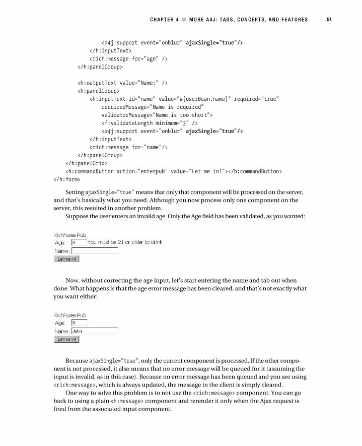
CH AP T E R 4 ■ M O R E A 4 J : T AG S , C ON CE P T S , A N D F E AT U R E S 51
<a4j:support event="onblur" ajaxSingle="true"/>
</h:inputText>
<rich:message for="age" />
</h:panelGroup>
<h:outputText value="Name:" />
<h:panelGroup>
<h:inputText id="name" value="#{userBean.name}" required="true"
requiredMessage="Name is required"
validatorMessage="Name is too short">
<f:validateLength minimum="3" />
<a4j:support event="onblur" ajaxSingle="true"/>
</h:inputText>
<rich:message for="name"/>
</h:panelGroup>
</h:panelGrid>
<h:commandButton action="enterpub" value="Let me in!"></h:commandButton>
</h:form>
Setting ajaxSingle="true" means that only that component will be processed on the server,
and that’s basically what you need. Although you now process only one component on the
server, this resulted in another problem.
Suppose the user enters an invalid age. Only the Age field has been validated, as you wanted:
Now, without correcting the age input, let’s start entering the name and tab out when
done. What happens is that the age error message has been cleared, and that’s not exactly what
you want either:
Because ajaxSingle="true", only the current component is processed. If the other compo-
nent is not processed, it also means that no error message will be queued for it (assuming the
input is invalid, as in this case). Because no error message has been queued and you are using
<rich:message>, which is always updated, the message in the client is simply cleared.
One way to solve this problem is to not use the <rich:message> component. You can go
back to using a plain <h:message> component and rerender it only when the Ajax request is
fired from the associated input component.
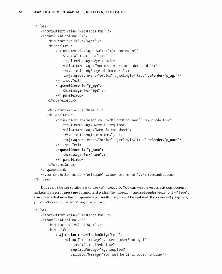
52 CH AP T E R 4 ■ M O R E A 4 J : T AG S , C ON CE P T S , A N D F E AT U R E S
<h:form>
<h:outputText value="RichFaces Pub" />
<h:panelGrid columns="2">
<h:outputText value="Age:" />
<h:panelGroup>
<h:inputText id="age" value="#{userBean.age}"
size="4" required="true"
requiredMessage="Age required"
validatorMessage="You must be 21 or older to drink">
<f:validateLongRange minimum="21" />
<a4j:support event="onblur" ajaxSingle="true" reRender="p_age"/>
</h:inputText>
<h:panelGroup id="p_age">
<h:message for="age" />
</h:panelGroup>
</h:panelGroup>
<h:outputText value="Name:" />
<h:panelGroup>
<h:inputText id="name" value="#{userBean.name}" required="true"
requiredMessage="Name is required"
validatorMessage="Name is too short">
<f:validateLength minimum="3" />
<a4j:support event="onblur" ajaxSingle="true" reRender="p_name"/>
</h:inputText>
<h:panelGroup id="p_name">
<h:message for="name"/>
</h:panelGroup>
</h:panelGroup>
</h:panelGrid>
<h:commandButton action="enterpub" value="Let me in!"></h:commandButton>
</h:form>
But even a better solution is to use <a4j:region>. You can wrap every input component
including its error message component within <a4j:region> and set renderRegionOnly="true".
This means that only the components within this region will be updated. If you use <a4j:region>,
you don’t need to use ajaxSingle anymore.
<h:form>
<h:outputText value="RichFaces Pub" />
<h:panelGrid columns="2">
<h:outputText value="Age:" />
<h:panelGroup>
<a4j:region renderRegionOnly="true">
<h:inputText id="age" value="#{userBean.age}"
size="4" required="true"
requiredMessage="Age required"
validatorMessage="You must be 21 or older to drink">

CH AP T E R 4 ■ M O R E A 4 J : T AG S , C ON CE P T S , A N D F E AT U R E S 53
<f:validateLongRange minimum="21" />
<a4j:support event="onblur"/>
</h:inputText>
<rich:message for="age" />
</a4j:region>
</h:panelGroup>
<h:outputText value="Name:" />
<h:panelGroup>
<a4j:region renderRegionOnly="true">
<h:inputText id="name" value="#{userBean.name}" required="true"
requiredMessage="Name is required"
validatorMessage="Name is too short">
<f:validateLength minimum="3" />
<a4j:support event="onblur"/>
</h:inputText>
<rich:message for="name"/>
</a4j:region>
</h:panelGroup>
</h:panelGrid>
<h:commandButton action="enterpub" value="Let me in!"></h:commandButton>
</h:form>
Running with the latest changes will produce the desired result, as shown here. Every
component is validated (processed) one at a time, and with renderRegionOnly="true", updates
are limited to this region only.
Revisiting our case, entering invalid input into one of the fields (age), tabbing out, and
entering value into another field (name) will not clear the other message because updates will
not be processed in that region:
<h:form>
<h:outputText value="RichFaces Pub" />
<h:panelGrid columns="2">
<h:outputText value="Age:" />
<h:panelGroup>
<h:inputText id="age" value="#{userBean.age}" required="true"
validatorMessage="You must be 21 or older to drink"
requiredMessage="Age required"
size="4">
<f:validateLongRange minimum="21" />
<a4j:support event="onblur" />
</h:inputText>

54 CH AP T E R 4 ■ M O R E A 4 J : T AG S , C ON CE P T S , A N D F E AT U R E S
<rich:message for="age" />
</h:panelGroup>
<h:outputText value="Name:"/>
<h:inputText value="#{userBean.name}"/>
</h:panelGrid>
<h:commandButton action="enterpub" value="Let me in!"></h:commandButton>
</h:form>
Here’s what you get:
■Note You have to be 21 or older to drink in the United States. Other countries might have a lower age limit.
Skipping Model Update During Validation
When the user tabs out or clicks somewhere else and the input is correct, it is easy to see that
all the phases (1–6) will be executed. You can easily test this by adding a phase listener as you
did before. However, it’s not always desirable to invoke the Update Model and Invoke Applica-
tion phases. In other words, when you want only to validate form values, you want to bypass
the Update Model and Invoke Application phases. When you actually click the Submit button,
then you want to go through all the phases.
RichFaces provides an attribute called bypassUpdates that provides exactly this function-
ality. When bypassUpdates="true", the framework will reach the Process Validation phase and,
even if all the values are correct, will jump to Render Response. This enables you to validate all
the form values without having to invoke the Update Model and Invoke Application phases.
<h:outputText value="Age:" />
<h:panelGroup>
<a4j:region renderRegionOnly="true">
<h:inputText id="age" value="#{userBean.age}"
size="4" required="true"
requiredMessage="Age required"
validatorMessage="You must be 21 or older to drink">
<f:validateLongRange minimum="21" />
<a4j:support event="onblur" bypassUpdates="true"/>
</h:inputText>
<rich:message for="age" />
</a4j:region>
</h:panelGroup>

CH AP T E R 4 ■ M O R E A 4 J : T AG S , C ON CE P T S , A N D F E AT U R E S 55
Looking at the phase listener output, you can see that this stops at the Process Validation
phase:
Mar 25, 2008 3:08:12 PM org.apache.catalina.core.ApplicationContext log
INFO: BEFORE RESTORE_VIEW 1
Mar 25, 2008 3:08:12 PM org.apache.catalina.core.ApplicationContext log
INFO: AFTER RESTORE_VIEW 1
Mar 25, 2008 3:08:12 PM org.apache.catalina.core.ApplicationContext log
INFO: BEFORE APPLY_REQUEST_VALUES 2
Mar 25, 2008 3:08:12 PM org.apache.catalina.core.ApplicationContext log
INFO: AFTER APPLY_REQUEST_VALUES 2
Mar 25, 2008 3:08:12 PM org.apache.catalina.core.ApplicationContext log
INFO: BEFORE PROCESS_VALIDATIONS 3
Mar 25, 2008 3:08:12 PM org.apache.catalina.core.ApplicationContext log
INFO: AFTER PROCESS_VALIDATIONS 3
Mar 25, 2008 3:08:12 PM org.apache.catalina.core.ApplicationContext log
INFO: BEFORE RENDER_RESPONSE 6
Mar 25, 2008 3:08:12 PM org.apache.catalina.core.ApplicationContext log
INFO: AFTER RENDER_RESPONSE 6
Again, this feature is useful when you want only to check validation without updating the
model and invoking the application.
Using <a4j:actionparam><a4j:actionparam> is a combination of the <f:param> and <f:actionListener> tags. Besides
passing a parameter (the <f:param> functionality), it also automatically assigns the value attri-
bute to the property pointed to by assignTo. In this example, the value of John will be assigned
to userBean.name. You don’t need to do anything else in the userBean. Only the setter and getter
for the name property are required. When using just <f:param>, you need the following addi-
tional server-side code to retrieve the value:
<a4j:actionparam name="username" value="John" assignTo="#{userBean.name}"/>
private String name;
public void setName (String name){
this.name = name;
}
public String getName ( ){
return this.name;
}
The value property can also point to an EL expression:
<table>
<a4j:repeat value="#{channelView.channels}" var="channel">
<tr>
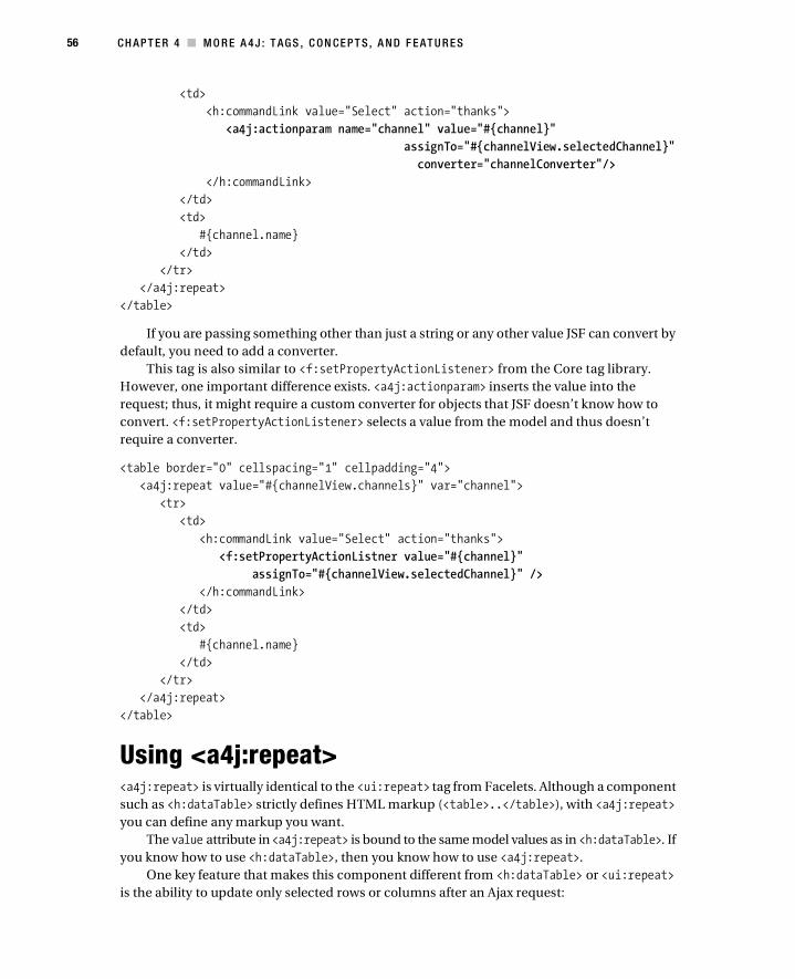
56 CH AP T E R 4 ■ M O R E A 4 J : T AG S , C ON CE P T S , A N D F E AT U R E S
<td>
<h:commandLink value="Select" action="thanks">
<a4j:actionparam name="channel" value="#{channel}"
assignTo="#{channelView.selectedChannel}"
converter="channelConverter"/>
</h:commandLink>
</td>
<td>
#{channel.name}
</td>
</tr>
</a4j:repeat>
</table>
If you are passing something other than just a string or any other value JSF can convert by
default, you need to add a converter.
This tag is also similar to <f:setPropertyActionListener> from the Core tag library.
However, one important difference exists. <a4j:actionparam> inserts the value into the
request; thus, it might require a custom converter for objects that JSF doesn’t know how to
convert. <f:setPropertyActionListener> selects a value from the model and thus doesn’t
require a converter.
<table border="0" cellspacing="1" cellpadding="4">
<a4j:repeat value="#{channelView.channels}" var="channel">
<tr>
<td>
<h:commandLink value="Select" action="thanks">
<f:setPropertyActionListner value="#{channel}"
assignTo="#{channelView.selectedChannel}" />
</h:commandLink>
</td>
<td>
#{channel.name}
</td>
</tr>
</a4j:repeat>
</table>
Using <a4j:repeat><a4j:repeat> is virtually identical to the <ui:repeat> tag from Facelets. Although a component
such as <h:dataTable> strictly defines HTML markup (<table>..</table>), with <a4j:repeat>
you can define any markup you want.
The value attribute in <a4j:repeat> is bound to the same model values as in <h:dataTable>. If
you know how to use <h:dataTable>, then you know how to use <a4j:repeat>.
One key feature that makes this component different from <h:dataTable> or <ui:repeat>
is the ability to update only selected rows or columns after an Ajax request:
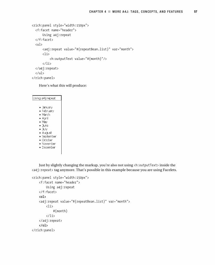
CH AP T E R 4 ■ M O R E A 4 J : T AG S , C ON CE P T S , A N D F E AT U R E S 57
<rich:panel style="width:150px">
<f:facet name="header">
Using a4j:repeat
</f:facet>
<ul>
<a4j:repeat value="#{repeatBean.list}" var="month">
<li>
<h:outputText value="#{month}"/>
</li>
</a4j:repeat>
</ul>
</rich:panel>
Here’s what this will produce:
Just by slightly changing the markup, you’re also not using <h:outputText> inside the
<a4j:repeat> tag anymore. That’s possible in this example because you are using Facelets.
<rich:panel style="width:150px">
<f:facet name="header">
Using a4j:repeat
</f:facet>
<ol>
<a4j:repeat value="#{repeatBean.list}" var="month">
<li>
#{month}
</li>
</a4j:repeat>
</ol>
</rich:panel>

58 CH AP T E R 4 ■ M O R E A 4 J : T AG S , C ON CE P T S , A N D F E AT U R E S
This code produces the following:
You can also use <a4j:repeat> to build an HTML table:
<rich:panel style="width:150px">
<f:facet name="header">
Using a4j:repeat
</f:facet>
<table border="1">
<tbody>
<a4j:repeat value="#{repeatBean.list}" var="month">
<tr>
<td>#{month}</td>
</tr>
</a4j:repeat>
</tbody>
</table>
</rich:panel>
Or you cannot create any markup at all:
<rich:panel>
<f:facet name="header">
Using a4j:repeat
</f:facet>
<a4j:repeat value="#{repeatBean.list}" var="month" rowKeyVar="i">
#{month}
<h:outputText value=", "rendered="#{i+1 lt 12}" />
</a4j:repeat>
</rich:panel>

CH AP T E R 4 ■ M O R E A 4 J : T AG S , C ON CE P T S , A N D F E AT U R E S 59
This produces the following:
Using the ajaxKeys Attribute
Let’s now look at a feature that actually makes this component different from <h:dataTable>
or <ui:repeat>. Using the ajaxKeys attribute, you can choose which rows to update after an
Ajax request.
■Note Updating any component via reRender is possible only if the component has produced some markup.
If a component doesn’t product any markup or has rendered="false", an outer placeholder must be used
such as <h:panelGrid> or <a4j:outputPanel>.
Looking at the following, you want to be able to decrease/increase a number by using the
-/+ links next to it. In other words, the update has to happen only in that row.
Here’s the code:
<h:form>
<rich:panel style="width:150px">
<f:facet name="header">
Using a4j:repeat
</f:facet>
<table>
<a4j:repeat value="#{repeatBean.numbers}" var="rec"
rowKeyVar="rowIndex" ajaxKeys="#{repeatBean.rowsToUpdate}">
<tr>
<td width="20px">
<h:outputText id="num" value="#{rec.number}" />
</td>

60 CH AP T E R 4 ■ M O R E A 4 J : T AG S , C ON CE P T S , A N D F E AT U R E S
<td>
<a4j:commandLink value="-" reRender="num"
actionListener="#{repeatBean.decrease}">
<a4j:actionparam name="rowIndex" value="#{rowIndex}"
assignTo="#{repeatBean.updatedRow}" />
</a4j:commandLink>
/
<a4j:commandLink value="+" reRender="num"
actionListener="#{repeatBean.increase}">
<a4j:actionparam name="rowIndex" value="#{rowIndex}"
assignTo="#{repeatBean.updatedRow}" />
</a4j:commandLink></td>
</tr>
</a4j:repeat>
</table>
</rich:panel>
</h:form>
The ajaxKeys attribute points to an Object (java.util.Set) that contains the row keys to
be updated. In other words, if you increase the number in the second row, ajaxKeys should
contain an object that holds the key of first row (the row index in the collection in this example).
There are two links to decrease/increase the number in the current row, and both have the
reRender attribute, which points to the component to be updated. You can also look at it as the
columns to be updated. In this example, there is only one column, but you can have a table
with more than one column, of course. Basically, ajaxKeys points to the rows to be updated,
and reRender points to the columns to be updated. It’s possible to update any number of rows
and any number of columns. By using this approach and looking at this as a grid, you can select
a single data cell to be updated.
If reRender points to the second column and ajaxKeys contains the first row, then only the
colored data cell will be updated.
The bean, placed in session scope in order not to reset the counting each time, looks like
this:
import java.util.ArrayList;
import java.util.HashSet;
import java.util.List;
import java.util.Set;
import javax.annotation.PostConstruct;
import javax.faces.event.ActionEvent;

CH AP T E R 4 ■ M O R E A 4 J : T AG S , C ON CE P T S , A N D F E AT U R E S 61
public class RepeatBean {
private List <MagicNumber> numbers;
private Set <Integer>rowsToUpdate;
private Integer updatedRow;
public RepeatBean() {
}
public void increase (ActionEvent event){
rowsToUpdate.clear();
// increase selected number
numbers.get(updatedRow).increase();
// insert row to be updated
rowsToUpdate.add(updatedRow);
}
public void decrease (ActionEvent event){
rowsToUpdate.clear();
// decrease selected number
numbers.get(updatedRow).decrease();
// insert row to be updated
rowsToUpdate.add(updatedRow); }
// init method
@PostConstruct
public void init () {
// list of numbers
numbers = new ArrayList <MagicNumber>();
// Set to hold rows to be updated
rowsToUpdate = new HashSet <Integer>();
numbers.add(new MagicNumber());
numbers.add(new MagicNumber());
numbers.add(new MagicNumber());
numbers.add(new MagicNumber());
numbers.add(new MagicNumber());
}
public List<MagicNumber> getNumbers() {
return numbers;
}
public void setNumbers(List<MagicNumber> numbers) {
this.numbers = numbers;
}
public Set <Integer>getRowsToUpdate() {
return rowsToUpdate;
}

62 CH AP T E R 4 ■ M O R E A 4 J : T AG S , C ON CE P T S , A N D F E AT U R E S
public Integer getUpdatedRow() {
return updatedRow;
}
public void setUpdatedRow(Integer updatedRow) {
this.updatedRow = updatedRow;
}
}
The following is MagicNumber.java:
public class MagicNumber {
private Integer number;
public void increase (){
++number;
}
public void decrease () {
--number;
}
public Integer getNumber() {
return number;
}
public void setNumber(Integer number) {
this.number = number;
}
public MagicNumber (){
number = 0;
}
}
Using <a4j:status>The <a4j:status> component allows you to display a status when an Ajax request is sent and
when the Ajax request has finished. The status can be a simple text or any other mix of JSF
components such as images. With Ajax-based applications, it is very common to display some
kind of status message or revolving image to let the user know something is happening. You
probably have seen a Gmail message appear at the top of the page when some action is happening.
You can use this tag. Any control that sends an Ajax request can point to an <a4j:status>
component. Another way is to associate a status with a region. This means any Ajax request
sent from this region will display the status.
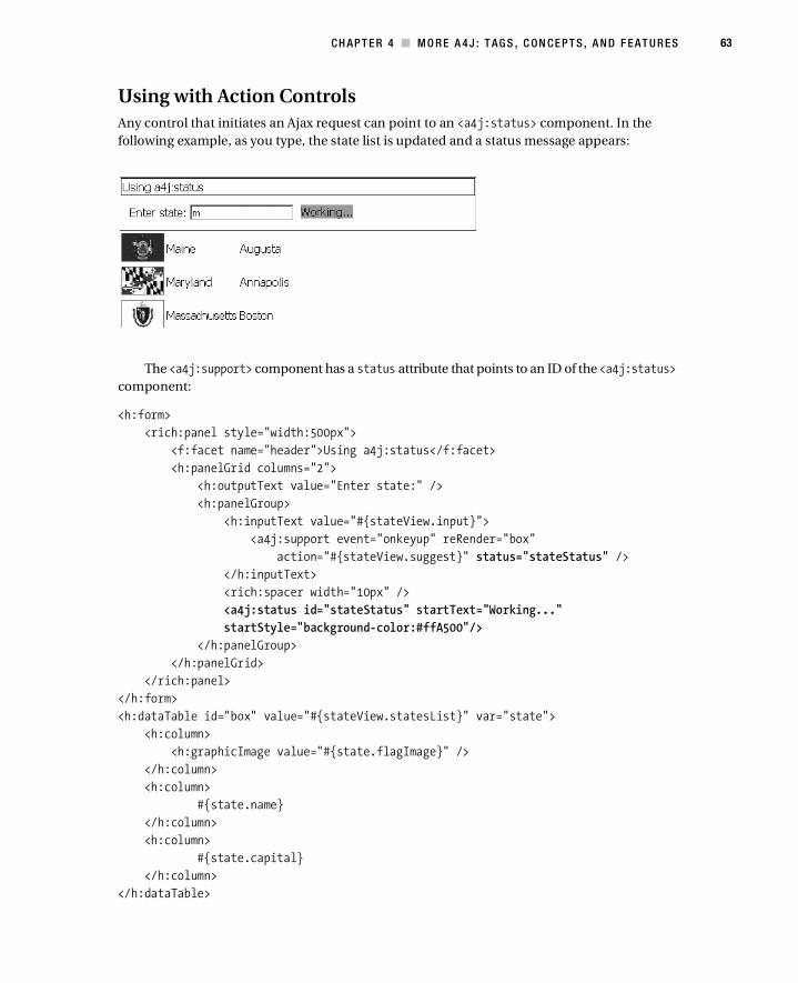
CH AP T E R 4 ■ M O R E A 4 J : T AG S , C ON CE P T S , A N D F E AT U R E S 63
Using with Action Controls
Any control that initiates an Ajax request can point to an <a4j:status> component. In the
following example, as you type, the state list is updated and a status message appears:
The <a4j:support> component has a status attribute that points to an ID of the <a4j:status>
component:
<h:form>
<rich:panel style="width:500px">
<f:facet name="header">Using a4j:status</f:facet>
<h:panelGrid columns="2">
<h:outputText value="Enter state:" />
<h:panelGroup>
<h:inputText value="#{stateView.input}">
<a4j:support event="onkeyup" reRender="box"
action="#{stateView.suggest}" status="stateStatus" />
</h:inputText>
<rich:spacer width="10px" />
<a4j:status id="stateStatus" startText="Working..."
startStyle="background-color:#ffA500"/>
</h:panelGroup>
</h:panelGrid>
</rich:panel>
</h:form>
<h:dataTable id="box" value="#{stateView.statesList}" var="state">
<h:column>
<h:graphicImage value="#{state.flagImage}" />
</h:column>
<h:column>
#{state.name}
</h:column>
<h:column>
#{state.capital}
</h:column>
</h:dataTable>

64 CH AP T E R 4 ■ M O R E A 4 J : T AG S , C ON CE P T S , A N D F E AT U R E S
In this example, you are using the component to show a message only when the request is
being processed because you set startText. It’s also possible to set stopText. In this case, before the
request is sent and after the request is done, the stopText message will be displayed.
Here are just the changes to the <a4j:status> component:
<a4j:status id="stateStatus"
startText="Working..."
startStyle="background-color:#ffA500"
stopText="Done..."
stopStyle="background-color:#c0c0c0"/>
You can use startStyle (or startStyleClass) and stopStyle (or stopStyleClass) to define
the look and feel of the message. Here’s what it looks like:
Text is not the only type of value that you can display. It’s actually possible to show any JSF
components mixed with any HTML markup as the status. <a4j:status> defines two facets, stop
and start, which work basically the same way as startText and stopText:
<a4j:status id="stateStatus">
<f:facet name="start">
<h:graphicImage value="/Ajax-loader.gif"/>
</f:facet>
</a4j:status>
I decided not to define the stop facet in this example. Keep in mind that if you need to
include more than one JSF component in this facet, you need to use <h:panelGroup> to group
the components because <f:facet> allows only one child.

CH AP T E R 4 ■ M O R E A 4 J : T AG S , C ON CE P T S , A N D F E AT U R E S 65
To take this one step further, it’s possible to specify absolute positioning for the status:
<a4j:status id="stateStatus" startText="Working..."
startStyle="background-color: #ffA500;
font-weight:bold;
position: absolute;
left: 520px;
top: 1px;
width: 100px;"/>
Here’s what that looks like:

66 CH AP T E R 4 ■ M O R E A 4 J : T AG S , C ON CE P T S , A N D F E AT U R E S
Associating Status with a Region
Instead of pointing to an <a4j:status> tag via the status attribute from one of the components
that sends an Ajax request, it’s possible to associate a status with a particular region (<a4:region>).
In fact, by default you don’t have to do anything at all. By default, the whole page is a region,
and any request initiated from it will activate the status.
In the following example, both buttons will display the “Working. . .” status when clicked
because they are in the same region (<a4j:region>):
<rich:panel>
<f:facet name="header">Main</f:facet>
<a4j:status startText="Working..." />
<br />
<a4j:commandButton value="Ajax Request #1" />
<rich:panel>
<f:facet name="header">Internal</f:facet>
<a4j:commandButton value="Ajax Request #2" />
</rich:panel>
</rich:panel>
Here is another example where the status is controlled implicitly by <a4j:region>:
<rich:panel>
<a4j:region>
<f:facet name="header">Main</f:facet>
<a4j:status startText="Working..." />
<br />
<a4j:commandButton value="Ajax Request #1" />
<rich:panel>
<f:facet name="header">Internal</f:facet>
<a4j:region>
<a4j:commandButton value="Ajax Request #2" />
<a4j:status startText="I'm so tired of work..." />
</a4j:region>
</rich:panel>
</a4j:region>
</rich:panel>
When Ajax Request #1 is clicked, the status “Working. . .” is shown. When the button Ajax
Request #2 is clicked, the status “I’m so tired of work. . .” is shown.
It’s also possible to assign <a4j:status> via the for attribute for a particular <a4j:region>:
<rich:panel>
<f:facet name="header">
Outside
</f:facet>
<a4j:region id="outside">
<a4j:commandButton value="Ajax Request #3" />
<a4j:commandButton value="Ajax Request #4" />
</a4j:region>

CH AP T E R 4 ■ M O R E A 4 J : T AG S , C ON CE P T S , A N D F E AT U R E S 67
</rich:panel>
<a4j:status for="outside" startText="Working..."
startStyle="background-color: #ffA500;
font-weight:bold;
position: absolute;
left: 520px;
top: 1px;
width: 100px;"/>
Using <a4j:include> and <a4j:keepAlive>One of the basic ideas behind <a4:include> is that it allows you to include another view in a
parent view and navigate in it using standard JSF navigation rules. This allows you to create a
basic wizardlike functionality. It’s going to look something like this, and you will be navigating
inside the yellow area:
Using this component is rather simple. Just put the component anywhere on the page, and
point its viewId attribute to the first view (page) to be displayed:
<rich:panel style="width:400px">
<f:facet name="header">
<h:outputText id="step"
value="Registration - Step #{registrationBean.step}"/>
</f:facet>
<h:panelGrid>
<a4j:include viewId="/step1.xhtml"/>
</h:panelGrid>
</rich:panel>
You can define the navigation rules as follows:
<navigation-rule>
<from-view-id>/step1.xhtml</from-view-id>
<navigation-case>
<from-outcome>forward</from-outcome>
<to-view-id>/step2.xhtml</to-view-id>
</navigation-case>
</navigation-rule>
<navigation-rule>
<from-view-id>/step2.xhtml</from-view-id>
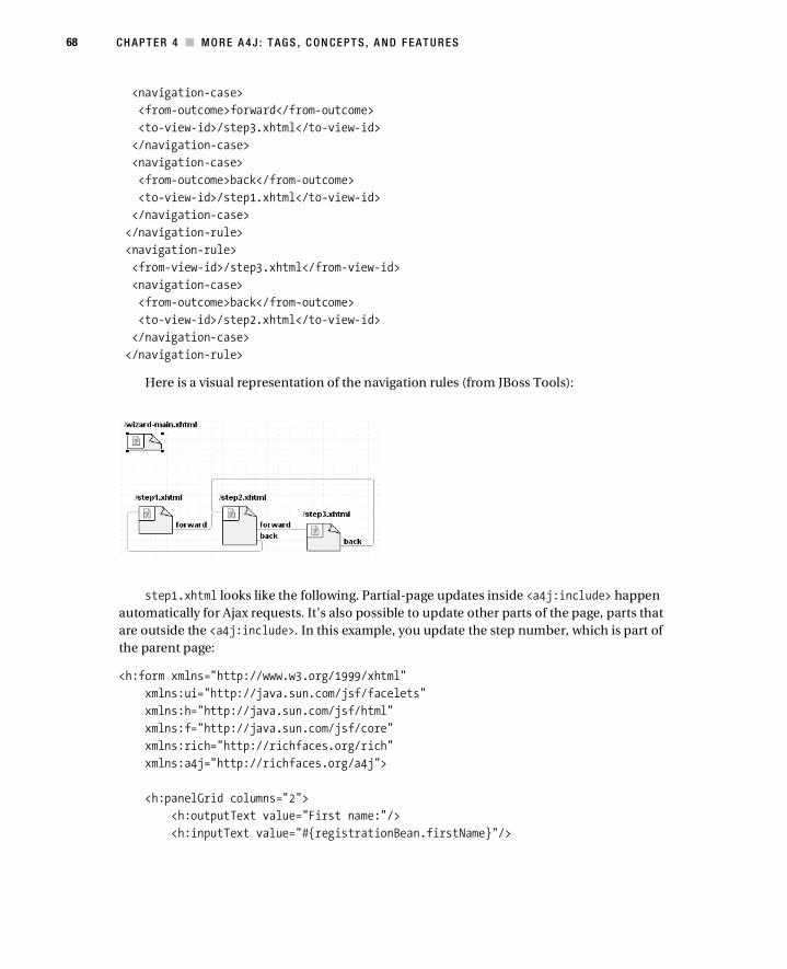
68 CH AP T E R 4 ■ M O R E A 4 J : T AG S , C ON CE P T S , A N D F E AT U R E S
<navigation-case>
<from-outcome>forward</from-outcome>
<to-view-id>/step3.xhtml</to-view-id>
</navigation-case>
<navigation-case>
<from-outcome>back</from-outcome>
<to-view-id>/step1.xhtml</to-view-id>
</navigation-case>
</navigation-rule>
<navigation-rule>
<from-view-id>/step3.xhtml</from-view-id>
<navigation-case>
<from-outcome>back</from-outcome>
<to-view-id>/step2.xhtml</to-view-id>
</navigation-case>
</navigation-rule>
Here is a visual representation of the navigation rules (from JBoss Tools):
step1.xhtml looks like the following. Partial-page updates inside <a4j:include> happen
automatically for Ajax requests. It’s also possible to update other parts of the page, parts that
are outside the <a4j:include>. In this example, you update the step number, which is part of
the parent page:
<h:form xmlns="http://www.w3.org/1999/xhtml"
xmlns:ui="http://java.sun.com/jsf/facelets"
xmlns:h="http://java.sun.com/jsf/html"
xmlns:f="http://java.sun.com/jsf/core"
xmlns:rich="http://richfaces.org/rich"
xmlns:a4j="http://richfaces.org/a4j">
<h:panelGrid columns="2">
<h:outputText value="First name:"/>
<h:inputText value="#{registrationBean.firstName}"/>
CH AP T E R 4 ■ M O R E A 4 J : T AG S , C ON CE P T S , A N D F E AT U R E S 69
<h:outputText value="Last name:"/>
<h:inputText value="#{registrationBean.lastName}"/>
</h:panelGrid>
<a4j:commandButton value="Continue" action="step2"
actionListener="#{registrationBean.nextStep}"
reRender="step"/>
</h:form>
Here’s RegistrationBean.java:
public class RegistrationBean implements java.io.Serializable{
private String firstName;
private String lastName;
private String email;
private Integer step = 1;
public Integer getStep() {
return step;
}
public String getFirstName() {
return firstName;
}
public void setFirstName(String firstName) {
this.firstName = firstName;
}
public String getLastName() {
return lastName;
}
public void setLastName(String lastName) {
this.lastName = lastName;
}
public String getEmail() {
return email;
}
public void setEmail(String email) {
this.email = email;
}
public void nextStep (ActionEvent event){
this.step++;
}
public void prevStep (ActionEvent event){
this.step--;
}
public RegistrationBean() {
}
}

70 CH AP T E R 4 ■ M O R E A 4 J : T AG S , C ON CE P T S , A N D F E AT U R E S
This is step2.xhtml:
<h:form xmlns="http://www.w3.org/1999/xhtml"
xmlns:ui="http://java.sun.com/jsf/facelets"
xmlns:h="http://java.sun.com/jsf/html"
xmlns:f="http://java.sun.com/jsf/core"
xmlns:rich="http://richfaces.org/rich"
xmlns:a4j="http://richfaces.org/a4j">
<h:panelGrid columns="2">
<h:outputText value="Email:"/>
<h:inputText value="#{registrationBean.email}"/>
</h:panelGrid>
<a4j:commandButton value="Back" actionListener="#{registrationBean.prevStep}"
action="back" reRender="step"/>
<rich:spacer width="5px"/>
<a4j:commandButton value="Continue"
actionListener="#{registrationBean.nextStep}"
action="step3" reRender="step"/>
</h:form>
This is step3.xhtml:
<h:form xmlns="http://www.w3.org/1999/xhtml"
xmlns:ui="http://java.sun.com/jsf/facelets"
xmlns:h="http://java.sun.com/jsf/html"
xmlns:f="http://java.sun.com/jsf/core"
xmlns:rich="http://richfaces.org/rich"
xmlns:a4j="http://richfaces.org/a4j">
<h:panelGrid columns="2">
<h:outputText value="First name:"/>
<h:outputText value="#{registrationBean.firstName}"/>
<h:outputText value="Last name:"/>
<h:outputText value="#{registrationBean.lastName}"/>
<h:outputText value="Email:"/>
<h:outputText value="#{registrationBean.email}"/>
</h:panelGrid>
<a4j:commandButton value="Back" actionListener="#{registrationBean.prevStep}"
action="back" reRender="step"/>
</h:form>
Running the application will produce the following sequence:
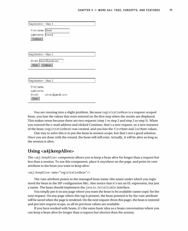
CH AP T E R 4 ■ M O R E A 4 J : T AG S , C ON CE P T S , A N D F E AT U R E S 71
You are running into a slight problem. Because registrationBean is a request-scoped
bean, you lose the values that were entered on the first step when the results are displayed.
This makes sense because there are two requests (step 1 to step 2 and step 2 to step 3). When
you entered the e-mail address and clicked Continue, that’s a new request, so a new instance
of the bean (registrationBean) was created, and you lost the firstName and lastName values.
One way to solve this is to put the bean in session scope, but that’s not a good solution.
Once you are done with the wizard, the bean will still exist. Actually, it will be alive as long as
the session is alive.
Using <a4j:keepAlive>
The <a4j:keepAlive> component allows you to keep a bean alive for longer than a request but
less than a session. To use this component, place it anywhere on the page, and point its name
attribute to the bean you want to keep alive:
<a4j:keepAlive name="registrationBean"/>
The name attribute points to the managed bean name (the name under which you regis-
tered the bean in the JSF configuration file). Also notice that it’s not an EL expression, but just
a name. The bean should implement the java.io.Serializable interface.
You simply put it on any page where you want the bean to be available (same copy) for the
next request. On any page where this tag is present, the bean pointed to by the name attribute
will be saved when the page is rendered. On the next request (from this page), the bean is restored
and put into request scope, so all its previous values are available.
If you have worked with Seam, it’s the same basic idea as a Seam conversation where you
can keep a bean alive for longer than a request but shorten than the session.
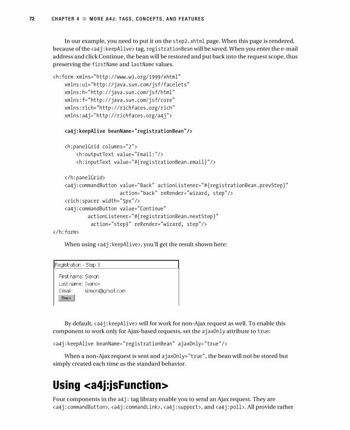
72 CH AP T E R 4 ■ M O R E A 4 J : T AG S , C ON CE P T S , A N D F E AT U R E S
In our example, you need to put it on the step2.xhtml page. When this page is rendered,
because of the <a4j:keepAlive> tag, registrationBean will be saved. When you enter the e-mail
address and click Continue, the bean will be restored and put back into the request scope, thus
preserving the firstName and lastName values.
<h:form xmlns="http://www.w3.org/1999/xhtml"
xmlns:ui="http://java.sun.com/jsf/facelets"
xmlns:h="http://java.sun.com/jsf/html"
xmlns:f="http://java.sun.com/jsf/core"
xmlns:rich="http://richfaces.org/rich"
xmlns:a4j="http://richfaces.org/a4j">
<a4j:keepAlive beanName="registrationBean"/>
<h:panelGrid columns="2">
<h:outputText value="Email:"/>
<h:inputText value="#{registrationBean.email}"/>
</h:panelGrid>
<a4j:commandButton value="Back" actionListener="#{registrationBean.prevStep}"
action="back" reRender="wizard, step"/>
<rich:spacer width="5px"/>
<a4j:commandButton value="Continue"
actionListener="#{registrationBean.nextStep}"
action="step3" reRender="wizard, step"/>
</h:form>
When using <a4j:keepAlive>, you’ll get the result shown here:
By default, <a4j:keepAlive> will for work for non-Ajax request as well. To enable this
component to work only for Ajax-based requests, set the ajaxOnly attribute to true:
<a4j:keepAlive beanName="registrationBean" ajaxOnly="true"/>
When a non-Ajax request is sent and ajaxOnly="true", the bean will not be stored but
simply created each time as the standard behavior.
Using <a4j:jsFunction>Four components in the a4j: tag library enable you to send an Ajax request. They are
<a4j:commandButton>, <a4j:commandLink>, <a4j:support>, and <a4j:poll>. All provide rather

CH AP T E R 4 ■ M O R E A 4 J : T AG S , C ON CE P T S , A N D F E AT U R E S 73
specific functionality. For example, <h:commandButton> will generate HTML specific to a button,
and <a4j:jsFunction> lets you send an Ajax request from any user-defined JavaScript function.
Other than that, it works just like any other control that sends an Ajax request, meaning it has
a reRender attribute, it has action and actionListener attributes, and so on.
The function is defined as follows where the name attribute defines the actual function
name, in this case, updateStyle. As you can see, you can use reRender attribute as you always
do. Basically, when this function is called, it will send an Ajax request to the server and on
return will rerender components pointed by reRender.
<a4j:jsFunction name="updateStyle" reRender="showname">
<a4j:actionparam name="param1" assignTo="#{jsFunctionBean.name}" />
<a4j:actionparam name="param2" assignTo="#{jsFunctionBean.size}" />
</a4j:jsFunction>
You can also include parameters to send to the server. It’s accomplished by nesting
<a4j:actionparam> tags inside. Now the question is how the parameters are passed. Here
is a snippet of a code to invoke the function you defined:
<td onmouseover="updateStyle('#CDEB8B', '16')"
onmouseout="updateStyle('transparent',14)">Mint, 14px
</td>
The parameters are automatically wired into the function. In other words, updateName has
two arguments, and they are two <a4j:actionparam> tags nested inside <a4j:jsFunction>. You
can also use <f:param> instead of <a4j:actionparam>.The following graphic and code show the
complete example. As you move the mouse over the names, the “I love MTV” message is updated
with the appropriate style. Each label has an onmouseover event and an onmouseout event that is
bound to the <a4j:jsFunction name="updateStyle"> function. Two parameters are passed: the
background color and the font size.
<h:form>
<rich:panel style="width:500px">
<f:facet name="header">Using a4j:jsFunction</f:facet>
<table width="400">
<tbody>
<tr>
<td onmouseover="updateStyle('#CDEB8B', '16')"
onmouseout=" updateStyle ('transparent',14)">Mint, 14px</td>
<td rowspan="3">
<h:panelGrid id="showname">
<h:outputText value="I love MTV"
style="font-size:#{jsFunctionBean.size}px;

74 CH AP T E R 4 ■ M O R E A 4 J : T AG S , C ON CE P T S , A N D F E AT U R E S
background-color:#{jsFunctionBean.name}" />
</h:panelGrid>
</td>
</tr>
<tr>
<td onmouseover=" updateStyle ('#FFFF88', 20)"
onmouseout=" updateStyle ('transparent',14)">Yellow, 20px</td>
</tr>
<tr>
<td onmouseover=" updateStyle ('#6BBA70', 24)"
onmouseout=" updateStyle ('transparent',14)">Green, 24px</td>
</tr>
</tbody>
</table>
</rich:panel>
<a4j:jsFunction name="updateStyle" reRender="showname">
<a4j:actionparam name="param1" assignTo="#{jsFunctionBean.name}" />
<a4j:actionparam name="param2" assignTo="#{jsFunctionBean.size}" />
</a4j:jsFunction>
</h:form>
To summarize, this component is not much different from any other component that
sends an Ajax request; the biggest difference is that you can send an Ajax request from any
user-defined function.
Using <a4j:ajaxListener><a4j:ajaxListener> points to a listener that is always invoked just before the actual rendering.
It is invoked within the Render Response phase. What makes it different from other listeners?
Because it is invoked during Render Response, you are always guaranteed it will be invoked.
Executing the value change listener or action listener can be affected by validation or other
events during the execution of the phases and can also be skipped. The Ajax listener is always
invoked. Another important point is that the Ajax listener is invoked only for an Ajax request.
One place where it can be useful is examining or setting the components to be rerendered.
Notice that reRender is bound to an EL expression here:
<rich:panel>
<f:facet name="header">Using a4j:actionListener</f:facet>
<a4j:commandButton value="Submit" reRender="#{ajaxBean.areas}">
<a4j:ajaxListener binding="#{ajaxBean.renderAreasListener}"/>
</a4j:commandButton>
</rich:panel>
<h:panelGrid>
<h:outputText id="id1"/>
<h:outputText id="id2"/>
</h:panelGrid>

CH AP T E R 4 ■ M O R E A 4 J : T AG S , C ON CE P T S , A N D F E AT U R E S 75
Inside the listener you can set or update the IDs of components to be updated. In our
example, you need to update components with the IDs id1 and id2:
private Set <String>areas = new HashSet <String>();
public Set <String> getAreas() {
return areas;
}
public void setAreas(Set <String>areas) {
this.areas = areas;
}
public AjaxListener getRenderAreasListener () {
return new AjaxListener (){
public void processAjax (AjaxEvent event){
// update IDs of components to be rerendered
areas.add("id1");
areas.add("id2");
}
};
}
SummaryThe chapter completes the coverage of the a4j: tag library tags, concepts, and features. When
using these tags, you decide what to process and update. You are basically in full control. This
approach, called a page-wide Ajax approach, gives you a lot of power and flexibility. Starting
with the next chapter, I’ll cover the components from the rich: tag library. These components
offer the component-wide Ajax approach. These components provide all the necessary func-
tionality out of the box for sending, and all the updates are done automatically. This of course
doesn’t mean that one approach is better than the other. You need both approaches to build
sophisticated JSF Ajax-based applications.

77
■ ■ ■
C H A P T E R 5
Input Components
The a4j: tag library provides page-level Ajax support. Another way to look at it is that it provides
framework-level or foundation-type controls. In other words, in most cases you decide how to
send the Ajax request to the server, and you decide what to update. This kind of approach gives
you a lot of power and flexibility. Although I haven’t covered JavaScript at all, you still have a lot
of control over the application.
The RichFaces components that are available via the rich: tag library provide component-
level Ajax support, layout components, and client-side components. This means you don’t
need to specify how to send the request and what to update. Each component handles sending
and updating automatically.
This doesn’t mean that one approach is better than the other. You need both approaches.
Having both approaches will give you all the power and flexibility to develop an Ajax-based
application using JSF.
So far, I have covered the most important a4j: components. In this chapter, I’ll cover some
rich: components. There are a lot of components, and I can’t cover all of them in this book, so
I will cover the most important ones.
This chapter covers some of the input components available in RichFaces. The input
components range from an in-place editor to a spinner to a suggestion box.
■Note Although a lot of the components provide out-of-the-box Ajax functionality, some such as
<rich:separator> don’t provide any Ajax functionality. All components in the rich: tag library are also
skinnable, and thus even a control such as <rich:separator> is in this tag library. Skinnability, covered in
more detail in Chapter 11, lets you change the look and feel of the application easily and on the fly. I just
wanted to mention this in case you were wondering why a component such as <rich:separator> is rich.
■Note When you build these examples and see that your colors are different, don’t be concerned. I’m
simply using a different skin for many of the screen shots in this book. The chapter uses the ruby skin. Jump
forward to Chapter 11 to see what skins are available. Pick anyone you want, and set it in the web.xml file
per the instructions in that chapter.

78 CH AP T E R 5 ■ I N P U T C O M P ON E N T S
Using <rich:inplaceInput><rich:inplaceInput> is a rich extension to the standard input component. It looks like this:
It’s possible to click the label to have the component switch to an input field. Once the
input is entered, the component switches back to label state. So, let’s start with the simplest case:
<h:form>
<h:panelGrid columns="1">
<rich:inplaceInput value="#{inplaceInputBean.name}"
defaultLabel="Click to edit name"/>
<rich:inplaceInput value="#{inplaceInputBean.email}"
defaultLabel="Click to edit email"/>
</h:panelGrid>
</h:form>
Here is the managed bean:
public class InplaceInput {
private String email ;
private String name;
// setter and getter methods
}
This is really not much different from using the standard input component. One extra
attribute that you are using here is defaultLabel, which sets the label that you can click to start
editing the value. Here’s what this code produces:
If the value to which the component is bound has an initial value, then that value will be
displayed instead of the label.
Once the value has been changed, the change in value is indicated by a small red triangle
in the top-left corner, as shown here:

C HA P TE R 5 ■ I N P U T CO M P O N E N TS 79
So far, to start editing, you click the label. When done editing, you click anywhere outside
the component to save the input. Keep in mind that nothing is sent to the server. The value has
changed only in the browser. You would still click a button or a link to submit the page. Alter-
natively, it’s possible to use <a4j:support> on special JavaScript events to send an Ajax request
to the server (the events are shown later).
There is also an option to add controls to save or cancel the changes. To enable controls,
set showControl="true":
The controls by default appear in the top-right corner. You can use the
controlsHorizontalPosition attribute (the possible values are left, right, and center) to
change the horizontal positioning and the controlsVerticalPosition attribute (the possible
values are bottom, center, and top) to change the vertical positioning.
It’s also possible to define completely custom controls by using the controls facet:
When using custom controls, you have to call the JavaScript API for the save and cancel
operations:
<rich:inplaceInput id="inputEmail" value="#{inplaceInputBean.email}"
defaultLabel="Click to edit email" showControls="true"
controlsVerticalPosition="bottom"
controlsHorizontalPosition="left">
<f:facet name="controls">
<button onclick="#{rich:component('inputEmail')}.save();"
type="button">Save</button>
<button onclick="#{rich:component('inputEmail')}.cancel();"
type="button">Cancel</button>
</f:facet>
</rich:inplaceInput>
Here you are using #{rich:component('id')} to refer to the component and call the JavaScript
API on it. You have also repositioned the controls by using the controlsVerticalPosition and
controlsHorizonalPosition attributes.
■Note For other JavaScript APIs available on this component, please refer to the Developer Guide
(http://www.jboss.org/jbossrichfaces/docs/).

80 CH AP T E R 5 ■ I N P U T C O M P ON E N T S
The component also provides a number of specific events. You can use these events to
send an Ajax request to the server when the component state changes.
• oneditactivation: Fired on edit state activation
• oneditactivated: Fired when the edit state is activated
• onviewactivation: Fired on view state activation
• onviewactivated: Fired after the component is changed to view state
For example:
<rich:inplaceInput id="inputEmail" value="#{inplaceInputBean.email}"
defaultLabel="Click to edit email" showControls="true"
controlsVerticalPosition="bottom"
controlsHorizontalPosition="left"
oneditactivation="if (confirm('Start editing value?')){return false;}">
<f:facet name="controls">
<button onclick="#{rich:component('inputEmail')}.save();"
type="button">Save</button>
<button onclick="#{rich:component('inputEmail')}.cancel();"
type="button">Cancel</button>
</f:facet>
</rich:inplaceInput>
That covers the <rich:inplaceInput> component. Keep in mind that all the same conver-
sion and validation rules apply here as well.
■Note The controls facet also implies using the showControls attribute, which is set to true.
Using <rich:inplaceSelect><rich:inplaceSelect> is similar to <rich:inplaceInput>, but instead of allowing the user to
enter the value, it shows a drop-down list from which a value can be selected:

C HA P TE R 5 ■ I N P U T CO M P O N E N TS 81
Here’s the JSF page code:
<rich:inplaceSelect value="#{bean.drink}"
defaultLabel="Select drink">
<f:selectItem itemValue="1" itemLabel="Red wine" />
<f:selectItem itemValue="2" itemLabel="White wine" />
<f:selectItem itemValue="3" itemLabel="Beer" />
<f:selectItem itemValue="4" itemLabel="Vodka" />
<f:selectItem itemValue="5" itemLabel="Tequila" />
<f:selectItem itemValue="6" itemLabel="Sangria" />
</rich:inplaceSelect>
The defaultLabel attribute sets the label to be displayed. If #{bean.drink} is initialized to
one of the values, then that value will be displayed instead of the “Select drink” label.
Creating the list of options is rather simple. You just use the standard <f:selectItem> or
<f:selectItems> tag to build the list.
As with <rich:inplaceInput>, you can add controls to the component in order to either
save or cancel the edited value:
Here’s the code:
<rich:inplaceSelect value="#{bean.drink}"
defaultLabel="Select drink"
showControls="true">
<f:selectItem itemValue="1" itemLabel="Red wine" />
<f:selectItem itemValue="2" itemLabel="White wine" />
<f:selectItem itemValue="3" itemLabel="Beer" />
<f:selectItem itemValue="4" itemLabel="Vodka" />
<f:selectItem itemValue="5" itemLabel="Tequila" />
<f:selectItem itemValue="6" itemLabel="Sangria" />
</rich:inplaceSelect>
It’s also possible to control the placement of controls by setting the
controlsHorizontalPosition attribute (the possible values are left, right, and center) to
change the horizontal positioning and the controlsVerticalPosition attribute (the possible
values are bottom, center, and top) to change the vertical positioning.
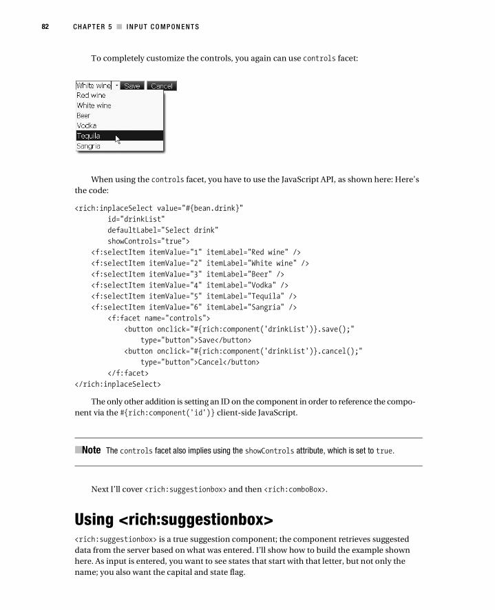
82 CH AP T E R 5 ■ I N P U T C O M P ON E N T S
To completely customize the controls, you again can use controls facet:
When using the controls facet, you have to use the JavaScript API, as shown here: Here’s
the code:
<rich:inplaceSelect value="#{bean.drink}"
id="drinkList"
defaultLabel="Select drink"
showControls="true">
<f:selectItem itemValue="1" itemLabel="Red wine" />
<f:selectItem itemValue="2" itemLabel="White wine" />
<f:selectItem itemValue="3" itemLabel="Beer" />
<f:selectItem itemValue="4" itemLabel="Vodka" />
<f:selectItem itemValue="5" itemLabel="Tequila" />
<f:selectItem itemValue="6" itemLabel="Sangria" />
<f:facet name="controls">
<button onclick="#{rich:component('drinkList')}.save();"
type="button">Save</button>
<button onclick="#{rich:component('drinkList')}.cancel();"
type="button">Cancel</button>
</f:facet>
</rich:inplaceSelect>
The only other addition is setting an ID on the component in order to reference the compo-
nent via the #{rich:component('id')} client-side JavaScript.
■Note The controls facet also implies using the showControls attribute, which is set to true.
Next I’ll cover <rich:suggestionbox> and then <rich:comboBox>.
Using <rich:suggestionbox><rich:suggestionbox> is a true suggestion component; the component retrieves suggested
data from the server based on what was entered. I’ll show how to build the example shown
here. As input is entered, you want to see states that start with that letter, but not only the
name; you also want the capital and state flag.

C HA P TE R 5 ■ I N P U T CO M P O N E N TS 83
Here is how this component works. The user starts entering a value into the input field,
and a request is sent to the server where a listener is invoked. The listener is being passed the
value entered into the input field. The listener then returns suggested values based on the
input entered. Basically, it is the developer’s responsibility to implement the part that returns
the suggested values, while the component knows how to render the returned data.
The <rich:suggestionbox> component doesn’t provide the input field, so you have to attach
the component to a particular input field. In the following example, I’ll start by showing the
managed bean first:
public class StatesSuggestionBean {
private List<State> statesList;
private String state;
public String getState() {
return state;
}
public void setState(String state) {
this.state = state;
}
@PostConstruct
public void init() {
statesList = new ArrayList<State>();
statesList.add(new State("Alabama", "Montgomery"));
statesList.add(new State("Alaska", "Juneau"));
statesList.add(new State("Arizona", "Phoenix"));
statesList.add(new State("Arkansas", "Little Rock"));
statesList.add(new State("California", "Sacramento"));
statesList.add(new State("Colorado", "Denver"));
statesList.add(new State("Connecticut", "Hartford"));
statesList.add(new State("Delaware", "Dover"));

84 CH AP T E R 5 ■ I N P U T C O M P ON E N T S
statesList.add(new State("Florida", "Tallahassee"));
statesList.add(new State("Georgia", "Atlanta"));
statesList.add(new State("Hawaii", "Honolulu"));
statesList.add(new State("Idaho", "Boise"));
statesList.add(new State("Illinois", "Springfield"));
statesList.add(new State("Indiana", "Indianapolis"));
statesList.add(new State("Iowa", "Des Moines"));
statesList.add(new State("Kansas", "Topeka"));
statesList.add(new State("Kentucky", "Frankfort"));
statesList.add(new State("Louisiana", "Baton Rouge"));
statesList.add(new State("Maine", "Augusta"));
statesList.add(new State("Maryland", "Annapolis"));
statesList.add(new State("Massachusetts", "Boston"));
statesList.add(new State("Michigan", "Lansing"));
statesList.add(new State("Minnesota", "St. Paul"));
statesList.add(new State("Mississippi", "Jackson"));
statesList.add(new State("Missouri", "Jefferson City"));
statesList.add(new State("Montana", "Helena"));
statesList.add(new State("Nebraska", "Lincoln"));
statesList.add(new State("Nevada", "Carson City"));
statesList.add(new State("New Hampshire", "Concord"));
statesList.add(new State("New Jersey", "Trenton"));
statesList.add(new State("New Mexico", "Santa Fe"));
statesList.add(new State("New York", "Albany"));
statesList.add(new State("North Carolina", "Raleigh"));
statesList.add(new State("North Dakota", "Bismarck"));
statesList.add(new State("Ohio", "Columbus"));
statesList.add(new State("Oklahoma", "Oklahoma City"));
statesList.add(new State("Oregon", "Salem"));
statesList.add(new State("Pennsylvania", "Harrisburg"));
statesList.add(new State("Rhode Island", "Providence"));
statesList.add(new State("South Carolina", "Columbia"));
statesList.add(new State("South Dakota", "Pierre"));
statesList.add(new State("Tennessee", "Nashville"));
statesList.add(new State("Texas", "Austin"));
statesList.add(new State("Utah", "Salt Lake City"));
statesList.add(new State("Vermont", "Montpelier"));
statesList.add(new State("Virginia", "Richmond"));
statesList.add(new State("Washington", "Olympia"));
statesList.add(new State("West Virginia", "Charleston"));
statesList.add(new State("Wisconsin", "Madison"));
statesList.add(new State("Wyoming", "Cheyenne"));
}

C HA P TE R 5 ■ I N P U T CO M P O N E N TS 85
public List<State> getStatesList() {
return statesList;
}
}
The State class looks like this:
public class State {
private String name;
private String capital;
private String flagImage;
// getters and setters omitted for code clarity
public State (String name, String capital){
this.name = name;
this.capital = capital;
this.flagImage =
"/images/states/flag_"+(name.toLowerCase()).replace(" ", "")+".gif";
}
}
So, this is your model. You haven’t yet implemented the listener that will return the suggested
values. You will do that shortly. Let’s now write the JSF page.
To start, your page will look like this:
<h:form>
<h:inputText value="#{statesSuggestionBean.state}" id="stateInput"/>
</h:form>
Nothing really is interesting here—it’s just a standard input field. The next step is to attach
the suggestion box component to this input field. Basically, as you start typing, you would like
to see state information based on the input entered.
First, let’s create the suggestion box and attach it to the input field:
<h:form>
<h:inputText value="#{statesSuggestionBean.state}" id="stateInput"/>
<rich:suggestionbox for="stateInput">
</rich:suggestionbox>
</h:form>
The for attribute points to the ID of the input component. Next, you need to create the
suggestion action that will return values based on input provided. Here is how it looks; it is
placed inside the managed bean:

86 CH AP T E R 5 ■ I N P U T C O M P ON E N T S
public ArrayList <State> suggest (Object value){
String input = (String)value;
ArrayList <State> result = new ArrayList <State>();
for(State state : statesList) {
if ((state.getName().toLowerCase()).startsWith(input.toLowerCase()))
result.add(state);
}
return result;
}
All you are doing is going through the list of states and checking whether the current state
name starts with the input entered. Because this is inside a managed bean, you are free to
implement any other method of retrieving the suggested values. What’s important is that the
action needs to return a collection of objects to be displayed in a pop-up menu. Let’s go back
to the page and add markup to display the values:
<rich:suggestionbox suggestionAction="#{statesSuggestionBean.suggest}"
var="state"
for="stateInput">
<h:column>
#{state.name}
</h:column>
</rich:suggestionbox>
You first use the suggstionAction attribute to bind to the suggest action in the managed
beans. This action will return suggested states. If you notice, you are using <h:column> here.
The suggestion box component pop-up menu works just like a data table. You have also specified
a var attribute to display each record from the collection.
Running what you have so far will result in the following:
Adding More Columns
Because the component works similarly to a data table, you can add columns and display more
information in the pop-up menu. Here’s code to add two more columns to the suggestion box:

C HA P TE R 5 ■ I N P U T CO M P O N E N TS 87
<rich:suggestionbox suggestionAction="#{statesSuggestionBean.suggest}"
var="state"
for="stateInput">
<h:column>
#{state.name}
</h:column>
<h:column>
#{state.capital}
</h:column>
<h:column>
<h:graphicImage value="#{state.flagImage}"/>
</h:column>
</rich:suggestionbox>
And here’s the code to add the width attribute:
<h:inputText value="#{statesSuggestionBean.state}" id="stateInput"/>
<rich:suggestionbox suggestionAction="#{statesSuggestionBean.suggest}"
var="state"
for="stateInput"
width="350">
<h:column>..<h:column>
</rich:suggestionbox>
This code will produce the following:
As you can see, the component is very flexible. You can display any type of information in
any number of columns.
Adding More Features
Notice that when a selection is made, the state name is inserted (or set) into the input field. The
state name is inserted by default because it is the first column defined. Suppose instead of the state
name, you want to select the capital name. Rearranging the columns is not a good solution. All
you have to do is set the fetchValue attribute to the value to be inserted into the input field:

88 CH AP T E R 5 ■ I N P U T C O M P ON E N T S
<rich:suggestionbox suggestionAction="#{statesSuggestionBean.suggest}"
var="state"
for="stateInput"
width="350"
fetchValue="#{state.capital}">
It doesn’t matter in what order the columns are displayed. Using fetchValue, you can
always select the property to insert. You can use the fetchValue attribute to define any inser-
tion value. For example:
fetchValue="#{state.name} – #{state.capital}"
Another useful attribute is minChars, which specifies the minimum number of characters
in the input needed to activate the pop-up menu. If the suggestion list is rather large, it might
not be efficient to start filtering when only a few characters have been entered. So, to delay the
activation, you can set minChars, for example:
<rich:suggestionbox suggestionAction="#{statesSuggestionBean.suggest}"
var="state"
for="stateInput"
width="350"
fetchValue="#{state.capital}"
minChars="3">
This means that no request will be sent until three characters have been entered. All standard
Ajax optimization attributes are available as well.
If no data is returned from the server, you can display a default message notifying the user
that no information was returned by setting the nothingLabel attribute:
<rich:suggestionbox suggestionAction="#{statesSuggestionBean.suggest}"
var="state"
for="stateInput"
width="350"
fetchValue="#{state.capital}"
minChars="3"
nothingLabel="No states found">
Here’s what this produces:

C HA P TE R 5 ■ I N P U T CO M P O N E N TS 89
Let’s move to the next component, which also provides similar suggestlike functionality,
but instead of getting information from the server, it prerenders everything to the client.
Using <rich:comboBox>Although <rich:suggestionbox> allows you to get the suggestion from the server, <rich:comboBox>
is a client-side suggestion component. In other words, it prerenders the list of values. Addition-
ally, instead of implementing a server-side action to fetch the values, suggested values can be
created with standard <f:selectItem> and <f:selectItems> tags.
For example, let’s say you want to create this list:
One way to create the list of values is to use <f:selectItem> tags:
<rich:comboBox value="#{bean.drink}">
<f:selectItem itemValue="Red wine" />
<f:selectItem itemValue="White wine" />
<f:selectItem itemValue="Beer" />
<f:selectItem itemValue="Vodka" />
<f:selectItem itemValue="Tequila" />
<f:selectItem itemValue="Sangria" />
</rich:comboBox>
■Note Notice that you don’t need itemLabel because you want to see and edit the actual value, not
the label.
When you start typing, it shows values starting with the entered input:
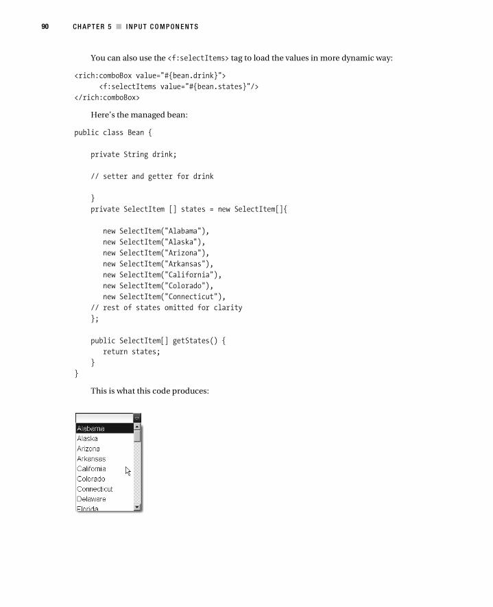
90 CH AP T E R 5 ■ I N P U T C O M P ON E N T S
You can also use the <f:selectItems> tag to load the values in more dynamic way:
<rich:comboBox value="#{bean.drink}">
<f:selectItems value="#{bean.states}"/>
</rich:comboBox>
Here’s the managed bean:
public class Bean {
private String drink;
// setter and getter for drink
}
private SelectItem [] states = new SelectItem[]{
new SelectItem("Alabama"),
new SelectItem("Alaska"),
new SelectItem("Arizona"),
new SelectItem("Arkansas"),
new SelectItem("California"),
new SelectItem("Colorado"),
new SelectItem("Connecticut"),
// rest of states omitted for clarity
};
public SelectItem[] getStates() {
return states;
}
}
This is what this code produces:

C HA P TE R 5 ■ I N P U T CO M P O N E N TS 91
Starting to type will produce the following:
Another option for loading values is to use the suggestedValues attribute, which binds to
a collection:
<rich:comboBox value="#{bean.drink}"
suggestionValues="#{bean.drinksList}">
where drinksList is a collection.You can add a default message by setting the defaultLabel
attribute:
<rich:comboBox value="#{bean.drink}"
defaultLabel="Select state..." >
<f:selectItems value="#{bean.states}"/>
</rich:comboBox>
This will produce the following:
Another useful attribute is directInputSuggestions; when set to true, the suggestion will
appear directly in the input field and be highlighted, as shown here:
Here’s the code:
<rich:comboBox value="#{bean.drink}>"
defaultLabel="Select state..."
directInputSuggestions="true">
<f:selectItems value="#{bean.states}"/>
</rich:comboBox>

92 CH AP T E R 5 ■ I N P U T C O M P ON E N T S
Adding More Input Components
Now I’ll cover a few more input components RichFaces provides. I’ll start with two components
that allow the user to input a number.
Using <rich:inputNumberSlider><rich:inputNumberSlider> renders a slider for inputting a number, as shown here:
This is the code:
<rich:inputNumberSlider value="#{bean.numberOfItems}" />
This renders the default component. numberOfItems is a property of type
java.lang.Integer with getter and setter methods.
Because this is basically just a rich input field, all the standard JSF rules such as conversion/
validation and event handling apply as well. Of course, the component provides a number of
rich features. You can easily set the minimum or maximum values as well as the step value (the
amount by which the value will be increased/decreased when the handle is dragged):
Here’s the code:
<rich:inputNumberSlider value="#{bean.numberOfItems}"
minValue="0"
maxValue="500"
step="2"/>
To disable manual input, you can set the enableManualInput attribute to false:
Here’s the code:
<rich:inputNumberSlider value="#{bean.numberOfItems}"
minValue="0"
maxValue="500"
step="2"
enableManualInput="false"/>

C HA P TE R 5 ■ I N P U T CO M P O N E N TS 93
To place the input field on the left side, set the inputPosition attribute:
Here’s the code:
<rich:inputNumberSlider value="#{bean.numberOfItems}"
minValue="0"
maxValue="500"
step="2"
inputPosition="left"/>
The default value is right.
To hide the input field, you can set showInput="false":
<rich:inputNumberSlider value="#{bean.numberOfItems}"
minValue="0"
maxValue="500"
step="2"
showInput="false"/>
Here’s what that looks like:
Other attributes such as showBoundaryValues determine whether the minimum/maximum
values are shown. When set to false, the showInput attribute will hide the input field. When set
to false, showToolTip will not display a tooltip when the handle is dragged.
Using <rich:inputNumberSpinner><rich:inputNumberSpinner> provides a familiar input field, but it renders a slider with up and
down arrows to increase or decrease the value:
Here’s the code:
<rich:inputNumberSpinner value="#{bean.numberOfItems}"/>

94 CH AP T E R 5 ■ I N P U T C O M P ON E N T S
Similar attributes exist on <rich:inputNumberSpinner> as on <rich:inputNumberSlider>:
<rich:inputNumberSpinner value="#{bean.numberOfItems}"
maxValue="500"
minValue="0"
step="5"
enableManualInput="false"/>
You can set the minimum and maximum values, set the step size, and disable manual input.
One other attribute is cycled. When set to true, when the value reaches one of the bound-
aries (minimum/maximum), the value will be set to the next boundary or reversed.
Using <rich:calendar>The calendar component allows you to select the date and time values either inline or via a
pop-up menu.
<rich:calendar value="#{bean.today}"
datePattern="dd/M/yy hh:mm:a"/>
today is of type java.util.Date with getter and setter methods.
Here’s an example of selecting the date:

C HA P TE R 5 ■ I N P U T CO M P O N E N TS 95
And here’s an example of selecting the time:
SummaryThis chapter covered some of the most widely used input components. Most input compo-
nents from the rich: tag library provide all the functionality out of the box. This means you
don’t need to specify how or when to send the request or what to update. The components do
that automatically.
There are a few components such as <rich:fileUpload> that I had to skip simply because of
limited time and space in this book. However, because I covered all the important concepts, using
any new RichFaces component should be easy for you. To see all the input components in action,
view the online demo: go to http://www.jboss.org/jbossrichfaces/, and click Online Demo.

97
■ ■ ■
C H A P T E R 6
Output Components
RichFaces offers a good number of out-of-the-box components for displaying data. This
chapter will cover output components such as panels, tabbed panels, toggle panels, and modal
panels. Be prepared for numerous examples as well as common usages such as how to use a
modal panel to display a status message.
Using <rich:panel><rich:panel> is just a panel or a container for any other content. You can place anything you
want inside it, such as text or any other JSF components. Here’s what a simple one looks like:
The following code:
<rich:panel style="width:450px">
New York City (officially The City of New York) is the most populous
city in the United States, with its metropolitan area
ranking among the largest urban
areas in the world. It has been the largest city in the United States
since 1790, and was the country's first capital city and the site of George
Washington's inauguration as the first president of the United States.
For more than a century, it has been one of the world's major centers of
commerce and finance. New York City is rated as an alpha world city for its
global influences in media, politics, education, entertainment, arts and
fashion. The city is also a major center for foreign affairs, hosting the
headquarters of the United Nations.
New York City comprises five boroughs, each of which is coextensive with a
county: The Bronx, Brooklyn, Manhattan, Queens and Staten Island.
With over 8.2 million residents within an area of 322 square miles (830 km),
New York City is the most densely populated major city in the United States.
</rich:panel>

98 CH AP T E R 6 ■ O U TP U T CO M P O N E N TS
creates the following <rich:panel>:
You can easily add a label by adding a header with <f:facet>:
<rich:panel style="width:450px">
<f:facet name="header">New York City</f:facet>
New York City (officially The City of New York) is the most populous
city in the United States, with its metropolitan area ranking among the
largest urban areas in the world. It has been the largest city in the
United States since 1790,
. . .
</rich:panel>
Here’s what that looks like:
Keep in mind that you can place any other JSF components inside and the component is
fully skinnable.
Here’s an example of a second <rich:panel> nested inside the first one:
<rich:panel style="width:450px">
<f:facet name="header">New York City</f:facet>
New York City (officially The City of New York) is the most populous
city in the United States...

CH AP T E R 6 ■ O U TP U T CO M P O N E N TS 99
<rich:panel>
<f:facet name="header">5 Boroughs</f:facet>
New York City comprises five boroughs, each of which is coextensive
with a county: The Bronx, Brooklyn, Manhattan, Queens and Staten Island.
With over 8.2 million residents within an area of 322 square miles
(830 km), New York City is the most densely populated major city in
the United States.
</rich:panel>
</rich:panel>
Here’s what that looks like:
Using <rich:simpleTogglePanel><rich:simpleTogglePanel> is similar to the <rich:panel> component with the additional function-
ality of being closed or open. Here’s an example:
<h:form>
<rich:simpleTogglePanel width="450px" switchType="ajax">
<f:facet name="header">New York City</f:facet>
New York City (officially The City of New York) is the most populous city in
the United States, with its metropolitan area ranking among the largest
urban areas in the world. It has been the largest city in the United States
since 1790, and was the country's first capital city and the site of George
Washington's inauguration as the first president of the United States.
For more than a century, it has been one of the world's major centers of
commerce and finance. New York City is rated as an alpha world city for its
global influences in media, politics, education, entertainment,
arts and fashion.
The city is also a major center for foreign affairs, hosting the
headquarters of the United Nations.
</rich:simpleTogglePanel>
</h:form>

100 CH AP T E R 6 ■ O U TP U T CO M P O N E N TS
As you can see in the following two images, a control to toggle the component is rendered
at the top-right corner, but you can actually click anywhere in the header to toggle:
There are three switch types that you can use:
• server (default): This is the default and will produce a full-page refresh.
• ajax: An Ajax request will be sent.
• client: All tab content will be prerendered to the client, and no interaction with the
server will happen during switching.
Keep in mind that if you place input components inside the panel and use the client
switch mode, no form submit will happen.
To control whether the component is closed or opened when rendered for the first time,
simply set the opened attribute to either true or false:
<rich:simpleTogglePanel width="450px" switchType="ajax" opened="false">
You can also point to an EL expression to control the attribute inside the managed bean:
<rich:simpleTogglePanel width="450px" switchType="ajax" opened="#{cityBean.isOpen}">
Using <rich:tabPanel> and <rich:tab><rich:tabPanel> and <rich:tab> let you create tabs on a page. <rich:tabPanel> is the container
with one or more tabs (<rich:tab>).
<rich:tab> can contain any other content and any JSF components including input compo-
nents. If you do place input components, don’t forget to add a form. The following code:
<rich:panel style="width:500px">
<f:facet name="header">rich:tabPanel and rich:tab</f:facet>
<rich:tabPanel switchType="ajax">
<rich:tab label="New York City">
Statue of Liberty
</rich:tab>

CH AP T E R 6 ■ O U TP U T CO M P O N E N TS 101
<rich:tab label="San Francisco">
Golden Gate Bridge
</rich:tab>
<rich:tab label="Los Angeles">
Hollywood
</rich:tab>
</rich:tabPanel>
</rich:panel>
renders the following:
It’s easy to change the tab alignment as well as mark any tab as disabled:
<rich:panel style="width:500px">
<f:facet name="header">rich:tabPanel and rich:tab</f:facet>
<rich:tabPanel switchType="ajax" headerAlignment="right">
<rich:tab label="New York City">
Statue of Liberty
</rich:tab>
<rich:tab label="San Francisco">
Golden Gate Bridge
</rich:tab>
<rich:tab label="Los Angeles" disabled="true">
Hollywood
</rich:tab>
</rich:tabPanel>
</rich:panel>
Of course, both attributes, headerAlignment and disabled, can point to an EL expression
and be controlled via the model. You can use a facet named label to define tab headers out of
any number of components. For example, if you want to include images in the header for each
tab, like the following:

102 CH AP T E R 6 ■ O U TP U T CO M P O N E N TS
then you can use any of the following three switch types:
• server: This is the default and will produce a full-page refresh.
• ajax: An Ajax request will be sent during when a new tab is selected.
• client: All tab content will be prerendered to the client, and no interaction with the
server will happen during switching.
It’s also possible to control which tab opens when the page is loaded for the first time by
setting the selectedTab attribute to point to an ID of the tab to display. Note that each tab needs
to have an ID. Instead of ID attributes, it’s also possible to set the name attribute for each tab,
like so:
<rich:panel style="width:500px">
<f:facet name="header">rich:tabPanel and rich:tab</f:facet>
<rich:tabPanel switchType="ajax" selectedTab="sf">
<rich:tab label="New York City" id="nyc">
Statue of Liberty
</rich:tab>
<rich:tab label="San Francisco" id="sf">
Golden Gate Bridge
</rich:tab>
<rich:tab label="Los Angeles" id="la">
Hollywood
</rich:tab>
</rich:tabPanel>
</rich:panel>
This renders the following:
A frequent question is, how do you control the selected tab inside the model? Well, that’s
very simple to do. Just point selectedTab to an EL expression, and set the desired tab inside the
bean, like so:
<h:form>
<rich:panel style="width:500px">
<h:selectOneRadio value="#{cityTabBean.city}">
<f:selectItem itemLabel="New York" itemValue="nyc" />
<f:selectItem itemLabel="San Francisco" itemValue="sf" />
<f:selectItem itemLabel="Los Angeles" itemValue="la" />
<a4j:support event="onclick"
actionListener="#{cityTabBean.changeCity}" reRender="cityTabs" />
</h:selectOneRadio>
</rich:panel>

CH AP T E R 6 ■ O U TP U T CO M P O N E N TS 103
</h:form>
<rich:panel style="width:500px">
<f:facet name="header">rich:tabPanel and rich:tab</f:facet>
<rich:tabPanel id="cityTabs" switchType="ajax"
selectedTab="#{cityTabBean.selectedTab}">
<rich:tab label="New York City" id="nyc">
Statue of Liberty
</rich:tab>
<rich:tab label="San Francisco" name="sf">
Golden Gate Bridge
</rich:tab>
<rich:tab label="Los Angeles" id="la">
Hollywood
</rich:tab>
</rich:tabPanel>
</rich:panel>
By selecting a radio button, an Ajax request (via <a4j:support>) is sent and updates the
selectedTab property, which is bound to the selectedTab attribute holding the ID of the selected
tab. That’s pretty simple, right? For example, the following code:
public class CityTabBean {
private String city = "sf";
private String selectedTab = "sf";
// getters and setters for city and selectedTab
public void changeCity (ActionEvent event){
selectedTab = city;
}
}
renders the following:

104 CH AP T E R 6 ■ O U TP U T CO M P O N E N TS
Another option is to use the binding attribute. The changes needed are shown in bold:
<rich:panel style="width:500px">
<f:facet name="header">rich:tabPanel and rich:tab</f:facet>
<rich:tabPanel id="cityTabs" switchType="ajax"
binding="#{cityTabBean.tabPanel}"
selectedTab="sf">
<rich:tab label="New York City" id="nyc">
Statue of Liberty
</rich:tab>
<rich:tab label="San Francisco" name="sf">
Golden Gate Bridge
</rich:tab>
<rich:tab label="Los Angeles" id="la">
Hollywood
</rich:tab>
</rich:tabPanel>
</rich:panel>
The changes to the bean are as follows:
private HtmlTabPanel tabPanel;
public HtmlTabPanel getTabPanel() {
return tabPanel;
}
public void setTabPanel(HtmlTabPanel tabPanel) {
this.tabPanel = tabPanel;
}
public void changeCity (ActionEvent event){
tabPanel.setSelectedTab(city);
}
To return quickly to using forms, it’s also possible to place a form inside each tab. In this
case, you don’t need a form outside the tab panel (it’s actually not allowed to nest forms). This
means that only components inside the tab will be processed on the server. When you switch
tabs, the form will not be submitted in this case.
Using <rich:panelBar><rich:panelBar> allows you to create a set of panels. When a particular panel is selected to be
opened, the currently opened panel is closed or collapsed. Content for each panel is prerendered
to the client. This means when you open/close the panels, the change is happening only on the
client (the browser).
Creating a component is rather simple. A panel bar consists of one more panel bar items.
The following code:

CH AP T E R 6 ■ O U TP U T CO M P O N E N TS 105
<rich:panel style="width:550px">
<f:facet name="header">
Using a4j:panelBar
</f:facet>
<rich:panelBar selectedPanel="sf">
<rich:panelBarItem id="nyc">
<f:facet name="label">
New York
</f:facet>
Statue of Liberty
</rich:panelBarItem>
<rich:panelBarItem id="sf">
<f:facet name="label">
San Francisco
</f:facet>
Golden Gate Bridge
</rich:panelBarItem>
<rich:panelBarItem id="la">
<f:facet name="label">
Los Angeles
</f:facet>
Hollywood
</rich:panelBarItem>
</rich:panelBar>
</rich:panel>
creates the following:
To define a header for each panel bar item, a facet with the name of label is used. A facet is
useful when you need to customize the label such as to include more than just simple text or
images. For simpler cases, you can use the label attribute on the <rich:panelBarItem> compo-
nent, like so:
<rich:panelBarItem id="nyc">
<f:facet name="label">
New York
</f:facet>
Statue of Liberty
</rich:panelBarItem>

106 CH AP T E R 6 ■ O U TP U T CO M P O N E N TS
You can place any content inside each panel group item. For example, this includes the
city flag:
To control which panel is opened, set the selectedPanel attribute on <rich:panelBar> to
the ID of the panel to open when the page is rendered for the first time. Of course, you can also
control which panel bar is opened by binding the attribute to a bean property:
<rich:panelBar selectedPanel="#{cityBean.openedPanel}">
It’s important to point out again that this component will prerender all content to the
client (browser) when the page is rendered for the first time.
Using <rich:panelMenu><rich:panelMenu> builds a vertical, collapsible menu with any depth level.
To start building the menu, you first start with <rich:panelMenu>, which acts as the main
container for all menu items or nodes. Inside the container, you can place any number of
menu items (<rich:menuPanelItem>) or groups (<rich:menuPanelGroup>). Each group in turn
can have any menu items or additional groups, and so on. There is no limit to the depth of the
menu that you can create.
Here is one example:
<rich:panel style="width:450px">
<f:facet name="header">
Using a4j:panelMenu
</f:facet>
<rich:panelMenu mode="ajax"
iconCollapsedGroup="disc">
<rich:panelMenuGroup label="Group 1">
<rich:panelMenuItem>
Item 1.1
</rich:panelMenuItem>

CH AP T E R 6 ■ O U TP U T CO M P O N E N TS 107
<rich:panelMenuItem>
Item 1.2
</rich:panelMenuItem>
<rich:panelMenuItem>
Item 1.3
</rich:panelMenuItem>
<rich:panelMenuGroup label="Group 1.4">
<rich:panelMenuItem>
Item 1.4.1
</rich:panelMenuItem>
<rich:panelMenuItem>
Item 1.4.2
</rich:panelMenuItem>
<rich:panelMenuGroup label="Group 1.4.3" >
<rich:panelMenuItem >
Item 1.4.3.1
</rich:panelMenuItem>
</rich:panelMenuGroup>
</rich:panelMenuGroup>
</rich:panelMenuGroup>
<rich:panelMenuGroup label="Group 2">
<rich:panelMenuItem>
Item 2.1
</rich:panelMenuItem>
</rich:panelMenuGroup>
</rich:panelMenu>
</rich:panel>
which renders the following:

108 CH AP T E R 6 ■ O U TP U T CO M P O N E N TS
You can use <rich:panelMenuItem label="Item 1.1"> instead of nested content for simple
labels, which will create something like the following menu:
Each group or menu item has an action or actionListener attribute that allows you to
bind to listeners and invoke methods when a particular item or group is selected.
It’s also possible to specify modes for menu opening/closing as well as a separate mode for
submitting. When a mode is specified for a group, all items inside the group inherit the same
mode unless you explicitly overwrite a particular menu. Table 6-1 describes the mode and
expandMode attributes.
Suppose you want to have a client-expanded menu but submit it via Ajax, like so:
<rich:panelMenu mode="ajax"
expandMode="client">
All groups and items would inherit this behavior. If one particular item has to do a full-
form submit (on the server), you can overwrite the particular item like this:
<rich:panelMenuItem mode="server">
Item 1.1
</rich:panelMenuItem>
Table 6-1. mode and expandMode Attributes Description
Attribute Description
mode (available on all tags) Possible values are server, ajax, and none (none is the default). Specifies the mode for submitting the form when this node is clicked.
expandMode (available on <rich:panelMenu> and <rich:panelMenuGroup>)
Possible values are server, ajax, and none (none is the default). Specifies the mode for expanding the group.

CH AP T E R 6 ■ O U TP U T CO M P O N E N TS 109
To overwrite for a whole group, use this:
<rich:panelMenuGroup label="Group 1" mode="server">
Setting expandSingle to true:
<rich:panelMenu mode="ajax" expandSingle="true">
will allow to have only one top group opened at a time. Whenever another group is selected,
the currently opened group will be closed.
To disable a particular menu item or group, set the disabled attribute to true, like so:
<rich:panelMenuItem disabled="true">
Item 1.1
</rich:panelMenuItem>
Using <rich:togglePanel>While <rich:simpleTogglePanel> allows you to toggle one panel, <rich:togglePanel> allows
you to toggle between two or more panels. You basically define two or more panels and then
set the order in which they are shown, and that’s it. Let’s look at an example that uses famous
quotes as the content for the panels.
The panel looks like this:
Next, let’s hide the current panel and show the next one:
<rich:panel style="width:450px">
<rich:togglePanel id="quotes"
switchType="ajax" stateOrder="quote1,quote2,quote3,quote4,quote5">
<f:facet name="quote1">
<h:panelGrid>
<h:outputText value="C makes it easy to shoot
yourself in the foot; C++ makes it harder, but when you do,
it blows away your whole leg."/>
<h:outputText value="- Bjarne Stroustrup"
style="font-style: italic"/>
<rich:toggleControl value="Next"/>
</h:panelGrid>
</f:facet>

110 CH AP T E R 6 ■ O U TP U T CO M P O N E N TS
<f:facet name="quote2">
<h:panelGrid>
<h:outputText value="If you are going through hell, keep going."/>
<h:outputText value="- Sir Winston Churchill
(1874-1965)" style="font-style: italic"/>
<rich:toggleControl value="Next" />
</h:panelGrid>
</f:facet>
<f:facet name="quote3">
<h:panelGrid>
<h:outputText value="Life is pleasant. Death is peaceful.
It's the transition that's troublesome."/>
<h:outputText value="- Isaac Asimov" style="font-style: italic"/>
<rich:toggleControl value="Next"/>
</h:panelGrid>
</f:facet>
<f:facet name="quote4">
<h:panelGrid>
<h:outputText value="Make everything as simple as possible,
but not simpler."/>
<h:outputText value="- Albert Einstein (1879-1955)"
style="font-style: italic"/>
<rich:toggleControl value="Next"/>
</h:panelGrid>
</f:facet>
<f:facet name="quote5">
<h:panelGrid>
<h:outputText value="If women didn't exist, all the money
in the world would have no meaning."/>
<h:outputText value="- Aristotle Onassis (1906-1975)"
style="font-style: italic"/>
<rich:toggleControl value="Next"/>
</h:panelGrid>
</f:facet>
</rich:togglePanel>
</rich:panel>
The panels (or the content) are defined by creating facets with unique names. In this example,
there are four facets with names of quote1..5 for each quote. Remember that <f:facet> can
hold only one child, so if you need to place more than one component inside, you need to use
components such as <h:panelGrid> or <h:panelGroup>.
Like its sister component <rich:simpleTogglePanel>, <rich:togglePanel> supports three
modes of switching:

CH AP T E R 6 ■ O U TP U T CO M P O N E N TS 111
• server (default): This is the default and will produce a full-page refresh.
• ajax: An Ajax request will be sent.
• client: The panel content will be prerendered to the client.
Now, what is the order in which they will be shown? That’s defined by setting the stateOrder
attribute:
<rich:togglePanel id="quotes" switchType="ajax"
stateOrder="quote1,quote2,quote3,quote4,quote5">
Finally, to toggle from one panel to another, you use a component called
<rich:toggleControl>. I will show you in a second how you can control the order in which panels
are shown, but for now, the order will be as specified in stateOrder. <rich:panelControl>, when
clicked, will show the next panel in order. Once all panels are shown, it will simply continue to
cycle based on the stateOrder.
In the previous example, the panel with the ID of quote1 will be shown first. However, it’s
possible to define a special panel to always be shown first. Suppose you want the following
panel to be shown first:
<f:facet name="start">
<h:panelGrid>
<h:outputText value="Let's look at some famous quotes"/>
<rich:toggleControl value="Start"/>
</h:panelGrid>
</f:facet>
The only other change is that you need to set the initialState attribute to point to the first
panel’s ID:
<rich:togglePanel id="quotes" initialState="start" switchType="ajax"
stateOrder="quote1,quote2,quote3,quote4,quote5">
This panel will be shown when the page is rendered initially but will not be shown again
when cycling through the panels the second time. Here’s what’s rendered initially:
So far, you have based the order of panels shown on the stateOrder attribute, but it’s also
possible to define the next (or previously) shown panel explicitly.
For each <rich:toggleControl>, you now have to specify which panel to show next:
<rich:toggleControl value="Start" switchToState="quote1"/>
Here is the example using the switchToState attribute. Notice that you no longer need to use
the stateOrder attribute. Even if stateOrder is specified, the state specified in switchToState will
take precedence.

112 CH AP T E R 6 ■ O U TP U T CO M P O N E N TS
<rich:togglePanel id="quotes"
initialState="start"
switchType="ajax">
<f:facet name="start">
<h:panelGrid>
<h:outputText value="Let's look at some famous quotes"/>
<rich:toggleControl value="Start" switchToState="quote1"/>
</h:panelGrid>
</f:facet>
<f:facet name="quote1">
<h:panelGrid>
<h:outputText value="C makes it easy to shoot yourself in the foot;
C++ makes it harder, but when you do,
it blows away your whole leg."/>
<h:outputText value="- Bjarne Stroustrup" style="font-style: italic"/>
<h:panelGrid columns="2">
<rich:toggleControl value="Prev" switchToState="start"/>
<rich:toggleControl value="Next" switchToState="quote2"/>
</h:panelGrid>
</h:panelGrid>
</f:facet>
<f:facet name="quote2">
<h:panelGrid>
<h:outputText value="If you are going through hell, keep going."/>
<h:outputText value="- Sir Winston Churchill (1874-1965)"
style="font-style: italic"/>
<h:panelGrid columns="2">
<rich:toggleControl value="Prev" switchToState="quote1"/>
<rich:toggleControl value="Next" switchToState="quote3"/>
</h:panelGrid>
</h:panelGrid>
</f:facet>
<f:facet name="quote3">
<h:panelGrid>
<h:outputText value="Life is pleasant. Death is peaceful.
It's the transition that's troublesome."/>
<h:outputText value="- Isaac Asimov" style="font-style: italic"/>
<h:panelGrid columns="2">
<rich:toggleControl value="Prev" switchToState="quote2"/>
<rich:toggleControl value="Next" switchToState="quote4"/>
</h:panelGrid>
</h:panelGrid>
</f:facet>
<f:facet name="quote4">
<h:panelGrid>
<h:outputText value="Make everything as simple as possible,
but not simpler."/>

CH AP T E R 6 ■ O U TP U T CO M P O N E N TS 113
<h:outputText value="- Albert Einstein (1879-1955)"
style="font-style: italic"/>
<h:panelGrid columns="2">
<rich:toggleControl value="Prev" switchToState="quote3"/>
<rich:toggleControl value="Next" switchToState="quote5"/>
</h:panelGrid>
</h:panelGrid>
</f:facet>
<f:facet name="quote5">
<h:panelGrid>
<h:outputText value="If women didn't exist, all the money in the
world would have no meaning."/>
<h:outputText value="- Aristotle Onassis (1906-1975)"
style="font-style: italic"/>
<h:panelGrid columns="2">
<rich:toggleControl value="Prev" switchToState="quote4"/>
<rich:toggleControl value="Start Over" switchToState="start"/>
</h:panelGrid>
</h:panelGrid>
</f:facet>
</rich:togglePanel>
So far, you have placed the toggle control inside the <rich:togglePanel> component. It’s
also possible to place the toggle control outside it. In such a case, you need to point to
<rich:togglePanel> via the for attribute and bring back the stateOrder attribute:
<rich:toggleControl for="quotes">
Next
</rich:toggleControl>
This allows you to place the toggle component anywhere on the page. For example, the
following code:
<rich:togglePanel id="quotes"
initialState="start"
switchType="ajax"
stateOrder="quote1, quote2, quote3, quote4, quote5">
produces the following:

114 CH AP T E R 6 ■ O U TP U T CO M P O N E N TS
Using <rich:toolBar><rich:toolBar> creates a horizontal bar that can hold any other JSF components including any
action components.
You can easily use <rich:toolBar> in conjunction with <rich:panel> where the panel
holds some information associated with a link in the toolbar. The following code:
<rich:panel style="width:650px">
<f:facet name="header">
Using rich:toolBar
</f:facet>
<rich:toolBar>
<a4j:commandLink id="nyc" value="New York City"
actionListener="#{toolBarBean.cityListener}" />
<a4j:commandLink id="sf" value="San Francisco"
actionListener="#{toolBarBean.cityListener}" />
<a4j:commandLink id="la" value="Los Angeles"
actionListener="#{toolBarBean.cityListener}" />
</rich:toolBar>
<rich:panel>
<a4j:outputPanel ajaxRendered="true">
<h:panelGrid rendered="#{toolBarBean.nyc}">
New York City is the most populous city in the United States,
with its metropolitan area ranking among the
largest urban areas in the world.
For more than a century, it has been one of the world's major centers
of commerce and finance. New York City is rated as an alpha world
city for its global influences in media, politics, education,
entertainment, arts and fashion. The city is also a major center
for foreign affairs, hosting the headquarters of the United Nations.
</h:panelGrid>
<h:panelGrid rendered="#{toolBarBean.sf}">
San Francisco is the fourth most populous city in California and the
14th most populous city in the United States.
San Francisco is a popular international tourist destination renowned
for its steep rolling hills, an eclectic mix of Victorian and modern
architecture, and famous landmarks, including the Golden Gate Bridge,
Alcatraz Island, the cable cars, Coit Tower, and Chinatown.
</h:panelGrid>
<h:panelGrid rendered="#{toolBarBean.la}">
Los Angeles is the largest city in the state of California and the
second-largest in the United States. Los Angeles is one of the
world's centers of culture, technology,
media, business, and international trade.
</h:panelGrid>
</a4j:outputPanel>
</rich:panel>
</rich:panel>

CH AP T E R 6 ■ O U TP U T CO M P O N E N TS 115
produces the following:
In this example, toolbar contains three command links, but keep in mind that any JSF
component can be placed inside the toolbar.
It’s also possible to specify a separator between items (components) on the toolbar. Four
built-in separators are available:
• none
• line
• square
• disc
Setting separator to disc:
<rich:toolBar itemSeparator="disc">
produces the following:
To use a custom separator image, you can use the following:
<rich:toolBar itemSeparator="/img/ico.gif">
which will render circular disks between the items.
It’s also possible to place a custom separator by creating a facet named itemSeparator,
such as using *:
<rich:toolBar>
<f:facet name="itemSeparator">
<h:outputText value="*" style="FONT-SIZE: large;"/>
</f:facet>
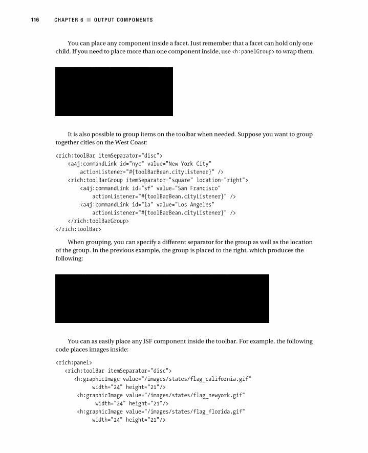
116 CH AP T E R 6 ■ O U TP U T CO M P O N E N TS
You can place any component inside a facet. Just remember that a facet can hold only one
child. If you need to place more than one component inside, use <h:panelGroup> to wrap them.
It is also possible to group items on the toolbar when needed. Suppose you want to group
together cities on the West Coast:
<rich:toolBar itemSeparator="disc">
<a4j:commandLink id="nyc" value="New York City"
actionListener="#{toolBarBean.cityListener}" />
<rich:toolBarGroup itemSeparator="square" location="right">
<a4j:commandLink id="sf" value="San Francisco"
actionListener="#{toolBarBean.cityListener}" />
<a4j:commandLink id="la" value="Los Angeles"
actionListener="#{toolBarBean.cityListener}" />
</rich:toolBarGroup>
</rich:toolBar>
When grouping, you can specify a different separator for the group as well as the location
of the group. In the previous example, the group is placed to the right, which produces the
following:
You can as easily place any JSF component inside the toolbar. For example, the following
code places images inside:
<rich:panel>
<rich:toolBar itemSeparator="disc">
<h:graphicImage value="/images/states/flag_california.gif"
width="24" height="21"/>
<h:graphicImage value="/images/states/flag_newyork.gif"
width="24" height="21"/>
<h:graphicImage value="/images/states/flag_florida.gif"
width="24" height="21"/>

CH AP T E R 6 ■ O U TP U T CO M P O N E N TS 117
<h:graphicImage value="/images/states/flag_massachusetts.gif"
width="24" height="21"/>
</rich:toolBar>
</rich:panel>
which produces the following:
Using <rich:separator>You use <rich:separator> to draw a horizontal line on a page. You can configure the separator
to be displayed in five ways:
• beveled (default)
• dotted
• dashed
• double
• solid
The following code:
<rich:separator height="2" lineType="dotted"/><br/>
<rich:separator height="2" lineType="dashed"/><br/>
<rich:separator height="4" lineType="double"/><br/>
<rich:separator height="2" lineType="solid"/><br/>
produces the following:
Using <rich:spacer><rich:spacer>is a simple component that renders an invisible image with the given width and
height. Usually it is used to separate elements of page design. Here’s an example:
<rich:spacer width="150"/>
Using <rich:modalPanel>The <rich:modalPanel> component implements a modal dialog box. All operations in the main
(parent) application window are locked out while this panel is active. Opening/closing the panel
is done through client JavaScript code.
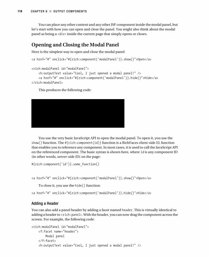
118 CH AP T E R 6 ■ O U TP U T CO M P O N E N TS
You can place any other content and any other JSF component inside the modal panel, but
let’s start with how you can open and close the panel. You might also think about the modal
panel as being a <div> inside the current page that simply opens or closes.
Opening and Closing the Modal Panel
Here is the simplest way to open and close the modal panel:
<a href="#" onclick="#{rich:component('modalPanel')}.show()">Open</a>
<rich:modalPanel id="modalPanel">
<h:outputText value="Cool, I just opened a modal panel!" />
<a href="#" onclick="#{rich:component('modalPanel')}.hide()">Hide</a>
</rich:modalPanel>
This produces the following code:
You use the very basic JavaScript API to open the modal panel. To open it, you use the
show() function. The #{rich:component(id)} function is a RichFaces client-side EL function
that enables you to reference any component. In most cases, it is used to call the JavaScript API
on the referenced component. The basic syntax is shown here, where id is any component ID
(in other words, server-side ID) on the page:
#{rich:component('id')}.some_function()
<a href="#" onclick="#{rich:component('modalPanel')}.show()">Open</a>
To close it, you use the hide() function:
<a href="#" onclick="#{rich:component('modalPanel')}.hide()">Hide</a>
Adding a Header
You can also add a panel header by adding a facet named header. This is virtually identical to
adding a header to <rich:panel>. With the header, you can now drag the component across the
screen. For example, the following code:
<rich:modalPanel id="modalPanel">
<f:facet name="header">
Modal panel
</f:facet>
<h:outputText value="Cool, I just opened a modal panel!" />

CH AP T E R 6 ■ O U TP U T CO M P O N E N TS 119
<a href="#" onclick="#{rich:component('modalPanel')}.hide()">Hide</a>
</rich:modalPanel>
produces the following:
Adding Header Controls
You can also add a control to the header to close the modal panel. It is achieved by adding
control facets to the modal panel, like so:
<rich:modalPanel id="modalPanel">
<f:facet name="header">
Modal panel
</f:facet>
<f:facet name="controls">
<h:graphicImage value="/modalPanel/close.png" style="cursor:pointer"
onclick="#{rich:component('modalPanel')}.hide()" />
</f:facet>
<h:outputText value="Cool, I just opened a modal panel!" />
<a href="#" onclick="#{rich:component('modalPanel')}.hide()">Hide</a>
</rich:modalPanel>
Inside the facet is an image that now can be clicked to close the panel. The onclick event
points to the same function to close the panel.
You might be tempted to use <h:outputText value="X" onclick. . .> instead of the
image. This will not work, however, because <h:outputText> doesn’t have the onclick event.
You can use <h:panelGrid> to attach the onclick event instead.

120 CH AP T E R 6 ■ O U TP U T CO M P O N E N TS
Other Ways to Open/Close the Modal Panel
Instead of using #{rich:component(id)}, you can use Richfaces.showModalPanel(id) and
Richfaces.hideModalPanel(id):
<a href="#" onclick="Richfaces.showModalPanel('modalPanel')">Open</a>
<rich:modalPanel id="modalPanel">
<f:facet name="header">
Modal panel
</f:facet>
<f:facet name="controls">
<h:graphicImage value="/modalPanel/close.png" style="cursor:pointer"
onclick="Richfaces.hideModalPanel('modalPanel')" />
</f:facet>
<h:outputText value="Cool, I just opened a modal panel!" />
<a href="#" onclick="Richfaces.hideModalPanel('modalPanel')">Hide</a>
</rich:modalPanel>
This approach and the first one I showed are basically identical.
To manage the placement of inserted windows, use the zindex attribute, which is similar
to the standard HTML attribute and can specify window placement relative to the content.
To manage window placement relative to the component, the left and top attributes
define a window shifting relative to the top-left corner of the window.
Modal panels can also support resize and move operations on the client side. To allow or
disallow these operations, set the resizeable and moveable attributes to true or false. Window
resizing is also limited by the minWidth and minHeight attributes specifying the minimal window
sizes. For example:
<a href="#" onclick="Richfaces.showModalPanel('modalPanel',
{top:'10px', left:'10px', height:'400'});">Show</a>
Additional method exist to open/close the modal panel using the <rich:componentControl>
component. Actually, it’s a universal component that allows calling the JavaScript API on any
component after some defined event such as onclick. I will cover this component in a later
chapter.
More Examples
What I have shown you so far is how to open and close modal panels using various methods.
Obviously, you want to use a panel for more interesting things such entering input and saving
and maybe even building wizardlike behavior.
Rerendering Content Inside <rich:modalPanlel>
So far, you have been using the JavaScript API to open and close the modal panels. This works
fine, but you probably want to display some server-side data, such as data from a managed
bean. For the data to be updated every time you open the modal panel, the content has to be
rerendered. To be able to rerender content, you have to use controls such as
<a4j:commandlLink> or <a4j:commandButton>.
CH AP T E R 6 ■ O U TP U T CO M P O N E N TS 121
Suppose you have added a time display to the modal panel:
<a href="#" onclick="#{rich:component('modalPanel')}.show()">Open</a>
<rich:modalPanel id="modalPanel">
<f:facet name="header">
Modal panel
</f:facet>
<f:facet name="controls">
<h:graphicImage value="/modalPanel/close.png" style="cursor:pointer"
onclick="#{rich:component('modalPanel')}.hide()" />
</f:facet>
<h:panelGrid>
<h:outputText value="Cool, I just opened a modal panel!" />
<h:outputText value="Time: #{modalPanelBean.now}"/>
</h:panelGrid>
<a href="#" onclick="#{rich:component('modalPanel')}.hide()">Hide</a>
</rich:modalPanel>
#{modalPanelBean.now} simply returns the current server time.
When the page is rendered for the first time, the time from the server will be rendered on
the page. When the modal panel is opened, the value previously rendered will simply be shown.
The time will not be the current time because you haven’t updated it (rerendered it). To solve
this issue, you’ll use <a4j:commandLink> to open the modal panel and rerender the component
that shows the time. This way, each time the modal panel is opened, you will get the latest time
from the server:
<h:form>
<a4j:commandLink value="Open"
onclick="#{rich:component('modalPanel')}.show()"
reRender="time"/>
</h:form>
<rich:modalPanel id="modalPanel">
<f:facet name="header">
Modal panel
</f:facet>
<f:facet name="controls">
<h:graphicImage value="/modalPanel/close.png" style="cursor:pointer"
onclick="#{rich:component('modalPanel')}.hide()" />
</f:facet>
<h:panelGrid>
<h:outputText value="Cool, I just opened a modal panel!" />
<h:outputText id="time" value="Time: #{modalPanelBean.now}"/>
</h:panelGrid>
<a href="#" onclick="#{rich:component('modalPanel')}.hide()">Hide</a>
</rich:modalPanel>
Again, it will help you to think about the modal panel as simply a section of the same page
that can be opened/closed. Other than that, all the rules for rerendering apply as before.
122 CH AP T E R 6 ■ O U TP U T CO M P O N E N TS
Using Modal Panes As a Wizard
Let’s look at an example where you can edit information in the modal panel. When you place
input fields or buttons/links inside the modal panel, you need to make sure the modal panel
has its own form. One thing to keep in mind is that it’s not allowed to nest forms, so the modal
panel must have its own form.
■Note To avoid a bug in Internet Explorer, the root node of the modal panel is moved to the top of a DOM
tree. However, you should have a separate form inside the modal panel if you want to perform submits from
this panel. So, the modal panel should not be placed inside any other form if it has its own form.
The following code shows an example using a modal panel as a wizard:
<rich:modalPanel id="modalPanel" width="350" height="150">
<f:facet name="header">
Modal panel
</f:facet>
<f:facet name="controls">
<h:graphicImage value="/modalPanel/close.png" style="cursor:pointer"
onclick="#{rich:component('modalPanel')}.hide()" />
</f:facet>
<h:form>
<h:panelGrid>
<h:outputText value="Name:"/>
<h:inputText value="#{modalPanelBean.name}" />
<h:panelGroup>
<a4j:commandButton value="Close" id="close"
oncomplete="Richfaces.hideModalPanel('modalPanel')" />
<a4j:commandButton value="Save and Close" id="save" reRender="input"
oncomplete="Richfaces.hideModalPanel('modalPanel')" />
</h:panelGroup>
</h:panelGrid>
</h:form>
</rich:modalPanel>
<h:form>
<h:panelGrid id="input">
<h:outputText value="Name: #{modalPanelBean.name}" />
<h:outputLink value="#" id="link">
Launch wizard
<rich:componentControl for="modalPanel" attachTo="link"
operation="show" event="onclick" />
</h:outputLink>
</h:panelGrid>
</h:form>

CH AP T E R 6 ■ O U TP U T CO M P O N E N TS 123
A wizard is launched to enter a value for the #{modalPanelBean.name} property. From the
modal panel, you can either close or save the value. If you save the value, the value entered is
then rerendered in the main page.
One thing to point out is that you need to rerender panelGrid in order to see the updated
values in the parent page. Also notice the separate form inside the modal panel.
Notice that to save the input inside the modal panel, you have to use <a4j:commandButton>
because you need to submit the value to the server. Once you are done, the oncomplete event
will be processed and will close the modal panel.
All the steps are shown here:
Creating a Wizard Using <rich:modalPanel>
Let’s take this idea one step further and create a wizard by using <rich:modalPanel> and
<a4j:include>.
Here is the starting page:
<rich:modalPanel id="wizard" width="350" height="150">
<f:facet name="header">
Wizard
</f:facet>
<f:facet name="controls">
<h:graphicImage value="/modalPanel/close.png" style="cursor:pointer"
onclick="#{rich:component('wizard')}.hide()" />
</f:facet>
<h:panelGrid id="include">
<a4j:include viewId="/modalPanel/page1.xhtml"/>
</h:panelGrid>
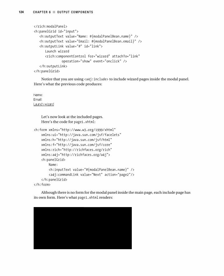
124 CH AP T E R 6 ■ O U TP U T CO M P O N E N TS
</rich:modalPanel>
<h:panelGrid id="input">
<h:outputText value="Name: #{modalPanelBean.name}" />
<h:outputText value="Email: #{modalPanelBean.email}" />
<h:outputLink value="#" id="link">
Launch wizard
<rich:componentControl for="wizard" attachTo="link"
operation="show" event="onclick" />
</h:outputLink>
</h:panelGrid>
Notice that you are using <a4j:include> to include wizard pages inside the modal panel.
Here’s what the previous code produces:
Let’s now look at the included pages.
Here’s the code for page1.xhtml:
<h:form xmlns="http://www.w3.org/1999/xhtml"
xmlns:ui="http://java.sun.com/jsf/facelets"
xmlns:h="http://java.sun.com/jsf/html"
xmlns:f="http://java.sun.com/jsf/core"
xmlns:rich="http://richfaces.org/rich"
xmlns:a4j="http://richfaces.org/a4j">
<h:panelGrid>
Name:
<h:inputText value="#{modalPanelBean.name}" />
<a4j:commandLink value="Next" action="page2"/>
</h:panelGrid>
</h:form>
Although there is no form for the modal panel inside the main page, each include page has
its own form. Here’s what page1.xhtml renders:

CH AP T E R 6 ■ O U TP U T CO M P O N E N TS 125
Here’s the code for page2.xhtml:
<h:form xmlns="http://www.w3.org/1999/xhtml"
xmlns:ui="http://java.sun.com/jsf/facelets"
xmlns:h="http://java.sun.com/jsf/html"
xmlns:f="http://java.sun.com/jsf/core"
xmlns:rich="http://richfaces.org/rich"
xmlns:a4j="http://richfaces.org/a4j">
<a4j:keepAlive beanName="modalPanelBean"/>
<h:panelGrid>
Email:
<h:inputText value="#{modalPanelBean.email}" />
<a4j:commandLink value="Next" action="page3"/>
</h:panelGrid>
</h:form>
Because modalPanelBean is in request scope, to save its state between requests, you are
using the <a4j:keepAlive> component. Here’s what page2.xhtml renders:
Here’s the code for page3.xhtml:
<h:form xmlns="http://www.w3.org/1999/xhtml"
xmlns:ui="http://java.sun.com/jsf/facelets"
xmlns:h="http://java.sun.com/jsf/html"
xmlns:f="http://java.sun.com/jsf/core"
xmlns:rich="http://richfaces.org/rich"
xmlns:a4j="http://richfaces.org/a4j">
<h:panelGrid columns="2">
<h:outputText value="Name:"/>
<h:outputText value="#{modalPanelBean.name}" />
<h:outputText value="Email:"/>
<h:outputText value="#{modalPanelBean.email}" />
<a4j:commandButton value="Close" id="save" reRender="input"
oncomplete="Richfaces.hideModalPanel('wizard')" />
</h:panelGrid>
</h:form>

126 CH AP T E R 6 ■ O U TP U T CO M P O N E N TS
On the last page you are showing a summary and rerendering the name and email values
in order to display them on the parent page. Here’s what page3.xhtml renders:
This is what the parent page looks like:
You also have to define the navigation rules:
<navigation-rule>
<from-view-id>/modalPanel/page1.xhtml</from-view-id>
<navigation-case>
<from-outcome>page2</from-outcome>
<to-view-id>/modalPanel/page2.xhtml</to-view-id>
</navigation-case>
</navigation-rule>
<navigation-rule>
<from-view-id>/modalPanel/page2.xhtml</from-view-id>
<navigation-case>
<from-outcome>page3</from-outcome>
<to-view-id>/modalPanel/page3.xhtml</to-view-id>
</navigation-case>
</navigation-rule>
Opening the Modal Panel from Within a Table
Another common usage is opening a modal panel from within a table to view or edit the
selected record. Say you have this page:

CH AP T E R 6 ■ O U TP U T CO M P O N E N TS 127
After clicking a View link, a modal panel opens and shows the selected record information:
Here’s the XHTML page:
<h:form>
<h:dataTable value="#{airlinesBean.airlines}" var="airline">
<h:column>
<f:facet name="header">
Edit
</f:facet>
<a4j:commandLink value="View"
onclick="#{rich:component('modalPanel')}.show()"
reRender="airlineInfo">
<f:setPropertyActionListener value="#{airline}"
target="#{airlinesBean.selected}" />
</a4j:commandLink>
</h:column>
<h:column>
<f:facet name="header">
Name
</f:facet>
#{airline.name}
</h:column>
<h:column>
<f:facet name="header">
Code
</f:facet>
#{airline.code}
</h:column>
</h:dataTable>
</h:form>
<rich:modalPanel id="modalPanel" width="250" height="150">
<f:facet name="header">
Airline Information
</f:facet>
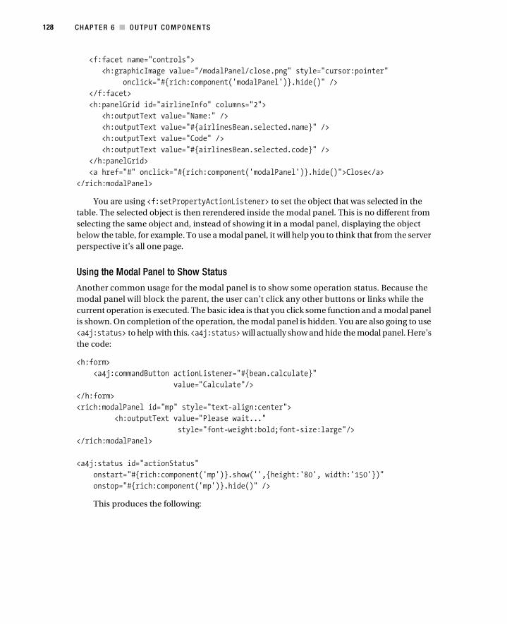
128 CH AP T E R 6 ■ O U TP U T CO M P O N E N TS
<f:facet name="controls">
<h:graphicImage value="/modalPanel/close.png" style="cursor:pointer"
onclick="#{rich:component('modalPanel')}.hide()" />
</f:facet>
<h:panelGrid id="airlineInfo" columns="2">
<h:outputText value="Name:" />
<h:outputText value="#{airlinesBean.selected.name}" />
<h:outputText value="Code" />
<h:outputText value="#{airlinesBean.selected.code}" />
</h:panelGrid>
<a href="#" onclick="#{rich:component('modalPanel')}.hide()">Close</a>
</rich:modalPanel>
You are using <f:setPropertyActionListener> to set the object that was selected in the
table. The selected object is then rerendered inside the modal panel. This is no different from
selecting the same object and, instead of showing it in a modal panel, displaying the object
below the table, for example. To use a modal panel, it will help you to think that from the server
perspective it’s all one page.
Using the Modal Panel to Show Status
Another common usage for the modal panel is to show some operation status. Because the
modal panel will block the parent, the user can’t click any other buttons or links while the
current operation is executed. The basic idea is that you click some function and a modal panel
is shown. On completion of the operation, the modal panel is hidden. You are also going to use
<a4j:status> to help with this. <a4j:status> will actually show and hide the modal panel. Here’s
the code:
<h:form>
<a4j:commandButton actionListener="#{bean.calculate}"
value="Calculate"/>
</h:form>
<rich:modalPanel id="mp" style="text-align:center">
<h:outputText value="Please wait..."
style="font-weight:bold;font-size:large"/>
</rich:modalPanel>
<a4j:status id="actionStatus"
onstart="#{rich:component('mp')}.show('',{height:'80', width:'150'})"
onstop="#{rich:component('mp')}.hide()" />
This produces the following:

CH AP T E R 6 ■ O U TP U T CO M P O N E N TS 129
When the button is clicked, the #{bean.calculate} listener is invoked. Let’s assume it
takes a few seconds to complete (you can put the current thread to sleep for a few seconds if
you are testing). You know from before that you can use <a4j:status> to display any content
while the Ajax request is being processed. In this example, you use <a4j:status>’s onstart and
onstop events to show and hide the modal panel. #{rich:component(id)} is the client EL func-
tion that allows you to call the JavaScript API on the referencing component. That’s exactly
what the example does. On the request start, you call show() on the modal panel. When the
request has been completed (onstop), you call hide() on the modal panel.
Alternatively, the following would give you the same functionality but will not use the
#{rich:component(id)} client function:
<a4j:status id="actionStatus"
onstart="Richfaces.showModalPanel('mp', {height:'80', width:'150'})"
onstop="Richfaces.hideModalPanel('mp')" />
Using <rich:toolTip><rich:toolTip> displays a nonmodal tool tip (window) based on some event. The most common
case would be when you move the mouse over some text or double-click. The tool tip can contain
any other JSF components and content.
Let’s say you start with something like this and want to display information about New
York City when the mouse cursor moves over the city name:
The content of the tool tip is enclosed within <rich:toolTip>. If the tool tip content is very
short, you can use the value attribute of <rich:toolTip> instead. By default, the tool tip will be
displayed when the mouseover event occurs. I will show you later in this chapter how you can
specify the event implicitly.

130 CH AP T E R 6 ■ O U TP U T CO M P O N E N TS
<rich:panel style="width:350px">
<f:facet name="header">
Using rich:toolTip
</f:facet>
<h:outputText id="nyc" value="New York City"
style="font-size: xx-large;"/>
<rich:toolTip mode="ajax" for="nyc">
<h:panelGrid style="width:200px">
New York City is the most populous city in the United States,
with its metropolitan area ranking among the
largest urban areas in the world.
For more than a century, it has been one of the world's major centers of
commerce and finance.
</h:panelGrid>
</rich:toolTip>
</rich:panel>
The for attribute points to the component that displays the tool tip. It’s also possible to
wrap the tool tip inside the actual component. I will show an example later in this chapter.
Finally, the loading mode used is ajax. In other words, when the mouse cursor moves over
the text, an Ajax request is sent to the server to get the content of the tool tip. Another option is
to use client mode. When mode="client", the tool tip content will be prerendered to the client.
When using ajax mode, you can display a default message while the tool tip content is
being retrieved from the server. This is useful if the operation to get the tool tip content might
take a little while. To show the default content, you can use a facet named defaultContent.
Another useful attribute is followMouse. When set to true, the tool tip will follow the mouse
as long as it is staying on the text:
<rich:toolTip mode="ajax" for="nyc" followMouse="true">
<f:facet name="defaultContent">
Loading...
</f:facet>
<h:panelGrid style="width:200px">
New York City is the most populous city in the United States,
with its metropolitan area ranking among the
largest urban areas in the world.
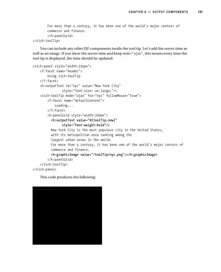
CH AP T E R 6 ■ O U TP U T CO M P O N E N TS 131
For more than a century, it has been one of the world's major centers of
commerce and finance.
</h:panelGrid>
</rich:toolTip>
You can include any other JSF components inside the tool tip. Let’s add the server time as
well as an image. If you show the server time and keep mode="ajax", this means every time the
tool tip is displayed, the time should be updated:
<rich:panel style="width:350px">
<f:facet name="header">
Using rich:toolTip
</f:facet>
<h:outputText id="nyc" value="New York City"
style="font-size: xx-large;"/>
<rich:toolTip mode="ajax" for="nyc" followMouse="true">
<f:facet name="defaultContent">
Loading...
</f:facet>
<h:panelGrid style="width:200px">
<h:outputText value="#{toolTip.now}"
style="font-weight:bold"/>
New York City is the most populous city in the United States,
with its metropolitan area ranking among the
largest urban areas in the world.
For more than a century, it has been one of the world's major centers of
commerce and finance.
<h:graphicImage value="/toolTip/nyc.png"></h:graphicImage>
</h:panelGrid>
</rich:toolTip>
</rich:panel>
This code produces the following:

132 CH AP T E R 6 ■ O U TP U T CO M P O N E N TS
Looking at the time, you will see that the time was updated. #{toolTip.now} is bound to a
getter that just returns the new time:
If you switch to mode="client", the tool tip content including the time will be prerendered
and not updated anymore.
So far, you have used the default onmouseover event; however, it’s possible to show the tool
tip on other events. The other events supported are as follows:
• onclick
• ondblclick
• onmouseout
• onmousemove
• onmouseover
Instead of onmouseover, you can ask the user click the text in order to show the tool tip and
move the mouse in order to hide the tool tip:
<rich:toolTip mode="ajax" for="nyc" followMouse="true"
showEvent="onclick" hideEvent="onmouseout">
Using <rich:toolTip> with Data Iteration Components
The <rich:toolTip> component can be useful with data iteration components. A mouse cursor
is moved over a particular row, and more information is displayed in the tool tip about that
record.
One way is to prerender the content of the tool tip for each row. You do this by setting
mode="client", as shown here:
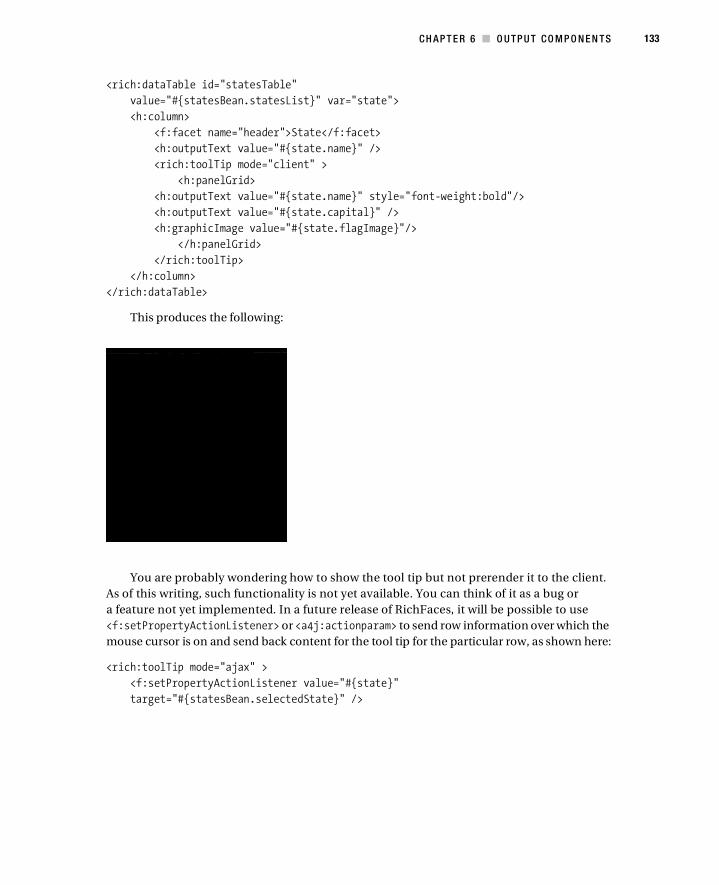
CH AP T E R 6 ■ O U TP U T CO M P O N E N TS 133
<rich:dataTable id="statesTable"
value="#{statesBean.statesList}" var="state">
<h:column>
<f:facet name="header">State</f:facet>
<h:outputText value="#{state.name}" />
<rich:toolTip mode="client" >
<h:panelGrid>
<h:outputText value="#{state.name}" style="font-weight:bold"/>
<h:outputText value="#{state.capital}" />
<h:graphicImage value="#{state.flagImage}"/>
</h:panelGrid>
</rich:toolTip>
</h:column>
</rich:dataTable>
This produces the following:
You are probably wondering how to show the tool tip but not prerender it to the client.
As of this writing, such functionality is not yet available. You can think of it as a bug or
a feature not yet implemented. In a future release of RichFaces, it will be possible to use
<f:setPropertyActionListener> or <a4j:actionparam> to send row information over which the
mouse cursor is on and send back content for the tool tip for the particular row, as shown here:
<rich:toolTip mode="ajax" >
<f:setPropertyActionListener value="#{state}"
target="#{statesBean.selectedState}" />

134 CH AP T E R 6 ■ O U TP U T CO M P O N E N TS
SummaryThis chapter covered some of the most common output components. As with any RichFaces
component, you can customize the look and feel of these components with skins. Chapter 11
in this book is dedicated to skins and skin customization. To see these and other components
in action, go to the RichFaces demo application at http://richfaces.org, and click Live Demo.

135
■ ■ ■
C H A P T E R 7
Data Iteration Components
If you know how to use the standard JSF <h:dataTable> component, then you basically know
how to use any data iteration components available in RichFaces. Of course, RichFaces offers
a number of features above what the standard data table component provides, such as skin-
nability and partial-table updates.
Let’s quickly review how the standard <h:dataTable> works. Basically, the component is
bound to a collection and iterates over the collection with the help of the var attribute value.
Using <h:column>, you can specify one or more columns depending on the properties that are
available in the object. For example:
<rich:panel style="width:500px">
<f:facet name="header"> Using h:dataTable
</f:facet>
<h:dataTable value="#{airlinesBean.airlines}" var="air">
<h:column> <f:facet name="header">
Airline name
</f:facet>
#{air.name} </h:column>
<h:column>
<f:facet name="header">
Airline code </f:facet>
#{air.code}
</h:column>
</h:dataTable></rich:panel>
airlinesBean looks like this:
public class AirlinesBean {
private List <Airline>airlines;
public List <Airline> getAirlines() {
return airlines;
}

136 CH AP T E R 7 ■ D AT A I TE R AT IO N C O M P ON E N T S
@PostConstruct
public void init () {
airlines = new ArrayList <Airline>();
airlines.add(new Airline("American Airlines", "AA"));
airlines.add(new Airline("United Airlines", "UA"));
airlines.add(new Airline("Delta", "DL"));
airlines.add(new Airline("Northwest Airlines", "NW"));
airlines.add(new Airline("US Airways", "US"));
airlines.add(new Airline("Continental", "CO"));
}
}
The Airline.java file looks like this:
public class Airline {
private String name;
private String code;
// setters and getters
}
And here is what the previous code renders:
<h:dataTable> always generates HTML <table>..</table> tags. However, when displaying a
collection, a table format is not always appropriate. You might want to display a definition list,
an ordered list, or an unordered list. That’s where RichFaces components come in.
■Note Don’t forget that all the components are skinnable and allow partial-row updating.
■Note Most screen shots in this chapter utilize the ruby skin. Chapter 11 shows how to change skins.

C HA P TE R 7 ■ D A TA IT E R A T I ON CO M P O N E N TS 137
RichFaces provides the following components to display collections:
• <rich:dataTable>
• <rich:dataDefinitionList>
• <rich:dataOrderedList>
• <rich:dataList>
• <rich:dataGrid>
All these components can be bound to the same data types as the standard <h:dataTable>
component; however, the most common object that is bound to any type of data iteration
component is java.util.List.
To show you how these components work, I’ll use the same airlines list as in the first
example.
Using <rich:dataTable><rich:dataTable> provides the same basic functionally as <h:dataTable> with additional features
such as skinnability, partial-row update, and rows and columns spans. The following code:
<rich:dataTable value="#{airlinesBean.airlines}" var="air">
<h:column>
<f:facet name="header">Airline name</f:facet>
#{air.name}
</h:column>
<h:column>
<f:facet name="header">Airline code</f:facet>
#{air.code}
</h:column>
</rich:dataTable>
produces the following:
Using <rich:dataDefinitionList><rich:dataDefintionList> will create what the name implies, an HTML data definition list. To
specify the data term, a facet named term is used in this example:

138 CH AP T E R 7 ■ D AT A I TE R AT IO N C O M P ON E N T S
<rich:panel style="width:500px">
<f:facet name="header">
Using rich:dataDefinitionList
</f:facet>
<rich:dataDefinitionList value="#{airlinesBean.airlines}" var="air">
<f:facet name="term">
#{air.code}
</f:facet>
#{air.name}, #{air.code}
</rich:dataDefinitionList>
</rich:panel>
which produces the following:
Using <rich:dataOrderedList><rich:dataOrderedList> produces an ordered list. The following code:
<rich:panel style="width:500px">
<f:facet name="header">
Using rich:dataOrderedList
</f:facet>
<rich:dataOrderedList value="#{airlinesBean.airlines}" var="air">
#{air.name}, #{air.code}
</rich:dataOrderedList>
</rich:panel>
produces the following:

C HA P TE R 7 ■ D A TA IT E R A T I ON CO M P O N E N TS 139
Using <rich:dataList><rich:dataList> produces an unordered list. The following code:
<rich:panel style="width:500px">
<f:facet name="header">
Using rich:dataList
</f:facet>
<rich:dataList value="#{airlinesBean.airlines}" var="air">
#{air.name}, #{air.code}
</rich:dataList>
</rich:panel>
produces the following:
Using <rich:dataGrid><rich:dataGrid> is a mix of <rich:dataTable> and <h:panelGrid>. While the component still
iterates over a collection, just like all other components in this chapter, an additional feature
this component provides is the ability to specify the number of columns.
For example, every two records (objects) will take up one row in the following code:
<rich:panel style="width:500px">
<f:facet name="header">
Using rich:dataGrid
</f:facet>
<rich:dataGrid value="#{airlinesBean.airlines}" var="air"
border="1" columns="2">
#{air.name}, #{air.code}
</rich:dataGrid>
</rich:panel>
which produces the following:

140 CH AP T E R 7 ■ D AT A I TE R AT IO N C O M P ON E N T S
Changing the code to columns="3" will result in the following
Also, don’t forget you can use <a4j:repeat>, which doesn’t produce any markup at all. The
following code:
<rich:panel style="width:500px">
<f:facet name="header">
Using a4j:repeat
</f:facet>
<a4j:repeat value="#{airlinesBean.airlines}" var="air" rowKeyVar="i">
#{air.name} -
#{air.code}
<h:outputText value="," rendered="#{i lt (airlinesBean.size-1)}"/>
</a4j:repeat>
</rich:panel>
produces the following:
Adding PaginationI’ve skipped the topic of pagination so far. In previous examples, the list was rather short, so it
didn’t need pagination. But I’m pretty sure you will need to use pagination in your own appli-
cation if you have a large volume of data. Fortunately, RichFaces comes with a ready component
called <rich:datascroller> that provides pagination for you.
Before you can start using pagination, you need a bigger collection than the previous
examples. Let’s use the United States state names, capitals, and flags for each state, which
means you will have 50 records:
<h:form>
<rich:panel>
<f:facet name="header">
Using rich:datascroller
</f:facet>
<rich:dataTable value="#{statesBean.statesList}" var="state">
<h:column>
<f:facet name="header">Flag</f:facet>

C HA P TE R 7 ■ D A TA IT E R A T I ON CO M P O N E N TS 141
<h:graphicImage value="#{state.flagImage}"/>
</h:column>
<h:column>
<f:facet name="header">State</f:facet>
#{state.name}
</h:column>
<h:column>
<f:facet name="header">Capital</f:facet>
#{state.capital}
</h:column>
</rich:dataTable>
</rich:panel>
</h:form>
The State class looks like this (the setters and getters are not shown):
public class State {
private String name;
private String capital;
private String flagImage;
}
Without any pagination, all 50 states are displayed (only a partial list is shown here):

142 CH AP T E R 7 ■ D AT A I TE R AT IO N C O M P ON E N T S
Using <rich:datascroller>
Suppose you want to display five or ten states at a time and be able to go see the next five and
the previous five.
To set how many states (records) display at once, you need to go back to <rich:dataTable>
and set the rows attribute. It’s the same attribute as in <h:dataTable> that specifies how many
rows to display. Keep in mind that all RichFaces data components are basically extending the
standard data table with various advanced features. For example, the following code:
<rich:dataTable value="#{statesBean.statesList}" var="state" rows="5">
produces the following:
That’s, of course, not enough because you still can’t go to the previous or next page. So, it’s
time to add <rich:datascroller>.
You can add a data scroller in many ways, but the easiest is to create a table footer and
place the scroller there:
<f:facet name="footer">
<rich:datascroller selectedStyle="font-weight:bold"/>
</f:facet>
You don’t even need to specify any attributes. Make sure you have set the rows attribute in
the table. This example also has a selectedStyle so you can easily see which page is currently
selected. In this example, page 2 is selected:

C HA P TE R 7 ■ D A TA IT E R A T I ON CO M P O N E N TS 143
You can customize how the scroller works and looks in many ways as well. The component
offers various facets to control how the first, last, next, previous, fastforward, and fastrewind
controls (and their disabled counterparts) look.
The following facets are available. You can create a facet for active (clickable) and inactive
(not clickable) controls. An inactive control is, for example, when you are looking at the last
page and the next control is disabled.
• first, first_disabled
• last, last_disabled
• next, next_disabled
• previous, previous_disabled
• fastforward, fastforward_disabled
• fastrewind, fastrewind_disabled
Here is an example redefining controls with facets:
<rich:datascroller selectedStyle="font-weight:bold">
<f:facet name="first">
<h:outputText value="First"/>
</f:facet>
<f:facet name="first_disabled">
<h:outputText value="First"/>
</f:facet>
<f:facet name="last">
<h:outputText value="Last"/>
</f:facet>
<f:facet name="last_disabled">
<h:outputText value="Last"/>
</f:facet>

144 CH AP T E R 7 ■ D AT A I TE R AT IO N C O M P ON E N T S
<f:facet name="next">
<h:outputText value="Next"/>
</f:facet>
<f:facet name="next_disabled">
<h:outputText value="Next"/>
</f:facet>
<f:facet name="previous">
<h:outputText value="Prev"/>
</f:facet>
<f:facet name="previous_disabled">
<h:outputText value="Prev"/>
</f:facet>
<f:facet name="fastforward">
<h:outputText value="FF"/>
</f:facet>
<f:facet name="fastforward_disabled">
<h:outputText value="FF"/>
</f:facet>
<f:facet name="fastrewind">
<h:outputText value="FR"/>
</f:facet>
<f:facet name="fastrewind_disabled">
<h:outputText value="FR"/>
</f:facet>
</rich:datascroller>
Here’s what the previous code produces:

C HA P TE R 7 ■ D A TA IT E R A T I ON CO M P O N E N TS 145
The previous example used text to create the controls, but it’s possible to use any other
components as well as images to create such controls.
It’s also possible to control how many page numbers are displayed by setting the maxPages
attribute:
<rich:datascroller maxPages="4" selectedStyle="font-weight:bold">
Here’s what the previous code produces:
Two additional useful attributes exist:
• pageIndexVar: Shows the current page number
• pagesVar: Shows the total number of pages
By using a facet called pages, you can show the number of pages in “pages/total pages”
format by setting the two attributes and adding the facet:
<rich:datascroller maxPages="4" selectedStyle="font-weight:bold"
pageIndexVar="currentPage" pagesVar="totalPages">
<f:facet name="pages">
#{currentPage}/#{totalPages}
</f:facet>
...
</rich:datascroller>

146 CH AP T E R 7 ■ D AT A I TE R AT IO N C O M P ON E N T S
Here’s what the previous code produces:
All examples I have shown so far placed the scroller inside the table component by using a
facet. It’s also possible to place the scroller outside the table, such as above it. In such a case,
you need to use the for attribute to point to the data table:
<rich:datascroller for="statesTable" maxPages="4"
selectedStyle="font-weight:bold" align="left">
<rich:dataTable id="statesTable" value="#{statesBean.statesList}"
var="state" rows="5">
. . .
</rich:dataTable>
Here’s what the previous code produces:

C HA P TE R 7 ■ D A TA IT E R A T I ON CO M P O N E N TS 147
Using Other Data Components with <rich:datascroller>
I have been using <rich:dataTable> to show how to use <rich:datascroller>, but you can use
<rich:datascroller> in a similar fashion with any other data iteration component.
Here is an example using <rich:dataDefinitionList> with <rich:datascroller>. Note
that the for attribute points to <rich:dataDefintionList>.
<rich:panel>
<f:facet name="header">
Using rich:datascroller
</f:facet>
<rich:dataDefinitionList id="statesTable"
value="#{statesBean.statesList}" var="state" rows="5">
<f:facet name="term">#{state.name}</f:facet>
<h:graphicImage value="#{state.flagImage}" />
#{state.capital}
</rich:dataDefinitionList>
<h:panelGrid style="text-align: left">
<rich:datascroller for="statesTable" maxPages="4"
selectedStyle="font-weight:bold"/>
</h:panelGrid>
</rich:panel>
Here’s what the previous code produces:
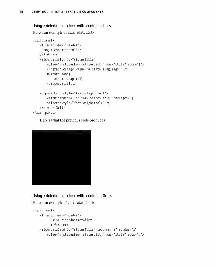
148 CH AP T E R 7 ■ D AT A I TE R AT IO N C O M P ON E N T S
Using <rich:datascroller> with <rich:dataList>
Here’s an example of <rich:dataList>:
<rich:panel>
<f:facet name="header">
Using rich:datascroller
</f:facet>
<rich:dataList id="statesTable"
value="#{statesBean.statesList}" var="state" rows="5">
<h:graphicImage value="#{state.flagImage}" />
#{state.name},
#{state.capital}
</rich:dataList>
<h:panelGrid style="text-align: left">
<rich:datascroller for="statesTable" maxPages="4"
selectedStyle="font-weight:bold" />
</h:panelGrid>
</rich:panel>
Here’s what the previous code produces:
Using <rich:datascroller> with <rich:dataGrid>
Here’s an example of <rich:dataGrid>:
<rich:panel>
<f:facet name="header">
Using rich:datascroller
</f:facet>
<rich:dataGrid id="statesTable" columns="3" border="1"
value="#{statesBean.statesList}" var="state" rows="9">

C HA P TE R 7 ■ D A TA IT E R A T I ON CO M P O N E N TS 149
<h:panelGrid>
<h:outputText value="#{state.name},"/>
<h:outputText value="#{state.capital}"/>
<h:graphicImage value="#{state.flagImage}" />
</h:panelGrid>
</rich:dataGrid>
<h:panelGrid style="text-align: left">
<rich:datascroller for="statesTable" maxPages="4"
selectedStyle="font-weight:bold" />
</h:panelGrid>
</rich:panel>
Here’s what the previous code produces:
Using JavaScript EventsData iteration components also provide numerous JavaScript events. You can use these events
to send an Ajax request to the server with the help of the <a4j:support> component. For example,
looking at <rich:dataTable>, the component exposes the following events:
• onclick
• ondblclick
• onkeydown
• onkeypress
• onkeyup
• onmousedown
• onmousemove
150 CH AP T E R 7 ■ D AT A I TE R AT IO N C O M P ON E N T S
• onmouseout
• onmouseover
• onmouseup
• onRowClick
• onRowDblClick
• onRowMouseDown
• onRowMouseMove
• onRowMouseOut
• onRowMouseOver
• onRowMouseUp
The following table takes a data table component and enables it so that when a row is
clicked, details of that row (object) are displayed below the table:
<h:form>
<rich:panel style="width:250px">
<rich:dataTable value="#{airlinesBean.airlines}" var="air">
<a4j:support event="onRowClick">
<f:setPropertyActionListener value="#{air}"
target="#{airlinesBean.selected}" />
</a4j:support>
<h:column>
<f:facet name="header">Airline name</f:facet>
#{air.name}
</h:column>
<h:column>
<f:facet name="header">Airline code</f:facet>
#{air.code}
</h:column>
</rich:dataTable>
</rich:panel>
<rich:spacer height="20" />
<a4j:outputPanel ajaxRendered="true">
<rich:panel style="width:250px"
rendered="#{not empty airlinesBean.selected}">
<h:outputText
value="#{airlinesBean.selected.name}, #{airlinesBean.selected.code}" />
</rich:panel>
</a4j:outputPanel>
</h:form>

C HA P TE R 7 ■ D A TA IT E R A T I ON CO M P O N E N TS 151
Here’s what the previous code produces:
The main idea is to use the <a4j:support> component to add the onRowClick event.
When a row is clicked, an Ajax request is sent, and the current row object is set into the
#{airlinesBean.selected} property via the <f:setPropertyActionListener> listener. You
could have used the reRender attribute and instead used <a4j:outputPanel> with
ajaxRendered="true", which means the details will always be rendered when not empty.
Performing Partial-Component Data UpdatesOne of the key features that all data iteration components have is the ability to update only specific
rows instead of the whole component if data changes. I’ll cover show that’s done in this section.
Here is how the page looks in a web browser. You can click an edit link in each cell, change
that particular record, and update only that data cell in the browser. Updating the whole compo-
nent is simple, but say you want to be able to update only the particular record you modified.
Also, just to keep things simple, let’s use random names and just use the name [email protected]
instead. Here’s what the example looks like:
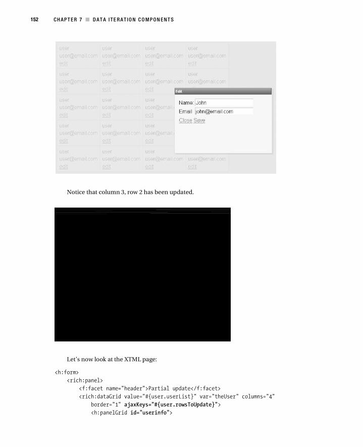
152 CH AP T E R 7 ■ D AT A I TE R AT IO N C O M P ON E N T S
Notice that column 3, row 2 has been updated.
Let’s now look at the XTML page:
<h:form>
<rich:panel>
<f:facet name="header">Partial update</f:facet>
<rich:dataGrid value="#{user.userList}" var="theUser" columns="4"
border="1" ajaxKeys="#{user.rowsToUpdate}">
<h:panelGrid id="userinfo">

C HA P TE R 7 ■ D A TA IT E R A T I ON CO M P O N E N TS 153
<h:outputText value="#{theUser.name}" />
<h:outputText value="#{theUser.email}" />
<a4j:commandLink value="edit"
onclick="#{rich:component('modalPanel')}.show()"
reRender="edituserinfo">
<f:setPropertyActionListener value="#{theUser}"
target="#{user.selectedUser}" />
</a4j:commandLink>
</h:panelGrid>
</rich:dataGrid>
</rich:panel>
</h:form>
<rich:modalPanel id="modalPanel">
<f:facet name="header">Edit</f:facet>
<a4j:keepAlive beanName="user" />
<h:form>
<h:panelGrid id="edituserinfo" columns="2">
<h:outputText value="Name:" />
<h:inputText value="#{user.selectedUser.name}" />
<h:outputText value="Email" />
<h:inputText value="#{user.selectedUser.email}" />
</h:panelGrid>
<h:panelGrid columns="2">
<a4j:commandLink value="Close"
onclick="#{rich:component('modalPanel')}.hide()" />
<a4j:commandLink value="Save" actionListener="#{user.updateUser}"
oncomplete="#{rich:component('modalPanel')}.hide()"
reRender="userinfo" />
</h:panelGrid>
</h:form>
</rich:modalPanel>
<rich:panelGrid> is used to render the data; however, you could use any other data
component.
<rich:modalPanel> is used to edit the record.
ajaxKeys points to the row to be updated. Its value is set inside the user.updateUser action
listener.
With this kind of partial update, you need to specify the columns to be updated as well
as the row or rows to update. In this case, you have one column, defined by <h:panelGird
id="userinfo"/>. That’s the reason you have reRender="userinfo" when the Save link is clicked. If
you needed to update more than one column, you would add IDs of columns to be rerendered.
Next, you have to specify what row to update. You use <f:setPropertyActionListener> to
pass in the object you selected for editing. Let’s now look inside the managed bean to see how
you set the row to be updated:

154 CH AP T E R 7 ■ D AT A I TE R AT IO N C O M P ON E N T S
public class UserBean {
private List <User>userList;
private User selectedUser;
private Set <Integer>rowsToUpdate;
public User getSelectedUser() {
return selectedUser;
}
public void setSelectedUser(User selectedUser) {
this.selectedUser = selectedUser;
}
public List <User> getUserList() {
return userList;
}
public void updateUser (ActionEvent event){
int index = userList.indexOf(selectedUser);
rowsToUpdate.add(index);
}
@PostConstruct
public void init () {
userList = new ArrayList <User>();
for (int i=0; i<20; i++){
userList.add(new User("user","[email protected]"));
}
rowsToUpdate = new HashSet <Integer>();
}
public Set<Integer> getRowsToUpdate() {
return rowsToUpdate;
}
}
selectedUser is the object you selected to edit. You then determine what the index of that
object in the list is and add it to rowsToUpdate. rowsToUpdate is bound to ajaxKeys, which deter-
mines which rows to update.
There is one more thing to mention. The property bound to ajaxKeys (rowsToUpdate in this
example) has to be in a request-scoped bean or needs to be cleared in code; otherwise, the
property will continue to grow and contain previous rows. In this example, you use a request-
scoped bean.
The User class is rather simple. It just has two properties, name and email, so I won’t show
them here.
C HA P TE R 7 ■ D A TA IT E R A T I ON CO M P O N E N TS 155
Creating Column and Row SpansOne notable feature that is missing from the standard data table is the ability to do column and
row spans. Luckily, RichFaces provides this functionality.
Spanning Columns
By itself, <rich:column> is not much different from <h:column>. The following will produce the
same result if you used <h:column>:
<rich:dataTable value="#{statesBean.statesList}"
var="state" border="1">
<rich:column>
<h:graphicImage value="#{state.flagImage}" />
</rich:column>
<rich:column>
#{state.name}
</rich:column>
<rich:column>
#{state.capital}
</rich:column>
</rich:dataTable>
Suppose you want the flag image to span two columns, like this:
156 CH AP T E R 7 ■ D AT A I TE R AT IO N C O M P ON E N T S
Here’s the code you would use:
<rich:dataTable value="#{statesBean.statesList}"
var="state" border="1">
<rich:column colspan="2">
<h:graphicImage value="#{state.flagImage}" />
</rich:column>
<rich:columnGroup>
<rich:column>
#{state.name}
</rich:column>
<rich:column>
#{state.capital}
</rich:column>
</rich:columnGroup>
</rich:dataTable>
For the column that contains the flag image, you have added the colspan="2" attribute in
this code. You wrapped the other two columns inside <rich:columnGroup>. This tag will combine
the columns that are inside and put them into a new row (equivalent to the <tr> tag). Basically,
you took one record and put it into two rows.
Another way to combine columns is to use <rich:column breakBefore="true"> instead of
<rich:columnGroup>. Both are the same thing but just with different markup. For example:
<rich:dataTable value="#{statesBean.statesList}" var="state"
border="1">
<rich:column colspan="3">
<h:graphicImage value="#{state.flagImage}" />
</rich:column>
<rich:column breakBefore="true">
#{state.name}
</rich:column>
<rich:column>
#{state.capital}
</rich:column>
</rich:dataTable>
breakBefore="true" means start a new row at this column.
Spanning Rows
It’s also very simple to span rows. The following code:
<h:panelGrid columns="2">
<rich:dataTable value="#{statesBean.statesList}" var="state"
border="1">

C HA P TE R 7 ■ D A TA IT E R A T I ON CO M P O N E N TS 157
<rich:column rowspan="2">
<h:graphicImage value="#{state.flagImage}" />
</rich:column>
<rich:column>
#{state.name}
</rich:column>
<rich:column breakBefore="true">
#{state.capital}
</rich:column>
</rich:dataTable>
produces the following:
First, you add rowspan="2" to the flag column. Then, to place the other two cells in the
same column but in two rows, you use breakBefore="true" again. This means the next column
will start in a new row.
You can achieve an identical result by using <rich:columnGroup> instead of
breakBefore="true", like so:
<rich:dataTable value="#{statesBean.statesList}" var="state"
border="1">
<rich:column rowspan="2">
<h:graphicImage value="#{state.flagImage}" />
</rich:column>
<rich:column>
#{state.name}
</rich:column>

158 CH AP T E R 7 ■ D AT A I TE R AT IO N C O M P ON E N T S
<rich:columnGroup>
<rich:column breakBefore="false">
#{state.capital}
</rich:column>
</rich:columnGroup>
</rich:dataTable>
Both <rich:columnGroup> and breakBefore="true" provide the same functionality. When
used, the next column will start at a new row. It really comes down to preference in how the
markup of the page looks.
SummaryThis chapter introduced various data iteration components from the most basic <a4j:repeat>,
which doesn’t produce any markup, to components such as <rich:dataGrid>. One unique
feature that all data iteration components have is partial-table update, where you can specify
which specific row(s) to update. The look and feel of all components can be greatly customized
via skins, which are covered in Chapter 11. Finally, the <rich:scrollableDataTable> compo-
nent is covered in Chapter 10.
159
■ ■ ■
C H A P T E R 8
Selection Components
The selection components in this chapter provide various controls for selecting values from a
defined list of values.
■Note The component screen shots in this chapter are based on the blueSky and deepMarine skins. I cover
skins in Chapter 11.
Using <rich:pickList><rich:pickList> allows you to select items and move them from one list to another. This compo-
nent is virtually identical to the standard <h:selectManyMenu> and <h:selectManyListbox>
components, both of which also allow you to select one or more values and save them into a
list. If you have used the Eclipse WTP plug-in to deploy projects, the Add and Remove Projects
Wizard has a similar view where you can deploy/undeploy projects:

160 CH AP T E R 8 ■ SE L E CT IO N CO M P ON E N T S
The following code:
<rich:pickList value="#{pickList.fruitsList}">
<f:selectItem itemValue="apple" itemLabel="Apple" />
<f:selectItem itemValue="banana" itemLabel="Banana" />
<f:selectItem itemValue="pear" itemLabel="Pear" />
<f:selectItem itemValue="orange" itemLabel="Orange" />
<f:selectItem itemValue="grapes" itemLabel="Grapes" />
<f:selectItem itemValue="watermelon" itemLabel="Watermelon" />
<f:selectItem itemValue="kiwi" itemLabel="Kiwi" />
<f:selectItem itemValue="grapes" itemLabel="Grapes" />
<f:selectItem itemValue="strawberries" itemLabel="Strawberries" />
</rich:pickList>
</rich:panel>
produces the following:
As with <h:selectManyListbox>, <f:selectItem> is used to create the list. In the same
fashion, you can use <f:selectItems>. All the standard rules apply here as well. For example, if
you want to display a custom object, you will need to write a converter. Custom objects require
a converter because they are represented as text in the browser. When the page is submitted,
the text-based representation has to be converted to a custom object type. This is exactly what
the converter does. It also converts the object to a text-based representation to be shown in a
browser (when the page is rendered).
The value attribute of a <rich:pickList> has to be bound to an object that can hold multiple
objects because it’s possible to select more than one value. The value can be bound to a list, an
array of strings, or an array of primitives (which is the same as the standard components).
On the right side are the values that are currently selected. If any of the values from the list
are equal to the initial value of the value attribute of the <rich:pickList> component (or if any
are found in the list/array provided by the value attribute), those values are selected by default
and will be shown on the right side.
The following code:
<rich:pickList value="#{pickList.fruitsList}">
...
</rich:pickList>
private String [] fruitsList = new String [] {"apple", "grapes"};

C HA P TE R 8 ■ S E L E C T I ON CO M P O N E N TS 161
produces the following:
To customize the labels on the buttons, you can use the following attributes:
• copyAllControlLabel
• copyControlLabel
• removeControlLabel
• removeAllControlLabel
You can use facets to further customize the controls. One thing to keep in mind is that for
each control, you need to define two facets: one for the label and one for the label when it’s
disabled. The facets’ names are as follows:
• copyAllControl
• copyAllControlDisabled
• removeAllControl
• removeAllControlDisabled
• copyControl
• copyControlDisabled
• removeControl
• removeControlDisabled
The following code:
<rich:pickList value="#{pickList.fruitsList}"
copyAllControlLabel="Add All"
copyControlLabel="Add"
removeControlLabel="Delete"
removeAllControlLabel="Delete All">
<f:selectItem itemValue="apple" itemLabel="Apple" />

162 CH AP T E R 8 ■ SE L E CT IO N CO M P ON E N T S
<f:selectItem itemValue="banana" itemLabel="Banana" />
<f:selectItem itemValue="pear" itemLabel="Pear" />
<f:selectItem itemValue="orange" itemLabel="Orange" />
<f:selectItem itemValue="grapes" itemLabel="Grapes" />
<f:selectItem itemValue="watermelon" itemLabel="Watermelon" />
<f:selectItem itemValue="kiwi" itemLabel="Kiwi" />
<f:selectItem itemValue="blackberries" itemLabel="Blackberries" />
<f:selectItem itemValue="strawberries" itemLabel="Strawberries" />
</rich:pickList>
produces the following:
To turn off the labels on the buttons, set the following:
showButtonsLabel="false"
to produce this:
Setting the following:
switchByClick="true"
will enable you to move values by just clicking them. Double-clicking works by default otherwise.
Besides supporting some of the standard events such as onclick and onchange, the compo-
nent also supports onlistchange. With onlistchange, you can use <a4j:support> to fire an Ajax
request when the list changes.
In the following code, every time a fruit is either added to or removed from the list, the fruit
salad list is updated:

C HA P TE R 8 ■ S E L E C T I ON CO M P O N E N TS 163
<rich:panel> <f:facet name="header"> Using rich:pickList </f:facet> <h:panelGrid columns="2"> <rich:pickList value="#{pickList.fruitsList}" copyAllControlLabel="Add All" copyControlLabel="Add" removeControlLabel="Delete" removeAllControlLabel="Delete All" showButtonsLabel="true"> <a4j:support event="onlistchanged" reRender="salad"/> <f:selectItem itemValue="apple" itemLabel="Apple" /> <f:selectItem itemValue="banana" itemLabel="Banana" /> <f:selectItem itemValue="pear" itemLabel="Pear" /> <f:selectItem itemValue="orange" itemLabel="Orange" /> <f:selectItem itemValue="grapes" itemLabel="Grapes" /> <f:selectItem itemValue="watermelon" itemLabel="Watermelon" /> <f:selectItem itemValue="kiwi" itemLabel="Kiwi" /> <f:selectItem itemValue="blackberries" itemLabel="Blackberries" /> <f:selectItem itemValue="strawberries" itemLabel="Strawberries" /> </rich:pickList> <rich:panel id="salad" style="height:130px"> <f:facet name="header"> Fruit salad </f:facet> <a4j:repeat value="#{pickList.fruitsList}" var="fruit"> #{fruit}<br/> </a4j:repeat> </rich:panel> </h:panelGrid></rich:panel>
The previous code produces the following:
<a4j:repeat> is used to display the select items. Of course, you can use any other data iter-
ation component as well.
Keep in mind that when using custom objects, you need to specify a converter to convert
the text representation of the object to an actual custom object.

164 CH AP T E R 8 ■ SE L E CT IO N CO M P ON E N T S
The component has a fully customizable look and feel via skinnability and redefining the
CSS class. Please see the Developer Guide (http://www.jboss.org/jbossrichfaces/docs/) for
information on look-and-feel customization.
Using <rich:orderingList><rich:orderingList> basically works like a data table component with a few additional features
such as the ability to reorder the items in the list. The reorder is happening on the client; however,
when the page is submitted, the order on the client will be set into the list property in the
managed bean. When using custom objects, the list items (values) will need to be converted to
objects via a custom converter. Keep in mind that values on the page appear as simple strings.
The following is an example of the <rich:orderingList> component:
As I just said, if you know how to use <h:dataTable> or <rich:dataTable>, then you already
know how to use this component. To start using the component, all you need is some sort of
collection of objects. For this component, let’s use a list of the seven ancient wonders of the world:
Notice the controls on the right. It’s possible to reorder the items in the list. Suppose you
want to move the currently selected wonder to the top of the list. With just a simple click of the
First button, you will end up with this:

C HA P TE R 8 ■ S E L E C T I ON CO M P O N E N TS 165
Keep in mind that reordering is done on the client (the browser). The new order will be
sent to the server only if the form is submitted. You’ll see how it’s done a little bit later.
The page looks like this:
<rich:panel> <f:facet name="header"> Using rich:orderingList </f:facet> <rich:orderingList id="list" value="#{worldWondersBean.ancientWonders}" var="wonder" listWidth="350"> <h:column> <f:facet name="header">Name</f:facet> #{wonder.name} </h:column> <h:column> <f:facet name="header">Location (present)</f:facet> #{wonder.location} </h:column> </rich:orderingList></rich:panel>
As you can see, it looks very much like any other data iteration component. The value attri-
bute points to a property of type list, and then you simply use <h:column> or <rich:column> to
define the columns for the list.
The managed bean looks like this:
public class WorldWondersBean {
private List <Wonder> ancientWonders;
public List<Wonder> getAncientWonders() {
return ancientWonders;
}
public void setAncientWonders(List<Wonder> ancientWonders) {
this.ancientWonders = ancientWonders;
}
@PostConstruct
public void init () {

166 CH AP T E R 8 ■ SE L E CT IO N CO M P ON E N T S
ancientWonders = new ArrayList <Wonder>();
ancientWonders.add(new Wonder ("Great Pyramid of Giza", "Egypt"));
ancientWonders.add(new Wonder ("Hanging Gardens of Babylon", "Iraq"));
ancientWonders.add(new Wonder ("Statue of Zeus at Olympia", "Greece"));
ancientWonders.add(new Wonder ("Temple of Artemis at Ephesus", "Turkey"));
ancientWonders.add(new Wonder ("Mausoleum of Maussollos at Halicarnassus",
"Turkey"));
ancientWonders.add(new Wonder ("Colossus of Rhodes",
"Greek island of Rhodes"));
ancientWonders.add(new Wonder ("Lighthouse of Alexandria",
"Egypt"));
}
Here’s the Wonder class:
package example.wonders;
public class Wonder {
private String name;
private String location;
// setters and getters
public Wonder(String name, String location) {
super();
this.name = name;
this.location = location;
}
public String toString () {
return name+":"+location;
}
}
Using the keyboard (pressing Ctrl, Shift, or Shift+A), you can select one or more items. Once
the items are selected, use the button to reorder the list.
When the page is displayed for the first time, you can set which items are selected by default
via the selection attribute:
<rich:orderingList id="list" value="#{worldWondersBean.ancientWonders}"
var="wonder" listWidth="350" selection="#{worldWondersBean.selected}">
...
</rich:orderingList>
The selection attribute must point to java.util.Set and hold the items to be selected:

C HA P TE R 8 ■ S E L E C T I ON CO M P O N E N TS 167
selected = new HashSet <Wonder>();
selected.add(new Wonder ("Hanging Gardens of Babylon", "Iraq"));
selected.add(new Wonder ("Colossus of Rhodes", "Greek island of Rhodes"));
You also use the selection attribute to hold the selected values when the page is submitted.
You can see that two items are now selected when the page is displayed for the first time.
The deepMarine skin is now used.
You also need to override the equals() and hashCode() methods on the Wonder bean in
order for this to work.
To add a caption or label at the top of the list, use the caption facet:
<f:facet name="caption">
7 Wonders of the Ancient World
</f:facet>
This produces the following:
To change the labels on buttons, use the following attributes:
• topControlLabel
• bottomControlLabel
• upControlLabel
• downControlLabel

168 CH AP T E R 8 ■ SE L E CT IO N CO M P ON E N T S
For example, the following code:
<rich:orderingList id="list" value="#{worldWondersBean.ancientWonders}" var="wonder" listWidth="350" selection="#{worldWondersBean.selected}" controlsHorizontalAlign="left" controlsVerticalAlign="bottom">...</rich:orderingList>
produces the following:
The control buttons can be positioned on the left side and also aligned vertically:
<rich:orderingList id="list" value="#{worldWondersBean.ancientWonders}"
var="wonder" listWidth="350"
selection="#{worldWondersBean.selected}"
controlsHorizontalAlign="left"
controlsVerticalAlign="bottom">
The following are possible values for the controlsHorizontalAlign attribute:
• right (default)
• left
• center
The following are possible values for the controlsVerticalAlign attribute:
• top
• bottom
• center (default)
To completely replace the buttons with custom controls, use the following facets:
• topControl
• topControlDisabled

C HA P TE R 8 ■ S E L E C T I ON CO M P O N E N TS 169
• bottomControl
• bottomControlDisabled
• upControl
• upControlDisabled
• downControl
• downControlDisabled
When completely overriding the controls, you have to use the built-in JavaScript API to
order the list. For example:
<f:facet name="topControl"> <h:outputLink value="#" onclick="#{rich:component('list')}.Top();return false;"> [First] </h:outputLink></f:facet>
This creates a custom control to move the value(s) to the top of the list (return false is
added in order to prevent the page from scrolling up when the button is clicked). When using
a facet, any complex content can be used to create the control. You can find additional API
methods in the Developer Guide.
I’m almost done covering this component. The most interesting part might be how to use
this component when submitting a form. In other words, you can reorder the items in the list
and submit the form, and the order you set will be set into the managed bean property. To see
how this works, I’ll show an example that will reorder the items in the component, submit the
form, and show how the values are updated on the server.
Because it is likely that you’ll use custom objects in the list, you need to create a custom
converter to convert the values from strings to custom object types. Additionally, the equals()
and hashCode() methods need to be overridden in the Wonder class. That’s basically it.
Here’s the second list you’ve created:
Because the reorder happens only on the client, once you click Submit and rerender the
second list, you should see the updated order. Let’s select the last two wonders and move them
all the way to the top.
170 CH AP T E R 8 ■ SE L E CT IO N CO M P ON E N T S
This is how it looks once you have reordered on the client, before clicking Submit:
And this is how it looks after clicking Submit:
The following code defines a converter and the second list:
<rich:panel> <f:facet name="header"> Using rich:orderingList </f:facet> <h:panelGrid columns="2"> <h:panelGrid> <rich:orderingList id="list" value="#{worldWondersBean.ancientWonders}" var="wonder" listWidth="350" converter="wonderConverter"> <f:facet name="caption"> 7 Wonders of the Ancient World </f:facet> <h:column> <f:facet name="header">Name</f:facet> #{wonder.name} </h:column>
C HA P TE R 8 ■ S E L E C T I ON CO M P O N E N TS 171
<h:column> <f:facet name="header">Location (present)</f:facet> #{wonder.location} </h:column> </rich:orderingList> <a4j:commandButton value="Submit" reRender="wonderList"/> </h:panelGroup> <rich:dataOrderedList value="#{worldWondersBean.ancientWonders}" var="wonder" id="wonderList"> #{wonder.name}, #{wonder.location} </rich:dataOrderedList> </h:panelGrid></rich:panel>
The key is to create a converter. For the other list, you use the <rich:dataOrderedList>
component that I have already covered.
The converter for the Wonder class might look like this:
public class WonderConverter
implements javax.faces.convert.Converter{
public Object getAsObject(FacesContext context, UIComponent component,
String value) {
String[] words = value.split (":");
String name = words[0];
String location = words[1];
Wonder wonder = new Wonder(name, location);
return wonder;
}
public String getAsString(FacesContext context, UIComponent component,
Object value) {
return value.toString();
}
}
172 CH AP T E R 8 ■ SE L E CT IO N CO M P ON E N T S
■Note For simplicity, the converter omits code to check whether the value object in the getAsObject(...)
and getAsString(...) methods is null. Please refer to the Converter API documentation for more information.
The converter is also registered in the JSF configuration file with an ID of wonderConverter.
The toString() method in Wonder looks like this:
public String toString () {
return name+":"+location;
}
And finally, the equals() and hashCode() methods in the Wonder class need to be overridden.
You can use Eclipse, for example, to generate these methods:
@Override
public int hashCode() {
final int prime = 31;
int result = 1;
result = prime * result
+ ((location == null) ? 0 : location.hashCode());
result = prime * result + ((name == null) ? 0 : name.hashCode());
return result;
}
@Override
public boolean equals(Object obj) {
if (this == obj)
return true;
if (obj == null)
return false;
if (getClass() != obj.getClass())
return false;
final Wonder other = (Wonder) obj;
if (location == null) {
if (other.location != null)
return false;
} else if (!location.equals(other.location))
return false;
if (name == null) {
if (other.name != null)
return false;
} else if (!name.equals(other.name))
return false;
return true;
}
C HA P TE R 8 ■ S E L E C T I ON CO M P O N E N TS 173
To take this one step further, instead of having to click a button each time, the component
supports the onorderchanged event that allows you to use the <a4j:support> component. This
way, every time the order is changed, an Ajax request will be fired, and the list will be updated
accordingly.
<rich:orderingList id="list" value="#{worldWondersBean.ancientWonders}" var="wonder" listWidth="350" converter="wonderConverter"> <a4j:support event="onorderchanged" reRender="wonderList"/> <f:facet name="caption"> 7 Wonders of the Ancient World </f:facet>...</rich:orderingList>
Using <rich:listShuttle><rich:listShuttle> is basically a combination of <rich:pickList> and <rich:orderingList>.
You can move items from one list to another and also reorder the target (right) list. As you may
remember, the <rich:orderedList> component works just like a data table component; this
one is basically the same thing. It’s a mix between table-like and select-like components.
You can display as many columns as you need and move the items between the two lists.
The moving and reordering are still done on the client. You will see later that you can as easily
submit the selected items. Because you are working with a custom object (the Airline object)
in this example, you need to write a converter to convert from text-based representation to
object and override equals() and hashCode() methods on the custom object.
As you can see, both lists can have a caption above them. The controls to move items from
one list to another and reorder the list can be rearranged via component attributes. If you want
to completely override the buttons, you can use facets. When using facets, you must use the
component’s built-in JavaScript API to move or reorder items in the lists.
Let’s look at an example where you can move items, rearrange them, and then submit the
changes. Clicking Update will submit the values in the My Favorite Airlines list and rerender
the selection to the right of the component using the <rich:dataGrid> component.

174 CH AP T E R 8 ■ SE L E CT IO N CO M P ON E N T S
Most of the code should look very familiar to you by now:
<rich:panel>
<f:facet name="header">
Using rich:listShuttle
</f:facet>
<h:panelGrid columns="2">
<h:panelGroup>
<rich:listShuttle sourceValue="#{airBean.airlines}"
targetValue="#{airBean.target}" var="air"
converter="airlineConverter" sourceListWidth="220"
targetListWidth="220">
<f:facet name="sourceCaption">
Major U.S based airlines
</f:facet>
<f:facet name="targetCaption">
My favorite airlines
</f:facet>
<h:column>
<f:facet name="header">Name</f:facet>
#{air.name}
</h:column>
<h:column>
<f:facet name="header">Code</f:facet>
#{air.code}
</h:column>
<h:column>
<f:facet name="header">Logo</f:facet>
<h:graphicImage value="#{air.logoImage}"
width="39" height="32" />
</h:column>

C HA P TE R 8 ■ S E L E C T I ON CO M P O N E N TS 175
</rich:listShuttle>
<a4j:commandButton value="Update" reRender="selectedAirlines" />
</h:panelGroup>
<rich:dataGrid id="selectedAirlines" columns="3"
value="#{airBean.target}" var="air">
#{air.code}<br />#{air.name}<br />
<h:graphicImage value="/images/air.jpg" width="39" height="32" />
</rich:dataGrid>
</h:panelGrid>
</rich:panel>
There are two lists now: one for the source (left list) and one for the target (right list). Both
are bound to a collection (list).
Because you are using a custom object (Airline), you need to use a converter (don’t forget
to override equals() and hashCode() on the custom object).
Although you can use facets to define labels above the lists, you can also use the attributes
sourceCaptionLabel and targetCaptionLabel.
Select United Airlines and Delta, move them to the right list, and click Update:
Select Continental, and move it to the top of the list; then click Update:

176 CH AP T E R 8 ■ SE L E CT IO N CO M P ON E N T S
Select Delta (from the right), move it to the top, and click Update:
Here’s the AirlinesBean class:
public class AirlinesBean {
private List<Airline> airlines;
private List<Airline> target;
public List<Airline> getTarget() {
return target;
}
public void setTarget(List<Airline> target) {
this.target = target;
}
public List<Airline> getAirlines() {
return airlines;
}
@PostConstruct
public void init() {
airlines = new ArrayList<Airline>();
airlines.add(new Airline("American Airlines", "AA"));
airlines.add(new Airline("United Airlines", "UA"));
airlines.add(new Airline("Delta", "DL"));
airlines.add(new Airline("Northwest Airlines", "NW"));
airlines.add(new Airline("US Airways", "US"));
airlines.add(new Airline("Continental", "CO"));
airlines.add(new Airline("JetBlue", "B9"));
airlines.add(new Airline("Alaska Airlines", "AS"));
airlines.add(new Airline("SouthWest Airlines", "SWA"));
C HA P TE R 8 ■ S E L E C T I ON CO M P O N E N TS 177
}
public int getSize() {
return this.airlines.size();
}
public void setAirlines(List<Airline> airlines) {
this.airlines = airlines;
}
}
Here’s the AirlineConverter class:
public class AirlineConverter
implements javax.faces.convert.Converter{
public Object getAsObject(FacesContext context, UIComponent component,
String value) {
String[] words = value.split (":");
String name = words[0];
String code = words[1];
Airline airline = new Airline(name, code);
return airline;
}
public String getAsString(FacesContext arg0, UIComponent arg1, Object value) {
return value.toString();
}
}
■Note For simplicity, the converter omits code to check whether the value object in the getAsObject(...)
and getAsString(...) methods is null. Please refer to the Converter API documentation for more information.
Here’s the Airline class:
public class Airline
implements java.io.Serializable{
private String name;
private String code;

178 CH AP T E R 8 ■ SE L E CT IO N CO M P ON E N T S
private String logoImage;
// setters and getters omitted for clarity
public Airline(String name, String code) {
super();
this.name = name;
this.code = code;
this.logoImage = "/images/air.jpg";
}
public String toString () {
return name+":"+code;
}
@Override
public int hashCode() {
final int prime = 31;
int result = 1;
result = prime * result + ((code == null) ? 0 : code.hashCode());
result = prime * result
+ ((logoImage == null) ? 0 : logoImage.hashCode());
result = prime * result + ((name == null) ? 0 : name.hashCode());
return result;
}
@Override
public boolean equals(Object obj) {
if (this == obj)
return true;
if (obj == null)
return false;
if (getClass() != obj.getClass())
return false;
final Airline other = (Airline) obj;
if (code == null) {
if (other.code != null)
return false;
} else if (!code.equals(other.code))
return false;
if (logoImage == null) {
if (other.logoImage != null)
return false;
} else if (!logoImage.equals(other.logoImage))
return false;
C HA P TE R 8 ■ S E L E C T I ON CO M P O N E N TS 179
if (name == null) {
if (other.name != null)
return false;
} else if (!name.equals(other.name))
return false;
return true;
}
}
Instead of clicking the Update button, two events are available to fire an Ajax request auto-
matically for either the onlistchanged or onorderchanged event. The first one fires when you
move items from one list to another, while the second event fires when reordering the items.
<rich:listShuttle sourceValue="#{airBean.airlines}"
targetValue="#{airBean.target}" var="air"
converter="airlineConverter" sourceListWidth="220"
targetListWidth="220"
sourceSelection="#{airBean.selected}">
<a4j:support event="onlistchanged" reRender="selectedAirlines"/>
<a4j:support event="onorderchanged" reRender="selectedAirlines"/>
. . .
The Developer Guide lists all the other available events such as onclick, oncopyclick,
oncopyallclick, and more.
To have some airlines selected when the page is displayed for the first time, set the
sourceSelection attribute to hold the objects to be selected. One thing to keep in mind is
that sourceSelection has to be bound to a Set object. For the target side, the targetSource
attribute provides the same functionality.
The selection attribute is also used to hold the selected values when the page is submitted:
<rich:listShuttle sourceValue="#{airBean.airlines}" targetValue="#{airBean.target}" var="air" converter="airlineConverter" sourceListWidth="220" targetListWidth="220" sourceSelection="#{airBean.selected}">...</rich:listShuttle>
...selected = new HashSet<Airline>();selected.add(new Airline("United Airlines", "UA"));selected.add(new Airline("Delta", "DL"));...
This results in airlines in the set being selected in the page:

180 CH AP T E R 8 ■ SE L E CT IO N CO M P ON E N T S
Before I end this chapter, I’ll mention two more attributes: sourceRequired and
targetRequired. When either the source or target lists cannot be empty, these two attributes
exist to enforce that requirement. When sourceRequired is set to true, the left list can’t be
empty when the form is submitted, or validation will fail. In other words, you can’t move all
values to the right side. The targetRequred attribute works the same way but for the right side.
SummaryIn this chapter, I have shown you how to use various selection components in RichFaces. In
this chapter as well as in others, you are still using basic RichFaces concepts to send and rerender
various parts of the page. As with all other RichFaces components, these components can be
greatly customized via component-defined facets and of course skinnability. Skinnability is
covered in Chapter 11. Finally, keep in mind that most components also offer client-side
JavaScript. For JavaScript API, please refer to the Developer Guide at http://www.jboss.org/
jbossrichfaces/docs/.

181
■ ■ ■
C H A P T E R 9
Menu Components
In this chapter, you’ll explore menu components available in RichFaces. First I’ll first cover a
drop-down menu component, and then I’ll show you a context menu component. The context
menu component will enable you to right-click an element on the page to display a menu.
■Note Component images in this chapter use a slightly customized ruby skin with a larger general font
size. Using skins is covered in Chapter 11.
Using <rich:dropDownMenu><rich:dropDownMenu> produces a drop-down menu, as shown here:
Of course, with every menu item you can associate a particular action or action listener to
be invoked via Ajax. All the standard Ajax concepts apply here as well, such as reRender.
The code to create this menu looks rather simple:
<h:form>
<rich:toolBar>
<rich:dropDownMenu>
<f:facet name="label">
<h:outputText value="File" />
</f:facet>
<rich:menuItem submitMode="ajax" value="New"/>
<rich:menuItem submitMode="ajax" value="Open File..."/>
<rich:menuItem submitMode="ajax" value="Close"/>
<rich:menuItem submitMode="ajax" value="Close All"/>
</rich:dropDownMenu>

182 CH AP T E R 9 ■ M E N U CO M P O N E N TS
<rich:dropDownMenu>
<f:facet name="label">
<h:outputText value="Edit" />
</f:facet>
<rich:menuItem submitMode="ajax" value="Undo"/>
</rich:dropDownMenu>
<rich:dropDownMenu>
<f:facet name="label">
<h:outputText value="Help" />
</f:facet>
<rich:menuItem submitMode="ajax" value="About"/>
</rich:dropDownMenu>
</rich:toolBar>
</h:form>
<rich:toolBar> is the container component, which I have covered before. Inside it, you
place one or more <rich:dropDownMenu> components. You use the label facet to define the
menu name. From there, you use <rich:menuItem> to create each menu item. That’s pretty
simple. Notice that the submitMode attribute is set to ajax. It has three possible values: ajax,
server, and none. none means no submission will occur. You can also set the submitMode attri-
bute on <rich:dropdownMenu>, which will apply to all the nested menu items.
Requesting the page will produce the following:
Of course, you want to make each menu actually do something, so now I’ll show you how
to add an action listener for each menu. Just to demonstrate that a listener is actually called,
you can display the menu name selected each time.
The changes are rather minor. You’ll add an action listener to each menu item. This means
you will need to create a managed bean first, so let’s start with that:
package example.menu;
import javax.faces.event.ActionEvent;
public class DropDownBean {
private String menuSelected;
public String getMenuSelected() {
return menuSelected;
}
CH AP T E R 9 ■ M E N U CO M P O N E N TS 183
public DropDownBean() {
}
public void listenerNew(ActionEvent event) {
menuSelected = "New";
}
public void listenerOpenFile(ActionEvent event) {
menuSelected = "Open File...";
}
public void listenerClose(ActionEvent event) {
menuSelected = "Close";
}
public void listenerCloseAll(ActionEvent event) {
menuSelected = "Close All";
}
public void listenerUndo(ActionEvent event) {
menuSelected = "Undo";
}
}
With this code, you have defined a listener for each menu item and also created a property
to display the selected menu item that you’ll display on a page. Let’s see what changes are
needed on the JSF page:
<rich:toolBar>
<rich:dropDownMenu>
<f:facet name="label">
<h:panelGroup>
<h:outputText value="File" />
</h:panelGroup>
</f:facet>
<rich:menuItem submitMode="ajax" value="New"
actionListener="#{dropDownBean.listenerNew}" reRender="menu" />
<rich:menuItem submitMode="ajax" value="Open File..."
actionListener="#{dropDownBean.listenerOpenFile}" reRender="menu" />
<rich:menuItem submitMode="ajax" value="Close"
actionListener="#{dropDownBean.listenerClose}" reRender="menu" />
<rich:menuItem submitMode="ajax" value="Close All"
actionListener="#{dropDownBean.listenerCloseAll}" reRender="menu" />
</rich:dropDownMenu>

184 CH AP T E R 9 ■ M E N U CO M P O N E N TS
<rich:dropDownMenu>
<f:facet name="label">
<h:panelGroup>
<h:outputText value="Edit" />
</h:panelGroup>
</f:facet>
<rich:menuItem submitMode="ajax" value="Undo"
actionListener="#{dropDownBean.listenerUndo}" reRender="menu" />
</rich:dropDownMenu>
<rich:dropDownMenu>
<f:facet name="label">
<h:panelGroup>
<h:outputText value="Help" />
</h:panelGroup>
</f:facet>
<rich:menuItem submitMode="ajax" value="About"/>
</rich:dropDownMenu>
</rich:toolBar>
<rich:spacer height="100"/>
<h:panelGroup id="menu">
<h:outputText value="#{dropDownBean.menuSelected}"/>
</h:panelGroup>
Every menu item has an action listener associated with it, and the menuSelected property
is rerendered on selection to show what was selected. That’s it!
This shows what the page would look like after Edit ➤ Undo was selected. Now select File ➤
Open File, also as shown here:
“Open File. . .” is now displayed below the menu, as shown here:

CH AP T E R 9 ■ M E N U CO M P O N E N TS 185
You have left the About menu in Help without any action. Let’s use what I have covered in
earlier chapters and open a modal panel when Help ➤ About is selected.
First, you need to create the modal panel and place it in another form:
<rich:modalPanel id="about"> <f:facet name="header"> <h:outputText value="About" /> </f:facet> <h:panelGrid> <h:outputText value="About text goes here" /> <a href="#" onclick="#{rich:component('about')}.hide();return false"> OK </a> </h:panelGrid></rich:modalPanel>
Next, you need to open the menu when Help ➤ About is selected. That’s pretty simple to do:
<rich:menuItem submitMode="none" value="About"
onselect="#{rich:component('about')}.show()" />
The code to open the modal panel is shown in bold. Running the application will produce
the following when Help ➤ About is selected:
You can use <rich:toolBarGroup> to create groups as well as specify a location on the
toolbar. For example, adding the following:
<rich:toolBar>
. . .
<rich:toolBarGroup location="right">
<h:panelGroup id="menu">
<h:outputText value="#{dropDownBean.menuSelected}"></h:outputText>
</h:panelGroup>
</rich:toolBarGroup>
. . .
</rich:toolBar>

186 CH AP T E R 9 ■ M E N U CO M P O N E N TS
will now display the selected menu in the toolbar, on the right side:
Using <rich:contextMenu><rich:contextMenu> is similar to the menu I just covered, because it is created out of the same
components. However, the difference is that you can attach it to any other component as a
context menu. For example, you can right-click and show the menu, as shown here:
The actual menu is basically identical to the one you built in the previous section. Let’s check
how the previous example is done. As you can see, you can right-click the text and get a menu
to change the text size or color.
Here is how the JSF page looks:
<h:form>
<h:panelGrid id="panel">
<h:outputText value="Humpty Dumpty sits on a wall, prior to his fall."
id="text"
style="fontsize:#{contextMenu.size}px;color:#{contextMenu.color}" />
<rich:contextMenu event="oncontextmenu" attachTo="panel"
submitMode="ajax">
<rich:menuGroup value="Size">
<rich:menuItem value="Decrease" id="dec"
actionListener="#{contextMenu.changeSize}" reRender="panel" />
<rich:menuItem value="Increase" id="inc"
actionListener="#{contextMenu.changeSize}" reRender="panel" />
</rich:menuGroup>
<rich:menuGroup value="Color" >
<rich:menuItem value="Aqua" reRender="panel" />
<rich:menuItem value="Black" id="black" reRender="panel"
actionListener="#{contextMenu.changeColor}"/>
<rich:menuItem value="Blue" id="blue" reRender="panel"
actionListener="#{contextMenu.changeColor}"/>
<rich:menuItem value="Fuchsia" id="fuchsia" reRender="panel"
actionListener="#{contextMenu.changeColor}"/>
<rich:menuItem value="Grey" id="grey" reRender="panel"
actionListener="#{contextMenu.changeColor}"/>
<rich:menuItem value="Green" id="green" reRender="panel"
actionListener="#{contextMenu.changeColor}"/>

CH AP T E R 9 ■ M E N U CO M P O N E N TS 187
<rich:menuItem value="Lime" id="lime" reRender="panel"
actionListener="#{contextMenu.changeColor}"/>
<rich:menuItem value="Maroon" id="maroon" reRender="panel"
actionListener="#{contextMenu.changeColor}"/>
<rich:menuItem value="Olive" id="olive" reRender="panel"
actionListener="#{contextMenu.changeColor}"/>
<rich:menuItem value="Purple" id="purple" reRender="panel"
actionListener="#{contextMenu.changeColor}"/>
<rich:menuItem value="Red" id="red" reRender="panel"
actionListener="#{contextMenu.changeColor}"/>
<rich:menuItem value="Silver" id="silver" reRender="panel"
actionListener="#{contextMenu.changeColor}"/>
<rich:menuItem value="Teal" id="teal" reRender="panel"
actionListener="#{contextMenu.changeColor}"/>
<rich:menuItem value="Yellow" id="yello" reRender="panel"
actionListener="#{contextMenu.changeColor}"/>
</rich:menuGroup>
</rich:contextMenu>
</h:panelGrid>
</h:form>
What goes inside <rich:contextMenu> should already be familiar to you. Every menu item
invokes an action listener that changes either the size or the color. The label is then rerendered.
What you set on <rich:contextMenu> is the event on which to invoke the menu; in this case,
it is oncontextmenu. Then you specify which component to attach the menu to; in this case, it is
the panel grid. oncontextmenu is the default event, so you don’t actually have to specify it. You
can use the event attribute to specify any other events supported by the parent component. For
example, using the ondblclick event:
<rich:contextMenu event="ondblclick" attachTo="panel">
produces this:
188 CH AP T E R 9 ■ M E N U CO M P O N E N TS
The managed bean looks like this:
import javax.faces.component.UIComponent;
import javax.faces.event.ActionEvent;
public class ContextMenu {
private String color = "black";
private Integer size = 12;
public Integer getSize() {
return size;
}
public String getColor() {
return color;
}
public ContextMenu() {
}
public void changeSize (ActionEvent event){
UIComponent component = event.getComponent();
String id = component.getId();
if ( id.equals("dec"))
size = size-2;
else
size = size+2;
}
public void changeColor (ActionEvent event){
UIComponent component = event.getComponent();
color = component.getId();
}
}
Also notice that the submitMode attribute is set to ajax. The two other options are to set it to
server or none. In the case of none, no submission will occur.
In this example, you submit a request to the server and then rerender the text with the new
font size and color. Another alternative is to do the same using JavaScript on the client instead
of on the server. To accomplish this, you first need to set submitMode to none. Then create a
JavaScript function to increase and decrease the font size and to change the colors:

CH AP T E R 9 ■ M E N U CO M P O N E N TS 189
<rich:contextMenu event="ondblclick" attachTo="panel" submitMode="none"> <rich:menuGroup value="Size"> <rich:menuItem value="Decrease" id="dec" onclick="descrease()"/> <rich:menuItem value="Increase" id="inc" onclick="increase()"/> </rich:menuGroup>...</rich:contextMenu>
Using <rich:contextMenu> with Tables
Another place where you can use a context menu is with data iteration components. For example,
you click a particular row, and a menu based on what was clicked is shown. Let’s return to our
airline table and add a context menu:
The JSF code for previous table is as follows:
<h:form> <rich:panel style="width:250px"> <rich:dataTable value="#{airlinesBean.airlines}" var="air"> <h:column> <f:facet name="header">Airline name</f:facet> <h:panelGrid> <h:outputText value="#{air.name}" /> </h:panelGrid> </h:column> <h:column> <f:facet name="header">Airline code</f:facet> <h:outputText value="#{air.code}"/> </h:column> </rich:dataTable> </rich:panel></h:form>

190 CH AP T E R 9 ■ M E N U CO M P O N E N TS
You want to be able to do the following:
The managed bean looks like this:
public class AirlinesBean {
private List <Airline>airlines;
private Airline selected;
public Airline getSelected() {
return selected;
}
public void setSelected(Airline selected) {
this.selected = selected;
}
public List <Airline> getAirlines() {
return airlines;
}
@PostConstruct
public void init () {
airlines = new ArrayList <Airline>();
airlines.add(new Airline("American Airlines", "AA"));
airlines.add(new Airline("United Airlines", "UA"));
airlines.add(new Airline("Delta", "DL"));
airlines.add(new Airline("Northwest Airlines", "NW"));
airlines.add(new Airline("US Airways", "US"));
airlines.add(new Airline("Continental", "CO"));
}
public void select (ActionEvent event){
//select airline
}

CH AP T E R 9 ■ M E N U CO M P O N E N TS 191
public void remove (ActionEvent event){
//remove airline
}
}
Here’s the Airline class:
public class Airline
implements java.io.Serializable{
private String name;
private String code;
// getters and setters
}
Now, you can add the context menu in a number of ways. The easiest method is to place a
context menu in a particular column:
<rich:panel style="width:250px"> <rich:dataTable value="#{airlinesBean.airlines}" var="air"> <h:column> <f:facet name="header">Airline name</f:facet> <h:panelGroup id="airlineName"> <h:outputText value="#{air.name}" /> <rich:contextMenu event="oncontextmenu" attached="true" submitMode="ajax"> <rich:menuGroup value="Action..."> <rich:menuItem value="Select #{air.name}" actionListener="#{airlinesBean.select}"> <f:setPropertyActionListener value="#{air}" target="#{airlinesBean.selected}" /> </rich:menuItem> <rich:menuItem value="Remove #{air.name}" actionListener="#{airlinesBean.remove}" > <f:setPropertyActionListener value="#{air}" target="#{airlinesBean.selected}" /> </rich:menuItem> </rich:menuGroup> </rich:contextMenu> </h:panelGroup> </h:column> <h:column> <f:facet name="header">Airline code</f:facet> <h:outputText value="#{air.code}" /> </h:column> </rich:dataTable></rich:panel>
Notice that you also added a <h:panelGroup> because you have to attach the menu to a
panel grid. It is not possible to attach the menu to <h:outputText>. You will also notice that

192 CH AP T E R 9 ■ M E N U CO M P O N E N TS
attached="true" is set. You do this to attach the context menu to the parent component, which
is <h:panelGroup>. Because you are in the iteration component, you have access to the #{air}
variable, which holds the current row object. You can then use it to create the context menu.
To accomplish the same goal using another approach, now you are going to place the context
menu outside the <h:panelGrid> (note that this example is just showing the first column):
<rich:panel style="width:250px"> <rich:dataTable value="#{airlinesBean.airlines}" var="air"> <h:column> <f:facet name="header">Airline name</f:facet> <h:panelGroup id="airlineName"> <h:outputText value="#{air.name}" /> </h:panelGrid> <rich:contextMenu event="oncontextmenu" attachTo="airlineName" submitMode="ajax"> <rich:menuGroup value="Action..."> <rich:menuItem value="Select #{air.name}" actionListener="#{airlinesBean.select}"> <f:setPropertyActionListener value="#{air}" target="#{airlinesBean.selected}" /> </rich:menuItem> <rich:menuItem value="Remove #{air.name}" actionListener="#{airlinesBean.remove}">> <f:setPropertyActionListener value="#{air}" target="#{airlinesBean.selected}" /> </rich:menuItem> </rich:menuGroup> </rich:contextMenu> </h:column> ... </rich:dataTable></rich:panel>
As I said, the biggest difference is that the context menu is now outside the panel grid, and
you are also using a different attribute. You are not setting the attachedTo attribute to point to
the ID of the panel grid. That’s it! Let’s look at another way to work with a context menu.
Using <rich:contextMenu> with <rich:componentControl>
<rich:contextMenu> was actually developed originally to work with data iteration components.
To minimize the amount of markup rendered, the basic idea was to render the menu once
outside the data iteration component and then reference it from each row, with the ability to
pass parameters if needed. I’ll now show you how that is done.
<rich:componentControl> is a universal component that enables you to control any other
component. You can basically invoke a JavaScript function on a particular component. The
best way to understand how it works is to look at an example, so let’s return to our table and
context menu.
Here is the table so far:

CH AP T E R 9 ■ M E N U CO M P O N E N TS 193
<rich:panel style="width:250px">
<rich:dataTable value="#{airlinesBean.airlines}" var="air">
<h:column>
<f:facet name="header">Airline name</f:facet>
<h:outputText value="#{air.name}" />
</h:column>
<h:column>
<f:facet name="header">Airline code</f:facet>
<h:outputText value="#{air.code}" />
</h:column>
</rich:dataTable>
</rich:panel>
Next, add <rich:componentControl> to the table:
<rich:dataTable value="#{airlinesBean.airlines}" var="air">
<h:column>
<f:facet name="header">Airline name</f:facet>
<h:outputText value="#{air.name}" />
</h:column>
<h:column>
<f:facet name="header">Airline code</f:facet>
<h:outputText value="#{air.code}" />
</h:column>
<rich:componentControl event="onRowClick" for="menu" operation="show">
<f:param value="#{air.name}" name="airlineName" />
</rich:componentControl>
</rich:dataTable>
So far, you have added the onRowClick event to the table via the <rich:componentControl>
component. What this means is that when a row is clicked (a regular click in this case), you can
invoke some function on a component referenced via the for attribute. In this case, it is the
component with an ID of menu. The function you’ll invoke is specified via the operation attri-
bute. In this case, it is show, which really corresponds to show() on the referenced component.
The component with the ID menu is shown next:
<rich:contextMenu attached="false"
submitMode="ajax" id="menu">
<rich:menuGroup value="Action...">
<rich:menuItem value="Select {airlineName}"
actionListener="#{airlinesBean.select}">
</rich:menuItem>
<rich:menuItem value="Remove {airlineName}"
actionListener="#{airlinesBean.remove}">
</rich:menuItem>
</rich:menuGroup>
</rich:contextMenu>

194 CH AP T E R 9 ■ M E N U CO M P O N E N TS
The menu component is placed once and outside the table to minimize the amount of
markup generated. However, you still want to pass parameters to the menu. If you look closely,
you will notice that you have two variables that look almost like EL expressions but are missing
the # sign. Don’t worry. I didn’t make a mistake. This is the correct way to do it. Look for a
second at <rich:componentControl>:
<rich:componentControl event="onRowClick" for="menu" operation="show">
<f:param value="#{air.name}" name="airlineName" />
</rich:componentControl>
You will notice that this includes the <f:param> tag where the name attribute matches the
variable you used, {airlineName}. You are basically passing a parameter to the context menu
because the menu is no longer inside the table. You can include as many <f:param> tags as
you need.
Although before you had to click in a particular column, now you are using the onRowClicked
event and so can click in any column.
Although the microsubstitution {param} (without the # sign) allows you to pass dynamic
data to the menu, it still depends on what has been rendered to the client. Sometimes you
might need a completely dynamic menu. In other words, the menu is built on the server based
on a particular row that was clicked.
Here is one example with using a tree component. A tree node is clicked, and based on the
node, a menu is built and shown:
<rich:tree style="width:300px" nodeSelectListener="#{simpleTreeBean.processSelection}" reRender="selectedNode" ajaxSubmitSelection="true" switchType="client" value="#{simpleTreeBean.treeNode}" var="item"> <rich:treeNode> <h:outputText value="#{item}" /> <a4j:support event="oncontextmenu" oncomplete="#{rich:component('cm')}.doShow(event, {})" actionListener="#{simpleTreeBean.treeListener}" reRender="cm" > <f:setPropertyActionListener value="#{item}" target="#{simpleTreeBean.nodeSelected}" /> </a4j:support> </rich:treeNode>

CH AP T E R 9 ■ M E N U CO M P O N E N TS 195
</rich:tree>
<rich:contextMenu submitMode="ajax" id="cm" binding="#{simpleTreeBean.contextMenu}"/>
<a4j:support> is used to attach the oncontextmenu event to each tree node. An
action listener is invoked, and based on the node clicked (the node name is passed via
<f:setPropertyActionListener>), a menu is built on the server. Notice the binding attribute
on <rich:contextMenu>. Then the menu is rerendered. The listener is shown next:
private ContextMenu contextMenu;
private String nodeSelected;
// getter and setter for contextMenu and nodeSelected
public void treeListener(ActionEvent event) {
FacesContext context = FacesContext.getCurrentInstance();
Application app = context.getApplication();
contextMenu.getChildren().clear();
UIOutput label =
(UIOutput)app.createComponent(HtmlOutputText.COMPONENT_TYPE);
label.setId("someLabel");
label.setValue(nodeSelected);
HtmlMenuItem mi =
(HtmlMenuItem)app.createComponenet(HtmlMenuItem.COMPONENT_TYPE);
mi.setId("menuItem");
mi.getChildren().add(label);
contextMenu.getChildren().add(mi);
}
You need to clear the menu children to clear the previously shown menu. So again, this
approach enables you to build on the server a completely dynamic menu based on the node
clicked and then show it in the browser.
More <rich:componentControl> Examples
<rich:componentControl> is a universal and handy component. You can use it to control any
other components that expose the JavaScript API. Let’s look at another example. This time, you
will use the component to open a modal panel.
<h:form>
<h:outputLink value="#" id="open">
Open Window
</h:outputLink>
<rich:componentControl for="modal" event="onclick"
operation="show" attachTo="open" />
</h:form>
<h:form>

196 CH AP T E R 9 ■ M E N U CO M P O N E N TS
<rich:modalPanel id="modal"> <f:facet name="header"> Window </f:facet> Opened via rich:componentControl. <h:panelGrid> <h:outputLink value="#" id="close">Close</h:outputLink> </h:panelGrid> <rich:componentControl for="modal" event="onclick" operation="hide" attachTo="close" /></rich:modalPanel>
This example uses a <rich:componentControl> to open and close the modal panel window.
This is how it works. In this example, it is attached to the component with the ID close, which
is an output link with an onclick event. When the output link component is clicked, you want
to invoke the operation close on the component with the ID modal. Keep in mind that the
appropriate JavaScript operations need to be defined on the component on which the opera-
tion is being invoked.
As you saw in a previous example, to pass parameters with <rich:componentControl>, you
can use <f:param> or <a4j:actionparam>.
To tie this all together, you probably remember that you used the following:
#{rich:component('id')}.<operation>()
For example, here’s how you rewrite the current example:
<h:form>
<h:outputLink value="#" id="open"
onclick="#{rich:component('modal')}.show()">
Open Window
</h:outputLink>
</h:form>
<h:form>
<rich:modalPanel id="modal">
<f:facet name="header">
Window
</f:facet>
Opened via rich:componentControl.
<h:panelGrid>
<h:outputLink value="#" id="close"
onclick="#{rich:component('modal')}.hide()">Close</h:outputLink>
</h:panelGrid>
</rich:modalPanel>
</h:form>

CH AP T E R 9 ■ M E N U CO M P O N E N TS 197
The two approaches are basically identical from the perspective that #{rich:component('id')}
allows you to invoke a JavaScript function on a component in a fashion similar to how
<rich:componentControl> does.
SummaryThis chapter covered various RichFaces menu components including the popular context
menu component. I also showed you how to use <rich:componentControl>, a universal compo-
nent that allows you to control any other RichFaces component.

199
■ ■ ■
C H A P T E R 1 0
Scrollable Data Table and Tree
This chapter was written by Ilya Shaikovsky, one of the RichFaces developers.
This chapter demonstrates how to use two very popular and often used RichFaces components,
the <rich:scrollableDataTable> and <rich:tree> components.
Using <rich: scrollableDataTable><rich:scrollableDataTable> is just one more iteration component. But, in comparison with
<rich:dataTable>, it provides some extra built-in features that are useful:
• It can fetch rows via Ajax when a table scrolled.
• It can select multiple rows.
• It can resize columns.
• It can set fixed columns.
• It can sort columns.
The biggest benefit of this component is that it allows you to represent large tables—possibly
with thousands of records, for example—in one table without having to worry about the pagi-
nation or the lazy loading of your data. You need only to limit the table sizes, and it will load
only a portion of data that could be shown in the table when rendered. Horizontal and vertical
scrolls elements will appear if needed. After any vertical scrolling, data that corresponds to the
newly shown scroll position will appear.
Let’s build a simple car table. As I’ve mentioned, the basic usage of this component does
not differ from the usage of the standard <h:dataTable>, so the simple page will contain code
similar to the table:

200 CH AP T E R 1 0 ■ S CR O L L AB L E DA TA TA B L E A N D T R E E
<rich:scrollableDataTable height="400px" width="700px" rows="30" value="#{dataTableScrollerBean.allCars}" var="category"> <rich:column id="make"> <f:facet name="header">Make</f:facet> <h:outputText value="#{category.make}" /> </rich:column> <rich:column id="model"> <f:facet name="header">Model</f:facet> <h:outputText value="#{category.model}" /> </rich:column> <rich:column id="price"> <f:facet name="header">Price</f:facet> <h:outputText value="#{category.price}" /> </rich:column> <rich:column id="mileage"> <f:facet name="header">Mileage</f:facet> <h:outputText value="#{category.mileage}" /> </rich:column> <rich:column id="vin"> <f:facet name="header">VIN</f:facet> <h:outputText value="#{category.vin}" /> </rich:column> <rich:column id="stock"> <f:facet name="header">Stock</f:facet> <h:outputText value="#{category.stock}" /> </rich:column></rich:scrollableDataTable>
There is nothing special in this code except the table sizes and number of rows to load. The
size should be restricted because the table will be large. <code>rows</code> attribute specifies
how many rows each chunk of loaded data should contain.
Now let’s look at the bean that will generate the data:
package org.richfaces.scrollableTable;
//imports
public class DataTableScrollerBean {
private static int DECIMALS = 1;
private static int ROUNDING_MODE = BigDecimal.ROUND_HALF_UP;
private List <DemoInventoryItem> allCars = null;

CH AP T E R 1 0 ■ SC R O L L AB L E D A TA TA B L E A N D TR E E 201
public List <DemoInventoryItem> getAllCars() {
synchronized (this) {
if (allCars == null) {
allCars = new ArrayList<DemoInventoryItem>();
allCars.addAll(createCar("Chevrolet","Corvette", 5));
allCars.addAll(createCar("Chevrolet","Malibu", 8));
allCars.addAll(createCar("Chevrolet","S-10", 10));
allCars.addAll(createCar("Chevrolet","Tahoe", 6));
allCars.addAll(createCar("Ford","Taurus", 12));
allCars.addAll(createCar("Ford","Explorer", 11));
allCars.addAll(createCar("Nissan","Maxima", 9));
allCars.addAll(createCar("Toyota","4-Runner", 7));
allCars.addAll(createCar("Toyota","Camry", 15));
allCars.addAll(createCar("Toyota","Avalon", 13));
allCars.addAll(createCar("GMC","Sierra", 8));
allCars.addAll(createCar("GMC","Yukon", 10));
allCars.addAll(createCar("Infiniti","G35", 6));
}
}
return allCars;
}
public int genRand() {
return rand(1,10000);
}
public List <DemoInventoryItem> createCar(String make, String model, int count){
ArrayList <DemoInventoryItem> iiList = null;
try{
int arrayCount = count;
DemoInventoryItem[] demoInventoryItemArrays =
new DemoInventoryItem[arrayCount];
for (int j = 0; j < demoInventoryItemArrays.length; j++){
DemoInventoryItem ii = new DemoInventoryItem();
ii.setMake(make);
ii.setModel(model);
//setters for other properties
demoInventoryItemArrays[j] = ii;

202 CH AP T E R 1 0 ■ S CR O L L AB L E DA TA TA B L E A N D T R E E
}
iiList =
new ArrayList<DemoInventoryItem>(Arrays.asList(demoInventoryItemArrays));
}catch(Exception e){
e.printStackTrace();
}
return iiList;
}
public static int rand(int lo, int hi)
{
Random rn2 = new Random();
int n = hi - lo + 1;
int i = rn2.nextInt() % n;
if (i < 0)
i = -i;
return lo + i;
}
public static String randomstring(int lo, int hi)
{
int n = rand(lo, hi);
byte b[] = new byte[n];
for (int i = 0; i < n; i++)
b[i] = (byte)rand('A', 'Z');
return new String(b);
}
}
package org.richfaces.scrollableTable;
import java.math.BigDecimal;
public class DemoInventoryItem {
String make;
String model;
String stock;
String vin;

CH AP T E R 1 0 ■ SC R O L L AB L E D A TA TA B L E A N D TR E E 203
BigDecimal mileage;
BigDecimal mileageMarket;
Integer price;
// other needed properties
//getters and setters
}
As you can see, this code is creating about 120 cars in the mock data bean. But this doesn’t
matter for just a simple example. Taking into consideration rows attribute value of 30, anywhere
from 1 to 30 rows might be loaded when the vertical scrollbar is used, as shown here:
■Note The component images shown in this chapter use the standard blueSky skin.
Only a dozen rows were loaded to the client at the initial rendering, and after you’ve scrolled
to the end of the table, the last dozen rows were fetched from the server via Ajax to replace the
initial ones.
Multiple Rows Selection
Another major feature that the table supports out of the box is the ability to select multiple
rows via mouse clicks and additional standard keyboard keys (Ctrl and Shift keys). The selection
also could be stored using a corresponding value binding and managed in the actions or listeners
after a form submit.

204 CH AP T E R 1 0 ■ S CR O L L AB L E DA TA TA B L E A N D T R E E
So, at first the table will look like the following after you click some element and use the
keyboard to select more rows:
This is just a client-side selection, but you need to allow the user to select some rows and
process this selection on the server. For example, this could be needed for getting the car details.
So, let’s modify the example to add this functionality.
To get the selection on the server, you need to implement the <code>Selection</code>
interface. In this simple example, you will use the built-in implementation SimpleSelection,
which contains rowKeys of selected rows. You can now add the following code to the bean:
import org.richfaces.model.selection.SimpleSelection;
. . .
private SimpleSelection selection = new SimpleSelection();
private UIScrollableDataTable table;
private ArrayList<DemoInventoryItem> selectedCars;
//getters and setters
//Method which iterates through selection and fetch corresponding objects
public String takeSelection() {
selectedCars = new ArrayList<DemoInventoryItem>();
Iterator<Object> iterator = getSelection().getKeys();
while (iterator.hasNext()){
Object key = iterator.next();
table.setRowKey(key);
if (table.isRowAvailable()) {
getSelectedCars().add((DemoInventoryItem) table.getRowData());
}
}
return null;
}

CH AP T E R 1 0 ■ SC R O L L AB L E D A TA TA B L E A N D TR E E 205
Next, add a selection and binding definition to scrollableDataTable so that its definition
will be like the one shown here:
<rich:scrollableDataTable height="400px" width="700px" id="carList"
value="#{dataTableScrollerBean.allCars}" var="category"
binding="#{dataTableScrollerBean.table}"
selection="#{dataTableScrollerBean.selection}">
So, all you need now is to add a control that will fetch the selected data and show it on the
page using some data component. You will use the <a4j:commandButton> control for the first
purpose and the <rich:dataTable> component to output selected objects. Add them to the
page right after the table definition:
<a4j:commandButton value="Show Current Selection" reRender="table"
action="#{dataTableScrollerBean.takeSelection}" />
<rich:dataTable value="#{dataTableScrollerBean.selectedCars}" var="sel" id="table">
<rich:column>
<f:facet name="header">Make</f:facet>
<h:outputText value="#{sel.make}" />
</rich:column>
<!-- Other columns definitions -->
</rich:dataTable>
After you select some rows and click the button, the result will be as follows:
206 CH AP T E R 1 0 ■ S CR O L L AB L E DA TA TA B L E A N D T R E E
Resizing Columns
You can easily resize the columns within the table using resize elements in the headers. Resizing
saves the state of the component between requests. So, you don’t need to save any user-defined
column widths. Additionally, there is a componentState value binding present for this compo-
nent. It allows you to store the state as well (for example, in users’ profile settings objects) in
order not to lose it after the component tree is created from scratch for this view.
So, after few drag and drops with the resize elements in the header, you get the next repre-
sentation of the example:
Fixed Columns
Imagine that you have numerous columns. Horizontal scrolling will be enabled by default, and
it will allow you to scroll the table to check the data in the columns that aren’t visible. But what
if you need to see the few first columns at the same time? Maybe you need to check the row
number or the first column’s data while looking through additional columns of information.
The <rich:scrollableDataTable> component provides named fixed (frozen) columns for such
purposes. The developer could define the number of the first columns to be visible even after
the table scrolls horizontally.
Look at the previous image again. You can’t see the VIN and Stock columns now, but you
need to see them while choosing a car so that after you scroll the table using the horizontal
scrollbar, you will be able to check them. It will be very useful to have Make and Model columns
shown all the time also, so in order to achieve this, just add the frozenColCount attribute to the
table definition, and set its value to 2, as shown here:

CH AP T E R 1 0 ■ SC R O L L AB L E D A TA TA B L E A N D TR E E 207
<rich:scrollableDataTable height="400px" width="700px" id="carList" value="#{dataTableScrollerBean.allCars}" var="category" binding="#{dataTableScrollerBean.table}" selection="#{dataTableScrollerBean.selection}" frozenColCount="2">
Now after scrolling the table to the right, the result will be as follows:
That’s it. Even though the table was scrolled to the last two columns, the first two columns
are still visible.
Sorting Columns
The <rich:scrollableDataTable> component provides a sorting capability out of the box. All
the developer needs to define is sortMode (which sorts by single column or by multiple columns) in
order to turn sorting on.
Let’s modify the table definition:
<rich:scrollableDataTable height="400px" width="700px" id="carList" value="#{dataTableScrollerBean.allCars}" var="category" binding="#{dataTableScrollerBean.table}" selection="#{dataTableScrollerBean.selection}" frozenColCount="2" sortMode="multy"> <rich:column id="make"> <f:facet name="header">Make</f:facet> <h:outputText value="#{category.make}" /> </rich:column> ...</rich:scrollableDataTable>

208 CH AP T E R 1 0 ■ S CR O L L AB L E DA TA TA B L E A N D T R E E
Now after clicking Model and then the Price header, you’ll get the following result:
So, the table was sorted by model names and price. You did almost nothing to get all this
working. One important thing to be aware of, for the sorting to work out of the box, column id
must match object property inside the column. In the example above, column id is 'make' which
matches object property name inside the column is #{category.make}.
But what if you were using, for example, a column consisting of more than one object and
wanted to sort this column only by one of these objects? This is also pretty simple. You could
use the <code>sortBy</code> attribute on every column in order to specify the value expression
to be used while sorting.
Let’s make one change in the <rich:scrollableTable> code. We’ll combine the Price and
Mileage columns in order to display both values at the same time but specify the sorting target
as mileage:
<rich:column id="price" sortBy="#{category.mileage}"> <f:facet name="header">Price/Mileage"</f:facet> <h:outputText value="#{category.price}" /> <h:outputText value=" / "/> <h:outputText value="#{category.mileage}" /></rich:column>
The result after clicking the header of this column will look like this:
CH AP T E R 1 0 ■ SC R O L L AB L E D A TA TA B L E A N D TR E E 209
Using <rich: tree>
■Note Sorting functionality can be added to a component such as <rich:dataTable> as well.
<rich:tree> is an implementation of a common component designed to display hierarchical
data. As with any JSF component, it has to be bound to a model that provides the data for
the tree. You can easily create your own data model simply by implementing the TreeNode
(org.richfaces.model.TreeNode) interface, but you can also use a default TreeNodeImpl class
out of the box. Additionally, <rich:tree> supports common javax.swing.tree.TreeNode inter-
face implementations.
Let’s start by looking at an example using TreeNodeImpl. You will build your data from a
simple properties file, simple-tree-data.properties:
1 PhoneBook
1.1 Family
1.2 Work
1.3 Friends
1.4 Entertainment
2 Addresses
2.2 Work
2.1 Friends
2.3 Other

210 CH AP T E R 1 0 ■ S CR O L L AB L E DA TA TA B L E A N D T R E E
The bean will create the hierarchical model using the record number depth. Let’s look
at TreeBean:
package demo.tree;
public class TreeBean {
private TreeNode root = null;
private static final String DATA_PATH = "/pages/simple-tree-data.properties";
private void addNodes(String path, TreeNode node, Properties properties) {
boolean end = false;
//Boolean flag that becomes true if no more properties in this level
int counter = 1;
//counter for the current tree node children 1.1, 1.2 etc..
while (!end) {
//new child key generation. It should consist of current node path
//and new counter value (e.g. "1" + "." + "2")
String key = path != null ? path + '.' + counter : String
.valueOf(counter);
//trying to get next child node with generated key
String value = properties.getProperty(key);
if (value != null) {
//new child creation for the current node.
TreeNodeImpl nodeImpl = new TreeNodeImpl();
nodeImpl.setData(value);
node.addChild(new Integer(counter), nodeImpl);
addNodes(key, nodeImpl, properties);
counter++;
} else {
//all childs fetched
end = true;
}
}
}
public void initTree() {
FacesContext facesContext = FacesContext.getCurrentInstance();
ExternalContext externalContext = facesContext.getExternalContext();
InputStream dataStream = externalContext.getResourceAsStream(DATA_PATH);
try {
Properties properties = new Properties();
properties.load(dataStream);
root = new TreeNodeImpl();
addNodes(null, root, properties);
}
CH AP T E R 1 0 ■ SC R O L L AB L E D A TA TA B L E A N D TR E E 211
//catching exceptions and stream closure with dataStream.close();
}
public TreeNode getRoot() {
if (root == null) {
initTree();
}
return root;
}
public void setRoot(TreeNode root) {
this.root = root;
}
}
So, as you can see, you are just reading the properties and using the numeric keys for every
row to add them to the model.
And finally, you need to define the tree on the page:
<h:form>
<rich:panel style="width:200px">
<f:facet name="header">
<h:outputText value="Simple Tree"/>
</f:facet>
<rich:tree value="#{treeBean.root}"/>
</rich:panel>
</h:form>
So, as you can see using the default implementation, you need to define very little in order
to use the tree component. Running this page, the following will be displayed:
Pretty simple, isn’t it?
As a next step, you want to handle the server-side expansion/selection events on the nodes
to perform navigation or some updates, such as when the user expands or selects some nodes.
Here I need to mention that the tree works in three modes (both for expansion and selection):
server, ajax, and client. In the next examples, you will use ajax mode.

212 CH AP T E R 1 0 ■ S CR O L L AB L E DA TA TA B L E A N D T R E E
Selection Event Handling
Now you’ll modify the code in order to process user selection. Add the NodeTitle property to
the TreeBean and the selectionListener method:
public String nodeTitle;
//getter and setter
public void selectionListener(NodeSelectedEvent event) {
UITree tree = (UITree) event.getComponent();
nodeTitle = (String) tree.getRowData();
}
The page also should be slightly changed in order to define the selection listener and add
parts on the page to be updated:
<h:form>
<rich:panel style="width:400px">
<f:facet name="header">
<h:outputText value="Simple Tree" />
</f:facet>
<h:panelGrid columns="1">
<rich:tree value="#{treeBean.root}"
nodeSelectListener="#{treeBean.selectionListener}"
reRender="out"
ajaxSubmitSelection="true" />
<h:outputText value="#{treeBean.nodeTitle}" id="out" />
</h:panelGrid>
</rich:panel>
</h:form>
So, after a node is selected, in this case, Friends, you’ll get the following result:
Expansion Event Handling
Next let’s add the same processing for nodes expansion or collapse. You need to add
changeExpandListener = "#{treeBean.expansionListener}" to the tree page definition
and the following method to the bean:

CH AP T E R 1 0 ■ SC R O L L AB L E D A TA TA B L E A N D TR E E 213
public void expansionListener(NodeExpandedEvent event) {
UITree tree = (UITree) event.getComponent();
nodeTitle = (String) tree.getRowData();
}
The listener is called when you expand or collapse a node, and the output will be also
updated with the title of the expanded node:
Next you will see you how to customize the component. The <rich:treeNode> component
is designed to customize a node’s markup.
Using <rich:treeNode>
In general, all you need for tree customization is to add a property to the node’s objects, which
will store so-called node types. It could be any property with any values. Then you need to
define treeNode components in the tree with the type attributes defined according to possible
model types. And then just define the markups inside every treeNode.
The tree component provides the nodeFaces attribute. You should use it to define the
property on the node that stores its type.
Now you just use a simple String placed in the treeNodeImpl data. Let’s create a simple
Data object that will store the String and the type of the node:
package demo.tree;
public class Data{
private String text;
private String type;
//getters and setters
}
Also, you should perform minor changes in the treeBean:
private void addNodes(String path, TreeNode node, Properties properties) {
boolean end = false;
int counter = 1;

214 CH AP T E R 1 0 ■ S CR O L L AB L E DA TA TA B L E A N D T R E E
while (!end) {
String key = path != null ? path + '.' + counter : String
.valueOf(counter);
String value = properties.getProperty(key);
if (value != null) {
TreeNodeImpl nodeImpl = new TreeNodeImpl();
Data data = new Data();
data.setText(value);
if (path == null){
// we will use two types. For the first level nodes it will be "parent"
data.setType("parent");
}else{
//And for the nodes starting from second level type wil be "child"
data.setType("child");
}
nodeImpl.setData(data);
node.addChild(new Integer(counter), nodeImpl);
addNodes(key, nodeImpl, properties);
counter++;
} else {
end = true;
}
}
}
public void selectionListener(NodeSelectedEvent event) {
UITree tree = (UITree) event.getComponent();
nodeTitle = ((Data)tree.getRowData()).getText();
}
public void expansionListener(NodeExpandedEvent event) {
UITree tree = (UITree) event.getComponent();
nodeTitle = ((Data)tree.getRowData()).getText();
}
Now you can modify the page in order to display the different types of the nodes:
<rich:tree value="#{treeBean.root}"
nodeSelectListener="#{treeBean.selectionListener}"
changeExpandListener="#{treeBean.expansionListener}"
var="node"
reRender="out"
ajaxSubmitSelection="true" nodeFace="#{node.type}">
<rich:treeNode type="parent">
<h:outputText value="#{node.text}"/>
</rich:treeNode>

CH AP T E R 1 0 ■ SC R O L L AB L E D A TA TA B L E A N D TR E E 215
<rich:treeNode type="child">
<h:outputLink value="#">
<h:outputText value="#{node.text}"/>
</h:outputLink>
</rich:treeNode>
</rich:tree>
And that’s all you need to do. As a result, you will get simple text parent nodes and links as
child nodes:
Except markup redefinition, every <rich:treeNode> has the same attributes that the tree
has for customization. So, using this you can customize the server-side listeners’ client event
handlers, look-and-feel attributes, and so on, for every node.
Also, the tree provides some set of attributes in order to customize not only the node’s
markup but its own look and feel as well. This attribute allows you to define different icons,
styles, connecting lines, and so on. These attributes are also duplicated at the tree node level.
Using <rich:treeNodeAdaptor> and
<rich: recursiveTreeNodesAdaptor>
Both the recursiveTreeNodesAdaptor and treeNodesAdaptor components allow you to define a
data model declaratively and bind treeNode components to tree model nodes.
treeNodesAdaptor has a nodes attribute that’s used to define a collection of elements to
iterate through. Collections are allowed to include any lists, arrays, maps, and XML NodeList
and NamedNodeMap nodes as a single object. The current collection element is accessible via a
request-scoped variable called var.
recursiveTreeNodesAdaptor is an extension of a treeNodesAdaptor component that allows
you to define two different value expressions: the first, assigned by the roots attribute, is used
at the top of the recursion, and the second, nodes, is used on the second level and deeper.
Let’s create a simple file system tree using the recursive adaptor. First you create the
recursiveAdaptorBean that will contain an Array of root nodes:
package demo.adaptors;
public class RecursiveAdaptorBean {
private static String SRC_PATH = "/WEB-INF/classes";
private FileSystemNode[] srcRoots;
216 CH AP T E R 1 0 ■ S CR O L L AB L E DA TA TA B L E A N D T R E E
public synchronized FileSystemNode[] getSourceRoots() {
if (srcRoots == null) {
srcRoots = new FileSystemNode(SRC_PATH).getNodes();
}
return srcRoots;
}
}
Here is the FileSystemNode implementation:
package demo.adaptors;
import java.util.Set;
import javax.faces.context.ExternalContext;
import javax.faces.context.FacesContext;
public class FileSystemNode {
private String path;
private static FileSystemNode[] CHILDREN_ABSENT = new FileSystemNode[0];
private FileSystemNode[] children;
private String shortPath;
public FileSystemNode(String path) {
this.path = path;
int idx = path.lastIndexOf('/');
if (idx != -1) {
shortPath = path.substring(idx + 1);
} else {
shortPath = path;
}
}
public synchronized FileSystemNode[] getNodes() {
if (children == null) {
FacesContext facesContext = FacesContext.getCurrentInstance();
ExternalContext externalContext = facesContext.getExternalContext();
Set resourcePaths = externalContext.getResourcePaths(this.path);
if (resourcePaths != null) {
Object[] nodes = (Object[]) resourcePaths.toArray();
children = new FileSystemNode[nodes.length];
for (int i = 0; i < nodes.length; i++) {
String nodePath = nodes[i].toString();
if (nodePath.endsWith("/")) {
nodePath = nodePath.substring(0, nodePath.length() - 1);
}
children[i] = new FileSystemNode(nodePath);
}

CH AP T E R 1 0 ■ SC R O L L AB L E D A TA TA B L E A N D TR E E 217
} else {
children = CHILDREN_ABSENT;
}
}
return children;
}
public String toString() {
return shortPath;
}
}
Now you need only the page definition:
<rich:panel style="width:400px">
<f:facet name="header">
<h:outputText value="Using Tree Adaptors" />
</f:facet>
<rich:tree style="width:300px" switchType="ajax">
<rich:recursiveTreeNodesAdaptor
roots="#{recursiveAdaptorBean.sourceRoots}"
var="item" nodes="#{item.nodes}" />
</rich:tree>
</rich:panel>
Now you can find your classes that you described using the tree on the page:
SummaryThis chapter covered two important and widely used components, <rich:scrollableDataTable>
and <rich:tree>. Next and as the final chapter in this book, I’ll cover skinnability, a feature that
I’ve mentioned numerous times throughout the book.

219
■ ■ ■
C H A P T E R 1 1
Skins
RichFaces comes with a built-in skinnability feature that allows you to control the look and
feel of your entire application from a single place. Skinnability sometimes is called themes, and
in this context they’re the same thing.
You are probably wondering why you wouldn’t just use good old CSS to change the look
and feel of your application. CSS is not going anywhere; you are still going to use it. The basic
idea is to provide more abstraction when working with the look and feel. Instead of repeating
the same color in the CSS file, you will be able to say that all panel headers or all tab labels will
be of this style or all separators will have this color, and so on. In situations where you need
more control and flexibility, you can still use CSS. However, when using skins, by changing just
a few parameters, it is possible to alter the appearance of RichFaces components in a synchro-
nized fashion without messing up the user interface consistency. Skinnability is a high-level
extension of standard CSS, which can be used together with regular CSS declarations.
Using Built-in SkinsRichFaces comes with a number of built-in skins. You have to do very little in order to use them.
These are the out-of-the-box skin that you will find in the richfaces-impl-3.2.x JAR file:
• DEFAULT
• plain
• emeraldTown
• blueSky
• wine
• japanCherry
• ruby
• classic
• deepMarine
• NULL

220 CH AP T E R 1 1 ■ S K I N S
Three new skins were recently introduced. The new skins are packaged into their own JAR
files, which means you need to add the JAR files to the application if you want to use them. The
three skins are as follows:
• laguna
• darkX
• glassX
The JAR files for these skins are called laguna-3-x.xjar, darkX-3.x.x.jar, and glassX-3.2.2,
respectively.
■Note Because the page you are looking at is black and white, I’ll use two very different skins to demon-
strate examples in chapter. I’ll use ruby, which is a dark skin, and laguna, which is a lighter skin. You should
be able to see the difference even on the black-and-white pages of the book. An even better option is to create
a new project and follow the steps throughout this chapter. That way, you’ll be able to see the results in real color.
To start using skins in your application, you need to add the org.richfaces.SKIN context
parameter to the web.xml file of the application and specify the name of the skin. Just take any
application you have built and add the following:
<context-param>
<param-name>org.richfaces.SKIN</param-name>
<param-value>ruby</param-value>
</context-param>
That’s it; you don’t need to do anything else. Restart the server, and you should see the
new look and feel.
The following shows an example of using the ruby skin. The panel header (<rich:panel>)
and tabs (<rich:tab>) have a dark red palette, and you didn’t have to specify any specific CSS.
If you want to try another skin, just update the parameter, restart the server, and see how
it looks. Here is an example using the laguna skin:

C HA PT E R 1 1 ■ S K I N S 221
Again, notice how the entire page has been updated with the look and feel according to the
selected skin. Besides the difference in color schema, you should also notice a difference in
height of the header and tabs.
This is how the source looks (some text was omitted to save space):
<rich:panel style="width:60%">
<f:facet name="header">
Continents
</f:facet>
<rich:tabPanel switchType="ajax">
<rich:tab label="Asia">
...
</rich:tab>
<rich:tab label="Africa">
...
</rich:tab>
<rich:tab label="North America">
...
</rich:tab>
<rich:tab label="South America">
...
</rich:tab>
<rich:tab label="Antarctica">
...
</rich:tab>
<rich:tab label="Europe">
...
</rich:tab>
<rich:tab label="Australia">
...
</rich:tab>
</rich:tabPanel>
</rich:panel>
■Note As mentioned earlier, all the default skins are located in the richfaces-impl-3.x.x.jar file,
which is in the META-INF/skins directory, while the three new skins (laguna, darkX, glassX) are packaged
each in their own JAR files (lagunar.jar, darkX.jar, and glassX.jar).

222 CH AP T E R 1 1 ■ S K I N S
The following is how the code for the ruby skin looks (it’s just property file). As you can see,
the skin defines fonts, colors for various sections, and parts of the user interface. You will see
later in the chapter how you can easily build your own skin.
#Colors
headerBackgroundColor=#900000
headerGradientColor=#DF5858
headerTextColor=#FFFFFF
headerWeightFont=bold
generalBackgroundColor=#f1f1f1
generalTextColor=#000000
generalSizeFont=11px
generalFamilyFont=Arial, Verdana, sans-serif
controlTextColor=#000000
controlBackgroundColor=#ffffff
additionalBackgroundColor=#F9E4E4
shadowBackgroundColor=#000000
shadowOpacity=1
panelBorderColor=#C0C0C0
subBorderColor=#ffffff
tabBackgroundColor=#EDAEAE
tabDisabledTextColor=#C47979
trimColor=#F7C4C4
tipBackgroundColor=#FAE6B0
tipBorderColor=#E5973E
selectControlColor=#FF9409
generalLinkColor=#CF0000
hoverLinkColor=#FF0000
visitedLinkColor=#CF0000
# Fonts
headerSizeFont=11px
headerFamilyFont=Arial, Verdana, sans-serif
tabSizeFont=11
tabFamilyFont=Arial, Verdana, sans-serif
buttonSizeFont=11

C HA PT E R 1 1 ■ S K I N S 223
buttonFamilyFont=Arial, Verdana, sans-serif
tableBackgroundColor=#FFFFFF
tableFooterBackgroundColor=#cccccc
tableSubfooterBackgroundColor=#f1f1f1
tableBorderColor=#C0C0C0
tableBorderWidth=1px
#Calendar colors
calendarWeekBackgroundColor=#f5f5f5
calendarHolidaysBackgroundColor=#FFF1F1
calendarHolidaysTextColor=#980808
calendarCurrentBackgroundColor=#808080
calendarCurrentTextColor=#ffffff
calendarSpecBackgroundColor=#f1f1f1
calendarSpecTextColor=#000000
warningColor=#FFE6E6
warningBackgroundColor=#FF0000
editorBackgroundColor=#F1F1F1
editBackgroundColor=#FEFFDA
#Gradients
gradientType=plain
How It Works
Because you now have the org.richfaces.SKIN context parameter in your web.xml file, RichFaces
will take the value of the parameter and generate a CSS file on the fly to be used. Yes, it is still
plain CSS behind the scenes.
Creating Your Own SkinsAs you can see, several skins are available that you can try, but of course you might want to
create your own skins. That’s easy enough to do. In fact, you can basically take an existing skin
and start making changes until you like how the page is rendered.
You have to place a custom skin where RichFaces can find it. You can put it in one of the
following classpath directories in your application:

224 CH AP T E R 1 1 ■ S K I N S
META-INF/skins/
WEB-INF/classes
Let’s take the ruby skin and copy it to the Java source directory in the application. When
the application is built, it will be copied to WEB-INF/classes.
Say you want to change the skin name. Suppose you want to call your skin newyork. The
naming convention is rather simple (name.skin.properties). Because you want to call your
skin newyork, you will rename the file you just copied to the following:
newyork.skin.properties
Next you have to register the skin in the web.xml file:
<context-param>
<param-name>org.richfaces.SKIN</param-name>
<param-value>newyork</param-value>
</context-param>
If you keep it as it is, you simply have created a copy of the ruby skin with a different name.
Your goal in this section is to create a custom skin that is different, though.
Make the changes to the following parameters in the skin:
generalSizeFont=16px
headerSizeFont=16px
When using your custom skin, the rendered page should look like the following. As you can
see, if you open the file, you have modified the font size as well as the header font size. All Rich-
Faces components will now inherit this look and feel throughout the application.
■Note I’m only changing the font attributes to make it easier for you to see the difference on the black-and-
white page.
In previous example, you copied the whole skin and then modified skin parameters. Here
is an alternative way to create a custom skin; it’s probably also simpler. Instead of copying the
whole skin file, you create a new skin and base it on any of the existing skins. Then overwrite

C HA PT E R 1 1 ■ S K I N S 225
only the parameter you need. So, taking the example, the newyork.skin.properties file will
look like this:
baseSkin=ruby
generalSizeFont=16px
headerSizeFont=16px
The result would be identical to the previous image.
Which Skin Parameter to Change?
You are probably asking, how do I know which skin parameter to change? In other words, how
do the skin parameters correspond to the CSS properties? To find which skin parameters of a
component correspond to CSS properties, go to the RichFaces Developer Guide available at
http://www.jboss.org/jbossrichfaces/docs/index.html. Find the RichFaces component you
want to use. You’ll see that every component has a “Skin Parameters Redefinition” section
where you’ll find which skin parameters define which CSS properties.
In this example, you have used <rich:tabPanel> and <rich:tab>, so now you’ll see how
skin parameters for these components correspond to CSS properties.
<rich:tabPanel>
Table 11-1 shows how CSS properties correspond to skin parameters.
For example, from this table you can see that the border color will be determined from the
panelBorderColor property of the skin.
<rich:tab>
Determining how skin parameters correspond to CSS properties is the same for the <rich:tab>
component. Table 11-2, Table 11-3, Table 11-4, and Table 11-5 show how CSS properties corre-
spond to skin parameters when using the <rich:tab> component.
Table 11-1. CSS Properties vs. Skin Parameters
CSS Property Skin Parameter
border-top-color panelBorderColor
border-bottom-color panelBorderColor
border-right-color panelBorderColor
border-left-color panelBorderColor
background-color generalBackgroundColor
color generalTextColor
font-size generalSizeFont
font-family generalFamilyFont

226 CH AP T E R 1 1 ■ S K I N S
For example, to define the color for the active tab, you would set the generalTextColor
skin parameter (per Table 11-3), and to define the disabled tab color, you would set the
tabDisabledTextColor skin parameter (per Table 11-5), which would result in the following
parameters in the skin file:
generalTextColor=blue
tabDisabledTextColor=green
Using Skinnability and CSSUsing skins gives you a lot of abstraction in defining CSS for the application. However, some-
times you might need more flexibility and control over the look and feel. In other words, you
might want to define additional styles beyond what the skins permit.
Table 11-2. Skin Parameters for the Header Section
CSS Property Skin Parameter
color generalTextColor
font-size generalSizeFont
font-family generalFamilyFont
Table 11-3. Skin Parameters for the Active Tab
CSS Property Skin Parameter
color generalTextColor
border-color subBorderColor
background-color generalBackgroundColor
Table 11-4. Skin Parameters for the Inactive Tab
CSS Property Skin Parameter
border-color subBorderColor
background-color tabBackgroundColor
Table 11-5. Skin Parameters for the Disabled Tab
CSS property Skin Parameter
color tabDisabledTextColor
border-color subBorderColor
background-color tabBackgroundColor

C HA PT E R 1 1 ■ S K I N S 227
There are three levels to defining the look and feel of your application. Each stage or level
gives you a different degree of control. The three approaches are as follows:
• Using skin-generated CSS
• Redefining skin-inserted CSS classes
• Adding user-defined styles (via style or styleClass-like attributes; RichFaces components
make available many other style-based attributes)
Skin-Generated CSS
Using skins is basically a global way of describing the look and feel of the application. RichFaces
will generate a CSS file based on the currently loaded skin. This is the first approach. You control
the look and feel of an application entirely through skins.
Redefining Skin-Generated CSS Classes
I’ll now demonstrate how to redefine or customize CSS styles generated by the skin. The approach
is slightly different if you are using a RichFaces version older than 3.1.4. The following section
shows how to do it if you are using version 3.1.4 or newer, and the section after that shows how
to do it if you are using a version older than 3.1.5.
RichFaces Version 3.1.4 and Newer To add custom-defined styles, simply append your custom
style into any of the generated CSS classes coming from the skin. Using the same approach, you
can overwrite any of the default styles. Let’s look at an example using the <rich:inplaceInput>
component:
<rich:inplaceInput id="nameInput" defaultLabel="edit name"
value="#{userBean.name}"/>
The following is part of the HTML generated for this component when the page is rendered:
<span class="rich-inplace rich-inplace-view "
id="form:nameInput"><input id="form:nameInputtabber"
style="width: 1px; position: absolute; left: -32767px;"
type="button" /><input autocomplete="off"
class="rich-inplace-field" id="form:nameInputtempValue"
style="display:none;" type="text" />
. . .
After clicking the label, this is what appears:

228 CH AP T E R 1 1 ■ S K I N S
After modifying the value, this is what appears:
Suppose you want to increase the font size. All you need to do is append (or overwrite) the
default generated classes. To increase the font size, you need to add the following:
<style>
.rich-inplace-view {font-size:x-large;}
.rich-inplace-field {font-size:x-large;}
.rich-inplace-changed {font-size:x-large;}
</style>
With these styles, the component now looks like this:
RichFaces Version Before 3.1.4 If you are using RichFaces version earlier than 3.1.4, then redefining
the generated CSS styles is done slightly differently. This section demonstrates how to do it.
When a page is rendered, a blank class name is inserted for each component. This class
name allows you to redefine a style in a CSS file or in the <style> section of the current page to
gain more control over the look and feel.
Suppose you have this <rich:panel>:
<rich:panel id="panel" style="width:300px">
<f:facet name="header">
Using skins is so cool...
</f:facet>
I can easily change how my application looks
</rich:panel>
which produces the following using ruby skin:
When the page is displayed, the following markup is rendered:
<div class="dr-pnl rich-panel " id="panel" style="width:300px">
<div class="dr-pnl-h rich-panel-header " id="panel_header">
Using skins is so cool...
</div>
<div class="dr-pnl-b rich-panel-body " id="panel_body">
I can easily change how my application looks
</div>
</div>

C HA PT E R 1 1 ■ S K I N S 229
The <rich:panel> component consists of three <div> HTML tags: one for the header, one
for the body, and one for a parent that wraps the header and body. If you look closely, you will
see that CSS classes have been inserted:
<div class="dr-pnl rich-panel " id="panel" style="width:300px">
<div class="dr-pnl-h rich-panel-header " id="panel_header">
<div class="dr-pnl-b rich-panel-body " id="panel_body">
The style classes in bold are skin-generated styles. You never modify them; they are always
generated from the skin.
Next to the skin-generated class is another generated class. That’s what’s called a skin
extension class. It is inserted there but not defined. It is for you to redefine in a CSS file or in the
<style> section on the same page. This basically gives you more control over the look and feel,
beyond what just the skins allow.
<div class="dr-pnl rich-panel " id="panel" style="width:150px">
<div class="dr-pnl-h rich-panel-header " id="panel_header">
div class="dr-pnl-b rich-panel-body " id="panel_body">
Suppose you define the following style at the top of the page:
<head>
<style>
.rich-panel-body {font-family: 'Calibri'; font-size:x-large}
.rich-panel-header {background: #00CCFF; font-family:
"Lucida Grande", Verdana, Arial, Helvetica, sans-serif}
</style>
</head>
To redefine styles for all <rich:panel> components on a page using CSS, it’s enough to
create classes with the same names and define necessary properties in them. This is the result
after redefining the style:
Keep in mind that any other panels on this page will have the same styling. Of course, you
don’t have to use the <style> tag; you can as easily define the style in a CSS separate file.
Finding What Class Name to Redefine
In this example, you looked inside the generated source, but that’s not the best way to do it. To
find out what class names are generated, you again have to refer to the RichFaces Developer
Guide. Go to http://richfaces.org, and click Documentation under Quick Start. Find the
<rich:panel> component, and then find the “Definition of Custom Style Classes” section. This
section defines what extension CSS class name will be generated for each component.
230 CH AP T E R 1 1 ■ S K I N S
Most components will display an image showing how various CSS class names correspond
to control sections:
Table 11-6 explains how each CSS class corresponds to the component’s appearance.
The rest of components follow the same approach.
Finally, the last approach is to use fully user-defined classes just as you would normally.
User-Defined Style
The last approach is to use the attributes you have always used, such as style, styleClass, and
any other component-defined style properties such as bodyStyle, headerStyle, and so on, to
define a custom style. Using the same example, you add a user-defined class to the <rich:panel>
component using the styleClass attribute:
<rich:panel id="panel" style="width:300px" styleClass="myClass">
<f:facet name="header">
Using skins is so cool...
</f:facet>
I can easily change how my application looks
</rich:panel>
myClass is defined as follows:
Table 11-6. How Each CSS Style Affects the Components Shown in the Previous Figure
CSS Class Class Description
rich-panel Defines styles for a wrapper <div> element of a component
rich-panel-header Defines styles for a header element
rich-panel-body Defines styles for a body element

C HA PT E R 1 1 ■ S K I N S 231
<head> <style> .rich-panel-body {font-family: 'Calibri'; font-size:x-large} .rich-panel-header {background: #00CCFF; font-family: "Lucida Grande", Verdana, Arial, Helvetica, sans-serif; } .myClass {font-style:italic} </style></head>
This is the generated HTML:
<div class="dr-pnl rich-panel myClass" id="panel" style="width:200px">
<div class="dr-pnl-h rich-panel-header " id="panel_header">
Using skins is so cool...</div><div class="dr-pnl-b rich-
panel-body " id="panel_body">
I can easily change how my application looks
</div>
</div>
The final result shows how italics has been applied to the whole panel:
To summarize, there are three different ways to work with look and feel of your applica-
tion. The first level is using the built-in skinnability feature. Keep in mind that skinnability is
simply a higher-level abstraction to good old CSS. The next level is redefining the CSS classes
automatically generated for each component. Finally, the last level is using attributes such as
style and styleClass (and any other component that defines the style attribute) to gain even
further control over the look and feel. This last method allows you to change the look and feel
for just the component on the current page without affecting components on other pages.
Dynamically Changing Skins
I have shown you how to create and use custom skins. It’s also possible to load any skin when
the application is running, including your custom skin. To enable such functionality, the org.
richfaces.SKIN parameter in web.xml has to point to an EL expression that resolves to the
current skin:
<context-param>
<param-name>org.richfaces.SKIN</param-name>
<param-value>#{skinBean.currentSkin}</param-value>
</context-param>
232 CH AP T E R 1 1 ■ S K I N S
The bean would look like this:
public class SkinBean {
private String currentSkin;
public String getCurrentSkin() {
return currentSkin;
}
public void setCurrentSkin(String currentSkin) {
this.currentSkin = currentSkin;
}
}
In this example, the managed bean currentBean will hold the currently selected skin. It
should be initialized to some initial skin value, for example, through the managed bean’s
configuration. The bean should also be placed in session scope so that the skin is not reset
on each request.
<managed-bean> <managed-bean-name>skinBean</managed-bean-name> <managed-bean-class>example.SkinBean</managed-bean-class> <managed-bean-scope>session</managed-bean-scope> <managed-property> <property-name>currentSkin</property-name> <value>newyork</value> </managed-property></managed-bean>
Now you can easily change the look and feel of the application by dynamically setting the
currentSkin property to one of the available skins in your application.
Partial-Page Update and New Skins
If you are changing skins when the application is running, it makes sense to reload the full
page. Without a full-page refresh, it’s not possible to update all the CSS. By default, RichFaces
will append the new CSS to the rerendered page part only, so you will end up with both styles,
from the old skin and the new skin. This, of course, might result in unexpected results.
Using Skins with Nonskinnable Sections
of ComponentsBy now you should see that RichFaces’ skinnability is a powerful extension to CSS.
Of course, the skinnability feature works only for skinnable RichFaces components. It’s
possible to use nonskinnable third-party components in your application, but even some of
the RichFaces components might not be directly controlled via the skin.

C HA PT E R 1 1 ■ S K I N S 233
In such cases you could use CSS, but a better solution would be to use skin colors from the
current skin. This allows you to change the skin without having to readjust that particular CSS
each time.
Suppose you add a button to your tabs example, like in the following code and image:
<h:commandButton action="next" value="Next page -
I want to learn about world oceans!"/>
As you can see, it’s a standard JSF button (<h:commandButton>) and, of course, not skinnable.
You can add a style via the style or styleClass attribute that matches the current skin (ruby),
but then you would need to adjust it each time you change the skin. A better way is to use skin
parameters to add style to the button. For example, you can use tabBackgroundColor as the
color for the button. Of course, you can use any other skin parameter from the skin.
<h:commandButton action="next" value="Next page -
I want to learn about world oceans!"
style="background-color:#{richSkin.tabBackgroundColor}"/>
Look at #{richSkin.tabBackgroundColor}. #{richSkin} is an implicit object that points to
the current skin and allows you to access any of the skin’s parameters. It’s no different from the
#{view} and #{initParam} implicit objects. You can reference any skin parameter in this way.
You can pull styles from the skin without even using any RichFaces components:
<div style="color: #D01F3C;
border: 2px solid #{richSkin.panelBorderColor};
width: 300px">
I can even use skinnability without any RichFaces components
</div>
The following example shows how to highlight a row in a table when the mouse cursor is
over that row:

234 CH AP T E R 1 1 ■ S K I N S
<rich:dataTable value="#{carBean.allCars}" var="car" rows="10"
onRowMouseOver="this.style.backgroundColor='#D5D2D1'"
onRowMouseOut="this.style.backgroundColor='#{richSkin.tableBackgroundColor}'">
<h:column>
<a4j:commandLink value="Details"
onclick="Richfaces.showModalPanel('modalPanel',{width:350,height:220, top:150})"
reRender="details">
<f:setPropertyActionListener target="#{carBean.selectedCar}"
value="#{car}" />
</a4j:commandLink>
</h:column>
<h:column>
<h:outputText value="#{car.make}" />
<rich:toolTip direction="top-right" mode="client">
#{car}
</rich:toolTip>
</h:column>
. . .
. . .
More Standard Component Skinning
Starting with RichFaces version 3.2.0, the RichFaces team made standard component skinning
even simpler. All you need to do is set a context parameter in the web.xml file, and skinnability
will be applied to all standard components as well.
Let’s look at a very simple example. The following code:
<h:panelGrid columns="1">
<h:outputText value="Favorite city: "/>
<h:inputText value="#{geography.city}"/>
</h:panelGrid>
<h:commandButton action="next" value="Submit"/>
renders the following:
So far, there is nothing interesting—just a plain JSF page.
From the previous section, you know how to apply skin-based CSS styles to standard
components by using the #{richSkin.<skinDefinedProperty>} expression. Alternatively, you
can add the following context parameter to the web.xml file:
<context-param> <param-name>org.richfaces.CONTROL_SKINNING</param-name> <param-value>enable</param-value></context-param>

C HA PT E R 1 1 ■ S K I N S 235
This basically means that all standard components on a page will be skinned. This example
will now look like this with the ruby skin applied:
An additional parameter that exists and is enabled by default is org.richfaces.
CONTROL_SKINNING_CLASSES. To disable it, add the following to your web.xml file:
<context-param> <param-name>org.richfaces.CONTROL_SKINNING_CLASSES</param-name> <param-value>disabled</param-value></context-param>
When enabled, it offers a special predefined class: rich-container. When this CSS class is
used on a container-like component (<h:panelGrid>, <rich:panel>, or just <div> ), any standard
components and even plain HTML controls will be skinned. This also means that all HTML
controls inside the container with this class will be skinned.
The following code examples are basically equivalent. The only difference is that in the
first one you apply the rich-container style to a <div> tag, while in the second example you
apply it to <h:panelGrid> instead:
<div class="rich-container"> <h:panelGrid columns="1" > <h:outputText value="Favorite city: " /> <h:inputText value="#{geography.city}" /> <h:commandButton action="next" value="Submit" /> </h:panelGrid></div>
<h:panelGrid columns="1" styleClass="rich-container">
<h:outputText value="Favorite city: " />
<h:inputText value="#{geography.city}" />
<h:commandButton action="next" value="Submit" />
</h:panelGrid>
You can also skin regular HTML tags. For example, the following code:
<h:panelGrid columns="1" styleClass="rich-container">
<h:outputText value="Favorite city: " />
<h:inputText value="#{geography.city}" />
<h:commandButton action="next" value="Submit" />
<input type="button" value="HTML Button"/>
</h:panelGrid>

236 CH AP T E R 1 1 ■ S K I N S
will produce the following:
Additionally, more specific CSS classes representing various skin parameters are also
available. To find out what’s available, look at the richfaces-ui.jar file in org/richfaces/
renderkit/html/css/basic_classes.xcss. This file will also show you the mapping between a
specially defined CSS class (such as rich-container) and a skin parameter and a standard CSS
parameter. For example, you will find this entry:
<u:selector name=".rich-text-general">
<u:style name="font-size" skin="generalSizeFont" />
<u:style name="font-family" skin="generalFamilyFont" />
<u:style name="color" skin="generalTextColor" />
</u:selector>
A specially defined .rich-text-general CSS class will be combined from the skin properties
generalSizeFont, generalFamilyFont, and generalTextColor. In turn, these skin properties corre-
spond to the font-size, font-family, and color CSS properties, respectively. The following code:
<h:panelGrid columns="1" styleClass="rich-container rich-text-general">
<h:outputText value="Favorite city: " />
<h:inputText value="#{geography.city}" />
<h:commandButton action="next" value="Submit" />
</h:panelGrid>
will produce the following:
Notice that “Favorite city” (<h:outputText>) has been skinned as well. It has a different
style than the previous examples.
Finally, one more thing to keep in mind is that there are two levels of standard skinning
provided:
• Standard: Customizes only basic style properties
• Extended: Extends the basic level, introducing customizations of a broader number of
style properties
The skinning level is calculated automatically on the server side depending on the user’s
browser.
C HA PT E R 1 1 ■ S K I N S 237
■Note Extended skinning is not applied to browsers with rich visual styling for controls (for example, Opera
and Safari). Furthermore, the advanced level of skinning requires either the support of CSS 2 attribute selectors as
implicit type attributes for button/text area elements (for example, Internet Explorer 7 in standards compliant
mode) or CSS 3 draft namespace selectors (for example, Mozilla Firefox).
SummaryThis chapter demonstrated one of the major features in RichFaces, skinnability. Skinnability is
simply a powerful extension to CSS. By using skins, you can easily change the look and feel of
your entire application. The chapter also demonstrated various ways to create custom skins as
well as customizing, extending, and redefining existing skins as well as skinning non-RichFaces
components.

239
Index
■A<a4j:actionparam> component, 55–56
<a4j:ajaxListener> component, 74–75
<a4j:commandButton> component, 31–33
<a4j:commandLink> component, 31–33
<a4j:include> component, 67–71
<a4j:jsFunction> component, 72–74
<a4j:keepAlive> component, 71–72
<a4j:log> component, 26–27
<a4j:outputPanel> component, 28, 40–41
<a4j:poll> component, 36–38
<a4j:region> component
associating status with, 66–67
overview, 41–42
renderRegionOnly attribute, 48–49
selfRendered attribute, 49
<a4j:repeat> component
ajaxKeys attribute, 59–62
overview, 56–59
<a4j:status> component
action controls, 63–65
associating with regions, 66–67
overview, 62
<rich:modalPanel> component, 128–129
<a4j:support> component, 20–22, 33–35
action controls, 63–65
Ajax
adding to RichFaces applications, 18–19
JSF and, 5–6
submitting via, 19
Ajax listeners, 74–75
Ajax requests, sending
<a4j:commandButton> component, 31–33
<a4j:commandLink> component, 31–33
<a4j:poll> component, 36–38
<a4j:support> component, 33–35
limitToList attribute, 38
Ajax4jsf, 6–7
ajaxKeys attribute, 59–62
ajaxSingle attribute, 42–43
applications, creating
<a4j:log> component, 26–27
<a4j:outputPanel> component, 28
<a4j:support> component, 20–22
Ajax
adding, 18–19
submitting via, 19
buttons, adding, 18
displaying content not rendered before,
25–26
managed beans, creating, 16–18
new projects, creating, 14
partial-page updates, 19–20
phase listeners, creating, 22–24
placeholders, 27–28
running application, 18
user interfaces, building, 14–16
validation, adding, 24–25
■Bbuilt-in skins, 219–223
buttons
adding to RichFaces applications, 18
command, 31–33
bypassUpdates attribute, 48
■Ccalendars, 94–95
Cascading Style Sheets (CSS)
dynamically changing skins, 231–232
overview, 226–227
partial-page updates and new skins, 232
skin-generated classes
overview, 227
redefining, 227–230
user-defined style, 230–231
CDK (Component Development Kit), 7–8

240 ■IN D E X
closing modal dialog boxes, 118, 120, 126–128
columns
adding to suggestion boxes, 86–87
fixed, 206–207
resizing, 206
sorting, 207–209
spanning, 155–156
combo boxes, 89–92
command links, 31–33
Component Development Kit (CDK), 7–8
component rendering, 2–3
configuring RichFaces
downloading, 12
installing, 12–13
setting up tag libraries, 13–14
CSS. See Cascading Style Sheets
■Ddata grids, 139–140, 148–149
data iteration components
JavaScript events, 149–151
overview, 135–137
pagination, adding
overview, 140–141
<rich:datascroller>, 142–149
partial-component data updates, 151–154
<rich:dataDefinitionList>, 137–138
<rich:dataGrid>, 139–140
<rich:dataList>, 139
<rich:dataOrderedList>, 138
<rich:dataTable>, 137
spanning
columns, 155–156
rows, 156–158
using <rich:toolTip> component with,
132–133
data scrollers, 142–149
development environment, setting up
Eclipse, 10
JBoss Tools, 10–12
overview, 9
project templates, 11
Tomcat, 11
Web Tools Project, 10
displaying content not rendered before,
25–26
downloading
Eclipse, 10
JBoss Tools, 10
project templates, 11
RichFaces, 12
Tomcat, 11
Web Tools Project, 10
drop-down menus, 181–186
■EEclipse, 10
events
expansion event handling, 212–213
JavaScript, 149–151
overview, 3–4
selection event handling, 212
eventsQueue attribute, 48
expansion event handling, 212–213
■Ffixed columns, 206–207
■Hheader controls, 119
headers, 118–119
horizontal lines, 117
HTML data definition lists, 137–138
■Iinput components
overview, 77
<rich:calendar>, 94–95
<rich:comboBox>, 89–92
<rich:inplaceInput>, 78–80
<rich:inplaceSelect>, 80–82
<rich:inputNumberSlider>, 92–93
<rich:inputNumberSpinner>, 93–94
<rich:suggestionbox>
adding more columns, 86–87
adding more features, 87–89
overview, 82–86
installing
Eclipse, 10
JBoss Tools, 10

241■I N D E X
project templates, 11
RichFaces, 12–13
Tomcat, 11
Web Tools Project, 10
Invoke Application phase, 54–55
■JJavaScript
events, 149–151
interactions, 46–48
JBoss RichFaces. See RichFaces
JBoss Seam, 8
JBoss Tools
downloading and installing, 10
setting up and testing, 11–12
JSF
Ajax and, 5–6
evaluating, 5
features of
events, 3–4
user interface (UI) components, 1–3
reasons to use, 4
server-side framework, 4–5
version 2.0, 8
■LlimitToList attribute, 38
■Mmanaged beans, 16–18
menu components
<rich:contextMenu>
overview, 186–189
using with <rich:componentControl>,
192–197
using with tables, 189–192
<rich:dropDownMenu>, 181–186
menus
drop-down, 181–186
vertical, collapsible, 106–109
modal dialog boxes
header controls, adding, 119
headers, adding, 118–119
opening and closing, 118, 120, 126–128
overview, 117–118
rerendering content inside, 120–121
status, using to show, 128–129
wizards
creating using, 123–126
using as, 122–123
■Nnonskinnable component sections
standard component skinning, 234–237
using skins with, 232–237
■Oopening modal dialog boxes, 118, 120, 126–128
ordered lists, 138
output components
<rich:modalPanel>
header controls, adding, 119
headers, adding, 118–119
opening and closing, 118, 120, 126–128
overview, 117–118
rerendering content inside, 120–121
status, using to show, 128–129
wizards, 122–126
<rich:panel>, 97–99
<rich:panelBar>, 104–106
<rich:panelMenu>, 106–109
<rich:separator>, 117
<rich:simpleTogglePanel>, 99–100
<rich:spacer>, 117
<rich:tab>, 100–104
<rich:tabPanel>, 100–104
<rich:togglePanel>, 109–113
<rich:toolBar>, 114–117
<rich:toolTip>
data iteration components, using with,
132–133
overview, 129–132
■Ppagination
overview, 140–141
<rich:datascroller> component
overview, 142–147
using <rich:dataGrid> component with,
148–149
using <rich:dataList> component
with, 148

242 ■IN D E X
panels
partial-page updates, 28, 40–41
sets of, 104–106
simple, 97–99
tabs, 100–104, 225
toggling between, 109–113
partial-page updates
<a4j:outputPanel> component, 28, 40–41
new skins and, 232
overview, 19–20, 38
performing, 151–154
reRender attribute, 39–40
performance considerations
<a4j:region> component
renderRegionOnly attribute, 48–49
selfRendered attribute, 49
bypassUpdates attribute, 48
eventsQueue attribute, 48
requestDelay attribute, 48
phase listeners, 22–24
placeholders, 27–28
polling requests, 36–38
process attribute, 43–44
project templates, 11
■Qqueues, controlling traffic with, 45–46
■Rredefining skin-generated CSS classes
finding class name to redefine, 229–230
RichFaces version 3.1.4 and newer,
227–228
RichFaces version before 3.1.4, 228–229
regions
associating status with, 66–67
overview, 41–42
renderRegionOnly attribute, 48–49
selfRendered attribute, 49
renderRegionOnly attribute, 48–49
requestDelay attribute, 48
reRender attribute, 39–40
resizing columns, 206
<rich:calendar> component, 94–95
<rich:column> component, 155–156
<rich:comboBox> component, 89–92
<rich:componentControl> component,
192–197
<rich:contextMenu> component
overview, 186–189
using with <rich:componentControl>
component, 192–197
using with tables, 189–192
<rich:dataDefinitionList> component,
137–138
<rich:dataGrid> component, 139–140,
148–149
<rich:dataList> component, 139, 148
<rich:dataOrderedList> component, 138
<rich:datascroller> component
overview, 142–147
using <rich:dataGrid> component with,
148–149
using <rich:dataList> component
with, 148
<rich:dataTable> component, 137
<rich:dropDownMenu> component,
181–186
RichFaces
<a4j:actionparam> component, 55–56
<a4j:ajaxListener> component, 74–75
<a4j:include> component, 67–71
<a4j:jsFunction> component, 72–74
<a4j:keepAlive> component, 71–72
<a4j:repeat> component
ajaxKeys attribute, 59–62
overview, 56–59
<a4j:status> component
action controls, 63–65
associating with regions, 66–67
overview, 62
Ajax requests, sending
<a4j:commandButton> component,
31–33
<a4j:commandLink> component, 31–33
<a4j:poll> component, 36–38
<a4j:support> component, 33–35
limitToList attribute, 38
applications, creating
<a4j:log> component, 26–27
<a4j:outputPanel> component, 28
<a4j:support> component, 20–22

243■I N D E X
Ajax, 18–19
buttons, adding, 18
displaying content not rendered before,
25–26
managed beans, creating, 16–18
new projects, creating, 14
partial-page updates, 19–20
phase listeners, creating, 22–24
placeholders, 27–28
running application, 18
user interfaces, building, 14–16
validation, adding, 24–25
Component Development Kit, 7–8
development environment, setting up
Eclipse, 10
JBoss Tools, 10–12
overview, 9
project templates, 11
Tomcat, 11
Web Tools Project, 10
downloading, 12
installing, 12–13
JavaScript interactions, 46–48
partial-page updates
<a4j:outputPanel> component, 40–41
overview, 38
reRender attribute, 39–40
performance considerations
<a4j:region> component, 48–49
bypassUpdates attribute, 48
eventsQueue attribute, 48
requestDelay attribute, 48
queues, controlling traffic with, 45–46
skinnability, 7
specifying data to process
<a4j:region> component, 41–42
ajaxSingle attribute, 42–43
process attribute, 43–44
tag libraries
overview, 7
setting up, 13–14
validating user input
overview, 49–54
skipping model update during
validation, 54–55
<rich:inplaceInput> component, 78–80
<rich:inplaceSelect> component, 80–82
<rich:inputNumberSlider> component,
92–93
<rich:inputNumberSpinner> component,
93–94
<rich:listShuttle> component, 173–180
<rich:modalPanel> component
header controls, adding, 119
headers, adding, 118–119
opening and closing, 118, 120, 126–128
overview, 117–118
rerendering content inside, 120–121
status, using to show, 128–129
wizards
creating using, 123–126
using as, 122–123
<rich:orderingList> component, 164–173
<rich:panel> component, 97–99
<rich:panelBar> component, 104–106
<rich:panelMenu> component, 106–109
<rich:pickList> component, 159–164
<rich:scrollableDataTable> component
fixed columns, 206–207
multiple row selection, 203–205
overview, 199–203
resizing columns, 206
sorting columns, 207–209
<rich:separator> component, 117
<rich:simpleTogglePanel> component, 99–100
<rich:spacer> component, 117
<rich:suggestionbox> component
adding columns, 86–87
adding features, 87–89
overview, 82–86
<rich:tab> component, 100–104, 225–226
<rich:tabPanel> component, 100–104, 225
<rich:togglePanel> component, 109–113
<rich:toolBar> component, 114–117
<rich:toolTip> component
data iteration components, using with,
132–133
overview, 129–132

244 ■IN D E X
<rich:tree> component
expansion event handling, 212–213
overview, 209–211
<rich:treeNode>, 213–215
<rich:treeNodeAdaptor>, 215–217
selection event handling, 212
<rich:treeNode> component, 213–215
<rich:treeNodeAdaptor> component,
215–217
rows
selection of multiple, 203–205
spanning, 156–158
■Sselecting multiple rows, 203–205
selection components
<rich:listShuttle> component, 173–180
<rich:orderingList> component, 164–173
<rich:pickList> component, 159–164
selection event handling, 212
selfRendered attribute, 49
sending Ajax requests
<a4j:commandButton> component, 31–33
<a4j:commandLink> component, 31–33
<a4j:poll> component, 36–38
<a4j:support> component, 33–35
limitToList attribute, 38
server-side frameworks, 4–5
skins
built-in, 219–223
creating
overview, 223–225
<rich:tab> component, 225–226
<rich:tabPanel> component, 225
CSS and
dynamically changing skins, 231–232
overview, 226–227
partial-page updates and new skins, 232
skin-generated classes, 227–230
user-defined style, 230–231
overview, 7
using with nonskinnable sections of
components, 232–237
sliders, 92–93
sorting columns, 207–209
spanning
columns, 155–156
rows, 156–158
specifying data to process
<a4j:region> component, 41–42
ajaxSingle attribute, 42–43
process attribute, 43–44
spinners, 93–94
status
action controls, 63–65
associating with regions, 66–67
overview, 62
using modal dialog boxes to show,
128–129
suggestion boxes
adding columns to, 86–87
adding features, 87–89
overview, 82–86
■Ttables. See also tree-scrollable tables
fixed columns, 206–207
multiple row selection, 203–205
opening modal dialog boxes from within,
126–128
overview, 199–203
resizing columns, 206
<rich:dataTable> component, 137
sorting columns, 207–209
using <rich:contextMenu> component
with, 189–192
tabs, 100–104, 225–226
tag libraries
overview, 7
setting up, 13–14
testing JBoss Tools, 11–12
themes, 7. See also skins
Tomcat, 11
tool bars, 114–117
tool tips
data iteration components, using with,
132–133
overview, 129–132

245■I N D E X
tree-scrollable tables
<rich:scrollableDataTable> component
fixed columns, 206–207
multiple row selection, 203–205
overview, 199–203
resizing columns, 206
sorting columns, 207–209
<rich:tree> component
expansion event handling, 212–213
overview, 209–211
<rich:treeNode> component, 213–215
<rich:treeNodeAdaptor> component,
215–217
selection event handling, 212
■UUIs. See user interfaces
unordered lists, 139, 148
Update Model phase, 54–55
user input, validating
overview, 49–54
skipping model update during validation,
54–55
user interfaces (UIs)
building, 14–16
component rendering, 2–3
overview, 1–2
■Vvalidation
adding to RichFaces applications, 24–25
of user input
overview, 49–54
skipping model update during
validation, 54–55
■WWeb Tools Project (WTP), 10
wizards
creating using modal dialog boxes,
123–126
using modal dialog boxes as, 122–123