Global mobility trends and analyses: - Government.nl
53
Global mobility trends and analyses: The impact of COVID-19 on mobility December 2021
-
Upload
khangminh22 -
Category
Documents
-
view
3 -
download
0
Transcript of Global mobility trends and analyses: - Government.nl

Global mobility trends and analyses:The impact of COVID-19 on mobility
December 2021

Table of contents
2
1
2
Cluster 1
Cluster 2
3 Cluster 3
1.1 Contracts
1.2 Support packages
1.2 EU Policies
2.1 Trends and differences
2.2 Supply and demand
3.1 Getting people (back) into public transport
0 Introduction and methodology
4 Summary of key takeaways

Introduction
3
In order to organize these questions, they have been grouped into one of three
clusters, highlighted below. In this final edition of our quarterly report, we focus on all
questions. We therefore also provide several examples to answer the questions that
were not answered in the first edition of this report. As many developments have
taken place since the publishing of the first edition and this final edition, stories and
examples that had been used previously have been updated to reflect these changes.
Cluster 1
This first cluster focuses on questions relating to contracts, support packages, and
policy. Here, the focus lies in better understanding the context of the various
countries and regions being explored, in order to ensure that we are comparing
apples to apples, so to speak.
Support packages
Contracts
EU Policy
What kind of (financial) support packages are offered to the public transport
operators (PTOs), and under which conditions?
What do other national public transport contracts look like? Who carries the
revenue risk? Are these mainly cost contracts?
What limitations does EU policy pose for making strategic decisions?
The Dutch Ministry of Infrastructure and
Water Management aims to understand
and collect international experiences
surrounding the current pandemic and
its impact on mobility. In order to do
this, they have developed several
knowledge questions aimed at
categorizing, organizing, and providing
further insight into international
developments.
The aim of this report is to gain insights
from various examples from around the
world that are able to highlight the
emerging trends brought on by the
current pandemic in the mobility sector.
These trends will be illustrated through
various examples. Each of these
examples serves to answer one, or more,
knowledge questions that have arisen as
a result of the pandemic. These
questions were developed in
consultation with the Ministry.
4
Cluster 3The final cluster explores what is needed to ensure people return to public transport,
and what roles different actors play in this process.
Getting people (back) into public transport
How do we get people back into public transport? And what’s the role of the
Ministry, regional governments, PTOs, and public transit authorities (PTAs)?
Cluster 2The second cluster explores the changes that have occurred in the mobility sector as a
result of the pandemic. Here, both differences before and after the pandemic as well
as differences between regions will be explored.
Trends and differences across regions, and before and after the pandemic
Supply and demand
Has the supply of public transport remained at a consistent level, or has it been
scaled down? What has the impact of this been on passenger numbers?
How do others deal with peak-hour travel? Has peak-shaving occurred? If yes,
what policy allowed for that to happen?
What are the developments around passenger numbers? And what are the
changes that stick?
What is the minimum level of public transport required for it to remain attractive
to passengers?
How has the demand for public transport develop internationally and what
differences do we see between regions/modes/certain demographics?
Do all public transport lines see the same demand, or are there differences?
To what extent were cuts in public transport supply already a topic on the table
pre-covid as a result of insufficient numbers of qualified staff? Will this be an
(greater) issue post-covid? What international examples are there of using
demand-responsive transit (DRT) to replace traditional public transport services?

5
Will the pandemic permanently change the daily habits of people?
Working from home
Social activities
Attitude towards transit
(New) mobility habits
CommunicationService change
Payment technology
Fare policy
How do public transport authorities, governments,
and public transport operators react to the
pandemic? How are they trying to adjust to
changes? Volume of travel
Mode of travelContracting
Support packages
Each of the examples given in this report is linked to one of the key factors listed above.
The color of the text box of the example matches the colors in the scheme above. A
complete list of categorized examples can be found on on the following page. We have
selected examples whilst answering these questions. This list of examples is by no
means exhaustive, many more examples are available.
Structure of the report
Although, on a more macro level, it is difficult to influence the pandemic, there are
ways of addressing its consequences. We believe that the following key factors will
strongly influence the recovery of public transport. They have been divided into two
groups. On the left are examples of actions that can be taken by PTOs, PTAs, and
governments in order to stimulate certain developments that will influence the recovery
of public transport. These actions specifically address consequences of the pandemic.
On the right are examples of behavioral changes due to the pandemic that will
influence, either positively or negatively, the recovery of public transport.
6
Compilation of examples
Service change
Ireland p. 20
Contracting
NTA, Ireland p. 11 and p. 14
PTO Evaluation: Ireland p. 12
North Rhine-Westphalia p. 12 and p. 14
Denmark p. 13
Belgium p. 13 and p. 14
Portugal p. 13
The impact of service cuts p. 21
Bringing back service in Los Angeles p. 22
Brussels, Belgium p. 15
France p. 15
Bringing back service in Ann Arbor p. 22
Washington, D.C. p. 23
Denver, United States p. 35
New York, United States p. 35
DRT: Couborg, Canada p. 36
DRT: Texas, United States p. 36
DRT: Menton, France p. 36
DRT: Milton Keynes, United Kingdom p. 37
DRT: Santa Cruz, United States p. 37
London’s Ultra-low Emission Zone p. 41
Service changes in L.A. and beyond p. 42
Austria p. 12

7
Attitude towards transit
(New) mobility habits
Peak hour public transit ridership p. 23
The recovery of public transport and driving p. 31
Perceptions of safety in public transport continue to improve p. 25
Safety in public transport p. 26
Congestion levels p. 33
Working from home
Social activities
Ireland p. 24
Travel behavior in Toronto p. 27
Search trends in Ontario p. 27
Working from home: The US vs. the EU p. 25
Dublin and Donegal p. 28
Sydney’s ‘Latte Line’ p. 29
Support packages
NTA, Ireland p. 16
Belgium p. 16
Denmark p. 17
Portugal p. 17
Austria p. 16
New York p. 30

Methodology
8
In order to answer the knowledge questions previously introduced, we use information
gathered in four different ways. These are outlined below.
Desk Research
We follow various international developments and use these to highlight various
relevant examples used to answer the knowledge questions. These sources include
anything from research reports to newspaper articles.
Data Monitoring
We use various data sources to provide further insight into the examples we use. These
sources are as follows:
Apple Mobility Trend Reports
Data on different modes of transportation—including walking, driving, and transit—is
provided by Apple and represents daily changes in requests for directions (the intent to
use transit and the intent to drive) within Apple Maps relative to a baseline date in
January 2020. For more details, visit https://covid19.apple.com/mobility.
Google COVID-19 Community Trend Report
Google data estimates how the number of visits and length of stay at different places
have changed compared to a pre-pandemic baseline. The baseline is the median value,
for the corresponding day of the week, during the five-week period Jan 3–Feb 6, 2020.
These changes are calculated using the same kind of aggregated and anonymized data
used to show popular times for places in Google Maps and are based on data from
users who have opted-in to location history for their Google account. The location
types provided include retail and recreation areas, grocery stores and pharmacies,
parks, transit stations, workplaces, and residential areas. For more details, visit
https://google.com/covid19/mobility.
Imperial College London COVID-19 Behavior TrackerThe Imperial College London is tracking how people across the world are responding to
the coronavirus pandemic. Their global survey, launched in April 2020, collects
fortnightly data from 14 countries to explore the public’s attitudes and health behaviors
as the situation evolves.
Through this survey they’re monitoring how compliant individuals are with COVID-19
safety measures, such as self-isolation and avoiding unnecessary travel. We’re also
looking into a range of other relevant behaviours and measures, from hygiene to
quality of life. For more information, please visit this link:
https://www.imperial.ac.uk/global-health-innovation/what-we-do/our-response-to-
covid-19/covid-19-behaviour-tracker/.
Oxford COVID-19 Government Response Tracker
The Oxford Covid-19 Government Response Tracker (OxCGRT) collects systematic
information on policy measures that governments have taken to tackle COVID-19. The
different policy responses are tracked since 1 January 2020, cover more than 180
countries and are coded into 23 indicators, such as school closures, travel restrictions,
vaccination policy. These policies are recorded on a scale (stringency level) to reflect the
extent of government action, and scores are aggregated into a suite of policy indices.
For more information, please visit this link: https://www.bsg.ox.ac.uk/research/research-
projects/covid-19-government-response-tracker.

9
Transaction data for public transport
We obtain transaction data for public transport from our network, and use this to
develop analytical analyses of trends, often together with the previous data sources
mentioned.
TomTom congestion data
TomTom congestion data shows how congested roads are in cities around the world.
The percentage congestion aligns with how much longer (in percentage terms) a trip
would take versus when the road would not be congested. For more information, visit
this link: https://www.tomtom.com/en_gb/traffic-index/.
Expert Knowledge
We actively approach experts from our international network of public transport
operators and authorities to gather supplementary information that helps us provide
detail to the examples we use.
Peer Discussions
We also actively organize discussions with ‘peer-regions’. These discussions include
both 1-on-1 sessions and larger sessions, like a summit, that are aimed at sharing and
exchanging knowledge and experiences. The insights gained from these discussions
form an essential basis for the examples used in this report.

Cluster 1
Support packages, contracts, and EU policies
10

1.1 Contracts
11
What do other national public transport contracts look like?
Why is this question important?
In order to make sure that regions that are compared to one another are comparable,
it is important to understand what public transport contracts look like. The answer to
this question will provide an overview, and the following two questions in this chapter
will dive deeper into the specifics of the different public transport contracts.
1 More information can be found in this Community of European Railway and Infrastructure Companies (CER) report.2 For more information on NTA contracts, visit their website here.
Public transport contracts in EUcountries1
In order to contextualize the previously
mentioned EU regulations, we’ve
included several examples below of
what public transport contracts look
like in some EU countries. The chart to
the left illustrates in which EU countries
the domestic rail market is, or isn’t,
open to competition. Here, we’ve
focused on rail, although there are
obviously more modes.
Prior to EU legislative initiative, several
countries introduced policies that
would allow their domestic passenger
market to open to competition. Some
countries started this process a long
time ago, such as: Sweden (1992/1993),
Germany (1994), Denmark (2000), and
Italy (2001).
Below, we zoom in on several of these
countries.
Domestic rail market opened to competitionDomestic rail market closed to competition
Public transport in Ireland is state-subsidized and run by many state-owned
operators. Specifically, public transport is at the hands of a statutory corporation
of Córas Iompair Éireann (CIÉ), and its subsidiaries, Bus Átha Cliath (Dublin Bus), Bus
Éireann (Irish Bus), and Iarnród Éireann (Irish Rail). There are both competitively
tendered and non-competitively tendered public transport contracts2.
In order to ensure that operators had access to proper funding during the pandemic,
Ireland opted to use emergency procurement measures as opposed to article 5.5 of
the PSO regulation. This was done because it would provide for a better long-term
timeline, as the PSO regulation only allows for a 2-year period in which funding can
be given.
Example 1: NTA, Ireland Contracting

12
Bus: Dublin Bus
Factors included in the
evaluation of Dublin Bus
include3:
• Stop maintenance
performance (including
information displays)
• Customer information
performance (including
fare information and
timetables)
• Bus equipment
performance (including
on-board displays, door
functionality, and ticket
machine functionality)
Rail: Iarnród Éireann
Factors included in the
evaluation of Iarnród
Éireann include4:
• Punctuality
• Passenger service train
kilometers
• Scheduled services
operated
• Timetable information
and website availability
• Cleanliness
• Staff performance
Tram: Luas
Factors included in the
evaluation of Luas5:
• Reliability (% of
scheduled service
kilometers operated)
• Punctuality (in terms of
excess waiting time)
• Comments and
complaints
• Cleanliness
• Passenger information
Example 2: PTO Evaluation: Ireland Contracting
3 A Q2 2019 report for Dublin Bus can be found here.4 A Q4 2019 evaluation of Iarnród Éireann can be found here.5 A Q4 2019 evaluation of Luas can be found here.6 Information on contracting in North Rhine-Westphalia stems from conversations between the VRR, DB, and the
Dutch Ministry of Infrastructure and Water Management.6 Information on contracting in Austria stems from conversations between the Austria Ministry of Transport,
Innovation, and Technology and the Dutch Ministry of Infrastructure and Water Management.
Operators in Ireland are required to develop quarterly reports on their performance
against targets stipulated in their public-service obligation (PSO) contract. Below, we
highlighted examples of one of each of these contracts per mode (bus, rail, and tram).
North Rhine-Westphalia (NRW) is divided into three different transport associations
(Rhine-Ruhr, Rhineland, Westphalia-Lippe). Those associations are responsible for
organizing local passenger transport, and for the integration of various public
transport services, for which they receive government funding6. One of these is the
Rhine-Ruhr Transport Association (VRR) which has the most inhabitants of all public
transport association regions not only in Germany, but in Europe as a whole. The
Rhine-Ruhr Public Transport Association (VRR) is one of the biggest transport
associations in Europe.
Example 3: North Rhine-Westphalia Contracting
Austria operates its public transport system under its own PSO contracts. They also
have their own regulations regarding profitability, so they experienced no dificulties in
implementing COVID-19-related aid. Austria did introduce emergency tendering
measures in order to dynamically help existing operators survivors operate when
operating in the market.
Example 4: Austria Contracting

13
Trafikstyrelsen, the Danish Transport Authority, is the government agency responsible
for regulating, planning and safety of public transport in Denmark7. The majority of
Denmark’s train system is not tendered but operated under a direct-award contract to
the Danish State Railways (DSB), whereas bus transport is decentralized. Local
municipalities and regions are responsible for funding and tendering bus transport.
Private bus operators in Denmark that are responsible for public transport have
suffered revenue-losses as a result of the pandemic, yet the revenue risk is borne by
the municipalities. This is because it was stipulated in that way in the public transport
contracts.
Example 5: Denmark Contracting
7 Information on contracting in Denmark stems from conversations between the Danish Ministry for Transport and
the Dutch Ministry of Infrastructure and Water Management.8 For more information on public transport contracts in Belgium, see page 185 in this report, ‘An Exploratory
Research in Institutional Frameworks in the Public Transport Sector’.9 Information on contracting in Portugal stems from conversations between the Portuguese Mobility and Transport
Agency and the Dutch Ministry of Infrastructure and Water Management.
Public transport operators in Belgium, such as ‘De Lijn’ in Flanders, have a public
service contract with their respective governments8. However, they need to
subcontract a large share of their services. These services are competitively tendered.
Small gross-cost contracts are used for this.
Worth noting: Operators have no freedom to innovate in service.
Example 6: Belgium Contracting
The principal train operator in Portugal is Comboios de Portugal. Rail infrastructure is
maintained by Infraestruturas de Portugal. The institutional organization of the
transportation sector is composed by the following entities:
o the Government, which is responsible for decisions and finances,
o municipalities, which are responsible for urban and local transport via concessions
with the operators, and
o metropolitan areas and regions, which competencies are dependent on the
creation of the future Metropolitan Transport Authorities.
For public transport, there are several types of contracts: (1) urban / local transport
managed by city councils and (2) trains and subways managed by the central state.
The relation between the State and the public operators can have one of three forms:
1. “exclusive right”: CP (rail operator), STCP (bus operator in Porto) and Transtejo
(ferry operator in Lisbon),
2. concession: Metro do Porto (Porto LRT), Carris (Lisbon Bus and tram operator),
FErtagus and Metro do Sul do Tejo (LRT in the south of Lisbon Metropolitan
Área), or
3. hybrid regime (after nationalization): Lisbon Subway.
In terms of the bus transport system, there is a concession contract with a fixed term,
that is renewable, and applied to suburban and regional networks. This initiative is
driven from private parties.
Example 7: Portugal9 Contracting

14
Key takeaway
In order to develop a solid comparison between regions regarding contracting in
public transport, it is important to ensure that we’re comparing apples to apples. The
examples utilized in answering this knowledge question show that this is not an easy
task, considering the wide range of public transport contracts that exist in the
European Union.
Who carries the revenue risk? Are these mainly cost contracts?
The National Transport Authority (NTA) is the national regulator and the public
transport licensing agency for Ireland. NTA had planned several contracting changes
pre-COVID-19, including moving towards a system where operators do not bare the
fare risk costs. This new system is now in place. There are two types of PSO contracts
in Ireland10:
1. Net cost contracts: operator retains all fare revenue. NTA contracts with Dublin
Bus, Bus Éireann, and Iarnród Éireann fall into this category. The contract outlines
the performance requirements that Iarnród Éireann must meet in return for the
payment of a public subsidy. A proportion of that subsidy payment is withheld and
is only paid if the performance targets are met by Iarnród Éireann. Contracts in this
category are not competitively tendered.
2. Gross cost contracts: NTA retains all fare revenue. All competitively tendered
contracts currently fall into this category.
The contracts set strict standards of operational performance and customer service,
and contain penalties for non-performance. NTA monitors the performance of each
PSO operator on a quarterly basis. This is highlighted in the below example.
Example 1: NTA, Ireland Contracting
In different regions and countries, different kinds of contracts exist. The examples
below show that, even within countries, there are multiple types of public transport
contracts.
Public transport operators in Belgium, such as ‘De Lijn’ in Flanders, have a public
service contract with their respective governments. However, they need to
subcontract a large share of their services. These services are competitively tendered.
Small gross-cost contracts are used for this.
Example 2: Belgium11 Contracting
PTOs in North Rhine-Westphalia receive a fixed sum from the PTA to cover a share of
its operating costs. The PTOs also receive a share of ticket income. Normally, these
two elements are able to cover all costs.
Revenue risk: The revenue risk is carried solely by the PTO.
Example 3: North Rhine-Westphalia12 Contracting
10 For more information on NTA contracts, visit their website here.11 The information given in this example comes from conversations between the Belgian Federal Ministry for Transport
and the Ministry of Infrastructure and Water Management.12 Information on contracting in North Rhine-Westphalia stems from conversations between the VRR, DB, and the
Dutch Ministry of Infrastructure and Water Management.

15
13 The information given in this example comes from conversations between the Belgian Federal Ministry for Transport
and the Ministry of Infrastructure and Water Management.14 For more information on public transport contracts in France, see pages 183-184 in this report, ‘An Exploratory
Research in Institutional Frameworks in the Public Transport Sector’.
The risk allocation in Brussels as well as the responsibilities of PTOs are assigned in
accordance with the city’s contracting agenda13.
Revenue risk: PTOs carry the revenue risk.
Example 4: Brussels, Belgium Contracting
Key takeaway
Most of the regions explored utilize either net or gross cost contracts (or both).
Furthermore, Ireland was the only selected region where the revenue risk is not
carried by the PTOs.
The institutional framework in place in French local public transport is similar to the
system in place in the Netherlands14. In France, network contracts are submitted to
competitive tendering and operators are essentially supposed to play a large role in
designing service.
Revenue risk: Public transport contracts give the revenue risk to operators.
Example 5: France Contracting

1.2 Support packages
16
What kind of (financial) support packages are offered to PTOs, and under which conditions?
At the beginning of the pandemic, private-sector operators (who operate a significant
amount of inter-city travel) were not receiving financial support from the government.
Normally, 30-35% of revenue in public transport stems from the government and the
rest is fare revenue. Due to the pandemic, however, this is now the other way around.
For 2022, the government will finance the amount needed by the PTOs, but will
conduct independent checks on this financial need to ensure it is accurate.
Financial support: As a result of the challenges faced by these operators due to them
being unable to receive financial support, NTA managed to secure funding for these
operators and has been in emergency award contract with almost all major private
operators since then.
Conditions for receiving support: This contract requires the operators to break-
down cost numbers for NTA, giving NTA a better idea of costs.
Example 1: NTA, Ireland15 Support packages
The Belgian Ministry of Transport has approached the country’s PTOs individually to
determine which levels of financial compensation (through subsidies) would be
appropriate.
Financial support: The subsidies were in place until June 2021 and they have not
been extended.
Conditions for receiving support: The subsidies only compensated for losses that
were directly related to the pandemic. The subsidies therefore did not compensate for
100% of losses.
Example 2: Belgium16 Support packages
15 The information given in this example comes from conversations between NTA and the Ministry of Infrastructure
and Water Management.16 The information given in this example comes from conversations between the Belgian Federal Ministry for
Transport and the Ministry of Infrastructure and Water Management.16 The information given in this example comes from conversations between the Austrian Ministry for Transport,
Innovation, and Technology and the Ministry of Infrastructure and Water Management.
(Financial) support packages in the wake of the pandemic
As a result of the pandemic, many PTOs around the world were provided with support
packages. Below, we highlight several examples and showcases the conditions (if any)
that were attached to this support.
All rail services in Austria fall under PSO contracts. PTOs rarely had to ask for
emergency aid.
Financial support: The subsidies were in place until summer 2021 and they have not
been extended. Since this period, PTOs have been running without financial support.
Example 3: Austria16 Support packages

17
When extending financial support to PTOs, it was the responsibility of the PTAs to
ensure that no double compensation was given. In 2019, Portugal initiated a program
to reduce fares and to promote the use of public transport. Funds from this initiative
were, as a result of the pandemic, redirected to emergency aid for PTOs.
Financial support: Financial support was given through the above-mentioned fund.
Conditions for receiving support: A written contract between the PTO and the PTA.
Example 4: Portugal18 Support packages
17 The information given in this example comes from conversations between the Danish Ministry for Transport and
the Ministry of Infrastructure and Water Management.18 Information on contracting in Portugal stems from conversations between the Portuguese Mobility and
Transport Agency and the Dutch Ministry of Infrastructure and Water Management.
Key takeaway
Financial support was granted to PTOs in different ways. Some regions chose to
compensate PTOs for all losses incurred, whereas other regions chose to only
compensate for losses that could be directly attached to the pandemic.
All public transport in Denmark is financed by ticket revenues (50%) and public
subsidies (taxes) (50%). At the beginning of 2020, there was an 80-90% drop in
revenues. Ticket revenues recovered to 60% by the end of 2020. Currently, revenues
are 50% lower than before COVID-19.
Financial support: The Danish government has decided that the revenue losses
suffered by PTOs and additional costs they have made (extra cleaning, etc.) will be
100% compensated by the state. For bus transport operators, the compensation
depends on their expected revenues. For DSB, this is based on the 2019 audit.
Conditions for receiving support: There were no specific conditions tied to these
subsidies.
Example 3: Denmark17 Support packages

1.3 EU Policy
18
What limitations does EU policy pose for making strategic decisions?
The main challenge of these criteria is the fourth. Here, the Commission essentially
only allows the criteria to be met if the provider is chosen on the basis of a
competitive tender. A consequence of this is that PSO contracts require notification
whenever they include any incentives for the operator to, for instance, increase efforts
or improve its quality of service. To ensure this doesn’t happen, or at least not often,
the Commission compels parties to agree to a fixed margin that may not be increased
as a result of economic success of the service.
Despite this, four conditions (the Altmark criteria) must be met for compensation not
to amount to state aid:
1. The recipient undertaking must actually have a PSO to discharge, and the
obligations must be clearly defined;
2. The parameters on the basis of which the compensation is calculated must be
established in advance in an objective and transparent manner;
3. The compensation cannot exceed what is necessary to cover all or part of the costs
incurred for the discharge of the PSO, taking into account a ‘reasonable profit’;
and
4. Where the undertaking is not chosen pursuant to a public procurement procedure
– which would ensure the selection of the most efficient bidder that would be
capable of providing those services at the least cost to the community – the
adequate level of compensation must be determined on the basis of the costs of a
typical, well-run and adequately equipped operator.
EU Regulation: PSO Contracts
In the initial EU legal text19 regarding PSO contracts, as well as in the amending
Regulation 1893/9120, there was no clear provision regarding the contract awarding
process, leaving unresolved the difficult question of whether these services should be
directly awarded or tendered. And even though the Regulation broadly described the
elements that should be included in the contract, it did not provide rules for the
calculation of the level of compensation21.
19 The legal text (Regulation 1191/69) can be found here.20 The amending legal text (Regulation 1893/91) can be found here.21 More information can be found in this Community of European Railway and Infrastructure Companies (CER) report.
Although EU policy
regarding PSO contracts is
complex, in discussions with
our network, we have not
come across situations
where strategic decision-
making processes were
impeded by EU policy
restrictions.
Key takeaway

Cluster 2
Trends, differences, supply, and demand
19

2.1 Trends and differences
20
Has the supply of PT remained at a consistent level, or has it been scaled down?
In almost all regions we explore we have noted that the supply of public transport has
decreased as a result of the pandemic. One exception, however, is Ireland, where the
supply of public transport has consistently remained at pre-pandemic levels
throughout the pandemic.
The graphs below show the average public transit demand across Ireland22 (in
number of boardings) and supply in the Dublin area23 (in number of vehicle trips) per
day of week for each month in 2021.
Whilst trips have been increasing for months, service frequencies in Ireland have
remained steady – they were not reduced substantially during the pandemic. Instead,
the reduced onboard vehicle capacity levels (25-75%) introduced at the height of the
pandemic were restored back to 100% as of September 2021.
Example 1: Ireland Service change
22 The chart was generated using NTA transaction data.23 The chart was generated using NTA GTFS data.

21
What impact have service changes had on passenger numbers?
Across the world, we have observed many instances of the supply of public transport
being scaled down as a result of the pandemic.
Unfortunately, it is difficult to determine if this scaling down resulted in fewer
passengers, or if services were scaled down as a result of a decrease in demand. To
illustrate this, we’ve included an example below.
The ‘transit death spiral’: does
cutting services lead to a decrease
in ridership?
Prior to the outbreak of COVID-19,
it had long been accepted that a
decrease in service levels in public
transit leads to a decrease in
ridership. Based on research
conducted during the pandemic, it
has been difficult to determine
whether or not a decrease in
ridership was triggered by cutting
services or because of restrictions
related to the pandemic.
On the top graph24, we have
visualized the weekly vehicle
supply of New York’s buses and
subways. The biggest service cut
was introduced in April, 2020. By
April, 2021 transit supply returned
to pre-pandemic levels.
The bottom graph25 shows the
ratio between ridership and transit
supply (number of weekly vehicle
trips / 100,000 trips).
Example 1: The impact of service cuts Service change
Oppositely, it is also difficult to determine whether or not an increase in service levels
led to an increase in passengers, or if service levels were increased in order to account
for a future increase in demand. The following example illustrates this.
24 The chart was generated using MTA transaction data and MTA GTFS data.25 The chart was generated using MTA GTFS data.
This data shows that when supply decreased, demand stayed relatively consistent.
Although supply was only decreased for two short periods, we still see that (in the
bottom chart) the demand for public transport increased after the original lockdown
periods. However, this is likely due to a decrease in restrictions, and not a restoration
of service levels.

22
What we have also observed in various regions is the decision to increase the supply
of public transport in anticipation of the return of students in September. Two of
these examples are highlighted below.
LA Metro increased service levels at the end of summer to accommodate students
returning. They are introducing new service lines and increasing service on existing
lines. The changes took effect on September 12th.
A result? A 9% increase in week-to-week Transit app use. The intent to use transit
data does not show a similar increase26, 27.
Example 3: Bringing back service in Los Angeles Service change
26 The top chart was generated using data from Transit App.27 The bottom chart was generated using Apple’s Mobility Trend Reports and Our World in Data.28 The chart was generated using Apple’s Mobility Trend Reports.
Another relevant example is that of Michigan’s Ann Arbor city. To welcome back
students, the local bus transportation system restored services to pre-pandemic levels
on August 29th.
A result? Combined with students’ return, this led to a ~210% increase in the intent
to use transit, compared to the previous week28.
Example 4: Bringing back service in Ann Arbor Service change

7 am 17 pm 7 am 17 pm 7 am 17 pm 7 am 17 pm 7 am 17 pm
23
How do others deal with peak hour travel? Has peak-shaving occurred? If yes, what policy allowed for that to happen?
In many regions, we see peak hour travel making a come-back. This is not only
happening in public transport, but also with cars. The latter development is worrying,
especially considering that congestion levels in many regions has returned to pre-
pandemic levels. It will, therefore, become increasingly difficult to avoid the post-
pandemic gridlock.
Despite this, some cities are exploring possibilities for avoiding the return of peak-
hour travel. We’ve highlighted an example below.
Key takeaway
Supply is not the only factor that influences demand in public transport. Other
important factors include COVID-19 cases and restrictions.
The Metro Board approved a set of changes that will bring the return of some rail
service as well as enhance a network of fairly-frequent bus routes. The changes aims
at moving the agency in the direction of providing more, all-day service to riders,
rather than focusing on the morning and evening peak “rush hour” periods29.
Example 1: Washington, D.C. Service change
29 Read more about the initiative in Washington, D.C. here.30 The data used to make this chart has been obtained via Trans Link Systems.
As we’ve stated, peak-hour travel in public traveled has returned to many regions.
This is highlighted in the data and example below.
In the Netherlands, peak-hour travel has, after the summer period, returned to public
transport30.
Example 2: Peak hour public transit ridership (New) mobility habits

24
31 This chart was generated using transaction data from the respective PTOs and PTAs in the regions included in the
chart.32 More information on the National Remote Working Strategy is available here.33 The Code of Practice on the Right to Disconnect came into effect on April 1st, 2021, and can be found here.
One key driver for this uptick is a slow return to the office and a return to in-person
education. Another key driver is a potential modal shift from public transport to cars,
or vice versa. A final, and very important driver, is the perception of safety regarding
the use of public transport. Below, we outline several examples illustrating the impact
of these drivers on passenger numbers.
What are the developments around passenger numbers? And what are the changes that stick?
Developments around passenger numbers
In several regions, we see an uptick in passenger numbers after the summer holidays.
The chart below illustrates this31.
We see that ‘opening-up’ plans play a large role in the recovery of mobility patterns.
Aside from this, an increased sense of safety due to steadily increasing vaccination
rates also play an important role here.
Working and learning from home
One of the most important factors that determines the ‘stickiness’ of working from
home is policy. Working from home policies developed by both governments and
employers have a large impact on travel behavior and patterns.
The Irish government is working to introduce a National Remote Working Strategy32.
This aims to give employees a legal right to request remote working and to also
introduce a code of practice on the right to disconnect33. The Strategy commits to
investing in remote work hubs and developing a national broadband plan. The
Strategy also sets a goal that 20% of public sector employees should be working
remotely in 2021. Travel to workplaces, based on Google data, has remained low in
Ireland over the past several months. These new policies could result in an extension
of this trend.
Example 1: Ireland Working from home

25
Policies around working from home in the US seem to be largely driven by employers,
whilst in the EU rules are more driven by the government. We’ve highlighted some
examples of working from home policies from US companies below.
Example 2: Working from home: The US vs. the EU
Working from home
Apple has been engaged in a bit of a battle with employees over working-from-home
policies in recent months. Towards the end of November, the company introduced a
new policy. This requires employees to work from the office 1-2 days a week starting
in February 2022. By March, this will have to increase to 3 days a week.
In contrast, Twitter had already in May 2020 announced that employees would be
allowed to continue working from home permanently. There was already a plan in
place to allow this, and it was simply accelerated due to the pandemic.
Microsoft will allow employees to decide between working from home, the office, or a
hybrid arrangement.
Google has introduced a salary calculator which indicates that those working from
home in a city other than the city in which their office is based would face a pay cut of
up to 25%.
Perceptions of safety in public transport
A key driver for the recovery of public transport is how safe people feel. Below, we
highlight some research on this subject.
Example 3: Perceptions of safety in public transport continue to improve
Attitudes towards transit
Furthermore, we also see that, using data from the Imperial College Behavior Tracker,
the number of people that feel unsafe in public transport, and therefore avoid it, is
decreasing in many regions41. this is likely due to a combination of decreasing COVID-
19 cases and increasing vaccination levels. Here, the United States is, seeing a recent
resurgence in COVID-19 cases and hospitalizations, an exception.
41 These charts were generated using data from the Imperial College London COVID-19 Behavior Tracker.

26
Example 4: Safety in public transport Attitudes towards transit
In this example, we use the same survey data as in the previous example. One of the
questions asked, (“Thinking about the last 7 days, how often have you avoided using
public transport to protect yourself or others from COVID-19?”), monitored people’s
changing willingness to use public transport throughout the pandemic. After we
inverted this data, we found that the trendlines are very similar to the trendlines we
observe in the Apple data42. As a result, we can assume that as people feel safer in
public transport, they are more likley to use it. The opposite here is also true.
United Kingdom
United Kingdom
Invert
ed
surv
ey d
ata
Ap
ple
data
42 These charts were generated using data from Apple’s Mobility Trend Reports and the Imperial College London
COVID-19 Behavior Tracker.

27
Another key indicator that people are more comfortable traveling is travel behavior to
non-essential locations, like bars and restaurants. We analyzed Google search
behavior and Google location data to see if we could observe a change in search and
travel behavior that aligns with what the Imperial College London data shows us.
Example 5: Travel behavior in Toronto Social activities
Since the peak of the 3rd wave, visits to retail & recreational venues have been
increasing faster than grocery & pharmacy visits, suggesting a rising appetite for
leisure activities43. The slower recovery of transit station visits implies that public
transit is used for a smaller share of these trips than before the pandemic.
43 These charts were generated using data from the Google COVID-19 Community Mobility Report.
“Essential” (Grocery & pharmacy)
Retail & recreation
Transit stations
Example 6: Search trends in Ontario Social activities
The chart32 below highlights that, as restrictions were eased in Ontario at the
beginning of summer, searches for non-essential locations increased to higher levels
than pre-pandemic times.
Key takeaway
We see that as new waves of the pandemic emerge, these continue to have a
negative impact on the use of public transport. We see that this is not necessarily
due to the COVID-19 cases themselves, but the policies and restrictions introduced
in response to them.

2.2 Supply and demand
28
What differences do we see between regions?
Regional differences
Across regions in the same country, we see differing developments with regards to
the demand for public transport. This is often a result of different characteristics of
these regions, such as the ratio of blue- and white-collar workers.
In the Republic of Ireland, we wanted to investigate Dublin and a region with the
largest difference in trips to transit stops and workplaces compared to Dublin. We
narrowed our search to regions with a population above 100,000. Based on this
criteria, County Donegal had the largest differences compared to County Dublin36.
Example 1: Dublin and Donegal
County Donegal is one of
the poorest counties in
the Republic of Ireland,
with a median gross
income of €32,000.
County Dublin is the one
of country’s richest
counties, with a median
gross income of €56,000.
This could be an
indication that low-
income areas are more
likely to have inhabitants
who are unable to work
from home and will
therefore continue
commuting.
Working from home
36 These charts were generated using data from the Google COVID-19 Community Mobility Report.

29
Sydney’s ‘latte line’37 divides the northeast and southwest of the city into two
different economic regions. The chart below outlines the difference in jobs available
across Sydney, based on a 2016 census. The darker the region, the more managerial
jobs there are in that area. 65% of people living above the line work in white-collar
professions, versus just 17% below the line.
Example 1: Sydney’s ‘Latte Line’ Working from home
The North Sydney Council sits in the northeast of Sydney. Here, the Google data38
shows that trips to both transit stations and workplaces are significantly lower than in
Liverpool, which is in the southwest of Sydney.
37 To learn more about the ‘latte line’, look at this article.38 These charts were generated using data from the Google COVID-19 Community Mobility Report.
What differences do we see between certain demographics?
Across cities, we see differing developments with regards to the demand for public
transport as a result of different demographics. This is often a result of different
characteristics of these demographics, such as blue- and white-collar workers.
Key takeaway
Different travel patterns between different types of workers are clearly visible in
different data sources.

30
Differences across modes of public transport
In the regions we explore, we see that different modes of (public) transportation often
recovery at a different pace. We often see that the use of buses recovers more quickly
than the use of other modes. This is most likely linked to the specific demographics
that make use of certain modes as opposed to others.
Example 1: New York Mobility habits
What differences do we see between modes?
In New York, we see that commuter lines such as the Long Island Railroad (LIRR) and
the Metro-North are catching up to other modes, as a result of reopening plans in the
city. Also, we see that the recovery of cars (measured by car trips through bridges and
tunnels) is significantly quicker than other modes, and already at pre-pandemic levels.

31
Driving vs. public transport
At the same time people are returning to public transport, we also see the emergence
of another worrying trend: the return of cars and traffic congestion. Since the
beginning of the pandemic, we have seen that the use of cars recovers faster than the
use of public transport. We developed the below example to illustrate the different
impacts policy changes have on the recovery of both modes.
We found that a country’s policy stringency is strongly correlated with Apple’s ‘intent
to travel’ data among the public; however, the correlation is more pronounced for
drivers at much higher stringencies when compared with transit riders39. Conversely,
as policy stringency is reduced, data indicates that driving recovers more quickly than
transit. While we cannot draw causal conclusions about these two measures, the
relationships suggest that policy stringency plays an important role in travel
intentions.
Example 3: The recovery of public transport and driving
(New) mobility habits
39 These charts were generated using data from Apple’s Mobility Trend Reports and the Oxford COVID-19
Government Response Tracker.
The chart at the top
shows that the intent
to use public transit
begins to decrease at
a stringency level of
40, whereas the intent
to drive only begins
to drop off at a
stringency level of 60.
This indicates that
people will stop using
public transport
earlier than they will
stop using cars.
Oppositely, it also
means that once
stringency levels are
relaxed, people will
return to cars more
quickly than they will
to public transport.

32
We developed an analysis to estimate where levels of public transport transactions
and levels of car use would have been had there not been a pandemic. After this, we
illustrated where those levels are currently.
Example 4: Public transport and car usage Mobility habits
The charts below show, in blue, where public transport transactions would have been
had there not been a pandemic. The actual transaction data is in orange.
We did the same analysis for car use. This showed that in both Ireland and London,
the use of cars (in number of kilometers driven) was already higher than we had
predicted it would have been, had there not been a pandemic. These charts are shown
below.
This analysis demonstrates a worrying trend where the use of public transport is
lagging behind the use of cars.
When we look at the recovery of public transport, we see that the same holds true.
The use of cars has bounced back much more quickly than the use of public transport.
Data source: Auckland Transport (Auckland), Transport for London (London), Translink (Netherlands),
Metropolitan Transportation Authority (New York City), National Transport Authority (Ireland).3Front door boarding in London was eliminated from April 13 to June 28, 2020. Bus ridership for this period is
therefore not available. 4Due to unavailable transaction data for the years prior to 2019, 2017 & 2018 ridership is
based on linear back casting of 2019 data.

33
Indeed, we see that car usage recovers faster than public transport usage. This is
reflected by TomTom congestion data, which shows that for many cities around the
world, congestion is already at, or above, 2019 levels. Here, these developments are
worrisome in that they likely mean it will that it will become increasingly difficult to
avoid the post-pandemic gridlock.
A worrying trend is the fast recovery of congestion levels in many metropolitan cities.
This development could be a major setback for global sustainability goals and
milestones.
The below charts40 show the congestion levels for the week of September 27 (in a red
line), congestion levels for 2020 (in a grey line) and congestion levels for 2019 (in a
dotted grey line).
Example 5: Congestion levels (New) mobility habits
40 These charts were generated by TomTom.
Key takeaway
Based on different sources, we clearly observe that the use of cars is recovering more
quickly than the use of public transport. This is a worrying trend, as it makes
attaining sustainability goals more difficult.

34
Do all PT lines see the same demand, or are there differences?
Commuter services
Internationally, we are seeing a slow but steady recovery of commuter services in
public transport. Below is one example from New York City.
Example 1: Commuter rail services in New York City (New) mobility habits
The commuter rail services in New York, the Long Island Railroad (LIRR) and Metro-
North, have been recovering steadily in recent months. This recovery has been
boosted by reopening plans in the city.
Example 2: Commuter rail services in California (New) mobility habits
California’s commuter rail has seen an upward trend, after the announcement of the
reopening stages in early May.
Subways
Metro orth
us

35
To what extent were cuts in PT supply already a topic on the table pre-covid as a result of insufficient numbers of qualified staff? Will this be an (greater) issue post-covid?
Globally, we see that employee shortages in public transport as a result of the
pandemic are a common problem. Below, we highlight several examples of this.
Example 1: Denver, United States Service change
In September, a Denver transit agency wanted to restore service back to pre-
pandemic levels. However, they were unable to do so dure to a serious lack of bus
drivers and train operators5. Due to this, the next proposed increase in service levels
will only take place in January 2022.
Example 2: New York, United States Service change
As of the beginning of December, the Metropolitan Transit Authority, which runs New
York’s subways and buses, has more than 600 job openings for train operators, train
conductors, and bus drivers6. As a response, the Authority has sent over 800 letters to
employees who had retired in the last 3 years, asking them to return for 3 months.
5 Read more about this issue here.6 More information can be found here.
Key takeaway
When looking at different types of public transport, we consistently see that
commuter lines have been hit hardest by the pandemic. A large contributor to this is
remote-working.
Key takeaway
Internationally, we see several examples of the negative impact of employee
shortages on public transport.

36
What international examples are there of using demand-responsive transit (DRT) to replace traditional public transportation services?
DRT solutions allow agencies to provide more cost-effective operations and still
ensure accessibility in cases when demand is low or volatile:
1. Serving low passenger demand areas, where implementing a regular service is not
financially feasible, for instance in rural or widely spread urban areas.
2. Replacing regular service temporarily in areas with significantly varying passenger
demand, like evening or weekend service.
3. Serving a specific group of commuters, like senior citizens.
DRT solutions have allowed agencies to adjust to more cost-effective operations
during the pandemic in response to decreasing demand and capacity limitations. With
streams of data collected and processed, agencies were able to create demand driven,
flexible, and scalable solutions to serve commuters efficiently and safely.
Nuances should be considered when designing and implementing DRT systems, as
station distribution and commuter attributes, for instance, can impact the feasibility
and adaptability of the system.
Internationally, there are several examples of using DRT to replace traditional
transportation services, thereby increasing the efficiency of these services. The
majority of these examples were planned to be launched prior to the outbreak of the
pandemic. We outline several examples below.
5 For more information on the Couborg Rides pilot, visit their website here. .
Example 1: DRT: Couborg, Canada Service change
Cobourg entered the second trial phase of Cobourg Rides, a town-wide, demand-
based, public transit service available to all residents and visitors. Customers can book
their trip via the app or through calling the service. The town switched to a DRT
system after having identified that the fixed route service levels were not providing
the best value for costs associated with operational and capital expenses.
Example 2: DRT: Texas, USA Service change
Start Transit extended its coverage beyond its regular service zone and added a
Saturday service to those with confirmed vaccination appointments. Commuters can
book specialized transit to the centers using the agency’s mobile app and apply a
promotional code to receive their no-fare ride.
Example 3: DRT: Menton, France Service change
ZestBus, a regular shuttle service dedicated to the inhabitants of the town, was
transformed into a DRT service dedicated for healthcare providers.

37
Example 4: DRT: Milton Keynes, United Kingdom Service change
The town of Milton Keynes (population ~300,000) in the U.K. decided in the
beginning of 2020 that they wanted to move all subsidized bus services paid for bythe Milton Keynes council to a demand-responsive system. They decided on this
change because the existing subsidized lines were, often times, running virtually
empty buses and were generally inefficient. Due to the pandemic, this development
was delayed, but the new DRT system, developed in collaboration with Via, went live
on April 1st. The service (MK Connect5) is being run by Via. Before going live, the
town experimented extensively with the new system. Below are some of the findings
from this trial period.
• The DRT system helped the town’s civilservants better understand what peoplewant from the bus network.
• Routes are now quicker, because busesdo not need to unnecessarily stop inareas where there are no waitingpassengers
• The vast majority of trips were bookedthrough the MK Connect app. Trips canalso be booked via a call-center.
• In the beginning of the trial, peoplegenerally stuck to the traditional busroutes. As the trials progressed, peoplehave been spreading out theirjourneys and traveling to new places.
• The system created new journeys. Manyusers state that they previously did notuse public transit.
• During the trial period, use of the systemhas not skewed towards a particularage group.
5 For more information on MK Connect, visit the Via website here or the Milton Keynes Council website here.
Example 5: DRT: Santa Cruz, California Service change
The Santa Cruz Metropolitan Transit District launched a DRT pilot in April (2021). The
pilot program will last for one year. The service reach is anywhere within 1 kilometer
from a fixed-bus route. Trips can be booked up to 24 hours in advance either through
the dedicated app or through the service phone number.
Key takeaway
The pandemic has accelerated the roll-out of several international DRT initiatives. We
also see there is an increased focus on developing equitable and efficient transit
systems.

Cluster 3
Getting people (back) into public transport
38

3.1 Getting people (back) into public transport
39
What have PTOs and PTAs done to get people (back) into public transport?
Marketing
Both PTOs and PTAs around the world have initiated several different methods to get
people (back) into public transport. These different methods can broadly be
categorized in four ways: marketing, price incentives, changes in service, and changes
in fare products. We use this categorization of the examples below.
Example 1: Besser Weiter Campaign in Germany Communication
What?In July 2020, the Association of German Transport companies (VDV) launched a
campaign to take action after a historic drop in ridership due to the pandemic. In
September 2020, the campaign began to focus on getting passengers back into
public transport.
Why?The Association wanted to ensure that the supply and capacity of public transport
remained consistent. Furthermore, the second stage of the campaign has focussed on
convincing passengers that using public transport is safe.
How?Through publishing studies on the safety of public transport and by including posters
on buses of the importance of wearing masks on public transport, the campaign aims
to increase the confidence of people in using public transport.

40
In The Netherlands, a major campaign, aimed at drawing people back to transit,was launched by June 23, 2021. The campaign was created by OVNL, an organization
whose members include all PTOs in the Netherlands. In light of the transit modes’
recent recovery trends and scenarios developed by OVNL supporting a 70-80%
occupancy rate by the end of the year, representatives claim that the marketing
efforts will focus on sending a positive message about the use of public transit.
Example 2: OVNL, The Netherlands Communication
Price incentives
During the pandemic, we noticed the emergence of three categories of price
strategies, or incentives: ‘welcome back’ discounts, permanent discounts, and the
postponement of fare increases. We also see the introduction of road charging s a
potential mechanism to boost the use of public transport. Below, we highlight several
examples for each of these categories.
‘Welcome back’ discounts
Boston In order to discourage returning commuters from driving, the city of Boston
and MBTA (PTA) have offered $60 transit credits and two-month bikeshare passes to
1,000 workers across five small business corridors.
Las Vegas The Southern Nevada RTC distributed over 20,000 free weekly transit
passes through employers participating in its Try Transit program in May 2021.
Sydney Many teleworkers in Sydney prefer to work from home on Mondays and
Tuesdays. As a result, local leaders are exploring offering free transit on those days as
a way to bring more people downtown.
New York LIRR offers summer discount packages to enjoy the region’s reopening by
getting passengers from the train to the tourist spots of Long Island including its
breweries and quaint downtown villages.
Example 1: ‘Welcome back’ discounts Fare policy

41
Road charging
The area in light blue represents the ULEZ, whilst the area in
red represents the congestion charging zone.
ondon’s Ultra Low Emission Zone (ULEZ) will be expanded starting October 25th.
Car-users driving in the ULEZ with an older, less sustainable car will be charged 12.5
pounds per day.
Example 2: London’s Ultra-low Emission Zone Service change
Heavy diesel vehicles
that do not meet the
required emissions-
related standards and
enter the zone are
charged a fee.
The initiative aims to
incentivize drivers to
use more
environmentally
friendly forms of
mobility.
5 For more information on the road-charging in London, please look here.

42
Change in service
Change in fare products
A survey, carried out in the UK in March 2021, looked into what measures would
encourage people’s increased use of public transport.
The fact that twice as many people selected ‘Cheaper single or day tickets’ than ‘More
affordable prepaid bundles’ or ‘Temporarily promotions’ suggests that currently
people would prefer flexible products like single or day tickets.
However, these products traditionally weren’t priced for frequent travellers. Therefore,
their price point is not meeting the requirements of people returning to transit. This
does not necessary mean that the price of single/day tickets should be reduced, but
rather indicates a need for more flexible products that solve a new use case: irregular
frequent commuters.
5 For more information on the survey, please look here.
30%
29%
29%
29%
26%
20%
17%
17%
15%
12%
20%
0% 10% 20% 30% 40%
Less crowding
Cheaper single or day tickets
Better routes that take me to where I need to go
More frequent services
More punctual services
Quicker journey times
More affordable prepaid bundles*
Temporary promotions**
Simpler payments***
Better access to live service information
Nothing
Measures which would encourage increased use of public transport
Los Angeles Metra, the city’s commuter rail service, will begin testing a new schedule
this week that moves away from the pre-pandemic, rush-hour focused schedule. The
aim is to provide a more equitable service throughout the day. Similar initiatives are in
place in Boston and Cleveland.
Example 1: Service changes in L.A. and beyond Service change

43
Another survey conducted towards the ends of summer 2021, concluded that 92% of
the surveyed transit agencies were planning to implement payment innovations to
draw riders back into public transport. The three key findings from this survey are
highlighted below.
3Despite this, 34% of surveyed agencies find it difficult to deploy newticketing features and functions. This means that, in the future, it will
become increasingly difficult for agencies to meet both customer and
operational demand.
1 More than half of agencies are planning to introduce mobile ticketing.
2Just under half of agencies are planning to introduce contactless EMV payments.
5 The entire report, ‘The State of Fare Collection’, can be read here.
Surveyed agencies were asked which fare payments plans they were considering to get
ridership levels back up to pre-pandemic levels. The answers to this question are shown
in the table below. This shows that mobile ticketing and EMV are the most popular
planned changes. However, as demonstrated in the above mentioned key findings,
agencies are struggling with deploying these new features and functions.
Please tell us about your fare payment plans to help get ridership numbers back up to pre-pandemic levels.
% of total
Mobile Ticketing 55.93%
Contactless EMV (cEMV) 49.15%
Account-Based Ticketing (ABT) 35.59%
Retail cash top up 35.59%
MaaS app offering (with journey planning) 32.20%
Remove cash onboard vehicles 15.25%
We do know that several agencies and PTOs around the world have already begun
implementing these changes. This demonstrates that the pandemic may have acted as
a catalyst to speed-up payment innovations that were planned but may have been
implemented on a later time-scale.
The following page highlights some of these examples, categorized by type of
innovation.

44
EMV
Fare capping
Five different agencies in California have recently introduced EMV on board their
vehicles. This is part of a state-wide trial to unify transit in California with a common
fare payment system, real-time data standard, and seamless verification of eligibility
for transit discount. Each of the five demonstrations has a different focus.
Example 1: EMV demonstrations in California Payment technology
Agency Status Focus of the demonstration
MST Live since May 2021
Contactless; bus only; distance-based
fares; capping (daily, weekly, monthly);
penalty fares; eligibility verification
SacRTLive since June 2021
(partial) and Sep 2021
(full)
Contactless; rail only; flat fares; capping
(90 min free transfer, daily); eligibility
verification
SBCAG Live since July 2021Contactless; coach only; flat fares; capping
(daily, monthly)
SBMTDPhase 1 live since July
2021 Phase 2 - Fall
Phase 1: Contactless; bus only; flat fares;
capping (daily, monthly)
Phase 2: UCSB staff and faculty using a
Prepaid Pretax Debit Card with a
discounted fare
LAX FlyAway Live since November
2021
‘Tap-on-phone’ contactless software
solution for a commuter bus to the airport
from Van Nys and Union Station
After implementing a 4% fare increase in January 2021, Auckland Transport (AT)
announced they would introduce a daily fare cap of NZ$20. Auckland is also part of
Project NEXT, which aims to implement an open-loop account-based transport
payment system nationally by 2026.
Example 2: Fare capping in Auckland Payment technology
Combination of initiatives
After launching Face Pay last month, Moscow Metro is expanding the test of its
‘Virtual Troika’ card. A virtual Troika card is being tested in two NFC wallets, those
supporting Google Pay and Samsung Pay. Aside from this, Moscow Metro already
supports EMV payments (which have doubled in the past year).
Example 3: Moscow’s Troika card Payment technology
45
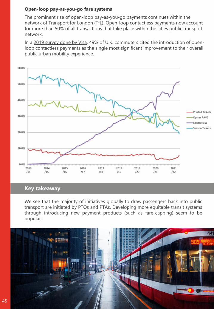
Open-loop pay-as-you-go fare systems
The prominent rise of open-loop pay-as-you-go payments continues within the
network of Transport for London (TfL). Open-loop contactless payments now account
for more than 50% of all transactions that take place within the cities public transport
network.
In a 2019 survey done by Visa, 49% of U.K. commuters cited the introduction of open-
loop contactless payments as the single most significant improvement to their overall
public urban mobility experience.
Key takeaway
We see that the majority of initiatives globally to draw passengers back into public
transport are initiated by PTOs and PTAs. Developing more equitable transit systems
through introducing new payment products (such as fare-capping) seem to be
popular.

Chapter 4
Summary of keytakeaways
46

5
4
3
2
Summary of key takeaways
47
In order to develop a solid comparison between regions regarding
contracting in public transport, it is important to ensure that we’re
comparing apples to apples. The examples utilized in answering this
knowledge question show that this is not an easy task, considering the
wide range of public transport contracts that exist in the European
Union.
Most of the regions explored utilize either net or gross cost contracts
(or both). Furthermore, Ireland was the only selected region where the
revenue risk is not carried by the PTOs.
Financial support was granted to PTOs in different ways. Some regions
chose to compensate PTOs for all losses incurred, whereas other
regions chose to only compensate for losses that could be directly
attached to the pandemic.
Although EU policy regarding PSO contracts is complex, in discussions
with our network, we have not come across situations where strategic
decision-making processes were impeded by EU policy restrictions.
Supply is not the only factor that influences demand in public
transport. Other important factors include COVID-19 cases and
restrictions.
We see that as new waves of the pandemic emerge, these continue to
have a negative impact on the use of public transport.
1
6
Different travel patterns between different types of workers are clearly
visible in different data sources.7

12
11
10
Summary of key takeaways
48
Based on different sources, we clearly observe that the use of cars is
recovering more quickly than the use of public transport. This is a
worrying trend, as it makes attaining sustainability goals more difficult.
Internationally, we see several examples of the negative impact of
employee shortages on public transport.
The pandemic has accelerated the roll-out of several international DRT
initiatives. We also see there is an increased focus on developing
equitable and efficient transit systems.
We see that the majority of initiatives globally to draw passengers
back into public transport are initiated by PTOs and PTAs. Developing
more equitable transit systems through introducing new payment
products (such as fare-capping) seem to be popular.
8
When looking at different types of public transport, we consistently
see that commuter lines have been hit hardest by the pandemic. A
large contributor to this is remote-working.9

Chapter 5
Looking to the future
49

Looking to the future
50
Will the pandemic permanently change the daily habits of people?
How do public transport authorities, governments,
and public transport operators react to the
pandemic? How are they trying to adjust to
changes?
Although the future, and the lasting impact of the pandemic, are unclear, we feel that
the above structure will remain essential. In particular, understanding what changes
can be impacted through policies and what knowledge is necessary to be able to
make certain decisions and take certain actions.
all 2 2 (Sep ov)
Winter 2 2 (Dec eb)
Summer 2 2 ( un Aug)
Sprin 2 2 (Mar May)
Average cases
per habitants
all 2 21(Sep ov)
Winter 2 21(Dec eb)
Summer 2 21( un Aug)
Sprin 2 21(Mar May)
The long-term impact of the pandemic is unclear. We do see, however, that we likely
won’t be rid of the pandemic anytime soon. This also raises the question of whether
we will ever reach a ‘post-pandemic’ situation, as illustrated by the pattern of COVID-
19 cases across different seasons in the United States in the chart below. This
emerging pattern also means that it is essential to determine what room to act
various organizations have, and to understand what actions need to be undertaken.
It also means that we need to shift our perspective away from thinking that we are
moving towards a post-pandemic era and respond accordingly.
In the introduction of this report, we outlined the below structure, explaining that
there are ways that PTAs, governments, and PTOs can respond to lasting behavioral
changes.

51
Over the past two years of the pandemic, we’ve seen the emerging of several
(behavioral) changes that will have a long-term impact on the recovery of public
transport. These changes also lead to new questions on how we will respond to them.
Many of these changes will have a lasting effect on mobility systems. In order to
ensure that mobility systems remain efficient, equitable, and sustainable, it is essential
to determine adequate ways of responding to these changes. In order to do so, it’s
becoming increasingly important to track these changes and respond proactively, as
opposed to reactively.
Working from home
We’ve seen that working from home could potentially be here to stay. This will have a
lasting impact on the attachment people place on offices and could therefore also
have a lasting impact on the way we organize cities. The maps below, for instance,
highlight how much space in the largest cities in the United States is dominated by
office spaces. If remote-working is here to stay, how will we re-organize our cities tobe in line with this trend?

52
People are moving out of large cities
Across the US, people moved away from urban cities and into suburban areas. In the
US, we explored towns and cities where the most people moved out of and moved
into. The towns and cities in the chart below reflect this shift. Locations with the
largest net gain of movers (in blue) are small cities close to metropolitan areas, with
an average population of 93 thousand. The ten cities that lost the most movers in
2020 (in orange) are all metropolises and they all lost more inhabitants than they did
in 2019. this begs the question: what impact will this trend have on the recovery ofpublic transport? How will this change the mobility needs of people? And whatactions can be taken to respond to these changes?
era e population si e in 2 1
1 million 3 t ousand
Future behavioral patterns
These examples highlight the importance of proactively developing policies and
measures with the aim of developing future-proof mobility systems. We know that the
pandemic will have a lasting impact on society and the way we behave. We should,
therefore, not allow these changes to surprise us and begin responding now as the
headlines below also suggest.

Chrétienne Hoek
+31 6 24 97 49 [email protected]
Wijnhaven 23
3011 WH Rotterdam
The Netherlands
+31 10 275 59 90
www.rebelgroup.com
+31 6 30 60 32 [email protected]
Femke Laauwen