Fluid Typography: Transforming letterforms in television idents
23
Fluid Typography: Transforming letterforms in television idents Barbara Brownie Arts and the Market Vol. 5 No. 2, 2015 pp. 154-167 Introduction Television broadcasters announce their brand using idents and bumpers. Evolved from the test-card, an ident is a short sequence which heavily features the logo or other identifying image, typically shown while a continuity announcer trails the following programme. Idents and bumpers have become increasingly important in the digital era, also known as TVIII, in which digital and internet television have increased the number of available channels, and distribution has become more commodified (Creeber and Hills, 2007, p. 1). Consistent brand recognition across platforms is essential for the survival of a broadcaster in the age of “digital convergence” (Caldwell, 2004, p. 305, as cited in Johnson, 2007, p . 5), in which broadcasters distribute content across multiple media platforms, and viewers are prone to “grazing” on multiple channels and screens (Bellamy and Traudt, 2007, p. 132). In this environment of increasingly fierce competition and diversity, “branding has emerged as the defining industrial practice” (Johnson, 2007, p . 6). The British television industry is markedly different from that of the USA, having emerged from non-commercial practices. As a publically funded service, the BBC paved the way for a television landscape in which competition is superseded by the remit to “inform, educate and entertain”. As Peter Meech (1999, p. 39) observes, the BBC of the twentieth century could not be seen to be inappropriately frivolous in the design of its logos and idents. These foundations of British broadcasting continue to influence what Meech identifies as British viewer’s relative unease in the face of overtly
Transcript of Fluid Typography: Transforming letterforms in television idents
Fluid Typography: Transforming letterforms in television idents Barbara BrownieArts and the MarketVol. 5 No. 2, 2015pp. 154-167
Introduction
Television broadcasters announce their brand using identsand bumpers. Evolved from the test-card, an ident is a short sequence which heavily features the logo or other identifying image, typically shown while a continuity announcer trails the following programme. Idents and bumpers have become increasingly important in the digitalera, also known as TVIII, in which digital and internet television have increased the number of available channels, and distribution has become more commodified (Creeber and Hills, 2007, p. 1).
Consistent brand recognition across platforms is essential for the survival of a broadcaster in the age of“digital convergence” (Caldwell, 2004, p. 305, as cited in Johnson, 2007, p . 5), in which broadcasters distribute content across multiple media platforms, and viewers are prone to “grazing” on multiple channels and screens (Bellamy and Traudt, 2007, p. 132). In this environment of increasingly fierce competition and diversity, “branding has emerged as the defining industrial practice” (Johnson, 2007, p . 6).
The British television industry is markedly different from that of the USA, having emerged from non-commercial practices. As a publically funded service, the BBC paved the way for a television landscape in which competition is superseded by the remit to “inform, educate and entertain”. As Peter Meech (1999, p. 39) observes, the BBC of the twentieth century could not be seen to be inappropriately frivolous in the design of its logos and idents. These foundations of British broadcasting continue to influence what Meech identifies as British viewer’s relative unease in the face of overtly
commercialised broadcasters (in contrast to the USA, where commercial interests are often more visible).
Nonetheless, the digital era has, for the UK as elsewhere, seen increasing competition in the market, resulting in the need for more overt branding. Even the BBC has devoted additional time in its schedule for self-promotion (Ellis, 2011, p. 89), and shown the desire to “emulate the commercial success of [commercial] animated idents” (Meech, 1999, p. 39). The convergence of public and commercial values creates a unique landscape in whichto explore branding practices.
While the aim of a broadcaster’s ident is, like other forms of branding, “product differentiation”, a television channel is “more ephemeral and nontangible than most other products or services”. As Bellamy and Traudt (2011, p. 135) observe, “awareness and image… are all television has to sell to the viewing audience”, and so the expression of a distinct set of values must be central to the design of any ident.
Since brand values are intangible assets, recent idents seek to assert them in tangible form. Idents exploit the features of the medium of television by treating the logoas a kinetic and physical object – an “assemblage of shape, colour and typography”, and crucially, kineticism (Meech, 1999, p. 39). Ident designers have recognised that a static or overlaid logo is not so representative of the medium of television as one which appears to be integrated into a kinetic sequence and a three-dimensional environment. Typography has historically been seen as “unmotivated”, or having “no natural connexion in reality” (Saussure [1913] 1983, pp. 67-69). In many contemporary idents, however, the visual appearance of the letters in the logo is motivated by itssurroundings. In order to emphasize connections between television channels and the content that they produce or broadcast, logos have become less graphical, and more tangible, directly imitating other televised objects.
Current idents for FOX UK, for example, depict the channel’s logo as three-dimensional illuminated letters, located within various British landscapes, or in a studioalongside actors and characters from their flagship shows. This anchors the word into the scenery, blurring the boundaries between the visual and verbal, and betweenthe diegesis of the broadcast and the reality of its production. These idents present the screen as a “fully navigable”, “three-dimensional typographic environment” (Worthington, 1998, p. 9), in which letters can be rendered “dimensional” (Miller, 1996, p. 2). Letterforms have become “architectural, ergonomic and cinematic”. Thespace which letters occupy has also changed, from a flat plane to an “environmental, immersive” space, in which type can be arranged and layered within four dimensions: three spatial, and one temporal (Ibid.).
This integration of graphical and photographic messages forces a convergence of the verbal language of the broadcaster’s name, and the visual language of the mediumof television. The inclusion of motion or other kinds of kineticism further enhances the sense that the logo is a part of the television content. As a result of this integration, it has become difficult to differentiate thevisual from verbal in television idents.
Kinetic branding for television broadcasters
The temporal environment offers designers a toolset of kinetic behaviours, which cannot be replicated in print. To suit temporal output, much of the expression of brand values is achieved through kineticism. Letters and shapeswithin the broadcaster’s logo become “a theatrical component” that can be brought to life through motion (Helfand, 1994, p. 51). While motion graphics have been widely theorised, texts have a tendency to describe on-screen events as ‘motion’, implying that the events involve simple relocation of objects (as in scrolling credits). In the temporal environment of television, however, verbal forms are capable of more dramatic transformation, and logos may morph, fragment, and
undergo numerous processes in addition to, or instead of,simple motion. Many of the idents described in this article feature logos that transform or emerge from pictorial scenes, blending type and image over time. To describe these possible behaviours as “motion” (as in theterm ‘motion graphics’) would be to deny the vast potential of the medium.
Even in examples that are solely graphical, idents have evolved to present the logo as a three-dimensional and animated object. SyFy (formerly the Sci-Fi Channel) presents a CGI model of its logo, constructed or emergingfrom surreal objects that occasionally make visual reference to well-known science fiction and fantasy. Cogs (2011) initially focuses on an arrangement of turning cogs, then pulls back to reveal that these cogs constructthe channel’s logo; Silver Balloons (2014) depicts an arrangement of silver balloons, tethered to the ground, which inflate and float upwards until they become recognisable as the letters of ‘SyFy’.
Similarly, in a range of contemporary television idents, the broadcaster’s logo is not treated as a fixed form, rather it is susceptible to change. The logo’s appearanceis often fleeting, as it emerges from, or dissolves into,a scenic backdrop. Rauf Yasit’s Bubbles ident (2009) depicts a chaotic arrangement of liquid bubbles which converge and then merge into the ‘M’ of the MTV logo. In the channel Five ident, Free (BB/Saunders, 2006), balloons float into alignment to form the letters of the channel’slogo. In a collection of idents for Sky’s three main television channels (2008), The Moving Picture company (MPC) mimics the different behaviours of three differentsubstances, each undergoing a different kind of transformation. In these idents, a figure ‘1’ is constructed from sharp fragments, ‘2’ forms from a flow of thick liquid, and ‘3’ emerges from a plume of sparkling pink dust.
Where this kind of transformation occurs in television idents and bumpers, practitioners and commentators have struggled to accurately define it, or to differentiate it

from other kinds of kineticism. Max Warner’s MTV Morph Bumper (2009) presents an array of moving fragments whichbegin in a disorderly array and then rotate and align, locking together to form the contours of a three-dimensional letter ‘M’. Warner describes his ident as presenting a “morph”, yet this animation does not presentthe kind of “smooth transition” that Coquaillart, and Jancéne’s (1991, p. 23) text on metamorphosis state is a requirement of a morph. such disagreements between texts suggest that there is not yet adequate language to describe the processes that occur in contemporary television idents.
Existing texts on motion graphics and temporal typographyin particular fail to explore the potential for transformation and inconsistent meaning that is offered by the medium of television. Lettering and typography, including that which appears in logos, is assumed to havea stable identity (Tsur, 2000, p. 765). Though numerous texts take account of the possibility of movement (see Shaw and Ramachandran, 2000), it is assumed that the identity of a form remains fixed throughout this temporalevent. Even Y. Y. Wong (1995), for example, who offers anextensive and useful typology of temporal typography, assumes that the identity of a verbal form remains constant. Her definitions allow for change which may affect legibility or connotations, but do not allow for the introduction of additional identities.
Fluid logos
In order to explain the transformations that are found inmany contemporary television idents, it is necessary to look beyond the field of motion graphics, to the holographic poetry of Eduardo Kac. A multimedia artist, Kac has experimented with a number of mixed-media and biological materials in the purist of poetic meaning. Though he produced poems as temporal experiences, he rarely presents them on screen. Between 1983 and 1993, heproduced a number of “holopoems” in which words and letters appear to transform as the viewer moves around
the gallery space in front of each hologram. Like the idents described in this text, these holopoems present verbal messages that emerge over time. In Multiple (1989), astring of numbers pivot so that they appear to become letters, in this way the word ‘POEM’ appears to transforminto the number ‘3309’; Andromeda Souvenir (1990) features an arrangement of abstract polygons which converge to construct the letters of the word ‘LIMBO’ when viewed from the angle that Kac (1997) describes as the ‘viewing zone’; in Astray in Deimos (1992), the letters of the word ‘EERIE’ appear to morph into the letters of ‘MIST’ as theviewer navigates around the poem.
Kac’s explorations of fluidity in holopoems is particularly relevant to contemporary idents as they prioritize local events. Other texts on the subject of temporal and kinetic typography tend to focus on global features, such as overall composition and changes in the relative positions of words. Authors including Soo C. Hostetler (2006), focus primarily on displacement (changein location), with very little acknowledgement of manipulation of individual forms. This focus is appropriate for exploration of large quantities of onscreen text, as in credit sequences, but is less usefulwhen dealing with text that contains only a single word or a few letters, as in a logo. As Peter Cho (1997, p. 10) observes, these existing texts on temporal typographytend to focus on changes in size, orientation and position, assuming that letterforms, though in motion, remain ‘intact’, thereby ignoring the fact that individual forms may be manipulated. These texts tend to assume that the letterform remains whole, and retains itsinitial identity. Kac’s research can be differentiated from this research in the field of temporal typography byhis focus on local transformation.
Television idents tend to contain far less typographic information than other forms of temporal typography, suchas credit sequences. Many of the categories of temporal typography that are defined elsewhere feature global change, affecting overall layout, as in scrolling typography or “dynamic layout” (Brownie, 2012, p. 142).
Kac’s exploration of local events is ideally suited for application in analysis of idents, since they contain only a few letterforms (a small string of letters, or a single numeral - the name or number of the television channel). In idents containing so few verbal forms, thereis necessarily a local focus.
Each of Kac’s holopoems achieves a local transformation of letterforms through a different process. In Multiple, three-dimensional letters revolve; in Andromeda Souvenir, break apart and are reconstructed; in Astray in Deimos they mutate. Through these various processes, each form loses its initial identity and adopts another. It is this replacement of identity that distinguishes motion from change, and that characterises what Kac describes as “fluid” transformation.
Fluid forms, as defined by Kac, are those which present inconsistent meanings, as different identities at poles of a transformation. One identity may be verbal, while another is abstract or pictorial. Between these poles of transformation there is a “transitional zone” (Whitman, 1995), which, Kac (1997) argues, is as meaningful as the definable messages that exist at the poles. In transition, the fluid form becomes “asemic” (Gaze, 2008, p. 31), having the hallmarks of writing, but having not yet achieved a precise verbal meaning. At this “in-between” stage, it is “neither one thing or another” (Kac, 1997).
The transitional zone, in fluid idents, is the pivotal moment in which the medium of television collides with the medium of typography. “Point-of-view and time become the pivot point” that marks the boundary between type andimage, or between the logo and the filmed environment that contains it (Brill, 1992). The logo is so integratedwith its environment that it cannot be clearly differentiated, and yet its difference to the surroundings promises that a meaningful message is about to emerge.
It is rarely the case that viewers need to focus on the legibility of the letters or words in an ident, since thelogo is a fleeting reminder of which channel is being watched. In idents, as in holopoetry, “more is said by the relationship of the words to their space than their dictionary meanings” (Brill, 1992). The “viewer contemplates the word as much for how it is dimensionallycomposed as to its intended meanings” (Ibid.).
Fluid processes in television idents
The different kinds of fluid transformation found in Kac’s holopoems are also exhibited in contemporary television idents. Each transformation can be described as fluid, as the logo and its component parts “escape theconsistency of meaning a printed sign would have” (Kac, 1997).
The Moving Picture Company’s Atlas idents (2004-) for Channel 4 feature a similar transformation to that exhibited in Kac’s Andromeda Souvenir. Following Martin Lambie Nairn’s original design of the Channel 4 logo (1982), and his subsequent idents, MPC presents the figure ‘4’ as a configuration of separate polygons. Thesepolygons are initially separate, integrated into a pictorial scene. During the sequence, they converge into a modular ‘4’ configuration’.
Martin Lambie Nairn’s early Channel 4 idents (1982-1984),and several of MPC’s Atlas idents, show the channel 4 logo constructed from independently moving parts. In Lambie Nairn’s Round and Back (1982), the coloured polygons of the‘4’ logo are presented on a plain black background. The polygons are flung outwards, so that the ‘4’ configuration is lost, and then return to the centre of the screen, where the ‘4’ is re-constructed. The behaviour illustrates the practice which set Channel 4 apart from its competitors in terrestrial television, that of bringing together programming content from multiple production companies (Woolman and Bellantoni, 1999, p. 34).
This notion of separately moving parts continued as the foundation for later idents by MPC, in Atlas idents including Alien and Bowling (2004). In these idents, the addition of a pictorial backdrop, and development of the polygons so that they resemble directly-filmed objects, helps to distance MPC’s idents from those of Lambie Nairn, and elevates the ‘4’ logo from a graphical form toan apparently physical object, and from the field of motion graphics to that of live-action film and VFX. Emerging directly from apparently live-action footage, the ‘4’ logo is presented as directly and inherently connected to the medium of television.
In Alien (2004), a quarrelling couple is interrupted by theunexpected appearance of a collection of mysteriously hovering, illuminated objects. These polygonal objects cast a glow that is reminiscent of that seen in UFO landings in science-fiction film. They dart around the sky, as if independent, cognisant, and seeking meaning inthe scene that lies beneath, until they align to form theconfiguration of Channel 4’s logo. Having found the meaning that they seek, the hovering objects disperse andvanish. In this and other Altas idents, each part of the ‘4’ logo has independent motion, and the separate objectscollaborate in the construction of a single numerical arrangement. This kind of construction of a letterform or logo is represented in the diagram, Fig. 1.
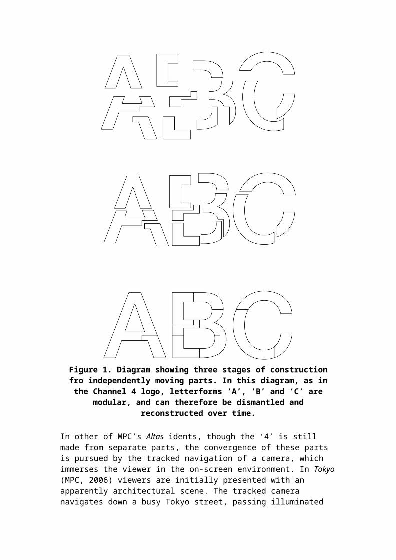
Figure 1. Diagram showing three stages of constructionfro independently moving parts. In this diagram, as inthe Channel 4 logo, letterforms ‘A’, ‘B’ and ‘C’ are
modular, and can therefore be dismantled andreconstructed over time.
In other of MPC’s Altas idents, though the ‘4’ is still made from separate parts, the convergence of these parts is pursued by the tracked navigation of a camera, which immerses the viewer in the on-screen environment. In Tokyo(MPC, 2006) viewers are initially presented with an apparently architectural scene. The tracked camera navigates down a busy Tokyo street, passing illuminated
architectural forms. As the sequence progresses, it becomes apparent that several of these objects are not connected to the surrounding buildings, but are independent, and dislocated from the environment. The tracked camera continues to navigate the streets until itencounters a space equivalent to Kac’s “viewing zone”, inwhich the floating architectural objects align to momentarily present the ‘4’ logo.
In this ident, the pivotal moment occurs when apparently architectural elements appear to become detached from their surroundings. At that moment it becomes evident that these forms, although they resemble architectural orenvironmental objects, are somehow different from the scene in which they are contained. Displaced from the scene, they become ambiguous, and invite the viewer to question their true purpose, and anticipate the emergenceof new meaning. This mystery is solved when the forms come into alignment to present the Channel 4 logo.
In this and other Atlas idents (Pylons, 2005; Abbey, 2011; Blackpool, 2011) the parts of the ‘4’ logo, though independent, do not move independently. Their convergenceis an optical illusion, brought about by an apparent flattening of space through parallax. Each component part is fixed at a different distance from the camera, but when viewed from a particular angle, that distance appears to compress, so that the forms appear to align. Asimilar parallax illusion can be observed in “impossible objects” such as the Penrose triangle (Fink, 1991).
Both construction and parallax are dependent on the modularityof the Channel 4 logo. Each component part must be considered a separate object, capable of independent motion or meaning. When these separate components converge, they collaborate in the construction of a shared meaning – that of the number ‘4’. During this process, the viewer’s understanding of the nature of eachpart is forced to change. The viewer may initially perceive the separate parts as objects or images, but must discard those abstract or pictorial interpretations of each part in favour of an interpretation that
considers the entire arrangement. In Gestalt terms, that the whole is more than the sum of its parts (Wertheimer, 1923, p. 12).
Construction and parallax leave the component parts as whole forms or objects in their own right: part of a numeral but still independent. This allows each individual part to have its own independent identity that may be retaineddespite fluidity. The separate parts may be pictorial, belonging to a different paradigm than the figure ‘4’. Asthe parts converge, the viewer is forced to alter his or her reading of the scene, from visual to verbal.
Other idents exhibit different kinds of behaviours, also comparable to the experiences provided in other of Eduardo Kac’s holopoems. Some depict letterforms that appear to change their identity when they revolve to present additional surfaces, each of which contains a different meaning. Kac’s Multiple (1989) presents forms that appear as letters when viewed from the front, and numbers when viewed from the reverse. This category of fluidity involves revealing identities that are permanently present within an object, but that are initially hidden from view (see Fig. 2).

Figure 2. Diagram depicting 3 stages of revelation, inwhich the flat numerical forms ‘1’, ‘2’ and ‘3’ are
revealed to be attached to three-dimensional letterforms‘A’, ‘B’ and ‘C’. As each form revolves, its meaning is
multiplied. Here, though the forms initially appear flat,they are revealed to be three-dimensional. This forcesthe viewer to reassess not only the number of verbalidentities, but also the nature of the space on the
screen, as the sequence progresses.
This process of revelation is dependent on the fact that thetwo-dimensional screen is capable of containing apparently three-dimensional objects, and that those

objects have multiple surfaces. Extrusion, the most common method of rendering a shape three-dimensional, creates additional surfaces at the sides, top and bottom of a shape, none of which resemble the shape that may be viewed from front or behind. An extruded ‘B’, for example, may appear as an abstract rectangle when viewed from the side of from above. Idents created by Discovery Creative for DMAX (Glitterball and Rubber Gloves, 2011) present the letters of the channel’s logo as extruded three-dimensional objects on a surface. Human hands reach into view and revolve the letters as if they were tangible objects, revealing their side surfaces and thereby rendering them abstract. These objects regain their verbal meaning when they are revolved back to show their front faces.
The additional surfaces of a three-dimensional letter each offer potential for additional messages. More complex three-dimensional objects may contain multiple identities on their many different surfaces. Additional meanings may appear as flat signs on hidden surfaces, or as voids craved into the side of an object that present aletterform in negative space. The logo for Channel 4’s companion channel, 4Seven, is three dimensional, with onesurface shaped to resemble the parent channel’s ‘4’ logo,and a neighbouring surface ornamented with an extruded ‘7’. When viewed from the front, the logo appears to readas a ‘4’, and when revolved by 45 degrees, can be read asa ‘7’. In the channel’s prelaunch idents (2012), these two numerals are accessed in turn as the logo revolves. The initial presentation of the ‘4’ appears to reassure the viewer of the familiarity of the channel, until the revolution causes the ‘7’ to apparently emerge from its side surface, illustrating the new channel’s subservient relationship to its parent company.
When additional identities are concealed on alternative surfaces, their meaning may be accessed by tracked navigation around the form (as in Kac’s holopoems, or MPC’s Toyko ident), or by revolving the object so that it presents a different face to the viewer. In other examples, identities may be hidden and revealed using
other methods. Illumination, for example, can grant access to identities that are initially concealed from the viewer. Maxim Ivanof’s ident for Bulgarian broadcaster TV7 (2007), uses floods of colour to extract the silhouette of numerical figures from a white backdrop. The viewer is initially presented with a white screen, within which coloured strips and words appear. Asthey appear, it becomes evident that these forms are constrained to a shaped space. As more coloured forms appear, they saturate an area of the screen until its silhouette is revealed to be the numbers 1-6 in sequence.
The final category of fluidity, and that which has been most widely explored elsewhere, is metamorphosis. In this kind of transformation, letterforms are treated as malleable. Their contours are elastic, permitting total transformation of the form so that it evolves, as if organically, into something else (see Fig. 3). Morphing letterforms can be found in Eduardo Kac’s Astray in Deimos (1992), and outside of typography in film and animation.
It is already well-established that metamorphosis exists in stop-motion, cell animation, and more recently digitalanimation, presenting a kind of fluidity referred to by Sergei Eisenstein (as cited in Solomon, 2010, p. 16) as “plasmaticness”, that allows freedom from a fixed form, and distortion to the point of acquiring new identities. The term ‘metamorphosis’, and therefore perhaps the term ‘fluid’, could be used in the description of a number of behaviours exhibited by artefacts ranging from Fleisher studios’ Koko the Clown (1919) (who is turned into a shape-shifting ghost, capable of adopting numerous different guises), Willow (Ron Howard, 1988, in which many audiences were introduced to digital morphing for the first time), and Terminator 2 (James Cameron, 1991, which demonstrated “seamless” morphing from a human-like form into liquid metal) (Klein, 2000, p. 27; Krasniewicz, 2000, p. 46). Arguably, examples such as these paved the way for metamorphosis in fluid characters by “spark[ing] the interest of the graphics community in metamorphosis techniques” (Gomes et al, 1999, p. 14).
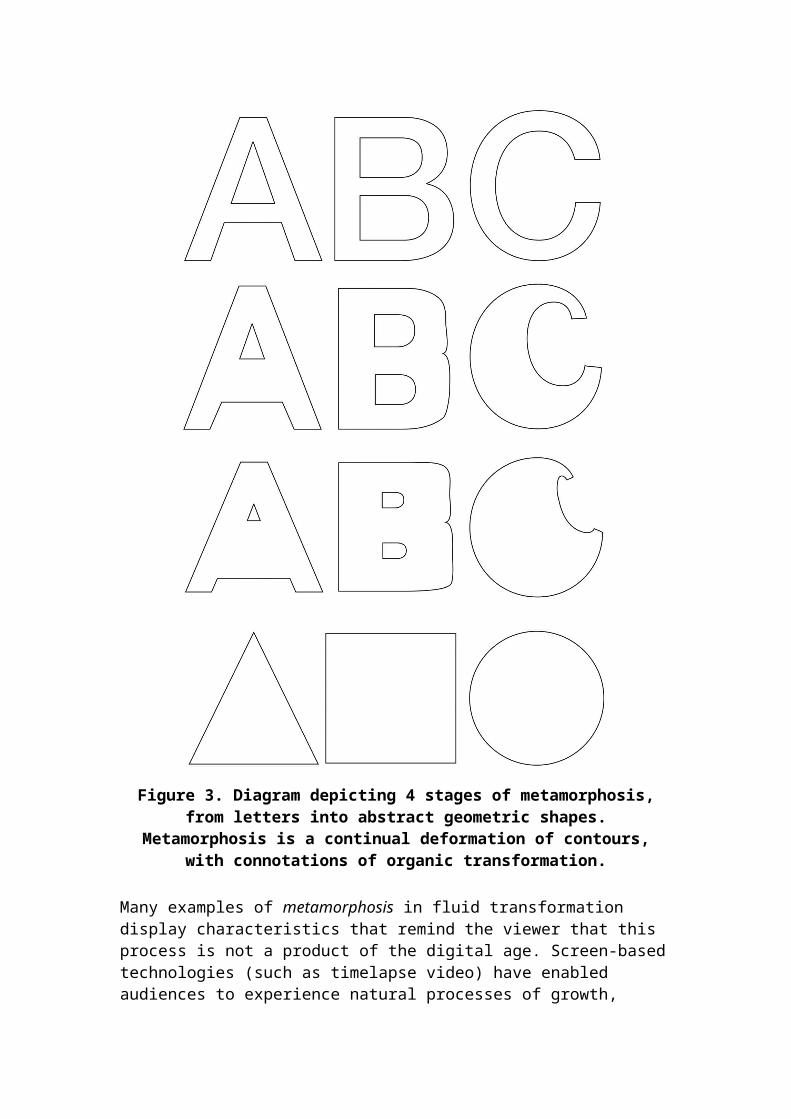
Figure 3. Diagram depicting 4 stages of metamorphosis,from letters into abstract geometric shapes.
Metamorphosis is a continual deformation of contours,with connotations of organic transformation.
Many examples of metamorphosis in fluid transformation display characteristics that remind the viewer that this process is not a product of the digital age. Screen-basedtechnologies (such as timelapse video) have enabled audiences to experience natural processes of growth,
decay and other forms of transformation, at an accelerated rate. Sequences created using this technologyaccelerate a natural process so severely that it appears to become magical. Meanwhile, the abundance of these sequences in natural history film and television has suggested the myth that accelerated metamorphosis is found in nature. The fact that metamorphosis is experienced in nature is exploited in BB/Saunders’ channel Five ident, Love, in which a human egg is fertilised, then divides into four separate cells. Each of these metamorphose into a letter to spell the word ‘love’.
The Love ident aims to reflect the biological process of conception and mitosis. Biological metamorphosis is oftenseen as a “continuous deformation” (Gomes et al. 1999, p. 4), rather than a process of change from one “pole” to another (Kac, 1991, p. 46). As a consequence, the original identity must be lost in order to allow for another to emerge. A single morphing form does not present several identities simultaneously. Unlike in construction, where the identity of component parts can remain even after a new linguistic identity has been introduced, and unlike in revelation, where all identities are permanent, metamorphosis requires the loss of the initial identity (Lazarus and Verrous, 1998, p. 373; Kentet al., 1992, p. 47). In Love, no form can be both letter and egg simultaneously; one identity must be sacrificed to invite the emergence of another.
Each of these categories, construction, parallax, revelation and metamorphosis allows a broadcaster’s identity to emerge from, or transform into, objects that are commonly associated with the medium of television. While logos, asgraphical objects, may be more commonly associated with the medium of print, fluid transformation allows them to become integrated with apparently live-action scenes, or animated backdrops. Through fluidity, the medium becomes associated with the identity of the broadcaster.
Conclusion
The digital era has yielded new branding practices, whichin turn present a demand for new definitions and terminology. Letterforms and logos that have previously been conceived as graphical forms, are now presented as kinetic and transforming objects. In these artefacts, letterforms and numerals are presented as active objects,capable of transforming between text and image, or between text and abstract object. This change in the treatment of logos reflects a wider cultural shift away from verbal information towards images (Crow, 2006), and an understanding that letters may be considered as three-dimensional (Miller, 1996) and pictorial forms (Gross, 1997; Lapacherie and Lehmann, 1994), that may simultaneously express visual and verbal information (Gross, 1997, p. 17). Moreover, idents such as those for Channel 4, Five, Sky, FOX, and MTV demonstrate that broadcasters can be branded not only with a stable visualconfiguration, but also as a collection of events and behaviours.
In order to account for the constantly evolving landscapeof the TVIII era, broadcast branding must move beyond simple "motion graphics” to idents that are less preciousabout the sanctity of the logo. Though re-branding may occur off-screen, this process does not have the immediacy of a logo which transforms in front of the viewer’s very eyes. A fluid logo, which audiences may directly witness in transformation, may be seen to more readily adapt to the constantly evolving broadcast landscape.
By moving away from the assumption that a logo is a fixedform, brands are able to present themselves as adaptable and progressive. A fluid logo, capable of change, reflects an organisation that is equally open to new ideas, and able to respond to unexpected scenarios without compromising core values.
References
Ahn, M. and Lee, S. (2002), “Mesh Metamorphosis with Topology Transformations,” Proceedings of the 10th Pacific Conference on Computer Graphics and Applications p. 481, available at: doi: 10.1109/PCCGA.2002.1167908 (accessed July 19, 2011)
Bellamy, R. V., and Traudt, P. J. (2007), “Television Branding as Promotion”, in Eastman, S. T. (ed), Research in Media Promotion, 2nd edition, Routledge, Oxon, pp. 127-159.
BBC (2014), “A History of the Network Symbol,” History of the BBC, available at: http://www.bbc.co.uk/historyofthebbc/resources/bbclogo/networksymbol.shtml (accessed 23 July 2014)
Brill, L. (1992), “Poetry in motion in the space-time continuum”, Computer Graphics Worldwide, Vol. 15, No. 5, pp. 80-82, available at http://www.ekac.org/louis.html (accessed 21 July 2014)
Brownie, B. (2012), “The Behaviours of Fluid Characterforms in Temporal Typography”, PhD thesis, University of Hertfordshire.
Cho, P. (1997), “Pliant Type: Development and temporal manipulation of expressive, malleable typography”, BSc diss., MIT, available at: http://hdl.handle.net/1721.1/10553 (accessed 13 July 2011)
Coquaillart, S., and Jancéne, P. (1991), “Animated Free-Form Deformation: An Interactive animation Technique”, Computer Graphics, Vol. 25, No. 4, pp. 23-26.
Creeber, G., and Hills, M. (2007), “TVIII”, New Review of Film and Television Studies, Vo. 5, No. 1, pp. 1-4.
Crow, D. (2006), Left to Right: The cultural shift from words to pictures,AVA, SA, Switzerland.
Ellis, J. (2011), “Interstitials: How the ‘Bits in Between’ Define the Programmes”, in Grainge, P. (ed),
Ephemeral Media: Transitory Screen Culture from Television to YouTube, Palgrave Macmillan, New York, pp. 89-106.
Fanthome, C. (2007), “Creating an iconic brand – an account of the history, development context and significance of channel 4’s idents”, Journal of Media Practice 8, no. 3, pp. 255-271.
Fink, K. (1991), “Impossible Figures in Perceptual Psychology”, Pitzer Psychology 106 – Perception, available at: http://www.fink.com/papers/impossible.html (accessed 23 July 2014)
Galin, E., and Akkouche, S. (1996), “Blob Metamorphosis based on Minkowski Sums”, Eurographics, Vol. 15, No. 3, pp. 143-153.
Gaze, T. (2008), “The Word ‘Asemic’”, Asemic Movement 2, available at: http://vugg.wippiespace.com/vugg/gaze/asemicmovement2.pdf(accessed 13 July 2011)
Gomes, J., Darsa, L., Costa, B. and Velho, L. (1999), Warping and Morphing of Graphical Objects, Morgan Kaufmann Publishers, San Francisco.
Grainge, P. (2009), “Lost Logos: Channel 4 and the Branding of American event Television”, in Pearson, R. E.(ed.), Reading Lost, IB Taurus, London, pp. 95-115.
Gross, S. (1997), “The Word Turned Image: Reading PatternPoems”, Poetics Today, Vol. 18, No. 1, pp. 15-32.
Helfand, J. (1994), ‘Electronic Typography: The New Visual Language,’ in Beirut, Michael, Drenttel, William and Heller, Stephen (eds), (1997) Looking Closer 2: Critical Writings on Graphic Design, New York: Allworth Press, pp. 49-53.
Hostetler, S. C. (2006), “Integrating Typography and Motion in Visual Communication”, paper presented at the 2006 iDMAa and IMS conference, Miami, 6-8 April, available at:
http://www.units.muohio.edu/codeconference/papers/papers/Soo%20Hostetler-2006%20iDMAa%20Full%20Paper.pdf (accessedJuly 13, 2011)
Johnson, C. (2007), “Tele-branding in TVIII: The Network as Brand and the Programme as Brand”, New Review of Film and Television Studies, Vo. 5, No. 1, pp. 5-24.
Kac, E. (1997), “Key Concepts of Holopoetry”, Electronic Book Review, originally published in Jacksin, D., Vos, E. and Drucker, J. (eds), Experimental-Visual-Concrete: Avant-Garde Poetry Since the 1960s, Rodopi, Amsterdam—Atlanta, pp. 247-257.
Kac, E. (1996), “How do you read your text? Eduardo Kac and Hypermedia poetry”, Hyphen Magazine, No. 12, pp. 9-12 available at: http://www.ekac.org/hyphen.html (accessed 21 July 2014)
Kac, E. (1991), “Recent experiments in holopoetry and computer holopoetry”, in Jeong T. H. (ed.), Display Holography, Bellingham, WA: Proc. SPIE 2333, pp. 229-236. Reproduced in Kac, E. (1995), Holopoetry: Essays, manifestos, critical and theoretical writings, New Media Editions, Lexington, pp. 40-51.
Kent, J. R. Carlson, W. E. and Parent, R. E. (1992), “Shape Transformation for Polyhedral Objects”, Computer Graphics Vol. 26, No. 2, pp. 47-54, available at: http://design.osu.edu/carlson/history/PDFs/shape-transform.pdf (accessed 19 July 2011)
Klein, N. M. (2000), “Animation and Animorphs: A Brief Disappearing Act”, in Sobchack, V. (ed.) Meta-Morphing: VisualCulture and the Culture of Quick Change, University of Minnesota Press, Minneapolis, pp. 21-39.
Krasniewicz, L. (2000), “Magical Transformations: Morphing and metamorphosis in two Cultures”, in Sobchack,V. (ed.) Meta-Morphing: Visual Culture and the Culture of Quick Change, University of Minnesota Press, Minneapolis, pp. 41-58.
Lapacherie, J., and Lehmann, A. (1994), “Typographic Characters: Tension between Text and Drawing”, Yale French Studies Vol. 48, pp. 63-77.
Lazarus, F., and Verrous, A. (1998), “3D Metamorphosis: ASurvey”, The Visual Computer, Vol. 4, pp. 373-389.
Meech, P. (1999), “Television Clutter: The British Experience”, Corporate Communications: An International Journal, Vol. 4, Issue 1, pp. 37-42.
Miller, J. A. (1996), Dimensional Typography, Princeton Architectural Press, New York.
Saussure, F. ([1913] 1983), Course in General Linguistics, Duckworth, London.
Shaw, G. L., and Ramachandran, V. S. (1982), “Interpolation during apparent motion”, Perception, Vol. 11,No. 4, pp. 491 – 494.
Solomon, Matthew (2000), ‘Twenty-Five Heads under One Hat: Quick Change in the 1890s’, in Vivian Sobchack (ed.) Meta-Morphing: Visual Culture and the Culture of Quick Change, University of Minnesota Press, Minneapolis, pp. 3-20.
Tsur, R. (2000), “Picture Poetry, Mannerism, and Sign Relationships”, Poetics Today Vol. 21, No. 4, pp. 751-781.
Turk, G. and O’Brien, J. F. (1999) “Shape Transforming Using Variational Implicit Functions”, Computer Graphics Proceedings, ACM SIGGRAPH 99, p. 445, accessed July 19, 2011 http://graphics.cs.berkeley.edu/papers/Turk-STU-1999-08/Turk-STU-1999-08.pdf
Wertheimer, M. (1923), “Special Problems, first Group: Perception, A. Perception and Organisation, Section 5: Laws of Organization in Perceptual Forms”, originally published as “Untersuchungen zur Lehre von der Gestalt, II”, Psychol. Forsch. Vol. 4, pp. 301-530, reproduced in Ellis, W. D. (ed., 1938), A Source Book of Gestalt Psychology. Routledge & Kegan Paul Ltd., London, pp. 71-88.
Whitman, I. V. (1995), “Holopoetry: The New Frontier of Language – An interview with Eduardo Kac”, in Tumg H. Jeong (ed.) Proceedings of the Fifth International Symposium on Display Holography, Bellingham, WA: Proc. SPIE 2333, pp. 138-145, available at: http://www.ekac.org/ivinterview.html (accessed 19 July 2014)
Williamson, D. (2009), “Caterpillars evolved from onychophorans by hybridogenesis”, Proceedings of The National Academy of Sciences of The United States of America, Vol. 106, No. 47,pp. 19901-19905.
Wong, Y. Y. (1995), “Temporal Typography: characterization of time-varying typographic form”, MS thesis, MIT, available at: http://hdl.handle.net/1721.1/29102 (accessed 19 July 2011)Woolman, M., and Bellantoni. J. (1999), Type in Motion: Innovations in Digital Graphics, Thames & Hudson, London.
Worthington, M. (1998), “The New Seduction: Movable Type”, AIGA Journal of Graphic Design, Vol. 16, No. 3, pp. 9-10.