College Composition/ College Composition Modular Examination Guide
Upload
khangminh22Category
view
1download
0
piiiii
ilj;;: v:;.,e.'«JA.:
Willi-

SCHOOL


CORRECT COMPOSITION


THE PRACTICE OF TYPOGRAPHY
CORRECT COMPOSITIONA TREATISE ON SPELLING
ABBREVIATIONS, THE COMPOUNDING ANDDIVISION OF WORDS, THE PROPER USE OF FIGURES
AND NUMERALS, ITALIC AND CAPITAL
LETTERS, NOTES, ETC.
WITH
OBSERVATIONS ON PUNCTUATIONAND PROOF-READING
BY
THEODORE LOW DE VINNE, A.M.
THIRD EDITION
NEW YORKTHE CENTURY CO.
1910

5-0
UBRARf
SCHOCL
Copyright, 1901, 1902, by
Theodore Low De Vinne
Published November, 1901
The De Vinne Press

CONTENTSCHAPTER PAGE
Preface vii
I Spelling 5
II Abbreviations 33
III Compound Words 61
IV Figures and Numerals 76
V Italic 9^
VI Capital Letters 168
VII Division of Words 128
VIII Small Capitals 145
IX Extracts and Letters 157
X Notes 171
XI Indention 182
XII Spacing 198
XIII Quotation-marks 209
XIV Subheadings 230
XV Punctuation 241
XVI Proof-reading 294
XVII About Copy 327
XVIII Errors of the Press 345
Appendix 359
Index > 447

-v^*'
^",-.-X ^

PREFACE
UNFORTUNATELY for an American printer, there is no
authority beyond appeal for the spelling-, division,
and compounding- of words. Neither in America nor in
Great Britain is there an institution, like the Academic
Fran^aise or the Department of PubHc Instruction of
France, which finally determines disputed questions
in orthography. We have many dictionaries of the
English language, but they do not fully agree with one
another as to the spelling of some words. There are more
than sixteen hundred variable spellings, as shown in the
Appendix to this work, and each form of spelling has
had the approval of good writers.
There are other irregularities in literary and mechani-
cal composition that are even more unfortunate. Wehave grammars that give us rules for the proper use of
capital letters, italic, and the marks of punctuation, but
these rules, good as far as they go, are not enough for
the guidance of a compositor who has to set types for
works much unlike as to form and style. Nor do our
high schools thoroughly teach the correct expression of
thought in writing. The pupil is taught to be precise in
his pronunciation of Latin and Greek as well as of Eng-
lish ; to give erroneous accent to a vowel, or improper
emphasis to a syllable, stamps him as a vulgar perverter
of correct speech ; but with too many pupils the practice
242327

viii Preface
of exactness ends with correctness of pronunciation.
Amateurs in literary composition soon acquire the bad
habit of writing carelessly ; they spell strange names in
two or more different ways j they form capital letters,
and even the small lower-case letters, so obscurely that
one word may be mistaken for another ; they have no
clearly defined system, or at least observe none, for the
proper placing of capitals, italic, and the marks of punc-
tuation.
There is a general belief that the correction of these
oversights is the duty of the printer, and the writer too
often throws this duty largely on the compositor and
the proof-reader. During the last fifty years there has
been no marked improvement in the average writer's
preparation of copy for the printer, but there have been
steadily increasing exactions from book-buyers. The
printing that passed a tolerant inspection in 1850 does
not pass now. The reader insists on more attention to
uniformity in mechanical details. He notices blemishes
in the composition of types more quickly than lapses
or oversights made by the author in written expression.
Not every reader assumes to be a critic of style in liter-
ature, but the reader of to-day is more or less a critic of
style in type-setting.
As there is no book of generally accepted authority
that lays down a full code of explicit rules for orderly
printing, every printing-house that strives for consis-
tency as well as accuracy has found it necessary to makeits own code for its own work. The code (or style -card,
as it is often called) is constantly needed in every house
for the guidance of new compositors and the mainte-
nance of uniformity. But the Avorks done in different
printing-houses are much unlike, and different rules
have to be made for different kinds of books, newspa-
pers, and trade catalogues. What is correct in one
house may be incorrect in another, and rules have to be
more or less flexible for special occasions. Yet there

Preface ix
are rules in all codes upon which all careful printers
agree, and this treatise is the result of an attempt to
combine and classify them.
It should be understood, however, at the outset, that
the writer does not propose here a complete system for
correct book-making-. The planning of a new book,
from the determination of the shape of page and proper
width of margin to the selection of the style and size of
type in which each of its many parts should be set, is a
subject too broad to be fairly treated in a limited space.
This treatise must be given up to the consideration of
the proprieties of undisplayed text composition, which
is reaUy the more important part of typography. It is
the correctness and the careful arrangement of text-
matter more than any novelty in plan, grace in display,
or skill in decoration that give distinction to any book.
Next to clearness of expression on the part of the author
comes clearness in its reproduction by the printer. Anincorrect expression may be overlooked in speech or in
letter-writing, but a slovenly arrangement of words in
type-setting is rated as a serious offence by the critical
reader, who practically requires the printer to be more
exact or at least more systematic than the author.
It is believed that the methods here advised, although
they may differ from those of a few codes, fairly define
the fixed practice of the greater number of authors and
printers concerning the niceties of type-setting. The
writer's experience of more than fifty years as middle-
man between the author on the one side and the printer
on the other warrants his behef that the methods here
advised are those that have been sanctioned by usage,
and that they are enough to prevent the common er-
rors of book composition. The compositor who heeds
these suggestions wiU prevent the wasting of labor in
avoidable alterations, and the inexperienced writer who
follows directions about acceptable copy will save the
expense of changes that must be made in proof.
X Preface
In making the last revision of this treatise, the writer
has doubts as to the propriety of assuming to be its
author, for the work done is as much the compilation
and rearrangement of notes made by other men as it is
the outcome of the writer's own long practice of print-
ing. He acknowledges with thanks and the highest
appreciation helpful suggestions and contributions madeby Mr. Benjamin E. Smith, managing editor of the
Century Dictionary and editor of the Century Cyclopedia
of Names; Mr. Brander Matthews, professor of Eng-
lish Literature in Columbia University, New York ; and
Mr. Wendell Phillips Garrison, editor of the Nation.
Mr. J. Stearns Cushing and the proof-readers of the
Norwood Press have been much interested in the prep-
aration of the work, and especially efficient as collabo-
rators. Last, but not least, thanks are due to Mr. P. J.
Cassidy of the De Vinne Press for general supervision,
and for the preparation of a table of the variable spell-
ings of the seven leading dictionaries. This last feature
should commend the book to every careful writer and
proof-reader.
August, 1901.
From Johusou's Typogriipliia (1824).

CORRECT COMPOSITION


SPELLING
I
EVEN large dictionaries of the English
language in daily use show that they
find approval by editions frequently
reprinted : in England and her colo-
nies are Stormonth's, the Imperial, and
the Oxford; in the United States are Webster's
(or, in its latest edition, Webster's International),
Worcester's, the Century, and the Standard. Theydo not agree in the spelling of every word, and
scholars who have been taught in boyhood to ac-
cept the spelling of a certain dictionary usually
adhere to that spelling in manhood and sometimes
are intolerant of any other. It follows that there
is occasional disagreement between writers and
printers about correct spelling. Considering the
great number of words that find place in every
dictionary, the words of changeable spelling are

6 Variable spellings
relatively few. Most noticeable in English dic-
tionaries are the retention of u in -our words like
honour and colour, and the preference for s in
words that all American dictionaries spell with z,
as authorize and harmonize. Peculiarities like
ax, wagon, program, theater, and the rejection
of one of the doubled consonants in words like
traveled, are mannerisms of some American dic-
tionaries.
In the compounding of words the divergences
are great and increasing. In the first quarter of
the nineteenth century rail road and steam boatwere separate words; after a little use the nounand its qualifier were connected by a hyphen;
now they are welded together in one word by aUdictionary makers. Other words have undergone
or are now undergoing similar changes, which
have been made in print, not by the order of any
academy or by accepted teachers of language, but
by writers who choose to deviate from previous
usage. All the changes begin with writers. Dic-
tionary makers (Webster excepted) claim that they
do not originate changes, and that they record only
those that have been generally accepted.
To many readers the variations of British and
American spelUng and of compounded and sepa-
rated words are of slight importance. Tolera-
tion is conceded to national mannerisms that have
been confirmed by usage and do not confuse the
meaning intended. Yet there are changes which
Variable compounds 7
seem trivial to the reader that are of importance
to the printer. To take out u in colour to please
one author, to put u in honor to please another,
and to compound or to separate meeting words
in the proof when these words were not so written
in the copy, are discouraging to the compositor
and hindrances to quick performance.
The changes sanctioned by dictionaries seem to
have been a sufficient warrant for some writers to
take other and greater liberties. Books are made
here and abroad in which some words are spelled
and compounded after one dictionary and other
words by another. In compound words editors
and proof-readers find opportunity for the exercise
of nice critical ability in the making of alterations
which they assert are for the sake of consistency,
but it is difficult for any one who is not a profes-
sional lexicographer to be minutely exact in fol-
lowing all the compoundings of any dictionary.
It is still more difficult for a proof-reader to aid
the author in the establishment of this consis-
tency when that author uses or rejects peculiari-
ties at his pleasure 5 for, in spite of all dictionary
teachings, the author is the only authority beyond
appeal in the printing-house for the spelling and
division of words.
The order of an author to disregard all variable
spellings in his copy, and to spell according to a
specified dictionary, has to be obeyed in the first
stage of the work by compositors who have small

8 Importance of uniformity
knowledge of, and often no access to, that author-
ity, for not one printing-house in a hundred has
more than one dictionary as a book of reference.
Prompt obedience is impracticable when British
orthography is demanded. The Imperial and Stor-
month's dictionaries are known by name only to
many American proof-readers, and the great Ox-
ford dictionary, still incomplete, is out of reach of
the workmen who need it most. In the absence
of authority the compositor and the proof-reader
have to hazard guesses, based on analogy, at the
spelling desired, and some of the guesses are cer-
tain to be wrong. Failing to find in the first proof
the spelling he prefers, the author does last what
he should have done first, and carefully writes out
on the proof the spellings which should have been
made in his copy. These alterations delay the work
and give dissatisfaction to the author because of
the added expense.^
There are some niceties in spelling and style that
have to be passed with slight notice. The forma-
tion of foreign words in the plural number, obso-
1 To remove some of these list may not include every vari-
hindrances to acceptable compo- ation, but it does include all in
sition tbe writer has prepared ordinary use, and some that the
a list of variable spellings com- compositor may never meet,
piled from seven dictionaries in Expression of preference for
frequent use. (See Appendix the authority of any dictionary
A.) The spelling of the Stan- has been avoided. Remarks oc-
dard dictionary differs from that casionally made about variable
of the Century in comparatively spelling are not intended to be
few words, but the exceptions dogmatic or argumentative, but
are enough to be noted. The helpful only.

Distinctness in ivriting 9
lete or little-used forms of past tenses and parti-
ciples, and the use of accents and diacritical marksfor words in English, belong to grammar rather
than to typography. In the use of these niceties
authors and editors have been and will continue
to be laws to themselves. For them, and indeed
for all who have made the niceties of literature a
study, this book was not written. It is intended
for the much larger number of compositors andproof-readers who are more or less bewildered bythe obscure writing of different authors, especiaUy
in words that end in -able and -ible, -ent and-ant, -ise and -ize, -or and -er, and by the con-
flict of authorities out of their reach. The com-positor especially needs a book of reference in
which different spellings are presented and the
spelling preferred by the author is clearly set forth.
The right of an educated author to spell as hepleases is not to be questioned, but he should write
distinctly. As an additional safeguard, he should
note on the first page of his copy the name of the
dictionary he desires to be accepted as authority.
If he chooses to deviate from that dictionary in
some words, he should prepare a list of his spell-
ings of these words. This precaution is especially
important for his own guidance in geographical
and historical names which are differently ren-
dered in foreign languages, as Mentz, Mainz, andMayence. It should not be expected that a com-
positor will make any one spelling invariable when

10 Compositors not correctors of copy
spellings vary in copy, or that a proof-reader will
attempt uniformity without positive instruction.
Arabic and Oriental names with many accents, andordinary names with diacritical marks, need par-
ticular attention. The preparation of a proper
code of spellings calls for time and trouble on the
part of the author, but he is well repaid by cleaner
proofs and by largely reduced expense for altera-
tions in type. These precautions are observed in
their best work by all disciplined writers.
Much copy comes into every printing-house from
wi'iters who are not illiterate, but who are careless
or apparently indifferent about spelling and writ-
ing. When they do not give particular directions,
and their spelling is not uniform, it is the rule of
all printing-houses that the spelling shall be that
of the dictionary selected by that house as author-
ity. When two or more forms of the same word
are presented in that dictionary, preference should
be given to the form that has the first place. Adebatable form of spelling in copy that may be
queried afterward by the proof-reader should not
be anticipated and corrected by the compositor.
Correction before the reading of proof is always a
risk, and in many houses an unpardonable liberty.
It is safer to follow copy and to leave all sugges-
tions of emendation to the proof-reader. The re-
marks on spelling that follow have to be confined
to words made uncertain by illegible writing or
by carelessness in the preparation of the copy.

Formation ofplurals 11
THE SPELLING OF NOUNS IN THE PLURAL
Changes from the singular to the plural in a proof
negligently revised sometimes put upon a composi-
tor the duty of making a proper plural. It is usu-
ally formed by adding s to the word in the singu-
lar number, as bamboo, bamboos ; cameo, cameos
;
folio, folios ; octavo, octavos. When the added s
makes another syllable (as it does in hiss, hisses
;
sash, sashes), and sometimes when it does not (as
in buffalo, buffaloes;potato, potatoes j
negro, ne-
groes ; hero, heroes), es is added.
When the noun ends in y, preceded by a con-
sonant, the y is changed in the plural to ies, as in
dainty, dainties;pygmy, pygmies ; spy, spies.
Some words ending in f or fe change the f for v
in the plural, as half, halves ; shelf, shelves ; knife,
knives. Fifes, proofs, and strifes are exceptions.
Nouns in common use, derived from foreign lan-
guages, usually form their plurals according to the
general English rule, as index, indexes; cherub,
cherubs ; formula, formulas ; seraph, seraphs ; beau,
beaus ; but in scientific writings the plurals should
be formed according to the rules of the language
from which the words have been derived, as in
appendix, appendices index, indices
beau, beaux medium, media
cherub, cherubim seraph, seraphim
formula, formulae vortex, vortices

12 Irregular plurals
For the proper plurals of foreign words, and of
some others that are accepted as strictly English,
the dictionary should be consulted. The formation
of the plurals of English words cannot be reduced to
a few simple rules : in some words they are of great
irregularity, as may be seen in these examples :
brother, brethren

When to use a or an 13
THE DIGRAPHS OR DIPHTHONGS
The digraphs (or diphthongs, as they are com-
monly called) 86 and oe are not in as much favor
as they have been for the true rendering of Latin
and Greek words and their derivatives. Aeneid,
Aeschylus, Caesar,^ Oedipus, mediaeval, etc., are so
written now by many classical scholars. In early
English names like Alfred and Caedmon, and in
French words like manoeuvre, the digraph should
be retained.
A OR AN
It is a good general rule to use an before a word
beginning with a vowel sound, or in which the ini-
tial h is silent, and to use a before a word begin-
ning with a consonant or a consonant sound, or
with a vowel preceded by a strong aspirate. The
few exceptions cannot be classified.
a eulogy
a European
a ewe
a ewer
a heroic
a historical
an adder
a hope
a horse
a hospitaP
a hoteP
a humble
a oneness
an herb, -al
an heir, -loom an honest
a unanimous
a uniform
a union
a universal
a useful
a usurper
an honor, -able
an hour, -glass
1 The Latin races discard the 2 These are American meth-
diphthong in names and words ods. There are English authors
derived from Latin or Greek, of eminence who write an hotel,
Caesar in French is C^sar. an hospital, an hydraulic.

14 When accents may he used
ACCENTS
It is one of the many merits of the English lan-
guage that words and sentences can be made suf-
ficiently intelligible without the aid of accents,
which are reserved for dictionaries and educational
books. The grave accent for the final syllable -ed
occasionally is used in poetry to show that this
-ed is a distinct syllable. It rarely appears in
prose, but when so marked by an author it should
be repeated. All words or proper names distinc-
tively foreign should be carefully accented as they
appear in their own language. Other foreign
words that have been incorporated in the English
language, as depot, debut, debris, etc., do not need
accents; but when accents have been carefully
added by the writer they should so appear in print.
O AND OH
The forms O and oh are often made interchange-
able by some very careful writers; but it seems
to be generally conceded that the proper form for
an address in the vocative is O, with the exclama-
tion-point at the end of the exclamatory phrase,
and not immediately after the interjection.
Lord, have mercy on us!
O my fellow- citizens
!
Break on thy cold gray stones, sea
!
Blessed art thou, Lord
!

Distinction between and oh 15
O is also used as an ejaculation expressive of a
wisli or desire, when it is joined to the following
clause by the word for or that.
for rest and peace
!
that I had wings like a dove !
As an interjection expressing surprise, indigna-
tion, or regret, O is frequently followed by an
implied ellipsis and the word that.
[it is sad] that I should live to see this day
!
O is common as an exclamation in trivial speech
:
as, O my ! O dear ! In many Southern States Ois the customary beginning of familiar and abrupt
address, as John ! O James
!
Oh, an ejaculation evoked by pain or woe, or
by sudden emotion, as surprise, consternation, or
delight, properly takes a lower-case letter (except
when beginning a sentence), and is followed by an
exclamation-point either directly after the oh or at
the end of the exclamatory phrase.
But she is in her grave, and oh
!
The difference to me
!
Oh, how I suffer
!
Oh ! my offence is rank, it smells to heaven.
Oh is often used, even in the Northern States, as
a colloquial introduction to a sentence, as in
Oh, James, I am glad to see you.
Oh, yes, it is quite satisfactory.

16 Endings in -ihle
ENDINGS IN -IBLE AND -ABLE
The correct spelling of words that end in -ible or
-able is often a puzzle to a compositor when they
have been obscurely written. For his guidance
the following list of the -ible words is presented.
It may be inferred that doubtful words not ap-
pearing in this list end in -able.^
accessible
admissible
appetible
apprehensible
audible
cessible
coercible
compatible
competible
comprehensible
compressible
conceptible
contemptible
contractible
controvertible
convertible
convincible
corrigible
corrosible
corruptible
credible
decoctible
deducible
defeasible
defensible
descendible
destructible
digestible
discernible
distensible
divisible
docible
edible
effectible
eligible
eludible
enforcible
evincible
expansible
expressible
extendible
extensible
fallible
feasible
fencible
flexible
forcible
frangible
fusible
gullible
horrible
illegible
immiscible
impassibleJ,'^^7)
intelligible
irascible
legible
1 On the use of this suffix, Dr. in -able, etc. (London, TriibnerFitzedward Hall's authoritative & Co., 1877), may be consultedtreatise, On English Adjectives with advantage.


18 Endings in -or
ENDINGS IN -IN OR -INE, -ID OR -IDE
The common words canine, feline, marine, divine,
clandestine, are always spelled with the final e, andthis was the preferred form for chlorin, cholesterin,
creatin, fibrin, protein, etc. ; but authors who nowwrite on medicine or therapeutics reject the final e.
The old chemical terms chloride, oxide, etc., are nowwritten chlorid, oxid, etc.^
NOUNS ENDING IN -OR
Words ending in -or and -er are often especially
misleading in illegibly written manuscript. Thefollowing lists of these words will be found helpful
:
appreciator
arbitrator
assassinator
assessor
benefactor
bettor (one who bets)
calculator
calumniator
captor
castor (oil)
abbreviator
abductor
abettor (law)
abominator
abrogator
accelerator
acceptor (law)
accommodator
accumulator
actor
adjudicator
adjutor
administrator
admonitor
adulator
adulterator
aggravator
aggressor
agitator
amalgamator
animator
annotator
antecessor
apparitor coadjutor
censor l^^n^^™'"""'
1 The new spellings of chemi-cal words, which appear in theCentury and the Standard dic-
tionaries, and in the last edition
of Gould's Dictionary of Medi-cine, were recommended by theAmerican Association for theAdvancement of Science.

Endings in -or 19
collector
competitor
compositor
conductor
confessor
conqueror
conservator
consignor
conspirator
constrictor
constructor
contaminator
contemplator
continuator
contractor
contributor
corrector
councillor
counsellor
covenantor (law)
creator
creditor
cultivator
cunctator
debtor
decorator
delator (law)
denominator
denunciator
depredator
depressor
deteriorator
detractor
dictator
dilator
director
dissector
disseizor (law)
disseminator
distributor
divisor
dominator
donor
effector
elector
elevator
elucidator
emulator
enactor
equivocator
escheator
estimator
exactor
excavator
exceptor
executor (law)
exhibitor
explorator
expositor
expostulator
extensor
extirpator
extractor
fabricator
factor
flexor
fornicator
fumigator
generator
gladiator
governor
grantor (law)
habitator
imitator
impostor
impropriator
inaugurator
inceptor
incisor
inheritor
initiator
innovator
insinuator
in stitutor
instructor
interlocutor
interpolator
interrogator
inventor
investor

20)

Endings in -er 21
NOUNS ENDING IN -ER^
abetter^
abstracter
accepter^
adapter
adviser
affirmer
aider
almoner
annoyer
arbiter
assenter
asserter
bailer^
caster (cruet, roller)
censer (vessel)
concocter
condenser
conferrer
conjurer
consulter
continuer
contradicter
contriver
convener
conveyer
corrupter
covenanter
debater
defender
deliberater
deserter
desolater
deviser
discontinuer^
disturber
entreater
exalter
exasperater
exciter
executer^
expecter
frequenter
granter^
idolater
imposer
impugner
incenser
inflicter
insulter
interceder
interrupter
interpreter
inviter
jailer
lamenter
mortgager^
obliger^
obstructer
obtruder
perfecter
perjurer
preventer
probationer
propeller
protester
recognizer^
regrater
relater-
respecter
sailer (ship)
sorcerer
suggester
supplanter
upholder
vender^
1 Variants ending with -er, betical order under the different
-re (center, centre ; niter, nitre
;
authorities in Appendix A.
scepter, sceptre ; theater, thea- 2 Except in law, where the suf•
tre ; etc. ) will be found in alpha- fix -or is preferred.
2

22 Endings in -sion and -Hon
NOUNS ENDING IN -SION AND -TION
A complete list of these words would be too long for
a table of ready reference, but the different endings
may be determined by this rule : Words which, in
their shortest form, end with -d, -de, -ge, -mit, -rt,
-se, or -ss, are usually lengthened by the ending
-sion. Other words take the ending -tion.
abscind, abscission
absterge, abstersion
admit, admission
condescend, condescension
confess, confession
confuse, confusion
convert, conversion
descend, descension
emerge, emersion
evade, evasion
extend, extension
impress, impression
intrude, intrusion
pervert, perversion
pretend, pretension
protrude, protrusion
remit, remission
revert, reversion
revise, revision
seclude, seclusion
IRREGULAR FORMS
adhesion

Ambiguous terminations 23
WORDS ENDING IN -ANCE OR -ENCE, -ANCY
OR -ENCY, -ANT OR -ENT
The terminations specified in this heading are often
made misleading by careless or illegible writing.
The following is a list of many common words
ending in -ence, -ency, -ent
:
abducent concurrence,-ent descendent(adj.)
abhorrence, -ent condolence despondency
abluent conference despondent
absent, -ence confidence, -ent difference
absorbent confluence, -ent diffidence, -ent
abstergent consentient diffluent
abstinence, -ent consequence efficiency, -ent
adherence, -ent consequent eminence, -ency
advertency, -ent consistence, -ent eminent
affluence, -ent consistency excellence, -ency
antecedence constituent excellent
antecedent continence, -ent existence, -ent
apparent convenience,-ent expediency, -ent
appertinent corpulence, -ent feculence, -ent
appetence, -ency correspondence flocculence, -ent
ardent correspondent fluency, -ent
benevolence,-ent currency, -ent fraudulence,-ent
circumference deference imminence, -ent
coexistence delinquency, -ent impatience, -ent
coherence, -ent dependence impellent
coincidence, -ent dependent (adj.) imprudence, -ent
competence, -ent deponent impudence, -ent

24 Ambiguous terminations
incipience, -ent permanency resplendent
incumbency,-ent permanent respondent
independence pertinence, -ent reverence, -ent
independent pestilence, -ent sentient
indolence, -ent poculent solvency, -ent
inference portent somnolency, -ent
inherence, -ent potency, -ent subserviency
intermittent precedence, -ent subservient
iridescence, -ent preference subsidence,-ency
lambent prescience, -ent subsistence, -ent
latency, -ent presence, -ent succulent
leniency, -ent presidency, -ent superintendence
magniloquence proficiency, -ent superintendency
magniloquent prominence, -ent superintendent
malevolence,-ent proponent tendence, -ency
mellifluence, -ent providence, -ent transcendence
moUient prudence, -ent transcendency
obedience, -ent purulence, -ent transcendent
occurrence, -ent quintessence transference
omniscience,-ent recurrence, -ent transient
opulence, -ency reference transparency
opulent refluence, -ent transparent
patience, -ent repellent transplendency
pendent '(adj.) residence, -ency transplendent
pendency resident turbulence, -ent
penitence, -ent resolvent vicegerency, -ent
permanence resplendence virulence, -ent
With few exceptions, words not found in the above
list should end in -ance, -ancy, or -ant.

Proper names frequently misspelled 25
PROPER NAMES
Names of persons and places are frequently mis-
spelled. The proper names of geography, history,
fiction, and mythology are differently rendered in
different languages. Two forms of the same namemay be written unwittingly by a rapid writer. To
decide upon one form is the duty, not of the com-
positor (nor yet of the proof-reader, who should
query unless authorized to change), but of the
author, who should write the name in one form
only for the same book. When this duty devolves
on the proof-reader he may confidently accept the
preferred spelling of the dictionary prescribed.
There are, however, many names not to be found
in the ordinary dictionary. Indian names, and new
places in the United States recently named, will be
found in the lists prepared by the Board on Geo-
graphic Names at Washington.^ For persons of
local celebrity, the proof-reader is advised to record
the proper spelling in an indexed memorandum-book. The names here given need special care.
Acadia (Nova Scotia) Andersen, Hans C.
Arcadia, poetical Apennines
Allegheny City Appalachian
Allegheny River Bastille, The
Alleghany Mountains Biglow Papers
1 Puerto Rico (the form adopted by the Board on Geographic
Names) is often spelled Porto Rico.

26 Amhigiioiis proper names
Bonheur, Rosa, painter
Britannia
Brittany
Brookline, Mass.
Brooklyn, New YorkBurdette, Robert Jones
Carey, Mathew, publicist
Car}^, Phoebe, author
Caribbean Sea
Caribbees
Carlisle, J. G.
Carlyle, Thomas, author
Charleston, S.C.
Charlestown, Mass.
Chile
Colombia (South
American republic)
Coverley, Sir Roger de
Dantzic
Davy, Sir HumphryDefoe, Daniel, author
De Quincey, ThomasDouglas, Stephen Arnold
Douglass, Frederick
Eifel River (in Germany)
Eiifel TowerEliot, George, author
Elliott, Ebenezer
Ericsson, John, inventor
Fenelon, ecclesiastic
Field, Cyrus W.Fields, James T., author
Fiske, John, historian
Fribourg, Switzerland
Gerome, Jean Leon, artist
Gray, Thomas, poet
Grey, Lady Jane
Greeley, Horace
Greely, General A. W.Green, J. R., historian
Greene, Robert, dramatist
Harte, Francis Bret
Hobbes, John Oliver
Hobbes, ThomasHumphrey, DukeHutton, Laurence, author
Iviza
Johnson, Samuel, author
Johnston, Albert Sidney
Jonson, Ben, dramatist
Leipsic
Lenox Library
Lichfield, England
Litchfield, Connecticut
Livingstone, David
Luxembourg Gardens
Luxembourg Palace
Luxemburg, Belgium
Magdalen College,Oxford
Magdalene College,Camb.

Distinctively British spellings 27
Mainz Reid, Whitelaw
Mitchell, Donald G. Rhead, Louis, artist
Mitchill, Samuel L. Rheims
Morris, Gouverneur Shakspere,! William
Mytilene, island (also Sidney, Sir Philip, author
chief city) of Lesbos Smith, SydneyNuremberg Spencer, Herbert
Oliphant, Laurence Spenser, Edmund, poet
Philips, Ambrose, author Sterne, Laurence, author
Phillips, Wendell Strasburg (Ger., Strass-
Poe, Edgar Allan, poet hurg; Fr., Strasbourg)
Procter, Adelaide, poet Thompson, BenjaminPyrenees Thomson, James, poet
Read, Thomas B., poet Ward, Mrs. HumphryReade, Charles, novelist Watt, James, inventor
Reed, Thomas B. Watts, Dr. Isaac
Reid, Thomas Wiirtemberg
DISTINCTIVELY BRITISH SPELLINGS
British spelling is occasionally required, and as
dictionaries made in England are not accessible to
compositors, special lists of some variable words in
frequent use are here appended. (See also three
columns in Appendix A. ) A general direction to use
1 " Shakspere is scholarly, as other form in the copy of an edu-
— The New Shakspere Society." cated writer, that form should
(Dr. J. A. H. Murray.) This is be repeated. The preferred ad-
the spelling of the Century die- jective suffix is -ian, not -ean
tionary, but if the compositor or (i.e. Shaksperian, not Shak-reader finds Shakespeare or any sperean).

28 Distinctively British spellings
British spelling is not specific enough. There are
differences between the Imperial, Stormonth, and
the Oxford ;^ therefore a request for British spell-
ing should name the dictionary to be followed.
THE -OUR WORDS
The words in British spelling which most perplex
the compositor are those ending in -our, as
arbour

Variations of British spellings 29
While the -our words are always seen in British
spelling/ the Oxford dictionary does not follow
the method of Stormonth, who changes many verbs
ending in -ize to -ise, as in civilise, realise, utilise.
WORDS ENDING IN -ISE
advertise
advise
affranchise
apprise (to in-
form)
chastise
circumcise
comprise
compromise
demise
despise
devise
disfranchise
disguise
emprise
enfranchise
enterprise
excise
exercise
franchise
improvise
incise
mainprise
manumise
merchandise
premise
reprise
revise
surmise
surprise
1 The u is frequently omitted
when the termination -ous is
added to any of the -our words,
as in clamorous, dolorous, hu-
morous, laborious, odorous, ran-
corous, rigorous, valorous,vapor-
ous, vigorous. In many words
derived from nouns ending in
-our the u is omitted, as in
armory, colorable, honorary, in-
vigorate, invigoration. There
are a few English authors of
authority who prefer clamor,
pallor, and tremor, but English
usage is largely in favor of the
retention of the u.
Saviour, as the synonym of
Christ, retains the u in all dic-
tionaries but that of Webster.
*'Aiming to write according to
the best usage of the present
day, I insert the u in so manyof these words as now seemmost famiUar to the eye whenso written. ... If this bookshould ever, by any good for-
tune, happen to be reprinted,
after honour, labour, favour, be-
haviour, and endeavour shall
have become as unfashionable
as authour, errour, terrour, andemperour are now, let the proof-
reader strike out the useless
letter not only from these words,
but from all others which shall
bear an equally antiquated ap-
pearance." Goold Brown's G^ram-
mar of-English Grammars, p. 197.

30 Words ending in -ize
WORDS ENDING IN -IZE
aggrandize

Reformed spelling 31
In the New English (Oxford) Dictionary all the
words that end in -ment retain the e in the pre-
ceding syllable, as abridgement, acknowledgement,
judgement. In other English and in all Americandictionaries the e is dropped.
Farther is generally restricted to distance : as,
^^thus far, and no farther," or "farther down the
river," etc. Further is equivalent to additional,
besides, moreover : as, "I have no further use for
him," "further consideration of the matter."
REFORMED SPELLING^
Reformed spelling, so called, is seldom presented
in copy, but when so used by a writer it may be
queried by the compositor : if he finds in his copy
hav for have, thru for through, fonografy for
phonography, and other spellings of like nature,
shall he spell the words as written ? When the
writer of these spellings orders and pays for the
printing, his spelling must be followed without
question ; but when this reformed spelling ap-
pears in a contribution to a periodical, and the
printing is done at the expense of the publisher,
that publisher or his editor has the right to deter-
mine the spelling. This determination should be
1 The American Philological list of amended spellings. ThisAssociation has published (in list is reprinted,with some slight
Transactions, 1886, and in the corrections, in the Century die-
periodical Spelling of 1887) a tionary (vol. viii).

32 Illiterate spelling
made before the copy goes to the compositor, andshould be expressed in writing on the first page.
ILLITERATE SPELLING
It is difficult to draw the line and say when copy
should, and when it should not, be faithfully fol-
lowed. Properly considered, it is an act of kindness
when the compositor throws a mantle of correct
composition over a writer's indecent exposure of
his bad spelling and writing, but he always does it
at a risk. As a rule, the ignorant writer is tena-
cious about his spelling and expression of thought.
Editors of newspapers frequently take maUcious
pleasure in printing a fault-finding communica-tion exactly as it was written, and always to the
writer's mortification. There are sent to news-
papers communications of such delightful absurdity
that it seems unwise and really foolish to attempt
betterments that destroy their peculiarities.
^
1 From Cornwall, England
:
begs to tell 'ee that I have just" R. G , Surgin, Parish beginned to sell all zorts of sta-
Clark and Skule-master, Groser tionary ware, cox, hens, vowls,and Hundertaker, respectably pigs and all other kinds ofinforms ladys and gentlemen poultiy. I as also laid in athat he drors teeth without wate- large azzortment of trype, dog's
ing a minut, applies laches every mate, lolipops, ginger-beer andhour, blisters on the lowest matches, and other pikkels, suchterms, and visicks for a penny as hepson salts, hoysters andapece. As times is crul bad I winzer sope."

II
ABBREVIATIONS
^LIPPED WORDS are as old as writ-
ing. They were stamped on coins and
medals and cut in stone or pressed on
--^. ^ _ bricks long before Genesis was written.
^^^^ Medieval books are full of tliem. The
practice began with the copyists who wished to put
many words in a small space, as well as to lighten
their own labor, but it was carried to such an extent
that the books then made were hard to read,i ^nd
scholars everywhere complained of their obscurity.
Books had to be published to explain their intent.
1 Chevillier (I'Origine de I'im-
primerie de Paris, etc., p. HI,
4to, Paris, 1595) specifies an edi-
tion of the Logic of Ockham,
printed in that city in 1488, in
which he found this mysterious
statement. He says it was se-
lected at hazard : Sic hie e fal sm
qd ad simplr a e pducibile a Deo
g a e (Sf silr hie a n e g a n e pduci-
bile a Deo. These are the abbre-
viations for Sicut hie est fallacia
secundum quid ad simpliciter.
A est producibile h Deo. ErgoAest. Et similiter hie. Anon est.
ErgoAnon est producibile k Deo.

34 Abbreviations of the fifteenth century
fubieilu*g"Sps umtl M ar" ia og*
po" d?'q) mPti Ifati Sif^idiai iudcos
pcepunt i'tpc xpi ,p^ de natiiQliekfli
cho"?& gamacle.un Io*dc pricfpib?
lufti cfedrdcrut ia cut, 1^ g? phartfcoi
U pfitcbiat nc extra fiaagogai f/cret^
ExpIfciut.qJo* Scot/'Jup qtuofii
bris foiaru^ m^'^.Si dc ah*6C|dlibctJ
ciufde.imfUcy^18 Venddiae dc
Spirit* Lauscf^
From Doctor John Scott's Commentary on the Four Booksof Sentences. Part of the last paragraph and colophon.
Printed by Windelin of Speyer, Venice, 1475.
Oncro.pp^^^d cc$tn an fili^rabdlio poffit pficcrc ififtfmp pic,D^nue tracm bicqSnc id.Lfirno.ff.Dc aucm.t.L^d Diam^$j.e.ti.j6aran.Lp2»t>efaUt.L4te(lamcr^
$.|.t)ercfta;'0crita8 c^ fiU^ cmadpar^pcLrili^cmacipat^.m f)n.ff.^e fal. fiiiue ac
in peace p2t6 no puL^c co.in ^n.ff«eode*
0uero vltimo nu4d fr^f^r po^^^t pficcrc
inftfmj) frarrc.'Rfidco fifaramboinptatcciufdepus no pr t>c req pU qnf.Loc^zio.{n^n.ff.t)cfaL f$ rifucemlapatipot.ar.Utmpuberc.$*;.DcfaU
ftnw Iiber plurimo^ tractarnii larf inil
pienruB^rgecine :Sinnot>huTR>xcccpciiu
finitM fejcca ferta poftSartbolomct.
From the Modus Tjoj^eudi Abbreviaturas, etc. Two para-
graphs and tlie colophon on its last page. Printed by-
Martin Flach, Strasbiirg, 1499.

Abbreviations of the seventeenth century 35
The facsimiles on the previous page, from two
books of the fifteenth century, are fair exhibits of
the frequency of early abbreviations.
When books in roman type were printed in the
sixteenth century for the unschooled reader, the
abbreviations were used sparingly, but they were
not entirely under ban in descriptive writing even
in the eighteenth century. They might have been
frequent in print if compositors could have put
them in diminutive letters and on a higher line as
readily as the writer of the manuscript, but the
selection and adjustment of small type in the text
made composition more difficult. When the pub-
lisher found that this use of small type delayed
work and increased cost, abbreviating with small
A Letterfrom Robert Scott, the London Agent of Dr. ThomasMarshall, to Samuel Clarke, concerning Type-metal for the
Clarendon Press.
These for M' Gierke att his house in
Holy Well in Oxford.
Octob' 2g'^: 1668.
M' Gierke
I haue rec* both yo' lett'^ & had sooner giuen you
answer : butt y* I was out of towne ; now first for
M' Lee, I find hee is willing to Gomply in all y* y®
Vniuersity hath desired & will shortley giue mee some
letters w*^** shall bee as a Standard for y® mettall, . . .
this is all att p'sent from S'
Yo' Seru* to Goinand
Robert Scott.
From Notes on a Century of Typography at the University
Press, Oxford, 1693-1794, etc. (Horace Hart, 1900), p. 155.

36 Abbreviations of the eighteenth century
Basket the patentee for bible-printing in Eng/. having
befides obtained a leafe of their printing-houfe from the
Univ. of Ox/, and having alfo as he thought fecured the
printing-h. at Edinburgh y immediately levied upon the
populace an advance of^60 p cent, on bibles and comm.
pr. books, raifing an enormous tax upon the people for
reading \\\q fcriptures, and for learning to ''pray by rote
upon the book.'' and this is what is called religion.
he impofed upon the fimple folk at his own price books
printed on bad paper and worfe letter.— for i id. the
duty charged by government on a ream of paper he
charged to the people 1 1 j. fo they were taxed this way and
that way, yet the affigns of Mofes had no part of the gains.
More moderate were The Comp. of Stat, who for the
additional \d. charged upon almanacs charged to the
people no more than 3^.— fuch are the effefts of charters
and patents granted to leeches, and to fuch leaches only
be they granted as to Rock and others who are panders
for the devil.— but why are the people fuch fools?
—
comm. prayer dindfcripture they may have for their tythes.
—for almanacs they may revive The clogg,— or there is
a vagabond Ifraelite who fells ''Perpetual almanacs that
lafts for ever.''
From Mores's English Typographical Founders and
Founderies (London, 1778), p. 79.
type had to give way to the cheaper method of
using text type only, and of shortening the word
with period or apostrophe. In account-books and
epistolary writing abbreviations of w'* for would,
w'*' for which, y® for the, hon'^^® for honorable,
judgm'* for judgment, and gents, for gentlemen,
were common. Although tolerated in some printed
books after the year 1800, they are now regarded

Proper and improper use of abbreviations 37
as evidences of laziness or illiteracy. The rule is
inflexible that words must be in full in all places
where space permits.^ In formal legal documents,
and even in brief notes or cards printed or written
for occasions of ceremony, the number of the year
and the day of the month must be spelled out in
full. In almanacs, arithmetics, dictionaries, gazet-
teers, and technical books of like nature, abbrevia-
tions are not a fault but a positive merit where
they save needed space. In treatises on botany,
chemistry, or algebra and the higher mathematics,
signs, symbols, and abbreviations are most helpful
to the student. To print words in fuU would be a
hindrance, especially so when it would prevent the
neat arrangement of figures in columns and tables
that makes the subject-matter clear at a glance.
PROPER AND IMPROPER USE
The compositor finds it perplexing to make or to
follow fixed rules for the proper use of abbrevia-
tions. The method that is suitable for the foot-
notes of a history is not becoming for its text.
Contractions permissible and commendable in the
narrow columns of tabular work are not allowed
in the descriptive text of a book. There must be
dissimilar methods for the different forms of com-
1 These remarks apply to de- to foot-notes or narrow columns
seriptive writing in the text of a in which abbreviations are some-
book or magazine, but not at all times obligatory.
3

38 Permissible abbreviations
position frequently required, and the compositor
should not be required to determine the method.
The line between a proper and an improper use
can be most satisfactorily drawn by the author,
who should not abbreviate any word in his copy
which he intends shall be printed at full length.
Even the abbreviations for foot- or for side-notes
should also be written exactly as they are to ap-
pear in that note. When these notes are extracts
from or citations of authors who write in a foreign
language, too much care cannot be given to dis-
tinctness of writing. The compositor cannot spell
out or contract technical words that he does not
understand, or put points, italic, and capitals in
proper places unless they are so marked in copy.
For the ordinary descriptive text the rule to
avoid abbreviations is now generally obeyed. No
form of carelessness in writing, not even the mis-
use of capitals and italic, so plainly indicates the
undisciplined writer as the abuse of abbreviations.
Cobbett has stigmatized them as plain indications
of slovenliness and vulgarity.
PERMISSIBLE ABBREVIATIONS
Acceptable abbreviations in the text of a book are
not numerous. Mr., Mrs., Messrs., Hon., Right
Hon., Jr., Sr. (or Jun., Sen.), Esq., Rev., and
Right Rev. are tolerated in newspapers and maga-
zines, and even in some books, but it is more deco-

Abbreviations of time and date 39
rous to spell out all the words in the precedinglist except Mr., Mrs., Messrs., Jr., and Sr. Doctorand Professor should always be spelled out. Innewspapers Gen., Capt., Col., and Maj. are some-times allowed, but in book-work these titles shouldbe in full, as General, Captain, Colonel, and Major.
When the title is double and is connected with ahyphen, as in Major-general or Lieutenant-colonel,
the first word takes the capital letter. The sameruling should be applied to Ex-governor or Ex-senator.
ABBREVIATIONS OF TIME AND DATE
Ante meridiem and post meridiem are frequently
presented in the small capitals a.m. and p.m. with-
out a separating space, but it is now a commonerpractice to make use of lower-case letters for a.m.
and p.m., as is here shown.
The abbreviations inst., prox., and ult., which
are usual in correspondence and commercial work,
are entirely improper in the texts of books. Thename of the month should be in full. The days
of the week and the name of the month may be
abbreviated in the narrow columns of a table, but
never in any place where there is full space.
The names of months and days should always be
in full in the text of a standard book. In the nar-
row measure of a side-note and elsewhere they maybe abbreviated, as is shown on the next page.

40 Abbreviations of names and epochs
Jan.

Abbreviations for epochs 41
Nicknames and pet names, like Bob, Dick, Jim,
Tom, and Joe, do not belong to the class of abbre-
viations, for they do not require a full point after
the last letter; but Wm., Jas., Chas., and Geo.
are rated as abbreviations requiring a full point.
The pet names may appear in the text of a book
as here printed, but clipped names like Wm. and
Geo. should there appear in full as William and
George. In all foot- and side-notes the initial or
initials only of the baptismal name or names of
the author of a cited book may be inserted, but
this name should be printed in full in the list of
authorities or in the index. Formal abbreviations
of anno Domini, anno mundi, anno hejirae, anno
urbis conditae, and before Christ are made with
A.D., A.M., A.H., A.U.C., and B.C. For this purpose
small capitals closely set are preferred.
Other abbreviations, like e.g. for exempli gratia,
i.e. for id est, q.v. for quod vide, viz. for videlicet
or to wit, etc. for et cetera, are frequently put in
lower-case, and, when composed of two or more
abbreviated words, without any separating space.
They have a grudged tolerance in ordinary books,
but careful writers avoid them in their texts, even
when they make use of them in tables and foot-
notes : six o'clock in the morning and for ex-
ample will be so written for the text, while 6 a.m.
and e.g. will be substituted for the foot- or side-note.
ItaUc is frequently but not always wisely used
for the common abbreviations q.v., viz., e.g.

42 When the ampersand may he used
MARKS OF REFERENCE
The seven marks of reference made for foot-notes
* t t II § IT Iiy are seldom used in the
best books. They have been condemned as too
few for many notes on the same page, as well as
for their want of regularity. Some are too weak
and others are too bold. Superior figures and let-
ters ^ are preferred : the figures for the texts of or-
dinary books ; the letters for cut-in notes of pocket
Bibles, and for other notes when many in number.
THE AMPERSAND
The ampersand & is proper for the exact rendering
of the signature or the authorized business nameof a firm of copartners or a corporation, as in
R. Hoe & Co. or New York & Harlem Railroad Co.
It is in this form that such names are used in news-
papers and pamphlets, and even in ordinary books.
When many firm names are printed in a column,
as in signatures, the & and the Co. should be re-
tained as the true copy of each signature.^
1 The letters are also used as 2 Some publishers and authors
signs or symbols in text-books of require that they shall appear in
sciences to refer to many differ- a standard book as R. Hoe andent things. In music and geom- Company and New York andetry, roman capital letters are Harlem Railroad Company. It
preferred ; in algebra, lower-case is, however, impossible here to
italic letters; in astronomy, draw a line of distinction be-
lower-case Greek characters ; in tween the ordinary and the
chemistry, capitals, figures, and standard book. The compositorlower-case combined. should follow his copy.

Abbreviations of companies and titles 43
The ampersand is occasionally found in the lead-
ing line of display in the title-pages of fine English
books, but this use of & is rare in America. Why& should be forbidden in the text and allowed in
the title-page has never been explained.
ABBREVIATIONS OF COMPANIES AND TITLES
The abbreviation Co., as in The Century Co., mustbe so used when it is the company's approved formof imprint and signature. The compositor should
not spell out Co. as Company in the official docu-
ment of any company without a distinct order to
that effect. When the firm name is to be set in all
capital letters, the final o in Co. should not be in
lower-case, and the same method should be ob-
served with Jr. and Sr., or Jun. and Sen.
:
THE CENTUEY Co. THE CENTURY CO.JOHN BROWN, Jr. JOHN BROWN, JR.
PAUL SMITH, Sr. PAUL SMITH, SR.
Incorrect Correct
The spelling out of abbreviations should be con-
fined to all writings that have been carelessly pre-
pared, not with intent, but through inadvertence or
thoughtlessness. Extracts, quotations, and docu-
ments inserted in any text should be faithfully
copied, with all their faults. Without special order,
the compositor should not try to amend, in the copy
of an educated writer, any supposed fault in spell-

44 Abbreviations of companies and titles
iug, abbreviation, or pnnctiiatioii, or in the use of
italic. Yet the compositor is often requested to
amend the grosser faults of an illiterate or care-
less writer. It is not possible here to define where
the amendment should begin or end. Faults of
writing often convey to the reader a clearer notion
of the style and mental status of the writer than
can be gathered from his words properly rendered.
Abbreviations of honorary titles, as a.m., m.d.,
LL.D., and D.D., are usually put in capitals whenthey are appended to a name in the text composed
almost entirely of lower-case letters. When the
abbreviations of many titles are added to the name,
as in
John Robinson, M.D., F.R.S., K.C.B.,
the absurdity of capitalizing the abbreviations of
titles and making them more prominent than the
name becomes painfully conspicuous. Despite the
absurdity, this use of capitals for abbreviated titles
in the text is made imperative in many offices.
When the small capitals of the text letter have a
little more prominence than the lower-case letters
(which they seldom have), the small capitals will
be found a more pleasing substitute.
In the title-pages of books a contrary practice
prevails. When the name of the author has manyletters, and the honorary titles are many, these
honorary titles are sometimes made smaller than
the name by being put in snudl capitals. This

Scientific signs and terminology 45
makes a crooked or unbalanced line of display.
When honorary titles are numerous it is the usual
practice to put them in one or more lines of small
capitals or small lower-case below the name.
ABBREVIATIONS THAT CONFUSE
Abbreviations may make confusion. The initials
A.M. are abbreviations of three distinct phrases
:
master of arts, in the year of the world, and before
noon. Dr. stands for doctor and debtor; P.M.,
for postmaster and afternoon. As a rule, the con-
text prevents misunderstanding, but abbreviations
are sometimes used which cannot be explained by
the context. What is worse, a short word may be
misunderstood as an abbreviation.
^
SCIENTIFIC SIGNS AND TERMINOLOGY
The abbreviations oftenest used are to be found
in the dictionaries ; but for the abbreviations used
in works on chemistry, botany, medicine, mathe-
matics, and other sciences, in which they are some-
times conjoined with signs, an approved modern
text-book of these sciences is the only safe authority.
1 The cataloguer at times puts title of a celebrated picture as
the compositor to shame. In an Jupiter and 10. To him the 10
English catalogue appears this was quite a plausible reading of
entry of Talfourd's Ion
:
the lo who was one of Jupiter's
Talfourd. One on, a Tragedy, numerous loves. I have seen
The reader may here recollect Jupiter and lo rendered in print
Saxe's ignoramus, who read the as Jupiter and Jo.

46 Mathematical and astronomical signs
MATHEMATICAL SIGNS
+ plus

Commercial and apothecaries^ signs 47
ZODIACAL
T Aries, the ram
« Taurus, the bull
n Gemini, the twins
^ Cancer, the crab
^ Leo, the lion
^ Virgo, the virgin
— Libra, the scales
fll Scorpio, scorpion
t Sagittarius, archer
V3 Capricornus,goat
ox AquariuS,waterman
^ Pisces, the fishes
ASPECTS AND NODES
6 conjunction
D quadrature
Q ascending node
Q descending node

48 Signs used in hooks of devotion
The abbreviation fb. may properly be selected for
pounds, but some dictionaries sanction lbs.
The abbreviations that appear in newspapers for
reports of markets and of sales of stocks and bonds
at the stock exchange, for horse-racing, base-ball,
and aquatic sports, as well as many used in the
catalogues of booksellers, auctioneers, and manu-
facturers, are not to be found in any dictionary.
Some of them soon go out of use and are forgot-
ten, but others stay and ultimately find a place in
proper text-books. In the absence of printed au-
thority, the proof-reader should make up a manu-
script book of the unlisted abbreviations he has to
use repeatedly. Without this guide he may pass
abbreviations of the same word in two forms.
ECCLESIASTICAL SIGNS
J* The Maltese cross is used before their signa-
tures by certain dignitaries of the Roman Catholic
Church. It is also used in the service-books of
that church to notify the reader when to make the
sign of the cross. The ordinary reference-mark f
(the dagger) should not be used as a substitute.
*^ The Latin cross.
X St. Andrew's cross.
Ec Response in service-books. The apothecaries'
sign I^ is not an entirely acceptable substitute.
Y Versicle in service-books.
^ indicates the words intoned by the celebrant.

Abbreviations ofLatin^ new and old 49
ABBREVIATION OF LATIN WORDS
A printer is seldom asked to abbreviate long words.
If so required, to maintain uniformity in column
matter, the abbreviations made, especially in Latin
words, should end preferably on a consonant, as
mere. cor. for mercurius corrosivus.
Many Latin words, as pro tempore and per cen-
tum, have been incorporated in the English lan-
guage in their abbreviated forms pro tern, and
per cent. They do not really need the abbrevi-
ating period, but if the author systematically uses
the period the compositor must follow his method.
They need not be in italic.
Medieval copyists made many abbreviations, but
few of them have been reproduced by American
type-founders, and those mainly for bodies of ten-
eleven- and twelve-point roman. The few made
and most used are cO for cujus ; n for non; p for
per, por, par; q for qui
; q for quod ;c$ for que
;
a for rum;5 for et.^ Made with many variations
by different copyists and different printers, they
were hard to decipher even in their own time. They
are used now mainly by librarians for the exact
rendering of the colophons or titles of old books.
1 An apparently fuU list, yet Latin abbreviations, amounting
incomplete, is given in Savage's to more than thirteen thousand
Dictionary of the Art of Print- words, has been madeby Adriano
ing (8vo, London, 1841), under Capelli in his Dizionario di Ab-
the subheading of Records. A breviature Latine ed Italiane
much more complete list of the (16mo, Milan, 1899).

50 Abbreviations of dialect and slang
DIALECT AND SLANG
Dialect, slang, and colloquialisms are considered
of value in giving piquancy to a story or novel,
and each writer has a method of his own which the
compositor must follow. When he can do so, and
the author permits, he should make one word of
all colloquial clippings of speech, as ain't or hain't,
don't, won't, can't, shan't, putting no space
between the words and using the apostrophe in
place of the cancelled letter. Ain't and are n't
are of bad form, but permissible as exhibits of vul-
garisms. According to rule, shan't should have
two apostrophes (one for the elision in shall, and
one for that in not), but two apostrophes in one
short word are unsightly, and one is customary.
I 've, you '11, 't was, 't was n't, 't is, 't is n't,
etc., are more clearly expressed when a thin space
is put between the words, but in some printing-
houses this space is often omitted by order.
* I Ve forgotten the countersign,' sez 'e.
' Oh ! You 'ave, 'ave you ?' sez L
* But I 'm the Colonel,' sez 'e.
' Oh ! You are, are you ?' sez I.
* Colonel nor no Colonel, you waits 'ere till I 'm
relieved, an' the Sarjint reports on your ugly old
mug. Coop!^ sez L . . . An' s'elp me soul, 't was
the Colonel after all
!
Kipling.
The Century dictionary prefers a thin space before
the apostrophe when is or has is clipped to 's.

Old-style contractions of words 51
but the space should be thinner than that between
other words in that line, as
:
It 's true, the man 's thoroughly exhausted.
He 's arrived by the Empire State Express.
The thinner space is intended to show that the
short form of is or has should not be confounded
with the possessive form of the pronouns.
The man's services were appreciated.
It 's the New York Central's fastest train.
Dialect matter, for which there can be no good
authority but that of the author, should be spelled
as written, even when the same word is abbrevi-
ated or contracted in different ways. It is unwise
to attempt uniformity without a written code or
permission from the author.
OLD-STYLE CONTRACTIONS
Quotations from obsolete authors, or reprints of
old books or documents, or illustrative letters by
illiterate people, should be accurate copies of the
originals. Every fault of bad spelling, or misuse
of capitals or italic, should be faithfully repeated
to the minutest particular, so far as the types will
allow. Old-style abbreviations with superior letters,
such as w**, w^, y®, etc., are troublesome, and may
lead to the dropping out of a superior letter which
cannot be justified securely ; but they must be re-
peated unless a distinct order is given to spell out.

52 Indefensible abbreviations
SOME INDEFENSIBLE ABBREVIATIONS
When a sentence begins with the specification of a
number, the spelled-out form should always be nsed,
even if arable figures are made to serve for other
numbers in the same paragraph or sentence.^
Abbreviations like dept. or dep't, gov't, sec,
sec'y, or sect'y, pres't, and treas. are indefensible
in any kind of pamphlet work or job-work when
they appear, as they usually do, in open lines with
ample space. Even in hurried job-work abbrevia-
tions like these are damaging to the reputation of
any printing-house. They often appear in the en-
graved headings of official letter-paper and in the
display lines of job-printers, so made with intent
to put many words in one line of large letters, in
places where the words would have been clearer
and more comely in two lines of smaller letters.
1 This rule should not be ap- ure 1 and Exempli gratia are ac-
plied to the figures that specify ceptable. The improper use of
verses in the Bible or in hymn- abbreviations and arable figures
books, which are not followed by for words is more fully set forth
a period. Nor can it be applied in the chapter on Figures and
to the signs H and § which are Numerals. The exhibit of its ab-
sometimes used before figures surdity here appended is taken
to indicate paragraphs and sec- from a letter to the Evening Post
tions. Exception also may be of New York City, in which the
made for the figures that begin writer properly burlesques the
the short sentences under an carelessness of some composi-
illustration and that explain cor- tors and proof-readers,
responding figures in that illus- ^ a lea., % a lea.,
tration, but abbreviations like V«j a lea. onward
—
Fig. 1 or E.g. at the beginning of All in the valley of death
a foot-note are unsightly: Fig- Rode the 600.

Abbreviations of states, etc. 53
USUAL ABBREVIATIONS FOR STATES, ETC.
The names of states and territories frequently have
to be abbreviated in job-work, and in gazetteers
and guide-books where space must be economized,
but in a well-printed book Burlington, Vermont,
should be so presented, and not as Burlington, Vt.
Alabama. . .

54 Abbreviations of sizes of books
Maine, Iowa, Ohio, Utah, Alaska, and Idaho are
always unwisely abbreviated. It is better practice
to spell out Mississippi and Missouri in any position
where there is full space, for the abbreviations
Miss, and Mo. are not sufficiently distinct. Penn.
is clearer than Pa., which may be improperly taken
for Philadelphia as well as for Pennsylvania.
ABBREVIATIONS OF SIZES OF BOOKS
Ordinary sizes of books specified as in folio, quarto,
octavo, or duodecimo may be in words. For the
sizes smaller than sextodecimo words in Latin or
English seem pedantical. Arabic figures convey a
clearer notion to the reader, but figures cannot
be consistently used, for there is no approved ab-
breviation for folio, and a figure has an unsightly
appearance when it appears, as it often does, at
the beginning of a sentence. In book-lists 4to,
8vo, 16mo, 64mo, and other compounds are tol-
erated as savers of space, but they should not have
the abbreviating period.
BOOKS OF THE BIBLE
OLD TESTAIklENT
Gen. xi. 17

Authorities cited in foot-notes 55
Esther

56 Authorities cited in foot-notes
of the same name. Set name in roman lower-case
only, unless otherwise ordered. The use of small
capitals is an old fashion, and is lapsing into disuse.
2 The name of the book in roman lower-case,
always abbreviated in the same form. The full
title, with all its words spelled out, may be given
in the list of authorities at the end of the book.
Some publishers require the full title of the bookto be inclosed with marks of quotation, but this
formality is more common in the text, and is un-
necessary in the foot-note.
3 The number of the volume in roman numerals
of capital letters. When the small capitals of the
text type are taller than the round letters of the
lower-case, small capitals should be preferred. If
the small capitals are not tall, or if condensed andnot clear, use the full capitals. The period may be
omitted. (See exhibits of notes on pages 58, 59.)
4 The number of the page in arable figures.
The specification of the edition of the book fromwhich the citation has been made is required only
when two or more editions have been printed with
changes in paging and subject-matter. If the edi-
tion is clearly specified in the list of authorities, this
information need not be repeated in the foot-note.
In many books frequently cited, like the Bible,
Shakspere, Blackstone, Homer, or Horace, the pas-
sage quoted cannot be specified properly by giving
the number of volume and page, for there are too
many editions in different form. Book, chapter,

Abbreviations for citations 57
and verse, section and paragraph, or canto, stanza,
and line must be specified. This cannot be donereadily, for the ordinary font of text type has not
enough characters to give a separate distinction to
each abbreviation. The following abbreviations
are approved and used by the Century dictionary :
Number of paragraph only .... No. 68
Stanza only st. 18
Page only p. 213
Line only 1. 384
Paragraph only ^34Section only § 5
Chapter only xiv.
Canto only xiv.
Book only iii.
Book and chapter n
Part and chapter ( ... q
Book and line y
Act and scene /
Act, scene, and line iv. 3. 45
Chapter and verse \
Number and page > II. 34
Volume and page )
Volume and chapter IV. iv.
Part, book, and chapter II. iv. 12
Part, canto, and stanza II. iv. 12 .
Chapter, section, paragraph.... vii. § 3, tf 4
Volume, part, section, paragraph . I. i. § 2, ^ 6
Book, chapter, section, paragraph . I. i. § 2, ^ 6

58 Abbreviations in foot-notes
In an abbreviated reference to the Bible or to
the plays of Shakspere, use arable figures instead
of roman numerals to specify first, second, or third
part of the same epistle, play, or book ; but put
these figures before the name of the play or book.
Give at least one full syllable to each abbreviation
of the book, and where it is possible make the ab-
breviation end with a consonant.
In making reference to Shakspere's 1 Henry VI,
iii. 2. 14, the form here given is the preferred style
of the Clarendon Press. Some writers prefer 1
Henry VI, iii. ii. 14. The great objection to small
capitals is their too frequent insignificance.
From English Past and Present, hy B. C. Trench
1 Guest, Hist, of English Rhythms, vol. I. p. 280.
2 Hooker, Eccles. Pol. i. 3, 5.
3 Craik, On the English of Shakespeare, 2nd edit. p. 97.
* Marsh, Manual of the English Language, Engl. edit,
p. 278.
From Gibbon^s Decline and Fall of the Roman Empire,
Murray^s edition of 1881 {8 vols. 8vo)
1 Orosius, I. ii. c. 19, p. 143.
2 Heineccius, Antiquitat. Juris Roman, torn, i, p. 96.
3 Jornandes, de Reb. Get. c. 30, p. 654 [p. 87, ed. Lugd.
B. 1597].
4 Ausonius (de Claris Urbibus. p. 257-262 [No. 14]).
5 A. Thierry, Lettres sur I'Histoire de France, p. 90.
6 Procopius, de Bell.Vandal. I. i. c. 7, p. 194 [torn. I. p. 341,
ed. Bonn].

Abbreviations in foot-notes 59
From Hume^s History of England,
CadelVs edition of 1841 {6 vols. 8vo)
1 Herbert, p. 431, 432. * Burnet, p. 322.
2 Collier, vol. ii. p. 176. 5 34 and 35 Hen. VHI. c. i.
3 Stowe, p. 575. ^ Memoires du Bellay, lib. x.
The comma is not inserted after the period in some
places where it would be used in the text.
When citations are made in the text, the abbre-
viations in copy of ch. for the chapter and p. for
the page should not be repeated in type, even whenthe author has made them in his manuscript copy.
Spell out chapter and page. The abbreviations ch.,
p., and pp. may be used in foot-notes.
In a lower-case text &c. should not be used ; etc.
is better, but it need not be repeated.
PS. (not P.S.) for postscript, and MS. for manu-
script, are still tolerated in capital or small-capital
form, but they are more acceptable as spelled-out
words.
By-laws are frequently printed with the side-
headings ArTo 1 for Article 1, Sec. 2 for Section 2,
etc., but it is a better practice to print the word in
full in the paragraph where it first appears, and to
omit the word in subsequent paragraphs, using the
proper figure only, as is customary in verses of the
Bible and in hymn-books.
The arable figures engraved on illustrations as
references to their explanations in the small type
below the illustration never have No, before them.

60 Special lists of ahhreviations
It is useless to insert No. before the reference fig-
ures in the explanation. Figures and letters used
as references do not need the abbreviating period.
Abbreviations of honorary titles should not be
divided by putting one letter in one line and its
mate in the following line. These titles, abbreviated
with two or more capitals, as in A.M. or LL.D., do
not need intervening spaces, for the space is con-
fusing in a list of many abbreviated titles.
When two or more pages are specified in the
text, set them thus : pages 141, 142, 158, and not as
pp. 141-2, 158, nor as 141-158. When a reference
includes numerous pages, set thus : pages 141 to 150.
Compactness is desirable in references, but abbre-
viations should not be indefinite or misleading.
When a period of time is expressed by the dates
of two consecutive years, set them thus : 1895-6.
When there is a lapse of a year or more, give each
date in full, as : 1895, 1897, 1899. The apostrophe
in such cases as ^95, ^97, and ^99 is common, but it
makes an unpleasing abbreviation.
The careful writer who has to abbreviate in his
foot-notes the names of books and periodicals, or
scientific terms and foreign or little-used words,
should prepare an alphabetical list of abbrevia-
tions that will prevent him and the compositor
from spelling the same word in different ways.
As the compositor is required to follow his copy,
he must abbreviate as the writer has done, even
when the abbreviations are not always consistent.

Ill
COMPOUND WOEDS
>ORDS of variable spelling are rare in
ordinary copy, but words that maybe compounded are frequent. Whento set up two meeting words as two
words, when to consolidate them in
one word, when to connect them with a hyphen,
are problems that the compositor has to decide
almost every hour. He finds it very difficult to
get authoritative instruction. There are not manyauthors who compound words uniformly, and the
dictionaries differ, and sometimes are not consis-
tent in rendering words or phrases of similar class.
Arm chair, arm-chair, armchair, are suitable
illustrations. The proof-reader may overrule the
teachings of the dictionary provided by the office
as an authority, and may correct proof by some
system of his own. The author may object to the

62 Compounds needed for clearness
rulings of dictionary and proof-reader, and may-
insist on his own methods. It follows that there
are often wranglings in every printing-house over
the propriety of some compounded words.^
VALUE OF COMPOUNDS
The subject cannot be set aside as frivolous. The
importance of making instantly perceptible the
union or the distinctiveness of meeting words that
might otherwise convey unintended meanings is
fairly presented by Mr. Teall in the three forms
iron fence, iron-saw, and ironwood. An iron
fence is a fence of iron, which is clearly under-
stood when set as two distinct words. Iron-saw,
a saw made to cut iron, if not connected with a
hyphen would convey the wrong notion that it
was a saw made of iron. Ironwood, the accepted
name of a kind of hard wood, would not so clearly
convey the intended meaning if set as two words
or if it were connected with a hyphen. Other
illustrations could be presented to show that the
neglect to compound or to keep separate meeting
words may lead to unforeseen misunderstandings.
1 It is not the purpose of the are interested in greater niceties
writer to lay down new rules or are referred to two books by
to take part in the controversies Mr. F. Horace Teall : English
of opposing systems. For this Compound Words and Phrases
work it is enough to present (octavo, New York, 1892), and
examples of words and word- The Compounding of English
joinings that have met with Words, etc. (duodecimo. Newgeneral approval. Readers who York, 1891).

Consolidations fixed hy usage 63
THEORY OF COMPOUNDING
The theory of compounding is quite intelligibly
presented in many English grammars. When two
words meet which convey one meaning, with the
emphasis of pronunciation upon the first word,
the two words should be consolidated or connected
with the hyphen, as in laughter-loving. Whenemphasis is required for the second word, the two
words may not be connected with the hyphen.^
This is clear and easily remembered, but to this
general rule there are some exceptions not to be
classified. The compositor must determine whether
the first word in a possible compound is an ordi-
nary and removable qualifier which has no need of
a hyphen, or whether it is an inseparable adjunct
which must have the hyphen or be consolidated
with the following word. The consolidation of two
words in one, as in ironwood, is still more difiicult
to define by rule, for consolidation is governed by
usage, as in the words railroad and steamboat, once
1. . . Is not the pronunciation compound has but one accent-
of the words the best guide?— ed syllable in pronunciation, as
In the English language, every nighfcap, bed'stead, broad'sword,
word of more than one syllable the two words have coalesced
is marked by an accent on some completely into one, and no hy-
particular syllable. Some very phen should be admitted. Onlong words indeed admit a sec- the other hand, when each of
ondary accent on another syl- the radical words has an accent,
lable ; but still this is much in- as Chris'tian-name' , broad'-shouV-
ferior, and leaves one leading dered, I think the hyphen should
accent prominent : as in expos'- be used. Goold Brown's Gram-
tulatory. Accordingly, when a mar ofEnglish Grammars, ^.\%%.

64 Dieresis in consolidated ivords
separate, but now consolidated, while house-boat
and ferry-boat are sometimes hyphened and some-
times set as distinct words.
Many good writers do not favor the increase of
compounds : words once hyphened are now sepa-
rated, as
common law master printer sister city
grand jury minute hand slave trade
interest tables palm leaf Sunday school
law merchant peasant woman supper table
The compounding of very long phrases, as never-
enough-to-be-remembered, long-looked-for, coun-
sellor-at-law, after the German method of uniting
all qualifying words, is not practised by careful
writers. Bigelow judiciously says that the hyphen-
ing of these words adds nothing toward clearness
of expression. Two words should not be connected
with the hyphen when separated words will convey
the meaning with sufficient distinctness.
THE DIERESIS
The dieresis, always on the second vowel, may be re-
quired in some words like cooperative and preem-
inent. When a word carrying this dieresis, like
cooperation and preemption, has to be divided on
the first syllable at the end of a line, the dieresis
should be suppressed.
He sought the agent at once, and asked his co-
operation in securing for his son the pre-
emption of the land.

Fractions and numerals 65
When the prefix co- is followed by a consonant it
does not always take the hyphen. Usage allows
contemporary, copartner, and correspond, as well
as co-worker and co-respondent.
The dieresis should be preferred where, in words
not compound, the vowel o is doubled, forming a
separate syllable, as in epizootic, laocoon, zoology,
zoophyte.
POINTS OF THE COMPASS
Useless hyphened words are often made in naming
some of the points of the compass, as north-east,
north-west, south-east, south-west, which are better
as consolidated words (northeast, northwest, etc.).
A hyphen is needed only when one of the words is
repeated, as in north-northeast, south-southwest.
FRACTIONS AND NUMERALS
Simple fractions, like one half, two thirds, seven
sixteenths, ten thousandths, need no connecting
hyphen; they are more clearly expressed when
numerator and denominator are kept separate and
printed as two disunited words. But two nume-
rals may be compounded by the aid of the hyphen
when they are needed to qualify a following noun,
as in one-half interest, two-third share, seven-six-
teenth division.
When the fraction is complex, as in three sev-
enty-ninths or thirty-eight thousandths, the hyphen

66 Compounds for numerals
should be used to connect the numerals more nearly-
related. For a similar reason the hyphen should
be used in the specification of numbered streets,
as in Eighty-second Street or One-hundred-and-
twenty-first Street. The hyphen makes the phraseawkward in appearance, but it is of real service,
for by dictation the words Eighty-second Street
might be misunderstood as Eighty (or 80) SecondStreet. Two numerals so connected as to express
an amount that represents unity and not division,
as twenty-seven, should always be compounded.Compounds of half, quarter, eighth, etc., are
usually conjoined by the hyphen, as
eighth-barrel half-dozen half-witted
half-barrel half-holiday quarter-barrel
half-crown half-past quarter-day
half-dollar half-yearly quarter-section
but quartermaster and headquarters are not.
Numerals of one syllable used before the suffix
-fold, or with the words score, penny, and pence,are consolidated, as in
fourfold

Consolidation of'personal nouns 67
First-rate, second-rate, and other terms signi-
fying degrees, are compounded. So are the titles
of First-lieutenant, Second-lieutenant, First-mate,
Second -mate, when used before the name of the
person; but when these titles occur without the
name of the person they are made separate words.
Numerals combined with adjectives or nounsand used as qualifying adjectives take the hyphen.
four-mile run three-legged stool two-hundred-
four-story twenty-acre lot dollar note
one-sided two-foot rule two-faced
APPROVED COMPOUNDS OF KINDRED
foster-brother great-grandfa- mother-in-law
grand-uncle ther second-cousin
great-aunt heir-at-law son-in-law
Kinship words in frequent use are consolidated
godfather grandfather stepfather
godmother grandmother stepmother
godson stepdaughter stepson
PERSONAL COMPOUNDS
Compound nouns ending with man or womanshould be consolidated : as, Englishman, French-
woman, oysterman, warehouseman, needlewoman,
workingman, marketwoman, etc.

68 Civic and military titles
While a noun or an adjective made by adding a
suffix to a proper name composed of two wordsmay be compounded (as in East-Indian or New-Yorker), qualifying names without a suffix should
not be compounded : the East India Company anda New York man are better renderings.
The hyphen is needed in many words beginning
with self. Exceptions are selfhood, selfsame, andselfish with some derivatives. Words ending with
self, as myself, itself, himself, are consolidated.
The exception is one's self, which should be madetwo words, marking the first word in the possessive
case. There are a few writers, however, who pre-
fer the soUd form oneself.
Personal descriptions tersely expressed in twowords, as light -haired, long-legged, sharp -nosed,
broad-shouldered, blue-eyed, invariably have these
words connected with a hyphen.
CIVIC AND MILITARY TITLES
Accepted compounds are major-general, rear-ad-
miral, captain-general, adjutant-general, attorney-
general, lieutenant-colonel, governor-general, vice-
president, vice-chancellor, but the words viceroy
and viceregent are consolidated. They'always take
one capital when they precede the name of the per-
son, and sometimes when used as the synonym of
that person's name, as in the words Governor-gen-
eral, the Rear-admiral, the Vice-president, etc.

Compounds ofpossessive case 69
COMPOUNDS OF -LIKE AND MID-
Compoiinds ending- with -like are usually madeone word, unless derived from a proper name, or
appearing in unusual and unpleasing combination,
as they do when two or more similar consonants
meet, in which case the hyphen should be used,
as it is in shell-like, bell-like, and miniature-like.
Childlike, godlike, lifelike, ladylike, businesslike,
etc., are always consolidated.
Compounds in which the prefix mid- begins the
word are frequently written with a hyphen, as in
mid-ocean ; but the words in commoner use have
become consolidated, as midday, midnight, midway,
midsummer, midships, midland, midrib, midwife.
COMPOUNDS OF COLOR
Expressions like a brownish yellow or a yellowish
white, being simple cases of adjective and noun,
are not compounded. But where a noun is used
with an adjective to specify color the words maytake the hyphen : lemon-yellow, silver-gray, olive-
green, emerald-green, etc.
COMPOUNDS OF POSSESSIVE CASE
Compounds formed of nouns in the possessive case
with other nouns are not infrequent, as in bird's-
eye, death's-head, king's-evil, crow's-nest, bear's-
foot, jew's-harp^ etc. The use of a hyphen follow-
5

70 Approved consolidations
ing the possessive 's has good authority, but it is
of doubtful propriety and is much oftener disre-
garded, as in birdseye, jewsharp, ratsbane, bees-
wax, and townspeople. When there is reasonable
doubt as to their propriety, it will be safer to omit
the apostrophe and hyphen and to consolidate.
APPROVED CONSOLIDATIONS
anybody

Prefixes frequently compounded 71
PREFIXES
Where the prefix pre- or re- is joined to a word
beginning with e, the hyphen, and not the dieresis,
may be needed, as pre-exist, re-enter, re-enlist.
The hyphen should be used when the prefix comes
before a consonant and forms a word similar in
form to another of different signification, as in
re-create or re-creation, but not in rec'reation,
nor in rec'ollection. It may be used in re-form or
re-formation, but not in refformation, for the word
with a hyphen conveys a different meaning. The
hj^hen is used in pre-historic and pre-raphaelite,
but not in predetermine.
The prefixes over, under, after, out, cross, and
counter are usually consolidated, as in overdone,
overestimate, overboard, underclothes, undertaker,
underbrush, undergraduate, afterpiece, aftermath,
outlook, outpour, crossexamine, crossquestion,
countermarch, countercharm. When, however,
these prefixes come before nouns or adjectives of
two syllables they may take the hyphen, as in under-
current, under-master, counter-current, over-issue,
over-jealous. In some dictionaries the hyphen is
authorized in under -lip, over- anxious, after -age,
after-part, cross-piece, county-town, cross-section,
counter-influence, but these words are oftener kept
apart. Antislavery and antedate, once joined with
a hyphen, are now more common as consolidated
words.

72 Prefixes frequently consolidated
Demi and semi, non, sub, and extra are prefixes
usually consolidated with the following word, but
when the combination is unusual, as in demi-devil,
semi-savage, non-essential, sub-iodide, extra-judi-
cial, the hyphen should be used.
The same distinction may be made in scientific
prefixes like electro, thermo, pseudo, sulpho.
Electro - gilding, thermo - electric, pseudo - metallic,
and sulpho-cyanide are made clearer by the hyphen.
Above, ill, well, so, when they precede a parti-
ciple and are used as qualifiers, may be connected to
that participle by a hyphen, as in above-mentioned,
ill-bred, well -formed, so-called. Adverbs ending
in -ly are seldom compounded with the participle
that may follow.
Nouns or adjectives preceded or followed by a
present participle are frequently connected with a
hyphen: composing-room, printing-house, dining-
table, good-looking, cloud-compelling. In the ear-
lier editions of Shakspere and of other English
dramatists hyphened compounds of nouns with
participles are noticeably frequent.
School is consolidated in the following words
:
schoolboy, schoolmate, schoolmaster, schoolmis-
tress; but it is compounded in school-bred and
school-teaching when used to qualify a following
noun. It is a distinct word in school teacher,
school children, school days, school district.
Eye is usually consolidated in most of its com-
pounds, as eyelash, eyebrow, eyeglass, eyewitness.

Prefixes frequently consolidated 73
PREFIXES AND TERMINALS
Compounds that end with boat, house, book,
room, side, yard, shop, mill, work, maker,
holder, keeper, etc., are frequently printed with
a hyphen, but when the words that so end are in
common use they should be consolidated, as in
anteroom
bedroom
bedside
bookbinder
bookseller
breastworks
commonplace
daybreak
daylight
daytime
downstairs
drawbridge
earthworks
fireside
firewarden
foothills
framework
gamekeeper
groundwork
handbill
handbook
headwaters
hillside
hilltop
hotchpot
lawsuit
lifetime
network
outhouse
quitclaim
rainfall
roadside
sawmill
seaside
shoemaker
steamboat
stockholder
storehouse
storeroom
upstairs
warehouse
watercourse
wayfarer
wayside
workshop
It should be noted that most of the prefixes in
these examples are words of one syllable. Whenthe prefix consists of two syllables, as in canal-
boat, ferry-house, dwelling-house, water-drop, etc.,
the words are more acceptable when connected
with the hyphen.

74 Words that may he compounded
PHRASES OF SEPARATE WORDS
after a while
attorney at law
by and by
by the bye
ever to be remembered
good by
good morning
in any wayin any wise
in no wise
inside out
in the meanwhile
in the meantime
it may be so
long looked for (return)
some time ago
the carrying out
the pulling downuncalled for (remarks)
upside down
waste ground
well laid out (grounds)
Good day and good night should be made separate
words, except when used as qualifiers of a follow-
ing noun, as in good-night kiss, good-day greeting.
APPROVED COMPOUNDS
a-fishing
apple-tree
arm-chair
arm's-length
battle-flag
bill-holder
bird's-eye view
book-account
bric-a-brac
burnt-offering
charter-party
counting-house
church-goer
deep-mouthed
dining-hall
easy-chair
evil-doer
fancy-free
fault-finding
fee-simple
fellow-student
first-born
first-fruits
fore-leg
freight-car
glass-house
gold-mining
good-will
ground-floor
ground-plan

Compounds in capital letters 75
gi'ound-rent
harvest-time
head-right
heaven-high
high-priest
high-water markhill-bound
hind-leg
hind-quarters
horse-power
house-servant
imposing-stone
judgment-day
knight-errant
land-office
laughing-stock
law-abiding
law-writer
livery-stable
live-stock
long-suffering
looker-on
loop-hole
man-of-war
many-sided
May-pole
mill-pond
moss-covered
night-time
old-fashioned
out-building
party-wall
peace-loving
pew-owner
purchase-money
rent-charge
rent-service
resting-place
safe-keeping
set-off
sewing-machine
side-track
silver-tongued
smart-money
snow-bound
snow-storm
spell-bound
star-chamber
starting-point
steam-engine
stock-raising
stumbling-block
subject-matter
table-land
terra-cotta
text-book
text-writer
title-page
trade-wind
water-mark
water-proof
way-bill
way-station
well-being
wide-spread
wrong-doer
Compound words often cause over -wide spacing,
but the gaps so made may be modified by putting
a thin space on each side of the hyphen.
A compound word within a line of capital letters
should have an en dash to mark the comporandj
but when it has to be divided at the end of a line,
the hyphen should be used.

IV
FIGURES AND NUMERALS
RABIC FIGURES are not always to
be repeated in type as written in the
manuscript copy. In the descriptive
text of a standard book numbers but
occasionally presented are more pleas-
ing in words. Figures should be avoided as much
as possible for all numbers but those of dates. Yet
there are limits to the rule, for many writings com-
pel a free use of arable figures.
FIGURES PREFERRED IN COMMERCIAL PRINTING
When and where to substitute figures for words
cannot be determined by an inflexible rule. If the
compositor finds this statement in his copy, the
height of the statue is 8 ft. 1 1 in., he mayput it in type in many ways. If it is to appear in

Words preferred in formal writings 11
an auctioneer's catalogue, or in an advertisement
where compactness is desired, lie may repeat it
exactly as written, using figures and abbreviations
for feet and inches. If it is for a more carefully
printed trader's pamphlet or circular, he may use
figures, but he should spell out the words feet
and inclies 5 if it is for the descriptive text of a
good book, the words eight feet and eleven inches
should be preferred. This substitution of words
for figures is a hazard, but the compositor may as-
sume, when space is limited and brevity is sought,
that figures and abbreviations will be preferred.
WORDS PREFERRED IN FORMAL WRITINGS
When great precision of statement is desired, as
is customary in legal documents and in many other
kinds of formal writing, figures and abbreviations
should never be used where there is abundance of
space. ^ Words should be preferred for the state-
ments of whole numbers in simple sentences:
The basket held twenty apples.
The engine has one hundred horse-power.
The steamer's capacity is six thousand tons.
In ordinary newspaper and job work numbers of
infrequent recurrence should be in words. Even
1 The principal exception to the compactness of figures aids
this rule is to be found in the the reader in making a compari-
composition of tables in which son of amounts.

78 Uniformity of expression
when the numbers are large but not too frequent,
words are to be preferred if space will permit.
The regiment consisted of ten hundred and forty-
eight men.
The returns showed twenty-nine killed, forty-four
wounded, and twenty-six missing.
In ordinary description the expression of numbers
by hundreds is preferred to that by thousands:
twenty-eight hundred and sixty is a more approved
phrase than two thousand eight hundred and sixty.
In legal documents a contrary method prevails:
dates always appear by thousands, and spelled-out
words are obligatory for measurements, values, and
their fractions in every form.
UNIFORMITY OF EXPRESSION TO BE MAINTAINED
When space is limited, and numbers appear in
every sentence and are complex, calling for manydigits, spelled-out words are a hindrance and of no
benefit to the reader. The information intended
will be more quickly discerned by figures, which
must be regarded as proper when they really help
the reader. Yet it is not becoming to put figures
in one chapter or paragraph and not in another.
Uniformity of style should be maintained through-
out. It is better to give slight offence by an ap-
parently pedantic precision in one paragraph than
to give greater offence by varying the style in dif-
ferent paragraphs to the confusion of the reader.

Words preferred in legal documents 79
WORDS PREFERRED IN LEGAL DOCUMENTS
Words should always be preferred for numbers as
well as for dates in legal documents, as in
This indenture, made the twenty-seventh day of
June, in the year of our Lord one thousandeight hundred and ninety-seven.
Words should also be used in all legal papers for
the statement of moneys paid, as well as for the
measurements of land and the expression of values,
for figures are specially liable to error, alteration,
and misconstruction. For this reason statements
of numbers plainly intended to have special dis-
tinction should be in words, even when they ap-
pear as arabic figures in ordinary writings. Evenin compact writing the use of spelled-out wordsinstead of figures is sometimes obligatory.
FIGURES SHOULD NOT BEGIN A SENTENCE
When the sentence begins with a numerical state-
ment, words must be used for the numbers, even
if figures are used in other parts of that sentence.
Eighteen thousand men enUsted in New York State
during the year: 8000 are credited to Manhat-tan, 4000 to Brooklyn, 2000 to Troy, 1000 to
Albany, and 3000 elsewhere.
A statement like this is permissible in a newspaper
or pamphlet, but in a history or in any book in-

80 Figures and tvords in one sentence
tended to be formally precise, it is a mucli better
practice to put all tlie numbers in words.
In a catalogue of books in which the size of the
book has to be specified, the terms 4to, 8vo, 12mo,
etc., may be used within the sentence, but the words
Quarto, Octavo, Twelvemo, Eighteenmo, Thirty-
twomo, etc., are better when they begin sentences.
FIGURES AND WORDS IN ONE SENTENCE
When any paragraph consists largely of numbers
that specify quantities, weights, or measurements,
immediately followed by rates or values, then the
quantities, weights, or measurements should be in
words and the rates in figures. This remark ap-
plies mainly to the circulars of traders. In market
reports, catalogues, inventories, and works of like
character in which great compactness is desired,
figures may be used throughout for specifications
of all numbers. When vulgar fractions have to
be used with whole numbers, the selection of arable
figures seems unavoidable.
Seventy yards of cahco, at 5% cents per yard.
Forty-five bushels of oats, at 37^ cents per bushel.
Seventeen acres of land, at $12^ per acre.
When numerical statements like these are repeated
frequently, this restricted use of figures for rates or
values makes a proper distinction between quanti-
ties and rates, and helps the reader to a better
understanding of the subject-matter.

Bates best expressed in figures 81
Arabic figures should be selected to express de-
grees of heat (as iu Temperature 71o) or specifica-
tions of gravity (as in Lead is 11.352), but words
are better for degrees of inclination (as in At an
angle of forty-five degrees).
Records of votes (as in 20 yeas to 41 nays), or of
time in a race (as in One mile in 2 minutes 23^ sec-
onds), are made clearer by figures.
Numerals occasionally employed as qualifiers are
neater in words (as in two-foot rule or ten-story
building) j but when a noun is frequently repeated
on the same page, with different qualifiers, figures
make the subject-matter more intelligible (as in 6-
point, 24-point, and 60-point type). It is admitted,
however, that the combination of figures and words
in a compound is not sightly.
DATES BEST EXPRESSED IN FIGURES
In ordinary writings all dates should be in arabic
figures, but when they appear in legal documents
words should be used. When the numerical day
of the month precedes the month, it should appear
as 10th April or 22d April. When it follows the
month, the th or d is not required ; it should be
April 10 or April 22. When it is spelled out in a
document, it should be in full, as the tenth day of
April or the twenty-second day of April. Dates
should be stated with system in every book. It is
a fault to have April 17, 1762, on one page, and

82 Vulgar and decimal fractions
23d August, 1764, on another. The use of 2nd or
3rd, common in England, is not to be commendedj
2d or 3d is a more acceptable abbreviation.
STATEMENTS OF TIME
In formal writing a statement of time should be
made in words. Phrases like two o'clock, half-past
three, or ten minutes to four are more pleasingly
expressed by words than by 2 o'clock, 3.30, or 3.50.
Hours are usually separated from minutes by a
period, as in 11.30. Sometimes the period is in-
verted, as in 11*30, and sometimes a colon is un-
wisely used, as in 11:30. The forms o'clk and o'cPk
are tolerated in narrow column work only.
In rapid writing figures are often used for time
when followed by the abbreviations a.m. or p.m.
When a.m. and p.m. are not in the copy, which reads,
at seven o'clock in the morning, or at twelve o'clock
noon, words should be used instead of figures.
VULGAR AND DECIMAL FRACTIONS
In ordinary description, but not in a legal docu-
ment, the expression of money in complex or brokenamounts, as $21.76 or £23 7s. 3d., should be in fig-
ures. Even amounts of money, like five dollars or
three shillings, may be in words, but not if figures
are used in the same paragraph for other amounts.In ordinary composition, whole numbers with vul-
gar fractions often compel the use of figures.

Obscurity of many fractions 83
Analysis showed 13 J^ grains of soda to the pint.
John has $76.21, and James has $50.67.
An isolated vulgar fraction should be in words:
i or sV is insignificant, and is more readably pre-
sented as one eighth or one thirty-second.
The hyphen is not needed to join the words one
eighth, or those of any similar fraction, when they
are used alone, but it is needed when the fraction
is used as a qualifier, as in one-eighth share.
Compounded fractions like eight thirty-seconds
take the hyphen for the compounded numeral, be-
cause the hyphen is needed to show the closer re-
lation of the two numbers to each other, as more
clearly appears in forty-seven ninety-sixths.
The figures upon the en body provided by type-
founders are insignificant in a line of capital let-
ters. Newspapers prefer figures on the two-third-
em body for their tabular work.
\ i i i i i i Vs H h y2 h h %
Fractions on the en body are quite indistinct in
tabular work, for which fractions on the em body
should be preferred. Piece-fractions on two bodies,
each one half of the en body of the text type, are
often required for vulgar fractions, but they are
almost unreadable when cast for the smaller sizes.
As these piece-fractions differ in size and cut from
the solid fractions of the font, the two forms should
not be used in the same table.

84 Figures not mating with letters
Decimal fractions are most intelligibly stated in
figures, with the decimal point placed on the line
of the figure, as it is in .638. The inversion of the
decimal point, as in '638, is not an improvement.
The decimal point must always precede the decimal
figures. If division has to be made between dollars
and cents, the point should be before the cents.
The ciphers .00 should not be added in paragraph
matter to any statement of even dollars : $100 is
better than $100.00, which may be confusing. Yetthe addition of the ciphers is proper in every table
that contains columns separating dollars and cents.
When figures of very large amounts, as 23,762
or 5,368,872, are of frequent recurrence, the thou-
sands should be separated by a comma ; but it is
not necessary to use the comma for four figures
only, as 5962, nor should the comma be inserted
between figures that express dates, as 1861.
Figures in a descriptive text are not pleasing,
but they are necessary when the amounts are large
and of frequent recurrence. To put the figures in
the preceding paragraph in words would require
more space, and would not be regarded as an im-
provement by the reader. In the texts of formal
documents, however, words are preferred to fig-
ures, not only for their greater exactness, but for
their neater appearance. As figures are ascending
letters, occupying two thirds of the height of the
body, the bunching of many of them in a para-
graph spots the page and produces the effect of

Numerical names of streets 85
the overbold display of many capital letters. Yet
it often happens that neatness must be subordi-
nated to clearness. Figures are more quickly read,
are more compact, and are decidedly indispensable
for tabular work that is intended to present con-
trasts or comparisons of amounts or values.
Statistical matter not put in tables often com-
pels the use of figures in a descriptive text, as
:
The warehouse held 950 tons of wheat : 500 prime,
240 ordinary, 210 inferior.
The cannon captured were 110 in number: 40 ten-
pounders, 50 forty-pounders, 15 sixty-pouuders,
5 hundred-pounders.
In all encyclopedias, gazetteers, dictionaries, guide-
books, and compact works of similar character, fig-
ures are preferred for numerical statements. Asimilar rule prevails, with occasional exceptions, in
some forms of official documents, and exception is
rarely made for a short number like 1 or 10.
NUMERICAL NAMES OF STREETS
The numerical names of city streets are presented
best in words when the words are not repeated
too frequently in the sanie sentence or paragraph.
First Street is better than 1st Street. One-hundred-
and-sixty-first Street is a somewhat awkward term,
but it should be governed by this rule and be uni-
form with other numerical words.
6

86 Numerical names of regiments
When the number of the house is placed before
the street name, as 65 First Street or 27 One-hun-
dred-and-sixty-first Street, figures are needed to
emphasize the difference between the number of
the house and that of the street.^
When streets and avenues are frequently men-
tioned in the same sentence or paragraph, and
this treatment is not contrary to that prevailing
in other parts of the work, the avenue may take
the numerical word and the street the arabic figure
or figures, as Fifth Avenue and 125th Street. In
directories and other compacted works streets and
avenues are necessarily described by figures only.
But when a distinction has to be made, the avenue
should have the word, the street the figui'e.
NUMERICAL NAMES OF REGIMENTS
Regiments and corps of the army are easily differ-
entiated by similar treatment. When two or more
regiments only are specified in a sentence, as the
Fortieth and the One-hundred-and-seventh, words
are properly selected ; but when in this sentence or
paragraph other names occur, as the First Corps,
Seventh Corps, etc., then the corps should be spe-
cified by numerical words and the regiments by
arabic figures. In a newspaper report of a battle
or a review the specification of different regiments
1 In England the comma always is pnt after the number of the
house. This is correct, but it is not American usage.

Arabic figures with capital letters 87
by words would make that report needlessly prolix,
and sometimes would confuse the reader.
ARABIC FIGURES BAD MATES FOR CAPITALS
Arabic figures are now made to line with the lower-
case letters, and are of improved symmetrical form,
but they continue to be cast upon the en body for
convenience in table-work. They are consequently
too weak to be used with capital letters that may
be nearly twice as wide. For this reason the dates
of some book titles, and the numbers of chapters
and of other headings of a book in which numbers
have to appear in the same line with capitals, are
usually put in roman numerals made of capital
letters. When a font has full figures of the width
of the average capital letter, these broader figures
may properly be used with the capitals, but figures
on the en body should be used with capital letters
only when these capitals are of condensed shape.
When arable figures are required in a display line
of old-style capitals, the figures selected should be
of a larger body—about one half larger— than the
regular capitals, and should be justified to line ; but
this is possible only in a book title or in very open
display.
ROMAN NUMERALS
The insignificance in a line of capital letters of
the arable figures provided for book types compels

88 Numerals made by capital letters
the use of roman numerals for an orderl}' rendering
of dates in title-pages and chapter headings. The
numerals in most use are made from combinations
of the seven capitals, I, V, X, L, C, D, M :
1=1

Ungainliness of early arable figures 89
Roman numerals had to be used by the first printers
because they had no arable figures. These figures
were first used in 1471 by Ther Hoernen, but they
did not obtain a general acceptance for many years
after. They were irregular in form and bad mates
for the roman capital letters. These unsymmetrical
characters were bettered but slowly, still remaining
11

90 Numerals for chapter headings
inscriptions, and every other part of a book that was
required to be composed largely in capital letters.^
NUMERALS FOR CHAPTER HEADINGS, ETC.
Roman numerals are often used to specify parts
and chapters. The numeral used in a chapter head-
ing generally has the word chapter before it, as
CHAPTER I CHAPTER III
but the continued repetition of the word chapter
seems as unnecessary in this position as the word
page before paging figures. Some printers sup-
press the word chapter (always understood) to give
the required prominence to the numeral. Arabic
figures following the word chapter should be as
broad and as prominent as the letters of the word.
Sections, pages, paragraphs, and verses are usu-
ally marked with arable figures, but numerals of
roman small capitals are preferred for cantos or
stanzas of poetry. Numerals in roman lower-case
are the rule for the paging of prefaces and some-
1 Old-style arable figures that signs the crooked Greek letters,
are clear enough when embedded Old-style figures in all tables set
in a lower-case text are not fairly in a broad measure, especially
clear when set solid in the col- when the columns of figures are
umns of a table, for the figures separated by a broad blank from
in different lines are sometimes the words that show their mean-
too close and need the separation ing, are too compact; they in-
of a lead to give them proper dis- terfere, and confuse the reader,
tinctiveness. Sometimes, how- Figures of greater height than
ever, irregularity in figures is a the round lower-case letters need
merit. It is for unevenness that leads between lines to produce
writers on astronomy prefer for the clearness desired.

Numerals for magnates and centuries 91
times of introductions. Book titles, dedications,
and formal printed pieces which require an occa-
sional use of numbers usually present these num-
bers in the form of roman numerals, but this is not
obligatory. The date line of the title-page of the
ordinary book is frequently in arable figures.
The numbers of the chapter headings in a table
of contents are put in roman numerals, usually in
capitals, but sometimes in small capitals.
NUMERALS FOR MAGNATES AND CENTURIES
The numerical part of the names of magnates is
usually put in capital letters, and the name proper
is kept in lower-case, as Gregory IX, Henry VIII,
etc.; but the large size and the frequent recur-
rence of these capitals seriously disfigure a page
that has many names of like character. To avoid
this blemish, small capitals may be preferred when
they are a trifle higher than the round letters of the
lower-case and are sufliciently large and distinct.
They should not be used when they are not higher
and are condensed or compacted.
Centuries and dynasties are often specified by
numerals in capital letters, as in XlXth century,
XXIId dynasty ; but the undue prominence of the
roman numerals in a lower-case text is a needless
blemish. Small capitals when sufficiently large may
be substituted with advantage.
Many writers make use of spelled-out words in

92 Numerals and figures for foot-notes
place of roman numerals. The phrase nineteenth
century is now more common than XIXth cen-
tury„ The phrases sixteenth Louis, Gregory the
fourth, and twenty-second dynasty may displease
some readers by their novelty, but it is probable
that they will supplant the older form.
It is customary in many printing-houses to put
a period after the numerical part of the name.
The need of the period in this position has never
been satisfactorily explained, for XIX is no moreof an abbreviation than 19, but it is unsafe for the
compositor to suppress it unless so requested. Theperiod is not used with the numerals employed to
page a preface, nor for Part II or Canto IV, norfor [chapter] xx, [page] 375, as in a foot-note. Afew old printers did, however, rate figures as ab-
breviations.^
Reference figures need not be separated from the
text by the marks of parenthesis, as in (1) or 1).
The marks so used may be more prominent thanold-style figures, and can serve no useful purpose.
When the type selected for text and notes is small,
a figure of slightly bolder face will be more help-
ful to the reader.^
1 1 have seen old books with figure ; in a broad nneasure thethe period hefore and after every em quadrat may be used. In adate, and even after the arable catalogue of books hanging in-flgures selected for the paging dention should be preferred, soof leaves. The period seems a that the figure that denotes theuseless nicety in this position. number of each book shall pro-
2 In a narrow measure the en ject into the margin and readilyquadrat may come after the be seen by the reader.

Figures without points in versification 93
NUMERALS FOR FOOT-NOTES
Roman numerals of the capital, small-capital, or
lower-case series are sometimes used to specify vol-
umes, parts, or chapters in indexes and foot-notes.
The word volume or chapter is rarely spelled out
in an index or a note, or even abbreviated to vol.
or cli., for it is supposed that the size, shape, andposition, of the numeral will distinguish it fromother abbreviations, as it does in xi, 63, which is
intended to express chapter xi, page 63. (See Ab-breviations.) The numerals used for the paging of
prefaces and introductions should be of the romanlower-case series. The lower-case and the small-
capital letters i, v, x, closely resemble each other,
and it is safer to make use of the lower-case letters
only for the foot-notes where this treatment is possi-
ble. This is one of many reasons why small capitals
should be made higher and wider than the roundletters of the lower-case and be a proper interme-
diate between that series and the series of capitals.
FIGURES IN VERSIFICATION
When figures are used at the beginning of para-
graphs, or to number verses or other subdivisions,
the period is not needed after the figure. See the
paragraphing of the Bible and the versification of
all hymn-books.

ITALIC
NE line drawn underneath any written
word is understood as a direction to
put that word in italic. This under-
scoring should be done by the writer
wherever italic is really needed. Ageneral direction to put in italic a class of words
not so marked may not be understood when copy
so neglected has to be set by many compositors.
In the sixteenth century italic was an approved
letter for book texts ; it is now seldom selected for
that purpose, although frequently used for sub-
headings, running titles, important texts or para-
graphs, and sometimes for prefaces. Authors of the
eighteenth century made free use of italic not only
as an emphasizing letter, but to enforce nice and
needless distinctions between different kinds of
subject-matter, as may be noticed in the following

Improper use of italic 95
extract from Hansard's Typographia (page 373),
in which book that author literally quotes this pas-
sage from Nelson's Fasts mid Festivals.
Q. WTiat was the form of St Andrew's Cross ?
A. The Instrument of his Martyrdom is commonlysaid to have been something peculiar in the
Form of the letter X, being a Cross decussate,
two Pieces of Timber crossing each other in
the Middle : And hence known by the Nameof St. Andrewh Cross.
It will be seen that there has been no want of
method in this arrangement. 1. The Questions
to be Italic the answers Roman ; but the Q. and
the A. to be reversed, viz. the Q. to be Roman for
the Italic, and the A. to be Italic for the Roman.
2. All substantives to be capitaled ; all noun-sub-
stantives to be Italic in the Roman part, and
Roman in the Italic part, this not to extend to
the sign of the genitive case, as the letter s is to
be the reverse. Also particular words to be dis-
tinguished contrarywise.— The labour to a com-
positor, and also the reader, on such a work as
this, will be httle short of that required upon a
work of which he understands not a single word,
and the book, when printed, exhibits a motley
appearance of Roman and Italic, capitals and
lower-case, till those who are not sufficient judges
of typography to know the cause, wonder whythe page is so confused and tiresome to the eye.
Since 1825 the reading world has outgrown this
artificial method of using italic, but it still adheres
to other methods that are as illogical.

96 Mismating of italic untJi roman
ITALIC IN COPY NOT ALWAYS TO BE REPEATED
The free use, or even tlie moderate use, of italic
for emphasis in a text is now regarded as an exhi-
bition of bad taste on the part of the writer and a
needless affront to the intelligence of the reader.
For this reason the compositor should not servilely
follow copy in its markings for italic. The undis-
ciplined writer usually regrets profuse italicizings
when he sees their effect in the proof. In case of
doubt special instructions either to follow or to
change overmarked italic should be obtained from
the foreman or the proof-reader. If seven per cent,
of the words in a manuscript is marked for italic,
its composition cannot be done to advantage on
the ordinary type-setting machine. When ten per
cent, or more is italicized, the compositor by hand
rightfully claims an extra price for the additional
labor it imposes.
ITALIC NOT ALWAYS A MATE FOR ROMAN
Italic was made objectionable to critical readers
by its frequent mismating with roman. When a
thin italic of light face was made the emphasizing
character for a text in a bold-faced roman, the in-
congruity of the unlike styles was apparent, and this
led to a general dislike of all italics. Type-setting
machines constructed without proper provision for
the composition of italic have been more effectual

Misuse of italic for foreign phrases 97
than any other agency in curtailing its use. Italic
is rarely seen in the text of the reading-matter of
the ordinary daily newspaper, for experience has
proved that it is not needed as much as was sup-
posed for emphasis or distinctness of statement.
Yet it is not out of fashion in book-work, being
used for running titles and subheadings, and to
some extent in the text to differentiate words or
phrases that might be misunderstood ; but it is not
used so freely as it has been to mark the emphatic
words and examples of educational books. It has
been found that the profuse commingling of an
upright and an inclined letter irritates the eye, con-
fuses perception, and makes the page hard to read
and understand. A light-faced antique of round
or slightly compressed form has been found more
acceptable than italic for distinctions in the text.
FOREIGN WORDS AND PHRASES
Words and phrases in foreign languages are not
put in italic so frequently as they were a hundred
years ago, but if the compositor finds italic clearly
marked in the manuscript of a disciplined writer,
he should obey this direction. Yet there are many
good book-houses that forbid the use of italic for
the short sentences of the following examples
:
This inscription was on the tablet : Duke et decorum
est pro patria mori.

98 German authors dislike italic
Caesar wrote : Veni, vidi, vici.
Qui vit sans folie rCest pas si sage quHl croit. Most
true, you spiteful critic.
Sentences like these do not need italic or quota-
tion-marks. The selection of the colon, the change
from English to a foreign language, the beginning
of the quotation with a capital letter, the context,
and the occasional but improper use of quotation-
marks, are enough to make it apparent that the
foreign words are quotations. To set an entire
paragraph of the quoted matter of a foreign lan-
guage in italic, or even to select it too freely for
phrases, practically nullifies its value as a display
letter for the subheadings or for any other part of
the book in which distinction is really needed.
Words and short phrases quoted from Greek or
German are usually set in roman between quota-
tion-marks ; but if the quoted word or phrase is
made the text or subject of fine verbal criticism, it
should be put in the proper character of its own
language. To the critical German author italic is
offensive as it appears in this sentence
:
The connection with potamos and with posis is
equivocal and insufficient.
The connection with noza[x6q and with noaiq is
equivocal and insufficient.
Greek characters, as they are shown in the second
example, should be preferred to those of italic.

Verses and phrases in italic 99
When an entire paragraph or a long sentence in
a foreign language is quoted in full, the quotation-
marks are sufficient to show that the quoted matter
is not a part of the text. Italic is not needed, but
bibliographers who habitually select italic for the
citations of books prefer that character for all quo-
tations, whether they do or do not make an entire
paragraph. The verse that follows is in the style
preferred by Pollard^ in his reprint of the colophon
of an edition of Bartolus de Saxoferrato on the Di-
gests of Justinian, printed by Windelin of Speyer
:
Si correcta voles digesta evolvere legum,
Hec erne, quae nulla carpere parte pates.
Perlege : nan parvo sunt emendata labore.
Nil nisi correctum vendere Spira jubet
One revival of an old fashion in typography is the
selection of italic in modern books for bits of verse
between paragraphs in the text of roman, but it is
not a fashion to be commended.
An unusual word or a short phrase in a foreign
language, even when it is accompanied by a trans-
lation, is sometimes required to be set in italic, as in
It was a simple chaise, a due posti, neither newnor neat.
The metayer system is not beneficial to the farmer.
We had our dejeuner a la fourchette as early as
eleven o'clock in the morning.
1 Last Words on the History of the Title Page, etc., p. 11.

100 Words that do not need italic
Wliy these words sliould be set in italic, why a due
posti would not be equally clear in quotation-marks
or in parentheses, why metayer should not be in
quotation-marks, are questions not to be answered
satisfactorily, but when it is the plain order of the
author to set phrases or words like these in italic,
that direction must be obeyed. There are foreign
words, used for the first time, that need some dis-
tinction, and there are others that have no proper
equivalents in English. Here follows a sentence in
which the use of italic seems to be regarded by the
writer as not only admissible but commendable-.
He was told that she was very unhappy, pour lui et
par lid, and that his attentions had been com-
promettant to her prospects as well as destructive
to her peace.
Pour hii et par lui and comproynettant have satis-
factory equivalents in English, but these equiva-
lents do not convey the alliteration and the play
OIL words intended by the writer.
There is increasing resistance to the excessive
use of italic. The foreign words and phrases that
have been practically incorporated in the English
language are now preferably put in roman, as in
aide-de-camp alma mater billet-doux
addenda anno domini bona fide
ad valorem ante-bellum bon-ton
alias k propos bravos
alibi beau ideal cafe

Words that do not need italic 101
cantos
carte blanche
chapeau
chaperon
charge d'affaires
chiaroscuro
cicerone
contra
corrigenda
data
debris
debut
depot
diarrhoea
dictum
dilettante
dramatis per-
sonae
ennui
entrepot
erratum
et cetera
facsimile
fete
finis
gratis
imprimatur
innuendo
literati
mandamusmanoeuvre
mignonette
naive
olla podrida
onus
paterfamilias
patois
per annum
per capita
per cent.
per centum
per se
post-mortem
pro rata
protege
quondamregime
rendezvous
r61e
savants
seraglio
sobriquet
ultimatum
verbatim
vice
vice versa
viva voce
This list could be largely extended. Any word of
foreign origin which appears as an English word
in an approved English dictionary, by that adop-
tion ceases to be foreign, and should not be set in
italic unless it is so ordered by the author.
Foreign words that are familiar to all intelligent
readers do not need italic. The accents should be
repeated when they are so marked in copy, but
their omission in words like depot and role when
set in roman is a common practice.
7

102 Italic preferred for citations of hooks
The following words or phrases usually appear in
italic, with their proper accents
:
ab ovo en passant locum tenens
ancien regime fait accompli mise en scene
Mte noire grand monde noblesse oblige
comme il faut hors de combat raison d^etre
de qiioi vivre inter alia sans ceremonie
de trop jeud^esprit tour deforce
The phrases prima facie and ex officio, when used
to qualify the nouns that follow, are frequently put
in roman ; but when used as adverbs they may be
set in italic. The compositor may need from the
proof-reader special instruction for these cases.
Prima-facie evidence.
The evidence is, prima facie, convincing.
An ex-officio member of the committee.
The Speaker is, ex officio, the chairman.
Note also that these words may be connected with
a hyphen when they are used as qualifiers.
In works on bibliography the titles of all books
specified in the text are usually put in italic, as
:
Storia Critica de Nic. Jenson.
Lettres d'un Bibliographe."*
Hints on Decorative Printing.
This method, approved by all bibliographers, is to
be preferred to the commoner practice of setting
titles in roman and inclosing them with quotation-

Italic for names ofperiodicals 103
marks. A different method is observed for foot-
notes, not only by bibliographers, but by modern
historians : the name of the author, the title of the
book, and the date and description are always set in
roman lower-ease, without the use of small capitals,
italic, or quotation-marks.
1 Sardini, Storia Critiea de Nic. Jenson, Lucca, 1796-98
(3 parts), 8vo, p. 19.
2 Madden, Lettres d'lm Bibliographe, Paris, 1886, 8vo,
sixieme s^rie, p. 116.
3 Savage, Hints on Decorative Printing, London, 1882, 4to,
chap. ii.
In the texts of magazines and journals, and in all
ordinary book-work, the titles of cited books are
frequently and needlessly put in roman lower-case
between quotation-marks, as in
^' Introduction to the Classics," vol. ii, p. 555.
" Gentleman's Magazine," 1793, p. 91.
The full names of magazines and newspapers were
formerly always set in italic, but they often appear
now in roman lower-case quoted.^ A recent prac-
tice is to select italic for the name (but not always
the place) of the paper, as London Times or Neiv
1 Some editors still adhere to the specification of the article
the old usage, putting the name could be made equally clear by
of the book or magazine in italic, using roman lower-case for the
and reserving quotation-marks name or title, and beginning each
for the heading of any article important word with a capital
referred to in the publication, letter, as has been the custom for
This is a nice distinction, but the specification of book titles.

104 Italic for characters in plays
York Herald} One old tradition is maintained : the
paper or magazine that prints its own name in its
text does so with small capitals.
Names of vessels, as the Kearsarge or the Ala-
bama, are frequently put in italic. The intent of the
italic is to differentiate the ships from the places.
Italic is often selected (too often unwisely) for
the names of paintings and statues, and for char-
acters in plays, apparently with intent to aid the
reader to a better understanding of the subject.
In the text of the ordinary book or periodical,
Julius Caesar, the man of history, is always set in
roman; but Julius Caesar as a personage in a
play is usually set in italic. In these attempts
to help, profuse italic defeats the purpose of the
writer; it spots the text, disfigures the page, and
irritates the reader.^
PROPER USE OF ITALIC
Although italic often has been misused, it cannot
be dispensed with. It can be made a help to good
1 The definite article the, use of Italic for words arbitra-
which usually precedes the cita- rily selected, see the extract on
tion of a journal, need not be page 36, from Rowe Mores's Ty-
capitalized, italicized, or put in pographical Founders and Foun-
quotation-marks, "The New deries. The Mechanick Exercises
York Herald," "The Evening of Joseph Moxon, frequently
Journal," are obsolete fashions cited in this book, is even more
of citation. These papers are profuse in display. Excess of
oftener cited without quotation- italic in print, like false empha-
marks, as the New York Herald sis in oratory and profuse un-
or the Evening Journal. derscorings in writing, does not
2 For an exhibit of a needless help but hinders understanding.

Italic for credits 105
typography. It may be selected with propriety for
running titles, for the headings of tables, for sub-
headings, and for a clearer marking of the words
and phrases that really need distinction in the text.
The signature of each contributor to a magazine
is usually set in italic, but it is unwisely used for
side-notes, for it has many kerned or projecting
letters, which are liable to break and often do break
off at the endings of lines in an exposed position.
Italic may be selected occasionally to distinguish
the words or clauses that serve as verbal texts for
an extended comment, but it should not be selected
unless there is real need for making a distinction.
Small capitals are sometimes used with good effect.
In the text of a book or pamphlet, use roman for
the name of the writer, but italic for the title of
the cited book. In a citation that makes a full
paragraph, and in all foot-notes, it is the commonpractice to put the name of the author as well as
of the book in roman lower-case. At the end of
a paragraph or foot-note, specification of author
and book may be roman for author and italic for
book ; book alone, italic.
Select roman, without quotation-marks, for the
names of papers, magazines, and serials appearing
in the body of the text or in a foot-note, but when
put at the end of paragraphs as credits, use italic.
When an unfamiliar foreign word is used to
convey precise description, put it in italic, but use
roman for repetitions of that word.

106 Latinized names of science
LATINIZED NAMES OF SCIENCE
Names of diseases, as angina pectoris, cerebrospi-
nal meningitis, and of remedies, as uux vomica,
cannabis indica, are not set in italic, nor does the
first word begin with a capital letter.
Ordinary names in geology, as quartz, horn-
blende, gneiss, do not take capitals or italic; but
when thej^ are derived from proper names, as De-
vonian, Jurassic, a capital is required for the first
letter, but the word is set in roman.
In botany and zoology the first letter of a namecomposed of two words usually takes a capital, and
each word is set in italic. The first word denotes the
genus ; the second, the species,—the generic and
specific names together constituting the scientific
name of the animal or plant : as, Arvicola ampMh-
itis. When the second name is derived from that of
a person or place, its first letter may be capitalized,
as in DelpMnus Sinensis or Darlingtonia Californica.
When the name of a family or an order is mentioned,
the first letter of the word is usually capitalized.
Of the Castoridae, or beaver family of Kodentia, wehave three native species: the water-vole {Arvi-
cola amphibius), the field-vole {Arvicolct agrestis),
and the bank-vole {Arvicola pratensis).
In this illustration the words Casforidae and Boden-
tia denote respectively the family and order, and
the three species of Arvicola the particular kind of

Names of species in italic 107
animal. When first used all the words should be in
italic. The words Castoridae or Rodentia when re
peated in the same article may be in roman, but the
names of species should be in italic, however often
repeated. The distinction prevents confusion.
Authorities in science differ as to the use of italic
and capitals, but the rules here given are enough
for the uniformity of negligently prepared copy.
If the compositor finds another method in carefully
prepared copy, he should observe that method.
Italic is frequently used for the words of a run-
ning commentary bracketed in the text. The word
[sic] is often selected to call attention to bad spell-
ing or the improper use of a word. Comments
set in roman and put in brackets should not need
greater distinction.
Italic should be avoided in all lines (as in date-
lines and side-notes) in which upright figures are
used. The contrast between straight roman and
bent italic in the same word is unpleasing.
Quotations and extracts that make two or more
lines, and really require a special paragraph, may be
set in roman with quotation-marks if in the same
type as the text, or without them if in smaller type
with blank at top and bottom. This arrangement
will be more pleasing than a paragraph of italic.
In book-work, italic parentheses should not be
used for inclosing words in italic. Distinction is
sought for the words, not for the points. In dis-
played job-work italic parentheses may be used.

yi
CAPITAL LETTEES
ETTERS intended for capitals of full size
" are indicated in the manuscript by
underscoring them with three parallel
lines. The first word of every full sen-
tence should begin with a capital letter.
For the proper expression of words correctly written
in English this rule is invariable, but it should not
be applied, when literal exactness is intended, to a
reprint of the incorrect writing of an illiterate per-
son who does not begin a sentence with a capital.^
Every line or verse of poetry shou.ld begin with a
1 There have been even schol-
arly men who did not observe this
ruling. The English Typograph-
ical Founders and Founderies of
E. Rowe Mores shows capitals for
proper names only and for the
first letter of the first sentence
in a paragraph, but not for the
first letters of sentences that
follow in that paragraph. (See
extract on page 36. ) A quotation
from the book is not fairly pre-
sented if it does not reproducethis mannerism. In setting mat-ter with these peculiarities the
copy should be followed.
108

Capitals for the Deity and synonyms 109
capital letter, but this rule does not apply to the
turned-over words of a line or a verse of too many
syllables for the measure. The early printers of
Italy put small capitals at the beginning of lines
of poetry, and these small capitals were separated
by a wide space from the letters in lower-case that
followed. When literal exactness is intended in a
quotation this mannerism may be followed.
E / p/elfs in medijs latina campis
H orrebat mala nauigationes.^
The first letter of every proper noun should have
a capital. Here the printer may be puzzled. John
Smith and James Brown, America and England,
are unmistakably proper nouns, but there are per-
sonified abstractions, like Government, Goodness,
Heaven, etc., which in some senses need a capital,
and in others do not. Rules for giving or withhold-
ing the capital may be gathered from the following
remarks.
THE DEITY, SYNONYMS, AND PRONOUNS
The name of the Deity in every person, and in
every synonym or attribute, should begin with a
capital, as Father, Son, Holy Ghost, God, Lord,
Jehovah, Jesus Christ, Holy Spirit, Saviour, Al-
mighty, Heaven, Creator, Providence, etc. In
the Bible the words God and Lord, when they
1 From an edition of Statins by Aldus, 1502.

110 Capitals for certain pronouns
'^ represent the words substituted by Jewish cus-
tom for the ineffable Name," ^ are presented in
capitals and small capitals, as is here shown; but
the gods and lords of the heathen have not this
distinction. The pronouns Thee, Thou, and Thy,
He, Him, and His, specifying God, always begin
with a lower-case letter in the Bible, but in hymn-
books and other manuals of devotion it is usual to
give to them a capital letter. The pronouns that,
which, who, whose, and whom, referring to Deity
or divine attributes, do not take a capital letter.
The capitalizing of a pronoun is contrary to the
general rules of English grammar, but for this
purpose capitals have found approval for manyyears, and when a compositor or proof-reader finds
such pronouns consistently capitalized in manu-
script he should not make or suggest their altera-
tion to lower-case letters.
The pronoun I and the interjection O always
take a capital letter in English writing, but oh does
not, except when it begins a sentence. This rule
does not always apply to Latin, in which the de-
nouncing or appealing O should appear in the form
of a lower-case letter.^ Sometimes the capital O has
been used in famous editions of the classics, but this
usage is not approved by the best scholars. The
compositor should select the lower-case character.
1 Preface to Revised Version, 16mo, p. vi, edition of 1885.
2 Hoccine seclum ! o scelera ! o genera sacrilega ! o homineminipium
!
Terence, Adelphi, III, ii, 6.
Adestes o Maria, o Angele, o Patroni castitatis mete.
Libellus Precum.

Capitals for hooks, plays, and pictures 111
DAYS OF THE WEEK AND MONTH, FESTIVALS
AND HISTORIC DAYS
The proper names of the days of the week and of
the months of the year should always begin with a
capital. This rule is amplified to include the days
of feasts and fasts, festivals and holidays, whether
they are for religious or civic observance, as
:
Arbor Day Easter Lady DayAscension Fast Day New Year's
Bank Holiday Fourth of July Thanksgiving
Christmas Good Friday Whitsunday
Decoration Day Labor Day Whitsuntide
Appellations attached to historic days, even when
they are of merely temporary importance, as Black
Friday, must be rated as proper names and should
take a capital.
Do not capitalize O'Clock in any lower-case text
that seems to call for some form of modified dis-
play 5 always make it o'clock. This remark applies
also to such names as John o' Groat, Tam o' Shan-
ter, etc. : in all names so compounded the o' should
be small and separated from the following word.
TITLES OF BOOKS, PERIODICALS, PLAYS,
AND PICTURES
The title of every book, periodical, play, or picture
that is mentioned in the text should always begin

112 Capitals for hooks and headings
with a capital letter, and every important word of
the title so described is usually capitalized/ as
:
Maxwell's Advanced Lessons in English Grammar.
the New-York Tribune.
Watson's History of the Art of Printing.
Blades's How to Tell a Caxton.
Sheridan's School for Scandal.
Dore's Christ Leaving the Pretorium.
In long or complex titles the nouns always may be
capitalized ; important verbs, participles, and adjec-
tives usually; articles, prepositions, and conjunc-
tions rarely or never. This rule is usually applied
not only to the titles of books and plays, but of
every form of literary or artistic work, large or
small, even to the title of a short newspaper article.
When the name of a newspaper or periodical
is cited in the text, the definite article the should
not have a capital, but in the exact citation of a
book title this beginning the should be capitalized.
According to the Tribune.
This appears in the Century.
We cannot praise The Revolt of Islam.
Capitals are preferred for the composition of all
titles a.nd dedications, the headings of parts and
chapters, and the headings of many important
1 This is prevailing usage, but another method is
presented on page 127 of this work.

Capitals for organised corporations 113
minor portions of a book,i but they should never
be compacted in composition. As capitals occupy
much more of the type body, and have no ascend-
ing or descending strokes or lines to break up their
monotony, they require a much wider leading and a
broader spacing than are given to text letters in
lower-case.
Where one thin lead is used between the lines of
a lower-case text, at least two and sometimes three
leads are needed to make consecutive lines of capi-
tals sufficiently readable. This method is approved
by the publishers of all modern books.^
TITLES OF CORPORATIONS
The first word and the leading words of the titles
of corporations, and of all organized assemblies or
societies, should begin with a capital letter.
The Board of Education of the City of New York.
The Senate and Assembly of the State of New York.
The Society for Improving the Condition of the Poor.
When, for the sake of brevity, the full title of a
corporate body is not given, but is shortened, as
1 For Capitals express Dignity, ing the fashion of a few of the
where - ever they are Set, and early printers, who had not then
Space and Distance also implies learned the value of leads, he
stateliness. Joseph Moxon, Me- recommended that all words be
chanick Exercises, p. 225, close spaced and lines be kept
2 William Morris of the Kelms- close together, making no excep-
cott Press held to a different tion for lines of capitals. For an
practice, which is accepted by illustration of the two methods,
some of his disciples. Follow- see page 203 of this book.

114 Capitals for titles of honor
the Senate, the Assembly, the Chamber (of Com-
merce), the Company, the Club, and it is clearly
intended that tlie word so selected is to apply to a
particular organization, the capital letter always
should be selected. This rule is to be observed in
printing the abbreviated name of every organiza-
tion or association when it is intended to specify
a particular association, as the Synod, the Conven-
tion, the Union, the Typothetae, the Parliament,
the State, the Government.
These words, and all other words of like nature,
need not take a capital when they are not intended
to specify one association only. A state, a govern-
ment, or a convention is but a common noun and
needs no capital. The State, the Government, or
the Convention, when used to identify one corpo-
rate body only, becomes the synonym of a proper
noun and should have the capital. The general
rule to be deduced is that corporate bodies defined
by the definite article the need a capital, while
those that follow the indefinite article a or anshould not have a capital.
TITLES OF HONOR OR DISTINCTION
Titles of distinction that immediately precede the
name of a person should begin with a capital let-
ter. No change to a lower-case letter should be
made when the title has to be applied to an office
or official of no conventional dignity.

Capitals for titles of honor 115
President Harrison's first pension agent was
Corporal James Tanner.
A plan sanctioned by President Cleveland.
Engineer Roberts Mr. Robinson
Janitor Jones Officer Jenkins
Messrs. R. Hoe & Co. Queen Victoria
When the title of an official follows his name, the
capital need not be used in good book-work for
the first letter of that title, but it is frequently so
used in newspapers and advertising pamphlets as
a method of modified display. Copy so capitalized
should be followed, but this method of using the
capital letters is not recommended.
James G. Blaine, secretary of state.
Alexis, grand duke and envoy extraordinary.
C. B. Farwell, ex-senator from Illinois.
William Gedney, first lieutenant. Company I.
Frank Wood, roundsman, Broadway squad.
A too frequent use of capital letters for titles spots
the page and makes the titles much more prominent
than the namesjyet capitals must be used if so
requested by the author. One rule should prevail
for all appended titles, but the selection of a capital
should not depend upon the relative rank of the
person. This rule is too often set aside. In official
documents it is common to capitalize the titles of
potentates, even when they follow the name.
Victoria, by the grace of God, Queen of Great
Britain and Ireland, Empress of India, Defender
of the Faith, etc.

116 Capitals for complimentary salutations
In formal and ceremonious letters or addresses to
dignitaries, in which neither the name nor the full
title of the person addressed is specifically men-
tioned, it is customary to capitalize the synonym
and its preceding pronoun in the salutation, as
:
Your Grace Your Honor Your Majesty
Your Reverence Your Royal Highness, etc.
When only the title of a person is mentioned, pre-
ceded by the article the, and the context shows
that this title is intended for one person only, it
should have a capital, as the Pope, the President,
the Sultan, the Czar, the Chief-justice. The capi-
tal should not be selected when the context shows
that the title is not intended for one person, but
may be applied to two or more persons.
When complimentary salutations appear, not at
the beginning, but within the text, of a sentence
or paragraph of dialogue matter, as sir, my lord,
madam, your honor, they do not take a capital.
A title distinctly intended as the synonym of a
particular person thereby becomes a proper noun,
and should be capitalized.
Good morning, General.
Mr. Speaker, I rise to a point of order.
He sent his credentials to the President.
The Sultan proceeded in state to the mosque.
Two capitals are not needed in a compound title, as
:
Major-general Merritt. Ex-president Cleveland.
Chief-justice Fuller. Vice-president Little.

Capitals following proper names 117
It is the commoner usage to provide a capital for
each title, but one capital should be enough for a
compounded title. When two capitals precede the
name of a man, they make that name relatively
insignificant, but if double capitalizing is syste-
matic in copy, the compositor should not alter.
Abbreviated titles of honor or of respect imme-
diately following a name should have capitals.
John Smith, Esq.
Robert Southard, D.D.
Henry Armitage, LL.D.
The observance of this rule gives a very unsightly
appearance to a page when the person mentioned
has many honorary titles, as in
Robert W. Rogers, Ph.D., D.D., LL.D., F.R.G.S.
In this example the titles have more prominence
than the man, and shabbily spot the page of text.
Small capitals are neater, but they should not be
used without the permission of the author, pub-
lisher, or editor. Jr. and sr. need not take a capi-
tal in lower-case text matter, but if an author does
so capitalize, follow his copy.
In the composition of the leading display line of
a book title, the titles of honor put after a name
are often an annoyance by their frequent length
or undue prominence. Sometimes the honorary
titles are put in a small size of the same face and
justified in the line. This treatment abates the

118 Capitals for prefixes and nicknames
prominence, but puts the line out of balance. Amuch better method is to put honorary titles, when
there are many, in small type in a separate line
below the name, and to spell out all the words.
A title not clearly intended as the synonym of
a specified person should not begin with a capital.
He was taken before a judge.
Every captain on the staff obtained his brevet.
The assembly chamber was soon filled with sena-
tors and congressmen, mayors and sheriffs, and
other magnates.
There is no appeal from the High Court of Chan-
cery. Wards may weep, gay captains fume, ser-
jeants-at-law protest, but a chancery judge is an
oracle with a bench for a tripod, whose decisions
oft are bare of sense as the inarticulate mutter-
ings of a Delphic pythia.
PREFIXES AND NICKNAMES
Prepositional words ushering foreign proper names
usually begin with a capital, as De or D' in French
;
Da, Delia, De, or Di in Italian ; Van in Dutch, or
Von in German j^ but there are prefixes that do
not begin with a capital, and when the author sys-
1 For French and German se- with capital V is correct whenlect the capital when the name is alone, but the capital V should
not in full, as De Tocqueville
;
not appear in Ludwig van Bee-
but when preceded by a title or thoven. In Italian there is more
by the baptismal name, the pre- irregularity : Edmondo DeAmi-fix should be lower-case, as in M. cis is coiTect, but so are Leonardo
de Tocqueville. Van Beethoven da Vinci and Luca della Robbia.

Capitals for geographical names 119
tematically makes use of the lower-case letter for
any one of them, his usage must be followed. The
compositor who changes the de of copy to De in
type, fancying that De is always proper, is in fault.
Nicknames or disparaging epithets when applied
to races or castes are rarely capitalized, as Creole,
negro, coolie, quadroon, gipsy.
The word devil is sometimes written with a capi-
tal when it is obviously intended for the Devil of
the Bible and of John Milton. When used in dia-
logue matter, or as an expletive in swearing, the
capital is never allowed. Other names of the devil,
as Satan or Beelzebub, always take the capital.
GEOGRAPHICAL NAMES AND QUALIFIERS
Names of all geographical zones or sections of the
world, when used as proper nouns, take a capital,
as the Arctic, the Tropics, the Levant, the Orient.
Geographical, national, or personal qualifiers, whenused as nouns or before nouns in common use that
specify merchandise, do not need a capital.
arctic ivory

120 Capitals for geograpMcal 7iames
In the capitalizing of qualifying words we meet
with many serious inconsistencies that cannot be
defended or explained. We make qualifying words
directly derived from proper nouns, as French,
English, American, always begin with a capital.
Long usage has sanctioned the rule that gives the
qualifier more prominence than the noun to which
it is subjected, but the rule is illogical. In the
catalogues of auctioneers, and sometimes in those
of merchants and manufacturers, qualifying words
like French, Spanish, German, Italian, sometimes
begin with a lower-case letter, and the capital is
reserved for the noun. This agrees with French
usage, in which language words of this description
never take a capital. There are writers of good
English who follow the French method in words
like anglicized, romanized, frenchified, and ameri-
canized. Although not sanctioned by the diction-
aries, this method is common.
Qualifiers derived from proper names and com-
pounded with prefixes or suffixes, as in transat-
lantic, cisalpine, hyperborean, tropical or sub-
tropical, herculean, plutonian, vulcanized, platonic,
etc., should not have a capital.
East, West, North, South, and their compounds
Northeast, etc., when used to particularize unde-
fined geographical sections, should have a capital.
When used to specify direction only (or as points
of the compass), east, west, north, south, and their
compounds should not be capitalized.

Capitals for geographical names 121
The West is an empire, poor as compared with
the East, but rich in promise of greatness.
A representative of the South.
I am going west.
The house was fifty feet east from the river, and
extended twelve feet due north of the building-
line.
The compass indicated south-southwest.
When a geographical or a personal name is used
to qualify another descriptive word, like street,
avenue, river, road, lake, island, valley, etc., the capi-
tal should be put at the beginning of each word, as
:
Bay of Fundy Lafayette Place
Chenango County Long Island
Erie Canal Long Island Sound
Governor's Island Shenandoah Valley
Hudson River Railroad Strait of Dover
When place, street, county, river, island, road, etc.,
are used in a generalized way, and not for specific
identification, they do not take capitals ; but when
one place is clearly intended and is usually so un-
derstood, although the full name of that place is
not given, the capital should be used.
I purpose making a trip to-morrow on the Sound
steamer for Fall River.
The man was sent to the Island.
When the general name precedes the specific in
ordinary book-work, as in county of Westchester,

122 Capitals for religious and political names
state of New York, empire of Germany, the capital
need not be used for the first name of the phrase
;
but in legal documents and in every writing of
formality, as well as in all forms of displayed com-
position, use the capital for the general as well as
for the specific name.
HISTORIC, RELIGIOUS, AND POLITICAL NAMES
All important epochs or events in history should
have a capital for the more prominent words
:
Civil War the Dark Ages
Commencement Day the Elizabethan Age
Eocene Period
Great Reformation
Lord's DayParliamentary Time
Peace of Utrecht
Silurian Age
the Middle Ages
the Renaissance
the Deluge
the Captivity
the Restoration
the Advent
Thirty Years' War
All religious denominations and political parties
should have their names capitalized, whether used
as nouns or adjectives, as
:
Catholic

Capitals for abstract qualities 123
The capital should not be selected for heathen or
pagan, for these words do not sufficiently specify
any particular belief or association.
Indirect references to the Bible, as in Scriptures,
Gospels, Psalms, etc., should begin with a capital
The same rule should be applied to important
divisions of the Book of Common Prayer, as the
Collects, the Litany, etc.
The words hell, purgatory, and paradise are nowseldom capitalized, but Hades, Walhalla, and other
poetical names of a future abode should have the
capital always.
ABSTRACT QUALITIES PERSONIFIED
Abstract qualities, when personified in exclama-
tory addresses, always should be capitalized, as
:
Liberty ! what crimes are committed in thy name
!
Fame ! thy smile forebodes a frown.
Some writers give a capital to an abstract quality
that is not clearly personified and is not at all ex-
clamatory, as War, Slavery, Temperance. This is
not a wise use of the capital, but it must be copied
when the intent of a writer is plain.
A youth to Fortune and to Fame unknown.
And Scandal at her shot no venom'd shaft.
Then Crime ran riot.
Let Fate do her worst
!
Now comes Peace to bless the land.

124 Capitals as a means of displaij
The capital need not be selected when the princi-
ple or attribute does not decidedly represent active
agency. War, Slavery, Intemperance, and similar
words are erroneously capitalized when they are
passive or objects of action. The capital should
be suppressed when the words are not intended
as synonyms of personified forces.
CAPITALS IN QUOTATIONS
In the text, all quotations that are intended to be
emphatic, or that consist of a complete sentence,
should always begin with a capital, as
:
Then Ehjah said, Thou art the man.
The officers answered. Never man spake like this
A fragmentary quotation needs no capital, but it
is the common practice to inclose all short quota-
tions in the ordinary quotation-marks, as
:
The " carriage," so called, was really a wagon.
The writer's account was described as " marked by
accuracy and fairness."
CAPITALS AS A MEANS OF DISPLAY
In all job-work and in some newspapers and maga-
zines capitals may be used more freely than in
good book-work. The writers of advertisements,
pamphlets, and circulars use capital letters as a

Free use of capitals 125
means of distinction or display in the text, but
they are seldom used consistently. It is a part
of the duty of the compositor and the proof-reader
to try to maintain consistency in the use of capi-
tals, but this is difficult when one abandons rules
that have proved useful in other work. In cases
of doubt the capital may be safely omitted, for the
style of an author is seriously vulgarized by an ex-
cessive use of capitals.
Capitals are largely used in the nomenclature of
different sciences, but under rules that differ for
each science. The study (not a cursory reading)
of authoritative treatises on chemistry, botany,
medicine, mineralogy, etc., will be required for an
understanding of the different systems of capital-
izing and abbreviating adopted in each of these
sciences.
In job-work, and in many kinds of catalogue
and pamphlet work, a free use of capitals is not
only permissible but necessary. Precise rules for
these kinds of work cannot be given, for they will
have to be varied according to the subject-matter
and the wishes of the publisher or writer.
In serious or standard books capitals should
not be used too lavishly for marking emphasis in
the text. A projecting capital in a text is like a
rock in the current, for it diverts the eye and inter-
rupts an even stream of attention. For the same
reason, a free use of capitals is of service in mer-
cantile blanks or catalogues, when they draw the

126 Capitals for summaries and legends
attention to nouns for which notice is desired.
When capitals are used freely in a text they must
be used with system, and the same words or class
of words should always come under the same rule.
Compound words in every line of capital letters
should be connected with an en dash, and not with
the hyphen.
Some writers make use of capitals as a modified
form of display, or to invite special attention to a
particular word or words.
The Drive, when it has been justified and fitted to
the mould, is known as a Matrix.'
In some kinds of descriptive wiiting this use of the
capital is permissible, but it is unsafe to capitalize
nouns too freely, and thereby make display where
display is not needed and is irritating to a reader.
Exact writers never make use of this method of
marking emphasis in any scientific description.
CAPITALS IN SUMMARIES AND LEGENDS
Summaries of chapters, running titles, tables of
contents, and work of similar nature, including the
1 The words Drive and Matrix one of these methods when it is
could be put in italic or in quo- specified for the first time, but
tation-marks, but this treatment it is not at all necessary to con-
would give them a greater dis- tinue the use of capitals, italic,
tinction. A word or phrase se- or quotation-marks in subse-
lected for extended comment in quent repetitions of that word
the text may be treated by any or phrase.

Capital letters unwisely used 127
legend lines of diagrams and illustrations, may be
capitalized by the same rules that govern the capi-
talization of book titles : capitals to nouns and im-
portant verbs always ; to pronouns, adjectives, and
participles seldom ; to particles rarely or not at
all. This is common usage, but a too free use of
capital letters gives an uncouth appearance to long
summaries and legend lines that is too suggestive
of the startling head-lines of a sensational news-
paper, or the hackneyed methods of the writer of
beguiling advertisements.
" Changing his Plans, He Throws Himself upon the
King's Supposed Generosity, Praying that He be
Allowed to Reveal His Secret Instructions."
'' A Fatal Gift ! What Will He Do with It ?"
One may change these capitals in many ways, but
every change will be equally unpleasing ; a profu-
sion of capitalized verbs or adjectives is always a
disfigurement in any book. In recent English and
French books of high merit a new method is in
favor for the citations of the titles of books, for the
legend lines of illustrations, and for all running
titles. Capital letters are excluded from all words
but those that begin a sentence or are proper names.
This simplicity is commendable, but it is not safe
for a compositor to follow this style in opposition
to copy.

VII
DIVISION OF WORDS
)HREE systems, or attempts at system,
for the division of words have been
in use for many years, but it does not
appear that any one has succeeded in
securing the favor of all printers and
publishers. The system most approved now au-
thorizes the division of a word, when consistent
with pronunciation, on the vowel at the end of the
syllable.
THE VOWEL SYSTEM
This system can be applied safely to many long
words, but its too rigid observance may lead the
unthinking compositor to these unusual breaks
:
ca-pa-ci-ty lexi-co-gra-pher pro-gno-sti-cate
cata-stro-phe pre-fe-rence re-co-gnize
128

Division on emphasised syllables 129
The vowel system has many adherents in America,
in spite of occasional uncouth divisions, but it is
defective as a system in its inability to make pro-
vision for the syllables that end with consonants.
DIVISION ON CONSTITUENTS
Another system requires the division of consoli-
dated words at the junction of their constituents.
anim-ad-vert geo-logy pre-judice
cata-strophe know-ledge pro-gnos-ticate
found-ation lexi-co-grapher pro-position
geo-graphy pre-fer-ence typo-graphy
This system is logical, or at least etymological,
but it is not practicable in the printing-house, for
compositors should not be expected to be expert
in divining the derivation of words compounded
from Greek or Latin. Nor does this system pro-
vide for the words that have to be divided but are
not made up of two or more consolidated words.
DIVISION ON EMPHASIZED SYLLABLES
The system which seems to have the most sup-
porters in the United States is that which permits
the division of a word on the emphasized syllable.
an-imadvert geog-raphy pref-erence
catas-trophe lexi-cog-rapher prog-nos-ticate

130 The system of no division
This system is of most service in dividing words
of many syllables, yet it frequently happens that a
word must be divided on an unemphasized syllable.
No system of division known to the writer is so en-
tirely satisfactory as to command general obedience.
The compositor usually takes for his guide in
division the dictionary selected by the office as its
authority, but he sometimes finds that this author-
ity is rejected by the proof-reader and the author,
who say that a word is not always correctly divided
when it is hyphened according to the dictionary,
for the hyphens are inserted there only as helps
to a proper pronunciation. Dictionaries not only
differ with one another, but are not always con-
sistent with their own practice in making sylla-
bles of similar words.
THE SYSTEM OF NO DIVISION
Fifty years ago the proposition was made by some
unknown reformer of typography that all divisions
are blemishes. It was then taught that the unequal
spacing of words in proximate lines which must
follow the application of this rule should be rated
as a more tolerable defect. Obeying this teaching,
the late Joel Munsell of Albany printed a book of
many pages in which no divided word can be seen
;
but the spacing between the words was unavoidably
irregular, and the general effect of the print was
not pleasing. His method had few imitators.

Divisions in lines of display 131
It is now admitted bj^ all publishers and printers
that it is impracticable to prevent divisions. The
narrow measures used for pocket editions of the
Bible, for the column headings of table matter,
and for side-notes of all forms, compel divisions
of one short syllable and sometimes of one letter
only. Long words have to be divided occasion-
ally even in a very broad measure. Although the
divisions are unavoidable, the prejudice still holds
that the breaking of a word is a misfortune to be
deplored when it is not a fault to be condemned.
DIVISIONS IN LINES OF DISPLAY
In one kind of composition division is prohibited
absolutely : words of bold display in a title-page
must never be divided. But there are minor lines
of display in smaller capitals (usually subtitles
and summaries) in which words are often divided.
Nor does the breaking of this old rule end at this
point. A new school of typography authorizes the
division of capitals in a square-set title, sometimes
in the middle of a syllable confessedly indivisible,
without the formality of the hyphen, but this is per-
missible in eccentric composition only. A subhead-
ing of two lines should never have a divided word
on the first line when it is possible to turn the full
word over into the next line. The shortening of the
first line is never a blemish, but a too short second
line following a hyphened first line is always a fault.

132 Divisions authorized hy pronunciation
WANT OF SYSTEM IN DIVISION
To the young compositor these vagaries of practice
in division are confusing. The only clear impres-
sion left on his mind after a study of the proof-
reader's marking is that the divisions should be
made at the ends of syllables only. But what are
correct syllables 1 One proof-reader may divide a
long word on a vowel to show its derivation, and
another on the emphasized syllable to indicate its
pronunciation. The proof-reader must be obeyed,
especially so when his ruling has been approved.
Sometimes the proof-reader is overruled by the
author, editor, or publisher. In a reading over of
the composition of a morning newspaper or of hur-
ried job-work the proof-reader refrains from chang-
ing any division that is not flagrantly bad. A di-
vision of doubtful propriety that could be changed
in movable types at moderate expense cannot be
changed in the solid lines of linotype composition
without a serious loss of time and greatly increased
expense. The questionable division is allowed, for
it is well understood by the publisher that not one
reader in a hundred will find fault with it or will
accept any change as a betterment.
DIVISION BY PRONUNCIATION
A very long word of one sylla])lo like through is
indivisible even in a narrow measure, and there

Divisions autliorized hy pronunciation 133
are words of but two syllables whicli some proof-
readers make indivisible in the ordinary measure.
crooked
browned

134 Divisions on short syUahles
Divisions in print as guides to good pronunciation
are condemned as needless manglings of language
by many teachers who maintain that every wordshould be divided on syllables according to deriva-
tion or structure. Obeying this rule, geography andtheology should be divided in the second syllable
on the letter o, but in pronunciation these words
are correctly emphasized and thereby practically
divided on the g and 1. In many dictionaries these
words ar^ hyphened geog-raphy and theol-ogy.
The rules of the teachers are in opposition to those
of dictionaries and to proper pronunciation.^
DIVISIONS ON SHORT SYLLABLES
Syllables of two letters have to take a division in
a narrow measure, but terminations of words end-
ing in -ly and -ed are not good in a broad measure
when they appear at the beginning of new lines.
Nor are in-, en-, on-, and de- wisely placed at the
1 The usual rules for dividing ster. Improved Grammar, p. 156.
[words into] syllables are not Philosophical Grammar, p. 221.
only arbitrary but false and ab- Goold Brown adds these notes
:
surd. They contradict the very "... to show what is thedefinition of a syllable given by pronunciation of a word, wethe authors themselves. ... A must, if possible, divide into
syllable in pronunciation is an such syllabic sounds as will ex-
indivisible thing ; and strange as actly recompose the word, whenit may appear, what is indivisi- put together again ; as, or-thog-
hle in utterance, is divided in ra-phy, the-ol-o-gy. This beingwriting; when the very purpose the most common purpose of
of dividing words into syllables syllabication, perhaps it wouldin writing, is to lead the learner be well to give it a general
to a just pronunciation. Web- preference, and adopt it when-

Divisions on short syllables 135
end of a line when division can be avoided with-
out bad spacing.
The terminations -ed and -ing of all verbs and
participles may be carried over when unavoidable
in a narrow measure, as in
bound-ed debat-ed gild-ed rat-ed
bound-ing debat-ing gild-ing rat-ing
The terminations -er and -est in many adjectives
are divisible, but when pronunciation practically
makes one syllable only of a word, as in cooked,
its division should be avoided when possible.
black-er bold-er great-er strong-er
blaek-est bold-est great-est strong-est
The terminations -ed, -ing, -er, -est, should not
be carried over as distinct syllables in words that
double the consonants preceding, as
:
admit-ted hot-ter red-der
admit-ting hot-test red-dest
ever we can, not only in the same in written, as in spoken
composing of spelling-books and language ; otherwise the learner
dictionaries, but also in the di- is misguided, and seduced byviding of words at the ends of false representations into inju-
lines. . . . rious errors.' (Wilson, Ussay
'' The old principle of dividing on Grammar, p. 37.) Through
by the eye, and not by the ear, the influence of books in which
I have rejected ; and, with it, the words are divided according
all but one of the five rules to their sounds, the pronunci-
which the old grammarians gave ation of the language is daily be-
for the purpose. * The divi- coming more and more uniform,
sions of the letters into syllables, . . ." Grammar of English
should, unquestionably, be the Grammars, p. 182.

136 Divisions hekveen consonants
To divide any word properly, a knowledge of its
etymology is of value, but this knowledge is not so
generally useful as that of its correct pronunciation.
He who pronounces and emphasizes correctly is
seldom in error as to the right division of a word.
DIVISIONS BETWEEN CONSONANTS
When two consonants meet between vowels, and
the syllable ends on one consonant, divisions are
often properly made between the consonants, as
:
advan-tage foun-da-tion In-dian plain-tiff
appel-lant fur-ther mad-der Rich-mond
appel-lee gar-nish mar-ket scur-rilous
finan-cier gram-mar mil-lion struc-ture
for-tune impor-tant moun-tain Wil-liam
The divisions here offered are not always on the
radicals ; it is the pronunciation that determines
the place of division. This observation concerning
pronunciation is of value in deciding the position
of the doubled consonant. When three consonants
follow a short vowel, the consonants that must be
pronounced together should make a separate syl-
lable.
ac-tress

Division on prefixes 137
The division of similar words should be accommo-
dated to suit altered pronunciation, as in
amend-able represen-tation syste-matic
emen-dation represent-ative system-atize
DIVISIONS ON VOWELS
Divisions are properly made on the vowel when
the emphasis is on the syllable that contains this
vowel, and not on its following consonant.
busi-ness ma-tron noi-sy pro-gress
colo-nel me-moir pa-tron trou-ble
dou-ble mo-bile pro-duct wo-man
Pro-gress is the proper division for the verb, and
prog-ress is permissible but awkward for the noun.
Some of these words violate the rule of division
on the emphasized syllable, but they are tolerated
when they prevent too short final syllables, as in
trou-ble.
DIVISION ON PREFIXES
The word compounded with a prefix should be
divided preferably on the prefix, as in dis-inherit,
dis-avow, dis-agree, un-able. The terminations
-tion, -able, -ive, are most frequent in one sylla-
ble, but -sion may be more flexible. In occa-sion,
apprehen-sion, ces-sion, and declen-sion the s al-
ways appears in the final syllable. As a rule,

138 Good divisions may make had sjjacing
these endings should be kept intact, but in a word
like division the strong emphasis needed for the s
in pronunciation seems to justify divis-ion.
BAD SPACING MADE BY INJUDICIOUS DIVISION
All proper names and all amounts in figures suffer
from division, but this division is unavoidable in
narrow measures. When the author objects to an
offensive division of words or figures he should be
asked to add or cancel or substitute a word or
words that will prevent the breakage. The over-
running of a long paragraph to evade a strange
division of a word often produces the much more
unsightly blemish of irregular spacing, and this
change is usually accomplished at a serious added
cost to that of the first composition. Changes like
these would seldom be made if the author or the
proof-reader had to pay for the additional altera-
tions. These remarks can be applied to manuscript
copy only ; in a faithful reprint a change of any
kind cannot be allowed. Authors who insist on
even spacing always, with sightly divisions always,
do not clearly understand the rigidity of types.
^
1 On this point Drew wisely theories must gracefully yield,
says: '* Theories are elastic,
—
and allow, it may be, a two-letter
are expansible and compressi- division even in a wide measure,
ble ; but types of metal have set Types are tyrannical, and will
dimensions of extension, and, sometimes perpetrate solecisms
in some circumstances, absolute- under the plea of necessity."
ly refuse to budge,— wherefore Pens and Types, p. 89.

Good divisions may make had spacing 139
Assuming that all divisions are blemishes, some
printing-houses try to put these rules in practice
:
avoid divisions in three consecutive lines, in the
first and last lines of any paragraph or page, in
the proper name of any person or place. A strict
compliance with all these rules is impracticable in
the ordinary measure without the cooperation of
an author who is willing to shorten or lengthen
the words in a line by substituting synonymous
words or expletives that will prevent the objec-
tionable division. There are few authors who will
take this trouble. Without doubt, words always
appear better unbroken, but the breaking of words
may not be so unsightly as the breaking up of a
general uniformity of the spacing between words.
To avoid divisions that may be offensive, the com-
positor may have to hair-space one line and em-
quad the next line. He may make a worse division
in the lines following that he has to overrun. Hemay unintentionally produce the irregular upcurv-
ing gaps of white across lines, known as hounds'-
teeth, which are more offensive to the reader than
any strangeness of division. The setting of Wil-
at the end of a tight line and of liam McKinleyat the beginning of another line is not so sightly
as William McKinley in one line, but the attempts
of a compositor, without the help of the author,
to keep this name in one line may and probably
will produce a much greater blemish.
More attention is now given to the even spacing

140 Divisions of the Clarendon Press
of lines. The old fashion of spacing with two
three-to-em spaces, and even with em quadrats, is
not tolerated in books, although it is an oddity
which seems to be favored by modern advertisers.
To avoid the fault of over-wide spacing divisions
which were once prohibited are now allowed.
DIVISIONS OF THE UNIVERSITY PRESS
These divisions are preferred by Horace Hart of
the University Press, Oxford, England
:
abun-dance dimin-ish minis-ter
corre-spon- estab-lish-ment pun-ish
dence impor-tance respon-dent
depen-dent inter-est
He disapproves of these divisions
:
gene-ration imagi-nation origi-nally
exal-tation obser-vation star-vation
The principle is that the part of the word left at
the end of the first line should suggest the part to
be carried over to the next line. He advises that
the word '^happiness be divided happi-ness, not
hap-piness." He prefers Roman-ism, Puritan-ism,
Catholi-cism, criti-cism, fanati-cism, tautolo-gism,
witti-cism, philo-sophy, atmo-sphere, tele-scope,
tele-phone, micro-scope ; but he admits that some
of the divisions specified in this paragraph, and

Divisions make composition expensive 141
noted as preferable, are not free from objection,
and should be avoided when it can be done.
Webster allows discrep-ancy ; Worcester prints the
word as discre-pancy. English printers divide fa-
ther and mo-ther as is here shown, but Americanprinters render the words as fa-ther and moth-er.
DIVISIONS MAKE COMPOSITION EXPENSIVE
The rule that words must be divided on syllables
compels a very great waste of time. At least once
every hour (and five or more times an hour if the
measure is narrow) the compositor has to pause
and think before he decides the question. Shall I
divide on this or on that letter? He may decide
wrongly, and be required by the proof-reader to
divide on another syllable and to overrun manylines. The author may overrule the proof-reader
and divide in a third way. The time wasted in
overrunning and respacing lines to avoid divisions
objected to by proof-reader and author is a serious
tax upon the cost of composition— not less in the
aggregate than one fifth the cost of type-setting
alone. To correct the supposed fault words mayhave to be spaced wide in one line and close in
the next line, to a much greater disfigurement of
the composition.
Are the rules now in force for dividing wordsin syllables really needed in printing ? A book is

142 Supposed importance of catcJnvords
supposed to be written for the convenience of the
reader, and not to illustrate the author's scientific
knowledge of the derivation and proper dissection
of words derived from foreign languages. Thereader is helped to a better understanding of the
subject when the division of the word in the first
line more clearly suggests the pronunciation (not
the derivation) of the part following in the next line.
Efforts to help or educate the reader have been
made often in a wrong direction. Before typog-
raphy had been introduced, and for about twenty
years after its invention, all books were written or
printed as type-writing is now done, with a ragged
outline at the right. This was unavoidable, for
the early printers did not have spaces of different
widths. There are improvers of typography in
our own time who revive this old method, regard-
less of its raggedness, and to some extent of the
correct division of words. In the chap-book style
for the display of title-pages it is permissible to
omit the hyphen in a divided word at the end of a
full line, and there are other practitioners of this
style who divide the word on any letter, regardless
of the syllable, and require the reader to join the
broken word without the suggestion made by the
hyphen.
For more than three centuries printers of books
appended at the foot of every page the first wordor syna))le of the next page. This catchword wassupposed to be needed by the reader to make clear

Knowledge of theories of value 143
the connection between the two pages; but the
catchword is now out of use, and it is not missed.
It may be that the reader of the future will have
a similar opinion of the present method of divid-
ing words on syllables only. A feeble resistance
against the tyranny of the rule has already been
made by some amateurs in printing. If, to pre-
vent bad spacing, it is proper to divide a word
like Geo rge on the o (as it here appears) in the
large type of the displayed lines of the so-called
artistic title-page, why is it not proper to repeat the
practice in the small type of the text of the same
book? Is a division on two letters, or even on
one letter,^ as offensive as a wide spacing of words
in one line and their narrow spacing in the line
following ! It is not probable that this innovation
will find favor with the critical, but it may be
mentioned as an exhibit of increasing restiveness
at grammatical and typographical shackles which
annoy the reader and do not help and do hinder
the proper rendering of printed words.
Beadnell, Wilson, Bigelow, Drew, and Teall have
written on the division of words much that may
be read with advantage by every compositor ; but
these writers admit that printed words can be, and
1 Not much attention seems to divisions in the preface by Mil-
have been paid to a systematic ton : e-specially and o-therwise,
division of words even by good and they appear in lines where
printers of the eighteenth cen- there was no real need for a di-
tury. In BaskerviUe's edition vision of these long words on
of Paradise Lost, I find these the single letter.

144 Divisions in foreign languages
often must be, arranged in ways that compel the vio-
hition of theu' rules. Yet rules cannot be entirely
abrogated. The good compositor should under-
stand the theory as well as the practice of making
syllables; but his acquired knowledge of the ele-
mentary principles of etymology and his memo-
rizing of fixed rules will not prove so serviceable
in every-day work as a knowledge of correct pro-
nunciation. Much as the writer dislikes clippings
and abbreviations in a text, he would not hesitate
to render though as tho' at the end of a line in
which it would be impossible to crowd the three
following letters of the word.
The occasional reprinting in a foreign language
of sentences, sometimes in the form of entire para-
graphs, calls for the division of words by a com-
positor who knows nothing of the structure or the
true pronunciation of the words. The remarks in
Appendices B, C, and D, prepared by an author
who has had the technical education of a printer
and long experience as an editor, will be found
of material service in the composition of French,
Italian, and German.
The rules for the division of words in Spanish
have been copied, in Appendix E, from Knapp's
Spanish Grammar, by permission of the publish-
ers, Messrs. Ginn & Co.

VIII
SMALL CAPITALS
WRITER'S desire for small capitals
in print is indicated in manuscript by
underscoring the specified words with
two lines. For purposes of emphasis
^^^__^ _ or display the small capitals have been
i^ed as superior to italic, but this superiority is
not apparent. In regular fonts the small capitals
are no taUer than the round letters of the lower-
case, are on a narrower set and usually of a lighter
face' and are obscured by more connecting lines.
In many fonts they are really the weakest and
least distinct of the five correlated series (roman
capitals, lower-case, and small capitals, italic capi-
tals and lower-case) furnished as a complete font
of book type. For this reason small capitals are
seldom selected for any division of the book for
which more distinctness or emphasis is desired.
145

146 Small capitals following the initial
They are freely used for the side-headings of short
articles or separate paragraphs, for running titles,
and for the catch-lines of title-pages, not so muchfor the purpose of display as for the making of a
change in the monotony of a text of all large
capitals or all lower-case. They would be moreuseful if the characters were taller and wider.
Small capitals are often selected for the first
word after a blank line and for the first word of a
new chapter.
HISTORY recommends itself as the
most profitable of all studies.
Long quotations of poetry introduced into the text
are sometimes treated in a similar manner, but
short quotations of poetry or prose seldom begin
with small capitals. The medieval practice was
to put a very large capital after the initial j then
came letters in smaller capitals, and after these
the regular text letter. This method is obsolete
:
the letters of the first word that follow an initial
are now set in capitals of uniform size.
*T^Umine labia mea y~x
gm^' aperies. E Etos JLJ
raeum annunciabit laud- meum annunciabit laud
Omine labia mea y~xoMiNE labia meaaperies. E Etos JlJ aperies. E Et os
When the first word of a chapter has only one or
two letters, the characteristics of the small-capital
style .are not readily discerned, and it then seems

Should truly line with the initial 147
necessary to use small capitals for the second word
to make the attempted distinction apparent.
So IT came to pass that >^onsolator optime,
Aucassin departed. vy Dulcis hospes animae
When a chapter begins with the proper name of a
person, each part of the name of two or more words
must be put in capitals or small capitals. Whensmall capitals have been selected, the first letter of
each word in this name should be in larger capi-
tals to give the name the required distinction.
HENRY WaDSWORTH LoNGFELLOW, mOSt
admired of recent American poets, is
When a large initial three or more lines high has
been selected for the first letter of a new chap-
ter, large capitals are occasionally used, but they
sometimes meet with the old objection that they
savor too much of the style of the short adver-
tisement of newspapers. When this initial is an
ordinary two-line letter, it should be selected of a
height that gives to it exact alignment with the
small capitals of the upper line as well as with the
lower line of the text letter.
PROVIDENCE made Mendelssohn a hunchback
in order to teach the rabble in a very strik-
ing manner that men are not to be judged by
outer appearance, but by inner worth.
Initial of proper height.

148 Small capitals for tables of contents
The initial is badly cliosen when it leaves a high
gap of white, as appears in the following exhibit.
TJeinrich Heine justifies his gay trifling
in these words : Life is in reality so ter-
ribly serious that it would be insupportable
without a union of the pathetic and the comic,
as our poets well know.
SUMMARIES OF CHAPTERS
Summaries of chapters under the regular chapter
heading are sometimes set in long paragraphs of
small capitals of the text type, but they are not
so readable as they would be in lower-case letters
on a smaller body. The dull monotony of compact
characters without letters ascending above or de-
scending below the line becomes wearisome when
protracted in three or more lines. The density of
the small capital may be made less unpleasing by
hair-spacing and wide leading, but these are ex-
pedients not practicable in solid and compact com-
position. The paragraph of many lines of small
capitals on a small body can be made more read-
able by the occasional use of large capitals at the
beginning of important words, but the change so
made is seldom pleasing. Tables of contents, often
set as two or more pages of small capitals, maybe wide leaded and have full capitals for impor-
tant words, when it can be done, to their great
improvement. The size selected should be one or

Ineffective when used in a mass 149
two sizes smaller than that of the text type. If
set in the small capitals of the text letter or larger,
the page will have a coarse, job-like appearance.
FORMS OF LETTERS—PHENICIAN LETTERS, AND THEIR DERIV-
ATIVES—PELASGIC LETTERS, AND THEIR DERIVATIVES-ROMAN LETTERS, AND THOSE DERIVED FROM THEM—SPECIMENS OF ANCIENT ALPHABETS AND WRITING.
The old method of setting summaries. This is a fair imita-
tion of a summary in Astle's Origin and Progress of Writ-
ing, etc. 4to, London, 1803. The small capitals were ona wide set or were hair-spaced.
Of the Librarii, Notarii, and Antiquarii — Of Illuminators—
Of Paintings and Ornaments — Of Materials for Writing
upon — Of Instruments for Writing with — Of Inks.
A modern method of setting summaries. A new school of
typography requires all the capital letters, except those of
proper names, or those that begin a sentence, to be put in
lower-case.
SUBHEADINGS IN SMALL CAPITALS
Subheadings in small capitals produce the best
effect when they do not make more than two lines.
As small capitals have no ascending or descending
letters, the space between the lines of composition
seems greater than the space between those of a
lower-case text. When it can be done, the effect
of uniformity in leading may be made by a change
of leads. For three or more lines of a subheading,
or for the summary of a chapter, low^er-case is
preferable.
10

150 Small capitals for names of authors
The signature of the writer or editor, or the credit
given to an author at the end of an article or a
paragraph, is frequently put in capitals and small
capitals.
The engagement occurred on August 5, 1864, and
lasted four hours. Editor.
If thou wilt receive profit, read with humility, sim-
plicity, and faith, and seek not the fame of being
learned. Thomas a Kempis.
A style more approved now is to set these credits
at the end of the matter in italic lower-case, and to
omit the em dash often used to connect the name
of the writer with the remark or quotation.
When two or more quotations appear as mottos,
the name of the author may be set in small capi-
tals, but in a separate line. When small capitals
are selected for the author's name, italic may be
employed for the name of the book, and a smaller
roman type for the specification of the occasion.
It appears to us a self-evident truth that, what-
ever the gospel is designed to destroy at any period
of the world, being contrary to it, ought NOW to be
abandoned.
William Lloyd Garrison, in the Decla-
ration of Sentiments of the Peace Conven-
tion at Boston, September 18-20, 1838.
In short, I did what I could for the redemption
of the human race.
William Lloyd Garrison to Henry C.
Wright, August 23, 1840.

Small capitals for running titles 151
The signatures of numerous persons to a document
or memorial, when arranged in cohimns, are often
set in capitals and small capitals. Full capitals of
the text are always found much too large.
DEDICATIONS AND RUNNING TITLES
The dedication of a book is generally in small cap-
itals only. The usual requirement of the writer
that particular words or phrases be set in one line
only may compel the unwise selection of too small
a size. As the dedication occupies an entire page,
it should have wide leading always.
Small capitals still find some favor as one of the
approved styles for the running titles of pages,
but they should not be selected for this use when
the words are few. Capitals of full size are more
effective. The small capitals of twelve- or four-
teen-point body are sufficiently distinct, but those
of nine-point and smaller sizes are dense and not
easily read. This indistinctness can be ameliorated
by a hair-spacing of letters, but this is not always
practicable. In their exposed positions as lines at
the head of the page they receive too much wear
;
their shallow counters are too soon choked with
ink. As a safeguard against undue wear, capitals
of the monotone or of a light-faced antique are
sometimes selected for books frequently reprinted
in which the running titles have to endure much
wear in a very exposed position.

152 The spacing of small cajntals
The new fashion of spacing all running titles with
em quads or wider quadrats until they reach the
full width of the measure (putting the folio figure
at the foot) has a few admirers, but it is too un-
couth for long life. Attractive as this oddity may
be for an advertising pamphlet, overspaced letters
for running titles are a blemish in any serious book.
FRENCH SMALL CAPITALS
French type-founders are now making for their
new faces of roman letter small capitals of greater
height and width. Others put their small capitals
on a wider set, so that they seem hair-spaced. So
treated, the small - capital series is more readable,
and can be used more effectively.
Capitals and small capitals continue in favor as
an approved style of type for side-headings and
for subheadings. French printers make good use
of their new style of broad small capitals, without
the employment of a large capital, for the names
of characters in plays. It is a pleasing change.
MADAME DE TRANSPOR. — II a des dents de
loup, ce petit Fred ! . . .
LA DUCH ESSE. — Comment trouves-tu Made-
moiselle de Beauval ? . . .
From Monsieur Fred, by Gyp. 12mo, Paris, 1891.
The em dash at the end of a side-heading or before a
signature is an unnecessary addition, for the change

Letter headings in small capitals 153
in style of type is enougli to show separation of
subject. This needless use of the dash probably
began with the copying of a similar dash unthink-
ingly put in his copy by the author.
LETTER HEADINGS IN SMALL CAPITALS
In reprinting letters, the name of the town or
city in which the letter was written, and of the
person or firm to whom the letter was addressed,
as well as the signature of the writer, are often put
in capitals and small capitals. The name of the
month and the day and date, although oftenest by
the side of the place, are put in lower-case of the
text letter. This is the rule in the composition of
job-work and advertising pamphlets, but it is not
a good rule for newspapers or books. In the book-
house small capitals should be considered as a letter
of modified display, to be used only when demanded
by words that need special distinction. The com-
plimentary salutation of Dear Sir or Gentlemen
does not need small capitals. When the printed
heading of a letter is unusually long, as it is in
the following examples, lower-case is preferable.
Office of Bramhall, Abernethy & Sullivan,
No. 140 Independence Square, Philadelphia.
Office of the Society for the Improvement of
the Condition of the Poor, No. 761 United
Charities Building, New York.

154 Needless use of small capitals
It is impracticable to strait-jacket these words in
separate lines of symmetry, or to try to show the
relative value of each clause by alternating lines in
plain roman lower-case, italic, and small capitals.
The job-printer may do it with his greater variety
of styles of type, but the book compositor cannot.
The reader is not helped, but is bewildered, by the
artificial arrangement and by the mixing of types.
OF SMALL VALUE IN LETTER HEADINGS
Although the extravagant use of small capitals
gives undue distinction to many words, there are
readers accustomed to this style who find the more
extended use of roman lower-case equally offensive
for its alleged monotony and want of display. At-
tempt is sometimes made to avoid this presumed
fault by the use of small capitals two or three
sizes smaller than that of the text, which will allow
many words to be put in the desired single line.
This method is not an improvement, for it makes
a needless feebleness in places where some clear-
ness is needed. If the name of the person or firm
addressed is composed in small capitals, and the
signature of the writer is put in the same style or
in italic, the letter should have point enough from
the typographical standpoint. All else may be in
lower-case with propriety. When there is no spe-
cification of name or address, and the complimen-
tary salutation is only that of Dear Sir, Gentlemen,

Small capitals for proper names 155
or FeUow-citizens, italic lower-case may be used,
with a colon (but uo dash) at the end. In double-
leaded matter the salutation may be put m a sepa-
rate line The distinction sought by the use of the
small capitals for any name is weakened when
the small capitals are used too freely elsewhere.
Small capitals, usually selected for the reprint-
ing of formal inscriptions on tablets, are often in-
closed in a rule border. Care' should be taken to
maintain a good relief of white space between the
border line and the type.
In the Bible and hymn-books the words Loed
and God, when specifying the Almighty, are often
set iu capitals and small capitals. FoUowmg this
method of showing veneration, many prmters of
an earlier period put the names of all magnates,
spiritual and temporal, in capitals and small capi-
tals Nor is this fashion entirely obsolete. There
are journals of our own time that require the
names of all persons, even when they are of small
distinction, to be so emphasized. This treatment
of names is rare in book-work, and should never
be attempted without special order.
The old custom of putting a list of the names of
the members of or subscribers to an association
in lined columns of capitals and small capitals is
still observed, but the fashion is declining. Itahc
lower-case has preference for signatures and plain
roman lower-case for lists in the text.
Small capitals have been found much too weak

156 Small capitals in hook-ivork
for side-headings in dictionaries, catalogues, and
educational books. The lighter faces of antique
lower-case, of title letter, and other styles of plain
tj^pe are now preferred even in books intended
to have the severest simplicity. Small capitals
are rarely used to indicate the emphatic words of
a text. The taste which forbids the too free use
of italic is equally severe on small capitals. Type-
setting machines of old form, which are without
any provision for italic or small capitals, are a
still more eifective agency for their suppression.
Readers have been slowly and somewhat unwill-
ingly taught that the emphasis of italic and the
modified display of small capitals are not really
needed for the comprehension of printed matter.
Yet it is not probable that small capitals or italic
will ever go out of use. Of small service for dis-
play within a text, they are of real value whenused with discretion in differentiating some of the
different divisions or features of a book.

IX
EXTRACTS AND LETTERS
)T IS CUSTOMARY for the publisher of a
proposed book to determine the length
and width of its page and the size and
style of its type before he gives the copy
to the printer. He decides at that time
also whether the text shall be leaded or solid, so
that it may occupy a prescribed number of pages.
There he often stops. Definite orders are rarely
given concerning types for extracts, letters, docu-
ments, notes, tables, preface, appendix, and index.
It is unwisely assumed that the selection of proper
type for these parts of the book may be left to the
discretion of the compositors.
The running title, chapter headings, and other
parts of minor importance, which are set usually by
one maker-up, are sure to be uniform in style, but
this uniformity cannot be safely predicted concern-
157

158 The need for graduated sizes of type
ing the irregular adjuncts before mentioned, that
have to be set by many compositors. Without pre-
cise instruction, each compositor will set irregular
divisions of a new book to suit his own notions of
propriety. One may use a larger and another a
smaller type, and perhaps they will be of different
faces and in different forms of indention.
THE DETERMINATION OF SIZE OF TYPE
This neglect to provide for uniformity in minor
details is damaging to the appearance of a book.
To have the relative value of each part easily dis-
cerned, the book of many parts should be planned
before copy is given to the compositors, so that
each part may be set in a proper size of type and
with uniformity of style. It is understood by all
parties that the text should be set in the larger
and the adjuncts in smaller sizes of type, and that
the size selected for each different part should be
so graduated that the reader can determine at a
glance its relative value, and that parts of equal
importance should be, for the most part, of similar
size and style of type.^
1 This suggestion should not positor to get them in on that
be construed as an insistence on page. There are extracts that
absolute uniformity. There are should be set in black-letter, and
tables of figures and words which old letters that do not properly
must appear on predetermined show old-style mannerisms un-
pages, and six-point may be com- less they appear in old-style type,
pulsory for one and eight-point with the capitals, italic, and ab-
for another to enable the com- breviations of the original.

Types should he of the same style 159
Before this selection of face and exact grading of
the sizes of type can be properly determined in a
book that has to be kept within a prescribed number
of pages, some calculation should be made (not of
necessity minutely exact) of the space that will be
taken up by each part.
UNIFORMITY NEEDED IN PAGES OF TYPE
The style of type that has been determined for the
text should regulate that of all its minor parts. Atext in old style should have its extracts and foot-
notes in smaller sizes of the same face or family of
old style. Extracts in the Elzevir face, or even in
the Caslon face, when inserted in a text of modern-
ized old style, are as discordant as they would be
for a text set in modern-cut letter. Foot-notes in
bold-face of modern cut under a page of light-face
text make another unpleasing discord. All sub-
headings, side-headings, and running titles should
also be in agreement with the types of the text.
They may be and often must be more conspicuous,
as is imperative in the side-headings of diction-
aries and gazetteers, but they need not be so dense
and black as to make painful contrast.
The impropriety of putting together types of
radically different styles on the same page is gen-
erally acknowledged, but it is not so well under-
stood that types of the same style, but of different
shape or form (as they are when bold forms oppose

160 Suggestions for graduating sizes
light, and condensed forms oppose broad), should
not be put in opposition on the same page. Even
the uncritical reader will note the discord. Print is
most pleasing when types of different size '' hang
together," to employ the artist's phrase, and are
not of unrelated families.
SUGGESTIONS FOR GRADUATING SIZES
Extracts, letters, or documents made a part of the
page should be so composed that the reader will
discern at a glance that they are not a part of the
text proper. When the added matter is of high
importance and is made the subject of comment,
it may be set in the text type and inclosed in the
ordinary marks of quotation. This treatment has
the disadvantage, in many instances, of unduly
increasing the size of the book. It is a commoner
practice to set extraneous matter in a type one size
smaller than that of the text. When the insert is
long and of minor importance, and it is desirable
to economize space, a type two sizes smaller is often
selected, but the old practice of setting extracts or
documents in eight- or seven-point for the text in
twelve-point is not in present favor. The reduced
size which is proper in the foot-note is not proper
at all in the extract, for it cheapens and seriously
degrades the workmanship of the page. Authors
object to this treatment ; they say that the sub-
ject-matter of extracts is often as important as

Abuse of marks of quotation 161
that of text-matter, and should have nearly equal
prominence. Readers are always better pleased
when the printer puts these inserts in a type that
is easily readable. The small type for inserts is not
always an exhibit of the bad taste of the printer.
When the publisher has predetermined that the
intended book shall come within a specified numberof pages, the use of small type may be unavoidable.
WHEN MARKS OF QUOTATION ARE NOT NEEDED
When the insert has to be set in a type of smaller
body than that of the text, quotation-marks are not
needed at the beginning of every paragraph. The
change in size of type is enough to show that the
insert is not the writing of the author. The too
free use of quotation-marks impairs their value in
the places where they are actually needed. It is
only when the author requires the insert to be set
in the type of the text that these quotation-marks
are needed. The old method of differentiating the
extract from the text was to put double quotation-
marks at the beginning of every paragraph. Whenthis treatment did not seem to give distinction
enough, double quotes were put before every line,
but not to advantage. In a reprinted letter con-
taining many short or broken lines a succession
of bristles before every line makes a sorry sight,
needless as well as irritating, as will be more clearly
seen in the reprint on the next page.

162 Extracts identified hy indention
** Philad^ July 5, 1775.
** Mr Straharif
** You are a Member of Parliament, and one
**of that Majority which has doomed my Country to de-
** struction,— You have begun to burn our Towns and
** murder our People,— Look upon your Hands!— They
"are stained with the Blood of your Relations!— You and
**I were long Friends:—You are now my Enemy,— and
" I am,<« Yours,
" B. Franklin.*'
INDENTION AND INITIALS FOR INSERTS
The modern method of treating a short extract
in the type of the text is to narrow the measure
by indenting it one em on each side in every line.
So treated, the quotation-marks may be omitted at
the beginning and the end of paragraphs: the
change of indention should be enough to denote
quoted matter. For an extract that fills less than
two pages this method of indention is satisfactory,
but when the extract exceeds two facing pages the
distinction made by special indention is not per-
ceptible. Under ordinary conditions, extracts, let-
ters, and documents that make more than two
pages are most pleasing to author and reader in
the appendix.
Another method of presenting the extract is to
indent it two or more ems at the left, in the style
of motto indention, making all lines of full width
at the right. This makes the page lopsided.

Mannerisms of letter-writers 163
John Baskerville of Birmingham thinks proper to give
notice that having now finished his edition of Firgi/
in one Volume, Quarto, it will be published the lat-
ter end of next month, price one guinea, in sheets.
He therefore desires that such gentlemen who intend
to favour him with their names, will be pleased to send
them either to himself at Birmingham, or to R. and
J. Dodsley in Pall Mall, in order that they may be
inserted in the list of his encouragers. [1757-]
From Eeed's Old English Letter Foundries, p. 272.
A document in the text is made distinguishable
and more impressive by setting it in type one size
smaller than the text type, beginning it with a
plain two-line letter and omitting quotation-marks.
BY HIS Excellency.— I order Benjamin Harris
to print the Acts and Laws made by the Great
and General Court, or Assembly of their Majesties
Province of Massachusetts-Bay in New England, that
we the People may be informed thereof.
Boston, December i6, 1692. William Phipps.
Nor do extracts in the form of letters need quo-
tation-marks when set in a smaller size of type.
It is a needless affectation of precision to insert
quotation-marks at the beginning of each separate
line or paragraph, when it is unmistakably apparent
that the letter is an insertion.
MANNERISMS OF LETTER-WRITERS
In the reprinting of a letter it has been customary
to imitate the letter-writer^s arrangement of words

164 Letter headings do not need display
and lines. The name of the society, department,
or business firm, and the name of the place, are
usually set in capitals and small capitals, as they
are more fully exhibited in the following example.
The name of the person addressed is often put in
small capitals. Other portions of the heading, and
sometimes the address, are set in roman or italic
lower-case letters of the same body. This method
of setting the letter wastes space and makes use-
less display of words that do not require display.
Department of the Interior,
Census Office,
Washington, D.C, January 5, 1901.
Henry W. Penfield,
Philadelphia.
Bear Sir :
When the heading and the address consist of few
words and make short lines, it is not difficult to
imitate the style of the letter-writer, but is imita-
tion needed? The selection of small capitals for
four lines, and of italic for one line, with a gen-
erous allowance of space about six broken lines, is
of questionable propriety in the narrow columns of
a magazine or a duodecimo page. Why should the
heading of a note that may be relatively of slight
importance have more display and more space than
are given to the regular subheadings of the text?

Boman loiver-case a preferable suhstitute 165
The difficulty of closely imitating the mannerisms
of letter-writers is aggravated when the heading
and the address are long and fill many lines.
The Hebrew Benevolent and Orphan Asylum Society,
Amsterdam Avenue, near 136th Street.
Office, 22 Bible House,
To the Superintendent of the
Clara de Hirsch Home for Working Girls.
Dear Madam
:
To put this heading in type line for line as written
or printed, the compositor will have to select a type
of smaller size than that of the text of the letter,
and this selection may break lines awkwardly or
make them insignificant in any narrow measure.
Name, location, and date may be unimportant in
some letters, but in others they need prominence.
AVOIDANCE OF LETTER-WRITERS' METHODS
In the narrow columns of a magazine or news-
paper, or in any form of compact composition, this
imitation of the mannerisms of the penman who
writes upon a broad quarto leaf will be found un-
sightly even when it is not impracticable. Three
distinct series of characters for words that need no
display make useless breaks in the harmony of com-
position. The matter in the heading above would
be presented in a more orderly manner, and be
11

166 Small capitals wasteful of space
quite as intelligible, if it were set in a hanging
indention after this form
;
The Hebrew Benevolent and Orphan Asylum Society,
Amsterdam Avenue, near 136th Street. Office, 22
Bible House. New York, December 6, 1900.
To the Superintendent of the
Clara de Hirsch Home for Working Gh-ls.
Dear Madam
:
SMALL CAPITALS NEEDLESSLY PREFERRED
Capitals and small capitals continue to be employed
for addresses, date-lines, and signatures, but there
is an increasing tendency toward the curtailment
of display in ordinary matter that does not require
distinction for any part. Readers of daily news-
papers are now reconciled to the exclusion of italic
and small capitals, and it is possible that readers
of books will be equally content with plain roman
lower-case characters in all places where display is
not of real service.
When there are many words in the heading and
address of an official letter no attempt should be
made to crowd the words in one line or to spread
them over many lines, or to arrange them in any
arbitrary form for which the types of the text are
plainly unfitted. For solid composition the hang-
ing and diagonal indentions of the preceding ex-
ample will be preferred by all publishers who wish
to confine the printed matter within a prescribed

Customary methods of setting letters 167
limit. Italic is not advised for the date-line, in
which upright figures have to stand side by side
with inclined characters.
To those who are accustomed to old methods
the composition of a letter heading in lower-case,
without display and in hanging indention, maynot be pleasing, but the simpler treatment is gain-
ing in favor and should have a respectful consid-
eration. The tendency of modern typography is
toward simplicity and the avoidance of all imprac-
ticable imitations. Job-printers try no longer to
follow the styles of lithographers and copperplate-
printers ; they abandon ornamental types, curved
lines, and many laborious methods of type-setting.
Indeed, they often go too far in the opposite extreme
of needless coarseness, but the spirit that recognizes
typography as a distinct branch of the graphic
arts, not dependent on any other for its models of
style, and able to stand on its own feet and origi-
nate its own models, is a spirit to be commended.
The mannerisms of the modern letter-writer, and
those of the medieval copyist, do not deserve imita-
tion in ordinary book composition.
To those who prefer to continue the old fashions
of composing letters these suggestions are offered.
CUSTOMARY METHODS OF SETTING LETTERS
The full name of the person or society issuing the
letters may be in capitals and small capitals of the

168 Customary methods of setting letters
text, as is shown in the next ilhistration. The
street appears in a centred and separate line of
lower-case ; the date (preceded by the name of the
city in small capitals), in another line of lower-case
at or near the end of the measure. The name of
the firm or person addressed begins another line
without indention ; the place or office of the person
addressed follows in another line with much inden-
tion. Never abbreviate an address to save a line
;
if it is too long, set it in two lines of unequal length.
When it can be done, leave a broad blank at the
end of the line or lines of address.
The Typothet^ of the City of New York,106 and 108 Fulton Street,
New York, October 12, 1897.
Dear Sirs:
The committee appointed by this Typothetae to con-
fer with a similar committee from Typogi^aphical Union
No. 6 concerning the proposed day of nine hours wiU
meet, as has been mutually agi'eed, in these rooms on
Thursday, October 14, at 4 o'clock p.m. Your punctual
attendance is respectfully requested.
Yours very truly,
E. Parke Coby,
Secretary.
Messrs. Samuel B. Donnelly, president, ,
William Ferguson, secretary, andother members of the Committee of
Typographical Union No. 6.
The complimentary salutation of Dear Sir or
Gentlemen, or any other phrase, should be in a
The composition of long salutations 169
separate line, if space will allow. When the com-
position is solid and more space cannot be allowed,
run the salutation in the first paragraph as a side-
heading, making it a part of the first line of the
letter. Put a colon after the salutation, but never
follow it with the dash, which is not needed, for
this dash has no value and is but the unthinking
mark of a writer who is undecided concerning the
point that is proper, and who uses the dash at a
venture. This salutation is usually set in italic,
although it is never so italicized by the writer, and
does not need that distinction in type. The roman
lower-case is always to be preferred.
HOW TO TREAT LONG SALUTATIONS
When the address is very long, as it is in a formal
petition to a legislature or a municipality, and is
not followed by any complimentary phrase, italic
lower-case may be used for all words in the address.
When the address makes more than one line, the
second and third lines should be in hanging inden-
tion. The paragraphs of a letter set solid or sin-
gle-leaded in roman or italic are best presented
with the ordinary indention of one or two ems.
The wide paragraph indention sometimes made
by penmen is tolerable only in script or in any
character which has the long ascenders and de-
scenders that make wide spaces between lines.
One signature, set in small capitals, is usually

170 Diagonal indention for addresses
indented at its end one em from the right, but it
is a better method to use the italic lower-case of
the text.i If there are two or more signatures, all
of them should be set to line at their beginning.
Wlien the address is underwritten at the end of
the letter, as is sometimes done in a formal corre-
spondence, this address, which frequently consists
of two or more lines, may have, if the space will
permit, a diagonal indention in this fashion
:
ToMr. Henry R. Braithwaite,
President of the Society for
Microscopical Research,
New York City.
When space has to be filled and attempt is madeat an open display of a letter which is addressed
to many persons, each name should have a separate
line, but all the names should line at the begin-
ning, as has been suggested for the composition of
signatures. The specification in separate lines of
honorary titles or of any other particular should
be always in the lower-case of the type of the text.
1 The portions of the printed writer who does not wish to haveletter heading that need not be copied a long list of society offi-
copied cannot be determined by cials or directors and the num-the compositor. To be a proper bers of the rooms in an office
legal exhibit all words should be building, with other irrelevant
copied, but there is often in these matter, should have this need-
headings an amount of verbiage less matter erased in the copynot required by a reader. The before it goes to the printer.

NOTES
,OTES are a hindrance in composition
and making-up. When they have to be
affixed to a page that has engravings,
or when they are many in number or
are of unusual length, the maker-up is
perplexed.^ A long note may have its reference-
mark on the last line of the page, and the follow-
ing page or pages may have other notes that can-
not be shown complete in the proper place, but
1 One of many excessively an-
notated books is the Histoire de
I'origine et des premiers progres
de I'imprimerie [by Prosper Mar-
chand],4to,^LaHaye,1740. The
text is set in type of about four-
teen-point body; the foot-notes
are set in eight- and nine-point,
in half-measure ; the notes to
notes in six-point, broad mea-
sure ; side-notes in seven-point.
Italic, parenthetical reference
figures and letters of roman and
italic, and spaced small capitals
are profusely used, with sprink-
lings of Greek. Page 10 has but
two lines and pages 11, 12, and 13
have but one line of text type,
the greater part of each page be-
ing filled with notes set in differ-
ent measures. The composition
and making-up of this matter
171

D E L' I M P R I M E R I E. 23
' A CETTE premiere Edition, deux habilcj Critiques en joignent
one feconde, dont pcrfonne qu'eux nc parle; favoir, une premiere
Edition en Cara£lercs mobiles, & fans Date,du Cathohcon J ohan-Nis Januensis (N).
Et
frondiori , quali boiie MilTalia fo'ent imprmi ( 123 ).
cruvius & Werther donnent ccs Carafleres pour fim-
plemcnt fa^onncz au Couteau : Wiaerda les donne
comme ant^rieurs i laDecouverte dcsPoin(;ons & dcs
Matrices par Schoiffer ( 124) ; & le Prefident Coufin
prdtend , que cette Edition n'eft faite qu'avcc dcs
Planches de Bois gravdcs {125): mais, ils fc trom-
pent tous dgalement.
Chevillier remarque avcc raifon , que, quoi-
gu'il n'y ait plut oucun Etemploire de cette fiible , en
doit peiirtant lui occorder le primier Rang eiitre toutet
Us Bibles (126)5 & meme cntrc tous les Livrcs im-
primef, pouvoit-il ajouter: & Ton peut bicn s'iin.igi'
Bcr,qu'une pareille Edition eft d'une Rarctc extre-
me. Ccpendant, Mr. d'Uffenbach, Magiftrat dcFraiic-
fort fur le Mein , fe flattoit d'en poffcder \in Excm-plairci & voici la Notice qu'il nous en a donniie.
Latinorum Bibliorum Editio vetuPiJfiina, duohis conf-
tant yotuminibus in folio.
Vide T u R tmnium prima, {^ Moguntia ab ipfis Ar-
tis Typographic^ Inventoribus Gi;ttembbhgjo Jcili-
cet ac Fausto Typis exfcripta. Ouamvis eiii-.n mlla
Temporis , Loci , atque Typograpborum Meniio fiat , evin-
fit tamen id Typorum in/ignis , noti otnni tnmeii Elcgan-
tid carens, Puditas; tf « 'pf<i bac Ruditate fnd da-
riffime elucens 'jiiiertinda Antiquitas , Linearum ac ipfa-
fum Litterarum feu Typorum Incequalitas , vwjiifiukrum
ac iuitialium Litterarum Ahmi, 6f quidem faHn Adpic-
tio , Minio etiam ubivis ai^ditce JnterpwiSioiies , infignis
denique Cbnrtce Craffaies , Albedo , ac Nitor,quiiur ve-
tufliffimi Libri, cmniumqne primce £ditienes ,rccentioret
noflras omnino antecellunt ( 127).
(N) Deux babiks Critiques patient d'une Edition fans
Date duCatholicon Johan his Januensis.] Cesdeux hab'lcs Critiques font les Pcrcs Jaqucs Quetif
& Jaques Echard , Doniiaiccijis > qui alTuicnc avoir
vQ un magnifiquc Exemplaire dc ccttc Edition rarf
& inconnue dans la liibliotheque de I'Abbjie Roialcde Ste Genncvievc dc Paris, I'une dcs plus confide-
rablcs & dcs micux fourr.ics dc cette grange V'llle.
Altera (12S), difcnt-ils , ex Arte Typographicd turn
perfefla , tamcn abfque Numeris , Signaturis , Reclama-
tionibus , Anno, Loco, Nomine Tyiotbeta; alf^ue Lit-
teiis etiam initiatibus, qua omnes addita (j' piSit : qua
Moguntiie prodiijfs conjiciur.t. Exjlnt ejufce ExemplarParifiis , in Gcnovefnn [Bibliothccd] folii.
Charti Regicl (129).ExcEPTF. Clievillicr . qui piroit indiquer cette
Edition lingulicre en ces Tcrmes , J'en ai vH une tres
ancienne fans Date (130) , ils font i la verity les
feuls qui ai'cnt jamais pariii dc cette Edition : mais ,
ils font fi bons Connoilfeurs en cc Genre, & ils onefi bien & fi judicicufcmcnt drcfie la Hibliothcque deIcur Ordre, que Icur TOmoignagc doit toujours etre
de tres grand Poids , a moins qu'il ne fe trouve cx-prciremcju infirmiJ , ou detruic
, par dcs Aucoritczformcllcs & pofitivcs. ' '»'
Bien loindc-li: voici de quoi le confirmcr. J'ai
moi-inemc une Edition tout-i-fait fcmblable u ccUcqu'ils dccriycnt : & jc la crois d'autant plus rcJelle-
nicnt dcs trois premiers Imprimcurs , Guttembcrg,Fuft , & SchoifTcr , que Ic Caraflcrc , a quelque pcudc GrofTcur pris , en eft tout-.'i-fait femblablo a celiii
dc la Bible Lntine imprimce par Fufl {5" Scbciffer en
1462; & que le Papier, fur leqiid elk eft faite, por-
tc prOcircinent les ir.cmes Marques que celui fur Icqueltouccs IcuTs Editions font imprinK*cs(i3i).Cct Excra-nlalrc a autrefois appartcnu a la Comniunaut^ desClercs d'EmerJc , a laquclie il avoit <jte legui? par Ge-rard d: Bruno, Ch.inoine de Dcvciitcr. II eft parfai-
tcinent bicn confcrvc , & relic en Bois, couvert dcPeau de Truie. II eft,<le plus, antique fur Tranclie,
& lave & regie, non feiilement a I'ordinairc autourdc chaque Page, mais cxiraordinairemcnt audclTous dc
chi-
( II) ) Chronic. Colon, tfui MilllnVrof, f/g. 17. f 114 ) Struvii Tntrod. ;>i^. 917. Wcrihcr ./4<. t. VViKrili , f^^. \i. f i«t ) Jour-
mi del Savani, ^(4r. iS9',.faf. 114. ( 1 16 ) Chevillier, f^t. 8 & 7(. Molaimi , Caialogi Ciiholicoiuni S. Sceipi. Inie'pitium , fi^.j,fjutimr itU SiiyJende, ovetwinnenile , en iciumpliemi<le WatiheiJ , impr. ti Anviri , tn iCij, Op. I; Lipenii Dibliodi. Tl>fi>l. /•<(. 1(1,-
Beughem . Inc.Typojr. •( v/i ; C- d;\,tri tuirti /in/ Jcult , dtnmm lit mimt It ftimttt Rani * '"" BiHt : & il ifl Uin ttimani ,' ^h, U
P. le Long, Biblioih. Sacrz c^^.no <!r l(l , fait non ftultmlnl ruardit temml dtutiufi au lommt un pmfit E/fai , mail mimi fait itjel-
If. c.mm. fafJT', O- <]oi Mt.Matiiaiu ni fail ftini admi(i dan, fc, Annalei. ( 1 17 ) Zach. Cent, ab UlT.nbaih . Bibliorh. CfTenbAchianiTtm. I. fag. 1 4- 1. OmlM ijh'iI J in a kb mirt Exim/ilailt dan, la BlUiolhtout du Barm dt Cfffiir^i L,t^t. i'xix^ It Theophili SillCClJ
Sammlun^ von lacfn Buchfin, / Siutk,, pag. i^ . fr /f CaialoftU! Libfot. t>\\oi.de Vom ,pag iij ii8.«u I'tn nfait It, Ca,all<ri, it Bi,i& mi-Hit, a&tuftnitfttvi, ,ju-in\(iit X X X y 1 1. iija VoiumCitcu\am in AmiUi luii , aa l,tu li'in Naiibui. ( iiS ) 11, v,n„,ni dt parltr
it ftiiuf d, tt mimi LivTt , faiit avic dt, Planthti fravtt, , & dtaiii c-dtfu, Rtmafjut ( H ). ( u> )Q.uetif ic Ecli.nd Scdpiotfi
Old. Pixdicaioiuro leierfiti. 7«»i. /. ^4^.4<i, ( ijoj CbevilUet, Otij. de I'lmpt. de Piiu.^jj. 1 j. (iji) ymici-diJIiui U SMi4X I, Ptrairajtlii leui r»pi«i 4c feJ Mu<iuu.
Reduced facsimile of a page of Marcliand's Ilistoire de
I'origine et des premiers progr6s de rimprimerie.

B«««hi<rfario{<itria ludicium atiod (dm ouafi
ftfocuraro: pollmodiim eft wpcrtue raium
cfTc DCb«.vtl2tc.«J.oc icfcrip.eicpartc,«.flf.
to.fi p2ocarato2eJ .in ft.^.C.cc fatifda.l.vna.
ctiam ante iudicium ccptu>ft.iudi.lbl.fi au^
ttm.ad4dfa'. , , ^
«<t.flr,oc rol.a iudice:vd«aduerfario fa/
tommcm.f. ctum fucnt iiidiauni q6ft titmm: lA* ides quaft pjocuracoz podfiquisferuo. modumcrpcrtuecllrramcXcumquie clTcrcbcbit T dcm.
iredi port
.
p:ocurato: mmdiao etia
modmmo ad futilrasUtcettpiocura
ramcacdito toioatuecomplunbaa U
re miitaucrit mul infoUdum : p«fcrrar
ToUiiitatcin. n p2€occupauu ncQocio):
cefTat lenatut
cofultiirquo'
tifam inituim Ipectanmimeft.ff.admacedo.
ritamen.£trj Dicam.qiuvolueritciiin feruo
mcocontraljcrc pcrkulo mco coirajpatpof^
ium miitae voluntatem.ficeitlficauero ere
ditionem.ff.qood iiilTu. l.i.refponfo.i. m (i.
@tveroreuceaUoperuen(at aduidicem rel
adadiierfariumqmcquid fit cmn eo tan^cum taUo piocuratoze noii f aletvt l^ic a con
trario renfu.e.oe refcrJp.oc parte eecani.po
ttea non piocedat ludcjc cum tllo p:ociirato-
re.e.co.audulff.'r ficiniellisittir quod Dici^^
tiir.G.eo.ejc iiHinuatione: t.c.in noi»ra. qui
cnim vultreuocare piocurato:em. ccriiSca-'
re oebci aduerfaraim vcl iudicem vt l?ic z>U
cit.ficut littcre oe rato mittuiuur indict z adlieri'ano.flf.co.rtp:ocnr9to:cin.ff.reinratam
tabe.ne fartfdatio lie multofouine Utrerc re
liocao2je.SedquareDicupoft lit. eontef.tn^
tiuinir a conirario fenfn.q> ante li. conteJla.
^oiTet renccatio fieri etiam idno:ante nidice
veladnenario.z qp necede no fit figntficarc
uidtci vel aduerfario.fic ridctur loqm&ecre.
e.co.cx mfvinianone in noitra. £x littera lUo
mm nun$ colUgttnr cp reuocatio perurnerit
fld iudicem velad aduerf'mnm.i:tamen rC"
Bocatnrquodfeictnm tuit per iDoe p:ocufa>'
to:c0.Scdibifnpplctnr q> reuocatio, venii
adaduerrarium.ficergofiipplel^ic ma.time
quia Idem ei^ ante \u contefla. z pofl litem,
ftc enim multi pofTent'Deapuft fola reuoca'
lio pjoairafons'furflccret.rt non oenucictur
aduerfariovclindici.qnaudocimcc fiat reno
ratio certificandiid ell aduerfartuo: eliasim
putet fibt qui l^oc taeuit.argumen.contra.ff.
man. ft mandaflein.illud in ncgocije vbi
iion Deeipitur vendit02 Ijic oecipttur ad'^
iicrrgriue . z Hdco Ucw . Sed li reuocatio
XL jrjTcW.
fit miffa p:octtr/itoH ante litem conteAatam i64« fpfe occulta! t?oc vtderetur 9 piocuratori
fttimputandumq'eamnonodendit^ ieU''
tentia quantum ad enm valeat:led n5 quan
turn ad Dcminuiquia k Uti obtuUt alune.fr.
re ra.l?abe.U
raii0 fi tiucrfo icmp6« "i-^'^?^^Hf|
curator. apptUartecbcta I'M^'^'f.fcntcntiainifiacaBfaer 'btuiii-l.'Ucotourrquocafuocbctco Xdiaa/ftaaminonundarece fcntCH/ fjruo.i fi.fed
tia ; appcllationcm tamcn ^poc lozfttan
p»fcaui non tcnetur. roilj habere
DiBn ^apftuTusriid. iccum cu5 pinmlleindcr^ccltil: curatoiefok
afiUafantt.fm ficnmoii^^l^^^^;^llf^
ctaruj Dcuc.
t% (nfinuatione in noftra. ud oic quod u:-'
net fententia z imputet tibi o<^nim"6qn<
qui Ijoc non infinauit ludicl ret a^"" 'arto
vt p:obat l2ec littcra. Item cj: feac Uncra ru
detur g» etiam port litem conteilatam mdiflie
renterJVreuocaripciruaMc^cauiecosnmo
ne. z ideo.contra,ff eo.poft Utero conttrtataj
non eft contra : qma Ijic non «?ab£i ocuin
quando pzucuratoj conlcntii.fi rer pjoctira
to: nollet:oebf t toe fieri caufa cognlia.tamc
non p:ocedetur in caufa port rtuocationcm
nifi port caufam coghuam z tamcn non oe^
bet audiri p:ocuratoj qui fibt alTumpfit p:o
curaiionem vel fe alTcnt p:ocuralo:cm ,toe
ipfo luipectueert.c Ita fempcr rcmouerctiir
ff.ec.que omni .lecue ft l?oc fcicit PJOcin atoi
vt finenota fufpcionisremoueatur, vi.Upze
dicta que omnia.
a C Uel.p:o ^.allas fequerf ttir a contra/^
rio:quod ft ieuocattC» ad altcrum perncnif^'
fei: valcrei qTi cueoractd ilTct <i no clt vcp.
-r\ onintufte. <r Sen funiouta pnnci^
I / palia iftis tcK.recundum. ibi.andius.
Xertium . ibi.aui licet, auartum.ibt*
jQuod fieri . auintum-. ibl . -potuu . Sp C'
j:tum:ibi.licet.Sbba0»
b C flUumfamilifle fihuftamiliaa enant
finemand«OP:opatreadmittitiir ad ageti
dum z oefcndendum p:enita lanrdationc.
immoifi fffet mino2:quia lufime ert ta^
lem adinitterc quam abfcntcindetcniu}Con
dcmnare.C.eodem iitulo e)rigendi . OJ^ ill
poteft conftitui p:ocur3i02 ad agendftirt:
z Detend<ndum:vtl>ic clew: 'z.ff.eodem.ft/
liurramtliaB.^.ipfe quoque, vndc ludei:
iulle lecit qm ilium adnufit.mricneimi/
DO? qucin non Wbuit admiitcrc.quw ft
Reduced facsimile of a page of the Decretals.

174 Leads needed for notes and text
must be split and put in piecemeal on other ad-
vanced pages. To take back or to drive out notes
heedlessly planned seems equally impracticable.^
SMALL TYPES PREFERRED FOR ALL NOTES
To diminish the annoyance made by notes, pub-
lishers and printers have agreed on the policy of
setting them in small type and crowding them in
the smallest space. A text in twelve-point leaded
may have its notes in eight- or seven-point solid.
So treated, the density of the small type and the
openness of the large type are in violent contrast
and make a forbidding page. When leading can
be permitted it is better practice to lead both text
and note, always giving to the text the thicker
and to the note the thinner lead. A quarto or an
octavo in single-leaded type on twelve-point body
may have its notes in eight- or seven-point, with six-
to-pica leads for the text and but ten-to-pica for the
notes. A duodecimo in ten-point may have notes
in six-point, with a similar discrimination in the
selection of appropriate leads for each body.
must have been an affliction to 1 The reduced facsimile onbe avoided by the compositors, page 172 (one of the few whichIn his preface Marchand apolo- could be intelligibly produced)
gizes for its delayed publication, gives but an imperfect presenta-
caused by the idleness [?] and tion of the complications met in
dissipation of the printers,which the making-up of this book,
he says is a fresh confirmation of Immediately following (pageanoldcomplaintof men of letters 173) is the facsimile of a pageagain st the abuses of printing. from the Decretals of Gratianus,

References for foot-notes 175
When the inserts put in a text are set in smaller
type it is desirable to make clear to the reader, bythe use of still smaller type, the relatively inferior
value of the notes ; but the inserts and the notes
should be of the same face as that of the text (un-
less for an attempted facsimile in black-letter or
old style), and should further show their mutual re-
lationship by a graduated diminution in the thick-
ness of leads. To lead notes with the thick lead
selected for the text is always a blemish.
OLD SIGNS OF REFERENCE DISUSED
The signs that were selected for many years to
refer to notes, * t t || § and ^, and are still madea part of every font of book type, are now rated
as disfigurements to the page. Superior letters
or figures are preferred as more sightly and not so
obtrusive, but when these references are made bythe use of letters or figures upon a body one half
that of the text they may be as objectionable byreason of their pettiness as are signs by their ob-
trusiveness. The regular superior figures made
a book of 1400 pages, printed at been spent in overrunning typeVenice in 1498 by Andrew Tore- to adapt notes to text and textsani, the successor or Nicolas to notes than was given to theJenson, and the father-in-law of first composition. It is anotherAldus Manutius, who became, in exhibit of the frequent abbrevia-turn, his successor. Every page tions and narrow measures thatof text (some of a few lines only) had to be adopted by early com-is surrounded on each side by positors to keep together thenotes. More time must have notes and the text.

176 Notes should he liept apart
by the founders for this purpose are more satis-
factory, and are most frequently used.
123456789 123456789Four-point figures. Eegular superior figures.
In mathematical work, however, the old signs may
be used instead of superior figures to distinguish
note references from powers of numbers, letters, etc.
NOTES IN BROAD MEASURE
When notes are few and short it is customary to
set them as regular paragraphs to the full width
of the measure, with the same indention as that
of paragraphs of text. Wherever it is practicable,
the reference-mark should be separated by a space
from the first letter of the note. Notes are always
unsightly when they consist mainly of abbreviated
citations of books, which in many cases overrun
one or two words on the second line, thereby mak-
ing needless and wasteful gaps of white space. (See
page 58.) The old method of closing the gaps by
allowing note 2 to follow note 1, and making all
the notes one solid paragraph (as appears in the
subnotes on page 172 of this book), is no longer
allowed. As a rule, the author wants a separate
paragraph or line for each note, but separate para-
graphs may make unsightly blanks when their last
lines have but a few letters.
When there is but one note to the page, and that

Notes do not need dividing rules 111
note is short and does not fill the line, it may be
set in the centre of the line. When there are twoor more short notes to the page, thej^ may be pntin half measure, if each note has enough of white
space at the end of every paragraph to make it
readily distinguishable as a separate note. (See
page 28.)
The old-fashioned paragraph indention (which is
objectionable in a succession of short notes in full
measure that make wide blanks at the ends of the
second lines) can be avoided, when there is only
one note to the page, by centring the second line.
When the only note on a page makes more than
one line, and overruns a few words on the second
line, centre both lines after this fashion—
The second line of this note should be centred
and nearly as long as the first line.
If there are not words enough to make a fair show-
ing of the second line, shorten the first line by equal
indention on each side.
DIVIDING-RULES OUT OF FAVOR
It was an old fashion to separate the note fromthe text by a hair-line rule that extended the full
width of the measure. Some printers used a short
rule in the centre or at the left of the measure for the
same purpose. These fashions now find few imi-
tators, for there is no need of a cross-rule in a bookof text and notes only. When extracts in the text

178 Notes in half measure to he preferred
are in types but little larger than the note type, a
cross-rule may be of service in separating notes
from extracts. When notes are in half measure
the cross-rule is not needed.
The hair-line rule over the note or under the running title is
often of thin brass, with its face out to a sharp angle. This face,
easily bent or gapped, is electrotyped with difficulty, and it mayappear in print with the defects of gaps or crookedness, or thickat one end of the line and thin at the other. It is rare to find in
any book hair-line rules printed with perfect uniformity.
NOTES IN HALF MEASURE
When small type is selected for foot-notes that
may be of unequal length, the notes may be put in
half measure. The space between the two columns
should not be wider than the em quad of the type
of the note, and may be still narrower. The half-
measure note saves space in turned-over lines, andpresents a neater appearance than that made bythe straggling lines of the broad measure, with its
frequent gaps of white produced by short lines that
sometimes contain one syllable only.
The note in half measure may broad measure) is not so offen-
show an uneven number of lines sive in the half measure, for byin the two parallel columns, but that treatment the blank mustthe gap of white space at the end be less than that of some over-(sometimes nine tenths of the turns of a broad measure.
The use of half measure for notes gives to thema distinction that they do not have when set in a
broad measure, and it differentiates them from the

Usual widths for side-notes 179
extracts in a much clearer manner. This method
will be found of service in giving a neater appear-
ance to the page, especially when the notes are
mainly made up of short citations, for they can be
kept apart much better than when they have been
set to appear in broad measure.
1 Note 1 is distinct, for it stands 2 Note 2 is equally distinct ; it
apart in its own column, and does stands apart from note 1, and
not seem a part of note 2. cannot be confused with it.
Half measure should not be used for long lines of
poetry, nor for the only note on a page when that
note makes but two nearly full lines; but three
lines will justify the use of half measure.
When long lines of verse are put in a note it is
injudicious to break these lines in the middle to
accommodate them to the half measure. ^ It is a
better practice to use the broad measure ;but when
the verse will not be broken, the half measure will
be found more acceptable.^
SIDE-NOTES
Side-notes, which add to the expense of composi-
tion, are not used as much as they were fifty years
ago. The widths oftenest selected are one broad
quotation (eight ems of six-point) and two narrow
quotations (twelve ems of six-point). Types larger
than six-point are seldom selected for explanatory
matter in these narrow measures.
1 See notes on page 110. 2 See note on page 52.

180 Types used for cut-in notes
Italic lower-case, frequently approved by many au-
thors, is not a good selection ; for italic has kerns
which are easily broken, and its inclined letters
contrast badly with the upright arabic figures that
have to be used to specify dates, pages, or years.
When permitted, use roman for side-notes.
CUT-IN NOTES
Cut-in notes, more troublesome than side-notes, are
usually set in roman lower-case at least three sizes
smaller than the type of the text. They need less
space than subheadings. When set
^f gooiTform!with a broad and clearly defined white
line around each note they have dis-
tinction enough to compel the notice of a student.
A short square of white space in the text is an
unusual form which attracts attention, but it does
^ ^ , ^ , not offend the eye, as does any kindSchool-book '^ '
, ii
noteinUght of bokl jobbing type, which spots the
antique type.^^^^^ YvVq a blot of ink. Request is
often made by publishers, who wish to give to cut-
in notes the boldness of subheadings, for types of
a bolder face, like antique or condensed title-letter.
,These bold types are not wisely chosen
Advertiser S^^^, ^^^^ standard book. They may be
Cllt-in note.^^^^^ .^ school-books, but they carry
with them the suggestion of the overbold display
of the advertising pamphlet. Italic is objection-
able not only for its frailty, but for its weaken-

Centre- and shoulder-notes 181
ing of the emphasis that may be more needed for
the words or phrases of italic in the text. This
objection applies with equal force to the selection
of italic for side-notes.
CENTRE-NOTES
Centre-notes are rarely used, although they are un-
avoidable in pocket editions of the Scriptures, for
which pearl or diamond types are required, with
still smaller characters in roman and italic for the
signs to indicate the references. For this purpose
superior letters are preferred to superior figures.
SHOULDER-NOTE
is the name given to the note that appears in the
upper and outer corner onty of the page. They
are used in law work to define sections or chap-
ters, or for special purposes of cross-reference, as
well as in historical work to specify dates. The
words SECTION IV. in the upper right-hand corner of
the facsimile from Marchand (page 172) show the
position and style of the old-fashioned shoulder-
note.
12

XI
INDENTION
RINTED WORDS need the relief of a
surrounding blank as much as figures
in a landscape need background or
contrast, perspective or atmosphere.
Even in a book of solid composition
there is invariably more white than black on the
page. Much of it may be in the margin, but the
amount of white put between the lines and within
each letter is greater than is supposed. It is not
merely by the selection of suitable types, but by
the graduation of blank space about its lines, that
a title-page is made attractive or repelling. Whenthese blanks have been removed from a properly
spaced title-page, and the lines are huddled, the
effect produced will be as unpleasing as that of a
squeezed theatrical advertisement in a newspaper.
On the coritrary, too much relief of white space
182

Types need relief of blank space 183
may be as unpleasing as too little. If the blanks
of the title are too wide, so that the coherence of
straggling lines is not apparent at first glance, the
effect of good composition is destroyed.
What is of value for the title-page is of value
also for the page of text. White space is required
to make printing comprehensible. A new chapter
is identified at once by a larger allowance of blank
at the top of that page. A change of importance
in the subject-matter of the text, like that of a
document, extract, or letter, is more plainly indi-
cated by putting a full blank line before and after
the insert. A change of minor importance is in-
dicated by putting a small square of white, knownas the em quadrat, at the beginning of a new para-
graph. This petty square of white makes a break
in the regular outline of the page which arrests
attention almost as plainly and more neatly than
was done by the ^ or ^[ which were the para-
graph-marks of the early printers.^
Much more might be said about the importance
of suitable blanks for title-pages and chapter head-
ings, but the relief of white space produced by the
quadrats which are most used in the composition of
book texts is all that can be considered under this
1 The repetition of these tru- ing methods of huddling wordsisms may be of small value to which deservedlyhave been dis-
compositors who have had ex- carded for centuries. For anperience in type-setting, but it illustration of the old methodsseems to be sorely needed by the of pinching space and huddlingamateurs and the young com- words, see facsimiles on pagespositors who are servilely imitat- 34 and 173 of this book.

184 Indentions of one em preferred
heading. The quadrats are enough to enable the
compositor to make the forms of indention knownas regular paragraph, hanging, motto, lozenge or
diamond, half-diamond, squared, and diagonal.
PARAGRAPH INDENTION
The one-em indention for the regular paragraph is
most frequent, but indention changes with varied
forms of composition. For solid matter, one emat the beginning of a paragraph is enough to give
the intended distinction of a change of subject.
When the matter is wide leaded or white-lined,
and the white space between lines is thereby madelarger, two- or three-em quadrats are often used.
These wide indentions are striking, but they have
disadvantages. If the preceding paragraph ends
with a single syllable, it is practically separated
from its following paragraph by a full white line
of irregular shape, which makes an awkward gap.
part of a paragraph ending with the overrun wordso.
The overrun of the word so and the wide inden-tion practically make an awkward white line be-tween the two paragraphs, where it is not needed.
To prevent this disfigurement the closing lines of
the first paragraph are often overrun and morewidely spaced, so that the last word shall pass
beyond the indention of the second paragraph.
This hides the blemish of an irregular white line,
but it makes objectionably uneven spacing.

Deep indentions wasteful of space 185
The very wide indentions made by penmen, whosometimes begin a new paragraph in or near the
centre of the sheet, should not be imitated in print.
They are unpleasing even in script type.
There are some kinds of composition for which
the indention of one em only is insufficient. In all
dialogue matter of many short paragraphs, some
of them beginning with marks of quotation and
some without, the indention of one em and two thick
spaces is sometimes used for unquoted paragraphs,
and of one em only for paragraphs with quotation-
marks. As the two quotation-marks and a following
thin space (about the thickness of two thick spaces)
occupy but a small portion of the type body, and
give but little added blackness to the print, they
do not apparently diminish the white space pro-
duced by the broader indention of the unquoted
paragraphs.^ An indention of one em for quoted
and of one and two-third ems for unquoted para-
graphs keeps the capitals in a vertical line, to the
improvement of the composition. When the same
indention is made for all paragraphs the capitals
will be noticeably out of line.
Indentions of three ems or more in a narrow
measure are almost as wasteful of space as a full
white line. A pleasing appearance can be given
to open composition by one-em indention and full
white lines between the paragraphs. The object of
indention, the leading of the eye to a noticeable
1 See illustrations on page 224.

186 Paragraph indention lad for display
white space that indicates a break in the discourse
or writing, is defeated when that blank is madetoo wide, compelling the turning over of too manyshort lines. The proper adjustment of indention
and of breaks at the ends of paragraphs is as im-
portant as even leading and even spacing.
WHEN PARAGRAPH INDENTION IS NOT NEEDED
The first Hue of any new chapter, even when that
line does not begin with a large initial letter, or
any first line of type following the white line usu-
ally put at the end of an extract or insert, needs
no indention: the white line above the print is
sufiicient indication of a change in subject-matter.
Nor is the one-em indention required under a
short line of subheading, but if the heading fills
the measure the one-em indention is proper.
FOR CIRCULAR LETTERSType-write your letter or
circular on a prepared stencilsheet just as you would writeit on paper. Then putthe sten-cil in
THE NEW MULTIGRAPHand print
600 COPIES AN HOURwith ease and accuracy.
FOR CIRCULAR LETTERSType-write your letter orcircular on a preparedstencil sheet just as youwould write it on paper.Then put the stencil in
THE NEW MULTIGRAPHAND PRINT
600 COPIES AN HOURwith ease and accuracy.
The regular paragraph indention should never
be used for a few lines of text in any form of dis-
played composition. These few lines may be set
the full width of the measure when the last line fills

The hanging indention marks a change 187
that measure, but they can be narrowed or half-
diamonded with better effect. Display is damagedwhen there is much unbalanced irregularity in the
blanks. When short lines are centred, displayed
lines have the desired prominence, and the compo-
sition is made more symmetrical.
When two or more sizes of type are used on the
same page, the paragraph indention of each size
should be of uniform width. Foot-notes may be
excepted when they are in half measure. When a
foot-note in broad measure is a citation of author-
ity not exceeding two lines, the first line may be full
or nearly full, but the following line should be cen-
tred. The turning over in a separate line of the
last syllable or of a few figures should be avoided
by thin spacing when it is possible to do so.
HANGING INDENTION
When the first paragraph in a book is preceded
by a summary of its contents or by a long text or
motto under the chapter heading, or when a long
rule or proposition within the text is followed by
extended comment, the types and the indention
of this specialized matter should be perceptibly
different. A change in style as well as in size of
type is needed to show a distinction in subject-
matter. For this purpose preference is often given
to the hanging indention, which makes the first
line the full width of the measure and indents one

188 Hanging indention for summaries
or more ems on the left all the lines following.
When space will allow, the matter so treated may
be preceded and followed by a full white line.
For unleaded composition, even in the broadest
measure, the one-em indention of the lines follow-
ing the first line is enough to give the matter dis-
tinction. For leaded matter an indention of one
and a half ems is common, and two or more ems
may be used for a summary in very small type ; but
two ems may be found too much for widely leaded
lines of large type. A three-em indention in open
matter makes composition lopsided and unsightly.
The slight projection of the first line and the slight
recession of the following lines are enough to
arrest attention. Summaries of contents under a
CHAPITRE II.
Son s^jour en Italie.— Simon de Villeneuve.— Jean du Bellay.
Langey.— Amours avec une V6nitienne.— Son talent commepoete latin.— Opinion de Buchanan et de Scaliger k cet €gard.
Boulmier, Estienne Dolet.
chapter heading, which are usually set in small
type, may receive indention of the same width as
that used for the regular paragraphs of the text.
Indexes, directories, dictionaries, and all similar
forms of composition abounding in short para-
graphs, each beginning with a word intended to
arrest attention, should have the first line of each
paragraph the full width of the measure, and all
following lines of that paragraph indented. With
small type the indention of one en is enough.

Usefulness of half-diamond indention 189
paper-mill (pa'per-mil), n. A mill
in which paper is manufactured.
paper-mulberry (pa'per-muF'ber-i),
n. See Broussonetia.
paper-muslin (pa'per-muznin), n. Aglazed muslin used for dress-linmgs
In circulars or advertisements consisting almost
entirely of concise paragraphs, often of two and
never exceeding three lines, the hanging indention
should be preferred. When set in usual paragraph
style the projecting syllable of the second line is
first seen, while the more important first word of
the paragraph is not so noticeable. Composition
with projecting second lines that often end with a
broad blank always has a ragged and incoherent
appearance.
Dialogue matter in a book wiU not be improved
by the use of hanging indention, for it will be at
variance with the regular indention of other para-
graphs, and will destroy the uniformity which is
of greater importance. The distinction of a hang-
ing indention should be given only to a paragraph
which has some marked peculiarity in its subject-
matter. The bad turnovers that may happen mshort paragraphs of dialogue matter do not war-
rant the change to a hanging indention.
HALF-DIAMOND INDENTION
This is a pleasing mannerism of the early printers,
who used it not only for the title-pages of books,

190 Good effect of half-diamond indention
but for the endings of chapters. The reader was
notified by a gradual narrowing of lines that the
paragraph so treated was hastening to a point and
to its end. The half-diamond form prevented the
lopsided appearance always presented when the last
line had few words and showed great waste of white
space. It was often used with good effect in the
title-pages of Pickering, and it has been revived
to advantage, not only for title-pages, but for other
forms of displayed composition. It gives promi-
nence to display lines, whether they are long or
short, and symmetrically distributes the relief of
white space that is needed for the display of type.
C^ftat tl)ou magest tTje sonei antreafipe?fptre (mofle gentle ?eatie?) eitJ)e? tl)e
name af anp pe?fone o? anp otlje? gooli
mattie^ contetneli in tl)is boofee, %Ijaue Ije^e atitieli a la?ge anli plameCable afte^ tlje a^li?e of tlje 3-
QB. C,fetouttoiti)ti)enaum^
b^e of tlje leafe, M)t%ztI)0ufl)altfpnlieanp
(ucbe tl)png as
tl)aulies!p?efl
to bane
in.

Limitations of lozenge indention 191
The half-diamond and the lozenge-shaped inden-
tions are unwisely neglected in open display work.
Compositors frequently use paragraph indention
for sentences of two or three lines, even when the
last line ends in a turnover of five letters. It is
always a blemish to allow an irregular white line at
the end of a line of text and over a line of display.
In the title-pages of books half-diamond inden-
tion can be used with good effect for all groups of
words that do not need special display. It prevents
the useless display of many lines, with their space-
wasting catch-lines, and makes a pleasing variation
in the composition by its systematic irregularity of
outline. It is not a favored style for dedications,
in which words are seldom found that wiU allow of
this treatment without the making of bad spacing
or of divisions that are equally offensive.
LOZENGE INDENTION
This form of indention is troublesome, for it re-
quires some preliminary calculation of the number
of words to be so treated. The compositor begins
the work by setting one word in the centre of the
measure, and gradually increases the number of
words in each succeeding line until the measure is
filled. The indention in all following lines is in-
creased until the matter closes in the last line with
one word only. The lines may have to be repeat-
edly reset and justified before the proper shape is

192 The motto indention rarely used
produced. When lozenge indention can be madewithout uneven spacing or bad divisions, the effect
A TREATISE ON THE
PROCESSES OF TYPE-MAKING,
THE POINT SYSTEM, THE NAMES, SIZES,
STYLES, AND PRICES OF
PRINTING-TYPES.
is pleasing, but it is unwisely attempted within a
narrow measure and with capital letters only.
MOTTO INDENTION
This form of indention is largely used by French
printers for the mottos of title-pages and for para-
graphs that call for special attention. To makeit the compositor fills np one half or more of the
measure at the left with quadrats, and sets the motto
in small type, so that print shall appear on the right
On ne pent se flgurer rimpressionproduite . . . par In mort du jeuneNapoleon . . . J'ai meme vii pleurer dejeimes r^publioains, Henri Hehie.
Motto of Rostand's L'Aiglon.
half of the title-page. It is a form used in England
and America almost exclusively for some forms of
law work in which the mannerisms of early Normancopyists are still maintained. It gives a markedprominence to subject-matter, but the composition
so treated is always unsymmetrical.

Recent methods of indenting matter 193
NO INDENTION
A new school of typography disapproves of the
old-fashioned method of indenting paragraphs, and
advises that the first letter in the first line of a
paragraph be set flush with the measure, without
the preliminary em quadrat. No objection can be
made to this method when this first line has a full
white line over it, as is usual at the beginning of a
chapter, for the white line is an indication of a newsubject as well as of the new paragraph. Whenmatter is set solid, without any white line between
paragraphs, the no-indention method is not to be
commended. It does not help the reader, and it
may confuse him. If the last line of a preceding
paragraph fills the measure, as sometimes happens,
distinction between that paragraph and the one
following is destroyed. Without the needed break
of white between, the two paragraphs are made one.
SQUARED INDENTION
This name is given to the squared and centred com-
position of short indented lines (often of capitals
only) now in favor for undisplayed parts of a title-
page. Every line is set with a wide indention on
each side, and with first and last lines always of the
full width of the narrowed measure, so that they will
take the form of a symmetrical square. This method
is one form of rebellion against the old displayed

194 Limitations of the squared indention
title-page which separated words in many lines
of unequal length, making some absurdly large
and others (catch-lines) unduly small, much to the
waste of the white space really needed for a proper
relief to the few lines of display. The new fashion
is as artificial as the old, much more troublesome,
and sometimes more unsightly. To make perfect
all the lines of a squared paragraph of capital let-
ters in a narrow measure, the words in some lines
may have to be spaced between the letters jin other
OBSERVATIONS CONCERNINGSPELLING, ABBREVIATIONS,COMPOUND WORDS, ITALIC,FIGURES, NUMERALS, SMALL-CAPITAL AND CAPITAL LET-TERS, DIVISION OF WORDS,EXTRACTS, LETTERS, NOTES,INDENTION, EVEN SPACING.
In this illustration of squaring, the letters are not hair-spaced, but the spaces
between the words are objectionably uneven. Judicious hair-spacing is needed
to lessen the gaps in the second, third, and eighth lines.
lines the words may have to be separated by spaces
which are too thick or too thin. When this uneven
spacing has been made, the letters in some lines
seem to belong to different fonts. The spacing of
letters changes the color of the lines ; some words
will seem too light and others too dark, and the
general effect will be as disagreeable to a critical
eye as that which would be produced by double or
triple leading between some lines and the entire
omission of leads between other lines.

Irregular indention for extracts and letters 195
DIAGONAL INDENTION
When two or more words intended for display in a
poster or an advertisement are of nearl}^ the same
length, and are of equal value, but cannot be set
in one line properly, and cannot be put in separate
and full lines without making a display too bold
for the occasion, nor centred without awkwardness
of effect, they may be arranged diagonally in this
fashion
;
COURIERGAZETTE
TRIBUNE
This can be done with a better effect when there is
ample space for the use of leads to separate lines,
but the triangular gaps of white do not favor easy
composition on the side. Advertisers often fiU the
blanks with small type.
In a circular of plain and undisplayed type, the
diagonal indention is wisely used for the address
of corporations or societies which have titles too
long to be arranged in one or two lines. It is the
proper method for composing type in imitation of
the superscription of the address on an envelope.
IRREGULAR INDENTION
Extracts inserted in the body of the text are often
indented evenly with one em or two ems on each

196 System needed in irregular indentions
side of the full measure. Another method indents
the extracts two or more ems at the left and allows
all lines to be flush at the right.^
Date-lines and signature-lines are habitually in-
dented one em at the right end of the line. Whenthere are many signatures to a document, each name
must begin evenly at an arbitrarily fixed point on
the left, regardless of the space made at the ending.
An address to a person or corporation at the
beginning of a letter needs no indention for its
first line, but the formal complimentary salutation
of Dear Sir or Gentlemen, which is intended to
follow the name of the person or the firm, should
be indented one em.
The complimentary conclusion of Yours truly
and similar phrases should be in a separate line,
and indented, when it can be done, so that the last
letter of the preceding line shall be at a regular
distance from the beginning of the following line.
There are other forms of irregular composition
for which set rules cannot be given, but this gen-
eral rule may be observed : to give needed promi-
nence to lines, space should be as evenly distributed
as the nature of the work will allow.
Nor can arbitrary rules be given for the indention
of poetry. It is customary to give similar inden-
tion to the lines that rime, but there are authors
who insist on their own treatment of indention,
1 See chapters on Small Capitals, Extracts and Letters,
and Subheadings for fuller illustration.

Irregular indention of poems 197
which is sometimes notably irregular. Reprints
of the sonnets of the seventeenth century should
preserve the indention of their first editions.
Since honour from the honourer proceeds,
How well do they deserve, that memorize
And leave in books for all posterities
The names of worthies and their virtuous deeds;
When all their glory else, like water-weeds
Without their element, presently dies.
And all their greatness quite forgotten hes.
And when and how they flourished no man heeds
!
How poor remembrances are statues, tombs,
And other monuments that men erect
To princes, which remain in closed rooms
Where but few behold them, in respect
Of books, that to the universal eye
Show how they lived -, the other where they he I
John Florio, 1615,
As a collection of poems in different measures must
have lines of unequal length, it is impracticable to
give rules for absolute uniformity, but care should
be taken to regulate the indention so that lines will
not turn over unnecessarily. Odes with lines of
uneven length must be indented irregularly, to keep
the body of the text matter as nearly as possible
in the middle of the page. When odes are set in
narrow measure, it is better to turn over an occa-
sional long line rather than print most of the lines
out of centre.
13

XII
SPACING
COMPOSITION is made more pleasing
when the spaces between words seem
to be of the same width in all lines on
the page. A reader is repelled by print
in which words have been separated,
as they may be occasionally, by two three-to-em
spaces in the first and by five-to-em spaces in
the next line. Quite as unsightly are lines that have
been thick-spaced at one side and thin-spaced at
the other. Spacing of either kind, as is shown in
this paragraph, is a disgrace to the printer ; it is a
fault for which there is seldom acceptable excuse.
Even spacing is not easily secured. Whether the
measure is narrow or wide, whether the type is fat
or lean, the compositor has to put in type the words
as set down in his copy. He must divide words on
syllables only ; but some syllables and some words
198

Irregular letters male irregular spacing 199
have many letters and may not be divided at all.
He cannot compress the types, or a,bbreviate a long
word, as was the prevailing practice in the early
days of type-setting. He often faces the dilemma
of a bad division to prevent wide spacing in one
line and thin spacing in the next line. To avoid
either fanlt he may have to overrnn and respace
preceding lines so that he can take in or drive out
the clumsy word that threatens uneven spacing or
wrong division. In an ordinary measure, twenty
ems or more wide, the threatened blemish may be
prevented by overrunning, but there may be narrow
measures in which this expedient is impracticable.
Even in a broad measure he will find indivisible
words, proper names, and large amounts in arable
figures, which are great hindrances to even spacing.
It follows that absolute uniformity in spacing is
impossible. When we insist upon the division of
words on syllables only, we must tolerate some un-
evenness in spacing, and be content with approxi-
mations to an ideal but unreached standard.
LETTERS NEED SPACES OF UNEQUAL WIDTH
To make spacing seem even, the spaces between
words must not be of the same width. Allowance
must be made for some irregularities in the shape
of different characters : letters like o and e occupy
but one half of the type body;points like . ,
— '
much less than one half ; ascending or descending

200 How to vary the spacing oftvords
letters, like d, h, g, y, and the capitals, about three
fourths ; others, like j and Q, nearly the full height
of the type body. Some are upright, like I and H
;
others are angled, like A and L, or Y and W. When
a word ends with the letter d, and the next word
begins with the letter h or H, the space between
Qdpse-,'HYMLjthem may be wider than it is between a word end-
ing with e and the next word beginning with o.
On the contrary, a word ending with y when fol-
lowed by another word beginning with W should
have a thinner space between them. Short let-
ters like o, e, s, c, at ends and beginnings of words
take thin spaces. Irregular characters, like . ,',
that fill but a small portion of the body, and angled
characters, like y, w. A, L, Y, V, etc., at the ending
and beginning of words, should have the bits of
blanks made by their irregularities reckoned as a
part of the spacing. It is not practicable to make
these distinctions with small types, but a discrim-
ination in the selection of spaces is desirable and
even necessary with types larger than twelve-point.
These niceties are possible in hand composition
only. In the work of automatic type-setting and
justifying machines a special adjustment of spaces
between words in the same line is impossible. In

Faults of wide and narrow spacing 201
newspaper work with type on six- or seven-point
body, nnevenness in spacing is held of but slight
importance, bnt nnevenness is not allowed in good
book-work from hand composition with large type.
In the display lines of title-pages and even of manysubheadings, an intelligent discrimination in the
selection of spaces is of great importance.
TOO WIDE AND TOO NARROW SPACING
For solid composition in ordinary lower-case let-
ters of standard width the space most used is the
three-to-em space. For wide-leaded matter the en
quadrat is frequently substituted, and this is wide
enough for most open composition. The
"pigeonholing" of matter produced by the
use of two thick spaces or of em quadrats
between words in wide-leaded matter, as is
shown in these lines, was once in fashion,
but it is now generally disapproved.
Five-to-em- or hair-spacing of lines of text maybe passed occasionally in solid composition whenordered on the final revised proof of an author,
but it is offensive in leaded matter. It must be
tolerated when it prevents the turning over of a
syllable in a line of poetry, yet it is unsightly.
The hair-spacing of solid composition, sometimes un-
avoidable in the final correction of hurried proofs, is
shown in two Lines of this sentence, and may be
found in good work, but it is always a misfortune.

202 Spacing of fat and lean types
Uneven spacing in the same line is without excuse.
When three-to-em spaces do not fill the measure
they must be supplanted with en quadrats or two
five -to-em spaces. When three-to-em spaces are
too much they should be changed for four -to-em
or flve-to-em spaces. In composition by hand this
change of spaces should be evenly done between
all words as far as the irregular forms of meeting
letters will allow.
It is always desirable to have a little blank at
the end of a paragraph to show more plainly the
ending of the last line of that paragraph, but this
last line should not be spaced closer or wider than
the preceding line.
LEAN AND FAT TYPES NOT SPACED ALIKE
A fat letter of fifteen or more ems to the alphabet
will bear much wider spacing than a thin letter of
twelve ems or less. Condensed letter, on the con-
Tliis form of condensed tjpe slioold h spaced willi five-to-eoi spaces
For expanded type use en quadrat
trary, should be thin-spaced invariably, The proper
space between words in any type is fairly indicated
by the blanks between the stems of the letters mand n of that type, which will be wide in fat and
narrow in lean type, and should be a safe guide for
the determination of correct spacing.

Capitals need a wider spacing 203
SPACING OF CAPITAL LETTERS
The composition of capital letters only, which are
generally twice as high and twice as wide as the
round letters of the lower-case series, needs spaces
twice as wide as those between lower-case words,
and leads twice as thick as those between lower-
case lines. The en quadrat is the least permissible
space between words set in capitals ; two three-to-
em spaces are better, but the em quadrat may be
allowed in a head-line of two-line letter when it is
surrounded by much open space.
IN THESE LINES OF CAPITALSTHE WORDS IN THE LINES AREHUDDLEDANDHARD TOREAD i
THE WIDER SPACING AND THE
THICKER LEADING OF THESE
LINES MAKE EASIER READING
Capital letters in all lines of large display often
require unequal spacing, for characters like A, Y,
L, J, P, V,W are of irregular form, and when two
1 Thin spacing is practised by The em quadrat between sen-
several eminent disciples of the tences and the three-to-em space
fifteenth-century school of ty- between words are rated as waste
pography, apparently on these white space, and are a vexation
grounds : As the early printers to one who admires the manner-
made exclusive use of one thin isms of medieval copyists. If
space, we should use the thin a sentence ends within the hue,
space only. It is held that this omit all space after it;
let the
thin space is wide enough to sep- capital letter of the new press on
arate words and even sentences, the period of the last sentence.

204 Spacing of uprigM letters
or more meet in one word, and are preceded by
upright regular letters, the irregular letters show
too much of white between their stems or thick
strokes. The unpleasant contrast between regular
and irregular characters can be diminished by put-
ting a thin space between all the upright letters.
When capitals with upright stems are thin-spaced
and meet letters of irregular form not spaced, all
will seem to be apart at uniform distance.
HEMINGWAY HEMINGWAYWhen there is much white space on the page or
about one or more lines of capital letters printed
thereon, single capital letters may be wide-spaced
with propriety, providing that the spacing be made
apparently uniform in all lines, and will not pro-
duce unsightly divisions of some syllables. If sin-
gle letters are spaced, the ordinary spacing between
words should be proportionately increased. In no
case, however, should the space between single let-
ters be greater than that between adjacent lines.
It is a sad disfigurement to a title-page to have two
picas between the letters of a bold display line and
but one pica of blank between the proximate lines.
SPACING AFFECTED BY PUNCTUATION
Quote-marks should have liair-spaces put between
them and the quoted matter in every place where

Spacing modified hy punctuation 205
they abut or interfere with upright letters. The
capital A, with its broad-angled shoulder, does not
need this intervening hair-space, nor is it needed
in a closing quote that follows a period or comma,
but it is needed in every place where the tail of
the quote touches the stem of a letter. French
printers give more distinctness to the quote-marks
by the use of the thick space before and often after
all quotations that do not end with points.
"These quote-marks are too close to the letters"
" These quote-marks set off with proper space."
Dashes used as marks of punctuation should be
separated from their adjoining text letters by the
hair-space or the five-to-em space. When a comma
(rarely needed) precedes the dash, the space may be
omitted, for the blank above the comma is enough
to prevent its interference. In electrotype work the
f at the end or the j at the beginning of a line, if
kerned, should have that kern kept within the line
of the page by a protecting thin space, for the kern
may be broken off in moulding. This remark ap-
plies to all characters projecting beyond the page.
If it is possible to do so without uneven spacing,
avoid placing an em dash at the beginning or at
the end of a line. The dash makes a gap in the
regular outline of the page.
Dashes of two ems or more should not be used
to mark a break. For an ellipsis make use of three
periods two spaces apart.

206 Spacing of hlack-letter and script
SPACING OF LETTERS
In the narrow measure of eight ems or less, as is
usual in side-notes, or in text matter led down the
, ., , side of illustrations, there must be someA side-note . t i?i. i,
unwisely irregularity of spacing, it otten hap-spaced out.
^^^^ ^^^^ ^^^ ^q^^j q^\j g^n be put in a
line, and that this word will not fill the measure
;
but no attempt should be made to close it entirely
, ., , by spacing the letters of that word, forA side-note J ir &
,^ ^
unspaced, this Spacing of letters alters the charac-
but proper.^^^ ^^^^ ^^^ ^^^^^ ^f ^^^ composition, and
makes a much more unpleasing blemish. The un-
avoidability of the short line is apparent, and no
attempt need be made to remedy unavoidable fault.
SPACING OF BLACK-LETTER AND LOWER-CASE
Black-letter should always be thin-spaced between
words, and thin-leaded, if leaded at all, but it will
be more pleasing when set solid. Its letters should
never be spaced, for the spirit of all black-letter
forms is based upon their compression and com-
pactness, and a widening of the set or of the space
between letters destroys the true spirit of the style.
aintotse spacing of l)lacfe4etter
at ite besJt toten letters; are tms;paceli
Script type should never be wide-spaced in any
position. When capital letters used as abbrevia-

Spacing of lower-case letters 207
tions follow one another, as in N.Y. or S.C, there
need be no space between these letters.
Lower-case characters, always of irregular shape,
filling from one fourth to three fourths of the type
body, are made more irregular or more sprawling
by putting spaces between the letters. The effect
first produced by the spacing of lower-case letters is
that of incoherence ; the next is that of a too ap-
parent striving after quaintness or eccentricity,
The Eve of St, Agnes
The Eve of St.Agneswhich should be unpleasing to any reader. When
the type selected is not large enough to occupy the
measure, use type of a larger size. If this cannot
be done, leave the letters unspaced.i
1 These suggestions are flatly measure. The space to be put
contradicted by the teaching and between letters may be an en
the practice of a new school of quadrat or a three-em quadrat,
typography, which directs that I have seen the date of 1900 at
all lines must fill the measure, the foot of a title-page so widely
The order must be enforced for spaced, with six ormore em quad-
the shortest word in the broadest rats separating the digits, that

208 Even spacing requires watchfulness
Leaded poetry ma}^ be spaced with the en quadrat,
especially when it is double-leaded or white-lined
;
but the en quadrat does not improve the appear-
ance of poetry set solid, however wide the measure.
Many compound words in one line may make over-
wide spacing between words. This blemish can be
amended by putting a thin space on each side of
the hyphen.
Compositors on time, and piece-hands who make
alterations on time, have no excuse for the neglect
of even spacing. Piece-compositors who have to
take back and overrun for more even spacing should
claim pay (even before first proof) for the time so
spent. The proof-readerwho passes uneven spacing
is in fault 5 to keep his own reputation he should
discipline compositors who are slovens in spacing.
its significance was not compre- century who had scant supply of
hensible at first glance. This quadrats and had to fudge for
new fashion began with the re- needed sorts. Every compositor
cent revival of the mannerisms who has had experience in anyof medieval illuminators, who, petty printing-house of 1845 mayto give the desired prominence recall the expedients he had to
to a large and highly ornamented resort to in composing lines of
initial letter, ordered the copyists large types destitute of quadrats
to sprawl dislocated letters to and spaces. If the first and last
fill vacant space by the side of letters of the line to be displayed
or over the initial. The proper were placed at the ends of the
coherence of letters and words measure, he could fill that line
had to be sacrificed ; the blank with spaces or qiiadrats of any
space had to be filled whether it smaller body. To a printer whodid or did not justify lettering. has had this experience, it is not
Another warrant for too wide a little amusing to remark that
spacing is to be found in the all these imitations of scampeduncouth title-pages of some Eng- workmanship are now paraded
lish printers of the seventeenth as evidences of superior taste.

XIII
QUOTATION-MARKS
^QOTATION-MARKS of commas only,
put in the outer margin, were used by
Morel of Paris before 1557. Menage's
marks, made a century later, were of
^ ^this form :(()). They were put in the
centre of the type body, so that they could be re-
versed and printed in pairs for the beginning and
the ending of a quotation. They were not com-
mon in books of the eighteenth century. When
English printers did decide to mark quotations,
they refused the French form, and made a very
awkward substitute by inverting two commas for
the beginning and using two apostrophes for the
ending of the quotation. The quote-marks so sub-
stituted " '' are what Moxon calls a makeshift
device, for these signs, wrested from their first pur-
pose, are not symmetrical mates : the apostrophe
209

210 Hackneyed phrases not to he quoted
on the five-to-em body is made thinner than the
comma on the four-to-em body, and their knobby
endings are not in true line. Unlike other charac-
ters in the font, they occupy the upper part of the
body, and leave an unsightly blank below, often
to the detriment of even spacing.
When a mark of quotation has to appear before
a two-line letter at the beginning of a chapter, the
turned commas used for that purpose should be of
the type of the text, and be Justified in at the side
or over the head of the two-line letter. It is a seri-
ous blemish to any page to select commas to mate
with the large initial used in the first paragraph.
WHEN QUOTE-MARKS ARE NOT NEEDED
The purpose of quote-marks within the text is to
inclose the exact words of another writer, so that
the reader at a glance can differentiate the words
quoted from those of the author. When used with
discretion quote-marks are helpful; too lavishly
used, they disfigure print and really degrade the
style of the writer. There are phrases in the Bible,
in Shakspere, Milton, and other famous authors,
which b}^ their terseness have become what maybe called verbal coins in the English language, and
their origin and value should be known to every
reader. To fence in with quote-marks phrases
like these — not of an age, but for all time ; the
knell of parting day ; the observed of all observersj

Methods of using quote-marks 211
to the manner born — impHes on the part of the
author a low estimate of the reader's knowledge
of literature. It is an intimation that he has not
read these phrases and knows little or nothing of
the writings of good authors. This remark may be
applied to all trite proverbs and hackneyed sayings,
which do not need quote-marks any more than they
need foot-notes citing author, book, and page.
No fixed line can be drawn between the proper
and the improper use of quote-marks, which maybe proper on one occasion and not on another. The
author, not the compositor, must avoid the impu-
tation of filching the language of another writer
by omitting the quote-marks, as well as that of a
pedantic precision by inserting them where they
are not needed and may be a positive offence. The
compositor has no choice ; he must follow copy.
When a sentence or a long extract from another
writer is incorporated in the type of the text, two
turned commas are usually placed at the begin-
ning and two apostrophes at the end of the incor-
porated matter. If the extract consists of two or
more paragraphs, the turned commas should be
used at the beginning of every paragraph, but the
doubled apostrophes appear only at the end of the
quotation.
There have been authors who held that quote-
marks at the beginning and the end of an extract
extending over one or more pages were not em-
phatic enough to catch the eye of a casual reader.

212 Insiynlficance of single quotes
To prevent any misunderstanding as to the limit
of the quotation, doubled commas were inserted at
the beginning of every line by many printers of the
first half of the nineteenth century.^ Nor is this
fashion entirely obsolete ; doubled commas at the
beginning of lines are used occasionally in legal
documents and in the columns of newspapers, but
this style is out of fashion in good book-work. The
long quotation or extract is specially indented or is
shown in a smaller type, with equal clearness to
the reader and with better effect in the print,^ but
when double quotes are clearly marked in copy, the
compositor must insert them without question.
When an author objects to quote-marks at the
beginning of every line of a long extract or docu-
ment, but insists on its appearance in the type of
the text, the distinction desired for this extract
may be made by indenting all the lines one em on
each side or by a deeper indention on the left.
SINGLE QUOTES
British printers sometimes use single instead of
double quotes, but not with advantage to the print
or help to the reader. The single qu^te-mark, a
feeble sign at its best, and especially feeble when
the tails of the characters are worn, should be re-
served for the quote within a quote, as will be
shown in following illustrations.
1 See letter on page 162. 2 See extract on page 163.

Dialogue intelligihle without quotes 213
When special attention is invited to any word, it
is customary to inclose it in single qnote-marks, as
:
By ^ experiment ' is meant the process of altering
the arrangements presented by nature.
In this illustration the single quote-mark is the ac-
cepted substitute for the old fashion of putting the
word experiment in italic or beginning it with a
capital. The single quote is of real service when
it identifies unmistakably the exact word used by
a speaker or writer, but it will prove an irritating
precision when it is repeated too often in subse-
quent citations of that word.
QUOTE-MARKS NOT USED IN THE BIBLE
It has been said that the conversation of different
speakers would be unintelligible or confused if the
words of each speaker were not inclosed in quote-
marks. A careful reading of the following dia-
logue, as presented in the authorized version of the
Bible, will show that quote-marks are not needed
as much as is commonly supposed to distinguish
the words of different speakers.
And he came unto his father, and said, My father
:
and he said, Here am 1 ; who art thou, my son ?
And Jacob said unto his father, I am Esau thy first-
bom ; I have done according as thou badest me
:
arise, I pray thee, sit and eat of my venison, that
thy soul may bless me.
14

214 When to use or omit quotes
And Isaac said unto his son, How is it that thou
hast found it so quickly, my son? And he said.
Because the Lord thy God brought it to me.
And Isaac said unto Jacob, Come near, I pray
thee, that I may feel thee, my son, whether thou
he my very son Esau or not. Genesis, xxvii, 18-21.
QUOTE-MARKS NOT NEEDED FOR SMALLER TYPE
The quotation or extract which is set in smaller
type and is made a separate paragraph needs no
quote-marks. Change of size is enough to show
that it is not a part of the text. When the name
of the writer of the extract is given in the text, or
in a credit or foot-note, quote-marks are a useless
formality.^
General Denvers said:
There may have been individual guards who were
rude, but rudeness was rare. The officer could
scarcely ever visit the prisoners.
But when the quotation or extract is made a part
of the paragraph, the quote-marks must be used.
In his testimony Mr. Wyeth said that '^ two men,
for an infringement, were compelled to * mark time
'
for more than an hour."
As there we stood, on me the Mantuan faced
His eyes, and thus he spake :" Both fires, my son.
The temporal and the eternal, thou hast seen."
Virgirs farewell to Dante.
1 See page 163.

When to use or omit quotes 215
When a compositor is uncertain as to the proper
use of quotation-marks in copy not systematically
prepared, he should use quote-marks for the exact
words only of the writer or speaker.
This was his written promise to me :" I agree to
pay you one hundred dohars on the first day of
June, 1896."
But there should be no quotation-marks when the
statement is worded after this manner:
He advised me by letter that he would, on the first
day of June, 1896, pay me one hundred dollars.
Quotation-marks are frequently used in editorial
comment to stigmatize objectionable quoted words.
His fondness for the big or unusual words and
phrases '^empyrean," ''nadir," " capriccio," ''cui
bono," " coup d'etat," shows that he has been to a
feast of languages and stolen the scraps.
When a compositor finds these marks in his copy
he must follow copy, even if he doubts, as does
the writer, whether the quote-marks add anything
to the force of the comment.
When a word or phrase has been made the sub-
ject of special and caustic criticism, this word or
phrase is usually inclosed in quotes when it first
appears in the comment ; but if the quoted word
or phrase has to be frequently reprinted, the quota-
tion-marks may be suppressed in the repetitions.

216 Proper spacing of quotations
PUNCTUATION BEFORE AND AFTER QUOTE-MARKS
Quotations of isolated words or phrases, as in the
last example, do not need a dash, comma, or colon
after the introductory clause. Nor is a point alwaysneeded when the quoted words are long enough to
make an independent sentence, as in
:
Cobbett's remark, that ^' the apostrophe ought to becalled the mark, not of elision, but of laziness andvulgarity,'''' is as true now as it was then.
In this example the flow of thought and expres-
sion is continuous ; there is no break in language,
and a point is not needed after the word that.
When the quotation is long, or when it is intro-
duced in a formal manner, it is usually precededby a colon, as :
In describing the influence of a great orator overan audience, Sheridan says :
" Notwithstanding the
diversity of minds in such a multitude, by the
hghtning of eloquence they are melted into onemass; the whole assembly, actuated in one andthe same way, become, as it were, but one man,and have but one voice. The universal cry is,
Let us march against Philip ! let us fight for ourhberties ! let us conquer or die !
"
"
Quotation-marks should be separated by a thin
space from adjacent or abutting letters when they
press them too closely. When a closing quote is
at the end of a clause or sentence that also ends

Quoted matter only to he inclosed 217
with a period or comma, the thin space may be
omitted, for the blank over the period or commais enough to show the separation. When a dash
is used to mark broken or interrupted speech, the
quote may come close after the dash.
When words are purposely omitted in a quota-
tion, this omission should be marked by the use
of three periods about two spaces apart.
There is an old but unwritten rule, fairly ob-
served by many compositors, that the closing marksof quotation always should be put after the commaor the period in all places where these points are
needed. This practice, proper enough in many in-
stances, seems to have warranted the frequent but
erroneous insertion of these marks after every point
of punctuation and even after a final parenthesis.
The proper place of the closing marks of quotation
should be determined by the quoted words only;
they must inclose these words, and no more ; they
may be before or after the points, according to the
construction of the sentence. When the quotation
makes a complete sentence, put the quotation-marks
after the period at the end of that sentence ; whenthe quotation is at the end of but a portion of this
sentence which terminates with a colon, semicolon,
or any other point, then put the marks before the
point. The mark of punctuation intended to define
the construction of the completed sentence should
not be made a portion of the fragmentary quoted
matter.

218 Quotes tvitliin quotes
It was presented as a "substitute" for a previous
motion to substitute the minority for the majority-
report {i. e. to strike out the majority proposal for
'' a brief summary of the reformed faith").
It was the baker's chance, and he took it. ..." I
played ' The Heart Bowed Down ' under his win-
dow, and he sent word for me to come and play it
again in the kitchen. Ah, that is a good song,
' The Heart Bowed Down '!
"
QUOTES WITHIN QUOTES
It often happens that a quoted word or phrase in
the body of a much longer quotation must be dis-
tinguished by another series of quote-marks, as is
shown in the example:
" If the physician sees you eat anything that is not
good for you, he says, ' It is poison !' If the divine
sees you do anything that is hurtful to your soul,
he says, ' It is damnable ! '
"
The interior quotation is usually made with one
inverted comma and one closing apostrophe, and
is known as a single quote. Some printers reverse
the order, using the single quote for the long and
the double quote for the short quotation. Drewdoes not object to this practice,^ but it is not com-
mon in America.
A third series of quote-marks may be ordered
by the author to appear within the second series
1 Pens and Types, p. 119.

Abuse of quotation-marks 219
as an interior quotation. As this second quotation
is usually defined by single quotes, the third quo-
tation really requires a new set of signs. Bigelow
advises that this third quotation be inclosed with
double quotes, as is customary with the first quota-
tion, but recommends that the marking of this third
quotation be " avoided if possible, especially whenthe three series of quote-marks come together at
the close." ^ If the author insists, the inclosure of
a third quotation cannot be avoided, but two in-
verted periods might be enough to give the slight
distinction demanded. Five series of quote-marks
in a row at the end of a sentence, with unavoidable
bad spacing, are highly objectionable.^ They do
not clarify but really muddle the meaning, as the
following example will clearly show. In the Gospel
according to John (x, 34) is this verse
:
Jesus answered them, Is it not written in your law,
I said, Ye are gods ?
Without any quotation-mark this verse is entirely
intelligible. Assuming that it is part of a longer
1 Punctuation, p. 42. As might be supposed, the plac-
2 I have seen a manuscript in ing of quote-marks was not con-
which the author had tried to sistent in the manuscript. Whenuse five distinct series of quote- the author saw in the proof of
marks. After a descriptive text, the first chapter the bad effect
which was but a preface, came
:
of these fivefold markings, he1 The confession or narration, had to confess that the reader
2 Letters explanatory. would understand the subject
3 Letters within letters. more clearly if the use of quote-
4 Dialogue matter. marks were confined to two se-
5 Quotations within dialogue, ries only.

220 Too many quote-marks confuse
sentence from a modern author, and applying to it
old rules of punctuation, it should be so rendered
:
" In the New Testament we have the following words
:
' Jesus answered them, '^ Is it not written in your
law, ' I said, '' Ye are gods '" r" "
Here are five quotations. These absurd repetitions
of turned commas and apostrophes are the logical
application of an old rule carried much bej^ond its
legitimate purpose.^
It is but a step from the sublime to the ridicu-
lous, and from clearness to confusion.
NEEDLESS USE OF QUOTE-MARKS
A notable example of the needless use of single
quote-marks may be seen in the English Past and
Present of Richard Chenevix Trench.^
There are in every language a vast number of
words which are indistinguishable to the ear, but
are at once distinguishable to the eye by the spell-
ing. I will only mention such as are the sameparts of speech ; thus ' sun ' and ' son ;
'' reign,'
' rain,' and ' rein ;'
' hair ' and ' hare 5 '' plate ' and
' plait ;'
' moat ' and ' mote ; '' pair ' and ' pear ;
'
' air ' and ' heir ;'
' ark ' and ^ arc ; '' mite ' and
* might ;'
' pour ' and ' pore ; '* veil ' and ' vale ;
'
' knight ' and ' night ;'
' knave ' and ' nave;
' ' pier
'
1 Wilson, Punctuation, p. 160. noted that these closing quotes2 Edition of Redtield, p. 179- are wrongly placed after the
Pages 106-1 11 of this book swarm semicolons. They should be be-
wlth single quotes. It should be fore them.

Quote-marhs divert the eye 221
and ' peer -,' ' rite ' and ' right ;
'' site ' and ' sight ;
'
^ aisle ' and ' isle;
'' concent ' and ' consent ;
'' sig-
net ' and ' cygnet.'
If every quote-mark had been omitted the illus-
trations would be clearer. The eye is unavoidably
diverted from the words to the points ; the mind
is confused by the repetition of undesired signs.
To read line after line bristling with these points
is as irritating as a walk through brier-bushes.
The following extract is another exhibit of a
needless use of the marks of quotation. If every
one had been suppressed the matter would be more
easily comprehended. The use of a capital letter
for the first word in each title is enough to show
its separation from titles preceding and following.
Here is a partial list of works, very infrequently
heard nowadays, of which I have preserved a
record :" Rienzi," " Nero," " The Barber of Bag-
dad," '' The Taming of the Shrew," " Hernando
Cortez," '' Merhn," *' Mireille," " Masaniello," '' Le
Pre aux Clercs," " Dinorah," " L'Etoile du Nord,"
" Robert le Diable," '' Si j'etais Roi," " Le Postil-
ion de Lonjumeau," " Le Voyage en Chine," ^^ Les
Dragons de Villars," ''Paul et Virginie," "Die
Weisse Dame " ('' La Dame Blanche"), '' Les Contes
d'Hoffmann" (Offenbach's only serious opera),
"Don Pasquale," "Lucrezia Borgia," "L'Elisir
d'Amore," " Crispino e la Comare," " I Puritani,"
" La Gazza Ladra," " Un Ballo in Maschera," " La
Forza del Destino," " I Lombardi," " Luisa Miller,"
" lone," and " II Guarany."

222 French method for quoted tvords
QUOTE-MARKS FOR FOREIGN WORDS
Occasional words and phrases in foreign languages
are often set in italic j but when these words makeone or more sentences of the paragraph they are
more frequently put in roman with quote-marks.
Quotation-marks are rarely needed to inclose a
foreign word, phrase, or sentence in italic. Occa-
sions may arise, but these occasions are exception-
ally rare. Use one or the other, but do not use the
two together unless the two are positively ordered
by the author. The compositor must follow copy,
but the author should be reminded by the proof-
reader that this double emphasizing savors too
much of the methods of an advertisement writer.
FRENCH METHOD OF USING QUOTE-MARKS
The French method of using quote-marks is muchsimpler than ours, as will be seen in this extract
from Le Nahah,^ by Alphonse Daudet.
« Vous avez hi ?
— C'est epoTivantable.
— Croyez-vous la chose possible ?
— Je n'en sais rien. En tout cas, j'ai prefer^
ne pas amener ma femme.— J'ai fait comme vous . . . Un homme pent
aller partout sans se compromettre . . .
— Certainement . . . Tandis qu'une femme ...»
1 Edition of Charpentier, Paris, 1877, 12mo, p. 288.

French method makes quotations plainer 223
There are two speakers in this dialogue, but the
words of each speaker are sufficiently distinguished
by the new paragraph and its forewarning dash.
Quote-marks are used at the beginning and at the
ending only of the entire dialogue, and are they not
enough ? They are sparingly employed in the para-
graphs of French dialogue matter even when the
speech is broken and explanatory words are added
to the sentences of dialogue matter.
« Faites, faites .... Au point ou nous en
sommes, je puis travailler sans vous.
— Oh! oui, dit le docteur, I'oeuvre est a peu
pres terminee. »
^
According to American and English usage, closing
quotes should be inserted after oui, and beginning
quotes before Vmuvre. Are they really demanded ?
Can there be a reader so obtuse as to need more
quote-marks to show that the words dit le docteur
were not spoken by the doctor ?
The French quote-marks for the beginning as
well as for the ending of the quotation are more
distinguishable than ours as to form, and are dis-
tinctly set off from the inclosed words by a thick
space. So treated, the quote-marks are quickly
recognized. Our method huddles the marks too
close to the quoted matter, as if they were signs to
be ashamed of and to be reduced to insignificance.
1 Ibid., p. 125.

224 Quotations in poetry
QUOTE-MARKS IN POETRY
Quote-marks disturb the regularity of indention in
poetry. Two turned commas and the following
space are nearly as wide as the em quadrat of in-
dention. Feeble as marks, when reckoned as part
of the blank they defeat the purpose of indention.
'' And everybody praised the duke
Who this great fight did win."
'^ But what good came of it at last ?"
Quoth little Peterkin.
" Why, that I cannot tell," said hej
" But 't was a famous victory."
The second and fourth lines, made to rime, are in-
dented in other stanzas of this poem, and so they
are here, yet they do not seem to be indented at all.
When quote-marks begin one of two adjacent
lines not made to rime, the regular (so-called) in-
dention makes decided irregularities.
He holds him with his skinny hand." There was a ship," quoth he.
" Hold off, unhand me, grey-beard loon !
"
Eftsoons his hand dropt he.
Indention could be made apparently .uniform by
indenting unevenly to keep the capitals in vertical
line, but this method is often forbidden. A sym-
metrical arrangement of composition is not possi-
ble when quote-marks are rated as integral parts
(which they are not) of the sentence.

Different methods of giving titles 225
QUOTE-MARKS FOR TITLES OF BOOKS
The titles of books and periodicals and of plays andoperas are sometimes set in italic and sometimes
inclosed in quote-marks.^ Italic is preferred by
bookish men, but quote-marks (easily set by the
compositor) are more common.Every attempt to enforce the rule of italic only
or of quotes only for the names of books will have
to encounter many exceptions. No writer thinks
it wise to italicize or put in quote-marks the Bible,
the Odyssey or the Iliad, the Inferno or Paradise
Lost, for it is to be supposed that these books are
well known by name. If we do not fence in these
titles with quote-marks, should we use them for
Hiawatha or Marmion, for the New York Herald
or for the Edinburgh Review ? The compositor or
the proof-reader who tries to maintain uniformity
in specifying titles does not find it easy to direct
where the quotes should or should not be used.
Bibliographers have not changed the practice
of specifying with italic the titles of books men-
1 ** In examining The Atlantic, tion-raarks and four use italics
Natioti, Scrihner's Monthly, Ear- in referring to the titles of
per^s, Magazine ofAmerican His- books; eleven use italics andtory, Lippincotfs, Popular Sci- six use quotation-marks in refer-
ence Monthly, International He- ring to magazines and papers."
vieiv, New Englander, London W. J. Cocker, Punctuation, p. 45.
Quarterly, British Quarterly, (In this list but fifteen periodi-
Westminster Bevieiv, Edinburgh cals are specified.) A similar ir-
Review, Contemporary Review, regularity of practice may be
The Fortnightly Review, we find noted in periodicals of more re-
that thirteen of these use quota- cent date.

226 Exactness in citing titles
tioned in the text, and their practice is preferable
in all books about books. ^ Italic makes the title
plainer to the reader, but the quote-marks are
more convenient to the printer.
When it is supposed that the exact words of the
title of a book may not be well known to the general
reader, its title, when mentioned in a text, may be
quoted, but care should be taken to give with pre-
cision the exact words. To cite any printed title
from memory is always unsafe ; there is a proba-
bility that the writer will add or omit some words.
Gibbon's " History of the Roman Empire " is here
wrongly quoted ; it should read, " The Decline and
Fall of the Roman Empire." A long title like
this need not be put at length in the text; it is
better practice to give the fuU title in a foot-note,
in which position it does not need italic or quota-
tion-marks. A reference to Fronde's History or
Parkman's History is a very inexact citation, for
Froude and Parkman have written many histories.
An early copy of George Kennan's " Siberia and
the Exile System " was sent to Emperor William of
Germany, at his own request.
Sir Noel Paton perhaps profited more by his '^ Pur-
suit of Pleasure," which sold for £2000, than by all
his early religious paintings.
1 Italic, however, is not often vious pages of tbis work, in anyused for the titles of books in extract intended to present the
foot-notes, but it should be used, exact words and the style of the
as is done in some notes on pre- quoted writer.

Quotation-marks for characters 227
CHARACTERS IN PLAYS AND NOVELS
In comments on plays, the names of the characters
are usually put in italic, and the name of the play
in roman inclosed in marks of quotation. The in-
tent is to prevent possible confusion in the mind of
a reader between the real men of history and the
heroes of fiction. Julius Caesar as a character of
Shakspere should be in italic ;
" Julius Caesar " as a
play must have marks of quotation ; Julius Caesar
as author or statesman must be in plain roman,
and take no special badge for identification. These
are nice distinctions, easily made and useful for
ordinary cases, but not so easily observed when the
proof-reader is expected to particularize with typo-
graphic badges the persons of classical history or
mythology. Some editors refuse these distinctions,
putting only the names of characters in quotation-
marks, as in the following example.
In *' Othello " Salvini found a part wherein all the
passion of his southern blood had free course and
was glorified. Though he played "lago" more
than once, the cold villainy of that character was
less acceptable to his impulsive art than the love
and jealous anger of the Moor.
There are other editors who will not accept the
quotation-marks for the characters in novels, nor
are they really needed in the specifications of
names in the following paragraphs.

228 Quote-marks for names of vessels
Dickens derived his mirth from the old g:iaiits of
English fun. Mr. Squeers and Sam Weller, Mrs.
Gamp and all the Pickwiekiaus, Dowler and John
Browdie, will live while there is a laugh among us.
Take the indignation of Alceste, the self-decep-
tion of Tartufe, the blasphemy of Don Juan— whobeside Moliere ever combined such humor, such
wit, such irrepressible mirth ?
NAMES OF VESSELS
Quote-marks are used by some writers to inclose
the names of vessels, but others put the words in
italic. There may be occasions for which it is expe-
dient to distinguish the names of vessels from the
places that gave them name, to prevent confusion
in the mind of the reader, but these occasions are
rare. This extract from Bigelow ^ should be enough
to show that quote-marks for this purpose are not
needed in ordinary descriptions.
A collision took place on the Sound on Friday
night between the steamers Stonington and Narra-
gansett. The Narragansett soon began to sink, and
immediately took fire. The steamer City of NewYork sent boats to their assistance, and took a
large number of passengers off the vessel. During
Saturday the steamer Relief, of the Coast Wreck-
ing Company, arrived at the scene of the disaster.
The schooner Report still lies alongside. A metallic
life-boat was picked up about five miles from the
wreck, containing a number of life-preservers
marked *' Narragansett."
1 Puiu'tiiation, aud Other Typographical Matters, p. 41.

Modern practice avoids display 229
Why the last word was inclosed in quotes is not to
be explained.
The desire to make written language clear to the
reader is to be respected, but some of the methods
now in general use are unsatisfactory and will not
stand critical examination. A hundred years ago
it was the duty of the printer to begin every noun
with a capital letter and to compose in italic every
word that needed or seemed to need emphasis. It
was hoped that capitals and italic would help the
reader to a better comprehension of the subject,
but they were used too profusely and really made
trouble for the reader.
Experience has proved that readers do not need
these crutches, and that ordinary matter can be
made readable and intelligible without them.
It is probable that the next generation will put
greater restrictions on the use of quotation-marks.
They will never go entirely out of use, for they are
of real importance in many forms of literary work,
but they will be used with more discretion and only
in the places where they are really needed.
15

XIV
SUBHEADINGS
>APITAL LETTERS of the text type are
used with propriety in leaded matter
for subheadings of one word or of two
or three words that make less than one
line, but they will seem bold, coarse,
and sprawling in every subheading of words that
must occupy two or more lines. As subheadings
of the same class should be uniform, a size of capi-
tal should be selected that will enable the greater
number of words to come in one line.
When subheadings are frequent and make more
than one line, the small capitals of the text type are
preferred for solid and often for leaded matter. If
the text type is of small body, the small capitals of
that text may be found too compact and relatively
insignificant. To give the desired distinction, pub-
lishers of school-books sometimes select light-faced
230

Faces preferred for subheadings 231
antiques or gothics of small sizes for subheadings.
Judiciously selected, the change in face may be ac-
ceptable, but the temptation to make subheadings
prominent by the use of large and thick-faced types
should be resisted. There are but few occasions in
which job type of large size is tolerable in a good
book, which is materially degraded when it imitates
the typographic mannerisms of a trade pamphlet
or a newspaper advertisement.
Italic lower-case of the text is preferable as a
substitute for job type. It has the merit of com-
pactness with clearness, for it will take in more
letters to the line than is practicable with ordinary
capitals. It is always preferred for the long head-
ings of tables and tabular matter. When greater
prominence is desired for any special subheading,
an italic of larger size than that of the text may be
selected with propriety.^
Roman lower-case three sizes smaller than the
type of the text is often used for subheadings by-
the book-printers of France. The display of large
type is purposely avoided as savoring too plainly
of advertising methods. It is supposed that the
attentive reader will not need large or bold type
for a subheading any moi-e than he needs it in a
side-note. The following subheading in brevier
1 These remarks can apply to rarely fitted with accuracy and
lower-case only. Subheadings symmetry upon the square body,
set in italic capitals are seldom Awkward junctions in the com-
pleasing, for the inclined and binations of letters are commonkerned characters of italic are in many faces of italic.

232 Subheadings need surrounding blanks
(over a text in small-pica) is from a book printed
at the Imperial Printing House at Paris :
^
§ 8 Par qui et en quelle ville furent Imprim^es les
Editions anonymes du Speculum.
SPACE NEEDED FOR SUBHEADINGS
White space is needed more than staring type to
give distinction to subheadings. The subheading
in small capitals of text type which has a broad
blank above it and a narrower one below it al-
ways has more prominence and a neater appear-
ance than the subheading in bold type forced in
a too narrow blank space. The relief of white is
required as well at the sides. The heading should
be arranged to avoid a crowded appearance whenit occupies two or more lines. A first line of full
HEADINGS ARE UNPLEASING WHEN TOO FAR ABOVE THETEXT
width and a too short second line violate this rule.
Such a subheading may huddle to comparative in-
distinctness the words in the first line, and produce
ungainly white gaps at each end of the second line,
while needlessly separating the text from the sub-
heading. When a subheading makes more than
one line, it is not needful that its first line should
fill the measure. If its second line is made short by
I Bernard, De I'origine et des debuts de rimprimerie, tome i, p. 55.

Belated words should he kept together 233
the turnover of one word or syllable, the first line
should be shortened to turn over more words, so
HEADINGS ARE MORE PLEASING WHEN PUT
NEARER TO THE TEXT BELOW
as more evenly to distribute the blank space. For
the reader's convenience (the object most deserving
of consideration), it is of no consequence whether
the first line is short and the second line long, or
vice versa ; but it is of consequence that the words
most clearly related in sense should be kept to-
gether and that the blank space about the heading
should be evenly distributed. A first line should
never be full over a second line of one syllable.
AN ILLUSTRATION OF A SUBHEADING DIVIDED AWKWARD-
LY
If two lines of a verbose subheading or legend
are of the same length, do not attempt, by a hair-
spacing of letters or a wide spacing of the words, to
change their position or their length. It is admitted
that they produce an unpleasing effect when of the
same length, but not so unpleasing as they would
if the first line should be full and the second line
short, with a needless gap of white space below.
Lieutenant James Calhoun, commander of Troop L,
one of the officers who died with general custer
The white space about an illustration in the text
and about headings and subheadings should be

234 Division of ivords to he avoided
graduated to some extent by the margins and by
the closeness or openness of the text matter. It
should be more in leaded and less in solid compo-
sition. It is an offensive impropriety to try to save
space by the use of solid type and narrow margins,
and then to waste that space in useless blanks. A
FOOT-BALL, GOLF, HOCKEY, AND OTHER OUTDOOR
AMUSEMENTS
large margin calls for wide leads and more whites
;
a smaller margin for thinner leads and narrower
white lines.
When the subheading, or the legend line under
a woodcut, makes more than one line, put together
FOOT-BALL, GOLF, HOCKEY,
AND OTHER OUTDOOR AMUSEMENTS
in each line, where it can be done with propriety,
the words most clearly related in sense.
Never divide a word at the end of a subhead line,
if the division can be avoided by shortening the
line and carrying over the word to the next line.
When small capitals are used for running titles
or for subheadings, the wide shoulder on the small
capitals should be reckoned as a part of the blank.
If it is not so reckoned, the blank that follows may
seem too wide. On six-point type the shoulder may
be too small to be noticed, but on twelve- or four-
teen-point the shoulder must be reckoned as a lead.

Types selected for legend lines 235
ILLUSTRATIONS AND THEIR LEGENDS
The full-page illustration usually has its legend
line in larger capitals than those selected for illus-
trations in the text. Some publishers prefer mono-tone or light-faced antique or gothic, but the plain
roman capital is in the greatest favor. When the
legend line is very long, small capitals are often
used, but sometimes they are so small that they
cannot be clearly printed and easily read. Hair-
line gothic in capital or lower-case series is fre-
quently selected for its freedom from serifs and its
supposedly greater perspicuity; but it is not any
clearer, for the absence of serifs makes the letters
more compact and quite as hard to read.
FRAYSER'S farm-house, from the QUAKER ORCHURCH ROAD, LOOKING TOWARD THE SOUTH.FROM A PHOTOGRAPH BY E. S. ANDERSON, 1885.
FRAYSER'S FARM-HOUSE.
FROM THE QUAKER OR CHURCH ROAD, LOOKING TOWARD THESOUTH. FROM A PHOTOGRAPH BY E. S. ANDERSON, 1885.
Small capitals are preferred for the legend lines
of illustrations, large or small, because they are not
so liable to alteration as lower-case, in which the
capitalization of the first letters of words may be
changed capriciously by author or editor. Lower-
case of plain roman two or three sizes smaller than
that of the text type is now selected for the legend
line by many prominent printers here and abroad.

236 White space needed for illustrations
These legend lines are treated in the same manner
as the running title, by using capital letters only
for the first letter of the line and for proper names
that really require the capital. It is obviously in-
tended in this style to avoid the display of picked
words, as is common in posters, and to trust to the
intelligence of the reader for their entire compre-
hension. Italic lower-case is sometimes used for
the legend lines, and those lines, instead of being
put in the centre, as has been customary, are often
put capriciously on one side.
General W. H. C. Whiting, C. S. Army. From
a photograph by Van Orsdell.
General W. H. C. Whiting, C. S. Army.
From a photograph by Van Orsdell.
The amount of white space to be put around an
illustration in the text should be determined to
some extent by the openness or closeness of the
composition : much in leaded and but little in solid
matter. 1 The disciples of the Kelmscott school of
typography prefer to have the type very close to
all cuts, initials, and borders, but this is not the
prevailing practice. It is the general belief that an
illustration, especially in leaded matter,ns seriously
belittled when it is pressed too closely by type.
1 A similar treatment should presses too closely on the type,
be given to borders about pages, the composition has a mean and
or to type set in panels of brass pinched appearance, which im-
rule. When that border or rule plies a want of forethought.

Treatment of explanatory descriptions 237
Legend lines are often followed by explanations,
which are usually set in very small type. It is a
common practice to inclose these explanations in
brackets, but the brackets should be selected only
when it is necessary to distinguish the matter so
inclosed as an interpolation in the text.
[This house was used as General Sumner's headquarters and as ahospital during the battle. The fighting took place from half to three
quarters of a mile to the right or westward. Editor.]
Without a special order to the contrary, do not use
the brackets to inclose the extended description
of an illustration, or the office or the name of the
writer. The change in the size of type, with the
specification of the name or office of the writer at
the ending of the paragraph, should be enough to
show that the words of the note are not those of
the writer of the text matter.
Remains of Iguanodon.
1. Right side of lower jaw. 2. a, Two upper molars, external
view ; 6, same, internal view ; c, external view of maturelower molar ; d, internal view of same. 3. Fang. 4. Horn.
Winterberry {Ilex verticillata).
1, flowering branch of the male plant ; 2, branch of the femaleplant, with fruit ; a, single fruit on larger scale.
Explanatory descriptions in small type, immedi-
ately following the legend line of an illustration
in the text, when of three lines or over, may be in
hanging indention. When they make two short

238 Avoid needless ijoints in descriptions
lines only, put them in the centre. Paragraph
indention for one paragraph only is not a good
choice.
The illustrations in many educational works are
covered with engraved letters or figures that refer
to descriptions in the small type below the legend
line. These characters of reference when repeated
in type are too often made obscure by inclosure in
parentheses, or by the insertion of useless periods
and em dashes, which do not help but really be-
wilder the reader, as in this example
:
a. — sclerotic a sclerotic
b. — choroid b choroid
c. — ciliary nerves c ciliary nerves
d.— retina d retina
e.— vitreous body e vitreous bodyf._ crystalline f crystalline
The explanations are quite as clear and the print
is more sightly without the points and dashes.
It is a good general rule in typography not to use
any point or character that does not make the sense
clearer or the print more readable. The periods,
dashes, and parentheses about marks of reference
noticeable in some manuscripts were seldom made
to be repeated ; they are really scratches made un-
thinkingly by the writer without a foreknowledge
of their effect in print. The rule follow copy (rarely
to be disobeyed) may be put aside when it is evident
to the compositor or proof-reader that the super-
fluous signs are a disfigurement to the printed page,
and are not at all helpful to the reader.

Arrangement of text about initials 239
Take special pains to avoid the use of dashes in
legend lines. Do not insert them after Fig. 1, Fig.
2, etc., when they refer to engraved letters in the
illustration. The points, and even the word Fig.,
do not help the reader ; they do disfigure the line.
WADY OLLAKEE.—ANCIENT ARAB CASTLE.
WADY OLLAKEE. ANCIENT ARAB CASTLE.
FIG. 7.—THE FULL MOON.
7 THE FULL MOON.
FIG. 8.—GLASS GLOBE, CRACKED.
8 GLASS GLOBE, CRACKED.
The word Fig. before and the full point after the
numeral are equally superfluous ; the figure alone
makes a clearer reference mark. (See remarks on
the abuse of the dash, in Chapter xv.)
In a close text of solid matter brackets and pa-
rentheses are chiefly needed to separate words or
clauses that may have been interjected but are not
really vital to the sense. In open composition, and
in special paragraphs in small type, the brackets
and parentheses are not needed.
In the composition of pages in two columns, in
which a very large initial letter or initial cut com-
pels the temporary use of full, broad measure, do
not make composition in broad measure extend
below the cut or the initial. Return to the use of
half measure as soon as you have passed the cut.

240 Types selected for side-headings
SIDE-HEADINGS
When much matter has to be crowded in a small
space, side-headiugs are preferred. In dictionaries
and similar books of reference, types of bold face
are usually selected.
The old-fashioned fat-face or title let
ter once had the greatest favor, but it is slowly
passing out of use. It does not wear well, and be-
comes indistinct when its hair-lines are gapped and
serifs blunted.
A clean-cut antique of a lighter face is more
distinct and gives promise of better service.
Gothic lower-case is not a good choice, for
the absence of serifs in a condensed type may hud-
dle some letters to their confusion.
Expanded type of any style does not
produce acceptable side-headings. A moderately
compressed plain display letter which lines with the
roman of the text is more satisfactory. Lower-
case forms are always to be preferred.
Small capitals of the text are largely nsed for
side-headings. In this position the large capitals
of a text-type of small size may be selected with pro-
priety for the initials of the more important words.
Italic lower-case is more generally serviceable for
side-headings than any other face of type.
Eccentric forms of lettering should never be used
for the side-heading. They do not make reading
easier, and their peculiarities do annoy the reader.

XV
PUNCTUATION
)N apology may be demanded for a new
essay on punctuation. Every English
grammar has a chapter on this subject,
and there are many books of authority
^^ ^^^ ^^ that treat of punctuation exclusively.
Why should any one add to the number?
The treatises we now have, written to instruct
undisciplined writers in the punctuation of then-
own writings, give but little help to the compositor,
whose first business it is to copy, and not to write.
He is enjoined strictly to follow the copy and never
to change the punctuation of any author who is
precise and systematic; but he is also required to
punctuate the writings of all authors who are not
careful, and to make written expression mtelhgible
in the proof. When to follow copy, and when not
to foUow, is not taught in any treatise on grammar.
2il

242 Limitations of didactic teaching
Compositors who begin the study of grammar to
learn a system of punctuation are often repelled at
the outset by its scientific phraseology. To under-
stand the grammatical rules a compositor should
have (which he may not) some previous knowledge
of the subject, but he soon finds that there are too
many rules and exceptions to be memorized. Nor
can the rules of punctuation that he may acquire
be adapted to unlike writings. A year's experience
at type-setting teaches him that poems and bibli-
ographies, sermons and market reports, cannot be
punctuated by the same code. Different systems
of pointing prevail in differeAt houses : authors,
editors, and proof-readers have opinions of their
own, and do not always defer to the grammarians,
and the compositor has to accept their rulings as
final. It follows that compositors are inclined to
neglect the study of rules that cannot be generally
applied. To write on a subject that has met with
continued disregard is hazardous, but the writer
believes that the attention of the young composi-
tor, who most needs instruction, may be secured
by giving to him less of rule and more of example,
and by trying to point out wliere he may and
where he must not deviate from the punctuation
of copy. Even in this restricted field didactic
teaching has its limitations.
The question of the compositor, Shall I correct
the punctuation of my copy, which I consider is
faulty ? is rarely answered to the satisfaction of all

Imperfect preparation of copy 243
the parties interested. If the copy is neatly pre-
pared, obviously the work of a disciplined writer who
points with system and is mindful of detail, his
pointing should not be altered by any person, even
if it does violate the rules of the house. It is the
author's right to use his own system, and the com-
positor must neither make nor suggest any change.
If the proof-reader thinks that the author's system
of pointing will confuse the reader, he may (but it
requires tact to do so) invite the attention of the
author to its vagueness. There his duty ends. He
must accept the author's decision. Meddling with
an educated author's punctuation is always inju-
dicious, and may be regarded as impertinent.
Conditions are altered when copy is pointed un-
evenly, badly, or not at all. A reader will find more
fault with the printer than with the author if the
text is confused by bad punctuation, for it is gen-
erally understood that punctuation is the duty of
the printer. This belief is not always just, but the
printer has to conform for the sake of his reputa-
tion, and has to require the compositor to give his
aid when the copy has been hastily prepared. It
is his interest to do so. Copy comes into every
printing-house in which the commas and periods
are omitted, the colons and semicolons are inter-
changed unwisely, and the too handy dash is made
to serve as a substitute for the right point. For
the compositor to follow copy badly prepared is
to postpone an easy correction in the stick for a

244 Close pointing is sometimes needed
more troublesome correction on the stone. In all
printing-houses it is the duty of the compositor
to try to make composition intelligible, so far as
it can be done, by the proper use of points.
CLOSE AND OPEN PUNCTUATION
Two systems of punctuation are in use. One may
be called the close or stiff, and the other the open
or easy system. For all ordinary descriptive writ-
ing the open or easy system, which teaches that
points be used sparingly, is in most favor, but the
close or stiff system cannot be discarded. It is of
importance in the composition of laws, legal and
ecclesiastical formularies, and in precise composi-
tions of every description. Even the omission of
the hyphen in words meant to be compounded may
make a serious error.
^
Close pointing is obligatory also in blank verse
of inverted construction, and in all kinds of writ-
1 The importance of a hyphen the legislators to use the corn-
was clearly shown by its absence pound word fruit-seeds, that
in a printed enactment of Con- fruit qualified seeds, and that
gress, which enactment specified the seeds only of fruit were free
certain articles free of customs of duty. On appeal it was de-
duty. In this specification ap- cided that the enactment must
peared the words "fruit, seeds," be construed strictly by the of-
as they are here printed. Im- ficial print. Fruits as well as
porters of fruit claimed that fruit seeds were made free of duty,
meant fruit of all kinds, and The thoughtless insertion of a
seeds meant seeds of all kinds, comma instead of a hyphen de-
But the collector decided that prived the United States of
the comma was a typographical duties amounting to many thou-
error, that it was the intent of sands of dollars.

Points have small elocutionary value 245
ing in which many distinct statements are welded
together in one long sentence. Complicated sen-
tences are not quickly comprehended, whether they
have few or many points, but many authors believe
that the understanding will be assisted if points
are liberally used. This is a serious mistake, but
compositors must conform to the author's wish.
The proper use of points is largely governed by
construction; points may be scant in direct but
must be frequent in indirect statements. Yet this
remark does not always hold. To understand and
punctuate properly the words of a clear thinker
and ready writer who expresses his thoughts curtly
may be difficult, even in short sentences of simple
construction. A statement too tersely expressed
must have points to make it intelligible. Without
points the two sentences following are unmeaning
:
I said and and not or.
That that is is that that is not is not.
I said and, and not or.
That that is, is ; that that is not, is not.
The function of points is to make expression in-
telligible. Punctuation tries to do this by sepa-
rating the words that are not closely related, and by
keeping together those that are related. Inciden-
tally points justify rules of grammar, but the dem-
onstration of these rules is not their first purpose.
Points have small elocutionary value. The old
teachings that there should be one pause in the
16

246 Relation ofpunctuation to grammar
voice after a comma, two pauses after a semicolon,
three pauses after a colon, and four pauses after a
period, are now generally condemned. The dash,
interrogation, exclamation, and parenthesis are the
only points that can be made generally useful as
guides for the voice.
Before attempting to show prevailing usage con-
cerning points, it is well to begin with the admis-
sion that punctuation is not included in the exact
sciences. It is not even an established system, for
the rules of its teachers differ, and so does the
practice of scholars taught by the same teacher.
Nor can the rules of any system be applied to all
books. Points may be omitted or inserted in a
directory in a manner that would not be tolerated
in the ordinary book. The writings of Pope and
Macaulay may be punctuated by rules that are not
properly applied to those of Swift or Browning.
Punctuation is a system of much flexibility, for
its points are made to serve different purposes, as
will be shown on following pages.
A knowledge of grammar is of great value in
enabling a compositor to punctuate properly. Hewho has been taught to parse and to dissect con-
struction should be qualified to separate a complex
sentence into its component parts. It is not within
the scope of this essay to treat of grammar, but it is
proper here to show that the different parts of a
complex sentence are not unlike the different parts
of a book. Its division into chapters, paragraphs,

Component parts of a sentence 247
and sentences shows at a glance the relative value
of each part. A broad blank at the ending and at
the beginning of each chapter, an occasional white
line between two paragraphs, and smaller type for
extracts and notes, are other aids. The marks of
punctuation serve a similar purpose, for they sub-
divide the sentence so that the reader can more
quickly catch its meaning.
GRAMMATICAL NAMES
The grammatical names of the component parts
of a long sentence are the particle, the phrase, and
the clause or member, which are thus defined in
the Century dictionary
:
Particle, a part of speech that is considered of
minor consequence, . . . especially conjunctions,
prepositions, and primitive iadverbs. The term
is loose and unscientific.
Phrase, a brief expression 5 . . . two or more words
expressing what is practically a single notion.
Member, . . . any unit or division that can be
considered separately as part of a total.
Clause, one of the lesser sentences which united
and modified form a compound or complex sen-
tence. A clause differs from a phrase in contain-
ing both a subject and its predicate, while a
phrase is a group of two or more words not con-
taining both these essential elements of a simple
sentence.
Sentence, a form of words having grammatical
completeness j a number of words constituting a
whole.

248 Definitions ofgrammatical names
A sentence that makes a direct statement with one
subject, one verb, and one object needs no comma. ^
John went to the city.
Columbus discovered America.
When these simple sentences are ampHfied by added
words, one or more commas may be used, as in
John, James, and Charles went to the city.
If a comma is not put after John the reader mayunderstand John James to be one person. In the
example, John and James ivent to the city, the
comma is not needed ; but if it is omitted after
James, in the third example, the impression may
be made that James and Charles were travellers
with each other and not fellows with John. The
omission of the comma before the word and, in
every nominative that specifies three or more per-
sons or things, is an error often made by rapid
1 These are Goold Brown's be thirsty, give him water to
definitions and illustrations
:
drink."
A Phrase is two or more words The terms clause and member
which express some relation of in grammar appear to have been
different ideas, but no entire generally used as words sy-
proposition ; as, " By the means nonymous ; but some authors
appointed."— " To be plain with have thought it convenient to
you." — " Having loved his discriminate them, as having
own." different senses. Hiley says,
A Clause, or Member, is a sub- '* Those parts of a sentence
division of a compound sen- which are separated by commas,
tence ; and is itself a sentence, are called clauses ; and those sep-
either simple or compound : as, arated by semicolons, are called
"If thine enemy be hungry, members." Grammar of Eng-
give him bread to eat; if he lish Grammars, p. 458.

Construction and punctuation 249
writers, but the comma should be inserted by the
compositor unless forbidden by the proof-reader.
Christopher Columbus, an Italian by birth, dis-
covered America.
The addition of an Italian hj hirtJi, which breaks
the directness of the statement, requires this phrase
to be separated by commas.
It is said that Christopher Columbus, an ItaHan
by birth, discovered America.
In this position the preliminary phrase it is said
does not break the directness of the statement.
When this sentence is expanded by the addition
of the following words it becomes a compound
sentence, for it makes many statements and needs
many points
:
It is said that Christopher Columbus, an Italian
by birth, discovered America, but he saw its out-
lying islands only ; the honor of the discovery of
the mainland being surrendered to Vespucius,
although there is some warrant for the belief that
the northern part of America had been visited by
Norsemen in the twelfth century.
The words on each side of the semicolon make
two distinct statements, and are known as mem-
bers or clauses of the sentence. The example wiU
show that punctuation depends largely on the
construction of words. The two members of the
sentence in the example could be put properly

250 Components of the long sentence
in two sentences, if the word being were changed to
the word is. The statements could be put in three
sentences, if the word altJioiigh had been omitted,
but the use of the words heing and although makes
the latter statements dependent on the former.
Language can be constructed so that the clause
of one sentence will be the phrase in another, and
two connected members can be framed as inde-
pendent sentences. The preceding example (with
others to follow) should be sufficient to define the
different parts of a long sentence, and to show the
importance of points. From them the compositor
should frame these general rules
:
A sentence makes, or is intended to make, com-
plete sense. In ordinary description it begins with
a capital and usually ends with a period.
A member does not make complete sense for
the want of a word or words expressed or implied
in a previous or following member. It is defined
usually by a semicolon or colon.
The phrase, always incomplete as to sense, may
be defined by the comma, dash, or parenthesis.
The particle, usually one word, limits, enlarges,
or qualifies the meaning of a phrase or clause, as
:
It remains, perhaps, to be said . . .
It IS, therefore, an objection . . .
In law, and, indeed, in ethics . .
The words perhaps, therefore, and, indeed, are par-
ticles, which in stiff punctuation are fenced in with

Simple and complex sentences 251
commas, but in the easy or open style of punctua-
tion the commas are frequently and wisely omitted.
Sentences are simple or complex. The simple
sentence of direct statement needs no semicolon,
but it may need many commas, as in this example
:
George Washington, elected the first president of
the United States of America, was inaugurated at
New York, in the presence of the two Houses of Con-
gress, on the thirtieth day of April in the year 1789.
The compound sentence makes two or more state-
ments which could be separated into two or more
sentences by a slight change of words. It may con-
sist of few words, as in the following illustration
:
To err is human ; to forgive divine.
These statements could be put in two sentences
:
To err is human. To forgive is divine.
But the two statements are more forcibly presented
in one sentence.
THE COMPLEX SENTENCE
In the illustration that follows is a complex sen-
tence which could be divided into two or more in-
dependent sentences, but the writer believed that
his thought could be more clearly expressed in one
sentence. The colon, semicolon, quote-marks, and
parentheses are really needed to enable the reader

252 Complex sentences need many points
to discern the relation of the different parts of the
sentence to one another.
It is an old and veritable saying that, '' whoever
would bring home with him the wealth of the Indies
must first take out with him the wealth of the In-
dies "j which, as to lexicographers, may be thus par-
aphrased : whoever would undertake to reform the
orthography of a language (which orthography was
acceptable to the masters of the language from the
days of Johnson to the day of such reformer), must
bring to the task something more than the qualities
of a patient, dihgent student.^
In the first illustration, to err is human; to forgive
divine, there are two members, one on each side of
the semicolon, but no phrase or particle. Accord-
ing to old rules, a comma should follow the words
err and forgive; but commas are not needed, for
the statement can be understood without them.
In the illustration above the words before the
semicolon constitute one member of the sentence
;
the words between semicolon and colon make an-
other member ; the words after the colon two more
members ; the words inclosed in parentheses are a
long parenthetical clause ; it is mi old and veritable
saying is a long phrase ; and as to lexicographers is
a shorter phrase.
These examples should lead to these rules : the
semicolon or colon separates the members of the
I Gould's Good English, p. 141. His punctuation.

Comma as a mark of separation 253
sentence; the comma separates phrases, particles,
and sometimes clauses. When a member is long,
with quotations or other irregularities, it may be
necessary (to prevent the too frequent repetition of
the comma) to make occasional use of parentheses.
THE COMMA
The chief purpose of the comma is to define
the particles and minor clauses of a sentence. %Reversed, and often in pairs, commas mark the
beginning of a quotation. Used singly and re-
versed, the comma marks the abbreviation of Mac
in Scotch names, as in McCartney (not M'Cartney).
In numerical statements it separates arable figures
by triplets in classes of hundreds. In table-work
reversed commas badly serve as a sign for ditto.
The comma is not needed in the simple sentence
with one nominative, one verb, and one object ; but
it is needed when its simplicity and directness
are broken by the addition or repetition of nouns,
verbs, adjectives, or adverbs that do not qualify
the words that directly follow.
Ulysses was wise, eloquent, cautious, and intrepid,
as was requisite in a leader of men.
Ease, indulgence, luxury, and sloth are causes of
misery.
He shot, hanged, imprisoned, or exiled the insur-
gents, and offered amnesty to non-combatants.

254 Comma for words in pairs
When the words are in pairs, connected by the
word and^ or disconnected by the word or, the
comma is needed only at the end of each pair.
Ulysses was wise and eloquent, cautious and in-
trepid, as was requisite in a leader of men.
Ease and indulgence, luxury and sloth, are causes
of misery.
He shot or hanged, imprisoned or exiled, the in-
surgents, and offered amnesty to non-combatants.
When the words are not in pairs, the comma must
be used, even if or frequently intervenes.
O'er bog, o'er steep , through strait, rough, dense, or rare,
With head, hands, wings, or feet, pursues his way,
And swims, or sinks, or wades, or creeps, or flies.
An obsolete rule of punctuation ordered that the
comma should be used at the slight pauses of the
voice usually made in reading aloud, and as a sub-
stitute for defective but implied words.
From law arises security j from security, inquiry
;
from inquiry, knowledge.
The modern practice of punctuation retains the
two semicolons in this illustration and discards the
commas ; but if a compositor finds these commasin copy he should follow that copy.
The comma should not be used between words
when these words directly qualify other words and
the object and immediately precede that object.
A lady's enamelled gold hunting watch.

Comma a substitute for implied tvords 255
But if the noun begins the sentence, as is usual in
catalogues, then the commas are needed.
Watch, lady's hunting, enamelled gold.
The comma is used as a substitute for defective
words in specifying addresses of persons.
He lives at Hudson, Columbia County, New York.
These commas are practically the substitutes for
in Columbia County and in the State of New York.
A salutation or an explanatory phrase, not really
needed to perfect the meaning, but incorporated in
the body of the sentence, should be separated from
the context by commas.
The correct practice of punctuation, John, is not
acquired without thought or study.
Go, flatterer, go thy way.
Paul, the apostle to the Gentiles, was martyred.
I am,' my dear sir, your obedient servant.
Hear me, friends, for my cause.
The address or explanation is a break in directness,
and consequently needs separation. It is practi-
cally parenthetical, but is of too slight importance
to deserve inclosure in parentheses.
Breaks like the following may be short or long,
but they are usually separated by the comma.
He told me, cordially, that I had his approval.
He told me, in the most courteous and compli-
mentary manner, that I had his approval.

256 Comma used to separate particles
The clause that begins a sentence with a limiting
word like if, ivhen, where, whenever, etc., should be
kept separate by a comma, even when the state-
ment so made may seem to be direct.
When English printers did decide to use quote-
marks, they refused the French form.
In this example the use of the comma is justified
by the need of two subjects and two verbs.
When two statements, each with its own subject,
verb, and object, are put in one sentence, the commashould be used to show their distinctiveness, even
when the sentence is very short.
John saw William, and William saw Susan.
A particle at the beginning of any sentence that
implies its relation to a previous sentence should
be separated from its context by a comma.
Moreover, he called Prince John a villain.
Lastly, what lay you to their charge ?
When the particle or parenthetical phrase is in the
text of the sentence, it is usually but not invariably
preceded as well as followed by a comma.
You may, perhaps, ask me why I ride.
He is, it is said, a man of great learning.
The comma is not always needed at the transition
point of comparison or antithetical statement, but
when it appears in a quotation, as from the Bible
or other classic, the comma must be repeated.

Comma frequently misused 257
Better is a dinner of herbs where love is, than a
stalled ox and hatred therewith.
When each clause is a distinct statement with its
own verb and implied nominative, use the comma.
Damn with faint praise, assent with civil leer,
And without sneering teach the rest to sneer
;
Willing to wound, and yet afraid to strikej
Just hint a fault, and hesitate dislike.
As a general rule, the direct statement which con-
tains a very long nominative without parenthetical
clause need not have a comma to separate it fromthe verb, but the comma is often used.
To be constantly employed in laudable pursuits is
characteristic of a good man.
That the governor of this great state of Illinois
should make this unworthy appeal to the passions
and prejudices of the foreign-born citizens of the
nation must always be a cause of mortification to
every lover of his country.
This long sentence does not require a comma, but if
the comma appears in copy after the word nation,
the compositor should insert it in type.
The comma is needlessly used at the beginning
of formal resolutions in the phrases Whereas^ It
appears . . . Resolved, That . . . Ordered, That . . .
If these first words appeared in the middle of anylong paragraph they would not have the attached
comma or be followed by a capital letter.

258 Involved sentences hard to punctuate
When construction is inverted, and the objective
precedes the nominative, a comma is much needed.
To the good, old age is the time of content.
Omit the comma, and good would seem to qualify
old age. Whenever it is necessary to prevent con-
fusion, the comma should be used between words
not directly connected in sense, even when it does
separate the verb from the nominative.
An involved construction of the sentence always
makes punctuation difficult. When three or more
distinct statements are welded together in one sen-
tence, and each one of its members is loaded with
parenthetical phrases which moderate, connect, or
explain an apparent discord in other members of
that sentence, the commas omitted by the author
may have to be inserted in places where they would
not be allowed in a sentence of simple construction.^
Phrases like it is said, however this may he, to be can-
did, etc. 5the conjunctions and, hut, or; the rela-
tive pronouns which, that; and the ?idverhs perhaps,
notwithstanding, moreover, may require a following
comma, but this comma is often inserted where it
1 The most important princi- overcome by the multiplication
pie for practical use is to avoid of commas. In,
the following
overburdeningmatter with com- example the superfluous com-
mas. Almost inexplicable con- mas are inclosed in parentheses:
fusion is sometimes introduced It remains (,) perhaps (,) to be
in the attempt to make the said (,) that, if any lesson at
meaning of a sentence clear by all (,) as to these delicate mat-
pointing off every separable ters (,) is needed (.) in this
word or clause. The involved period, it is not so much a les-
style of a writer can rarely be son, . . . Teall, Punctuation, p. 11.

Study ofgood editions helpful 259
muddles the sense. The compositor often has to
read the sentence twice or thrice before he can dis-
cern its meaning. As the compositor has no right
to alter the construction, he usually follows the
rules that prevail in most printing-houses and in-
closes in commas the disjunctive words and quali-
fying phrases.
Editors of experience put severe restrictions on
the use of the comma for particles, marking them
out unsparingly in statements like these
:
He was, indeed, a good man.
This, also, was an error.
Yet it often happens that the commas marked out
by the editor will be reinserted by the author.
The most useful rules are those that the com-
positor will make for himself after a careful study
of punctuation in good editions of good writers.
For a study of close pointing, the common version
of the Bible, on which many editors and revisers
have been lavish of care, is an excellent text-book.
Blackstone's Commentaries on Law is equally val-
uable for its precision. Shakspere will show the
widest range of expression from the stateliest dic-
tion to the commonest colloquialisms. Nor should
writers so unlike as Dr. Johnson and Sterne, Ma-
caulay and Carlyle, be overlooked. Milton is not
to be recommended, for the latinized style and the
long, involved sentences of his Paradise Lost will
confuse more than they will enlighten.

260 Subject-matter must he understood
While a study of the punctuation of good books is
of great value, the compositor must not overlook
that of newspapers, magazines, directories, cata-
logues, advertisements, circulars, and other forms
of commercial work. Different methods of punc-
tuation are required for these different forms of
printed work. These methods are not always in-
terchangeable, nor can they be formulated by fixed
rule. The compositor who hopes for clean proofs
must study also the rules of punctuation prevailing
in the house in which he is employed.
Rules are of value, whether they are found in
grammars or are taught by proof-readers, but they
can never take the place of an understanding of
subject-matter. '' An ounce of understanding is
worth a ton of memory," wisely remarked William
Cobbett. Here is an illustration—a short sentence
which can be made to convey contrary meanings
by the insertion or omission of two commas.^
The prisoner said the witness was a convicted thief.
The prisoner, said the witness, was a convicted thief.
Useful as the comma is as a helper in exact expres-
sion, it can be greatly misused. The antiquated
teaching that the comma must be used to indicate
pauses of the voice in impressive reading aloud is
responsible for much of the misuse. The nu^mo-
rizing and stolid application of old rules without
a proper understanding of the subject-matter is
1 Why we Punctuate, by a Journalist, p. 30.

Bean Alford on commas 261
another contributory cause, as may be seen in the
following passage from a book by Dean Alford
:
From speaking of the forms of words, we will come
to punctuation, or stopping. I remember when I
was young in printing, once correcting the punctua-
tion of a proof-sheet, and complaining of the hber-
tieswhich had been taken with my manuscript. The
pubhsher quietly answered nie, that punctuation
was alwaijs left to the compositors. And a precious
mess they make of it. The great enemies to un-
derstanding anything printed in our language are
the commas. And these are inserted by the com-
positors, without the shghtest compunction, on
every possible occasion. Many words are by rule
always hitched off with two commas 5one before
and one behind ; nursed, as the Omnibus Company
would call it. " Too " is one of these words ;" how-
ever,''^ another; '' a?so," another; the sense in almost
every such case being disturbed, if not destroyed
by the process. I remember beginning a sentence
with — '' However true this may be." When it
came in proof, the inevitable comma was after the
" hoivever,^^ thus of course making nonsense of
my unfortunate sentence. I have some satisfac-
tion in reflecting, that, in the course of editing the
Greek text of the New Testament, I believe I have
destroyed more than a thousand commas, which
prevented the text being properly understood.^
To correct wrongly pointed copy the compositor
should cogitate and understand each sentence, and
1A Plea for the Queen's English, pp. 98, 99. Alford's punctuation.
The last comma in this extract is superfluous.
17

262 Uses of the semicolon
mentally determine the points needed before he
sets the first word. When he has not digested the
complete sentence, and puts in commas at the end
of each clause as he sets it, without understanding
the relation that one clause bears to other clauses,
he will point unwisely. Unfortunately, there is a
wide-spread belief that it is better to use too manythan too few commas.^
Use commas only where they will he of service in
unfolding the sense. In case of douht, omit the comma.
Points must be selected to aid the reader; they
should not be used as practical demonstrations of
the rules of grammarians or of elocutionists.^
THE SEMICOLON
Semi (half) kolon (colon) distinctly explains the
proper function of this point. It prevents
the repetition of the comma, and keeps apart
1 This remark is often made period only, and it was after-
in the composing-room: ** Put ward used to show a separation
in commas enough. Let Smarty between huddled words, or as
[the slang name for the proof- the mark of abbreviation. Thereader] mark 'em out. It's easier early printers used a period at the
to pull out than to put in." This end of sentences, the colon, and
is bad advice. It reinforces the sometimes the slanting / for the
false teachings of old grammari- comma. The interrogation wasans, who fenced in the adverbs awkwardly made with a reversed
and conjunctions of a long sen- semicolon. Wynkin de Worde,
tence until it fairly bristled with writing in 1509, says he used five
commas. points: the comma, the semico-
2 The marks of punctuation. Ion, the parenthesis, the period,
as we use them, are relatively and the "interrogative." The
of recent invention. The earli- dash, apostrophe, exclamation,
est lettering on stone shows the and quote-marks are of laterdate.

Semicolon separates members 263
the more important members of the sentence. It is
most used in long sentences, but it may be needed
in a short sentence, as in the following example
:
I eat to livejyou live to eat.
The semicolon should be used in all sentences that
contain two or more members, when each member
makes a distinct statement, with some dependence
on statements in the other member or members.
Wisdom hath builded her house; she hath hewnout her seven pillars ; she hath killed her beasts
;
she hath mingled her wine } she hath furnished her
table.
Some place their bliss in action, some in ease
;
Those call it pleasure, and contentment these.
In the first example the semicolon is needed be-
cause each member of the sentence is nearly com-
plete in sense. Remove the words she hath in all
members after the first, and they will become clauses
or amplifications of statement, which need commasonly for their separation ; but the statements so
treated would lose much of their force.
Sit thou a patient looker-onj
Judge not the play before the play be done.
Her plot has many changes ; every day
Speaks a new scene. The last act crowns the play.
As there is no point of an intermediate importance
between the semicolon and the comma, the semi-

264 Example showing semicolon
colon has to be occasionally used to prevent the too
frequent repetition of the comma in the amplified
clauses of a long or a complex nominative. This
use of the semicolon is most satisfactory when the
object of the long nominative is briefly stated.
For a nominative and an objective that are very
long, each composed of many members, and each
apparently requiring the use of a semicolon, the
distinction sought may be more clearly made by
the occasional use of the dash or the parenthesis.^
It needs no effort of imagination to conceive whatthe sensations of an isolated set of scholars (almost
all either clergymen or professors) must have been,
in the presence of this big-boned, black-browed,
brawny stranger, with his great flashing eyes, who,having forced his way among them from the
plough-tail, at a single stride, manifested in the
whole strain of his bearing and conversation, amost thorough conviction that in the society of the
most eminent men of his nation, he was exactly
where he was entitled to be; hardly deigned to
flatter them by exhibiting even an occasional
symptom of being flattered by their notice ; byturns calmly measured himself against the mostcultivated understanding of his time in discussion
;
overpowered the hon mots of the most celebrated
convivialists by broad floods of merriment, impreg-
nated with all the burning life of genius ; astounded
bosoms habitually enveloped in the thrice-piled
folds of social reserve, by compelling them to
tremble,— nay, to tremble visibly,— beneath the
1 For a too free use of the dash, see the third
example on page 271.

Example slioiving semicolon 265
fearless touch of natural pathos ; and all this with-
out indicating the smallest wilhngness to be ranked
among those professional ministers of excitement,
'who are content to be paid in money and smiles
for doing what the spectators and auditors would
be ashamed of doing in their own persons, even if
they had the power of doing it; and last, and
probably worst of all, who was known to be in the
habit of enlivening societies which they would
have scorned to approach, still more frequently
than their own, with eloquence no less magnificent
;
with wit, in all likelihood still more daring ;often
enough, as the superiors whom he fronted without
alarm might have guessed from the beginning,
and had, ere long, no occasion to guess, with wit
pointed at themselves. LocJchart on Burns.
India and its inhabitants were ... to him . . .
a real country and a real people. The burning
sun ; the strange vegetation of the palm and the
cocoa-tree; the rice-field and the tank; the huge
trees, older than the Mogul Empire, under which
the village crowds assemble ;the thatched roof
of the peasant's hut, and the rich tracery of the
mosque, where the imaum prayed with his face to
Mecca ; the drums, and banners, and gaudy idols
;
the devotee swinging in the air; the graceful
maiden, with the pitcher on her head, descending
the steps to the river-side ; the black faces, the
long beards, the yellow streaks of sect ; the turbans
and the flowing robes ; the spears and the silver
maces ; the elephants with their canopies of state;
the gorgeous palanquin of the prince, and the close
litter of the noble lady— all those things were to
him as the objects amidst which his own life had
been passed— as the objects which lay on the road
between Beaconsfield and St. James's Street.
Macaulay on Burke,

•
266 Examples of the need of a colon
Unlike most of the other points, the semicolon has
this merit : it cannot be perverted to any use but
that of a mark of punctuation.
THE COLON
Nearly every long sentence which consists of
many members has its place of transition in
construction or statement, for which place the
colon is the proper mark. It is the joint or hinge
which unites the members of the nominative and
the objective, which would seem to be disconnected
if the colon were omitted.
Art has been to me its own exceeding great reward
:
it has soothed my afflictions; it has refined myenjoyments ; it has endeared sohtude ; and it has
given me the habit of wishing to discover the good
and the beautiful in all that surrounds me.
I have neither the scholar's melancholy, which is
emulation; nor the musician's, which is fantasti-
cal; nor the courtier's, which is proud; nor the
soldier's, which is ambitious ; nor the lawyer's,
which is politic ; nor the lady's, which is nice ; nor
the lover's, which is all these : but it is a melancholy
of my own, compounded of many simples; ex-
tracted from many objects ; and, indeed, the sundry
contemplation of ray travels ; which, by often rumi-
nation, wraps me in a sweet harmonious sadness.
In these examples the sense is incompletely stated
by tlio words that precede the colon, and it is this

Other uses of the colon 267
incompleteness that calls for its employment. Noother point would serve as well. A period in place
of the colon would leave the first expression but
half defined, and a following new sentence wouldbe too abrupt for want of a connecting particle.
A semicolon in place of a colon would confuse the
reader, for it would not show the point of transi-
tion between the leading members. The dash wouldindicate a sudden change of thought, and not the
logical sequence intended.
A quotation incorporated in the text of a sentence
is usually preceded by a colon and it may begin
with a capital letter.
Nothing can be more sophistical than this aphorismfrom Pope : Whatever is, is right.
It is customary to put a colon after the compli-
mentary salutation in a letter or an address, as:
Dear Sir : Ladies and Gentlemen
:
The quotation, whether short or long, that does not
make complete sense in itself, rarely needs a colon
before it, or a beginning capital letter.
The colon is used after the particles or phrases
that serve as introductory words to another state-
ment, as in to wit : viz : for example :
The colon has been employed in the imprints on
the title-pages of books, as
:
New York : Harper & Brothers, 1880

268 The period an overworked point
This employment of the colou is traditional, and
its pertinence in the position cannot be explained.
The colon has been selected instead of the period
to separate hours from minutes, and in abbrevia-
tions of proper names, but this usage is not gener-
ally approved. (See chapter on Abbre\dations.)
No rule can be laid down for limiting the number
of the commas, semicolons, dashes, or even periods
(as abbreviating marks) in a long and involved
sentence, but there is rarely any necessity for more
than one colon in any sentence. Exception may
be made for the colon that precedes a long quota-
tion in which another colon appears.^
THE PERIOD
The period marks the end of a completed sen-
tence. It is also employed in abbreviations of ^proper names and of foreign phrases, as in Mr.
J. B. Smith, i.e., q.v., etc. It separates hours from
minutes, and whole numbers from their decimal
fractions. It is largely employed in frequent repe-
tition as a leader line to connect words or figures
arranged in separate columns.^
The period is now omitted at the ter^nination of
1 Paradise Lost provides us 2 For additional remarks on
with another notable exception, the proper use of the period, see
In one sentence only— a sen- chapters on Abbreviations and
tence of forty-three lines (book Figures and Numerals, in which
vi, lines 219-261, Baskerville edi- many examples are presented of
tion) — I count five colons. its manifold application.

Objections to the dash as a point 269
displayed lines in title-pages, in running titles and
subheadings, and generally at the end of all lines
that are followed by blank space. Lists of names
set up in columns or in directories, and the endings
of paragraphs of index matter, are without final
periods. In these forms of composition the period
is not needed to indicate the end of the sentence.
As it is the feeblest of all the points, and least able
to withstand wear, it should not be needlessly
placed in any exposed position.
THE DASH
The dash is sometimes substituted for nearly
all the other points. It was once used as the 1^proper mark to indicate suppressed words.
Sometimes it serves as a ditto-mark in catalogue
work. It is employed to connect a side-heading with
the text that follows, or to connect the end of that
text with the name of the writer. Writers who
do not clearly know what point is needed always
make the dash serve as its acceptable equivalent.
It has been so much overworked that one author
has called for its abolition.
Those who have thought proper, like Mr. Lindley
Murray, to place the dash amongst the grammatical
points, ought to give us some rule relative to its
different longitudinal dimensions in different cases.
The inch, the three-quarter-inch, the half-inch, the
quarter-inch; these would be something determi-

270 Examples showing need of dashes
nate; but, ' the dash,'' without measure, must be a
most perilous thing for a young grammarian to
handle. In short, ' the dash ' is a cover for igno-
rance as to the use of points, and it can answer no
other purpose.^
It is practicable to write a grammar, as Cobbett
has done, without using the dash, but the dash has
been a useful mark of punctuation in Great Britain
and America for at least two centuries. That it
has been misapplied and made the cover for igno-
rance as to the use of points is undeniable, but the
assertion that ''it can answer no other purpose"
cannot be accepted. Sentences are frequently con-
structed which would not be intelligibly expressed,
and might be entirely unintelligible, if they were
not punctuated with the dash.
The dash should be selected wherever there is
an abrupt change in a statement, as
:
Here lies the great— false marble ! where ?
Nothing but sordid dust lies here.
Thus the plot thickens—but I weary you.
" The decision was in your favor, but— " Here the
speaker was ordered to stop.
The dash is often used to give additional point to
language in which there is an anticlimax.
Thou, great Anna, whom three States obey,
Who sometimes counsel takes— and sometimes tea.
1 Cobbett, Grammar of the English Language, sec. 156.

The dash used in amplifications 271
Good people all, with one accord,
Lament for Madame Blaize,
Who never wanted a good word—From those who spoke her praise.
They will steal anything, and call it— purchase.
The dash was much used by authors of a century
or more ago to express in one sentence great con-
trariety of action, as appears in this extract from
Sterne, which is a close reprint of his punctuation
:
Nature instantly ebbed again;— the film returned
to its place;— the pulse fluttered,— stopped,—
went on,— throbbed,— stopped again,— moved,
stopped, Shall I go on ? No.
The insertion of the comma before the dash, as
appears in the quotation from Sterne, would now,
except in rare cases, be regarded as unnecessary.
They yield— they break— they fly
:
The victory is won.
Pursue ! they faint — they fall— they diej
Oh stay ! the work is done.
The dash is also used to separate the repetition or
different amplifications of the same statement.
The infinite importance of what he has to do— the
goading conviction that it must be done — the
dreadful combination in his mind of both the neces-
sity and the incapacity— the despair of crowding
the concerns of an age into a moment— the im-
possibility of beginning a repentance which should
have been completed— of setting about a peace

272 Bashes for side-headings
which should have been concluded— of suing for
a pardon which should have been obtained— all
these complicated concerns intolerably augment
the sufferings of the victims.
In this example dashes are used profusely. Semi-
colons would be better for all clauses but the last.
The dash is often selected to amplify the details
of a statement in a clause not parenthetical.
But you— that are polluted with your lusts,
Stained with the guiltless blood of innocents,
Corrupt and tainted with a thousand vices—Because you want the grace that others have,
You judge it straight a thing impossible.
The dash is much more visible as a mark than the
comma or semicolon, and here serves a good pur-
pose in guiding the eye of the reader to the unity
of the sentence. It is of equal importance in legal
pleadings that are prolix and complex, in which the
same statement is repeated in many forms and with
great elaboration of detail, for commas and semi-
colons and sometimes parentheses are so frequently
repeated that the relation of the clauses is obscured
and the unity of the sentence is temporarily lost.
In any long sentence of this description a judicious
employment of the dash may unwind an apparent
entanglement of words.
The dash is generally selected to connect a side-
heading with the words of the paragraph, and these
Avords with the authority cited at the end.

The dash and the parenthesis 273
A Cynical Remark.— In the misfortunes of our
best friends we always find something that does
not entirely displease u^.—Rochefoucauld,
Would not the entire paragraph be as intelligible
and more sightly without the two dashes?
Dashes are used to specify a period of time by
connecting extreme dates, as in 1860-1867. They
serve also to define a reference to a passage in the
Bible, as in Matt, ix, 1-6, or in the pages of any
book, as pp. 17-23.
As the dash entirely fills the body sidewise, it
should have before and after it a thin space to pre-
vent its interference with adjoining characters.
Sterne used dashes freely : the em — for a short
and the two-em for a long break in narrative.
French printers make the dash serve as a par-
tial substitute for quotation-marks in a dialogue.
For this purpose the quotation-marks are placed
only at the beginning and at the end of the dia-
logue, even when it is protracted over many pages.
The dash that precedes each new paragraph is the
only mark that indicates a new speaker.
THE PARENTHESIS
(The parenthesis, usually shown in pairs, Vincloses the words added to a sentence
which would be complete as to its sense, ^although deficient in clearness, without the new
words. It is sometimes used singly, as well as

274 Parenthesis a point of value
in pairs, to inclose reference figures and letters at
the beginning of sentences.
The parenthesis is much neglected as a mark of
punctuation. As it occupies the full height of the
body, and is too often needlessly black and staring,
it is frequently rated as too coarse and ungainly a
mark for a good book. The dash is preferred by
authors and printers, but not always wisely. The
dash is the proper point to indicate abruptness, or
to inclose clauses containing different phases or
expansions of the same statement ; but the paren-
thesis is the only proper point to define an inter-
polation by the writer in that sentence. The words
inclosed in the parentheses usually consist of an
explanation that could be constructed in an inde-
pendent sentence to convey new information.
The Egyptian style of architecture (see Dr. Pocock
— not his discourses but his prints) was apparently
the mother of the Greek.
Know then this truth (enough for man to know)
:
Virtue alone is happiness below.
Left now to himself (malice could not wish him a
worse adviser), he resolves on a desperate project.
He had two Latin words almost constantly in his
mouth (how odd sounds Latin from an oilman's
lips), which my better knowledge since has enabled
me to correct.
An interrogation-point inclosed within parentheses
and inserted in a sentence is a mark intended to

Parentheses needed for running comments 275
express a doubt of the truth of the statement. In
a similar position the exclamation-point expresses
surprise or contempt.
Parentheses are sometimes freely used in a text
to inclose the names as well as the quoted words
of authorities. This is not a good method. Cita-
tions of the books or authorities appear to a better
advantage in foot-notes.
The parenthesis is used, sometimes singly but
oftener in pairs, to inclose the reference letters or
figures that divide and classify precise statements
or arguments, as
:
(a) or a) or (1) or i)
When a compositor finds copy so marked he must
follow it;^but he will wonder, as most readers do,
why the reference figure or letter is so small and
why the inclosing parentheses are so large.
He died leaving four children (John, Charles,
Mary, Thomas) inheritors of his estate: John
married his cousin Lucy (daughter of James Boyle)
and died without issue ; Charles was lost at sea (in
the Arctic) ; Mary (dying unmarried) bequeathed
her interest to Thomas, who is now sole owner of
the estate.
These illustrations show the utility of the paren-
thesis. When a new statement, not necessary to
its unity, is interpolated in a sentence by the writer,
that statement should be put in parentheses.

276 Italic parenthesis not approved
The curt style compels the use of the parenthesisj
the diffuse style the dash.
A specification of dates or figures is sometimes
inclosed in parentheses.
During this year (1816, May 16) peace was con-
chided between the two warring nations.
Commas are often improperly selected to inclose a
phrase that is strictly parenthetical. Parentheses
seem to have been avoided because those provided
by the type-founder are too prominent. Whenproperly made (as they are for this face of type),
they rarely will be found objectionable, and can
be made useful in involved sentences as substitutes
for the overworked comma and dash.
The old-fashioned form of parenthesis, always
made too thick, may need a thin space between it
and its adjoining character when it is placed too
close to any letter that nearly fills the body in
height, as in (Hall). The space may not be needed
when the proximate character has a shoulder, as in
(Art), or when the parenthesis follows a period.
Italic punctuation-marks are now provided for all
fonts of type. For job-work and full display lines
they may be employed with propriety, Jaut the italic
form of parenthesis is objectionable in good book-
work. Distinction is sought for the word in italic,
and not for the parentheses inclosing that word.^
1 This remark applies to short in italic should make use of any
phrases or citations only ; a sen- italic mark of punctuation that
tence or paragraph exclusively may be needed.

Brackets used hy reporters and editors 211
THE BRACKET
[The bracket is also used in pairs within a Tj
sentence to mark interjected words of ex- I
planation or comment (usually made by I
author, reporter, or editor) that seem necessary to a
better understanding of the subject. The bracket
inclosing many sentences indicates passages of
inferior importance that may be omitted, or that
need not be made a part of the text. It appears
most frequently in newspaper reports of speeches,
as in this example :
We would have our Union to be a union of hearts,
and we would have our Constitution obeyed, not
merely because force compels that obedience, but
obeyed because the people love the principles of
the Constitution [long-continued applause]; and
to-day, if I am called to the work to which Abra-
ham Lincoln was called sixteen years ago, it is
under brighter skies and more favorable auspices.
[Applause.]
These inclosures in brackets are obviously by the
reporter. In every literal reprint of a misspelled
or badly worded letter, its most indefensible errors
are carefully pointed out by inclosing in brackets
the corrections of the faults.
I want you to no [know] that I don't think you
can't learn [teach] my boys ennythink [anything]
about gramer or speling.
18

278 Brackets for too many parentheses
Sometimes no attempt is made to correct the bad
spelling ; the fanlt is sufficiently noted by putting
[sic] or [so] after the faulty word.
The bracket is employed in legal or ecclesiastical
papers where numerical words have to be changed
to suit varying conditions, or where details have to
be supplied, as in
This is the first [second or third] time of asking.
The directors of this society shall be six in number,
and shall remain in office [here state the time] , andno longer.
One bracket is also used to inclose an ending wordof a line of poetry that will not come within the
measure, and must be turned over or taken back
in the preceding short line.
Weary knife-grinder ! little think the proud ones,
Who in their coaches roll along the turnpike [and
Road, what hard work 't is crying all day, '^ Knives
Scissors to grind !"
The bracketing in a previous line of a word too
long for the line was common in old printing, but
it is justifiable now only when it saves space.
Sometimes the bracket is used to prevent the
bewilderment of parentheses within .parentheses.
Sterne used them freely for this purpose.
I know the banker I deal with, or the physician I
usually call in — [There is no need, cried Dr. Slop
(waking) to call in any physician m this case]—to be neither of them men of much religion.

Proper use of the interrogation 279
Compositors are sometimes at a loss when to use
the parenthesis and when to use the bracket. This
general rule will apply in most instances
:
Parentheses always inclose remarks apparently
made by the writer of the text. Brackets inclose
remarks certainly made by the editor or reporter
of that text.
Reprints of passages in early manuscripts that
may be considered spurious, special amendments to
statute law while under legislative consideration,
or any other portions of a text which need peculiar
identification, are usually inclosed in brackets.
THE INTERROGATION
The interrogation marks the end of a question /-^
that requires answer. It is not neededwhen the ^supposed question does not call for answer. •
The Cyprians asked me why I wept.
This is an assertion, for it does not ask a question.
If put in interrogative form, as in the following
example, the interrogation is needed.
The Cyprians said, Why dost thou weep ?
He asked the question. Will you go to-day, and metwith refusal.
In the second example the words are descriptive,
and not questioning. Many writers would put an

280 Interrogation to follow every question
interrogation after the word to-day, but it is not
needed. In the first example the interrogation is
needed, for an answer is invited.
Was the prisoner alone when he was arrested?
Was he drunk ? Is he known to the police ? Hashe any regular business ? What is liis name ?
A compositor is sometimes perplexed by sentences
that are clearly interrogative in form but exclam-
atory in spirit, as in this example :
The "passing crowd" is a phrase coined in the
spirit of indifference. Yet, to a man of universal
sympathies, and even to the plain, ordinary deni-
zens of the world, what can be more interesting
than the '^ passing crowd " ?
This sentence properly closes with an interroga-
tion, for a question is plainly asked, although an
answer may not be expected.
The interrogation should follow each and every
separate question, however short these questions
may be. It is often needed before the close of the
complete sentence.
Was the bruise in the flesh? or did it extend to
the bone ? Was it on the heel ? or on the toes ? or
on the instep ?
To divide these questions by commas or dashes
would impair their force, and would not improve
the appearance of the page.

Varying uses of the exclamation 281
THE EXCLAMATION
The exclamation marks a word or phrase in- Wtended to express great surprise or emotion. ^
What a piece of work is man! how noble in
reason ! how infinite in faculties ! in form and
moving how express and admirable ! in action
how like an angel ! in apprehension how like a
god ! the beauty of the world ! the paragon of
animals
!
Father of light and life ! thou God supreme
!
teach me what is good ! teach me thyself
!
Look, my lord ! it comes !
Angels and ministers of grace, defend us
!
Alas ! poor Yorick.
The exclamation may be placed at the end of every
exclamatory clause, without regard to the length
of the sentence or the number of clauses. Short
ejaculations, whether of enthusiasm, as Bravo!
Hurrah! Good ! or ot conteurpt, Si8 Get out ! Away!
or of sorrow, as Alas! 0! always call for the
exclamation.
The exclamation is sometimes marked in by edi-
tors after a word in a quotation, to express surprise
or dissent, or to emphasize an apparent absurdity.
The interrogation is similarly employed to express
wonder and doubt. When so used, these marks
should be inclosed in brackets.
The distinction to be observed in the use of the

282 Alivays at end of exclamatory phrase
exclamation and the interrogation will be plainly
seen in the following example
:
Whither shall I turn? Wretch that I am! To
what place shall I betake myself ? Shall I go to
the Capitol ? Alas ! it is overflowed with the blood
of my kinsmen ! Or shall I return to my house ?
Yet there I behold my brother, plunged in misery,
weeping, and despairing
!
The clauses framed to elicit answers are the only
ones that need interrogations ; all those that are
purely exclamatory, and express outbursts of feel-
ing, are the ones requiring the exclamation-points.
The proper position of the exclamation is some-
times a question of doubt, but it should go at the
end of the exclamatory phrase or address, which
may be at the beginning, in the middle, or at the
end of the sentence.
Alas for his family
!
Alas ! and did my Saviour bleed ?
Alas, my noble boy ! that thou shouldst die
!
Charge, Chester, charge
!
Give me liberty, or give me death
!
Daughter of Faith ! awake ! arise !,
In the first, fourth, and fifth examples the out-
burst of feeling is without break, and the exclama-
tion should be at the end of the sentence ; in all
the other examples, where this outburst of feeling

Uses of the apostrophe 283
is broken, the exclamation should be put next to
the exclamatory phrase.
It is rated an error to put an exclamation after
every vocative O.
thou invisible spirit of wine ! if thou hast noname to be known by, let us call thee devil.
Tremble, man ! whosoever thou art.
Oh, indeed ! Oh, yes ! John
!
The exclamation-point, properly used, gives force
and point to language ; improperly and profusely
used, it degrades intended pathos and makes bom-bast. The Book of Job and the Psalms show that
this point is most effective when sparingly used.
The exclamation-point is sometimes used by job-
printers at the end of displayed lines, for no other
reason than its convenience in filling up an other-
wise short line. This is a practice not to be com-mended
;put spaces between the letters or let the
line remain short.
THE APOSTROPHE
The apostrophe, most used as a sign to mark %the possessive case, as in the word John's, is
also used to show the contraction of words andthe omission of letters, as in tho' for though, Ja's
for James, and the clippings of words in dialect.
It is also used in single and double form to markthe close of a quotation. (See Quotation-marks.)

284 When used with possessive
The apostrophe for the possessive case should be
attached to nouns onl}^, and never be added to pro-
nouns like his or hers, ours or theirs.
For nouns in the singular number and nouns in
the plural that end in any letter but s, the apos-
trophe must precede the s, as in
president's house dog's kennel man's hat
men's meeting child's shoes children's room
For all nouns in the plural number that end in s,
the apostrophe must follow this s, as in boys' games,
horses' harness.
For nouns in the singular number that end in s,
the possessive must be formed by adding the 's, as
in James's book.
This rule about the nouns ending in s is not uni-
versally accepted, for the addition of another s
disagreeably prolongs the hissing sound of the s in
Moses's hat James's son
Francis's style The princess's birthday
When the sound of a second s is given distinctly in
correct pronunciation always insert this second s.
When it is made silent in speech, as in the phrase
for conscience' sake, in which the apostrophe is
retained to show the possessive case, th,e s may be
omitted in print.
Harrison's Landing and Garrison's Ferry need
the possessive 's, but when Landing and Ferry are
not added, and the places are written as Harrisons
or Garrisons, omit the apostrophe.

Apostrophes not good for some plurals 285
The apostrophe indicates the omission of letters
in dialect, in familiar dialogue, and in poetry, as in
I '11 for I will does n't for does not
I 've for I have 't was for it was
'em for them ne'er for never
When two words are practically made into one syl-
lable a thin space may be put before the apostrophe,
as in I Ve, I '11. The phrases don't, can't, won't, and
shan't are exceptions, and are consolidated. There
are many cases in which a separating space is needed
to make more apparent the difference between the
possessive s and the contraction of is, as in
Where truth 's unknown and honor 's dead.
Figures expressing dates are sometimes abbrevi-
ated, as in
The spirit of '76 The Argonauts of '49
These are slipshod forms of expression ; the omit-
ted figures of the dates would present a neater ap-
pearance than the apostrophes.
The apostrophe is sometimes written in copy to
make a plural for letters and figures, as in
Mind your p's and q's.
Cross your t's and dot your i's.
Make T's and 3's more distinct.
The apostrophe is not a proper mark for the expres-
sion of plurality. Its use in print for this purpose is
but the repetition of an indefensible colloquialism.

286 Different applications of the hyphen
Copy so written must be followed, but the meaning
would be clear without the apostrophe and final s.
The apostrophe was lavishly used by poets of a
bygone period to suppress the sound of e and to
shorten the last s^dlable of participles ending in ed.
Dropp'd from her nerveless grasp the shatter'd spear,
Clos'd her bright eye, and curb'd her high career
;
Hope for a season bade the world farewell.
And Freedom shriek'd as Kosciusko fell.
This use of the apostrophe has been abandoned.
It is supposed rightl}^ that every reader does not
need the apostrophe as a guide to correct pronun-
ciation, but the practice is still maintained of using
the grave e for the last syllable of past tenses and
participles of verbs when that syllable should be
distinctly pronounced.
Hence, loathed Melancholy
!
For other remarks on the apostrophe, showing
where it may be properly used as a mark of con-
traction, and where the period is of better service,
see chapter on Abbreviations.
THE HYPHEN
The first function of the hyphen is to mark
the division of a too long word at the end ^of a line, but it serves also to connect com-
pounded words, as in round-shouldered. It is also
used in repetition as a leader line to connect words

The function of the brace 287
or figures in different columns, as is shown in the
following table
:
Weight in ounces of the points furnished by type-founders
for a thousand-pound font of roman type
, 160 80 ( 10
; 40 ' 30 [ 10
: 30 ! 10 — 40
. 80 ? 10 40
The period is more in favor as a leader line. Anew school of typography rejects all leader lines.
The new method is not to be commended, especially
so in a table of two or more columns, in which the
figures are put too far apart from the words or
signs that they are intended to elucidate, and are
brought too near to the words or signs in another
column with which they have no direct relation.
}
BRACES
f Braces cannot be regarded as marks of
J punctuation, but they were largely used
by printers of the eighteenth century to
L. inclose triple Hues of rime. This prac-
tice is no longer maintained ; but the brace is still
needed in law-work, table-work, and general job-
work to inclose two or more lines to be explained by
a word or words at the central point of the brace.
They are furnished by type-founders on two- and
three-em bodies and in sections of rights, centres,

288 Eleven points are sufficient
and lefts; but the sectional braces do not agree
with the solid braces in form or color, and the two
kinds should never be used together.
SUMMARY
A Period marks the end of a sentence.
A Colon is at the transition point of the sentence.^
A Semicolon separates different statements.^
A Comma separates clauses, phrases, and particles.
A Dash marks abruptness or irregularity.
An Exclamation marks surprise.
An Interrogation asks a question for answer.
An Apostrophe marks elisions or possessive case.
Quotation-marks define quoted words.
Parentheses inclose mterpolations in the sentence.
Brackets inclose irregularities in the sentence.
Eleven characters should be quite ample to make
clear the expression of thought in print; but the
late Francis Hart of New York thought otherwise,
and had made a minute -mark for a new position
to prevent the repetition of the comma in sentences
with man}^ consecutive nouns or adjectives, as in
Men/ women/ children/ horses/ and cattle were drowned.
He was strong/ bold/ tactful/ persevering, yet he failed.
The innovation was not approved. The need of a
minor point to separate particles in a compound
1 It serves to mark an equation 2 This is the case especially
of ideas, equivalent to = ( T I ) in when the statements are in the
a mathematical equation. nature of a category.

Bejection ofpoints in title-pages 289
nominative or an involved sentence is sometimes
painfully apparent ; but a new point for this pur-
pose would not lessen but increase the difficulties
of punctuation.
The only new point or sign that is really needed
(and that could not be misused) is a sign or mark
for ditto in the catalogue matter of job-printers.
The inverted commas now in frequent use serve the
purpose badly ; they are out of true line and mis-
lead or annoy the eye when they appear in solid
composition between words, leaders, or figures.
The sign ts used by all penmen is preferable to
turned commas or to the abbreviation do.
TITLE-PAGES WITHOUT POINTS
Book titles are now set without points—a fashion
introduced by Pickering of London about 1850.
At that time it was customary to make one large
display line of the leading words of the title, and to
put a comma or a semicolon at its end. Condensed
two -line type, then an admired novelty with other
printers, was preferred for lines of display. To
make short words fill the line, the types of this
condensed letter often had to be spaced, with the
unavoidable result of throwing the line that ended
with a point apparently out of centre and making
it lopsided. To prevent this blemish the point at
the end of the leading display line was omitted, as
had been done for many years by job-printers in

290 Points may he unwisely omitted
the display lines of posters and handbills. This
rejection of the useless point was accepted as an
improvement 5 but the disciples of Pickering and
Whittingham, not content with omitting points at
the ends of display lines, rejected them in all lines,
and in most titles to their benefit typographically,
but in some to the confusion of sense. When one
line, or even two or three adjacent and correlated
lines, in a title-page constitute a distinct member
of a sentence, a point is not required at the end of
each line. A change of size and style in the types
of a following line, and the intervening blank, are
indications enough that this new line contains a
new clause. There is no need for a period at the end
of a line like Illustrated, or Second Edition, or ByJohn Smith, nor for a colon after New York in an
imprint. The conditions are altered when abbrevia-
tions have to be used to specify the honorary titles
that follow the name of the author : to omit the
abbreviating periods makes confusion. When the
imprint of the publisher particularizes two or more
partners, as in Marston, Earl, Searle, & Rivington,
the reader cannot know whether these words are
or are not the names of two, three, or four persons
unless commas have been inserted. About these
niceties the compositor is never consulted. Whenhe is directed to compose a title without any points,
he must do as he is told, and leave the responsibil-
ity of its possible confusion of meaning with the
author or publisher who has given the order.

The uselessness of double pointing 291
TWO POINTS TOGETHER
The doubling of points should be avoided. Whenan abbreviation precedes a colon, as in the particle
viz : the period may be omitted ; when it precedes a
comma, the period is often inserted, but the appear-
ance of the line is damaged and the sense is not
bettered. In many instances the period should be
retained and the comma omitted, as in this line
:
He was there at 6 p.m. but he was too late.
There is seldom any need of the comma, semicolon,
or colon before the dash, as ,— ;— :— . The
dash is the boldest and most striking of the minor
points, and the greater should carry the less. The
dash after minor points can be safely used only
in the sentence that is overstudded with commas,
and where it is selected as the equivalent of the
parenthesis, for which it is an improper substitute.
A comma put before the first parenthesis is rarely
needed; it should go after the closing parenthesis
if it is used at all. When any complete sentence is
inclosed by parentheses, the period should be before
the last parenthesis, but when these parentheses
inclose a few words at the end of the sentence, the
period should be after the last parenthesis.
A common fault in double pointing is putting
a full point before an apostrophe and the posses-
sive s, as in Co.'s. The word Company may be
abbreviated to Co. and in the possessive to Co*s

292 Close pointing needed in law work
(although this should be tolerated only in a very
narrow measure), but Co.'s is superfluous.
To some compositors these may seem needless
niceties, but those who do not choose to observe
them in composition will have to do so in proof,
and to learn the art of punctuation, as the author
of an old printers' grammar has wisely remarked,
" by dint of a bodkin."
In the composition of poetry from manuscript the
compositor should follow the copy. The cadence of
rhythmical words deceives the eye as well as the
ear, and it may lead an inexpert to put points at the
ends of lines or in other places where they seem to
be but are not needed. As a rule, the poet points
his writing with nicety, and that compositor is un-
wise who alters or suggests alteration.
A comparison of the punctuation of early and
late editions of English classics will show that the
tendency of modern editors is to a more sparing
use of points. The precise rules of older times are
now set aside : every point that does not really aid
the reader to a better understanding of the subject
is properly omitted.
This remark does not apply to legal documents,
some of which fairly bristle with points. There are
sentences in legal pleadings or papers that seem
to defy all attempts to punctuate. When a single
sentence contains more than two Inindred words
which are amplifications of the same statement, the

The true function ofpoints 293
comma, dash, and parenthesis must be repeated
so frequently that they lose their value, and the
author may obscure the meaning still more by a
reckless use of semicolons and colons.
The punctuation of a long extract from another
book, or of a letter or document, should never be
changed without special order. It may be wrong,
but it is an exhibit of the style of the writer or of
his time, and the errors, or what seem to be errors,
are evidences of the faithfulness of the reprint.
A working knowledge of punctuation is not to be
acquired merely by learning rules ; the understand-
ing of an author's meaning should be the earliest
study. Next comes a knowledge of the elements of
grammar. Careful reading of standard editions
of good authors is always helpful. The compositor
should make his own rules, but he cannot do this
until he can properly discriminate between the
different parts of a sentence. The great object of
punctuation is to make clear to the reader the
meaning of the author. Rules are of value, but
the unfolding of obscured sense is the object of
most importance.
19

XVI
PEOOF-EEADING
)N no branch of printing do methods andperformance differ more than in that of
proof-reading. In one printing-house
one reader and his copy-holder may read
for fifteen compositors who are engaged
in setting type by hand on a plain reprint ; in an-
other, that reader may find it difficult to keep up
with the product of six compositors engaged on a
troublesome and frequently revised and corrected
manuscript. His performance is controlled by the
legibility of the copy, the number of proofs, the
re-readings of repeatedly corrected author's proofs,
and other hindrances caused by correspondence and
interviews with the author or publisher. To these
delays may be added the time lost in searching or
consulting books of reference or authority for a
verification of doubted dates and names.
294

Variable cost ofproof-reading 295
Ordinary news work, for the most part, receives but
one reading. Sometimes the errors marked on the
first proof are revised on another proof, but this
proof is not always re-read. Sometimes revising
is done in the metal. In the cheapest forms of hur-
ried auction-catalogue printing the composition is
not even proved on paper : the copy-holder reads
aloud from the copy while the corrector follows
him, reading from the type on the galley and cor-
recting, as he proceeds, the grossest errors only.
Reading so done is unavoidably imperfect, but the
scamped method saves time and largely reduces
cost. This is one way to produce cheap composition.
Every book of reference or authority should be
read on three or more proofs. When the author's
proof has to be read by many experts, as is usual,
duplicates are taken after each correction of the
previous proof, and each duplicated proof receives
an entirely new reading. The cost of reading and
revising with this care is large, usually about one
half as much as that of the first type-setting. Somepages will cost more than the first type-setting.
The slighted catalogue reading which costs about
one tenth that of type-setting, and the careful dic-
tionary reading which costs more than first type-
setting, are the extremes of book-work. The cost
of the reading of the ordinary novel or descriptive
book cannot be fixed at any definite point between
the extremes : it is small when it is a strict reprint,
large when it is in manuscript and not entirely in

296 System needed in jproof-reading
the full control of the printing-house. It must be
assumed, however, that every thoughtfully treated
book calls for three and sometimes four readings, of
which one or two are given by the author and two
invariably by the printing-house. The manuscript
that has been hastily prepared always should have
three readings, for it is more liable to error.
THE ROUTINE OF BOOK READING
It is unsafe to give but one reading to a book, and
it is equally unsafe to trust too much to the thor-
oughness of the author's reading. The two read-
ings of the printing-house are most satisfactory
when they have been done by different readers.
The clean proof furnished to the second reader
gives him a much better opportunity for the detec-
tion of errors, and he is or should be better quali-
fied for critical reading.
The proof-reader should have before him writ-
ten instructions defining the proper width and
length of the page, the size and face of the type,
the thickness of leads, the types to be selected for
extracts, notes, chapter headings, and every other
peculiarity. These instructions shoi^ld be minute
and thorough. Before he begins the reading of
a new galley, or of the signature of a new form,
he should make and satisfactorily answer these
queries concerning the proper connection of old
with new matter
:

Proofs should he properly prepared 297
Is this new composition the immediate continuation
of previous matter ? Is the paging of the book or
the numbering of the galley consecutive ? Are the
running titles, chapter headings, blank spaces at
the heads of chapters, type for titles, and the more
prominent features of composition according to
written instructions and in the same style as the
preceding pages? Is the signature at the foot of
the first page correct 1^
If the proof shows that the new matter is not
the proper continuation of matter preceding, or if
there is any important departure from the written
instructions or from the style of preceding pages,
the reader should at once notify the foreman, who
will teU him whether he may proceed with the read-
ing, or whether he shall order the faults or errors
corrected before the reading. It will be safer to
have the corrections made before reading, even if
this added work causes what seems to be a waste
of time.
The first proof of book matter is usually taken
from the long galley on which the compositor puts
his composition. The proof should be on thin and
hard paper that wiU take a pen-mark. The print
should be in tint more pale than dark, so that the
reader can easily discern an imperfect type. Cor-
rections written on soft paper with a lead-pencil
1 A book or pamphlet form before the page reading. It is a
of more than one sheet should mistake to read matter that has
have a proper signature in the not been fully prepared, for one
place directed by the publisher neglect leads to another.

298 Reading hy copy and collating
are always unsatisfactoiy and may be misleading.
No attempt should be made to read a proof that
is too pale or that is over-inked, or with margins too
scant for the marking of corrections. Corrections
should be made in ink, but when the second reader
follows the first on the same proof he should use
ink of different color.
Preferably, the reading should be done aloud by
the copy-holder, and not from the proof by the
reader. The first reader marks all the errors made
by the compositor in spelling, division, italic, points,
and capitals, and every deviation from the copy or
from the office standard of style. ^^ Outs," or omis-
sions from copy, are detected bymeans of the trained
copy-holder who reads aloud from the manuscript
while the eye of the reader follows every spoken
word as it should appear in the proof. Whenproper names and foreign or unusual words are
met, the copy-holder should spell them out letter
by letter. This tedious and painstaking process
must be observed to make sure of absolute accu-
racy. Some readers dispense with a copy-holder,
and collate the proof with the copy by the tedious
comparison of word for word and line for line.
Collating is a slower and more expensive method,
but it should be more accurate than the commoner
method of depending on the words spoken by the
copy-holder, especially when the copy-holder has
not been fully trained.
The time to be spent and the care to be given

When correction is permissihle 299
to a piece of reading must be determined by its
importance. Ordinary composition should be made
correct to copy with reasonable despatch, but writ-
ings of value should be read thoughtfully, with a
view to the discovery of faults more serious than
those of spelling or punctuation.
When the reader meets with an unmistakable
fault made by the writer through lapse of memory
or by negligence, he should correct it. He does so,
however, at some peril. He must know and not
suspect it to be an error, and must be prepared to
defend his correction, not by his own belief, but
by unquestionable authority. Whenever he feels
obliged to query a change in spelling or in state-
ment, he must note this change on the author's
proof. In every writing of importance the reader
should query faulty construction, bad metaphor,
inconsistent statement, the misuse of a word, and
other errors of similar character : but in no case
should he correct these apparent faults when the
author will revise what he has read ; he must stop
with the query. The spelling, capitals, italicizing,
and pointing of a systematic author should not be
changed. If these features of correct composition
are not consistently maintained in the copy, the
reader should try to make them correct accord-
ing to what he believes is the author's neglected
standard.
When copy has been negligently written by an
undisciplined writer who cannot revise the reading,
300 First revision of the proof
the reader should correct the grosser errors accord-
ing to the standard of the editor or of the office, as
he may be directed. But they must be indefensible
errors. Bad spelling or grammar obviously madethrough ignorance or carelessness must always be
corrected, but this license will not apply to dialect,
or to quotations intended to be literally exact.
Strange proper names, of places or people, of his-
tory or fiction, should be verified by reference to the
office dictionary. The reader is always adjudged
in fault if he passes any misspelled Avord that can
be rightly spelled. The same observation will apply
to quotations from the Bible, hackneyed proverbs,
phrases in foreign languages, and any of the scien-
tific words of dictionaries.
While it is desirable to have accurate workman-
ship, the reader should not forget that it is his
first duty to correct, and not to edit. He must not
spend unnecessary time in consulting reference
books to make up the deficiencies of a careless
writer. Nor should he annoy the author with any
emendations that savor of pedantic nicety.
When the first proof has been corrected, a newproof of the matter so corrected is taken, which is
called the first revise. In most printing-houses the
reviser is the copy-holder, who collates the marked
proof with the first revise, and makes sure that no
correction has been overlooked. When a correc-
tion in first proof has compelled the overrunning
of two or more lines, the reviser should re-read

Two proofs for the author 301
from dictation the entire paragraph. If any errors
in first proof have been uncorrected, or if any newerrors have been made in this first correction, they
are re-marked on the revise and sent back to the
compositor for re-correction. The proof to go to
the author should be correct to copy in all its
features, and have no marks on it but the queries
made by the x^roof-reader, which should be trans-
ferred from the first proof to the author's proof.
In some book-houses the corrected matter is not
sent to the author in the shape of a galley proof,
but is made up in pages of the prescribed form.
Proofs in pages are more readily handled by the
author and offer him a generous margin for correc-
tions ;but page proofs seriously add to the expense
of the work when the author makes much altera-
tion, for frequent alterations will compel an over-
running and remaking-up of many pages. Pages
of type that have been tied up and piled on letter-
boards are more liable to be pied, or to suffer from
dropped letters at the endings of lines, and conse-
quently require additional care in reading. It is
a commoner practice to put the first author's proof
in the form of a galley slip, and it is to his bene-
fit to read on the galley, for his alterations in the
proof are more quickly and cheaply made by the
compositor on the galley than in the page.
Two proofs are usually sent to the author. Onthe one returned the author marks the changes he
desires, and he retains the other for possible future

302 Press proof or foundry proof
reference and as a reminder of every correction he
ordered. All the corrections desired by the author
should be made by him upon his fii'st proof. To
postpone any correction for the final proof in page
form causes delay and greater added expense, with
liability to new errors which are harder to correct
on the final than on the first proof.
When the author's revise has been returned as
corrected, the matter may be made up into pages
;
but if there is reason to believe that the author
contemplates other serious changes, it is safer to
send the next proof from galley. Matter should
not be made up in pages when there is a proba-
bility that these pages will be overrun, and that
the overrunning will be followed by a new make-
up and greater delay.
The author's first proof, when corrected, should
always be returned to him with the second proof,
which he should consider as his revise for the veri-
fication of previous corrections, and for the making
of trivial corrections only. But if many correc-
tions are made by the author on this second proof,
these corrections, when made, should be followed
by a third proof to the author. It is unsafe to
send to press or to foundry any page that has not
been pronounced entirely correct by the author.
The last proof certified as correct by the author
is the proof known in the printing-house as the
foundry proof or the press proof. It is always
read by the second reader for the discovery and

Last revision of the proof 303
correction of minor errors that may not have been
discerned by the first reader and the author. To
do this properly the copy and all previous proofs
should be at the second reader's hand. It is a mis-
take for the author, when he returns the last proof,
to keep back the copy and all the previous proofs,
for they usually contain memoranda on the margins
that are of importance in the final reading. All
errors should have been corrected and all queries
answered on the second or final proof of the au-
thor ; but if any new question arises that can be
answered by the author only, that question should
at once be sent to him for his decision.
Two readers are desirable for accuracy, but they
may not work in concord. The first reader, sup-
posed to be properly qualified, should determine
the typographic style, and that style should not be
changed by the second reader unless the change is
of real importance. To remodel the punctuation or
the divisions of the first reader in trivial niceties is
always a great waste of time. Not one reader in a
thousand may recognize that the changes ordered
by the second reader are betterments. If the sec-
ond reader thinks it is necessary to make serious
changes, he should submit the changes proposed to
the foreman or manager for his decision.
The author should see and approve all the minor
changes made by the last reader on the foundry
proof before he returns it as approved. As a rule,
he does not see them, because each additional proof

304 Corrections in electrotype plates
tempts the author to indulge in petty correction,
which delays the work and needlessly increases his
bill of expense.
To keep different kinds of proof distinguishable,
in good order, and always accessible requires manyproof-hooks and pigeonholes and constant over-
sight. Each proof should be properly marked as
First office or Second office. First author's or Foundry
,
and should be dated with a rubber stamp and have
the written initials of the reader. A perceptible
distinction between the two kinds of proof can be
made by using white paper for the author's proof
and buff or pale yellow for the office proof. Dated
and signed proofs are of value for their dates and
as the attests of individual responsibility. At the
end of the reading on each book, proof should be
put in order, and packed and labelled so that it can
be examined readily. All proofs should be kept
for one year after the publication of the work.
If a serious error be found after the page has
been cast, the fault may be remedied by resetting
and electrotyping the faulty spot for a patching of
the plate. But corrections so made are expensive
;
they weaken the plate, and are a great hindrance to
good presswork. Trivial corrections do uiore harmthan good. The}^ increase the liability to new er-
rors ; for perfect types near the faulty ones maybe bruised in the process of correction. Patched
plates, always disliked by pressmen, are the cause
of much bad presswork. For changes that call

Limits to a proof-reader'^s duty 305
for many patchings it is better to reset and makea new plate than to patch the old one.
The proof-reader is asked to serve two masters.
His employer rightfully asks for a fair day's workas well as exact reading, for it is the printer morethan the author who is held responsible by the bookreviewer for the book's faults of typographic style,
and sometimes for its inconsistencies of statement.
But there are fastidious authors who insist uponthe strictest adherence to their imperfect copy, andrefuse to consider queries made in their own inter-
est. To query or correct is to offend these authors
;
to leave a possible error unqueried or uncorrected
is to invite plain censure for neglect or ignorance.
There are other authors who ask, as a matter of
right, that the proof-reader verify proper names,
dates, and all unusual words, and that he main-
tain consistency of statement as well as of style.
Some go so far as to ask for the verification of all
quotations from standard text-books. They hold
that it is the duty of the proof-reader to correct all
errors. This last request, based on the assump-
tion that the proof-reader has within easy reach
a library of reference books, and that he can beallowed time to consult them, is often impossible.
Every printer who desires to preserve a reputation
for accuracy will be generous in his allowance of
time for a careful reading, but he has to keep the
reading within a limit of cost. How much or howlittle time can be allowed for the verification of

306 When suggestions are permissible
statements must be determined by each house for
itself. The cost of searches is never considered in
any estimate of composition, and must be an added
expense. When the publisher consents to pay for
the extra work, the reader should try to verify all
proper names, dates, and foreign words by consult-
ing authorities. Quotations from the Bible need
special attention, for they are usually inexact when
written from memory. When the reader has a rea-
sonable doubt of the exactness of any part of the
copy, whether in date, spelling, or quotation, and
has not the time or the authority at hand to solve
that doubt, he should suggest to the author that its
verification seems desirable. With that query his
responsibility for the error threatened should end.
Suggestions to the author concerning the use of
an ambiguous or improper word ^ or the faulty con-
struction of a sentence are often needed, but the
reader- makes them at a risk. He should be rea-
sonably sure that the suggestion will be as kindly
received as it is intended. In some printing-houses
the reader is ordered by the master printer never
to pass a split infinitive, as in this sentence
:
The dog had been trained at a given signal to
immediately raise himself on his hind tegs.
1 Reliable has been condemned in -able. In this book he showsby some English critics as an un- that the word has the sanction
grammatical Americanism, but of several English writers of
its propriety has been defended authority. The word should not
by Dr. Fitzedward Hall in his be queried by the proof-reader
treatise On English Adjectives when he finds it in copy.

Queries should he intelligible 307
The infinitive to raise must be kept together, andimmediately may be put before or after the verb,
as euphony dictates. The change is needed for goodEnglish ; but there are writings in which the author
purposely splits the infinitive to show an ordinary
colloquialism. The proof-reader must judge whe-
ther it is or is not safe to correct without the query.
With regard to the loose phrasing of the undisci-
plined writer, as in " a gold lady's watch," he need
not hesitate to make it read a lady's gold watch.The irregular variations made by some writers
in their reproductions of colloquial language often
make the proof-reader pause. Don't is preferred
over does n't, but if the author persistently uses
does n't, do not alter his spelling. Don't, shan't,
won't, can't, and words of like form are usually
presented as is here done, b}^ putting the apostrophe
in the place of the cancelled letters ; but when the
word is is clipped, and is presented as 's in he 's
or it 's, it is better practice to put a thin space
before the apostrophe. (See Abbreviations.)
Authors may be annoyed by the unmeaningness
of the queries made by some proof-readers. Tounderscore a word or phrase in proof and to write
Qu. or ? in the margin does not specify the nature
of the suspected error, which may be in the spell-
ing of the word, in its unfitness, or in the construc-
tion of the full sentence. The reader should write
out in full the change that he suggests, or should
specify the authority at variance with a doubtful

308 Proofs should always he accessible
statement. Without this specification the query is
entii-ely unmeaning. The author may not perceive
the error which the reader thinks needs change.
A query should be headed Query to author or
Query to editor. When this has not been done, the
editor or author may regard it as the query of one
reader to another reader in the same house, and
may give it no attention.
When a plain query has not been answered, it
is always safe to follow copy. A gross error in
copy may be safely corrected when the writer can-
not see the last proof and when the printing-house
will be held responsible for the error ; otherwise its
correction is a risk. It cannot be too frequently
impressed upon the author that the proof-reader is
not an editor. It is the wiser and safer course for
the proof-reader to query all supposed errors by
calling the attention of the writer to every appa-
rent fault in date or grammar, or to statements
that seem to be contradictory on different pages
of the same book. It is an unpleasant duty, but
it can be done with tact and discretion.
Readers should always keep by them in good
order a complete file of all work in progress, so that
it can be referred to readily. First proof, second
proof, author's proof, and author's revise should be
kept on separate hooks or in pigeonholes, and be
properly marked with the initials of the reader.
The author's proof and revise should have on
each sheet the office stamp and the date. Readers

Qualifications needed in reading 309
should keep a book containing the name and the
address of all persons to whom proof is to be sent.
They should make themselves familiar with post-
office lawSj and make up the packages to be sent
by mail in such a manner that the office will not
suffer from delay or needless expense in postage.
The readers should try to arrange all their workso that proofs can be despatched before the closing
of the last mail. The foreman should see that the
readers are provided with postage-stamps and en-
velopes of graduated sizes, and that all packages
are neatly made up and properly addressed.
Every paragraph containing an alteration that
compels one or more overruns should be re-read
by a copy-holder in the same manner that has to
be observed for the first proof. When this cannot
be done it should be collated carefully, word for
word, to the end of the paragraph. The hurried or
inconsiderate revision of only the lines that have
been marked for alteration is the commonest cause
of the most disgraceful errors in a book.
QUALIFICATIONS NEEDED IN READING
Application is frequently made to printing-houses
by educated men and women, and sometimes bythose who are not properly educated, for employ-
ment as proof-readers. Too often the applicant sup-
poses that any person who knows how to spell andpunctuate is sufficiently qualified. This is a great
20

310 Readers need training for the work
mistake. If the applicant is successful in securing
employment, which is rare, he will discover that his
knowledge of spelling and punctuation is insuffi-
cient even for the simplest forms of commercial
printing. To be a useful reader one should know
types by their names and understand the technical
terms and the methods of a printing-house. There
is also much to be learned in the routine of proof-
reading which is acquired most thoroughly by the
young compositor or copy-holder. There are a few
excellent readers who have not been printers or
copy-holders, but the readers of most utility are
those who have set type or held copy from their
youth. A large book-house of New York reports
that at different times it had occasion to engage
many men as proof-readers who were graduates of
colleges and, by virtue of their education, posses-
sors of a good knowledge of English as well as of
the classics. A few of these graduates ultimately
became useful readers, but the majority did not.
They could not or did not choose to acquire the
knowledge of the petty details and technicalities
of the trade that is indispensable. Every master
printer who has employed many readers will agree
with the writer in the opinion that > the average
master of arts is not so successful in detecting de-
viations from copy and in maintaining uniformity
of typographic style as a regularly trained reader.
The extract that follows is the testimony of a
British printer.

Wrong notions about reading 311
As a specimen of the value, relatively, of scholar-
ship and unschooled but practical lynx-eyed ob-
servation, I may mention a fact which came under
my own notice some few years back. A new edi-
tion of a well known lexicon was brought out by
a publisher in the Row, the editorship being con-
fided to a scholar of high reputation, at an ex-
pense, it was said, of five guineas per sheet. The
proofs returned by him to the printer, during up-
wards of four months, contained an average of
sixteen corrections on each sheet. Before going to
press they were again carefully read by a young
fellow from the north of the island, who possessed
but a moderate reading acquaintance with the lan-
guage, who spent a day-and-a-half over each sheet,
at a cost to the printer of nine or ten shillings, and
made additional corrections, averaging through the
whole period fifty-three per sheet !^
For the proof-reading of books a knowledge of the
classics and modern languages is always of value,
but much of the work that has to be done by the
reader is most distasteful drudgery. The scholarly
applicant for a proof-reader's position who goes
for the first time to the reader's desk in the belief
that he can spend much time in a critical exami-
nation of an author's style, with its possible chances
for the discovery of errors in copy as well as in
the proof which will redound vastly to his credit,
is sorely disappointed when he is asked to read a
directory, market reports, a series of interest tables,
1 [C. M. Smith,] The Working-man's Way in the World, p. 285.

312 Reading done hy the copy-holder
or documents in a foreign language about which he
knows very little. For poems and biographies and
the commercial printing that are common in all
book-houses the amateur reader's knowledge of
Latin, Greek, and the higher mathematics cannot
be put to practical use. Commercial printing is
always drudgery, but it cannot be made easy, nor
can it be done properly, by any reader who cannot
adapt himself to his situation and will not take a
proper pride in the faithful following of his copy.
Proof-reading must not be done mechanically or
perfunctorily. The reader's wits must be on the
alert continually, for in every department of print-
ing exists some liability to error and accident, for
which the reader may be called to account.
Even the reading aloud by a trained copy-holder
of the best passages of a good author is a torment
when that reading is done in a monotonous drawl,
as is usual, without any pause, break, or attempt
at emphasis. To insure accuracy, the copy-holder
is required to call out every paragraph, mark of
punctuation, and italicized word, which he does in
a singsong voice, clipping the names of the points
in the copy after the following fashion :
^
1 The extract on the following ligible to the American printer,
pages (taken from The Working- the words used in the United
man's Way in the World, p. 288) States have been substituted for
is a fair illustration of the copy- those used in England, and the
holder'sniethod of jumbling the technical names of points have
words of the copy with thenames also been changed to agree with
of the points and breaks in that the American method. To the
copy. To make the matter intel- inexpert bystander who listens,

Beading done hy the copy-holder 313
[THE ENUNCIATION OF THE COPY-HOLDER]
Par quote This ruling passion two ital com the
most enduring of all the passions which obtain a
mastery over the mind com is described in Pope's
single quote Moral Essays close single thus colon
Par double and single quote Odious exclam in
woollen exclam pos twould a saint provoke comclose single were the last words that poor Narcissa
spoke sem single quote no exclam let a charming
chintz and Brussels lace wrap my cold limbs comand shade my lifeless face colon one would not
com sure com be frightful when one pos s dead
com dash and com Betty com [Here the reader
dips his pen in the ink, and the boy takes the op-
portunity to blow like a young grampus for a few
seconds, and then resumes :]give this cheek a lit-
tle red period close single and double line of points
Par double and single quote I give and I devise
com close single old Euclio said com and sigh pos
d com single quote my lands and tenements to Nedperiod close single dash single again your money
com sir inter close single dash single again mymoney com sir colon what com all inter why com
dash if I must com close single then wept comsingle quote I give it Paul period close single
single again the manor com sir inter close single
dash single again the manor exclam hold com close
the words of the copy-holder are is no better vocal method for
meaningless jargon, and they securing accuracy. A careful
are not easily comprehended by collation of every character in
the amateur proof-reader, who the proof with every character in
learns the copy-holder's coUoqui- the copy (amuch slower method)
alisms with reluctance and bad is the only alternative. For the
grace. Silly as this method of translation of this seeming gib-
reading proof may seem, there berish, see page 314.

314 Compositors not qualified readers
single he cried com single quote not that com dash
I cannot part with that exclam close single dash
and died period close double dash Epistle one 1 two
four six dash two six naught period
^' This ruling passion, the most enduring of all the
passions which obtain a mastery over the mind, is
described in Pope's ' Moral Essays ' thus :
" ' Odious ! in woollen ! 'twould a saint provoke,'
Were the last words that poor Narcissa spoke
;
' No ! let a charming chintz and Brussels lace
Wrap my cold limbs, and shade my lifeless face
:
One would not, sure, be frightful when one's dead,
—
And, Betty, give this cheek a little red.'
"
^' ^ I give and I devise,' old Euclio said,
And sigh'd, ' my lands and tenements to Ned.'—' Your money, sir *?
'—
' My money, sir : what, all ?
' Why,— if I must,' then wept, ' I give it Paul.'
' The manor, sir ? '— ' The manor ! hold,' he cried,
' Not that,— I cannot part with that ! '— and died."
— Epistle 1, 1. 246-260.
It does not follow that the average type-setter is
or can be a good reader. His knowledge of names
and technicalities is not half enough. If he has not
earned an expert's reputation for clean composition,
as has been proved by his ability to decipher imper-
fect manuscript and to point and capitalize wdth
propriety ; if he does not display a genuine fond-
ness for books by the knowledge that comes from
some stiidy as well as from omnivorous reading ; if
he has no more than a passable acquaintance wdth

Accuracy offirst importance 315
authors and books and men of history and fiction
;
if he has not the literary instinct which leads him
to value books for mechanical merit—he cannot
be a correct reader of books. It is a great risk to
trust him with the simplest reading.
The reader good in one house may be inefficient
in another, for the requirements of printing-houses
vary. On the ordinary daily newspaper the broad
knowledge required of the reader is the knowledge
of to-day, which comes from present observation
more than from a study of books. A good memory
is also needed. The reader who can recollect the
spelling of the baptismal names of public men who
respectively spell their names Read, Reid, Rhead,
and Reed is of greater value to his employer than
the scholarly reader who can read Latin and Greek,
but who rarely has occasion to use that knowledge,
and who professes some contempt for much of the
distasteful work on which he must be engaged. In
the composition of advertisements and general job-
work, the correct taste on the part of the reader that
leads him to mark errors of display, spacing, and
make-up is more prized by the employer than any
kind of classical information.
Accuracy is always of first importance, but the
reader or book reviewer, as well as the author or
publisher, may want more than this. They may
assume that the proof-reader should have some-
thing more than a superficial knowledge- of men,
books, arts, and languages—enough to prevent the

316 Proof-reading not enviable tvorJc
author from stumbling in an error. The correct
spelling of a foreign phrase, or of a proper namein history or fiction, adherence to obsolete British
spelling/ and the accurate placing of accents in
strange languages, are supposed to be as much a
part of his duty as the correction of gross faults in
English. Few readers can meet this expectation,
for they are not allowed the time to deliberate or
to consult books of authority, and they dare not
correct a fault by trusting to memory only. Sug-
gestions to the author can be wisely made only
after consulting books of authority. The critical
reading desired by publisher and author consumes
much time and costs much money. When the
reader is compelled at every paragraph to seek au-
thority to verify a date or quotation, or the true
spelling of rarely used names, he does little work.
He could probably read one hundred pages of a
reprint in the time that he devotes to ten pages of
a manuscript that requires constant verification.
The proof-reader's position is not an envial)le
one. When he does his best and makes his book
1 Writers who continue to use low the spelling of Webster, andthe older forms of British spell- had found it acceptable else-
ing make trouble for the proof- where. "Webster!" sbi'ieked
reader. Some years ago a Rich- the angered editor. " Never let
mond editor sharply rebuked a me hear that name as an author-
new proof-reader : "Why do you ity. Webster may spell to suit
strike out of my proof the u in a Yankee trader, but not a Vir-
honour, and the k in musick, ginia gentleman. Be pleased
when I plainly wrote them in hereafter to follow my copy andmy copy f
" The reader replied Dr. Johnson's dictionary. Letthat he had been taught to fol- us hear no more of Webster."

Writers often neglect petty details 317
correct he has done no more than his duty. Hemay correct ninety-nine errors out of a hundred,
but if he misses the hundredth he may be sharply
reproved by the book reviewer for that negligence.
Authors often send to the printing-house type-
written copy that is easily readable, but that has
not been thoughtfully corrected. Proper names in
foreign languages may be spelled in two or more
ways; capital letters, italic, quotation-marks, and
abbreviations may be written in without system,
apparently with small concern about their lack of
uniformity. This disregard of attention to trivial
details is a common fault. Exactness in spelling
and pronunciation is well taught in all our high
schools, but exactness of expression in writing for
the press is not taught at all. It is the belief now,
as it was in the days of Moxon, the first English
writer on the technics of printing, that it is the
duty of the printer to supplement the negligences
of the writer.
The reader of the printed book or paper knows
little of these irregularities. Now and then he has
an inkling of them when the editor of a newspaper
avenges himself on a testy adversary by printing
the letter of the angry subscriber exactly as it was
written, with faults in almost every line, much to the
amusement of the reader, and to the mortification
of the wiiter. Careless writing is so common that
it often passes unnoticed. Every one who chooses
to look them up in his correspondence (sometimes

318 Banger offollowing copy literally
in the writings of educated men) will find faults of
construction as well as of orthography that would
be glaringly offensive if repeated in print.
A broader knowledge of the frequency of faults
in writing should lead to a better appreciation of the
services of the proof-reader ; but this knowledge is
rarely acquired out of a printing-house. The undis-
ciplined writer who believes that he is careful and
exact often resents the suggestion that he can be
indebted to the proof-reader for help of any kind.
The too rapid and over-confident writer, who mayhave been provoked by too many queries from the
reader (for there are amateurs who can be as irri-
tating as mosquitos), may peremptorily order that
his copy shall be followed faithfully in every partic-
ular. Not a comma nor a capital must be changed.
Writers like these put the reader in an unpleasant
position. To query a supposed error is an offence
to the writer ; to pass an indefensible error is to
offend the employer and incur discredit as a com-
petent reader. Yet the positive order of ^'Follow
copy exactly " may lead to unhappy results whenthe author cannot see the proof of his writing.^
1 The editor of a prominent ten. The reader expostulated,
daily newspaper in New York but promised obedience. ThatCity, after some angry talk with evening this editor made theone of the proof-readers concern- mistake of tarrying too long in
ing that reader's alleged officious festive company over the dinner-
meddling with his articles In the table. His half-written article
proof, gave the positive order of the morning concerning the
that every article written by him war of 1859 in Italy abundantlyshould be printed as It was writ- proved his knowledge of the sub-

Banger of correcting too much 319
Correction can be overdone, for there are amateur
readers who unduly magnify their office, and seize
every occasion to show to the author their critical
knowledge of rhetoric, etymology, and punctuation.
Tinkering with points is their favorite amusement.
ject and his ability as a writer
;
but the conclusion of that arti-
cle, written after the dinner, as
clearly showed that the writer's
brains had been muddled with
wine. Compositors and readers
were staggered by its incoherent
drivel. What could be done ?
It was past midnight ; the writer
had left the office and could not
revise the proof. No one dared
correct. Obeying the order last
given, the reader authorized the
article to go to press, and it was
printed, as had been directed, ex-
actly as it was written. About
the bewilderment of the readers
of the paper, and the consterna-
tion of the writer when he saw
his editorial in print, it is not
necessary to say another word.
Copies of this editorial are stiU
preserved among the curiosities
of newspaper literature.
The risk a printer has to en-
counter when he is positively
directed to correct faulty manu-
script is quite as great, as will
be shown by the following anec-
dote.
An illiterate man, who wished
to be alderman, wrote an address
to the public, in which he pro-
claimed his worthiness and an-
nounced his purpose. Not satis-
fied with his work, he asked and
received the literary helping of
brother illiterates ; but repeated
correction had made a tangled
and interlined copy, hard to read
and harder to understand. Hetook it to a job-printer, confess-
ing his dissatisfaction with aU
the work done, as weU as his in-
ability to unravel the tangle.
He asked the printer to put it in
good shape and to make all the
changes that were needed. Thecomplaisant printer indiscreetly
rewrote the address, and madeit intelligible, for rewriting was
a lighter task than correction.
To do this he had to change bad
spelling and grammar, to substi-
tute short for ridiculously long
and improper words, to put in
two or three sentences unrelated
statements that had been welded
in one. After this treatment it
was put in type and printed, for
it was in haste, and could not be
read in the proof by the person
who would claim its authorship.
To the printer's confusion, the
prospective alderman refused
the printed work with indigna-
tion. It was not his address.
The printer had spoiled it. Hehad cut out all his fine writing
and elegant language, and had
made his address as simple as a
child's primer!

320 Unwise changes in punctuation
wliich they practise on plates whenever they are
not fully employed, with little regard to its cost.^
The irritability of an author may be justly pro-
voked by the meddling queries of a captious reader
who suggests corrections where the corrections are
not needed. Even the amiable poet Cowper has put
on record his anger at a proof-reader who had tried
1 Many years ago the senior
partner of the firm of Harper &Brothers, in his daily round of
inspection, stopped before a fin-
isher in the stereotype foun-
dry, who had before him a large
pile of plates and many proofs
of the pages of a book which
had been reprinted in several
editions. The finisher's work
was the substitution of commasfor semicolons, or the reverse
process— obviously a meddle-
some and useless work. Mr. Har-
per asked the question, "Arethese changes the order of the
author or of the office ? " He was
told that they were ordered by
the proof-reader. Then said Mr.
Harper: " Please take all proofs
back to the reader, and tell himthat if he wants to pay for the
corrections, you can go on with
your work. Harper & Brothers
will not pay for them,"
A reprint advertisement mak-
ing a full page of solid nonpareil
was once sent to a magazine, and
reset with ordinary corrections.
It does not appear that there
could have been any important
error in the punctuation, for it
had been satisfactory to the pub-
lisher and to the public, but the
proof-reader fancied it was his
duty to improve it. He claimed
to be qualified to punctuate bythe Wilson system, which wasinfallibly correct. Working un-
der this system, he thoroughly
remodelled the punctuation, at
a serious added expense to the
office. When the page of type
so corrected had been printed, it
was wrapped up and put awayas dead matter. One year after,
the same advertisement, torn
out of a copy of the previous
year's issue, was again offered to
the magazine. The old compo-
sition, still intact, was re-proved
and sent to the same reader, whohad entirely forgotten his pre-
vious work upon it. To the fore-
man's surprise, this infallible
reader remodelled his own punc-
tuation as thoroughly as he had
remodelled that of the first re-
print copy. Theh the foreman
took out of the previous year's
proof-files the corrections that
reader had made for the first
issue, and showed him that this
year's changes in the points
were an unnecessary return to
the original punctuation.

A tribute hy Charles Dickens 321
to improve his poems ; he accused him of rash and'^ gratuitous emendation," and with being '^ a pre-
sumptuous intermeddler." This meddling (rarely
done by the trained proof-reader) is common withthe amateur at correction.
Authors who are most far-seeing in the prepara-
tion of copy are generous in their acknowledgmentof the efficient service rendered to them by a com-petent proof-reader. Charles Dickens,^ in a speechmade by him at London in 1867, gives this testi-
mony concerning his indebtedness
:
I can testify that the duties of a corrector are notmechanical, not mere matters of manipulation androutine, but that they require from those who per-
form them much natural intelligence, much super-added cultivation, considerable readiness of refer-
ence, quickness of resource, an excellent memory,and a clear understanding. I gratefully acknow-ledge that I have never gone through the sheets
of any book that I have written without havinghad presented to me by the corrector of the press
something that I have overlooked, some slight in-
consistency into which I have fallen, some little
lapse I have made; in short, without having set
down in black and white some unquestionable in-
dication that I have been closely followed throughmy work by a patient and trained mind, and notmerely by a skilled eye.
1 Robert Browning, Sir Wal- raphy are other men of author-ter Besant, and the editors of ity who have cheerfully testi-
the Century dictionary and of fled to the helpfulness of thethe Dictionary of National Biog- proof-readers.

322 The marks used hy proof-readers
THE PROOF-READER'S SIGNS
No 11 No new paragraph.
Run in Let there be no break in the reading.
^ Make a new paragraph.
\/ \/ y/ Correct uneven spacing of words.
^ Strike out the marked type, word, or sen-
tence.
9 Reverse this type.
# More space where caret ^ is marked.-—
'
Contract the spacing.
C^ Take out all spacing.
r Move this to the left.
"I Move this to the right.
'' Raise this line or letter.
! ,Depress this line or letter.
1
1
Make parallel at the side with other lines.
Indent line an em.
>L Push down a space that blackens the proof.
X Change this bruised type.
w,f. Change this faulty type of a wrong font.
tr. Transpose words or letters underlined.
Ix, Put in lower-case, or small letters.
sx. Put in small capitals.
caps. Put in capitals. \
Z. Insert apostrophe. Superior characters
are put over an inverted caret, as ^ ^^ ^ , etc. ; for inferior characters the
caret is put in its usual position, as in '?.
ram. Change from italic to roman.

The marks used hy proof-readers 323
ital. Change from roman to italic.
O Insert period.
9 1 Insert comma.
; / Insert semicolon.' / Insert colon.
= I Insert hyphen.
/— / One-em dash.
/ / Two-em dash.
^ Take out cancelled character and close up.
Qiuov ? Is this right ? See to it.
A Insert letter or word marked in margin.
I I I I
Hair-space letters as marked.
Stet Restore crossed-out word or letter.
.... Dots put below the crossed word mean :
Cancel the correction first made, and let
the types stand as they were.^ Over two or three letters. Change for the
diphthong or for a logotype, as ae, ffi.
^^^ Straighten lines.
Diagonal lines crossing the text indicate
that the composition is out of square.
Out, see copy. Here is an omission ; see copy.
Corrections or textual improvements suggested to
the author should be accompanied by the inter-
rogation-point and be inclosed in parentheses or
"ringed," as {tr. / f) or (^ / f).
Corrections should always be made in the mar-gin, and never in the text ; faults in the types or
text to be indicated only by light pen marks.

324 Exhibit ofproof-reader'*s markings
PROOF BEFORE CORRECTION
Cafuil\y Prksidkxt LINCOLNS GETTYSBURG ADDRES.S;^ \^<:^7tZ^
J/.(y. .Four score and seven years ago our father's brought fortli <:^
(^icexyved/ on this continent, a new nation, -Gonoorvcd- in /iberty, and CCi^-
dedicated to the proi)Osition that all nijAn are created equal.^ W O^ ^Now we are engaged in a great ^ivil war; testing whether <^
^ijy, that nation, or any nation so conc^^ed and so dedicated, can ^long endure. We are met on a great battle^eld of that wai; 'I 4^1^
^ that war. We have come to dedicate a portion of that field,
as a final resting place for those who (gave\here) their lives Mt/.
Mj that that nation might l^ve. It is altogether fitting^that we a/na/
\^ / should do this. -
jjJJJJJ/ / / /
y . But, in a larger senseT'^ve ^rnn ^not Mledicate— we can /unn/.
(^lu/fV/Vtiok^notI
consecrate— we can not haMow— this ground. The CI 1 brave] men, living liLlidj dead, who struggled here have eon-
Jy-C/- ^ secratedjit, far_above our poor power to add or detract."^
Jl-ou Cllie~worid will little note, nor loyig remember what we 7t//
J*/ say here /but it can never forget what they did here^ It is ^i
I
I
^for us the living, rather, to be dedicated -h^i^ to the^ _jiit /U/f^ht/j
A ^ I fished work which they who fought here have (so\far/{hiig) -^^juM^^
nobly advanced. It is rather for us to be here dedicated to the J2/j
no-r^. great task remaining before us— that^from these honored J/
p 1/ y. dead we take increased devotion to that Cause for which they // c/. __^'^^^gave the last full measure of devotion—that we here highly
resolve that these dead shall not have died in vain^r^and^_
that government of the people, by the peopl^ for tf\e peo- J ^_^pie, shall not perish from the earth.
y"^
^ ' From a fac/simile of the n)ayus(;ript written by Mr. LitHoln f()tth(' Baltiiiiore Fair — the ^ ~, /
<0/tdj, M^ ccrjvu^

Exhibit of the proof after its correction 325
PROOF AFTER CORRECTION
PRESIDENT LINCOLN'S GETTYSBURG ADDRESS*
Four score and seven years ago our fathers brought forth
on this continent, a new nation, conceived in Liberty, and
dedicated to the proposition that all men are created equal.
Now we are engaged in a great civil war ; testing whether
that nation, or any nation so conceived and so dedicated, can
long endure. We are met on a great battle-field of that war.
We have come to dedicate a portion of that field, as a final
resting place for those who here gave their lives that that
nation might live. It is altogether fitting and proper that
we should do this.
But, in a larger sense, we can not dedicate— we can not
consecrate— we can not hallow— this ground. The brave
men, living and dead, who struggled here have consecrated
it, far above our poor power to add or detract. The world
will little note, nor long remember what we say here, but it
can never forget what they did here. It is for us the living,
rather, to be dedicated here to the unfinished work which
they who fought here have thus ftir so nobly advanced. It is
rather for us to be here dedicated to the great task remaining
before us— that from these honored dead we take increased
devotion to that cause for which they gave the last full mea-
sure of devotion— that we here highly resolve that these
dead shall not have died in vain— that this nation, under
God, shall have a new birth of freedom— and that govern-
ment of the people, by the people, for the people, shall not
perish from the earth.
' From a facsimile of the manuscript written by Mr. Lincoln for the Baltimore Fair— the
standard version— which appeared in The Century Magazine for February, 1891
21

326 Moxofi's notions about copy
In a Jiridfencey a good Compofiter need be no more than
an Engiijh Schollerj or indeedfcarcefo much; for if he
knows but his Letters and Characters he Jhall meet with
in his Printed or Written Copy, and have otherwife a
good natural capacitjy he may be a better Compofiter
than another Man zvhofe Education has adorn'd him with
Latin, Greek, Hebrew, and other Languages y andf^all
want a good natural Genius : For by the Laws of Print-
ing, a Compofiter is Jlri^ly tofollow his Copy, vix. to
obferve and do juji fo much and no more than his Copywill bear him outfor ; fo that his Copy is to be his Rule
and Authority : But the carelefnefs offome good Authors
y
and the ignorance of other Authorsy has fore'*d Printers
to introduce a Cufomy which among them is look''d upon
as a task and duty incumbent on the Compofiter, viz.
to difcern and amend the bad Spelling and Pointing of
his Copy, if it be Englijh ; But if it be in any Forrain
Languagey the Author is wholy left to his own Skill and
Judgement in Spelling and Pointing, ^c. his Copy, and
Correfting the Prooves, unlefs they be Latine, Greek or
Hebrew,/i?r to thofe Languages there is generally a Cor-
reftor belongs to the Printing-Houfe : And how wellother
Forrain Languages are Corre6led by the Author y we may
perceive by the Englijh that is Printed in Forrain Coun-
tries.
Therefore upon confederation of thefe accidental cir-
cumftances that attend Copy, // is necejfary that a Com-pofiter be a good Englijh Schollar at leaji ; and that he
know the prejent traditional Spelling of all Englijh
Wordsy and that he have Jo much Sence a/id Reajony as
to Point his Sentences properly : when to begin a Wordwith a Capital Letter, when \to render the Sence of the
Author more intelligent to the Reader) to Set fome
Words or Sentences in Italick or Englilh Letters, ^r.^
1 Moxon, Mechanick Exercises, pp. 197, 198.

XVII
ABOUT COPY
OXON has defined the compositor's
duty as largely but not entirely that
of the copyist. The author may tell
him to follow copy literally, but the
master printer tells him to maintain
uniformity. These orders often conflict. How can
agreement be had ?
When copy has been negligently prepared by
a careless writer who sometimes spells incorrectly
and capitalizes and italicizes without system, it is
the duty of the compositor to correct these faults
according to the style prescribed by the office in
which he works ; but when copy has been carefully
prepared by a disciplined writer, who plainly shows
that he has a style of his own, that copy should be
followed faithfully, even if it does conflict with
the system of the office. It is the author's right to
327

328 Negligence in ^preparation of copy
go before the public in his own way ; to show his
own notions about italic, punctuation, and capital-
izing, and to follow the spelling of Webster, Stor-
mouth, or Dr. Johnson. All that the printer asks
of the author is that he shall spell uniformly and
put his capitals, points, and other peculiarities of
style in their proper places, so that there can be
no misunderstanding about his intent. If he has
not done this thoroughly (even a careful writer
cannot be consistent always), he should prepare a
written code of his style, plainly indicating the
spellings he prefers and making clear his system
for the use of italic, points, quotation-marks, refer-
ences, compound words, abbreviations, etc. Whenthe master printer has this code put in type, and
provides a fair proof of it for every compositor on
bhe work, the irregularities of style that deface a
first proof and make the alterations expensive are
largely prevented. When the writer does not pro-
vide this written code, the compositor should try
to make the style uniform, according to his under-
standing of the author's unexpressed wishes. There
the compositor's duty ends, even if he does not cor-
rectly guess an unexpressed intent, and does not
maintain in all points the author's notions about
uniformity. It is not his fault if copy is mislead-
ing or if instructions are insufficient.
The art of preparing copy for a printer is not
taught in schools, and the authors are few who
have devised and adhere to systems of their own.

Many compositors needed for a hook 329
Much of the copy sent to a printing-house seems
to indicate on the part of the author his indiffer-
ence to all typographic niceties : a strange proper
name may be spelled in two or more ways;punc-
tuation may be excessive in one paragraph and
scant in another ; italic may be marked for one
quotation, quotation-marks for another, while a
third of the same class may have no marks of dis-
tinction ;arabic figures and spelled-out words for
numbers may appear upon the same page. These
are some of the many inconsistencies of the ordi-
nary manuscript, which the writer fails to see in his
own writing, but they are glaringly offensive when
they reappear in the proof. Good copy and bad
copy are easily distinguished, and the compositor
knows almost at a glance that he must follow the
first and correct the last. Between these two ex-
tremes is a much larger quantity of copy that may
or may not require correction. The common be-
lief that the correction of these lapses is the com-
positor's duty is based on the assumption that the
compositor is a qualified corrector. This is a grave
error. If he were a corrector, it is probable that he
would have the much better paid position of proof-
reader or assistant editor.
It is another mistake to assume that the work
of composition is always done by one compositor,
who can and will correct errors with uniformity.
A long manuscript is always set by many com-
positors ;if it is required in haste, or even if its

330 Compositors not qualified correctors
composition is protracted over many months, it may
be set and read by many compositors and readers.
In onr present condition of conflicting authority,
compositors and proof-readers must have different
opinions about correct composition, and it is not
reasonable to expect that all the workmen will
agree on every point. The uniformity desired by
an author should begin with himself in the copy,
even if he finds it is necessary to have the copy
type-written and approved by a qualified corrector
before it is sent to the printer.
Too much dependence should not be placed on
the corrections that are hoped for in the printing-
house. It is unsafe for the master printer to allow
the compositor to make a material change in copy
without positive authorit3^ He may correct plain
faults according to the system provided by the
author or by the office, but he must do no more.
Even when he finds in the copy what may seem
unauthorized errors of spelling or grammar, he is
not justified in correcting them without a special
order, for the supposed errors may not be errors.
In extracts, testimony, or documents intended to
be literally exact, faults of grammar or spelling
are presumptive evidence of painstaking accuracy.
The writer or speaker, not the printer, is respon-
sible for the errors. The compositor should have
small license for correction ; he is safe only when
he literally follows copy, or obeys a distinct order
to change. He should not alter properly prepared

Selection of;paperfor copy 331
copy without order, for the use or the misuse of
capitals, italic, and points indicates the mental
status of the writer as plainly as his written words.
In legal documents much may depend upon the
presence or absence of a comma.
Quotations should be put in type as written in
copy. Those made from memory only are usually
inexact, but the compositor should not correct the
fault even when he knows the true rendering. Ajudicious author will be thankful for the query of
a supposed error, but the reader must stop with
the query. It cannot be too frequently impressed
on him that his first duty is to follow copy.
It often happens that the author and the master
printer are at variance regarding typographic de-
tails. The author has the right to overrule every
typographic method that may be suggested by the
printer, and when he does so overrule his decision
should be obeyed without question, even when the
author follows the fashions of advertisers and job-
printers, and insists on typography in the worst
taste ; but the printer can and should refuse his
imprint to all printing done to order in bad form.
This is the printer's right ; for it may be assumed
by the book reviewer that typographic uncouth-
ness in a book is an evidence of the ignorance or
the bad taste of the printer.
Paper selected for copy should be uniform as
to size. When odds and ends of paper have been
used for copy, and interleaved with additions on

332 Proper provision for alterations
smaller scraps, some with coarse and some with
fine writing, it is impracticable to make a correct
estimate of the number of pages that the manu-
script will occupy in print. Copy so put together
gives needless trouble to the workmen ; it is not
easily arranged by the copy-holder, and is liable to
misplacement and loss. What is worse, it leads to
the making of blunders.^ The size commercial
note (leaf 5x8 inches) is large enough for those
who write with small and neat letters ; sermon
paper (leaf 7 x 8.J inches) and letter paper (leaf
8 X 10 inches) are better sizes for those who write
with more boldness, and are entirely acceptable
to compositors; but foolscap (leaf 7J x 12 inches)
and flat cap (leaf 8^ x 14 inches) are inconvenient
shapes. Very thin paper that cannot be kept in
position on the compositor's case, and very thick
paper that may have been marred with creases,
are equally objectionable. Manuscripts should be
kept flat ; if it is necessary to roll them, let them
be rolled with the writing on the convex side.
Copy paper should have a wide margin on the
left side of the leaf as a provision for possible alter-
ations in the manuscript. Alterations in minute
writing between the lines are usually obscure and
1 Sharon Turner, author of a copy upon the backs of letters
History of the Anglo-Saxons, addressed to hlra. One of his
sent much of his copy to the detractors stigmatized him as
printer on any stray waif of "the penurious, paper-sparing
paper he found at hand. The Pope." The cheapness of paper
poet Pope wrote some of his has put an end to this economy.

Bad ijractices in penmanship 333
productive of error. When the author does not
provide a wide margin at the left of the copy paper,
he should leave wide spaces between lines.
Copy should be written with ink, and on one side
of the leaf. That which has been written on both
sides often has to be cut apart in two or three slips
and given to different compositors. The reuniting
of these slips gives needless trouble, and it may be
done badly and lead to very serious error. Pencil
writing makes bad copy unless it has been done
boldly and with an indelible pencil. Weak hand-
writing with a hard pencil on smooth paper always
makes indistinct copy.
Many of the so-called errors of the press begin
with bad arrangement of copy and indistinct writ-
ing which compels the compositor to guess (and to
guess erroneously sometimes) at the spelling of the
obscure words. Some teachers of penmanship are
to blame for the bad models they put before their
pupils : in some models the n and u are nearly ahke
;
in the penmanship of their pupils they are exactly
alike. Capital letters are sometimes so overloaded
with flourishes that one letter will be mistaken for
another. In the angular style of penmanship the
small letters are almost as uniform in shape as the
teeth of a saw—each tooth and each small letter
much like its fellows. The meaning of the words
has to be guessed at from an occasional capital or
the loops of the ascending or descending letters.
Some writers make no easily perceptible distinction

334 Some authors provide good copy
between the capitals I and J. When they appear
in the name Isaac Jones, the letters that follow the
capitals are the real guides to the proper selection
of capitals ; but when the first name is abbrevi-
ated to I. Jones, it is possible that I will appear as J
in print. A similar remark may be made concern-
ing the formations of the capitals T, S, and Y as
they are put upon paper by some writers. It is
not reasonable to suppose that the compositor whoworks by the piece can afford to waste much time
in deciphering the words which the writer has not
even tried to make plain. With every desire to aid
the author, the compositor can do but little toward
helping him in making his words intelligible.
There is a wide-spread belief that all authors are
illegible writers. The first copy of their writings
may be indistinct or illegible, on which hasty pen-
scratches were made to preserve a quickly flying
thought, and this copy may be afterward obscured
with erasures and interlineations ; but this is not
the copy that is sent to the printing-house. The
last copy of the professional writer, even when it
is not type-written, is much neater and is usually
much more systematically arranged than that of
the man of business or the amateur in^authorship.*
1 The poet Gray rewrote his Allan Poe were models of neat-
Elegy nearly twenty times be- ness. The penmanship of some
fore he was content with its con- journalists is almost as read-
struction. Tennyson was almost able as print. Eugene Field was
as fastidious. The writings of a notable example. There are
Thomas Hood and of Edgar busy authors who keep in their

Illegible writing calls for study 335
What the compositor desires in every manuscript
is distinctness and a systematic use of points and
capitals. The writer of a crabbed hand may be a
preparer of readable copy. Horace Greeley's manu-
script was a torment to the inexpert, but the few
compositors on the Tribune who had studied its
peculiarities said it was fair copy. Capitals and
points were correctly used, and were not changed
in proof. Mr. Greeley often said that he would not
care to read proof if he could be assured that his
words would be printed as they had been written.^
Dr. Holland, a better penman and a voluminous
employ a special editor to cor-
rect and systematize, and a copy-
ist to transcribe, their manu-
scripts. Charles Dickens's writ-
ings were sorevisedbyan editor,
who cancelled paragraphs and
pages at his pleasure, and re-
turned to him the manuscript
for addition and improvement.
George Bancroft, the historian,
had his manuscripts carefully
transcribed and put in type,
from which two proofs were
made. The first setting of the
type was then distributed. The
two proofs were carefully re-
vised at convenience, dates and
authorities were verified, verbi-
age was cut out, new matter
added, and imperfect sentences
amended. The new copy so
prepared on this proof gave no
more trouble to the compositor
than ordinary reprint, and the
charges for alterations in the
proof were consequently trivial.
1 Ability to read bad writing
is an inborn faculty, but it can
be developed by study. There
are compositors, and even copy-
holders, whose guesses at ob-
scure words are as happy as
old-time divination, but their
seeming guesses are really the
outcome of the study that fol-
lows keener perception. As a
rule, every penman writes con-
sistently ; his style is affected
by changes of pen, ink, and
paper, by age, haste, or fatigue,
but he always retains his ownmannerisms, the same letters or
combinations of letters being
repeated in the same general
form. Keeping this in view,
the key may be found that will
unlock the concealments of bad
writing. In a letter to his pub-
lisher, Byron said: '' Your com-
positor is a worker of miracles.
He has done what I cannot do.
He has read my bad writing."

336 Bad writing delays performance
wi-iter, was a trained preparer of copy ; lie seldom
changed a word or point in his proof. Wendell
Phillips Garrison and his brother Francis Jackson
wrote a book of four octavo volumes with side-notes
and a profusion of letters, documents, and extracts
;
but the copy was systematically prepared, and the
changes made in the proof were insignificant-
much smaller than had been made in the printing-
house upon any other work of equal size.
A generous forbearance must be conceded to the
rude and rapid writing of a reporter who has sten-
ographically reported an evening speech, and has
to rewrite it in longhand so that the compositors
can have the copy before midnight. The hurried
work of the night editor of a daily newspaper calls
for a similar indulgence, but that forbearance is
not due to the writer who has ample time to write
legibly, or the means to have his illegible writing
fairly transcribed or type-written. The needs, and
indeed the rights, of the printer deserve more con-
sideration than they receive.
The composition of ordinary books is always a
work of special contract. When the master printer
agrees in turn with his compositors at a fixed rate
per page, it is supposed that the copy furnished
will be easily readable, and that the daily perform-
ance of every type-setter will be about five duo-
decimo pages of ten -point type or its equivalent.
The master printer and the compositor are not
paid for time spent on the work ; they are paid for

Injustice produced hy had copy 337
actual performance only. If the copy is hard to
read and understand, the compositor will set but
four or three pages. When it is very obscure he
will do no more than two pages, and he may andsometimes does refuse to do work that is so meanlypaid. Composition done under these conditions is
always done badly, and may be full of obscurities
that hinder the proof-reader and bring discredit
upon printer and publisher. It frequently happens
that the master printer has to return a manuscript
to the writer to be legibly rewritten. The injustice
of this disregard of the workmen's need is fairly pre-
sented by Drew.^
Additions to a manuscript should never be writ-
ten on the back of the leaf, where an addition is
1 In all other cases of en- tween man and man, where badcroaching on the time and pa- writing, except in rare and ex-
tience of another,— as, for in- treme cases, does not involvestance, our failure to fulfill an pecuniary loss. But when weappointment, or calling at an are writing for the press, ourunseasonable hour, or seeking duty to write legibly becomesadvice in an affair wholly our imperative ; indeed, a failure in
own,—we feel bound tomake due this respect trenches so closely
apology, nay, sometimes even ac- upon a violation of the eighthknowledge a sense of shame; commandment, that it can sel-
but who ever felt regret on hear- dom happen but from a want of
ing that he had put someone thought as to the relation be-
to the trouble of studying, and tween those who write and thoseguessing at, a puzzling intricacy who print. . . .
of cramped writing ; his victim If one-eighth of the time nowbeing obliged to seek aid from spent in correcting, overrun-dictionaries, gazetteers, direc- ning the matter, and revising,
tories, and even experts? We were bestowed upon perfectingnever heard of a man's suffering the copy, there would seldomcompunction on this score. ... be any delay in a well appointedWe say this, referring to ordi- printing-office.
nary business transactions be- Pens mid Types, pp. 20, 21, 25.

338 Foreign words need special care
liable to be overlooked ; but if such an addition is
made, attention should be directed to it by bold
markings on the face of the copy. It is a better
practice to write out the addition on a separate
slip of paper and to paste it on in its proper place,
where it will not be overlooked.
When an insertion of one leaf or more is to be
made in copy, the inserted leaves should be care-
fully numbered in order. If, as is usual, it is im-
practicable to renumber anew all the leaves of the
entire manuscript, the inserts should receive the
number of the last folio, with the addition of al-
phabetical letters in regular order. If the inserts
are to go between folios 22 and 23, these inserts
should be marked 22a, 22h, 22c, etc. The foot of
page 22 should have this note for the compositor
:
22 is followed hy 22a, 221), 22c. A similar practice
should be observed in the cancelling of discarded
leaves. If pages 41 to 46 must be cancelled, the
foot of page 40 should have this note : Pages 41-46
are cancelled.
Words in foreign languages, proper names of all
kinds, historical or geographical, and little-used
terms in science and art should be written with
unusual distinctness and with the acceints clearly
marked. The compositor is not expected to have
the knowledge of these matters that will supple-
ment the writer's neglect to wi-ite plainly.
Moxon's comments on neglected preparation of
copy deserve reprinting in full.

Additional observations hy Moxon 339
Although I have in the precedent Exercifes JhewVthe Accomplijhments of a good Compofiter, yet will not
a curious Author truft either to his Care or Abilities
in Pointing, Italicking, Capitalling, Breaking, &c.
Therefore it behoves an Author to examine his Copy
very well e're he deliver it to the Printer, and to Point
ity and mark it fo as the Compofiter may know what
Words to Set in Italick, Englifh, Capitals, &c.
If his Copy, or any part of it, be Written in any
Foreign Language y he is Jirialy to fpell that Foreign
Language right : Becaufe the Compofiter, as Ifaid in
the Preface to this §, takes no notice ofany thing therein
but the very Letters, Points and Charafters he finds in
his Copy.
If an Author have not {through hafie in Writing)
made Breaks in proper places ; when he comes to perufe
his Copy he may find caufe to make feveral Breaks
where he made none : In fuch a cafe he makes a
Crotchet [ thus, at the Word he would have begin his
new Paragraph.
Thus in all particulars he takes care to deliver his
Copy perfeB : For then he may expea to have his
Book perfealy Printed. For by no means he ought to
hope to mend it in the Proof, the Compofiter not being
obliged to it : And it cannot reafonably be expelled he
fipould be fo good Natured to take fo much pains to mend
fuch Alterations as the fecond Dilates of an Author
may make, unlefs he be very well paid for it over and
above what he agreedfor with the Mailer- Printer, i
The placing of marks of punctuation is usually done
by the author when he completes each sentence,
but if he remodels the phrasing or construction of
that sentence in a subsequent revision, the points
1 MechaBick Exercises, pp. 265, 266.

340 Underscorings for display
should be looked after with care, for those first
made will surely be wrong, and will bewilder the
compositor. Abbreviations should not be used in
the manuscript which the author does not wish to
see repeated in that form in print.
These are the underscorings used by editors as
directions for italic, small capitals, and capitals
:
italic.= capitals.
smaU capitals. := italic capitals.
Mr. J. Stearns Gushing of the Norwood Press offers
these underscorings for display in school-books
:
bold-faced bold-faced
lower-case. .^^^...^.^-.^..r^.^^—^ capital letters.
bold-faced spacesbetweenItalic lower- letters.
Underscoring for italic or bold display, and the
placing of quotation-marks, should not be done
during literary composition, for they are sure to be
inconsistent. It wdll be prudent to postpone these
markings until the writing has been completed,
and the author is better prepared to jnake a code
that can be applied to all cases. It is desirable to
have the punctuation done by the writer ;but he
should not over-punctuate, and especially should
not make too free use of the dash and quote-marks,
which may obscure his meaning.

Type-written copy is preferred 341
The leaves of all manuscript copy should be paged
systematically from beginning to end. To page
each chapter by itself leads to confusion. Whentwo or more chapters are in the hands of different
compositors at one time, they cannot be reassem-
bled easily and put in the proper place. Page 16 of
manuscript, intended for chapter vi, may be trans-
posed with page 16 of chapter vii.
A foot-note, or a citation of quoted authority,
should be written exactly as it should appear in
print, and be placed directly under the line of text
which contains the reference to that note. Whenfoot-notes are written on separate scraps of paper
and are pasted out of place on the copy, it is prob-
able that they will be out of place in print.
When copy for the text of a book is sent to the
printing-house at irregular intervals and in instal-
ments of one or two chapters, its composition is
done at disadvantage. An inspection at one time
of all the copy is needed to determine the uniform-
ity in little details which is one of the merits of a
well-made book. When the text of any book con-
taining irregular parts is set and electrotyped in
driblets, it must have inconsistencies of treatment
that may cry aloud for expensive changes after the
plates have been made.
When it is possible to do so, manuscript should
be type-written, and carefully revised by the author
before it is sent to the printing-house. Even a
neat and careful writer will be surprised to find
22

342 Copy has to he revised in proof
how much more quickly he can detect an error in
type-written copy than in his manuscript. Pub-
lishers of experience give all manuscripts accepted
by them, whether written well or ill, to the type-
writer, and this type-written copy is revised by the
author before it goes to the printer. The type-
writing of the new copy does not cost so much as
the alterations in type that have to be made from
manuscript copy. Careful authors approve of this
method, for it hastens the getting of a clean proof
and lightens the subsequent labor of correction.
If the writer of indistinct copy could stand by the
case of a compositor, and could note how much he
is delayed by obscure writing, what grave errors
he makes by reason of this obscurity, how imper-
fectly the proof-reader corrects the misunderstand-
ings of the compositor, and could foresee the added
expense of the alterations and overrunnings that
have been caused by hasty writing, but that will
have to be made, and that the author will have to
pay for— he would not regret the delay or question
the economy of type-written copy.
The author's work does not end with his revision
of copy. He should read proof, and proof-reading
will require much more of time and c^re than he in-
tended to give. He is sure to find words awkwardly
divided, and the subheadings, foot-notes, extracts,
tables, and illustrations contrary to the plan of the
copy and in unexpected positions. His reference-
mark to a foot-note in the manuscript, or his line of

The grievance of had writing 343
subheading, may fall on tlie last line of the page of
print, where it cannot be put. His indivisible table
of figures or engraved illustration may have been
placed in the proof, and unavoidably so placed, too
far from the explanatory text. He sees that it is
not always possible for the printer to follow copy
unthinkingly. The types are tyrannous; pages
must be of uniform length and width, and words
or lines must be made longer or shorter to adapt
them to type and page. The maker-up and proof-
reader are usually intelligent helpers and discreet
advisers to this end, but they cannot rearrange the
composition without fresh instruction from the
author. If he expects an orderly book, he must cut
out or add words to prevent the bad division of a
proper name ; he must add or cancel lines before
or after a table or an illustration that may stand
in the way of a proper make-up. This is drudgery,
but it is not to be avoided. It cannot be done by
the printer ; it must be done by the author.
Bad writing is a very old grievance of printing,
but complaint has not led to any improvement, for
its practice is as common as ever. Faults found
with speech that is hard to understand are seldom
applied to letters that are hard to read. We are
used to bad writing in correspondence, in the bills
of tradesmen, in the receipts of expressmen, in the
prescriptions of physicians, and we have to tol-
erate it. The haste with which we require some
work to be done seems to compel careless writing.

344 Machines must have readable copy
The good penman fresh from school who goes into
a counting-room is urged to be quick and quicker,
and he soon falls into the bad habits of forming
letters indistinctly, of making signs and abbrevia-
tions. The journalist who works against time is
unable to make entirely legible upon the paper the
thoughts that crowd too fast for proper expres-
sion. There always have been and always will be
bad writers, and the compositor must accept some
bad copy as one of the conditions of the printing
trade against which it seems useless to protest.
Yet there is a limit to forbearance.
Bad writing and badly arranged copy have to be
declined on the type-setting machine. A machine
made to quicken tj^pe-setting is of no benefit to any
one if the operator has to pause on every line to
decipher obscure words. It is not for the tedious
disentangling of written puzzles that the master
printer pays thirty-four hundred dollars for a new
machine and from three and a half to five dollars
a day to the operator. The master printer has to
insist on copy, preferably type-written, that can be
read as quickly as reprint. The writer who care-
lessly prepares unreadable copy should not expect
to share in any of the advantages that should be
had from the use of a quick machine which has
been made inefficient by his neglect.

XVIII
EREORS OF THE PRESS
ERRORS of the press is a convenient
phrase, for it carries with it a vaguenotion that there is in the methodsor machinery of printing a perverse
tendency to the making of mistakes
which are due more to the process than to the
man. What is meant by the press is not clear:
it seems to be a factor apart from the man, for it
is seldom any helper of the press confesses that
"the mistake is mine." The impression is pro-
duced that the complex organization known as the
press, which may need a dozen intelligent helpers
between the author and the bookbinder, and manyunintelligent contributors from the types to the
printing-machines, has acquired some measure of
independent activity through combination, permit-
ting it to wander away in a forbidden path which315

346 BoastfIllness of the early printers
could not be foreseen or prevented. That no one
should be held responsible for some forms of mis-
print (another convenient phrase) is a comfortable
doctrine for the authors, compositors, and proof-
readers who work with haste and negligence, for
the press is inanimate and cannot respond. The
silent are always wrong.
Another belief has been fostered in the mind of
the reader: that printing in its early days was
done much better than it is now ; that books were
printed more accurately when the methods and
machinery of the art were simpler, when printers
and publishers were men of high scholarship and
had more intimate intercourse with the literati of
their time. This belief has no good, basis. The
demigods of typography are like the demigods of
so-called history: the greatest are those who are
at the greatest distance. Not much research is
needed to show that demigods of all kinds do not
belong to history but to fiction, and that errors of
the press were, to say the least, quite as commonin the early days of typography as they are now.
With a few exceptions, the early printers were
foolishly boastful. They bragged of the superior
beauty of their types and the greater accuracy of
their texts. Gutenberg, first and best of all, seems
to have been the only one who refused to magnify
himself. Printing had been practised less than
twenty years when Peter Schoeffer, the surviving
member of the triumvirate who developed the art,

Errata common in early editions 347
in his edition of the Institutes of Justinian of 1468,
reminded his readers that he paid great sums to
the wise men who corrected his texts, but he adds
that there were even then rival printers who did
not take proper precautions against errors of the
press. It may be assumed that Gabriel Petrus of
Venice was one of the growing number of negli-
gent printers, for he published a book in 1478 with
two pages of errata. Before the fifteenth century
closed, lists of errata were frequent. Sometimes
errors were so numerous that the faulty book had
to be reprinted. Robert Gaguin of Paris was so
disgusted with the mistakes made by a printer of
that city in an edition of French legends (1497)
that he ordered a second edition from a printer of
Lyons, but the change of printer was not happy
:
the reprinted book was as faulty as the first.
Cardinal Bellarmine of Rome had a provoking
experience in 1581. He cancelled the first edition
of his book printed at Rome, and sent an amended
copy to a printer of Venice, hoping to get abso-
lutely perfect work, but the new edition was also
fuU of errors.
A book of Picus Mirandola, printed at Strasburg
in 1507, in the real cradle of typography, contains
fifteen pages of errata.
The fullest list of errata known is that of a book
called The Andtomij of the Mass, printed in 1561.
This book of one hundred and seventy-two pages
is followed by errata covering fifteen pages. In

348 Errors in early editions of the Bible
apology, the writer says the errors were caused bythe malice of the devil, who had allowed the manu-
script to be drenched with water and made almost
illegible before it was placed in the hands of the
printers. Not content with this, the devil insti-
gated the printers to commit a surprising numberof inexcusable blunders.
Books of authority and reference made in the six-
teenth century were quite as full of errors as moreunpretentious work. Joseph Scaliger said that he
would frequently make a bet that he could find
an error on any chance-selected page of the Greeh
Lexicon of Robert Constantine, and that he always
won the bet. Chevillier adds that Constantine was
responsible for as many errors as the printer.
In his Memoirs, Baron de Grimm tells of a French
author who died in a spasm of anger after he had
detected more than three hundred typographical
errors in a newly printed copy of his work.
The Bible, as a bulky and frequently reprinted
book, presents exceptional opportunity for error.
An edition of the Vulgate printed in 1590, and said
to have been made under the supervision of Pope
Sixtus V, has the unenviable distinction of being
full of misprints. Barker's edition qt the Bible,
printed at London in 1632, and notorious in the
trade as the Wicked Bible, gives this rendering
of the seventh commandment : Thou shalt commit
adultery. For this error, undoubtedly made by a
malicious compositor, the printer was fined three

Printing was supervised hy censors 349
thousand pounds, and all obtainable copies of the
edition were destroyed.^ To prevent error, Parlia-
ment forbade all unauthorized printing of the Bible.
It was the same spirit of mischief-making that
prompted a woman in Germany to steal into her
husband's printing-house by night and make an
alteration in type that was ready for the press by
changing the German word Herr to Narr, thereby
perverting the passage in Genesis iii, 16, from
'^he shall be thy lord" to ''he shall be thy fool."
The story goes that she had to atone for this silly
joke with her life.
Errors of the press were and are not confined to
any nation. Erasmus said that the books printed
in Italy were, without exception, full of faults, due
largely to the parsimony of publishers who would
not pay a proper price for the supervision of the
copy. Books were so incorrectly printed in Spain
during the sixteenth century that the authorities
refused to license their publication before they
had been approved by a censor appointed for the
duty. He required that aU faults noted by himshould be corrected in an appended list of errata.
Chevillier says that the printers of Geneva during
the sixteenth century used execrable paper and
iSometiines errata have been ter's dog." Before the book waspurposely made to gratify per- published, Scarron quarrelled
sonal malignity. Paul Scarron, with his sister, and ordered this
the French poet and writer of erratum to be added: "Makeburlesques, wrote a book of po- * Guillemette, my sister's dog '
ems in which were verses dedi- read ' Guillemette, my dog of a
cated to "Guillemette, my sis- sister.'"

350 The judgment of early critics
made the texts of their books intolerably incorrect.
Even the famous Christopher Plantin of Antwerp
was not beyond all reproach. One of his eulogists
has to admit sorrowfully that he found in Plantin's
enormous Polyglot Bible many errors of paging
which his scholarly proof-readers had overlooked.
The apology of John Froben of Basle for his
errata is really pathetic :" I do everything I can
to produce correct editions. In this edition of the
New Testament in Greek I have doubled my care
and my vigilance ; I have spared neither time nor
money. I have engaged with difficulty many cor-
rectors of the highest ability, among them John
Oecolampadius, a professor of three languages.
Erasmus himself has done his best to help me."
This book was in press for a year, but after all
this care it had errata of one and a half pages.
Erasmus himself charged one of the workmen
of Froben with intended malice in perverting (in
another book) his tribute of admiration to Queen
Elizabeth of Hungary to a passage of unmention-
able obscenity. He declared that he would have
given three hundred crowns in gold to have pre-
vented the scandalous error.
Examples enough have been presenj^ed to show
that errors are not always detected by educated
printers or by scholarly correctors, but the sum-
ming up may be left to earlier writers. Chevillier,
writing in 1694, quotes many authors and printers
in support of his proposition that a book without

Examples of gross modern blunders 351
an error is impossible/ and that early books do not
deserve the reputation they have had for superior
accui'acy. Prosper Marchand, writing in 1738, says
that reader is deceived who thinks that old books
are more correct than new books ; on the contrary,
they are much more inaccurate.
Errors of the press often begin with errors of
reporters who have misunderstood spoken words.
The rule of follow copy compels the compositor to
repeat the exact words written by the reporter, andthe following blunders are the result of obedience
to this rule. A speaker made this statement
:
In these days clergymen are expected to have the
wisdom and learning of Jeremy Taylor.
But the reporter wrote, and the compositor repeated
:
. . . the wisdom and learning of a journeyman tailor.
Another speaker quoted these lines
:
come, thou goddess fair and free,
In heaven yclept Euphrosyne.
They were printed as written
:
come, thou goddess fair and free,
In heaven she crept and froze her knee.
Another orator quoted this line from Tennyson's
Locksley Hall :
Better fifty years of Europe than a cycle of Cathay.
1 Whoever thinks a faultless piece to see,
Thinks what ne'er was, nor is, nor e'er shall he.
Pope.

352 Examples ofgross modern hkmders
But the quotation was written and printed
:
Better fifty years of Europe than a circus in Bombay.
One of the worst perversions of a hackneyed quo-
tation (incorrectly given by the speaker) is this,
which seems to be the joint work of the zealous
reporter and the equally reckless printer
:
Amicus Plato, amicus Socrates, sed major Veritas.
I may cuss Plato, I may cuss Socrates, said Major Veritas.
Here are other illustrations of the great danger of
following the sound regardless of the sense
:
Those lovely eyes bedimmed.
Those lovely eyes be damned.
Behold the martyr in a sheet of fire
!
Behold the martyr in a shirt on fire
!
This battle-scarred veteran.
This battle-scared veteran.^
A congressman advocated grants of public lands,
not to railroad corporations, but to '' actual settlers."
The tired translator of the telegraphic report of the
speech construed the last words as "cattle stealers."
An editor closed his leader concerning some mu-
nicipal abuse that he wished to reform with the
quoted Latin lament, o temporal o mores! which
the compositor transformed to " temperance ! OMoses ! " and it was so printed.
A reporter of a trial tried to write that " the jury
1 Pendleton, Newspaper Reporting, pp. 172-183.

Examples ofgross modern blunders 353
disagreed and were discharged/' but he wrote indis-
tinctly, and the compositor construed the writing
into " the jury disappeared and were disgraced."
A petitioner appealed to a legislature as '' indi-
viduals " as well as lawmakers. He wrote illegibly,
and the clerk read '^ Indian devils " instead of indi-
viduals, much to the indignation of the assembly.
Drew 1 attributes these blunders to bad writing
:
The book Typographical Antiquities was cited as
Typographical Ambiguities.
In testimony concerning a compound microscope
the witness said that its efficiency would vary with
the power of the " eye-piece " employed. Eye-piece
was too carelessly written, and the compositor ren-
dered it as lye-juice.
At a public dinner this toast was offered to the
President, '' May he live to a green old age." But
it was printed, " May he live to a grim old age."
The last words of the poorly written sentence,
"Alone and isolated, man would become impotent
and perish," were not understood by the compositor,
and they were printed as " impatient and peevish."
A bloody battle was so described in a newspaper
:
It was fearful to see. The men fell in ranks and
marched in pantaloons to their final account.
It is probable that the compositor did not know
the word platoon, and thought it proper to make
1 Pens and Types, pp. 16-24.

354 Why compositors cannot correct
this foolish correction. It must have been a raw
compositor of this class who set Dogs of the Seine
for Days of the League, and parboiled sceptic for
purblind sceptic. ^These wild guesses at the mean-
ing of the writer had to be hazarded when writing
was indistinct.
Many pages could be filled with illustrations of
similar blunders—some silly or unmeaning, others
frightful or blasphemous—but in most instances
it is evident that the blunders were the outcome
of careless or illegible writing. The compositor
who is told to follow copy learns to do so mechani-
cally, even if his rendering does not '^ make sense."
A critical reader may ask why the master printer
does not employ compositors of more intelligence
who can correctly divine an obscure word after
their reading of the context. This expedient is
impracticable. Publishers decided long ago that
the composition of books is so largely mechanical
that it can be done well enough (after its correc-
tion by a reader) by men of limited experience and
ability, or even by boys or girls. The pay offered
is small; the piece-compositor on book-work does
not earn, even at the prices authorized by the trade-
unions, as much as journeymen mechanics in other
trades. Expert compositors refuse to do the piece-
work of books ; they seek and find steady employ-
ment at fixed wages by the week on job-work or
as operators of type-setting machines. It follows
that book composition by hand has to be done by

Errors sometimes passed hy readers 355
young men and women of limited experience, or
by elderly persons who have outgrown all desire
to improve the quality of their workmanship or to
qualify themselves for better-paid situations.
The irresponsibility of the inexpert compositor
is largely increased by his consciousness that there
is in the house a proof-reader whose business it is
to correct all his faults. Compositors of all grades
would make fewer mistakes if they had to pay a
proper penalty for all wilfully slighted composition.
Contrary to prophecies made some years ago, type-
setting machines have proved to be aids to correct
composition. The operator who makes an error in
every other line, as is not uncommon in hand com-
position, is soon required to give up his machine.
To be advantageous, the machine must be operated
by a workman who does not average many errors
to a paragraph.
Even when exceeding care has been taken in the
selection of able compositors and readers, there is
liability to error from oversights and unforeseen
accidents. Crapelet ^ tells us of the sore distress of
his father in discovering the error of Pelenope for
Penelope, in a treatise which he had carefully read
three times with intent to make it in all points a
faultless book. He had read it too often ; he did
not have the assistance of a second reader ; and his
memory failed when most needed. Even the care-
ful reader may pass unobserved the transposition of
1 [Etudes pratiques et litt^raires sur la typographie, p. 233.

356 Errors made in correcting
letters or syllables in a proper name. Looking too
intently on one object does not always make that
object more distinct ; it may produce a temporary
obscurity. Proof read and corrected too often by
one reader only may have errors in the last proof
that did not exist in the first.
A page of the ordinary book consists of at least
one thousand and sometimes of five thousand dis-
tinct pieces of metal. The omission or the trans-
position of any one makes a fault which may be
serious. Printing-house rules for meddling with
type are not sufficiently stringent. No one should
be allowed to touch type but the workman in whose
charge it is placed. Picking up a type out of a
case or the lifting of a line on galley or in a form
by a curiosity-seeker should be regarded as a real
offence. Gross errors can be easily made in the
transposition of letters and lines by unthinking
persons who mean to do no mischief.
Errors are frequently made by the compositor
who corrects a proof : in trying to correct one error
he may make another, or he may damage adjacent
letters. Whenever he makes any change in type
that has not been marked on the proof, he should
take another proof and draw a lar^e ring with
lead-pencil around the place of change, and the
proof-reader should re-read the entire paragraph
by copy as if it were new composition. A similar
marking should be made by the electrotyper or the
pressni:in who has braised letters in a plate, so that

Errors due to obscure alterations 357
the proof shall be read again carefully by the office
reader. Some provoking errors are unintention-
ally made by workmen who think that the formal
re-reading of the lines in which the battered let-
ters have been changed is a waste of time.
The renewal of the solid lines of linotype com-
position calls for great vigilance from the reviser.
When the fifth faulty line of a paragraph has been
reset by the operator, the corrected line may not
be put in its proper place. Some meddler may have
pushed other lines up or down. It may be inserted
in the gap so made and appear in print as the fourth,
or the seventh line. To prevent this error the para-
graph should be formally re-read. When haste does
not warrant a re-reading by copy, the proof that
has the fault marked should be carefully folded
through the centre and one half of it lapped over
the new proof, so that their proper connection will
be visible at a glance.
Authors who correct the final proof with a lead-
pencil provoke the making of new errors. They
note an error in phrasing and write down the cor-
rection. After re-reading this correction they see
that it does not fully convey the meaning intended.
The first pencil markings are rubbed out and other
words take their place. Sometimes two or three
alterations have to be made, and all are written over
markings previously made. Repeated rubbing out
makes the writing illegible and liable to perver-
sion. Sometimes an addition is made to a singular
23

358 A real error of the press
nominative which should compel the selection of
a plural form of verb or pronoun in the words
that precede or follow, but the plural forms may be
and often are overlooked. When the press is kept
waiting for this final proof, it is possible that the
errors corrected will be those only that are marked
in the proof. It follows that the author as well as
the printer has to suffer the stigma of an inexcus-
able violation of plain grammatical rules.^
1 Here is the story of an error
not made by a compositor or
reader, pressman or mischief-
maker. An author, intent on
having an immaculate book,
and not content with the official
reading of the printing-house,
had the last proof revised byanother expert reader, vsrho cer-
tified that the last reading waswithout fault. The book wasprinted, bound, and distributed,
and bragged of as a book with-
out an error. A year after pub-
lication the author, in making a
cursory reexamination of the
work, discovered this phrase,
"his too nasty steps." Filled
with anger and alarm, he wentto the printing-house and de-
manded the reason why this
shocking alteration had been
made. The last proof was found
and it plainly showed that the
phrase was "his too hasty steps."
It was clear that a change had
been made after the final read-
ing, and possibly in the electro-
type plate. The plate was sent
for, and, when closely examinedunder a magnifying-glass, re-
vealed the origin of the error.
The solder which fastened the
copper shell to the lead base
had a minute air-bubble underthe top of this letter h, whichwas unseen and unsuspected bythe electrotyper. Some copies
of the book (how many could
not be ascertained) showed this
letter h accurately, but after
several perfect copies had been
printed, a knot in the paper or
a grain of sand or plaster hadfallen over the top of this letter
h, and had crushed or depressed
it in the hollow air-bubble be-
low, practically changing it to
the letter n. This depression of
the letter h was too small a fault
to be noticed by the pressman,
who could give but a glance at
the sheets when the press wasprinting apparently faultless
copies at the rate of fifteen in a
minute.

APPENDIX


Comparative list ofvariations in spelling compiledfromthe American dictionaries known as the Century^
Standard, Webster^s International^ and Worcester;
and the English dictionaries hiown as StormontWs,
the Imperial, and the N'ew English Dictionary on
Historical Principles, oftener called the Oxford.
The hyphens in words under the heading of Divisions
indicate the divisions that are generally acceptable. In
most of them, the mark ' which shows the emphasized
syllable may be accepted as a substitute for the hyphen,
and a proper place for the division of a word ; but it
should not be taken as authorizing divisions like ban-
dan'a or i'dol-ize when it sets apart a syllable of one
letter. For the same reason, the hyphen is omitted anda space is inserted in words hke ar'mor y. Divisions ontwo letters, and sometimes on one letter, are grudgingly
permitted in very narrow measures only.
British usage with regard to words ending in -ize is
undergoing change. Stormonth prefers -ise, but in tlie
new Oxford dictionary Dr. Murray says that, whatever
the element to which it is added, "-ize is in its origin
the Greek 'i^siv, Latin -izare ; and as the pronunciation
is also with z, there is no reason why in Enghsh the
special French spelling [-iser] should be followed in
opposition to that which is at once etymological andphonetic." A complete list of participles has been found
impossible in the restricted space, but the system of par-
ticipial formation adopted by each dictionary has been
fairly indicated.

362 Comparative list of variable spellings
Century
abridgment
acclimatize
accoutre
accoutred
accoutring
accoutrement
acknowledgment
aggrandize
agistor
agrarianize
aide-de-camp
alkalize
aluminium
amortize
amphitheater
anabaptize
analyze
anathematize
anatomize
anemia
anemic
anesthetic
anesthetize
animalize
antagonize
apodictic
apologize
apostatize
apostem
appal
arbor
ardor
Standard
abridgment
acclimatize
accouter
accoutered
accoutering
accouterment
acknowledgment
aggrandize
agistor
agrarianize
aide-de-camp
alkalize
aluminum
amortize
amphitheater
anabaptize
analyze
anathematize
anatomize
anemia
anemic
anesthetic
anesthetize
animalize
antagonize
apodictic
apologize
apostatize
apostem
appal
arbor
ardor
» A spelling more in
Webster
abridgment
acclimatize
accouter
accoutered
accoutering
accouterment
acknowledgment
aggrandize
agister
agrarianize
aid-de-camp
alkahze
aluminium
amortize
Worcester
abridgment
acclimatize
accoutre
accoutred
accoutring
accoutrement
acknowledgment
aggrandize
agistor
agrarianize
aide-de-camp
alkalize
aluminium
amortise
amphitheater amphitheatre
anabaptize anabaptize
analyze
anathematize
anatomize
anaemia
anaemic
ansesthetic
anaesthetize
animalize
antagonize
apodeictic
apologize
apostatize
aposteme
appall
arbor
ardor
analyze
anathematize
anatomize
anaemia
anaemic
anaesthetic
anaesthetize
animalize
antagonize
apodictic
apologize
apostatize
aposteme
appall
arbor
ardor
accordance with English

Comparative list of variable spellings 363
Stormonth
abridgment
acclimatise
accoutre
accoutred
accoutring
accoutrement
acknowledgment
aggrandise
agistor
agrarianise
aide-de-camp
alkalise
aluminum
amortise
amphitheatre
anabaptise
analyse
anathematise
anatomise
anaemia
anaemic
anaesthetic
anaesthetise
animalise
antagonise
apodictic
apologise
apostatise
aposteme
appal
arbour
ardour
Imperial
abridgment
acclimatize
accoutre
accoutred
accoutring
accoutrement
acknowledgment
aggrandize
agister
agrarianize
aide-de-camp
alkalize
aluminium
amortize
amphitheatre
anabaptize
analyse
anathematize
anatomize
anaemia
anaemic
anaesthetic
anaesthetize
animaUze
antagonize
apodeictic
apologize
apostatize
aposteme
appal
arbour
ardour
values of letters.
Oxford Divisions
abridgement^ a bridg'ment
acclimatize
accoutre
accoutred
accoutring
accoutrement
ac-cli'ma-tize
ac-cou'tre
ac-cou'tred
ac-cou'tring
ac-cou'tre-ment
acknowledgement^ ac-know'ledg-ment
aggrandize ag'gran-dize
agistor
agrarianize
aide-de-camp
alkalize
aluminium
amortize
a gist'or
a gi*a'ri-an-ize
al'ka-lize
al-u-min'i-um
a mor'tize
amphitheatre am-phi-the'a-ter
anabaptize an-a-bap-tize'
an'a-lyze
a nath'e-ma-tize
a nat'o-mize
a ne'mi a
a nem'ic
an-es-thet'ic
an-es'the-tize
an'i-mal-ize
an-tag'o-nize
ap-o-dic'tic
a pol'o-gize
a pos'ta-tize
ap'o-stem
ap-pal'
ar'bor
ar'dor
analyse
anathematize
anatomize
anaemia
anaemic
anaesthetic
anaesthetize
animalize
antagonize
apodictic
apologize
apostatize
apostem
appal
arbour
ardour
Neiv English Dictionary.
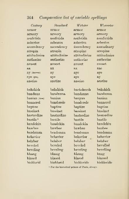
364 Comparative list of variable spellings
Century

Comparative list of variable spellings 365
Stormonth

366 Comparative list of variable spellings
Century

Comparative list of variable spellings 367
Stormonth

3(38 Comparative list of variable spellings
Century

Comparative list of variable spellings 369
Stormonth

370 Comparative list of variable spellings
Century

Comparative list of variable spellings 371
Stormonth

372 Comparative list of variable spellings
Century

Comparative list of variable spellings 373
Stormonth
decolour
decolourise
d£edal
dsedalian
defence
demeanour
demobilise
demonetise
demonise
demoralise
denationalise
denaturalise
dentine
dentise
deodorise
deoxidise
deoxygenise
depauperise
depolarise
depopularise
deputise
despatch
desynonymise
detonise
devilise
diabolise
dialling
dialogise
diarise
diarrhoea
diarrhoetic
dicky
24
Imperial
decolour
decolorize
daedal
daedahan
defence
demeanour
demobilise
demonetize
demonize
demoralize
denationalize
denaturalize
dentine
dentize
deodorize
deoxidize
deoxygenize
depauperize
depolarize
depopularize
deputize
despatch
desynonymize
detonize
devilize
diabolize
dialling
dialogize
diarize
diarrhoea
diarrhoetic
dickey
Oxford
decolour
decolorize
daedal
daedalian
defence
demeanour
demobilize
demonetize
demonize
demoralize
denationalize
denaturalize
dentine
dentize
deodorize
deoxidize
deoxygenize
depauperize
depolarize
depopularize
deputize
dispatch
desynonymize
detonize
devihze
diabolize
dialling
dialogize
diarize
diarrhoea
diarrhoetic
dicky
Divisions
de-col'or
de-eol'or-ize
de'dal
de-da'li-an
de-fense'
de-mean'or
de-mo'bil-ize
de-mon'e-tize
de'mon-ize
de-mor'al-ize
de-na'tion-al-ize
de-nat'u-ral-ize
den'tin
den'tize
de-o'dor-ize
de-ox'i-dize
de-ox'y-gen-ize
de-pau'per-ize
de-po'lar-ize
de-pop'u-lar-ize
dep'u-tize
de-spatch'
de-sy-non'y-mize
det'o-nize
dev'il-ize
di-ab'o-lize
di'al-ing
di-al'o-gize
di'a-rize
di-ar-rhe'a
di-ar-rhet'ic

374 Comparative list of variable spellings
Century

Comparative list of variable spellings 375
Stormonth
diaeresis
digitalin
dingey
diphthongise
diplomatise
discolour
disenamour
disenrol
disfavour
disharmonise
dishevelled
dishonour
disillusionise
disenclose
disindividualise
disc
dislustre
disorganise
distil
disutilise
divinise
doggerelise
dogmatise
dolomise
dolor
domesticise
Doricise
Dorise
doxologise
doxie
dragoonade
drosky
Imperial
diaeresis
digitalin
dinghy
diphthongize
diplomatize
discolour
disenamour
disenroll
disfavour
disharmonize
dishevelled
dishonour
disillusionize
disinclose
disindividualize
disc
dislustre
disorganize
distil
disutilize
divinize
doggerelize
dogmatize
dolomize
dolour
domesticize
Doricize
Dorize
doxologize
doxy
dragonade
drosky
Oxford
diaeresis
digitalin
dinghy
diphthongize
diplomatize
discolour
disenamour
disenrol
disfavour
disharmonize
dishevelled
dishonour
disillusionize
disenclose
disindividualize
disk
dislustre
disorganize
distil
disutnize
divinize
doggerelize
dogmatize
dolomize
dolour
domesticize
doricize
dorize
doxologize
doxy
dragonnade
droshky
Divisions
di-er'e-sis
dig'i-ta-lin
din'ghy
diph'thong-ize
di-plo'ma-tize
dis-col'or
dis-en-am'our
dis-en-roll'
dis-fa'vor
dis-har'mo-nize
di-shev'el-ed
dis-hon'or
dis-il-lu'sion-ize
dis-in-close'
dis-in-di-vid'u-al-ize
dis-lus'ter
dis-or'gan-ize
dis-til'
dis-u'til-ize
div'i-nize
dog'ger-el-ize
dog'ma-tize
dolo-mize
do'lor
do-mes'ti-cize
Dor'i-cize
Do'rize
dox-ol'o-gize
drag-o-nade'
drosh'ky

376 Comparative list of variable spellings
Century

Comparative list of variable spellings 377
Sto7'month

378 Comparative list of variable spellings
Century

Comparative list of variable spellings 379
Stormontli

380 Comparative list of variable spellings
Century

Comparative list of variable spellings 381
Stormonth

382 Comparative list of variable spellings
Century

Comparative list of variable spellings 383
Stormonth

384 Comparative list of variable spellings
Century

Comparative list of variahle spellings 385
Stortnonth

386 Comparative list of variable spellings
Century
idolatrize
idolize
iliadize
illegalize
illegitimatize
illiberalize
iinmaterialize
immortalize
impale
impanel
impaneled
impaneling
imperialize
imperiled
incase
inclose
inclosure
incognizable
incognizant
individualize
inorganizable
inorganization
inorganized
inoxidizable
inoxidize
instalment
instil
intellectualize
internationalize
Tonicize
Ionize
Italianize
Standard
idolatrize
idolize
iliadize
illegalize
illegitimatize
illiberalize
immaterialize
immortalize
empale
impanel
impaneled
impaneling
imperialize
imperiled
incase
enclose
enclosure
incognizable
incognizant
individualize
inorganizable
inorganization
inorganized
inoxidizable
inoxidize
instalment
instil
intellectualize
internationalize
lonicize
Ionize
Italianize
Webster
idolatrize
idolize
iliadize
illegalize
illegitimatize
illiberalize
immaterialize
immortalize
impale
impanel
impaneled
impaneling
imperialize
imperiled
incase
inclose
inclosure
incognizable
incognizant
individualize
inorganizable
inorganization
inorganized
inoxidizable
inoxidize
installment
instill
intellectualize
internationalize
lonicize
Ionize
Italianize
Worcester
idolatrize
idolize
iliadize
illegalize
illegitimatize
illiberalize
immaterialize
immortalize
empale
impanel
impanelled
impanelling
imperialize
imperilled
encase
enclose
enclosure
incognizable
incognizant
individualize
inorganizable
inorganization
inorganized
inoxidizable
inoxidize
instalment
instil
intellectualize
internationalize
lonicize
Ionize
Italianize

Comparative list of variable spellings 387
Stormonth
idolatrise
idolise,
iliadise
illegalise
illegitimatise
illiberalise
immaterialise
immortalise
empale
impannel
impannelled
impannelling
imperialise
imperilled
encase
enclose
enclosure
incognisable
incognisant
individualise
inorganisable
inorganisation
inorganised
inoxidisable
inoxidise
instalment
instil
intellectualise
internationalise
lonicise
Ionise
Italianise
Imperial
idolatrize
idolize
iliadize
illegalize
illegitimatize
illiberalize
immaterialize
immortalize
impale
impannel
impannelled
impannelling
imperialize
imperilled
incase
inclose
inclosure
incognizable
incognizant
individualize
inorganizable
inorganization
inorganized
inoxidizable
inoxidize
instalment
instil
intellectualize
internationalize
lonicize
Ionize
Italianize
Oxford
idolatrize
idolize
iliadize
illegalize
illegitimatize
illiberalize
immaterialize
immortalize
impale
empanel
empanelled
empanelling
imperialize
imperilled
encase
enclose
enclosure
incognizable
incognizant
individualize
inorganizable
inorganization
inorganized
inoxidizable
inoxidize
instalment
instil
intellectualize
internationalize
lonicize
Ionize
Italianize
Divisions
i dol'a-trize
i'dol-ize
il'i-ad-ize
il-le'gal-ize
il-le-git'i-ma-tize
il-lib'er-al-ize
im-ma-te'ri-al-ize
im-mor'tal-ize
im-pale'
im-pan'el
im-pan'el-ed
im-pan'el-ing
im-pe'ri-al-ize
im-per'il-ed
in-case'
in-close'
in-clo'sure
in-cog'ni-za-ble
in-cog'ni-zant
in-di-vid'u-al-ize
in-or'gan-i-za-ble
in-or-gan-i-za'tion
in-or'gan-ized
in-ox'i-diz-a-ble
in-ox'i-dize
in-stal'ment
in-stil'
in-tel-lec'tu-al-ize
in-ter-na'tion-al-ize
I on'i-cize
I'o-nize
I tallan-ize

388 Comparative list of variable spellings
Century

Comparative list of variable spellings 389
Stormonth

390 Comparative list of var'iahh spellings
Century

Comparative list of variable spellings 391
Stormonth

392 Comparative list of variahle spellings
Century

Comparative list of variable spellings 393
Stormonth
martyrise
marvellous
materialise
maugre
meagre
medallist
mediatise
mediaeval
mediaevalise
memorise
mercurialise
metalled
metalling
metallise
metre
methodise
millionaire
millionise
mineralise
minimise
mitre
mobilise
modelled
modeller
modelling
mould
moult
monetise
monopolise
moralise
mortalise
moustache
Imperial
martyrize
marvellous
materialize
maugre
meagre
medallist
mediatize
mediaeval
mediaevalize
memorize
mercurialize
metalled
metalling
metallize
metre
methodize
millionaire
millionize
mineralize
minimize
mitre
mobilise
modelled
modeller
modelling
mould
moult
monetize
monopolize
moralize
mortalize
moustache
Oxford
martyrize
marvellous
materialize
maugre
meagre
medallist
mediatize
mediaeval
medisevalize
memorize
mercurialize
metalled
metalling
metallize
metre
methodize
millionaire
millionize
mineralize
minimize
mitre
mobilize
modelled
modeller
modelling
mould
moult
monetize
monopolize
moralize
mortalize
moustache
Divisions
mar'tyr-ize
mar'vel-ous
ma-te'ri-al-ize
mau'gre
mea'ger
med'al-ist
me'di-a-tize
me-di-e'val
me-di-e'val-ize
mem'o-rize
mer-cu'ri-al-ize
met'al-ed
met'al-ing
met'al-lize
me'ter
meth'od-ize
mil-lion-aire'
million-ize
min'er-al-ize
min'i-mize
mi'ter
mo'bil-ize
mod'el-ed
mod'el-er
mod'el-ing
mon'e-tize
mo-nop'o-lize
mor'al-ize
mor'tal-ize
mus-tache'

394 Comparative list of variahle spellings
Century
iiiytholog'ize
mythopeic
iiaplitbalene
iiaplitlialize
narcotize
narghile
nasalize
natlieless
nathemore
nationalize
naturalize
nebulize
nectarize
neighbor
Nemeanneologize
nephelin
neutralize
nilgau
niter
nitery
nitrogenize
nitroglycerin
nomadize
noniinalize
normalize
novelize
nozle
nuncheon
Standard
mythologize
mythopeic
naphthalene
naphthalize
narcotize
narghile
nasalize
nathless
nathmore
nationalize
naturalize
nebulize
nectarize
neighbor
Nemeanneologize
nepheline
neutralize
nilgau
niter
nitery
nitrogenize
nitroglycerin
nomadize
noniinalize
normalize
novelize
nozle
nuncheon
Webster
mythologize
mythopceic
naphthalene
naphthalize
narcotize
nargile
nasalize
nathless
nathmore
nationalize
naturalize
nebulize
nectarize
neighbor
Nemeanneologize
nepheline
neutralize
nylghau
niter
nitry
nitrogenize
nitroglycerin
nomadize
noniinalize
normalize
novelize
nozzle
nunchion
Worcester
mythologize
mythopoeic
naphthaline
naphthalize
narcotize
nargile
nasalize
nathless
nathmore
nationalize
naturalize
nebuhze
nectarize
neighbor
Nemeanneologize
nepheline
neutralize
nylghau
nitre
nitry
nitrogenize
nitroglycerine
nomadize
noniinalize
normalize
novelize
nozle
nunchion
ob))ligato obbligato obbligato obbligato

Comparative list of variable spellings 395
Stormonth
mythologise
mythopoeic
naphthaline
naphthaUse
narcotise
nargile
nasahse
nathless
nathemore
nationaUse
naturahse
nebuhse
nectarise
neighbour
Nemsean
neologise
nepheline
neutralise
nylgau
nitre
nitry
nitrogenise
nitro-glycerin
nomadise
nominalise
normalise
novelise
nozzle
nuncheon
Imperial
mythologize
mythopoeic
naphthalene
naphthalize
narcotize
narghile
nasalize
nathless
nathmore
nationalize
naturalize
nebulize
nectarize
neighbour
Nemeanneologize
nephelin
neutralize
nylghau
nitre
nitry
nitrogenize
iiitro-glycerine
nomadize
nominalize
normalize
novelize
nozzle
nuncheon
Oxford
mythologize
mythopoeic
naphthaline
naphthalize
narcotize
narghile
nasalize
natheless
nathemore
nationalize
naturalize
nebulize
nectarize
neighbour
Nemeanneologize
nepheline
neutralize
nylghau
nitre
nitry
nitrogenize
nitroglycerine
nomadize
nominalize
normalize
novelize
nozzle
nuncheon
Divisions
my-thol'o-gize
myth-o-pe'ic
naph'tha-lene
naph'tha-lize
nar'co-tize
nar'ghi-le
na'sal-ize
na'the-less'
na'the-more'
na'tion-al-ize
nat'u-ral-ize
neb'u-lize
nec'tar-ize
neigh'bor
Ne-me'an
ne-oFo-gize
neph'e-lin
neu'tral-ize
nil'gau
ni'ter
ni'ter-y
ni'tro-gen-ize
ni-tro-gly'cer-iu
nom'ad-ize
nom'i-nal-ize
nor'mal-ize
nov'el-ize
nozle
nun'cheon
obligato obbligato obbligato ob-bli-ga'to

396 Comparative list of variahle spellings
Century

Comparative list of variahle spellings 397
Stormonth

398 Comparative list of variable spellings
Century

Comparative list of variahle spellings 399
Stormonth

400 Comparative list of variable spellin()s
Century
partizan
party-colored
pasha
patchouli
patronize
pauperize
paynira
peccary
pectin
peculiarize
pedantize
peddler
pedestrianize
pemmican
penciled
percarbureted
perdue
perineum
peritoneum
peroxid
peroxidize
personalize
petaled
petardeer
petrohn
pewit
phaeton
phagedena
Phenician
phenicin
phenix
phenyl
Standard
partizan
party-colored
pasha
patchouli
patronize
pauperize
paynim
peccary
pectin
peculiarize
pedantize
pedler
pedestrianize
pemmican
penciled
percarbureted
perdue
perineum
peritoneum
peroxid
peroxidize
personalize
petaled
petardeer
petrolin
pewit
phaeton
phagedaena
Phenician
phenicin
phenix
phenyl
Webster
partisan
party-colored
patchouli
patronize
pauperize
painim
peccary
pectin
peculiarize
pedantize
peddler
pedestrianize
pemmican
penciled
percarbureted
perdu
perineum
peritoneum
peroxide
peroxidize
personalize
petaled
petnrdeer
petroline
pewit
phaeton
phagedena
Phoenician
phenicine
phenix
phenyl
Worcester
partisan
party-colored
pacha
patehouly
patronize
pauperize
painim
peccary
pectine
peculiarize
pedantize
pedler
pedestrianize
pemican
pencilled
percarburetted
perdu
perinseum
peritonaeum
peroxide
peroxidize
personalize
petaled
petardeer
petroline
pewit
phaeton
phagedena
Phamician
phenicine
phoenix
phenyle

Comparative list of variahle spellings 401
Stormonth

402 Comparative list of variable spellings
Century

Comparative list of variable spellings 403
Stormonth

404 Comparative list of variahle spellings
Century
pommeled
popularize
porcelainized
porcelanite
porphyrize
postiler
practise, v.
praemunire
pram
pratique
precipe
preeminence
preemption
preengage
preesta4;)lisli
preexist
premise, n.
pretense
preterit
pretor
primigenial
prodigalize
progi-am
proletariate
prologuizer
proniiiiciaiiiiento
propretor
proselytize
prosopopeia
prothalamium
protoxid
proverbialize
Standard
pommeled
popularize
porcelainized
porcelanite
porphyrize
postiler
practise, n. and V,
praemunire
praam
pratique
precipe
preeminence
preemption
preengage
preestablish
preexist
premise
pretense
preterit
pretor
primigenial
prodigalize
program
proletariat
prologizer
pronunciamento
propretor
proselytize
prosopopeia
prothalamion
protoxid
proverbialize
Webster
pommeled
popularize
porcelainized
porcelanite
porphyrize
postiler
practice,", and/'
praemunire
praam
pratique
praecipe
preeminence
preemption
preengage
preestablish
preexist
premise
pretense
preterit
pretor
primogenial
prodigalize
programme
proletariat
prologizer
proimiiciamento
propretor
proselytize
pros()po])(i'ia
prothalamion
protoxide
proverbialize
Worcester
pommelled
popularize
porcelainized
porcelainite
porphyrize
postiller
practise, v.
praemunire
pram
pratic
praecipe
preeminence
preemption
preengage
preestablish
preexist
premise
pretence
preterite
pretor
primogenial
prodigalize
programme
proletariat
prologizer
pronunciameiito
propraetor
proselytize
pr<)so]>oiiana
prothalamion
protoxide
proverbialize

Comparative list of variable spellings 405
Stormonth
pommelled
popularise
porcelainised
poreellanite
porphyrise
practise, v.
premunire
praampratique
praecipe
pre-eminence
pre-emption
pre-engage
pre-establish
pre-exist
premiss
pretence
preterite
praetor
primogenial
prodigalise
programme
proletariat
pronunciamiento
propretor
proselytise
prosopopoeia
protlialamium
protoxide
proverbialise
26
Imperial
pommelled
popularize
porcelainized
poreellanite
porphyrize
postiller
practise, v.
praemunire
prampratique
praecipe
pre-eminence
pre-emption
pre-engage
pre-establish
pre-exist
premise
pretence
preterit
praetor
primigenial
prodigaUze
programmeproletariat
prologizer
pronunciamiento
propraetor
proselytize
prosopopeia
protlialamium
protoxide
proverbiahze
Oxford
pommelled
popularize
porcelainized
poreellanite
porphyrize
postiller
practise, v.
praemunire
pram
pratique
praecipe
pre-eminence
pre-emption
pre-engage
pre-establish
pre-exist
premise
pretence
preterite
praetor
primigenial
prodigalize
program
proletariate
prologuizer
pronunciamento
proprietor
proselytize
prosopopoeia
prothalamion
protoxide
proverbiahze
Divisions
pom'mel-ed
pop'u-lar-ize
porce'lain-ized
por'ce-lan-ite
por'phy-rize
pos'til-er
prac'tise
prae-mu-ni're
prat'ique
pre'ci-pe
pre-em'i-uence
pre-emp'tion
pre-en-gage'
pre-es-tab'hsh
pre-ex-ist'
premise
pre-tense'
pret'er-it
pre'tor
pri-mi-ge'ni-al
prod'i-gal-ize
pro'gTam
pro-le-ta'ri-ate
pro'logu-i-zer
pro-nun-ci-a-mien'to
pro-pre'tor
pros'e-ly-tize
pro-so-po-pe'ia
pro-tha-la'mi-imi
pro-tox'id
pro-ver'bi-al-ize

406 Comparative list of variahle spellings
Century

Comparative list of variable spellings 407
Stormonth
prunella
psalmodise
pterodactyle
ptyalin
pulkha
pulverin
pulverise
pupilarity
puritanise
purline
purpurine
putchock
pyroxyliue
quadrumane
quarrelled
quarrelling'
quarter-foil
quercitrine
quaestor
quinzaine
quippa
Imperial
prunella
psalmodize
pterodactyl
ptyalin
pulkha
pulverin
pulverize
pupilarity
puritanize
purlin
purpurin
putchock
pyroxyline
quadruman
quarrelled
quarrelling
quatrefoil
quercitrin
questor
quinzaine
quipo
Oxford
prunella
psalmodize
pterodactyl
ptyalin
pulka
pulverine
pulverize
pupillarity
puritanize
purlin
purpurin
putchuk
pyroxylin!
Divisions
pru-nella
psal'mo-dize
pter-o-dac'tyl
pty'a-lin
pul've-rin
pul've-rize
pu-pi-lar'i-ty
pu'ri-tan-ize
pur'lin
pur'pu-rin
put-chuk'
py-rox'y-lin
quad'ru-man
quar'rel-ed
quar'rel-ing
qua'tre-foil
quer'cit-rin
ques'tor
quin'zain
qui^pu
raccoon
raguled
rajah
rajpoot
rampallion
rancour
ratan
rhatany
rationalise
raguly
rajah
Rajput
rampallian
rancour
rattan
ratany
rationalize
As far as published at date of printiiu
ra-coon'
rag'u-ly
ra'ja
Raj -put'
ram-pal'lian
ran'cor
ra-tan'
rat'a-ny
ra'tion-al-ize

408 Comparative list of variable spellinrjs
Century

Comparative list of variable spellings 409
Stormonth

410 Comparative list of variable spellings
Centura/

Comparative list of variable spellings 411
Stormonth

412 Comparative list of variable spellings
Century

Comparative list of variable spellings 413
Stormonth

414 Comparative list of variable S2)ellings
Century

Comparative list of variable spellings 415
Stormonth

416 Comparative list of variable spellings
Century

Comparative list of variable spellings 417
Stormonth

418 Comparative list of variable spellings
Century

Comparative list of variable spellings 419
Stormonth

420 Comparative list of variable spellings
Century

Comparative list of variable spellings 421
Stormonth

422 Comparative list of variable spellings
Centura/

Comparative list of variable spellings 423
Stormonth

424 Comparative list of variable spellings
Century

Comparative list of variable spellings 425
Stormonth

426 Comparative list of variable spellings
Century

Comparative list of variable spellings 427
Stormonth

428 Comparative list of variable spellings
Century Standard Webster Worcester
uranography uranography uranography uranography
uremia uremia uraemia uraemia
utas utas utas utas
utilize utilize utilize utilize
vagabondize

Comparative list of variable spellings 429
Stormonth

430 Comparative list of variable spellings
Century

Comparative list of variable spellings 431
Stormonth

.432 Comparative list of variable spellings
Century Standard Webster Worcester
worshiped worshiped worshiped worshipped
worshiper worshiper worshiper worshipper
Wychfite Wychfite WycUfite Wickliffite
xanthin xanthin xanthin xanthine
xanthophyl xanthophyl xanthophyll xanthophyll
xyloidine xyloidin xyloidin xyloidine
yernut yer-nut yernut yernut
zaffer

Comparative list of variable spellings 433
Stormonth

B
FRENCH DIVISION OF WORDS
A. According to G. Daupeley-Gouverneur ("Le Com-
positeur et le Correcteur Typographes," Paris, 1880),
there are two schools, one favoring division according
to etymology, the other according to French spelling.
The latter to be preferred. (Hence ins- traction, and not
in- struction, since in oral spelling in the schools it is
always, for example, m, a, ma, n, u, s, nus, manus,
c, r, i, t, crit, raanuscrit.)
B. No mute syllable to be carried over, even of four
letters, unless under stress of narrow measure. (Not
pubU- ques, but pu- bliques.)
C. No two-letter syllable to be carried over even if not
mute (par- mi, rele- ve, confon- du), nor the pronominal
article attached to the verb as its object (prenez- la), nor
the demonstrative adverb attached to pronouns (ceux- ci).
D. No two-letter ending of the Hne if the letters are
thin (il- lettre, li- mace, fl- ligrane), under any circum-
stances j the measure may excuse two thick letters (en-
fantine, pa- villon).
B. No one-letter ending ever admissible (i- mage,
a- venir, e- mission), nor in combination with an eli-
sion (I'e- legance, I'a- venement, d'a- vance, d'e- pargne,
qu'a- vant).
F. No division between two vowels (lou- ange, the-
atre, situ- ation) [M. Claye, head of the house for which
our author was former proof-reader, thinks this an unrea-
sonable prejudice], except in case of compounds (extra-
ordinaire, archi- episcopal, anti- orleaniste;preferable to
extraor- dinaire, etc.).
G. Divide compounds, already hyphened, on the hy-
phen by preference (morte- saison, contre- expertise, plus-
value), and compounds elided with apostrophe after the
434

French divisions 435
apostrophe (grand'- m^re, a grand'- peine), but not omit-
ting the hyphen, as is sometimes done [see Marie Bash-
kirtseff's Journal, Paris, 1888, grand'|maman].
H. Divide after a mute syllable in the middle of a wordrather than before (courte- pointe, not cour- tepointe,
evene- ment, not eve- nement).
I. Carry over euphonic t between hyphens (ira- t-il,
presente- t-on).
J. Never divide on x or y (= cs and ii) -, neither Alex-
andre nor Ale- xandre, fix- er nor fl- xer, roy- aliste nor
ro- yaliste.
K. Never carry over etc.
L. No more than three successive hues ending with
a hyphen are tolerable. An obsolete rule forbade the
first line of a work ending in a hyphen.
W. P. G's observations based on Rambaud (R) : Hist, de laCivilisation Contemp. en France, Paris, 1888.
Llhomme (L) : Les Femmes Ecrivains, Paris, c. 1892.Daudet (D) : Tartarin sur les Alpes, Paris, 1886.Bashkirtseff (B) : Journal, Paris, 1888.
Bacourt (Bt) : Souvenirs d'un Diplomat, Paris, 1882.
Flaubert (F) : Correspondance, iii^ serie, Paris, 1891.Taine (T): Origines de la France Contemp., Paris, 1887.(DG) refers to Daupeley-Gouverneur, as above.
1 In general, with compounds of ab- (abs-) circon-
com- con- des- ex- in- ob- per- pro- sub- super- trans-,
divide on the preposition. But when s impur (s followed
by a consonant) succeeds, generally divide on that, es-
pecially in the case of in- (compare DG [A]).
R (both usages)circon- stance recon- stitua in- structioncircons- tance cons- tituer ins- truction
L (both usages)circon- stancecircons- tance cons- truire pros- cription
supers- titieuses

436 French divisions
B (both usages)

French divisions 437
3 Divide between two consonants (not constituting
one of the above digraphs), including Hquid II; or between
a consonant and a digi*aph (or trigraph).— No exception
in the case of a monosyllable ending in mute e (contrary
to DG B).—No consideration paid to effect on nasaliza-
tion (to the eye).
R

ITALIAN DIVISION OF WORDS
W. p. G's observations based on Barbara (B) : Memorie d'unEditore, Florence, 1883.
Carducci (C) : Rime di F. Petrarca, Leghorn, 1876.
Cibrario (Ci) : Econ. Polit. del Medio Evo, vol. i., Turin, 1861.
Mario (MJ : Scritti, vol. i., Bologna, 1884.
Stecchetti (S) ; Postuma Nova, Polemica, Bologna, 1884, 1885.
Ricci (R) : First Italian Reading-Book, New York (Londonmake?), 1888.
Giannone (G) : Opere Postume, vol. i., Italy (no place, prob-ably under the ban political and ecclesiastical), 1821.
lia comparison with Gesualdo (Ge), II Petrarcha, Venice, 1553.
Machiavelli (Ma), Discorsi, Venice, 1554.
Boccaccio (Bo), Decamerone, Florence, 1573.
[See the corresponding paragraphs in French Division.]
C. Two letters may be carried over even in a two-
syllable word, as, uo- mo, and C has not only co- me but
(in narrow measure) co- m*.
D. The line may end with two letters, even if thin, as,
11- bera, fl- gliuoli.
E. The best practice is now doubtless adverse to ab-
solute one-letter endings, which were used ad libitum in
Latin books and in the early Italian texts, and are not
infrequent in C (o- mai, a- vesse, 'n- chiostro, [e- nim]), andof constant occurrence in Ci (e- sempi, u- dienze). This
has commonly no regard to the exigencies of spacing.
—
There seems to be no rule against one-letter endings in
combination with an elision, as, C (I'o- z'iose), Ci (d'l-
talia), M (I'a- more), G (I'o- pinione). The oldest works
cited are full of instances of both these usages.
P. Division may take place betweeh two vowels, as,
C (pa- iono).
G. Compounds are generally disregarded in favor of
the rule to divide on the vowel where possible. But the
usage IS mixed here as in the Latin. Thus, B (di- scus-
sioni, di- sposti, di- scretaj but also tra- scorsi, tras-

Italian divisions 439
cura, tras- porto); C (di- susata, [qui- squis,] tra- sport6,
tra- slazione) ; Ci (tra- scrivere and tras- curata, dis- ono-
rati, in- stituti); M (di- sposti, di- sgrazia, tra- sformate).
— The usage with tra- tras- varies also in the elder texts
:
Bo (tra- sportarsi), Ge (tra- sfigurato, tras- figuro).— In
dissyllabic prefixes, care is not always taken to make the
division after the preposition, even when there is room,
as, S (so- praindicate, for sopra- indicate).
J. The Latin division was uniformly on the vowel
preceding x, and is correctly followed in C ([respe-
xisset]), M ([ma- xima]). It is regularly observed in
Spanish and in Portuguese, where the sound of this
consonant has become aspirated. The Itahan alphabet
has no x.
L. Four successive hyphens occur in B, five in C, six
in Ci, five in M, four and five on one page in S (P. N.),
four in G, six in Bo and Ge.
M. In such locutions as nell' arte, mezz' ore, quell'
Arcadia, P altr' ieri, fors' anco, the well-settled practice
is to carry over the elided syllable— nel- Parte, Pal- tr'ieri,
for- s'anco. But G varies between quel- Pistesso and
quell'a- zione, all'o- recchio, as does the older Ge between
del- Pappetito and dell'- arco. The latter is also free to
end the line with an elision (ch'|egh), as in Bo (co'
|va-
lenti, e'|
giovani, tra'|
quaU, se'.| ), and even R (po'
Istrano, se' |
Pabate, pe' |suo').
1 Divide on vowel or diphthong before a single con-
sonant, or before any consonantal combination capable
of beginning an Italian word, including sb, sd, and sf, or
before vr. (The division, in Latin words, before ct goes
back to the days when these letters were cast on a single
type-body. Compare no- cte in p. 1 of Fust and Schof-
fer's Psalter of 1457. " The modern Portuguese retains
this division: e. g., produ-ctoras.)

440 Italian divisions
B

Italian divisions 441
G [assum- psit]
Bo
Ma
Ge Petrarch- sea
[Regen- sburg][avec- ques]
[Stan- sfeld]
[Wim- pfen]ta- cque >
na- cque ^(exception)
tac- quepiac- que
ac- queac- quistare
nac- que
tac- quepiac- quenac- queac- queta
tran- quillo
sol- dati
par- lamentecom- battendo
[coem- ptionem[descrip- tionem][descrip- turn]
[volu- ptas]
[see- ptrumj
[Da- phne][Ere- chtheo](exception)
w. P. aJune, 1896.

GERMAN DIVISION OF WORDS
W. p. G's observations based on Lankenau and Oelsnitz (L)
:
Das Heutige Russland, Leipzig, 1881.
Baumbach (B) : Sommermarchen, Leipzig, 1885 (Roman letter).
Kapp (K) : Geschichte des Deutschen Buchhandels, Leipzig,
1886, and Justus Erich BoUmann, Berlin, 1880.
Sicherer (S) : Die Genossenschaftsgesetzgebung in Deutsch-land, Erlangen, 1872.
Heppe (H) : Geschichte des Deutschen Volksschulwesens, Gotha,1858, vol. i.
Goethe (G) : Werke, Weimar, 1887, vol. 1, part 3, and Paris,
1836, vol. iii.
Hartmann (Ha) : Die Nigritier, Berlin, 1876 (Roman letter).
Meyer's Konversations-Lexikon (M), vol. xi, Leipzig, 1888.
[See the corresponding paragraphs in French Division.]
C. Two letters may be carried over even in a two-
syllable word, as, die- se, Bluntsch- li.
D. The line may end with two letters, as, ei- nem,
ih- nen (and numerous prefixes).
B. Single-letter endings are avoided, if not forbidden.
F. Division may take place between vowels, as, the-
oretisch, and in obedience to the rules for compounds and
prefixes, as. Bade- ort, Bau- aufseher. Be- antwor- tung.
G. With compounds, division is preferably by com-
ponent parts, as, Mittel- alter; but Mit- telalter or Mit-
telal- ter is permissible, while Mitte- lalter is not.
J. It is proper to divide on a vowel before x, as, Ale-
xander.
L. Four successive hyphens occur in L, K, Ha; five
in M ; six in H ; and seven in S.
1 Divide compounds by component parts preferably
;
subdivision, if necessary, should be independent for each
part (see [G] above), without regard to Rule 4. (The
exception Din- stag below is to be accounted for by the
early practice of casting long s and t on one tj'pe-body.
ii2

German divisions 443
See its operation in Rule 4.) The same treatment is
applicable to compounds of classic origin.
Bade- ort Hoch- ebene Auer- ochs Konig- reich wo-nach ein- ander Spra- chengewirr (L) ', Berges- abhangSchlag- entzwei Schweins- leder Miillers- tochter Jabres-
tag (B) ; Voll- endung Schreib art Eng- land Manu-skript Mono- graphien Aristo- kratie (K); Gut- achten
Bekanntma- chung (S); Sonn- abend Fried- rich vier-
eckig Heb- amme [Din- stag] (H) ; Lohnbe- dienten Fels-
lagen (G)j Bau- aufseher Physio- gnomien Properi-
spomenon (Ha)^ Diet- rich Re- prasentanten atmo-
spharisch kontra- stierendes Pro- gnathic epi- seopales
Mon- archie Tri- klinium Mikro- scop Manganhydr-oxyd Beet- hoven (M).
2 Divide on prefixes, except in the infrequent case of
emp-, where the tendency if not the rule is to join p andf, as, Em- pfindung. (In the case of trans- the s is given
to the main word if elision has occurred in consequenceof that word beginning with s.) The prefix may be sub-
divided, as Un- ternehmen.
Ver- ehrung Umher- irrens er- blicken Be- antwortungGe- prage un- interessant (L) ; auf- horen her- unter
gegen- iiber Ein- gang pro- phetischen (B) ; Mit- arbeiter
dar- iiber beob- achteten Re- skripte Kon- skription
inter- essant [in- teresse] Trans- port [tran- scripta] (K);
Ex- kursion Em-pfahl inte- ressant (irregular) (G); Ver-
unzierungen (Ha).
3 Divide on suffixes beginning with a consonant, as,
-bar, -chen, -fach, -haft, -heit, -keit, -hch, -los, -schaft,
-zig. (In accordance with Rule 4 or 5, but contrary
to the English practice, a consonant is regularly carried
over for suffixes beginning with a vowel, as, -end, -ig,
-isch, -ung, as well as endings of inflection, declension,
comparison, or agency.)

444 German divisions
Stadt- chen ekel- haft Vergangen- heit mog- lich weib-
lich Leiden- scliaft (L); wunder- bare Selig- keit (B);
viel- fach zweck- los (K)j [Lebliaf- tigkeit] {(}); vortreff-
lich (Ha).
4 (Rides 1-3 satisfied), divide on a vowel or diph-
thong followed by a single consonant, including h and x
;
or before bl, gl, kl: br, dr, fr, gr, kr, skr, str, tr, thr:
ch, ph, th: sch: tsch: single type ck, st, sz (in Romanletter = ss, divided s- s), tz. Usage fluctuates with pf,
as, Ku- pfer Schop- fung dum- pfig; with dr, as, nie-
drig nied- rig; with fr, as, schief- rigen; with kl, as,
dunk- ler, and st, as, lus- tig. (Here the suffix seems to
claim the single consonant.) Finally, we meet with
Deut- schen instead of Deu- tschen.
Wie-der Belusti- gung heili- gen Ei- lande grii- nen
Roma- nen verbunde- nen Eu- ropa Wande- rung gewe-
sen bedeu- tend Ale- xander De- klamation Fe- bruar
Pa- triarchen Ko- stroma ma- chen Ste- phan ro- then
zwi-schen Berdi- tschew Fe- stung Preu- szen drau- szen
(L); zei- gend dei- nigen (B); schrei- ben Brie- fen
geisti- gen sei- ner spa- nische changie- ren Patrio- tismus
[qua- dringentesimo] Ma- trizen unparteyi- schen Exi-
stenz Maje- stiit friihe- sten Mini- sterium (K) ; ei- gene
ei- nem ih- nen kontra- hiren koo- perative steh- ende
(irregular) pu- blizirt nie- driger Indu- strie au- szerdem
Gese- tzes (S); mo- gen Ta- ges vorliiufi- gen ge- heu
Bib- Hotheken (irregular) mii- szen (H) ; na- her ru- hig
beste- hen rii- cken gro- szen (G) ; Entste- hung Zuzie-
hungen blii- henden frii- hesten wei- ter beglei- tetes Ni-
gritier Katastro- phen geogra- phischer wilde- sten in-
du- striosen Zoroa- strichen (Ha) ; Me- xiko eu- ropiiischer
Samo- jeden Bi- bliothek Ma- drid Kathe- drale Ro- dri-
guez Emi- granten Je- frem Mi- kroscope Bea- trix
Deme- trius Di- strikt Lo- thringen Mi- thridatisch Ku-
pfer Pondi- tscherri Kau- tschuk Pe- tschenegen (M).
German divisions 445
5 Divide between double consonants; between twoconsonants other than the digraphs and trigraphs enu-
merated in Rule 4j or between a consonant or conso-
nantal combination and any combination capable of
beginning a German word. But note the exceptions
indicated under Rule 4.
Quel- len bren- nen fes- selnd Wet- ters dunk- ler
(irregular) nied- rig (irregular) unschul- dig gegen- den
Verbin- dung Drohun- gen mil- den Sep- tember behaup-
ten charak- terisirt Bos- porus Lamais- mus mitt- lerer
wel- chem son- stige Kon- trast herr- schende Deut-
schen (irregular?) Pet- schora (irregular) Kap- tschak
(L); weis- sen (Roman letter) Gries- gram schwan-
kender erwach- senen leuch- teten Adel- heid dam-pfenden klat- schenden (irregular?) lus- tige (irregular?)
(B)j Renais- sance Ok- tober Korrek- toren Dis- putiren
Dis- ziplin des- peratem (in disregard of classic prefix)
Eras- mus Fis- kal Nachfol- gerin Vol- kern Sach- sens
Exem- plar Pamph- leten Fiir- sten Lempertz- schen (K) -,
Genos- senschaft verflos- senen zen- tral Bluntsch- li (S);
al- len widersin- nig brin- gen sin- gen Schop- fung letz-
terer sach- sisch Drechs- ler (H); nach- stens Em- pfin-
dungen kam- pfen Tisch- chen Men- schen (G); mils- sen
wis- sen beis- senden (all Roman letter) Auffas- sung
dum- pfig schief- rigen (irregular?) Por- trait Alexan-
drien hoch- stens Flach- ses deh- nenden Vereh- rung
Semitis- mus Skulp- turen agyp- tisch (Ha) ; Es- karpe
Is- pahan Geg- ner Ma- gnesia (irregular, as if follow-
ing the Greek division) Kep- ler Ian- gern Lan- gres
Zwin- ger Mus- kat Dam- pfer Tiibin- gen Weresch-
tschagin (M).W. P. G.
August, 1898.

E
SPANISH DIVISION OF WORDS
A single consonant between vowels begins a syllable:
me-sa, table. la-bor, needle-work.
The letters ch, rr, 11, and n, are considered as simple
consonants, and follow the same rule
:
mu-cha-cho, hoy. ni-uo, child.
pan-ta-lla, lamp-shade. tie-rra, land.
Two separable consonants standing between vowels are
divided
:
puer-ta, door. gus-to, pleasure.
Exception.— The letters b, c, ch, d, f, g, j, p, q, t,
V, z, followed by 1 or r, cannot be separated, unless
they unite compound words
:
pa-la-bra, icord. ta-bla, hoard.
si-glo, century. po-dra, he will he ahle.
sub-lu-nar, sub-lunar.
Three or four consonants, of which s is the second, divide
after the s
:
eons-tan-te, constmit. trans-eri-bir, to copy.
Otherwise compound words are to be resolved into their
elements
:
cor-ta-plu-mas, penknife. ca-ri-lar-go, long-faced.
])VQ-^o-H\-Q,\on, preposition, ad-je-ti-vo, adjective.
True diphthongs and triphthongs are indivisible
:
vie-ne, he comes. bue-no, good.
pre-ciais, ye prize. va-cieis,' i/e tnay empty.
but
lo-Or, praise. le-er, to read.
a-ta-ud, coffin. gan-zu-a, false key.
Copied, by permission, from Knapp's Grammar of the ModemSpanish Language. Second edition, 12mo, pp. 18, 19. Boston,
Ginn & Co., 1900.

INDEX


INDEX
A. See ArticleAbbreviations, early, 34, 35; in
sixteenth-century books for un-
schooled readers, 35; in eigh-
teenth-century descriptive writ-
ing, 35; use of small type for,
35, 36; in account-books andepistolary writing, 36; tolerated
in some books after 1800, 36, 37;
in technical and scientific works,
37; in foot-notes and narrowcolumns, 37 {note) ;
proper andimproper use of, 37, 38 ;
permis-
sible, 38 et seq. ; use of small
capitals and of lower-ease for,
39, 41; of companies and titles,
43-45, 60 ; supposed faults in, 43,
44; in capitals when appendedto names in text, 44 ; confusing,
45 (see also note) ; conjoined withsigns, 45 ; some not found in anydictionary, 48 ; manuscript bookor list of, 48, 60 ; Latin, 49 (see
also note) ; of dialect, slang, andcolloquialisms, 50 ; troublesome,
51 ; indefensible, 52 (see also
note) ; for states and territories,
53, 54; of sizes of books, 54; for
citations, 55 et seq. ; use of, in
catalogues and advertisements,
76, 77; in legal documents, 77
(see also note) ; dislike of, in text,
144; early use of period with,
262 (note 2), 290; undesired, 340
-able, words ending in, 9, 16 (see
also note), 17
Accents, use of, 9, 14 ; names withmany, 10; on retention andOTnission of, 101, 102; accurate
placing of, 316Account-books, abbreviations in.
Adjectives, treatise on, in -able, 16
(note) ; in -ant, -ent, 23, 24 ; com-pound, 66 et seq. ; capitalizing of
certain, 122; in book titles, 127;
division of, 135; use of commawith, 253-255
Adverbs, words consolidated as,
70; ending in -ly, 72; use of
comma with, 253, 255, 258, 259,
262 {note 1)
Advertisements, use of figures andabbreviations in, 76, 77 ; capital
letters used by writers of, 124,
125 ; hackneyed methods of, 127
;
style of short, 147 ; squeezed the-
atrical, 182 ; hanging indention
in, 189 ; typographic mannerismsof, 231 ; study of punctuation of,
260; composition of, 315
Advertisers, old fashion of over-
wide spacing favored by modem,140
Alford, Dean, 261 (see also note)
Algebra, abbreviations in treatises
on, 37 ; use of letters as symbolsin, 42 {note 1)
Almanacs, abbreviations in, 37
Amateurs, in printing, 143 ; imita-
tion by, 183 (note) ; m proof-read-
ing, 318, 319, 320 (see also note),
321America, use of ampersand in title-
pages rare in, 43 ; vowel systemof divisions has many adherentsin, 129; use of motto indention
in, 192; single quotation-marksin, 218 ; dash a useful mark of
punctuation in, 270. See UnitedStates
American Association for the Ad-vancement of Science, new spell-
ings recommended by, 18.(»o<e)
449

450 Index
American Philological Association,
amended spellings of, 31 (note)
Ampersand, uses of, 42 (see also
note 2), 43An. See Article
Anatomy of the Mass, 347
-ant, words ending in, 9
Antique, light-faced, 97, 230, 231,
235; lighter faces of, preferredfor side-headings, 156, 240; for
cut-in notes, 180
A Plea for the Queen's English,
261 (note)
Apocrypha, abbreviations for thebooks of, 55
Apostrophe, use of, for abbrevia-tions, 35, 36, 60, 283, 288 ; in dia-
lect, slang, and colloquialisms,
50, 51; in compounds of posses-
sive case, 69, 70; employed for
quotation-marks, 209, 210, 218,
220, 283 ; of later date than otherpoints, 262 (note 2); various usesof, 283; in possessive case, 284,
288 ; indicates omission of letters
in dialect, familiar dialogue, andpoetry, 285, 288 ; use of thin spacebefore, 285, 307 ; with abbreviateddates, 285 ; used to indicate plural
of letters and figures, 285, 286;
lavishly used by poets of bygoneperiod, 286; last syllable of pastparticiples shortened by, 286;
use of period with, in abbrevia-tions in the possessive, 291, 292
;
in reproductions of colloquial
language, 307Appendix, selection of type for,
157 ; extracts, letters, and docu-ments in, 162
Arithmetics, abbreviations in, 37
Art, little-used terms in, 338
Article, use of indefinite, 13 (see
also note 2), 114; definite, in titles
of newspapers, periodicals, andbooks, 112, 114
Aspects, astronomical, 47Aspirate, use of a before word be-
ginning with strong, 13 (see also
note 2)
Astronomy, use of letters as sym-bols in, 42 (note 1), 90 (note)
Auctioneers, abbreviations in cata-
logues of, 48Authorities, disadvantage of ab-
sence of, 8 ; avoidance of expres-sion of preference for, 8 (note);
conflict of, 9, 330; full namesshould be given in list of, 41
;
cited in foot-notes, 55 et seq., 105,
275; differ as to italic and capi-
tals, 107; use of dash beforenames of, 272, 273 ; consultationof, 306, 316
Authors, dififerent methods of, 7;
decision of, final in printing-
house, 7, 331 ; difficulty of access
to dictionaries preferred by, 7,
8 ; alterations made by, in proofdelay work and increase expense,
8; laws to themselves in useof certain niceties, 9 ; obscurewriting of, 9; should write dis-
tinctly and note on copy author-ity to be followed, 9 ; importanceof preparation of code by, 10,
328; of works on medicine ortherapeutics, 18; should spell
proper names uniformly, 25;
English, of authority, 29 (note);
proper use of abbreviations by,
38; extracts from, in foreign
language, 38; permission of, to
be secured in certain cases, 50,
51; quotations from obsolete,
51; cited in foot-notes, 55, 56;
seldom compound words uni-
formly, 61 ; rulings of, in com-pound words, 61, 62 ; free use of
italic by, in eighteenth century,
94, 95; style of, vulgarized byexcessive use of capitals, 125;
dictionary divisions sometimesrejected by, 130; proof-readerssometimes overruled by, 132, 141
;
assistance of, in preventing baddivisions, 138, 139 ; small capitals
^
for signatures of, 150 ; on selec-
tion of types, 160, 161 ; irregular
indention sometimes insisted onby, 196, 197 ; final revised proof
of, 201 ; terse phrases in famous,210, 211 ; double emphasizing by,
222; punctuation by, 241-243;
often differ with editors in re-
gard to use of comma, 259;
brackets used to inclose explana-tions or comments by, 277 ; stan-
dard editions of good, helpful in
learning punctuation, 293; sys-
tematic, 299 ; two proofs usually
sent to, 301, 302; should makeall con-ections on first proof,
302; additional proofs to, 302;
final proof of, 303; fastidious,
305; suggestions to, 306, 320,
323; use of split infinitive by,
307; services of proof-readersacknowledged by, 321 (see also
note); right of, 327, 328; uni-

Index 451
formity should begin with, 330;
punctuation by, 339, 340 : proof-
reading by, 342, 343 ; corrections
in lead-pencil by, 357 ; sometimesoverlook changes from singular
to plural, 357, 358. See Editorsand Writers
Bancroft, George, 335 (note)
Barker, Robert, 348
Bartolus de Saxoferrato, 99
BaskerviUe, John, 143 {note), 268
{note 1)
Beadnell, Henry, 143
BeUarmine, Cardinal, 347
Besant, Sir Walter, 321 {note)
Bible, pocket, 42; figures specify-
ing verses in, 52 {note), 59; ab-
breviations for books of, 54, 55
;
frequently cited, 56-58; para-
graphing of, 93 ;particular use
of capitals and small capitals in,
109, 110 (see also note 1), 155; useof lower-case letters for pro-
noxins specifying Deity in, 110
;
nicknames in, 119; indirect ref-
erences to, 123 ; divisions in nar-
row measure of pocket editions
of, 131, 133; terse phrases in,
210; quotation-marks not usedin, 213, 214; title of, not itali-
cized nor quoted, 225 ; the commain quotations from, 256, 257 ; ex-
cellent text-book for study of
close pointing, 259; use of dashin references to passages in, 273
;
verification of quotations from,300, 306 ; errors in early editions
of, 348, 349, 350; unauthorizedprinting of, forbidden by Parlia-
ment, 349Bibliographers, use of italic by,
99, 102, 103, 225, 226; style of
foot-notes preferred by, 103
Bibliography, use of italic in workson, 102, 103
Bigelow, Marshall T., 64, 143, 219,
228Black-letter, extracts in, 158 {note)
;
facsimiles in, 175; spacing of,
206Blackstone, Sir William, 56, 57,
259Board on Geographic Names, lists
prepared by, 25 (see also note)
Book of Common Prayer, impor-tant divisions of, 123
Book-printers, of France, 231, 232
Books, typographical inconsisten-
cies of, 7; accents reserved for
educational, 14; medieval, full
of clipped words, hard to read,33 (see also note) ; of the fifteenthcentury, 34, 35 ; in roman typeprinted in sixteenth century, 35
;
abbreviations in, 36, 37 (see alsonote), 38 et seq.; marks of refer-
ence in, 42 (see also note 1); use ofampersand in, 42 (see also note
2), 43 ; abbreviations of honorarytitles in, 44, 45 ; exact renderingof titles of old, 49 ; reprints of
old, 51 ; abbreviations of sizes of,
54; of the Bible, 54, 55; cited in
foot-notes, 56 et seq., 176, 275 ; useof words for numbers in text of,
76, 77, 79, 80; roman numeralsin, 87 et sea.; hanging indentionpreferred for catalogues of, 92
{note); uses of italic in, 94, 97,
99, 102-105; titles of cited, 103;
use of capitals in titles of, 111-
113 ; capitals should not be usedlavishly in serious or standard,
125; rules governing capitaliza-
tion of titles of, 127 ; recent Eng-lish and French, 127 ; divisions
prevent unequal spacing in, 130
;
old fashion of over-wide spacingnot tolerated in, 140 ; written forconvenience of readers, 141, 142,
233; use of catchword in, 142, 143;
running titles of, 151, 152 ; over-
spaced letters a blemish in, 152;
method of c<nnposing letter head-ings in, 153, 154 ; side-headings in
educational, 155, 156; small capi-
tals and italic of value when usedwith discretion in, 1 56 ; size of
page and type of, determined bypublisher, 157 ; lack of uniform-ity in minor details damaging to
appearance of, 158;plain roman
lower-case characters in, 166;
excessively annotated, 171 {note),
174 (note) ; cut-in notes in stan-
dard, 180 ; of solid composition,
182 ; composition of text of, 183,
184 ; half-diamond indention usedin title-pages of, 189, 190 ; use of
italic and of quotation-marks for
titles of, 225, 226 (see also note) ;
types for side-headings in, 240;
of authority on punctuation, 241
;
division of, into chapters, para-graphs, and sentences, 246, 247;
study of punctuation of good,
260 ; use of dash in references to
passages in, 273 ; of reference orauthority, 294, 295, 305; proof-

452 Index
reading of, 296 et seq.; typo-graphic uncouthnessin,331; com-position of ordinary, 336, 337 (see
also note) ; errors in early, 346et. seq.; composition of, unre-munerative, 354, 355; pieces ofmetal in page of ordinary, 356.
See EditionsBooksellers, abbreviations in cata-logues of, 48
Book-work, treatment of namesin, 155; uneven spacing not al-
lowed in good, 201Border, small capitals for inscrip-
tions inclosed in, 155Botany, abbreviations in works
on, 37, 45 ; use of capitals anditalic for names in, 106, 107 ; au-thoritative treatises on, 125
Braces, not regarded as marks ofpunctuation, 287 ; formerly usedto inclose triple lines of rime,287; in law-work, tables, andjob-work, 287
Brackets, use of, for interpolationsin text, 237, 239, 277, 288; in legal
and ecclesiastical papers, 278;
before turned-over words in poe-try, 278; used to prevent bewil-derment by parentheses withinparentheses, 278; general rulefor use of parentheses and, 279;
used to inclose reprints of pas-
sages considered spurious in
early manuscripts, 279 ; meaningof exclamation and interrogationwhen inclosed in, 281
Bricks, clippedwords pressed on, 33
Browning, Robert, 246, 321 (note)
Byron, George Noel Gordon, 335
(note)
Caesar, Julius, 227Cantos, numerals of roman small
capitals for, 90Capelli, Adriano, 49 (note)
Capitals, marking of, in copy, 38;
misuse of, 38, 51 ; abbreviationsin, 44 ; arable figures on en bodybad mates for, 87, 89 ; roman nu-merals of, for chapter headings,90, 91 ; for titles of magnates, cen-
turies, and djniasties, 91, 92; ro-
man numerals of, in foot-notesand indexes, 93 ; small capitals
should be proper intermediatebetween lower-case and, 93 ; forLatinized scientific names, 106,
107; hov,' indicated in manu-script, 108; beginning lines of
poetry, 108, 109; for propernouns, 109; for Deity, syno-nyms, and pronouns, 109, 110;for week-days, festivals, and his-
toric days, 111 ; for books, period-icals, plays, and pictures, 111,112;
in long or complex titles, 112;
for titles and dedications, 112,
113 ; should never be compactedin composition, 113; for names ofcorporations, 113, 114 ; for titles
of honor or distinction, 114-118;
in compound titles, 116, 117 ; forpiretixes and nicknames, 118 (see
also note), 119; for geographicalnames and qualifiers, 119-122 ; in-
consistencies in use of, 120 ; in
catalogues, 120, 125, 126 ; Frenchmethod of using, 120, 127; forhistoric, religious, political, andpoetical names, 122, 123; for ab-
stract qualities personified, 123,
124; in quotations, 124; as ameans of display, 124-126; con-sistency in use of, 125, 126; in
serious* or standard books, 125;
en dash for compound words in
line of, 126; in summaries andlegends, 126, 127; monotony of
text composed of large, 146;
at beginning of chapters, 147;
used with small capitals, 148, 150,
151, 166 ; of monotone or light-
faced antique for running titles,
151 ; used with small capitals forside-headings, subheadings, andletter headings, 152, 153, 164 et
seq., 240; lozenge indention un-wisely attempted with, 192;
squared paragraph of, 194 ; com-position and spacing of, 203, 204
;
for subheadings, 230 ; for legendlines, 235 ; systematic use of, 335.
See Small capitals
Carlyle, Thomas, 259
Cataloguer, amusing error of, 45(note)
Catalogties, abbreviations in, 48,
76, 77 ; use of figures and wordsin, 80 ; hanghig indention pre-
ferred for, 92 (note) ; of auction-
eers, merchants, and manufac-ttxrers, 120 ; free use of capitals
in, 125; side-headings in, 155, 156;
use of commas in, 255; stiidy of
punctuation of, 260; dash usedas ditto-mark in, 269
Catch-lines, small capitals freely
used for, 146; space-wasting, 191;
unduly small, 194

Index 453
Catchword, use of, in books, 142,
143Celebrant, symbol indicating wordsintoned by, 48
Centre-notes, in pocket editions ofScriptures, 181
Century, changes of word forms in
nineteenth, 6; facsimiles fromtwo books of fifteenth, 34, 35;
abbreviations in sixteenth and ineighteenth, 35; specification of,
in roman numerals, 91, 92; italic
approved for book texts in six-
teenth, 94Century Dictionary, an authorityin United States, 5 ; spelling of,
8 {note) ; new spellings of chemi-cal words in, 18 {note) ;
preferredspellings of, 28 {note 2), 29 {iiote),
31 ; reformed spelling in, 31
{note) ; use of space before apos-trophe in certain cases in, 50, 51
;
abbreviations approved by, 57,
58; names and definitions of
component parts of sentences asgiven by, 247; acknowledgmentby editors of, 321 {note)
Chap-books, style of, 142
Chapters, roman numerals forheadings of, 87 et seq.; capitals insummaries of, 126, 127; smallcapitals for first word or wordsof, 146, 147; beginning withproper names, 147; summariesof, 148, 149 ; uniformity of head-ings of, 157 ; shoulder-notes usedin'law-work to define, 181 ; al-
lowance of blank at top of,
183, 247 ; half-diamond indentioniised for endings of, 189, 190 ; noindention at beginning of, 193
Characters, use of italic for namesof, in plays, 104; dull monotonyof compact, 148; French methodof composing names of, in plays,
152 ; three distinct series of, 165
;
plain roman lower-case, 166 ; in-
clined, 167; with long ascendersand descenders, 169; irregulari-
ties of different, 199, 200, 203,
204; projecting, in electrotypework. 205; eleven, used in punc-tuation, 288
Chemistry, abbreviations and sym-bols in works on, 37, 45-48 ; useof letters and figures in, 42 {note
1) ; authoritative treatises on,
125Chevillier, Andre, 33 {note), 348, 349,
350
29
Ciphers, use of, in expressingamounts, 84
Circulars, use of figures and spelled-out words in, 76, 77, 80 ; capitalletters used by writers of, 124,
125; hanging indention in, 189;study of punctuation of, 260
Citations, in foreign language, 38;abbreviations in, 54 etseq.; use ofitalic in, 105; notes made up ofshort, 179 ; appear to better ad-vantage in foot-notes, 275
; plac-ing of. in copy, 341
Clarendon Press, 35, 58, 140
Clarke, Samuel, 35Classics, spellings chosen by teach-ers of, 17; famous editions of,
110 ; divisions in narrow measureof pocket editions of, 133 ; thecomma in quotations from, 256,
257 ;punctuation of early and late
editions of, 292; knowledge of,
in proof-reading, 310, 315Clause, definition of, by CenturyDictionary and by Goold Brown,247, 248 {note) ; examples of, 249
;
sometimes defined by comma,253 ; use of comma with limiting,
256 ; unwise iise of comma with,
262 ; use of exclamation-point at
end of every exclamatory, 281 , 282
Cobbett, William, 38, 216, 260, 270
(see also note)
Cocker, W. J., 225 {note)
Code, importance of preparationof, by author, 10, 328
Coins, clipped words stamped on,
33Collation, method of, 298, 309, 313
{note)
Colloquialisms, abbreviations of,
50; indefensible, 285; ordinary,307
Colon, use of, 97, 98; in letter
headings, 169 ; before quotations,216 ; with closing marks of quo-tation, 217; old teaching as to
elocutionary value of, 245, 246;
defines member of sentence, 250,
252, 253; in complex sentences,251-253 ; of later date than otherpoints, 262 {note 2) ; proper func-tion of, 266, 267, 288; quotationsusually preceded by, 267, 268;
other uses of, 267, 268, 290 ; sen-
tence rarely needs more thanone, 268 (see also note 1) ; seldomused with dash, 291
Colonies, English, dictionaries usedin, 5

454 Index
Colophons, abbreviations used forrendering of, 49
Comma, in citations, 59; use of,
with figures in expressingamounts, 84 ; after house num-bers, 86 {note) ; when used withdash, 205; employed for quota-tion-marks, 209, 210, 218, 220;use of, l)efore quotations, 216;with closing quotation-marks,217 ; old teaching as to elocution-ary value of, 245, 246, 260;omission of, in direct sentences,248, 253; use of, in amplifiedsentences, 248, 249, 251 ;
phrasesdefined by, 250, 253, 288; usedwith particles in stiff punctua-tion, 250, 251, 253, 256, 288 ; clausessometimes separated by, 253,
288 ; various uses of, 253-262 ; inobsolete and modern punctua-tion, 254 ; with limiting clauses,
256; needless use of, 257, 258(note) ; in inverted and involvedconstruction, 258 (see also note)
;
differences of editors and au-thors with regard to, 259; ashelper in exact expression, 260
;
wide-spread belief as to frequentuse of, 262 (see also note 1)
;
should be used only as aid tosense, 262; early use of, 262(note 2) ; no point of intermedi-ate impoi-tance between semi-colon and, 263, 264 ; rarely usedwith dash, 271, 291 ; improperlyused instead of parenthesis, 276;use of, with parenthesis, 291
Commentary on the Four Booksof Sentences, 34
Composition, hindrances to accep-table, 8 (note); made difficult
by abbreviations, 35 ; dissimilarmethods of abbreviation in, 37,
38 ; arable figui'es used for wholenumbers with vulgar fractionsin ordinary, 82, 83 ; on type-set-ting machine, 96 ; capitals shouldnever be compacted in, 112, 113;
use of capitals in displayed, 122;
division of words prohibited inone kind of, 131; eccentric, 131;overrunning to avoid bad divi-
sions increases cost of, 138, 141
;
solid and compact, 148, 165 et seq.,
182, 201 ; of letter headings, 163
et seq. ; useless breaks in har-mony of, 165; ordinary book,167, 183: notes a hindrance in,
171 (see also note), 174 (see also
note); straggling lines destroyeffect of good, 183 ; varied formsof, 184; open, 185, 239; inden-tion in displayed, 186, 187 ; mademore symmetrical, 187 ; hangingindention of leaded and un-leaded, 188; half-diamond inden-tion in displayed, 190; pleasingvariation in, 191; made unsym-metrical by motto indention,192 ; ii-regular, 196 ; even spacingof, 198 et seq.; spacing of hand,200-202; of capital letters only,203, 204; spacing of letters alterscolor of, 206; effect of quote-marks upon symmetrical ar-
rangement of, 224; spacing ofillustrations in text determinedby openness or closeness of, 236
;
of pages in two columns, 239;close punctuation in precise, 244(see also note) ; of poetry frommanuscript, 292; one way to pro-duce cheap, 295 ; features of cor-
rect, 299; different opinions asto correct, 330; of ordinarybooks, 336, 337 ; unremunerative,354, 355; revising of linotype,357. See Type-setting
Compositors, changes from copydiscouraging to, 7 ; difficulty of,
in following different diction-aries, 7, 8; English dictionariesoiit of reach of American, 8 ; list
of variable spellings compiledfor, 8 (note) ; bewildered by ob-scure writing, 9 ; need of book ofreference by, 9 ; not expected toedit variable copy, 9, 10, 25 ; de-batable spellings in copy not tobe changed by, 10 ; duty of mak-ing plural sometimes put upon,11 ; correct spelling of words end-ing in -ible, -able a puzzle to, 16;should follow copy or manuscriptof educated writers, 17,42 (note 2),
43, 44, 50, GO, 97, 222, 241, 292. 327,
330, 331 ; dictionaries made inEngland nqi accessible to, 27
;
, reformed spSlling may be queriedby, 31 ; on the correction of badspelling, etc., by, 32; abbre%'ia-tions or early copyists not readilyfollowed by, 35; ])roper use ofabbreviaticms i)erplexing to, 37,
38: ro(|U('sted to amend illiterate
or careless <'o])y, 44 : carelessnessof, burlesciued, 52 (note); nuistdetermine compound words, 63,
64; remarks on use of figures,

Index 455
abbreviations, and spelled-outwords by, 76, 77 ; copy set bymany, 94 ; should receive instruc-
tions regarding italic, 96, 102;
consistency in use of capitals to
be niaintafned by, 125: unusualdivisions by, 128 ; dictionaiy asguide in divisions for, 130 ; wantof system in dividing words con-fusing to, 132 ; overrunning by,
to avoid bad divisions, 139 ; bookson divisions of advantage to,
143. 144; limited in choice ofbook types, 154; selection of
type for parts of book unwiselyleft to, 157; divisions of bookset by many, 157, 158 ; type forbook shoTild be selected beforecopy goes to, 158 ; on the setting
of letter headings by, 163 et seq.;
imitation by young, 183 (note);
frequent use of paragi-aph in-
dention in display by, 191 ; their
method of producing lozenge in-
dention, 191, 192 ; how motto in-
dention is produced by, 192 ; evenspacing not easily secured by,
198, 199 ; on time and on piece,
208 ; use of quotation-marks by,
215, 217, 225, 226 ; when rule "fol-
low copy " may be put aside by,
238 ; treatises on punctuation of
little help to, 241; on study of
pimctuation in grammar by, 242
;
should not change systematicpunctuation, 243 ; correction of
bad punctuation by, 243, 244, 261,
262 (see also note 1) ; knowledgeof grammar vakiable as aid to
correct punctuation by, 246;general rules for use of, in punc-tuating, 250, 251 ; exceptionaluses of comma to be followed by,
254, 257; cannot alter construc-tion, 259; most useful rules onpunctuation for, 259 ; other aids
to knowledge of punctuation by,
260, 293 ;general rule for use of
parentheses and brackets by,
279 ;proper use of interrogation
sometimes perplexing to, 280;
title-pages composed withoutpoints by, 290 ; on reprint andon manuscript, 294 ; early train-
ing of, valuable in proof-reading,
310; Moxon on qualifications of,
326, 339 ; duty of, as defined byMoxon, 326, 327, 839 ; should tryto make style uniform, 328 ; notqualified correctors, 329; long
manuscript set by many, 329,
330; distinctness of manuscriptdesired by, 335 ; amusing errorsby, 351-354 ; book-work unre-munerative to, 354, 355 ; irre-
sponsibility of inexpert, 355. SeeFrinters and Type-setters
Compounding, divergences in, 6, 7
;
variations in British and Ameri-can methods of. 6 ; efforts of edi-
tors and proof-readers for con-sistency in, 7 ; author final au-thority for, in printing-house, 7
;
theory of, 63Compounds, value of, 62; writersdo not favor increase of, 64; of
kindred, 67; personal, 67, 68;civic and military, 68 ; with self,
68 ; of -like and niid-, 69 ; of color,
69 ; of possessive case, 69, 70 ; con-solidated and hyphened, 70 et seq. ;
figures and words together in,
not sightly, 81
Conjunctions, use of comma with,
258, 259, 262 (note 1)
Consolidations, 61 et seq.
Consonants, use of a before wordsbeginning with, 13 ; syllables end-ing with, 129 ; words with double,135 ; divisions between, 136
Constantine, Robert, 348Constituents, division of wordsupon, 129
Contents, tables of, 148, 149; typeand indention of summaries of,
187, 188Continent, the, spelling and pro-nunciation of classical names on,
17Contractions, proper and improperuse of, 37 ; the apostrophe in, 283.
See Abbreviatio7isCopperplate-printers, style of, 167
Copy, changes from, hinder quickperformance, 7; importance of
coi*rect, 8 ; authority to be fol-
lowed should be noted on first
sheet of, 9, 31, 32; compositorsand proof-readers not expectedto edit variable, 9, 10 ; imperfect,
10, 243, 299, 317; debatable spell-
ings in, 10 ; reformed spelling in,
31; on the following of, 32, 241-
243, 286, 308, 327, 329, 330, 331;
remarks on preparation of, 38,
157, 170 (note), 328, 329, 330, 333
et seq. ; of educated writers notto be altered without order, 43,
44; illiterate or careless, 44;
compositor required to follow,

456 Index
60; words of variable spelling
rare in oi-dinary, 61; figures in
manuscript, 76; how italic is
indicated in, 94 ; negligently andcarefully prepared, 107, '.Vll
;
capitalization of titles in, 115;
manuscript, 11^8; exceptional uses
of comma in, to 1)e followed,
254, 257; correction of wronglypointed, 261, 262 (see also note
1) ; views of Moxon on, 326, 338,
339; in ink, and on one side of
leaf, 333 ; numbering of inserted
leaves in, 338 ; should be pagedsystematically from beginningto end, 341 ;
placing of foot-notes
in, 341 ; should not be delivered
to printer in instalments, 341
;
type-written, 341, 342; suitable
for tjTpe-setting machines, 344;
errors due to following, 351, 352,
354; errors caused by bad, 352-
354. See ManuscriptCopy-holders, conditions control-
ling performance of, 294; onhurried auction-catalogue print-
ing, 295; copy should be readaloud by, 298; overruns shouldbe read by, 309; early training
of, valuable in proof-reading,
310; method of reading aloud by,
312-314Copyists, practice of clippingwords began with, 33 ; many ab-
breviations made by medieval,49; mannerisms of medieval,167 ; early Norman, 192
Corrections, with lead-pencil onsoft paper, 297, 298 ; in ink, 298
;
expense needlessly increased bypetty, 304 ; in electrotype plates,
304, 305; unnecessary, 319, 320
(see also note) ; should not bemade without authority, 330,
331Correctors, on hurried auction-
catalogue printing, 295 ; comjjos-
itors not qualiticMl, 329; copy ap-proved by qualitied, 330; errorsnot always detected by scholarly,
350. See Proof-readersCowper, William, 320Crapelet, Georges-Adrien, 355Credits, roman and italic in, 105;
small capitals for, 150 ; in italic
lowercase, 150Cross, Maltese, 48; Latin, 48; St.
Andrew's, 48Cross-reference, shoulder-notesused for purposes of, 181
Cross-rule, use of, between tesrt
and foot-notes, 177, 178
Gushing, J. Steams, 340
Dash, omission of, in letter head-ings, 169; should be sejiarated
from text letters by thin space,
205 ; at beginning or end of lines,
205; use of, before quotations,
216 ; in explanatory descriptionsunder illustrations, 238, 239;
made to serve as substitute for
correct point, 243, 269, 270 ; elo-
cutionary value of, 246 : phrasesdefined by, 250 ; of later date thanother points, 262 (note 2) : dis-
tinction more clearly made byoccasional use of, 264 (see also
note) ; various uses of, 269-273,
288; call for abolition of, 269, 270
(see also note); grammar writtenwithout use of, 270; a useful
mark of punctuation, 270; com-ma rarely used with, 271, 291 ; in
legal pleadings, 272; after side-
headings and before names of
authorities, 272, 273 ; in refer-
ences to passages in books, 273 ;
should have thin space beforeand after it, 273 ; used by Frenchprinters as partial substitute for
quotation-marks, 273; used in-
stead of parenthesis, 274 ; diffuse
style compels use of, 276 ; too free
use of, 340. See Em dashDate-lines, capitals and small capi-
tals for, 166; italic not advisedfor, 167 ; indention of, 196
Dates, on the use of figures and of
words for, 81, 82; shoulder-notesused to specify, 181 ; in paren-theses, 276; figures abbreviatedwith apostrophe for, 285 ; verifi-
cation of, 294, 306Daudet, Alphouse, 222 (see also
7iote), 223 (see also note)
Decretals, page of the, 173, 174
(not<) .
Dedications, tise of roman muuer-als in, 89-91; capitals preferredfor, 112, 113; in small capitals,
151 ; half-diamond indention notfavcn-ed for, 191
Degrees, use of figures and of wordsto express, 81
de Grimm, Baron, 348Derivatives, Latin and Greek, 13
de Worde, AVynkin, 262 (note 2)
Dialect, abbreviations used in, 50;

Index 457
should be spelled as written, 51
;
use of apostrophe in, 28;5, 285
Dickens, Charles, 321, 335 {note)
Dictionaries, seven large, in daily
use, 5 ; disagreement of, in spell-
ing, 5 ; words of changeable spell-
ing in, relatively few, 5, 6 ;pecu-
liarities of English and American,6; changes m word forms re-
corded, not originated, by, 6;
changes sanctioned by, encour-age other and greater liberties,
7 ; difficulty of following all com-poundings of, 7; scarcity of, inpi-inting-houses, 7, 8 ; English,
known by name only to manyAmerican proof-readers, 8 ; vari-
able spellings compiled from, 8
(note) ; accents reserved for, 14
;
many names not found in ordi-
nary, 25; made in England notaccessible to American compo-sitors, 27; complete and au-thoritative English, 28 (note 1)
;
preferred spellings of, 29, 31 ; ab-
breviations in, 37, 45; some ab-
breviations not found in, 48 ; dif-
fer in compound words, 61, 62, 71
;
figures preferred for numericalstatements in, 85 ; foreign wordsand phrases adopted m English,100, 101; use of small or lower-case letters not sanctioned by,
120 ; as authorities for division ofwords, 130, 134 ; side-headings in,
155, 156, 159; hanging indentionof, 188
Dictionary of National Biography,321 (note)
Dictionary of the Art of Printing,49 (note)
Dieresis, use of, 64, 65, 71Digests of Justinian, 99Digraphs, use of, 13
Diphthongs, use of, 13Directories, use of arable figures
in, 86; hanging indention of,
188; study of punctuation of,
260 ; omission of periods in, 269Display, use of ampersand in lead-
ing line of, 43 ; crooked or un-balanced line of, 44, 45; capitals
as a means of, 124-126; divisionsin lines of, 131; small capitals
rated as superior to italic for,
145 ; relation of small capitals to,
146; useless, 164; tendency to-
ward curtailment of, 166, 167;
overbold, 180; damaged by ir-
regularity of blanks, 187; half-
diamond indention in, 190 ; half-
diamond and lozenge indentionsunwisely neglected m open, 191 \
white space really needed torelieve lines of, 194; diagonalarrangement of, 195 ; spacing of,
in title-pages, 201. See SpacingDitto-mark, need of new, 289Dividing-rules, use of, betweentext and foot-notes, 177, 178
Divisions, author final author-ity for, in printing-house, 7; ofwords, 128 et seq.; unusual, 128;
on emphasized syllables, 129, 130
;
system of no, 130; admitted asunavoidable by publishers andprinters, 131 ; in lines of display,
131; want of system in, 132; in
composition of newspapers andjob-work, 132; by pronunciation,132-134; on short syllables, 134;
between consonants, 136 ; onvowels, 137 ; on prefixes, 137 ; onterminations, 137, 138 ; bad spac-
ing made by injudicious, 138;
rules of some printing-houseswith regard to, 139; formerlyprohibited now allowed, 140; of
the University Press, 140, 141;
composition made expensive by,
141; on two letters and on oneletter, 143 (see also 7iote) ; bookswritten on, 143, 144; half-dia-
mond indention a cause of bad,
191; on syllables, 198, 199; first
function of hyphen to indicate,
286Documents, formal, 37 ; inserted in
text should be faithfully copied,
43 ; reprints of old, 51 ; spelled-
out words prefen-ed in legal andformal, 77 (see also note), 78, 79,
84; words used for dates in, 81
;
expression of amounts in, 82;
capitalization of titles in, 115,
122 ; method of setting signatures
to, 151 ; selection of type for,
157, 160, 161, 163; use of blankline before and after, 183 ;
quo-
tation-marks in legal, 212; punc-tuation of legal and other, 292,
293Dramatists, early editions of Eng-
lish, 72Drew, Benjamin, 138 (note), 143,
218, 337 (see also note), 353
Dutch, prefixes of proper namesin, 118 (see also note), 119
Dynasties, roman numerals for
titles of, 91, 92

458 Index
Editions, approval of dictionariesof Englisli sliown by frequent, 5
;
.pocket, 42, 131, 133, 181 ; reprintsshould preserve indention offirst, 197 ; study of punctuationin good, 259 ; punctuation of earlyand late, 292 ; errors in early, 347et seq. See Books
Editors, efforts of, for consistencyin compound words, 7; laws tothemselves in use of certainniceties, 9 : right of, to determinespelling, 31 : verbatim printingof fault-finding communicationsby, 32 ;
proof-readers sometimesoverruled by, 132 ; small capitalsfor signatures of, 150; punctua-tion by, 242, 292 ; use of commarestricted by, 259 ; brackets usedto inclose explanations or com-ments by, 277, 279; queries to,
308. See AuthorsElectrotypes, spacing of projecting
letters in, 205; corrections in,
304, 305Elizabeth, Queen of Hungary, 350Ellipsis, proper method of indicat-
ing, 205, 217Em dash, omission of, before cred-
its, 150, 152, 153 ; at beginning orend of lines, 205 ; in explanatorydescriptions under illustrations,
238, 239. See DashEmphasis, small capitals rated assuperior to italic for, 145
Em quadrat, use of, with referencefigures in broad measure, 92(note); old fashion of spacingwith, 140, 201 ; for spacing run-ning titles, 152 ; between columnsof foot-notes in half measure,178; at beginning of new para-graphs, 183, 193; when allowedin spacing, 203
Encyclopedias, figures preferredfor numerical statements in, 85
En dash, when to use, 75 ; for com-pound words in line of capitals,
126England, dictionaries daily used as
autlioritifs in, 5; sjicliiiiii andpi-onunciation of classicjil namesin, 17 ; dictionaries made in, notaccessible to American composi-tors, 27; use of motto indentionin, 192. See Great Britain
English, seven large dictionaries of,
in daily use, 5; use of accentsand diacritical marks for wordsin, 9; one of many merits of, 14;
words and phrases incorporatedin, 100, 101 ; writers of good. 120
English Past and Pi*esent, 220 (seealso note 2)
English Typographical Foundersand Founderies, 36, 104 (note 2),
108 (note)
Engravings, pages with foot-notesand, 171
En quadrat, use of, with referencefigures in narrow measure, 92(note) ; for spacing wide-leadedmatter, 201; in composition ofcajjitals, 203
-ent, words ending in, 9-er, woi'ds ending in, 9, 21 (see alsonotes)
Erasmus, Desiderius, 349, 350Errata, early lists of, 347, 349, 350Errors, amusing, 45 (note) ; correc-
tion and querying of, 299, 300,
307, 308, 318 ; hurried or incon-siderate revision the commonestcause of, 309; of the press, 333,
345 et seq. ; as common formerlyas now, 34(3 ; attributed to maliceof the devil, 348 ; in early booksof authority and reference, 348;malicious, 348, 349, 350; of thepress not confined to any nation,349 ; due to following copy, 351,
352 ; caused by bad writing, 352-
354; made through meddlingwith type, 356 ; by compositor in
correcting, 356; by electrotyperand pressman, 356, 357
Etymology, knowledge of, usefulin dividing words, 136; elemen-tary principles of, 144
Evening Post, 52 {note)
Exclamation, use of, in vocative,
14; with ejaculations or inter-
jections, 15 ; elocutionary valueof, 246; of later date thaii otherpoints, 262 (note 2) ; meaning of,
when inclosed in parentheses,274, 275; function of, 281, 288;
at end of every exclamatoryclause or »hrase, 281, 282, 283;sliort ejaciuations call for, 281
;
meaning of, when inclosed in
brackets, 281 ; distinctive use ofinten-ogation and of, 281, 282;proper iind improper use of, 283
Extracts, in foreign language, 38;
inserted in text should be faith-
fully copied, 43; methods of set-
ting. 107: selection of tvpe for,
157, 158 (note), 160, 161, 247; old
fashion of differentiating, 161,

Index 459
162; method of indenting, 162,
163, 195, 196, 212; in type butlittle larger than that of notes,177, 178; notes differentiatedfrom, 178, 179; use of blankline befoi-e and after, 183 ; quota-tion-marks not needed for, whenin smaller type, 214; formingpart of paragraphs, 214, 215;punctuation of, 293. See Quota-tions
Face, types of different, 158 ; Elze-vir, 159; Caslon, 159
Facsimiles, from two books offifteenth century, 34, 35; re-
duced, 172, 173, 174 {note); inblack-letter or old style, 175
Farther, further, use of, 31Fasts and Festivals, 95Fat-face, old-fashioned, 240Fiction, proper names of, 25-27,
316Field, Eugene, 334 (note)
Figures, neat arrangement of, intables, 37 ; superior, 42 (see alsonote 1), 175, 176, 181; arable, 52(see also note), 54, 56 et seq.; inbook texts, 76 ; in catalogues andadvertisements, 76, 77; in legaland official documents, 77 (seealso note), 78, 79, 85; should notbegin a sentence, 79, 80 ; in samesentence with words, 80; whenselection of arable, is unavoid-able, 80, 82; degrees of heat andspecifications of gravity shouldbe expressed in arable, 81 ; rec-ords of votes made clearer by, 81
;
use of, for qualifying numerals,81; dates best expressed in ara-ble, 81 ; for statements of time,82; expression of amounts in,
82; on en and two-third-em bod-ies, 83, 87 ; decimal fractions mostintelligibly stated in, 84; notpleasing, but sometimes neces-sary, in descriptive text, 84, 85
;
advantages and disadvantages of,
84, 85; prefeiTed for numericalstatements in compact works, 85
;
for numerical names of streetsand avenues, 85, 86 (see also note) ;
for regiments and corps of thearmy, 86, 87 ; made to line withlower-ease, 87; on en body badmates for capitals, 87, 89 ; broadand naiTOW, 87 ; table of romannumerals and arable, 88 ; first
printers had no arable, 89; ear-
liest iise of, 89 ; imperfections ofold-style, 89, 90 (see also note);for sections, pages, paragraphs,and verses, 90 ; for date-lines oftitle-pages, 91 ; period used with,by old printers, 92 (see also note1) ; use of parentheses with ref-erence, 92 (see also note 2), 273,
274, 275; period not needed af-
ter, at beginning of paragraphs,verses, or other subdivisions, 93
;
unavoidable division of amountsin, 138; in date-lines, 167; up-right arable, 180; in illusti'ations
of educational works, 238, 239;when separated by commas, 253
;
in parentheses, 276 ; abbreviatedwith apostrophe for dates, 285
;
use of apostrophe to indicateplural of, 285, 286. See Numerals
Flach, Martin, 34Florio, John, 197Font, piece-fractions differ from
solid fractions of, 83 ; broad andnarrow figures in, 87 ; small cap-itals of regular, 145; five cor-related series in complete, 145;signs of reference in, 175; spac-ing of letters changes appear-ance of, 194
Foot-notes, abbreviations in, 37(note), 38 et seq.; marks of refer-ence made for, 42; authoritiescited in, 55 et seq., 275; romannumerals used for, 93 ; style of,
preferred by bibliographers andhistorians, 103; examples of, 103;use of roman and of italic forcitations in, 105; in bold-face ofmodern cut, 159; type for, 160,
178; indention of, 187; titles intext and in, 226; placing of, incopy, 341. See Notes
Formularies, close punctuation inlegal and ecclesiastical, 244 (see
also note)Fractions, compounding of, 65, 66
;
used with whole numbers, 80 ; onthe use of figures and of wordsfor vulgar and decimal, 82, 83;on en and em bodies, 83 ; figuresmost intelligible for decimal, 84
France, book-printers of, 231, 232French, prefixes of proper names
in, 118 (see also note), 119; use ofcapitals in, 120; divisions in com-position of, 144
Froben, John, 350Fronde, James Anthony, 226Further. See Farther

460 Index
Gaguin, Robert, 347Galley, proof in, 297. 301, 302
Garrison, Francis , I atkson, 336
Garrison, Weiidcll IMiillips, 336
Gazetteers, ablircviations in, 37, 53,
54; tiiiures prt'tVrred for numer-ical statements in, 1S5 ; side-head-ings of, 159
Genesis, clipped words antedatewriting of, 33
Geogi-aphy, proper names of, 25-27
Geology, ordinary names in, 106
Geometry, nse of letters as sym-bols in, 42 {note 1)
German, words or phrases quotedfrom, 98; prefixes of propernames in, 118 (see also note), 119;
divisions in comx^osition of, 144
Gibbon, Edward, 58, 226
Ginn & Co., Messrs., 144
Goold Brown, 29 (note), 63 (note),
133 (note), 134, 135 (note), 248
(note)
Gothic, light-faced, for siibheadings, 230, 231 ; for legend lines,
235 ; for side-headings, 240
Gould's Dictionary of Medicine,new spellings in, 18 (note)
Grammar, certain niceties belong-
ing to, 8, 9; tlu'orv of compound-ing in, 63; punctuation in, li41,
242, 260; points .pistify rules of
,
245; knowledge of, valuable as
aid to jjroper punctuation, 246,
293Grammar of English Grammars,
29 (note), 63 (note), 133 {note),
134, 135 (note), 248 (note)
Graphic arts, typography distinct
branch of, 167
Gratianus, 174 (note)
Gray, Thomas, 334 (note)
Great Britain, dash a useful markof punctuation in, 270
Greek, spelling and pronunciationof classical, 17; words or plirases
quoted from, 98; words com-pounded from, 129; sprinklings
of, 171 (note); knowledge of, in
proof-reading, 312, 315
Greek Lexicon, 348
Greeley, Horace, 335
Guide books, abbreviations in, 53,
54; figures ])referred for numeri-cal statements in, 85
Gutenberg, John, 346
Hall, Fitzedward, 16 (note)
Handbills, omission of points in
display lines of, 289, 290
Hansard, Thomas Curson, 95
Hart, Francis, 288Hart, Horace, 35, 140
Hiley, Richard, 248 (note)
Historians, style of foot-notes pre-
ferred by, 103History, proper names of, 25-27,
316Holland, Josiah Gilbert, 335Homer, 56, 57
Hood, Thomas, 334 (note)
Horace, 56, 57
Hume, David, 59Hymn-books, figures specifyingverses in, 52 (note), 59, 93 ; versi-
fication of, 93; capitalization of
certain pronouns in, 110; special
use of capitals and small capi-
tals in, 155Hyphen, use of, in forming com-pound words, 6, 61 et seq., 286;
in compounded fractions, 83 ; in
qualifying phrases, 102 ; en dashinstead of, in line of capitals,
126 ; use of, as help to correctpronunciation, 130; words di-
vided without, 131; use of thinspace on each side of, 208 ; errone-oiis omission of, 244 (see also
note) ; first function of, 286
;
repetition of, as leader line in
tables, 286, 287
-ible, words ending in, 9, 16, 17
-id, -ide, words ending with, 18
Iliad, not italicized nor quoted, 225
Illuminators, revival of manner-isms of medieval, 208 (note)
Illustrations, spacing of, 206, 233
et seq.; legends under, 234 et seq.;
in educational works, 238, 239
Imperial Dictionary, an authorityin England and colonies, 5;
known only by name to manyAmerican proof-readers, 8; dif-
ferences of spelling in, 28 (see
also note 1), 29 (note), 31
Imi)rint, ai)proved form of, 43 ; useof colon ii^, 267, 268, 290 ; refusal
of, by i)i-inter, 331
Improved Grammar, 134
-in, words ending with, 18
Indention, hanging, ])referred for
catalogues, 92 (note); ditterent
forms of, l.'tS, b'^4-18(i: for inserts,
162, 163; lianging, for letter head-
ings, 165-167; 169; diagimal. 166,
170; wide, 169; of signatures, 169,
170; of notes, 176, 177; of quotedand unquoted paragraphs, 185;

Index 461
object of, 185, 186; proper adjustment of, 186; when it is imnecessary, 186; paragraph, 186, 187description and uses of hanging^187-189; half-diamond, 189-191;lozenge, 191, 192 ; motto, 192 ; systern of no, 193 : squared, 193, 194diagonal, 195; irregular, 195-197regularity of , in poetry disturbedby quotation-marks, 224 ; how toproduce uniform, in poetrj', 224
;
iplanatory descripllustrations, 237, 23der illustrations, 237, 238
Index, full names should be givenin, 41 ; roman numerals used tospecify volumes, parts, and chap-ters in, 93 ; selection of type for,
157 ; hanging indention of, 188
;
omission of period at end of para-graphs of, 269
-ine, words ending with, 18Inferno, not italicized nor quoted,225
Infinitive, split, 306, 307Initials, use of, for baptismalnames, 40, 41 ; medieval and mod-ern methods of using, 146 ; re-
marks upon and examples of useof, 147, 148, 163; adjustment oflarge, in pages composed in twocolumns, 239
Inscriptions, use of roman numer-als in, 89, 90; small capitals forreproduction of, 155
Inserts, type for, 160, 161, 175;when quotation-marks are notneeded for, 161; use of blankline before and after, 183; incopy, 338
Institutes of Justinian, 347Interjections, use of exclamation-point with, 14, 15, 281-283
Interrogation, elocutionarv valueof, 246 ; early use of, 26'2 (note
2) ; meaning of, when inclosed inparentheses, 274, 275; functionof, 279, 288; when to use and whento omit, 279, 280 ;
proper use of,
sometimes perplexing to com-positors, 280 ; should follow eachseparate question, 280 ; meaningof, when inclosed in brackets,281 ; distinctive use of exclama-tion and of, 281, 282
Introductions, numerals in romanlower-case for paging of, 90, 91,
93Inventories, xase of figures in, 80-ise, words ending in, 9, 29Italian, prefixes of proper names
30
in, 118 (see also note), 119; divi-sions in composition of, 144
Italic, marking of, in copy, 38;misuse of, 38, 41, 51; supposedfaults in use of, 43, 44 ; how in-dicated in copy, 94; approvedfor book texts in sixteenth cen-tury, 94; various uses of, 94, 97,107; artificial method of using,95; for emphasis, 96; mismatedvdth roman, 96 ; use of, curtailedby type-setting machines, 90, 97
;
rare in reading-matter of dailynewspapers, 97 ; disadvantageof, 97; for foreign words andphrases, 97, 99-102, 105, 222; ex-amples showing use of, 97, 98;too free use nullifies value of, 98,104 (see also note 2) ; for bits ofverse in roman text, 99; inworks on bibliography, 102, 103
;
in foot-notes, 103; for names ofmagazines and newspapers, 103(see also note), 104 (see also 7iote
1) ; for names of vessels, 104
;
proper use of, 104, 105 ; for Latin-ized scientific names, 106, 107;contrast between roman and,107; special use of, 126 (note);small capitals rated as superiorto, for emphasis or display, 145
;
credits set in, 150; letter head-ings in, 154, 155 ; for signatures,155 ; too free use of, 156 ; of valuewhen used with discretion, 156;lower-case of, in letter headings,164 et seq. ; letters set in, 169
;
for signatures, 169, 170 ; not goodfor side-notes, 180; objectionablefor cut-in notes, 180, 181 ; rarelyiised with quotation-marks, 222
;
for titles of books, periodicals,plays, and operas. 225-227; low-er-case of, for subheadings, 231(see also note) ; for legend lines,236 ; for side-headings, 240 ; punc-tuation-marks of, 276 (see alsonote)
Italy, early printers of, 109-ize, words ending in, 9, 29, 30
Jenson, Nicolas, 175 (note)Job-printers, variety of types atdisposal of, 154; ornamentalstyles abandoned by, 167; im-proper use of exclamation-pointby, 283 ; omission of points in dis-
play lines by, 289, 290. See Book-printers, Compositors, Printers,and Type-setters

462 Index
Job-work, indefensible abbrevia-tions in, 52; abbreviations forstates and territories in, 53, 54;capitals used freely in, 124, 125;di\'ision of words in compositionof, 132 ; method of composingletter headings and signaturesin, 158; composition of, 315; ex-pert compositors on, 354. SeeBook-work
Johnson, Samuel, 259, 316 {note),
328Johnson's Dictionary, 316 {note),
328Journals, special use of capitalsand small capitals by, 155
Kelmscott Press, 113 (note 2)
Kelmscott school of typography,disciples of, 236
Kipling, Rudyard, 50Knapp, William Ireland, 144
Language, seven large dictionariesof English, 5 ; names differentlyrendered in foreign, 9, 25 ; pluralsof nouns derived from foreign,11, 12; one of many merits ofEnglish, 14; extracts in foreign,38 ; italic for words and phrasesin foreign, 97 ; words and phrasesincorporated in English, 100, 101
;
divisions condemned as needlessmanglings of, 134; words de-
rived from foreign, 142; verbalcoins in English, 210; old typo-graphic methods of dealing with,229; different constructions of,
250 ; reproductions of colloquial,307
Latin, capitalization of interjec-tion O in, 110 (see also note 2)
;
words compounded from, 129;knowledge of, in proof-reading,312, 315
Laws, close punctuation in compo-sition of, 244 (see also note)
Leading, utility of wide, 148;uniformity of, 149; dedicationsshould have wide, 151 ; of textand notes, 174, 175; importanceof even, 186 ; disagreeable effectof uneven, 194. See Sparing
Leads, need of, between lines offigures, 90 (note) ; between linesof capitals, 113 (see also notes);for text and notes, 174, 175; incomposition of capitals, 203
Legends, use of capitals in, 126, 127;spacing of, 233 et seq. ; types se-
lected for, 235 et seq. ; capitaliza-tion of words in, 235, 236; ex-planatory descriptions following,237, 238; superfluous marks ofpunctuation in, 238, 239
Letter-boards, pages of tjTje on,301
Letters, selection and adjustmentof diminutive, 35 ; use of lowercase, for abbreviations, 39 ; superior, 42 (see also note 1), 51175, 181 ; illustrative, 51 ; compound words in lines of capital75; arable figures made to linewith lower-case, 87 ; figures on enbody bad mates for capital, 87, 89
;
numbers represented by, 88 (seealso note) ; disadvantage of up-right and inclined, 97; kerned orprojecting, 105; capital, 108 et
seq. ; capital and lower-case, incatalogues, 120; ordinary two-line, used as initials, 147, 163;chapter summaries in smalllower-case, 148, 149; ascendingand descending, 148, 149, 199,
200 ; hair-spacing of, 151 ; over-spaced, 152 ; new faces of roman,152; lighter faces of title, 156;in books, 157 et seq.; text inmodern-cut, 159; a-oman anditalic lower-case, in letter head-ings, 164 et seq. ; customarymethods of setting, 167-170; loz-
enge indention unwisely at-tempted with capital, 192;squared paragi-aph of capital,194; composition Ln ordinarylower-case, 201 ; composition andspacing of capital, 203, 204;spacing of quote-marks and up-right, 204, 205, 216; projecting,in electrotype work, 205 ; spacingof, 206, 207 (see also note) ; sub-headings in capital and in small-capital, 230: in illustrations ofeducational works, 238, 239 ; forside-headings, 240 ; use of paren-theses with reference, 273, 274,275; apostrophe indicates omis-sion of, 283,-285; iise of apostro-phe to denote plural of, 285, 286.See Type
Lexicographers, disagreement of,
in spelling, 5, 6; changes inword forms not originated by, 6
;
professional, 7
Librarians, medieval abbreviationsnow used mainly by, 49
-like, compounds of, 69

Index 463
Literature, niceties of, 9 ; names in,
25-27 (see also note)
Lithographers, style of, 167Lockhart, John Gibson, 264, 265Logic of Ockhain, mysterious state-
ment in, 33 (note)
Lower-case, use of, for abbrevia-tions, 89, 41; honorary titles insmall, 45; arable figures nowmade to line with, 87 ; romannumerals in, 90, 91; small capi-
tals contrasted with, 91, 93 ; ro-
man numerals of, for foot-notesand indexes, 93; small capitalsshould be higher and wider than,
93 ;quoted, for names of maga-
zines and newspapers, 103 (see
also note) ; certain uses of, 110,
111 ; for qualifying words in cat-
alogues, 120; small capitals notaller than round letters of, 145
;
monotony of text composed en-
tirely of, 146 ; chapter summariesin small, 148, 149 ; credits set initalic, 150; letter headings in,
153, 154; letter salutations in
italic, 154, 155; special uses ofitalic and romau, 155; lighter
faces of antique, 156; in letter
headings, 164 et seq.; signaturesin italic, 169, 170 ; honorary titles
in, 170 ; italic, not good for side-
notes, 180; cut-in notes usuallyset in roman, 180; compositionin ordinary, 201 ; spacing of, 206,
207; italic and roman, for sub-headings, 231, 232; roman, forlegend lines, 235, 236 ; italic, forside-headings, 240. See Type
Lowth, Robert, 133 (note)
-ly, adverbs ending in, 72
Macaulay, Thomas Babington, 246,
259, 265Magazines, abbreviations in, 37
{note), 38 et seq.-, titles of booksin text of, 103 ; use of italic fornames of, 103 (see also note), 104(see also note 1) ; in small capi-
tals, 104; in italic, 105; as credits,
105 ; narrow columns of, 164, 165
;
study of punctuation of, 260Magnates, roman numerals fornames of, 91 ; in capitals andsmall capitals, 155
Maker-up, parts of book set byone, 157; adjustment of notesperplexing to, 171 (see also note),
174 (see also note) ; difficulties en-countered by, 343
Making-up, notes a hindrance in,
171 (see also note), 174 (see alsonote) ; difficulties of, 342, 343
Mannerisms, English and Ameri-can orthographic, 6; of writersconfirmed by usage, 6 ; must bereproduced in reprints, 108 (seealso 7iote), 109; old-style, 158(note) ; of letter-writers, 163 et
seq.; of medieval copyists, 167,208 (note) ; of medieval illumi-nators, 208 {note) ; typographic,231. See Style
Manuals, capitalization of certainpronouns in devotional, 110
Manufacturers, abbreviations incatalogues of, 48
Manuscript, classical forms in, 17
;
words in -or, -er misleading in il-
legibly written, 18; abbreviationsreadily made by early writers of,
35; figures in, 76; how capitals areindicated in, 108 ; when pronounsrefeiTing to Deity are consis-tently capitalized in, 110; howsmall capitals are indicated in,
145; superfluous punctuation in,
238 ; ixse of brackets to inclosepassages considered spurious inreprints of «arly, 279; composi-tion of poetry from, 292; com-positors engaged on, 294; incon-sistencies of ordinary, 329; thecomposition of long, 329, 330;distinctness of, desired by com-positors, 335; additions to, 337,
338 ; undesired abbreviations in,
340 ; should be type-written, 341,
342. See CopyManutius, Aldus, 109 (note), 175
(note), 262 (note 2)
Marchand, Prosper, 171 (note), 172,
181, 351Marks, use of diacritical, 9 ; nameswith diacritical, 10 ; of reference,42; used by proof-readers, 322-324
Marshall, Thomas, 35Mathematics, abbreviations inworks on, 37, 45, 46; knowledgeof, in proof-reading, 312
Measure, use of en and em quad-rats depends on, 92 (note) ; divi-
sions in narrow and in broad,131, 134, 135, 138 ; running titles
spaced to full width of, 152 ; in-
serts in narrow, 162, 163; notesin broad, 176-179, 187; notes inhalf, 177-179, 187; indention.' In
narrow, 185; lozenge indention

464 Index
unwisely attempted in narrow,192 ; squared paragraph of capital
letters in narrow, 194; odes in
narrow, 197; spacing in ordinary,
narrow, and broad, 199 ; spacing
of letters in narrow, 206; tem-porary use of broad, for large
initials, 239Mechanick Exercises, 104 (note 2),
113 {note 1), 326 {note), 339 (note)
Medals, clipped words stamped on.
Medicine, abbreviations an workson, 45-48 ; authoritative treatises
on, 125Member, definition of, by CenturyDictionary and by Goold Brown,247, 248 (note) ; examples of, 249
;
defined by semicolon or colon,
250, 252, 253, 262, 263 ; examplesof, 252 ; in involved construction,
258Menage, Gilles, 209
-ment, words ending in, 31
mid-, compounds with, 69
Milton, John, 119, 143 (note), 210,
259Mineralogy, authoritative treatises
on, 125Minute-mark, use of, in new posi-
tion, as substitute for comma,288
Mirandola, Picus, 347
Misprints, some forms of, 346 ; in
early edition of Vulgate, 348;
ludicrous, 351-354
Modixs Legendi Abbre\daturas, 34
Monotone, use of, for legend lines,
235Morel, Guillaume, 209
Mores, Edward Rowe, 36, 104 {note
2), 108 (note)
Morris, William, 113 (note 2)
Mottos, quotations as, 150; methodof indenting, 162, 187, 188; of
title-pages, 192
Moxon, Joseph, 104 (note 2), 113
(note 1), 209, 317, 326 (note), 327,
338, 339Munsell, Joel, 130
Murray, James Augustus Henry,28 (note 1)
Music, use of letters as symbolsin, 42 (note 1)
Mythology, proper names of, 25-27
Names, geographical and liistoi'i-
cal, differently rendered, 9 ; Ar-abic and Oriental, 10; early
English, 13 ; accenting of foreign.
14, 338 ; spelline and pronuncia-tion of classical, 17 ;
proper, 25-
27 (see also note) ; Indian, 25
;
abbreviation of baptismal, 40, 41
;
pet, 41 ; use of ampersand in busi-ness, 42 (see also note 2) ; romannumerals in dynastic, 91, 92 ; Lat-inized scientific, 106, 107 ; ofDeity, 109, 110; of week-days,festivals, and historic days. 111
;
of books, periodicals, plays, andpictures, 111, 112; of newspapers,112; of corporations, 113, 114;
titles preceding and followingproper, 114-118^ prefixes of for-
eign proper, 118 (see also note),
119; use of capitals and of lower-case for geographical, 119-122
;
historic, religious, and political,
122, 123 ; unavoidable division ofproper, 138 ; chapters beginningwith proper, 147; type for, andarrangement of, in letters, 164 et
seq. ; of component parts of longsentence, 247; use of invertedcomma in Scotch, 253; omissionof periods in lists of, 269 ; verifi-
cation of, 294, 300, 305, 306 ; spell-
ing of proper, 298, 316Nelson, Robert, 95
New English Dictionary of thePhilological Society. See Ox-ford Dictionary
Newspapers, communications ofdelightful absurdity sent to, 32
(see also note) ; abbre%aations in,
38 et seq. ; the ampersand in, 42
;
use of words for numbers in, 77-
79 ; italic rare in reading-matterof daily, 97; use of italic fornames of, 103 (see also note), 104
(see also note 1) ; in small capi-
tals, 104; in roman, 105; as cred-
its, 105; capitals in names of,
112; titles following propernames in, 115; startling head-lines of, 127 ; division of wordsin composition of, 132; style
of short ad /ertisement in, 147
;
names and addresses in, 153:
narrow columns of, 165; exclu-
sion of italic and small capitals
from, 166; squeezed theatricaladvertisements in, 182; unevenspacing of slight importance in,
200, 201; quotation-marks in,
212; study of punctuation of,
260New Testament, abbreviations forbooks of, 55 ; in Greek, 350

Index 465
Nicknames, 41; prefixes and, 118
(see also note), 119
Nodes, astronomical, 47
Norwood Press, 340
Notes, abbreviations in, 38 et seq. ;
marks of reference made for, 42
;
cut-in, 42; type selected for, 92
(see also note 2), 157; hindrancein composition and making-np,171 (see also note), 174 (see also
note) ; small types preferred for,
174, 175, 247; leading of, 174, 175;
signs of reference for, 175, 176;
in broad measure, 176-178 ; in half
measure, 177-179; separated fromtext by hair-line rule, 177, 178;
differentiated from extracts, 178,
179; side-, 179, 180; cut-in, 180,
181; centre-, 181; shoulder-, 181.
See Foot-notes and Side-notes
Notes on a Century of Typog-raphy, 35
Nouns, spelling of, in the plural,
11, 12; ending in -or, 18-20; in
-er, 21 (see also notes 1 and 2)
;
in -sion and -tion, 22; irregvilar
forms, 22 ; in -ance, -ence, -ancy,
-ency, 23, 24; compound, 67 et
seq.; capitals for proper, 109 et
seq. ; too free capitalization of,
126; in book titles, 127; use of
comma with, 253-255; apostro-
phe in possessive case of, 283, 284
Novels, dialect, slang, and col-
loquialisms in, 50; roman for
characters in, 227, 228
Numbers, spelled out, 52, 76 etseq.;
vulgar fractions with whole, 80;
letters used to represent, 88 (see
also note) ; in book titles, dedica-
tions, and formal printed pieces,
Numerals, roman, 58; compound-ing of, 65-67; use of words andof figures for, 81 ; on the use of
roman, 87 et seq. ; in roman small
capitals and in lower-case, 90;
for magnates, centuries, and dy-
nasties, 91, 92; use of spelled-
out words instead of roman, 91,
92 ; in foot-notes and indexes, 93.
See Figures
O, use of, 14, 15, 281, 283
Ockham, William of, 33 (note)
Odyssey, not italicized nor quoted,
225Oecolampadius, John, 350
Oh, use of, 14, 15, 283
Old English Letter Foundries, 163
Old style, text in, 159; facsimilesin, 175
Old Testament, abbreviations forbooks of, 54, 55
On English Adjectives in -able, 16
{note)
Operas, use of italic and of quota-tion-marks for titles of, 225. SeePlays
-or, words ending in, 9, 18-20
Originals, accurate copies of, 51
Orthography, British, 8
-our, words ending in, 28, 29 (see
also note)
Oxford Dictionary, an authority inEngland and colonies, 5; stiU
(1901) incomplete, 8; differencesof spelling in, 28 (see also note
1), 29 (see also note), 31
Page, size of, determined by pub-lisher, 157; uniformity of, 159,
160 ; workmanship of, 160 ; madelopsided by indention, 162, 163;
. adjustment of notes in, 171 (see
also note), 174 (see also note);
types in violent contrast makeforbidding, 174; signs of refer-
ence rated as disfigurements to,
175; notes in half measure giveneater appearance to, 178, 179;
allowance of blank at top of, for
new chapter, 183;paragi-aph in-
dention should be uniform on,
187 ;proper spacing of, 204 ; when
dash causes gap in regular out-
line of, 205; superfluous marksof punctuation a disfigurementto, 238, 239; composed in twocolumns, 239 ; made up from first
proof, 301 ; alterations or correc-
tions in, 301, 302; made up fromauthor's revise, 302; pieces of
metal in ordinary, 356
Paintings, use of italic for namesof, 104
Pamphlets, use of ampersand in,
42; indefensible abbreviations in,
52 ; figures and spelled-out wordsin, 76, 77, 79; italic in, 105; titles
following proper names in, 115;
capital letters used by writers of,
124, 125 ; attractive oddity for advertising, 152; method of composing, 153 ; overbold display of,
180 ; typographic mannerisms of,
231Paper, for proofs, 297, 304; for
copy, 331-333Paradise Lost, unusual divisions

466 Index
in preface of, 143 (note); notquoted nor italicized, 225; Latin-
ized style and involved sentences
of, 259; use of colons in, 208
(note 1)
Paragraph-marks, old, 183
ParaEcraphs, sign used to indicate,
52 (note) ;period not needed after
figiires at beginning of, 93 ; smallcapitals for side-headings of , 146;
summaries of chapters set in
long, 148, 149; credits at end of,
150; when quotation-marks are
not needed at beginning of, 161-
163; indention of, 169, 184 et seq.,
193; notes set as regular, 176,
177 ; em quadrat at beginning of
new, 183; indention of quotedand unquoted, 185; adjustmentof breaks at ends of, 186 ; mottoindention used by French print-
ers for special, 192 ; small blankdesirable at end of, 202; quota-
tion-marks at beginning of, 211
;
extracts or qutitations formingpart of, 214, 215; special, in small
type, 239 ; use of white lines be-
tween, 247Parentheses, use of, with reference
figures, 92 (see also note 2); for
foreign words or phrases, 100;
italics 107 ; when used with clos-
ing marks of quotation, 217,
218; in explanatory descriptions
under illustrations, 238; for in-
terjected words or clauses, 239,
288; elocutionai-y value of, 246;
phrases defined by, 250; in com-plex sentences, 251-253 ; explana-
tory phrases not inclosed in, 255;
early use of, 262 (note) ; distinc-
tion more clearly made by occa-
sional use of, 264; proper func-
tion of, 273, 274, 275, 288 ; other
uses of, 273-275; neglected in
punctuation, 274; defects in
make of, 274, 276; use of dashinstead of, 274; meaning of in-
terrogation and of exclamationwhen inclosed in, 274, 275; curt
style compels use of, 276 ; italic,
276; use of, within brackets, 278;
general rule for brackets and,
279 ; use of comma and of period
with, 291Parkman, Francis, 226
Parliament, unjiulhorizod printing
of I'.iblf forliiddrn by, 349
Participles, obsolete or little-used
forms of past, 8, 9; use of, to
form compounds, 72 ; in book ti-
tles, 127; division of, 135; last
syllable of past, shortened byapostrophe, 286 ; accentuation offinal syllable of past. 286
Particles, capitalization of. in booktitles, 127 : definition of, 247, 2.50;
punctuation of, 2.50, 251, 253
Pens and Types, 138 (yiote), 218
(note).S31 (note), 3.53 (note)
Period, use of, for abbreviations,35, 36, 290 ; not used with verse fig-
ures in Bibles or hymn-books, 52
(note); in citaticms, 59; with ro-
man numerals, 92 (see also note
1) ; not needed after figures at
beginning of paragraphs, verses,
or other subdivisions, 93 ; use of,
with closing quotation-marks,217 ; new use of invei-ted. 219 : inexplanatory descriptions underillustrations, 238, 239; old teach-
ing as to elocutionary value of,
245, 246; at end of descriptive
sentence, 250, 262 (note 2), 268,
288; early tise of, 262 (note 2);
various uses of, 268 (note 2)
;
omitted in exposed positions,
268, 269 ; in favor for leader lines,
287; use of, with parenthesis,
291 ; before apostrophe and pos-
sessive s, 291, 292
Periodicals, reformed spelling in,
31 ; abbreviations of, 60 ; use of
italic for certain names in, 104
;
capitals in titles of. 111, 112; useof italic and of quotation-marksfor titles of, 225, 226. See Maga-zines
Petrus, Gabriel, 347
Phases, moon's, symbols of, 46
Philosophical Grammar, 134
Phrases, compounding of long, 64;
of separate words, 70, 74; forti-
fies of centuries and djniasties,
92 ; use of italic for foreign, 97,
99-102, 222; quoted from Greekor German, 98; incorporated in
English language, 100, 101; itali-
cized and accented. 102, 105
;
terse, 210, 211 ; use of quote-
marks for criticized, 215 ;quota-
tions of isolated, 216 ; as defined
by Century Dictionary and byGoold Brown, 247, 248 (note) ; de-
fined by comma, dash, or paren-
thesis, 250, 253; examples of,
252; use of coiniii;ts with explan-
atory, 2.55; parenthetical, 258;
exclamation-point at end of ex-

Index 467
clamatory, 282; verification offoreign, 300; correct spellingof foreifi:n, 316
Pickering^ William, 190, 289, 290Pictures, iise of capitals in titles
of. 111, 112Piece-fractions, 83Piece-work, unremunerative, 354,
355Planets, symbols of, 46Plantin, Christopher, 350Plates, corrections in electrotype,
304, 305, 341 ; bruised letters in,
356, 357Plays, use of italic for names ofcharacters in, 104, 227; capitalsin titles of. 111, 112; Frenchmethod of composing names ofcharacters in, 152; use of italic
and of quotation-marks for ti-
tles of, 225-227;quote-marks for
characters in, 227; example ofroman for characters in, 228
Plural, formation of foreign wordsin, 8, 9 ; spelling of noiins in, 11,
12; division of nouns of onesyllable in, 133; use of apostro-phe to indicate, 285, 286
Poe, Edgar Allan, 334 {note)
Poetry, use of grave accent in, 14
;
numerals in roman small capitalsfor cantos and stanzas of, 90;capitals and small capitals be-ginning lines of, 107, 108; longand short quotations of, 146 ; in-
dention of, 196, 197; spacing of,
208; quote-marks disturb regu-larity of indention in, 224; useof brackets before turned-overwords in, 278; apostrophe indi-
cates omission of letters in, 285
;
composition of, from manu-script, 292
Poets, former use of apostropheby, 286
Points, marking of, in copy, 38use of decimal, 84; in legendsand explanatory descriptions238, 239; systematic use of, 243
244, 335 ; dash made to serve assubstitute for con-ect, 243, 269
270; governed by construction245; function of, 245 ; have smallelocutionary value, 245, 246made to serve different pur-
poses, 246; in compound sentences, 249; title-pages without289, 290 ; use of doulDle, 291, 292
See Punctuation and specific
names of points
Pollard, Alfred William, 99Polyglot Bible, 350Pope, Alexander, 246, 332 (note)Posters, omission of points in dis-play lines of, 289, 290
pre-, use of, 71Preface, numerals in roman lower-case for paging of, 90, 93 ; italicsometimes used for, 94 ; selectionof type for, 157
Prefixes, 69; when hyphened andwhen consolidated, 71-73; offoreign proper names, 118 (seealso note), 119 ; division of wordson, 137
Press, the, writing for, 317; so-called en-ors of, 333, 345 et seq.
;
a real error of, 358 (note)
Presswork, patched plates a causeof bad, 304
Printers, differing authorities onspelling used by, 5 ; variations inspelling and compounding of im-portance to, 6, 7; abbreviationsmade with variations by differ-
ent, 49 ; roman numerals used byfirst, 89, 90; use of period byold, 92 (see also note 1) ; peculiaruse of small capitals by early,109; not agreed as to divisions,128; divisions admitted as un-avoidable by, 131; English andAmerican, 141; early, 142; useof the catchword by, 142, 143;French, 152; special use of capi-tals and small capitals by early,155; selection of sizes of booktypes by, 160, 161; agreed ontype for notes, 174; paragraph-marks of early, 183; pleasingmannerism of early, 189, 190;motto indention largely used byFrench, 192; bad spacing a dis-
grace to, 198; spacing of quote-marks by French, 205; employ-ment of quotation-marks byFrench and English, 209, 210; useof single quote-marks by British,212, 218; quote-marks more con-venient than italic to, 226 ;
punc-tuation regarded as duty of, 243
;
punctuation by early, 262 (note 2)
;
use of dash by French, as partialsubstitute for quotation-marks,273 ; use of braces by, 287 ; heldresponsible for faults of typo-graphic style, 305, 331 ; refusal ofimprint by, 331; rights of, 336,
337 (see also note) ; foolish boast-fulness of early, 346, 347 ;
grow-

468 Index
ing number of negligent, 347;bad paper and incorrect texts ofearly, 349, 350; errors not al-
ways detected by educated, 350.See Book-printers. Comj^ositors,Job-printers, and Tt/pe-si'tters
Printing, figures i)r('f(rrt'd in com-mercial, 76; rules for dividing"words in, 141, 142; amateurs in,
143; need of white space in, 183;use of brackets for turned-overwords common in old, 278 ; hur-ried auction-catalogue, 295; com-mercial, 310, 312; bad wiiting anold grievance of, 343, 344 ; errorsin early, 346 et seq. See Typog-raphy
Printing-houses, decision of authoron spelling and divisions finalin, 7 ; scarcity of dictionaries in,
7, 8 ; imperfect copy in, 10, 243,
244, 317; rule of, as to spelling,10; indefensible abbreviationsdamaging to reputation of, 52;compound words in, 62 (see alsonote) ; use of period in many, 92
;
division of words on constituentsnot practicable in, 129; unusualand improper divisions in, 133;rules of some, with regard to di-
visions, 139; use of comma in,
259; proof-reading in different,
294 ; system of proof-reading fol-
lowed in, 296 et seq. ; technicalterms and methods of, 310 ; vary-ing requirements of, in proof-reading, 315
Pronouns, on use of capital and oflower-case letters for,when refer-ringto Deity, 110; in addresses orsalutations to dignitaries, 116; inbook titles, 127; use of commawith, 258, 259; apostrophe notused with possessive, 284
Pronunciation, uniform, of classi-
cal names, 17; in compoundingof words, 63 (see also 7iote) ; di-
visions consistent with, 128; useof hyphens as helps to correct,130 ; division of words by, 132et seq.; apostrophe not needed asguide to correct, 286
Proof, changes from copy made in,
hinder quick performance, 7;how to minimize expense of al-
terations in, 10; correction bycompositor in advance of, alwaysa risk, 10; negligently revised,11 ; final revised, 201 ; hurried,201; author's, 294, 295, 301, 308;
taking of first, 297, 298; colla-tion of, 298; re-reading of over-runs in, 300, 301, 309; to go toauthor, 301, 302; in galley andin page, 301; foundry or press,302 ; distinctive marking of, 304,308 ; before correction, 324 ; aftercorrection, 325; huiTied coiTec-tion of final, 358
Proof-readers, efforts of, for con-sistency in compound words, 7;English dictionaries out of reachof many American, 8 ; list of va-riable spellings compiled for, 8{7iote) ; bewildered by obscurewriting, 9; not expected to editvariable copy without instruc-tion, 10, 25; debatable spellingsqueried by, 10; suggestions ofemendation to be left to, 10;should follow educated writers'spelling of classical names, 17;use of indexed memorandum-book by, 25; should make manu-script book of abbreviations, 48
;
carelessness of, burlesqued, 52(note); rulings of, in compoundwords, 61, 62; in italic, 96, 102;consistency^ in use of capitals tobe maintained by, 125; diction-ary divisions sometimes rejectedby, 130; differ in methods ofdividing words, 132; sometimesoverruled by author, editor, orpublisher, 132, 141 ; marking ofuneven spacing by, 208; doubleemphasizing should be queriedby, 222 ; when rule "follow copy "
may be put aside by, 238 ; punc-tuation by, 242, 243, 260; condi-tions controlling performance of,
294; system pursued by, onbooks, 296 et seq. ; verification ofconnection of old and new matterby, 296, 297 ; copy should be readaloud to, 298 ; duties of first andsecond, 298, 302, 303; correctionand querying by, 299, 300, 307,308, 318, 331; should not edit, 300,
308; sliould^'ork in accord, 303;what is expected of, 305 et seq.
;
suggestions to autlior by, 306;sliould have complete file of all
work in progress, 308; qualifica-tions needed by, 309 et seq. ; ondaily newspapers, 315; positionof, not enviable, 316, 317; diffi-
culties of, 318 (see also note), 337;amateur, 318, 319, 320 (see alsonote), 321 ; authoi's' acknowledg-

Index 469
ment of services of, 321 (see alsonote) ; marks or sigiis iised by,322-324; long manuscript readby many, 329, 330; errors by,355, 356. See Revisers
Proof-reading, difference in meth-ods and performance of, 294; ofordinary news work, 295; costof, 295, 296; rovitine of, on books,296 et seq. ; time spent in, 298,
299 ; system of second, 302, 303
;
qualifications needed in, 309 et
seq. ; should not be done me-chanically or perfunctorily, 312;on daily newspapers, 315 ; criti-
cal, 316; marks or signs used in,
322-324; by the author, 342, 343;errors in, 355, 356
Prose, grave accent rarely used in,
14 ; short quotations of, 146Proverbs, verification of, 300Publishers, right of, to determine
spelling, 31 ; disapprove of smalltype for abbreviations, 35, 36 ; ofmodern books, 113 (see also note
2) ; not agreed as to divisions,
128; divisions admitted as un-avoidable by, 131 ;
proof-readerssometimes oveiTuled by, 132 ; de-termine size of page and typeof books, 157; restrict books tospecified number of pages, 161;hanging and diagonal indentionsprefeiTed by, 166, 167 ; agreed ontype for notes, 174; parsimonyof early, 349
Punctuation, supposed faults in,
43, 44; spacing affected by, 204,
205; dashes used as marks of,
205 ; before and after quotation-marks, 216-218 ; books of author-itv on, 241 ; in grammar, 242
;
different systems of, 242, 260;when to follow and when tochange, 243, 244 ; close and open,244 (see also note), 245, 2.50, 251
;
not included in exact sciences,
246; a system of much flexibil-
ity. 246; knowledge of grammarvaluable as aid to coi*rect, 246,
293 ;purpose served by marks of,
247; depends on construction,249, 2.50; general rules for, 250,
251; obsolete rule of, 254; mod-ern practice of, 2.54; made diffi-
cult by involved constmction,258; most useful rules for, 259;
of good books, 260; Dean Al-ford's, 261 (see also note) ; inven-tion of marks of, 262 (note 2)
;
italic marks of, 276 (see alsonote) ; braces not regarded asmarks of, 287 ; summary of char-acters used in, 288; of early andlate editions of English classics,
292 ; of extracts, letters, or docu-ments, 293; how to acquire work-ing knowledge of, 293 ; object of,
293 ; knowledge of, insufficient inproof-reading, 310 ; by the author,339, 340
Quadrats, use of, in compositionof book texts, 183, 184 ; employedin producing motto indention,192 ; spacing with, 207 (note). 8eeEm quadrat and En quadrat
Queries, as to old and new matter,296, 297 (see also note); to au-thor, 299, 305-308 ; to editor, 308
Quotation-marks, use of, 98-100,
102, 103, 107, 124, 126 (note), 160,
209 et seq., 222, 288, 340; whenneeded and when not, 161-163,210 et seq. ; old method of using,161, 162 ; indention of paragraphsbeginning with, 1 85 ; spacing of,
204, 205, 210, 216, 217 ; used before1557, 209; a century later, 209;as employed by French and Eng-lish printers, 209, 210
;purpose
of, 210; methods of using, 211,
212; use of single, 212, 213, 218-221; omitted in Bible, 213, 214;not needed for extracts in smalltype, 214 ; should be used only forexact words of writer or speaker,215; frequently used in edito-rial comment, 215; punctuationbefore and after, 216-218; useof, within quotation-marks, 218-
220; five series of, 219 (see alsonote 2), 220; needless use of, 220,
221, 340 ; rarely used with italic,
222; French method of using,222, 223 ; French form of, 223
;
regularity of indention in poetrydisturbed by, 224; for titles ofbooks, periodicals, plays, andoperas, 225-227 ; for names of ves-sels, 228, 229; of impoi'tance inliterary work, 229; in complexsentences, 251, 252 ; of later datethan other points, 262 (note 2)
;
dash used by French printers aspartial substitute for, 273
Quotations, reproduction of, intext, 43, 331; from obsolete au-thors, 51 ; methods of setting,
107 ; beginning with a capital,

470 Index
124; fragmentary, 124; as mot-tos, 150; spacing of, by Frenchprinters. 205 ; use of quote-marksfor, 209 et seq. ;
quote-marks notneeded for, when in small t>T)e,
214 ; forming part of paragraphs,
214, 215; punctuation before andafter, 216-218; use of, within quo-tations, 218-220; inverted com-mas mark beginning of, 253;
the comma in, 256, 257; usually
preceded bv colon, 267, 268;
verification of, 300, 306. See Ex-tracts
re-, use of, 71Readers, variations in spelling andcompounding of slight impor-tance to many, 6, 7; books printed
in sixteenth century for un-schooled, 35; reference figures of
slightly bold face helpful to, 92
(see also note 2) ; free use of italic
for emphasis an affront to intel-
ligence of, 96 ;profuse italic irri-
tating to, 104 (see also note 2);
unnecessary display offensive to,
126; books written for conve-
nience of, 141, 142, 233 ; not helpedby artificial arrangement andmixing of types, 154; accustomedto restricted use of italic andsmall capitals, 156; graduationof types for, 158, 160, 161; of
newspapers and of books, 166,
175; repelled by bad spacing,
198; too free use of quotation-
marks implies lack of knowledgeby, 210, 211; italic makes titles
plainer to, 226 ; methods of mak-ing language clear to, 229 ; super-
fluous marks of punctuation nothelpful to, 238, 239 ; correct punc-tuation makes sentences quicklyintelligible to, 247 ;
points shouldbe selected to aid, 262
Reed, Talbot Baines, 163
Reference-marks, 175, 176; super-
fluous punctuation with, 238, 239
Reporters, use of brackets to in-
close explanations or commentsby, 277, 279
Reports, use of figures in, 80
Reprints, old, 51; faithful, 138;
old method of using quotation-marks for, 161, 162; of seven-teentliciMitury sonnets, 197; useof ])nickets in literal, 277, 278;
passaiifs considered spurious in,
usually inclosed in brackets, 279;
evidences of faithfulness of, 293
;
compositors engaged on, 294
Response, symbol of, 48Revise, taking of first, 300; au-thors, 302, 308 ; distinctive mark-iiig of, 308
Revisers, duty of, 300, 301 ; of lino-
type composition, 357Revising, of ordinary news work,
295; cost of, 295; hurried or in-
considerate, 309; of copy, 341,
342; of linotype composition, 357
Roman, abbrcN'iations made forten-, eleven-, and twelve-point,49 (see also note) ; italic mismatedwith, 96 ; use of, between quota-tion-marks, 98, 102, 103, 107;
words and phrases preferablyput in, 100-102
;quoted for names
of magazines and newspapers,103 (see also note); in citations,
105 ; for scientific names, 106,
107; contrast between italic and,
107 ; new faces of, 152 ; lower-case of, in letter headings, 164 et
seq. ; letters set in, 169;prefeiTed
for side-notes, 180 ; cut-in notesusually set in, 180 ; for ^charac-
ters in novels and plays, 227, 228
;
lower-case of, for subheadings,231, 232; capitals of, for legendlines, 235; lower-case of, for
legend lines, 235
Rules, use of, between text andfoot-notes, 177, 178 ; under run-ning titles, 178
Savage, William, 49 (note)
Scaliger, Joseph, 348
Scarron, Paul, 349 {note)
Schoeffer, Peter, 346Scholars, differing authorities on
spelling preferred by, 5; avoid-
ance of diphthongs by classical,
13 (see also note 1) ; complainedof obscui-ity of early books, 33
;
use of capital O as interjection
in Latin not approved bv best,
110; different methods of punc-tuation practised by, 246
School-books, cut-in notes in, 180;
siibheadings in, 230, 231
Sciences, signs or symbols in text-
books of, 42 (note 1); abbrevia-
tions in works on, 45 ; Latinized
names of, 106, 107; capitals
largely used in nomenclature of,
125 ;punctuation not included in
exact, 246 ; little-used terms in,
338

Index 471
Scott, John, 34Scott, Robert, 35
Script, indention of, 169; very-
wide indention unpleasing evenin, 185; spacing of, 206, 207
Scriptures, centre-notes in pocketeditions of, 181
Sections, sign used to indicate, 52
(note); shoulder-notes used in
law work to define, 181
self, compounds with, 68
Semicolon, use of, with closingmarks of quotation, 217; old
teaching as to elociitionary valueof, 245, 246; in compound sen-
tences, 249, 250 : defines memberof sentence, 250, 252, 253 ; omis-
sion of, in simple sentences, 251
;
use of, in complex sentences, 251-
253 ; in modern practice of punc-tuation, 254 ; early use of, 262
(note 2) ;proper function of, 262,
263, 288 ; no point of intermediateimportance between comma and,
263, 264 ; cannot be perverted to
other use,- 266 ; seldom used withdash, 291
Sentences, in English, intelligible
without accents, 14 ;punctuation
of complicated and of short, 245
;
different parts of complex, 246;
names of component parts of
long, 247, 250 ; definition of, 247,
250 ; omission of comma in direct,
248, 253 ; use of comma in ampli-fied, 248, 249; construction andpunctuation of compound, 249,
250; simple and complex orcompound, 251-253 ; explanatoryphrases incorporated in, 255;
proper function of semicolon in,
262, 263 ;period at end of com-
pleted, 268; position of interro-
gation and of exclamation in,
280-283; faulty construction of,
306Serials, names of, in roman, 105;
in italic, 105Service-books, symbol of response
in, 48 ; symbol of versicle in, 48
Shakspere. William, 56-58, 72, 210,
227, 259Shoulder-notes, use, position, and
style of, 181
Side-headings, small capitals freelyused for, 146 ; capitals and smallcapitals an approved style for,
152; in dictionaries, catalogues,
and educational books, 155, 156,
240; should agree with types of
text, 159; in letters, 169; typesselected for, 240; use of dashwith, 269, 272, 273
Side-notes, abbreviations in, 38 et
seq. ; italic unwisely used for,
105; divisions in narrow mea-sures of, 131; add to expense ofcomposition, 179; type for, 179-
181; cut-in notes more trouble-
some than, 180; spacing of letters
in, 206Signatures, use of ampersand in,
42 (see also note 2); abbrevia-tions in, 43 ; italic for, 105 ; capi-
tals and small capitals for, 150,
151, 153, 154, 166, 169 ; indentionof, 169, 170, 196
Signs, use of, in scientific treatises
and text-books, 37, 42 (note 1);
scientific, 45; abbreviations con-joined with, 45; mathematical,46; astronomical, 46, 47; com-mercial, 47; apothecaries', 47,
48; ecclesiastical, 48; for para-graphs and sections, 52 (note);
of reference, 175, 176; used byproof-readers, 322-324
Singular, changes from, to plural,
11, 12-sion, nouns ending in, 22Sixtus V, Pope, 348Slang, abbreviations of, 50
Small capitals, use of, for abbre-viations, 39, 41; abbreviated ti-
tles in, 44; numerals of roman,90, 91; for titles of magnates,centuries, and dynasties, 91, 92;contrasted with lower-case, 91,
93 ; roman numerals of, for foot-
notes and indexes, 93; shouldbe proper intermediate betweenlower-case and capitals, 93; in
footnotes, 103; for names ofnewspapers and magazines, 104
;
at beginning of lines of poetry,
108; particular use of, in Bible,
109, 110 (see also note 1); for
titles of honor or distinction,
117; how indicated in copy, 145;
rated as superior to italic foremphasis or display, 145 ; notaller than round letters of low-er-case, 145; characteristics of,
145 ; uses of, 145 et seq. ; moreuseful if taller and wider, 146;
how to i-elieve densitv of, 148;
used with capitals, 148, 150, 151,
166; French, 152; letter headingsand signatures in, 153-155, 164 et
seq. ; for reproduction of inscrip-

472 Index
tions on tablets, 155; for side-
headings in dictionaries, cata-
logues, and educational books,155, 156, 240; rarely used for em-phatic words, 156 ; of value whenused with discretion, 156; sub-headings in, 230, 234; for runningtitles, 234 ; for legend lines, 235
Smith, C. M., 311 (note)
Spaces, disuse of, in abbreviations,
39, 41; old fashion of spacingwith two three-to-em, 140; of
different widths not possessed byearly printers, 142; proper andimproper use of, 198 et seq.
Spacing, over-wide, 75; of capitals,
113 (see also notes), 203, 204; divi-
sion of words prevents unequal,130 ; injudicious division of wordsa cause of bad, 138, 139; moreattention now given to even, 139,
140 ; wide and naiTow, 143 ; den-sity of small capitals relieved byhair-, 148; of running titles, 152;
objectionably uneven, 184; im-portance of even, 186; half-dia-
mond indention a cause of bad,
191 ; of capitals in squared para-
graph of narrow measure, 194;
even, 198 et seq. ; of hand com-position, 200-202; how to secureeven, 202 ; of lean and fat types,
202 ; thin, 203 (note) ; affected bypunctuation, 204, 205, 210; of let-
ters, 206, 289; of black-letter,
lower-case, and script, 206, 207
;
of poetry, 208; of subheadings,232 et seq. See Leading
Spanish, division of words in, 144
Spanish Grammar, 144
Spelling, seven approved authori-
ties on, 5; disagreement of dic-
tionaries, writers, and printers
with regard to, 5; words of
changeable, relatively few in dic-
tionaries, 5, 6 ; variations of Brit-
ish and American, 6; inconsis-
tencies of authors in, 7; decision
of author on, final in printing-
house, 7; difficultj^ of followingdifferent authorities in, 7, 8;
importance of unifoi-mity in, 8;
variable, 8 (note) ; remarks aboutvariable, 8 (note) ; author shouldfurnish list of woi'ds of peculi;ir,
9; words of variable, in copy, 9,
10, 61; im])ort;(n(*t' of proi)pr<-o(h'
of, 10; writers :tpi>;irently indif-
ferent about, 10; dt'hatahle formsof, 10; remarks on, 10; correct,
of words ending in -ible, -able,
16, 17; of classical names, 17;
of proper names, 25-27 (see alsonote) ; distinctively British, 27-
31 ; reformed, 31 (see also note);
illiterate, 32 (see also note) ; sup-posed faults in, 43, 44; bad,should be repeated in copies oforiginals, 51; knowledge of. in-
sulficient in proof-reading, 310;obsolete British, 316 (see alsonote)
Standard Dictionary, use of, inUnited States, 5; spelling of, 8
(note) ; chemical words in, 18
(note);prefen-ed spellings of, 28
(note 2), 29 (note), 31
Stanzas, numerals of roman smallcapitals for, 90
States, Southern, use of O in, 15
;
Northern, use of oh in, 15; usualabbreviations of, 53, 54
Statins, Publius Papinius, 109(note)
Statues, use of italic for names of,
104Sterne, Laurence, 259, 271, 273, 278Stone, clipped words cut in, 33
Stormonth, Rev. James, 328Stormonth's Dictionary, an author-
ity in England and colonies, 5;
known only by name to manyAmerican proof-readers, 8; dif-
ferences of spelling in, 28 (see
also note 1), 29 (see also noU), 31
;
spelling of, 328Style, niceties in, 8 ; uniformity of,
78, 157, 158 (see also note), 328;chap-book, 142; characteristics
of small-capital, 146, 147; for
side-headings and sublieadina;s,
152 ; types radically different m,159; types identical in, but ofdiffere'nt shape. l.')9. KiO; typo-graphic, 305, 310; written codeof , 328. ^ee Mannn-isms
Subheadings, division of words in,
131; in small capitals, 149; in
lower-case, 149 ; capitals andsmall capitals an approved style
for. 152; should agree with typesof text, 159; regular, 164; cut-in
notes need less s}»ace tlian, 180 ;
indention not needed undersh<n-t, 186; spacing of, 201, 232 et
seq. ; types selected for, 230-232;omission of ])eriod at end of , 268,
2()9. SiH" Siih'-hendimjsSubtitles, divisions sometimes un-avoidable in, 131

Index 473
Suffixes, 9, 16, 17, 18-24, 27 (note),
28-31Summaries, use of capitals in, 126,
127; divisions in square-set, 131;of chapters, 148, 149; type andindention of, 187, 188
Swift, Jonathan, 246Syllables, in pronunciation andcompounding, 63 {note) ; whenaccented with dieresis, 64, 65
;
numerals of one aiid two, 66;prefixes of one and two, 73; di-
visions on, 128-130, 132 et seq.,
198, 199; theory and practice ofmaking, 144; on the shorteningand the accenting of final, 286
Symbols, use of, in scientific trea-'tises and text-books, 37, 42 (note 1)
Tables, neat arrangement of fig-
ures in, 37 ; abbreviations or con-tractions in, 37, 39 et seq.
;piece-
fractions should not be used withsolid fractions in same, 83 ; useof ciphers in, 84; figures indis-pensable and cast on en bodyfor, 85, 87, 89; old-style figuresin solid, 90 (note) ; italic for head-ings of, 105, 231 (see also note)
;
of contents, 126, 127, 148, 149 ; di-
visions in narrow measures of,
131 ; selection of type for, 157, 158(note) ; inverted commas as signfor ditto in, 253 ; use of hyphensto form leader lines in, 286, 287
Teall, F. Horace, 62 (see also note),
143Tennyson, Alfred, 334 (note), 351Tense, obsolete or little-used forms
of past, 8, 9Terminations, divisible, 135, 137, 138Terminals, consolidated, 73Terminology, scientific, 45Terms, chemical, 18 (see alsorto^e)
;
abbreviations of scientific, 60;little-used, 338
Territories, usual abbreviationsfor, 53, 54
Text, abbreviations or contrac-tions in, 37 (see also note), 38 et
seq. ; marks of reference in, 42(see also note 1); use of amper-sand in, 42 (see also note 2), 43
;
extracts, quotations, and docu-ments inserted in, 43; use ofcapitals and of small capitals forabbreviated titles in, 44; use ofwords for numbers in, 76 ; figuresnot pleasing but sometimes ne-cessary in descriptive, 84, 85;
old-style figures in lower-ease,90 (note) ; roman numerals inlower-case, 91 ; type selected for,92 (see also note 2) ; italic ap-proved for book, in sixteenthcentury, 94; use of italic for em-phasis in, 96; certain propernames in, italicized, 104; italicfor citations in, 105; commen-taries in, italicized and brack-eted, 107; quotations in type of,
107 ; use of capitals for titles in,
111, 112; when quotations shouldbe capitalized in, 124; capitalletters as means of distinction ordisplay in, 124-126 ; of serious orstandard books, 125; dislike ofabbreviations in, 144; long andshort quotations introduced into,146; leading of small capitalsand of lower-case, 149; smallcapitals rarely used for emphaticwords of, 156; whether leadedor solid decided by publisher,157; proper type for, 158-161;inserts in type smaller than thatof, 161, 163, 164; regular sub-headings of, 164; honorai-y titles
in lower-case of, 170 ; leading of,
174, 175; separated from notesby hair-line rule, 177, 178 ; cut-innotes in roman lower-case threesizes smaller than type of, 180;composition of book, 183, 184;indention of extracts in, 195,
196; five-to-em- or hair-spacingof lines of, 201 ; spacing of, atside of illustrations, 206; pur-pose of quote-marks in, 210;titles in foot-notes and in, 226;spacing of illustrations in, 233,
234, 236 (see also note) ; bracketsand parentheses in, 239; use ofbrackets to inclose interpolatedwords in, 277. See Composition
Text-books, signs or symbols in,
42 (note 1); abbreviations in, 48;for study of close ijointing, 259
;
standard, 305The. See ArticleTher Hoernen, Arnold, arable fig-
iires first used by, 89Time, on the use of words and of
figures for statements of, 82-tion, nouns ending in, 22Title-pages, use of ampersand in
English, 43; small capitals usedfor honorary titles in, 44, 45 ; ro-man numerals used for dates in,
87 et seq. ; division of words in,

474 Index
131; chap-book style of, 142;so-called artistic, 143 ; small cap-itals freely used for catch-linesof, 146 ; made attractive or re-
pelling, 182, 183; importance ofsuitable blanks for, 183; half-
diamoud indention used in, 189-
191; motto indention used byFrench printers in, 192 ; squaredindention in favor for undis-played parts of, 193, 194 ; spacingof display lines of, 201, 204; un-couth, 208 (note); omission of pe-riod at end of displayed lines in,
268, 269 ; without points, 289, 290Titles, abbreviations of, 43-45, 60,
290; compound civic and mili-tary, 68 ; roman numerals in, 91
;
use of italic for running, 94, 97,
105; in woi'ks on bibliography,102; in foot-notes, 103; in ordi-
nary book-work, 103 (see alsonote) ; of books, periodicals,plays, and pictures. 111, 112
;
long or complex, 112; capitalspreferred for, 112, 113; of corpo-rations,113, 114 ; of honor or dis-
tinction, 114-118; capitalizationof compound, 116, 117; use ofcapitals for running, 126, 127,
151 ; small capitals used for run-ning, 146, 151 ; suitable type for,
and spacing of, running, 151, 152,
157; should agree with types oftext, 159 ; honorary, in letters,
170; needless use of quotation-marks for, 221 ; use of italic andof quote-marks for, 225-229; ex-actness in citing, 226 ; omission ofperiod at end of running, 268, 269
Toresani, Andrew, 175 (note)
Treatises, abbreviations in scien-tific, 37; study of authoritative,125 ; on punctuation, 241 ; ongrammar, 241
Trench. Richard Chenevix, 58, 220(see also note 2)
Turner, Sharon, 332 (note)
Type, how to minimize expenseof alterations in, 10; books inroman, printed in sixteenth cen-tury, 35 ; use of small, for abbre-viations, 35, 36 ; ordinary font of,
57 ; arable figures of book, 87, 88;
for text and notes,92 (see also note
2) ; for quotations, 107 ; rigidityof, 138 (see also note) ; five cor-
related series in complete fontof, 145; capitals and small capi-tals an approved style of, for
side-headings and subheadings,152, 230 ; readers not helped byartificial arrangement and mix-ing of, 154; for side-headings,155, 156 ; size and style of, forbooks determined by publisher,157 ; should be selected beforecopy goes to compositoi-s, 158(see also note), 159; uniformityneeded in pages of, 159, 160 ; sug-gestions for gi-aduating sizes of,
160, 161 ; for inserts, 161, 163 ; forletter headings, 163 et seq. ; aban-donment of ornamental, 167
;
honorary titles in lower-case oftext, 171); for notes, 174, 175;signs of reference in font ofbook, 175; for side -notes, 179-
181; for cut-in notes, 180, 181;
for centre-notes, 181 ; for shoul-der-notes, 181 ; for title-pages,
182 ; very wide indention un-pleasing even in script, 185 ; uni-form indention of two or moresizes of, 187 ; distinction in sub-ject-matter shown by change insize and style of, 187; half-dia-
mond indention for display of,
190; plain and undisplayed,' 195
;
spacing of, 198 et seq., 289; leanand fat, 202 ; quote-marks notneeded for extracts in small, 214;for subheadings, 230-232; forlegend lines, 235 et seq. ; for ex-planatory desci-iptions followinglegends, '237, 238 ; for side-head-ings, 240; condensed two-line,
289; danger of meddling with,356; all unmarked changes in,
should be "I'inged " by composi-tor, electrotyper, or pressman,356, 357. See Letters
Type-founders, medieval abbreNaa-tions reproduced by American,49 (see also note); French, 152;over-prominence of parenthesesmade by, 276 ; solid and sectionalbraces furnislied by, 287, 288
Type-setters, (niallfications neededby, in proofreading, 314, 315;
daily performance of, 336, 337.
See Book-printers. Compositors,Job-printers, and Printers
Type-setting, laborious methodsof, 167 ; eiirly days of, 199 ; costof pi'oof-reading compared witli
that of, 295. See Compo.'^itioii
Type-setting machines, composi-tion on, 96 ; use of italic and smallcapitals curtailed by, 96, 97, 156
;

Index 475
special adjustment of spaces im-possible in, 200; bad copy notaccepted for, 344; expert com-positors on, 354, 355
Type-writing, old method of print-
ing in fashion of, 142Typographia, 95Typography, niceties belonging togrammar rather than to, 8, 9;
revival of old fashion in, 99
;
proper use of italic a help togood, 104, 105; unknown re-
former of, 130; new school of,
131, 149, 193, 207 (note), 287; oldmethod of, 142; tendency ofmodern, 167; distinct branch of
graphic arts, 167; fifteenth-cen-
tury school of, 203 {note) ; Kelm-scott school of, 236 ;
^ood generalrule in, 238 ; errors in early, 346et seq. See Printing
Underscorings, for italic, smallcapitals, and capitals, 340 ; fordisplay, 340
United States, dictionaries used in,
5 ; new places recently named in,
25 ; methods of dividing wordsin, 129, 130. See America
University Press, 35, 140Usage, writers not governed by, 6
;
mannerisms in writing confirmedty, 6
Verbs, capitalization of, in booktitles, 127; division of, 135; useof comma with, 253, 254
Verses, period not needed afterfigures at beginning of, 93; first
word of, capitalized, 107, 108;notes composed of, 179
Versicle, symbol of, 48Vessels, use of italic for names of,
104; quote-marks for, 228, 229Vocative, use of exclamation-point
in, 14, 283Vowels, use of an before words be-ginning with, 13 ; pronunciationof Greek /c before, 18; dieresisalways on second, 64, 65 ; divisionof words on, 128, 129, 137
Vulgate, errors in early edition of,
348
Webster, Noah, 134 (note), 316(note), 328
Webster's Dictionary, an authorityin United States, 5 ; latest editionof, 5; preferred spellings of, 28
(note 2), 29 (7iote), 31; the word
discrepancy in, 141; spelling of,
328Whittingham, Charles, 290Wicked Bible, 348Wilson, John, 135 (note), 143, 220
(note 1), 320 (note)
Windelin of Speyer, 34, 99Woodcuts, legend lines under, 234Worcester's Dictionary, an author-
ity in United.States, 5; preferredspellings of, 28 (note 2), 29 (note),
31 ; the word discrepancy in, 141
Words, differences of dictionariesin spelling of, relatively few, 5,
6; divergences in compoundingof, 6, 7 ; variations in British andAmerican spelling and com-pounding of, 6 ; efforts of editorsand proof-readers for consistencyin compound, 7; decision of au-thor final in spelling and divisionof, in printing-house, 7; forma-tion of foreign, in plural, 8, 9;
use of accents and diacritical
marks in English, 9; ending in-able, -ible, -ent, -ant, -ise, -ize,
-or, -er, 9, 16, 17, 18-21 (see alsonotes), 23, 29, 30; author shouldfurnish list of preferred spellingsof peculiar, 9; made uncertainby illegible writing, 10 ; spellingof, in the plural, 11, 12; Latinand Greek, 13 (see also note 1)
;
French, 13 (see also note 1); ac-
centing of, 14 ; ending in -in, -ine,
-id, -ide, 18; new spellings ofchemical, 18 (note) ; in -sion and-tion, 22; irregular forms of, 22;in -ance, -ence, -ancy, -ency, -ant,
-ent, 23, 24 ; special lists of somevariable, 27-31; in -our, 28, 29(see also note); in -ment, 31;clipped, as old as writing, 33;
must be in full where space per-
mits, 37 (see also note); abbre-viated, in technical and scientific
works, 37; on spelling out andcontraction of, 38 et seq. ; abbre-viation of Latin, 49; foreign orlittle-used, 60, 338; compound,61 et seq.; good writers do notfavor increase of compound, 64
;
useless hyphened, 65; consoli-
dated, separate, and hyphened,70 et seq. ; over-wide spacingcaused by compound, 75 ; in legal
documents and formal writings,
77 (see also note), 78, 79; in news-paper and job work, 77, 78; in
same sentence with figures, 80;

476 Index
degrees of inclination should beexpressed in, 81 ; use of, for quali-fying numerals, 81; for state-ments of time, 82 ; expression ofamounts in, 82; used for isolatedvulgar fractions, 83 ; for numeri-cal names of streets and avenues,85, 8(J (see also note) ; for regi-
ments and corps of the army, 86,
87; used instead of roman nu-merals, 91, 92; use of italic forforeign, 97, 99-102, 105, 222;quoted from Greek or German,98 ; incorporated in English lan-guage, 100, 101; italicized andaccented, 102, 105-107; inconsis-tencies in capitalization of quali-fying, 120; en dash for compound,in line of capitals, 126; divisionof, 128 et seq. ; compounded fromGreek or Latin, 129; unequalspacing of, 130; derived fromforeign languages, 142; properrendering of printed, 143 ; bookson division of, 143, 144; divisionof foreign, 144; useless display of,
164; relief of surrounding blankneeded by printed, 182; oldmethods of huddling, 183 (note)
;
diagonal display of, 195 ; spacingof, 198 et seq ; division of, onsyllables, 198, 199; old fashion ofdistinguishing, 213 ; use of quote-marks for criticized, 215 ;
quota-tions of isolated, 216; place ofquote-marks should be deter-mined only by quoted, 217; useof comma with certain, 254;
clauses beginning with limiting,
256; dash once used to indicatesuppressed, 269 ; use of bracketsto inclose interpolated, 277 ; com-pounded with hyphen, 286; spell-
ing out of foreign or unusual,198 ; verification of scientific, 300
;
of foreign, 306; ambiguous orimproper, 306
Working-man's Way in the World,311 (note), 312 (note)
Writers, (lifforing authorities onsi)elling preferred by, 5; changesin word forms originate with, 6;li})ertics taken Jjy some, 7 ;
pre-cautions observed by disciplined,
10; imperfect copy furnishedby, 10, 299, 317; interjections Oand oh used interchangeably by,14; classical forms in manu-script of educated, 17; reformedspelling used by, 31 ; ignorant,
tenacious about spelling and ex-pression, 32 ; abbreviations read-ily made by early, 35; abuse ofabbre%aations by undisciplined,38; compositors should followcopy of educated, 43, 44, 50,
60, 327, 330, 331; illiterate orcareless, 44, 327; do not favorincrease of compounds, 64;spelled-out words prefen-ed in-
stead of roman numerals bymany, 91, 92 ; free use of italic
for emphasis shows bad taste of,
96 ; capitals not used for empha-sis by exact, 126; how smallcapitals are indicated by, 145;small capitals for signatures of,
150, 151 ; mannerisms of, 163 et
seq.;quote-marks should be used
only for exact words of, 215;methods of advertisement, 222;treatises on punctuation for un-disciplined, 241 ;
punctuation bydisciplined, 243; study of punc-tuation in good, 259 ; dash usedas substitute for other points by,269, 270; loose phrasing of un-disciplined, 307; negligences of,
317, 318 ; copy of professional,334 (see also note). See Authors
Writing, authors apparently indif-
ferent about, 10; words madeuncertain by illegible, 10; for-mation of plurals in scientific,
11; illiterate, 32, 108 (see alsonote) ; clipped words as old as,
33; abbreviations in descriptive,in eighteenth centuiy, 35; com-mon abbreviations in epistolary,
36; importance of distinctnessin, 38, 333 et seq. ; carelessly pre-pared, 43, 317. 318; free use ofarable figures in, 76 ; words pre-ferred in formal, 77 (see alsonote); spelled-out words some-times obligatory in compact, 79
;
arable fitjures vised for dates inordinary, SI ; statements of timeinf<n-mal and in riipid. 82; use of
capitals in formal, 122; in somekinds of descriptive, 126; trea-
tises on punctuation of, 241
;
open punctuation in ordinarydescri]itive, 244; for the press,
317, 318, 343, 344; errors causedby bad, 352, 353
Zodiac, signs of, 47Zoology, use of capitals and italic
for names in, 106, 107


*
\
RETURN LIBRARY SCHOOL LIBRARYTO^ 2 South Hall 642-2253

U.C.BERKELEY LIBRARIES
CD5H7ME5bb
24^327

>•?%'
Copyright © 2022 FDOKUMEN