DISCOVERING KNOWLEDGE IN DATA - X-Files
336
DISCOVERING KNOWLEDGE IN DATA An Introduction to Data Mining Second Edition Daniel T. Larose • Chantal D. Larose Wiley Series on Methods and Applications in Data Mining Daniel T. Larose, Series Editor
-
Upload
khangminh22 -
Category
Documents
-
view
0 -
download
0
Transcript of DISCOVERING KNOWLEDGE IN DATA - X-Files

DISCOVERING KNOWLEDGE IN DATA
An Introduction to Data Mining
Second Edition
Daniel T. Larose • Chantal D. Larose
Wiley Series on Methods and Applications in Data Mining
Daniel T. Larose, Series Editor


DISCOVERINGKNOWLEDGE IN DATA

WILEY SERIES ON METHODS AND APPLICATIONSIN DATA MINING
Series Editor: Daniel T. Larose
Discovering Knowledge in Data: An Introduction to Data Mining, Second Edition �
Daniel T. Larose and Chantal D. Larose
Data Mining for Genomics and Proteomics: Analysis of Gene and Protein ExpressionData � Darius M. Dziuda
Knowledge Discovery with Support Vector Machines � Lutz Hamel
Data-Mining on the Web: Uncovering Patterns in Web Content, Structure, and Usage �
Zdravko Markov and Daniel Larose
Data Mining Methods and Models � Daniel Larose
Practical Text Mining with Perl � Roger Bilisoly

SECOND EDITION
DISCOVERINGKNOWLEDGE IN DATAAn Introduction to Data Mining
DANIEL T. LAROSECHANTAL D. LAROSE

Copyright © 2014 by John Wiley & Sons, Inc. All rights reserved.
Published by John Wiley & Sons, Inc., Hoboken, New Jersey.Published simultaneously in Canada.
No part of this publication may be reproduced, stored in a retrieval system, or transmitted in any form orby any means, electronic, mechanical, photocopying, recording, scanning, or otherwise, except aspermitted under Section 107 or 108 of the 1976 United States Copyright Act, without either the priorwritten permission of the Publisher, or authorization through payment of the appropriate per-copy fee tothe Copyright Clearance Center, Inc., 222 Rosewood Drive, Danvers, MA 01923, (978) 750-8400, fax(978) 750-4470, or on the web at www.copyright.com. Requests to the Publisher for permission shouldbe addressed to the Permissions Department, John Wiley & Sons, Inc., 111 River Street, Hoboken, NJ07030, (201) 748-6011, fax (201) 748-6008, or online at http://www.wiley.com/go/permission.
Limit of Liability/Disclaimer of Warranty: While the publisher and author have used their best efforts inpreparing this book, they make no representations or warranties with respect to the accuracy orcompleteness of the contents of this book and specifically disclaim any implied warranties ofmerchantability or fitness for a particular purpose. No warranty may be created or extended by salesrepresentatives or written sales materials. The advice and strategies contained herein may not be suitablefor your situation. You should consult with a professional where appropriate. Neither the publisher norauthor shall be liable for any loss of profit or any other commercial damages, including but not limited tospecial, incidental, consequential, or other damages.
For general information on our other products and services or for technical support, please contact ourCustomer Care Department within the United States at (800) 762-2974, outside the United States at (317)572-3993 or fax (317) 572-4002.
Wiley also publishes its books in a variety of electronic formats. Some content that appears in print maynot be available in electronic formats. For more information about Wiley products, visit our website atwww.wiley.com.
Library of Congress Cataloging-in-Publication Data:
Larose, Daniel T.Discovering knowledge in data : an introduction to data mining / Daniel T. Larose and
Chantal D. Larose. – Second edition.pages cm
Includes index.ISBN 978-0-470-90874-7 (hardback)
1. Data mining. I. Larose, Chantal D. II. Title.QA76.9.D343L38 2014006.3′12–dc23 2013046021
Printed in the United States of America
10 9 8 7 6 5 4 3 2 1

CONTENTS
PREFACE xi
CHAPTER 1 AN INTRODUCTION TO DATA MINING 1
1.1 What is Data Mining? 1
1.2 Wanted: Data Miners 2
1.3 The Need for Human Direction of Data Mining 3
1.4 The Cross-Industry Standard Practice for Data Mining 4
1.4.1 Crisp-DM: The Six Phases 5
1.5 Fallacies of Data Mining 6
1.6 What Tasks Can Data Mining Accomplish? 8
1.6.1 Description 8
1.6.2 Estimation 8
1.6.3 Prediction 10
1.6.4 Classification 10
1.6.5 Clustering 12
1.6.6 Association 14
References 14
Exercises 15
CHAPTER 2 DATA PREPROCESSING 16
2.1 Why do We Need to Preprocess the Data? 17
2.2 Data Cleaning 17
2.3 Handling Missing Data 19
2.4 Identifying Misclassifications 22
2.5 Graphical Methods for Identifying Outliers 22
2.6 Measures of Center and Spread 23
2.7 Data Transformation 26
2.8 Min-Max Normalization 26
2.9 Z-Score Standardization 27
2.10 Decimal Scaling 28
2.11 Transformations to Achieve Normality 28
2.12 Numerical Methods for Identifying Outliers 35
2.13 Flag Variables 36
2.14 Transforming Categorical Variables into Numerical Variables 37
2.15 Binning Numerical Variables 38
2.16 Reclassifying Categorical Variables 39
2.17 Adding an Index Field 39
2.18 Removing Variables that are Not Useful 39
2.19 Variables that Should Probably Not Be Removed 40
2.20 Removal of Duplicate Records 41
v

vi CONTENTS
2.21 A Word About ID Fields 41
The R Zone 42
References 48
Exercises 48
Hands-On Analysis 50
CHAPTER 3 EXPLORATORY DATA ANALYSIS 51
3.1 Hypothesis Testing Versus Exploratory Data Analysis 51
3.2 Getting to Know the Data Set 52
3.3 Exploring Categorical Variables 55
3.4 Exploring Numeric Variables 62
3.5 Exploring Multivariate Relationships 69
3.6 Selecting Interesting Subsets of the Data for Further Investigation 71
3.7 Using EDA to Uncover Anomalous Fields 71
3.8 Binning Based on Predictive Value 72
3.9 Deriving New Variables: Flag Variables 74
3.10 Deriving New Variables: Numerical Variables 77
3.11 Using EDA to Investigate Correlated Predictor Variables 77
3.12 Summary 80
The R Zone 82
Reference 88
Exercises 88
Hands-On Analysis 89
CHAPTER 4 UNIVARIATE STATISTICAL ANALYSIS 91
4.1 Data Mining Tasks in Discovering Knowledge in Data 91
4.2 Statistical Approaches to Estimation and Prediction 92
4.3 Statistical Inference 93
4.4 How Confident are We in Our Estimates? 94
4.5 Confidence Interval Estimation of the Mean 95
4.6 How to Reduce the Margin of Error 97
4.7 Confidence Interval Estimation of the Proportion 98
4.8 Hypothesis Testing for the Mean 99
4.9 Assessing the Strength of Evidence Against the Null Hypothesis 101
4.10 Using Confidence Intervals to Perform Hypothesis Tests 102
4.11 Hypothesis Testing for the Proportion 104
The R Zone 105
Reference 106
Exercises 106
CHAPTER 5 MULTIVARIATE STATISTICS 109
5.1 Two-Sample t-Test for Difference in Means 110
5.2 Two-Sample Z-Test for Difference in Proportions 111
5.3 Test for Homogeneity of Proportions 112
5.4 Chi-Square Test for Goodness of Fit of Multinomial Data 114
5.5 Analysis of Variance 115
5.6 Regression Analysis 118

CONTENTS vii
5.7 Hypothesis Testing in Regression 122
5.8 Measuring the Quality of a Regression Model 123
5.9 Dangers of Extrapolation 123
5.10 Confidence Intervals for the Mean Value of y Given x 125
5.11 Prediction Intervals for a Randomly Chosen Value of y Given x 125
5.12 Multiple Regression 126
5.13 Verifying Model Assumptions 127
The R Zone 131
Reference 135
Exercises 135
Hands-On Analysis 136
CHAPTER 6 PREPARING TO MODEL THE DATA 138
6.1 Supervised Versus Unsupervised Methods 138
6.2 Statistical Methodology and Data Mining Methodology 139
6.3 Cross-Validation 139
6.4 Overfitting 141
6.5 BIAS–Variance Trade-Off 142
6.6 Balancing the Training Data Set 144
6.7 Establishing Baseline Performance 145
The R Zone 146
Reference 147
Exercises 147
CHAPTER 7 k-NEAREST NEIGHBOR ALGORITHM 149
7.1 Classification Task 149
7.2 k-Nearest Neighbor Algorithm 150
7.3 Distance Function 153
7.4 Combination Function 156
7.4.1 Simple Unweighted Voting 156
7.4.2 Weighted Voting 156
7.5 Quantifying Attribute Relevance: Stretching the Axes 158
7.6 Database Considerations 158
7.7 k-Nearest Neighbor Algorithm for Estimation and Prediction 159
7.8 Choosing k 160
7.9 Application of k-Nearest Neighbor Algorithm Using IBM/SPSS Modeler 160
The R Zone 162
Exercises 163
Hands-On Analysis 164
CHAPTER 8 DECISION TREES 165
8.1 What is a Decision Tree? 165
8.2 Requirements for Using Decision Trees 167
8.3 Classification and Regression Trees 168
8.4 C4.5 Algorithm 174
8.5 Decision Rules 179
viii CONTENTS
8.6 Comparison of the C5.0 and Cart Algorithms Applied to Real Data 180
The R Zone 183
References 184
Exercises 185
Hands-On Analysis 185
CHAPTER 9 NEURAL NETWORKS 187
9.1 Input and Output Encoding 188
9.2 Neural Networks for Estimation and Prediction 190
9.3 Simple Example of a Neural Network 191
9.4 Sigmoid Activation Function 193
9.5 Back-Propagation 194
9.5.1 Gradient Descent Method 194
9.5.2 Back-Propagation Rules 195
9.5.3 Example of Back-Propagation 196
9.6 Termination Criteria 198
9.7 Learning Rate 198
9.8 Momentum Term 199
9.9 Sensitivity Analysis 201
9.10 Application of Neural Network Modeling 202
The R Zone 204
References 207
Exercises 207
Hands-On Analysis 207
CHAPTER 10 HIERARCHICAL AND k-MEANS CLUSTERING 209
10.1 The Clustering Task 209
10.2 Hierarchical Clustering Methods 212
10.3 Single-Linkage Clustering 213
10.4 Complete-Linkage Clustering 214
10.5 k-Means Clustering 215
10.6 Example of k-Means Clustering at Work 216
10.7 Behavior of MSB, MSE, and PSEUDO-F as the k-Means Algorithm Proceeds 219
10.8 Application of k-Means Clustering Using SAS Enterprise Miner 220
10.9 Using Cluster Membership to Predict Churn 223
The R Zone 224
References 226
Exercises 226
Hands-On Analysis 226
CHAPTER 11 KOHONEN NETWORKS 228
11.1 Self-Organizing Maps 228
11.2 Kohonen Networks 230
11.2.1 Kohonen Networks Algorithm 231
11.3 Example of a Kohonen Network Study 231
11.4 Cluster Validity 235
11.5 Application of Clustering Using Kohonen Networks 235

CONTENTS ix
11.6 Interpreting the Clusters 237
11.6.1 Cluster Profiles 240
11.7 Using Cluster Membership as Input to Downstream Data Mining Models 242
The R Zone 243
References 245
Exercises 245
Hands-On Analysis 245
CHAPTER 12 ASSOCIATION RULES 247
12.1 Affinity Analysis and Market Basket Analysis 247
12.1.1 Data Representation for Market Basket Analysis 248
12.2 Support, Confidence, Frequent Itemsets, and the a Priori Property 249
12.3 How Does the a Priori Algorithm Work? 251
12.3.1 Generating Frequent Itemsets 251
12.3.2 Generating Association Rules 253
12.4 Extension from Flag Data to General Categorical Data 255
12.5 Information-Theoretic Approach: Generalized Rule Induction Method 256
12.5.1 J-Measure 257
12.6 Association Rules are Easy to do Badly 258
12.7 How Can We Measure the Usefulness of Association Rules? 259
12.8 Do Association Rules Represent Supervised or Unsupervised Learning? 260
12.9 Local Patterns Versus Global Models 261
The R Zone 262
References 263
Exercises 263
Hands-On Analysis 264
CHAPTER 13 IMPUTATION OF MISSING DATA 266
13.1 Need for Imputation of Missing Data 266
13.2 Imputation of Missing Data: Continuous Variables 267
13.3 Standard Error of the Imputation 270
13.4 Imputation of Missing Data: Categorical Variables 271
13.5 Handling Patterns in Missingness 272
The R Zone 273
Reference 276
Exercises 276
Hands-On Analysis 276
CHAPTER 14 MODEL EVALUATION TECHNIQUES 277
14.1 Model Evaluation Techniques for the Description Task 278
14.2 Model Evaluation Techniques for the Estimation and Prediction Tasks 278
14.3 Model Evaluation Techniques for the Classification Task 280
14.4 Error Rate, False Positives, and False Negatives 280
14.5 Sensitivity and Specificity 283
14.6 Misclassification Cost Adjustment to Reflect Real-World Concerns 284
14.7 Decision Cost/Benefit Analysis 285
14.8 Lift Charts and Gains Charts 286

x CONTENTS
14.9 Interweaving Model Evaluation with Model Building 289
14.10 Confluence of Results: Applying a Suite of Models 290
The R Zone 291
Reference 291
Exercises 291
Hands-On Analysis 291
APPENDIX: DATA SUMMARIZATION AND VISUALIZATION 294
INDEX 309

PREFACE
WHAT IS DATA MINING?
According to the Gartner Group,
Data mining is the process of discovering meaningful new correlations, patterns andtrends by sifting through large amounts of data stored in repositories, using patternrecognition technologies as well as statistical and mathematical techniques.
Today, there are a variety of terms used to describe this process, including analyt-ics, predictive analytics, big data, machine learning, and knowledge discovery indatabases. But these terms all share in common the objective of mining actionablenuggets of knowledge from large data sets. We shall therefore use the term datamining to represent this process throughout this text.
WHY IS THIS BOOK NEEDED?
Humans are inundated with data in most fields. Unfortunately, these valuable data,which cost firms millions to collect and collate, are languishing in warehouses andrepositories. The problem is that there are not enough trained human analysts avail-able who are skilled at translating all of these data into knowledge, and thence upthe taxonomy tree into wisdom. This is why this book is needed.
The McKinsey Global Institute reports:1
There will be a shortage of talent necessary for organizations to take advantage of bigdata. A significant constraint on realizing value from big data will be a shortage of talent,particularly of people with deep expertise in statistics and machine learning, and themanagers and analysts who know how to operate companies by using insights from bigdata . . . . We project that demand for deep analytical positions in a big data world couldexceed the supply being produced on current trends by 140,000 to 190,000 positions.. . . In addition, we project a need for 1.5 million additional managers and analysts inthe United States who can ask the right questions and consume the results of the analysisof big data effectively.
This book is an attempt to help alleviate this critical shortage of data analysts.Discovering Knowledge in Data: An Introduction to Data Mining provides readerswith:
� The models and techniques to uncover hidden nuggets of information,
1Big data: The next frontier for innovation, competition, and productivity, by James Manyika et al.,Mckinsey Global Institute, www.mckinsey.com, May, 2011. Last accessed March 16, 2014.
xi

xii PREFACE
� The insight into how the data mining algorithms really work, and� The experience of actually performing data mining on large data sets.
Datamining is becomingmore widespread everyday, because it empowers companiesto uncover profitable patterns and trends from their existing databases. Companiesand institutions have spent millions of dollars to collect megabytes and terabytes ofdata, but are not taking advantage of the valuable and actionable information hiddendeep within their data repositories. However, as the practice of data mining becomesmore widespread, companies which do not apply these techniques are in danger offalling behind, and losing market share, because their competitors are applying datamining, and thereby gaining the competitive edge.
In Discovering Knowledge in Data, the step-by-step, hands-on solutions ofreal-world business problems, using widely available data mining techniques appliedto real-world data sets, will appeal to managers, CIOs, CEOs, CFOs, and others whoneed to keep abreast of the latest methods for enhancing return-on-investment.
WHAT’S NEW FOR THE SECOND EDITION?
The second edition of Discovery Knowledge in Data is enhanced with an abundanceof new material and useful features, including:
� Nearly 100 pages of new material.� Three new chapters:
� Chapter 5:Multivariate Statistical Analysis covers the hypothesis tests usedfor verifying whether data partitions are valid, along with analysis of vari-ance, multiple regression, and other topics.
� Chapter 6: Preparing to Model the Data introduces a new formula for bal-ancing the training data set, and examines the importance of establishingbaseline performance, among other topics.
� Chapter 13: Imputation of Missing Data addresses one of the most over-looked issues in data analysis, and shows how to impute missing values forcontinuous variables and for categorical variables, as well as how to handlepatterns in missingness.
� The R Zone. In most chapters of this book, the reader will find The R Zone,which provides the actual R code needed to obtain the results shown in thechapter, along with screen shots of some of the output, using R Studio.
� A host of new topics not covered in the first edition. Here is a sample of thesenew topics, chapter by chapter:� Chapter 2:Data Preprocessing. Decimal scaling; Transformations to achievenormality; Flag variables; Transforming categorical variables into numericalvariables; Binning numerical variables; Reclassifying categorical variables;Adding an index field; Removal of duplicate records.

PREFACE xiii
� Chapter 3: Exploratory Data Analysis. Binning based on predictive value;Deriving new variables: Flag variables; Deriving new variables: Numericalvariables; Using EDA to investigate correlated predictor variables.
� Chapter 4: Univariate Statistical Analysis. How to reduce the margin oferror; Confidence interval estimation of the proportion; Hypothesis testingfor the mean; Assessing the strength of evidence against the null hypothesis;Using confidence intervals to perform hypothesis tests; Hypothesis testingfor the proportion.
� Chapter 5:Multivariate Statistics. Two-sample test for difference in means;Two-sample test for difference in proportions; Test for homogeneity of pro-portions; Chi-square test for goodness of fit of multinomial data; Analysisof variance; Hypothesis testing in regression; Measuring the quality of aregression model.
� Chapter 6: Preparing to Model the Data. Balancing the training data set;Establishing baseline performance.
� Chapter 7: k-Nearest Neighbor Algorithm. Application of k-nearest neighboralgorithm using IBM/SPSS Modeler.
� Chapter 10: Hierarchical and k-Means Clustering. Behavior of MSB, MSE,and pseudo-F as the k-means algorithm proceeds.
� Chapter 12: Association Rules. How can we measure the usefulness of asso-ciation rules?
� Chapter 13: Imputation of Missing Data. Need for imputation of missingdata; Imputation of missing data for continuous variables; Imputation ofmissing data for categorical variables; Handling patterns in missingness.
� Chapter 14: Model Evaluation Techniques. Sensitivity and Specificity.� An Appendix onData Summarization and Visualization. Readers whomay be abit rusty on introductory statistics may find this new feature helpful. Definitionsand illustrative examples of introductory statistical concepts are provided here,along with many graphs and tables, as follows:� Part 1: Summarization 1: Building Blocks of Data Analysis� Part 2: Visualization: Graphs and Tables for Summarizing and OrganizingData
� Part 3: Summarization 2: Measures of Center, Variability, and Position� Part 4: Summarization and Visualization of Bivariate Relationships
� New Exercises. There are over 100 new chapter exercises in the second edition.
DANGER! DATA MINING IS EASY TO DO BADLY
The plethora of new off-the-shelf software platforms for performing data mining haskindled a new kind of danger. The ease with which these graphical user interface(GUI)-based applications can manipulate data, combined with the power of the

xiv PREFACE
formidable data mining algorithms embedded in the black box software currentlyavailable, makes their misuse proportionally more hazardous.
Just as with any new information technology, data mining is easy to do badly. Alittle knowledge is especially dangerous when it comes to applying powerful modelsbased on large data sets. For example, analyses carried out on unpreprocessed datacan lead to erroneous conclusions, or inappropriate analysis may be applied to datasets that call for a completely different approach, or models may be derived that arebuilt upon wholly specious assumptions. These errors in analysis can lead to veryexpensive failures, if deployed.
“WHITE BOX” APPROACH: UNDERSTANDINGTHE UNDERLYING ALGORITHMIC AND MODELSTRUCTURES
The best way to avoid these costly errors, which stem from a blind black-box approachto data mining, is to instead apply a “white-box” methodology, which emphasizesan understanding of the algorithmic and statistical model structures underlying thesoftware.
Discovering Knowledge in Data applies this white-box approach by:
� Walking the reader through the various algorithms;� Providing examples of the operation of the algorithm on actual large data sets;� Testing the reader’s level of understanding of the concepts and algorithms;� Providing an opportunity for the reader to do some real data mining on largedata sets; and
� Supplying the reader with the actual R code used to achieve these data miningresults, in The R Zone.
AlgorithmWalk-Throughs
Discovering Knowledge in Datawalks the reader through the operations and nuancesof the various algorithms, using small sample data sets, so that the reader gets a trueappreciation of what is really going on inside the algorithm. For example, in Chapter10, Hierarchical and K-Means Clustering, we see the updated cluster centers beingupdated, moving toward the center of their respective clusters. Also, in Chapter11, Kohonen Networks, we see just which kind of network weights will result in aparticular network node “winning” a particular record.
Applications of the Algorithms to Large Data Sets
Discovering Knowledge in Data provides examples of the application of the variousalgorithms on actual large data sets. For example, in Chapter 9, Neural Networks,a classification problem is attacked using a neural network model on a real-worlddata set. The resulting neural network topology is examined, along with the networkconnection weights, as reported by the software. These data sets are included on the

PREFACE xv
data disk, so that the reader may follow the analytical steps on their own, using datamining software of their choice.
Chapter Exercises: Check Your Understanding
Discovering Knowledge in Data includes over 260 chapter exercises, which allowreaders to assess their depth of understanding of the material, as well as have a littlefun playing with numbers and data. These include conceptual exercises, which helpto clarify some of the more challenging concepts in data mining, and “Tiny data set”exercises, which challenge the reader to apply the particular data mining algorithmto a small data set, and, step-by-step, to arrive at a computationally sound solution.For example, in Chapter 8, Decision Trees, readers are provided with a small dataset and asked to construct—by hand, using the methods shown in the chapter—aC4.5 decision tree model, as well as a classification and regression tree model, andto compare the benefits and drawbacks of each.
Hands-On Analysis: Learn Data Mining by Doing Data Mining
Most chapters provide hands-on analysis problems, representing an opportunity forthe reader to apply newly-acquired data mining expertise to solving real problemsusing large data sets. Many people learn by doing. This book provides a frameworkwhere the reader can learn data mining by doing data mining.
The intention is to mirror the real-world data mining scenario. In the real world,dirty data sets need to be cleaned; raw data needs to be normalized; outliers need tobe checked. So it is with Discovering Knowledge in Data, where about 100 hands-onanalysis problems are provided. The reader can “ramp up” quickly, and be “up andrunning” data mining analyses in a short time.
For example, in Chapter 12, Association Rules, readers are challenged touncover high confidence, high support rules for predicting which customer will beleaving the company’s service. In Chapter 14,Model Evaluation Techniques, readersare asked to produce lift charts and gains charts for a set of classification modelsusing a large data set, so that the best model may be identified.
The R Zone
R is a powerful, open-source language for exploring and analyzing data sets (www.r-project.org). Analysts using R can take advantage of many freely available packages,routines, and GUIs, to tackle most data analysis problems. In most chapters of thisbook, the reader will find The R Zone, which provides the actual R code needed toobtain the results shown in the chapter, along with screen shots of some of the output.The R Zone is written by Chantal D. Larose (Ph.D. candidate in Statistics, Universityof Connecticut, Storrs), daughter of the author, and R expert, who uses R extensivelyin her research, including research on multiple imputation of missing data, with herdissertation advisors, Dr. Dipak Dey and Dr. Ofer Harel.

xvi PREFACE
DATA MINING AS A PROCESS
One of the fallacies associated with data mining implementations is that data miningsomehow represents an isolated set of tools, to be applied by an aloof analysisdepartment, and marginally related to the mainstream business or research endeavor.Organizations which attempt to implement data mining in this way will see theirchances of success much reduced. Data mining should be viewed as a process.
Discovering Knowledge in Data presents data mining as a well-structuredstandard process, intimately connected with managers, decision makers, and thoseinvolved in deploying the results. Thus, this book is not only for analysts, but formanagers as well, who need to communicate in the language of data mining.
The standard process used is the CRISP-DM framework: the Cross-IndustryStandard Process for Data Mining. CRISP-DM demands that data mining be seen asan entire process, from communication of the business problem, through data col-lection and management, data preprocessing, model building, model evaluation, and,finally, model deployment. Therefore, this book is not only for analysts andmanagers,but also for data management professionals, database analysts, and decision makers.
GRAPHICAL APPROACH, EMPHASIZING EXPLORATORYDATA ANALYSIS
Discovering Knowledge in Data emphasizes a graphical approach to data analysis.There are more than 170 screen shots of computer output throughout the text, and 40other figures. Exploratory data analysis (EDA) represents an interesting and fun wayto “feel your way” through large data sets. Using graphical and numerical summaries,the analyst gradually sheds light on the complex relationships hidden within the data.Discovering Knowledge in Data emphasizes an EDA approach to data mining, whichgoes hand-in-hand with the overall graphical approach.
HOW THE BOOK IS STRUCTURED
Discovering Knowledge in Data: An Introduction to Data Mining provides a compre-hensive introduction to the field. Commonmyths about datamining are debunked, andcommon pitfalls are flagged, so that new dataminers do not have to learn these lessonsthemselves. The first three chapters introduce and follow the CRISP-DM standardprocess, especially the data preparation phase and data understanding phase. The nextnine chapters represent the heart of the book, and are associated with the CRISP-DMmodeling phase. Each chapter presents data mining methods and techniques for aspecific data mining task.
� Chapters 4 and 5 examine univariate and multivariate statistical analyses,respectively, and exemplify the estimation and prediction tasks, for example,using multiple regression.

PREFACE xvii
� Chapters 7–9 relate to the classification task, examining k-nearest neighbor(Chapter 7), decision trees (Chapter 8), and neural network (Chapter 9) algo-rithms.
� Chapters 10 and 11 investigate the clustering task, with hierarchical and k-means clustering (Chapter 10) and Kohonen networks (Chapter 11) algorithms.
� Chapter 12 handles the association task, examining association rules throughthe a priori and GRI algorithms.
� Finally, Chapter 14 considers model evaluation techniques, which belong tothe CRISP-DM evaluation phase.
Discovering Knowledge in Data as a Textbook
Discovering Knowledge in Data: An Introduction to Data Mining naturally fits therole of textbook for an introductory course in datamining. Instructorsmay appreciate:
� The presentation of data mining as a process� The “White-box” approach, emphasizing an understanding of the underlyingalgorithmic structures� Algorithm walk-throughs� Application of the algorithms to large data sets� Chapter exercises� Hands-on analysis, and� The R Zone
� The graphical approach, emphasizing exploratory data analysis, and� The logical presentation, flowing naturally from the CRISP-DM standard pro-cess and the set of data mining tasks.
Discovering Knowledge in Data is appropriate for advanced undergraduate orgraduate-level courses. Except for one section in the neural networks chapter, nocalculus is required. An introductory statistics course would be nice, but is notrequired. No computer programming or database expertise is required.
ACKNOWLEDGMENTS
I firstwish to thankmymentorDr.DipakK.Dey,Distinguished Professor of Statistics,and Associate Dean of the College of Liberal Arts and Sciences at the University ofConnecticut, as well as Dr. John Judge, Professor of Statistics in the Department ofMathematics at Westfield State College. My debt to the two of you is boundless, andnow extends beyond one lifetime. Also, I wish to thank my colleagues in the datamining programs at Central Connecticut State University: Dr. Chun Jin, Dr. DanielS. Miller, Dr. Roger Bilisoly, Dr. Darius Dziuda, and Dr. Krishna Saha. Thanks tomy daughter Chantal Danielle Larose, for her important contribution to this book,as well as for her cheerful affection and gentle insanity. Thanks to my twin children

xviii PREFACE
Tristan Spring and Ravel Renaissance for providing perspective on what life is reallyabout. Finally, I would like to thank my wonderful wife, Debra J. Larose, for our lifetogether.
Daniel T. Larose, Ph.D.Professor of Statistics and Data MiningDirector, Data [email protected]/larose
I would first like to thank my PhD advisors, Dr. Dipak Dey, Distinguished Professorand Associate Dean, and Dr. Ofer Harel, Associate Professor, both from the Depart-ment of Statistics at the University of Connecticut. Their insight and understandinghave framed and sculpted our exciting research program, including my PhD disser-tation, Model-Based Clustering of Incomplete Data. Thanks also to my father Danielfor kindling my enduring love of data analysis, and to my mother Debra for hercare and patience through many statistics-filled conversations. Finally thanks to mysiblings, Ravel and Tristan, for perspective, music, and friendship.
Chantal D. Larose, MSDepartment of StatisticsUniversity of Connecticut
Let us settle ourselves, and work, and wedge our feet downwards through the mud andslush of opinion and tradition and prejudice and appearance and delusion, . . . till wecome to a hard bottom with rocks in place which we can call reality and say, “This is,and no mistake.”
Henry David Thoreau

CHAPTER1AN INTRODUCTION TODATA MINING
1.1 WHAT IS DATA MINING? 1
1.2 WANTED: DATA MINERS 2
1.3 THE NEED FOR HUMAN DIRECTION OF DATA MINING 3
1.4 THE CROSS-INDUSTRY STANDARD PRACTICE FOR DATA MINING 4
1.5 FALLACIES OF DATA MINING 6
1.6 WHAT TASKS CAN DATA MINING ACCOMPLISH? 8
REFERENCES 14
EXERCISES 15
1.1 WHAT IS DATA MINING?
TheMcKinseyGlobal Institute (MGI) reports [1] that most American companies withmore than 1000 employees had an average of at least 200 terabytes of stored data.MGIprojects that the amount of data generated worldwide will increase by 40% annually,creating profitable opportunities for companies to leverage their data to reduce costsand increase their bottom line. For example, retailers harnessing this “big data” to bestadvantage could expect to realize an increase in their operating margin of more than60%, according to the MGI report. And healthcare providers and health maintenanceorganizations (HMOs) that properly leverage their data storehouses could achieve$300 in cost savings annually, through improved efficiency and quality.
The MIT Technology Review reports [2] that it was the Obama campaign’seffective use of data mining that helped President Obama win the 2012 presidentialelection over Mitt Romney. They first identified likely Obama voters using a datamining model, and then made sure that these voters actually got to the polls. Thecampaign also used a separate data mining model to predict the polling outcomes
Discovering Knowledge in Data: An Introduction to Data Mining, Second Edition.By Daniel T. Larose and Chantal D. Larose.© 2014 John Wiley & Sons, Inc. Published 2014 by John Wiley & Sons, Inc.
1

2 CHAPTER 1 AN INTRODUCTION TO DATA MINING
county-by-county. In the important swing county of Hamilton County, Ohio, themodel predicted that Obama would receive 56.4% of the vote; the Obama share of theactual vote was 56.6%, so that the prediction was off by only 0.02%. Such precise pre-dictive power allowed the campaign staff to allocate scarce resources more efficiently.
About 13 million customers per month contact theWest Coast customer servicecall center of the Bank of America, as reported by CIO Magazine [3]. In the past,each caller would have listened to the same marketing advertisement, whether or notit was relevant to the caller’s interests. However, “rather than pitch the product of theweek, we want to be as relevant as possible to each customer,” states Chris Kelly, vicepresident and director of database marketing at Bank of America in San Francisco.Thus Bank of America’s customer service representatives have access to individualcustomer profiles, so that the customer can be informed of new products or servicesthat may be of greatest interest to him or her. This is an example of mining customerdata to help identify the type of marketing approach for a particular customer, basedon customer’s individual profile.
So, what is data mining?
Data mining is the process of discovering useful patterns and trends in large datasets.
While waiting in line at a large supermarket, have you ever just closed youreyes and listened? You might hear the beep, beep, beep, of the supermarket scanners,reading the bar codes on the grocery items, ringing up on the register, and storingthe data on company servers. Each beep indicates a new row in the database, a new“observation” in the information being collected about the shopping habits of yourfamily, and the other families who are checking out.
Clearly, a lot of data is being collected. However, what is being learned fromall this data? What knowledge are we gaining from all this information? Probablynot as much as you might think, because there is a serious shortage of skilled dataanalysts.
1.2 WANTED: DATA MINERS
As early as 1984, in his book Megatrends [4], John Naisbitt observed that “We aredrowning in information but starved for knowledge.” The problem today is not thatthere is not enough data and information streaming in. We are in fact inundated withdata in most fields. Rather, the problem is that there are not enough trained humananalysts available who are skilled at translating all of these data into knowledge, andthence up the taxonomy tree into wisdom.
The ongoing remarkable growth in the field of data mining and knowledgediscovery has been fueled by a fortunate confluence of a variety of factors:
� The explosive growth in data collection, as exemplified by the supermarketscanners above,

1.3 THE NEED FOR HUMAN DIRECTION OF DATA MINING 3
� The storing of the data in data warehouses, so that the entire enterprise hasaccess to a reliable, current database,
� The availability of increased access to data from web navigation and intranets,� The competitive pressure to increase market share in a globalized economy,� The development of “off-the-shelf” commercial data mining software suites,� The tremendous growth in computing power and storage capacity.
Unfortunately, according to the McKinsey report [1],
There will be a shortage of talent necessary for organizations to take advantage of bigdata. A significant constraint on realizing value from big data will be a shortage of talent,particularly of people with deep expertise in statistics and machine learning, and themanagers and analysts who know how to operate companies by using insights from bigdata . . . . We project that demand for deep analytical positions in a big data world couldexceed the supply being produced on current trends by 140,000 to 190,000 positions. . . .In addition, we project a need for 1.5 million additional managers and analysts in theUnited States who can ask the right questions and consume the results of the analysisof big data effectively.
This book is an attempt to help alleviate this critical shortage of data analysts.
1.3 THE NEED FOR HUMAN DIRECTIONOF DATA MINING
Many software vendorsmarket their analytical software as being a plug-and-play, out-of-the-box application that will provide solutions to otherwise intractable problems,without the need for human supervision or interaction. Some early definitions of datamining followed this focus on automation. For example, Berry and Linoff, in theirbook Data Mining Techniques for Marketing, Sales and Customer Support [5] gavethe following definition for data mining: “Data mining is the process of explorationand analysis, by automatic or semi-automatic means, of large quantities of data inorder to discover meaningful patterns and rules” [emphasis added]. Three years later,in their sequelMastering Data Mining [6], the authors revisit their definition of datamining, andmention that, “If there is anything we regret, it is the phrase ‘by automaticor semi-automatic means’ . . . because we feel there has come to be too much focuson the automatic techniques and not enough on the exploration and analysis. This hasmisled many people into believing that data mining is a product that can be boughtrather than a discipline that must be mastered.”
Very well stated! Automation is no substitute for human input. Humans needto be actively involved at every phase of the data mining process. Rather than askingwhere humans fit into data mining, we should instead inquire about how we maydesign data mining into the very human process of problem solving.
Further, the very power of the formidable data mining algorithms embedded inthe black box software currently available makes their misuse proportionally moredangerous. Just as with any new information technology, data mining is easy todo badly. Researchers may apply inappropriate analysis to data sets that call for a

4 CHAPTER 1 AN INTRODUCTION TO DATA MINING
completely different approach, for example, or models may be derived that are builtupon wholly specious assumptions. Therefore, an understanding of the statistical andmathematical model structures underlying the software is required.
1.4 THE CROSS-INDUSTRY STANDARD PRACTICEFOR DATA MINING
There is a temptation in some companies, due to departmental inertia and com-partmentalization, to approach data mining haphazardly, to re-invent the wheel andduplicate effort. A cross-industry standard was clearly required, that is industry-neutral, tool-neutral, and application-neutral. The Cross-Industry Standard Processfor Data Mining (CRISP-DM) [7] was developed by analysts representing Daimler-Chrysler, SPSS, and NCR. CRISP provides a nonproprietary and freely availablestandard process for fitting data mining into the general problem solving strategy ofa business or research unit.
According to CRISP-DM, a given datamining project has a life cycle consistingof six phases, as illustrated in Figure 1.1. Note that the phase-sequence is adaptive.
Business / ResearchUnderstanding Phase
Deployment Phase
Evaluation Phase Modeling Phase
Data Understanding Phase
Data Preparation Phase
Figure 1.1 CRISP-DM is an iterative, adaptive process.

1.4 THE CROSS-INDUSTRY STANDARD PRACTICE FOR DATA MINING 5
That is, the next phase in the sequence often depends on the outcomes associated withthe previous phase. The most significant dependencies between phases are indicatedby the arrows. For example, suppose we are in the modeling phase. Dependingon the behavior and characteristics of the model, we may have to return to thedata preparation phase for further refinement before moving forward to the modelevaluation phase.
The iterative nature of CRISP is symbolized by the outer circle in Figure 1.1.Often, the solution to a particular business or research problem leads to furtherquestions of interest, which may then be attacked using the same general process asbefore. Lessons learned from past projects should always be brought to bear as inputinto new projects. Here is an outline of each phase.
Issues encountered during the evaluation phase can conceivably send the analystback to any of the previous phases for amelioration.
1.4.1 Crisp-DM: The Six Phases
1. Business/Research Understanding Phase
a. First, clearly enunciate the project objectives and requirements in terms ofthe business or research unit as a whole.
b. Then, translate these goals and restrictions into the formulation of a datamining problem definition.
c. Finally, prepare a preliminary strategy for achieving these objectives.
2. Data Understanding Phase
a. First, collect the data.
b. Then, use exploratory data analysis to familiarize yourself with the data,and discover initial insights.
c. Evaluate the quality of the data.
d. Finally, if desired, select interesting subsets that may contain actionablepatterns.
3. Data Preparation Phase
a. This labor-intensive phase covers all aspects of preparing the final dataset, which shall be used for subsequent phases, from the initial, raw,dirty data.
b. Select the cases and variables you want to analyze, and that are appropriatefor your analysis.
c. Perform transformations on certain variables, if needed.
d. Clean the raw data so that it is ready for the modeling tools.
4. Modeling Phase
a. Select and apply appropriate modeling techniques.
b. Calibrate model settings to optimize results.

6 CHAPTER 1 AN INTRODUCTION TO DATA MINING
c. Often, several different techniques may be applied for the same data miningproblem.
d. May require looping back to data preparation phase, in order to bring theform of the data into line with the specific requirements of a particular datamining technique.
5. Evaluation Phase
a. The modeling phase has delivered one or more models. These models mustbe evaluated for quality and effectiveness, before we deploy them for use inthe field.
b. Also, determine whether the model in fact achieves the objectives set for itin Phase 1.
c. Establish whether some important facet of the business or research problemhas not been sufficiently accounted for.
d. Finally, come to a decision regarding the use of the data mining results.
6. Deployment Phase
a. Model creation does not signify the completion of the project. Need to makeuse of created models.
b. Example of a simple deployment: Generate a report.
c. Example of a more complex deployment: Implement a parallel data miningprocess in another department.
d. For businesses, the customer often carries out the deployment based on yourmodel.
This book broadly follows CRISP-DM, with some modifications. For example,we prefer to clean the data (Chapter 2) before performing exploratory data analysis(Chapter 3).
1.5 FALLACIES OF DATA MINING
Speaking before the US House of Representatives SubCommittee on Technology,Information Policy, Intergovernmental Relations, and Census, Jen Que Louie, Pres-ident of Nautilus Systems, Inc. described four fallacies of data mining [8]. Two ofthese fallacies parallel the warnings we have described above.
� Fallacy 1. There are data mining tools that we can turn loose on our datarepositories, and find answers to our problems.� Reality. There are no automatic data mining tools, which will mechanicallysolve your problems “while you wait.” Rather data mining is a process.CRISP-DM is one method for fitting the data mining process into the overallbusiness or research plan of action.

1.5 FALLACIES OF DATA MINING 7
� Fallacy 2. The data mining process is autonomous, requiring little or no humanoversight.� Reality. Data mining is not magic. Without skilled human supervision, blinduse of data mining software will only provide you with the wrong answerto the wrong question applied to the wrong type of data. Further, the wronganalysis is worse than no analysis, since it leads to policy recommendationsthat will probably turn out to be expensive failures. Even after the modelis deployed, the introduction of new data often requires an updating of themodel. Continuous quality monitoring and other evaluative measures mustbe assessed, by human analysts.
� Fallacy 3. Data mining pays for itself quite quickly.� Reality. The return rates vary, depending on the start-up costs, analysispersonnel costs, data warehousing preparation costs, and so on.
� Fallacy 4. Data mining software packages are intuitive and easy to use.� Reality. Again, ease of use varies. However, regardless of what some soft-ware vendor advertisements may claim, you cannot just purchase some datamining software, install it, sit back, and watch it solve all your problems.For example, the algorithms require specific data formats, whichmay requiresubstantial preprocessing. Data analystsmust combine subject matter knowl-edge with an analytical mind, and a familiarity with the overall business orresearch model.
To the above list, we add three further common fallacies:� Fallacy 5. Data mining will identify the causes of our business or researchproblems.� Reality. The knowledge discovery process will help you to uncover patternsof behavior. Again, it is up to the humans to identify the causes.
� Fallacy 6. Data mining will automatically clean up our messy database.� Reality. Well, not automatically. As a preliminary phase in the data min-ing process, data preparation often deals with data that has not beenexamined or used in years. Therefore, organizations beginning a newdata mining operation will often be confronted with the problem of datathat has been lying around for years, is stale, and needs considerableupdating.
� Fallacy 7. Data mining always provides positive results.� Reality.There is no guarantee of positive results whenmining data for action-able knowledge. Data mining is not a panacea for solving business problems.But, used properly, by people who understand the models involved, the datarequirements, and the overall project objectives, data mining can indeedprovide actionable and highly profitable results.
The above discussion may have been termed, what data mining cannot orshould not do. Next we turn to a discussion of what data mining can do.

8 CHAPTER 1 AN INTRODUCTION TO DATA MINING
1.6 WHAT TASKS CAN DATA MINING ACCOMPLISH?
The following list shows the most common data mining tasks.
Data Mining Tasks
Description
Estimation
Prediction
Classification
Clustering
Association
1.6.1 Description
Sometimes researchers and analysts are simply trying to findways to describe patternsand trends lying within the data. For example, a pollster may uncover evidence thatthose who have been laid off are less likely to support the present incumbent inthe presidential election. Descriptions of patterns and trends often suggest possibleexplanations for such patterns and trends. For example, those who are laid off arenow less well off financially than before the incumbent was elected, and so wouldtend to prefer an alternative.
Data mining models should be as transparent as possible. That is, the resultsof the data mining model should describe clear patterns that are amenable to intuitiveinterpretation and explanation. Some data mining methods are more suited to trans-parent interpretation than others. For example, decision trees provide an intuitive andhuman-friendly explanation of their results. On the other hand, neural networks arecomparatively opaque to nonspecialists, due to the nonlinearity and complexity ofthe model.
High quality description can often be accomplished with exploratory dataanalysis, a graphical method of exploring the data in search of patterns and trends.We look at exploratory data analysis in Chapter 3.
1.6.2 Estimation
In estimation, we approximate the value of a numeric target variable using a set ofnumeric and/or categorical predictor variables. Models are built using “complete”records, which provide the value of the target variable, as well as the predictors.Then, for new observations, estimates of the value of the target variable are made,based on the values of the predictors.
For example, we might be interested in estimating the systolic blood pressurereading of a hospital patient, based on the patient’s age, gender, body-mass index,and blood sodium levels. The relationship between systolic blood pressure and thepredictor variables in the training set would provide us with an estimation model. Wecan then apply that model to new cases.

1.6 WHAT TASKS CAN DATA MINING ACCOMPLISH? 9
Examples of estimation tasks in business and research include
� Estimating the amount of money a randomly chosen family of four will spendfor back-to-school shopping this fall
� Estimating the percentage decrease in rotary movement sustained by a footballrunning back with a knee injury
� Estimating the number of points per game, LeBron James will score whendouble-teamed in the playoffs
� Estimating the grade point average (GPA) of a graduate student, based on thatstudent’s undergraduate GPA.
Consider Figure 1.2, where we have a scatter plot of the graduate GPAs againstthe undergraduate GPAs for 1000 students. Simple linear regression allows us tofind the line that best approximates the relationship between these two variables,according to the least squares criterion. The regression line, indicated as a straightline increasing from left to right in Figure 1.2 may then be used to estimate thegraduate GPA of a student, given that student’s undergraduate GPA.
Here, the equation of the regression line (as produced by the statistical packageMinitab, which also produced the graph) is y = 1.24 + 0.67 x. This tells us that theestimated graduate GPA y equals 1.24 plus 0.67 times the student’s undergrad GPA.For example, if your undergrad GPA is 3.0, then your estimated graduate GPA isy = 1.24 + 0.67 (3) = 3.25. Note that this point (x = 3.0, y = 3.25) lies precisely onthe regression line, as do all of the linear regression predictions.
The field of statistical analysis supplies several venerable and widely used esti-mation methods. These include, point estimation and confidence interval estimations,simple linear regression and correlation, and multiple regression. We examine these
2
2
3
4
3.25
3
GPA - Undergraduate
GPA
Gra
duate
4
Figure 1.2 Regression estimates lie on the regression line.

10 CHAPTER 1 AN INTRODUCTION TO DATA MINING
methods and more in Chapters 4 and 5. Neural networks (Chapter 9) may also beused for estimation.
1.6.3 Prediction
Prediction is similar to classification and estimation, except that for prediction, theresults lie in the future. Examples of prediction tasks in business and research include
� Predicting the price of a stock 3 months into the future.� Predicting the percentage increase in traffic deaths next year if the speed limitis increased.
� Predicting the winner of this fall’s World Series, based on a comparison of theteam statistics.
� Predicting whether a particular molecule in drug discovery will lead to a prof-itable new drug for a pharmaceutical company.
Any of the methods and techniques used for classification and estimation mayalso be used, under appropriate circumstances, for prediction. These include the tra-ditional statistical methods of point estimation and confidence interval estimations,simple linear regression and correlation, and multiple regression, investigated inChapters 4 and 5, as well as data mining and knowledge discovery methods likek-nearest neighbor methods (Chapter 7), decision trees (Chapter 8), and neuralnetworks (Chapter 9).
1.6.4 Classification
Classification is similar to estimation, except that the target variable is categoricalrather than numeric. In classification, there is a target categorical variable, suchas income bracket, which, for example, could be partitioned into three classes orcategories: high income, middle income, and low income. The data mining modelexamines a large set of records, each record containing information on the targetvariable as well as a set of input or predictor variables. For example, consider theexcerpt from a data set shown in Table 1.1.
Suppose the researcher would like to be able to classify the income bracket ofnew individuals, not currently in the above database, based on the other characteristicsassociated with that individual, such as age, gender, and occupation. This task is aclassification task, very nicely suited to data mining methods and techniques.
TABLE 1.1 Excerpt from data set for classifying income
Subject Age Gender Occupation Income Bracket
001 47 F Software Engineer High002 28 M Marketing Consultant Middle003 35 M Unemployed Low. . . . . . . . . . . . . . .

1.6 WHAT TASKS CAN DATA MINING ACCOMPLISH? 11
The algorithm would proceed roughly as follows. First, examine the dataset containing both the predictor variables and the (already classified) targetvariable, income bracket. In this way, the algorithm (software) “learns about” whichcombinations of variables are associated with which income brackets. For example,older females may be associated with the high income bracket. This data set is calledthe training set.
Then the algorithm would look at new records, for which no informationabout income bracket is available. Based on the classifications in the training set, thealgorithm would assign classifications to the new records. For example, a 63-year-oldfemale professor might be classified in the high income bracket.
Examples of classification tasks in business and research include
� Determining whether a particular credit card transaction is fraudulent;� Placing a new student into a particular track with regard to special needs;� Assessing whether a mortgage application is a good or bad credit risk;� Diagnosing whether a particular disease is present;� Determining whether a will was written by the actual deceased, or fraudulentlyby someone else;
� Identifying whether or not certain financial or personal behavior indicatespossible criminal behavior.
For example, in the medical field, suppose we are interested in classifying thetype of drug a patient should be prescribed, based on certain patient characteristics,such as the age of the patient and the patient’s sodium/potassium (Na/K) ratio. For asample of 200 patients, Figure 1.3 presents a scatter plot of the patients’ Na/K ratioagainst the patients’ age. The particular drug prescribed is symbolized by the shadeof the points. Light gray points indicate Drug Y; medium gray points indicate DrugsA or X; dark gray points indicate Drugs B or C. In this scatter plot, Na/K ratio isplotted on the Y (vertical) axis and age is plotted on the X (horizontal) axis.
Suppose that we will base our prescription recommendation based on thisdata set.
1. Which drug should be prescribed for a young patient with high Na/K ratio?
2. Young patients are on the left in the graph, and high Na/K ratios are in theupper half, which indicates that previous young patients with high Na/K ratioswere prescribed Drug Y (light gray points). The recommended prediction clas-sification for such patients is Drug Y.
3. Which drug should be prescribed for older patients with low Na/K ratios?
4. Patients in the lower right of the graph have been taking different prescriptions,indicated by either dark gray (Drugs B or C) or medium gray (Drugs A or X).Without more specific information, a definitive classification cannot be madehere. For example, perhaps these drugs have varying interactions with beta-blockers, estrogens, or other medications, or are contraindicated for conditionssuch as asthma or heart disease.

12 CHAPTER 1 AN INTRODUCTION TO DATA MINING
10 20 30 40 50 60 70
10
20
30
40
Age
Na
/K
Figure 1.3 Which drug should be prescribed for which type of patient?
Graphs and plots are helpful for understanding two and three dimensionalrelationships in data. But sometimes classifications need to be based on many dif-ferent predictors, requiring a many-dimensional plot. Therefore, we need to turn tomore sophisticated models to perform our classification tasks. Common data miningmethods used for classification are k-nearest neighbor (Chapter 7), decision trees(Chapter 8), and neural networks (Chapter 9).
1.6.5 Clustering
Clustering refers to the grouping of records, observations, or cases into classes ofsimilar objects. A cluster is a collection of records that are similar to one another, anddissimilar to records in other clusters. Clustering differs from classification in thatthere is no target variable for clustering. The clustering task does not try to classify,estimate, or predict the value of a target variable. Instead, clustering algorithms seekto segment the whole data set into relatively homogeneous subgroups or clusters,where the similarity of the records within the cluster is maximized, and the similarityto records outside of this cluster is minimized.
Nielsen Claritas is in the clustering business. Among the services they provideis a demographic profile of each of the geographic areas in the country, as definedby zip code. One of the clustering mechanisms they use is the PRIZM segmentationsystem, which describes every American zip code area in terms of distinct lifestyletypes. The 66 distinct clusters are shown in Table 1.2.
For illustration, the clusters for zip code 90210, Beverly Hills, California are
� Cluster # 01: Upper Crust Estates� Cluster # 03: Movers and Shakers

1.6 WHAT TASKS CAN DATA MINING ACCOMPLISH? 13
TABLE 1.2 The 66 clusters used by the PRIZM segmentation system
01 Upper Crust 02 Blue Blood Estates 03 Movers and Shakers04 Young Digerati 05 Country Squires 06 Winner’s Circle07 Money and Brains 08 Executive Suites 09 Big Fish, Small Pond10 Second City Elite 11 God’s Country 12 Brite Lites, Little City13 Upward Bound 14 New Empty Nests 15 Pools and Patios16 Bohemian Mix 17 Beltway Boomers 18 Kids and Cul-de-sacs19 Home Sweet Home 20 Fast-Track Families 21 Gray Power22 Young Influentials 23 Greenbelt Sports 24 Up-and-Comers25 Country Casuals 26 The Cosmopolitans 27 Middleburg Managers28 Traditional Times 29 American Dreams 30 Suburban Sprawl31 Urban Achievers 32 New Homesteaders 33 Big Sky Families34 White Picket Fences 35 Boomtown Singles 36 Blue-Chip Blues37 Mayberry-ville 38 Simple Pleasures 39 Domestic Duos40 Close-in Couples 41 Sunset City Blues 42 Red, White and Blues43 Heartlanders 44 New Beginnings 45 Blue Highways46 Old Glories 47 City Startups 48 Young and Rustic49 American Classics 50 Kid Country, USA 51 Shotguns and Pickups52 Suburban Pioneers 53 Mobility Blues 54 Multi-Culti Mosaic55Golden Ponds 56 Crossroads Villagers 57 Old Milltowns58 Back Country Folks 59 Urban Elders 60 Park Bench Seniors61 City Roots 62 Hometown Retired 63 Family Thrifts64 Bedrock America 65 Big City Blues 66 Low-Rise Living
� Cluster # 04: Young Digerati� Cluster # 07: Money and Brains� Cluster # 16: Bohemian Mix
The description for Cluster # 01: Upper Crust is “The nation’s most exclusiveaddress, Upper Crust is the wealthiest lifestyle in America, a Haven for empty-nestingcouples between the ages of 45 and 64. No segment has a higher concentration ofresidents earning over $100,000 a year and possessing a postgraduate degree. Andnone has a more opulent standard of living.”
Examples of clustering tasks in business and research include
� Target marketing of a niche product for a small-cap business which does nothave a large marketing budget,
� For accounting auditing purposes, to segmentize financial behavior into benignand suspicious categories,
� As a dimension-reduction tool when the data set has hundreds of attributes,� For gene expression clustering, where very large quantities of genesmay exhibitsimilar behavior.
Clustering is often performed as a preliminary step in a data mining process,with the resulting clusters being used as further inputs into a different technique

14 CHAPTER 1 AN INTRODUCTION TO DATA MINING
downstream, such as neural networks.1 We discuss hierarchical and k-means cluster-ing in Chapter 10 and Kohonen networks in Chapter 11.
1.6.6 Association
The association task for data mining is the job of finding which attributes “gotogether.” Most prevalent in the business world, where it is known as affinity analysisor market basket analysis, the task of association seeks to uncover rules for quanti-fying the relationship between two or more attributes. Association rules are of theform “If antecedent then consequent,” together with a measure of the support andconfidence associated with the rule. For example, a particular supermarket may findthat, of the 1000 customers shopping on a Thursday night, 200 bought diapers, andof those 200 who bought diapers, 50 bought beer. Thus, the association rule would be“If buy diapers, then buy beer,” with a support of 200/1000 = 20% and a confidenceof 50/200 = 25%.
Examples of association tasks in business and research include
� Investigating the proportion of subscribers to your company’s cell phone planthat respond positively to an offer of an service upgrade,
� Examining the proportion of children whose parents read to them who arethemselves good readers,
� Predicting degradation in telecommunications networks,� Finding out which items in a supermarket are purchased together, and whichitems are never purchased together,
� Determining the proportion of cases in which a new drugwill exhibit dangerousside effects.
We discuss two algorithms for generating association rules, the a priori algo-rithm, and the generalized rule induction (GRI) algorithm, in Chapter 12.
REFERENCES
1. James Manyika, by James Manyika, Michael Chui, Brad Brown, Jacques Bughin, Richard Dobbs,Charles Roxburgh, Angela Hung Byers, Big data: The next frontier for innovation, competition, andproductivity, McKinsey Global Institute, 2011, www.mckinsey.com, last accessed March 8, 2014.
2. Sasha Issenberg, How President Obama’s campaign used big data to rally individual voters, MITTechnology Review, December 19, 2012.
3. Peter Fabris, Advanced Navigation, in CIO Magazine, May 15, 1998 http://www.cio.com/archive/051598_mining.html.
4. John Naisbitt, Megatrends, 6th edn, Warner Books, 1986.5. Michael Berry and Gordon Linoff, Data Mining Techniques for Marketing, Sales and Customer
Support, John Wiley and Sons, New York, 1997.6. Michael Berry and Gordon Linoff,Mastering Data Mining, John Wiley and Sons, New York, 2000.
1For the use of clustering in market segmentation, see the forthcoming Data Mining and PredictiveAnalytics, by Daniel Larose and Chantal Larose, John Wiley and Sons, Inc., 2015.

EXERCISES 15
7. Peter Chapman, JulianClinton, RandyKerber, ThomasKhabaza, ThomasReinart, Colin Shearer, andRudiger Wirth, CRISP-DM Step-by-Step Data Mining Guide, 2000, www.the-modeling-agency.com/crisp-dm.pdf, last accessed March 8, 2014.
8. Jen Que Louie, President of Nautilus Systems, Inc. (www.nautilus-systems.com), Testimony before theUS House of Representatives SubCommittee on Technology, Information Policy, IntergovernmentalRelations, and Census, Federal Document Clearing House, Congressional Testimony, March 25, 2003.
EXERCISES
1. Refer to the Bank of America example early in the chapter. Which data mining task or tasksare implied in identifying “the type of marketing approach for a particular customer, basedon customer’s individual profile”? Which tasks are not explicitly relevant?
2. For each of the following, identify the relevant data mining task(s):
a. The Boston Celtics would like to approximate how many points their next opponent willscore against them.
b. A military intelligence officer is interested in learning about the respective proportionsof Sunnis and Shias in a particular strategic region.
c. A NORAD defense computer must decide immediately whether a blip on the radar is aflock of geese or an incoming nuclear missile.
d. A political strategist is seeking the best groups to canvass for donations in a particularcounty.
e. A Homeland Security official would like to determine whether a certain sequence offinancial and residence moves implies a tendency to terrorist acts.
f. A Wall Street analyst has been asked to find out the expected change in stock price fora set of companies with similar price/earnings ratios.
3. For each of the following meetings, explain which phase in the CRISP-DM process isrepresented:
a. Managers want to know by next week whether deployment will take place. Therefore,analysts meet to discuss how useful and accurate their model is.
b. The data mining project manager meets with the data warehousing manager to discusshow the data will be collected.
c. The data mining consultant meets with the Vice President for Marketing, who says thathe would like to move forward with customer relationship management.
d. The data mining project manager meets with the production line supervisor, to discussimplementation of changes and improvements.
e. The analysts meet to discuss whether the neural network or decision tree models shouldbe applied.
4. Discuss the need for human direction of data mining. Describe the possible consequencesof relying on completely automatic data analysis tools.
5. CRISP-DM is not the only standard process for datamining.Research an alternativemethod-ology (Hint: SEMMA, from the SAS Institute). Discuss the similarities and differences withCRISP-DM. �

CHAPTER2DATA PREPROCESSING
2.1 WHY DO WE NEED TO PREPROCESS THE DATA? 17
2.2 DATA CLEANING 17
2.3 HANDLING MISSING DATA 19
2.4 IDENTIFYING MISCLASSIFICATIONS 22
2.5 GRAPHICAL METHODS FOR IDENTIFYING OUTLIERS 22
2.6 MEASURES OF CENTER AND SPREAD 23
2.7 DATA TRANSFORMATION 26
2.8 MIN-MAX NORMALIZATION 26
2.9 Z-SCORE STANDARDIZATION 27
2.10 DECIMAL SCALING 28
2.11 TRANSFORMATIONS TO ACHIEVE NORMALITY 28
2.12 NUMERICAL METHODS FOR IDENTIFYING OUTLIERS 35
2.13 FLAG VARIABLES 36
2.14 TRANSFORMING CATEGORICAL VARIABLES INTO NUMERICALVARIABLES 37
2.15 BINNING NUMERICAL VARIABLES 38
2.16 RECLASSIFYING CATEGORICAL VARIABLES 39
2.17 ADDING AN INDEX FIELD 39
2.18 REMOVING VARIABLES THAT ARE NOT USEFUL 39
2.19 VARIABLES THAT SHOULD PROBABLY NOT BE REMOVED 40
2.20 REMOVAL OF DUPLICATE RECORDS 41
2.21 A WORD ABOUT ID FIELDS 41
THE R ZONE 42
REFERENCES 48
EXERCISES 48
HANDS-ON ANALYSIS 50
Discovering Knowledge in Data: An Introduction to Data Mining, Second Edition.By Daniel T. Larose and Chantal D. Larose.© 2014 John Wiley & Sons, Inc. Published 2014 by John Wiley & Sons, Inc.
16

2.2 DATA CLEANING 17
Chapter 1 introduced us to data mining, and the CRISP-DM standard process fordata mining model development. In Phase 1 of the data mining process, businessunderstanding or research understanding, businesses and researchers first enun-ciate project objectives, then translate these objectives into the formulation of a datamining problem definition, and finally prepare a preliminary strategy for achievingthese objectives.
Here in this chapter, we examine the next two phases of theCRISP-DMstandardprocess, data understanding and data preparation. We will show how to evaluatethe quality of the data, clean the rawdata, dealwithmissing data, and perform transfor-mations on certain variables. All of Chapter 3, Exploratory Data Analysis, is devotedto this very important aspect of the data understanding phase. The heart of any datamining project is the modeling phase, which we begin examining in Chapter 4.
2.1 WHY DO WE NEED TO PREPROCESS THE DATA?
Much of the raw data contained in databases is unpreprocessed, incomplete, andnoisy. For example, the databases may contain
� Fields that are obsolete or redundant,� Missing values,� Outliers,� Data in a form not suitable for the data mining models,� Values not consistent with policy or common sense.
In order to be useful for data mining purposes, the databases need to undergopreprocessing, in the form of data cleaning and data transformation. Data miningoften deals with data that have not been looked at for years, so that much of the datacontain field values that have expired, are no longer relevant, or are simply missing.The overriding objective is tominimize GIGO, to minimize the Garbage that gets Intoour model, so that we can minimize the amount of Garbage that our models give Out.
Depending on the data set, data preprocessing alone can account for 10–60%of all the time and effort for the entire data mining process. In this chapter, we shallexamine several ways to preprocess the data for further analysis downstream.
2.2 DATA CLEANING
To illustrate the need for cleaning up the data, let us take a look at some of the kindsof errors that could creep into even a tiny data set, such as that in Table 2.1.
Let us discuss, attribute by attribute, some of the problems that have found theirway into the data set in Table 2.1. The customer ID variable seems to be fine. Whatabout zip?
Let us assume that we are expecting all of the customers in the database to havethe usual five-numeral American zip code. Now, Customer 1002 has this unusual (toAmerican eyes) zip code of J2S7K7. If we were not careful, we might be tempted to

18 CHAPTER 2 DATA PREPROCESSING
TABLE 2.1 Can you find any problems in this tiny data set?
Marital TransactionCustomer ID Zip Gender Income Age Status Amount
1001 10048 M 78,000 C M 50001002 J2S7K7 F −40,000 40 W 40001003 90210 10,000,000 45 S 70001004 6269 M 50,000 0 S 10001005 55101 F 99,999 30 D 3000
classify this unusual value as an error, and toss it out, until we stop to think that not allcountries use the same zip code format. Actually, this is the zip code of St. Hyacinthe,Quebec, Canada, and so probably represents real data from a real customer. Whathas evidently occurred is that a French-Canadian customer has made a purchase, andput their home zip code down in the required field. In the era of globalization, wemust be ready to expect unusual values in fields such as zip codes, which vary fromcountry to country.
What about the zip code for Customer 1004? We are unaware of any countriesthat have four digit zip codes, such as the 6269 indicated here, so this must be anerror, right? Probably not. Zip codes for the New England states begin with thenumeral 0. Unless the zip code field is defined to be character (text) and not numeric,the software will most likely chop off the leading zero, which is apparently whathappened here. The zip code may well be 06269, which refers to Storrs, Connecticut,home of the University of Connecticut.
The next field, gender, contains a missing value for customer 1003. We shalldetail methods for dealing with missing values later in this chapter.
The income field has three potentially anomalous values. First, Customer 1003is shown as having an income of $10,000,000 per year. While entirely possible,especially when considering the customer’s zip code (90210, Beverly Hills), thisvalue of income is nevertheless an outlier, an extreme data value. Certain statis-tical and data mining modeling techniques do not function smoothly in the pres-ence of outliers; therefore, we shall examine methods of handling outliers later inthe chapter.
Poverty is one thing, but it is rare to find an income that is negative, as ourpoor Customer 1002 has. Unlike Customer 1003’s income, Customer 1002’s reportedincome of −$40,000 lies beyond the field bounds for income, and therefore must bean error. It is unclear how this error crept in, with perhaps the most likely explanationbeing that the negative sign is a stray data entry error. However, we cannot be sure,and should approach this value cautiously, and attempt to communicate with thedatabase manager most familiar with the database history.
So what is wrong with Customer 1005’s income of $99,999? Perhaps nothing;it may in fact be valid. But, if all the other incomes are rounded to the nearest $5000,why the precision with Customer 1005? Often, in legacy databases, certain specifiedvalues are meant to be codes for anomalous entries, such as missing values. Perhaps99999 was coded in an old database to mean missing. Again, we cannot be sure andshould again refer to the database administrator.

2.3 HANDLING MISSING DATA 19
Finally, are we clear regarding which unit of measure the income variable ismeasured in? Databases often get merged, sometimes without bothering to checkwhether such merges are entirely appropriate for all fields. For example, it is quitepossible that customer 1002, with the Canadian zip code, has an income measured inCanadian dollars, not U.S. dollars.
The age field has a couple of problems. Though all the other customers havenumeric values for age, Customer 1001’s “age” of C probably reflects an earliercategorization of this man’s age into a bin labeled C. The data mining software willdefinitely not like this categorical value in an otherwise numeric field, and we willhave to resolve this problem somehow. How about Customer 1004’s age of 0? Perhapsthere is a newborn male living in Storrs, Connecticut who has made a transactionof $1000. More likely, the age of this person is probably missing and was coded as0 to indicate this or some other anomalous condition (e.g., refused to provide the ageinformation).
Of course, keeping an age field in a database is a minefield in itself, since thepassage of time will quickly make the field values obsolete and misleading. It is betterto keep date-type fields (such as birthdate) in a database, since these are constant,and may be transformed into ages when needed.
The marital status field seems fine, right? Maybe not. The problem lies in themeaning behind these symbols. We all think we know what these symbols mean, butare sometimes surprised. For example, if you are in search of cold water in a restroomin Montreal, and turn on the faucet marked C, you may be in for a surprise, since theC stands for chaude, which is French for hot. There is also the problem of ambiguity.In Table 2.1, for example, does the S for Customers 1003 and 1004 stand for singleor separated?
The transaction amount field seems satisfactory, as long as we are confidentthat we know what unit of measure is being used, and that all records are transactedin this unit.
2.3 HANDLING MISSING DATA
Missing data are a problem that continues to plague data analysis methods. Evenas our analysis methods gain sophistication, we nevertheless continue to encountermissing values in fields, especially in databases with a large number of fields. Theabsence of information is rarely beneficial. All things being equal, more informationis almost always better. Therefore, we should think carefully about how we handlethe thorny issue of missing data.
To help us tackle this problem, we will introduce ourselves to a new dataset, the cars data set, originally compiled by Barry Becker and Ronny Kohaviof Silicon Graphics, and available for download at the book series websitewww.dataminingconsultant.com. The data set consists of information about 261automobiles manufactured in the 1970s and 1980s, including gas mileage, numberof cylinders, cubic inches, horsepower, and so on.
Suppose, however, that some of the field valuesweremissing for certain records.Figure 2.1 provides a peek at the first 10 records in the data set, with two of the fieldvalues missing.

20 CHAPTER 2 DATA PREPROCESSING
Figure 2.1 Some of our field values are missing.
A common method of “handling” missing values is simply to omit the recordsor fields with missing values from the analysis. However, this may be dangerous,since the pattern of missing values may in fact be systematic, and simply deletingthe records with missing values would lead to a biased subset of the data. Further,it seems like a waste to omit the information in all the other fields, just because onefield value is missing. In fact, Schmueli, et al. [1] state that if only 5% of data valuesare missing from a data set of 30 variables, and the missing values are spread evenlythroughout the data, almost 80% of the records would have at least one missing value.Therefore, data analysts have turned to methods that would replace the missing valuewith a value substituted according to various criteria.
Some common criteria for choosing replacement values for missing data are asfollows:
1. Replace the missing value with some constant, specified by the analyst.
2. Replace the missing value with the field mean1 (for numeric variables) or themode (for categorical variables).
3. Replace the missing values with a value generated at random from the observeddistribution of the variable.
4. Replace the missing values with imputed values based on the other character-istics of the record.
Let us examine each of the first three methods, none of which is entirelysatisfactory, as we shall see. Figure 2.2 shows the result of replacing the missingvalues with the constant 0 for the numerical variable cubicinches and the labelmissing for the categorical variable brand.
Figure 2.3 illustrates how themissing valuesmaybe replacedwith the respectivefield means and modes.
Figure 2.2 Replacing missing field values with user-defined constants.
1See the Appendix for the definition of mean and mode.
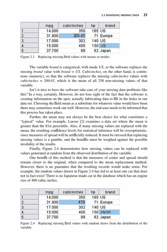
2.3 HANDLING MISSING DATA 21
Figure 2.3 Replacing missing field values with means or modes.
The variable brand is categorical, with mode US, so the software replaces themissing brand value with brand = US. Cubicinches, on the other hand, is contin-uous (numeric), so that the software replaces the missing cubicinches values withcubicinches = 200.65, which is the mean of all 258 non-missing values of thatvariable.
Isn’t it nice to have the software take care of your missing data problems likethis? In a way, certainly. However, do not lose sight of the fact that the software iscreating information on the spot, actually fabricating data to fill in the holes in ourdata set. Choosing the field mean as a substitute for whatever value would have beenthere may sometimes work out well. However, the end-user needs to be informed thatthis process has taken place.
Further, the mean may not always be the best choice for what constitutes a“typical” value. For example, Larose [2] examines a data set where the mean isgreater than the 81st percentile. Also, if many missing values are replaced with themean, the resulting confidence levels for statistical inference will be overoptimistic,since measures of spread will be artificially reduced. It must be stressed that replacingmissing values is a gamble, and the benefits must be weighed against the possibleinvalidity of the results.
Finally, Figure 2.4 demonstrates how missing values can be replaced withvalues generated at random from the observed distribution of the variable.
One benefit of this method is that the measures of center and spread shouldremain closer to the original, when compared to the mean replacement method.However, there is no guarantee that the resulting records would make sense. Forexample, the random values drawn in Figure 2.4 has led to at least one car that doesnot in fact exist! There is no Japanese-made car in the database which has an enginesize of 400 cubic inches.
Figure 2.4 Replacing missing field values with random draws from the distribution of thevariable.

22 CHAPTER 2 DATA PREPROCESSING
We therefore need data imputation methods that take advantage of the knowl-edge that the car is Japanese when calculating its missing cubic inches. In dataimputation, we ask “What would be the most likely value for this missing value,given all the other attributes for a particular record?” For instance, an Americancar with 300 cubic inches and 150 horsepower would probably be expected to havemore cylinders than a Japanese car with 100 cubic inches and 90 horsepower. This iscalled imputation of missing data. Before we can profitably discuss data imputation,however, we need to learn the tools needed to do so, such as multiple regression orclassification and regression trees. Therefore, to learn about the imputation of missingdata, please see Chapter 13.
2.4 IDENTIFYING MISCLASSIFICATIONS
Let us look at an example of checking the classification labels on the categoricalvariables, to make sure that they are all valid and consistent. Suppose that a frequencydistribution of the variable brand was as shown in Table 2.2.
The frequency distribution shows five classes, USA, France, US, Europe, andJapan. However, two of the classes, USA and France, have a count of only oneautomobile each. What is clearly happening here is that two of the records havebeen inconsistently classified with respect to the origin of manufacture. To maintainconsistency with the remainder of the data set, the record with originUSA should havebeen labeledUS, and the record with origin France should have been labeled Europe.
2.5 GRAPHICAL METHODS FORIDENTIFYING OUTLIERS
Outliers are extreme values that go against the trend of the remaining data. Identifyingoutliers is important because they may represent errors in data entry. Also, even if anoutlier is a valid data point and not an error, certain statistical methods are sensitiveto the presence of outliers and may deliver unreliable results.
One graphical method for identifying outliers for numeric variables is to exam-ine a histogram2 of the variable. Figure 2.5 shows a histogram of the vehicle weightsfrom the (slightly amended) cars data set. (Note: This slightly amended data set isavailable as cars2 from the series website.)
TABLE 2.2 Notice anything strange about thisfrequency distribution?
Brand Frequency
USA 1France 1US 156Europe 46Japan 51
2See the Appendix for more on histograms, including a caution on their interpretation.

2.6 MEASURES OF CENTER AND SPREAD 23
0
0
10
20
Co
un
t
30
40
1000 2000 3000
weight4000 5000
Figure 2.5 Histogram of vehicle weights: can you find the outlier?
There appears to be one lonely vehicle in the extreme left tail of the distribution,with a vehicle weight in the hundreds of pounds rather than in the thousands. Furtherinvestigation (not shown) tells us that the minimum weight is 192.5 pounds, whichis undoubtedly our little outlier in the lower tail. As 192.5 pounds is rather light foran automobile, we would tend to doubt the validity of this information.
We can surmise that perhaps the weight was originally 1925 pounds, withthe decimal inserted somewhere along the line. We cannot be certain, however, andfurther investigation into the data sources is called for.
Sometimes two-dimensional scatter plots3 can help to reveal outliers in morethan one variable. Figure 2.6, a scatter plot of mpg against weightlbs, seems to havenetted two outliers.
Most of the data points cluster together along the horizontal axis, except for twooutliers. The one on the left is the same vehicle we identified in Figure 2.6, weighingonly 192.5 pounds. The outlier near the top is something new: a car that gets over500 miles per gallon! Clearly, unless this vehicle runs on dilithium crystals, we arelooking at a data entry error.
Note that the 192.5 pound vehicle is an outlier with respect to weight butnot with respect to mileage. Similarly, the 500-mpg car is an outlier with respectto mileage but not with respect to weight. Thus, a record may be an outlier in aparticular dimension but not in another. We shall examine numeric methods foridentifying outliers, but we need to pick up a few tools first.
2.6 MEASURES OF CENTER AND SPREAD
Suppose that we are interested in estimating where the center of a particular variablelies, as measured by one of the numerical measures of center, the most common
3See the Appendix for more on scatter plots.

24 CHAPTER 2 DATA PREPROCESSING
0
0
100
200
300
400
500
600
1000 2000
weight
mp
g
3000 4000 5000
Figure 2.6 Scatter plot of mpg against Weightlbs shows two outliers.
of which are the mean, median, and mode. Measures of center are a special caseof measures of location, numerical summaries that indicate where on a number linea certain characteristic of the variable lies. Examples of measures of location arepercentiles and quantiles.
The mean of a variable is simply the average of the valid values taken bythe variable. To find the mean, simply add up all the field values and divide by thesample size. Here we introduce a bit of notation. The sample mean is denoted asx (“x-bar”) and is computed as x =
∑x/n, where
∑(capital sigma, the Greek letter
“S,” for “summation”) represents “sum all the values” and n represents the samplesize. For example, suppose that we are interested in estimating where the center ofthe customer service calls variable lies from the churn data set that we will explorein Chapter 3. IBM/SPSS Modeler supplies us with the statistical summaries shownin Figure 2.7. The mean number of customer service calls for this sample of n =3333 customers is given as x = 1.563. Using the sum and the count statistics, we canverify that
x =∑x
n= 5209
3333= 1.563
For variables that are not extremely skewed, the mean is usually not too farfrom the variable center. However, for extremely skewed data sets, the mean becomesless representative of the variable center. Also, the mean is sensitive to the presence ofoutliers. For this reason, analysts sometimes prefer to work with alternative measuresof center, such as the median, defined as the field value in the middle when the fieldvalues are sorted into ascending order. The median is resistant to the presence ofoutliers. Other analysts may prefer to use the mode, which represents the field valueoccurring with the greatest frequency. The mode may be used with either numericalor categorical data, but is not always associated with the variable center.

2.6 MEASURES OF CENTER AND SPREAD 25
Figure 2.7 Statistical summary of customer service calls.
Note that measures of center do not always concur as to where the center of thedata set lies. In Figure 2.7, the median is 1, which means that half of the customersmade at least one customer service call; the mode is also 1, which means that themost frequent number of customer service calls was 1. The median and mode agree.However, the mean is 1.563, which is 56.3% higher than the other measures. This isdue to the mean’s sensitivity to the right-skewness of the data.
Measures of location are not sufficient to summarize a variable effectively. Infact, two variables may have the very same values for the mean, median, and mode,and yet have different natures. For example, suppose that stock portfolio A and stockportfolio B contained five stocks each, with the price/earnings (P/E) ratios as shownin Table 2.3. The portfolios are distinctly different in terms of P/E ratios. Portfolio Aincludes one stock that has a very small P/E ratio and another with a rather large P/Eratio. On the other hand, portfolio B’s P/E ratios are more tightly clustered around themean. But despite these differences, the mean, median, and mode of the portfolios,P/E ratios are precisely the same: The mean P/E ratio is 10, the median is 11, and themode is 11 for each portfolio.
Clearly, these measures of center do not provide us with a complete picture.What ismissing aremeasures of spread ormeasures of variability, whichwill describehow spread out the data values are. Portfolio A’s P/E ratios are more spread out thanthose of portfolio B, so the measures of variability for portfolio A should be largerthan those of B.
Typical measures of variability include the range (maximum − minimum),the standard deviation, the mean absolute deviation, and the interquartile range. The
TABLE 2.3 The two portfolios have the same mean,median, and mode, but are clearly different
Stock Portfolio A Stock Portfolio B
1 711 811 1111 1116 13

26 CHAPTER 2 DATA PREPROCESSING
sample standard deviation is perhaps the most widespread measure of variability andis defined by
s =
√∑(x − x)2
n − 1
Because of the squaring involved, the standard deviation is sensitive to thepresence of outliers, leading analysts to prefer other measures of spread, such as themean absolute deviation, in situations involving extreme values.
The standard deviation can be interpreted as the “typical” distance between afield value and the mean, and most field values lie within two standard deviations ofthe mean. From Figure 2.7 we can state that the number of customer service callsmade by most customers lies within 2(1.315) = 2.63 of the mean of 1.563 calls. Inother words, most of the number of customer service calls lie within the interval(−1.067, 4.193), that is, (0, 4). (This can be verified by examining the histogram ofcustomer service calls in Figure 3.14 in Chapter 3.)
More information about these statistics may be found in the Appendix. A morecomplete discussion of measures of location and variability can be found in anyintroductory statistics textbook, such as Larose [2].
2.7 DATA TRANSFORMATION
Variables tend to have ranges that vary greatly from each other. For example, if weare interested in major league baseball, players’ batting averages will range from zeroto less than 0.400, while the number of home runs hit in a season will range fromzero to around 70. For some data mining algorithms, such differences in the rangeswill lead to a tendency for the variable with greater range to have undue influenceon the results. That is, the greater variability in home runs will dominate the lesservariability in batting averages.
Therefore, data miners should normalize their numeric variables, in order tostandardize the scale of effect each variable has on the results. Neural networks benefitfrom normalization, as do algorithms that make use of distance measures, such as thek-nearest neighbor algorithm. There are several techniques for normalization, and weshall examine three of the more prevalent methods. Let X refer to our original fieldvalue, and X∗ refer to the normalized field value.
2.8 MIN-MAX NORMALIZATION
Min-max normalization works by seeing how much greater the field value is than theminimum value min(X), and scaling this difference by the range. That is
X∗mm = X − min(X)
range(X)= X − min(X)
max(X) −min(X)
The summary statistics for weight are shown in Figure 2.8.

2.9 Z-SCORE STANDARDIZATION 27
Figure 2.8 Summary statistics for weight.
The minimum weight is 1613 pounds, and the range = max (X) − min (X) =4997 − 1613 = 3384 pounds. Let us find the min-max normalization for three auto-mobiles weighing 1613 pounds, 3384 pounds, and 4997, respectively.
� For an ultra-light vehicle, weighing only 1613 pounds (the field minimum), themin-max normalization is
X∗mm = X − min(X)
range(X)= 1613 − 1613
3384= 0
Thus, data values that represent the minimum for the variable will havea min-max normalization value of zero.
� The midrange equals the average of the maximum and minimum values in adata set. That is,
midrange(X) = max(X) + min(X)2
= 4997 + 16132
= 3305 pounds
For a “midrange” vehicle (if any), which weighs exactly halfway betweenthe minimum weight and the maximum weight, the min-max normalization is
X∗mm = X − min(X)
range(X)= 3305 − 1613
3384= 0.5
So the midrange data value has a min-max normalization value of 0.5.� The heaviest vehicle has a min-max normalization value of
X∗mm = X − min(X)
range(X)= 4497 − 1613
3384= 1
That is, data values representing the field maximum will have a min-max nor-malization of 1. To summarize, min-max normalization values will range from 0 to 1.
2.9 Z-SCORE STANDARDIZATION
Z-score standardization, which is very widespread in the world of statistical analysis,works by taking the difference between the field value and the field mean value, andscaling this difference by the standard deviation of the field values. That is
Z-score = X −mean(X)SD(X)

28 CHAPTER 2 DATA PREPROCESSING
Figure 2.8 tells us that mean(weight) = 3005.49 and SD(weight) = 852.49.
� For the vehicle weighing only 1613 pounds, the Z-score standardization is
Z-score = X −mean(X)SD(X)
= 1613 − 3005.49852.49
≈ −1.63
Thus, data values that lie below the mean will have a negative Z-scorestandardization.
� For an “average” vehicle (if any), with a weight equal to mean(X) = 3005.49pounds, the Z-score standardization is
Z-score = X −mean(X)SD(X)
= 3005.49 − 3005.49852.49
= 0.
That is, values falling exactly on the mean will have a Z-score standard-ization of zero.
� For the heaviest car, the Z-score standardization is
Z-score = X −mean(X)SD(X)
= 4997 − 3005.49852.49
≈ 2.34.
That is, data values that lie above the mean will have a positive Z-scorestandardization.4
2.10 DECIMAL SCALING
Decimal scaling ensures that every normalized value lies between −1 and 1.
X∗decimal =
X10d
where d represents the number of digits in the data value with the largest absolutevalue. For the weight data, the largest absolute value is |4997| = 4997, which hasd = 4 digits. The decimal scaling for the minimum and maximum weights is
Min: X∗decimal =
1613104
= 0.1613 Max: X∗decimal =
4997104
= 0.4997
2.11 TRANSFORMATIONS TO ACHIEVE NORMALITY
Some data mining algorithms and statistical methods require that the variables benormally distributed. The normal distribution is a continuous probability distributioncommonly known as the bell curve, which is symmetric. It is centered at mean 𝜇
(“myu”) and has its spread determined by standard deviation 𝜎 (sigma). Figure 2.9shows the normal distribution that has mean 𝜇 = 0 and standard deviation 𝜎 = 1,known as the standard normal distribution Z.
4Also, for a given Z-score, we may find its associated data value. See the Appendix.

2.11 TRANSFORMATIONS TO ACHIEVE NORMALITY 29
–3 –2 –1 0
Mean μ
Spread determined byσ
1 2 3
Figure 2.9 Standard normal Z distribution.
It is a commonmisconception that variables that have had the Z-score standard-ization applied to them follow the standard normal Z distribution. This is not correct!It is true that the Z-standardized data will have mean 0 and standard deviation 1 (seeFigure 2.14), but the distribution may still be skewed. Compare the histogram ofthe original weight data in Figure 2.10 with the Z-standardized data in Figure 2.11.Both histograms are right-skewed; in particular, Figure 2.10 is not symmetric, and socannot be normally distributed.
We use the following statistic to measure the skewness of a distribution5:
Skewness = 3 (mean −median)standard deviation
For right-skewed data, the mean is greater than the median, and thus the skew-ness will be positive (Figure 2.12), while for left-skewed data, the mean is smaller
1000
0
5
10
15
20
Co
un
t
25
2000 3000
weightlbs4000 5000
Figure 2.10 Original data.
5Find more about standard deviations in the Appendix.

30 CHAPTER 2 DATA PREPROCESSING
–2
0
5
10
15
Co
un
t
20
25
–1 0
weight_z1 2 3
Figure 2.11 Z-Standardized data are still right-skewed, not normally distributed.
MeanMedian
Figure 2.12 Right-skewed data have positive skewness.
than the median, generating negative values for skewness (Figure 2.13). For perfectlysymmetric data (such as in Figure 2.9) of course, the mean, median, and mode are allequal, and so the skewness equals zero.
Much real-world data are right-skewed, including most financial data. Left-skewed data are not as common, but often occurs when the data are right-censored,such as test scores on an easy test, which can get no higher than 100. We use thestatistics for weight and weight_Z shown in Figure 2.14 to calculate the skewness forthese variables.
For weight we have
Skewness = 3 (mean −median)standard deviation
= 3(3005.490 − 2835)852.646
= 0.6

2.11 TRANSFORMATIONS TO ACHIEVE NORMALITY 31
Mean Median
Figure 2.13 Left-skewed data have negative skewness.
For weight_Z we have
Skewness = 3 (mean −median)standard deviation
= 3(0 − (−0.2))1
= 0.6
Thus, Z-score standardization has no effect on skewness.To make our data “more normally distributed,” we must first make it sym-
metric, which means eliminating the skewness. To eliminate skewness, we apply atransformation to the data. Common transformations are the natural log transfor-mation ln(weight), the square root transformation
√weight, and the inverse square
root transformation 1∕√weight. Application of the square root transformation (Fig-
ure 2.15) somewhat reduces the skewness, while applying the ln transformation(Figure 2.16) reduces skewness even further.
Figure 2.14 Statistics for calculating skewness.

32 CHAPTER 2 DATA PREPROCESSING
40
0
5
10
15
20
Co
un
t25
50 60
sqrt(weight)70 80
Figure 2.15 Square root transformation somewhat reduces skewness.
The statistics in Figure 2.17 is used to calculate the reduction in skewness:
Skewness(sqrt (weight)) = 3 (54.280 − 53.245)7.709
≈ 0.40
Skewness(ln (weight)) = 3 (7.968 − 7.950)0.284
≈ 0.19
Finally, we try the inverse square root transformation 1∕√weight, which gives
us the distribution in Figure 2.18. The statistics in Figure 2.19 gives us
Skewness (inverse sqrt (weight)) = 3 (0.019 − 0.019)0.003
= 0
which indicates that we have eliminated the skewness and achieved a symmetricdistribution.
7.25
0
5
10
15
Co
un
t
20
7.50 7.75
In(weight)8.00 8.25 8.50
Figure 2.16 Natural log transformation reduces skewness even further.

2.11 TRANSFORMATIONS TO ACHIEVE NORMALITY 33
Figure 2.17 Statistics for calculating skewness.
Now, there is nothing magical about the inverse square root transformation; itjust happened to work for the amount of skewness present in this variable.
Though we have achieved symmetry, we still have not arrived at normality. Tocheck for normality, we construct a normal probability plot, which plots the quantilesof a particular distribution against the quantiles of the standard normal distribution.Similar to a percentile, the pth quantile of a distribution is the value xp such that p%of the distribution values are less than or equal to xp.
In a normal probability plot, if the distribution is normal, the bulk of the pointsin the plot should fall on a straight line; systematic deviations from linearity in thisplot indicate nonnormality. Note from Figure 2.18 that the distribution is not a goodfit for the normal distribution curve shown. Thus, we would not expect our normalprobability plot to exhibit normality. As expected, the normal probability plot of
0.0140
5
10
15
20
Freq
uen
cy
25
0.016 0.018 0.020
inverse_sqrt (weight)0.022 0.024
Figure 2.18 The transformation inverse sqrt (weight) has eliminated the skewness, but is stillnot normal.

34 CHAPTER 2 DATA PREPROCESSING
Figure 2.19 Statistics for inverse sqrt (weight).
inverse_sqrt(weight) in Figure 2.20 shows systematic deviations from linearity, indi-cating nonnormality. For contrast, a normal probability plot of normally distributeddata is shown in Figure 2.21; this graph shows no systematic deviations from linearity.
Experimentation with further transformations (not shown) did not yield accept-able normality for inverse_sqrt(weight). Fortunately, algorithms requiring normalityusually do fine when supplied with data that is symmetric and unimodal.
Finally, when the algorithm is done with its analysis, do not forget to “de-transform” the data. Let x represent the original variable, and y represent the trans-formed variable. Then, for the inverse square root transformation, we have
y = 1√x
“De-transforming,” we obtain: x = 1y2. Results that your algorithm provided on
the transformed scale would have to be de-transformed using this formula.6
0.0100.1
1
5
10
20304050607080
9095
Per
cen
t
99
99.9
0.015 0.020
inverse_sqrt(weight)0.025 0.030
Figure 2.20 Normal probability plot of inverse_sqrt(weight) indicates nonnormality.
6For more on data transformations, seeData Mining Methods and Models, by Daniel Larose (Wiley, 2006)or Data Mining and Predictive Analytics, by Daniel Larose and Chantal Larose (Wiley, 2015, to appear).

2.12 NUMERICAL METHODS FOR IDENTIFYING OUTLIERS 35
–50.01
1
5
20
50
Per
cen
t
80
95
99
99.99
–4 –3 –2 –1 0
Normally distributed data1 2 3 4
Figure 2.21 Normal probability plot of normally distributed data.
2.12 NUMERICAL METHODS FORIDENTIFYING OUTLIERS
The Z-score method for identifying outliers states that a data value is an outlier ifit has a Z-score that is either less than −3 or greater than 3. Variable values withZ-scores much beyond this range may bear further investigation, in order to verifythat they do not represent data entry errors or other issues. On the other hand, oneshould not automatically omit outliers from analysis.
We saw that the minimum Z-score was for the vehicle weighing only 1613pounds, and having a Z-score of −1.63, while the maximum Z-score was for the4997-pound vehicle, with a Z-score of 2.34. Since neither Z-score is either less than−3 or greater than 3, we conclude that there are no outliers among the vehicle weights.
Unfortunately, the mean and standard deviation, which are both part of theformula for the Z-score standardization, are both rather sensitive to the presence ofoutliers. That is, if an outlier is added to (or deleted from) a data set, the valuesof mean and standard deviation will both be unduly affected by the presence (orabsence) of this new data value. Therefore, when choosing a method for evaluatingoutliers, it may not seem appropriate to use measures which are themselves sensitiveto their presence.
Therefore, data analysts have developed more robust statistical methods foroutlier detection, which are less sensitive to the presence of the outliers themselves.One elementary robust method is to use the interquartile range (IQR). The quartilesof a data set divide the data set into four parts, each containing 25% of the data.
� The first quartile (Q1) is the 25th percentile.� The second quartile (Q2) is the 50th percentile, that is, the median.� The third quartile (Q3) is the 75th percentile.

36 CHAPTER 2 DATA PREPROCESSING
Then, the interquartile range (IQR) is a measure of variability, much morerobust than the standard deviation. The IQR is calculated as IQR = Q3 – Q1, andmay be interpreted to represent the spread of the middle 50% of the data.
A robust measure of outlier detection is therefore defined as follows. A datavalue is an outlier if
a. It is located 1.5(IQR) or more below Q1 or
b. It is located 1.5(IQR) or more above Q3.
For example, suppose for a set of test scores, the 25th percentile was Q1 = 70and the 75th percentile was Q3 = 80, so that half of all the test scores fell between 70and 80. Then the interquartile range, or the difference between these quartiles wasIQR = 80 − 70 = 10.
A test score would be robustly identified as an outlier if
a. It is lower than Q1 – 1.5(IQR) = 70 – 1.5(10) = 55 or
b. It is higher than Q3 + 1.5(IQR) = 80 + 1.5(10) = 95.
2.13 FLAG VARIABLES
Some analytical methods, such as regression, require predictors to be numeric. Thus,analysts wishing to use categorical predictors in regression need to recode the categor-ical variable into one or more flag variables. A flag variable (or dummy variableor indicator variable) is a categorical variable taking only two values, 0 and 1.For example, the categorical predictor sex, taking values female and male, could berecoded into the flag variable sex_flag as follows:
If sex = female = then sex flag = 0; if sex = male then sex flag = 1.
When a categorical predictor takes k ≥ 3 possible values, then define k − 1dummy variables, and use the unassigned category as the reference category. Forexample, if a categorical predictor region has k = 4 possible categories, {north,east, south, west}, then the analyst could define the following k − 1 = 3 flagvariables.
north flag : If region = north then north flag = 1; otherwise north flag = 0.east flag : If region = east then east flag = 1; otherwise east flag = 0.south flag : If region = south then south flag = 1; otherwise south flag = 0.
The flag variable for the west is not needed, since, region = west is alreadyuniquely identified by zero values for each of the three existing flag variables. (Further,inclusion of the fourth flag variable will cause some algorithms to fail, because of thesingularity of the (X′X)−1 matrix in regression, for instance.) Instead, the unassignedcategory becomes the reference category, meaning that, the interpretation of the valueof north_flag is region = north compared to region = west. For example, if we arerunning a regression analysis with income as the target variable, and the regressioncoefficient (see Chapter 5) for north_flag equals $1000, then the estimated income

2.14 TRANSFORMING CATEGORICAL VARIABLES INTO NUMERICAL VARIABLES 37
for region = north is $1000 greater than for region = west, when all other predictorsare held constant.
2.14 TRANSFORMING CATEGORICAL VARIABLES INTONUMERICAL VARIABLES
Would not it be easier to simply transform the categorical variable region into a singlenumerical variable rather than using several different flag variables? For example,suppose we defined the quantitative variable region_num as follows:
Region Region_num
North 1East 2South 3West 4
Unfortunately, this is a common and hazardous error. The algorithm nowerroneously thinks the following:
� The four regions are ordered,� West > South > East > North,� West is three times closer to South compared to North, and so on.
So, in most instances, the data analyst should avoid transforming categoricalvariables to numerical variables. The exception is for categorical variables that areclearly ordered, such as the variable survey_response, taking values always, usually,sometimes, never. In this case, one could assign numerical values to the responses,though one may bicker with the actual values assigned, such as:
SurveySurvey response Response_num
Always 4Usually 3Sometimes 2Never 1
Should never be “0” rather than “1”? Is always closer to usually than usuallyis to sometimes? Careful assignment of the numerical values is important.

38 CHAPTER 2 DATA PREPROCESSING
2.15 BINNING NUMERICAL VARIABLES
Some algorithms prefer categorical rather than continuous predictors7, in which casewe would need to partition any numerical predictors into bins or bands. For example,we may wish to partition the numerical predictor house value into low, medium, andhigh. There are four common methods for binning numerical predictors:
1. Equal width binning divides the numerical predictor into k categories of equalwidth, where k is chosen by the client or analyst.
2. Equal frequency binning divides the numerical predictor into k categories,each having k/n records, where n is the total number of records.
3. Binning by clustering uses a clustering algorithm, such as k-means clustering(Chapter 10) to automatically calculate the “optimal” partitioning.
4. Binning based on predictive value. Methods (1)–(3) ignore the target variable;binning based on predictive value partitions the numerical predictor based onthe effect each partition has on the value of the target variable. Chapter 3contains an example of this.
Equal width binning is not recommended for most data mining applications,since the width of the categories can be greatly affected by the presence of outliers.Equal frequency distribution assumes that each category is equally likely, an assump-tion which is usually not warranted. Therefore, methods (3) and (4) are preferred.
Suppose we have the following tiny data set, which we would like to discretizeinto k = 3 categories: X = {1, 1, 1, 1, 1, 2, 2, 11, 11, 12, 12, 44}.
1. Using equal width binning, we partition X into the following categories of equalwidth, illustrated in Figure 2.22a:� Low: 0 ≤ X < 15, which contains all the data values except one.� Medium: 15 ≤ X < 30, which contains no data values at all.� High: 30 ≤ X < 45, which contains a single outlier.
2. Using equal frequency binning, we have n = 12, k = 3, and n/k = 4. Thepartition is illustrated in Figure 2.22b.� Low: Contains the first four data values, all X = 1.� Medium: Contains the next four data values, X = {1, 2, 2, 11}.� High: Contains the last four data values, X = {11, 12, 12, 44}.
Note that one of the medium data values equals a data value in the lowcategory, and another equals a data value in the high category. This violateswhat should be a self-evident heuristic: Equal data values should belong tothe same category.
3. Finally, k-means clustering identifies what seems to be the intuitively correctpartition, as shown in Figure 2.22c.
7For further information about discrete and continuous variables, as well as other ways of classifyingvariables, see the Appendix.

2.18 REMOVING VARIABLES THAT ARE NOT USEFUL 39
42363024181260(c) k-Means Clustering
(b) Equal Frequency42363024181260
42363024181260(a) Equal Width
Figure 2.22 Illustration of binning methods.
We provide two examples of binning based on predictive value in Chapter 3.
2.16 RECLASSIFYING CATEGORICAL VARIABLES
Reclassifying categorical variables is the categorical equivalent of binning numericalvariables. Often, a categorical variable will contain too many field values to beeasily analyzable. For example, the predictor state could contain 50 different fieldvalues. Data mining methods such as logistic regression and the C4.5 decision treealgorithm perform suboptimally when confronted with predictors containing toomanyfield values. In such a case, the data analyst should reclassify the field values. Forexample, the 50 states could each be reclassified as the variable region, containing fieldvalues Northeast, Southeast, North Central, Southwest, andWest. Thus, instead of 50different field values, the analyst (and algorithm) is faced with only 5. Alternatively,the 50 states could be reclassified as the variable economic_level, with three fieldvalues containing the richer states, the midrange states, and the poorer states. The dataanalyst should choose a reclassification that supports the objectives of the businessproblem or research question.
2.17 ADDING AN INDEX FIELD
It is recommended that the data analyst create an index field, which tracks the sortorder of the records in the database. Data mining data gets partitioned at least once(and sometimes several times). It is helpful to have an index field so that the originalsort order may be recreated. For example, using IBM/SPSS Modeler, you can use the@Index function in the Derive node to create an index field.
2.18 REMOVING VARIABLES THAT ARE NOT USEFUL
The data analyst may wish to remove variables that will not help the analysis,regardless of the proposed data mining task or algorithm. Such variables include
� Unary variables� Variables which are very nearly unary

40 CHAPTER 2 DATA PREPROCESSING
Unary variables take on only a single value, so a unary variable is not so mucha variable as a constant. For example, data collection on a sample of students at anall-girls private school would find that the sex variable would be unary, since everysubject would be female. Since sex is constant across all observations, it cannot haveany effect on any data mining algorithm or statistical tool. The variable should beremoved.
Sometimes a variable can be very nearly unary. For example, suppose that99.95% of the players in a field hockey league are female, with the remaining 0.05%male. The variable sex is therefore very nearly, but not quite, unary. While it may beuseful to investigate the male players, some algorithms will tend to treat the variableas essentially unary. For example, a classification algorithm can be better than 99.9%confident that a given player is female. So, the data analyst needs to weigh howclose to unary a given variable is, and whether such a variable should be retained orremoved.
2.19 VARIABLES THAT SHOULD PROBABLYNOT BE REMOVED
It is (unfortunately) a common—though questionable—practice to remove from anal-ysis the following types of variables:
� Variables for which 90% or more of the values are missing.� Variables which are strongly correlated.
Before you remove a variable because it has 90% or more missing values, con-sider that there may be a pattern in the missingness, and therefore useful information,that you may be jettisoning. Variables which contain 90% missing values presenta challenge to any strategy for imputation of missing data (see Chapter 13). Forexample, are the remaining 10% of the cases are truly representative of the missingdata, or are the missing values occurring due to some systematic but unobservedphenomenon? For example, suppose we have a field called donation_dollars in aself-reported survey database. Conceivably, those who donate a lot would be inclinedto report their donations, while those who do not donate much may be inclined to skipthis survey question. Thus, the 10% who report are not representative of the whole.In this case, it may be preferable to construct a flag variable, donation_flag, sincethere is a pattern in the missingness which may turn out to have predictive power.
However, if the data analyst has reason to believe that the 10% are representa-tive, then he or she may choose to proceed with the imputation of the missing 90%. Itis strongly recommended that the imputation be based on the regression or decisiontree methods shown in Chapter 13. Regardless of whether the 10% are representativeof the whole or not, the data analyst may decide that it is wise to construct a flagvariable for the non-missing values, since they may very well be useful for predictionor classification. Also, there is nothing special about the 90% figure; the data analyst

2.21 A WORD ABOUT ID FIELDS 41
may use any large proportion he or she considers warranted. Bottom line: one shouldavoid removing variables just because they have lots of missing values.
An example of correlated variables may be precipitation and attendance at astate beach. As precipitation increases, attendance at the beach tends to decrease, sothat the variables are negatively correlated8. Inclusion of correlated variables may atbest double-count a particular aspect of the analysis, and at worst lead to instability ofthe model results. When confronted with two strongly correlated variables, therefore,some data analysts may decide to simply remove one of the variables. We adviseagainst doing so, since important information may thereby be discarded. Instead, itis suggested that principal component analysis be applied, where the common vari-ability in correlated predictors may be translated into a set of uncorrelated principalcomponents9.
2.20 REMOVAL OF DUPLICATE RECORDS
During a database’s history, recordsmay have been inadvertently copied, thus creatingduplicate records. Duplicate records lead to an overweighting of the data values inthose records, so, if the records are truly duplicate, only one set of them shouldbe retained. For example, if the ID field is duplicated, then definitely remove theduplicate records. However, the data analyst should apply common sense. To takean extreme case, suppose a data set contains three nominal fields, and each fieldtakes only three values. Then there are only 3 × 3 × 3 = 27 possible different setsof observations. In other words, if there are more than 27 records, at least one ofthem has to be a duplicate. So, the data analyst should weigh the likelihood that theduplicates represent truly different records against the likelihood that the duplicatesare indeed just duplicated records.
2.21 A WORD ABOUT ID FIELDS
Because ID fields have a different value for each record, they will not be helpfulfor your downstream data mining algorithms. They may even be hurtful, with thealgorithm finding some spurious relationship between ID field and your target. Thus itis recommended that ID fields should be filtered out from the data mining algorithms,but should not be removed from the data, so that the data analyst can differentiatebetween similar records.
In Chapter 3, Exploratory Data Analysis, we apply some basic graphical andstatistical tools to help us begin to uncover simple patterns and trends in the datastructure.
8For more on correlation, see the Appendix.9For more on principal component analysis, see Data Mining Methods and Models, by Daniel Larose(Wiley, 2006) or Data Mining and Predictive Analytics, by Daniel Larose and Chantal Larose (Wiley,2015, to appear).

42 CHAPTER 2 DATA PREPROCESSING
THE R ZONE
Getting Started with R
R is a powerful, open-source language for exploring and analyzing data sets. Analysts using Rcan take advantage of many freely available packages, routines, and graphical user interfaces,to tackle most data analysis problems. Go to www.r-project.org, select “download R,” choosea CRAN mirror close to your location, click the download link that applies to your operatingsystem, and follow the instructions to install R for the first time.
The format we will follow in much of The R Zone is to present the R code in the leftcolumn, and the associated output in the right column. Sometimes, the R code takes up boththe columns.
How to Handle Missing Data: Example Using the Cars Data Set
Note: Lines beginning with “#” are comment lines explaining what we are doing. The Rcompiler skips these lines. Lines indented (e.g., Create a Histogram, below) are meant to beon the same line as the one above. A semicolon tells R to separate one line into two lines, onebefore and one after the semicolon.
# Input data set Cars into Data Frame “cars”
cars <- read.csv(file = "C:/ . . . /cars.txt",stringsAsFactors = FALSE)
# Show the new Data Frame "cars"cars# (only the first seven records shown# in output)
# Create subset of "cars"
# Use records 1 to 5, variables 1, 3, 4, and 8.cars_tiny <- cars[1:5,c(1, 3, 4, 8)]cars_tiny
# Replace the missing value with some constant
cars_tiny[2,2] <- cars_tiny[4,4] <- NAcars_tiny[2,2] <- 0cars_tiny[4,4] <- "Missing"cars_tiny

2.21 A WORD ABOUT ID FIELDS 43
# Replace the missing value with the field mean or mode
# Recreate the missing value tablecars_tiny[2,2] <- cars_tiny[4,4] <- NA# Replace cars_tiny[2,2] with cubicinches meancars_tiny[2,2] <-
mean(na.omit(cars_tiny$cubicinches))# Replace cars_tiny[4,4] with brand modeour_table <- table(cars_tiny$brand)our_mode <- names(our_table)[our_table ==
max(our_table)]cars_tiny[4,4] <- our_modecars_tiny
# Replace missing values with a value generated at random from the observed distribution
# Recreate the missing value tablecars_tiny[2,2] <- cars_tiny[4,4] <- NA# Generate random observation from# observed distribution; results will varyobs_brand <-
sample(na.omit(cars_tiny$brand), 1)obs_cubicinches <-
sample(na.omit(cars_tiny$cubicinches), 1)# Replace the missing valuescars_tiny[2,2] <- obs_cubicinchescars_tiny[4,4] <- obs_brandcars_tiny
# Five Number Summary with Mean # Count
summary(cars$weight) length(cars$weight)
# Min-Max Normalization # Z-score
mmnorm.weight <- (cars$weight -min(cars$weight))/(max(cars$weight) -min(cars$weight))
mmnorm.weight
zscore.weight <- (cars$weight -mean(cars$weight))/sd(cars$weight)
zscore.weight

44 CHAPTER 2 DATA PREPROCESSING
# Create a histogram
# Input the cars2 datasetcars2 <- read.csv(file = "C:/ . . . /cars2.txt",
stringsAsFactors = TRUE)# Set up the plot areapar(mfrow = c(1,1))# Create the histogram barshist(cars2$weight,
breaks = 30,xlim = c(0, 5000),col = "blue",border = "black",ylim = c(0, 40),xlab = "Weight",ylab = "Counts",main = "Histogram of Car Weights")
# Make a box around the plotbox(which = "plot",
lty = "solid",col="black")
# Create a scatterplot
plot(cars2$weight, cars2$mpg,xlim = c(0, 5000),ylim = c(0, 600),xlab = "Weight",ylab = "MPG",main = "Scatterplot of MPG by Weight",type = "p",pch = 16,col = "blue")
#Add open black circlespoints(cars2$weight,
cars2$mpg,type = "p",col = "black")
# Natural Log transformation # Inverse Square Root transformation
natlog_weight <- log(cars$weight)natlog_weight
invsqrt_weight <- 1 / sqrt(cars$weight)invsqrt_weight

2.21 A WORD ABOUT ID FIELDS 45
# Calculate skewness # Find the skewness
weight_skew <- (3*(mean(cars$weight) -median(cars$weight))) / sd(cars$weight)
zscore.weight_skew <-(3*(mean(zscore.weight) -median(zscore.weight))) /sd(zscore.weight)
weight_skew; zscore.weight_skew
lnweight_skew <- (3*(mean(natlog_weight) -median(natlog_weight))) /sd(natlog_weight)
lnweight_skew
# Side-by-Side Histograms of Weight and Z-score of Weight
par(mfrow = c(1,2))hist(cars$weight, breaks = 30,
xlim = c(1000, 5000),main = "Histogram of Weight",xlab = "Weight",ylab = "Counts")
box(which = "plot",lty = "solid",col="black")
hist(zscore.weight,breaks = 30,xlim = c(-2, 3),main = "Histogram of Z-score
of Weight",xlab = "Z-score of Weight",ylab = "Counts")
box(which = "plot",lty = "solid",col="black")
# Normal probability plot
par(mfrow = c(1,1))qqnorm(invsqrt_weight,
datax = TRUE,col = "red",ylim = c(0.01, 0.03),main = "Normal Q-Q Plot of Inverse
Square Root of Weight")qqline(invsqrt_weight,
col = "blue",datax = TRUE)

46 CHAPTER 2 DATA PREPROCESSING
# Inverse Square Root skewness
invsqweight_skew <- (3*(mean(invsqrt_weight) - median(invsqrt_weight)))/sd(invsqrt_weight)invsqweight_skew
# Create histogram with fitted Normal distribution
# Simulate from a Normal distributionx <- rnorm(1000000,
mean = mean(invsqrt_weight),sd = sd(invsqrt_weight))
par(mfrow = c(1,1))hist(invsqrt_weight,
breaks = 30,xlim = c(0.0125, 0.0275),col = "lightblue",prob = TRUE,border = "black",xlab = "Inverse Square Root of Weight",ylab = "Counts",main = "Histogram of Inverse Square Root of
Weight")box(which = "plot",
lty = "solid",col="black")
lines(density(x),col = "red")
# Create three flag variables for four categories
# Ten observations, with 999 as our placeholder for unassigned valuesnorth_flag <- east_flag <- south_flag <- c(rep(999, 10))# Create the variable regionregion <- c(rep(c("north", "south", "east",
"west"),2), "north", "south")# Change the flag variable values to 0 or 1for (i in 1:length(region)) {
if(region[i] == "north") north_flag[i] = 1else north_flag[i] = 0
if(region[i] == "east") east_flag[i] = 1 elseeast_flag[i] = 0
if(region[i] == "south") south_flag[i] = 1else south_flag[i] = 0
}north_flag; east_flag; south_flag

2.21 A WORD ABOUT ID FIELDS 47
# Transforming the data
x <- cars$weight[1]; x# Transform x using y = 1 / sqrt(x)y <- 1 / sqrt(x); y# Detransform x using x = 1 / (y)ˆ2detransformedx <- 1 / yˆ2; detransformedx
# Find duplicate records in a data frame
anyDuplicated(cars)# To examine each record, use Duplicatedduplicated(cars)# 'True' indicates a record which is a duplicate of previous records,# 'False' indicates a record which is not a duplicate of previous records# Duplicate the first record in 'data' to make new datasetnew.cars <- rbind(cars, cars[1,])# Check for duplicatesanyDuplicated(new.cars)# The 262nd record is a duplicateduplicated(new.cars)# 'True' indicates a duplicate of a previous record
# Create an index field
# For data frames# Data frames already have an index field;# the left-most column# The index of a record will stay with that# record, even if the records are reordered.carscars[order(cars$mpg),]
# For vectors or matrices# Add a column to act as an index fieldx <- c(1,1,3:1,1:4,3); y <- c(9,9:1)z <-c(2,1:9)matrix <- t(rbind(x,y,z)); matrixindexed_m <- cbind(c(1:length(x)), matrix);indexed_mindexed_m[order(z),]

48 CHAPTER 2 DATA PREPROCESSING
# Binning
# Enter the dataset, call it xdataxdata <- c(1,1,1,1,1,2,2,11,11,12,12,44)# Get the sample size of the variablen <- length(xdata)#Declare number of bins and bin indicatornbins <- 3whichbin <- c(rep(0, n))
# K-meanskmeansclustering <- kmeans(xdata,
centers = nbins)whichbin <- kmeansclustering$cluster;whichbin
# Equal frequencyfreq <- n/nbins# Sort the dataxsorted <- sort(xdata)for (i in 1:nbins) {for (j in 1:n) {if((i-1)*freq < j && j <=i*freq)whichbin[j] <- i
}}whichbin
# Equal widthrange_xdata <- max(xdata) - min(xdata) + 1binwidth <- range_xdata/nbinsfor (i in 1:nbins) {for (j in 1:n) {if((i-1)*binwidth < xdata[j] &&xdata[j] <= (i)*binwidth)whichbin[j] <- i
}}whichbin
REFERENCES
1. Gallit Shmueli, Nitin Patel, and Peter Bruce, Data Mining for Business Intelligence, 2nd edn, JohnWiley and Sons, 2010.
2. Daniel Larose, Discovering Statistics, second edition, W.H. Freeman Publishers, New York, 2013.
EXERCISES
1. Describe the possible negative effects of proceeding directly to mine data that has not beenpreprocessed.
2. Refer to the income attribute of the five customers in Table 2.1, before preprocessing.
a. Find the mean income before preprocessing.
b. What does this number actually mean?
c. Now, calculate the mean income for the three values left after preprocessing. Does thisvalue have a meaning?
3. Explain why zip codes should be considered text variables rather than numeric.
4. What is an outlier? Why do we need to treat outliers carefully?
5. Explain why a birthdate variable would be preferred to an age variable in a database.
6. True or false: All things being equal, more information is almost always better.
7. Explain why it is not recommended, as a strategy for dealing with missing data, to simplyomit the records or fields with missing values from the analysis.

EXERCISES 49
8. Which of the fourmethods for handlingmissing datawould tend to lead to an underestimateof the spread (e.g., standard deviation) of the variable? What are some benefits to thismethod?
9. What are some of the benefits and drawbacks for the method for handling missing datathat chooses values at random from the variable distribution?
10. Of the four methods for handling missing data, which method is preferred?
11. Make up a classification scheme which is inherently flawed, and would lead to misclas-sification, as we find in Table 2.2. For example, classes of items bought in a grocerystore.
12. Make up a data set, consisting of the heights and weights of six children, in which one ofthe children is an outlier with respect to one of the variables, but not the other. Then alterthis data set so that the child is an outlier with respect to both variables.
Use the following stock price data (in dollars) for Exercises 13–18.
10 7 20 12 75 15 9 18 4 12 8 14
13. Calculate the mean, median, and mode stock price.
14. Compute the standard deviation of the stock price. Interpret what this number means.
15. Find the min-max normalized stock price for the stock worth $20.
16. Calculate the midrange stock price.
17. Compute the Z-score standardized stock price for the stock worth $20.
18. Find the decimal scaling stock price for the stock worth $20.
19. Calculate the skewness of the stock price data.
20. Explain why data analysts need to normalize their numeric variables.
21. Describe three characteristics of the standard normal distribution.
22. If a distribution is symmetric, does it follow that it is normal? Give a counterexample.
23. What do we look for in a normal probability plot to indicate nonnormality?Use the stock price data for Exercises 24–26.
24. Do the following.
a. Identify the outlier.
b. Verify that this value is an outlier, using the Z-score method.
c. Verify that this value is an outlier, using the IQR method.
25. Identify all possible stock prices that would be outliers, using:
a. The Z-score method.
b. The IQR method.
26. Investigate how the outlier affects the mean and median by doing the following.
a. Find the mean score and the median score, with and without the outlier.
b. State which measure, the mean or the median, the presence of the outlier affects more,and why.

50 CHAPTER 2 DATA PREPROCESSING
27. What are the four common methods for binning numerical predictors? Which of these arepreferred?
Use the following data set for Exercises 28–30: 1 1 1 3 3 7
28. Bin the data into three bins of equal width (width = 3).
29. Bin the data into three bins of two records each.
30. Clarify why each of the binning solutions above are not optimal.
31. Explain why we might not want to remove a variable that had 90% or more missingvalues.
32. Explain why we might not want to remove a variable just because it is highly correlatedwith another variable.
HANDS-ON ANALYSIS
Use the churn data set on the book series website for the following exercises.
33. Explore whether there are missing values for any of the variables.
34. Compare the area code and state fields. Discuss any apparent abnormalities.
35. Use a graph to visually determine whether there are any outliers among the number ofcalls to customer service.
36. Identify the range of customer service calls that should be considered outliers, using:
a. The Z-score method, and
b. The IQR method.
37. Transform the day minutes attribute using Z-score standardization.
38. Work with skewness as follows.
a. Calculate the skewness of day minutes.
b. Then calculate the skewness of the Z-score standardized day minutes. Comment.
c. Based on the skewness value, would you consider day minutes to be skewed or nearlyperfectly symmetric?
39. Construct a normal probability plot of day minutes. Comment on the normality of the data.
40. Work with international minutes as follows.
a. Construct a normal probability plot of international minutes.
b. What is stopping this variable from being normally distributed.
c. Construct a flag variable to deal with the situation in (b).
d. Construct a normal probability plot of the derived variable nonzero international min-utes. Comment on the normality.
41. Transform the night minutes attribute using Z-score standardization. Using a graph,describe the range of the standardized values. �

CHAPTER3EXPLORATORY DATA ANALYSIS
3.1 HYPOTHESIS TESTING VERSUS EXPLORATORY DATA ANALYSIS 51
3.2 GETTING TO KNOW THE DATA SET 52
3.3 EXPLORING CATEGORICAL VARIABLES 55
3.4 EXPLORING NUMERIC VARIABLES 62
3.5 EXPLORING MULTIVARIATE RELATIONSHIPS 69
3.6 SELECTING INTERESTING SUBSETS OF THE DATA FOR FURTHERINVESTIGATION 71
3.7 USING EDA TO UNCOVER ANOMALOUS FIELDS 71
3.8 BINNING BASED ON PREDICTIVE VALUE 72
3.9 DERIVING NEW VARIABLES: FLAG VARIABLES 74
3.10 DERIVING NEW VARIABLES: NUMERICAL VARIABLES 77
3.11 USING EDA TO INVESTIGATE CORRELATED PREDICTOR VARIABLES 77
3.12 SUMMARY 80
THE R ZONE 82
REFERENCE 88
EXERCISES 88
HANDS-ON ANALYSIS 89
3.1 HYPOTHESIS TESTING VERSUS EXPLORATORYDATA ANALYSIS
When approaching a data mining problem, a data mining analyst may already havesome a priori hypotheses that he or she would like to test regarding the relationshipsbetween the variables. For example, suppose that cell phone executives are interestedin whether a recent increase in the fee structure has led to a decrease in market share.In this case, the analyst would test the hypothesis that market share has decreased,and would therefore use hypothesis testing procedures.
Discovering Knowledge in Data: An Introduction to Data Mining, Second Edition.By Daniel T. Larose and Chantal D. Larose.© 2014 John Wiley & Sons, Inc. Published 2014 by John Wiley & Sons, Inc.
51

52 CHAPTER 3 EXPLORATORY DATA ANALYSIS
A myriad of statistical hypothesis testing procedures are available through thetraditional statistical analysis literature. We cover many of these in Chapters 4 and 5.However, analysts do not always have a priori notions of the expected relationshipsamong the variables. Especially when confronted with unknown, large databases,analysts often prefer to use exploratory data analysis (EDA), or graphical dataanalysis. EDA allows the analyst to
� Delve into the data set;� Examine the inter-relationships among the attributes;� Identify interesting subsets of the observations; and� Develop an initial idea of possible associations among the predictors, as wellas between the predictors and the target variable.
3.2 GETTING TO KNOW THE DATA SET
Graphs, plots, and tables often uncover important relationships that could indicateimportant areas for further investigation. In this chapter, we use exploratory methodsto delve into the Churn data set [1] from the UCI Repository of Machine LearningDatabases at the University of California, Irvine. The data set is also available on thebook series website, www.dataminingconsultant.com. Churn, also called attrition, isa term used to indicate a customer leaving the service of one company in favor ofanother company. The data set contains 20 predictors worth of information about3333 customers, along with the target variable, churn, an indication of whether thatcustomer churned (left the company) or not.
The variables are as follows:
� State: Categorical, for the 50 states and the District of Columbia� Account Length: Integer-valued, how long account has been active� Area code: Categorical� Phone Number: Essentially a surrogate for customer ID� International Plan: Dichotomous categorical, yes or no� Voice Mail Plan: Dichotomous categorical, yes or no� Number of Voice Mail Messages: Integer-valued� Total Day Minutes: Continuous, minutes customer used service during the day� Total Day Calls: Integer-valued� Total Day Charge: Continuous, perhaps based on above two variables� Total Eve Minutes: Continuous, minutes customer used service during theevening
� Total Eve Calls: Integer-valued� Total Eve Charge: Continuous, perhaps based on above two variables� Total Night Minutes: Continuous, minutes customer used service during thenight
� Total Night Calls: Integer-valued

3.2 GETTING TO KNOW THE DATA SET 53
� Total Night Charge: Continuous, perhaps based on above two variables� Total International Minutes: Continuous, minutes customer used service tomake international calls
� Total International Calls: Integer-valued� Total International Charge: Continuous, perhaps based on above two variables� Number of Calls to Customer Service: Integer-valued� Churn: Target. Indicator of whether the customer has left the company (Trueor False)
To begin, it is often best to simply take a look at the field values for some of the records.Figure 3.1 shows the variable values for the first 10 records of the churn data set.
We can begin to get a feel for the data by looking at Figure 3.1. We note forexample:
� The variable Phone uses only seven digits� There are two flag variables� Most of our variables are continuous� The response variable Churn is a flag variable having two values, True andFalse
Next, we turn to summarization and visualization (see Appendix). Figure 3.2shows graphs (either histograms or bar charts) and summary statistics for each variablein the data set, except Phone, which is an identification field. The variable types forthis software (Modeler, by IBM/SPSS) are shown (set for categorical, flag for flag,and range for continuous). We may note that Vmail messages has a spike on thelength, and that most quantitative variables seem to be normally distributed, exceptfor Intl Calls and CustServ Calls, which are right-skewed (note that the Skewness
(a)
(b)
Figure 3.1 Field values of the first 10 records in the churn data set.

54 CHAPTER 3 EXPLORATORY DATA ANALYSIS
(a)
(b)
Figure 3.2 Summarization and visualization of the churn data set.
statistic is larger for these variables). Unique represents the number of distinct fieldvalues. We wonder how it can be that there are 51 distinct values for State, but only 3distinct values for Area Code. Also, the mode of State being West Virginia may haveus scratching our heads a bit. More on this later. We are still just getting to know thedata set.

3.3 EXPLORING CATEGORICAL VARIABLES 55
3.3 EXPLORING CATEGORICAL VARIABLES
The bar graph in Figure 3.3 shows the counts and percentages of customers whochurned (True) and did not churn (False). Fortunately, only a minority (14.49%) ofour customers have left our service. Our task is to identify patterns in the data thatwill help to reduce the proportion of churners.
One of the primary reasons for performing exploratory data analysis is toinvestigate the variables, examine the distributions of the categorical variables, lookat histograms of the numeric variables, and explore the relationships among sets ofvariables. On the other hand, our overall objective for the data mining project as awhole (not just the EDA phase) is to develop a model of the type of customer likelyto churn (jump from your company’s service to another company’s service). Today’ssoftware packages allow us to become familiar with the variables, while at the sametime beginning to see which variables are associated with churn. In this way, we canexplore the data while keeping an eye on our overall goal. We begin by consideringthe categorical variables, and their relationship to churn.
The first categorical variable we investigate is International Plan. Figure 3.4shows a bar chart of International Plan, with an overlay of Churn, and representsa comparison of the proportion of churners and non-churners, among customerswho either had selected the International Plan (yes, 9.69% of customers) or had notselected it (no, 90.31% of customers). The graphic appears to indicate that a greaterproportion of International Plan holders are churning, but it is difficult to be sure.
In order to “increase the contrast” and better discern whether the proportionsdiffer, we can ask the software (in this case, IBM/SPSS Modeler) to provide thesame size bars for each category. Thus, in Figure 3.5, we see a graph of the verysame information as in Figure 3.4, except that the bar for the yes category has been“stretched” out to be the same length as for the no category. This allows us to betterdiscern whether the churn proportions differ among the categories. Clearly, those whohave selected the International Plan have a greater chance of leaving the company’sservice than do those who do not have the International Plan.
Figure 3.3 Churners and non-churners.
Figure 3.4 Comparison bar chart of churn proportions, by International Plan participation.

56 CHAPTER 3 EXPLORATORY DATA ANALYSIS
Figure 3.5 Comparison bar chart of churn proportions, by International Plan participation,with equal bar length.
The graphics above tell us that International Plan holders tend to churn morefrequently, but they do not quantify the relationship. In order to quantify the rela-tionship between International Plan holding and churning, we may use a contingencytable (Table 3.1), since both variables are categorical.
Note that the counts in the first column add up to the total number of nonselectorsof the International Plan fromFigure 3.4: 2664+ 346= 3010. Similarly for the secondcolumn. The first row in Table 3.1 shows the counts of those who did not churn, whilethe second row shows the counts of those that did churn.
The total column contains the marginal distribution for churn, that is, thefrequency distribution for this variable alone. Similarly the total row represents themarginal distribution for International Plan. Note that the marginal distribution forInternational Plan concurs with the counts in Figure 3.5.
We may enhance Table 3.1 with percentages, depending on our question ofinterest. For example, Table 3.2 adds column percentages, which indicate, for eachcell, the percentage of the column total.
We calculate the column percentages whenever we are interested in comparingthe percentages of the rowvariable for each value of the column variable. For example,here we are interested in comparing the proportions of churners (row variable) forthose who belong or do not belong to the International Plan (column variable).Note that 137/(137 + 186) = 42.4% of the International Plan holders churned, ascompared to only 346/(346 + 2664) = 11.5% of those without the International Plan.Customers selecting the International Plan are more than three times as likely to leavethe company’s service and those without the plan. Thus, we have now quantified therelationship that we uncovered graphically earlier.
The graphical counterpart of the contingency table is the clustered bar chart.Figure 3.6 shows a Minitab bar chart of churn, clustered by International Plan. The
TABLE 3.1 Contingency table of International Plan with Churn
International Plan
No Yes Total
Churn False 2664 186 2850True 346 137 483Total 3010 323 3333

3.3 EXPLORING CATEGORICAL VARIABLES 57
TABLE 3.2 Contingency table with column percentages
International Plan
No Yes Total
Churn False Count 2664Col% 88.5%
Count 186Col% 57.6%
Count 2850Col% 85.5%
True Count 346Col% 11.5%
Count 137Col% 42.4%
Count 483Col% 14.5%
Total 3010 323 3333
first set of two bars represents those who do not belong to the plan, and is associatedwith the “No” column in Table 3.2. The second set of two bars represents thosewho dobelong to the International Plan, and is associated with the “Yes” column in Table 3.2.Clearly, the proportion of churners is greater among those belonging to the plan.
Another useful graphic for comparing two categorical variables is the compar-ative pie chart. Figure 3.7 shows a comparative pie chart of churn, for those who donot (“no”) and those who do (“yes”) belong to the International Plan. The clusteredbar chart is usually preferred, because it conveys counts as well as proportions, whilethe comparative pie chart conveys only proportions.
Contrast Table 3.2 with Table 3.3, the contingency table with row percentages,which indicate, for each cell, the percentage of the row total. We calculate the rowpercentages whenever we are interested in comparing the percentages of the column
Figure 3.6 The clustered bar chart is the graphical counterpart of the contingency table.

58 CHAPTER 3 EXPLORATORY DATA ANALYSIS
no
Panel variable: International Plan
Pie Chart of Churn
yes False
Category
True
Figure 3.7 Comparative pie chart associated with Table 3.2.
variable for each value of the rowvariable. Table 3.3 indicates, for example, that 28.4%of churners belong to the International Plan, compared to 6.5% of non-churners.
Figure 3.8 contains the bar chart of International Plan, clustered by Churn, andrepresents the graphical counterpart of the contingency table with row percentagesin Table 3.3. The first set of bars represents non-churners, and is associated with the“False” row in Table 3.3. The second set of bars represents churners, and is associatedwith the “True” row in Table 3.3. Clearly, the proportion of International Plan holdersis greater among the churners. Similarly for Figure 3.9, which shows the comparativebar chart of International Plan holders, by whether or not they have churned (“True”or “False”).
To summarize, this EDA on the International Plan has indicated that
1. Perhaps we should investigate what it is about our International Plan that isinducing our customers to leave!
2. We should expect that, whatever data mining algorithms we use to predictchurn, the model will probably include whether or not the customer selectedthe International Plan.
TABLE 3.3 Contingency table with row percentages
International Plan
No Yes Total
Churn False Count 2664Row % 93.5%
Count 186Row % 6.5%
2850
True Count 346Row % 71.6%
Count 137Row % 28.4%
483
Total Count 3010Row % 90.3%
Count 323Row % 9.7%
3333

3.3 EXPLORING CATEGORICAL VARIABLES 59
Figure 3.8 Clustered bar chart associated with Table 3.3.
Let us now turn to the Voice Mail Plan. Figure 3.10 shows, using a bar graphwith equalized lengths, that those who do not have the Voice Mail Plan are morelikely to churn than those who do have the Plan. (The numbers in the graph indicateproportions and counts of those who do and do not have the Voice Mail Plan, withoutreference to churning.)
Again, we may quantify this finding by using a contingency table. Becausewe are interested in comparing the percentages of the row variable (Churn) for eachvalue of the column variable (Voice Mail Plan), we choose a contingency table withcolumn percentages, shown in Table 3.4.
False
Panel variable: Churn
Pie Chart of International Plan
True no
Category
yes
Figure 3.9 Comparative pie chart associated with Table 3.3.
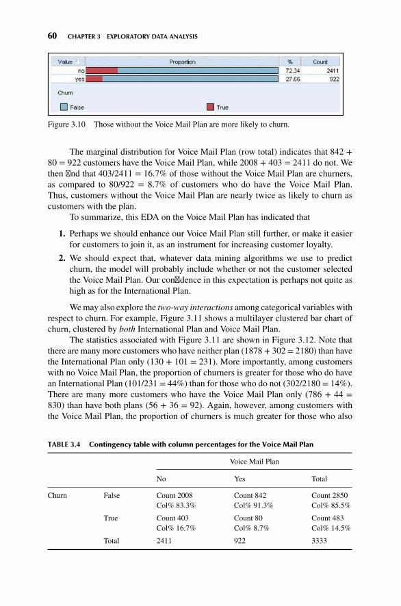
60 CHAPTER 3 EXPLORATORY DATA ANALYSIS
Figure 3.10 Those without the Voice Mail Plan are more likely to churn.
The marginal distribution for Voice Mail Plan (row total) indicates that 842 +80 = 922 customers have the Voice Mail Plan, while 2008 + 403 = 2411 do not. Wethen find that 403/2411 = 16.7% of those without the Voice Mail Plan are churners,as compared to 80/922 = 8.7% of customers who do have the Voice Mail Plan.Thus, customers without the Voice Mail Plan are nearly twice as likely to churn ascustomers with the plan.
To summarize, this EDA on the Voice Mail Plan has indicated that
1. Perhaps we should enhance our Voice Mail Plan still further, or make it easierfor customers to join it, as an instrument for increasing customer loyalty.
2. We should expect that, whatever data mining algorithms we use to predictchurn, the model will probably include whether or not the customer selectedthe Voice Mail Plan. Our confidence in this expectation is perhaps not quite ashigh as for the International Plan.
Wemay also explore the two-way interactions among categorical variables withrespect to churn. For example, Figure 3.11 shows a multilayer clustered bar chart ofchurn, clustered by both International Plan and Voice Mail Plan.
The statistics associated with Figure 3.11 are shown in Figure 3.12. Note thatthere are many more customers who have neither plan (1878+ 302= 2180) than havethe International Plan only (130 + 101 = 231). More importantly, among customerswith no Voice Mail Plan, the proportion of churners is greater for those who do havean International Plan (101/231 = 44%) than for those who do not (302/2180 = 14%).There are many more customers who have the Voice Mail Plan only (786 + 44 =830) than have both plans (56 + 36 = 92). Again, however, among customers withthe Voice Mail Plan, the proportion of churners is much greater for those who also
TABLE 3.4 Contingency table with column percentages for the Voice Mail Plan
Voice Mail Plan
No Yes Total
Churn False Count 2008Col% 83.3%
Count 842Col% 91.3%
Count 2850Col% 85.5%
True Count 403Col% 16.7%
Count 80Col% 8.7%
Count 483Col% 14.5%
Total 2411 922 3333

3.3 EXPLORING CATEGORICAL VARIABLES 61
International Plan
Churn
False
True
False
True
False
True
False
True
no yes
yes
no
no
yes
500
0
1000
Co
un
t
1500
2000
Voice Mail Plan
Figure 3.11 Multilayer clustered bar chart.
Figure 3.12 Statistics for multilayer clustered bar chart.

62 CHAPTER 3 EXPLORATORY DATA ANALYSIS
select the International Plan (36/92 = 39%) than for those who do not (44/830 =5%). Note also that there is no interaction among the categorical variables. That is,International Plan holders have greater churn regardless of whether they are VoiceMail Plan adopters or not.
Finally, Figure 3.13 shows a directed web graph of the relationships betweenInternational Plan holders, VoiceMail Plan holders, and churners. Note that threelines lead to the Churn = False node, which is good. However, note that one faint lineleads to the Churn = True node, that of the International Plan holders, indicating thata greater proportion of International Plan holders choose to churn. This supports ourearlier findings.
Churn
FalseTrue
nono
Voice Mail Plan
yes
International Plan
yes
Figure 3.13 Directed web graph supports earlier findings.
3.4 EXPLORING NUMERIC VARIABLES
Next, we turn to an exploration of the numeric predictive variables. Refer back toFigure 3.2 and for histograms and summary statistics of the various predictors. Notethat many fields show evidence of symmetry, such as account length and all theminutes, charge, and call fields. Fields not showing evidence of symmetry includevoice mail messages and customer service calls. The median for voice mail messagesis zero, indicating that at least half of all customers had no voice mail messages.This results of course from fewer than half of the customers selecting the Voice MailPlan, as we saw above. The mean of customer service calls (1.563) is greater thanthe median (1.0), indicating some right-skewness, as also indicated by the maximumnumber of customer service calls being nine.
Unfortunately, the usual type of histograms (such as those in Figure 3.2) donot help us determine whether the predictor variables are associated with the targetvariable. To explore whether a predictor is useful for predicting the target variable,
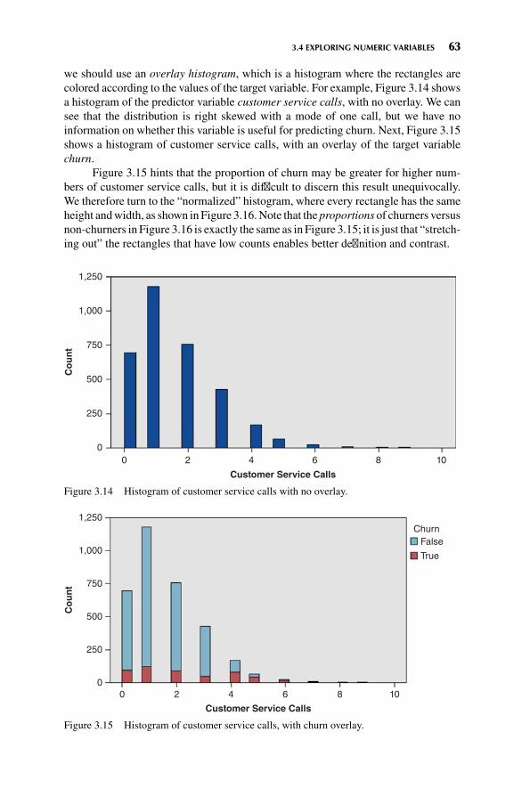
3.4 EXPLORING NUMERIC VARIABLES 63
we should use an overlay histogram, which is a histogram where the rectangles arecolored according to the values of the target variable. For example, Figure 3.14 showsa histogram of the predictor variable customer service calls, with no overlay. We cansee that the distribution is right skewed with a mode of one call, but we have noinformation on whether this variable is useful for predicting churn. Next, Figure 3.15shows a histogram of customer service calls, with an overlay of the target variablechurn.
Figure 3.15 hints that the proportion of churn may be greater for higher num-bers of customer service calls, but it is difficult to discern this result unequivocally.We therefore turn to the “normalized” histogram, where every rectangle has the sameheight andwidth, as shown in Figure 3.16.Note that the proportions of churners versusnon-churners in Figure 3.16 is exactly the same as in Figure 3.15; it is just that “stretch-ing out” the rectangles that have low counts enables better definition and contrast.
0
Co
un
t
0
250
500
750
1,000
1,250
2 4 6
Customer Service Calls
8 10
Figure 3.14 Histogram of customer service calls with no overlay.
0
0
250
500
750
1,000
1,250
2
Co
un
t
4
Customer Service Calls
6 8 10
Churn
False
True
Figure 3.15 Histogram of customer service calls, with churn overlay.

64 CHAPTER 3 EXPLORATORY DATA ANALYSIS
0
0
20
40
60
80
100
2
Per
cen
t
4
Customer Service Calls
6 8 10
Churn
False
True
Figure 3.16 “Normalized” histogram of customer service calls, with churn overlay.
The pattern now becomes crystal clear. Customers who have called customerservice three times or less have a markedly lower churn rate (darker part of therectangle) than customers who have called customer service four or more times.
This EDA on the customer service calls has indicated that
1. We should carefully track the number of customer service calls made by eachcustomer. By the third call, specialized incentives should be offered to retaincustomer loyalty, because, by the fourth call, the probability of churn increasesgreatly.
2. We should expect that, whatever data mining algorithms we use to predictchurn, the model will probably include the number of customer service callsmade by the customer.
Important note: Normalized histograms are useful for teasing out the relationshipbetween a numerical predictor and the target. However, data analysts should alwaysprovide the companion nonnormalized histogram along with the normalized his-togram, because the normalized histogram does not provide any information on thefrequency distribution of the variable. For example, Figure 3.16 indicates that thechurn rate for customers logging nine service calls is 100%; but Figure 3.15 showsthat there are only two customers with this number of calls.
Let us now turn to the remaining numerical predictors. The normalized his-togram of Day Minutes in Figure 3.17b shows that high day-users tend to churn at ahigher rate. Therefore
1. We should carefully track the number of dayminutes used by each customer. Asthe number of day minutes passes 200, we should consider special incentives.
2. We should investigate why heavy day-users are tempted to leave.
3. We should expect that our eventual data mining model will include day minutesas a predictor of churn.

3.4 EXPLORING NUMERIC VARIABLES 65
400
300
200
100
0
400
Churn
False
True
300200
Day Minutes
Co
un
t
1000
100
(a)
(b)
80
60
40
20
0
400
Churn
False
True
300200
Day Minutes
Per
cen
t
1000
Figure 3.17 (a) Nonnormalized histogram of day minutes; (b) normalized histogram of dayminutes.
Figure 3.18b shows a slight tendency for customerswith higher eveningminutesto churn. Based solely on the graphical evidence, however, we cannot concludebeyond a reasonable doubt that such an effect exists. Therefore, we shall hold off onformulating policy recommendations on evening cell-phone use until our data miningmodels offer firmer evidence that the putative effect is in fact present.
Figures 3.19b indicates that there is no obvious association between churn andnight minutes, since the pattern is relatively flat. In fact, EDA would indicate no

66 CHAPTER 3 EXPLORATORY DATA ANALYSIS
400
500
300
200
100
0
400
Churn
False
True
300200
Evening Minutes
Co
un
t
1000
(a)
400
Churn
False
True
300200
Evening Minutes
1000
(b)
100
80
60
40
20
0
Per
cen
t
Figure 3.18 (a) Nonnormalized histogram of evening minutes; (b) normalized histogram ofevening minutes.
obvious association with the target for any of the remaining numeric variables in thedata set (except one), though showing this is left as an exercise.
Note: The lack of obvious association at the EDA stage between a predictorand a target variable is not sufficient reason to omit that predictor from the model. Forexample, based on the lack of evident association between churn and night minutes,we will not necessarily expect the data mining models to uncover valuable predictive

3.4 EXPLORING NUMERIC VARIABLES 67
400
500
300
200
100
0
400
Churn
False
True
300200
Night Minutes
Co
un
t
1000
(a)
400
Churn
False
True
300200
Night Minutes
1000
(b)
100
80
60
40
20
0
Per
cen
t
Figure 3.19 (a) Nonnormalized histogram of night minutes; (b) normalized histogram ofnight minutes.
information using this predictor. However, we should nevertheless retain the predictoras an input variable for the data mining models, because actionable associations maystill exist for identifiable subsets of the records, and they may be involved in higher-dimension associations and interactions. In any case, unless there is a good reasonfor eliminating the variable prior to modeling, then we should probably allow themodeling process to identify which variables are predictive and which are not.

68 CHAPTER 3 EXPLORATORY DATA ANALYSIS
For example, Figures 3.20a and 3.20b, of the predictor International Callswithchurn overlay, do not indicate strong graphical evidence of the predictive importanceof International Calls. However, a t-test (see Chapter 4) for the difference in meannumber of international calls for churners and non-churners is statistically significant(Figure 3.21, p-value = 0.003; p-values larger than, say, 0.10 are not consideredsignificant; see Chapter 4), meaning that this variable is indeed useful for predictingchurn: Churners tend to place a lower mean number of international calls. Thus,had we omitted International Calls from the analysis based on the seeming lack ofgraphical evidence, we would have committed a mistake, and our predictive modelwould not perform as well.
A hypothesis test, such as this t-test, represents statistical inference and modelbuilding, and as such lies beyond the scope of exploratory data analysis. We mentionit here merely to underscore the importance of not omitting predictors merely becausetheir relationship with the target is nonobvious using EDA.
600
400
200
0
Co
un
t
20
Churn
False
True
Churn
False
True
1510
International Calls50
(b)
201510
International Calls50
(a)
100
80
60
40
20
0
Per
cen
t
Figure 3.20 (a) Nonnormalized histogram of International Calls; (b) normalized histogramof International Calls.

3.5 EXPLORING MULTIVARIATE RELATIONSHIPS 69
Figure 3.21 t-test is significant for difference in mean international calls for churners andnon-churners.
3.5 EXPLORING MULTIVARIATE RELATIONSHIPS
We next turn to an examination of possible multivariate associations of numericvariables with churn, using scatter plots. Multivariate graphics can uncover newinteraction effects which our univariate exploration missed.
Figure 3.22 shows a scatter plot of day minutes versus evening minutes, withchurners indicated by the darker circles. Note the straight-line partitioning off the
Churn400
300
200
Day
Min
ute
s
Evening Minutes
100
0
4003002001000
Count7654321
FalseTrue
Figure 3.22 Customers with both high day minutes and high evening minutes are at greaterrisk of churning.

70 CHAPTER 3 EXPLORATORY DATA ANALYSIS
upper right section of the graph. Records above this diagonal line, representingcustomers with both high day minutes and high evening minutes, appear to have ahigher proportion of churners than records below the line. The univariate evidencefor a high churn rate for high evening minutes was not conclusive (Figure 3.18b), soit is nice to have a multivariate graph that indicates that supports the association, atleast for customers with high day minutes.
Figure 3.23 shows a scatter plot of customer service calls versus day minutes.Churners and non-churners are indicated with large and small circles, respectively.Consider the records inside the rectangle partition shown in the scatter plot, whichindicates a high churn area in the upper left section of the graph. These records rep-resent customers who have a combination of a high number of customer service callsand a low number of day minutes used. Note that this group of customers could nothave been identified had we restricted ourselves to univariate exploration (exploringvariable by single variable). This is because of the interaction between the variables.
In general, customers with higher numbers of customer service calls tend tochurn at a higher rate, as we learned earlier in the univariate analysis. However,Figure 3.23 shows that, of these customers with high numbers of customer servicecalls, those who also have high day minutes are somewhat “protected” from this highchurn rate. The customers in the upper right of the scatter plot exhibit a lower churnrate than those in the upper left. But how do we quantify these graphical findings?
Churn
Cu
sto
mer
Ser
vice
Cal
ls
Day Minutes
0
2
4
6
8
10
4003002001000
FalseTrue
Figure 3.23 There is an interaction effect between customer service calls and day minutes,with respect to churn.

3.7 USING EDA TO UNCOVER ANOMALOUS FIELDS 71
3.6 SELECTING INTERESTING SUBSETS OF THE DATAFOR FURTHER INVESTIGATION
Graphical EDA can uncover subsets of records that call for further investigation, asthe rectangle in Figure 3.23 illustrates. Let us examine the records in the rectanglemore closely. IBM/SPSS Modeler allows the user to click and drag a box arounddata points of interest, and select them for further investigation. Here we select therecords within the rectangular box in the upper left. Figure 3.24 shows that about 65%(115 of 177) of the selected records are churners. That is, those with high customerservice calls and low day minutes have a 65% probability of churning. Compare thisto the records with high customer service calls and high day minutes (essentiallythe data points to the right of the rectangle). Figure 3.25 shows that only about 26%of customers with high customer service calls and high day minutes are churners.Thus, it is recommended that we red-flag customers with low day minutes who havea high number of customer service calls, as they are at much higher risk of leaving thecompany’s service than customers with the same number of customer service calls,but higher day minutes.
To summarize the strategy we implemented here.
1. Generate multivariate graphical EDA, such as scatter plots with a flag overlay.
2. Use these plots to uncover subsets of interesting records.
3. Quantify the differences by analyzing the subsets of records.
Figure 3.24 Very high proportion of churners for high customer service calls and low dayminutes.
Figure 3.25 Much lower proportion of churners for high customer service calls and high dayminutes.
3.7 USING EDA TO UNCOVER ANOMALOUS FIELDS
Exploratory data analysis will sometimes uncover strange or anomalous records orfields which the earlier data cleaning phase may have missed. Consider, for example,the area code field in the present data set. Though the area codes contain numerals,they can also be used as categorical variables, since they can classify customersaccording to geographic location. We are intrigued by the fact that the area code field

72 CHAPTER 3 EXPLORATORY DATA ANALYSIS
contains only three different values for all the records, 408, 415, and 510 (which allhappen to be California area codes), as shown by Figure 3.26.
Now, this would not be anomalous if the records indicated that the customers alllived in California. However, as shown in the contingency table in Figure 3.27 (shownonly up to Georgia, to save space), the three area codes seem to be distributed moreor less evenly across all the states and the District of Columbia. Also, the chi-squaretest (see Chapter 5) has a p-value of 0.608, supporting the suspicion that the areacodes are distributed randomly across all the states. Now, it is possible that domainexperts might be able to explain this type of behavior, but it is also possible that thefield just contains bad data.
We should therefore be wary of this area code field, and should not include itas input to the data mining models in the next phase. Further, the state field may bein error as well. Either way, further communication with someone familiar with thedata history, or a domain expert, is called for before inclusion of these variables inthe data mining models.
Figure 3.26 Only three area codes for all records.
Figure 3.27 Anomaly: three area codes distributed randomly across all 50 states.
3.8 BINNING BASED ON PREDICTIVE VALUE
Chapter 2 discussed four methods for binning numerical variables. Here, we pro-vide two examples of the fourth method: Binning based on predictive value. Recall
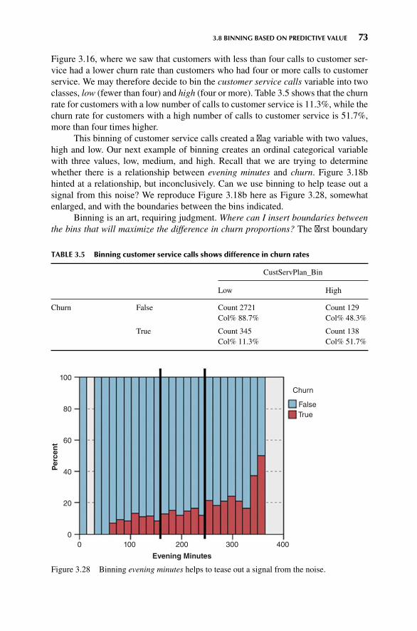
3.8 BINNING BASED ON PREDICTIVE VALUE 73
Figure 3.16, where we saw that customers with less than four calls to customer ser-vice had a lower churn rate than customers who had four or more calls to customerservice. We may therefore decide to bin the customer service calls variable into twoclasses, low (fewer than four) and high (four or more). Table 3.5 shows that the churnrate for customers with a low number of calls to customer service is 11.3%, while thechurn rate for customers with a high number of calls to customer service is 51.7%,more than four times higher.
This binning of customer service calls created a flag variable with two values,high and low. Our next example of binning creates an ordinal categorical variablewith three values, low, medium, and high. Recall that we are trying to determinewhether there is a relationship between evening minutes and churn. Figure 3.18bhinted at a relationship, but inconclusively. Can we use binning to help tease out asignal from this noise? We reproduce Figure 3.18b here as Figure 3.28, somewhatenlarged, and with the boundaries between the bins indicated.
Binning is an art, requiring judgment. Where can I insert boundaries betweenthe bins that will maximize the difference in churn proportions? The first boundary
TABLE 3.5 Binning customer service calls shows difference in churn rates
CustServPlan_Bin
Low High
Churn False Count 2721Col% 88.7%
Count 129Col% 48.3%
True Count 345Col% 11.3%
Count 138Col% 51.7%
100
80
60
40
20
0
400
Churn
False
True
300200
Evening Minutes
Per
cen
t
1000
Figure 3.28 Binning evening minutes helps to tease out a signal from the noise.
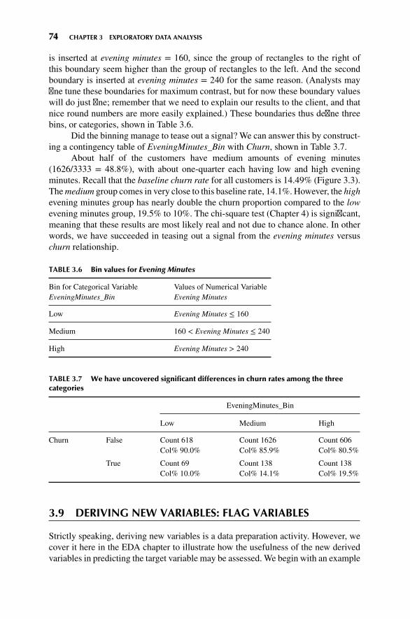
74 CHAPTER 3 EXPLORATORY DATA ANALYSIS
is inserted at evening minutes = 160, since the group of rectangles to the right ofthis boundary seem higher than the group of rectangles to the left. And the secondboundary is inserted at evening minutes = 240 for the same reason. (Analysts mayfine tune these boundaries for maximum contrast, but for now these boundary valueswill do just fine; remember that we need to explain our results to the client, and thatnice round numbers are more easily explained.) These boundaries thus define threebins, or categories, shown in Table 3.6.
Did the binning manage to tease out a signal? We can answer this by construct-ing a contingency table of EveningMinutes_Bin with Churn, shown in Table 3.7.
About half of the customers have medium amounts of evening minutes(1626/3333 = 48.8%), with about one-quarter each having low and high eveningminutes. Recall that the baseline churn rate for all customers is 14.49% (Figure 3.3).Themedium group comes in very close to this baseline rate, 14.1%. However, the highevening minutes group has nearly double the churn proportion compared to the lowevening minutes group, 19.5% to 10%. The chi-square test (Chapter 4) is significant,meaning that these results are most likely real and not due to chance alone. In otherwords, we have succeeded in teasing out a signal from the evening minutes versuschurn relationship.
TABLE 3.6 Bin values for Evening Minutes
Bin for Categorical VariableEveningMinutes_Bin
Values of Numerical VariableEvening Minutes
Low Evening Minutes ≤ 160
Medium 160 < Evening Minutes ≤ 240
High Evening Minutes > 240
TABLE 3.7 We have uncovered significant differences in churn rates among the threecategories
EveningMinutes_Bin
Low Medium High
Churn False Count 618Col% 90.0%
Count 1626Col% 85.9%
Count 606Col% 80.5%
True Count 69Col% 10.0%
Count 138Col% 14.1%
Count 138Col% 19.5%
3.9 DERIVING NEW VARIABLES: FLAG VARIABLES
Strictly speaking, deriving new variables is a data preparation activity. However, wecover it here in the EDA chapter to illustrate how the usefulness of the new derivedvariables in predicting the target variable may be assessed. We begin with an example

3.9 DERIVING NEW VARIABLES: FLAG VARIABLES 75
of a derived variable which is not particularly useful. Figure 3.2 shows a spike in thedistribution of the variable voicemailmessages, whichmakes its analysis problematic.We therefore derive a flag variable (see Chapter 2), VoiceMailMessages_Flag, toaddress this problem, as follows:
If Voice Mail Messages > 0 then VoiceMailMessages_Flag = 1;otherwise VoiceMailMessages_Flag = 0.
The resulting contingency table is shown in Table 3.8. Compare the results withthose from Table 3.4, the contingency table for the Voice Mail Plan. The results areexactly the same, which is not surprising, since those without the plan can have novoice mail messages. Thus, since VoiceMailMessages_Flag has identical values asthe flag variable Voice Mail Plan, it is not deemed to be a useful derived variable.
Recall Figure 3.22 (reproduced here as Figure 3.29), showing a scatter plot ofdayminutes versus eveningminutes, with a straight line separating a group in the upperright (with both high day minutes and high evening minutes) that apparently churnsat a greater rate. It would be nice to quantify this claim. We do so by selecting therecords in the upper right, and compare their churn rate to that of the other records.One way to do this in IBM/SPSS Modeler is to draw an oval around the desiredrecords, which the software then selects (not shown). However, this method is adhoc, and not portable to a different data set (say the validation set). A better idea is to
1. Estimate the equation of the straight line and
2. Use the equation to separate the records, via a flag variable.
This method is portable to a validation set or other related data set.We estimate the equation of the line in Figure 3.22 to be
y = 400 − 0.6x
That is, for each customer, the estimated day minutes equals 400 minutesminus 0.6 times the evening minutes. We may then create a flag variable High-DayEveMins_Flag as follows:
If Day Minutes > 400 - 0.6 Evening Minutes thenHighDayEveMins_Flag = 1; otherwise HighDayEveMins_Flag = 0.
Then each data point above the line will haveHighDayEveMins_Flag= 1whilethe data points below the line will have HighDayEveMins_Flag = 0. The resultingcontingency table (Table 3.9) shows the highest churn proportion of any variable
TABLE 3.8 Contingency table for VoiceMailMessages_Flag
VoiceMailMessages_Flag
0 1
Churn False Count 2008Col% 83.3%
Count 842Col% 91.3%
True Count 403Col% 16.7%
Count 80Col% 8.7%

76 CHAPTER 3 EXPLORATORY DATA ANALYSIS
Churn400
300
200
Day
Min
ute
s
Evening Minutes
100
0
400300200
(a)
1000
Count7654321
FalseTrue
Figure 3.29 Use the equation of the line to separate the records, via a flag variable.
TABLE 3.9 Contingency table for HighDayEveMins_Flag
HighDayEveMins_Flag
0 1
Churn False Count 2792Col% 89.0%
Count 58Col% 29.6%
True Count 345Col% 11.0%
Count 138Col% 70.4%
we have studied thus far, 70.4% versus 11%, a more than sixfold difference. On theother hand, this 70.4% churn rate is restricted to a subset of fewer than 200 records,fortunately for the company.
A NOTE ABOUT CRISP-DM FOR DATA MINERS:BE STRUCTURED BUT FLEXIBLE
For EveningMinutes_Bin, we referred to the chi-square significance test (Chapter 5), whichreally belongs to the modeling phase of data analysis. Also, our derived variable really

3.11 USING EDA TO INVESTIGATE CORRELATED PREDICTOR VARIABLES 77
belongs to the data preparation phase. These examples illustrate the flexibility of theCRISP-DM standard practice (or indeed any well-structured standard practice) of datamining. The assorted phases are interdependent, and should not be viewed as isolatedfrom each other. For example, deriving variables is a data preparation activity, but derivedvariables need to be explored using EDA and (sometimes) significance tests. The data minerneeds to be as flexible as CRISP-DM.
However, some data analysts fall victim to the opposite problem, interminably iter-ating back and forth between data preparation and EDA, getting lost in the details, andnever advancing toward the research objectives. When this happens, CRISP-DM can serveas a useful road map, a structure to keep the data miner organized and moving toward thefulfillment of the research goals.
3.10 DERIVING NEW VARIABLES:NUMERICAL VARIABLES
Suppose we would like to derive a new numerical variable which combines CustomerService Calls and International Calls, and whose values will be the mean of the twofields. Now, since International Calls has a larger mean and standard deviationthan Customer Service Calls, it would be unwise to take the mean of the raw fieldvalues, since International Calls would thereby be more heavily weighted. Instead,when combining numerical variables, we first need to standardize. The new derivedvariable therefore takes the form:
CSCInternational Z = (CSC Z + International Z)2
where CSC_Z represents the z-score standardization of Customer Service Calls andInternational_Z represents the z-score standardization of International Calls. Theresulting normalized histogram of CSCInternational_Z indicates that it will be usefulfor predicting churn, as shown in Figure 3.30b.
3.11 USING EDA TO INVESTIGATE CORRELATEDPREDICTOR VARIABLES
Two variables x and y are linearly correlated if an increase in x is associated witheither an increase in y or a decrease in y. The correlation coefficient r quantifies thestrength and direction of the linear relationship between x and y. The threshold forsignificance of the correlation coefficient r depends on the sample size, but in datamining, where there are a large number of records (over 1000), even small values ofr, such as −0.1 ≤ r ≤ 0.1 may be statistically significant.
One should take care to avoid feeding correlated variables to one’s data miningand statistical models. At best, using correlated variables will overemphasize onedata component; at worst, using correlated variables will cause the model to becomeunstable and deliver unreliable results. However, just because two variables arecorrelated does not mean that we should omit one of them. Instead, while in the EDAstage, we should apply the following strategy:

78 CHAPTER 3 EXPLORATORY DATA ANALYSIS
400
300
200
100
0
Churn
False
True
CSCInternational_Z
Co
un
t
–2 –1 0 1 2 3 4
(a)
CSCInternational_Z
–2 –1 0 1 2 3 4
(b)
Churn
False
True
100
80
60
40
20
0
Per
cen
t
Figure 3.30 (a) Nonnormalized histogram of CSCInternational_Z; (b) normalized histogramof CSCInternational_Z.
STRATEGY FOR HANDLING CORRELATED PREDICTORVARIABLES AT THE EDA STAGE
1. Identify any variables that are perfectly correlated (i.e., r = 1.0 or r = −1.0). Do notretain both variables in the model, but rather omit one.
2. Identify groups of variables that are correlated with each other. Then, later, during themodeling phase, apply dimension reduction methods, such as principal componentsanalysis1, to these variables.
1For more on dimension reductions and principal component analysis, see Data Mining Methods andModels, by Daniel Larose (Wiley, 2006) or Data Mining and Predictive Analytics, by Daniel Larose andChantal Larose (Wiley, 2015, to appear).

3.11 USING EDA TO INVESTIGATE CORRELATED PREDICTOR VARIABLES 79
Note that this strategy applies to uncovering correlation among the predictors alone,not between a given predictor and the target variable.
Turning to our data set, for each of day, evening, night, and international, thedata set contains three variables, minutes, calls, and charge. The data descriptionindicates that the charge variable may be a function of minutes and calls, with theresult that the variables would be correlated. We investigate using a matrix plot(Figure 3.31), which is a matrix of scatter plots for a set of numeric variables, in thiscase for day minutes, day calls, and day charge. Figure 3.32 contains the correlationcoefficient values and the p-values for each pairwise set of variables.
There does not seem to be any relationship between day minutes and day calls,nor between day calls and day charge. This we find to be rather odd, as one may haveexpected that, as the number of calls increased, the number of minutes would tend toincrease (and similarly for charge), resulting in a positive correlation between thesefields. However, the graphical evidence in Figure 3.31 does not support this, nor dothe correlations in Figure 3.32, which are r = 0.07 for both relationships, with a largep-value of 0.697.
Figure 3.31 Matrix plot of Day Minutes, Day Calls, and Day Charge.
Figure 3.32 Correlations and p-values.

80 CHAPTER 3 EXPLORATORY DATA ANALYSIS
On the other hand, there is a perfect linear relationship between day minutesand day charge, indicating that day charge is a simple linear function of day minutesonly. UsingMinitab’s regression tool (see Figure 3.33), we find that we may expressthis function as the estimated regression equation: “Day charge equals 0.000613 plus0.17 times Day minutes.” This is essentially a flat rate model, billing 17 cents perminute for day use. Note from Figure 3.33 that the R-squared statistic is precisely100%, indicating a perfect linear relationship.
Since day charge is perfectly correlated with day minutes, then we shouldeliminate one of the two variables. We do so, arbitrarily choosing to eliminate daycharge and retain day minutes. Investigation of the evening, night, and internationalcomponents reflected similar findings, and we thus also eliminate evening charge,night charge, and international charge. Note that had we proceeded to the modelingphase without first uncovering these correlations, our data mining and statisticalmodels may have returned incoherent results, due, for example, to multicollinearityin multiple regression.We have therefore reduced the number of predictors from 20 to16 by eliminating one of each pair of perfectly correlated predictors. A further benefitof doing so is that the dimensionality of the solution space is reduced, so that certaindata mining algorithms may more efficiently find the globally optimal solution.
After dealing with the perfectly correlated predictors, the data analyst shouldturn to Step 2 of the strategy, and identify any other correlated predictors, for laterhandling with principal component analysis. The correlation of each numerical pre-dictor with every other numerical predictor should be checked, if feasible. Correla-tions with small p-values should be identified. A subset of this procedure is shownhere in Figure 3.34. Note that the correlation coefficient 0.038 between account lengthand day calls has a small p-value of 0.026, telling us that account length and daycalls are positively correlated. The data analyst should note this, and prepare to applyprincipal component analysis during the modeling phase.
3.12 SUMMARY
Let us consider some of the insights we have gained into the churn data set throughthe use of exploratory data analysis.We have examined each of the variables (here andin the exercises), and have taken a preliminary look at their relationship with churn.
Figure 3.33 Minitab regression output for Day Charge vs. Day Minutes.

3.12 SUMMARY 81
Figure 3.34 Account length is positively correlated with day calls.
� The four charge fields are linear functions of the minute fields, and should beomitted.
� The area code field and/or the state field are anomalous, and should be omitteduntil further clarification is obtained.
Insights with respect to churn:� Customers with the International Plan tend to churn more frequently.� Customers with the VoiceMail Plan tend to churn less frequently.� Customers with four or more Customer Service Calls churn more than fourtimes as often as the other customers.
� Customers with high Day Minutes and Evening Minutes tend to churn at ahigher rate than the other customers.
� Customers with both high Day Minutes and high Evening Minutes churn at arate about six times greater than the other customers.
� Customers with low Day Minutes and high Customer Service Calls churn at ahigher rate than the other customers.
� Customers with lower numbers of International Calls churn at a higher ratethan do customers with more international calls.
� For the remaining predictors, EDA uncovers no obvious association of churn.However, these variables are still retained for input to downstream data miningmodels and techniques.
Note the power of exploratory data analysis. We have not applied any high powereddata mining algorithms yet on this data set, such as decision trees or neural networkalgorithms. Yet, we have still gained considerable insight into the attributes that areassociated with the customers leaving the company, simply by careful applicationof exploratory data analysis. These insights can be easily formulated into actionablerecommendations, so that the company can take action to lower the churn rate amongits customer base.

82 CHAPTER 3 EXPLORATORY DATA ANALYSIS
THE R ZONE
# Input data set Churn into Data Frame "Churn"
churn <- read.csv(file = "C:/ . . . /churn.txt",stringsAsFactors=TRUE)
# Show the first ten recordschurn[1:10,]
# Summarize the Churn variable # Calculate proportion of churners
sum.churn <- summary(churn$Churn)sum.churn
prop.churn <- sum(churn$Churn == "True") /length(churn$Churn)
prop.churn
# Bar chart of variable Churn
barplot(sum.churn,ylim = c(0, 3000),main = "Bar Graph of Churners and Non-Churners",col = "lightblue")
box(which = "plot",lty = "solid",col="black")
# Make a table for counts of Churn and International Plan
counts <- table(churn$Churn, churn$Int.l.Plan,dnn=c("Churn", "International Plan"))
counts
# Create a table with sums for both variables
sumtable <- addmargins(counts, FUN = sum)sumtable

3.12 SUMMARY 83
# Overlayed bar chart
barplot(counts,legend = rownames(counts),col = c("blue", "red"),ylim = c(0, 3300),ylab = "Count",xlab = "International Plan",main = "Comparison Bar Chart:Churn Proportions by International Plan")
box(which = "plot",lty = "solid",col="black")
# Create a table of proportions over rows
row.margin <- round(prop.table(counts,margin = 1),
4)∗100row.margin
# Create a table of proportions over columns
col.margin <- round(prop.table(counts,margin = 2),
4)∗100col.margin
# Histogram of non-overlayed Customer Service Calls
hist(churn$CustServ.Calls,xlim = c(0,10),col = "lightblue",ylab = "Count",xlab = "Customer Service Calls",main = "Histogram of Customer Service Calls")

84 CHAPTER 3 EXPLORATORY DATA ANALYSIS
# Clustered Bar Chart, with legend
barplot(counts,col = c("blue", "red"),ylim = c(0, 3300),ylab = "Count",xlab = "International Plan",main = "Churn Count by International Plan",beside = TRUE)
legend("topright",c(rownames(counts)),col = c("blue", "red"),pch = 15,title = "Churn")
box(which = "plot",lty = "solid",col="black")
# Download and install the R Package ggplot2
install.packages("ggplot2")# Pick any CRAN mirror# (see example image)# Open the new packagelibrary(ggplot2)
# Clustered Bar Chart of Churn and Int’l Plan with legend
barplot(t(counts),col = c("blue", "green"),ylim = c(0, 3300),ylab = "Counts",xlab = "Churn",main = "International Plan Count by Churn",beside = TRUE)
legend("topright",c(rownames(counts)),col = c("blue", "green"),pch = 15,title = "Int’l Plan")
box(which = "plot",lty = "solid",col="black")

3.12 SUMMARY 85
# Overlayed bar charts
ggplot() +geom_bar(data = churn,aes(x = factor(churn$CustServ.Calls),fill = factor(churn$Churn.)),position = "stack") +scale_x_discrete("Customer Service Calls") +scale_y_continuous("Percent") +guides(fill=guide_legend(title="Churn")) +scale_fill_manual(values=c("blue", "red"))
0 1 2 3 4
Customer Service Calls
False.
True.
Churn
5 6 7 8 9
0
300
600
900
1200
Pe
rce
nt
ggplot() +geom_bar(data=churn,aes(x = factor(churn$CustServ.Calls),fill = factor(churn$Churn.)),position = "fill") +scale_x_discrete("Customer Service Calls") +scale_y_continuous("Percent") +guides(fill=guide_legend(title="Churn")) +scale_fill_manual(values=c("blue", "red"))
Customer Service Calls
False.
True.
Churn
0 1 2 3 4 5 6 7 8 9
0.00
0.25
0.50
0.75
1.00
Perc
ent
# Two-sample T-Test for Int’l Calls
# Partition datachurn.false <- subset(churn,
churn$Churn == "False")churn.true <- subset(churn,
churn$Churn == "True")# Run the testt.test(churn.false$Intl.Calls,
churn.true$Intl.Calls)

86 CHAPTER 3 EXPLORATORY DATA ANALYSIS
# Scatterplot matrix
pairs(∼churn$Day.Mins+churn$Day.Calls+churn$Day.Charge)
# Regression of Day Charge vs Day Minutes
fit <- lm(churn$Day.Charge ∼churn$Day.Mins)
summary(fit)
# Scatterplot of Evening Minutes and Day Minutes, colored by Churn
plot(churn$Eve.Mins,churn$Day.Mins,xlim = c(0, 400),ylim = c(0, 400),xlab = "Evening Minutes",ylab = "Day Minutes",main = "Scatterplot of Day and Evening
Minutes by Churn",col = ifelse(churn$Churn=="True",
"red","blue"))
legend("topright",c("True","False"),
col = c("red","blue"),
pch = 1,title = "Churn")

3.12 SUMMARY 87
# Scatterplot of Day Minutes and Customer Service Calls, colored by Churn
plot(churn$Day.Mins,churn$CustServ.Calls,xlim = c(0, 400),xlab = "Day Minutes",ylab = "Customer Service Calls",main = "Scatterplot of Day Minutes and
Customer Service Calls by Churn",col = ifelse(churn$Churn=="True",
"red","blue"),
pch = ifelse(churn$Churn=="True",16, 20))
legend("topright",c("True",
"False"),col = c("red",
"blue"),pch = c(16, 20),title = "Churn")
# Correlation values, with p-values
days <- cbind(churn$Day.Mins,churn$Day.Calls,churn$Day.Charge)
MinsCallsTest <- cor.test(churn$Day.Mins,churn$Day.Calls)
MinsChargeTest <- cor.test(churn$Day.Mins,churn$Day.Charge)
CallsChargeTest <- cor.test(churn$Day.Calls,churn$Day.Charge)
round(cor(days),4)
MinsCallsTest$p.valueMinsChargeTest$p.valueCallsChargeTest$p.value

88 CHAPTER 3 EXPLORATORY DATA ANALYSIS
# Correlation values and p-values in matrix form
# Collect variables of interestcorrdata <- cbind(churn$Account.Length,
churn$VMail.Message,churn$Day.Mins,churn$Day.Calls,churn$CustServ.Calls)
# Declare the matrixcorrpvalues <- matrix(rep(0, 25),
ncol = 5)# Fill the matrix with correlationsfor (i in 1:4) {for (j in (i+1):5) {corrpvalues[i,j] <- corrpvalues[j,i] <-round(cor.test(corrdata[,i],corrdata[,j])$p.value,
4)}
}round(cor(corrdata), 4)corrpvalues
REFERENCE
1. Blake, C.L. and Merz, C.J., Churn Data Set, UCI Repository of Machine Learning Databases, Univer-sity ofCalifornia,Department of Information andComputer Science, Irvine, CA, 1998, kdd.ics.uci.edu/.Accessed March 17, 2014.
EXERCISES
1. Explain the difference between EDA and hypothesis testing, and why analysts may preferEDA when doing data mining.
2. Why do we need to perform exploratory data analysis?Why should not we simply proceeddirectly to the modeling phase and start applying our high powered data mining software?
3. Why do we use contingency tables, instead of just presenting the graphical results?
4. How can we find the marginal distribution of each variable in a contingency table?
5. What is the difference between taking row percentages and taking column percentages ina contingency table?
6. What is the graphical counterpart of a contingency table?
7. Describe what it would mean for interaction to take place between two categorical vari-ables, using an example.

EXERCISES 89
8. What type of histogram is useful for examining the relationship between a numericalpredictor and the target?
9. Explain one benefit and one drawback of using a normalized histogram. Should we everpresent a normalized histogram without showing its nonnormalized counterpart?
10. Explain whether we should omit a predictor from the modeling stage if it does not showany relationship with the target variable in the EDA stage, and why.
11. Describe how scatter plots can uncover patterns in two dimensions that would be invisiblefrom one-dimensional EDA.
12. Make up a fictional data set (attributes with no records is fine) with a pair of anomalousattributes. Describe how EDA would help to uncover the anomaly.
13. Explain the objective and the method of binning based on predictive value.
14. Why is binning based on predictive value considered to be somewhat of an art?
15. What step should precede the deriving of a new numerical variable representing the meanof two other numerical variables?
16. What does it mean to say that two variables are correlated?
17. Describe the possible consequences of allowing correlated variables to remain in themodel.
18. A common practice among some analysts when they encounter two correlated predictorsis to omit one of them from the analysis. Is this practice recommended?
19. Describe the strategy for handing correlated predictor variables at the EDA stage.
20. For each of the following descriptivemethods, statewhether itmay be applied to categoricaldata, continuous numerical data, or both.
a. Bar charts
b. Histograms
c. Summary statistics
d. Crosstabulations
e. Correlation analysis
f. Scatter plots
g. Web graphs
h. Binning
HANDS-ON ANALYSIS
21. Using the churn data set, develop EDA which shows that the remaining numeric variablesin the data set (apart from those covered in the text above) indicate no obvious associationwith the target variable.
Use the Adult data set from the book series website for the following exercises. Thetarget variable is income, and the goal is to classify income based on the other variables.
22. Which variables are categorical and which are continuous?
23. Using software, construct a table of the first 10 records of the data set, in order to get afeel for the data.

90 CHAPTER 3 EXPLORATORY DATA ANALYSIS
24. Investigate whether we have any correlated variables.
25. For each of the categorical variables, construct a bar chart of the variable, with an overlayof the target variable. Normalize if necessary.
a. Discuss the relationship, if any, each of these variables has with the target variables.
b. Which variables would you expect to make a significant appearance in any data miningclassification model we work with?
26. For each pair of categorical variables, construct a crosstabulation. Discuss your salientresults.
27. (If your software supports this.) Construct a web graph of the categorical variables. Finetune the graph so that interesting results emerge. Discuss your findings.
28. Report on whether anomalous fields exist in this data set, based on your EDA, which fieldsthese are, and what we should do about it.
29. Report the mean, median, minimum, maximum, and standard deviation for each of thenumerical variables.
30. Construct a histogram of each numerical variables, with an overlay of the target variableincome. Normalize if necessary.
a. Discuss the relationship, if any, each of these variables has with the target variables.
b. Which variables would you expect to make a significant appearance in any data miningclassification model we work with?
31. For each pair of numerical variables, construct a scatter plot of the variables. Discuss yoursalient results.
32. Based on your EDA so far, identify interesting sub-groups of records within the data setthat would be worth further investigation.
33. Apply binning to one of the numerical variables. Do it in such a way as to maximize theeffect of the classes thus created (following the suggestions in the text). Now do it in sucha way as to minimize the effect of the classes, so that the difference between the classes isdiminished. Comment.
34. Refer to the previous exercise. Apply the other two binning methods (equal width, andequal number of records) to this same variable. Compare the results and discuss thedifferences. Which method do you prefer?
35. Summarize your salient EDA findings from the above exercises, just as if you were writinga report. �

CHAPTER4UNIVARIATE STATISTICALANALYSIS
4.1 DATA MINING TASKS IN DISCOVERING KNOWLEDGE IN DATA 91
4.2 STATISTICAL APPROACHES TO ESTIMATION AND PREDICTION 92
4.3 STATISTICAL INFERENCE 93
4.4 HOW CONFIDENT ARE WE IN OUR ESTIMATES? 94
4.5 CONFIDENCE INTERVAL ESTIMATION OF THE MEAN 95
4.6 HOW TO REDUCE THE MARGIN OF ERROR 97
4.7 CONFIDENCE INTERVAL ESTIMATION OF THE PROPORTION 98
4.8 HYPOTHESIS TESTING FOR THE MEAN 99
4.9 ASSESSING THE STRENGTH OF EVIDENCE AGAINST THE NULLHYPOTHESIS 101
4.10 USING CONFIDENCE INTERVALS TO PERFORM HYPOTHESIS TESTS 102
4.11 HYPOTHESIS TESTING FOR THE PROPORTION 104
THE R ZONE 105
REFERENCE 106
EXERCISES 106
4.1 DATA MINING TASKS IN DISCOVERINGKNOWLEDGE IN DATA
In Chapter 1 we were introduced to the six data mining tasks:
� Description� Estimation� Prediction� Classification
Discovering Knowledge in Data: An Introduction to Data Mining, Second Edition.By Daniel T. Larose and Chantal D. Larose.© 2014 John Wiley & Sons, Inc. Published 2014 by John Wiley & Sons, Inc.
91

92 CHAPTER 4 UNIVARIATE STATISTICAL ANALYSIS
� Clustering� Association
In the description task, analysts try to find ways to describe patterns and trendslying within the data. Descriptions of patterns and trends often suggest possibleexplanations for such patterns and trends, as well as possible recommendations forpolicy changes. This description task can be accomplished capably with exploratorydata analysis (EDA), as we saw in Chapter 3. The description task may also beperformed using descriptive statistics, such as the sample proportion or the regressionequation, which we learn about in Chapters 4 and 5. Table 4.1 provides an outline ofwhere in this book we learn about each of the data mining tasks.
Of course, the data mining methods are not restricted to only one task each,which results in a fair amount of overlap among data mining methods and tasks.For example, decision trees may be used for classification, estimation, or prediction.Therefore, Table 4.1 should not be considered as a definitive partition of the tasks,but rather as a general outline of how we are introduced to the tasks and the methodsused to accomplish them.
TABLE 4.1 Data mining tasks in Discovering Knowledge in Data
Task We Learn about This Task in
Description Chapter 3: Exploratory data analysisChapter 4: Univariate statistical analysisChapter 5: Multivariate statistical analysis
Estimation Chapter 4: Univariate statistical analysisChapter 5: Multivariate statistical analysis
Prediction Chapter 4: Univariate statistical analysisChapter 5: Multivariate statistical analysis
Classification Chapter 7: k-Nearest neighbor algorithmChapter 8: Decision treesChapter 9: Neural networks
Clustering Chapter 10: Hierarchical and k-means clusteringChapter 11: Kohonen networks
Association Chapter 12: Association rules
4.2 STATISTICAL APPROACHES TO ESTIMATIONAND PREDICTION
If estimation and prediction are considered to be data mining tasks, statistical ana-lysts have been performing data mining for over a century. In Chapters 4 and 5 weexamine widespread and traditional methods of estimation and prediction, drawnfrom the world of statistical analysis. Here in Chapter 4 we examine univariate

4.3 STATISTICAL INFERENCE 93
methods, statistical estimation, and prediction methods that analyze one variable ata time. These methods include point estimation and confidence interval estimationfor population means and proportions. We discuss ways of reducing the margin oferror of a confidence interval estimate. Then we turn to hypothesis testing, examininghypothesis tests for populationmeans and proportions. Then, inChapter 5we considermultivariate methods for statistical estimation and prediction.
4.3 STATISTICAL INFERENCE
Consider our roles as data miners. We have been presented with a data set with whichwe are presumably unfamiliar. We have completed the data understanding and datapreparation phases and have gathered some descriptive information using EDA. Next,we would like to perform univariate estimation and prediction. A widespread tool forperforming estimation and prediction is statistical inference.
Statistical inference consists of methods for estimating and testing hypothesesabout population characteristics based on the information contained in the sample. Apopulation is the collection of all elements (persons, items, or data) of interest in aparticular study.
For example, presumably, the cell phone company does not want to restrict itsactionable results to the sample of 3333 customers from which it gathered the data.Rather, it would prefer to deploy its churn model to all of its present and future cellphone customers, which would therefore represent the population. A parameter is acharacteristic of a population, such as the mean number of customer service calls ofall cell phone customers.
A sample is simply a subset of the population, preferably a representativesubset. If the sample is not representative of the population, that is, if the samplecharacteristics deviate systematically from the population characteristics, statisticalinference should not be applied. A statistic is a characteristic of a sample, such as themean number of customer service calls of the 3333 customers in the sample (1.563).
Note that the values of population parameters are unknown for most interestingproblems. Specifically, the value of the population mean is usually unknown. Forexample, we do not know the true mean number of customer service calls to bemade by all of the company’s cell phone customers. To represent their unknownnature, population parameters are often denoted with Greek letters. For example,the population mean is symbolized using the Greek lowercase letter 𝜇 (pronounced“myu”), which is the Greek letter for “m” (“mean”).
The value of the population mean number of customer service calls 𝜇 isunknown for a variety of reasons, including the fact that the data may not yet havebeen collected or warehoused. Instead, data analysts would use estimation. For exam-ple, they would estimate the unknown value of the population mean 𝜇 by obtaining asample and computing the sample mean x, which would be used to estimate 𝜇. Thus,we would estimate the mean number of customer service calls for all customers tobe 1.563, since this is the value of our observed sample mean.
An important caveat is that estimation is valid only as long as the sample istruly representative of the population. For example, suppose for a moment that the

94 CHAPTER 4 UNIVARIATE STATISTICAL ANALYSIS
churn data set represents a sample of 3333 disgruntled customers. Then this samplewould not be representative (one hopes!) of the population of all the company’scustomers, and none of the EDA that we performed in Chapter 3 would be actionablewith respect to the population of all customers.
Analysts may also be interested in proportions, such as the proportion ofcustomers who churn. The sample proportion p is the statistic used to measurethe unknown value of the population proportion, 𝜋. For example, in Chapter 3 wefound that the proportion of churners in the data set was p = 0.145, which could beused to estimate the true proportion of churners for the population of all customers,keeping in mind the caveats above.
Point estimation refers to the use of a single known value of a statistic toestimate the associated population parameter. The observed value of the statistic iscalled the point estimate. We may summarize estimation of the population mean,standard deviation, and proportion using Table 4.2.
Estimation need not be restricted to the parameters in Table 4.2. Any statisticobserved from sample data may be used to estimate the analogous parameter inthe population. For example, we may use the sample maximum to estimate thepopulation maximum, or we could use the sample 27th percentile to estimate thepopulation 27th percentile. Any sample characteristic is a statistic, which, underthe appropriate circumstances, can be used to estimate its respective parameter.
More specifically, for example, we could use the sample churn proportion ofcustomers who did select the VoiceMail Plan, but did not select the InternationalPlan, and who made three customer service calls to estimate the population churnproportion of all such customers. Or, we could use the sample 99th percentile of dayminutes used for customers without the VoiceMail Plan to estimate the population99th percentile of day minutes used for all customers without the VoiceMail Plan.
TABLE 4.2 Use observed sample statistics to estimate unknown population parameters
Sample Statistic … Estimates…PopulationParameter
Mean x ⟶ 𝜇
Standard deviation s ⟶ 𝜎
Proportion p ⟶ 𝜋
4.4 HOW CONFIDENT ARE WE IN OUR ESTIMATES?
Let us face it: anyone can make estimates. Crystal ball gazers will be happy (for aprice) to provide you with an estimate of the parameter in which you are interested.The question is: How confident can we be in the accuracy of the estimate?
Do you think that the population mean number of customer service calls madeby all of the company’s customers is exactly the same as the sample mean x =1.563? Probably not. In general, since the sample is a subset of the population,inevitably the population contains more information than the sample about any givencharacteristic. Hence, unfortunately, our point estimates will nearly always “miss”

4.5 CONFIDENCE INTERVAL ESTIMATION OF THE MEAN 95
the target parameter by a certain amount, and thus be in error by this amount, whichis probably, though not necessarily, small.
This distance between the observed value of the point estimate and the unknownvalue of its target parameter is called sampling error, defined as |statistic− parameter|.For example, the sampling error for the mean is |x − 𝜇|, the distance (always positive)between the observed sample mean and the unknown population mean. Since the truevalues of the parameter are usually unknown, the value of the sampling error is usuallyunknown in real-world problems. In fact, for continuous variables, the probability thatthe observed value of a point estimate exactly equals its target parameter is preciselyzero. This is because probability represents area above an interval for continuousvariables, and there is no area above a point.
Point estimates have no measure of confidence in their accuracy; there is noprobability statement associated with the estimate. All we know is that the estimateis probably close to the value of the target parameter (small sampling error) but thatpossibly it may be far away (large sampling error). In fact, point estimation has beenlikened to a dart thrower, throwing darts with infinitesimally small tips (the pointestimates) toward a vanishingly small bull’s-eye (the target parameter). Worse, thebull’s-eye is hidden, and the thrower will never know for sure how close the darts arecoming to the target.
The dart thrower could perhaps be forgiven for tossing a beer mug in frustrationrather than a dart. But wait! Since the beer mug has width, there does indeed exista positive probability that some portion of the mug has hit the hidden bull’s-eye.We still do not know for sure, but we can have a certain degree of confidence thatthe target has been hit. Very roughly, the beer mug represents our next estimationmethod, confidence intervals.
4.5 CONFIDENCE INTERVAL ESTIMATIONOF THE MEAN
A confidence interval estimate of a population parameter consists of an interval ofnumbers produced by a point estimate, together with an associated confidence levelspecifying the probability that the interval contains the parameter. Most confidenceintervals take the general form
point estimate ±margin of error
where the margin of error is a measure of the precision of the interval estimate.Smaller margins of error indicate greater precision. For example, the t-interval forthe population mean is given by
x ± t𝛼∕2(s∕√n)
where the sample mean x is the point estimate and the quantity t𝛼∕2(s∕√n) represents
themargin of error. The t-interval for themeanmay be usedwhen either the populationis normal or the sample size is large.

96 CHAPTER 4 UNIVARIATE STATISTICAL ANALYSIS
Under what conditions will this confidence interval provide precise estimation?That is, when will the margin of error t𝛼∕2(s∕
√n) be small? The quantity s∕
√n
represents the standard error of the sample mean (the standard deviation of thesampling distribution of x) and is small whenever the sample size is large or thesample variability is small. The multiplier t𝛼∕2 is associated with the sample size andthe confidence level (usually 90–99%) specified by the analyst, and is smaller forlower confidence levels. Since we cannot influence the sample variability directlyand we hesitate to lower our confidence level, we must turn to increasing the samplesize should we seek to provide more precise confidence interval estimation.
Usually, finding a large sample size is not a problem for many data miningscenarios. For example, using the statistics in Figure 4.1, we can find the 95% t-interval for the mean number of customer service calls for all customers as follows:
x ± t𝛼∕2(s∕√n)
1.563 ± 1.96(1.315∕√3333)
1.563 ± 0.045
(1.518, 1.608)
We are 95% confident that the population mean number of customer servicecalls for all customers falls between 1.518 and 1.608 calls. Here, the margin of erroris 0.045 customer service calls, which is fairly precise for most applications.
However, data miners are often called upon to perform subgroup analyses, thatis, to estimate the behavior of specific subsets of customers instead of the entirecustomer base, as in the example above. For example, suppose that we are interestedin estimating the mean number of customer service calls for customers who haveboth the International Plan and the VoiceMail Plan and who have more than 220 dayminutes. This reduces the sample size to 28 (Figure 4.2), which however is still largeenough to construct the confidence interval.
Figure 4.1 Summary statistics of customer service calls.
Figure 4.2 Summary statistics of customer service calls for those with both the InternationalPlan and VoiceMail Plan and with more than 200 day minutes.

4.6 HOW TO REDUCE THE MARGIN OF ERROR 97
There are only 28 customers in the sample who have both plans and who loggedmore than 220minutes of day use. The point estimate for the populationmean numberof customer service calls for all such customers is the sample mean 1.607. We mayfind the 95% t-confidence interval estimate as follows:
x ± t𝛼∕2(s∕√n)
1.607 ± 2.048(1.892∕√28)
1.607 ± 0.732
(0.875, 2.339)
We are 95% confident that the population mean number of customer servicecalls for all customers who have both plans and who have more than 220 minutes ofday use falls between 0.875 and 2.339 calls. Here, 0.875 is called the lower boundand 2.339 is called the upper bound of the confidence interval. The margin of errorfor this specific subset of customers is 0.732, which indicates that our estimate ofthe mean number of customer service calls for this subset of customers is much lessprecise than for the customer base as a whole.
Confidence interval estimation can be applied to any desired target parame-ter. The most widespread interval estimates are for the population mean and thepopulation proportion.
4.6 HOW TO REDUCE THE MARGIN OF ERROR
The margin of error E for a 95% confidence interval for the population mean 𝜇 isE = t𝛼 ∕2(s∕
√n) and may be interpreted as follows:
We can estimate 𝜇 to within E units with 95% confidence.
For example, the margin of error above of the number of customer service calls for allcustomers equals 0.045 service calls, which may be interpreted as, “We can estimatethe mean number of customer service calls for all customers to within 0.045 callswith 95% confidence.”
Now, the smaller the margin of error, the more precise our estimation. So thequestion arises, how can we reduce our margin of error? Now the margin of error Econtains three quantities:
� t𝛼 ∕2, which depends on the confidence level and the sample size,� the sample standard deviation s, which is a characteristic of the data, and maynot be changed, and
� n, the sample size.
Thus, we may decrease our margin of error in two ways
� By decreasing the confidence level, which reduces the value of t𝛼 ∕2, andtherefore reduces E. Not recommended.

98 CHAPTER 4 UNIVARIATE STATISTICAL ANALYSIS
� By increasing the sample size. Recommended. Increasing the sample size isthe only way to decrease the margin of error while maintaining a constant levelof confidence.
For example, had we procured a new sample of 5000 customers, with the samestandard deviation s = 1.315, then the margin of error for a 95% confidence intervalwould be:
E = t𝛼∕2(s∕√n) = 1.96(1.315∕
√5000) = 0.036
Due to the√n in the formula for E, an increase of a in the sample size leads to
a reduction in margin of error of√a.
4.7 CONFIDENCE INTERVAL ESTIMATIONOF THE PROPORTION
Figure 3.3 showed that 483 of 3333 customers had churned, so that an estimate ofthe population proportion 𝜋 of all of the company’s customers who churn is
p = number who churnsample size
= xn= 483
3333= 0.1449
Unfortunately, with respect to the population of our entire customer base, wehave no measure of our confidence in the accuracy of this estimate. In fact, it is nearlyimpossible that this value exactly equals 𝜋. Thus, we would prefer a confidenceinterval for the population proportion 𝜋, given as follows.
p ± Z𝛼∕2
√p ⋅ (1 − p)
n
where the sample proportion p is the point estimate of𝜋 and the quantityZ𝛼∕2
√p⋅(1−p)
nrepresents the margin of error. The quantity Z𝛼∕2 depends on the confidence level:for 90% confidence Z𝛼∕2 = 1.645, for 95% confidence Z𝛼∕2 = 1.96, and for 99%confidence Z𝛼∕2 = 2.576. This Z-interval for 𝜋 may be used whenever both np ≥ 5and n(1 − p) ≥ 5.
For example, a 95% confidence interval for the proportion 𝜋 of churners amongthe entire population of the company’s customers is given by:
p ± Z𝛼∕2
√p ⋅ (1 − p)
n= 0.1149 ± 1.96
√(0.1449) (0.8551)
3333
= 0.1149 ± 0.012
= (0.1329, 0.1569)
We are 95% confident that this interval captures the population proportion 𝜋.Note that the confidence interval for 𝜋 takes the form
p ± E = 0.1149 ± 0.012

4.8 HYPOTHESIS TESTING FOR THE MEAN 99
where the margin of error E for a 95% confidence interval for the population mean 𝜋
is E = Z𝛼∕2
√p⋅(1−p)
n. The margin of error may be interpreted as follows:
We can estimate 𝜋 to within E with 95% confidence.
In this case, we can estimate the population proportion of churners to with 0.012 (or1.2%) with 95% confidence. For a given confidence level, the margin of error can bereduced only by taking a larger sample size.
4.8 HYPOTHESIS TESTING FOR THE MEAN
Hypothesis testing is a procedure where claims about the value of a populationparameter (such as 𝜇 or 𝜋) may be considered using the evidence from the sample.Two competing statements, or hypotheses, are crafted about the parameter value:
� The null hypothesis H0 is the status quo hypothesis, representing what has beenassumed about the value of the parameter, and
� The alternative hypothesis or research hypothesis Ha represents an alternativeclaim about the value of the parameter.
The two possible conclusions are (a) Reject H0, and (b) Do not reject H0. A criminaltrial is a form of a hypothesis test, with the following hypotheses:
H0 : Defendant is innocent Ha : Defendant is guilty
Table 4.3 illustrates the four possible outcomes of the criminal trial with respectto the jury’s decision, and what is true in reality.
� Type I error: Reject H0 when H0 is true. The jury convicts an innocent person.� Type II error: Do not reject H0 when H0 is false. The jury acquits a guiltyperson.
� Correct decisions:� Reject H0 when H0 is false. The jury convicts a guilty person.� Do not reject H0 when H0 is true. The jury acquits an innocent person.
TABLE 4.3 Four possible outcomes of the criminal trial hypothesis test
Reality
H0 true: defendant did notcommit crime
H0 false: defendant didcommit crime
Jury’sdecision
Reject H0: finddefendant guilty
Type I error Correct decision
Do not Reject H0:find defendantnot guilty
Correct decision Type II error

100 CHAPTER 4 UNIVARIATE STATISTICAL ANALYSIS
The probability of a Type I error is denoted 𝛼, while the probability of a TypeII error is denoted 𝛽. For a constant sample size, a decrease in 𝛼 is associated with anincrease in 𝛽, and vice versa. In statistical analysis, 𝛼 is usually fixed at some smallvalue, such as 0.05, and called the level of significance.
A common treatment of hypothesis testing for the mean is to restrict thehypotheses to the following three forms.
� Left-tailed test. H0 : 𝜇 ≥ 𝜇0 vs. Ha : 𝜇 < 𝜇0� Right-tailed test. H0 : 𝜇 ≤ 𝜇0 vs. Ha : 𝜇 > 𝜇0� Two-tailed test. H0 : 𝜇 = 𝜇0 vs. Ha : 𝜇 ≠ 𝜇0
where 𝜇0 represents a hypothesized value of 𝜇.When the sample size is large or the population is normally distributed, the test
statistic
tdata =x − 𝜇0
s∕√n
follows a t distribution, with n− 1 degrees of freedom. The value of tdata is interpretedas the number of standard errors above or below the hypothesized mean 𝜇, that thesample mean x resides, where the standard error equals s∕
√n. (Roughly, the standard
error represents a measure of spread of the distribution of a statistic.) When the valueof tdata is extreme, this indicates a conflict between the null hypothesis (with thehypothesized value 𝜇0) and the observed data. Since the data represent empiricalevidence whereas the null hypothesis represents merely a claim, such conflicts areresolved in favor of the data, so that, when tdata is extreme, the null hypothesis H0 isrejected. How extreme is extreme? This is measured using the p-value.
The p-value is the probability of observing a sample statistic (such as x ortdata) at least as extreme as the statistic actually observed, if we assume that the nullhypothesis is true. Since the p-value (“probability value”) represents a probability,its value must always fall between zero and one. Table 4.4 indicates how to calculatethe p-value for each form of the hypothesis test.
The names of the forms of the hypothesis test indicate in which tail or tails ofthe t distribution the p-value will be found.
TABLE 4.4 How to calculate p-value
Form of Hypothesis Test p-Value
Left-tailed testH0 : 𝜇 ≥ 𝜇0 vs. Ha : 𝜇 < 𝜇0
P(t < tdata)
Right-tailed testH0 : 𝜇 ≤ 𝜇0 vs. Ha : 𝜇 > 𝜇0
P(t > tdata)
Two-tailed testH0 : 𝜇 = 𝜇0 vs. Ha : 𝜇 ≠ 𝜇0
If tdata < 0 then p-value = 2 ⋅ P(t < tdata)If tdata > 0 then p-value = 2 ⋅ P(t > tdata)

4.9 ASSESSING THE STRENGTH OF EVIDENCE AGAINST THE NULL HYPOTHESIS 101
A small p-value will indicate conflict between the data and the null hypothesis.Thus we will reject H0 if the p-value is small. How small is small? Since researchersset the level of significance 𝛼 at some small value (such as 0.05), we consider thep-value to be small if it is less than 𝛼. This leads us to the rejection rule:
Reject H0 if the p-value is < 𝛼.
For example, recall our subgroup of customers who have both the InternationalPlan and the VoiceMail Plan and who have more than 220 day minutes. Suppose wewould like to test whether the mean number of customer service calls of all suchcustomers differs from 2.4, and we set the level of significance 𝛼 to be 0.05. Wewould have a two-tailed hypothesis test:
H0 : 𝜇 = 2.4 vs. Ha : 𝜇 ≠ 2.4
The null hypothesis will be rejected if the p-value is <0.05. Here, we have𝜇0 = 2.4, and earlier we saw that x = 1.607, s = 1.892, and n = 28. Thus,
tdata =x − 𝜇0
s∕√n
= 1.607 − 2.4
1.892∕√28
= −2.2178
Since tdata < 0, we have
p-value = 2 ⋅ P(t < tdata) = 2 ⋅ P (t < −2.2178) = 2 ⋅ 0.01758 = 0.035
Since the p-value of 0.035 is less than the level of significance 𝛼 = 0.05, wereject H0. The interpretation of this conclusion is that there is evidence at level ofsignificance 𝛼 = 0.05 that the population mean number of customer service calls ofall such customers differs from 2.4. Had we not rejected H0, we could simply insertthe word “insufficient” before “evidence” in the previous sentence.
4.9 ASSESSING THE STRENGTH OF EVIDENCE AGAINSTTHE NULL HYPOTHESIS
However, there is nothing written in stone saying that the level of significance 𝛼 mustbe 0.05. What if we had chosen 𝛼 = 0.01 in this example? Then the p-value 0.035would not have been less than 𝛼 = 0.01, and we would not have rejectedH0. Note thatthe hypotheses have not changed and the data have not changed, but the conclusionhas been reversed simply by changing the value of 𝛼.
Further, consider that hypothesis testing restricts us to a simple “yes-or-no”decision: either to rejectH0 or not rejectH0. But this dichotomous conclusion providesno indication of the strength of evidence against the null hypothesis residing in thedata. For example, for level of significance 𝛼 = 0.05, one set of data may return a p-value of 0.06 while another set of data provides a p-value of 0.96. Both p-values leadto the same conclusion—do not reject H0. However, the first data set came close torejecting H0, and shows a fair amount of evidence against the null hypothesis, whilethe second data set shows no evidence at all against the null hypothesis. A simple“yes-or-no” decision misses the distinction between these two scenarios. The p-valueprovides extra information that a dichotomous conclusion does not take advantage of.

102 CHAPTER 4 UNIVARIATE STATISTICAL ANALYSIS
TABLE 4.5 Strength of evidence against H0 for various p-values
p-Value Strength of Evidence Against H0
p-value ≤ 0.001 Extremely strong evidence0.001 < p-value ≤ 0.01 Very strong evidence0.01 < p-value ≤ 0.05 Solid evidence0.05 < p-value ≤ 0.10 Mild evidence0.10 < p-value ≤ 0.15 Slight evidence0.15 < p-value No evidence
Some data analysts do not think in terms of whether or not to reject the nullhypothesis so much as to assess the strength of evidence against the null hypothesis.Table 4.5 provides a thumbnail interpretation of the strength of evidence against H0for various p-values. For certain data domains, such as physics and chemistry, theinterpretations may differ.
Thus, for the hypothesis test H0 : 𝜇 = 2.4 vs. Ha : 𝜇 ≠ 2.4, where the p-valueequals 0.035, we would not provide a conclusion as to whether or not to reject H0.Instead, we would simply state that there is solid evidence against the null hypothesis.
4.10 USING CONFIDENCE INTERVALS TO PERFORMHYPOTHESIS TESTS
Did you know that one confidence interval isworth 1000 hypothesis tests?Because thet confidence interval and the t hypothesis test are both based on the same distributionwith the same assumptions, we may state the following:
A 100(1 − 𝛼)% confidence interval for 𝜇 is equivalent toa two-tailed hypothesis test for 𝜇,with level of significance 𝛼.
Table 4.6 shows the equivalent confidence levels and levels of significance.The equivalency is stated as follows (see Figure 4.3):
� If a certain hypothesized value for 𝜇0 falls outside the confidence interval withconfidence level 100 (1 − 𝛼)%, then the two-tailed hypothesis test with levelof significance 𝛼 will reject H0 for that value of 𝜇0.
TABLE 4.6 Confidence levels and levels of significance for equivalentconfidence intervals and hypothesis tests
Confidence Level 100 (1 − 𝛼)% Level of Significance 𝛼
90% 0.1095% 0.0599% 0.01

4.10 USING CONFIDENCE INTERVALS TO PERFORM HYPOTHESIS TESTS 103
Lower Bound Upper Bound
Reject H0Reject H0 Do not reject H0
Figure 4.3 Reject values of 𝜇0 that would fall outside the equivalent confidence interval.
� If the hypothesized value for 𝜇0 falls inside the confidence interval with con-fidence level 100 (1 − 𝛼)%, then the two-tailed hypothesis test with level ofsignificance 𝛼 will not reject H0 for that value of 𝜇0.
For example, recall that our 95% confidence interval for the population meannumber of customer service calls for all customers who have the International Planand the VoiceMail plan and who have more than 220 minutes of day use is:
(lower bound, upper bound) = (0.875, 2.339)
Wemay use this confidence interval to test any number of possible values of 𝜇0,as long as the test is two-tailed with level of significance 𝛼 = 0.05. For example, uselevel of significance 𝛼 = 0.05 to test whether the mean number of customer servicecalls for such customers differs from the following values:
a. 0.5
b. 1.0
c. 2.4
The solution is as follows. We have the following hypothesis tests:
a. H0 : 𝜇 = 0.5 vs. Ha : 𝜇 ≠ 0.5
b. H0 : 𝜇 = 1.0 vs. Ha : 𝜇 ≠ 1.0
c. H0 : 𝜇 = 2.4 vs. Ha : 𝜇 ≠ 2.4
We construct the 95% confidence interval, and place the hypothesized values of 𝜇0on the number line, as shown in Figure 4.4.
Their placement in relation to the confidence interval allows us to immedi-ately state the conclusion of the two-tailed hypothesis test with level of significance𝛼 = 0.05, as shown in Table 4.7.
0.875
0.5
2.339
Reject H0Reject H0 Do not reject H0
1.0 2.4
Figure 4.4 Placing the hypothesized values of 𝜇0 on the number line in relation to theconfidence interval informs us immediately of the conclusion.

104 CHAPTER 4 UNIVARIATE STATISTICAL ANALYSIS
TABLE 4.7 Conclusions for three hypothesis tests using the confidence interval
𝜇0 Hypotheses With 𝛼 = 0.05Position in Relation to 95%Confidence Interval Conclusion
0.5 H0 : 𝜇 = 0.5 vs. Ha : 𝜇 ≠ 0.5 Outside Reject H0
1.0 H0 : 𝜇 = 1.0 vs. Ha : 𝜇 ≠ 1.0 Inside Do not reject H0
2.4 H0 : 𝜇 = 2.4 vs. Ha : 𝜇 ≠ 2.4 Outside Reject H0
4.11 HYPOTHESIS TESTING FOR THE PROPORTION
Hypothesis tests may also be performed about the population proportion 𝜋. The teststatistic is:
Zdata =p − 𝜋0√𝜋0(1 − 𝜋0)
n
where 𝜋0 is the hypothesized value of 𝜋, and p is the sample proportion
p = number of successesn
The hypotheses and p-values are shown in Table 4.8.For example, recall that 483 of 3333 customers in our sample had churned, so
that an estimate of the population proportion 𝜋 of all of the company’s customerswho churn is
p = number who churnsample size
= xn= 483
3333= 0.1449
Suppose we would like to test using level of significance 𝛼 = 0.10 whether 𝜋differs from 0.15. The hypotheses are
H0 : 𝜋 = 0.15 vs. Ha : 𝜋 ≠ 0.15
TABLE 4.8 Hypotheses and p-values for hypothesis tests about 𝝅
Hypotheses p-Value
Left-tailed testH0 : 𝜋 ≥ 𝜋0 vs. Ha : 𝜋 < 𝜋0
P(Z < Zdata)
Right-tailed testH0 : 𝜋 ≤ 𝜋0 vs. Ha : 𝜋 > 𝜋0
P(Z > Zdata)
Two-tailed testH0 : 𝜋 = 𝜋0 vs. Ha : 𝜋 ≠ 𝜋0
If Zdata < 0 then p-value = 2 ⋅ P(Z < Zdata)If Zdata > 0 then p-value = 2 ⋅ P(Z > Zdata)

4.11 HYPOTHESIS TESTING FOR THE PROPORTION 105
The test statistic is
Zdata =p − 𝜋0√𝜋0(1 − 𝜋0)
n
= 0.1449 − 0.15√0.15(0.85)
3333
= −0.8246
Since Zdata < 0 the p-value = 2 ⋅ P(Z < Zdata) = 2 ⋅ P (Z < −0.8246) = 2 ⋅ 0.2048 =0.4096.
Since the p-value is not less than 𝛼 = 0.10 we would not reject H0. There isinsufficient evidence that the proportion of all our customers who churn differs from15%. Further, assessing the strength of evidence against the null hypothesis usingTable 4.5 would lead us to state that there is no evidence against H0. Also, given aconfidence interval, we may perform two-tailed hypothesis tests for 𝜋, just as we didfor 𝜇.
THE R ZONE
# Input the data set Churn
churn <- read.csv(file = "C:/ . . . /churn.txt",stringsAsFactors=TRUE)
# Show the variables in Churnnames(churn)# Show the first ten values of Int.l.Planchurn$Int.l.Plan[1:10]# Show the first ten values of VMail Planchurn$VMail.Plan[1:10]
# Find a subgroup
# Customers who have Int’l and VMail# plans, and more than 220 day minutessubchurn <- subset(churn,
churn$Int.l.Plan == "yes" &churn$VMail.Plan == "yes" &churn$Day.Mins>220)
subchurnsummary(subchurn$CustServ.Calls)length(subchurn$CustServ.Calls)

106 CHAPTER 4 UNIVARIATE STATISTICAL ANALYSIS
# One Sample T-test and Confidence Interval for Mean
mean.test <- t.test(x= subchurn$CustServ.Calls,mu=2.4,conf.level= 0.95)
mean.test$statisticmean.test$p.valuemean.test$conf.int
# One sample Proportion Test and Confidence Interval
# Show possible levels of Churn variablelevels(churn$Churn)# Find how many customers churnednum.churn <- sum(churn$Churn == "True")# Find sample size, Calculate p, Z_datasample.size <- dim(churn)[1]p <- num.churn/sample.sizeZ_data <- (p - 0.15) / sqrt((0.15*(1-0.15))/sample.size)# Find confidence interval, p-value of Z_dataerror <- qnorm(0.975, mean = 0, sd = 1)*
sqrt((p*(1-p))/sample.size)lower.bound <- p - errorupper.bound <- p + errorp.value <- 2*pnorm(Z_data, mean = 0, sd = 1)Z_data; p.valuelower.bound; upper.bound
REFERENCE
1. Much more information regarding the topics covered in this chapter may be found in any introductorystatistics textbook, such as Discovering Statistics, by Daniel T. Larose, second edition, published byW. H. Freeman, New York, 2013.
EXERCISES
1. Explain what is meant by statistical inference. Give an example of statistical inferencefrom everyday life, say, a political poll.
2. What is the difference between a population and a sample?
3. Describe the difference between a parameter and a statistic.
4. When should statistical inference not be applied?
5. What is the difference between point estimation and confidence interval estimation?

EXERCISES 107
6. Discuss the relationship between the width of a confidence interval and the confidencelevel associated with it.
7. Discuss the relationship between the sample size and the width of a confidence interval.Which is better, a wide interval or a tight interval? Why?
8. Explain what we mean by sampling error.
9. What is the meaning of the term margin of error?
10. What are the two ways to reduce margin of error, and what is the recommendedway?
11. A political poll has a margin of error of 3%. How do we interpret this number?
12. What is hypothesis testing?
13. Describe the two ways a correct conclusion can be made, and the two ways an incorrectconclusion can be made.
14. Explain clearly why a small p-value leads to rejection of the null hypothesis.
15. Explain why it may not always be desirable to draw a black-and-white, up-or-downconclusion in a hypothesis test. What can we do instead?
16. How can we use a confidence interval to conduct hypothesis tests?
17. The duration customer service calls to an insurance company is normally distributed, withmean 20 minutes, and standard deviation 5 minutes. For the following sample sizes, con-struct a 95% confidence interval for the populationmean duration of customer service calls.
a. n = 25
b. n = 100
c. n = 400
18. For each of the confidence intervals in the previous exercise, calculate and interpret themargin of error.
19. Refer to the previous exercise. Describe the relationship between margin of error andsample size.
20. Of 1000 customers who received promotional materials for a marketing campaign, 100responded to the promotion. For the following confidence levels, construct a confidenceinterval for the population proportion who would respond to the promotion.
a. 90%
b. 95%
c. 99%
21. For each of the confidence intervals in the previous exercise, calculate and interpret themargin of error.
22. Refer to the previous exercise. Describe the relationship between margin of error andconfidence level.
23. A sample of 100 donors to a charity has a mean donation amount of $55 with a samplestandard deviation of $25. Test using 𝛼 = 0.05 whether the population mean donationamount exceeds $50.
a. Provide the hypotheses. State the meaning of 𝜇.
b. What is the rejection rule?

108 CHAPTER 4 UNIVARIATE STATISTICAL ANALYSIS
c. What is the meaning of the test statistic tdata?
d. Is the value of the test statistic tdata extreme? How can we tell?What is the meaning of the p-value in this example?
e. What is our conclusion?
f. Interpret our conclusion so that a nonspecialist could understand it.
24. Refer to the hypothesis test in the previous exercise. Suppose we now set 𝛼 = 0.01.
a. What would our conclusion now be? Interpret this conclusion.
b. Note that the conclusion has been reversed simply because we have changed the valueof 𝛼. But have the data changed? No, simply our level of what we consider to besignificance. Instead go ahead and assess the strength of evidence against the nullhypothesis.
25. Refer to the first confidence interval you calculated for the population mean duration ofcustomer service calls. Use this confidence interval to test whether this population meandiffers from the following values, using level of significance 𝛼 = 0.05.
a. 15 minutes
b. 20 minutes
c. 25 minutes
26. In a sample of 100 customers, 240 churned when the company raised rates. Test whetherthe population proportion of churners is less than 25%, using level of significance𝛼 = 0.01. �

CHAPTER5MULTIVARIATE STATISTICS
5.1 TWO-SAMPLE t-TEST FOR DIFFERENCE IN MEANS 110
5.2 TWO-SAMPLE Z-TEST FOR DIFFERENCE IN PROPORTIONS 111
5.3 TEST FOR HOMOGENEITY OF PROPORTIONS 112
5.4 CHI-SQUARE TEST FOR GOODNESS OF FIT OF MULTINOMIAL DATA 114
5.5 ANALYSIS OF VARIANCE 115
5.6 REGRESSION ANALYSIS 118
5.7 HYPOTHESIS TESTING IN REGRESSION 122
5.8 MEASURING THE QUALITY OF A REGRESSION MODEL 123
5.9 DANGERS OF EXTRAPOLATION 123
5.10 CONFIDENCE INTERVALS FOR THE MEAN VALUE OF y GIVEN x 125
5.11 PREDICTION INTERVALS FOR A RANDOMLY CHOSEN VALUE OF yGIVEN x 125
5.12 MULTIPLE REGRESSION 126
5.13 VERIFYING MODEL ASSUMPTIONS 127
THE R ZONE 131
REFERENCE 135
EXERCISES 135
HANDS-ON ANALYSIS 136
So far we have discussed inference methods for one variable at a time. Data ana-lysts are also interested in multivariate inferential methods, where the relationshipsbetween two variables, or between one target variable and a set of predictor variables,are analyzed.
We begin with bivariate analysis, where we have two independent samples andwish to test for significant differences in the means or proportions of the two samples.When would data miners be interested in using bivariate analysis? In Chapter 6, we
Discovering Knowledge in Data: An Introduction to Data Mining, Second Edition.By Daniel T. Larose and Chantal D. Larose.© 2014 John Wiley & Sons, Inc. Published 2014 by John Wiley & Sons, Inc.
109

110 CHAPTER 5 MULTIVARIATE STATISTICS
illustrate how the data is partitioned into a training data set and a test data set for cross-validation purposes. Dataminers can use the hypothesis tests shown here to determinewhether significant differences exist between the means of various variables in thetraining and test data sets. If such differences exist, then the cross-validation is invalid,because the training data set is nonrepresentative of the test data set.
� For a continuous variable, use the two-sample t-test for the difference in means.� For a flag variable, use the two-sample Z-test for the difference in proportions.� For a multinomial variable, use the test for the homogeneity of proportions.
Of course, there are presumably many variables in each of the training setand test set. However, spot-checking of a few randomly chosen variables is usuallysufficient.
5.1 TWO-SAMPLE t-TEST FOR DIFFERENCE IN MEANS
To test for the difference in population means, we use the following test statistic,
tdata =x1 − x2√s21n1
+s22n2
which follows an approximate t distribution with degrees of freedom the smaller ofn1 − 1 and n2 − 1, whenever either both populations are normally distributed or bothsamples are large.
For example, we partitioned the churn data set into a training set of 2529records and a test set of 804 records (the reader’s partition will differ). We would liketo assess the validity of the partition by testing whether the population mean numberof customer service calls differs between the two data sets. The summary statisticsare given in Table 5.1.
Now, the sample means do not look very different, but we would like to havethe results of the hypothesis test just to make sure. The hypotheses are:
H0 : 𝜇1 = 𝜇2 vs. Ha : 𝜇1 ≠ 𝜇2
The test statistic is:
tdata =x1 − x2√s21n1
+s22n2
= 1.5714 − 1.5361√1.31262
2529+ 1.32512
804
= 0.6595
TABLE 5.1 Summary statistics for customer service calls, training data set and test data set
Data Set Sample Mean Sample Standard Deviation Sample Size
Training set x1 = 1.5714 s1 = 1.3126 n1 = 2529Test set x2 = 1.5361 s2 = 1.3251 n2 = 804

5.2 TWO-SAMPLE Z-TEST FOR DIFFERENCE IN PROPORTIONS 111
The two-tailed p-value for tdata = 0.6594 is:
p-value = 2 ⋅ P(t > 0.6595) = 0.5098
Since the p-value is large, there is no evidence that themean number of customerservice calls differs between the training data set and the test data set. For this variableat least, the partition seems valid.
5.2 TWO-SAMPLE Z-TEST FOR DIFFERENCE INPROPORTIONS
Of course not all variables are numeric, like customer service calls. What if we havea 0/1 flag variable—such as membership in the VoiceMail Plan—and wish to testwhether the proportions of records with value 1 differ between the training dataset and test data set? We could turn to the two-sample Z-test for the difference inproportions. The test statistic is
Zdata =p1 − p2√
ppooled ⋅ (1 − ppooled)(
1n1
+ 1n2
)where ppooled =
x1+x2n1+n2
, and xi and pi represents the number of and proportion of
records with value 1 for sample i, respectively.For example, our partition resulted in x1 = 707 of n1 = 2529 customers in the
training set belonging to the VoiceMail Plan, while x2 = 215 of n2 = 804 customersin the test set belonging, so that p1 =
x1n1
= 7072529
= 0.2796, p2 =x2n2
= 215804
= 0.2674,
and ppooled =x1+x2n1+n2
= 707+2152529+804 = 0.2766.
The hypotheses are
H0 : 𝜋1 = 𝜋2 vs. Ha : 𝜋1 ≠ 𝜋2
The test statistic is
Zdata =p1 − p2√
ppooled ⋅ (1 − ppooled)(
1n1
+ 1n2
)= 0.2796 − 0.2674√
0.2766 ⋅ (0.7234)(
12529
+ 1804
) = 0.6736
The p-value is
p-value = 2 ⋅ P(Z > 0.6736) = 0.5006
Thus there is no evidence that the proportion of VoiceMail Planmembers differsbetween the training and test data sets. For this variable, the partition is valid.

112 CHAPTER 5 MULTIVARIATE STATISTICS
5.3 TEST FOR HOMOGENEITY OF PROPORTIONS
Multinomial data is an extension of binomial data to k > 2 categories. For example,suppose a multinomial variable marital status takes the values married, single, andother. Suppose we have a training set of 1000 people and a test set of 250 people,with the frequencies shown in Table 5.2.
To determine whether significant differences exist between the multinomialproportions of the two data sets, we could turn to the test for the homogeneity ofproportions.1 The hypotheses are
H0 : pmarried,training = pmarried,test,
psingle,training = psingle,test,
pother,training = pother,testHa : At least one of the claims in H0 is wrong.
To determine whether these observed frequencies represent proportions that aresignificantly different for the training and test data sets, we compare these observedfrequencies with the expected frequencies that we would expect if H0 were true. Forexample, to find the expected frequency for the number of married people in thetraining set, we (a) find the overall proportion of married people in both the trainingand test sets, 505
1250, and (b) we multiply this overall proportion by the number of
people in the training set, 1000, giving us the expected proportion of married peoplein the training set to be
Expected frequencymarried,training =(1000)(505)
1250= 404
We use the overall proportion in (a) because H0 states that the training and testproportions are equal. Generalizing, for each cell in the table, the expected frequenciesare calculated as follows:
Expected frequency = (row total) (column total)grand total
Applying this formula to each cell in the table gives us the table of expectedfrequencies in Table 5.3.
TABLE 5.2 Observed frequencies
Data Set Married Single Other Total
Training set 410 340 250 1000Test set 95 85 70 250Total 505 425 320 1250
1Thanks to Dr. Daniel S. Miller for helpful discussions on this topic.

5.3 TEST FOR HOMOGENEITY OF PROPORTIONS 113
TABLE 5.3 Expected frequencies
Data Set Married Single Other Total
Training set 404 340 256 1000Test set 101 85 64 250Total 505 425 320 1250
The observed frequencies (O) and the expected frequencies (E) are comparedusing a test statistic from the 𝜒2 (chi-square) distribution:
𝜒2data =
∑ (O − E)2
E
Large differences between the observed and expected frequencies, and thus alarge value for𝜒2
data, will lead to a small p-value, and a rejection of the null hypothesis.Table 5.4 illustrates how the test statistic is calculated.
The p-value is the area to the right of 𝜒2data under the 𝜒
2 curve with degrees offreedom equal to (number of rows – 1)(number of columns – 1) = (1)(2) = 2:
p-value = P(𝜒2 > 𝜒2data) = P(𝜒2 > 1.15) = 0.5627
Because this p-value is large, there is no evidence that the observed frequenciesrepresent proportions that are significantly different for the training and test data sets.In other words, for this variable, the partition is valid.
This concludes our coverage of the tests to apply when checking the validityof a partition.
TABLE 5.4 Calculating the test statistic 𝜒2data
Cell Observed Frequency Expected Frequency(Obs − Exp)2
Exp
Married, training 410 404(410 − 404)2
404= 0.09
Married, test 95 101(95 − 101)2
101= 0.36
Single, training 340 340(340 − 340)2
340= 0
Single, test 85 85(85 − 85)2
85= 0
Other, training 250 256(250 − 256)2
256= 0.14
Other, test 70 64(70 − 64)2
64= 0.56
𝜒2data = 1.15
114 CHAPTER 5 MULTIVARIATE STATISTICS
5.4 CHI-SQUARE TEST FOR GOODNESS OF FIT OFMULTINOMIAL DATA
Next, suppose a multinomial variable marital status takes the values married, single,and other, and suppose that we know that 40% of the individuals in the populationare married, 35% are single, and 25% report another marital status. We are takinga sample and would like to determine whether the sample is representative of thepopulation. We could turn to the 𝜒2 (chi-square) goodness of fit test.
The hypotheses for this 𝜒2 goodness of fit test would be as follows:
H0 : pmarried = 0.40, psingle = 0.35, pother = 0.25
Ha : At least one of the proportion sin H0 is wrong.
Our sample of size n = 100 yields the following observed frequencies (repre-sented by the letter “O”):
Omarried = 36,Osingle = 35,Oother = 29
To determine whether these counts represent proportions that are significantlydifferent from those expressed in H0, we compare these observed frequencies withthe expected frequencies that we would expect if H0 were true. If H0 were true, thenwe would expect 40% of our sample of 100 individuals to be married, that is, theexpected frequency for married is
Emarried = n ⋅ pmarried = 100 ⋅ 0.40 = 40
Similarly,
Esingle = n ⋅ psingle = 100 ⋅ 0.35 = 35
Eother = n ⋅ pother = 100 ⋅ 0.25 = 25
These frequencies are compared using the test statistic:
𝜒2data =
∑ (O − E)2
E
Again, large differences between the observed and expected frequencies, andthus a large value for 𝜒2
data, will lead to a small p-value, and a rejection of the nullhypothesis. Table 5.5 illustrates how the test statistic is calculated.
The p-value is the area to the right of 𝜒2data under the 𝜒2 curve with k − 1
degrees of freedom, where k = the number of categories (here k = 3):
p-value = P(𝜒2 > 𝜒2
data
)= P(𝜒2 > 1.04) = 0.5945
Thus, there is no evidence that the observed frequencies represent proportionsthat differ significantly from those in the null hypothesis. In other words, our sampleis representative of the population.

5.5 ANALYSIS OF VARIANCE 115
TABLE 5.5 Calculating the test statistic 𝜒2data
Marital Status Observed Frequency Expected Frequency(Obs − Exp)2
Exp
Married 36 40(36 − 40)2
40= 0.4
Single 35 35(35 − 35)2
35= 0
Other 29 25(29 − 25)2
25= 0.64
𝜒2data = 1.04
5.5 ANALYSIS OF VARIANCE
In an extension of the situation for the two-sample t test, suppose that we havea threefold partition of the data set, and wish to test whether the mean value ofa continuous variable is the same across all three subsets. We could turn to one-way analysis of variance (ANOVA). To understand how ANOVA works, considerthe following small example. We have samples from Groups A, B, and C, of fourobservations each, for the continuous variable age, shown in Table 5.6.
The hypotheses are
H0 : 𝜇A = 𝜇B = 𝜇c
Ha : Not all the population means are equal.
The sample mean ages are xA = 45, xB = 40, and xC = 35. A comparisondotplot of the data (Figure 5.1) shows that there is a considerable amount of overlapamong the three data sets. So, despite the difference in sample means, the dotplot
TABLE 5.6 Sample ages for Groups A, B, and C
Group A Group B Group C
30 25 2540 30 3050 50 4060 55 45
25C
B
A
30 35 40 45
Ages of Groups A, B, and C
50 55 60
Figure 5.1 Dotplot of groups A, B, and C shows considerable overlap.

116 CHAPTER 5 MULTIVARIATE STATISTICS
offers little or no evidence to reject the null hypothesis that the population means areall equal.
Next, consider the following samples from Groups D, E, and F, for the contin-uous variable age, shown in Table 5.7.
Once again, the sample mean ages are xD = 45, xE = 40, and xF = 35. Acomparison dotplot of these data (Figure 5.2) illustrates that there is very littleoverlap among the three data sets. Thus, Figure 5.2 offers good evidence to reject thenull hypothesis that the population means are all equal.
To recapitulate, Figure 5.1 shows no evidence of difference in group means,while Figure 5.2 shows good evidence of difference in group means, even though therespective sample means are the same in both cases. The distinction stems from theoverlap among the groups, which itself is a result of the spread within each group.Note that the spread is large for each group in Figure 5.1, and small for each group inFigure 5.2.When the spread within each sample is large (Figure 5.1), the difference insamplemeans seems small.When the spreadwithin each sample is small (Figure 5.2),the difference in sample means seems large.
ANOVA works by performing the following comparison. Compare
1. The between-sample variability, that is, the variability in the sample means,such as xA = 45, xB = 40, and xC = 35, with
2. The within-sample variability, that is, the variability within each sample, mea-sured for example by the sample standard deviations.
When (1) is much larger than (2), this represents evidence that the populationmeans are not equal. Thus, the analysis depends on measuring variability, hence theterm analysis of variance.
Let x represent the overall sample mean, that is, the mean of all observationsfrom all groups. We measure the between-sample variability by finding the variance
TABLE 5.7 Sample ages for Groups D, E, and F
Group D Group E Group F
43 37 3445 40 3545 40 3547 43 36
25F
E
D
30 35 40 45
Ages of Groups D, E, and F
50 55 60
Figure 5.2 Dotplot of Groups D, E, and F shows little overlap.

5.5 ANALYSIS OF VARIANCE 117
of the k sample means, weighted by sample size, and expressed as the mean squaretreatment (MSTR):
MSTR =∑ni(xi − x)2
k − 1
We measure the within-sample variability by finding the weighted mean of thesample variances, expressed as the mean square error (MSE):
MSE =∑
(ni − 1)s2int − k
We compare these two quantities by taking their ratio:
Fdata =MSTRMSE
which follows anF distribution,with degrees of freedom df1 = k − 1 and df2 = nt − k.The numerator of MSTR is the sum of squares treatment, SSTR, and the numeratorof MSE is the sum of squares error, SSE. The total sum of squares (SST) is the sumof SSTR and SSE. A convenient way to display the above quantities is in the ANOVAtable, shown in Table 5.8.
The test statistic Fdata will be large when the between-sample variability ismuch greater than the within-sample variability, which is indicative of a situationcalling for rejection of the null hypothesis. The p-value is P(F > Fdata); reject thenull hypothesis when the p-value is small, which happens when Fdata is large.
For example, let us verify our claim that Figure 5.1 showed little or no evidencethat the population means were not equal. Figure 5.3 shows the Minitab ANOVAresults.
The p-value of 0.548 indicates that there is no evidence against the null hypoth-esis that all population means are equal. This bears out our earlier claim. Next let usverify our claim that Figure 5.2 showed evidence that the population means were notequal. Figure 5.4 shows the Minitab ANOVA results.
TABLE 5.8 ANOVA table
Source of Variation Sum of Squares Degrees of Freedom Mean Square F
Treatment SSTR df1 = k − 1 MSTR = SSTRdf1
Fdata =MSTRMSE
Error SSE df2 = nt − k MSE = MSEdf2
Total SST
Figure 5.3 ANOVA results for H0 : 𝜇A = 𝜇B = 𝜇C.

118 CHAPTER 5 MULTIVARIATE STATISTICS
Figure 5.4 ANOVA results for H0 : 𝜇D = 𝜇E = 𝜇F .
The p-value of approximately zero indicates that there is strong evidence thatnot all the population mean ages are equal, thus supporting our earlier claim.
5.6 REGRESSION ANALYSIS
To help us learn about regression methods for estimation and prediction, let usget acquainted with a new data set, cereals. The cereals data set, included at thebook series website courtesy of the Data and Story Library [1], contains nutritioninformation for 77 breakfast cereals and includes the following variables:
� Cereal name� Cereal manufacturer� Type (hot or cold)� Calories per serving� Grams of protein� Grams of fat� Milligrams of sodium� Grams of fiber� Grams of carbohydrates� Grams of sugars� Milligrams of potassium� Percentage of recommended daily allowance of vitamins (0%, 25%, or 100%)� Weight of one serving� Number of cups per serving� Shelf location (1 = bottom, 2 = middle, 3 = top)� Nutritional rating, calculated by Consumer Reports
Table 5.9 provides a peek at eight of these fields for the first six cereals. We areinterested in estimating the nutritional rating of a cereal given its sugar content.
It is important to note that this data set contains some missing data. Thefollowing four field values are missing:
� Potassium content of Almond Delight� Potassium content of Cream of Wheat� Carbohydrates and sugars content of Quaker Oatmeal
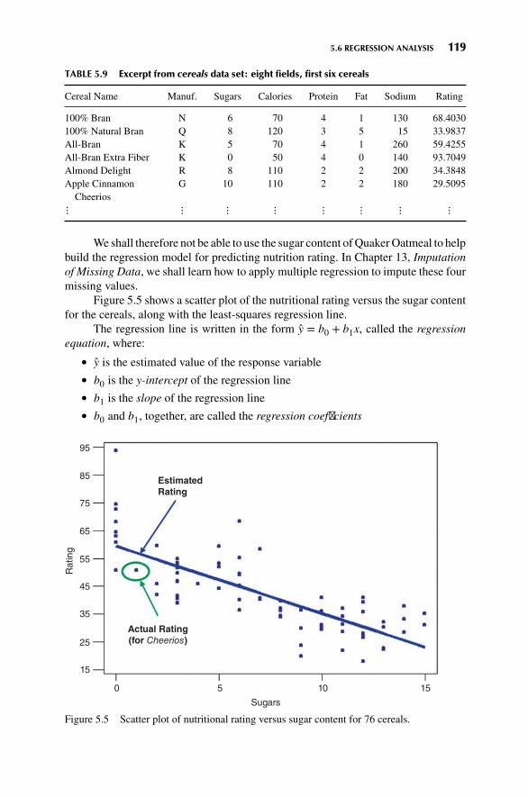
5.6 REGRESSION ANALYSIS 119
TABLE 5.9 Excerpt from cereals data set: eight fields, first six cereals
Cereal Name Manuf. Sugars Calories Protein Fat Sodium Rating
100% Bran N 6 70 4 1 130 68.4030100% Natural Bran Q 8 120 3 5 15 33.9837All-Bran K 5 70 4 1 260 59.4255All-Bran Extra Fiber K 0 50 4 0 140 93.7049Almond Delight R 8 110 2 2 200 34.3848Apple Cinnamon
CheeriosG 10 110 2 2 180 29.5095
⋮ ⋮ ⋮ ⋮ ⋮ ⋮ ⋮ ⋮
Weshall therefore not be able to use the sugar content ofQuakerOatmeal to helpbuild the regression model for predicting nutrition rating. In Chapter 13, Imputationof Missing Data, we shall learn how to apply multiple regression to impute these fourmissing values.
Figure 5.5 shows a scatter plot of the nutritional rating versus the sugar contentfor the cereals, along with the least-squares regression line.
The regression line is written in the form y = b0 + b1x, called the regressionequation, where:
� y is the estimated value of the response variable� b0 is the y-intercept of the regression line� b1 is the slope of the regression line� b0 and b1, together, are called the regression coefficients
95
85
75
65
55
45
35
25
15
0 5 10 15
Sugars
Actual Rating(for Cheerios)
EstimatedRating
Rating
Figure 5.5 Scatter plot of nutritional rating versus sugar content for 76 cereals.

120 CHAPTER 5 MULTIVARIATE STATISTICS
The regression results are shown in Figure 5.6. At the top we see, “The regres-sion equation is: Rating = 59.9 − 2.46 sugars”. These are rounded values for theregression coefficients. Next comes a note that only 76 cereals were used (becausethe sugar information for Quaker Oats is missing). Then, below “Coef”, are presentedmore accurate values for the regression coefficients. We see that b0 (the coefficientfor constant) is 59.853, and b1 (the coefficient for sugars) is –2.4614. Thus regression
Figure 5.6 Regression results for using sugars to estimate rating.

5.6 REGRESSION ANALYSIS 121
equation is given as y = 59.853 − 2.4614 (sugars). This estimated regression equationcan then be interpreted as: “The estimated cereal rating equals 59.853 minus 2.4614times the sugar content in grams.” The regression line and the regression equationare used as a linear approximation of the relationship between the x (predictor) andy (response) variables, that is, between sugar content and nutritional rating. We canthen use the regression equation to make estimates or predictions.
For example, suppose that we are interested in estimating the nutritional ratingfor a new cereal (not in the original data) that contains x = 1 gram of sugar. Using theregression equation, we find the estimated nutritional rating for a cereal with 1 gramof sugar to be y = 59.853 − 2.4614(1) = 57.3916. Note that this estimated valuefor the nutritional rating lies directly on the regression line, at the location (x = 1,y = 57.3916), as shown in Figure 5.5. In fact, for any given value of x (sugar content),the estimated value for y (nutritional rating) lies precisely on the regression line.
Now, there is one cereal in our data set that does have a sugar content of 1 gram,Cheerios. Its nutrition rating, however, is 50.765, not 57.3916 as we estimated abovefor the new cereal with 1 gram of sugar. Cheerios’ point in the scatter plot is located at(x = 1, y = 50.765), within the oval in Figure 5.5. Now, the upper arrow in Figure 5.5is pointing to a location on the regression line directly above the Cheerios point. Thisis where the regression equation predicted the nutrition rating to be for a cereal with asugar content of 1 gram. The prediction was too low by 50.765 − 57.3916 = −6.6266rating points, which represents the vertical distance from the Cheerios data point tothe regression line. This vertical distance, in general (y − y), is known variously asthe prediction error, estimation error, or residual. In Figure 5.6 we see that Minitabidentifies two unusual observations, cereal 1 (100% Bran) and cereal 4 (All-Branwith Extra Fiber), which have large positive residuals, indicating that the nutritionrating was unexpectedly high, given their sugar level.
We, of course, seek to minimize the overall size of our prediction errors. Least-squares regression works by choosing the unique regression line that minimizes thesum of squared errors (SSE) over all the data points. There are alternative methods ofchoosing the line that best approximates the linear relationship between the variables,such as median regression, although least squares remain the most common method.
The y-intercept b0 is the location on the y-axis where the regression line inter-cepts the y-axis, that is, the estimated value for the response variable when thepredictor variable equals zero. Now, in many regression situations, a value of zerofor the predictor variable would not make sense. For example, suppose that we weretrying to predict elementary school student weight (y) based on student height (x).Themeaning of height= 0 is unclear, so that the denotative meaning of the y-interceptwould not make interpretive sense in this case. However, for our data set, a value ofzero for the sugar content does make sense, as several cereals contain zero grams ofsugar. Therefore, for our data set, the y-intercept b0 = 59.853 simply represents theestimated nutritional rating for cereals with zero sugar content.
The slope of the regression line indicates the estimated change in y per unitincrease in x. We interpret b1 =−2.4614 to mean the following: “For each increase of1 gram in sugar content, the estimated nutritional rating decreases by 2.4614 ratingpoints.” For example, cereal A with 5 more grams of sugar than cereal B would havean estimated nutritional rating 5(2.4614) = 12.307 rating points lower than cereal B.

122 CHAPTER 5 MULTIVARIATE STATISTICS
5.7 HYPOTHESIS TESTING IN REGRESSION
Just as in univariate analysis we used the known value of the samplemean x to performinference for the unknown value of the population mean 𝜇, so here in regressionanalysis, we will use the known value for the slope b1 of the regression equation toperform inference for the unknown value of the slope 𝛽1 of the population regressionequation. The population regression equation represents a linear approximation ofthe relationship between, say, nutritional ratings and sugar content for the entirepopulation of cereals, not just the cereals in our sample. The population regressionequation looks like this:
y = 𝛽0 + 𝛽1x + 𝜀
where 𝜀 represents a random variable for modeling the errors. Note that, when 𝛽1 = 0,the population regression equation becomes:
y = 𝛽0 + (0) x + 𝜀 = 𝛽0 + 𝜀
In other words, when 𝛽1 = 0, there is no relationship between the predictor xand the response y. For any other value of 𝛽1, there is a linear relationship betweenx and y. Thus, if we wish to test for the existence of a linear relationship between xand y, we may simply perform the following hypothesis test:
H0 : 𝛽1 = 0 No relationship between x and yvs.
Ha : 𝛽1 ≠ 0 Linear relationship between x and y
The test statistic for this hypothesis test is:
t =b1sb1
where sb1 represents the standard error of the coefficient b1. For example, in Fig-ure 5.6, one may find sb1 = 0.2417 under SE coef. This is a measure of the variabilityin the slope of the regression line, observed from sample to sample. Large values forsb1 indicate that there may be too much wiggle-factor (that is, variability) in our slopeestimate b1, making precise inference regarding the slope difficult. This is reflectedin the presence of sb1 in the denominator of the t-statistic, so that large values of sb1tend to reduce the size of the t-statistic.
Figure 5.6 provides the value of the t-statistic for sugars as t = −10.18. This isobtained as the ratio of the slope b1 and the standard error sb1 :
t =b1sb1
= −2.46140.2417
= −10.18
The p-value for this test statistic is found in Figure 5.6 under P. The p-valueindicates the probability of observing this value for t, if there really is no relationshipbetween x and y.A small p-value (usually<0.05) indicates that 𝛽1 differs significantlyfrom zero. Here we have p-value ≈ 0, leading us to conclude that 𝛽1 ≠ 0, and thatthere exists a linear relationship between sugar content and nutritional rating.

5.9 DANGERS OF EXTRAPOLATION 123
5.8 MEASURING THE QUALITY OF A REGRESSIONMODEL
How do we measure how helpful our regression model is? Clearly, if we cannot rejectthe null hypothesis in the hypothesis test above, then the regression model is no helpat all. But if we do find that 𝛽1 ≠ 0, then there are two statistics that indicate thequality of our regression model. A very useful statistic is s, the standard error ofthe estimate (not to be confused with s, the sample standard deviation for univariatestatistics, or sb1 , the standard error of the slope coefficient).
s =√MSE =
√SSE∕n − 2
where SSE is the sum of squared errors. The statistic s is useful for assessing thequality of a regression model because its value indicates a measure of the size of the“typical” prediction error. For example, in Figure 5.6 we see that s = 9.16616 ≈ 9.2.Thus, if we are given the sugar content (in grams) of a new cereal, our typical errorin predicting nutritional rating will be about 9.2 points. Roughly (using the empiricalrule), our estimate of the new cereal’s rating will be within 9.2 points about two-thirdsof the time. This may be good enough for some applications. But it is not likely tobe good enough for precise estimation of the nutritional rating. Thus, to reduce thevalue of s, we would need to add more predictors to the model (such as sodium, andso on), and use multiple regression.
Another measure of the quality of a regression model is the r2 (“r-squared)”statistic. r2 measures how closely the linear regression fits the data, with values closerto 100% indicating a more perfect fit. The formula for r2 is:
r2 = SSRSST
where SST represents the variability in the y-variable, and SSR represents theimprovement in estimation from using the regression model as compared to justusing y to estimate y. Thus, r2 may be interpreted as the ratio of the total variabilityin y that is accounted for by the linear relationship between x and y.
� r2 is a measure of how closely the linear regression model fits the data, withvalues closer to 90–100% indicating a very nice fit.
The correlation coefficient r for rating and sugars is −0.764 (not shown),indicating that the nutritional rating and the sugar content are negatively correlated.It is not a coincidence that both r and b1 are both negative. In fact, the correlationcoefficient r and the regression slope b1 always have the same sign. In Figure 5.6, wehave r2 = 58.4%. Thus, 58.4% of the variability in nutritional rating is accounted forby the linear relationship between rating and sugars alone, without looking at othervariables such as sodium.
5.9 DANGERS OF EXTRAPOLATION
Suppose that a new cereal (say, the Chocolate Frosted Sugar Bombs loved by Calvin,the comic strip character written by Bill Watterson) arrives on the market with a

124 CHAPTER 5 MULTIVARIATE STATISTICS
very high sugar content of 30 grams per serving. Let us use our estimated regressionequation to estimate the nutritional rating for Chocolate Frosted Sugar Bombs:
y = 59.853 − 2.4614 (sugars) = 59.4 − 2.4614(30) = −13.989.
In other words, Calvin’s cereal has so much sugar that its nutritional rating isactually a negative number, unlike any of the other cereals in the data set (minimum=18) and analogous to a student receiving a negative grade on an exam. What is goingon here?
The negative estimated nutritional rating for Chocolate Frosted Sugar Bombsis an example of the dangers of extrapolation. Analysts should confine the estimatesand predictions made using the regression equation to values of the predictor variablecontained within the range of the values of x in the data set. For example, in thecereals data set, the lowest sugar content is zero grams and the highest is 15 grams,so that predictions of nutritional rating for any value of x (sugar content) between zeroand 15 grams would be appropriate. However, extrapolation, making predictions forx-values lying outside this range, can be dangerous, since we do not know the natureof the relationship between the response and predictor variables outside this range.
Extrapolation should be avoided if possible. If predictions outside the givenrange of xmust be performed, the end user of the prediction needs to be informed thatno x-data is available to support such a prediction. The danger lies in the possibilitythat the relationship between x and y, which may be linear within the range of x inthe data set, may no longer be linear outside these bounds.
Consider Figure 5.7. Suppose that our data set consisted only of the data pointsin black but that the true relationship between x and y consisted of both the black(observed) and the gray (unobserved) points. Then, a regression line based solely
Predicted value of Y
based on available data.
Large prediction error.
Actual value of y.
Figure 5.7 Dangers of extrapolation.

5.11 PREDICTION INTERVALS FOR A RANDOMLY CHOSEN VALUE OF y GIVEN x 125
on the available (black dot) data would look approximately similar to the regressionline indicated. Suppose that we were interested in predicting the value of y for anx-value located at the triangle. The prediction based on the available data would thenbe represented by the dot on the regression line indicated by the upper arrow. Clearly,this prediction has failed spectacularly, as shown by the vertical line indicating thehuge prediction error. Of course, since the analyst would be completely unaware ofthe hidden data, he or she would hence be oblivious to the massive scope of the errorin prediction. Policy recommendations based on such erroneous predictions couldcertainly have costly results.
5.10 CONFIDENCE INTERVALS FOR THE MEAN VALUEOF y GIVEN x
Thus far, we have discussed point estimates for values of the response variable fora given value of the predictor variable. Of course, point estimates in this contextsuffer the same drawbacks as point estimates in the univariate case, notably the lackof a probability statement associated with their accuracy. We may therefore turn toconfidence intervals for the mean value of y for a given value of x.
The confidence interval for the mean value of y for a given value of x is asfollows:
point estimate ±margin of error = yp ± t𝛼∕2(s)
√1n+
(xp − x)2∑(xi − x)2
where
xp = the particular value of x for which the prediction is being madeyp = the point estimate of y for a particular value of x
t𝛼∕2 = a multiplier associated with the sample size and confidence level
s =√MSE =
√SSE∕n − 1 = the standard error of the estimate
SSE = the sum of squared residuals
We look at an example of this type of confidence interval below, but first weare introduced to a new type of interval, the prediction interval.
5.11 PREDICTION INTERVALS FOR A RANDOMLYCHOSEN VALUE OF y GIVEN x
Have you ever considered that it is “easier” to predict the mean value of a variablethan it is to predict a randomly chosen value of that variable? For example, baseballbuffs perusing the weekly batting average statistics will find that the team battingaverages (which are the means of all the team’s players) are more closely bunchedtogether than are the batting averages of the individual players. An estimate of theteam batting average will therefore be more precise than an estimate of a randomlychosen member of that team for the same level of confidence.

126 CHAPTER 5 MULTIVARIATE STATISTICS
Exam scores provide another example. It is not unusual for a randomly selectedstudent’s score to exceed 95, say, but it is quite unusual for the class average to bethat high. This anecdotal evidence reflects the smaller variability associated with themean (class average) of a variable rather than a randomly selected value (individualscore) of that variable. Therefore, it is “easier” to predict the class average on anexam than it is to predict a randomly chosen student’s score.
In many situations, data miners are more interested in predicting an individualvalue rather than the mean of all the values, given x. For example, an analyst may bemore interested in predicting the credit score for a particular credit applicant ratherthan predicting the mean credit score of all similar applicants. Or, a geneticist maybe interested in the expression of a particular gene rather than the mean expressionof all similar genes.
Prediction intervals are used to estimate the value of a randomly chosen valueof y, given x. Clearly, this is a more difficult task than estimating the mean, resultingin intervals of greater width (lower precision) than confidence intervals for the meanwith the same confidence level. The prediction interval for a randomly chosen valueof y for a given value of x is as follows:
point estimate ±margin of error = yp ± t𝛼∕2(s)
√1 + 1
n+
(xp − x)2∑(xi − x)2
Note that this formula is precisely the same as the formula for the confidenceinterval for the mean value of y, given x, except for the presence of the “1+” insidethe square root. This ensures that the prediction interval is always wider than theanalogous confidence interval.
The last half-dozen lines of Figure 5.6 indicate the results for our confidenceintervals and prediction intervals for a new cereal containing 1 gram of sugar.
� Fit is nothing but the point estimate of the nutritional rating for a cereal with1 gram of sugar: y = 59.853−2.4614(1) = 57.3916.
� SE fit is a measure of the variability of the point estimate.� The 95% confidence interval for the mean nutritional rating of all cerealscontaining 1 gram of sugar is (53.81, 60.97).
� The 95% prediction interval for the nutritional rating of a randomly chosencereal containing 1 gram of sugar is (38.78, 76.00).
Note that as expected, the prediction interval is wider than the confidenceinterval, reflecting the greater challenge of estimating a particular y value rather thanthe mean y value for a given value of x.
5.12 MULTIPLE REGRESSION
Most data mining applications enjoy a wealth (indeed, a superfluity) of data, withsome data sets including hundreds of variables, many of which may have a linear

5.13 VERIFYING MODEL ASSUMPTIONS 127
relationship with the target (response) variable. Multiple regression modeling pro-vides an elegant method of describing such relationships. Multiple regression modelsprovide improved precision for estimation and prediction, analogous to the improvedprecision of regression estimates over univariate estimates.
To illustrate the use of multiple regression modeling using the cereals data set,we shall add the predictor sodium to the model, and observe whether the quality ofthe model has improved or not. The multiple regression equation for two predictorslooks like this:
y = b0 + b1x1 + b2x2
Figure 5.8 shows the multiple regression results for predicting nutritional ratingbased on sugars and sodium.
From Figure 5.8 we have the multiple regression equation:
y = 69.180 − 2.3944 (sugars) − 0.06057 (sodium)
We have b2 = −0.06057, which is interpreted as follows. For each additionalmilligram (mg) of sodium, the estimated decrease in nutritional rating is 0.06057points, when sugars are held constant. The point estimate of nutritional rating for acereal, like Cheerios, that has 1 gram of sugars and 290 mg of sodium, is
y = 69.180 − 2.3944(1) − 0.06057(290) = 49.22
The prediction error for Cheerios is the difference between its actual rating yand the predicted rating y: (y − y) = 50.765 − 49.22 = 1.545. Note that the predictionerror for this multiple regression model is smaller than the prediction error from theprevious model, (y − y) = −6.62266, because our new model uses double the data(two predictors rather than one) compared to the earlier regression model.
The standard error of the estimate has been reduced from s ≈ 9.2 points tos ≈ 7.7 points. The addition of the sodium information to the model has reduced ourtypical prediction errors to 7.7 points. Finally, the value of r2 = 58.4% has increasedfrom 58.4% to 70.8%, so that the proportion of the variability in nutritional ratingthat is explained by our regression model is now over 70%.
5.13 VERIFYING MODEL ASSUMPTIONS
Before a model can be implemented, the requisite model assumptions must be ver-ified. Using a model whose assumptions are not verified is like building a housewhose foundation may be cracked. Making predictions using a model where theassumptions are violated may lead to erroneous and overoptimistic results, withcostly consequences when deployed.
These assumptions—linearity, independence, normality, and constantvariance—may be checked using a normality plot of the residuals (Figure 5.9, upperleft), and a plot of the standardized residuals against the fitted (predicted) values (Fig-ure 5.9, upper right). One evaluates a normality plot by judging whether systematicdeviations from linearity exist in the plot, in which case one concludes that the datavalues plotted (the residuals in this case) are not drawn from the particular distribution

128 CHAPTER 5 MULTIVARIATE STATISTICS
Figure 5.8 Multiple regression results.

5.13 VERIFYING MODEL ASSUMPTIONS 129
–20
–10 0 10 20 30 1 5 10 15 20 25 30 35 40 45 50 55 60 65 70 75
00.1
30
20
10 0
10
20
30
–10
0
1
10
50
90
99
99.9
Per
cen
t
Res
idu
al
Freq
uen
cy
Res
idu
al
Histogram
Residual
Versus Order
Fitted Value
Versus FitsNormal Probability Plot
Residual Plots for Rating
Residual Observation Order
20 40 30
–10
0
10
20
30
40 50 60 70
Figure 5.9 Plots for verifying regression model assumptions. Note the outlier.
(the normal distribution in this case). The bulk of the points in the normal probabilityplot do line up on a straight line, so our normality assumption is essentially. But thereis one extreme value (cereal 4: All-Bran with Extra Fiber) which may be makingmischief with respect to normality. We will return to this in a moment.
The plot of the residuals versus the fits (Figure 5.9, upper right) is examinedfor discernible patterns. If obvious curvature exists in the scatter plot, the linearityassumption is violated. If the vertical spread of the points in the plot is systematicallynonuniform, the constant variance assumption is violated. We detect no such patternsin the plot of the residuals versus fits and therefore conclude that the linearity andconstant variance assumptions are intact for this example.
The independence assumption makes sense for this data set, since we wouldnot expect that the rating for one particular cereal would depend on the rating foranother cereal. Time-dependent data can be examined for order independence usinga runs test or a plot of the residuals versus ordering.
Now, humans are pattern recognition experts. For example, Rorschach testswould indicate that humans see patterns everywhere, even where no such patternactually exists! Thus, we need to exercise care when reading these plots not tosee patterns that do not exist. For example, the departures from linearity must besystematic and significant. Secondly, the huge data sets involved in data miningusually are not well behaved mathematically, conforming perfectly with normalityand so on. Thus, the analyst should give the model assumptions the benefit of thedoubt, unless there is good evidence to the contrary.
Because least squares regression is based on the squared prediction errors,outliers can have an outsized influence on the results. Thus care should be taken to

130 CHAPTER 5 MULTIVARIATE STATISTICS
identify extreme outliers, and, if necessary and appropriate, omit them. Figure 5.8identified 4 outliers, including the most extreme outlier, cereal 4: All-Bran with ExtraFiber. Note that this cereal is extreme in each of the four plots in Figure 5.9, andis skewing our normality a bit. Suppose that we omit cereal 4 from our analysis.Then our assumption plots look better behaved (Figure 5.10), especially the plots fornormality (upper left and lower left).
Is our omission of cereal 4 warranted? This depends on the scope and purposeof the project. If we intend to include further predictors, then we should definitelynot omit cereal 4 at this stage, since an observation that is an outlier in 3-dimensionalspace may not be an outlier in 10-dimensional space. On the other hand, if our projectrequired us to ignore all the other predictors in the data set, and restrict ourselves tosugars and sodium, then omission of cereal 4 may perhaps be considered.
In Chapter 13, Imputation of Missing Data, we illustrate how to use multipleregression to impute missing predictor values.
–20 –10
–10 –5–15 0 5 10 15 20 1 5 10 15 20 25 30 35 40 45 50 55 60 65 70 75
00.1
16
12
4
8 0
10
20
–10
–20
0
10
20
–10
–20
0
1
10
50
90
99
99.9
Per
cen
t
Res
idu
al
Freq
uen
cy
Res
idu
al
Histogram
Residual
Versus Order
Fitted Value
Versus FitsNormal Probability Plot
Residual Plots for Rating
Residual Observation Order
10 20 30 40 50 60 70
Figure 5.10 Plots for verifying regression model assumptions, after outlier omitted.

5.13 VERIFYING MODEL ASSUMPTIONS 131
THE R ZONE
# Two-Sample T-Test for difference in means
# Input the summary statistics from Table 5.1xbar1 <- 1.5714xbar2 <- 1.5361s1 <- 1.3126s2 <- 1.3251n1 <- 2529n2 <- 804# Make the degrees of freedom the smaller of the two sample sizesdfs <- min(n1-1, n2-1)# Calculate test statistictdata <- (xbar1 - xbar2) / sqrt((s1ˆ2/n1)+(s2ˆ2/n2))# Find and display the p-valuepvalue <- 2*pt(tdata, df = dfs, lower.tail=FALSE)tdata; pvalue
# Two-Sample Z-Test for Difference in Proportions
# Input the summary statistics# Some of these will override the values# from the previous examplex1 <- 707x2 <- 215n1 <- 2529n2 <- 804p1 <- x1 / n1p2 <- x2 / n2ppooled <- (x1+x2) / (n1+n2)# Calculate test statisticzdata <- (p1-p2) / sqrt(ppooled*(1-ppooled)*((1/n1)+(1/n2)))# Find the p-valuepvalue <- 2*pnorm(abs(zdata), lower.tail = FALSE)pvalue
# Chi-Square Goodness of Fit of Multinomial Data
# Population proportionsp_status <- c(0.40, 0.35, 0.25)# Observed frequencieso_status <- c(36, 35, 29)chisq.test(o_status, p = p_status)

132 CHAPTER 5 MULTIVARIATE STATISTICS
# Chi-Square Test for Homogeneity of Proportions
# Recreate Table 5.2table5.2 <- as.table(rbind(c(410, 340, 250),
c(95, 85, 70)))dimnames(table5.2) <- list(Data.Set =
c("Training Set", "Test Set"),Status = c("Married", "Single", "Other"))
Xsq_data <- chisq.test(table5.2)# Show the test statistic,# p-value, expected frequenciesXsq_data$statisticXsq_data$p.valueXsq_data$expected
# ANOVA
a <- c(30, 40, 50, 60)b <- c(25, 30, 50, 55)c <- c(25, 30, 40, 45)ab <- append(a,b)datavalues <- append(ab, c)datalabels <- factor(c(rep("a", length(a)),
rep("b", length(b)),rep("c", length(c))))
anova.results <- aov(datavalues ∼ datalabels)summary(anova.results)
# Recreate Table 5.9
# Input the dataset Cerealscereal <- read.csv(file =
"C:/ . . . /cereals.txt",stringsAsFactors=TRUE,header=TRUE,sep="\t")
# Display the names of all the columnsnames(cereal)cereal[1:6,c("Name", "Manuf", "Type",
"Sugars", "Calories", "Protein","Fat", "Sodium", "Rating")]

5.13 VERIFYING MODEL ASSUMPTIONS 133
# Create regression line of rating by sugar content
# Save Rating and Sugar as new variablessugars <- cereal$Sugarsrating <- cereal$Rating# Create regression linelm.out <- lm(rating∼sugars)# Create scatterplot and overlay regression lineplot(sugars,
rating,main = "Cereal Rating by Sugar Content",xlab = "Sugar Content",ylab = "Rating")
abline(lm.out)
# Show the full regression output
summary(lm.out)
# Confidence interval and Prediction interval using Regression output
pred.confidence <- predict(lm.out,data.frame(sugars = 1),interval = "confidence")
pred.prediction <- predict(lm.out,data.frame(sugars = 1),interval = "prediction")
pred.confidencepred.prediction

134 CHAPTER 5 MULTIVARIATE STATISTICS
# Multiple Regression
# Use Sodium and Sugars# to predict Ratingsodium <- cereal$Sodiummreg.out <- lm(rating ∼ sugars
+ sodium)summary(mreg.out)
# Prediction interval using Multiple Regression output
mreg.int <- predict(mreg.out,data.frame(sugars = 1,sodium = 290),interval = "confidence")
mreg.int
# Plot the four default diagnostic plots
# The first two are the top# two plots in Figure 5.9par(mfrow=c(2,2))plot(lm.out)

EXERCISES 135
REFERENCE
1. Data and Story Library, Carnegie Mellon University, Pittsburgh, PA, www.lib.stat.cmu.edu/DASL,accessed March 17, 2014.
Much more information regarding the topics covered in this chapter may be foundin any introductory statistics textbook, such as Discovering Statistics, by Daniel T.Larose, second edition, published by W. H. Freeman, New York, 2013.
EXERCISES
1. In Chapter 6, we will learn to split the data set into a training data set and a test data set.To test whether there exist unwanted differences between the training and test set, whichhypothesis test do we perform, for the following types of variables:
a. Flag variable
b. Multinomial variable
c. Continuous variable
2. Table 5.10 contains information on the mean duration of customer service calls betweena training and a test data set. Test whether the partition is valid for this variable, using𝛼 = 0.10.
TABLE 5.10 Summary statistics for duration of customer service calls
Data set Sample Mean Sample Standard Deviation Sample Size
Training set x1 = 20.5 s1 = 5.2 n1 = 2000Test set x2 = 20.4 s2 = 4.9 n2 = 600
3. Our partition shows that 800 of the 2000 customers in our test set own a tablet, while 230of the 600 customers in our training set own a tablet. Test whether the partition is validfor this variable, using 𝛼 = 0.10.
4. Table 5.11 contains the counts for the marital status variable for the training and test setdata. Test whether the partition is valid for this variable, using 𝛼 = 0.10.
TABLE 5.11 Observed frequencies for marital status
Data set Married Single Other Total
Training set 800 750 450 2000Test set 240 250 110 600Total 1040 1000 560 2600
5. The multinomial variable payment preference takes the values credit card, debit card, andcheck. Now, suppose we know that 50% of the customers in our population prefer to payby credit card, 20% prefer debit card, and 30% prefer to pay by check. We have taken asample from our population, and would like to determine whether it is representative ofthe population. The sample of size 200 shows 125 customers preferring to pay by creditcard, 25 by debit card, and 50 by check. Test whether the sample is representative of thepopulation, using 𝛼 = 0.05.

136 CHAPTER 5 MULTIVARIATE STATISTICS
6. Suppose we wish to test for difference in population means among three groups.
a. Explain why it is not sufficient to simply look at the differences among the samplemeans, without taking into account the variability within each group.
b. Describe what we mean by between-sample variability and within-sample variability.
c. Which statistics measure the concepts in (b).
d. Explain how analysis of variance would work in this situation.
7. Table 5.12 contains the amount spent (in dollars) in a random sample of purchases wherethe payment was made by credit card, debit card, and check, respectively. Test whetherthe population mean amount spent differs among the three groups, using 𝛼 = 0.05.
TABLE 5.12 Purchase amounts for three payment methods
Credit Card Debit Card Check
100 80 50110 120 7090 90 80
100 110 80
8. Refer to the previous exercise. Now test whether the population mean amount spentdiffers among the three groups, using 𝛼 = 0.01. Describe any conflict between your twoconclusions. Suggest at least two courses of action to ameliorate the situation.
9. Explain why we use regression analysis and for which type of variables it is appropriate.
10. Suppose that we are interested in predicting weight of students based on height. We haverun a regression analysis with the resulting estimated regression equation as follows: “Theestimated weight equals (–180 pounds) plus (5 pounds times the height in inches).”
a. Suppose that one student is 3 inches taller than another student. What is the estimateddifference in weight?
b. Suppose that a given student is 65 inches tall. What is the estimated weight?
c. Suppose that the regression equation above was based on a sample of students rangingin height from 60 to 75 inches. Now estimate the height of a 48-inch-tall student.Comment.
d. Explain clearly the meaning of the 5 in the equation above.
e. Explain clearly the meaning of the –180 in the equation above.
HANDS-ON ANALYSIS
Use the cereals data set included, at the book series website, for the following exercises. Useregression to estimate rating based on fiber alone.
11. What is the estimated regression equation?
12. Explain clearly the value of the slope coefficient you obtained in the regression.
13. What does the value of the y-intercept mean for the regression equation you obtained?Does it make sense in this example?

EXERCISES 137
14. What would be a typical prediction error obtained from using this model to predict rating?Which statistic are you using to measure this? What could we do to lower this estimatedprediction error?
15. How closely does our model fit the data? Which statistic are you using to measure this?
16. Find a point estimate for the rating for a cereal with a fiber content of 3 grams.
17. Find a 95% confidence interval for the true mean rating for all cereals with a fiber contentof 3 grams.
18. Find a 95%prediction interval for a randomly chosen cereal with a fiber content of 3 grams.
19. Based on the regression results, what would we expect a scatter plot of rating versus fiberto look like? Why?
For the following exercises, use multiple regression to estimate rating based onfiber and sugars.
20. What is the estimated regression equation?
21. Explain clearly and completely the value of the coefficient for fiber you obtained in theregression.
22. Compare the r2 values from the multiple regression and the regression done earlier in theexercises. What is going on? Will this always happen?
23. Compare the s values from the multiple regression and the regression done earlier in theexercises. Which value is preferable, and why? �

CHAPTER6PREPARING TO MODELTHE DATA
6.1 SUPERVISED VERSUS UNSUPERVISED METHODS 138
6.2 STATISTICAL METHODOLOGY AND DATA MINING METHODOLOGY 139
6.3 CROSS-VALIDATION 139
6.4 OVERFITTING 141
6.5 BIAS–VARIANCE TRADE-OFF 142
6.6 BALANCING THE TRAINING DATA SET 144
6.7 ESTABLISHING BASELINE PERFORMANCE 145
THE R ZONE 146
REFERENCE 147
EXERCISES 147
6.1 SUPERVISED VERSUS UNSUPERVISED METHODS
Data mining methods may be categorized as either supervised or unsupervised.In unsupervised methods, no target variable is identified as such. Instead, thedata mining algorithm searches for patterns and structure among all the variables.The most common unsupervised data mining method is clustering, our topic forChapters 10 and 11. For example, political consultants may analyze congressionaldistricts using clustering methods, to uncover the locations of voter clusters that maybe responsive to a particular candidate’s message. In this case, all appropriate vari-ables (e.g., income, race, gender) would be input to the clustering algorithm, with notarget variable specified, in order to develop accurate voter profiles for fund-raisingand advertising purposes.
Another data mining method, which may be supervised or unsupervised, isassociation rule mining. In market basket analysis, for example, one may simply beinterested in “which items are purchased together,” in which case no target variable
Discovering Knowledge in Data: An Introduction to Data Mining, Second Edition.By Daniel T. Larose and Chantal D. Larose.© 2014 John Wiley & Sons, Inc. Published 2014 by John Wiley & Sons, Inc.
138

6.3 CROSS-VALIDATION 139
would be identified. The problem here, of course, is that there are so many itemsfor sale, that searching for all possible associations may present a daunting task, dueto the resulting combinatorial explosion. Nevertheless, certain algorithms, such asthe a priori algorithm, attack this problem cleverly, as we shall see when we coverassociation rule mining in Chapter 12.
Most data mining methods are supervised methods, however, meaning that(1) there is a particular prespecified target variable, and (2) the algorithm is givenmany examples where the value of the target variable is provided, so that the algorithmmay learn which values of the target variable are associated with which values of thepredictor variables. For example, the regression methods of Chapter 5 are supervisedmethods, since the observed values of the response variable y are provided to theleast-squares algorithm, which seeks to minimize the squared distance between thesey values and the y values predicted given the x-vector. All of the classificationmethodswe examine in Chapters 7–9 are supervised methods, including decision trees, neuralnetworks, and k-nearest neighbors.
Note: The terms supervised and unsupervised are widespread in the literature,and hence used here. However, we do not mean to imply that unsupervised meth-ods require no human involvement. To the contrary, effective cluster analysis andassociation rule mining both require substantial human judgment and skill.
6.2 STATISTICAL METHODOLOGY AND DATAMINING METHODOLOGY
In Chapters 4 and 5 we were introduced to a wealth of statistical methods for per-forming inference, that is, for estimating or testing the unknown parameters of apopulation of interest. Statistical methodology and data mining methodology differin two ways.
1. Applying statistical inference using the huge sample sizes encountered in datamining tends to result in statistical significance, even when the results are notof practical significance.
2. In statistical methodology, the data analyst has an a priori hypothesis in mind.Data mining procedures usually do not have an a priori hypothesis, insteadfreely trolling through the data for actionable results.
6.3 CROSS-VALIDATION
Unless properly conducted, data mining can become data dredging, whereby theanalyst “uncovers” phantom spurious results, due to random variation rather thanreal effects. It is therefore crucial that data miners avoid data dredging. This isaccomplished through cross-validation.
Cross-validation is a technique for insuring that the results uncovered in ananalysis are generalizable to an independent, unseen, data set. In data mining, themost common methods are twofold cross-validation and k-fold cross-validation. Intwofold cross-validation, the data are partitioned, using random assignment, into a

140 CHAPTER 6 PREPARING TO MODEL THE DATA
training data set and a test data set. The test data set should then have the targetvariable omitted. Thus, the only systematic difference between the training data setand the test data set is that the training data includes the target variable and the test datadoes not. For example, if we are interested in classifying income bracket, based onage, gender, and occupation, our classification algorithm would need a large pool ofrecords, containing complete (as complete as possible) information about every field,including the target field, income bracket. In other words, the records in the trainingset need to be preclassified. A provisional data mining model is then constructedusing the training samples provided in the training data set.
However, the training set is necessarily incomplete; that is, it does not includethe “new” or future data that the data modelers are really interested in classifying.Therefore, the algorithm needs to guard against “memorizing” the training set andblindly applying all patterns found in the training set to the future data. For example,it may happen that all customers named “David” in a training set may be in the highincome bracket. We would presumably not want our final model, to be applied to newdata, to include the pattern “If the customer’s first name is David, the customer has ahigh income.” Such a pattern is a spurious artifact of the training set and needs to beverified before deployment.
Therefore, the next step in supervised data mining methodology is to examinehow the provisional data mining model performs on a test set of data. In the test set,a holdout data set, the values of the target variable are hidden temporarily from theprovisional model, which then performs classification according to the patterns andstructure it learned from the training set. The efficacy of the classifications is thenevaluated by comparing them against the true values of the target variable. The pro-visional data mining model is then adjusted to minimize the error rate on the test set.
Estimates of model performance for future, unseen data can then be computedby observing various evaluative measures applied to the test data set. Such modelevaluation techniques are covered in Chapter 14. The bottom line is that cross-validation guards against spurious results, since it is highly unlikely that the samerandom variation would be found to be significant in both training set and the testset. For example, a spurious signal with probability 0.05 of being observed, if in factno real signal existed, would have only 0.052 = 0.0025 probability of being observedin both the training and test sets, because these data sets are independent. In otherwords, the data analyst could report on average 400 results before one would expecta spurious result be reported.
But the data analyst must insure that the training and test data sets are indeedindependent, by validating the partition. We validate the partition into training andtest data sets by performing graphical and statistical comparisons between the twosets. For example, we may find that, even though the assignment of records was maderandomly, a significantly higher proportion of positive values of an important flagvariable were assigned to the training set, compared to the test set. This would biasour results, and hurt our prediction or classification accuracy on the test data set.It is especially important that the characteristics of the target variable be as similaras possible between the training and test data sets. Table 6.1 shows the suggestedhypothesis test for validating the target variable, based on the type of target variable.
In k-fold cross-validation, the original data are partitioned into k independentand similar subsets. The model is then built using the data from k – 1 subsets, using

6.4 OVERFITTING 141
TABLE 6.1 Suggested hypothesis tests for validating different types of target variables
Type of Target Variable Test From Chapter 5
Continuous Two-sample t-test for difference in meansFlag Two-sample Z-test for difference in proportionsMultinomial Test for homogeneity of proportions
the kth subset as the test set. This is done iteratively until we have k different models.The results from the kmodels are then combined using averaging or voting. A popularchoice for k is 10. A benefit of using k-fold cross-validation is that each record appearsin the test set exactly once; a drawback is that the requisite validation task is mademore difficult.
To summarize, most supervised data mining methods apply the followingmethodology for building and evaluating a model.
METHODOLOGY FOR BUILDING AND EVALUATING ADATA MODEL
1. Partition the available data into a training set and a test set. Validate the partition.
2. Build a data mining model using the training set data.
3. Evaluate the data mining model using the test set data.
6.4 OVERFITTING
Usually, the accuracy of the provisional model is not as high on the test set asit is on the training set, often because the provisional model is overfitting on thetraining set. Overfitting results when the provisional model tries to account for everypossible trend or structure in the training set, even idiosyncratic ones such as the“David” example above. There is an eternal tension in model building between modelcomplexity (resulting in high accuracy on the training set) and generalizability to thetest and validation sets. Increasing the complexity of the model in order to increasethe accuracy on the training set eventually and inevitably leads to a degradation inthe generalizability of the provisional model to the test set, as shown in Figure 6.1.
Figure 6.1 shows that as the provisional model begins to grow in complexityfrom the null model (with little or no complexity), the error rates on both the trainingset and the test set fall. As the model complexity increases, the error rate on thetraining set continues to fall in amonotone fashion. However, as themodel complexityincreases, the test set error rate soon begins to flatten out and increase becausethe provisional model has memorized the training set rather than leaving room forgeneralizing to unseen data. The point where the minimal error rate on the test setis encountered is the optimal level of model complexity, as indicated in Figure 6.1.Complexity greater than this is considered to be overfitting; complexity less than thisis considered to be underfitting.

142 CHAPTER 6 PREPARING TO MODEL THE DATA
Error
Rate
Optimal Level of
Model Complexity
Error Rate on
Test Set
Error Rate on
Training SetUnderfitting Overfitting
Complexity of Model
Figure 6.1 The optimal level of model complexity is at the minimum error rate on the testset.
6.5 BIAS–VARIANCE TRADE-OFF
Suppose that we have the scatter plot in Figure 6.2 and are interested in constructingthe optimal curve (or straight line) that will separate the dark gray points from thelight gray points. The straight line has the benefit of low complexity but suffers fromsome classification errors (points ending up on the wrong side of the line).
In Figure 6.3 we have reduced the classification error to zero but at the cost ofa much more complex separation function (the curvy line). One might be tempted toadopt the greater complexity in order to reduce the error rate. However, one shouldbe careful not to depend on the idiosyncrasies of the training set. For example,
Figure 6.2 Low complexity separator with high error rate.

6.5 BIAS–VARIANCE TRADE-OFF 143
Figure 6.3 High complexity separator with low error rate.
suppose that we now add more data points to the scatter plot, giving us the graph inFigure 6.4.
Note that the low complexity separator (the straight line) need not change verymuch to accommodate the new data points. This means that this low complexityseparator has low variance. However, the high complexity separator, the curvy line,must alter considerably if it is to maintain its pristine error rate. This high degree ofchange indicates that the high complexity separator has a high variance.
Even though the high complexity model has a low bias (in terms of theerror rate on the training set), it has a high variance; and even though the lowcomplexity model has a high bias, it has a low variance. This is what is known asthe bias–variance trade-off. The bias–variance trade-off is another way of describ-ing the overfitting/underfitting dilemma shown in Figure 6.1. As model complexityincreases, the bias on the training set decreases but the variance increases. The goalis to construct a model in which neither the bias nor the variance is too high, butusually, minimizing one tends to increase the other.
Figure 6.4 Withmore data: low complexity separator need not changemuch; high complexityseparator needs much revision.

144 CHAPTER 6 PREPARING TO MODEL THE DATA
For example, a common method of evaluating how accurate model estimationis proceeding for a continuous target variable is to use themean-squared error (MSE).Between two competing models, one may select the better model as that model withthe lower MSE. Why is MSE such a good evaluative measure? Because it combinesboth bias and variance. The MSE is a function of the estimation error (SSE) and themodel complexity (e.g., degrees of freedom). It can be shown (e.g., Hand et al. [1])that the MSE can be partitioned using the following equation, which clearly indicatesthe complementary relationship between bias and variance:
MSE = variance + bias2
6.6 BALANCING THE TRAINING DATA SET
For classification models in which one of the target variable classes has much lowerrelative frequency than the other classes, balancing is recommended. A benefit ofbalancing the data is to provide the classification algorithms with a rich balance ofrecords for each classification outcome, so that the algorithms have a chance to learnabout all types of records, not just those with high target frequency. For example,suppose we are running a fraud classification model and our training data set consistsof 100,000 transactions, only 1000 of which are fraudulent. Then our classificationmodel could simply predict “non-fraudulent” for all transactions, and achieve 99%classification accuracy. However, clearly this model is useless.
Instead the analyst should balance the training data set so that the relativefrequency of fraudulent transactions is increased. There are two ways to accomplishthis.
1. Resample a number of fraudulent records.
2. Set aside a number of non-fraudulent records.
Resampling refers to the process of sampling at random and with replacement froma data set. Suppose we wished our 1000 fraudulent records to represent 25% of thebalanced training set, rather than the 1% represented by these records in the rawtraining data set. Then we could add 32,000 resampled fraudulent records so that wehad 33,000 fraudulent records, out of a total of 100,000 + 32,000 = 132,000 recordsin all. This represents 33,000
132,000= 0.25 or the desired 25%.
How did we arrive at the number of 32,000 additional fraudulent records? Byusing the equation
1000 + x = 0.25 (100,000 + x)
and solving for x, the required number of additional records to resample. In general,this equation is:
rare + x = p(records + x)
and solving for x gives us:
x =p(records) − rare
1 − p
where x is the required number of resampled records, p represents the desired pro-portion of rare values in the balanced data set, records represents the number of

6.7 ESTABLISHING BASELINE PERFORMANCE 145
records in the unbalanced data set, and rare represents the current number of raretarget values.
Some data miners have a philosophical aversion to resampling records toachieve balance, since they feel this amounts to fabricating data. In this case, asufficient number of non-fraudulent transactions would instead be set aside, therebyincreasing the proportion of fraudulent transactions. To achieve a 25% balance pro-portion, we would retain only 3000 non-fraudulent records. We would then need todiscard from the analysis 96,000 of the 99,000 non-fraudulent records, using randomselection. It would not be surprising if our data mining models would suffer as aresult of starving them of data in this way. Instead, the data analyst would probablybe well-advised either to decrease the desired balance proportion to something like10%, or to use resampling.
When choosing a desired balancing proportion, recall the rationale for doingso: in order to allow the model a sufficiently rich variety of records to learn howto classify the rarer value of the target variable across a range of situations. Thebalancing proportion can be relatively low (e.g., 10%) if the analyst is confident thatthe rare target value is exposed to a sufficiently rich variety of records. The balancingproportion should be higher (e.g., 25%) if the analyst is not so confident of this.
The test data set should never be balanced. The test data set represents newdata that the models have not seen yet. Certainly the real world will not balancetomorrow’s data for the convenience of our classification models; therefore, the testdata set itself should not be balanced. Note that all model evaluation will take placeusing the test data set, so that the evaluative measures will all be applied to unbalanced(real-world-like) data.
6.7 ESTABLISHING BASELINE PERFORMANCE
In Star Trek IV: The Voyage Home, Captain Kirk travels back in time to the twentiethcentury, finds himself in need of cash, and pawns his eyeglasses. The buyer offershim $100, to which Captain Kirk responds, “Is that a lot?” Unfortunately, the Captainhad no frame of reference to compare the $100 to, and so was unable to determinewhether the $100 was a satisfactory offer or not. As data analysts we should do ourbest to avoid putting our clients into Captain Kirk’s situation, by reporting resultswith no comparison to a baseline. Without comparison to a baseline, a client cannotdetermine whether our results are any good.
For example, suppose we naively report that “only” 28.4% of customers adopt-ing our International Plan (see Table 3.3) will churn. That does not sound too bad,until we recall that, among all of our customers, the overall churn rate is only 14.49%(Figure 3.3). This overall churn rate may be considered our baseline, against whichany further results can be calibrated. Thus, belonging to the International Plan actuallynearly doubles the churn rate, which is clearly not good.
The type of baseline one should use depends on the way the results are reported.For the churn example, we are interested in decreasing the overall churn rate, whichis expressed as a percentage. So, our objective would be to report a decrease in theoverall churn rate. Note the difference between an absolute difference in churn rateversus a relative difference in churn rate. Suppose our data mining model resulted

146 CHAPTER 6 PREPARING TO MODEL THE DATA
in a predicted churn rate of 9.99%. This represents only a 14.49% – 9.99% = 4.5%absolute decrease in the churn rate, but a 4.5%∕14.49% = 31% relative decrease inthe churn rate. The analyst should make it clear for the client which comparisonmethod is being used.
Suppose our task is estimation, and we are using a regression model. Then ourbaseline model may take the form of a “ymodel”, that is, a model which simply findsthe mean of the response variable, and predicts that value for every record. Clearlythis is quite naıve, so no data mining model worth its salt should have a problembeating this ymodel. By the same token, if your data miningmodel cannot outperformthe y model, then something is clearly wrong. (Recall that we measure the goodnessof a regression model using the standard error of the estimate s along with r2.)
A more challenging yardstick against which to calibrate your model is to useexisting research or results already existing in the field. For example, suppose thealgorithm your analytics company currently uses succeeds in identifying 90% of allfraudulent online transactions. Then your company will probably expect your newdata mining model to outperform this 90% baseline.
THE R ZONE
# Input the data
dat <- read.csv(file = "C:/ . . . /adult.txt",stringsAsFactors=TRUE)
# Partition data into 75% training data, 25% testing data
dat$part <- runif(length(dat$income),min = 0,max = 1)
dat[1:5, c(1,2,3,16)]training <- dat[dat$part <= 0.75,]testing <- dat[dat$part > 0.75,]training[1:5, c(1,2,3,16)]testing[1:5, c(1,2,3,16)]

EXERCISES 147
# Remove the target variable, Income, from the testing data
names(testing)# The target variable is column 15testing <- testing[,-15]names(testing)# Target variable is no longer in# the testing data
# Remove the partitioning variable, Part, from both data sets
# Part is now the 15th variabletesting <- testing[,-15]names(testing)names(training)# Part is the 16th variable# in the training data settraining <- training[,-16]names(training)
REFERENCE
1. David Hand, HeikkiMannila, and Padhraic Smyth, Principles of DataMining, MIT Press, Cambridge,MA, 2001.
EXERCISES
1. Explain the difference between supervised and unsupervised methods. Which data miningtasks are associated with unsupervised methods? Supervised? Both?
2. Describe the differences between the training set, test set, and validation set.
3. Should we strive for the highest possible accuracy with the training set? Why or why not?How about the validation set?
4. How is the bias–variance trade-off related to the issue of overfitting and underfitting? Ishigh bias associated with overfitting and underfitting, and why? High variance?
5. Explain why we sometimes need to balance the data.

148 CHAPTER 6 PREPARING TO MODEL THE DATA
6. Suppose we are running a fraud classification model, with a training set of 10,000 recordsof which only 400 are fraudulent. How many fraudulent records need to be resam-pled if we would like the proportion of fraudulent records in the balanced data set tobe 20%?
7. When should the test data set be balanced?
8. Explain why we should always report a baseline performance, rather than merely citingthe uncalibrated results from our model.
9. Explain the distinction between reporting an absolute difference versus a relativedifference.
10. If we are using a regression model, what form may our baseline model take? �

CHAPTER7k-NEAREST NEIGHBORALGORITHM
7.1 CLASSIFICATION TASK 149
7.2 k-NEAREST NEIGHBOR ALGORITHM 150
7.3 DISTANCE FUNCTION 153
7.4 COMBINATION FUNCTION 156
7.5 QUANTIFYING ATTRIBUTE RELEVANCE: STRETCHING THE AXES 158
7.6 DATABASE CONSIDERATIONS 158
7.7 k-NEAREST NEIGHBOR ALGORITHM FOR ESTIMATION ANDPREDICTION 159
7.8 CHOOSING k 160
7.9 APPLICATION OF k-NEAREST NEIGHBOR ALGORITHM USINGIBM/SPSS MODELER 160
THE R ZONE 162
EXERCISES 163
HANDS-ON ANALYSIS 164
7.1 CLASSIFICATION TASK
Perhaps the most common data mining task is that of classification. Examples ofclassification tasks may be found in nearly every field of endeavor:
� Banking: determining whether a mortgage application is a good or bad creditrisk, or whether a particular credit card transaction is fraudulent
� Education: placing a new student into a particular track with regard to specialneeds
� Medicine: diagnosing whether a particular disease is present
Discovering Knowledge in Data: An Introduction to Data Mining, Second Edition.By Daniel T. Larose and Chantal D. Larose.© 2014 John Wiley & Sons, Inc. Published 2014 by John Wiley & Sons, Inc.
149

150 CHAPTER 7 k-NEAREST NEIGHBOR ALGORITHM
� Law: determining whether a will was written by the actual person deceased orfraudulently by someone else
� Homeland security: identifying whether or not certain financial or personalbehavior indicates a possible terrorist threat
In classification, there is a target categorical variable, (e.g., income bracket),which is partitioned into predetermined classes or categories, such as high income,middle income, and low income. The data mining model examines a large set ofrecords, each record containing information on the target variable as well as a set ofinput or predictor variables. For example, consider the excerpt from a data set shownin Table 7.1. Suppose that the researcher would like to be able to classify the incomebracket of persons not currently in the database, based on the other characteristicsassociated with that person, such as age, gender, and occupation. This task is aclassification task, very nicely suited to data mining methods and techniques.
The algorithm would proceed roughly as follows. First, examine the data setcontaining both the predictor variables and the (already classified) target variable,income bracket. In this way, the algorithm (software) “learns about” which combi-nations of variables are associated with which income brackets. For example, olderfemales may be associated with the high income bracket. This data set is called thetraining set. Then the algorithm would look at new records for which no informationabout income bracket is available. Based on the classifications in the training set, thealgorithm would assign classifications to the new records. For example, a 63-year-oldfemale professor might be classified in the high income bracket.
7.2 k-NEAREST NEIGHBOR ALGORITHM
The first algorithm we shall investigate is the k-nearest neighbor algorithm, whichis most often used for classification, although it can also be used for estimation andprediction. k-Nearest neighbor is an example of instance-based learning, in whichthe training data set is stored, so that a classification for a new unclassified recordmay be found simply by comparing it to the most similar records in the training set.Let us consider an example.
Recall the example from Chapter 1 where we were interested in classifying thetype of drug a patient should be prescribed, based on certain patient characteristics,such as the age of the patient and the patient’s sodium/potassium (Na/K) ratio. For asample of 200 patients, Figure 7.1 presents a scatter plot of the patients’ Na/K ratioagainst the patients’ age. The particular drug prescribed is symbolized by the shade
TABLE 7.1 Excerpt from data set for classifying income
Subject Age Gender Occupation Income Bracket
001 47 F Software engineer High002 28 M Marketing consultant Middle003 35 M Unemployed Low⋮

7.2 k-NEAREST NEIGHBOR ALGORITHM 151
40
30
20
10
10
Na/K
20 30 40
Age
New Patient 1 New Patient 2 New Patient 3
50 60 70
Figure 7.1 Scatter plot of sodium/potassium ratio against age, with drug overlay.
of the points. Light gray points indicate drug Y; medium gray points indicate drug Aor X; dark gray points indicate drug B or C.
Now suppose that we have a new patient record, without a drug classification,and would like to classify which drug should be prescribed for the patient basedon which drug was prescribed for other patients with similar attributes. Identifiedas “new patient 1,” this patient is 40 years old and has a Na/K ratio of 29, placingher at the center of the circle indicated for new patient 1 in Figure 7.1. Which drugclassification should be made for new patient 1? Since her patient profile places herdeep into a section of the scatter plot where all patients are prescribed drug Y, wewould thereby classify new patient 1 as drug Y. All of the points nearest to this point,that is, all of the patients with a similar profile (with respect to age and Na/K ratio)have been prescribed the same drug, making this an easy classification.
Next, we move to new patient 2, who is 17 years old with a Na/K ratio of12.5. Figure 7.2 provides a close-up view of the training data points in the localneighborhood of and centered at new patient 2. Suppose we let k = 1 for ourk-nearest neighbor algorithm, so that new patient 2 would be classified accordingto whichever single (one) observation it was closest to. In this case, new patient 2would be classified for drugs B and C (dark gray), since that is the classification ofthe point closest to the point on the scatter plot for new patient 2.
However, suppose that we now let k = 2 for our k-nearest neighbor algorithm,so that new patient 2 would be classified according to the classification of the k = 2

152 CHAPTER 7 k-NEAREST NEIGHBOR ALGORITHM
A
B
C
New
Figure 7.2 Close-up of three nearest neighbors to new patient 2.
points closest to it. One of these points is dark gray, and one is medium gray, so thatour classifier would be faced with a decision between classifying new patient 2 fordrugs B and C (dark gray) or drugs A and X (medium gray). How would the classifierdecide between these two classifications? Voting would not help, since there is onevote for each of two classifications.
Voting would help, however, if we let k= 3 for the algorithm, so that new patient2 would be classified based on the three points closest to it. Since two of the three clos-est points are medium gray, a classification based on voting would therefore choosedrugs A and X (medium gray) as the classification for new patient 2. Note that theclassification assigned for new patient 2 differed based on which value we chose for k.
Finally, consider new patient 3, who is 47 years old and has a Na/K ratioof 13.5. Figure 7.3 presents a close-up of the three nearest neighbors to new
Figure 7.3 Close-up of three nearest neighbors to new patient 3.

7.3 DISTANCE FUNCTION 153
patient 3. For k = 1, the k-nearest neighbor algorithm would choose the dark gray(drugs B and C) classification for new patient 3, based on a distance measure. Fork = 2, however, voting would not help. But voting would not help for k = 3 in thiscase either, since the three nearest neighbors to new patient 3 are of three differentclassifications.
This example has shown us some of the issues involved in building a classifierusing the k-nearest neighbor algorithm. These issues include:
� How many neighbors should we consider? That is, what is k?� How do we measure distance?� How do we combine the information from more than one observation?
Later we consider other questions, such as:
� Should all points be weighted equally, or should some points have more influ-ence than others?
7.3 DISTANCE FUNCTION
We have seen above how, for a new record, the k-nearest neighbor algorithm assignsthe classification of the most similar record or records. But just how do we definesimilar? For example, suppose that we have a new patient who is a 50-year-old male.Which patient is more similar, a 20-year-old male or a 50-year-old female?
Data analysts define distance metrics to measure similarity. A distance metricor distance function is a real-valued function d, such that for any coordinates x, y,and z:
1. d(x, y) ≥ 0, and d(x, y) = 0 if and only if x = y
2. d(x, y) = d(y, x)
3. d(x, z) ≤ d(x, y) + d(y, z)
Property 1 assures us that distance is always nonnegative, and the only way fordistance to be zero is for the coordinates (e.g., in the scatter plot) to be the same.Property 2 indicates commutativity, so that, for example, the distance from NewYorkto Los Angeles is the same as the distance from Los Angeles to New York. Finally,property 3 is the triangle inequality, which states that introducing a third point cannever shorten the distance between two other points.
The most common distance function is Euclidean distance, which representsthe usual manner in which humans think of distance in the real world:
dEuclidean(x, y) =√∑
i
(xi − yi)2
where x = x1, x2,… , xm, and y = y1, y2,… , ym represent the m attribute values oftwo records. For example, suppose that patient A is x1 = 20 years old and has a Na/K

154 CHAPTER 7 k-NEAREST NEIGHBOR ALGORITHM
ratio of x2 = 12, while patient B is y1 = 30 years old and has a Na/K ratio of y2 = 8.Then the Euclidean distance between these points, as shown in Figure 7.4, is
dEuclidean(x, y) =√∑
i
(xi − yi)2 =√(20 − 30)2 + (12 − 8)2
=√100 + 16 = 10.77
When measuring distance, however, certain attributes that have large values,such as income, can overwhelm the influence of other attributes which are measuredon a smaller scale, such as years of service. To avoid this, the data analyst shouldmake sure to normalize the attribute values.
For continuous variables, the min-max normalization or Z-score standardiza-tion, discussed in Chapter 2, may be used:
Min-max normalization:
X∗ = X − min(X)range(X)
= X − min(X)max(X) − min(X)
Z-score standardization:
X∗ = X −mean(X)SD(X)
For categorical variables, the Euclidean distance metric is not appropriate.Instead, we may define a function, “different from,” used to compare the ith attributevalues of a pair of records, as follows:
Different (xi, yi) ={0 if xi = yi1 otherwise
where xi and yi are categorical values. We may then substitute different (xiyi) for theith term in the Euclidean distance metric above.
For example, let us find an answer to our earlier question: which patient ismore similar to a 50-year-old male: a 20-year-old male or a 50-year-old female?
Na/K
Age
(20,12)
(30, 8)
Figure 7.4 Euclidean distance.

7.3 DISTANCE FUNCTION 155
Suppose that for the age variable, the range is 50, the minimum is 10, the mean is45, and the standard deviation is 15. Let patient A be our 50-year-old male, patientB the 20-year-old male, and patient C the 50-year-old female. The original variablevalues, along with the min-max normalization (ageMMN) and Z-score standardization(ageZ-score), are listed in Table 7.2.
We have one continuous variable (age, x1) and one categorical variable (gender,x2). When comparing patients A and B, we have different (x2, y2) = 0, with different(x2, y2) = 1 for the other combinations of patients. First, let us see what happens whenwe forget to normalize the age variable. Then the distance between patients A and Bis d(A,B) =
√(50 − 20)2 + 02 = 30, and the distance between patients A and C is
d(A,C) =√(20 − 20)2 + 12 = 1. We would thus conclude that the 20-year-old male
is 30 times more “distant” from the 50-year-old male than the 50-year-old female is.In other words, the 50-year-old female is 30 times more “similar” to the 50-year-oldmale than the 20-year-old male is. Does this seem justified to you? Well, in certaincircumstances, it may be justified, as in certain age-related illnesses. But, in general,one may judge that the two men are just as similar as are the two 50-year olds. Theproblem is that the age variable is measured on a larger scale than the different (x2, y2)variable. Therefore, we proceed to account for this discrepancy by normalizing andstandardizing the age values, as shown in Table 7.2.
Next, we use the min-max normalization values to find which patient ismore similar to patient A. We have dMMN(A,B) =
√(0.8 − 0.2)2 + 02 = 0.6 and
dMMN(A,C) =√(0.8 − 0.8)2 + 12 = 0.1, which means that patient B is now consid-
ered to be more similar to patient A.Finally, we use the Z-score standardization values to determine which patient is
more similar to patient A. We have dZ-score(A,B) =√[0.33 − (−1.67)]2 + 02 = 2.0
and dZ-score(A,C) =√(0.33 − 0.33)2 + 12 = 1.0, whichmeans that patient C is again
closer. Using the Z-score standardization rather than the min-max standardization hasreversed our conclusion aboutwhich patient is considered to bemore similar to patientA. This underscores the importance of understanding which type of normalizationone is using. The min-max normalization will almost always lie between zero and 1just like the “identical” function. The Z-score standardization, however, usually takesvalues –3 < z < 3, representing a wider scale than that of the min-max normalization.Therefore, perhaps, when mixing categorical and continuous variables, the min-maxnormalization may be preferred.
TABLE 7.2 Variable values for age and gender
Patient Age AgeMMN AgeZ-score Gender
A 5050 − 10
50= 0.8
50 − 4515
= 0.33 Male
B 2020 − 10
50= 0.2
20 − 4515
= −1.67 Male
C 5050 − 10
50= 0.8
50 − 4515
= 0.33 Female

156 CHAPTER 7 k-NEAREST NEIGHBOR ALGORITHM
7.4 COMBINATION FUNCTION
Now that we have a method of determining which records are most similar to the new,unclassified record, we need to establish how these similar records will combine toprovide a classification decision for the new record. That is, we need a combinationfunction. The most basic combination function is simple unweighted voting.
7.4.1 Simple Unweighted Voting
1. Before running the algorithm, decide on the value of k, that is, how manyrecords will have a voice in classifying the new record.
2. Then, compare the new record to the k nearest neighbors, that is, to the k recordsthat are of minimum distance from the new record in terms of the Euclideandistance or whichever metric the user prefers.
3. Once the k records have been chosen, then for simple unweighted voting, theirdistance from the new record no longer matters. It is simple one record, onevote.
We observed simple unweighted voting in the examples for Figures 7.2 and7.3. In Figure 7.2, for k = 3, a classification based on simple voting would choosedrugs A and X (medium gray) as the classification for new patient 2, since two ofthe three closest points are medium gray. The classification would then be made fordrugs A and X, with confidence 66.67%, where the confidence level represents thecount of records, with the winning classification divided by k.
On the other hand, in Figure 7.3, for k = 3, simple voting would fail to choosea clear winner since each of the three categories receives one vote. There would be atie among the three classifications represented by the records in Figure 7.3, and a tiemay not be a preferred result.
7.4.2 Weighted Voting
One may feel that neighbors that are closer or more similar to the new record shouldbe weighted more heavily than more distant neighbors. For example, in Figure 7.3,does it seem fair that the light gray record farther away gets the same vote as thedark gray vote that is closer to the new record? Perhaps not. Instead, the analyst maychoose to apply weighted voting, where closer neighbors have a larger voice in theclassification decision than do more distant neighbors. Weighted voting also makesit much less likely for ties to arise.
In weighted voting, the influence of a particular record is inversely proportionalto the distance of the record from the new record to be classified. Let us lookat an example. Consider Figure 7.2, where we are interested in finding the drugclassification for a new record, using the k = 3 nearest neighbors. Earlier, when usingsimple unweighted voting, we saw that there were two votes for the medium grayclassification, and one vote for the dark gray. However, the dark gray record is closer

7.4 COMBINATION FUNCTION 157
than the other two records. Will this greater proximity be enough for the influence ofthe dark gray record to overcome that of the more numerous medium gray records?
Assume that the records in question have the values for age and Na/K ratiogiven in Table 7.3, which also shows the min-max normalizations for these values.Then the distances of records A, B, and C from the new record are as follows:
d(new,A) =√(0.05 − 0.0467)2 + (0.25 − 0.2471)2 = 0.004393
d(new,B) =√(0.05 − 0.0533)2 + (0.25 − 0.1912)2 = 0.58893
d(new,C) =√(0.05 − 0.0917)2 + (0.25 − 0.2794)2 = 0.051022
The votes of these records are then weighted according to the inverse square of theirdistances.
One record (A) votes to classify the new record as dark gray (drugs B and C),so the weighted vote for this classification is
votes (dark gray) = 1d(new,A)2
= 10.0043932
≅ 51,818
Two records (B and C) vote to classify the new record as medium gray (drugsA and X), so the weighted vote for this classification is
votes (medium gray) = 1d(new,B)2
+ 1d(new,C)2
= 10.0588932
+ 10.0510222
≅ 672
Therefore, by the convincing total of 51,818 to 672, the weighted voting pro-cedure would choose dark gray (drugs B and C) as the classification for a new17-year-old patient with a Na/K ratio of 12.5. Note that this conclusion reverses theearlier classification for the unweighted k = 3 case, which chose the medium grayclassification.
When the distance is zero, the inverse would be undefined. In this case thealgorithm should choose the majority classification of all records whose distance iszero from the new record.
Consider for a moment that once we begin weighting the records, there isno theoretical reason why we could not increase k arbitrarily so that all existingrecords are included in the weighting. However, this runs up against the practicalconsideration of very slow computation times for calculating the weights of all of therecords every time a new record needs to be classified.
TABLE 7.3 Age and Na/K ratios for records from Figure 5.4
Record Age Na/K AgeMMN Na/KMMN
New 17 12.5 0.05 0.25A (dark gray) 16.8 12.4 0.0467 0.2471B (medium gray) 17.2 10.5 0.0533 0.1912C (medium gray) 19.5 13.5 0.0917 0.2794

158 CHAPTER 7 k-NEAREST NEIGHBOR ALGORITHM
7.5 QUANTIFYING ATTRIBUTE RELEVANCE:STRETCHING THE AXES
Consider that not all attributes may be relevant to the classification. In decision trees(Chapter 8), for example, only those attributes that are helpful to the classificationare considered. In the k-nearest neighbor algorithm, the distances are by defaultcalculated on all the attributes. It is possible, therefore, for relevant records thatare proximate to the new record in all the important variables, but are distant fromthe new record in unimportant ways, to have a moderately large distance from thenew record, and therefore not be considered for the classification decision. Analystsmay therefore consider restricting the algorithm to fields known to be important forclassifying new records, or at least to blind the algorithm to known irrelevant fields.
Alternatively, rather than restricting fields a priori, the data analyst may preferto indicate which fields are of more or less importance for classifying the targetvariable. This can be accomplished using a cross-validation approach or one basedon domain expert knowledge. First, note that the problem of determining which fieldsare more or less important is equivalent to finding a coefficient zj by which to multiplythe jth axis, with larger values of zj associated with more important variable axes.This process is therefore termed stretching the axes.
The cross-validation approach then selects a random subset of the data to beused as a training set and finds the set of values z1, z2,… , zm that minimize theclassification error on the test data set. Repeating the process will lead to a moreaccurate set of values z1, z2,… , zm. Otherwise, domain experts may be called uponto recommend a set of values for z1, z2,… , zm. In this way, the k-nearest neighboralgorithm may be made more precise.
For example, suppose that either through cross-validation or expert knowledge,the Na/K ratio was determined to be three times as important as age for drug classifi-cation. Then we would have zNa/K = 3 and zage = 1. For the example above, the newdistances of records A, B, and C from the new record would be as follows:
d(new,A) =√(0.05 − 0.0467)2 + [3(0.25 − 0.2471)]2 = 0.009305
d(new,B) =√(0.05 − 0.0533)2 + [3(0.25 − 0.1912)]2 = 0.17643
d(new,C) =√(0.05 − 0.0917)2 + [3(0.25 − 0.2794)]2 = 0.09756
In this case, the classification would not change with the stretched axis forNa/K, remaining dark gray. In real-world problems, however, axis stretching canlead to more accurate classifications, since it represents a method for quantifying therelevance of each variable in the classification decision.
7.6 DATABASE CONSIDERATIONS
For instance-based learning methods such as the k-nearest neighbor algorithm, it isvitally important to have access to a rich database full of as many different combina-tions of attribute values as possible. It is especially important that rare classifications

7.7 k-NEAREST NEIGHBOR ALGORITHM FOR ESTIMATION AND PREDICTION 159
be represented sufficiently, so that the algorithm does not only predict common clas-sifications. Therefore, the data set would need to be balanced, with a sufficiently largepercentage of the less common classifications. One method to perform balancing isto reduce the proportion of records with more common classifications.
Maintaining this rich database for easy access may become problematic ifthere are restrictions on main memory space. Main memory may fill up, and accessto auxiliary storage is slow. Therefore, if the database is to be used for k-nearestneighbor methods only, it may be helpful to retain only those data points that arenear a classification “boundary.” For example, in Figure 7.1, all records with Na/Kratio value greater than, say, 19 could be omitted from the database without loss ofclassification accuracy, since all records in this region are classified as light gray.New records with Na/K ratio >19 would therefore be classified similarly.
7.7 k-NEAREST NEIGHBOR ALGORITHM FORESTIMATION AND PREDICTION
So far we have considered how to use the k-nearest neighbor algorithm for classifica-tion. However, it may be used for estimation and prediction as well as for continuous-valued target variables. One method for accomplishing this is called locally weightedaveraging.Assume that we have the same data set as the example above, but this timerather than attempting to classify the drug prescription, we are trying to estimate thesystolic blood pressure reading (BP, the target variable) of the patient, based on thatpatient’s age and Na/K ratio (the predictor variables). Assume that BP has a range of80 with a minimum of 90 in the patient records.
In this example we are interested in estimating the systolic blood pressurereading for a 17-year-old patientwith aNa/K ratio of 12.5, the same newpatient recordfor which we earlier performed drug classification. If we let k = 3, we have the samethree nearest neighbors as earlier, shown here in Table 7.4. Assume that we are usingthe zNa/K = three-axis stretching to reflect the greater importance of the Na/K ratio.
Locally weighted averaging would then estimate BP as the weighted average ofBP for the k = 3 nearest neighbors, using the same inverse square of the distances forthe weights that we used earlier. That is, the estimated target value y is calculated as
ynew =
∑iwiyi∑iwi
TABLE 7.4 k = 3 nearest neighbors of the new record
Record Age Na/K BP AgeMMN Na/KMMN Distance
New 17 12.5 ? 0.05 0.25 –A 16.8 12.4 120 0.0467 0.2471 0.009305B 17.2 10.5 122 0.0533 0.1912 0.17643C 19.5 13.5 130 0.0917 0.2794 0.26737

160 CHAPTER 7 k-NEAREST NEIGHBOR ALGORITHM
where wi = 1∕d(new, xi)2 for existing records x1, x2,… , xk. Thus, in this example,the estimated systolic blood pressure reading for the new record would be
ynew =
∑iwiyi∑iwi
=120
0.0093052+ 122
0.176432+ 130
0.097562
10.0093052
+ 10.176432
+ 10.097562
= 120.0954.
As expected, the estimated BP value is quite close to the BP value in the presentdata set that is much closer (in the stretched attribute space) to the new record. Inother words, since record A is closer to the new record, its BP value of 120 contributesgreatly to the estimation of the BP reading for the new record.
7.8 CHOOSING k
How should one go about choosing the value of k? In fact, there may not be anobvious best solution. Consider choosing a small value for k. Then it is possiblethat the classification or estimation may be unduly affected by outliers or unusualobservations (“noise”). With small k (e.g., k= 1), the algorithm will simply return thetarget value of the nearest observation, a process that may lead the algorithm towardoverfitting, tending to memorize the training data set at the expense of generaliz-ability.
On the other hand, choosing a value of k that is not too small will tend to smoothout any idiosyncratic behavior learned from the training set. However, if we take thistoo far and choose a value of k that is too large, locally interesting behavior will beoverlooked. The data analyst needs to balance these considerations when choosingthe value of k.
It is possible to allow the data itself to help resolve this problem, by followinga cross-validation procedure similar to the earlier method for finding the optimalvalues z1, z2,… , zm for axis stretching. Here we would try various values of k withdifferent randomly selected training sets and choose the value of k that minimizes theclassification or estimation error.
7.9 APPLICATION OF k-NEAREST NEIGHBORALGORITHM USING IBM/SPSS MODELER
Table 7.5 contains a small data set of 10 records excerpted from the ClassifyRiskdata set, with predictors age, marital status, and income, and target variable risk.We seek the k-nearest neighbor for record 10, using k = 2. Modeler’s results areshown in Figure 7.5. (Note that Modeler automatically normalizes the data.) Records8 and 9 are the two nearest neighbors to record 10, with the same marital status, andsomewhat similar ages. Since both records 8 and 9 are classified as good risk, theprediction for record 10 would be good risk as well.

Sin
gle
Oth
er
Sel
ect
Po
ints
to u
se a
s Fo
cal R
eco
rds
Bu
ilt M
od
el: 3
Sel
ecte
d P
red
icto
rs, K
= 2
Pre
dic
tor
Sp
ace
Pee
rs C
har
t
Foca
l Rec
ord
s an
d N
eare
st N
eig
hb
ors
Focal
Type
Targ
et:
Ris
k
No
Yes
Tra
inin
g
Hold
out
Bad L
oss
Bad L
oss
K:
2
Good R
isk
Good R
isk
98
10
10
8 9
Ris
k
Marital_Status Marr
ied 20
3040
5060
40,0
00
30,0
00
Inco
me
20,0
00
50,0
00 45,0
00
35,0
00
25,0
00
70Ag
e
Focal
Type
No
Yes
Tra
inin
g
Hold
out
10
8 9
65
Ag
e70
60
55
50
98
10
Mar
ital
_S
tatu
sIn
com
e
47,500 42,500 37,500
Single Other Married
Figu
re7.5
Mod
elerk-nearestn
eigh
borresults.
161

162 CHAPTER 7 k-NEAREST NEIGHBOR ALGORITHM
TABLE 7.5 Find the k-nearest neighbor for record #10
Record Age Marital Income Risk
1 22 Single $46,156.98 Bad loss2 33 Married $24,188.10 Bad loss3 28 Other $28,787.34 Bad loss4 51 Other $23,886.72 Bad loss5 25 Single $47,281.44 Bad loss6 39 Single $33,994.90 Good risk7 54 Single $28,716.50 Good risk8 55 Married $49,186.75 Good risk9 50 Married $46,726.50 Good risk10 66 Married $36,120.34 Good risk
THE R ZONE
# Install the package needed to run KNN
install.packages("class")library(class)
# Create the data set using Table 7.3
new <- c(0.05,0.25)A <- c(0.0467, 0.2471)B <- c(0.0533, 0.1912)C <- c(0.0917, 0.2794)data <- rbind(A, B, C)dimnames(data) <- list(c("Dark", "Medium", "Medium"),
c("Age (MMN)", "Na/K (MMN)"))# Declare true classifications of A, B, and Ctrueclass <- c("Dark", "Medium", "Medium")
# Run KNN
knn(data,new,cl = trueclass,k = 3,prob = TRUE)

EXERCISES 163
# Calculate the Euclidean distance
install.packages("fields")library(fields)together <- rbind(new, data)# The top row of rdist are the# distance values from Newrdist(together)
# Stretch the axes
ds_newA <- sqrt((new[1] -A[1])ˆ2 + (3*(new[2]-A[2]))ˆ2)ds_newB <- sqrt((new[1] -B[1])ˆ2 + (3*(new[2]-B[2]))ˆ2)ds_newC <- sqrt((new[1] -C[1])ˆ2 + (3*(new[2]-C[2]))ˆ2)
# Table 7.4
distance <- c(ds_newA,ds_newB,ds_newC)
BP <- c(120, 122, 130)data <- cbind(BP, data, distance)data
# Weights = inverse of distance
weights <- (1/(distanceˆ2))sum_wi <- sum(weights)sum_wiyi <- sum(weights∗data[,1])yhat_new <- sum_wiyi/sum_wiyhat_new
EXERCISES
1. Clearly describe what is meant by classification.
2. What is meant by the term instance-based learning?
3. Make up a set of three records, each with two numeric predictor variables and onecategorical target variable, so that the classification would not change regardless of thevalue of k.
4. Refer to Exercise 3. Alter your data set so that the classification changes for differentvalues of k.

164 CHAPTER 7 k-NEAREST NEIGHBOR ALGORITHM
5. Refer to Exercise 4. Find the Euclidean distance between each pair of points. Using thesepoints, verify that Euclidean distance is a true distance metric.
6. Compare the advantages and drawbacks of unweighted versus weighted voting.
7. Why does the database need to be balanced?
8. The example in the text regarding using the k-nearest neighbor algorithm for estimationhas the closest record, overwhelming the other records in influencing the estimation.Suggest two creative ways that we could dilute this strong influence of the closest record.
9. Discuss the advantages and drawbacks of using a small value versus a large value for k.
10. Why would one consider stretching the axes?
11. What is locally weighted averaging, and how does it help in estimation?
HANDS-ON ANALYSIS
12. Using the data in Table 7.5, find the k-nearest neighbor for record #10, using k = 3.
13. Using the ClassifyRisk data set with predictors age, marital status, and income, and targetvariable risk, find the k-nearest neighbor for record #1, using k= 2 and Euclidean distance.
14. Using the ClassifyRisk data set with predictors age, marital status, and income, and targetvariable risk, find the k-nearest neighbor for record #1, using k = 2 and Minkowski(city-block) distance (see Chapter 10). �

CHAPTER8DECISION TREES
8.1 WHAT IS A DECISION TREE? 165
8.2 REQUIREMENTS FOR USING DECISION TREES 167
8.3 CLASSIFICATION AND REGRESSION TREES 168
8.4 C4.5 ALGORITHM 174
8.5 DECISION RULES 179
8.6 COMPARISON OF THE C5.0 AND CART ALGORITHMS APPLIED TOREAL DATA 180
THE R ZONE 183
REFERENCES 184
EXERCISES 185
HANDS-ON ANALYSIS 185
8.1 WHAT IS A DECISION TREE?
In this chapter we continue our examination of classificationmethods for data mining.One attractive classification method involves the construction of a decision tree, acollection of decision nodes, connected by branches, extending downward from theroot node until terminating in leaf nodes. Beginning at the root node, which byconvention is placed at the top of the decision tree diagram, attributes are tested atthe decision nodes, with each possible outcome resulting in a branch. Each branchthen leads either to another decision node or to a terminating leaf node. Figure 8.1provides an example of a simple decision tree.
The target variable for the decision tree in Figure 8.1 is credit risk, with potentialcustomers being classified as either good or bad credit risks. The predictor variablesare savings (low, medium, and high), assets (low or not low), and income (≤$50,000or >$50,000). Here, the root node represents a decision node, testing whether eachrecord has a low, medium, or high savings level (as defined by the analyst or domainexpert). The data set is partitioned, or split, according to the values of this attribute.
Discovering Knowledge in Data: An Introduction to Data Mining, Second Edition.By Daniel T. Larose and Chantal D. Larose.© 2014 John Wiley & Sons, Inc. Published 2014 by John Wiley & Sons, Inc.
165

166 CHAPTER 8 DECISION TREES
Figure 8.1 Simple decision tree.
Those records with low savings are sent via the leftmost branch (savings = low)to another decision node. The records with high savings are sent via the rightmostbranch to a different decision node.
The records with medium savings are sent via the middle branch directly to aleaf node, indicating the termination of this branch. Why a leaf node and not anotherdecision node? Because, in the data set (not shown), all of the records with mediumsavings levels have been classified as good credit risks. There is no need for anotherdecision node, because our knowledge that the customer has medium savings predictsgood credit with 100% accuracy in the data set.
For customers with low savings, the next decision node tests whether thecustomer has low assets. Those with low assets are then classified as bad credit risks;the others are classified as good credit risks. For customers with high savings, thenext decision node tests whether the customer has an income of at most $30,000.Customers with incomes of $30,000 or less are then classified as bad credit risks,with the others classified as good credit risks.
When no further splits can be made, the decision tree algorithm stops growingnew nodes. For example, suppose that all of the branches terminate in “pure” leafnodes, where the target variable is unary for the records in that node (e.g., eachrecord in the leaf node is a good credit risk). Then no further splits are necessary, sono further nodes are grown.
However, there are instances when a particular node contains “diverse”attributes (with non-unary values for the target attribute), and yet the decision treecannot make a split. For example, suppose that we consider the records from Figure8.1 with high savings and low income (≤$30,000). Suppose that there are five recordswith these values, all of which also have low assets. Finally, suppose that three of
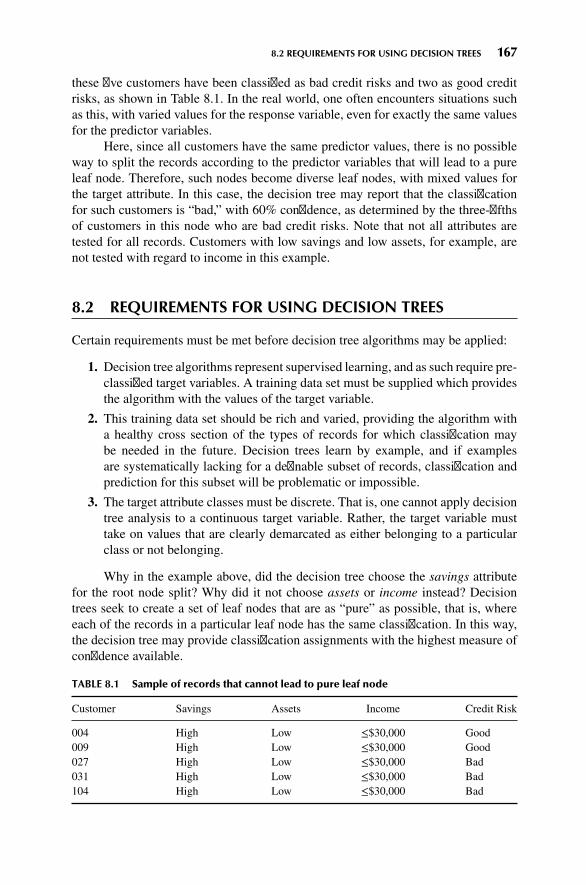
8.2 REQUIREMENTS FOR USING DECISION TREES 167
these five customers have been classified as bad credit risks and two as good creditrisks, as shown in Table 8.1. In the real world, one often encounters situations suchas this, with varied values for the response variable, even for exactly the same valuesfor the predictor variables.
Here, since all customers have the same predictor values, there is no possibleway to split the records according to the predictor variables that will lead to a pureleaf node. Therefore, such nodes become diverse leaf nodes, with mixed values forthe target attribute. In this case, the decision tree may report that the classificationfor such customers is “bad,” with 60% confidence, as determined by the three-fifthsof customers in this node who are bad credit risks. Note that not all attributes aretested for all records. Customers with low savings and low assets, for example, arenot tested with regard to income in this example.
8.2 REQUIREMENTS FOR USING DECISION TREES
Certain requirements must be met before decision tree algorithms may be applied:
1. Decision tree algorithms represent supervised learning, and as such require pre-classified target variables. A training data set must be supplied which providesthe algorithm with the values of the target variable.
2. This training data set should be rich and varied, providing the algorithm witha healthy cross section of the types of records for which classification maybe needed in the future. Decision trees learn by example, and if examplesare systematically lacking for a definable subset of records, classification andprediction for this subset will be problematic or impossible.
3. The target attribute classes must be discrete. That is, one cannot apply decisiontree analysis to a continuous target variable. Rather, the target variable musttake on values that are clearly demarcated as either belonging to a particularclass or not belonging.
Why in the example above, did the decision tree choose the savings attributefor the root node split? Why did it not choose assets or income instead? Decisiontrees seek to create a set of leaf nodes that are as “pure” as possible, that is, whereeach of the records in a particular leaf node has the same classification. In this way,the decision tree may provide classification assignments with the highest measure ofconfidence available.
TABLE 8.1 Sample of records that cannot lead to pure leaf node
Customer Savings Assets Income Credit Risk
004 High Low ≤$30,000 Good009 High Low ≤$30,000 Good027 High Low ≤$30,000 Bad031 High Low ≤$30,000 Bad104 High Low ≤$30,000 Bad

168 CHAPTER 8 DECISION TREES
However, how does one measure uniformity, or conversely, how does onemeasure heterogeneity? We shall examine two of the many methods for measuringleaf node purity, which lead to the two leading algorithms for constructing decisiontrees:
� Classification and regression trees (CART) algorithm� C4.5 algorithm
8.3 CLASSIFICATION AND REGRESSION TREES
The classification and regression trees (CART) method was suggested by Breimanet al. [1] in 1984. The decision trees produced by CART are strictly binary, contain-ing exactly two branches for each decision node. CART recursively partitions therecords in the training data set into subsets of records with similar values for thetarget attribute. The CART algorithm grows the tree by conducting for each decisionnode, an exhaustive search of all available variables and all possible splittingvalues, selecting the optimal split according to the following criteria (from Kennedyet al. [2]).
LetΦ(s|t) be a measure of the “goodness” of a candidate split s at node t, where
Φ(s|t) = 2PLPR
#classes∑j=1
|P(j|tL) − P(j|tR)| (8.1)
and wheretL = left child node of node t
tR = right child node of node t
PL =number of records at tL
number of records in training set
PR =number of records at tR
number of records in training set
P(j|tL) = number of class j records at tLnumber of records at t
P(j|tR) = number of class j records at tRnumber of records at t
Then the optimal split is whichever split maximizes this measure Φ(s|t) over allpossible splits at node t.
Let us look at an example. Suppose that we have the training data set shownin Table 8.2 and are interested in using CART to build a decision tree for predictingwhether a particular customer should be classified as being a good or a bad credit risk.In this small example, all eight training records enter into the root node. Since CARTis restricted to binary splits, the candidate splits that the CART algorithm wouldevaluate for the initial partition at the root node are shown in Table 8.3. Althoughincome is a continuous variable, CARTmay still identify a finite list of possible splits

8.3 CLASSIFICATION AND REGRESSION TREES 169
TABLE 8.2 Training set of records for classifying credit risk
Customer Savings Assets Income ($1000s) Credit Risk
1 Medium High 75 Good2 Low Low 50 Bad3 High Medium 25 Bad4 Medium Medium 50 Good5 Low Medium 100 Good6 High High 25 Good7 Low Low 25 Bad8 Medium Medium 75 Good
based on the number of different values that the variable actually takes in the dataset. Alternatively, the analyst may choose to categorize the continuous variable intoa smaller number of classes.
For each candidate split, let us examine the values of the various componentsof the optimality measure Φ(s|t) in Table 8.4. Using these observed values, we mayinvestigate the behavior of the optimality measure under various conditions. Forexample, when is Φ(s|t) large? We see that Φ(s|t) is large when both of its maincomponents are large: 2PLPR and
∑# classesj=1 |P(j|tL) − P(j|tR)|.
Let Q(s|t) = ∑# classesj=1 |P(j|tL) − P(j|tR)|. When is the component Q(s|t) large?
Q(s|t) is large when the distance between P(j|tL) and P(j|tR) is maximized acrosseach class (value of the target variable). In other words, this component is maximizedwhen the proportions of records in the child nodes for each particular value of thetarget variable are as different as possible. The maximum value would therefore occurwhen for each class the child nodes are completely uniform (pure). The theoreticalmaximum value forQ(s|t) is k, where k is the number of classes for the target variable.Since our output variable credit risk takes two values, good and bad, k = 2 is themaximum for this component.
The component 2PLPR is maximized when PL and PR are large, which occurswhen the proportions of records in the left and right child nodes are equal. Therefore,
TABLE 8.3 Candidate splits for t = root node
Candidate Split Left Child Node, tL Right Child Node, tR
1 Savings = low Savings ∈ {medium, high}2 Savings = medium Savings ∈ {low, high}3 Savings = high Savings ∈ {low, medium}4 Assets = low Assets ∈ {medium, high}5 Assets = medium Assets ∈ {low, high}6 Assets = high Assets ∈ {low, medium}7 Income ≤ $25,000 Income > $25,0008 Income ≤ $50,000 Income > $50,0009 Income ≤ $75,000 Income > $75,000

170 CHAPTER 8 DECISION TREES
TABLE 8.4 Values of the components of the optimality measure Φ(s|t) for each candidatesplit, for the root node
Split PL PR P(j|tL) P(j|tR) 2PLPR Q(s|t) Φ(s|t)
1 0.375 0.625 G: .333 G: .8 0.46875 0.934 0.4378B: .667 B: .2
2 0.375 0.625 G: 1 G: 0.4 0.46875 1.2 0.5625B: 0 B: 0.6
3 0.25 0.75 G: 0.5 G: 0.0667 0.375 0.334 0.1253B: 0.5 B: 0.333
4 0.25 0.75 G: 0 G: 0.833 0.375 1.667 0.6248B: 1 B: 0.167
5 0.5 0.5 G: 0.75 G: 0.5 0.5 0.5 0.25B: 0.25 B: 0.5
6 0.25 0.75 G: 1 G: 0.5 0.375 1 0.375B: 0 B: 0.5
7 0.375 0.625 G: 0.333 G: 0.8 0.46875 0.934 0.4378B: 0.667 B: 0.2
8 0.625 0.375 G: 0.4 G: 1 0.46875 1.2 0.5625B: 0.6 B: 0
9 0.875 0.125 G: 0.571 G: 1 0.21875 0.858 0.1877B: 0.429 B: 0
Φ(s|t) will tend to favor balanced splits that partition the data into child nodescontaining roughly equal numbers of records. Hence, the optimality measure Φ(s|t)prefers splits that will provide child nodes that are homogeneous for all classesand have roughly equal numbers of records. The theoretical maximum for 2PLPR is2(0.5)(0.5) = 0.5.
In this example, only candidate split 5 has an observed value for 2PLPR thatreaches the theoreticalmaximum for this statistic, 0.5, since the records are partitionedequally into two groups of four. The theoretical maximum for Q(s|t) is obtained onlywhen each resulting child node is pure, and thus is not achieved for this data set.
The maximum observed value forΦ(s|t) among the candidate splits is thereforeattained by split 4, with Φ(s|t) = 0.6248. CART therefore chooses to make the initialpartition of the data set using candidate split 4, assets= low versus assets∈{medium,high}, as shown in Figure 8.2.
The left child node turns out to be a terminal leaf node, since both of the recordsthat were passed to this node had bad credit risk. The right child node, however, isdiverse and calls for further partitioning.
We again compile a table of the candidate splits (all are available except split4), along with the values for the optimality measure (Table 8.5). Here two candidatesplits (3 and 7) share the highest value for Φ(s|t), 0.4444. We arbitrarily select thefirst split encountered, split 3, savings = high versus savings ∈{low, medium}, fordecision node A, with the resulting tree shown in Figure 8.3.
Since decision node B is diverse, we again need to seek the optimal split.Only two records remain in this decision node, each with the same value for savings

8.3 CLASSIFICATION AND REGRESSION TREES 171
Figure 8.2 CART decision tree after initial split.
(high) and income (25). Therefore, the only possible split is assets = high versusassets = medium, providing us with the final form of the CART decision tree forthis example, in Figure 8.4. Compare Figure 8.4 with Figure 8.5, the decision treegenerated by Modeler’s CART algorithm.
Let us leave aside this example now, and consider how CART would operateon an arbitrary data set. In general, CART would recursively proceed to visit eachremaining decision node and apply the procedure above to find the optimal splitat each node. Eventually, no decision nodes remain, and the “full tree” has beengrown. However, as we have seen in Table 8.1, not all leaf nodes are necessarilyhomogeneous, which leads to a certain level of classification error.
TABLE 8.5 Values of the components of the optimality measure Φ(s|t) for each candidatesplit, for decision node A
Split PL PR P(j|tL) P(j|tR) 2PLPR Q(s|t) Φ(s|t)
1 0.167 0.833 G: 1 G: .8 0.2782 0.4 0.1113B: 0 B: .2
2 0.5 0.5 G: 1 G: 0.667 0.5 0.6666 0.3333B: 0 B: 0.333
3 0.333 0.667 G: 0.5 G: 1 0.4444 1 0.4444B: 0.5 B: 0
5 0.667 0.333 G: 0.75 G: 1 0.4444 0.5 0.2222B: 0.25 B: 0
6 0.333 0.667 G: 1 G: 0.75 0.4444 0.5 0.2222B: 0 B: 0.25
7 0.333 0.667 G: 0.5 G: 1 0.4444 1 0.4444B: 0.5 B: 0
8 0.5 0.5 G: 0.667 G: 1 0.5 0.6666 0.3333B: 0.333 B: 0
9 0.833 0.167 G: 0.8 G: 1 0.2782 0.4 0.1112B: 0.2 B: 0

172 CHAPTER 8 DECISION TREES
Figure 8.3 CART decision tree after decision node A split.
For example, suppose that since we cannot further partition the records inTable 8.1, we classify the records contained in this leaf node as bad credit risk. Thenthe probability that a randomly chosen record from this leaf node would be classifiedcorrectly is 0.6, since three of the five records (60%) are actually classified as badcredit risks. Hence, our classification error rate for this particular leaf would be 0.4 or40%, since two of the five records are actually classified as good credit risks. CARTwould then calculate the error rate for the entire decision tree to be the weightedaverage of the individual leaf error rates, with the weights equal to the proportion ofrecords in each leaf.
Figure 8.4 CART decision tree, fully grown form.

8.3 CLASSIFICATION AND REGRESSION TREES 173
$R-Risk
Assets
Node 0
Category % n
Node 2
Category % n
Node 1
Category % n
Node 4
Category % n
Node 3
Category % n
High Medium
Node 6
Category % n
Node 5
Category % n
Bad 0.00 0 Bad 100.00 1
Bad 0.00 0Bad 50.00 1
Good 50.00 1
Total 25.00 2
Good 100.00 4
Total 50.00 4
Bad 16.67 1Bad 100.00 2
Bad 37.50 3
Good 62.50 5
Total 100.00 8
Good 0.00 0
Total 25.00 2
Good 83.33 5
Total 75.00 6
Good 0.00 0
Total 12.50 1
Good 100.00 1
Total 12.50 1
Savings
Assets
Low High:Medium
High Low:Medium
Figure 8.5 Modeler’s CART decision tree.

174 CHAPTER 8 DECISION TREES
To avoid memorizing the training set, the CART algorithm needs to beginpruning nodes and branches that would otherwise reduce the generalizability of theclassification results. Even though the fully grown tree has the lowest error rate on thetraining set, the resulting model may be too complex, resulting in overfitting. As eachdecision node is grown, the subset of records available for analysis becomes smallerand less representative of the overall population. Pruning the tree will increase thegeneralizability of the results. How the CART algorithm performs tree pruning isexplained in Breiman et al. [1]. Essentially, an adjusted overall error rate is foundthat penalizes the decision tree for having too many leaf nodes and thus too muchcomplexity.
8.4 C4.5 ALGORITHM
The C4.5 algorithm is Quinlan’s extension of his own ID3 algorithm for generatingdecision trees [3]. Just as with CART, the C4.5 algorithm recursively visits eachdecision node, selecting the optimal split, until no further splits are possible. However,there are interesting differences between CART and C4.5:
� Unlike CART, the C4.5 algorithm is not restricted to binary splits. WhereasCART always produces a binary tree, C4.5 produces a tree of more variableshape.
� For categorical attributes, C4.5 by default produces a separate branch for eachvalue of the categorical attribute. This may result in more “bushiness” thandesired, since some values may have low frequency or may naturally be asso-ciated with other values.
� The C4.5 method for measuring node homogeneity is quite different from theCART method and is examined in detail below.
The C4.5 algorithm uses the concept of information gain or entropy reductionto select the optimal split. Suppose that we have a variable X whose k possible valueshave probabilities p1, p2, … , pk. What is the smallest number of bits, on averageper symbol, needed to transmit a stream of symbols representing the values of Xobserved? The answer is called the entropy of X and is defined as
H(X) = −∑j
pj log2(pj)
Where does this formula for entropy come from? For an event with probabilityp, the average amount of information in bits required to transmit the result is –log2(p).For example, the result of a fair coin toss, with probability 0.5, can be transmittedusing –log2(0.5) = 1 bit, which is a zero or 1, depending on the result of the toss.For variables with several outcomes, we simply use a weighted sum of the log2(pj)’s,with weights equal to the outcome probabilities, resulting in the formula
H(X) = −∑j
pj log2(pj)

8.4 C4.5 ALGORITHM 175
C4.5 uses this concept of entropy as follows. Suppose that we have a candidatesplit S, which partitions the training data set T into several subsets, T1, T2, … , Tk.The mean information requirement can then be calculated as the weighted sum of theentropies for the individual subsets, as follows:
HS(T) = −k∑i=1
piHS(Ti) (8.2)
where pi represents the proportion of records in subset i. We may then define ourinformation gain to be gain(S) = H(T) – HS(T), that is, the increase in informationproduced by partitioning the training data T according to this candidate split S. Ateach decision node, C4.5 chooses the optimal split to be the split that has the greatestinformation gain, gain(S).
To illustrate the C4.5 algorithm at work, let us return to the data set in Table 8.2and apply the C4.5 algorithm to build a decision tree for classifying credit risk, just aswe did earlier using CART. Once again, we are at the root node and are consideringall possible splits using all the data (Table 8.6).
Now, because five of the eight records are classified as good credit risk, withthe remaining three records classified as bad credit risk, the entropy before splittingis
H(T) = −∑j
pj log2(pj) = − 58log2
( 58
)− 3
8log2
( 38
)= 0.9544
We shall compare the entropy of each candidate split against this H(T) = 0.9544, tosee which split results in the greatest reduction in entropy (or gain in information).
For candidate split 1 (savings), two of the records have high savings, three of therecords have medium savings, and three of the records have low savings, so we have:Phigh =
28, Pmedium = 3
8, Plow = 3
8. Of the records with high savings, one is a good
credit risk and one is bad, giving a probability of 0.5 of choosing the record with agood credit risk. Thus, the entropy for high savings is − 1
2log2 (
12) − 1
2log2(
12) = 1,
which is similar to the flip of a fair coin. All three of the records withmedium savingsare good credit risks, so that the entropy formedium is− 3
3log2 (
33) − 0
3log2 (
03) = 0,
where by convention we define log2(0) = 0.In engineering applications, information is analogous to signal, and entropy is
analogous to noise, so it makes sense that the entropy for medium savings is zero,since the signal is crystal clear and there is no noise. If the customer has medium
TABLE 8.6 Candidate splits at root node for C4.5 algorithm
Candidate Split Child Nodes
1 Savings = low Savings = medium Savings = high2 Assets = low Assets = medium Assets = high3 Income ≤ $25,000 Income > $25,0004 Income ≤ $50,000 Income > $50,0005 Income ≤ $75,000 Income > $75,000

176 CHAPTER 8 DECISION TREES
savings, he or she is a good credit risk, with 100% confidence. The amount ofinformation required to transmit the credit rating of these customers is zero, as longas we know that they have medium savings.
One of the records with low savings is a good credit risk, and two recordswith low savings are bad credit risks, giving us our entropy for low credit risk as− 1
3log2 (
13) − 2
3log2 (
23) = 0.9183.We combine the entropies of these three subsets,
using Equation (8.2) and the proportions of the subsets pi, so that Hsavings(T) =28(1) + 3
8(0) + 3
8(0.9183) = 0.5944 . Then the information gain represented by the
split on the savings attribute is calculated asH(T) −Hsavings (T) = 0.9544 − 0.5944 −0.36 bits.
How are we to interpret these measures? First, H(T) = 0.9544 means that, onaverage, one would need 0.9544 bit (0’s or 1’s) to transmit the credit risk of the eightcustomers in the data set. Now,Hsavings (T)= 0.5944means that the partitioning of thecustomers into three subsets has lowered the average bit requirement for transmittingthe credit risk status of the customers to 0.5944 bits. Lower entropy is good. Thisentropy reduction can be viewed as information gain, so that we have gained onaverage H(T) − Hsavings(T) = 0.9544 − 0.5944 = 0.36 bits of information by usingthe savings partition. We will compare this to the information gained by the othercandidate splits, and choose the split with the largest information gain as the optimalsplit for the root node.
For candidate split 2 (assets), two of the records have high assets, four ofthe records have medium assets, and two of the records have low assets, so we havePhigh =
28, Pmedium = 4
8, Plow = 2
8. Both of the records with high assets are classified
as good credit risks, which means that the entropy for high assets will be zero, justas it was for medium savings above.
Three of the records with medium assets are good credit risks and one is a badcredit risk, giving us entropy − 3
4log2 (
34) − 1
4log2 (
14) = 0.8113. And both of the
records with low assets are bad credit risks, which results in the entropy for low assetsequaling zero. Combining the entropies of these three subsets, using Equation (8.2)and the proportions of the subsets pi, we haveHassets(T) =
28(0) + 4
8(0.8113) + 2
8(0) =
0.4057. The entropy for the assets split is lower than the entropy (0.5944) for thesavings split, which indicates that the assets split contains less noise and is to bepreferred over the savings split. This is measured directly using the information gain,as follows:H(T) −Hassets(T) = 0.9544 − 0.4057 = 0.5487 bits. This information gainof 0.5487 bits is larger than that for the savings split of 0.36 bits, verifying that theassets split is preferable.
While C4.5 partitions the categorical variables differently from CART, the par-titions for the numerical variables are similar. Here we have four observed values forincome: 25,000, 50,000, 75,000, and 100,000, which provide us with three thresholdsfor partitions, as shown in Table 8.6. For candidate split 3 from Table 8.6, income≤ $25,000 versus income > $25,000, three of the records have income ≤ $25,000,with the other five records having income > $25,000 giving us Pincome ≤ $25,000 =38, Pincome > $25,000 =
58. Of the records with income ≤ $25,000, one is a good credit
risk and two are bad, giving us the entropy for income ≤ $25,000 as − 13log2 (
13) −
23log2 (
23) = 0.9483. Four of the five records with income > $25,000 are good credit

8.4 C4.5 ALGORITHM 177
risks, so that the entropy for income> $25,000 is− 45log2(
45) − 1
5log2 (
15) = 0.7219.
Combining, we find the entropy for candidate split 3 to be Hincome≤$25,000(T) =38(0.9183) + 5
8(0.7219) = 0.7956. Then the information gain for this split is H(T) −
Hincome≤$25,000(T) = 0.9544 − 0.7956 = 0.1588 bits, which is our poorest choice yet.For candidate split 4, income ≤ $50,000 versus income > $50,000, two of the
five records with income ≤ $50,000 are good credit risks, and three are bad, while allthree of the records with income > $50,000 are good credit risks. This gives us theentropy for candidate split 4 as
Hincome≤ $50,000(T) =58
(−25
log225− 3
5log2
35
)+38
(−33
log233− 0
3log2
03
)= 0.6069
The information gain for this split is thusH(T) –Hincome ≤ $50,000(T)= 0.9544 –0.6069 = 0.3475, which is not as good as for assets. Finally, for candidate split 5,income ≤ $75,000 versus income > $75,000, four of the seven records with income≤ $75,000 are good credit risks, and three are bad, while the single record withincome > $75,000 is a good credit risk. Thus, the entropy for candidate split 4 is
Hincome ≤ $75,000(T) =78
(−47
log247
− 37
log237
)+ 1
8
(−11
log211− 0
1log2
01
)= 0.8621
The information gain for this split is H(T) – Hincome ≤ $75,000(T) = 0.9544 –0.8621 = 0.0923, making this split the poorest of the five candidate splits.
Table 8.7 summarizes the information gain for each candidate split at the rootnode. Candidate split 2, assets, has the largest information gain, and so is chosenfor the initial split by the C4.5 algorithm. Note that this choice for an optimal splitconcurs with the partition preferred by CART, which split on assets = low versus
TABLE 8.7 Information gain for each candidate split at the root node
Candidate Split Child Nodes Information Gain (Entropy Reduction)
1 Savings = low 0.36 bitsSavings = mediumSavings = high
2 Assets = low 0.5487 bitsAssets = mediumAssets = high
3 Income ≤ $25,000 0.1588 bitsIncome > $25,000
4 Income ≤ $50,000 0.3475 bitsIncome > $50,000
5 Income ≤ $75,000 0.0923 bitsIncome > $75,000

178 CHAPTER 8 DECISION TREES
assets = {medium, high}. The partial decision tree resulting from C4.5’s initial splitis shown in Figure 8.6.
The initial split has resulted in the creation of two terminal leaf nodes andone new decision node. Since both records with low assets have bad credit risk,this classification has 100% confidence, and no further splits are required. Similarlyfor the two records with high assets. However, the four records at decision node A(assets = medium) contain both good and bad credit risks, so that further splitting iscalled for.
We proceed to determine the optimal split for decision node A, containingrecords 3, 4, 5, and 8, as indicated in Table 8.8. Because three of the four records areclassified as good credit risks, with the remaining record classified as a bad creditrisk, the entropy before splitting is
H(A) = −∑j
pj log2(pj) = − 34log2
(34
)− 1
4log2
(14
)= 0.8113
The candidate splits for decision node A are shown in Table 8.9.For candidate split 1, savings, the single record with low savings is a good credit
risk, along with the two records with medium savings. Perhaps counterintuitively, thesingle record with high savings is a bad credit risk. So the entropy for each ofthese three classes equals zero, since the level of savings determines the credit riskcompletely. This also results in a combined entropy of zero for the assets split,Hassets(A) = 0, which is optimal for decision node A. The information gain for thissplit is thus H(A) – Hassets(A) = 0.8113 – 0.0 = 0.8113. This is, of course, themaximum information gain possible for decision node A. We therefore need notcontinue our calculations, since no other split can result in a greater information gain.
Figure 8.6 C4.5 concurs with CART in choosing assets for the initial partition.
TABLE 8.8 Records available at decision node A for classifying credit risk
Customer Savings Assets Income ($1000s) Credit Risk
3 High Medium 25 Bad4 Medium Medium 50 Good5 Low Medium 100 Good8 Medium Medium 75 Good

8.5 DECISION RULES 179
TABLE 8.9 Candidate splits at decision node A
Candidate Split Child Nodes
1 Savings = low Savings = medium Savings = high3 Income ≤ $25,000 Income > $25,0004 Income ≤ $50,000 Income > $50,0005 Income ≤ $75,000 Income > $75,000
As it happens, candidate split 3, income ≤ $25,000 versus income > $25,000, alsoresults in the maximal information gain, but again we arbitrarily select the first suchsplit encountered, the savings split.
Figure 8.7 shows the form of the decision tree after the savings split. Notethat this is the fully grown form, since all nodes are now leaf nodes, and C4.5 willgrow no further nodes. Comparing the C4.5 tree in Figure 8.7 with the CART tree inFigure 8.4, we see that the C4.5 tree is “bushier,” providing a greater breadth, whilethe CART tree is one level deeper. Both algorithms concur that assets is the mostimportant variable (the root split) and that savings is also important. Finally, oncethe decision tree is fully grown, C4.5 engages in pessimistic postpruning. Interestedreaders may consult Kantardzic [4].
8.5 DECISION RULES
One of the most attractive aspects of decision trees lies in their interpretability,especially with respect to the construction of decision rules. Decision rules can beconstructed from a decision tree simply by traversing any given path from the rootnode to any leaf. The complete set of decision rules generated by a decision tree isequivalent (for classification purposes) to the decision tree itself. For example, fromthe decision tree in Figure 8.7, wemay construct the decision rules given in Table 8.10.
Figure 8.7 C4.5 Decision tree: fully grown form.

180 CHAPTER 8 DECISION TREES
TABLE 8.10 Decision rules generated from decision tree in Figure 8.7
Antecedent Consequent Support Confidence
If assets = low Then bad credit risk28
1.00
If assets = high Then good credit risk28
1.00
If assets = medium and savings = low Then good credit risk18
1.00
If assets = medium and savings = medium Then good credit risk28
1.00
If assets = medium and savings = high Then bad credit risk18
1.00
Decision rules come in the form if antecedent, then consequent, as shown inTable 8.10. For decision rules, the antecedent consists of the attribute values from thebranches taken by the particular path through the tree, while the consequent consistsof the classification value for the target variable given by the particular leaf node.
The support of the decision rule refers to the proportion of records in the dataset that rest in that particular terminal leaf node. The confidence of the rule refers tothe proportion of records in the leaf node for which the decision rule is true. In thissmall example, all of our leaf nodes are pure, resulting in perfect confidence levels of100% = 1.00. In real-world examples, such as in the next section, one cannot expectsuch high confidence levels.
8.6 COMPARISON OF THE C5.0 AND CARTALGORITHMS APPLIED TO REAL DATA
Next, we apply decision tree analysis using IBM/SPSS Modeler on a real-world dataset. We use a subset of the data set adult, which was drawn from US census data byKohavi [5]. You may download the data set used here from the book series website,www.dataminingconsultant.com. Here we are interested in classifying whether or nota person’s income is less than $50,000, based on the following set of predictor fields.
� Numerical variables
Age
Years of education
Capital gains
Capital losses
Hours worked per week� Categorical variables
Race
Gender
Work class
Marital status

8.6 COMPARISON OF THE C5.0 AND CART ALGORITHMS APPLIED TO REAL DATA 181
The numerical variables were normalized so that all values ranged betweenzero and 1. Some collapsing of low frequency classes was carried out on the workclass andmarital status categories. Modeler was used to compare the C5.0 algorithm(an update of the C4.5 algorithm) with CART. The decision tree produced by theCART algorithm is shown in Figure 8.8.
Here, the tree structure is displayed horizontally, with the root node at theleft and the leaf nodes on the right. For the CART algorithm, the root node splitis on marital status, with a binary split separating married persons from all others(Marital_Status in [“Divorced” “Never-married” “Separated” “Widowed”]). Thatis, this particular split onmarital statusmaximized the CART split selection criterion[Equation (8.1)]:
Φ(s|t) = 2PLPR
# classes∑j=1
|P(j|tL) − P(j|tR)|Note that the mode classification for each branch is ≤$50,000. The married
branch leads to a decision node, with several further splits downstream. However,the nonmarried branch is a leaf node, with a classification of ≤$50,000 for the 9228such records, with 93.7% confidence. In other words, of the 9228 persons in thedata set who are not presently married, 93.7% of them have incomes of at most$50,000.
The root node split is considered to indicate the most important single variablefor classifying income. Note that the split on the Marital_Status attribute is binary,as are all CART splits on categorical variables. All the other splits in the full CARTdecision tree shown in Figure 8.8 are on numerical variables. The next decision nodeis Years of education_mm, representing the min-max normalized number of years ofeducation. The split occurs at Years of education_mm ≤ 0.700 (mode ≤$50,000) ver-sus Years of education_mm > 0.700 (mode >$50,000). However, your client may notunderstand what the normalized value of 0.700 represents. So, when reporting results,the analyst should always denormalize, to identify the original field values. The min-max normalizationwas of the formX∗ = X−min(X)
range(X)= X−min(X)
max(X)−min(X). Years of education
ranged from 16 (maximum) to 1 (minimum), for a range of 15. Therefore, denor-malizing, we have X = X∗ × range (X) + min (X) = 0.700 × 15 + 1 = 11.5. Thus, thesplit occurs at 11.5 years of education. It seems that those who have graduated highschool tend to have higher incomes than those who have not.
Figure 8.8 CART decision tree for the adult data set.

182 CHAPTER 8 DECISION TREES
Interestingly, for both education groups, Capital gains represents the next mostimportant decision node. For the branch with more years of education, there are twofurther splits, on Capital loss, and then Hours (worked per week).
Now, will the information-gain splitting criterion and the other characteristicsof the C5.0 algorithm lead to a decision tree that is substantially different from orlargely similar to the tree derived using CART’s splitting criteria? Compare the CARTdecision tree above with Modeler’s C5.0 decision tree of the same data displayed inFigure 8.9. (We needed to specify only three levels of splits. Modeler gave us eightlevels of splits, which would not have fit on the page.)
Differences emerge immediately at the root node. Here, the root split is on theCapital gains_mm attribute, with the split occurring at the relatively low normalizedlevel of 0.068. Since the range of capital gains in this data set is $99,999 (maximum=99,999, minimum = 0), this is denormalized as X = X∗ × range (X) + min (X) =0.0685 × 99, 999 + 0 = $6850. More than half of those with capital gains greaterthan $6850 have incomes above $50,000, whereas more than half of those with cap-ital gains of less than $6850 have incomes below $50,000. This is the split that waschosen by the information-gain criterion as the optimal split among all possible splitsover all fields. Note, however, that there are 23 times more records in the low capitalgains category than in the high capital gains category (23,935 vs. 1065 records).
For records with lower capital gains, the second split occurs on capital loss,with a pattern similar to the earlier split on capital gains.Most people (23,179 records)had low capital loss, and most of these have incomes below $50,000. Most of the few(756 records) who had higher capital loss had incomes above $50,000.
Figure 8.9 C5.0 decision tree for the adult data set.

8.6 COMPARISON OF THE C5.0 AND CART ALGORITHMS APPLIED TO REAL DATA 183
For records with low capital gains and low capital loss, consider the next split,which is made on marital status. Note that C5.0 provides a separate branch for eachcategorical field value, whereas CART was restricted to binary splits. A possibledrawback of C5.0’s strategy for splitting categorical variables is that it may lead toan overly bushy tree, with many leaf nodes containing few records.
Although the CART and C5.0 decision trees do not agree in the details, we maynevertheless glean useful information from the broad areas of agreement betweenthem. For example, the most important variables are clearly marital status, education,capital gains, capital loss, and perhaps hours per week. Both models agree that thesefields are important, but disagree as to the ordering of their importance. Much moremodeling analysis may be called for.
THE R ZONE
# Read in the data, install and load required packages for this chapter
dat <- read.csv(file = "C:/ . . . /adult.txt",stringsAsFactors=TRUE)
install.packages(c("rpart", "rpart.plot", "C50"))library("rpart"); library("rpart.plot"); library("C50")
# Collapse some of the categories by giving them the same factor label
levels(dat$marital.status)levels(dat$workclass)levels(dat$marital.status)[2:4] <-
"Married"levels(dat$workclass)[c(2,3,8)] <-
"Gov"levels(dat$workclass)[c(5, 6)] <-
"Self"levels(dat$marital.status)levels(dat$workclass)
# Standardize the numeric variables
dat$age.z <- (dat$age - mean(dat$age))/sd(dat$age)dat$education.num.z <- (dat$education.num - mean(dat$education.num))/sd(dat$education.num)dat$capital.gain.z <- (dat$capital.gain - mean(dat$capital.gain))/sd(dat$capital.gain)dat$capital.loss.z <- (dat$capital.loss - mean(dat$capital.loss))/sd(dat$capital.loss)dat$hours.per.week.z <- (dat$hours.per.week -
mean(dat$hours.per.week))/sd(dat$hours.per.week)

184 CHAPTER 8 DECISION TREES
# Use predictors to classify whether or not a person’s income is less than $50K
cartfit <- rpart(income ∼ age.z + education.num.z + capital.gain.z + capital.loss.z +hours.per.week.z + race + sex + workclass + marital.status,data = dat,method = "class")
print(cartfit)
# Plot the decision tree
rpart.plot(cartfit)
# C5.0
# Put the predictors into ‘x’, the response into ‘y’names(dat)x <- dat[,c(2,6, 9, 10, 16, 17, 18, 19, 20)]y <- dat$incomec50fit <- C5.0(x, y)summary(c50fit)
REFERENCES
1. Leo Breiman, Jerome Friedman, Richard Olshen, and Charles Stone, Classification and RegressionTrees, Chapman & Hall/CRC Press, Boca Raton, FL, 1984.
2. Ruby L. Kennedy, Yuchun Lee, Benjamin Van Roy, Christopher D. Reed, and Richard P. Lippman,Solving Data Mining Problems through Pattern Recognition, Pearson Education, Upper Saddle River,NJ, 1995.
3. J. Ross Quinlan,C4.5: Programs for Machine Learning, Morgan Kaufmann, San Francisco, CA, 1992.4. Mehmed Kantardzic, Data Mining: Concepts, Models, Methods, and Algorithms, 2nd edn, Wiley-
Interscience, Hoboken, NJ, 2011.5. Ronny Kohavi, Scaling up the accuracy of naive Bayes classifiers: A decision tree hybrid, Proceed-
ings of the 2nd International Conference on Knowledge Discovery and Data Mining, Portland, OR,1996.

EXERCISES 185
EXERCISES
1. Describe the possible situations when no further splits can be made at a decision node.
2. Suppose that our target variable is continuous numeric. Can we apply decision treesdirectly to classify it? How can we work around this?
3. True or false: Decision trees seek to form leaf nodes to maximize heterogeneity in eachnode.
4. Discuss the benefits and drawbacks of a binary tree versus a bushier tree.Consider the data in Table 8.11. The target variable is salary. Start by discretizing
salary as follows:� Less than $35,000 Level 1� $35,000 to less than $45,000 Level 2� $45,000 to less than $55,000 Level 3� Above $55,000 Level 4
TABLE 8.11 Decision tree data
Occupation Gender Age Salary
Service Female 45 $48,000Male 25 $25,000Male 33 $35,000
Management Male 25 $45,000Female 35 $65,000Male 26 $45,000Female 45 $70,000
Sales Female 40 $50,000Male 30 $40,000
Staff Female 50 $40,000Male 25 $25,000
5. Construct a classification and regression tree to classify salary based on the other variables.Do as much as you can by hand, before turning to the software.
6. Construct a C4.5 decision tree to classify salary based on the other variables. Do as muchas you can by hand, before turning to the software.
7. Compare the two decision trees and discuss the benefits and drawbacks of each.
8. Generate the full set of decision rules for the CART decision tree.
9. Generate the full set of decision rules for the C4.5 decision tree.
10. Compare the two sets of decision rules and discuss the benefits and drawbacks of each.
HANDS-ON ANALYSIS
For the following exercises, use the churn data set available at the book series website.Normalize the numerical data and deal with the correlated variables.

186 CHAPTER 8 DECISION TREES
11. Generate a CART decision tree.
12. Generate a C4.5-type decision tree.
13. Compare the two decision trees and discuss the benefits and drawbacks of each.
14. Generate the full set of decision rules for the CART decision tree.
15. Generate the full set of decision rules for the C4.5 decision tree.
16. Compare the two sets of decision rules and discuss the benefits and drawbacks ofeach. �

CHAPTER9NEURAL NETWORKS
9.1 INPUT AND OUTPUT ENCODING 188
9.2 NEURAL NETWORKS FOR ESTIMATION AND PREDICTION 190
9.3 SIMPLE EXAMPLE OF A NEURAL NETWORK 191
9.4 SIGMOID ACTIVATION FUNCTION 193
9.5 BACK-PROPAGATION 194
9.6 TERMINATION CRITERIA 198
9.7 LEARNING RATE 198
9.8 MOMENTUM TERM 199
9.9 SENSITIVITY ANALYSIS 201
9.10 APPLICATION OF NEURAL NETWORK MODELING 202
THE R ZONE 204
REFERENCES 207
EXERCISES 207
HANDS-ON ANALYSIS 207
The inspiration for neural networks was the recognition that complex learning sys-tems in animal brains consisted of closely interconnected sets of neurons. Althougha particular neuron may be relatively simple in structure, dense networks of inter-connected neurons could perform complex learning tasks such as classification andpattern recognition. The human brain, for example, contains approximately 1011
neurons, each connected on average to 10,000 other neurons, making a total of1,000,000,000,000,000= 1015 synaptic connections.Artificial neural networks (here-after, neural networks) represent an attempt at a very basic level to imitate the typeof nonlinear learning that occurs in the networks of neurons found in nature.
As shown in Figure 9.1, a real neuron uses dendrites to gather inputs fromother neurons and combines the input information, generating a nonlinear response(“firing”) when some threshold is reached, which it sends to other neurons using the
Discovering Knowledge in Data: An Introduction to Data Mining, Second Edition.By Daniel T. Larose and Chantal D. Larose.© 2014 John Wiley & Sons, Inc. Published 2014 by John Wiley & Sons, Inc.
187

188 CHAPTER 9 NEURAL NETWORKS
Figure 9.1 Real neuron and artificial neuron model.
axon. Figure 9.1 also shows an artificial neuron model used in most neural networks.The inputs (xi) are collected from upstream neurons (or the data set) and combinedthrough a combination function such as summation (Σ), which is then input into a(usually nonlinear) activation function to produce an output response (y), which isthen channeled downstream to other neurons.
What types of problems are appropriate for neural networks? One of the advan-tages of using neural networks is that they are quite robust with respect to noisy data.Because the network contains many nodes (artificial neurons), with weights assignedto each connection, the network can learn to work around these uninformative (oreven erroneous) examples in the data set. However, unlike decision trees, whichproduce intuitive rules that are understandable to nonspecialists, neural networks arerelatively opaque to human interpretation, as we shall see. Also, neural networksusually require longer training times than decision trees, often extending into severalhours.
9.1 INPUT AND OUTPUT ENCODING
One possible drawback of neural networks is that all attribute values must be encodedin a standardized manner, taking values between zero and 1, even for categoricalvariables. Later, when we examine the details of the back-propagation algorithm, weshall understand why this is necessary. For now, however, how does one go aboutstandardizing all the attribute values?
For continuous variables, this is not a problem, as we discussed in Chapter 2.We may simply apply the min-max normalization:
X∗ = X − min(X)range(X)
= X − min(X)max(X) − min(X)

9.1 INPUT AND OUTPUT ENCODING 189
This works well as long as the minimum and maximum values are knownand all potential new data are bounded between them. Neural networks are somewhatrobust tominor violations of these boundaries. Ifmore serious violations are expected,certain ad hoc solutions may be adopted, such as rejecting values that are outside theboundaries, or assigning such values to either the minimum or maximum value.
Categorical variables are more problematical, as might be expected. If thenumber of possible categories is not too large, one may use indicator (flag) variables.For example, many data sets contain a gender attribute, containing values female,male, and unknown. Since the neural network could not handle these attribute valuesin their present form, we could, instead, create indicator variables for female andmale. Each record would contain values for each of these two indicator variables.Records for females would have a value of 1 for female and 0 for male, while recordsfor males would have a value of 0 for female and 1 for male. Records for personsof unknown gender would have values of 0 for female and 0 for male. In general,categorical variables with k classes may be translated into k − 1 indicator variables,as long as the definition of the indicators is clearly defined.
Be wary of recoding unordered categorical variables into a single variablewith a range between zero and 1. For example, suppose that the data set containsinformation on a marital status attribute. Suppose that we code the attribute valuesdivorced, married, separated, single, widowed, and unknown, as 0.0, 0.2, 0.4, 0.6,0.8, and 1.0, respectively. Then this coding implies, for example, that divorced is“closer” to married than it is to separated, and so on. The neural network would beaware only of the numerical values in themarital status field, not of their pre-encodedmeanings, and would thus be naive of their true meaning. Spurious and meaninglessfindings may result.
With respect to output, we shall see that neural network output nodes alwaysreturn a continuous value between zero and 1 as output. How can we use suchcontinuous output for classification?
Many classification problems have a dichotomous result, an up-or-down deci-sion, with only two possible outcomes. For example, “Is this customer about to leaveour company’s service?” For dichotomous classification problems, one option is touse a single output node (such as in Figure 9.2), with a threshold value set a prioriwhich would separate the classes, such as “leave” or “stay.” For example, with the
Figure 9.2 Simple neural network.

190 CHAPTER 9 NEURAL NETWORKS
threshold of “leave if output ≥ 0.67,” an output of 0.72 from the output node wouldclassify that record as likely to leave the company’s service.
Single output nodes may also be used when the classes are clearly ordered. Forexample, suppose that we would like to classify elementary school reading prowessbased on a certain set of student attributes. Then we may be able to define thethresholds as follow:
� If 0 ≤ output < 0.25, classify first-grade reading level.� If 0.25 ≤ output < 0.50, classify second-grade reading level.� If 0.50 ≤ output < 0.75, classify third-grade reading level.� If output ≥ 0.75, classify fourth-grade reading level.
Fine-tuning of the thresholds may be required, tempered by experience and thejudgment of domain experts.
Not all classification problems, however, are soluble using a single output nodeonly. For instance, suppose that we have several unordered categories in our targetvariable, as, for example, with the marital status variable above. In this case, wewould choose to adopt 1-of-n output encoding, where one output node is used foreach possible category of the target variable. For example, if marital status was ourtarget variable, the network would have six output nodes in the output layer, one foreach of the six classes divorced, married, separated, single, widowed, and unknown.The output node with the highest value is then chosen as the classification for thatparticular record.
One benefit of using 1-of-n output encoding is that it provides a measure ofconfidence in the classification, in the form of the difference between the highestvalue output node and the second highest value output node. Classifications withlow confidence (small difference in node output values) can be flagged for furtherclarification.
9.2 NEURAL NETWORKS FOR ESTIMATION ANDPREDICTION
Clearly, since neural networks produce continuous output, they may quite naturallybe used for estimation and prediction. Suppose, for example, that we are interested inpredicting the price of a particular stock 3months in the future. Presumably, wewouldhave encoded price information using the min-max normalization above. However,the neural network would output a value between zero and 1, which (one would hope)does not represent the predicted price of the stock.
Rather, the min-max normalization needs to be inverted, so that the neuralnetwork output can be understood on the scale of the stock prices. In general, thisdenormalization is as follows:
prediction = output(data range) +minimum
where output represents the neural network output in the (0,1) range, data rangerepresents the range of the original attribute values on the nonnormalized scale, and

9.3 SIMPLE EXAMPLE OF A NEURAL NETWORK 191
minimum represents the smallest attribute value on the nonnormalized scale. Forexample, suppose that the stock prices ranged from $20 to $30 and that the networkoutput was 0.69. Then the predicted stock price in 3 months is
prediction = output(data range) +minimum = 0.69($10) + $20 = $26.90
9.3 SIMPLE EXAMPLE OF A NEURAL NETWORK
Let us examine the simple neural network shown in Figure 9.2. A neural networkconsists of a layered, feedforward, completely connected network of artificial neurons,or nodes. The feedforward nature of the network restricts the network to a singledirection of flow and does not allow looping or cycling. The neural network iscomposed of two or more layers, although most networks consist of three layers: aninput layer, a hidden layer, and an output layer. There may be more than one hiddenlayer, althoughmost networks contain only one, which is sufficient for most purposes.The neural network is completely connected, meaning that every node in a given layeris connected to every node in the next layer, although not to other nodes in the samelayer. Each connection between nodes has a weight (e.g.,W1A) associated with it. Atinitialization, these weights are randomly assigned to values between zero and 1.
The number of input nodes usually depends on the number and type of attributesin the data set. The number of hidden layers and the number of nodes in each hiddenlayer are both configurable by the user. One may have more than one node in theoutput layer, depending on the particular classification task at hand.
How many nodes should one have in the hidden layer? Since more nodes inthe hidden layer increases the power and flexibility of the network for identifyingcomplex patterns, one might be tempted to have a large number of nodes in the hiddenlayer. On the other hand, an overly large hidden layer leads to overfitting, memorizingthe training set at the expense of generalizability to the validation set. If overfittingis occurring, one may consider reducing the number of nodes in the hidden layer;conversely, if the training accuracy is unacceptably low, one may consider increasingthe number of nodes in the hidden layer.
The input layer accepts inputs from the data set, such as attribute values, andsimply passes these values along to the hidden layer without further processing. Thus,the nodes in the input layer do not share the detailed node structure that the hiddenlayer nodes and the output layer nodes share.
We will investigate the structure of hidden layer nodes and output layer nodesusing the sample data provided in Table 9.1. First, a combination function (usually
TABLE 9.1 Data inputs and initial values for neural network weights
x0 = 1.0 W0A = 0.5 W0B = 0.7 W0Z = 0.5
x1 = 0.4 W1A = 0.6 W1B = 0.9 WAZ = 0.9x2 = 0.2 W2A = 0.8 W2B = 0.8 WBZ = 0.9x3 = 0.7 W3A = 0.6 W3B = 0.4

192 CHAPTER 9 NEURAL NETWORKS
summation, Σ) produces a linear combination of the node inputs and the connectionweights into a single scalar value, which we will term net. Thus, for a given node j,
netj =∑i
Wijxij = W0jx0j +W1jx1j +⋯ +WIjxIj
where xij represents the ith input to node j, Wij represents the weight associated withthe ith input to node j, and there are I + 1 inputs to node j. Note that x1, x2, … , xIrepresent inputs from upstream nodes, while x0 represents a constant input, analogousto the constant factor in regression models, which by convention uniquely takes thevalue x0j = 1. Thus, each hidden layer or output layer node j contains an “extra” inputequal to a particular weight W0jx0j = W0j, such as W0B for node B.
For example, for node A in the hidden layer, we have
netA =∑iWiAxiA = W0A(1) +W1Ax1A +W2Ax2A +W3Ax3A
= 0.5 + 0.6(0.4) + 0.80(0.2) + 0.6(0.7) = 1.32
Within node A, this combination function netA = 1.32 is then used as an input toan activation function. In biological neurons, signals are sent between neurons whenthe combination of inputs to a particular neuron cross a certain threshold, and theneuron “fires.” This is nonlinear behavior, since the firing response is not necessarilylinearly related to the increment in input stimulation. Artificial neural networksmodelthis behavior through a nonlinear activation function.
The most common activation function is the sigmoid function:
y = 11 + e−x
where e is base of natural logarithms, equal to about 2.718281828. Thus, within nodeA, the activation would take netA = 1.32 as input to the sigmoid activation function,and produce an output value of y = 1/(1 + e−1.32) = 0.7892. Node A’s work is done(for the moment), and this output value would then be passed along the connection tothe output node Z, where it would form (via another linear combination) a componentof netZ.
But before we can compute netZ, we need to find the contribution of node B.From the values in Table 9.1, we have
netB =∑iWiBxiB = W0B(1) +W1Bx1B +W2Bx2B +W3Bx3B
= 0.7 + 0.9(0.4) + 0.80(0.2) + 0.4(0.7) = 1.5
Then
f (netB) =1
1 + e−1.5= 0.8176
Node Z then combines these outputs from nodes A and B, through netZ, aweighted sum, using the weights associated with the connections between these

9.4 SIGMOID ACTIVATION FUNCTION 193
nodes. Note that the inputs xi to node Z are not data attribute values but the outputsfrom the sigmoid functions from upstream nodes:
netZ =∑iWiZxiZ = W0Z(1) +WAZxAZ +WBZxBZ
= 0.5 + 0.9(0.7892) + 0.9(0.8176) = 1.9461
Finally, netZ is input into the sigmoid activation function in node Z, resultingin
f (netZ) =1
1 + e−1.9461= 0.8750
This value of 0.8750 is the output from the neural network for this first passthrough the network, and represents the value predicted for the target variable for thefirst observation.
9.4 SIGMOID ACTIVATION FUNCTION
Why use the sigmoid function? Because it combines nearly linear behavior, curvi-linear behavior, and nearly constant behavior, depending on the value of the input.Figure 9.3 shows the graph of the sigmoid function y = f(x) = 1/(1 + e−x), for −5< x < 5 (although f(x) may theoretically take any real-valued input). Through muchof the center of the domain of the input x (e.g., −1 < x < 1), the behavior of f(x) isnearly linear. As the input moves away from the center, f(x) becomes curvilinear. Bythe time the input reaches extreme values, f(x) becomes nearly constant.
Moderate increments in the value of x produce varying increments in the valueof f(x), depending, on the location of x. Near the center, moderate increments inthe value of x produce moderate increments in the value of f(x); however, near theextremes, moderate increments in the value of x produce tiny increments in the valueof f(x). The sigmoid function is sometimes called a squashing function, since it takesany real-valued input and returns an output bounded between zero and 1.
Figure 9.3 Graph of the sigmoid function y = f(x) = 1/(1 + e−x).
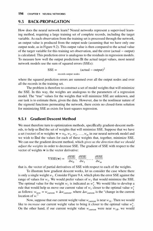
194 CHAPTER 9 NEURAL NETWORKS
9.5 BACK-PROPAGATION
How does the neural network learn? Neural networks represent a supervised learn-ing method, requiring a large training set of complete records, including the targetvariable. As each observation from the training set is processed through the network,an output value is produced from the output node (assuming that we have only oneoutput node, as in Figure 9.2). This output value is then compared to the actual valueof the target variable for this training set observation, and the error (actual − output)is calculated. This prediction error is analogous to the residuals in regression models.To measure how well the output predictions fit the actual target values, most neuralnetwork models use the sum of squared errors (SSEs):
SSE =∑
records
∑output nodes
(actual − output)2
where the squared prediction errors are summed over all the output nodes and overall the records in the training set.
The problem is therefore to construct a set of model weights that will minimizethe SSE. In this way, the weights are analogous to the parameters of a regressionmodel. The “true” values for the weights that will minimize SSE are unknown, andour task is to estimate them, given the data. However, due to the nonlinear nature ofthe sigmoid functions permeating the network, there exists no closed-form solutionfor minimizing SSE as exists for least-squares regression.
9.5.1 Gradient Descent Method
We must therefore turn to optimization methods, specifically gradient-descent meth-ods, to help us find the set of weights that will minimize SSE. Suppose that we havea set (vector) of m weights w = w0, w1, w2,… , wm in our neural network model andwe wish to find the values for each of these weights that, together, minimize SSE.We can use the gradient descent method, which gives us the direction that we shouldadjust the weights in order to decrease SSE. The gradient of SSE with respect to thevector of weights w is the vector derivative:
∇SSE(w) =[𝜕SSE𝜕w0
,𝜕SSE𝜕w1
,… ,𝜕SSE𝜕wm
]that is, the vector of partial derivatives of SSE with respect to each of the weights.
To illustrate how gradient descent works, let us consider the case where thereis only a single weight w1. Consider Figure 9.4, which plots the error SSE against therange of values for w1. We would prefer values of w1 that would minimize the SSE.The optimal value for the weight w1 is indicated as w∗
1. We would like to develop arule that would help us move our current value of w1 closer to the optimal value w∗
1as follows: wnew = wcurrent + Δwcurrent, where Δwcurrent is the “change in the currentlocation of w.”
Now, suppose that our current weight value wcurrent is near w1L. Then we wouldlike to increase our current weight value to bring it closer to the optimal value w∗
1.On the other hand, if our current weight value wcurrent were near w1R, we would

9.5 BACK-PROPAGATION 195
Figure 9.4 Using the slope of SSE with respect to w1 to find weight adjustment direction.
instead prefer to decrease its value, to bring it closer to the optimal value w∗1. Now
the derivative 𝜕SSE/𝜕w1 is simply the slope of the SSE curve at w1. For values of w1close to w1L, this slope is negative, and for values of w1 close to w1R, this slope ispositive. Hence, the direction for adjusting wcurrent is the negative of the sign of thederivative of SSE at wcurrent, that is, −sign(𝜕SSE/𝜕wcurrent).
Now, how far should wcurrent be adjusted in the direction of−sign(𝜕SSE/𝜕wcurrent)? Suppose that we use the magnitude of the derivative of SSEat wcurrent. When the curve is steep, the adjustment will be large, since the slope isgreater in magnitude at those points.When the curve is nearly flat, the adjustment willbe smaller, due to less slope. Finally, the derivative is multiplied by a positive constant𝜂 (Greek lowercase eta), called the learning rate, with values ranging between zeroand 1. (We discuss the role of 𝜂 in more detail below.) The resulting form ofΔwcurrentis as follows:Δwcurrent = −𝜂 (𝜕SSE/𝜕wcurrent), meaning that the change in the currentweight value equals negative a small constant times the slope of the error function atwcurrent.
9.5.2 Back-Propagation Rules
The back-propagation algorithm takes the prediction error (actual − output) fora particular record and percolates the error back through the network, assigningpartitioned responsibility for the error to the various connections. The weights onthese connections are then adjusted to decrease the error, using gradient descent.
Using the sigmoid activation function and gradient descent,Mitchell [1] derivesthe back-propagation rules as follows:
wij, new = wij, current + Δwij where Δwij = 𝜂𝛿jxij
Nowwe know that 𝜂 represents the learning rate and xij signifies the ith input tonode j, but what does 𝛿j represent? The component 𝛿j represents the responsibility fora particular error belonging to node j. The error responsibility is computed using thepartial derivative of the sigmoid function with respect to netj and takes the following

196 CHAPTER 9 NEURAL NETWORKS
forms, depending on whether the node in question lies in the output layer or thehidden layer:
𝛿j =
{outputj(1 − outputj)(actualj − outputj) for output layernode
outputj(1 − outputj)∑
downstreamWjk𝛿j for hidden layer nodes
where Σdownstream Wjk𝛿j refers to the weighted sum of the error responsibilities forthe nodes downstream from the particular hidden layer node. (For the full derivation,see Mitchell [1].)
Also, note that the back-propagation rules illustrate why the attribute valuesneed to be normalized to between zero and 1. For example, if income data, with valuesranging into six figures, were not normalized, the weight adjustment Δwij = 𝜂𝛿jxijwould be dominated by the data value xij. Hence the error propagation (in the formof 𝛿j) through the network would be overwhelmed, and learning (weight adjustment)would be stifled.
9.5.3 Example of Back-Propagation
Recall from our introductory example that the output from the first pass through thenetwork was output = 0.8750. Assume that the actual value of the target attribute isactual= 0.8 and that we will use a learning rate of 𝜂 = 0.01. Then the prediction errorequals 0.8 − 0.8750 = −0.075, and we may apply the foregoing rules to illustratehow the back-propagation algorithm works to adjust the weights by portioning outresponsibility for this error to the various nodes. Although it is possible to updatethe weights only after all records have been read, neural networks use stochastic (oronline) back-propagation, which updates the weights after each record.
First, the error responsibility 𝛿Z for node Z is found. Since node Z is an outputnode, we have
𝛿Z = outputZ(1 − outputZ)(actualZ − outputZ)
= 0.8751(1 − 0.875)(0.8 − 0.875) = −0.0082
We may now adjust the “constant” weight W0Z (which transmits an “input”of 1) using the back-propagation rules as follows:
ΔW0Z = 𝜂𝛿Z(1) = 0.1(−0.0082)(1) = −0.00082w0Z,new = w0Z,current + Δw0Z = 0.5 − 0.00082 = 0.49918
Next, we move upstream to node A. Since node A is a hidden layer node, itserror responsibility is
𝛿A = outputA(1 − outputA)∑
downstream
Wjk𝛿j
The only node downstream from node A is node Z. The weight associated withthis connection is WAZ = 0.9, and the error responsibility at node Z is −0.0082, sothat 𝛿A = 0.7892(1 − 0.7892)(0.9)(−0.0082) = −0.00123.

9.5 BACK-PROPAGATION 197
We may now update weightWAZ using the back-propagation rules as follows:
ΔWAZ = 𝜂𝛿Z ⋅ outputA = 0.1(−0.0082)(0.7892) = −0.000647wAZ,new = wAZ,current + ΔwAZ = 0.9 − 0.000647 = 0.899353
The weight for the connection between hidden layer node A and output layernode Z has been adjusted from its initial value of 0.9 to its new value of 0.899353.
Next, we turn to node B, a hidden layer node, with error responsibility
𝛿B = outputB(1 − outputB)∑
downstream
Wjk𝛿j
Again, the only node downstream from node B is node Z, giving us 𝛿B =0.8176(1 –0.8176)(0.9)(–0.0082) = –0.0011.
WeightWBZ may then be adjusted using the back-propagation rules as follows:
ΔWBZ = 𝜂𝛿Z ⋅ outputB = 0.1(−0.0082)(0.8176) = −0.00067
wBZ,new = wBZ,current + ΔwBZ = 0.9 − 0.00067 = 0.89933
We move upstream to the connections being used as inputs to node A. Forweight W1A we have
ΔW1A = 𝜂𝛿Ax1 = 0.1(−0.00123)(0.4) = −0.0000492
w1A,new = w1A,current + Δw1A = 0.6 − 0.000492 = 0.5999508
For weight W2A we have
ΔW2A = 𝜂𝛿Ax2 = 0.1(−0.00123)(0.2) = −0.0000246
w2A,new = w2A,current + Δw2A = 0.8 − 0.0000246 = 0.7999754
For weight W3A we have
ΔW3A = 𝜂𝛿Ax3 = 0.1(−0.00123)(0.7) = −0.0000861
w3A,new = w3A,current + Δw3A = 0.6 − 0.0000861 = 0.5999139.
Finally, for weight W0A we have
ΔW0A = 𝜂𝛿A(1) = 0.1(−0.00123) = −0.000123
w0A,new = w0A,current + Δw0A = 0.5 − 0.000123 = 0.499877
Adjusting weights W0B, W1B, W2B, and W3B is left as an exercise.Note that the weight adjustments have beenmade based on only a single perusal
of a single record. The network calculated a predicted value for the target variable,compared this output value to the actual target value, and then percolated the errorin prediction throughout the network, adjusting the weights to provide a smallerprediction error. Showing that the adjusted weights result in a smaller predictionerror is left as an exercise.

198 CHAPTER 9 NEURAL NETWORKS
9.6 TERMINATION CRITERIA
The neural network algorithm would then proceed to work through the training dataset, record by record, adjusting the weights constantly to reduce the prediction error.It may take many passes through the data set before the algorithm’s terminationcriterion is met. What, then, serves as the termination criterion, or stopping criterion?If training time is an issue, one may simply set the number of passes through thedata, or the amount of real time the algorithm may consume, as termination criteria.However, what one gains in short training time is probably bought with degradationin model efficacy.
Alternatively, one may be tempted to use a termination criterion that assesseswhen the SSE on the training data has been reduced to some low threshold level.Unfortunately, because of their flexibility, neural networks are prone to overfitting,memorizing the idiosyncratic patterns in the training set instead of retaining general-izability to unseen data.
Therefore, most neural network implementations adopt the following cross-validation termination procedure:
1. Retain part of the original data set as a holdout validation set.
2. Proceed to train the neural network as above on the remaining training data.
3. Apply the weights learned from the training data on the validation data.
4. Monitor two sets of weights, one “current” set of weights produced by thetraining data, and one “best” set of weights, as measured by the lowest SSE sofar on the validation data.
5. When the current set of weights has significantly greater SSE than the best setof weights, then terminate the algorithm.
Regardless of the stopping criterion used, the neural network is not guaranteedto arrive at the optimal solution, known as the global minimum for the SSE. Rather,the algorithm may become stuck in a local minimum, which represents a good, if notoptimal solution. In practice, this has not presented an insuperable problem.
� For example, multiple networks may be trained using different initializedweights, with the best-performing model being chosen as the “final” model.
� Second, the online or stochastic back-propagation method itself acts as a guardagainst getting stuck in a local minimum, since it introduces a random elementto the gradient descent (see Reed and Marks [2]).
� Alternatively, a momentum term may be added to the back-propagation algo-rithm, with effects discussed below.
9.7 LEARNING RATE
Recall that the learning rate 𝜂, 0 < 𝜂 < 1, is a constant chosen to help us move thenetwork weights toward a global minimum for SSE. However, what value should 𝜂
take? How large should the weight adjustments be?

9.8 MOMENTUM TERM 199
When the learning rate is very small, the weight adjustments tend to be verysmall. Thus, if 𝜂 is small when the algorithm is initialized, the network will probablytake an unacceptably long time to converge. Is the solution therefore to use largevalues for 𝜂? Not necessarily. Suppose that the algorithm is close to the optimalsolution and we have a large value for 𝜂. This large 𝜂 will tend to make the algorithmovershoot the optimal solution.
Consider Figure 9.5, where W∗ is the optimum value for weight W, whichhas current value Wcurrent. According to the gradient descent rule, Δwcurrent =−𝜂(𝜕SSE/𝜕wcurrent),Wcurrent will be adjusted in the direction ofW
∗. But if the learningrate 𝜂, which acts as a multiplier in the formula for Δwcurrent, is too large, the newweight valueWnew will jump right past the optimal valueW∗, and may in fact end upfarther away from W∗ than Wcurrent.
In fact, since the new weight value will then be on the opposite side of W∗,the next adjustment will again overshoot W∗, leading to an unfortunate oscillationbetween the two “slopes” of the valley and never settling down in the ravine (theminimum). One solution is to allow the learning rate 𝜂 to change values as thetraining moves forward. At the start of training, 𝜂 should be initialized to a relativelylarge value to allow the network to quickly approach the general neighborhood ofthe optimal solution. Then, when the network is beginning to approach convergence,the learning rate should gradually be reduced, thereby avoiding overshooting theminimum.
Figure 9.5 Large 𝜂 may cause algorithm to overshoot global minimum.
9.8 MOMENTUM TERM
The back-propagation algorithm is made more powerful through the addition of amomentum term 𝛼, as follows:
Δwcurrent = −𝜂 𝜕SSE𝜕wcurrent
+ 𝛼Δwprevious
whereΔwprevious represents the previous weight adjustment, and 0 ≤ 𝛼 < 1. Thus, thenew component 𝛼Δwprevious represents a fraction of the previous weight adjustmentfor a given weight.

200 CHAPTER 9 NEURAL NETWORKS
Essentially, the momentum term represents inertia. Large values of 𝛼 willinfluence the adjustment in the current weight,Δwcurrent, tomove in the same directionas previous adjustments. It has been shown (e.g., Reed and Marks [2]) that includingmomentum in the back-propagation algorithm results in the adjustment becoming anexponential average of all previous adjustments:
Δwcurrent = −𝜂∞∑k=0
𝛼k𝜕SSE
𝜕wcurrent-k
The 𝛼k term indicates that the more recent adjustments exert a larger influence.Large values of 𝛼 allow the algorithm to “remember” more terms in the adjustmenthistory. Small values of 𝛼 reduce the inertial effects aswell as the influence of previousadjustments, until, with 𝛼 = 0, the component disappears entirely.
Clearly, a momentum component will help to dampen the oscillations aroundoptimality mentioned earlier, by encouraging the adjustments to stay in the samedirection. But momentum also helps the algorithm in the early stages of the algo-rithm, by increasing the rate at which the weights approach the neighborhood ofoptimality. This is because these early adjustments will probably all be in the samedirection, so that the exponential average of the adjustments will also be in thatdirection. Momentum is also helpful when the gradient of SSE with respect to wis flat. If the momentum term 𝛼 is too large, however, the weight adjustments mayagain overshoot the minimum, due to the cumulative influences of many previousadjustments.
For an informal appreciation of momentum, consider Figures 9.6 and 9.7. Inboth figures, the weight is initialized at location I, local minima exist at locations Aand C, with the optimal global minimum at B. In Figure 9.6, suppose that we havea small value for the momentum term 𝛼, symbolized by the small mass of the “ball”on the curve. If we roll this small ball down the curve, it may never make it over thefirst hill, and remain stuck in the first valley. That is, the small value for 𝛼 enables thealgorithm to easily find the first trough at location A, representing a local minimum,but does not allow it to find the global minimum at B.
Next, in Figure 9.7, suppose that we have a large value for the momentum term𝛼, symbolized by the large mass of the “ball” on the curve. If we roll this large ball
Figure 9.6 Small momentum 𝛼 may cause algorithm to undershoot global minimum.
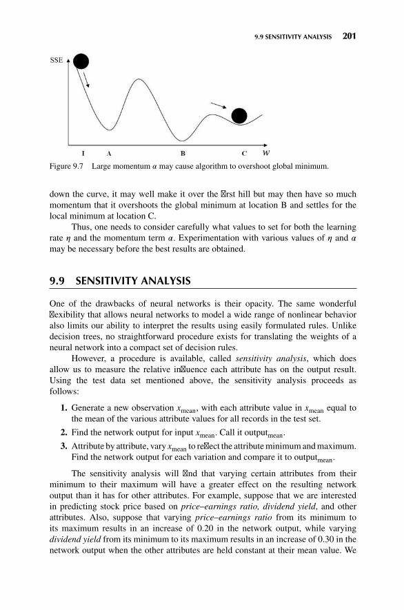
9.9 SENSITIVITY ANALYSIS 201
Figure 9.7 Large momentum 𝛼 may cause algorithm to overshoot global minimum.
down the curve, it may well make it over the first hill but may then have so muchmomentum that it overshoots the global minimum at location B and settles for thelocal minimum at location C.
Thus, one needs to consider carefully what values to set for both the learningrate 𝜂 and the momentum term 𝛼. Experimentation with various values of 𝜂 and 𝛼
may be necessary before the best results are obtained.
9.9 SENSITIVITY ANALYSIS
One of the drawbacks of neural networks is their opacity. The same wonderfulflexibility that allows neural networks to model a wide range of nonlinear behavioralso limits our ability to interpret the results using easily formulated rules. Unlikedecision trees, no straightforward procedure exists for translating the weights of aneural network into a compact set of decision rules.
However, a procedure is available, called sensitivity analysis, which doesallow us to measure the relative influence each attribute has on the output result.Using the test data set mentioned above, the sensitivity analysis proceeds asfollows:
1. Generate a new observation xmean, with each attribute value in xmean equal tothe mean of the various attribute values for all records in the test set.
2. Find the network output for input xmean. Call it outputmean.
3. Attribute by attribute, vary xmean to reflect the attributeminimumandmaximum.Find the network output for each variation and compare it to outputmean.
The sensitivity analysis will find that varying certain attributes from theirminimum to their maximum will have a greater effect on the resulting networkoutput than it has for other attributes. For example, suppose that we are interestedin predicting stock price based on price–earnings ratio, dividend yield, and otherattributes. Also, suppose that varying price–earnings ratio from its minimum toits maximum results in an increase of 0.20 in the network output, while varyingdividend yield from its minimum to its maximum results in an increase of 0.30 in thenetwork output when the other attributes are held constant at their mean value. We

202 CHAPTER 9 NEURAL NETWORKS
conclude that the network is more sensitive to variations in dividend yield and thattherefore dividend yield is a more important factor for predicting stock prices than isprice–earnings ratio.
9.10 APPLICATION OF NEURAL NETWORK MODELING
Next, we apply a neural network model using Insightful Miner on the same adultdata set [3] from the UC Irvine Machine Learning Repository that we analyzed inChapter 8. The Insightful Miner neural network software was applied to a training setof 25,000 cases, using a single hidden layer with eight hidden nodes. The algorithmiterated 47 epochs (runs through the data set) before termination. The resulting neuralnetwork is shown in Figure 9.8. The squares on the left represent the input nodes.For the categorical variables, there is one input node per class. The eight dark circlesrepresent the hidden layer. The light gray circles represent the constant inputs. Thereis only a single output node, indicating whether or not the record is classified ashaving income less than or equal to $50,000.
Figure 9.8 Neural network for the adult data set generated by Insightful Miner.

9.10 APPLICATION OF NEURAL NETWORK MODELING 203
In this algorithm, the weights are centered at zero. An excerpt of the computeroutput showing the weight values is provided in Figure 9.9. The columns in the firsttable represent the input nodes: 1 = age, 2 = education-num, and so on, while therows represent the hidden layer nodes: 22 = first (top) hidden node, 23 = secondhidden node, and so on. For example, the weight on the connection from age tothe topmost hidden node is −0.97, while the weight on the connection from Race:American Indian/Eskimo (the sixth input node) to the last (bottom) hidden node is−0.75. The lower section of Figure 9.9 displays the weights from the hidden nodesto the output node.
The estimated prediction accuracy using this very basic model is 82%, whichis in the ballpark of the accuracies reported by Kohavi [4]. Since over 75% of thesubjects have incomes at or below $50,000, simply predicted “less than or equal to$50,000” for every person would provide a baseline accuracy of about 75%.
However, wewould like to knowwhich variables aremost important for predict-ing (classifying) income. We therefore perform a sensitivity analysis using Modeler,with results shown in Figure 9.10. Clearly, the amount of capital gains is the bestpredictor of whether a person has income less than or equal to $50,000, followed bythe number of years of education. Other important variables include the number ofhours worked per week and marital status. A person’s gender does not seem to behighly predictive of income.
Figure 9.9 Some of the neural network weights for the income example.

204 CHAPTER 9 NEURAL NETWORKS
Figure 9.10 Most important variables: results from sensitivity analysis.
Of course, there is much more involved with developing a neural networkclassification model. For example, further data preprocessing may be called for; themodel would need to be validated using a holdout validation data set, and so on.
THE R ZONE
# Install package needed for this chapter
install.packages("neuralnet")library(neuralnet)
# Read in the data, shrink the data set to 500 records for a brief example
dat <- read.csv(file = "C:/ . . . /adult.txt",stringsAsFactors=TRUE)
newdat <- dat[1:500,]# Combine factor labels as in Chapter 8levels(newdat$marital.status)[2:4] <- "Married"levels(newdat$workclass)[c(2,3,8)] <- "Gov"levels(newdat$workclass)[c(5, 6)] <- "Self"
# Determine how many Indicator variables are needed
unique(newdat$income) # One variable for incomeunique(newdat$sex) # One variable for sexunique(newdat$race) # Four variables for raceunique(newdat$workclass) # Three variables for workclassunique(newdat$marital.status) # Four variables for marital.status

9.10 APPLICATION OF NEURAL NETWORK MODELING 205
# Declare, assign indicator variables
newdat$race_white <- newdat$race_black <- newdat$race_as.pac.is <-newdat$race_am.in.esk <- newdat$wc_gov <- newdat$wc_self <- newdat$wc_priv <-newdat$ms_marr <- newdat$ms_div <- newdat$ms_sep <- newdat$ms_wid <-newdat$income2 <- newdat$sex2 <- c(rep(0, length(newdat$income)))
for (i in 1:length(newdat$income)) {if(newdat$income[i]!="<=50K.")
newdat$income2[i]<-1if(newdat$sex[i] == "Male")
newdat$sex2[i] <- 1if(newdat$race[i] == "White") newdat$race_white[i] <- 1if(newdat$race[i] == "Amer-Indian-Eskimo") newdat$race_am.in.esk[i] <- 1if(newdat$race[i] == "Asian-Pac-Islander") newdat$race_as.pac.is[i] <- 1if(newdat$race[i] == "Black") newdat$race_black[i] <- 1if(newdat$workclass[i] == "Gov") newdat$wc_gov[i] <- 1if(newdat$workclass[i] == "Self") newdat$wc_self[i] <- 1if(newdat$workclass[i] == "Private" ) newdat$wc_priv[i] <- 1if(newdat$marital.status[i] == "Married") newdat$ms_marr[i] <- 1if(newdat$marital.status[i] == "Divorced" ) newdat$ms_div[i] <- 1if(newdat$marital.status[i] == "Separated" ) newdat$ms_sep[i] <- 1if(newdat$marital.status[i] == "Widowed" ) newdat$ms_wid[i] <- 1
}
# To use the R package neuralnet, all variables must be of type Numeric or Complex
# Check the variable types.class(newdat$age); class(newdat$education.num); class(newdat$capital.gain);
class(newdat$capital.loss); class(newdat$hours.per.week)# Change these Integer types to Numeric typesnewdat$age <- as.numeric(newdat$age)newdat$education.num <- as.numeric(newdat$education.num)newdat$capital.gain <- as.numeric(newdat$capital.gain)newdat$capital.loss <- as.numeric(newdat$capital.loss)newdat$hours.per.week <- as.numeric(newdat$hours.per.week)# Check the rest of the variablesclass(newdat$income2); class(newdat$sex2)class(newdat$wc_priv); class(newdat$wc_gov); class(newdat$wc_self)class(newdat$race_am.in.esk); class(newdat$race_as.pac.is); class(newdat$race_black);
class(newdat$race_white)class(newdat$ms_div); class(newdat$ms_sep); class(newdat$ms_wid); class(newdat$ms_marr)# These do not need to be changed# Delete the variables we don’t neednewdat <- newdat[,-c(2, 3, 4, 6, 7, 8, 9, 10, 14, 15)]

206 CHAPTER 9 NEURAL NETWORKS
# Run the neural net package
# Code may take some minutes to runprint(net.dat <- neuralnet(formula =
income2 ∼ age + education.num + sex2 +race_am.in.esk + race_as.pac.is +race_black + race_white + capital.gain +capital.loss + hours.per.week +ms_div + ms_sep + ms_wid + ms_marr +wc_priv + wc_gov + wc_self,data = newdat,rep = 10,hidden = 8,linear.output=FALSE))
# Note: If the package fails to converge,# run the same lines again.plot(net.dat, show.weights = FALSE)
# Show the weights
net.dat$weights# In the first matrix,# rows represent the 17# input variables and one# constant, while columns# represent 8 hidden nodes.
# In the second matrix,# rows represent the 8# hidden nodes and one# constant input, while the# column represents the# single output, income2.

EXERCISES 207
REFERENCES
1. Tom M. Mitchell, Machine Learning, McGraw-Hill, New York, 1997.2. Russell D. Reed and Robert J. MarksII, Neural Smithing: Supervised Learning in Feedforward
Artificial Neural Networks, MIT Press, Cambridge, MA, 1999.3. C. L. Blake and C. J. Merz, UCI Repository of Machine Learning Databases, University of California,
Department of Information and Computer Science, Irvine, CA, 1998, http://www.ics.uci.edu/∼mlearn/MLRepository.html. Accessed March 17, 2014.
4. Ronny Kohavi, Scaling up the accuracy of naıve Bayes classifiers: A decision tree hybrid, Proceedingsof the 2nd International Conference on Knowledge Discovery and Data Mining, Portland, OR, 1996.
EXERCISES
1. Suppose that you need to prepare the data in Table 6.10 for a neural network algorithm.Define the indicator variables for the occupation attribute.
2. Clearly describe each of these characteristics of a neural network:
a. Layered
b. Feedforward
c. Completely connected
3. What is the sole function of the nodes in the input layer?
4. Should we prefer a large hidden layer or a small one? Describe the benefits and drawbacksof each.
5. Describe how neural networks function nonlinearly.
6. Explain why the updating term for the current weight includes the negative of the sign ofthe derivative (slope).
7. Adjust the weightsW0B,W1B,W2B, andW3B from the example on back-propagation in thetext.
8. Refer to Exercise 7. Show that the adjusted weights result in a smaller prediction error.
9. True or false: Neural networks are valuable because of their capacity for always findingthe global minimum of the SSE.
10. Describe the benefits and drawbacks of using large or small values for the learning rate.
11. Describe the benefits and drawbacks of using large or small values for the momentumterm.
HANDS-ON ANALYSIS
For Exercises 12–14, use the data set churn. Normalize the numerical data, recode the cate-gorical variables, and deal with the correlated variables.
12. Generate a neural network model for classifying churn based on the other variables.Describe the topology of the model.
13. Which variables, in order of importance, are identified as most important for classifyingchurn?

208 CHAPTER 9 NEURAL NETWORKS
14. Compare the neural network model with the CART and C4.5 models for this task inChapter 6. Describe the benefits and drawbacks of the neural network model compared tothe others. Is there convergence or divergence of results among the models?
For Exercises 15–17, use the ClassifyRisk data set.
15. Run an NNmodel predicting income based only on age. Use the default settings and makesure there is one hidden layer with one neuron.
16. Consider the following quantity: (weight for Age-to-Neuron1) + (weight for Bias-to-Neuron1) ∗ (weight for Neuron 1-to-Output node). Explain whether this makes sense,given the data, and why.
17. Make sure the target variable takes the flag type. Compare the sign of (weight for Age-to-Neuron1) + (weight for Bias-to-Neuron1) ∗ (weight for Neuron 1-to-Output node) forthe good risk output node, as compared to the bad loss output node. Explain whether thismakes sense, given the data, and why.
IBM/SPSS Modeler Analysis. For Exercises 18–19, use the nn1 data set.
18. Set your neural network build options as follows: Use a Multilayer Perceptron and cus-tomize number of units in Hidden Layer 1 to be 1 and Hidden Layer 2 to be 0. For StoppingRules, select ONLY Customize number of maximum training cycles. Start at 1 and go toabout 20. For Advanced, deselect Replicate Results.
19. Browse yourmodel. In theNetworkwindowof theModel tab, select the Style: Coefficients.Record the Pred1-to-Neuron1 weight and the Pred2-to-Neuron1 weight for each run.Describe the behavior of these weights. Explain why this is happening. �

CHAPTER10HIERARCHICAL AND k-MEANSCLUSTERING
10.1 THE CLUSTERING TASK 209
10.2 HIERARCHICAL CLUSTERING METHODS 212
10.3 SINGLE-LINKAGE CLUSTERING 213
10.4 COMPLETE-LINKAGE CLUSTERING 214
10.5 k-MEANS CLUSTERING 215
10.6 EXAMPLE OF k-MEANS CLUSTERING AT WORK 216
10.7 BEHAVIOR OF MSB, MSE, AND PSEUDO-F AS THE k-MEANSALGORITHM PROCEEDS 219
10.8 APPLICATION OF k-MEANS CLUSTERING USING SAS ENTERPRISEMINER 220
10.9 USING CLUSTER MEMBERSHIP TO PREDICT CHURN 223
THE R ZONE 224
REFERENCES 226
EXERCISES 226
HANDS-ON ANALYSIS 226
10.1 THE CLUSTERING TASK
Clustering refers to the grouping of records, observations, or cases into classes ofsimilar objects. A cluster is a collection of records that are similar to one another anddissimilar to records in other clusters. Clustering differs from classification in thatthere is no target variable for clustering. The clustering task does not try to classify,estimate, or predict the value of a target variable. Instead, clustering algorithms seekto segment the entire data set into relatively homogeneous subgroups or clusters,
Discovering Knowledge in Data: An Introduction to Data Mining, Second Edition.By Daniel T. Larose and Chantal D. Larose.© 2014 John Wiley & Sons, Inc. Published 2014 by John Wiley & Sons, Inc.
209

210 CHAPTER 10 HIERARCHICAL AND k-MEANS CLUSTERING
where the similarity of the records within the cluster is maximized, and the similarityto records outside this cluster is minimized.
For example, the Nielsen PRIZM segments, developed by Claritas, Inc., repre-sent demographic profiles of each geographic area in the United States, in terms ofdistinct lifestyle types, as defined by zip code. For example, the clusters identifiedfor zip code 90210, Beverly Hills, California, are
� Cluster # 01: Upper Crust Estates� Cluster # 03: Movers and Shakers� Cluster # 04: Young Digerati� Cluster # 07: Money and Brains� Cluster # 16: Bohemian Mix
The description for Cluster # 01: Upper Crust is “The nation’s most exclusive address,Upper Crust is the wealthiest lifestyle in America, a Haven for empty-nesting couplesbetween the ages of 45 and 64. No segment has a higher concentration of residentsearning over $100,000 a year and possessing a postgraduate degree. And none has amore opulent standard of living.”
Examples of clustering tasks in business and research include
� Target marketing of a niche product for a small-capitalization business thatdoes not have a large marketing budget
� For accounting auditing purposes, to segment financial behavior into benignand suspicious categories
� As a dimension-reduction tool when a data set has hundreds of attributes� For gene expression clustering, where very large quantities of genesmay exhibitsimilar behavior
Clustering is often performed as a preliminary step in a data mining process,with the resulting clusters being used as further inputs into a different techniquedownstream, such as neural networks. Due to the enormous size of many present-daydatabases, it is often helpful to apply clustering analysis first, to reduce the searchspace for the downstream algorithms. In this chapter, after a brief look at hierarchi-cal clustering methods, we discuss in detail k-means clustering; in Chapter 11, weexamine clustering using Kohonen networks, a structure related to neural networks.
Cluster analysis encounters many of the same issues that we dealt within thechapters on classification. For example, we shall need to determine
� How to measure similarity� How to recode categorical variables� How to standardize or normalize numerical variables� How many clusters we expect to uncover
For simplicity, in this book, we concentrate on Euclidean distance betweenrecords:
dEuclidean(x, y) =√∑
i
(xi − yi)2

10.1 THE CLUSTERING TASK 211
where x = x1, x2,… , xm and y = y1, y2,… , ym represent them attribute values of tworecords. Of course, many other metrics exist, such as city-block distance:
dcityblock(x, y) =∑i
|xi − yi|orMinkowski distance, which represents the general case of the foregoing twometricsfor a general exponent q:
dMinkowski(x, y) =∑i
|xi − yi|qFor categorical variables, we may again define the “different from” function
for comparing the ith attribute values of a pair of records:
different(xi, yi) ={0 if xi = yi1 otherwise
where xi and yi are categorical values. We may then substitute different (xi, yi) for theith term in the Euclidean distance metric above.
For optimal performance, clustering algorithms, just like algorithms for classi-fication, require the data to be normalized so that no particular variable or subset ofvariables dominates the analysis. Analysts may use either themin-max normalizationor Z-score standardization, discussed in earlier chapters:
Min-max normalization: X∗ = X − min(X)Range(X)
Z-score standardization: X∗ = X −mean(X)SD(X)
All clustering methods have as their goal the identification of groups of recordssuch that similarity within a group is very high while the similarity to records in othergroups is very low. In other words, as shown in Figure 10.1, clustering algorithmsseek to construct clusters of records such that the between-cluster variation is large
Figure 10.1 Clusters should have small within-cluster variation compared to the between-cluster variation.

212 CHAPTER 10 HIERARCHICAL AND k-MEANS CLUSTERING
compared to the within-cluster variation. This is somewhat analogous to the conceptbehind analysis of variance.
10.2 HIERARCHICAL CLUSTERING METHODS
Clustering algorithms are either hierarchical or nonhierarchical. In hierarchical clus-tering, a treelike cluster structure (dendrogram) is created through recursive partition-ing (divisive methods) or combining (agglomerative) of existing clusters. Agglomer-ative clustering methods initialize each observation to be a tiny cluster of its own.Then, in succeeding steps, the two closest clusters are aggregated into a new com-bined cluster. In this way, the number of clusters in the data set is reduced by one ateach step. Eventually, all records are combined into a single huge cluster. Divisiveclustering methods begin with all the records in one big cluster, with the most dis-similar records being split off recursively, into a separate cluster, until each recordrepresents its own cluster. Because most computer programs that apply hierarchicalclustering use agglomerative methods, we focus on those.
Distance between records is rather straightforward once appropriate recodingand normalization have taken place. But how do we determine distance betweenclusters of records? Should we consider two clusters to be close if their nearestneighbors are close or if their farthest neighbors are close? How about criteria thataverage out these extremes?
We examine several criteria for determining distance between arbitrary clustersA and B:
� Single linkage, sometimes termed the nearest-neighbor approach, is based onthe minimum distance between any record in cluster A and any record in clusterB. In other words, cluster similarity is based on the similarity of themost similarmembers from each cluster. Single linkage tends to form long, slender clusters,which may sometimes lead to heterogeneous records being clustered together.
� Complete linkage, sometimes termed the farthest-neighbor approach, is basedon the maximum distance between any record in cluster A and any record incluster B. In other words, cluster similarity is based on the similarity of themost dissimilar members from each cluster. Complete-linkage tends to formmore compact, sphere-like clusters, with all records in a cluster within a givendiameter of all other records.
� Average linkage is designed to reduce the dependence of the cluster-linkagecriterion on extreme values, such as the most similar or dissimilar records.In average linkage, the criterion is the average distance of all the records incluster A from all the records in cluster B. The resulting clusters tend to haveapproximately equal within-cluster variability.
Let us examine how these linkage methods works, using the following small,one-dimensional data set:
2 5 9 15 16 18 25 33 33 45

10.3 SINGLE-LINKAGE CLUSTERING 213
10.3 SINGLE-LINKAGE CLUSTERING
Suppose that we are interested in using single-linkage agglomerative clustering onthis data set. Agglomerative methods start by assigning each record to its own cluster.Then, single linkage seeks theminimum distance between any records in two clusters.Figure 10.2 illustrates how this is accomplished for this data set. Theminimum clusterdistance is clearly between the single-record clusters which each contain the value 33,for which the distance must be zero for any valid metric. Thus, these two clusters arecombined into a new cluster of two records, both of value 33, as shown in Figure 10.2.Note that, after step 1, only nine (n – 1) clusters remain. Next, in step 2, the clusterscontaining values 15 and 16 are combined into a new cluster, since their distance of1 is the minimum between any two clusters remaining.
Here are the remaining steps:� Step 3: The cluster containing values 15 and 16 (cluster {15, 16}) is combinedwith cluster {18}, since the distance between 16 and 18 (the closest records ineach cluster) is two, the minimum among remaining clusters.
� Step 4: Clusters {2} and {5} are combined.� Step 5: Cluster {2, 5} is combined with cluster {9}, since the distance between5 and 9 (the closest records in each cluster) is 4, the minimum among remainingclusters.
� Step 6:Cluster {2, 5, 9} is combinedwith cluster {15, 16, 18}, since the distancebetween 9 and 15 is 6, the minimum among remaining clusters.
� Step 7: Cluster {2, 5, 9, 15, 16, 18} is combined with cluster {25}, since thedistance between 18 and 25 is 7, the minimum among remaining clusters.
� Step 8: Cluster {2, 5, 9, 15, 16, 18, 25} is combined with cluster {33, 33}, sincethe distance between 25 and 33 is 8, the minimum among remaining clusters.
� Step 9: Cluster {2, 5, 9, 15, 16, 18, 25, 33, 33} is combined with cluster {45}.This last cluster now contains all the records in the data set.
Figure 10.2 Single-linkage agglomerative clustering on the sample data set.

214 CHAPTER 10 HIERARCHICAL AND k-MEANS CLUSTERING
10.4 COMPLETE-LINKAGE CLUSTERING
Next, let us examine whether using the complete-linkage criterion would result ina different clustering of this sample data set. Complete linkage seeks to minimizethe distance among the records in two clusters that are farthest from each other.Figure 10.3 illustrates complete-linkage clustering for this data set.
� Step 1: Since each cluster contains a single record only, there is no differencebetween single linkage and complete linkage at step 1. The two clusters eachcontaining 33 are again combined.
� Step 2: Just as for single linkage, the clusters containing values 15 and 16 arecombined into a new cluster. Again, this is because there is no difference in thetwo criteria for single-record clusters.
� Step 3: At this point, complete linkage begins to diverge from its predecessor.In single linkage, cluster {15, 16} was at this point combined with cluster {18}.But complete linkage looks at the farthest neighbors, not the nearest neighbors.The farthest neighbors for these two clusters are 15 and 18, for a distance of3. This is the same distance separating clusters {2} and {5}. The complete-linkage criterion is silent regarding ties, so we arbitrarily select the first suchcombination found, therefore combining the clusters {2} and {5} into a newcluster.
� Step 4: Now cluster {15, 16} is combined with cluster {18}.� Step 5: Cluster {2, 5} is combined with cluster {9}, since the complete-linkagedistance is 7, the smallest among remaining clusters.
� Step 6:Cluster {25} is combinedwith cluster {33, 33}, with a complete-linkagedistance of 8.
� Step 7:Cluster {2, 5, 9} is combined with cluster {15, 16, 18}, with a complete-linkage distance of 16.
� Step 8: Cluster {25, 33, 33} is combined with cluster {45}, with a complete-linkage distance of 20.
� Step 9: Cluster {2, 5, 9, 15, 16, 18} is combined with cluster {25, 33, 33, 45}.All records are now contained in this last large cluster.
Figure 10.3 Complete-linkage agglomerative clustering on the sample data set.

10.5 k-MEANS CLUSTERING 215
Finally, with average linkage, the criterion is the average distance of all therecords in cluster A from all the records in cluster B. Since the average of a singlerecord is the record’s value itself, this method does not differ from the earlier meth-ods in the early stages, where single-record clusters are being combined. At step 3,average linkage would be faced with the choice of combining clusters {2} and {5}, orcombining the {15, 16} cluster with the single-record {18} cluster. The average dis-tance between the {15, 16} cluster and the {18} cluster is the average of |18 − 15| and|18 − 16|, which is 2.5, while the average distance between clusters {2} and {5} is ofcourse 3. Therefore, average linkage would combine the {15, 16} cluster with cluster{18} at this step, followed by combining cluster {2} with cluster {5}. The readermay verify that the average-linkage criterion leads to the same hierarchical structurefor this example as the complete-linkage criterion. In general, average linkage leadsto clusters more similar in shape to complete linkage than does single linkage.
10.5 k-MEANS CLUSTERING
The k-means clustering algorithm [1] is a straightforward and effective algorithm forfinding clusters in data. The algorithm proceeds as follows:
� Step 1: Ask the user how many clusters k the data set should be partitionedinto.
� Step 2: Randomly assign k records to be the initial cluster center locations.� Step 3: For each record, find the nearest cluster center. Thus, in a sense, eachcluster center “owns” a subset of the records, thereby representing a partitionof the data set. We therefore have k clusters, C1,C2,… ,Ck.
� Step 4: For each of the k clusters, find the cluster centroid, and update thelocation of each cluster center to the new value of the centroid.
� Step 5: Repeat steps 3 to 5 until convergence or termination.
The “nearest” criterion in step 3 is usually Euclidean distance, although othercriteria may be applied as well. The cluster centroid in step 4 is found as follows.Suppose that we have n data points (a1, b1, c1), (a2, b2, c2),… , (an, bn, cn), the cen-troid of these points is the center of gravity of these points and is located at point(∑ai∕n,
∑bi∕n,
∑ci∕n). For example, the points (1,1,1), (1,2,1), (1,3,1), and (2,1,1)
would have centroid(1 + 1 + 1 + 24
,1 + 2 + 3 + 1
4,1 + 1 + 1 + 1
4
)= (1.25, 1.75, 1.00)
The algorithm terminates when the centroids no longer change. In other words,the algorithm terminates when for all clusters C1,C2,… ,Ck, all the records “owned”by each cluster center remain in that cluster. Alternatively, the algorithm may termi-nate when some convergence criterion is met, such as no significant shrinkage in themean squared error (MSE):
MSE = SSEN − k
=∑ki=1
∑p∈Ci d(p,mi)
2
N − k

216 CHAPTER 10 HIERARCHICAL AND k-MEANS CLUSTERING
where SSE represents the sum of squares error, p ∈ Ci represents each data pointin cluster i, mi represents the centroid (cluster center) of cluster i, N is the totalsample size, and k is the number of clusters. Recall that clustering algorithms seek toconstruct clusters of records such that the between-cluster variation is large comparedto the within-cluster variation. Because this concept is analogous to the analysis ofvariance, we may define a pseudo-F statistic as follows:
Fk−1,N−k =MSBMSE
=SSB∕k − 1
SSE∕N − k
where SSE is defined as above, MSB is the mean square between, and SSB is thesum of squares between clusters, defined as
SSB =k∑i=1
ni ⋅ d(mi,M)2
where ni is the number of records in cluster i, mi is the centroid (cluster center) forcluster i, and M is the grand mean of all the data.
MSB represents the between-cluster variation and MSE represents the within-cluster variation. Thus a “good” cluster would have a large value of the pseudo-Fstatistic, representing a situation where the between-cluster variation is large com-pared to the within-cluster variation. Hence, as the k-means algorithm proceeds, andthe quality of the clusters increases, we would expect MSB to increase, MSE todecrease, and F to increase.
10.6 EXAMPLE OF k-MEANS CLUSTERING AT WORK
Let us examine an example of how the k-means algorithm works. Suppose that wehave the eight data points in two-dimensional space shown in Table 10.1 and plottedin Figure 10.4 and are interested in uncovering k = 2 clusters.
Let us apply the k-means algorithm step by step.
� Step 1: Ask the user how many clusters k the data set should be partitionedinto. We have already indicated that we are interested in k = 2 clusters.
� Step 2: Randomly assign k records to be the initial cluster center locations. Forthis example, we assign the cluster centers to be m1 = (1,1) and m2 = (2,1).
� Step 3 (first pass): For each record, find the nearest cluster center. Table 10.2contains the (rounded) Euclidean distances between each point and each clustercenter m1 = (1,1) and m2 = (2,1), along with an indication of which clustercenter the point is nearest to. Therefore, cluster 1 contains points {a, e, g}, andcluster 2 contains points {b, c, d, f , h}.
TABLE 10.1 Data points for k-means example
A b c d E f g h(1,3) (3,3) (4,3) (5,3) (1,2) (4,2) (1,1) (2,1)

10.6 EXAMPLE OF k-MEANS CLUSTERING AT WORK 217
Figure 10.4 How will k-means partition these data into k = 2 clusters?
� Step 4 (first pass): For each of the k clusters find the cluster centroid and updatethe location of each cluster center to the new value of the centroid. The centroidfor cluster 1 is [(1 + 1 + 1)/3, (3 + 2 + 1)/3] = (1,2). The centroid for cluster2 is [(3 + 4 + 5 + 4 + 2)/5, (3 + 3 + 3 + 2 + 1)/5] = (3.6, 2.4). The clustersand centroids (triangles) at the end of the first pass are shown in Figure 10.5.Note that m1 has moved up to the center of the three points in cluster 1, whilem2 has moved up and to the right a considerable distance, to the center of thefive points in cluster 2.
� Step 5: Repeat steps 3 and 4 until convergence or termination. The centroidshave moved, so we go back to step 3 for our second pass through the algorithm.
� Step 3 (second pass): For each record, find the nearest cluster center. Table 10.3shows the distances between each point and each updated cluster center m1 =(1,2) andm2 = (3.6, 2.4), together with the resulting cluster membership. Therehas been a shift of a single record (h) from cluster 2 to cluster 1. The relativelylarge change in m2 has left record h now closer to m1 than to m2, so that recordh now belongs to cluster 1. All other records remain in the same clusters aspreviously. Therefore, cluster 1 is {a, e, g, h}, and cluster 2 is {b, c, d, f}.
� Step 4 (second pass): For each of the k clusters, find the cluster centroid andupdate the location of each cluster center to the new value of the centroid. The
TABLE 10.2 Finding the nearest cluster center for each record (first pass)
Point Distance from m1 Distance from m2 Cluster Membership
a 2.00 2.24 C1
b 2.83 2.24 C2
c 3.61 2.83 C2
d 4.47 3.61 C2
e 1.00 1.41 C1
f 3.16 2.24 C2
g 0.00 1.00 C1
h 1.00 0.00 C2

218 CHAPTER 10 HIERARCHICAL AND k-MEANS CLUSTERING
Figure 10.5 Clusters and centroids Δ after first pass through k-means algorithm.
new centroid for cluster 1 is [(1 + 1 + 1 + 2)/4, (3 + 2 + 1 + 1)/4] = (1.25,1.75). The new centroid for cluster 2 is [(3 + 4 + 5 + 4)/4, (3 + 3 + 3 + 2)/4]= (4, 2.75). The clusters and centroids at the end of the second pass are shownin Figure 10.6. Centroids m1 and m2 have both moved slightly.
� Step 5: Repeat steps 3 and 4 until convergence or termination. Since the cen-troids have moved, we once again return to step 3 for our third (and as it turnsout, final) pass through the algorithm.
� Step 3 (third pass): For each record, find the nearest cluster center. Table 10.4shows the distances between each point and each newly updated cluster centerm1 = (1.25, 1.75) and m2 = (4, 2.75), together with the resulting clustermembership. Note that no records have shifted cluster membership from thepreceding pass.
� Step 4 (third pass):For each of the k clusters, find the cluster centroid and updatethe location of each cluster center to the new value of the centroid. Since norecords have shifted cluster membership, the cluster centroids therefore alsoremain unchanged.
� Step 5: Repeat steps 3 and 4 until convergence or termination. Since the cen-troids remain unchanged, the algorithm terminates.
TABLE 10.3 Finding the nearest cluster center for each record (second pass)
Point Distance from m1 Distance from m2 Cluster Membership
a 1.00 2.67 C1
b 2.24 0.85 C2
c 3.16 0.72 C2
d 4.12 1.52 C2
e 0.00 2.63 C1
f 3.00 0.57 C2
g 1.00 2.95 C1
h 1.41 2.13 C1
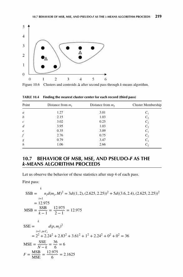
10.7 BEHAVIOR OF MSB, MSE, AND PSEUDO-F AS THE k-MEANS ALGORITHM PROCEEDS 219
Figure 10.6 Clusters and centroids Δ after second pass through k-means algorithm.
TABLE 10.4 Finding the nearest cluster center for each record (third pass)
Point Distance from m1 Distance from m2 Cluster Membership
a 1.27 3.01 C1
b 2.15 1.03 C2
c 3.02 0.25 C2
d 3.95 1.03 C2
e 0.35 3.09 C1
f 2.76 0.75 C2
g 0.79 3.47 C1
h 1.06 2.66 C2
10.7 BEHAVIOR OF MSB, MSE, AND PSEUDO-F AS THEk-MEANS ALGORITHM PROCEEDS
Let us observe the behavior of these statistics after step 4 of each pass.
First pass:
SSB =k∑i=1
nid(mi,M)2 = 3d((1, 2), (2.625, 2.25))2 + 5d((3.6, 2.4), (2.625, 2.25))2
= 12.975
MSB = SSBk − 1
= 12.9752 − 1
= 12.975
SSE =k∑i=1
∑p𝜀Ci
d(p,mi)2
= 22 + 2.242 + 2.832 + 3.612 + 12 + 2.242 + 02 + 02 = 36
MSE = SSEN − k
= 366
= 6
F = MSBMSE
= 12.9756
= 2.1625

220 CHAPTER 10 HIERARCHICAL AND k-MEANS CLUSTERING
In general, we would expect MSB to increase, MSE to decrease, and F to increase,and such is the case. The calculations are left as an exercise.
Second pass: MSB = 17.125, MSE = 1.313333, F = 13.03934.
Third pass: MSB = 17.125, MSE = 1.041667, F = 16.44.
These statistics indicate that we have achieved the maximum between-cluster varia-tion (as measured by MSB), compared to the within-cluster variation (as measuredby MSE).
Note that the k-means algorithm cannot guarantee finding the global maximumpseudo-F statistic, instead often settling at a local maximum. To improve the prob-ability of achieving a global minimum, the analyst may consider using a variety ofinitial cluster centers. Moore [2] suggests (1) placing the first cluster center on arandom data point and (2) placing the subsequent cluster centers on points as faraway from previous centers as possible.
One potential problem for applying the k-means algorithm: Who decides howmany clusters to search for? That is, who decides k? Unless the analyst has a prioriknowledge of the number of underlying clusters, therefore, an “outer loop” shouldbe added to the algorithm, which cycles through various promising values of k.Clustering solutions for each value of k can therefore be compared, with the valueof k resulting in the largest F statistic being selected. Alternatively, some clusteringalgorithms, such as the BIRCH clustering algorithm, can select the optimal numberof clusters.1
What if some attributes are more relevant than others to the problem for-mulation? Since cluster membership is determined by distance, we may apply thesame axis-stretching methods for quantifying attribute relevance that we discussed inChapter 7. In Chapter 11, we examine another common clustering method, Kohonennetworks, which are related to artificial neural networks in structure.
10.8 APPLICATION OF k-MEANS CLUSTERING USINGSAS ENTERPRISE MINER
Next, we turn to the powerful SAS Enterpriser Miner 3] software for an applicationof the k-means algorithm on the churn data set from Chapter 3 (available at the bookseries website; also available from http://www.sgi.com/tech/mlc/db/). Recall thatthe data set contains 20 variables worth of information about 3333 customers, alongwith an indication of whether or not that customer churned (left the company).
The following variables were passed to the Enterprise Miner clustering node:
� Flag (0/1) variables� International Plan and VoiceMail Plan
1For more on BIRCH clustering, seeData Mining and Predictive Analytics, by Daniel Larose and ChantalLarose, John Wiley and Sons, 2015, to appear.

10.8 APPLICATION OF k-MEANS CLUSTERING USING SAS ENTERPRISE MINER 221
� Numerical variables� Account length, voice mail messages, day minutes, evening minutes, nightminutes, international minutes, and customer service calls,
� After applying min-max normalization to all numerical variables.
The Enterprise Miner clustering node uses SAS’s FASTCLUS procedure, aversion of the k-means algorithm. The number of clusters was set to k = 3. Thethree clusters uncovered by the algorithm varied greatly in size, with tiny cluster 1containing 92 records, large cluster 2 containing 2411 records, and medium-sizedcluster 3 containing 830 records.
Some basic cluster profiling will help us to learn about the types of recordsfalling into each cluster. Figure 10.7 provides a look at the clustering resultswindowofEnterpriseMiner, containing a pie chart profile of the International Planmembershipacross the three clusters. All members of cluster 1, a fraction of themembers of cluster2, and no members of cluster 3 have adopted the International Plan. Note that theleft most pie chart represents all records, and is similar to cluster 2.
Next, Figure 10.8 illustrates the proportion of VoiceMail Plan adopters ineach cluster. (Note the confusing color reversal for yes/no responses.) Remarkably,clusters 1 and 3 contain only VoiceMail Plan adopters, while cluster 2 contains onlynonadopters of the plan. In other words, this field was used by the k-means algorithm
1
Cluster ID
_ALL_
Intl Plan
no yes
2 3
Figure 10.7 Enterprise Miner profile of International Plan adopters across clusters.
1
Cluster ID
_ALL_
VMail Plan
no yes
2 3
Figure 10.8 VoiceMail Plan adopters and nonadopters are mutually exclusive.

222 CHAPTER 10 HIERARCHICAL AND k-MEANS CLUSTERING
to create a “perfect” discrimination, dividing the data set perfectly among adoptersand nonadopters of the International Plan.
It is clear from these results that the algorithm is relying heavily on the cat-egorical variables to form clusters. The comparison of the means of the numericalvariables across the clusters in Table 10.5 shows relatively little variation, indicatingthat the clusters are similar across these dimensions. Figure 10.9, for example, illus-trates that the distribution of customer service calls (normalized) is relatively similarin each cluster. If the analyst is not comfortable with this domination of the clusteringby the categorical variables, he or she can choose to stretch or shrink the appropriateaxes, as mentioned earlier, which will help to adjust the clustering algorithm to amore suitable solution.
The clusters may therefore be summarized, using only the categorical variables,as follows:
� Cluster 1: Sophisticated Users. A small group of customers who have adoptedboth the International Plan and the VoiceMail Plan.
TABLE 10.5 Comparison of variable means across clusters shows little variation
Cluster Freq. AcctLength_m VMailMessage DayMins_mm
1 92 0.4340639598 0.5826939471 0.53600156162 2411 0.4131940041 0 0.51263344513 830 0.4120730857 0.5731159934 0.5093940185
Cluster EveMins_mm NightMins_mm IntMins_mm CustServCalls
1 0.5669029659 0.4764366069 0.5467934783 0.16304347832 0.5507417372 0.4773586813 0.5119784322 0.17526153283 0.5564095259 0.4795138596 0.5076626506 0.1701472557
1_ALL_0
200
400
600
800
2
Cluster ID
3 1
Frequency
0.875
0.625
0.3750.25
0.125
0CustServCalls
0.5
0.75
Figure 10.9 Distribution of customer service calls is similar across clusters.

10.9 USING CLUSTER MEMBERSHIP TO PREDICT CHURN 223
� Cluster 2: The Average Majority. The largest segment of the customer base,some of whom have adopted the VoiceMail Plan but none of whom haveadopted the International Plan.
� Cluster 3: Voice Mail Users. A medium-sized group of customers who have alladopted the VoiceMail Plan but not the International Plan.
10.9 USING CLUSTER MEMBERSHIP TOPREDICT CHURN
Suppose, however, that we would like to apply these clusters to assist us in the churnclassification task. We may compare the proportions of churners directly among thevarious clusters, using graphs such as Figure 10.10. Here we see that overall (theleftmost column of pie charts), the proportion of churners is much higher amongthose who have adopted the International Plan than among those who have not. Thisfinding was uncovered in Chapter 3. Note that the churn proportion is higher in cluster1, which contains International Plan adopters, than in cluster 2, which contains amixture of adopters and nonadopters, and higher still than cluster 3, which containsno such adopters of the International Plan. Clearly, the company should look at theplan to see why the customers who have it are leaving the company at a higher rate.
Now, since we know from Chapter 3 that the proportion of churners is loweramong adopters of the VoiceMail Plan, we would expect that the churn rate forcluster 3 would be lower than for the other clusters. This expectation is confirmed inFigure 10.11.
1
Cluster ID
_ALL_
Churn?
False.
no
yes
Intl Plan
True.
2 3
Figure 10.10 Churn behavior across clusters for International Plan adopters and nonadopters.

224 CHAPTER 10 HIERARCHICAL AND k-MEANS CLUSTERING
1
Cluster ID
_ALL_
Churn?
False.
no
yes
VMail Plan
True.
2 3
Figure 10.11 Churn behavior across clusters for VoiceMail Plan adopters and nonadopters.
In Chapter 11, we explore using cluster membership as input to downstreamdata mining models.
THE R ZONE
# Single-Linkage Clustering
agn <- agnes(data,diss = FALSE,stand = FALSE,method = "single")
# Make and plot the dendrogramdend_agn <- as.dendrogram(agn)plot(dend_agn,
xlab = "Index of Data Points",ylab = "Steps",main = "Single-Linkage Clustering")

10.9 USING CLUSTER MEMBERSHIP TO PREDICT CHURN 225
# Install the required package
install.packages("cluster")library(cluster)
# Create the data
data <- c(2, 5, 9, 15, 16, 18, 25, 33, 33, 45)
# Complete-Linkage Clustering
agn_complete <- agnes(data,diss = FALSE,stand = FALSE,method = "complete")
# Make and plot the dendrogramdend_agn_complete <-
as.dendrogram(agn_complete)plot(dend_agn_complete,
xlab = "Index of Data Points",ylab = "Steps",main = "Complete-Linkage Clustering")
# K-Means clustering
# Create the data matrix# from Table 10.1a <- c(1,3)b <- c(3,3)c <- c(4,3)d <- c(5,3)e <- c(1,2)f <- c(4,2)g <- c(1,1)h <- c(2,1)m <- rbind(a,b,c,d,e,f,g,h)km <- kmeans(m, centers = 2)km

226 CHAPTER 10 HIERARCHICAL AND k-MEANS CLUSTERING
REFERENCES
1. JamesMacQueen, Some methods for classification and analysis of multivariate observations, Proceed-ings of the 5th Berkeley Symposium on Mathematical Statistics and Probability, Vol. 1, pp. 281–297,University of California Press, Berkeley, CA, 1967.
2. AndrewMoore, k-Means and Hierarchical Clustering, Course Notes, 2001, www.cs.cmu.edu/∼cga/ai-course/kmeans.pdf, last accessed March 18, 2014.
3. The SAS Institute, Cary, NC, www.sas.com, accessed March 18, 2014.
EXERCISES
1. To which cluster for the 90210 zip code would you prefer to belong?
2. Describe the goal of all clustering methods.
3. Suppose that we have the following data (one variable). Use single linkage to identify theclusters. Data: 0 0 1 3 3 6 7 9 10 10
4. Suppose that we have the following data (one variable). Use complete linkage to identifythe clusters. Data: 0 0 1 3 3 6 7 9 10 10
5. What is an intuitive idea for the meaning of the centroid of a cluster?
6. Suppose that we have the following data:
a B c d e f g h i j(2,0) (1,2) (2,2) (3,2) (2,3) (3,3) (2,4) (3,4) (4,4) (3,5)
Identify the cluster by applying the k-means algorithm, with k = 2. Try using initial clustercenters as far apart as possible.
7. Refer to Exercise 6. Show that the ratio of the between-cluster variation to the within-cluster variation decreases with each pass of the algorithm.
8. Once again identify the clusters in Exercise 6 data, this time by applying the k-meansalgorithm, with k = 3. Try using initial cluster centers as far apart as possible.
9. Refer to Exercise 8. Show that the ratio of the between-cluster variation to the within-cluster variation decreases with each pass of the algorithm.
10. Which clustering solution do you think is preferable? Why?
11. Confirm the calculations for the second pass and third pass for MSB, MSE, and pseudo-Ffor Step Four of the example given in the chapter.
HANDS-ON ANALYSIS
Use the cereals data set, included at the book series website, for the following exercises. Makesure that the data are normalized.
12. Using all of the variables except name and rating, run the k-means algorithm with k = 5to identify clusters within the data.
13. Develop clustering profiles that clearly describe the characteristics of the cereals withinthe cluster.

EXERCISES 227
14. Rerun the k-means algorithm with k = 3.
15. Which clustering solution do you prefer, and why?
16. Develop clustering profiles that clearly describe the characteristics of the cereals withinthe cluster.
17. Use cluster membership to predict rating. One way to do this would be to construct ahistogram of rating based on cluster membership alone. Describe how the relationshipyou uncovered makes sense, based on your earlier profiles. �

CHAPTER11KOHONEN NETWORKS
11.1 SELF-ORGANIZING MAPS 228
11.2 KOHONEN NETWORKS 230
11.3 EXAMPLE OF A KOHONEN NETWORK STUDY 231
11.4 CLUSTER VALIDITY 235
11.5 APPLICATION OF CLUSTERING USING KOHONEN NETWORKS 235
11.6 INTERPRETING THE CLUSTERS 237
11.7 USING CLUSTER MEMBERSHIP AS INPUT TO DOWNSTREAM DATAMINING MODELS 242
THE R ZONE 243
REFERENCES 245
EXERCISES 245
HANDS-ON ANALYSIS 245
11.1 SELF-ORGANIZING MAPS
Kohonen networks were introduced in 1982 by Finnish researcher Tuevo Kohonen[1]. Although applied initially to image and sound analysis, Kohonen networks arenevertheless an effective mechanism for clustering analysis. Kohonen networks rep-resent a type of self-organizing map (SOM), which itself represents a special class ofneural networks, which we studied in Chapter 9.
The goal of self-organizing maps is to convert a complex high-dimensionalinput signal into a simpler low-dimensional discrete map [2]. Thus, SOMs are nicelyappropriate for cluster analysis, where underlying hidden patterns among recordsand fields are sought. SOMs structure the output nodes into clusters of nodes, wherenodes in closer proximity are more similar to each other than to other nodes that arefarther apart. Ritter [3] has shown that SOMs represent a nonlinear generalization ofprincipal component analysis, another dimension-reduction technique.
Discovering Knowledge in Data: An Introduction to Data Mining, Second Edition.By Daniel T. Larose and Chantal D. Larose.© 2014 John Wiley & Sons, Inc. Published 2014 by John Wiley & Sons, Inc.
228

11.1 SELF-ORGANIZING MAPS 229
SOMs are based on competitive learning, where the output nodes competeamong themselves to be the winning node (or neuron), the only node to be activatedby a particular input observation. As Haykin [2] describes it: “The neurons becomeselectively tuned to various input patterns (stimuli) or classes of input patterns in thecourse of a competitive learning process.” A typical SOM architecture is shown inFigure 11.1. The input layer is shown at the bottom of the figure, with one inputnode for each field. Just as with neural networks, these input nodes do no processingthemselves but simply pass the field input values along downstream.
Like neural networks, SOMs are feedforward and completely connected. Feed-forward networks do not allow looping or cycling. Completely connected means thatevery node in a given layer is connected to every node in the next layer, althoughnot to other nodes in the same layer. Like neural networks, each connection betweennodes has a weight associated with it, which at initialization is assigned randomlyto a value between zero and 1. Adjusting these weights represents the key for thelearning mechanism in both neural networks and SOMs. Variable values need to benormalized or standardized, just as for neural networks, so that certain variables donot overwhelm others in the learning algorithm.
Unlike most neural networks, however, SOMs have no hidden layer. The datafrom the input layer are passed along directly to the output layer. The output layer isrepresented in the form of a lattice, usually in one or two dimensions, and typicallyin the shape of a rectangle, although other shapes, such as hexagons, may be used.The output layer shown in Figure 11.1 is a 3 × 3 square.
Figure 11.1 Topology of a simple self-organizing map for clustering records by age andincome.

230 CHAPTER 11 KOHONEN NETWORKS
For a given record (instance), a particular field value is forwarded from aparticular input node to every node in the output layer. For example, suppose that thenormalized age and income values for the first record in the data set are 0.69 and 0.88,respectively. The 0.69 value would enter the SOM through the input node associatedwith age, and this node would pass this value of 0.69 to every node in the outputlayer. Similarly, the 0.88 value would be distributed through the income input nodeto every node in the output layer. These values, together with the weights assigned toeach of the connections, would determine the values of a scoring function (such asEuclidean distance) for each output node. The output node with the “best” outcomefrom the scoring function would then be designated as the winning node.
SOMs exhibit three characteristic processes:
1. Competition. As mentioned above, the output nodes compete with each otherto produce the best value for a particular scoring function, most commonly theEuclidean distance. In this case, the output node that has the smallest Euclideandistance between the field inputs and the connection weights would be declaredthe winner. Later, we examine in detail an example of how this works.
2. Cooperation. Thewinning node therefore becomes the center of a neighborhoodof excited neurons. This emulates the behavior of human neurons, which aresensitive to the output of other neurons in their immediate neighborhood. InSOMs, all the nodes in this neighborhood share in the “excitement” or “reward”earned by the winning nodes, that of adaptation. Thus, even though the nodes inthe output layer are not connected directly, they tend to share common features,due to this neighborliness parameter.
3. Adaptation. The nodes in the neighborhood of the winning node participate inadaptation, that is, learning. The weights of these nodes are adjusted so as tofurther improve the score function. In other words, these nodes will therebyhave an increased chance of winning the competition once again, for a similarset of field values.
11.2 KOHONEN NETWORKS
Kohonen networks are SOMs that exhibit Kohonen learning. Suppose that we con-sider the set of m field values for the nth record to be an input vector xn = xn1,xn2, … , xnm, and the current set of m weights for a particular output node j to be aweight vector wj = w1j, w2j, … , wmj. In Kohonen learning, the nodes in the neigh-borhood of the winning node adjust their weights using a linear combination of theinput vector and the current weight vector:
wij,new = wij,current + 𝜂(xni − wij,current ) (11.1)
where 𝜂, 0 < 𝜂 < 1, represents the learning rate, analogous to the neural networkscase. Kohonen [4] indicates that the learning rate should be a decreasing functionof training epochs (runs through the data set) and that a linearly or geometricallydecreasing 𝜂 is satisfactory for most purposes.

11.3 EXAMPLE OF A KOHONEN NETWORK STUDY 231
The algorithm for Kohonen networks (after Fausett [5]) is shown in the accom-panying box. At initialization, the weights are randomly assigned, unless firm a prioriknowledge exists regarding the proper value for the weight vectors. Also at initial-ization, the learning rate 𝜂 and neighborhood size R are assigned. The value of Rmaystart out moderately large but should decrease as the algorithm progresses. Note thatnodes that do not attract a sufficient number of hits may be pruned, thereby improvingalgorithm efficiency.
11.2.1 Kohonen Networks Algorithm
For each input vector x, do:
� Competition. For each output node j, calculate the valueD(wj, xn) of the scoring
function. For example, for Euclidean distance, D(wj, xn) =√∑
i (wij − xni)2.
Find the winning node J that minimizes D(wj, xn) over all output nodes.� Cooperation. Identify all output nodes j within the neighborhood of J definedby the neighborhood size R. For these nodes, do the following for all inputrecord fields:� Adaptation. Adjust the weights:
wij,new = wij,current + 𝜂(xni − wij,current)
� Adjust the learning rate and neighborhood size, as needed.� Stop when the termination criteria are met.
11.3 EXAMPLE OF A KOHONEN NETWORK STUDY
Consider the following simple example. Suppose that we have a data set with twoattributes, age and income, which have already been normalized, and suppose thatwe would like to use a 2 × 2 Kohonen network to uncover hidden clusters in the dataset. We would thus have the topology shown in Figure 11.2.
A set of four records is ready to be input, with a thumbnail description of eachrecord provided. With such a small network, we set the neighborhood size to beR = 0, so that only the winning node will be awarded the opportunity to adjust itsweight. Also, we set the learning rate 𝜂 to be 0.5. Finally, assume that the weightshave been randomly initialized as follows:
w11 = 0.9 w21 = 0.8 w12 = 0.9 w22 = 0.2
w13 = 0.1 w23 = 0.8 w14 = 0.1 w24 = 0.2
For the first input vector, x1 = (0.8, 0.8), we perform the following competition,cooperation, and adaptation sequence.

232 CHAPTER 11 KOHONEN NETWORKS
Output layer
Input layer
IncomeAge
Node 1 Node 3
Node 4Node 2
w21w13 w23
w11
w12
w14
w22w24
Figure 11.2 Example: topology of the 2 × 2 Kohonen network.
� Competition. We compute the Euclidean distance between this input vector andthe weight vectors for each of the four output nodes:
Node 1: D(w1, x1) =√∑
i (wi 1 − x1i)2 =√(0.9 − 0.8)2 + (0.8 − 0.8)2
= 0.1
Node 2: D(w3, x1) =√(0.9 − 0.8)2 + (0.2 − 0.8)2 = 0.61
Node 3: D(w3, x1) =√(0.1 − 0.8)2 + (0.8 − 0.8)2 = 0.70
Node 4: D(w4, x1) =√(0.1 − 0.8)2 + (0.2 − 0.8)2 = 0.92
The winning node for this first input record is therefore node 1, since it mini-mizes the score function D, the Euclidean distance between the input vector for thisrecord, and the vector of weights, over all nodes.
Note why node 1 won the competition for the first record, (0.8, 0.8). Node 1won because its weights (0.9, 0.8) are more similar to the field values for this recordthan are the other nodes’ weights. For this reason, we may expect node 1 to exhibitan affinity for records of older persons with high income. In other words, we mayexpect node 1 to uncover a cluster of older, high income persons.
� Cooperation. In this simple example, we have set the neighborhood size R = 0so that the level of cooperation among output nodes is nil! Therefore, only thewinning node, node 1, will be rewarded with a weight adjustment. (We omitthis step in the remainder of the example.)

11.3 EXAMPLE OF A KOHONEN NETWORK STUDY 233
� Adaptation. For the winning node, node 1, the weights are adjusted as follows:
wij,new = wij,current + 𝜂(xni − wij,current)
For j = 1 (node 1), n = 1 (the first record) and learning rate 𝜂 = 0.5, thisbecomes wi 1, new = wi 1, current + 0.5(x1 i – wi 1, current) for each field:
For age: w11, new = w11, current + 0.5(x11 − w11, current)
= 0.9 + 0.5(0.8 − 0.9) = 0.85
For income: w21, new = w21, current + 0.5(x12 − w21, current)
= 0.8 + 0.5(0.8 − 0.8) = 0.8
Note the type of adjustment that takes place. The weights are nudged in thedirection of the fields’ values of the input record. That is, w11, the weight on the ageconnection for the winning node, was originally 0.9, but was adjusted in the directionof the normalized value for age in the first record, 0.8. Since the learning rate 𝜂 = 0.5,this adjustment is half (0.5) of the distance between the current weight and the fieldvalue. This adjustment will help node 1 to become even more proficient at capturingthe records of older, high income persons.
Next, for the second input vector, x2 = (0.8, 0.1), we have the followingsequence.
� Competition
Node 1: D(w1, x2) =√∑
i (wi1 − x2i)2 =√(0.9 − 0.8)2 + (0.8 − 0.1)2
= 0.71
Node 2: D(w2, x2) =√(0.9 − 0.8)2 + (0.2 − 0.1)2 = 0.14
Node 3: D(w3, x2) =√(0.1 − 0.8)2 + (0.8 − 0.1)2 = 0.99
Node 4: D(w4, x2) =√(0.1 − 0.8)2 − (0.2 − 0.1)2 = 0.78
Winning node: node 2. Note that node 2 won the competition for the secondrecord, (0.8, 0.1), because its weights (0.9, 0.2) are more similar to the field valuesfor this record than are the other nodes’ weights. Thus, we may expect node 2 to“collect” records of older persons with low income. That is, node 2 will represent acluster of older, low income persons.
� Adaptation. For the winning node, node 2, the weights are adjusted as follows:For j = 2 (node 2), n = 2 (the first record) and learning rate 𝜂 = 0.5, we havewi 2, new = wi 2, current +0.5(x2i – wi2, current) for each field:
For age: w12, new = w12, current + 0.5(x21 − w12, current)
= 0.9 + 0.5(0.8 − 0.9) = 0.85
For income: w22, new = w22, current + 0.5(x22 − w22, current)
= 0.2 + 0.5(0.1 − 0.2) = 0.15

234 CHAPTER 11 KOHONEN NETWORKS
Again, the weights are updated in the direction of the field values of the inputrecord. Weight w12 undergoes the same adjustment w11 above, since the currentweights and age field values were the same. Weight w22 for income is adjusteddownward, since the income level of the second record was lower than the currentincome weight for the winning node. Because of this adjustment, node 2 will be evenbetter at catching records of older, low income persons.
Next, for the third input vector, x3 = (0.2, 0.9), we have the following sequence.
� Competition
Node 1: D(w1, x3) =√∑
i(wi1 − x3i)2 =
√(0.85 − 0.2)2 + (0.8 − 0.9)2
= 0.66
Node 2: D(w2, x3) =√(0.85 − 0.2)2 + (0.15 − 0.9)2 = 0.99
Node 3: D(w3, x3) =√(0.1 − 0.2)2 + (0.8 − 0.9)2 = 0.14
Node 4: D(w4, x3) =√(0.1 − 0.2)2 + (0.2 − 0.9)2 = 0.71
The winning node is node 3 because its weights (0.1, 0.8) are the closest tothe third record’s field values. Hence, we may expect node 3 to represent a cluster ofyounger, high income persons.
� Adaptation. For the winning node, node 3, the weights are adjusted as follows:wi3, new = wi3, current + 0.5(x3i – wi3, current), for each field:
For age: w13, new = w13, current + 0.5(x31 − w13, current)
= 0.1 + 0.5(0.2 − 0.1) = 0.15
For income: w23, new = w23, current + 0.5(x32 − w23, current)
= 0.8 + 0.5(0.9 − 0.8) = 0.85
Finally, for the fourth input vector, x4 = (0.1, 0.1), we have the followingsequence.
� Competition
Node 1: D(w1, x4) =√∑
i(wi1 − x4i)2 =
√(0.85 − 0.1)2 + (0.8 − 0.1)2
= 1.03
Node 2: D(w2, x4) =√(0.85 − 0.1)2 + (0.15 − 0.1)2 = 0.75
Node 3: D(w3, x4) =√(0.15 − 0.1)2 + (0.85 − 0.1)2 = 0.75
Node 4: D(w4, x4) =√(0.1 − 0.1)2 + (0.2 − 0.1)2 = 0.10
The winning node is node 4 because its weights (0.1, 0.2) have the smallestEuclidean distance to the fourth record’s field values. We may therefore expect node4 to represent a cluster of younger, low income persons.

11.5 APPLICATION OF CLUSTERING USING KOHONEN NETWORKS 235
� Adaptation. For the winning node, node 4, the weights are adjusted as follows:wi4, new = wi4, current + 0.5(x4i − wi4, current), for each field:
For age: w14, new = w14, current + 0.5(x41 − w14, current)
= 0.1 + 0.5(0.1 − 0.1) = 0.10
For income: w24, new = w24, current + 0.5(x42 − w24, current)
= 0.2 + 0.5(0.1 − 0.2) = 0.15
Thus, we have seen that the four output nodes will represent four distinctclusters if the network continues to be fed data similar to the four records shown inFigure 11.2. These clusters are summarized in Table 11.1.
Clearly, the clusters uncovered by the Kohonen network in this simple exampleare fairly obvious. However, this example does serve to illustrate how the networkoperates at a basic level, using competition and Kohonen learning.
TABLE 11.1 Four clusters uncovered by Kohonen Network
Cluster Associated with: Description
1 Node 1 Older person with high income2 Node 2 Older person with low income3 Node 3 Younger person with high income4 Node 4 Younger person with low income
11.4 CLUSTER VALIDITY
To avoid spurious results, and to assure that the resulting clusters are reflective ofthe general population, the clustering solution should be validated. One commonvalidation method is to split the original sample randomly into two groups, developcluster solutions for each group, and then compare their profiles using the methodsbelow or other summarization methods.
Now, suppose that a researcher is interested in performing further inference,prediction, or other analysis downstream on a particular field, and wishes to use theclusters as predictors. Then, it is important that the researcher not include the fieldof interest as one of the fields used to build the clusters. For example, in the examplebelow, clusters are constructed using the churn data set. We would like to use theseclusters as predictors for later assistance in classifying customers as churners or not.Therefore, we must be careful not to include the churn field among the variables usedto build the clusters.
11.5 APPLICATION OF CLUSTERING USINGKOHONEN NETWORKS
Next, we apply the Kohonen network algorithm to the churn data set fromChapter 3 (available at the book series website; also available from http://www.sgi.com/tech/mlc/db/). Recall that the data set contains 20 variables worth

236 CHAPTER 11 KOHONEN NETWORKS
of information about 3333 customers, along with an indication of whether that cus-tomer churned (left the company) or not. The following variables were passed to theKohonen network algorithm, using IBM/SPSS Modeler:
� Flag (0/1) variables� International Plan and VoiceMail Plan
� Numerical variables� Account length, voice mail messages, day minutes, evening minutes, nightminutes, international minutes, and customer service calls
� After applying Z-score standardization to all numerical variables
The topology of the network was as in Figure 11.3, with every node in theinput layer being connected with weights (not shown) to every node in the outputlayer, which are labeled in accordance with their use in the Modeler results. TheKohonen learning parameters were set in Modeler as follows. For the first 20 cycles(passes through the data set), the neighborhood size was set at R = 2, and the learningrate was set to decay linearly starting at 𝜂 = 0.3. Then, for the next 150 cycles, theneighborhood size was reset to R = 1 while the learning rate was allowed to decaylinearly from 𝜂 = 0.3 to at 𝜂 = 0.
As it turned out, the Modeler Kohonen algorithm used only six of the nineavailable output nodes, as shown in Figure 11.4, with output nodes 01, 11, and 21being pruned. [Note that each of the six clusters is actually of constant value in thisplot, such as (0,0), (1,2), and so on. A random shock (x, y agitation, artificial noise)was introduced to illustrate the size of the cluster membership.]
Figure 11.3 Topology of 3 × 3 Kohonen network used for clustering the churn data set.

11.6 INTERPRETING THE CLUSTERS 237
0.0
0.0
0.5
1.0
1.5
2.0
0.5 1.0
$KX-Kohonen
$KY-
Ko
ho
nen
1.5 2.0
Figure 11.4 Modeler uncovered six clusters.
11.6 INTERPRETING THE CLUSTERS
How are we to interpret these clusters? How can we develop cluster profiles? Con-sider Figure 11.5, which plots the clusters similar to Figure 11.4, but with panels forwhether a customer is an adopter of the International Plan. Figure 11.5 shows thatInternational Plan adopters reside exclusively in Clusters 12 and 22, with the otherclusters containing only nonadopters of the International Plan. The Kohonen cluster-ing algorithm has found a high quality discrimination along this dimension, dividingthe data set neatly among adopters and nonadopters of the International Plan.
Figure 11.6 shows the VoiceMail Plan adoption status of the cluster members.The three clusters along the bottom row (i.e., Cluster 00, Cluster 10, and Cluster 20)contain only nonadopters of the VoiceMail Plan. Clusters 02 and 12 contain onlyadopters of the VoiceMail Plan. Cluster 22 contains mostly nonadopters but alsosome adopters of the VoiceMailPlan.
0.0
0.0
0.5
1.0
1.5
2.0
0.5 1.0
$KX-Kohonenno
$KY-
Ko
ho
nen
1.5 2.0 0.0 0.5 1.0
$KX-Kohonenyes
Intl Plan
1.5 2.0
Figure 11.5 International Plan adopters reside exclusively in Clusters 12 and 22.

238 CHAPTER 11 KOHONEN NETWORKS
0.0
0.0
0.5
1.0
1.5
2.0
0.5 1.0
$KX-Kohonenno
$KY-
Ko
ho
nen
1.5 2.0 0.0 0.5 1.0
$KX-Kohonenyes
VMail Plan
1.5 2.0
Figure 11.6 Similar clusters are closer to each other.
Recall that because of the neighborliness parameter, clusters that are closertogether should bemore similar than clusters that are farther apart. Note in Figure 11.5that all International Plan adopters reside in contiguous (neighboring) clusters, as doall nonadopters. Similarly for Figure 11.6, except that Cluster 22 contains a mixture.
We see that Cluster 12 represents a special subset of customers, those who haveadopted both the International Plan and the VoiceMail Plan. This is a well-definedsubset of the customer base, which perhaps explains why the Kohonen networkuncovered it, even though this subset represents only 2.4% of the customers.
Figure 11.7 provides information about how the values of all the variablesare distributed among the clusters, with one column per cluster and one row pervariable. The darker rows indicate the more important variables, that is, the variableswhich proved more useful for discriminating among the clusters. Consider AccountLength_Z. Cluster 00 contains customers who tend to have been with the companyfor a long time, that is, their account lengths tend to be on the large side. Contrastthis with Cluster 20, whose customers tend to be fairly new.
For the quantitative variables, the data analyst should report the means foreach variable, for each cluster, along with an assessment of whether the difference inmeans across the clusters is significant. It is important that the means reported to theclient appear on the original (untransformed) scale and not on the Z scale or min-maxscale, so that the client may better understand the clusters.
Figure 11.8 provides these means, along with the results of an analysis ofvariance (see Chapter 5) for assessing whether the difference in means across clustersis significant. Each row contains the information for one numerical variable, withone analysis of variance for each row. Each cell contains the cluster mean, standard
deviation, standard error (standard deviation∕√cluster count), and cluster count. The
degrees of freedomare df1 = k − 1 = 6 − 1 = 5 and df2 = N − k = 3333 − 6 = 3327.The F-test statistic is the value of F = MSTR∕MSE for the analysis of variance forthat particular variable, and the Importance statistic is simply 1 – p-value, wherep-value = P(F > F test statistic).

11.6 INTERPRETING THE CLUSTERS 239
Figure 11.7 How the variables are distributed among the clusters.
Note that both Figure 11.7 and 11.8 concur in identifying account length andthe number of voice mail messages as the two most important numerical variablesfor discriminating among clusters. Next, Figure 11.7 showed graphically that theaccount length for Cluster 00 is greater than that of Cluster 20. This is supported bythe statistics in Figure 11.8, which shows that the mean account length of 141.508days for Cluster 00 and 61.707 days for Cluster 20. Also, tiny Cluster 12 has thehighest mean number of voice mail messages (31.662), with Cluster 02 also having alarge amount (29.229). Finally, note that the neighborliness of Kohonen clusters tendsto make neighboring clusters similar. It would have been surprising, for example, tofind a cluster with 141.508 mean account length right next to a cluster with 61.707mean account length. In fact, this did not happen.
In general, not all clusters are guaranteed to offer obvious interpretability.The data analyst should team up with a domain expert to discuss the relevance

240 CHAPTER 11 KOHONEN NETWORKS
Figure 11.8 Assessing whether the means across clusters are significantly different.
and applicability of the clusters uncovered using Kohonen or other methods. Here,however, most of these clusters appear fairly clear-cut and self-explanatory.
11.6.1 Cluster Profiles� Cluster 00: Loyal Nonadopters. Belonging to neither theVoiceMail Plan nor theInternational Plan, customers in large Cluster 00 have nevertheless been withthe company the longest, with by far the largest mean account length, whichmay be related to the largest number of calls to customer service. This clusterexhibits the lowest average minutes usage for day minutes and internationalminutes, and the second lowest evening minutes and night minutes.
� Cluster 02: Voice Mail Users. This large cluster contains members of theVoiceMail Plan, with therefore a high mean number of VoiceMail messages,and no members of the International Plan. Otherwise, the cluster tends towardthe middle of the pack for the other variables.
� Cluster 10:Average Customers. Customers in this medium-sized cluster belongto neither the VoiceMail Plan nor the International Plan. Except for thesecond-largest mean number of calls to customer service, this cluster other-wise tends toward the average values for the other variables.

11.6 INTERPRETING THE CLUSTERS 241
� Cluster 12: Power Customers. This smallest cluster contains customers whobelong to both the VoiceMail Plan and the International Plan. These sophisti-cated customers also lead the pack in usage minutes across three categories andare in second place in the other category. They also have the fewest averagecalls to customer service. The company should keep a watchful eye on thiscluster, as they may represent a highly profitable group.
� Cluster 20: Newbie Nonadopters Users. Belonging to neither the VoiceMailPlan nor the International Plan, customers in large Cluster 00 represent thecompany’s newest customers, on average, with easily the shortest mean accountlength. These customers set the pacewith the highestmean nightminutes usage.
� Cluster 22: International Plan Users. This small cluster contains members ofthe International Plan and only a few members of the VoiceMail Plan. Thenumber of calls to customer service is second lowest, which may mean thatthey need a minimum of hand-holding. Besides the lowest mean night minutesusage, this cluster tends toward average values for the other variables.
Cluster profilesmay be of actionable benefit to companies and researchers. Theymay, for example, suggest marketing segmentation strategies in an era of shrinkingbudgets. Rather than targeting the entire customer base for a mass mailing, for exam-ple, perhaps only the most profitable customers may be targeted. Another strategyis to identify those customers whose potential loss would be of greater harm to thecompany, such as the customers in Cluster 12 above. Finally, customer clusters couldbe identified that exhibit behavior predictive of churning; intervention with thesecustomers could save them for the company.
Suppose, however, that we would like to apply these clusters to assist us inthe churn classification task. We may compare the proportions of churners amongthe various clusters, using graphs such as Figure 11.9. From the figure, we can seethat customers in Clusters 12 (power customers) and 22 (International Plan users)are in greatest danger of leaving the company, as shown by their higher overallchurn proportions. Cluster 02 (VoiceMail Plan users) has the lowest churn rate. Thecompany should take a serious look at its International Plan to see why customers do
Figure 11.9 Proportions of churners among the clusters.

242 CHAPTER 11 KOHONEN NETWORKS
not seem to be happy with it. Also, the company should encourage more customers toadopt its VoiceMail Plan, in order to make switching companies more inconvenient.These results and recommendations reflect our findings from Chapter 3, where weinitially examined the relationship between churning and the various fields. Note alsothat Clusters 12 and 22 are neighboring clusters; even though churn was not an inputfield for cluster formation, the type of customers who are likely to churn are moresimilar to each other than to customers not likely to churn.
11.7 USING CLUSTER MEMBERSHIP AS INPUT TODOWNSTREAM DATA MINING MODELS
Cluster membership may be used to enrich the data set and improve model efficacy.Indeed, as data repositories continue to grow and the number of fields continues toincrease, clustering has become a common method of dimension reduction.
Wewill illustrate how cluster membershipmay be used as input for downstreamdata mining models, using the churn data set and the clusters uncovered above. Eachrecord now has associated with it a cluster membership assigned by the Kohonennetworks algorithm. We shall enrich our data set by adding this cluster membershipfield to the input fields used for classifying churn. A CART decision tree model wasrun, to classify customers as either churners or nonchurners. The resulting decisiontree output is shown in Figure 11.10.
The root node split is on whetherDayMin_Z (the Z-standardized version of dayminutes; the analyst should untransform these values if this output is meant for theclient) is greater than about 1.573. This represents the 142 users who have the highestday minutes, 1.573 standard deviations above the mean. For this group, the second-level split is by cluster, with Cluster 02 split off from the remaining clusters. Note thatfor high day minutes, the mode classification is True (churner), but that within thissubset, membership in Cluster 02 acts to protect from churn, since the 31 customerswith high day minutes and membership in Cluster 02 have a 100% probability ofnot churning. Recall that Cluster 02, which is acting as a brake on churn behavior,represents Voice Mail Users, who had the lowest churn rate of any cluster.
Figure 11.10 Output of CART decision tree for data set enriched by cluster membership.

11.7 USING CLUSTER MEMBERSHIP AS INPUT TO DOWNSTREAM DATA MINING MODELS 243
THE R ZONE# Read in the Churn data set
churn <- read.csv(file = "C:/ . . . /churn.txt",stringsAsFactors=TRUE)
# Install the required package and load the library
install.packages("kohonen")library(kohonen)
# Run the algorithm to get a 3 × 3 Kohonen network
som.churn <- som(data,grid = somgrid(3, 3),rlen = 200,alpha = c(0.03, 0.00),radius = 1)
# Make a new color schemegreys <- function(n, alpha = 1) {
rev(grey(0:9 /9))}# Plot the make-up of each clusterplot(som.churn,
type = c("codes"),palette.name = rainbow,main = "Cluster Content")
# Plot the counts in each clusterplot(som.churn,
type = c("counts"),palette.name = greys,main = "Cluster counts")

244 CHAPTER 11 KOHONEN NETWORKS
# Create Flag Variables and standardize numeric variables
IntPlan <- VMPlan <- Churn <- c(rep(0, length(churn$Int.l.Plan)))for (i in 1:length(churn$Int.l.Plan)) {
if (churn$Int.l.Plan[i]=="yes") IntPlan[i] = 1if (churn$VMail.Plan[i]=="yes") VMPlan[i] = 1if (churn$Churn[i] == "True") Churn[i] = 1
}# StandardizeAcctLen <- (churn$Account.Length - mean(churn$Account.Length))/sd(churn$Account.Length)VMMess <- (churn$VMail.Message - mean(churn$VMail.Message)) /
sd(churn$VMail.Message)DayMin <- (churn$Day.Mins - mean(churn$Day.Mins))/sd(churn$Day.Mins)EveMin <- (churn$Eve.Mins - mean(churn$Eve.Mins))/sd(churn$Eve.Mins)NiteMin <- (churn$Night.Mins - mean(churn$Night.Mins))/sd(churn$Night.Mins)IntMin <- (churn$Intl.Mins - mean(churn$Intl.Mins))/sd(churn$Intl.Mins)CSC <- (churn$CustServ.Calls - mean(churn$CustServ.Calls))/sd(churn$CustServ.Calls)# Make the variables into one matrix, and make sure the records are the rowsdata <- t(rbind(IntPlan, VMPlan, AcctLen, VMMess, DayMin, EveMin, NiteMin, IntMin, CSC))
# Run the algorithm to get a 3 × 2 Kohonen network
som.churn6 <- som(data,grid = somgrid(3, 2),rlen = 200,alpha = c(0.03, 0.00),radius = 1)
# Plot the make-up of each clusterplot(som.churn6,
type = c("codes"),palette.name = rainbow,main = "Cluster Content")
# Plot the counts in each clusterplot(som.churn6,
type = c("counts"),palette.name = greys,main = "Cluster Counts")

EXERCISES 245
REFERENCES
1. Kohonen Tuevo, Self-organized formation of topologically correct feature maps, Biological Cybernet-ics, Vol. 43, pp. 59–69, 1982.
2. Simon Haykin, Neural Networks: A Comprehensive Foundation, Prentice Hall, Upper Saddle River,NJ, 1990.
3. Helge Ritter, Self-organizing feature maps: Kohonen maps, in M.A. Arbib, ed., The Handbook ofBrain Theory and Neural Networks, pp. 846–851, MIT Press, Cambridge, MA, 1995.
4. Tuevo Kohonen, Self-Organization and Associative Memory, 3rd edn, Springer-Verlag, Berlin,1989.
5. Laurene Fausett, Fundamentals of Neural Networks, Prentice Hall, Upper Saddle River, NJ,1994.
EXERCISES
1. Describe some of the similarities between Kohonen networks and the neural networks ofChapter 7. Describe some of the differences.
2. Describe the three characteristic processes exhibited by self-organizing maps such asKohonen networks. What differentiates Kohonen networks from other self-organizingmap models?
3. Using weights and distance, explain clearly why a certain output node will win thecompetition for the input of a certain record.
4. For larger output layers, what would be the effect of increasing the value of R?
5. Describe what would happen if the learning rate 𝜂 did not decline?
6. This chapter shows how cluster membership can be used for downstream modeling. Doesthis apply to the cluster membership obtained by hierarchical and k-means clustering aswell?
HANDS-ON ANALYSIS
Use the adult data set at the book series website for the following exercises.
7. Apply the Kohonen clustering algorithm to the data set, being careful not to include theincome field. Use a topology that is not too large, such as 3 × 3.
8. Construct a scatter plot (with x/y agitation) of the cluster membership, with an overlay ofincome. Discuss your findings.
9. Construct a bar chart of the cluster membership, with an overlay of income. Discuss yourfindings. Compare to the scatter plot.
10. Construct a bar chart of the cluster membership, with an overlay ofmarital status. Discussyour findings.
11. If your software supports this, construct a web graph of income, marital status, and theother categorical variables. Fine-tune the web graph so that it conveys good information.
12. Generate numerical summaries for the clusters. For example, generate a cluster meansummary.

246 CHAPTER 11 KOHONEN NETWORKS
13. Using the information above and any other information you can bring to bear, constructdetailed and informative cluster profiles, complete with titles.
14. Use cluster membership as a further input to a CART decision tree model for classifyingincome. How important is clustering membership in classifying income?
15. Use cluster membership as a further input to a C4.5 decision tree model for classifyingincome. How important is clustering membership in classifying income? Compare to theCART model. �

CHAPTER12ASSOCIATION RULES
12.1 AFFINITY ANALYSIS AND MARKET BASKET ANALYSIS 247
12.2 SUPPORT, CONFIDENCE, FREQUENT ITEMSETS, AND THE A PRIORIPROPERTY 249
12.3 HOW DOES THE A PRIORI ALGORITHM WORK? 251
12.4 EXTENSION FROM FLAG DATA TO GENERAL CATEGORICAL DATA 255
12.5 INFORMATION-THEORETIC APPROACH: GENERALIZED RULEINDUCTION METHOD 256
12.6 ASSOCIATION RULES ARE EASY TO DO BADLY 258
12.7 HOW CAN WE MEASURE THE USEFULNESS OF ASSOCIATION RULES? 259
12.8 DO ASSOCIATION RULES REPRESENT SUPERVISED ORUNSUPERVISED LEARNING? 260
12.9 LOCAL PATTERNS VERSUS GLOBAL MODELS 261
THE R ZONE 262
REFERENCES 263
EXERCISES 263
HANDS-ON ANALYSIS 264
12.1 AFFINITY ANALYSIS AND MARKETBASKET ANALYSIS
Affinity analysis is the study of attributes or characteristics that “go together.” Meth-ods for affinity analysis, also known as market basket analysis, seek to uncoverassociations among these attributes; that is, it seeks to uncover rules for quantifyingthe relationship between two or more attributes. Association rules take the form “Ifantecedent, then consequent,” along with a measure of the support and confidenceassociated with the rule. For example, a particular supermarket may find that of the
Discovering Knowledge in Data: An Introduction to Data Mining, Second Edition.By Daniel T. Larose and Chantal D. Larose.© 2014 John Wiley & Sons, Inc. Published 2014 by John Wiley & Sons, Inc.
247

248 CHAPTER 12 ASSOCIATION RULES
1000 customers shopping on a Thursday night, 200 bought diapers, and of the 200who bought diapers, 50 bought beer. Thus, the association rule would be: “If buydiapers, then buy beer,” with a support of 50/1000 = 5% and a confidence of 50/200= 25%.
Examples of association tasks in business and research include the following:
� Investigating the proportion of subscribers to your company’s cell phone planthat respond positively to an offer of a service upgrade
� Examining the proportion of children whose parents read to them who arethemselves good readers
� Predicting degradation in telecommunications networks� Finding out which items in a supermarket are purchased together, and whichitems are never purchased together
� Determining the proportion of cases in which a new drugwill exhibit dangerousside effects
What types of algorithms can we apply to mine association rules from a par-ticular data set? The daunting problem that awaits any such algorithm is the curse ofdimensionality. The number of possible association rules grows exponentially in thenumber of attributes. Specifically, if there are k attributes, we limit ourselves to binaryattributes, we account only for the positive cases (e.g., buy diapers = yes), there areon the order of (k)2k–1 possible association rules. Consider that a typical applicationfor association rules is market basket analysis and that there may be thousands ofbinary attributes (buy beer? buy popcorn? buy milk? buy bread? etc.), the searchproblem appears at first glance to be utterly hopeless. For example, suppose that atiny convenience store has only 100 different items, and a customer could either buyor not buy any combination of those 100 items. Then there are 2100 ≅ 1.27 × 1030
possible association rules that await your intrepid search algorithm.The a priori algorithm for mining association rules, however, takes advantage
of structure within the rules themselves to reduce the search problem to a moremanageable size. Before we examine the a priori algorithm, however, let us considersome basic concepts and notation for association rule mining. We begin with a simpleexample.
Suppose that a local farmer has set up a roadside vegetable stand and is offeringthe following items for sale: {asparagus, beans, broccoli, corn, green peppers, squash,tomatoes}. Denote this set of items as I. One by one, customers pull over, pick upa basket, and purchase various combinations of these items, subsets of I. (For ourpurposes, we do not keep track of how much of each item is purchased, just whetheror not that particular item is purchased.) Suppose Table 12.1 lists the transactionsmade during one fine fall afternoon at this roadside vegetable stand.
12.1.1 Data Representation for Market Basket Analysis
There are two principal methods of representing this type of market basket data: usingeither the transactional data format or the tabular data format. The transactionaldata format requires only two fields, an ID field and a content field, with each

12.2 SUPPORT, CONFIDENCE, FREQUENT ITEMSETS, AND THE A PRIORI PROPERTY 249
TABLE 12.1 Transactions made at the roadside vegetable stand
Transaction Items Purchased
1 Broccoli, green peppers, corn2 Asparagus, squash, corn3 Corn, tomatoes, beans, squash4 Green peppers, corn, tomatoes, beans5 Beans, asparagus, broccoli6 Squash, asparagus, beans, tomatoes7 Tomatoes, corn8 Broccoli, tomatoes, green peppers9 Squash, asparagus, beans
10 Beans, corn11 Green peppers, broccoli, beans, squash12 Asparagus, beans, squash13 Squash, corn, asparagus, beans14 Corn, green peppers, tomatoes, beans, broccoli
record representing a single item only. For example, the data in Table 12.1 could berepresented using transactional data format as shown in Table 12.2.
In the tabular data format, each record represents a separate transaction, with asmany 0/1 flag fields as there are items. The data from Table 12.1 could be representedusing the tabular data format, as shown in Table 12.3.
TABLE 12.2 Transactional data format for theroadside vegetable stand data
Transaction ID Items
1 Broccoli1 Green peppers1 Corn2 Asparagus2 Squash2 Corn3 Corn3 Tomatoes⋮ ⋮
12.2 SUPPORT, CONFIDENCE, FREQUENT ITEMSETS,AND THE A PRIORI PROPERTY
Let D be the set of transactions represented in Table 12.1, where each transaction Tin D represents a set of items contained in I. Suppose that we have a particular set ofitems A (e.g., beans and squash), and another set of items B (e.g., asparagus). Then

250 CHAPTER 12 ASSOCIATION RULES
TABLE 12.3 Tabular data format for the roadside vegetable stand data
Transaction Asparagus Beans Broccoli Corn Green Peppers Squash Tomatoes
1 0 0 1 1 1 0 02 1 0 0 1 0 1 03 0 1 0 1 0 1 14 0 1 0 1 1 0 15 1 1 1 0 0 0 06 1 1 0 0 0 1 17 0 0 0 1 0 0 18 0 0 1 0 1 0 19 1 1 0 0 0 1 010 0 1 0 1 0 0 011 0 1 1 0 1 1 012 1 1 0 0 0 1 013 1 1 0 1 0 1 014 0 1 1 1 1 0 1
an association rule takes the form if A, then B (i.e., A ⇒ B), where the antecedentA and the consequent B are proper subsets of I, and A and B are mutually exclusive.This definition would exclude, for example, trivial rules such as if beans and squash,then beans.
The support s for a particular association rule A ⇒ B is the proportion oftransactions in D that contain both A and B. That is,
support = P(A ∩ B) =number of transactions containing both A and B
total number of transactions.
The confidence c of the association rule A ⇒ B is a measure of the accuracy ofthe rule, as determined by the percentage of transactions in D containing A that alsocontain B. In other words,
confidence = P(B|A) = P(A ∩ B)P(A)
=number of transactions containing both A and B
number of transactions containing A
Analysts may prefer rules that have either high support or high confidence,and usually both. Strong rules are those that meet or surpass certain minimum sup-port and confidence criteria. For example, an analyst interested in finding whichsupermarket items are purchased together may set a minimum support level of 20%and a minimum confidence level of 70%. On the other hand, a fraud detection ana-lyst or a terrorism detection analyst would need to reduce the minimum supportlevel to 1% or less, since comparatively few transactions are either fraudulent orterror-related.
An itemset is a set of items contained in I, and a k-itemset is an itemset containingk items. For example, {beans, squash} is a 2-itemset, and {broccoli, green peppers,corn} is a 3-itemset, each from the vegetable stand set I. The itemset frequency is

12.3 HOW DOES THE A PRIORI ALGORITHM WORK? 251
simply the number of transactions that contain the particular itemset. A frequentitemset is an itemset that occurs at least a certain minimum number of times, havingitemset frequency ≥ 𝜙. For example, suppose that we set 𝜙 = 4. Then itemsets thatoccur more than four times are said to be frequent. We denote the set of frequentk-itemsets as Fk.
MINING ASSOCIATION RULES
The mining of association rules from large databases is a two-step process:
1. Find all frequent itemsets; that is, find all itemsets with frequency ≥ 𝜙.
2. From the frequent itemsets, generate association rules satisfying the minimum sup-port and confidence conditions.
The a priori algorithm takes advantage of the a priori property to shrink thesearch space. The a priori property states that if an itemset Z is not frequent, thenadding another item A to the itemset Z will not make Z more frequent. That is, ifZ is not frequent, Z ∪ A will not be frequent. In fact, no superset of Z (itemsetcontaining Z) will be frequent. This helpful property reduces significantly the searchspace for the a priori algorithm.
A PRIORI PROPERTY
If an itemset Z is not frequent then for any item A, Z ∪ A will not be frequent.
12.3 HOW DOES THE A PRIORI ALGORITHM WORK?
12.3.1 Generating Frequent Itemsets
Consider the set of transactions D represented in Table 12.1. How would the a priorialgorithm mine association rules from this data set?
Let 𝜙 = 4, so that an itemset is frequent if it occurs four or more times inD. Wefirst find F1, the frequent 1-itemsets, which represent simply the individual vegetableitems themselves. To do so, we may turn to Table 12.3 and take the column sums,which give us the number of transactions containing each particular vegetable. Sinceeach sum meets or exceeds 𝜙 = 4, we conclude that each 1-itemset is frequent. Thus,F1 = {asparagus, beans, broccoli, corn, green peppers, squash, tomatoes}.
Next, we turn to finding the frequent 2-itemsets. In general, to find Fk, the apriori algorithm first constructs a set Ck of candidate k-itemsets by joining Fk–1 withitself. Then it prunes Ck using the a priori property. The itemsets in Ck that survivethe pruning step then form Fk. Here, C2 consists of all the combinations of vegetablesin Table 12.4.

252 CHAPTER 12 ASSOCIATION RULES
TABLE 12.4 Candidate 2-itemsets
Combination Count Combination Count
Asparagus, beans 5 Broccoli, corn 2Asparagus, broccoli 1 Broccoli, green peppers 4Asparagus, corn 2 Broccoli, squash 1Asparagus, green peppers 0 Broccoli, tomatoes 2Asparagus, squash 5 Corn, green peppers 3Asparagus, tomatoes 1 Corn, squash 3Beans, broccoli 3 Corn, tomatoes 4Beans, corn 5 Green peppers, squash 1Beans, green peppers 3 Green peppers, tomatoes 3Beans, squash 6 Squash, tomatoes 2Beans, tomatoes 4
Since 𝜙 = 4, we have F2 = {{asparagus, beans}, {asparagus, squash}, {beans,corn}, and {beans, squash}, {beans, tomatoes}, {broccoli, green peppers}, {corn,tomatoes}}. Next, we use the frequent itemsets in F2 to generate C3, the candidate3-itemsets. To do so, we join F2 with itself, where itemsets are joined if they have thefirst k – 1 items in common (in alphabetical order). For example, {asparagus, beans}and {asparagus, squash} have the first k – 1 = 1 item in common, asparagus. Thus,they are joined into the new candidate itemset {asparagus, beans, squash}. Similarly,{beans, corn} and {beans, squash} have the first item, beans, in common, generatingthe candidate 3-itemset {beans, corn, squash}. Finally, candidate 3-itemsets {beans,corn, tomatoes} and {beans, squash, tomatoes} are generated in like fashion. Thus,C3 = {{asparagus, beans, squash}, {beans, corn, squash}, {beans, corn, tomatoes},{beans, squash, tomatoes}}.
C3 is then pruned, using the a priori property. For each itemset s in C3, its sizek – 1 subsets are generated and examined. If any of these subsets are not frequent, scannot be frequent and is therefore pruned. For example, let s = {asparagus, beans,squash}. The subsets of size k – 1 = 2 are generated, as follows: {asparagus, beans},{asparagus, squash}, and {beans, squash}. From Table 12.4 we see that each of thesesubsets is frequent and that therefore s = {asparagus, beans, squash} is not pruned.The reader will verify that s = {beans, corn, tomatoes} will also not be pruned.
However, consider s = {beans, corn, squash}. The subset {corn, squash} hasfrequency 3 < 4 = 𝜙, so that {corn, squash} is not frequent. By the a priori property,therefore, {beans, corn, squash} cannot be frequent, is therefore pruned, and doesnot appear in F3. Also consider s = {beans, squash, tomatoes}. The subset {squash,tomatoes} has frequency 2 < 4 = 𝜙, and hence is not frequent. Again, by the apriori property, its superset {beans, squash, tomatoes} cannot be frequent and is alsopruned, not appearing in F3.
We still need to check the count for these candidate frequent itemsets. Theitemset {asparagus, beans, squash} occurs four times in the transaction list, {beans,corn, tomatoes} occurs only three times. Therefore, the latter candidate itemset isalso pruned, leaving us with a singleton frequent itemset in F3: {asparagus, beans,

12.3 HOW DOES THE A PRIORI ALGORITHM WORK? 253
squash}. This completes the task of finding the frequent itemsets for the vegetablestand data D.
12.3.2 Generating Association Rules
Next, we turn to the task of generating association rules using the frequent item-sets. This is accomplished using the following two-step process, for each frequentitemset s:
GENERATING ASSOCIATION RULES
1. First, generate all subsets of s.
2. Then, let ss represent a nonempty subset of s. Consider the association rule R : ss⇒(s − ss), where (s − ss) indicates the set s without ss. Generate (and output) R if Rfulfills the minimum confidence requirement. Do so for every subset ss of s. Notethat for simplicity, a single-item consequent is often desired.
For example, let s = {asparagus, beans, squash} from F3. The proper subsetsof s are {asparagus}, {beans}, {squash}, {asparagus, beans}, {asparagus, squash},{beans, squash}. For the first association rule shown in Table 12.5, we let ss ={asparagus, beans}, so that (s – ss) = {squash}. We consider the rule R: {asparagus,beans} ⇒ {squash}. The support is the proportion of transactions in which both{asparagus, beans} and {squash} occur, which is 4 (or 28.6%) of the 14 total trans-actions in D. To find the confidence, we note that {asparagus, beans} occurs in fiveof the 14 transactions, four of which also contain {squash}, giving us our confidenceof 4/5 = 80%. The statistics for the second rule in Table 12.5 arise similarly. For thethird rule in Table 12.5, the support is still 4/14 = 28.6%, but the confidence falls to66.7%. This is because {beans, squash} occurs in six transactions, four of which alsocontain {asparagus}. Assuming that our minimum confidence criterion is set at 60%and that we desire a single consequent, we therefore have the candidate rules shownin Table 12.5. If our minimum confidence were set at 80%, the third rule would notbe reported.
Finally, we turn to single antecedent/single consequent rules. Applying theassociation rule generation method outlined in the box above, and using the itemsetsin F2, we may generate the candidate association rules shown in Table 12.6.
TABLE 12.5 Candidate association rules for vegetable stand data: two antecedents
If Antecedent, then Consequent Support Confidence
If buy asparagus and beans, then buy squash 4/14 = 28.6% 4/5 = 80%If buy asparagus and squash, then buy beans 4/14 = 28.6% 4/5 = 80%If buy beans and squash, then buy asparagus 4/14 = 28.6% 4/6 = 66.7%

254 CHAPTER 12 ASSOCIATION RULES
TABLE 12.6 Candidate association rules for vegetable stand data: one antecedent
If Antecedent, then Consequent Support Confidence
If buy asparagus, then buy beans 5/14 = 35.7% 5/6 = 83.3%If buy beans, then buy asparagus 5/14 = 35.7% 5/10 = 50%If buy asparagus, then buy squash 5/14 = 35.7% 5/6 = 83.3%If buy squash, then buy asparagus 5/14 = 35.7% 5/7 = 71.4%If buy beans, then buy corn 5/14 = 35.7% 5/10 = 50%If buy corn, then buy beans 5/14 = 35.7% 5/8 = 62.5%If buy beans, then buy squash 6/14 = 42.9% 6/10 = 60%If buy squash, then buy beans 6/14 = 42.9% 6/7 = 85.7%If buy beans, then buy tomatoes 4/14 = 28.6% 4/10 = 40%If buy tomatoes, then buy beans 4/14 = 28.6% 4/6 = 66.7%If buy broccoli, then buy green peppers 4/14 = 28.6% 4/5 = 80%If buy green peppers, then buy broccoli 4/14 = 28.6% 4/5 = 80%If buy corn, then buy tomatoes 4/14 = 28.6% 4/8 = 50%If buy tomatoes, then buy corn 4/14 = 28.6% 4/6 = 66.7%
To provide an overall measure of usefulness for an association rule, analystssometimes multiply the support times the confidence. This allows the analyst to rankthe rules according to a combination of prevalence and accuracy. Table 12.7 providessuch a list for our present data set, after first filtering the rules through a minimumconfidence level of 80%.
Compare Table 12.7 with Figure 12.1, the association rules reported by Mod-eler’s version of the a priori algorithm, with minimum 80% confidence, and sortedby support × confidence. The third column, which Modeler calls “Support %,” isactually not what we defined support to be in this chapter (following Han and Kam-ber [1], Hand et al. [2], and other texts). Instead, what Modeler calls “support” isthe proportion of occurrences of the antecedent alone rather than the antecedent andthe consequent. To find the actual support for the association rule using the Modelerresults, multiply the reported “support” times the reported confidence. For example,Modeler reports 50% support and 85.714% confidence for the first association rule,
TABLE 12.7 Final list of association rules for vegetable stand data: ranked by support ×confidence, minimum confidence 80%
If Antecedent, then Consequent Support Confidence Support × Confidence
If buy squash, then buy beans 6/14 = 42.9% 6/7 = 85.7% 0.3677If buy asparagus, then buy beans 5/14 = 35.7% 5/6 = 83.3% 0.2974If buy asparagus, then buy squash 5/14 = 35.7% 5/6 = 83.3% 0.2974If buy broccoli, then buy green peppers 4/14 = 28.6% 4/5 = 80% 0.2288If buy green peppers, then buy broccoli 4/14 = 28.6% 4/5 = 80% 0.2288If buy asparagus and beans, then buy squash 4/14 = 28.6% 4/5 = 80% 0.2288If buy asparagus and squash, then buy beans 4/14 = 28.6% 4/5 = 80% 0.2288

12.4 EXTENSION FROM FLAG DATA TO GENERAL CATEGORICAL DATA 255
Figure 12.1 Association rules for vegetable stand data, generated by Modeler.
but this really means 50% × 85.714% = 42.857% support, according to the gener-ally accepted definition of support. Be careful with Figure 12.1, because it reports theconsequent before the antecedent. Apart from the “support” anomaly, the software’sassociation rules shown in Figure 12.1 represent the same rules as those we foundstep by step, and by hand, for the vegetable stand data.
Armed with this knowledge, the vegetable stand entrepreneur can deploy mar-keting strategies that take advantage of the patterns uncovered above. Why do theseparticular products co-occur in customers’ market baskets? Should the product lay-out be altered to make it easier for customers to purchase these products together?Should personnel be alerted to remind customers not to forget itemBwhen purchasingassociated item A?
12.4 EXTENSION FROM FLAG DATA TO GENERALCATEGORICAL DATA
Thus far, we have examined association rules using flag data types only. That is, allof the vegetable stand attributes took the form of Boolean 0/1 flags, resulting in thetabular data format found in Table 12.3, reflecting a straightforward market basketanalysis problem. However, association rules are not restricted to flag data types. Inparticular, the a priori algorithm can be applied to categorical data in general. Let uslook at an example.
Recall the normalized adult data set analyzed in Chapters 8 and 9. Here inChapter 12 we apply the a priori algorithm, for the predictor variables marital-status,

256 CHAPTER 12 ASSOCIATION RULES
sex, workclass, and the target variable income in that same data set, using Modeler.Minimum support of 15%, minimum confidence of 80%, and a maximum of twoantecedents are specified, with the resulting association rules shown in Figure 12.2.
Some of these rules contain the nominal variables Marital Status and Workclass, each of which contain several values, so that these attributes are truly non-flagcategorical attributes. The a priori algorithm simply finds the frequent itemsets justas before, this time counting the occurrences of the values of the categorical variablesrather than simply the occurrence of the flag.
For example, consider the second rule reported in Figure 12.2: “If Maritalstatus = Never-married, then income ≤ 50K,” with confidence 95.319%. There were8225 instances in the data set where the attributeMarital Status took the value Never-married, which represents 32.9% of the number of records in the data set. (Again,Modeler refers to this as the “support,” which is not how most researchers define thatterm.) The support for this rule is (0.329)(0.95319) = 0.3136. That is, 31.362% of therecords contained the value Never-married for Marital Status and the value “≤50K”for income, thus making this pairing a frequent 2-itemset of categorical attributes.
Figure 12.2 Association rules for categorical attributes found by the a priori algorithm.
12.5 INFORMATION-THEORETIC APPROACH:GENERALIZED RULE INDUCTION METHOD
The structure of association rules, where the antecedent and consequent are bothBoolean statements, makes them particularly well suited for handling categoricaldata, as we have seen. However, what happens when we try to extend our associationrule mining to a broader range of data, specifically, numerical attributes?
Of course, it is always possible to discretize the numerical attributes, for exam-ple, by arbitrarily defining income under $30,000 as low, income over $70,000 ashigh, and other income as medium. Also, we have seen how both C4.5 and CARThandle numerical attributes by discretizing the numerical variables at favorable loca-tions. Unfortunately, the a priori algorithm is not well equipped to handle numericattributes unless they are discretized during preprocessing. Of course, discretizationcan lead to a loss of information, so if the analyst has numerical inputs and prefers notto discretize them, he or she may choose to apply an alternative method for mining

12.5 INFORMATION-THEORETIC APPROACH: GENERALIZED RULE INDUCTION METHOD 257
association rules: generalized rule induction (GRI). The GRI methodology can han-dle either categorical or numerical variables as inputs, but still requires categoricalvariables as outputs.
Generalized rule induction was introduced by Smyth and Goodman in 1992 [3].Rather than using frequent itemsets, GRI applies an information-theoretic approach(as did the C4.5 decision tree algorithm) to determining the “interestingness” of acandidate association rule.
12.5.1 J-Measure
Specifically, GRI applies the J-measure:
J = p(x)
[p(y | x) ln
p(y | x)p(y)
+ [1 − p(y | x)] ln1 − p(y | x)1 − p(y)
]where
� p(x) represents the probability or confidence of the observed value of x. This isa measure of the coverage of the antecedent. How prevalent is this value of theantecedent attribute? You can calculate p(x) using a frequency distribution forthe variable in the antecedent.
� p(y) represents the prior probability or confidence of the value of y. This is ameasure of the prevalence of the observed value of y in the consequent. You cancalculate p(y) using a frequency distribution for the variable in the consequent.
� p(y|x) represents the conditional probability, or posterior confidence, of y giventhat x has occurred. This is a measure of the probability of the observed valueof y given that this value of x has occurred. That is, p(y|x) represents an updatedprobability of observing this value of y after taking into account the additionalknowledge of the value of x. In association rule terminology, p(y|x) is measureddirectly by the confidence of the rule.
� ln represents the natural log function (log to the base e).
For rules with more than one antecedent, p(x) is considered to be the probabilityof the conjunction of the variable values in the antecedent.
As usual, the user specifies desired minimum support and confidence criteria.For GRI, however, the user also specifies howmany association rules he or she wouldlike to be reported, thereby defining the size of an association rule table referenced bythe algorithm. The GRI algorithm then generates single-antecedent association rules,and calculates J, the value of the J-measure for the rule. If the “interestingness” of thenew rule, as quantified by the J-measure, is higher than the current minimum J in therule table, the new rule is inserted into the rule table, which keeps a constant size byeliminating the rule with minimum J. More specialized rules with more antecedentsare then considered.
How can the behavior of the J-statistic be described? Clearly (since p(x) sitsoutside the brackets), higher values of J will be associated with higher values of p(x).That is, the J-measure will tend to favor those rules whose antecedent value is moreprevalent, reflecting higher coverage in the data set. Also, the J-measure tends toward

258 CHAPTER 12 ASSOCIATION RULES
higher values when p(y) and p(y|x) are more extreme (near zero or 1). Hence, theJ-measure will also tend to favor those rules whose consequent probability, p(y), ismore extreme, or whose rule confidence, p(y|x), is more extreme.
The J-measure favors rules with either very high or very low confidence. Whywould we be interested in an association rule with extremely low confidence? Forexample, suppose that we have a rule R: If buy beer, then buy fingernail polish, withconfidence p(y|x) = 0.01%, which would presumably be favored by the J-measure,since the confidence is so low. The analyst could then consider the negative form of R:If buy beer, then NOT buy fingernail polish, with confidence 99.99%. Although suchnegative rules are often interesting (“I guess we better move that fingernail polish outof the beer section . . . ”), they are often not directly actionable.
12.6 ASSOCIATION RULES ARE EASY TO DO BADLY
Association rules need to be applied with care, since their results are sometimesdeceptive. Let us look at an example. Turning back to the a priori algorithm, weasked Modeler to mine association rules from the adult database using 10% mini-mum support, 60% minimum confidence, and a maximum of two antecedents. Oneassociation rule is shown from the results, in Figure 12.3.
The results (not shown) include the following association rule: If Work_Class= Private, then sex = Male, with 65.63% confidence. Marketing analysts interestedin small business owners might be tempted to use this association rule in support ofa new marketing strategy aimed at males. However, seen in its proper light, this rulemay in fact be worse than useless.
One needs to take into account the raw (prior) proportion of males in the dataset, which in this case is 66.84%. In other words, applying this association ruleactually reduces the probability of randomly selecting a male from 0.6684 to 0.6563.You would have been better advised to pull a name out of a hat from the entire dataset than apply this rule.
Why, then, if the rule is so useless, did the software report it? The quick answeris that the default ranking mechanism for Modeler’s a priori algorithm is confidence.However, it needs to be emphasized here that data miners should never simplybelieve the computer output without making the effort to understand the models andmechanisms underlying the results. With the onset of sophisticated point-and-clickdata mining software, poor analysis costing millions of dollars is more prevalent thanever. In a word, data mining is easy to do badly. Insightful human expertise andconstant human vigilance are required to translate the nuggets hidden in the databaseinto actionable and profitable results.
Figure 12.3 An association rule that is worse than useless.

12.7 HOW CAN WE MEASURE THE USEFULNESS OF ASSOCIATION RULES? 259
With association rules, one needs to keep in mind the prior probabilitiesinvolved. To illustrate, we now ask Modeler to provide us with a priori associa-tion rules, but this time using the confidence difference as the evaluative measure.Here, rules are favored that provide the greatest increase in confidence from the priorto the posterior. One such association rule is shown in Figure 12.4: If Marital status= Divorced then Sex = Female. The data set contains 33.16% females, so an associa-tion rule that can identify females with 60.029% confidence is useful. The confidencedifference for this association rule is 0.60029 – 0.3316 = 0.26869 between the priorand posterior confidences.
Alternatively, analysts may prefer to use the confidence ratio to evaluate poten-tial rules. This is defined as
confidence ratio = 1 − min(p(y | x)p(y)
,p(y)p(y | x)
)For example, for the rule: If Marital Status = Divorced, then Sex = Female, we
have p(y) = 0.3316 and p(y|x) = 0.60029, so that
min
(p(y|x)p(y)
,p(y)p(y|x)
)=
p(y)p(y|x) = 0.3316
0.60029= 0.5524
and the confidence ratio equals 1 – 0.5524 = 0.4476. In the exercises we explorefurther the differences among these rule selection criteria.
Figure 12.4 This association rule is useful, because the posterior probability (0.60029) ismuch greater than the prior probability (0.3316).
12.7 HOW CAN WE MEASURE THE USEFULNESS OFASSOCIATION RULES?
As we have seen, not all association rules are equally useful. Here we are introducedto a measure that can quantify the usefulness of an association rule: lift. We definelift as follows:
Lift = Rule confidencePrior proportion of the consequent
Recall the supermarket example where, of 1000 customers, 200 bought diapers,and of these 200 customers who bought diapers, 50 also bought beer. The priorproportion of those who bought beer is 50/1000 = 5%, while the rule confidence is50/200 = 25%. Therefore, the lift for the association rule, “If buy diapers, then buybeer”, is
Lift = 0.250.05
= 5

260 CHAPTER 12 ASSOCIATION RULES
This may be interpreted as, “Customers who buy diapers are five times as likelyto buy beer as customers from the entire data set.” Clearly, this association rule wouldbe useful to a store manager wishing to sell more diapers. Next, suppose, of that40 of the 1000 customers bought expensive makeup, whereas, of the 200 customerswho bought diapers, only 5 bought expensive makeup. In this case, the lift for theassociation rule “If buy diapers, then buy expensive makeup”, is
Lift =5∕200
40∕1000= 0.025
0.04= 0.625
So, customers who buy diapers are only 62.5% as likely to buy expensivemakeup as customers in the entire data set.
In general, association rules with lift values different from 1 will be moreinteresting and useful than rules with lift values close to 1. Why are rules with liftvalues close to 1 not useful? Recall the definition of confidence for the associationrule “If A then B”:
Confidence = P (B|A) = P(A∩B)P(A)
Then, to obtain lift, we divide by the prior probability of the consequent B,giving us:
Lift = Rule confidencePrior proportion of the consequent
= P(A∩B)P(A)P(B)
Now, events A and B are independent when P(A∩B) = P(A)P(B). Thus, theratio P(A∩B)
P(A)P(B)being close to 1 implies that A and B are independent events, meaning
that knowledge of the occurrence of A does not alter the probability of the occurrenceof B. Such relationships are not useful from a data mining perspective, and thusit makes sense that we prefer our association rules to have a lift value differentfrom 1.
12.8 DO ASSOCIATION RULES REPRESENT SUPERVISEDOR UNSUPERVISED LEARNING?
Beforewe leave the subject of association rules, let us touch on a few topics of interest.First, we may ask whether association rules represent supervised or unsupervisedlearning. Recall that most data mining methods represent supervised learning, since(1) a target variable is prespecified, and (2) the algorithm is provided with a richcollection of examples where possible association between the target variable andthe predictor variables may be uncovered. Conversely, in unsupervised learning, notarget variable is identified explicitly. Rather, the data mining algorithm searchesfor patterns and structure among all the variables. Clustering is perhaps the mostcommon unsupervised data mining method.
Association rule mining, however, can be applied in either a supervised or anunsupervised manner. In market basket analysis, for example, one may simply beinterested in “which items are purchased together,” in which case no target variable

12.9 LOCAL PATTERNS VERSUS GLOBAL MODELS 261
would be identified. On the other hand, some data sets are naturally structured so thata particular variable fulfills the role of consequent, and not antecedent (see the playexample in the exercises). For example, suppose that political pollsters have collecteddemographic data in their exit polling, along with the subject’s voting preference. Inthis case, association rules could be mined from this data set, where the demographicinformation could represent possible antecedents, and the voting preference couldrepresent the single consequent of interest. In this way, association rules could beused to help classify the voting preferences of citizens with certain demographiccharacteristics, in a supervised learning process.
Thus, the answer to the question is that association rules, while generallyused for unsupervised learning, may also be applied for supervised learning for aclassification task.
12.9 LOCAL PATTERNS VERSUS GLOBAL MODELS
Finally, data analysts need to consider the difference between models and patterns.A model is a global description or explanation of a data set, taking a high levelperspective. Models may be descriptive or inferential. Descriptive models seek tosummarize the entire data set in a succinct manner. Inferential models aim to pro-vide a mechanism that enables the analyst to generalize from samples to popula-tions. Either way, the perspective is global, encompassing the entire data set. Onthe other hand, patterns are essentially local features of the data. Recognizable pat-terns may in fact hold true for only a few variables or a fraction of the records inthe data.
Most of the modeling methods we have covered have dealt with global modelbuilding. Association rules, on the other hand, are particularly well suited to uncover-ing local patterns in the data. As soon as one applies the if clause in an association rule,one is partitioning a data so that, usually, most of the records do not apply. Applyingthe if clause “drills down” deeper into a data set, with the aim of uncovering a hiddenlocal pattern which may or may not be relevant to the bulk of the data.
For example, consider the following association rule from Figure 12.4: if Mar-ital Status = Divorced, then Sex = Female, with confidence 60.029%. We see thatthis association rule applies to only 13.74% of the records and ignores the remaining86.24% of the data set. Even among this minority of records, the association ruleignores most of the variables, concentrating on only two. Therefore, this associationrule cannot claim to be global and cannot be considered a model in the strict sense.It represents a pattern that is local to these records and variables only.
Then again, finding interesting local patterns is one of the most important goalsof data mining. Sometimes, uncovering a pattern within the data can lead to thedeployment of new and profitable initiatives. For example, recall from the churndata set (Chapter 3) that those customers who belonged to the VoiceMail Plan wereat considerably lower risk of churning than other customers (see Figure 12.5). Thisfinding affected only 922 (27.663%) of the 3333 records and only two of the variables,and is thus to be considered a local pattern. Nevertheless, the discovery of this nugget

262 CHAPTER 12 ASSOCIATION RULES
Figure 12.5 Profitable pattern: VoiceMail Plan adopters less likely to churn.
could lead to policy changes which, if properly deployed, could lead to increasedprofits for the cell phone company.
THE R ZONE
# Read in the Adult data set
dat <- read.csv(file = "C:/ . . . /adult.txt",stringsAsFactors=TRUE)
# Install and load the required package
install.packages("arules")library(arules)
# Make the Factors into a Transaction object
testing <- as(dat[,-c(1, 3, 4, 5, 7, 8, 9, 11, 12, 13, 14)], "transactions")
# Run the program, view the output sorted by support
rules <- apriori(testing,parameter = list(supp = 0.15,
conf = 0.80,maxlen = 3))
inspect(sort(rules))

EXERCISES 263
REFERENCES
1. Jiawei Han and Micheline Kamber, Data Mining Concepts and Techniques, Morgan Kaufmann, SanFrancisco, CA, 2001.
2. David Hand, Heikki Mannila, and Padhraic Smith, Principles of DataMining, MIT Press, Cambridge,MA, 2001.
3. Padhraic Smyth and Rodney M. Goodman, An information theoretic approach to rule induction fromdatabases, IEEE Transactions on Knowledge and Data Engineering, Vol. 4, No. 4, pp. 301–316, August1992.
4. J. Ross Quinlan,C4.5: Programs for Machine Learning, Morgan Kaufmann, San Francisco, CA, 1993.
EXERCISES
1. Describe the two main methods of representing market basket data. What are the benefitsand drawbacks of each?
2. Describe support and confidence. Express the formula for confidence using support.
3. Restate the a priori property in your own words.For the following several exercises, consider the following data set fromQuinlan [4]
shown as Table 12.8. The goal is to develop association rules using the a priori algorithmfor trying to predict when a certain (evidently indoor) game may be played. Therefore,unlike the vegetable stand example, wemay restrict our itemset search to items that includethe attribute play.
4. Let 𝜙 = 3. Generate the frequent 1-itemsets.
5. Let 𝜙 = 3. Generate the frequent 2-itemsets.
6. Let 𝜙 = 3. Generate the frequent 3-itemsets.
7. Using 75% minimum confidence and 20% minimum support, generate one-antecedentassociation rules for predicting play.
TABLE 12.8 Weather data set for association rule mining
No. Outlook Temperature Humidity Windy Play
1 Sunny Hot High False No2 Sunny Hot High True No3 Overcast Hot High False Yes4 Rain Mild High False Yes5 Rain Cool Normal False Yes6 Rain Cool Normal True No7 Overcast Cool Normal True Yes8 Sunny Mild High False No9 Sunny Cool Normal False Yes10 Rain Mild Normal False Yes11 Sunny Mild Normal True Yes12 Overcast Mild High True Yes13 Overcast Hot Normal False Yes14 Rain Mild High True No

264 CHAPTER 12 ASSOCIATION RULES
8. Using 75% minimum confidence and 20% minimum support, generate two-antecedentassociation rules for predicting play.
9. Multiply the observed support times the confidence for each of the rules in Exercises 7and 8, and rank them in a table.
10. Verify your manually found results using association rule software.
11. For each of the association rules found above by the a priori algorithm, find the J-measure.Then order the rules by J-measure. Compare the ordering with that from the a priorisupport × confidence ordering.
12. Find the value of the J-measure for the sixth rule from Figure 12.5.
HANDS-ON ANALYSIS
Use the churn data set, given at the book series website, for the following exercises. Usethe Churn_Training_File. Filter out all variables except the following: VMail Plan, Intl Plan,CustServ Calls, and Churn. Set CustServ Calls to be ordinal. Allow the three predictors to bein either antecedent or consequent, but do not allow Churn to be in the antecedent.
13. Set the minimum antecedent support to 1%, the minimum rule confidence to 5%, and themaximum number of antecedents to 1. Use rule confidence as your evaluation measure.
a. Find the association rule with the greatest lift.
b. Report the following for the rule in (a).
i. Number of instances
ii. Support % (as defined in this chapter)
iii. Confidence %
iv. Rule support %
v. Lift
vi. Deployability
c. Using hand calculations, show how the measures were calculated.
d. Explain, in terms of this data, what each of the measures in (c) means (you can skip(i)).
14. Set the minimum antecedent support to 1%, the minimum rule confidence to 5%, and themaximum number of antecedents to 1.
a. Generate rules using confidence difference as your evaluation measure with evaluationmeasure lower bound = 40. Explain what this evaluation measure means.
b. For the rules that are generated, use hand calculations to compute the reported evaluationmeasure, and show that the evaluation measure lower bound has been met.
c. Generate rules using confidence difference as your evaluation measure with evaluationmeasure lower bound = 30.
d. Select the rule with the highest deployability. Explain why the deployability of this ruleis greater than the rule we found in Question 1a.
15. Set the minimum antecedent support to 1%, the minimum rule confidence to 5%, and themaximum number of antecedents to 1.
a. Generate rules using confidence ratio as your evaluation measure with evaluationmeasure lower bound = 40. Explain what this evaluation measure means.

EXERCISES 265
b. Select the rule involving Intl Plan. Use hand calculations to compute the reportedevaluation measure, and show that the evaluation measure lower bound has been met.
16. Compare the results from Exercise 13 with the results from the EDA and decision treeanalysis in Chapters 3 and 6. Discuss similarities and differences. Which analysis formatdo you prefer? Do you find a confluence of results?
17. Apply the GRI algorithm to uncover association rules for predicting either churn ornonchurn behavior. Specify reasonable lower bounds for support and confidence.
18. Compare the results from the a priori algorithm with those of the GRI algorithm. Whichalgorithm yields a richer set of rules, and why? Which algorithm is probably preferablefor this particular data set? Why? �

CHAPTER13IMPUTATION OF MISSING DATA
13.1 NEED FOR IMPUTATION OF MISSING DATA 266
13.2 IMPUTATION OF MISSING DATA: CONTINUOUS VARIABLES 267
13.3 STANDARD ERROR OF THE IMPUTATION 270
13.4 IMPUTATION OF MISSING DATA: CATEGORICAL VARIABLES 271
13.5 HANDLING PATTERNS IN MISSINGNESS 272
THE R ZONE 273
REFERENCE 276
EXERCISES 276
HANDS-ON ANALYSIS 276
13.1 NEED FOR IMPUTATION OF MISSING DATA
In this world of big data, the problem of missing data is widespread. It is the raredatabase that contains no missing values at all. Depending on how the analyst dealswith the missing data may change the outcome of the analysis, so it is important tolearn methods for handling missing data that will not bias the results.
Missing datamay arise from any of several different causes. Survey datamay bemissing because the responder refuses to answer a particular question, or simply skipsa question by accident. Experimental observations may be missed due to inclementweather or equipment failure. Data may be lost through a noisy transmission, andso on.
In Chapter 2 we learned three common methods for handling missing data:
1. Replace the missing value with some constant, specified by the analyst,
2. Replace the missing value with the field mean (for numeric variables) or themode (for categorical variables),
3. Replace the missing values with a value generated at random from the observeddistribution of the variable.
Discovering Knowledge in Data: An Introduction to Data Mining, Second Edition.By Daniel T. Larose and Chantal D. Larose.© 2014 John Wiley & Sons, Inc. Published 2014 by John Wiley & Sons, Inc.
266

13.2 IMPUTATION OF MISSING DATA: CONTINUOUS VARIABLES 267
We learned that there were problems with each of these methods, which couldgenerate inappropriate data values that would bias our results. For example, inChapter 2, a value of 400 cubic inches was generated for a vehicle whose cubicinches value was missing. However, this value did not take into account that thevehicle is Japanese, and there is no Japanese-made car in the database which has anengine size of 400 cubic inches.
We therefore need data imputation methods that take advantage of the knowl-edge that the car is Japanese when calculating its missing cubic inches. In dataimputation, we ask “What would be the most likely value for this missing value,given all the other attributes for a particular record?” For instance, an American carwith 300 cubic inches and 150 horsepower would probably be expected to have morecylinders than a Japanese car with 100 cubic inches and 90 horsepower. This is calledimputation of missing data. In this chapter we shall examine methods for imputingmissing values for (a) continuous variables, and (b) categorical variables.
13.2 IMPUTATION OF MISSING DATA: CONTINUOUSVARIABLES
In Chapter 5 we introduced multiple regression using the cereals data set. It may beworthwhile to take a moment to review the characteristics of the data set by lookingback at that chapter. We noted that there were four missing data values:
� Potassium content of Almond Delight� Potassium content of Cream of Wheat� Carbohydrates and sugars content of Quaker Oatmeal
Before we use multiple regression to impute these missing values, we must firstprepare the data for multiple regression. In particular, the categorical variables mustbe transformed into 0/1 dummy variables. We did so (not shown) for the variabletype, turning it into a flag variable to indicate whether or not the cereal was coldcereal. We then derived a series of dummy variables for the variable manufacturer,with flags for Kellogg’s, General Mills, Ralston, and so on.
We begin by using multiple regression to build a good regression model forestimating potassium content. Note that we will be using the variable potassium asthe response, and not the original response variable, rating. The idea is to use theset of predictors (apart from potassium) to estimate the potassium content for ourAlmond Delight cereal. Thus, all the original predictors (minus potassium) representthe predictors, and potassium represents the response variable, for our regressionmodel for imputing potassium content. Do not include the original response variablerating as a predictor for the imputation.
Because not all variables will be significant for predicting potassium, we applythe stepwise variable selectionmethod ofmultiple regression. In stepwise regression,1
the regression model begins with no predictors, then the most significant predictor is
1For more on regression modeling andmultiple regression, including stepwise regression, seeDataMiningMethods and Models, by Daniel Larose (Wiley, 2006) or Data Mining and Predictive Analytics, by DanielLarose and Chantal Larose (Wiley, 2015, to appear).

268 CHAPTER 13 IMPUTATION OF MISSING DATA
entered into the model, followed by the next most significant predictor. At each stage,each predictor is tested whether it is still significant. The procedure continues untilall significant predictors have been entered into the model, and no further predictorshave been dropped. The resulting model is usually a good regression model, thoughit is not guaranteed to be the global optimum.
Figure 13.1 shows the multiple regression results for the model chosen by thestepwise variable selection procedure.2 The regression equation is
Estimated potassium = −73.11 + 10.137 (Protein) + 23.515 (Fiber)
+1.6444 (Sugars) + 7.841 (Shelf) + 70.61 (Weight)
−22.1 (Kelloggs)
Figure 13.1 Multiple regression results for imputation of missing potassium values. (Thepredicted values section of this output is for Almond Delight only.)
2Note two things about this regression. First, the predictors were chosen using best subsets regression (seereference in footnote 1). Second, for simplicity, Shelf is treated here as a numeric rather than a categoricalvariable, in order to concentrate on issues of missing data.

13.2 IMPUTATION OF MISSING DATA: CONTINUOUS VARIABLES 269
To estimate the potassium content for Almond Delight, we plug in AlmondDelight’s values for the predictors in the regression equation:
Estimated potassium for Almond Delight = −73.11 + 10.137 (2) + 23.515 (1)
+ 1.6444 (8) + 7.841 (3) + 70.61 (1)
− 22.1 (0) = 77.9672
That is, the estimated potassium in Almond Delight is 77.9672 mg. This, then,is our imputed value for Almond Delight’s missing potassium value: 77.9672 mg.
We may use the same regression equation to estimate the potassium contentfor Cream of Wheat, plugging in Cream of Wheat’s values for the predictors in theregression equation:
Estimated potassium for Cream of Wheat = −73.11 + 10.137 (3) + 23.515 (1)
+ 1.6444 (0) + 7.841 (2) + 70.61 (1)
− 22.1 (0) = 67.108
The imputed value for Cream ofWheat’smissing potassium value is 67.108mg.Next we turn to imputing the missing values for the carbohydrates and sugars
content of Quaker Oatmeal. A challenge here is that two predictors have missingvalues for Quaker Oatmeal. For example, if we build our regression model to imputecarbohydrates, and the model requires information for sugars, what value do we usefor Quaker Oats sugars, since it is missing? Using the mean or other such ad hocsubstitute is unsavory, for the reasons mentioned earlier. Therefore, we will use thefollowing approach:
Step 1. Build a regressionmodel to impute carbohydrates; do not include sugarsas a predictor.
Step 2. Construct a regression model to impute sugars, using the carbohydratesvalue found in Step 1.
Thus, the values from Steps 1 and 2 will represent our imputed values forsugars and carbohydrates. Note that we will include the earlier imputed values forpotassium.
Step 1: The stepwise regression model for imputing carbohydrates, based onall the predictors except sugars, is as follows (to save space, the computer output isnot shown):
Estimated carbohydrates = 6.004 − 1.7741 (Fat) + 0.06557 (Calories)
+ 0.9297 (Protein) + 0.013364 (Sodium)
− 0.7331 (Fiber) + 4.406 (Nabisco) + 2.7 (Ralston)
(Note that sugars is not one of the predictors.) Then the imputed Step 1 carbo-hydrates for Quaker Oats is as follows:
Estimated carbohydrates for Quaker Oats = 6.004 − 1.7741 (2) + 0.06557 (100)
+ 0.9297 (5) + 0.013364 (0)
− 0.7331 (2.7) + 4.406 (0)
+ 2.7 (0) = 11.682 grams

270 CHAPTER 13 IMPUTATION OF MISSING DATA
Step 2: We then replace the missing carbohydrates value for Quaker Oats with11.682 in the data set. The stepwise regression model for imputing sugars is
Estimated sugars = 0.231 + 0.16307 (Calories) − 1.5664 (Fat)
− 1.04574 (Carbohydrates) − 0.8997 (Protein)
+ 1.329 (Cups) + 7.934 (Weight)
− 0.34937 (Fiber) + 1.342 (Ralston)
Estimated sugars for Quaker Oats = 0.231 + 0.16307 (100) − 1.5664 (2)
− 1.04574 (11.682) − 0.8997 (5) + 1.329 (0.67)
+ 7.934 (1) − 0.34937 (2.7) + 1.342 (0)
= 4.572 grams
We insert 4.572 for the missing sugars value for Quaker Oats in the data set, sothat there now remain no missing values in the data set.
Now, ambitious programmers may wish to (a) use the imputed 4.572 gramssugars value to impute a more precise value for carbohydrates, (b) use that moreprecise value for carbohydrates to go back and obtain a more precise value forsugars, and (c) repeat steps (a) and (b) until convergence. However, the estimatesobtained using a single application of Steps 1 and 2 above usually result in a usefulapproximation of the missing values.
When there are several variables with many missing values, the above step-by-step procedure may be onerous, without recourse to a recursive programminglanguage. In this case, do the following:
Step 1. Impute the values of the variable with the fewest missing values. Useonly the variables with no missing values as predictors. If no such predictorsare available, use the set of predictors with the fewest missing values (apartfrom the variable you are predicting, of course).
Step 2. Impute the values of the variable with the next fewest missing values,using similar predictors as used in Step 1.
Step 3. Repeat Step 2 until all missing values have been imputed.
13.3 STANDARD ERROR OF THE IMPUTATION
Clients may wish to have an idea of the precision of an imputed value. When estimat-ing or imputing anything, analysts should try to provide a measure of the precisionof their estimate or imputation. In this case, the standard error of the imputation3 isused. The formula for the simple linear regression case is
Standard error of the imputation = SEI = s ⋅
√1 + 1
n+
(xp − x)2
(n − 1)s2x
3This is from the same formula used to find prediction intervals for the value of a randomly chosen y insimple linear regression.
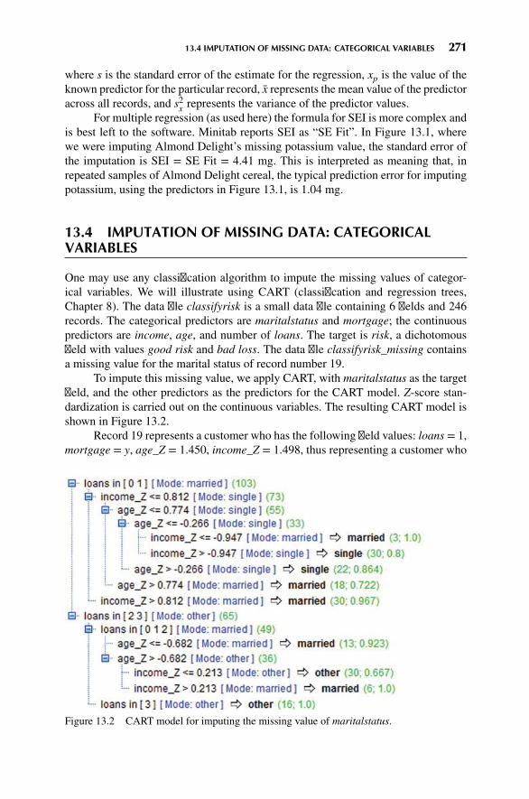
13.4 IMPUTATION OF MISSING DATA: CATEGORICAL VARIABLES 271
where s is the standard error of the estimate for the regression, xp is the value of theknown predictor for the particular record, x represents the mean value of the predictoracross all records, and s2x represents the variance of the predictor values.
For multiple regression (as used here) the formula for SEI is more complex andis best left to the software. Minitab reports SEI as “SE Fit”. In Figure 13.1, wherewe were imputing Almond Delight’s missing potassium value, the standard error ofthe imputation is SEI = SE Fit = 4.41 mg. This is interpreted as meaning that, inrepeated samples of Almond Delight cereal, the typical prediction error for imputingpotassium, using the predictors in Figure 13.1, is 1.04 mg.
13.4 IMPUTATION OF MISSING DATA: CATEGORICALVARIABLES
One may use any classification algorithm to impute the missing values of categor-ical variables. We will illustrate using CART (classification and regression trees,Chapter 8). The data file classifyrisk is a small data file containing 6 fields and 246records. The categorical predictors are maritalstatus and mortgage; the continuouspredictors are income, age, and number of loans. The target is risk, a dichotomousfield with values good risk and bad loss. The data file classifyrisk_missing containsa missing value for the marital status of record number 19.
To impute this missing value, we apply CART, with maritalstatus as the targetfield, and the other predictors as the predictors for the CART model. Z-score stan-dardization is carried out on the continuous variables. The resulting CART model isshown in Figure 13.2.
Record 19 represents a customer who has the following field values: loans = 1,mortgage = y, age_Z = 1.450, income_Z = 1.498, thus representing a customer who
Figure 13.2 CART model for imputing the missing value of maritalstatus.

272 CHAPTER 13 IMPUTATION OF MISSING DATA
is older than average, with higher income than average, with a mortgage and oneother loan. The root node split is on loans; we follow the branch down “loans in[0 1]”. The next split checks whether income_Z is greater than 0.812. We fol-low the branch down “income_Z > 0.812”, which ends at a leaf node containing30 records, 96.7% of which have a marital status of married. Thus, our imputedvalue for the marital status of record 19 is married, with a confidence levelof 96.7%.
13.5 HANDLING PATTERNS IN MISSINGNESS
The analyst should remain aware that imputation of missing data represents replace-ment. The data value is now no longer missing; rather, its “missingness” has beenreplaced with an imputed data value. However, there may be information in the pat-tern of that missingness, information that will be wasted unless some indicator isprovided to the algorithm indicating that this data value had been missing. Forexample, suppose a study is being made of the effect of a new fertility drug onpremenopausal women, and the variable age has some missing values. It is possiblethat there is a correlation between the age of the subject, and the likelihood that thesubject declined to give their age. Thus, it may happen that the missing values for ageare more likely to occur for greater values of age. Because greater age is associatedwith infertility, the analyst must account for this possible correlation, by flaggingwhich cases have had their missing ages imputed.
One method to account for patterns in missingness is simply to construct a flagvariable, as follows:
age missing ={
1 if age value imputed0 otherwise
Add age_missing to the model, and interpret its effect. For example, in aregression model, perhaps the age_missing dummy variable has a negative regressioncoefficient, with a very small p-value, indicating significance. This would indicatethat indeed there is a pattern in the missingness, namely that the effect size of thefertility drug for those cases whose age value was missing tended to be smaller (ormore negative). The flag variable could also be used for classification models, suchas CART or C4.5.
Another method for dealing with missing data is to reduce the weight that thecase wields in the analysis. This does not account for the patterns in missingness, butrather represents a compromise between no indication of missingness and completelyomitting the record. For example, suppose a data set has ten predictors, and Record001 has one predictor value missing. Then this missing value could be imputed, andRecord 001 assigned a weight, say, of 0.90. Then Record 002, with two of ten fieldvalues missing, would be assigned a weight of 0.80. The specific weights assigneddepend on the particular data domain and research question of interest. The algorithmswould then reduce the amount of influence the records with missing data have on theanalysis, proportional to how many fields are missing.

13.5 HANDLING PATTERNS IN MISSINGNESS 273
THE R ZONE
# Input the data set
cereal <- read.csv(file = "C:/ . . . /cereals.txt",stringsAsFactors=FALSE,header=TRUE,sep="\t")
names(cereal)
# Show what type of variable each one is
sapply(cereal, class)# Name, Manuf, and Type are categorical variables# The rest are numeric
# Use the model to estimate missing values
# Almond Delight is record 5;# Cream of Wheat is record 21predict(reg2, newdata = cereal[5,])predict(reg2, newdata = cereal[21,])
# Read in the ClassifyRisk data set. Install and load the required packages
crisk <- read.csv(file = "C:/ . . . / classifyrisk.txt",stringsAsFactors=TRUE,sep="\t",header=TRUE)
install.packages(c("rpart", "rpart.plot"))library(rpart)library(rpart.plot)# Make Record 19’s marital status missingcrisk[19,4]<-NAcriskna <- crisk

274 CHAPTER 13 IMPUTATION OF MISSING DATA
# Standardize the continuous variables
criskna$zincome <- (criskna$income - mean(criskna$income))/sd(criskna$income)criskna$zage <- (criskna$age - mean(criskna$age))/sd(criskna$age)criskna$zloans <- (criskna$loans - mean(criskna$loans))/sd(criskna$loans)
# Create the dummy variables
unique(cereal$Type) # needs one indicatorunique(cereal$Manuf) # needs six indicatorscereal$Cold <- c(rep(0, length(cereal$Type)))cereal$Manuf_N <- cereal$Manuf_Q <- cereal$Manuf_K <- cereal$Manuf_R <-cereal$Manuf_G <- cereal$Manuf_P <- c(rep(0, length(cereal$Manuf)))
for (i in 1:length(cereal$Type)) {if(cereal$Type[i] == "C") cereal$Cold[i] <- 1if(cereal$Manuf[i] == "N") cereal$Manuf_N[i] <- 1if(cereal$Manuf[i] == "Q") cereal$Manuf_Q[i] <- 1if(cereal$Manuf[i] == "K") cereal$Manuf_K[i] <- 1if(cereal$Manuf[i] == "R") cereal$Manuf_R[i] <- 1if(cereal$Manuf[i] == "G") cereal$Manuf_G[i] <- 1if(cereal$Manuf[i] == "P") cereal$Manuf_P[i] <- 1
}
# Build the regression model
reg1<- lm(Potass ∼ Calories +Protein + Fat + Sodium +Fiber + Carbo + Sugars +Vitamins + Shelf +Weight + Cups + Cold +Manuf_P + Manuf_R +Manuf_G + Manuf_K +Manuf_Q + Manuf_N,data = cereal)
step1 <- step(reg1,direction = "both")
summary(step1)

13.5 HANDLING PATTERNS IN MISSINGNESS 275
# Run the final regression model
# Include only predictors# significant in the# previous analysisreg2<- lm(Potass ∼ Protein +
Fiber + Sugars + Shelf +Weight + Manuf_K,data = cereal)
summary(reg2)
# Apply CART to impute the marital status
imp1 <- rpart(marital_status ∼mortgage + zloans + zage +zincome,data = criskna,model = TRUE,method = "class")
# Plot the decision treerpart.plot(imp1)
# Predict the marital status of Record 19
predict(imp1, criskna[19,])

276 CHAPTER 13 IMPUTATION OF MISSING DATA
REFERENCE
1. The classic text on missing data is: Little, Roderick, and Rubin, Donald, Statistical Analysis withMissing Data, 2nd edn, Wiley, 2002.
EXERCISES
1. Why do we need to impute missing data?
2. When imputing a continuous variable, explain what we use for the set of predictors, andfor the target variable.
3. When imputing a missing value, do we include the original target variable as one of thepredictor variables for the data imputation model? Why or why not?
4. Describe what we should do if there are many variables with many missing values.
5. On your own, think of a data set where a potential pattern in missingness would representgood information.
6. State two methods for handling patterns in missingness.
HANDS-ON ANALYSIS
Use the cereals data set for Exercises 7–12. Report the standard error of each imputation.
7. Impute the potassium content of Almond Delight using multiple regression.
8. Impute the potassium content of Cream of Wheat.
9. Impute the carbohydrates value of Quaker Oatmeal.
10. Impute the sugars value of Quaker Oatmeal.
11. Insert the value obtained in Exercise 10 for the sugars value of Quaker Oatmeal, andimpute the carbohydrates value of Quaker Oatmeal.
12. Compare the standard errors for the imputations obtained in Exercises 9 and 11. Explainwhat you find.
13. Open the ClassifyRisk_Missing data set. Impute the missing value for marital status. Usethe ClassifyRisk_Missing2 data set for Exercises 14–15.
14. Impute all missing values in the data set. Explain the ordering that you are using.
15. Report the standard errors (for continuous values) or confidence levels (for categoricalvalues) for your imputations in Exercise 14. �

CHAPTER14MODEL EVALUATIONTECHNIQUES
14.1 MODEL EVALUATION TECHNIQUES FOR THE DESCRIPTION TASK 278
14.2 MODEL EVALUATION TECHNIQUES FOR THE ESTIMATION ANDPREDICTION TASKS 278
14.3 MODEL EVALUATION TECHNIQUES FOR THE CLASSIFICATIONTASK 280
14.4 ERROR RATE, FALSE POSITIVES, AND FALSE NEGATIVES 280
14.5 SENSITIVITY AND SPECIFICITY 283
14.6 MISCLASSIFICATION COST ADJUSTMENTTO REFLECT REAL-WORLD CONCERNS 284
14.7 DECISION COST/BENEFIT ANALYSIS 285
14.8 LIFT CHARTS AND GAINS CHARTS 286
14.9 INTERWEAVING MODEL EVALUATION WITH MODEL BUILDING 289
14.10 CONFLUENCE OF RESULTS: APPLYING A SUITE OF MODELS 290
THE R ZONE 291
REFERENCE 291
EXERCISES 291
HANDS-ON ANALYSIS 291
As you may recall from Chapter 1, the CRISP cross-industry standard process fordata mining consists of six phases, to be applied in an iterative cycle:
1. Business understanding phase
2. Data understanding phase
3. Data preparation phase
Discovering Knowledge in Data: An Introduction to Data Mining, Second Edition.By Daniel T. Larose and Chantal D. Larose.© 2014 John Wiley & Sons, Inc. Published 2014 by John Wiley & Sons, Inc.
277

278 CHAPTER 14 MODEL EVALUATION TECHNIQUES
4. Modeling phase
5. Evaluation phase
6. Deployment phase
Nestled between the modeling and deployment phases comes the crucial evaluationphase, techniques for which are discussed in this chapter. By the time we arrive at theevaluation phase, the modeling phase has already generated one or more candidatemodels. It is of critical importance that these models be evaluated for quality andeffectiveness before they are deployed for use in the field. Deployment of datamining models usually represents a capital expenditure and investment on the part ofthe company. If the models in question are invalid, the company’s time and moneyare wasted. In this chapter we examine model evaluation techniques for each ofthe six main tasks of data mining: description, estimation, prediction, classification,clustering, and association.
14.1 MODEL EVALUATION TECHNIQUES FOR THEDESCRIPTION TASK
In Chapter 3 we learned how to apply exploratory data analysis (EDA) to learnabout the salient characteristics of a data set. EDA represents a popular and powerfultechnique for applying the descriptive task of data mining. On the other hand, becausedescriptive techniques make no classifications, predictions, or estimates, an objectivemethod for evaluating the efficacy of these techniques can be elusive. The watchwordis common sense. Remember that data mining models should be as transparent aspossible. That is, the results of the data mining model should describe clear patternsthat are amenable to intuitive interpretation and explanation. The effectiveness of yourEDA is best evaluated by the clarity of understanding elicited in your target audience,whether a group of managers evaluating your new initiative or the evaluation board oftheU.S. Food andDrugAdministration assessing the efficacy of a newpharmaceuticalsubmission.
If one insists on using a quantifiable measure to assess description, one mayapply the minimum descriptive length principle. Other things being equal, Occam’srazor (a principle named after the medieval philosopher William of Occam) statesthat simple representations are preferable to complex ones. The minimum descriptivelength principle quantifies this, saying that the best representation (or description) ofa model or body of data is the one that minimizes the information required (in bits)to encode (1) the model and (2) the exceptions to the model.
14.2 MODEL EVALUATION TECHNIQUES FOR THEESTIMATION AND PREDICTION TASKS
For estimation and prediction models, we are provided with both the estimated (orpredicted) value y of the numeric target variable and the actual value y. Therefore,a natural measure to assess model adequacy is to examine the estimation error, or

14.2 MODEL EVALUATION TECHNIQUES FOR THE ESTIMATION AND PREDICTION TASKS 279
residual, |y − y|. Since the average residual is always equal to zero, we cannot use itfor model evaluation; some other measure is needed.
The usual measure used to evaluate estimation or prediction models is themeansquare error (MSE):
MSE =
∑i(yi − yi)
2
n − p − 1
where p represents the number of model parameters. Models are preferred that min-imize MSE. The square root of MSE can be regarded as an estimate of the typicalerror in estimation or prediction when using the particular model. In context, this is
known as the standard error of the estimate and denoted by s =√MSE.
For example, consider Figure 14.1 (excerpted from Chapter 5), which providesthe Minitab regression output for the estimated nutritional rating based on sugarcontent for the 76 breakfast cereals with nonmissing sugar values. Both MSE = 84.0and s = 9.16616 are circled on the output. The value of 9.16616 for s indicates thatthe estimated prediction error from using this regression model to predict nutritionrating based on sugar content alone is 9.16616 rating points.
Is this good enough to proceed to model deployment? That depends on theobjectives of the business or research problem. Certainly the model is simplicityitself, with only one predictor and one response; however, perhaps the predictionerror is too large to consider deployment. Compare this estimated prediction errorwith the value of s obtained by the multiple regression in Figure 5.8 in Chapter 5:s = 7.72769. The estimated error in prediction for the multiple regression is smaller,but more information is required to achieve this, in the form of a second predictor:
Figure 14.1 Regression results, with MSE and s indicated.

280 CHAPTER 14 MODEL EVALUATION TECHNIQUES
sodium. As with so much else in statistical analysis and data mining, there is atrade-off between model complexity and prediction error. The domain experts forthe business or research problem in question need to determine where the point ofdiminishing returns lies.
In Chapter 9, Neural Networks, we examined an evaluation measure that wasrelated to MSE:
SSE =∑
records
∑output nodes
(actual − output)
which represents roughly the numerator ofMSE above. Again, the goal is tominimizethe sum of squared errors over all output nodes. In Chapter 5 we learned anothermeasure of the goodness of a regression model is the coefficient of determination,
R2 = SSRSST
R2 represents the proportion of the variability in the response that is accounted forby the linear relationship between the predictor (or predictors) and the response. Forexample, in Figure 14.1 we see that R2 = 58.4%, which means that 58.4% of thevariability in cereal ratings is accounted for by the linear relationship between ratingsand sugar content. This is actually quite a chunk of the variability, since it leaves only41.6% of the variability left for all other factors.
14.3 MODEL EVALUATION TECHNIQUES FOR THECLASSIFICATION TASK
How dowe assess howwell our classification algorithm is functioning? Classificationassignments could conceivably be made based on coin flips, tea leaves, goat entrails,or a crystal ball. Which evaluative methods should we use to assure ourselves thatthe classifications made by our data mining algorithm are efficacious and accurate?Are we outperforming the coin flips?
In this chapter we examine the following evaluative concepts, methods, andtools: error rate, false positives, false negatives, error cost adjustment, lift, lift charts,and gains charts, in the context of the C5.0 model for classifying income fromChapter 8.
14.4 ERROR RATE, FALSE POSITIVES,AND FALSE NEGATIVES
Recall the Adult data set from Chapter 8 that we applied a C5.0 model for classifyingwhether a person’s income was low (≤$50,000) or high (>$50,000), based on a setof predictor variables which included capital gain, capital loss, marital status, and soon. Let us evaluate the performance of that decision tree classification model (withall levels retained, not just three, as in Figure 8.9), using the notions of error rate,false positives, and false negatives.

14.4 ERROR RATE, FALSE POSITIVES, AND FALSE NEGATIVES 281
The general form of the matrix of the correct and incorrect classifications madeby a classification algorithm, termed the contingency table,1 is shown in Table 14.1.Table 14.2 contains the statistics from the C5.0 model, with “≥ 50K” denoted as thepositive classification. The columns represent the predicted classifications, and therows represent the actual (true) classifications, for each of the 25,000 records. Thereare 19,016 records whose actual value for the target variable income is ≤50,000, andthere are 5984 records whose actual value income is >50,000. The C5.0 algorithmclassified 20,758 of the records as having income ≤50,000, and 4242 records ashaving income >50,000.
Of the 20,758 records whose income is predicted by the algorithm to be≤50,000, 18,197 of these records actually do have low income. However, the algo-rithm incorrectly classified 2561 of these 20,758 records as having income ≤50,000,when their income is actually >50,000.
Now, suppose that this analysis is being carried out for a financial lendingfirm, which is interested in determining whether or not a loan applicant’s incomeis >50,000. A classification of income >50,000 is considered to be positive, sincethe lending firm would then proceed to extend the loan to the person in question. Aclassification of income ≤50,000 is considered to be negative, since the firm would
TABLE 14.1 General form of the contingency table of correct and incorrect classifications
Predicted Category
0 1 Total
0 True negatives:Predicted 0Actually 0
False positives:Predicted 1Actually 0
Total actually negative
Actual category 1 False negatives:Predicted 0Actually 1
True positives:Predicted 1Actually 1
Total actually positive
Total TotalPredicted negative
TotalPredicted positive
Grand total
TABLE 14.2 Contingency table for the C5.0 model
Predicted Category
≤50K >50K Total
≤50K 18,197 819 19,016
Actual category >50K 2561 3423 5984
Total 20,758 4242 25,000
1Also referred to as the confusion matrix or the error matrix.

282 CHAPTER 14 MODEL EVALUATION TECHNIQUES
proceed to deny the loan application to the person, based on low income (in thissimplified scenario). Assume that in the absence of other information, the defaultdecision would be to deny the loan due to low income.
Thus, the 20,758 classifications (predictions) of income ≤50,000 are said to benegatives, and the 4242 classifications of income>50,000 are said to be positives. The2561 negative classifications that were made in error are said to be false negatives.That is, a false negative represents a record that is classified as negative but is actuallypositive. Of the 4242 positive classifications, 819 actually had low incomes, so thatthere are 819 false positives. A false positive represents a record that is classified aspositive but is actually negative.
Let TN, FN, FP, and TP represent the numbers of true negatives, false negatives,false positives, and true positives, respectively, in our contingency table. Then wemay define our evaluation measures as follows.
Overall Error Rate = FN + FPTN + FN + FP + TP
Overall Accuracy = 1 − Overall Error Rate = TN + TPTN + FN + FP + TP
Proportion of False Positives = PFP = FPFP + TP
Proportion of False Negatives = PFN = FNFN + TN
Higher is better for Overall Accuracy, Sensitivity, and Specificity; lower is better forOverall Error Rate, PFP, and PFN.
The overall error rate, or simply the error rate, is the sum of the false negativesand false positives, divided by the total number of records. Here we have
overall error rate = FN + FPTN + FN + FP + TP
= 2561 + 81925,000
= 0.1352
To find the proportion of false negatives, divide the number of false negatives bythe total number of negative classifications. Similarly, to find the proportion of falsepositives, divide the number of false positives by the total number of positive classi-fications. Here we have
proportion of false negatives = PFN = 256120,758
= 0.1234
proportion of false positives = PFP = 8194242
= 0.1931
That is, using the present C5.0 decision tree model, we are more likely to classify anapplicant’s income incorrectly as high than to classify an applicant’s income incor-rectly as low. Using error rate, false positive rate, and proportion of false negatives,analysts may compare the accuracy of various models. For example, a C5.0 decisiontree model may be compared against a CART decision tree model or a neural networkmodel. Model choice decisions can then be rendered based on the relative rankingsof these evaluation measures.

14.5 SENSITIVITY AND SPECIFICITY 283
As an aside, in the parlance of hypothesis testing, since the default decision isto find that the applicant has low income, we would have the following hypotheses:
H0 : income ≤ 50,000
Ha : income > 50,000
whereH0 represents the default, or null, hypothesis, andHa represents the alternativehypothesis,which requires evidence to support it. A false positivewould be considereda type I error in this setting, incorrectly rejecting the null hypothesis, while a falsenegativewould be considered a type II error, incorrectly accepting the null hypothesis.
14.5 SENSITIVITY AND SPECIFICITY
A good classification model should be sensitive, meaning that it should identify ahigh proportion of the customers who are positive (have high income). Sensitivity isdefined as
Sensitivity =Number of true positives
Number of actual positives= TP
TP + FN
For example, fromTable 14.2, we calculate the sensitivity of our income classificationmodel to be:
Sensitivity =Number of true positives
Number of actual positives= 3423
5984= 0.5720
This statistic is interpreted as follows: our classificationmodel has correctly classified57.20% of the actual high income customers as having high income.
In some fields, such as information retrieval [1], sensitivity is referred to asrecall. Of course, a perfect classification model would have sensitivity = 1.0 =100%. However, a null model which simply classified all customers as positivewould also have sensitivity = 1.0. Clearly, it is not sufficient to identify the positiveresponses alone.
A classification model also needs to be specific, meaning that it should identifya high proportion of the customers who are negative (have low income). Specificityis defined as
Specificity =Number of true negatives
Number of actual negatives= TN
FP + TN
From Table 14.2, we compute the specificity of our income classification modelto be:
Specificity =Number of true negatives
Number of actual negatives= 18,197
19,016= 0.9569
Thus, our classification model has correctly classified 95.69% of the actual lowincome customers as having low income.
Of course, a perfect classification model would have specificity = 1.0. But sowould a model which classifies all customers as low income. A good classificationmodel should have acceptable levels of both sensitivity and specificity, but what
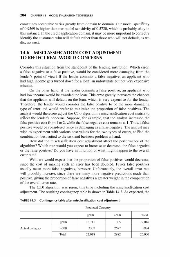
284 CHAPTER 14 MODEL EVALUATION TECHNIQUES
constitutes acceptable varies greatly from domain to domain. Our model specificityof 0.9569 is higher than our model sensitivity of 0.5720, which is probably okay inthis instance. In the credit application domain, it may be more important to correctlyidentify the customers who will default rather than those who will not default, as wediscuss next.
14.6 MISCLASSIFICATION COST ADJUSTMENTTO REFLECT REAL-WORLD CONCERNS
Consider this situation from the standpoint of the lending institution. Which error,a false negative or a false positive, would be considered more damaging from thelender’s point of view? If the lender commits a false negative, an applicant whohad high income gets turned down for a loan: an unfortunate but not very expensivemistake.
On the other hand, if the lender commits a false positive, an applicant whohad low income would be awarded the loan. This error greatly increases the chancesthat the applicant will default on the loan, which is very expensive for the lender.Therefore, the lender would consider the false positive to be the more damagingtype of error and would prefer to minimize the proportion of false positives. Theanalyst would therefore adjust the C5.0 algorithm’s misclassification cost matrix toreflect the lender’s concerns. Suppose, for example, that the analyst increased thefalse positive cost from 1 to 2, while the false negative cost remains at 1. Thus, a falsepositive would be considered twice as damaging as a false negative. The analyst maywish to experiment with various cost values for the two types of errors, to find thecombination best suited to the task and business problem at hand.
How did the misclassification cost adjustment affect the performance of thealgorithm? Which rate would you expect to increase or decrease, the false negativeor the false positive? Do you have an intuition of what might happen to the overallerror rate?
Well, we would expect that the proportion of false positives would decrease,since the cost of making such an error has been doubled. Fewer false positivesusually mean more false negatives, however. Unfortunately, the overall error ratewill probably increase, since there are many more negative predictions made thanpositive, giving the proportion of false negatives a greater weight in the computationof the overall error rate.
The C5.0 algorithm was rerun, this time including the misclassification costadjustment. The resulting contingency table is shown in Table 14.3. As expected, the
TABLE 14.3 Contingency table after misclassification cost adjustment
Predicted Category
≤50K >50K Total
≤50K 18,711 305 19,016
Actual category >50K 3307 2677 5984
Total 22,018 2982 25,000

14.7 DECISION COST/BENEFIT ANALYSIS 285
proportion of false negatives has increased, while the proportion of false positives hasdecreased. Whereas previously, false positives were more likely to occur, this timethe proportion of false positives is lower than the proportion of false negatives. Asdesired, the proportion of false positives has decreased. However, this has come ata cost. The algorithm, hesitant to classify records as positive due to the higher cost,instead made many more negative classifications, and therefore more false negatives.
proportion of false negatives = 330722,018
= 0.1501, up from 0.1234 previously,
proportion of false positives = 3052982
= 0.1023, down from 0.1931 previously.
Unfortunately, the overall error rate has climbed as well:
overall error rate = 3307 + 30525,000
= 0.14448, up from 0.1352 previously.
Nevertheless, a higher overall error rate and a higher proportion of false negatives areconsidered a “good trade” by this lender, who is eager to reduce the loan default rate,which is very costly to the firm. The decrease in the proportion of false positives from19.31% to 10.23% will surely result in significant savings to the financial lendingfirm, since fewer applicants who cannot afford to repay the loan will be awarded theloan. Data analysts should note an important lesson here: that we should not be wedto the overall error rate as the best indicator of a good model.
14.7 DECISION COST/BENEFIT ANALYSIS
Company managers may require that model comparisons be made in terms ofcost/benefit analysis. For example, in comparing the original C5.0 model beforethe misclassification cost adjustment (call thismodel 1) against the C5.0 model usingthe misclassification cost adjustment (call thismodel 2), managers may prefer to havethe respective error rates, false negatives and false positives, translated into dollarsand cents.
Analysts can provide model comparison in terms of anticipated profit or loss byassociating a cost or benefit with each of the four possible combinations of correct andincorrect classifications. For example, suppose that the analyst makes the cost/benefitvalue assignments shown in Table 14.4. The “–$300” cost is actually the anticipatedaverage interest revenue to be collected from applicants whose income is actually
TABLE 14.4 Cost/benefit table for each combination of correct/incorrect decision
Outcome Classification Actual Value Cost Rationale
True negative ≤50,000 ≤50,000 $0 No money gained or lostTrue positive >50,000 >50,000 –$300 Anticipated average interest
revenue from loansFalse negative ≤50,000 >50,000 $0 No money gained or lostFalse positive >50,000 ≤50,000 $500 Cost of loan default averaged over
all loans to ≤50,000 group

286 CHAPTER 14 MODEL EVALUATION TECHNIQUES
>50,000. The $500 reflects the average cost of loan defaults, averaged over all loansto applicants whose income level is low. Of course, the specific numbers assignedhere are subject to discussion and are meant for illustration only.
Using the costs from Table 14.4, we can then compare models 1 and 2:Cost of Model 1 (False positive cost not doubled):
18,197($0) + 3423(−$200) + 2561($0) + 819($500) = −$275,100
Cost of Model 2 (False positive cost doubled):
18,711($0) + 2677(−$200) + 3307($0) + 305($500) = −$382,900
Negative costs represent profits. Thus, the estimated cost savings from deploy-ing model 2, which doubles the cost of a false positive error, is
−$275,100 − (−$382,900) = $107,800
In other words, the simple data mining step of doubling the false positive costhas resulted in the deployment of a model greatly increasing the company’s profit.Is not it amazing what a simple misclassification cost adjustment can mean to thecompany’s bottom line? Thus, even though model 2 suffered from a higher overallerror rate and a higher proportion of false negatives, it outperformedmodel 1 “where itcounted,” with a lower proportion of false positives, which led directly to a six-figureincrease in the company’s estimated profit.
14.8 LIFT CHARTS AND GAINS CHARTS
In Chapter 12 we were introduced to the concept of lift for association rules. Forclassificationmodels, lift is a concept, originally from themarketing field,which seeksto compare the response rates with and without using the classification model. Liftcharts and gains charts are graphical evaluative methods for assessing and comparingthe usefulness of classificationmodels.We shall explore these concepts by continuingour examination of the C5.0 models for classifying income.
Suppose that the financial lending firm is interested in identifying high incomepersons to put together a targeted marketing campaign for a new platinum credit card.In the past, marketers may have simply canvassed an entire list of contacts withoutregard to clues about the contact’s income. Such blanket initiatives are expensive andtend to have low response rates. It is much better to apply demographic informationthat the company may have about the list of contacts, build a model to predict whichcontacts will have high income, and restrict the canvassing to these contacts classifiedas high income. The cost of the marketing program will then be much reduced andthe response rate may be higher.
A good classification model should identify in its positive classifications (the>50,000 column in Tables 14.2 and 14.3), a group that has a higher proportionof positive “hits” than the database as a whole. The concept of lift quantifies this.

14.8 LIFT CHARTS AND GAINS CHARTS 287
We define lift as the proportion of positive hits in the set of the model’s positiveclassifications, divided by the proportion of positive hits in the data set overall:
lift =proportion of positive hits in set of positive classifications
proportion of positive hits in data set as a whole
For example, in Table 14.2, model 1 identifies 4242 records as being classifiedpositive (income >50,000). This is the set of positive classifications. Of these 4242,3423 records are positive hits; that is, the actual value of income is >50,000. Thisgives us 3423/4242 = 0.8069 as the proportion of positive hits in the set of positiveclassifications. Now, in the data set as a whole, 5984 of the 25,000 records haveincome >50,000, giving us 5984/25,000 = 0.23936 as the proportion of positive hitsin the data set as a whole. The lift, measured at the 4242 positively predicted records,is therefore 0.8069/0.23936 = 3.37.
Lift is a function of sample size, which is why we had to specify that the liftof 3.37 for model 1 was measured at n = 4242 records. When calculating lift, thesoftware will first sort the records by the probability of being classified positive. Thelift is then calculated for every sample size from n = 1 to n = the size of the data set.A chart is then produced which graphs lift against the percentile of the data set.
Consider Figure 14.2, which represents the lift chart for model 1. Note thatlift is highest at the lowest percentiles, which makes sense since the data are sortedaccording to the most likely positive hits. The lowest percentiles have the highestproportion of positive hits. As the plot moves from left to right, the positive hits tendto get “used up,” so that the proportion steadily decreases until the lift finally equalsexactly 1 when the entire data set is considered the sample. Therefore, for any liftchart, the highest lift is always obtained with the smallest sample sizes.
Now, 4242 records represents about the 17th percentile of the 25,000 totalrecords. Note in Figure 14.2 that the lift at about the 17th percentile would be near3.37, as we calculated above. If our market research project required merely the
00.5
1
1.5
2
2.5
Lift
3
3.5
4
4.5
20 40
Percentiles
60 80 100
Figure 14.2 Lift chart for model 1: strong lift early, then falls away rapidly.

288 CHAPTER 14 MODEL EVALUATION TECHNIQUES
most likely 5% of records, the lift would have been higher, about 4.1, as shown inFigure 14.2. On the other hand, if the project required 60% of all records, the liftwould have fallen off to about 1.6. Since the data are sorted by positive propensity,the further we reach into the data set, the lower our overall proportion of positive hitsbecomes. Another balancing act is required: between reaching lots of contacts andhaving a high expectation of success per contact.
Lift charts are often presented in their cumulative form, where they are denotedas cumulative lift charts, or gains charts. The gains chart associated with the liftchart in Figure 14.2 is presented in Figure 14.3. The diagonal on the gains chart isanalogous to the horizontal axis at lift = 1 on the lift chart. Analysts would like to seegains charts where the upper curve rises steeply as one moves from left to right andthen gradually flattens out. In other words, one prefers a deeper “bowl” to a shallowerbowl. How do you read a gains chart? Suppose that we canvassed the top 20% of ourcontact list (percentile = 20). By doing so, we could expect to reach about 62% ofthe total number of high income persons on the list. Would doubling our effort alsodouble our results? No. Canvassing the top 40% on the list would enable us to reachapproximately 85% of the high income persons on the list. Past this point, the law ofdiminishing returns is strongly in effect.
Lift charts and gains charts can also be used to compare model performance.Figure 14.4 shows the combined lift chart for models 1 and 2. The figure shows thatwhen it comes tomodel selection, a particularmodelmay not be uniformly preferable.For example, up to about the 6th percentile, there appears to be no apparent differencein model lift. Then, up to approximately the 17th percentile, model 2 is preferable,providing slightly higher lift. Thereafter, model 1 is preferable.
Hence, if the goal were to canvass up to the top 17% or so of the people on thecontact list with high incomes, model 2 would probably be selected. However, if thegoal were to extend the reach of the marketing initiative to 20% or more of the likelycontacts with high income, model 1 would probably be selected. This question of
00
20
40
% G
ain
60
100
80
20 40
Percentiles
60 80 100
Figure 14.3 Gains chart for model 1.
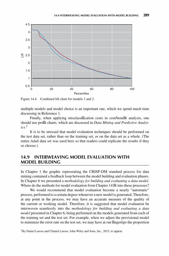
14.9 INTERWEAVING MODEL EVALUATION WITH MODEL BUILDING 289
00.5
1
1.5
2
2.5Lift
3
3.5
4
4.5
20 40
Percentiles
60 80 100
Figure 14.4 Combined lift chart for models 1 and 2.
multiple models and model choice is an important one, which we spend much timediscussing in Reference 1.
Finally, when applying misclassification costs in cost/benefit analysis, oneshould use profit charts, which are discussed in Data Mining and Predictive Analyt-ics.2
It is to be stressed that model evaluation techniques should be performed onthe test data set, rather than on the training set, or on the data set as a whole. (Theentire Adult data set was used here so that readers could replicate the results if theyso choose.)
14.9 INTERWEAVING MODEL EVALUATION WITHMODEL BUILDING
In Chapter 1 the graphic representing the CRISP-DM standard process for datamining contained a feedback loop between the model building and evaluation phases.In Chapter 6 we presented a methodology for building and evaluating a data model.Where do the methods for model evaluation from Chapter 14 fit into these processes?
We would recommend that model evaluation become a nearly “automatic”process, performed to a certain degree whenever a newmodel is generated. Therefore,at any point in the process, we may have an accurate measure of the quality ofthe current or working model. Therefore, it is suggested that model evaluation beinterwoven seamlessly into the methodology for building and evaluating a datamodel presented in Chapter 6, being performed on the models generated from each ofthe training set and the test set. For example, when we adjust the provisional modelto minimize the error rate on the test set, we may have at our fingertips the proportion
2By Daniel Larose and Chantal Larose, John Wiley and Sons, Inc., 2015, to appear.

290 CHAPTER 14 MODEL EVALUATION TECHNIQUES
of false positives, the proportion of false negatives, the overall error rate, the liftcharts, and the gains charts. These evaluative measures can then point the analyst inthe proper direction for best ameliorating any drawbacks of the working model.
14.10 CONFLUENCE OF RESULTS: APPLYING A SUITEOF MODELS
In Olympic figure skating, the best-performing skater is not selected by a single judgealone. Instead, a suite of several judges is called upon to select the best skater fromamong all the candidate skaters. Similarly in model selection, whenever possible, theanalyst should not depend solely on a single data mining method. Instead, he or sheshould seek a confluence of results from a suite of different data mining models.
For example, for the adult database, Figures 8.5, 8.7, and 9.9 show that thevariables listed in Table 14.5 are the most influential (ranked roughly in order ofimportance) for classifying income, as identified by CART, C5.0, and the neuralnetwork algorithm, respectively. Although there is not a perfect match in the orderingof the important variables, there is still much that these three separate classificationalgorithms have uncovered, including the following:
� All three algorithms identify Marital_Status, education-num, capital-gain,capital-loss, and hours-per-week as the most important variables, except forthe neural network, where age snuck in past capital-loss.
� None of the algorithms identified either work-class or sex as important vari-ables, and only the neural network identified age as important.
� The algorithms agree on various ordering trends, such as education-num ismore important than hours-per-week.
When we recall the strongly differing mathematical bases on which these threedata mining methods are built, it may be considered remarkable that such convincingconcurrence prevails among them with respect to classifying income. Remember thatCART bases its decisions on the “goodness of split” criterionΦ(s|t), that C5.0 appliesan information-theoretic approach, and that neural networks base their learning onback-propagation. Yet these three different algorithms represent streams that broadlyspeaking, have come together, forming a confluence of results. In this way, the modelsact as validation for each other.
TABLE 14.5 Most important variables for classifying income, as identified by CART, C5.0,and the neural network algorithm
CART C5.0 Neural Network
Marital_Status Capital-gain Capital-gainEducation-num Capital-loss Education-numCapital-gain Marital_Status Hours-per-weekCapital-loss Education-num Marital_StatusHours-per-week Hours-per-week Age Capital-loss

EXERCISES 291
THE R ZONE
# Install the required package
install.packages("C50")library("C50")
# The confusion matrix
# After using the C5.0 package, the confusion matrix is included in the output of summary()# See Chapter 8 for data preparation and code to implement the C5.0 package
# Add costs to the model
#After running data preparation from Chapter 8x <- dat[,c(2,6, 9, 10, 16, 17, 18, 19, 20)]y <- dat$income# Without weights:c50fit <- C5.0(x, y)summary(c50fit)
# With weights:costm <- matrix(c(1, 2, 1, 1),
byrow = FALSE,2, 2)
c50cost <- C5.0(x, y,costs = costm)
summary(c50cost)
REFERENCE
1. Zdravko Markov and Daniel Larose, Data Mining the Web, Uncovering Patterns in Web Content,Structure, and Usage, John Wiley and Sons, New York, 2007.
EXERCISES
HANDS-ON ANALYSIS
Use the churn data set at the book series website for the following exercises. Make sure thatthe correlated variables have been accounted for.

292 CHAPTER 14 MODEL EVALUATION TECHNIQUES
1. Apply a CARTmodel for predicting churn. Use default misclassification costs. Determinethe following measures.
a. Proportion of false positives.
b. Proportion of false negatives.
c. Overall error rate.
d. Overall model accuracy (1 – overall error rate).
e. Sensitivity
f. Specificity
2. In a typical churn model, in which interceding with a potential churner is relatively cheapbut losing a customer is expensive, which error is more costly, a false negative or a falsepositive (where positive = customer predicted to churn)? Explain.
3. Based on your answer to Exercise 2, adjust the misclassification costs for your CARTmodel to reduce the prevalence of themore costly type of error. Rerun the CART algorithm.Compare the false positive, false negative, sensitivity, specificity, and overall error ratewith the previous model. Discuss the trade-off between the various rates in terms of costfor the company.
4. Perform a cost/benefit analysis for the default CART model from exercise 1 as follows.Assign a cost or benefit in dollar terms for each combination of false and true positivesand negatives, similar to Table 14.4. Then, using the contingency table, find the overallanticipated cost.
5. Perform a cost/benefit analysis for the CART model with the adjusted misclassificationcosts. Use the same cost/benefits assignments as for the default model. Find the overallanticipated cost. Compare with the default model, and formulate a recommendation as towhich model is preferable.
6. Construct a lift chart for the default CARTmodel. What is the estimated lift at 20%? 33%?40%? 50%?
7. Construct a gains chart for the default CART model. Explain the relationship between thischart and the lift chart.
8. Construct a lift chart for the CART model with the adjusted misclassification costs. Whatis the estimated lift at 20%? 33%? 40%? 50%?
9. Construct a single lift chart for both of the CART models. Which model is preferable overwhich regions?
10. Now turn to a C4.5 decision tree model, and redo Exercises 1–9. Compare the results.Which model is preferable?
11. Next, apply a neural network model to predict churn. Calculate the following measures.
a. Proportion of false positives.
b. Proportion of false negatives.
c. Overall error rate.
d. Overall model accuracy (1 – overall error rate).
e. Sensitivity
f. Specificity

EXERCISES 293
12. Construct a lift chart for the neural network model. What is the estimated lift at 20%?33%? 40%? 50%?
13. Construct a single lift chart which includes the better of the two CART models, the betterof the two C4.5 models, and the neural network model. Which model is preferable overwhich regions?
14. In view of the results obtained above, discuss the overall quality and adequacy of ourchurn classification models. �

APPENDIX
DATA SUMMARIZATION ANDVISUALIZATION
PART 1 SUMMARIZATION 1: BUILDING BLOCKS OF DATA ANALYSIS 294
PART 2 VISUALIZATION: GRAPHS AND TABLES FOR SUMMARIZINGAND ORGANIZING DATA 296
PART 3 SUMMARIZATION 2: MEASURES OF CENTER, VARIABILITY, ANDPOSITION 301
PART 4 SUMMARIZATION AND VISUALIZATION OF BIVARIATERELATIONSHIPS 304
Here, we present a very brief review of methods for summarizing and visualizingdata. For deeper coverage, please seeDiscovering Statistics, byDaniel Larose (secondedition, W.H. Freeman, New York, 2013).
PART 1 SUMMARIZATION 1: BUILDING BLOCKSOF DATA ANALYSIS
� Descriptive statistics refers to methods for summarizing and organizing theinformation in a data set.Consider Table A.1, which we will use to illustrate some statistical concepts.
� The entities for which information is collected are called the elements. InTable A.1, the elements are the 10 applicants. Elements are also called casesor subjects.
� A variable is a characteristic of an element, which takes on different valuesfor different elements. The variables in Table A.1 are marital status, mortgage,income, rank, year, and risk. Variables are also called attributes.
Discovering Knowledge in Data: An Introduction to Data Mining, Second Edition.By Daniel T. Larose and Chantal D. Larose.© 2014 John Wiley & Sons, Inc. Published 2014 by John Wiley & Sons, Inc.
294

APPENDIX DATA SUMMARIZATION AND VISUALIZATION 295
TABLE A.1 Characteristics of 10 loan applicants
Applicant Marital Status Mortgage Income ($) Income Rank Year Risk
1 Single y 38,000 2 2009 Good2 Married y 32,000 7 2010 Good3 Other n 25,000 9 2011 Good4 Other n 36,000 3 2009 Good5 Other y 33,000 4 2010 Good6 Other n 24,000 10 2008 Bad7 Married y 25,100 8 2010 Good8 Married y 48,000 1 2007 Good9 Married y 32,100 6 2009 Bad10 Married y 32,200 5 2010 Good
� The set of variable values for a particular element is an observation. Observa-tions are also called records. The observation for Applicant 2 is:
Applicant Marital Status Mortgage Income ($) Income Rank Year Risk
2 Married y 32,000 7 2010 Good
� Variables can be either qualitative or quantitative.� A qualitative variable enables the elements to be classified or categorizedaccording to some characteristic. The qualitative variables in Table A.1 aremarital status, mortgage, rank, and risk. Qualitative variables are also calledcategorical variables.
� A quantitative variable takes numeric values and allows arithmetic to bemeaningfully performed on it. The quantitative variables in Table A.1 areincome and year. Quantitative variables are also called numerical variables.
� Data may be classified according to four levels of measurement: nominal,ordinal, interval, and ratio. Nominal and ordinal data are categorical; intervaland ratio data are numerical.� Nominal data refer to names, labels, or categories. There is no naturalordering, nor may arithmetic be carried out on nominal data. The nominalvariables in Table A.1 are marital status, mortgage, and risk.
� Ordinal data can be rendered into a particular order. However, arithmeticcannot be meaningfully carried out on ordinal data. The ordinal variable inTable A.1 is income rank.
� Interval data consist of quantitative data defined on an interval without anatural zero. Addition and subtraction may be performed on interval data.The interval variable in Table A.1 is year. (Note that there is no “year zero.”The calendar goes from 1 B.C. to 1 A.D.)
� Ratio data are quantitative data for which addition, subtraction, multipli-cation, and division may be performed. A natural zero exists for ratio data.The interval variable in Table A.1 is income.
� A numerical variable that can take either a finite or a countable number ofvalues is a discrete variable, for which each value can be graphed as a

296 APPENDIX DATA SUMMARIZATION AND VISUALIZATION
separate point,with space between each point. The discrete variable inTableA.1is year.
� A numerical variable that can take infinitely many values is a continuousvariable, whose possible values form an interval on the number line, with nospace between the points. The continuous variable in Table A.1 is income.
� A population is the set of all elements of interest for a particular problem.A parameter is a characteristic of a population. For example, the populationis the set of all American voters, and the parameter is the proportion of thepopulation who supports a $1 per ton tax on carbon.� The value of a parameter is usually unknown, but it is a constant.
� A sample consists of a subset of the population. A characteristic of a sampleis called a statistic. For example, the sample is the set of American voters inyour classroom, and the statistic is the proportion of the sample who supportsa $1 per ton tax on carbon.� The value of a statistic is usually known, but it changes from sample tosample.
� A census is the collection of information from every element in the population.For example, the census here would be to find from every American voterwhether they support a $1 per ton tax on carbon. Such a census is impractical,so we turn to statistical inference.
� Statistical inference refers to methods for estimating or drawing conclusionsabout population characteristics based on the characteristics of a sample of thatpopulation. For example, suppose 50% of the voters in your classroom supportthe tax; using statistical inference, we would infer that 50% of all Americanvoters support the tax. Obviously, there are problems with this. The sampleis neither random nor representative. The estimate does not have a confidencelevel, and so on.
� When we take a sample for which each element has an equal chance of beingselected, we have a random sample.
� A predictor variable is a variable whose value is used to help predict thevalue of the response variable. The predictor variables in Table A.1 are all thevariables except risk.
� A response variable is a variable of interest whose value is presumably deter-mined at least in part by the set of predictor variables. The response variable inTable A.1 is risk.
PART 2 VISUALIZATION: GRAPHS AND TABLES FORSUMMARIZING AND ORGANIZING DATA
2.1 Categorical Variables� The frequency (or count) of a category is the number of data values in eachcategory. The relative frequency of a particular category for a categoricalvariable equals its frequency divided by the number of cases.

APPENDIX DATA SUMMARIZATION AND VISUALIZATION 297
TABLE A.2 Frequency distribution and relative frequency distribution
Category of Marital Status Frequency Relative Frequency
Married 5 0.5Other 4 0.4Single 1 0.1
Total 10 1.0
� A (relative) frequency distribution for a categorical variable consists of all thecategories that the variable assumes, together with the (relative) frequencies foreach value. The frequencies sum to the number of cases; the relative frequenciessum to 1.
For example Table A.2 contains the frequency distribution and rela-tive frequency distribution for the variable marital status for the data fromTable A.1.
� A bar chart is a graph used to represent the frequencies or relative frequenciesfor a categorical variable. Note that the bars do not touch.� A Pareto chart is a bar chart where the bars are arranged in decreasingorder. Figure A.1 is an example of a Pareto chart.
� A pie chart is a circle divided into slices, with the size of each slice proportionalto the relative frequency of the category associated with that slice. Figure A.2shows a pie chart of marital status.
2.2 Quantitative Variables� Quantitative data are grouped into classes. The lower (upper) class limit ofa class equals the smallest (largest) value within that class. The class width isthe difference between successive lower class limits.
Married0
1
2Freq
uen
cy 3
4
5
Other
Marital status
Single
Figure A.1 Bar chart for marital status.

298 APPENDIX DATA SUMMARIZATION AND VISUALIZATION
Married
5, 50.0%
Category
Married
Other
Single
Single
1, 10.0%
Other
4, 40.0%
Figure A.2 Pie chart of marital status.
� For quantitative data, a (relative) frequency distribution divides the data intononoverlapping classes of equal classwidth. TableA.3 shows the frequency dis-tribution and relative frequency distribution of the continuous variable incomefrom Table A.1.
� A cumulative (relative) frequency distribution shows the total number (rel-ative frequency) of data values less than or equal to the upper class limit. SeeTable A.4.
� A distribution of a variable is a graph, table, or formula that specifies the valuesand frequencies of the variable for all elements in the data set. For example,Table A.3 represents the distribution of the variable income.
� A histogram is a graphical representation of a (relative) frequency distributionfor a quantitative variable. See Figure A.3. Note that histograms represent asimple version of data smoothing and can thus vary in shape depending on thenumber and width of the classes. Therefore, histograms should be interpretedwith caution. See Discovering Statistics, by Daniel Larose (W.H. Freeman)section 2.4 for an example of a data set presented as both symmetric andright-skewed by altering the number and width of the histogram classes.
� A stem-and-leaf display shows the shape of the data distribution while retain-ing the original data values in the display, either exactly or approximately. The
TABLE A.3 Frequency distribution and relative frequency distribution of income
Class of Income Frequency Relative Frequency
$24,000–$29,999 3 0.3$30,000–$35,999 4 0.4$36,000–$41,999 2 0.2$42,000–$48,999 1 0.1
Total 10 1.0

APPENDIX DATA SUMMARIZATION AND VISUALIZATION 299
TABLE A.4 Cumulative frequency distribution and cumulative relative frequencydistribution of income
Cumulative CumulativeClass of Income Frequency Relative Frequency
$24,000–$29,999 3 0.3$30,000–$35,999 7 0.7$36,000–$41,999 9 0.9$42,000–$48,999 10 1.0
leaf units are defined to equal a power of 10, and the stem units are 10 timesthe leaf units. Then each leaf represents a data value, through a stem-and-leafcombination. For example, in Figure A.4, the leaf units (right-hand column)are 1000s and the stem units (left-hand column) are 10,000s. So “2 4” rep-resents 2 × 10, 000 + 4 × 1000 = $24, 000, while “2 55” represents two equalincomes of $25,000 (one of which is exact, the other approximate, $25,100).Note that Figure A.4, turned 90 degrees to the left, presents the shape of thedata distribution.
� In a dotplot, each dot represents one or more data values, set above the numberline. See Figure A.5.
� A distribution is symmetric if there exists an axis of symmetry (a line) thatsplits the distribution into two halves that are approximately mirror images ofeach other (Figure A.6a).
� Right-skewed data have a longer tail on the right than the left (Figure A.6b).Left-skewed data have a longer tail on the left than the right (Figure A.6c).
24,0000
1
2
Freq
uen
cy
3
4
30,000 36,000
Income
42,000 48,000
Figure A.3 Histogram of income.

300 APPENDIX DATA SUMMARIZATION AND VISUALIZATION
Figure A.4 Stem-and-leaf display of income.
24,000 28,000 32,000 36,000
Income
40,000 44,000 48,000
Figure A.5 Dotplot of income.
Bell-shaped curve is symmetric
(a)
Right-skewed distribution(b)
Left-skewed distribution
(c)
Figure A.6 Symmetric and skewed curves.
APPENDIX DATA SUMMARIZATION AND VISUALIZATION 301
PART 3 SUMMARIZATION 2: MEASURES OF CENTER,VARIABILITY, AND POSITION
� The summation notation∑x means to add up all the data values x. The sample
size is n and the population size is N.� Measures of center indicate where on the number line the central part of thedata is located. The measures of center we will learn are the mean, the median,the mode, and the midrange.� Themean is the arithmetic average of a data set. To calculate the mean, addup the values and divide by the number of values. The mean income fromTable A.1 is
38,000 + 32,000 +⋯ + 32,20010
= 325,40010
= $32,540
� The sample mean is the arithmetic average of a sample, and is denoted x(“x-bar”).
� The population mean is the arithmetic average of a population, and isdenoted 𝜇 (“myu”, the Greek letter for m).
� The median is the middle data value, when there is an odd number of datavalues and the data have been sorted into ascending order. If there is aneven number, the median is the mean of the two middle data values. Whenthe income data are sorted into ascending order, the two middle values are$32,100 and $32,200, the mean of which is the median income, $32,150.
� The mode is the data value that occurs with the greatest frequency. Bothquantitative and categorical variables can have modes, but only quantitativevariables can have means or medians. Each income value occurs only once,so there is no mode. The mode for year is 2010, with a frequency of 4.
� Themidrange is the average of the maximum and minimum values in a dataset. The midrange income is
midrange (income) = (max (income) + min (income))2
= 48,000 + 24,0002
= $36,000
� Skewness and measures of center. The following are tendencies, and notstrict rules.� For symmetric data, the mean and the median are approximately equal.� For right-skewed data, the mean is greater than the median.� For left-skewed data, the median is greater than the mean.
� Measures of variability quantify the amount of variation, spread, or dispersionpresent in the data. The measures of variability we will learn are the range, thevariance, the standard deviation, and, later, the interquartile range.

302 APPENDIX DATA SUMMARIZATION AND VISUALIZATION
� The range of a variable equals the difference between the maximum andminimum values. The range of income is
Range = max (income) − min (income) = 48,000 − 24,000 = $24,000.
� A deviation is the signed difference between a data value, and the meanvalue. For Applicant 1, the deviation in income equals x − x = 38,000 −32,540 = 5,460. For any conceivable data set, the mean deviation alwaysequals zero, because the sum of the deviations equals zero.
� The population variance is the mean of the squared deviations, denoted as𝜎2 (“sigma-squared”):
𝜎2 =∑
(x − 𝜇)2
N� The population standard deviation is the square root of the population
variance: 𝜎 =√𝜎2.
� The sample variance is approximately the mean of the squared deviations,with n replaced by n – 1 in the denominator in order to make it an unbiasedestimator of 𝜎2. (An unbiased estimator is a statistic whose expected valueequals its target parameter.)
s2 =∑(x − x)2
n − 1� The sample standard deviation is the square root of the sample variance:
s =√s2.
� The variance is expressed in units squared, an interpretation that may beopaque to nonspecialists. For this reason, the standard deviation, whichis expressed in the original units, is preferred when reporting results. Forexample, the sample variance of income is s2 =51,860,444 dollars squared,the meaning of which may be unclear to clients. Better to report the samplestandard deviation s = $7201.
� The sample standard deviation s is interpreted as the size of the typicaldeviation, that is, the size of the typical difference between data values andthe mean data value. For example, incomes typically deviate from their meanby $7201.
� Measures of position indicate the relative position of a particular data value inthe data distribution. The measures of position we cover here are the percentile,the percentile rank, the Z-score, and the quartiles.� The pth percentile of a data set is the data value such that p percent of thevalues in the data set are at or below this value. The 50th percentile is themedian. For example, the median income is $32,150, and 50% of the datavalues lie at or below this value.
� The percentile rank of a data value equals the percentage of values in thedata set that are at or below that value. For example, the percentile rank

APPENDIX DATA SUMMARIZATION AND VISUALIZATION 303
of Applicant 1’s income of $38,000 is 90%, since that is the percentage ofincomes equal to or less than $38,000.
� The Z-score for a particular data value represents how many standard devia-tions the data value lies above or below the mean. For a sample, the Z-scoreis
Z-score = x − xs
For Applicant 6, the Z-score is
24,000 − 32,5407201
≈ −1.2
The income of Applicant 6 lies 1.2 standard deviations below the mean.� We may also find data values, given a Z-score. Suppose no loans will begiven to those with incomes more than 2 standard deviations below themean. Here, Z-score = −2, and the corresponding minimum income is
Income = Z-score ⋅ s + x = (−2) (7201) + 32,540 = $18,138
No loans will be provided to the applicants with incomes below $18,138.� If the data distribution is normal, then the Empirical Rule states:
� About 68% of the data lies within 1 standard deviation of the mean,� About 95% of the data lies within 2 standard deviations of the mean,� About 99.7% of the data lies within 3 standard deviations of the mean.
� The first quartile (Q1) is the 25th percentile of a data set; the secondquartile (Q2) is the 50th percentile (median); and the third quartile (Q3)is the 75th percentile.
� The interquartile range (IQR) is ameasure of variability that is not sensitiveto the presence of outliers. IQR = Q3 − Q1.
� In the IQR method for detecting outliers, a data value x is an outlier ifeither� x ≤ Q1 − 1.5(IQR), or� x ≥ Q3 + 1.5(IQR).
� The five-number summary of a data set consists of the minimum, Q1, themedian, Q3, and the maximum.
� The boxplot is a graph based on the five-number summary, useful for recog-nizing symmetry and skewness. Suppose for a particular data set (not fromTable A.1), we have Min = 15, Q1 = 29, Median = 36, Q3 = 42, and Max =47. Then the boxplot is shown in Figure A.7.� The box covers the “middle half” of the data from Q1 to Q3.� The left whisker extends down to the minimum value which is not an outlier.� The right whisker extends up to the maximum value that is not an outlier.� When the left whisker is longer than the right whisker, then the distributionis left-skewed. And vice versa.

304 APPENDIX DATA SUMMARIZATION AND VISUALIZATION
Figure A.7 Boxplot of left-skewed data.
� When the whiskers are about equal in length, the distribution is symmetric.The distribution in Figure A.7 shows evidence of being left-skewed.
PART 4 SUMMARIZATION AND VISUALIZATION OFBIVARIATE RELATIONSHIPS
� A bivariate relationship is the relationship between two variables.� The relationship between two categorical variables is summarized using a con-
tingency table, which is a crosstabulation of the two variables, and containsa cell for every combination of variable values (i.e., for every contingency).Table A.5 is the contingency table for the variablesmortgage and risk. The totalcolumn contains themarginal distribution for risk, that is, the frequency dis-tribution for this variable alone. Similarly the total row represents the marginaldistribution for mortgage.
� Much can be learned from a contingency table. The baseline proportion of badrisk is 2/10 = 20%. However, the proportion of bad risk for applicants withouta mortgage is 1/3 = 33%, which is higher than the baseline; and the proportionof bad risk for applicants with a mortgage is only 1/7 = 1%, which is lowerthan the baseline. Thus, whether or not the applicant has a mortgage is usefulfor predicting risk.
� A clustered bar chart is a graphical representation of a contingency table.Figure A.8 shows the clustered bar chart for risk, clustered by mortgage. Notethat the disparity between the two groups is immediately obvious.
� To summarize the relationship between a quantitative variable and a categoricalvariable, we calculate summary statistics for the quantitative variable for eachlevel of the categorical variable. For example, Minitab provided the following
TABLE A.5 Contingency table formortgage versus risk
Mortgage
Yes No Total
Risk Good 6 2 8Bad 1 1 2Total 7 3 10

APPENDIX DATA SUMMARIZATION AND VISUALIZATION 305
BadRisk
Mortgage
0
1
2
3
Co
un
t
4
5
6
Good
No
Bad Good
No
Figure A.8 Clustered bar chart for risk, clustered by mortgage.
summary statistics for income, for records with bad risk and for records withgood risk. All summary measures are larger for good risk. Is the differencesignificant? We need to perform a hypothesis test to find out (Chapter 4).
� To visualize the relationship between a quantitative variable and a categoricalvariable, we may use an individual value plot, which is essentially a set ofvertical dotplots, one for each category in the categorical variable. Figure A.9shows the individual value plot for income versus risk, showing that incomesfor good risk tend to be larger.
Bad
25000
30000
35000Inco
me
40000
45000
50000
Good
Risk
Figure A.9 Individual value plot of income versus risk.

No
ap
par
ent
linea
r re
lati
on
ship
, r =
0
Per
fect
neg
ativ
e lin
ear
rela
tio
nsh
ip, r
= –
1
Per
fect
po
siti
ve li
nea
r re
lati
on
ship
, r =
1
No
nlin
ear
rela
tio
nsh
ip b
ut
no
lin
ear
rela
tio
nsh
ip, r
= 0
Str
on
g n
egat
ive
linea
r re
lati
on
ship
, r =
–0.
9
Mo
der
ate
neg
ativ
e lin
ear
rela
tio
nsh
ip, r
= –
0.5
Mo
der
ate
po
siti
ve li
nea
r re
lati
on
ship
, r =
0.5
Str
on
g p
osi
tive
lin
ear
rela
tio
nsh
ip, r
= 0
.9
Figu
reA.10
Somepo
ssiblerelatio
nships
betw
eenxandy.
306

APPENDIX DATA SUMMARIZATION AND VISUALIZATION 307
� A scatter plot is used to visualize the relationship between two quantitativevariables, x and y. Each (x, y) point is graphed on a Cartesian plane, withthe x axis on the horizontal and the y axis on the vertical. Figure A.10 showseight scatter plots, showing some possible types of relationships between thevariables, along with the value of the correlation coefficient r.
� The correlation coefficient r quantifies the strength and direction of the linearrelationship between two quantitative variables. The correlation coefficient isdefined as
r =∑(x − x) (y − y)
(n − 1) sxsy
where sx and sy represent the standard deviation of the x-variable and they-variable, respectively. −1 ≤ r ≤ 1.� In data mining, where there are a large number of records (over 1000), evensmall values of r, such as −0.1 ≤ r ≤ 0.1 may be statistically significant.
� If r is positive and significant, we say that x and y are positively correlated.An increase in x is associated with an increase in y.
� If r is negative and significant, we say that x and y are negatively correlated.An increase in x is associated with a decrease in y.


INDEX
Adaptation in Kohonen networks, 230Affinity analysis, 247–249Agglomerative methods, 209–214Analysis of variance (ANOVA), 115–117Anomalous fields, 71–72Antecedent, 250Appendix: Data Summarization and
Visualization, 294–307attribute, 294bar chart, 297bivariate relationship, 304boxplot, 303case, 294categorical variable, 296census, 296class limits, 297class width, 297clustered bar chart, 304contingency table, 304continuous variable, 296correlation coefficient r, 307count, 296cumulative frequency distribution, 298descriptive statistics, 294deviation, 302discrete variable, 295distribution, 298dotplot, 299element, 294Empirical Rule, 303five-number summary, 303frequency, 296histogram, 298individual value plot, 305interquartile range (IQR), 303interval data, 295IQR method of detecting outliers, 303left-skewed, 299
levels of measurement, 295marginal distribution, 304mean, 301measures of center, 301measures of position, 302measures of variability, 301median, 301midrange, 301mode, 301nominal data, 295numerical variable, 295observation, 295ordinal data, 295parameter, 296Pareto chart, 297percentile, 302percentile rank, 302pie chart, 297population, 296population mean, 301population standard deviation, 302population variance, 302predictor variable, 296qualitative variable, 295quantitative variable, 295quartile, 303random sample, 296range, 302ratio data, 295record, 295relative frequency, 296relative frequency distribution, 297, 298response variable, 296right-skewed, 299sample, 296sample mean, 301sample standard deviation, 302sample variance, 302
Discovering Knowledge in Data: An Introduction to Data Mining, Second Edition.By Daniel T. Larose and Chantal D. Larose.© 2014 John Wiley & Sons, Inc. Published 2014 by John Wiley & Sons, Inc.
309

310 INDEX
Appendix: Data Summarization andVisualization (Continued)
scatter plot, 307skewness, 301statistic, 296statistical inference, 296stem-and-leaf display, 298subject, 294summation notation, 301symmetric, 299unbiased estimator, 302variable, 294Z-score, 303
Application of clustering using Kohonennetworks, 235–236
Application of k-means clustering usingSAS Enterprise Miner, 220–223
Application of neural network modeling,202–203
Apriori algorithm, 251Apriori property, 251Assessing strength of evidence against null
hypothesis, 101–102Association, 14, 247–261Association rules, 14, 247–261affinity analysis, 247–249antecedent, 250apriori algorithm, 251confidence, 250consequent, 250data representation for market basket
analysis, 248–249tabular data format, 248–249transactional data format, 248–249
definition of, 250extension to general categorical data,
255generalized rule induction (GRI),
256–258itemset, 250itemset frequency, 250itemset, frequent, 251local patterns versus global models, 261market basket analysis, 247–249measuring usefulness of, 259–260procedure for mining, 251supervised or unsupervised learning, 260support, 250
Association rules, confidence differencemethod, 259
Association rules, confidence ratio method,259
Association rules, definition of, 250Association rules, measuring usefulness of,
259–260Attribute, 294Average linkage, 212
Back-propagation, 194–197Back-propagation rules, 195Back-propagation, example of, 196Balancing the training data set, 144–145Bank of America, 2Bar chart, 55, 297Behavior of MSB, MSE, and pseudo-F,
219–220Between cluster variation (BCV), 211Bias-variance trade-off, 142–144Binary trees, 168Binning, 38, 72Binning based on predictive value, 72–74Binning numerical variables, 38Bivariate relationship, 304Boxplot, 303
C4.5 algorithm, 174–178Candidate splits, 170CART, 168–173CART optimality measure, 168Case, 294Categorical variable, 296Census, 296Chi-square test for goodness of fit, 114Choosing k for k-nearest neighbor, 160CIO Magazine, 2City block distance, 211Class limits, 297Class width, 297Classification, 10–12, 149–161, 165–182,
187–203Classification and regression trees (CART),
168–173Classification error, 171Cluster centroid, 215Cluster membership as input to downstream
models, 242–243Cluster profiles, 240Cluster validity, 235Clustered bar chart, 304Clustering, 12–14, 209–223, 228–242

INDEX 311
Clustering, hierarchical methods, 209–214agglomerative methods, 209–214average linkage, 212complete linkage, 212dendrogram, 212divisive methods, 212single linkage, 212
Clustering, k-means see k-means clusteringCombination function for k-nearest
neighbor, 156Combination function for neural networks,
192Comparison bar chart, 55–56Comparison of the CART and C4.5
algorithms, 180–183Competition for Kohonen networks, 230Competitive learning, 229Complete linkage, 212Confidence for decision rules, 180Confidence for association rules, 250Confidence interval estimate, 95, 98Confidence intervals for the mean, 94–97Confidence intervals for the mean value of y
given x, 125Confidence intervals for the proportion,
98–99Confidence level, 95Confluence of results, 290Consequent, 250Contingency table, 56, 281, 304Continuous variable, 296Cooperation for Kohonen networks, 230Correlated predictor variables, 77–80Correlation, 77, 123, 307Correlation coefficient r, 307Count, 296CRISP-DM, cross industry standard
process, 4–6Cross-validation, 139–141Cumulative frequency distribution, 298
Dangers of extrapolation, 123Data Cleaning, see Data pre-processingData Mining
definition of, xi, 2fallacies of, 6–7need for human direction, 3tasks, 8
Data pre-processing, 17–41binning numerical variables, 38
data cleaning, 17–19data transformation, 27, 28–34decimal scaling, 28flag variables, 36handling missing data, 19–22identifying misclassifications, 22ID fields, 41index field, 39measures of center and spread, 23–26,
301–303min-max normalization, 26need for, 17outliers, graphical methods for
identifying, 22–23outliers, numerical methods for
identifying, 35reclassifying categorical variables, 39removal of duplicate records, 41removing variables that are not useful, 39transformations to achieve normality,
28–34transforming categorical variables into
numeric, 37variables that should not be removed, 40why pre-process data, 27–28Z-score standardization, 27
Data representation for market basketanalysis, 248–249
Data transformation, see Datapre-processing
Database considerations for k-nearestneighbor, 158
Decimal scaling, 28Decision cost/benefit analysis, 285–286Decision nodes, 165Decision rules, 179–180Decision trees, 165–183C4.5 algorithm, 174–179entropy, 174entropy as noise, 175entropy reduction, 174information gain, 175information as signal, 175
classification and regression trees(CART), 168–174
binary trees, 168candidate splits, 170CART optimality measure, 168classification error, 171tree pruning, 174

312 INDEX
Decision trees (Continued)comparison of the CART and C4.5
algorithms, 180–183decision nodes, 165decision rules, 179–180confidence for, 180support for, 180
leaf nodes, 165requirements for, 167
Definition of association rules, 250Definition of data mining, xi, 2Dendrogram, 212Deriving new flag variables, 74–76Deriving new numerical variables, 77Description, 8Description task, model evaluation
techniques, 278Descriptive statistics, 294Deviation, 302“Different from” function, 154Discrete variable, 295Distance function (distance metric),
153–155city block distance, 211Euclidian distance, 153, 210Minkowski distance, 211
Distribution, 298Divisive methods, 212Dotplot, 299
Element, 294Empirical rule, 303Entropy, 174Entropy reduction, 174Entropy as noise, 175Error rate, overall, 280–283Error responsibility in neural networks, 195Establishing baseline performance,
145–146Estimation, 8–10, 92–99, 118–122,
125–126, 190in neural networks, 190in regression, 118–122, 125–126in univariate statistics, 93–99
Estimation and prediction using k-nearestneighbor, 159–160
Estimation and prediction using neuralnetworks, 190–191
Estimation error (prediction error orresidual), 121, 278
Euclidian distance, 153–154, 210Example of a Kohonen network study,
231–235Example of k-means clustering, 216–219Exploratory data analysis, 51–81anomalous fields, 71–72binning based on predictive value, 72–74correlated predictor variables, 77–80deriving new flag variables, 74–76deriving new numerical variables, 77exploring categorical variables, 55–62comparison bar chart, 55–56contingency table, 56web graph, 62
exploring multivariate relationships,69–71
interaction, 70exploring numerical variables, 62–69getting to know the data set, 52–55selecting interesting subsets of the data,
71versus hypothesis testing, 51–52
Exploring categorical variables, 55–62Exploring multivariate relationships, 69–71Exploring numerical variables, 62–69Extension to general categorical data, 255Extrapolation, 123–125
Fallacies of data mining, 6–7False negatives, 204, 282False positives, 204, 282Five-number summary, 303Flag variables, 36Frequency, 296
Gains charts, 286–289Generalized rule induction (GRI), 256–258Getting to know the data set, 52–55Gradient descent method, 194–195
Handling missing data, 19–22Hidden layer, 191Hierarchical clustering, 212–215Histogram, 22–23, 298Histogram, normalized, 63Histogram, overlay, 63How confident are we in our estimates, 94Hypothesis testing for the mean, 99–101Hypothesis testing for the proportion,
104–105

INDEX 313
Hypothesis testing in regression, 122Hypothesis testing using confidence
intervals, 102–104
ID fields, 41Identifying misclassifications, 22Imputation of missing data, 266–273
for categorical variables, 272–272for continuous variables, 267–270need for, 266–267patterns in missingness, 272–273standard error of the imputation, 270
Imputation of missing data for categoricalvariables, 272
Imputation of missing data for continuousvariables, 267–270
Index field, 39Indicator variables (flag variables, dummy
variables), 36–37, 74–77Indicator variables for neural networks, 189Individual value plot, 305Information gain, 174–175Information as signal, 175Input layer, 191Instance-based learning, 150Interaction, 70Interquartile range (IQR), 35, 303Interval data, 295Interweaving model evaluation with model
building, 289IQR method of detecting outliers, 303Itemset, 250Itemset frequency, 250Itemset, frequent, 251
J-measure, 257
k-Fold cross-validation, 140k-Means clustering, 215–224
application of k-means clustering usingSAS Enterprise Miner, 220–223
behavior of MSB, MSE, and pseudo-F,219–220
cluster centroid, 215example of k-means clustering, 216–219using cluster membership to make
predictions, 223k-Means clustering, application of, using
SAS Enterprise Miner, 223–224k-Means clustering, example of, 216–219
k-Nearest neighbor algorithm, 149–161choosing k, 160combination function, 156–158database considerations, 158distance function (distance metric),
153–155“different from” function, 154Euclidian distance, 154similarity, 153–155triangle inequality, 153
estimation and prediction, 159–160instance-based learning, 150
Kohonen networks, 228–243adaptation in Kohonen networks, 230application of clustering using Kohonen
networks, 235–236cluster membership as input to
downstream models, 242–243cluster profiles, 240cluster validity, 235competition in Kohonen networks, 230cooperation in Kohonen networks, 230example of a Kohonen network study,
231–235
Leaf nodes, 165Learning rate for neural networks, 195Least squares, 119Left-skewed, 299Levels of measurement, 295Lift, 286–289Lift charts, 286–289Linkage, average, 212Linkage, complete, 212Linkage, single, 212Local patterns versus global models, 261
Margin of error, 97–98Marginal distribution, 304Market basket analysis, 247–249Mean, 301Mean square error (MSE), 117, 279Measures of center, 301Measures of position, 302Measures of variability, 301–302Measuring quality of regression model, 123Measuring usefulness of association rules,
259–260Median, 301Methodology for building, 141

314 INDEX
Midrange, 301Minimum descriptive length principle, 278Minkowski distance, 211Min-max normalization, 26Mode, 301Model evaluation techniques, 278–291confluence of results, 290for the classification task, 280–290contingency table, 281decision cost/benefit analysis, 285–286error rate, overall, 280–283false negatives, 204false positives, 204gains charts, 286–289lift, 286–289lift charts, 286–289type I error, 283type II error, 283
for the description task, 278minimum descriptive length principle,
278Occam’s razor, 278
for the estimation and prediction tasks,278–280
estimation error, 278mean square error (MSE), 279residual, 279standard error of the estimate,
279interweaving model evaluation with
model building, 289sensitivity, 283specificity, 283
Model evaluation techniques for theclassification task, 280–290
Model evaluation techniques for thedescription task, 278
Model evaluation techniques for theestimation and prediction tasks,278–280
Momentum term, 199–201Multicollinearity, 80Multiple regression, 126–131Multivariate statistics, 110–130analysis of variance (ANOVA), 115–117chi-square test for goodness of fit, 114confidence intervals for the mean value
of y given x, 125dangers of extrapolation, 123extrapolation, 123
hypothesis testing in regression, 122measuring quality of regression model,
123multiple regression, 126–131prediction intervals for a randomly
chosen value of y given x, 125simple linear regression, 118–125correlation, 123estimation error, 121least squares, 119prediction error, 121regression line, 119residual, 121slope, 119y-intercept, 119
test for homogeneity of proportions, ‘,112–114
two-sample test for means, 110two-sample test for proportions, 111verifying regression model assumptions,
127–130
Need for data pre-processing, 17Need for human direction, 3Need for imputation of missing data,
266–267Neural networks, 188–203application of neural network modeling,
202–203back-propagation, 194–197estimation and prediction using neural
networks, 190–191gradient descent method, 194learning rate, 195momentum term, 199neurons, 188sensitivity analysis, 201–202sigmoid activation function, 193simple example of a neural network,
191–193termination criteria, 198
Neurons, 188Nominal data, 295Numerical variable, 295
Observation, 295Occam’s razor, 278Ordinal data, 295Outliers, graphical methods for identifying,
22–23

INDEX 315
Outliers, numerical methods for identifying,35
Overfitting, 141–142
Parameter, 93, 296Pareto chart, 297Patterns in missingness, 272–273Percentile, 302Percentile rank, 302Pie chart, 297Point estimate, 94Point estimation, 94Population, 93, 296Population mean, 301Population standard deviation, 302Population variance, 302Prediction, 10, 91–105, 110–130, 159–160Prediction error (estimation error, residual),
121Prediction intervals for a randomly chosen
value of y given x, 125Prediction task, model evaluation
techniques, 278–280Predictor variable, 296Preparing to model the data, 138–146
balancing the training data set, 144–145bias-variance tradeoff, 142–144establishing baseline performance,
145–146cross-validation, 139–141k-fold cross-validation, 140methodology for building andevaluating a data model, 141
test data set, 140training data set, 140two-fold cross-validation, 139validating the partition, 140
overfitting, 141statistical and data mining methodology,
139supervised versus unsupervised methods,
138–139supervised methods, 139unsupervised methods, 138
Procedure for mining association rules,251
Qualitative variable, 295Quantitative variable, 295Quartiles, 35, 303
Random sample, 296Range, 302Ratio data, 295Reclassifying categorical variables, 39Record, 295Reducing the margin of error, 97–98Regression line, 119Regression, simple linear, 118–125Relative frequency, 296Relative frequency distribution, 297, 298Removal of duplicate records, 41Removing variables that are not useful, 39Requirements for decision trees, 167Residual (estimation error, prediction error),
121, 279Response variable, 296Right-skewed, 299
Sample, 93, 296Sample mean, 301Sample standard deviation, 302Sample variance, 302Sampling error, 95Scatter plot, 307Selecting interesting subsets of the data, 71Self-organizing maps (SOMs), 228–230Sensitivity, 283Sensitivity analysis for neural networks,
201–202Sigmoid activation function, 193Similarity, 153–155Simple example of a neural network,
191–193Simple linear regression, 118–125Single linkage, 212Skewness, 301Slope, 119Specificity, 283Standard deviation, 26, 302Standard error of the estimate, s, 123, 279Standard error of the imputation, 270Statistic, 93, 296Statistical and data mining methodology,
139Statistical inference, 93–105, 296Stem-and-leaf display, 298Subject, 294Summation notation, 301Supervised methods, 139Supervised or unsupervised learning, 260

316 INDEX
Supervised versus unsupervised methods,138–139
Support, 180, 250Support for decision rules, 180Symmetric, 299
Tabular data format, 248–249Tasks, data mining, 8–14association, 14, 247–261classification, 10–12, 149–161, 165–182,
187–203clustering, 12–14, 209–223, 228–242description, 8estimation, 8–10, 93–99, 118–122,
125–126, 190prediction, 10, 91–105, 110–130,
159–160Termination criteria, 198Test data set, 140Test for homogeneity of proportions,
112–114Training data set, 140Transactional data format, 248–249Transformations to achieve normality,
28–34Transforming categorical variables into
numeric, 37Tree pruning, 174Triangle inequality, 153Two-fold cross-validation, 139Two-sample test for means, 110Two-sample test for proportions, 111Type I error, 283Type II error, 283
Unbiased estimator, 302Underfitting, 141–142Univariate Statistics, 91–105assessing strength of evidence against
null hypothesis, 101–102
confidence intervals, 94–99confidence level, 95margin of error, 97–98for the mean, 94–97for the proportion, 98–99
how confident are we in our estimates, 94hypothesis testing for the mean, 99–101hypothesis testing for the proportion,
104–105hypothesis testing using confidence
intervals, 102–104reducing the margin of error, 97–98statistical inference, 93–105estimation, 92–98parameter, 93point estimate, 94point estimation, 94population, 93sample, 93statistic, 93sampling error, 95
Unsupervised methods, 138Using cluster membership to make
predictions, 223
Validating the partition, 140Variable, 294Variables that should not be removed, 40Verifying regression model assumptions,
127–130Voting, simple unweighted, 156Voting, weighted, 156
Web graph, 62Why pre-process data, 27–28
y-Intercept, 119
Z-score, 303Z-score standardization, 27