Designing publications - Wpro Iris
44
Designing publications Guidance and recommendations
-
Upload
khangminh22 -
Category
Documents
-
view
0 -
download
0
Transcript of Designing publications - Wpro Iris

Designing publications Guidance and recommendations


Designing publications Guidance and recommendations

ii
© World Health Organization 2014. All rights reserved. This information product is intended for a restricted audience only. It may not be reviewed, abstracted, quoted, reproduced, transmitted, distributed, translated or adapted, in part or in whole, in any form of by any means.The designations employed and the presentation of the material in this publication do not imply the expression of any opinion whatsoever on the part of the World Health Organization concerning the legal status of any country, territory, city or area or of its authorities, or concerning the delimitation of its frontiers or boundaries. Dotted lines on maps represent approximate borderlines for which there may not yet be full agreement.
The mention of specific companies or of certain manufacturers’ products does not imply that they are endorsed or recommended by the World Health Organization in preference to others of a similar nature that are not mentioned. Errors and omissions excepted, the names of proprietary products are distinguished by initial capital letters.The World Health Organization does not warrant that the information contained in this information product is complete and correct and shall not be liable for any damages incurred as a result of its use.

iii
ContentsElements of design 1
Elements of clarity 2
Introduction 4
1. Formats 61.1 Standard paper format 61.2 Nature of the information 71.3 Target audience 7TIPS on formats 9
2. Covers 102.1 Front cover 102.2 Back cover 112.3 Logo 11TIPS on covers 13
3. Inside pages 14 3.1 Margins, white spaces 143.2 Grid structure 143.3 Text: font, alignement 163.4 Text: headlines 17TIPS on inside pages 20
4. Colours 22 4.1 Colour combinations 23TIPS on colours 25
5. Illustrations 265.1 Figures 265.2 Tables 275.3 Boxes 275.4 Maps 285.5 Photographs 29TIPS on visuals 32
6. Bibliography 34


1
Elements of design
© Wordle by Jonathan Feinberg

2
Elements of clarityThe challenge in designing any publication is to present large amounts of information in a way that is accurate, concise, adequate for the purpose and easy to understand. That challenge relates not only to displays of statistical information, but also to any type of display – even plain text.
The key to proper design is a consistent approach to the display of information that enhances its accuracy, ease of comprehension and dissemination. Contrast is another tool that can draw your reader’s attention to important elements. Contrasting fonts, shapes, colours, etc. can help structure and highlight information.
Use the design to enhance the reader’s understanding
ForMaT, GrId – Once the appropriate page format for your publication is set, apply a construction grid made of columns and rows to organize and align the various elements: type area, margins, illustrations and white space.
WhITE SPaCES – They allow the reader’s eyes to rest and concentrate on important information.
TExTS – Use either left-aligned or justified texts. Do not use centred or right-aligned texts: reserve them for rare cases.
FoNTS – When in doubt with fonts, use Minion Pro (body text) and Myriad Pro (headlines), which are good choices. Use only a couple of different fonts and a few different font sizes: this will structure your information better.
CoLourS – Colours are important, but the use of too many different colours can be distracting and can make text very hard to read. Define a colour scheme from the colour wheel.
ILLuSTraTIoNS – Show figures, tables, graphs, maps and photos that are appropriate for the topic, with appropriate resolution.
See how your publication should appear
Front cover and inside front cover
Preliminary pages have lower-case Roman page numbers* Title page* Copyright + disclaimer + cataloging (behind title page)* Table of contents (list of chapters, figures and tables)* Foreword or Preface* Acknowledgements* List of contributors* List of abbreviations* Executive summary
Main pages have Arabic page numbers* Chapters* References or bibliography* Annexes
Inside back cover and back cover

3
TITLE PAGE
– TITLE– LOGO
i
CONTENTS
iii
EXECUTIVE SUMMARY
vii
INTRODUCTION
………
1
INSIDE BACK COVER,BLANK PAGE
ANNEXES
57
CHAPTER 5
–––
49
BACK COVER
– LOGO– BAR CODE + ISBN
INSIDE FRONT COVER,
BLANK PAGE
BACK TITLE PAGE
– CATALOGING
– COPYRIGHT
– DISCLAIMER
LIST – CONTRIBUTORS
OR– ABBREVIATIONS
vi
BLANK PAGE
LAST PAGE
ORBLANK PAGE
64
REFERENCES
OR BIBLIOGRAPHY
56
END OF CHAPTER 4
48
ACKNOWLEDGEMENTS
v
FOREWORD
ORPREFACE
iv
FRONT COVER
– TITLE
– ILLUSTRATION(S)
– LOGO
SPINE

4
IntroductionArticle 2 of the World Health Organization (WHO) Constitution requests the Organization, among other functions, to:• provide information, counsel and assistance in the field
of health; and• assist in developing an informed public opinion among
all peoples on matters of health.
WHO publications must present accurate, well-written and clear public health information. If your publication is professionally designed and user-friendly, then it will be easier to get your message across.
Designing publications has been created for staff members and designated designers working for the WHO Western Pacific Region on materials produced by the Regional Office. It aims to improve the quality of publications and deliver a consistent visual design across the Region.
This guide presents best practices and is based on the combination of existing WHO guidance, including the WHO Style guide, WHO Visual identity guidelines, WHO Design and print it right, Guidance on Accessible Publishing at WHO and some basic manuals on design.
WHO
WHOstyle guide
SecOnd editiOn
Guidance onAccessible Publishing
at WHO
World Health OrganizationVisual identity guidelines
How to use the WHO logo

5
Even though WHO works in six official languages, not all individuals or groups to whom the information is addressed are fluent in those languages. Applying the rules shown in the “please, do” and “do not” sections of this guide will allow the main message to stand out.
This guide and its companion “Quick guide on the publication process” encourage staff members to think about what they want to accomplish and what they want to communicate. It can serve as a checklist of the main issues and most important points to consider when preparing a publication.
It is also a guide for graphic designers to help them create designs that will enhance the reader’s appreciation and understanding. Every decision made in the layout – on format, margins, typefaces, colours, etc. – should be deliberate, based on the guidance in this document, and have a reason behind it. Think about how your document will compare against others when it will be displayed on a shelf or on a screen.
This guide will be a “living” document that will be updated regularly.
After all, design is all about communication.
Basic rulesApproved manuscripts submitted to the Publications unit (PUB) for layout and design must include the following:
• Edited text – Ensure that the Word document submitted for layout has been edited according to the WHO Style guide, revised to address the editor’s queries and comments, and approved by the appropriate responsible officer. Please keep it simple, design will be done later.
• Appropriate illustrations – Ensure that the files are in high resolution (300 dpi in their final size), in acceptable (TIFF, JPEG, EPS) and original (Excel) formats. If copyrighted materials are to be used, ensure that appropriate permission has been obtained.
• Regional Office logo – Ensure that the Regional Office logo occupies a clear position and stands out.
In an effort to provide explicit guidance, we have drawn best practices from the basics of graphic design, with examples showing what works and why. These best practices are summarized in the “TIPS” sections. In addition, several examples appear in this guide, offering more in-depth information about particular topics.
Some recommendations in this guide are intended for authors, others for designers, but do not forget that good design requires time: time to plan, be creative and do the work.

6
The way information is presented often influences whether or not documents will be read and understood. Readers begin to identify a document by its physical appearance: format, size and apparent complexity. They will already have recognized different kinds of information before they begin to read the text.
So, the first step before starting production of an information product is to agree with the designer on a final format.
Unless the document is part of an existing series, the dimensions of the document will depend on the nature of the information it contains and its target audience.
1.1 Standard paper formats The international standard A0 paper size is defined to have an area of 1 m2. The successive paper sizes in the A series: A1, A2, A3, A4, A5, etc. are defined by halving the preceding paper size across the larger dimension.
Note: by convention, the first number defines the width, the second one the height.
1. Formats
A1
A2
A3
A4
A5
A6A7
A8

7
The more frequently used formats
• The A4 format (21 cm x 29.7 cm) is used in a portrait orientation. It tends to be the international standard paper size that is used in most countries today.
• US Letter (21.59 cm x 27.94 cm) and 8” x 10” (20.32 cm x 25.4 cm) are also formats in common use.
• The A5 format (21 cm x 14.8 cm) can be used in both orientations, portrait or landscape.
• 16/24 is an intermediate format – 16 cm x 24 cm – that can support both portrait or landscape orientations.
1.2 Nature of the information• A4, or similar sizes, such as US letter, can be used
effectively for meeting reports or institutional documents, guidelines, and training materials, all of which include large amounts of text, graphs, tables, and illustrative and didactic photos – all elements that need space.
• A5, or similar sizes, can be used effectively when the information, even if massive, is likely to be divided into numerous small sections, such as guides on diseases or countries, and is mainly illustrative, such as photo books or advocacy materials with short messages.
• 16/24 format or similar sizes, such as 8”x 10”, works well for advocacy documents.
1.3 Target audienceThe specific sector of the public to which an information product is targeted plays a decisive role in the choice of the format, as well as how this target audience will use the document.
• Will it be used for workshops and training courses?
• Is it intended for the general public?
• Is it intended for the media?
• Will it be distributed during large campaigns?
• Distributed to donors?
• Be shared by professionals?

8
in the WHO Western Pacific Region
Final Report June 2012 through December 2013
Supported by the Australian Government, Department of Foreign Affairs and Trade
HOUSEHOLD WATER TREATMENT AND SAFE STORAGE
HO
US
EH
OLD
WAT
ER
TR
EAT
ME
NT
AN
D S
AFE
STO
RA
GE
M A N U A L f o r t h e T R A I N E R
ISBN 978 92 9061 616 0
WHO Western Pacific RegionPUBLICATION
ISBN-13 978 92 9061 616 0
MA
NU
AL
fo
r t
he
TR
AIN
ER
CouverturesHWTSTreat.indd 1,3 23/05/13 19:14
EXAMPLES
WHO-Macao (China) Healthy City Leadership Programme for the prevention and control of noncommunicable diseases
WHO
-Mac
ao (C
hina
) Hea
lthy C
ity Le
ader
ship
Prog
ram
me
PROGRESS REPORT 2012–2013
PRO
GRE
SS R
EPO
RT 2
012–
2013
© AFP
WHO in the Western Pacific RegionHighlights 2009–2013
A4 A4
A4 A4
A4
21 x 16 cm
8 x 10 “
A5
24 x 16 cm
MEDICINAL PLANTSIN MONGOLIA

9
» Beforebeginningdesignwork,checkonwhathasbeendonepreviouslyinthesamefield.Determinewhetherornotyournewdocumentcouldbepartofanexistingseriesorformat,orifitneedsafreshformat.
» Thinkofhowyourdocumentwillfitinwhendisplayed–onashelf,tableorscreen–orwhenmixedwithexistingdocumentsorwhenusedbyyouraudience.
» Theprintrunandthedistributionarealsoimportantpointstoconsiderearlyon.Biggerdocumentswillweighmoreandthuscostmoretodistribute.
» Checkwithyourprinterbeforeusinganyformatthatdoesnotfitstandardpaper.Sometimes,justoneextracentimetremightrequirelargersheetsofpaperthatneedtobetrimmed.
14.8 cm x 21 cmA5 PORTRAIT(preferred format)
21 cm x 14.8 cmA5 LANDSCAPE(preferred format)
16 cm x 24 cm16/24 PORTRAIT(alternate format)
24 cm x 16 cm16/24 LANDSCAPE(alternate format)
TIPS on FORMAT
8.5 inches x 11 inches(21.59 cm x 27.94 cm)US LETTER PORTRAIT(alternate format)
The A4 format is perfectly adapted for reports, training manuals, country profiles, etc.
21 cm x 29.7 cmA4 PORTRAIT(preferred format)

10
The style, format, colours and message of the cover should be compatible with and support the style, format, colours and message of the inside pages. The cover should attract readers with either its text or its image. It should be bold and simple, more like a billboard than a full-page display advertisement. A potential reader should understand at a glance what the publication is about: the theme should be immediately clear in a short title, with highly readable, simple letters.
Remember also the back cover. Treat covers – front and back – and the spine (closed edge of the publication) as part of a whole design: they should all be considered as one continuous piece.
The design of the cover and the inside layout should be handled by the same person as part of the same assignment to ensure a unified design and greater impact.
2.1 Front cover
Title and subtitle
The title should be clear, legible and as short as possible. A subtitle often is not necessary, but if you use one, it also should be short, clear and legible.
Image/illustration
First impressions are lasting impressions. The cover helps create an experience for readers even before they open the publication. Choose a strong image to integrate with your title or a strong typeface that will make an impression. Make sure your title is legible even if placed over an image.
A single image usually has greater impact than multiple images. Choose an image that conveys and reinforces your message. The image should not overwhelm the title, so beware of overpowering your words with pictures.
Using contrast effectively not only differentiates your design from others, it is an essential ingredient that makes content accessible to every viewer.
2. Covers

11
2.2 Back cover• The back cover will contain the ISBN, the bar code, and
the Regional Office logotype.
• Optional: address and contact information for the technical division that produced the publication.
• Optional: a single-colour or a muted illustration can appear on the back cover.
2.3 Logo The Regional Office logo should always appear on the front and back covers.
If another organization provided technical input or if it is a joint publication, the logos should appear preferably at the bottom of the page, on a clean background.
Using logos from other organizations, such as external partners and other United Nations organizations, is allowed only if the external partner has made technical contributions to the publication. If the contribution is only financial, the institution or the external partner will be acknowledged in the acknowledgments section.
Use the corporate WHO logo only in cases of joint publication with another Regional Office or with headquarters; if not the case, use the WHO logo for the Western Pacific Region.
For more information, please see the WHO Visual identity guidelines or contact the Publications unit.
The logo should not be merged with any other graphic element. Bar code: keep visible all the information as sent by the publisher.
Tobacco health warnings in China
EvidEncE of EffEctivEnEss and implications for action
back cover front cover

12
Do not use visuals or colours that do not follow the inside colours.
Do not use titles that are too long or that are not clearly visible.
Do not overlap or misplace visuals: use the grid.
Always use the grid when placing visuals or text.
Use short titles and place them so they are visible. If necessary, use a coloured stripe behind the text to make it stand out.
If using visuals, keep them simple and match the content.
Please DO DO NOT

13
Makethedesignmatchthecontent
» Remember,“Ilikeit…”isnotareasontoinclude“it”inyourdesign.Logic,clarityandmeaningshoulddrivethedesign.
» Aboveall,makesurethatthetitleiseasytoread.Thebetterthecontrast,themorelegiblethetext.
» Beconsistent,helpthereaderrecognize,identify,andcomprehenddifferenttypesofinformation.
» Chooseastrongimagethatconveysandreinforcesyourmessage.
» Coversandthespinearepartofa“whole”design.Theyshouldbeconsideredasacontinuouspiece.
» Designcaninformandteach.Designcanalsoraisemoney.
Keepyourdesignclean
» Avoidaclutteredlookandmakeuseofwhitespace.
» Toomanydifferentcolourscanbedisturbing:twomaincolours,plusanaccent,arepreferred.
» Toomanyelementscanthreaten,confuseandfrustratethereader.
» Keepfontscleanandeasytoread;donotsquishtexttogether.
Useafocalpointtoorienttheuser
» Grabthereader’sattentionwithanelementthatwillfocushisorherattention.
» Findafocalpoint–usuallyadrawingoraphoto–thatwillcommunicateclearlywhatyourpublicationisabout.Yourbookcoverisapromiseofwhatisinside.
» Donotcentreeveryitem.
Thelogo
» TheRegionalOfficelogoshouldalwaysappearonfrontandbackcovers
» Please,refertotheWHO Visual identity guidelines orcontactthePublicationsunit.
TIPS on COVERS

14
The objective of Designing publications is to help present your work in the most appealing and reader-friendly manner. No matter how good your document is, it will not have much impact if it is unattractive and difficult to navigate. This section examines the key elements of good layout of inside pages.
Good design balances colour and shapes – represented as blocks of text, headlines, boxes or images – and uses these elements to guide both the reader’s navigation of the page and his or her comprehension of the message.
3.1 Margins, white spacesThe margins are the white spaces distributed on all the sides of a page – top, bottom, inside and outside – that frame the contents. Inside margins should be smaller than the outside margins. They act as white borders and should balance the grey areas formed by text and images.
To help readers easily absorb the information, choose margins that maximize what appears on the page, but without over-whelming the eye. Remember, white space is used to create a balanced and harmonious layout and improve readability.
If margins are too tight, fonts too small or pages strewn with clutter, readers will not want to engage with your document. When presented with the option of cluttering a page or leaving more white space, choose the latter.
3.2 Grid structureThe design grid is an architectural element that promotes clarity, consistency and continuity throughout the document.
This “invisible” grid has to be as complex as the information it organizes. It helps define a proper proportion with regard to size, colour or quantity, and organize a design area.
Using a grid helps unify the appearance of your document by providing a harmonious structure. It also helps set the placement of text and of images within your pages, from the front cover up to the back cover. Everything on the page should be aligned with something else. More complex grids provide more flexibility to the designer and help create a better layout. Alignment can be created vertically, horizontally or diagonally. Most readers will not consciously notice that text, photos, illustrations and tables are neatly aligned, but they will sense when these elements are out of alignment.
3. Inside pages

15
Source: Wolfgang Schmittel, Corporate design International. aBC Verlag, Zurich, 1984.
http://www.flickr.com/photos/bobbytannam/5097516222/sizes/o/in/photostream/
A grid is a system of guidelines, borders and columns into which elements are placed and to which they are aligned to ensure clarity and readability.
A grid makes it easier to design clearly, consistently and with continuity; it creates order by organizing and structuring page elements.
Margins frame elements such as text blocks and illustrations.
Avoid using the same margins on all sides of a publication. The bottom or top margins may be larger than other margins. Margins also help, as do different font sizes, at showing hierarchy.
White space is a graphic design tool crucial to attractive layouts. Use white space to help define or isolate an element, or to create visual connections.
©: Bobby Tannam

16
3.3 Text: fonts, alignment, line spacingOne should not have to fight to read your text. The following sections will help you ensure that your message gets through.
Font families
Considering the large variety of font families, the need for legibility should lead you to chose typefaces that are open and well proportioned. Using such fonts guarantees that your information products will appear well designed. Avoid the fonts that have been created for computer use (Courier, Geneva, Georgia, Monaco, etc.).
For ease of reading, optimum sizes for body-text typeface are between 8 and 12 points depending on the font. Avoid stretching or crunching fonts.
Text alignment
Flushleftis perhaps the most legible means of aligning text.
Justifiedtextcan be very readable if the designer ensures that the spacing between letters and words is consistent, as flushright works against the reader.
Centeredalignment is fine when used minimally.
Line spacing
Line spacing (or leading) ensures that the reader is not distracted by lines of type that visually run together. With inadequate space between lines, the eye struggles to distinguish one line from the next.
flush left flush right
centered
full justification
appropriate line spacing
avoid large spaces between words
use centered only with minimal words
consistent Cepudi consero con conet aut rectia simus, simo modit, ea eat hil imporerat eos sae. Et acepra cus aut labo. Citios repe eos.
consistent Cepudi consero con conet aut rectia simus, simo modit, ea eat hil impo-rerat eos sae. Et acepra cus aut labo. Citios repe eos vel id quam volor seque remIlitius doluptat. Eperferis volupti equaectie dolup tatem quuntur aut
consistent Cepudi consero con conet aut rectia simus, simo modit, ea eat hil imporerat eos sae. Et acepra cus aut labo. Citios repe eos vel id quam volor seque remIlitius doluptat. Eperferis volupti equaectie doluptatem quuntur
consistent Cepudi consero con conet
aut rectia simus, simo modit, ea eat hil
imporerat eos sae. Et acepra cus aut
labo. Citios repe eos vel id quam volor
seque remIlitius doluptat. Eperferis
volupti equaectie doluptatem quuntur
consistentCepudi consero con conet aut rectia simus, simo modit,
ea eat hil imporerat eos sae. Et acepra cus aut labo. Citios repe eos
consistent Cepudi consero conet aut rectia simus
full justification
wrong line spacing
consistent Cepudi consero con conet aut rectia simus, simo modit, ea eat a imporerat eos sae. Et acepra cus aut labo. Citios repe eos vel id quam volor seque remIlitius doluptat. Eperferis volupti quaecti
Please DO DO NOT
17
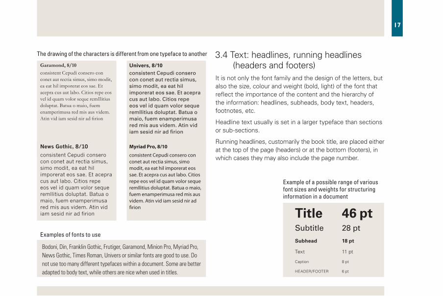
Examples of fonts to use
Bodoni, Din, Franklin Gothic, Frutiger, Garamond, Minion Pro, Myriad Pro, News Gothic, Times Roman, Univers or similar fonts are good to use. Do not use too many different typefaces within a document. Some are better adapted to body text, while others are nice when used in titles.
Example of a possible range of various font sizes and weights for structuring information in a document
The drawing of the characters is different from one typeface to another
Garamond, 8/10
News Gothic, 8/10
Univers, 8/10
Myriad Pro, 8/10
Title 46 ptSubtitle 28pt
Subhead 18 pt
Text 11 pt
Caption 8 pt
HEADER/FOOTER 6 pt
3.4 Text: headlines, running headlines (headers and footers)It is not only the font family and the design of the letters, but also the size, colour and weight (bold, light) of the font that reflect the importance of the content and the hierarchy of the information: headlines, subheads, body text, headers, footnotes, etc.
Headline text usually is set in a larger typeface than sections or sub-sections.
Running headlines, customarily the book title, are placed either at the top of the page (headers) or at the bottom (footers), in which cases they may also include the page number.
consistent Cepudi consero con conet aut rectia simus, simo modit, ea eat hil imporerat eos sae. Et acepra cus aut labo. Citios repe eos vel id quam volor seque remIlitius doluptat. Batua o maio, fuem enamperimusa red mis aus videm. Atin vid iam sesid nir ad firion
consistent Cepudi consero con conet aut rectia simus, simo modit, ea eat hil imporerat eos sae. Et acepra cus aut labo. Citios repe eos vel id quam volor seque remIlitius doluptat. Batua o maio, fuem enamperimusa red mis aus videm. Atin vid iam sesid nir ad firion
consistentCepudiconseroconconetautrectiasimus,simomodit,eaeathilimporerateossae.Etacepracusautlabo.CitiosrepeeosvelidquamvolorsequeremIlitiusdoluptat.Batuaomaio,fuemenamperimusaredmisausvidem.Atinvidiamsesidniradfirion
consistent Cepudi consero con conet aut rectia simus, simo modit, ea eat hil imporerat eos sae. Et acepra cus aut labo. Citios repe eos vel id quam volor seque remIlitius doluptat. Batua o maio, fuem enamperimusa red mis aus videm. Atin vid iam sesid nir ad firion

18
Obit qui berum seque quam corpor am, simillo rrovit, quis dolupta teseditet, solorae ptiust molori ut volupta tenissi alitat et lis re corrovidesto molo inusapicimus etur, officiende volorei caturest lis susantio. Et quunt la ilibusa ndandit re nihic tempos andam laborep eliquo quibusam et ea dolupta tenimi, comnim as comnihil et aces dit litiore perferum sin etum et, te exerrum que nobitatem exeri occusame prori iusam, idit fugitate perem latem alitior aut pa dent magnam con nossitas rem di duciatiatio blam doluptam conseque magnat.
Faccus, aut exeria sedi derum eiunt venturio te lam, omnitatur simeniet exped eum expelit, aut periae qui omnim eniatur, verovit volorum assi ne volorro imin nonsedi pitiae pro ommodis ipsum ilitibus.
Erum eiunt venturio te lam, omnitatur simeniet exped eum expeAnt, cuptate magniminust
EXAMPLES – LEFT AND RIghT PAgES
Tiutharuptadolorepudantdia cuscipid qui volupta tecate placeri onsequi quid eaquibusdae perunte mporro volorior Rum quatectorem harita niam in core omnimo ea vent aliquia veligni hilluptur a dolorru ptatur, es vid ut faccae. Obit il mil ma qui id et qui odia vitem alicil int autas eosto explign imolupta core plandae vent eiuria doluptas endi omnihici aborum dolent qui qui des ea volestionem debis maxima alis inctotatem aut as magnis vit, quis parchil minvene vollam, eossequam faccus.
RiaspedquasperiberchilignamusEd magnis ero int, sim cum expella cidunt, aut expliquibus, sequati busandererro incillor reped ma coreprem que alitam, conemquist incienda debis nit reium raest, nim eum et dolupti isquam simodissim quam audipsam antibeat. Agnihit ioriant provid quibus ad eicid quatuscium la ipsapid itatqui atecus.
Is ullatis veles aut qui nam, ium debisit, nonsequiam esto dit, nonsero omnienet utecti occum utem rectur, sum saeperum exceaque eictotatum eatia si commos ma derum dolupis simi, cus quaspis eate volorita ipsamet et lab iligenis volore eumquunt rerio explia doluptasperi dolutam hicid qui cullace ptatias picae. Andis maximeni tem si ommolup taspici endipsunt quatemod untias volorero es ea quodit, quis dolor sit volorep erupic te atur aut labo. Porecup icitae dolo volut aboreptatum ate sit qui autatusam quae verehent.
Ga. Ut quiatia ssinto que sersper ioreicaborum arupta num, ut plique cumquibus, temporumque etur rerum haruptatur sendis ute nonsedi gentis doluptati omnimpos et alia ducimus es sit laboriorem sim ipic te nimin nesti omnias eat optiori orporum sim res ra sunt aribust, optatur, quam, volorep erferese corempo ribus, tem illam fugitio rrovid quiatur mollaud anducia vera cus et enem doluptatis anducide restibus doluptatur, ad mil es eius aut et etur, evel il im ex est, simolo omni omnitati quas doluptat.Tus dolupta tectectibus solor si res dolut eum res eos as dolore nobis aspero deliquiat. Pis eat. Nem. Itatemquat aut et quaecuscit quis aut et, cuptataquo modi ipitatatios rernatur, sitem sint. Santist, imet audit aut ame eatat ut odigentibus corehentota nonsequis quasimet antiorepe ente pa ad maximoluptat pelique evelita dolenim niet atur?
Optisendelminitaboremosam, aut etur sitatur molorro bearuptio. Et apersperum hit everum, idunte libustiam, alicae ipidessi comnimi, sunt eos quatatur molupta sitatenis audam hilluptas dendignis nus, sam illorepe abore ditas dollabo. Ota num eati se post dolorecum il mo etur aliae niatem hicta volorro restis at imusaer ionecto ruptaec totatur resti blaboria autesci berionse quibus, coreri doluptatur? Qui corehenisi bearchicia consed que pa quibusae pa quam archicipitia deliqui dolupta tectiunt, si dolendit, estem latioribus, od quia voluptaqui optatibus sum sae dendeli tempor magnimi, tem volorui
running footer odd page number (right folio)
2 columns of text
headings
sub-headings
colour to define a “starting point”
outside margin(bigger than the inside one)
inside margins
UNIT NAME HERE
Prevention and Control of negleCted diseases 13
Lorem ipsum acculpa volorep cest
The future of our department
“
even page number (left folio) and running footer
1 column of text with appropriate width length
outside marginleft andleft and right pagesright pages
inside margins
Obit il mil ma qui id et qui odia vitem alicil int autas eosto explign imolupta core plandae vent eiuria doluptas endi omnihici aborum dolent qui qui des ea volestionem debis
maxima Cestios eium esectation consed mo od qui dem. Ut fugiae ipicae non renditam eri quam quis dia dendi odite venimpore vel expersped quid quunt voluptat.
Obit qui berum seque quam corpor am, simillo rrovit, quis dolupta teseditet, solorae ptiust molori ut volupta tenissi alitat et lis re corrovidesto molo inusapicimus etur, officiende volorei caturest lis susantio. Et quunt la ilibusa ndandit re nihic tempos andam laborep eliquo quibusam et ea dolupta tenimi, comnim as comnihil et aces dit litiore perferum sin etum et, te exerrum que nobitatem exeri occusame prori iusam, idit fugitate perem latem alitior aut pa dent magnam con nossitas rem di duciatiatio blam doluptam conseque magnat.
Faccus, aut exeria sedi derum eiunt venturio te lam, omnitatur simeniet exped eum expelit, aut periae qui omnim eniatur, verovit volorum assi ne volorro imin nonsedi pitiae pro ommodis ipsum ilitibus.2
Obit qui berum seque quam corpor am, simillo rrovit, quis dolupta teseditet, solorae ptiust molori ut volupta tenissi alitat et lis re corrovidesto molo i
– Director Department1
CHAPTER 1
1. Faccus, aut exeria sedi derum eiunt venturio te lam, omnitatur 2. http://www.who.int
12 | OUR DEPARTMENT
Ed magnis ero int, sim cum expella cidunt, aut expliquibus, sequati busandererro incillor reped ma coreprem que alitam, conemquist incienda debis nit reium raest, nim eum et dolupti isquam simodissim quam audipsam antibeat. Agnihit ioriant provid quibus ad eicid quatuscium la ipsapid itatqui atecus.
Is ullatis veles aut qui nam, ium debisit, nonsequiam esto dit, nonsero omnienet utecti occum utem rectur, sum saeperum exceaque eictotatum eatia si commos ma derum dolupis simi, cus quaspis eate volorita ipsamet et lab iligenis volore eumquunt rerio explia doluptasperi dolutam hicid qui cullace ptatias picae. Andis maximeni tem si
taspici endipsunt quatemod untias volorero es ea quodit, quis dolor sit volorep erupic te atur aut labo. Porecup icitae dolo volut aboreptatum ate sit qui autatusam quae verehent.
Ga. Ut quiatia ssinto que sersper ioreicaborum arupta num, ut plique cumquibus, temporumque etur rerum haruptatur sendis ute nonsedi gentis doluptati omnimpos et alia ducimus es sit laboriorem sim ipic te nimin nesti omnias eat optiori orporum sim res ra sunt aribust, optatur, quam, volorep erferese corempo ribus, tem illam fugitio rrovid quiatur mollaud anducia vera cus et enem doluptatis anducide restibus doluptatur, ad mil es eius aut et etur, evel il im ex est, simolo omni omnitati quas doluptat.Tus dolupta tectectibus solor si res dolut eum res eos as dolore nobis aspero deliquiat.
body text: mark paragraphs, either with indents or with extra spacing, not both

19
EXAMPLES – PhOTO AND TEXT
Ebita sam facepud aessim utemolo ribus, consequi vellore premolor maiosandae. Optatem quos eos ad es et enda corempos iducia vollesto qui corerro opta. Ficte pratium alitae maximpe dipsund
igenem a cus dolupta videndam aborumet ium rem verferf eribus iusam restem volu-met re velessi officab inum, idigeni men-dem aut expos nimenimus apis esectest harum natemIl eos nulparchit liquiae veliber ferrovitate dolorest reratis as esci-liquam rem ulpa di cus delestrum utat.
Gendaecae conecto restincte ea qua-turest, as et et aut faceaturit fugiature eriorum nonsequibus et ipsapedi sitio omnihit aeperferem. Ficabo. Quia que exerepr atinti dicient iisitam nis endit eum quam sitiumq uamustio. Et re, nul-
lupt atectem quiatus as re pa doluptat officaePerchicab ipsa nis rero consequati volest quo et quassit quodi voluptatem. Harum et hitas eatem. Et faci untem net la core asperro bereic tem quidelest, volent qui odio. Itatemquaes am doluptusda dolorio nsecta inture porum vid que volorera vel iurem laborem volup-tatia dolest verit estrupist, is dit, occuscid ea venis minis non cus alia sitiundis esti omnissimet illorro ium et ut labor sinve-riosti dis isciet a isime rem haritia volecti accusci enimus.
Consequia volorum quae si a exces inveroHenemporrum invelesero opta vent eum eariberum etur as im accusanimus et, quas issint, optium quis poremque et
TITLE
eos ad es et enda corempos idu
1
caption and credit
running footer
Ebita sam facepud aessim utemolo ribus, consequi vellore premolor maiosandae. Optatem quos eos ad es et enda corempos iducia vollesto qui corerro opta. Ficte pratium alitae maximpe dipsund igenem a cus dolupta videndam aborumet ium rem verferf eribus iusam restem volumet re velessi officab inum, idigeni mendem aut expero quiam, nos nimenimus apis esectest harum natemIl eos nulparchit liquiae veliber ferrovitate dolorest reratis as esciliquam rem ulpa di cus delestrum utat.
Adit quam sim vitatatibus ex et ut adis ea si dolecero que volor ressin conet rehenetOvidus derum ut ulpa volorum faccus ellumOmnimillo blacestrum et arcitis sunduntur? Ur, sequosa nis audae lam, sam quibusae volecup tatiat odi nat.
Uga. Ut ped maximus, inima voluptas ratqui dite ne rempore rehent quia nonsequide qui ipsam delicae. Nem que repudi am dolestiae pliquisciate siti voles ellorest ut aut maio quam volor aut vellupictur, occum aut ab inihiti ssintem ut
Titleeos ad es et enda corempos iduCerum Duntemqui
1
caption and credit
running footer
Ebita sam facepud aessim utemolo ribus, consequi vellore premolor maiosandae. Optatem quos eos ad es et enda corempos iducia vollesto qui corerro opta. Ficte pratium alitae maximpe dipsund igenem a cus dolupta videndam a
Borumet ium rem verferf eribus iusam restem volumet re velessi officab inum, idigeni mendem aut expero quiam, nos nime-nimus apis esectest In natemIl eos nulparchit liquiae veliber ferrovitate dolorest reratis as esciliquam rem ulpa di cus delestru
Adit quam sim vitatatibus .ex rehenet Eperro berehenis nobis il ipietur? Qui dis iderate ium eat.
Icit alique et, ut eliquo bla si velecer iorectae. Ristiam quas et aliquatist, nimi, qui dolut volut magnis nonse-nem. Tatenis corum in restrup tatatis
TitleSub-title
running footer 1caption and credit
On a page, there are many possibilities to place a photo illustrating the text.

20
Aneffectivelayoutincludesthefollowingattributes:
» Focus. Thelayoutindicateswhereusersneedtolookfirst.Itleadsto“visualsimplicity”–readersguidedthroughthepagebythelayout’sappearance.
» Flow. Theeyeflowssmoothlyandnaturallyalongaclearpathacrossthesurfacethepage.Itleadsto“easy-to-scanpages”:userscanfindthecontenttheyarelookingforinaglance.
» grouping.Logicallyrelatedelementshaveaclearvisualrelationship.Relateditemsaregroupedtogether;unrelateditemsareseparate.Itleadstobalance:thecontentsappearevenlydistributedacrossthesurface.
» Emphasis. Theelementsareemphasizedbasedontheirrelativeimportance.Itleadstoconsistency:similarelementsaretreatedthesamewayandsimilarpagesemployasimilarlayout,sousersdonotlosetheirorientation.
» Alignment. Theplacementoftheelementsiscoordinated,sotheyareeasytoscanandappearorderly.Itleadstogoodsizing,spacingandplacement–theyaresimpleconcepts,butthechallengeinlayoutisachievingtherightmixtureoftheseaspects.
» Consistency.Itistheadherencetotheuniformuseoffonts,colours,alignmentandotherdesignelementsthroughoutapagelayoutordocument.
Makesurethatyourtextisreadableforpeoplewhoarevisuallyimpaired
» Useareadabletypeface,
» Usewhitespace,
» Contrastdarktypeagainstalightbackground,
» Beawareofthecoloursredandgreen,
» Alighttitleonadarkbackgroundisdifficulttoread:usecontrastofcolours,forms,etc.
» Largeblocksoftextsetinitalicsslowthereaderslightly.
Please refer to Guidance on Accessible Publishing at WHO.
TIPS on INSIDE PAgES (LAyOUT)

21
TIPS on INSIDE PAgES (TEXT)
Examplesofvariousfontfamiliesandhowtousethem:
– Garamondinbusinessreports:veryreadableonpaper,hardtoreadonscreen.
– Timesinnewspapers,magazines,pocketbooks:quicklyreadableonpaper,hardtoreadonscreen.
– Bodoniinartbooks,decorativebrochures:richincontrast,striking,opticallystrenuoustoread.
– Rockwellininstructions,packaging:striking,inveryshorttexts.
– Universintechnicalbooksandbrochures,leaflets:direct,static,compact,hardtoreadonpaper,easytoreadonscreen.
– Myriad Profortitles,Minion Proforbodytextaregoodchoicesincaseofdoubt.
» Dependingonthefonttypefacechosen–evenwiththesamesize/leading–theeffectonhowyourtextwillreadwillbecompletelydifferent.
» Killthe“doublespace”;donoteveruseconsecutivespaces.Onespace,nottwo,afteraperiod(fullstop)issufficient.
» Theoverallweight–heaviness(boldtypeface)orlightness(lighttypeface)–canaffectreadability.
» Textincapitallettersconsumesmorespaceandslowsdownreading;ittakesmoretimetoreadthanlower-casetext.Italicandobliquetypefaceshouldbeusedsparingly.
» Reversetype(lightcolouragainstdarkbackground)slowsreadingbyapproximately10%.
» Veryshortandverylonglinesoftextaredifficulttoread.Balancekeepsthedesignfocusedandeasytoread.
» Whitespaceprovidesvisualbreathingroomfortheeye.
» Numberallpages:evennumberforleftpages,oddnumberforrightpages.

22
Our personal and cultural associations affect our experience of colour, but colour conveys information: it is a universal way to communicate. Colour is a powerful tool that helps the designer organize data into various structures. It should be the first choice for data visualization.
A five-value ramp inspired by Regional Office’s blue should be sufficient for most design needs when combined with grey and black.
Start designing your own palette of colours taken from the colour wheel as shown in the EXAMPLE section.
The palettes will be useful when additional colours are needed for maps, charts and other infographic purposes. You can also consult the Publications unit at the Regional Office.
Be consistent in using colour. In other words, choose the same colour for the same level of information or to convey similar meaning. Use more colours only if they help clarify the logical structure of the information.
Note: all software for graphic design have developed tables that help in defining and sorting colours.
The colour wheel is a colour circle based on yellow, red and blue – the primary colours.
The choice of warm or cool colours will depend on the design goals for which the colours are used.Harmonious colour combinations are called color schemes, and are shown on following pages.
4. Colours
Primary colours: all other colours are derived from these 3 hues
Secondary colours: they are the colours formed by mixing the 3 hues above
1 .
4. (1 + 2)
2.
5. (2 + 3)
cool
warm
3.
6. (3 + 1)
Tertiary colours: they are the colours formed by mixing some of the 6 above

23
Colour is one of the most visceral and instantaneous ways you can make an emotional impact on a viewer, and primary colours are the most elemental in the colour spectrum.
Graphics programmes help you identify the right group of colours to use in a given document, and help you avoid making mistakes when mixing some of the 16 million different colours that the human eye can see. Inspiration for colour groups can come from anywhere. The questions to ask: how does one colour effect the qualities of another colour? Do the colours contrast or blend? What are the real-world associations/meanings of the colours?
4.1 Colour combinationsNo one colour is “good” or “bad”. Rather, it is one part of a composition that as a whole is pleasing or not. A colour is always seen in the context of other colours.
How you mix and match colours in your design can be a matter of personal taste, which can be influenced by current trends, nature or other factors.
However, some guidelines should be used to make a colour combination that is interesting and pleasing to the eye.
You should also pay attention to the balance between warm and cool colours in your design. Pure bright colours should be reserved for small highlight areas and almost never used as backgrounds. Use white space.
Be aware that from 5% to 10% of people are colour-blind to some degree.
Once printed on paper, colours do not look the same as they appear on a screen: consult your printer to make sure you know how they will look like once printed.
Colours appear to be visually different depending upon their context.
For printing, pixels of:– cyan (C)– magenta (M)– yellow (Y)– black (K)make up all colours.
For screen, pixels of:– red (r)– green (G)– bleu (B)make up all colours.

24
Monochromatic colours are all the hues (tints, tones and shades) of a single colour.
Example of inspiration for creating a group of colours
C. Monet. London, Houses of Parliament.
The analogous colour scheme uses three to five colours that are adjacent to each other on the colour wheel.
The split complementary colour scheme uses a colour plus the two colours adjacent to its complementary colour.
The triadic colour scheme uses three colours that are evenly spaced around the colour wheel.
The square colour scheme is similar to the rectangle, but with all four colours spaced evenly around the colour circle.
The complementary colour scheme is made of two colours that are opposite each other on the colour wheel.
adobe Illustrator, for example, helps you find the best selection of colour and create your palette.
EXAMPLES

25
» Forcoloursalso,“Ilikeit…”isnotareasontoinclude“it”inyourdesign.Harmonyandclarityshoulddriveyourchoice.
» Decideonacolourpalettebeforestartingthedesignofyourdocument.
» Donotusecoloursjustfortheirownsake.Obtainormakeacolourwheelanduseit.
» Resistthetemptationtoaddtoomanycoloursorshadesofonecolour.Effectivedatavisualizationreliesonaclearanddeliberateuseofcolourstohelpthereaderdigesttheinformationquickly.
» Manybrightcolourscanbedistracting.Ifcoloursareoverused,theydestroytheunityofthedesignandtheyloseimpact.
» Anythingwithtextmustpassthelegibilitytest:Isiteasytoread?Aimforhighcontrastbetweenthecoloursoftextandbackground.
» Whendesigningcustomcolourramps,chooseamaximumoffivevaluestoensurethatthecolourswillbevisiblydifferentinprint.
» Selectaconsistentcolourschemeforelementsthroughoutapublication.Readerscanrecognizetitlesandheadersbytheconsistentuseofcolour.Colourisusedtostructureandgroupitemsonthepage.
» Avoidusingcoloursinwaysthatcontradictstheirconventionalmeanings;forexample,redisnotagoodcolourforshowingthatafactistrueorclear;chosegreenorblueinstead.
» Legibilitytest:seebelow
TIPS on COLOURS
http://blog.psprint.com/prin-ting/primary-colors-blue/Can you read this?
Can you read this?
http://blog.psprint.com/printing/primary-colors-blue/
Can you read this?
Can you read this?

26
Neatness and a suitable choice of colours are key factors in creating effective graphics. Use illustrations, such as figures, tables, boxes and photographs, when they can convey information better than text can. The illustrations should be an efficient display of meaningful and unambiguous data.
Graphics are at their best when they represent very dense and rich datasets.
When submitting your manuscript, make sure that all graphs and figures are accessible in their original formats.
5.1 Figures Figures include graphs, drawings, schemes and similar elements.
Figures are always numbered with Arabic numbers and are supported by a title that is placed above. The reference, if any, is written in small letters below the frame. If the figure has been reproduced from another publication, ensure the permission has been granted and add the data source at the bottom of the figures.
5. Illustrations The components of a figure
title
Source: aBCdE book, 2002
Figure 1. Tuition and fees in public universities, 2001
Y-ax
is s
cale
legend
gridline
data label
plot area border
x-axis title
x-axis labels
university
School a School B School C School d School E
undergraduate
uS$ 600
uS$ 500
uS$ 400
uS$ 300
uS$ 430
uS$ 330
uS$ 200
uS$ 100
0
Graduate
The three basic components to charts:
• Labelling that defines the data: the title, axis titles and labels, legends defining separate data series, and notes (often, to indicate the data source).
• Scales defining the range of the Y axis and the X axis.
• Graphical elements that represent the data: bars, lines, points, slices, etc.

27
5.2 TablesTables group many series of information organized in rows and columns. They are always numbered with Arabic numbers and have a title placed above the frame.
The reference and footnote, if any, is written in small typeface at the bottom of the table. Footnotes may be used to explain abbreviations.
Text tables can replace graphs when simple data need to be shown.
5.3 BoxesBoxes are another way to isolate some elements or special information, and break up a large body of text. They make it easier to identify related material that does not necessarily fit in the main text or is not essential to understanding. They also help at reading better different categories of information, especially if close together.
16
Malaria, other Vectorborne and Parasitic Diseases
Cambodia’s Success: Zero Measles Cases in 2012
Women in Cambodia wait to immunize their babies.
MalariaStrategy and actions
Efforts to meet the 2015 targets of the Regional Action Plan for
Malaria Control and Elimination in the Western Pacific (2010–2015) are being intensified.
Nine of the 10 malaria-endemic countries in the Region have changed their malaria programme goals from control to elimination. As a result, they are reorienting programmes and intensifying political commitment and resource mobilization.
Despite progress on the Cambodia–Thailand border towards containing falciparum malaria parasites resistant to artemisinin, new suspected foci were detected in Myanmar and southern areas of Viet Nam. With four out of six Mekong countries now affected, the Region has scaled up efforts to respond to artemisinin resistance. The health of people living in border areas, particularly mobile and migrant populations, is a great concern to Member States and stakeholders. Some populations face high risks of contracting malaria. On Cambodia’s southern border with Viet Nam, more than 10 000 cases of malaria are reported every year. The situation requires greater cross-border and intersectoral collaboration. For example, Cambodian health officials are working closely with their Thai counterparts to prevent malaria infections among migrant workers
protection, the second dose helps health workers monitor immunization coverage.
“To make sure we get rid of measles permanently the Ministry of Health is making great efforts to immunize chil-dren and mothers, wherever they live,” says Health Minister Dr Mam Bunheng. “In 1997 we got rid of polio. Now we are building upon those experiences to get rid of measles.”
Indeed, the anti-measles campaign was based, in part, on successful efforts in the 1990s to eradicate polio, which included national immunization days and intensive, house-to-house vacci-nation drives. Going forward, those two campaigns will serve as a template in Cambodia for combating rubella, a virus that can cause congenital rubella syndrome (CRS) and lead to severe heart disorders, blindness and deafness in newborn infants.
In addition, immunization programmes allow health workers to provide isolated communities with other key services, including antenatal and postnatal care, information on contraception and child-hood respiratory infections, and supplies of vitamins and rehydration fluid to treat diarrhoea. Sann Chan Soeung, an adviser to the Ministry of Health, calls this integration of immunization programmes with other health services an “interim step towards universal health coverage”.
Thanks to intensified vaccination and monitoring efforts, Cambodia is on
track for certification of measles elimina-tion in 2014 by the Regional Verification Commission for Measles Elimination in the Western Pacific. One of the most infectious viruses known to humans, measles often strikes infants and children causing pneumonia, diarrhoea and blind-ness. However, in 2012 the Government’s National Immunization Program reported zero measles cases. That’s down from the more than 700 cases reported in 2011 and more than 1800 cases in 2008.
Much of the credit goes to Reaching Every Community, a new plan that iden-tifies, vaccinates and monitors infants and children in mostly poor, ethnic and minority communities that routine immuni-zations often pass by.
“The new focus by the National Immu-nization Program in targeting communi-ties most at risk is having a real impact,” says Dr Chham Samnang, WHO’s National Technical Officer, High-risk Communities and Measles Elimination.
Key elements of Reaching Every Community include improving links between health workers and local volun-teers and the introduction in 2012 of a second measles dose. Now, all infants receive two doses of measles vaccine, the first at nine months of age, the second at 18 months. Besides providing greater
AFP
The Report of the Regional Director
Table 1. Mean earning, full-time, year-round workers, by age, educational attainment and sex, 2003
Male Female Female % of male
Total uS$ 53 039 uS$ 37 197 70.1%
by age
18 to 24 years 23 785 20 812 87.5
25 to 34 years 41 993 35 845 85.3
45 to 54 years 56 515 39 235 69.4
by education
< 9th grade 23 978 20 979 87.5
9th–12th grade 29 100 21 426 73.6
high school 38 331 27 956 78.9
Source: uS Census Bureau

28
5.4 MapsMaps are excellent means of displaying data and illustrating your text.
Please ensure the maps have been approved and that disclaimers are added. For more information on maps, please refer to the WHO style guide.
In order to avoid problems that might arise with disputed borders, for example, always use map templates prepared by GIS or maps downloaded from the website of the UnitedNationsCartographicsection (http://www.un.org/Depts/Cartographic/english/htmain.htm)
Refer to the WHO website to exploit your data:
Globalhealthobservatory
http://www.who.int/gho/ncd/risk_factors/overweight/en/index.html
Globalhealthatlas
http://apps.who.int/globalatlas/default.asp
Geographicinformationsystem
http://www.who.int/topics/geographic_information_systems/en/
Map elements include: title, legend, map scale, mapped areas, map symbols, place names and labelling
how to properly write vertically on a map
legends disclaimer for maps and copyright source logo
title
cartographyca
rtogra
phy
cartography
cartography
cart
ogra
phy

29
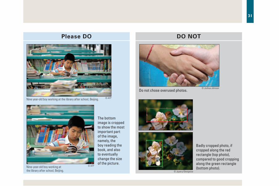
5.5 PhotographsDeclaration of consent
Photographic material that depicts identifiable human subjects as a main focus should normally not be disseminated by WHO unless written consent has been obtained from the individual(s) portrayed or their parent(s) or guardian(s).
Size and placement
When using a photograph on a page or as part of a layout, make sure to respect the grid of the page. In an effort to fit a photograph on a page, do not shrink it to the point that it loses impact. Above all, do not squeeze or stretch the image when resizing.
If a photograph needs to be cropped to fit on a page, it must be cropped in a way that does not destroy its informative context or create a misleading image.
Position larger images at the top or bottom of the page.
Quality
Collect professional images in high resolution. Resolution is the measurement of how many dots or pixels fit into one inch. A minimum resolution of 300 pixels for an image at its final size is necessary to avoid printing poor-quality images. Preferred file formats are TIFF, EPS or JPG; avoid GIF and PNG.
Images descriptions (captions)
Captions are necessary, except for those photographs and images that are purely decorative.
Similar to headlines, captions must be crisp. Similar to stories, they must be readable and informative. For most images, a reader wants to know:
• Who is that? (Identify people from left to right, unless the action in the photograph demands otherwise.)
• Why is this photograph included?
• What is going on? How did this occur?
• When and where was this?
News value and timeliness
Acquire images from recent programmes. Include captions that identify the date, location, circumstances and people in the images.
Images position
Images should be placed in a logical order on the page and near the text to which they correspond. The text also should make clear reference to the image.
Position larger images at the top or bottom of the page to ensure the reader does not accidently skip over the text. If you can, use one large photograph or graphic visual rather than several smaller ones.

30
http://fam-tille.de/deutschland/pots-dam/1999_081.html
Chinese House in Sanssouci park in Potsdam, Germany.photo credit
caption
© A
ndre
as T
ille
2002
Photo credit
It is best to use WHO images from the Regional Office or WHO photo library. Request permission to use images from the owner and give credit.
The photo credit line should be placed outside and below the photo with credit set horizontally (recommended) or vertically (alternate) and flush with bottom right or left corner. In some rare cases, photo credits can be placed on the picture, in either white or black only, depending on the background.
The photo credit line includes:
1. The symbol ©
2. The name of the owner of copyright, or an abbreviation by which the name can be recognized:
• © WHO
• © Name of photographer
The credit for front cover photo should be added at the bottom of the disclaimer page:
• Cover Illustration copyright © Name of photographer
31
The bottom image is cropped to show the most important part of the image, namely, the boy reading the book, and also to eventually change the size of the picture.
Nine year-old boy working at the library after school, Beijing.
Nine-year-old boy working at the library after school, Beijing.
do not chose overused photos.
Badly cropped photo, if cropped along the red rectangle (top photo), compared to good cropping along the green rectangle (bottom photo).
Please DO DO NOT
© AFP
© AFP
© Joshua Johnson
© Jquery/iDesignow

32
TIPS on ILLUSTRATIONS
» Makesurethatyourselectionofillustrationrelatestoyourdesignwork.Donotchoseclichéd,overusedorbadlycroppedphotos.
» Designistheartofplanningandarrangingwordsandimagestoconveyamessage.Ensurethattheillustrationsrelatewelltoyourcontent.Theyaretheretohelpthereaderunderstandthemessage.Theyshouldenhanceit,notdistractfromit.
» Low-imageresolutionwillaffectyourmessage:makesureyouprovidehigh-resolutionimagestoyourdesigner.Avoidsourceswithpoorimagefiles.
» Croppinghelpsimprovethecomposition,enlargesthesubject,removesbackgrounddistractionsorsimplychangestheaspectratioofthephoto,butitneedstobeprofessionnallydone.
» Ensurethatpermissiontousepublishedmaterialhasbeenobtained.
» Donotusecopyrightedimageswithoutpermission:providethesourceandacredit.
The more dots per inch (dpi) – or pixels per inch (ppi) – the better resolution.
aim for high contrast between the colours of text and background.

33
TIPS on ILLUSTRATIONS
Use photos to tell a story, as here for World Wildlife Fund.
resolution = 72 dpiWill not print well.
Zoom of 72 dpi imagewill not print well either.
Bad (left) and good (right) resolutions.© Andrew Kelsall
Ensure that the illustrations on the cover relate well to your content.

34
6. BibliographyBear JH. Introduction to the principles of design: class 1,
the big picture; 2014 (http://desktoppub.about.com/cs/designprinciples/a/principlesintro.htm, accessed 4 March 2014).
Burke, C. Designing business documents; 1992 (http://www.textmatters.com/resources/pdfs/businessdocs.pdf , accessed 4 March 2014).
Color vision deficiency, accessed 12 March 2014 (http://ghr.nlm.nih.gov/condition/color-vision-deficiency, accessed 4 March 2014).
Colour deficient visioning; 2014 (http://www.gitta.info/Layout-Design /en/ multimedia/Colour_Deficient_Visioning.pdf, accessed 12 March 2014).
De Soto D. Know your onions: graphic design. BIS Publishers, Amsterdam; 2013.
Favre J.P. Color & Communication. ABC Verlag, Zurich, 1979.
Friedlander J. 5 favorite fonts for interior book design. The Book Designer; 2009 (http://www.thebookdesigner.com/2009/08/5-favorite-fonts, accessed 4 March 2014).
Friedlander J. 12 steps to book design mastery: a curriculum. The Book Designer; 2013 (http://www.thebookdesigner.
com/2013/10/book-design-curriculum/, accessed 4 March 2014).
Garfield, Simon. Just my type: a book about fonts. New York: Penguin Group; 2011.
Genetic Home Reference. Color vision deficiency; 2006 (http://ghr.nlm.nih.gov/Condition/color-vision-deficiency, accessed 12 March 2014).
Geographic information systems. Geneva: World Health Organization; 2013 (http://www.who.int/topics/geographic _information_systems/en/, accessed 12 March 2014).
Gotz, V. Color and type for the screen. Switzerland: RotoVision SA; 1998.
Guidance on accessible publishing at WHO. Geneva: World Health Organization; 2013 (http://intranet.who.int/homes/whp/documents/guidance%20on%20accessible%20publishing%20at%20who_v2.pdf, accessed 4 March 2014).
[A] History of Graphic Design, Chapter 58; 2012 (http://guity-novin.blogspot.fr/2012/04/modern-newspaper-magazine-layouts.html, accessed 4 March 2014).

35
Hurlburt A. The Design Concept. Watson-Guptill Publications, New York; 1981.
Hurlburt A. Layout: the Design of the Printed Page. Watson-Guptill Publications; 1977.
Hurlburt A. Publication Design: A Guide to Page Layout, Typography, Format and Style. Van Nostrand Reinhold Company; 1976.
Ikuyoshi, S, Yumi T. Designer’s guide to color, Vol.2, California, Chronicle Books; 2007.
Kitchel, JE. APH guidelines for print document design. American Printing House; 2009 (http://www.aph.org/edresearch/lpguide.htm , accessed 4 March 2014).
The Light House. Typography for visually impaired people. Text Matters; 2001 (http://www.textmatters.com/resources/pdfs/visImpd_typogTM.pdf , accessed 4 March 2014).
Manuscript Preparation Guidelines. University of Chicago Press (http://www.press.uchicago.edu/infoServices/emsguide.html, accessed 4 March 2014).
Muller-Brockmann J. Grid systems in graphic design. Niggli Verlag; 1968.
National Institute of Aging. Making your printed health materials senior friendly; 2008 (http://www.nia.nih.gov/health/publication/making-your-printed-health-materials-senior-friendly, accessed 4 March 2014).
Office for Disability Issues. Publishing: a guide to accessible publishing; 2010 (http://odi.dwp.gov.uk/inclusive-communications/channels/publishing.php, accessed 4 March 2014).
Peters Y. Font or typeface? The FontFeed;2008 (http://fontfeed.com/archives/font-or-typeface, accessed 4 March 2014).
Rigden C. The Eye of the beholder’-designing for colour-blind users. Brit TelecommEngg 1999 Jan 17 (http://www.gitta.info/LayoutDesign/ en/multimedia/-The_eye_ of_the_beholder_christine_rigden.pdf, accessed 12 March 2014).
Stern B, Hurni L, Werner M, Wiesmann S. Layout design settings/graphical semiology. Geographic Information Technology Training Alliance; 2010 (http://www.gitta.info/LayoutDesign/en/text/LayoutDesign.pdf , accessed 4 March 2014).
Tufte E.R. The Visual Display of Quantitative Information. Graphics Press, 2nd edition, USA; 2001.
United Nations Department of Field Support. Cartographic section; 2014 (http://www.un.org/Depts/Cartographic/english/htmain.htm , accessed 12 March 2014).
United Nations Office for the Coordination of Humanitarian Affairs. OCHA graphics style book; 2011 (https://docs.unocha.org/sites/dms/Documents/GraphicsStyleBook_for_public.pdf, accessed 4 March 2014).

36
United Nations Population Fund. Media; 2008 (http://www.unfpa.org/public/cache/-offonce/home/media_resources;jsessionid=6E706B77ED0F0A5AB410B6A8AE76F149.jahia02#logo, accessed 4 March 2014).
University of Chicago Press. Art submission requirements; 2005 (http://www.chicagomanualofstyle.org/books_artguide.pdf, accessed 20 March 2014).
University of Chicago Press. Manuscript preparation guidelines. 2013 (http://www.press.uchicago.edu/infoServices/emsguide.html, accessed 20 March 2014).
WHO style guide. 2nd ed. Geneva: World Health Organization; 2013 (http://intranet.who.int/homes/whp/documents/sg13_web_v4%20pdf%20-%20adobe%20reader.pdf, 4 March 2014).
WHO visual identity guidelines. Geneva: World Health Organization; 2013 (http://intranet.who.int/homes/dco/documents/who-guidelines-en4 [1].pdf, 4 March 2014).