An embeddable dashboard for widget-based visual analytics on scientific communities
18
Lehrstuhl Informatik 5 (Information Systems) Prof. Dr. M. Jarke 1 These presentation slides by Michael Derntl are licensed under a Creative Commons Attribution-ShareAlike 3.0 Unported License. An Embeddable Dashboard for Widget-Based Visual Analytics on Scientific Communities Michael Derntl, Stephan Erdtmann, Ralf Klamma RWTH Aachen University Advanced Community Information Systems (ACIS) Informatik 5, Aachen, Germany [email protected] 12th International Conference on Knowledge Management and Knowledge Technologies (i-KNOW 2012) 5-7 September 2012 Graz, Austria
-
Upload
rwth-aachen -
Category
Documents
-
view
1 -
download
0
Transcript of An embeddable dashboard for widget-based visual analytics on scientific communities
Lehrstuhl Informatik 5
(Information Systems)
Prof. Dr. M. Jarke
1 These presentation slides by Michael Derntl are licensed under a Creative Commons Attribution-ShareAlike 3.0 Unported License.
An Embeddable Dashboard for
Widget-Based Visual Analytics on
Scientific Communities
Michael Derntl, Stephan Erdtmann, Ralf Klamma
RWTH Aachen University Advanced Community Information Systems (ACIS)
Informatik 5, Aachen, Germany
12th International Conference on Knowledge Management
and Knowledge Technologies (i-KNOW 2012)
5-7 September 2012
Graz, Austria
Lehrstuhl Informatik 5
(Information Systems)
Prof. Dr. M. Jarke
2
Motivation
Scientific results socially created in scientific
communities1
Quality of products success of community
Stakeholder interest in success factors
Classic indices: publications, citations –
established communities
New publication channels, new collaboration means
– Web 2.0, social media/networks, etc.
– Scattered information and large data volumes
1W. A. Kornfeld and C. Hewitt. The Scientic Community Metaphor. IEEE Trans. Syst., Man, and Cybern., SMC-11(1):24-33, 1981.
Lehrstuhl Informatik 5
(Information Systems)
Prof. Dr. M. Jarke
3
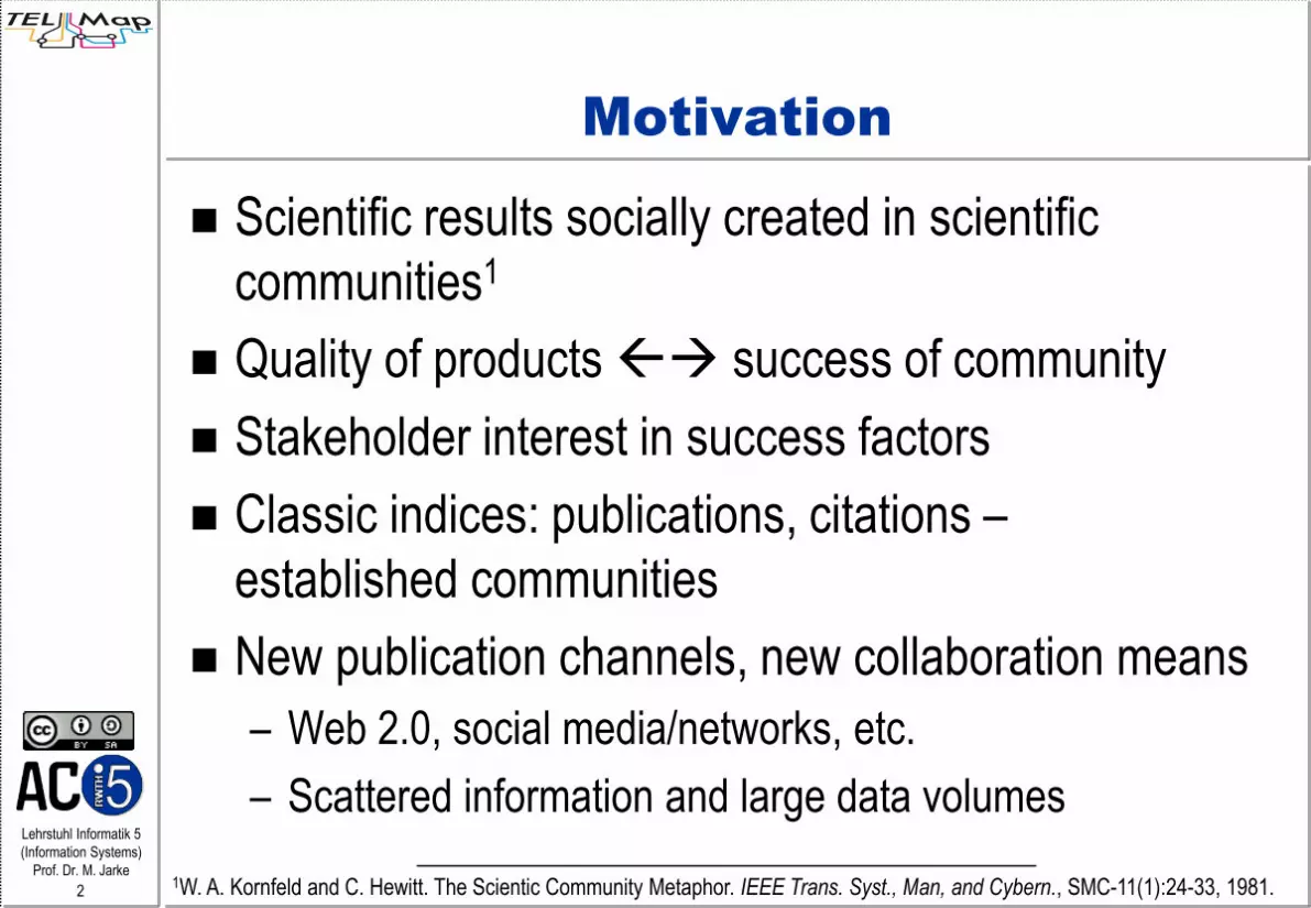
Data Visualization
Data visualization
eases assimilation
of information
Modern web
technologies
enable interactive
visualizations
Popular metaphor: dashboards
– One page overview, aggregate data, focus on important
data, interactive components
© Google, Inc.
Lehrstuhl Informatik 5
(Information Systems)
Prof. Dr. M. Jarke
4
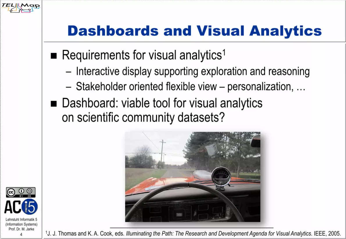
Dashboards and Visual Analytics
Requirements for visual analytics1
– Interactive display supporting exploration and reasoning
– Stakeholder oriented flexible view – personalization, …
Dashboard: viable tool for visual analytics on scientific community datasets?
1J. J. Thomas and K. A. Cook, eds. Illuminating the Path: The Research and Development Agenda for Visual Analytics. IEEE, 2005.

Lehrstuhl Informatik 5
(Information Systems)
Prof. Dr. M. Jarke
5
Pilot Community: TEL
TEL-Map: roadmapping and weak signal analysis in Technology Enhanced Learning (TEL); supported by the TEL Mediabase1
1M. Derntl, R. Klamma. A Mediabase for Technology Enhanced Learning in Europe. IEEE Learn. Tech. Newsletter, 14(3):2-5, 2012.

Lehrstuhl Informatik 5
(Information Systems)
Prof. Dr. M. Jarke
6
Challenges
Configuring personalized dashboards
– Addressing different stakeholder groups
– Easy to set up / configure / use for non-technical people
– Reusability of the solution beyond the pilot case
Interactive visualization of arbitrary database query
results
– Different types of charts / graphs
– New visualizations should easily be createable
– Compatible with existing and new databases

Lehrstuhl Informatik 5
(Information Systems)
Prof. Dr. M. Jarke
7
Objectives
Web-based dashboard for visualising SQL query
results
Decoupling the hosting application from dashboard
application
Implementation of
– Dashboard frame containing visualization widgets
– Data visualization generator app
For pilot case at learningfrontiers.eu:
– Dashboard frame as a Drupal module
– Reuse of user credendials

Lehrstuhl Informatik 5
(Information Systems)
Prof. Dr. M. Jarke
8
Use Cases & GUI
Embedding Application
Control
Pane
Widget Container
Viz 1
Viz n
Viz 2

Lehrstuhl Informatik 5
(Information Systems)
Prof. Dr. M. Jarke
9
http://learningfrontiers.eu/?q=dashboard

Lehrstuhl Informatik 5
(Information Systems)
Prof. Dr. M. Jarke
10
Widget Creator
Selecting a database
connection
Entering an SQL query
Selecting a
visualization type
Instant preview using
Google Visualization
API
Publish as OpenSocial
widget

Lehrstuhl Informatik 5
(Information Systems)
Prof. Dr. M. Jarke
11
Technical Architecture
Data Sources for
Visualization
Dashboard
Control Pane Widget Container
LAS Ajax Client
Visualization Widgets
Lightweight Application Server (LAS)1
LAS HTTP Connector
LAS Services
LAS Database Connector
User & Widget
Data
Data Sources for
Visualization
Visualization
Layer
Application
Layer
Data
Layer
1M. Spaniol et al. LAS: A Lightweight Application Server…In Proc. i-KNOW 2006, pp. 592-599, 2006.
Previously
existing
Newly
implemented
Legend
Lehrstuhl Informatik 5
(Information Systems)
Prof. Dr. M. Jarke
13
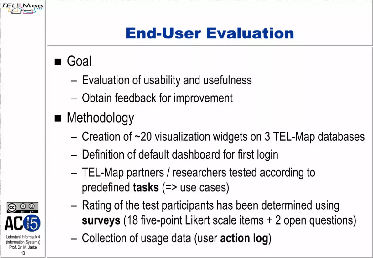
End-User Evaluation
Goal
– Evaluation of usability and usefulness
– Obtain feedback for improvement
Methodology
– Creation of ~20 visualization widgets on 3 TEL-Map databases
– Definition of default dashboard for first login
– TEL-Map partners / researchers tested according to
predefined tasks (=> use cases)
– Rating of the test participants has been determined using
surveys (18 five-point Likert scale items + 2 open questions)
– Collection of usage data (user action log)

Lehrstuhl Informatik 5
(Information Systems)
Prof. Dr. M. Jarke
14
Evaluation: Participants
Survey was completed by 20 participants from TEL
context
On average they
– dedicate 2/3 of their current working time to TEL.
– have 8.5 years of experience with TEL

Lehrstuhl Informatik 5
(Information Systems)
Prof. Dr. M. Jarke
16
Evaluation: Usability Results
Higher scores for usability compared to usefulness
Negative correlation (p<.01) between years of experience and usability/usefulness
4.90
4.40
4.15
4.55
4.15
3.85
3.85
3.50
4.55
1 2 3 4 5
It is easy to remove widgets
It is easy to rearrange widgets
It is easy to resize the widget height and width
It is easy to detach widgets
It is easy to find the description of a widget
The widget descriptions are sufficient to understand thewidget content
The search interface is easy to use
It was easy to find relevant widgets
It was easy to add available widgets
Usa
bilit
y
N = 20 (M = 4.21 ± .68)

Lehrstuhl Informatik 5
(Information Systems)
Prof. Dr. M. Jarke
17
Evaluation: Usefulness Results
Higher scores for usability compared to usefulness
Negative correlation (p<.01) between years of experience and usability/usefulness
3.80
4.05
3.90
3.45
3.65
3.40
3.05
4.11
4.00
1 2 3 4 5
The data covered by available widgets appears relevantto me
The data covered by the widgets appears relevant to theTEL community
The available widgets cover a broad range of TEL
The available categories are useful to search forwidgets
The style of the data visualizations is appropriate
The range of available data visualizations is sufficient
This dashboard has all the functions and capabilities Iexpect it to have
The dashboard is useful to support mapping androadmapping activities in TEL
The dashboard can support different TEL stakeholdersin observing data
Use
fuln
ess
(M = 3.72 ± .84)N = 20

Lehrstuhl Informatik 5
(Information Systems)
Prof. Dr. M. Jarke
18
Evaluation: Qualitative Results
Experiences with creating a new widget (exploring the data, offering visualizations)
– 14 tried, 7 succeeded (3 w/ error message on embed)
– Problems: Incomplete documentation, DB schemas unknown
Suggestions for improvement
– Missing access to data behind a visualization
– Useful for statistics about TEL, but less useful for understanding the future
– Problems with meaning of visualizations and categories
– Complex visualizations hard to read
– Data export functionalities needed
– Unintuitive interaction with the dashboard

Lehrstuhl Informatik 5
(Information Systems)
Prof. Dr. M. Jarke
19
Evaluation: Action Log
687 actions by 25 users traced over 13 days (~27 per user)
4.00
4.00
3.00
2.75
2.33
2.25
2.14
2.00
2.00
2.00
0 1 2 3 4
Search (1)
Social (1)
Radar* (3)
Network (4)
Content (3)
Histogram* (4)
Papers (7)
Blogs (6)
Geographical (6)
Pie* (4)
Top 10: # Embeds / Widget / Category
196
141
101
88
50
30
26
28
17
10
0 50 100 150 200 250 300
Toggle control pane
Embed widget
Remove widget
Move widget
Search by category
Search by keyword
Resize column
Resize widget
Create widget
Add/Rem column
Action Ranking
During evaluation
After evaluation

Lehrstuhl Informatik 5
(Information Systems)
Prof. Dr. M. Jarke
20
Conclusions and Further Work
Key points
– Dashboard embeddable anywhere with few HTML lines
– Visualization of scientific community data – OpenSocial based widgets
– Google Visualization API based on SQL query results
– Arbitrary relational DB sources possible
– Pilot case: Drupal-based TEL portal; generally positive evaluation
Limitations
– Visualizations limited to single SQL query
– More interactive and explorative features needed for visual analytics tasks