A Polyline-based Visualization Technique for Tagged Time-varying Data
6
A Polyline-Based Visualization Technique for Tagged Time-Varying Data Sayaka Yagi, Yumiko Uchida, Takayuki Itoh Ochanomizu University {sayaka, yumi-ko, itot}@itolab.is.ocha.ac.jp Abstract We have various interesting time-varying data in our daily life, such as weather data (e.g., temperature and air pressure) and stock prices. Such time-varying data is often associated with other information: for example, tempera- tures can be associated with weather, and stock prices can be associated with social or economic incidents. Mean- while, we often draw large-scale time-varying data by mul- tiple polylines in one space to compare the time variation of multiple values. We think it should be interesting if such time-varying data is effectively visualized with their asso- ciated information. This paper presents a technique for polyline-based visualization and level-of-detail control of tagged time-varying data. Supposing the associated in- formation is attached as tags of the time-varying values, the technique generates clusters of the time-varying val- ues grouped by the tags, and selects representative values for each cluster, as a preprocessing. The technique then draws the representative values as polylines. It also pro- vides a user interface so that users can interactively select interesting representatives, and explore the values which belong to the clusters of the representatives. Keywords— Information visualization, tagged time- varying data, level-of-detail control. 1 Introduction We represent time-varying data as polyline charts very often. Also, we commonly draw multiple time-varying values in a single polyline chart space so that users can compare the time-varying values. On the other hand, we often deal with hundreds or even thousands of time- varying values in the above mentioned various fields. It is usually difficult to read if we draw hundreds or thou- sands of polylines in a single space. Several recent works have addressed the visualization of such large-scale time- varying data. Wattenberg et al. presented a sketch-based query interface to search for specific shapes of polylines [8]. Hochheiser et al. presented Timeboxes and Time- Searcher [3], a gradient- and range-based query interface for polyline-based time-varying data visualization Some works focused on similarity-based pattern and outlier dis- covery. Buono et al. presented a technique to interactively search for similar pattern [1] as an extension of Time- Searcher, and a similarity-based forecasting technique [2] for the forecasts the future patterns. Lin et al. presented a technique to discover non-trivial patterns [5], by clus- tering a set of time-varying values and searching for out- liers. Wang et al. presented a technique for important poly- line selection [7]. Recently we presented two time-varying data visualization techniques, featuring sketch query on the clustered view [6], and pattern display on the heatmap [4]. Meanwhile, such time-varying data is often associated with other information: for example, temperatures can be associated with weather, and stock prices can be associ- ated with social or economic incidents. Such information may be tightly correlated with the time-varying values, and therefore, it should be useful if time-varying data visual- ization techniques simultaneously display such associated information. This paper presents a new time-varying data visualiza- tion technique which supposes time series values have tags for each time. We suppose that tags consist of a set of pre- defined terms: for example, sunny, cloudy, and rainy for weather data, or exercising, eating, or sleeping for health care data. As a preprocessing, the technique clusters poly- lines based on their shapes and tags, and then selects rep- resentative polylines from the clusters. It realizes smooth level-of-detail control by interactively controlling the num- ber of polylines to be displayed. Also, the technique fea- tures click and sketch interfaces so that users can interac- tively select particular polylines which are tagged with the user-interested terms. This paper presents the effective- ness of the presented technique with Japanese weather data recorded by AMeDAS (Automated Meteorological Data Acquisition System). 2 Level-of-detail control for time varying data visualization This section briefly introduces a level-of-detail control and sketch interface [6] for time-varying data visualization previously we presented. The technique supposes the following time series data, consisting of a set of values =( 1 , 2 , ..., ) repre- 2012 16th International Conference on Information Visualisation 1550-6037/12 $26.00 © 2012 IEEE DOI 10.1109/IV.2012.28 106
Transcript of A Polyline-based Visualization Technique for Tagged Time-varying Data

A Polyline-Based Visualization Technique for Tagged Time-Varying Data
Sayaka Yagi, Yumiko Uchida, Takayuki ItohOchanomizu University
{sayaka, yumi-ko, itot}@itolab.is.ocha.ac.jp
AbstractWe have various interesting time-varying data in our
daily life, such as weather data (e.g., temperature and airpressure) and stock prices. Such time-varying data is oftenassociated with other information: for example, tempera-tures can be associated with weather, and stock prices canbe associated with social or economic incidents. Mean-while, we often draw large-scale time-varying data by mul-tiple polylines in one space to compare the time variationof multiple values. We think it should be interesting if suchtime-varying data is effectively visualized with their asso-ciated information. This paper presents a technique forpolyline-based visualization and level-of-detail control oftagged time-varying data. Supposing the associated in-formation is attached as tags of the time-varying values,the technique generates clusters of the time-varying val-ues grouped by the tags, and selects representative valuesfor each cluster, as a preprocessing. The technique thendraws the representative values as polylines. It also pro-vides a user interface so that users can interactively selectinteresting representatives, and explore the values whichbelong to the clusters of the representatives.
Keywords— Information visualization, tagged time-varying data, level-of-detail control.
1 IntroductionWe represent time-varying data as polyline charts very
often. Also, we commonly draw multiple time-varyingvalues in a single polyline chart space so that users cancompare the time-varying values. On the other hand,we often deal with hundreds or even thousands of time-varying values in the above mentioned various fields. Itis usually difficult to read if we draw hundreds or thou-sands of polylines in a single space. Several recent workshave addressed the visualization of such large-scale time-varying data. Wattenberg et al. presented a sketch-basedquery interface to search for specific shapes of polylines[8]. Hochheiser et al. presented Timeboxes and Time-Searcher [3], a gradient- and range-based query interfacefor polyline-based time-varying data visualization Someworks focused on similarity-based pattern and outlier dis-
covery. Buono et al. presented a technique to interactivelysearch for similar pattern [1] as an extension of Time-Searcher, and a similarity-based forecasting technique [2]for the forecasts the future patterns. Lin et al. presenteda technique to discover non-trivial patterns [5], by clus-tering a set of time-varying values and searching for out-liers. Wang et al. presented a technique for important poly-line selection [7]. Recently we presented two time-varyingdata visualization techniques, featuring sketch query on theclustered view [6], and pattern display on the heatmap [4].
Meanwhile, such time-varying data is often associatedwith other information: for example, temperatures can beassociated with weather, and stock prices can be associ-ated with social or economic incidents. Such informationmay be tightly correlated with the time-varying values, andtherefore, it should be useful if time-varying data visual-ization techniques simultaneously display such associatedinformation.
This paper presents a new time-varying data visualiza-tion technique which supposes time series values have tagsfor each time. We suppose that tags consist of a set of pre-defined terms: for example, sunny, cloudy, and rainy forweather data, or exercising, eating, or sleeping for healthcare data. As a preprocessing, the technique clusters poly-lines based on their shapes and tags, and then selects rep-resentative polylines from the clusters. It realizes smoothlevel-of-detail control by interactively controlling the num-ber of polylines to be displayed. Also, the technique fea-tures click and sketch interfaces so that users can interac-tively select particular polylines which are tagged with theuser-interested terms. This paper presents the effective-ness of the presented technique with Japanese weather datarecorded by AMeDAS (Automated Meteorological DataAcquisition System).
2 Level-of-detail control for time varyingdata visualization
This section briefly introduces a level-of-detail controland sketch interface [6] for time-varying data visualizationpreviously we presented.
The technique supposes the following time series data,consisting of a set of values 𝑃 = (𝑝1, 𝑝2, ..., 𝑝𝑛) repre-
2012 16th International Conference on Information Visualisation
1550-6037/12 $26.00 © 2012 IEEE
DOI 10.1109/IV.2012.28
106

Figure 1: Quantization of polylines.
sented as 𝑛 polylines. We describe the values of a polylineas 𝑝𝑖 = (𝑝𝑖1, 𝑝𝑖2, ..., 𝑝𝑖𝑚); 𝑝𝑖𝑗 denotes the value at the 𝑗-thtime of the 𝑖-th polyline. We draw the set of values as apolyline chart, while the horizontal axis denotes the 1st tothe 𝑚-th time, and the vertical axis denote the magnitudeof the values.
As a preprocessing, the technique temporarily quantizespolylines, generates clusters of them, and selects represen-tative polylines from the clusters. While the quantizationstep, the technique generates a grid surrounding all poly-lines, and calculates intersections between the polylinesand grid-lines. It then generates rough polylines by con-necting the intersections, and uses them for the clustering.Number of clusters can be controlled by the resolution ofthe grid as well as similarity threshold values, and our im-plementation prepares several clustering results so that thenumber of representative polylines smoothly varies.
The technique then initially displays representativepolylines. Smoothly switches clustering results, it canseamlessly change the number of representative polylinesto be displayed. Also, the technique provides a click inter-face, so that users can specify interesting representativesby directly clicking. It also provides a sketch interface,so that users can specify interesting representatives whichhave partial shapes similar to the sketched curves.
3 Extension to the tagged time-varying datavisualization
This section proposes an extended visualization tech-nique for tagged time-varying data. This paper extends theaforementioned time series data as follows: we describethe tags of the 𝑖-th polyline as 𝑤𝑖 = (𝑤𝑖1, 𝑤𝑖2, ..., 𝑤𝑖𝑚);𝑤𝑖𝑗 denotes the tag at the 𝑗-th time of the 𝑖-th polyline, aswell as 𝑝𝑖𝑗 denotes the value at the 𝑗-th time of the 𝑖-thpolyline.
3.1 Clustering and Representative Polyline Se-lection
The extended technique displays adequate number ofrepresentative polylines to reduce the cluttering among thepolylines and improve the readability. The technique clipsthe polylines interval by interval, and then generates clus-ters of clipped polylines for each interval, where clippedpolylines in a cluster is similarly shaped and tagged.
The technique first generates a grid covering the draw-ing area, and then divides into 𝑎×𝑏 subspaces, as shown inFigure 1(a). Here this paper formalizes the grid as follows:ℎ𝑖 is the 𝑖-th horizontal line of the grid (0 ≤ 𝑖 ≤ 𝑏), 𝑣𝑖 isthe 𝑖-th vertical line of the grid (0 ≤ 𝑖 ≤ 𝑎), 𝑡𝑖 is the timeat 𝑣𝑖, and 𝑏𝑖 is the value at ℎ𝑖.
The technique first samples 𝑃 at 𝑡0 to 𝑡𝑎, and temporar-ily quantizes the sampled values at 𝑏0 to 𝑏𝑏. The techniquethen generates groups of polylines, if the polylines havethe same quantized values both at 𝑡𝑖−1 and 𝑡𝑖, as shown inFigure 1(b). It then clips polylines of a group by 𝑡𝑖−1 and𝑡𝑖, as shown in Figure 1(c), and generates clusters of theclipped polygons.
Procedure for clustering of tagged polylines is as fol-lows. Figure 2(Left) denotes the procedure, while the col-ors of polylines denote their dominant tags. Here, the tech-nique regards the clipped polylines as 𝑛-dimensional vec-tors, while they contain 𝑛 time steps between 𝑡𝑖−1 and 𝑡𝑖.This step firstly divides the clipped polylines according totags, as shown in Figure 2(b), using a dendrogram from thepolylines constructed according to similarities of their 𝑘-dimensional vectors (𝑤𝑗𝑡𝑖−1
, ..., 𝑤𝑗𝑡𝑖). The technique thenapplies a non-hierarchical clustering (e.g. k-means) to thepolylines in each cluster, using their 𝑛-dimensional vec-tors (𝑝𝑗𝑡𝑖−1
, ..., 𝑝𝑗𝑡𝑖). Here, we predesignate the numberof clusters as specified by users. Consequently, it gen-erates clusters consisting of similarly tagged and shapedfragments of polylines, as shown in Figure 2(c).
Next, the technique selects representative polylines, for
107

��� ��������� ���� ���������������������
���������������������� ����������������� ����
Figure 2: (Left) Clustering of polylines. (Right) Sketch interface.
each cluster, as shown in Figure 2(d). Our current im-plementation simply extracts a polyline as the representa-tive, which is the closest to the center of a cluster in a 𝑛-dimensional vector space. This strategy is basically goodbecause it selects average polylines. Here, if one or morepolylines in a cluster have been already selected as the rep-resentative polylines of other clusters, the technique doesnot select any new representative from the current cluster,so that we can reduce the total number of representativepolylines.
3.2 Interactive VisualizationThe extended technique represents the time-varying
data as colored polylines. It assigns colors to the tags (e.g.red to sunny, and gray to cloudy, to the tags of weatherdata), and draws the polyline in the assigned colors. If thevertices of a segment of a polyline have different tags, itinterpolates the colors along the segments. The techniquealso features selective polyline display based on the tags.Users can select particular tags so that the technique candraw only corresponding parts of the polylines. They canalso select particular tags to be filtered from the display ofthe polylines.
Initially our technique draws only the representativepolylines. Our current implementation generates severalclustering results, with several configurations of the gridand the clustering process. Smoothly replacing the cluster-ing results, our technique seamlessly displays several lev-els of numbers of representatives.
The technique provides click and sketch interfaces, sothat users can specify interesting representatives by di-rectly clicking or sketching particular shapes. When a userclicks a point on the display, the technique calculates dis-tances between the point and all segments of the drawn
polylines. If at least one of the segments of a polyline isenough close to the clicked point, the technique highlightsthe current polyline. When a user draws a curve on thedisplay, as shown in Figure 2(Right), the technique sam-ples several points on the curve, and calculates distancesbetween the sampled points and all segments of the drawnpolylines. If at least one of the segments of a polyline isenough close to each of the sampled points, the techniquehighlights the current polyline.
While polyline reduction in our technique improvesthe readability of the data, users may want to look allthe polylines that have the interested features. To satisfysuch requirement, the technique can reactivate the non-representative polylines, which belong to the clusters ofthe representative polylines specified by click/sketch oper-ations.
Users can specify particular tags to be extracted by theabove query operations. It can highlight only the parts ofthe polylines corresponding to the specified tags while theclick or sketch operations. Also, it can reactivate only theparts of the non-representative polylines corresponding tothe specified tags.
4 ExamplesWe developed the presented technique with JDK (Java
Development Kit) 1.6, and executed on a personal com-puter (CPU 2.7GHz Dual Core, RAM 8.0GB) with Win-dows 7 (64bit). We applied Japanese weather data recordedby AMeDAS (Automated Meteorological Data Acquisi-tion System) to the presented technique. We extractedtime-varying temperature data observed at 83 points in ev-ery 2 hours. We then assigned weather tags including”Clear”, ”Sunny”, ”Cloudy”, ”Rainy”, and ”Snowy” totemperature value of each time of each point.
108

���
���
Figure 3: (a) Overview without tags. (b) Overview with tags.
Our implementation draws the segments of ”Clear”polylines in red, ”Sunny” in yellow, ”Cloudy” in green,”Rainy” in blue, and ”Snowy” in cyan, interpolating thecolors if tags of two ends of a segment is different. Ex-ceptionally it may draw the segments in gray if we can-not obtain the weather data. While using click or sketchinterfaces, our implementation draws selected polylinesbrightly, and others in gray.
Figure 3 shows an overview of the temperature data.While Figure 3(a) displays just major and outlier variationsof temperature, Figure 3(b) demonstrates much more infor-mation. Colors in the dense parts denote major weather ofthe days. Red or yellow (”Clear” or ”Sunny”) is mainlyobserved at the higher peak times of the temperature. Thevariation looks more complicated when less points were”Clear” or ”Sunny”. This result well demonstrates theeffectiveness of the visualization of tagged time-varyingdata, since it is difficult to obtain such knowledge fromFigure 3(a).
Figure 4 shows a zoom up view of temperature vari-ation during three days. Figure 4(a) shows the originalview of the tagged temperature data before applying level-of-detail control, and Figure 4(b) shows after the level-of-
detail control. We can observe that temperatures drawn asblue or cyan polylines continued decreasing for almost 24hours, while temperatures drawn as yellow or green poly-lines increased in the day times. Figure 4(a) looks some-what crowded, while Figure 4(b) represents the features ofthe data more clearly. Again, it is difficult to obtain suchknowledge from the visualization results without tags, asshown in Figure 4(c).
Figure 5 shows interactive polyline selection by usingclick and sketch interfaces. Figure 5(Upper) shows theresult which we clicked middle-range points while select-ing two tags ”Clear” and ”Sunny”; consequently polylinestagged as ”Clear” or ”Sunny” at the clicked points werehighlighted. It represents that range of temperature be-tween the daytime and the night is relatively large, whilethe variation is quite stable. Figure 5(Center) shows the re-sult which we clicked low-range points while selecting twotags ”Rainy” and ”Snowy”; consequently polylines taggedas ”Rainy” or ”Snowy” at the clicked points were high-lighted. It represents that range of temperature between thedaytime and the night is relatively small, and the averageis a bit lower than temperatures of ”Clear” and ”Sunny”.Also, we can find that extremely lower temperature can be
109

Figure 4: (a) Zoom up view with tags, without level-of-detail control. (b) Zoom up view with tags, with level-of-detailcontrol. (c) Zoom up view without tags.
often observed from ”Clear” or ”Sunny” points. Similarknowledge can be brought from Figure 5(Lower), whichwe clicked low-range points while not selecting any tags,and consequently polylines which have extremely lowervalues at clicked points are highlighted. Again, we can findthat extremely lower temperature can be often observedfrom ”Clear” or ”Sunny” points, while temperature vari-ation is relatively smaller at ”Rainy” or ”Snowy” points atthat times.
5 ConclusionThis paper presented a polyline-based visualization
technique for tagged time-varying data. The paper first de-scribed the definition of the tagged time-varying data, andpresented techniques for level-of-detail control and interac-tive polyline selection. It also demonstrated effectivenessof the technique by applying temperature data with weathertags.
Our potential future work includes the following:[Many kinds of tags:] Since our current implementationrepresents tags as colors, it may be difficult to visually dis-tinguish if we have many kinds (e.g. more than 10) of tags.We would like to discuss what kinds of visual metaphorcan be more effective for the representation of more kindsof tags.[Multiple tags at a point:] It is also difficult for our cur-rent implementation to represent if multiple tags are simul-taneously assigned to a particular time of a particular poly-line. Again, we would like to discuss what kinds of visualmetaphor can be more effective for the representation ofmultiple tags.[Observation of tag-change:] It is interesting for several
kinds of data to observe how time series values vary whenthe assigned tags change. We would like to add featuresto the technique so that we can focus on time series valuevariation with particular patterns of tag changes.[More applications and tests:] We would like to applymore various data to the technique, including medical mea-surement datasets, system measurement datasets, and stockprice datasets. Also, we would like to have experiments forsubjective and objective evaluations of the technique.
References[1] P. Buono, A. Aris, C. Plaisant, A. Khella, B. Shnei-
derman, Interactive Pattern Search in Time Series,Conference on Visualization and Data Analysis ’05,175-186, 2005.
[2] P. Buono, C. Plaisant, A. Simeone, A. Aris, B. Shnei-derman, G. Shmueli, W. Jank, Similarity-based fore-casting with simultaneous previews: A river plot in-terface for time series forecasting, 11th InternationalConference on Information Visualisation, 191-196,2007.
[3] H. Hochheiser, B. Shneiderman, Dynamic querytools for time series data sets: Timeboxwidgetsfor interactive exploration, Information Visualization,3(1):1-18, 2004.
[4] M. Imoto, T. Itoh, A 3d visualization techniquefor large scale time-varying data, 14th Interna-tional Conference on Information Visualisation, 17-22, 2010.
110
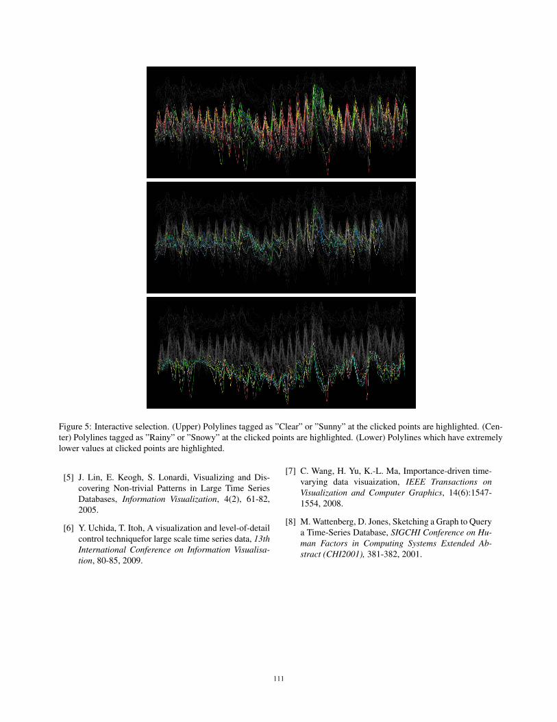
Figure 5: Interactive selection. (Upper) Polylines tagged as ”Clear” or ”Sunny” at the clicked points are highlighted. (Cen-ter) Polylines tagged as ”Rainy” or ”Snowy” at the clicked points are highlighted. (Lower) Polylines which have extremelylower values at clicked points are highlighted.
[5] J. Lin, E. Keogh, S. Lonardi, Visualizing and Dis-covering Non-trivial Patterns in Large Time SeriesDatabases, Information Visualization, 4(2), 61-82,2005.
[6] Y. Uchida, T. Itoh, A visualization and level-of-detailcontrol techniquefor large scale time series data, 13thInternational Conference on Information Visualisa-tion, 80-85, 2009.
[7] C. Wang, H. Yu, K.-L. Ma, Importance-driven time-varying data visuaization, IEEE Transactions onVisualization and Computer Graphics, 14(6):1547-1554, 2008.
[8] M. Wattenberg, D. Jones, Sketching a Graph to Querya Time-Series Database, SIGCHI Conference on Hu-man Factors in Computing Systems Extended Ab-stract (CHI2001), 381-382, 2001.
111