Visually Mining Off-line Data for Quality Improvement
11
QUALITY AND RELIABILITY ENGINEERING INTERNATIONAL Qual. Reliab. Engng. Int. 2003; 19:273–283 (DOI: 10.1002/qre.588) Special Issue Visually Mining Off-line Data for Quality Improvement ‡ Giovanni C. Porzio 1, ∗,† and Giancarlo Ragozini 2 1 Department of Economics, Cassino University, via Mazzaroppi, 03043 Cassino, Italy 2 Department of Sociology ‘Gino Germani’, Federico II University of Naples, Vico Monte di Piet` a 1, 80138 Naples, Italy Highly automated modern manufacturing processes are yielding large databases with records on hundreds of process variables and product characteristics. This large amount of information calls for new approaches to production process analysis. In this paper, we discuss why a data mining framework can be appropriate for this goal, and we propose a visual data mining strategy to mine large and high- dimensional off-line data sets. The strategy allows users to achieve a deeper process understanding through a set of linked interactive graphical devices, and is illustrated within an industrial process case study. Copyright c 2003 John Wiley & Sons, Ltd. KEY WORDS: dynamic graphics; retrospective CUSUM; statistical process control; visual data mining 1. INTRODUCTION B oth monitoring the production process and improving its quality are of strategic importance to the manufacturing industry. These goals are generally pursued through standard statistical process control (SPC) techniques. Nevertheless, new technologies call for new statistical methods. In the past, data were collected by sampling because of some limited capabilities of measurement systems. The main SPC tools were then designed to analyse sampled data, basically exploiting inferential methods. However, new automatic measurement devices have recently allowed continuous monitoring of processes, yielding large amounts of measures stored in internal databases. Consequently, both on-line process monitoring should be revised to manage such complexities 1 , and off-line analysis should be enriched through specific tools suitable for exploring large data sets. Wishing to address the latter issue, we propose a visual data mining strategy for off-line analysis of production processes. The method is designed to improve process and item quality, paying attention to the process level and variability, and to the main causes that lower quality. In order to visually extract interesting information lying in internal SPC databases, we provide a set of easy-to- interpret linked charts. These charts, that exploit some basic statistical methods, are strongly based on interactive and dynamic graphical devices. The procedure has been tested within the production process of a European car industry. Data are collected through optical electronic devices that take measures on about 70 points of each produced vehicle body. The paper is organized as follows. In Section 2 we briefly recall the main aims and tools of SPC, while in Section 3 we introduce basic concepts of data mining and we discuss a related visual approach. Then, we present ∗ Correspondence to: G. C. Porzio, Department of Economics, Cassino University, via Mazzaroppi, 03043 Cassino, Italy. † E-mail: [email protected] ‡ This paper is based on a presentation given at the second ENBIS Conference, Rimini, September 2002. Copyright c 2003 John Wiley & Sons, Ltd. Received 3 March 2003 Revised 25 May 2003
Transcript of Visually Mining Off-line Data for Quality Improvement

QUALITY AND RELIABILITY ENGINEERING INTERNATIONAL
Qual. Reliab. Engng. Int. 2003; 19:273–283 (DOI: 10.1002/qre.588)
Special Issue Visually Mining Off-line Datafor Quality Improvement‡
Giovanni C. Porzio1,∗,† and Giancarlo Ragozini21Department of Economics, Cassino University, via Mazzaroppi, 03043 Cassino, Italy2Department of Sociology ‘Gino Germani’, Federico II University of Naples, Vico Monte di Pieta 1, 80138 Naples, Italy
Highly automated modern manufacturing processes are yielding large databases withrecords on hundreds of process variables and product characteristics. This largeamount of information calls for new approaches to production process analysis.In this paper, we discuss why a data mining framework can be appropriate forthis goal, and we propose a visual data mining strategy to mine large and high-dimensional off-line data sets. The strategy allows users to achieve a deeper processunderstanding through a set of linked interactive graphical devices, and is illustratedwithin an industrial process case study. Copyright c© 2003 John Wiley & Sons, Ltd.
KEY WORDS: dynamic graphics; retrospective CUSUM; statistical process control; visual data mining
1. INTRODUCTION
Both monitoring the production process and improving its quality are of strategic importance to themanufacturing industry. These goals are generally pursued through standard statistical process control(SPC) techniques. Nevertheless, new technologies call for new statistical methods.
In the past, data were collected by sampling because of some limited capabilities of measurement systems.The main SPC tools were then designed to analyse sampled data, basically exploiting inferential methods.However, new automatic measurement devices have recently allowed continuous monitoring of processes,yielding large amounts of measures stored in internal databases. Consequently, both on-line process monitoringshould be revised to manage such complexities1, and off-line analysis should be enriched through specific toolssuitable for exploring large data sets.
Wishing to address the latter issue, we propose a visual data mining strategy for off-line analysis of productionprocesses. The method is designed to improve process and item quality, paying attention to the process leveland variability, and to the main causes that lower quality.
In order to visually extract interesting information lying in internal SPC databases, we provide a set of easy-to-interpret linked charts. These charts, that exploit some basic statistical methods, are strongly based on interactiveand dynamic graphical devices.
The procedure has been tested within the production process of a European car industry. Data are collectedthrough optical electronic devices that take measures on about 70 points of each produced vehicle body.
The paper is organized as follows. In Section 2 we briefly recall the main aims and tools of SPC, while inSection 3 we introduce basic concepts of data mining and we discuss a related visual approach. Then, we present
∗Correspondence to: G. C. Porzio, Department of Economics, Cassino University, via Mazzaroppi, 03043 Cassino, Italy.†E-mail: [email protected]‡This paper is based on a presentation given at the second ENBIS Conference, Rimini, September 2002.
Copyright c© 2003 John Wiley & Sons, Ltd.Received 3 March 2003
Revised 25 May 2003

274 G. C. PORZIO AND G. RAGOZINI
a visual data mining strategy to improve quality in Section 4. Methodological details are provided within a casestudy in Section 5. Finally, Section 6 offers some concluding remarks.
2. IMPROVING QUALITY THROUGH SPC
In the last few decades there has been considerable growth in the use of statistical methods for qualityimprovement in almost every kind of firm. Even if quality design and customer satisfaction have received muchattention in a total quality management perspective, process quality control still remains the main issue formanufacturing industries to tackle.
In this context, production can be efficiently managed through SPC, a common practice in industries anda classic consolidated methodology in statistics. SPC techniques are used to monitor the ongoing process, todetect out-of-control items, and to improve the overall process and item quality. In other words, SPC is mainlydevoted to:
(i) evaluating whether the process and items have specific quality standards (i.e. whether the process leveland/or the item characteristics are sufficiently close to given targets);
(ii) evaluating the coherence and the closeness to standards (i.e. if the process variability is sufficiently small);(iii) detecting and identifying process features that decrease quality.
SPC methodology is based on a set of user-oriented descriptive and inferential statistical tools, which usuallyexploit graphical representations (i.e. charts) to make their utilization easier.
Among the inferential techniques, control charts are the primary tool. Many kinds of charts are available,from the first Shewhart to the more sophisticated CUSUM and EWMA charts. Control charts are essentially avisualization of a series of repeated significance tests, one for each incoming item in the sample. Being tests,they obviously require precise distributional assumptions on models for the observed data. Several charts havebeen designed under different conditions to monitor process level or variability, and to detect out-of-controlitems (see e.g. Montgomery2).
The increasing complexity of production processes, which requires controlling many product features, hasbeen leading researchers to develop tools that take into account the multivariate nature of processes. In aparametric setting, main works consider multivariate normal as the underlying density function3–5, while morerecently nonparametric control charts have been developed to deal with more complex data structures6–8.
Multivariate control charts offer higher sensitivity in detecting out-of-control items. However, they do notallow quality to be directly improved as they do not indicate which variable or variables led to changes in leveland/or variability. In other words, multivariate methods generally fail to provide tools for discovering causes thatlower process and items quality. In this direction, some diagnostic techniques have been proposed, for exampleby Hawkins9, and Fuchs and Benjamini10.
3. PROCESS ANALYSIS AND DATA MINING FRAMEWORKS
Thanks to modern database capabilities and new measurement devices, an increasing number of production dataare available to extract relevant information for quality improvement. In our opinion, to manage these large datasets and to address the new issues of off-line process analysis, data mining seems to be the adequate statisticalframework.
Data mining has emerged in response to a need from industry for effective and efficient analysis of largedata sets. It was first defined as a non-trivial process of knowledge discovery in databases to identify valid,novel, potentially useful, and ultimately understandable patterns in data11. In this framework, new methods andtechniques are developed combining both basic and more sophisticated statistical tools in order to extract usefulinformation hidden in data, such as clusters, trends, associations and correlations12,13.
Copyright c© 2003 John Wiley & Sons, Ltd. Qual. Reliab. Engng. Int. 2003; 19:273–283

VISUALLY MINING OFF-LINE DATA 275
Data mining has found primary applications in the business world for market basket analysis, customerprofiling and scoring, Web clickstream analysis, and suchlike14. However, many other applications haveemerged in other fields such as economics, ecology, chemistry, medicine, and on-line SPC as well 15,16.
Hence, data mining strategy potentials lead us to believe that integrating statistical process control techniqueswith data mining can be effective in tackling the discussed emerging issues in process analysis. In particular,we consider visual data mining as the most appropriate framework for people involved daily in SPC, because oftheir habit of dealing with graphical displays.
Visual data mining can be considered a data mining process enriched by visualization methods17,18. It consistsof a learning process based on new visualization techniques like dynamic graphics. However, while data miningis generally based on highly automated methods, visual data mining is an interactive and not a completelyautomatic process. The key idea behind the approach is that people complement machines, and hence thecapabilities of both can be better exploited for knowledge discovery if visualization complements automaticprocedures19. In a visual data mining perspective, graphical representations are tools for the analysis bythemselves, and not a way of representing numerical results.
4. A VISUAL DATA MINING STRATEGY
With the aim of improving process quality, we thus propose a visual strategy that allows the user to achievedeeper process understanding. Specifically, we design a procedure that aims to identify changes in theprocess level and variability, and to detect causes that most affect quality, through an off-line analysis ofhigh dimensional and large SPC data sets. The procedure makes it easy to extract useful information in anunderstandable way through simple visualization and exploratory data analysis tools.
The proposed methodology is based on a set of control charts related to each other through algebraiclinkages20, and it relies on dynamic graphics tools21. The user is called upon to interactively mine the datathroughout three steps: the knowledge acquired on one chart is exploited as an input to decide upon somegraphical parameters that allow the next charts to be drawn.
At the first stage, we propose analysing the series of a certain univariate quality index—summarizingsomehow the multivariate measurements taken on each item—by means of a retrospective CUSUM type chart.The latter is a CUSUM chart applied to off-line process data22, and allows us to identify possible points wherethe process level changes (generally referred to as change points or breakpoints). The series is then split intogroups of data on the basis of the identified change points. As these subgroups are homogeneous with respectto the process level, we denote them as retrospective rational subgroups.
We then suggest a visual inspection of two charts, that we call Subgroup Mean and Interquantile charts,to select the rational subgroups that present heavier quality decay. Looking at differences among both meansand variations in interquantile ranges, groups of data with a worse process level and/or wider variability areidentified for further analysis.
Finally, in order to discover the main causes of quality decrease, we propose a Pareto-like graphical displayto facilitate the user to decide upon possible intervention on the production process. The chart is based on anassociation analysis performed through the computation of appropriate correlation coefficients on the selectedsubgroups.
We would like to note here that SPC techniques are usually provided along with automatic decision rules,based on critical values of hypothesis tests. However, inferential methods are not suitable in a data miningperspective. Large amounts of data lead to the rejection almost always of any null hypothesis, as the power oftests becomes very high. Consequently, in our case, any test to verify the presence of change points or differencesamong some statistics (means, medians, variances and suchlike) will yield too many significant results.
For this reason, we do not provide any kind of test-based decision rules for the discussed charts: the useris called to assess the significance of any differences by looking at the charts, taking into account his/herknowledge of the process.
Copyright c© 2003 John Wiley & Sons, Ltd. Qual. Reliab. Engng. Int. 2003; 19:273–283

276 G. C. PORZIO AND G. RAGOZINI
5. THE STRATEGY: TECHNICAL DETAILS AND A CASE STUDY
In this section we present the proposed strategy within a case study. First, we briefly introduce the data and thecontext where they arise, and then we provide the methodological details along with real data charts.
5.1. An industrial process case study
The data we consider derive from a production plant of a European car industry. Bodies of vehicles are monitoredthrough optical electronic devices, taking real-time measurements on 68 key points of the surfaces. Each dayover 1000 cars are produced, so that roughly half a million data could be stored weekly.
At the factory, process level and variability are monitored on-line through univariate classical control charts(X and R charts) for around 30 vehicles at time. Due to the large number of variables, factory engineers choseto monitor those of crucial interest, and hence only a small subset of quality characteristics are actually underinspection. In this way, potentially useful information is overlooked.
The whole set of variables is instead exploited to construct a univariate index that summarizes the overallquality of any single car body. For every 30 cars, the index values are visualized to manage the processperformance.
If we denote with X = (X1, . . . , Xj , . . . , X68) the variables under control at the factory, and with X0 =(X1
0, . . . , Xj
0 , . . . , X680 ) the corresponding target values, the index will be
QI = f (X, X0) (1)
i.e. QI is a map from the high dimensional space R68 to R1. Although we cannot describe the index in detail,note that lower values of the index correspond to higher quality products.
An observed series of the index for 1000 cars, recorded in about five days, is represented in Figure 1, wheredata have been pre-processed. The level and the variability of the series do not appear to be homogeneous forall the items, even if it is quite difficult to determine where such changes occur. In the following, without lackof generality, we will use the QI index and this series to illustrate our methodology.
5.2. Identifying retrospective rational subgroups
In the case of a large number of observations, such as the series in Figure 1, determining visually whether andwhere breakpoints have occurred can be difficult. However, breakpoints potentially hidden in the plot of theoriginal series can appear more clearly if data are appropriately transformed through retrospective cumulativesums. Displaying this cumulated series in a chart allows easier graphical identification of change points.
In SPC, CUSUM charts are used to detect when a process is going out of control because of a small shiftwith respect to a given target value. Generally, on-line CUSUM charts display the series of cumulative sums ofdeviations of the observed values from a given target value. The sum is up to the last observed data value, and itis updated as soon as a new value comes in. Properties of CUSUM charts have been extensively investigated inthe literature by many authors (see e.g. Hawkins and Olwell23, and references therein).
Retrospective CUSUMs differ from on-line CUSUMs as they transform off-line data for a given period,taking as the target value their arithmetic mean. Breakpoints in the transformed series correspond to breakpointsin the original one. If the latter presents subseries with different mean levels, a plot of the transformed series(the rCUSUM chart) will show a piecewise behaviour. The slope of each piece measures the difference amongthe subseries process level and the overall mean level. Its sign highlights positive or negative shifts in the mean,while the size measures the width of the difference. As long as the slope is close to zero, the correspondingvalues of the series are close to the overall average. Breakpoint detection methods based on rCUSUM have beeninvestigated in an inferential framework (see e.g. Antoch et al.24 and references therein), and some automaticprocedures for multiple breakpoints detection are available for small data sets25.
In our visual data mining perspective, the user selects dynamically the change points in the rCUSUM chart,looking at substantial differences in slopes. In so doing, a partition of the transformed series that corresponds to
Copyright c© 2003 John Wiley & Sons, Ltd. Qual. Reliab. Engng. Int. 2003; 19:273–283

VISUALLY MINING OFF-LINE DATA 277
Items
Qua
lity
Inde
x
0 200 400 600 800 1000
0.4
0.6
0.8
1.0
1.2
Figure 1. An observed series of the quality index QIi computed for 1000 vehicle bodies
a partition in the original one is generated. The item groups in the partition will be homogeneous with respectto their mean level in the original series. Due to such homogeneity, we call these groups of items retrospectiverational subgroups.
In SPC jargon, sampling by rational subgroups is a way of collecting groups of data that are likely to behomogeneous within and potentially different among them. Hence, rational subgroups are identified before dataare collected. In our case, we group off-line data after collection and some preliminary analyses, and this is whywe denote them as retrospective rational subgroups.
With respect to the quality indexQI (Equation 1), we aim to identify groups of items which are homogeneouswith respect to their quality level. In other words, we look for a partition of the observed series {QIi}(i=1,...,n)
taken in a period of interest. Its retrospective cumulative sum up to the mth observation C(QI)m is
C(QI)m =m∑
i=1
(QIi − �QI)
sQI
= C(QI)m−1 + (QIm − �QI)
sQI
where �QI is the arithmetic mean and sQI the standard deviation of {QIi}(i=1,...,n) (the standardized versionfacilitates the comparison of charts over different periods). The rCUSUM chart consists of the point-line indexplot of C(QI)m, m = 1, . . . , n.
Looking at the piecewise behaviour in this chart, the user breaks the cumulative series into pieces, selectingthe main change points. This implies the identification of a corresponding set of retrospective rational subgroups.If the change points are located at m1, . . . , mk, . . . , mK−1, the K retrospective rational subgroups of items willbe indexed by
rRSk = {mk−1 < i ≤ mk} k = 1, . . . , K, i ∈ Nwith m0 = 0, and mK = n. That is, rRSk is the set of indices of the observations belonging to the kth group.
Figure 2 presents the rCUSUM chart for the series discussed above (Figure 1). A piecewise behaviourclearly appears, and hence some change points in the cumulative series can be identified. At a first glance, we
Copyright c© 2003 John Wiley & Sons, Ltd. Qual. Reliab. Engng. Int. 2003; 19:273–283
278 G. C. PORZIO AND G. RAGOZINI
Items
Ret
rosp
ectiv
e C
umul
ativ
e S
ums
0 200 400 600 800 1000
-8-6
-4-2
02
4
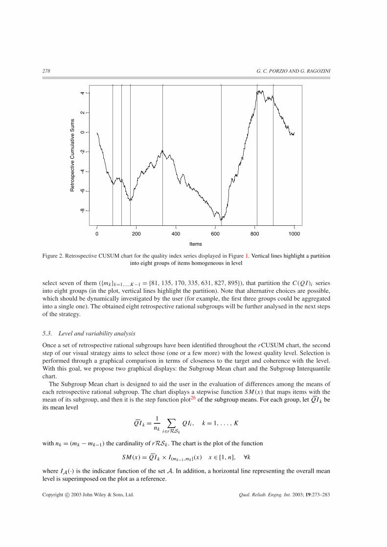
Figure 2. Retrospective CUSUM chart for the quality index series displayed in Figure 1. Vertical lines highlight a partitioninto eight groups of items homogeneous in level
select seven of them ({mk}k=1,...,K−1 = {81, 135, 170, 335, 631, 827, 895}), that partition the C(QI)i seriesinto eight groups (in the plot, vertical lines highlight the partition). Note that alternative choices are possible,which should be dynamically investigated by the user (for example, the first three groups could be aggregatedinto a single one). The obtained eight retrospective rational subgroups will be further analysed in the next stepsof the strategy.
5.3. Level and variability analysis
Once a set of retrospective rational subgroups have been identified throughout the rCUSUM chart, the secondstep of our visual strategy aims to select those (one or a few more) with the lowest quality level. Selection isperformed through a graphical comparison in terms of closeness to the target and coherence with the level.With this goal, we propose two graphical displays: the Subgroup Mean chart and the Subgroup Interquantilechart.
The Subgroup Mean chart is designed to aid the user in the evaluation of differences among the means ofeach retrospective rational subgroup. The chart displays a stepwise function SM(x) that maps items with themean of its subgroup, and then it is the step function plot26 of the subgroup means. For each group, let �QIk beits mean level
�QIk = 1
nk
∑i∈rRSk
QIi, k = 1, . . . , K
with nk = (mk − mk−1) the cardinality of rRSk . The chart is the plot of the function
SM(x) = �QIk × I(mk−1,mk](x) x ∈ [1, n], ∀k
where IA(·) is the indicator function of the set A. In addition, a horizontal line representing the overall meanlevel is superimposed on the plot as a reference.
Copyright c© 2003 John Wiley & Sons, Ltd. Qual. Reliab. Engng. Int. 2003; 19:273–283

VISUALLY MINING OFF-LINE DATA 279
The Subgroup Interquantile chart provides a way to graphically compare variability among groups.By analogy with the previous chart, it is a plot of two stepwise functions IQR(x) and PR(x), which respectivelymaps items with the interquartile and the 10–90 percentile ranges of their groups. Let IQRk = Qk
0.75 − Qk0.25
(k = 1, . . . , K) be the subgroup interquartile range and PRk = Qk0.90 − Qk
0.10 (k = 1, . . . , K) be its 10–90percentile range, where we denote the j/m quantile for the kth group with Qk
j/m, that is the value below whichare the j mths of the data in the group. The chart is a step function plot of the subgroup interquantile ranges,displaying both
IQR(x) = IQRk × I(mk−1,mk](x) x ∈ [1, n], ∀k
PR(x) = PRk × I(mk−1,mk](x) x ∈ [1, n], ∀k
along with two reference lines corresponding to the overall interquartile and the 10–90 percentile ranges.The proposed charts allow the user to select the worst subgroups, as they visualize:
(i) which groups of items have better or worse performance with respect to the average level and variability;(ii) how wide are the deviations of the group means and ranges from the overall mean and range;
(iii) how large are the sizes of each group.
Combining the information from both charts, users should select one or more rational subgroups to beexplored in the next steps of the analysis. They should focus their attention on groups with the widest positivedeviations from the reference lines, jointly taking into account the group sizes.
For the data set we are analysing, the proposed charts for the eight groups previously obtained are displayedin Figures 3 and 4. In the Subgroup Mean chart (Figure 3) we note that two groups (the fourth and the sixth fromthe left) have mean levels substantially higher than the overall level, i.e. the worse quality level. In addition, theSubgroup Interquantile chart (Figure 4) highlights that one of these (the sixth) also has the widest variability.As the size of such a group is quite large with respect to the series size (183 over 1000 observations), we considerit worthy of further investigation.
5.4. Discovering causes
At this stage of our visual data mining strategy it is worth discovering which are the Xj variables that movealong with the quality index series. In other words, we aim to point out the variables that have the same patternof the quality index for the group of items presenting the lowest (or lower) quality. The pairwise correlationcoefficient seems to us to be a simple and an appropriate tool for this aim. It is indeed well known that it is asimilarity measure among two series, as it is negatively related to their squared Euclidean distance.
Furthermore, as the quality index is a function of all the quality measurements, in our case the correlationcoefficient can be interpreted in terms of causality. Hence, the most correlated variables may have caused thequality decay and are good candidates for further investigation. To visually identify the variables that mainlylead to the decay of process quality, we then propose a Correlation Pareto chart.
The chart consists of two side by side bar plots, representing respectively the positive and negative correlationvalues on a quadratic scale. The values are arranged in descending order in both plots, and the same vertical axisscale is used, so that the user can easily identify which variables have mainly contributed to the variation of theindex. In addition, to highlight the relative weight of each variable with respect to the others (having the samecorrelation sign), a Pareto-like line is superimposed on each plot.
The correlation coefficients are computed for the items belonging to two consecutive rational subgroups: theone selected through the inspection of the Subgroup Mean and Interquantile charts, and the previous group.In this way we do not consider patterns along the whole observed series, but we measure similarities only inneighbourhoods of the selected change in level.
In detail, let k∗ be the selected group, and let r∗j be the moment product Pearson correlation coefficients
between the quality index and its j th component variable computed on the items belonging to the k∗th and the
Copyright c© 2003 John Wiley & Sons, Ltd. Qual. Reliab. Engng. Int. 2003; 19:273–283

280 G. C. PORZIO AND G. RAGOZINI
Items
Sub
grou
p M
eans
0 200 400 600 800 1000
0.58
0.60
0.62
0.64
0.66
0.68
0.70
0.72
Figure 3. Subgroup Mean chart for the quality index series displayed in Figure 1, based on the partition drawn in Figure 2.The function displays the group means. The horizontal line represents the overall mean
Items
Sub
grou
p In
terq
uant
iles
0 200 400 600 800 1000
0.1
0.2
0.3
0.4
Figure 4. Subgroup Interquantile chart for the quality index series displayed in Figure 1, based on the partition drawn inFigure 2. The functions display the group 10–90 percentiles and the interquartile ranges, respectively, at the top and at the
bottom of the figure. The horizontal lines represent the overall ranges
Copyright c© 2003 John Wiley & Sons, Ltd. Qual. Reliab. Engng. Int. 2003; 19:273–283

VISUALLY MINING OFF-LINE DATA 2810.
00.
10.
20.
30.
40.
5
Variables
r^2
100%
75%
50%
25%
0.0% 0.0
0.1
0.2
0.3
0.4
0.5
Variables
100%
75%
50%
25%
0.0%
Cum
ulat
ive
perc
enta
ge
Figure 5. Correlation Pareto chart for the sixth selected group
previous group. That is,
r∗j = rk∗(QI, Xj ) =
∑i∈rRSI∗ (QIi − �QII∗)(Xj
i − �Xj
I∗)√∑i∈rRSI∗ (QIi − �QII∗)2
∑i∈rRSI∗ (X
ji − �Xj
I∗)2
with rRSI∗ = rRSk∗−1 ∪ rRSk∗ , I∗ = {k∗ − 1, k∗}, �QII∗ and �Xj
I∗ are the means of QIi and Xji for the
items in rRSI∗ .The Correlation Pareto chart will display separately the positive and negative correlations (say r∗+
j and r∗−j ),
as they provide different information. While positive correlations highlight variables that may have caused thequality lowering, negative correlations point out variables that may have improved the quality level.
Furthermore, as the correlation coefficient values are not on a linear scale, we plot them on a quadratic scalein order that comparison is not misleading. The squared correlation coefficient can also be interpreted as theproportion of variance of the QI index explained by the linear relationship with the variable Xj .
To visually aid the user in evaluating differences we draw the two bar plots in analogy with the classicalSPC Pareto chart. The left side of the chart displays the sorted sequence of the squared positive coefficients{[r∗+]2
(j)}j=1,...,J+ ([r∗+]2(j) ≥ [r∗+]2
(j+1)), with J+ the number of positive correlations. In addition, a linejoining the points
P+(j) =
∑j
i=1[r∗+]2(i)∑J+
i=1[r∗+]2(i)
j = 1, . . . , J+
is superimposed. Negative correlations are represented in an analogous way at the right side of the chart.
Copyright c© 2003 John Wiley & Sons, Ltd. Qual. Reliab. Engng. Int. 2003; 19:273–283

282 G. C. PORZIO AND G. RAGOZINI
With respect to our case study, the Correlation Pareto chart for the sixth group identified in the previoussection is displayed in Figure 5. Looking at positive correlations (left side of the chart) we note three variables(in order from the left X57, X58, X42) with higher correlations. These variables mainly lead to the qualitydecrease of the selected items. They are, then, candidates for further investigation by the factory engineers.
At this stage of the analysis, further investigations on the selected variables may be performed throughpartial correlations, so that relationships among them and possible spurious correlations can be taken intoaccount. Alternatively, if a strong multivariate correlation structure is suspected, we suggest constructing aPartial Correlation Pareto Chart for all the variables.
At the end, we would like to note that a knowledge discovery process cannot be brought to a close by meansof a single procedure or method. The whole strategy has thus to be intended as an exploratory phase of thelearning process that could be integrated with more sophisticated analysis.
6. SOME CONCLUDING REMARKS
In this paper we presented a visual data mining strategy designed to visually investigate multivariate productionprocesses in an effective and simple way. Effectiveness is pursued through the interaction among human visuallearning skills and computer-based numerical methods. The user is called upon to learn from data step by step,exploiting novel information acquired at each stage to achieve deeper insights into the process. The overallstrategy is designed so that the graphical procedure has to be run more than once: the user should changethe items to be grouped and investigated, so that different causes of quality lowering can be discovered.In addition, we note that the method, asking the user to interactively drive the computer in the detection ofrelevant information allows some computational gains with respect to other possible automatic techniques.
The simplicity of the strategy is given by both the adopted statistical methods and the way in which resultsare represented. Basic ideas behind our proposal are indeed quite familiar within the SPC context. However, werevised their use in order to provide answers to the challenging questions arising from the availability of largedatabases. Furthermore, combining these basic tools under a visual data mining perspective, we enhanced theircapabilities and explanatory power.
Finally, we note that, although the procedure has been illustrated for a given index, it can be performed withany univariate quality index that maps the multivariate structure of a process in a few summary variables (e.g. theHotelling T 2 statistic or some first principal components).
Acknowledgements
The authors would like to thank Paola Costantini and staff at the company for useful information anddiscussions.
REFERENCES
1. Montgomery DC. Research in industrial statistics—part I. Quality and Reliability Engineering International 2001;17(6):iii–iv.
2. Montgomery DC. Introduction to Statistical Quality Control (4th edn). Wiley: New York, 2001.3. Alt FB. Multivariate quality control. Encyclopaedia of Statistical Sciences, vol. 6, Johnson NL, Kotz S (eds.). Wiley:
New York, 1985; 111–122.4. Alt FB, Smith ND. Multivariate process control. Handbook of Statistics, vol. 7, Krishnaiah PR, Rao CR (eds.). Elsevier:
Amsterdam, 1988; 333–351.5. Mason RL, Young JC. Multivariate Statistical Process Control with Industrial Application (ASA-SIAM Series on
Statistics and Applied Probability, vol. 9). Society for Industrial and Applied Mathematics: Philadelphia, PA, 2001.6. Liu RY. Control charts for multivariate process. Journal of the American Statistical Association 1995; 90:1380–1387.7. Qiu P, Hawkins DM. A rank-based multivariate CUSUM procedure. Technometrics 2001; 43:120–132.
Copyright c© 2003 John Wiley & Sons, Ltd. Qual. Reliab. Engng. Int. 2003; 19:273–283

VISUALLY MINING OFF-LINE DATA 283
8. Scepi G. Parametric and nonparametric multivariate quality control charts. Multivariate Total Quality Control, Lauro C,Antoch J, Esposito Vinzi V, Saporta G (eds.). Physica: Heidelberg, 2002; 163–189.
9. Hawkins DM. Multivariate quality control using regression adjusted variables. Technometrics 1991; 33:61–75.10. Fuchs C, Benjamini Y. Multivariate profile charts for statistical process control. Technometrics 1994; 36:182–195.11. Fayyad UM, Piatetsky-Shapiro G G, Smyth P. From data mining to knowledge discovery. Advances in Knowledge
Discovery and Data Mining, Fayyad UM, Piatetsky-Shapiro G G, Smyth P (eds.). AAAI Press: Menlo Park, CA, 1996;37–57.
12. Hastie T, Tibshirani R, Friedman J. The Elements of Statistical Learning: Data Mining, Inference, and Prediction.Springer: New York, 2001.
13. Perner P. Data Mining on Multimedia Data. Springer: Heidelberg, 2002.14. Giudici P. Applied Data Mining: Statistical Methods for Business and Industry. Wiley: New York, 2003(in press).15. Milne R,Drummond M, Renoux P. Predicting paper making defects on-line using data mining. Knowledge-Based
Systems 1998; 11:331–338.16. Perner P. Advances in Data Mining, Applications in E-commerce, Medicine, and Knowledge Management. Springer:
Heidelberg, 2002.17. Inselberg A. Visual data mining with parallel coordinates. Computational Statistics 1998; 13:47–63.18. Macedo M, Cook D, Brown TJ. Visual data mining in atmospheric science data. Data Mining and Knowledge Discovery
2000; 4:69–80.19. Cox KC, Eick SG, Wills GJ. Visual data mining: recognizing telephone calling fraud. Data Mining and Knowledge
Discovery 1997; 1:225–231.20. Young FW, Faldowsky RA, McFarlane MM. Multivariate statistical visualization. Handbook of Statistics, vol. 9,
Rao CR (ed.). Elsevier: Amsterdam, 1993; 959–998.21. Cleveland WS, McGill R. Dynamic Graphics for Statistics. Wadsworth and Brooks/Cole: Belmont, CA, 1988.22. Woodward RH, Goldsmith PL. Cumulative Sum Techniques. Oliver and Boyd for ICI: Edinburgh, 1964.23. Hawkins DM, Olwell DH. Cumulative Sum Charts and Charting for Quality Improvement, Springer: New York, 1998.24. Antoch J, Huskova M, Jaruskova D. Off-line statistical process control. Multivariate Total Quality Control, Lauro C,
Antoch J, Esposito Vinzi V, Saporta G (eds.). Physica: Heidelberg, 2002; 1–86.25. Taylor AL, Tait SP, Porter MA, Perry MJ, Nicolson RW. Automatic breakpoint detection for retrospective cumulative
sum charts. Pharmaceutical Statistics 2002; 1:25–34.26. Cleveland WS. The Elements of Graphing Data (rev. edn). AT& T Bell Laboratories: Murray Hill, NJ, 1994; 188–189.
Authors’ biographies
Giovanni C. Porzio is an Associate Professor in the Department of Economics at Cassino University in Italy.He received an MSc in Statistics from the University of Minnesota, and a PhD in Computational Statistics fromthe Federico II University of Naples, Italy. His research interests include multivariate statistical process control,model building and diagnostics, graphical methods for statistics.
Giancarlo Ragozini is an Assistant Professor in the Department of Sociology at the Federico II University ofNaples in Italy. He received a PhD in Computational Statistics from the Federico II University of Naples, Italy.His research interests include multiple outlier detection in multivariate data, nonparametric quality control,graphical methods for statistics, and the application of computational geometry to exploratory data analysis.He is currently involved in the VITAMINS European project on visual data mining.
Copyright c© 2003 John Wiley & Sons, Ltd. Qual. Reliab. Engng. Int. 2003; 19:273–283