Sign language phonology: Issues of iconicity and universality 1
Upload
independentCategory
view
3download
0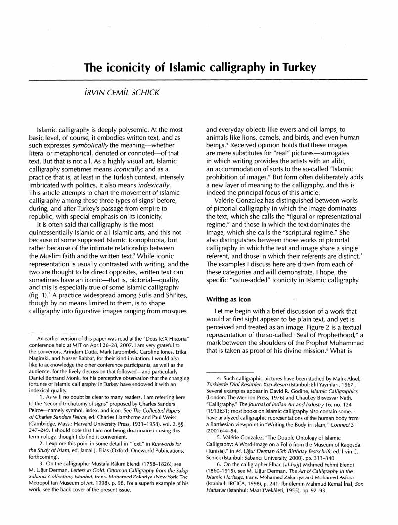
The iconicity of Islamic calligraphy in Turkey
IRVIN CEMIL SCHICK
Islamic calligraphy is deeply polysemic. At the most
basic level, of course, it embodies written text, and as
such expresses symbolically the meaning?whether literal or metaphorical, denoted or connoted?of that text. But that is not all. As a highly visual art, Islamic
calligraphy sometimes means iconically; and as a
practice that is, at least in the Turkish context, intensely imbricated with politics, it also means indexically.
This article attempts to chart the movement of Islamic
calligraphy among these three types of signs1 before,
during, and after Turkey's passage from empire to
republic, with special emphasis on its iconicity. It is often said that calligraphy is the most
quintessential^ Islamic of all Islamic arts, and this not because of some supposed Islamic iconophobia, but rather because of the intimate relationship between the Muslim faith and the written text.2 While iconic
representation is usually contrasted with writing, and the two are thought to be direct opposites, written text can sometimes have an iconic?that is, pictorial?quality, and this is especially true of some Islamic calligraphy (fig. 1).3 A practice widespread among Sufis and Shi'ites,
though by no means limited to them, is to shape calligraphy into figurative images ranging from mosques
and everyday objects like ewers and oil lamps, to
animals like lions, camels, and birds, and even human
beings.4 Received opinion holds that these images are mere substitutes for "real" pictures?surrogates in which writing provides the artists with an alibi, an accommodation of sorts to the so-called "Islamic
prohibition of images." But form often deliberately adds a new layer of meaning to the calligraphy, and this is indeed the principal focus of this article.
Valerie Gonzalez has distinguished between works of pictorial calligraphy in which the image dominates the text, which she calls the "figural or representational regime," and those in which the text dominates the
image, which she calls the "scriptural regime." She also distinguishes between those works of pictorial calligraphy in which the text and image share a single referent, and those in which their referents are distinct.5 The examples I discuss here are drawn from each of these categories and will demonstrate, I hope, the
specific "value-added" iconicity in Islamic calligraphy.
Writing as icon
Let me begin with a brief discussion of a work that would at first sight appear to be plain text, and yet is
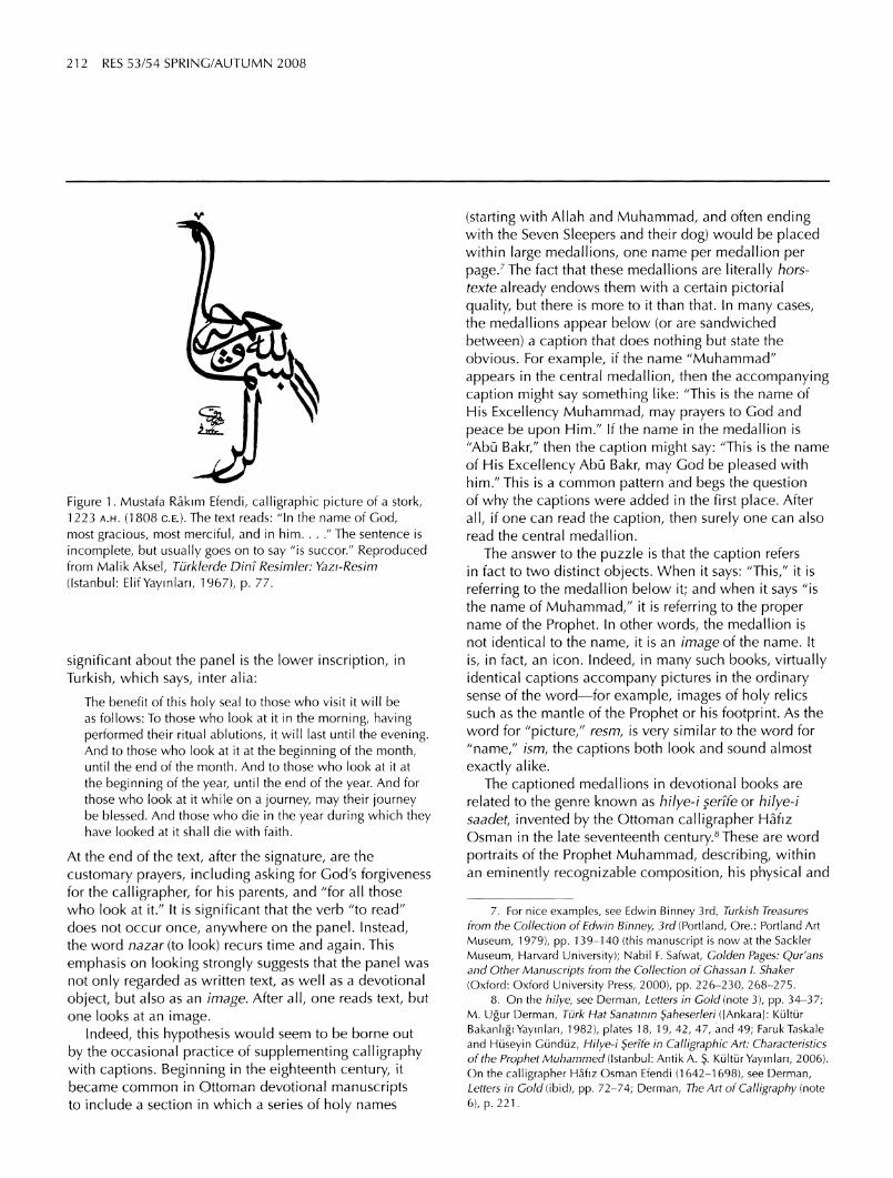
perceived and treated as an image. Figure 2 is a textual
representation of the so-called "Seal of Prophethood," a mark between the shoulders of the Prophet Muhammad that is taken as proof of his divine mission.6 What is
An earlier version of this paper was read at the "Deus (e)X Historia" conference held at MIT on April 26-28, 2007. I am very grateful to
the convenors, Arindam Dutta, Mark Jarzombek, Caroline Jones, Erika
Naginski, and Nasser Rabbat, for their kind invitation. I would also like to acknowledge the other conference participants, as well as the
audience, for the lively discussion that followed?and particularly Daniel Bertrand Monk, for his perceptive observation that the changing fortunes of Islamic calligraphy in Turkey have endowed it with an
indexical quality. 1. As will no doubt be clear to many readers, I am referring here
to the "second trichotomy of signs" proposed by Charles Sanders
Peirce?namely symbol, index, and icon. See The Collected Papers of Charles Sanders Peirce, ed. Charles Hartshorne and Paul Weiss
(Cambridge, Mass.: Harvard University Press, 1931-1958), vol. 2, ?? 247-249. I should note that I am not being doctrinaire in using this
terminology, though I do find it convenient.
2. I explore this point in some detail in "Text," in Keywords for the Study of Islam, ed. Jamal J. Elias (Oxford: Oneworld Publications,
forthcoming). 3. On the calligrapher Mustafa Rakim Efendi (1758-1826), see
M. Ugur Derman, Letters in Gold: Ottoman Calligraphy from the Sakip Sabanci Collection, Istanbul, trans. Mohamed Zakariya (New York: The
Metropolitan Museum of Art, 1998), p. 98. For a superb example of his
work, see the back cover of the present issue.
4. Such calligraphic pictures have been studied by Malik Aksel, Turklerde Dint Resimler: Yazi-Resim (Istanbul: Elif Yaymlari, 1967). Several examples appear in David R. Godine, Islamic Calligraphics (London: The Merrion Press, 1976) and Chaubey Bisvesvar Nath,
"Calligraphy," The Journal of Indian Art and Industry 16, no. 124
(1913):31; most books on Islamic calligraphy also contain some. I have analyzed calligraphic representations of the human body from a Barthesian viewpoint in "Writing the Body in Islam," Connect 3
(2001):44-54. 5. Valerie Gonzalez, "The Double Ontology of Islamic
Calligraphy: A Word-Image on a Folio from the Museum of Raqqada (Tunisia)," in M. Ugur Derman 65th Birthday Festschrift, ed. Irvin C. Schick (Istanbul: Sabanci University, 2000), pp. 313-340.
6. On the calligrapher Elhac [al-hajj] Mehmed Fehmi Efendi
(1860-1915), see M. Ugur Derman, The Art of Calligraphy in the Islamic Heritage, trans. Mohamed Zakariya and Mohamed Asfour
(Istanbul: IRCICA, 1998), p. 241; ibniilemin Mahmud Kemal inal, Son Hattatlar (Istanbul: Maarif Vekaleti, 1955), pp. 92-93.
212 RES 53/54 SPRING/AUTUMN 2008
V
Figure 1. Mustafa Rakim Efendi, calligraphic picture of a stork, 1223 a.h. (1808 ce). The text reads: "In the name of God,
most gracious, most merciful, and in him. . . ." The sentence is
incomplete, but usually goes on to say "is succor/' Reproduced from Malik Aksel, Turklerde Dint Resimler: Yazi-Resim (Istanbul: Elif Yayinlari, 1967), p. 77.
significant about the panel is the lower inscription, in
Turkish, which says, inter alia:
The benefit of this holy seal to those who visit it will be as follows: To those who look at it in the morning, having performed their ritual ablutions, it will last until the evening. And to those who look at it at the beginning of the month, until the end of the month. And to those who look at it at the beginning of the year, until the end of the year. And for those who look at it while on a journey, may their journey be blessed. And those who die in the year during which they have looked at it shall die with faith.
At the end of the text, after the signature, are the
customary prayers, including asking for God's forgiveness for the calligrapher, for his parents, and "for all those
who look at it." It is significant that the verb "to read" does not occur once, anywhere on the panel. Instead, the word nazar (to look) recurs time and again. This
emphasis on looking strongly suggests that the panel was
not only regarded as written text, as well as a devotional
object, but also as an image. After all, one reads text, but one looks at an image.
Indeed, this hypothesis would seem to be borne out
by the occasional practice of supplementing calligraphy with captions. Beginning in the eighteenth century, it became common in Ottoman devotional manuscripts to include a section in which a series of holy names
(starting with Allah and Muhammad, and often ending with the Seven Sleepers and their dog) would be placed within large medallions, one name per medallion per
page.7 The fact that these medallions are literally hors texte already endows them with a certain pictorial quality, but there is more to it than that. In many cases, the medallions appear below (or are sandwiched
between) a caption that does nothing but state the obvious. For example, if the name "Muhammad"
appears in the central medallion, then the accompanying caption might say something like: "This is the name of His Excellency Muhammad, may prayers to God and
peace be upon Him." If the name in the medallion is "Abu Bakr," then the caption might say: "This is the name of His Excellency Abu Bakr, may God be pleased with him." This is a common pattern and begs the question of why the captions were added in the first place. After
all, if one can read the caption, then surely one can also read the central medallion.
The answer to the puzzle is that the caption refers in fact to two distinct objects. When it says: "This," it is
referring to the medallion below it; and when it says "is the name of Muhammad," it is referring to the proper name of the Prophet. In other words, the medallion is not identical to the name, it is an image of the name. It
is, in fact, an icon. Indeed, in many such books, virtually identical captions accompany pictures in the ordinary sense of the word?for example, images of holy relics such as the mantle of the Prophet or his footprint. As the
word for "picture," resm, is very similar to the word for
"name," ism, the captions both look and sound almost
exactly alike. The captioned medallions in devotional books are
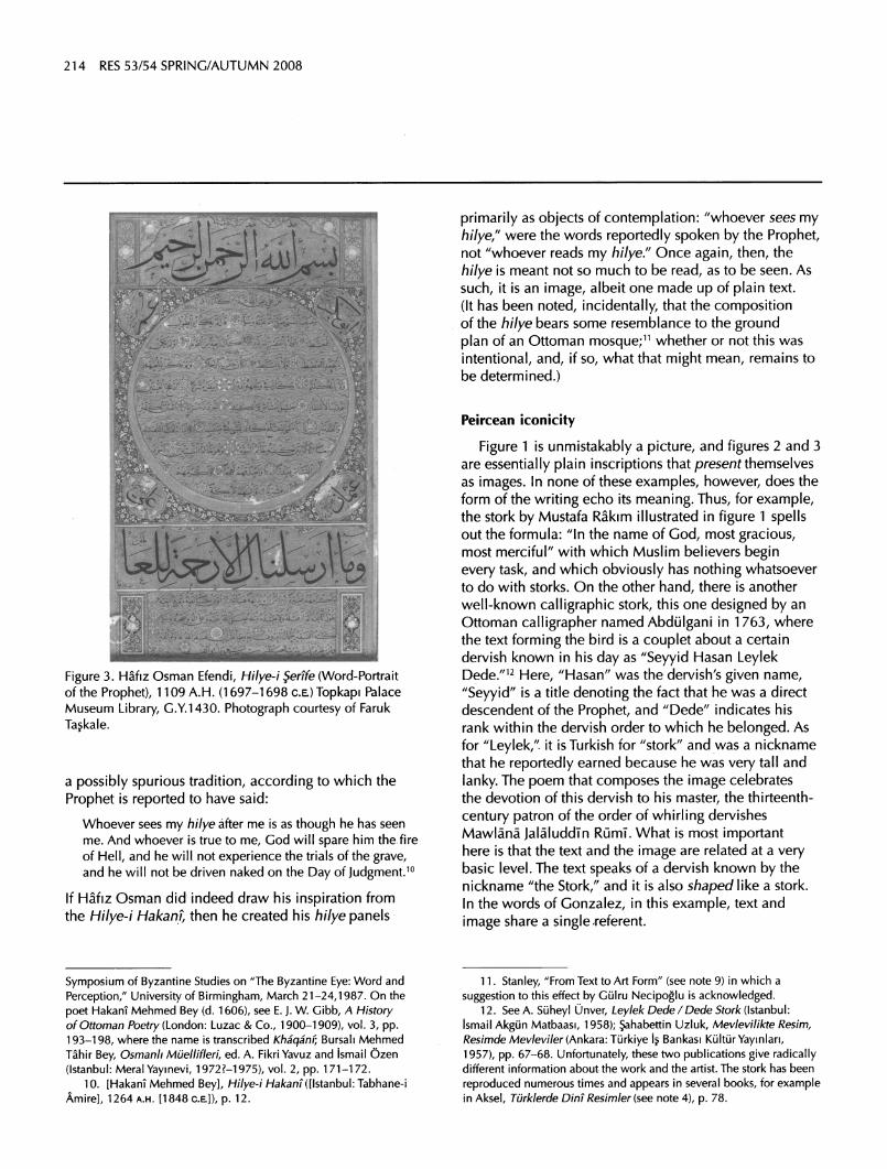
related to the genre known as hilye-i ?er?fe or hilye-i saadet, invented by the Ottoman calligrapher Hafiz Osman in the late seventeenth century.8 These are word
portraits of the Prophet Muhammad, describing, within an eminently recognizable composition, his physical and
7. For nice examples, see Edwin Binney 3rd, Turkish Treasures
from the Collection of Edwin Binney 3rd (Portland, Ore.: Portland Art
Museum, 1979), pp. 139-140 (this manuscript is now at the Sackler
Museum, Harvard University); Nabil F. Safwat, Golden Pages: Qur'ans and Other Manuscripts from the Collection of Ghassan I. Shaker
(Oxford: Oxford University Press, 2000), pp. 226-230, 268-275.
8. On the hi lye, see Derman, Letters in Gold (note 3), pp. 34-37; M. Ugur Derman, Turk Hat Sanatmm }aheserleri ([Ankara]: Kultur
Bakanhgi Yaymlan, 1982), plates 18, 19, 42, 47, and 49; FarukTaskale
and Huseyin Gunduz, Hilye-i ?er?fe in Calligraphic Art: Characteristics
of the Prophet Muhammed (Istanbul: Antik A. ?. Kultur Yaymlan, 2006). On the calligrapher Hafiz Osman Efendi (1642-1698), see Derman, Letters in Gold (ibid), pp. 72-74; Derman, The Art of Calligraphy (note
6), p. 221.

Schick: The iconicity of Islamic calligraphy in Turkey 213
Figure 2. Elhac Mehmed Fehmi Efendi, calligraphic panel titled "Form of the Seal of Prophethood of Muhammad the Chosen One," 1309 a.h. (1891-1892 ce). Author's collection.
moral attributes (fig. 3). With slight variations, the central medallion contains the following text:
[It is related] from 'Ali (may God be pleased with him) that when he described the attributes of the Prophet (may prayers to God and peace be upon him), he said: He was not too tall, nor was he too short, he was of medium height amongst the nation. His hair was not short and curly, nor was it lank, it would hang down in waves. His face was not overly plump, nor was it fleshy, yet it was somewhat circular. His
complexion was rosy white. His eyes were large and black, and his eyelashes were long. He was large-boned and broad-shouldered. His torso was hairless except for a thin line that stretched down his chest to his belly. His hands and feet were rather large. When he walked, he would lean forward as if going down a slope. When he looked at someone, he would turn his entire body towards him. Between his two shoulders was the Seal of Prophethood, and he was the last of the prophets.
That these panels were intended as portraits is clear not
only from the descriptive text above, but also from the
fact that the components of the panel were named (from
top to bottom): ba?makam (head station), gobek (belly), kusak (belt), and etek (skirt).
Now, the Arabic word hilyah refers to the features or
appearance of a person, and the Ottoman compounds hilye-i serife (noble hi lye) and hilye-i saadet (felicitous
hilye) denote the features or appearance of the Prophet Muhammad. Tim Stanley has suggested that while the
hilye may have arisen as the Muslim counterpart of the Orthodox Christian icon, in view of the fact that a figural representation of the Prophet would have been frowned
upon in the Sunni tradition, it was most likely inspired by the celebrated poem of the sixteenth-century Ottoman
poet HakanT Mehmed Bey known as Hilye-i Hakan?
(the hilye of HakanT).9 This latter was in turn based on
9. Tim Stanley, "From Text to Art Form in the Ottoman Hilye," to appear in Studies in Islamic Art and Architecture in Honor ofFiliz
gagman (forthcoming). See also his "Sublimated Icons: The Hilye-i ?erife as an Image of the Prophet," paper read at the 21 st Spring
214 RES 53/54 SPRING/AUTUMN 2008
Figure 3. Hafiz Osman Efendi, Hilye-i $ertfe (Word-Portrait of the Prophet), 1109 A.H. (1697-1698 ce) Topkapi Palace Museum Library, G.Y.1430. Photograph courtesy of Faruk Taskale.
a possibly spurious tradition, according to which the
Prophet is reported to have said:
Whoever sees my hi lye after me is as though he has seen me. And whoever is true to me, God will spare him the fire of Hell, and he will not experience the trials of the grave, and he will not be driven naked on the Day of Judgment.10
If Hafiz Osman did indeed draw his inspiration from the Hilye-i Hakani, then he created his hilye panels
primarily as objects of contemplation: "whoever sees my
hilye/' were the words reportedly spoken by the Prophet, not "whoever reads my hilye." Once again, then, the
hilye is meant not so much to be read, as to be seen. As
such, it is an image, albeit one made up of plain text.
(It has been noted, incidentally, that the composition of the hilye bears some resemblance to the ground plan of an Ottoman mosque;11 whether or not this was
intentional, and, if so, what that might mean, remains to be determined.)
Peircean iconicity
Figure 1 is unmistakably a picture, and figures 2 and 3 are essentially plain inscriptions that present themselves as images. In none of these examples, however, does the form of the writing echo its meaning. Thus, for example, the stork by Mustafa Rakim illustrated in figure 1 spells out the formula: "In the name of God, most gracious, most merciful" with which Muslim believers begin every task, and which obviously has nothing whatsoever to do with storks. On the other hand, there is another
well-known calligraphic stork, this one designed by an
Ottoman calligrapher named Abdulgani in 1763, where the text forming the bird is a couplet about a certain dervish known in his day as "Seyyid Hasan Leylek Dede."12 Here, "Hasan" was the dervish's given name,
"Seyyid" is a title denoting the fact that he was a direct descendent of the Prophet, and "Dede" indicates his rank within the dervish order to which he belonged. As for "Leylek," it is Turkish for "stork" and was a nickname that he reportedly earned because he was very tall and
lanky. The poem that composes the image celebrates the devotion of this dervish to his master, the thirteenth
century patron of the order of whirling dervishes Mawlana Jalaluddin Rumi. What is most important here is that the text and the image are related at a very basic level. The text speaks of a dervish known by the nickname "the Stork," and it is also shaped like a stork. In the words of Gonzalez, in this example, text and
image share a single referent.
Symposium of Byzantine Studies on "The Byzantine Eye: Word and
Perception/' University of Birmingham, March 21-24,1987. On the
poet Hakani Mehmed Bey (d. 1606), see E. J. W. Gibb, A History of Ottoman Poetry (London: Luzac & Co., 1900-1909), vol. 3, pp.
193-198, where the name is transcribed Khaqanv, Bursali Mehmed
Tahir Bey, Osmanh Muellifleri, ed. A. Fikri Yavuz and ismail Ozen
(Istanbul: Meral Yaymevi, 1972?-1975), vol. 2, pp. 171-172.
10. [Hakam Mehmed Bey], Hilye-i Hakani ([Istanbul: Tabhane-i
Amire], 1264 a.h. [1848 ce]), p. 12.
11. Stanley, "From Text to Art Form" (see note 9) in which a
suggestion to this effect by Gulru Necipoglu is acknowledged. 12. See A. Suheyl Unver, Leylek Dede /Dede Stork (Istanbul:
ismail Akgun Matbaasi, 1958); ?ahabettin Uzluk, Mevlevilikte Resim, Resimde Mevleviler (Ankara: Turkiye Is Bankasi Kultur Yaymlan, 1957), pp. 67-68. Unfortunately, these two publications give radically different information about the work and the artist. The stork has been
reproduced numerous times and appears in several books, for example in Aksel, Turklerde Dint Resimler (see note 4), p. 78.
Schick: The iconicity of Islamic calligraphy in Turkey 215
Figure 4. Mustafa Halim Ozyazici, calligraphic image incorporating the Qur'anic verse: "And we have not sent you but as mercy to the worlds" (al-Anbiya 21:107), 1348 a.h.
(1929-30 ce). Author's collection.
There are many such examples. Ali, son-in-law of the Prophet Muhammad and the fourth caliph according to Sunni Muslims (and his first legitimate successor according to Shi'ites) was nicknamed Haydar and Asadullah?the former meaning "lion" and the latter "lion of God." For this reason, many calligraphic compositions containing invocations and prayers to him are shaped like a lion.13 In other cases, the letter ya in Ali's name is forked, to resemble his fabled sword,
dhulfiqar. Many panels declaring "Ah min al-'ashq" (Ah! [How I have suffered] from love) have the letter
ha shaped like a tearful eye, sometimes pierced by an
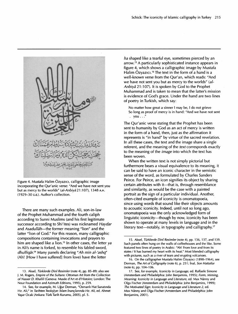
arrow.15 A particularly sophisticated instance appears in
figure 4, which shows a calligraphic image by Mustafa Halim Ozyazici.16The text in the form of a hand is a
well-known verse from the Qur'an, which reads: "And we have not sent you but as mercy to the worlds" (a/
Anbiya 21:107). It is spoken by God to the Prophet Muhammad and is taken to mean that the latter's mission is evidence of God's grace. Under the hand are two lines
of poetry in Turkish, which say:
No matter how great a sinner I may be, I do not grieve So long as proof of mercy is in hand: "And we have not sent , you ..."
The Qur'anic verse stating that the Prophet has been sent to humanity by God as an act of mercy is written in the form of a hand, then, just as the affirmation it
represents is "in hand" by virtue of the sacred revelation. In all these cases, the text and the image share a single referent, and the meaning of the text corresponds exactly to the meaning of the image into which the text has been woven.
When the written text is not simply pictorial but furthermore bears a visual equivalence to its meaning, it can be said to have an iconic character in the semiotic sense of the word, as formulated by Charles Sanders Peirce. For Peirce, an icon signifies its object by sharing certain attributes with it?that is, through resemblance and similarity, as would be the case with a painted portrait as the sign of a particular individual. Another, often-cited example of iconicity is onomatopoeia, since using words that sound like their objects amounts to acoustic iconicity. Indeed, until not so long ago, onomatopoeia was the only acknowledged form of
linguistic iconicity?though by now, iconicity has been shown to operate at many levels in language and in the
literary text?notably, in typography and calligraphy17
13. Aksel, Turklerde Dint Resimler (note 4), pp. 85-89; also see
J. M. Rogers, Empire of the Sultans: Ottoman Art from the Collection
of Nasser D. Khalili (Geneva: Musee a"Art et d'Histoire; London: The
Nour Foundation and Azimuth Editions, 1995), p. 259.
14. See, for example, M. Ugur Derman, "Osmanli Hat Sanatmda
Hz. Ali," in Tarihten Teolojiye: islam inanglannda Hz. Ali, ed. Ahmet
Ya?ar Ocak (Ankara: TurkTarih Kurumu, 2005), pi. 5.
15. Aksef, Turklerde Din? Resimler (note 4), pp. 136, 137, and 139.
Such panels often hung on the walls of coffeehouses and the like. Some
featured two lines of poetry in Arabic: "Ah! From love and from its
states / It has burned my heart with its heat." Most blended calligraphy with pictures, such as a river of tears and erupting volcanoes.
16. On the calligrapher Mustafa Halim Ozyazici (1898-1964), see
Derman, The Art of Calligraphy (note 6), p. 251; inal, Son Hattatlar
(note 6), pp. 104-106.
17. See, for example, Iconicity in Language, ed. Raffaele Simone
(Amsterdam and Philadelphia: John Benjamins, 1995); Form, Miming,
Meaning: Iconicity in Language and Literature, ed. Max Nanny and
Olga Fischer (Amsterdam and Philadelphia: John Benjamins, 1999); The Motivated Sign: Iconicity in Language and Literature 2, ed.
Max Nanny and Olga Fischer (Amsterdam and Philadelphia: John
Benjamins, 2001).

216 RES 53/54 SPRING/AUTUMN 2008
: ^^^^^ i
Figure 5a. Elhac Mehmed Nazif Bey, calligraphic panel on the virtues of the Basmala, 1319 a.h. (1901-2 ce). Author's collection.
Interestingly, works of Islamic calligraphy that are iconic in this particular sense are not limited to
figurative pictures such as those of birds and animals. There are, once again, examples of plain text in which
iconicity is present, albeit in an extremely subtle way. Figure 5a shows a magnificent piece of calligraphy by Elhac Mehmed Nazif Bey,18 composed of a short poem in Turkish extolling the virtues of the formula "In the name of God, most gracious, most merciful," known in abbreviated form as the Basmala or Bismillah. This formula is very important, in that by reciting it, the believer invokes the name of God upon undertaking any task. Indeed, there is a saying attributed to the Prophet, to the effect that any action not initiated by reciting this formula is doomed to fail.19 The poem is of no great literary value, and reads as follows:
Figure 5b. Detail from the panel in Figure 5a.
As soon as Sultan Bismillah raises his flag The angels become the pillars of the court of Bismillah
Interpret its equator as the Sirat-i Mustakfm The short route of Bismillah leads towards God
Before discussing the calligraphy, let me note that the
phrase al-$irat al-Mustaqrm, or "the straight path," appears in the very first chapter of the Qur'an, and is taken to mean the true faith, that is, Islam. In addition, however, Sufis believed that there is a bridge by this
18. On the calligrapher Elhac [al-hajj] Mehmed Nazif Bey (1846-1913), and on this panel in particular, see Derman, The Art of
Calligraphy (note 6), pp. 242-243; also see Derman, Letters in Gold
(note 3), p. 152.
19. See, for example, Jalal at-Dm Abu al-Fadl 'Abd al-Rahman ibn
Abf Bakr al-SuyutT, al-Jami' al-saghlr min hadlth al-bashlr al-nadhlr, kaf: 233.
Schick: The iconicity of Islamic calligraphy in Turkey 217
name that every person is required to cross after death; it is "thinner than a hair and more trenchant than a sword," in the words of the poets, and those who fail to reach the
other side fall down into the eternal fires of Hell. Those who can cross the bridge, on the other hand, reach the side of God. In the poem, a visual analogy is drawn between the bridge of $irat and the words Bismillah, as I will now attempt to explain.
Figure 5b shows a close-up of the words Bismillah in the first line of the poem. Here, bismi, or "in the name," is shaded horizontally, and Allah, the proper name of
God, vertically. Together, these two words read bismillahi and mean "In the name of God," the beginning of the Basmala formula. The poem plays on the lengthened arc in the words bismi. In an ordinary text, these words would be written with a short arc; however, calligraphers traditionally lengthened the arc when writing this
particular formula. Such lengthened Basmalas are very common and are termed oklu Besmele (Basmala with arrow) in Turkish.
With its lengthened arc, which the poet qualifies as an "equator," the formula is likened to the bridge of $irat, which, going from right to left, leads straight to Allah. So we have here a bit of visual iconicity. The formula Bismillah leads the believer to God, and it actually looks like the very bridge over which the believer is to reach
God in the afterlife. Moreover, in the last line where the
poem refers to the Basmala as a "short route" that leads to God, the calligrapher has shortened the arc, so that once again the form of the writing echoes the meaning of the text itself.
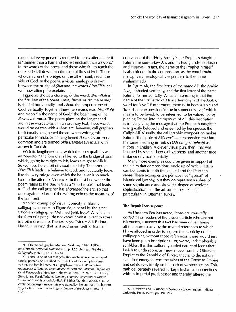
Another example of visual iconicity in Islamic
calligraphy appears in Figure 6a, a panel by the great Ottoman calligrapher Mehmed ?efik Bey.20 Why it is in the form of a pear, I do not know.21 What I want to stress is a bit more subtle. The text says: "Mercy Ali, Fatima,
Hasan, Husayn," that is, it addresses itself to Islam's
equivalent of the "Holy Family": the Prophet's daughter Fatima, his son-in-law AM, and his two grandsons Hasan and Husayn. (In fact, the name of the Prophet himself is also hidden in the composition, as the word aman,
mercy, is numerologically equivalent to the name
Muhammad.) In Figure 6b, the first letter of the name AN, the Arabic
'ayn, is shaded vertically, and the first letter of the name
Fatima, fa, horizontally. What is interesting is that the name of the first letter of Ali is a homonym of the Arabic word for "eye." Furthermore, there is, in both Arabic and
Turkish, the expression "to be in someone's eye," which means to be loved, to be esteemed, to be valued. So by placing Fatima into the 'ayn/eye of Ali, this inscription is in fact giving the message that the Prophet's daughter
was greatly beloved and esteemed by her spouse, the
Caliph Ali. Visually, the calligraphic composition makes Fatima "the apple of Ali's eye"?an expression that has the same meaning in Turkish (Ali'nin goz bebegi) as it does in English. A clever visual pun, then, that was imitated by several later calligraphers, and another nice instance of visual iconicity.
Many more examples could be given in support of the claim that compositions made up of Arabic letters can be iconic in both the general and the Peircean sense. These examples are perhaps not "typical" of Islamic calligraphy, but they do represent a subset of some significance and show the degree of semiotic
sophistication that the art sometimes reached,
particularly in Ottoman Turkey.
The Republican rupture
As Umberto Eco has noted, icons are culturally coded.22 For readers of the present article who are not
Islamicists, I suspect this fact has been driven home all the more clearly by the myriad references to which I have alluded in order to expose the iconicity of the
calligraphies; without those references, these would just have been plain inscriptions?or, worse, indecipherable scribbles. It is this culturally coded nature of icons that I wish to underscore, as I now move from the Ottoman
Empire to the Republic of Turkey, that is, to the nation state that emerged from the ashes of the Ottoman Empire and set its eyes firmly on the path of westernization. This
path deliberately severed Turkey's historical connections with its imperial predecessor and thereby altered the
20. On the calligrapher Mehmed ?efik Bey (1820-1880), see Derman, Letters in Gold (note 3), p. 122; Derman, The Art of
Calligraphy (note 6), pp. 233-234 21.1 should point out that ?efik Bey wrote several pear-shaped
panels; perhaps he just liked the fruit? For other examples signed by him, see Heath Lowry, "Calligraphy?Husn-i Hat" in Tulips, Arabesques & Turbans: Decorative Arts from the Ottoman Empire, ed. Yanni Petsopoulos (New York: Abbeville Press, 1982), p. 179; Hiiseyin Gunduz and FarukTaskale, Dancing Letters: A Selection of Turkish
Calligraphic Art (Istanbul: Antik A. ?. Kultur Yaymlan, 2000), p. 83. A
lovely decoupage version (this one signed by the cut-out artist but not
by ?efik Bey himself) is in Rogers, Empire of the Sultans (note 13), p. 266.
22. Umberto Eco, A Theory of Semiotics (Bloomington: Indiana
University Press, 1979), pp. 191-217.
218 RES 53/54 SPRING/AUTUMN 2008
Figure 6a. Mehmed ?efik Bey, calligraphic panel with the names "Mercy Ali, Fatima, Hasan, Husayn," 1292 a.h. (1875
ce). Author's collection.
Figure 6b. Detail from the panel in Figure 6a.
cultural matrix in which the icons I have been describing had operated.
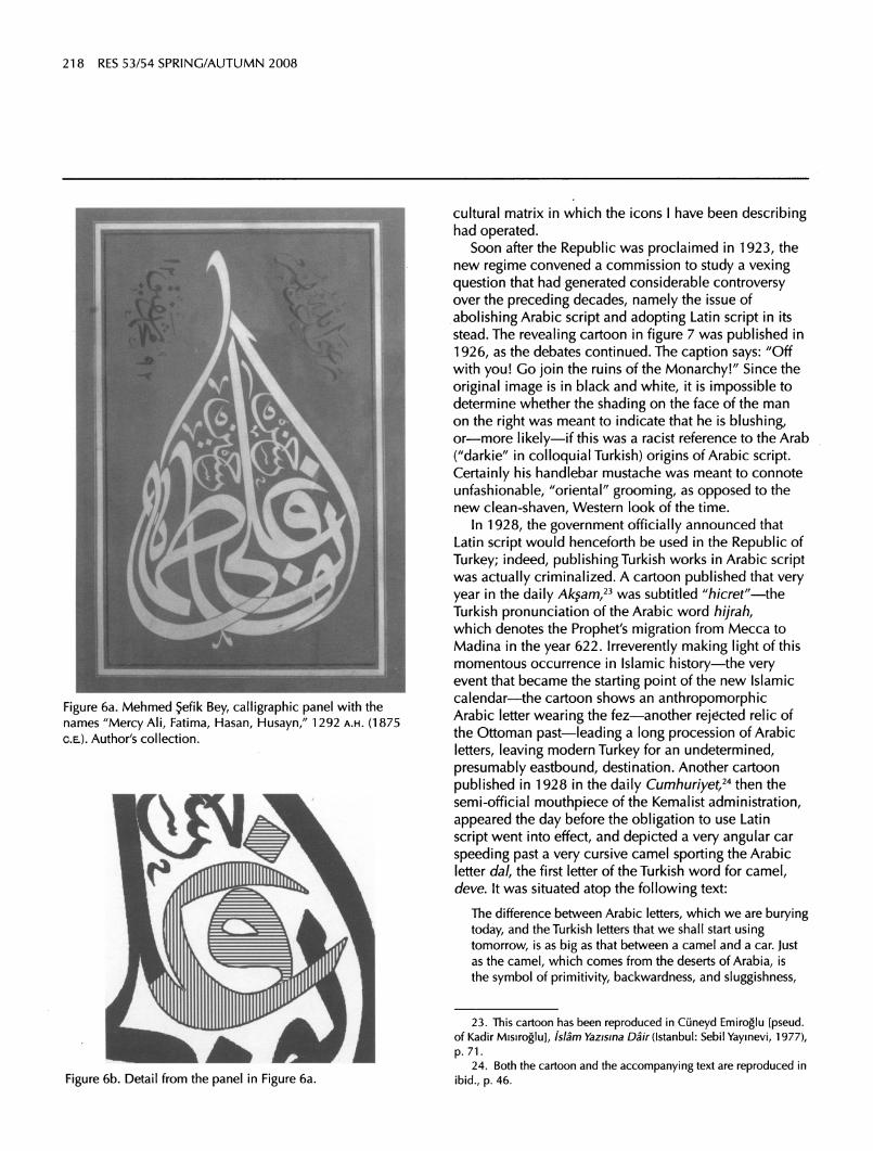
Soon after the Republic was proclaimed in 1923, the new regime convened a commission to study a vexing question that had generated considerable controversy over the preceding decades, namely the issue of
abolishing Arabic script and adopting Latin script in its stead. The revealing cartoon in figure 7 was published in
1926, as the debates continued. The caption says: "Off with you! Go join the ruins of the Monarchy!" Since the
original image is in black and white, it is impossible to determine whether the shading on the face of the man on the right was meant to indicate that he is blushing, or?more likely?if this was a racist reference to the Arab
("darkie" in colloquial Turkish) origins of Arabic script. Certainly his handlebar mustache was meant to connote
unfashionable, "oriental" grooming, as opposed to the new clean-shaven, Western look of the time.
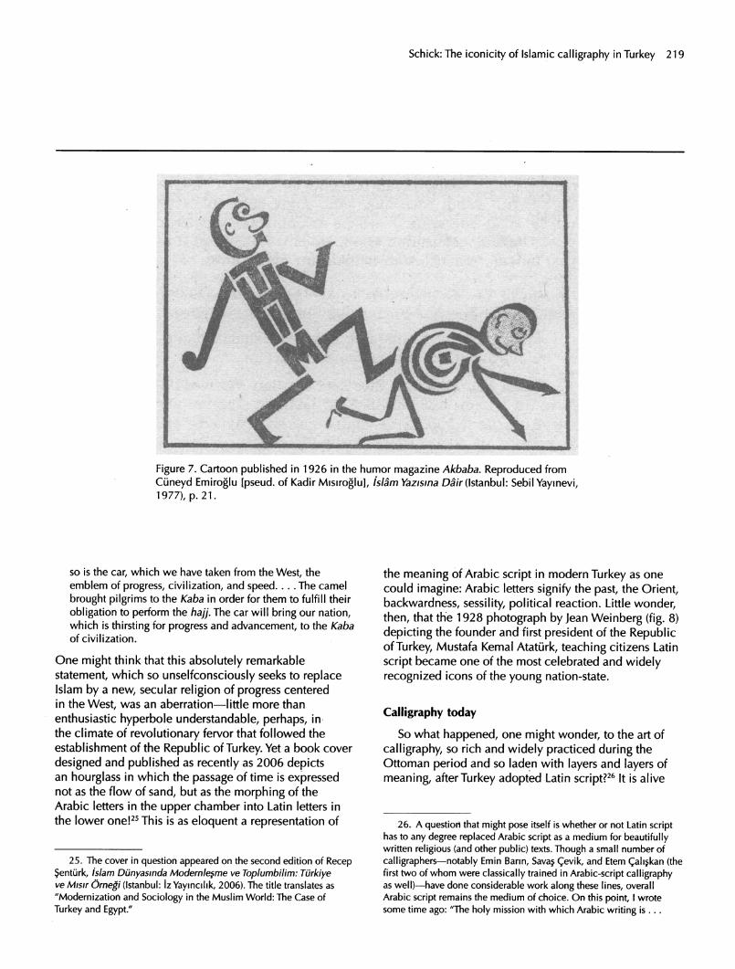
In 1928, the government officially announced that Latin script would henceforth be used in the Republic of
Turkey; indeed, publishing Turkish works in Arabic script was actually criminalized. A cartoon published that very year in the daily Ak?am,23 was subtitled "h/cref"?the Turkish pronunciation of the Arabic word hijrah, which denotes the Prophet's migration from Mecca to Madina in the year 622. Irreverently making light of this momentous occurrence in Islamic history?the very event that became the starting point of the new Islamic calendar?the cartoon shows an anthropomorphic Arabic letter wearing the fez?another rejected relic of the Ottoman past?leading a long procession of Arabic
letters, leaving modern Turkey for an undetermined,
presumably eastbound, destination. Another cartoon
published in 1928 in the daily Cumhuriyet,24 then the semi-official mouthpiece of the Kemalist administration,
appeared the day before the obligation to use Latin
script went into effect, and depicted a very angular car
speeding past a very cursive camel sporting the Arabic letter dal, the first letter of the Turkish word for camel,
deve. It was situated atop the following text:
The difference between Arabic letters, which we are burying today, and the Turkish letters that we shall start using tomorrow, is as big as that between a camel and a car. Just as the camel, which comes from the deserts of Arabia, is the symbol of primitivity, backwardness, and sluggishness,
23. This cartoon has been reproduced in Cuneyd Emiroglu [pseud, of Kadir Misiroglu], islam Yazisma Dair (Istanbul: Sebil Yaymevi, 1977),
p. 71.
24. Both the cartoon and the accompanying text are reproduced in
ibid., p. 46.
Schick: The iconicity of Islamic calligraphy in Turkey 219
Figure 7. Cartoon published in 1926 in the humor magazine Akbaba. Reproduced from
Cuneyd Emiroglu [pseud, of Kadir Misiroglu], islam Yazisma Dair (Istanbul: Sebil Yaymevi, 1977), p. 21.
so is the car, which we have taken from the West, the emblem of progress, civilization, and speed... .The camel
brought pilgrims to the Kaba in order for them to fulfill their
obligation to perform the ha]]. The car will bring our nation, which is thirsting for progress and advancement, to the Kaba of civilization.
One might think that this absolutely remarkable
statement, which so unselfconsciously seeks to replace Islam by a new, secular religion of progress centered in the West, was an aberration?little more than
enthusiastic hyperbole understandable, perhaps, in the climate of revolutionary fervor that followed the establishment of the Republic of Turkey. Yet a book cover
designed and published as recently as 2006 depicts an hourglass in which the passage of time is expressed not as the flow of sand, but as the morphing of the Arabic letters in the upper chamber into Latin letters in the lower one!25 This is as eloquent a representation of
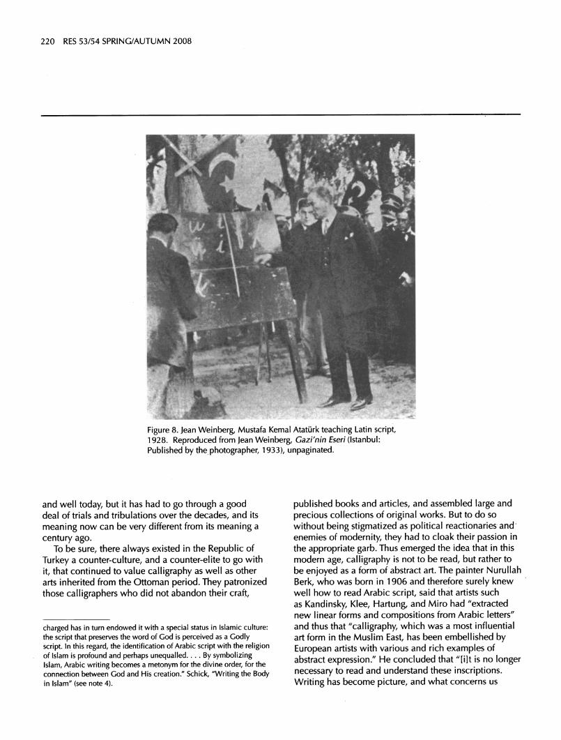
the meaning of Arabic script in modern Turkey as one could imagine: Arabic letters signify the past, the Orient, backwardness, sessility, political reaction. Little wonder, then, that the 1928 photograph by Jean Weinberg (fig. 8) depicting the founder and first president of the Republic of Turkey, Mustafa Kemal Ataturk, teaching citizens Latin
script became one of the most celebrated and widely recognized icons of the young nation-state.
Calligraphy today
So what happened, one might wonder, to the art of
calligraphy, so rich and widely practiced during the Ottoman period and so laden with layers and layers of
meaning, after Turkey adopted Latin script?26 It is alive
25. The cover in question appeared on the second edition of Recep ?enturk, islam Dunyasmda Modern lesme ve Toplumbilim: Turkiye ve Misir Ornegi (Istanbul: iz Yaymcilik, 2006). The title translates as
"Modernization and Sociology in the Muslim World: The Case of
Turkey and Egypt/'
26. A questiort that might pose itself is whether or not Latin script has to any degree replaced Arabic script as a medium for beautifully written religious (and other public) texts. Though a small number of
calligraphers?notably Emin Barm, Savas ?evik, and Etem ?aliskan (the first two of whom were classically trained in Arabic-script calligraphy as well)?have done considerable work along these lines, overall Arabic script remains the medium of choice. On this point, I wrote some time ago: "The holy mission with which Arabic writing is ...
220 RES 53/54 SPRING/AUTUMN 2008
Figure 8. Jean Weinberg, Mustafa Kemal Ataturk teaching Latin script, 1928. Reproduced from Jean Weinberg, Gazi'nin Eseri (Istanbul: Published by the photographer, 1933), unpaginated.
and well today, but it has had to go through a good deal of trials and tribulations over the decades, and its
meaning now can be very different from its meaning a
century ago. To be sure, there always existed in the Republic of
Turkey a counter-culture, and a counter-elite to go with
it, that continued to value calligraphy as well as other arts inherited from the Ottoman period. They patronized those calligraphers who did not abandon their craft,
published books and articles, and assembled large and
precious collections of original works. But to do so
without being stigmatized as political reactionaries and enemies of modernity, they had to cloak their passion in
the appropriate garb. Thus emerged the idea that in this
modern age, calligraphy is not to be read, but rather to
be enjoyed as a form of abstract art. The painter Nurullah
Berk, who was born in 1906 and therefore surely knew well how to read Arabic script, said that artists such as Kandinsky, Klee, Hartung, and Miro had "extracted new linear forms and compositions from Arabic letters" and thus that "calligraphy, which was a most influential art form in the Muslim East, has been embellished by European artists with various and rich examples of abstract expression." He concluded that "[i]t is no longer necessary to read and understand these inscriptions.
Writing has become picture, and what concerns us
charged has in turn endowed it with a special status in Islamic culture:
the script that preserves the word of God is perceived as a Godly
script. In this regard, the identification of Arabic script with the religion of Islam is profound and perhaps unequalled.... By symbolizing Islam, Arabic writing becomes a metonym for the divine order, for the
connection between God and His creation." Schick, "Writing the Body in Islam" (see note 4).
Schick: The iconicity of Islamic calligraphy in Turkey 221
in them is their melodic and musical lines, the plastic appearance of their compositions/'27
An apparently apocryphal story also began to
circulate around that time, according to which, upon
seeing a work of Islamic calligraphy, Picasso had exclaimed: "This is what I have sought to achieve my entire life. This is true modern art." The publisher ?evket Rado, a conservative intellectual who accumulated the
largest private collection of Ottoman calligraphy in the
world, quoted this statement in his book, and wrote:
It has now become clear that the art of Islamic calligraphy, which was for a long time regarded as merely the craft of beautiful writing, is in fact a magical pictorial art that was born more than a thousand years ago and evolved in a
totally mystical context. Today, western critics view it... as
an art of abstract painting that must be taken seriously.28
In all these statements by authoritative Turkish artists and critics, the role of time is extremely noteworthy. They all say, essentially, that calligraphy used to be writing, but now is abstraction, that it used to be read, but now is
only to be contemplated visually. What they did thereby is to exaggerate the pictorial quality of calligraphy, but
entirely deny its iconicity, that is, its role as sign. Or
perhaps to redefine it as the indicator/index of an Eastern creative genius that had discovered abstract art before
Europe had done so?the East as more Western than the West itself.
Over time, this attitude has changed. The cultural moment to which it is customary to refer as "the
postmodern turn" in Europe and North America has taken different forms in societies outside the Western
metropoles, but they have certainly all shared many common elements: a loss of confidence in the metanarrative of modernism; cultural atomization;
proliferating experimentation and bricolage with non-mainstream cultures; an inward turn inspired by communalism, nativism, and spirituality; and a growing interest in detemporalized history as part of an eternal
present. In this context, calligraphy was suddenly driven back into prominence, but, in the absence of a single
dominant culture, it came to be infused with widely different meanings by different cultural communities.
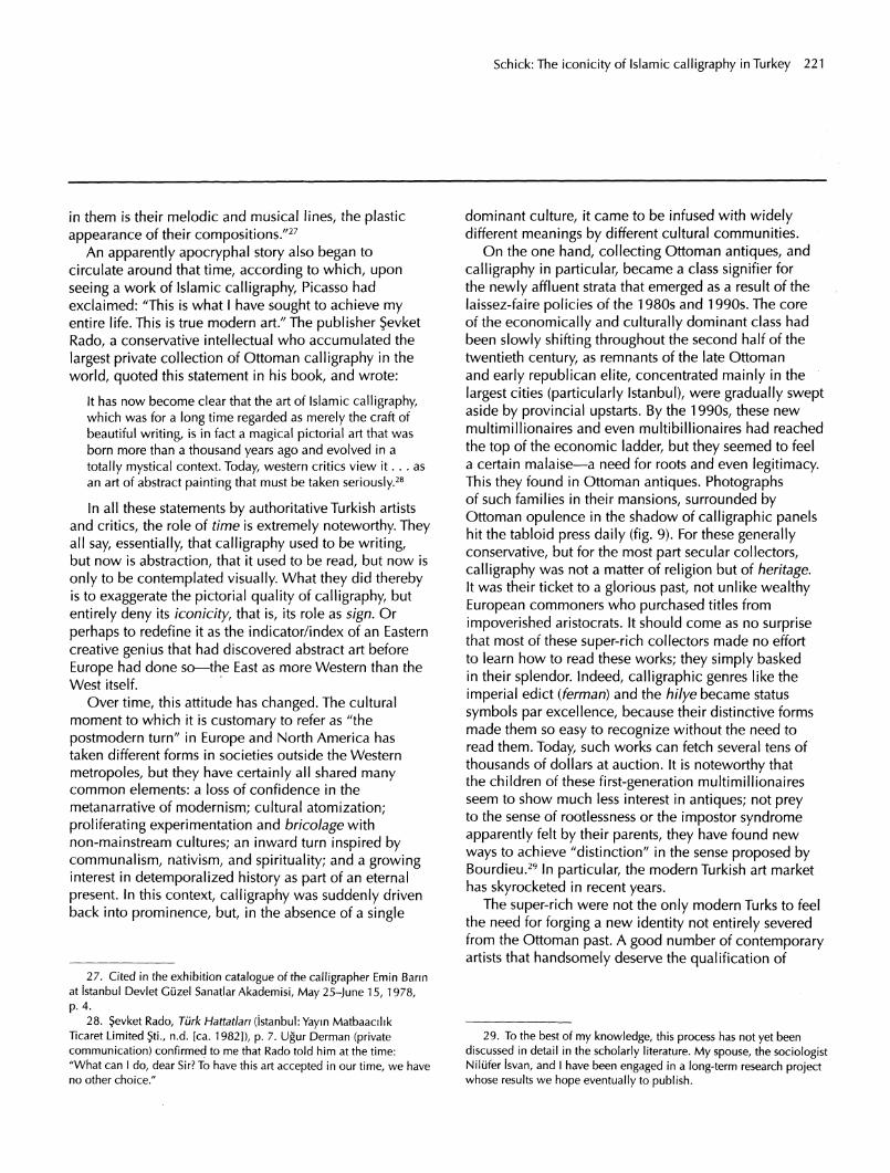
On the one hand, collecting Ottoman antiques, and
calligraphy in particular, became a class signifier for the newly affluent strata that emerged as a result of the laissez-faire policies of the 1980s and 1990s. The core
of the economically and culturally dominant class had been slowly shifting throughout the second half of the twentieth century, as remnants of the late Ottoman and early republican elite, concentrated mainly in the
largest cities (particularly Istanbul), were gradually swept aside by provincial upstarts. By the 1990s, these new
multimillionaires and even multibillionaires had reached the top of the economic ladder, but they seemed to feel a certain malaise?a need for roots and even legitimacy. This they found in Ottoman antiques. Photographs of such families in their mansions, surrounded by Ottoman opulence in the shadow of calligraphic panels hit the tabloid press daily (fig. 9). For these generally conservative, but for the most part secular collectors,
calligraphy was not a matter of religion but of heritage. It was their ticket to a glorious past, not unlike wealthy European commoners who purchased titles from
impoverished aristocrats. It should come as no surprise that most of these super-rich collectors made no effort to learn how to read these works; they simply basked in their splendor. Indeed, calligraphic genres like the
imperial edict (ferman) and the hilye became status
symbols par excellence, because their distinctive forms made them so easy to recognize without the need to read them. Today, such works can fetch several tens of thousands of dollars at auction. It is noteworthy that the children of these first-generation multimillionaires seem to show much less interest in antiques; not prey to the sense of rootlessness or the impostor syndrome apparently felt by their parents, they have found new
ways to achieve "distinction" in the sense proposed by Bourdieu.29 In particular, the modern Turkish art market has skyrocketed in recent years.
The super-rich were not the only modern Turks to feel the need for forging a new identity not entirely severed from the Ottoman past. A good number of contemporary artists that handsomely deserve the qualification of
29. To the best of my knowledge, this process has not yet been discussed in detail in the scholarly literature. My spouse, the sociologist Nilufer isvan, and I have been engaged in a long-term research project whose results we hope eventually to publish.
27. Cited in the exhibition catalogue of the calligrapher Emin Barm at istanbul Devlet Giizel Sanatlar Akademisi, May 25-June 15, 1978,
p. 4.
28. Jevket Rado, Turk Hattatlari (istanbul: Yayin Matbaacilik Ticaret Limited ?ti., n.d. [ca. 1982]), p. 7. Ugur Derman (private communication) confirmed to me that Rado told him at the time: "What can I do, dear Sir? To have this art accepted in our time, we have no other choice/'
222 RES 53/54 SPRING/AUTUMN 2008
Figure 9. From the sublime to the ridiculous, two examples of society pages from the early 1990s. Left: from the magazine V, the late Sakip Sabanci at home, in front of a selection of imperial edicts from his vast collection of Ottoman calligraphy; the headline reads: "The collection the world is talking about." Right: from the magazine Fame, Aysegiil Nadir in her (leased and freshly restored) historical mansion on the
Bosphorus, striking an "Ottoman" pose for the tabloid press; Nadir's collection also included numerous
imperial edicts, as well as rare examples of Ottoman marbled paper and other precious antiques.
"postmodern" began to integrate Ottoman motifs into their works, particularly calligraphy. The painter Erol Akyavaj was the first to do so, thus achieving infinitely greater commercial success than he had
done throughout his career. Ergin Inan and Suleyman Saim Tekcan are two other prominent artists who use
calligraphy in their work.30 The important point to note
here is that their use of calligraphy would never be mistaken for works of calligraphy proper. What they have done is to use calligraphy principally as an element of texture?Nan Freeman has suggested, extremely aptly, I think, that their use of calligraphy is akin to the use of
newsprint in Cubist painting.31 The text that they use is
inconsequential, and it is not at all unusual for them to write an inscription backward, if the graphic composition warrants it. In their hands, calligraphy has become pure sign. But not icon: At most, it has become symbol.
At the same time, Islamic calligraphy has also become
something of a rallying point and source of identity
30. Examples of Akyavas's work appear in Erol Akyavas: Yasami ve Yapitlan, ed. Beral Madra and Haldun Dostoglu (Istanbul: Bilgi Oniversitesi Yaymlari, 2000); for inan, see Ferit Edgu, Ergin inan
([istanbul]: Ada Yaymlan, 1988); forTekcan, see Semra Germaner,
Suleyman Saim Tekcan: 45 Years of Arts [sic] (Istanbul: Turkiye is
Bankasi, 2006). An exhibition was held recently in London, focusing on similar works from elsewhere in the Middle East. Though many of the works in the show were wonderful, the complete absence of
Turkish artists among nearly eighty?ranging from Morocco to Iran
and even China (!)?is nothing short of incomprehensible. For the
catalogue, see Venetia Porter, Word into Art: Artists of the Modern
Middle East (London: The British Museum Press, 2006). 31. Private communication.

Schick: The iconicity of Islamic calligraphy in Turkey 223
for religious youth in Turkey.32 In fact, calligraphy is
eminently well suited for such a role, precisely because the majority of Turkish citizens today cannot read it.
Thus, Arabic script acts to some degree as a password or
"secret handshake" that performs boundary maintenance on the community, distinguishing insiders from outsiders.
One of the effects of this new role assumed by Islamic
calligraphy in Turkey has been the emergence of a new orthodox formalism?not only in calligraphy, but also in some of the allied arts, particularly illumination and marbling. The neologism "traditional art"33 has
emerged as an unchallengeable and unquestionable concept encompassing these diverse fields and
endowing them with an inviolability that borders on
sacrality. Attitudes toward these arts have become a test of political correctness and even moral rectitude.
Underlying this new orthodoxy is a historicist, indeed
Darwinian, conception of art according to which styles and techniques evolve in monolinear progression, and the survival of the fittest is accomplished through compatibility and congruence with the "soul of the nation"?a concept that is, of course, never defined. As a result of what we might call "aesthetic Darwinism," the entire history of each so-called "traditional art" is viewed
teleologically, a single mainstream practice is recognized as the correct one, and all practices that deviate from it are viewed as undesirable mutations and perversions of the national essence that must be snuffed out, so that the art?and the nation?can be restored to the "correct" course.
To give just one example: It is a long-standing practice in calligraphy for a master to give the student a license called icazet (Arabic: ijazah) upon completing the standard course of study. This practice has historically been scrupulously enforced, and, with a handful of
exceptions, students who had not yet earned their license were not permitted to sign their work?in other
32. On June 23, 2007, I took part in the Symposium on the Arts of the Book organized by iSMEK, a highly successful program of art education and vocational training associated with the municipality of Istanbul. A good 90 percent of the audience was female, and of those,
easily 95 percent were veiled. 33. Traditional arts are generally known in Turkish as geleneksel
sanatlar. There is some irony in this, however: The suffixes sel/sal
(gelenek+sel is equivalent to tradition+al) are strongly disliked by traditionalists, who view them?and not entirely without justification? as an artificial construct of Republican linguistic engineering. On the other hand, the Ottoman adjective an'anev? is obsolete and very
unlikely to replace geleneksel. The term gelenekli sanatlar ("arts with
traditions") has recently been proposed by Ugur Derman, and has
gained some acceptance within the arts of the book community.
words, to function as professional calligraphers. In the art of paper marbling (Turkish: ebru; Persian: abr\), however, there was never such a practice. At least, we
currently dispose of no historical evidence whatsoever to indicate that master marblers might have once granted licenses to their apprentices. Be that as it may, in the last decade or two, a small number of Turkish marblers have invented the tradition of granting licenses for
marbling.34 This has permitted them to gain a doctrinal.
monopoly of sorts over an art that is becoming more
popular, and hence less centrally controlled, by the day. There is even a web site in which, by clicking on some
links, one can hear the recorded voice of their common
teacher, the late Mustafa Duzgunman, describing his methods and recipes.35 The context makes it clear that his is the only legitimate artistic lineage, as far as they are concerned, and for what they consider legitimate marblers, his methods and recipes and they alone are the correct ones. Any experimentation with "nontraditional"
pigments, sizes, mordants, or designs is viewed not only as beyond the pale of Turkish marbling, but indeed as a
betrayal of it. Yet what constitutes "traditional" materials and techniques derives only from the verbal testimony of a couple of twentieth-century masters of the art, and not from laboratory work and scientific analysis of historical
examples. In other words, this tradition?like all others, of course?is merely a modern invention that projects itself into time immemorial. Thus, it is not only through form but also through practice that new meanings have been ascribed to calligraphy and other arts of the book in modern Turkey.
Whether a status symbol for the rich, a source of
identity for the postmodern, or a test of orthodoxy for Islamists, calligraphy remains a problematic icon in Turkey today, one that has become part of the
raging "culture wars." The daily Hurriyet reported on
September 21, 2005, that, as a bit of "happening" or
conceptual art, some unidentified persons suddenly unfurled a large banner in the Karakoy neighborhood
34. For examples of these documents, some of which curiously blend traditionalist verbiage with recent-vintage nationalism, see Muin Nursen Eris, Mustafa Esat Duzgunman and Ebru (Istanbul: istanbul
Buyuksehir Belediyesi Kultur A. ?. Yaymlan, 2007), pp. 164-165, 176-177.
35. The URL of this site, maintained by the marbler Alparslan Babaoglu, is http://www.gelenekselebru.com/. There is also an
English version of the site, but it is incomplete. In particular, the
hyperpolemical pages entitled Reddiye (refutation) in the Turkish section remain untranslated. The Turkish section even includes a
?ehadetname (testimonial) from Duzgunman's son attesting to the fact that the information presented therein is faithful to his father's practices.

224 RES 53/54 SPRING/AUTUMN 2008
of downtown Istanbul. On it were two pieces of
calligraphy, both in Turkish. One said gel keyfim gel, which is more or less untranslatable but could best be described as an invocation to pleasure, to hedonism. The other said bu da geger ya HQ, which roughly means "Lord, this too shall pass." Both, in other words, were nonpolitical, secular, and entirely unthreatening expressions that any average Turk might have uttered on a suitable occasion.36 Alas, people in the street below could not read them. They interpreted the banner as some sort of Islamist battle cry, and much anxiety was reportedly experienced, until the municipality ordered it removed?a tragicomical twist in the saga of Islamic calligraphy in Turkey. Indeed, this saga shows the art, taken in toto, to have had a powerfully indexical quality, particularly during the Republican period. Its suppression, reemergence, redefinition, and reappropriation provide clues as to the profound sociocultural transformations that have taken place since the collapse of the Ottoman Empire.
36. When I presented this material at MIT, Caroline Jones wondered if "Lord, this too shall pass" might not be intended as a
response to the invocation to pleasure above it?that is, if it might not represent a conservative rejoinder to the hedonistic practices of
modern society. Though I agree that this possibility cannot be ruled out, I strongly doubt it, as the phrase bu da geger ya HQ does not have such
a censorious connotation in Turkish.
Copyright © 2022 FDOKUMEN