Test Targets 3.1 - CiteSeerX
33
A collaborative effort exploring the use of scientific methods for color imaging and process control 2081-753-06 Advanced Color Management R•I•T School of Print Media, June 2003 Test Targets 3.1 Digital Imaging A collection of digital test forms showcasing features, capabilities, and applications in printing and publishing. An R • I • T School of Print Media Publication June 2003
-
Upload
khangminh22 -
Category
Documents
-
view
0 -
download
0
Transcript of Test Targets 3.1 - CiteSeerX

A collaborative effort exploring the use of
scientific methods for color imaging and process control
2081-753-06 Advanced Color Management
R•I•T School of Print Media, June 2003
Test Targets 3.1
DigitalImaging
A collection of digital test forms showcasing features,
capabilities, and applications in printing and publishing.
An R•I•T School of Print Media PublicationJune 2003

Test Targets 3.1
Copyright © 2003 School of Print Media, Rochester Institute of Technology
Printed in Rochester, New York, USA
Table of Contents
Introduction, by Robert Chung … … … … … … … … … … … … … … … … … … … … ii
Part One: Digital Imaging ApplicationsDigital Imaging and Color management, by Robert Chung … … … … … … … … … … … … … 1
Test Targets 3.1: an editorial perspective, by Edline M. Chun … … … … … … … … … … … … 5
Color Management System Lab Introduction, by Seunga Kang Ha … … … … … … … … … … … 7
Colorimetric Comparison between Generic and Custom Press Profiles, by Chao-Yi Hsu … … … … … … 9
Colorimetric Analysis of Color Image Reproduction, by Hemachand Kolli … … … … … … … … … 13
The Effect of Sample Backing on the Accuracy of Color Measurement, by Lingjun Kong … … … … … 17
Spot Color Matching in ICC Color Managed Workflows, by Seunga Kang Ha … … … … … … … … … 21
Panorama Photography, by Jon Lesser … … … … … … … … … … … … … … … … … 25
Role of Image Content in Objective Color Matching, by Somika Shetty … … … … … … … … … … 29
A Comparison of Color Conversion between Photoshop and ICC CMS, by Ryan Testa … … … … … … 33
Color Matching between Pantone and ICC Profiles, by Vikaas Gupta … … … … … … … … … … 37
Part Two: Test Forms and ImagesTF_01 Device Characterization Target … … … … … … … … … … … … … … … … … 41
TF_02 Pictorial Reference Images … … … … … … … … … … … … … … … … … … 42
TF_03 Synthetic Targets … … … … … … … … … … … … … … … … … … … … 43
TF_04 Screening Targets … … … … … … … … … … … … … … … … … … … … 44
TF_05 IT 8. 7/3 Target … … … … … … … … … … … … … … … … … … … … … 45
TF_06 GretagMacbeth Profiling Target … … … … … … … … … … … … … … … … … 46
TF_07 Monaco Profiling Target … … … … … … … … … … … … … … … … … … … 47
TF_08 Fujifilm Profiling Target … … … … … … … … … … … … … … … … … … … 48
TF_09 Kodak Profiling Target … … … … … … … … … … … … … … … … … … … 49
TF_10 ECI Profiling Target … … … … … … … … … … … … … … … … … … … … 50
TF_11 TAC Chart … … … … … … … … … … … … … … … … … … … … … … 51
TF_12 Contrast Resolution Target … … … … … … … … … … … … … … … … … … 52
Part Three: AppendicesGlossary of Terms, by Vikaas Gupta … … … … … … … … … … … … … … … … … … 53
Press Run Organizer … … … … … … … … … … … … … … … … … … … … … 57
About the Authors … … … … … … … … … … … … … … … … … … … … … … 58
i
iiiTest Targets 3.1ii Test Targets 3.1
by Seunga Kang Ha on color matching via differentcolor spaces from file creation to an Epson ink jetprinter output.
Two new research topics were initiated as the result ofRIT’s participation in CGATS SC3 on metrology andSC4 on process control in 2003. Visiting ProfessorLingjun Kong, from Shanghai Publishing and PrintingCollege, investigated the effect of sample backing oncolor measurement accuracy. She tested the spectral-based correction algorithm, proposed by Hans Ott ofGretagMacbeth, and reported her findings for threedifferent ink-paper-press combinations. Somika Shettystudied the use of image-dependent targets to deter-mine objective color match of pictorial images. Arefined methodology with more testing is underway asSomika prepares for her thesis project.
A collection of 12 digital test forms are Part Two of thepublication. Many targets can be measured by theSpectrolino/Spectroscan, an automated scanning spec-trophotometer and densitometer from GretagMacbeth.We continue to build and to refine data analysis andgraphing capabilities with customized Excel spread-sheets. TT3.1 ends with a glossary of terms, an organ-izer for the publication press run, and a brief biograph-ic sketch of each of the authors in the publication.
From Our Feedback to YoursGetting Test Targets 3.1 published is like taking a jour-ney, it requires a balancing act from start to end. Westrived to balance the contents between theory andpractice. We tried to balance the use of class timebetween individual endeavors and collaborative efforts.When you have a chance to read Test Targets 3.1, pleaseemail us at [email protected] and tell us your assessmentof the publication. For example, what we did well, whatcould be improved, and how you can contribute to thenext edition of Test Targets.
AcknowledgementsPushing color measurement and color managementtechnology practices, followed by relentless revisioneffort are only half of the total efforts required to com-plete the publication. We wish to extend our sincereappreciation to partners from RIT and industry formaking Test Targets 3.1 possible.
School of Print Media—Barb Pellow, administrativechair, made certain that all press runs were covered inthe school budget. Professor Franz Sigg, provided tech-nical review. Professor Edline Chun provided editorialreview. Professor Patti Russotti provided a number ofdigital images for color management use.
Sloan Printing Industry Center—Under the leadershipof Professors Frank Cost and Pat Source, SloanPrinting Industry Center is an excellent partner when itcomes to distributing Test Targets 3.1 outside of RITand for providing financial support.
Printing Applications Laboratory (PAL)—Under theleadership of Bill Garno, PAL converts bits and bytesof digital files into printed images using CTP, and theHeidelberg Sunday 2000 web offset press.
Sappi—Through the support of Mr. David Niles andthe generosity of his company, Sappi donated all papersneeded in the production of Test Targets 3.1.
There are a number of industry partners who have beensupportive in keeping the CMS Lab facilities current.Amongst color management partners are Color Vision,Fujifilm, GretagMacbeth, Kodak, and X-Rite.Amongst hardware and consumable are DuPont,Epson, and Harlequin. In addition, Mr. Steve Bonoffof IPA provided us with SWOP Hi-Lo targets, andMr. David Steinhardt of IDEAlliance provided us withT-Refs and GRACoL publication.
What’s Test Targets?The term, test targets, has a different meaning to dif-ferent people. In general, test targets represent knownvalues from an object or in a digital file, e.g., colorpatches, digital dots, lines with known dimensions, etc.The Macbeth ColorChecker is an analog target with 24physical color patches. When captured by an inputdevice and reproduced by an imaging system, we cancompare tone and color relationships between thesource target and its reproduction. On the other hand,the IT8.7/3 target is a digital file consisting of hun-dreds of patches with known CMYK digital values.When printed along side a signature, we can assessprint quality quantitatively with the use of opticalinstruments and associated analysis techniques.
Recognizing the importance of test targets and colormeasurement for tone and color analysis, process con-trol, and color management system implementation,RIT’s School of Print Media offers a four-credit courseon Test Targets for Graphic Arts Imaging. Franz Siggand I have had the privilege to be the co-instructors inthis course. Therefore, the term, Test Targets, also rep-resents a course, or a body of knowledge, in the printmedia curriculum.
By surveying students’ opinions, we learned that TestTargets is one of the most challenging, yet mostrewarding technical courses. A significant part of thatexperience is the collaboration in publishing a mono-graph titled Test Targets. The inaugural issue was print-ed on an Indigo UltraStream digital press in Februaryof 2002, so we called the publication Test Targets 2.0.
Test Targets 3.1 (or TT3.1), is the third issue and isprinted on RIT’s Heidelberg Sunday 2000 web offsetpress in the Advanced Color Management class. Thus,test targets also represent a publication.
A Quick Tour of Test Targets 3.1The first glimpse of Test Targets 3.1 suggests that it hasa very attractive cover (Courtesy of Mr. Tom Chung).You may recognize that the test chart resembles theshape of an eye. The cover is printed on the Heidelberg6-color SpeedMaster sheetfed press using SappiSomerset Lustro Gloss, 80 lb. cover stock. The coverwas then embossed to provide a visual twist. Theembossed area spells out the words, TEST TARGETS.You may notice the words easier if you look from insideof the cover.
The text was printed on the Heidelberg Sunday 2000web offset press using Sappi Somerset Gloss, 80 lb.text. The class was responsible for the content creationand prepress. There were a total of four web press runsbeginning with press calibration in early April, to colormanaged press run without the text, and finally, thepublication press run in July of 2003.
There are 11 articles in this issue. To broaden the scopeof the publication, we included a number of generaltopics. For example, the article on digital imaging andcolor management by myself, the article on TT3.1’seditorial perspective by Professor Edline Chun, thearticle that introduces the CMS Lab by Seunga KangHa, and the article on panorama photography by JonLesser, bear such general interests.
Acting as the prepress manager of TT3.1, Chao-Yi(Fred) Hsu continued to investigate color matchingperformance between generic and custom press pro-files. Hemachand Kolli did his colorimetric analysis ofcolor image reproduction from a film scanner to press.Ryan Testa tested GCR and black printer features ofICC profiles and compared their performances withthe CMYK color settings in Photoshop. Vikaas Guptareported his color matching findings from Pantonecolor specifications to press. A similar study was done
Introduction
by Robert Chung

KeywordsDigital imaging, Color gamut, Color rendering
IntroductionThe advent of the desktop prepress technology in the1990s had changed the prepress infrastructure, includ-ing equipment, materials, manpower, and workflows.Capturing digital images and preparing them for printvia ICC-based color management is a part of the newimaging paradigm. It requires a whole new set ofunderstanding and skill sets. This article, a revision ofa similar article published by the Instant & SmallCommercial Printer (Chung, 2002), provides a basicunderstanding of digital imaging and the ICC-basedcolor management.
Pixel describes a picture elementA pixel is the contraction of two words, picture and ele-ment. It is the fundamental element an input device canassign a digital value to. An example of an input deviceis a digital camera or a flatbed scanner. Pixel-basedimages can be edited by software, such as AdobePhotoshop.
When we capture an image with a digital camera with1,000 pixels across its width and 1,000 pixels down itslength, the image is said to have 1,000 x 1,000 or1,000,000 pixels. Since the number, 1,000,000 is a mil-lion, we call the digital camera an one-mega pixel cam-era. The more pixels a digital camera can pack in agiven dimension, the greater the spatial resolution, e.g.,300 pixels per inch, the device is capable of.
Pixel has bit depthA pixel, like a pigeon hole in a roll-top desk, is used tostore data. A pixel with one-bit depth can store either a‘zero’ or ‘one.’ So, a bitmap image is suitable for repre-senting a line art image, e.g., a cartoon drawing, at highspatial resolution.
A pixel with 8-bit depth is necessary to represent visu-al information with sufficient gray levels, e.g., a black-and-white photograph. In other words, an image willappear to be photograph-like when any one of the pix-els in the image can be represented by 256 (2 to the 8thpower) possible gray values (Figure 1).
Figure 1. Gray levels as a function of bit depth.
When capturing a color image, a pixel typically con-tains 24 bits in three channels. One-third of the bitdepths (8 bits) is assigned to the red channel, the otherone-third is assigned to the green channel, and anoth-er one-third is assigned to the blue channel. Eight bitsis equal to one byte in the world of computers. So, amega-pixel input device will produce a three megabyteuncompressed color image data file.
Rendering pixels as visual signalsUnderstanding human color vision facilitates theunderstanding of how digital image rendering works.Color is a visual sensation which is the result of detect-ing light, that has been modified by an object, as colorsignals (Figure 2).
Figure 2. The human visual system.
1 Test Targets 3.1
Digital Imaging and Color Management
by Robert Chung
The color signals are detected by light sensitive cells inthe eye, and interpreted by the brain. For example, thered of an apple is seen as the result of having white lightfalling on to the apple whereby long wavelength ener-gies are reflected from the apple’s surface, entering intothe eye and detected by red light sensitive cells. Thecolor signals, then, pass through the optical nerves andto the brain. It is the brain that interprets the visual sig-nals as a sensation. In short, the more energy the eyedetects, the brighter or the more colorful the object is.
A color monitor emits tiny red, green, and blue light.This is why a three-channel RGB image is essential fordisplaying a digital image on a monitor. A press printscyan, magenta, yellow, and black dots of varying sizes toabsorb lights that are not in the image. Thus, a four-channel CMYK file is essential for output to a digitalimage to a desktop digital printer or a web press. Inaddition, there are a number of issues involved in thedigital image rendering process, e.g., spatial resolution,device color space, and color conversion. Let’s explorethese topics further.
RGB drives monitor displayA color monitor has a finite number of addressablespots. Each spot is coated with either red, green, or bluephosphor. The collection of all the spots in a lineararray is called a raster. Red, green, and blue raster linesare interlaced in the monitor. The total number ofraster lines makes up the monitor matrix or displayarea. The higher the monitor matrix, e.g., 1280 x 1024as opposed to 640 x 480, the greater details the moni-tor can render an image with. The larger the phosphorchromaticities are, the more colorful the monitor candisplay a color image.
A color monitor uses RGB data for display and behavesaccording to the additive color mixing principle. For
example, when a pixel contains high digital values forred, green, and blue channel, more electrons bombardthe phosphors which cause the spot on the monitor toemit more energies. The spot would look bright to theviewer (Figure 3). If a pixel represents the red of anapple in the source image, only high digital counts, upto 255, are stored in the red channel of that pixel, andthe spot would appear red on the monitor. If a pixelrepresents a dark element in the source image, lowRGB values are stored in that pixel, and the spot wouldappear dark to the viewer.
Figure 3. RGB and additive color mixing principle.
CMYK for color printingA color printer consists of a marking engine withCMYK colorants, and a paper transport sub-system.The marking engine, whether it’s a laser, an inkjet head,a dye diffusion thermo transfer head, is driven by therasterized version of the image data. The smallest markan output device can produce is called a spot. The num-ber of spots per linear distance, e.g., 2,400 spots perinch (spi) is a measure of the addressability of the out-put device. The higher the addressability, the greaterpotential for the device to render fine image details.
We rely on the subtractive color mixing principle torender tone and color in a hard copy (Figure 4). Whenwhite paper is used for hard copy output, the specularhighlight in an image requires little or no colorants atthe pixel. The more colorants are laid down, the morelight are absorbed (or subtracted). Thus, the area that isoccupied by heavy ink coverage appears dark.
2Test Targets 3.1

Figure 5. ICC-based CMS infrastructure.
For example, presses using cyan, magenta, yellow, andblack inks cannot match deep blues and deep reds, asseen in photographic media or on color monitors,because these colors are outside of the printer colorgamut. For scan-to-print workflow, the color renderingintent used is called perceptual rendering.
Implementing color managementTo achieve color portability in an open system environ-ment, CMS begins with device calibration, i.e., adjust-ing the amplitude of solids and tonal values to knownvalues. After the device is calibrated, an ICC profile ofthe device is then generated with the use of profilingsoftware packages, such as Kodak ColorFlowProfileEditor (Figure 6a), GretagMacbethProfileMaker (Figure 6b), or Monaco Profiler (Figure6c). This publication includes a collection of profilingtargets and a total area coverage (TAC) chart for profil-ing uses.
Figure 6. Printer profiling targets from Kodak (a, left),
GretagMacbeth (b, center), and right (c, Monaco)
To convert images from the source device to the desti-nation device, a combination of software at the OSlevel and the application level are essential. Today,Adobe Photoshop 7, running on Mac OS X, has themost complete application programming interface
(API) for ICC CMS implementation. But Photoshopis limited to handling only one image at a time. Colormanagement solution must be document based. Inaddition, color conversions from RGB-to-CMYK arelikely to take place later in the workflow as in the pag-ination, PDF, or RIP stage.
SummaryDigital imaging and printing is an emerging and fastmaturing technology. Digital imaging fundamentals arefurther covered by books such as Pocket Guide to DigitalPrinting (Cost, 1997). CMS, as a body of knowledge,encompasses from design to prepress to printing. CMSsoftware and hardware vendors now provide easy-to-use and affordable products (Fraser, et al., 2003). Thecreative community and publishers now have greateraccess to color management. Print buyers are often thesuppliers of digital files for print. They need to knowwhat quality color is and how to start the color manage-ment chain. Printers ultimately find themselves respon-sible for color quality at the end of an imaging and printproduction workflow.
Literature Cited
Chung, R. (2002, June). Color Management Systems:Foundations for Success, Instant & Small CommercialPrinter, 21, 24-26; 56.
Cost, F. (1997). Pocket Guide to Digital Printing.Albany, NY: Delmar.
Fraser, B. Bunting, F. and Murphy, C. (2003). RealWorld Color Management. Berkeley, CA: Peachpit Press.
Figure 4. Subtractive color mixing principle.
There is a resolution limit in the human visual system.An unaided eye can resolve fine details around 100-150line pairs per inch (lpi). Beyond that, it sees fine linemarkings as gray. This is why we are able to perceiveprinted color reproduction, at the screen rulings of 100-150 lpi, resembling the source image closely.
When a hard copy is printed with dots of different sizesbut with the same screen frequency, e.g., 150 lpi, we callthis type of tonal rendering, conventional halftoning oramplitude modulated (AM) screening. When a hardcopy is printed with microdots of equal sizes but withdifferent frequency, we call this type of tonal rendering,error diffusion or frequency modulated (FM) screening.One of the test targets, TF_04, in this publicationshows the effect of both AM and FM screening ontone reproduction.
Pair-wise color managementJust as color perception varies from one person to theother, an imaging device—input, display, or output—relies on a different mechanism to capture or reproducecolors. For example, as an image moves from scan toproof to final print, each device, along the workflow,introduces its own subtle changes in color.
In the past, when organizations purchased all equip-ment from one manufacturer, e.g., Scitex, Hell, orCrosfield, that manufacturer would develop proprietarytechnologies to ensure color quality and consistencyfrom a specific brand of input device to a specific brand
of output device. The pair-wise color managementsolution is a close system for color management. Inother words, the image, prepared for one imagingdevice, can not be easily repurposed for another device,not to mention another device of a different manufac-turer.
ICC-based color managementToday, many companies use an open system approachto implement digital workflow that calls for devices andsoftware supplied by a range of manufacturers. Toensure color quality and consistency in the digitalworkflow, an open system solution is based on themethodology developed by the International ColorConsortium (ICC). The goal of ICC is to create andpromote the standardization of an open, vendor-neu-tral, cross-platform color management system (CMS)architecture.
Color can be specified in a device-independent mannerand coded in a color imaging software. Not all colorscan be reproduced accurately. The range of colors animaging device can render is called color gamut. Thecolor gamut of an output device can be expressed in theCIELAB color space.
If a pixel in the source file is an in-gamut color of thedestination device, then CMS is used to match thecolor in the destination device by means of absolutecolorimetric rendering. If a pixel in the source file is anout-of-gamut color of the destination device, thenCMS is used to manage the color of the pixel accord-ing to other rendering intents. In either case, ICC-based CMS offers a solution whereby the color man-agement module (CMM) alters the data from thesource device, via the profile connection space (PCS),to achieve the color agreement as judged from the des-tination device output (Figure 5).
3 4Test Targets 3.1 Test Targets 3.1

sources. The glossary appearing in TT3.1 contains aselection of terms from the larger glossary that studentsuse for the course. While some readers may take excep-tion to an explanation given in Glossary of Terms, thesedefinitions were originally written to help team mem-bers within the context of their work, readings, and dis-cussions. The team is very aware of the differences indefinitions existing in the Color World.
Review ProcessTo ensure clear, accurate content, each article wouldundergo a minimum of two reviews: a technical reviewby Professor Robert Chung or Senior ResearchAssociate Franz Sigg and an editorial review byAdjunct Faculty Edline M. Chun. A final editorialcheck would occur when the QuarkXPress files wereready for proofs prior to platemaking.
ConclusionAs stated in the introduction, the Advanced ColorManagement course set out to provide students with amany-level learning experience. As TT3.1 goes topress, it can be said that students have become morefamiliar with emerging graphic arts technology stan-dards, the necessity of standards, and practical applica-tion of standards. As the team has worked with and dis-cussed various issues in process control for repeatablecolor, members have also had to consider what it meansto have standards or guidelines for writing reports in agroup endeavor.
The impact of this experience to help each team mem-ber cope successfully in the future with writing to stan-dards and guidelines may be evident as early as the nextreport or article that a team member writes, or may notbe acknowledged until after the team member hasbegun his or her career. In the short term, effectiveness
of the editorial process in producing Test Target 3.1 willbe known only after team members have had time toreflect on that aspect of taking this publication to print.Evaluation findings can then be considered for the nextpublication of Test Targets.
References
Chung, R (2003, March). Syllabus. Introduction toAdvanced Color Management. Graduate course 2081-753-06: Advanced Color Management, offered SpringQuarter, 2003, by the School of Print Media, RochesterInstitute of Technology, Rochester, NY.
School of Print Media (2002, December). Master ofScience Degree Thesis Style Manual for Graduate Programsin the School of Print Media, College of Imaging Arts andSciences, Rochester Institute oil Technology. Rochester,NY: Author.
Section D16: Institute Writing Policy (2002, May).RIT Institute Policies and Procedures Manual. Rochester,NY: Rochester Institute of Technology.
Technical Association of the Graphic Arts (n.d.).Putting Your Paper Together: TAGA Proceeding Guidelinesfor Copy Preparation. Rochester, NY: Author.
6Test Targets 3.1
IntroductionRochester Institute of Technology (RIT) has a “writingacross the curriculum” policy to ensure that studentshave written communication skills before graduating(Section D16: Institute Writing Policy, 2002, May).This means that writing is not confined to writingcourses, but is also an important element of technicaland laboratory courses. The ability to write is thoughtof as an added-value feature of the RIT degree andassures employers that an RIT student, whether a newhire or on Co-op, possess a certain level of writingcompetency.
Test Target 3.1 (TT3.1) is the group project of a gradu-ate course that strives to teach advanced color manage-ment techniques and process control principles byusing digital technology and teamwork. Through thecourse work, students become familiar with the latestcolor management technology and graphic arts tech-nology standards and trends; enhance their knowledgeof scientific methodology in process control for repeat-able color; and show their ability to work as a team byproducing a color-managed publication (Chung, 2002,March). TT3.1 is a reflection of the competency andcreativity of the students in Advanced ColorManagement, Spring Quarter of the 2002-2003 aca-demic year at RIT.
As explained in the next section, in addition to dealingwith process research and printing aspects of TT3.1,students used this opportunity to prepare themselvesfor the writing process of the Master’s degree project byusing clear guidelines and holding group discussions toclarify issues and reach consensus. The different roleseach person assumed to get TT3.1 to press, opened thewindow for everyone to the editorial side of preparinga document for publication under a set of conditionsclose to what would be required for a Master’s thesis orMaster’s research paper.
Approach to editorial contentThe Graduate Program of the School of Print Mediarequires that a Master’s thesis or Master’s researchpaper be appropriately formatted in structure and thatit use the American Psychological Association (APA)style for internal citations and reference section (Schoolof Print Media, 2002, December). The AdvancedColor Management course stipulated that the formatfor TT3.1 articles would, in general, conform to TAGAProceedings: Guidelines for Copy Preparation (TAGA,n.d.). Each article would include at least three internalcitations and a reference section; internal citations andreference entries would follow APA style.
Early in the quarter, the team analyzed Test Target 3.0that had been printed the previous quarter, and decid-ed that the format of TT3.1 needed to be standardizedso all reports would have a similar look.Standardization would also give TT3.1 an organized appearance. The group further decided that each arti-cle, including visuals, would fit on four printed pages.
During Week Five of the course, the author met withthe team to help members understand report structuresin general, clarify any issues surrounding use of theAPA style, and review the TAGA guidelines as appliedto TT3.1.
At that meeting the group decided short abstractswould appear in the table of contents rather than thefour pages allotted to each writer. The team also agreedto the article body containing: introduction, objective,procedure, results, conclusion, and references, with theexact wording of section heads left to the writer. A con-tent template with style sheet would be available for theconvenience of team members to reduce formattingissues for the person preparing the QuarkXPress files.From later meetings came the decision that keywordswould be taken from a glossary compiled from many
5 Test Targets 3.1
Test Targets 3.1: an editorial perspective
by Edline M. Chun

8Test Targets 3.17 Test Targets 3.1
ment, and ICC CMS workflow analysis. (Figure 1).
Figure 1. Devices and Activities in CMS
Website: www.rit.edu/~rycppr The website at www.rit.edu/~rycppr is updated on July,2003 , and it is available to students.The website of the CMS Lab gives information andresources to people who want to share information andresources. It is composed of five different parts. PartOne ‘About CMS’ introduces the CMS Lab brieflyand shows the address of the lab. You can have a virtu-al tour of the lab from the slides show.
Figure 2. Website in CMS
Part Two of the website, ‘Resources,’ is the heart of theCMS Lab digital archives, because students can use theresources. This part contains test forms and images forprofiling which are currently issued for color manage-ment workflow. Main categories in this section are: TestForms and Profiling Targets, Test Images with KnownSource Profile, Excel Template, and ICC Profiles. Eachcategory has resource files related to the lab portion of
classes such as Tone and Color and Color Perceptionand Measurement. Some categories require a passwordto get in. For example, in Tone and Color, the title oflab was ‘Color management from digital photograph toprints.’ The main activities in this lab is to build an ICCprofile, apply that to the images, and evaluate reproduc-tion quality by comparing images. To perform this lab,the targets for profiling and images were downloadedfrom the website. This lab used resources from the web-site and hardware devices that gave a real experiencewith the technology in color management workflow.
Part Three ‘Research and Publication’ gives general ref-erences such as a glossary, manual of Microsoft Excel,and previous research projects of the CMS Lab that areuseful for sources and research projects. All files in PDFformat can be downloaded.
Part Four of this website, ‘Courses,’ introduces classesthat Professor Robert Chung is currently teaching atRIT. A student can explore them by downloadingcourse syllabus, outlines, and a sample lab in PDF for-mat.
Part Five ‘Sponsors,’ acknowledges those companieswho have made significant donations of equipment andfunds. The CMS Lab is grateful for their continuingsupport. We continue to look for donations and supportof the CMS Lab. Please feel free to contact the CMSLab (e-mail: [email protected]).
ReferenceChang. J. (2000, Nov. 18). Newsletter in CMS Lab,http://www.rit.edu/~rycppr/CMS_Lab/LabEvents/LabEvents.html.
IntroductionThis article introduces the facilities, activities, and web-site of the CMS (color management systems) Lab.The CMS Lab basically supports the student for a bet-ter understanding of current technology in print media.Based on my working experience as lab assistant, theresources in the facilities and its website help studentsnot only understand the technology but also give theminsights to its color imaging applications.
The lab is located in the School of Print Media,Gannette Building, Room 7B-1297. CMS Lab prima-rily supports students in their development of under-standing both technology and theory in print media.The facilities are available to both undergraduate andgraduate students. Main activities are for class assign-ment and research projects focusing on color measure-ment, color quality assurance, and ICC-based colormanagement system.
Facilities The facilities of the CMS Lab include software andhardware. Software consists of two parts: one is thecolor measurement and management, and the other isthe application for digital color imaging.
Table 1. Software Applications in CMS
Software Application
Kodak Colorflow ProfileEditorGretagMacBeth ProfileMaker 3.0GretagMacBeth Key Wizard 2.0Monaco Profiler 3.2ColorBlind Profiling SoftwareCreo/Scitex SPWColor Vision Optical 3.0X-Key 2.0Dupont Color ScientistAdobe Acrobat 4.0QuarkXPress 5.0.1Adobe InDesign 2.0.2Adobe IllustratorAdobe Photoshop 7.0Macromedia DreamweaverMacromedia FireworkFetchExplorer, NetscapeMicrosoft Office suites
Color Measurement/ Management
Software
Application Software
Within Table 1, GretagMacbeth Key Wizard 2.0 andX-Key 2.0 are software bridging device and computerdata. Dupont Color Scientist is use for inspection of aprofile. Others applications support ICC color man-agement workflow such as profile making and monitorcalibration.
Table 2.Hardware Applications in CMS
Hardware is composed of computer, input and outputdevices, and color measurement devices listed in Table2. The PowerMac G4 computer including flat paneldisplay have been recently replaced.
ActivitiesThe activities in CMS Lab can be divided mainly withlab for the class and research activities. The lab facilitiesare used for the laboratory portion of the followingcourses: Tone and Color Analysis, Imaging Technology,Quality Control, Color Perception and Measurement,and Advanced Color Management.Research activitieshave been in the area of device calibration, press runanalysis, and ICC-based color management systemstudies. Recent on-going and completed projectsincludes digital proofing, ICC CMS application in dig-ital photography, profile inspection software develop-
Hardware Model NumberMac PowerPC G4/ Dual 1.2 GHZ, OS X 3Mac PowerPC G4/ Dual 450 MHZ, OS X 1Mac PowerPC G4/ 733 MHZ, OS X 1Mac PowerPC G4/ 450 MHZ, OS X 1Mac PowerPC G4/ 1.4 GHZ, OS X 1Mac G3/ 400 MHZ, OS 9 1Power Mac G3/ 132 MHZ, OS 8 2PC Dell PowerEdge 1300, Windows 2000 1Umax PowerLook III flatbed scanner 1Kodak DC290 digital camera 1Epson Stylus Pro5000 Inkjet Printer 2Epson Stylus PHOTO2200 Inkjet Printer 1GretagMacBeth Spectrolino/ Spectroscan 2X-Rite Spectrodensitometer 500s 2X-Rite Spectrodensitometer 900s 1ColorTron II 2GretagMacBeth Color Eye One 1X-Rite Monitor Optimizer 10
Computer
Input Devices
Output Devices
Color Measurement/ Management
Devices
Color Management System Labby Seunga Kang Ha

10Test Targets 3.19 Test Targets 3.1
Custom profile: Using ProfileMaker 4.1.5, a customprofile was built for for the Heidelberg Sunday2000 web press from the April 18, 2002 press run.The press run was adjusted to conform SWOPspecifications.(More details about process variability and specifi-cations are shown in Box 1.)
2. Color gamut evaluationThe evaluation tool “Gamut View” in ProfileEditor4.1.5 was used for investigating the difference ofcolor gamut between the generic profile and thecustom profiles.
3. Color-matching performance evaluationGeneric and custom profiles were used inPhotoshop 7.0.1 to convert the original a*b* slicetarget from Lab files to CMYK files. For maximumcolor accuracy, the conversion engine was set asAdobe (ACE), rendering intent as absolute colori-
metric, black point compensation unchecked anddither unchecked.
These targets were then printed on the HeidelbergSunday 2000 web offset presses. A GretagSpectroScan instrument was used to measureL*a*b* values of the printed a*b* slice targets underthe following settings: D50 illumination, 2-degreeobserver angle, no filter and black backing measure-ment.
The Excel template, “F_ab_slice(v1.0).xls,” wasused to evaluate the color-matching performance.When we analyze the color matching performance,it is important to check the gamut boundary usingPhotoshop “Gamut Warning.” Only those patchesinside the gamut boundary should be taken foranalysis. To do that, in Photoshop color settings wefirst set the CMYK working space as the desiredoutput profile. All the conversion options would bethe same as the settings when these a*b* slice testtargets were converted from Lab files to CMYKfiles. Then open the original Lab files of a*b* slicetest targets and turn on the “Gamut Warning” fea-ture. Only reproducible patches would show and allthe patches outside the gamut boundary would greyout. (Figures 4, 5, and 6)
DiscussionThe following are the major findings from this study.
1. Color gamut comparisonThe colors defined in the a*b* slices cover the wholerange of CIELab space However, those colors,lying outside of the press gamut, would be clippedunder absolute colorimetric rendering intent whendoing color space conversion.
KeywordsCMM, Profile, Color gamut, Color matching
ObjectivesA generic SWOP profile is suitable if a printing systemconforms to SWOP specifications. (SWOP, 2002) Ina repeatable printing system, a custom-built profilecould be a great benefit in better color matching.However, it is not clear whether or not there is anadvantage for using a custom-built press profile over ageneric press profile. Therefore, if there is no signifi-cant difference in color matching performancesbetween a generic and a custom-built profile, then acustom profile is not worth building.
To determine the value of creating a custom profile, thisstudy focuses on the color gamut difference between ageneric SWOP press profile and a custom-builtHeidelberg Sunday 2000 press profile. Furthermore,under a repeatable printing system adjusted to SWOPspecifications, the accuracy of color-matching compar-ison between a generic and a custom-built profile werecompared on three different a*b* slices. Finally, theresult is then compared with a similar colorimetriccomparison between a generic profile and a customHeidelberg M-1000B press profile. (Hsu, 2002)
ResourcesThe following is the list of resources needed in thisstudy.1. Conventional presses
Heidelberg Sunday 2000 web offset presses.
2. Press profiles
Generic press profile: U.S. Web Coated (SWOP)
v2
Custom press profile: Sunday_April_18_03.icc.
3. Test targets
The a*b* slice test targets are defined by CIELab
color space on L30, L50, and L70. The range of the
color swatches go from a*=-100 to a*=100, and b*=-
100 to b*=100. (Figure. 1)
Colorimetric Comparisonbetween Generic and Custom Press Profiles
by Chao-Yi Hsu
Figure 3.
Profiling software,
GretagMacbeth
ProfileMaker 4.1.5.
Figure 2.
GretagMacbeth
ProfileMaker CMYK
profiling target
Figure 1.
a*b* slice test target
4. Profiling software and profiling target
GretagMacbeth CMYK profiling target, TC3.5
CMYK1.tif, was used for press profiling target with
profiling software, GretagMacbeth ProfileMaker
4.1.5. (Figures 2 and 3)
5. Application Programming Interface
Adobe Photoshop 7.0.1
6. Data collection and analysis
Gretag SpectroScan and Microsoft Excel template
“F_ab_slice(v1.0).xls” (Chung, 2002). CIE ∆E76
was used to calculate the color difference between
source L*a*b* and the press output L*a*b*.
ProceduresThe following shows the procedures in this study.1. Press profiles
Generic profile: U.S. Web Coated (SWOP) v2 inAdobe Photoshop 7.0.1 was used as a generic pressprofile.

12Test Targets 3.111 Test Targets 3.1
2. Color-matching performance comparisonIn this study, only reproducible colors were used forcolor matching evaluation. The color differenceobserved in Table 1 shows the difference betweentwo printing conditions using generic SWOP pro-file and Heidelberg M-1000B custom profile. (Hsu,2002) Table 2 shows the difference betweenSWOP profile and Heidelberg Sunday 2000 pro-file. In Table 3 and 4, pairs of neutral color (a*=0and b*=0) swatches were compared. In Figure 10, avisual comparison of neutral colors shows the cus-tom profile resulted in better gray balance than thegeneric profile.
SWOP tolerance
Process variability
Process average
SWOP aim
The graph above shows the concept of processvariability and specifications. The SWOP genericprofile was calculated for average of several care-fully controlled SWOP runs. Custom profile wascalculated for our condition and it compensatesfor the fact that our process was within SWOPtolerance but not exactly at SWOP aim.
Generally, the generic profile provides less reproduciblecolor samples, higher average ∆Es, and higher maxima∆E values. By applying the custom profile, ∆E valuesdramatically decreased. (Table 1, 2, 3, and 4)
In conclusion, a repeatable printing system can achievebetter color matching performance via correct customdevice profiles.
Table 1. ∆E comparison (Generic SWOP profile vs.
custom Heidelberg M-1000B profile.)
Table 3.
∆E comparison -
Neutral colors.
(Generic SWOP pro-
file vs. custom
Heidelberg M-1000B
profile.)
Table 2. ∆E comparison (Generic SWOP profile vs.
custom Heidelberg Sunday 2000 profile.)
Table 4.
∆E comparison -
Neutral colors.
(Generic SWOP pro-
file vs. custom
Heidelberg Sunday
2000 profile.)
ReferencesChung, R. (2002). ICC-based Color Matching, Toneand Color Analysis Lab Assignment, Fall 2002.Rochester Institute of Technology, Rochester. NY.
Fraser, B. Bunting, F. and Murphy, C. (2003). RealWorld Color Management. Berkeley, CA: Peachpit Press.
Hsu, C. (2002). Color Matching Comparison betweenGeneric and Custom Press Profiles. Test Target 3.0, anRIT School of Print Media Publication, Rochester,NY.
SWOP Incorporated. (2001). SWOP for the NewMillennium: 2001. (9th edn.). Marblehead, MA:SWOP Inc.
Generic Custom Generic Custom Generic Custom
Figure 10. Visual comparison of neutral colors. a*=0, b*=0
on each L30, L50 and L70 slice. (Generic profile vs. cus-
tom Sunday 2000 profile)
Box 1. Process variability and specifications.
Figure 4. Reproducible
patches on L30 a*b* slice
target embedded with the
custom profile, Heidelberg
Sunday 2000_April_18_03
Figure 5. Reproducible
patches on L50 a*b* slice
target embedded with the
custom profile, Heidelberg
Sunday 2000_April_18_03
Figure 6. Reproducible
patches on L70 a*b* slice
target embedded with the
custom profile, Heidelberg
Sunday 2000_April_18_03
Figure 7. Gamut boundary
comparison on L30.
(Yellow line -generic profile,
red line -custom profile)
Figure 8. Gamut boundary
comparison on L50.
(Yellow line -generic profile,
red line - custom profile)
Figure 9. Gamut boundary
comparison on L70.
(Yellow line -generic profile,
red line - custom profile)
The gamut boundaries of the custom and genericprofiles are shown in Figures 7, 8, and 9. On L30a*b* slice, the Heidelberg Sunday 2000 customprofile describes a significant larger gamut in themagenta and cyan areas. On both L50 and L70a*b* slices, the custom profile shows slightly largergamut in yellow and green areas. However, becauseall of these profiles were calculated for the SWOPcondition, their gamut boundaries are pretty muchin the same shapes.

14Test Targets 3.113 Test Targets 3.1
properly reproduced, other colors will also be reproducedaccordingly. The measurements from the original and thereproduced were analyzed in various ways and comparedwith visual evaluations.
The colorimetric analysis procedure used were first pub-lished in a paper by Irving Pobboravsky etal. (ISCCProceedings, 1971) of which three different methods oftone and color analysis were performed as shown inFigures 2, 3, and 4. Some graphs are modified to bring outsignificant relationship between original and reproduc-tion.
To begin with, lightness (or darkness) of the original iscompared with lightness (or darkness) of the reproduced.Similar to densitometric analysis of tone reproduction, thehighlight is located at the lower left corner of Figure 2b.
Figure 2a. Tone reproduction of L*(orig) vs.L*(Repro)
From Figure 2b, we observe that the reproduction isslightly darker than that of the original. Specifically, thehighlights and the midtones were reproduced at the cor-rect slope whereas the shadow region of the original wasclipped in the reproduction.
0
10
20
30
40
50
60
70
80
90
100
0 10 20 30 40 50 60 70 80 90 100L* (Orig)
Refrence Reproduced
Shadows
Highlights
Figure 2b. Tone reproduction of Darkness (orig ) vs.
Darkness (repro)
Gray scale has been used to visually indicate color bal-ance and tone reproduction in the graphic arts industry.Figure 3 shows the colorimetric analysis of gray scalereproduction in comparison with that of the original. Itindicates that the highlight region of the reproductionis closer to neutral, i.e., less C* or metric chroma, thanthe original.
Figure 3. colorimetric analysis of neutrality
0
10
20
30
40
50
60
70
80
90
100
0 2 4 6 8 10Original ReproducedC*
-6
-5
-4
-3
-2
-1
0
1
2
3
4
5
6
-6 -5 -4 -3 -2 -1 0 1 2 3 4 5 6
a*Original Reproduced
0
10
20
30
40
50
60
70
80
90
100
0 10 20 30 40 50 60 70 80 90 100Darkness (Orig)
Refrence Reproduced
Shadows
Highlights
KeywordsGamut mapping, Tone compression, Tone reproduc-tion, Clipping, Chroma shift
IntroductionThe use of color imaging and color reproduction con-tinues to grow at a very fast pace. Every day, most peo-ple in the industrialized parts of the world are users ofcolor images that come from a wide range of imagingdevices; for example color photographs, magazines, andtelevision at home, computers with color displays, andcolor printers in the office. All the images are typicallyanalyzed by means of visual judgment, not by quantita-tive means with the use of test targets. This article isdesigned to analyze color image reproduction colori-metrically and to correlate such findings with visualperception.
ObjectiveThis study illustrates how ICC color management canbe applied from scan to print using perceptual render-ing. Colorimetric analysis of IT8.7/1 test target wasvery useful in analyzing the quantative and visual rela-tionships between the reproduced images and the orig-inal.
Figure 1. IT8.7/1 Target
Resources1. Profiling software: GretagMacbeth ProfileMaker
4.1.5 2. Test image: IT8.7/1 target and digital images (cour-
tesy of Professor Patti Russotti)3. Color measurement: Spectrolino Spectroscan4. Color conversion: Adobe Photoshop 7.0.1
ProceduresThe following procedures are used to prepare colormanaged reproduction and to obtain data for analysis:
1) PreparationAn IT8.7/1 target shown in Figure 1 is scanned and anICC profile is built using GretagMacbethProfileMaker 4.1.5.
2) Press profilingThe output profile was created by printing theGretagMacbeth profiling target on the HeidelbergSunday 2000 web offset. The printed target is thenmeasured on the GretagMacbeth SpectrolinoSpectroscan. The printer ICC profile is created withGretagMacbeth ProfileMaker using perceptual render-ing.
3) Color conversionAfter opening the scanned target and the pictorialimages in Photoshop 7.0, the raw RGB image isassigned to Nikon Scanner ICC profile. The image inNikon Scanner ICC profile is, then, converted toHeidelberg Sunday 2000 CMYK space via “Convert toprofile.” Adobe CMM with perceptual rendering isused in the conversion.
Tone and color analysisPatches of the gray scale, solid inks, and their overlapshave been used as an indication of color correction. Theidea is that if the gray scale and the color patches are
Colorimetric analysis of color image reproduction
by Hemachand Kolli

1615 Test Targets 3.1
The gamut compression indicates a reduction of chromafrom original to the reproduction. Using the data of col-umn 8 of the IT8 7/1 target, the graph in Figure 4shows that the hue angles were preserved, and theamount of chroma compression is indicated by thelength of the lines. While gamut compression can beseen very clearly from the graph, it cannot be observedvisually if we examine pictorial color reproduction, asshown in Figure 4a-4d.
Figure 4 Hue reproduction
-70
-60
-50
-40
-30
-20
-10
0
10
20
30
40
50
60
70
-70 -60 -50 -40 -30 -20 -10 0 10 20 30 40 50 60 70
a*Original Reproduced
Figure 4a Sample of color managed reproduction
Figure 4b. Sample of color managed reproduction
Test Targets 3.1
Figure 4c. Sample of color managed reproduction
Figure 4d. sample of color managed reproduction
Conclusion
This article documented a procedure for analyzing thetonal relationship, as well as gray balance and colori-metric relationship, between a source image and itsreproduction. Visual assessment and colorimetricanalysis agree with each other in that there was no hueshift between the original and reproduction, and thatthe dark colors were clipped.
The most valuable thing that we have learned from thiswork is difficult to communicate in writing. It is theexperience of working in the lab, using color measure-ment and analysis tools, observing the results, tendingto press runs, and struggling with the surprises on theway. Some changes in the color image reproductionwere anticipated due to the color gamut of the inks andthe complexity of the color separations and printingprocess.
Reference
Pobboravsky,I., Pearson,M., and Yule, J.A.C. (1977).The Relationships Between Photomechnical ColorReproductions and the Original Copy, 1971 InterSociety Color Council Proceedings.
Although some compression in the gamut has occurredin the tone scale and color saturation, this is not usuallywhat the poor print quality is primarily due to. It ismore often caused by poor color balance, tone repro-duction, hue reproduction, loss of highlight and shad-ow saturation, unevenness, grainy appearance, andsharpness of detail.

18Test Targets 3.117 Test Targets 3.1
Figure 1. CRF curves of six measurement errors.
Opacity of paper can be defined as the percent ratio ofthe CIE Y of the paper measured on a black backingand the CIE Y of the same paper measured on a whitebacking (CGAT.5-200x). Table 1 shows the opacity forthe three papers used in this work.
Table 1 The opacities of three kinds of paper.
Figure 2 shows four CRF curves to express the systemnoise and the color differences of the three kinds ofpaper due to the sample backing. The curves indicatethat ∆Es of the sampled paper are much higher thanthe system noise. In addition, the higher the opacity ofthe paper, the lower the ∆Es produced, i.e., there is lesseffect from backing substrate on the colorimetric data.
For example, newsprint has a ∆E of 4.45 at the 95percentile, digital laser print paper has a ∆E of 2.88 atthe 95 percentile, coated paper has a ∆E of 2.2 at the95 percentile, and the system error has a ∆E of 0.37 atthe 95 percentile.
Coated paper Dig. print paper NewsprintY(Black backing) 86.24 85.39 56.32Y(White backing) 89.66 91.03 61.66
Opacity 96.19 93.80 91.34
0
10
20
30
40
50
60
70
80
90
100
0.0 0.2 0.4 0.6 0.8 1.0 1.2 1.4 1.6 1.8 2.0
∆E
Coated_black backing
Dig. print_black backing
Newsprint_black backing
Coated_white backing
Dig. print_white backing
Newsprint_white backing% C
umul
ativ
e re
lativ
e fr
eque
ncy
Figure 2 CRF curves of the three papers and system noise
Conversion from White Backing toBlack BackingAccording to the literature on conversion of color val-ues for different sample backing (Ott, 2003), we cancompute the reflection spectrum values of the sampleswith black backing from the white backing for 182color patches on the three kinds of paper, using the for-mula:
Rbi= Rwi* Rb/Rw (1)
with,Rbi: Reflection-Spectrum for ink on
a black backingRwi: Reflection-Spectrum for ink on
a black backingRb: Reflection-Spectrum for the paper
on the black backingRw: Reflection-Spectrum for the paper
on the white backing
Figure 3 shows the reflection spectrum curves of yellowsolid printed on the coated paper. We find that the cal-culated spectrum value with black backing is very close
0
10
20
30
40
50
60
70
80
90
100
0.0 1.0 2.0 3.0 4.0 5.0 6.0∆E
system error Coated paper Dig. print paper Newsprint
% C
umul
ativ
e re
lativ
e Fr
eque
ncy
KeywordsColor difference, Backing, Conversion method
IntroductionColor is quantified by CIE colorimetry and color dif-ference can be expressed quantitatively by ∆E(CGATS.5, 200x). Those who use colorimetry to spec-ify color and compare color differences know that themagnitude of ∆E correlates to color difference of sim-ple colors. But, many do not know that the same sam-ple, e.g., a solid yellow patch, measured by the sameinstrument using a different sample backing could havea significant color difference.
ISO 5-4 (1995) specifies the use of black backing incolor measurement for process control. Yet, white back-ing is preferred by professionals who make color meas-urement for device profiling. Such inconsistensies incolor measurement conditions can cause obvious errorswhen comparing colors. For example, printers and cus-tomers compare how the colors match between proofsand press sheets. They may get a large ∆E and thinkthat there is large color difference between the twocompared samples, when in fact, the large ∆E is pro-duced by the backing substrates, not the colors them-selves.
To reconcile the effect of backing materials in colormeasurement, Hans Ott (2003) proposed an approachto convert the color values from one sample backing toanother.
ObjectiveThe objective of this study is to find out the magnitudeof color difference due to sample backing for paperswith different opacity, implement the spectral correc-tions as described by Hans Ott to account for the back-ing difference, and assess the effectiveness of the con-version method.
Measurement Device and TargetsIn this research, we use Gretag SpectroScan to measurethe IT 8.7/3 basic test target (182 patches). The targetwas printed on three different papers: coated paper(Consolidated Matte 80#), digital print paper(Hammermill laser print), and newsprint using a blackand a white backing substrate.
System Noise StatisticTo evaluate the noise in the measurement device, weuse two sets of colorimetric data measured from a sin-gle paper on the same black or white backing to calcu-late ∆E(Lab). The two sets of data are obtained in twodays, and the measurement condition adheres to 0/45geometry, D50 illuminant, and 2-degree observer.Thus, we obtain the measurement errors through ∆Esof the 182 color patches of the six samples.
Cumulative relative frequency (CRF) curves can beused for quantitative analysis of color difference(Chung, 2001). Figure 1 illustrates the six CRF curvesof measurement errors derived from six samples. Theshape of the six curves is identical, and all curves areclose to each other, which show that the measurementerrors from different samples are very similar In addi-tion, the maximum ∆E is less than one. Therefore, wecan derive a CRF curve of measurement error using theaverage values of the six measurement errors from thesix samples .
Color Difference Due to SampleBackingWe compute the difference between two sets of datameasured from a single paper in the same day, but ontwo different backing substrate, so that we can findhow the sample backing affects the measured colori-metric values. For this study, we will compare theeffects of sample backing to papers with differentopacities.
The Effect of Sample Backing on the Accuracy of Color Measurement
by Lingjun Kong

20Test Targets 3.119 Test Targets 3.1
∆E is reduced from 4.45 to 1.40 at the 95 percentile,and the % correction using spectrum-based approach is75%.
Figure 6 CRF curves of ∆E of the newsprint
From the above three figures, we learn that newsprintgets a largest reduction of ∆E from the conversionmethod. However, we find that ∆Es are still a littlegreater than the system noise; the difference of two col-orimetric data obtained from two different backingsubstrate still exists.
ConclusionFrom this study, we learn that backing substrate influ-ences the colorimetric values and spectral data for colormeasurements, and paper with lower opacity will showmore effect.
The analysis of this study also shows that the effect ofbacking substrate on paper can be reduced and correct-ed through the reflection spectrum conversion methodproposed by Hans Ott, but it still cannot be eliminatedcompletely due to uncertain reasons. Furthermore, asthe opacity of paper decreases, the effect of backingsubstrates will increase.
0
10
20
30
40
50
60
70
80
90
100
0.0 1.0 2.0 3.0 4.0 5.0 6.0∆E
system error ∆E between measured andcalculated data on blackbacking∆E between measureddata of black and whitebacking
%Cu
mcu
lativ
e Re
lativ
e Fr
eque
ncy
Therefore, we should select the right backing substratefor different paper and adhere to the CGATS. 5 stan-dard (NPES, 2003), which leads to the following: (1)white backing is recommended when the substrateopacity is below 95, (2) black backing shall be usedwhile the substrate opacity is between 95 and 99 orwhen both side of the substrate are printed, (3) if thesubstrate opacity is equal to or greater than 99, it is con-sidered opaque, and the backing used for measurementis not relevant.
AcknowledgmentsI wish to thank to Professor Chung for the suggestionof the topic, advice, and encouragement. Thanks alsogo to Professor Franz Sigg and Professor Edline Chunfor their critiques and suggestions.
Literature CitedChung, R. and Shimamura, Y. (2001). QuantitativeAnalysis of Pictorial Color Image Difference, 2001TAGA Proceedings, 333-344.
International Organization for Standardization(1995). ISO 5-4: 1995 Photography -Density measure-ments - part 4: Geometric conditions for reflection density.
NPES (2003, March 21). CGATS.5-200x (Revision ofCGATS.5-1993) Graphic technology—Spectral measure-ment and colorimetric computation for graphic artsimages. Draft #17, CGATS/SC3 N 630. Reston, VA:Author.
Ott, H. (2003, March). CGATS/SC3 N 627 Proposal toconvert color values for different substrate backing.
to the measured ones.
Figure 3 Yellow solid spectrum curves.
After we compute and obtain the spectrum values for182 color patches printed on the three sample paper, wecalculate the values of X, Y, Z and L, a, b for each colorpatch, using the spectral weights and X,Y,Z calculationequations provided in CGATS.5-200x and L, a, b cal-culation equations provided in Annex H of CGATS.5-200x for calculation of colorimetric values.
Conversion Method AssessmentWe compare the calculated colorimetric values of eachcolor on black backing with the measured ones, andobtain the ∆E for each color on the three kinds ofpaper. Figure 4, 5, and 6 use the CRF curves of ∆E toshow the difference between measured data and calcu-lated data of one paper on the same black backing sub-strate.
Figure 4 shows two CRF curves of ∆E of the coatedpaper and CRF curve of the system noise. ∆E isreduced to below 1.0, but it is not the same as the sys-tem errors. At the 95 percentile, the value of ∆E isreduced from 2.26 to 0.67. The % correction using thespectrum-based approach is equal to (2.26-0.67)/(2.26-0.37) or 84%.
0
0.1
0.2
0.3
0.4
0.5
0.6
0.7
0.8
0.9
1
380 430 480 530 580 630 680 730Wavelength
Mea. blackMea. whiteCal. black
Refle
ctan
ce
Figure 4 CRF curves of ∆E of Coated paper.
Figure 5 shows two CRF curves of ∆E of the digitallaser print paper and CRF curve of the system noise.Here, we also find that ∆E is reduced greatly, butthere is still a little difference from the system noise.At the 95 percentile, the value of ∆E is reduced from2.86 to 0.87. The % correction using the spectrum-based method is 80%.
Figure 5 CRF curves of ∆E of digital laser print paper.
Figure 6 shows two CRF curves of ∆E of the newsprintand CRF curve of the system noise. In this picture, ∆Eis reduced greatly, but the CRF curve of the reduced∆E is not close to the one of system noise. The value of
0
10
20
30
40
50
60
70
80
90
100
0.0 1.0 2.0 3.0 4.0 5.0 6.0∆E
system error ∆E between measured data and calculated data on blackbacking ∆E between measured dataof black and white backing
%Cu
mcu
lativ
e Re
lativ
e Fr
eque
ncy
0
10
20
30
40
50
60
70
80
90
100
0.0 1.0 2.0 3.0 4.0 5.0 6.0∆E
system error ∆E between measured data and calculated data on blackbacking ∆E between measured dataof black and white backing
%Cu
mul
ativ
e Re
lativ
e Fr
eque
ncy

22Test Targets 3.121 Test Targets 3.1
4. Reproduction of color samplesAfter all files are made, they are sent to print to theEpson Stylus 5000 Inkjet Printer. In the printer,‘simulation off ’ was set, and Epson RIP is used. Toverify consistent color reproduction, three sheetswere printed from each of the four workflows.
5. Measurement of CIELAB valuesTo evaluate the accuracy of color matching, theCIELAB values of the color samples of the outputswere measured. An X-Rite 500 series spectropho-tometer is calibrated. In each workflow, three sheetswere printed, and each color sample is measuredfive times. Thus, the number of measurements persample is 15.
6. Visual assessmentAfter measuring CIELAB value of all samples, 10observers took the paired comparison test for colormatching between sample and reference understandard viewing condition. In this study, there arefour different prints. Thus, six pairs are made for thetest.
ResultsResults will be given by looking at in-gamut and out-of-gamut color in Adobe Photoshop.
1. In-gamut and out of-gamut color in Photoshop To produce color samples equivalent to reference,CIELAB value of reference is entered. Out of fivecolors, yellow and orange is out of the printer’s colorgamut, while neutral gray, green, and blue are in-gamut colors as seen in Table 2. Thus, the gamutwarning icon is clicked in yellow, and orange andthe CIELAB value is recalculated. When CIELABvalues were entered, B- to- A ICC tag was used forcolor conversion, and when CIELAB value is recal-culated, A-to-B ICC tag was applied. For theanalysis of color samples, yellow and orange colorsare excluded, because they are not reproducible.
* Yellow and Orange are out -of- gamut colors
Table 2. Color Conversion
L* a* b* L* a* b*Neutral Gray 82 0 4 82 0 4 0.0
Green 55 -59 22 55 -59 22 0.0Blue 44 -7 -48 44 -7 -48 0.0
Yellow* 80 22 85 77 20 77 8.8Orange* 59 57 70 59 50 56 15.7
Color B to A A to B
∆E
KeywordsSpot color, Color matching, Color conversion
IntroductionWhen creating a file for color matching, there are sev-eral different color spaces to use in Adobe Photoshop:RGB, CMYK, LAB. These modes are related to thedesignated device such as printer or computer monitor.Traditionally, prepress has been based on CMYK work-flow. However, CMYK workflow has some limitationas a device-dependent workflow. The output from adigital camera very often is some sort of RGB. Printeruses CMYK inks. Somewhere between camera andprinters, there needs to be a RGB-to-CMYK conver-sion. Color managed systems do this conversion usinginput and output profiles which can be generic or cus-tom made. Workflows where the CMYK conversion ismade near the input stage are called CMYK workflows.Workflows where the CMYK conversion is made nearthe printing device (RIP) are called RGB workflows.From the aspect of workflow, RGB-based workflow cansupport both affordability and flexibility, if the RGB-based workflow has a set of generic color space such asAdobe 1998 in Adobe Photoshop. Thus it is necessaryto learn the capability of RGB workflow from theaspect of output.
ObjectivesIn this study, RGB workflow is defined as a file createdin RGB space in Photoshop and sent to an Epsoninkjet printer. CMYK workflow is defined as a file thatis created as CMYK space and sent to the same print-er. The Epson RIP can accept either RGB or CMYKinput. The purpose of this experiment is to determinethe spot color matching performance between RGB-based workflow and CMYK-based workflow.
ProceduresTo compare workflows, the following steps were taken.
1. Sample preparation for referenceFive physical samples of spot color are selected frompaint chips. The colors selected are: neutral gray,blue, green, yellow, and orange. CIELAB values ofeach sample are measured five times. The medianvalue is selected as the reference (see Table 1 ).
Table 1. CIELAB value of reference.
2. Printer profilingProfiling targets are printed on Epson Stylus 5000Inkjet Printer, and the profiles were generated byGretagMacbeth ProfileMaker 4.1. There are twodifferent output profiles created: one is CMYK out-put profile, and the other is RGB output profile.
3. ICC-based color workflow Three RGB workflows and one CMYK workflowwere investigated as shown Fig.1. For RGB_1workflow, the file is set to RGB mode, and theRGB setting was Adobe (1998), then RGB spacewas converted to RGB output profile with absolutecolorimetric intent. For RGB_ 2 workflow, the pro-cedure is the same as RGB_ 1 workflow but it hasrelative colorimetric intent. For RGB_ 3 workflow,the file is set to RGB mode, and the RGB outputprofile created by using GretagMacbeth Profile-Maker 4.1. For CMYK workflow, the file is set toCMYK mode, and CMYK output profile was alsogenerated by GretagMacbeth. To implement eachof the four above mentioned workflows, RGB andCMYK files are created separately, because eachworkflow has a different starting point. Then, theCIELAB value of the references was entered usingthe Color Picker in Photoshop (B-to-A conver-sion).
Reference L* a* b*
Neutral Gray 81.39 -0.43 3.88Green 55.25 -58.96 21.72Blue 43.41 -7.33 -47.42
Yellow 79.28 22.04 85.21Orange 58.23 56.05 69.14
Spot Color Matching in ICC Color Managed Workflows
by Seunga Kang Ha
Figure 1. RGB-based workflow vs. CMYK-based workflow.
24Test Targets 3.123 Test Targets 3.1
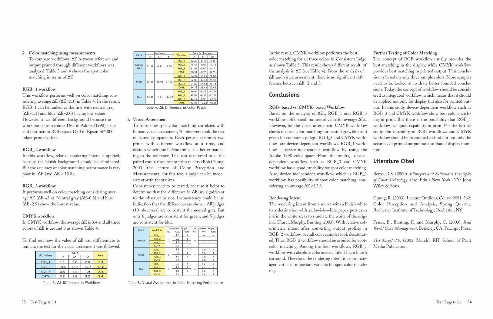
In the result, CMYK workflow performs the bestcolor matching for all three colors in Consistent Judgeas shown Table 5. This result shows different result ofthe analysis in ∆E (see Table 4). From the analysis of∆E and visual assessment, there is no significant dif-ference between ∆E 2 and 3.
Conclusions
RGB- based vs. CMYK- based WorkflowBased on the analysis of ∆Es, RGB_1 and RGB_3workflows offer small numerical value for average ∆Es.However, for the visual assessment, CMYK workflowshows the best color matching for neutral gray, blue andgreen for consistent judges. RGB_3 and CMYK work-flows are device-dependent workflows. RGB_1 work-flow is device-independent workflow by using theAdobe 1998 color space. From the results, device-dependent workflow such as RGB_3 and CMYKworkflow has a good capability for spot color matching.Also, device-independent workflow, which is RGB_1workflow, has possibility of spot color matching, con-sidering an average ∆E of 2.3.
Rendering IntentThe rendering intent from a source with a bluish whiteto a destination with yellowish-white paper puts cyanink in the white areas to simulate the white of the orig-inal (Fraser, Murphy, Bunting, 2003). With relative col-orimetric intent after converting output profiles inRGB_2 workflow, overall color samples look desaturat-ed. Thus, RGB_2 workflow should be avoided for spot-color matching. Among the four workflows, RGB_1workflow with absolute colorimetric intent has a bluishsurround. Therefore, the rendering intent in color man-agement is an important variable for spot color match-ing.
Further Testing of Color MatchingThe concept of RGB workflow usually provides thebest matching in the display, while CMYK workflowprovides best matching in printed output. This conclu-sion is based on only three sample colors. More samplesneed to be looked at to draw better founded conclu-sions. Today, the concept of workflow should be consid-ered as integrated workflow, which means that it shouldbe applied not only for display but also for printed out-put. In this study, device-dependent workflow such asRGB_3 and CMYK workflow show best color match-ing in print. But there is the possibility that RGB_1workflow has good capability in print. For the furtherstudy, the capability in RGB workflows and CMYKworkflow should be researched to find out not only theaccuracy of printed output but also that of display mon-itor.
Literature Cited
Berns, R.S. (2000). Bilmeyers and Saltzman’s Principlesof Color Technology. (3rd Edn.) New York, NY: JohnWiley & Sons.
Chung, R. (2003). Lecture Outlines, Course 2081-562:Color Perception and Analysis, Spring Quarter,Rochester Institute of Technology, Rochester, NY
Fraser, B., Bunting, F., and Murphy, C. (2003). RealWorld Color Management. Berkeley, CA: Peachpit Press.
Test Target 3.0. (2003, March). RIT School of PrintMedia Publication.
2. Color matching using measurementsTo compare workflows, ∆E between reference andoutput printed through different workflows wasanalyzed. Table 3 and 4 shows the spot colormatching in terms of ∆E.
RGB_ 1 workflowThis workflow performs well on color matching con-sidering average ∆E (∆E=2.3) in Table 4. In the result,RGB_1 can be ranked as the first with neutral gray(∆E=1.1) and blue (∆E=2.0) having low values.However, it has different background because thewhite point from source D65 in Adobe (1998) spaceand destination RGB space D50 in Epson SP5000inkjet printer differ.
RGB_ 2 workflow In this workflow, relative rendering intent is applied,because the bluish background should be eliminated.But the accuracy of color matching performance is verypoor in ∆E (ave. ∆E = 12.8).
RGB_ 3 workflowIt performs well on color matching considering aver-age ∆E (∆E =2.4). Neutral gray (∆E=0.8) and blue(∆E=2.9) show the lowest value.
CMYK workflow In CMYK workflow, the average ∆E is 3.4 and all threecolors of ∆E is around 3 as shown Table 4.
To find out how the value of ∆E can differentiate tohuman, the test for the visual assessment was followed.
Table 3. ∆E Difference in Workflow
L* a* b*
RGB_1 1.1 3.8 2.0 2.3RGB_2 10.4 12.2 15.7 12.8RGB_3 0.8 4.5 1.9 2.4CMYK 3.2 3.8 3.2 3.4
Workflow∆E's
Ave
Table 4. ∆E Difference in Color Patch
3. Visual AssessmentTo learn how spot color matching correlates withhuman visual assessment, 10 observers took the testof paired comparison. Each person examines twoprints with different workflow at a time, anddecides which one he/she thinks is a better match-ing to the reference. This test is referred to as thepaired comparison test of print quality (Bob Chung,2003, the lecture of Color Perception andMeasurement). For this test, a judge can be incon-sistent with themselves.Consistency need to be tested, because it helps todetermine that the difference in ∆E are significantto the observer or not. Inconsistency could be anindication that the differences are shown. All judges(10 observers) are consistent for neutral gray. Butonly 6 judges are consistent for green, and 5 judgesare consistent for blue.
Table 5. Visual Assessment in Color Matching Performance
No. Ave. Rank No. Ave RankRGB_1 1.3 3 -- --RGB_2 0.0 4 -- --RGB_3 1.7 2 -- --CMYK 3.0 1 -- --RGB_1 1.8 2 2.0 1RGB_2 0.0 4 0.0 4RGB_3 1.7 3 2.0 1CMYK 2.5 1 2.0 1RGB_1 0.2 4 1.2 2RGB_2 1.6 3 2.2 1RGB_3 1.8 2 1.2 2CMYK 2.4 1 1.4 4
6
5
Patch Workflow
0
4
5
Inconsistent Judge
Neutral
Green
Blue
Consistent Judge
10
L* a* b* L* a* b*RGB_1 82.22 -0.73 4.45RGB_2 75.57 4.16 11.12RGB_3 81.93 -0.60 4.11CMYK 80.51 -0.73 0.79RGB_1 54.94 -55.25 21.08RGB_2 52.86 -47.30 24.38RGB_3 54.88 -54.53 21.14CMYK 54.72 -55.43 20.43RGB_1 44.04 -9.25 -47.24RGB_2 42.69 -6.35 -31.78RGB_3 44.14 -8.99 -47.22CMYK 43.96 -10.29 -48.38
Reference Sample (Average)Patch Workflow
Green 55.25 -58.96 21.72
Blue 43.41 -7.33 -47.42
3.88-0.4381.39Neutral grey

Figure 3: Digital noise most noticablty manifests itself in
dark colors and shadow areas.
26Test Targets 3.125 Test Targets 3.1
sures. The Manfrotto QTVR head facilities image cap-ture by clicking into place at defined degree intervalsranging from 10 to 90 degrees.
Everyone in the picture was instructed to remain as stillas possible as the pictures were taken and the camerarotated. Any movement of the subject can create prob-lems with the stitching process.
Image StitchingStitching is a very automated process if the nodal pointand degrees between exposures are correct as ensuredby the Manfrotto QTVR head. The images wereimported into QuickTime VR Authoring Studio andarranged in the order they were taken. The softwarethen goes about blending and contorting the files intoa single panoramic image. Inevitably, people movedslightly between exposures and Somika Shetty andHemachand Kolli had to be reconstructed from thesource images using Adobe Photoshop.
Image AdjustmentWorking in the default sRGB color space of the NikonCoolpix 5000, we isolated and corrected numerouscolor casts with Photoshop layer masks. The casts werethe result of three competing light sources in my com-position: simulated D50 over the press controls, sodi-um-vapor lamps on the ceiling, and daylight from thewindows behind the camera.
Digital noise appears as a sort of colorful specklingmost apparent in the dark areas of digital photos.Jeremy McCreary (2002) describes two primary classi-fications of noise. Random noise is temporally depend-ent and occurs arbitrarily over the whole image. Fixedpattern noise is spatially static but varies over time(online). To remove the digital noise a Gaussian blurfilter was applied a with a seven-pixel radius and thenimmediately faded to color with 100% opacity. Figure 3is a detail of Franz Sigg's sweater where the noiseremoval was particularly noticeable.
An inkjet proof from an Epson P2200 allowed us toinspect how effectively the color casts were removed.We shared the proof with professors and peers toreceive constructive criticism on the composition andlighting of the image. Unsharp masking was appliedappropriately for web offset press output and finally
KeywordsPanorama, Digital photography, QTVR
IntroductionThe Library of Congress (1998) traces panoramic pho-tography back to the birth of the modern photograph-ic process in the 19th century. The first panoramicimages were simply a series of daguerreotypes arrangednext to each other. Soon after, panoramic film cameraswere developed that use a pivoting lens design toexpose a long length of film (online). Contemporaryversions of these cameras are made with extreme preci-sion and subsequently are expensive. Today special dig-ital image processing software makes it possible to"stitch" multiple digital photographs together to createa virtual panorama.
The first objective in creating the panoramic image onpage 27-28 of this publication was to explore a uniqueimaging process to capture the hardworking membersof the Test Targets team. To achieve this, a specializedtripod head, a Nikon Coolpix 5000 digital camera, andApple's QuickTime VR Authoring Studio were used.
The second objective was to ensure pleasing colorreproduction by adjusting the image in AdobePhotoshop with a calibrated monitor for output to theHeidelberg Sunday 2000 web offset press.
ProcedureOur process of can be broken down into three sections:image capture, image stitching, and image adjustment.
Image CaptureThe first step in creating high quality panoramicimages is the setup of the appropriate hardware. AManfrotto QTVR tripod head was used allowing us tolevel the camera and accurately maneuver it so that thenodal point, or optical center, was positioned directly
over the tripod's axis of rotation. Figure 1 describes thelocation of the nodal point: where the image focuses toa point before expanding to cover the film plane orCCD. The QuickTime VR Authoring Studio manual(1998) explains how this procedure avoids parallaxproblems which would otherwise distort the finalimage (Apple Computer, p. 81).
Once the camera is in position and the first exposure ismade, the camera needs to rotate a certain number ofdegrees to ensure a 50% overlap between exposures asseen in Figure 2. James Rigg (2002) explains how thenumber of degrees is dependent on the field of view(FOV) of the lens being used and can be derived withthe following formula (online):FOV = 2 x tan-1 (24/(2 x f )) where 24 is the 24mm dimension of 35mm film in por-trait orientation. (35mm film is 35 x 24 mm.) The focallength of the lens, f, must then be relative to 35mm filmand was in our case 28mm. The Nikon's actual focallength was 7.1mm but we had to use the 35mm filmequivalent because we didn't know the size of its CCD.
Simply dividing the field of view by two will yield thenumber of degrees necessary between exposures. In mysetup the camera focal length was 28mm and the FOVwas 46.4 degrees indicating 23.2 degrees between expo-
Panoramic Photography
by Jon Lesser
Figure 1: We estimated the nodal point of the Nikon
Coolpix 5000 by look straight down from above.
Figure 2: The darker blue represents where the two images
overlap. The degrees between exposures will be different
for both landscape and portrait orientations.

28Test Targets 3.127 Test Targets 3.1
ReferencesApple Computer, Inc. (1998). QuickTime VR Authoring Studio Manual. Cupertino, CA.
Library of Congress. (1998). A Brief History ofPanoramic Photography, Part 1. Retrieved May 25, 2003,from Taking the Long View:Panoramic Photographs, 1851-1991 athttp://lcweb2.loc.gov/ammem/pnhtml/pnhist1.html
McCreary, J. (2002). Exposure strategies for digital cam-eras with manual exposure controls. Retrieved May 25,2003, from dpFWIW (Digital Photography For WhatIt's Worth) at http://www.cliffshade.com/dpfwiw/exposure.htm
Rigg, J. (2002). Panoramic Photography Techniques:Special Topics - Calculating focal length.Retrieved May 20, 2003, from panoguide.com athttp://www.panoguide.com/reference/focal_length.html
the image was converted to the custom CMYK profilecreated for Test Targets 3.1.
ConclusionThe specialized tripod head from Manfrotto was veryhelpful to us because of its ability to optically center thecamera and avoid parallax errors. There are other com-panies, such as Kaidan, who also make tripod headsspecially designed for panoramic photography.
The inkjet proof we made was not meant to be a pressproof as the custom press profile was not available at
the time. It did, however, show how well we neutralizedcolor casts, removed noise, and retouched the image.Our post-capture workflow could have been morestreamlined with more static subject matter.
Panoramic photography is a visually effective way tocommunicate an image. The extremely wide angleinvites the eye to study what is normally only perceivedin peripheral vision. From a more pragmatic stand-point, panoramic images let you show very large objectsby simulating the turning of the head motion.
Pictured above from left to right: Franz Sigg, Somika Shetty, Vikaas Gupta, Edline Chun, Seunga Kang Ha,Hemachand Kolli, Lingjun Kong, Chao-Yi (Fred) Hsu, and Bob Chung. Not pictured: Ryan Testa, Jon Lesser.

30Test Targets 3.129 Test Targets 3.1
the image into not less than 150 blocks and not morethan 250 blocks, with all blocks being uniform in size.The sampling is carried out using a “nearest neighborsampling” in Adobe Photoshop. The SCID imagesN2A, N4A, and N7A were sampled in this way into160 blocks of size 1cm x 1cm; these sampled imagesor image-dependent targets are referred to in this arti-cle as N2s, N4s, and N7s respectively.
Figure 2. SCID image N2A (left) and its target N2s (right).
Figure 3. SCID image N4A (left) and its target N4s (right).
Figure 4. SCID image N7A (left) and its target N7s (right).
Producing samplesThese sampled images were printed along with theSCID image and the IT8.7/3 target on theHeidelberg Sunday 2000 web offset press at RochesterInstitute of Technology. To achieve samples that vary
in color by a small percentage in a successive manner,the inking of the press was deliberately adjusted togradually reduce the amount of magenta applied ontothe sheets. A batch of 78 sheets was collected duringthis period. Since the web offset machine was runningat a speed of 1200fpm at this time, the 78 sheets col-lected amounts to 7.02secs of the pressrun. Becausethis is a very short period of time, the samples havesmall visual differences. From these samples, Sheet 1was used as the reference and Sheets 5, 15, 30, 50, and75 as samples. These samples were measured for solidink densities to validate their selection. It can be seenin Figure 5 that the magenta solid ink density has adrop of about 0.11 from Sheet 1, which is the refer-ence sheet.
Figure 5. ∆SID of IT8.7/3 and custom targets.
Subjective match evaluationThe subjective color matching was achieved throughvisual inspection of the SCID images and theirrespective samples by ten observers. SCID imagesN2A, N4A, and N7A and their respective sampleswere masked from the rest of the press sheet with auniform gray paper. This was presented to observers torank the samples in order of closeness in appearanceto the reference and tabulated, Table 1.
Objective match evaluationAll the image-dependent targets or custom targetsand the IT8.7/3 target from these sheets were meas-ured and the readings were entered into the Microsoft
Magenta ∆SID of Custom Targets
-0.25
-0.2
-0.15
-0.1
-0.05
0
0.05
0.1
0.15
0 20 40 60 80
Sheet No.
N2A N4AN7A IT8.7/3
KeywordsColor matching, Color difference (∆E), CRF,Psychophysical analysis
IntroductionColor difference can either be evaluated subjectively orobjectively. Perceived color difference is termed sub-jective color evaluation and colorimetric assessment ofcolor difference is termed objective color evaluation.The subjective and objective color difference analysisbetween two spot colors correlate well. But color dif-ference between two pictorial color images is mostlyperformed subjectively. Ideally both subjective andobjective color matching need to be performed onimages because the correlation between the subjectiveand objective evaluations is mostly unknown.
To answer the question “Will colorimetric assessmentof color difference between two pictorial color imagescorrelate with visual assessment?” Chung andShimamura (2001) investigated objective color match-ing by a method of colorimetric measurement of ageneric target and the use of statistics. For this theassumption made was, “the use of a multi-patch tar-get, like the IT8.7/3 (ISO 12642) basic target for ana-lytical work and the use of an ISO SCID naturalimage for visual appraisal are sufficient to representany pictorial color image” (pp 337). This studyaddresses the same question and also verifies theextent to which a generic target like the IT8.7/3 isappropriate for analytical work of color differenceevaluation. This is carried out by a method of sam-pling pictorial images.
CRF of ∆EThe statistical study of objective match has been doneusing CRF curves. Here the ∆E of all the patches ofall targets are plotted against the cumulative relativefrequency of the patches. Chung and Shimamura
(2001) demonstrated the three thresholds of objectivematch namely no visual difference, fair color match,and printing validation (pp 343) as shown in Figure 1.Here we see that a curve with ∆E of 0.6 at 50 per-centile, 1.2 at 90 percentile and 2.4 at unity has novisual difference between two pictorial images. A faircolor match is one with a CRF curve of ∆E of 2 at 50percentile, 4 at 90 percentile and 8 at unity. The CRFcurve for printing validation shows ∆E of 3 at 50 per-centile, 6 at 90 percentile and 12 at unity.
Figure 1. CRF curves showing ∆E thresholds.
ObjectiveThe objective of this study is to verify that image con-tent contributes to objective color matching evaluationbetween two pictorial color images. If this is proventhen it suggests that a generic target imparts limitedinformation and would require some modifications,such as assigning weighing functions, to the measure-ments of patches to provide accurate analytical results.
Experimental ProceduresThis study tests the correlation between the quantita-tive measurements of the IT8.7/3 target and the visualassessment of the ISO SCID images when all of theseare printed under uniform conditions.
Sampling the pictorial imagesThe October 2002 Minutes of CGATS SC3 TF1,states that objective color measurement can beachieved by the pixilation of the SCID images asshown in Figure 2, 3, and 4. This is done by sampling
Role of Image Content in Objective Color Matching
by Somika Shetty

32Test Targets 3.131 Test Targets 3.1
human eye is not completely capable of differentiatingthe amount of color departure from the original. Acomparison of Sheet 75 targets against the previouslydescribed thresholds of CRF of ∆E is shown in Figure9. Here we see that ∆E at unity is comparable for allthe targets. But the ∆E at 50 percentile is different,i.e., it is 1.3 for IT8.7/3, 3.1 for N2s, 2.5 for N4s, and3.7 for N7s. This shows that although the generic tar-get, IT8.7/3, tells the color difference, the custom tar-gets give better insight at 50 percentile, thus suggest-ing that image content has a play in the color differ-ence between pictorial images.
Figure 9. ∆E of the targets in Sheet 75.
Figure 9 shows that target N4s has the maximum ∆Eas 2 less than that of IT8.7/3 and ∆E at 50 percentileas 1 more than IT8.7/3. This is the target for the neu-tral image N4A, and may have the involvement ofGCR settings, which causes maximum ∆E to be lim-ited to less than 5. Visually Sheet 75 of N7A isacceptable when compared with the reference.
Scope for Future WorkThe samples produced for this study were printed onthe Heidelberg Sunday 2000 web offset press. Somefactors that have not been accounted for in the presentstudy are ink uniformity across the press sheet, inkuniformity between the two sides of the press sheet,and natural process variation. A further study on thistopic would require a more stable electronic printersuch as Kodak Approval, Epson StylusPro, etc. By
doing so a controlled production of samples can becarried out against arbitrary selection of samples froma batch. The samples can be produced using profile-editing tools or transfer curves, the advantage beingthat the samples produced will be affected globally asagainst having only one colorant changed. Thisprocess will be more controlled and have greater lati-tude to gain information about the magnitude anddirection of color difference and how it affects thehuman visual system.
The practice of sampling the pictorial images to gaininformation about the color difference is not feasiblein a production scenario. This calls for a modificationof the standard targets such that they give us the sameinformation. The major step in this direction would beto define the effect of memory colors. For this, thepatches on the IT8.7/3 target that represent the mem-ory colors and colors that are sensitive to the humaneye need to be identified. These patches can then beassigned a quantitative weighing factor while calculat-ing the color difference. This would give the desiredresults, quantitative data that correlate well with thesubjective matching.
ReferencesChung, R. and Komori, Y. (1998), ICC-based CMSand its color matching performance, 1998 TAGAProceedings, pp. 195-205.
Chung, R. and Shimamura, Y. (2001), Quantitativeanalysis of pictorial color image difference, 2001TAGA Proceedings, pp. 333-345.
NPES. Section 7.1 Random sampling of SCIDimages from Minutes of CGATS SC3 TF1 –Objective Color Matching, a meeting held October30-31, 2002, Chaparral Suites, Mesa, AZ. NPES doc-ument CGATS/SC3/TF1 N 021.
Excel template designed to calculate CumulativeRelative Frequency (CRF) of ∆E with respect to thereference. In this way two sets of objective colormatch measurements are obtained, one being theIT8.7/3 target and the other the image-dependenttargets. The two sets of objective color match meas-urements, were then compared with the rankings ofthe subjective color evaluation to determine which setof CRF curves exhibit better correlation.
Table 1. Results of psychophysical analysis of SCID images.
FindingsThe CRF curves of ∆E of the IT8.7/3 target shows asthe same for Sheets 5 and 15 and a successive increasein the other three samples, Figure 5. But the same isnot seen with the custom targets of the SCID images,all of which have an approximately uniform pattern inthe CRFs of ∆E, Figure 6, 7, and 8. In these, Sheets 5and 15 show a significant difference. But because theCRF curves of these sheets lie within the threshold ofno visual difference, the visual analysis of the samplesrevealed confusion in the ranking order of Sheets 5and 15.
Figure 5. CRF of ∆E for IT8.7/3 target.
1 2 3 4 5 1 2 3 4 5 1 2 50 4 51 5 30 75 15 50 15 5 30 50 75 30 5 50 15 752 5 30 15 50 75 5 15 50 75 30 5 15 30 50 753 15 5 30 50 75 5 15 50 30 75 15 5 50 30 754 15 5 50 30 75 5 15 50 30 75 5 30 50 15 755 50 5 30 15 75 5 15 50 30 75 5 15 50 30 756 15 30 50 75 5 5 15 50 30 75 5 15 30 75 507 5 15 50 30 75 5 15 50 30 75 5 15 30 50 758 5 30 15 50 75 5 15 50 30 75 5 15 30 50 759 5 15 30 50 75 5 30 15 75 50 5 15 50 30 75
10 5 15 50 30 75 5 15 50 30 75 5 15 50 30 75Result 5 30 50 50 75 5 15 50 30 75 5 15 50 30 75
SCID N7Observer SCID N2 SCID N4
The IT8.7/3 target of Sheets 30 and 50, wereobserved to have large differences in ∆E from the ref-erence but the custom targets’ CRFs show that theimages have the same ∆E when compared to the ref-erence. The visual analysis by observers revealed con-fusion in ranking between Sheets 30 and 50 support-ing the results of the custom target that these sheetsare equally different from the reference.
Figure 6. CRF of ∆E for N2s custom target.
Figure 7. CRF of ∆E for N4s custom target.
Figure 8. CRF of ∆E for N7s custom target.
Another justification of the confusion in ranks is thatthe CRF curves of Sheets 5, 15, 30, and 50 fall withinthe threshold for a fair color match showing that the

34Test Targets 3.133 Test Targets 3.1
KeywordsGCR, Profile, Color management, Black point
IntroductionGray Component Replacement (GCR) is a techniquethat replaces roughly equal amounts of cyan, magenta,and yellow ink in a given process color mix with anappropriate amount of black ink. GCR affects theshadows, grays, colors, and details throughout a picture.
One of the advantages is, that in the shadows the totalink coverage (TIC) is much smaller, relying more onthe black separation to provide details in the shadows.GCR images are also less sensitive to the variability ofthe process of printing, as well as saving Cyan,Magenta, and Yellow inks being used in the image.
Black point compensation will also be tested in con-junction with the differences in GCR settings. Blackpoint compensation finds the darkest point on a sourceimage space and matches it to the darkest point on theICC color managed image space.
The objective of this study is to examine the visual dif-ferences in GCR settings in color profiling software, inparticular the Kodak ColorFlow profiling softwarepackage.
ProcedureThe Heidelberg Sunday 2000 web press was used forthe testing purposes of this study. Kodak ColorFlowv2.1 (TF_08) was used to create 4 separate ICC pressprofiles with the following characteristics:
a. 0% GCR / 280 TACb. 40% GCR / 280 TACc. 88% GCR / 280 TACd. 100% GCR / 280 TAC
All profiles were measured using the GretagMacbethSpectrolino Spectroscan, and identical settings, as seenin Figure 1, were used for all profiles: 100% Max Black,
0% Black Start and applied through the same proce-dure in Adobe Photoshop 7.0, shown in Figure 2.These settings were applied to an Adobe RGB taggedTIF file for use in this study. Because of this, a percep-tual rendering intent was used when applying the pro-
files to the images, which would allow for a visualanalysis of the images side by side.
It is sometimes hard to see the differences betweenGCR settings because, if they do what they should, youshouldn’t be able to see a difference in the actual image.To compare the different settings, a separate image file
A Comparison of Color Conversion between Photoshop & ICC CMS
by Ryan Testa
Figure 1: Kodak Advanced Black Settings
Figure 2: Photoshop Custom CMYK Settings
Image 1 - 0 GCR Black Channel
Image 2 - 40 GCR Black Channel
Image 3 - 80 GCR Black Channel
Image 4 - 100 GCR Black Channel Image 4 - Max GCR Black Channel
Image 1 - Light GCR Black Channel
Image 2 - Medium GCR Black Channel
Image 3 - Heavy GCR Black Channel
Images courtesy of Patti RussottiFigure 3
ICC GCR
Figure 4
Photoshop GCR
36Test Targets 3.135 Test Targets 3.1
ConclusionSWOP’s specification for Gray ComponentReplacement states that the maximum GCR thatshould be used would be 60%, because if GCR is usedin excess it can limit options for editorial color changesin prepress or interfere with color adjustments for pre-cise matching on press. It can also result in shadowsand black areas that have a loss in detail and color. AtGCR levels above 60%, SWOP recommends that theprinter use caution in printing, and use appropriatetesting. This was true for a film workflow, but mightnot apply for color managed digital workflows asshown in this report.
It is unknown how Adobe and Kodak implementGCR into their products or what the algorithms arethat create the black channels. We can assume thatKodak uses LAB values to create their black.However, when the tests were conducted, the values ofthe ICC-based GCR images did not correctly imple-ment GCR, as shown in Figure 6, but all imageslooked similar to each other. Photoshop was able touse GCR correctly, however, each image was slightlydifferent. From this experiment we can see that thealgorithms used in Photoshop and Kodak Colorflowdiffer in implementation, and visually.
ReferencesSWOP, Incorporated (2001). SWOP for the NewMillenium: 2001 (9th edn.). Marblehead, MA: Author.
International Digital Enterprise Alliance andGRACol Committee (2002). General Requirements forApplications in Commercial Offset Lithography –GRACol 6.0. Alexandria, VA: Author. Also available assupplements of June 2002 issues of Graphic ArtsMonthly and Graphic Design: USA.
Cost, Frank. (1997). Pocket Guide to Digital Printing.Albany, NY: Delmar.
using only the black channel was created to be able toshow the differences in GCR settings. As shown inFigures 3 and 4, the black channel is on the right of theimage for which it is being used.
After creating the ICC GCR files, the same image filewas used to create 4 different Photoshop-created GCRfiles. These files had characteristics similar to KodakColorFlow:
a. Low GCR / 280 TACb. Medium GCR / 280 TACc. High GCR / 280 TACd. Maximum GCR / 280 TAC
Figure 4 shows the Custom CMYK Settings inPhotoshop 7 that was used to create one of the four testimages.
Another test was performed using Photoshop's BlackPoint Compensation (BPC) function. This optiondetermines how the dark image information is handledwithin the CMM. When leaving the BPC boxchecked (which is the most common procedure whencreating a profile), the darkest neutral color of the orig-inal color space is mapped on to the darkest neutralcolor of the new color space. When the box isunchecked, the darkest neutral color is mapped toabsolute black. After creating the original 4 profiles,black point compensation was enabled for comparison.The images in Figure 5, when compared to the Figure3 and 4 images represent this function including thedifferent GCR settings for comparison.
ResultsWhen evaluating the differences in GCR settings thereis little difference in the images visually. When com-
paring Photoshop to ICC-based GCR implementation(Figure 6) using Photoshop’s Info Palette, there is a sig-nificant difference in the numerical values of the samemeasured area. As shown below, the ICC 100% GCRused over 100% total ink correctly. The Photoshop100% used less than the 100% GCR for a very darkarea. Photoshop might assume that a very high densitycolor can be achieved with black only, which might notbe appropriate. Both images look pleasing to the eye,and show very little color difference except a little lessmodulation in the dark areas for the 100% Photoshopimage.
For the images tested in this study, the black point com-pensation test showed the same results as the GCR test.No real difference was noticed between the images, andGCR settings.
0 GCR BPC On Black Channel
100 GCR BPC On Black Channel
Figure 5
Black Point Compensation
Figure 6
ICC 40% GCR
ICC 100% GCR
Photoshop Medium GCR
Photoshop Max GCR
Point 1
(Top)
C 16
M 92
Y 89
K 11
Total 208
Point 2
(Bottom)
C 60
M 60
Y 59
K 98
Total 277
Point 1
(Top)
C 4
M 85
Y 80
K 31
Total 200
Point 2
(Bottom)
C 60
M 60
Y 58
K 98
Total 276
Point 1
(Top)
C 20
M 87
Y 80
K 9
Total 216
Point 2
(Bottom)
C 62
M 52
Y 51
K 96
Total 261
Point 1
(Top)
C 0
M 82
Y 95
K 24
Total 201
Point 2
(Bottom)
C 0
M 0
Y 0
K 98
Total 98

Test Targets 3.137 Test Targets 3.1 38
2. Color matching accuracy is judged by the average∆E between the reproduceable color samples andtheir original specifications. Table 1 shows thethree different conversion methods used.
Table 1. The three color matching methods used
3. The color settings used are shown in Figure 1. Formaximum color accuracy, Best CMM renderingquality and Absolute Colorimetric renderingintent were selected. Default CMM was selecteddue to limitations of the software when perform-ing an A-to-B (Abs) conversion.
Figure 1: Color settings and sample A to B (Abs)
conversion on DuPont Color Scientist v1.21
4. A summary of minimum, maximum, and averageL*, a*, b* differences and ∆E between theCIELAB (ref ) and CIELAB (DuPont ColorScientist values from B-to-A-to-B (Abs) conver-sion) for the reproduceable patches are shown in
Method B to A (Abs) A to B (Abs)Pantone Pantone 150 lpi ProfileMaker
Custom 1 ProfileMaker ProfileMakerCustom 2 Colorflow Colorflow
Tables 2a, 2b, and 2c.Table 2c reflects values basedon an addtional A-to-A (Abs) conversion fromthe Pantone profile to the output profile usingGreatgMacbeth ProfileMaker 4.1.1.
Table 2a. Results for GretagMacbeth ProfileMaker
Table 2b. Results for Kodak Colorflow.
Table 2c. Results for Pantone 150 lpi.
Printed Samples MethodThe following method is used to determine requireddot areas for printing.
1. The colors specified were converted to theirCMYK values using the Adobe Photoshop API .A sample conversion using the color picker isshown in Figure 2.
Figure 2. B to A (Abs) conversion using color picker
n=9 ∆L* ∆a* ∆b* ∆EMin. -0.77 -1.86 -2.06 1.00Max. 1.95 2.10 1.72 2.71Ave. 1.04 -0.16 0.16 2.08
n=9 ∆L* ∆a* ∆b* ∆EMin. -0.08 -1.86 -0.93 0.14Max. 0.66 1.82 1.60 1.98Ave. 0.34 -0.38 -0.07 1.34
n=9 ∆L* ∆a* ∆b* ∆EMin. -0.23 -0.81 -0.90 0.43Max. 0.78 0.61 0.51 1.21Ave. 0.25 -0.15 -0.19 0.68
KeywordsColor matching, Color difference, Color accuracy,Pantone®, ICC
IntroductionPantone®, founded in 1963, has a popular system ofidentifying, matching and communicating colors tosolve problems associated with producing accuratecolor matches in the graphic arts community. Today,Pantone color matching system provides proprietaryreference and color matching solutions for spot colorsusing process inks via Adobe Photoshop API. Since,these values assume “standarized” Pantone press condi-tions which do not reflect actual press conditions andother process parameters, it would be interesting toevaluate how Pantone compares to a custom-built ICCpress profile using various profiling software.
ObjectiveEvaluate spot color matching performances betweenPantone press profile (150 lpi Pantone) and customICC press profiles. Color matching accuracy will bedetermined both by simulation method (DuPontColor Scientist v1.21) and by actual measurement ofcolor difference between Pantone color patches repro-duced in print (Heidelberg Sunday 2000 web offsetpress).
ProcedureThe following steps were used in preparation for thesimulation method and printed sample method.1. Fifteen color patches from the Pantone Color
Imaging Guide (1996) were selected and theirmeasured CIELAB values specified as aimpoints.The swatches were measured using a calibratedX-Rite 528 spectrodensitometer under D50 illu-minant and 2-deg. observer.
2. Two profiling packages, Kodak Colorflow v2.1
and GretagMacbeth ProfileMaker v4.1.1 wereused to build the ICC press profile. CMYKoptions of 280 TAC, 10 % min. Black, 100% max.Black, and medium GCR were used for both. Theoutput profiles were built for the HeidelbergSunday 2000 perfecting heatset web offset presson which this publication is printed. The profileswere based on test forms printed earlier on thesame press keeping all press parameters constantand process variations to a minimum.
3. The two custom ICC press profiles,Sunday_Kodak_vg.icc and Sunday_Gretag_hk.iccwere loaded in the Apple ColorSync folder. ThePantone profile for 150 lpi screen (150-lpiPantone.icc) is already available and comes as adefault with most graphic application packages.
4. Out of the 15 Pantone color swatches selected, 6patches were out-of-gamut while the rest werereproduceable in print. This was done to furtheranalyze color accuracy and gamut clipping issues,which however have not been discussed in thisarticle.
5. The measured CIELAB values for the samplecolor swatches were taken as the reference andconverted to their respective CMYK values (B toA conversion, absolute) using the Heidelberg out-put press profile as the destination space. TheCMYK values were converted back to CIELAB(A-to-B conversion, absolute) by two methods.
Simulation Method1. DuPont Color Scientist v1.21 was used for con-
version from CIELAB (ref ) to CMYK (usingPantone, Gretag, and Kodak ICC output profiles)and back to CIELAB color space.
Color Matching between Pantone and Custom ICC Profiles
by Vikaas Gupta

Test Targets 3.1Test Targets 3.139 40
DiscussionThis study was done using two methods of analysis.In the simulation methodology ∆E should theoretical-ly be zero. Since any variations caused by randomerrors present in the measuring instruments and theprinting process itself are eliminated. The residual ∆Edifferences are due to interpolation and roundingerrors of the profiling package, software used foranalysis (DuPont Color Scientist v1.21), and CMMused.
Between the two profiling packages used,GretagMacbeth ProfileMaker v4.1.1 provides bestcolor accuracy based on color difference (∆E) values.A larger sampling of color patches needs to be takenbefore arriving at a final verdict in favor ofGretagMacbeth ProfileMaker.
It is also interesting to note that in the analysis usingthe simulation method the color differences betweenthe Pantone profile and the custom ICC press profileswas not very large.
In the printed color sample analysis the ∆E differ-ences were more noticeable. As the results in Tables3a, 3b and 3c show, the custom ICC press profiles hadlower average ∆E than the Pantone profile. Using ∆Eas a criteria to judge the degree of a color match, wecan conclude that the custom ICC profile does indeedprovide a closer color match to the specified colorthan the Pantone profile. This is primarily due to thefact that the Pantone profile has to be generic innature and does not take into account for the capabili-ties and limitations of a given output process. We haveno knowledge of the print parameters and conditionsunder which the Pantone profile was built.
This study highlights the fact that for ICC-basedcolor management system to work effectively, graphicarts professionals and printers must be careful in usingICC profiles that reflect their existing process capabil-ities and print parameters.Having color managementis better than no color management. But to use colormanagement effectively, an understanding of howcolor management works is important and requireseffort to build custom ICC press profiles.
As the graphics arts industry moves from a traditionalcraft based industry to a more exact science, theemphasis is on tighter color tolerances and controlledprocess variations.. Even though traditional skills of acraftsman are replaced by ICC color management, itstill requires well trained and skilled operators toimplement a color management system or workflow.
The results of the study provides a basis for furtheranalysis on quantitative color matching. For a morecomprehensive analysis, a larger sampling of colorscan be taken and more profiling packages can beincluded for color accuracy comparisons.
ReferencesChung, Robert and Kuo, Shih-Lung. (Nov. 1996).Color Matching with ICC Profiles IS&T’s 4th ColorImaging Conference Proceedings. Scottsdale, AZ.
Sharma, Abhay and Feming, Paul D. (2003). WMUProfiling Review 3.0. Kalamazoo, MI: WesternMichigan University.
Gupta, Vikaas (March 2003). Spot color matchingbetween Pantone and ICC press profiles. Test Targetsv3.0, pp. 19-20. Rochester, NY: School of PrintMedia, Rochester Institute Of Technology.
2. The color settings were set to the output workingspace of the three profiles(Pantone,GretagMacbeth, and Kodak). The renderingintent was set to Absolute colorimetric for maxi-mum color accuracy. Black point compensation(BPC) and the dither options were left unchecked.
3. The recorded CMYK values for the three testconditions were converted back to CIELAB (A toB conversion, absolute) by printing these colorpatches with the CMYK values returned byAdobe Photoshop API and then measuring thepress sheets using the X-Rite 528Spectrodensitometer.
4. The colors specified were printed on the samepress (Heidelberg Sunday 2000) which was usedfor printing the profiling targets, keeping allparameters constant and print process variations toa minimum. A summary of results for the repro-ducedable printed colors is given below in Tables3a, 3b, and 3c.
Table 3a. Results for GretagMacbeth ProfileMaker
Table 3b. Results for Kodak Colorflow
Table 3c. Results for Pantone 150 lpi
n=9 ∆L* ∆a* ∆b* ∆EMin. -11.9 -9.1 -8.2 6.0Max. -2.1 4.1 6.3 13.0Ave. -5.7 -0.1 3.5 9.2
n=9 ∆L* ∆a* ∆b* ∆EMin. -7.9 -6.4 -12.4 1.4Max. 3.0 5.3 8.7 13.2Ave. -1.6 -1.4 0.0 5.4
n=9 ∆L* ∆a* ∆b* ∆EMin. -4.6 -5.1 -4.1 3.1Max. 1.1 5.2 7.0 8.1Ave. -1.9 -1.5 2.1 4.6
5. ∆E values and visual differences perceived betweenthe Pantone and custom ICC output profiles ofthe color patches are indicative of quantitative aswell as qualitative color differences. To enable thereader to visually perceive differences in color, thespecified colors reproduced in print on theHeidelberg Sunday 2000 press using the Pantoneand custom ICC profiles (GretagMacbethProfileMaker v4.1.1 and Kodak Colorflow v2.1)are shown in Figure 3.
Figure 3. Colors specified and reproduced in print
In-g
amut
col
ors
Out
-of-
gam
ut c
olor
s

Test Targets 3.1 Test Targets 3.1
ISO
126
40 N
4A.ti
fIS
O 1
2640
N7A
.tif
ISO 300
Heidelberg Sunday 2000 Sappi Somerset Gloss 80# Text, 36” wideQuark / Printergy / CreoVLF150 lpi / 2400 spi
TF_02v2.2July 15, 2003
Pictorial Reference Images ISO 12640 Standard Color Image Data
RIP Information:Mac Distiller
600 spi, 42.3 µ/spot PS Version: 3011.104PS Language Level: 3
IDVersionProd. DateNotes
PressPaper
Prepress
ISO 300
TR
4V03
U.E
PS
1998
RIT
P4B
AR
03U
.EP
S
Print⋅ RIT Gray BarV 0.3 Franz Sigg, Switzerland 2003
Use only at Rochester Institute of Technology
Device Mac Distiller
Addressability 600 DPI
PS Version 3011.104
7562
6080
K
Print⋅ RIT BarV 0.3 Franz Sigg. Switzerland 2003
Use only at Rochester Institute of Technology
Device Mac DistillerLicense expires Oct. 28, 2003
Addressability 600 DPI
PS Version 3011.104
CM
KY
50%
Dou
bl11
22
3344
Zer
oZ
ero
CM
50%
50%
1122
3344
YK
50%
150
L/in
1122
3344
1x1
2x2
3x3
4x4
M
C50
%D
oubl
1122
3344
KY
C+
YM
+Y
C+
MC
M 1
x1 2
x2 3
x3 4
x4
GCRBAR3U.EPS
75 62 60 80 K
C M K Y 50% Doubl11 22
33 44
ZeroZero C M 50% 50%11 22
33 44
Y K 50% 150 L/in11 22
33 44
1x1 2x2 3x3 4x4 M C 50% Doubl11 22
33 44
K Y
1998
RIT
TR4V03U.EPS
R⋅I⋅T Doubling GridScreen Ruling: 150 lpi PixCorrection = 0Licensed User: Use only at Rochester Institute of Technology
TR
4V03
U.E
PS
1998
RIT
GCRBAR3U.EPS
DG4CE11U.EPS
IT8.7/3.TIF
P4B
AR
03U
.EP
S
Heidelberg Sunday 2000 Sappi Somerset Gloss 80# Text, 36” wideQuark / Printergy / CreoVLF150 lpi / 2400 spi
TF_01v2.2July 15, 2003
Device Characterization TargetIT8.7/3 Basic Data Set from ISO 12640 SCID
RIP Information:Mac Distiller
600 spi, 42.3 µ/spot PS Version: 3011.104PS Language Level: 3
IDVersionProd. DateNotes
PressPaper
Prepress
75 62 60 80 K
C M K Y 50% Doubl11 22
33 44
ZeroZero C M 50% 50%11 22
33 44
Y K 50% 150 L/in11 22
33 44
1x1 2x2 3x3 4x4 M C 50% Doubl11 22
33 44
K Y
Print⋅ RIT Gray BarV 0.3 Franz Sigg, Switzerland 2003
Use only at Rochester Institute of Technology
Device Mac Distiller
Addressability 600 DPI
PS Version 3011.104
7562
6080
K
Print⋅ RIT BarV 0.3 Franz Sigg. Switzerland 2003
Use only at Rochester Institute of Technology
Device Mac DistillerLicense expires Oct. 28, 2003
Addressability 600 DPI
PS Version 3011.104
CM
KY
50%
Dou
bl11
22
3344
Zer
oZ
ero
CM
50%
50%
1122
3344
YK
50%
150
L/in
1122
3344
1x1
2x2
3x3
4x4
M
C50
%D
oubl
1122
3344
KY
C+
YM
+Y
C+
MC
M 1
x1 2
x2 3
x3 4
x4
1998
RIT
TR4V03U.EPS
41 42

43 Test Targets 3.1
R⋅I⋅T Neutral Balance Target for SWOP
Background only black, circles only CMY tints
25% 50% 75% 100%
25% 16% 16% 50% 39% 39% 75% 63% 63% 100% 86% 86%
1x1 2x2 3x3 4x4 1x1 2x2 3x3 4x4
R⋅I⋅T 4 Color Resolution Target ver. 0.8
Screen rulings in L/in: Checker sizes in microns:424.3 212.1 141.4 106.1 42.3 84.6 126.9 169.2
Reference tints = 10x10 spots, 42.4 L/in, 423.0 microns/checker
Mac Distiller 600 DPI
100100120120
133133150150
175175200200
250250300300
400400500500
Lines / inch
Mac Distiller, 600 spi, 2003 Rochester Institute of Technology
R⋅I⋅T Screen Pattern Analyzer for Proofs Ver. 0.1
90° 75°
60°
45°
30°
15° 0°
-15°
-30°
-45°
-60°
-75°
-90°
1x1
2x2
3x
3 4
x4
10x1010x10
1x1
2x2
3x
3 4
x4
150 lpi
R⋅I⋅T 4 Color Fan Target for ProofingMac Distiller
600 dpi
Rochester Institute ofTechnology
Rochester, NY 14623Ver. 1.0 2002
87 Spokes for each color1 pix 1 pix 1 pix2 pix 2 pix 2 pix3 pix 3 pix 3 pix4 pix 4 pix 4 pix
Registration
Line = 2 pixels 2 px = 84.6 µ
Roc
heste
r Institute of Technology D
igital Ray Target 7
3 ra
ys
Roc
heste
r Institute of Technology D
igital Ray Target 7
3 ra
ys
Roc
heste
r Institute of Technology D
igital Ray Target 7
3 ra
ys
Roc
heste
r Institute of Technology D
igital Ray Target 7
3 ra
ys
R⋅I⋅T Visual Registration Scale 1998 Franz Sigg, Rochester Institute of Technology, T&E CenterLicensed user: Use only at Rochester Institute of Technology
Ver.: 08 Device: Mac Distiller Addressability: 600ppi Resolution: 1px = 42µ License expires: June 28 2001
0-2-4-6-8-10-12-14-16-18-20-22-24-26-28-30 2 4 6 8 10 12 14 16 18 20 22 24 26 28 30- 0.001 inch +
160
120 80 40 0 40 80 120
160
160
120 80 40 0 40 80 120
160
160
120 80 40 0 40 80 120
160
1x1 2x2 3x3 4x4
R⋅I⋅T ResPatch Ver. 0.8
4VREP08U.EPS
4Res08U.EPS
SWGR04U.EPS
S6A.rev.tif
ScrPat2U.eps Documents screen angles and ruling for proofs
FAN
P10
U.E
PS
RA73T_U.EPS, There isalso a version with 37 rays
VREGH08inU.EPS Comes in inch / metric and horizontal / vertical versions
Not all targets areshown at originalsize.
GutenbergPQ01.tif Evaluation ofoverall print quality
Heidelberg Sunday 2000 Sappi Somerset Gloss 80# Text, 36” wideQuark / Printergy / CreoVLF150 lpi / 2400 spi
TF_03v2.3July 15, 2003
Synthetic TargetsTesting for Resolution, Register, Dot Gain and Gray Balance
RIP Information:Mac Distiller
600 spi, 42.3 µ/spot PS Version: 3011.104PS Language Level: 3
IDVersionProd. DateNotes
PressPaper
Prepress
DG4CE11U.EPS
R⋅I⋅
T D
oubl
ing
Grid
Scr
een
Rul
ing:
150
lpi
Pix
Cor
rect
ion
= 0
Lice
nsed
Use
r:
Use
onl
y at
Roc
hest
er In
stitu
te o
f Tec
hnol
ogy
R⋅I⋅T Doubling GridScreen Ruling: 150 lpi PixCorrection = 0Licensed User: Use only at Rochester Institute of Technology
RIP Information:Mac Distiller
600 spi, 42.3 µ/spot PS Version: 3011.104PS Language Level: 3
150lpi_15step.eps Creo Staccato 21µ_15step.eps300lpi_15step.eps FM21µ/2400dpi_15step.velvet
Note:These are Photoshop EPS files with imbedded screening. Some RIP’s override theserequests and default to their own screening. FM scales were produced using Ugra Velvetscreening and Creo Staccato FM screening.
Heidelberg Sunday 2000 Sappi Somerset Gloss 80# Text, 36” wideQuark / Printergy / CreoVLF150 lpi & 300 lpi / Ugra & CreoFM
TF_04v2.2July 15, 2003
Screening TargetsA Collection of AM and FM Screening
IDVersionProd. DateNotes
PressPaper
Prepress
GCRBAR3U.EPS
75 62 60 80 K
C M K Y 50% Doubl11 22
33 44
ZeroZero C M 50% 50%11 22
33 44
Y K 50% 150 L/in11 22
33 44
1x1 2x2 3x3 4x4 M C 50% Doubl11 22
33 44
K Y C+Y M+Y C+M C M 1x1 2x2 3x3 4x4
DG4CE11U.EPS
R⋅I⋅T Doubling GridScreen Ruling: 150 lpi PixCorrection = 0Licensed User: Use only at Rochester Institute of Technology
P4BAR03U.EPS
Test Targets 3.1 44

TC3.5 CMYK1.tif
Heidelberg Sunday 2000 Sappi Somerset Gloss 80# Text, 36” wideQuark / Printergy / CreoVLF150 lpi / 2400 spi
TF_06v2.2July 15, 2003
GretagMacbeth Profiling TargetFor Printer ICC Profile Construction
RIP Information:Mac Distiller
600 spi, 42.3 µ/spot PS Version: 3011.104PS Language Level: 3
IDVersionProd. DateNotes
PressPaper
Prepress
Test Targets 3.1 46
IT8.7/3 TargetIT8.7/3 Full Set from ISO 12640 SCID
A B C D E F
A B C D E
G H I J K L M N
A
B
C
D
E
F
12
34
5
12
34
56
78
91
01
11
21
3
12
34
56
78
91
01
11
21
3
123456
IT8
.7/3
12
34
Dru
ckfo
rm f
ür
die
An
pas
sun
g v
on
Prü
fdru
cksy
stem
en a
n d
enst
and
ard
isie
rten
Off
setd
ruck
(B
VD
/FO
GR
A)
IT8.7/3.eps
45 Test Targets 3.1

Mon
aco_
4.0_
530.
tif
Monaco Profiling Target For Printer ICC Profile Construction
R⋅I⋅
T D
oubl
ing
Grid
Scr
een
Rul
ing:
150
lpi
Pix
Cor
rect
ion
= 0
Lice
nsed
Use
r:
Use
onl
y at
Roc
hest
er In
stitu
te o
f Tec
hnol
ogy
TR
4V03
U.E
PS
1998
RIT
GC
RB
AR
3U.E
PS
7562
6080
K
DG4CE11U.EPS
47 Test Targets 3.1
Heidelberg Sunday 2000 Sappi Somerset Gloss 80# Text, 36” wideQuark / Printergy / CreoVLF150 lpi / 2400 spi
TF_08v1.2July 15, 2003
FujiFilm Profiling TargetFor Printer ICC Profile Construction
RIP Information:Mac Distiller
600 spi, 42.3 µ/spot PS Version: 3011.104PS Language Level: 3
IDVersionProd. DateNotes
PressPaper
Prepress
Test Targets 3.1 48

CF.
Med
ium
.tif
Heidelberg Sunday 2000 Sappi Somerset Gloss 80# Text, 36” wideQuark / Printergy / CreoVLF150 lpi / 2400 spi
TF_09v2.2July 15, 2003
Kodak Profiling Target For Printer ICC Profile Construction
RIP Information:Mac Distiller
600 spi, 42.3 µ/spot PS Version: 3011.104PS Language Level: 3
IDVersionProd. DateNotes
PressPaper
Prepress
TR
4V03
U.E
PS
1998
RIT
P4B
AR
03U
.EP
S
Print⋅ RIT Gray BarV 0.3 Franz Sigg, Switzerland 2003
Use only at Rochester Institute of Technology
Device Mac Distiller
Addressability 600 DPI
PS Version 3011.104
7562
6080
K
Print⋅ RIT BarV 0.3 Franz Sigg. Switzerland 2003
Use only at Rochester Institute of Technology
Device Mac DistillerLicense expires Oct. 28, 2003
Addressability 600 DPI
PS Version 3011.104
CM
KY
50%
Dou
bl11
22
3344
Zer
oZ
ero
CM
50%
50%
1122
3344
YK
50%
150
L/in
1122
3344
1x1
2x2
3x3
4x4
M
C50
%D
oubl
1122
3344
KY
C+
YM
+Y
C+
MC
M 1
x1 2
x2 3
x3 4
x4
GCRBAR3U.EPS
75 62 60 80 K
49 Test Targets 3.1
ECI Profiling TargetFor Printer ICC Profile Construction
ECI2002R CMYK.tif
Test Targets 3.1 50

TAC
_CM
YK
(v1.
3).ti
f
R⋅I⋅T Neutral Balance Target for SWOP
Background only black, circles only CMY tints
25% 50% 75% 100%
25% 16% 16% 50% 39% 39% 75% 63% 63% 100% 86% 86%
Heidelberg Sunday 2000 Sappi Somerset Gloss 80# Text, 36” wideQuark / Printergy / CreoVLF150 lpi / 2400 spi
TF_11v2.2July 15, 2003
Total Area Coverage ChartFor Total Area Coverage Determination of a CMYK Output Device
RIP Information:Mac Distiller
600 spi, 42.3 µ/spot PS Version: 3011.104PS Language Level: 3
IDVersionProd. DateNotes
PressPaper
Prepress
Print⋅ RIT Gray BarV 0.3 Franz Sigg, Switzerland 2003
Use only at Rochester Institute of Technology
Device Mac Distiller
Addressability 600 DPI
PS Version 3011.104
7562
6080
K
GCRBAR3U.EPS
75 62 60 80 K
DG4CE11U.EPS
R⋅I⋅T Doubling GridScreen Ruling: 150 lpi PixCorrection = 0Licensed User: Use only at Rochester Institute of Technology
51 Test Targets 3.1
X direction Y direction
R⋅I⋅
T C
ontr
ast R
esol
utio
n T
est T
arge
t
Ver
. 1.3
Out
put d
evic
e: M
ac D
istil
ler
P
S L
angu
age
Leve
l: 3
P
ostS
crip
t Ver
sion
: 301
1.10
4
Add
ress
abili
ty: 6
00 s
pi, 4
2.3
µ/sp
ot
010
2030
4050
6070
8090
100
010
2030
4050
6070
8090
100
010
2030
4050
6070
8090
100
1x1
2x2
3x3
4x4
1 1
2 2
3 3
4 4
5 5
6 6
7 7
8 8
9 9
10 10
A
A
B
B
C
C
D
D
E
E
F
F
G
G
H
H
J
J
K
K
11
22
33
44
55
66
77
88
99
1010
A A
B B
C C
D D
E E
F F
G G
H H
J J
K K
1 1
2 2
3 3
4 4
5 5
6 6
7 7
8 8
9 9
10 10
A
A
B
B
C
C
D
D
E
E
F
F
G
G
H
H
J
J
K
K
11
22
33
44
55
66
77
88
99
1010
A A
B B
C C
D D
E E
F F
G G
H H
J J
K K
1 1
2 2
3 3
4 4
5 5
6 6
7 7
8 8
9 9
10 10
A
A
B
B
C
C
D
D
E
E
F
F
G
G
H
H
J
J
K
K
11
22
33
44
55
66
77
88
99
1010
A A
B B
C C
D D
E E
F F
G G
H H
J J
K K
Resolution Reference Contrast = 50 %Line width Lp/mm Contrast Range
1 1000 µ 0.50 A 100.0 % 0.0 - 100 %2 755 µ 0.66 B 59.9 % 20.1 - 80.0 %3 570 µ 0.88 C 35.9 % 32.1 - 68.0 %4 431 µ 1.16 D 21.5 % 39.3 - 60.8 %5 325 µ 1.54 E 12.9 % 43.6 - 56.5 %6 246 µ 2.03 F 7.7 % 46.2 - 53.9 %7 186 µ 2.69 G 4.6 % 47.7 - 52.3 %8 140 µ 3.57 H 2.8 % 48.6 - 51.4 %9 106 µ 4.72 J 1.7 % 49.2 - 50.9 %
10 80 µ 6.25 K 1.0 % 49.5 - 50.5 %
Spot Correction: 0
Licensed user: Use only at Rochester Institute of Technology
Heidelberg Sunday 2000 Sappi Somerset Gloss 80# Text, 36” wideQuark / Printergy / CreoVLF150 lpi / 2400 spi
TF_12v2.2July 15, 2003
Contrast Resolution TargetTesting for Resolution as a Function of Contrast
RIP Information:Mac Distiller
600 spi, 42.3 µ/spot PS Version: 3011.104PS Language Level: 3
IDVersionProd. DateNotes
PressPaper
Prepress
TR
4V03
U.E
PS
1998
RIT
P4B
AR
03U
.EP
S
Print⋅ RIT Gray BarV 0.3 Franz Sigg, Switzerland 2003
Use only at Rochester Institute of Technology
Device Mac Distiller
Addressability 600 DPI
PS Version 3011.104
7562
6080
K
Print⋅ RIT BarV 0.3 Franz Sigg. Switzerland 2003
Use only at Rochester Institute of Technology
Device Mac DistillerLicense expires Oct. 28, 2003
Addressability 600 DPI
PS Version 3011.104
CM
KY
50%
Dou
bl11
22
3344
Zer
oZ
ero
CM
50%
50%
1122
3344
YK
50%
150
L/in
1122
3344
1x1
2x2
3x3
4x4
M
C50
%D
oubl
1122
3344
KY
C+
YM
+Y
C+
MC
M 1
x1 2
x2 3
x3 4
x4
K
Test Targets 3.1 52
CO
NR
E13
U.E
PS

saturated, unsaturated, light, dark, etc., or by a combi-nation of such names.Note: Perceived color depends on the spectral distribution of the color stimulus, on the size, shape,structure, and surround of the stimulus area, on thestate of adaptation of the observer’s visual system, andon the state of adaptation of the observer’s experienceof the prevailing and similar situations of observations.International Lighting Vocabulary, CIE 1987.
Color accuracyThe ability of a sample (reproduction) to match as closeas possible to the reference (original) in hue,saturation, and lightness.
Color difference (∆E)In the subjective sense, it is an expression of the visualdifference between two colors. When expressed as anumerical value it is the shortest distance between twopoints representing two colors in a three-dimensionalcolor space (CIELAB color space). The degree of colormatching is quantitatively expressed by the value, ∆E.Color difference or ∆E indicates tonal color differencesand establishes color tolerances.
Color gamutThe range of colors that an imaging device can renderat a known or specified display or printing condition.
Color managementThe integration of imaging devices in color matchingand color image rendering. Application of software tocontrol the display and/or output of color on a varietyof devices so that the result of all output matches theintended color representation.
Color matchingA state that describes an agreement between a color ofinterest and a sample.
Color renderingMethod of color mapping from a color space to theother. Higher computational precision requires morecomputer resources.
Cummalative Relative Frequency (CRF)A distribution of the successive sums of the relative fre-quencies of outcomes over a range of values.
Digital photographyProcess of photographing an image onto an electronicmedium instead of silver halide light-sensitive materials.
Gamut mappingConverting the co-ordinates of one color space toanother color space. This can result in tonal range com-pression.
GCRAbbreviation for Gray Component Replacement. It isthe process of removing some amount of chromaticinks forming gray and replacing it with equivalent blackink.
ICCAbbreviation for International Color Consortium. ICCwas founded in 1993 to create standards for rendering color on the desktop. ICC initiated thedevelopment and standardization of an open architecture for a color management system (CMS)that is independent of suppliers and platforms.
Output profileAn output profile is used to convert information fromthe profile connection space (PCS) to the output devicecolor space.
54Test Targets 3.1
Absolute colorimetricA rendering intent in which the white point of the paperor source is not factored in. All colors within the gamutare rendered with the same colorimetric values as theoriginal. For objective color matching, this renderingintent gives maximum color accuracy.
Black pointDefinition of a color in an image that the scanner or aninput device should interpret as black. All colors in theinput/scanned image that are darker than the blackpoint are also set to black. Colors lighter than the blackpoint are adapted as needed. Black point is set alongwith the white point to achieve optimal highlight andshadow detail.
Black point compensation (BPC)A setting in ICC-enabled applications that adjusts fordifferences in black points when colors are convertedbetween color spaces. When selected (in applicationslike Adobe Illustrator and Adobe Photoshop), the fulldynamic range of the source color space is mapped tothe full dynamic range of the destination color space. When deselected, the dynamicrange of the source color space is mapped colorimetri-cally in the destination color space.
ChromaUsed to describe the difference of color from gray.Synonymous with saturation or strength of the color inthe Munsell color space model.
CMMAcronym for Color Management Module; a dataprocessor, used in the color management system to per-form color conversion. It is an engine used to drive anycolor conversions. Results may vary depending on theCMM selected.
CIEAbbreviation for Commission Internationale DeL'Eclairage. Originally started out as InternationalCommission on Illumination. The French translationwas adopted to avoid any confusion with the acronymfor the British chemical giant ICI (Imperial ChemicalIndustries). CIE defined a color metric system thatconsists of color specifications with mathematical definitions and measurement procedures. Today, it isthe main international organization concerned withcolor and color measurement.
CIE standard observerA hypothetical observer having the tristimulus colormixture data recommended in 1931 by the CIE for a 2-degree viewing angle. An additional observer for a larg-er angle of 10 degrees was adopted on request from thepaint, textiles, and automobile industries in 1964. If notspecified, in the graphic arts industry, the 2-degreestandard observer should be assumed. In cases wherethe field of view is larger than 4 degrees, 10-degreestandard observer should be used.
CMYKAbbreviation for colors Cyan, Magenta, Yellow, andblacK (K also stands for Key, meaning black). Thesemake up the four primary colors used in process colorprinting.
ColorColor is a visual sensation. By the CIE color measurement method, color can be determined bymeasurement of hue, saturation, and brightness of thereflected light.Formal definition: Attribute of visual perception consisting of any combination of chromatic and achro-matic content. This attribute can be described by chro-matic color names such as yellow, orange, brown, red,pink, green, blue, purple, etc., and qualified by
53 Test Targets 3.1
Glossary Of Terms
by Vikaas Gupta

References
Adobe Systems Inc. Glossary of color management terms.Retrieved on 18 December 2002 fromwww.Adobe.com atwww.adobe.com/support/techguides/color/cms_glossary/main.html
Berns R. (2000).Billmeyer and Saltzman’s Principles OfColor Technology (Third Edition).New York, NY: JohnWiley & Sons, Inc.
Field G. (1988). Color And Its Reproduction. Pittsburgh,PA: Graphic Arts Technical Foundation.
International Paper Company (1995). Pocket Pal - AGraphic Arts Production Handbook. Memphis, TN:Author.
International Digital Enterprise Alliance. ( June 2002),General Requirements For Applications In CommercialOffset Lithography -GRACoL 6.0. Alexandria, VA:Author. Also available as supplements of June 2002issues of Graphic Arts Monthly and Graphic Design:USA.
Southworth M., Mcllroy T. and Southworth D. (1992),The Color Resource Complete Color Glossary. Livonia,NY: The Color Resource.
56
TACShort for Total Area Coverage; it is a limit as to howmuch ink coverage in terms of % dot area sum ofCMYK is applied to any one area of a process colorprinted image. The TAC chart contains patches withTAC ranges from 117% to 376%. The TAC chart canbe used to determine the lowest TAC that still gives avery high density.
Tone compressionThe compression of tonal relationship in the reproduction in comparison to its original. It isinevitable when the tonal range of the reproductionmedium is less than that of the original medium.
Tone reproductionA term that relates the density of every reproduced toneto the corresponding original density. This relationship is best described by the use of a graph.
White point (monitor)The hue of the monitor color at its maximum RGB dig-ital counts as expressed in terms of equivalent colortemperature or chromacity coordinates.
Test Targets 3.1
PanoramaA picture (or series of pictures) covering a large angleof view.
Pantone® A color naming system for covering color by swatches and matching by ink formulations; usedwidely among graphic professionals.
PCSShort for Profile Connection Space. A device inde-pendent color space used by a CMM for translatingcolors from one device’s gamut to another.
Perceptual rendering intentA color image rendering style which yields the mostvisually pleasing results (subjective) given the capabili-ties/limitations of the device involved. This renderingintent is most suitable for photographic images.
ProfileA file containing information about the color rendering capabilities of a device, such as a scanner ora printer. It takes two profiles (source and output) torender color images. It is a mathematical relationbetween a standard color space (PCS) and either theinput color response (scanner, digital camera, etc.) oroutput color values of a color recording device (printer,monitor, etc.). Profiles were developed by ICC and introduced in 1995.
PsychophysicsThe branch of psychology concerned with quantitativerelations between physical stimuli and their psychological effects.
Relative colorimetricA rendering intent which compares the white point(extreme highlight) of the source color space to that of
the destination color space and shifts all colors accordingly. In short, it is a colorimetric match which isrelative to source or paper white point.Typically this rendering intent is most suitable for illustrations ratherthan images and is the default rendering intent inAdobe products.
Rendering intent Method by which a CMM compresses (maps) colorsfrom one device’s gamut to another. The four renderingintents are Perceptual, Saturation, Relative Colorimetricand Absolute Colorimetric. Rendering intent is specifiedfor different types of data images, illustrations, businessgraphics etc. to ensure best color reproduction depend-ing on its end use.
RGBRefers to primaries of red, green, and blue phosphor ona color monitor. These primaries form images by meansof additive color mixing.
Source profileA source profile is used to convert image informationfrom the device color space to the profile connectionspace (PCS).
Spectrum (visible)That part of electromagnetic energy to which thehuman eye is sensitive.
Spot ColorAny color printed by a separate printing unit using cus-tom mixed ink; usually refers to colors that must bematched. Some spot colors may be reproduced byequivalent CMYK combinations. Spot colors causeproblems in digital proofing where there is a limitationin the color gamut of the CMYK devices.
55 Test Targets 3.1

Vikaas Gupta is a graduate student in the School of PrintMedia and has worked as Teaching Assistant to Prof.Chung. His major interest is color management systems andcan be reached at: [email protected].
Hemachand Kolli, employed as a prepress operator in theeService Department of Wilcox Press, Ithaca, NY, receiveda Master of Science from RIT’s School of Print Media inJune 2003. Hemachand focused his RIT course work in theareas of color management and quality control in theGraphic Arts. He can be reached at: [email protected].
Lingjun Kong is a Visiting Professor in the School of PrintMedia and returns to her teaching duties at ShanghaiPrinting and Publishing College (SPPC) in Shanghai,China. She is also SPPC liaison for RIT’s School of PrintMedia and SPPC Collaborative Program that facilitatesRIT faculty members’ teaching at SPPC. Her Shanghai e-mail address is: [email protected].
Jon Lesser, an undergraduate majoring in New MediaPublishing in the School of Print Media, enjoys photogra-phy, printing, programming, and design. Jon has worked asan undergraduate assistant to Prof. Chung since 2002, andis a manager in the pre-press and publishing labs. He can bereached at: [email protected].
Somika Shetty is a graduate student in the School of PrintMedia with a Bachelor of Engineering in PrintingTechnology from B. M. S. College of Engineering,Bangalore University, India. Her area of concentration iscolor management. She hopes to build her graduate thesiswork on the topic of her article in TT 3.1, Objective ColorMatch. Somika can be reached at: [email protected].
Ryan Testa, enrolled as a graduate student after receiving aBachelor of Science in New Media Publishing from RIT.He is especially proficient in the use of desktop imagingtools. Ryan works as an assistant in the Digital PublishingCenter maintaining device calibrations. He can be reachedat: [email protected].
Test Targets 3.1
About the Authors
57 Test Targets 3.1 58
Press date: Fri., July 15, 2003Project description: TT3.1 Run 4
Project leader(s): Robert Chung & Franz SiggTelephone No: x52722 (o)Today's date:
Job Specifications Production Data / Quality Assurance
PREPRESS Sixty-four 8.5" x 11" pages Notes on digital workflow:Signature contents: See the layout (not included) Paginated as single pages in Quark 5.0
Image resolution: 300 ppi (ISO); 72 ppi (charts) Imposed in Preps according to signature layoutColor control bar: RIT Color Control Bar (150 lpi) Make sure creep and bleed are adrressed in pagination
PROOF Digital Note:Manufacturer: Agfa
Brand: SherpaProofing guide: PLATE CTP Notes on RIP and screening:Manufacturer: CREO VLF 2400 dpi RIP: Creo Normalizer JTP; PS Version: 3011.104
Brand: KPG(12mil); thermal Gold Default screening is 150 lpiPlate exposure guide: Rex28.eps, Kexp34.eps TF_04 contains multiple AM & FM screenings
PRESS Notes on standardized platemaking:Manufacturer: Heidelberg web offset press Plate dot is equal to digital dot on the color control bar.
Brand: Sunday 2000 Use CCDot meter or 1 x 1 checkerboard to verify plate dotsSize (max): 57"; Repeat length: 22.75"
FOUNTAIN SOL'N Notes on densitometers (Status T, no polarization, absolute) used:Manufacturer: Anchor CMS Lab: X-Rite 528, sn 001830 (plaque #518-62A)
Brand: PAL: X-Rite 528, sn. 001806 (plaque #518-62A)pH/Conductivity: pH 4.0 buffered; Conduct. 2300 GMI: ColorQuickBLANKET
Manufacturer: Day International Ink tackBrand: gapless C 16.1
Packing: (none) M 13.5INK Process Y 11.6
Manufacturer: Sun Chemical K 14.0Brand: web heatset
Temp./Tack: 85 degrees (from ink vibrators)PAPER Coated Notes on dot gain adjustment found from April 18 run:
Brand: Sappi Somerset Gloss Measured: C18.5% M 20.4% Y24.2% K23.5% Basis weigh / Size: 80# Text, 36" wide SWOP aim: C20% M20% Y18% K22%
Quantity: Two rollsPRINTING Reference: SWOP Press make-ready: (on different paper roll)
Ink-down sequence: KCMY Production: 1,200 ft/min*Solid ink density: K: 1.60 M: 1.40
(±0.10) C: 1.30 Y: 1.00 * Source: TAGA, D. McDowell and A. Taggi, 1995 Status T, dry, and absolute density
Dot gain: K: 22% M: 20%(-3%/+6%) C: 20% Y: 18%
SAMPLINGOne color OK sample after SID conformance (date, time, and initial) for each of the four signatures
Description: (1) prepare test forms in Quark; (2) print to SWOP:2001 specifications for SID and dot gain; (3) produce Test Targets 3.1, a 64-page publication
Press Run Organizer
Mon., June 23, 2003Note: (1) Plates should be made linearly as was in TT_3.1 Run 1, (2) there are four 16-page press runs, (3) print 4,000 signatures per run, and (4) ship to Rochester Binding & Finishing for saddle stitch binding on Mon., July 21st. We're looking for 3,000 finished copies.
Quantities: 4,000 signatures per press run needed. A paper roll provides 30 minutes running time at 600+ impressions per minutes. The running time for 4,000 signatures is 7 minutes after color OK.
Bob Chung is a Professor of School of Print Media atRochester Institute of Technology since 1980. He teachescourses in color perception and analysis, tone and coloranalysis, test targets, color management systems, and quali-ty control in the graphic arts. Bob was the recipient of the1991 GATF’s Education Award of Excellence. He can bereached at: [email protected].
Franz Sigg has spent much of his professional careerresearching, developing, testing and producing both ana-logue and digital test targets for the graphic arts industry.Currently, he is involved in designing and programmingPostScript targets for digital imaging systems. He was the1998 TAGA Honors Award recipient. He can always bereached at: [email protected].
Edline M. Chun has been a member of the Adjunct Facultyof the School of Print Media since 1993. She coordinatedtechnical publications for the Instruments Group of Bausch& Lomb, Inc during its divestiture period and later super-vised technical publications for the Analytical ProductsDivision of Milton Roy Company. She freelances as an edi-tor-writer and can be reached at [email protected].
Chao-Yi (Fred) Hsu, the prepress manager of TT3.1, is agraduate student of the School of Print Media. Uponreceiving a Master of Arts in Graphic Communicationsfrom New York University in 2002, he started a secondMaster’s degree from RIT’s Printing Technology Program.He is involved in color management research related toprofiling, proofing, and prepress. Fred can be reached at:[email protected].
Seunga Kang Ha, a graduate student of the School of PrintMedia, with a Master of Science from Yonsei University,Seoul, South Korea, and is working for a second Master’sdegree in RIT’s Printing Technology Program. During the2002-2003 academic year she has updated and redesignedthe CMS Lab web site, as well as served as TeachingAssistant for Imaging Technology and Color Perceptionand Analysis. Seunga can be reached at [email protected].

Test Targets v3.1An R•I•T School of Print Media Publication
Rochester, New York, USA
Cover printed at R•I•T’s Printing Applications Laboratory on the Heidelberg Speedmaster 74 Sheetfed PressSappi Somerset Lustro Gloss 80# Cover
Text printed at R•I•T’s Printing Applications Laboratory on the Heidelberg Sunday 2000 Web PressSappi Somerset Gloss 80# Text
Copyright © 2003