Orange Visual Programming Documentation - Read the Docs
311
Orange Visual Programming Documentation Release 3 Orange Data Mining Apr 01, 2022
-
Upload
khangminh22 -
Category
Documents
-
view
3 -
download
0
Transcript of Orange Visual Programming Documentation - Read the Docs

Orange Visual ProgrammingDocumentation
Release 3
Orange Data Mining
Apr 01, 2022


CONTENTS
1 Getting Started 1
2 Widgets 21
i

ii

CHAPTER
ONE
GETTING STARTED
Here we need to copy the getting started guide.
1.1 Loading your Data
Orange comes with its own data format, but can also handle native Excel, comma- or tab-delimited data files. Theinput data set is usually a table, with data instances (samples) in rows and data attributes in columns. Attributes canbe of different types (numeric, categorical, datetime, and text) and have assigned roles (input features, meta attributes,and class). Data attribute type and role can be provided in the data table header. They can also be changed in the Filewidget, while data role can also be modified with Select Columns widget.
1.1.1 In a Nutshell
• Orange can import any comma- or tab-delimited data file, or Excel’s native files or Google Sheets document.Use File widget to load the data and, if needed, define the class and meta attributes.
• Types and roles can be set in the File widget.
• Attribute names in the column header can be preceded with a label followed by a hash. Use c for class and mfor meta attribute, i to ignore a column, w for weights column, and C, D, T, S for continuous, discrete, time, andstring attribute types. Examples: C#mph, mS#name, i#dummy.
• An alternative to the hash notation is Orange’s native format with three header rows: the first with attributenames, the second specifying the type (continuous, discrete, time, or string), and the third proving informationon the attribute role (class, meta, weight or ignore).
1.1.2 Data from Excel
Here is an example dataset (sample.xlsx) as entered in Excel:
1

Orange Visual Programming Documentation, Release 3
The file contains a header row, eight data instances (rows) and seven data attributes (columns). Empty cells in the tabledenote missing data entries. Rows represent genes; their function (class) is provided in the first column and their namein the second. The remaining columns store measurements that characterize each gene. With this data, we could, say,develop a classifier that would predict gene function from its characteristic measurements.
Let us start with a simple workflow that reads the data and displays it in a table:
To load the data, open the File widget (double click on the icon of the widget), click on the file browser icon (“. . . ”)and locate the downloaded file (called sample.xlsx) on your disk:
2 Chapter 1. Getting Started

Orange Visual Programming Documentation, Release 3
File Widget: Setting the Attribute Type and Role
The File widget sends the data to the Data Table. Double click the Data Table to see its contents:
1.1. Loading your Data 3

Orange Visual Programming Documentation, Release 3
Orange correctly assumed that a column with gene names is meta information, which is displayed in the Data Tablein columns shaded with light-brown. It has not guessed that function, the first non-meta column in our data file, isa class column. To correct this in Orange, we can adjust attribute role in the column display of File widget (below).Double-click the feature label in the function row and select target instead. This will set function attribute as our target(class) variable.
You can also change attribute type from nominal to numeric, from string to datetime, and so on. Naturally, data valueshave to suit the specified attribute type. Datetime accepts only values in ISO 8601 format, e.g. 2016-01-01 16:16:01.Orange would also assume the attribute is numeric if it has several different values, else it would be considered nominal.All other types are considered strings and are as such automatically categorized as meta attributes.
Change of attribute roles and types should be confirmed by clicking the Apply button.
Select Columns: Setting the Attribute Role
Another way to set the data role is to feed the data to the Select Columns widget:
Opening Select Columns reveals Orange’s classification of attributes. We would like all of our continuous attributes tobe data features, gene function to be our target variable and gene names considered as meta attributes. We can obtain
4 Chapter 1. Getting Started

Orange Visual Programming Documentation, Release 3
this by dragging the attribute names around the boxes in Select Columns:
To correctly reassign attribute types, drag attribute named function to a Class box, and attribute named gene to a MetaAttribute box. The Select Columns widget should now look like this:
1.1. Loading your Data 5

Orange Visual Programming Documentation, Release 3
Change of attribute types in Select Columns widget should be confirmed by clicking the Apply button. The data fromthis widget is fed into Data Table that now renders the data just the way we intended:
6 Chapter 1. Getting Started

Orange Visual Programming Documentation, Release 3
We could also define the domain for this dataset in a different way. Say, we could make the dataset ready for regression,and use heat 0 as a continuous class variable, keep gene function and name as meta variables, and remove heat 10 andheat 20 from the dataset:
By setting the attributes as above, the rendering of the data in the Data Table widget gives the following output:
1.1. Loading your Data 7

Orange Visual Programming Documentation, Release 3
1.1.3 Header with Attribute Type Information
Consider again the sample.xlsx dataset. This time we will augment the names of the attributes with prefixes that defineattribute type (continuous, discrete, time, string) and role (class or meta attribute). Prefixes are separated from theattribute name with a hash sign (“#”). Prefixes for attribute roles are:
• c: class attribute
• m: meta attribute
• i: ignore the attribute
• w: instance weights
and for the type:
• C: Continuous
• D: Discrete
• T: Time
• S: String
This is how the header with augmented attribute names looks like in Excel (sample-head.xlsx):
8 Chapter 1. Getting Started

Orange Visual Programming Documentation, Release 3
We can again use a File widget to load this dataset and then render it in the Data Table:
1.1. Loading your Data 9

Orange Visual Programming Documentation, Release 3
Notice that the attributes we have ignored (label “i” in the attribute name) are not present in the dataset.
1.1.4 Three-Row Header Format
Orange’s legacy native data format is a tab-delimited text file with three header rows. The first row lists the attributenames, the second row defines their type (continuous, discrete, time and string, or abbreviated c, d, t, and s), and thethird row an optional role (class, meta, weight, or ignore). Here is an example:
1.1.5 Data from Google Sheets
Orange can read data from Google Sheets, as long as it conforms to the data presentation rules we have presented above.In Google Sheets, copy the shareable link (Share button, then Get shareable link) and paste it in the Data File / URLbox of the File widget. For a taste, here’s one such link you can use: http://bit.ly/1J12Tdp, and the way we have enteredit in the File widget:
10 Chapter 1. Getting Started

Orange Visual Programming Documentation, Release 3
1.1.6 Data from LibreOffice
If you are using LibreOffice, simply save your files in Excel (.xlsx) format (available from the drop-down menu underSave As Type).
1.1.7 Datetime Format
To avoid ambiguity, Orange supports date and/or time formatted in one of the ISO 8601 formats. For example, thefollowing values are all valid:
20162016-12-272016-12-27 14:20:5116:20
1.1. Loading your Data 11

Orange Visual Programming Documentation, Release 3
1.2 Building Workflows
The core principle of Orange is visual programming, which means each analytical step in contained within a widget.Widgets are placed on the canvas and connected into an analytical workflow, which is executed from left to right.Orange never passes data backwards.
1.2.1 Simple workflow
Let us start with a simple workflow. We will load the data with the File widget, say the famous Iris data set. Right-clickon the canvas. A menu will appear. Start typing “File”, then press Enter to confirm the selection. File widget will beplaced on the canvas.
File widget has an “ear” on its right side – this is the output of the widget. Click on the “ear” and drag a connectionout of it. Upon releasing the connection, a menu will appear. Start typing the name of the widget to connect with theFile widget, say Data Table. Select the widget and press enter. The widget is added to the canvas.
This is a simple workflow. The File widget loads the data and sends it to the output. Data Table receives the data anddisplays it in a table. Please note that Data Table is a viewer and passes onwards only the selection. The data is alwaysavailable at the source - in the File widget.
12 Chapter 1. Getting Started

Orange Visual Programming Documentation, Release 3
1.2.2 Workflows with subsets
Visualizations in Orange are interactive, which means the user can select data instances from the plot and pass themdownstream. Let us look at two examples with subsets.
Selecting subsets
Place File widget on the canvas. Then connect Scatter Plot to it. Click and drag a rectangle around a subset of points.Connect Data Table to Scatter Plot. Data Table will show selected points.
Highlighting workflows
Place File widget on the canvas. Then connect Scatter Plot to it and a Data Table. Connect Data Table to ScatterPlot. Select a subset of points from the Data Table. Scatter Plot will highlight selected points.
1.2.3 Workflows with models
Predictive models are evaluated in Test and Score widget, while predictions on new data are done in Predictions. Testand Score accepts several inputs: data (data set for evaluating models), learners (algorithms to use for training themodel), and an optional preprocessor (for normalization or feature selection).
For prediction, the training data is first passed to the model. Once the model is trained, it is passed to Predictions. ThePredictions widget also needs data to predict on, which are passed as a second input.
1.2. Building Workflows 13

Orange Visual Programming Documentation, Release 3
1.3 Exporting Models
Predictive models can be saved and re-used. Models are saved in Python pickle format.
1.3.1 Save model
Models first require data for training. They output a trained model, which can be saved with Save Model widget in thepickle format.
1.3.2 Load model
Models can be reused in different Orange workflows. Load Model loads a trained model, which can be used in Predic-tions and elsewhere.
14 Chapter 1. Getting Started

Orange Visual Programming Documentation, Release 3
1.3.3 Load in Python
Models can also be imported directly into Python and used in a script.
import pickle
with open('model.pkcls', 'rb') as model:lr = pickle.loads(model)
lr>> LogisticRegressionClassifier(skl_model=LogisticRegression(C=1,
class_weight=None, dual=False,fit_intercept=True, intercept_scaling=1.0,l1_ratio=None, max_iter=10000,multi_class='auto', n_jobs=1, penalty='l2',random_state=0, solver='lbfgs', tol=0.0001,verbose=0, warm_start=False))
1.4 Exporting Visualizations
Visualizations are an essential part of data science, and analytical reports are incomplete without them. Orange providesa couple of options for saving and modifying visualizations.
At the bottom of each widget, there is a status bar. Visualization widgets have a Save icon (second from the left) and aPalette icon (fourth from the left). Save icon saves the plot to the computer. Palette icon opens a dialogue for modifyingvisualizations.
1.4. Exporting Visualizations 15

Orange Visual Programming Documentation, Release 3
1.4.1 Saving a plot
Visualizations in Orange can be saved in several formats, namely .png, .svg, .pdf, .pdf from matplotlib and as a mat-plotlib Python code. A common option is saving in .svg (scalable vector graphic), which you can edit with a vectorgraphics software such as Inkscape. Ctrl+C (cmd+C) will copy a .png plot, which you can import with ctrl+V (cmd+V)into Word, PowerPoint, or other software tools.
Matplotlib Python code is ideal for detailed editing and a high customization level. Below is an example of the Pythoncode. It is possible to adjust the colors, size of the symbols, markers, etc.
import matplotlib.pyplot as pltfrom numpy import array
plt.clf()
# datax = array([1.4, 1.4, 1.3, 1.5, 1.4])y = array([0.2, 0.7, 0.9, 0.2, 0.1])# stylesizes = 13.5edgecolors = ['#3a9ed0ff', '#c53a27ff']edgecolors_index = array([0, 0, 1, 1, 1], dtype='int')facecolors = ['#46befa80', '#ed462f80']facecolors_index = array([0, 0, 1, 1, 1], dtype='int')linewidths = 1.5plt.scatter(x=x, y=y, s=sizes**2/4, marker='o',
facecolors=array(facecolors)[facecolors_index],edgecolors=array(edgecolors)[edgecolors_index],linewidths=linewidths)
plt.xlabel('petal length')plt.ylabel('petal width')
plt.show()
16 Chapter 1. Getting Started

Orange Visual Programming Documentation, Release 3
1.4.2 Modifying a plot
It is possible to modify certain parameters of a plot without digging into the code. Click on the Palette icon to openvisual settings. One can change various attributes of the plot, such as fonts, font sizes, titles and so on.
1.5 Learners as Scorers
Certain learners can be used as feature scorers in Orange. Here’s a quick example with Random Forest.
We are using the iris data for the example. Connect File with Rank. Then connect Random Forest to Rank. RandomForest will be used as a Scorer in this case. Rank will use Random Forest’s feature importance to rank the attributes.
1.5. Learners as Scorers 17

Orange Visual Programming Documentation, Release 3
Passing additional scorers works for both, classification and regression:
• Logistic Regression (classification) / Linear Regression (regression)
• Stochastic Gradient Descent
• Gradient Boosting
• Random Forest
1.6 Report
It is possible to compile a report in Orange. We can save the report in .html, .pdf or .report format. Reports allow us totrace back analytical steps as it saves the workflow at which each report segment was created.
Each widget has a report button in the status bar at the bottom. Pressing on the the File icon adds a new section to thereport.
18 Chapter 1. Getting Started

Orange Visual Programming Documentation, Release 3
Report can be examined with View - Show report.
1.6.1 Simple example
We built a simple workflow with File and Scatter Plot, adding a section to the report at each step. Widgets reportparameters, visualizations, and other settings. Each section includes a comment for extra explanation.
1.6. Report 19

Orange Visual Programming Documentation, Release 3
To remove a report section, hover on the section in the list on the left. A Trash and an Orange icon will appear. Thetrash icon removes the section from the report list. Orange icon loads the workflow as it was at the time of creatingthe section. This is very handy if a colleague wishes to inspect the results. This option is available only if the report issaved in .report format.
20 Chapter 1. Getting Started

CHAPTER
TWO
WIDGETS
2.1 Data
2.1.1 File
Reads attribute-value data from an input file.
Outputs
• Data: dataset from the file
The File widget reads the input data file (data table with data instances) and sends the dataset to its output channel.The history of most recently opened files is maintained in the widget. The widget also includes a directory with sampledatasets that come pre-installed with Orange.
The widget reads data from Excel (.xlsx), simple tab-delimited (.txt), comma-separated files (.csv) or URLs. For otherformats see Other Formats section below.
21

Orange Visual Programming Documentation, Release 3
1. Browse through previously opened data files, or load any of the sample ones.
2. Browse for a data file.
3. Reloads currently selected data file.
4. Insert data from URL addresses, including data from Google Sheets.
5. Information on the loaded dataset: dataset size, number and types of data features.
6. Additional information on the features in the dataset. Features can be edited by double-clicking on them. Theuser can change the attribute names, select the type of variable per each attribute (Continuous, Nominal, String,Datetime), and choose how to further define the attributes (as Features, Targets or Meta). The user can alsodecide to ignore an attribute.
7. Browse documentation datasets.
8. Produce a report.
22 Chapter 2. Widgets

Orange Visual Programming Documentation, Release 3
Example
Most Orange workflows would probably start with the File widget. In the schema below, the widget is used to read thedata that is sent to both the Data Table and the Box Plot widget.
Loading your data
• Orange can import any comma, .xlsx or tab-delimited data file or URL. Use the File widget and then, if needed,select class and meta attributes.
• To specify the domain and the type of the attribute, attribute names can be preceded with a label followed by ahash. Use c for class and m for meta attribute, i to ignore a column, and C, D, S for continuous, discrete andstring attribute types. Examples: C#mpg, mS#name, i#dummy.
• Orange’s native format is a tab-delimited text file with three header rows. The first row contains attribute names,the second the type (continuous, discrete or string), and the third the optional element (class, meta or time).
2.1. Data 23

Orange Visual Programming Documentation, Release 3
Read more on loading your data here.
Other Formats
Supported formats and the widgets to load them:
• distance matrix: Distance File
• predictive model: Load Model
• network: Network File from Network add-on
• images: Import Images from Image Analytics add-on
• text/corpus: Corpus or Import Documents from Text add-on
• single cell data: Load Data from Single Cell add-on
• several spectroscopy files: Multifile from Spectroscopy add-on
2.1.2 CSV File Import
Import a data table from a CSV formatted file.
Outputs
• Data: dataset from the .csv file
• Data Frame: pandas DataFrame object
The CSV File Import widget reads comma-separated files and sends the dataset to its output channel. File separatorscan be commas, semicolons, spaces, tabs or manually-defined delimiters. The history of most recently opened files ismaintained in the widget.
Data Frame output can be used in the Python Script widget by connecting it to the in_object input (e.g. df =in_object). Then it can be used a regular DataFrame.
Import Options
The import window where the user sets the import parameters. Can be re-opened by pressing Import Options in thewidget.
Right click on the column name to set the column type. Right click on the row index (on the left) to mark a row as aheader, skipped or a normal data row.
24 Chapter 2. Widgets

Orange Visual Programming Documentation, Release 3
1. File encoding. Default is UTF-8. See Encoding subchapter for details.
2. Import settings:
• Cell delimiter:
– Tab
– Comma
– Semicolon
– Space
– Other (set the delimiter in the field to the right)
• Quote character: either “ or ‘. Defines what is considered a text.
• Number separators:
– Grouping: delimiters for thousands, e.g. 1,000
– Decimal: delimiters for decimals, e.g. 1.234
3. Column type: select the column in the preview and set its type. Column type can be set also by right-clickingon the selected column.
• Auto: Orange will automatically try to determine column type. (default)
• Numeric: for continuous data types, e.g. (1.23, 1.32, 1.42, 1.32)
• Categorical: for discrete data types, e.g. (brown, green, blue)
• Text: for string data types, e.g. (John, Olivia, Mike, Jane)
• Datetime: for time variables, e.g. (1970-01-01)
2.1. Data 25

Orange Visual Programming Documentation, Release 3
• Ignore: do not output the column.
4. Pressing Reset will return the settings to the previously set state (saved by pressing OK in the Import Optionsdialogue). Restore Defaults will set the settings to their default values. Cancel aborts the import, while OKimports the data and saves the settings.
Widget
The widget once the data is successfully imported.
1. The folder icon opens the dialogue for import the local .csv file. It can be used to either load the first file orchange the existing file (load new data). The File dropdown stores paths to previously loaded data sets.
2. Information on the imported data set. Reports on the number of instances (rows), variables (features or columns)and meta variables (special columns).
3. Import Options re-opens the import dialogue where the user can set delimiters, encodings, text fields and soon. Cancel aborts data import. Reload imports the file once again, adding to the data any changes made in theoriginal file.
Encoding
The dialogue for settings custom encodings list in the Import Options - Encoding dropdown. Select Customize Encod-ings List. . . to change which encodings appear in the list. To save the changes, simply close the dialogue. Closing andreopening Orange (even with Reset widget settings) will not re-set the list. To do this, press Restore Defaults. To haveall the available encodings in the list, press Select all.
26 Chapter 2. Widgets

Orange Visual Programming Documentation, Release 3
Example
CSV File Import works almost exactly like the File widget, with the added options for importing different types of.csv files. In this workflow, the widget read the data from the file and sends it to the Data Table for inspection.
2.1.3 Datasets
Load a dataset from an online repository.
Outputs
• Data: output dataset
Datasets widget retrieves selected dataset from the server and sends it to the output. File is downloaded to the localmemory and thus instantly available even without the internet connection. Each dataset is provided with a descriptionand information on the data size, number of instances, number of variables, target and tags.
2.1. Data 27

Orange Visual Programming Documentation, Release 3
1. Information on the number of datasets available and the number of them downloaded to the local memory.
2. Content of available datasets. Each dataset is described with the size, number of instances and variables, type ofthe target variable and tags.
3. Formal description of the selected dataset.
4. If Send Data Automatically is ticked, selected dataset is communicated automatically. Alternatively, press SendData.
Example
Orange workflows can start with Datasets widget instead of File widget. In the example below, the widget retrieves adataset from an online repository (Kickstarter data), which is subsequently sent to both the Data Table and the Distri-butions.
28 Chapter 2. Widgets

Orange Visual Programming Documentation, Release 3
2.1.4 SQL Table
Reads data from an SQL database.
Outputs
• Data: dataset from the database
The SQL widget accesses data stored in an SQL database. It can connect to PostgreSQL (requires psycopg2 module)or SQL Server (requires pymssql module).
To handle large databases, Orange attempts to execute a part of the computation in the database itself without down-loading the data. This only works with PostgreSQL database and requires quantile and tsm_system_time extensionsinstalled on server. If these extensions are not installed, the data will be downloaded locally.
2.1. Data 29

Orange Visual Programming Documentation, Release 3
1. Database type (can be either PostgreSQL or MSSQL).
2. Host name.
3. Database name.
4. Username.
5. Password.
6. Press the blue button to connect to the database. Then select the table in the dropdown.
7. Auto-discover categorical variables will cast INT and CHAR columns with less than 20 distinct values as cate-gorical variables (finding all distinct values can be slow on large tables). When not selected, INT will be treatedas numeric and CHAR as text. Download to local memory downloads the selected table to your local machine.
##Installation Instructions
###PostgreSQL
Install the backend.
pip install psycopg2
Alternatively, you can follow these instructions for installing the backend.
If the installation of psycopg2 fails, follow to instructions in the error message you get (it explains how to solve theerror) or install an already compiled version of psycopg2-binary package:
pip install psycopg2-binary
Note: psycopg2-binary comes with own versions of a few C libraries, among which libpq and libssl, which will beused regardless of other libraries available on the client: upgrading the system libraries will not upgrade the librariesused by psycopg2. Please build psycopg2 from source if you want to maintain binary upgradeability.
30 Chapter 2. Widgets

Orange Visual Programming Documentation, Release 3
Install the extensions. [optional]
###MSSQL
Install the backend.
pip install pymssql
If you are encountering issues, follow these instructions.
##Example
Here is a simple example on how to use the SQL Table widget. Place the widget on the canvas, enter your databasecredentials and connect to your database. Then select the table you wish to analyse.
Connect SQL Table to Data Table widget to inspect the output. If the table is populated, your data has transferredcorrectly. Now, you can use the SQL Table widget in the same way as the File widget.
2.1. Data 31

Orange Visual Programming Documentation, Release 3
2.1.5 Save Data
Saves data to a file.
Inputs
• Data: input dataset
The Save Data widget considers a dataset provided in the input channel and saves it to a data file with a specified name.It can save the data as:
• a tab-delimited file (.tab)
• comma-separated file (.csv)
• pickle (.pkl), used for storing preprocessing of Corpus objects
• Excel spreadsheets (.xlsx)
• spectra ASCII (.dat)
• hyperspectral map ASCII (.xyz)
• compressed formats (.tab.gz, .csv.gz, .pkl.gz)
The widget does not save the data every time it receives a new signal in the input as this would constantly (and, mostly,inadvertently) overwrite the file. Instead, the data is saved only after a new file name is set or the user pushes the Savebutton.
If the file is saved to the same directory as the workflow or in the subtree of that directory, the widget remembers therelative path. Otherwise, it will store an absolute path but disable auto save for security reasons.
• Add type annotations to header: Include Orange’s three-row header in the output file.
• Autosave when receiving new data: Always save new data. Be careful! This will overwrite existing data on yoursystem.
• Save by overwriting the existing file.
• Save as to create a new file.
Example
In the workflow below, we used the Zoo dataset. We loaded the data into the Scatter Plot widget, with which we selecteda subset of data instances and pushed them to the Save Data widget to store them in a file.
32 Chapter 2. Widgets

Orange Visual Programming Documentation, Release 3
2.1. Data 33

Orange Visual Programming Documentation, Release 3
2.1.6 Data Info
Displays information on a selected dataset.
Inputs
• Data: input dataset
A simple widget that presents information on dataset size, features, targets, meta attributes, and location.
1. Information on dataset size
2. Information on discrete and continuous features
3. Information on targets
4. Information on meta attributes
5. Information on where the data is stored
6. Produce a report.
Example
Below, we compare the basic statistics of two Data Info widgets - one with information on the entire dataset and theother with information on the (manually) selected subset from the Scatter Plot widget. We used the Iris dataset.
34 Chapter 2. Widgets

Orange Visual Programming Documentation, Release 3
2.1.7 Aggregate Columns
Compute a sum, max, min . . . of selected columns.
Inputs
• Data: input dataset
Outputs
• Data: extended dataset
Aggregate Columns outputs an aggregation of selected columns, for example a sum, min, max, etc.
2.1. Data 35

Orange Visual Programming Documentation, Release 3
1. Selected attributes.
2. Operator for aggregation:
• sum
• product
• min
• max
• mean
• variance
• median
3. Set the name of the computed attribute.
4. If Apply automatically is ticked, changes will be communicated automatically. Alternatively, click Apply.
Example
We will use iris data from the File widget for this example and connect it to Aggregate Columns.
Say we wish to compute a sum of sepal_length and sepal_width attributes. We select the two attributes from the list.
36 Chapter 2. Widgets

Orange Visual Programming Documentation, Release 3
2.1.8 Data Table
Displays attribute-value data in a spreadsheet.
Inputs
• Data: input dataset
Outputs
• Selected Data: instances selected from the table
The Data Table widget receives one or more datasets in its input and presents them as a spreadsheet. Data instancesmay be sorted by attribute values. The widget also supports manual selection of data instances.
1. The name of the dataset (usually the input data file). Data instances are in rows and their attribute values incolumns. In this example, the dataset is sorted by the attribute “sepal length”.
2. Info on current dataset size and number and types of attributes
3. Values of continuous attributes can be visualized with bars; colors can be attributed to different classes.
4. Data instances (rows) can be selected and sent to the widget’s output channel.
5. Use the Restore Original Order button to reorder data instances after attribute-based sorting.
6. Produce a report.
7. While auto-send is on, all changes will be automatically communicated to other widgets. Otherwise, press SendSelected Rows.
2.1. Data 37

Orange Visual Programming Documentation, Release 3
Example
We used two File widgets to read the Iris and Glass dataset (provided in Orange distribution), and send them to theData Table widget.
Selected data instances in the first Data Table are passed to the second Data Table. Notice that we can select whichdataset to view (iris or glass). Changing from one dataset to another alters the communicated selection of data instancesif Commit on any change is selected.
38 Chapter 2. Widgets

Orange Visual Programming Documentation, Release 3
2.1.9 Select Columns
Manual selection of data attributes and composition of data domain.
Inputs
• Data: input dataset
Outputs
• Data: dataset with columns as set in the widget
The Select Columns widget is used to manually compose your data domain. The user can decide which attributes willbe used and how. Orange distinguishes between ordinary attributes, (optional) class attributes and meta attributes. Forinstance, for building a classification model, the domain would be composed of a set of attributes and a discrete classattribute. Meta attributes are not used in modeling, but several widgets can use them as instance labels.
Orange attributes have a type and are either discrete, continuous or a character string. The attribute type is marked witha symbol appearing before the name of the attribute (D, C, S, respectively).
1. Left-out data attributes that will not be in the output data file
2. Data attributes in the new data file
3. Target variable. If none, the new dataset will be without a target variable.
2.1. Data 39

Orange Visual Programming Documentation, Release 3
4. Meta attributes of the new data file. These attributes are included in the dataset but are, for most methods, notconsidered in the analysis.
5. Produce a report.
6. Reset the domain composition to that of the input data file.
7. Tick if you wish to auto-apply changes of the data domain.
8. Apply changes of the data domain and send the new data file to the output channel of the widget.
Examples
In the workflow below, the Iris data from the File widget is fed into the Select Columns widget, where we select tooutput only two attributes (namely petal width and petal length). We view both the original dataset and the dataset withselected columns in the Data Table widget.
For a more complex use of the widget, we composed a workflow to redefine the classification problem in the heart-disease dataset. Originally, the task was to predict if the patient has a coronary artery diameter narrowing. We changedthe problem to that of gender classification, based on age, chest pain and cholesterol level, and informatively kept thediameter narrowing as a meta attribute.
40 Chapter 2. Widgets

Orange Visual Programming Documentation, Release 3
2.1.10 Select Rows
Selects data instances based on conditions over data features.
Inputs
• Data: input dataset
Outputs
• Matching Data: instances that match the conditions
• Non-Matching Data: instances that do not match the conditions
• Data: data with an additional column showing whether a instance is selected
This widget selects a subset from an input dataset, based on user-defined conditions. Instances that match the selectionrule are placed in the output Matching Data channel.
Criteria for data selection are presented as a collection of conjunct terms (i.e. selected items are those matching all theterms in ‘Conditions’).
Condition terms are defined through selecting an attribute, selecting an operator from a list of operators, and, if needed,defining the value to be used in the condition term. Operators are different for discrete, continuous and string attributes.
2.1. Data 41

Orange Visual Programming Documentation, Release 3
1. Conditions you want to apply, their operators and related values
2. Add a new condition to the list of conditions.
3. Add all the possible variables at once.
4. Remove all the listed variables at once.
5. Information on the input dataset and information on instances that match the condition(s)
6. Purge the output data.
7. When the Send automatically box is ticked, all changes will be automatically communicated to other widgets.
8. Produce a report.
Any change in the composition of the condition will update the information pane (Data Out).
If Send automatically is selected, then the output is updated on any change in the composition of the condition or anyof its terms.
Example
In the workflow below, we used the Zoo data from the File widget and fed it into the Select Rows widget. In the widget,we chose to output only two animal types, namely fish and reptiles. We can inspect both the original dataset and thedataset with selected rows in the Data Table widget.
42 Chapter 2. Widgets

Orange Visual Programming Documentation, Release 3
In the next example, we used the data from the Titanic dataset and similarly fed it into the Box Plot widget. We firstobserved the entire dataset based on survival. Then we selected only first class passengers in the Select Rows widgetand fed it again into the Box Plot. There we could see all the first class passengers listed by their survival rate andgrouped by gender.
2.1. Data 43

Orange Visual Programming Documentation, Release 3
2.1.11 Data Sampler
Selects a subset of data instances from an input dataset.
Inputs
• Data: input dataset
Outputs
• Data Sample: sampled data instances
• Remaining Data: out-of-sample data
The Data Sampler widget implements several data sampling methods. It outputs a sampled and a complementarydataset (with instances from the input set that are not included in the sampled dataset). The output is processed afterthe input dataset is provided and Sample Data is pressed.
44 Chapter 2. Widgets

Orange Visual Programming Documentation, Release 3
1. Information on the input and output dataset.
2. The desired sampling method:
• Fixed proportion of data returns a selected percentage of the entire data (e.g. 70% of all the data)
• Fixed sample size returns a selected number of data instances with a chance to set Sample with replacement,which always samples from the entire dataset (does not subtract instances already in the subset). Withreplacement, you can generate more instances than available in the input dataset.
2.1. Data 45

Orange Visual Programming Documentation, Release 3
• Cross Validation partitions data instances into the specified number of complementary subsets. Followinga typical validation schema, all subsets except the one selected by the user are output as Data Sample, andthe selected subset goes to Remaining Data. (Note: In older versions, the outputs were swapped. If thewidget is loaded from an older workflow, it switches to compatibility mode.)
• Bootstrap infers the sample from the population statistic.
3. Replicable sampling maintains sampling patterns that can be carried across users, while stratify sample mimicsthe composition of the input dataset.
4. Press Sample Data to output the data sample.
If all data instances are selected (by setting the proportion to 100 % or setting the fixed sample size to the entire datasize), output instances are still shuffled.
Examples
First, let’s see how the Data Sampler works. We will use the iris data from the File widget. We see there are 150instances in the data. We sampled the data with the Data Sampler widget and we chose to go with a fixed samplesize of 5 instances for simplicity. We can observe the sampled data in the Data Table widget (Data Table (in-sample)).The second Data Table (Data Table (out-of-sample)) shows the remaining 145 instances that weren’t in the sample. Tooutput the out-of-sample data, double-click the connection between the widgets and rewire the output to RemainingData –> Data.
Now, we will use the Data Sampler to split the data into training and testing part. We are using the iris data, which weloaded with the File widget. In Data Sampler, we split the data with Fixed proportion of data, keeping 70% of datainstances in the sample.
Then we connected two outputs to the Test & Score widget, Data Sample –> Data and Remaining Data –> Test Data.Finally, we added Logistic Regression as the learner. This runs logistic regression on the Data input and evaluates theresults on the Test Data.
46 Chapter 2. Widgets

Orange Visual Programming Documentation, Release 3
Over/Undersampling
Data Sampler can also be used to oversample a minority class or undersample majority class in the data. Let us showan example for oversampling. First, separate the minority class using a Select Rows widget. We are using the iris datafrom the File widget. The data set has 150 data instances, 50 of each class. Let us oversample, say, iris-setosa.
In Select Rows, set the condition to iris is iris-setosa. This will output 50 instances of the iris-setosa class. Now,connect Matching Data into the Data Sampler, select Fixed sample size, set it to, say, 100 and select Sample withreplacement. Upon pressing Sample Data, the widget will output 100 instances of iris-setosa class, some of which willbe duplicated (because we used Sample with replacement).
Finally, use Concatenate to join the oversampled instances and the Unmatched Data output of the Select Rows widget.This outputs a data set with 200 instances. We can observe the final results in the Distributions.
2.1. Data 47

Orange Visual Programming Documentation, Release 3
2.1.12 Transpose
Transposes a data table.
Inputs
• Data: input dataset
Outputs
• Data: transposed dataset
Transpose widget transposes data table.
48 Chapter 2. Widgets

Orange Visual Programming Documentation, Release 3
Example
This is a simple workflow showing how to use Transpose. Connect the widget to File widget. The output of Transposeis a transposed data table with rows as columns and columns as rows. You can observe the result in a Data Table.
2.1.13 Discretize
Discretizes continuous attributes from an input dataset.
Inputs
• Data: input dataset
Outputs
• Data: dataset with discretized values
The Discretize widget discretizes continuous attributes with a selected method.
2.1. Data 49

Orange Visual Programming Documentation, Release 3
1. The basic version of the widget is rather simple. It allows choosing between three different discretizations.
• Entropy-MDL, invented by Fayyad and Irani is a top-down discretization, which recursively splits the at-tribute at a cut maximizing information gain, until the gain is lower than the minimal description lengthof the cut. This discretization can result in an arbitrary number of intervals, including a single interval, inwhich case the attribute is discarded as useless (removed).
• Equal-frequency splits the attribute into a given number of intervals, so that they each contain approximatelythe same number of instances.
• Equal-width evenly splits the range between the smallest and the largest observed value. The Number ofintervals can be set manually.
• The widget can also be set to leave the attributes continuous or to remove them.
2. To treat attributes individually, go to Individual Attribute Settings. They show a specific discretization of eachattribute and allow changes. First, the top left list shows the cut-off points for each attribute. In the snapshot, weused the entropy-MDL discretization, which determines the optimal number of intervals automatically; we cansee it discretized the age into seven intervals with cut-offs at 21.50, 23.50, 27.50, 35.50, 43.50, 54.50 and 61.50,respectively, while the capital-gain got split into many intervals with several cut-offs. The final weight (fnlwgt),for instance, was left with a single interval and thus removed. On the right, we can select a specific discretizationmethod for each attribute. Attribute “fnlwgt” would be removed by the MDL-based discretization, so to preventits removal, we select the attribute and choose, for instance, Equal-frequency discretization. We could alsochoose to leave the attribute continuous.
3. Produce a report.
4. Tick Apply automatically for the widget to automatically commit changes. Alternatively, press Apply.
50 Chapter 2. Widgets

Orange Visual Programming Documentation, Release 3
Example
In the schema below, we show the Iris dataset with continuous attributes (as in the original data file) and with discretizedattributes.
2.1.14 Continuize
Turns discrete variables (attributes) into numeric (“continuous”) dummy variables.
Inputs
• Data: input data set
Outputs
• Data: transformed data set
The Continuize widget receives a data set in the input and outputs the same data set in which the discrete variables(including binary variables) are replaced with continuous ones.
2.1. Data 51

Orange Visual Programming Documentation, Release 3
1. Define the treatment of non-binary categorical variables.
Examples in this section will assume that we have a discrete attribute status with the values low, middle and high,listed in that order. Options for their transformation are:
• First value as base: a N-valued categorical variable will be transformed into N-1 numeric variables, eachserving as an indicator for one of the original values except for the base value. The base value is thefirst value in the list. By default, the values are ordered alphabetically; their order can be changed in EditDomain.
In the above case, the three-valued variable status is transformed into two numeric variables, status=middlewith values 0 or 1 indicating whether the original variable had value middle on a particular example, andsimilarly, status=high.
• Most frequent value as base: similar to the above, except that the most frequent value is used as a base.So, if the most frequent value in the above example is middle, then middle is considered as the base and thetwo newly constructed variables are status=low and status=high.
• One attribute per value: this option constructs one numeric variable per each value of the original variable.
52 Chapter 2. Widgets

Orange Visual Programming Documentation, Release 3
In the above case, we would get variables status=low, status=middle and status=high.
• Ignore multinomial attributes: removes non-binary categorical variables from the data.
• Treat as ordinal: converts the variable into a single numeric variable enumerating the original values. Inthe above case, the new variable would have the value of 0 for low, 1 for middle and 2 for high. Again notethat the order of values can be set in Edit Domain.
• Divide by number of values: same as above, except that values are normalized into range 0-1. In ourexample, the values of the new variable would be 0, 0.5 and 1.
2. Define the treatment of continuous attributes. Besised the option to Leave them as they are, we can Normalizeby span, which will subtract the lowest value found in the data and divide by the span, so all values will fit into[0, 1]. Option Normalize by standard deviation subtracts the average and divides by the standard deviation.
3. Define the treatment of class attributes (outcomes, targets). Besides leaving it as it is, the available options mirrorthose for multinomial attributes, except for those that would split the outcome into multiple outcome variables.
4. This option defines the ranges of new variables. In the above text, we supposed the range from 0 to 1.
5. Produce a report.
6. If Apply automatically is ticked, changes are committed automatically. Otherwise, you have to press Apply aftereach change.
Examples
First, let’s see what is the output of the Continuize widget. We feed the original data (the Heart disease data set) intothe Data Table and see how they look like. Then we continuize the discrete values and observe them in another DataTable.
2.1. Data 53

Orange Visual Programming Documentation, Release 3
In the second example, we show a typical use of this widget - in order to properly plot the linear projection of the data,discrete attributes need to be converted to continuous ones and that is why we put the data through the Continuize wid-get before drawing it. The attribute “chest pain” originally had four values and was transformed into three continuousattributes; similar happened to gender, which was transformed into a single attribute “gender=female”.
54 Chapter 2. Widgets

Orange Visual Programming Documentation, Release 3
2.1.15 Create Instance
Interactively creates an instance from a sample dataset.
Inputs
• Data: input dataset
• Reference: refrence dataset
Outputs
• Data: input dataset appended the created instance
The Create Instance widget creates a new instance, based on the input data. The widget displays all variables of theinput dataset in a table of two columns. The column Variable represents the variable’s name, meanwhile the columnValue enables setting the variable’s value. Each value is initially set to median value of the variable. The values can bemanually set to Median, Mean, Random or Input by clicking the corresponding button. For easier searching throughthe variables, the table has filter attached. When clicking upon one of the mentioned buttons, only filtered variablesare considered. One can also set the value by right-clicking a row and selecting an option in a context menu.
2.1. Data 55

Orange Visual Programming Documentation, Release 3
1. Filter table by variable name.
2. The column represents a variable’s name and type. The table can be sorted by clicking the columns header.
3. Provides controls for value editing.
4. Set filtered variables’ values to:
• Median: median value of variable in the input dataset
• Mean: mean value of variable in the input dataset
• Random: random value in a range of variable in the input dataset
• Input: median value of variable in the reference dataset
5. If Append this instance to input data is ticked, the created instance is appended to the input dataset. Otherwise,a single instance appears on the output. To distinguish between created and original data, Source ID variable isadded.
6. If Apply automatically is ticked, changes are committed automatically. Otherwise, you have to press Apply aftereach change.
7. Produce a report.
8. Information on input and reference dataset.
9. Information on output dataset.
56 Chapter 2. Widgets

Orange Visual Programming Documentation, Release 3
Example
The Create Instance is usually used to examine a model performance on some arbitrary data. The basic usage isshown in the following workflow, where a (Housing) dataset is used to fit a Linear Regression model, which is thanused to predict a target value for data, created by the Create Instance widget. Inserting a Rank widget between Fileand Create Instance enables outputting (and therefore making predictions on) the most important features. A SelectColumn widget is inserted to omit the actual target value.
The next example shows how to check whether the created instance is some kind of outlier. The creates instance is feedto PCA whose first and second componens are then examined in a Scatter Plot. The created instance is colored red inthe plot and it could be considered as an outlier if it appears far from the original data (blue).
2.1. Data 57

Orange Visual Programming Documentation, Release 3
2.1.16 Create Class
Create class attribute from a string attribute.
Inputs
• Data: input dataset
Outputs
• Data: dataset with a new class variable
Create Class creates a new class attribute from an existing discrete or string attribute. The widget matches the stringvalue of the selected attribute and constructs a new user-defined value for matching instances.
58 Chapter 2. Widgets

Orange Visual Programming Documentation, Release 3
1. The attribute the new class is constructed from.
2. Matching:
• Name: the name of the new class value
• Substring: regex-defined substring that will match the values from the above-defined attribute
• Instances: the number of instances matching the substring
• Press ‘+’ to add a new class value
3. Name of the new class column.
4. Match only at the beginning will begin matching from the beginning of the string. Case sensitive will match bycase, too.
5. Produce a report.
6. Press Apply to commit the results.
2.1. Data 59

Orange Visual Programming Documentation, Release 3
Example
Here is a simple example with the auto-mpg dataset. Pass the data to Create Class. Select car_name as a column tocreate the new class from. Here, we wish to create new values that match the car brand. First, we type ford as the newvalue for the matching strings. Then we define the substring that will match the data instances. This means that allinstances containing ford in their car_name, will now have a value ford in the new class column. Next, we define thesame for honda and fiat. The widget will tell us how many instance are yet unmatched (remaining instances). We willname them other, but you can continue creating new values by adding a condition with ‘+’.
We named our new class column car_brand and we matched at the beginning of the string.
Finally, we can observe the new column in a Data Table or use the value as color in the Scatter Plot.
2.1.17 Randomize
Shuffles classes, attributes and/or metas of an input dataset.
Inputs
• Data: input dataset
Outputs
• Data: randomized dataset
The Randomize widget receives a dataset in the input and outputs the same dataset in which the classes, attributesor/and metas are shuffled.
60 Chapter 2. Widgets

Orange Visual Programming Documentation, Release 3
1. Select group of columns of the dataset you want to shuffle.
2. Select proportion of the dataset you want to shuffle.
3. Produce replicable output.
4. If Apply automatically is ticked, changes are committed automatically. Otherwise, you have to press Apply aftereach change.
5. Produce a report.
Example
The Randomize widget is usually placed right after (e.g. File widget. The basic usage is shown in the followingworkflow, where values of class variable of Iris dataset are randomly shuffled.
2.1. Data 61

Orange Visual Programming Documentation, Release 3
In the next example we show how shuffling class values influences model performance on the same dataset as above.
62 Chapter 2. Widgets

Orange Visual Programming Documentation, Release 3
2.1.18 Concatenate
Concatenates data from multiple sources.
Inputs
• Primary Data: data set that defines the attribute set
• Additional Data: additional data set
Outputs
• Data: concatenated data
The widget concatenates multiple sets of instances (data sets). The merge is “vertical”, in a sense that two sets of 10and 5 instances yield a new set of 15 instances.
2.1. Data 63

Orange Visual Programming Documentation, Release 3
1. Set the attribute merging method.
2. Add the identification of source data sets to the output data set.
3. Produce a report.
4. If Apply automatically is ticked, changes are communicated automatically. Otherwise, click Apply.
If one of the tables is connected to the widget as the primary table, the resulting table will contain its own attributes.If there is no primary table, the attributes can be either a union of all attributes that appear in the tables specified asAdditional Tables, or their intersection, that is, a list of attributes common to all the connected tables.
Example
As shown below, the widget can be used for merging data from two separate files. Let’s say we have two data setswith the same attributes, one containing instances from the first experiment and the other instances from the secondexperiment and we wish to join the two data tables together. We use the Concatenate widget to merge the data sets byattributes (appending new rows under existing attributes).
Below, we used a modified Zoo data set. In the first File widget, we loaded only the animals beginning with the lettersA and B and in the second one only the animals beginning with the letter C. Upon concatenation, we observe the newdata in the Data Table widget, where we see the complete table with animals from A to C.
64 Chapter 2. Widgets

Orange Visual Programming Documentation, Release 3
2.1.19 Select by Data Index
Match instances by index from data subset.
Inputs
• Data: reference data set
• Data Subset: subset to match
Outputs
• Matching data: subset from reference data set that matches indices from subset data
• Unmatched data: subset from reference data set that does not match indices from subset data
• Annotated data: reference data set with an additional column defining matches
Select by Data Index enables matching the data by indices. Each row in a data set has an index and given a subset,this widget can match these indices to indices from the reference data. Most often it is used to retrieve the original datafrom the transformed data (say, from PCA space).
2.1. Data 65

Orange Visual Programming Documentation, Release 3
1. Information on the reference data set. This data is used as index reference.
2. Information on the data subset. The indices of this data set are used to find matching data in the reference dataset. Matching data are on the output by default.
Example
A typical use of Select by Data Index is to retrieve the original data after a transformation. We will load iris.tab datain the File widget. Then we will transform this data with PCA. We can project the transformed data in a Scatter Plot,where we can only see PCA components and not the original features.
Now we will select an interesting subset (we could also select the entire data set). If we observe it in a Data Table, wecan see that the data is transformed. If we would like to see this data with the original features, we will have to retrievethem with Select by Data Index.
Connect the original data and the subset from Scatter Plot to Select by Data Index. The widget will match the indicesof the subset with the indices of the reference (original) data and output the matching reference data. A final inspectionin another Data Table confirms the data on the output is from the original data space.
66 Chapter 2. Widgets

Orange Visual Programming Documentation, Release 3
2.1.20 Paint Data
Paints data on a 2D plane. You can place individual data points or use a brush to paint larger datasets.
Outputs
• Data: dataset as painted in the plot
The widget supports the creation of a new dataset by visually placing data points on a two-dimension plane. Data pointscan be placed on the plane individually (Put) or in a larger number by brushing (Brush). Data points can belong toclasses if the data is intended to be used in supervised learning.
2.1. Data 67

Orange Visual Programming Documentation, Release 3
1. Name the axes and select a class to paint data instances. You can add or remove classes. Use only one class tocreate classless, unsupervised datasets.
2. Drawing tools. Paint data points with Brush (multiple data instances) or Put (individual data instance). Selectdata points with Select and remove them with the Delete/Backspace key. Reposition data points with Jitter(spread) and Magnet (focus). Use Zoom and scroll to zoom in or out. Below, set the radius and intensity forBrush, Put, Jitter and Magnet tools.
3. Reset to Input Data.
4. Save Image saves the image to your computer in a .svg or .png format.
5. Produce a report.
6. Tick the box on the left to automatically commit changes to other widgets. Alternatively, press Send to applythem.
68 Chapter 2. Widgets

Orange Visual Programming Documentation, Release 3
Example
In the example below, we have painted a dataset with 4 classes. Such dataset is great for demonstrating k-meansand hierarchical clustering methods. In the screenshot, we see that k-Means, overall, recognizes clusters better thanHierarchical Clustering. It returns a score rank, where the best score (the one with the highest value) means the mostlikely number of clusters. Hierarchical clustering, however, doesn’t group the right classes together. This is a great toolfor learning and exploring statistical concepts.
2.1.21 Pivot Table
Reshape data table based on column values.
Inputs
• Data: input data set
Outputs
• Pivot Table: contingency matrix as shown in the widget
• Filtered Data: subset selected from the plot
• Grouped Data: aggregates over groups defined by row values
Pivot Table summarizes the data of a more extensive table into a table of statistics. The statistics can include sums,averages, counts, etc. The widget also allows selecting a subset from the table and grouping by row values, which haveto be a discrete variable. Data with only numeric variables cannot be displayed in the table.
2.1. Data 69

Orange Visual Programming Documentation, Release 3
1. Discrete or numeric variable used for row values. Numeric variables are considered as integers.
2. Discrete variable used for column values. Variable values will appear as columns in the table.
3. Values used for aggregation. Aggregated values will appear as cells in the table.
4. Aggregation methods:
• For any variable type:
– Count: number of instances with the given row and column value.
– Count defined: number of instances where the aggregation value is defined.
• For numeric variables:
– Sum: sum of values.
– Mean: average of values.
– Mode: most frequent value of the subset.
– Min: smallest value.
– Max: highest value.
– Median: middle value.
– Var: variance of the subset.
• For discrete variables:
– Majority: most frequent value of the subset.
5. Tick the box on the left to automatically output any changes. Alternatively, press Apply .
70 Chapter 2. Widgets

Orange Visual Programming Documentation, Release 3
Discrete variables
Example of a pivot table with only discrete variables selected. We are using heart-disease data set for this example.Rows correspond to values of diameter narrowing variable. Our columns are values of gender, namely female andmale. We are using thal as values in our cells.
We have selected Count and Majority as aggregation methods. In the pivot table, we can see the number of instancesthat do not have diameter narrowing and are female. There are 72 such patients. Concurrently, there are 92 malepatients that don’t have diameter narrowing. Thal values don’t have any effect here, we are just counting occurrencesin the data.
The second row shows majority. This means most female patients that don’t have diameter narrowing have normal thalresults. Conversely, female patients that have diameter narrowing most often have reversable defect.
2.1. Data 71

Orange Visual Programming Documentation, Release 3
Numeric variables
Example of a pivot table with numeric variables. We are using heart-disease data set for this example. Rows correspondto values of diameter narrowing variable. Our columns are values of gender, namely female and male. We are usingrest SBP as values in our cells.
We have selected Count, Sum and Median as aggregation methods. Under Count, we see there are 72 female patientsthat don’t have diameter narrowing, same as before for discrete values. What is different are the sum and medianaggregations. We see that the sum of resting systolic blood pressure for female patients that don’t have diameternarrowing is 9269 and the median value is 130.
Example
We are using Forest Fires for this example. The data is loaded in the Datasets widget and passed to Pivot Table. ForestFires datasets reports forest fires by the month and day they happened. We can aggregate all occurrences of forestfires by selecting Count as aggregation method and using month as row and day as column values. Since we are usingCount, Values variable will have no effect.
We can plot the counts in Line Plot. But first, let us organize our data a bit. With Edit Domain, we will reorder rowsvalues so that months will appear in the correct order, namely from January to December. To do the same for columns,we will use Select Columns and reorder day to go from Monday to Sunday.
Finally, our data is ready. Let us pass it to Line Plot. We can see that forest fires are most common in August andSeptember, while their frequency is higher during the weekend than during weekdays.
72 Chapter 2. Widgets

Orange Visual Programming Documentation, Release 3
2.1.22 Python Script
Extends functionalities through Python scripting.
Inputs
• Data (Orange.data.Table): input dataset bound to in_data variable
• Learner (Orange.classification.Learner): input learner bound to in_learner variable
• Classifier (Orange.classification.Learner): input classifier bound to in_classifier variable
• Object: input Python object bound to in_object variable
Outputs
• Data (Orange.data.Table): dataset retrieved from out_data variable
• Learner (Orange.classification.Learner): learner retrieved from out_learner variable
• Classifier (Orange.classification.Learner): classifier retrieved from out_classifier variable
• Object: Python object retrieved from out_object variable
Python Script widget can be used to run a python script in the input, when a suitable functionality is not implemented inan existing widget. The script has in_data, in_distance, in_learner, in_classifier and in_object variables(from input signals) in its local namespace. If a signal is not connected or it did not yet receive any data, those variablescontain None. For the case when multiple inputs are connected to the widget, the lists in_datas, in_distances,in_learners, in_classifiers and in_objects may be used instead.
After the script is executed variables from the script’s local namespace are extracted and used as outputs of the widget.The widget can be further connected to other widgets for visualizing the output.
For instance the following script would simply pass on all signals it receives:
2.1. Data 73

Orange Visual Programming Documentation, Release 3
out_data = in_dataout_distance = in_distanceout_learner = in_learnerout_classifier = in_classifierout_object = in_object
Note: You should not modify the input objects in place.
1. Info box contains names of basic operators for Orange Python script.
2. The Library control can be used to manage multiple scripts. Pressing “+” will add a new entry and open it in thePython script editor. When the script is modified, its entry in the Library will change to indicate it has unsavedchanges. Pressing Update will save the script (keyboard shortcut “Ctrl+S”). A script can be removed by selectingit and pressing the “-“ button.
3. Pressing Execute in the Run box executes the script (keyboard shortcut “Ctrl+R”). Any script output (fromprint) is captured and displayed in the Console below the script.
4. The Python script editor on the left can be used to edit a script (it supports some rudimentary syntax highlighting).
5. Console displays the output of the script.
74 Chapter 2. Widgets

Orange Visual Programming Documentation, Release 3
Examples
Python Script widget is intended to extend functionalities for advanced users. Classes from Orange library are de-scribed in the documentation. To find further information about orange Table class see Table, Domain, and Variabledocumentation.
One can, for example, do batch filtering by attributes. We used zoo.tab for the example and we filtered out all theattributes that have more than 5 discrete values. This in our case removed only ‘leg’ attribute, but imagine an examplewhere one would have many such attributes.
from Orange.data import Domain, Tabledomain = Domain([attr for attr in in_data.domain.attributes
if attr.is_continuous or len(attr.values) <= 5],in_data.domain.class_vars)
out_data = Table(domain, in_data)
The second example shows how to round all the values in a few lines of code. This time we used wine.tab and roundedall the values to whole numbers.
2.1. Data 75

Orange Visual Programming Documentation, Release 3
import numpy as npout_data = in_data.copy()#copy, otherwise input data will be overwrittennp.round(out_data.X, 0, out_data.X)
The third example introduces some Gaussian noise to the data. Again we make a copy of the input data, then walkthrough all the values with a double for loop and add random noise.
import randomfrom Orange.data import Domain, Tablenew_data = in_data.copy()for inst in new_data:for f in inst.domain.attributes:inst[f] += random.gauss(0, 0.02)
out_data = new_data
76 Chapter 2. Widgets

Orange Visual Programming Documentation, Release 3
The final example uses Orange3-Text add-on. Python Script is very useful for custom preprocessing in text mining,extracting new features from strings, or utilizing advanced nltk or gensim functions. Below, we simply tokenized ourinput data from deerwester.tab by splitting them by whitespace.
print('Running Preprocessing ...')tokens = [doc.split(' ') for doc in in_data.documents]print('Tokens:', tokens)out_object = in_dataout_object.store_tokens(tokens)
You can add a lot of other preprocessing steps to further adjust the output. The output of Python Script can be usedwith any widget that accepts the type of output your script produces. In this case, connection is green, which signalizesthe right type of input for Word Cloud widget.
2.1. Data 77

Orange Visual Programming Documentation, Release 3
2.1.23 Feature Constructor
Add new features to your dataset.
Inputs
• Data: input dataset
Outputs
• Data: dataset with additional features
The Feature Constructor allows you to manually add features (columns) into your dataset. The new feature can be acomputation of an existing one or a combination of several (addition, subtraction, etc.). You can choose what type offeature it will be (discrete, continuous or string) and what its parameters are (name, value, expression). For continuousvariables you only have to construct an expression in Python.
78 Chapter 2. Widgets

Orange Visual Programming Documentation, Release 3
1. List of constructed variables
2. Add or remove variables
3. New feature name
4. Expression in Python
5. Select a feature
6. Select a function
7. Produce a report
8. Press Send to communicate changes
For discrete variables, however, there’s a bit more work. First add or remove the values you want for the new feature.Then select the base value and the expression. In the example below, we have constructed an expression with ‘if lowerthan’ and defined three conditions; the program ascribes 0 (which we renamed to lower) if the original value is lowerthan 6, 1 (mid) if it is lower than 7 and 2 (higher) for all the other values. Notice that we use an underscore for thefeature name (e.g. petal_length).
2.1. Data 79

Orange Visual Programming Documentation, Release 3
1. List of variable definitions
2. Add or remove variables
3. New feature name
4. Expression in Python
5. Select a feature
6. Select a function
7. Assign values
8. Produce a report
9. Press Send to communicate changes
Example
With the Feature Constructor you can easily adjust or combine existing features into new ones. Below, we added onenew discrete feature to the Titanic dataset. We created a new attribute called Financial status and set the values to berich if the person belongs to the first class (status = first) and not rich for everybody else. We can see the new datasetwith Data Table widget.
80 Chapter 2. Widgets

Orange Visual Programming Documentation, Release 3
Hints
If you are unfamiliar with Python math language, here’s a quick introduction.
• +, - to add, subtract
• * to multiply
• / to divide
• % to divide and return the remainder
• ** for exponent (for square root square by 0.5)
• // for floor division
• <, >, <=, >= less than, greater than, less or equal, greater or equal
• == for equal
• != for not equal
As in the example: (value) if (feature name) < (value), else (value) if (feature name) < (value), else (value)
[Use value 1 if feature is less than specified value, else use value 2 if feature is less than specified value 2, else usevalue 3.]
See more here.
2.1. Data 81

Orange Visual Programming Documentation, Release 3
2.1.24 Edit Domain
Rename features and their values.
Inputs
• Data: input dataset
Outputs
• Data: dataset with edited domain
This widget can be used to edit/change a dataset’s domain - rename features, rename or merge values of categoricalfeatures, add a categorical value, and assign labels.
1. All features (including meta attributes) from the input dataset are listed in the Variables list. Selecting one featuredisplays an editor on the right.
2. Editing options:
• Change the name of the feature.
• Change the type of the feature. For example, convert a string variable to categorical.
• Unlink variable from its source variable. This option removes existing computation for a variable (say forCluster how clustering was computed), making it ‘plain’. This enables merging variables with same namesin Merge Data.
• Change the value names for discrete features in the Values list box. Double-click to edit the name.
• Add, remove or edit additional feature annotations in the Labels box. Add a new label with the + buttonand add the Key and Value for the new entry. Key will be displayed in the top left corner of the Data Table,while values will appear below the specified column. Remove an existing label with the - button.
82 Chapter 2. Widgets

Orange Visual Programming Documentation, Release 3
3. Reorder or merge values of categorical features. To reorder the values (for example, to display them in Distribu-tions, use the up and down keys at the bottom of the box. To add or remove a value, use + and - buttons. Selecttwo or more variables and click = to merge them into a single value. Use the M button to merge variables oncondition.
4. Rename the output table. Useful for displaying table names in Venn Diagram.
5. To revert the changes made to the selected feature, press the Reset Selected button while the feature is selectedin the Variables list. Pressing Reset All will remove all the changes to the domain. Press Apply to send the newdomain to the output.
Merging options
• Group selected values: selected cateogorical values become a single variable.
• Group values with less than N occurrences: values which appear less than N times in the data, will be groupedinto a single value.
• Group values with less than % occurrences: values which appear less then X % of the time in the data, will begrouped into a single value.
• Group all except N most frequent values: all values but the N most frequent will be grouped into a single variable.
• New value name: the name of the grouped value.
Example
Below, we demonstrate how to simply edit an existing domain. We selected the heart_disease.tab dataset and editedthe gender attribute. Where in the original we had the values female and male, we changed it into F for female and Mfor male. Then we used the down key to switch the order of the variables. Finally, we added a label to mark that theattribute is binary. We can observe the edited data in the Data Table widget.
2.1. Data 83

Orange Visual Programming Documentation, Release 3
2.1.25 Impute
Replaces unknown values in the data.
Inputs
• Data: input dataset
• Learner: learning algorithm for imputation
Outputs
• Data: dataset with imputed values
Some Orange’s algorithms and visualizations cannot handle unknown values in the data. This widget does what statis-ticians call imputation: it substitutes missing values by values either computed from the data or set by the user. Thedefault imputation is (1-NN).
84 Chapter 2. Widgets

Orange Visual Programming Documentation, Release 3
1. In the top-most box, Default method, the user can specify a general imputation technique for all attributes.
• Don’t Impute does nothing with the missing values.
• Average/Most-frequent uses the average value (for continuous attributes) or the most common value (fordiscrete attributes).
• As a distinct value creates new values to substitute the missing ones.
• Model-based imputer constructs a model for predicting the missing value, based on values of other at-tributes; a separate model is constructed for each attribute. The default model is 1-NN learner, which takesthe value from the most similar example (this is sometimes referred to as hot deck imputation). This al-gorithm can be substituted by one that the user connects to the input signal Learner for Imputation. Note,however, that if there are discrete and continuous attributes in the data, the algorithm needs to be capableof handling them both; at the moment only 1-NN learner can do that. (In the future, when Orange has moreregressors, the Impute widget may have separate input signals for discrete and continuous models.)
• Random values computes the distributions of values for each attribute and then imputes by picking randomvalues from them.
• Remove examples with missing values removes the example containing missing values. This check also
2.1. Data 85

Orange Visual Programming Documentation, Release 3
applies to the class attribute if Impute class values is checked.
2. It is possible to specify individual treatment for each attribute, which overrides the default treatment set. One canalso specify a manually defined value used for imputation. In the screenshot, we decided not to impute the valuesof “normalized-losses” and “make”, the missing values of “aspiration” will be replaced by random values, whilethe missing values of “body-style” and “drive-wheels” are replaced by “hatchback” and “fwd”,respectively. Ifthe values of “length”, “width” or “height” are missing, the example is discarded. Values of all other attributesuse the default method set above (model-based imputer, in our case).
3. The imputation methods for individual attributes are the same as default methods.
4. Restore All to Default resets the individual attribute treatments to default.
5. Produce a report.
6. All changes are committed immediately if Apply automatically is checked. Otherwise, Apply needs to be tickedto apply any new settings.
Example
To demonstrate how the Impute widget works, we played around with the Iris dataset and deleted some of the data. Weused the Impute widget and selected the Model-based imputer to impute the missing values. In another Data Table,we see how the question marks turned into distinct values (“Iris-setosa, “Iris-versicolor”).
86 Chapter 2. Widgets

Orange Visual Programming Documentation, Release 3
2.1.26 Merge Data
Merges two datasets, based on values of selected attributes.
Inputs
• Data: input dataset
• Extra Data: additional dataset
Outputs
• Data: dataset with features added from extra data
The Merge Data widget is used to horizontally merge two datasets, based on the values of selected attributes (columns).In the input, two datasets are required, data and extra data. Rows from the two data sets are matched by the values ofpairs of attributes, chosen by the user. The widget produces one output. It corresponds to the instances from the inputdata to which attributes (columns) from input extra data are appended.
If the selected attribute pair does not contain unique values (in other words, the attributes have duplicate values), thewidget will give a warning. Instead, one can match by more than one attribute. Click on the plus icon to add theattribute to merge on. The final result has to be a unique combination for each individual row.
1. Information on main data.
2. Information on data to append.
3. Merging type:
• Append columns from Extra Data outputs all rows from the Data, augmented by the columns in the ExtraData. Rows without matches are retained, even where the data in the extra columns are missing.
• Find matching pairs of rows outputs rows from the Data, augmented by the columns in the Extra Data.Rows without matches are removed from the output.
• Concatenate tables treats both data sources symmetrically. The output is similar to the first option, exceptthat non-matched values from Extra Data are appended at the end.
4. List of attributes from Data input.
5. List of attributes from Extra Data input.
6. Produce a report.
2.1. Data 87

Orange Visual Programming Documentation, Release 3
Merging Types
#####Append Columns from Extra Data (left join)
Columns from the Extra Data are added to the Data. Instances with no matching rows will have missing values added.
For example, the first table may contain city names and the second would be a list of cities and their coordinates.Columns with coordinates would then be appended to the data with city names. Where city names cannot be matched,missing values will appear.
In our example, the first Data input contained 6 cities, but the Extra Data did not provide Lat and Lon values forBratislava, so the fields will be empty.
#####Find matching pairs of rows (inner join)
Only those rows that are matched will be present on the output, with the Extra Data columns appended. Rows withoutmatches are removed.
In our example, Bratislava from the Data input did not have Lat and Lon values, while Belgrade from the Extra Datacould not be found in the City column we were merging on. Hence both instances are remove - only the intersection ofinstances is sent to the output.
#####Concatenate tables (outer join)
The rows from both the Data and the Extra Data will be present on the output. Where rows cannot be matched, missingvalues will appear.
In our example, both Bratislava and Belgrade are now present. Bratislava will have missing Lat and Lon values, whileBelgrade will have a missing Population value.
88 Chapter 2. Widgets

Orange Visual Programming Documentation, Release 3
#####Row index
Data will be merged in the same order as they appear in the table. Row number 1 from the Data input will be joinedwith row number 1 from the Extra Data input. Row numbers are assigned by Orange based on the original order of thedata instances.
#####Instance ID
This is a more complex option. Sometimes, data in transformed in the analysis and the domain is no longer the same.Nevertheless, the original row indices are still present in the background (Orange remembers them). In this case onecan merge on instance ID. For example if you transformed the data with PCA, visualized it in the Scatter Plot, selectedsome data instances and now you wish to see the original information of the selected subset. Connect the output ofScatter Plot to Merge Data, add the original data set as Extra Data and merge by Instance ID.
#####Merge by two or more attributes
Sometimes our data instances are unique with respect to a combination of columns, not a single column. To mergeby more than a single column, add the Row matching condition by pressing plus next to the matching condition. Toremove it, press the x.
In the below example, we are merging by student column and class column.
2.1. Data 89

Orange Visual Programming Documentation, Release 3
Say we have two data sets with student names and the class they’re in. The first data set has students’ grades and thesecond on the elective course they have chosen. Unfortunately, there are two Jacks in our data, one from class A andthe other from class B. Same for Jane.
To distinguish between the two, we can match rows on both, the student’s name and her class.
Examples
Merging two datasets results in appending new attributes to the original file, based on a selected common attribute.In the example below, we wanted to merge the zoo.tab file containing only factual data with zoo-with-images.tabcontaining images. Both files share a common string attribute names. Now, we create a workflow connecting the twofiles. The zoo.tab data is connected to Data input of the Merge Data widget, and the zoo-with-images.tab data to theExtra Data input. Outputs of the Merge Data widget is then connected to the Data Table widget. In the latter, theMerged Data channels are shown, where image attributes are added to the original data.
90 Chapter 2. Widgets

Orange Visual Programming Documentation, Release 3
The case where we want to include all instances in the output, even those where no match by attribute names was found,is shown in the following workflow.
2.1. Data 91

Orange Visual Programming Documentation, Release 3
The third type of merging is shown in the next workflow. The output consists of both inputs, with unknown valuesassigned where no match was found.
92 Chapter 2. Widgets

Orange Visual Programming Documentation, Release 3
2.1.27 Outliers
Outlier detection widget.
Inputs
• Data: input dataset
Outputs
• Outliers: instances scored as outliers
• Inliers: instances not scored as outliers
• Data: input dataset appended Outlier variable
The Outliers widget applies one of the four methods for outlier detection. All methods apply classification to thedataset. One-class SVM with non-linear kernels (RBF) performs well with non-Gaussian distributions, while Co-variance estimator works only for data with Gaussian distribution. One efficient way to perform outlier detection onmoderately high dimensional datasets is to use the Local Outlier Factor algorithm. The algorithm computes a scorereflecting the degree of abnormality of the observations. It measures the local density deviation of a given data pointwith respect to its neighbors. Another efficient way of performing outlier detection in high-dimensional datasets is touse random forests (Isolation Forest).
2.1. Data 93

Orange Visual Programming Documentation, Release 3
1. Method for outlier detection:
• One Class SVM
• Covariance Estimator
• Local Outlier Factor
• Isolation Forest
2. Set parameters for the method:
• One class SVM with non-linear kernel (RBF): classifies data as similar or different from the core class:
– Nu is a parameter for the upper bound on the fraction of training errors and a lower bound of the fractionof support vectors
– Kernel coefficient is a gamma parameter, which specifies how much influence a single data instancehas
• Covariance estimator: fits ellipsis to central points with Mahalanobis distance metric:
– Contamination is the proportion of outliers in the dataset
– Support fraction specifies the proportion of points included in the estimate
• Local Outlier Factor: obtains local density from the k-nearest neighbors:
– Contamination is the proportion of outliers in the dataset
– Neighbors represents number of neighbors
– Metric is the distance measure
94 Chapter 2. Widgets

Orange Visual Programming Documentation, Release 3
• Isolation Forest: isolates observations by randomly selecting a feature and then randomly selecting a splitvalue between the maximum and minimum values of the selected feature:
– Contamination is the proportion of outliers in the dataset
– Replicabe training fixes random seed
3. If Apply automatically is ticked, changes will be propagated automatically. Alternatively, click Apply.
4. Produce a report.
5. Number of instances on the input, followed by number of instances scored as inliers.
Example
Below is an example of how to use this widget. We used subset (versicolor and virginica instances) of the Iris datasetto detect the outliers. We chose the Local Outlier Factor method, with Euclidean distance. Then we observed theannotated instances in the Scatter Plot widget. In the next step we used the setosa instances to demonstrate noveltydetection using Apply Domain widget. After concatenating both outputs we examined the outliers in the Scatter Plot(1).
2.1. Data 95

Orange Visual Programming Documentation, Release 3
2.1.28 Preprocess
Preprocesses data with selected methods.
Inputs
• Data: input dataset
Outputs
• Preprocessor: preprocessing method
• Preprocessed Data: data preprocessed with selected methods
Preprocessing is crucial for achieving better-quality analysis results. The Preprocess widget offers several preprocess-ing methods that can be combined in a single preprocessing pipeline. Some methods are available as separate widgets,which offer advanced techniques and greater parameter tuning.
96 Chapter 2. Widgets

Orange Visual Programming Documentation, Release 3
1. List of preprocessors. Double click the preprocessors you wish to use and shuffle their order by dragging themup or down. You can also add preprocessors by dragging them from the left menu to the right.
2. Preprocessing pipeline.
3. When the box is ticked (Send Automatically), the widget will communicate changes automatically. Alternatively,click Send.
2.1. Data 97

Orange Visual Programming Documentation, Release 3
Preprocessors
1. List of preprocessors.
2. Discretization of continuous values:
• Entropy-MDL discretization by Fayyad and Irani that uses expected information to determine bins.
• Equal frequency discretization splits by frequency (same number of instances in each bin.
• Equal width discretization creates bins of equal width (span of each bin is the same).
• Remove numeric features altogether.
98 Chapter 2. Widgets

Orange Visual Programming Documentation, Release 3
3. Continuization of discrete values:
• Most frequent as base treats the most frequent discrete value as 0 and others as 1. The discrete attributeswith more than 2 values, the most frequent will be considered as a base and contrasted with remainingvalues in corresponding columns.
• One feature per value creates columns for each value, place 1 where an instance has that value and 0 whereit doesn’t. Essentially One Hot Encoding.
• Remove non-binary features retains only categorical features that have values of either 0 or 1 and transformsthem into continuous.
• Remove categorical features removes categorical features altogether.
• Treat as ordinal takes discrete values and treats them as numbers. If discrete values are categories, eachcategory will be assigned a number as they appear in the data.
• Divide by number of values is similar to treat as ordinal, but the final values will be divided by the totalnumber of values and hence the range of the new continuous variable will be [0, 1].
4. Impute missing values:
• Average/Most frequent replaces missing values (NaN) with the average (for continuous) or most frequent(for discrete) value.
• Replace with random value replaces missing values with random ones within the range of each variable.
• Remove rows with missing values.
5. Select relevant features:
• Similar to Rank, this preprocessor outputs only the most informative features. Score can be determined byinformation gain, gain ratio, gini index, ReliefF, fast correlation based filter, ANOVA, Chi2, RReliefF, andUnivariate Linear Regression.
• Strategy refers to how many variables should be on the output. Fixed returns a fixed number of top scoredvariables, while Percentile return the selected top percent of the features.
6. Select random features outputs either a fixed number of features from the original data or a percentage. This ismainly used for advanced testing and educational purposes.
2.1. Data 99

Orange Visual Programming Documentation, Release 3
1. Normalize adjusts values to a common scale. Center values by mean or median or omit centering altogether.Similar for scaling, one can scale by SD (standard deviation), by span or not at all.
2. Randomize instances. Randomize classes shuffles class values and destroys connection between instances andclass. Similarly, one can randomize features or meta data. If replicable shuffling is on, randomization resultscan be shared and repeated with a saved workflow. This is mainly used for advanced testing and educationalpurposes.
3. Remove sparse features retains features that have more than a number/percentage of non-zero/missing values.The rest are discarded.
4. Principal component analysis outputs results of a PCA transformation. Similar to the PCA widget.
5. CUR matrix decomposition is a dimensionality reduction method, similar to SVD.
100 Chapter 2. Widgets

Orange Visual Programming Documentation, Release 3
Preprocessing for predictive modeling
When building predictive models, one has to be careful about how to do preprocessing. There are two possible waysto do it in Orange, each slightly different:
1. Connect Preprocess to the learner. This will override the default preprocessing pipeline for the learner and applyonly custom preprocessing pipeline (default preprocessing steps are described in each learner’s documentation).
2. Connect Preprocess to Test and Score. This will apply the preprocessors to each batch within cross-validation.Then the learner’s preprocessors will be applied to the preprocessed subset.
Finally, there’s a wrong way to do it. Connecting Preprocess directly to the original data and outputting preprocesseddata set will likely overfit the model. Don’t do it.
Examples
In the first example, we have used the heart_disease.tab dataset available in the dropdown menu of the File widget.then we used Preprocess to impute missing values and normalize features. We can observe the changes in the DataTable and compare it to the non-processed data.
2.1. Data 101

Orange Visual Programming Documentation, Release 3
In the second example, we show how to use Preprocess for predictive modeling.
This time we are using the heart_disease.tab data from the File widget. You can access the data in the dropdown menu.This is a dataset with 303 patients that came to the doctor suffering from a chest pain. After the tests were done, somepatients were found to have diameter narrowing and others did not (this is our class variable).
Some values are missing in our data set, so we would like to impute missing values before evaluating the model. Wedo this by passing a preprocessor directly to Test and Score. In Preprocess, we set the correct preprocessing pipeline(in our example only a single preprocessor with Impute missing values), then connect it to the Preprocessor input ofTest and Score.
We also pass the data and the learner (in this case, a Logistic Regression). This is the correct way to pass a preprocessorto cross-validation as each fold will independently get preprocessed in the training phase. This is particularly importantfor feature selection.
102 Chapter 2. Widgets

Orange Visual Programming Documentation, Release 3
2.1.29 Apply Domain
Given dataset and template transforms the dataset.
Inputs
• Data: input dataset
• Template Data: template for transforming the dataset
Outputs
• Transformed Data: transformed dataset
Apply Domain maps new data into a transformed space. For example, if we transform some data with PCA and wishto observe new data in the same space, we can use Apply Domain to map the new data into the PCA space created fromthe original data.
The widget receives a dataset and a template dataset used to transform the dataset.
2.1. Data 103

Orange Visual Programming Documentation, Release 3
Side note
Domain transformation works by using information from the template data. For example, for PCA, Components arenot enough. Transformation requires information on the center of each column, variance (if the data is normalized),and if and how the data was preprocessed (continuized, imputed, etc.).
Example
We will use iris data from the File widget for this example. To create two separate data sets, we will use Select Rowsand set the condition to iris is one of iris-setosa, iris-versicolor. This will output a data set with a 100 rows, half ofthem belonging to iris-setosa class and the other half to iris-versicolor.
We will transform the data with PCA and select the first two components, which explain 96% of variance. Now, wewould like to apply the same preprocessing on the ‘new’ data, that is the remaining 50 iris virginicas. Send the unuseddata from Select Rows to Apply Domain. Make sure to use the Unmatched Data output from Select Rows widget.Then add the Transformed data output from PCA.
Apply Domain will apply the preprocessor to the new data and output it. To add the new data to the old data, useConcatenate. Use Transformed Data output from PCA as Primary Data and Transformed Data from Apply Domainas Additional Data.
Observe the results in a Data Table or in a Scatter Plot to see the new data in relation to the old one.
104 Chapter 2. Widgets

Orange Visual Programming Documentation, Release 3
2.1.30 Purge Domain
Removes unused attribute values and useless attributes, sorts the remaining values.
Inputs
• Data: input dataset
Outputs
• Data: filtered dataset
Definitions of nominal attributes sometimes contain values which don’t appear in the data. Even if this does not happenin the original data, filtering the data, selecting exemplary subsets and alike can remove all examples for which theattribute has some particular value. Such values clutter data presentation, especially various visualizations, and shouldbe removed.
After purging an attribute, it may become single-valued or, in extreme case, have no values at all (if the value of thisattribute was undefined for all examples). In such cases, the attribute can be removed.
A different issue is the order of attribute values: if the data is read from a file in a format in which values are not declaredin advance, they are sorted “in order of appearance”. Sometimes we would prefer to have them sorted alphabetically.
2.1. Data 105

Orange Visual Programming Documentation, Release 3
1. Purge attributes.
2. Purge classes.
3. Purge meta attributes.
4. Information on the filtering process.
5. Produce a report.
6. If Apply automatically is ticked, the widget will output data at each change of widget settings.
Such purification is done by the widget Purge Domain. Ordinary attributes and class attributes are treated separately.For each, we can decide if we want the values sorted or not. Next, we may allow the widget to remove attributes withless than two values or remove the class attribute if there are less than two classes. Finally, we can instruct the widget tocheck which values of attributes actually appear in the data and remove the unused values. The widget cannot removevalues if it is not allowed to remove the attributes, since having attributes without values makes no sense.
106 Chapter 2. Widgets

Orange Visual Programming Documentation, Release 3
The new, reduced attributes get the prefix “R”, which distinguishes them from the original ones. The values of newattributes can be computed from the old ones, but not the other way around. This means that if you construct a classifierfrom the new attributes, you can use it to classify the examples described by the original attributes. But not the opposite:constructing a classifier from the old attributes and using it on examples described by the reduced ones won’t work.Fortunately, the latter is seldom the case. In a typical setup, one would explore the data, visualize it, filter it, purify it. . .and then test the final model on the original data.
Example
The Purge Domain widget would typically appear after data filtering, for instance when selecting a subset of visualizedexamples.
In the above schema, we play with the adult.tab dataset: we visualize it and select a portion of the data, which containsonly four out of the five original classes. To get rid of the empty class, we put the data through Purge Domain beforegoing on to the Box Plot widget. The latter shows only the four classes which are in the Purge Data output. To see theeffect of data purification, uncheck Remove unused class variable values and observe the effect this has on Box Plot.
2.1.31 Rank
Ranking of attributes in classification or regression datasets.
Inputs
• Data: input dataset
• Scorer: models for feature scoring
Outputs
2.1. Data 107

Orange Visual Programming Documentation, Release 3
• Reduced Data: dataset with selected attributes
• Scores: data table with feature scores
• Features: list of attributes
The Rank widget scores variables according to their correlation with discrete or numeric target variable, based onapplicable internal scorers (like information gain, chi-square and linear regression) and any connected external modelsthat supports scoring, such as linear regression, logistic regression, random forest, SGD, etc. The widget can alsohandle unsupervised data, but only by external scorers, such as PCA.
1. Select scoring methods. See the options for classification, regression and unsupervised data in the Scoringmethods section.
2. Select attributes to output. None won’t output any attributes, while All will output all of them. With manualselection, select the attributes from the table on the right. Best ranked will output n best ranked attributes. IfSend Automatically is ticked, the widget automatically communicates changes to other widgets.
3. Status bar. Produce a report by clicking on the file icon. Observe input and output of the widget. On the right,warnings and errors are shown.
Scoring methods (classification)
1. Information Gain: the expected amount of information (reduction of entropy)
2. Gain Ratio: a ratio of the information gain and the attribute’s intrinsic information, which reduces the biastowards multivalued features that occurs in information gain
3. Gini: the inequality among values of a frequency distribution
4. ANOVA: the difference between average values of the feature in different classes
5. Chi2: dependence between the feature and the class as measured by the chi-square statistic
6. ReliefF: the ability of an attribute to distinguish between classes on similar data instances
108 Chapter 2. Widgets

Orange Visual Programming Documentation, Release 3
7. FCBF (Fast Correlation Based Filter): entropy-based measure, which also identifies redundancy due to pairwisecorrelations between features
Additionally, you can connect certain learners that enable scoring the features according to how important they are inmodels that the learners build (e.g. Logistic Regression, Random Forest, SGD). Please note that the data is normalizedbefore ranking.
Scoring methods (regression)
1. Univariate Regression: linear regression for a single variable
2. RReliefF: relative distance between the predicted (class) values of the two instances.
Additionally, you can connect regression learners (e.g. Linear Regression, Random Forest, SGD). Please note that thedata is normalized before ranking.
Scoring method (unsupervised)
Currently, only PCA is supported for unsupervised data. Connect PCA to Rank to obtain the scores. The scorescorrespond to the correlation of a variable with the individual principal component.
Scoring with learners
Rank can also use certain learners for feature scoring. See Learners as Scorers for an example.
Example: Attribute Ranking and Selection
Below, we have used the Rank widget immediately after the File widget to reduce the set of data attributes and includeonly the most informative ones:
Notice how the widget outputs a dataset that includes only the best-scored attributes:
2.1. Data 109

Orange Visual Programming Documentation, Release 3
Example: Feature Subset Selection for Machine Learning
What follows is a bit more complicated example. In the workflow below, we first split the data into a training set and atest set. In the upper branch, the training data passes through the Rank widget to select the most informative attributes,while in the lower branch there is no feature selection. Both feature selected and original datasets are passed to theirown Test & Score widgets, which develop a Naive Bayes classifier and score it on a test set.
110 Chapter 2. Widgets

Orange Visual Programming Documentation, Release 3
For datasets with many features, a naive Bayesian classifier feature selection, as shown above, would often yield a betterpredictive accuracy.
2.1.32 Correlations
Compute all pairwise attribute correlations.
Inputs
• Data: input dataset
Outputs
• Data: input dataset
• Features: selected pair of features
• Correlations: data table with correlation scores
Correlations computes Pearson or Spearman correlation scores for all pairs of features in a dataset. These methodscan only detect monotonic relationship.
2.1. Data 111

Orange Visual Programming Documentation, Release 3
1. Correlation measure:
• Pairwise Pearson correlation.
• Pairwise Spearman correlation.
2. Filter for finding attribute pairs.
3. A list of attribute pairs with correlation coefficient. Press Finished to stop computation for large datasets.
4. Access widget help and produce report.
112 Chapter 2. Widgets

Orange Visual Programming Documentation, Release 3
Example
Correlations can be computed only for numeric (continuous) features, so we will use housing as an example data set.Load it in the File widget and connect it to Correlations. Positively correlated feature pairs will be at the top of the listand negatively correlated will be at the bottom.
Go to the most negatively correlated pair, DIS-NOX. Now connect Scatter Plot to Correlations and set two outputs,Data to Data and Features to Features. Observe how the feature pair is immediately set in the scatter plot. Looks likethe two features are indeed negatively correlated.
2.1. Data 113

Orange Visual Programming Documentation, Release 3
2.1.33 Color
Set color legend for variables.
Inputs
• Data: input data set
Outputs
• Data: data set with a new color legend
The Color widget sets the color legend for visualizations.
1. A list of discrete variables. Set the color of each variable by double-clicking on it. The widget also enablesrenaming variables by clicking on their names.
2. A list of continuous variables. Click on the color strip to choose a different palette. To use the same palette forall variables, change it for one variable and click Copy to all that appears on the right. The widget also enablesrenaming variables by clicking on their names.
3. Produce a report.
4. Apply changes. If Apply automatically is ticked, changes will be communicated automatically. Alternatively,just click Apply.
114 Chapter 2. Widgets

Orange Visual Programming Documentation, Release 3
Palettes for numeric variables are grouped and tagged by their properties.
• Diverging palettes have two colors on its ends and a central color (white or black) in the middle. Such palettesare particularly useful when the the values can be positive or negative, as some widgets (for instance the Heatmap) will put the 0 at the middle point in the palette.
• Linear palettes are constructed so that human perception of the color change is linear with the change of thevalue.
• Color blind palettes cover different types of color blindness, and can also be linear or diverging.
• In isoluminant palettes, all colors have equal brightness.
• Rainbow palettes are particularly nice in widgets that bin numeric values in visualizations.
Example
We chose to work with the heart_disease data set. We opened the color palette and selected two new colors for diameternarrowing variable. Then we opened the Scatter Plot widget and viewed the changes made to the scatter plot.
2.1. Data 115
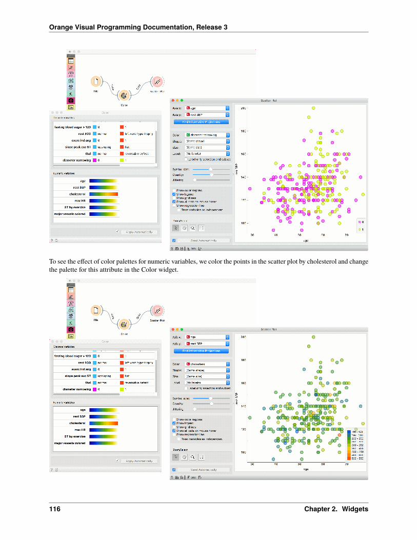
Orange Visual Programming Documentation, Release 3
To see the effect of color palettes for numeric variables, we color the points in the scatter plot by cholesterol and changethe palette for this attribute in the Color widget.
116 Chapter 2. Widgets

Orange Visual Programming Documentation, Release 3
2.1.34 Feature Statistics
Show basic statistics for data features.
Inputs
• Data: input data
Outputs
• Reduced data: table containing only selected features
• Statistics: table containing statistics of the selected features
The Feature Statistics widget provides a quick way to inspect and find interesting features in a given data set.
The Feature Statistics widget on the heart-disease data set. The feature exerc ind ang was manually changed to a metavariable for illustration purposes.
1. Info on the current data set size and number and types of features
2. The histograms on the right can be colored by any feature. If the selected feature is categorical, a discrete colorpalette is used (as shown in the example). If the selected feature is numerical, a continuous color palette is used.The table on the right contains statistics about each feature in the data set. The features can be sorted by eachstatistic, which we now describe.
3. The feature type - can be one of categorical, numeric, time and string.
4. The name of the feature.
5. A histogram of feature values. If the feature is numeric, we appropriately discretize the values into bins. If thefeature is categorical, each value is assigned its own bar in the histogram.
6. The central tendency of the feature values. For categorical features, this is the mode. For numeric features, thisis mean value.
7. The dispersion of the feature values. For categorical features, this is the entropy of the value distribution. Fornumeric features, this is the coefficient of variation.
8. The minimum value. This is computed for numerical and ordinal categorical features.
2.1. Data 117

Orange Visual Programming Documentation, Release 3
9. The maximum value. This is computed for numerical and ordinal categorical features.
10. The number of missing values in the data.
Notice also that some rows are colored differently. White rows indicate regular features, gray rows indicate classvariables and the lighter gray indicates meta variables.
Example
The Feature Statistics widget is most often used after the File widget to inspect and find potentially interesting featuresin the given data set. In the following examples, we use the heart-disease data set.
Once we have found a subset of potentially interesting features, or we have found features that we would like to exclude,we can simply select the features we want to keep. The widget outputs a new data set with only these features.
Alternatively, if we want to store feature statistics, we can use the Statistics output and manipulate those values asneeded. In this example, we simply select all the features and display the statistics in a table.
118 Chapter 2. Widgets
Orange Visual Programming Documentation, Release 3
2.1.35 Melt
Transform wide data to narrow.
Inputs
• Data: wide data table
Outputs
• Data: narrow data table
The Melt widget receives a dataset in the more common wide format and outputs a table of (row_id, variable, value)triplets.
2.1. Data 119

Orange Visual Programming Documentation, Release 3
1. Select the variable used as id. The widget offers only columns without duplicated values. Alternatively, rownumber can be used as id.
2. Select whether to include non-numeric variables, and whether to exclude zero values.
3. Set the names of the columns with name of the variable (“item”) and the corresponding value.
Example
In the following workflow we play with the Zoo data set, in which we convert all variables to numeric by treating themas ordinal. All variables except the number of legs boolean (e.g. the animal lays or does not lay eggs), so a value of1 will correspond to an animal having a particular feature. In data table we select all rows (Ctrl-A or Cmd-A) anddeselect the duplicate description of the frog in order to avoid duplicate values in the “name” column.
We pass it to Melt, where we designate the name as the row id, and discard zero values. The resulting table has multiplerows for each animal: one for each of animals features.
An interesting immediate use for this is to pass this data to Distributions and see what are the most and the least commonfeatures of animals.
120 Chapter 2. Widgets

Orange Visual Programming Documentation, Release 3
In the next example we show how shuffling class values influences model performance on the same dataset as above.
2.1. Data 121

Orange Visual Programming Documentation, Release 3
2.1.36 Neighbors
Compute nearest neighbors in data according to reference.
Inputs
• Data: An input data set.
• Reference: A reference data for neighbor computation.
Outputs
• Neighbors: A data table of nearest neighbors according to reference.
The Neighbors widget computes nearest neighbors for a given reference and for a given distance measure. The referencecan be either one instance or more instances. In the case with one reference widget outputs closest n instances fromdata where n is set by the Number of neighbors option in the widget. When reference contains more instances widgetcomputes the combined distance for each data instance as a minimum of distances to each reference. Widget outputs ndata instances with lowest combined distance.
122 Chapter 2. Widgets

Orange Visual Programming Documentation, Release 3
1. Distance measure for computing neighbors. Supported measures are: Euclidean, Manhattan, Mahalanobis, Co-sine, Jaccard, Spearman, absolute Spearman, Pearson, absolute Pearson.
2. Number of neighbors on the output.
3. If Exclude rows (equal to) references is ticked, data instances that are highly similar to the reference (distance <1e-5), will be excluded.
4. Click Apply to commit the changes. To communicate changes automatically tick Apply Automatically.
5. Status bar with access to widget help and information on the input and output data.
Examples
In the first example, we used iris data and passed it to Neighbors and to Data Table. In Data Table, we selected aninstance of iris, that will serve as our reference, meaning we wish to retrieve 10 closest examples to the select datainstance. We connect Data Table to Neighbors as well.
We can observe the results of neighbor computation in Data Table (1), where we can see 10 closest images to ourselected iris flower.
2.1. Data 123

Orange Visual Programming Documentation, Release 3
Now change the selection Data Table to multiple examples. As a result, we get instances with closest combineddistances to the references. The method computes the combined distance as a minimum of distances to each reference.
Another example requires the installation of Image Analytics add-on. We loaded 15 paintings from famous painterswith Import Images widget and passed them to Image Embedding, where we selected Painters embedder.
Then the procedure is the same as above. We passed embedded images to Image Viewer and selected a painting fromMonet to serve as our reference image. We passed the image to Neighbors, where we set the distance measure tocosine, ticked off Exclude reference and set the neighbors to 2. This allows us to find the actual closest neighbor to areference painting and observe them side by side in Image Viewer (1).
124 Chapter 2. Widgets

Orange Visual Programming Documentation, Release 3
2.1.37 Unique
Remove duplicated data instances.
Inputs
• Data: data table
Outputs
• Data: data table without duplicates
The widget removes duplicated data instances. The user can choose a subset of observed variables, so two instancesare considered as duplicates although they may differ in values of other, ignored variables.
1. Select the variables that are considered in comparing data instances.
2.1. Data 125

Orange Visual Programming Documentation, Release 3
2. Data instance that is kept. The options are to use the first, last, middle or random instance, or to keep none, thatis, to remove duplicated instances altogether.
Example
Data set Zoo contains two frogs. This workflow keeps only one by removing instances with the same names.
2.1.38 Group by
Groups data by selected variables and aggregate columns with selected aggregations.
Inputs
• Data: input data table
Outputs
• Data: aggregated data
Group By widget first identifies groups based on selected variables in the Group by list. Groups are defined by alldistinct combinations of values in selected variables.
In the second step, the widget computes aggregations defined in the table on the right side of the widget for each group.
126 Chapter 2. Widgets

Orange Visual Programming Documentation, Release 3
1. Select variables that define groups
2. View variables and their aggregations. To change aggregation for one or more variables, select them in the table.
3. Change aggregations for variables selected in the view above.
4. When the Send automatically box is ticked, all changes will be automatically communicated to other widgets.
5. Get documentation, observe a number of items on input or output
Examples
We first load heart_disease dataset in the File widget. In the Group By widget, we set variables that define groups –diameter narrowing and gender. Each group includes items (rows) that belong to one combination of both variables.
In the table on the right-hand side of the widget, we set that we want to compute mean and median for values of restSBP variable in each group, median for values of cholesterol variable, and mean for major vessels colored.
In the Data Table widget, we can see that both females and males have lower average values for rest SBP whendiameter narrowing is 0. The difference is greater for females. The median of rest SBP is different only for females,while for males is the same.
You can also observe differences between median cholesterol level and mean value of major vessel colored betweengroups.
2.1. Data 127

Orange Visual Programming Documentation, Release 3
128 Chapter 2. Widgets

Orange Visual Programming Documentation, Release 3
2.2 Visualize
2.2.1 Box Plot
Shows distribution of attribute values.
Inputs
• Data: input dataset
Outputs
• Selected Data: instances selected from the plot
• Data: data with an additional column showing whether a point is selected
The Box Plot widget shows the distributions of attribute values. It is a good practice to check any new data with thiswidget to quickly discover any anomalies, such as duplicated values (e.g., gray and grey), outliers, and alike. Bars canbe selected - for example, values for categorical data or the quantile range for numeric data.
1. Select the variable you want to plot. Tick Order by relevance to subgroups to order variables by Chi2 or ANOVAover the selected subgroup.
2. Choose Subgroups to see box plots displayed by a discrete subgroup. Tick Order by relevance to variable toorder subgroups by Chi2 or ANOVA over the selected variable.
3. When instances are grouped by a subgroup, you can change the display mode. Annotated boxes will display theend values, the mean and the median, while comparing medians and compare means will, naturally, compare the
2.2. Visualize 129

Orange Visual Programming Documentation, Release 3
selected value between subgroups. continuous
4. The mean (the dark blue vertical line). The thin blue line represents the standard deviation.
5. Values of the first (25%) and the third (75%) quantile. The blue highlighted area represents the values betweenthe first and the third quartile.
6. The median (yellow vertical line).
For discrete attributes, the bars represent the number of instances with each particular attribute value. The plot showsthe number of different animal types in the Zoo dataset: there are 41 mammals, 13 fish, 20 birds, and so on.
Display shows:
• Stretch bars: Shows relative values (proportions) of data instances. The unticked box shows absolute values.
• Show box labels: Display discrete values above each bar.
• Sort by subgroup frequencies: Sort subgroups by their descending frequency.
130 Chapter 2. Widgets

Orange Visual Programming Documentation, Release 3
Examples
The Box Plot widget is most commonly used immediately after the File widget to observe the statistical properties ofa dataset. In the first example, we have used heart-disease data to inspect our variables.
Box Plot is also useful for finding the properties of a specific dataset, for instance, a set of instances manually definedin another widget (e.g. Scatter Plot or instances belonging to some cluster or a classification tree node. Let us now usezoo data and create a typical clustering workflow with Distances and Hierarchical Clustering.
Now define the threshold for cluster selection (click on the ruler at the top). Connect Box Plot to Hierarchical Clus-tering, tick Order by relevance, and select Cluster as a subgroup. This will order attributes by how well they define theselected subgroup, in our case, a cluster. It seems like our clusters indeed correspond very well with the animal type!
2.2. Visualize 131

Orange Visual Programming Documentation, Release 3
2.2.2 Violin Plot
Visualize the distribution of feature values in a violin plot.
Inputs
• Data: input dataset
Outputs
• Selected Data: instances selected from the plot
• Data: data with an additional column showing whether a point is selected
The Violin Plot widget plays a similar role as a Box Plot. It shows the distribution of quantitative data across severallevels of a categorical variable such that those distributions can be compared. Unlike the Box Plot, in which all of theplot components correspond to actual data points, the Violin Plot features a kernel density estimation of the underlyingdistribution.
132 Chapter 2. Widgets

Orange Visual Programming Documentation, Release 3
1. Select the variable you want to plot. Tick Order by relevance to subgroups to order variables by Chi2 or ANOVAover the selected subgroup.
2. Choose Subgroups to see violin plots displayed by a discrete subgroup. Tick Order by relevance to variable toorder subgroups by Chi2 or ANOVA over the selected variable.
3. Box plot: Tick to show the underlying box plot.
Strip plot: Tick to show the underlying data represented by points.
Rug plot: Tick to show the underlying data represented by lines.
Order subgroups: Tick to order violins by median (ascending).
Orientation: Determine violin orientation.
4. Kernel: Select the kernel used to estimate the density. Possible kernels are: Normal, Epanechnikov and Linear.
Scale: Select the method used to scale the width of each violin. If area is selected, each violin will have thesame area. If count is selected, the width of the violins will be scaled by the number of observations in that bin.If width is selected, each violin will have the same width.
2.2. Visualize 133

Orange Visual Programming Documentation, Release 3
Examples
The Violin Plot widget is most commonly used immediately after the File widget to observe the statistical propertiesof a dataset. In the first example, we have used heart-disease data to inspect our variables.
The Violin Plot could also be used for outlier detection. In the next example we eliminate the outliers by selecting onlyinstances that fall inside the Q1 1.5 and Q3 + 1.5 IQR.
134 Chapter 2. Widgets

Orange Visual Programming Documentation, Release 3
2.2.3 Distributions
Displays value distributions for a single attribute.
Inputs
• Data: input dataset
Outputs
• Selected Data: instances selected from the plot
• Data: data with an additional column showing whether an instance is selected
• Histogram Data: bins and instance counts from the histogram
The Distributions widget displays the value distribution of discrete or continuous attributes. If the data contains aclass variable, distributions may be conditioned on the class.
The graph shows how many times (e.g., in how many instances) each attribute value appears in the data. If the datacontains a class variable, class distributions for each of the attribute values will be displayed (like in the snapshot
2.2. Visualize 135

Orange Visual Programming Documentation, Release 3
below). To create this graph, we used the Zoo dataset.
1. A list of variables for display. Sort categories by frequency orders displayed values by frequency.
2. Set Bin width with the slider. Precision scale is set to sensible intervals. Fitted distribution fits selected distribu-tion to the plot. Options are Normal, Beta, Gamma, Rayleigh, Pareto, Exponential, Kernel density.
3. Columns:
• Split by displays value distributions for instances of a certain class.
• Stack columns displays one column per bin, colored by proportions of class values.
• Show probabilities shows probabilities of class values at selected variable.
• Show cumulative distribution cumulatively stacks frequencies.
1. If Apply Automatically is ticked, changes are communicated automatically. Alternatively, click Apply.
For continuous attributes, the attribute values are also displayed as a histogram. It is possible to fit various distribu-tions to the data, for example, a Gaussian kernel density estimation. Hide bars hides histogram bars and shows onlydistribution (old behavior of Distributions).
For this example, we used the Iris dataset.
136 Chapter 2. Widgets

Orange Visual Programming Documentation, Release 3
In class-less domains, the bars are displayed in blue. We used the Housing dataset.
2.2. Visualize 137

Orange Visual Programming Documentation, Release 3
2.2.4 Heat Map
Plots a heat map for a pair of attributes.
Inputs
• Data: input dataset
Outputs
• Selected Data: instances selected from the plot
• Data: data with an additional column showing whether a point is selected
Heat map is a graphical method for visualizing attribute values in a two-way matrix. It only works on datasets containingnumeric variables. The values are represented by color according to the selected color pallette. By combining classvariable and attributes on x and y axes, we see where the attribute values are the strongest and where the weakest, thusenabling us to find typical features for each class.
The widget enables row selection with click and drag. One can zoom in with Ctrl++ (Cmd++) and zoom out with Ctrl+-(Cmd+-). Ctrl+0 (Cmd+0) resets zoom to the extended version, while Ctrl+9 (Cmd+9) reset it to the default.
138 Chapter 2. Widgets

Orange Visual Programming Documentation, Release 3
2.2. Visualize 139

Orange Visual Programming Documentation, Release 3
1. The color pallette. Choose from linear, diverging, color-blind friendly, or other pallettes. Low and High arethresholds for the color palette (low for attributes with low values and high for attributes with high values).Selecting one of diverging palettes, which have two extreme colors and a neutral (black or white) color at themidpoint, enables an option to set a meaningful mid-point value (default is 0).
2. Merge rows. If there are too many rows in the visualization, one can merge them with k-means algorithm into Nselected clusters (default 50).
3. Cluster columns and rows:
• None (lists attributes and rows as found in the dataset)
• Clustering (clusters data by similarity with hierarchical clustering on Euclidean distances and with averagelinkage)
• Clustering with ordered leaves (same as clustering, but it additionally maximizes the sum of similaritiesof adjacent elements)
4. Split rows or columns by a categorical variable. If the data contains a class variable, rows will be automaticallysplit by class.
5. Set what is displayed in the plot in Annotation & Legend.
• If Show legend is ticked, a color chart will be displayed above the map.
• If Stripes with averages is ticked, a new line with attribute averages will be displayed on the left. Row An-notations adds annotations to each instance on the right. Color colors the instances with the correspondingvalue of the selected categorical variable. Column Annotations adds annotation to each variable at theselected position (default is Top). Color colors the columns with the corresponding value of the selectedcolumn annotation.
6. If Keep aspect ratio is ticked, each value will be displayed with a square (proportionate to the map).
7. If Send Automatically is ticked, changes are communicated automatically. Alternatively, click Send.
Advanced visualization
Heat map enables some neat plot enhancements. Such options are clustering of rows and/or columns for better dataorganization, row and column annotations, and splitting the data by categorical variables.
Row and column clustering is performed independently. Row clustering is computed from Euclidean distances, whilecolumn clustering uses Pearson correlation coefficients. Hierarchical clustering is based on the Ward linkage method.Clustering with optimal leaf ordering reorders left and right branches in the dendrogram to minimize the sum of dis-tances between adjacent leaves (Bar-Joseph et al. 2001).
140 Chapter 2. Widgets

Orange Visual Programming Documentation, Release 3
2.2. Visualize 141

Orange Visual Programming Documentation, Release 3
Examples
Gene expresssions
The Heat Map below displays attribute values for the brown-selected data set (Brown et al. 2000). Heat maps areparticularly appropriate for showing gene expressions and the brown-selected data set contains yeast gene expressionsat different conditions.
Heat map shows low expressions in blue and high expressions in yellow and white. For better organization, we addedClustering (opt. ordering) to the columns, which puts columns with similar profiles closer together. In this way we cansee the conditions that result in low expressions for ribosomal genes in the lower right corner.
Additionally, the plot is enhanced with row color on the right, showing which class the rows belong to.
Sentiment Analysis
Heat maps are great for visualizing any kind of comparable numeric variables, for example sentiment in a collection ofdocuments. We will take book-excerpts corpus from the Corpus widget and pass it to the Sentiment Analysis widget,which computes sentiment scores for each document. The output of sentiment analysis are four columns, positive,negative, and neutral sentiment score, and a compound score that aggregates the previous scores into a single number.Positive compound values (white) represent positive documents, while negative (blue) represent negative documents.
We used row clustering to place similar rows closer together, resulting in clear negative and positive groups. Now wecan select negative children’s books and explore which are they.
142 Chapter 2. Widgets

Orange Visual Programming Documentation, Release 3
References
Bar-Joseph, Z., Gifford, D.K., Jaakkola, T.S. (2001) Fast optimal leaf ordering for hierarchical clustering, Bioinformat-ics, 17, 22-29.
Brown, M.P., Grundy, W.N., Lin, D., Cristianini, N., Sugnet, C., Furey, T.S., Ares, M., Haussler, D. (2000) Knowledge-based analysis of microarray gene expression data by using support vector machines, Proceedings of the NationalAcademy of Sciences, 1, 262-267.
2.2.5 Scatter Plot
Scatter plot visualization with exploratory analysis and intelligent data visualization enhancements.
Inputs
• Data: input dataset
• Data Subset: subset of instances
• Features: list of attributes
Outputs
• Selected Data: instances selected from the plot
2.2. Visualize 143

Orange Visual Programming Documentation, Release 3
• Data: data with an additional column showing whether a point is selected
The Scatter Plot widget provides a 2-dimensional scatter plot visualization. The data is displayed as a collection ofpoints, each having the value of the x-axis attribute determining the position on the horizontal axis and the value of they-axis attribute determining the position on the vertical axis. Various properties of the graph, like color, size and shapeof the points, axis titles, maximum point size and jittering can be adjusted on the left side of the widget. A snapshotbelow shows the scatter plot of the Iris dataset with the coloring matching of the class attribute.
1. Select the x and y attribute. Optimize your projection with Find Informative Projections. This feature scoresattribute pairs by average classification accuracy and returns the top scoring pair with a simultaneous visualizationupdate.
2. Attributes: Set the color of the displayed points (you will get colors for categorical values and blue-green-yellowpoints for numeric). Set label, shape and size to differentiate between points. Label only selected points allowsyou to select individual data instances and label only those.
3. Set symbol size and opacity for all data points. Set jittering to prevent the dots overlapping. Jittering will ran-domly scatter point only around categorical values. If Jitter numeric values is checked, points are also scatteredaround their actual numeric values.
• Show color regions colors the graph by class (see the screenshot below).
• Show legend displays a legend on the right. Click and drag the legend to move it.
144 Chapter 2. Widgets

Orange Visual Programming Documentation, Release 3
• Show gridlines displays the grid behind the plot.
• Show all data on mouse hover enables information bubbles if the cursor is placed on a dot.
• Show regression line draws the regression line for pair of numeric attributes. If a categorical variableis selected for coloring the plot, individual regression lines for each class value will be displayed. Thereported r value corresponds to the rvalue from linear least-squares regression, which is equal to thePearson’s correlation coefficient.
• Treat variables as independent fits regression line to a group of points (minimize distance from points),rather than fitting y as a function of x (minimize vertical distances).
4. Select, zoom, pan and zoom to fit are the options for exploring the graph. The manual selection of data instancesworks as an angular/square selection tool. Double click to move the projection. Scroll in or out for zoom.
5. If Send automatically is ticked, changes are communicated automatically. Alternatively, press Send.
Here is an example of the Scatter Plot widget if the Show color regions and Show regression line boxes are ticked.
2.2. Visualize 145

Orange Visual Programming Documentation, Release 3
Intelligent Data Visualization
If a dataset has many attributes, it is impossible to manually scan through all the pairs to find interesting or usefulscatter plots. Orange implements intelligent data visualization with the Find Informative Projections option in thewidget.
If a categorical variable is selected in the Color section, the score is computed as follows. For each data instance, themethod finds 10 nearest neighbors in the projected 2D space, that is, on the combination of attribute pairs. It then checkshow many of them have the same color. The total score of the projection is then the average number of same-coloredneighbors.
Computation for numeric colors is similar, except that the coefficient of determination is used for measuring the localhomogeneity of the projection.
To use this method, go to the Find Informative Projections option in the widget, open the subwindow and press StartEvaluation. The feature will return a list of attribute pairs by average classification accuracy score.
Below, there is an example demonstrating the utility of ranking. The first scatter plot projection was set as the defaultsepal width to sepal length plot (we used the Iris dataset for simplicity). Upon running Find Informative Projectionsoptimization, the scatter plot converted to a much better projection of petal width to petal length plot.
Selection
Selection can be used to manually defined subgroups in the data. Use Shift modifier when selecting data instances toput them into a new group. Shift + Ctrl (or Shift + Cmd on macOs) appends instances to the last group.
Signal data outputs a data table with an additional column that contains group indices.
146 Chapter 2. Widgets

Orange Visual Programming Documentation, Release 3
Exploratory Data Analysis
The Scatter Plot, as the rest of Orange widgets, supports zooming-in and out of part of the plot and a manual selectionof data instances. These functions are available in the lower left corner of the widget.
The default tool is Select, which selects data instances within the chosen rectangular area. Pan enables you to move thescatter plot around the pane. With Zoom you can zoom in and out of the pane with a mouse scroll, while Reset zoomresets the visualization to its optimal size. An example of a simple schema, where we selected data instances from arectangular region and sent them to the Data Table widget, is shown below. Notice that the scatter plot doesn’t showall 52 data instances, because some data instances overlap (they have the same values for both attributes used).
2.2. Visualize 147

Orange Visual Programming Documentation, Release 3
Example
The Scatter Plot can be combined with any widget that outputs a list of selected data instances. In the example below,we combine Tree and Scatter Plot to display instances taken from a chosen decision tree node (clicking on any nodeof the tree will send a set of selected data instances to the scatter plot and mark selected instances with filled symbols).
148 Chapter 2. Widgets

Orange Visual Programming Documentation, Release 3
References
Gregor Leban and Blaz Zupan and Gaj Vidmar and Ivan Bratko (2006) VizRank: Data Visualization Guided by Ma-chine Learning. Data Mining and Knowledge Discovery, 13 (2). pp. 119-136. Available here.
2.2.6 Line Plot
Visualization of data profiles (e.g., time series).
Inputs
• Data: input dataset
• Data Subset: subset of instances
Outputs
• Selected Data: instances selected from the plot
• Data: data with an additional column showing whether a point is selected
Line plot a type of plot which displays the data as a series of points, connected by straight line segments. It only worksfor numerical data, while categorical can be used for grouping of the data points.
2.2. Visualize 149

Orange Visual Programming Documentation, Release 3
1. Information on the input data.
2. Select what you wish to display:
• Lines show individual data instances in a plot.
• Range shows the range of data points between 10th and 90th percentile.
• Mean adds the line for mean value. If group by is selected, means will be displayed per each group value.
• Error bars show the standard deviation of each attribute.
3. Select a categorical attribute to use for grouping of data instances. Use None to show ungrouped data.
4. Select, zoom, pan and zoom to fit are the options for exploring the graph. The manual selection of data instancesworks as a line selection, meaning the data under the selected line plots will be sent on the output. Scroll in orout for zoom. When hovering over an individual axis, scrolling will zoom only by the hovered-on axis (verticalor horizontal zoom).
5. If Send Automatically is ticked, changes are communicated automatically. Alternatively, click Send.
Example
Line Plot is a standard visualization widget, which displays data profiles, normally of ordered numerical data. In thissimple example, we will display the iris data in a line plot, grouped by the iris attribute. The plot shows how petallength nicely separates between class values.
If we observe this in a Scatter Plot, we can confirm this is indeed so. Petal length is an interesting attribute for separationof classes, especially when enhanced with petal width, which is also nicely separated in the line plot.
150 Chapter 2. Widgets

Orange Visual Programming Documentation, Release 3
2.2.7 Bar Plot
Visualizes comparisons among discrete categories.
Inputs
• Data: input dataset
• Data Subset: subset of instances
Outputs
• Selected Data: instances selected from the plot
• Data: data with an additional column showing whether a point is selected
The Bar Plot widget visualizes numeric variables and compares them by a categorical variable. The widget is usefulfor observing outliers, distributions within groups, and comparing categories.
2.2. Visualize 151

Orange Visual Programming Documentation, Release 3
1. Parameters of the plot. Values are the numeric variable to plot. Group by is the variable for grouping the data.Annotations are categorical labels below the plot. Color is the categorical variable whose values are used forcoloring the bars.
2. Select, zoom, pan and zoom to fit are the options for exploring the graph. The manual selection of data instancesworks as an angular/square selection tool. Double click to move the projection. Scroll in or out for zoom.
3. If Send automatically is ticked, changes are communicated automatically. Alternatively, press Send.
4. Access help, save image, produce a report, or adjust visual settings. On the right, the information on input andoutput are shown.
Example
The Bar Plot widget is most commonly used immediately after the File widget to compare categorical values. In thisexample, we have used heart-disease data to inspect our variables.
152 Chapter 2. Widgets

Orange Visual Programming Documentation, Release 3
First, we have observed cholesterol values of patient from our data set. We grouped them by diameter narrowing, whichdefines patients with a heart disease (1) and those without (0). We use the same variable for coloring the bars.
Then, we selected patients over 60 years of age with Select Rows. We sent the subset to Bar Plot to highlight thesepatients in the widget. The big outlier with a high cholesterol level is apparently over 60 years old.
2.2.8 Venn Diagram
Plots a Venn diagram for two or more data subsets.
Inputs
• Data: input dataset
Outputs
• Selected Data: instances selected from the plot
• Data: entire data with a column indicating whether an instance was selected or not
The Venn Diagram widget displays logical relations between datasets by showing the number of common data in-stances (rows) or the number of shared features (columns). Selecting a part of the visualization outputs the correspond-ing instances or features.
1. Select whether to count common features or instances.
2.2. Visualize 153

Orange Visual Programming Documentation, Release 3
2. Select whether to include duplicates or to output only unique rows; applicable only when matching instances byvalues of variables.
Rows can be matched
• by their identity, e.g. rows from different data sets match if they came from the same row in a file,
• by equality, if all tables contain the same variables,
• or by values of a string variable that appears in all tables.
Examples
The easiest way to use the Venn Diagram is to select data subsets and find matching instances in the visualization. Weuse the breast-cancer dataset to select two subsets with Select Rows widget - the first subset is that of breast cancerpatients aged between 40 and 49 and the second is that of patients with a tumor size between 20 and 29. The VennDiagram helps us find instances that correspond to both criteria, which can be found in the intersection of the twocircles.
The Venn Diagram widget can be also used for exploring different prediction models. In the following example,we analysed 3 prediction methods, namely Naive Bayes, SVM and Random Forest, according to their misclassifiedinstances.
By selecting misclassifications in the three Confusion Matrix widgets and sending them to Venn diagram, we can seeall the misclassification instances visualized per method used. Then we open Venn Diagram and select, for example,
154 Chapter 2. Widgets

Orange Visual Programming Documentation, Release 3
the misclassified instances that were identified by all three methods. This is represented as an intersection of all threecircles. Click on the intersection to see this two instances marked in the Scatter Plot widget. Try selecting differentdiagram sections to see how the scatter plot visualization changes.
2.2.9 Linear Projection
A linear projection method with explorative data analysis.
Inputs
• Data: input dataset
• Data Subset: subset of instances
• Projection: custom projection vectors
Outputs
• Selected Data: instances selected from the plot
• Data: data with an additional column showing whether a point is selected
• Components: projection vectors
This widget displays linear projections of class-labeled data. It supports various types of projections such as circular,linear discriminant analysis, and principal component analysis.
Consider, for a start, a projection of the Iris dataset shown below. Notice that it is the sepal width and sepal lengththat already separate Iris setosa from the other two, while the petal length is the attribute best separating Iris versicolor
2.2. Visualize 155

Orange Visual Programming Documentation, Release 3
from Iris virginica.
1. Axes in the projection that are displayed and other available axes. Optimize your projection by using SuggestFeatures. This feature scores attributes and returns the top scoring attributes with a simultaneous visualiza-tion update. Feature scoring computes the classification accuracy (for classification) or MSE (regression) ofk-nearest neighbors classifier on the projected, two-dimensional data. The score reflects how well the classes inthe projection are separated.
2. Choose the type of projection:
• Circular Placement
• Linear Discriminant Analysis
• Principal Component Analysis
3. Set the color of the displayed points. Set shape, size, and label to differentiate between points. Label only selectedpoints labels only selected data instances.
4. Adjust plot properties:
• Symbol size: set the size of the points.
• Opacity: set the transparency of the points.
156 Chapter 2. Widgets

Orange Visual Programming Documentation, Release 3
• Jittering: Randomly disperse points with jittering to prevent them from overlapping.
• Hide radius: Axes inside the radius are hidden. Drag the slider to change the radius.
5. Additional plot properties:
• Show color regions colors the graph by class.
• Show legend displays a legend on the right. Click and drag the legend to move it.
6. Select, zoom, pan and zoom to fit are the options for exploring the graph. Manual selection of data instancesworks as an angular/square selection tool. Double click to move the projection. Scroll in or out for zoom.
7. If Send automatically is ticked, changes are communicated automatically. Alternatively, press Send.
Example
The Linear Projection widget works just like other visualization widgets. Below, we connected it to the File widget tosee the set projected on a 2-D plane. Then we selected the data for further analysis and connected it to the Data Tablewidget to see the details of the selected subset.
2.2. Visualize 157

Orange Visual Programming Documentation, Release 3
References
Koren Y., Carmel L. (2003). Visualization of labeled data using linear transformations. In Proceedings of IEEEInformation Visualization 2003, (InfoVis’03). Available here.
Boulesteix A.-L., Strimmer K. (2006). Partial least squares: a versatile tool for the analysis of high-dimensional ge-nomic data. Briefings in Bioinformatics, 8(1), 32-44. Abstract here.
Leban G., Zupan B., Vidmar G., Bratko I. (2006). VizRank: Data Visualization Guided by Machine Learning. DataMining and Knowledge Discovery, 13, 119-136. Available here.
2.2.10 Sieve Diagram
Plots a sieve diagram for a pair of attributes.
Inputs
• Data: input dataset
A Sieve Diagram is a graphical method for visualizing frequencies in a two-way contingency table and comparingthem to expected frequencies under assumption of independence. It was proposed by Riedwyl and Schüpbach in atechnical report in 1983 and later called a parquet diagram (Riedwyl and Schüpbach 1994). In this display, the areaof each rectangle is proportional to the expected frequency, while the observed frequency is shown by the numberof squares in each rectangle. The difference between observed and expected frequency (proportional to the standardPearson residual) appears as the density of shading, using color to indicate whether the deviation from independenceis positive (blue) or negative (red).
158 Chapter 2. Widgets

Orange Visual Programming Documentation, Release 3
1. Select the attributes you want to display in the sieve plot.
2. Score combinations enables you to fin the best possible combination of attributes.
3. Save Image saves the created image to your computer in a .svg or .png format.
4. Produce a report.
The snapshot below shows a sieve diagram for the Titanic dataset and has the attributes sex and survived (the latter isa class attribute in this dataset). The plot shows that the two variables are highly associated, as there are substantialdifferences between observed and expected frequencies in all of the four quadrants. For example, and as highlightedin the balloon, the chance for surviving the accident was much higher for female passengers than expected (0.06 vs.0.15).
2.2. Visualize 159

Orange Visual Programming Documentation, Release 3
Pairs of attributes with interesting associations have a strong shading, such as the diagram shown in the above snapshot.For contrast, a sieve diagram of the least interesting pair (age vs. survival) is shown below.
160 Chapter 2. Widgets

Orange Visual Programming Documentation, Release 3
Example
Below, we see a simple schema using the Titanic dataset, where we use the Rank widget to select the best attributes (theones with the highest information gain, gain ratio or Gini index) and feed them into the Sieve Diagram. This displaysthe sieve plot for the two best attributes, which in our case are sex and status. We see that the survival rate on the Titanicwas very high for women of the first class and very low for female crew members.
2.2. Visualize 161

Orange Visual Programming Documentation, Release 3
The Sieve Diagram also features the Score Combinations option, which makes the ranking of attributes even easier.
162 Chapter 2. Widgets

Orange Visual Programming Documentation, Release 3
References
Riedwyl, H., and Schüpbach, M. (1994). Parquet diagram to plot contingency tables. In Softstat ‘93: Advances inStatistical Software, F. Faulbaum (Ed.). New York: Gustav Fischer, 293-299.
2.2. Visualize 163

Orange Visual Programming Documentation, Release 3
2.2.11 Pythagorean Tree
Pythagorean tree visualization for classification or regression trees.
Inputs
• Tree: tree model
• Selected Data: instances selected from the tree
Pythagorean Trees are plane fractals that can be used to depict general tree hierarchies as presented in an article byFabian Beck and co-authors. In our case, they are used for visualizing and exploring tree models, such as Tree.
1. Information on the input tree model.
2. Visualization parameters:
• Depth: set the depth of displayed trees.
• Target class (for classification trees): the intensity of the color for nodes of the tree will correspond to theprobability of the target class. If None is selected, the color of the node will denote the most probable class.
• Node color (for regression trees): node colors can correspond to mean or standard deviation of class valueof the training data instances in the node.
• Size: define a method to compute the size of the square representing the node. Normal will keep node sizescorrespond to the size of training data subset in the node. Square root and Logarithmic are the respectivetransformations of the node size.
164 Chapter 2. Widgets

Orange Visual Programming Documentation, Release 3
• Log scale factor is only enabled when logarithmic transformation is selected. You can set the log factorbetween 1 and 10.
3. Plot properties:
• Enable tooltips: display node information upon hovering.
• Show legend: shows color legend for the plot.
4. Reporting:
• Save Image: save the visualization to a SVG or PNG file.
• Report: add visualization to the report.
Pythagorean Tree can visualize both classification and regression trees. Below is an example for regression tree. Theonly difference between the two is that regression tree doesn’t enable coloring by class, but can color by class mean orstandard deviation.
Example
The workflow from the screenshot below demonstrates the difference between Tree Viewer and Pythagorean Tree. Theycan both visualize Tree, but Pythagorean visualization takes less space and is more compact, even for a small Iris flowerdataset. For both visualization widgets, we have hidden the control area on the left by clicking on the splitter betweencontrol and visualization area.
2.2. Visualize 165

Orange Visual Programming Documentation, Release 3
Pythagorean Tree is interactive: click on any of the nodes (squares) to select training data instances that were associatedwith that node. The following workflow explores these feature.
The selected data instances are shown as a subset in the Scatter Plot, sent to the Data Table and examined in the BoxPlot. We have used brown-selected dataset in this example. The tree and scatter plot are shown below; the selectednode in the tree has a black outline.
166 Chapter 2. Widgets

Orange Visual Programming Documentation, Release 3
References
Beck, F., Burch, M., Munz, T., Di Silvestro, L. and Weiskopf, D. (2014). Generalized Pythagoras Trees for VisualizingHierarchies. In IVAPP ‘14 Proceedings of the 5th International Conference on Information Visualization Theory andApplications, 17-28.
2.2.12 Pythagorean Forest
Pythagorean forest for visualizing random forests.
Inputs
• Random Forest: tree models from random forest
Outputs
• Tree: selected tree model
Pythagorean Forest shows all learned decision tree models from Random Forest widget. It displays them asPythagorean trees, each visualization pertaining to one randomly constructed tree. In the visualization, you can se-lect a tree and display it in Pythagorean Tree widget. The best tree is the one with the shortest and most stronglycolored branches. This means few attributes split the branches well.
Widget displays both classification and regression results. Classification requires discrete target variable in the dataset,while regression requires a continuous target variable. Still, they both should be fed a Tree on the input.
2.2. Visualize 167

Orange Visual Programming Documentation, Release 3
1. Information on the input random forest model.
2. Display parameters:
• Depth: set the depth to which the trees are grown.
• Target class: set the target class for coloring the trees. If None is selected, the tree will be white. If the inputis a classification tree, you can color the nodes by their respective class. If the input is a regression tree,the options are Class mean, which will color tree nodes by the class mean value and Standard deviation,which will color them by the standard deviation value of the node.
• Size: set the size of the nodes. Normal will keep the nodes the size of the subset in the node. Square rootand Logarithmic are the respective transformations of the node size.
• Zoom: allows you to see the size of the tree visualizations.
3. Save Image: save the visualization to your computer as a .svg or .png file. Report: produce a report.
168 Chapter 2. Widgets

Orange Visual Programming Documentation, Release 3
Example
Pythagorean Forest is great for visualizing several built trees at once. In the example below, we’ve used housingdataset and plotted all 10 trees we’ve grown with Random Forest. When changing the parameters in Random Forest,visualization in Pythagorean Forest will change as well.
Then we’ve selected a tree in the visualization and inspected it further with Pythagorean Tree widget.
References
Beck, F., Burch, M., Munz, T., Di Silvestro, L. and Weiskopf, D. (2014). Generalized Pythagoras Trees for VisualizingHierarchies. In IVAPP ‘14 Proceedings of the 5th International Conference on Information Visualization Theory andApplications, 17-28.
2.2. Visualize 169

Orange Visual Programming Documentation, Release 3
2.2.13 CN2 Rule Viewer
CN2 Rule Viewer
Inputs
• Data: dataset to filter
• CN2 Rule Classifier: CN2 Rule Classifier, including a list of induced rules
Outputs
• Filtered Data: data instances covered by all selected rules
A widget that displays CN2 classification rules. If data is also connected, upon rule selection, one can analyze whichinstances abide to the conditions.
1. Original order of induced rules can be restored.
2. When rules are many and complex, the view can appear packed. For this reason, compact view was implemented,which allows a flat presentation and a cleaner inspection of rules.
3. Click Report to bring up a detailed description of the rule induction algorithm and its parameters, the data domain,and induced rules.
Additionally, upon selection, rules can be copied to clipboard by pressing the default system shortcut (ctrl+C, cmd+C).
170 Chapter 2. Widgets

Orange Visual Programming Documentation, Release 3
Examples
In the schema below, the most common use of the widget is presented. First, the data is read and a CN2 rule classifieris trained. We are using titanic dataset for the rule construction. The rules are then viewed using the Rule Viewer.To explore different CN2 algorithms and understand how adjusting parameters influences the learning process, RuleViewer should be kept open and in sight, while setting the CN2 learning algorithm (the presentation will be updatedpromptly).
Selecting a rule outputs filtered data instances. These can be viewed in a Data Table.
2.2.14 Mosaic Display
Display data in a mosaic plot.
Inputs
• Data: input dataset
• Data subset: subset of instances
Outputs
• Selected data: instances selected from the plot
The Mosaic plot is a graphical representation of a two-way frequency table or a contingency table. It is used for visu-alizing data from two or more qualitative variables and was introduced in 1981 by Hartigan and Kleiner and expandedand refined by Friendly in 1994. It provides the user with the means to more efficiently recognize relationships betweendifferent variables. If you wish to read up on the history of Mosaic Display, additional reading is available here.
2.2. Visualize 171

Orange Visual Programming Documentation, Release 3
1. Select the variables you wish to see plotted.
2. Select interior coloring. You can color the interior according to class or you can use the Pearson residual, whichis the difference between observed and fitted values, divided by an estimate of the standard deviation of theobserved value. If Compare to total is clicked, a comparison is made to all instances.
3. Save image saves the created image to your computer in a .svg or .png format.
4. Produce a report.
172 Chapter 2. Widgets

Orange Visual Programming Documentation, Release 3
Example
We loaded the titanic dataset and connected it to the Mosaic Display widget. We decided to focus on two variables,namely status, sex and survival. We colored the interiors according to Pearson residuals in order to demonstrate thedifference between observed and fitted values.
We can see that the survival rates for men and women clearly deviate from the fitted value.
2.2. Visualize 173

Orange Visual Programming Documentation, Release 3
2.2.15 Silhouette Plot
A graphical representation of consistency within clusters of data.
Inputs
• Data: input dataset
Outputs
• Selected Data: instances selected from the plot
• Data: data with an additional column showing whether a point is selected
The Silhouette Plot widget offers a graphical representation of consistency within clusters of data and provides theuser with the means to visually assess cluster quality. The silhouette score is a measure of how similar an object is toits own cluster in comparison to other clusters and is crucial in the creation of a silhouette plot. The silhouette scoreclose to 1 indicates that the data instance is close to the center of the cluster and instances possessing the silhouettescores close to 0 are on the border between two clusters.
174 Chapter 2. Widgets

Orange Visual Programming Documentation, Release 3
1. Choose the distance metric. You can choose between:
• Euclidean (“straight line” distance between two points)
• Manhattan (the sum of absolute differences for all attributes)
• Cosine (1 - cosine of the angle between two vectors)
2. Select the cluster label. You can decide whether to group the instances by cluster or not.
3. Display options:
• Choose bar width.
• Annotations: annotate the silhouette plot.
4. Save Image saves the created silhouette plot to your computer in a .png or .svg format.
5. Produce a report.
2.2. Visualize 175

Orange Visual Programming Documentation, Release 3
6. Output:
• Add silhouette scores (good clusters have higher silhouette scores)
• By clicking Commit, changes are communicated to the output of the widget. Alternatively, tick the box onthe left and changes will be communicated automatically.
7. The created silhouette plot.
Example
In the snapshot below, we have decided to use the Silhouette Plot on the iris dataset. We selected data instances withlow silhouette scores and passed them on as a subset to the Scatter Plot widget. This visualization only confirms theaccuracy of the Silhouette Plot widget, as you can clearly see that the subset lies in the border between two clusters.
If you are interested in other uses of the Silhouette Plot widget, feel free to explore our blog post.
2.2.16 Tree Viewer
A visualization of classification and regression trees.
Inputs
• Tree: decision tree
Outputs
• Selected Data: instances selected from the tree node
• Data: data with an additional column showing whether a point is selected
176 Chapter 2. Widgets

Orange Visual Programming Documentation, Release 3
This is a versatile widget with 2-D visualization of classification and regression trees. The user can select a node,instructing the widget to output the data associated with the node, thus enabling explorative data analysis.
1. Information on the input.
2. Display options:
• Zoom in and zoom out
• Select the tree width. The nodes display information bubbles when hovering over them.
• Select the depth of your tree.
• Select edge width. The edges between the nodes in the tree graph are drawn based on the selected edgewidth.
– All the edges will be of equal width if Fixed is chosen.
– When Relative to root is selected, the width of the edge will correspond to the proportion of instancesin the corresponding node with respect to all the instances in the training data. Under this selection,the edge will get thinner and thinner when traversing toward the bottom of the tree.
– Relative to parent makes the edge width correspond to the proportion of instances in the nodes withrespect to the instances in their parent node.
• Define the target class, which you can change based on classes in the data.
3. Press Save image to save the created tree graph to your computer as a .svg or .png file.
4. Produce a report.
2.2. Visualize 177

Orange Visual Programming Documentation, Release 3
Examples
Below, is a simple classification schema, where we have read the data, constructed the decision tree and viewed it inour Tree Viewer. If both the viewer and Tree are open, any re-run of the tree induction algorithm will immediatelyaffect the visualization. You can thus use this combination to explore how the parameters of the induction algorithminfluence the structure of the resulting tree.
Clicking on any node will output the related data instances. This is explored in the schema below that shows the subsetin the data table and in the Scatter Plot. Make sure that the tree data is passed as a data subset; this can be done byconnecting the Scatter Plot to the File widget first, and connecting it to the Tree Viewer widget next. Selected datawill be displayed as bold dots.
Tree Viewer can also export labeled data. Connect Data Table to Tree Viewer and set the link between widgets toData instead of Selected Data. This will send the entire data to Data Table with an additional meta column labelingselected data instances (Yes for selected and No for the remaining).
178 Chapter 2. Widgets

Orange Visual Programming Documentation, Release 3
Finally, Tree Viewer can be used also for visualizing regression trees. Connect Random Forest to File widget usinghousing.tab dataset. Then connect Pythagorean Forest to Random Forest. In Pythagorean Forest select a regressiontree you wish to further analyze and pass it to the Tree Viewer. The widget will display the constructed tree. Forvisualizing larger trees, especially for regression, Pythagorean Tree could be a better option.
2.2. Visualize 179

Orange Visual Programming Documentation, Release 3
2.2.17 Nomogram
Nomograms for visualization of Naive Bayes and Logistic Regression classifiers.
Inputs
• Classifier: trained classifier
• Data: input dataset
Outputs
• Features: selected variables, 10 by default
The Nomogram enables some classifier’s (more precisely Naive Bayes classifier and Logistic Regression classifier)visual representation. It offers an insight into the structure of the training data and effects of the attributes on theclass probabilities. Besides visualization of the classifier, the widget offers interactive support for prediction of classprobabilities. A snapshot below shows the nomogram of the Titanic dataset, that models the probability for a passengernot to survive the disaster of the Titanic.
When there are too many attributes in the plotted dataset, only best ranked ones can be selected for display. It is possibleto choose from ‘No sorting’, ‘Name’, ‘Absolute importance’, ‘Positive influence’ and ‘Negative influence’ for NaiveBayes representation and from ‘No sorting’, ‘Name’ and ‘Absolute importance’ for Logistic Regression representation.
The probability for the chosen target class is computed by ‘1-vs-all’ principle, which should be taken in considerationwhen dealing with multiclass data (alternating probabilities do not sum to 1). To avoid this inconvenience, you canchoose to normalize probabilities.
1. Select the target class you want to model the probability for. Select, whether you want to normalize the proba-bilities or not.
2. By default Scale is set to Log odds ration. For easier understanding and interpretation option Point scale can beused. The unit is obtained by re-scaling the log odds so that the maximal absolute log odds ratio in the nomogramrepresents 100 points.
180 Chapter 2. Widgets

Orange Visual Programming Documentation, Release 3
3. Display all attributes or only the best ranked ones. Sort them and set the projection type.
Continuous attributes can be plotted in 2D (only for Logistic Regression).
logreg
Examples
The Nomogram widget should be used immediately after trained classifier widget (e.g. Naive Bayes or LogisticsRegression). It can also be passed a data instance using any widget that enables selection (e.g. Data Table) as shownin the workflow below.
2.2. Visualize 181

Orange Visual Programming Documentation, Release 3
Referring to the Titanic dataset once again, 1490 (68%) passengers on Titanic out of 2201 died. To make a prediction,the contribution of each attribute is measured as a point score and the individual point scores are summed to determinethe probability. When the value of the attribute is unknown, its contribution is 0 points. Therefore, not knowinganything about the passenger, the total point score is 0 and the corresponding probability equals the unconditionalprior. The nomogram in the example shows the case when we know that the passenger is a male adult from the firstclass. The points sum to -0.36, with a corresponding probability of not surviving of about 53%.
Features output
The second example shows how to use the Features output. Let us use heart_disease data for this exercise and loadit in the File widget. Now connect File to Naive Bayes (or Logistic Regression) and add Nomogram to Naive Bayes.Finally, connect File to Select Columns.
Select Columns selects a subset of variables, while Nomogram shows the top scoring variables for the trained classifier.To filter the data by the variables selected in the Nomogram, connect Nomogram to Select Columns as shown below.Nomogram will pass a list of selected variables to Select Columns, which will retain only the variables from the list.For this to work, you have to press Use input features in Select Columns (or tick it to always apply it).
We have selected the top 5 variables in Nomogram and used Select Columns to retain only those variables.
182 Chapter 2. Widgets

Orange Visual Programming Documentation, Release 3
2.2.18 FreeViz
Displays FreeViz projection.
Inputs
• Data: input dataset
• Data Subset: subset of instances
Outputs
• Selected Data: instances selected from the plot
• Data: data with an additional column showing whether a point is selected
• Components: FreeViz vectors
FreeViz uses a paradigm borrowed from particle physics: points in the same class attract each other, those from differentclass repel each other, and the resulting forces are exerted on the anchors of the attributes, that is, on unit vectors ofeach of the dimensional axis. The points cannot move (are projected in the projection space), but the attribute anchorscan, so the optimization process is a hill-climbing optimization where at the end the anchors are placed such that forcesare in equilibrium. The button Optimize is used to invoke the optimization process. The result of the optimization maydepend on the initial placement of the anchors, which can be set in a circle, arbitrary or even manually. The later alsoworks at any stage of optimization, and we recommend to play with this option in order to understand how a changeof one anchor affects the positions of the data points. In any linear projection, projections of unit vector that are veryshort compared to the others indicate that their associated attribute is not very informative for particular classificationtask. Those vectors, that is, their corresponding anchors, may be hidden from the visualization using Radius slider inShow anchors box.
2.2. Visualize 183

Orange Visual Programming Documentation, Release 3
1. Two initial positions of anchors are possible: random and circular. Optimization moves anchors in an optimalposition.
2. Set the color of the displayed points (you will get colors for discrete values and grey-scale points for continuous).Set label, shape and size to differentiate between points. Set symbol size and opacity for all data points.
3. Anchors inside a circle are hidden. Circle radius can be be changed using a slider.
4. Adjust plot properties:
• Set jittering to prevent the dots from overlapping (especially for discrete attributes).
• Show legend displays a legend on the right. Click and drag the legend to move it.
• Show class density colors the graph by class (see the screenshot below).
• Label only selected points allows you to select individual data instances and label them.
184 Chapter 2. Widgets

Orange Visual Programming Documentation, Release 3
5. Select, zoom, pan and zoom to fit are the options for exploring the graph. The manual selection of data instancesworks as an angular/square selection tool. Double click to move the projection. Scroll in or out for zoom.
6. If Send automatically is ticked, changes are communicated automatically. Alternatively, press Send.
7. Save Image saves the created image to your computer in a .svg or .png format.
8. Produce a report.
Manually move anchors
One can manually move anchors. Use a mouse pointer and hover above the end of an anchor. Click the left button andthen you can move selected anchor where ever you want.
Selection
Selection can be used to manually defined subgroups in the data. Use Shift modifier when selecting data instances toput them into a new group. Shift + Ctrl (or Shift + Cmd on macOs) appends instances to the last group.
Signal data outputs a data table with an additional column that contains group indices.
2.2. Visualize 185

Orange Visual Programming Documentation, Release 3
Explorative Data Analysis
The FreeViz, as the rest of Orange widgets, supports zooming-in and out of part of the plot and a manual selection ofdata instances. These functions are available in the lower left corner of the widget. The default tool is Select, whichselects data instances within the chosen rectangular area. Pan enables you to move the plot around the pane. WithZoom you can zoom in and out of the pane with a mouse scroll, while Reset zoom resets the visualization to its optimalsize. An example of a simple schema, where we selected data instances from a rectangular region and sent them to theData Table widget, is shown below.
186 Chapter 2. Widgets

Orange Visual Programming Documentation, Release 3
2.2.19 Radviz
Radviz vizualization with explorative data analysis and intelligent data visualization enhancements.
Inputs
• Data: input dataset
• Data Subset: subset of instances
Outputs
• Selected Data: instances selected from the plot
• Data: data with an additional column showing whether a point is selected
• Components: Radviz vectors
Radviz (Hoffman et al. 1997) is a non-linear multi-dimensional visualization technique that can display data defined bythree or more variables in a 2-dimensional projection. The visualized variables are presented as anchor points equallyspaced around the perimeter of a unit circle. Data instances are shown as points inside the circle, with their positionsdetermined by a metaphor from physics: each point is held in place with springs that are attached at the other end to thevariable anchors. The stiffness of each spring is proportional to the value of the corresponding variable and the pointends up at the position where the spring forces are in equilibrium. Prior to visualization, variable values are scaled tolie between 0 and 1. Data instances that are close to a set of variable anchors have higher values for these variablesthan for the others.
The snapshot shown below shows a Radviz widget with a visualization of the dataset from functional genomics (Brownet al. 2000). In this particular visualization the data instances are colored according to the corresponding class, andthe visualization space is colored according to the computed class probability. Notice that the particular visualizationvery nicely separates data instances of different class, making the visualization interesting and potentially informative.
2.2. Visualize 187

Orange Visual Programming Documentation, Release 3
Just like all point-based visualizations, this widget includes tools for intelligent data visualization (VizRank, see Lebanet al. 2006) and an interface for explorative data analysis - selection of data points in visualization. Just like the ScatterPlot widget, it can be used to find a set of variables that would result in an interesting visualization. The Radviz graphabove is according to this definition an example of a very good visualization, while the one below - where we show anVizRank’s interface (Suggest features button) with a list of 3-attribute visualizations and their scores - is not.
188 Chapter 2. Widgets

Orange Visual Programming Documentation, Release 3
References
Hoffman, P. E. et al. (1997) DNA visual and analytic data mining. In the Proceedings of the IEEE Visualization.Phoenix, AZ, pp. 437-441.
Brown, M. P., W. N. Grundy et al. (2000). “Knowledge-based analysis of microarray gene expression data by usingsupport vector machines.” Proc Natl Acad Sci U S A 97(1): 262-7.
Leban, G., B. Zupan et al. (2006). “VizRank: Data Visualization Guided by Machine Learning.” Data Mining andKnowledge Discovery 13(2): 119-136.
Mramor, M., G. Leban, J. Demsar, and B. Zupan. Visualization-based cancer microarray data classification analysis.Bioinformatics 23(16): 2147-2154, 2007.
2.2. Visualize 189

Orange Visual Programming Documentation, Release 3
2.3 Model
2.3.1 Constant
Predict the most frequent class or mean value from the training set.
Inputs
• Data: input dataset
• Preprocessor: preprocessing method(s)
Outputs
• Learner: majority/mean learning algorithm
• Model: trained model
This learner produces a model that always predicts themajority for classification tasks and mean value for regressiontasks.
For classification, when predicting the class value with Predictions, the widget will return relative frequencies of theclasses in the training set. When there are two or more majority classes, the classifier chooses the predicted classrandomly, but always returns the same class for a particular example.
For regression, it learns the mean of the class variable and returns a predictor with the same mean value.
The widget is typically used as a baseline for other models.
This widget provides the user with two options:
1. The name under which it will appear in other widgets. Default name is “Constant”.
2. Produce a report.
If you change the widget’s name, you need to click Apply. Alternatively, tick the box on the left side and changes willbe communicated automatically.
190 Chapter 2. Widgets

Orange Visual Programming Documentation, Release 3
Preprocessing
Constant does not use any preprocessing.
Examples
In a typical classification example, we would use this widget to compare the scores of other learning algorithms (suchas kNN) with the default scores. Use iris dataset and connect it to Test & Score. Then connect Constant and kNN toTest & Score and observe how well kNN performs against a constant baseline.
For regression, we use Constant to construct a predictor in Predictions. We used the housing dataset. In Predictions,you can see that Mean Learner returns one (mean) value for all instances.
2.3. Model 191

Orange Visual Programming Documentation, Release 3
2.3.2 CN2 Rule Induction
Induce rules from data using CN2 algorithm.
Inputs
• Data: input dataset
• Preprocessor: preprocessing method(s)
Outputs
• Learner: CN2 learning algorithm
• CN2 Rule Classifier: trained model
The CN2 algorithm is a classification technique designed for the efficient induction of simple, comprehensible rules ofform “if cond then predict class”, even in domains where noise may be present.
CN2 Rule Induction works only for classification.
192 Chapter 2. Widgets

Orange Visual Programming Documentation, Release 3
1. Name under which the learner appears in other widgets. The default name is CN2 Rule Induction.
2. Rule ordering:
• Ordered: induce ordered rules (decision list). Rule conditions are found and the majority class is assignedin the rule head.
• Unordered: induce unordered rules (rule set). Learn rules for each class individually, in regard to theoriginal learning data.
3. Covering algorithm:
2.3. Model 193

Orange Visual Programming Documentation, Release 3
• Exclusive: after covering a learning instance, remove it from further consideration.
• Weighted: after covering a learning instance, decrease its weight (multiplication by gamma) and in-turndecrease its impact on further iterations of the algorithm.
4. Rule search:
• Evaluation measure: select a heuristic to evaluate found hypotheses:
– Entropy (measure of unpredictability of content)
– Laplace Accuracy
– Weighted Relative Accuracy
• Beam width; remember the best rule found thus far and monitor a fixed number of alternatives (the beam).
5. Rule filtering:
• Minimum rule coverage: found rules must cover at least the minimum required number of covered exam-ples. Unordered rules must cover this many target class examples.
• Maximum rule length: found rules may combine at most the maximum allowed number of selectors(conditions).
• Default alpha: significance testing to prune out most specialised (less frequently applicable) rules in regardto the initial distribution of classes.
• Parent alpha: significance testing to prune out most specialised (less frequently applicable) rules in regardto the parent class distribution.
6. Tick ‘Apply Automatically’ to auto-communicate changes to other widgets and to immediately train the classifierif learning data is connected. Alternatively, press ‘Apply‘ after configuration.
Preprocessing
CN2 Rule Induction uses default preprocessing when no other preprocessors are given. It executes them in the followingorder:
• removes empty columns
• removes instances with unknown target values
• imputes missing values with mean values
To remove default preprocessing, connect an empty Preprocess widget to the learner.
Examples
For the example below, we have used zoo dataset and passed it to CN2 Rule Induction. We can review and interpretthe built model with CN2 Rule Viewer widget.
194 Chapter 2. Widgets

Orange Visual Programming Documentation, Release 3
The second workflow tests evaluates CN2 Rule Induction and Tree in Test & Score.
2.3. Model 195

Orange Visual Programming Documentation, Release 3
References
1. Fürnkranz, Johannes. “Separate-and-Conquer Rule Learning”, Artificial Intelligence Review 13, 3-54, 1999.
2. Clark, Peter and Tim Niblett. “The CN2 Induction Algorithm”, Machine Learning Journal, 3 (4), 261-283, 1989.
3. Clark, Peter and Robin Boswell. “Rule Induction with CN2: Some Recent Improvements”, Machine Learning -Proceedings of the 5th European Conference (EWSL-91),151-163, 1991.
4. Lavrač, Nada et al. “Subgroup Discovery with CN2-SD”,Journal of Machine Learning Research 5, 153-188,2004
196 Chapter 2. Widgets

Orange Visual Programming Documentation, Release 3
2.3.3 Calibrated Learner
Wraps another learner with probability calibration and decision threshold optimization.
Inputs
• Data: input dataset
• Preprocessor: preprocessing method(s)
• Base Learner: learner to calibrate
Outputs
• Learner: calibrated learning algorithm
• Model: trained model using the calibrated learner
This learner produces a model that calibrates the distribution of class probabilities and optimizes decision threshold.The widget works only for binary classification tasks.
1. The name under which it will appear in other widgets. Default name is composed of the learner, calibration andoptimization parameters.
2. Probability calibration:
• Sigmoid calibration
• Isotonic calibration
• No calibration
3. Decision threshold optimization:
• Optimize classification accuracy
• Optimize F1 score
• No threshold optimization
4. Press Apply to commit changes. If Apply Automatically is ticked, changes are committed automatically.
2.3. Model 197

Orange Visual Programming Documentation, Release 3
Example
A simple example with Calibrated Learner. We are using the titanic data set as the widget requires binary class values(in this case they are ‘survived’ and ‘not survived’).
We will use Logistic Regression as the base learner which will we calibrate with the default settings, that is with sigmoidoptimization of distribution values and by optimizing the CA.
Comparing the results with the uncalibrated Logistic Regression model we see that the calibrated model performsbetter.
2.3.4 kNN
Predict according to the nearest training instances.
Inputs
• Data: input dataset
• Preprocessor: preprocessing method(s)
Outputs
• Learner: kNN learning algorithm
• Model: trained model
The kNN widget uses the kNN algorithm that searches for k closest training examples in feature space and uses theiraverage as prediction.
198 Chapter 2. Widgets
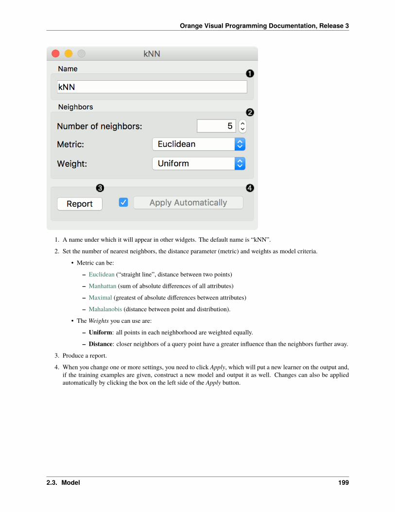
Orange Visual Programming Documentation, Release 3
1. A name under which it will appear in other widgets. The default name is “kNN”.
2. Set the number of nearest neighbors, the distance parameter (metric) and weights as model criteria.
• Metric can be:
– Euclidean (“straight line”, distance between two points)
– Manhattan (sum of absolute differences of all attributes)
– Maximal (greatest of absolute differences between attributes)
– Mahalanobis (distance between point and distribution).
• The Weights you can use are:
– Uniform: all points in each neighborhood are weighted equally.
– Distance: closer neighbors of a query point have a greater influence than the neighbors further away.
3. Produce a report.
4. When you change one or more settings, you need to click Apply, which will put a new learner on the output and,if the training examples are given, construct a new model and output it as well. Changes can also be appliedautomatically by clicking the box on the left side of the Apply button.
2.3. Model 199

Orange Visual Programming Documentation, Release 3
Preprocessing
kNN uses default preprocessing when no other preprocessors are given. It executes them in the following order:
• removes instances with unknown target values
• continuizes categorical variables (with one-hot-encoding)
• removes empty columns
• imputes missing values with mean values
• normalizes the data by centering to mean and scaling to standard deviation of 1
To remove default preprocessing, connect an empty Preprocess widget to the learner.
Examples
The first example is a classification task on iris dataset. We compare the results of k-Nearest neighbors with the defaultmodel Constant, which always predicts the majority class.
The second example is a regression task. This workflow shows how to use the Learner output. For the purpose of thisexample, we used the housing dataset. We input the kNN prediction model into Predictions and observe the predictedvalues.
200 Chapter 2. Widgets

Orange Visual Programming Documentation, Release 3
2.3.5 Tree
A tree algorithm with forward pruning.
Inputs
• Data: input dataset
• Preprocessor: preprocessing method(s)
Outputs
• Learner: decision tree learning algorithm
• Model: trained model
Tree is a simple algorithm that splits the data into nodes by class purity (information gain for categorical and MSE fornumeric target variable). It is a precursor to Random Forest. Tree in Orange is designed in-house and can handle bothcategorical and numeric datasets.
It can also be used for both classification and regression tasks.
2.3. Model 201

Orange Visual Programming Documentation, Release 3
1. The learner can be given a name under which it will appear in other widgets. The default name is “Tree”.
2. Tree parameters:
• Induce binary tree: build a binary tree (split into two child nodes)
• Min. number of instances in leaves: if checked, the algorithm will never construct a split which wouldput less than the specified number of training examples into any of the branches.
• Do not split subsets smaller than: forbids the algorithm to split the nodes with less than the given numberof instances.
• Limit the maximal tree depth: limits the depth of the classification tree to the specified number of nodelevels.
3. Stop when majority reaches [%]: stop splitting the nodes after a specified majority threshold is reached
4. Produce a report. After changing the settings, you need to click Apply, which will put the new learner on theoutput and, if the training examples are given, construct a new classifier and output it as well. Alternatively, tickthe box on the left and changes will be communicated automatically.
202 Chapter 2. Widgets

Orange Visual Programming Documentation, Release 3
Preprocessing
Tree does not use any preprocessing.
Examples
There are two typical uses for this widget. First, you may want to induce a model and check what it looks like in TreeViewer.
The second schema trains a model and evaluates its performance against Logistic Regression.
2.3. Model 203

Orange Visual Programming Documentation, Release 3
We used the iris dataset in both examples. However, Tree works for regression tasks as well. Use housing dataset andpass it to Tree. The selected tree node from Tree Viewer is presented in the Scatter Plot and we can see that the selectedexamples exhibit the same features.
204 Chapter 2. Widgets

Orange Visual Programming Documentation, Release 3
2.3.6 Random Forest
Predict using an ensemble of decision trees.
Inputs
• Data: input dataset
• Preprocessor: preprocessing method(s)
Outputs
• Learner: random forest learning algorithm
• Model: trained model
Random forest is an ensemble learning method used for classification, regression and other tasks. It was first proposedby Tin Kam Ho and further developed by Leo Breiman (Breiman, 2001) and Adele Cutler.
Random Forest builds a set of decision trees. Each tree is developed from a bootstrap sample from the training data.When developing individual trees, an arbitrary subset of attributes is drawn (hence the term “Random”), from whichthe best attribute for the split is selected. The final model is based on the majority vote from individually developedtrees in the forest.
Random Forest works for both classification and regression tasks.
1. Specify the name of the model. The default name is “Random Forest”.
2. Basic properties:
• Number of trees: Specify how many decision trees will be included in the forest.
• Number of trees considered at each split: Specify how many attributes will be arbitrarily drawn for con-sideration at each node. If the latter is not specified (option Number of attributes. . . left unchecked), thisnumber is equal to the square root of the number of attributes in the data.
• Replicable training: Fix the seed for tree generation, which enables replicability of the results.
2.3. Model 205

Orange Visual Programming Documentation, Release 3
• Balance class distribution: Weigh classes inversely proportional to their frequencies.
3. Growth control:
• Limit depth of individual trees: Original Breiman’s proposal is to grow the trees without any pre-pruning,but since pre-pruning often works quite well and is faster, the user can set the depth to which the trees willbe grown.
• Do not split subsets smaller than: Select the smallest subset that can be split.
4. Click Apply to communicate the changes to other widgets. Alternatively, tick the box on the left side of the Applybutton and changes will be communicated automatically.
Preprocessing
Random Forest uses default preprocessing when no other preprocessors are given. It executes them in the followingorder:
• removes instances with unknown target values
• continuizes categorical variables (with one-hot-encoding)
• removes empty columns
• imputes missing values with mean values
To remove default preprocessing, connect an empty Preprocess widget to the learner.
Feature Scoring
Random Forest can be used with Rank for feature scoring. See Learners as Scorers for an example.
206 Chapter 2. Widgets

Orange Visual Programming Documentation, Release 3
Examples
For classification tasks, we use iris dataset. Connect it to Predictions. Then, connect File to Random Forest and Treeand connect them further to Predictions. Finally, observe the predictions for the two models.
For regressions tasks, we will use housing data. Here, we will compare different models, namely Random Forest,Linear Regression and Constant, in the Test & Score widget.
2.3. Model 207

Orange Visual Programming Documentation, Release 3
References
Breiman, L. (2001). Random Forests. In Machine Learning, 45(1), 5-32. Available here.
2.3.7 Gradient Boosting
Predict using gradient boosting on decision trees.
Inputs
• Data: input dataset
• Preprocessor: preprocessing method(s)
Outputs
• Learner: gradient boosting learning algorithm
• Model: trained model
Gradient Boosting is a machine learning technique for regression and classification problems, which produces a pre-diction model in the form of an ensemble of weak prediction models, typically decision trees.
208 Chapter 2. Widgets

Orange Visual Programming Documentation, Release 3
1. Specify the name of the model. The default name is “Gradient Boosting”.
2. Select a gradient boosting method:
• Gradient Boosting (scikit-learn)
• Extreme Gradient Boosting (xgboost)
• Extreme Gradient Boosting Random Forest (xgboost)
• Gradient Boosting (catboost)
3. Basic properties:
• Number of trees: Specify how many gradient boosted trees will be included. A large number usually resultsin better performance.
• Learning rate: Specify the boosting learning rate. Learning rate shrinks the contribution of each tree.
• Replicable training: Fix the random seed, which enables replicability of the results.
• Regularization: Specify the L2 regularization term. Available only for xgboost and catboost methods.
4. Growth control:
2.3. Model 209

Orange Visual Programming Documentation, Release 3
• Limit depth of individual trees: Specify the maximum depth of the individual tree.
• Do not split subsets smaller than: Specify the smallest subset that can be split. Available only for scikit-learn methods.
5. Subsampling:
• Fraction of training instances: Specify the percentage of the training instances for fitting the individualtree. Available for scikit-learn and xgboost methods.
• Fraction of features for each tree: Specify the percentage of features to use when constructing each tree.Available for xgboost and catboost methods.
• Fraction of features for each level: Specify the percentage of features to use for each level. Available onlyfor xgboost methods.
• Fraction of features for each split: Specify the percentage of features to use for each split. Available onlyfor xgboost methods.
6. Click Apply to communicate the changes to other widgets. Alternatively, tick the box on the left side of the Applybutton and changes will be communicated automatically.
Preprocessing
Gradient Boosting uses default preprocessing when no other preprocessors are given. It executes them in the followingorder:
• removes instances with unknown target values
• continuizes categorical variables (with one-hot-encoding)
• removes empty columns
• imputes missing values with mean values
To remove default preprocessing, connect an empty Preprocess widget to the learner.
Feature Scoring
Gradient Boosting can be used with Rank for feature scoring. See Learners as Scorers for an example.
Example
For a classification tasks, we use the heart disease data. Here, we compare all available methods in the Test & Scorewidget.
210 Chapter 2. Widgets

Orange Visual Programming Documentation, Release 3
2.3.8 SVM
Support Vector Machines map inputs to higher-dimensional feature spaces.
Inputs
• Data: input dataset
• Preprocessor: preprocessing method(s)
Outputs
• Learner: linear regression learning algorithm
• Model: trained model
• Support Vectors: instances used as support vectors
Support vector machine (SVM) is a machine learning technique that separates the attribute space with a hyperplane, thusmaximizing the margin between the instances of different classes or class values. The technique often yields supreme
2.3. Model 211

Orange Visual Programming Documentation, Release 3
predictive performance results. Orange embeds a popular implementation of SVM from the LIBSVM package. Thiswidget is its graphical user interface.
For regression tasks, SVM performs linear regression in a high dimension feature space using an -insensitive loss. Itsestimation accuracy depends on a good setting of C, and kernel parameters. The widget outputs class predictions basedon a SVM Regression.
The widget works for both classification and regression tasks.
212 Chapter 2. Widgets

Orange Visual Programming Documentation, Release 3
1. The learner can be given a name under which it will appear in other widgets. The default name is “SVM”.
2. SVM type with test error settings. SVM and -SVM are based on different minimization of the error function. Onthe right side, you can set test error bounds:
• SVM:
– Cost: penalty term for loss and applies for classification and regression tasks.
2.3. Model 213

Orange Visual Programming Documentation, Release 3
– : a parameter to the epsilon-SVR model, applies to regression tasks. Defines the distance from truevalues within which no penalty is associated with predicted values.
• -SVM:
– Cost: penalty term for loss and applies only to regression tasks
– : a parameter to the -SVR model, applies to classification and regression tasks. An upper bound onthe fraction of training errors and a lower bound of the fraction of support vectors.
3. Kernel is a function that transforms attribute space to a new feature space to fit the maximum-margin hyperplane,thus allowing the algorithm to create the model with Linear, Polynomial, RBF and Sigmoid kernels. Functionsthat specify the kernel are presented upon selecting them, and the constants involved are:
• g for the gamma constant in kernel function (the recommended value is 1/k, where k is the number of theattributes, but since there may be no training set given to the widget the default is 0 and the user has to setthis option manually),
• c for the constant c0 in the kernel function (default 0), and
• d for the degree of the kernel (default 3).
4. Set permitted deviation from the expected value in Numerical Tolerance. Tick the box next to Iteration Limit toset the maximum number of iterations permitted.
5. Produce a report.
6. Click Apply to commit changes. If you tick the box on the left side of the Apply button, changes will be commu-nicated automatically.
Preprocessing
SVM uses default preprocessing when no other preprocessors are given. It executes them in the following order:
• removes instances with unknown target values
• continuizes categorical variables (with one-hot-encoding)
• removes empty columns
• imputes missing values with mean values
For classification, SVM also normalizes dense and scales sparse data.
To remove default preprocessing, connect an empty Preprocess widget to the learner.
Examples
In the first (regression) example, we have used housing dataset and split the data into two data subsets (Data Sampleand Remaining Data) with Data Sampler. The sample was sent to SVM which produced a Model, which was thenused in Predictions to predict the values in Remaining Data. A similar schema can be used if the data is already in twoseparate files; in this case, two File widgets would be used instead of the File - Data Sampler combination.
214 Chapter 2. Widgets

Orange Visual Programming Documentation, Release 3
The second example shows how to use SVM in combination with Scatter Plot. The following workflow trains a SVMmodel on iris data and outputs support vectors, which are those data instances that were used as support vectors in thelearning phase. We can observe which are these data instances in a scatter plot visualization. Note that for the workflowto work correctly, you must set the links between widgets as demonstrated in the screenshot below.
2.3. Model 215

Orange Visual Programming Documentation, Release 3
References
Introduction to SVM on StatSoft.
2.3.9 Linear Regression
A linear regression algorithm with optional L1 (LASSO), L2 (ridge) or L1L2 (elastic net) regularization.
Inputs
• Data: input dataset
• Preprocessor: preprocessing method(s)
Outputs
• Learner: linear regression learning algorithm
• Model: trained model
• Coefficients: linear regression coefficients
The Linear Regression widget constructs a learner/predictor that learns a linear function from its input data. Themodel can identify the relationship between a predictor xi and the response variable y. Additionally, Lasso and Ridgeregularization parameters can be specified. Lasso regression minimizes a penalized version of the least squares lossfunction with L1-norm penalty and Ridge regularization with L2-norm penalty.
Linear regression works only on regression tasks.
216 Chapter 2. Widgets

Orange Visual Programming Documentation, Release 3
1. The learner/predictor name
2. Parameters: Fit intercept. Unchecking the option forces the intercept to zero.
3. Choose a model to train:
• no regularization
• a Ridge regularization (L2-norm penalty)
• a Lasso bound (L1-norm penalty)
• an Elastic net regularization
Preprocessing
Linear Regression uses default preprocessing when no other preprocessors are given. It executes them in the followingorder:
• removes instances with unknown target values
• continuizes categorical variables (with one-hot-encoding)
• removes empty columns
• imputes missing values with mean values
To remove default preprocessing, connect an empty Preprocess widget to the learner.
2.3. Model 217

Orange Visual Programming Documentation, Release 3
Feature Scoring
Linear Regression can be used with Rank for feature scoring. See Learners as Scorers for an example.
Observing Coefficients
To observe coefficients of linear regression, first build a model, then pass the model to the Data Table. This willautomatically connect the Coefficients output to the Data Table, where you can sort the table by coefficients and observewhich variables positively and negatively correlate with the prediction.
Example
Below, is a simple workflow with housing dataset. We trained Linear Regression and Random Forest and evaluatedtheir performance in Test & Score.
218 Chapter 2. Widgets

Orange Visual Programming Documentation, Release 3
2.3.10 Logistic Regression
The logistic regression classification algorithm with LASSO (L1) or ridge (L2) regularization.
Inputs
• Data: input dataset
• Preprocessor: preprocessing method(s)
Outputs
• Learner: logistic regression learning algorithm
• Model: trained model
• Coefficients: logistic regression coefficients
Logistic Regression learns a Logistic Regression model from the data. It only works for classification tasks.
2.3. Model 219

Orange Visual Programming Documentation, Release 3
1. A name under which the learner appears in other widgets. The default name is “Logistic Regression”.
2. Regularization type (either L1 or L2). Set the cost strength (default is C=1).
3. Press Apply to commit changes. If Apply Automatically is ticked, changes will be communicated automatically.
Preprocessing
Logistic Regression uses default preprocessing when no other preprocessors are given. It executes them in the followingorder:
• removes instances with unknown target values
• continuizes categorical variables (with one-hot-encoding)
• removes empty columns
• imputes missing values with mean values
To remove default preprocessing, connect an empty Preprocess widget to the learner.
Feature Scoring
Logistic Regression can be used with Rank for feature scoring. See Learners as Scorers for an example.
220 Chapter 2. Widgets

Orange Visual Programming Documentation, Release 3
Example
The widget is used just as any other widget for inducing a classifier. This is an example demonstrating prediction resultswith logistic regression on the hayes-roth dataset. We first load hayes-roth_learn in the File widget and pass the datato Logistic Regression. Then we pass the trained model to Predictions.
Now we want to predict class value on a new dataset. We load hayes-roth_test in the second File widget and connectit to Predictions. We can now observe class values predicted with Logistic Regression directly in Predictions.
2.3.11 Naive Bayes
A fast and simple probabilistic classifier based on Bayes’ theorem with the assumption of feature independence.
Inputs
• Data: input dataset
• Preprocessor: preprocessing method(s)
Outputs
• Learner: naive bayes learning algorithm
• Model: trained model
Naive Bayes learns a Naive Bayesian model from the data. It only works for classification tasks.
2.3. Model 221

Orange Visual Programming Documentation, Release 3
This widget has two options: the name under which it will appear in other widgets and producing a report. The defaultname is Naive Bayes. When you change it, you need to press Apply.
Preprocessing
Naive Bayes uses default preprocessing when no other preprocessors are given. It executes them in the following order:
• removes empty columns
• discretizes numeric values to 4 bins with equal frequency
To remove default preprocessing, connect an empty Preprocess widget to the learner.
Examples
Here, we present two uses of this widget. First, we compare the results of the Naive Bayes with another model, theRandom Forest. We connect iris data from File to Test & Score. We also connect Naive Bayes and Random Forest toTest & Score and observe their prediction scores.
222 Chapter 2. Widgets

Orange Visual Programming Documentation, Release 3
The second schema shows the quality of predictions made with Naive Bayes. We feed the Test & Score widget a NaiveBayes learner and then send the data to the Confusion Matrix. We also connect Scatter Plot with File. Then we selectthe misclassified instances in the Confusion Matrix and show feed them to Scatter Plot. The bold dots in the scatterplotare the misclassified instances from Naive Bayes.
2.3. Model 223

Orange Visual Programming Documentation, Release 3
2.3.12 AdaBoost
An ensemble meta-algorithm that combines weak learners and adapts to the ‘hardness’ of each training sample.
Inputs
• Data: input dataset
• Preprocessor: preprocessing method(s)
• Learner: learning algorithm
Outputs
• Learner: AdaBoost learning algorithm
• Model: trained model
The AdaBoost (short for “Adaptive boosting”) widget is a machine-learning algorithm, formulated by Yoav Freund andRobert Schapire. It can be used with other learning algorithms to boost their performance. It does so by tweaking theweak learners.
AdaBoost works for both classification and regression.
224 Chapter 2. Widgets

Orange Visual Programming Documentation, Release 3
1. The learner can be given a name under which it will appear in other widgets. The default name is “AdaBoost”.
2. Set the parameters. The base estimator is a tree and you can set:
• Number of estimators
• Learning rate: it determines to what extent the newly acquired information will override the old information(0 = the agent will not learn anything, 1 = the agent considers only the most recent information)
• Fixed seed for random generator: set a fixed seed to enable reproducing the results.
3. Boosting method.
• Classification algorithm (if classification on input): SAMME (updates base estimator’s weights with clas-sification results) or SAMME.R (updates base estimator’s weight with probability estimates).
• Regression loss function (if regression on input): Linear (), Square (), Exponential ().
4. Produce a report.
5. Click Apply after changing the settings. That will put the new learner in the output and, if the training exam-ples are given, construct a new model and output it as well. To communicate changes automatically tick ApplyAutomatically.
Preprocessing
AdaBoost uses default preprocessing when no other preprocessors are given. It executes them in the following order:
• removes instances with unknown target values
• continuizes categorical variables (with one-hot-encoding)
• removes empty columns
• imputes missing values with mean values
To remove default preprocessing, connect an empty Preprocess widget to the learner.
2.3. Model 225

Orange Visual Programming Documentation, Release 3
Examples
For classification, we loaded the iris dataset. We used AdaBoost, Tree and Logistic Regression and evaluated themodels’ performance in Test & Score.
For regression, we loaded the housing dataset, sent the data instances to two different models (AdaBoost and Tree) andoutput them to the Predictions widget.
226 Chapter 2. Widgets

Orange Visual Programming Documentation, Release 3
2.3.13 Curve Fit
Fit a function to data.
Inputs
• Data: input dataset
• Preprocessor: preprocessing method(s)
Outputs
• Learner: curve fit learning algorithm
• Model: trained model
• Coefficients: fitted coefficients
The Curve Fit widget fits an arbitrary function to the input data. It only works for regression tasks. The widget usesscipy.curve_fit to find the optimal values of the parameters.
The widget works only on regression tasks and only numerical features can be used for fitting.
2.3. Model 227

Orange Visual Programming Documentation, Release 3
1. The learner/predictor name.
2. Introduce model parameters.
3. Input an expression in Python. The expression should consist of at least one fitting parameter.
4. Select a feature to include into the expression. Only numerical features are available.
5. Select a parameter. Only the introduced parameters are available.
6. Select a function.
7. Press Apply to commit changes. If Apply Automatically is ticked, changes are committed automatically.
8. Show help, produce a report, input/output info.
Preprocessing
Curve fit uses default preprocessing when no other preprocessors are given. It executes them in the following order:
• removes instances with unknown target values
• removes empty columns
• imputes missing values with mean values
To remove default preprocessing, connect an empty Preprocess widget to the learner.
228 Chapter 2. Widgets

Orange Visual Programming Documentation, Release 3
Example
Below, is a simple workflow with housing dataset. Due to example simplicity we used only a single feature. Unlikethe other modelling widgets, the Curve Fit needs data on the input. We trained Curve Fit and Linear Regression andevaluated their performance in Test & Score.
2.3.14 Neural Network
A multi-layer perceptron (MLP) algorithm with backpropagation.
Inputs
• Data: input dataset
• Preprocessor: preprocessing method(s)
Outputs
• Learner: multi-layer perceptron learning algorithm
• Model: trained model
The Neural Network widget uses sklearn’s Multi-layer Perceptron algorithm that can learn non-linear models as wellas linear.
2.3. Model 229

Orange Visual Programming Documentation, Release 3
1. A name under which it will appear in other widgets. The default name is “Neural Network”.
2. Set model parameters:
• Neurons per hidden layer: defined as the ith element represents the number of neurons in the ith hiddenlayer. E.g. a neural network with 3 layers can be defined as 2, 3, 2.
• Activation function for the hidden layer:
– Identity: no-op activation, useful to implement linear bottleneck
– Logistic: the logistic sigmoid function
– tanh: the hyperbolic tan function
– ReLu: the rectified linear unit function
• Solver for weight optimization:
– L-BFGS-B: an optimizer in the family of quasi-Newton methods
– SGD: stochastic gradient descent
– Adam: stochastic gradient-based optimizer
• Alpha: L2 penalty (regularization term) parameter
• Max iterations: maximum number of iterations
Other parameters are set to sklearn’s defaults.
230 Chapter 2. Widgets

Orange Visual Programming Documentation, Release 3
3. Produce a report.
4. When the box is ticked (Apply Automatically), the widget will communicate changes automatically. Alternatively,click Apply.
Preprocessing
Neural Network uses default preprocessing when no other preprocessors are given. It executes them in the followingorder:
• removes instances with unknown target values
• continuizes categorical variables (with one-hot-encoding)
• removes empty columns
• imputes missing values with mean values
• normalizes the data by centering to mean and scaling to standard deviation of 1
To remove default preprocessing, connect an empty Preprocess widget to the learner.
Examples
The first example is a classification task on iris dataset. We compare the results of Neural Network with the LogisticRegression.
The second example is a prediction task, still using the iris data. This workflow shows how to use the Learner output.We input the Neural Network prediction model into Predictions and observe the predicted values.
2.3. Model 231

Orange Visual Programming Documentation, Release 3
2.3.15 Stochastic Gradient Descent
Minimize an objective function using a stochastic approximation of gradient descent.
Inputs
• Data: input dataset
• Preprocessor: preprocessing method(s)
Outputs
• Learner: stochastic gradient descent learning algorithm
• Model: trained model
The Stochastic Gradient Descent widget uses stochastic gradient descent that minimizes a chosen loss function witha linear function. The algorithm approximates a true gradient by considering one sample at a time, and simultaneouslyupdates the model based on the gradient of the loss function. For regression, it returns predictors as minimizers of thesum, i.e. M-estimators, and is especially useful for large-scale and sparse datasets.
232 Chapter 2. Widgets

Orange Visual Programming Documentation, Release 3
2.3. Model 233

Orange Visual Programming Documentation, Release 3
1. Specify the name of the model. The default name is “SGD”.
2. Algorithm parameters:
• Classification loss function:
– Hinge (linear SVM)
– Logistic Regression (logistic regression SGD)
– Modified Huber (smooth loss that brings tolerance to outliers as well as probability estimates)
– Squared Hinge (quadratically penalized hinge)
– Perceptron (linear loss used by the perceptron algorithm)
– Squared Loss (fitted to ordinary least-squares)
– Huber (switches to linear loss beyond )
– Epsilon insensitive (ignores errors within , linear beyond it)
– Squared epsilon insensitive (loss is squared beyond -region).
• Regression loss function:
– Squared Loss (fitted to ordinary least-squares)
– Huber (switches to linear loss beyond )
– Epsilon insensitive (ignores errors within , linear beyond it)
– Squared epsilon insensitive (loss is squared beyond -region).
3. Regularization norms to prevent overfitting:
• None.
• Lasso (L1) (L1 leading to sparse solutions)
• Ridge (L2) (L2, standard regularizer)
• Elastic net (mixing both penalty norms).
Regularization strength defines how much regularization will be applied (the less we regularize, the more weallow the model to fit the data) and the mixing parameter what the ratio between L1 and L2 loss will be (if set to0 then the loss is L2, if set to 1 then it is L1).
4. Learning parameters.
• Learning rate:
– Constant: learning rate stays the same through all epochs (passes)
– Optimal: a heuristic proposed by Leon Bottou
– Inverse scaling: earning rate is inversely related to the number of iterations
• Initial learning rate.
• Inverse scaling exponent: learning rate decay.
• Number of iterations: the number of passes through the training data.
• If Shuffle data after each iteration is on, the order of data instances is mixed after each pass.
• If Fixed seed for random shuffling is on, the algorithm will use a fixed random seed and enable replicatingthe results.
5. Produce a report.
234 Chapter 2. Widgets

Orange Visual Programming Documentation, Release 3
6. Press Apply to commit changes. Alternatively, tick the box on the left side of the Apply button and changes willbe communicated automatically.
Preprocessing
SGD uses default preprocessing when no other preprocessors are given. It executes them in the following order:
• removes instances with unknown target values
• continuizes categorical variables (with one-hot-encoding)
• removes empty columns
• imputes missing values with mean values
• normalizes the data by centering to mean and scaling to standard deviation of 1
To remove default preprocessing, connect an empty Preprocess widget to the learner.
Feature Scoring
Stochastic Gradient Descent can be used with Rank for feature scoring. See Learners as Scorers for an example.
Examples
For the classification task, we will use iris dataset and test two models on it. We connected Stochastic Gradient Descentand Tree to Test & Score. We also connected File to Test & Score and observed model performance in the widget.
2.3. Model 235

Orange Visual Programming Documentation, Release 3
For the regression task, we will compare three different models to see which predict what kind of results. For thepurpose of this example, the housing dataset is used. We connect the File widget to Stochastic Gradient Descent,Linear Regression and kNN widget and all four to the Predictions widget.
236 Chapter 2. Widgets

Orange Visual Programming Documentation, Release 3
2.3.16 Stacking
Stack multiple models.
Inputs
• Data: input dataset
• Preprocessor: preprocessing method(s)
• Learners: learning algorithm
• Aggregate: model aggregation method
Outputs
• Learner: aggregated (stacked) learning algorithm
• Model: trained model
Stacking is an ensemble method that computes a meta model from several base models. The Stacking widget has theAggregate input, which provides a method for aggregating the input models. If no aggregation input is given the defaultmethods are used. Those are Logistic Regression for classification and Ridge Regression for regression problems.
2.3. Model 237

Orange Visual Programming Documentation, Release 3
1. The meta learner can be given a name under which it will appear in other widgets. The default name is “Stack”.
2. Click Apply to commit the aggregated model. That will put the new learner in the output and, if the trainingexamples are given, construct a new model and output it as well. To communicate changes automatically tickApply Automatically.
3. Access help and produce a report.
Example
We will use Paint Data to demonstrate how the widget is used. We painted a complex dataset with 4 class labels andsent it to Test & Score. We also provided three kNN learners, each with a different parameters (number of neighborsis 5, 10 or 15). Evaluation results are good, but can we do better?
Let’s use Stacking. Stacking requires several learners on the input and an aggregation method. In our case, this isLogistic Regression. A constructed meta learner is then sent to Test & Score. Results have improved, even if onlymarginally. Stacking normally works well on complex data sets.
238 Chapter 2. Widgets

Orange Visual Programming Documentation, Release 3
2.3.17 Load Model
Load a model from an input file.
Outputs
• Model: trained model
1. Choose from a list of previously used models.
2. Browse for saved models.
3. Reload the selected model.
2.3. Model 239

Orange Visual Programming Documentation, Release 3
Example
When you want to use a custom-set model that you’ve saved before, open the Load Model widget and select the desiredfile with the Browse icon. This widget loads the existing model into Predictions widget. Datasets used with Load Modelhave to contain compatible attributes!
2.3.18 Save Model
Save a trained model to an output file.
If the file is saved to the same directory as the workflow or in the subtree of that directory, the widget remembers therelative path. Otherwise it will store an absolute path, but disable auto save for security reasons.
Inputs
• Model: trained model
240 Chapter 2. Widgets

Orange Visual Programming Documentation, Release 3
1. Choose from previously saved models.
2. Save the created model with the Browse icon. Click on the icon and en-ter the name of the file. The model will be saved to a pickled file.
3. Save the model.
Example
When you want to save a custom-set model, feed the data to the model (e.g. Logistic Regression) and connect it toSave Model. Name the model; load it later into workflows with Load Model. Datasets used with Load Model have tocontain compatible attributes.
2.3. Model 241

Orange Visual Programming Documentation, Release 3
2.4 Evaluate
2.4.1 Calibration Plot
Shows the match between classifiers’ probability predictions and actual class probabilities.
Inputs
• Evaluation Results: results of testing classification algorithms
The Calibration Plotplots class probabilities against those predicted by the classifier(s).
242 Chapter 2. Widgets

Orange Visual Programming Documentation, Release 3
1. Select the desired target class from the drop down menu.
2. Choose which classifiers to plot. The diagonal represents optimal behavior; the closer the classifier’s curve gets,the more accurate its prediction probabilities are. Thus we would use this widget to see whether a classifier isoverly optimistic (gives predominantly positive results) or pessimistic (gives predominantly negative results).
3. If Show rug is enabled, ticks are displayed at the bottom and the top of the graph, which represent negative andpositive examples respectively. Their position corresponds to the classifier’s probability prediction and the colorshows the classifier. At the bottom of the graph, the points to the left are those which are (correctly) assigned alow probability of the target class, and those to the right are incorrectly assigned high probabilities. At the topof the graph, the instances to the right are correctly assigned high probabilities and vice versa.
4. Press Save Image if you want to save the created image to your computer in a .svg or .png format.
5. Produce a report.
Example
At the moment, the only widget which gives the right type of signal needed by the Calibration Plot is Test & Score.The Calibration Plot will hence always follow Test & Score and, since it has no outputs, no other widgets follow it.
Here is a typical example, where we compare three classifiers (namely Naive Bayes, Tree and Constant) and inputthem into Test & Score. We used the Titanic dataset. Test & Score then displays evaluation results for each classifier.Then we draw Calibration Plot and ROC Analysis widgets from Test & Score to further analyze the performance ofclassifiers. Calibration Plot enables you to see prediction accuracy of class probabilities in a plot.
2.4. Evaluate 243

Orange Visual Programming Documentation, Release 3
2.4.2 Confusion Matrix
Shows proportions between the predicted and actual class.
Inputs
• Evaluation results: results of testing classification algorithms
Outputs
• Selected Data: data subset selected from confusion matrix
• Data: data with the additional information on whether a data instance was selected
The Confusion Matrix gives the number/proportion of instances between the predicted and actual class. The selectionof the elements in the matrix feeds the corresponding instances into the output signal. This way, one can observe whichspecific instances were misclassified and how.
The widget usually gets the evaluation results from Test & Score; an example of the schema is shown below.
244 Chapter 2. Widgets

Orange Visual Programming Documentation, Release 3
1. When evaluation results contain data on multiple learning algorithms, we have to choose one in the Learnersbox. The snapshot shows the confusion matrix for Tree and Naive Bayesian models trained and tested on the irisdata. The right-hand side of the widget contains the matrix for the naive Bayesian model (since this model isselected on the left). Each row corresponds to a correct class, while columns represent the predicted classes. Forinstance, four instances of Iris-versicolor were misclassified as Iris-virginica. The rightmost column gives thenumber of instances from each class (there are 50 irises of each of the three classes) and the bottom row givesthe number of instances classified into each class (e.g., 48 instances were classified into virginica).
2. In Show, we select what data we would like to see in the matrix.
• Number of instances shows correctly and incorrectly classified instances numerically.
• Proportions of predicted shows how many instances classified as, say, Iris-versicolor are in which trueclass; in the table we can read the 0% of them are actually setosae, 88.5% of those classified as versicolorare versicolors, and 7.7% are virginicae.
• Proportions of actual shows the opposite relation: of all true versicolors, 92% were classified as versicolors
2.4. Evaluate 245

Orange Visual Programming Documentation, Release 3
and 8% as virginicae.
3. In Select, you can choose the desired output.
• Correct sends all correctly classified instances to the output by selecting the diagonal of the matrix.
• Misclassified selects the misclassified instances.
• None annuls the selection. As mentioned before, one can also select individual cells of the table to selectspecific kinds of misclassified instances (e.g. the versicolors classified as virginicae).
4. When sending selected instances, the widget can add new attributes, such as predicted classes or their probabil-ities, if the corresponding options Predictions and/or Probabilities are checked.
5. The widget outputs every change if Send Automatically is ticked. If not, the user will need to click Send Selectedto commit the changes.
6. Produce a report.
Example
The following workflow demonstrates what this widget can be used for.
246 Chapter 2. Widgets

Orange Visual Programming Documentation, Release 3
Test & Score gets the data from File and two learning algorithms from Naive Bayes and Tree. It performs cross-validation or some other train-and-test procedures to get class predictions by both algorithms for all (or some) datainstances. The test results are fed into the Confusion Matrix, where we can observe how many instances were mis-classified and in which way.
In the output, we used Data Table to show the instances we selected in the confusion matrix. If we, for instance, clickMisclassified, the table will contain all instances which were misclassified by the selected method.
The Scatter Plot gets two sets of data. From the File widget it gets the complete data, while the confusion matrixsends only the selected data, misclassifications for instance. The scatter plot will show all the data, with bold symbolsrepresenting the selected data.
2.4. Evaluate 247

Orange Visual Programming Documentation, Release 3
2.4.3 Lift Curve
Measures the performance of a chosen classifier against a random classifier.
Inputs
• Evaluation Results: results of testing classification algorithms
The Lift curve shows the curves for analysing the proportion of true positive data instances in relation to the classifier’sthreshold or the number of instances that we classify as positive.
Cumulative gains chart shows the proportion of true positive instances (for example, the number of clients who acceptthe offer) as a function of the number of positive instances (the number of clients contacted), assuming the the instancesare ordered according to the model’s probability of being positive (e.g. ranking of clients).
248 Chapter 2. Widgets

Orange Visual Programming Documentation, Release 3
Lift curve shows the ratio between the proportion of true positive instances in the selection and the proportion ofcustomers contacted. See a tutorial for more details.
1. Choose the desired Target class. The default is chosen alphabetically.
2. Choose whether to observe lift curve or cumulative gains.
2.4. Evaluate 249

Orange Visual Programming Documentation, Release 3
3. If test results contain more than one classifier, the user can choose which curves she or he wants to see plotted.Click on a classifier to select or deselect the curve.
4. Show lift convex hull plots a convex hull over lift curves for all classifiers (yellow curve). The curve shows theoptimal classifier (or combination thereof) for each desired lift or cumulative gain.
5. Press Save Image to save the created image in a .svg or .png format.
6. Produce a report.
7. A plot with lift or cumulative gain vs. positive rate. The dashed line represents the behavior of a randomclassifier.
Example
The widgets that provide the right type of the signal needed by the Lift Curve (evaluation data) are Test & Score andPredictions.
In the example below, we observe the lift curve and cumulative gain for the bank marketing data, where the classificationgoal is to predict whether the client will accept a term deposit offer based on his age, job, education, marital status andsimilar data. The data set is available in the Datasets widget. We run the learning algorithms in the Test and Scorewidget and send the results to Lift Curve to see their performance against a random model. Of the two algorithmstested, logistic regression outperforms the naive Bayesian classifier. The curve tells us that by picking the first 20 %of clients as ranked by the model, we are going to hit four times more positive instances than by selecting a randomsample with 20 % of clients.
2.4.4 Predictions
Shows models’ predictions on the data.
Inputs
• Data: input dataset
• Predictors: predictors to be used on the data
Outputs
• Predictions: data with added predictions
• Evaluation Results: results of testing classification algorithms
The widget receives a dataset and one or more predictors (predictive models, not learning algorithms - see the examplebelow). It outputs the data and the predictions.
250 Chapter 2. Widgets

Orange Visual Programming Documentation, Release 3
1. Information on the input, namely the number of instances to predict, the number of predictors and the task(classification or regression). If you have sorted the data table by attribute and you wish to see the original view,press Restore Original Order.
2. You can select the options for classification. If Predicted class is ticked, the view provides information onpredicted class. If Predicted probabilities for is ticked, the view provides information on probabilities predictedby the classifier(s). You can also select the predicted class displayed in the view. The option Draw distributionbars provides a visualization of probabilities.
3. By ticking the Show full dataset, you can view the entire data table (otherwise only class variable will be shown).
4. Select the desired output.
5. Predictions.
The widget show the probabilities and final decisions of predictive models. The output of the widget is another dataset,where predictions are appended as new meta attributes. You can select which features you wish to output (originaldata, predictions, probabilities). The result can be observed in a Data Table. If the predicted data includes true classvalues, the result of prediction can also be observed in a Confusion Matrix.
2.4. Evaluate 251

Orange Visual Programming Documentation, Release 3
Examples
In the first example, we will use Attrition - Train data from the Datasets widget. This is a data on attrition of employees.In other words, we wish to know whether a certain employee will resign from the job or not. We will construct apredictive model with the Tree widget and observe probabilities in Predictions.
For predictions we need both the training data, which we have loaded in the first Datasets widget and the data to predict,which we will load in another Datasets widget. We will use Attrition - Predict data this time. Connect the second dataset to Predictions. Now we can see predictions for the three data instances from the second data set.
The Tree model predicts none of the employees will leave the company. You can try other model and see if predictionschange. Or test the predictive scores first in the Test & Score widget.
In the second example, we will see how to properly use Preprocess with Predictions or Test & Score.
This time we are using the heart disease.tab data from the File widget. You can access the data through the dropdownmenu. This is a dataset with 303 patients that came to the doctor suffering from a chest pain. After the tests were done,some patients were found to have diameter narrowing and others did not (this is our class variable).
The heart disease data have some missing values and we wish to account for that. First, we will split the data set intotrain and test data with Data Sampler.
Then we will send the Data Sample into Preprocess. We will use Impute Missing Values, but you can try any combina-tion of preprocessors on your data. We will send preprocessed data to Logistic Regression and the constructed modelto Predictions.
Finally, Predictions also needs the data to predict on. We will use the output of Data Sampler for prediction, but thistime not the Data Sample, but the Remaining Data, this is the data that wasn’t used for training the model.
Notice how we send the remaining data directly to Predictions without applying any preprocessing. This is becauseOrange handles preprocessing on new data internally to prevent any errors in the model construction. The exact samepreprocessor that was used on the training data will be used for predictions. The same process applies to Test & Score.
252 Chapter 2. Widgets

Orange Visual Programming Documentation, Release 3
2.4.5 ROC Analysis
Plots a true positive rate against a false positive rate of a test.
Inputs
• Evaluation Results: results of testing classification algorithms
The widget shows ROC curves for the tested models and the corresponding convex hull. It serves as a mean of com-parison between classification models. The curve plots a false positive rate on an x-axis (1-specificity; probabilitythat target=1 when true value=0) against a true positive rate on a y-axis (sensitivity; probability that target=1 whentrue value=1). The closer the curve follows the left-hand border and then the top border of the ROC space, the moreaccurate the classifier. Given the costs of false positives and false negatives, the widget can also determine the optimalclassifier and threshold.
2.4. Evaluate 253

Orange Visual Programming Documentation, Release 3
1. Choose the desired Target Class. The default class is chosen alphabetically.
2. If test results contain more than one classifier, the user can choose which curves she or he wants to see plotted.Click on a classifier to select or deselect it.
3. When the data comes from multiple iterations of training and testing, suchas k-fold cross validation, the results can be (and usually are) averaged.
254 Chapter 2. Widgets

Orange Visual Programming Documentation, Release 3
The averaging options are:
• Merge predictions from folds (top left), which treats all the test data as if they came from a single iteration
• Mean TP rate (top right) averages the curves vertically, showing the corresponding confidence intervals
• Mean TP and FP at threshold (bottom left) traverses over threshold, averages the positions of curves andshows horizontal and vertical confidence intervals
• Show individual curves (bottom right) does not average but prints all the curves instead
4. Option Show convex ROC curves refers to convex curves over each individual classifier (the thin lines positionedover curves). Show ROC convex hull plots a convex hull combining all classifiers (the gray area below thecurves). Plotting both types of convex curves makes sense since selecting a threshold in a concave part of thecurve cannot yield optimal results, disregarding the cost matrix. Besides, it is possible to reach any point onthe convex curve by combining the classifiers represented by the points on the border of the concave region.
2.4. Evaluate 255

Orange Visual Programming Documentation, Release 3
The diagonal dotted line represents the behavior of a random classifier. The full diagonal line represents iso-performance. A black “A” symbol at the bottom of the graph proportionally readjusts the graph.
5. The final box is dedicated to the analysis of the curve. The user can specify the cost of false positives (FP) andfalse negatives (FN), and the prior target class probability.
• Default threshold (0.5) point shows the point on the ROC curve achieved by the classifier if it predicts thetarget class if its probability equals or exceeds 0.5.
• Show performance line shows iso-performance in the ROC space so that all the points on the line give thesame profit/loss. The line further to the upper left is better than the one down and right. The direction ofthe line depends upon costs and probabilities. This gives a recipe for depicting the optimal threshold for thegiven costs: this is the point where the tangent with the given inclination touches the curve and it is markedin the plot. If we push the iso-performance higher or more to the left, the points on the iso-performanceline cannot be reached by the learner. Going down or to the right, decreases the performance.
• The widget allows setting the costs from 1 to 1000. Units are not important, as are not the magnitudes.What matters is the relation between the two costs, so setting them to 100 and 200 will give the sameresult as 400 and 800. Defaults: both costs equal (500), Prior target class probability 50%(from the data).
256 Chapter 2. Widgets

Orange Visual Programming Documentation, Release 3
False positive cost: 830, False negative cost 650, Prior target class probability 73%.
2.4. Evaluate 257

Orange Visual Programming Documentation, Release 3
6. Press Save Image if you want to save the created image to your computer in a .svg or .png format.
7. Produce a report.
Example
At the moment, the only widget which gives the right type of signal needed by the ROC Analysis is Test & Score.Below, we compare two classifiers, namely Tree and Naive Bayes, in Test&Score and then compare their performancein ROC Analysis, Life Curve and Calibration Plot.
258 Chapter 2. Widgets

Orange Visual Programming Documentation, Release 3
2.4.6 Test and Score
Tests learning algorithms on data.
Inputs
• Data: input dataset
• Test Data: separate data for testing
• Learner: learning algorithm(s)
Outputs
• Evaluation Results: results of testing classification algorithms
The widget tests learning algorithms. Different sampling schemes are available, including using separate test data. Thewidget does two things. First, it shows a table with different classifier performance measures, such as classificationaccuracy and area under the curve. Second, it outputs evaluation results, which can be used by other widgets foranalyzing the performance of classifiers, such as ROC Analysis or Confusion Matrix.
The Learner signal has an uncommon property: it can be connected to more than one widget to test multiple learnerswith the same procedures.
2.4. Evaluate 259

Orange Visual Programming Documentation, Release 3
1. The widget supports various sampling methods.
• Cross-validation splits the data into a given number of folds (usually 5 or 10). The algorithm is tested byholding out examples from one fold at a time; the model is induced from other folds and examples from theheld out fold are classified. This is repeated for all the folds.
• Cross validation by feature performs cross-validation but folds are defined by the selected categoricalfeature from meta-features.
• Random sampling randomly splits the data into the training and testing set in the given proportion (e.g.70:30); the whole procedure is repeated for a specified number of times.
• Leave-one-out is similar, but it holds out one instance at a time, inducing the model from all others andthen classifying the held out instances. This method is obviously very stable, reliable. . . and very slow.
• Test on train data uses the whole dataset for training and then for testing. This method practically alwaysgives wrong results.
• Test on test data: the above methods use the data from Data signal only. To input another dataset withtesting examples (for instance from another file or some data selected in another widget), we select SeparateTest Data signal in the communication channel and select Test on test data.
2. For classification, Target class can be selected at the bottom of the widget. When Target class is (Average overclasses), methods return scores that are weighted averages over all classes. For example, in case of the classifierwith 3 classes, scores are computed for class 1 as a target class, class 2 as a target class, and class 3 as a target
260 Chapter 2. Widgets

Orange Visual Programming Documentation, Release 3
class. Those scores are averaged with weights based on the class size to retrieve the final score.
3. The widget will compute a number of performance statistics. A few are shown by default. To see others, right-click on the header and select the desired statistic.
• Classification
– Area under ROC is the area under the receiver-operating curve.
– Classification accuracy is the proportion of correctly classified examples.
– F-1 is a weighted harmonic mean of precision and recall (see below).
– Precision is the proportion of true positives among instances classified as positive, e.g. the proportionof Iris virginica correctly identified as Iris virginica.
– Recall is the proportion of true positives among all positive instances in the data, e.g. the number ofsick among all diagnosed as sick.
– Specificity is the proportion of true negatives among all negative instances, e.g. the number of non-sickamong all diagnosed as non-sick.
– LogLoss or cross-entropy loss takes into account the uncertainty of your prediction based on how muchit varies from the actual label.
– Train time - cumulative time in seconds used for training models.
– Test time - cumulative time in seconds used for testing models.
2.4. Evaluate 261

Orange Visual Programming Documentation, Release 3
• Regression
– MSE measures the average of the squares of the errors or deviations (the difference between the esti-mator and what is estimated).
– RMSE is the square root of the arithmetic mean of the squares of a set of numbers (a measure ofimperfection of the fit of the estimator to the data)
– MAE is used to measure how close forecasts or predictions are to eventual outcomes.
– R2 is interpreted as the proportion of the variance in the dependent variable that is predictable fromthe independent variable.
– CVRMSE is RMSE normalized by the mean value of actual values.
– Train time - cumulative time in seconds used for training models.
– Test time - cumulative time in seconds used for testing models.
4. Choose the score for pairwise comparison of models and the region of practical equivalence (ROPE), in whichdifferences are considered negligible.
5. Pairwise comparison of models using the selected score (available only for cross-validation). The number in thetable gives the probability that the model corresponding to the row has a higher score than the model correspond-ing to the column. What the higher score means depends on the metric: a higher score can either mean a modelis better (for example, CA or AUC) or the opposite (for example, RMSE). If negligible difference is enabled, thesmaller number below shows the probability that the difference between the pair is negligible. The test is basedon the Bayesian interpretation of the t-test (shorter introduction).
262 Chapter 2. Widgets

Orange Visual Programming Documentation, Release 3
6. Get help and produce a report.
Preprocessing for predictive modeling
When building predictive models, one has to be careful about how to preprocess the data. There are two possible waysto do it in Orange, each slightly different:
1. Connect Preprocess to the learner. This will override the default preprocessing pipeline for the learner and applyonly custom preprocessing pipeline (default preprocessing steps are described in each learner’s documentation).The procedure might lead to errors within the learner.
2. Connect Preprocess to Test and Score. This will apply the preprocessors to each batch within cross-validation.Then the learner’s preprocessors will be applied to the preprocessed subset.
Finally, there’s a wrong way to do it. Connecting Preprocess directly to the original data and outputting preprocesseddata set will likely overfit the model. Don’t do it.
2.4. Evaluate 263

Orange Visual Programming Documentation, Release 3
Example
In a typical use of the widget, we give it a dataset and a few learning algorithms and we observe their performance inthe table inside the Test & Score widget and in the ROC. The data is often preprocessed before testing; in this case wedid some manual feature selection (Select Columns widget) on Titanic dataset, where we want to know only the sexand status of the survived and omit the age.
In the bottom table, we have a pairwise comparison of models. We selected that comparison is based on the area underROC curve statistic. The number in the table gives the probability that the model corresponding to the row is betterthan the model corresponding to the column. We can, for example, see that probability for the tree to be better thanSVM is almost one, and the probability that tree is better than Naive Bayes is 0.001. Smaller numbers in the table areprobabilities that the difference between the pair is negligible based on the negligible threshold 0.1.
Another example of using this widget is presented in the documentation for the Confusion Matrix widget.
264 Chapter 2. Widgets

Orange Visual Programming Documentation, Release 3
2.5 Unsupervised
2.5.1 PCA
PCA linear transformation of input data.
Inputs
• Data: input dataset
Outputs
• Transformed Data: PCA transformed data
• Components: Eigenvectors.
Principal Component Analysis (PCA) computes the PCA linear transformation of the input data. It outputs either atransformed dataset with weights of individual instances or weights of principal components.
1. Select how many principal components you wish in your output. It is best to choose as few as possible withvariance covered as high as possible. You can also set how much variance you wish to cover with your principalcomponents.
2. You can normalize data to adjust the values to common scale. If checked, columns are divided by their standarddeviations.
3. When Apply Automatically is ticked, the widget will automatically communicate all changes. Alternatively, clickApply.
4. Press Save Image if you want to save the created image to your computer.
5. Produce a report.
2.5. Unsupervised 265

Orange Visual Programming Documentation, Release 3
6. Principal components graph, where the red (lower) line is the variance covered per component and the green(upper) line is cumulative variance covered by components.
The number of components of the transformation can be selected either in the Components Selection input box or bydragging the vertical cutoff line in the graph.
Preprocessing
The widget preprocesses the input data in the following order:
• continuizes categorical variables (with one-hot-encoding)
• imputes missing values with mean values
• if Normalize variables is checked, it divides columns by their standard deviation.
Examples
PCA can be used to simplify visualizations of large datasets. Below, we used the Iris dataset to show how we canimprove the visualization of the dataset with PCA. The transformed data in the Scatter Plot show a much clearerdistinction between classes than the default settings.
The widget provides two outputs: transformed data and principal components. Transformed data are weights for in-dividual instances in the new coordinate system, while components are the system descriptors (weights for principal
266 Chapter 2. Widgets

Orange Visual Programming Documentation, Release 3
components). When fed into the Data Table, we can see both outputs in numerical form. We used two data tables inorder to provide a more clean visualization of the workflow, but you can also choose to edit the links in such a way thatyou display the data in just one data table. You only need to create two links and connect the Transformed data andComponents inputs to the Data output.
2.5.2 Correspondence Analysis
Correspondence analysis for categorical multivariate data.
Inputs
• Data: input dataset
Outputs
• Coordinates: coordinates of all components
Correspondence Analysis (CA) computes the CA linear transformation of the input data. While it is similar to PCA,CA computes linear transformation on discrete rather than on continuous data.
2.5. Unsupervised 267

Orange Visual Programming Documentation, Release 3
1. Select the variables you want to see plotted.
2. Select the component for each axis.
3. Inertia values (percentage of independence from transformation, i.e. variables are in the same dimension).
4. Produce a report.
268 Chapter 2. Widgets

Orange Visual Programming Documentation, Release 3
Example
Below, is a simple comparison between the Correspondence Analysis and Scatter Plot widgets on the Titanic dataset.While the Scatter Plot shows fairly well which class and sex had a good survival rate and which one didn’t, Corre-spondence Analysis can plot several variables in a 2-D graph, thus making it easy to see the relations between variablevalues. It is clear from the graph that “no”, “male” and “crew” are related to each other. The same goes for “yes”,“female” and “first”.
2.5.3 Distance Map
Visualizes distances between items.
Inputs
• Distances: distance matrix
Outputs
• Data: instances selected from the matrix
• Features: attributes selected from the matrix
The Distance Map visualizes distances between objects. The visualization is the same as if we printed out a table ofnumbers, except that the numbers are replaced by colored spots.
Distances are most often those between instances (“rows” in the Distances widget) or attributes (“columns” in Distanceswidget). The only suitable input for Distance Map is the Distances widget. For the output, the user can select a region
2.5. Unsupervised 269

Orange Visual Programming Documentation, Release 3
of the map and the widget will output the corresponding instances or attributes. Also note that the Distances widgetignores discrete values and calculates distances only for continuous data, thus it can only display distance map fordiscrete data if you Continuize them first.
The snapshot shows distances between columns in the heart disease data, where smaller distances are represented withlight and larger with dark orange. The matrix is symmetric and the diagonal is a light shade of orange - no attribute isdifferent from itself. Symmetricity is always assumed, while the diagonal may also be non-zero.
1. Element sorting arranges elements in the map by
• None (lists instances as found in the dataset)
• Clustering (clusters data by similarity)
• Clustering with ordered leaves (maximizes the sum of similarities of adjacent elements)
2. Colors
• Colors (select the color palette for your distance map)
• Low and High are thresholds for the color palette (low for instances or attributes with low distances andhigh for instances or attributes with high distances).
3. Select Annotations.
4. If Send Selected Automatically is on, the data subset is communicated automatically, otherwise you need to pressSend Selected.
5. Press Save Image if you want to save the created image to your computer.
270 Chapter 2. Widgets

Orange Visual Programming Documentation, Release 3
6. Produce a report.
Normally, a color palette is used to visualize the entire range of distances appearing in the matrix. This can be changedby setting the low and high threshold. In this way we ignore the differences in distances outside this interval andvisualize the interesting part of the distribution.
Below, we visualized the most correlated attributes (distances by columns) in the heart disease dataset by setting thecolor threshold for high distances to the minimum. We get a predominantly black square, where attributes with thelowest distance scores are represented by a lighter shade of the selected color schema (in our case: orange). Besidethe diagonal line, we see that in our example ST by exercise and major vessels colored are the two attributes closesttogether.
The user can select a region in the map with the usual click-and-drag of the cursor. When a part of the map is selected,the widget outputs all items from the selected cells.
2.5. Unsupervised 271

Orange Visual Programming Documentation, Release 3
Examples
The first workflow shows a very standard use of the Distance Map widget. We select 70% of the original Iris data asour sample and view the distances between rows in Distance Map.
In the second example, we use the heart disease data again and select a subset of women only from the Scatter Plot.Then, we visualize distances between columns in the Distance Map. Since the subset also contains some discrete data,the Distances widget warns us it will ignore the discrete features, thus we will see only continuous instances/attributesin the map.
272 Chapter 2. Widgets

Orange Visual Programming Documentation, Release 3
2.5.4 Distances
Computes distances between rows/columns in a dataset.
Inputs
• Data: input dataset
Outputs
• Distances: distance matrix
The Distances widget computes distances between rows or columns in a dataset. By default, the data will be normalizedto ensure equal treatment of individual features. Normalization is always done column-wise.
Sparse data can only be used with Euclidean, Manhattan and Cosine metric.
The resulting distance matrix can be fed further to Hierarchical Clustering for uncovering groups in the data, to DistanceMap or Distance Matrix for visualizing the distances (Distance Matrix can be quite slow for larger data sets), to MDSfor mapping the data instances using the distance matrix and finally, saved with Save Distance Matrix. Distance filecan be loaded with Distance File.
Distances work well with Orange add-ons, too. The distance matrix can be fed to Network from Distances (Networkadd-on) to convert the matrix into a graph and to Duplicate Detection (Text add-on) to find duplicate documents in thecorpus.
2.5. Unsupervised 273

Orange Visual Programming Documentation, Release 3
1. Choose whether to measure distances between rows or columns.
2. Choose the Distance Metric:
• Euclidean (“straight line”, distance between two points)
• Manhattan (the sum of absolute differences for all attributes)
• Cosine (the cosine of the angle between two vectors of an inner product space). Orange computes the cosinedistance, which is 1-similarity.
• Jaccard (the size of the intersection divided by the size of the union of the sample sets)
• Spearman(linear correlation between the rank of the values, remapped as a distance in a [0, 1] interval)
• Spearman absolute(linear correlation between the rank of the absolute values, remapped as a distance in a[0, 1] interval)
• Pearson (linear correlation between the values, remapped as a distance in a [0, 1] interval)
• Pearson absolute (linear correlation between the absolute values, remapped as a distance in a [0, 1] interval)
• Hamming (the number of features at which the corresponding values are different)
• Bhattacharyya distance (Similarity between two probability distributions, not a real distance as it doesn’tobey triangle inequality.)
Normalize the features. Normalization is always done column-wise. Values are zero centered and scaled. Incase of missing values, the widget automatically imputes the average value of the row or the column. The widgetworks for both numeric and categorical data. In case of categorical data, the distance is 0 if the two values arethe same (‘green’ and ‘green’) and 1 if they are not (‘green’ and ‘blue’).
3. Tick Apply Automatically to automatically commit changes to other widgets. Alternatively, press ‘Apply’.
Examples
The first example shows a typical use of the Distances widget. We are using the iris.tab data from the File widget. Wecompute distances between data instances (rows) and pass the result to the Hierarchical Clustering. This is a simpleworkflow to find groups of data instances.
274 Chapter 2. Widgets
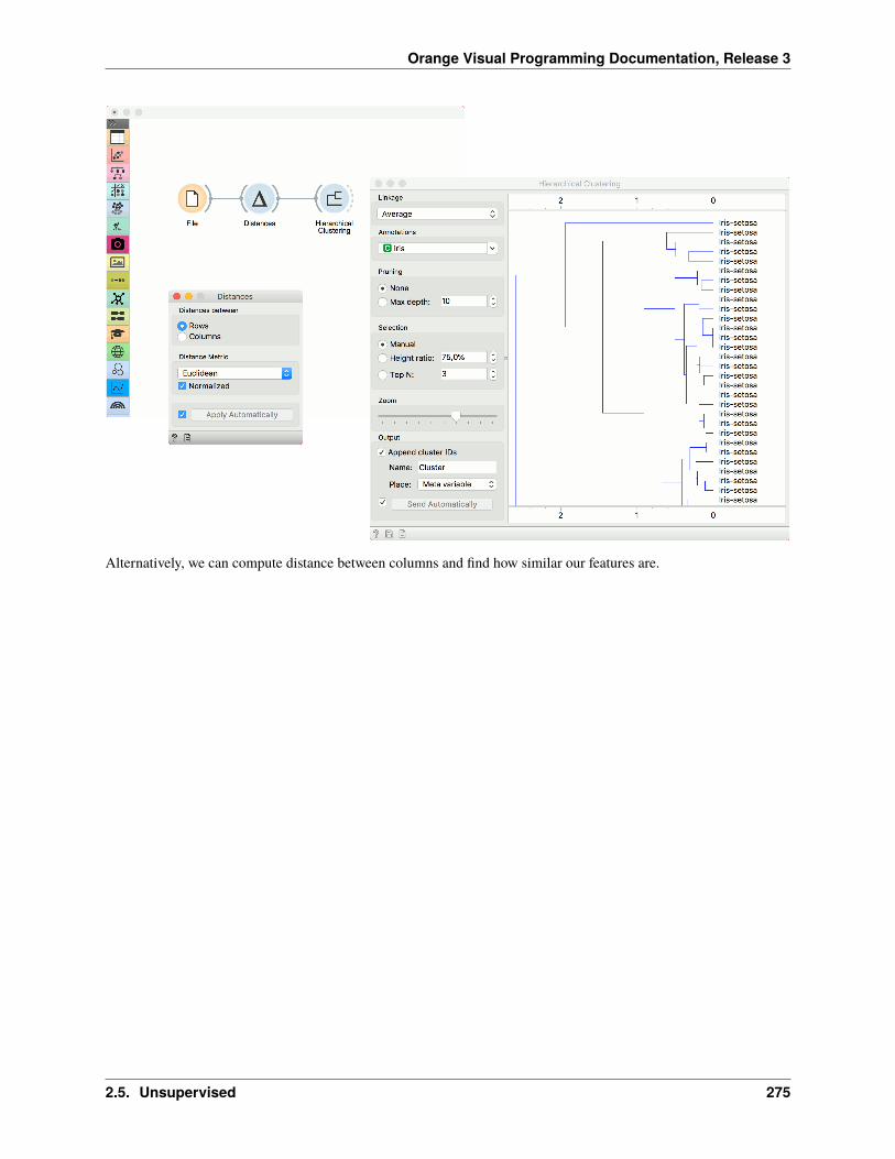
Orange Visual Programming Documentation, Release 3
Alternatively, we can compute distance between columns and find how similar our features are.
2.5. Unsupervised 275

Orange Visual Programming Documentation, Release 3
The second example shows how to visualize the resulting distance matrix. A nice way to observe data similarity is ina Distance Map or in MDS.
276 Chapter 2. Widgets

Orange Visual Programming Documentation, Release 3
2.5.5 Distance Matrix
Visualizes distance measures in a distance matrix.
Inputs
• Distances: distance matrix
Outputs
• Distances: distance matrix
• Table: distance measures in a distance matrix
The Distance Matrix widget creates a distance matrix, which is a two-dimensional array containing the distances,taken pairwise, between the elements of a set. The number of elements in the dataset defines the size of the matrix.Data matrices are essential for hierarchical clustering and they are extremely useful in bioinformatics as well, wherethey are used to represent protein structures in a coordinate-independent manner.
2.5. Unsupervised 277

Orange Visual Programming Documentation, Release 3
1. Elements in the dataset and the distances between them.
2. Label the table. The options are: none, enumeration, according to variables.
3. Produce a report.
4. Click Send to communicate changes to other widgets. Alternatively, tick the box in front of the Send button andchanges will be communicated automatically (Send Automatically).
The only two suitable inputs for Distance Matrix are the Distances widget and the Distance Transformation widget.The output of the widget is a data table containing the distance matrix. The user can decide how to label the table andthe distance matrix (or instances in the distance matrix) can then be visualized or displayed in a separate data table.
Example
The example below displays a very standard use of the Distance Matrix widget. We compute the distances betweenrows in the sample from the Iris dataset and output them in the Distance Matrix. It comes as no surprise that IrisVirginica and Iris Setosa are the furthest apart.
278 Chapter 2. Widgets

Orange Visual Programming Documentation, Release 3
2.5.6 Distance Transformation
Transforms distances in a dataset.
Inputs
• Distances: distance matrix
Outputs
• Distances: transformed distance matrix
The Distances Transformation widget is used for the normalization and inversion of distance matrices. The normal-ization of data is necessary to bring all the variables into proportion with one another.
2.5. Unsupervised 279

Orange Visual Programming Documentation, Release 3
1. Choose the type of Normalization:
• No normalization
• To interval [0, 1]
• To interval [-1, 1]
• Sigmoid function: 1/(1+exp(-X))
2. Choose the type of Inversion:
• No inversion
• -X
• 1 - X
• max(X) - X
• 1/X
3. Produce a report.
4. After changing the settings, you need to click Apply to commit changes to other widgets. Alternatively, tickApply automatically.
280 Chapter 2. Widgets

Orange Visual Programming Documentation, Release 3
Example
In the snapshot below, you can see how transformation affects the distance matrix. We loaded the Iris dataset andcalculated the distances between rows with the help of the Distances widget. In order to demonstrate how DistanceTransformation affects the Distance Matrix, we created the workflow below and compared the transformed distancematrix with the “original” one.
2.5.7 Distance File
Loads an existing distance file.
Outputs
• Distance File: distance matrix
2.5. Unsupervised 281

Orange Visual Programming Documentation, Release 3
1. Choose from a list of previously saved distance files.
2. Browse for saved distance files.
3. Reload the selected distance file.
4. Information about the distance file (number of points, labelled/unlabelled).
5. Browse documentation datasets.
6. Produce a report.
Example
When you want to use a custom-set distance file that you’ve saved before, open the Distance File widget and select thedesired file with the Browse icon. This widget loads the existing distance file. In the snapshot below, we loaded thetransformed Iris distance matrix from the Save Distance Matrix example. We displayed the transformed data matrix inthe Distance Map widget. We also decided to display a distance map of the original Iris dataset for comparison.
282 Chapter 2. Widgets

Orange Visual Programming Documentation, Release 3
2.5.8 Save Distance Matrix
Saves a distance matrix.
If the file is saved to the same directory as the workflow or in the subtree of that directory, the widget remembers therelative path. Otherwise it will store an absolute path, but disable auto save for security reasons.
Inputs
• Distances: distance matrix
1. By clicking Save, you choose from previously saved distance matrices. Alternatively, tick the box on the left sideof the Save button and changes will be communicated automatically.
2. By clicking Save as, you save the distance matrix to your computer, you only need to enter the name of the fileand click Save. The distance matrix will be saved as type .dst.
2.5. Unsupervised 283

Orange Visual Programming Documentation, Release 3
Example
In the snapshot below, we used the Distance Transformation widget to transform the distances in the Iris dataset. Wethen chose to save the transformed version to our computer, so we could use it later on. We decided to output all datainstances. You can choose to output just a minor subset of the data matrix. Pairs are marked automatically. If you wishto know what happened to our changed file, see Distance File.
284 Chapter 2. Widgets

Orange Visual Programming Documentation, Release 3
2.5.9 Hierarchical Clustering
Groups items using a hierarchical clustering algorithm.
Inputs
• Distances: distance matrix
Outputs
• Selected Data: instances selected from the plot
• Data: data with an additional column showing whether an instance is selected
The widget computes hierarchical clustering of arbitrary types of objects from a matrix of distances and shows acorresponding dendrogram. Distances can be computed with the Distances widget
1. The widget supports the following ways of measuring distances between clusters:
• Single linkage computes the distance between the closest elements of the two clusters
• Average linkage computes the average distance between elements of the two clusters
• Weighted linkage uses the WPGMA method
• Complete linkage computes the distance between the clusters’ most distant elements
• Ward linkage computes the increase of the error sum of squares. In other words, the Ward’s minimumvariance criterion minimizes the total within-cluster variance.
2. Labels of nodes in the dendrogram can be chosen in the Annotation box.
3. Huge dendrograms can be pruned in the Pruning box by selecting the maximum depth of the dendrogram. Thisonly affects the display, not the actual clustering.
2.5. Unsupervised 285

Orange Visual Programming Documentation, Release 3
4. The widget offers three different selection methods:
• Manual (Clicking inside the dendrogram will select a cluster. Multiple clusters can be selected by holdingCtrl/Cmd. Each selected cluster is shown in a different color and is treated as a separate cluster in theoutput.)
• Height ratio (Clicking on the bottom or top ruler of the dendrogram places a cutoff line in the graph. Itemsto the right of the line are selected.)
• Top N (Selects the number of top nodes.)
5. Use Zoom and scroll to zoom in or out.
6. The data can be automatically output on any change (Send Automatically) or, if the box isn’t ticked, by pushingSend Selection.
To output the cluster, click on the ruler at the top or the bottom of the visualization. This will create a cut-off for theclusters.
Examples
Cluster selection and projections
We start with the Grades for English and Math data set from the Datasets widget. The data contains two numericvariables, grades for English and for Algebra.
Hierarchical Clustering requires distance matrix on the input. We compute it with Distances, where we use theEuclidean distance metric.
Once the data is passed to the hierarchical clustering, the widget displays a dendrogram, a tree-like clustering structure.Each node represents an instance in the data set, in our case a student. Tree nodes are labelled with student names.
To create the clusters, we click on the ruler at the desired threshold. In this case, we chose three clusters. We pass thoseclusters to MDS, which shows a 2D projection of data instances, colored by cluster label.
286 Chapter 2. Widgets

Orange Visual Programming Documentation, Release 3
Cluster explanation
In the second example, we continue the Grades for English and Math data. Say we wish to explain what characterizesthe cluster with Maya, George, Lea, and Phill.
We select the cluster in the dendrogram and pass the entire data set to Box Plot. Note that the connection here is Data,not Selected Data. To rewire the connection, double-click on it.
In Box Plot, we set Selected variable as the Subgroup. This will split the plot into selected data instances (our cluster)and the remaining data. Next, we use Order by relevance to subgroup option, which sorts the variables according tohow well they distinguish between subgroups. It turns out, that our cluster contains students who are bad at math (theyhave low values of the Algebra variable).
2.5. Unsupervised 287

Orange Visual Programming Documentation, Release 3
2.5.10 k-Means
Groups items using the k-Means clustering algorithm.
Inputs
• Data: input dataset
Outputs
• Data: dataset with cluster label as a meta attribute
• Centroids: table with initial centroid coordinates
The widget applies the k-Means clustering algorithm to the data and outputs a new dataset in which the cluster labelis added as a meta attribute. Silhouette scores of clustering results for various k are also shown in the widget. Whenusing the silhouette score option, the higher the silhouette score, the better the clustering.
288 Chapter 2. Widgets

Orange Visual Programming Documentation, Release 3
1. Select the number of clusters.
• Fixed: algorithm clusters data to a specified number of clusters.
• From X to Y: widget shows clustering scores for the selected cluster range using the Silhouette score(contrasts average distance to elements in the same cluster with the average distance to elements in otherclusters).
2. Preprocessing: If the option is selected, columns are normalized (mean centered to 0 and standard deviationscaled to 1).
3. Initialization method (the way the algorithm begins clustering):
• k-Means++ (first center is selected randomly, subsequent are chosen from the remaining points with prob-ability proportioned to squared distance from the closest center)
• Random initialization (clusters are assigned randomly at first and then updated with further iterations)
Re-runs (how many times the algorithm is run from random initial positions; the result with the lowest within-cluster sum of squares will be used) and Maximum iterations (the maximum number of iterations within eachalgorithm run) can be set manually.
Preprocessing
k-Means uses default preprocessing if necessary. It executes it in the following order:
• continuizes categorical variables (with one feature per value)
• imputes missing values with mean values
To override default preprocessing, preprocess the data beforehand with Preprocess widget.
2.5. Unsupervised 289

Orange Visual Programming Documentation, Release 3
Examples
First, we load the Iris dataset, run k-Means with three clusters, and show it in the Scatter Plot. To interactively explorethe clusters, we can use Select Rows to select the cluster of interest (say, C1) and plot it in the scatter plot usinginteractive data analysis. That means if we pass a subset to the scatter plot, the subset will be exposed in the plot.
Try the same procedure for 2 or 4 clusters or explore different clusters in the plot (C2, C3).
But as we used silhouette score to estimate our cluster quality, we can plot the clusters in the Silhouette Plot to observeinliers and outliers. Place Silhouette Plot in place of Select Rows.
Silhouette Plot shows silhouette scores for individual data instances. High, positive scores represent instances that arehighly representative of the clusters, while negative scores represent instances that are outliers (don’t fit well with thecluster). Select negative scores from the green cluster C3 and plot them in a scatter plot as a subset.
It seems like these are mostly iris versicolors, which are bordering the iris virginica region. Note that the green colorof the cluster C3 doesn’t coincide with the green color of the iris labels - these are two different things.
290 Chapter 2. Widgets

Orange Visual Programming Documentation, Release 3
2.5.11 Louvain Clustering
Groups items using the Louvain clustering algorithm.
Inputs
• Data: input dataset
Outputs
• Data: dataset with cluster label as a meta attribute
• Graph (with the Network addon): the weighted k-nearest neighbor graph
The widget first converts the input data into a k-nearest neighbor graph. To preserve the notions of distance, the Jaccardindex for the number of shared neighbors is used to weight the edges. Finally, a modularity optimization communitydetection algorithm is applied to the graph to retrieve clusters of highly interconnected nodes. The widget outputs anew dataset in which the cluster label is used as a meta attribute.
2.5. Unsupervised 291

Orange Visual Programming Documentation, Release 3
1. Information on the number of clusters found.
2. Preprocessing:
• Normalize data: Center to mean and scale to standard deviation of 1.
• Apply PCA preprocessing: PCA processing is typically applied to the original data to remove noise (seePCA widget).
• PCA Components: number of principal components used.
3. Graph parameters:
• Distance metric: The distance metric is used for finding specified number of nearest neighbors (Euclidean,Manhattan, Cosine).
• k neighbors: The number of nearest neighbors to use to form the KNN graph.
• Resolution is a parameter for the Louvain community detection algorithm that affects the size of the recov-ered clusters. Smaller resolutions recover smaller clusters and therefore a larger number of them, while,conversely, larger values recover clusters containing more data points.
4. When Apply Automatically is ticked, the widget will automatically communicate all changes. Alternatively, clickApply.
Preprocessing
Louvain Clustering uses default preprocessing if necessary. It executes it in the following order:
• continuizes categorical variables (with one feature per value)
• imputes missing values with mean values
To override default preprocessing, preprocess the data beforehand with Preprocess widget.
292 Chapter 2. Widgets

Orange Visual Programming Documentation, Release 3
Example
Louvain Clustering converts the dataset into a graph, where it finds highly interconnected nodes. In the example below,we used the iris data set from the File widget, then passed it to Louvain Clustering, which found 4 clusters. We plottedthe data with Scatter Plot, where we colored the data points according to clusters labels.
We can visualize the graph itself using the Network Explorer from the Network addon.
References
Blondel, Vincent D., et al. “Fast unfolding of communities in large networks.” Journal of statistical mechanics: theoryand experiment 2008.10 (2008): P10008.
Lambiotte, Renaud, J-C. Delvenne, and Mauricio Barahona. “Laplacian dynamics and multiscale modular structure innetworks.” arXiv preprint, arXiv:0812.1770 (2008).
2.5.12 DBSCAN
Groups items using the DBSCAN clustering algorithm.
Inputs
• Data: input dataset
Outputs
• Data: dataset with cluster label as a meta attribute
The widget applies the DBSCAN clustering algorithm to the data and outputs a new dataset with cluster labels as ameta attribute. The widget also shows the sorted graph with distances to k-th nearest neighbors. With k values setto Core point neighbors as suggested in the methods article. This gives the user the idea of an ideal selection forNeighborhood distance setting. As suggested by the authors, this parameter should be set to the first value in the first“valley” in the graph.
2.5. Unsupervised 293

Orange Visual Programming Documentation, Release 3
1. Parameters:
• Core point neighbors: The number of neighbors for a point to be considered as a core point.
• Neighborhood distance: The maximum distance between two samples for one to be considered as in theneighborhood of the other.
2. Distance metric used in grouping the items (Euclidean, Manhattan, or Cosine). If Normalize features is selected,the data will be standardized column-wise (centered to mean and scaled to standard deviation of 1).
3. If Apply Automatically is ticked, the widget will commit changes automatically. Alternatively, click Apply.
The graph shows the distance to the k-th nearest neighbor. k is set by the Core point neighbor option. With movingthe black slider left and right you can select the right Neighborhood distance.
Example
In the following example, we connected the File widget with the Iris dataset to the DBSCAN widget. In the DBSCANwidget, we set Core points neighbors parameter to 5. And select the Neighborhood distance to the value in the first“valley” in the graph. We show clusters in the Scatter Plot widget.
294 Chapter 2. Widgets

Orange Visual Programming Documentation, Release 3
2.5.13 MDS
Multidimensional scaling (MDS) projects items onto a plane fitted to given distances between points.
Inputs
• Data: input dataset
• Distances: distance matrix
• Data Subset: subset of instances
Outputs
• Selected Data: instances selected from the plot
• Data: dataset with MDS coordinates
Multidimensional scaling is a technique which finds a low-dimensional (in our case a two-dimensional) projection ofpoints, where it tries to fit distances between points as well as possible. The perfect fit is typically impossible to obtainsince the data is high-dimensional or the distances are not Euclidean.
In the input, the widget needs either a dataset or a matrix of distances. When visualizing distances between rows, youcan also adjust the color of the points, change their shape, mark them, and output them upon selection.
The algorithm iteratively moves the points around in a kind of a simulation of a physical model: if two points are tooclose to each other (or too far away), there is a force pushing them apart (or together). The change of the point’s positionat each time interval corresponds to the sum of forces acting on it.
2.5. Unsupervised 295

Orange Visual Programming Documentation, Release 3
1. The widget redraws the projection during optimization. Optimization is run automatically in the beginning andlater by pushing Start.
• Max iterations: The optimization stops either when the projection changes only minimally at the lastiteration or when a maximum number of iterations has been reached.
• Initialization: PCA (Torgerson) positions the initial points along principal coordinate axes. Random setsthe initial points to a random position and then readjusts them.
• Refresh: Set how often you want to refresh the visualization. It can be at Every iteration, Every 5/10/25/50steps or never (None). Setting a lower refresh interval makes the animation more visually appealing, butcan be slow if the number of points is high.
2. Defines how the points are visualized. These options are available only when visualizing distances between rows(selected in the Distances widget).
• Color: Color of points by attribute (gray for continuous, colored for discrete).
• Shape: Shape of points by attribute (only for discrete).
• Size: Set the size of points (Same size or select an attribute) or let the size depend on the value of thecontinuous attribute the point represents (Stress).
• Label: Discrete attributes can serve as a label.
• Symbol size: Adjust the size of the dots.
296 Chapter 2. Widgets

Orange Visual Programming Documentation, Release 3
• Symbol opacity: Adjust the transparency level of the dots.
• Show similar pairs: Adjust the strength of network lines.
• Jitter: Set jittering to prevent the dots from overlapping.
3. Adjust the graph with Zoom/Select. The arrow enables you to select data instances. The magnifying glass enableszooming, which can be also done by scrolling in and out. The hand allows you to move the graph around. Therectangle readjusts the graph proportionally.
4. Select the desired output:
• Original features only (input dataset)
• Coordinates only (MDS coordinates)
• Coordinates as features (input dataset + MDS coordinates as regular attributes)
• Coordinates as meta attributes (input dataset + MDS coordinates as meta attributes)
5. Sending the instances can be automatic if Send selected automatically is ticked. Alternatively, click Send selected.
6. Save Image allows you to save the created image either as .svg or .png file to your device.
7. Produce a report.
The MDS graph performs many of the functions of the Visualizations widget. It is in many respects similar to theScatter Plot widget, so we recommend reading that widget’s description as well.
Preprocessing
When given Distances on the input, preprocessing is not applied. When given Data, MDS uses default preprocessingif necessary. Preprocessing is executed in the following order:
• continuizes categorical variables (with one feature per value)
• imputes missing values with mean values
To override default preprocessing, preprocess the data beforehand with Preprocess widget.
2.5.14 Example
The above graphs were drawn using the following simple schema. We used the iris.tab dataset. Using the Distanceswidget we input the distance matrix into the MDS widget, where we see the Iris data displayed in a 2-dimensionalplane. We can see the appended coordinates in the Data Table widget.
2.5. Unsupervised 297

Orange Visual Programming Documentation, Release 3
2.5.15 References
Wickelmaier, F. (2003). An Introduction to MDS. Sound Quality Research Unit, Aalborg University. Available here.
2.5.16 t-SNE
Two-dimensional data projection with t-SNE.
Inputs
• Data: input dataset
• Data Subset: subset of instances
Outputs
• Selected Data: instances selected from the plot
• Data: data with an additional column showing whether a point is selected
The t-SNE widget plots the data with a t-distributed stochastic neighbor embedding method. t-SNE is a dimensionalityreduction technique, similar to MDS, where points are mapped to 2-D space by their probability distribution.
298 Chapter 2. Widgets

Orange Visual Programming Documentation, Release 3
1. Parameters for plot optimization:
• measure of perplexity. Roughly speaking, it can be interpreted as the number of nearest neighbors todistances will be preserved from each point. Using smaller values can reveal small, local clusters, whileusing large values tends to reveal the broader, global relationships between data points.
• Preserve global structure: this option will combine two different perplexity values (50 and 500) to trypreserve both the local and global structure.
• Exaggeration: this parameter increases the attractive forces between points, and can directly be used tocontrol the compactness of clusters. Increasing exaggeration may also better highlight the global structureof the data. t-SNE with exaggeration set to 4 is roughly equal to UMAP.
• PCA components: in Orange, we always run t-SNE on the principal components of the input data. Thisparameter controls the number of principal components to use when calculating distances between datapoints.
• Normalize data: We can apply standardization before running PCA. Standardization normalizes each col-umn by subtracting the column mean and dividing by the standard deviation.
• Press Start to (re-)run the optimization.
2.5. Unsupervised 299

Orange Visual Programming Documentation, Release 3
2. Set the color of the displayed points. Set shape, size and label to differentiate between points. If Label onlyselection and subset is ticked, only selected and/or highlighted points will be labelled.
3. Set symbol size and opacity for all data points. Set jittering to randomly disperse data points.
4. Show color regions colors the graph by class, while Show legend displays a legend on the right. Click and dragthe legend to move it.
5. Select, zoom, pan and zoom to fit are the options for exploring the graph. The manual selection of data instancesworks as an angular/square selection tool. Double click to move the projection. Scroll in or out for zoom.
6. If Send selected automatically is ticked, changes are communicated automatically. Alternatively, press SendSelected.
Preprocessing
t-SNE uses default preprocessing if necessary. It executes it in the following order:
• continuizes categorical variables (with one feature per value)
• imputes missing values with mean values
To override default preprocessing, preprocess the data beforehand with Preprocess widget.
Examples
The first example is a simple t-SNE plot of brown-selected data set. Load brown-selected with the File widget. Thenconnect t-SNE to it. The widget will show a 2D map of yeast samples, where samples with similar gene expressionprofiles will be close together. Select the region, where the gene function is mixed and inspect it in a Data Table.
300 Chapter 2. Widgets

Orange Visual Programming Documentation, Release 3
For the second example, use Single Cell Datasets widget from the Single Cell add-on to load Bone marrow mononuclearcells with AML (sample) data. Then pass it through k-Means and select 2 clusters from Silhouette Scores. Ok, it lookslike there might be two distinct clusters here.
But can we find subpopulations in these cells? Select a few marker genes with the Marker Genes widget, for examplenatural killer cells (NK cells). Pass the marker genes and k-Means results to Score Cells widget. Finally, add t-SNE tovisualize the results.
In t-SNE, use Cluster attribute to color the points and Score attribute to set their size. We see that killer cells are nicelyclustered together and that t-SNE indeed found subpopulations.
2.5. Unsupervised 301

Orange Visual Programming Documentation, Release 3
2.5.17 Manifold Learning
Nonlinear dimensionality reduction.
Inputs
• Data: input dataset
Outputs
• Transformed Data: dataset with reduced coordinates
Manifold Learning is a technique which finds a non-linear manifold within the higher-dimensional space. The widgetthen outputs new coordinates which correspond to a two-dimensional space. Such data can be later visualized withScatter Plot or other visualization widgets.
302 Chapter 2. Widgets

Orange Visual Programming Documentation, Release 3
1. Method for manifold learning:
• t-SNE
• MDS, see also MDS widget
• Isomap
• Locally Linear Embedding
• Spectral Embedding
2. Set parameters for the method:
• t-SNE (distance measures):
– Euclidean distance
– Manhattan
– Chebyshev
– Jaccard
– Mahalanobis
– Cosine
• MDS (iterations and initialization):
– max iterations: maximum number of optimization interactions
– initialization: method for initialization of the algorithm (PCA or random)
• Isomap:
– number of neighbors
• Locally Linear Embedding:
2.5. Unsupervised 303

Orange Visual Programming Documentation, Release 3
– method:
∗ standard
∗ modified
∗ hessian eigenmap
∗ local
– number of neighbors
– max iterations
• Spectral Embedding:
– affinity:
∗ nearest neighbors
∗ RFB kernel
3. Output: the number of reduced features (components).
4. If Apply automatically is ticked, changes will be propagated automatically. Alternatively, click Apply.
5. Produce a report.
Manifold Learning widget produces different embeddings for high-dimensional data.
From left to right, top to bottom: t-SNE, MDS, Isomap, Locally Linear Embedding and Spectral Embedding.
304 Chapter 2. Widgets

Orange Visual Programming Documentation, Release 3
Preprocessing
All projections use default preprocessing if necessary. It is executed in the following order:
• continuization of categorical variables (with one feature per value)
• imputation of missing values with mean values
To override default preprocessing, preprocess the data beforehand with Preprocess widget.
Example
Manifold Learning widget transforms high-dimensional data into a lower dimensional approximation. This makes itgreat for visualizing datasets with many features. We used voting.tab to map 16-dimensional data onto a 2D graph.Then we used Scatter Plot to plot the embeddings.
2.5.18 Self-Organizing Map
Computation of a self-organizing map.
Inputs
• Data: input dataset
Outputs
• Selected Data: instances selected from the plot
• Data: data with an additional column showing whether a point is selected
2.5. Unsupervised 305

Orange Visual Programming Documentation, Release 3
A self-organizing map (SOM) is a type of artificial neural network (ANN) that is trained using unsupervised learningto produce a two-dimensional, discretized representation of the data. It is a method to do dimensionality reduction.Self-organizing maps use a neighborhood function to preserve the topological properties of the input space.
The points in the grid represent data instances. By default, the size of the point corresponds to the number of instancesrepresented by the point. The points are colored by majority class (if available), while the intensity of interior colorshows the proportion of majority class. To see the class distribution, select Show pie charts option.
Just like other visualization widgets, Self-Organizing Maps also supports interactive selection of groups. Use Shiftkey to select a new group and Ctr+Shift to add to the existing group.
1. SOM properties:
• Set the grid type. Options are hexagonal or square grid.
• If Set dimensions automatically is checked, the size of the plot will be set automatically. Alternatively, setthe size manually.
• Set the initialization type for the SOM projection. Options are PCA initialization, random initialization andreplicable random (random_seed = 0).
• Once the parameters are set, press Start to re-run the optimization.
2. Set the color of the instances in the plot. The widget colors by class by default (if available).
• Show pie charts turns points into pie-charts that show the distributions of the values used for coloring.
• Size by number of instances scales the points according to the number of instances represented by the point.
306 Chapter 2. Widgets

Orange Visual Programming Documentation, Release 3
Example
Self-organizing maps are low-dimensional projections of the input data. We will use the brown-selected data anddisplay the data instance in a 2-D projection. Seems like the three gene types are well-separated. We can select a subsetfrom the grid and display it in a Data Table.
2.5. Unsupervised 307