Logical Document Structure Handbook: Word 2010
200
Logical Document Structure Handbook: Word 2010 Karen McCall, M.Ed.
-
Upload
khangminh22 -
Category
Documents
-
view
3 -
download
0
Transcript of Logical Document Structure Handbook: Word 2010
Logical Document Structure Handbook: Word 2010
Karen McCall, M.Ed.

2
Written and published by Karen McCall, copyright 2011. All rights reserved.
Cover photo copyright Karen McCall
Published in Canada
First published April 2011.
ISBN 978-0-9782675-4-4
Logical Document Structure Handbook: Word 2010, ISBN 978-0-9782675-4-4
No part of this publication may be reproduced or transmitted in any form or any
means electronic or mechanical, for any purpose, without the express written
permission of Karen McCall.
® Adobe, Adobe Acrobat, Adobe Capture, form Designer, LiveCycle, LiveCycle Designer, and Adobe
Reader are registered trademarks of Adobe Systems.
® Duxbury is a registered trademark of Duxbury Systems.
® JAWS is a registered trademark of Freedom Scientific Blind/Low Vision Group, St. Petersburg,
Florida.
® OmniPage Pro and TextBridge are either registered trademarks or trademarks of Nuance
Software.
® Microsoft, Windows, Excel, PowerPoint, Outlook and Word are either registered trademarks or
trademarks of Microsoft Corporation in the United States and/or other countries.
© Window-Eyes is a registered trademark of GW Micro.
All other trademarks are the property of their respective owners.
Other Books by Karen McCall
Accessible and Useable PDF Documents : Techniques for Document Authors, Second Edition,
ISBN 978-0-9782675-2-0
Logical Document Structure Handbook - Word 2003, ISBN 0-9738370-3-9
Logical Document Structure Handbook – Word 2007, ISBN 0-9738370-9-8
Logical Document Structure Handbook: Word 2007 Legal Edition,
ISBN 978-0-9782675-3-7
Logical Document Structure Handbook: Word 2010, ISBN 978-0-9782675-4-4
Logical Document Structure Handbook: Word 2010 Legal Edition,
ISBN 978-0-9782675-5-1
Logical Document Structure Handbook: PowerPoint 2010, ISBN 978-0-9782675-7-5
Microsoft Word 2007 from the Keyboard, ISBN 978-0-9781272-5-1

3
Author's Note This book is based on the work and experience of Karen McCall. This book was written as a best
practices guide for working with accessible Microsoft Word based documents. These are the
techniques that have worked or not worked for me and I decided to share them with others who
are working in the area of accessible document design.
Dedication This book is dedicated to Joyce Malombe, Aimee and Greg Todd …and to my "live in" friends
Barnaby Edmund and Olivia Zane…who all keep me focused and somewhat sane.
Photo ©Karen McCall

4
Contents
Author's Note ............................................................................................................................................ 3
Dedication ................................................................................................................................................. 3
Introduction .................................................................................................................................................. 9
What is a Logical Document Structure? .................................................................................................. 10
Why do I Need to Have a Logical Document Structure? ..................................................................... 12
Before We Begin… .................................................................................................................................. 13
The AppKey ......................................................................................................................................... 13
Focus and Selection ............................................................................................................................ 14
Working with Versions ................................................................................................................................ 15
Save Settings in Word, Excel or PowerPoint Options ......................................................................... 15
Auto Recovery ..................................................................................................................................... 16
Manage Versions................................................................................................................................. 17
Manage Versions in File/Backstage Area ........................................................................................ 17
Recovered Files in Recent Documents ............................................................................................ 18
Open Button in the Open Dialog ..................................................................................................... 18
Auto Recover “Shelf Life” .................................................................................................................... 18
Background on the Open “Split Button” ......................................................................................... 18
What is “Protected view?” .............................................................................................................. 19
What is “open with transform?” ..................................................................................................... 20
Open and Repair ............................................................................................................................. 20
Working with Templates ............................................................................................................................. 21
Random Placeholder Text ....................................................................................................................... 21
Creating a Template ................................................................................................................................ 22
Template Caveats ................................................................................................................................ 25
Working with Themes ................................................................................................................................. 26

5
Standard Fonts and Accessibility ............................................................................................................ 27
Which Font is Most Accessible? .......................................................................................................... 27
Themes and Hard Coded Formatting .................................................................................................. 28
Starting Point with Themes ..................................................................................................................... 30
Global Theme Attributes ..................................................................................................................... 30
Theme Fonts ....................................................................................................................................... 33
Theme Colours .................................................................................................................................... 35
Theme Effects ..................................................................................................................................... 40
Create the New Theme ....................................................................................................................... 41
The Difference Between a Theme and a Template ................................................................................ 43
Themes and Style Sets ............................................................................................................................ 43
Creating a Custom Style Set .................................................................................................................... 44
Deleting a Custom Style Set ................................................................................................................ 47
Using your Custom Style Set on Other Computers ............................................................................. 49
Working with Styles .................................................................................................................................... 50
Misuse of Heading Styles ........................................................................................................................ 51
Heading Styles ......................................................................................................................................... 52
Applying a Heading Style ..................................................................................................................... 53
Modify a Heading Style ....................................................................................................................... 58
Creating Custom Styles ....................................................................................................................... 60
Paragraph and Character Styles .......................................................................................................... 62
Additional Tools to Review Structure ..................................................................................................... 66
Navigation Pane: List of Headings ....................................................................................................... 66
Apply Styles Pane ................................................................................................................................ 68
Apply Styles Pane on the Quick Access Toolbar ............................................................................. 68
Reveal Formatting Pane ...................................................................................................................... 70
Styles Organizer .................................................................................................................................. 71
Style Inspector .................................................................................................................................... 75
For Geeks Only: Viewing the Document WordML .................................................................................. 77
Creating a Paragraph Style ...................................................................................................................... 78

6
Paragraph Frames ................................................................................................................................... 82
Headings, Bookmarks and Tags in PDF Documents ................................................................................ 83
Content Tools .............................................................................................................................................. 86
Readability Statistics ............................................................................................................................... 86
Building Blocks ........................................................................................................................................ 87
Create a Building Block ....................................................................................................................... 89
New Building Block Category .......................................................................................................... 89
Index and Table of Contents ....................................................................................................................... 90
Generating a Table of Contents .............................................................................................................. 90
Modifying What Appears in a Table of Contents .................................................................................... 93
Updating a Table of Contents ............................................................................................................. 96
Table of Figures ....................................................................................................................................... 97
Modifying Formatting for Referenced Tables ..................................................................................... 99
Creating an Index .................................................................................................................................. 103
Updating an Index ............................................................................................................................. 107
Cross-References and Accessibility ....................................................................................................... 107
Tables of Reference in a Tagged PDF Document .................................................................................. 108
Tables and Text Boxes ............................................................................................................................... 109
HTML Table Structure ........................................................................................................................... 109
Tagged PDF Table Structure .................................................................................................................. 111
Table Structure in Word ........................................................................................................................ 113
Tables for Design or Presentation ..................................................................................................... 115
Text Boxes- Just Say No! ....................................................................................................................... 121
Creating Tables in Word ........................................................................................................................ 124
Creating a Table ................................................................................................................................ 125
Header Rows Repeat ......................................................................................................................... 126
Rows Braking Across Pages ............................................................................................................... 127
Empty Table Cells .............................................................................................................................. 128
Cell Margins ...................................................................................................................................... 129
Captions for Tables ............................................................................................................................... 130

7
Table Frames or Drawn Tables.............................................................................................................. 131
Parallel Columns ....................................................................................................................................... 135
Text Alignment and Justification ....................................................................................................... 137
Creating Columns .................................................................................................................................. 137
Graphics, Images and Charts ..................................................................................................................... 139
Context is Key .................................................................................................................................... 141
Adding Alt Text ...................................................................................................................................... 141
Captions for Images .............................................................................................................................. 143
Captions for Equations ...................................................................................................................... 144
Grouped Objects and Accessibility ....................................................................................................... 146
Grouped Objects ............................................................................................................................... 146
SmartArt ........................................................................................................................................ 146
Creating Your Own Images ....................................................................................................................... 148
Creating Pictures with Snipping Tool and Screen Clippings .............................................................. 148
Windows Vista and Windows 7 Snipping Tool .............................................................................. 148
OneNote Screen Clippings ................................................................................................................ 151
Using Paint to save Images ........................................................................................................... 153
Text as Images ........................................................................................................................................... 165
Drop Caps .............................................................................................................................................. 165
WordArt ................................................................................................................................................ 167
Links in Documents ................................................................................................................................... 169
Contextual Links .................................................................................................................................... 171
Linking to Document Formats ............................................................................................................... 172
Bullets and List Items ................................................................................................................................ 173
List Paragraph Style ............................................................................................................................... 174
Creating a Well Structured List ............................................................................................................. 177
Images as Bullets ................................................................................................................................... 179
Accessibility Checker ................................................................................................................................. 181
Save as PDF ............................................................................................................................................... 184
Using Save as PDF ................................................................................................................................. 184
8
Save as PDF Options .............................................................................................................................. 187
Save as DAISY ............................................................................................................................................ 189
Locating the Acronym Tool ........................................................................................................... 190
Creating an Acronym Entry ........................................................................................................... 190
Viewing Acronyms in the Document............................................................................................. 191
Legacy Documents .................................................................................................................................... 192
Removing and Organizing Styles ........................................................................................................... 192
Legacy Macros ....................................................................................................................................... 194
Manage Styles Tool ............................................................................................................................... 195
References and Resources ........................................................................................................................ 198
HTML ..................................................................................................................................................... 198
Resources for Programmers, But Worthy of Note ................................................................................ 198
Index.......................................................................................................................................................... 199

9
Introduction
This book is put forth as an answer to the question of what is a logical document structure and why
do you need to provide one in the documents you create? Once these questions are answered, the
next step covered in this book is to attempt to provide some best practices and guidelines for
ensuring that documents have a logical document structure.
For those of you who have read my previous book on logical document structure for Word 2003,
there is a new call-out or special comment in this book specifically for document geeks and
geekettes. These call-outs provide a greater level of detail about a topic and I do try to keep them
short! My reason for doing this is to try and bring the concept and usability of XML based formats
together for you so you can see how everything is related and how deeply accessibility in the
content can be implemented.
Although focused on Microsoft Word, the principles and tools for providing structure to documents
exist in almost every application we use. The tips and support information on how adaptive
technology accesses information can be used to understand why we need to create better designed
and structured documents. This is not meant to be a Style Guide, but something more basic. Once
we understand that documents require a structure and that structure needs to have some sense of
logic and flow to it, we can create and apply the necessary Styles identified by organizations.
The author takes the position that if adaptive technology is used by the end-user, the tools in that
adaptive technology should be used to optimize accessibility for well-designed and structured
documents. Larger font sizes should be used for printing documents that have to be read away from
the computer. While a document is in digital format a combination of the adaptive technology and
the ability of the end-user to optimize the accessibility of a well-designed and structured document
should be used. This does not mean that document authors are responsible for creating their
documents in what I call “differently accessible” forms. If a document is designed and created to be
accessible, the end-user bears some responsibility for knowing how to use their adaptive
technology and Microsoft Word to swap out fonts and font sizes.
10
What is a Logical Document Structure? If we consider print documents, we can generally identify a logical document structure visually. We
can visually identify headings, sub-headings, paragraphs, tables, lists of information, page numbers
and headers or footers. These are structural elements of a document. They help us read documents
and identify what we are reading. The structure has some logic to it in that each page doesn’t apply
a different structure to the content. For example, the headings on page one are the same as the
headings on page 40 or the page numbers are located in the same place throughout the document.
Over the years, structural elements for print documents have been catalogued, identified and used
to establish standards of presentation.
We make decisions on what we read based on its structure. For example header and footer
information is not generally read as part of the main content on a page. Sometimes we might read a
sidebar and sometimes we continue to focus on the main content. Our decisions are based on the
visual structure of the page. Adding the underlying structure, or labelling the structure, “converts”
that visual structure into actual structure that can be identified by adaptive technology and
conversions tools.
For example, if you tell someone that a book is in hardcover, you know what the contents of the
book should look like. Your expectations for the structure of a paperback may be different. If you
are told that something is a magazine or newspaper article, you have expectations as to the
structure of what you will find when you open the cover. You might have different expectations for
accessing information in a manual or textbook.
What types of structure do you see in your mind’s eye when you think of a digital or web-based
document? We seem to have lost this in our transition from print to electronic documents. It is very
easy to mimic a structure by throwing formatting at content but formatting is not structure. Then
when we attempt to repurpose content to other formats such as PDF, DAISY or Braille, we find that
we have no structure, logical or otherwise, to our documents.
Consider the example of a page from this book without formatting. How would you find the content
you needed when you needed it? Without structure, this is how someone using a screen reader
would experience a document.

11
Figure 1 First two pages of chapter on Working with Templates without structure.
The preceding image is of the first two pages of the chapter on “Working with Templates” from this
book. Are you able to find the information you need from the text? Are you able to navigate to the
paragraph you want or the topic you need?
In this next view of the same page, you will notice headings which have been formatted by bolding,
adding borders and changing the font size. HOWEVER they have been created by individually
formatting each of the headings therefore they are not identifiable structure needed for adaptive
technology.

12
Figure 2 Page with visual representation of headings.
Why do I Need to Have a Logical Document Structure? The strength of electronic content is our ability to repurpose content without a lot of repair and
reworking of the content. If we produce a document in our word processor, the underlying
structure of the document should exist so that we don’t have to re-write the entire document for
another document format.
In countries where there is legislation around the accessibility and usability of electronic
documents, we are finding that we are unable to meet legislative criteria for accessibility if there is
no underlying structure to the original document template or document. The ability of people who
are reading our documents, whether they have a disability and are using adaptive technology or
not, is seriously compromised without consistent and logical structure and formatting.
In short, we are finding out that we’ve been creating really bad documents since we moved to
electronic document production.

13
As technology advances and we can separate content from formatting and structure, we can use the
content we create in different formats. We can display it on different devices and allow people to
view and interact with content as they choose to. It is easy to choose ‘File > Save As. HTML’ for
example. Even when we do this, we need to ensure that our documents have a logical structure so
that the tool creating the HTML identifies structural elements such as headings, lists, tables, and
paragraphs.
Somehow, along the way in the transition from printed to electronic information we’ve made the
decision that the thoughtful creation and design of documents is not important. As long as it looks
“pretty” we have been satisfied. We are now beginning to see the folly of our short sightedness. We
need to think about information, how it is going to be used, who will be accessing it, what kind of
technology it will be displayed on, and how it should be structured before we start writing.
We will look at document structures that are used on a daily basis. Each piece of a document has a
corresponding structural element. You can find out how to create that structure in the Help
documentation of your word processor or application.
Although this book uses Microsoft Word to create a logical document structure, similar tools are
available in PowerPoint, Excel, Adobe InDesign and Corel WordPerfect.
Before We Begin… If you are not familiar with keyboard commands, focus and selection, the following is an overview
of the tools people using adaptive technology are familiar with. The AppKey is the equivalent of the
right mouse click. Focus happens when am item is surrounded by a dotted line and when it is
highlighted it is selected.
This book uses keyboard commands rather than mouse clicks to identify steps as an attempt to
provide people using adaptive technology equal access to the techniques described in this book.
The AppKey The keyboard equivalent of a Right Mouse Click is the Application Key commonly referred to as the
“AppKey.” The AppKey is located on the lower right side of the main keys on your keyboard. It is
just to the left of the Ctrl or Control key, and to the left of the left Windows Key [the key with the
Windows logo on it]. The image on it looks like a little application Window.
Figure 3 AppKey from Windows On-screen keyboard.
14
If your keyboard doesn’t have an AppKey, you can also use Shift + F10. Some applications don’t
support the shift + F10 keyboard command but do support the use of the AppKey. For this reason,
this document refers to using the AppKey.
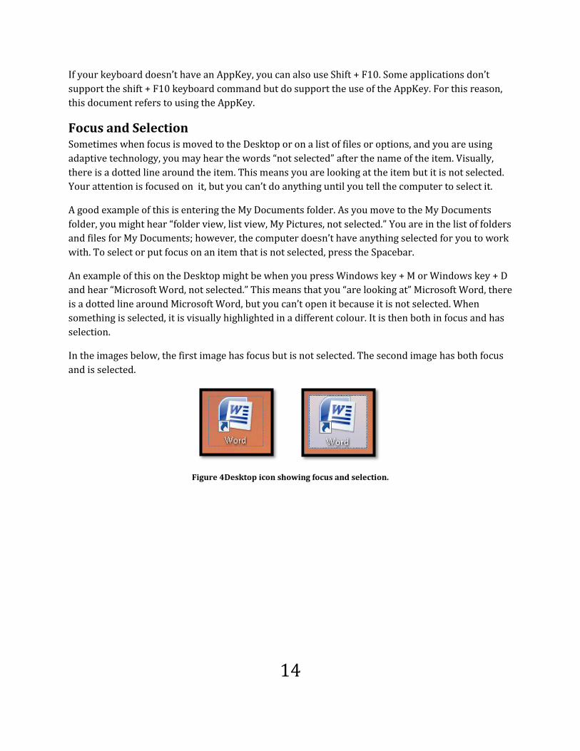
Focus and Selection Sometimes when focus is moved to the Desktop or on a list of files or options, and you are using
adaptive technology, you may hear the words “not selected” after the name of the item. Visually,
there is a dotted line around the item. This means you are looking at the item but it is not selected.
Your attention is focused on it, but you can’t do anything until you tell the computer to select it.
A good example of this is entering the My Documents folder. As you move to the My Documents
folder, you might hear “folder view, list view, My Pictures, not selected.” You are in the list of folders
and files for My Documents; however, the computer doesn’t have anything selected for you to work
with. To select or put focus on an item that is not selected, press the Spacebar.
An example of this on the Desktop might be when you press Windows key + M or Windows key + D
and hear “Microsoft Word, not selected.” This means that you “are looking at” Microsoft Word, there
is a dotted line around Microsoft Word, but you can’t open it because it is not selected. When
something is selected, it is visually highlighted in a different colour. It is then both in focus and has
selection.
In the images below, the first image has focus but is not selected. The second image has both focus
and is selected.
Figure 4Desktop icon showing focus and selection.

15
Working with Versions
With Office 2010 it is easier to recover documents if you have inadvertently closed them without
saving or if the document has been damaged.
I’ve included this section in the book because we often forget to save what we’ve done and many
people don’t know that this tool exists in Office 2010. For those of us using the keyboard and/or a
screen reader, these processes are quite accessible.
Save Settings in Word, Excel or PowerPoint Options The first place to start is by choosing the Save settings in Word, PowerPoint or Excel. This needs to
be done for each application so you can coordinate and customize the settings for each application.
For all three applications press Alt + F, T to open the Options dialog from the Backstage area under
the File menu.
Press S to move to the Save category and then Tab to move into the settings for saving documents.
Figure 5 The settings area for saving documents in Word.

16
The following items are ones you will want to verify and select.
I suggest tabbing to the first setting since it is checked by default and using its keyboard command
will uncheck it. It is the second setting in the Save category. The keyboard command for this check
box is Alt + A.
Press Tab until you come to the “Save Auto Recover information every”… setting. This is a two part
setting, the first is the check box to say yes, save an auto recovery version of my document and the
second part identifies how many minutes you want between the auto saves. Once you verify that
the check box to save a recovery version is checked, press Tab or Alt + M to move to the “Minutes”
edit box. The default setting is to auto save your documents every 10 minutes.
I typically set auto save to every 3 or 4 minutes. While this might cause pauses in my work flow
while the auto save is going on in the background, it is better than having written something
brilliant that I can’t remember now and may be lost forever.
As a rule I typically save everything I’ve done that I like. If I’ve added a paragraph I save, if I’ve
formatted text or created a style I save. Ctrl + S is your BFF!
The next item in the Save category settings doesn’t have a keyboard command to move to it. Once
you are in the Minutes edit area press Tab to move to the check box to “Keep the last version if I
close without saving.” This should be checked by default so verify that this is true.
Word Option only: The other setting you might consider in Word is the “always
create backup” check box which is found under the Advanced settings in the Options
dialog. The keyboard command to move to this while you are in the Advanced
category settings is Alt +B. It is in the Save section of the Advanced category and is
quite a way down the list of options. There is more than one setting that uses Alt + B
but using this keyboard command to move from setting to setting will save you time.
Once you land on the “always create backup copy” check box, press the Spacebar to
check it. You can then Tab to and activate the OK button to confirm changes to the
Word Options. A backup copy of your work is saved in the same folder as the
original document. All backup copies of files start with “backup of…”
We’re now ready to talk about how to get that darn document back!
Auto Recovery The typical Recovery Pane opens to the left of your document if you’ve experienced a crash of
Word, PowerPoint or Excel. “Auto recovered” versions of the documents you were working on at
the time of the crash are listed and can be opened using the keyboard.

17
To access the Recovery Pane press Shift + F6 while a blank document is open in Word. Use the Up
and Down Arrows to review the recovered documents. Press Enter on any document you want to
open and save. If you don’t need these recovered versions of your documents press Tab until you
land on the Close button in the Recovery Pane and press Enter. The Recovery Pane closes and you
are returned to your document.
Manage Versions There are several ways to work with versions. All of them new to Office 2010.
Manage Versions in File/Backstage Area
In the backstage area under the Info options is a button to “Manage Versions. You will find it by
pressing Alt + F, letter I, R for File/Backstage, Info, Manage Versions. This opens a sub-button and if
you press Enter you are taken to an unsaved files folder on your hard drive. Any unsaved files are
listed in this folder. You can then select the one you want and press Enter or Alt + letter O to open it.
Figure 6 Manage Versions in the File/Backstage area of Office applications.
If you are using a screen reader you will want to press Tab to move to the Manage Versions button,
and then press Tab until you hear something like “Today at 4:15…” which is the latest recovery
version of a document. This won’t appear until you open the original document. This is a good place
to explore how the Manage Versions is set up however there are keyboard commands to help you
work more effectively with this tool.
If you know or suspect that there is a recovered version of a document you can press Alt + F, letter I,
V to move to the Backstage area, Info options, Versions which then becomes a list of the versions of
the document available to you. You can press Y, number 1, Y, 2 and so forth to open the
corresponding document. Pressing Y and the number 1 for example will open the first document in
the list.
Figure 7 Several versions of an auto saved document under Manage Versions.
You can also press the Up or Down Arrows to move through the versions available and then press
Enter on the one you want to open.

18
Once you save a document with changes the recovered version disappears from this list until the
next auto recover save.
Recovered Files in Recent Documents
If you press Alt + F, R, R for Backstage, Recent Documents, Recovered Files, the Open dialog appears
and you are in the Unsaved Files folder. Choose the file you want to open and either press Enter or
Alt + letter O to open it.
Sometimes you’ll find the documents in the Manage Versions of the Backstage area when you won’t
find them in this unsaved files folder. As a suggestion, always start with the Manage Versions in the
File/Backstage area to recover an unsaved version of a document.
Open Button in the Open Dialog
There is also the option to show previous versions from the Open dialog itself.
Press Ctrl + letter O, Tab to the Open button and press the Down Arrow. Choose Show previous
versions by pressing the letter P until you find this option and then pressing Enter.
You are taken to the Unsaved Files folder on your hard drive where you can choose any of the listed
files and open them. As with the Recovered Files from the Recent Files list, sometimes you’ll find
the recovered files in the Backstage, manage Versions list rather than in this unsaved files folder.
Auto Recover “Shelf Life” Files are saved for 4 days on your computer. After that they are deleted.
One huge caveat to using the ability to manage versions and recover documents is that files are
saved on the computer so if you are working on a computer that is not yours; make sure that there
are no recovered versions of your documents on that computer. If you are working in an
educational environment where the computer is “cleaned” each time it is restarted make sure you
restart the computer before leaving the work station.
Also note that if you edit a document and save the document any “unsaved files” will be deleted.
They are now “saved.”
Background on the Open “Split Button”
In Word 2010 when you open a document the Open button is a “split button.” This means that there
are options for how you open a document.
This tool is extremely helpful with Mac versus Windows versions of documents or documents
created in earlier Office versions or other applications such as Corel WordPerfect.
Press Ctrl + letter O to access the Open dialog. This is a standard keyboard command.
If you select a document and press Enter or press Alt + letter O the document will open. This
method does not give you access to the split button and open options.

19
Figure 8 Open button options.
To access the Open options, with a document selected in the list of files or typed into the filename
edit area of the Open dialog, press the Tab key to move to the Open button. Then press the Down
Arrow to open the Open options.
The options for opening a document are:
Open the document, press Letter O
Open a read only version of the document, press R
Open as copy, press C.
Open in browser, press B.
Open with Transform, press T.
Open in Protected view, press P.
Open and repair the document, press E.
Show previous versions of the document, press P. This is new to Word 2010.
Two of the items use the letter P to quickly choose that item. Pressing P once will take you to
Protected view and pressing P again will take you to show previous versions. Press Enter on the
one you want to confirm that option.
What is “Protected view?”
I generally refer to this as “preview mode” or “preview view rather than Protected View because
documents that use the Office ability to protect them are not accessible to adaptive technology. This
new preview or protected mode is.
Protected view is typically applied to attachments opened through or saved from Outlook or
downloaded from the Internet. It lets you read the document but none of the elements that might be
harmful to your computer are active. The content of documents in Protected view are accessible if
you are using a screen reader.

20
If a document is in Protected View there will be an information Bar at the top of the document just
under the Ribbons. You can either click it with the mouse or use the keyboard to turn off Protected
View. Some current versions of screen readers may not see the Information Bar however this
should improve as we work more with Office 2010.
Figure 9 Info tab if a document is opened in Protected View.
You can’t edit the document until you turn off Protected view.
As a reminder to turn off Protected view press Alt + F, letter I, E. It will be the only option in the Info
options of the File/Backstage area of Office 2010 documents until you turn it off.
What is “open with transform?”
This option lets you open an XML document with an XSLT transformation in Word. I will admit that
at the moment this is too geeky for me. However I can see the need for me to investigate this as we
move to more XML based documents.
Open and Repair
This is a useful tool to try if you have documents that give you a corrupt file message when you try
to open them.
Press Ctrl + letter O to access the Open dialog.
Select the file you got the corrupt file message for.
Tab to the Open split button and press the Down Arrow.
Choose Open and Repair by pressing the letter R.
You will be guided through the process and hopefully your document can be opened and repaired.
This is where having a backup copy or knowing where to find information on all the recovery
techniques is really useful!
We’ve all had documents that the computer ate. We now have several tools to try and get those
documents back or the parts of documents we haven’t saved yet.

21
Working with Templates
The first step in creating and working with more accessible documents is the use of templates for
specific types of documents you create or your organization publishes. Some examples might be
newsletters, letterheads, books, brochures, or memos. When working in a template, as long as the
space you are working in has been saved as a template, the Heading Styles can be modified. This
will not affect the normal.dot or new blank documents created, just documents the current
template is used for.
Templates can also contain static content or content that will be used every time the document is
created or published. Putting this static content into the template saves time when creating a
newsletter or report. The template can contain images and placeholders for a Table of Contents.
When content is added or heading text placeholders replaced, the Table of Contents just needs to be
updated not generated from scratch.
Random Placeholder Text If you don't have content at the time you are creating a template you can add placeholder text to the
document to get an idea of what the template will look like once it is populated with content. Using
placeholder text during the design and creation of a template lets you create the Styles you need to
format content and immediately let you see how it looks on the page.
There are two keyboard commands you can use to insert placeholder text into templates while
working on them.
The first keyboard command will insert random text from the Office Help documentation. The
number you choose is the number of paragraphs inserted, each containing three sentences.
"=rand(7)"
Type this without the quotes. Once you press the Enter key seven paragraphs will be added to the
document each having three sentences. You can use any number you want or need.
"=rand(5,7)"
When the Enter key is pressed five paragraphs of seven sentences each will be added to the
document. The content is from the Office Help documentation.

22
If you want the traditional Latin text, type =lorem(5) or =lorem (5, 7) to add Latin placeholder text
into your document. It works the same way, use one number to add X paragraphs of three
sentences each and X, Y to add X number of paragraphs with Y number of sentences.
As with the previous keyboard commands, you can use any number combination you want or need.
Remember to delete this before you save your new template.
Creating a Template Before you create a template review the document standards of your organization. Make sure you
know which font is the standard and how headings are to be formatted.
The following process is for Office 2010 on a Windows 7 computer. The location and steps specific
to locating the Templates folder may vary if you are using Windows XP or Windows Vista. For
example in Windows Vista the "Microsoft Office Word" option in the navigation pane says
"Templates" which is a bit more intuitive and will take you right into the Templates folder on the
hard drive.
To create a template in Word 2010:
1. Open a new blank document.
2. Press Alt + F, F, D, C, T which opens the File/Backstage area, Save and Send category,
Change File Type, Word Template dialog.
a. You can also press F12 and choose Word Template as the file type which might be
faster.
Figure 10 Save document as a template.
3. We now need to ensure that the template is saved with other templates.
a. Starting with Windows Vista, templates did not automatically save to the default
Templates folder on the computer.
4. To ensure that the Template will be saved to the default Templates folder move to the
navigation pane on the left of the Save As dialog.

23
a. For Windows Vista: You are looking for the Templates link. Once you find this,
press enter which will open the available templates in the list of files and folders.
i. On a Windows Vista system, you might need to open the Templates folder
once you have activated the Templates link in the Navigation Panel. I’m not
sure why but if you move to the list of files and folders and find a Templates
folder, you will need to open this.
b. For Windows 7: The keyboard commands are to press Shift + Tab until you hear
the name of your computer/hard drive, press the letter M for Microsoft Office Word
and press Enter. You will now have to press Tab to move to the list of folders and
files. Stop when you hear "Document Themes." This is where you want to be.
5. Return to the Filename edit box by pressing Alt + N.
6. Type in the name of the template, for example Annual Report.
7. Tab to the Save button and press Enter to confirm.
The next few pages contain the steps visualized.
Locate the Microsoft Office Word option in the Save As dialog.
Figure 11 Microsoft Office Word option in the Save As dialog.

24
Press tab to move to the files and folders list where you will find the Templates folder.
Figure 12 Templates folder revealed.
Press Enter on the Templates folder to reveal the currently installed templates. Press Alt + N to
move to the Filename edit box and give the template a name and then press Alt + S to save the
template. It is now ready to work on.
s
Figure 13 Templates folder open and template given a name.

25
Template Caveats Always start your document with the appropriate template. It is difficult to swap out some of the
formatted elements completely and you may end up with some conflicts and wonky formatting.
Themes do make swapping look and feel easier with less formatting conflict but Themes are not
templates. There is more information on Themes in the chapter dedicated to them.
If you want to change the font to something like Verdana for the entire document, do this in the
Styles Pane rather than selecting the document and changing the font size and Style. This prevents
sudden relapses in original font size and Style [We'll go through how to do this in the next chapter.].
One of the distinct advantages to a template with Styles is the ability to use Ctrl + Alt + 1 to apply a
Heading 1 Style. In a document with a Custom Heading 1 Style, pressing this keyboard command
would apply the inherent or default Heading 1, not a Custom Heading. The keyboard commands for
applying Headings 2 and 3 are Ctrl + Shift + 2, and Ctrl + Shift + 3 respectively. These three
keyboard commands save a lot of time!
Summary of keyboard commands for formatting Headings:
Ctrl + Alt + number 1 applies the Heading 1 Style.
Ctrl + Alt + 2 applies Heading 2 Style.
Ctrl + Alt + 3 applies the Heading 3 Style.
The other huge advantage to using styles is that you can change the look and feel of a document by
making a few changes to a style or styles and don’t have to look throughout the entire document for
hard coded or individually applied formatting.

26
Working with Themes
Office 2010 has a set of Themes that can be used with documents. Unlike formatting in versions
before Office 2007, any combination of Themes can be applied to a document or template.
You can even create your own Theme based on your organization's standards and guidelines for
documents. This is the recommended process for working with documents as we move forward.
This allows for the better branding and common look and feel for all documents whether they are
Word, Excel, PowerPoint or Outlook based. Once you create a Theme in one Office application, it is
available to you in all other Office applications.
A Theme or combination of Theme elements can be saved as part of a template.
However, you can also swap out Theme Fonts, colours and effects of templates. Themes are
powerful tools when creating documents. There are preinstalled Themes that come with Microsoft
Office. These include Office, Meridian, Foundry, Apex, Civic, Opulent, and Concourse.
Using Themes lets end-users create their own Themes for their specific needs and then swap out
the current Theme of the document for their own which in turn optimizes the accessibility of a
well-structured document.
This is possible due to the new DOCX for WordML format of documents. This may not be possible if
you are using legacy formats such as the DOC format. It will depend on the parts of the Theme you
try to apply.
Themes are files that have a THMX extension. They are binary files rather than XML files. They are
stored in the AppData/Roaming/Microsoft/Templates folder for the computer user in a Document
Themes folder.
For those of you who can’t wait to take a look at them, The Themes can be found under the Page
Layout Ribbon. The keyboard command to access the built-in Themes is Alt + P, T, H.
To access individual components of each Theme:
Press Alt + P, T, F to explore the Theme Fonts.
Press Alt + P, F, C to explore the Theme Colour.
Press Alt + P, F, E to explore Theme Effects

27
Standard Fonts and Accessibility Before we begin working with and creating Themes, we need to understand a bit about Fonts and
how they are used in DOCX formatted documents.
The best practice is to always use standard Unicode ISO fonts rather than custom designed ones.
Which Font is Most Accessible? One of the frequently asked questions is “which font and font size is the most accessible?” The
answer is that you can ask ten people with visual or print disabilities which font works best for
them and you will get ten different answers for both font and font size. There are also fonts
designed for display on a computer screen and those designed for print material.
This is where the use of Themes is the most powerful. Themes let the end-user create and
implement the font and font size they need to access content in the document either on-screen or in
print.
Some people with or without disabilities “prefer” a sans-serif or Arial type of font because the Serifs
or ligatures get in the way of decoding the characters and their ability to use word prediction. Some
people with or without disabilities prefer Serif fonts because they depend on the Serifs or ligatures
for decoding or word prediction. There is no right or wrong answer.
Fonts that have been developed to the ISO Unicode standard are the ones to be used and used
consistently for branded documents. Using what I call “one off” fonts or custom fonts not designed
to the standard will cause accessibility issues with documents either in Word or when the
document is converted to another format.
Many people suggest using only the Verdana font for documents. Verdana is a display font which
means that it is most effective if the content is only going to be used on a computer screen. Word
now uses Calibri and Cambria for DOCX documents. Research has gone into the development of
these types of more readable fonts however the document author needs to keep in mind the
publishing format of the document. Themes would allow for end-users to swap out fonts and font
sizes that don’t work for them but if the document were to be printed you might want to use a font
that is more readable in print. Creating tagged PDF brings another element to the table. Using
Preferences in Adobe Reader lets the end-user customize how they view and interact with the
tagged PDF document. Design begins with making decisions about how the document will be used.
Font size is another area where trying to account for every font size scenario is counter-productive.
Someone who has tunnel vision cannot make use of 18 point font, someone with a visual disability
might need 28 point font or larger, and someone with a print disability might need 14 point font.
Focusing on letting the end-user choose how they view and interact with the content is the key to
this level of accessibility. This means not forcing fonts, font sizes or colours on the end-user but
letting them apply their own Theme or Style Set to a document.

28
There are some basics to keep in mind when deciding on fonts and font sizes for specific content.
All uppercase is the most difficult font Style to read for people with or without disabilities. It
should be used sparingly. The reason it is difficult is that it removes our ability to use
character and word prediction. We rely on the shape of words to read and when this is
taken away by the use of uppercase it affects the readability of documents. There are some
people with learning disabilities who prefer uppercase and this should be achieved by using
customized Themes and Style Sets.
Italic is difficult to read because the characters are thinner and slanted in one direction. In
some cases when magnified the characters are unreadable due to the thinness of the
strokes. This is another Style that should be used sparingly.
There is single spacing after punctuation. When we had fixed fonts where every font took up
the same amount of space on a line, double spacing after punctuation was necessary. With
electronic documents we use proportional fonts which means that the letter “d” takes up
more space on a line than the letter “l.” Using double spacing with proportional fonts
creates issues of white space and distracts from the readability of the content.
Full justification also interferes with the readability of content as it often creates rivers of
white space throughout a paragraph or column. The person reading the content is forced to
focus visually on the meandering white rivers of space which lengthens the time it takes to
read. Full justification combined with double spacing is a reader’s nightmare. The standard
for electronic documents is left aligned text..
All of these elements and attributes need to be considered when designing a document. Often we
don’t think of these components. We just begin typing and flinging formatting or take documents
and reformat for specific end-user preferences.
As digital content evolves both the document author and the end-user/reader will need to learn
how to effectively create and access content in a “preferred” Style or format.
Themes and Hard Coded Formatting If we have a document where we “hard code” fonts into the document, someone who can’t see those
fonts clearly cannot easily use their own Theme to make the document more readable and
accessible. This is similar to when web pages have hard coded HTML attributes rather than using
CSS or Cascading Style Sheets to define the look and feel of web documents.
For example if you want a document to be in Verdana font, don’t select the entire document and
open the Font dialog to apply the Verdana font. This is equal to “hard-coding” which is an inflexible
method of formatting the font into the document. In this scenario text using the Emphasis Style
would not reflect the use of Verdana and would remain in the default document font.

29
Figure 14 Font change not reflected by other document Styles.
If you want to change the font and optimize accessibility:
1. Change the font in the Styles Pane by modifying the Normal Style which can be used for the
current document or documents based on the current template.
2. Create a Theme Font which can then be used for other documents in other applications and
applied globally to a document.
3. Create a Style Set with a specific font and font size that can be applied to a document.
Themes can apply a font style while Style Sets can apply both font style and size.
Figure 15 Font changed in Styles Pane does conform to use of Styles.
Don’t worry, we’ll walk through this as we move through the Themes and Style Set topics.

30
Starting Point with Themes Now that we’ve talked about Themes where do we find them and how do we use them?
There are a couple of ways to use Themes. First you can apply the entire Theme which includes font
and font attributes, colours and effects for fonts such as shadow, subscript or superscript.
Global Theme Attributes To look at the built-in Themes for Office 2010 press Alt + P for Page Layout and then T, H for
Themes.
The Themes Gallery will open and you can view the Themes and some of the colour options. If you
are using a screen reader, use the arrow keys to move around the choices. The names of the Themes
will be read to you by your screen reader but not a description.
You can download additional Themes1 from the Microsoft web site. Remember that a Theme is
different from a template in that a template is for a specific document in a specific application while
a Theme can be applied to any document in most Office applications [Word, Excel or PowerPoint].
The following image is of the Themes Gallery in Word.
Figure 16 Theme Gallery in Word 2010.
1 Microsoft Office Themes home page: http://office.microsoft.com/en-us/templates

31
In the Page Layout Ribbon the Themes Group has the global Themes button and also buttons for
Theme Fonts, Theme Colours and Theme Effects.
To apply a Theme navigate to it in the Themes Gallery and Press Enter. If you are working in Word
you may not see the page background depending on the Word Option settings you choose. In most
cases the page background colour is not displayed by default since it is expensive to print and we
often forget to select the option not to print background. <grin>
Let's take a look at how to create a new theme by modifying one component of an existing Theme.
You may find that a theme or its components are almost what you need but not quite. You may only
need one or two adjustments.
There are four components to a Theme:
Font
Colour
Effects
Theme itself.
The Theme itself contains the three elements of font, colour and effects. To create a single Theme
you will need to save these four components with the same name.
I recommend creating a new font, colour and/or effects Theme first and then saving all components
as a new Theme.
With each modification the individual elements will be saved as new Theme parts and then the
global Theme will be saved.
I know it sounds complicated but it isn’t.
Let’s start with a blank document with some random text inserted so we can see what we are doing.
Use the keyboard commands for inserting random text into a document. =rand(5,4)
Put your cursor back to the top of the document by pressing Ctrl + Home.
Choose Page Layout, Themes or press Alt + P, T, H.
For our example we'll choose the Oriel theme.
The font set for the body and headings for this Theme are Century Schoolbook. To verify this place
your cursor into any piece of text and look in the Font Style area of the Home Ribbon.
The colours are muted which is why it was chosen for this example.
Select some text and create a link by pressing Ctrl + K and entering any web address. This is a
sandbox document so context is not necessary. We need to see how links are coloured in an Oriel

32
document. By creating a sample link the colour contrast or lack of it is more apparent than when we
look at the Theme Colour samples in the Theme Colour Gallery. In most Themes, the link colour is
so muted as to be unrecognizable. When we get to Theme Colours, this is the element we will
change for our new Theme Colour set.
Figure 17 Oriel Theme sample document look and feel.
The preceding image shows some sample text in an Oriel Theme based document. This is where
using the ability to create random text in a document comes in handy. The content is there for you
to quickly format to get a feel for what your publication will look like. It takes a lot of the guesswork
out of the process.
One thing noticeable on first glance is that the links are coloured in such a way that they may be
difficult to see in the document.
We can change this in the Theme Colour options which we will do later in this chapter.

33
Theme Fonts The keyboard command for viewing the installed Theme Fonts is Alt + P, T, F for "Theme Font." This
view of them gives you a Thumbnail of what they will look like in the document.
Use the arrow keys to move up and down the list watching your document change to each font .
Press Enter on the font set you want to use. Of course you can always use the mouse to do this.
If you look at your document and don't like the effect, press Ctrl + Z to Undo the change. Then go
back to the Theme Font Alt + P + T + F and choose another Theme Font.
Each Theme comes with its own set of corresponding fonts. These can be applied to the template
you are working on [or the current document].
Figure 18 Theme Fonts Gallery.
There are other options in the Font Gallery. Pressing Alt + P, T, F, C will let you create a new Theme
Font. It is recommended that you also create a new Theme, Theme Colours, and Theme Effects with
the same name even if some of these elements don’t change.
This is where we pick up the process of creating a new Theme. We will create a new Theme Font.
When you press Alt + P, T, F, C a dialog opens where you can create the new Theme Font using a
preferred font set. For example many people like to use Verdana.

34
Figure 19 Create New Theme Font dialog.
Using the tab key move to heading font or press Alt + H. Press the down arrow key to open a list box
and move through the list until you find the font you want. Press Enter and the name will appear on
the List box. Press Tab and move to Body font and do the same thing. Notice that the fonts change in
the Sample box to the right. Once you choose the fonts to use in the new Theme Font, remember to
name the new Theme Font. For example I have a Theme Font named Karlen.
Once the New Theme Font is created, it will appear in the list of available Theme Fonts when you
press Alt + P, T, F. When you create customized Themes or Theme sets, a “Custom” category is
added to the Themes Galleries. This lets you easily distinguish between the built-in Themes and the
Custom Themes.
Figure 20 New Font Theme in list of available Font Themes.
We’ve done the first step in creating a new Theme. We have a Theme Font set called Karlen. Now
let’s look at modifying some of the colours.

35
Theme Colours For people with colour deficits, creating a set of Theme Colours that are usable is a powerful tool.
Once again I recommend that you create a new Theme Colour set and name it with the same name
that the new, custom Theme Font was named. In this example it would be “Karlen.”
The first step is to look at the Theme Colours and see if there is a Theme Colour close to what you
prefer.
When we applied the Oriel Theme we noticed that the links in an Oriel themed document might not
be accessible or readable since the colour contrast between the font and the background was not
clear enough.
To view, apply or create a new Theme Colour press Alt + P, T, C for "Theme Colours." This opens the
Theme Colours Gallery. Each Theme has its own colour set.
Figure 21 Theme Colours Gallery.
To choose a Theme Colour set, press the down arrow and select it from the list of options by
pressing Enter on your choice. That Theme Colour will be applied to the current document.
This is where we pick up the process of creating a new Theme Colour.

36
To change some element or elements of the Theme Colours choose “Create New Theme Colour” by
pressing Alt + P, T, C, C.
Note: If you are in doubt about the colour contrast in your document, there is a free
tool called the Colour Contrast Analyzer2 that can be used on documents as well as
web pages.
As mentioned the links may not be as visible as you need them to be. You might want a darker
colour or the default blue link colour for them.
To modify colour in the Theme and save it as a new Theme:
1. With our Oriel document open, press Alt + P, T, C to open the Theme Colour list.
2. Choose Create new Theme Colours by pressing the letter C.
Figure 22 New Theme Colour option.
3. This opens a dialog with all of the assigned colours for the current Theme Colour set.
4. For our example, move to the Hyperlink element, press Alt + H, and open the colour palette.
This is the colour we will change for our Karlen Theme.
2 Web Accessibility Tools Consortium Color Contrast Analyzer: http://www.wat-c.org/tools/CCA/1.1/

37
a. If we are looking at the blues in the palette they are all pretty muted. We are looking
for a brighter blue.
Figure 23Hyperlink colour palette open.
5. In the colour palette that opens, choose More colours (Alt + M).
6. This opens another dialog that shows the Standard Colors tab and a Custom Colors tab
where you can enter values for the colour you want or choose from a larger colour palette.
To move around the Custom Color tab use your tab key until the cross hairs are highlighted
then using your arrow keys move around the colour palette. If you press tab again you will
be at the side bar where you can move up and down to choose the depth of the colour. You
can also enter values and view the color changes to the right.
7. Choose a bright blue that is comparable to the standard blue hyperlink colour.
8. Move to and activate the OK button to close the dialog.
9. Notice that you can see a difference in the previous colour assigned for links in documents.
In this case I did try the lighter blue but links didn't stand out enough.

38
Figure 24 Larger colour palette open.
10. Once you are returned to the New Theme Colour dialog you need to name the Theme Colour
set.
11. I've called this colour set Karlen to match the Theme Font set I created.
Figure 25 New Karlen Theme Colour.

39
I first tried one of the blues in the default colour palette and found that I couldn't find one bright
enough for a link colour.
To edit an existing Theme Colour set:
1. Press Alt + P, T, C for Theme Colour.
2. The Theme Colour Gallery opens.
3. Use the Up or Down Arrow to select the Theme you need to modify; in this case it is Karlen.
4. Press the AppKey to open the context menu.
5. Choose Edit
6. Your colour Theme will open and you can make any edits you need.
7. The modifications will be saved when you activate the OK button in the .dialog.
Figure 26 Blue hyperlink colour in Karlen Theme Colour.
You are able to see the changes immediately when you return to your document.
40
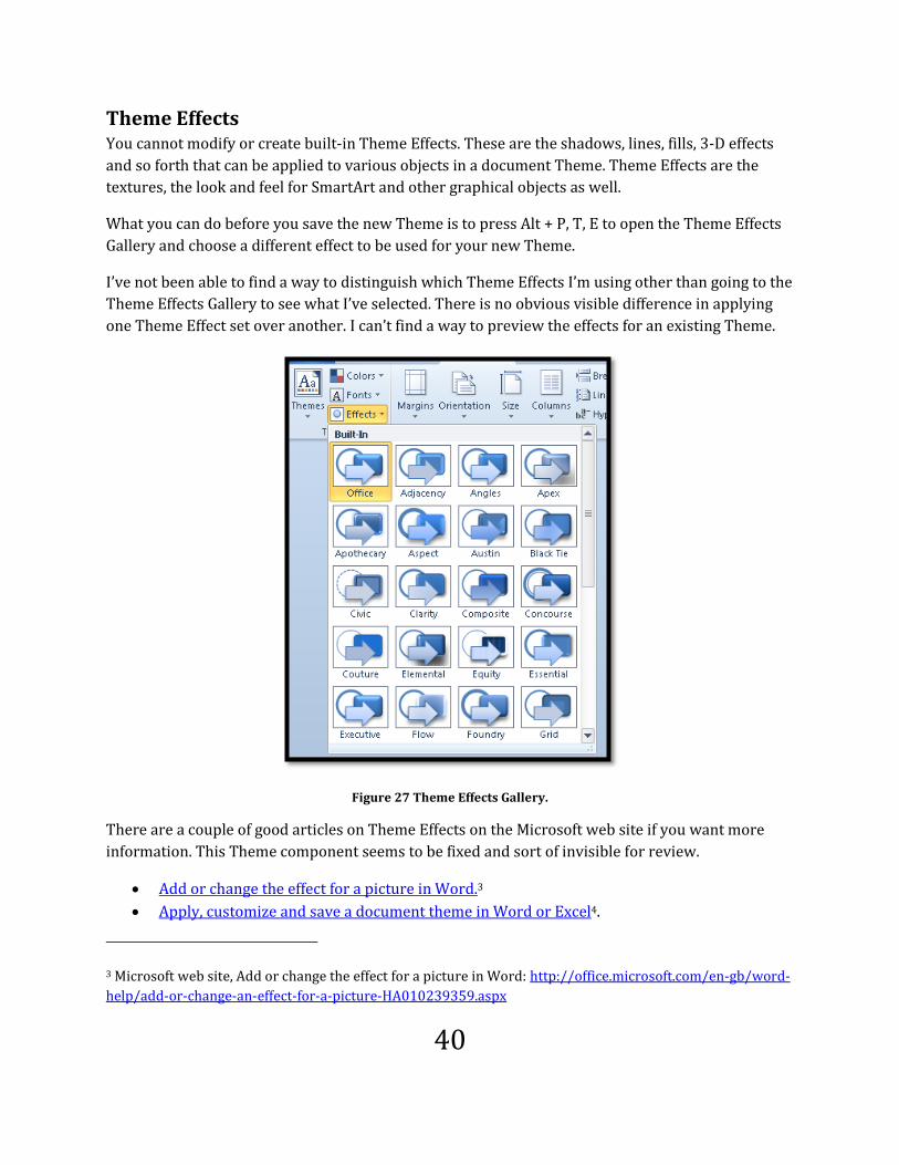
Theme Effects You cannot modify or create built-in Theme Effects. These are the shadows, lines, fills, 3-D effects
and so forth that can be applied to various objects in a document Theme. Theme Effects are the
textures, the look and feel for SmartArt and other graphical objects as well.
What you can do before you save the new Theme is to press Alt + P, T, E to open the Theme Effects
Gallery and choose a different effect to be used for your new Theme.
I’ve not been able to find a way to distinguish which Theme Effects I’m using other than going to the
Theme Effects Gallery to see what I’ve selected. There is no obvious visible difference in applying
one Theme Effect set over another. I can’t find a way to preview the effects for an existing Theme.
Figure 27 Theme Effects Gallery.
There are a couple of good articles on Theme Effects on the Microsoft web site if you want more
information. This Theme component seems to be fixed and sort of invisible for review.
Add or change the effect for a picture in Word.3
Apply, customize and save a document theme in Word or Excel4.
3 Microsoft web site, Add or change the effect for a picture in Word: http://office.microsoft.com/en-gb/word-
help/add-or-change-an-effect-for-a-picture-HA010239359.aspx

41
Create the New Theme We've created a new Theme Font, Theme Colour and maybe chosen a different Theme Effect for the
Theme we are about to create. Now we can create a global Theme. By applying the Theme we can
apply all of its parts, font colours and effects. We can also choose to apply the Karlen Theme fonts or
Karlen Theme Colours independent of the overall Theme. The Karlen Theme will be available in
other Office applications such as Excel and PowerPoint.
To create the Karlen Theme or the new Theme:
1. With the document we’ve been working in open and the Karlen Theme Font and Karlen
Theme Colour applied to the document, press Alt + P, T, H, A.
a. If you don’t choose a different Theme Effect the default for the current Theme will
be used. As mentioned in the previous section, I can’t find a way to distinguish the
options for Theme Effects to make an informed decision as to which set of Theme
Effects I might want to use.
2. The standard Save As dialog opens but you are in the Document Themes folder in the user
files for your computer. The dialog is called Create New Theme.
3. Name the Theme, in this case it will be Karlen.
4. Tab to and activate the Save button by pressing Enter.
Figure 28 Create New theme Save As dialog.
4 Microsoft web site, Apply, customize and save a document theme in Word or Excel:
http://office.microsoft.com/en-ca/word-help/apply-customize-and-save-a-document-theme-in-word-or-
excel-HA001229924.aspx

42
You can now apply your theme, in this case the Karlen Theme, to any document or you can choose
to apply only Karlen Theme Fonts or Karlen Theme Colours.
The Karlen Theme will show up in the Theme Gallery for PowerPoint, Excel, Word and Outlook [you
can use the Theme in Outlook5 as long as the message format is set to HTML.].
Figure 29 Karlen Theme in Excel.
Figure 30 Karlen Theme in PowerPoint.
5 Microsoft web site, Customize Word Themes to use as Stationary for messages/Outlook:
http://office.microsoft.com/en-gb/outlook-help/customize-word-themes

43
The Difference Between a Theme and a Template Confused? What is the difference between a Theme and a template? How do I know which one to
use?
A template can have a Theme but can also have default images such as a company logo, decorative
images that are consistently used for a specific document and any specific formatting or text Styles.
A template is also confined to the application it is created for. For example you can’t use a Word
template in PowerPoint or Excel.
A Theme determines the fonts and colours as well as effects that are available in the document.
Think of it as the visual aspects of the template or document. A Theme can be part of a template or
applied to a specific document.
Taking the Karlen Theme for example, if we wanted the Heading 1 to be centered for a report we
could create a template called Report that uses the Karlen Theme and then use the Styles pane to
modify the alignment of headings for that template. Headings are template based. The Theme only
determines the font, colours and effects to be used in a template.
The template provides the underlying structure for the document, whether it is a book, flyer,
brochure, or letterhead. The Theme provides the look and feel of that document.
The power of Themes is that you can create a Theme based on an organizational brand and then
use that Theme for every document and template you need. Create the Theme once and use it many
times.
There is a good article on the Microsoft web site explaining the difference between templates6. This article is related to PowerPoint however it applies to the use of templates and Themes in all Office applications.
Themes and Style Sets As mentioned briefly in this chapter, if you need to use specific fonts or font sizes for documents a
Theme might not give you the flexibility you need. Themes, while being able to apply a specific font
cannot apply a specific font size. The font size is the default of 11 point. The easiest way for
someone to quickly swap out a specific font and font size is to create a Style Set. This section
provides the step-by-step instructions for doing this.
As a document author creating global documents, the tools to use are Templates, Themes and
Styles. It is the end-user or person who is opening the document to read it that implements the
Style Set.
6 Microsoft PowerPoint difference between templates and themes: http://office.microsoft.com/en-
us/powerpoint/HA103575281033.aspx

44
Creating a Custom Style Set On the Home Ribbon there is a button to the far right called Change Style Set. You can access it by
pressing Alt + H, G.
This gives you several options.
1. You can choose from a list of Style Sets that are built-in such as “Distinctive,” “Elegant” and
“Fancy.”
2. You can create your own Style Set which is something like Verdana 16 point.
3. If you are used to working with Themes and have created a Theme Font you can choose
Fonts and apply the Theme Font although this would not affect the font size, just the font
Style.
Note: Themes can be used to create a common look and feel for documents in Word,
PowerPoint or Excel. Themes don’t typically identify a font size but do identify
Theme Fonts or Theme Colours. Using Style Sets provides more flexibility in
applying font attributes such as bold, colour, or case so that you can read Word
documents easier. You can copy one Style Set file rather than the separate Theme
Font, Theme Colour and Theme Effects file from computer to computer.
Figure 31 Options under the Change Style Set button on the Home Ribbon.
I recommend starting with the Word 2010 Style Set because it has the paragraph spacing built-in
whereas the Word 2003 Style Set does not and you will have to either manually add paragraph
spacing or do this in the Normal Paragraph Style. So it saves you time!
You will only have to do this once. When you create your Style Set you can archive it somewhere for
safe-keeping. If a service pack update or reinstall of Office removes your Style set as an option, you
can copy it back to the Quick Styles folder and continue using it. You won’t have to recreate it.
Step 1 - Modify the Normal Paragraph Style:

45
1. It is always better to work with content in a document.
2. Open a new document (Ctrl + N).
3. Use the ability to insert random text using =rand(x, y) where x is the number of paragraphs
and y is the number of sentences in each paragraph. This will give you some text to work
with. Press Ctrl + Home to move to the top of your document.
4. Press Ctrl + Shift + S to open the Apply Styles Pane. This will float over the document but if
you are using a screen reader it will have focus once it is opened.
5. Make sure that the Normal Style is the one identified in the ASP or Apply Styles Pane in the
list box Style Name.
6. Tab to the Modify button and press Enter.
7. The standard Modify Style dialog opens.
8. Tab to the Font Style area under Formatting and choose the font you prefer. You can either
type it in or open the list by pressing the down arrow key and use first character navigation
to find it.
9. Tab to the Font Size list and press the Down Arrow to open the list.
10. Locate the font size you want and press Enter.
11. If you want to choose a default colour for all text in the document when the Style Set is used,
press Tab to move to the colour palette, press the Spacebar to open the colour selections,
and choose a colour. There is no keyboard command to quickly move to the colour palette.
You will need to press the Tab key several times.
12. This is the Modify Style dialog and it can apply to new documents based on this template
which we don’t want to check; or this document only. Since we are only using this document
as a sort of sandbox to figure out what our Style set should look like, I recommend that the
check box for this document be the only one checked.
13. Do not choose to Automatically Update.
14. Tab to and activate the OK button. You will return to the Apply Styles Pane. Press Esc to exit
this pane. Notice that the font has changed in the document. Also notice that the Apply
Styles pane is still visible but “greyed” out and your cursor is again in the document.
Step 2 - Create the new Style Set that can be swapped out for the current Style Set:
1. With the changes to the Normal Style in front of you and before you close the sandbox
document without saving press Alt + H, G to open the Change Styles options.
2. The first item in the list is Style Set.
3. Press The Right Arrow to open Style Set.
4. Press the letter Q to Save Quick Style Set dialog. This is the last item in the list of choices so
you can also press the Up Arrow to get to it quickly.

46
Figure 32 Save as Quick Style Set dialog.
5. When you press Q and the Save Quick Style dialog opens, your focus is in the filename edit
box where you can type the name of your Quick Style or Style Set. Type in a name for your
Style Set. I chose Karlen for mine but you can call it “Accessible” if you like.
a. It will appear in the list of available Style Sets in alphabetical order. You cannot use
first character navigation in the list of Style Sets so this might influence your choice
of a name.
6. Press Enter or Alt + S to Save the new Style Set.
a. The new Style set is saved to the Microsoft/Quick Styles folder for Microsoft
applications. Don’t worry about where it is saved at this point. We’ll get to that when
we learn how to copy or delete a Custom Style Set.
7. When you press Alt + H + G, and open the Style Set list, your Style set will be there and when
chosen, will apply your font and font attributes to the document.

47
Figure 33 Karlen Style Set applied to document.
You can make this the default Style Set to be used for all documents you create. One thing to keep in
mind is that these are your preferences and someone else reviewing or editing your documents
may not find your Style set accessible. Of course if they have their own Style set they can swap out
yours!
The option to make your Style Set the default for documents is found in the Style Set list. The
keyboard command is Alt + H, G, S to Set as Default. If you are working on a document that has a
template the defaults will be saved for that template. You will know this because the name of the
template will appear in the Save as Default item on the Change Styles list.
Deleting a Custom Style Set If you created a Style Set for practice and now want to delete it, you can do this. It means going into
the user files on your computer.
Note: If you have the UAC or User Account Settings set to warn you when you are
performing administrative tasks, you will need to activate the Continue button when
it appears.
The Quick Styles are stored in Users/Username/AppData/Roaming/Microsoft/Templates/Quick
Styles.
To delete a Custom Style Set:
1. Go to My Computer and press Enter to open it.
2. Locate your computer’s hard drive which is usually C:\ and might have a name such as Local
Drive or Local Disk Drive.
3. Locate the Users folder. You can do this by pressing the letter U.
a. If the Show Hidden Files option is not turned on for your computer, go to Control
Panel (Press Start Menu, Settings, Control Panel, press Enter), press F for Folder

48
Options and press Enter. Press Ctrl + Tab to move to the View tab at the top. Tab to
Advanced settings: and arrow down to “Show hidden files and folders”. If the radio
button is not activated press spacebar to turn on the ability to see hidden files. Tab
to OK and press Enter. Close the Control Panel (Alt + F4).
4. In the Users folder, find your username and press Enter to open it.
5. Choose AppData from the list of files and Folders. AppData is a hidden file which is why you
need to show hidden files in order to do this. You can press the letter A to find this but it is
most likely at the top of the list and the only file beginning with that character.
6. Choose Roaming [Press letter R.].
7. Choose Microsoft [Press letter M..].
8. Choose Quick Styles which should be the Quick Styles folder [Press letter Q.].
a. You can use first character navigation for all of these steps.
9. Press Enter to open the quick Styles folder.
10. Locate the Custom Style Set you want to delete and select it by pressing the spacebar.
11. Press the Delete key.
12. Confirm that you want to delete this Style Set.
13. Press Alt + F4 to close the current window.
That’s it! The Custom Style Set has been deleted and will disappear from the list of available Style
Sets in Word.
To delete a Custom Style Set without going into the User files:
1. You must have Recent Documents visible on the Start Menu to do this and your Quick Style
Set must be in the list of recent documents.
2. Press the Windows key to open the Start Menu.
3. Press the Tab key once to get out of the search mode in Windows Vista or Windows 7.
4. Press R for Recent Documents or use the Arrow keys to find it.
5. Open the Recent Documents list and if you’ve recently created your Style Set it will be listed.
6. Select it and press the AppKey to open the context menu.
7. Choose Delete.
8. You may be asked to confirm that you want the file deleted. Say yes.
If you want to make sure this is the right file, instead of pressing Delete, open the Properties for this
file and check that it is in the Quick Styles folder. Then you can access the context menu again and
delete the file.

49
Using your Custom Style Set on Other Computers If you have a laptop as well as a desktop or a computer at work [and you have administrative
permission to access the user files] you can copy your Style Set to a flash drive and put it on the
other computes.
To use the Custom Style Set on other computers:
1. Go to Users/Username/AppData/Roaming/Microsoft/ Quick Styles.
2. You can either copy the entire folder if you have several Custom Style Sets or the individual
Style Sets by going into the folder and selecting the one you want to use on another
computer.
3. Press Ctrl + C to copy it to the Windows Clipboard.
4. Switch to the external storage device such as a flash drive and press Ctrl + V to paste the
folder or file to that device.
5. Go to the second computer.
6. Insert the flash drive and open the list of files and folders on it.
7. Locate the Quick Styles folder or file and press Ctrl + C to copy it to the Windows clipboard.
8. On the computer you want to copy the Style Set to, go to
Users/Username/Roaming/AppData/Microsoft/ Quick Styles and either paste the Quick
Styles folder or the Quick Style file into the Quick Styles folder. You can use Ctrl + V for this.
That’s it! You’ve copied your preferred Style Set so that it can be used on a different computer.
To copy your Style Set without going into the User files if it is in the list of Recent Documents:
1. You must have Recent Documents visible on the Start Menu.
2. Press the Windows key to open the Start Menu.
3. Press Tab to get out of the edit area for Windows Vista and Windows 7.
4. Press R for Recent Documents or use the Arrow keys to find it.
5. Open the list of Recent Documents and find your Style Set file in the list.
6. Press the AppKey to open the context menu.
7. Choose the “Send To” option and then choose the external device such as a flash drive to
send the file to.
8. Press Escape to get back to the Start button.
You can now go to the external device to verify that the file has been sent to it.
If you want to copy the entire Quick Styles folder you will have to use the long method and go into
the User folders and files.
50
Working with Styles
We’ve looked at how to create a template and a Theme for the document look and feel. Now we can
look at the way the document is structured.
The first place to start in looking at how to structure a document is the Styles used by the native
application. Each application has “specifications” as to what a standard paragraph or body text is.
Each piece of body text or paragraph that you create looks the same and has the same elements.
This is how the application knows how to present and display it to you and this also determines
how the body text or paragraph should appear when printed. This is all done behind the scene as
you type or dictate content.
You can modify the “normal” body text or paragraph attributes, however in some applications, it is
difficult to reset them if your plans go awry and you end up with a Style that is unusable. If you are
not going to create a template, it is preferable to take the existing Style and create a new one based
on it.
If you do create chaos in the Styles of the Normal.DOCX template you can exit Word, delete it from
the Templates folder under your computer username and then restart Word. This will rebuild the
Normal.DOCX template with the defaults. If you had Styles in that template you wanted, they will be
lost.
Imagine a newspaper, magazine, school textbook, or even a novel that was one long series of
paragraphs with no visual cues for a change in content, important information to remember, or
even page numbers or a Table of Contents. This would be a document without a logical document
structure and clearly, it would be very difficult to read.

51
Figure 34 Document page with no structure.
The preceding image is of the first two pages of the “Working with Templates” chapter from this
book. Were you able to locate the step-by-step instructions? Were you able to find the “headings”
you needed for the content you want? Without proper structural elements this is how someone who
couldn’t see the visual representations of structure would experience the content.
Misuse of Heading Styles I mentioned mistakes in the use of headings earlier in this section of the book. One of the most
prevalent uses of headings is to identify important information in a document. This has serious
implications for the use of other document tools and for adaptive technology such as screen
readers.
The following image illustrates two paragraphs of text formatted as headings.

52
Figure 35 Two paragraphs in a document formatted as headings.
As can be seen in the preceding image both paragraphs would be included when a Table of Contents
is generated for this document. This amount of text overwhelms other information in the Table of
Contents preventing the Table of Contents from being used as an effective navigational tool.
The better solution would be to create a paragraph Style that isolates the text as something
important needing the reader's attention. We'll do this later in this book.
Heading Styles The most common Styles you will work with are Heading Styles. Heading Styles provide visual
distinction between topics. For example a chapter title might be a Heading 1. Any sub-topics under
that chapter heading would be identified by the appropriate heading level.
Heading levels should reflect the hierarchy of the topics in the document. Headings should move
from Heading 1 to Heading 2 and then Heading 3. Headings should not skip from Heading 1 to
Heading 3 or Heading 2 followed by Heading 4. This does not accurately represent the hierarchy of
the content in a document.
I hear the question...
But I like the way Heading 3 looks so I just used it for everything in the document.

53
OK, we can work with that.
The solution is to make Heading 1 look like Heading 3. You can modify the existing heading in a
template or create a Custom Heading if you need more than one look and feel for a heading level.
Remember that what you are doing provides the hierarchy of content...its order of importance in
the document. We also need to let go of the visual and focus on the underlying structure of what we
are looking at.
As stated in the previous section of this book on templates, there is no "reset" button to return the
normal headings back to their original look and feel if you mangle them horridly unless you delete
the Normal.DOCX and rebuild it.
First create a template. Then create your Theme. Then modify the inherent Heading Styles to look
the way you want or create Custom Heading Styles for a more specific look and feel to your
documents.
If we create a visual representation of a heading by simply formatting the text by simply enlarging
the font, bolding, underlining, etc. in order to make it stand apart from a paragraph, that visual
representation of a "heading" has the underlying structure of a normal paragraph. It can't be used
to generate a Table of Contents without bookmarking it, a person using a screen reader can't find it
among all the other paragraphs in a document, and you won't be able to use it to generate
Bookmarks in a tagged PDF document converted from Word without extra steps.
In other words you create more work for yourself than is necessary.
Applying a Heading Style Once again, for those of you who just want to start using Heading Styles, here are the keyboard
commands to apply them to selected text. I recommend always selecting content you want to
format to ensure that the formatting is only applied to what you want. Often turning on formatting,
typing and then turning off formatting results in forgetting to turn formatting off at the appropriate
time. This results in conflicting formatting that will appear “randomly” when documents are
converted to other formats such as tagged PDF.
To apply Heading Styles to the selected text press:
Ctrl + Alt + number 1 for a Heading 1.
Ctrl + Alt + 2 for Heading 2.
Ctrl + Alt + 3 for Heading 3.
One of the things that document authors should do is to organize the topics in their publication.
This is similar to organizing your thoughts for a slide presentation. How to you want the document
to start and how do you want the content to flow.
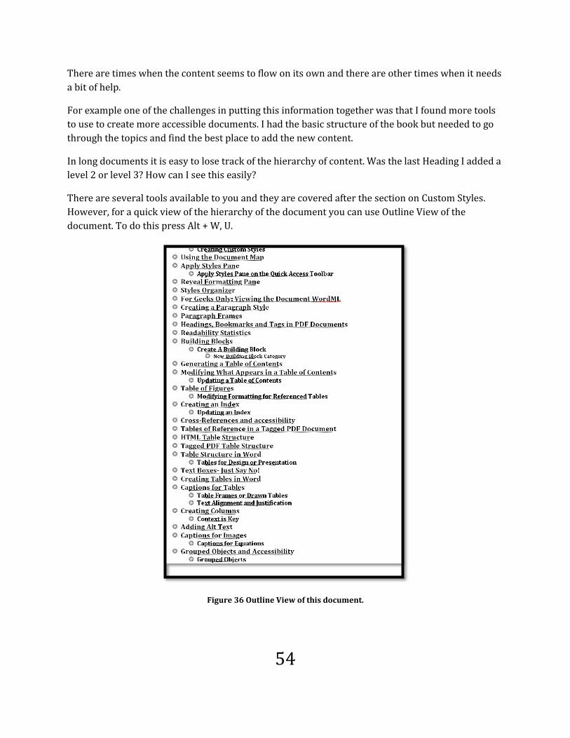
54
There are times when the content seems to flow on its own and there are other times when it needs
a bit of help.
For example one of the challenges in putting this information together was that I found more tools
to use to create more accessible documents. I had the basic structure of the book but needed to go
through the topics and find the best place to add the new content.
In long documents it is easy to lose track of the hierarchy of content. Was the last Heading I added a
level 2 or level 3? How can I see this easily?
There are several tools available to you and they are covered after the section on Custom Styles.
However, for a quick view of the hierarchy of the document you can use Outline View of the
document. To do this press Alt + W, U.
Figure 36 Outline View of this document.

55
The preceding image shows the hierarchy of content for this area of the book. The content is
collapsed under the headings and you can easily see where you are and what heading levels
surround the content you are working on.
The hierarchy is represented by the level of indentation of a topic. There are plus or minus signs
beside the headings to indicate that they can be expanded or collapsed to show all of or some of the
other levels of content under headings.
You can easily review the flow of the document and drag or cut and paste items around the
document to create a more logical reading order.
You would not be able to do this if you simply formatted the text to represent a heading visually.
The following image is of one topic in this book with a visual heading: text with just formatting
rather than applying a heading level or using a Style. . It looks good, everything separated, with
what looks like a proper heading.
Figure 37 Page with visual representation of heading.
If we look at the Outline view of this document by pressing Alt + W, U, we can see that everything is
at the same level in the document. The visual representation of a heading is at the same level as
paragraph text.
Unlike an Outline showing the heading levels, it becomes difficult to move content around the
document to create a more logical flow.

56
Figure 38 Outline View of document with visual representation of headings.
A document that has structure will illustrate that structure in Outline view. The following image is
of this document with proper headings and other structural elements.
Figure 39 This book in Outline view.
One of the things we can do with an Outline is to only show specific heading levels or hierarchical
levels in the document. [By the way the empty spaces in the image above represent images in the
document.] The following image shows this document with only Headings 1 and 2 showing. All

57
other levels have been collapsed. This let’s you see if the flow of information makes sense. It also
lets you verify that the topics for Headings 1 and 2 are as they should be, one following the other
and that a Heading 1 shouldn’t be a Heading 2 and vice versa.
Figure 40 This document in Outline view with Heading levels 1 and 2 visible.
Going back to the first image in this series, we would not be able to view any “levels” or hierarchical
structure in that document because everything was at the lowest level, that of body text or a normal
paragraph.
Always use Styles to apply heading levels to content. If you don’t like the look and feel of a heading,
modify it for your template.

58
Modify a Heading Style As mentioned, if you don’t like a Heading Style, you can modify it in your template. One thing to
keep in mind when determining normal text or body text font size is that the other Styles in the
document do not automatically adjust to reflect the new base font size. For example in the
Normal.DOCX template the text font size is 11 point and the Heading 1 font size is 16 point. If you
adjust the body text or normal text to 16 point the Heading 1 text will also be at 16 point. You will
need to manually adjust the relative font sizing.
Figure 41 Modify Style option from the Style Pane.
To modify a Heading Style:
1. Type some text into the document.
2. Select the text and apply a Heading 1 to it by pressing Ctrl + Alt + number 1.
3. Press Alt + H, F, Y to open the Styles Pane.
a. Because you selected text and applied the Heading 1 Style, this Style will have focus
in the Styles Pane.
4. With the Heading 1 Style selected in the Styles Pane, press the AppKey to open the context
menu.
5. Choose Modify from the list of options and press Enter.
6. This will open the Modify Styles dialog.
7. You can now adjust the font, font size, font colour, borders, alignment and so forth for the
Heading 1 Style.
8. Once you are finished, make sure that the check box to “Add to Quick Styles list is still
selected and then choose one of the radio buttons to either only use the modification in the
current document or for new documents based on the current template.
9. Do not choose to automatically update Styles. This is where you can inadvertently corrupt
your Styles.
10. Tab to and activate the OK button to confirm the modifications.

59
Figure 42 Modify Style dialog.
Within the Modify Style dialog there is a button that can be accessed labeled “Format.” This button
contains options for borders, paragraph spacing, additional font tools and other formatting options.
Note: You can press the AppKey on a Style in the Quick Styles Gallery and choose
Modify to do the same thing. The use of the Styles Pane is featured here because it is
more accessible than the Quick Styles Gallery. The Quick Styles Gallery requires the
use of the Up, Down, Left or Right Arrows to find a Style. There is no fast way to
locate the Style you want.
When modifying or creating a new Style you will be able to see what that Style will look like with
your changes. This lets you quickly assess size, alignment, border, and colour for readability and
integration in the document look and feel.

60
Creating Custom Styles There are times in documents when you need to create Custom Styles for headings. For example
when you want two or more pieces of content to have a top level role in the document but you need
them to look slightly different. The key is to base any Custom Style on an existing Style in Microsoft
Word.
If you follow this process, it helps you visually confirm that the Style you’ve created looks the way it
should.
To create a Custom Heading Style:
1. Launch Microsoft Word.
2. With a new/blank document open, type your name.
3. Select your name and press Ctrl + Alt + the number 1 to apply the Heading 1 Style.
a. You can apply other levels of headings by pressing Ctrl + Alt + 2 for a Heading 2 or
Ctrl + Alt + 3 for a Heading 3. For this example we will work with a Heading 1.
4. Press Alt + H, F, Y to open the Styles Pane.
Figure 43 Styles Pane beside heading in document.
5. This opens a pane on the right of your screen and your focus should be in it. To toggle
between the task pane and your document, press F6. To move back to the document press
Shift + F6.
6. By default, Heading 1 is the Style “in focus.” This is because it is applied to the selected text
in the document. By selecting text and applying a Style you want to customize, you don’t
have to go through the list of Styles to find the one you want.

61
a. Tab to the New Style button located at the bottom left corner on the Styles Pane and
press Enter. This opens a dialog box with all the formatting currently applied to a
Heading 1. The image below shows the “Style based on” selected. The Style listed in
this list box is what the new Style will be based on. Notice that under Formatting in
this dialog, you can see the formatting applied to this Style.
Figure 44 New Style dialog.
7. Your focus is in the name edit box and “Style1” is selected. Type in the name of your new
Style. In the case of documents created for Karlen Communications, I've called the Style
based on Heading 1 “Karlen 1.”
8. Tab to the next edit box. In our example, the key is to leave the Style based on Heading 1.
This Style is what automated tools will be looking for when generating a table of contents,
index, or creating bookmarks for your tagged PDF documents.
9. Tab to the next edit box. In our example, the key is to leave the Style based on Heading 1.
This Style is what automated tools will be looking for when generating a Table of Contents,
Index, or creating bookmarks for your tagged PDF documents.
10. Press Tab again and you can modify the Style that comes immediately after a Heading 1. It is
recommended that you leave this as it is.
11. Pressing Tab again takes you into the attributes under the heading of formatting or
“specifications” of a Heading 1 where you can modify things like font, colour, size, Style,
alignment and so forth. Continue using Tab to move from attribute to attribute. Standard
dialog box keyboard commands will work in this dialog.
12. You can also choose Alt + the letter O to activate the Format button which will let you add
borders, shading, widows and orphans and block protect to your Style.

62
a. Widows and orphans are important to eliminate those single lines of paragraphs
that appear on the next page making your documents look a bit lop sided. Widows,
are the single lines of text at the bottom of the page while the rest of the paragraph
is on the next page. Orphans are those single lines of text at the top of a page while
the rest of the paragraph is on the proceeding page.
b. Block protect lets you keep text together by telling Word that the paragraphs or list
items or other content is not to be separated. This can present document formatting
issues when editing and adding content to a document. In some cases blocks of text
are forced to the next page in order to keep them together which creates large white
spaces on pages, or a paragraph on one page and the block protected content on the
next page. At times the only way to repair this is to turn off the block protect for the
affected content.
13. There is one other critical piece to creating your Custom Style. You must check the check
box to add this Style to the template.
14. Do not check the check box to automatically update. This will automatically update the
Styles and formatting with any formatting done to individual pieces of text. This can get
quite messy in a list of Styles.
15. Activate the OK button to confirm your new Style.
When you generate a Table of Contents for the document, your Custom Styles will be included in
the Table of Contents.
You can use this Custom Style in other documents based on this template. If you choose to only use
the Custom Style in the current document it will not be available to you in documents based on this
template.
When you save the current document, if you chose to use this Custom Style in documents based on
this template, you will be prompted to save the changes to the template. Choose yes to complete the
process of creating a Custom Style usable in this template.
Paragraph and Character Styles In a document you can have Paragraph Styles or Character Styles.
What is the difference?
The difference comes from being able to work in an XML based environment. Using Paragraph
Styles we can format large pieces of the document to have a specific role or structure in the
document. Character Styles on the other hand are more decorative and are intended for a few
characters or words only. There is no structural element for a character style. Character Styles are
pure decorative formatting.
Why should I use them if they are decorative formatting?

63
If you have pieces of content such as letters, numbers or words that you need to have specific and
consistent formatting throughout your documents, using a Character Style ensures the consistency.
For someone using adaptive technology such as a screen reader who has Style identification turned
on, it means they will be notified when they come across a Character Style by its name such as
“Important” or “Emphasis.” This has more meaning than randomly applying bold, italic or underline
and you have more flexibility to use decorative display options.
A Character Style lets you combine formatting for characters in the document. If you bold
something that is pretty much what you can do to the text using the “bold” command. If you apply a
Character Style such as “Emphasis” you can combine colour, font size, font Style and borders to the
content the Character Style is applied to.
Again one application of a Style gives you all the formatting you used previously for the same type
of content.
To create a Character Style:
1. Make sure that the Style you are on is the Normal paragraph Style. You might want to type a
word or two then select the text.
2. Open the Styles Pane by pressing Alt + H, F, Y. Be sure that the focus is on Normal in the
styles list.
3. Move to the New Style button and press Enter to activate it.
4. The New Style dialog opens. Notice that you are in the Name edit box.
5. For this example, I’ll call the new Style “Note.” Type in Note
6. Press tab to the Style type list and choose “Character” by pressing the down arrow key or
using first letter navigation and typing the letter “C” and pressing Enter.

64
Figure 45 First step to create a Character Style.
7. Notice that your options are now limited in terms of what you can use to format a character.
8. For the Note Style, I turned on Bold, changed the font size to 12, the font colour is a dark
purple and then went into the Format options and put a light purple shading behind the
text. Normally I wouldn’t over format like this but I wanted you to see the potential for
using a Character Style.
9. Move to and activate the OK button to create the Style once you’ve formatted the Style the
way you want.

65
Figure 46 Formatting applied to Character Style, step 2.
As with other Styles you can apply them to the current document or other documents based on the
current template. Notice that when you are setting up the Character Style the preview includes
paragraphs of text rather than isolated words or characters. This is normal. Just make sure you
have the Character option chosen in the Style type.
When the Note Style is applied to single characters or words, the formatting is consistent and
uniform.
If you don’t like the way the Note Style looks, for example the background shading in this case
detracts from the impact of the isolated text, changing this in the Note Style changes it everywhere
the Note Style is used. You don’t have to spend time going through the document to find all
instances of the formatting. You locate the Character Style in the Style Pane, modify it and all
instances of its use in your document or template will be changed once you activate the OK button.

66
Figure 47 Text in document with Character Style applied.
A well-structured document uses a combination of Style types to format content.
Additional Tools to Review Structure Word has several tools that will help you review the structure and Styles of the document you are
working in. These tools include a Navigation Pane with a list of headings in the document, , reveal
formatting tool, Style Inspector and Style Organizer.
All are briefly covered in the next section of this chapter.
Navigation Pane: List of Headings One of the tools available to you to look at the headings and their hierarchy in a document is the
"Navigation Pane." The Navigation Pane is found under the View Ribbon. The keyboard command
to check the check box to show the Navigation Pane is Alt + W, K.
Figure 48 Navigation Pane on View Ribbon.
The following image is of the list of headings in this document in the Navigation Pane.

67
Figure 49 Navigation Pane open showing headings in this document.

68
Apply Styles Pane You can also press Ctrl + Shift + S for the Apply Styles Pane and choose the appropriate Heading
Style from the drop down list. To choose a Style press the Spacebar and use the Up and Down
Arrows to go through the list of Styles or simply type in the Style you want to apply such as List
Paragraph.
Figure 50 Apply Styles Pane.
If you are using adaptive technology, you can open the Apply Styles Pane and choose to Modify the
style here instead of going through the Styles Pane. There is also a New Styles button in the Apply
Styles Pane. Select the text with the formatting you want to modify or base the new style on before
opening the Apply Styles Pane.
Apply Styles Pane on the Quick Access Toolbar
You might find it easier to put the Apply Styles Pane or ASP on the Quick Access Toolbar or QAT.
Figure 51 Customize QAT dialog.
To put the Apply Styles Pane on the Quick Access Toolbar:

69
1. Press Alt + F, T to open the Word Options dialog.
2. Press Q to move to the Quick Access Toolbar options.
3. Press Tab to move into the customizable options.
4. You could also put the QAT below the Ribbon using this Customize context menu.
5. The focus will be in the “Choose commands from…” list box.
6. Press Alt + Down Arrow to expand the list.
7. Choose “Commands not on the Ribbon” and press Enter.
8. Press Tab to move into the list of commands. The focus will probably be on <Separator>.
9. Use first character navigation or the Up and Down Arrows to find “Style.”
10. There are a couple of Style based options so make sure you choose the “Style” tool.
11. Once Style is selected, press Alt + A to add it to the list of commands in the QAT.
12. If you press Tab you will put focus on the Add button if you prefer this method.
13. Pressing Tab again moves you to the list box “Customize Quick Access Toolbar” where you
can choose to have the customized items on the QAT displayed for all documents or for just
the current document. I recommend that you have the QAT tools available for all
documents.
14. Press Tab which will move focus to the list of commands currently on the QAT.
15. Pressing Tab again moves you to the “Reset” button where the original QAT items can be
restored.
16. Moving through the options to customize the QAT, pressing Tab again will let you move a
selected item in the list of QAT tools up.
a. The “Move Up” and “Move Down” buttons are icons with arrows pointing either up
or down so there is no keyboard command to move directly to them. Visually they
are to the right of the list of items currently on the QAT.
17. Pressing Tab from the “Move UP” button will move focus to the “Move Down” button where
you can move the selected item down in the list by pressing the Enter key.
a. If you want to remove an item from the QAT, select it and press Alt + R. You could
also Tab to the Remove button and press Enter.
18. Once you’ve added the Style tool to the QAT, Tab to and activate the OK button.
19. You are returned to the document and the new tools are added to the QAT.
You access the tools in numerical order. For example on my computer the Style tool is the fourth
item on the QAT so pressing Alt + 4 will take me directly to the Style tool. When you move tools up
or down in the current list of QAT tools in the Customize dialog, you affect the number you would
need to press to move directly to that tool. For example, if I moved the Style tool down one place in
the list, Alt + 5 would put focus on it not Alt + 4.
Figure 52 Quick Access Toolbar showing Apply Styles Pane added.

70
Putting the ASP on the QAT is one way to view the formatting of a document while you are working
with it. There is a way to see more details about the formatting of Styles used in your document as
you work with it.
One of the most often asked questions is whether there is the WordPerfect equivalent of Reveal
Codes. The closest tool to this in Word is the ability to reveal formatting in a separate pane in the
document.
Reveal Formatting Pane To show the Reveal Formatting Pane press Shift + F1.
Figure 53 Reveal Formatting Pane.
There are two options in this pane: a check box to distinguish Style source and a check box to show
all formatting marks.
The checkbox to Distinguish Style source shows the name of the Style and the type of Style in the
Reveal Formatting Pane.

71
Figure 54 Distinguish Style Source not turned on in Reveal Formatting Pane.
Figure 55 Distinguish Formatting Source turned on in Reveal Formatting Pane.
The Show All Formatting Marks check box is the same as pressing Ctrl + Shift + 8 on the number
row to show the paragraph marks in the document.
To close the Reveal Formatting Pane make sure it has focus, remember you can press Shift + F6 to
move to it and press Ctrl + Spacebar then C for Close.
Styles Organizer With Word 2010 you have the capability to create Styles in one document and use them in another
document. This is leveraging the XML based formatting of Office 2007.
It is also similar to CSS or Cascading Style Sheets used in web based content or other XML based
formats.
The Styles Organizer is found in the Manage Styles dialog.
Figure 56 Manage Styles button, third button on the right at the bottom of the Styles Pane.
To import or export Styles from one document to another:
1. Press Alt + H, F, Y to open the Styles Pane.

72
2. Tab to the bottom of the Styles Pane and activate the Manage Styles button. It is the button
to the right of the three buttons at the bottom of the Styles Pane.
3. The Manage Styles dialog opens.
Figure 57 Manage Styles dialog.
4. Choose Import/Export – Alt + X which is in the lower left corner of the Manage Styles dialog.
Figure 58 Import/Export button in lower left of Manage Styles dialog.
5. The Styles organizer dialog opens.

73
Figure 59 Styles Organizer dialog.
6. By default the Styles for the document you have opened is on the left and the Styles in the
Normal template are on the right. There are buttons between these views that will let you
copy Styles from one document to the other.
7. Word assumes you want to copy Styles from one document into a template but you can
choose a “regular” Word document to copy the files into.
8. On the right side of the Styles Organizer dialog just under the list box containing the Normal
template filename, the button says “Close File.”
9. If you do not want to copy Styles into the Normal template activate this button by pressing
Alt + E.
10. The “Close File” button is now the “Open File button.
Figure 60 Styles Organizer dialog with Normal template file closed.
11. Activate the Open File button by pressing Alt + E.
12. A dialog opens with focus on the Word Templates folder so you can choose a template to
copy the Styles to.

74
Figure 61 Open dialog where you can choose template to copy Styles into.
13. Once you choose a file or template and activate the Open button the Styles for that
document are displayed on the right side of the Styles Organizer dialog.
Figure 62 Styles Organizer with two documents open ready to copy Styles.
14. When you are finished working with the Styles, copying, deleting or renaming them, move
to and activate the Close button.
If you select a Style in the current document displayed on the left, the copy button between the list
of Styles in both documents points to the document on the right.

75
Figure 63 Open document Styles to be copied.
If you select a Style or Styles in the document or template on the right, the arrows change so that
you can copy the Style to the document you have open which is displayed on the left of the Styles
Organizer dialog.
Figure 64 Document on the right in the Styles Organizer dialog ready to copy Styles.
You can use the Shift key to select contiguous Styles or Ctrl + A to select all Styles you want to copy
or delete.
You can also use the standard keyboard command to select non-contiguous Styles or hold down the
Ctrl key and click the Styles you want to copy or delete.
This is a powerful tool you can use to ensure consistent look and feel for documents that might not
have or need Themes.
Style Inspector The Style Inspector is another way to get a snapshot of content formatted at the cursor point. The
Style Inspector is a floating pane that changes as you move through a document depending on
where the cursor is.
For example, in this document, at the current cursor position the Style Inspector shows the
attributes for normal body text.

76
Figure 65 Style Inspector showing normal paragraph Style.
If I move the cursor to the next heading in the document, the information in the Style Inspector
changes.
Figure 66 Style Inspector for heading.
To turn on the Style Inspector:
1. Press Alt + H, F, Y to open the Styles Pane.
2. At the bottom of the Styles Pane there are three buttons.
3. The middle button is the one for the Styles Inspector.
4. Activate the Style Inspector button by pressing Enter.
5. The Style Inspector Pane opens and floats over the document.

77
Figure 67 Style Pane buttons.
The Styles Inspector has several useful tools along the right side of the Pane.
From Top to bottom they are:
Reset to Normal Paragraph Style.
Clear Paragraph formatting. This is the same as pressing Alt + H, E.
Clear Character Style.
Clear Character formatting.
There are also three buttons along the bottom of the Style Inspector:
Reveal Formatting which is the same as pressing Shift + F1.
New Style.
Clear All.
All of these items can be tabbed to and will be identified if you are using a screen reader. Note that
some tools remove formatting while others reset or remove Styles.
This is a handy tool to clean up legacy documents. Use a combination of these tools to work with
legacy documents or non-structured current documents.
To close this window, press Shift + F6 until it is in focus. Press Ctrl + Spacebar and then the letter C
for Close. Use the same keystrokes to close the Styles Pane as well.
For Geeks Only: Viewing the Document WordML This is one of those sections in the book just for those of us who need to see it or want to take a look
under the hood of the document to see what is going on. This procedure is for DOCX files only
because they are XML based. You cannot do this with DOC format files.
You can look at the WordML codes for a document by doing the following:
1. Press F12 to open the Save As dialog.
2. Save a copy of the current document. I added the words SampleXML when I did this to see if
it worked.
3. Once the document is saved, close the current document.
4. Locate the file in its folder.

78
5. Press F2 to go into Edit mode and replace the DOCX with ZIP. You will be asked if you are
sure you want to do this because it will affect how the document is opened. Say yes.
6. Press the AppKey on the new ZIP file and choose Extract All. Remember where the folder or
place that the files are being extracted to. I typically keep the extracted folder in the same
folder as the ZIP file.
7. Once the files have been extracted, launch NotePad. You can open this file in Internet
Explorer but if you are using adaptive technology the XML content is a bit easier to navigate
in NotePad.
8. With NotePad open, press Ctrl + letter O to launch the Open dialog and then locate the
Document.XML file which you just extracted.
9. Once the Document.XML file is open, you will see the underlying WordML schema.
10. I suggest that you use the Find tool to locate some content text so that exploring the schema
makes a bit more sense.
As I said at the start of this topic, this is for geeks and geekettes only! For most of us just knowing
this is a tool that exists is enough!
Creating a Paragraph Style We've talked about it in this section so now let's work through creating a Paragraph Style that
isolates that important information you need to draw attention to.
Normally I would modify the Quote or Intense Quote style n a template to do this. However it is
good practice to work through creating a new style for this type of paragraph decoration.
To create an outstanding Paragraph Style:
1. Add some random text to your document and select it or select an existing paragraph in the
document.
2. Open the Styles Pane by using Alt + H, F, Y.
3. Choose the New Style button.
a. You have a normal paragraph in the document selected and this is what you want.
4. Your cursor is in the “Name” edit box. Give the new Style a name like "Important" or
"Attention." Make sure that someone else who might be revising the document or using the
template will know what that Style is for based on its name.
5. Make any changes you want to the font, size, colour, alignment and so forth .
6. Press Alt + letter O to open the Format button options.
7. Choose Borders.
8. This opens the Borders and Shading dialog.
9. Choose the border you want as well as its colour, thickness, number of sides you want it to
appear and so forth.

79
10. If you want extra space between the text and the border, activate the Options button in the
Borders dialog and add some padding. In this document I made the padding 14 point top,
bottom, left and right.
a. Tab to and activate the OK button once you are finished.
11. Make sure that the border is applied to the paragraph and not the text. This is a list box just
under the visual image of what the text will look like once it has borders.
12. For this book and the example shown in the following image I also went to the Shading tab
and chose one of the lightest fill/shadings for this documents colour palette. If you add
shading make sure that the text is still readable. You could modify the text to be white and
the fill colour or shading to be darker…as long as it passes a colour contrast validation.
13. Tab to and activate the OK button once you think you have the look and feel you want.
14. You can always come back and modify the Style if you do not like your choice.
15. Remember to choose whether this Style is available in this document or any documents
based on this template. Do not check automatically update.
16. Tab to and activate the OK button to finish creating the Style. Notice that it appears in the
Styles Pane list.
This type of Paragraph Style can be used in combination with columns and is accessible. Most
advanced screen readers have a verbosity setting to identify border changes when they are
encountered.
creating a bordered Paragraph Style visualized.
Figure 68 New Style dialog showing Important style attributes.

80
The preceding image shows a paragraph style similar to the one used in this book. The next few
images show how to create a different look and feel for the same type of paragraph style. The
difference is that I’ve ignored good colour usage.
Choose a border.
Figure 69 Choose a border and add thickness or colour.
Make any changes to the padding between the text and the border.
Figure 70 Change padding between text and border.

81
The changes can be seen in the New Style dialog so that if you don't like what you see, you can make
the edits before returning to your document.
Figure 71 New Style before changes are confirmed.
Change the left or right indent using the Paragraph dialog.
Figure 72 Left and/or right indent a paragraph.

82
Paragraph in document with new "Important" Style applied.
Figure 73 Important Style applied in document.
Paragraph Frames Paragraph frames are similar to text boxes. They are not accessible document elements and in most
cases cannot be read by screen readers. Paragraph frames are used in much the same way that
single cell tables or text boxes are used in that they isolate items the document author wants the
reader to pay attention to. In the notes for this book, I’ve used paragraph formatting to achieve the
same effect; however, some document authors use single cell tables, text boxes or paragraph frames
to do the same thing.
Paragraph frames can be found while in the New or Modify Styles dialog. If you want to take a look
at them, choose Format > Frames in the new or Modify Styles dialog which opens another dialog to
attach a frame to the Style you are working on.
In Word 2010 if the paragraph frame is the only element on the page or the last element on the
page, adaptive technology such as a screen reader will enter it and read it.
BUT, if as in the following example the paragraph frame is applied to the second of three
paragraphs on a page, it floats over the third paragraph which has now moved up to fill the void left
by the reformatted paragraph frame and adaptive technology cannot see it to access and read its
contents.

83
Figure 74 Paragraph frame in a document.
In the preceding image the third paragraph on the page was formatted with purple shading so that
it would be visible and the effect of applying a paragraph frame would be evident.
Even if you were able to adjust the spacing and make the page look like it should, because the
paragraph frame is surrounded by other content it is invisible to adaptive technology.
Avoid the use of paragraph frames in documents and instead, create a Paragraph Style using
borders to isolate important text for the reader.
Headings, Bookmarks and Tags in PDF Documents We've talked about how important it is to use headings in documents but what does this look like in
a tagged PDF document. Since most of the Word documents we work with will eventually be
converted to tagged PDF it is important to understand the implications of using and not using
proper heading Styles in documents.
I wrote a How To book on adding images to training material7 using the basic tools on your
Windows computer. I'm going to be using it as an example of tagged PDF throughout this book. The
How To book is a free download from the Karlen Communications web site.
7 Adding Images to Training Material by Karen McCall:
http://www.karlencommunications.com/adobe/AddImagesToTrainingMaterialCourse.pdf

84
Headings that are properly implemented in a Word or other document formats convert to Heading
Tags in a tagged PDF document.
Figure 75 Heading Tag with corresponding content.
Using Adobe Acrobat Professional software, I opened the document and turned on the Highlight
Content in the Tags Tree.
A screen reader or screen magnification software capable of giving the person a list of headings in
the document will include this heading in the list.
Figure 76List of headings in a tagged PDF document.
By pressing the Enter key on the heading, the person can quickly navigate to that content and begin
reading. Without this type of navigational structure the person would have to read the entire
document each time they needed or wanted to read only specific information. By reviewing the list
of headings, they can also review the contents in the document. Being able to get a list of headings
anywhere in the document also means not having to return to the Table of Contents to find
information. This does not mean you don't have to include a Table of Contents. It is one more tool
that we have to find information quickly in documents.

85
A person using adaptive technology capable of rendering a list of headings or links in a Word
document will also be able to use these tools to quickly find content in a Word document.
Headings will also be converted to Bookmarks. This lets people who are not using adaptive
technology quickly find what they need or want to read. For people with learning, cognitive or
visual disabilities who are not using audio output such as screen reading or TTS/Text-to-Speech
tools, this is also a tool that means they don't have to keep returning to the Table of Contents to find
content.
Figure 77 Bookmarks in a PDF document.
In this PDF document, I’ve further enhanced the usability of these bookmarks by making all level 1
headings blue. Readers can quickly identify main topics, sections and chapters using this strategy.
Just remember not to go overboard with colour or you may create an accessibility issue.

86
Content Tools
What do I mean by “content tools?” There are at least two useful tools in Word 2010 that will help
you with elements of content. One will give you the grade level of the text in the document and one
will let you create blocks of content that you use in several documents.
Readability Statistics One of the nifty tools available when you turn on the “check grammar with spelling” option in the
Word Options under Proofing is to have readability statistics for your document presented to you.
This is useful because you can see the grade level of content for your document. The grade level is
based on the Flesch-Kincaid Grade Level.
To turn on Readability Statistics:
1. Press Alt + F, Letter T.
2. Choose the Proofing category by pressing the letter P.
3. Tab to the settings for the proofing tools.
4. Press Alt + H to Check Grammar with Spelling.
5. Press Alt + L to Show Readability Statistics You can only choose Readability Statistics with
the Check Grammar with Spelling option.
Figure 78 Readability Statistics options in the Proofing category.
The readability statistics will provide information about reading levels of the language you use
summaries of counts, averages of sentences per paragraph and words per sentence and the
readability of the document based on passive sentences, Flesch Reading Ease, and the Flesch-
Kincaid Grade Level.
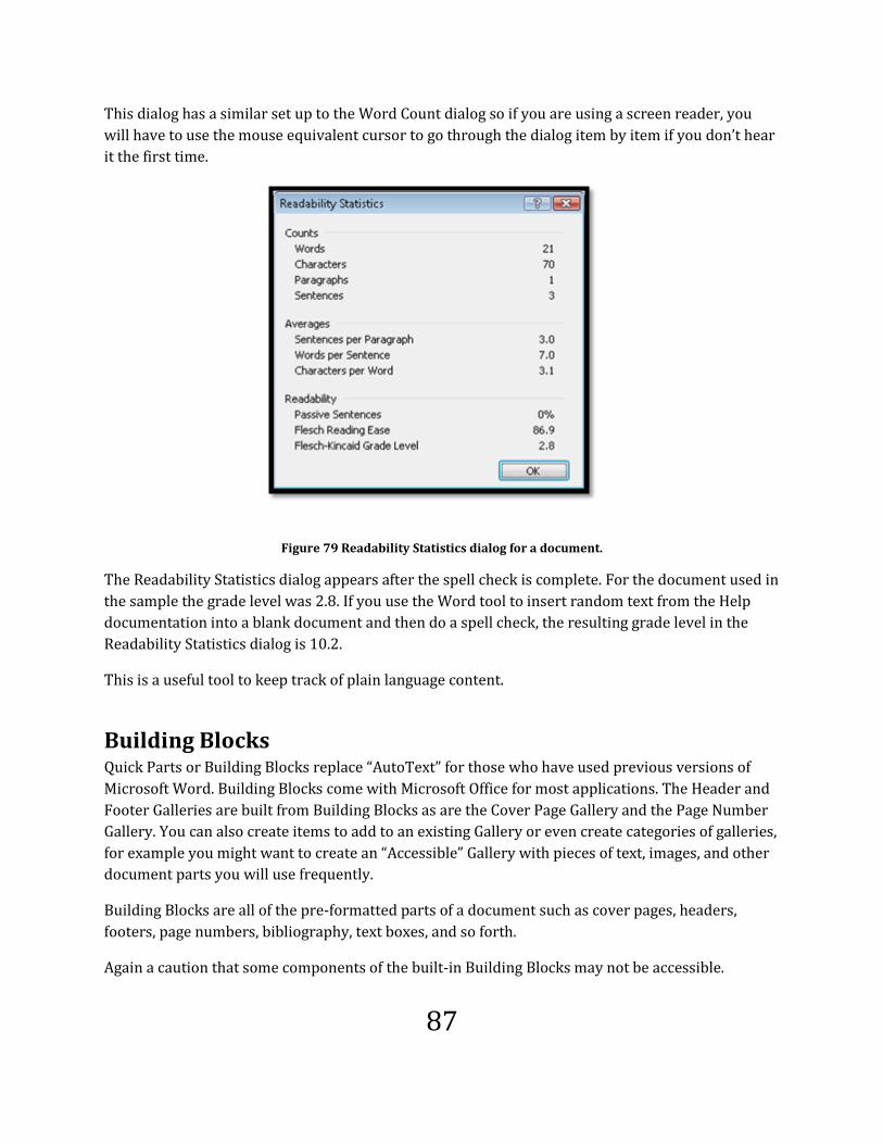
87
This dialog has a similar set up to the Word Count dialog so if you are using a screen reader, you
will have to use the mouse equivalent cursor to go through the dialog item by item if you don’t hear
it the first time.
Figure 79 Readability Statistics dialog for a document.
The Readability Statistics dialog appears after the spell check is complete. For the document used in
the sample the grade level was 2.8. If you use the Word tool to insert random text from the Help
documentation into a blank document and then do a spell check, the resulting grade level in the
Readability Statistics dialog is 10.2.
This is a useful tool to keep track of plain language content.
Building Blocks Quick Parts or Building Blocks replace “AutoText” for those who have used previous versions of
Microsoft Word. Building Blocks come with Microsoft Office for most applications. The Header and
Footer Galleries are built from Building Blocks as are the Cover Page Gallery and the Page Number
Gallery. You can also create items to add to an existing Gallery or even create categories of galleries,
for example you might want to create an “Accessible” Gallery with pieces of text, images, and other
document parts you will use frequently.
Building Blocks are all of the pre-formatted parts of a document such as cover pages, headers,
footers, page numbers, bibliography, text boxes, and so forth.
Again a caution that some components of the built-in Building Blocks may not be accessible.

88
To insert a Building Block into the document at the cursor point:
1. Press Alt + N, Q, B which opens the Building Blocks dialog.
2. On the left side of the dialog is a list of the various Building Blocks and which Gallery or
category they belong to. On the right is a visual representation of what they will look like in
the document.
a. You can use first character navigation in this list but I recommend that you use the
Up and Down Arrows to explore it first to get a feel for what is listed.
3. Once you find the Building Block you want to insert, press Alt + Letter I or Tab to the Insert
button and press Enter.
4. The Building Block is inserted at the cursor point.
Figure 80 Building Block dialog.
The following image shows a Bibliography Building Block inserted into the Text Group Samples
document.
Figure 81 Bibliography Building Block inserted into a document.
You can use Building Blocks from their Ribbon location. For example, a cover page can be inserted
into the document through the Page Layout Ribbon.

89
Create a Building Block You can create your own Building Blocks for repetitive content in the current document or for any
document you create.
To create a Building Block:
1. Type in some text and format it the way you want.
2. Select the text. It can be one line, one word, one paragraph, or anything you want to use
repeatedly in other documents.
3. Press Alt + N, Q, S to save the selection as a Building Block. This opens a dialog.
4. Fill in the necessary information using Tab and Shift + Tab to move through the dialog.
5. Tab to and activate the OK button by pressing Enter, once the information about the
Building Block is entered.
You can now use Alt + N, Q, B and first character navigation to find the new Building Block and Alt +
Letter I to insert it.
Figure 82 Create new Building Block dialog.
New Building Block Category
If you want to create a new category of Building Blocks, press Alt + C while in the Create New
Building Block dialog. This will open another dialog where you can type in the name of the new
category. For example, you might want a category specific to your business or one for accessible
Building Blocks.
Figure 83 Create new Category dialog from New Building Block dialog.
You can also choose which document template the new Building Block is available in.

90
Index and Table of Contents
We briefly talked about how using a Heading Style or Custom Heading Style helps when you want to
create a Table of Contents or when you want to repurpose your word processed document as a
tagged PDF document with bookmarks.
When creating a Table of Contents, Table of Figures, Table of Authorities8, or Indexes, it’s a good idea to build the structure of the page before you actually generate the Table or Index. This means choosing the location for the Table of Contents and inserting a couple of blank lines for visual spacing under the title “Table of Contents.” With Indexes and a Table of Contents, if you don’t create the framework, you will run into formatting issues once the Index or Table of Contents is generated.
Generating a Table of Contents It is relatively easy to create a Table of Contents or a TOC. A Table of Contents is based on the use of
the Heading Styles in Word. If you create a Custom Heading based on an existing Heading, it can be
added when you generate your Table of Contents.
To add a Table of Contents to your document:
1. Position the cursor where you want the Table of Contents to start.
2. Press Alt + S, T.
a. This opens the Tables of Content gallery.
3. Use your arrow keys to view the pre-formatted Tables of Contents. Once you have chosen
the style that you like you can either press Enter or press Alt + I to choose "Insert Table of
Contents." I always choose to Insert Table of Contents as it gives me more flexibility and
accessibility options.
a. The difference is that by choosing to insert a Table of Contents you can modify its
look and feel easier.
4. Make sure that the check box to create a linked Table of Contents is checked.
5. Make sure that the Dot Leaders are being used for the TOC. This will give you the dots from
the topic to the page number which helps the readability of the TOC.
8 Microsoft About Creating a Table of Authorities help topic: http://office.microsoft.com/en-
us/word/HP052356441033.aspx

91
6. If you need to add other Styles such as the Title or Custom Styles, activate the Customize
button and add the hierarchical level. We'll do this in the next topic.
7. Tab to and activate the OK button in the Table of Contents dialog.
8. The Table of Contents appears at the cursor point.
When you generate a TOC based on properly created Custom Styles, it will look like this:
Figure 84 Table of Contents for this book.
You can choose some options for a Table of Contents. Generally, for readability, you want the dotted
lines from the text to the page number. Putting page numbers right after the text can be visually
confusing for people with learning, cognitive or visual disabilities. It is equally confusing when
page numbers are on the other side of the page with no visual connection to their topic. Our fingers
tend to wander in a less than straight line across the page trying to find the right page number for
the topic we are looking for.
When a TOC or any text content is in all capital letters, it can be difficult to read. Uppercase fonts
are the most difficult to read because it removes our ability to use letter shape for word prediction.
This affects everyone’s ability to navigate a document, not just the ability of people with disabilities.

92
Italics are visually difficult to read and distracting. Italics, by their very nature, are thinner slanted
font formats that may not be readable depending on the device used to view the document.
Since you are working with a digital document, it is also important that your Table of Contents has
links that will let readers move quickly to the topic they want. If you are repurposing your
document to tagged PDF this navigational tool will be carried through to that format.
If you are converting a Word document to Braille, the Table of Contents will let the reader know
what the print page navigational structure is. Since Braille takes up more room than print, Braille is
formatted through a translation software, for Braille and print pages to appear if the Braille copy. If
someone is supposed to go to page 6 and find information, they can use the TOC to know they are in
the right area, and use the print page number to move directly to that information.
PDF documents have the same type of page numbering structure, particularly if the document is
being read in an older version of Adobe Reader and has preface pages such as “iii” or “iv.” The PDF
reader displays page numbers starting at page 1 no matter what the document page number is.
Therefore, on a document with ten prefix pages, if you use the Go To tool in your reader to get to
information on page 6, you will actually be on page “vi” not page 6 of the document. A Table of
Contents will help people move closer to the information they want and need in the document.
It is easy to see how all of the basic structural elements of a document are related to similar
functionality in other document formats.

93
Modifying What Appears in a Table of Contents Let's take a look at a document that uses titles and Custom Styles. In the following illustration a
document uses the Title Style as well as a Custom Heading Style.
Figure 85 Document with Title Styles and Custom Heading Styles.
A Custom Style based on the Title Style was used for the cover page. This lets you make use of the
Title Style for multiple purposes. The "Table of Contents " is the Subtitle Style modified to exclude
italics. We are working with the Normal DOCX document for this example.
On page 2 the "Introduction" is the Title Style. The text "Styles" is a Heading 1, the text "Custom
Styles" is a Heading 2 and the "Quick Tip for Custom Styles" is a heading called “Heading 2A."
Heading 2A is based on Heading 2. I purposely created it in wonky colours so it would stand out.
The colours are orange and purple! Please don't consider this colour combination to have good
contrast! It does, however make learning a bit more fun.
What we are about to do we could do in the Styles Pane but it is much faster to use the Table of
Contents dialog and it is easier to keep track of the hierarchy of the content in the TOC.
We need to tell Word that the Title Style should be at the level 1 position, Heading 1 should be at
the level 2 position, Headings 2 and 2A should be at the level 3 position and Heading 3 should be at
the level 4 position.
Don't worry; there are lots of images for this one!
To customize the Table of Contents for a document:
1. Position your cursor where you want the TOC to be placed.

94
2. Press Alt + S, T to open the Table of Contents gallery.
3. Choose "Insert Table of Contents” by pressing the letter I
4. This opens a dialog.
Figure 86 Table of Contents dialog showing Heading 2A in place.
The title text "Introduction" will not appear in this Table of Contents. We need to add it and adjust
the levels of the existing TOC entries.
Figure 87 Table of Contents without part of the document hierarchy.
5. In the Table of Contents dialog move to and activate the Option button by pressing Alt + O.
6. This opens another dialog with the Style and corresponding level in the Table of Contents
visible. We can edit the level for the Styles.

95
Figure 88Default TOC level placement for headings.
7. Make the following edits if you have appropriate heading levels:
a. Heading 1 = 2.
b. Heading 2 = 3. [If you have a Heading 2 and 2A both should be at the level 3
position]
c. Heading 3 = 4.
8. We do not have anything less than a Heading 3 in the document.
Figure 89 Edited levels for headings in TOC.
9. Scroll down to the end of the list of Styles. If you are using a screen reader you can press the
Tab key until you find the edit box for "Title."
10. Edit the level of the Title Style to be number 1.
11. Tab to and activate the OK button which will close this dialog.

96
12. The Title Style is now included in the TOC and the hierarchy of content is clear.
Figure 90Title Style placed in TOC hierarchy.
When the Table of Contents is generated the Title Style is included but the text for the cover title
and subtitle aren't. You typically would not want information on the cover page or pages to be
included in the Table of Contents for the document. We've modified the Table of Contents using this
method because the Title Style was close to what we wanted to use for both the cover title and
chapter titles. We could have used the Heading 1 Style. In this instance the technique is whatever
you can keep track of. You can modify the Heading 1 to be a Chapter Heading which means you
don't have to go through this process. However, if staff understand document structure in terms of
Chapter Headings being something separate from "headings" it is a good idea to build this
modification into the template so that there is no confusion when generating a Table of Contents.
Speaking of confusion, you can use Bookmarks to flag content to create a Table of Contents. One
huge caveat to this is not to over Bookmark a document. Some of the documents I've worked on
have been revised by editors who don't know how to maintain flagged Bookmarks for a Table of
Contents or who don't know what content should or shouldn't be flagged. In these situations it is
difficult without the original document author's intervention to create a functional Table of
Contents. Using the Heading Styles is a more effective method of generating a Table of Contents.
One of the reasons is that anything that is formatted as a heading goes into the Table of Contents.
Odd pieces of text that get mixed into a Bookmark field don't end up in the document TOC.
Updating a Table of Contents Now that we have a Table of Contents in our document, what happens if we add images or other
content to the document? What if we remove one section and add another?

97
To update a Table of Contents:
1. Place the cursor in the Table of Contents.
2. Press F9 or press the AppKey and choose "Update Field."
3. You may be asked if you want to update the page numbers or the entire Table of Contents.
4. I always choose to update the entire Table of Contents since this covers any changes to the
document including heading text.
I generally create a Table of Contents after I've added a couple of topics to the document I am
working on. I use the Table of Contents as a visual aid to ensure that content is in its proper
hierarchical order. You can also use the Outline view of the document but if you are not familiar
with working in Outline view, using the TOC as a guide is a good strategy.
Table of Figures You would create a Table of Figures in a similar way to creating a Table of Contents. Instead of
using Heading Styles as the flags for a Table of Figures, captions are used as the basis for content in
a Table of Figures. This book is a good example of how this works. All of the images except
decorative ones at the beginning of the book have captions. This means that the decorative images
which do have Alt Text can be identified using adaptive technology, but will not appear in a
referenced Table of Figures.
Figure 91 Captions Group on the Reference Ribbon.
To add a Table of Figures to your document:
1. Place your cursor where you want the Table of Figures to appear in the document.
a. Make sure that this section of your document has a Heading/Title.
2. Press Alt + S, G.
3. This opens the Table of Figures dialog.
4. Generally you can accept the default settings. Make sure that the Table of Figures is a linked
Table of Figures.
5. Tab to and activate the OK button.

98
Figure 92 Table of Figures dialog.
The following illustration is of a sample Table of Figures for this document. It shows the default
settings for a Table of Figures .
Figure 93 Sample Table of Figures from this document.
One thing to keep in mind when adding captions to images is the length of the text. In a Table of
Figures the text will keep wrapping until the caption text is fully displayed. After you've created a

99
Table of Figures with verbose text and view the result, you'll get better at supporting the images in
the document content and writing shorter captions.
If the Table of Figures text is just a titch too long, you can modify the font size for the Table of
Figures [or Table of Contents] so that the text will fit on one line. This should only be done if the
heading or caption text is on one line and is close to the page number. For multiple lines of headings
or caption text, edit the text and update the table.
Modifying Formatting for Referenced Tables We've looked at some of the accessibility issues related to bold, uppercase and italic font. What do
we do if we don't like the default template for the Tables of Figures, Contents or Tables? In each of
the dialogs, there is a Modify button.
To modify the font and font size of a Table of Contents:
1. With the Table of Contents dialog open, activate the Modify button.
2. This opens a dialog with all of the TOC formats listed. You can change one of them, for
example if you want all Heading 1 items bolded, you can do that. You can modify all of them
individually. Changing one does not replicate the changes in the other TOC items.
3. Once you choose the TOC level to modify, move to and activate the Modify button in this
dialog.
4. The Modify Style dialog opens.
5. Make the changes you want and Tab to and activate the OK button.
a. You do have the choice of having this change in the current document or in all
documents based on this template.
6. Tab to and activate the OK Button.
7. Generate the Table of Contents by moving to and activating the OK button in the Table of
Contents dialog.
8. You might be asked if you want to replace the existing TOC. Say “yes.”

100
Step 1 visualized.
Figure 94 Table of Contents dialog.
Step 2 visualized.
Figure 95Modify TOC Style dialog.

101
Step 4 visualized.
Figure 96Modify Style dialog for TOC1.
To modify the font and font size of a Table of Figures :
1. With the Table of Figures dialog open, activate the Modify button.
2. This opens a dialog with the Table of Figures format selected.
3. Move to and activate the Modify button in this dialog.
4. The Modify Style dialog opens.
5. Make the changes you want and Tab to and activate the OK button.
a. You do have the choice of having this change in the current document or in all
documents based on this template.
6. Tab to and activate the OK Button.
7. Generate the Table of Figures by moving to and activating the OK button in the Table of
Figures dialog.
Step 1 visualized.

102
Figure 97 Modify Table of Figures dialog.
Step 2 visualized.
Figure 98 Modify Table of Figures dialog.

103
Step 4 visualized.
Figure 99 Modify Style dialog for table of figures format.
Creating an Index There might be times when you are working on a document that requires an Index. Creating an
Index requires a bit more planning and concentration when writing a document. Words and
phrases will be marked for an Index and then the Index will be generated. An Index doesn’t use
headings or other Styles, but rather uses author identified information.
Creating an Index is a multi-step process. Before you build the Index, you need to identify the pieces
of text that will be part of the Index.
To mark an entry for an Index:
1. Open a document.
2. Find text that you want to appear in the Index and select it.
a. Keep in mind that this is an Index so long phrases should not be selected.
3. Press Alt + S, N which opens the Mark Index Entry dialog in the References Index Group..
4. The selected text is already entered in the first edit field.
5. Press Tab to move to the Bold check box and check it by pressing Spacebar. This means that
the page numbers will appear in bold. Try to avoid using the Italic format because of
readability problems.

104
6. Tab to and activate either the Mark button or the Mark All button to have Word go through
the document and mark all instances of the word.
7. When you mark an entry, the paragraph marks are revealed as are the field codes for the
marked entry. Tab to Close and press Enter.
8. Once you have text marked and identified, move to the page you want the Index to be on
and place your cursor at the point at which you want the Index to start.
9. Press Alt + S, X to open the Index dialog.
10. Choose the type of Index to create. In this example I’ve used the classic template.
11. The Index is built at the cursor point.
12. In the images that follow that illustrate these steps the Words Alt Text were given a sub-
category. The Index will be in two columns, there will be dot leaders between the text and
the page numbers, and the page numbers will be in bold.
a. Two columns works well with an Index for readability and conversion to other
formats such as tagged PDF. With tagged PDF if you have four or more columns, the
conversion tool can get confused and mistag multiple columns as one single column.
13. You can update the Index as you edit or revise content.
To show or hide paragraph marks press Ctrl + Shift + 8 on the number row. When you create an
Index the paragraph marks may be automatically turned on to let you see the field codes next to the
items you’ve selected to be indexed.
You can leave the Mark Entry dialog open while you work. It does float above the document so you
might need to keep moving it. Pressing Escape closes it. You can easily show it again once you found
an entry to mark by pressing Alt + S, N.

105
Steps to create an Index visualized.
Figure 100 Index Group on the References Ribbon.
Step 4 visualized.
Figure 101 Text selected and Mark Entry dialog on-screen.

106
Step 9 visualized.
Figure 102 Paragraph codes for marked Index entry.
Step 11 visualized.
Figure 103 Index dialog.

107
Step 13 visualized:
Figure 104 Generated Index.
As mentioned in the steps on a previous page, a sub-entry was created for Alt Text called
"Accessibility." This was done to demonstrate what a sub-entry is. Visually, when the Index is
generated, Alt Text now has a sub-entry or sub-topic called "Accessibility." Any other item marked
for the Accessibility sub-entry would appear under this topic.
Updating an Index Update the Index by placing your cursor in the Index fields and either pressing F9 or pressing the
AppKey and choosing Update Field.
You may get asked if you want to update all or some of the Index. I usually choose all so that
everything is up to date.
Cross-References and Accessibility Cross-references can be used in documents with a caveat. While they may work in the source Word
document, when cross-references are converted to tagged PDF they often either don't convert
gracefully or don't convert at all. This behaviour is not limited to Word documents and seems to be
an issue with cross-references in general.
If the document has cross-references and is converted to tagged PDF note that there is currently no
effective way to repair them. With this in mind make sure that any text identifying items that are
cross-referenced are clear enough so that the end-user can locate the cross-reference if the link is
broken in a tagged PDF document.
Since cross-references are not converted to Braille or DAISY format, making sure the text for cross-
referenced material is clear is a good habit to get into.

108
Tables of Reference in a Tagged PDF Document At the end of the section on headings and Styles we looked at how these tools affected and
optimized accessibility and navigation in a tagged PDF document. Using the same "Adding Images
to Training Material" book, the following image is of a list of links in that document show the table
of contents entries.
Figure 105 List of links in a tagged PDF document.
As with the list of headings, the list of links in a tagged PDF...or even Word document can be asked
for at any time. This gives the person reading the document a choice in navigational tools.

109
Tables and Text Boxes
At first thought, this might seem an unlikely combination. What do Tables and Text Boxes have in
common? Tables are often used to isolate important thoughts rather than using paragraph borders.
Text Boxes are also often used to isolate ideas; however, many document authors don’t realize that
Text Boxes are inherently inaccessible. Both items are included in this discussion of tables and
design layout for document content as they are both used ineffectively.
Some legislation states that data tables must be correctly identified and/or tagged. Tagging might
refer to converting content created in a word processor to either HTML or PDF content. If the
legislation intends that all Tables used in word processed documents are data tables, a lot of
document authors who use the table structure for design layout will face major problems in making
their documents compliant. Tables used for design and presentation aren’t data tables.
Being correctly identified or tagged is different than ensuring that all structural elements of a
document are identified or have tags. You can have a Table identified or tagged, but you will be
unable to apply “correct” identification or tagging to the table structure because of how the table
has been used in a document.
HTML Table Structure What do we mean by proper or correct table structure? The best way to see a correct or proper
table structure is to look at the code or specifications for a Table in HTML. The same structure is
used in tagged PDF, Corel WordPerfect, and Microsoft Word to identify data tables.
A Table has a Header row to let the reader associate data they are reading with the context of its
importance. The code used for a Table Header is <TH>. The cells containing data are tagged as <TD>
for Table data, or data cell. The HTML code would look like this:

110
<table width="83%" border="0" summary="Type a short summary of the table contents">
<caption>Provide a caption for the table</caption>
<tr>
<th id="header1" width="33%"> First Header</th>
<th id="header2" width="14%">Second Header</th>
<th id="header3" width="30%"> Third Header</th>
<th id="header4" width="23%"> Fourth Header</th>
</tr>
<tr>
<td headers="header1" width="33%">table data</td>
<td headers="header2" width="14%"> table data</td>
<td headers="header3" width="30%"> table data </td>
<td headers="header4" width="23%"> table data</td>
</tr>
<tr>
<td headers="header1" width="33%">table data</td>
<td headers="header2" width="14%"> table data</td>
<td headers="header3" width="30%"> table data</td>
<td headers="header4" width="23%"> table data</td>
</tr>
<tr>
<td headers="header1" width="33%">table data</td>
<td headers="header2" width="14%"> table data</td>
<td headers="header3" width="30%"> table data</td>
<td headers="header4" width="23%">table data</td>
</tr>
</table>
Using the <caption>...</caption> puts a caption above the table so that people with learning
disabilities or people who are blind or visually disabled have an idea of what is coming. The
summary attribute is also used to let people using screen readers know why the table is there.
These two elements meet W3C guidelines for accessibility of tables.
<th id="header1">...<th> indicates a Table header. This is used by screen readers to let the end user
know what the cell information is related to. For example if you were down four rows and over two
columns, you could ask the screen reader to read the title of the information so that you can
associate the data better.
<tr>...</tr>indicates the Table row, notice we have four of them here
<td headers="header1">…</td> indicates a Table data cell and the header cell its information is
related to. This is how screen readers and other adaptive technology help you keep track of where
you are in a table.

111
You can see how a table is structured. If you are working in HTML, begin with the <table>...</table>.
The next tag is the <tr>...</tr> to define the rows across the page. The <td>...</td> is for the
"columns" or data cells in the table.
Of course, HTML editors such as Adobe Dreamweaver and Microsoft Expressions have tools to let
you automatically create tables. You can then look at the underlying code to ensure that the table is
correctly tagged.
If you are confused about Tables and how they are structured, you can copy the well-structured
code from a source document and fill in your own information switching from NotePad/HTML
editor view to the browser view until you get the structure and placement right.
In HTML, a lot of learning is done through copy and paste of code! If you are trying to do something
difficult or new, go and see how other people have done it. There’s no sense in re-inventing the
wheel. One caution is that your own creativity and individuality need to be present in a web page,
just copying source code and filling in the blanks won't impress your customers who are also out
there surfing and seeing what is new in accessible web page design!
Tagged PDF Table Structure If we take the Table in the previous section and convert it to a tagged PDF document, what would
the tags or table structure look like?
Figure 106 Tagged Table in a PDF document.
The tool used to tag the table or convert it to tagged PDF was Adobe Acrobat Professional. Notice
that the column and row titles have <TH> or Table Header Tags. Highlight Content was turned on to
illustrate the content that corresponds to the selected Tag.
Notice that a <THead>or Table Header row has been identified. The conversion tool used the
“Header row repeat” to create the Table Header information. Also notice that there is a <TBody>tag
which indicates that the following Table Rows and cells are the body or data of the Table.

112
Figure 107 Close-up of the Table Tags.
What can we do in Word to ensure that we meet legislative criteria for accessibility for repurposed
content? How can we make our word processed documents more accessible and usable to our
readers? To answer this we need to look at table structure in Word.

113
Table Structure in Word Now that we have an idea of what the structure of a correct or proper data table is, let’s look at
what a proper or correct table structure consists of in a word processed document. Here we will
find similar components for data tables.
Data tables are used to display comparative data either simple or complex. The key to creating an
accessible Table is to ensure that no matter where in the table someone who can't see is, they can
get the information they need to determine what it is they are reading.
A properly structured data table might look like this:
Table 1 Properly structured table in Microsoft Word 2003.
Salesperson First Quarter Second Quarter Third Quarter
Data cell Data cell Data cell Data cell
Data cell Data cell Data cell Data cell
Data cell Data cell Data cell Data cell Data cell Data cell Data cell Data cell
Data cell Data cell Data cell Data cell
In the above table, the Header row has been visually set apart by using bold and centring. The
Header row has also been structurally identified by selecting the row, choosing Table Layout and
then choosing Header Row Repeat from the Table Layout Ribbon. The keyboard commands are Alt
+ J, L, J. This means that in the unlikely event that this data table is divided over two pages, the
column Headers will display on the second page. In Word 2010 you can select more than one
contiguous row to be header rows.
This is not the same as Heading Styles and Heading Styles should not be used in a table.
The steps are in this book in detail after the general discussion about Tables.

114
Figure 108 Header Row Repeat Table option.
The option to repeat the Header rows is also a flag to the Adobe or Microsoft conversion tools so
that the <TH> or Table Header Tag is used for that row. Unfortunately at the present time there is
no mechanism for identifying the row titles in a table created in Word. This repair too will need to
be done manually in a tagged PDF document.
On the other hand in Word 2010 you can select more than one consecutive header row in a table.
Accessibility is always evolving.
In Word, most of the high level screen readers such as JAWS provide tools for someone selecting the
column to use for row titles. This type of "meeting halfway" by both Microsoft and the adaptive
technology developers facilitate better access to document parts in transition.
The preceding Table has been further structured by selecting the table and choosing Table
Properties > Rows, and un-checking “allow rows to break across pages.” This keeps you honest as a
document author. If the amount of information in a row breaks across a page, you need to redesign
the way the information is displayed. Some people can’t follow the text in a row if it breaks across a
page. Even if a cell doesn’t have a lot of information, not letting the row break across pages helps
with the readability and usability of a document.

115
Figure 109 Allow Row to Break Across Pages Table option.
Tables for Design or Presentation This topic looks at how we misuse the table structure in our documents. If we know that a proper
table structure includes a Header row or column and a caption, how would you add these elements
to a table that spans 20 pages, has multiple types of content, multiple Headers, split and merged
cells, and deleted cells for visual effect? A Table can have only one Header row and one Caption.
Although in Word 2010 it is possible to identify more than one Header row, keep in mind that this
information is going to be provided to someone using a screen reader for every cell the Header
information applies to.
Simple formats are often the best. Just because we can put information in a table for presentation
doesn’t mean that this is the best way to present the information or to read it. Often we find that
information plunked into a table is not readable in any logical manner.
Document design is important before you start formatting.
The following Table begins with 6 columns and 125 rows. In the original document, this one Table
went on with similar "formatting" for 68 pages.

116
Figure 110 Horrid Table design used for layout.
As we see, the Table quickly loses four of its columns and appears to have three “Headers” before
we get to the information in the table. If this Table were to go on for pages and pages, which of
these three header rows would you use as the Title or Header row of the table? How can we swap
out the first yellow row which is a visual "topic change" with the yellow row at the bottom of the
page which also is visually indicating it is a topic change? Adaptive technology is not "psychic" in
knowing that the topic change should now be read instead of the originally coloured topic header.
Word processors are not designed to identify row titles. They are only designed to identify column
headers or column titles.
But wait, things quickly change on page two.

117
Figure 111 Continuation of Table used for layout.
At the top of page 2 of this horrid Table there are no visual headers or topic changes. Remember, it
was at the bottom of the first page. The "Table" suddenly decides it IS a data table and deletes some
columns and adds yet more header rows.
We’ve now lost one column, but the table purpose/structure has changed to that of a data table
displaying a check list for accessibility. Then, yet another format comes along. We have another
Header, but the two columns we are presented with aren’t the same two as in the beginning of the
table and “column 1” is now smaller than column 2. I’ve left the grid lines on in this example to
demonstrate the illogical structure of the document; however, typically, these would be turned off.

118
Figure 112 Yet more of the horrid Table used for design layout.
Looking at this one Table that spans many pages, identify the Header rows that will be identified
throughout the table for someone using a screen reader. Provide a caption for the table. Remember
that the Header rows were way back on page 1 of the table.
Even from a “visual” perspective this “table” is confusing and unreadable.
If you are looking at a table and can’t identify Header rows and provide a caption for the table, you
need to look at using a different structure or presentation method. It is not acceptable to divide
each change in table usage/structure into individual tables. Tables are intended to display brief
pieces of comparative information. If we are not doing this, we should not be using a table.
Let’s look at another example of bad Table use. I recently heard someone say that putting
information into table format for people who are using screen readers would make that
information more readable. Given that people who are using screen readers have to use table

119
navigation keyboard commands rather than general document navigation keyboard commands,
this statement and belief demonstrate a lack of understanding.
Why would you force someone to use specialized keyboard commands to read your document
when “plain old every day” keyboard commands let them read and navigate faster and more
effectively?
The following example shows how we tend to format agendas for meetings. Once again, ask
yourself what the Header row is and what the caption is for this table.
Figure 113 Table structure used for agenda.
Using Tabs would give you the same effect and be more readable and navigable. However, is this
the best design for an agenda?
With Word 2010 you can now select more than one row as the Header row of the table. In the
sample Table below this still presents a problem in that there is no scope attribute for the column
titles in blue that span more than one column. If this document is sent to Adobe Acrobat as a tagged
PDF document, the scope can be added using the Table Inspect tool. However if this document
remains a Word document, a slight redesign would be necessary to ensure that the information
about the province is rendered to adaptive technology.
Table 2 Table with two Header rows, split cells and one column with no Header.
Day of the
Week
Toronto Calgary
Winter Summer 2Winter Summer
Sunday 5 25 1 22
Monday 3 31 2 25
Tuesday 4 30 2 27
Wednesday 4 24 4 23
Thursday 3 25 5 24
Friday 2 23 2 25
Saturday 5 25 0 25

120
Which of the first two rows would you designate as the Header row? What would you do with the
two blank cells that were merged for visual effect in the upper left hand corner?
Table 3 Average daily temperature in degrees Celsius.
Days of the
Week
Toronto -
Winter
Toronto-
Summer
Calgary -
Winter
Calgary -
Summer
Sunday 5 25 1 22
Monday 3 31 2 25
Tuesday 4 30 2 27
Wednesday 4 24 4 23
Thursday 3 25 5 24
Friday 2 23 2 25
Saturday 5 25 0 25
With the Table above, a person using a screen reader will be able to designate both column and row
Titles/Headers and ask the screen reader for the relationship of the information in cell C5. It would
tell you that the average temperature on Wednesday in winter in Calgary was four degrees Celsius.
If the only information someone using a screen reader can get is the number four without being
able to know what day or what city, or what time of the year it relates to; or even that these are
average daily temperatures, how usable “and” accessible was the original table?
Also remember to support the information contained in a table in the surrounding text of the
document. Don’t use Tables or images out of context or gratuitously.
The next demonstration of a misuse of Tables is prevalent in both word processing and HTML. It is
the use of a one cell table to isolate an important piece of information.
The next image shows a single cell table used to display something the author has identified as
important and worthy of note. The single cell has been decorated with a blue border to make it
stand out.
The lower part of the image shows the same text but instead of using a table to present this as
important, the borders and shading tool in Word was used for the same effect. By using borders and
Shading, I also had access to the shadow effect which is not available when using the borders and
shading for table cells.

121
Figure 114 Single cell Table on top with paragraph formatted text on bottom.
If we were to provide a Header row and caption for the single cell table, the result would be
something like this:
Figure 115 Single cell Table with caption.
Once we can visualize or even listen to this type of table with a screen reader, we can quickly see
that using a paragraph with a border is more efficient and effective. In HTML you can achieve the
same effect using an external Style sheet [CSS]. With both word processing and HTML, you can
create a Custom Style that will also include different fonts, font sizes, margins and indents.
I know what some of you are thinking about the next heading…Text Boxes! Just say no!
Text Boxes- Just Say No! Some document authors use Text Boxes instead of single cell tables to isolate information or to
create an effect for text. Text Boxes are very difficult to navigate if you are using adaptive
technology and they may not convert well into other formats.
Text Boxes float over the page because they are objects not part of the text layer of the document.
Most of them cannot be put into focus so that the content is accessible to adaptive technology
unless you can physically put the mouse cursor into the text.
Some screen readers do have the ability to list objects in a document and then let the end-user put
focus into the text but because they are objects the process is similar to walking on stepping stones
in a pond. You move from stone to stone without touching the water. In this metaphor you move
from object to object/Text Box to Text Box without touching the surrounding content.
Why are Text Boxes inherently inaccessible?

122
Text Boxes are not part of the main document text layer. They are objects that float above the text
layer. Because they are not part of the text layer of documents, adaptive technology doesn’t see
them.
Imagine moving along this river looking left, right and in front of you. You can touch the area you
are nearest to which means you “have access” to these parts of your surroundings.
Figure 116Photo of Jackson Trail Alberta copyright Karen McCall.
The clouds float above the area you are walking in as do birds and insects. The clouds, birds, insects,
planes and other elements that you don’t have access to would be comparable to the objects that
are not in the text layer of a document. The “text layer” would be comparable to the area around
you as you walk that you have access to.
Figure 117 Photo of clouds taken from plane copyright Karen McCall.

123
Some adaptive technology such as the JAWS screen reader have keyboard commands for getting a
list of objects in a document. You can navigate to an object such as a text box and sometimes read
the contents.
But here is the problem.
If you are moving from object to object it is like being in an airplane skimming along the clouds. You
can see the clouds and go in and out of them but you have no idea from looking at the clouds where
you are. You don't have the ability to look down to see what might be below the clouds.
Figure 118 Photo of clouds taken from plane to illustrate objects and layers.
This is compounded with layered documents. It is like gliding between layers of clouds without
knowing where you are or what you are “touching.” In some cases it is difficult to separate one layer
of cloud from another. Similarly with layered documents it becomes difficult separating one layer of
“content” from another.
So while you may be able to read the content in a text box, you have no mechanism to help you view
what is under it or around it. Each "layer” of the document lives in isolation of each other as
experienced by adaptive technology.
Text Boxes are often used for quotations and other text that document authors want people to
really notice and read.
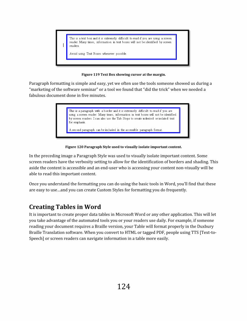
124
Figure 119 Text Box showing cursor at the margin.
Paragraph formatting is simple and easy, yet we often use the tools someone showed us during a
“marketing of the software seminar” or a tool we found that “did the trick” when we needed a
fabulous document done in five minutes.
Figure 120 Paragraph Style used to visually isolate important content.
In the preceding image a Paragraph Style was used to visually isolate important content. Some
screen readers have the verbosity setting to allow for the identification of borders and shading. This
aside the content is accessible and an end-user who is accessing your content non-visually will be
able to read this important content.
Once you understand the formatting you can do using the basic tools in Word, you’ll find that these
are easy to use…and you can create Custom Styles for formatting you do frequently.
Creating Tables in Word It is important to create proper data tables in Microsoft Word or any other application. This will let
you take advantage of the automated tools you or your readers use daily. For example, if someone
reading your document requires a Braille version, your Table will format properly in the Duxbury
Braille Translation software. When you convert to HTML or tagged PDF, people using TTS [Text-to-
Speech] or screen readers can navigate information in a table more easily.

125
Note: Tables should not be used for formatting; they should be used to display brief
pieces of comparative information. If you want to create columns, use Format >
Columns in Word, or the structural element for creating columns in the application
you’re working in.
There are some elements of creating a table you need to include.
Creating a Table Create a table by pressing Alt + N, T. You can either use the visual grid which will be read by the
JAWS screen reader or by using the Insert Table dialog. Both will create a uniform table.
Figure 121 Insert Table using Table grid.
Using Insert Table or the grid of possible rows and columns initially creates a uniform table which
is more recognizable by automated tools like Duxbury, DAISY book authoring tools, HTML and PDF
converters. It will also make navigating tables in Word a lot easier.

126
Figure 122 Insert Table dialog.
Once you've created your table Tab to OK and press Enter. Now there are a few settings you need
to modify.
Header Rows Repeat First, select the column title/titles or first row of the table. You can wait until you've entered the
column title information if you like.
Choose Table Tools, Layout, Header Rows Repeat. The keyboard commands are Alt + J, L, J.
Adaptive technology such as screen readers have their own verbosity settings or user settings that will let the person using the screen reader choose which columns and rows they want read as the Header rows of a Table. The settings in the Table Tools Sub-Ribbons are not the place this is done.
Figure 123 Header Row Repeat icon in the Data Group on the Table Layout Ribbon.
Having the Header rows repeat not only helps people using adaptive technology such as screen
magnification or Text-to-Speech software, it also helps everyone keep track of the relationships
between information if your table spans two pages. Even if your table will not span pages, using the

127
Header Row Repeat is what the Adobe and Microsoft PDF conversion tools used to identify and
create the TH or Table Header Tags.
On the Table Tools Design Ribbon there are some check boxes for column or row title.
Figure 124 Table Tools Design Ribbon Table header options.
These check boxes are for internal Word use only and are not used by screen readers at this time to
determine a column or row title. They are checked by default when you create a table.
The important setting is to have the header rows repeat in the table. There is no tool at this time to
identify row titles for repurposing Word table content to tagged PDF or other formats.
Rows Braking Across Pages The second thing you need to do is to not let the rows break across pages. I know, several of you are
cranky about this at the moment.
Put your focus in the table and select it by pressing Alt + J, L, K, T. I put the Select Table tool in the
QAT or Quick Access Toolbar because it is a tool I use often.
With the table selected, press the AppKey.
From the context list, choose Table Properties at the bottom of the list. You can also get to Table
Properties once the table is selected by pressing Alt + J, L, letter O.
On the Row tab, make sure the check box allowing rows to break across pages is unchecked.

128
Figure 125 Allow rows to break across pages Table option.
This does two things: first it keeps you honest in only having short pieces of information in a table
cell; and second, it makes it easier for your readers using adaptive technology when you keep all
information in one cell together.
If your document is printed, it is easier for people with visual or learning disabilities to read the
content of a cell if it isn’t broken over pages.
Empty Table Cells You should not have a lot of blank cells in your table. If you have a blank cell because there is no
information, use a – [dash] which will help automated processes understand that this is a blank cell.
If someone is using a screen reader to read a table and empty cells have been used for “spacing” or
visual effect, the person using the screen reader hears “blank” for each empty cell. If someone hears
too many “blanks” in a row, they will stop reading the table information thinking that either their
screen reader is stuck, or that the document author simply put lots of empty cells in a table for
visual effect. Either way, the person reading your document is frustrated and loses mental focus and
concentration on what they are reading.
Tables used in HTML for design layout often have 10, 15, or more empty cells in a row or column
because the document author is misusing the table structure for a visual effect. People using
adaptive technology such as screen readers have been conditioned to believe that any series of

129
blank or empty cells are just another example of improper use of Tables and that it is a waste of
time and energy to try to figure out where the content is.
Figure 126 Cell Properties dialog.
Cell Margins Use the Cell Margins option to create space around cell content, not blank lines. If someone using a
screen reader hears “blank” when they enter each cell, they might not listen to hear that content
follows. It is also quite annoying to hear “blank” before and/or after every piece of content in a
table.
The Cell Margin tool is accessed through Table Properties > Cell. If you have Table Properties open
press Ctrl + Tab until you reach the Cell tab at the top.
Tab to and press Enter on the Options button. The first topic in this dialog is Cell margins. You can
adjust all four margins in a single cell or series of selected cells. Make sure to un-check the “Same as
the whole table” check box. Your focus is on this check box when you enter the Cell Options dialog.

130
Figure 127 Cell Margins dialog.
You can then tab to each side of a cell: top, bottom, left and right. Make the changes you need to in
order to get the spacing effect you want. Make any other changes you want, Tab to the OK button
and press Enter.
A caution here is not to use whole numbers. A cell margin of .10 or .20 is more than enough for
visual separation. Using whole numbers creates havoc.
You are returned to the Cell Tab in the Table Properties dialog. Tab to the OK button and press
Enter.
The cells you’ve assigned new margins to are now showing these new margin settings.
Try to maintain a uniform table structure as much as possible. Do not have a blank row with
another table after the first– make it two tables. Design your table with care before you begin
constructing it.
Nesting tables is not good form or document structure. If you find yourself thinking of nesting
information, perhaps a table isn't the right structure for your content!
Captions for Tables Just as you should add a caption for an image or equation, you should add a caption for tables used
in your documents. This will also help you remain honest in the use of tables within a document.
Many people won’t want to put a caption on a table used for design layout.
To provide a caption for a table, select the table and then press the AppKey. The context menu
appears, use your down arrow key to move to Insert Caption or press the letter C. The Caption
dialog box appears. The Caption should begin with “Table #” and your cursor should be just past
this text at the point where you can type the caption. As with the image and equation captions, I
generally insert a space before I begin typing just to provide some separation between the table
identifier and the caption text.

131
Figure 128 Insert Caption item from context menu.
The Insert Caption dialog opens and your focus is where you can type or paste the text for the
caption.
Figure 129 Insert Caption dialog with label changed to Table.
Make sure the label is changed from Figure or Equation to Table. A table caption traditionally goes
before the table. This lets people know what to expect when reading through the table.
Table Frames or Drawn Tables I've recently come across the notion of "Table Frames" which appear to be drawn tables that text is
dumped into.
If the tool to draw individual table cells is used to create a visual table, this is not an accessible
table. There are some interesting side effects that affect the readability of the content. There are
also some side effects that will impact your ability as a document author to rearrange content and
control table frame/drawn table content.

132
This type of tool is used in documents, not only Word documents, to create a table instead of using
the tools in an application that would create a uniform standard table.
The following image is of a visual table created using several drawn tables positioned to look like a
single table.
Figure 130 Drawn Table in document.
As with uniform tables, the table can have one of the built-in designs applied to it as shown in the
image below.
Figure 131 Drawn Table with design applied.
So what are the issues that affect accessibility and readability? These look fine to me.
The first issue is that when an end-user enters this type of "table" they are not told they are in a
table. If they have the verbosity set to announce borders and shading, they are told they are in
bordered text. It isn't until they move to the second "cell" in the "table" which is empty, that they

133
are told they are in a table structure. They are not, however told how many columns or rows the
"table" has. They are told it is a non-uniform table.
As the end-user moves through the "table" cell by cell, they are not provided any information about
where they are. The screen reader indicates the key pressed which is either Tab or Shift + Tab. If
the end-user arrows through the "table" they hear space on the empty cells rather than the cell
coordinates. At times we hear things like "table 4, or table 3, column 3, row 4." Remember that each
"cell" of this table is an individual table that has been "joined" for a visual effect.
When I created this table, as I added subsequent cells they "joined in a non-uniform table structure.
Pressing Enter after the last table I drew created a duplicate row which then formed the "table."
Even if the first row is selected in either sample shown previously in this topic and identified as the
header row to repeat, the information is not available to someone using a screen reader.
Another interesting element to drawing tables is that if there is another drawn table near the one
you are working on, they seem to recognize each other and connect.
Figure 132 Table frame with table headers from previously drawn Table in document.
For example I had created what can be referred to as a "Table Frame" borrowing from concepts I've
found on the Internet in help documentation, and my drawn table cemented itself to the Table
Frame and couldn't be separated.

134
Not only that, when I had the header row repeat on the first table, it did so on the second table...the
one containing the text. I used a table break to separate the two tables.
This brings us to the other disadvantage of using a table frame or table to position content. If a table
frame or drawn table is used as a container for text, as it is resized it will spill over to the next page.
It does not behave as columns would. You will have to remove some content from the table and try
to find a way to display it on the same page. I tried to create a table next to this one on the page
without success. This is not a challenge! It is a recommendation not to use drawn tables or table
frames to position content!
Figure 133 Drawn Table resized to look like a column with content spilling onto next page.
Parallel columns have their own unique issues when it comes to accessibility. The difference is that
there is a technique you can use to modify the reading order and retain the look and feel you want.

135
Parallel Columns
Document authors can also alter the reading order of information once it’s tagged. For example, if
you have parallel columns with the document text on the right and a quote from that text
highlighted on the left, it all gets tagged in order which may put the quote in the middle of the text.
It changes the reading order of the document for those using adaptive technology. Whereas our
eyes will pick up the quote first and then move to the text, someone using Read-Out-Loud [comes
with Adobe Reader 6.x or later] or a screen reader will have the text and quote jumbled together. As
a document author, you can find the paragraph or quote and move it in the logical document
structure so it makes sense to the reader. The visual appearance of your document isn't altered, but
people accessing the content in a non-visual way will be able to better understand what they are
reading.
Consider this example:
“You might have a very
insightful quote here.
The quote may or may
not be included in the
text on the right.”
Document authors can also alter the reading order of
information once it’s tagged. For example, if you have
parallel columns with the document text on the right and a
quote from that text highlighted on the left, it all gets
tagged in order which puts the quote in the middle of the
text. It changes the reading order of the document for
those using adaptive technology.
Whereas our eyes will pick up the quote first and then
move to the text, someone using Read-Out-Loud [comes
with Adobe Reader 6.x or later] or a screen reader will
have the text and quote jumbled together. As an author,
you can find the paragraph or quote and move it in the
logical document structure so it makes sense to the reader.
The visual appearance of your document isn't altered, but
those accessing the content in a non-visual way will be
able to better understand what they are reading
In the sample above, because we used the column tool in Microsoft Word, the columns were tagged
properly when the document was converted to PDF. This is not likely to be the case if we draw the

136
parallel columns, use objects or other non-standard methods of visually displaying this same
information.
The other advantage to using parallel columns in Word is that a screen reader or TTS technology
will read down the first column and then down the second column….in the logical reading order. If
someone changes the document view to Draft, the column content will flow from one page to the
next in a single column, once again reflecting the logical reading order.
The Borders and Shading tool can be used to further isolate a quote when using this format. This is
the technique used in the preceding example.
Parallel columns do not have an inherent “structure” and are considered formatting rather than
structure. Whether parallel or newspaper columns are used, their purpose is to reflow the content
not to provide any associative structure. Repairs will need to be done on repurposed documents
where parallel columns have been used to show a heading in one column and the associated text in
the other.
You can also create newspaper columns from selected text and have each column equal so that
information doesn’t stray and look out of place.
Using the dividing line, which is a check box in the Columns dialog, people reading information in
columns can better separate information. This is especially useful if you use three or more columns
and text appears to visually blur into one line.
I can also use the Borders and Shading tool to
further isolate a quote when using this
format. This is the technique used in the
example above.
You can also create newspaper columns from
selected text and have each column equal so
that information doesn’t stray and look out of
place.
Using the dividing line, which is a check box
in the Columns dialog box, people reading
information in columns can better separate
information. This is especially useful if you
use three or more columns and text appears
to visually blur into one line.

137
The preceding columns have wide gutters, or spaces between them. Again, I’ve used the dividing
line to visually separate information. The gutters are the standard distance assigned by Word
between two columns on a page. The size will be adjusted smaller the more columns you have.
Text Alignment and Justification Text in columns or text in general should not be fully justified because when text is justified it
becomes harder to read and this limits the readability and usability of the information. Fully
justified text creates a lot of white space between words especially when only one or two words
will fit in a column. Think of newspaper or magazine articles you’ve read where in four or five
columns, two words are on a line, or worse, the letters in a word are spread out to span the line
making it even harder to read and continue the thought or the article.
Fully justifying text, whether it is in a single column or multiple columns creates distracting rivers
of white throughout your text. Even for people without visual or print disabilities, it is often difficult
to follow the context of what they are reading. Because digital documents use proportional fonts,
there is no need for full justification; it is a holdover from old typewriter days when the fonts were
fixed [which meant that the letter “o” took up the same space as the letter “i”]. Body text should be
left justified.
Creating Columns To create columns in Microsoft Word, type the text that you want to be displayed in parallel or
newspaper columns then perform a spell check on your work and make sure it is left aligned.
Remember that fully justified text can create readability problems.
1. Select the text you want to be a parallel or newspaper column.
2. Choose Page Layout > Column or press Alt + P, J to open the Column Gallery.
Figure 134 Column Gallery.

138
3. The Column Gallery has one, two or three newspaper columns and left or right parallel
columns as well as an option for more column choices.
4. Choose More Columns by pressing Alt + P, J, letter C, and the standard Column dialog opens.
Figure 135 Column dialog.
5. Your focus is in the number of columns in the columns dialog. If you are creating newspaper
columns, you can choose the number of columns here. Remember that when you create a lot
of columns, more text gets squeezed onto the page and this makes it more difficult to hold
the reader’s interest. A good rule to follow is to limit your columns to three, preferably two.
6. For parallel columns, Press Shift + Tab and to move to Presets then use the arrow keys to
choose either Left or Right to indicate where you want the smaller column, on the left or the
right of the page.
7. Press Alt + B to insert a line between your columns whether they are newspaper or parallel.
This will assist the reader in defining the column boundaries across the page.
8. Tab to and activate the OK button. The selected text is now displayed in columns.
You can use column breaks to force the columns to look the way you want [Choose Insert > Break >
Column Break]. The column break will be inserted at the cursor point. You need to be in a column to
use this. If you are not in a column a page break may be inserted instead.
Creating columns by selecting text will ensure that your columns are balanced. This means that
within one or two lines, both columns will end on the same visual line on the screen. You won’t end
up with one column filling a page from top to bottom and the overflow text being displayed at the
top of the next page. It will also ensure that the text that you don’t want in columns will remain
outside of the column structure.

139
Graphics, Images and Charts
If you use an image in a document, it should have Alt Text and a caption. Providing Alt Text or
“alternative text” will let people who are reading the document in digital format and people with
learning disabilities know why you used the image and what it is if they find it visually confusing.
Providing a caption for an image will let people who prefer to print the document know why you
used the image .This is especially important if that person is using a printer that will not let them
print in colour or a sufficient resolution to make the image clear in print.
If you are converting the document to tagged PDF, one of the “wonky” things about Acrobat 9 and
the Microsoft Save As PDF or inaccessible XPS add-in is that the <Figure> Tags or all of the images
in the document are placed at the top of the Tags Tree. This means that you will either need to
manually drag them and drop them into their logical place in the Tags Tree or relegate them to
being Artifacts in the document. If you have captions, making the images Artifacts is a moot point
since everyone will have access to the captions. This is the fastest, most effective repair for this type
of situation. Hopefully this bug will be repaired in the next version of Acrobat and the Save As PDF
or inaccessible XPS add-in. This oddity does happen in both tools.
We create information for people to read and the more accessible, readable, and usable information
is; the more people will gain from what we create.
It is also important that images a document author uses support surrounding content and are not
“the entire content” themselves. The following is an example from a handout I created for web-
based content, but I think the general concept transfers nicely to other document formats.
If we are creating content for e-learning opportunities, we need to look at the context of the images
used and the Alt Text or support information we provide. It is always best that the document author
provide the Alt Text or a long description or descriptive text file for an image.
For example, if I as the instructional designer, independent of the document author, saw this image
in this document, I would set the Alt Text as "Photo of a dinosaur skeleton." That is, after all, what it
is.
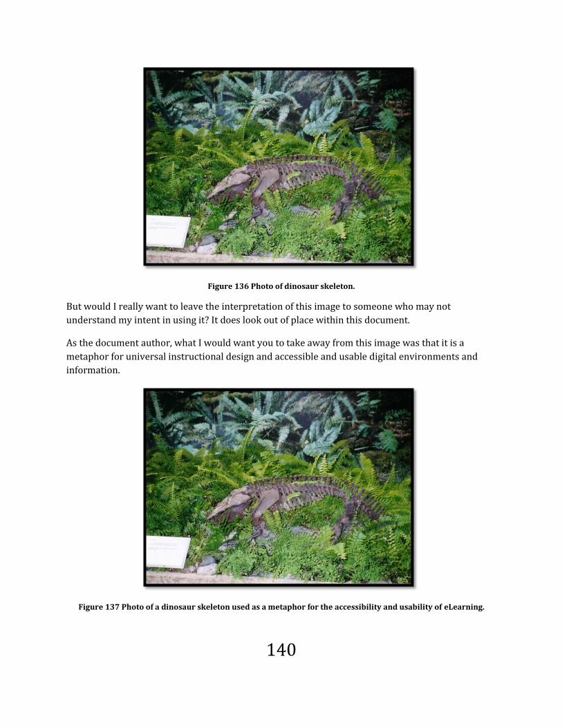
140
Figure 136 Photo of dinosaur skeleton.
But would I really want to leave the interpretation of this image to someone who may not
understand my intent in using it? It does look out of place within this document.
As the document author, what I would want you to take away from this image was that it is a
metaphor for universal instructional design and accessible and usable digital environments and
information.
Figure 137 Photo of a dinosaur skeleton used as a metaphor for the accessibility and usability of eLearning.

141
This is an image of a dinosaur skeleton in the foyer of the Geology Department building at the
University of Saskatoon in Saskatchewan Canada. It has all the elements of the struggle for
understanding the role of accessibility and usability in digital environments and information.
The skeleton of this prehistoric creature represents the way we've thought of classroom learning
for the past hundreds of years. The fact that the creature has died, yet this environment doesn't
seem to know it, only adds to the richness of the metaphor.
If you consider the fact that these remains of the past are further encased in a building that
provides some light and "creature comforts" we can pose the hypothesis that the traditional way of
teaching and our expectations of learning are encased in our own architectural framework. Yet,
through the remains of this long dead creature, through every inch of its skeleton, we see new
growth, new ideas, and new realizations of what learning can be for instructors and learners if we
take the technology available to us and use it to our advantage rather than trying to make it fit this
skeleton.
The fact that I set the Alt Text as "Photo of a dinosaur skeleton as a metaphor for the progress
toward accessible information" gave the reader a direction and path to think about this image
related to the topic at hand--the accessibility and usability of digital environments and information.
How different would your mind’s "recognition" of this image be if the Alt Text simply said "Photo of
a dinosaur skeleton"? You would wonder why it was plunked in the document. I also supported the
image in subsequent text by drawing your thoughts to how we might see this as a metaphor. Even if
you had read the subsequent text, would you have chosen the Alt Text I provided for the second
image? What would you have said about the image?
Context is Key Clearly, it is essential that document authors define and describe the images used in content for the
sake of context and the support of surrounding information. This is also the reason that Alt Text
needs to be concise and meaningful to the reader.
In a non-web based version of this document, you would add the caption as I’ve done when
transferring this image from HTML to word processor format.
Adding Alt Text Here is how you add Alt Text to images while creating documents in Microsoft Word 2010.
1. Select the image you want to add Alt Text to.
a. If you are using JAWS, you can press Ctrl + Shift + the letter O for a list of inline
objects and move directly to the image or object. Inline objects are objects inserted
into documents. These can be part of an Excel worksheet, a PowerPoint slide, linked
OLE [object linking and embedding] objects that update when the original text is
modified, or icons linking to other content.

142
2. Press the AppKey.
3. Choose Format Picture.
4. Press Tab to move to the categories list and then the End key to move to the Alt Text
category.
5. Press Tab to move to the Title edit area where you can add a title to the image.
6. Press Tab to move to the Description area where you can add a bit more description [not an
essay].
7. Tab to the OK button and press Enter.
If you press Enter while in the Description edit area, you will move to the next line.
Your image now has Alt Text that will be associated with this image when you convert the
document to a PDF document using the conversion tool on the Menu bar. The Alt Text will not be
captured if you use Print > Adobe PDF to create the PDF document.
Figure 138 Alt Text category in Format Picture dialog.
You can copy and paste the text from the Alt Text dialog to the Caption dialog. This can be done
using either the keyboard or a mouse. Some people ask about the redundancy of content. Keep in
mind that you may have to create Artifacts from these images, that someone using a screen reader
cannot go through Alt Text letter by letter or word by word, and that the document might be
printed. Someone using a screen reader can also skip or navigate away from repetitive content. The
caption doesn’t have to be different from the Alt text.

143
Captions for Images Document authors should provide captions for images. This helps people with learning disabilities
as well as other readers in general to figure out the context for the image within the document.
A caption can be placed above or below an image. Generally captions are identified as “Figure #”
and can also appear as a Table of Figures at the beginning or end of a document as with this
document.
To add a caption to an image, select the image and press the AppKey. Choose Insert Caption which
will open a dialog. By default the caption will be at the bottom of the image; however, you can
choose to put it at the top.
Your cursor is flush against the colon after the number one. I generally press the Spacebar before
typing just to provide some distance between the “figure #” and the caption itself.
Figure 139 Caption dialog.
This is a good place to discuss a related topic, the “cost of accessibility.”
It has long been my view that building accessibility and usability into the documents we produce
“costs the same” as producing documents with good design and structure.
When we first got our word processors, we were thrilled the first time we saved a file and it actually
appeared in the location we intended it to go to. When we had to spell check documents, we learned
how to do this. It is the same for adding page numbers, footers, headers, Styles, lists and other parts
of documents we use on a daily basis.
Yet, we don’t seem to view the accessibility of digital documents in the same way. We find reasons
not to learn about how to create better documents in these formats.

144
Do we look at word processed documents we produce and say that doing a spell check will cost and
take too much time so we won’t do this?
The other argument I hear is that creating accessible and usable content will detract from the
author’s ability to be creative. Again, can I choose not to spell check a document based on the
premise that it interferes with my “creative license?”
Learning to create accessible digital content is simply evolving with the technology. The process of
creating accessible and usable content is also evolving as we understand how people are accessing
digital information and the need for device independent information. Learning how to create
information that is more accessible and usable for everyone should be part of our global learning
and production plans in creating documents.
We are at the point in our ability to create accessible and usable information where we should no
longer be trying to justify why we should create accessible content; but rather we need to justify
why we are not creating accessible and usable digital environments and information.
How does this informative ramble relate to the issue of documents structure?
I knew about captions years ago but somehow put it on a shelf for later investigation. What I’ve
realized with Office 2003 is that Alt Text helps identify images if you are reading the document
electronically. How does the reader relate the image to the surrounding content if they print any
type of document? The Alt Text which is used digitally is not available if you move a mouse over a
printed image. Captions provide the print equivalent of Alt Text and we need to begin including
them for images, Tables and equations as well as providing Alt Text where we can for these types
of content, especially if we intend on repurposing information.
Captions for Equations Until we have the ability to have a MathML/XML type tag for mathematical and scientific equations,
we will need to provide Alt Text that describes the formula in long hand. Most equation editors
provide an image of the equation within a document. This information can’t be extracted by
adaptive technology. Depending on the device the equation is being read on, it may not be readable
or understandable.
Providing a caption along with Alt Text for equations, which will likely be <Shape> tags in the Tags
Tree of a PDF document, will help readers understand equations.
To add a caption to an equation in Microsoft Word 2010, select the equation object, and press the
AppKey. The Caption dialog appears. Press the Tab key once to move to the Label list box and
choose Equation. Press Shift + Tab to move back up to the Caption edit box and type the caption for
the equation.

145
Figure 140 Caption dialog showing Equation label.
If you have a table, select the table and press the AppKey. Choose Insert Caption. Change the label to
“Table” and add the caption.
Figure 141 Caption dialog showing the Table label.

146
Grouped Objects and Accessibility One of the commonly used elements in documents are grouped objects. These are shapes, arrows,
SmartArt and other visual elements that are composed of several smaller objects. Some of the
elements or objects are accessible while some are not.
Let’s look at the accessibility issues and the tools you can use in Microsoft Office 2010 [specifically
Word], the Windows operating system and in Microsoft OneNote to create a single image out of
grouped objects.
Grouped Objects What is a grouped object? Any piece of content that is made up of other components such as
SmartArt, shapes, arrows, organization charts and so forth.
SmartArt
SmartArt replaces the old Org Chart that was available in PowerPoint. Not many people knew that
this was a stand-alone application that could be used on its own to create accessible Org Charts.
Who knew?!
SmartArt is a tool that lets you create charts in Word, PowerPoint, Excel and Outlook.
Figure 142 SmartArt dialog.
To explore SmartArt or to insert one of the SmartArt objects, press Alt + N, M.
SmartArt has been designed to be accessible for people who are using adaptive technology. Having
said that there are, of course, caveats.

147
When you insert a SmartArt Object there is the choice to have the Text Pane show or be hidden.
People who are using screen readers can use the Text Pane to enter information into each of the
SmartArt components…except images.
Figure 143 SmartArt with Text Pane.
In the SmartArt used for this example there are three main areas of the object: three picture
placeholders and three text placeholders. While someone using a screen reader can access the text
placeholders, they cannot access the picture placeholders.
This means that non-essential images should be used in picture placeholders for SmartArt Objects.
It is true that each of the images in the example SmartArt object can have Alt Text and this should
be added so that if adaptive technology can eventually support access to it, it is already there.
Alt Text can be added to the global SmartArt Object as well and this should definitely be done. It
helps someone using a screen reader locate the specific SmartArt object they need to examine.
There are, however, pieces of SmartArt objects that cannot have Alt text and are simply read to
someone as arrow or shape. It is recommended that you create the SmartArt image in your
document so that the colours and look and feel are the same and then create a single image of the
SmartArt object using the Windows Snipping Tool or the OneNote Screen Clipping tool. There are
instructions on how to do this in this book.

148
Creating Your Own Images
There are times when you will be creating tutorial content and will want to show the person
reading your document what the dialog or screen looks like. This chapter takes you through a
couple of tools and techniques for creating images from your computer screen. It is included in this
book because these images will also need Alt Text and Captions.
Creating Pictures with Snipping Tool and Screen Clippings There are two “built-in” tools that can be used to create a single image from a group of objects or
images. One is found in the Windows Vista or Windows 7 operating system (not in the Home Basic
version), and the other is found in Microsoft OneNote (both 2003, 2007 and 2010). OneNote 2003 is
a standalone program and OneNote 2007 or 2010is included with the Microsoft Home/Student
version of Microsoft Office.
Both of these tools are mouse dependent activities.
Windows Vista and Windows 7 Snipping Tool
This is a great tool for taking parts or "snips" of what is on the screen.
Figure 144 Snipping Tool Window.
You might want to put this item in the Start Menu list of programs or on the Desktop as an icon so it
is easy to find.
To launch the Windows Snipping Tool:
1. Press Windows key to open the start Menu.
2. In the Start Menu Search edit box, type Snipping Tool.
3. The Snipping Tool should be the first item found.
4. Press Enter on it to launch it.
5. When the Snipping Tool launches, the desktop screen “dims” and you are ready to use the
mouse to outline the part of the screen you want to use as an image.

149
Figure 145 Computer screen with Snipping Tool active.
You can press the Escape key to exit Snipping Tool mode but the snipping Tool will still be on your
screen. Press Alt + F4 to close it in the same way you would any other application. Once you have
the application you want to snip a screen image from continue with the steps.
1. Hold down the left mouse button and drag the mouse diagonally across the screen over the
part of the screen you want to use as an image.
2. Once you select the area of the screen you want to create the image from, let go of the
mouse button. The Snipping Tool window opens and the “snip” is displayed.
The Snipping Tool uses the Windows Clipboard to display and copy content to.
Figure 146 Snipping Tool Window with snip of Word Ribbon.

150
While the image is in the Snipping Tool window, you can add information to it. Unlike laying arrows
or circles on images as other objects or layers, when the modified image is copied to an application
such as Adobe Fireworks, Adobe PhotoShop or Paint, the additional information is there too. This is
also true if you copy the image from the Snipping Tool into a Word document.
Figure 147 Screen snipping with Office Button circled.
The preceding image shows the Word Ribbons with the Office button circled in blue. This came
from the Snipping Tool. With practice, these types of additions will be less awkward looking. You
can also do this on a tablet computer with a pen instead of on a desktop computer with a mouse…or
add a tablet style pen to your desktop computer for working with images.
There are options for the Snipping Tool. Almost all of them are selected by default. The exception is
to hide the text instructions for the Snipping Tool.
Figure 148 Snipping Tool options.
The colour of the outline of the “snip” can also be changed from red to one of the other colours in
the palette.
You can choose to have the Snipping Tool as an icon in the Quick Launch Toolbar.
The snipping can be saved directly from the Snipping Tool by choosing File, Save As.

151
By using the Snipping Tool to create a single image from grouped objects, the individual pieces of
the grouped object will not be identified as images with no Alt Text when the document is
converted to tagged PDF or when someone using a screen reader comes across them in your
document and you will not have to ad Alt Text to every piece of the set of grouped objects. Nor will
you have to arrange the grouped objects into a logical Tab Order. You will just have to add one piece
of Alt Text to the single image.
OneNote Screen Clippings Microsoft OneNote is a free form writing tool that has many interesting applications for both
academic and business environments. One of the most useful tools within OneNote is the ability to
create “screen clippings” from any content on the screen. In this example, four pictures were added
to a PowerPoint slide and the OneNote screen Clipping tool was used to create one single image.
Figure 149 Single image taken from PowerPoint slide using OneNote Screen Clippings.
The first thing to do once you launch Microsoft OneNote is to go to Tools, Options and the “Other”
category. Make sure that the option to place the OneNote icon in the taskbar is checked. This will let
you create images of the screen as you need them without having to launch OneNote.

152
Figure 150 OneNote options for System Tray.
To use the OneNote screen clipping tool:
1. Press Windows key + S or click the OneNote icon in the System Tray.
2. The screen “dims.”
3. Use the mouse to select an area of the screen by holding down the left mouse button and
dragging diagonally until you have the content you want selected.
4. When the mouse button is released, OneNote opens and the screen clipping is on its own
“Side Note.”
5. Select the screen clipping (not the associated text).
6. Right mouse click on the plus sign to the left of the screen clipping and choose Cut.
7. Switch to your image editing software such as Paint and create a new image.
8. Press Ctrl + V to paste the screen clipping into your imaging software.
9. Save the image in the file format you want.

153
Figure 151 OneNote application Window showing screen clipping.
You can either keep this side note or delete it from the Side Notes area. The fastest way to delete the
page is to have it selected then press Ctrl + Shift + A and then the Delete key.
Your image is on the Windows Clipboard and can be copied directly into Word or Paint or another
imaging software program such as Adobe Fireworks or Adobe PhotoShop. The Screen Clipping Tool
is just the mechanism for putting it there.
Keep in mind that copying images directly into documents increases the file size substantially. It
also means that you don't have an archive of images to work with. Trying to remember what
document you copied an image into gets tiring.
Using Paint to save Images
Whether you are using Print Screen, the Snipping Tool or the Screen Clippings Tool, you can paste
the image into Paint and save it as a PNG file and add circles or arrows or other symbols to it.
Paint comes with the Windows operating system.
To launch Paint:
1. Press the Windows key.
2. In the Search edit box type Paint.
3. It should be the first item found.
4. Press Enter to open the Paint Application.
5. To open Paint on a Windows XP or earlier computer:
6. Press the Windows key.
7. In the Start Menu choose All Programs and press Enter.

154
8. Choose Accessories and press Enter.
9. Choose Paint and press Enter.
Figure 152 Paint application Window.
The image shows Paint in the Windows 7 environment. Your version might look slightly different
but the tools will be the same.
The white area is the canvas and the canvas can extend to the entire document area of the
application Window. You will need to keep an eye on the size of the canvas relative to the size of
your image. We'll work through this to demonstrate.
If we look at the image of the Word application Window that was used earlier in this document, we
can walk through the process of creating a PNG image. You can create a JPG or GIF but PNG is now
pretty much the standard for creating images that can be used in both documents and on web
pages.
The first thing I am going to do is press Print Screen to snag the Word application Window. I have a
blank document on the screen so that background text/noise doesn't interfere with what I am
trying to demonstrate.
I then switch to Paint and paste the image into the Paint "document” by pressing Ctrl + V.

155
Figure 153 Paint "document" with Word application Window showing Paragraph dialog.
The image appears quite large so I chose View and Zoom Out so that I could see the entire image.
Figure 154 Zoomed out image in Paint.
I need to be able to see the entire image so that if I need to remove any surrounding white pieces of
the canvas, I can use the mouse to do so. If you have white pieces of the canvas showing, it will be
saved as part of the image. This creates unbalanced images or images that you can't size effectively
in a document.

156
Choose File, Save As and expand the Save As menu to show the ability to save the picture as a PNG
file.
Figure 155 Save as PNG option from Save As menu item.
I usually create a file folder in My Pictures or Pictures for the project I am working on. For example
in this case I created a Create Images folder to put the images in. For this document and in the
future if I need images related to the creation of images, they are all there ready to use.
Now I need to create and image of the Paragraph dialog. In this case it is the Lines and Page breaks
part of the dialog that I am teaching. This is not the tab that opens by default so if you are following
along, don't panic.
I used Alt + Print Screen to get this image which doesn’t include the image of my document
underneath. Then I move back to Paint and paste the image onto a blank canvas.

157
Figure 156 Paragraph dialog in a Paint document.
In this case the image is smaller than the canvas. If I were to save this image now and had to resize
it in a document, the Paragraph dialog would not be visible in a way that it could be seen.
Figure 157 Paragraph dialog with canvas attached.
So I need to remove some of the canvas.
To remove some of the canvas from an image in Paint:

158
1. Click on one of the edges of the canvas usually in the centre of a side or the corners.
2. You will see small handles that change to a double arrow when you hover the mouse over
them.
3. Click on one of the handles while you have the double arrow and drag it toward the image.
4. Stop when you are at the edge of the image.
Figure 158 Paragraph dialog image with resized canvas on right.
5. You can now go to View and Zoom in to see the image clearly.
6. You may have to zoom out again to adjust the bottom edge of the canvas.

159
Figure 159 Paragraph dialog image with resized canvas.
You can now save the image and when it is inserted into a document, you will only have the
Paragraph dialog [in this case] as the image.
Figure 160 Paragraph dialog.
So far we've shown where the Paragraph dialog appears on the screen and what it looks like close
up. Now we can create images that focus on specific parts of the dialog.

160
Note: When we resized the canvas, it will stay at that size until you resize it again.
Figure 161 Resized canvas in new Paint document.
To Create the new image of a piece of the Paragraph dialog you can use two methods:
1. Use the Snipping Tool or the Screen Clippings Tool when you aren't going to have an image
of the larger dialog or application Window.
2. Use the ability in Paint to cut a piece of the image out and make a new image of it if you
don't have access to the Snipping Tool or the Screen Clipping Tool.
3. To create an image from the Snipping Tool or the Screen Clipping Tool:
4. Snag the piece of the screen you want. In this example it is the first set of options in the
Paragraph Line and Page Breaks dialog.

161
Figure 162 Screen Clipping turned to get image.
5. Switch to Paint and paste the image.
6. Resize the canvas as necessary.
7. Save the image as a PNG file.
Figure 163 Piece of Paragraph dialog in Paint.
You can now insert the image into a document.

162
Figure 164 Keeping text together in the Paragraph dialog.
To create an image of a piece of an existing image in Paint:
1. Open the image you want to take the piece from. In this case it is the Paragraph dialog
image. I've also zoomed in to make it larger.
Figure 165 Paragraph dialog in Paint zoomed.
2. From the Home Ribbon choose Select and then Rectangular Selection.

163
Figure 166 Rectangular Selection option from Selection button.
3. Use the mouse to drag diagonally across the image to choose what you need. In this case I'm
going to select different options from the previous example.
Figure 167 Section of Paragraph dialog identified to be removed from image.
4. Press Ctrl + X to cut the piece of the image out of the larger image.
5. Do not save the changes to the image when you close it.

164
Figure 168 Paragraph dialog image with piece cut out of it.
6. Close the large image and create a new blank image document.
7. Press Ctrl + V to paste the piece of the image into the new image document.
8. Make any adjustments to the canvas as needed.
9. Save the new image as a PNG.
Figure 169 New image cut from Paragraph dialog.
That's it!
You now have several different ways to create images for your training material. When working
with Word, use Insert, Picture. The keyboard command is Alt + N, P.
Once the picture is inserted remember to add Alt Text and a Caption.

165
Text as Images
There are tools in Word that will let you create images of text. These tools can create accessibility
barriers. While decorative they should not be used for headings and should be used sparingly.
Understanding the accessibility problems will help you make decisions about using them in
documents. The two main tools in this category are Drop Caps and WordArt.
One of the components to documents might be the addition of a “drop cap” to begin a chapter or
section heading. This technique is most often found in books or textbooks.
Drop Caps n this paragraph, the letter “I” for the word “in” has been made a drop cap, or dropped capital
letter. By using a drop cap, the paragraph is emphasized and stands out visually on a page. How
does this affect the accessibility and usability of the document? Technically drop caps are
“images” and “formatting.” They are a type of hybrid document element. One of the nice features is
that Alt Text is automatically added to them as it is created which helps when converting to tagged
PDF. The down side to using them is that adaptive technology interprets them as graphics and puts
a pause between the drop cap and the rest of the word. If you are repurposing text to Braille, the
Braille document will require repairs where drop caps are used.
As seen in the image below, the letter “I” has its own “box” or container.
Figure 170 Image of the drop cap after inserted into text.
I

166
When a screen reader encounters this, the paragraph begins “graphic I, n this paragraph…” or the
letter “I” is ignored. This might not seem critical for the word “in;” however, with the word “the” the
person using the screen reader would hear “he this paragraph….” And with the word “this” would
hear “his this paragraph…” which disrupts readability and comprehension.
The drop cap used above is set to display in the margin. The same results occur when the drop cap
is placed on the first line or designated to take up a specific number of lines as shown in the image
below of the drop cap options dialog.
One solution is to insert a white letter replacing the Drop Cap at the beginning of the paragraph. For
example if the word “this” were in Drop Caps, you could add the word “This” in a size 4 font and
match the text to the background just before the first word in black text. The screen reader would
hear the graphic of the word but when they read the paragraph the first sentence would make
sense. If the document were converted to tagged PDF the Drop Cap would be converted to an
Artifact and a screen reader would still have access to the full text that begins the paragraph. The
spacing might be slightly off but who can tell if this is an editorial or creative decision or not,
especially if all instances of Drop Cap have similar spacing.
The Drop Cap tools can be found on the Insert Ribbon. The keyboard command to open the Drop
Cap Gallery is Alt + N, R, C.
Figure 171 DropCap Gallery.
If you choose “Drop Cap Options you will open the Drop Cap dialog.

167
Figure 172 Drop Cap dialog.
Some of the PDF tagging tools are becoming sophisticated enough to know that a drop cap is part of
a word and will render proper pronunciation; however, repairs will need to be made for other
formats. Even with a tagged PDF document, this type of document element needs to be verified as
being accessible using a screen reader.
WordArt The ability to add WordArt to documents is another way of formatting text. WordArt is not a
document structure; it is a partially accessible document format. When you create WordArt, as with
a drop cap, the Alt Text is created which helps when tagging PDF. For Word documents and other
formats such as Braille, WordArt is an object in the document and is not accessible.
If you move the cursor down the left margin of this page, you’ll notice that it does not go into the
WordArt. It stays at the margin. This means that the WordArt is an object in the document. When
the document is converted to tagged PDF if WordArt has been used for headings, it will be a figure
requiring Alt Tex and the addition of a Heading Tag.
In this Word document, the text is not seen by screen readers and therefore does not exist to them.
The person using a screen reader can get a list of objects

168
Figure 173 List of objects for the JAWS screen reader showing WordArt.
In the preceding image the WordArt is not distinguishable from the other images in this document.
It would be impossible for someone using a screen reader to know what is an image and what is
WordArt.
When the document is converted to tagged PDF the WordArt is tagged as an image of text which
will then require Actual Text. If the WordArt is being used as a heading in the document it will also
need to be put within a <H1> Tag or a Tag representing the appropriate heading level. If this isn’t
done it affects the ability to navigate the document.

169
Links in Documents
Creating accessible links and hyperlinks in word processed documents follows the same rules as in
web-based documents. The links should be contextual and concise and not be the entire URL
plunked in the middle of the text. Instead they should take the form of a few key words or a short
phrase that a person can click on to take them to that link. People using adaptive technology can
get a list of links in a word document in the same way they can get a list of links in a web-based
document. The lines are rapidly blurring and the “genre” of documents is moving to a more global
XML structure and format.
The following image shows a list of links that have been created using the URL’s for the target
documents. Imagine having to listen to all of these and try to identify the link you want to go to.
Figure 174 List of non-contextual links using the JAWS Screen reader.
The following image from another Word document on adding accessible images to training
material, demonstrates the ease of finding the target document if the links have clear and concise
text.

170
The person using a screen reader can use the first letter of the topic they are looking for, also
known as first character navigation, to quickly find and move to that area in the document.
Figure 175 JAWS list of contextual links.
As you create documents using contextual links, two issues are raised:
1. What if I am working on a document that people might print?
2. What if the link doesn’t work? How can people know the entire URL or web address?
The answer to both of these questions is one simple solution. Use the context links within the
document and then use either footnotes or endnotes to provide the long web addresses. This
technique has been used throughout this document and other publications by Karen McCall.
If you are considering that the document will be printed, it is reasonable to expect that people can’t
point their finger at a link and go to another document. So, as they read, the flow of content isn’t
disrupted by visually skipping over long URL’s; yet, if they are taking the document with them and
are at another computer, they can type in the URL from the footnotes or endnotes.
To add a footnote or endnote to your document:
1. Place your cursor at the end of the word you want to note. In this case it would be at the end
of the link.
2. For Footnotes press Alt + S, F. This moves your focus to the bottom of the page and the
number of the current footnote is entered automatically.

171
3. For Endnotes press Alt + S, E which moves your focus to the end of the document where
you can enter the information next to the automatically numbered endnote.
What I would do for this is to copy and paste the URL so that when I selected the text in the
document and pressed Ctrl + K to open the Insert Link dialog, I could paste the link there, but also
paste it to the footnote or endnote. Before I paste the web address I would type the text so that the
person reading the document would know which web address it is.
For example:
Contact Karlen Communications: [email protected]
This technique optimizes accessibility and usability of linked content. I did not add the footnote for
this link because it is an example of text I would put in a footnote.
An example of a contextual link with a footnote is:
The Karlen Communication web site has an accessible document on Adding Images to Training
Material9.
In this case the important information is the linked information: the name of the publication. If
someone were reading the document and knew the name of the publication that is what they would
be looking for, not the information about the web site itself.
Contextual Links One of the other questions most often asked is if contextual links will change the way we write. Yes.
We will automatically begin to think of a clear and concise way of providing the link information.
This is not necessarily a bad thing for document authors. While the process might seem awkward at
first, we’ll get better with practice.
Here are a few other things to keep in mind when creating contextual links.
Don’t start every link with “select this link to go to…” People using adaptive technology can use first
character navigation to move through lists of links and headings. If every link begins with the same
character, this can’t be done and every link in a document has to be listened to for that last crumb of
vital information that tells us where the link will take us.
Other contextual issues are using “click” or “click here” as links. If I get a list of links in a document,
why would I want to “click” or where will “click here” take me?
9 Adding Images to Training Material:
http://www.karlencommunications.com/MicrosoftOfficeAccessibility.html

172
Consider the following list of links. Would you know where you are going? Would you have the
patience to read through all of this to find that one piece of information that might tell you what the
link is for? How would you feel after listening to an entire URL only to find that the target page is
named “file01.html” or “image42158.gif?” Would you find this information useful?
Linking to Document Formats The other mistake document authors make is when there are several flavours for formats of a
document. This is usually done with web-based content, but since the line is blurring between what
we would consider “regular” documents and web-based ones, it is worth mentioning here.
Often you will have a document available in tagged PDF or Microsoft Word. Typically a document
author will identify the different formats as follows:
Chapter One: Introduction [PDF] [Word]
Again, think of a series of chapters or lectures where the only information you have is:
Word
Word
Word
Word
Would you be able to find the Word document for chapter five or lecture 13?
We need to be aware of more than the visual when creating documents. With smaller devices, the
need for auditory access for input and output will increase. What will be the fastest most efficient
way to get information when you need it?

173
Bullets and List Items
Bullets and numbering can make a document more readable and understandable or it can be a
readability nightmare. Often bullets are used as "decorative elements" rather than to link like items
in a list.
When text is formatted as bulleted or numbered items there is a visual relationship that let's
someone reading the document know that bullet point one is related to bullet point two and so
forth. For numbered steps, keeping that relationship is critical in understanding what to do first,
second, third and so on so that a step in a process is not overlooked.
This relationship is provided to someone who can't see the bulleted or numbered list if the bulleted
or numbered list is formatted properly.
Properly formatted bulleted or numbered lists:
Use standard bullets or numbering not images, non-Unicode symbols or other inaccessible
elements.
Are not single bullet or numbered items.
Have proper spacing as opposed to pressing the Enter key to space bulleted or list items.
In the list above the three items describe the characteristics of a well-structured bulleted or
numbered list.
A list by its very use implies more than one item.
When someone using a screen reader comes upon the list above in the document they are told they
are entering a list of three bulleted items. There are settings in some screen readers to notify the
person when they are moving from a first level bullet or number to a sub-bullet or number [a
second level bullet or number]. Does this sound familiar? Think back to the use of Heading Styles
and the moving from Heading 1 to Heading 2 and so forth. The key is that people using screen
readers have access to the same visual representation of the document "but" only if the underlying
structure is there for each document element.
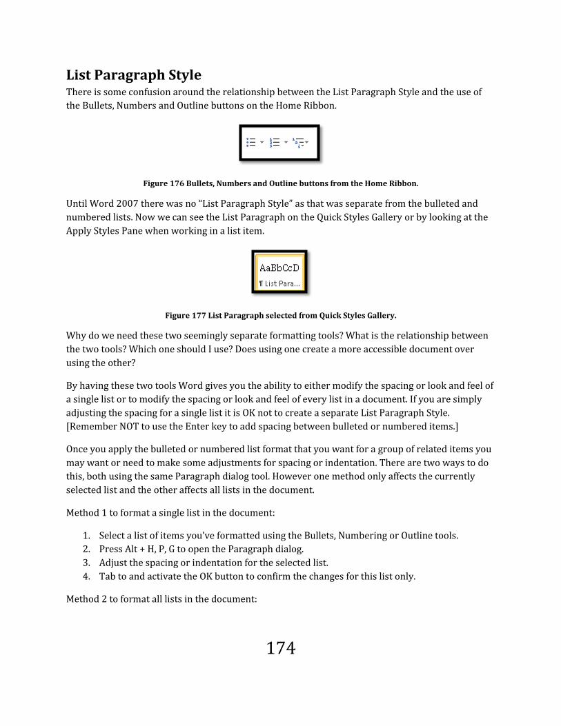
174
List Paragraph Style There is some confusion around the relationship between the List Paragraph Style and the use of
the Bullets, Numbers and Outline buttons on the Home Ribbon.
Figure 176 Bullets, Numbers and Outline buttons from the Home Ribbon.
Until Word 2007 there was no “List Paragraph Style” as that was separate from the bulleted and
numbered lists. Now we can see the List Paragraph on the Quick Styles Gallery or by looking at the
Apply Styles Pane when working in a list item.
Figure 177 List Paragraph selected from Quick Styles Gallery.
Why do we need these two seemingly separate formatting tools? What is the relationship between
the two tools? Which one should I use? Does using one create a more accessible document over
using the other?
By having these two tools Word gives you the ability to either modify the spacing or look and feel of
a single list or to modify the spacing or look and feel of every list in a document. If you are simply
adjusting the spacing for a single list it is OK not to create a separate List Paragraph Style.
[Remember NOT to use the Enter key to add spacing between bulleted or numbered items.]
Once you apply the bulleted or numbered list format that you want for a group of related items you
may want or need to make some adjustments for spacing or indentation. There are two ways to do
this, both using the same Paragraph dialog tool. However one method only affects the currently
selected list and the other affects all lists in the document.
Method 1 to format a single list in the document:
1. Select a list of items you’ve formatted using the Bullets, Numbering or Outline tools.
2. Press Alt + H, P, G to open the Paragraph dialog.
3. Adjust the spacing or indentation for the selected list.
4. Tab to and activate the OK button to confirm the changes for this list only.
Method 2 to format all lists in the document:
175
1. From the Quick Styles Gallery select the List Paragraph Style. Press Alt + H, L to open the
Quick Styles Gallery and then Arrow around until you find List Paragraph. You can’t use first
character navigation in the Quick Styles Gallery.
2. Press the AppKey and choose to Modify the Style.
3. When the Modify Style dialog opens press Alt + letter O to open the Format options.
4. Choose Paragraph from the list which opens the Paragraph dialog.
5. Adjust the spacing and indentation for all lists in the document.
6. Tab to and activate the OK button to confirm the changes to the Paragraph formatting for
the List Paragraph Style.
7. Choose whether to apply the changes to this document only or to the document template so
that other documents you will create based on this template will have the same List
Paragraph formatting.
8. Tab to and activate the OK button to confirm the changes to the List Paragraph Style.
If you choose to modify the List Paragraph Style you can also change the font, font size, text colour
and other formatting for all lists in the document.
Each time you create a list the List Paragraph Style is applied to the text. The two tools are
connected however you can apply the list Paragraph Style to text on its own. It will not associate a
bullet or numbering Style with the text but it is a valid Style to apply.
If you apply the List Paragraph Style without using bullets or numbers keep in mind that someone
using a screen reader or using screen magnification will still “see” that formatted text as a list. For
screen readers the Style name “List Paragraph” is provided to them. Hearing this they may think
that there is a list that cannot be found, is broken, their screen reader is not working properly and
other problems exist which will cause the end-user to stop reading and go into troubleshooting
mode. For someone using screen magnification, they may think that their technology is being
overwhelmed and some of the visual formatting is not being rendered to them. As with someone
using a screen reader, they will stop reading and go into troubleshooting mode to try and find the
problem.
Having said this, using the List Paragraph Style if you have a paragraph of text under a bulleted or
numbered list item and the Word document IS NOT going to be distributed would be an
appropriate use of the List Paragraph Style. The advantage in this instance would be that the text
would be formatted properly to nest under the bulleted or numbered list item as shown in the
following image.

176
Figure 178 List with sub-text formatted as List Paragraph.
For the text in the preceding image, the List Paragraph Style was identified to a screen reader. In
this instance you may want to adjust the spacing after each List Paragraph Style so that the content
is more readable and discernable.
However, without the use of the Bullet or Numbering icons on the Home Ribbon, when this
document is converted to tagged PDF, the List Paragraph Style is interpreted as a regular paragraph
and not part of the list itself.
Figure 179 Tagged PDF showing List Paragraph Style converted as regular paragraph text.
Once again we need to consider how someone is going to access the document. If it is in Word the
List Paragraph Style information will be available to someone using a screen reader. If the
document is going to be converted to tagged PDF, using the List Paragraph Style will ensure
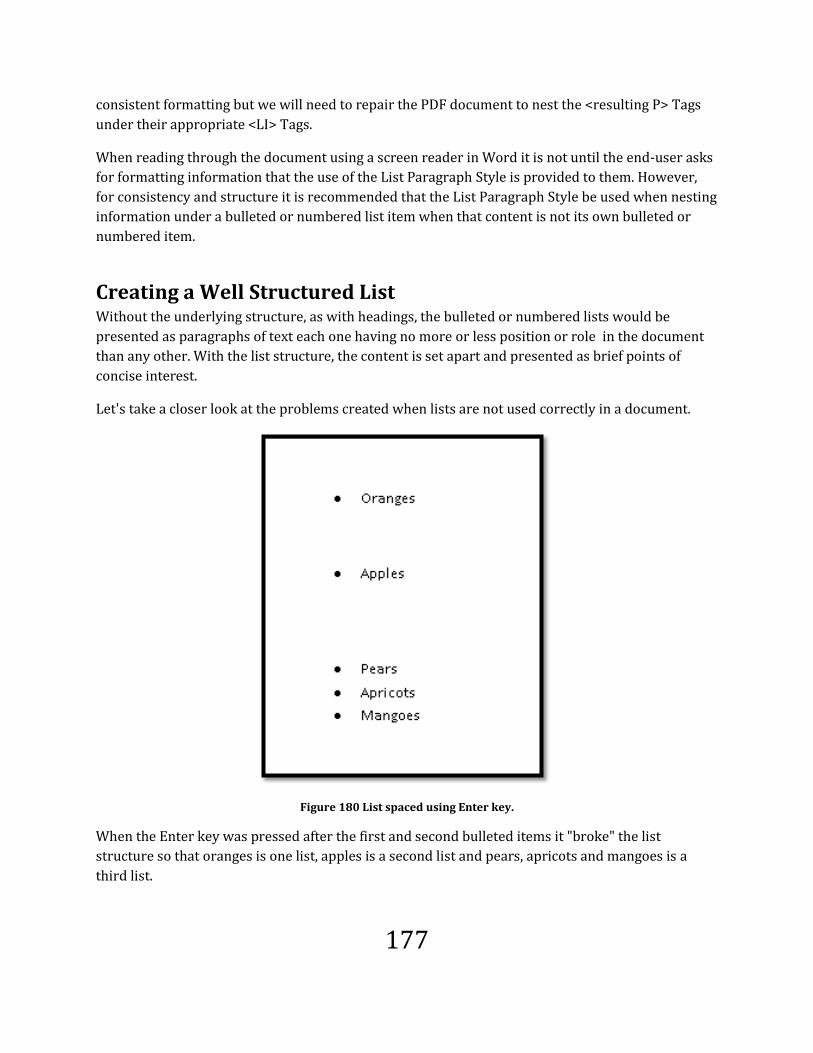
177
consistent formatting but we will need to repair the PDF document to nest the <resulting P> Tags
under their appropriate <LI> Tags.
When reading through the document using a screen reader in Word it is not until the end-user asks
for formatting information that the use of the List Paragraph Style is provided to them. However,
for consistency and structure it is recommended that the List Paragraph Style be used when nesting
information under a bulleted or numbered list item when that content is not its own bulleted or
numbered item.
Creating a Well Structured List Without the underlying structure, as with headings, the bulleted or numbered lists would be
presented as paragraphs of text each one having no more or less position or role in the document
than any other. With the list structure, the content is set apart and presented as brief points of
concise interest.
Let's take a closer look at the problems created when lists are not used correctly in a document.
Figure 180 List spaced using Enter key.
When the Enter key was pressed after the first and second bulleted items it "broke" the list
structure so that oranges is one list, apples is a second list and pears, apricots and mangoes is a
third list.

178
The intent of the document author was that this is one list of fruit that is spaced more generously
than the standard spacing before or after list items. The reality is that the fruits are no longer
"related" to each other except for the pears, apricots and mangoes.
This is one of those instances where you can choose to affect the spacing of all lists in the document
by modifying the List Paragraph Style or by selecting the list and modifying the spacing for this list
only. We are going to modify the spacing for this list only.
To modify the List Paragraph Style for all lists in the document select the List Paragraph Style from
the quick Styles Gallery, press the AppKey and choose Modify. Then activate the Format button and
choose Paragraph which will open the Paragraph dialog. From that point the steps are the same as
the ones that follow.
To add space before or after bulleted or numbered list items:
1. Type the list and then format it for bullets or numbers. It is easier to control the formatting
if you apply formatting to selected content rather than turning it on, typing and then turning
it off.
2. Select the list.
Figure 181 Paragraph dialog shown over selected list in document.
3. Press Alt + H, P, G to open the Paragraph dialog.
4. Uncheck the check box "Don't add space between paragraphs of the same Style."
5. When you do this a default spacing of 10 point or points is added after each list item.

179
6. If this is not enough spacing adjust it to what you need.
7. Tab to the OK button and activate it by pressing the Enter key.
8. The underlying list structure is intact however the list has spacing between the list items.
Figure 182 Properly spaced list.
Images as Bullets If the Word document you are creating is ONLY going to be used to create a tagged PDF and NO one
will get the Word document, you could use images as bullets such as in the following image.
Figure 183 Visual list created without using list structure.
Why the caveat?
Although the image of the list looks “pretty” it is not a list structure. Each point is a paragraph with
no relationship to other visual list elements.

180
In a tagged PDF document we could make the following repairs:
1. Make the images of the paw prints Artifacts so that screen readers would ignore them. It is
not necessary to give them Alt Text of “bullet” since we will…
2. Add the list structure in the Tags Tree which is what the adaptive technology such as screen
readers uses to determine the structure of the document element.
Figure 184 Repaired list in a tagged PDF document.
The Highlight Content was turned on so that the list elements could be seen better. The images have
been reassigned as Artifacts or pieces of the background. If someone is not using adaptive
technology they will see the visual representation of a list but if someone is reading the document
with adaptive technology such as a screen reader they will know that this is a list because the
structure was added.
This technique should only be used if there is no possibility that the Word version of the document
is provided to clients, customers, staff or students. Within the Word environment this is an
inaccessible list. For more information on working with tagged PDF documents, purchase
“Accessible and Usable PDF Documents: Techniques for Document Authors Second Edition10.” ISBN
978-0-9782675-2-0.
10 Accessible and Usable PDF Documents: Techniques for Document Authors -
http://www.karlencommunications.com/products.htm

181
Accessibility Checker
Microsoft Office 2010 has a built-in “Accessibility Checker”11 to help you identify problems with
your documents. The accessibility checker is available in Excel, PowerPoint and Word.
The accessibility checker is a mechanical tool and is not a substitute for a thorough review of the
document or learning how to create more accessible and well-structured documents. It will
however, identify images with no Alt Text. It won’t identify visual representations of headings that
do not have the underlying heading level structure.
The article on the Microsoft site indicates that there are three key areas that the accessibility
checker looks at:
Images missing Alt text.
Unreadable content such as a table that has SEVERAL BLANK CELLS AND?OR COMPLEX
FORMATTING.
Unreadable content due to an illogical reading order [for example the order of objects on a
slide].
The accessibility details of the document you are working on are always available to you through
the File/Backstage area under the Info category and the Prepare for Sharing options.
Figure 185 Accessibility results at a glance in the Prepare for Sharing area of the Info category.
At that point you, as the document author can run the accessibility checker. Remember that the
elements the mechanical checker finds may be OK and accessible. When reviewing the results of an
11 Microsoft 2010 Accessibility Investment and Document Accessibility article:
http://blogs.technet.com/b/office2010/archive/2010/01/07/office-2010-accessibility-investments-
document-accessibility.aspx

182
accessibility check you will need to make decisions about document structure and content and
either make repairs or continue along the publishing stream.
Note: The Accessibility Check seems to only work on documents in the 2010 DOCX document
format. I had documents in the 2007 DOCX format and got the result that the checker couldn’t check
the document.
To perform an accessibility check in Word:
Press Alt + F, letter I, letter I for File/Backstage, Info and Check for Issues in the Prepare for Sharing
options.
When the sub-menu opens use the Down Arrow once to find “Check Accessibility.”
Figure 186 Check Accessibility item in the sub-menu of Prepare for Sharing.
When the Accessibility Pane opens to the right of your document there are a few areas of problems
that you can navigate through.
You can use the arrow keys to move through the items in the Accessibility check results. Press F6 to
move into the results if you lose focus.
If you press Enter on any item listed in the accessibility check results you will be taken to that
element in the document. Review the element for accessibility and make a decision as to whether it
I an accessible element or not. Then move on to the next element in the Accessibility Check Pane
results.

183
Figure 187 Figure 182

184
Save as PDF
Office 2010 includes an add-in that lets document authors create tagged PDF directly from Word
without having Adobe Acrobat installed on their computers. In Office 2007 this was a free but
separate download. Now it is just part of the file types you can save as.
The key to ensuring that the resulting tagged PDF document is tagged correctly is to build the
structure into the Word document.
Note: Currently XPS is a completely inaccessible file format because there is no way
for adaptive technology to access the content whether the XPS content is viewed in a
browser or one of the XPS viewers.
The disadvantage to using the Save as PDF option is that you can’t view the Tags in the resulting
tagged PDF document to make any repairs or to perform the QA/Quality Assurance process unless
you have Adobe Acrobat. However, if one person in the department vets documents for legislative
compliance for accessibility, using the save as PDF tool can reduce costs.
Note: The Save As PDF tool often puts all images or shapes at the top of the Tags
Tree. The Save As PDF tool uses the PDF 1.7 specifications which are the current
specifications for PDF documents so this is an issue with the Tags not necessarily
with the tool itself. You will also see this behaviour when using Adobe Acrobat 9 or
X. It hasn’t been fixed as of the date of publication.
Using Save as PDF There are two ways to use Save as PDF:
Through the File/Backstage area which will take you to the same place as pressing F12.
Through the Save As dialog which you can use by pressing Alt + F, A or F12..

185
To use the Save as PDF tool through the File/Backstage area:
1. After ensuring that your Word document has the necessary structure, press Alt + F, D, P and
then press Tab to move to the Save as PDF button. Press Enter to open the Publish as PDF
dialog..
2. This opens the Publish to PDF dialog.
3. I usually keep the filename the same to avoid confusion.
4. I also generally keep a copy of the PDF document in the same folder as the source document
to avoid confusion.
5. Press Tab to move to the Files of Type list. If you are using the keyboard and PDF is not the
selected file format, press the letter P. PDF should now be the file format you will save the
document in.
6. Check the Options to make sure that Tags will be generated and that headings will be used
as Bookmarks. [see next topic]
7. Tab to and activate the Publish button by pressing Enter.
Figure 188 Save as PDF from File/Backstage area.
While in the Save and Send tools you can also choose Change File Type and then choose Save as
Another file Type. The keyboard command is Alt + F, D, C, V. This will also take you to the Save As
dialog where you can choose PDF as the file type.

186
Figure 189 Change File Type process from File/Backstage area.
To use the Save as PDF tool through the Save As dialog:
1. After ensuring that your Word document has the necessary structure, press F12.
2. This opens the Save As dialog.
a. I usually keep the filename the same to avoid confusion.
b. I also generally keep a copy of the PDF document in the same folder as the source
document to avoid confusion.
3. Press Tab to move to the Files of Type list. If you are using the keyboard and PDF is not the
selected file format, press the letter P. PDF should now be the file format you will save the
document in.
4. Check the Options to make sure that Tags will be generated and that headings will be used
as Bookmarks. [see next topic]
5. Tab to and activate the Publish button by pressing Enter.
Figure 190 Save as PDF option in Save As dialog.

187
Save as PDF Options You should only have to do this once unless you need to repair or update your installation of Office.
If the document you are saving to tagged PDF does not contain structural headings the option to use
headings to create Bookmarks in the tagged PDF document will not be available to you.
In the Save As dialog, once you choose to create a PDF document, some of the dialog changes. For
example there is an Options button and the Save button is now the Publish button.
You will need to press Alt + letter O to open the options for your PDF document.
Figure 191 PDF Options dialog.
The two important options to check are:
Create Bookmarks using headings. “Headings” is a radio button under the option for
creating Bookmarks and is the default setting once you choose to activate this option.
Document structure Tags for accessibility. This should be checked by default.

188
Note: The check box that indicates PDF/A specifications are not related to
accessibility. This is a library based PDF format that focuses on the visual integrity
of the PDF document as it relates to publishing, typography and library content.
Once you have the options set for creating a tagged PDF from Word, Tab to and activate the OK
button in this dialog and then Tab to and activate the Publish button to start the conversion.
Review the Tags in Adobe Acrobat. There is a bug in Acrobat 9 and X where the <Figure> Tags are
either all placed at the bottom of a page if Picture Styles aren’t used; or, if Picture Styles are used, all
<Figure> Tags are placed at the top of the Tags Tree. Adobe has known about this bug since
Acrobat 9.
If you’ve used captions for images, the fastest way to make the repairs is to make all images in the
document Artifacts. Someone using a screen reader or TTS software can access the caption text so
they know that an image is there and what it represents in the document.
If you are using Acrobat 9 you will then have to go to the Tags Tree and delete the empty <Figure>
Tags but in Acrobat X this is done automatically when you use the TouchUp Reading Order tool or
the Order Panel to make images Artifacts.
I still add the Alt text to image in Word documents because I may need to distribute the Word
document and at some point, hopefully in the near future, Adobe will fix this longstanding bug.

189
Save as DAISY
There is an add-in available to you for Office 2010. It is the Save as Daisy add-in12 which lets you
create DAISY or Digital Accessible Information System books/Digital Talking Books directly from
Word. At the time this book was published the Save as DAISY add-in had not been included in the
release version of Office 2010 and the Daisy Consortium hadn’t updated the add-in for Office 2010;
however keep checking to see when the add-in has been updated because it is a useful tool for
everyone.
I hear the puzzlement…but I don’t want to create Daisy books.
You don’t have to. The reason this topic is in the book is because of the Acronym tool that comes
with the Save as Daisy add-in.
This is a wonderful tool for documents that have a lot of acronyms. What this tool gives you is a way
to provide the expanded text for acronyms while the document is being read or edited in Word.
So, you don’t have to create a Daisy book in order to use the tool. As long as it is installed on a
computer, the end user will have access to the list of acronyms.
Once the Save as Daisy add-in is installed there will be an “Accessibility Ribbon” which is misnamed
since it is a tool for creating Daisy content not accessible Word content.
The Acronym tool is found under the Accessibility/DAISY Ribbon. It is a tool for creating DAISY
books13 or Digital Accessible Information System books for people with disabilities.
BUT..
In a Word document it allows you to create a list of acronyms and their expanded text so that
anyone reading the document and not being familiar with the acronyms used in the document can
quickly review the meaning of the acronym if they also have the Save as Daisy add-in installed.
It is NOT just a tool that can be used by people with disabilities or for the creation of DAISY books.
12 Save as DAISY add-in for Microsoft Word: http://www.daisy.org/project/save-as-daisy-microsoft
13 Daisy Consortium: http://www.daisy.org

190
Figure 192 Accessibility Ribbon.
Locating the Acronym Tool
To find the acronym tool press Alt + Y, then C to open the Create Acronym dialog or G to open the
list of acronyms in the current document if you have acronyms identified.
Figure 193 Acronym Group.
Creating an Acronym Entry
It is easy to create a list of acronyms for your document. The first step is to type the acronym into
the document.
To mark an acronym entry:
1. Select the acronym.
2. Press Alt + Y, C.
3. This opens the Manage Acronym dialog.
4. Your focus is in the edit area where you type the expanded text for the acronym. For
example Royal Canadian Mounted Police with RCMP selected in the document.
5. Press Tab to check the check box to use this acronym in the entire document.
a. Use the Spacebar to check or uncheck this option.
6. Press Tab again to have the acronym pronounced in the resulting DAISY book. If you are not
creating a DAISY book from your document ignore this check box.
7. Tab to the Mark button and press Enter.
8. The Acronym is now in the list of acronyms for this document.

191
Figure 194 Manage Acronyms dialog.
Viewing Acronyms in the Document
You can view your list of acronyms anytime by pressing Alt + Y, G. This opens the Manage Acronyms
dialog.
Figure 195 Manage Acronym dialog showing list of Acronyms.
Note that both the dialog for marking an acronym entry and viewing the acronyms are called the
same thing, however they have different elements.

192
Legacy Documents
In this book we’ve looked at what structures and elements create both barriers and paths to
accessibility when creating Word documents. What do you do if you have a legacy document – a
document that is in its third, fourth or twentieth revision cycle and you need to make it accessible?
Of course the other question I get is “why aren’t my PDF tags right?”
The first item to consider is developing a basic Style guide for a document or documents you are
going to produce. This would be available to anyone who works on the document and it needs to be
followed. Often people aren’t aware of what was done in the document previously and after quickly
searching for Styles that are not there, make things up as they go. Then there are people who are
truly creative and give the document a new look and feel without removing old formatting.
When you have inconsistent formatting, even in documents where you’ve been careful to create
Styles and structures, you are building barriers to accessibility and repurposing content.
Removing and Organizing Styles In previous sections of this book we’ve looked at using the Styles Organizer to copy Styles from one
document to another. With legacy documents there often aren’t Styles or the “Styles” that you see in
the Styles Pane are “manual” Styles or inherent document Styles with formatting flung at it.
Manual Styles will look something like “normal + bold + italic + 10 point” or “Heading 1 +
Centre + 15 pt.”

193
Figure 196 Styles Pane with legacy manual Styles.
The “Clear All” at the top of the Styles list will do the same thing as Alt + H, E. It will clear the
formatting of selected text.
This does not remove the manual Styles from the Styles Pane. They are there until you delete them.
This gets difficult in a document where there is so much one-off formatting of text that visually isn’t
much different from surrounding text. Combine this dog’s breakfast with the department manager
who insists that the document MUST look exactly the same and you face long hours of frustration.
In the case where the department limits what can be done to ensure the accessibility of the
document, often the only thing you can do is to start educating them on why so many Styles can
create barriers and to gently lead them toward a more cleaner looking document that uses proper
Styles.
If you have the authority to clean these types of documents up, keeping the general look and feel
but cleaning up the document styles, there are several approaches you can take to make repairs.
In the example above, most of the text in the document formatted with the one-off manual Styles is
paragraph text. Choose one and make that the Normal Style for the document.

194
You may have to keep notes in a separate file on what changes you are making just to keep it
straight in your own mind.
Legacy Macros Another step in working with legacy documents is to review any macros used to populate the
document with reused content. Let’s look at an example. Macros, in this sense, are automated
components of a document that would let you enter text in one place in a document and have it
immediately “fill in a blank” at another place in the document. For example, if I were to type my
name at the top of page two, every other place in the document that would require my name to
appear would be filled in automatically.
If I have a list of three general topics that are to appear in an executive summary or introduction,
and then are used later in the document, a macro might automatically copy them to the appropriate
place later in the document.
For this example I’ve flung formatting at some of the text so that I can reproduce the
inaccessible/incorrect elements.
Don’t do this at home kids!
Tables
Text Boxes
Parallel columns
As I type these topics into the document, they will also appear on a later page:
Tables
Type information here.
Text Boxes
Type information here.
Parallel columns
Type information here.
In the example above, the text was copied from the bulleted list but the bulleted formatting wasn’t
removed before the Heading Style was applied. When a conversion tool or anyone reading this
document in Word, comes across this, they won’t be sure of what it is. Typically a list has more than
one item and typically a heading isn’t a list item…what should I do with this? Conversion tools just

195
pick one and in the case of the items above, the tool may see the first one as a bulleted list item, the
second one as a heading and give up on the third one and say it is a paragraph. This means you have
to repair the converted document.
When you use a macro to populate a document with text or information that’s already been
entered, you must remember to include the step of removing the original formatting and then
applying the new formatting as it is placed in the document structure.
This brings us to the key of working with legacy documents. Always start with a document that has
been cleared of formatting! Select the document using Ctrl + A, then press Alt + H, E to Erase
formatting.
With some legacy documents, so much damage has been done in terms of over formatting and
misuse of structure being layered on top of one another, that taking the document into something
like NotePad is the only way to give you a clean copy to work with. If you need to do this, remove
table structures before doing so. Choose Table > Convert Table to text and use tab stops in the
document. This will let you select the unformatted text again and apply the table structure.
As with text, some tables have been so horribly created that starting with a new table and copying
and pasting each cell content into the new table is the only way to ensure that the table is accessible
to someone with a disability and often this makes the
table more accessible to someone without a disability.
Manage Styles Tool This topic was covered in a previous section of the book but is also here so you don’t have to go
back to review its value.
You will also want to remove wonky and unwanted Styles from the Styles Pane using the Manage
Styles tool. Sometimes copying the unformatted content to a fresh new document will remove a lot
of the wonky Styles but in other instances it won’t and you will have to manually remove them from
the list of available Styles in the document.
To use the Manage Styles tool to remove wonky and unwanted Styles:
1. Open the Styles Pane by pressing Alt + H, F, Y.
2. Tab to and activate the Manage Styles button in the bottom of the Styles Pane. It is the
button on the right of the set of three at the bottom of the Styles Pane.
Figure 197 Manage Styles button in the Styles Pane.

196
3. This opens the Manage Styles dialog.
4. Select the Style you need to remove from the document and choose the Delete button.
Figure 198 Manage Styles dialog.
You can remove some of the wonky and unwanted Styles directly from the Styles Pane but I find
this method more reliable and consistent in letting me delete Styles. It also keeps me focused on
what I am doing.
It will take you less time to start with a clean, unformatted document, make the necessary edits and
format it again, than it will to try and solve all of the formatting and Style conflicts. It will also save
financial resources if you need to perform accessibility audits on documents…some conflicts are
just cost prohibitive or can’t be “fixed” once the document is converted.
As with any “inheritance”, things can go either way. You may have to pay off substantial debts
accrued through documents without structure that have been worked on over years; or you can
“get the bonus” of receiving documents that have been created in a clean and logical manner.
The latter requires little or no investment of time and financial resources to make them accessible
and repurpose them.

197
We’ve learned that creating web-based content that has good design and structure helps everyone,
not only people with disabilities. It is the same when we create logical document structures. It
makes document access easier for everyone with the bonus of saving financial resources on repairs.
No one wants to inherit a “money pit!”

198
References and Resources
Text/Typographical Layout Tutorial by WebAIM this resource provides information on structuring
and formatting web-based documents. Some of the concepts can be transferred to other digital
formats. Readability and usability are format independent issues.
Re-visioning Document Structure from All things Web
Microsoft has published a document on “Creating Accessible Word Documents14” which has good
information. Although the document indicates the use of styles for long documents, best practice is
to use them in all of your documents. They have two other documents, “Creating Accessible Excel
Documents15” and “Creating Accessible PowerPoint Documents16.”
HTML Chapter 2: Understanding HTML, HTML Document Structure.
Resources for Programmers, But Worthy of Note DSD – Document Structure Description. This demonstrates the move toward, and need of,
document structure for repurposing content. Given that next generation word processors such as
Microsoft Office 12 will be XML based, document structure will become an integral part of how we
create information.
14 Microsoft web site, Creating Accessible Word Documents: http://office.microsoft.com/en-us/word-
help/creating-accessible-word-documents-HA101999993.aspx?CTT=1#_Toc275414988
15 Microsoft web site, Creating Accessible Excel Documents: http://office.microsoft.com/en-us/excel-
help/creating-accessible-excel-files-HA102013545.aspx?CTT=1
16 Microsoft web site, Creating Accessible PowerPoint Documents: http://office.microsoft.com/en-
us/powerpoint-help/creating-accessible-powerpoint-presentations-HA102013555.aspx?CTT=1

199
Index
I’ve removed the table of figures from the document and am trying an index. Knowing how to create
an index and actually implementing it in a document are two separate things. This book represents
the third index I’ve created and I think I’m betting better at it! There will be some things I’ve missed
but I think I’m getting the hang of this. Learning is fun!
A
Accessibility checker ....................... 185, 186
Acronym tool........................................... 193
Alt Text . 7, 98, 105, 108, 142, 144, 145, 147,
150, 151, 154, 168, 169, 171, 184, 185
Alt Text, adding ....................................... 144
Apply Styles Pane .................. 46, 69, 70, 178
B
Bad table design ...................................... 116
Building Blocks .......................................... 88
Bullets and numbering ............................ 177
Bullets and numbering, image bullets .... 183
Bullets and numbering, spacing .............. 182
C
Caption, add for image ........................... 146
Caption, equations .................................. 147
Change Style Set........................................ 45
Create building blocks ............................... 90
Create new Theme .................................... 42
Custom Styles ............................................ 61
D
drop cap .................................. 169, 170, 171
F
Fonts and font sizes .................................. 29
Footnote or Endnote, adding .................. 174
H
Headings ... 10, 11, 12, 13, 23, 57, 67, 68, 185
I
Import or export Styles ............................. 72
Index, creating ........................................ 104
Index, mark entry .................................... 104
Index, update .......................................... 108
L
Legacy document .................................... 196
Link, insert ............................................... 175
Links, contextual ..................................... 175
Links, list of .............................................. 173
List Paragraph Style ................................. 178
List Paragraph Style, modify ................... 182
M
Manage Styles ................. 8, 72, 73, 199, 200
Manage Versions ................................ 17, 18

200
Modify Style .............................................. 59
N
Navigation Pane ........................................ 67
Newspaper columns ............... 138, 139, 140
P
Paint ........................................................ 157
Paragraph frames ...................................... 83
Paragraph marks ....................................... 72
Paragraph Style . 5, 7, 45, 78, 79, 80, 84, 125,
178, 179, 180, 181, 182
Parallel columns ...................... 137, 138, 140
Placeholder text ........................................ 22
Protected View .................................... 19, 20
R
Readability statistics ................................. 87
Recover documents ............................ 15, 18
Recovery Pane ..................................... 16, 17
Reveal formatting ..................................... 71
S
Save as Daisy ........................................... 193
Save as PDF ............................................. 188
Save as PDF, options ............................... 191
screen clippings ....................................... 154
SmartArt .................................................. 149
Snipping Tool ...... 7, 150, 151, 152, 153, 154,
157, 164
Standard fonts ........................................... 28
Style Inspector .......................................... 76
Styles Organizer ........................................ 72
T
Table of contents, adding ......................... 91
Table of contents, customize .................... 94
Table of contents, font and font size ...... 100
Table of contents, update ......................... 98
Table, caption .......................................... 132
Table, cell margins .................................. 131
Table, frames and drawn ........................ 133
Table, header Row Repeat ...................... 114
Table, insert ............................................ 127
Table, rows breaking across pages ......... 129
Tagged PDF.... 28, 54, 62, 84, 85, 91, 93, 105,
108, 109, 110, 112, 115, 120, 126, 129,
142, 154, 169, 170, 171, 172, 176, 180,
183, 184, 188, 191, 192
Templates ... 22, 23, 24, 25, 26, 27, 31, 44, 54
Text Boxes ........... 6, 110, 122, 123, 125, 198
Theme Colours .......................................... 36
Theme Effect ............................................. 41
Theme fonts .............................................. 34
Themes .................................... 27, 43, 44, 76
W
WordArt .............................. 7, 169, 171, 172
WordML .................................................... 78