Intermediate Microeconomics - Open Textbooks
432
Intermediate Microeconomics
-
Upload
khangminh22 -
Category
Documents
-
view
0 -
download
0
Transcript of Intermediate Microeconomics - Open Textbooks

Intermediate Microeconomics


Intermediate Microeconomics
PATRICK M. EMERSON
OREGON STATE UNIVERSITY
CORVALLIS, OR

Intermediate Microeconomics by Patrick M. Emerson is licensed under a Creative Commons Attribution-NonCommercial-ShareAlike 4.0 International License, except where otherwise noted.
Publication and ongoing maintenance of this textbook is possible due to grant support from Oregon State University Ecampus.
Suggest a correction (bit.ly/33cz3Q1)
Privacy (open.oregonstate.education/privacy)
This book was produced with Pressbooks (https://pressbooks.com) and rendered with Prince.
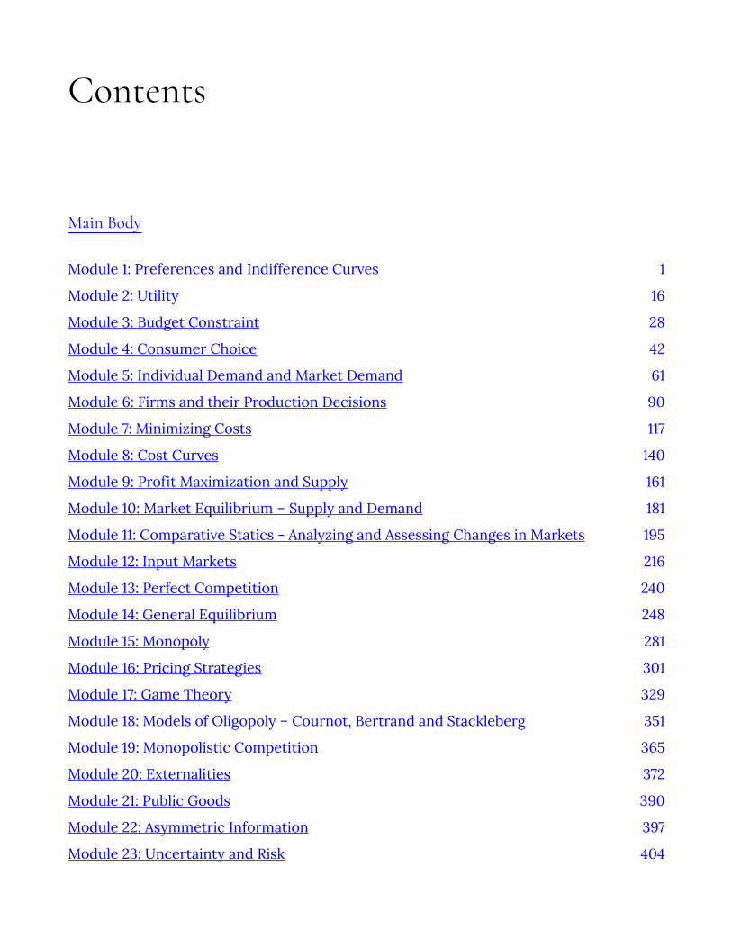
Contents
Main Body
Module 1: Preferences and Indifference Curves 1
Module 2: Utility 16
Module 3: Budget Constraint 28
Module 4: Consumer Choice 42
Module 5: Individual Demand and Market Demand 61
Module 6: Firms and their Production Decisions 90
Module 7: Minimizing Costs 117
Module 8: Cost Curves 140
Module 9: Profit Maximization and Supply 161
Module 10: Market Equilibrium – Supply and Demand 181
Module 11: Comparative Statics - Analyzing and Assessing Changes in Markets 195
Module 12: Input Markets 216
Module 13: Perfect Competition 240
Module 14: General Equilibrium 248
Module 15: Monopoly 281
Module 16: Pricing Strategies 301
Module 17: Game Theory 329
Module 18: Models of Oligopoly – Cournot, Bertrand and Stackleberg 351
Module 19: Monopolistic Competition 365
Module 20: Externalities 372
Module 21: Public Goods 390
Module 22: Asymmetric Information 397
Module 23: Uncertainty and Risk 404

Module 24: Time – Money Now or Later? 413
Creative Commons License 423
Recommended Citations 424
Versioning 426
Module 1: Preferences and Indifference Curves
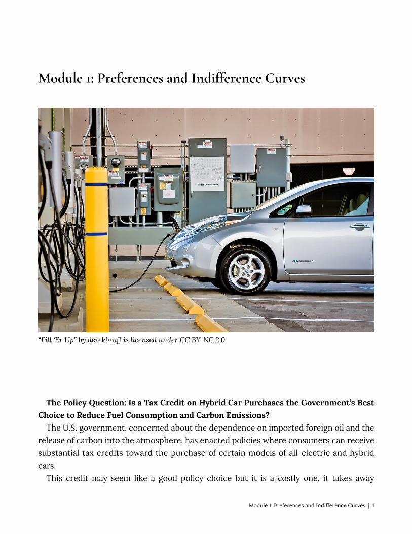
“Fill ‘Er Up” by derekbruff is licensed under CC BY-NC 2.0
The Policy Question: Is a Tax Credit on Hybrid Car Purchases the Government’s Best
Choice to Reduce Fuel Consumption and Carbon Emissions? The U.S. government, concerned about the dependence on imported foreign oil and the
release of carbon into the atmosphere, has enacted policies where consumers can receive substantial tax credits toward the purchase of certain models of all-electric and hybrid cars.
This credit may seem like a good policy choice but it is a costly one, it takes away
Module 1: Preferences and Indifference Curves | 1
resources that could be spent on other government policies, and it is not the only approach to decreasing carbon emissions and dependency on fossil fuels. So how do we decide which policy is best?
Suppose that this tax credit is wildly successful and doubles the average fuel economy of all cars on U.S. roads (this is clearly not realistic but useful for our subsequent discussions). What do you think would happen to the fuel consumption of all U.S. motorists? Should the government expect fuel consumption and carbon emissions of U.S. cars to decrease by half in response?
The answers to these questions are critical when choosing among the policy alternatives. In other words, is offering a subsidy to consumers the most effective way to meet the policy goals of decreased dependency on foreign oil and carbon emissions? Are there more efficient—that is, less expensive–ways to achieve these goals? The ability to predict with some accuracy the response of consumers to this policy is vital to determining the merits of the policy before millions of federal dollars are spent.
Consumption decisions, such as how much automobile fuel to consume, come fundamentally frompreferences – our likes and dislikes. Human decision making, driven by our preferences, is at the core of economic theory. Since we can’t consume everything our hearts desire, we have to make choices and those choices are based on our preferences. Choosing based on likes and dislikes does not mean that we are selfish–our preferences may include charitable giving and the happiness of others.
In this module, we will study preferences in economics. 1.1 Fundamental Assumptions about Individual Preferences Learning Objective 1.1: List and explain the three fundamental assumptions about
preferences. 1.2 Graphing Preferences with Indifference Curves Learning Objective 1.2: Define and draw an indifference curve. 1.3 Properties of Indifference Curves Learning Objective 1.3: Relate the properties of indifference curves to assumptions
about preference 1.4 Marginal Rate of Substitution Learning Objective 1.4: Define marginal rate of substitution. 1.5 Perfect Complements and Perfect Substitutes Learning Objective 1.5: Use indifference curves to illustrate perfect complements and
perfect substitutes. 1.6 Policy Example: The Hybrid Car Tax Credit and Consumer Preference Learning Objective 1.6: Apply indifference curves to the policy of a hybrid car tax credit.
2 | Module 1: Preferences and Indifference Curves
1.1 Fundamental Assumptions about Individual Preferences
Learning Objective 1.1: List and explain the three fundamental assumptions about preferences.
To build a model that can predict choices when variables change, we need to make some assumptions about the preferences that drive consumer choices.
Economics makes three assumptions about preferences that are the most basic building blocks of our theory of consumer choice.
To introduce these it is useful to think of collections or bundles of goods. To simplify, let’s identify two bundles, Aand B. The way we think of preferences always boils down to comparing two bundles. Even if we are choosing among three or more bundles, we can always proceed by comparing pairs and eliminating the lesser bundle until we are left with our choice.
When we call something a good, we mean exactly that – something that a consumer likes and enjoys consuming. Something that a consumer might not like we call a bad. The fewer bads consumed, the happier a consumer is. To keep things simple, we will focus only on goods, but it is easy to incorporate bads into the same framework by considering their absence – the fewer the bads the better.
The three fundamental assumptions about preferences are:
1. Completeness: We say preferences are completewhen a consumer can always say one of the following about two bundles: A is preferred to B, B is preferred to A or A is equally good as B
2. Transitivity: We say preferences are transitive if they are internally consistent: if A is preferred to B and B is preferred to C, then it must be that A is preferred to C.
3. More is Better: If bundle A represents more of at least one good, and no less of any other good, than bundle B, then A is preferred to B.
The most important results of our model of consumer behavior hold when we only assume completeness and transitivity, but life is much easier if we assume more is better as well. If we assume free disposal (we can get rid of extra goods at no cost) the assumption that more is better seems reasonable. It is certainly the case the more is not worse in that
Module 1: Preferences and Indifference Curves | 3
situation and so to keep things simple we’ll maintain the standard assumption that we prefer more of a good to less.
Our model works well when these assumptions are valid, which seems to be most of the time in most situations. However, sometimes these assumptions do not apply. For instance, in order to have complete and transitive preferences, we must know something about the goods in the bundle. Imagine an American who does not speak Hindi entering an Indian restaurant where the menu is entirely in Hindi. Without the aid of translation, the customer cannot act as economic theory would predict.
1.2 Graphing Preferences with Indifference Curves
Learning Objective 1.2: Define and draw an indifference curve. Individual preferences, given the basic assumptions, can be represented using
something called indifference curves. An indifference curve is a graph of all of the combinations of bundles that a consumer prefers equally. In other words the consumer would be just as happy consuming any of them. Representing preferences graphically is a great way to understand both preferences and how the consumer choice model works – so it is worth mastering them early in your study of microeconomics.
Bundles can contain many goods, but to simplify, we will consider only pairs of goods. At first this may seem impossibly restrictive but it turns out that we don’t really lose generality in so doing. We can always consider one good in the pair to be, collectively, all other consumption goods. What the two-good restriction does so well is to help us see the tradeoffs in consuming more of one good and less of another.
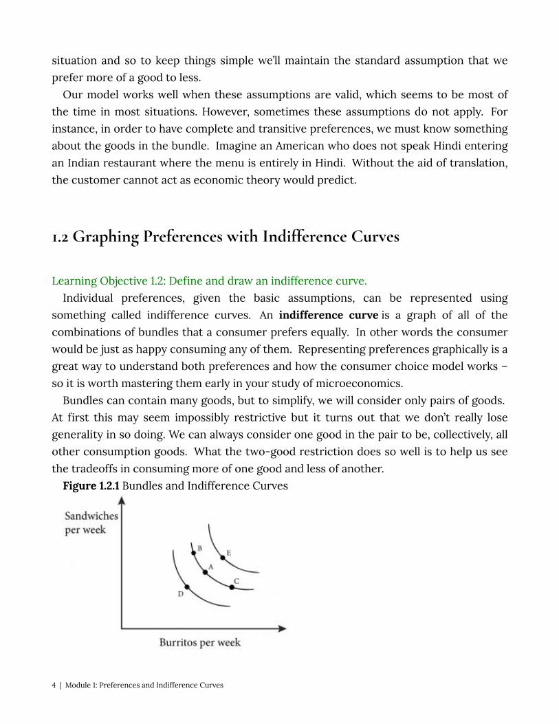
Figure 1.2.1 Bundles and Indifference Curves
4 | Module 1: Preferences and Indifference Curves
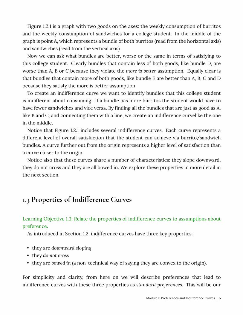
Figure 1.2.1 is a graph with two goods on the axes: the weekly consumption of burritos and the weekly consumption of sandwiches for a college student. In the middle of the graph is point A, which represents a bundle of both burritos (read from the horizontal axis) and sandwiches (read from the vertical axis).
Now we can ask what bundles are better, worse or the same in terms of satisfying to this college student. Clearly bundles that contain less of both goods, like bundle D, are worse than A, B or C because they violate the more is better assumption. Equally clear is that bundles that contain more of both goods, like bundle E are better than A, B, C and D because they satisfy the more is better assumption.
To create an indifference curve we want to identify bundles that this college student is indifferent about consuming. If a bundle has more burritos the student would have to have fewer sandwiches and vice versa. By finding all the bundles that are just as good as A, like B and C, and connecting them with a line, we create an indifference curvelike the one in the middle.
Notice that Figure 1.2.1 includes several indifference curves. Each curve represents a different level of overall satisfaction that the student can achieve via burrito/sandwich bundles. A curve further out from the origin represents a higher level of satisfaction than a curve closer to the origin.
Notice also that these curves share a number of characteristics: they slope downward, they do not cross and they are all bowed in. We explore these properties in more detail in the next section.
1.3 Properties of Indifference Curves
Learning Objective 1.3: Relate the properties of indifference curves to assumptions about preference.
As introduced in Section 1.2, indifference curves have three key properties:
• they are downward sloping • they do not cross • they are bowed in (a non-technical way of saying they are convex to the origin).
For simplicity and clarity, from here on we will describe preferences that lead to indifference curves with these three properties as standard preferences. This will be our
Module 1: Preferences and Indifference Curves | 5
default assumption – that consumers have standard preferences unless otherwise noted. As we will see in this module, there are other types of preferences that are common as well and we will continue to study both the standard type and the other types as we progress through the material.
To understand the first two properties, it’s useful to think about what happen if they were not true.
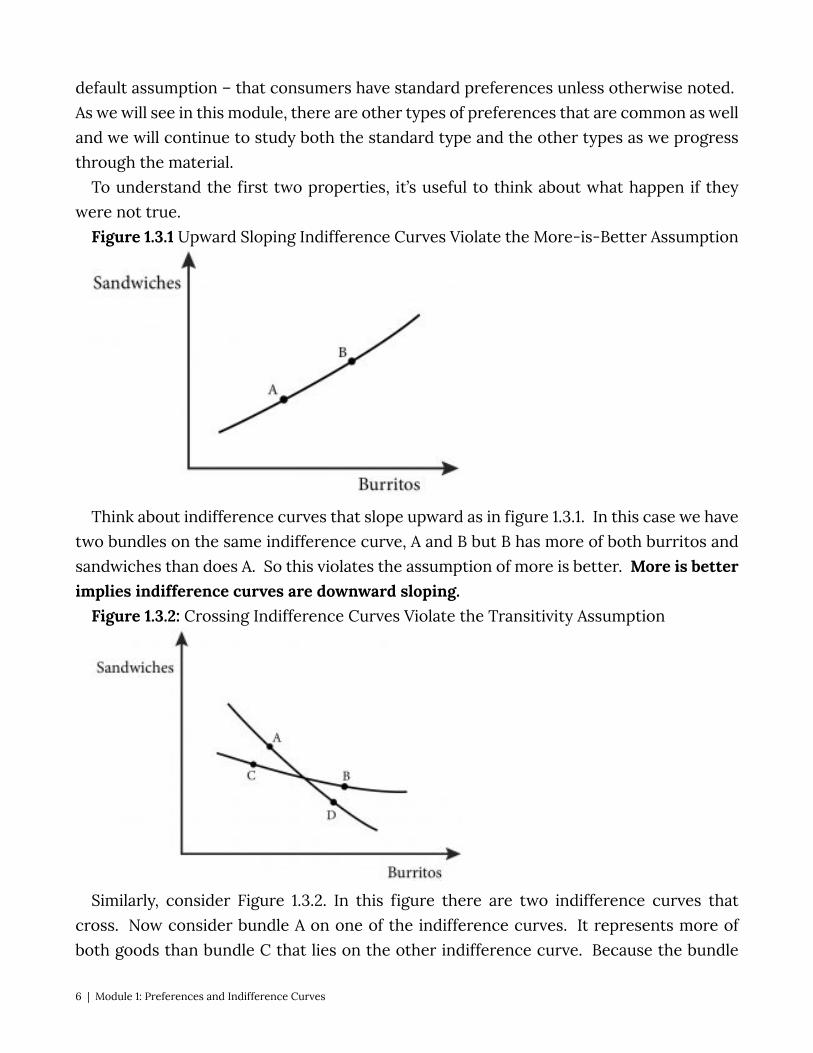
Figure 1.3.1 Upward Sloping Indifference Curves Violate the More-is-Better Assumption
Think about indifference curves that slope upward as in figure 1.3.1. In this case we have two bundles on the same indifference curve, A and B but B has more of both burritos and sandwiches than does A. So this violates the assumption of more is better. More is better implies indifference curves are downward sloping.
Figure 1.3.2: Crossing Indifference Curves Violate the Transitivity Assumption
Similarly, consider Figure 1.3.2. In this figure there are two indifference curves that cross. Now consider bundle A on one of the indifference curves. It represents more of both goods than bundle C that lies on the other indifference curve. Because the bundle
6 | Module 1: Preferences and Indifference Curves
B lies on the same indifference curve as bundle C the two bundles should be equally preferred and therefore A should be preferred to B and C. B also represents more of both goods than bundle D and therefore B should be preferred to D. However D is on the same indifference curve as A, so B should be preferred to A. Since A can’t be preferred to B and B preferred to A at the same time, this is a violation of our assumptions of transitivity and more is better. Transitivity and more is better imply that indifference curves do not cross.
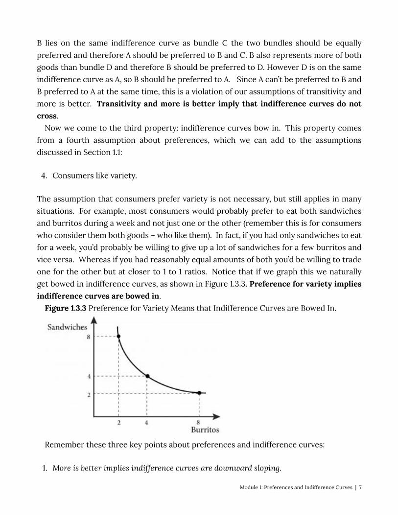
Now we come to the third property: indifference curves bow in. This property comes from a fourth assumption about preferences, which we can add to the assumptions discussed in Section 1.1:
4. Consumers like variety.
The assumption that consumers prefer variety is not necessary, but still applies in many situations. For example, most consumers would probably prefer to eat both sandwiches and burritos during a week and not just one or the other (remember this is for consumers who consider them both goods – who like them). In fact, if you had only sandwiches to eat for a week, you’d probably be willing to give up a lot of sandwiches for a few burritos and vice versa. Whereas if you had reasonably equal amounts of both you’d be willing to trade one for the other but at closer to 1 to 1 ratios. Notice that if we graph this we naturally get bowed in indifference curves, as shown in Figure 1.3.3. Preference for variety implies indifference curves are bowed in.
Figure 1.3.3 Preference for Variety Means that Indifference Curves are Bowed In.
Remember these three key points about preferences and indifference curves:
1. More is better implies indifference curves are downward sloping.
Module 1: Preferences and Indifference Curves | 7

2. Transitivity and more is better imply indifference curves do not cross. 3. Preference for variety implies indifference curves are bowed in.
1.4 Marginal Rate of Substitution
Learning Objective 1.4: Define marginal rate of substitution. From now on we will assume that consumers like variety and that indifference curves
are bowed in. However, it is worth considering examples on either extreme: perfect substitutes and perfect complements.
When we move along an indifference curve we can think of a consumer substituting one good for another. Two bundles on the same indifference curve, which represent the same satisfaction from consumption, have one thing in common: they represent more of one good and less of the other. This makes sense given our assumption of ‘more is better’; if more of one good makes you better off, then you must have less of the other good in order to maintain the same level of satisfaction.
In economics we have a more technical way of expressing this tradeoff: the marginal rate of substitution. The marginal rate of substitution (MRS) is the amount of one good a consumer is willing to give up to get one more unit of another good and maintain the same level of satisfaction. This is one of the most important concepts in economics because it is critical to understanding consumer choice.
Mathematically, we express the marginal rate of substitution for two generic goods like this:
where Δ indicates a change in the quantity of the good. In the case of our student consuming burritos and sandwiches, the expression would
be:
For example suppose at his current consumption bundle, 5 burritos and 4 sandwiches weekly, Luca is willing to give up 2 burritos to get one more sandwich. Another way of saying the same thing is that Luca is indifferent between consuming 5 burritos and 4 sandwiches in a week or 3 burritos and 5 sandwiches in a week. The MRS for Luca at that point is:
8 | Module 1: Preferences and Indifference Curves
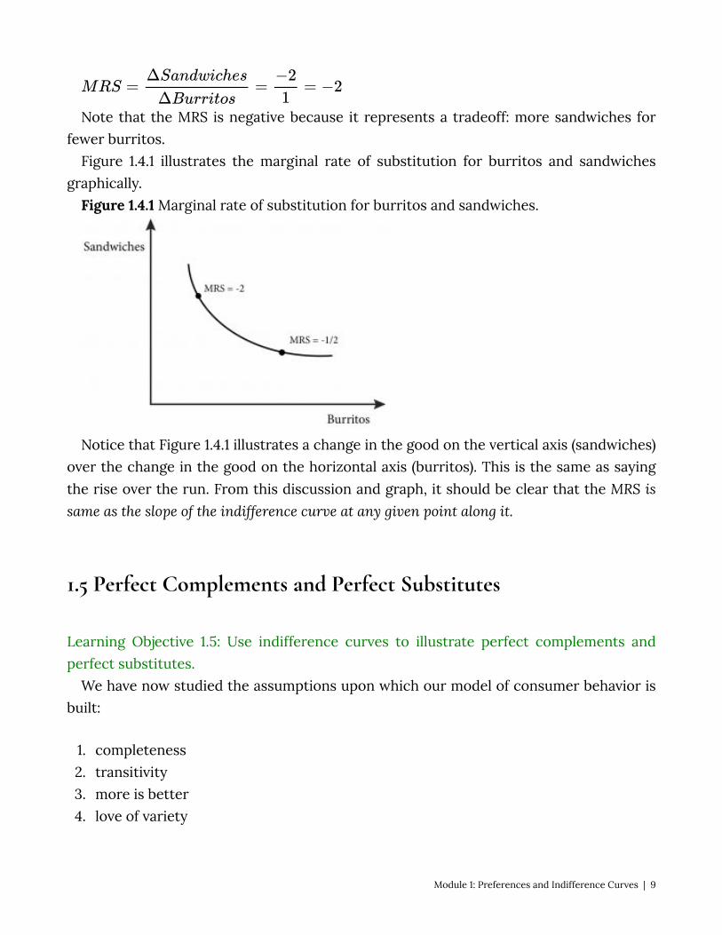
Note that the MRS is negative because it represents a tradeoff: more sandwiches for fewer burritos.
Figure 1.4.1 illustrates the marginal rate of substitution for burritos and sandwiches graphically.
Figure 1.4.1 Marginal rate of substitution for burritos and sandwiches.
Notice that Figure 1.4.1 illustrates a change in the good on the vertical axis (sandwiches) over the change in the good on the horizontal axis (burritos). This is the same as saying the rise over the run. From this discussion and graph, it should be clear that the MRS is same as the slope of the indifference curve at any given point along it.
1.5 Perfect Complements and Perfect Substitutes
Learning Objective 1.5: Use indifference curves to illustrate perfect complements and perfect substitutes.
We have now studied the assumptions upon which our model of consumer behavior is built:
1. completeness 2. transitivity 3. more is better 4. love of variety
Module 1: Preferences and Indifference Curves | 9
We have also seen how these assumptions govern the properties of indifference curves. It is worth taking a moment to think about two other types of preference relations that
are special cases but not uncommon: perfect complements and perfect substitutes. Perfect Complements Perfect complements are goods that consumers want to consume only in fixed
proportions. Consider the example of an iPod Shuffle and earphones. An iPod Shuffle is useless
without earphones and earphones are useless without an iPod Shuffle, but put them together and, voila, you have a portable stereo, which is worth quite a lot. An extra set of earphones doesn’t increase the usefulness of the iPod and an extra iPod doesn’t increase the usefulness of the earphones. So these are things that we consume in a fixed proportion: one iPod goes with one set of earphones. We call such preference relations perfect complements.
Figure 1.5.1 illustrates the process of drawing indifference curves for perfect complements.
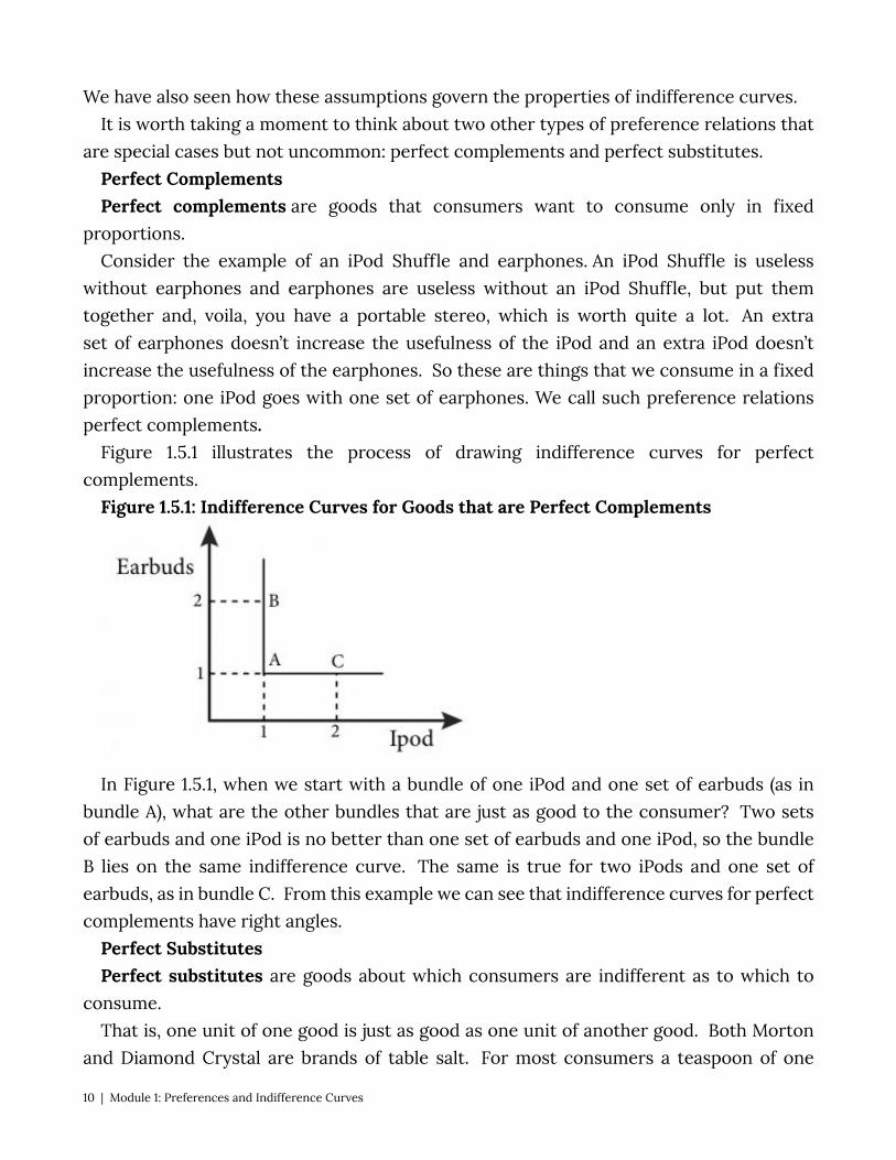
Figure 1.5.1: Indifference Curves for Goods that are Perfect Complements
In Figure 1.5.1, when we start with a bundle of one iPod and one set of earbuds (as in bundle A), what are the other bundles that are just as good to the consumer? Two sets of earbuds and one iPod is no better than one set of earbuds and one iPod, so the bundle B lies on the same indifference curve. The same is true for two iPods and one set of earbuds, as in bundle C. From this example we can see that indifference curves for perfect complements have right angles.
Perfect Substitutes Perfect substitutes are goods about which consumers are indifferent as to which to
consume. That is, one unit of one good is just as good as one unit of another good. Both Morton
and Diamond Crystal are brands of table salt. For most consumers a teaspoon of one
10 | Module 1: Preferences and Indifference Curves
salt is just as good as a teaspoon of the other regardless of the amount possessed by the consumer. We call goods like these perfect substitutes.
Drawing indifference curves for perfect substitutes is straightforward as shown in Figure 1.5.2.
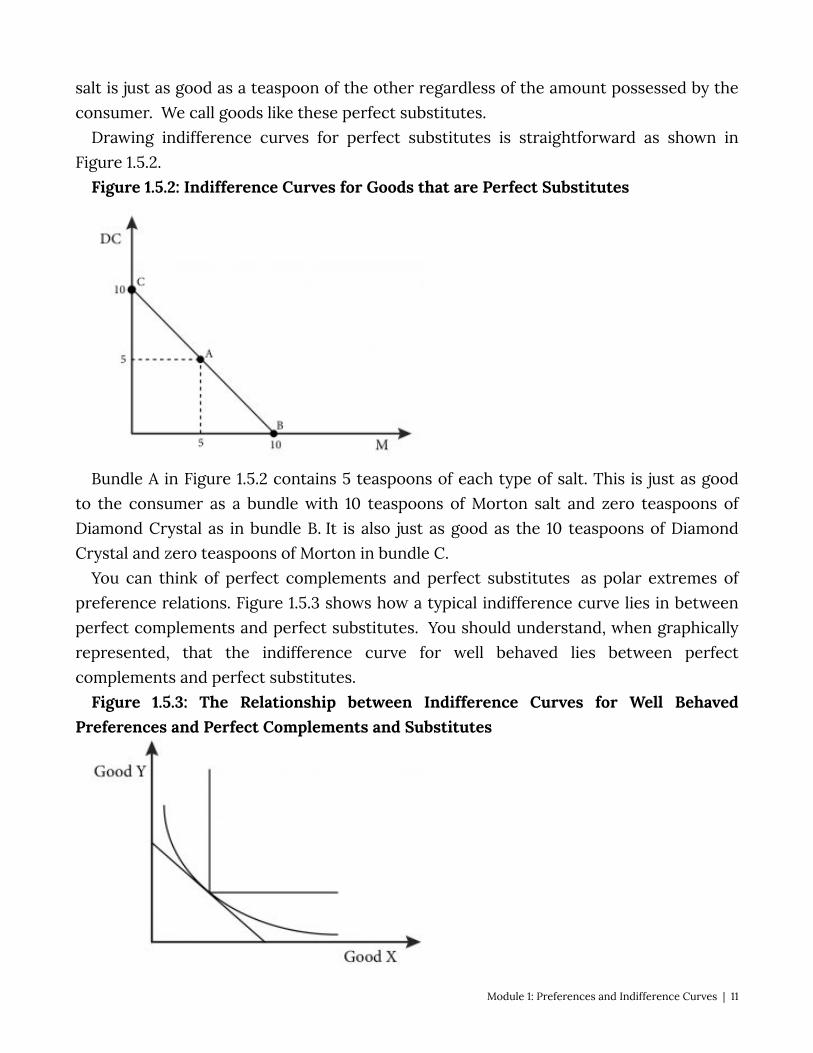
Figure 1.5.2: Indifference Curves for Goods that are Perfect Substitutes
Bundle A in Figure 1.5.2 contains 5 teaspoons of each type of salt. This is just as good to the consumer as a bundle with 10 teaspoons of Morton salt and zero teaspoons of Diamond Crystal as in bundle B. It is also just as good as the 10 teaspoons of Diamond Crystal and zero teaspoons of Morton in bundle C.
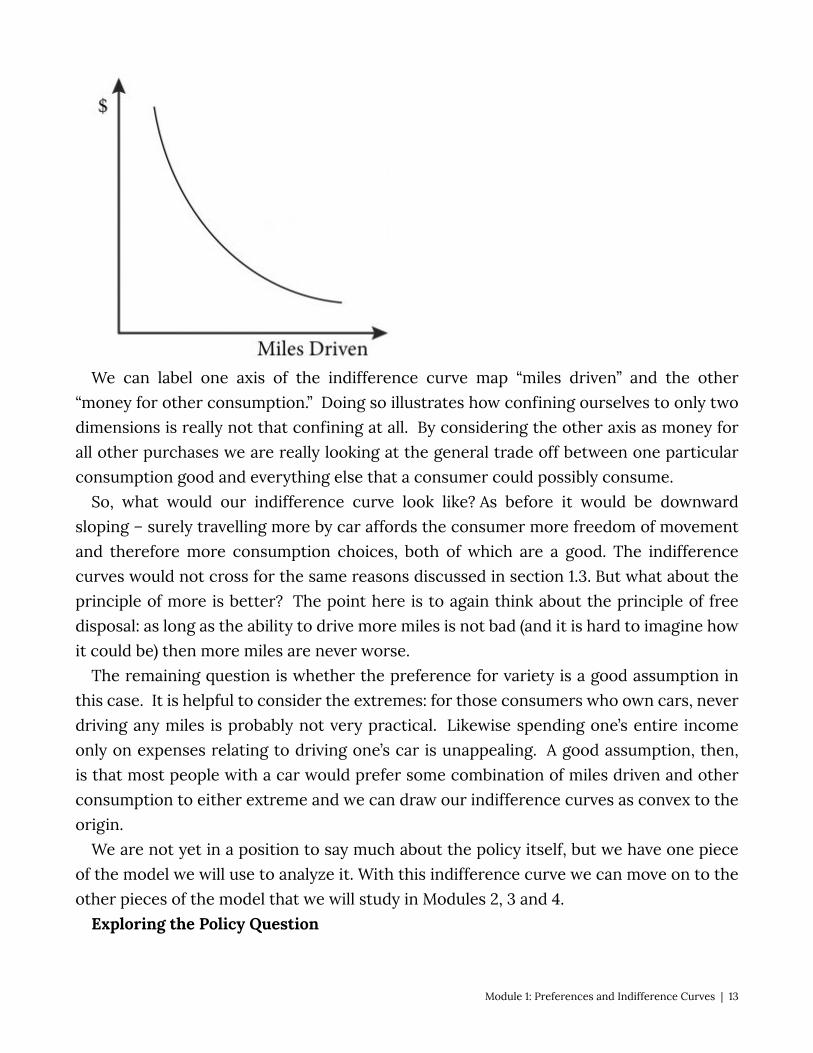
You can think of perfect complements and perfect substitutes as polar extremes of preference relations. Figure 1.5.3 shows how a typical indifference curve lies in between perfect complements and perfect substitutes. You should understand, when graphically represented, that the indifference curve for well behaved lies between perfect complements and perfect substitutes.
Figure 1.5.3: The Relationship between Indifference Curves for Well Behaved Preferences and Perfect Complements and Substitutes
Module 1: Preferences and Indifference Curves | 11

1.6 Policy Example: The Hybrid Car Tax Credit and Consumer Preference Learning Objective 1.6: Apply indifference curves to the policy of a hybrid car tax credit The issue of consumer preferences is central to the real world policy question posed at
the beginning of this module.
“Traffic jam” from Lynac on Flickr is licensed under CC BY-NC
Recall that we are assuming that the tax credit will cause the average fuel economy of U.S. cars to double. So, from a consumer behavior perspective, one of the things we want to know in evaluating the policy is whether this improvement in gas mileage will cause an equivalent decrease in the demand for gasoline. In other words, the consumer decision is about the tradeoff of purchasing gasoline to travel in a car versus all of the other uses of the money spent on gas.
We can apply the principle of preferences and the assumptions we make about them to this particular question by drawing indifference curves, as shown in Figure 1.6.1
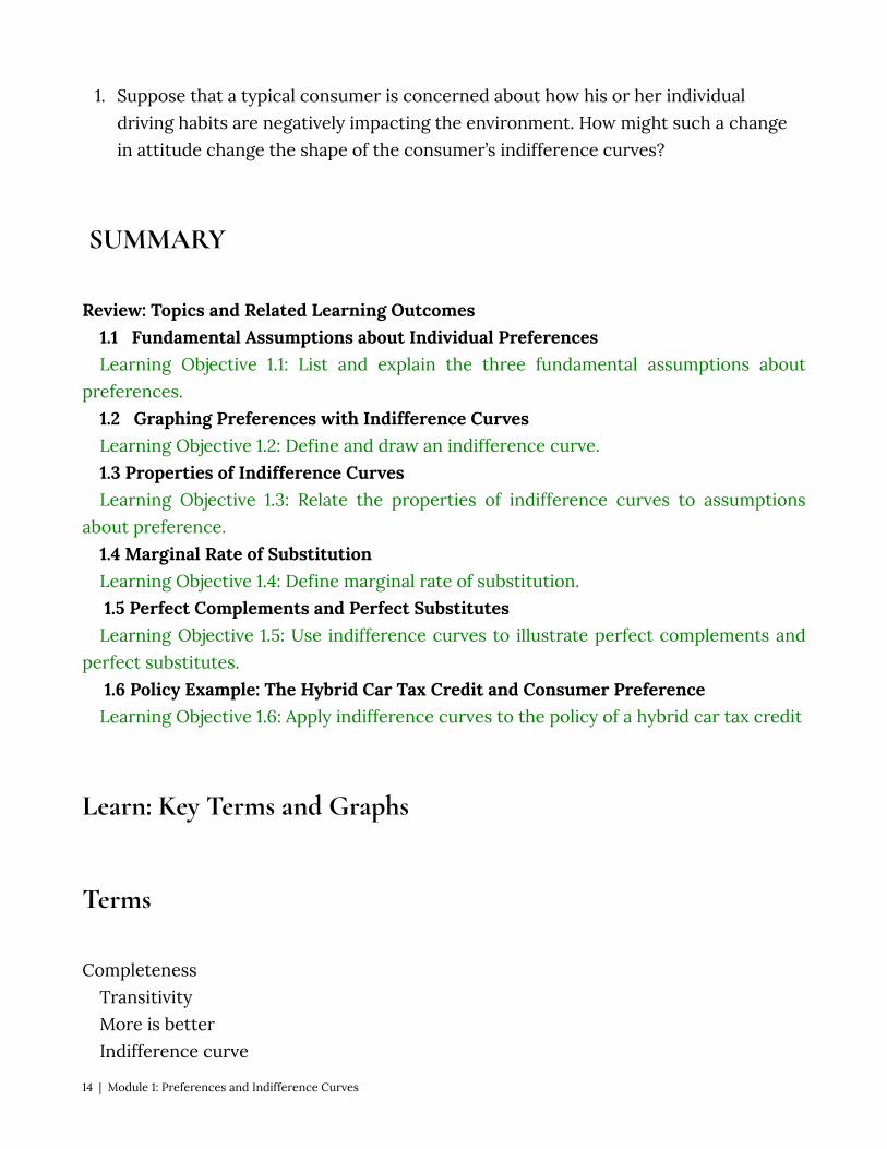
Figure 1.6.1: Indifference Curve for Miles Drives versus Money Spent on All Other Goods
12 | Module 1: Preferences and Indifference Curves
We can label one axis of the indifference curve map “miles driven” and the other “money for other consumption.” Doing so illustrates how confining ourselves to only two dimensions is really not that confining at all. By considering the other axis as money for all other purchases we are really looking at the general trade off between one particular consumption good and everything else that a consumer could possibly consume.
So, what would our indifference curve look like? As before it would be downward sloping – surely travelling more by car affords the consumer more freedom of movement and therefore more consumption choices, both of which are a good. The indifference curves would not cross for the same reasons discussed in section 1.3. But what about the principle of more is better? The point here is to again think about the principle of free disposal: as long as the ability to drive more miles is not bad (and it is hard to imagine how it could be) then more miles are never worse.
The remaining question is whether the preference for variety is a good assumption in this case. It is helpful to consider the extremes: for those consumers who own cars, never driving any miles is probably not very practical. Likewise spending one’s entire income only on expenses relating to driving one’s car is unappealing. A good assumption, then, is that most people with a car would prefer some combination of miles driven and other consumption to either extreme and we can draw our indifference curves as convex to the origin.
We are not yet in a position to say much about the policy itself, but we have one piece of the model we will use to analyze it. With this indifference curve we can move on to the other pieces of the model that we will study in Modules 2, 3 and 4.
Exploring the Policy Question
Module 1: Preferences and Indifference Curves | 13
1. Suppose that a typical consumer is concerned about how his or her individual driving habits are negatively impacting the environment. How might such a change in attitude change the shape of the consumer’s indifference curves?
SUMMARY
Review: Topics and Related Learning Outcomes 1.1 Fundamental Assumptions about Individual Preferences Learning Objective 1.1: List and explain the three fundamental assumptions about
preferences. 1.2 Graphing Preferences with Indifference Curves Learning Objective 1.2: Define and draw an indifference curve. 1.3 Properties of Indifference Curves Learning Objective 1.3: Relate the properties of indifference curves to assumptions
about preference. 1.4 Marginal Rate of Substitution Learning Objective 1.4: Define marginal rate of substitution. 1.5 Perfect Complements and Perfect Substitutes Learning Objective 1.5: Use indifference curves to illustrate perfect complements and
perfect substitutes. 1.6 Policy Example: The Hybrid Car Tax Credit and Consumer Preference Learning Objective 1.6: Apply indifference curves to the policy of a hybrid car tax credit
Learn: Key Terms and Graphs
Terms
Completeness Transitivity More is better Indifference curve
14 | Module 1: Preferences and Indifference Curves
Marginal rate of substitution (MRS) Perfect complements Perfect substitutes
Graphs
Indifference curve Marginal rate of substitution Perfect complements Perfect substitutes
Equations
Module 1: Preferences and Indifference Curves | 15
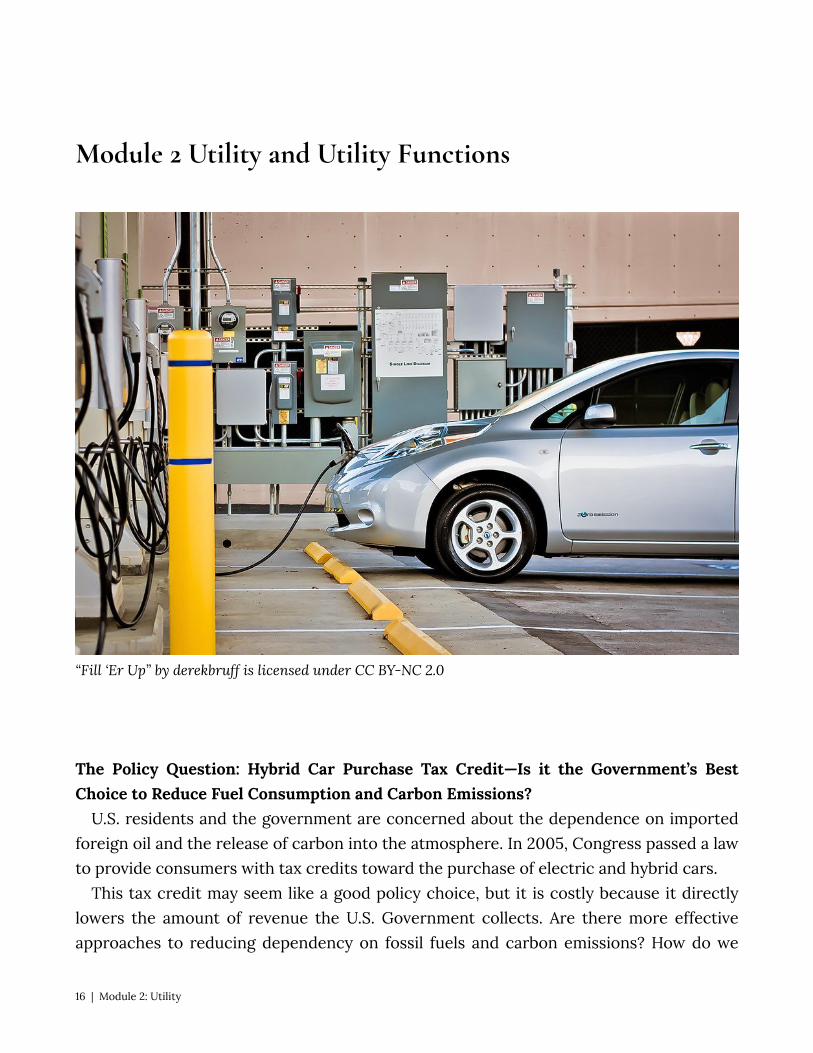
Module 2 Utility and Utility Functions
“Fill ‘Er Up” by derekbruff is licensed under CC BY-NC 2.0
The Policy Question: Hybrid Car Purchase Tax Credit—Is it the Government’s Best Choice to Reduce Fuel Consumption and Carbon Emissions?
U.S. residents and the government are concerned about the dependence on imported foreign oil and the release of carbon into the atmosphere. In 2005, Congress passed a law to provide consumers with tax credits toward the purchase of electric and hybrid cars.
This tax credit may seem like a good policy choice, but it is costly because it directly lowers the amount of revenue the U.S. Government collects. Are there more effective approaches to reducing dependency on fossil fuels and carbon emissions? How do we
16 | Module 2: Utility
decide which policy is best? To answer this question, policymakers need to predict with some accuracy how consumers will respond to this tax policy before these policymakers spend millions of federal dollars.
We can apply the concept of utility to this policy question. In this module, we will study utility and utility functions. We will then be able to use an appropriate utility function to derive indifference curves that describe our policy question.
Exploring the Policy Question Suppose that the tax credit to subsidize hybrid car purchases is wildly successful and
doubles the average fuel economy of all cars on U.S. roads – a result that is clearly not realistic but useful for our subsequent discussions. What do you think would happen to the fuel consumption of all U.S. motorists? Should the government expect fuel consumption and carbon emissions from cars to decrease by half in response? Why or why not?
2.1 Utility Functions LO 2.1: Describe a utility function. 2.2 Utility Functions and Typical Preferences LO 2.2: Identify utility functions based on the typical preferences they represent. 2.3 Relating Utility Functions and Indifference Curve Maps LO 2.3: Explain how to derive an indifference curve from a utility function. 2.4 Finding Marginal Utility and Marginal Rate of Substitution LO 2.4: Derive marginal utility and MRS for typical utility functions. 2.5. Policy Question 2.1 Utility Functions LO1: Describe a utility function. Our preferences allow us to make comparisons between different consumption bundles
and choose the preferred bundles. We could, for example, determine the rank ordering of a whole set of bundles based on our preferences. A utility function is a mathematical function that ranks bundles of consumption goods by assigning a number to each where larger numbers indicate preferred bundles. Utility functions have the properties we identified in Module 1 regarding preferences. That is: they are able to order bundles, they are complete and transitive, more is preferred to less and, in relevant cases, mixed bundles are better.
The number that the utility function assigns to a specific bundle is known as utility, the satisfaction a consumer gets from a specific bundle. The utility number for each bundle does not mean anything in absolute terms; there is no uniform scale against which we
Module 2: Utility | 17
measure satisfaction. Is only purpose is in relative terms: we can use utility to determine which bundles are preferred to others.
If the utility from bundle A is higher than the utility from bundle B, it is equivalent to saying that a consumer prefers bundle A to bundle B. Utility functions therefore rank consumer preferences by assigning a number to each bundle. . We can use a utility function to draw the indifference curve maps described in Module 1. Since all bundles on the same indifference curve provide the same satisfaction, and therefore none is preferred, each bundle has the same utility. We can therefore draw an indifference curve by determining all the bundles that return the same number from the utility function.
Economists say that utility functions are ordinal rather than cardinal. Ordinal means that utility functions only rank bundles – they only indicate which one is better, not how much better it is than another bundle. Suppose, for example, that one utility function indicates that bundle A returns 10 utils and bundle B 20 utils. We do not say that bundle B is twice as good, or 10 utils better, only that the consumer prefers bundle B. For example, suppose a friend entered a race and told you she came in third. This information is ordinal: You know she was faster than the fourth place finisher and slower than the second place finisher. You only know the order in which runners finished. The individual times are cardinal: If the first place finisher ran the race in exactly one hour and your friend finished in on hour and six minutes, you know your friend was exactly 10% slower than the fastest runner. because utility functions are ordinal many different utility functions can represent the same preferences. This is true as long as the ordering is preserved.
Take for example the utility function U that describes preferences overbundles of goods A abd B: U(A,B). We can apply any positive monotonic transformation to this function (which means, essentially, that we do not change the ordering) and the new function we have created will represent the same preferences. For example, we could multiply a positive constant, α , or add a positive or a negative constant, β . So αU(A,B)+β represents exactly the same preferences as U(A,B) because it will order the bundles in exactly the same way. This fact is quite useful because sometimes applying a positive monotonic transformation of a utility function makes it easier to solve problems.
2.2 Utility Functions and Typical Preferences LO2: Identify utility functions based on the typical preferences they represent Consider bundles of apples, A, and bananas, B. A utility function that describes Isaac’s
preferences for bundles of apples and bananas is the function U(A,B). But what are Isaac’s particular preferences for bundles of apples and bananas? Suppose that Isaac has fairly standard preferences for apples and bananas that lead to our typical indifference curves:
18 | Module 2: Utility
He prefers more to less, and he likes variety. A utility function that represents these preferences might be:
U(A,B) = AB If apples and bananas are perfect complements in Isaac’s preferences, the utility
function would look something like this: U(A,B) = MIN[A,B], where the MIN function simply assigns the smaller of the two numbers as the function’s
value. If apples and bananas are perfect substitutes, the utility function is additive and would
look something like this: U(A,B) = A + B A class of utility functions known as Cobb-Douglas utility functions are very commonly
used in economics for two reasons: 1. They represent ‘well-behaved’ preferences, such as more is better and preference for
variety. 2. They are very flexible and can be adjusted to fit real-world data very easily. Cobb-Douglas utility functions have this form: U(A,B) = AαBβ
Because positive monotonic transformations represent the same preferences, one such transformation can be used to set α + β = 1 , which later we will see is a convenient condition that simplifies some math in the consumer choice problem.
Another way to transform the utility function in a useful way is to take the natural log of the function, which creates a new function that looks like this:
U(A,B) = αln(A) + βln(B) To derive this equation, simply apply the rules of natural logs. [We’ll add a link here for
students to Click to see how in an Explain It video tutorial]. It is important to keep in mind the level of abstraction here. We typically cannot make specific utility functions that precisely describe individual preferences. Probably none of us could describe our own preferences with a single equation. But as long as consumers in general have preferences that follow our basic assumptions, we can do a pretty good job finding utility functions that match real-world consumption data. We will see evidence of this later in the course.
Table 2.1 summarizes the preferences and utility functions described in this section.
Module 2: Utility | 19
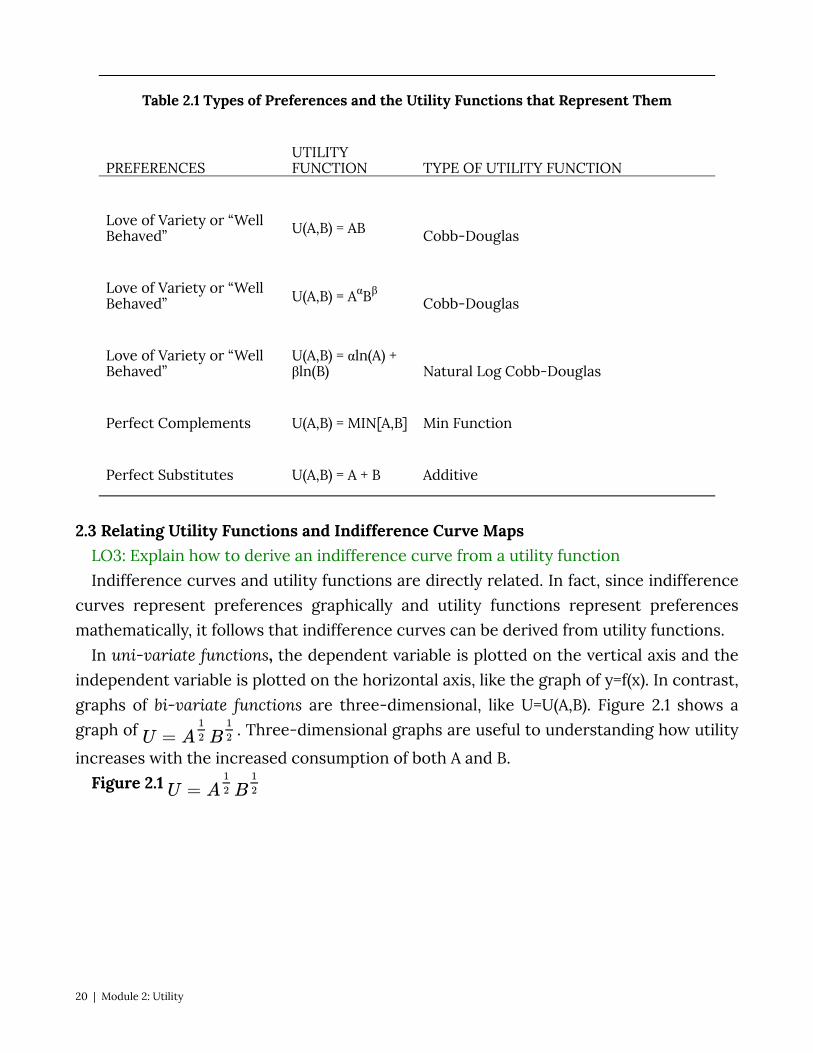
Table 2.1 Types of Preferences and the Utility Functions that Represent Them
PREFERENCES UTILITY FUNCTION TYPE OF UTILITY FUNCTION
Love of Variety or “Well Behaved” U(A,B) = AB Cobb-Douglas
Love of Variety or “Well Behaved” U(A,B) = AαBβ Cobb-Douglas
Love of Variety or “Well Behaved”
U(A,B) = αln(A) + βln(B) Natural Log Cobb-Douglas
Perfect Complements U(A,B) = MIN[A,B] Min Function
Perfect Substitutes U(A,B) = A + B Additive
2.3 Relating Utility Functions and Indifference Curve Maps LO3: Explain how to derive an indifference curve from a utility function Indifference curves and utility functions are directly related. In fact, since indifference
curves represent preferences graphically and utility functions represent preferences mathematically, it follows that indifference curves can be derived from utility functions.
In uni-variate functions, the dependent variable is plotted on the vertical axis and the independent variable is plotted on the horizontal axis, like the graph of y=f(x). In contrast, graphs of bi-variate functions are three-dimensional, like U=U(A,B). Figure 2.1 shows a graph of . Three-dimensional graphs are useful to understanding how utility
increases with the increased consumption of both A and B. Figure 2.1
20 | Module 2: Utility

Figure 2.1 clearly shows the assumption that consumers have a preference for variety. Each bundle which contains a specific amount of A and B represents a point on the surface. The vertical height of the surface represents the level of utility. By increasing both A and B, a consumer can reach higher points on the surface.
So where do indifference curves come from? Recall that an indifference curve is a collection of all bundles that a consumer is indifferent about, with respect to which one to consume. Mathematically, this is equivalent to saying all bundles, when put into the utility function, return the same functional value. So if we set a value for utility, Ū, and find all the
Module 2: Utility | 21

bundles of A and B that generate that value, we will define an indifference curve. Notice that this is equivalent to finding all the bundles that get the consumer to the same height on the three-dimensional surface in Figure 2.1.
Indifference curves are a representation of elevation (utility level) on a flat surface. In this way, they are analogous to a contour line on a topographical map. By taking the three-dimensional graph back to two-dimensional space –the A, B space –we can show the contour lines/indifference curves that represent different elevations or utility levels. From the graph in Figure 2.1, you can already see how this utility function yields indifference curves that are ‘bowed-in’ or concave to the origin.
So indifference curves follow directly from utility functions and are a useful way to represent utility functions in a two- dimensional graph.
2.4 Finding Marginal Utility and Marginal Rate of Substitution LO4: Derive marginal utility and MRS for typical utility functions. Marginal utility is the additional utility a consumer receives from consuming one
additional unit of a good. Mathematically we express this as:
or the change in utility from a change in the amount of A consumed, where Δ represents a change in the value of the item. So,
Note that when we are examining the marginal utility of the consumption of A, we hold B constant.
Using calculus, the marginal utility is the same as the partial derivative of the utility function with respect to A:
Consider a consumer who sits down to eat a meal of salad and pizza. Suppose that we hold the amount of salad constant – one side salad with a dinner, for example. Now let’s increase the slices of pizza suppose with 1slice utility is 10, with 2 it is 18, with 3it is 24 and with 4 it is 28. Let’s plot these numbers on a graph that has utility on the vertical axis and pizza on the horizontal axis (Figure 2.2).
Figure 2.2: Graph and table of Diminishing Marginal Utility
22 | Module 2: Utility
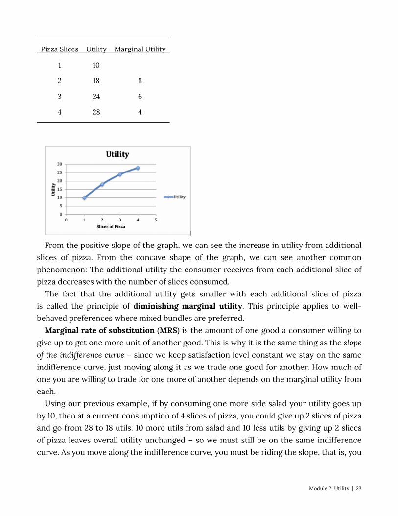
Pizza Slices Utility Marginal Utility
1 10
2 18 8
3 24 6
4 28 4
From the positive slope of the graph, we can see the increase in utility from additional slices of pizza. From the concave shape of the graph, we can see another common phenomenon: The additional utility the consumer receives from each additional slice of pizza decreases with the number of slices consumed.
The fact that the additional utility gets smaller with each additional slice of pizza is called the principle of diminishing marginal utility. This principle applies to well-behaved preferences where mixed bundles are preferred.
Marginal rate of substitution (MRS) is the amount of one good a consumer willing to give up to get one more unit of another good. This is why it is the same thing as the slope of the indifference curve – since we keep satisfaction level constant we stay on the same indifference curve, just moving along it as we trade one good for another. How much of one you are willing to trade for one more of another depends on the marginal utility from each.
Using our previous example, if by consuming one more side salad your utility goes up by 10, then at a current consumption of 4 slices of pizza, you could give up 2 slices of pizza and go from 28 to 18 utils. 10 more utils from salad and 10 less utils by giving up 2 slices of pizza leaves overall utility unchanged – so we must still be on the same indifference curve. As you move along the indifference curve, you must be riding the slope, that is, you
Module 2: Utility | 23
must be giving up the good on the vertical axis for more of the good on the horizontal axis, which yields a negative rise over a positive run.
We can go directly from marginal utility to MRS by recognizing the connection between the two concepts. In our case, for a utility function , MRS is represented as:
Note that when we substitute we can simplify the equation:
Inserting the calculus it equates to:
2.5 Policy Question We determined in Module 1 that the relevant consumer decision between more miles
driven and other consumption probably conforms to the standard assumptions about consumer choice. Therefore, using the Cobb-Douglas utility function to represent a consumer who likes to drive a car as well as consume other goods, and who sees them as a trade-off (money spent on gas is money not spent on other consumer goods), is a good choice. It also has the benefits of both conforming to the assumptions, and being flexible:
, where MD = Miles driven, and C = Other consumption. In fact, the function itself can be taken to real-world data where the parameters and can
be estimated for this market, the market for miles driven in the consumer’s car. Figure 2.3 Graph of indifference curves for the policy example
24 | Module 2: Utility
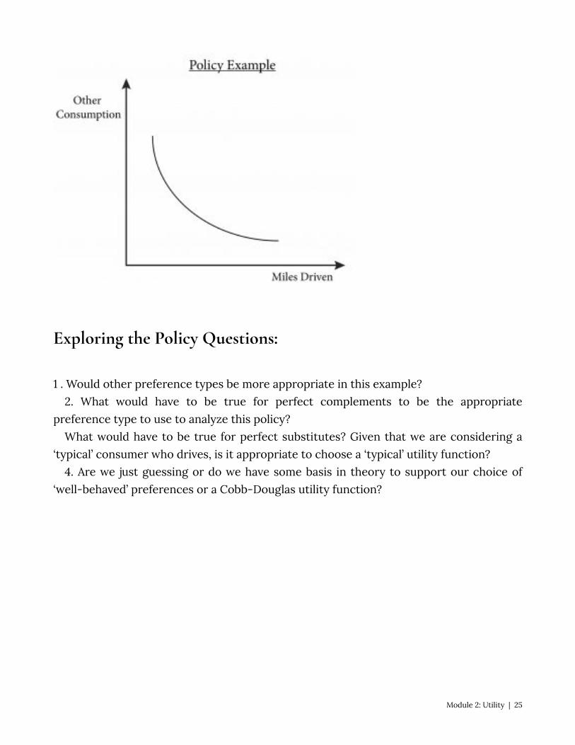
Exploring the Policy Questions:
1 . Would other preference types be more appropriate in this example? 2. What would have to be true for perfect complements to be the appropriate
preference type to use to analyze this policy? What would have to be true for perfect substitutes? Given that we are considering a
‘typical’ consumer who drives, is it appropriate to choose a ‘typical’ utility function? 4. Are we just guessing or do we have some basis in theory to support our choice of
‘well-behaved’ preferences or a Cobb-Douglas utility function?
Module 2: Utility | 25

SUMMARY
Review: Topics and Related Learning Outcomes
2.1 Utility Functions LO 2.1: Describe a utility function 2.2 Utility Functions and Typical Preferences LO 2.2: Identify utility functions based on the typical preferences they represent 2.3 Relating Utility Functions and Indifference Curve Maps LO 2.3: Explain how to derive an indifference curve from a utility function 2.4 Finding Marginal Utility and Marginal Rate of Substitution LO 2.4: Derive marginal utility and MRS for typical utility functions. 2.5. Policy Question
Learn: Key Terms and Graphs
Terms
Bi-variate functions Cardinal Contour line Diminishing marginal utility
Function
Marginal rate of substitution (MRS) Marginal utility
26 | Module 2: Utility
Ordinal Univariate functions Util Utility Utility function
Graphs
3D utility function and contour line
Equations
Cobb-Douglas Perfect complements Perfect substitutes
Module 2: Utility | 27
Module 3 – Budget Constraint
The Policy Question: Hybrid Car Purchase Tax Credit—Is it the Government’s Best Choice to Reduce Fuel Consumption and Carbon Emissions?
The U.S. government policy of extending tax credits toward the purchase of electric and hybrid cars can have consequence beyond decreasing carbon emissions. For instance, a consumer that purchases a hybrid car could spend less money on gas and have more money to spend on other things. This has implications for both the individual consumer and the larger economy.
Even the richest people – from Bill Gates to Oprah Winfrey – can’t afford to own everything in the world. Each of us has a budget that limits the extent of our consumption. Economists call this limit a budget constraint. In our policy example, an individual’s choice between consuming gasoline and everything else is constrained by his or her current income. Any additional money spent on gasoline is money that is not available for other goods and services and vice-versa. This is why the budget constraint is called a constraint.
The budget constraint is governed by income on the one hand, how much money a consumer has available to spend on consumption, and the prices of the goods the consumer purchases on the other.
Exploring the Policy Question What are some of the budget implications for a consumer who owns a hybrid car? What
purchase decisions might this consumer make given his or her savings on gas, and how does this, in turn, affect the goals of the tax subsidy policy?
3.1 Description of the Budget Constraint LO1: Define a budget constraint, conceptually, mathematically, and graphically. 3.2 The Slope of the Budget Line LO2: Interpret the slope of the budget line. 3.3 Changes in Prices and Income LO3: Illustrate how changes in prices and income alter the budget constraint and budget
line. 3.4 Coupons, Vouchers, and Taxes LO4: Illustrate how coupons, vouchers, and taxes alter the budget constraint and budget
line.
28 | Module 3: Budget Constraint
3.5 Policy Example: The Hybrid Car Subsidy and Consumers’ Budgets
3.1 Description of the Budget Constraint LO1: Define a budget constraint, conceptually, mathematically, and graphically. The budget constraint is the set of all the bundles a consumer can afford given that
consumer’s income. We assume that the consumer has a budget – an amount of money available to spend on bundles. For now, we do not worry about where this money or income comes from, we just assume a consumer has a budget.
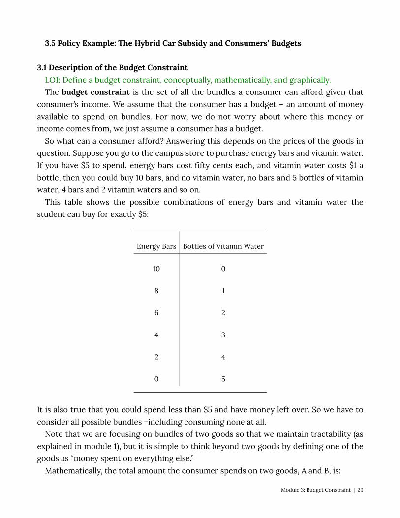
So what can a consumer afford? Answering this depends on the prices of the goods in question. Suppose you go to the campus store to purchase energy bars and vitamin water. If you have $5 to spend, energy bars cost fifty cents each, and vitamin water costs $1 a bottle, then you could buy 10 bars, and no vitamin water, no bars and 5 bottles of vitamin water, 4 bars and 2 vitamin waters and so on.
This table shows the possible combinations of energy bars and vitamin water the student can buy for exactly $5:
Energy Bars Bottles of Vitamin Water
10 0
8 1
6 2
4 3
2 4
0 5
It is also true that you could spend less than $5 and have money left over. So we have to consider all possible bundles −including consuming none at all.
Note that we are focusing on bundles of two goods so that we maintain tractability (as explained in module 1), but it is simple to think beyond two goods by defining one of the goods as “money spent on everything else.”
Mathematically, the total amount the consumer spends on two goods, A and B, is:
Module 3: Budget Constraint | 29
(3.1) , where is the price of good A and is the price of good B. If the money the
consumer has to spend on the two goods, his income, is given as I, then the budget constraint is:
(3.2)Note the inequality: This equation states that the consumer cannot spend more than his
income but can spend less. We can simplify this assumption by restricting the consumer to spending all of his income on the two goods. This will allow us to focus on the frontier of the budget constraint. As we shall see in Module 4, this assumption is consistent with the more-is-better assumption – if you can consume more (if your income allows it) you should because you will make yourself better off. With this assumption in place, we can write the budget constraint as:
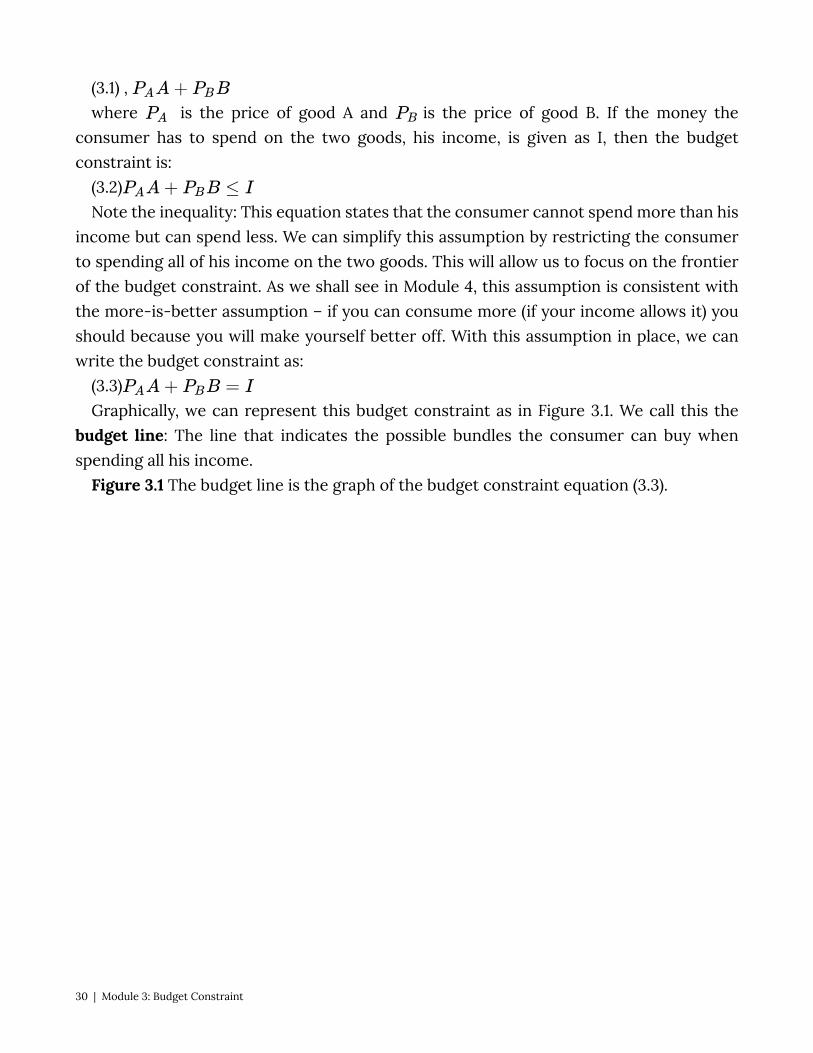
(3.3)Graphically, we can represent this budget constraint as in Figure 3.1. We call this the
budget line: The line that indicates the possible bundles the consumer can buy when spending all his income.
Figure 3.1 The budget line is the graph of the budget constraint equation (3.3).
30 | Module 3: Budget Constraint
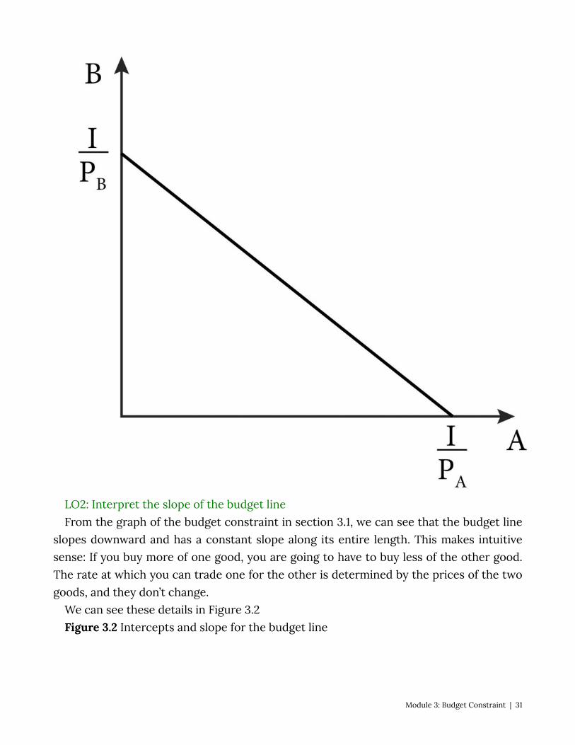
LO2: Interpret the slope of the budget line From the graph of the budget constraint in section 3.1, we can see that the budget line
slopes downward and has a constant slope along its entire length. This makes intuitive sense: If you buy more of one good, you are going to have to buy less of the other good. The rate at which you can trade one for the other is determined by the prices of the two goods, and they don’t change.
We can see these details in Figure 3.2 Figure 3.2 Intercepts and slope for the budget line
Module 3: Budget Constraint | 31
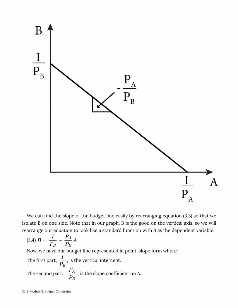
We can find the slope of the budget line easily by rearranging equation (3.3) so that we
isolate B on one side. Note that in our graph, B is the good on the vertical axis, so we will rearrange our equation to look like a standard function with B as the dependent variable:
(3.4)
Now, we have our budget line represented in point-slope form where:
The first part, , is the vertical intercept.
The second part, , is the slope coefficient on A.
32 | Module 3: Budget Constraint
Note that the slope of the budget line is simply the ratio of the prices, also known as the price ratio. This is the rate at which you can trade one good for the other in the marketplace. To see this, let’s return to the campus store with $5 to spend on energy bars and vitamin water.
Suppose you originally decided to buy 5 bottles of vitamin water and placed them in a basket. After some thought, you decided to trade 1 bottle for 2 energy bars. Now you have 4 bottles of vitamin water and 2 energy bars in the basket. If you want even more bars, the same trade off is available: 2 more bars can be had if you give up one bottle of vitamin water, and so on.
The slope of the budget line is also called the economic rate of substitution (ERS). The slope of the budget line also represents the opportunity cost of consuming more of
good A because it describes how much of good B the consumer has to give up to consume one more unit of good A. The opportunity cost of something is the value of the next-best alternative given up in order to do get it. For example, if you decide to buy one more bottle of vitamin water, you have to give up two energy bars. Note that opportunity cost is not limited to the consumption of material goods. For example, the opportunity cost of an hour’s nap might be the hour of studying microeconomics that did not happen because of it.
Changes in Prices and Income LO3: Illustrate how changes in prices and income alter the budget constraint and budget
line. From our mathematical description of the budget line, we can easily see how changes
in prices and income affect the budget line and a consumer’s choice set —the set of all the bundles available to her at current prices and income. Let’s go back to equation (3.3):
(3.3)We know from the previous Figure 3.3 that the vertical intercept for equation (3.3) is
and the horizontal intercept is .
Now consider an increase in the price of good A. Notice in Figure 3.3 that this increase
does not affect the vertical intercept, only the horizontal intercept. As increases,
decreases, moving closer to the origin. This change makes the budget line ‘steeper’ or
more negatively sloped as we can see from the slope coefficient: . As increases,
this ratio increases in absolute value, so the slope becomes more negative or steeper.
Module 3: Budget Constraint | 33
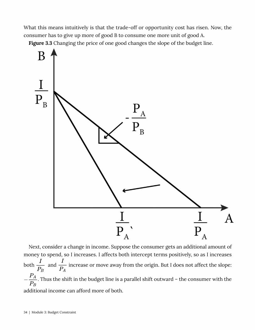
What this means intuitively is that the trade-off or opportunity cost has risen. Now, the consumer has to give up more of good B to consume one more unit of good A.
Figure 3.3 Changing the price of one good changes the slope of the budget line.
Next, consider a change in income. Suppose the consumer gets an additional amount of money to spend, so I increases. I affects both intercept terms positively, so as I increases
both and increase or move away from the origin. But I does not affect the slope:
. Thus the shift in the budget line is a parallel shift outward – the consumer with the
additional income can afford more of both.
34 | Module 3: Budget Constraint
4 Coupons, Taxes, and Vouchers LO4: Illustrate how coupons, vouchers and taxes alter the budget constraint and budget
line. Budget constraints can change due to changes in prices and income, but let’s now
consider other common features of the real-world market that can affect the budget constraint. We start with coupons or other methods firms use to give discounts to consumers.
Consider a coupon or a sale that gives consumers a discount on the price of one item in our budget constraint problem. A coupon that entitles the bearer to a percentage off in price is essentially a reduction in price and has precisely the same effect. For example, a 20% off coupon on a good that normally costs $10 is the same as reducing the price to $8.
More complicated is a coupon that gives a percentage off the entire purchase. In this case, the percentage is taken from the price of both items A and B in our budget constraint problem. In this case, the price ratio, or the slope of the budget constraint, does not change.
For example, if the price of A is regularly $10 and the price of B is regularly $20 then with 20% off the entire purchase, the new prices are $8 and $16 respectively. Intuitively, we can see that this is equivalent to increasing the income, and achieves the same result: by expanding the budget set, the consumer can now afford bundles with more of both goods.
Product Regular Price New Price with 20% discount on entire purchase
A $10 $8
B $20 $16
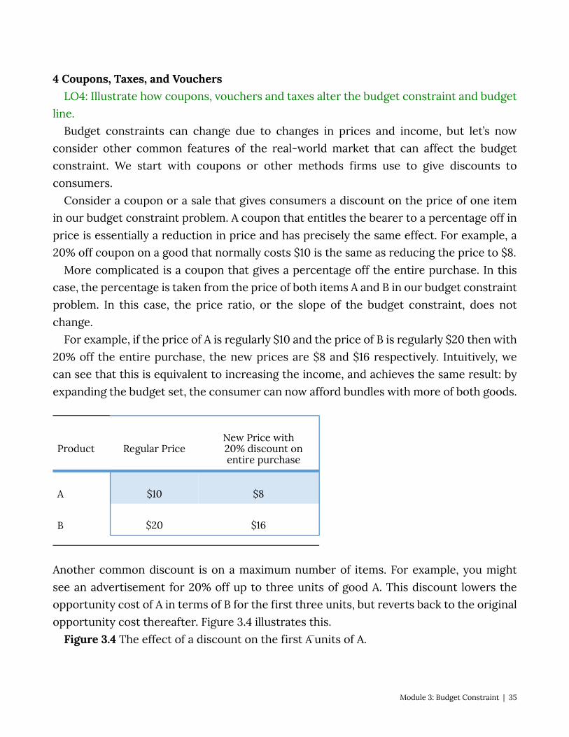
Another common discount is on a maximum number of items. For example, you might see an advertisement for 20% off up to three units of good A. This discount lowers the opportunity cost of A in terms of B for the first three units, but reverts back to the original opportunity cost thereafter. Figure 3.4 illustrates this.
Figure 3.4 The effect of a discount on the first A̅ units of A.
Module 3: Budget Constraint | 35
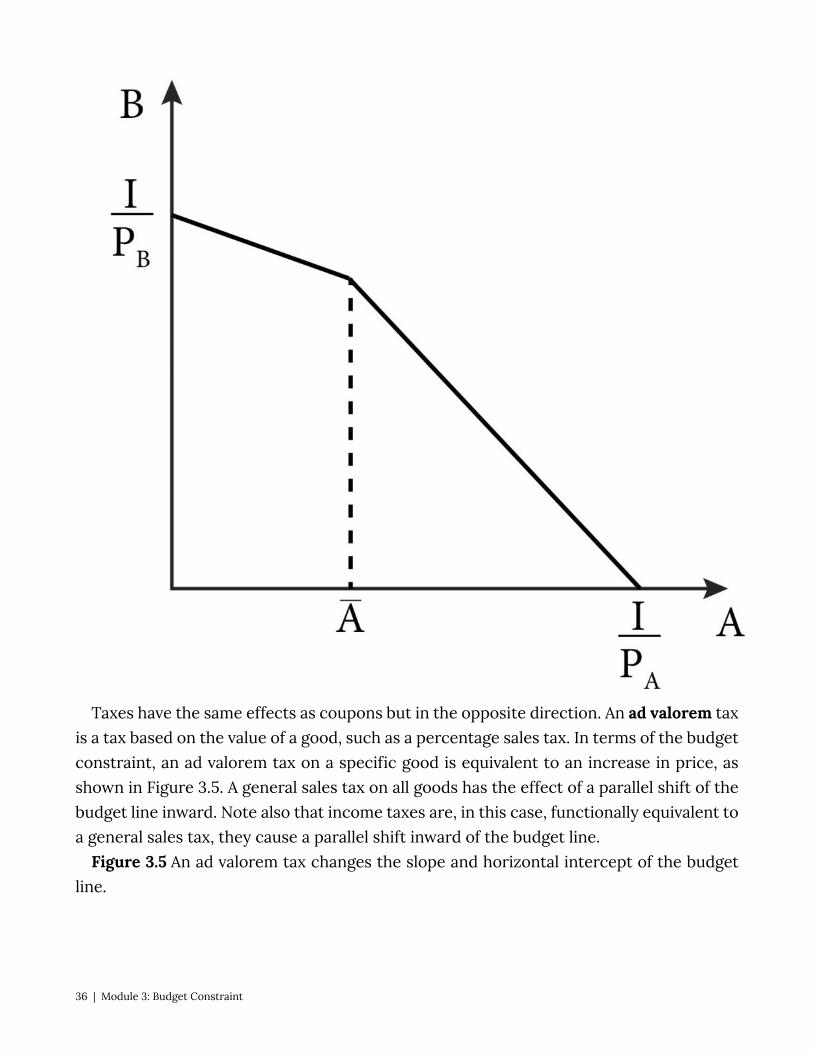
Taxes have the same effects as coupons but in the opposite direction. An ad valorem tax is a tax based on the value of a good, such as a percentage sales tax. In terms of the budget constraint, an ad valorem tax on a specific good is equivalent to an increase in price, as shown in Figure 3.5. A general sales tax on all goods has the effect of a parallel shift of the budget line inward. Note also that income taxes are, in this case, functionally equivalent to a general sales tax, they cause a parallel shift inward of the budget line.
Figure 3.5 An ad valorem tax changes the slope and horizontal intercept of the budget line.
36 | Module 3: Budget Constraint
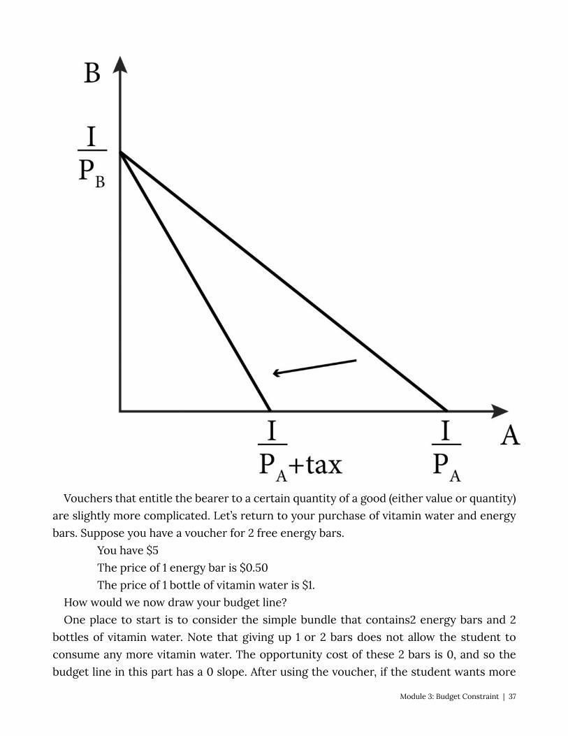
Vouchers that entitle the bearer to a certain quantity of a good (either value or quantity) are slightly more complicated. Let’s return to your purchase of vitamin water and energy bars. Suppose you have a voucher for 2 free energy bars.
You have $5 The price of 1 energy bar is $0.50 The price of 1 bottle of vitamin water is $1.
How would we now draw your budget line? One place to start is to consider the simple bundle that contains2 energy bars and 2
bottles of vitamin water. Note that giving up 1 or 2 bars does not allow the student to consume any more vitamin water. The opportunity cost of these 2 bars is 0, and so the budget line in this part has a 0 slope. After using the voucher, if the student wants more
Module 3: Budget Constraint | 37
than 2 bars the opportunity cost is the same as before – .05 a bottle of vitamin water – and so the budget line from this point on is the same as before. The new budget line with the voucher has a kink.
5 Policy Example: The Hybrid Car Subsidy and Consumers’ Budgets For several modules, we have considered the policy of a hybrid car tax credit. In Module
1, we thought about various driving preferences of a typical consumer. In Module 2, we translated these preferences into a type of utility function and corresponding indifference curve. Now, let’s think about the appropriate budget line for our policy example.
To start, let’s use the same two axes as we used for the indifference curve map as shown in Figure 3.6. In other words, let’s place ‘miles driven’ on the horizontal axis and $, which is all the money spent on other consumption on the vertical axis. For now, we won’t specify the precise level of income..
Now we can ask, what is the price of ‘other consumption?’ Since we are talking about money left over after paying for miles driven, the price for other consumption is simply 1. This is because we are talking about money itself and the price of a dollar is a dollar. So, the intercept on this axis is simply the value of I.
But what is the price of a mile driven? This question is more complicated and includes the cost of maintenance and depreciation. However, because we are focused on the effect of increasing the miles per gallon of gas, let’s concentrate on only the cost as it relates to the purchase of gasoline. In this case, the cost of driving a mile is the price of gasoline divided by the car’s miles per gallon (MPG). Since we are again interested not in an individual but a group, we can use the average price of a gallon of regular gas divided by the average MPG of cars driven in the United States as a reasonable approximation of the cost of a mile driven in a non-hybrid cr. Now we have the ‘price’ of driving a mile; dividing income by this price gives us the intercept on the ‘miles driven’ axis.
Figure 3.6 A consumer’s budget constraint for the hybrid car policy
38 | Module 3: Budget Constraint

Now that we have a budget constraint for our electric and hybrid car subsidy policy example, we can see the effect of the policy on the constraint. Doubling the MPG from 20, say, to 40, dramatically reduces the price of driving a mile . This reduction causes the ‘miles driven’ intercept to move upwards and the entire budget constraint to move outward. Note that now the typical consumer can afford to consume bundles with more of both miles driven and everything else – bundles that were unavailable to them prior to the policy.
Equation (3.4) summarizes the budget constraint for miles driven and other goods. (3.4) Income = (PMiles Driven)(Miles Driven) + Dollars Spent on Other Consumption I Exploring the Policy Questions
1. What can we say about the availability of bundles after the hybrid car tax credit is enacted compared to before? Do the bundles represent more consumption of only miles driven or do they represent more of other goods as well?
Module 3: Budget Constraint | 39
2. Another type of car that is high mileage (high MPG) is a diesel car. In the United States, however, the price of diesel gas is typically higher than the price of regular gas. How would only higher MPG shift the budget line in Figure 3.9? How would only higher priced gas shift the budget line in figure 3.9? How would these two factors together alter the budget line from Figure 3.9?
3. If the government subsidizes the purchase of hybrid cars through a rebate that adds to the income of consumers, what happens to the budget line in Figure 3.9?
SUMMARY
Review: Topics and Related Learning Outcomes
3.1 Description of the Budget Constraint LO1: Define a budget constraint 3.2 The Slope of the Budget Line LO2: Discuss the interpretation of the slope of the budget line 3.3 Changes in Prices and Income LO3: Illustrate how changes in prices and income alter the budget constraint and budget
line 3.4 Coupons, Vouchers and Taxes LO4: Illustrate how coupons, vouchers and taxes alter the budget constraint and budget
line 3.5 Policy Example
Learn: Key Terms and Graphs
Terms
Ad Valorem Tax
40 | Module 3: Budget Constraint

Budget Constraint Budget Line Economic Rate of Substitution Opportunity Cost
Graphs
Normal budget constraint Budget constraint with coupon Budget constraint with voucher
Equations
Budget constraint
Module 3: Budget Constraint | 41
“Fill ‘Er Up” by derekbruff is licensed under CC BY-NC 2.0
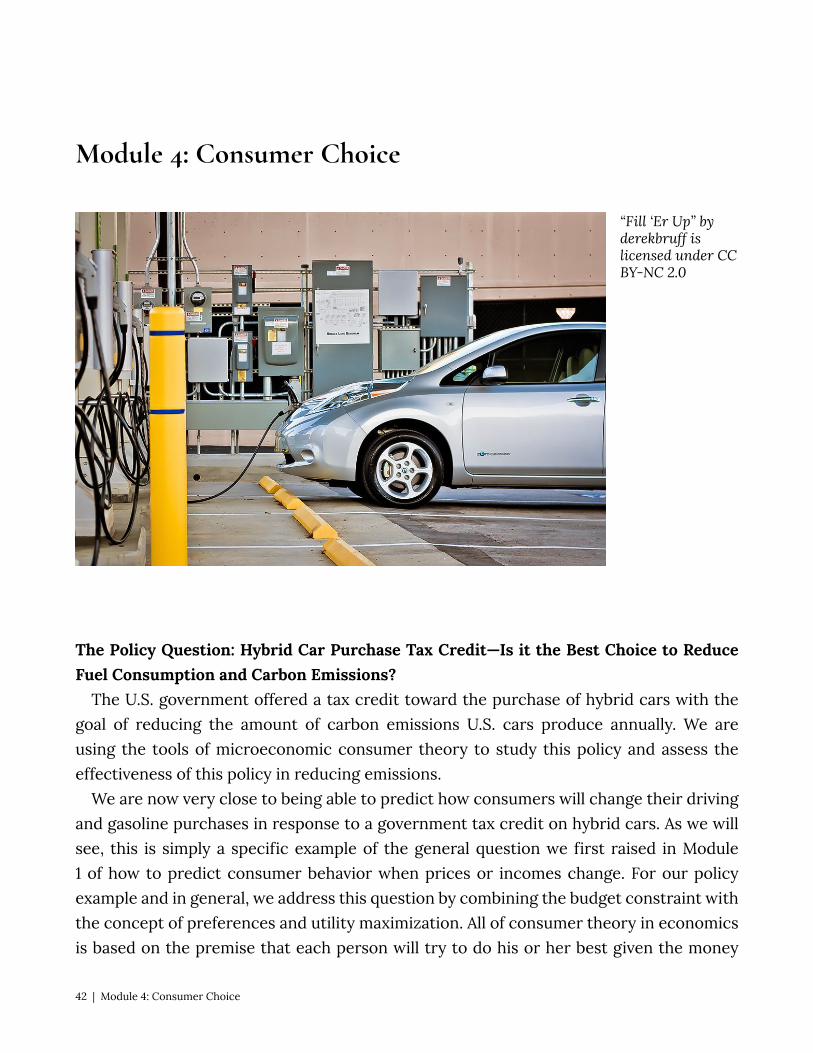
Module 4: Consumer Choice
The Policy Question: Hybrid Car Purchase Tax Credit—Is it the Best Choice to Reduce Fuel Consumption and Carbon Emissions?
The U.S. government offered a tax credit toward the purchase of hybrid cars with the goal of reducing the amount of carbon emissions U.S. cars produce annually. We are using the tools of microeconomic consumer theory to study this policy and assess the effectiveness of this policy in reducing emissions.
We are now very close to being able to predict how consumers will change their driving and gasoline purchases in response to a government tax credit on hybrid cars. As we will see, this is simply a specific example of the general question we first raised in Module 1 of how to predict consumer behavior when prices or incomes change. For our policy example and in general, we address this question by combining the budget constraint with the concept of preferences and utility maximization. All of consumer theory in economics is based on the premise that each person will try to do his or her best given the money
42 | Module 4: Consumer Choice
they have and the prices of the goods and services they like. This is what we mean by utility maximization – choosing the affordable bundle of goods and services that returns the highest utility.
Think about a consumer who goes grocery shopping. There are many ways to fill a shopping basket – ending up with many different possible bundles of goods. This module is concerned with how each consumer picks the best affordable. As we will see shortly, consumers think about the income they have, and the relative prices of all the possible goods they could buy, and then choose among all of the possible bundle combinations that their budget can support.
Exploring the Policy Question What is your prediction about how consumers’ driving and gasoline purchasing
behavior will change when their income increases or decreases? When the price of gasoline increases or decreases? What implications will these behavior changes have for the hybrid car tax credit policy?
4.1 The consumer choice problem: maximizing utility LO1: Define the consumer choice problem. 4.2 Solving the consumer choice problem LO2: Solve a consumer choice problem with the typical utility function. 4.3 Corner solutions and kinked indifference curves LO3: Solve a consumer choice problem with utility function for perfect complements
and perfect substitutes. 4.4 Policy example: The hybrid car tax credit and consumer choice
4.1 The consumer choice problem: maximizing utility LO1: Define the consumer choice problem. What is the consumer’s optimal choice among competing bundles? This question
summarizes the consumer choice problem. To resolve this problem, we can combine our understanding of the budget constraint and preferences as represented by utility functions. The budget constraint describes all of the bundles the consumer could possibly choose. The utility function describes the consumer’s preferences and relative level of satisfaction from the consumption of bundles. We put these two pieces together by answering the question: Among all the bundles the consumer could possibly choose, which one returns the highest level of utility?
Conceptually, we are overlaying the indifference curve map on the budget constraint and looking for the point or points of intersection, as in Figure 4.1. Recall that there can be more than one indifference curve for bundles of goods A and B. The goal for solving the
Module 4: Consumer Choice | 43

consumer choice problem is to get on the highest indifference curve – the curve that is the farthest to the upper right – while also satisfying the budget constraint. The highest indifference curve – the one that represents the highest level of utility or satisfaction – is the one that just touches the budget line at a single point. It is not possible to get on a higher indifference curve given the budget constraint, and though it is possible to get on a lower one, doing so necessarily means a lower level of utility or satisfaction.
Figure 4.1 Indifference curve on the budget constraint
Figure 4.1 summarizes the solution to the consumer choice problem: The consumer should pick the one bundle that returns the highest level of utility while also satisfying the budget constraint. This graph also shows us the two fundamental conditions that represent the solution to the consumer choice problem:
1. The consumer’s optimal choice is on the budget line itself, not inside the budget
44 | Module 4: Consumer Choice
constraint. This is why we can focus on the line rather than the whole set of affordable bundles.
2. At the optimal choice, the indifference curve just touches the budget line and so at this one point they have exactly the same slope.
This second condition has a significant intuitive interpretation. Recall that the slope of the indifference curve is the marginal rate of substitution(MRS) – the rate at which the consumer is willing to trade off one good for the other and remain just as well off. Recall also that the slope of the budget line is the economic rate of substitution (ERS) – the rate at which the consumer is able to trade one good for the other at current prices. What figure 4.1 shows is that at the optimal choice these two things must equal. But why?
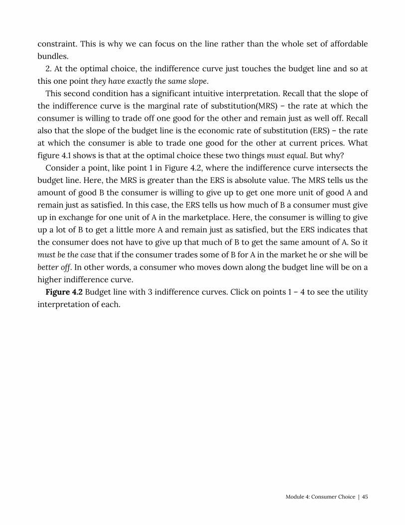
Consider a point, like point 1 in Figure 4.2, where the indifference curve intersects the budget line. Here, the MRS is greater than the ERS is absolute value. The MRS tells us the amount of good B the consumer is willing to give up to get one more unit of good A and remain just as satisfied. In this case, the ERS tells us how much of B a consumer must give up in exchange for one unit of A in the marketplace. Here, the consumer is willing to give up a lot of B to get a little more A and remain just as satisfied, but the ERS indicates that the consumer does not have to give up that much of B to get the same amount of A. So it must be the case that if the consumer trades some of B for A in the market he or she will be better off. In other words, a consumer who moves down along the budget line will be on a higher indifference curve.
Figure 4.2 Budget line with 3 indifference curves. Click on points 1 – 4 to see the utility interpretation of each.
Module 4: Consumer Choice | 45
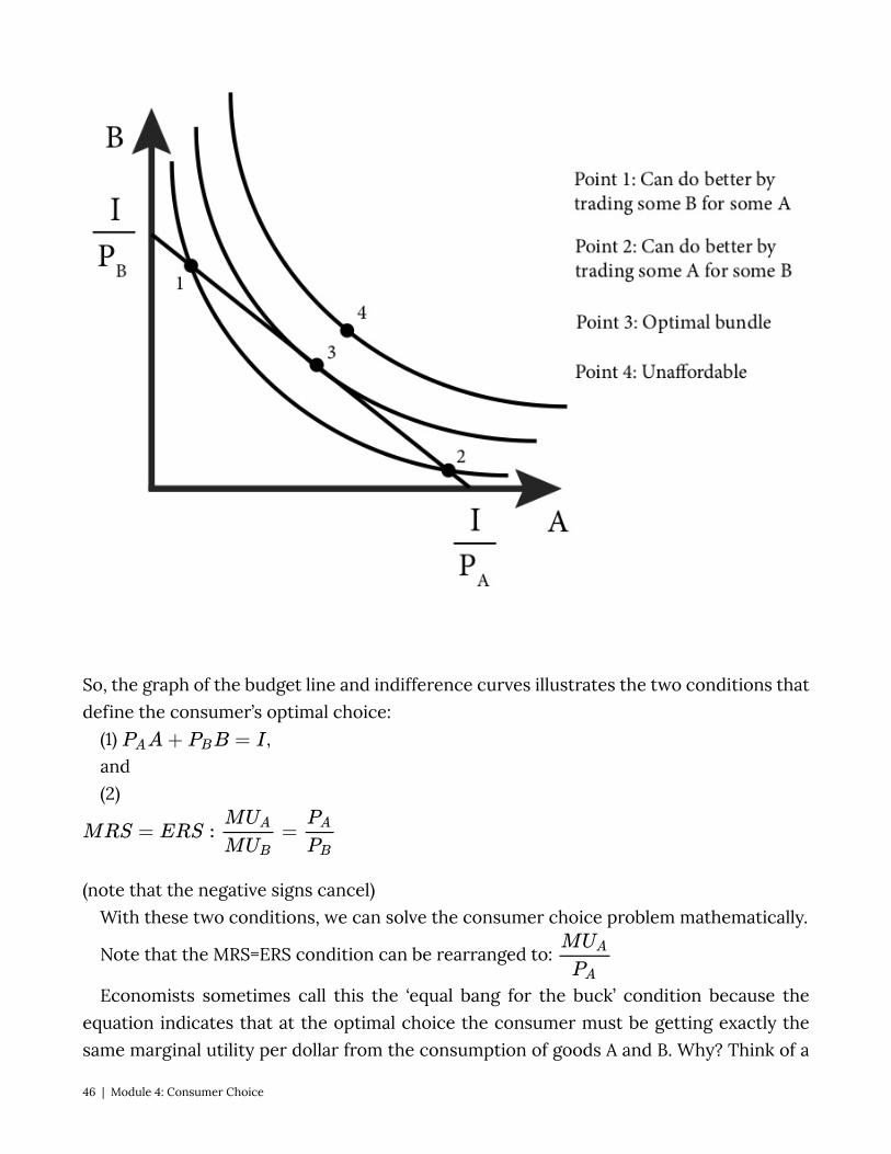
So, the graph of the budget line and indifference curves illustrates the two conditions that define the consumer’s optimal choice:
(1) , and (2)
(note that the negative signs cancel) With these two conditions, we can solve the consumer choice problem mathematically.
Note that the MRS=ERS condition can be rearranged to:
Economists sometimes call this the ‘equal bang for the buck’ condition because the equation indicates that at the optimal choice the consumer must be getting exactly the same marginal utility per dollar from the consumption of goods A and B. Why? Think of a
46 | Module 4: Consumer Choice
case where these two goods are not equal. If you’re at a pizza parlor eating slices of pizza and bowls of salad, suppose that:
This equation indicates that marginal utility per dollar of pizza is less than the marginal utility per dollar of salad at your current level of consumption. You cannot optimize your utility. Why not?
For simplicity let’s assume the price of both a slice of pizza and a small salad is exactly $1, so:
. Now, let’s take $1 away from pizza and spend it instead on salad. You lose the marginal
utility of that last slice of pizza, but you gain the marginal utility of one more serving of salad. From the condition above, we know that total utility must have increased since:
. We also know that marginal utility for a normal preference diminishes when you
consume more of a good, and therefore increases when you consume less, . Therefore, the marginal utility of pizza will increase and the marginal utility of salad will decrease, getting you closer to equality. As long as this condition is not met (as long as there is an inequality), a consumer can always make these types of trades to become better off.
4.2 Solving the consumer choice problem LO2: Solve a consumer choice problem with the typical utility function Formally, the consumer’s optimal choice problem looks like this:
(4.1)
As we discussed in the Section 4.1, the second line of this problem (the ‘subject to’ part) is the budget constraint. Since we have the more-is-better assumption, the consumer will always spend all of his or her budget on goods A and B. So, we can rewrite the consumer choice problem as: (4.2)
Module 4: Consumer Choice | 47
\begin{matrix} max\,U(A,B)\\(A,B) \\subject\,to\,P_AA+P_BB=I \end{matrix}
Let’s use the Cobb-Douglas utility function and solve this problem analytically. Our problem is now:
(4.3)
To solve this problem, we will apply what we know from Section 4.1: At the optimal solution, we have two conditions, MRS=ERS, and we are on the budget line.
MRS=ERS in this case requires that we find the marginal utility of bundles A and B. This requires determining the partial derivative of the utility function for good A and then for good B.
The MRS is the ratio of the two marginal utilities:
The ERS is the ratio of the prices:
Putting these two equations together gives us:
The second part of the consumer choice problem, the budget constraint (that we are on the budget line or the ‘subject to’ part), is straightforward:
At this point, solving the problem is a matter of simple algebra. We have two equations
48 | Module 4: Consumer Choice
with two unknowns, good A and good B. We can solve these equations by repeated substitution: solve equation (4.4) for good A or B and substitute the result into equation (4.5).
If we solve (4.4) for bundle B, we get:
Substituting into (4.5) gives us:
Simplifying this equation gives us:
Solving for A, we get:
(4.9)
Plugging this equation into (4.6) gives us:
Simplifying this equation gives us the solution for good B:
(4.10)
Remember that the prices, the income, and the parameter values for alpha and beta are all just numbers that are given. Therefore, these solutions for goods A and B are simply a specific amount of both – one specific bundle of A and B consumption that is the very best choice a consumer has among all the possible choices.
Equations 4.9 and 4.10 are the demand functions for goods A and B, respectively. Demand functions are mathematical functions that describe the relationship between quantity demanded and prices, income and other things that affect purchase decisions. We can use these demand functions to predict what will happen to the consumption of both goods when prices and incomes change. From the demand functions, it is easy to predict that increases in the price of the good will lead to lower consumption and increases in income will lead to greater consumption. We will return to the examination of these demand functions in the next module.
4.3 Corner solutions and kinked indifference curves LO3: Solve a consumer choice problem with utility function for perfect complements
and perfect substitutes.
Module 4: Consumer Choice | 49
So far, we have considered the optimal consumption bundle for a consumer who has ‘well- behaved’ preferences, meaning that he or she has indifference curves that are smooth, curved in, and not touching the vertical or horizontal axes. The optimal choice for these well-behaved preferences is characterized by the MRS=ERS. The solution to the consumer choice problem with these preferences is always an interior solution: a utility maximizing bundle that has a positive amount of both goods.
But we know that there are other relatively common preference types, such as perfect complements and perfect substitutes, that have indifference curves that are shaped differently. The solution to the consumer choice problem for these preferences types cannot be characterized by the MRS=ERS condition.
As we saw in Module 2, perfect complements have indifference curves that are kinked at 90-degree angles, and perfect substitutes have indifference curves that are straight lines that begin and end on the axes. For both perfect complements and perfect substitutes the solution to the consumer choice problem is the one consumption bundle that puts the consumer on the highest indifference curve possible. But in both cases, this does not have the tangency condition of the MRS equaling the ERS.
Since perfect complements have indifference curves that are kinked: they have abrupt changes in slope at a single point. At this kink, the MRS is not defined because there is no slope. The solution to the consumer choice problem with perfect complement preferences is interior – you definitely need some of both good to get any utility – but at the kink so there is no MRS to equate to ERS.
The solutions to consumer choice problems with perfect complement preferences are usually corner solutions: a utility maximizing bundle that consists of only one of the two goods. In other words, a consumption bundle that is located at one corner of the budget constraint. Corner solutions are typical when preferences are perfect substitutes but can occur for many other preference types that we will not study.
Let’s see how to find the utility maximizing bundle for these two preference types starting with perfect complements.
Perfect Complements In the case of perfect complements with strictly positive prices, the optimal bundle is
always the one at the 90-degree kink in the indifference curve, as shown in Figure 4.3. We can use this observation similarly to how we used the fact that MRS = ERS in the previous section. If the optimal bundle is always at the kink and is always on the budget line, we can once again find two equations with two unknowns to solve.
Figure 4.3 Solution to the consumer choice problem for perfect complements
50 | Module 4: Consumer Choice

Recall that the utility function for perfect complements looks like this: , where α and are parameters.
POP UP TEXT: Parameter: a fixed value given outside the model, one that never changes. Variable: a value that can change such as prices, income, etc.
Consuming at the kink implies that . This condition makes intuitive sense: Since the utility function takes on only the value of the smaller of the two choices, spending money on some of good A without the corresponding increase in good B will not raise utility at all but will cost the consumer money. So, this choice cannot possibly be optimal. The only optimal decision is to spend money on goods A and B in the precise proportions that they are consumed. With the condition and the budget constraint, , we can easily solve through repeated substitution. Note that:
, substitutes into the budget constraint as follows:
Module 4: Consumer Choice | 51
Solving for B:
, or
Solving for A using :
Again, we see that the quantity demanded of each item decreases with an increase in its price and increases with increases in income. But now we also have the interesting result that quantity demanded of one good decreases as the price of the other good increases. This makes intuitive sense because perfect complements are goods, such as hot dogs and hot dog buns, that are only consumed together.
Perfect Substitutes With perfect substitutes, the optimal bundle is generally either at one corner of the
budget constraint or the other. If you stop and think about it for a moment, the intuition behind this observation becomes clear. If you like Coke and Pepsi equally well and think of them as perfect substitutes for one another, you will logically buy only the one that has the lower price. If Coke costs $1 and Pepsi $1.50, and you like them equally well, why would you ever buy any Pepsi at all? There is one exception to this “all-of-one-or-the-other” rule. When Coke and Pepsi have the same prices, you can get all of one, all of the other, or any combination of both. In this case, there is not just one optimal bundle. In this module, we will concentrate on the case where there is one optimal bundle and so you, the consumer, have to purchase all of one or the other.
Consider Figure 4.4, which illustrates a generic budget line (in black) for goods A and B, and a series of indifference curves (in blue) representing preferences for the perfect substitutes of goods A and B. The slope of the indifference curves (the MRS) is always greater than the slope of the budget line (the ERS). As you can see from Figure 4.4, this means that consumers always does better when they consume more A and less B – consumers move to a higher indifference curve. Specifically, consider bundle 1 in the graph. This bundle contains both A and B. If we compare bundle 1 to the bundle in the corner of the budget constraintlabeled ‘optimal bundle’, you can see that the optimal bundle is on a higher indifference curve, which means that this bundle is better. In fact this is true of any other bundle in the budget constraint – all other bundles place consumers on a lower indifference curve.
52 | Module 4: Consumer Choice
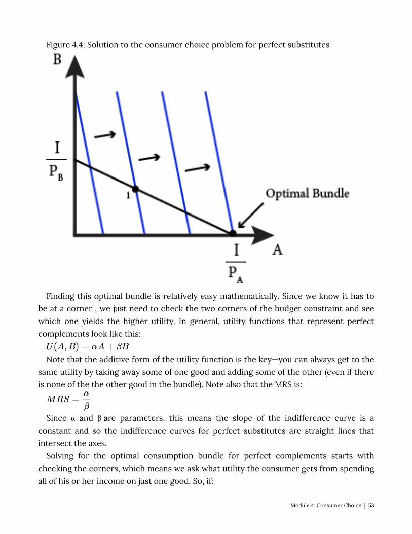
Figure 4.4: Solution to the consumer choice problem for perfect substitutes
Finding this optimal bundle is relatively easy mathematically. Since we know it has to be at a corner , we just need to check the two corners of the budget constraint and see which one yields the higher utility. In general, utility functions that represent perfect complements look like this:
Note that the additive form of the utility function is the key—you can always get to the same utility by taking away some of one good and adding some of the other (even if there is none of the the other good in the bundle). Note also that the MRS is:
Since α and β are parameters, this means the slope of the indifference curve is a constant and so the indifference curves for perfect substitutes are straight lines that intersect the axes.
Solving for the optimal consumption bundle for perfect complements starts with checking the corners, which means we ask what utility the consumer gets from spending all of his or her income on just one good. So, if:
Module 4: Consumer Choice | 53
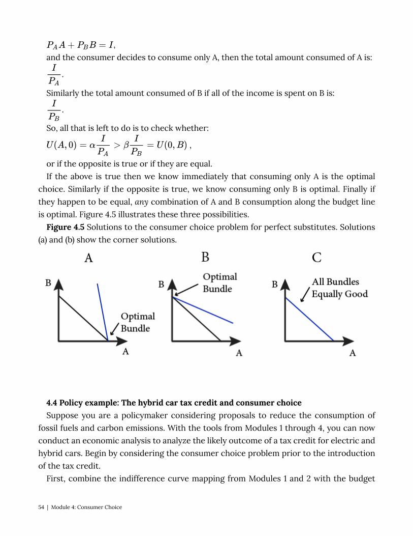
, and the consumer decides to consume only A, then the total amount consumed of A is:
.
Similarly the total amount consumed of B if all of the income is spent on B is:
.
So, all that is left to do is to check whether:
,
or if the opposite is true or if they are equal. If the above is true then we know immediately that consuming only A is the optimal
choice. Similarly if the opposite is true, we know consuming only B is optimal. Finally if they happen to be equal, any combination of A and B consumption along the budget line is optimal. Figure 4.5 illustrates these three possibilities.
Figure 4.5 Solutions to the consumer choice problem for perfect substitutes. Solutions (a) and (b) show the corner solutions.
4.4 Policy example: The hybrid car tax credit and consumer choice Suppose you are a policymaker considering proposals to reduce the consumption of
fossil fuels and carbon emissions. With the tools from Modules 1 through 4, you can now conduct an economic analysis to analyze the likely outcome of a tax credit for electric and hybrid cars. Begin by considering the consumer choice problem prior to the introduction of the tax credit.
First, combine the indifference curve mapping from Modules 1 and 2 with the budget
54 | Module 4: Consumer Choice
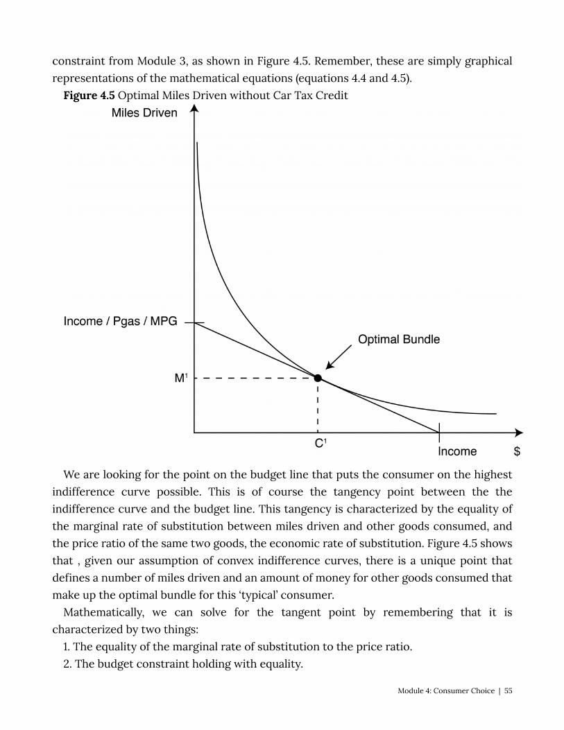
constraint from Module 3, as shown in Figure 4.5. Remember, these are simply graphical representations of the mathematical equations (equations 4.4 and 4.5).
Figure 4.5 Optimal Miles Driven without Car Tax Credit
We are looking for the point on the budget line that puts the consumer on the highest indifference curve possible. This is of course the tangency point between the the indifference curve and the budget line. This tangency is characterized by the equality of the marginal rate of substitution between miles driven and other goods consumed, and the price ratio of the same two goods, the economic rate of substitution. Figure 4.5 shows that , given our assumption of convex indifference curves, there is a unique point that defines a number of miles driven and an amount of money for other goods consumed that make up the optimal bundle for this ‘typical’ consumer.
Mathematically, we can solve for the tangent point by remembering that it is characterized by two things:
1. The equality of the marginal rate of substitution to the price ratio. 2. The budget constraint holding with equality.
Module 4: Consumer Choice | 55
The first equation ensures that the bundle is at a point of tangency between the indifference curve and lines with the same slope as the budget line. But remember that the price ratio describes the slope, not the specific budget line, which is why we need the second equation to make sure we are on the specific line that describes the consumer’s budget.
Specifically, if the utility function that represents the ‘typical’ consumer’s preferences over miles driven (M) and all other consumption (C) is:
Then we can solve for the MRS:
As noted above, this is one condition that characterized the optimal consumption bundle, the other is the budget line:
Income = (PriceMileDriven ) x (MilesDriven) + $ for other consumption We can solve this system of equations by the process of repeated substitution to come
up with the description of the precise optimal bundle for this consumer. Now let’s consider what happens after policymakers pass the tax credit into law. From
Module 3, we know that the effect of the tax credit on the budget constraint is to make the cost of miles consumers drive less expensive, which represents a drop in the price of miles driven. This will cause the budget line to expand along the vertical axis, but it will not change the horizontal intercept. The consumer must now choice a new the optimal bundle, and we must compare the new bundle to the old one. Let’s first examine this graphically, in Figure 4.6.
Figure 4.6 Optimal Miles Consumers Drive with Car Tax Credit
56 | Module 4: Consumer Choice

In this graph, it is clear that the new bundle represents more of both goods. The consumer will choose to consume more other goods with the extra buying power that the more fuel-efficient car affords as well as to consume more miles driven due to the lower cost of the activity. So the policy turns out to have an unintended consequence: in an effort to decrease fuel consumption, the policy actually lowers the marginal cost of driving, inducing consumers to drive more.
By making some fairly basic assumptions about typical consumer preferences and modeling the consumer choice problem, economic theory suggests that we should expect an increase in miles driven as a result. This application illustrates the power of models. By simplifying reality into a model framework, we can discover something about the world and human behavior that was not obvious.
But this is just a theory, so it is suggestive rather than definitive. It is important to note
Module 4: Consumer Choice | 57
that the assumptions we made may not be completely accurate and so our prediction may be inaccurate. For example, depending on the precise indifference curve mapping we could actually see decreased miles driven after the hybrid car tax credit
We now need to test the theory by evaluating real-world data. So, what does the data suggest? Studies have shown that:
1. An increase in MPG increases how much consumers drive 2. This effect is in the rage of 10 to 30 percent, meaning that a 10 percent increase in
MPG would increase how many miles consumers drive by between 1 and 3 percent. This data does not mean that the policy is a failure. If you increase MPG by 50 percent
and miles driven increase by 10 percent in response, you still have succeeded in decreasing fuel consumption substantially. The point is that you do not get the same decrease you would have expected if you didn’t understand the consumer choice problem and how consumers respond to changes in relative prices. Understanding consumer choice is important because there may be a number of different policy approaches, each with its own costs and benefits, and the goal of policymakers is to achieve the policy objective at the lowest cost.
In this case of fuel consumption, economists generally prefer that policymakers increase the gas tax, the subsidy approach and other indirect approaches like the corporate fuel economy standard known as CAFE [http://www.nhtsa.gov/cars/rules/cafe/overview.htm (inactive link as of 05/24/2021)]. The tax on fuel raises the cost of consumption and, as we have now seen, which would decrease fuel consumption. A number of studies have shown that an increase in the gas tax is a more cost-effective way to decrease gasoline usage. [http://www.cbo.gov/ftpdocs/51xx/doc5159/03-09-CAFEbrief.pdf (inactive link as of 05/24/2021)]
With our analysis of the policy based on both theory and evidence, we are now in a position to answer the original question posed at the beginning of Section 1:
Suppose that a hybrid car tax credit were wildly successful and succeeded in doubling the average fuel economy of all cars on U,S, roads . . . What do you think would happen to the fuel consumption of all U.S. motorists? Should the government expect the fuel consumption and carbon emissions of cars driven in the United States to decrease by half in response?
The answer is clearly ‘no.’ Even the most conservative estimates suggest that a 100 percent increase in average fuel efficiency will result in an increase of miles driven by 10 percent meaning that the decrease in fuel consumption and carbon emissions will fall but by less than half.
Exploring the Policy Questions
58 | Module 4: Consumer Choice
• Suppose the hybrid car tax credit were accompanied by a tax increase on gasoline. How would the analysis of the policy change? Could you make a prediction about the change in carbon emissions now?
• How would the analysis change if consumers’ preferences change and they begin to lower their gas consumption by carpooling, walking, and biking more instead of driving? How could you show this on Figure 4.6?
• The phenomenon of increased energy efficiency leading to increased consumption is known among economists as the rebound effect, and it is common in other practical contexts besides vehicles and driving. What other examples of rebound effect would you expect to see in the real world?
SUMMARY
Review: Topics and Related Learning Outcomes
4.1 Understanding the consumer choice problem – utility maximization LO1: Define the consumer choice problem 4.2 Solving the consumer choice problem LO2: Solve a consumer choice problem with the typical utility function 4.3 Corner solutions and kinked indifference curves LO3: Solve a consumer choice problem with utility function for perfect compliments
and perfect substitutes. 4.4 Policy example
Module 4: Consumer Choice | 59
Learn: Key Terms and Graphs
Terms
Consumer Choice Problem Demand Functions Kinked Curves Corner Solutions Interior solutions Corner Solutions
Graphs
Solution to the general consumer choice problem Solution to the consumer choice problem for perfect substitutes Solution to the consumer choice problem for perfect complements Equations Demand functions
60 | Module 4: Consumer Choice
Module 5: Individual Demand and Market Demand
The Policy Question: Should Your City Charge More for Downtown Parking Spaces? Major cities have a significant number of parking spaces on public streets. In congested
areas, such as downtowns, street parking is usually priced and limited in duration. Cities meter downtown parking for many reasons, including to raise revenue, ensure the frequent turnover of customers for local merchants, and ensure the availability of parking spot for those looking for parking. But how much should a city charge for parking in order to raise revenue or ensure available spots? The answer depends on understanding the demand for parking.
Demand is a natural next topic after the consumer choice problem of maximizing utility among competing bundles of goods, which we studied in Module 4. We saw in Module 4 that the solution to the consumer choice problem gives us, among other things, the individual demand functions. These functions tell us how much the individual consumer will demand of each good in order to maximize utility for any set of prices and income. And by taking into account all of the individual demands, we can come up with an overall market demand for a good.
Module 5: Individual Demand and Market Demand | 61
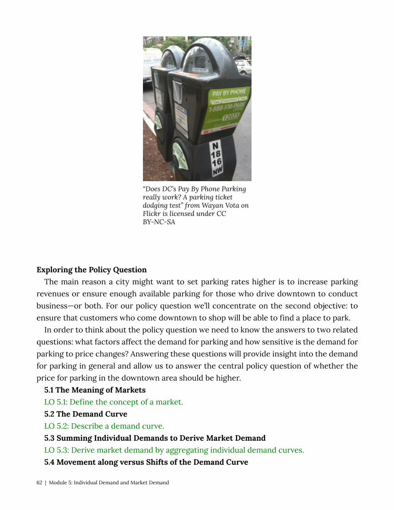
“Does DC’s Pay By Phone Parking really work? A parking ticket dodging test” from Wayan Vota on Flickr is licensed under CC BY-NC-SA
Exploring the Policy Question The main reason a city might want to set parking rates higher is to increase parking
revenues or ensure enough available parking for those who drive downtown to conduct business—or both. For our policy question we’ll concentrate on the second objective: to ensure that customers who come downtown to shop will be able to find a place to park.
In order to think about the policy question we need to know the answers to two related questions: what factors affect the demand for parking and how sensitive is the demand for parking to price changes? Answering these questions will provide insight into the demand for parking in general and allow us to answer the central policy question of whether the price for parking in the downtown area should be higher.
5.1 The Meaning of Markets LO 5.1: Define the concept of a market. 5.2 The Demand Curve LO 5.2: Describe a demand curve. 5.3 Summing Individual Demands to Derive Market Demand LO 5.3: Derive market demand by aggregating individual demand curves. 5.4 Movement along versus Shifts of the Demand Curve
62 | Module 5: Individual Demand and Market Demand

LO 5.4: Explain movements along versus shifts of the demand curve. 5.5 Price and Income Elasticity of Demand LO 5.5: Calculate and interpret the price and income elasticity of a demand curve. 5.6 Income and Substitution Effects LO 5.6: Identify income and substitution effects that result from a change in prices. 5.7 Policy Example: Should Your City Charge More for Downtown Parking Spaces? LO 5.7: Use elasticity to determine how much city officials should charge for parking. 5.1 The Meaning of Markets LO 5.1: Define the concept of a market. Broadly defined, a market is a place where people go in order to buy, sell, or exchange
goods and services. Markets can be physical or virtual, large or small, for one good or many. In order to understand and derive demand curves we need to specify the particular market we are studying.
A market is always for an individual good at a specific price. We can define a collective good, like sandwiches, only if we can describe a single price—as opposed to distinct prices for cheese sandwiches, club sandwiches, and sub sandwiches, for example. There are many types of sandwiches, and therefore no one price exists. However, for a restaurant owner, the specific market for cheese sandwiches does not matter as much as how the market behaves for sandwiches in general. Just remember that when we are analyzing markets we are talking about a specific good with a specific price.
A market for a good is also defined by a place and a time. For example, we could study the market for iPhones in the United States in 2014 or in California in May of 2014, or even in Cupertino on May 5, 2014. In order to talk reasonably about a quantity demanded, we have to know who is demanding the quantity and when.
Sometimes the boundaries of a market are not entirely clear. Think about the market for telephone calls. Does this include wired home telephone service through dedicated wires (yes), telephone over coaxial cable (almost certainly), mobile phones (probably), voice over internet phones (maybe), texting (probably not)? We will return to this issue in future modules when we discuss market concentration, so for now just understand that market boundaries can sometimes be hard to define.
A market must have:
• A good specific enough to have a single price • A defined time or time period • A defined place
Module 5: Individual Demand and Market Demand | 63
5.2 The Demand Curve LO 5.2: Describe and draw a demand curve. As we saw in Module 4, when we solve the consumer choice problem – that is we
determine the optimal consumption bundle based on the current prices of the goods and the income of the consumer – we end up with a demand function.
A demand curve is a graphical representation of the demand function that tells us for every price of a good, how much of the good is demanded. As we saw from deriving the demand function in Module 4, other factors help determine demand for a good, namely the price of the other good and the buyer’s income. Holding the price of the other good and buyer’s income constant and changing prices, the demand function describes the optimal consumption quantity for every price–that is, what quantity the individual will demand at every price.
Figure 5.1 illustrates how the demand curve for coffee is derived from the consumer choice problem. In the upper panel, we see that as the price of coffee increases the consumer chooses to consume less and less coffee. In the lower panel we can plot the pairs of price and quantity of coffee consumed at that price to draw the demand curve.
Figure 5.1: Deriving individual demand curves from consumer consumption choices
64 | Module 5: Individual Demand and Market Demand
In the top graph of 5.1 the price of coffee increases from P1 to P2 and then to P3. Since this is an increase of the price of the good, this consumer chooses to consume less coffee as price increases. The bottom graph plot the combinations of prices of coffee and quantities consumed (demanded) of coffee: P1 and X1, P2 and X2 and P3 and X3.
Note that by keeping the price and income of other goods constant we are simply changing the slope of the budget line and anchoring it at the vertical intercept.
As an example, let’s consider Marco who eats burritos and pizza slices. Figure 5.2 describes his weekly consumption. The top panel shows his consumption bundles given the prices of burritos and pizza and his income. The bottom panel shows his demand curve.
In the top panel, we see that Marco has a weekly income of $15 to spend on burritos and pizza slices. Originally, when the prices are $1.50 each, he consumes 5 burritos and 5 slices of pizza. When the price of pizza falls to $1, Marco adjusts his consumption to 6 burritos and 6 slices of pizza. When the price of pizza slices falls for a second time to $0.50, Marco adjusts his consumption to 7 burritos and 9 slices of pizza.
For each price there is a unique solution to the consumer choice problem. By mapping the price and resulting optimal consumption pairs we can describe this individual’s demand curve for pizza slices, as shown in the bottom panel. At a price of $1.50 per slice, Marco demands 5. At a price of $1, Marco demands 6, and at a price of $0.50, Marco demands 9. We can plot these points on a graph that has price on the vertical axis and quantity of pizza slices on the horizontal axis.
By connecting these price-quantity points with a line, we graphically approximate the demand curve. These points are the same as the price and quantity pairs you would get directly from the demand function when you hold the price of the other good and income constant. The difference is that the demand function is continuous and therefore has a continuous graph that we can draw precisely. For our purposes now, the approximate demand curve is sufficient.
Figure 5.2 Marco’s consumption choices and demand curve for pizza slices
Module 5: Individual Demand and Market Demand | 65
Note that as the price of a good declines, the consumer consumes more and more of
the good because, holding the other price and income constant, the consumer’s income goes farther. In our example, this means that Marco consumes more of both burritos and pizza slices. His demand curve exhibits the law of demand: As price decreases, quantity demanded increases holding other factors such as income and the price of other goods constant. It is worth noting that this ‘law’ has limits – it does not hold for certain types of goods, as we will discuss in Module 6.
Figure 5.2.1
66 | Module 5: Individual Demand and Market Demand
5.3 Summing Individual Demand Curves to Derive Market Demand LO 5.3: Derive market demand by aggregating individual demand curves. The demand curve we described for Marco’s weekly consumption of pizza slices is an
individual demand curve. It tells us precisely how many slices of pizza Marco will demand for each price. But if you sell pizza slices in Marco’s neighborhood, it does not tell you what the total demand for a week will be. In order to derive the market demand curve, we need to know the demand curve for every person in the neighborhood.
As noted in Section 5.1, the market we are describing is the weekly demand for pizza slices in Marco’s neighborhood. We are implicitly assuming that all pizza slices are identical, and that Marco and other demanders of pizza will buy it in the neighborhood.
Suppose that there are only three people who eat pizza slices in the neighborhood and one pizza vendor and that each customer has a demand curve for pizza slices identical to Marco’s. What is the correct way to think about the total or market demand for pizza? Consider what the pizza shop owner will experience:
• When she sets the price at $1.50 she sees three customers who each demand 5 slices of pizza or a total demand of 5+5+5=15 slices of pizza.
• When she lowers the price to $1, she sees a total demand of 6+6+6=18 slices of pizza. • When she lowers the price to $0.50, she sees a total demand of 9+9+9=27 slices of
pizza.
These are the three points on the total demand curve in Figure 5.3: Q=15 at P=$1.50
Module 5: Individual Demand and Market Demand | 67
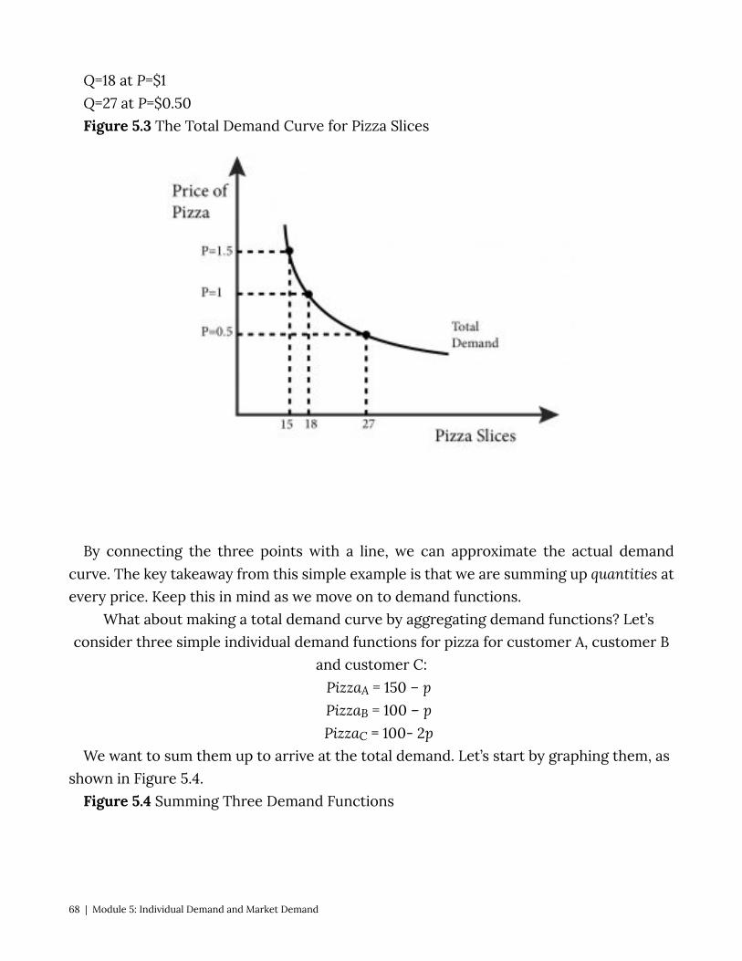
Q=18 at P=$1 Q=27 at P=$0.50 Figure 5.3 The Total Demand Curve for Pizza Slices
By connecting the three points with a line, we can approximate the actual demand
curve. The key takeaway from this simple example is that we are summing up quantities at every price. Keep this in mind as we move on to demand functions.
What about making a total demand curve by aggregating demand functions? Let’s consider three simple individual demand functions for pizza for customer A, customer B
and customer C: PizzaA = 150 – p PizzaB = 100 – p PizzaC = 100- 2p
We want to sum them up to arrive at the total demand. Let’s start by graphing them, as shown in Figure 5.4.
Figure 5.4 Summing Three Demand Functions
68 | Module 5: Individual Demand and Market Demand

We want total demand, which is the sum of all the quantities at every price or
PizzaTOTAL =PizzaA + PizzaB + PizzaC. To get this, we can simply add up the left and right and sides of the equations above. If we did so we would get:
PizzaTOTAL = 350 – 4p. Is this total demand function correct?
Consider a price of $25. From the individual demands, we know that qA = 125, qB = 75, and qC = 50, so the total demand is 250. If we put p=$25 directly into our total demand
function, we get: PizzaTOTAL = 350 – 4(25) = 250.
Another way of thinking about total demand is to sum the three demands in the individual graphs horizontally, which reveals a problem with our total demand function.
Notice that at a price of 75: PizzaA = 75, PizzaB = 25, and PizzaC = 0,
so the total demand is 100. Note that demands cannot have a negative number. If we put p = $75 into the aggregate function we get:
PizzaTOTAL = 350 – 4(75) = 50. In this case, we have not accounted for the fact that qC has stopped at zero. So we have
not quite accurately described the total demand. Note that the graph of each individual demand function has a different vertical
intercept. So we have to account for the case where a demand goes to zero. For customer C this is at p=$50, for customer B this is at p=$100, and for customer C this is at p=$150. It’s important to note that for prices above $50 there are only two consumers who still demand, consumers B and A. And for prices above $100, only consumer A demands. We can express the demand curve by the function: \begin{align*}
Module 5: Individual Demand and Market Demand | 69
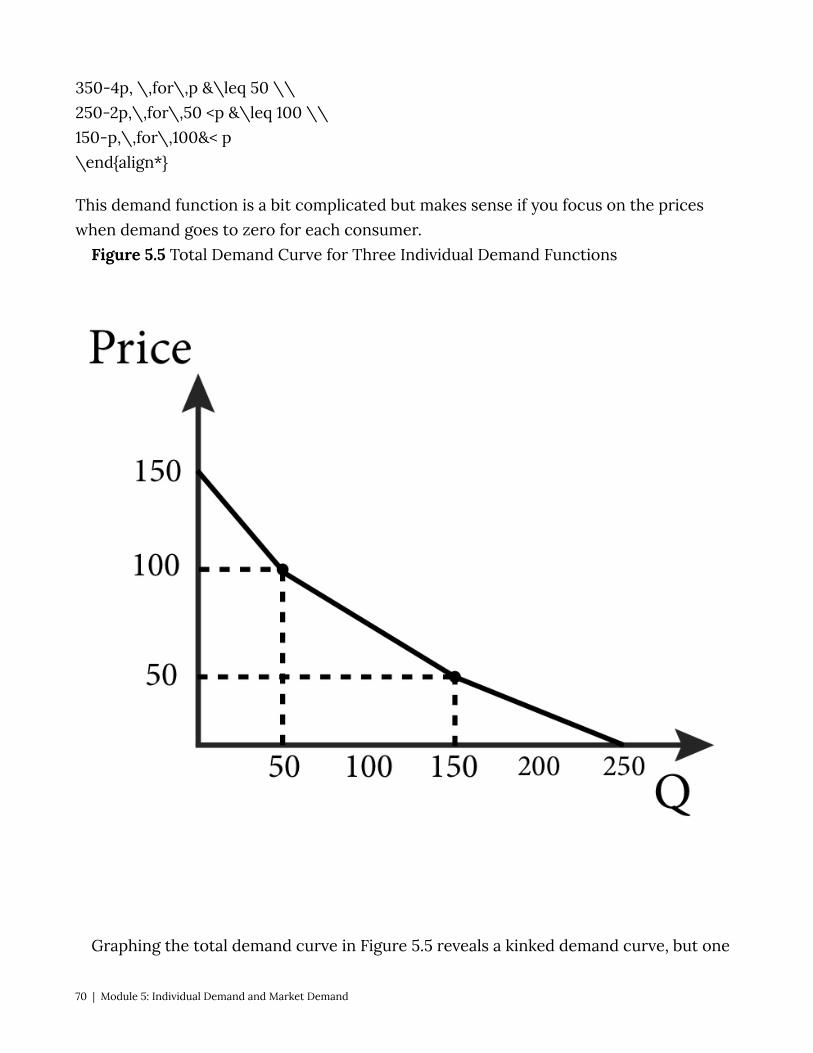
350-4p, \,for\,p &\leq 50 \\ 250-2p,\,for\,50 <p &\leq 100 \\ 150-p,\,for\,100&< p \end{align*}
This demand function is a bit complicated but makes sense if you focus on the prices when demand goes to zero for each consumer.
Figure 5.5 Total Demand Curve for Three Individual Demand Functions
Graphing the total demand curve in Figure 5.5 reveals a kinked demand curve, but one
70 | Module 5: Individual Demand and Market Demand

that is downward sloping. When we examine a market with only a few potential customers, it is reasonable to expect kinks at the prices where potential customers turn into real customers. But it is easy to see that as we add more and more demand curves together, the individual kinks will become smaller and more frequent until. After we have added enough demand together, we get a smooth and downward sloping market demand curve.
5.4 Movements Along versus Shifts of the Demand Curve LO 5.4: Explain movements along versus shifts of the demand curve. The market demand curve describes the relationship between the price a good is
offered at and the resulting quantity demanded. As the price of a good moves higher and lower, consumers demand different quantities of the good and the demand function and resulting graph change in response.
But we know that variables other than price can affect the demand for a particular good, for example:
• The income of consumers • The price of complements and substitutes
A host of other factors might influence the consumer’s demand for a good as well, including advertising, the popularity of the good, and news stories about its health benefits or risks.
How do these potential impacts conform to our observation that the demand curve is simply a description of the quantity demanded for any given price? This is where the concept of ceteris paribus comes in: This Latin phrase means, roughly, all other things remain the same. Here, ceteris paribus means that any demand curve that we graph is for a specific set of circumstances–we are considering only the price of the good and holding all the other factors that affect demand constant.
Once we have a particular demand curve, we can observe what happens when a factor is allowed to change.
• Changes in price cause movements along the demand curve. • Changes in factors other than the price of the good itself cause shifts of the demand
curve.
Understanding shifts versus movements of demand curves can be challenging, so try a few examples in the Your Turn that follows.
Module 5: Individual Demand and Market Demand | 71
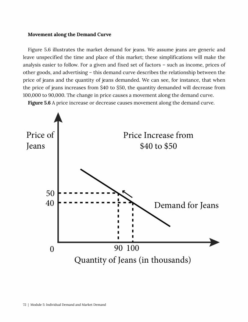
Movement along the Demand Curve Figure 5.6 illustrates the market demand for jeans. We assume jeans are generic and
leave unspecified the time and place of this market; these simplifications will make the analysis easier to follow. For a given and fixed set of factors – such as income, prices of other goods, and advertising – this demand curve describes the relationship between the price of jeans and the quantity of jeans demanded. We can see, for instance, that when the price of jeans increases from $40 to $50, the quantity demanded will decrease from 100,000 to 90,000. The change in price causes a movement along the demand curve.
Figure 5.6 A price increase or decrease causes movement along the demand curve.
72 | Module 5: Individual Demand and Market Demand
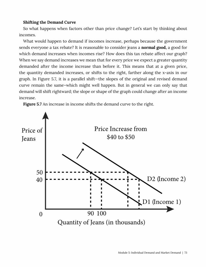
Shifting the Demand Curve So what happens when factors other than price change? Let’s start by thinking about
incomes. What would happen to demand if incomes increase, perhaps because the government
sends everyone a tax rebate? It is reasonable to consider jeans a normal good, a good for which demand increases when incomes rise? How does this tax rebate affect our graph? When we say demand increases we mean that for every price we expect a greater quantity demanded after the income increase than before it. This means that at a given price, the quantity demanded increases, or shifts to the right, farther along the x-axis in our graph. In Figure 5.7, it is a parallel shift—the slopes of the original and revised demand curve remain the same–which might well happen. But in general we can only say that demand will shift rightward; the slope or shape of the graph could change after an income increase.
Figure 5.7 An increase in income shifts the demand curve to the right.
Module 5: Individual Demand and Market Demand | 73
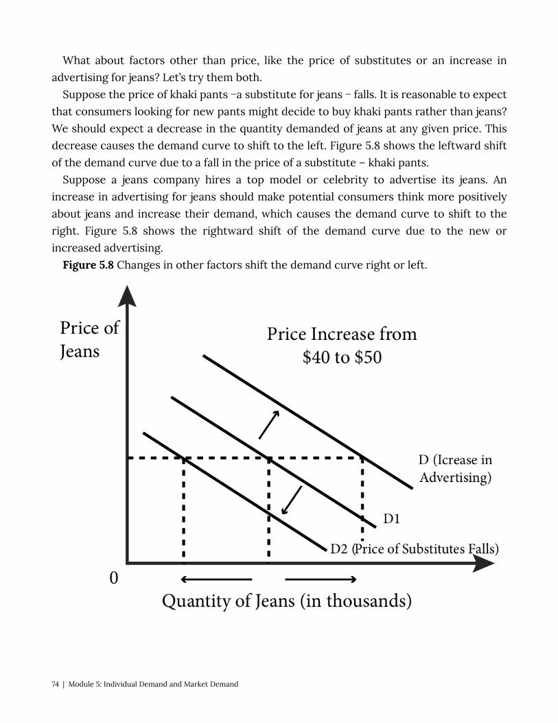
What about factors other than price, like the price of substitutes or an increase in advertising for jeans? Let’s try them both.
Suppose the price of khaki pants −a substitute for jeans − falls. It is reasonable to expect that consumers looking for new pants might decide to buy khaki pants rather than jeans? We should expect a decrease in the quantity demanded of jeans at any given price. This decrease causes the demand curve to shift to the left. Figure 5.8 shows the leftward shift of the demand curve due to a fall in the price of a substitute – khaki pants.
Suppose a jeans company hires a top model or celebrity to advertise its jeans. An increase in advertising for jeans should make potential consumers think more positively about jeans and increase their demand, which causes the demand curve to shift to the right. Figure 5.8 shows the rightward shift of the demand curve due to the new or increased advertising.
Figure 5.8 Changes in other factors shift the demand curve right or left.
74 | Module 5: Individual Demand and Market Demand
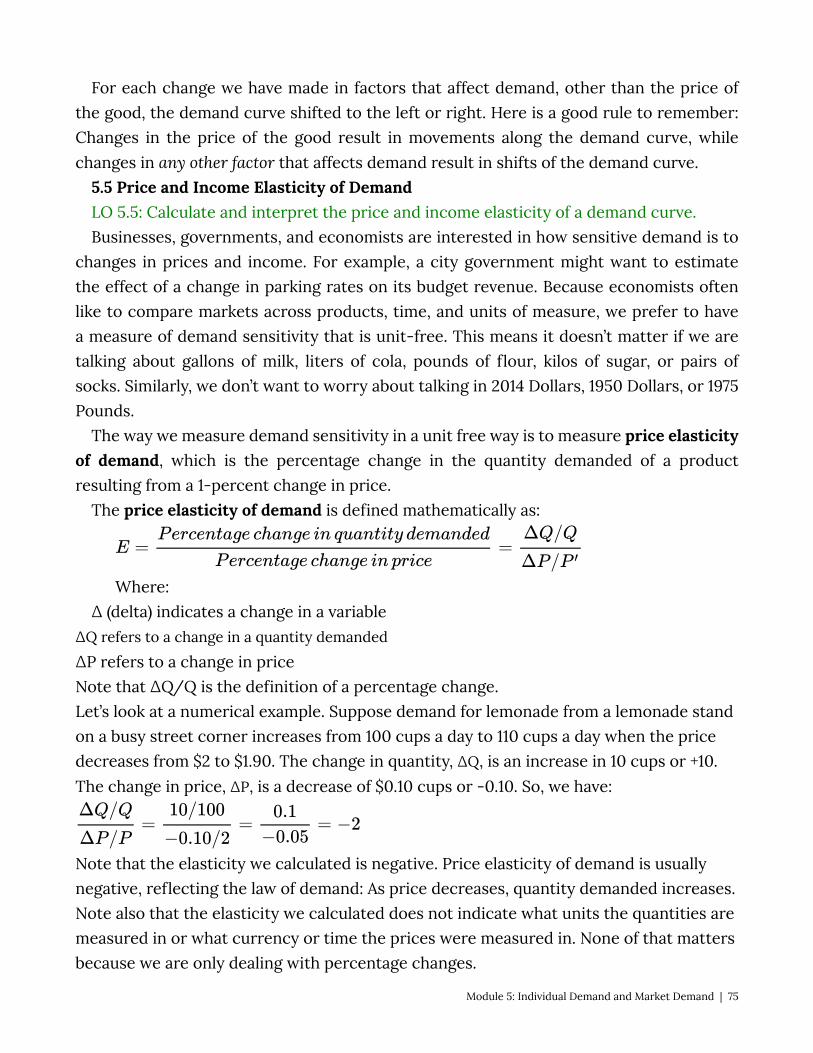
For each change we have made in factors that affect demand, other than the price of the good, the demand curve shifted to the left or right. Here is a good rule to remember: Changes in the price of the good result in movements along the demand curve, while changes in any other factor that affects demand result in shifts of the demand curve.
5.5 Price and Income Elasticity of Demand LO 5.5: Calculate and interpret the price and income elasticity of a demand curve. Businesses, governments, and economists are interested in how sensitive demand is to
changes in prices and income. For example, a city government might want to estimate the effect of a change in parking rates on its budget revenue. Because economists often like to compare markets across products, time, and units of measure, we prefer to have a measure of demand sensitivity that is unit-free. This means it doesn’t matter if we are talking about gallons of milk, liters of cola, pounds of flour, kilos of sugar, or pairs of socks. Similarly, we don’t want to worry about talking in 2014 Dollars, 1950 Dollars, or 1975 Pounds.
The way we measure demand sensitivity in a unit free way is to measure price elasticity of demand, which is the percentage change in the quantity demanded of a product resulting from a 1-percent change in price.
The price elasticity of demand is defined mathematically as:
Where: Δ (delta) indicates a change in a variable
∆Q refers to a change in a quantity demanded ∆P refers to a change in price Note that ∆Q/Q is the definition of a percentage change. Let’s look at a numerical example. Suppose demand for lemonade from a lemonade stand on a busy street corner increases from 100 cups a day to 110 cups a day when the price decreases from $2 to $1.90. The change in quantity, ∆Q, is an increase in 10 cups or +10. The change in price, ∆P, is a decrease of $0.10 cups or -0.10. So, we have:
Note that the elasticity we calculated is negative. Price elasticity of demand is usually negative, reflecting the law of demand: As price decreases, quantity demanded increases. Note also that the elasticity we calculated does not indicate what units the quantities are measured in or what currency or time the prices were measured in. None of that matters because we are only dealing with percentage changes.
Module 5: Individual Demand and Market Demand | 75

How do we interpret the -2 value of elasticity? It tells us by how much quantity demanded changes when the price increases by 1%. But wait, didn’t prices change by 5%? Yes, but the elasticity says that for every 1% increase in price we should see (multiply by the elasticity) a -2% change in quantity demanded. Table 5.1 Classifying Values of Price Elasticity of Demand
Value of Price Elasticity of Demand, ε
Description of Demand Interpretation
0 Perfectly Inelastic Quantity demanded does not change at all with price
From 0 to -1 Inelastic Quantity demanded is relatively unresponsive to price changes
-1 Unit elastic Percentage change in quantity demanded is equal to percentage change in price
From -1 to – Elastic Quantity demanded is relatively responsive to price changes
– Perfectly Elastic
Quantity demanded goes to zero with any increase in price, and goes to infinity with any decrease in price.
Figure 5.8.1 shows demand curves that are more and less elastic as well as demand curves that are perfectly inelastic and perfectly elastic.Notice that the slope of the elastic demand curve is less steep than that of the inelastic demand curve, as it takes a small change in P (price) to induce a large change in Q (quantity) relative to the inelastic demand. However, note that the elasticity is constantly changing along the demand curves so to compare elasticity across demand curves you have to compare them at the same price. (see Figure 5.8.2).
Figure 5.8.2 Comparing elasticity across two demand curves
76 | Module 5: Individual Demand and Market Demand
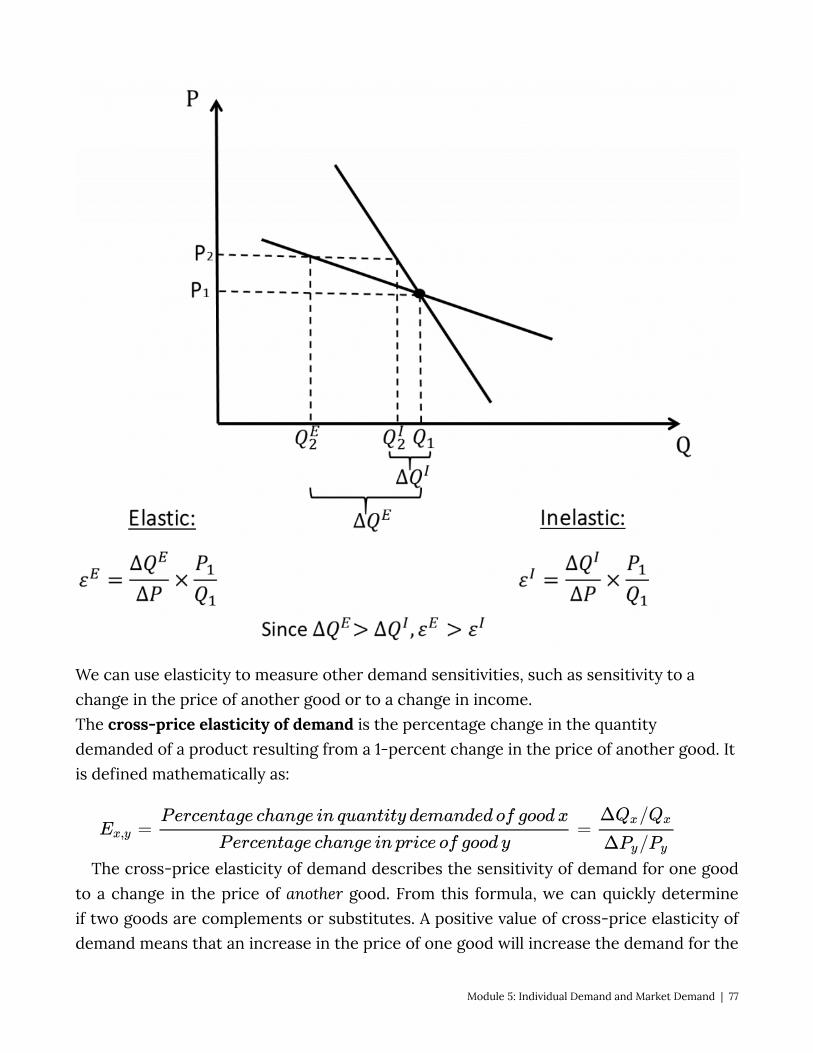
We can use elasticity to measure other demand sensitivities, such as sensitivity to a change in the price of another good or to a change in income. The cross-price elasticity of demand is the percentage change in the quantity demanded of a product resulting from a 1-percent change in the price of another good. It is defined mathematically as:
The cross-price elasticity of demand describes the sensitivity of demand for one good to a change in the price of another good. From this formula, we can quickly determine if two goods are complements or substitutes. A positive value of cross-price elasticity of demand means that an increase in the price of one good will increase the demand for the
Module 5: Individual Demand and Market Demand | 77
other. This indicates the two goods are substitutes: Consumers will substitute more of the other good as the price of the first good increases. Examples of substitutes are Coke and Pepsi, Apple computers, and PCs and private cars and public transportation. Similarly, if the cross-price elasticity of demand is negative, the goods are complements: Since they are consumed together, raising the price of one raises the price of the combination, so consumers cut back on both. Examples of complements are tortilla chips and salsa, iPods and headphones, and tennis rackets and tennis balls.
Economists are often interested in seeing how a change in income affects demand, for instance, how a government tax rebate will affect the demand for used economics text books. The income elasticity of demand is the percentage change in the quantity demanded for a product from a 1 percent change in income.
Income elasticity of demand is defined mathematically as:
Suppose that your income increases from $1,000 a month to $1,200 a month and your demand for songs on iTunes changes from 10 a month to 12 a month as a result. Let’s find the income elasticity of demand.
Note that this value of 1 indicates that the income elasticity of your demand for iTunes is unit elastic. That is, the quantity response is proportional to the change in income.
A positive value of income elasticity of demand indicates a normal good, a good for which the quantity demanded increases as income rises. We call goods for which the quantity demanded falls as income rises inferior goods. Inferior goods have a negative value of income elasticity of demand. Figure 5.9 shows an example of an inferior good: as income rises the quantity of ramen consumed falls.
78 | Module 5: Individual Demand and Market Demand

“Ramen Noodle Soup Oriental Flavor” from Bradley Gordon on Flickr is licensed under CC BY
Figure 5.9: Demand for an Inferior Good
Module 5: Individual Demand and Market Demand | 79
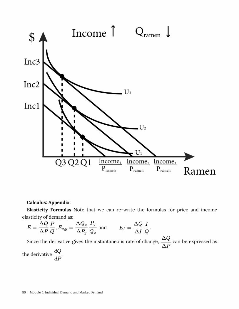
Calculus: Appendix: Elasticity Formulas Note that we can re-write the formulas for price and income
elasticity of demand as:
and .
Since the derivative gives the instantaneous rate of change, can be expressed as
the derivative .
80 | Module 5: Individual Demand and Market Demand
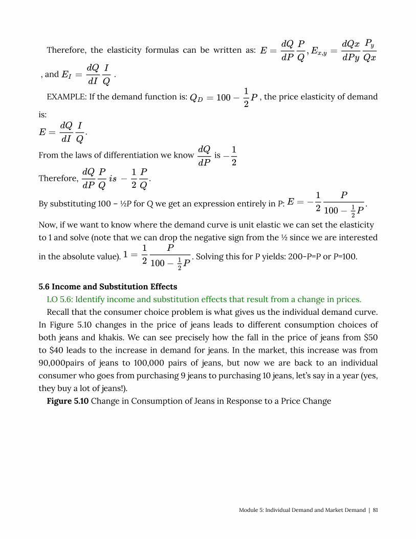
Therefore, the elasticity formulas can be written as:
, and .
EXAMPLE: If the demand function is: , the price elasticity of demand
is:
.
From the laws of differentiation we know is
Therefore, .
By substituting 100 – ½P for Q we get an expression entirely in P: .
Now, if we want to know where the demand curve is unit elastic we can set the elasticity to 1 and solve (note that we can drop the negative sign from the ½ since we are interested
in the absolute value). . Solving this for P yields: 200-P=P or P=100.
5.6 Income and Substitution Effects LO 5.6: Identify income and substitution effects that result from a change in prices. Recall that the consumer choice problem is what gives us the individual demand curve.
In Figure 5.10 changes in the price of jeans leads to different consumption choices of both jeans and khakis. We can see precisely how the fall in the price of jeans from $50 to $40 leads to the increase in demand for jeans. In the market, this increase was from 90,000pairs of jeans to 100,000 pairs of jeans, but now we are back to an individual consumer who goes from purchasing 9 jeans to purchasing 10 jeans, let’s say in a year (yes, they buy a lot of jeans!).
Figure 5.10 Change in Consumption of Jeans in Response to a Price Change
Module 5: Individual Demand and Market Demand | 81
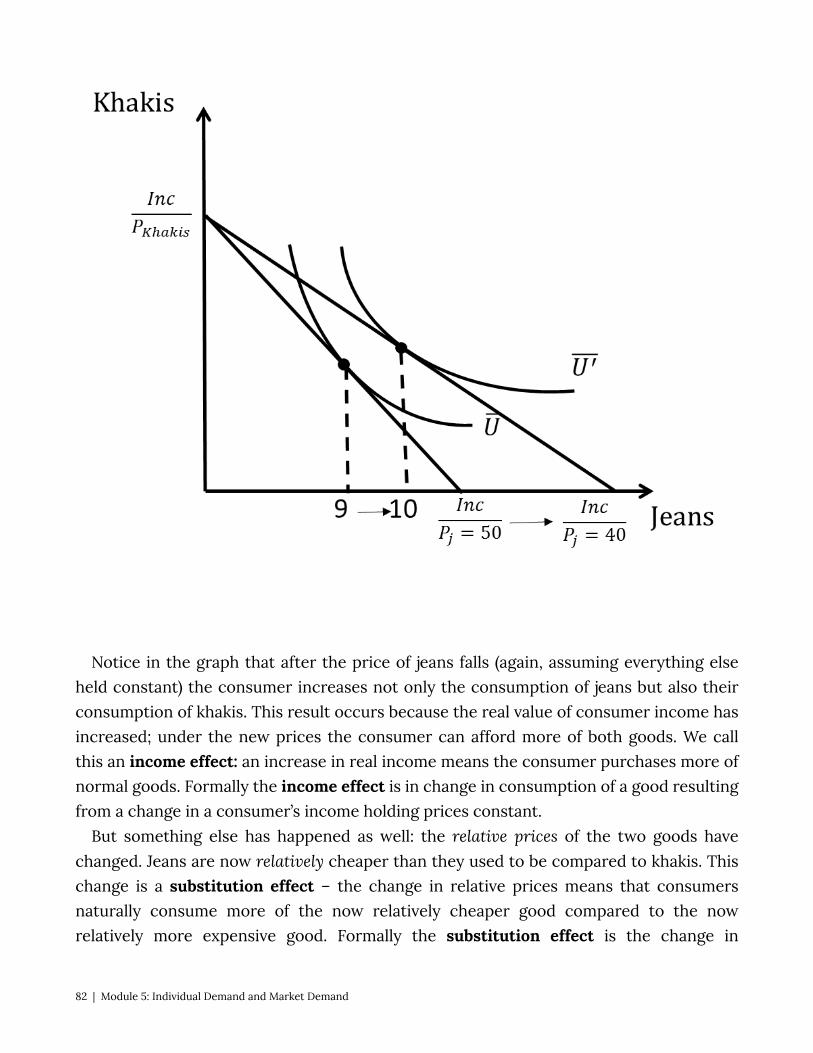
Notice in the graph that after the price of jeans falls (again, assuming everything else
held constant) the consumer increases not only the consumption of jeans but also their consumption of khakis. This result occurs because the real value of consumer income has increased; under the new prices the consumer can afford more of both goods. We call this an income effect: an increase in real income means the consumer purchases more of normal goods. Formally the income effect is in change in consumption of a good resulting from a change in a consumer’s income holding prices constant.
But something else has happened as well: the relative prices of the two goods have changed. Jeans are now relatively cheaper than they used to be compared to khakis. This change is a substitution effect – the change in relative prices means that consumers naturally consume more of the now relatively cheaper good compared to the now relatively more expensive good. Formally the substitution effect is the change in
82 | Module 5: Individual Demand and Market Demand

consumption of a good resulting from a change in its price holding the consumer’s utility level constant.
A question economists often ask is how much of the resulting change in consumption of jeans, what we call the total effect of the price change, is due to the income effect and how much is due to the substitution effect? They care about this because understanding how much of a change is due to each allows us to better predict the effect of changes in demand from changes in income and prices in the future. The easiest way to think about an answer is with a thought experiment: what if we could adjust the consumer’s nominal income after the change in price so that in the end they are no better or worse off? How would this income adjustment look on the consumer choice graph?
Let’s start with the condition that the consumer is no better or worse off after the change in price than before it. This means that, by definition, the consumer must still be consuming on the same indifference curve. [Hypertext Pop-up: indifference curve] So, after the change in price we adjust the nominal income such that the new budget line just touches the old indifference curve. Remember that changes in nominal income lead to shifts in the budget line but do not change the slope. If we shift the new budget line back to where it just touches the indifference curve, we can find the bundle that the consumer would choose under these hypothetical circumstances. By comparing the original consumption bundle to the hypothetical one, we can isolate the substitution effect. The change in jeans consumption in this case has nothing to do with income (in the sense that the consumer is just as well off) and everything to do with the change in the price of jeans.
As long as the indifference curve conforms to the ‘well-behaved’ [Hypertext Pop-up: “well behaved preferences’] conditions discussed in Module 1 the substitution effect will always act in the same way. When relative prices change, consumers will substitute away from the good that has become relatively more expensive and toward the good that has become relatively less expensive.
Figure 5.10 b – Decomposing Consumption Change into Income and Substitution Effects.
Module 5: Individual Demand and Market Demand | 83
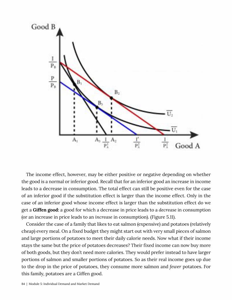
The income effect, however, may be either positive or negative depending on whether the good is a normal or inferior good. Recall that for an inferior good an increase in income leads to a decrease in consumption. The total effect can still be positive even for the case of an inferior good if the substitution effect is larger than the income effect. Only in the case of an inferior good whose income effect is larger than the substitution effect do we get a Giffen good: a good for which a decrease in price leads to a decrease in consumption (or an increase in price leads to an increase in consumption). (Figure 5.11).
Consider the case of a family that likes to eat salmon (expensive) and potatoes (relatively cheap) every meal. On a fixed budget they might start out with very small pieces of salmon and large portions of potatoes to meet their daily calorie needs. Now what if their income stays the same but the price of potatoes decreases? Their fixed income can now buy more of both goods, but they don’t need more calories. They would prefer instead to have larger portions of salmon and smaller portions of potatoes. So as their real income goes up due to the drop in the price of potatoes, they consume more salmon and fewer potatoes. For this family, potatoes are a Giffen good.
84 | Module 5: Individual Demand and Market Demand
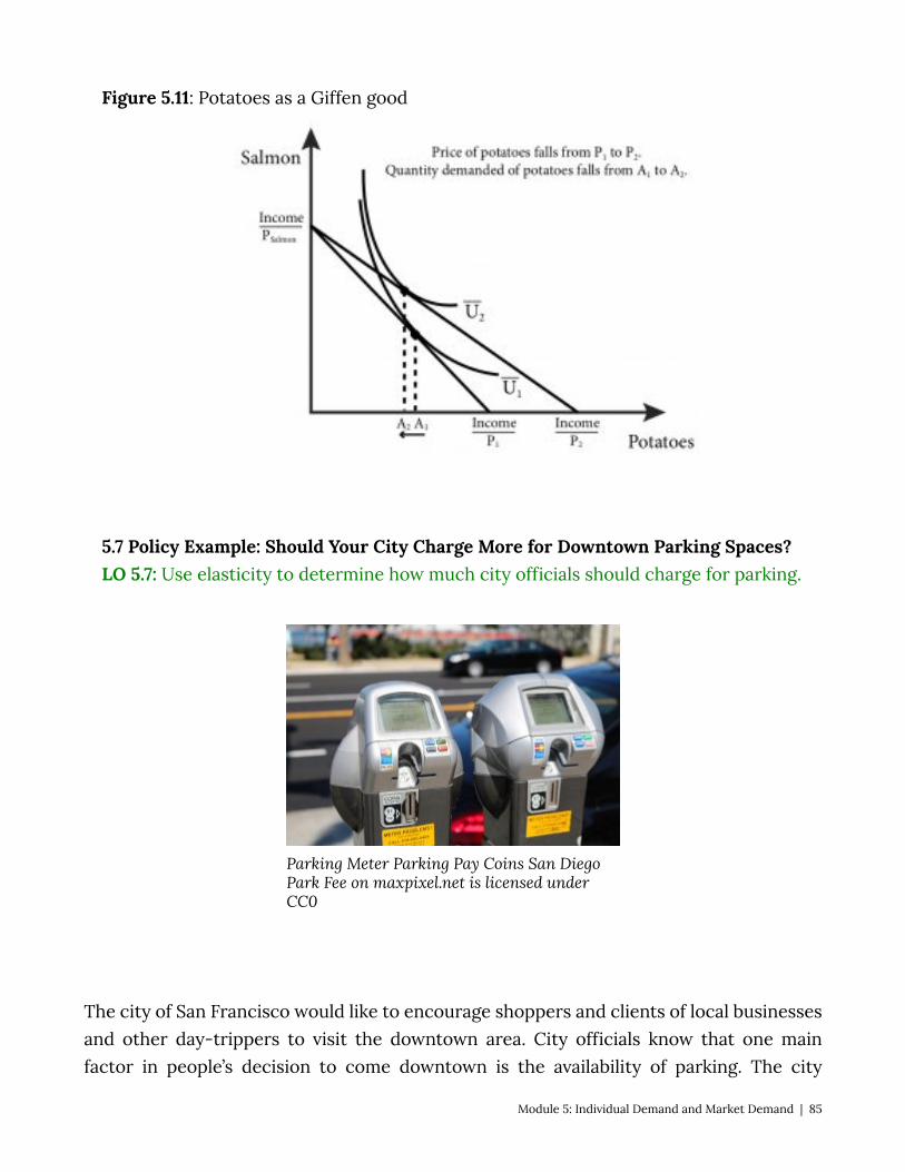
Figure 5.11: Potatoes as a Giffen good
5.7 Policy Example: Should Your City Charge More for Downtown Parking Spaces? LO 5.7: Use elasticity to determine how much city officials should charge for parking.
Parking Meter Parking Pay Coins San Diego Park Fee on maxpixel.net is licensed under CC0
The city of San Francisco would like to encourage shoppers and clients of local businesses and other day-trippers to visit the downtown area. City officials know that one main factor in people’s decision to come downtown is the availability of parking. The city
Module 5: Individual Demand and Market Demand | 85

controls the surface parking spots, the curb parking, and charges for parking through the use of meters, so officials know they can use the price of parking to change the number of shoppers and clients who visit through the law of.
• Price the parking too low, and day-trippers will increase their quantity demanded of parking spaces. Potential shoppers and clients will become discouraged by their inability to find parking.
• Price the parking too high, and day-trippers will decrease their quantity demanded of parking spaces. When too few day-trippers come downtown, the local merchants will complain about lack of customers (even though the parking is plentiful!).
Understanding the nature of the demand for parking enables the city to get the pricing just right.
By knowing the price elasticity of demand for parking in the downtown area, San Francisco officials can predict how much the quantity demanded will fall if they raise rates and, conversely, how much it will rise as rates decrease. Understanding the demand function allows city planners to anticipate changes in demand from other factors, including incomes, weather, and days of the week. In the days of mechanical coin-operated meters, cities were forced to pick one price. With modern electronic technology, cities can become much more flexible with pricing. Take, for example, San Francisco’s dynamic pricing scheme. In San Francisco, smart meters can adjust parking rates from as low as $0.25 and hour to $6 an hour. In times of high demand the rates will rise for local parking sports and in times of low demand rates will fall. This is the mission statement from SF Park, the local bureau in charge of setting rates:
SFpark charges the lowest possible hourly rate to achieve the right level of parking availability. In areas and at times where it is difficult to find a parking space, rates will increase incrementally until at least one space is available on each block most of the time. In areas where open parking spaces are plentiful, rates will decrease until some of the empty spaces fill. (Emphasis mine) [http://sfpark.org/how-it-works/pricing/]
Let’s take a simple hypothetical example. Suppose the City of San Francisco has exactly 1,000 one-hour parking spaces available over 100 city blocks. City planners have estimated the hourly demand for parking (QD) as 3,000-600P, where P is the hourly price of parking. Suppose that city planners have determined that to reduce congestion and pollution from drivers searching for available parking the optimal hourly demand for parking is 900 per
86 | Module 5: Individual Demand and Market Demand

hour (averaging one free space per block). What should they charge per hour of parking? The answer is $3.50. We find this price by setting QD at 900 and solving for P.
Since the precise demand curve is difficult to ascertain, a more realistic example is one where the city has a pretty good idea of the price elasticity of demand for hourly parking. Suppose the city estimates that the elasticity at current prices is close to 1. Currently the city charges $2 an hour, and the demand for spots is 1,000 hours. The city’s goal is to decrease this demand to 900 hours. Since a 100-spot reduction in demand represents a 10% decrease and the elasticity is 1, the city knows that a 10% increase in price should accomplish the goal. The city should therefore increase parking rates to $2.20 an hour.
Exploring the Policy Question The demand for hourly parking in Cleveland, Ohio is given by the demand function: QD = 3,600-400P Suppose Cleveland has 1,600 hourly spots available. What should Cleveland charge for
hourly parking if the goal is to keep 10% of the spots open at any given time in order to encourage shoppers, clients and day-trippers to come to the downtown core.
___ per hour Answer: 10% of 1,600 is 160. So Cleveland city planners want hourly demand to be: QD = 1,460 (or 1,600-140). Therefore, 1,460 = 3,600 – 400P. 400P = 2,140 or P = 2,140/4,100 or P = $5.35 an hour.
SUMMARY
Review: Topics and Related Learning Outcomes
Defining markets LO 1: Explain the concept of a market. The Demand Function
Module 5: Individual Demand and Market Demand | 87
LO 2: Describe a demand function. Summing Individual Demands to Derive Market Demand LO 3: Explain how individual demands are aggregated to find market demand. Movement along, and shifts of, the demand curve LO 4: Explain what causes movements along, and what causes shifts of, demand curves. Price and Income Elasticity of Demand LO 5: Determine the price and income elasticity of a demand curve and recognize
normal and inferior goods. Income and Substitution Effects LO 7: Identify income and substitution effects from a change in prices and recognize a
Giffen good. 5.7 Policy Example: Should Your City Charge More for Downtown Parking Spaces? LO 5.7: Use elasticity to determine how much city officials should charge for parking.
Learn: Key Terms and Graphs
Terms
Market Law of Demand Ceteris Paribus Normal Good Inferior Good Giffen Good Own-Price Elasticity of Demand Cross-Price Elasticity of Demand Price Elasticity of Demand Income Elasticity of Demand Income Effect Substitution Effect Total effect
88 | Module 5: Individual Demand and Market Demand
Graphs
Demand function Movement along the demand curve Shifting the demand curve Inferior good Giffen good Income and substitution effects Equations Income elasticity of demand Price elasticity of demand
Module 5: Individual Demand and Market Demand | 89

Module 6: Firms and their Production Decisions
SECTION 2: FIRMS AND SUPPLY In Module 5, we covered individual and market demand. We now turn to the supply
side of the market – where the goods and services that are offered for sale in markets come from. A good is a physical product like a candy bar or a car, while a service is a task, like an accountant doing your taxes or a hairdresser cutting your hair. In economics we say that all goods and services come from firms. Firm is a term that describes any entity that produces a good or service for sale in a market. Thus, a firm can be a mammoth conglomerate like General Electric that makes everything from kitchen appliances to advanced medical equipment to jet engines. Or a firm can be an 11-year-old child selling lemonade on the street corner.
Our goal in this section is similar to understand where supply curves come from and what influences their shape and movement. We can then make reasonable predictions about how changes in production affect the price and sales of goods and services.
When we understand and are able to describe supply curves, we can match them up to the demand curves and talk about markets and market outcomes in Section 3.
The Policy Question: Is Introducing Technology in the Classroom the Best Way to Improve Education?
Reform efforts are common in the history of public education in the United States. The Bush administration’s No Child Left Behind Act and the Obama administration’s Race to the Top initiative are examples of broad efforts to reform education. Yet despite these and many other efforts in recent decades, the United States still does relatively poorly in rankings of educational outcomes.
This suggests that policy makers need to better understand how knowledge is acquired and transmitted in a group setting. For example:
• How important is the training of teachers, and what types of training are most effective?
• How important is caring for the health and well-being of students, and what are the best ways of doing so?
• How important are good textbooks, and what makes a textbook good?
90 | Module 6: Firms and their Production Decisions

• Does the quality of school infrastructure matter? • Is it important to have computers integrated into learning in the 21st century?
These are all important questions that need to be answered in order to make effective policy. These are also all part of what an economist would describe as the education production function: the set of inputs (teachers, students, supplies and infrastructure) that are combined by education systems to produce an output: educated children. This module explains production functions in economics and will give us some guidance into thinking about the education production function that we might use to guide and shape education policy.
6.1 Inputs Learning Objective: Identify the four basic categories of inputs in production, and give
examples of each. 6.2 Production Functions, Inputs, and Short and Long Runs
Learning Objective: Explain the concept of production functions, the difference between fixed and variable inputs, and the difference between the economic short run and long run.
6.3 Production Functions and Characteristics in the Short Run Learning Objective: Explain the concepts of marginal product of labor, total product of
labor, average product of labor, and the law of diminishing marginal returns. 6.4 Production Functions in the Long Run Learning Objective: Describe and illustrate isoquants generally, and for for Cobb-
Douglas, perfect complements (fixed proportions) and perfect substitutes. 6.5 Returns to Scale
Learning Objective: Define the three categories of returns to scale and describe how to identify them.
6.6 Technological Change and Productivity Growth Learning Objective: Discuss technological change and productivity increases and
how they affect production functions. 6.7 Policy Example: Is Introducing Technology in the Classroom the Best Way to
Improve Education? Learning Objective: Use a production function to model the process of learning in
education.
6.1 Inputs LO: Identify the four basic categories of inputs in production, and give examples of each.
Module 6: Firms and their Production Decisions | 91
Previously we distilled the essence of consumers to a utility function that describes their preferences and is used to choose a consumption bundle among many possible alternatives. In this module we are going to do something very similar with producers, boiling down their real world complexity to the very essence of their function.
Another term for producer is firm. The most basic definition of a firm is an entity that combines a set of inputs to produce a good or service for sale in a market. There are four basic categories of inputs that describe most of the potential inputs used in any production process:
Labor (L). This category of input encompasses physical labor as well as intellectual labor. It includes less-skilled or manual labor, managerial labor, skilled labor (engineers, scientists, lawyers, etc.) – all of the human element that goes into the production of a good or service.
Capital (K). This input category describes all of the machines that are used in production, such as conveyor belts, robots, and computers. It also describes the buildings, such as factories, stores, and offices, and other non-human elements of production, such as delivery trucks.
Land (N). Some goods, most notably agricultural goods, need land to produce. Fields that grow crops and forests that grow trees for lumber and pulp for paper are examples of the land input in production.
Materials (M). This input category describes all of the raw materials (trees, ore, wheat, oil, etc.) or intermediate products (lumber, rolled aluminum, flour, plastic, etc.) used in the production of the final good. Note that one firm’s final good like aluminum, is often another firm’s input.
Not all firms use all of the inputs. For example, a child who runs a lemonade stand uses labor (his or her time cutting, squeezing, mixing and selling), capital (the knife to cut, the juicer to juice, the pitcher to hold the lemonade) and materials (lemons, water and sugar). This young entrepreneur does not use land, though the producer of the lemons does.
The providers of services use inputs as well. An accountant, for example, might use his or her labor, a computer (capital), office supplies (materials) and so on.
6.2 Production Functions, Inputs, and Short and Long Runs LO: Explain the concept of production functions, the difference between fixed and
variable inputs, and the difference between the economic short run and long run. The way inputs are combined to produce an output is called the firm’s technology or
production process. We describe the production process with a production function: a
92 | Module 6: Firms and their Production Decisions
mathematical expression of the maximum output that results from a specific amount of each input.
Let’s start with the very simple example of our lemonade stand. Suppose for each cup of lemonade the child can sell it takes exactly one lemon, two cups of water, one tablespoon of sugar and 10 minutes of labor, including the making and the selling of the beverage. A production function that describes this process would look something like this:
Cups of Lemonade = f(lemons, sugar, water, labor time) where f stands for some functional form. For the moment we are not describing the
actual function, but just that these inputs are what go into the production of lemonade. A more generic description of a production function would look like this:
Output, Q = f(L, K, M, N) Similar to the way we simplified the consumer choice problem, we will generally use
two input production functions to keep the problem simple and tractable. By convention we typically use labor (L) and capital (K) as the two inputs and so the generic production function is:
Q = f(L, K) When we put in actual amounts for labor and capital, this function tells us the maximum
output that can be achieved with the two amounts. Producing less than that output is possible, but we will soon find that firms that are trying to maximize profits or minimize costs would never produce less than the full amount of something that they can sell for a positive price. Said the other way, if a firm has a specific output in mind it has no interest in using more than the minimum amounts of inputs.
Producing a good or service for the market requires firms to make choices about the type and amount of inputs to use. As we will see this choice depends critically on the contribution the input makes to the final output relative to its cost. But a firm can only make choices about inputs that are variable: inputs whose quantities can be adjusted by the firm. In shorter time periods some inputs are not variable but fixed: the firm cannot adjust their quantities.
Consider a firm that produces tablet computers for use in classrooms using an assembly line . A conveyor belt (capital) carries the computers in various stages of construction past stations where the next part is added by a worker (labor). The firm might decide that it wants to expand production and add a second conveyor belt, but it takes time to expand the factory, build the belt and get it operational. In this case, capital (the conveyor belt) is a fixed input – an input than cannot be adjusted by the firm in a given time period. If the firm wants to increase production for the time being it will have to adjust labor, a variable input – an input that can be adjusted by the firm in a given time period.
Module 6: Firms and their Production Decisions | 93

Given enough time, this firm could add the second conveyor belt and increase production on its new level of capital. This concept is how we define short run and long run in economics: the short run is a period of time in which some inputs are fixed. The long run is a period of time long enough that all inputs can be adjusted. It is important to note that these are not defined by any objective period of time (day, month, year, etc.) but are specific to the particular firm and its particular inputs.
Suppose our tablet computer manufacturer needs three months to install a second assembly line. That is, its short run is less than three months and its long run is three months or more. For our lemonade salesperson, it might take an hour-long trip to the store to buy a new juicer or pitcher. In this case, the short run is less than an hour and the long run is an hour or more.
6.3 Production Functions and Characteristics in the Short Run LO: Explain the concepts of marginal product of labor, total product of labor, average
product of labor, and the law of diminishing marginal returns. The short run, as was just described, is a period short enough that at least one input is
fixed. We will follow the convention that the capital (K) input is fixed in the short run and labor is variable. This assumption is not always true but labor hours often can be adjusted quickly, for example by having workers put in a little overtime, and capital inputs generally take some time the adjust. To describe the short run using our production function, we write it like this:
where Q is the quantity of the output, L is the quantity of the labor (generally measured in labor hours), and K is the quantity of capital (generally measured in capital hours). The bar over the capital variable indicates that it is fixed: .
Let’s go back to our computer manufacturer. In the short run the firm cannot add capital in the form of a new assembly line. But it can add workers. It could for example add a second shift to production, using the same assembly line through the night. Or, if already running 24 hours, the firm could add more workers to the same assembly line and squeeze more production out of it.
The relationship between the amount of the variable input used and the amount of output produced (given a level of the fixed input) is the total product, or in this case the total product of labor (Q) as labor is the variable input. Table 6.3.1 summarizes this information for our tablet computer manufacturer, along with some additional information, which we will discuss.
Table 6.3.1 Inputs, Output, Marginal Product, and Average Product
94 | Module 6: Firms and their Production Decisions
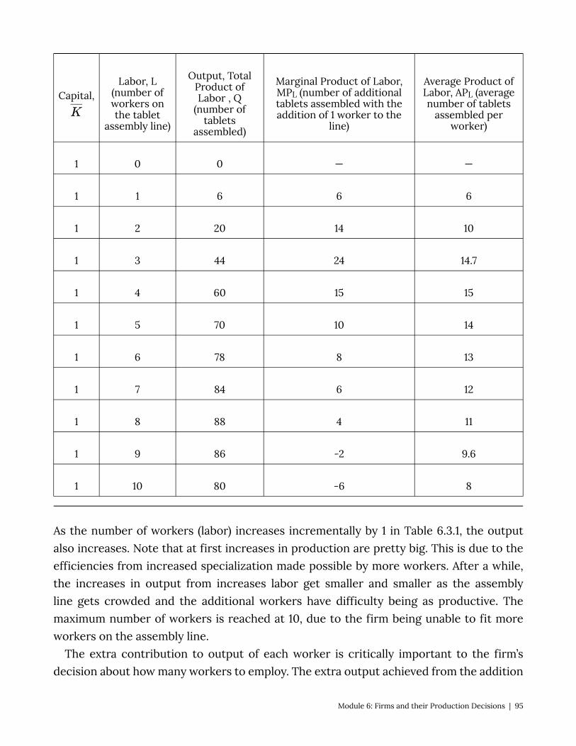
Capital,Labor, L
(number of workers on the tablet
assembly line)
Output, Total Product of Labor , Q
(number of tablets
assembled)
Marginal Product of Labor, MPL (number of additional tablets assembled with the addition of 1 worker to the
line)
Average Product of Labor, APL (average number of tablets
assembled per worker)
1 0 0 — —
1 1 6 6 6
1 2 20 14 10
1 3 44 24 14.7
1 4 60 15 15
1 5 70 10 14
1 6 78 8 13
1 7 84 6 12
1 8 88 4 11
1 9 86 -2 9.6
1 10 80 -6 8
As the number of workers (labor) increases incrementally by 1 in Table 6.3.1, the output also increases. Note that at first increases in production are pretty big. This is due to the efficiencies from increased specialization made possible by more workers. After a while, the increases in output from increases labor get smaller and smaller as the assembly line gets crowded and the additional workers have difficulty being as productive. The maximum number of workers is reached at 10, due to the firm being unable to fit more workers on the assembly line.
The extra contribution to output of each worker is critically important to the firm’s decision about how many workers to employ. The extra output achieved from the addition
Module 6: Firms and their Production Decisions | 95
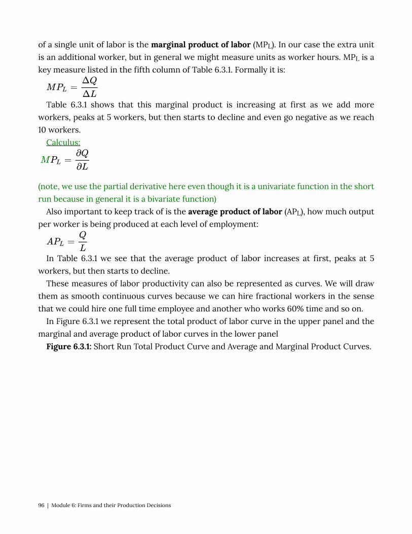
of a single unit of labor is the marginal product of labor (MPL). In our case the extra unit is an additional worker, but in general we might measure units as worker hours. MPL is a key measure listed in the fifth column of Table 6.3.1. Formally it is:
Table 6.3.1 shows that this marginal product is increasing at first as we add more workers, peaks at 5 workers, but then starts to decline and even go negative as we reach 10 workers.
Calculus:
(note, we use the partial derivative here even though it is a univariate function in the short run because in general it is a bivariate function)
Also important to keep track of is the average product of labor (APL), how much output per worker is being produced at each level of employment:
In Table 6.3.1 we see that the average product of labor increases at first, peaks at 5 workers, but then starts to decline.
These measures of labor productivity can also be represented as curves. We will draw them as smooth continuous curves because we can hire fractional workers in the sense that we could hire one full time employee and another who works 60% time and so on.
In Figure 6.3.1 we represent the total product of labor curve in the upper panel and the marginal and average product of labor curves in the lower panel
Figure 6.3.1: Short Run Total Product Curve and Average and Marginal Product Curves.
96 | Module 6: Firms and their Production Decisions
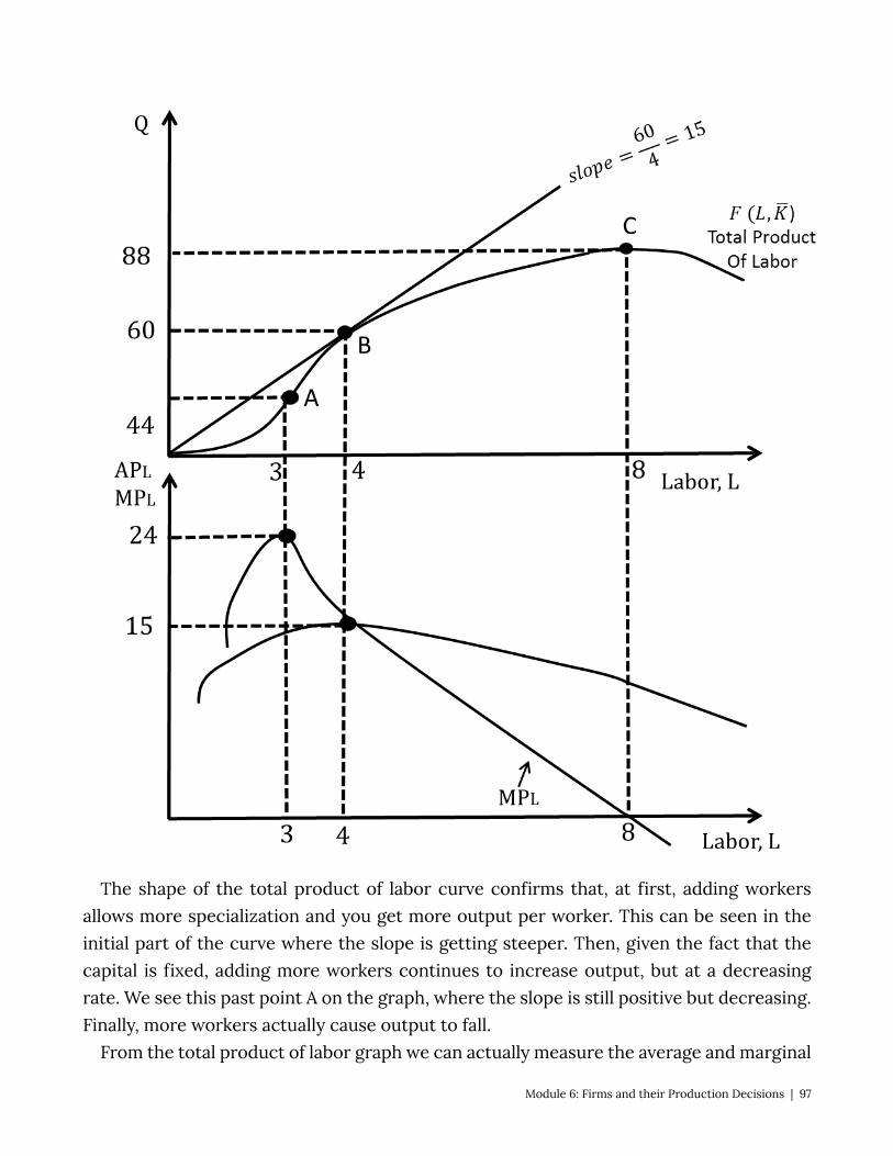
The shape of the total product of labor curve confirms that, at first, adding workers allows more specialization and you get more output per worker. This can be seen in the initial part of the curve where the slope is getting steeper. Then, given the fact that the capital is fixed, adding more workers continues to increase output, but at a decreasing rate. We see this past point A on the graph, where the slope is still positive but decreasing. Finally, more workers actually cause output to fall.
From the total product of labor graph we can actually measure the average and marginal
Module 6: Firms and their Production Decisions | 97
product of labor. The average product of labor is the same as the slope of the ray from the origin that intersects the total product curve (note that the slope, rise/run, is output/labor). This reaches its highest slope right at point B where the ray is just touching the total product curve. The marginal product of labor curve is the change in output over the change in labor, which is the same as the slope of the total product curve itself. Notice that the maximum slope is right at point A, that the average and the marginal are exactly the same at point B, and that the slope turns negative at point C – the point of maximum output. These observations can help us draw the average and marginal product curves in the lower panel. We know marginal product reaches a maximum at A, crosses the average product curve at B and turns negative at C. We also know that when the marginal product is above the average the average is increasing and when the marginal product is below the average the average is decreasing. Thus the two sets of curves relate directly to each other.
There is one more important characteristic of production to note before we move on: the law of diminishing marginal returns. This ‘law’ states that if a firm increases one input while holding all others constant, the marginal product of the input will start to get smaller, just like in our example at 3 labor units. It is important to remember that we are talking about the marginal returns here – that the additional output will be positive but smaller and smaller. We can also talk about diminishing returns – what happens to total output as labor is increased, which in our case does eventually diminish (at 9 labor units) but this is not a general rule.
6.4 Production Functions in the Long Run LO: Describe and illustrate isoquants, both generally and for Cobb-Douglas, perfect
complements (fixed proportions) and perfect substitutes. In the long run all production inputs are variable. Because of this firms have more
flexibility in how they choose to produce, expand, and contract their output in the long run than in the short run. But this situation also complicates firms’ decision making. They have to weigh the marginal contribution to output an extra unit of each input would provide and the cost of that extra unit. We will now focus on this decision process.
Since we have simplified our firm to one that uses only two inputs, capital (K) and labor (L), we have a choice problem that shares many similarities with the consumers’ problem we studied in Section 1. It should come as no surprise then that the way we solve the problem is similar as well. Let’s start with the production function.
Q = f(L,K) Note that there is no bar above the K, meaning that both labor and capital are now
98 | Module 6: Firms and their Production Decisions
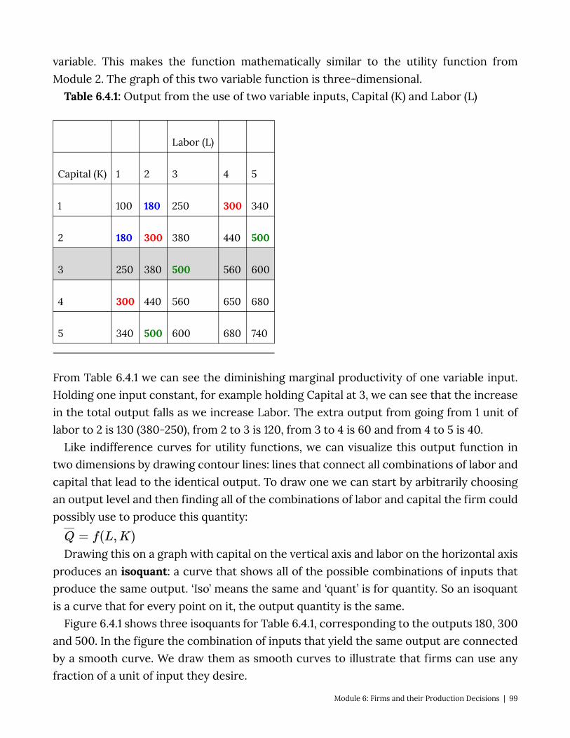
variable. This makes the function mathematically similar to the utility function from Module 2. The graph of this two variable function is three-dimensional.
Table 6.4.1: Output from the use of two variable inputs, Capital (K) and Labor (L)
Labor (L)
Capital (K) 1 2 3 4 5
1 100 180 250 300 340
2 180 300 380 440 500
3 250 380 500 560 600
4 300 440 560 650 680
5 340 500 600 680 740
From Table 6.4.1 we can see the diminishing marginal productivity of one variable input. Holding one input constant, for example holding Capital at 3, we can see that the increase in the total output falls as we increase Labor. The extra output from going from 1 unit of labor to 2 is 130 (380-250), from 2 to 3 is 120, from 3 to 4 is 60 and from 4 to 5 is 40.
Like indifference curves for utility functions, we can visualize this output function in two dimensions by drawing contour lines: lines that connect all combinations of labor and capital that lead to the identical output. To draw one we can start by arbitrarily choosing an output level and then finding all of the combinations of labor and capital the firm could possibly use to produce this quantity:
Drawing this on a graph with capital on the vertical axis and labor on the horizontal axis produces an isoquant: a curve that shows all of the possible combinations of inputs that produce the same output. ‘Iso’ means the same and ‘quant’ is for quantity. So an isoquant is a curve that for every point on it, the output quantity is the same.
Figure 6.4.1 shows three isoquants for Table 6.4.1, corresponding to the outputs 180, 300 and 500. In the figure the combination of inputs that yield the same output are connected by a smooth curve. We draw them as smooth curves to illustrate that firms can use any fraction of a unit of input they desire.
Module 6: Firms and their Production Decisions | 99

Figure 6.4.1: Selected Isoquants from Table 6.4.1
You can, of course, do this for any output level you choose so the entire space is filled with potential isoquants; figure 6.4.1 simply sketches three. Note that we do not have a specific functional form for the production function so we are drawing hypothetical isoquants. We will derive an isoquant from a specific production function momentarily.
Properties of Isoquants Just like indifference curves isoquants have properties that we can characterize. 1. Isoquants that represent greater output are farther from the origin.
Quite simply, if you add more of both inputs you get more output. Stated the other way, if you want more output you have to increase the inputs.
2. Isoquants do not cross each other. To understand this, try a thought experiment. If two isoquants crossed it would
mean that at the crossing point the same inputs would yield two different and distinct output levels. Under the assumption that firms make efficient decisions, they would never produce the lower output.
3. Isoquants are downward sloping. This is the same as saying there are tradeoffs with inputs: you can replace some
capital with labor and produce the same amount of output and vice versa. Really this requirement is only a prohibition on upward sloping isoquants, which would imply that you could cut back on both inputs and produce the same output.
4. Isoquants do not bow out. This is a similar property to the one for indifference curves, which are bowed
in. Note that we do not say that isoquants can only be bowed in, because perfect complements and substitutes play a big role in production functions. But isoquants that curve in represent the idea that it is often more efficient to have a mix of labor
100 | Module 6: Firms and their Production Decisions
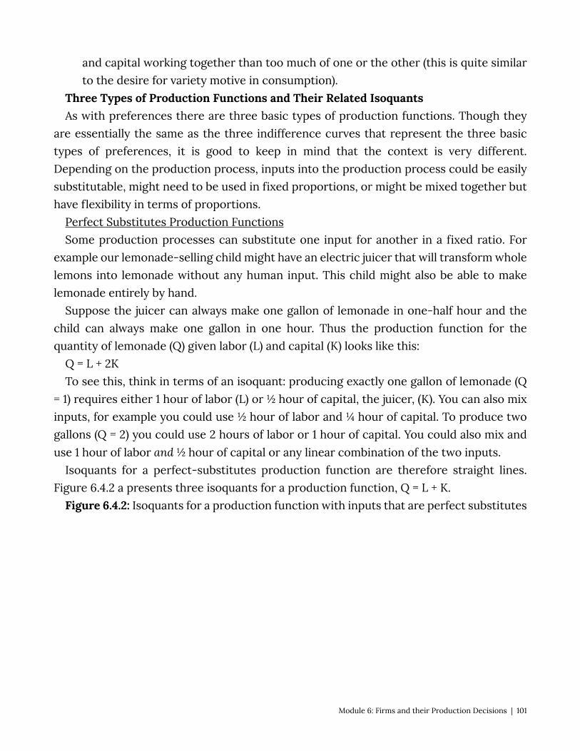
and capital working together than too much of one or the other (this is quite similar to the desire for variety motive in consumption).
Three Types of Production Functions and Their Related Isoquants As with preferences there are three basic types of production functions. Though they
are essentially the same as the three indifference curves that represent the three basic types of preferences, it is good to keep in mind that the context is very different. Depending on the production process, inputs into the production process could be easily substitutable, might need to be used in fixed proportions, or might be mixed together but have flexibility in terms of proportions.
Perfect Substitutes Production Functions Some production processes can substitute one input for another in a fixed ratio. For
example our lemonade-selling child might have an electric juicer that will transform whole lemons into lemonade without any human input. This child might also be able to make lemonade entirely by hand.
Suppose the juicer can always make one gallon of lemonade in one-half hour and the child can always make one gallon in one hour. Thus the production function for the quantity of lemonade (Q) given labor (L) and capital (K) looks like this:
Q = L + 2K To see this, think in terms of an isoquant: producing exactly one gallon of lemonade (Q
= 1) requires either 1 hour of labor (L) or ½ hour of capital, the juicer, (K). You can also mix inputs, for example you could use ½ hour of labor and ¼ hour of capital. To produce two gallons (Q = 2) you could use 2 hours of labor or 1 hour of capital. You could also mix and use 1 hour of labor and ½ hour of capital or any linear combination of the two inputs.
Isoquants for a perfect-substitutes production function are therefore straight lines. Figure 6.4.2 a presents three isoquants for a production function, Q = L + K.
Figure 6.4.2: Isoquants for a production function with inputs that are perfect substitutes
Module 6: Firms and their Production Decisions | 101
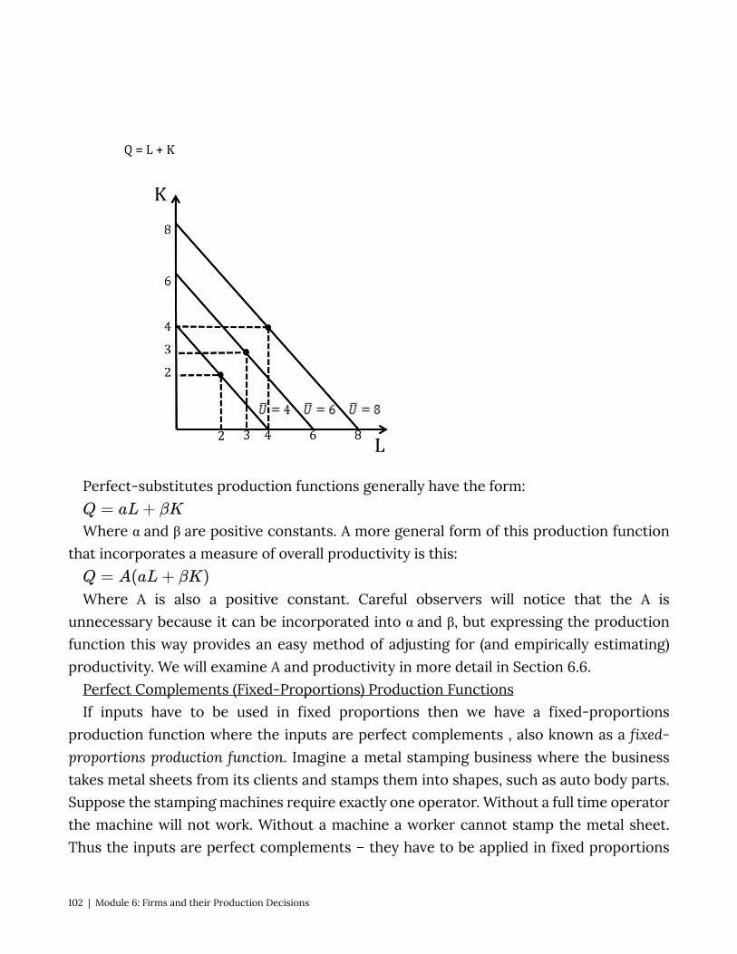
Perfect-substitutes production functions generally have the form:
Where α and β are positive constants. A more general form of this production function that incorporates a measure of overall productivity is this:
Where A is also a positive constant. Careful observers will notice that the A is unnecessary because it can be incorporated into α and β, but expressing the production function this way provides an easy method of adjusting for (and empirically estimating) productivity. We will examine A and productivity in more detail in Section 6.6.
Perfect Complements (Fixed-Proportions) Production Functions If inputs have to be used in fixed proportions then we have a fixed-proportions
production function where the inputs are perfect complements , also known as a fixed-proportions production function. Imagine a metal stamping business where the business takes metal sheets from its clients and stamps them into shapes, such as auto body parts. Suppose the stamping machines require exactly one operator. Without a full time operator the machine will not work. Without a machine a worker cannot stamp the metal sheet. Thus the inputs are perfect complements – they have to be applied in fixed proportions
102 | Module 6: Firms and their Production Decisions
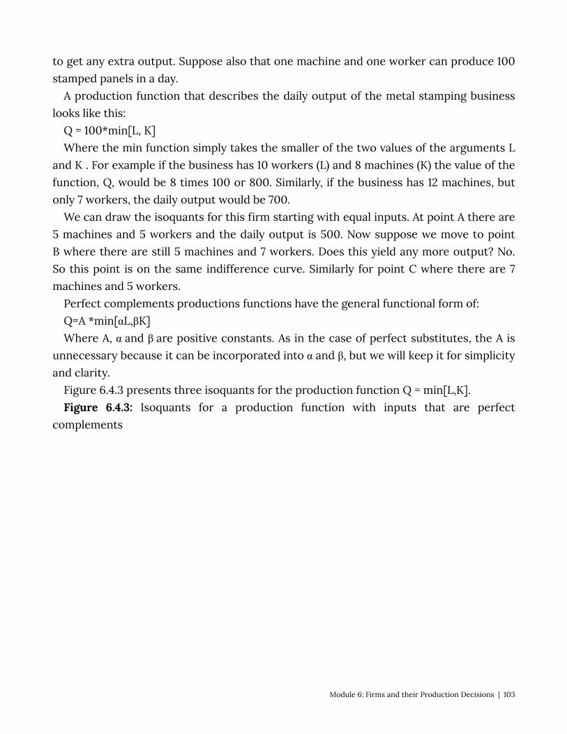
to get any extra output. Suppose also that one machine and one worker can produce 100 stamped panels in a day.
A production function that describes the daily output of the metal stamping business looks like this:
Q = 100*min[L, K] Where the min function simply takes the smaller of the two values of the arguments L
and K . For example if the business has 10 workers (L) and 8 machines (K) the value of the function, Q, would be 8 times 100 or 800. Similarly, if the business has 12 machines, but only 7 workers, the daily output would be 700.
We can draw the isoquants for this firm starting with equal inputs. At point A there are 5 machines and 5 workers and the daily output is 500. Now suppose we move to point B where there are still 5 machines and 7 workers. Does this yield any more output? No. So this point is on the same indifference curve. Similarly for point C where there are 7 machines and 5 workers.
Perfect complements productions functions have the general functional form of: Q=A *min[αL,βK] Where A, α and β are positive constants. As in the case of perfect substitutes, the A is
unnecessary because it can be incorporated into α and β, but we will keep it for simplicity and clarity.
Figure 6.4.3 presents three isoquants for the production function Q = min[L,K]. Figure 6.4.3: Isoquants for a production function with inputs that are perfect
complements
Module 6: Firms and their Production Decisions | 103
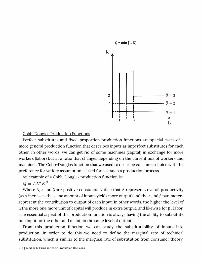
Cobb-Douglas Production Functions Perfect-substitutes and fixed-proportion production functions are special cases of a
more general production function that describes inputs as imperfect substitutes for each other. In other words, we can get rid of some machines (capital) in exchange for more workers (labor) but at a ratio that changes depending on the current mix of workers and machines. The Cobb-Douglas function that we used to describe consumer choice with the preference for variety assumption is used for just such a production process.
An example of a Cobb-Douglas production function is:
Where A, α and β are positive constants. Notice that A represents overall productivity (as A increases the same amount of inputs yields more output) and the α and β parameters represent the contribution to output of each input. In other words, the higher the level of α the more one more unit of capital will produce in extra output, and likewise for β , labor. The essential aspect of this production function is always having the ability to substitute one input for the other and maintain the same level of output.
From this production function we can study the substitutability of inputs into production. In order to do this we need to define the marginal rate of technical substitution, which is similar to the marginal rate of substitution from consumer theory.
104 | Module 6: Firms and their Production Decisions
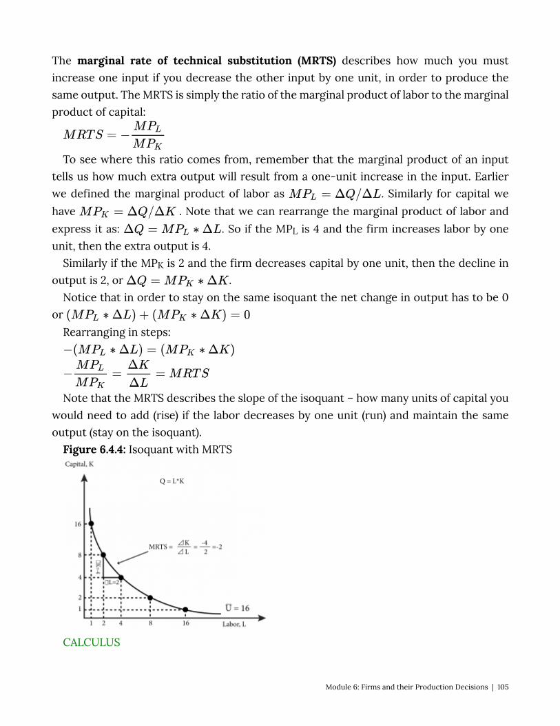
The marginal rate of technical substitution (MRTS) describes how much you must increase one input if you decrease the other input by one unit, in order to produce the same output. The MRTS is simply the ratio of the marginal product of labor to the marginal product of capital:
To see where this ratio comes from, remember that the marginal product of an input tells us how much extra output will result from a one-unit increase in the input. Earlier we defined the marginal product of labor as . Similarly for capital we have . Note that we can rearrange the marginal product of labor and express it as: . So if the MPL is 4 and the firm increases labor by one unit, then the extra output is 4.
Similarly if the MPK is 2 and the firm decreases capital by one unit, then the decline in output is 2, or .
Notice that in order to stay on the same isoquant the net change in output has to be 0 or
Rearranging in steps:
Note that the MRTS describes the slope of the isoquant – how many units of capital you would need to add (rise) if the labor decreases by one unit (run) and maintain the same output (stay on the isoquant).
Figure 6.4.4: Isoquant with MRTS
CALCULUS
Module 6: Firms and their Production Decisions | 105
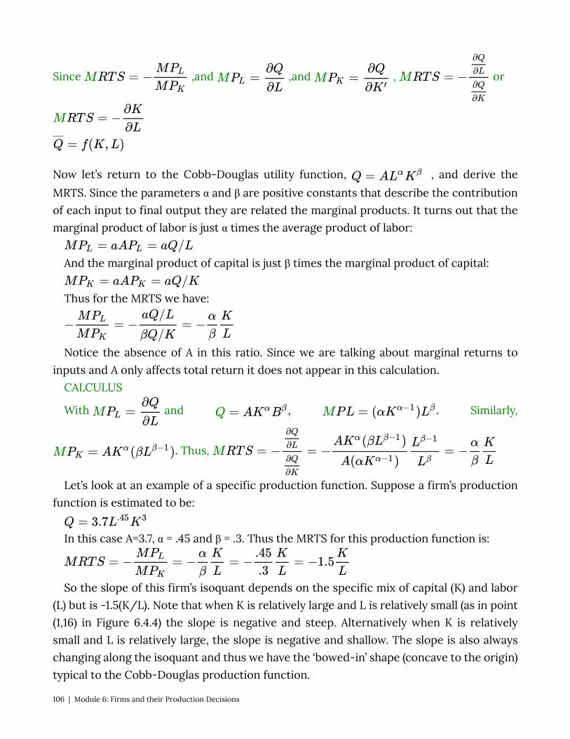
Since ,and ,and , or
Now let’s return to the Cobb-Douglas utility function, , and derive the MRTS. Since the parameters α and β are positive constants that describe the contribution of each input to final output they are related the marginal products. It turns out that the marginal product of labor is just α times the average product of labor:
And the marginal product of capital is just β times the marginal product of capital:
Thus for the MRTS we have:
Notice the absence of A in this ratio. Since we are talking about marginal returns to inputs and A only affects total return it does not appear in this calculation.
CALCULUS
With and , . Similarly,
. Thus,
Let’s look at an example of a specific production function. Suppose a firm’s production function is estimated to be:
In this case A=3.7, α = .45 and β = .3. Thus the MRTS for this production function is:
So the slope of this firm’s isoquant depends on the specific mix of capital (K) and labor (L) but is -1.5(K/L). Note that when K is relatively large and L is relatively small (as in point (1,16) in Figure 6.4.4) the slope is negative and steep. Alternatively when K is relatively small and L is relatively large, the slope is negative and shallow. The slope is also always changing along the isoquant and thus we have the ‘bowed-in’ shape (concave to the origin) typical to the Cobb-Douglas production function.
106 | Module 6: Firms and their Production Decisions

6.5 Returns to Scale LO: Define the three categories of returns to scale and describe how to identify them. Up to now our focus on marginal returns has centered on the change of one input
holding the other input constant. In this section we consider what happens to output when we increase or decrease both inputs. Increasing or decreasing both inputs can be described as scaling the firm up or down, and we want to know how it affects output. In particular we would like to know about proportional changes to output. For example, if the firm doubles both inputs does output double as well? Does it increase more or less than double the previous amount? The answer to these questions determines the returns to scale of the firm: the rate at which the output increases when all inputs are increased proportionally.
Constant Returns to Scale (CRS) If a firm’s output changes in exact proportion to changes in the inputs, we say the firm
exhibits constant returns to scale (CRS). Let’s consider this situation using the doubling example.
Suppose a firm has a production function of
Now the firm doubles its inputs. We can show this by multiplying the current inputs by 2:
If this yields exactly double the output we can write this expression:
This expression says that if both inputs double, output doubles. It is an example of a constant returns to scale production function. The CRS condition can be expressed more generally as:
where is a strictly positive constant, like 2 in our example. In the case of scaling down, Φ would be a fraction, such as ½.
Increasing Returns to Scale (IRS) Increasing returns to scale (IRS) production functions are those for which the output
increases or decreases by a greater percentage than the percentage increase or decrease in inputs. In the case of doubling inputs the IRS expression would look like this:
Look carefully at what this says. The first term on the left is the output that results from the doubling of the two inputs. We compare this to the doubling of the output,
Module 6: Firms and their Production Decisions | 107
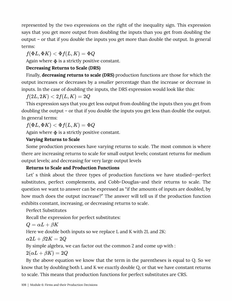
represented by the two expressions on the right of the inequality sign. This expression says that you get more output from doubling the inputs than you get from doubling the output – or that if you double the inputs you get more than double the output. In general terms:
Again where is a strictly positive constant. Decreasing Returns to Scale (DRS) Finally, decreasing returns to scale (DRS) production functions are those for which the
output increases or decreases by a smaller percentage than the increase or decrease in inputs. In the case of doubling the inputs, the DRS expression would look like this:
This expression says that you get less output from doubling the inputs then you get from doubling the output – or that if you double the inputs you get less than double the output. In general terms:
Again where is a strictly positive constant. Varying Returns to Scale Some production processes have varying returns to scale. The most common is where
there are increasing returns to scale for small output levels; constant returns for medium output levels; and decreasing for very large output levels
Returns to Scale and Production Functions Let’ s think about the three types of production functions we have studied—perfect
substitutes, perfect complements, and Cobb-Douglas–and their returns to scale. The question we want to answer can be expressed as “if the amounts of inputs are doubled, by how much does the output increase?” The answer will tell us if the production function exhibits constant, increasing, or decreasing returns to scale.
Perfect Substitutes Recall the expression for perfect substitutes:
Here we double both inputs so we replace L and K with 2L and 2K:
By simple algebra, we can factor out the common 2 and come up with :
By the above equation we know that the term in the parentheses is equal to Q. So we know that by doubling both L and K we exactly double Q, or that we have constant returns to scale. This means that production functions for perfect substitutes are CRS.
108 | Module 6: Firms and their Production Decisions

Perfect Complements The perfect complements function is:
Again, we want to begin by replacing L and K with 2L and 2K and note that sice we are doubling both inputs the minimum of the two numbers must also be doubled so we can pull the 2 out in front of the min:
Since the order of multiplication does not matter we know,
Which is the same as doubling output:
The first step is not immediately obvious, but think about the way the min function works: it just picks the smaller of the two numbers in the square brackets. Doubling them both does not change which one is smaller and in the end the value is just double the smaller one, so it is the same as doubling after we choose the min of the two numbers. From there since order doesn’t matter in multiplication, we can move the 2 out in front of the A and now we have 2 multiplied by the original production functions (in parentheses) which is the same as Q. Again, we know that by doubling both L and K we exactly double Q, or that we have constant returns to scale. Thus production functions for perfect complements are also CRS.
Cobb-Douglas Recall the Cobb-Douglas function:
We will start the same way, replace L and K with 2L and 2K:
You have to be careful here because the exponents, α and β, are on L and K respectively and when we replace L with 2L, for example, the α is now the exponent for 2L. By the rules of exponents we can separate the 2s and the L and K:
Next, we can rearrange terms at will as order of operations does not matter in multiplication:
We can also, by the rules of exponents, express as :
Module 6: Firms and their Production Decisions | 109
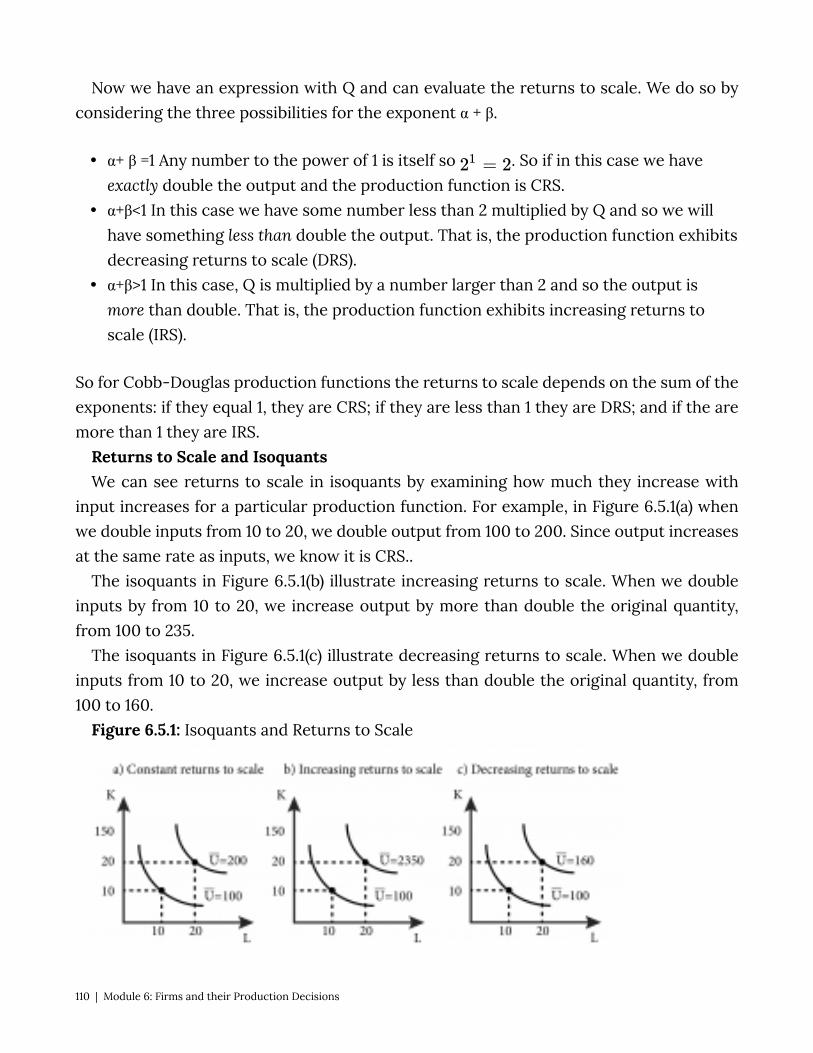
Now we have an expression with Q and can evaluate the returns to scale. We do so by considering the three possibilities for the exponent α + β.
• α+ β =1 Any number to the power of 1 is itself so . So if in this case we have exactly double the output and the production function is CRS.
• α+β<1 In this case we have some number less than 2 multiplied by Q and so we will have something less than double the output. That is, the production function exhibits decreasing returns to scale (DRS).
• α+β>1 In this case, Q is multiplied by a number larger than 2 and so the output is more than double. That is, the production function exhibits increasing returns to scale (IRS).
So for Cobb-Douglas production functions the returns to scale depends on the sum of the exponents: if they equal 1, they are CRS; if they are less than 1 they are DRS; and if the are more than 1 they are IRS.
Returns to Scale and Isoquants We can see returns to scale in isoquants by examining how much they increase with
input increases for a particular production function. For example, in Figure 6.5.1(a) when we double inputs from 10 to 20, we double output from 100 to 200. Since output increases at the same rate as inputs, we know it is CRS..
The isoquants in Figure 6.5.1(b) illustrate increasing returns to scale. When we double inputs by from 10 to 20, we increase output by more than double the original quantity, from 100 to 235.
The isoquants in Figure 6.5.1(c) illustrate decreasing returns to scale. When we double inputs from 10 to 20, we increase output by less than double the original quantity, from 100 to 160.
Figure 6.5.1: Isoquants and Returns to Scale
110 | Module 6: Firms and their Production Decisions

6.6 Technological Change and Productivity Growth LO: Discuss technological change and productivity increases and how they affect
production functions. A firm’s production function need not be static over time. Many firms adopt new
technologies or new ways of organizing and doing things in order to become more productive. Technological change refers to new production technology or knowledge that changes firms’ production functions such that more output is produced by the same amount of inputs. Technological change is also known as total factor productivity growth.
We can express changes in overall productivity with production functions. So far we have assumed that firms are efficient, meaning that they do not waste inputs – they use the minimum of inputs necessary to produce a particular output level. You can see this by the way we assume that certain inputs yield specific amounts of output. There is no waste in this scenario. Productivity, on the other hand, refers to how much overall output a firm gets from a set amount of inputs. The more a firm produces with the same inputs, the more productive it is.
As was noted in Section 6.4, the constant A is a measure of overall productivity in the types of production functionswe have been studying. All else equal, increasing A increases the output that a firm produces from a set amount of inputs.
Graphically adjusting A in any of our three production function types re-labels our isoquants. As Figure 6.6.1 shows, when A is increased from 1 to 3 in the case of a simple Cobb-Douglas production function, all of the outputs associated with the individual isoquants increase by 3 as well.
Figure 6.6.1: Isoquant Cobb-Douglas With Outputs Increasing.
Module 6: Firms and their Production Decisions | 111
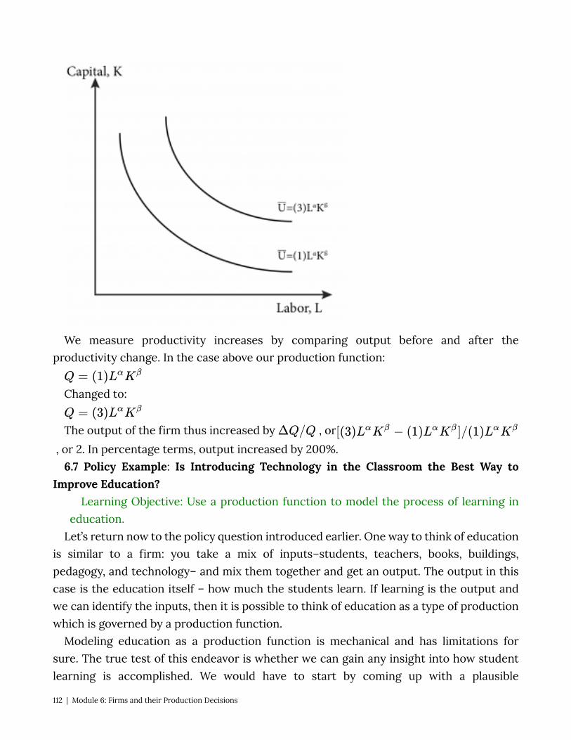
We measure productivity increases by comparing output before and after the productivity change. In the case above our production function:
Changed to:
The output of the firm thus increased by , or , or 2. In percentage terms, output increased by 200%.
6.7 Policy Example: Is Introducing Technology in the Classroom the Best Way to Improve Education?
Learning Objective: Use a production function to model the process of learning in education.
Let’s return now to the policy question introduced earlier. One way to think of education is similar to a firm: you take a mix of inputs–students, teachers, books, buildings, pedagogy, and technology– and mix them together and get an output. The output in this case is the education itself – how much the students learn. If learning is the output and we can identify the inputs, then it is possible to think of education as a type of production which is governed by a production function.
Modeling education as a production function is mechanical and has limitations for sure. The true test of this endeavor is whether we can gain any insight into how student learning is accomplished. We would have to start by coming up with a plausible
112 | Module 6: Firms and their Production Decisions

production function. By far the most flexible, and perhaps the most relevant to education, is the Cobb-Douglas production function where inputs are imperfectly substitutable.
For example, you don’t get any learning without a teacher but you might be able to substitute some technology-based instruction for some live teaching. This is the essence of the Cobb-Douglas production function. We can express an education production function, apply it to real world data, and estimate its parameters to find out, for example, how important good teachers are and how substitutable they could be using technology. Doing so will give policy makers a better idea of the most effective ways to spend scarce resources if the ultimate goal of education funding is learning.
For example, suppose we posit that learning is a function of teacher quality, the technology used in the classroom, the quality of the class materials and the size of the class (number of students per teacher). So, we imagine that the learning production function looks something like this:
With appropriate data, the parameters alpha, beta, gamma and delta can be measured, giving policy makers an idea about where the highest return to an investment is found. In fact, economists have been doing this for quite some time. See: http://hanushek.stanford.edu/publications/measuring-investment-education, or http://hanushek.stanford.edu/sites/default/files/publications/Hanushek%201996%20JEP%2010%284%29.pdf
Exploring the Policy Question
• What do you think are the relevant inputs into the learning production function? • Which type of production function best represents the grade school learning
environment? • If you believe that teachers are easily replaced by on-line videos, where one hour of
on line video is exactly equivalent to one hour of live teaching, what type of production function would you use to describe this?
• It there was a magic ‘learning pill’ that students could take and that would, regardless of the current level and mix of inputs, double their learning, how would you express this in a production function?
Module 6: Firms and their Production Decisions | 113
SUMMARY
Review: Topics and Related Learning Outcomes
6.1 Inputs Learning Objective: Identify the four basic categories of inputs in production, and
give examples of each. 6.2 Production Functions, Inputs, and Short and Long Runs Learning Objective: Explain the concept of production functions, the difference
between fixed and variable inputs, and the difference between the economic short run and long run.
6.3 Production Functions and Characteristics in the Short Run Learning Objective: Explain the concepts of marginal product of labor, total product
of labor, average product of labor, and the law of diminishing marginal returns. 6.4 Production Functions in the Long Run Learning Objective: Describe and illustrate isoquants generally, and for for Cobb-
Douglas, perfect complements (fixed proportions) and perfect substitutes. 6.5 Returns to Scale Learning Objective: Define the three categories of returns to scale and describe how
to identify them. 6.6 Technological Change and Productivity Growth Learning Objective: Discuss technological change and productivity increases and
how they affect production functions. 6.7 Policy Example: Is Introducing Technology in the Classroom the Best Way to
Improve Education? Learning Objective: Use a production function to model the process of learning in
education.
114 | Module 6: Firms and their Production Decisions
Learn: Key Terms and Graphs
Terms
Labor Capital Land Materials Production Function Variable Input Fixed Input Short Run Long Run Total Product of Labor Average Product of Labor Marginal Product of Labor Law of Diminishing Marginal Returns Isoquant Cobb-Douglas Production Functions Perfect Substitutes Production Functions Perfect Complements (Fixed-Proportions) Production Functions Marginal Rate of Technical Substitution (MRTS) Returns to Scale Constant Returns to Scale (CRS) Increasing Returns to Scale (IRS) Decreasing Returns to Scale (DRS)
Module 6: Firms and their Production Decisions | 115
Graphs
Short Run Total Product Curve and Average and Marginal Product Curves Examples of Isoquants Isoquants for a production function with inputs that are perfect substitutes Isoquants for a production function with inputs that are perfect complements Isoquant with MRTS Isoquants and Returns to Scale Isoquant Cobb-Douglas With Outputs Increasing Equations Average Product of Labor Marginal Product of Labor Marginal Rate of Technical Substitution (MRTS)
116 | Module 6: Firms and their Production Decisions
Module 7: Minimizing Costs
The Policy Question: Will an increase in the minimum wage decrease employment? Recently, a much discussed policy topic in the U. S. is the idea of increasing minimum
wages as a response to poverty and growing income inequality. There are many questions of debate about minimum wages as an effective policy tool to tackle these problems, but one common criticism of minimum wages is that they increase unemployment. In this module we will study how firms decide how much of each input to employ in their production of a good or service. This knowledge will allow us to address the question of whether firms are likely to reduce the amount of labor they employ if the minimum wage is increased.
In order to provide goods and services to the marketplace firms use inputs. These inputs are costly, so firms must be smart about how they use labor, capital and other inputs to achieve a certain level of output. The goal of any profit maximizing firm is to produce any level of output at the minimum cost. Doing anything else cannot be a profit maximizing strategy. This module studies the cost minimization problem for firms: how to most efficiently use inputs to produce output.
Exploring the Policy Question Read the following article about raising the minimum wage and answer the questions
below: http://blogs.wsj.com/washwire/2014/08/31/labor-day-turns-attention-back-to-minimum-wage-debate/
1. What potential benefits to raising the minimum wage are identified in the article? 2. What potential disadvantages to raising the minimum wage are identified?
7.1 The Economic Concept of Cost Learning Objective 7.1: Explain fixed and variable costs, opportunity cost, sunk cost
and depreciation. 7.2 Short-Run Cost Minimization Learning Objective 7.2: Describe the solution to the cost minimization problem in
the short-run. 7.3 Long-Run Cost Minimization
Module 7: Minimizing Costs | 117
Learning Objective 7.3: Describe the solution to the cost minimization problem in the long-run.
7.4 When Input Costs and Output Change Learning Objective 7.4: Analyze the effect of changes in prices or output on total
cost. 7.5 Policy Example: Will an Increase in the Minimum Wage Decrease
Employment? Learning Objective 7.5: Apply the concept of cost minimization to a minimum wage
policy. 7.1 The Economic Concept of Cost Learning Objective 7.1: Explain fixed and variable costs, opportunity cost, sunk cost and
depreciation. From the isoquants described in Module 6 we know that firms have many choices of
input combinations to produce the same amount of output. Each point on an isoquant represents a different combination of inputs that produces the same amount of output.
Of course inputs are not free: the firm must pay workers for their labor, buy raw materials, and buy or rent machines, all of which are costly. So the key question for firms is: which point on an isoquant is the best choice? The answer is the point that represents the lowest cost. The topics of this module will help us to locate that point.
This module studies production costs; that is, how costs are related to output. In order to draw a cost curve that shows a single cost for each output amount, we have to understand how firms make the decision about which set of possible inputs to use to be as efficient as possible. To be as efficient as possible means that the firm wants to produce output at the lowest possible cost.
For now we assume that firms want to produce as efficiently as possible, in other words, minimize costs. Later, in Module 9: Profit Maximization and Supply, we will see that producing at the lowest cost is what profit maximizing firms must do (otherwise they cannot possibly be maximizing profit!).
A good way to think about the cost side of the firm is to consider a manager who is in charge of running a factory for a large company. She is responsible for producing a specific amount of output at the lowest possible cost. She must choose the mix of inputs the factory will use to achieve the production target. Her task, in other words, is to run her factory as efficiently as possible. She does not want to use any extra inputs and she does not want to pick a mix of inputs that costs more than another mix of inputs that produces the same amount of output.
118 | Module 7: Minimizing Costs
To make efficient or cost-minimizing decisions it is important to understand some basic cost concepts, starting with fixed and variable costs as well as opportunity costs, sunk costs and depreciation.
Fixed and Variable Costs A fixed cost is a cost that does not change as output changes. For example a firm might
need to pay for the lights to be on in order for the workers to see what they are doing and for production to happen. But the lights are simply on or off and the cost of powering them does not change when output changes.
A variable cost is a cost that changes as output changes. For example a firm that wishes to produce more output might need to employ more labor hours by either hiring more workers or have existing workers work more hours. The cost of this labor is therefore a variable cost as it changes as the output level changes.
Opportunity Costs As we learned in Module 3, the opportunity cost of something is the value of the next-
best alternative given up in order to do get it. Suppose a firm has access to an input that it can use in production without paying a
price for it. A simple example is a family farm. The farm uses land, water, seeds, fertilizer, labor, and farm machinery to produce a crop—let’s say corn–which it then sells in the marketplace. If the farm owns the land it uses to produce the corn, do we then say that the land component is not part of the firm’s costs? The answer, of course, is no. When the farm uses the land to produce corn it forgoes any other use of the land; that is, it gives up the opportunity to use the resource for another purpose. In many cases the opportunity cost is the market value of the input.
For example, suppose an alternative use for the land is to rent it to another farmer. The forgone rent from the decision to use the land to produce its own corn is the farm’s opportunity cost and should be factored in to the production decision. If the opportunity cost, which in this case is the rental fee, is higher than the profit the farm will earn from producing corn, the most efficient economic decision is to rent out the land instead.
Now consider the more complex example of a farm manager who is told to produce a certain amount of corn. Suppose that the manager figures out that she can produce exactly that amount using a low-fertilizer variety of corn and all of the available land. She also knows that another way to produce the same amount of corn is with a higher yielding variety that requires a lot more fertilizer but uses only 75% of the land. The additional fertilizer for this higher yielding corn will cost an extra $50,000. Which option should the farm manager choose?
Module 7: Minimizing Costs | 119
Without considering the opportunity cost she would use the low-fertilizer variety of corn and all of the land, because it costs $50,000 less than the alternative method. But what if, under the alternative method, she could rent out for $60,000 the 25% of the land that would not be planted? In that case the cost minimizing decision is actually to use the higher yielding corn variety and rent out the unused land.
Another classic example is that of a small business owner who runs, say, a coffee shop. The inputs into the coffee shop are the labor, the coffee, the electricity, the machines and so on. But suppose the owner also works a lot in the shop. He does not pay himself a salary but simply pays himself from the shop’s excess revenues, or revenues in excess of the cost of the other inputs. The cost of his labor for the shop is not $0 but the amount he could earn working elsewhere instead. If, for example, he could work in the local bank for $4,000 a month then the opportunity cost of his working at the coffee shop is $4,000 and if the excess revenues are less than $4,000 he should close the shop and work at the bank instead, assuming he likes both jobs equally well.
Sunk Costs Some costs are recoverable and some are not. An example of a recoverable cost is the
money a farmer spends on a new tractor knowing that she can turn around and re-sell it for the same amount she paid.
A sunk cost is an expenditure that is not recoverable. An example of a sunk cost is the cost of the paint a business owner uses to paint the leased storefront of his coffee shop. Once the paint is on the wall it has no resale value. Many inputs reflect both recoverable and sunk costs. A business that buys a car for the use of an employee for $30,000 and can resell it for $20,000 should consider $10,000 of its expenditure a sunk cost and $20,000 a recoverable cost.
Why do sunk costs matter in choosing inputs? Because after incurring sunk costs, a manager should not consider them in making subsequent decisions. Sunk costs have no bearing on such decisions. To see this, suppose you buy a $500 non-refundable and non-transferrable airline ticket to go to Florida at spring break. However, as spring break approaches you are invited by friends to spend the break at a mountain cabin they have rented to which they will give you a ride in their car at no cost to you. You prefer to spend the break with your friends in the cabin but you have already spent the $500 on the ticket and you feel compelled to get your money’s worth by using it to go to Florida. Doing so would be the wrong decision. At the time of your decision, the $500 spent on the ticket is non-recoverable and therefore a sunk cost. Whether you go to Florida or not you cannot get the $500 back, so you should do what makes you most happy, which is going to the cabin.
120 | Module 7: Minimizing Costs
Depreciation Depreciation is the loss of value of a durable good or asset over time. A durable good is
a good that has a long usable life. Durable goods are things like vehicles, factory machines or appliances that generally last many years. The difference in the beginning value of a durable good and its value some time later is called depreciation. Most durable goods depreciate: machines wear out, newer more advanced ones are produced reducing the value of current ones, and so on.
Suppose you are a manager who runs a pencil-making factory that uses a large machine. How does -the machine’s depreciation factor into the cost of using it
The appropriate way to think about these costs is through the lens of opportunity cost. If your factory didn’t use the machine you could rent it to another firm, or sell it. Let’s consider the selling of the machine. Suppose it cost $100,000 to purchase the machine new, and it depreciates at a rate of $1,000 per month, meaning that each month its resale value drops by $1,000. Note that the purchase cost of the machine is not sunk because it is recoverable – but each month the recoverable amount diminishes with the rate of depreciation. So, for example, exactly one year after purchase the machine is worth $88,000. At this point in time the $12,000 depreciation has become a sunk cost. However at the current point in time you have a choice: you can sell the machine for $88,000 or use it for a month and sell it at the end of the month for $87,000. The opportunity cost of using the machine for this month is exactly $1,000 in depreciation.
Why does depreciation matter in choosing inputs? Well, suppose workers can do the same job as the machine, or in economics parlance, you can substitute workers for capital. To produce the same amount of pencils as the machine, you need to add labor hours at a rate of $900 a month. A manager without good economics training might think that since the firm purchased the machine the machine is free and since the labor costs $900 a month, use the machine. But you–a manager well trained in economics–know that the monthly cost of using the machine is the $1000 drop in resale value (the depreciation cost) and the monthly cost of the labor is $900. You will save the company $100 a month by using the labor and selling the machine.
7.2 Short-Run Cost Minimization LO: Describe the solution to the cost minimization problem in the short run. In order to maximize profits firms must minimize cost. Cost minimization simply
implies that firms are maximizing their productivity or using the lowest cost amount of inputs to produce a specific output. In the short run firms have fixed inputs, like capital, giving them less flexibility than in the long run. This lack of flexibility in the choice of inputs tends to result in higher costs.
Module 7: Minimizing Costs | 121
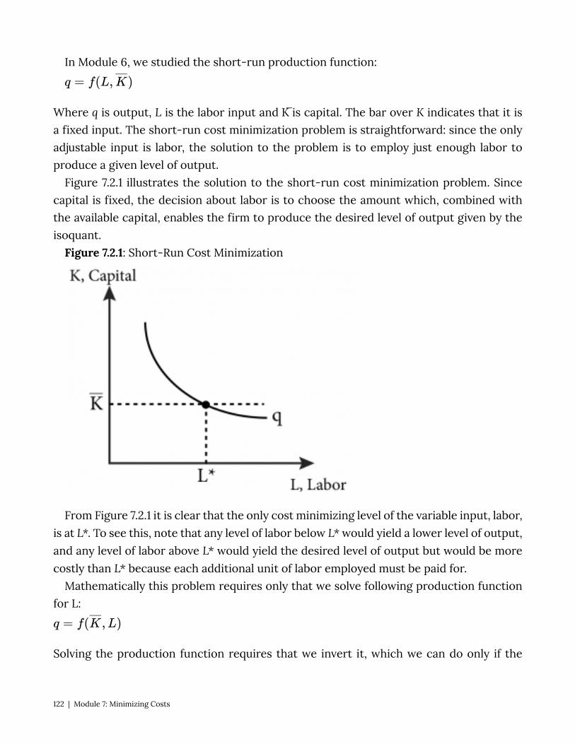
In Module 6, we studied the short-run production function:
Where q is output, L is the labor input and K ̅is capital. The bar over K indicates that it is a fixed input. The short-run cost minimization problem is straightforward: since the only adjustable input is labor, the solution to the problem is to employ just enough labor to produce a given level of output.
Figure 7.2.1 illustrates the solution to the short-run cost minimization problem. Since capital is fixed, the decision about labor is to choose the amount which, combined with the available capital, enables the firm to produce the desired level of output given by the isoquant.
Figure 7.2.1: Short-Run Cost Minimization
From Figure 7.2.1 it is clear that the only cost minimizing level of the variable input, labor, is at L*. To see this, note that any level of labor below L* would yield a lower level of output, and any level of labor above L* would yield the desired level of output but would be more costly than L* because each additional unit of labor employed must be paid for.
Mathematically this problem requires only that we solve following production function for L:
Solving the production function requires that we invert it, which we can do only if the
122 | Module 7: Minimizing Costs
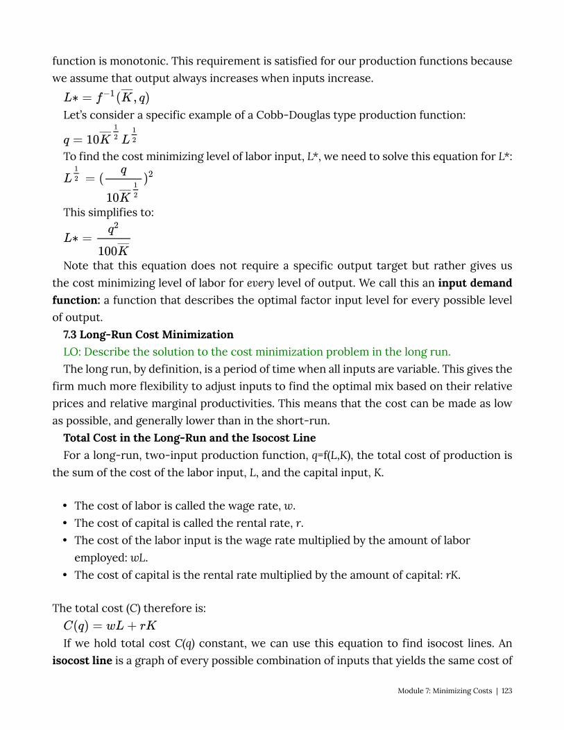
function is monotonic. This requirement is satisfied for our production functions because we assume that output always increases when inputs increase.
Let’s consider a specific example of a Cobb-Douglas type production function:
To find the cost minimizing level of labor input, L*, we need to solve this equation for L*:
This simplifies to:
Note that this equation does not require a specific output target but rather gives us the cost minimizing level of labor for every level of output. We call this an input demand function: a function that describes the optimal factor input level for every possible level of output.
7.3 Long-Run Cost Minimization LO: Describe the solution to the cost minimization problem in the long run. The long run, by definition, is a period of time when all inputs are variable. This gives the
firm much more flexibility to adjust inputs to find the optimal mix based on their relative prices and relative marginal productivities. This means that the cost can be made as low as possible, and generally lower than in the short-run.
Total Cost in the Long-Run and the Isocost Line For a long-run, two-input production function, q=f(L,K), the total cost of production is
the sum of the cost of the labor input, L, and the capital input, K.
• The cost of labor is called the wage rate, w. • The cost of capital is called the rental rate, r. • The cost of the labor input is the wage rate multiplied by the amount of labor
employed: wL. • The cost of capital is the rental rate multiplied by the amount of capital: rK.
The total cost (C) therefore is:
If we hold total cost C(q) constant, we can use this equation to find isocost lines. An isocost line is a graph of every possible combination of inputs that yields the same cost of
Module 7: Minimizing Costs | 123
production. By picking a cost, and given wage rates, w, and rental rates, r, we can find all the combinations of L and K that solve the equation and graph the isocost line.
Consider the example of a pencil making factory where both capital in the form of pencil making machines, and labor to run those machines are utilized. Suppose the wage rate of labor for the pencil maker is $20 per hour and the rental rate of capital is $10 per hour. If the total cost of production is $200 the firm could be employing 10 hours of labor and no capital, 20 hours of capital and no labor, 5 hours of labor and 10 hours of capital or any other combination of capital and labor for which the total cost is $200. Figure 7.3.1 illustrates this particular isocost line.
Figure 7.3.1: An Isocost Line
This figure represents the isocost line where total cost equals $200. But we can draw an isocost line that is associated with any total cost level. Notice that any combination of labor hours and capital that is less expensive than this particular isocost line will end up on a lower isocost line. For example 2 hours of labor and 5 hours of capital will cost $90. Any combination of hours of labor and capital that are more expensive than this particular isocost line will end up on a higher isocost line. For example 20 hours of labor and 30 hours of capital will cost $700.
Note that the slope of the isocost line is the ratio of the input prices, –w/r. This tells us how much of one input (capital) we have to give up to get one more unit of the other input (labor) and maintain the same level of total cost. For example if both labor and capital cost $10 an hour, the ratio would be -10/10 or -1. This is intuitive– if they cost the same amount, to get one more hour of labor, you need to give up one hour of capital. In our pencil maker
124 | Module 7: Minimizing Costs

example, labor is $20 per hour and capital is $10 per hour, so the ratio is -2: to get one more hour of labor input you must give up 2 hours of capital in order to maintain the same total cost or remain on the same isocost line.
The solution to the long-run cost minimization problem is illustrated in Figure 7.3.2. The plant manager’s problem is to produce a given level of output at the lowest cost possible. A given level of output corresponds to a particular isoquant so the cost minimization problem is to pick the point on the isoquant that is the lowest cost of production. This is the same as saying the point that places the firm on the lowest isocost line. We can see this by examining Figure 7.3.2 and noting that the point on the isoquant that corresponds to the lowest isocost line is the one where the isocost is tangent to the isoquant.
Figure 7.3.2: The Solution to the Long-Run Cost Minimization Problem
From figure 7.3.2 we can see that the optimal solution to the cost minimization problem is where the isocost and isoquant are tangent: the point at which they have the same slope. We just learned that the slope of the isocost is –w/r and in Module 6 we learned that the slope of the isoquant is the marginal rate of technical substitution (MRTS), which is the ratio of the marginal product of labor and capital:
So the solution to the long-run cost minimization problem is
or
Module 7: Minimizing Costs | 125
(7.1)
This can be rearranged to help with intuition:
(7.2)
Equation (7.2) says that at the cost minimizing mix of inputs the marginal products per dollar must be equal. This conclusion makes sense if you think about what would happen if Equation (7.2) did not hold. Suppose instead that the marginal product of capital per dollar was more than the marginal product of labor per dollar:
This inequality tells us that this current use of labor and capital cannot be an optimal solution to the cost minimization problem. To understand why, consider the effect of taking a dollar spent on labor input away, thereby lowering the amount of labor input (raising the MPL – remember the law of diminishing marginal returns), and spending that dollar instead on capital and increasing the capital input (lowering the MPK). We know from the inequality that if we do this, overall output must increase because the additional output from the extra dollar spent on capital has to be greater than the lost output from the diminished labor. Therefore the net effect is an increase in overall output. The same argument applies if the inequality were reversed.
Calculus Appendix: Long-Run Cost Minimization Problem: Mathematically we express the long-run cost minimization problem in the following
way; we want to minimize total cost subject to an output target.
(7.1C)
We can proceed by defining a Lagrangian function:
126 | Module 7: Minimizing Costs
(7.3C)
where λ is the Lagrange multiplier. The first order conditions for an interior solution (i.e. L > 0 and K > 0) are as follows:
(7.4C)
(7.5C)
(7.6C)
From module 6 we know that and
Substituting these in and combining 7.4C and 7.5C to get rid of the Lagrange multiplier yields expression (7.1):
(7.7C)
And 7.6C is the constraint:
(7.8C)
Module 7: Minimizing Costs | 127
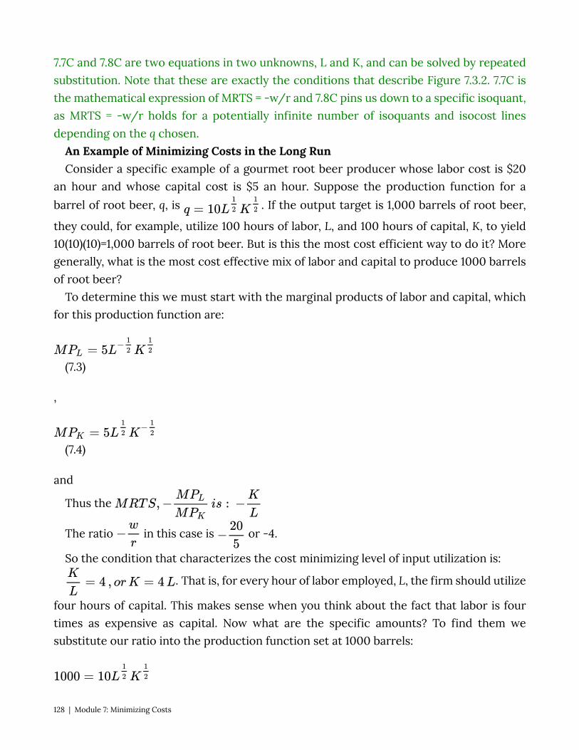
7.7C and 7.8C are two equations in two unknowns, L and K, and can be solved by repeated substitution. Note that these are exactly the conditions that describe Figure 7.3.2. 7.7C is the mathematical expression of MRTS = -w/r and 7.8C pins us down to a specific isoquant, as MRTS = -w/r holds for a potentially infinite number of isoquants and isocost lines depending on the q chosen.
An Example of Minimizing Costs in the Long Run Consider a specific example of a gourmet root beer producer whose labor cost is $20
an hour and whose capital cost is $5 an hour. Suppose the production function for a barrel of root beer, q, is . If the output target is 1,000 barrels of root beer,
they could, for example, utilize 100 hours of labor, L, and 100 hours of capital, K, to yield 10(10)(10)=1,000 barrels of root beer. But is this the most cost efficient way to do it? More generally, what is the most cost effective mix of labor and capital to produce 1000 barrels of root beer?
To determine this we must start with the marginal products of labor and capital, which for this production function are:
(7.3)
,
(7.4)
and
Thus the
The ratio in this case is or -4.
So the condition that characterizes the cost minimizing level of input utilization is:
. That is, for every hour of labor employed, L, the firm should utilize
four hours of capital. This makes sense when you think about the fact that labor is four times as expensive as capital. Now what are the specific amounts? To find them we substitute our ratio into the production function set at 1000 barrels:
128 | Module 7: Minimizing Costs
(7.5)
If K = 4L then , or which equals 50. If L = 50, then K =
200. So using 50 hours of labor and 200 hours of capital is the most cost effective way to produce 1000 barrels of root beer for this firm.
CALCULUS SUPPLEMENT
1. For the following questions the , w = $30 an hour, r = $15 an hour and
the production target q = 1200:
a. Find the Marginal Product of Labor. b. Find the Marginal Product of Capital. c. Find the MRTS. d. Find the optimal amount of labor and capital inputs.
2. For and w and r, solve for the input demand functions using the
Lagrangian method.
7.4 When Input Costs and Output Change LO: Analyze the effect of changes in prices or output on total cost. In the previous section we determined the cost minimizing combination of labor and
capital to produce 1,000 barrels of root beer. As long as the prices of labor and capital remain constant, this producer will continue to make the same choice for every 1,000 barrels of root beer produced. But what happens when input prices change?
Suppose, for example, an increasing demand for the capital equipment used to make root beer drives the rental price up to $10 an hour. This means capital is more expensive than before not only in absolute terms but in relative terms as well. In other words, the opportunity cost of capital has increased. Before the price increase, for every extra hour of capital utilized, the root beer firm had to give up ¼ of an hour of labor. After the rental rate increase the opportunity cost has increased to ½ an hour of labor. A cost-minimizing firm should therefore adjust by utilizing less of the relatively more expensive input and more of the relatively less expensive input.
In this case, the ratio is now or -2. So the new condition that characterizes
the cost minimizing level of input utilization after the price change is:
, or .
Module 7: Minimizing Costs | 129
The production function for 1000 barrels has not changed:
So, if K = 2L then , or which equals roughly 71. If L = 71,
then K = 2L = 142. As expected the firm now uses more labor than it did prior to the price change and less capital.
We can also calculate and compare the total cost before and after the increase in the rental rate for capital. Total cost is C(q) = wL + rK. So in the first case where w is $20 and r is $5 the total cost is:
C(q) = 20(L) + 5(K) = $20(50) + $5(200) = $1000 + $1000 = $2000 Now, when capital rental rates increase to $10, total cost becomes: C(q) = 20(L) + 10(K) = $20(71) + $10(142) = $1420 + $1420 = $2840 This new higher cost makes sense because the production function did not change
so the firm’s efficiency remained constant, wages remained constant but rental rates increased. So overall the firm saw a cost increase and no change in productivity leading to an increase in production costs.
Expansion Path A firm’s expansion path is a curve that shows the cost-minimizing amount of each input
for every level of output. Let’s look at an example to see how the expansion path is derived. Equation 7.5 describes the production function set to the specific production target
of 1000 barrels of root beer. If we replace 1000 with the any output level q, we get the following expression:
(7.6)
We use the K = 4L ratio of capital to labor that characterizes the cost minimizing ratio when the wage rate for labor is $20 an hour and the rental rate for capital is $5 an hour:
• If .
• If .
So using 50 hours of labor and 200 hours of capital is the most cost effective way to produce 1,000 barrels of root beer for this firm.
Note that and are both functions of output, q. These are
the input demand functions.
130 | Module 7: Minimizing Costs

Input demand functions describe the optimal, or cost-minimizing, amount of a specific production input for every level of output. Note that when the output q = 1,000, L(q) = 50 and K(q) = 200 just as we found before. But from these factor demands we can immediately find the optimal amount of labor and capital for any output target at the given input prices. For example, suppose the factory wanted to increase output to 2000 or 3000 barrels of root beer:
At
At
We can graph this firm’s expansion path (Figure 7.4.1) from the input demands when q equals 1,000, 2,000 and 3,000. We can also immediately derive the long run total cost curve from these factor demands by putting them into the long run cost function,
:
At input prices w = $20 and r = $5, the function becomes
The long-run total cost curve shows us the specific total cost for each output amount when the firm is minimizing input costs.
Graphically, the expansion path and associated long-run total cost curve look like Figure 7.4.1.
Figure 7.4.1: The Expansion Path and Long-Run Cost Curve
Module 7: Minimizing Costs | 131
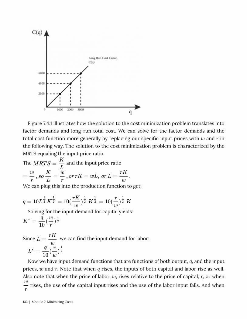
Figure 7.4.1 illustrates how the solution to the cost minimization problem translates into factor demands and long-run total cost. We can solve for the factor demands and the total cost function more generally by replacing our specific input prices with w and r in the following way. The solution to the cost minimization problem is characterized by the MRTS equaling the input price ratio:
The and the input price ratio
We can plug this into the production function to get:
Solving for the input demand for capital yields:
Since we can find the input demand for labor:
Now we have input demand functions that are functions of both output, q, and the input prices, w and r. Note that when q rises, the inputs of both capital and labor rise as well. Also note that when the price of labor, w, rises relative to the price of capital, r, or when
rises, the use of the capital input rises and the use of the labor input falls. And when
132 | Module 7: Minimizing Costs
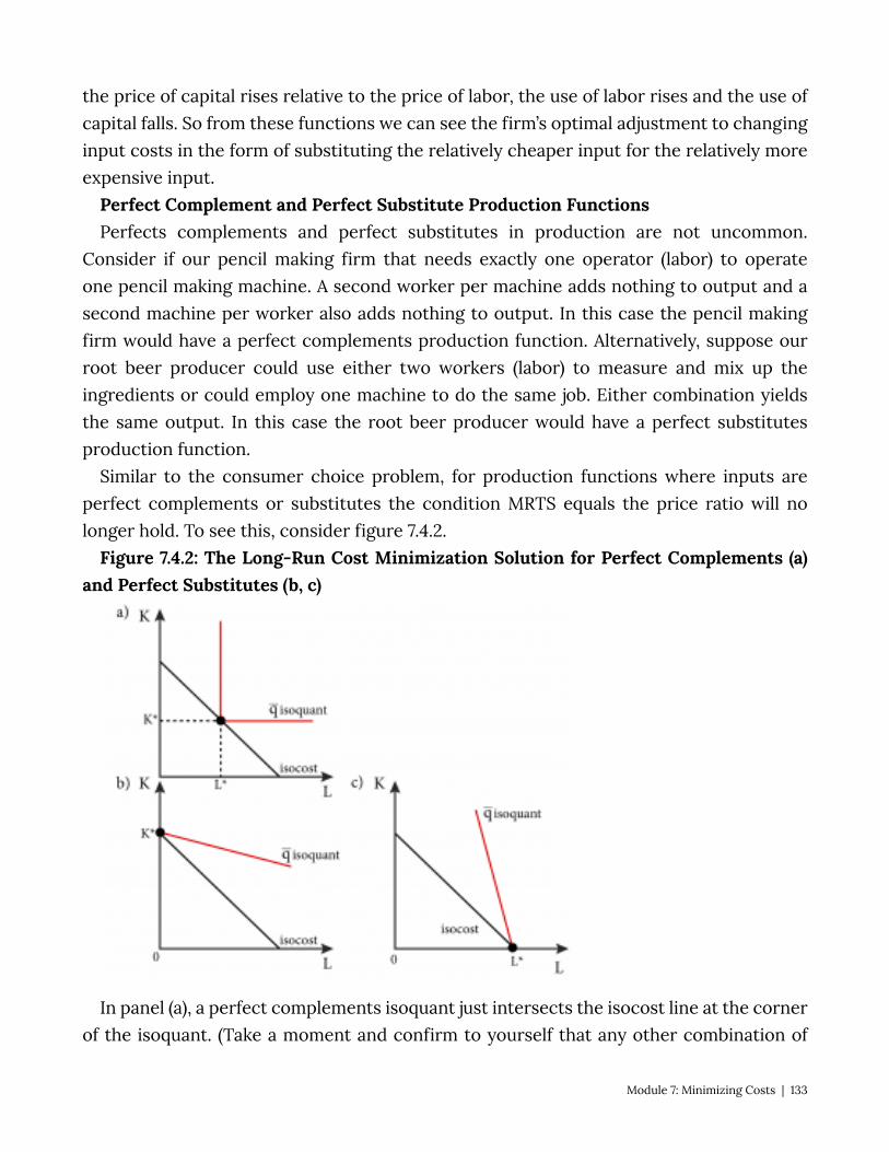
the price of capital rises relative to the price of labor, the use of labor rises and the use of capital falls. So from these functions we can see the firm’s optimal adjustment to changing input costs in the form of substituting the relatively cheaper input for the relatively more expensive input.
Perfect Complement and Perfect Substitute Production Functions Perfects complements and perfect substitutes in production are not uncommon.
Consider if our pencil making firm that needs exactly one operator (labor) to operate one pencil making machine. A second worker per machine adds nothing to output and a second machine per worker also adds nothing to output. In this case the pencil making firm would have a perfect complements production function. Alternatively, suppose our root beer producer could use either two workers (labor) to measure and mix up the ingredients or could employ one machine to do the same job. Either combination yields the same output. In this case the root beer producer would have a perfect substitutes production function.
Similar to the consumer choice problem, for production functions where inputs are perfect complements or substitutes the condition MRTS equals the price ratio will no longer hold. To see this, consider figure 7.4.2.
Figure 7.4.2: The Long-Run Cost Minimization Solution for Perfect Complements (a)and Perfect Substitutes (b, c)
In panel (a), a perfect complements isoquant just intersects the isocost line at the corner of the isoquant. (Take a moment and confirm to yourself that any other combination of
Module 7: Minimizing Costs | 133

labor and capital on the isoquant would be more expensive.) However, at the corner of the isoquant the slope is undefined, so there is no MRTS. For perfect complements, using inputs in any combination other than the optimal ratio is not cost minimizing. So we can immediately express the optimal ratio as a condition of cost. If the production function is of the perfect complement type, , the optimal input ratio is
. And since output is equal to the minimum of the two arguments of the function, that means . So the optimal amount of inputs for any output level q is:
Panels (b) and (c) of Figure 7.4.2 show the optimal solution to the long-run cost minimization problem when the production function is a perfect substitutes type. The solution is on one corner or the other of the isocost line, depending on the marginal productivities of the inputs and their costs. In (b), the MRTS or the slope of the isoqant is lower (less steep) than the slope of the isocost line or the ratio of the input prices. Since this is the case it is much less costly to employ only capital to produce q. In (c), the MRTS or the slope of the isoqant is higher (more steep) than the slope of the isocost line or the ratio of the input prices. Since this is the case it is much less costly to employ only labor to produce q.
Recall that a perfect substitutes production function is of the additive type:
The marginal product of labor is α and the marginal product of capital is β.
Since the MRTS is the ratio of the marginal products, the MRTS is , which is also the
slope of the isoquant.
The ratio of input prices is . This price ratio is the slope of the isocost.
From the graphs we can see that if , or the isoquant is less steep than the
isocost, only capital is used, thus we know that no labor will be employed, or L *= 0 , and
output must equal . Solving this for K gives us: . Alternatively, if
, only labor is used, so .
7.6 Policy Example: Will an Increase in the Minimum Wage Decrease Employment Learning Objective 7.5: Apply the concept of cost minimization to a minimum wage
policy.
134 | Module 7: Minimizing Costs

“Cleaning13” from Nick Youngson from Alpha Stock images is licensed under CC BY-SA
On May 15, 2014 the city of Seattle, Washington passed an ordinance that established a minimum wage of $15 an hour, almost $5 more than the statewide minimum wage and more than double the federal minimum of $7.25 an hour. [http://murray.seattle.gov/minimumwage/#sthash.DOMR7lEp.dpbs]
A minimum wage raises many issues about its impact, particularly for a city surrounded by suburbs that allow much lower rates of pay. One question we can answer with our current tools is how Seattle-based businesses affected by the increased minimum wage are likely to react to the higher cost of labor.
Most businesses that employ labor have many other inputs as well, some of which can be substituted for labor. Consider a janitorial firm that sells floor cleaning services to office buildings, restaurants, and industrial plants. The janitorial firm can choose to clean floors using a small amount of capital and a large amount of labor: they can employ many cleaners and equip them with a simple mop.
Or they could choose to employ more capital in the form of a modern floor-cleaning machine and employ fewer cleaners.
Module 7: Minimizing Costs | 135

Image on commons.wikimedia.org is licensed under CC BY-SA
Our theory of cost minimization can help us understand and predict the consequences
of making the labor input for cleaning the floors 50% more expensive. Figure 7.5.1 shows a typical firm’s long-run cost minimization problem. It is reasonable to consider the long-run in this case because it would not take the firm very long to lease or purchase and have delivered a floor cleaning machine. It is also reasonable to assume that floor cleaning machines and workers are substitutes but not perfect ones – meaning that machines can be used to replace some labor hours, but some machine operators are still needed. The opposite is also true: the restaurant can replace machines with labor but labor needs some capital (a simple mop) to clean a floor.
Figure 7.5.1: Change in Inputs Due to Increase in Wages
136 | Module 7: Minimizing Costs
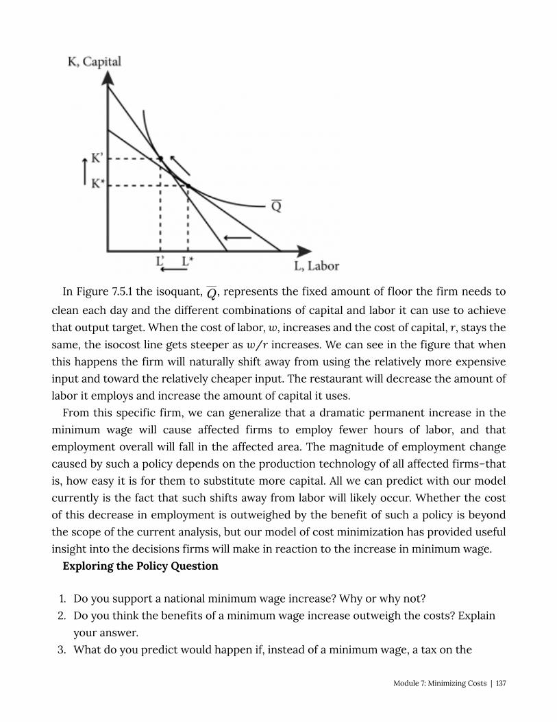
In Figure 7.5.1 the isoquant, , represents the fixed amount of floor the firm needs to clean each day and the different combinations of capital and labor it can use to achieve that output target. When the cost of labor, w, increases and the cost of capital, r, stays the same, the isocost line gets steeper as w/r increases. We can see in the figure that when this happens the firm will naturally shift away from using the relatively more expensive input and toward the relatively cheaper input. The restaurant will decrease the amount of labor it employs and increase the amount of capital it uses.
From this specific firm, we can generalize that a dramatic permanent increase in the minimum wage will cause affected firms to employ fewer hours of labor, and that employment overall will fall in the affected area. The magnitude of employment change caused by such a policy depends on the production technology of all affected firms–that is, how easy it is for them to substitute more capital. All we can predict with our model currently is the fact that such shifts away from labor will likely occur. Whether the cost of this decrease in employment is outweighed by the benefit of such a policy is beyond the scope of the current analysis, but our model of cost minimization has provided useful insight into the decisions firms will make in reaction to the increase in minimum wage.
Exploring the Policy Question
1. Do you support a national minimum wage increase? Why or why not? 2. Do you think the benefits of a minimum wage increase outweigh the costs? Explain
your answer. 3. What do you predict would happen if, instead of a minimum wage, a tax on the
Module 7: Minimizing Costs | 137
purchase or rental of capital equipment was imposed?
SUMMARY
Review: Topics and Related Learning Outcomes
7.1 The Economic Concept of Cost Learning Objective 7.1: Explain fixed and variable costs, opportunity cost, sunk cost
and depreciation. 7.2 Short-Run Cost Minimization
Learning Objective 7.2: Describe the solution to the cost minimization problem in the short-run.
7.3 Long-Run Cost Minimization Learning Objective 7.3: Describe the solution to the cost minimization problem in the
long-run. 7.4 When Input Costs and Output Change
Learning Objective 7.4: Analyze the effect of changes in prices or output on total cost. 7.5 Policy Example: Will an Increase in the Minimum Wage Decrease Employment?
Learning Objective 7.5: Apply the concept of cost minimization to a minimum wage policy.
Learn: Key Terms and Graphs
Terms
Fixed Cost Variable Cost Sunk Cost Depreciation
138 | Module 7: Minimizing Costs
Durable Good Input Demand Function Isocost Line
Graphs
Short-Run Cost Minimization An Isocost Line The Solution to the Long-Run Cost Minimization Problem The Expansion Path and Long-Run Cost Curve The Long-Run Cost Minimization Solution for Perfect Complements and Perfect
Substitutes Change in Inputs Due to Increase in Wages
Equations
Total Cost Marginal Rate of Technical Substitution (MRTS)
Module 7: Minimizing Costs | 139

Module 8: Cost Curves
The Policy Question: Should the Federal Government Promote the Domestic Production of Streetcars?
In recent years, streetcars have enjoyed a bit of a renaissance in the U.S. Streetcars are electric powered public transit that ride on rails embedded into normal city streets and comingle with traffic. Once common in the U.S., and still common in many European cities, streetcars all but disappeared from U.S. streets in the second half of the 20th
century. Portland, Oregon is one city that revived the streetcar and subsequently expanded their system.
After initially buying streetcars form the German company Siemens, Portland’s transit authority and government, pushed by the federal government, which funds a large portion of urban transit projects, decided to contract with a local firm, Oregon Iron Works to produce the streetcars locally. Oregon Iron Works had no experience in manufacturing streetcars, but created a subsidiary firm to do so called United Streetcar. Other U.S. cities that were introducing streetcars, such as Washington D.C. and Tucson, Arizona, contracted with Oregon Iron Works for their cars as well. In the end the firm faced severe delays and cost overruns and eventually got very behind on their scheduled delivery. In addition, the expected boom in streetcars slowed considerably with the recession of 2008 and changing municipal priorities. In 2014 United Streetcar ceased production and laid off its workers.
Source: Laris, Michael, “U.S. effort to help homegrown streetcar manufacturer falls short,” The Washington Post, November 29, 2014. http://www.washingtonpost.com/local/trafficandcommuting/us-effort-to-help-build-homegrown-streetcar-manufacturer-falls-short/2014/11/29/98c649b0-70b9-11e4-ad12-3734c461eab6_story.html
Exploring the Policy Question Is the story of United Streetcar an example of a misguided effort to steer business
domestically? Would it have succeeded if the market for streetcars in the U.S. had not dried up? To answer these questions we need to think about the cost structure of the industry and whether there are aspects of it that would support the decision to start
140 | Module 8: Cost Curves
manufacturing streetcars domestically. Cost curves—the subject of this module—are critical tools in analyzing a company’s cost structure.
8.1 Short-Run Cost Curves Learning Objective 8.1: Derive the seven short-run cost curves from the total cost
function. 8.2 Long-Run Cost Curves Learning Objective 8.2: Derive the three long-run cost curves from the total cost
function. 8.3 Short-Run Versus Long-Run Costs: The Advantage of Flexibility Learning Objective 8.3: Explain why long-run costs are always as low or lower than
short-run costs and how more flexibility in choosing inputs is always better than less. 8.4 Multiproduct Firms, Learning Curves, and Learning-by-Doing Learning Objective 8.4: Explain how making more than one product, learning over
time and learning by producing can lower costs. 8.5 Policy Example: Should the Federal Government Promote Domestic Production
of Streetcars? Learning Objective 8.5: Use a cost analysis to explain why building streetcars
domestically in the U.S. is or is not a good policy.
8.1 Short-Run Cost Curves LO 8.1: Derive the seven short-run cost curves from the total cost function.
A cost curve represents the relationship between output and the different cost measures involved in producing the output. Cost curves are visual descriptions of the various costs of production. In order to maximize profits firms need to know how costs vary with output, so cost curves are vital to the profit maximization decisions of firms.
There are two categories of cost curves: short-run and long-run. In this section we focus on short-run cost curves.
The Seven Short-Run Cost Measures The short-run, as we learned in the previous module, is a time period short enough that
some inputs are fixed while others are variable. There are seven cost curves in the short-run: fixed cost, variable cost, total cost, average fixed cost average variable cost, average total cost and marginal cost.
The fixed cost (FC) of production is the cost of production that does not vary with output level. The fixed cost is the cost of the fixed inputs in production, such as the cost of a machine (capital) that costs the same to operate no matter how much production is happening. An example of such a machine is a conveyor belt in a factory that moves a
Module 8: Cost Curves | 141
streetcar chassis through various stages of an assembly line. The belt is either on or off, but the cost of running it does not change depending on how many streetcars it carries at any point in time.
Note that the fixed cost of a piece of capital equipment that the company owns includes the opportunity cost as well. In our example, the fixed cost includes the actual costs of running the conveyer belt, such as power and maintenance, as well as the opportunity cost of using it for the firm’s own production rather than renting it out to another company.
The variable cost (VC) of production is the cost of production that varies with output level. This is the cost of the variable inputs in production, for example the cost of the workers that assemble the electronic devices along a conveyor belt. The number of workers might depend on how many devices the factory is trying to produce in a day. If its production target increases, it uses more labor. Thus the hourly wages it pays for these workers are a variable cost. Variable cost generally increases with the amount of output produced.
Like fixed cost of production, there is an opportunity cost associated with variable cost of production. In this case, the next best alternative use of these workers is to go to another firm that will employ them. Thus the market wage for workers represents their opportunity cost, and as such, the wage cost of employing them is equivalent to their opportunity cost.
The total cost (C) of production is the sum of fixed and variable costs of production: C = FC + VC. There are three short-run average cost measures: the average variable cost, average
fixed cost and average total cost. Average variable cost (AVC) is the variable cost per unit of output. Mathematically, it is
simply the variable cost divided by the output: AVC = VC/Q Note that since variable cost generally increases with the amount of output produced,
the average variable cost can increase or decrease as output increases. Average fixed cost (AFC) is the fixed cost per unit of output. Mathematically, it is simply
the fixed cost divided by the output: AFC = FC/Q Because fixed cost does not change with the amount of output produced, the average
fixed cost always decreases as output increases. Average total cost (AC), or simply average cost, of production is total cost per unit of
output. This is the same as the sum of the average fixed cost and the average variable cost:
142 | Module 8: Cost Curves
AC = AC/Q = AFC + AVC Because it is the sum of the average fixed cost, which is always declining with output,
and the average variable cost, which may increase or decrease with output, the average total cost may increase or decrease with output.
Marginal cost (MC) is the additional cost incurred from the production of one more unit of output. Thus marginal cost is:
The only part of total cost that increases with an additional unit of output is the variable cost, so we can re-write the marginal cost as:
CALCULUS APPENDIX: The marginal cost is the rate of change of the total cost as output increases, or the slope
of the total cost function, C(Q). To find this we need to simply take the derivative of the total cost function:
Since we can rewrite this derivative as:
FC is a constant so . Thus
Since fixed cost does not change as output increases, marginal cost depends only on the variable cost.
Fixed Cost, Variable Cost, and Total Cost Curves Table 8.1.1 summarizes a firm’s daily short-run costs. The firm has a fixed cost of $50 per
day of production. This cost is incurred whether the firm produces or not, as we can see by the fact that $50 is still a cost when output is zero. The firm’s fixed cost of $50 does not change with the amount of output produced. The data in the first two columns of Table 8.1.1 allow us to draw the firm’s fixed cost curve. It is a horizontal line at $50, as shown in Figure 8.1.1.
Table 8.1.1: An Example of the Seven Short-Run Cost Measures
Module 8: Cost Curves | 143

Output Fixed Cost
Variable Cost
Total Cost
Marginal Cost
Average Fixed Cost
Average Variable
Cost Average
Cost
Q FC VC C MC AFC AVC AC
0 50 0 50 – – – –
1 50 40 90 40 50.0 40.0 90.0
2 50 70 120 30 25.0 35.0 60.0
3 50 90 140 20 16.7 30.0 46.7
4 50 100 150 10 12.5 25.0 37.5
5 50 120 170 20 10.0 24.0 34.0
6 50 150 200 30 8.3 25.0 33.3
7 50 190 240 40 7.1 27.1 34.3
8 50 240 290 50 6.3 30.0 36.3
9 50 300 350 60 5.6 33.3 38.9
10 50 370 420 70 5.0 37.0 42.0
Figure 8.1.1: Three short-run cost curves – fixed, variable and total costs.
Figure 8.1.1 also shows variable and total cost curves plotted from data in Table 8.1.1. The
144 | Module 8: Cost Curves
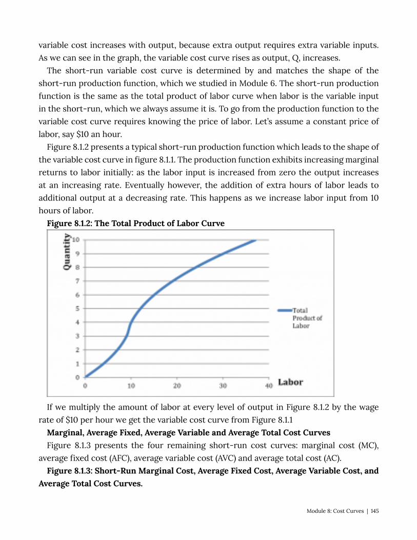
variable cost increases with output, because extra output requires extra variable inputs. As we can see in the graph, the variable cost curve rises as output, Q, increases.
The short-run variable cost curve is determined by and matches the shape of the short-run production function, which we studied in Module 6. The short-run production function is the same as the total product of labor curve when labor is the variable input in the short-run, which we always assume it is. To go from the production function to the variable cost curve requires knowing the price of labor. Let’s assume a constant price of labor, say $10 an hour.
Figure 8.1.2 presents a typical short-run production function which leads to the shape of the variable cost curve in figure 8.1.1. The production function exhibits increasing marginal returns to labor initially: as the labor input is increased from zero the output increases at an increasing rate. Eventually however, the addition of extra hours of labor leads to additional output at a decreasing rate. This happens as we increase labor input from 10 hours of labor.
Figure 8.1.2: The Total Product of Labor Curve
If we multiply the amount of labor at every level of output in Figure 8.1.2 by the wage rate of $10 per hour we get the variable cost curve from Figure 8.1.1
Marginal, Average Fixed, Average Variable and Average Total Cost Curves Figure 8.1.3 presents the four remaining short-run cost curves: marginal cost (MC),
average fixed cost (AFC), average variable cost (AVC) and average total cost (AC). Figure 8.1.3: Short-Run Marginal Cost, Average Fixed Cost, Average Variable Cost, and
Average Total Cost Curves.
Module 8: Cost Curves | 145
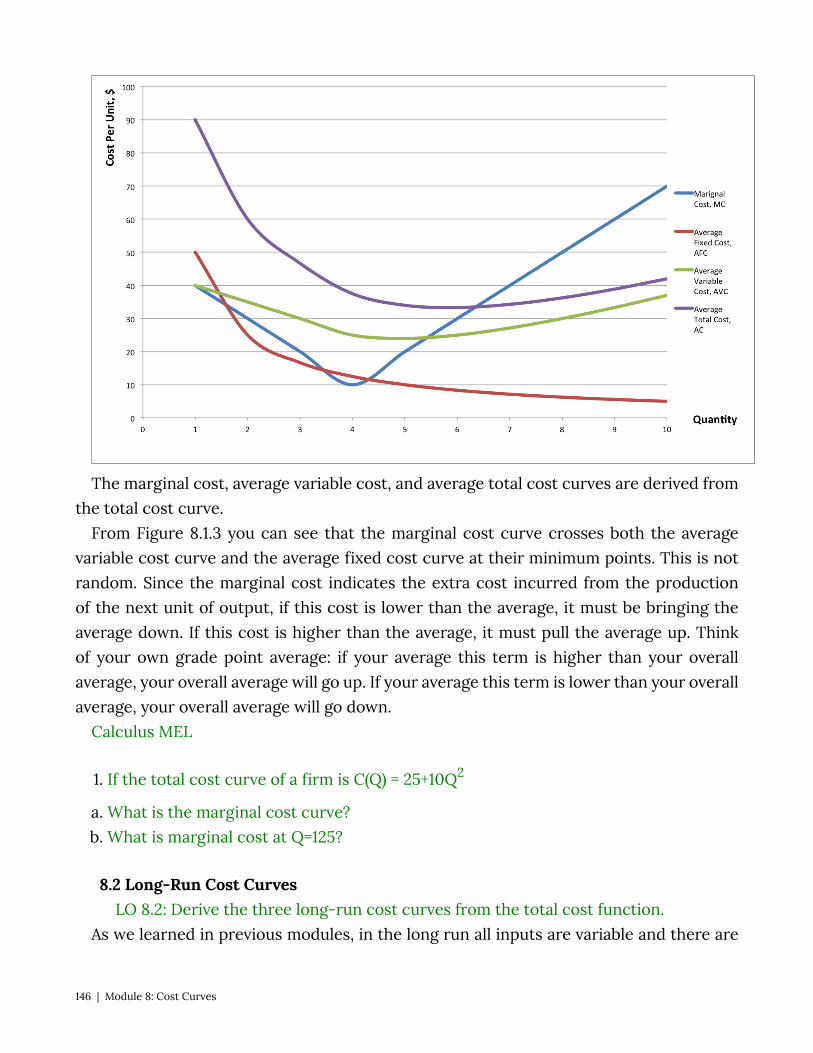
The marginal cost, average variable cost, and average total cost curves are derived from the total cost curve.
From Figure 8.1.3 you can see that the marginal cost curve crosses both the average variable cost curve and the average fixed cost curve at their minimum points. This is not random. Since the marginal cost indicates the extra cost incurred from the production of the next unit of output, if this cost is lower than the average, it must be bringing the average down. If this cost is higher than the average, it must pull the average up. Think of your own grade point average: if your average this term is higher than your overall average, your overall average will go up. If your average this term is lower than your overall average, your overall average will go down.
Calculus MEL
1. If the total cost curve of a firm is C(Q) = 25+10Q2
a. What is the marginal cost curve? b. What is marginal cost at Q=125?
8.2 Long-Run Cost Curves LO 8.2: Derive the three long-run cost curves from the total cost function.
As we learned in previous modules, in the long run all inputs are variable and there are
146 | Module 8: Cost Curves
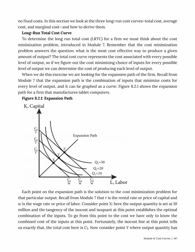
no fixed costs. In this section we look at the three long-run cost curves–total cost, average cost, and marginal cost—and how to derive them.
Long-Run Total Cost Curve To determine the long run total cost (LRTC) for a firm we must think about the cost
minimization problem, introduced in Module 7. Remember that the cost minimization problem answers the question: what is the most cost effective way to produce a given amount of output? The total cost curve represents the cost associated with every possible level of output, so if we figure out the cost minimizing choice of inputs for every possible level of output we can determine the cost of producing each level of output.
When we do this exercise we are looking for the expansion path of the firm. Recall from Module 7 that the expansion path is the combination of inputs that minimize costs for every level of output, and it can be graphed as a curve. Figure 8.2.1 shows the expansion path for a firm that manufactures tablet computers.
Figure 8.2.1: Expansion Path
Each point on the expansion path is the solution to the cost minimization problem for that particular output. Recall from Module 7 that r is the rental rate or price of capital and w is the wage rate or price of labor. Consider point X: here the output quantity is set at 10 million and the tangency of the isocost and isoquant at this point establishes the optimal combination of the inputs. To go from this point to the cost we have only to know the combined cost of the inputs at this point. Fortunately, the isocost line at this point tells us exactly that, the total cost here is C1. Now consider point Y where output quantity has
Module 8: Cost Curves | 147
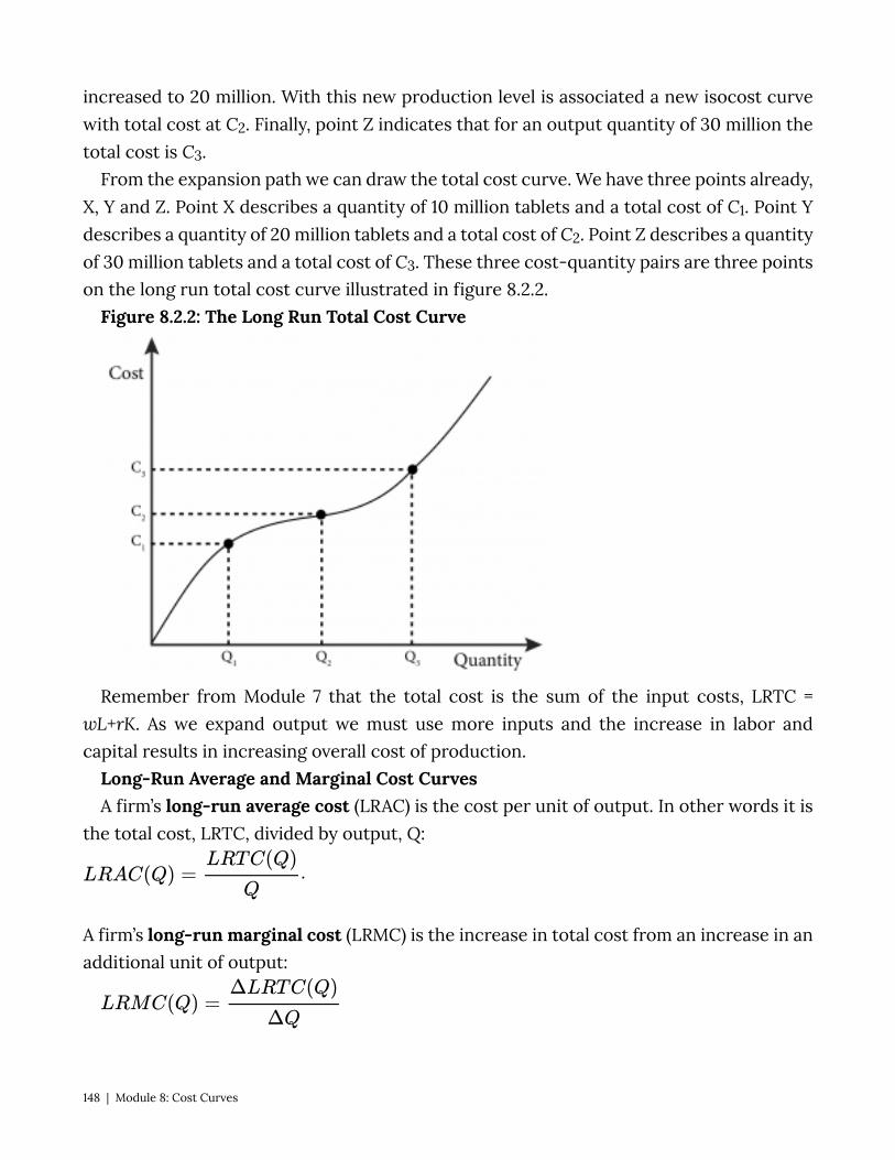
increased to 20 million. With this new production level is associated a new isocost curve with total cost at C2. Finally, point Z indicates that for an output quantity of 30 million the total cost is C3.
From the expansion path we can draw the total cost curve. We have three points already, X, Y and Z. Point X describes a quantity of 10 million tablets and a total cost of C1. Point Y describes a quantity of 20 million tablets and a total cost of C2. Point Z describes a quantity of 30 million tablets and a total cost of C3. These three cost-quantity pairs are three points on the long run total cost curve illustrated in figure 8.2.2.
Figure 8.2.2: The Long Run Total Cost Curve
Remember from Module 7 that the total cost is the sum of the input costs, LRTC = wL+rK. As we expand output we must use more inputs and the increase in labor and capital results in increasing overall cost of production.
Long-Run Average and Marginal Cost Curves A firm’s long-run average cost (LRAC) is the cost per unit of output. In other words it is
the total cost, LRTC, divided by output, Q:
.
A firm’s long-run marginal cost (LRMC) is the increase in total cost from an increase in an additional unit of output:
148 | Module 8: Cost Curves
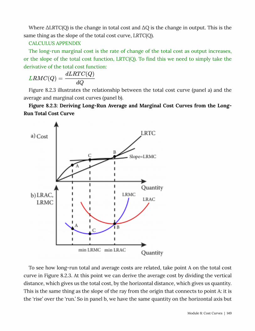
Where ∆LRTC(Q) is the change in total cost and ∆Q is the change in output. This is the same thing as the slope of the total cost curve, LRTC(Q).
CALCULUS APPENDIX The long-run marginal cost is the rate of change of the total cost as output increases,
or the slope of the total cost function, LRTC(Q). To find this we need to simply take the derivative of the total cost function:
Figure 8.2.3 illustrates the relationship between the total cost curve (panel a) and the average and marginal cost curves (panel b).
Figure 8.2.3: Deriving Long-Run Average and Marginal Cost Curves from the Long-Run Total Cost Curve
To see how long-run total and average costs are related, take point A on the total cost curve in Figure 8.2.3. At this point we can derive the average cost by dividing the vertical distance, which gives us the total cost, by the horizontal distance, which gives us quantity. This is the same thing as the slope of the ray from the origin that connects to point A: it is the ‘rise’ over the ‘run.’ So in panel b, we have the same quantity on the horizontal axis but
Module 8: Cost Curves | 149
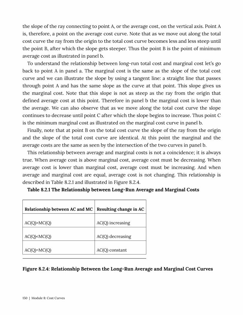
the slope of the ray connecting to point A, or the average cost, on the vertical axis. Point A is, therefore, a point on the average cost curve. Note that as we move out along the total cost curve the ray from the origin to the total cost curve becomes less and less steep until the point B, after which the slope gets steeper. Thus the point B is the point of minimum average cost as illustrated in panel b.
To understand the relationship between long-run total cost and marginal cost let’s go back to point A in panel a. The marginal cost is the same as the slope of the total cost curve and we can illustrate the slope by using a tangent line: a straight line that passes through point A and has the same slope as the curve at that point. This slope gives us the marginal cost. Note that this slope is not as steep as the ray from the origin that defined average cost at this point. Therefore in panel b the marginal cost is lower than the average. We can also observe that as we move along the total cost curve the slope continues to decrease until point C after which the slope begins to increase. Thus point C is the minimum marginal cost as illustrated on the marginal cost curve in panel b.
Finally, note that at point B on the total cost curve the slope of the ray from the origin and the slope of the total cost curve are identical. At this point the marginal and the average costs are the same as seen by the intersection of the two curves in panel b.
This relationship between average and marginal costs is not a coincidence; it is always true. When average cost is above marginal cost, average cost must be decreasing. When average cost is lower than marginal cost, average cost must be increasing. And when average and marginal cost are equal, average cost is not changing. This relationship is described in Table 8.2.1 and illustrated in Figure 8.2.4.
Table 8.2.1 The Relationship between Long-Run Average and Marginal Costs
Relationship between AC and MC Resulting change in AC
AC(Q)>MC(Q) AC(Q) increasing
AC(Q)<MC(Q) AC(Q) decreasing
AC(Q)=MC(Q) AC(Q) constant
Figure 8.2.4: Relationship Between the Long-Run Average and Marginal Cost Curves
150 | Module 8: Cost Curves
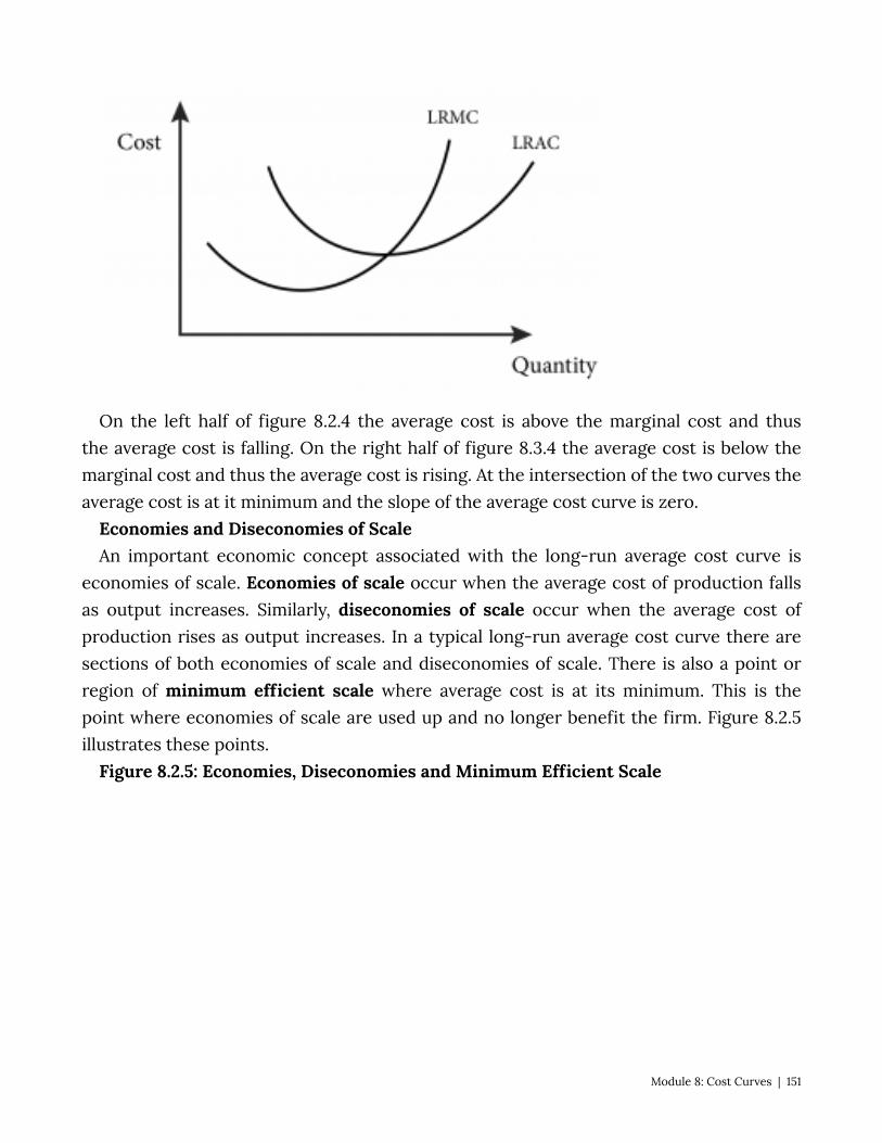
On the left half of figure 8.2.4 the average cost is above the marginal cost and thus the average cost is falling. On the right half of figure 8.3.4 the average cost is below the marginal cost and thus the average cost is rising. At the intersection of the two curves the average cost is at it minimum and the slope of the average cost curve is zero.
Economies and Diseconomies of Scale An important economic concept associated with the long-run average cost curve is
economies of scale. Economies of scale occur when the average cost of production falls as output increases. Similarly, diseconomies of scale occur when the average cost of production rises as output increases. In a typical long-run average cost curve there are sections of both economies of scale and diseconomies of scale. There is also a point or region of minimum efficient scale where average cost is at its minimum. This is the point where economies of scale are used up and no longer benefit the firm. Figure 8.2.5 illustrates these points.
Figure 8.2.5: Economies, Diseconomies and Minimum Efficient Scale
Module 8: Cost Curves | 151
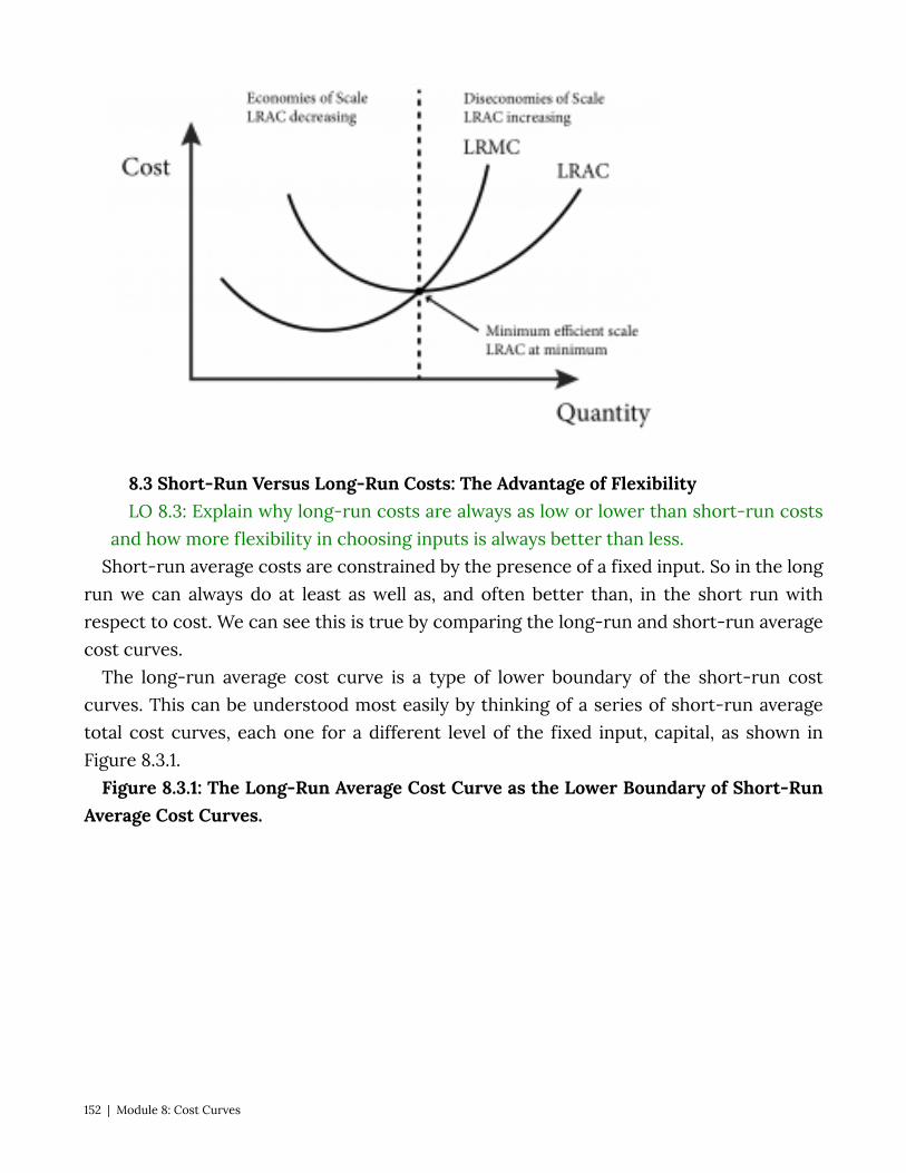
8.3 Short-Run Versus Long-Run Costs: The Advantage of Flexibility LO 8.3: Explain why long-run costs are always as low or lower than short-run costs
and how more flexibility in choosing inputs is always better than less. Short-run average costs are constrained by the presence of a fixed input. So in the long
run we can always do at least as well as, and often better than, in the short run with respect to cost. We can see this is true by comparing the long-run and short-run average cost curves.
The long-run average cost curve is a type of lower boundary of the short-run cost curves. This can be understood most easily by thinking of a series of short-run average total cost curves, each one for a different level of the fixed input, capital, as shown in Figure 8.3.1.
Figure 8.3.1: The Long-Run Average Cost Curve as the Lower Boundary of Short-Run Average Cost Curves.
152 | Module 8: Cost Curves
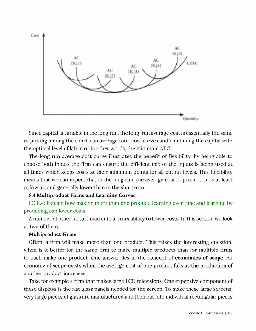
Since capital is variable in the long run, the long-run average cost is essentially the same as picking among the short-run average total cost curves and combining the capital with the optimal level of labor, or in other words, the minimum ATC.
The long run average cost curve illustrates the benefit of flexibility: by being able to choose both inputs the firm can ensure the efficient mix of the inputs is being used at all times which keeps costs at their minimum points for all output levels. This flexibility means that we can expect that in the long run, the average cost of production is at least as low as, and generally lower than in the short-run.
8.4 Multiproduct Firms and Learning Curves LO 8.4: Explain how making more than one product, learning over time and learning by
producing can lower costs. A number of other factors matter in a firm’s ability to lower costs. In this section we look
at two of them. Multiproduct Firms Often, a firm will make more than one product. This raises the interesting question,
when is it better for the same firm to make multiple products than for multiple firms to each make one product. One answer lies in the concept of economies of scope: An economy of scope exists when the average cost of one product falls as the production of another product increases.
Take for example a firm that makes large LCD televisions. One expensive component of these displays is the flat glass panels needed for the screen. To make these large screens, very large pieces of glass are manufactured and then cut into individual rectangular pieces
Module 8: Cost Curves | 153

for the televisions. Often there are smaller glass pieces left over. Rather than discard these pieces, the same company can make smaller LCD displays for computers, cars, appliances and so on. Since a lot of the other materials, technical know-how, skilled labor and the like can be shared across the two types of products, the average cost of both declines when the production of smaller LCD displays for computers is increased.
More formally, we can think of a multiproduct firm as having a cost function that depends on the output of two goods: Q1 and Q2. Such a cost function can be expressed as C(Q1, Q2). We say the economies of scope are present if:
C(Q1, Q2) < C(Q1, 0) + C(0, Q2) This equation makes intuitive sense. The left hand side of the inequality is the cost of
a single firm that produced positive quantities of both goods. The right hand side is the total cost of producing only Q1 added to the total cost of producing only Q2. If it is cheaper to produce the two together then the inequality holds.
Learning Curves Sometimes firms get better at making things over time, as they gain experience.
Economists call this learning-by-doing Learning by doing means that as the cumulative output–the total output ever produced–of the firm increases the average cost falls.
Learning by doing can take different forms:
• Over time workers become more efficient at specific tasks they perform repeatedly. • Managers can observe production and adjust task assignments and other aspects of
the production process. • Engineers can optimize product and plant design to increase efficiency. • Firms can get better at handling inputs, materials and inventories.
These and other instances of learning by doing often lower firms’ average costs and make them more efficient over time.
The idea of learning by doing can be graphed as a learning curve (Figure 8.4.1) where average cost is plotted as a function of either time or cumulative output. The learning curve is different from the typical average cost curve, which represents the total cost divided by current output.
Figure 8.4.1: The Learning Curve
154 | Module 8: Cost Curves
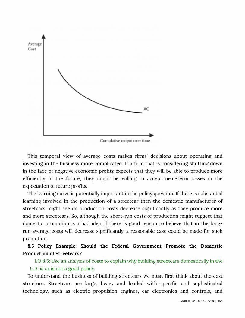
This temporal view of average costs makes firms’ decisions about operating and investing in the business more complicated. If a firm that is considering shutting down in the face of negative economic profits expects that they will be able to produce more efficiently in the future, they might be willing to accept near-term losses in the expectation of future profits.
The learning curve is potentially important in the policy question. If there is substantial learning involved in the production of a streetcar then the domestic manufacturer of streetcars might see its production costs decrease significantly as they produce more and more streetcars. So, although the short-run costs of production might suggest that domestic promotion is a bad idea, if there is good reason to believe that in the long-run average costs will decrease significantly, a reasonable case could be made for such promotion.
8.5 Policy Example: Should the Federal Government Promote the Domestic Production of Streetcars?
LO 8.5: Use an analysis of costs to explain why building streetcars domestically in the U.S. is or is not a good policy.
To understand the business of building streetcars we must first think about the cost structure. Streetcars are large, heavy and loaded with specific and sophisticated technology, such as electric propulsion engines, car electronics and controls, and
Module 8: Cost Curves | 155
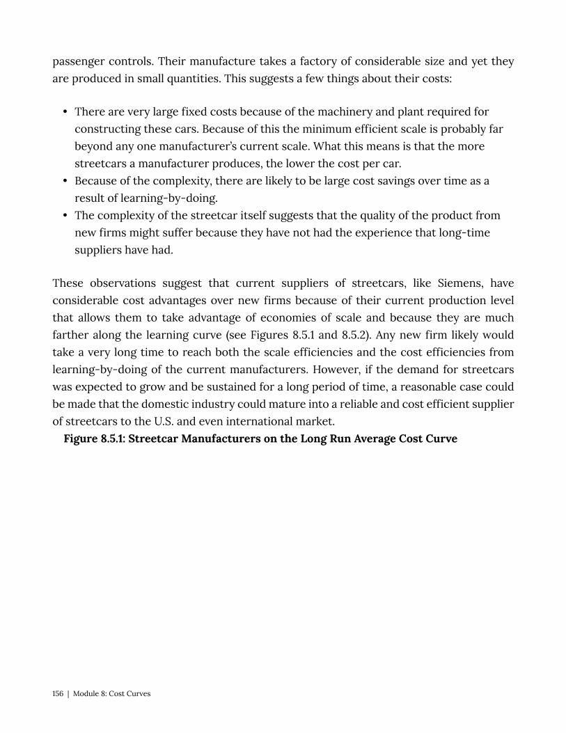
passenger controls. Their manufacture takes a factory of considerable size and yet they are produced in small quantities. This suggests a few things about their costs:
• There are very large fixed costs because of the machinery and plant required for constructing these cars. Because of this the minimum efficient scale is probably far beyond any one manufacturer’s current scale. What this means is that the more streetcars a manufacturer produces, the lower the cost per car.
• Because of the complexity, there are likely to be large cost savings over time as a result of learning-by-doing.
• The complexity of the streetcar itself suggests that the quality of the product from new firms might suffer because they have not had the experience that long-time suppliers have had.
These observations suggest that current suppliers of streetcars, like Siemens, have considerable cost advantages over new firms because of their current production level that allows them to take advantage of economies of scale and because they are much farther along the learning curve (see Figures 8.5.1 and 8.5.2). Any new firm likely would take a very long time to reach both the scale efficiencies and the cost efficiencies from learning-by-doing of the current manufacturers. However, if the demand for streetcars was expected to grow and be sustained for a long period of time, a reasonable case could be made that the domestic industry could mature into a reliable and cost efficient supplier of streetcars to the U.S. and even international market.
Figure 8.5.1: Streetcar Manufacturers on the Long Run Average Cost Curve
156 | Module 8: Cost Curves
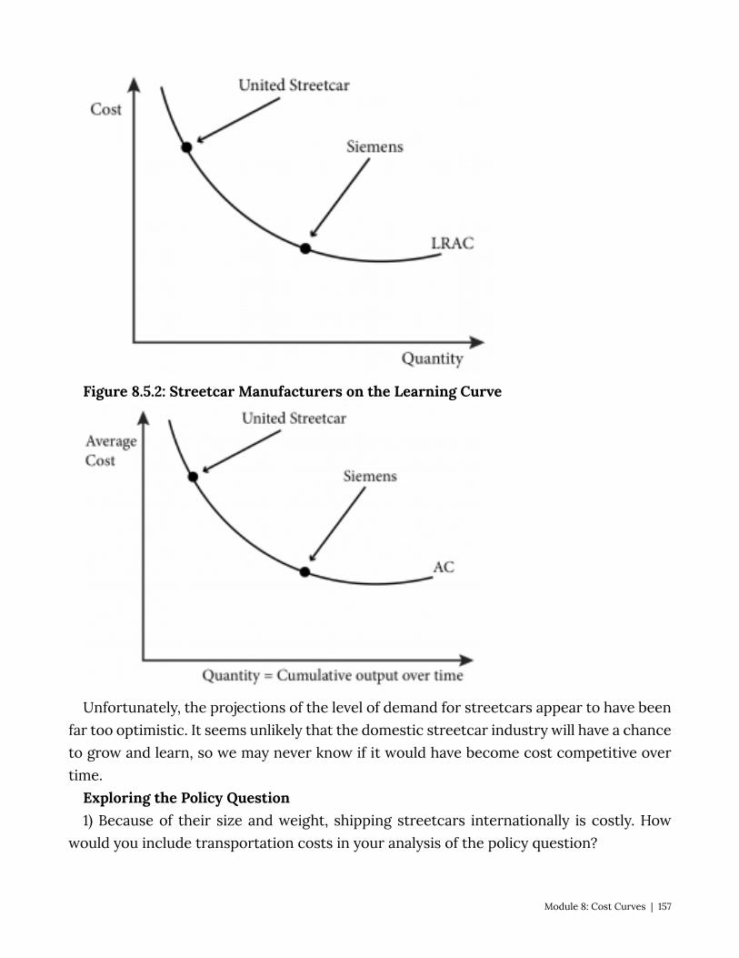
Figure 8.5.2: Streetcar Manufacturers on the Learning Curve
Unfortunately, the projections of the level of demand for streetcars appear to have been far too optimistic. It seems unlikely that the domestic streetcar industry will have a chance to grow and learn, so we may never know if it would have become cost competitive over time.
Exploring the Policy Question 1) Because of their size and weight, shipping streetcars internationally is costly. How
would you include transportation costs in your analysis of the policy question?
Module 8: Cost Curves | 157

2) If the market had not dried up, do you think United Streetcar would have succeeded in the long-run? Why or why not? Use economic reasoning in your answer.
SUMMARY
Review: Topics and Related Learning Outcomes
8.1 Short-Run Cost Curves Learning Objective 8.1: Derive the seven short-run cost curves from the total cost
function. 8.2 Long-Run Cost Curves
Learning Objective 8.2: Derive the three long-run cost curves from the total cost function.
8.3 Short-Run Versus Long-Run Costs: The Advantage of Flexibility Learning Objective 8.3: Explain why long-run costs are always as low or lower than
short-run costs and how more flexibility in choosing inputs is always better than less. 8.4 Multiproduct Firms, Learning Curves, and Learning-by-Doing
Learning Objective 8.4: Explain how making more than one product, learning over time and learning by producing can lower costs.
8.5 Policy Example: Should the Federal Government Promote Domestic Production of Streetcars?
Learning Objective 8.5: Use an analysis of costs to explain why building streetcars domestically in the U.S. is or is not a good policy.
158 | Module 8: Cost Curves

Learn: Key Terms and Graphs
Terms
Fixed Cost Variable Cost Total Cost Average Fixed Cost Average Variable Cost Average Total Cost Marginal Cost Long-Run Total Cost Long-Run Average Cost Long-Run Marginal Cost Expansion Path Economies of Scale Diseconomies of Scale Minimum Efficient Scale Economies of Scope Learning-by-doing Learning Curve
Graphs
Three short-run cost curves – fixed, variable and total costs The Total Product of Labor Curve Marginal Cost, Average Fixed Cost, Average Variable Cost, and Average Total Cost Expansion Path The Long Run Total Cost Curve Deriving Long-Run Average and Marginal Costs Curves from the Long-Run Total Cost
Curve Relationship Between the Long-Run Average and Marginal Cost Curves
Module 8: Cost Curves | 159
The Long-Run Average Cost Curve as the Lower Boundary of Short-Run Average Cost Curves
The Learning Curve
Equations
Fixed Cost Variable Cost Total Cost Average Fixed Cost Average Variable Cost Average Total Cost Marginal Cost Long-Run Total Cost Long-Run Average Cost Long-Run Marginal Cost
160 | Module 8: Cost Curves
Module 9: Profit Maximization and Supply
The Policy Question: Will a Carbon Tax Harm the Economy? Carbon emissions into the atmosphere have been identified as the key component
in global warming due to human activity. We know from earlier modules that the cost of consumption influences human choices. Therefore a very popular policy proposal to address global warming is to impose a tax on carbon at the source. For example, the state of California and the Canadian province of British Columbia began imposing a carbon tax in 2015 and 2008, respectively. Carbon taxes generally increase the price of fossil fuels, which have a large carbon component. The result is an increase in energy prices for all users. Critics of these policies suggest that carbon taxes would have an adverse impact on the economy greater than any potential benefit.
To analyze the impact on the economy, we must start with the individual actors upon which the economy depends: the firms themselves. This module examines how firms make decisions about how much to produce and how their profits are determined. Once we have developed a general model, we can use it to analyze the impact of a carbon tax on individual firms, understand the firm-level implications of the tax, and know the right questions to ask when trying to determine the cost and benefits of a carbon tax.
In this module we will study the supply side of markets: how firms’ cost conditions define and affect their supply curves and the market supply curve. By summing up all producers’ supply curves within a given industry, we can construct a market supply curve just as we constructed the market demand curve from individual demand curves. When we have both market demand and market supply we will be able to study market equilibrium in Section 3.
Exploring the Policy Question How does a tax on carbon affect individual firms’ output and profits? 9.1 Output Decisions for Price–Taking Firms Learning Objective 9.1: Explain how competitive, price-taking firms decide on output
levels. 9.2 Short-Run Supply Learning Objective 9.2: Describe how competitive firms make decisions on short-run
output and whether to shut down if they experience negative profit.
Module 9: Profit Maximization and Supply | 161

9.3 Long-Run Supply and Market Equilibrium Learning Objective 9.3: Describe competitive firms’ long-run supply curves and how
firm entry and exit affects the long-run market equilibrium. 9.4 Heterogeneous Firms and Constant, Increasing and Decreasing Cost Industries Learning Objective 9.4: Demonstrate how increasing and decreasing cost industries
affect the long run market supply curve. 9.5 Policy Example: Carbon Tax Learning Objective 9.5: Predict the effect of a carbon tax on the supply and profit
maximization decisions of firms on which it is imposed. 9.1 Output Decisions for Price Taking Firms LO 9.1: Explain how competitive, price-taking firms decide on output levels. Before considering the production decisions of firms, we need to understand a few
foundation ideas. First, we are focusing on the behavior of price-taking firms. A firm is said to be a price taker when it has no ability to influence the price the market will pay for its product; it must take the market price as determined by the laws of supply and demand in a competitive market. A perfectly competitive market is a market in which there are many firms so that each individual firm’s output has no impact on market equilibrium, output is identical across firms, firms have the same access to inputs and technology and consumers have perfect information about prices. All firms in a perfectly competitive market are price takers.
Second, we are focusing on firms that are motivated by profit. Many publicly- and privately-owned firms have one main objective: to maximize profits. Not-for-profit firms seek to maximize some other objective, like providing a social service such as mental health care to the greatest number of people in need, but these are a tiny fraction of all firms in the world. In this module we will assume that firms’ objectives are to maximize profits.
A firm’s profit (π) is the difference between its total revenue and its total cost: (9.1)
The total revenue is the quantity of the goods produced multiplied by the sales price of those goods.
The total cost is the total cost curve C(Q) introduced in Module 7 and represents the
162 | Module 9: Profit Maximization and Supply
economic cost. The economic cost is the cost inclusive of all opportunity costs, so it includes both explicit costs and implicit costs. This is distinct from the accounting cost which includes only the explicit costs, or those you would see in an accounting spreadsheet of the firm’s costs. So equation (9.1) is an expression of the economic profits of the firm, which consider economic costs. In economics, we focus exclusively on economic profits, because this is the relevant measure when it comes to decision-making.
To understand the difference between accounting cost and economic cost, imagine deciding whether to open up and run a small business making and selling soap infused with organic botanicals. Suppose you figure that your business will achieve annual sales of $230,000 and your out-of-pocket costs for the ingredients, equipment rental, property rental, etc., is $155,000 annually. Your accounting profits after a year would be $230,000-$155,000= $75,000, a pretty decent return.
But should you go ahead and start the business? To answer that you need to think about your opportunity cost. What would you do instead if you decided not to start your own business? Imagine that your friend has offered to hire you to work in her firm and she will pay you an annual salary of $90,000. Imagine also that you think you would be equally satisfied working with your friend as running your own business. With this in mind, your annual economic costs of running your business is $155,000 + $90,000 = $245,000. So your annual economic profit would be $230,000 – $245,000 = -$15,000. The answer is now clear–your best decision is to not run a business making soap but to work with your friend.
Let’s now turn to the output choice of a profit maximizing, price-taking firm. The objective of maximizing profit means that firms must choose the output level that maximizes the difference between total revenue and total profit. To determine this specific level of output the firm must ask how the production of one more unit of output contributes to both the total revenue and the total cost. For example, if a car manufacturer can produce one more car at a marginal cost of $15,500 and sell that car for a marginal revenue of $17,000, it knows that by producing the extra car its profits will increase by $1,500. Note that this is not the same as knowing that profits are positive because the calculation does not include fixed costs. Similarly if the additional car has a marginal cost of $18,000 to produce and can be sold for $17,000 then the manufacture and sale of this car would reduce profits by $1,000.
The term marginal revenue (MR), used in our example above, refers to the change in total revenue from a one-unit change in quantity produced. Marginal revenue is expressed
For a price-taking firm this increase in revenue from the sale of an additional unit is exactly the price of that unit. In other words, for a price-taking firm MR=P.
Module 9: Profit Maximization and Supply | 163
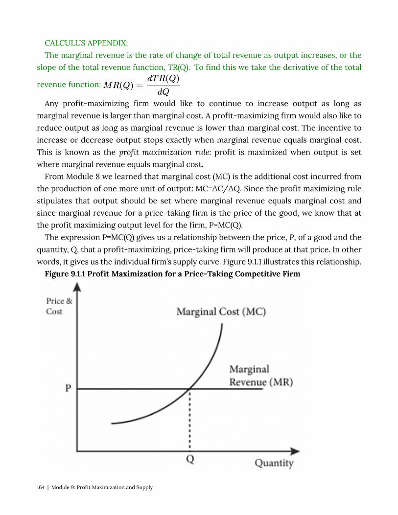
CALCULUS APPENDIX: The marginal revenue is the rate of change of total revenue as output increases, or the
slope of the total revenue function, TR(Q). To find this we take the derivative of the total
revenue function:
Any profit-maximizing firm would like to continue to increase output as long as marginal revenue is larger than marginal cost. A profit-maximizing firm would also like to reduce output as long as marginal revenue is lower than marginal cost. The incentive to increase or decrease output stops exactly when marginal revenue equals marginal cost. This is known as the profit maximization rule: profit is maximized when output is set where marginal revenue equals marginal cost.
From Module 8 we learned that marginal cost (MC) is the additional cost incurred from the production of one more unit of output: MC=∆C/∆Q. Since the profit maximizing rule stipulates that output should be set where marginal revenue equals marginal cost and since marginal revenue for a price-taking firm is the price of the good, we know that at the profit maximizing output level for the firm, P=MC(Q).
The expression P=MC(Q) gives us a relationship between the price, P, of a good and the quantity, Q, that a profit-maximizing, price-taking firm will produce at that price. In other words, it gives us the individual firm’s supply curve. Figure 9.1.1 illustrates this relationship.
Figure 9.1.1 Profit Maximization for a Price-Taking Competitive Firm
164 | Module 9: Profit Maximization and Supply
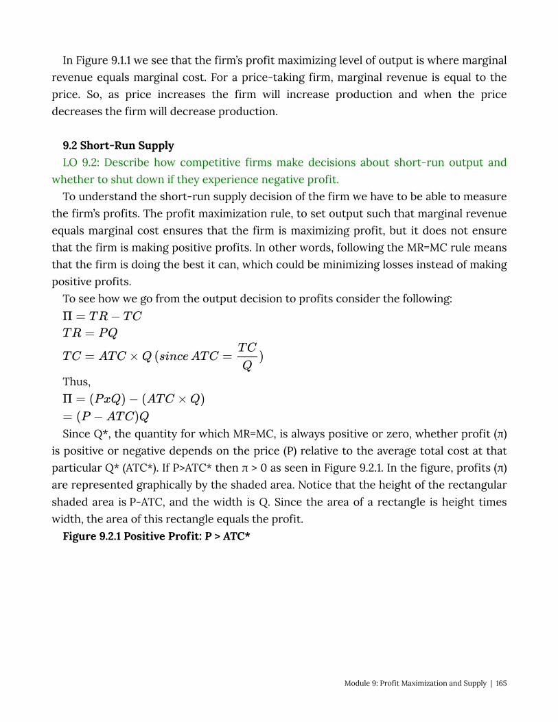
In Figure 9.1.1 we see that the firm’s profit maximizing level of output is where marginal revenue equals marginal cost. For a price-taking firm, marginal revenue is equal to the price. So, as price increases the firm will increase production and when the price decreases the firm will decrease production.
9.2 Short-Run Supply LO 9.2: Describe how competitive firms make decisions about short-run output and
whether to shut down if they experience negative profit. To understand the short-run supply decision of the firm we have to be able to measure
the firm’s profits. The profit maximization rule, to set output such that marginal revenue equals marginal cost ensures that the firm is maximizing profit, but it does not ensure that the firm is making positive profits. In other words, following the MR=MC rule means that the firm is doing the best it can, which could be minimizing losses instead of making positive profits.
To see how we go from the output decision to profits consider the following:
Thus,
Since Q*, the quantity for which MR=MC, is always positive or zero, whether profit (π) is positive or negative depends on the price (P) relative to the average total cost at that particular Q* (ATC*). If P>ATC* then π > 0 as seen in Figure 9.2.1. In the figure, profits (π) are represented graphically by the shaded area. Notice that the height of the rectangular shaded area is P-ATC, and the width is Q. Since the area of a rectangle is height times width, the area of this rectangle equals the profit.
Figure 9.2.1 Positive Profit: P > ATC*
Module 9: Profit Maximization and Supply | 165
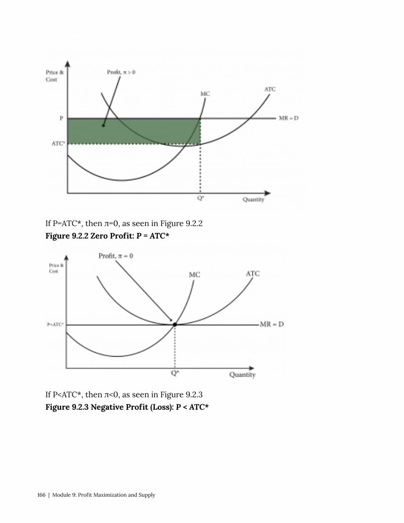
If P=ATC*, then π=0, as seen in Figure 9.2.2 Figure 9.2.2 Zero Profit: P = ATC*
If P<ATC*, then π<0, as seen in Figure 9.2.3 Figure 9.2.3 Negative Profit (Loss): P < ATC*
166 | Module 9: Profit Maximization and Supply
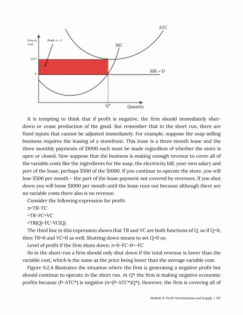
It is tempting to think that if profit is negative, the firm should immediately shut-down or cease production of the good. But remember that in the short run, there are fixed inputs that cannot be adjusted immediately. For example, suppose the soap selling business requires the leasing of a storefront. This lease is a three-month lease and the three monthly payments of $1000 each must be made regardless of whether the store is open or closed. Now suppose that the business is making enough revenue to cover all of the variable costs like the ingredients for the soap, the electricity bill, your own salary and part of the lease, perhaps $500 of the $1000. If you continue to operate the store, you will lose $500 per month – the part of the lease payment not covered by revenues. If you shut down you will loose $1000 per month until the lease runs out because although there are no variable costs there also is no revenue.
Consider the following expression for profit: π=TR-TC =TR-FC+VC =TR(Q)-FC-VC(Q) The third line in this expression shows that TR and VC are both functions of Q, so if Q=0,
then TR=0 and VC=0 as well. Shutting down means to set Q=0 so, Level of profit if the firm shuts down: π=0-FC-0=-FC So in the short-run a firm should only shut down if the total revenue is lower than the
variable cost, which is the same as the price being lower than the average variable cost. Figure 9.2.4 illustrates the situation where the firm is generating a negative profit but
should continue to operate in the short run. At Q* the firm is making negative economic profits because (P-ATC*) is negative (π=(P-ATC*)Q*). However, the firm is covering all of
Module 9: Profit Maximization and Supply | 167
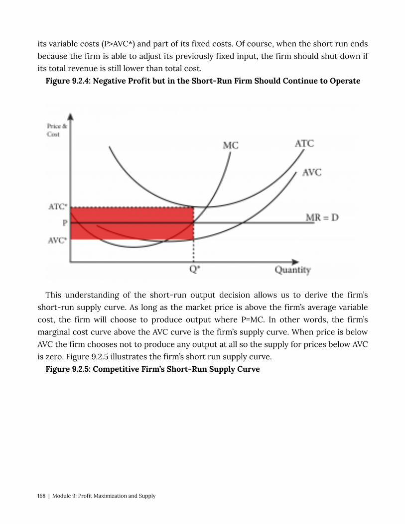
its variable costs (P>AVC*) and part of its fixed costs. Of course, when the short run ends because the firm is able to adjust its previously fixed input, the firm should shut down if its total revenue is still lower than total cost.
Figure 9.2.4: Negative Profit but in the Short-Run Firm Should Continue to Operate
This understanding of the short-run output decision allows us to derive the firm’s short-run supply curve. As long as the market price is above the firm’s average variable cost, the firm will choose to produce output where P=MC. In other words, the firm’s marginal cost curve above the AVC curve is the firm’s supply curve. When price is below AVC the firm chooses not to produce any output at all so the supply for prices below AVC is zero. Figure 9.2.5 illustrates the firm’s short run supply curve.
Figure 9.2.5: Competitive Firm’s Short-Run Supply Curve
168 | Module 9: Profit Maximization and Supply
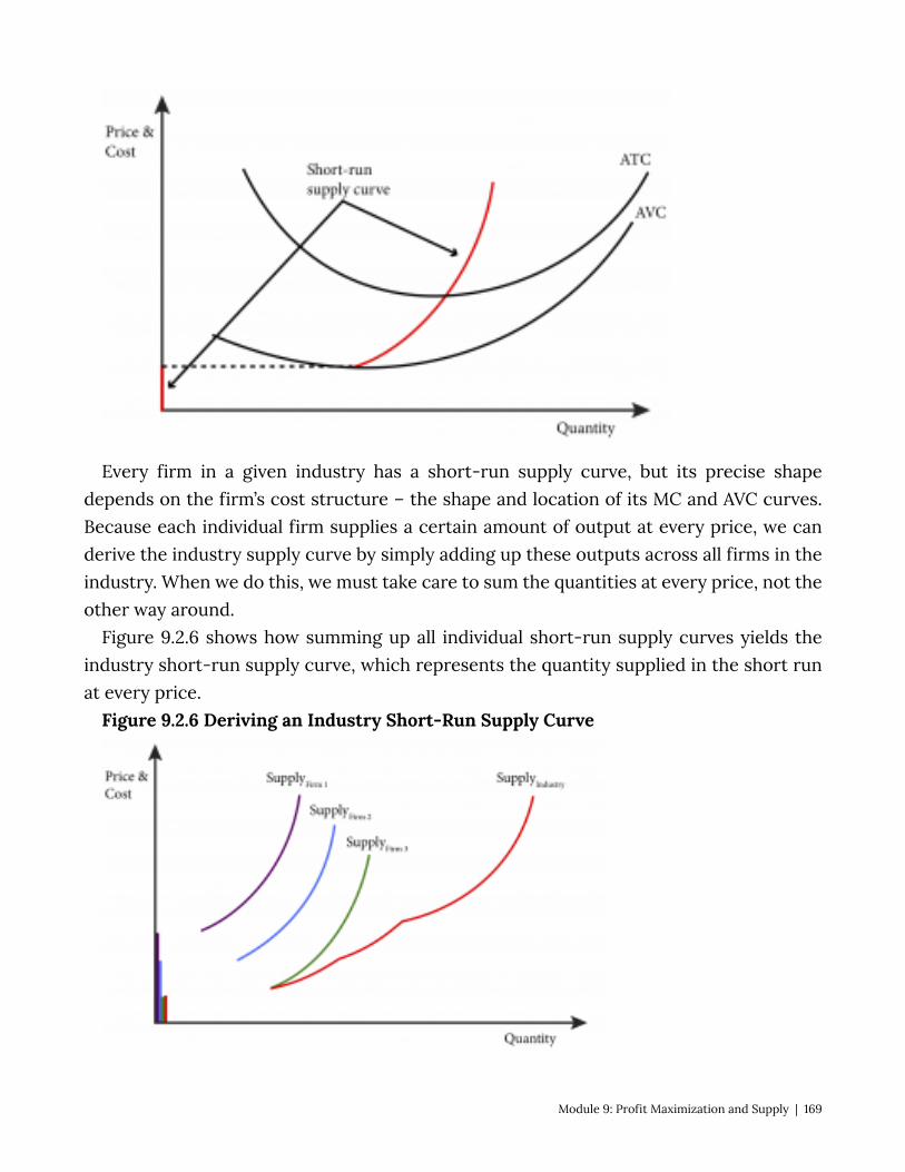
Every firm in a given industry has a short-run supply curve, but its precise shape depends on the firm’s cost structure – the shape and location of its MC and AVC curves. Because each individual firm supplies a certain amount of output at every price, we can derive the industry supply curve by simply adding up these outputs across all firms in the industry. When we do this, we must take care to sum the quantities at every price, not the other way around.
Figure 9.2.6 shows how summing up all individual short-run supply curves yields the industry short-run supply curve, which represents the quantity supplied in the short run at every price.
Figure 9.2.6 Deriving an Industry Short-Run Supply Curve
Module 9: Profit Maximization and Supply | 169

9.3 Long-Run Supply and Market Equilibrium LO 9.3: Describe a competitive firm’s long-run supply curves and how firm entry and
exit affects the long-run market equilibrium. In the long run, firms do not have any fixed costs; all production costs are variable. So a
firm’s profitability is determined solely by the long-run average total cost curve. A profit maximizing firm still sets output such that marginal revenue equals marginal cost, and since marginal revenue for a perfectly competitive firm is equal to the market price, the marginal cost curve above the long-run average total cost curve (LRATC) represents the firm’s supply curve.
As in the short-run case, the firm’s profits depend on the price relative to the long-run average total cost at the optimal output level for the firm, Q*. In Figure 9.3.1, the price is above LRATC so the firm is making positive profits. As long as profits are not negative the firm will continue to produce. So the portion of the long-run marginal cost (LRMC) that lies above the LRATC is the firm’s supply curve as seen in Figure 9.3.2:
Figure 9.3.1: Positive Profits in the Long Run
Figure 9.3.2: The Long–Run Supply Curve of a Perfectly Competitive Firm
170 | Module 9: Profit Maximization and Supply
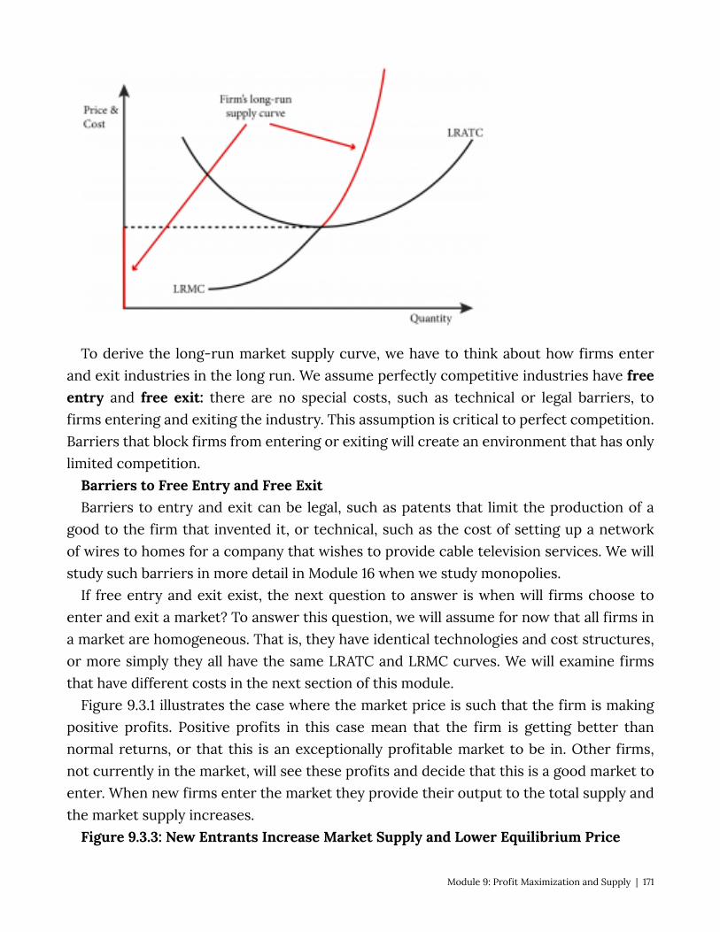
To derive the long-run market supply curve, we have to think about how firms enter and exit industries in the long run. We assume perfectly competitive industries have free entry and free exit: there are no special costs, such as technical or legal barriers, to firms entering and exiting the industry. This assumption is critical to perfect competition. Barriers that block firms from entering or exiting will create an environment that has only limited competition.
Barriers to Free Entry and Free Exit Barriers to entry and exit can be legal, such as patents that limit the production of a
good to the firm that invented it, or technical, such as the cost of setting up a network of wires to homes for a company that wishes to provide cable television services. We will study such barriers in more detail in Module 16 when we study monopolies.
If free entry and exit exist, the next question to answer is when will firms choose to enter and exit a market? To answer this question, we will assume for now that all firms in a market are homogeneous. That is, they have identical technologies and cost structures, or more simply they all have the same LRATC and LRMC curves. We will examine firms that have different costs in the next section of this module.
Figure 9.3.1 illustrates the case where the market price is such that the firm is making positive profits. Positive profits in this case mean that the firm is getting better than normal returns, or that this is an exceptionally profitable market to be in. Other firms, not currently in the market, will see these profits and decide that this is a good market to enter. When new firms enter the market they provide their output to the total supply and the market supply increases.
Figure 9.3.3: New Entrants Increase Market Supply and Lower Equilibrium Price
Module 9: Profit Maximization and Supply | 171
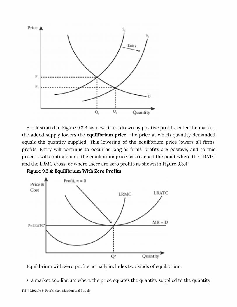
As illustrated in Figure 9.3.3, as new firms, drawn by positive profits, enter the market, the added supply lowers the equilibrium price—the price at which quantity demanded equals the quantity supplied. This lowering of the equilibrium price lowers all firms’ profits. Entry will continue to occur as long as firms’ profits are positive, and so this process will continue until the equilibrium price has reached the point where the LRATC and the LRMC cross, or where there are zero profits as shown in Figure 9.3.4
Figure 9.3.4: Equilibrium With Zero Profits
Equilibrium with zero profits actually includes two kinds of equilibrium:
• a market equilibrium where the price equates the quantity supplied to the quantity
172 | Module 9: Profit Maximization and Supply
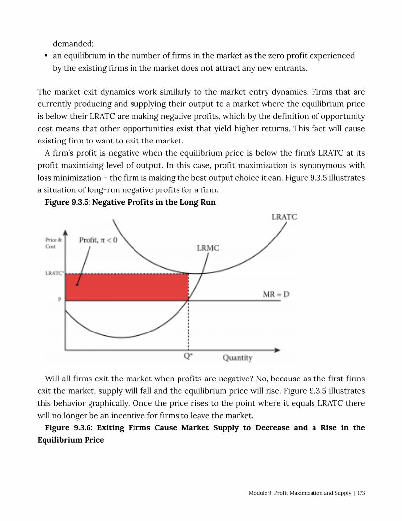
demanded; • an equilibrium in the number of firms in the market as the zero profit experienced
by the existing firms in the market does not attract any new entrants.
The market exit dynamics work similarly to the market entry dynamics. Firms that are currently producing and supplying their output to a market where the equilibrium price is below their LRATC are making negative profits, which by the definition of opportunity cost means that other opportunities exist that yield higher returns. This fact will cause existing firm to want to exit the market.
A firm’s profit is negative when the equilibrium price is below the firm’s LRATC at its profit maximizing level of output. In this case, profit maximization is synonymous with loss minimization – the firm is making the best output choice it can. Figure 9.3.5 illustrates a situation of long-run negative profits for a firm.
Figure 9.3.5: Negative Profits in the Long Run
Will all firms exit the market when profits are negative? No, because as the first firms exit the market, supply will fall and the equilibrium price will rise. Figure 9.3.5 illustrates this behavior graphically. Once the price rises to the point where it equals LRATC there will no longer be an incentive for firms to leave the market.
Figure 9.3.6: Exiting Firms Cause Market Supply to Decrease and a Rise in theEquilibrium Price
Module 9: Profit Maximization and Supply | 173
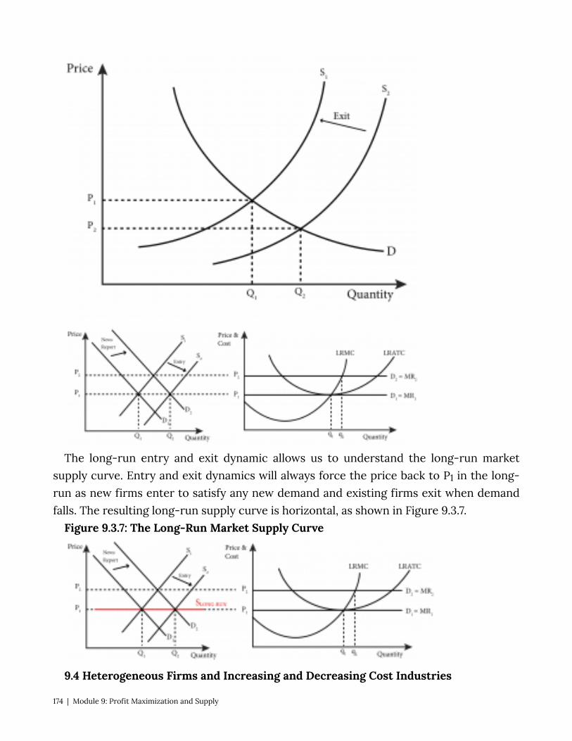
The long-run entry and exit dynamic allows us to understand the long-run market supply curve. Entry and exit dynamics will always force the price back to P1 in the long-run as new firms enter to satisfy any new demand and existing firms exit when demand falls. The resulting long-run supply curve is horizontal, as shown in Figure 9.3.7.
Figure 9.3.7: The Long-Run Market Supply Curve
9.4 Heterogeneous Firms and Increasing and Decreasing Cost Industries
174 | Module 9: Profit Maximization and Supply
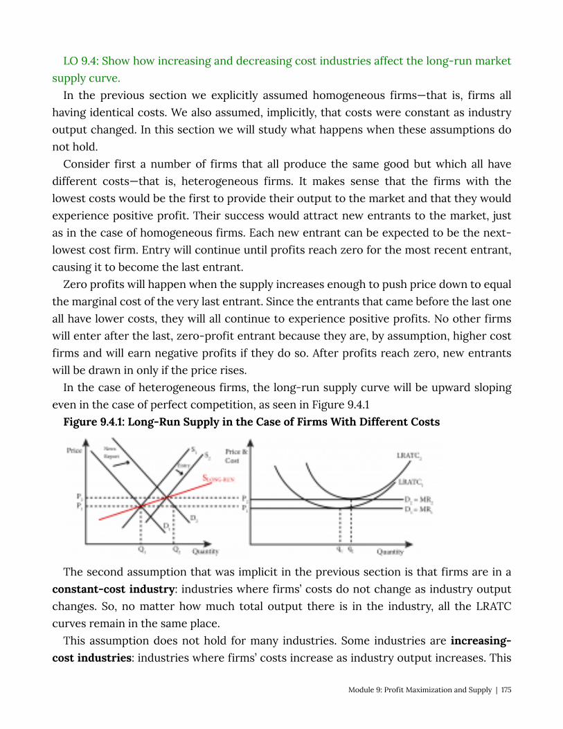
LO 9.4: Show how increasing and decreasing cost industries affect the long-run market supply curve.
In the previous section we explicitly assumed homogeneous firms—that is, firms all having identical costs. We also assumed, implicitly, that costs were constant as industry output changed. In this section we will study what happens when these assumptions do not hold.
Consider first a number of firms that all produce the same good but which all have different costs—that is, heterogeneous firms. It makes sense that the firms with the lowest costs would be the first to provide their output to the market and that they would experience positive profit. Their success would attract new entrants to the market, just as in the case of homogeneous firms. Each new entrant can be expected to be the next-lowest cost firm. Entry will continue until profits reach zero for the most recent entrant, causing it to become the last entrant.
Zero profits will happen when the supply increases enough to push price down to equal the marginal cost of the very last entrant. Since the entrants that came before the last one all have lower costs, they will all continue to experience positive profits. No other firms will enter after the last, zero-profit entrant because they are, by assumption, higher cost firms and will earn negative profits if they do so. After profits reach zero, new entrants will be drawn in only if the price rises.
In the case of heterogeneous firms, the long-run supply curve will be upward sloping even in the case of perfect competition, as seen in Figure 9.4.1
Figure 9.4.1: Long-Run Supply in the Case of Firms With Different Costs
The second assumption that was implicit in the previous section is that firms are in a constant-cost industry: industries where firms’ costs do not change as industry output changes. So, no matter how much total output there is in the industry, all the LRATC curves remain in the same place.
This assumption does not hold for many industries. Some industries are increasing-cost industries: industries where firms’ costs increase as industry output increases. This
Module 9: Profit Maximization and Supply | 175
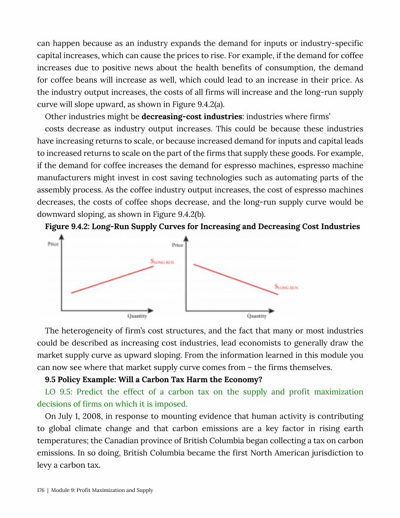
can happen because as an industry expands the demand for inputs or industry-specific capital increases, which can cause the prices to rise. For example, if the demand for coffee increases due to positive news about the health benefits of consumption, the demand for coffee beans will increase as well, which could lead to an increase in their price. As the industry output increases, the costs of all firms will increase and the long-run supply curve will slope upward, as shown in Figure 9.4.2(a).
Other industries might be decreasing-cost industries: industries where firms’ costs decrease as industry output increases. This could be because these industries
have increasing returns to scale, or because increased demand for inputs and capital leads to increased returns to scale on the part of the firms that supply these goods. For example, if the demand for coffee increases the demand for espresso machines, espresso machine manufacturers might invest in cost saving technologies such as automating parts of the assembly process. As the coffee industry output increases, the cost of espresso machines decreases, the costs of coffee shops decrease, and the long-run supply curve would be downward sloping, as shown in Figure 9.4.2(b).
Figure 9.4.2: Long-Run Supply Curves for Increasing and Decreasing Cost Industries
The heterogeneity of firm’s cost structures, and the fact that many or most industries could be described as increasing cost industries, lead economists to generally draw the market supply curve as upward sloping. From the information learned in this module you can now see where that market supply curve comes from – the firms themselves.
9.5 Policy Example: Will a Carbon Tax Harm the Economy? LO 9.5: Predict the effect of a carbon tax on the supply and profit maximization
decisions of firms on which it is imposed. On July 1, 2008, in response to mounting evidence that human activity is contributing
to global climate change and that carbon emissions are a key factor in rising earth temperatures; the Canadian province of British Columbia began collecting a tax on carbon emissions. In so doing, British Columbia became the first North American jurisdiction to levy a carbon tax.
176 | Module 9: Profit Maximization and Supply
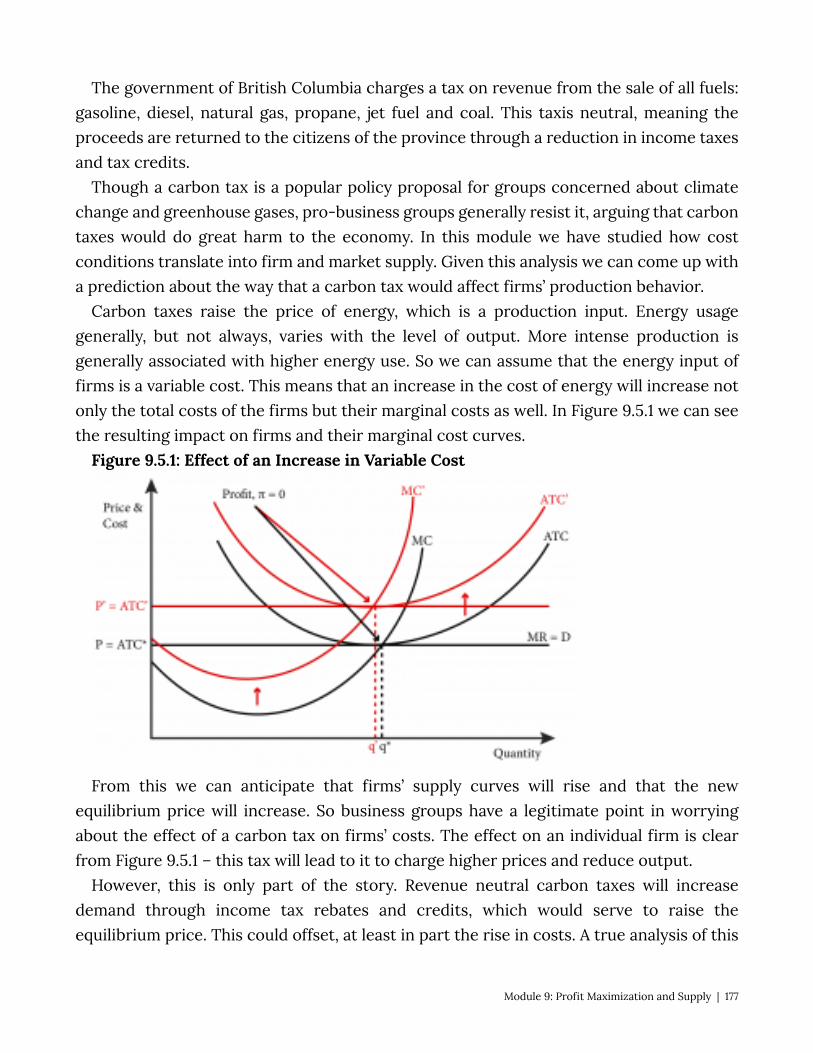
The government of British Columbia charges a tax on revenue from the sale of all fuels: gasoline, diesel, natural gas, propane, jet fuel and coal. This taxis neutral, meaning the proceeds are returned to the citizens of the province through a reduction in income taxes and tax credits.
Though a carbon tax is a popular policy proposal for groups concerned about climate change and greenhouse gases, pro-business groups generally resist it, arguing that carbon taxes would do great harm to the economy. In this module we have studied how cost conditions translate into firm and market supply. Given this analysis we can come up with a prediction about the way that a carbon tax would affect firms’ production behavior.
Carbon taxes raise the price of energy, which is a production input. Energy usage generally, but not always, varies with the level of output. More intense production is generally associated with higher energy use. So we can assume that the energy input of firms is a variable cost. This means that an increase in the cost of energy will increase not only the total costs of the firms but their marginal costs as well. In Figure 9.5.1 we can see the resulting impact on firms and their marginal cost curves.
Figure 9.5.1: Effect of an Increase in Variable Cost
From this we can anticipate that firms’ supply curves will rise and that the new equilibrium price will increase. So business groups have a legitimate point in worrying about the effect of a carbon tax on firms’ costs. The effect on an individual firm is clear from Figure 9.5.1 – this tax will lead to it to charge higher prices and reduce output.
However, this is only part of the story. Revenue neutral carbon taxes will increase demand through income tax rebates and credits, which would serve to raise the equilibrium price. This could offset, at least in part the rise in costs. A true analysis of this
Module 9: Profit Maximization and Supply | 177
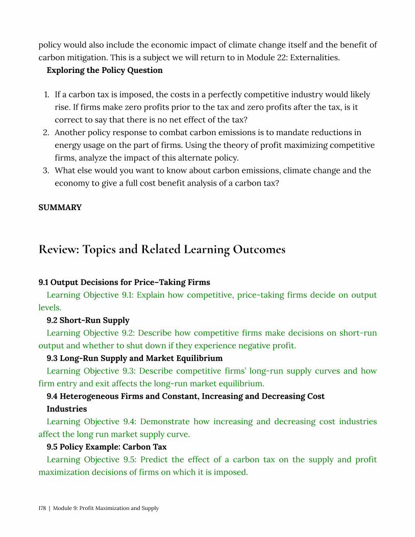
policy would also include the economic impact of climate change itself and the benefit of carbon mitigation. This is a subject we will return to in Module 22: Externalities.
Exploring the Policy Question
1. If a carbon tax is imposed, the costs in a perfectly competitive industry would likely rise. If firms make zero profits prior to the tax and zero profits after the tax, is it correct to say that there is no net effect of the tax?
2. Another policy response to combat carbon emissions is to mandate reductions in energy usage on the part of firms. Using the theory of profit maximizing competitive firms, analyze the impact of this alternate policy.
3. What else would you want to know about carbon emissions, climate change and the economy to give a full cost benefit analysis of a carbon tax?
SUMMARY
Review: Topics and Related Learning Outcomes
9.1 Output Decisions for Price–Taking Firms Learning Objective 9.1: Explain how competitive, price-taking firms decide on output
levels. 9.2 Short-Run Supply Learning Objective 9.2: Describe how competitive firms make decisions on short-run
output and whether to shut down if they experience negative profit. 9.3 Long-Run Supply and Market Equilibrium Learning Objective 9.3: Describe competitive firms’ long-run supply curves and how
firm entry and exit affects the long-run market equilibrium. 9.4 Heterogeneous Firms and Constant, Increasing and Decreasing Cost Industries Learning Objective 9.4: Demonstrate how increasing and decreasing cost industries
affect the long run market supply curve. 9.5 Policy Example: Carbon Tax Learning Objective 9.5: Predict the effect of a carbon tax on the supply and profit
maximization decisions of firms on which it is imposed.
178 | Module 9: Profit Maximization and Supply
Learn: Key Terms and Graphs
Terms
Profit Profit Maximization Rule Marginal Revenue Marginal Cost Short-run supply Long-run supply Shut-down rule Constant-cost industry Increasing-cost industry Decreasing-cost industry Free entry and exit
Graphs
Profit Maximization for a Price-Taking Competitive Firm Positive Profit Zero Profit Negative Profit (Loss) Negative Profit but in the Short-Run Firm Should Continue to Operate Competitive Firm’s Short-Run Supply Curve Positive Profits in the Long-Run The Long Run Supply Curve of a Perfectly Competitive Firm New Entrants Increase Market Supply and Lower Equilibrium Price Equilibrium With Zero Profits Negative Profits in the Long-Run Exiting Firms Cause Market Supply to Decrease and a Rise in the Equilibrium Price The Long-Run Market Supply Curve Long-Run Supply in the Case of Firms With Different Costs
Module 9: Profit Maximization and Supply | 179
Long-Run Cost Curves for Increasing and Decreasing Cost Industries
Equations
Profit Marginal Cost Marginal Revenue
180 | Module 9: Profit Maximization and Supply
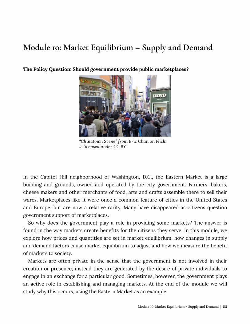
Module 10: Market Equilibrium – Supply and Demand
The Policy Question: Should government provide public marketplaces?
“Chinatown Scene” from Eric Chan on Flickr is licensed under CC BY
In the Capitol Hill neighborhood of Washington, D.C., the Eastern Market is a large building and grounds, owned and operated by the city government. Farmers, bakers, cheese makers and other merchants of food, arts and crafts assemble there to sell their wares. Marketplaces like it were once a common feature of cities in the United States and Europe, but are now a relative rarity. Many have disappeared as citizens question government support of marketplaces.
So why does the government play a role in providing some markets? The answer is found in the way markets create benefits for the citizens they serve. In this module, we explore how prices and quantities are set in market equilibrium, how changes in supply and demand factors cause market equilibrium to adjust and how we measure the benefit of markets to society.
Markets are often private in the sense that the government is not involved in their creation or presence; instead they are generated by the desire of private individuals to engage in an exchange for a particular good. Sometimes, however, the government plays an active role in establishing and managing markets. At the end of the module we will study why this occurs, using the Eastern Market as an example.
Module 10: Market Equilibrium – Supply and Demand | 181
Exploring the Policy Question Is public investment in marketplaces justified and if so why? 10.1 What is a Market? Learning Objective 10.1: Identify the characteristics of a market. 10.2 Market Equilibrium – The Supply and Demand Curves Together
Learning Objective 10.2: Determine the equilibrium price and quantity for a market, both graphically and mathematically.
10.3 Excess Supply and Demand Learning Objective 10.3: Calculate and graph excess supply and excess demand. 10.4 Measuring Welfare and Pareto Efficiency Learning Objective 10.4: Calculate consumer surplus, producer surplus, and deadweight loss for a market. 10.5 Policy Example: Should Government Provide Public Marketplaces? LO 10.5: Apply the concept of economic welfare to the policy of publicly-supported
marketplaces. 10.1 What is a Market? LO 10.1: Identify the characteristics of a market. In Module 9 we found out where the market supply curve comes from – the cost
structure of individual firms, which in turn comes from their technology as we discovered in Module 7. In Module 5 we found out where the demand curve comes from – the individual utility maximization problems of individual consumers. In both cases we assumed the demand for and supply of a specific good or service. In other words we were describing a particular market.
A market is characterized by a specific good or service being sold in a particular location at a defined time. So, for example, we might talk about:
• the market for eggs in Nashville, Tennessee in April of 2016. • the market for rolled aluminum in the U.S. in 2015. • the market for radiological diagnostic services worldwide in the last decade.
In addition, for whatever item, time and place we describe there must be both buyers and sellers in order for a market to exist. A market is where buyers and sellers exchange or where there is both demand and supply.
We tend to talk about markets somewhat loosely when studying economics. For
182 | Module 10: Market Equilibrium – Supply and Demand
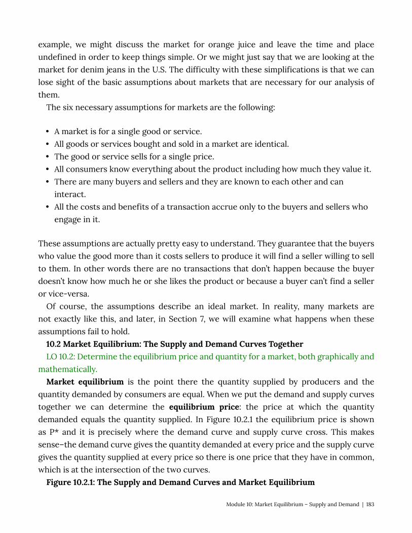
example, we might discuss the market for orange juice and leave the time and place undefined in order to keep things simple. Or we might just say that we are looking at the market for denim jeans in the U.S. The difficulty with these simplifications is that we can lose sight of the basic assumptions about markets that are necessary for our analysis of them.
The six necessary assumptions for markets are the following:
• A market is for a single good or service. • All goods or services bought and sold in a market are identical. • The good or service sells for a single price. • All consumers know everything about the product including how much they value it. • There are many buyers and sellers and they are known to each other and can
interact. • All the costs and benefits of a transaction accrue only to the buyers and sellers who
engage in it.
These assumptions are actually pretty easy to understand. They guarantee that the buyers who value the good more than it costs sellers to produce it will find a seller willing to sell to them. In other words there are no transactions that don’t happen because the buyer doesn’t know how much he or she likes the product or because a buyer can’t find a seller or vice-versa.
Of course, the assumptions describe an ideal market. In reality, many markets are not exactly like this, and later, in Section 7, we will examine what happens when these assumptions fail to hold.
10.2 Market Equilibrium: The Supply and Demand Curves Together LO 10.2: Determine the equilibrium price and quantity for a market, both graphically and
mathematically. Market equilibrium is the point there the quantity supplied by producers and the
quantity demanded by consumers are equal. When we put the demand and supply curves together we can determine the equilibrium price: the price at which the quantity demanded equals the quantity supplied. In Figure 10.2.1 the equilibrium price is shown as P* and it is precisely where the demand curve and supply curve cross. This makes sense–the demand curve gives the quantity demanded at every price and the supply curve gives the quantity supplied at every price so there is one price that they have in common, which is at the intersection of the two curves.
Figure 10.2.1: The Supply and Demand Curves and Market Equilibrium
Module 10: Market Equilibrium – Supply and Demand | 183

Graphing the supply and demand curves to locate their intersection is one way to find the equilibrium price. We can also find this quantity mathematically. Consider a demand curve for stereo headphones that is described by the following function:
QD = 1800 – 20P Note that in general we draw graphs of functions with the independent variable on the
horizontal axis and the dependent variable on the vertical axis. In the case of supply and demand curves, however, we draw them with quantity on the horizontal axis and price on the vertical. Because of this, it is sometimes easier to express the demand relationship as an inverse demand curve: the demand curve expressed as price as a function of quantity. In our example this would be:
P = 90 – 0.05QD
This is just the original demand curve solved for P instead of QD. In the inverse demand curve the vertical intercept is easy to see from the equation: demand for headphones stops at the price of $90. No consumer is willing to pay $90 or more for headphones.
Similarly the supply curve can be represented as a mathematical function. For example, consider a supply curve described by the function:
QS = 50P – 1000 Similar to the demand curve we can express this as an inverse supply curve: the supply
curve expressed as price as a function of quantity. In this case, the inverse supply curve would be:
P = 20 – 0.03QS
184 | Module 10: Market Equilibrium – Supply and Demand
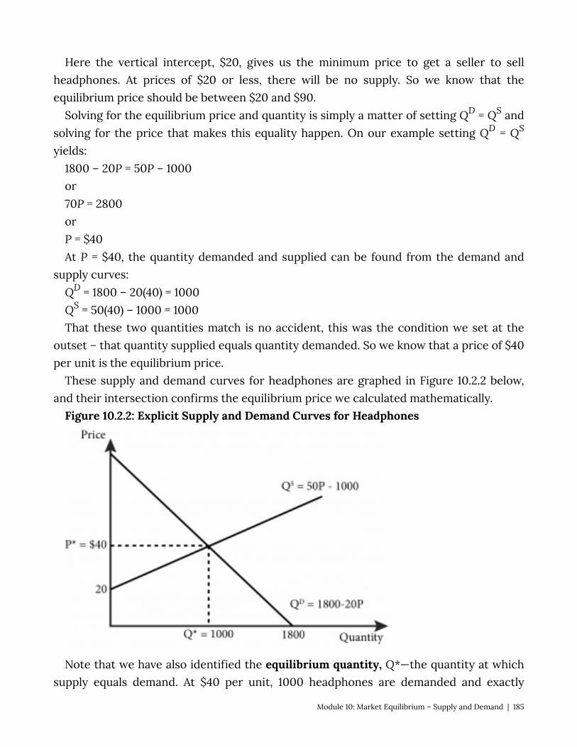
Here the vertical intercept, $20, gives us the minimum price to get a seller to sell headphones. At prices of $20 or less, there will be no supply. So we know that the equilibrium price should be between $20 and $90.
Solving for the equilibrium price and quantity is simply a matter of setting QD = QS and solving for the price that makes this equality happen. On our example setting QD = QS
yields: 1800 – 20P = 50P – 1000 or 70P = 2800 or P = $40 At P = $40, the quantity demanded and supplied can be found from the demand and
supply curves: QD = 1800 – 20(40) = 1000 QS = 50(40) – 1000 = 1000 That these two quantities match is no accident, this was the condition we set at the
outset – that quantity supplied equals quantity demanded. So we know that a price of $40 per unit is the equilibrium price.
These supply and demand curves for headphones are graphed in Figure 10.2.2 below, and their intersection confirms the equilibrium price we calculated mathematically.
Figure 10.2.2: Explicit Supply and Demand Curves for Headphones
Note that we have also identified the equilibrium quantity, Q*—the quantity at which supply equals demand. At $40 per unit, 1000 headphones are demanded and exactly
Module 10: Market Equilibrium – Supply and Demand | 185
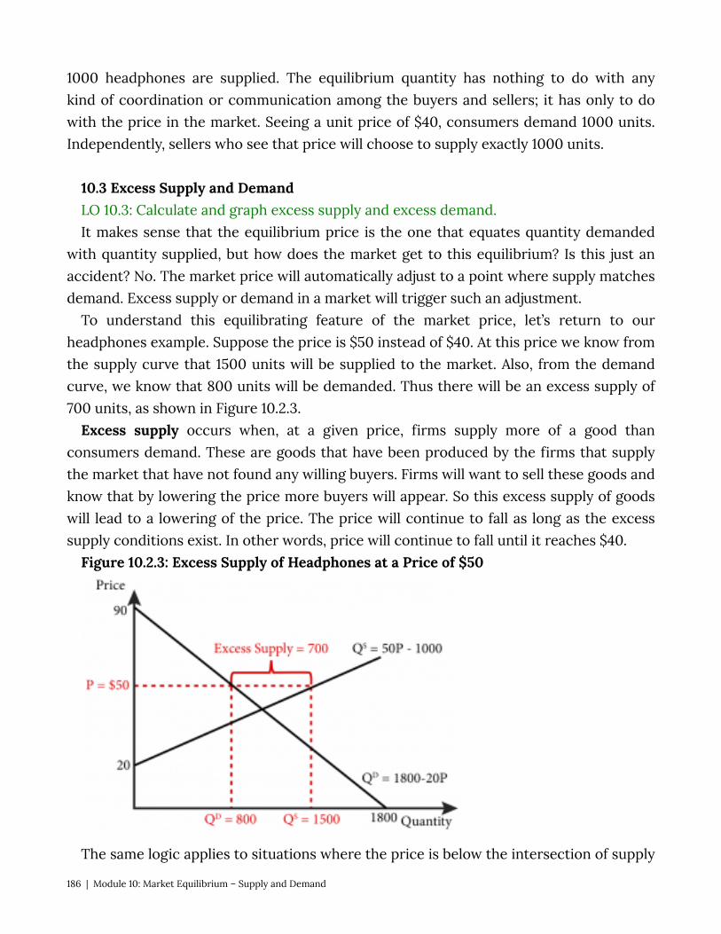
1000 headphones are supplied. The equilibrium quantity has nothing to do with any kind of coordination or communication among the buyers and sellers; it has only to do with the price in the market. Seeing a unit price of $40, consumers demand 1000 units. Independently, sellers who see that price will choose to supply exactly 1000 units.
10.3 Excess Supply and Demand LO 10.3: Calculate and graph excess supply and excess demand. It makes sense that the equilibrium price is the one that equates quantity demanded
with quantity supplied, but how does the market get to this equilibrium? Is this just an accident? No. The market price will automatically adjust to a point where supply matches demand. Excess supply or demand in a market will trigger such an adjustment.
To understand this equilibrating feature of the market price, let’s return to our headphones example. Suppose the price is $50 instead of $40. At this price we know from the supply curve that 1500 units will be supplied to the market. Also, from the demand curve, we know that 800 units will be demanded. Thus there will be an excess supply of 700 units, as shown in Figure 10.2.3.
Excess supply occurs when, at a given price, firms supply more of a good than consumers demand. These are goods that have been produced by the firms that supply the market that have not found any willing buyers. Firms will want to sell these goods and know that by lowering the price more buyers will appear. So this excess supply of goods will lead to a lowering of the price. The price will continue to fall as long as the excess supply conditions exist. In other words, price will continue to fall until it reaches $40.
Figure 10.2.3: Excess Supply of Headphones at a Price of $50
The same logic applies to situations where the price is below the intersection of supply
186 | Module 10: Market Equilibrium – Supply and Demand
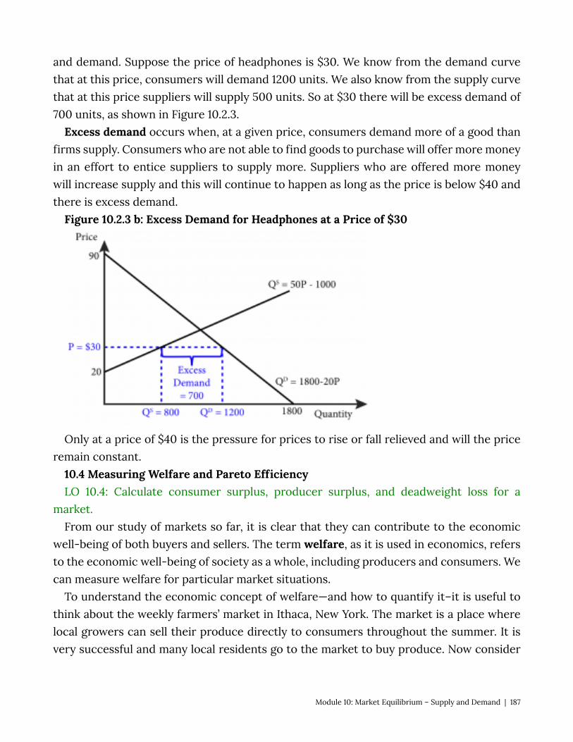
and demand. Suppose the price of headphones is $30. We know from the demand curve that at this price, consumers will demand 1200 units. We also know from the supply curve that at this price suppliers will supply 500 units. So at $30 there will be excess demand of 700 units, as shown in Figure 10.2.3.
Excess demand occurs when, at a given price, consumers demand more of a good than firms supply. Consumers who are not able to find goods to purchase will offer more money in an effort to entice suppliers to supply more. Suppliers who are offered more money will increase supply and this will continue to happen as long as the price is below $40 and there is excess demand.
Figure 10.2.3 b: Excess Demand for Headphones at a Price of $30
Only at a price of $40 is the pressure for prices to rise or fall relieved and will the price remain constant.
10.4 Measuring Welfare and Pareto Efficiency LO 10.4: Calculate consumer surplus, producer surplus, and deadweight loss for a
market. From our study of markets so far, it is clear that they can contribute to the economic
well-being of both buyers and sellers. The term welfare, as it is used in economics, refers to the economic well-being of society as a whole, including producers and consumers. We can measure welfare for particular market situations.
To understand the economic concept of welfare—and how to quantify it–it is useful to think about the weekly farmers’ market in Ithaca, New York. The market is a place where local growers can sell their produce directly to consumers throughout the summer. It is very successful and many local residents go to the market to buy produce. Now consider
Module 10: Market Equilibrium – Supply and Demand | 187
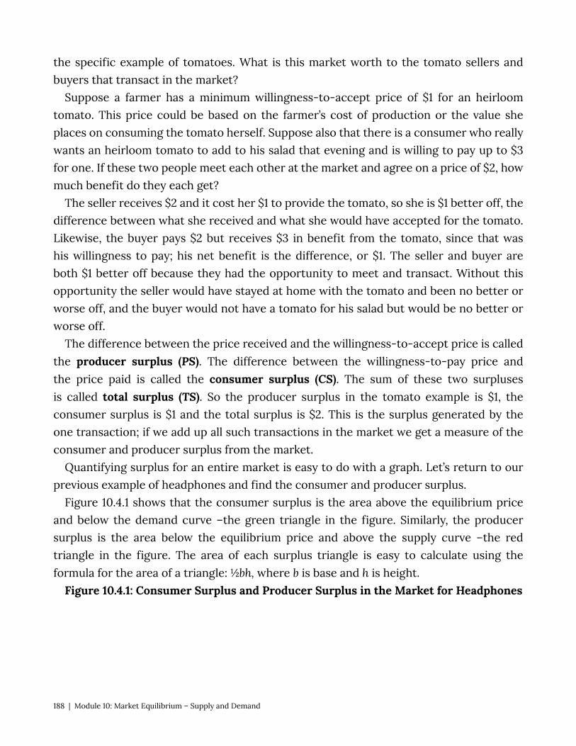
the specific example of tomatoes. What is this market worth to the tomato sellers and buyers that transact in the market?
Suppose a farmer has a minimum willingness-to-accept price of $1 for an heirloom tomato. This price could be based on the farmer’s cost of production or the value she places on consuming the tomato herself. Suppose also that there is a consumer who really wants an heirloom tomato to add to his salad that evening and is willing to pay up to $3 for one. If these two people meet each other at the market and agree on a price of $2, how much benefit do they each get?
The seller receives $2 and it cost her $1 to provide the tomato, so she is $1 better off, the difference between what she received and what she would have accepted for the tomato. Likewise, the buyer pays $2 but receives $3 in benefit from the tomato, since that was his willingness to pay; his net benefit is the difference, or $1. The seller and buyer are both $1 better off because they had the opportunity to meet and transact. Without this opportunity the seller would have stayed at home with the tomato and been no better or worse off, and the buyer would not have a tomato for his salad but would be no better or worse off.
The difference between the price received and the willingness-to-accept price is called the producer surplus (PS). The difference between the willingness-to-pay price and the price paid is called the consumer surplus (CS). The sum of these two surpluses is called total surplus (TS). So the producer surplus in the tomato example is $1, the consumer surplus is $1 and the total surplus is $2. This is the surplus generated by the one transaction; if we add up all such transactions in the market we get a measure of the consumer and producer surplus from the market.
Quantifying surplus for an entire market is easy to do with a graph. Let’s return to our previous example of headphones and find the consumer and producer surplus.
Figure 10.4.1 shows that the consumer surplus is the area above the equilibrium price and below the demand curve –the green triangle in the figure. Similarly, the producer surplus is the area below the equilibrium price and above the supply curve –the red triangle in the figure. The area of each surplus triangle is easy to calculate using the formula for the area of a triangle: ½bh, where b is base and h is height.
Figure 10.4.1: Consumer Surplus and Producer Surplus in the Market for Headphones
188 | Module 10: Market Equilibrium – Supply and Demand
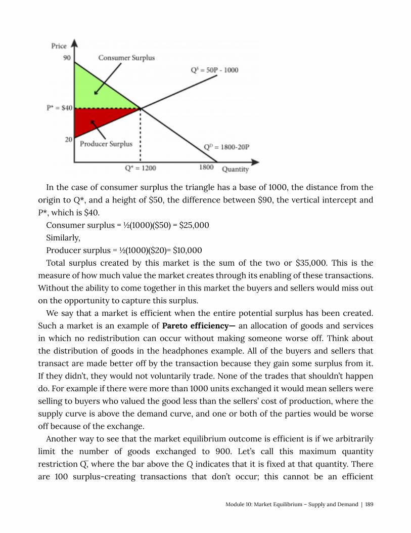
In the case of consumer surplus the triangle has a base of 1000, the distance from the origin to Q*, and a height of $50, the difference between $90, the vertical intercept and P*, which is $40.
Consumer surplus = ½(1000)($50) = $25,000 Similarly, Producer surplus = ½(1000)($20)= $10,000 Total surplus created by this market is the sum of the two or $35,000. This is the
measure of how much value the market creates through its enabling of these transactions. Without the ability to come together in this market the buyers and sellers would miss out on the opportunity to capture this surplus.
We say that a market is efficient when the entire potential surplus has been created. Such a market is an example of Pareto efficiency— an allocation of goods and services in which no redistribution can occur without making someone worse off. Think about the distribution of goods in the headphones example. All of the buyers and sellers that transact are made better off by the transaction because they gain some surplus from it. If they didn’t, they would not voluntarily trade. None of the trades that shouldn’t happen do. For example if there were more than 1000 units exchanged it would mean sellers were selling to buyers who valued the good less than the sellers’ cost of production, where the supply curve is above the demand curve, and one or both of the parties would be worse off because of the exchange.
Another way to see that the market equilibrium outcome is efficient is if we arbitrarily limit the number of goods exchanged to 900. Let’s call this maximum quantity restriction Q̅, where the bar above the Q indicates that it is fixed at that quantity. There are 100 surplus-creating transactions that don’t occur; this cannot be an efficient
Module 10: Market Equilibrium – Supply and Demand | 189
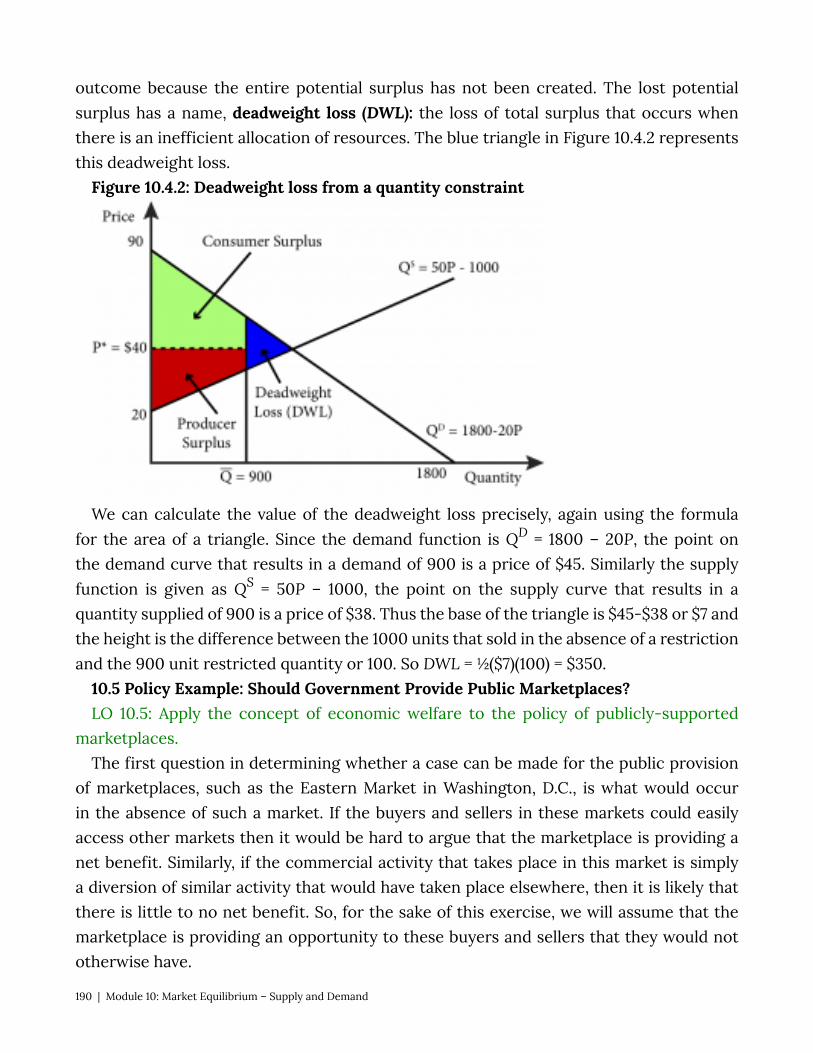
outcome because the entire potential surplus has not been created. The lost potential surplus has a name, deadweight loss (DWL): the loss of total surplus that occurs when there is an inefficient allocation of resources. The blue triangle in Figure 10.4.2 represents this deadweight loss.
Figure 10.4.2: Deadweight loss from a quantity constraint
We can calculate the value of the deadweight loss precisely, again using the formula for the area of a triangle. Since the demand function is QD = 1800 – 20P, the point on the demand curve that results in a demand of 900 is a price of $45. Similarly the supply function is given as QS = 50P – 1000, the point on the supply curve that results in a quantity supplied of 900 is a price of $38. Thus the base of the triangle is $45-$38 or $7 and the height is the difference between the 1000 units that sold in the absence of a restriction and the 900 unit restricted quantity or 100. So DWL = ½($7)(100) = $350.
10.5 Policy Example: Should Government Provide Public Marketplaces? LO 10.5: Apply the concept of economic welfare to the policy of publicly-supported
marketplaces. The first question in determining whether a case can be made for the public provision
of marketplaces, such as the Eastern Market in Washington, D.C., is what would occur in the absence of such a market. If the buyers and sellers in these markets could easily access other markets then it would be hard to argue that the marketplace is providing a net benefit. Similarly, if the commercial activity that takes place in this market is simply a diversion of similar activity that would have taken place elsewhere, then it is likely that there is little to no net benefit. So, for the sake of this exercise, we will assume that the marketplace is providing an opportunity to these buyers and sellers that they would not otherwise have.
190 | Module 10: Market Equilibrium – Supply and Demand
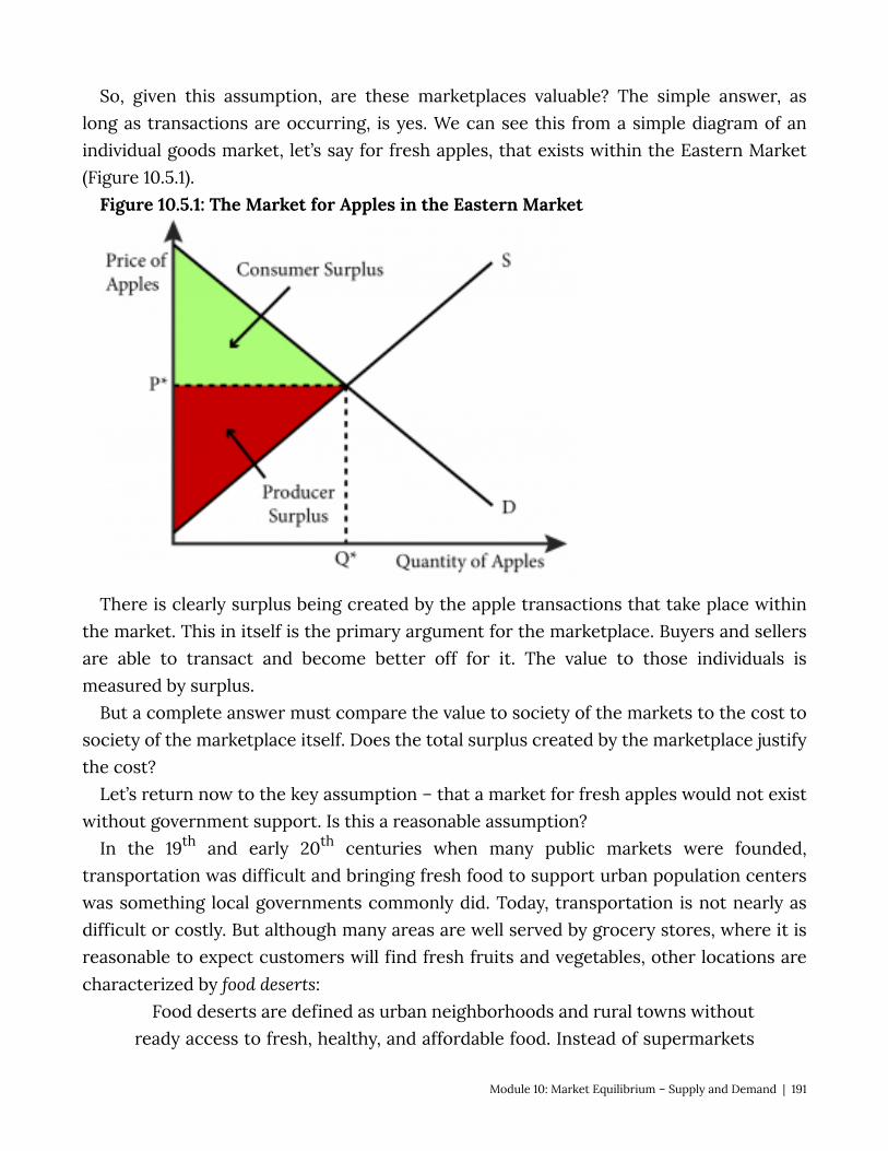
So, given this assumption, are these marketplaces valuable? The simple answer, as long as transactions are occurring, is yes. We can see this from a simple diagram of an individual goods market, let’s say for fresh apples, that exists within the Eastern Market (Figure 10.5.1).
Figure 10.5.1: The Market for Apples in the Eastern Market
There is clearly surplus being created by the apple transactions that take place within the market. This in itself is the primary argument for the marketplace. Buyers and sellers are able to transact and become better off for it. The value to those individuals is measured by surplus.
But a complete answer must compare the value to society of the markets to the cost to society of the marketplace itself. Does the total surplus created by the marketplace justify the cost?
Let’s return now to the key assumption – that a market for fresh apples would not exist without government support. Is this a reasonable assumption?
In the 19th and early 20th centuries when many public markets were founded, transportation was difficult and bringing fresh food to support urban population centers was something local governments commonly did. Today, transportation is not nearly as difficult or costly. But although many areas are well served by grocery stores, where it is reasonable to expect customers will find fresh fruits and vegetables, other locations are characterized by food deserts:
Food deserts are defined as urban neighborhoods and rural towns without ready access to fresh, healthy, and affordable food. Instead of supermarkets
Module 10: Market Equilibrium – Supply and Demand | 191
and grocery stores, these communities may have no food access or are served only by fast food restaurants and convenience stores that offer few healthy, affordable food options. The lack of access contributes to a poor diet and can lead to higher levels of obesity and other diet-related diseases, such as diabetes and heart disease. (U.S. Department of Agriculture (USDA))
The USDA estimates that 23.5 million people in the United States live in food deserts. Although the Capitol Hill neighborhood experienced some hard times in the past, today
it is prosperous and well served by grocery stores. So the need for government support of the Eastern Market there is less clear. In Section 7 we will explore public goods and externalities in detail and become better equipped to fully explore this issue.
Exploring the Policy Question
1. What other kinds of marketplaces can you think of that the government aids by providing infrastructure?
2. Airports allow the market for airline travel to exist in a functional way. Most airports in the United States are run by local governments. Using the topics explored in this module, give a justification for government expenditures on airports.
3. Should the District of Columbia government spend money on a market that primarily serves one neighborhood? Give reasons for and against.
SUMMARY
Review: Topics and Related Learning Outcomes
10.1 What is a Market? Learning Objective 10.1: Identify the characteristics of a market. 10.2 Market Equilibrium – The Supply and Demand Curves Together Learning Objective 10.2: Determine the equilibrium price and quantity for a market, both
graphically and mathematically. 10.3 Excess Supply and Demand Learning Objective 10.3: Calculate and graph excess supply and excess demand. 10.4 Measuring Welfare and Pareto Efficiency Learning Objective 10.4:
192 | Module 10: Market Equilibrium – Supply and Demand
Calculate consumer surplus, producer surplus, and deadweight loss for a market. 10.5 Policy Example: Should Government Provide Public Marketplaces? LO 10.5: Apply the concept of economic welfare to the policy of publicly-supported
marketplaces.
Learn: Key Terms and Graphs
Terms
Market Equilibrium Inverse Demand Curve Inverse Supply Curve Equilibrium Price Equilibrium Quantity Excess Demand Excess Supply Producer Surplus Consumer Surplus Total Surplus Pareto efficiency Deadweight loss
Graphs
The Supply and Demand Curves and Market Equilibrium Explicit Supply and Demand Curves Excess Supply at a Price of $50 Excess Demand at a Price of $30 Consumer Surplus and Producer Surplus Deadweight loss from a quantity constraint
Module 10: Market Equilibrium – Supply and Demand | 193
A Typical Goods Market in The Eastern Market
Equations
Quantity supplied Quantity demanded
194 | Module 10: Market Equilibrium – Supply and Demand

Module 11: Comparative Statics – Analyzing and Assessing Changes in Markets
The Policy Question: Should the Federal Government Subsidize Solar Power Installations?
In 2006, in an effort to spur the use of solar power in the country, the United States government created a Solar Investment Tax Credit (SITC) allowing U.S. households and businesses to deduct 30 percent of the amount they invested in solar power installations. Since the program began, the growth rate in solar installations has been 76 percent per year.
“Photovoltaik Dachanlage Hannover” on commons.wikimedia.org is licensed under CC BY-SA
The program has been seen as very successful in promoting solar energy installations. But what does economics say about the economic trade-offs of subsidizing these types of installation? Does the economic welfare they provide justify their costs?
This module looks at a method for evaluating the effects on price and quantity equilibria when supply or demand—or both—change within a market. Subsidies are just one potential cause of such changes. We will also look at the effects of taxes, price floors, and price ceilings. And throughout we will focus on the significance of changes in supply and demand for overall economic welfare.
Module 11: Comparative Statics - Analyzing and Assessing Changesin Markets | 195
Exploring the Policy Question
1. Do you think all subsidies work as well as the SITC to increase demand? What variables do you think influence their effectiveness?
2. What other kinds of market subsidies are you familiar with, and how would you evaluate their success?
11.1 Changes in Supply and Demand Learning Objective 11.1: Describe the causes of shifts in supply and demand and the
resulting effects on equilibrium price and quantity. 11.2 Welfare Analysis Learning Objective 11.2: Apply a comparative static analysis to evaluate economic
welfare, including the effect of government revenues. 11.3 Price Ceilings and Floors Learning Objective 11.3: Show the market and welfare effects of price ceilings and floors
in a comparative statics analysis. 11.4 Taxes and Subsidies Learning Objective 11.4: Show the market and welfare effects of taxes and subsidies in a
comparative statics analysis. 11.5 Policy Example: Should the Federal Government Subsidize Solar Power Installations? Learning Objective 11.5: Apply a comparative static analysis to evaluate government
subsidies of solar panel installations. 11.1 Changes in Supply and Demand LO 11.1: Describe the causes of shifts in supply and demand and the resulting effects on
equilibrium price and quantity. The competitive market supply and demand model is one of the most powerful tools
in economics. With it we can predict the impact of economic changes on consumers’ consumption decisions, producers’ supply decisions, and the market itself. We call the analysis of such changes comparative statics: the analysis of how equilibrium prices and quantities change when other exogenous variables – variables that shift demand and supply curves – change. The term static emphasizes the fact that we are comparing two different market equilibria at discrete points in time – one before and one after the changes occur–as opposed to analyzing a the dynamic process of price and quantity changes.
196 | Module 11: Comparative Statics - Analyzing and Assessing Changes in Markets
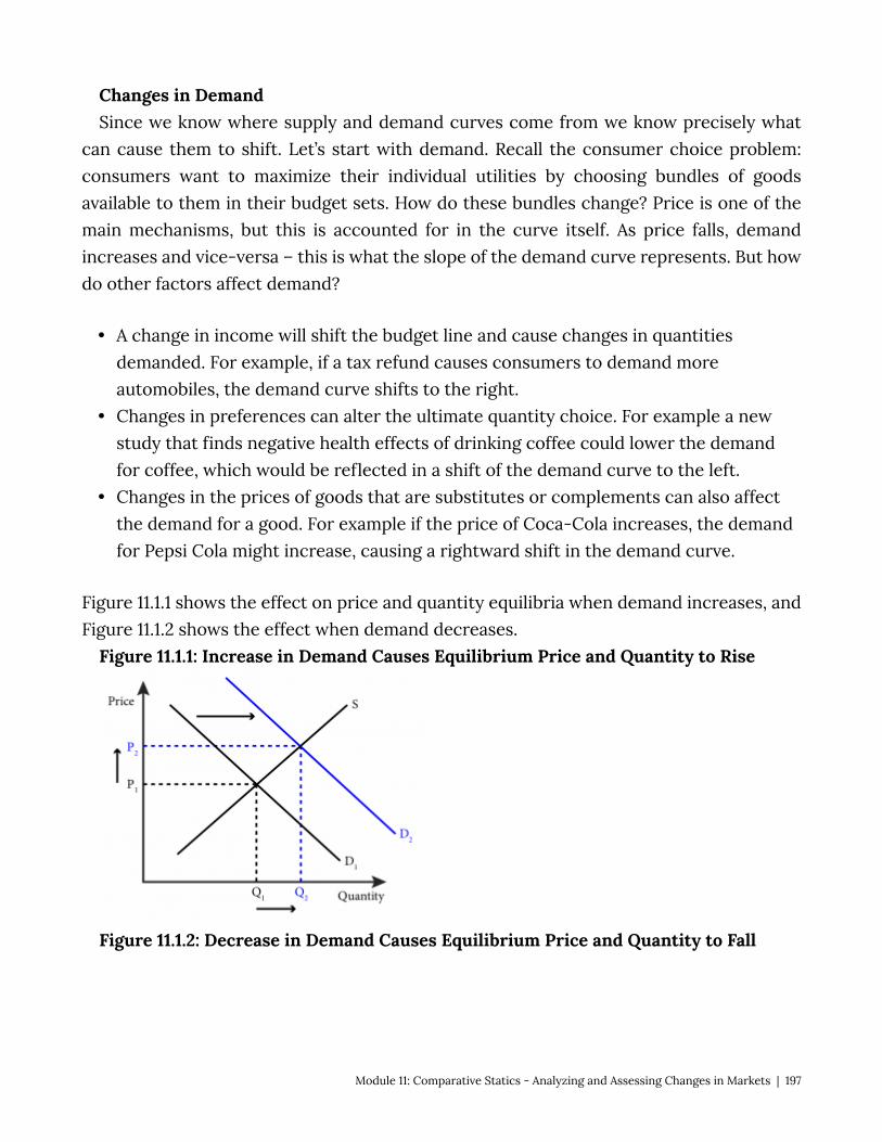
Changes in Demand Since we know where supply and demand curves come from we know precisely what
can cause them to shift. Let’s start with demand. Recall the consumer choice problem: consumers want to maximize their individual utilities by choosing bundles of goods available to them in their budget sets. How do these bundles change? Price is one of the main mechanisms, but this is accounted for in the curve itself. As price falls, demand increases and vice-versa – this is what the slope of the demand curve represents. But how do other factors affect demand?
• A change in income will shift the budget line and cause changes in quantities demanded. For example, if a tax refund causes consumers to demand more automobiles, the demand curve shifts to the right.
• Changes in preferences can alter the ultimate quantity choice. For example a new study that finds negative health effects of drinking coffee could lower the demand for coffee, which would be reflected in a shift of the demand curve to the left.
• Changes in the prices of goods that are substitutes or complements can also affect the demand for a good. For example if the price of Coca-Cola increases, the demand for Pepsi Cola might increase, causing a rightward shift in the demand curve.
Figure 11.1.1 shows the effect on price and quantity equilibria when demand increases, and Figure 11.1.2 shows the effect when demand decreases.
Figure 11.1.1: Increase in Demand Causes Equilibrium Price and Quantity to Rise
Figure 11.1.2: Decrease in Demand Causes Equilibrium Price and Quantity to Fall
Module 11: Comparative Statics - Analyzing and Assessing Changes in Markets | 197

Changes in Supply Shifts in supply arise from changes in:
• The cost of production for the firms. For example, auto workers in the United States represented by a union might negotiate a new labor contract for higher wages. This represents a cost increase on the part of firms and will result in a leftward shift of the supply curve.
• Technology that affects the production function. For example, a new robotic technology that aids in the assembly of automobiles in the factory could improve the efficiency of the plant resulting in a rightward shift of the supply curve.
• The number of sellers in the market. For example, perhaps a new company, like Tesla, decides to begin to manufacture cars in the U.S., or a foreign company, like FIAT, begins to sell in the U.S. market – either way the number of sellers has increased and the number of cars for sale is likely to increase as well, leading to a rightward shift in the supply curve
• The presence of alternative markets for sellers. For example, an economic boom in Canada might cause U.S. auto manufacturers to send more of the cars they produce to Canada instead of selling them in the U.S. leading to a lower supply of cars in the U.S. market represented by a leftward shift in the supply curve.
Figure 11.1.3 shows the effect on price and quantity equilibria when supply decreases, and Figure 11.1.4 shows the effect when supply increases.
Figure 11.1.3: Decrease in Supply Causes Equilibrium Price to Rise and Quantity to Fall
198 | Module 11: Comparative Statics - Analyzing and Assessing Changes in Markets
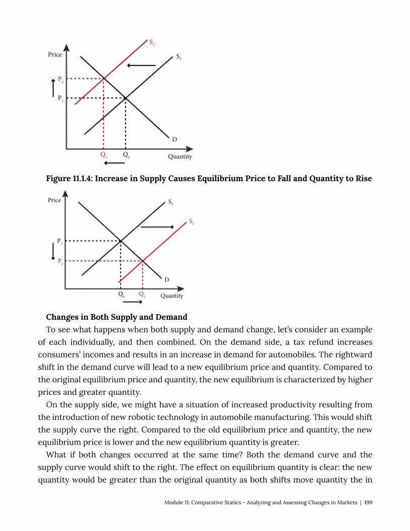
Figure 11.1.4: Increase in Supply Causes Equilibrium Price to Fall and Quantity to Rise
Changes in Both Supply and Demand To see what happens when both supply and demand change, let’s consider an example
of each individually, and then combined. On the demand side, a tax refund increases consumers’ incomes and results in an increase in demand for automobiles. The rightward shift in the demand curve will lead to a new equilibrium price and quantity. Compared to the original equilibrium price and quantity, the new equilibrium is characterized by higher prices and greater quantity.
On the supply side, we might have a situation of increased productivity resulting from the introduction of new robotic technology in automobile manufacturing. This would shift the supply curve the right. Compared to the old equilibrium price and quantity, the new equilibrium price is lower and the new equilibrium quantity is greater.
What if both changes occurred at the same time? Both the demand curve and the supply curve would shift to the right. The effect on equilibrium quantity is clear: the new quantity would be greater than the original quantity as both shifts move quantity the in
Module 11: Comparative Statics - Analyzing and Assessing Changes in Markets | 199
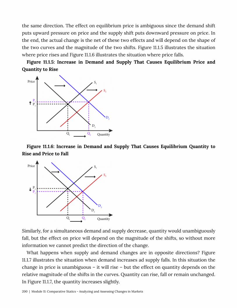
the same direction. The effect on equilibrium price is ambiguous since the demand shift puts upward pressure on price and the supply shift puts downward pressure on price. In the end, the actual change is the net of these two effects and will depend on the shape of the two curves and the magnitude of the two shifts. Figure 11.1.5 illustrates the situation where price rises and Figure 11.1.6 illustrates the situation where price falls.
Figure 11.1.5: Increase in Demand and Supply That Causes Equilibrium Price and Quantity to Rise
Figure 11.1.6: Increase in Demand and Supply That Causes Equilibrium Quantity to Rise and Price to Fall
Similarly, for a simultaneous demand and supply decrease, quantity would unambiguously fall, but the effect on price will depend on the magnitude of the shifts, so without more information we cannot predict the direction of the change.
What happens when supply and demand changes are in opposite directions? Figure 11.1.7 illustrates the situation when demand increases ad supply falls. In this situation the change in price is unambiguous – it will rise – but the effect on quantity depends on the relative magnitude of the shifts in the curves. Quantity can rise, fall or remain unchanged. In Figure 11.1.7, the quantity increases slightly.
200 | Module 11: Comparative Statics - Analyzing and Assessing Changes in Markets
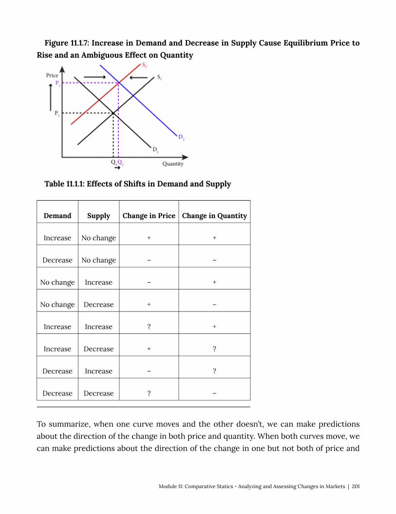
Figure 11.1.7: Increase in Demand and Decrease in Supply Cause Equilibrium Price to Rise and an Ambiguous Effect on Quantity
Table 11.1.1: Effects of Shifts in Demand and Supply
Demand Supply Change in Price Change in Quantity
Increase No change + +
Decrease No change – –
No change Increase – +
No change Decrease + –
Increase Increase ? +
Increase Decrease + ?
Decrease Increase – ?
Decrease Decrease ? –
To summarize, when one curve moves and the other doesn’t, we can make predictions about the direction of the change in both price and quantity. When both curves move, we can make predictions about the direction of the change in one but not both of price and
Module 11: Comparative Statics - Analyzing and Assessing Changes in Markets | 201
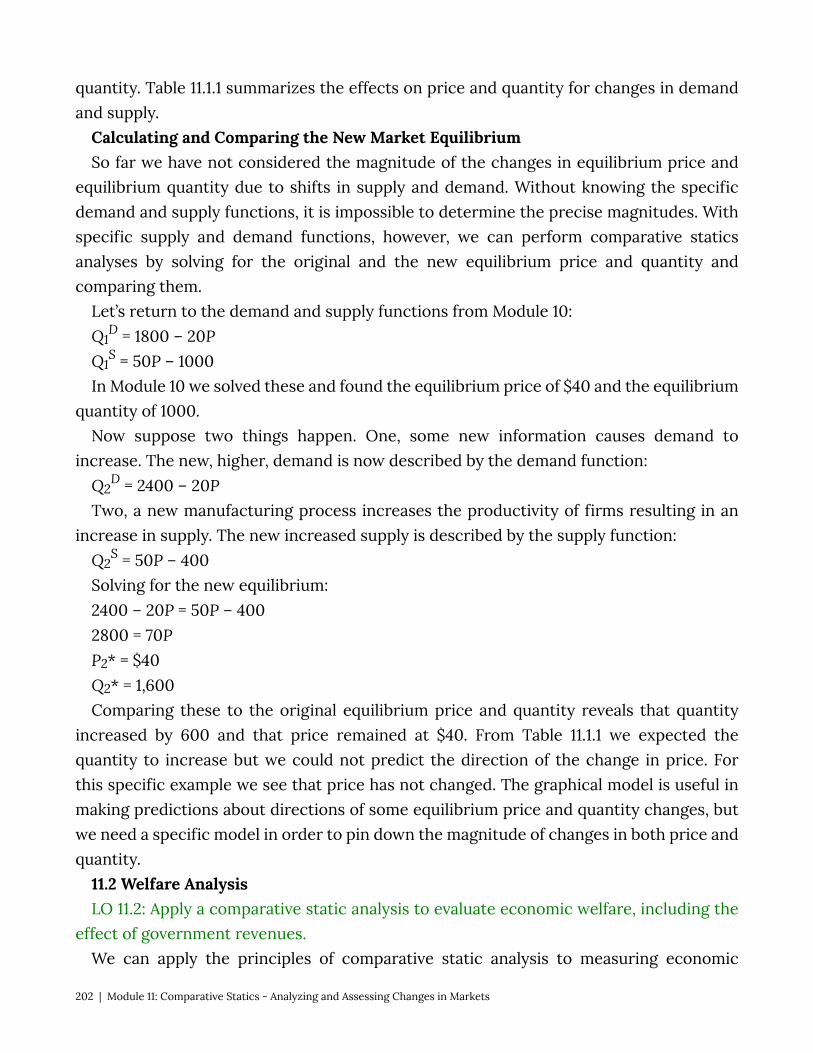
quantity. Table 11.1.1 summarizes the effects on price and quantity for changes in demand and supply.
Calculating and Comparing the New Market Equilibrium So far we have not considered the magnitude of the changes in equilibrium price and
equilibrium quantity due to shifts in supply and demand. Without knowing the specific demand and supply functions, it is impossible to determine the precise magnitudes. With specific supply and demand functions, however, we can perform comparative statics analyses by solving for the original and the new equilibrium price and quantity and comparing them.
Let’s return to the demand and supply functions from Module 10: Q1
D = 1800 – 20P Q1
S = 50P – 1000 In Module 10 we solved these and found the equilibrium price of $40 and the equilibrium
quantity of 1000. Now suppose two things happen. One, some new information causes demand to
increase. The new, higher, demand is now described by the demand function: Q2
D = 2400 – 20P Two, a new manufacturing process increases the productivity of firms resulting in an
increase in supply. The new increased supply is described by the supply function: Q2
S = 50P – 400 Solving for the new equilibrium: 2400 – 20P = 50P – 400 2800 = 70P P2* = $40 Q2* = 1,600 Comparing these to the original equilibrium price and quantity reveals that quantity
increased by 600 and that price remained at $40. From Table 11.1.1 we expected the quantity to increase but we could not predict the direction of the change in price. For this specific example we see that price has not changed. The graphical model is useful in making predictions about directions of some equilibrium price and quantity changes, but we need a specific model in order to pin down the magnitude of changes in both price and quantity.
11.2 Welfare Analysis LO 11.2: Apply a comparative static analysis to evaluate economic welfare, including the
effect of government revenues. We can apply the principles of comparative static analysis to measuring economic
202 | Module 11: Comparative Statics - Analyzing and Assessing Changes in Markets
welfare. In Module 10 we looked at welfare in terms of consumer surplus, producer surplus, and their combination, total surplus. For purposes of evaluating overall economic welfare, the total surplus is what economists care about. So we measure the effect of changes in supply and demand on welfare by comparing the total surplus before and after the change.
Figure 11.2.1 illustrates the change in welfare from an increase in demand. Increased demand leads to more transactions and to more consumer and producer welfare from all transactions. The blue shaded area shows the net increase in welfare that results from the increased demand.
Figure 11.2.1: Increase in Total Welfare from an Increase in Demand
Predicting the effect on total welfare is straightforward when one curve shifts but complicated when both curves shift. Any increase in only supply or demand will increase total welfare and any decrease in only supply or demand will decrease total welfare. It is also easy to see that welfare will increase when both supply and demand increase and will decrease when both supply and demand decrease. But what happens when one increases and the other decreases?
Figure 11.2.2 shows a situation where demand increases at the same time that supply decreases. The blue triangle represents the original total welfare, while the red triangle represents the new total welfare and the purple triangle represents neither a gain nor loss in welfare. Whether there is a net gain or loss in welfare depends on the relative sizes of the areas marked ‘gain in welfare’ and ‘loss in welfare’. As is easy to see, whether this is a new loss or gain depends on the magnitude and position of the shifting curves and can easily go either way.
Figure 11.2.2: Welfare Effects of Shifts in Both Curves
Module 11: Comparative Statics - Analyzing and Assessing Changes in Markets | 203
Sometimes government takes actions that lead to positive government revenue, for example by imposing a tax, or negative government revenue, for example by spending money. Economists account for government revenues or expenditures by including them in the total surplus calculations. Government revenues are public resources and spending is with public money, so both should be accounted for the same way consumer and producer surpluses are – they are all part of the societal gains or losses that we consider in total surplus:
Total Surplus = Consumer Surplus + Producer Surplus + Government Revenue Note that government revenue can be positive (tax receipts) or negative (government
spending). 11.3 Price Ceilings and Floors LO 11.3: Show the market and welfare effects of price ceilings and floors in a comparative
statics analysis. Price ceilings and price floors are artificial constraints that hold prices, respectively,
below and above their free market levels. Price ceilings and floors are created by extra-market forces, usually government. A classic example of a price ceiling is a rent control law like those that exist in New York City. Figure 11.3.1 illustrates the effect of a price ceiling in a market for rental housing. The price ceiling holds price below the market equilibrium price and there are more consumers wishing to rent apartments at the ceiling price than there are rental units available. The result is excess demand for rental housing.
Market Clearing Price Market equilibrium price is sometimes referred to as the market clearing price. This term references the fact that the market is cleared of all unsatisfied demand and excess supply at the equilibrium price.
Figure 11.3.1: The Welfare Effects of a Price Ceiling
204 | Module 11: Comparative Statics - Analyzing and Assessing Changes in Markets
The effect of a rental price ceiling on welfare is clear. Fewer apartments will be rented than at the market equilibrium price and all of the surplus that would have been created by those rentals is not realized, resulting in deadweight loss. Of the total surplus that is created, a greater proportion accrues to the consumers than the producers, but in welfare terms only the total surplus matters. So price ceilings do two things:
• they lower total surplus and create deadweight loss; • by creating excess demand, they create winners and losers among consumers. In the
case of a rental price ceiling, some consumers are lucky enough to find an apartment to rent at the ceiling price while others cannot.
The consumer surplus shown in Figure 11.3.1 assumes that the market will somehow allocate the apartments to the users whose valuation of them is the highest (those that represent the highest points on the demand curve). But no mechanism exists to assure that this will happen. Instead there is likely to be a random assignment of apartments among those willing to pay the ceiling price. This means that Figure 11.3.1 likely overstates the resulting consumer surplus and understates the deadweight loss. We will continue with the assumption of efficient allocation of apartments to keep the analysis simple, but it is important to understand the consequences of this assumption.
Figure 11.3.2 illustrates the situation for a price floor. When the price of a good is not allowed to sink to its market equilibrium level, a situation of excess supply occurs where producers would like to make and sell more goods than customers would like to buy. The price floor creates a deadweight loss in the same way a price ceiling does: it limits the number of goods that are bought and sold and therefore limits the amount of surplus created relative to the potential surplus. In the case of the price floor, more of the surplus that is created is in the form of producer surplus than consumer surplus. An example of
Module 11: Comparative Statics - Analyzing and Assessing Changes in Markets | 205

a price floor might be the regulated fares for taxis in many cities. The success of Uber and Lyft, so-called ride-sharing services, suggests that there is indeed an excess supply of potential taxis that would be quite happy to give rides for less.
This analysis assumes that firms with the lowest marginal cost supply the good but there is nothing in the market that ensures this. So the true welfare effects are likely to be lower producer surplus and higher deadweight loss than depicted in Figure 11.3.2.
Figure 11.3.2: The Welfare Effects of a Price Floor
For both price ceilings and price floors the welfare impact is clear: there is a reduction in total surplus relative to the market equilibrium price and quantity.
11.4 Taxes and Subsidies Learning Objective 11.4: Show the market and welfare effects of taxes and subsidies in a
comparative statics analysis. Governments levy taxes to raise revenues in many areas. Governments at all levels –
national, state, county, municipality – tax things such as income, hotel rooms, purchases of consumer goods, and so on. They tax both producers of goods and consumers of goods. Government also subsidizes things, like such as the production of dairy goods or the purchase of electric cars. In this section we will explore how taxes and subsidies affect the supply and demand model and their impact on welfare. We will discover is that it does not matter upon whom you levy a tax or provide a subsidy, producers or consumers. The burden or benefits will end up being shared among producers and consumers in identical proportions.
Taxes on Sellers To examine the effects of a tax on a market, let’s perform a comparative static analysis.
We will start with a market without a tax and then compare it to the same market with a tax. Let’s consider the market for tomatoes at the farmer’s market in Lawrence, Kansas. The current equilibrium price is $1.00 per tomato and the equilibrium quantity is 500.
206 | Module 11: Comparative Statics - Analyzing and Assessing Changes in Markets
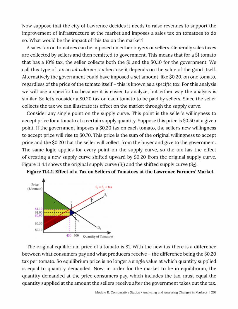
Now suppose that the city of Lawrence decides it needs to raise revenues to support the improvement of infrastructure at the market and imposes a sales tax on tomatoes to do so. What would be the impact of this tax on the market?
A sales tax on tomatoes can be imposed on either buyers or sellers. Generally sales taxes are collected by sellers and then remitted to government. This means that for a $1 tomato that has a 10% tax, the seller collects both the $1 and the $0.10 for the government. We call this type of tax an ad valorem tax because it depends on the value of the good itself. Alternatively the government could have imposed a set amount, like $0.20, on one tomato, regardless of the price of the tomato itself – this is known as a specific tax. For this analysis we will use a specific tax because it is easier to analyze, but either way the analysis is similar. So let’s consider a $0.20 tax on each tomato to be paid by sellers. Since the seller collects the tax we can illustrate its effect on the market through the supply curve.
Consider any single point on the supply curve. This point is the seller’s willingness to accept price for a tomato at a certain supply quantity. Suppose this price is $0.50 at a given point. If the government imposes a $0.20 tax on each tomato, the seller’s new willingness to accept price will rise to $0.70. This price is the sum of the original willingness to accept price and the $0.20 that the seller will collect from the buyer and give to the government. The same logic applies for every point on the supply curve, so the tax has the effect of creating a new supply curve shifted upward by $0.20 from the original supply curve. Figure 11.4.1 shows the original supply curve (S1) and the shifted supply curve (S2).
Figure 11.4.1: Effect of a Tax on Sellers of Tomatoes at the Lawrence Farmers’ Market
The original equilibrium price of a tomato is $1. With the new tax there is a difference between what consumers pay and what producers receive – the difference being the $0.20 tax per tomato. So equilibrium price is no longer a single value at which quantity supplied is equal to quantity demanded. Now, in order for the market to be in equilibrium, the quantity demanded at the price consumers pay, which includes the tax, must equal the quantity supplied at the amount the sellers receive after the government takes out the tax.
Module 11: Comparative Statics - Analyzing and Assessing Changes in Markets | 207
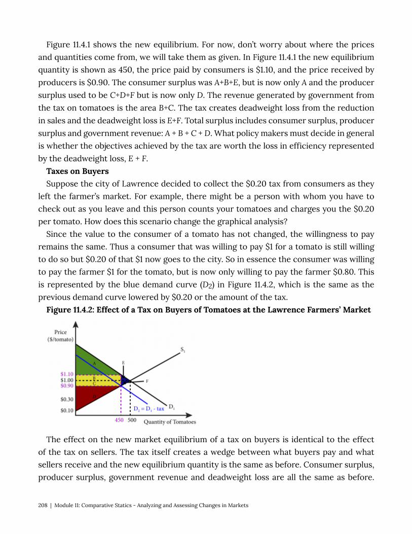
Figure 11.4.1 shows the new equilibrium. For now, don’t worry about where the prices and quantities come from, we will take them as given. In Figure 11.4.1 the new equilibrium quantity is shown as 450, the price paid by consumers is $1.10, and the price received by producers is $0.90. The consumer surplus was A+B+E, but is now only A and the producer surplus used to be C+D+F but is now only D. The revenue generated by government from the tax on tomatoes is the area B+C. The tax creates deadweight loss from the reduction in sales and the deadweight loss is E+F. Total surplus includes consumer surplus, producer surplus and government revenue: A + B + C + D. What policy makers must decide in general is whether the objectives achieved by the tax are worth the loss in efficiency represented by the deadweight loss, E + F.
Taxes on Buyers Suppose the city of Lawrence decided to collect the $0.20 tax from consumers as they
left the farmer’s market. For example, there might be a person with whom you have to check out as you leave and this person counts your tomatoes and charges you the $0.20 per tomato. How does this scenario change the graphical analysis?
Since the value to the consumer of a tomato has not changed, the willingness to pay remains the same. Thus a consumer that was willing to pay $1 for a tomato is still willing to do so but $0.20 of that $1 now goes to the city. So in essence the consumer was willing to pay the farmer $1 for the tomato, but is now only willing to pay the farmer $0.80. This is represented by the blue demand curve (D2) in Figure 11.4.2, which is the same as the previous demand curve lowered by $0.20 or the amount of the tax.
Figure 11.4.2: Effect of a Tax on Buyers of Tomatoes at the Lawrence Farmers’ Market
The effect on the new market equilibrium of a tax on buyers is identical to the effect of the tax on sellers. The tax itself creates a wedge between what buyers pay and what sellers receive and the new equilibrium quantity is the same as before. Consumer surplus, producer surplus, government revenue and deadweight loss are all the same as before.
208 | Module 11: Comparative Statics - Analyzing and Assessing Changes in Markets
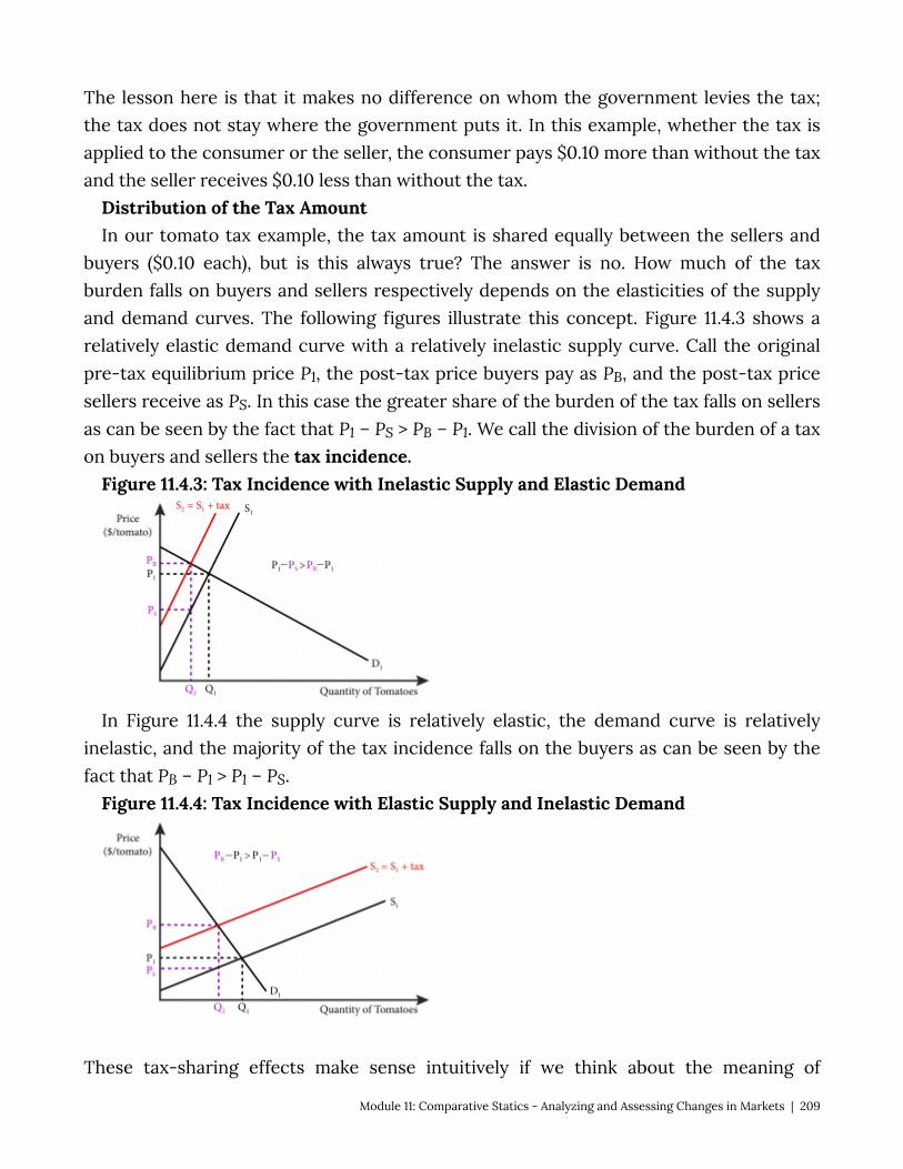
The lesson here is that it makes no difference on whom the government levies the tax; the tax does not stay where the government puts it. In this example, whether the tax is applied to the consumer or the seller, the consumer pays $0.10 more than without the tax and the seller receives $0.10 less than without the tax.
Distribution of the Tax Amount In our tomato tax example, the tax amount is shared equally between the sellers and
buyers ($0.10 each), but is this always true? The answer is no. How much of the tax burden falls on buyers and sellers respectively depends on the elasticities of the supply and demand curves. The following figures illustrate this concept. Figure 11.4.3 shows a relatively elastic demand curve with a relatively inelastic supply curve. Call the original pre-tax equilibrium price P1, the post-tax price buyers pay as PB, and the post-tax price sellers receive as PS. In this case the greater share of the burden of the tax falls on sellers as can be seen by the fact that P1 – PS > PB – P1. We call the division of the burden of a tax on buyers and sellers the tax incidence.
Figure 11.4.3: Tax Incidence with Inelastic Supply and Elastic Demand
In Figure 11.4.4 the supply curve is relatively elastic, the demand curve is relatively inelastic, and the majority of the tax incidence falls on the buyers as can be seen by the fact that PB – P1 > P1 – PS.
Figure 11.4.4: Tax Incidence with Elastic Supply and Inelastic Demand
These tax-sharing effects make sense intuitively if we think about the meaning of
Module 11: Comparative Statics - Analyzing and Assessing Changes in Markets | 209

elasticity. A more elastic curve means a larger quantity response to a change in price. Only a small part of the tax burden of the tax can be given to market participants that are more responsive to price and a larger part can be given to those that are less responsive to price, because the quantity demanded and supplied must equal in the end.
Subsidies for Buyers The effects of subsidies on markets are similar to taxes in that that create a difference
between what consumers pay and what suppliers receive. They are also similar in that it does not matter if you subsidize the purchase of a good or the sale of a good, the market equilibrium effects are the same. In the next section, we’ll consider in more detail the market equilibrium effects of a government policy to subsidize buyers of solar power installations. For now, we’ll examine a simpler example to understand the mechanics of such a subsidy.
Let’s go back to the Lawrence farmers market. Suppose the city government decides that it is important to support the tomato growers. It will subsidize consumers in the amount of $0.20 for each tomato they purchase. Suddenly, potential buyers who would have bought a tomato if the price was $1, are now willing to buy a tomato that is priced at $1.20 because their out-of-pocket cost is the same. We can see this effect in Figure 11.4.5. In the figure, the demand curve is shifted up by the amount of the subsidy leading to an increased quantity purchased, Q2, and an increased equilibrium price, PS.
Figure 11.4.5: Effect of a Subsidy on Tomatoes at the Lawrence Farmers’ Market Paid to Buyers
Tomato sellers are certainly helped by this policy. Producer surplus was C+D and it is now B+C+D+E, so it has increased by B+E. Consumer surplus has also increased. Originally it was A+B. After the subsidy it is A+B+C+F+G, so it has increased C+F+G. To see this, remember that consumers are actually spending PC on each tomato. So both consumer and producer surplus has increased.
Government spends $0.20 on each tomato sold and Q2 are sold, so the cost to government of this policy is shown as the area B+C+E+F+G+H.
210 | Module 11: Comparative Statics - Analyzing and Assessing Changes in Markets
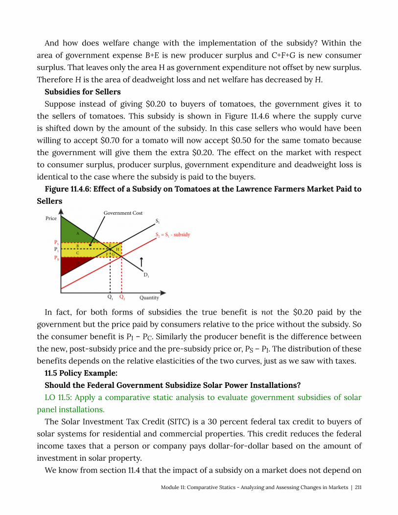
And how does welfare change with the implementation of the subsidy? Within the area of government expense B+E is new producer surplus and C+F+G is new consumer surplus. That leaves only the area H as government expenditure not offset by new surplus. Therefore H is the area of deadweight loss and net welfare has decreased by H.
Subsidies for Sellers Suppose instead of giving $0.20 to buyers of tomatoes, the government gives it to
the sellers of tomatoes. This subsidy is shown in Figure 11.4.6 where the supply curve is shifted down by the amount of the subsidy. In this case sellers who would have been willing to accept $0.70 for a tomato will now accept $0.50 for the same tomato because the government will give them the extra $0.20. The effect on the market with respect to consumer surplus, producer surplus, government expenditure and deadweight loss is identical to the case where the subsidy is paid to the buyers.
Figure 11.4.6: Effect of a Subsidy on Tomatoes at the Lawrence Farmers Market Paid to Sellers
In fact, for both forms of subsidies the true benefit is not the $0.20 paid by the government but the price paid by consumers relative to the price without the subsidy. So the consumer benefit is P1 – PC. Similarly the producer benefit is the difference between the new, post-subsidy price and the pre-subsidy price or, PS – P1. The distribution of these benefits depends on the relative elasticities of the two curves, just as we saw with taxes.
11.5 Policy Example: Should the Federal Government Subsidize Solar Power Installations? LO 11.5: Apply a comparative static analysis to evaluate government subsidies of solar
panel installations. The Solar Investment Tax Credit (SITC) is a 30 percent federal tax credit to buyers of
solar systems for residential and commercial properties. This credit reduces the federal income taxes that a person or company pays dollar-for-dollar based on the amount of investment in solar property.
We know from section 11.4 that the impact of a subsidy on a market does not depend on
Module 11: Comparative Statics - Analyzing and Assessing Changes in Markets | 211
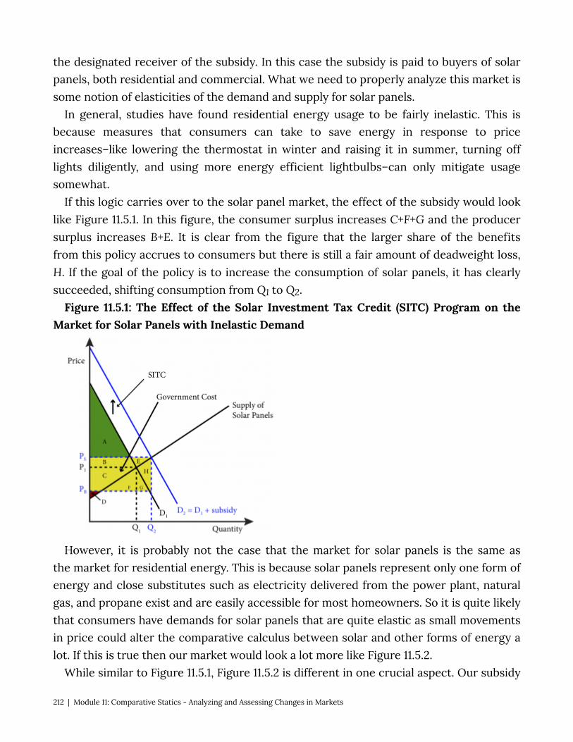
the designated receiver of the subsidy. In this case the subsidy is paid to buyers of solar panels, both residential and commercial. What we need to properly analyze this market is some notion of elasticities of the demand and supply for solar panels.
In general, studies have found residential energy usage to be fairly inelastic. This is because measures that consumers can take to save energy in response to price increases–like lowering the thermostat in winter and raising it in summer, turning off lights diligently, and using more energy efficient lightbulbs–can only mitigate usage somewhat.
If this logic carries over to the solar panel market, the effect of the subsidy would look like Figure 11.5.1. In this figure, the consumer surplus increases C+F+G and the producer surplus increases B+E. It is clear from the figure that the larger share of the benefits from this policy accrues to consumers but there is still a fair amount of deadweight loss, H. If the goal of the policy is to increase the consumption of solar panels, it has clearly succeeded, shifting consumption from Q1 to Q2.
Figure 11.5.1: The Effect of the Solar Investment Tax Credit (SITC) Program on the Market for Solar Panels with Inelastic Demand
However, it is probably not the case that the market for solar panels is the same as the market for residential energy. This is because solar panels represent only one form of energy and close substitutes such as electricity delivered from the power plant, natural gas, and propane exist and are easily accessible for most homeowners. So it is quite likely that consumers have demands for solar panels that are quite elastic as small movements in price could alter the comparative calculus between solar and other forms of energy a lot. If this is true then our market would look a lot more like Figure 11.5.2.
While similar to Figure 11.5.1, Figure 11.5.2 is different in one crucial aspect. Our subsidy
212 | Module 11: Comparative Statics - Analyzing and Assessing Changes in Markets

is likely to increase consumption more with an elastic demand curve than with an inelastic demand curve. It is also true that the increases in consumer and producer surplus are more equal and that there is still substantial deadweight loss.
Figure 11.5.2: The Effect of the Solar Investment Tax Credit (SITC) Program on the Market for Solar Panels with Elastic Demand
Our analysis shows that the SITC is likely to be successful in increasing the consumption of solar panels but it will also be quite costly and create a lot of deadweight loss. Is it worth it? To answer this question, policy makers have to evaluate the benefit to society of increased reliance on solar power and compare it to the cost of the program both in terms of accounting costs (B+C+E+F+G+H) and deadweight loss (H).
Exploring the Policy Question
• What other ways could the government sponsor the installation of solar energy systems, and how would their effects differ from a subsidy to buyers?
• Do you support the SITC subsidy? Why or why not?
Module 11: Comparative Statics - Analyzing and Assessing Changes in Markets | 213
SUMMARY
Review: Topics and Related Learning Outcomes
11.1 Changes in Supply and Demand Learning Objective 11.1: Describe the causes of shifts in supply and demand and the
resulting effects on equilibrium price and quantity. 11.2 Welfare Analysis Learning Objective 11.2: Apply a comparative static analysis to evaluate economic
welfare, including the effect of government revenues. 11.3 Price Ceilings and Floors Learning Objective 11.3: Show the market and welfare effects of price ceilings and floors
in a comparative statics analysis. 11.4 Taxes and Subsidies Learning Objective 11.4: Show the market and welfare effects of taxes and subsidies in a
comparative statics analysis. 11.5 Policy Example: Should the Federal Government Subsidize Solar Power Installations? Learning Objective 11.5: Apply a comparative static analysis to evaluate government
subsidies of solar panel installations.
Learn: Key Terms and Graphs
Terms
Price ceiling Price Floor Tax Subsidy Tax Incidence
214 | Module 11: Comparative Statics - Analyzing and Assessing Changes in Markets
Graphs
Increase in Demand Causes Equilibrium Price and Quantity to Rise Decrease in Demand Causes Equilibrium Price to and Quantity to Fall Decrease in Supply Causes Equilibrium Price to Rise and Quantity to Fall Increase in Supply Causes Equilibrium Price to Fall and Quantity to Rise Increase in Demand and Supply That Causes Equilibrium Price and Quantity to Rise Increase in Demand and Supply That Causes Equilibrium Quantity to Rise and Price to
Fall Increase in Demand and Decrease in Supply Causes Equilibrium Price to Rise and an
Ambiguous Effect on Quantity Increase in Total Welfare from an Increase in Demand Welfare Effects of Shifts in Both Curves The Welfare Effects of a Price Ceiling The Welfare Effects of a Price Floor Effect of a Tax on Sellers of Tomatoes at The Lawrence Farmers Market Effect of a Tax on Buyers of Tomatoes at The Lawrence Farmers Market Tax Incidence with Inelastic Supply and Elastic Demand Tax Incidence with Elastic Supply and Inelastic Demand Effect of a Subsidy on Tomatoes at the Lawrence Farmers Market Paid to Buyers Effect of a Subsidy on Tomatoes at the Lawrence Farmers Market Paid to Sellers The Effect of the Solar Investment Tax Credit (SITC) Program on the Market for Solar
Panels with Inelastic Demand The Effect of the Solar Investment Tax Credit (SITC) Program on the Market for Solar
Panels with Elastic Demand
Tables
Effects of Shifts in Both Demand and Supply
Module 11: Comparative Statics - Analyzing and Assessing Changes in Markets | 215
Module 12: Input Markets
The Policy Question: Should the States of Oregon and New Jersey Prohibit Self-Service Gas?
Only two states in the United States do not allow self-service gas stations: In Oregon and New Jersey, customers are not permitted to pump their own gas. Originally, this policy was driven by safety concerns–gasoline was considered a hazardous substance due to its flammability and the adverse health effects of touching it or inhaling fumes. However, advances in pump technology have made the self-pumping of gas safe enough that 48 states and the District of Columbia have allowed self-service gas for decades. Efforts to repeal the prohibition in Oregon and New Jersey have failed and one of the key arguments from groups that defend the policy is that the repeal would lead to job losses. Economists often claim that policies that mandate employment are inefficient and cause a drag on the economy itself.
In this module we will look at input markets and study labor markets in particular. Labor is an input in retail gas, so we will be able to study this policy in depth and think about the economic implications. We can also use what we have learned so far about product markets to think through the implications for consumers.
Exploring the Policy Question
1. Do you think prohibiting self-service gas is a good policy? Why or why not? 2. Do you think that policies such as this one help ensure that there is adequate
employment?
12.1 Input Markets Learning Objective 12.1: Explain how changes in input markets affect firms’ cost of
production. 12.2 Labor Markets Learning Objective 12.2: Describe how individuals make their labor supply decisions and
how this can lead to a backward bending labor supply curve. 12.3 Competitive Labor Markets and Monopsonist Labor Markets
216 | Module 12: Input Markets

Learning Objective 12.3: Explain how monopsonist labor markets differ from competitive labor markets.
12.4 Minimum Wages and Unions Learning Objective 12.4: Show the labor market and welfare effects of minimum wages
in a comparative statics analysis. 12.5 Policy Example: Should the Government Prohibit Self-Service Gas? Learning Objective 12.5: Apply a comparative static analysis to evaluate government
prohibitions of self-service gas on labor markets and the market for retail gas. 12.1 Input Markets and Employment LO 12.1: Explain how changes in input markets affect firms’ cost of production. In Module 6, we learned that when firms produce a good or service they do so by
combining various inputs. These inputs, also known as factors of production, have a price. For example we learned that capital has a price called the rental rate and labor has a price called the wage. But inputs can be almost anything, like aluminum for auto manufacturers, cocoa beans for chocolate makers, or fresh produce for a restaurant. When firms buy these inputs they do so on goods markets and act as consumers just like those in our demand models. In that way input markets are just the same as the markets we have already studied. In most cases, the markets work like the goods markets we have studied, but there are some important exceptions, and we will study two in this module.
The first exception comes from the input used by virtually every producer, labor. Labor markets have particular features that make them different than normal product markets. The first is that labor is not a good or service supplied by a firm but the physical and mental effort exerted by individuals in exchange for a wage. There are both physical constraints on the supply of labor–a person cannot supply more than 24 hours worth in a day–and constraints that come from individuals’ decisions to consume leisure time as well as tangible goods and services.
The second exception comes from the fact sometimes suppliers of inputs supply a single company. Thus the purchasing company acts as a monopsonist: a single buyer for goods or services sellers. Monopsony is the term used to describe a market in which there exists only one buyer for a good. Monopsonies are rare, but they do exist. Examples are the market for sophisticated weaponry for which there is only one legal buyer, the Department of Defense, and the market for labor in “company towns” where one firm employs most of the workers in the town.
Before studying the exceptions, let’s take a look at a typical input market that acts as a normal goods market, with many sellers and many buyers. Consider a company
Module 12: Input Markets | 217
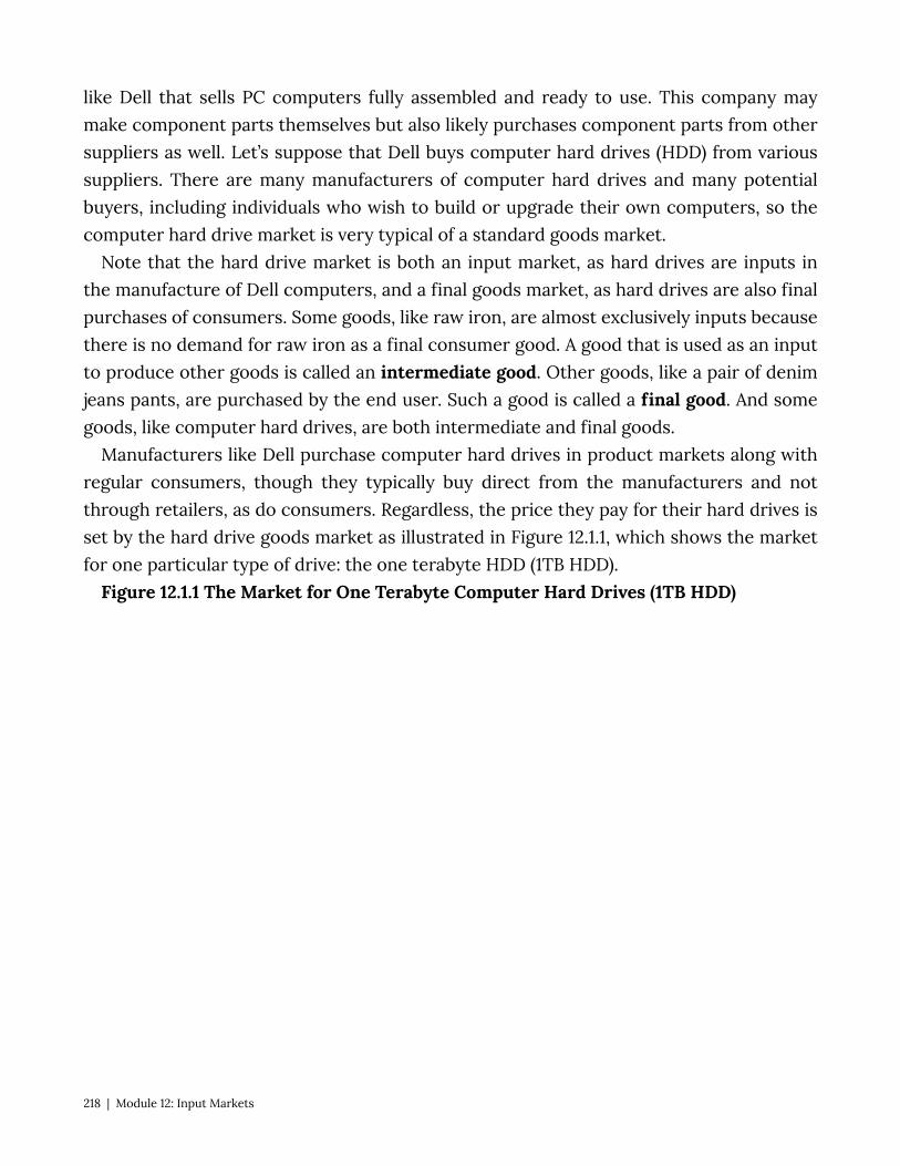
like Dell that sells PC computers fully assembled and ready to use. This company may make component parts themselves but also likely purchases component parts from other suppliers as well. Let’s suppose that Dell buys computer hard drives (HDD) from various suppliers. There are many manufacturers of computer hard drives and many potential buyers, including individuals who wish to build or upgrade their own computers, so the computer hard drive market is very typical of a standard goods market.
Note that the hard drive market is both an input market, as hard drives are inputs in the manufacture of Dell computers, and a final goods market, as hard drives are also final purchases of consumers. Some goods, like raw iron, are almost exclusively inputs because there is no demand for raw iron as a final consumer good. A good that is used as an input to produce other goods is called an intermediate good. Other goods, like a pair of denim jeans pants, are purchased by the end user. Such a good is called a final good. And some goods, like computer hard drives, are both intermediate and final goods.
Manufacturers like Dell purchase computer hard drives in product markets along with regular consumers, though they typically buy direct from the manufacturers and not through retailers, as do consumers. Regardless, the price they pay for their hard drives is set by the hard drive goods market as illustrated in Figure 12.1.1, which shows the market for one particular type of drive: the one terabyte HDD (1TB HDD).
Figure 12.1.1 The Market for One Terabyte Computer Hard Drives (1TB HDD)
218 | Module 12: Input Markets
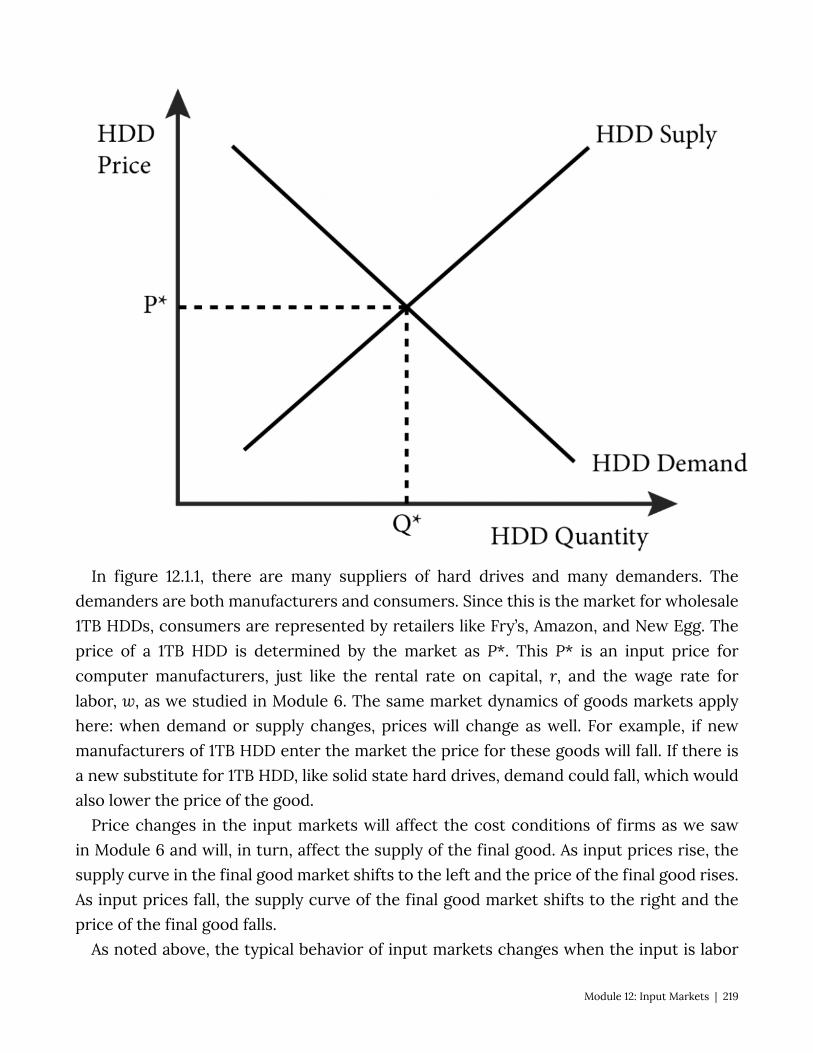
In figure 12.1.1, there are many suppliers of hard drives and many demanders. The demanders are both manufacturers and consumers. Since this is the market for wholesale 1TB HDDs, consumers are represented by retailers like Fry’s, Amazon, and New Egg. The price of a 1TB HDD is determined by the market as P*. This P* is an input price for computer manufacturers, just like the rental rate on capital, r, and the wage rate for labor, w, as we studied in Module 6. The same market dynamics of goods markets apply here: when demand or supply changes, prices will change as well. For example, if new manufacturers of 1TB HDD enter the market the price for these goods will fall. If there is a new substitute for 1TB HDD, like solid state hard drives, demand could fall, which would also lower the price of the good.
Price changes in the input markets will affect the cost conditions of firms as we saw in Module 6 and will, in turn, affect the supply of the final good. As input prices rise, the supply curve in the final good market shifts to the left and the price of the final good rises. As input prices fall, the supply curve of the final good market shifts to the right and the price of the final good falls.
As noted above, the typical behavior of input markets changes when the input is labor
Module 12: Input Markets | 219

or when the buyer of the input is the only buyer. We study these two instances in the next two sections.
12.2 Labor Markets LO 12.2: Describe how individuals make their labor supply decisions and how this can
lead to a backward bending labor supply curve. Almost every final good produced has some labor input involved, if not as part of
the manufacturing process than as an ancillary contribution through administration, marketing, sales and so forth. For this reason alone, labor has an outsized role in production and deserves special attention. Another particular aspect of labor that requires special attention is the fact that it is an input provided by individuals making optimal decisions about work and leisure.
The labor market is where labor prices, or wages, are set and is defined by the same supply and demand dynamics as other input markets. The supply of labor is determined by the labor-leisure choice of individuals. Individuals think about the tradeoff between working more and earning more money, which can be used to purchase goods and services, and working less and having more time to enjoy leisure activities and perform chores that are necessary but for which there is no monetary compensation.
The labor-leisure choice is the starting point to thinking about labor markets. We can model this choice just as we do consumers deciding between bundles of two different goods. Both leisure and the income from labor are goods that reflect standard preferences: individuals would prefer more of both, and a mix of both income and leisure is preferable to too much of one or the other. Thus we can describe an individual’s preferences by a utility function of income (I) and leisure (l):
U = U(I , l) Individuals cannot spend more than 24 hours per day in either activity. We can write
down a constraint that describes this as: H = 24 – l, where H is the hours spent working in a day and l is the amount of leisure consumed in
a day. For a given hourly wage rate, w, the income earned by a consumer, I, is given as: I = wH. Recall that in Module 4, where we studied the consumer choice problem, we took
income (I) as given to the consumer. In this discussion we will see that I is a result of a decision the individual makes about how much labor to supply to the labor market.
Figure 12.2.1 shows the optimal choice between leisure and income for an individual, Asha, and how it is determined. Asha’s income is measured on the vertical axis and the amount of leisure hours per day she consumes is measured on the horizontal axis. Since
220 | Module 12: Input Markets
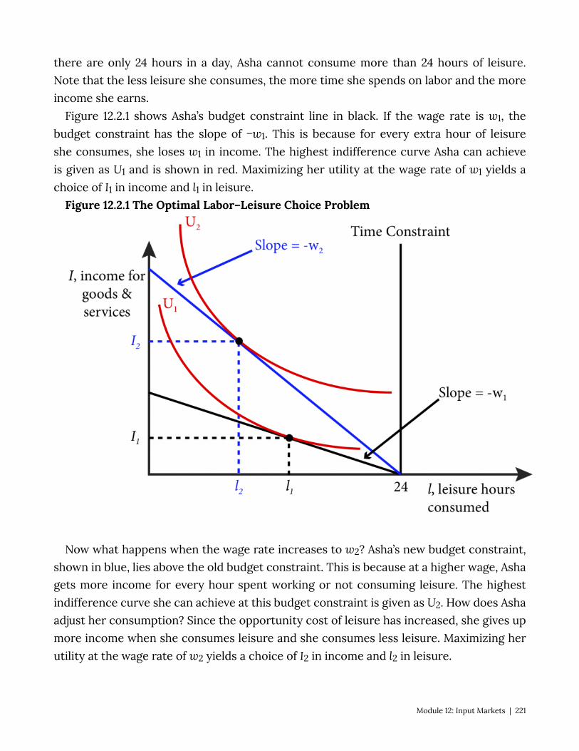
there are only 24 hours in a day, Asha cannot consume more than 24 hours of leisure. Note that the less leisure she consumes, the more time she spends on labor and the more income she earns.
Figure 12.2.1 shows Asha’s budget constraint line in black. If the wage rate is w1, the budget constraint has the slope of −w1. This is because for every extra hour of leisure she consumes, she loses w1 in income. The highest indifference curve Asha can achieve is given as U1 and is shown in red. Maximizing her utility at the wage rate of w1 yields a choice of I1 in income and l1 in leisure.
Figure 12.2.1 The Optimal Labor–Leisure Choice Problem
Now what happens when the wage rate increases to w2? Asha’s new budget constraint, shown in blue, lies above the old budget constraint. This is because at a higher wage, Asha gets more income for every hour spent working or not consuming leisure. The highest indifference curve she can achieve at this budget constraint is given as U2. How does Asha adjust her consumption? Since the opportunity cost of leisure has increased, she gives up more income when she consumes leisure and she consumes less leisure. Maximizing her utility at the wage rate of w2 yields a choice of I2 in income and l2 in leisure.
Module 12: Input Markets | 221
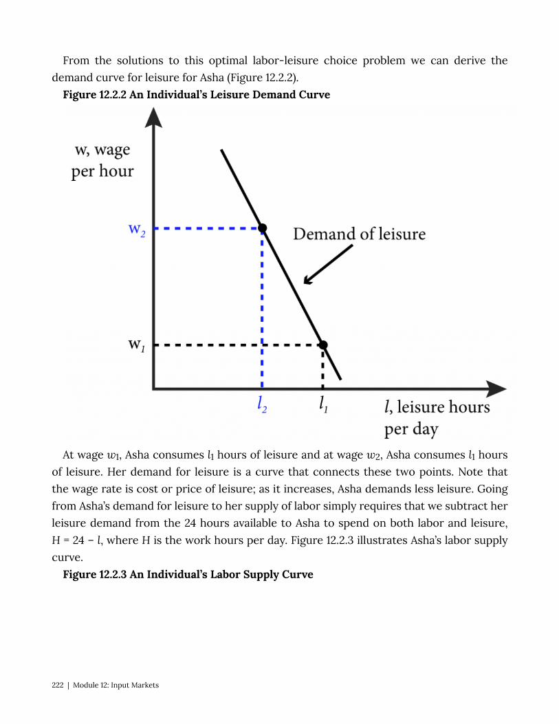
From the solutions to this optimal labor-leisure choice problem we can derive the demand curve for leisure for Asha (Figure 12.2.2).
Figure 12.2.2 An Individual’s Leisure Demand Curve
At wage w1, Asha consumes l1 hours of leisure and at wage w2, Asha consumes l1 hours of leisure. Her demand for leisure is a curve that connects these two points. Note that the wage rate is cost or price of leisure; as it increases, Asha demands less leisure. Going from Asha’s demand for leisure to her supply of labor simply requires that we subtract her leisure demand from the 24 hours available to Asha to spend on both labor and leisure, H = 24 – l, where H is the work hours per day. Figure 12.2.3 illustrates Asha’s labor supply curve.
Figure 12.2.3 An Individual’s Labor Supply Curve
222 | Module 12: Input Markets
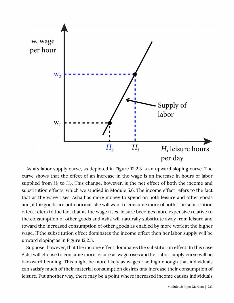
Asha’s labor supply curve, as depicted in Figure 12.2.3 is an upward sloping curve. The curve shows that the effect of an increase in the wage is an increase in hours of labor supplied from H1 to H2. This change, however, is the net effect of both the income and substitution effects, which we studied in Module 5.6. The income effect refers to the fact that as the wage rises, Asha has more money to spend on both leisure and other goods and, if the goods are both normal, she will want to consume more of both. The substitution effect refers to the fact that as the wage rises, leisure becomes more expensive relative to the consumption of other goods and Asha will naturally substitute away from leisure and toward the increased consumption of other goods as enabled by more work at the higher wage. If the substitution effect dominates the income effect then her labor supply will be upward sloping as in Figure 12.2.3.
Suppose, however, that the income effect dominates the substitution effect. In this case Asha will choose to consume more leisure as wage rises and her labor supply curve will be backward bending. This might be more likely as wages rise high enough that individuals can satisfy much of their material consumption desires and increase their consumption of leisure. Put another way, there may be a point where increased income causes individuals
Module 12: Input Markets | 223
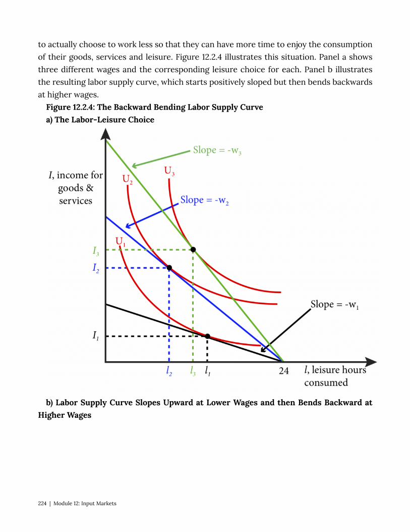
to actually choose to work less so that they can have more time to enjoy the consumption of their goods, services and leisure. Figure 12.2.4 illustrates this situation. Panel a shows three different wages and the corresponding leisure choice for each. Panel b illustrates the resulting labor supply curve, which starts positively sloped but then bends backwards at higher wages.
Figure 12.2.4: The Backward Bending Labor Supply Curve a) The Labor-Leisure Choice
b) Labor Supply Curve Slopes Upward at Lower Wages and then Bends Backward at Higher Wages
224 | Module 12: Input Markets
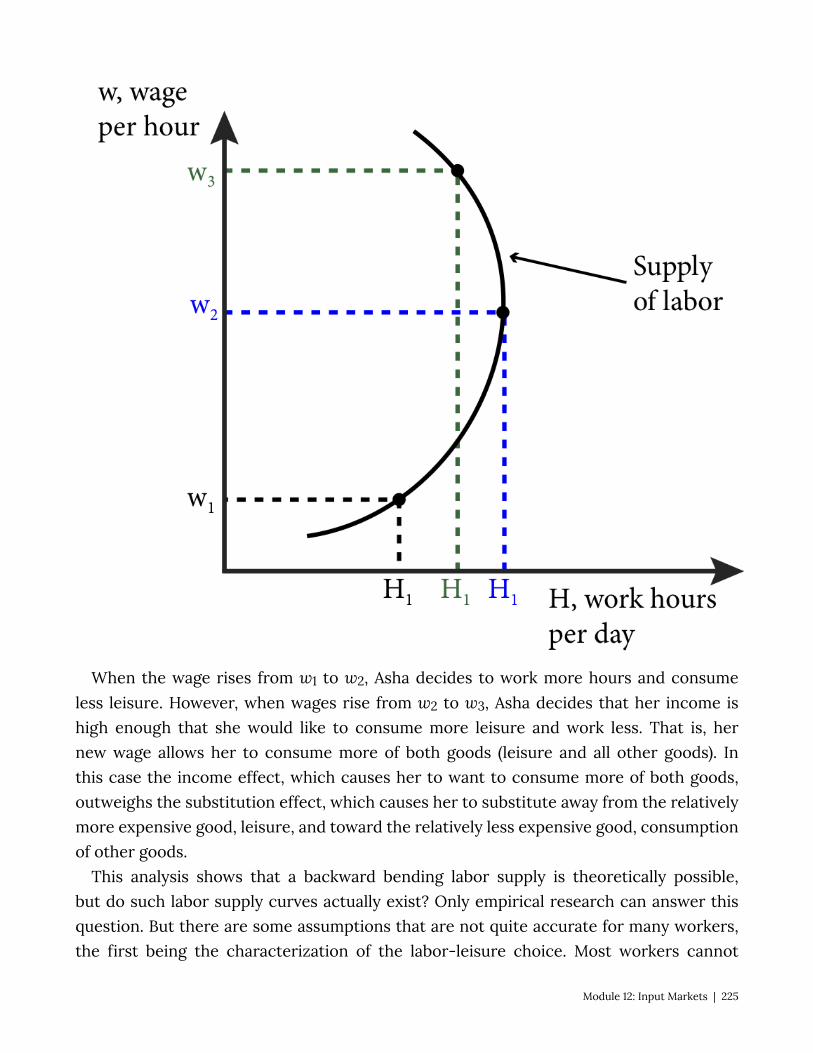
When the wage rises from w1 to w2, Asha decides to work more hours and consume less leisure. However, when wages rise from w2 to w3, Asha decides that her income is high enough that she would like to consume more leisure and work less. That is, her new wage allows her to consume more of both goods (leisure and all other goods). In this case the income effect, which causes her to want to consume more of both goods, outweighs the substitution effect, which causes her to substitute away from the relatively more expensive good, leisure, and toward the relatively less expensive good, consumption of other goods.
This analysis shows that a backward bending labor supply is theoretically possible, but do such labor supply curves actually exist? Only empirical research can answer this question. But there are some assumptions that are not quite accurate for many workers, the first being the characterization of the labor-leisure choice. Most workers cannot
Module 12: Input Markets | 225

choose independently how many hours per day they work. Many jobs have specified work hours and in the United States, many jobs are 40 hours a week with very little room for adjustment. So when employers raise wages, there may be no way for employees to adjust their hours in response. Empirical research suggests that for men this rigidity in hours might be very important as their labor supply curves have been estimated to be nearly vertical.
12.3 Competitive Labor Markets and Monopsonist Labor Markets LO 12.3: Explain how monopsonist labor markets differ from competitive labor markets. Another way that input markets can be different than a typical goods market is when
there is only one buyer of an input. Monopsony is the situation where there are many sellers but only one buyer of a good. Consider the case of an advanced weapon system that by law can only be sold to the government, or a factory town where almost all of the resident workers are employed by a single factory.
The case of professional American football players in the United States is a good example. The National Football League (NFL) is the only major professional American football league in the world, and while there are a few other options, like the Canadian Football League, they pale in comparison to the NFL. In labor market terms the NFL acts a lot like a single entity with strict rules about hiring that prevent teams from competing with each other for new talent. Each year there are many sellers of labor, the football players, and one buyer, the NFL.
Competitive Firms’ Employment Behavior How are monopsonists different than competitive firms in a labor market? To answer
this let’s first look at competitive firms’ hiring decisions. In a competitive labor market each firm has no influence on the equilibrium market wage, so no matter how many workers or worker hours a firm employs the wage will remain constant. Thus a firm’s decision is to continue to employ workers as long as the value of their marginal product of labor (MPL) is greater than the wage. Recall that MPL, is the extra output achieved from the addition of a single unit of labor. For our discussion here the unit is an hour of work. The marginal revenue product of labor (MRPL) is the value of the marginal product of labor—it is the extra revenue a firm receives for an additional unit of labor. Therefore the MRPL is the product of the marginal product of labor and the marginal revenue, MR, that accrues to the firm from one additional unit of output:
MRPL = MR × MPL
A firm will continue to add additional hours of labor as long as that additional labor adds positively to profits. The cost of an hour of labor is w and the benefit is precisely the MRPL. So as long as MRPL > w the firm is adding to its profits. If MRPL < w, the firm can increase
226 | Module 12: Input Markets
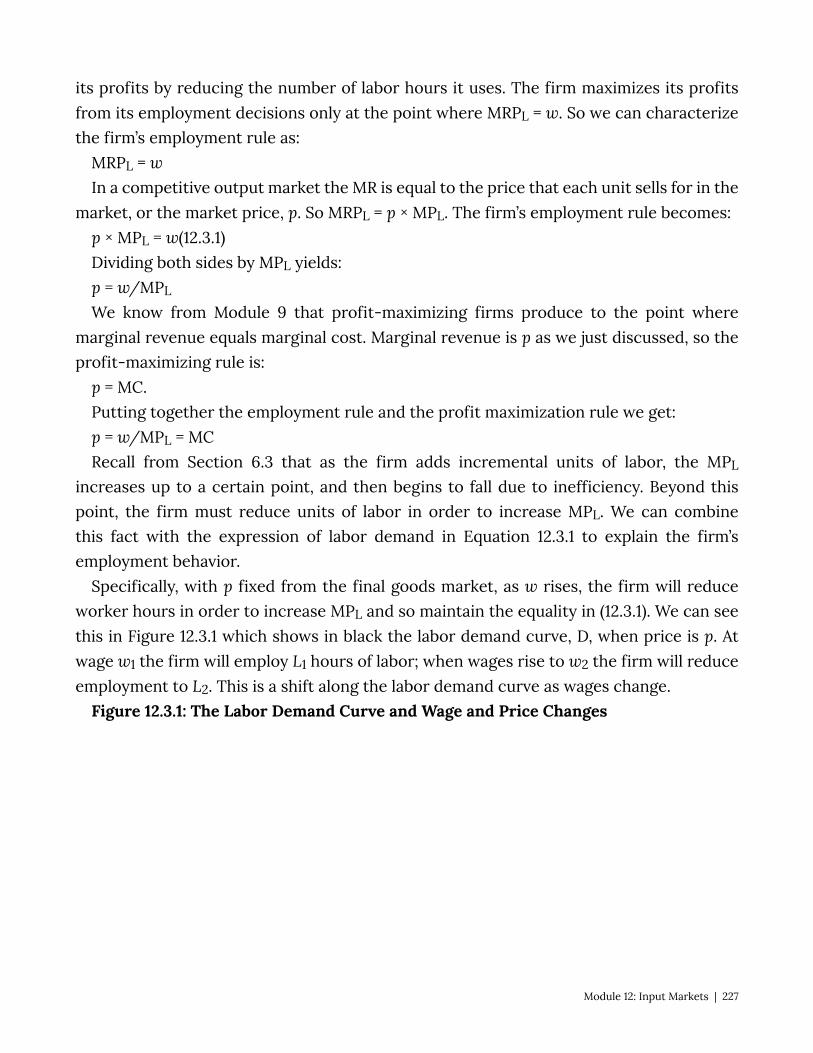
its profits by reducing the number of labor hours it uses. The firm maximizes its profits from its employment decisions only at the point where MRPL = w. So we can characterize the firm’s employment rule as:
MRPL = w In a competitive output market the MR is equal to the price that each unit sells for in the
market, or the market price, p. So MRPL = p × MPL. The firm’s employment rule becomes: p × MPL = w(12.3.1) Dividing both sides by MPL yields: p = w/MPL
We know from Module 9 that profit-maximizing firms produce to the point where marginal revenue equals marginal cost. Marginal revenue is p as we just discussed, so the profit-maximizing rule is:
p = MC. Putting together the employment rule and the profit maximization rule we get: p = w/MPL = MC Recall from Section 6.3 that as the firm adds incremental units of labor, the MPL
increases up to a certain point, and then begins to fall due to inefficiency. Beyond this point, the firm must reduce units of labor in order to increase MPL. We can combine this fact with the expression of labor demand in Equation 12.3.1 to explain the firm’s employment behavior.
Specifically, with p fixed from the final goods market, as w rises, the firm will reduce worker hours in order to increase MPL and so maintain the equality in (12.3.1). We can see this in Figure 12.3.1 which shows in black the labor demand curve, D, when price is p. At wage w1 the firm will employ L1 hours of labor; when wages rise to w2 the firm will reduce employment to L2. This is a shift along the labor demand curve as wages change.
Figure 12.3.1: The Labor Demand Curve and Wage and Price Changes
Module 12: Input Markets | 227

What happens when the price of the final good changes? Well suppose the price rises from p to p*. This means that the MRPL rises as well and so temporarily the p × MPL > w. The firm can now add more workers to lower the MPL until the equality of the MRPL to w is restored. We see this in Figure 12.3.1 as a shift in the labor demand curve from D (in black) to D* (in blue). Now at wage w1 the firm will employ L1* hours of labor and when wages rise to w2 the firm will reduce employment to L2*.
To summarize the results of wage and price changes on the labor demand curve:
• A change in wage results in a shift along the labor demand curve. • A change in price results in a shift of the labor demand curve.
Wages and Labor Market Equilibrium How is the wage amount set in a competitive labor market? To find labor market
equilibrium we must first derive the market supply of labor and the market demand for labor.
The market supply of labor is simply the sum of the labor supplied by all individual workers. Figure 12.2.3 showed an individual labor supply curve;. the market labor supply curve is illustrated in Figure 12.3.2. Labor hours, L, is simply all of the individual work hours
228 | Module 12: Input Markets
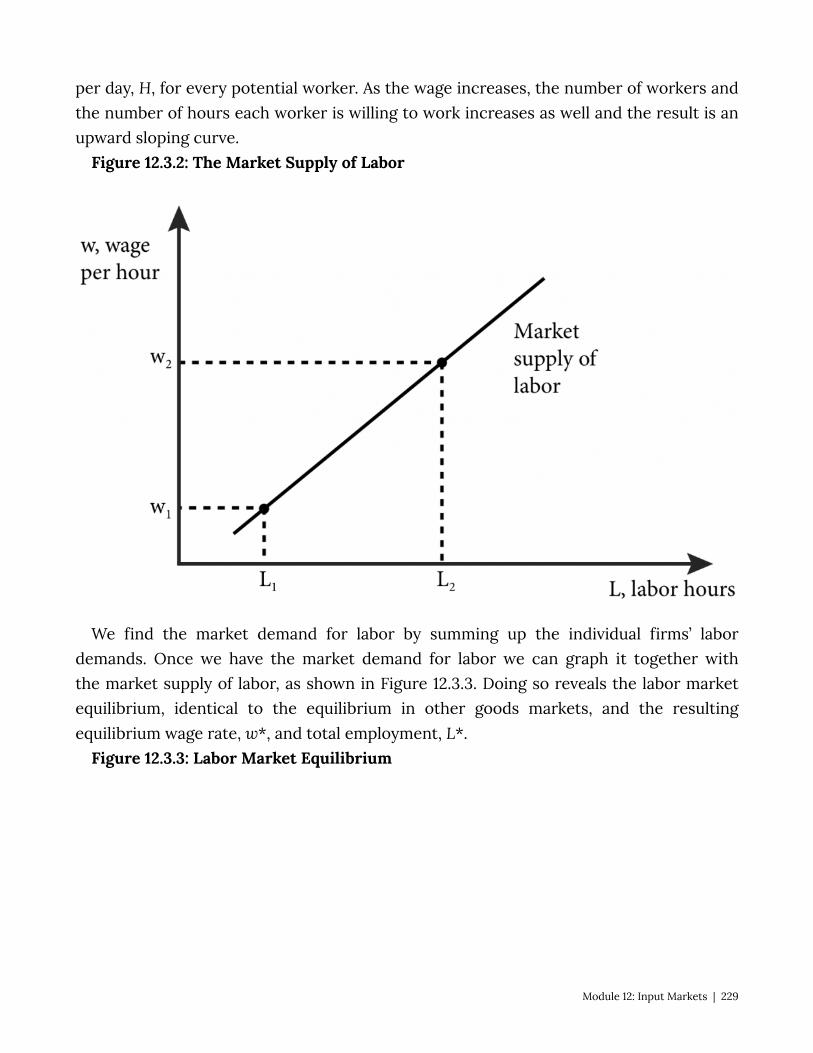
per day, H, for every potential worker. As the wage increases, the number of workers and the number of hours each worker is willing to work increases as well and the result is an upward sloping curve.
Figure 12.3.2: The Market Supply of Labor
We find the market demand for labor by summing up the individual firms’ labor demands. Once we have the market demand for labor we can graph it together with the market supply of labor, as shown in Figure 12.3.3. Doing so reveals the labor market equilibrium, identical to the equilibrium in other goods markets, and the resulting equilibrium wage rate, w*, and total employment, L*.
Figure 12.3.3: Labor Market Equilibrium
Module 12: Input Markets | 229

As Figure 12.3.3 shows, we call the market demand for labor DL and the market supply of labor SL. Where they cross is the equilibrium point and the wage and labor hours at that point are the equilibrium wage rate, w*, and equilibrium employment, L*, respectively.
Monopsony Employment Behavior In a competitive labor market the wage amount is set by market equilibrium of labor
supply and demand, and the firm must pay that wage in order to attract workers. But when the firm is a monopsonist in the labor market, it has power to influence the wage amount, w, and does not take it as fixed.
A competitive firm takes the wage as given and can hire as many work hours as it likes at that wage. We call the marginal expenditure (ME) the extra cost of hiring one more unit of labor. The ME for a competitive firm of an additional hour of labor is simply the market wage.
A monopsonist must also pay a wage to attract workers but this wage depends on the labor supply curve. For example, suppose that at a wage of $20 per hour, a monopsonist firm attracts 1000 hours of workers per week for a total weekly wage bill of $20,000. Now
230 | Module 12: Input Markets
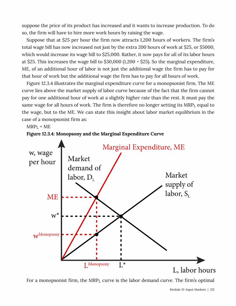
suppose the price of its product has increased and it wants to increase production. To do so, the firm will have to hire more work hours by raising the wage.
Suppose that at $25 per hour the firm now attracts 1,200 hours of workers. The firm’s total wage bill has now increased not just by the extra 200 hours of work at $25, or $5000, which would increase its wage bill to $25,000. Rather, it now pays for all of its labor hours at $25. This increases the wage bill to $30,000 (1,200 × $25). So the marginal expenditure, ME, of an additional hour of labor is not just the additional wage the firm has to pay for that hour of work but the additional wage the firm has to pay for all hours of work.
Figure 12.3.4 illustrates the marginal expenditure curve for a monopsonist firm. The ME curve lies above the market supply of labor curve because of the fact that the firm cannot pay for one additional hour of work at a slightly higher rate than the rest. It must pay the same wage for all hours of work. The firm is therefore no longer setting its MRPL equal to the wage, but to the ME. We can state this insight about labor market equilibrium in the case of a monopsonist firm as:
MRPL = ME Figure 12.3.4: Monopsony and the Marginal Expenditure Curve
For a monopsonist firm, the MRPL curve is the labor demand curve. The firm’s optimal
Module 12: Input Markets | 231

employment decision is where ME = DL. This occurs at LMonopsony. To attract this amount of labor the firm must pay wMonopsony – the point on the supply curve that yields precisely LMonopsony. We can see from figure 12.3.4 that the monopsonist will hire fewer hours of labor (LMonopsony) than would occur in a competitive market (L*) and pay a lower wage (wMonopsony) than in a competitive market (w*).
12.4 Minimum Wages and Unions Learning Objective 12.4: Show the labor market and welfare effects of minimum wages
in a comparative statics analysis. In a monopsonist labor market, the buyer of labor—the firm–has some power to set
wages, rather than accepting a market-driven rate. In other contexts, the sellers of labor—workers—may enjoy an advantage in determining wage rates or employment levels or both. These advantages can be achieved through collective bargaining, for example, or public policy approa ches such as setting a minimum wage.
In the United States it is illegal to pay workers below the federally mandated minimum wage, currently set at $7.25 an hour. Many states have set minimum wages above this level; in 2015 Washington was the state with the highest minimum wage, at $9.47 an hour. There are many reasons for these policies but the most common rationale, often expressed by those who champion even higher minimum wages, is that wages are too low and do not represent a ‘living wage’ – a wage high enough to afford the basic necessities of food, shelter and clothing. In other words, minimum wages are a policy tool to address poverty.
To analyze minimum wages, we start by recognizing that they are price floors in the labor market, similar to the price floors in goods markets that we studied in Module 11. A minimum wage set above the market equilibrium wage moves the market leftward on the market demand for labor curve, as Figure 12.4.1 shows. As a result, fewer employers are able to enter or remain in the market and existing employers demand fewer hours of labor at the minimum wage than at the market equilibrium wage, w*. At the same time, more workers are interested in entering the market and existing workers are willing to work more hours at the higher minimum wage than at the market equilibrium wage. This difference between the number of hours that workers would like to work (LSupplied) and the number of labor hours that employers demand (LDemanded) leads to an excess supply of labor at the minimum wage, as shown in Figure 12.4.1 .
Figure 12.4.1: Minimum Wage in a Labor Market
232 | Module 12: Input Markets
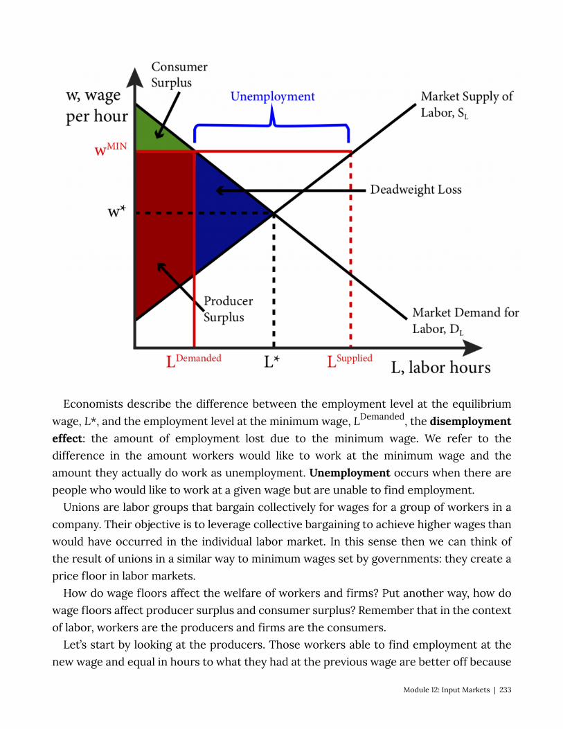
Economists describe the difference between the employment level at the equilibrium wage, L*, and the employment level at the minimum wage, LDemanded, the disemployment effect: the amount of employment lost due to the minimum wage. We refer to the difference in the amount workers would like to work at the minimum wage and the amount they actually do work as unemployment. Unemployment occurs when there are people who would like to work at a given wage but are unable to find employment.
Unions are labor groups that bargain collectively for wages for a group of workers in a company. Their objective is to leverage collective bargaining to achieve higher wages than would have occurred in the individual labor market. In this sense then we can think of the result of unions in a similar way to minimum wages set by governments: they create a price floor in labor markets.
How do wage floors affect the welfare of workers and firms? Put another way, how do wage floors affect producer surplus and consumer surplus? Remember that in the context of labor, workers are the producers and firms are the consumers.
Let’s start by looking at the producers. Those workers able to find employment at the new wage and equal in hours to what they had at the previous wage are better off because
Module 12: Input Markets | 233
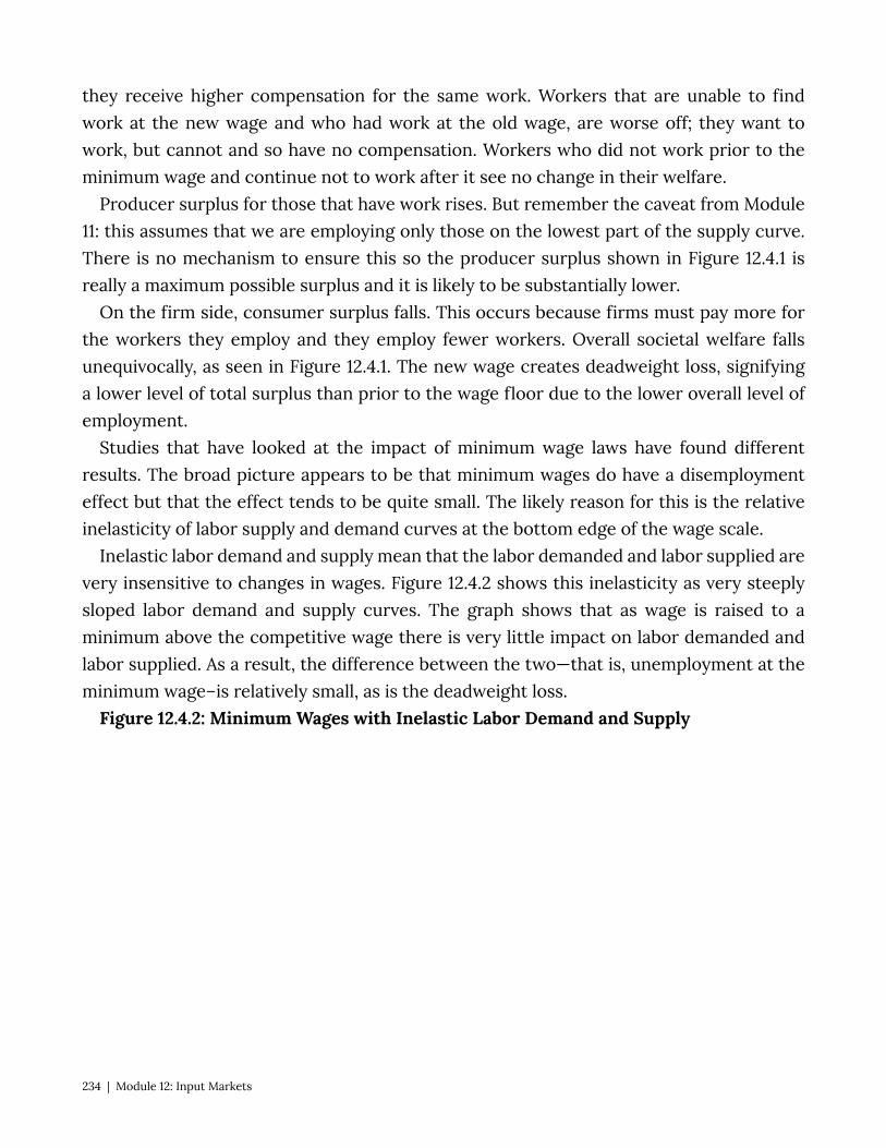
they receive higher compensation for the same work. Workers that are unable to find work at the new wage and who had work at the old wage, are worse off; they want to work, but cannot and so have no compensation. Workers who did not work prior to the minimum wage and continue not to work after it see no change in their welfare.
Producer surplus for those that have work rises. But remember the caveat from Module 11: this assumes that we are employing only those on the lowest part of the supply curve. There is no mechanism to ensure this so the producer surplus shown in Figure 12.4.1 is really a maximum possible surplus and it is likely to be substantially lower.
On the firm side, consumer surplus falls. This occurs because firms must pay more for the workers they employ and they employ fewer workers. Overall societal welfare falls unequivocally, as seen in Figure 12.4.1. The new wage creates deadweight loss, signifying a lower level of total surplus than prior to the wage floor due to the lower overall level of employment.
Studies that have looked at the impact of minimum wage laws have found different results. The broad picture appears to be that minimum wages do have a disemployment effect but that the effect tends to be quite small. The likely reason for this is the relative inelasticity of labor supply and demand curves at the bottom edge of the wage scale.
Inelastic labor demand and supply mean that the labor demanded and labor supplied are very insensitive to changes in wages. Figure 12.4.2 shows this inelasticity as very steeply sloped labor demand and supply curves. The graph shows that as wage is raised to a minimum above the competitive wage there is very little impact on labor demanded and labor supplied. As a result, the difference between the two—that is, unemployment at the minimum wage–is relatively small, as is the deadweight loss.
Figure 12.4.2: Minimum Wages with Inelastic Labor Demand and Supply
234 | Module 12: Input Markets
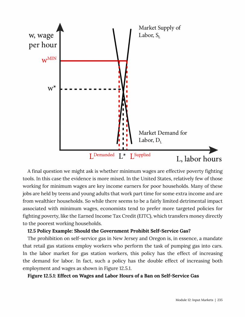
A final question we might ask is whether minimum wages are effective poverty fighting tools. In this case the evidence is more mixed. In the United States, relatively few of those working for minimum wages are key income earners for poor households. Many of these jobs are held by teens and young adults that work part time for some extra income and are from wealthier households. So while there seems to be a fairly limited detrimental impact associated with minimum wages, economists tend to prefer more targeted policies for fighting poverty, like the Earned Income Tax Credit (EITC), which transfers money directly to the poorest working households.
12.5 Policy Example: Should the Government Prohibit Self-Service Gas? The prohibition on self-service gas in New Jersey and Oregon is, in essence, a mandate
that retail gas stations employ workers who perform the task of pumping gas into cars. In the labor market for gas station workers, this policy has the effect of increasing the demand for labor. In fact, such a policy has the double effect of increasing both employment and wages as shown in Figure 12.5.1.
Figure 12.5.1: Effect on Wages and Labor Hours of a Ban on Self-Service Gas
Module 12: Input Markets | 235
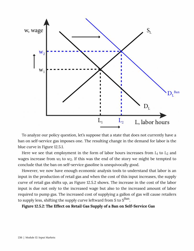
To analyze our policy question, let’s suppose that a state that does not currently have a ban on self-service gas imposes one. The resulting change in the demand for labor is the blue curve in Figure 12.5.1.
Here we see that employment in the form of labor hours increases from L1 to L2 and wages increase from w1 to w2. If this was the end of the story we might be tempted to conclude that the ban on self-service gasoline is unequivocally good.
However, we now have enough economic analysis tools to understand that labor is an input in the production of retail gas and when the cost of this input increases, the supply curve of retail gas shifts up, as Figure 12.5.2 shows. The increase in the cost of the labor input is due not only to the increased wage but also to the increased amount of labor required to pump gas. The increased cost of supplying a gallon of gas will cause retailers to supply less, shifting the supply curve leftward from S to SBan.
Figure 12.5.2: The Effect on Retail Gas Supply of a Ban on Self-Service Gas
236 | Module 12: Input Markets
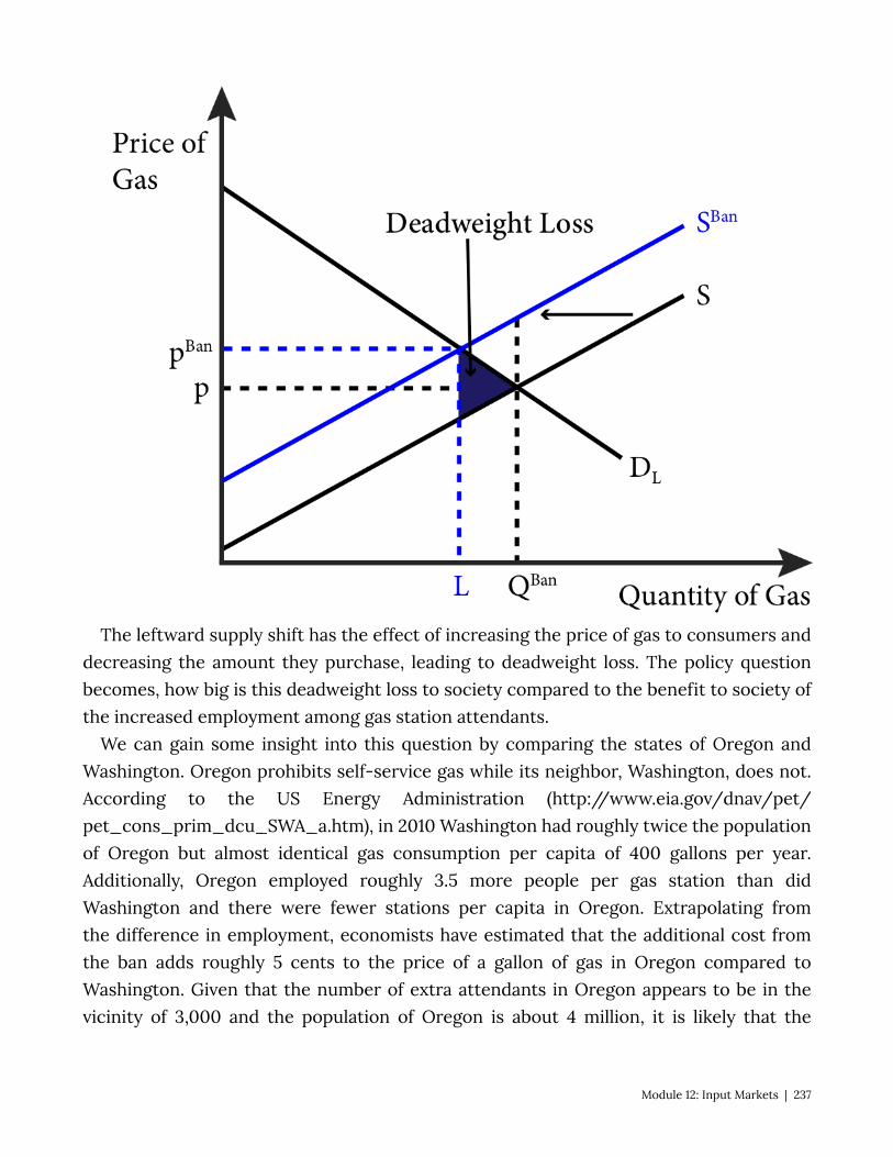
The leftward supply shift has the effect of increasing the price of gas to consumers and decreasing the amount they purchase, leading to deadweight loss. The policy question becomes, how big is this deadweight loss to society compared to the benefit to society of the increased employment among gas station attendants.
We can gain some insight into this question by comparing the states of Oregon and Washington. Oregon prohibits self-service gas while its neighbor, Washington, does not. According to the US Energy Administration (http://www.eia.gov/dnav/pet/pet_cons_prim_dcu_SWA_a.htm), in 2010 Washington had roughly twice the population of Oregon but almost identical gas consumption per capita of 400 gallons per year. Additionally, Oregon employed roughly 3.5 more people per gas station than did Washington and there were fewer stations per capita in Oregon. Extrapolating from the difference in employment, economists have estimated that the additional cost from the ban adds roughly 5 cents to the price of a gallon of gas in Oregon compared to Washington. Given that the number of extra attendants in Oregon appears to be in the vicinity of 3,000 and the population of Oregon is about 4 million, it is likely that the
Module 12: Input Markets | 237
deadweight loss that comes from the higher price of retail gasoline is quite large relative to the societal benefit of the relatively few added employees.
Exploring the Policy Question
1. Do you support the ban on self-service gas? Why or why not? 2. Suppose the government mandated that grocery stores must have employees carry
customers’ groceries of to their cars. What effect would be on prices and employment would you expect?
SUMMARY
Review: Topics and Related Learning Outcomes
12.1 Input Markets Learning Objective 12.1: Explain how changes in input markets affect firms’ cost of
production. 12.2 Labor Markets Learning Objective 12.2: Describe how individuals make their labor supply decisions and
how this can lead to a backward bending labor supply curve. 12.3 Monopsony Learning Objective 12.3: Explain how monopsonist labor markets differ from competitive
labor markets. 12.4 Minimum Wages and Unions Learning Objective 12.4: Show the labor market and welfare effects of minimum wages
in a comparative statics analysis. 12.5 Policy Example: Should the Government Prohibit Self-Service Gas? Learning Objective 12.5: Apply a comparative static analysis to evaluate government
prohibitions of self-service gas on labor markets and the market for retail gas.
238 | Module 12: Input Markets
Learn: Key Terms and Graphs
Terms
Final good Intermediate good Monopsonist Monopsony Marginal revenue product of labor (MRPL) Unemployment Disemployment effect
Graphs
The Market for One Terabyte Computer Hard Drives (1TB HDD) The Optimal Labor–Leisure Choice Problem An Individual’s Leisure Demand Curve An Individual’s Labor Supply Curve The Backward Bending Labor Supply Curve The Labor Demand Curve and Wage and Price Changes The Market Supply of Labor Labor Market Equilibrium Monopsony and the Marginal Expenditure Curve Minimum Wage in a Labor Market Minimum Wages with Inelastic Labor Demand and Supply Effect on Wages and Labor Hours of a Ban on Self-Service Gas The Effect on Retail Gas Supply of a Ban on Self-Service Gas
Module 12: Input Markets | 239
Module 13: Perfect Competition
Policy Example: Should the Government Allow Oil Companies to Merge Retail Gas Stations?
“Sandakan Sabah Shell-Station on commons.wikipedia.org is licensed under CC BY-SA
In the late 1990s and early 2000s, there were a number of mergers of big oil companies in the United States: Exxon acquired Mobil, BP Amoco acquired Arco, Chevron acquired Texaco, and Phillips merged with Conoco. This led to massive consolidation in the oil business. In response, U.S. government regulators required the sell off of some refineries to maintain competitiveness in regional refined gas markets. For the most part, however, the same regulators were unconcerned about the reduction in competition in the retail gas market. In this module we will explore perfectly competitive markets and, in so doing, will be able to better understand why regulators were relatively unconcerned about concentration in the retail gas industry.
Exploring the Policy Question
1. Why were retail gas stations not considered a main concern of regulators? 2. Does the merger of major oil companies necessarily lead to higher gas prices? Why
or why not?
13.1 Conditions for Perfect Competition
240 | Module 13: Perfect Competition
Learning Objective 13.1: Describe the characteristics of a perfectly competitive market. 13.2 Perfect Competition and Efficiency Learning Objective 13.2: Explain how perfectly competitive markets lead to Pareto
efficient outcomes. 12.3 Policy Example: Should the Government Allow Oil Companies to Merge Retail Gas
Stations? Learning Objective 12.3: Use the perfectly competitive market model to evaluate the
decision to allow the consolidation of retail gas stations under fewer brands. 13.1 Conditions for Perfect Competition LO 13.1: Describe the characteristics of a perfectly competitive market. In perfectly competitive markets firms and consumers are all price takers: their supply
and purchasing decisions have no impact on the market price. This means that the market is so big that any one individual seller or buyer is such a small part of the overall market that their individual decisions are inconsequential to the market as a whole. It is worth mentioning here at the start that this is a very strong assumption and thus this is considered an almost purely theoretical extreme along with monopoly at the other extreme. We can and will describe markets that come pretty close to the assumptions underlying perfect completion, but most markets will lie somewhere in between purely competitive and monopolistic. It is important to study these extremes to better understand the full range of markets and their outcomes.
Before we describe in detail perfectly competitive markets, let’s consider how we categorize market structure, the competitive environments in which firms and consumers interact. There are three main metrics by which we measure a market’s structure:
• The number of firms. More firms mean more competition, more places to which consumers can turn to purchase a good.
• The similarity of goods. The more similar are the goods sold in the market the more easily consumers can switch firms to buy from and the more competitive the market is.
• The barriers to entry. The more difficult is it to enter a market for a new firm, the less competitive it is.
Module 13: Perfect Competition | 241

The first is relatively straightforward; more firms mean more competition in the sense that it is hard to charge more for a product that consumes can find easily from other sellers. The second is a little subtler because products can be differentiated by something as simple as a brand or more tangible aspects like colors, features and other characteristics. Finally the third can be barriers of law like patents, or technology even if not covered by legal patent protection, or more natural barriers like a very high cost of starting up a firm that is not justified by the expected revenue.
We will study four market types in more detail where these metrics will be discussed further, but for now they are described along the three metrics in Table 13.1
Table 13.1: The Four Basic Market Structures Described
Perfect Competition
Monopolistic Competition Oligopoly Monopoly
Number of Firms Many Many Few One
Similarity of Goods Identical Differentiated Identical or
Differentiated Unique
Barriers to Entry None None Some Many
Module 13 20 19 15
With this categorization in palce we can turn to the definition of perfect competition. Perfect competition is a market with many firms, an identical product and no barriers to entry. Let’s take these three metrics one by one.
Many firms. Many firms means that from the perspective of one individual firm there is no way to raise or lower the market price for a good. This is because the individual firm’s output is such a small part of the overall market that it does not make a difference in terms of price. Firms are, therefore, price takers, meaning that their decision is simply how much to sell at the market price. If they try and sell for a higher price, no one will buy from them, and they could sell for a lower price, but if they did so, they would only be hurting themselves because it would not affect their quantity sold. Thus from an individual firm’s perspective, they face a horizontal demand curve. We assume they can sell as much as they want but only at the market price. This is an extreme assumption, as mentioned
242 | Module 13: Perfect Competition
before, but there are some markets that resemble this description. Take the market for corn in the United States. The annual U.S. corn crop is roughly 12 billion bushels, and there are roughly 315,000 corn farms in the country. Thus average output per farm is about 38 thousand bushels annually or about 0.000003% of the total supply of corn in the U.S. If one farmer, of average corn acreage decided to withhold output there would not likely be any effect on the market price. It is also true that consumers are price takers as well, meaning no one consumer has a large enough impact to affect prices.
Identical goods. Identical goods means there is nothing to distinguish one firms goods from another. To use the corn example, once all the corn is dumped into the grain elevator there is absolutely no way to tell from which farm a particular kernel of corn came. This means there is no way for one seller to differentiate their output to try and sell it at a different price on the premise that it is different. Contrast this to the automotive market where the products are heterogeneous. Cars manufactured by Audi are very different than cars manufactured by Kia. An Audi A6 is very different than a Kia Optima in many substantive ways. Even when there is very little of substance that is different, branding can be used to differentiate. Take, for example, polo shirts from Lacoste and Ralph Lauren. The shirt might be almost identical in terms of style, fabric, color, etc., but through branding them with a logo – a crocodile or polo player – the manufacturers are able to differentiate them in the minds of consumers.
Free entry and exit. It is very easy for firms to start and stop selling in this market. For example, if a farmer decides to plant corn instead of soybeans, there is nothing preventing them from doing so. Likewise a farmer who wishes to plant soybeans instead of corn faces no barriers. In general free entry and exit mean that there are no legal barriers to entry, like needing a special permit only given to a limited number of firms, and no major cost obstacles, like needing to invest millions of dollars in a manufacturing plant as a new car manufacturer would. This ensures that firms remain price takers even when demand increases. If there is suddenly more demand for corn, perhaps from ethanol producers, farmers can quickly adjust their crops so existing growers do not have an opportunity to raise prices. Free exit is important as well because if firms know they cannot exit easily, they might be reluctant to enter in the first place.
There are two other implicit assumptions worth mentioning here. The first is that we assume that buyers and sellers have full information meaning that they know the prices charged by every firm. This is important because without it a firm could possibly charge an uninformed consumer more and this violates the price taker condition. The second is that there are negligible transaction costs meaning it is easy for customers to switch sellers and vice-versa. This is also important to ensure price taking for if transactions
Module 13: Perfect Competition | 243
costs were high customers might accept higher process from existing suppliers to avoid the cost of initiating a new transaction with s supplier at a lower price.
Take a moment and think about the policy example, retail gas, and how well it matches with our definition of a perfectly competitive market.
• Are there many sellers? • Is the product identical? • Are there barriers to entry? • Is there full information and are transactions costs low?
Your answers to these questions will be the basis of our evaluation of the policy stance the federal government took in assessing the oil company mergers.
In Module 9 we studied profit maximization for a price taking firm. We now know in what type of market we find price-taking firms, perfectly competitive markets. In the three other market types we will consider, firms will all have some control over the price of the goods they sell. It is worth taking a moment to review the principles of profit maximization for price-taking firms.
We now know clearly what leads to the firm’s demand curve to be horizontal and thus the same as the Marginal Revenue curve, the fact that the firm is in a perfectly competitive market and has no influence on prices.
13.2 Perfect Competition and Efficiency LO 13.2: Explain how perfectly competitive markets lead to Pareto efficient outcomes. In module 10.4 we studied the concepts of consumer and producer surplus and defined
Pareto efficiency. We saw how prices adjust to conditions of excess supply and excess demand until a price that equates supply and demand is reached. What this means is that the market ensures that everyone who values the good more than or equal to the marginal cost of producing it will find a seller willing to sell the good and that all opportunities for consumer and producer surplus will be exploited. This is how we know that total surplus is maximized.
In a perfectly competitive market, neither consumers nor producers have any influence over prices in the market leaving them free to adjust to supply and demand excesses. Because of this there is no deadweight loss, total surplus is maximized and the outcome of the market is Pareto efficient. Prices in competitive markets act as demand and supply signals that are independent of institutional control and ensure that in the end there are no mutually beneficial trades that do not happen. By mutually beneficial we mean that buyers and sellers wish to engage in them because they will both be made better off.
244 | Module 13: Perfect Competition

It is in this sense that ‘free’ markets are considered efficient. By ‘free’ we mean that prices freely adjust, that there are no institutional or competitive controls that prevent prices adjusting to equilibrate the market until the efficient outcome is achieved. By efficient we mean Pareto efficient or that there is no dead weight loss. With this Module we understand the conditions that must hold for a market to achieve the efficient outcome. There must be many buyers and sellers, the good must be homogenous, there must be free entry and exit, and that there is complete information about the good and prices on the part of buyers and there are no transactions costs. If this sounds like a lot, it is. In later Modules, we will examine the effects of other market structures and when assumptions like complete information fail to hold.
12.3 Policy Example: Should the Government Allow Oil Companies to Merge Retail Gas Stations?
LO 12.3: Use the perfectly competitive market model to evaluate the decision to allow the consolidation of retail gas stations under fewer brands.
We are now well-equipped to address our policy example. What we need to do is evaluate the retail gas market using the description of a perfectly competitive market to try and decide how closely it resembles a perfectly competitive market. We then need to determine if the market looks like a competitive one pre-mergers, if that would change significantly after the mergers.
Number of firms. Overall, there are many retail gas stations in the United States, over 150,000 in 2012. But the United States is too big a geographical area to make sense as our definition of a market for this purpose. For most consumers of retail gas, a reasonable definition of a market is the metropolitan area in which they live if they live in urban areas or perhaps a 10-mile radius for rural residents. The number of major braded gas stations was reduced from ten to five with the mergers but there are also a number of independent or non-name brand gas stations in most retail markets. Post mergers, most communities affected by the merger, those that had stations that represented each of the company brands that merged, still had more than one competing station. But how many competing stations is enough? We will study this question in more detail in Module 19.
Identical goods. Retail gas is essentially identical but major brands do a lot of advertising to try and convince customers that their brand is better. How successful they are at this strategy is beyond our analysis here, but one clue to this is how much more the major branded stations charge over independent stations. However, in this case the question is how much major brands are able to charge from each other. Casual observation suggests that the answer is not very much. Major branded stations located close to each other almost always charge prices very close to each other suggesting that, though consumers
Module 13: Perfect Competition | 245
consider their gas higher quality than that of the independent brands, they consider all major branded gas essentially identical.
Free entry and exit of firms. The market for retail gas is fairly open but with some particular aspects. The first is that retail gas requires buried tanks, which often require special permitting. There may also be more zoning restrictions than for other businesses in some areas. But, in general there are few restrictions that prevent new stations to open and existing stations to close.
Retail gas is also one of the most transparent in terms of pricing most stations prominently display their prices on signs seen easily from the roadway so the assumption about full information in more apt here than for most retail markets. There are also few transactions costs. There is virtually no cost to purchasing from one station or switching to another. The major gas brands try and create some frictions by establishing loyalty programs or credit card tie-ins that qualify customers for lower prices, but the extent of these programs is clearly limited based on the price matching that most stations do that are located close together.
It appears, then that the retail gas market is fairly close to a competitive market if not quite perfect and that it remains fairly competitive even after the string of mergers. To fully answer the question of whether total surplus is reduced by the merger, we would need to look more closely at real world price data, but on the face of it, the mergers of retail gas station brands appears relatively benign.
SUMMARY
Review: Topics and Related Learning Outcomes
13.1 Conditions for Perfect Competition Learning Objective 13.1: Describe the characteristics of a perfectly competitive market. 13.2 Perfect Competition and Efficiency Learning Objective 13.2: Explain how perfectly competitive markets lead to Pareto
efficient outcomes. 12.3 Policy Example: Should the Government Allow Oil Companies to Merge Retail Gas
Stations?
246 | Module 13: Perfect Competition
Learning Objective 12.3: Use the perfectly competitive market model to evaluate the decision to allow the consolidation of retail gas stations under fewer brands.
Learn: Key Terms and Graphs
Terms
Market structure Perfect competition
Module 13: Perfect Competition | 247
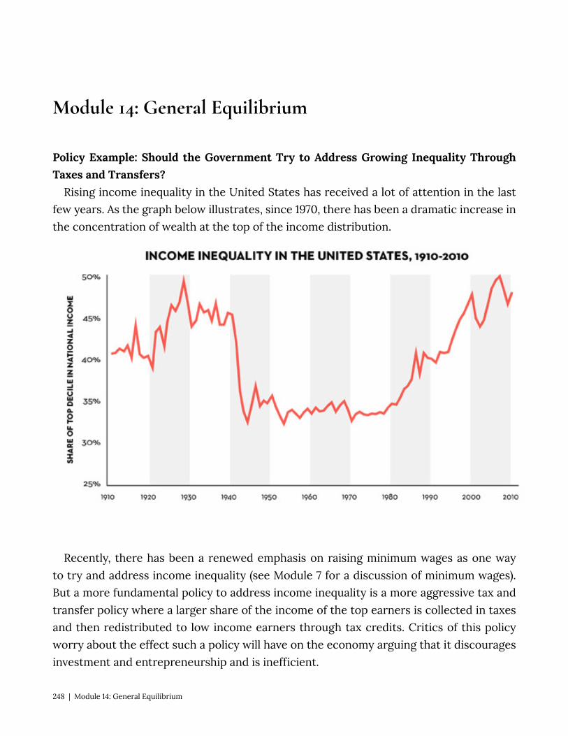
Module 14: General Equilibrium
Policy Example: Should the Government Try to Address Growing Inequality Through Taxes and Transfers?
Rising income inequality in the United States has received a lot of attention in the last few years. As the graph below illustrates, since 1970, there has been a dramatic increase in the concentration of wealth at the top of the income distribution.
Recently, there has been a renewed emphasis on raising minimum wages as one way to try and address income inequality (see Module 7 for a discussion of minimum wages). But a more fundamental policy to address income inequality is a more aggressive tax and transfer policy where a larger share of the income of the top earners is collected in taxes and then redistributed to low income earners through tax credits. Critics of this policy worry about the effect such a policy will have on the economy arguing that it discourages investment and entrepreneurship and is inefficient.
248 | Module 14: General Equilibrium
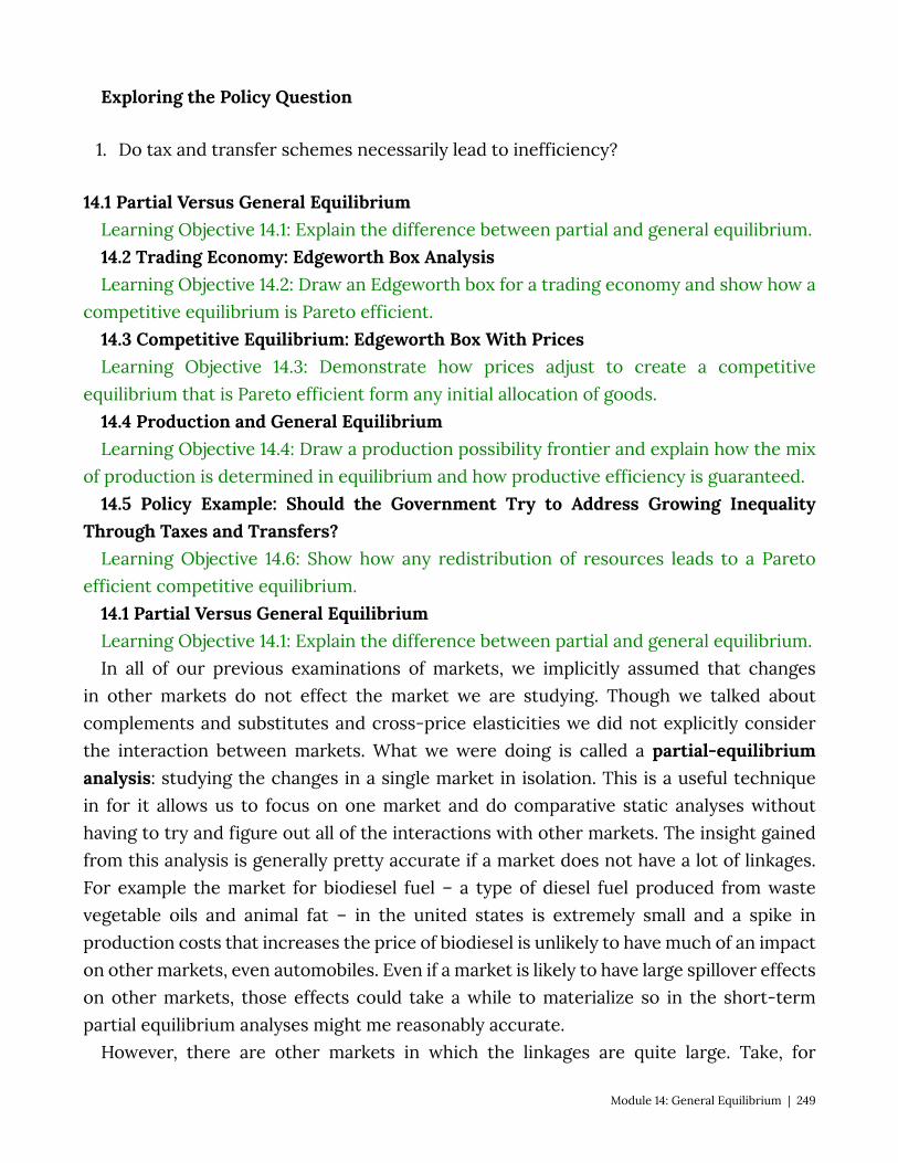
Exploring the Policy Question
1. Do tax and transfer schemes necessarily lead to inefficiency?
14.1 Partial Versus General Equilibrium Learning Objective 14.1: Explain the difference between partial and general equilibrium. 14.2 Trading Economy: Edgeworth Box Analysis Learning Objective 14.2: Draw an Edgeworth box for a trading economy and show how a
competitive equilibrium is Pareto efficient. 14.3 Competitive Equilibrium: Edgeworth Box With Prices Learning Objective 14.3: Demonstrate how prices adjust to create a competitive
equilibrium that is Pareto efficient form any initial allocation of goods. 14.4 Production and General Equilibrium Learning Objective 14.4: Draw a production possibility frontier and explain how the mix
of production is determined in equilibrium and how productive efficiency is guaranteed. 14.5 Policy Example: Should the Government Try to Address Growing Inequality
Through Taxes and Transfers? Learning Objective 14.6: Show how any redistribution of resources leads to a Pareto
efficient competitive equilibrium. 14.1 Partial Versus General Equilibrium Learning Objective 14.1: Explain the difference between partial and general equilibrium. In all of our previous examinations of markets, we implicitly assumed that changes
in other markets do not effect the market we are studying. Though we talked about complements and substitutes and cross-price elasticities we did not explicitly consider the interaction between markets. What we were doing is called a partial-equilibrium analysis: studying the changes in a single market in isolation. This is a useful technique in for it allows us to focus on one market and do comparative static analyses without having to try and figure out all of the interactions with other markets. The insight gained from this analysis is generally pretty accurate if a market does not have a lot of linkages. For example the market for biodiesel fuel – a type of diesel fuel produced from waste vegetable oils and animal fat – in the united states is extremely small and a spike in production costs that increases the price of biodiesel is unlikely to have much of an impact on other markets, even automobiles. Even if a market is likely to have large spillover effects on other markets, those effects could take a while to materialize so in the short-term partial equilibrium analyses might me reasonably accurate.
However, there are other markets in which the linkages are quite large. Take, for
Module 14: General Equilibrium | 249
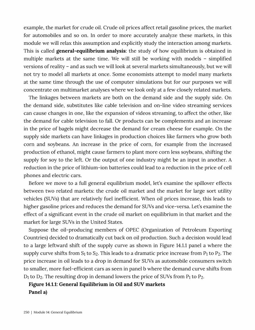
example, the market for crude oil. Crude oil prices affect retail gasoline prices, the market for automobiles and so on. In order to more accurately analyze these markets, in this module we will relax this assumption and explicitly study the interaction among markets. This is called general-equilibrium analysis: the study of how equilibrium is obtained in multiple markets at the same time. We will still be working with models – simplified versions of reality – and as such we will look at several markets simultaneously, but we will not try to model all markets at once. Some economists attempt to model many markets at the same time through the use of computer simulations but for our purposes we will concentrate on multimarket analyses where we look only at a few closely related markets.
The linkages between markets are both on the demand side and the supply side. On the demand side, substitutes like cable television and on-line video streaming services can cause changes in one, like the expansion of videos streaming, to affect the other, like the demand for cable television to fall. Or products can be complements and an increase in the price of bagels might decrease the demand for cream cheese for example. On the supply side markets can have linkages in production choices like farmers who grow both corn and soybeans. An increase in the price of corn, for example from the increased production of ethanol, might cause farmers to plant more corn less soybeans, shifting the supply for soy to the left. Or the output of one industry might be an input in another. A reduction in the price of lithium-ion batteries could lead to a reduction in the price of cell phones and electric cars.
Before we move to a full general equilibrium model, let’s examine the spillover effects between two related markets: the crude oil market and the market for large sort utility vehicles (SUVs) that are relatively fuel inefficient. When oil prices increase, this leads to higher gasoline prices and reduces the demand for SUVs and vice-versa. Let’s examine the effect of a significant event in the crude oil market on equilibrium in that market and the market for large SUVs in the United States.
Suppose the oil-producing members of OPEC (Organization of Petroleum Exporting Countries) decided to dramatically cut back on oil production. Such a decision would lead to a large leftward shift of the supply curve as shown in Figure 14.1.1 panel a where the supply curve shifts from S1 to S2. This leads to a dramatic price increase from P1 to P2. The price increase in oil leads to a drop in demand for SUVs as automobile consumers switch to smaller, more fuel-efficient cars as seen in panel b where the demand curve shifts from D1 to D2. The resulting drop in demand lowers the price of SUVs from P1 to P2.
Figure 14.1.1: General Equilibrium in Oil and SUV markets Panel a)
250 | Module 14: General Equilibrium
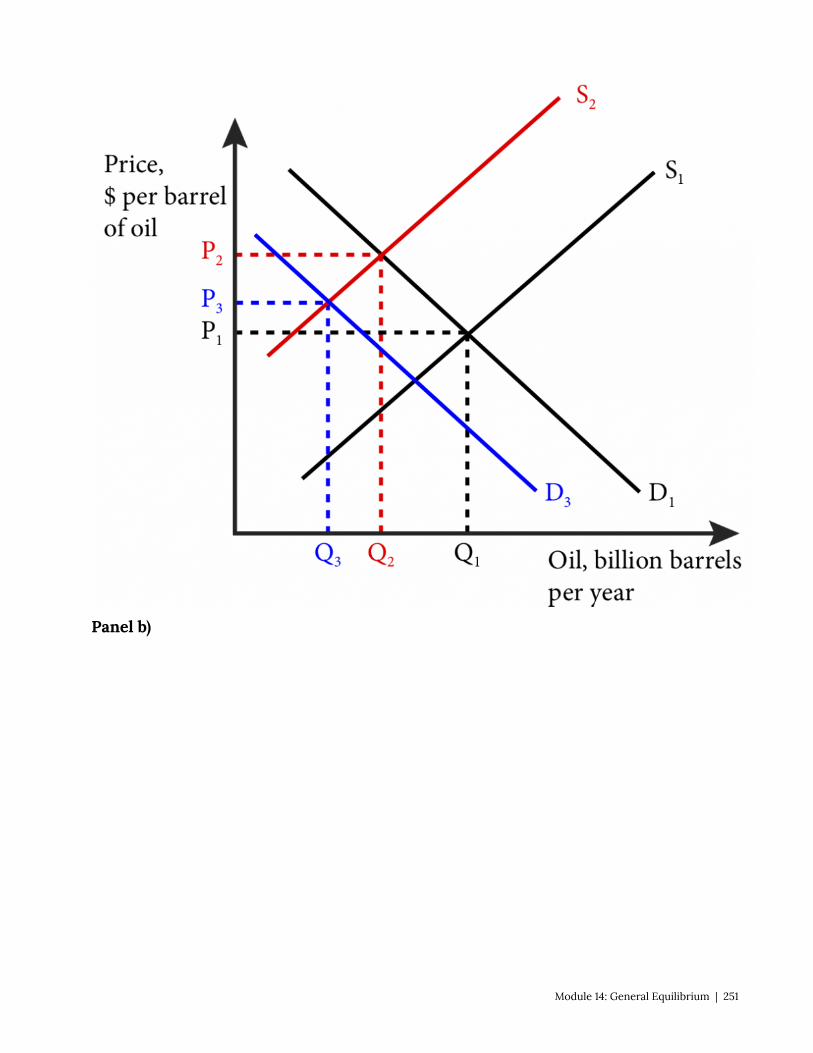
Panel b)
Module 14: General Equilibrium | 251
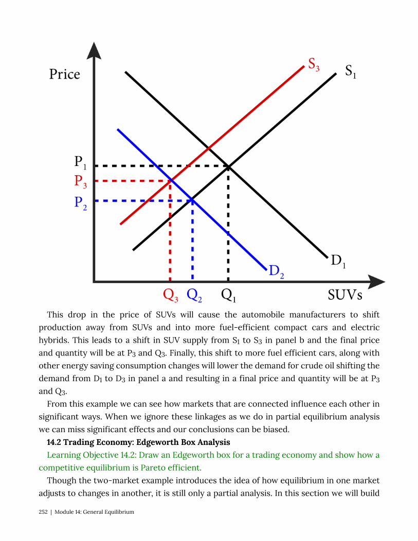
This drop in the price of SUVs will cause the automobile manufacturers to shift production away from SUVs and into more fuel-efficient compact cars and electric hybrids. This leads to a shift in SUV supply from S1 to S3 in panel b and the final price and quantity will be at P3 and Q3. Finally, this shift to more fuel efficient cars, along with other energy saving consumption changes will lower the demand for crude oil shifting the demand from D1 to D3 in panel a and resulting in a final price and quantity will be at P3
and Q3. From this example we can see how markets that are connected influence each other in
significant ways. When we ignore these linkages as we do in partial equilibrium analysis we can miss significant effects and our conclusions can be biased.
14.2 Trading Economy: Edgeworth Box Analysis Learning Objective 14.2: Draw an Edgeworth box for a trading economy and show how a
competitive equilibrium is Pareto efficient. Though the two-market example introduces the idea of how equilibrium in one market
adjusts to changes in another, it is still only a partial analysis. In this section we will build
252 | Module 14: General Equilibrium

a simple economy from the most fundamental of starting places: the initial endowment of resources for members of the economy and we will then show how, through trade in the form of barter, they are able to make themselves better off. In fact, we will show how free trade will lead to a Pareto efficient outcome: one where it is not possible to make one person better off without hurting another person. In the next section we will add a currency prices and show how prices adjust to achieve equilibrium in the supply and demands of all individuals and show again that the outcome is Pareto efficient .
To start to construct our trading economy we need to start with in initial state of the world. To keep matters simple and tractable, our model will assume that there are only two people in this world and two resources. As with all such models in economics, the results are generalizable to many individuals and many goods.
Imagine that two people from the same sea voyage are shipwrecked on two uninhabited tropical islands, separated by a small stretch of water – let’s call them Gilligan and Mary Ann. The only things the islands have for them to consume are the bananas and coconuts growing in the trees on both islands. Immediately after the shipwreck, they both take an inventory of the bananas and coconuts available to them. We call this initial allocation of goods their endowments. Gilligan finds that he has 60 coconuts and 60 bananas. Mary Ann has 40 coconuts and 90 bananas. The total amount of resources available to both of them is 100 (60+40) coconuts and 150 (60+90) bananas.
As in module 1 we can draw a graph for both Gilligan and Mary Ann that shows their initial bundle and their indifference curves through those bundles as in figure 14.2.1
Figure 14.2.1: Gilligan and Mary Ann’s Initial Endowments and Indifference Curves
The question for this module is, what happens when Gilligan and Mary Ann discover each other’s existence? More specifically, will they trade with each other and will it
Module 14: General Equilibrium | 253

improve their well-being? To answer these questions we can begin by implementing a graphical technique called an Edgeworth Box (names after the English economist Francis Edgeworth) and shown in Figure 14.2.2. The Edgeworth box has dimensions that equal the total resources in the economy. In our case, its height is measured in coconuts and since there are 100 coconuts total, the height of the box is 100. The width of the box is measured in bananas and since there are 150 bananas in total, the width is 150. In this way the dimensions of the Edgeworth box represent the total endowment of the economy. We measure Gilligan’s resources from the origin in the southeast corner of the box, labeled 0G. In contrast, we measure Mary Ann’s resources from the northeast corner of the box, labeled 0M.
Figure 14.2.2: The Edgeworth Box for Gilligan and Mary Ann’s Economy
Now each of their initial endowments can be expressed by a single point, marked e. Note that at his point Gilligan has 60 coconuts. Since there are 100 coconuts in total, that leaves exactly 40 for Mary Ann. This is the distance from Gilligan’s 60 to the top of the box. We measure Mary Ann’s endowment of coconuts from the top of the box down to her endowment point, e. Her 40 coconuts, leaves 60 for Gilligan. The same is true for bananas: we measure Gilligan’s from left to right starting at 0G, and we measure Mary Ann’s bananas
254 | Module 14: General Equilibrium
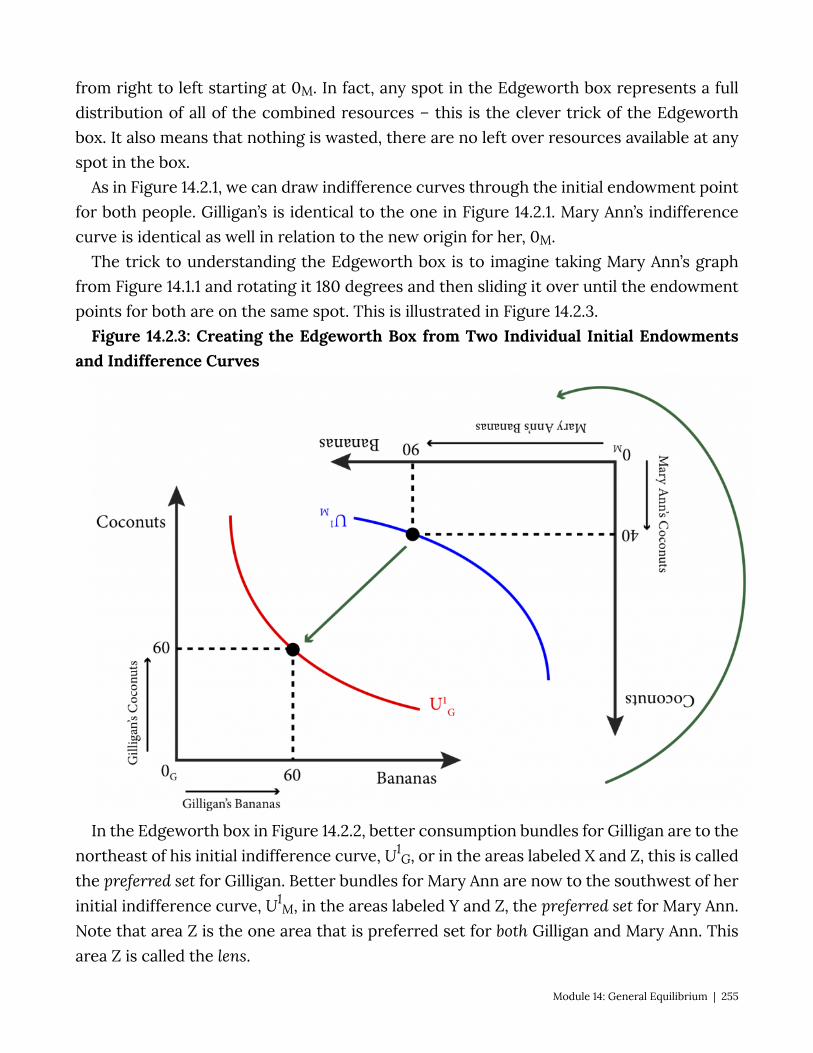
from right to left starting at 0M. In fact, any spot in the Edgeworth box represents a full distribution of all of the combined resources – this is the clever trick of the Edgeworth box. It also means that nothing is wasted, there are no left over resources available at any spot in the box.
As in Figure 14.2.1, we can draw indifference curves through the initial endowment point for both people. Gilligan’s is identical to the one in Figure 14.2.1. Mary Ann’s indifference curve is identical as well in relation to the new origin for her, 0M.
The trick to understanding the Edgeworth box is to imagine taking Mary Ann’s graph from Figure 14.1.1 and rotating it 180 degrees and then sliding it over until the endowment points for both are on the same spot. This is illustrated in Figure 14.2.3.
Figure 14.2.3: Creating the Edgeworth Box from Two Individual Initial Endowments and Indifference Curves
In the Edgeworth box in Figure 14.2.2, better consumption bundles for Gilligan are to the northeast of his initial indifference curve, U1
G, or in the areas labeled X and Z, this is called the preferred set for Gilligan. Better bundles for Mary Ann are now to the southwest of her initial indifference curve, U1
M, in the areas labeled Y and Z, the preferred set for Mary Ann. Note that area Z is the one area that is preferred set for both Gilligan and Mary Ann. This area Z is called the lens.
Module 14: General Equilibrium | 255
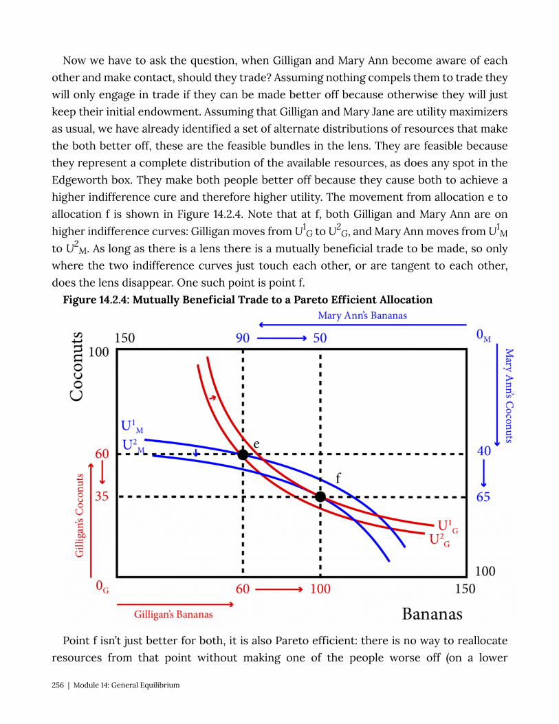
Now we have to ask the question, when Gilligan and Mary Ann become aware of each other and make contact, should they trade? Assuming nothing compels them to trade they will only engage in trade if they can be made better off because otherwise they will just keep their initial endowment. Assuming that Gilligan and Mary Jane are utility maximizers as usual, we have already identified a set of alternate distributions of resources that make the both better off, these are the feasible bundles in the lens. They are feasible because they represent a complete distribution of the available resources, as does any spot in the Edgeworth box. They make both people better off because they cause both to achieve a higher indifference cure and therefore higher utility. The movement from allocation e to allocation f is shown in Figure 14.2.4. Note that at f, both Gilligan and Mary Ann are on higher indifference curves: Gilligan moves from U1
G to U2G, and Mary Ann moves from U1
M
to U2M. As long as there is a lens there is a mutually beneficial trade to be made, so only
where the two indifference curves just touch each other, or are tangent to each other, does the lens disappear. One such point is point f.
Figure 14.2.4: Mutually Beneficial Trade to a Pareto Efficient Allocation
Point f isn’t just better for both, it is also Pareto efficient: there is no way to reallocate resources from that point without making one of the people worse off (on a lower
256 | Module 14: General Equilibrium
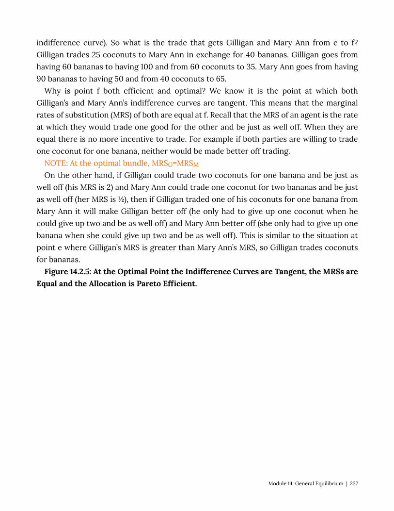
indifference curve). So what is the trade that gets Gilligan and Mary Ann from e to f? Gilligan trades 25 coconuts to Mary Ann in exchange for 40 bananas. Gilligan goes from having 60 bananas to having 100 and from 60 coconuts to 35. Mary Ann goes from having 90 bananas to having 50 and from 40 coconuts to 65.
Why is point f both efficient and optimal? We know it is the point at which both Gilligan’s and Mary Ann’s indifference curves are tangent. This means that the marginal rates of substitution (MRS) of both are equal at f. Recall that the MRS of an agent is the rate at which they would trade one good for the other and be just as well off. When they are equal there is no more incentive to trade. For example if both parties are willing to trade one coconut for one banana, neither would be made better off trading.
NOTE: At the optimal bundle, MRSG=MRSM
On the other hand, if Gilligan could trade two coconuts for one banana and be just as well off (his MRS is 2) and Mary Ann could trade one coconut for two bananas and be just as well off (her MRS is ½), then if Gilligan traded one of his coconuts for one banana from Mary Ann it will make Gilligan better off (he only had to give up one coconut when he could give up two and be as well off) and Mary Ann better off (she only had to give up one banana when she could give up two and be as well off). This is similar to the situation at point e where Gilligan’s MRS is greater than Mary Ann’s MRS, so Gilligan trades coconuts for bananas.
Figure 14.2.5: At the Optimal Point the Indifference Curves are Tangent, the MRSs are Equal and the Allocation is Pareto Efficient.
Module 14: General Equilibrium | 257
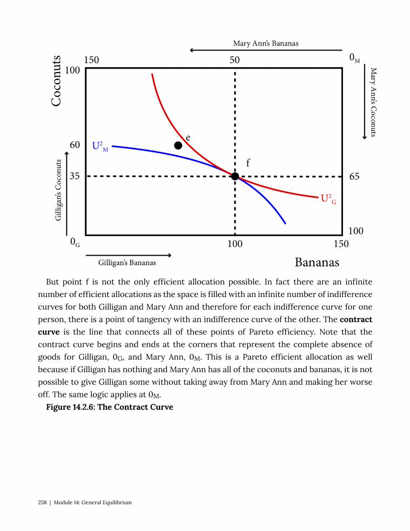
But point f is not the only efficient allocation possible. In fact there are an infinite number of efficient allocations as the space is filled with an infinite number of indifference curves for both Gilligan and Mary Ann and therefore for each indifference curve for one person, there is a point of tangency with an indifference curve of the other. The contract curve is the line that connects all of these points of Pareto efficiency. Note that the contract curve begins and ends at the corners that represent the complete absence of goods for Gilligan, 0G, and Mary Ann, 0M. This is a Pareto efficient allocation as well because if Gilligan has nothing and Mary Ann has all of the coconuts and bananas, it is not possible to give Gilligan some without taking away from Mary Ann and making her worse off. The same logic applies at 0M.
Figure 14.2.6: The Contract Curve
258 | Module 14: General Equilibrium
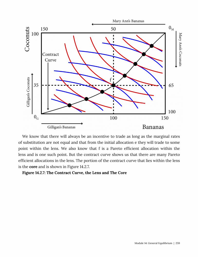
We know that there will always be an incentive to trade as long as the marginal rates of substitution are not equal and that from the initial allocation e they will trade to some point within the lens. We also know that f is a Pareto efficient allocation within the lens and is one such point. But the contract curve shows us that there are many Pareto efficient allocations in the lens. The portion of the contract curve that lies within the lens is the core and is shown in Figure 14.2.7.
Figure 14.2.7: The Contract Curve, the Lens and The Core
Module 14: General Equilibrium | 259
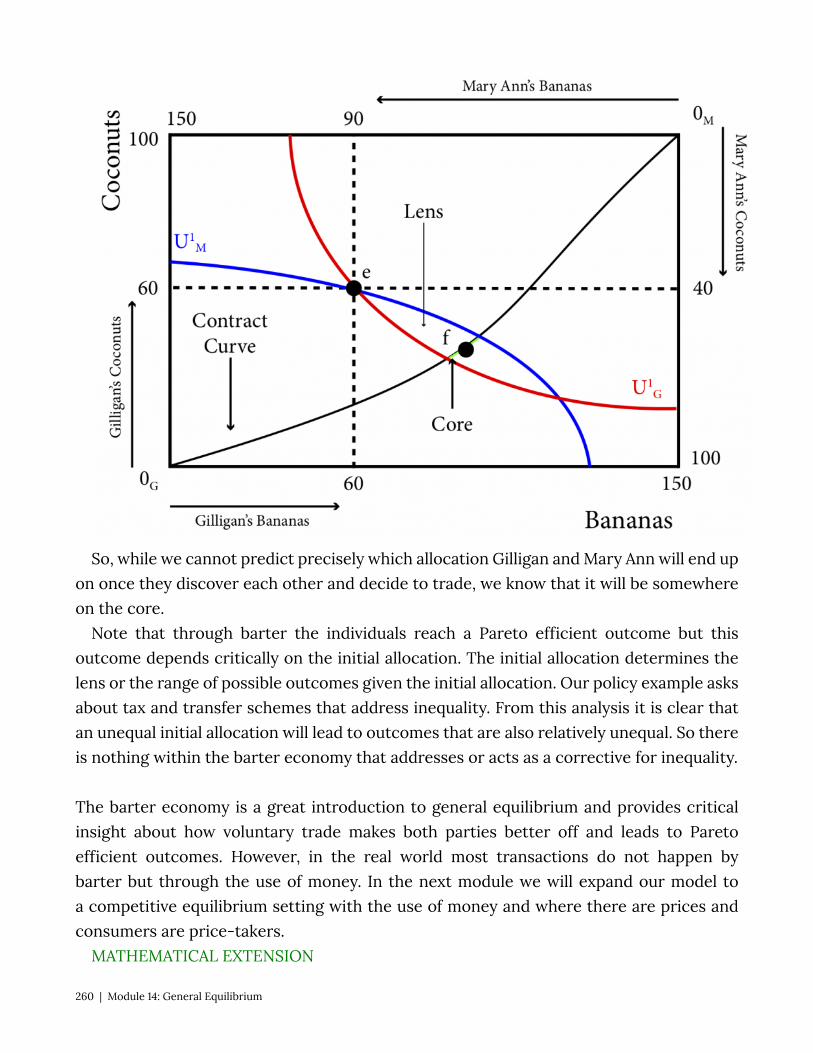
So, while we cannot predict precisely which allocation Gilligan and Mary Ann will end up on once they discover each other and decide to trade, we know that it will be somewhere on the core.
Note that through barter the individuals reach a Pareto efficient outcome but this outcome depends critically on the initial allocation. The initial allocation determines the lens or the range of possible outcomes given the initial allocation. Our policy example asks about tax and transfer schemes that address inequality. From this analysis it is clear that an unequal initial allocation will lead to outcomes that are also relatively unequal. So there is nothing within the barter economy that addresses or acts as a corrective for inequality.
The barter economy is a great introduction to general equilibrium and provides critical insight about how voluntary trade makes both parties better off and leads to Pareto efficient outcomes. However, in the real world most transactions do not happen by barter but through the use of money. In the next module we will expand our model to a competitive equilibrium setting with the use of money and where there are prices and consumers are price-takers.
MATHEMATICAL EXTENSION
260 | Module 14: General Equilibrium
We have described two conditions that define Pareto efficient allocations: One, they are feasible. We have ensured feasibility with our graphical technique of the
Edgeworth box – all allocations within the box are feasible. Mathematically, a feasible allocation is one that meets the two following conditions:
, where B is the total amount of bananas and is Gilligan’s share of bananas and is Mary Ann’s share of bananas.
, where C is the total amount of coconuts and is Gilligan’s share of bananas and is Mary Ann’s share of coconuts.
Two, at Pareto efficient allocations the marginal rates of substitution are equal. Mathematically the Marginal Rate of Substitution is:
, for Gilligan and
, for Mary Ann.
So the condition is equivalent to:
Let’s consider a specific example. We have the total bananas (150) and coconuts (100) in the economy. Let and let
, and , so
(14.2.1)
Now lets return to our feasibility constraints: and . Given our resources these become:
, or: (14.2.2)
, or: (14.2.3)
Substituting equations (14.2.2) and (14.2.3) into (14.2.1) yields the following expression of the tangency condition:
Module 14: General Equilibrium | 261
This is the equation of the contract curve. In this simplified example, the contract curve is just the diagonal of the rectangular Edgeworth box.
14.3 Competitive Equilibrium: Edgeworth Box With Prices Learning Objective 14.3: Demonstrate how prices adjust to create a competitive
equilibrium that is Pareto efficient form any initial allocation of goods. Much of the trade in the real world occurs in markets that use some sort of currency
as the medium of exchange and where the prices are posted. Take, for example, a supermarket where food and other goods are displayed on shelves with prices listed. There is no bargaining; you either buy or you don’t buy a good at the price shown. To make our simple model more realistic we need to add a market and prices. The idea that two people stranded on tropical islands would consider themselves to be price takers might seem a little odd but we will maintain this assumption to keep the analysis simple. In reality we are applying this model to situations where there are many buyers and sellers – for example, think of a large farmer’s market where there are many different sellers of the same produce and many buyers as well.
So now, instead of exchanging bananas for coconuts, Gilligan and Mary Ann exchange them for Dollars. For example if Mary Ann wants more coconuts, she has to sell some bananas to earn money and then use the money earned to buy coconuts. With only two goods it is the relative price that matters because it is the relative price that determines the rate of exchange. For example, if the price of bananas is $1 and the price of coconuts is $2 then the rate of exchange of bananas to coconuts is $1/$2 or ½. It takes two bananas to get one coconut. This is true if the price of bananas was $100 and the price of coconuts was $200 instead – it would still take two bananas to get one coconut.
To start, let’s consider the price of bananas of $1 and the price of coconuts of $2. At the initial distribution of goods, the bounty of Gilligan’s island is worth $180 ($1 per banana x 60 bananas + $2 per coconut x 60 coconuts) and the resources on Mary Ann’s island are worth $170 ($1 x 90 + $2 x 40).
Now suppose Gilligan would like to trade: he knows, because of the prices, that he can trade at a rate of two bananas for one coconut. He could for example sell all his bananas for $60 and then buy 30 coconuts with the money earned. This would leave him with 0 bananas and 90 coconuts. Alternatively he can sell 45 coconuts to buy 90 bananas and he could then have all 150 bananas on the two islands and it would leave him with 15 coconuts. He could also end up with any other bundle that represents a two for one trade
262 | Module 14: General Equilibrium
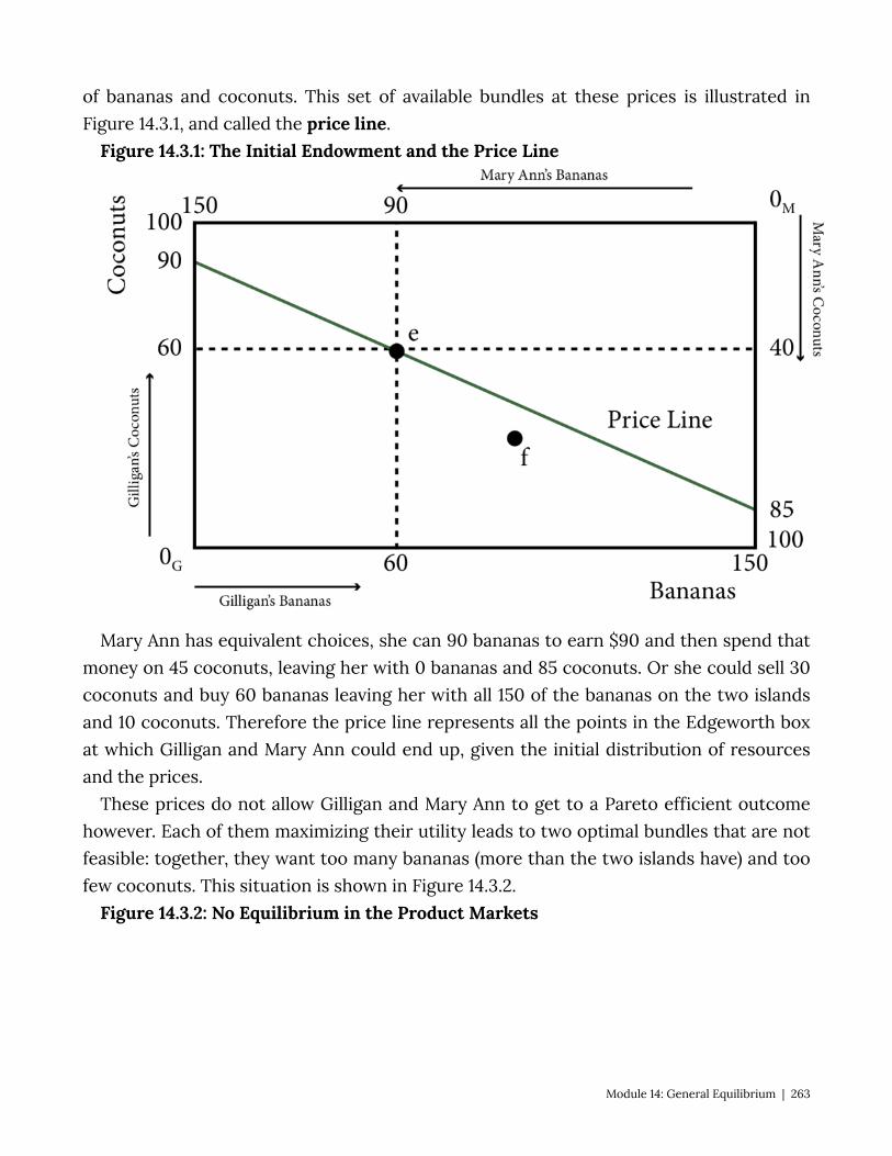
of bananas and coconuts. This set of available bundles at these prices is illustrated in Figure 14.3.1, and called the price line.
Figure 14.3.1: The Initial Endowment and the Price Line
Mary Ann has equivalent choices, she can 90 bananas to earn $90 and then spend that money on 45 coconuts, leaving her with 0 bananas and 85 coconuts. Or she could sell 30 coconuts and buy 60 bananas leaving her with all 150 of the bananas on the two islands and 10 coconuts. Therefore the price line represents all the points in the Edgeworth box at which Gilligan and Mary Ann could end up, given the initial distribution of resources and the prices.
These prices do not allow Gilligan and Mary Ann to get to a Pareto efficient outcome however. Each of them maximizing their utility leads to two optimal bundles that are not feasible: together, they want too many bananas (more than the two islands have) and too few coconuts. This situation is shown in Figure 14.3.2.
Figure 14.3.2: No Equilibrium in the Product Markets
Module 14: General Equilibrium | 263
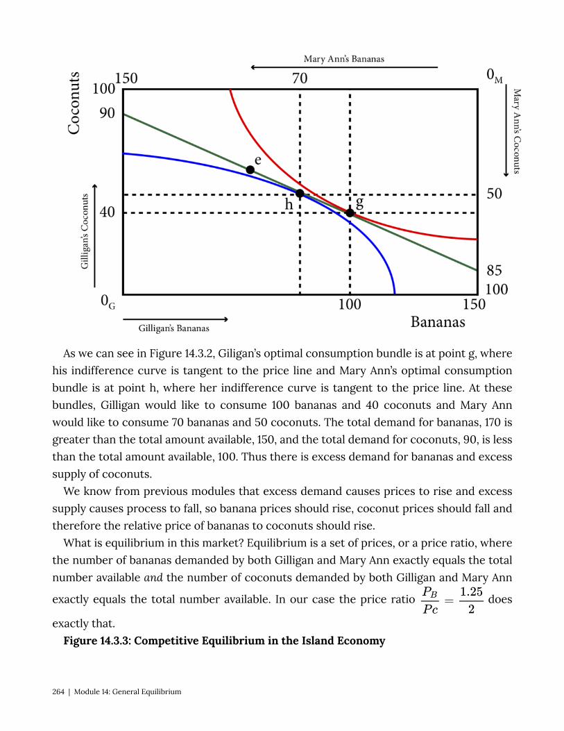
As we can see in Figure 14.3.2, Giligan’s optimal consumption bundle is at point g, where his indifference curve is tangent to the price line and Mary Ann’s optimal consumption bundle is at point h, where her indifference curve is tangent to the price line. At these bundles, Gilligan would like to consume 100 bananas and 40 coconuts and Mary Ann would like to consume 70 bananas and 50 coconuts. The total demand for bananas, 170 is greater than the total amount available, 150, and the total demand for coconuts, 90, is less than the total amount available, 100. Thus there is excess demand for bananas and excess supply of coconuts.
We know from previous modules that excess demand causes prices to rise and excess supply causes process to fall, so banana prices should rise, coconut prices should fall and therefore the relative price of bananas to coconuts should rise.
What is equilibrium in this market? Equilibrium is a set of prices, or a price ratio, where the number of bananas demanded by both Gilligan and Mary Ann exactly equals the total number available and the number of coconuts demanded by both Gilligan and Mary Ann
exactly equals the total number available. In our case the price ratio does
exactly that. Figure 14.3.3: Competitive Equilibrium in the Island Economy
264 | Module 14: General Equilibrium
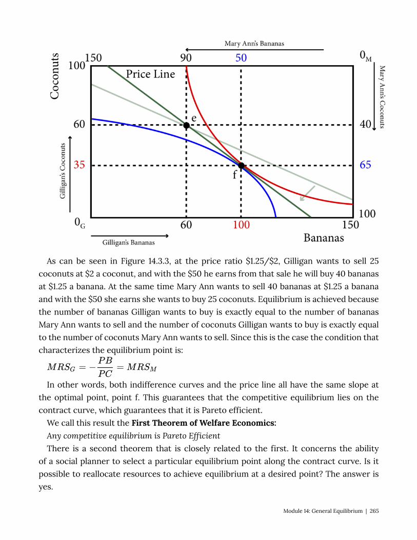
As can be seen in Figure 14.3.3, at the price ratio $1.25/$2, Gilligan wants to sell 25 coconuts at $2 a coconut, and with the $50 he earns from that sale he will buy 40 bananas at $1.25 a banana. At the same time Mary Ann wants to sell 40 bananas at $1.25 a banana and with the $50 she earns she wants to buy 25 coconuts. Equilibrium is achieved because the number of bananas Gilligan wants to buy is exactly equal to the number of bananas Mary Ann wants to sell and the number of coconuts Gilligan wants to buy is exactly equal to the number of coconuts Mary Ann wants to sell. Since this is the case the condition that characterizes the equilibrium point is:
In other words, both indifference curves and the price line all have the same slope at the optimal point, point f. This guarantees that the competitive equilibrium lies on the contract curve, which guarantees that it is Pareto efficient.
We call this result the First Theorem of Welfare Economics: Any competitive equilibrium is Pareto Efficient There is a second theorem that is closely related to the first. It concerns the ability
of a social planner to select a particular equilibrium point along the contract curve. Is it possible to reallocate resources to achieve equilibrium at a desired point? The answer is yes.
Module 14: General Equilibrium | 265
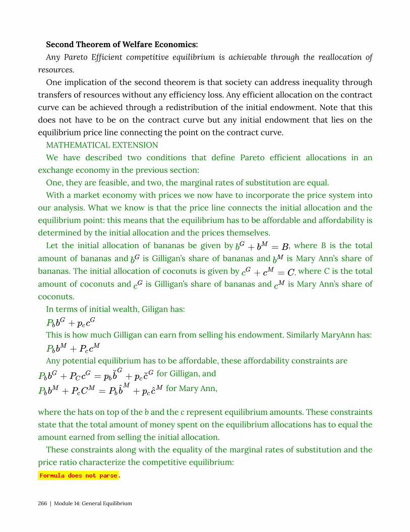
Second Theorem of Welfare Economics: Any Pareto Efficient competitive equilibrium is achievable through the reallocation of
resources. One implication of the second theorem is that society can address inequality through
transfers of resources without any efficiency loss. Any efficient allocation on the contract curve can be achieved through a redistribution of the initial endowment. Note that this does not have to be on the contract curve but any initial endowment that lies on the equilibrium price line connecting the point on the contract curve.
MATHEMATICAL EXTENSION We have described two conditions that define Pareto efficient allocations in an
exchange economy in the previous section: One, they are feasible, and two, the marginal rates of substitution are equal. With a market economy with prices we now have to incorporate the price system into
our analysis. What we know is that the price line connects the initial allocation and the equilibrium point: this means that the equilibrium has to be affordable and affordability is determined by the initial allocation and the prices themselves.
Let the initial allocation of bananas be given by , where B is the total amount of bananas and is Gilligan’s share of bananas and is Mary Ann’s share of bananas. The initial allocation of coconuts is given by , where C is the total amount of coconuts and is Gilligan’s share of bananas and is Mary Ann’s share of coconuts.
In terms of initial wealth, Giligan has:
This is how much Gilligan can earn from selling his endowment. Similarly MaryAnn has:
Any potential equilibrium has to be affordable, these affordability constraints are for Gilligan, and
for Mary Ann,
where the hats on top of the b and the c represent equilibrium amounts. These constraints state that the total amount of money spent on the equilibrium allocations has to equal the amount earned from selling the initial allocation.
These constraints along with the equality of the marginal rates of substitution and the price ratio characterize the competitive equilibrium:
.
266 | Module 14: General Equilibrium

Note, however, that the nominal prices don’t matter at all, only relative prices matter since the nominal values do not affect the ability to exchange allocated goods for new goods. So we can set one price, pc, to $1.
Let’s consider the same specific example form the previous section. We have the total bananas (150) and coconuts (100) in the economy. Let and let
, we found that in equilibrium: is equivalent to , or
And the contract curve is given as:
, or .
Thus . The demand functions for these Cobb Douglas type preferences are
Thus the equilibrium quantities and prices are:
(after rounding)
14.4 Production and General Equilibrium Learning Objective 14.4: Draw a production possibility frontier and explain how the mix
of production is determined in equilibrium and how productive efficiency is guaranteed. In the example of desert island economies above we have ignored production – the
bananas and coconut were simply there, endowed to the inhabitant of the island. Now we are going to add the final piece of complexity by adding production. Instead of a pile of coconuts and bananas available to the inhabitants, the inhabitants must produce them through the use of their labor to harvest them from trees on the islands. We will assume that both banana trees and coconut trees grow on both islands, but that Gilligan and Mary Ann differ in how many coconuts and bananas they can harvest in a day.
Banana trees are not tall and their fruit is easy to reach without climbing whilst coconut trees are very tall and require a lot of climbing to reach their fruit. It turns out that while they are both more than capable of harvesting both, Gilligan is more adept at finding and
Module 14: General Equilibrium | 267

harvesting bananas while Mary Ann is relatively better at climbing trees and harvesting coconuts.
If Gilligan spends his entire day collecting coconuts he can collect 100, if he spends his entire day collecting bananas, he can collect 200. He can also split his time between the two activities. If we call β the fraction of his time he spends on banana harvesting, then 1-β is the time he spends on coconut harvesting. So in one day Gilligan will harvest 200 β bananas plus 100 (1-β) coconuts. By varying β from 0 to 1 we can find all the points in Gilligan’s Production Possibility Frontier: a line that shows all of the possible combinations of bananas and coconuts Gilligan can harvest in a single day. This is shown in panel a of Figure 14.4.1.
Figure 14.4.1: Individual Production Possibility Frontiers
Siumilarly, if Mary Ann spends her entire day collecting coconuts she can collect 200, if she spends her entire day collecting bananas, she can collect 100. She can also split her time between the two activities. If we call β the fraction of his time she spends on banana harvesting, then 1-β is the time she spends on coconut harvesting. So in one day Mary Ann will harvest 100 β bananas plus 200 (1-β) coconuts. By varying β from 0 to 1 we can find all the points in Mary Ann’s Production Possibility Frontier. This is shown in panel b of Figure 14.4.1.
The slope of the production possibility frontier (PPF) is the Marginal Rate of Transformation (MRT): the cost of production of one good in terms of the foregone production of another good. This is the opportunity cost of producing that good. In this case the MRT is the amount of coconuts that can be collected if the collection of bananas is reduced by one banana. For Gilligan, every banana he chooses not to collect leads to
268 | Module 14: General Equilibrium
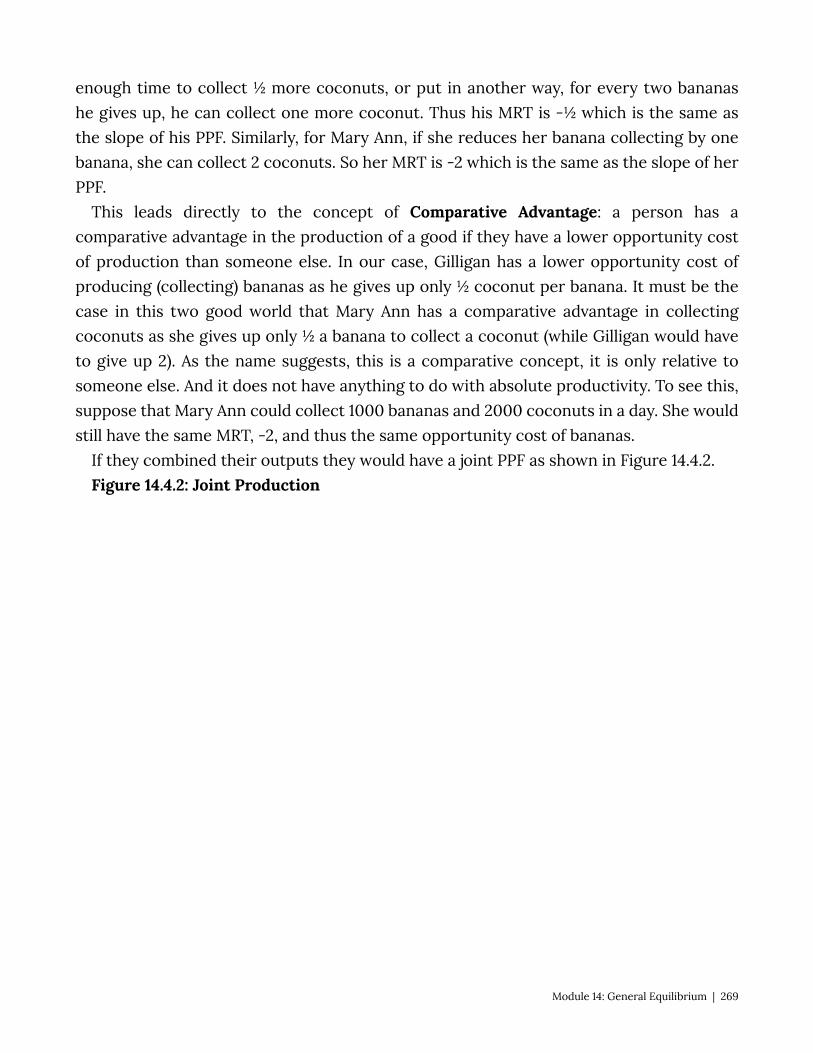
enough time to collect ½ more coconuts, or put in another way, for every two bananas he gives up, he can collect one more coconut. Thus his MRT is -½ which is the same as the slope of his PPF. Similarly, for Mary Ann, if she reduces her banana collecting by one banana, she can collect 2 coconuts. So her MRT is -2 which is the same as the slope of her PPF.
This leads directly to the concept of Comparative Advantage: a person has a comparative advantage in the production of a good if they have a lower opportunity cost of production than someone else. In our case, Gilligan has a lower opportunity cost of producing (collecting) bananas as he gives up only ½ coconut per banana. It must be the case in this two good world that Mary Ann has a comparative advantage in collecting coconuts as she gives up only ½ a banana to collect a coconut (while Gilligan would have to give up 2). As the name suggests, this is a comparative concept, it is only relative to someone else. And it does not have anything to do with absolute productivity. To see this, suppose that Mary Ann could collect 1000 bananas and 2000 coconuts in a day. She would still have the same MRT, -2, and thus the same opportunity cost of bananas.
If they combined their outputs they would have a joint PPF as shown in Figure 14.4.2. Figure 14.4.2: Joint Production
Module 14: General Equilibrium | 269
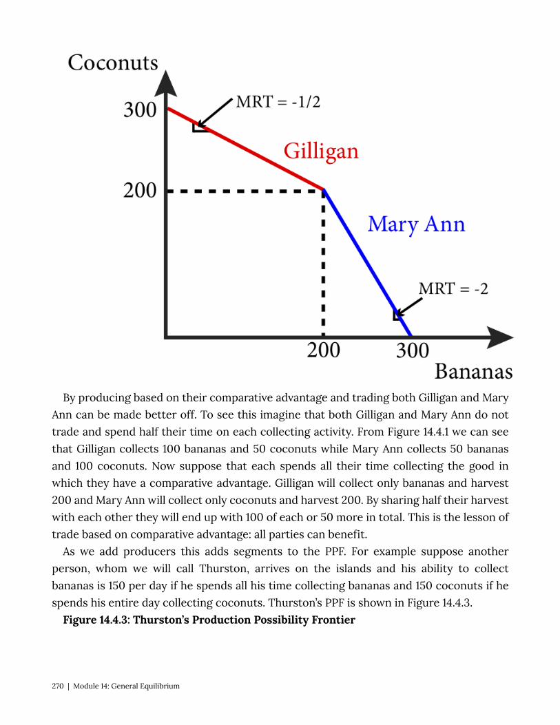
By producing based on their comparative advantage and trading both Gilligan and Mary Ann can be made better off. To see this imagine that both Gilligan and Mary Ann do not trade and spend half their time on each collecting activity. From Figure 14.4.1 we can see that Gilligan collects 100 bananas and 50 coconuts while Mary Ann collects 50 bananas and 100 coconuts. Now suppose that each spends all their time collecting the good in which they have a comparative advantage. Gilligan will collect only bananas and harvest 200 and Mary Ann will collect only coconuts and harvest 200. By sharing half their harvest with each other they will end up with 100 of each or 50 more in total. This is the lesson of trade based on comparative advantage: all parties can benefit.
As we add producers this adds segments to the PPF. For example suppose another person, whom we will call Thurston, arrives on the islands and his ability to collect bananas is 150 per day if he spends all his time collecting bananas and 150 coconuts if he spends his entire day collecting coconuts. Thurston’s PPF is shown in Figure 14.4.3.
Figure 14.4.3: Thurston’s Production Possibility Frontier
270 | Module 14: General Equilibrium
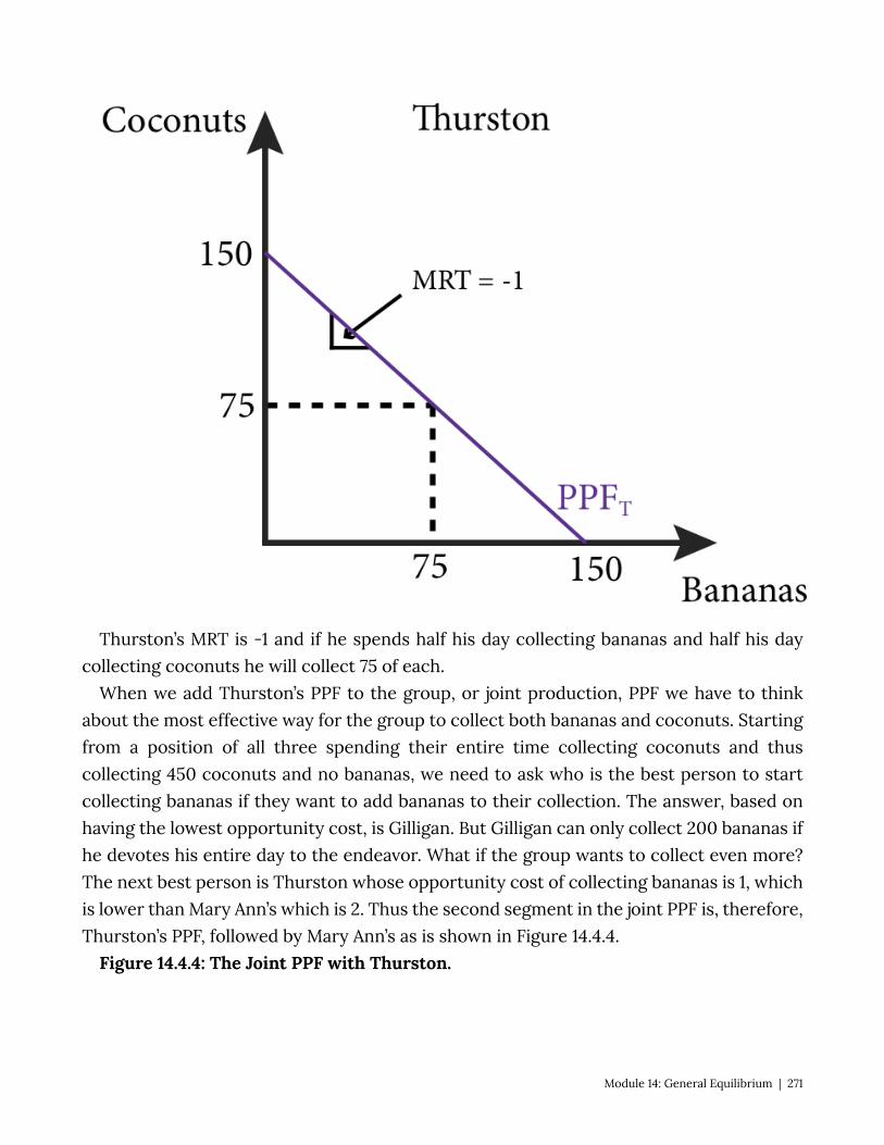
Thurston’s MRT is -1 and if he spends half his day collecting bananas and half his day collecting coconuts he will collect 75 of each.
When we add Thurston’s PPF to the group, or joint production, PPF we have to think about the most effective way for the group to collect both bananas and coconuts. Starting from a position of all three spending their entire time collecting coconuts and thus collecting 450 coconuts and no bananas, we need to ask who is the best person to start collecting bananas if they want to add bananas to their collection. The answer, based on having the lowest opportunity cost, is Gilligan. But Gilligan can only collect 200 bananas if he devotes his entire day to the endeavor. What if the group wants to collect even more? The next best person is Thurston whose opportunity cost of collecting bananas is 1, which is lower than Mary Ann’s which is 2. Thus the second segment in the joint PPF is, therefore, Thurston’s PPF, followed by Mary Ann’s as is shown in Figure 14.4.4.
Figure 14.4.4: The Joint PPF with Thurston.
Module 14: General Equilibrium | 271
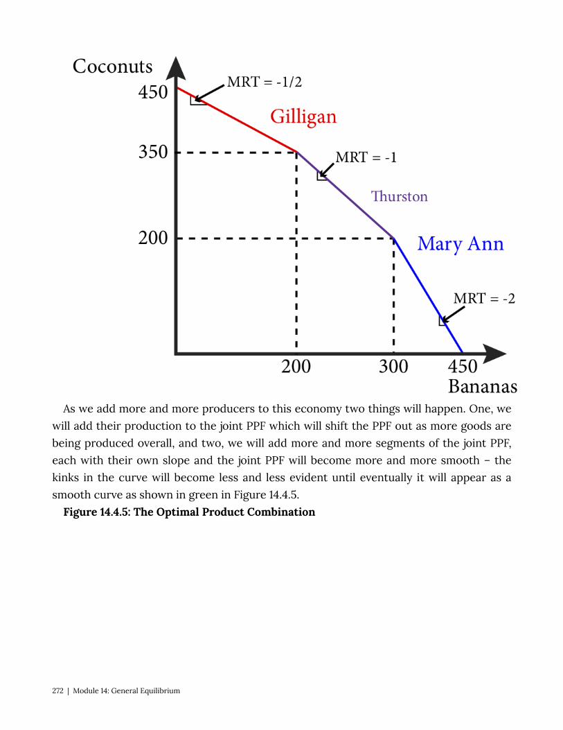
As we add more and more producers to this economy two things will happen. One, we will add their production to the joint PPF which will shift the PPF out as more goods are being produced overall, and two, we will add more and more segments of the joint PPF, each with their own slope and the joint PPF will become more and more smooth – the kinks in the curve will become less and less evident until eventually it will appear as a smooth curve as shown in green in Figure 14.4.5.
Figure 14.4.5: The Optimal Product Combination
272 | Module 14: General Equilibrium
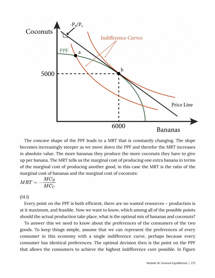
The concave shape of the PPF leads to a MRT that is constantly changing. The slope becomes increasingly steeper as we move down the PPF and therefor the MRT increases in absolute value. The more bananas they produce the more coconuts they have to give up per banana. The MRT tells us the marginal cost of producing one extra banana in terms of the marginal cost of producing another good, in this case the MRT is the ratio of the marginal cost of bananas and the marginal cost of coconuts:
(14.1) Every point on the PPF is both efficient, there are no wasted resources – production is
at it maximum, and feasible. Now we want to know, which among all of the possible points should the actual production take place, what is the optimal mix of bananas and coconuts?
To answer this we need to know about the preferences of the consumers of the two goods. To keep things simple, assume that we can represent the preferences of every consumer in this economy with a single indifference curve, perhaps because every consumer has identical preferences. The optimal decision then is the point on the PPF that allows the consumers to achieve the highest indifference cure possible. In Figure
Module 14: General Equilibrium | 273

14.4.5, point b is on the PPF but leads to an indifference curve that is below the one that includes point a. Point a is the one point that allows the consumers the most utility from the product mix. It is also the one that is just tangent to the PPF at point a. This means that we have a familiar condition that characterizes the optimal mix of goods: MRS = MRT.
We know from Module 4 that utility maximizing consumers choose a bundle of good for which their marginal rate of substitution equals the slope of the budget line – the negative of the price ratio. If all consumers face the same price ratio, they will all pick a consumption bundle where they all have the same MRS. This is true even if their preferences differ because prices are common to all consumers and a condition of the optimal consumption bundle is that MRS equals the negative of relative prices. Because all consumers have the same MRS, no trades will happen, there are no mutually beneficial trades to be had. This is called consumption efficiency: it is not possible to redistribute goods to make one person better off without making another person worse off. This also indicates that the consumption bundle lies on the contract curve.
Suppose that, rather than being traded, bananas and coconuts are sold by competitive firms. In a perfectly competitive environment each firm sells a quantity of each good so that their marginal cost of production equals the price:
.
We divide one equation by the other to get:
(14.2)
From 14.1 we know that , so :
.
(14.3)
This has an intuitive explanation. Consider an MRT of -1, what this means is that the can trade off production one-for-one. They can produce one more banana by producing one less coconut. Now suppose that the price of bananas is $2 and the price of coconuts is $1 so the price ratio is -2. Should the firm adjust output? Yes. By producing one more banana they earn $2 more, they have to produce one less coconut to do so, but they only forgo $1 in earnings so their net gain is $1. Only where
274 | Module 14: General Equilibrium

do these potential gains disappear.
Since we know the optimal consumption bundle is where MRS equals the negative of the price ratio, we know:
(14.4) Equation 14.4 is illustrated in Figure 14.4.5 – the PPF, the price line and the indifference
curves all have the same slope at point a. Competition ensures that MRT equals MRS and this means that the economy has achieved productive efficiency: there is no other mix of output levels that will increase the firm’s earnings.
We can combine the PPF and the Edgeworth box in the same graph by noting that each point on the PPF defines the dimensions of an Edgeworth box. In Figure 14.4.6, firms produce 150 bananas and 100 coconuts, point a on the PPF. This is the dimension of the Edgeworth box drawn inside of the PPF. The process that consumers pay are the same as the prices producers receive,
, so the price line in the Edgeworth box has the same slope as the price line that
touches the PPF.
Figure 14.4.6: Competitive Equilibrium
Module 14: General Equilibrium | 275

In equilibrium the price line is tangent to the consumers’ indifference curves at point f, as well as to the PPF at point a. Thus a competitive equilibrium is reached: consumers are maximizing their utilities at point f, producers are maximizing their returns at point a and supply equals demand in both markets: Gilligan consumes 100 bananas and 35 coconuts, Mary Ann consumes 50 bananas and 65 coconuts and the combines demand for both, 150 bananas and 100 coconuts exactly equals the supply.
14.5 Policy Example: Should the Government Try to Address Growing Inequality Through Taxes and Transfers?
Learning Objective 14.6: Show how any redistribution of resources leads to a Pareto efficient competitive equilibrium.
Income inequality is the outcome of markets and society. An unequal distribution of societal resources can be represented in the abstract through the use of Edgeworth box analysis. Though an Edgeworth box represents only two people and two goods, the insight generalizes to many people and many goods. We can represent inequality by an initial distribution of societal resources that gives most of them to only one person as shown in Figure 14.5.1.
276 | Module 14: General Equilibrium

Figure 14.5.1: A Tax and Transfer Scheme to Address Initial Inequality
Figure 14.5.1 shows an economy where there are two people, 1 and 2, and two goods, A and B. The initial allocation is at a, where person 1 has most of both goods. The competitive equilibrium that obtains from this allocation is at b, which is still highly unequal. To address this, a tax and transfer scheme could be implemented by taking away some of the initial allocation of A and B from 1 and transferring them to 2. This is shown in the figure as the movement from allocation a to the allocation x. The government that does this is not able to know all of the societal preferences and thus is unable to know where the competitive equilibria are – they do not know the contract curve. So their tax and transfer scheme does not get them directly to a competitive equilibrium. However, the first and second welfare theorems ensure that the competitive equilibrium is Pareto efficient and that any Pareto efficient allocation can be obtained through a redistribution of the initial endowment.
So we can see in the figure that the new allocation x will lead to the Pareto efficient outcome y. This suggests that there is no efficiency loss from a tax and transfer scheme. Person 1 is worse off than before the taxes and transfers and person 2 is better off. Inequality has been addressed but whether society is better off because of it is something that would require additional analyses.
What we can say is that there are no wasted societal resources – there is no inefficiency.
Module 14: General Equilibrium | 277
This assumes, however, that the tax and transfer scheme itself is costless while we know that in reality such a program would require a lot of bureaucratic costs. We also have not analyzed what a tax and transfer scheme would do to the incentive to produce. If the rich were not able to enjoy the full benefit of their labor because of an income tax, economic theory suggests that they might not work as hard and society would produce less. How would this reveal itself? In this case the PPF would shrink and so would the size of the Edgeworth box and since we assume more is better than the opposite must also be true – less is worse.
So both the bureaucratic costs and the loss from the dis-incentive to work suggests that there will be a cost to this program. The benefit is a more equal distribution of income. Thus whether it is a good idea to implement such a program depends on the relative benefits to a more equal income distribution and the costs of the program.
SUMMARY
Review: Topics and Related Learning Outcomes
14.1 Partial Versus General Equilibrium Learning Objective 14.1: Explain the difference between partial and general equilibrium. 14.2 Trading Economy: Edgeworth Box Analysis Learning Objective 14.2: Draw an Edgeworth box for a trading economy and show how a
competitive equilibrium is Pareto efficient. 14.3 Competitive Equilibrium: Edgeworth Box With Prices Learning Objective 14.3: Demonstrate how prices adjust to create a competitive
equilibrium that is Pareto efficient form any initial allocation of goods. 14.4 Production and General Equilibrium Learning Objective 14.4: Draw a production possibility frontier and explain how the mix
of production is determined in equilibrium and how productive efficiency is guaranteed. 14.5 Policy Example: Should the Government Try to Address Growing Inequality
Through Taxes and Transfers?
278 | Module 14: General Equilibrium
Learning Objective 14.6: Show how any redistribution of resources leads to a Pareto efficient competitive equilibrium.
Learn: Key Terms and Graphs
Terms
partial-equilibrium analysis general-equilibrium analysis endowments contract curve price line First Theorem of Welfare Economics Second Theorem of Welfare Economics Production Possibility Frontier Marginal Rate of Transformation Comparative Advantage consumption efficiency productive efficiency
Graphs
Figure 14.1.1: General Equilibrium in Oil and SUV markets Figure 14.2.1: Gilligan and Mary Ann’s Initial Endowments and Indifference Curves Figure 14.2.2: The Edgeworth Box for Gilligan and Mary Ann’s Economy Figure 14.2.3: Creating the Edgeworth Box from Two Individual Initial Endowments and
Indifference Curves Figure 14.2.4: Mutually Beneficial Trade to a Pareto Efficient Allocation Figure 14.2.5: At the Optimal Point the Indifference Curves are Tangent, the MRSs are
Equal and the Allocation is Pareto Efficient Figure 14.2.6: The Contract Curve
Module 14: General Equilibrium | 279
Figure 14.2.7: The Contract Curve, the Lens and The Core Figure 14.3.1: The Initial Endowment and the Price Line Figure 14.3.2: No Equilibrium in the Product Markets Figure 14.3.3: Competitive Equilibrium in the Island Economy Figure 14.4.1: Individual Production Possibility Frontiers Figure 14.4.2: Joint Production Figure 14.4.3: Thurston’s Production Possibility Frontier Figure 14.4.4: The Joint PPF with Thurston Figure 14.4.5: The Optimal Product Combination Figure 14.4.6: Competitive Equilibrium Figure 14.5.1: A Tax and Transfer Scheme to Address Initial Inequality
280 | Module 14: General Equilibrium

Module 15: Monopoly
Policy Example: Should the Government Give Patent Protection to Companies That Make Live-Saving Drugs?
“Spilled Pills” from zacharmstrong on Flickr is licensed under CC BY-NC-ND
In 1993 Shionogi, a Japanese pharmaceutical company received a patent for the anti-statin medication rosuvastatin calcium, better known by its brand name: Crestor. Crestor is used to treat high-cholesterol and related heart and cardiovascular disease. Crestor has become one of the best selling drugs of all time. In 2016, the patent protection will expire and AstraZeneca, the manufacturer of Crestor, will cease to be a monopolist in the market for Crestor as generic versions of the drug will flood the market place. The patent created a 23-year monopoly in the Crestor market for which it has enjoyed enormous profits; Astra Zeneca recorded $5 billion in Crestor sales in 2015 alone.
Providing a company the exclusive rights to sell a popular and medically important drug creates the potential for enormous profits, which gives pharmaceutical companies a very strong incentive to invest in the research and development of new drugs. But it also creates a situation in which medically necessary drugs are very expensive for consumers.
Exploring the Policy Question
1. Does the societal benefit from the advent of new drugs outweigh the cost to society
Module 15: Monopoly | 281

from the creation of monopolies? 2. What other way could society promote the development of new medicines?
15.1 Conditions for Monopoly Learning Objective 15.1: Explain the conditions that lead to monopolies. 15.2 Profit Maximization for Monopolists Learning Objective 15.2: Explain how monopolists maximize profits and solve for the
optimal monopolist’s solution from a demand curve and a marginal cost curve. 15.3 Market Power and the Demand Curve Learning Objective 15.3: Describe the relationship between demand elasticity and a
monopolist’s ability to price above marginal cost. 15.4 Monopoly and Welfare Learning Objective 15.4: Describe the how monopolists create deadweight loss and
explain how deadweight loss affects societal welfare. 15.5 Policy Example: Should the Government Give Patent Protection to Companies
That Make Live-Saving Drugs? Learning Objective 15.5: Explain the effect of patent protection on drug markets and the
trade-off society makes to promote the development of new drugs. 15.1 Conditions for Monopoly Learning Objective 15.1: Explain the conditions that lead to monopolies. A Monopoly is the sole supplier of a good for which there does not exist a close
substitute. In the policy example above a firm that make the only drug with which to treat or cure a disease is a monopolist if there is no other drug available to treat or cure the disease or if the only other drugs are not nearly as effective. Many drug makers continue to hold onto their trademarked drug names even after the patents run out and generic drugs enter the market, but the presence of the generics means that the original companies are no longer monopolists in the market for that particular drug.
As we learned in Module 13, the characteristics of monopoly markets are a single firm, a unique product and barriers to entry. But what are those barriers to entry and where to they come from? There are two main sources of these barriers: cost conditions that make it cheaper for one firm to produce than for many and government regulations that create legal barriers to entry that prevent other firms from competing in the same market.
Cost Advantages can come from a number of sources. A firm might control an essential input, for example one company might control the only source of a rare earth element
282 | Module 15: Monopoly
use in high performance batteries for automobiles. A firm might have a better technology or method of producing a good or service that gives it a cost advantage. Of course this advantage only lasts as long as the firm is the only one with the technology or method. For this reason, many firms keep their production processes a closely guarded secret.
Another source of monopoly are very large fixed costs associated with production. If the fixed costs of production are large enough relative to the demand for a product, it may be true that only one firm can make non-negative economic profits. This is referred to as a natural monopoly: when one firm can supply the market more cheaply than two or more firms. For example suppose an entrepreneur wants to start a concrete pumping service in her isolated small town to provide poured concrete to difficult to reach places that normal concrete trucks are unable to pull up to. Concrete pumping trucks are very large and very expensive. The town might have enough demand to justify the cost of one such truck, the entrepreneur will attract enough business to cover the cost of the truck itself and the other accounting and opportunity costs of the business. But there might not be enough demand to justify the purchase of a second concrete pumping truck if another business decided to start up. Thus the monopoly that results is a natural result of the large fixed cost relative to the limited demand.
We can express the concrete pumping example more formally with a simple model. Suppose the marginal cost of supping pumped concrete is fixed at c and the cost of the truck itself, the fixed cost, is F. The truck is a fixed cost because it costs F to acquire the truck and this does not depend on the amount of concrete sold, Q. The firms total cost function is therefore: TC = cQ + F. Average cost is: AC = c + F/Q. This is the same for any firm that enters the market. Let’s say that the cost of the truck, F, annualized, is $500,000 per year and the marginal cost is $1 per cubic foot of concrete, Q. Now suppose that the demand is such that at MC = $1, 100,000 cubic feet of concrete is sold per year. If there is one firm the average cost of pumped concrete is AC = $1 + $500,000/100,000. Or AC = $6. If there were two firms the average cost of the industry would be ACIND = c + 2F/Q. Note that at a constant MC, the cost of a single cubic foot of concrete is always c no matter which company provides it, however, with two firms there are two fixed costs because each one has to pay for a truck. So AC = $1 + $1,000,000/100,000, or AC = $11. If the maximum willing ness to pay for concrete at 100,000 cubit feet a year in this town is $8, the town can only support one firm. One firm would make $2 in economic profit in this business while two firms would each lose $3 in economic profit.
Another important source of monopoly power is government. The government itself owns and manages monopolies, for example the federal government runs the U.S. Postal Service, and local governments are often the sole provider of utilities such as water and
Module 15: Monopoly | 283

sewer services. The government also provides protection from competition for individual firms, guaranteeing their monopoly status. The most common protection the government offers is patent protection but government can also require licenses to operate businesses, for example to a local hospital, and issue only one per market or they can grant a firm the right to operate as a monopoly, for example a municipality might grant one company the right to collect residential trash.
A patent is an exclusive right to an invention, which excludes others from making, using, selling or importing it into the country for a limited time. In other words, the inventor is granted protection from any direct competition for a time period, generally 20 years form the time an application is filed, and in exchange the invention becomes public knowledge when the patent is granted. Why does the government offer patent protection? As we will see in the next section, being a monopolist often allows companies to collect positive economic profits – a better than normal return on investment. So patents give companies a reward for investing in new technologies, new drugs and new methods that are valuable to society in order to incentivize them into investing in such discoveries.
15.2 Profit Maximization for Monopolists Learning Objective 15.2: Explain how monopolists maximize profits and solve for the
optimal monopolist’s solution from a demand curve and a marginal cost curve. All profit maximizing firms, regardless of the structure of the markets in which they
sell, maximize profits by setting output such that marginal revenue equals marginal cost as we learned in Module 9. Module 8 demonstrated how to find a marginal cost curve from the firm’s total cost curve. What is different in the case of monopoly is the marginal revenue curve. Perfectly competitive firms take prices as given, their output decisions do not change market prices and so the marginal revenue for a perfectly competitive firm is simply the market price. Monopolists, on the other hand, are ‘price makers’ in the sense that they can set their prices by picking a point on the demand curve. Note that they are not free of constraint; the demand curve dictates the maximum price they can charge for every quantity level. The task for the profit-maximizing monopolist is to determine which point on the demand curve maximizes their profits. A downward sloping demand curve will mean that the firm faces a trade-off: they can sell more but must lower their price to do so. This means that the marginal revenue of a monopolist will depend on their output decision.
The total revenue for a firm is the amount of goods they sell, Q, multiplied by the price at which they sell the goods, p. Note that Q is both the firm’s output and the market output as there is only the one firm supplying the market.
TR = pQ
284 | Module 15: Monopoly
The firm’s marginal revenue is the change in total revenue from the sale of one more unit of their output. Thus a firm that earns ∆TR extra revenue from the sale of ∆Q more units has a marginal revenue of:
Therefore if the firm sells one more unit, ∆Q=1, and MR=∆TR Calculus note: Marginal revenue can be found from total revenue by taking the
derivative:
Because of the price-quantity trade off from the demand curve, the marginal revenue of a monopolist will depend on its output. Unlike a perfectly competitive firm whose product sells for a constant price and therefore its marginal revenue is that constant price, a monopolist who wants to sell one more unit must lower its price to do so. Thus a monopolist’s marginal revenue is a constantly declining function. It also declines at a rate greater than the demand curve because to sell more the monopolist must lower the price of all its goods. Figure 15.2.1 demonstrates the marginal revenue trade off.
Figure 15.2.1: Monopoly, Revenue and Marginal Revenue
Module 15: Monopoly | 285
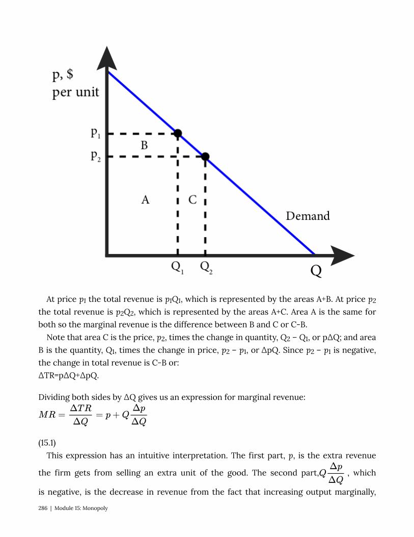
At price p1 the total revenue is p1Q1, which is represented by the areas A+B. At price p2
the total revenue is p2Q2, which is represented by the areas A+C. Area A is the same for both so the marginal revenue is the difference between B and C or C-B.
Note that area C is the price, p2, times the change in quantity, Q2 – Q1, or p∆Q; and area B is the quantity, Q1, times the change in price, p2 – p1, or ∆pQ. Since p2 – p1 is negative, the change in total revenue is C-B or: ∆TR=p∆Q+∆pQ.
Dividing both sides by ∆Q gives us an expression for marginal revenue:
(15.1) This expression has an intuitive interpretation. The first part, p, is the extra revenue
the firm gets from selling an extra unit of the good. The second part, , which
is negative, is the decrease in revenue from the fact that increasing output marginally,
286 | Module 15: Monopoly
lowers the price the firm receives for all of its output. Since the second part is negative we know that the MR curve is below the demand curve for every Q since demand curve relates price and quantity.
Figure 15.2.2 shows the relationship between a linear demand curve and the marginal revenue curve in the top panel and the total revenue in the bottom panel.
Figure 15.2.2: Demand, Marginal Revenue and Total Revenue
Module 15: Monopoly | 287

288 | Module 15: Monopoly
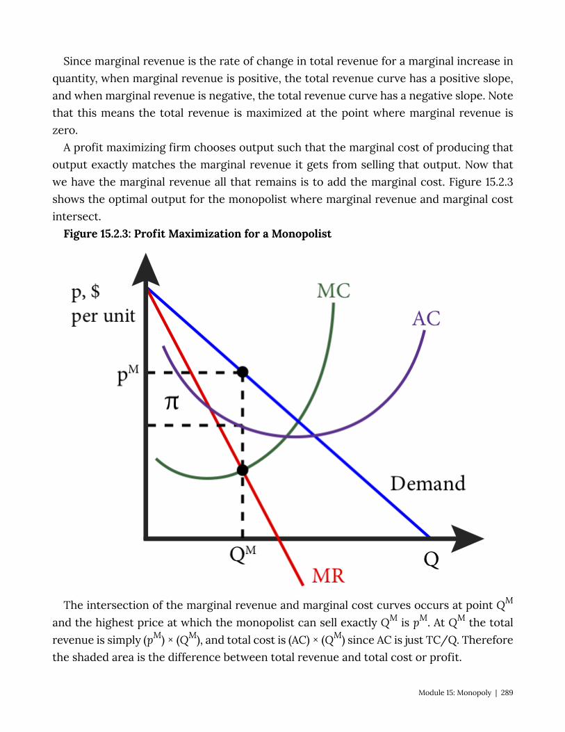
Since marginal revenue is the rate of change in total revenue for a marginal increase in quantity, when marginal revenue is positive, the total revenue curve has a positive slope, and when marginal revenue is negative, the total revenue curve has a negative slope. Note that this means the total revenue is maximized at the point where marginal revenue is zero.
A profit maximizing firm chooses output such that the marginal cost of producing that output exactly matches the marginal revenue it gets from selling that output. Now that we have the marginal revenue all that remains is to add the marginal cost. Figure 15.2.3 shows the optimal output for the monopolist where marginal revenue and marginal cost intersect.
Figure 15.2.3: Profit Maximization for a Monopolist
The intersection of the marginal revenue and marginal cost curves occurs at point QM
and the highest price at which the monopolist can sell exactly QM is pM. At QM the total revenue is simply (pM) × (QM), and total cost is (AC) × (QM) since AC is just TC/Q. Therefore the shaded area is the difference between total revenue and total cost or profit.
Module 15: Monopoly | 289

Mathematically, profit maximization for a monopolist is the same as for any firm: find the output level for which marginal revenue equals marginal cost. Let’s start with a general example. Suppose the demand for a good produced by a monopolist is p = A – BQ. Note that this is an inverse demand curve a demand curve written with price as a function of quantity. We could easily solve it for Q to get it back in normal form: Q = A/B – p/B. We can find the marginal revenue curve by first noting that TR = p × Q. Thus TR = (A – BQ) × Q, or TR = AQ – BQ2.
Calculus component: If TR = AQ – BQ2, then
MR=∂TR∂Q=A-2BQ.
The marginal revenue from a linear demand curve is a curve with the same vertical intercept as the demand curve, in this case A, and a slope twice as steep, in this case -2B. In other words, for an inverse demand curve, p = A – BQ, the marginal revenue curve is MR = A – 2BQ.
Let’s consider a specific example. Suppose that Tesla is a monopolist in the manufacture of luxury electric cars and faces an annual demand cure for its electric Model S cars of Q = 200 – 2p (in thousands). It has a marginal cost of producing a Model S of MC = Q (also in thousands).
First, we will solve for the monopolist’s profit maximizing level of output and the profit maximizing monopolist’s price. Second, we will graph the solution.
To solve the problem we need to proceed in four steps: one, find the inverse demand curve; two, find the marginal revenue curve; three, set marginal revenue equal to marginal cost and solve for QM, the monopolist’s profit maximizing output level; four, find pM the monopolist’s profit maximizing price.
1) We find the inverse demand curve by solving for demand curve for p: Q = 200 – 2p 2p = 200 – Q p = 100 – ½ Q 2) We find the marginal revenue curve by doubling the slope coefficient (B): MR = 100 – (2)×(½) Q MR = 100 – Q 3) Set MR equal to MC and solve for Q: MR = MC 100 – Q = Q 100 = 2Q
290 | Module 15: Monopoly
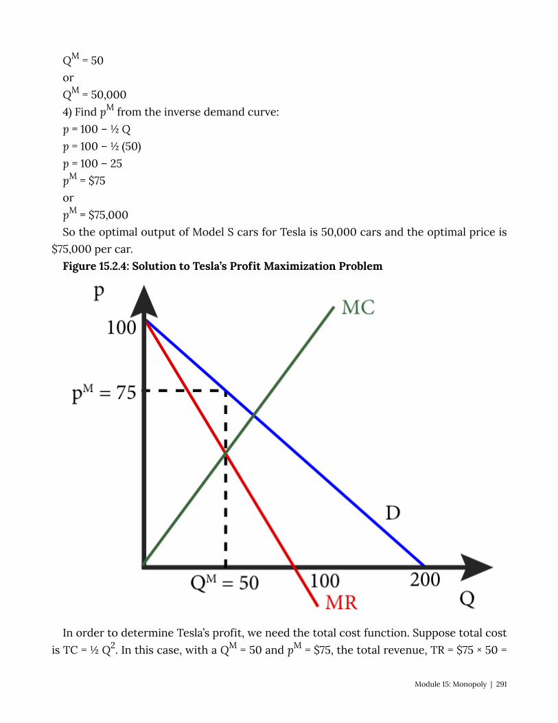
QM = 50 or QM = 50,000 4) Find pM from the inverse demand curve: p = 100 – ½ Q p = 100 – ½ (50) p = 100 – 25 pM = $75 or pM = $75,000 So the optimal output of Model S cars for Tesla is 50,000 cars and the optimal price is
$75,000 per car. Figure 15.2.4: Solution to Tesla’s Profit Maximization Problem
In order to determine Tesla’s profit, we need the total cost function. Suppose total cost is TC = ½ Q2. In this case, with a QM = 50 and pM = $75, the total revenue, TR = $75 × 50 =
Module 15: Monopoly | 291
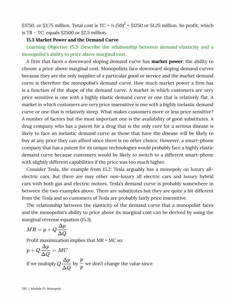
$3750, or $3.75 million. Total cost is TC = ½ (50)2 = $1250 or $1.25 million. So profit, which is TR – TC, equals $2500 or $2.5 million.
15.3 Market Power and the Demand Curve Learning Objective 15.3: Describe the relationship between demand elasticity and a
monopolist’s ability to price above marginal cost. A firm that faces a downward sloping demand curve has market power: the ability to
choose a price above marginal cost. Monopolists face downward sloping demand curves because they are the only supplier of a particular good or service and the market demand curve is therefore the monopolist’s demand curve. How much market power a firm has is a function of the shape of the demand curve. A market in which customers are very price sensitive is one with a highly elastic demand curve or one that is relatively flat. A market in which customers are very price insensitive is one with a highly inelastic demand curve or one that is relatively steep. What makes customers more or less price sensitive? A number of factors but the most important one is the availability of good substitutes. A drug company who has a patent for a drug that is the only cure for a serious disease is likely to face an inelastic demand curve as those that have the disease will be likely to buy at any price they can afford since there is no other choice. However, a smart-phone company that has a patent for its unique technologies would probably face a highly elastic demand curve because customers would be likely to switch to a different smart-phone with slightly different capabilities if the price was too much higher.
Consider Tesla, the example from 15.2: Tesla arguably has a monopoly on luxury all-electric cars. But there are may other non-luxury all electric cars and luxury hybrid cars with both gas and electric motors. Tesla’s demand curve is probably somewhere in between the two examples above. There are substitutes but they are quite a bit different from the Tesla and so customers of Tesla are probably fairly price insensitive.
The relationship between the elasticity of the demand curve that a monopolist faces and the monopolist’s ability to price above its marginal cost can be derived by using the marginal revenue equation (15.1):
Profit maximization implies that MR = MC so:
If we multiply by we don’t change the value since
292 | Module 15: Monopoly
, but we can rearrange to get , or:
Notice that the term in the parentheses is the inverse of the elasticity, , from Module
5 so:
Rearranging terms yields:
(15.2) We call the left-hand side of this equation the markup: the percentage amount the
price is above marginal cost. The right hand side of the equation says that the markup is inversely related to the elasticity of the demand. As consumers are more price sensitive, the absolute value of the elasticity increases causing the right-hand side of the equation to decrease, meaning the markup decreases – monopolists are not able to charge as high a price as if they faced price-insensitive customers. This equation (15.2) has a special name, it is called the Lerner Index, and it measures the firm’s optimal markup. This is also a measure of market power as firms with more market power are more able to change prices above marginal cost. Notice that when the demand curve is perfectly elastic, or horizontal, the monopolist is in the same situation that a perfectly competitive firm is. Perfect elasticity implies that ε=-∞ or that the right-hand side of the Lerner Index is essentially zero meaning the monopolist sets price equal to marginal cost just as if they were a perfectly competitive firm. On the other extreme, a perfectly inelastic demand curve has an elasticity of close to zero. In this case, the markup is infinitely high.
We know from figure 15.2.2 that a monopolist firm will never want to operate on the inelastic part of the demand curve and the Lerner Index confirms that if ,the index is greater than one and this implies that p-MC > p which can only be true if marginal cost is negative and marginal cost never negative.
The relationship between markup and demand elasticity can be seen graphically as in Figure 15.3.1.
Figure 15.3.1: Markup and the Shape of the Demand Curve
Module 15: Monopoly | 293
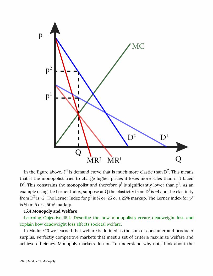
In the figure above, D1 is demand curve that is much more elastic than D2. This means that if the monopolist tries to charge higher prices it loses more sales than if it faced D2. This constrains the monopolist and therefore p1 is significantly lower than p2. As an example using the Lerner Index, suppose at Q the elasticity from D1 is -4 and the elasticity from D2 is -2. The Lerner Index for p1 is ¼ or .25 or a 25% markup. The Lerner Index for p2
is ½ or .5 or a 50% markup. 15.4 Monopoly and Welfare Learning Objective 15.4: Describe the how monopolists create deadweight loss and
explain how deadweight loss affects societal welfare. In Module 10 we learned that welfare is defined as the sum of consumer and producer
surplus. Perfectly competitive markets that meet a set of criteria maximize welfare and achieve efficiency. Monopoly markets do not. To understand why not, think about the
294 | Module 15: Monopoly
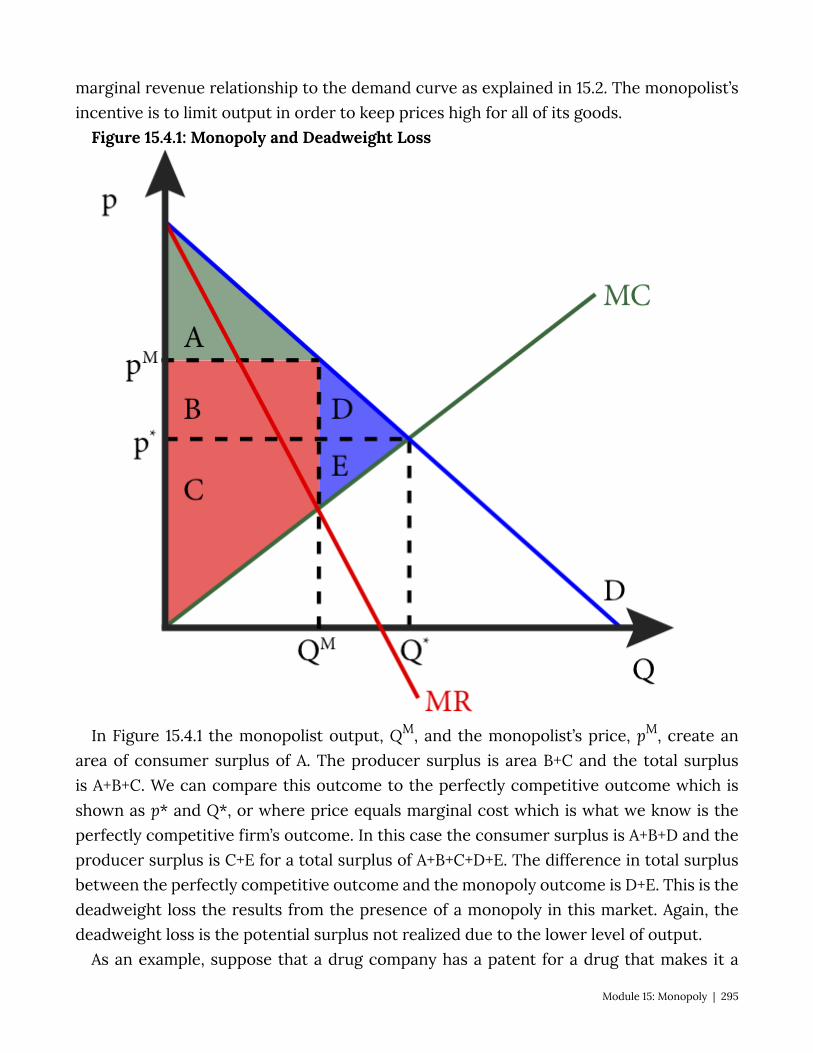
marginal revenue relationship to the demand curve as explained in 15.2. The monopolist’s incentive is to limit output in order to keep prices high for all of its goods.
Figure 15.4.1: Monopoly and Deadweight Loss
In Figure 15.4.1 the monopolist output, QM, and the monopolist’s price, pM, create an area of consumer surplus of A. The producer surplus is area B+C and the total surplus is A+B+C. We can compare this outcome to the perfectly competitive outcome which is shown as p* and Q*, or where price equals marginal cost which is what we know is the perfectly competitive firm’s outcome. In this case the consumer surplus is A+B+D and the producer surplus is C+E for a total surplus of A+B+C+D+E. The difference in total surplus between the perfectly competitive outcome and the monopoly outcome is D+E. This is the deadweight loss the results from the presence of a monopoly in this market. Again, the deadweight loss is the potential surplus not realized due to the lower level of output.
As an example, suppose that a drug company has a patent for a drug that makes it a
Module 15: Monopoly | 295
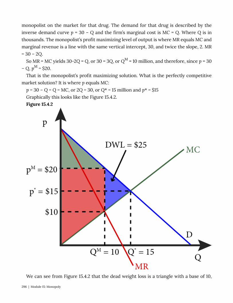
monopolist on the market for that drug. The demand for that drug is described by the inverse demand curve p = 30 – Q and the firm’s marginal cost is MC = Q. Where Q is in thousands. The monopolist’s profit maximizing level of output is where MR equals MC and marginal revenue is a line with the same vertical intercept, 30, and twice the slope, 2. MR = 30 – 2Q.
So MR = MC yields 30-2Q = Q, or 30 = 3Q, or QM = 10 million, and therefore, since p = 30 – Q, pM = $20.
That is the monopolist’s profit maximizing solution. What is the perfectly competitive market solution? It is where p equals MC:
p = 30 – Q = Q = MC, or 2Q = 30, or Q* = 15 million and p* = $15 Graphically this looks like the Figure 15.4.2. Figure 15.4.2
We can see from Figure 15.4.2 that the dead weight loss is a triangle with a base of 10,
296 | Module 15: Monopoly
because at QM=10, MC=$10 and pM=$20, therefore the distance between the two is $10, and a height of 5, the difference between QM and Q*. Using the formula for the area of a triangle of ½ base times height, we get ½($10)(5) = $25.
15.5 Policy Example: Should the Government Give Patent Protection to Companies That Make Live-Saving Drugs?
Learning Objective 15.5: Explain the effect of patent protection on drug markets and the trade-off society makes to promote the development of new drugs.
Providing companies like AstraZeneca patent protection for drugs like Crestor gives them a profit incentive to invest in the research and development of new, medically important, drugs. However, from 15.4 we also know that monopoly power creates deadweight loss. Figure 15.5.1 shows the deadweight loss that results from monopoly power, but it is important to understand what the deadweight loss represents: this is the loss to society that results from the reduction in output of these medically important drugs. By restricting output, monopolies keep prices high and in so doing exclude a segment of consumers who would purchase the drugs if the price were at marginal cost as would be the case in a perfectly competitive market.
Figure 15.5.1: Deadweight Loss From Monopoly Power
Module 15: Monopoly | 297
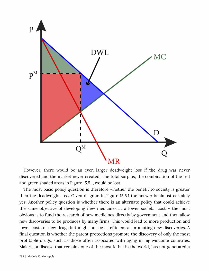
However, there would be an even larger deadweight loss if the drug was never discovered and the market never created. The total surplus, the combination of the red and green shaded areas in Figure 15.5.1, would be lost.
The most basic policy question is therefore whether the benefit to society is greater then the deadweight loss. Given diagram in Figure 15.5.1 the answer is almost certainly yes. Another policy question is whether there is an alternate policy that could achieve the same objective of developing new medicines at a lower societal cost – the most obvious is to fund the research of new medicines directly by government and then allow new discoveries to be produces by many firms. This would lead to more production and lower costs of new drugs but might not be as efficient at promoting new discoveries. A final question is whether the patent protections promote the discovery of only the most profitable drugs, such as those often associated with aging in high-income countries. Malaria, a disease that remains one of the most lethal in the world, has not generated a
298 | Module 15: Monopoly

lot of funding into the creation of a new drug to combat it and many critics believe this is because it is a disease most commonly found in low-income countries and thus the potential profits are low because the market could not support high prices. Supporters of the current system like the fact that is it private enterprise, not government, that decides in which areas to invest resources thus ensuring that the drugs with the highest expected benefit are invested in most heavily.
SUMMARY
Review: Topics and Related Learning Outcomes
15.1 Conditions for Monopoly Learning Objective 15.1: Explain the conditions that lead to monopolies. 15.2 Profit Maximization for Monopolists Learning Objective 15.2: Explain how monopolists maximize profits and solve for the
optimal monopolist’s solution from a demand curve and a marginal cost curve. 15.3 Market Power and the Demand Curve Learning Objective 15.3: Describe the relationship between demand elasticity and a
monopolist’s ability to price above marginal cost. 15.4 Monopoly and Welfare Learning Objective 15.4: Describe the how monopolists create deadweight loss and
explain how deadweight loss affects societal welfare. 15.5 Policy Example: Should the Government Give Patent Protection to Companies
That Make Live-Saving Drugs? Learning Objective 15.5: Explain the effect of patent protection on drug markets and the
trade-off society makes to promote the development of new drugs.
Module 15: Monopoly | 299
Learn: Key Terms and Graphs
Terms Monopoly Natural monopoly Patent Inverse demand curve
Graphs
Figure 15.2.1: Monopoly, Revenue and Marginal Revenue Figure 15.2.2: Demand, Marginal Revenue and Total Revenue Figure 15.2.3: Profit Maximization for a Monopolist Figure 15.2.4: Solution to Tesla’s Profit Maximization Problem Figure 15.3.1: Markup and the Shape of the Demand Curve Figure 15.4.1: Monopoly and Deadweight Loss Figure 15.5.1: Deadweight Loss From Monopoly Power
300 | Module 15: Monopoly
Module 16: Pricing Strategies
Policy Example: Should Public Universities Charge Everyone the Same Price? Modern public universities, like their private counterparts, publish a tuition price each
year that few students actually pay. Most students receive internal grants and awards that reduce their costs well below the list price. The amount of this reduction in price varies dramatically and is closely related to the income of the student’s family.
{where is the graph “Here’s What Students Actually Pay for College”} Unlike their private counterparts, public universities in the United States receive public
funding and are expected, in return, to provide affordable college education for residents of the states they serve. Are their pricing policies antithetical to their mission? Are they fair? Do they support the mission of the institution? These are questions we will seek to answer by studying the practice of price discrimination.
Exploring the Policy Question
1. Does charging tuition based on family income support or undermine the mission of public universities
2. Is charging tuition based on family income fair?
16.1 Market Power and Price Discrimination Learning Objective 16.1: Explain differentiated pricing and describe the three types of
price discrimination. 16.2 Perfect or First-Degree Price Discrimination Learning Objective 16.2: Describe first-degree price discrimination and the challenges
that make it hard. 16.3 Group Price Discrimination or Third-Degree Price Discrimination Learning Objective 15.3: Describe third-degree price discrimination and its effect on
profits. 16.4 Quantity Discounts or Second-Degree Price Discrimination Learning Objective 16.4: Describe second-degree price discrimination and how it
overcomes the identification problem.
Module 16: Pricing Strategies | 301
16.5 Two-Part Tariffs and Tie-In Sales Learning Objective 16.5: Define two-part tariffs and tie-in sales and how they work as
price discrimination mechanisms. 16.6 Bundling, Versioning and Hurdles Learning Objective 16.6: Define bundling, versioning and hurdles and how each works to
increase firm profits. 16.7 Policy Example: Should Public Universities Charge Everyone the Same Price? Learning Objective 16.7: Explain how the use of price discrimination can be seen as a way
for public universities to accomplish their mission. 16.1 Market Power and Price Discrimination Learning Objective 16.1: Explain differentiated pricing and describe the three types of
price discrimination. Firms that have market power face demand curves that are downward sloping. We
call such firms price makers, since the shape of the demand curve gives them choices about the prices they charge. Monopolists of the type examined in Module 15, are simple monopolists: monopolists that are limited to a single price at which all of the output they produce is sold. This limitation leads simple monopolists to limit output so that they can maintain a higher price for all of their goods or services. This limitation in output creates deadweight loss, the lost surplus from transactions that don’t happen but that for which positive total surplus is possible. What we will see in this module is that firms with market power that are able to differentiate their consumers based on their demands or willingness-to-pay for the goods and services may be able to charge different prices for their goods and services. This practice is called differentiated pricing: selling the same good or service for different prices to different consumers. Differentiated pricing can come in many forms from a car dealership that negotiates prices with consumers selling the same model car for different prices to different customers, to a movie theater that offers a student price and an adult price, to volume discounts where consumer who buy multiple units qualify for lower per-unit prices such as a sale on socks that are either $4 a pair or $10 for three pairs. Differentiated pricing can also come in the form of bundling, selling a set of goods for a single price, and product differentiation, selling different versions of a product for different prices that do not reflect production cost differences.
These more sophisticated pricing strategies are the topic of this module and economists call the practice of charging different prices for the same good to different consumers price discrimination. Price discrimination often leads to higher profits for firms and to higher output as the incentive to constrain output to maintain a higher price for
302 | Module 16: Pricing Strategies
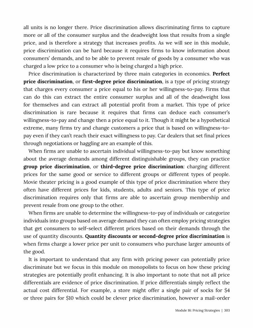
all units is no longer there. Price discrimination allows discriminating firms to capture more or all of the consumer surplus and the deadweight loss that results from a single price, and is therefore a strategy that increases profits. As we will see in this module, price discrimination can be hard because it requires firms to know information about consumers’ demands, and to be able to prevent resale of goods by a consumer who was charged a low price to a consumer who is being charged a high price.
Price discrimination is characterized by three main categories in economics. Perfect price discrimination, or first-degree price discrimination, is a type of pricing strategy that charges every consumer a price equal to his or her willingness-to-pay. Firms that can do this can extract the entire consumer surplus and all of the deadweight loss for themselves and can extract all potential profit from a market. This type of price discrimination is rare because it requires that firms can deduce each consumer’s willingness-to-pay and change then a price equal to it. Though it might be a hypothetical extreme, many firms try and change customers a price that is based on willingness-to-pay even if they can’t reach their exact willingness to pay. Car dealers that set final prices through negotiations or haggling are an example of this.
When firms are unable to ascertain individual willingness-to-pay but know something about the average demands among different distinguishable groups, they can practice group price discrimination, or third-degree price discrimination: charging different prices for the same good or service to different groups or different types of people. Movie theater pricing is a good example of this type of price discrimination where they often have different prices for kids, students, adults and seniors. This type of price discrimination requires only that firms are able to ascertain group membership and prevent resale from one group to the other.
When firms are unable to determine the willingness-to-pay of individuals or categorize individuals into groups based on average demand they can often employ pricing strategies that get consumers to self-select different prices based on their demands through the use of quantity discounts. Quantity discounts or second-degree price discrimination is when firms charge a lower price per unit to consumers who purchase larger amounts of the good.
It is important to understand that any firm with pricing power can potentially price discriminate but we focus in this module on monopolists to focus on how these pricing strategies are potentially profit enhancing. It is also important to note that not all price differentials are evidence of price discrimination. If price differentials simply reflect the actual cost differential. For example, a store might offer a single pair of socks for $4 or three pairs for $10 which could be clever price discrimination, however a mail-order
Module 16: Pricing Strategies | 303
retailer might make the same offer knowing that it costs $1 to prepare the shipment regardless of how many pairs of socks are ordered. So the socks are being sold for $3 plus the preparation charge and the price difference is simply a reflection of this fixed cost divided by the number of pairs of socks.
16.2 Perfect or First-Degree Price Discrimination Learning Objective 16.2: Describe first-degree price discrimination and the challenges
that make it hard. Imagine a firm with market power that can prevent the resale of its goods and is
able to ascertain each of its customers’ reservation price or maximum willingness-to-pay. If they are able to sell their goods at individual prices, the very best they can do in each transaction is to charge each customer exactly their reservation price. This ensures maximum revenue from each transaction as well as ensuring that the entire available surplus is captured by the firm as producer surplus.
Consider the simple example of a firm makes designer, gold plated, smart-phones that has only five potential customers, each of whom would purchase exactly one unit if the price is at or below their reservation price. The table below lists the customers and their reservation prices
Consumer Reservation Price
1 $10,000
2 $8,000
3 $6,000
4 $4,000
5 $2,000
In the case of a simple monopolist the firm does not know the reservation prices of their consumers, in this case the firm does know then reservation prices of individual consumers. Suppose in addition that the firm has a marginal cost of producing a unit of a good of $3,000. The graph that illustrates this table is given in Figure 16.2.1. In this figure we see that at a price of $10,000, the firm would sell exactly one unit because there is only one consumer who has a reservation price that high.
304 | Module 16: Pricing Strategies
Figure 16.2.1: First-Degree Price Discrimination
If the firm can practice perfect or first-degree price discrimination it means that they know each consumers reservation price and can prevent resale so they firm can charge consumer one $10, consumer two $8, consumer three $6, consumer four $4, and even consumer five $2. However, since consumer fives reservation price is below the marginal cost of production the firm will choose not to sell to consumer five. The marginal revenue is $10 for the first unit, $8 for the second unit, $6 for the third unit and $4 for the fourth unit. The surplus created by the sale of the first unit is the difference between the reservation price and the marginal cost: $10 – $3 = $7. This surplus is captured entirely by the firm making it all producer surplus. The producer surplus from the sale of the second good is $5, $3 from the sale of the third good and $1 from the sale of the fourth. Total producer surplus is the sum of these and equals $16, which is the area above the MC curve and below the demand curve. Notice that the marginal revenue curve is the same as the
Module 16: Pricing Strategies | 305

demand curve, which means this perfect price discriminating monopolist is producing at the point where marginal revenue equals marginal cost, four units.
Interestingly, the amount of output the firm produced is equal to the amount a perfectly competitive firm would produce and there is no deadweight loss. All the surplus that is possible to create in this market is created. The difference is, of course, that the firm captures the entire surplus for itself. So consumer surplus actually falls relative to a simple monopolist but total surplus and producer surplus increases.
Calculus Appendix To understand the firm’s optimal output decision we can start with the knowledge
that a perfect price discriminator charges each customer their reservation price or p=D(Q) where D(Q) is the inverse demand curve and Q is the firms output. Since the firm is charging each customer their reservation price their total revenue is the area under the demand curve up to the point of total output or:
Profit is total revenue minus the total cost of producing Q units of output, so the firms objective function is to maximize profit by choosing Q:
The first-order condition that characterizes a maximum is:
So the firm will choose the Q where the demand curve and the marginal cost curve intersect, which is the same as a perfectly competitive firm.
This is an ideal situation for a firm with market power, but does it actually happen in the real world? It is rare to see it in its purest, most perfect form but some examples come close. Bargaining over price is one example. Sellers might not be able to tell exact willingness to pay but can become skilled in making educated guesses. Consider the case of new car sales. When a customer walks into an auto showroom and is greeted by a salesperson, that salesperson is already making inferences about the customer’s reservation price. Casual conversation about what the customer lives, works, their family are all potential clues. The haggling itself is another signal as low reservation price individuals will likely haggle quite strenuously and high reservation price individuals might not haggle much at all. In the end, each customer walks out of the dealership paying a different price where that price difference is related to reservation price.
Another good example of first-degree price discrimination is higher education. Colleges and universities are some of the best price discriminators around. It is estimated that less
306 | Module 16: Pricing Strategies
than a third of all U.S. college students pays full tuition. Most students routinely fill out a form to apply for student financial aid that reveals a lot about their family’s financial situation and therefore their reservation price or ability to pay. Through the use of grants, scholarships and subsidized loans each student is given a price of attending a college or university that is tailored to them.
16.3 Group Price Discrimination or Third-Degree Price Discrimination Learning Objective 15.3: Describe third-degree price discrimination and its effect on
profits. In general, most firms with market power are unable to determine individual
consumers’ reservation prices and charge them individual prices. However, firms might know something about the average reservation prices of identifiable groups. For example, it is generally true that, on average, retired individuals have less income than prime working age adults and are likely to have lower reservation prices across a number of goods like admission to movie theaters. If purchases are in person, group membership can be determined through identification such as a driver’s license. This solves the identification problem but the arbitrage problem remains. To maintain price differentials firms must be able prevent resale from members of the low price group to members of the high priced group. Often such resale is prevented naturally by transactions costs, the economic costs of buying and selling a good or service beyond the price itself. For example in the car dealership example, it would take time and effort to find a buyer for a car that was just purchased, there would be bureaucratic costs associated with the switching the registration of the car and in many states sales tax would have to be paid for both transactions. Since this is a cumbersome and costly process, there is unlikely to be much arbitrage in the new car market and differential pricing will be able to be sustained. In the case of movie theaters however, it is not hard to imagine a group of enterprising kids who purchase youth tickets and then wait outside the theater and sell them to adults at a premium over the youth price but at a discount over the adult price. This is why most movie theaters have ticket sellers and ticket takers who inspect tickets as patrons enter the theater to be sure adults have adult tickets.
To understand how group price discrimination works, consider the following example of book prices in the United States versus the United Kingdom. The book Steve Jobs was released in 2011 in both the U.S. and the U.K. In the U.S. the cover price of the book was $30, in the U.K. the cover price was £25, which at the time equaled $40. The reason for the price differential was likely due to the demand for the book in the U.S. being quite different than the demand in the U.K. To see this suppose that the marginal cost of production was $5 in both countries and that the demand for the book in the U.K.
Module 16: Pricing Strategies | 307
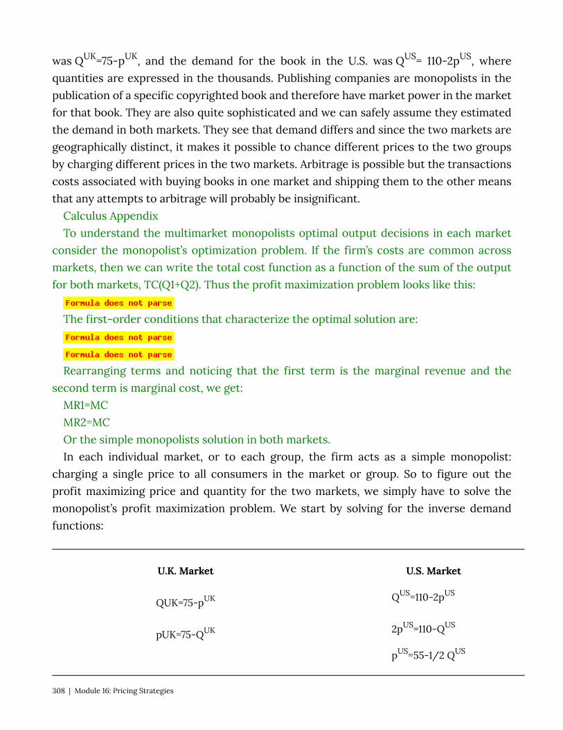
was QUK=75-pUK, and the demand for the book in the U.S. was QUS= 110-2pUS, where quantities are expressed in the thousands. Publishing companies are monopolists in the publication of a specific copyrighted book and therefore have market power in the market for that book. They are also quite sophisticated and we can safely assume they estimated the demand in both markets. They see that demand differs and since the two markets are geographically distinct, it makes it possible to chance different prices to the two groups by charging different prices in the two markets. Arbitrage is possible but the transactions costs associated with buying books in one market and shipping them to the other means that any attempts to arbitrage will probably be insignificant.
Calculus Appendix To understand the multimarket monopolists optimal output decisions in each market
consider the monopolist’s optimization problem. If the firm’s costs are common across markets, then we can write the total cost function as a function of the sum of the output for both markets, TC(Q1+Q2). Thus the profit maximization problem looks like this:
The first-order conditions that characterize the optimal solution are:
Rearranging terms and noticing that the first term is the marginal revenue and the second term is marginal cost, we get:
MR1=MC MR2=MC Or the simple monopolists solution in both markets. In each individual market, or to each group, the firm acts as a simple monopolist:
charging a single price to all consumers in the market or group. So to figure out the profit maximizing price and quantity for the two markets, we simply have to solve the monopolist’s profit maximization problem. We start by solving for the inverse demand functions:
U.K. Market U.S. Market
QUK=75-pUK QUS=110-2pUS
pUK=75-QUK 2pUS=110-QUS
pUS=55-1/2 QUS
308 | Module 16: Pricing Strategies

Because these are both linear demand curves, we know that the marginal revenue curves have the same vertical intercept as the inverse demand curves but have twice the slope. Thus the marginal revenue functions are the following:
U.K. Market U.S. Market
pUK=75-QUK pUS=55-1/2 QUS
MRUK=75-2QUK MRUS=55-QUS
To find the profit maximizing price and quantity in each market we have to apply the profit maximization rule which says that the profit maximizing output level is reached when MR=MC:
U.K. Market U.S. Market
MRUK=MCUK MRUS=MCUS
75-2QUK=5 55-QUS=5
70=2QUK 50=QUS
QUK=35 QUS=50
To find the price we simply plug these quantities into the inverse demand functions:
Module 16: Pricing Strategies | 309
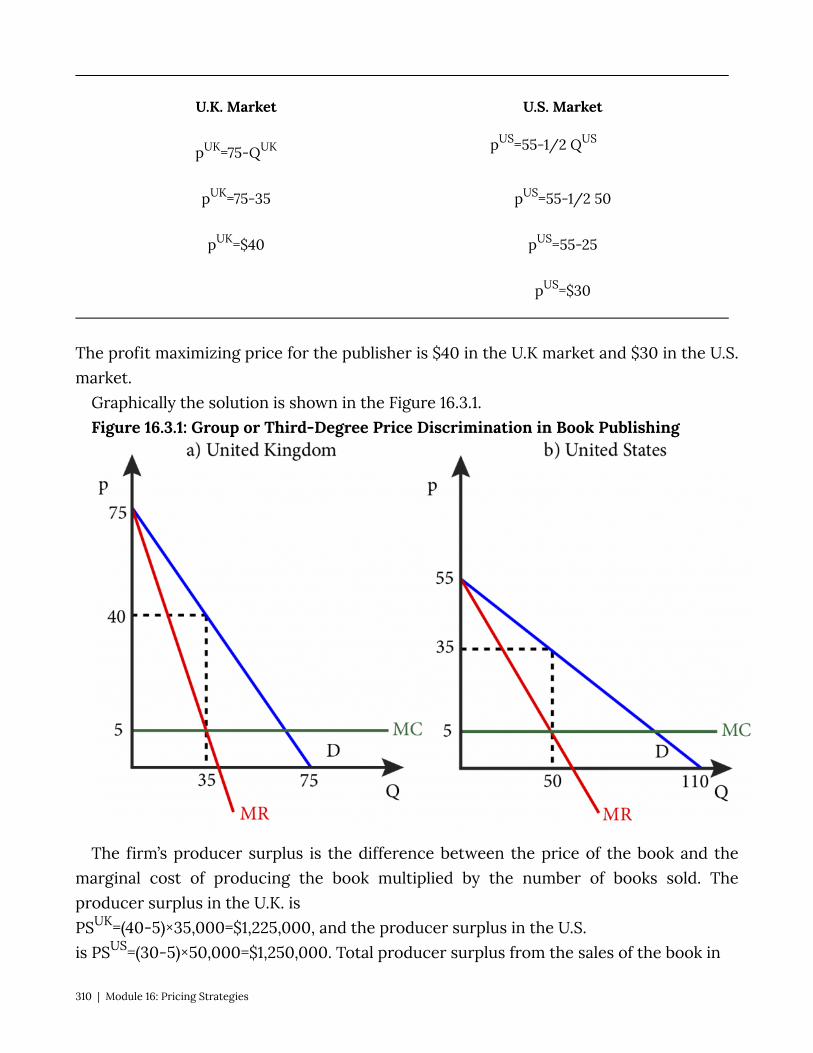
U.K. Market U.S. Market
pUK=75-QUK pUS=55-1/2 QUS
pUK=75-35 pUS=55-1/2 50
pUK=$40 pUS=55-25
pUS=$30
The profit maximizing price for the publisher is $40 in the U.K market and $30 in the U.S. market.
Graphically the solution is shown in the Figure 16.3.1. Figure 16.3.1: Group or Third-Degree Price Discrimination in Book Publishing
The firm’s producer surplus is the difference between the price of the book and the marginal cost of producing the book multiplied by the number of books sold. The producer surplus in the U.K. is PSUK=(40-5)×35,000=$1,225,000, and the producer surplus in the U.S. is PSUS=(30-5)×50,000=$1,250,000. Total producer surplus from the sales of the book in
310 | Module 16: Pricing Strategies

the two markets is $2,475,000.
How much more producer surplus did the firm earn from practicing group price discrimination? We can answer this question by comparing this outcome to the outcome for a simple monopolist that charged the same price for the book in both markets. To figure out the profit maximizing price for the combined market, we have to sum the two demands together. Note that for prices above $55, only U.K. consumers will purchase the book. So let’s begin by assuming that the final price will be below $55 and then we can check this assumption at the end.
Adding to two demands together for prices below $55 begins with adding the quantities together: \begin{align} \begin{aligned}[t] Q^{UK}=75-p^{UK}\\ + Q^{US}=110-2p^{US} \end{aligned}\\ \begin{aligned}[t] Q^{TOTAL}=185-3p \end{aligned} \end{align}
Putting this into inverse demand format yields:
Giving us a marginal revenue curve of
.
Setting MR=MC yields:
, or
.
Solving this gives us: , and p=$33.33.
We see here that our assumption that the price would be less than $55 is confirmed so consumers in both markets will purchase the book.
Module 16: Pricing Strategies | 311
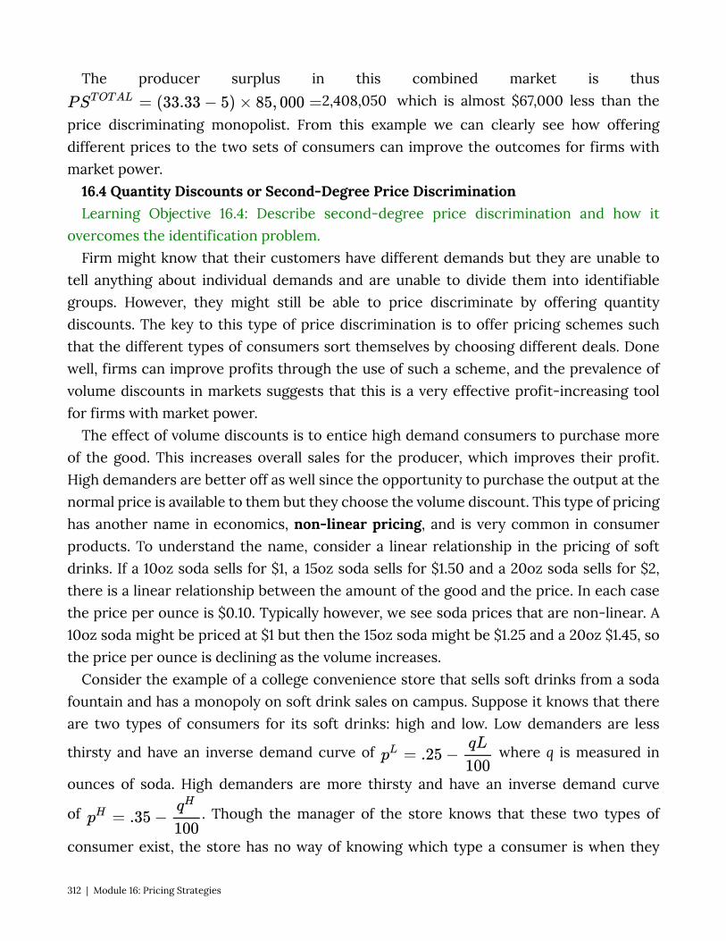
The producer surplus in this combined market is thus 2,408,050 which is almost $67,000 less than the
price discriminating monopolist. From this example we can clearly see how offering different prices to the two sets of consumers can improve the outcomes for firms with market power.
16.4 Quantity Discounts or Second-Degree Price Discrimination Learning Objective 16.4: Describe second-degree price discrimination and how it
overcomes the identification problem. Firm might know that their customers have different demands but they are unable to
tell anything about individual demands and are unable to divide them into identifiable groups. However, they might still be able to price discriminate by offering quantity discounts. The key to this type of price discrimination is to offer pricing schemes such that the different types of consumers sort themselves by choosing different deals. Done well, firms can improve profits through the use of such a scheme, and the prevalence of volume discounts in markets suggests that this is a very effective profit-increasing tool for firms with market power.
The effect of volume discounts is to entice high demand consumers to purchase more of the good. This increases overall sales for the producer, which improves their profit. High demanders are better off as well since the opportunity to purchase the output at the normal price is available to them but they choose the volume discount. This type of pricing has another name in economics, non-linear pricing, and is very common in consumer products. To understand the name, consider a linear relationship in the pricing of soft drinks. If a 10oz soda sells for $1, a 15oz soda sells for $1.50 and a 20oz soda sells for $2, there is a linear relationship between the amount of the good and the price. In each case the price per ounce is $0.10. Typically however, we see soda prices that are non-linear. A 10oz soda might be priced at $1 but then the 15oz soda might be $1.25 and a 20oz $1.45, so the price per ounce is declining as the volume increases.
Consider the example of a college convenience store that sells soft drinks from a soda fountain and has a monopoly on soft drink sales on campus. Suppose it knows that there are two types of consumers for its soft drinks: high and low. Low demanders are less
thirsty and have an inverse demand curve of where q is measured in
ounces of soda. High demanders are more thirsty and have an inverse demand curve
of . Though the manager of the store knows that these two types of
consumer exist, the store has no way of knowing which type a consumer is when they
312 | Module 16: Pricing Strategies
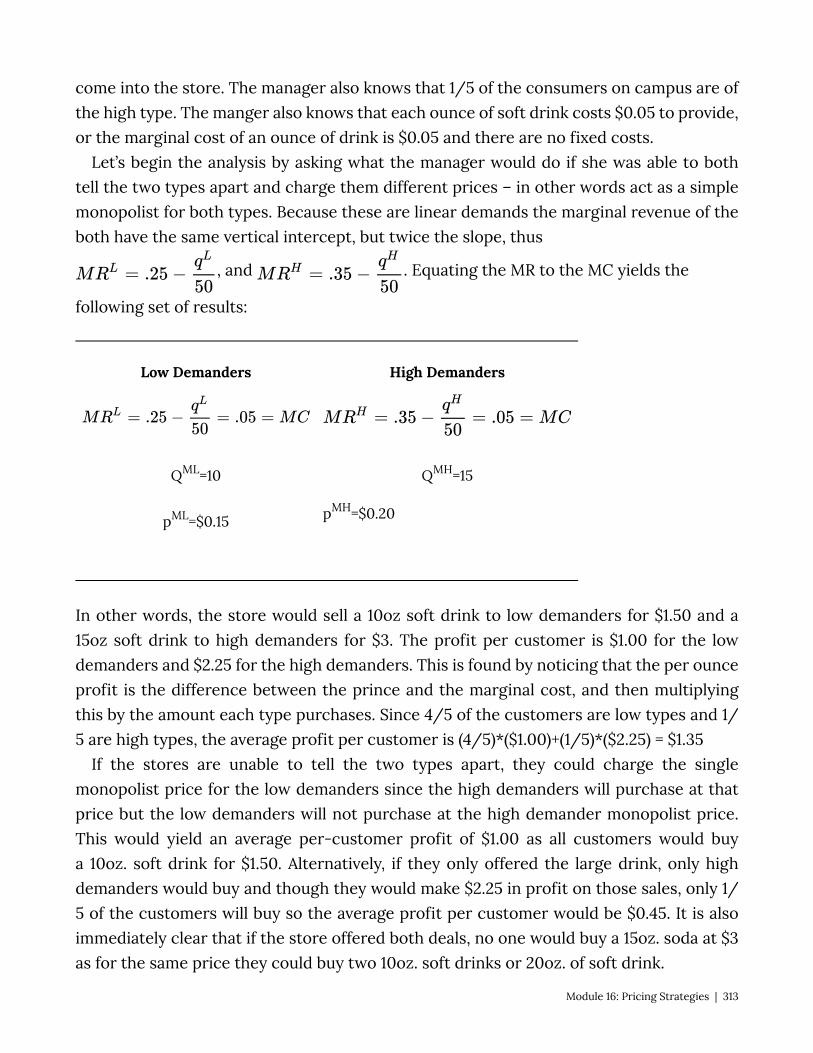
come into the store. The manager also knows that 1/5 of the consumers on campus are of the high type. The manger also knows that each ounce of soft drink costs $0.05 to provide, or the marginal cost of an ounce of drink is $0.05 and there are no fixed costs.
Let’s begin the analysis by asking what the manager would do if she was able to both tell the two types apart and charge them different prices – in other words act as a simple monopolist for both types. Because these are linear demands the marginal revenue of the both have the same vertical intercept, but twice the slope, thus
, and . Equating the MR to the MC yields the
following set of results:
Low Demanders High Demanders
QML=10 QMH=15
pML=$0.15 pMH=$0.20
In other words, the store would sell a 10oz soft drink to low demanders for $1.50 and a 15oz soft drink to high demanders for $3. The profit per customer is $1.00 for the low demanders and $2.25 for the high demanders. This is found by noticing that the per ounce profit is the difference between the prince and the marginal cost, and then multiplying this by the amount each type purchases. Since 4/5 of the customers are low types and 1/5 are high types, the average profit per customer is (4/5)*($1.00)+(1/5)*($2.25) = $1.35
If the stores are unable to tell the two types apart, they could charge the single monopolist price for the low demanders since the high demanders will purchase at that price but the low demanders will not purchase at the high demander monopolist price. This would yield an average per-customer profit of $1.00 as all customers would buy a 10oz. soft drink for $1.50. Alternatively, if they only offered the large drink, only high demanders would buy and though they would make $2.25 in profit on those sales, only 1/5 of the customers will buy so the average profit per customer would be $0.45. It is also immediately clear that if the store offered both deals, no one would buy a 15oz. soda at $3 as for the same price they could buy two 10oz. soft drinks or 20oz. of soft drink.
Module 16: Pricing Strategies | 313
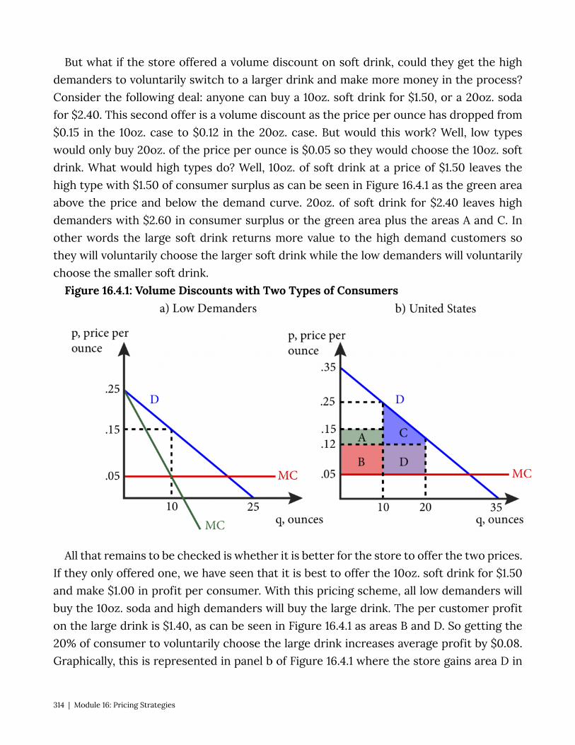
But what if the store offered a volume discount on soft drink, could they get the high demanders to voluntarily switch to a larger drink and make more money in the process? Consider the following deal: anyone can buy a 10oz. soft drink for $1.50, or a 20oz. soda for $2.40. This second offer is a volume discount as the price per ounce has dropped from $0.15 in the 10oz. case to $0.12 in the 20oz. case. But would this work? Well, low types would only buy 20oz. of the price per ounce is $0.05 so they would choose the 10oz. soft drink. What would high types do? Well, 10oz. of soft drink at a price of $1.50 leaves the high type with $1.50 of consumer surplus as can be seen in Figure 16.4.1 as the green area above the price and below the demand curve. 20oz. of soft drink for $2.40 leaves high demanders with $2.60 in consumer surplus or the green area plus the areas A and C. In other words the large soft drink returns more value to the high demand customers so they will voluntarily choose the larger soft drink while the low demanders will voluntarily choose the smaller soft drink.
Figure 16.4.1: Volume Discounts with Two Types of Consumers
All that remains to be checked is whether it is better for the store to offer the two prices. If they only offered one, we have seen that it is best to offer the 10oz. soft drink for $1.50 and make $1.00 in profit per consumer. With this pricing scheme, all low demanders will buy the 10oz. soda and high demanders will buy the large drink. The per customer profit on the large drink is $1.40, as can be seen in Figure 16.4.1 as areas B and D. So getting the 20% of consumer to voluntarily choose the large drink increases average profit by $0.08. Graphically, this is represented in panel b of Figure 16.4.1 where the store gains area D in
314 | Module 16: Pricing Strategies
profits and gives up area A. Since D is bigger than A, this represents an increase in profits for the store.
This example illustrates how firms with market power who serve customers with different demands can extract more surplus from the market by offering volume discounts which the high demand customers will choose voluntarily.
16.5 Two-Part Tariffs and Tie-In Sales Learning Objective 16.5: Define two-part tariffs and tie-in sales and how they work as
price discrimination mechanisms. There are other ways that a firm with market power can practice second-degree price
discrimination other than quantity discounts. One way is through the use of two-part pricing and the other is through tie-in sales. In both cases the key characteristic is the inability of the producer to identify consumers’ willing ness to pay either as individuals or in groups. Both pricing schemes rely on consumers voluntarily choosing a price based on their demands.
A Two-Part Tariff is a pricing scheme where a consumer pays a lum-sum fee for the right to purchase unlimited number of goods at a unit price. One example of a two-part tariff is a nightclub that charges a cover fee to enter the establishment and, once inside, patrons are able to purchase drinks at set prices. Another example are membership retailers like Costco and Sam’s Club which require patrons to purchase annual memberships to shop at the stores. Two-part tariffs are particularly relevant in the case of multiple purchases as consumers who only purchase one unit are essentially paying a single price but those that purchase more units are lowering their per-unit price as the one-time fee is divided across more units.
To understand how a two-part tariff works, we begin by assuming identical consumers, after examining the identical consumer case, we turn to the case of two types of consumers, high-demand and low-demand to understand how two-part tariffs can work as second-degree price discrimination mechanisms.
Two-Part Tariff with Identical Consumers Suppose a monopolist knows the demand curve of each of its consumers and that its
consumer all have identical demands. For example, suppose the only fitness club in a town knows that every single customer has exactly the same monthly inverse demand curve for visits to the club of p = 10 – ½ q where q is the individual’s quantity of visits. This fitness club is considering using a two-part pricing scheme where it charges a monthly membership fee and a price per-use. Furthermore the club estimates its marginal cost each time a client uses the club at $4. This includes the wear and tear on machines, cleaning, cost of towels and water in the locker room, etc. Since the monopolist knows the
Module 16: Pricing Strategies | 315
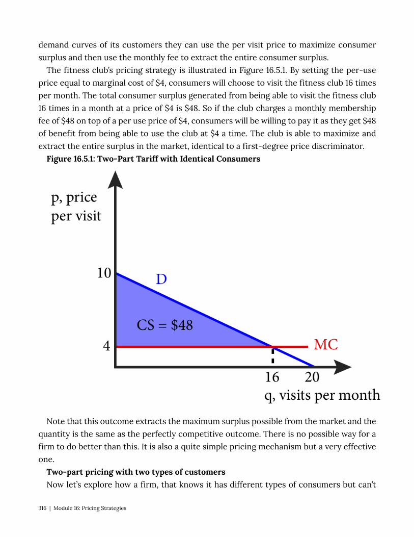
demand curves of its customers they can use the per visit price to maximize consumer surplus and then use the monthly fee to extract the entire consumer surplus.
The fitness club’s pricing strategy is illustrated in Figure 16.5.1. By setting the per-use price equal to marginal cost of $4, consumers will choose to visit the fitness club 16 times per month. The total consumer surplus generated from being able to visit the fitness club 16 times in a month at a price of $4 is $48. So if the club charges a monthly membership fee of $48 on top of a per use price of $4, consumers will be willing to pay it as they get $48 of benefit from being able to use the club at $4 a time. The club is able to maximize and extract the entire surplus in the market, identical to a first-degree price discriminator.
Figure 16.5.1: Two-Part Tariff with Identical Consumers
Note that this outcome extracts the maximum surplus possible from the market and the quantity is the same as the perfectly competitive outcome. There is no possible way for a firm to do better than this. It is also a quite simple pricing mechanism but a very effective one.
Two-part pricing with two types of customers Now let’s explore how a firm, that knows it has different types of consumers but can’t
316 | Module 16: Pricing Strategies
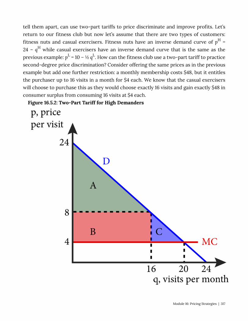
tell them apart, can use two-part tariffs to price discriminate and improve profits. Let’s return to our fitness club but now let’s assume that there are two types of customers: fitness nuts and casual exercisers. Fitness nuts have an inverse demand curve of pH = 24 – qH while casual exercisers have an inverse demand curve that is the same as the previous example: pL = 10 – ½ qL. How can the fitness club use a two-part tariff to practice second-degree price discrimination? Consider offering the same prices as in the previous example but add one further restriction: a monthly membership costs $48, but it entitles the purchaser up to 16 visits in a month for $4 each. We know that the casual exercisers will choose to purchase this as they would choose exactly 16 visits and gain exactly $48 in consumer surplus from consuming 16 visits at $4 each.
Figure 16.5.2: Two-Part Tariff for High Demanders
Module 16: Pricing Strategies | 317

But what about the fitness nuts whose demand curve is shown in Figure 16.5.2? This deal, let’s call it the Silver Membership – 16 visits at $4 each – would yield a total of $192 in consumer surplus (areas A + B), $48 of which would be paid as the monthly membership, netting $144 in leftover consumer surplus that the fitness nuts enjoy. However, note that the fitness nuts would like to visit the club more than 16 times in a month at the price of $4, they would like to visit 20 times. If they were allowed to visit 20 times, they would get a total of $200 in surplus (areas A + B + C). So the club could offer a Gold Membership, a package to more frequent visitors in addition to Silver Membership. If they offered a package that included 20 visits a month, how much could they charge for this enhanced membership? In order to get the fitness nuts to voluntarily choose the Gold Membership over the Silver Membership they need to leave them with as much consumer surplus as the Silver Membership leaves: $144. So $200 – $144 = $56. If the club charged $56 for the Gold Membership, the fitness nuts would voluntarily choose this package. What about casual exercisers? They would not visit more than 16 times in a month even if they had the right to, and they would not generate more than $48 in consumer surplus so a membership of $56 is too expensive and they would not choose it.
This pricing scheme is successful in getting the different types of consumer to self select into different pricing schemes, but is it better for the club? The answer is yes. The club breaks even at every visit since the price of each visit, $4, is exactly equal to the marginal cost of the visit. So by offering Gold Memberships, they collect $56 from types that they would otherwise have earned $48 from. This $8 difference is the improvement in profits for the club. Note that, in this case, the Gold Membership represents a volume discount, as the average cost per-visit for the Silver members is $7, while the average cost per-visit for the Gold members is $6.80.
Now that we have seen how two-part tariffs can be used to increase firm profits and act as a type of price discrimination, let’s consider the practice of tie-in sales.
Tie-In Sales Tie in sales refers to situations where the purchase of one item commits consumer to
buy another product as well. A very common example is ink-jet computer printers. The printers themselves are sold in quite competitive markets, but the printer requires that only the manufacturer’s ink can be used in the printer creating a situation where the firm has market power in the ink market. In many ways such programs are very similar to two-part tariffs where the price of the printer is like the fixed fee and the ink is the per-use price. However, in tie-in sales it is the printer that is priced competitively and the ink for which a monopoly price is charged.
318 | Module 16: Pricing Strategies
Other examples include razors and blades, automobiles and ‘genuine’ parts required to keep warranty valid.
16.6 Bundling, Versioning and Hurdles Learning Objective 16.6: Define bundling, versioning and hurdles and how each works to
increase firm profits. Selling more than one good together for a single price is called bundling. Firms use
bundling as another pricing strategy commonly used by firms to increase profit. Pure bundling is when the goods are only sold together at a single price and mixed bundling is when goods are available separately at individual prices and together at a single price that is typically lower than the sum of the two individual prices. Bundling is an alternative pricing strategy that is similar to quantity discounts but generally used in markets for goods where consumers don’t generally purchase more than one units of each at a single time and therefore quantity discounts are not effective. Bundling does require that resale preventable or impractical.
A good example of bundling is cable and satellite television. Most companies sell television channels in packages of channels so, for example, if you are sports fan that wants ESPN you might be forced to choose a package of channels that includes the Home and Garden Network (HGN) which you might not values very highly. On the other hand, you might be very interested in home improvement and value the HGN channel very highly and have a low value for ESPN. By selling them together as a bundle the cable or satellite television provider can improve its profits relative to selling them separately.
To see this consider the following simple example of an economy in which there are two types of television watchers: the sports fans and the home improvers. We will assume that there are equal numbers of both in the economy and that there is a single cable company that provides the channels but the cable provider cannot tell the two types of customers apart prior to a sale. We also assume that the cable company’s marginal cost of an extra subscriber for each channel is zero.
Sports fans like to watch sports and are not very interested in home improvement. Home improvers like to watch home improvement shows and are not very interested in sports. Their reservation prices for a month of access to ESPN and HGN are given in the table below:
Table 16.6.1: Reservation Prices for Television Channels per Month
Module 16: Pricing Strategies | 319

Consumer Types
Television Channels
Sports Fan Home Improver
ESPN $30 $12
HGN $14 $36
Both $44 $48
Given this information, what is the best pricing strategy for the cable monopolist? One strategy is to sell the channels separately a la carte style. If they did so, they could charge the monopoly price for each channel. In the case above, the profit-maximizing price for ESPN is $30. Since marginal cost is zero, the profit-maximizing price is the same as the price that maximizes revenue. If the company charges at $30 the sports fan will purchase it, the home improver will not so total revenue is $30 per customer pair. If instead the company charged $12, both consumers would purchase the channel so total revenue would be $24. So $30 is the profit-maximizing price for ESPN. Similarly if the cable company charged $36 for HGN, only home improvers would buy and the revenue per consumer pair would be $36. If they charged $14 both consumers would buy the channel and they would generate $28 per pair. In total the maximum profit per consumer pair from selling the channels separately is $30 + $36 or $66.
Now suppose they sold the two channels only as a bundle, what is the profit maximizing price fort the bundle? If the cable company charged $48 for the bundle, home improvers would buy, sports fans would not and revenue per consumer pair would be $48. If the cable company charged $44 for the bundle, both types would buy and revenues would be $44 ×2 or $88. So clearly the profit-maximizing price for the bundle is $44.
Comparing the bundle revenues to the single channel revenues, it is clear that bundling is a better choice for the company as they earn $88 per consumer pair when they bundle versus $66 when they sell the channels separately. Why is this? By selling them separately their incentive is to charge prices for individual channels that excludes the type that doesn’t prefer the channel. By bundling, the company both forces the consumer to purchase the other, less preferred channel, but offers a substantial discount for the second channel. This gets consumers to buy twice as many channels as they would
320 | Module 16: Pricing Strategies
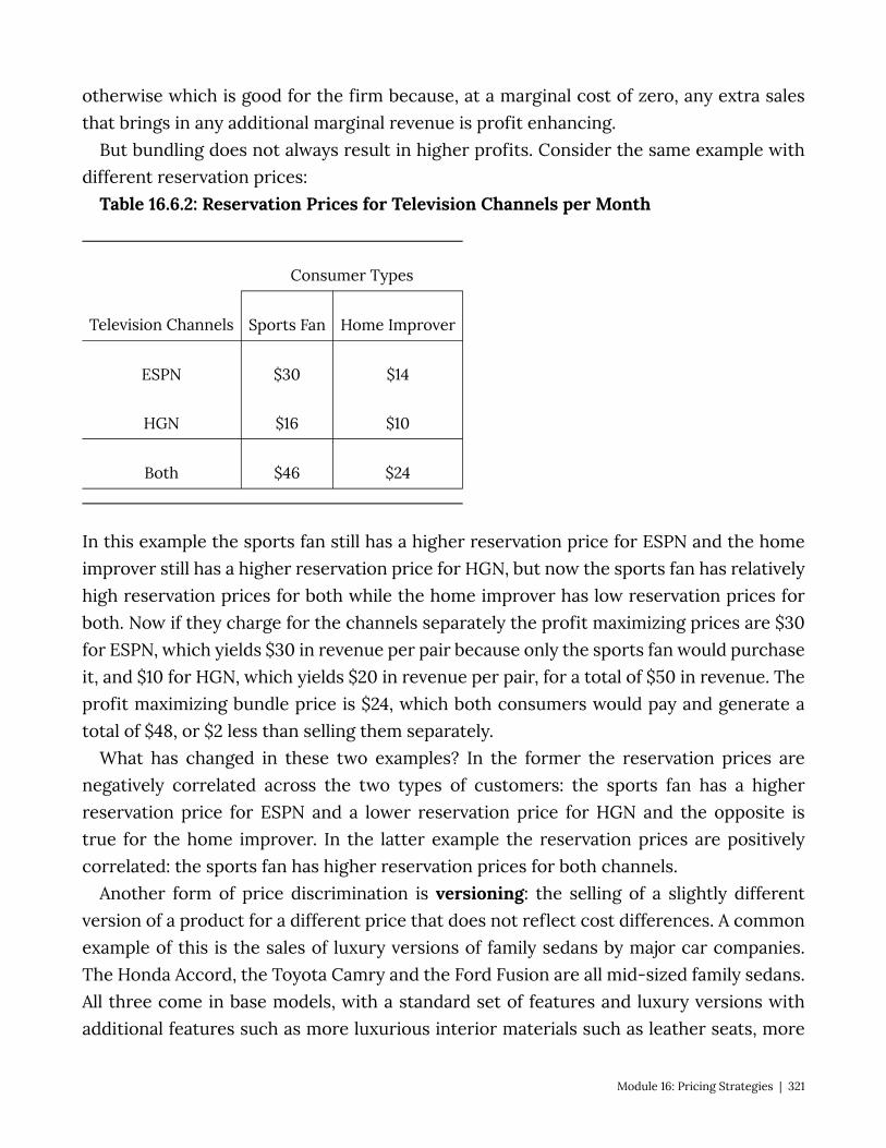
otherwise which is good for the firm because, at a marginal cost of zero, any extra sales that brings in any additional marginal revenue is profit enhancing.
But bundling does not always result in higher profits. Consider the same example with different reservation prices:
Table 16.6.2: Reservation Prices for Television Channels per Month
Consumer Types
Television Channels Sports Fan Home Improver
ESPN $30 $14
HGN $16 $10
Both $46 $24
In this example the sports fan still has a higher reservation price for ESPN and the home improver still has a higher reservation price for HGN, but now the sports fan has relatively high reservation prices for both while the home improver has low reservation prices for both. Now if they charge for the channels separately the profit maximizing prices are $30 for ESPN, which yields $30 in revenue per pair because only the sports fan would purchase it, and $10 for HGN, which yields $20 in revenue per pair, for a total of $50 in revenue. The profit maximizing bundle price is $24, which both consumers would pay and generate a total of $48, or $2 less than selling them separately.
What has changed in these two examples? In the former the reservation prices are negatively correlated across the two types of customers: the sports fan has a higher reservation price for ESPN and a lower reservation price for HGN and the opposite is true for the home improver. In the latter example the reservation prices are positively correlated: the sports fan has higher reservation prices for both channels.
Another form of price discrimination is versioning: the selling of a slightly different version of a product for a different price that does not reflect cost differences. A common example of this is the sales of luxury versions of family sedans by major car companies. The Honda Accord, the Toyota Camry and the Ford Fusion are all mid-sized family sedans. All three come in base models, with a standard set of features and luxury versions with additional features such as more luxurious interior materials such as leather seats, more
Module 16: Pricing Strategies | 321

technological components such as adaptive cruise control systems and the like. If the price differential simply reflected the extra cost to the firm of these extra features, there would be no price discrimination, however this is not the case, car companies charge a premium over additional costs. For this to be a profit maximizing strategy it must be the case that customers with low price elasticities self-select into the luxury versions because preference for luxury amenities and low price elasticity are correlated. They pay a higher price than do customers with higher price elasticities. As we saw in section 16.3, being able to charge the low elasticity customers a higher price than high elasticity customers is often a profit improving strategy.
[Example Honda Odyssey tourning v. elite. $1000 more for nav system] Another price discrimination mechanism is through the use of hurdles: a non-monetary
cost a consumer has to pay in order to qualify for a lower price. The most classic hurdle is the redeemable coupon. Consider a grocery store that prints a sheet of coupons and outs them in a flyer in the local newspaper or sends it in the mail. All customers of the store have a chance to use them but many don’t. Those that do pay a price to use them, the time and effort of cutting them, searching for the specific good for each coupon and redeeming them at check out. The price discrimination mechanism is that high elasticity customers are more likely to pay the cost of dealing with coupons and at the same time, these are the very customers to whom the stores would like to offer a lower price.
Other examples of hurdles are early-bird dinner deals, mail-in rebates, matinee movie tickets, paperback versions of popular books and rush tickets for theater performances only available the night of the performance. In all cases there is some cost to purchasing the product – having to arrive early to a restaurant or movie, not being able to be guaranteed a seat at a theater, having to wait to but a book, having to fill-out a rebate card and wait 6-8 weeks for a check – that entitles to the person paying the cost to a lower price. This cost causes consumers to self-select into two groups, those that pay the cost to get a lower price and those that pay the higher price and avoid the cost.
16.7 Policy Example: Should Public Universities Charge Everyone the Same Price? Learning Objective 16.7: Explain how the use of price discrimination can be seen as a way
for public universities to accomplish their mission. The public universities of the United States, like the University of California at Berkeley
have a common foundational purpose: to provide a quality education for the students of the state in which they reside. To provide a quality education comes at a considerable cost, as universities are complex institutions that house, feed and educate students. But is price discrimination antithetical to their mission? As non-profit entities, what
322 | Module 16: Pricing Strategies
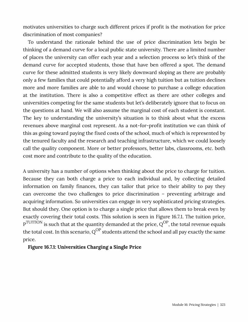
motivates universities to charge such different prices if profit is the motivation for price discrimination of most companies?
To understand the rationale behind the use of price discrimination lets begin be thinking of a demand curve for a local public state university. There are a limited number of places the university can offer each year and a selection process so let’s think of the demand curve for accepted students, those that have ben offered a spot. The demand curve for these admitted students is very likely downward sloping as there are probably only a few families that could potentially afford a very high tuition but as tuition declines more and more families are able to and would choose to purchase a college education at the institution. There is also a competitive effect as there are other colleges and universities competing for the same students but let’s deliberately ignore that to focus on the questions at hand. We will also assume the marginal cost of each student is constant. The key to understanding the university’s situation is to think about what the excess revenues above marginal cost represent. As a not-for-profit institution we can think of this as going toward paying the fixed costs of the school, much of which is represented by the tenured faculty and the research and teaching infrastructure, which we could loosely call the quality component. More or better professors, better labs, classrooms, etc. both cost more and contribute to the quality of the education.
A university has a number of options when thinking about the price to charge for tuition. Because they can both charge a price to each individual and, by collecting detailed information on family finances, they can tailor that price to their ability to pay they can overcome the two challenges to price discrimination – preventing arbitrage and acquiring information. So universities can engage in very sophisticated pricing strategies. But should they. One option is to charge a single price that allows them to break even by exactly covering their total costs. This solution is seen in Figure 16.7.1. The tuition price, PTUITION is such that at the quantity demanded at the price, QOP, the total revenue equals the total cost. In this scenario, QOP students attend the school and all pay exactly the same price.
Figure 16.7.1: Universities Charging a Single Price
Module 16: Pricing Strategies | 323

If instead the university practices price discrimination, they can charge each student exactly their reservation price. This situation is illustrated in Figure 16.7.2.
Figure 16.7.2: Universities Practicing First-Degree Price Discrimination
324 | Module 16: Pricing Strategies
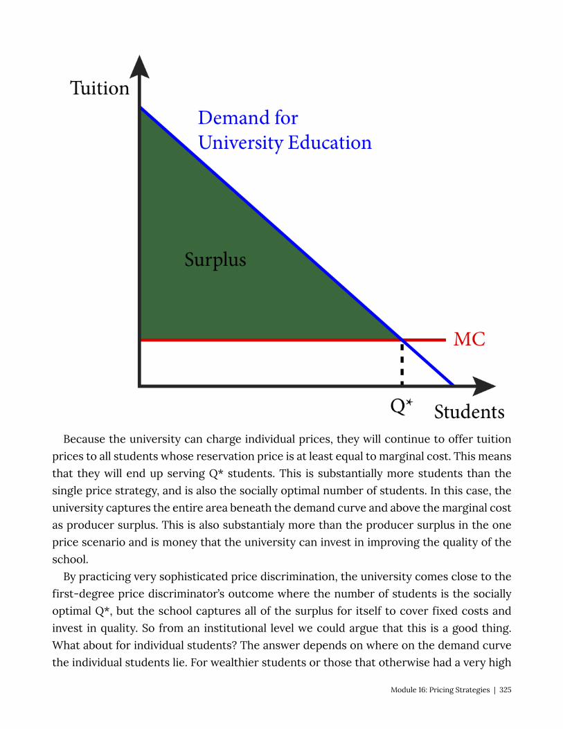
Because the university can charge individual prices, they will continue to offer tuition prices to all students whose reservation price is at least equal to marginal cost. This means that they will end up serving Q* students. This is substantially more students than the single price strategy, and is also the socially optimal number of students. In this case, the university captures the entire area beneath the demand curve and above the marginal cost as producer surplus. This is also substantialy more than the producer surplus in the one price scenario and is money that the university can invest in improving the quality of the school.
By practicing very sophisticated price discrimination, the university comes close to the first-degree price discriminator’s outcome where the number of students is the socially optimal Q*, but the school captures all of the surplus for itself to cover fixed costs and invest in quality. So from an institutional level we could argue that this is a good thing. What about for individual students? The answer depends on where on the demand curve the individual students lie. For wealthier students or those that otherwise had a very high
Module 16: Pricing Strategies | 325
reservation price, they are playing quite a bit more than they would with a single price. But for low income or otherwise low reservation price students, with price discrimination that can attend the university where otherwise they would have been shut out with a single price and they pay a lower tuition than the single price.
Exploring the Policy Question
1. Explain how high income students might feel very differently about the price discrimination by state universities than low-income students.
2. Do you think that price discrimination is consistent with the mission of your school? 3. How do you feel about the price you play for college – is it fair?
SUMMARY
Review: Topics and Related Learning Outcomes
16.1 Market Power and Price Discrimination Learning Objective 16.1: Explain differentiated pricing and describe the three types of
price discrimination. 16.2 Perfect or First-Degree Price Discrimination Learning Objective 16.2: Describe first-degree price discrimination and the challenges
that make it hard. 16.3 Group Price Discrimination or Third-Degree Price Discrimination Learning Objective 15.3: Describe third-degree price discrimination and its effect on
profits. 16.4 Quantity Discounts or Second-Degree Price Discrimination Learning Objective 16.4: Describe second-degree price discrimination and how it
overcomes the identification problem. 16.5 Two-Part Tariffs and Tie-In Sales Learning Objective 16.5: Define two-part tariffs and tie-in sales and how they work as
price discrimination mechanisms. 16.6 Bundling, Versioning and Hurdles Learning Objective 16.6: Define bundling, versioning and hurdles and how each works to
increase firm profits.
326 | Module 16: Pricing Strategies
16.7 Policy Example: Should Public Universities Charge Everyone the Same Price? Learning Objective 16.7: Explain how the use of price discrimination can be seen as a way
for public universities to accomplish their mission.
Learn: Key Terms and Graphs
Terms
Simple monopolists Differentiated pricing Price discrimination Perfect price discrimination First-degree price discrimination Group price discrimination Third-degree price discrimination Quantity discounts Second-degree price discrimination Transactions costs Non-linear pricing Two-Part Tariff Tie-In Sales Bundling Pure bundling Mixed bundling Versioning
Module 16: Pricing Strategies | 327
Graphs
Figure 16.2.1: First-Degree Price Discrimination Figure 16.3.1: Group or Third-Degree Price Discrimination in Book Publishing Figure 16.4.1: Volume Discounts with Two Types of Consumers Figure 16.5.1: Two-Part Tariff with Identical Consumers Figure 16.5.2: Two-Part Tariff for High Demanders
Tables
Table 16.6.1: Reservation Prices for Television Channels per Month Table 16.6.2: Reservation Prices for Television Channels per Month
328 | Module 16: Pricing Strategies
Module 17: Game Theory
Policy Example: Do We Need to Regulate Banks to Save Them From Themselves? In the real estate and banking crisis that caused the United States to fall into the worst
recession since the Great Depression, banks were seen to have engaged in reckless and risky behavior that was seemingly against their self-interest. Part of the risky behavior was attributed to the relaxation of banking regulations, particularly those that separated commercial banks from investment banks. But the question of why banks would engage in self-destructive behavior in the first place is one that puzzles many observers who have a background in economics and knows that free markets often direct individual self-interested action toward the ood of society.
One possible explanation for this disconnect is the possibility that the banking industry is much more strategic than policy makers understood. The strategic incentives to take risks could be a lot more powerful then generally appreciated. The nature of this strategic environment and the incentives it provides are essential to understand to be able to make appropriate and effective policy.
Exploring the Policy Question
1. What are the strategic incentives for banks to take risks? 2. What policy solutions present themselves from this analysis?
17.1 What is Game Theory? Learning Objective 17.1: Describe game theory and they types of situations it describes. 17.2 Single Play Games Learning Objective 17.2: Describe normal form games and identify optimal strategies and
equilibrium outcomes in such games. 17.3 Sequential Games Learning Objective 17.3: Describe sequential move games and explain how they are
solved. 17.4 Repeated Games
Module 17: Game Theory | 329
Learning Objective 17.4: Describe repeated games and the difference between finitely repeated game and infinitely repeated games and their equilibrium.
17.5 Policy Example: Do We Need to Regulate Banks to Save Them From Themselves? Learning Objective 17.5: Explain how game theory can be used to understand the
banking collapse of 2008. 17.1 What is Game Theory? Learning Objective 17.1: Describe game theory and they types of situations it describes. Until this module we have studied economic decision making in situations where an
agent’s payoff is based on his, her or its actions alone. In other words the payoff to an agent’s actions is known and the trick is to figure out how to get the highest payoff. But there are many situations in which the payoffs to an agent’s actions are determined in part by the actions of other agents. Consider this simple example. On Saturday, you know there are a number of parties happening in and around your school. How much you will enjoy attending any one party is in large part determined by how many of your friends will be there. In other words, your payoff is a function not only of your decision about which party to attend but also a function of the decisions of your friends. We call these types of interactions strategic interactions, where agents must anticipate the actions of others when making decisions, and we use game theory to model them so that we can think about the outcomes of these interactions just like we think about outcomes in markets without strategic interaction like the price and quantity outcome in a product market. The study of these models is called game theory: the study of strategic interactions among economic agents.
Game theory is extremely useful because it allows us to anticipate the behavior of economic agents within a game and the outcomes of strategic games. Game theory gets its name from actual games. Games like checkers and chess are strategic games where two players interact and the outcome of the game is determined by the actions of both players. In economics, game theory is particularly useful in understanding imperfectly competitive markets like oligopoly – the subject of the next module – because the price and output decisions of one firm affects the demand and therefore profit function of the other firms. But before we can study oligopoly markets, we must first understand games and how to analyze them. In this module we will consider only non-cooperative games, games where the players are not able to negotiate and make binding agreements within the game. An example of a cooperative game might be one where two poker payers agree to share winnings no matter who actually wins, as a result their strategies are based on how best to maximize the joint expected payoff, not individual payoffs.
330 | Module 17: Game Theory

All games have three basic elements: players, strategies and payoffs. The players of the game are the agents actively participating in the game and who will experience outcomes based on the play of all players. The strategies are all of the possible strategic choices available to each player, they can be the same for all players or different for each player. The payoffs are the outcomes associated with every possible strategic combination, for each player. Any complete description of a game must include these three elements. In the games that we will study in this module, we will assume that each player’s goal is to maximize their individual payoff which is consistent with the rational utility-maximizing agent that is the foundation of modern economic theory.
We begin by separating games into two basic types: simultaneous games and sequential games. Simultaneous games are games in which players take strategic actions at the same time, without knowing what move the other has chosen. A good example of this type of game is the matching coins game where two players each have a coin and choose which side to face up. They then reveal their choices simultaneously and if they match one player gets to keep both coins and if they don’t match the other player keeps both coins. Sequential games are games where players take turns and move consecutively. Checkers, chess and go are all good examples of sequential games. One player observes the move of the other player, then makes their play and so on.
Games can also be single-shot or repeated. Single-shot games are played once and then the game is over. Repeated games are simultaneous move games played repeatedly by the same players. A single-shot game might be a game of rock, paper, scissors played once to determine who gets to sit in the front seat of a car. A repeated game might be repeated plays of rock, paper, scissors with the first player to win five times getting the right to sit in the front seat of a car.
Games can become very complicated when all players do not know all the information about the game. For the purposes of this module, we will assume common knowledge. Common knowledge is when the players know all about the game – the players, strategies and payoffs – and know that the other players know, and that the other players know that they know, and so on ad infinitum. In simpler terms all participants know everything.
17.2 Single Play Games Learning Objective 17.2: Describe normal form games and identify optimal strategies and
equilibrium outcomes in such games. The most basic of games is the simultaneous, single play game. We can represent such
a game with a payoff matrix: a table that lists the players of the game, their strategies and the payoffs associated with every possible strategy combination. We call games that can be represented with a payoff matrix, normal-form games.
Module 17: Game Theory | 331

Let’s start with an example of a game among two friends, Erika and Sven, who are competing to be the top student in a class. They have a final exam approaching and they are deciding whether they should be cooperative and share notes or be uncooperative and keep their notes to themselves. They won’t see each other at the end of the day so they each have to decide whether to leave notes for each other without knowing what the other one has done. If they both share notes they both will get perfect scores. Their teacher gives a ten point bonus to the top exam score, but only of there is one exam better than the rest so if they both get top score there is no bonus and they both get 100 on their exams. If they both don’t share they wont do as well and they will both receive a 95 on their exams. However if one shares and the other doesn’t the one who shares will not benefit from the other’s notes, so will only get a 90 and the one who doesn’t share will benefit from the other’s notes, get the top score and the bonus for a score of 110.
All of these facts are expressed in the payoff matrix in Figure 17.2.1. Since this is a single-shot, simultaneous game it is a normal-form game and we can use a payoff matrix to describe it. There are two players: Lena and Sven. There are two strategies available to each player. Lena’s strategies are in blue and correspond to the rows and Sven’s are in red and correspond to the columns and they are the same for both: share or don’t share. The payoffs for each strategy combination are given in the corresponding row and column and Lena’s payoffs are in blue and Sven’s payoffs are in red. We will assume common knowledge – they both know all of this information about the game, and they know that the other knows it, and they know that the other knows that they know it, and so on.
Figure 17.2.1: The Valedictorian Game
Sven
Share Don’t Share
Lena Share 100, 100 90, 110
Don’t Share 110, 90 95, 95
The payoff matrix a complete description of the game because it lists the three elements: players, strategies and payoffs.
It is now time to think about individual strategy choices. We will start by examining
332 | Module 17: Game Theory
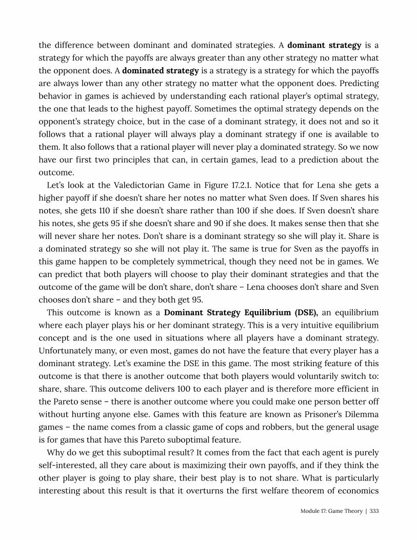
the difference between dominant and dominated strategies. A dominant strategy is a strategy for which the payoffs are always greater than any other strategy no matter what the opponent does. A dominated strategy is a strategy is a strategy for which the payoffs are always lower than any other strategy no matter what the opponent does. Predicting behavior in games is achieved by understanding each rational player’s optimal strategy, the one that leads to the highest payoff. Sometimes the optimal strategy depends on the opponent’s strategy choice, but in the case of a dominant strategy, it does not and so it follows that a rational player will always play a dominant strategy if one is available to them. It also follows that a rational player will never play a dominated strategy. So we now have our first two principles that can, in certain games, lead to a prediction about the outcome.
Let’s look at the Valedictorian Game in Figure 17.2.1. Notice that for Lena she gets a higher payoff if she doesn’t share her notes no matter what Sven does. If Sven shares his notes, she gets 110 if she doesn’t share rather than 100 if she does. If Sven doesn’t share his notes, she gets 95 if she doesn’t share and 90 if she does. It makes sense then that she will never share her notes. Don’t share is a dominant strategy so she will play it. Share is a dominated strategy so she will not play it. The same is true for Sven as the payoffs in this game happen to be completely symmetrical, though they need not be in games. We can predict that both players will choose to play their dominant strategies and that the outcome of the game will be don’t share, don’t share – Lena chooses don’t share and Sven chooses don’t share – and they both get 95.
This outcome is known as a Dominant Strategy Equilibrium (DSE), an equilibrium where each player plays his or her dominant strategy. This is a very intuitive equilibrium concept and is the one used in situations where all players have a dominant strategy. Unfortunately many, or even most, games do not have the feature that every player has a dominant strategy. Let’s examine the DSE in this game. The most striking feature of this outcome is that there is another outcome that both players would voluntarily switch to: share, share. This outcome delivers 100 to each player and is therefore more efficient in the Pareto sense – there is another outcome where you could make one person better off without hurting anyone else. Games with this feature are known as Prisoner’s Dilemma games – the name comes from a classic game of cops and robbers, but the general usage is for games that have this Pareto suboptimal feature.
Why do we get this suboptimal result? It comes from the fact that each agent is purely self-interested, all they care about is maximizing their own payoffs, and if they think the other player is going to play share, their best play is to not share. What is particularly interesting about this result is that it overturns the first welfare theorem of economics
Module 17: Game Theory | 333
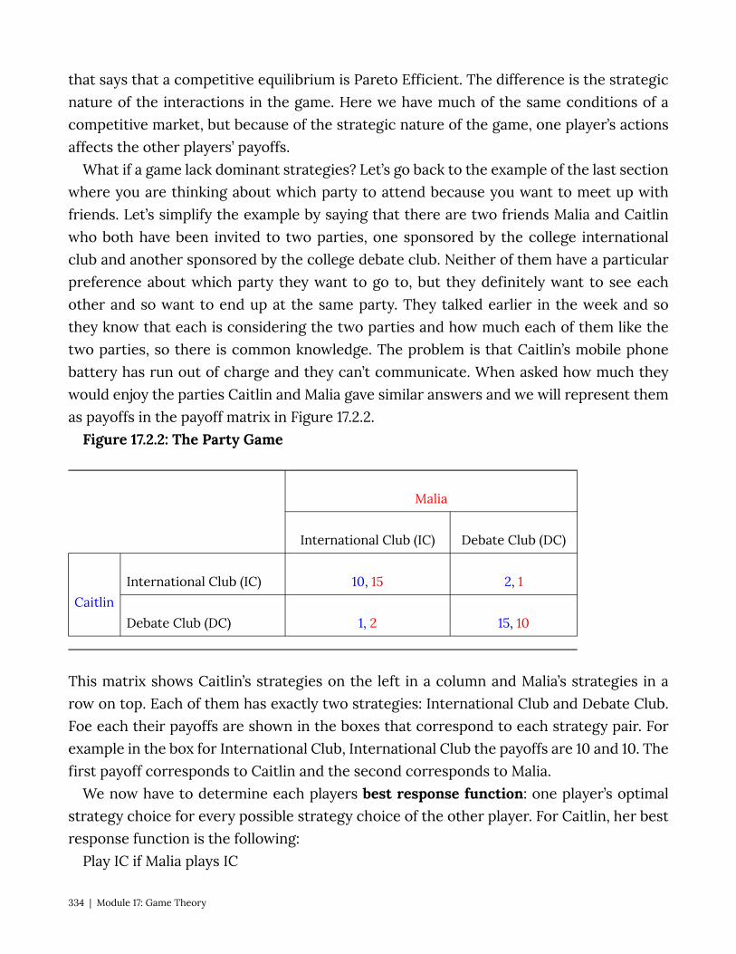
that says that a competitive equilibrium is Pareto Efficient. The difference is the strategic nature of the interactions in the game. Here we have much of the same conditions of a competitive market, but because of the strategic nature of the game, one player’s actions affects the other players’ payoffs.
What if a game lack dominant strategies? Let’s go back to the example of the last section where you are thinking about which party to attend because you want to meet up with friends. Let’s simplify the example by saying that there are two friends Malia and Caitlin who both have been invited to two parties, one sponsored by the college international club and another sponsored by the college debate club. Neither of them have a particular preference about which party they want to go to, but they definitely want to see each other and so want to end up at the same party. They talked earlier in the week and so they know that each is considering the two parties and how much each of them like the two parties, so there is common knowledge. The problem is that Caitlin’s mobile phone battery has run out of charge and they can’t communicate. When asked how much they would enjoy the parties Caitlin and Malia gave similar answers and we will represent them as payoffs in the payoff matrix in Figure 17.2.2.
Figure 17.2.2: The Party Game
Malia
International Club (IC) Debate Club (DC)
Caitlin International Club (IC) 10, 15 2, 1
Debate Club (DC) 1, 2 15, 10
This matrix shows Caitlin’s strategies on the left in a column and Malia’s strategies in a row on top. Each of them has exactly two strategies: International Club and Debate Club. Foe each their payoffs are shown in the boxes that correspond to each strategy pair. For example in the box for International Club, International Club the payoffs are 10 and 10. The first payoff corresponds to Caitlin and the second corresponds to Malia.
We now have to determine each players best response function: one player’s optimal strategy choice for every possible strategy choice of the other player. For Caitlin, her best response function is the following:
Play IC if Malia plays IC
334 | Module 17: Game Theory
Play DC if Malia plays DC For Malia, her best response function looks similar: Play IC if Caitlin plays IC Play DC if Caitlin plays DC Since the best response changes for both players depending on the strategy choice of
the other player, we know immediately that neither one has a dominant strategy. What then? How do we think about the outcome of the game? The solution concept most commonly used in game theory is the Nash equilibrium concept. A Nash equilibrium is an outcome where, given the strategy choices of the other players, no individual player can obtain a higher payoff by altering their strategy choice. An equivalent way to think about Nash equilibrium is that it is an outcome of a game where all players are simultaneously playing a best response to the others’ strategy choices. The equilibrium is intuitive, if, when placed in a certain outcome, no player wishes to unilaterally deviate from it, then equilibrium is achieved – there are no forces within the game that would cause the outcome to change.
In the party game above, there are two outcomes where the best responses correspond: both players choosing IC and both players choosing DC. If Caitlin shows up at the International Club party and finds Malia there, she will not want to leave Malia there and go to the Debate Club party. Similarly if Malia shows up at the International Club party and finds Caitlin there, she will not want to leave Caitlin there and go to the Debate Club party. So the outcome (IC, IC) – which describes Caitlin’s choice and Malia’s choice is a Nash equilibrium. The outcome (DC, DC) is also a Nash equilibrium for the same reason.
This example illustrates the strengths and weaknesses of the Nash equilibrium concept. Intuitively, if they show up at the same party, both women would be content and neither one would want to leave to the other party if the other is staying. However, there is nothing in the Nash equilibrium concept that gives us guidance as to predicting at which party the women will end up. In general, a normal form game can have zero, one or multiple Nash equilibrium.
Consider this different version of the party game where Caitlin really doesn’t want to go to the International Club party, so much so that she prefers attending the Debate Club party without Malia to attending the International Club party with Malia.
Figure 17.2.3: The Party Game, Version 2
Module 17: Game Theory | 335

Malia
International Club (IC) Debate Club (DC)
Caitlin International Club (IC) 1, 15 2, 1
Debate Club (DC) 5, 2 15, 10
Now DC is a dominant strategy for Caitlin. Malia knows Caitlin does not like the International Club party and will correctly surmise that she will attend the Debate Club party no matter what. So both Caitlin and Malia will go to the Debate Club party and (DC, DC) is the only Nash Equilibrium. In this case the Nash equilibrium concept is satisfying, it gives a clear prediction of the unique outcome of the game and it intuitively makes sense.
Another possibility is a game that has no Nash equilibrium. Consider the following game called matching pennies. In this game two players, Ahmed and Naveen, each have a penny. They decide which side of the penny to have facing up and cover the penny until they are both revealed simultaneously. By agreement, if the pennies match Ahmed gets to keep both and if the two pennies don’t match, Naveen keeps both. The players, strategies, and payoffs are given in the payoff matrix in Figure 17.2.4.
Figure 17.2.4: The Matching Pennies Game
Naveen
Heads Tails
Ahmed Heads 1, -1 -1, 1
Tails -1, 1 1, -1
Ahmed’s best response function is to play heads if Naveen plays heads and to play tails if Naveen plays tails. Naveen’s best response is to play tails if Ahmed plays heads and to play heads if Ahmed plays tails. As you can clearly see, there is no correspondence of best response functions, no outcome of the game in which no player would want to unilaterally
336 | Module 17: Game Theory

deviate and thus no Nash equilibrium. The outcome of this game is unpredictable and no outcome creates contentment for both players.
Finding the Nash equilibrium in normal form games is made relatively easy by following a simple technique that identifies the best response functions on the payoff matrix itself. To do so, simply underline the maximum payoff for a given opponent strategy. Consider the example below. For Chris, if Pat plays Left, the maximum payoff is 65 which comes from playing Up, so let’s underline 65. This is a representation of the best response to Pat playing left, Chris should play Up. Moving along the columns we find that Chris should play Down if Pat plays Center, and Chris should play Down again if Pat plays Right. Switching perspective, if Chris plays Up Pat gets a maximum payoff from playing Left so we underline Pat’s payoff, 44, in that box. Continuing on, if Chris plays Middle, Pay should play Right, and if Chris plays Down, Pat should play Center.
Pat
Left Center Right
Chris
Up 65, 44 29, 38 44, 29
Middle 53, 41 35, 31 19, 56
Down 30, 57 41, 63 72, 27
So now that we have identified each players best response functions, all that remains is to look for outcomes where the best response functions correspond. Such outcomes are those where both payoffs are underlined. In this game the two Nash equilibria are (Up, Left) and (Down, Center).
NOTE ON DOMINANT STRATEGY AND NASH EQUILIBRIUM If we change the payoffs in the game to what is shown below notice that each player has
a dominant strategy as see by the thee underlines all in the row ‘Down’ for Chris and three underlines all in the column ‘Center’ for Pat. Down is always the best strategy choice for Chris no matter what Pat chooses and Center is always the right strategy choice for Pat no matter what Chris chooses.
Module 17: Game Theory | 337
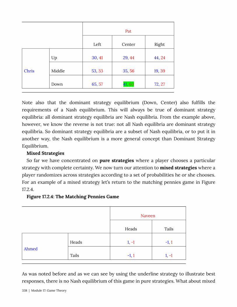
Pat
Left Center Right
Chris
Up 30, 41 29, 44 44, 24
Middle 53, 33 35, 56 19, 39
Down 65, 57 41, 63 72, 27
Note also that the dominant strategy equilibrium (Down, Center) also fulfills the requirements of a Nash equilibrium. This will always be true of dominant strategy equilibria: all dominant strategy equilibria are Nash equilibria. From the example above, however, we know the reverse is not true: not all Nash equilibria are dominant strategy equilibria. So dominant strategy equilibria are a subset of Nash equilibria, or to put it in another way, the Nash equilibrium is a more general concept than Dominant Strategy Equilibrium.
Mixed Strategies So far we have concentrated on pure strategies where a player chooses a particular
strategy with complete certainty. We now turn our attention to mixed strategies where a player randomizes across strategies according to a set of probabilities he or she chooses. For an example of a mixed strategy let’s return to the matching pennies game in Figure 17.2.4.
Figure 17.2.4: The Matching Pennies Game
Naveen
Heads Tails
Ahmed Heads 1, -1 -1, 1
Tails -1, 1 1, -1
As was noted before and as we can see by using the underline strategy to illustrate best responses, there is no Nash equilibrium of this game in pure strategies. What about mixed
338 | Module 17: Game Theory

strategies? A mixed strategy is a strategy itself, for example Ahmed might decide that he will play heads 75% of the time and tails 25% of the time. What is Neveen’s best response to this strategy? Well if Naveen plays tails with certainty, he will win 75% of the time. Ahmed’s best response to Naveen playing tails is to play tails with certainty, so Ahmed’s mixed strategy is not a Nash equilibrium strategy. How about Ahmed choosing a mixed strategy of playing heads and tails each with a 50% chance – simply flipping the coin – can this be a Nash equilibrium strategy? The answer is yes which is evident when we think of Naveen’s best response to this mixed strategy. Naveen can play either heads or tails with certainty or the same mixed strategy with equal results, he can expect to win half the time. We know that the pure strategies have best responses as given in the matrix above so only the mixed strategy is a Nash equilibrium. If Ahmed decides to flip his coin, Naveen’s best response is to flip his too. And if Naveen is flipping his coin, Ahmed’s best response is to do the same.
So this game, that did not have a Nash equilibrium in pure strategies, does have a Nash equilibrium in mixed strategies. Both players randomize over their two strategy choices with probabilities .5 and .5.
17.3 Sequential Games Learning Objective 17.3: Describe sequential move games and explain how they are
solved. There are many situations where players of a game move sequentially. The game of
checkers is such a game, one player moves, the other players observes the move and then responds with their own move. Sequential move games are games where players take turns making their strategy choices and observe their opponents choice prior to making their own strategy choices. We describe these games by drawing a game tree, a diagram that describes the players, their turns, their choices at every turn, and the payoffs for every possible set of strategy choices. We have another name for this description of sequential games: extensive form games.
Consider a game where two Indian food carts located next to each other are competing for many of the same customers for its Tikka Masala. The first cart, called Ashok’s, opens first and sets its price, the second cart, called Tridip’s opens second and sets its price after observing the price set by Ashok’s. To keep it simple let’s suppose there are three prices possible for both carts: high, medium, low.
The extensive form, or game tree representation of this game is given in Figure 17.3.1. The game tree describes all of the principle elements of the game: the players, the strategies and the payoffs. The players are described at each decision node of the game, each place where a player might potentially have to choose a strategy. From each node
Module 17: Game Theory | 339

there extend branches representing the strategy choices of a player. At the end of the final set of branches are the payoffs for every possible outcome of the game. This is the complete description of the game. There are also subgames within the full game. Subgames are the all of the subsequent strategy decisions that follow from one particular node.
Figure 17.3.1: The Curry Pricing Game
In this game Ashok’s is at the first decision node so they get to move first. Tridip’s is at the second set of decision nodes so they move second. How will the game resolve itself? To determine the outcome it is necessary to use backward induction: to start at the last play of the game and determine what the player with the last turn of the game will do in each situation and then, given this deduction, determine what the payer with the second to last turn will do at that turn, and continue this way until the first turn is reached. Using backward induction leads to the Subgame Perfect Nash Equilibrium of the game. The Subgame Perfect Nash Equilibrium (SPNE) is the solution in which every player, at every turn of the game, is playing an individually optimal strategy.
For the curry pricing game illustrated in Figure 17.3.1, the SPNE is found by first determining what Tridip will do for each possible play by Ashok. Tridip is only concerned with his payoffs in red and will play Medium if Ashok plays High and get 410, will play Low if Ashok plays Medium and get 360, and will play Low if Ashok plays Low and get 310. Because of common knowledge, Ashok knows this as well and so has only three possible outcomes. Ashok knows that if he plays High, Tridip will play Medium and he will get 340; if he plays Medium, Tridip will play Low and he will get 210, and if he plays Low, Tridip will play Low and he will get 320. Since 340 is best of the possible outcomes, Ashok will pick High. Since Ashok picks high, Tridip will pick Medium and the game ends.
340 | Module 17: Game Theory
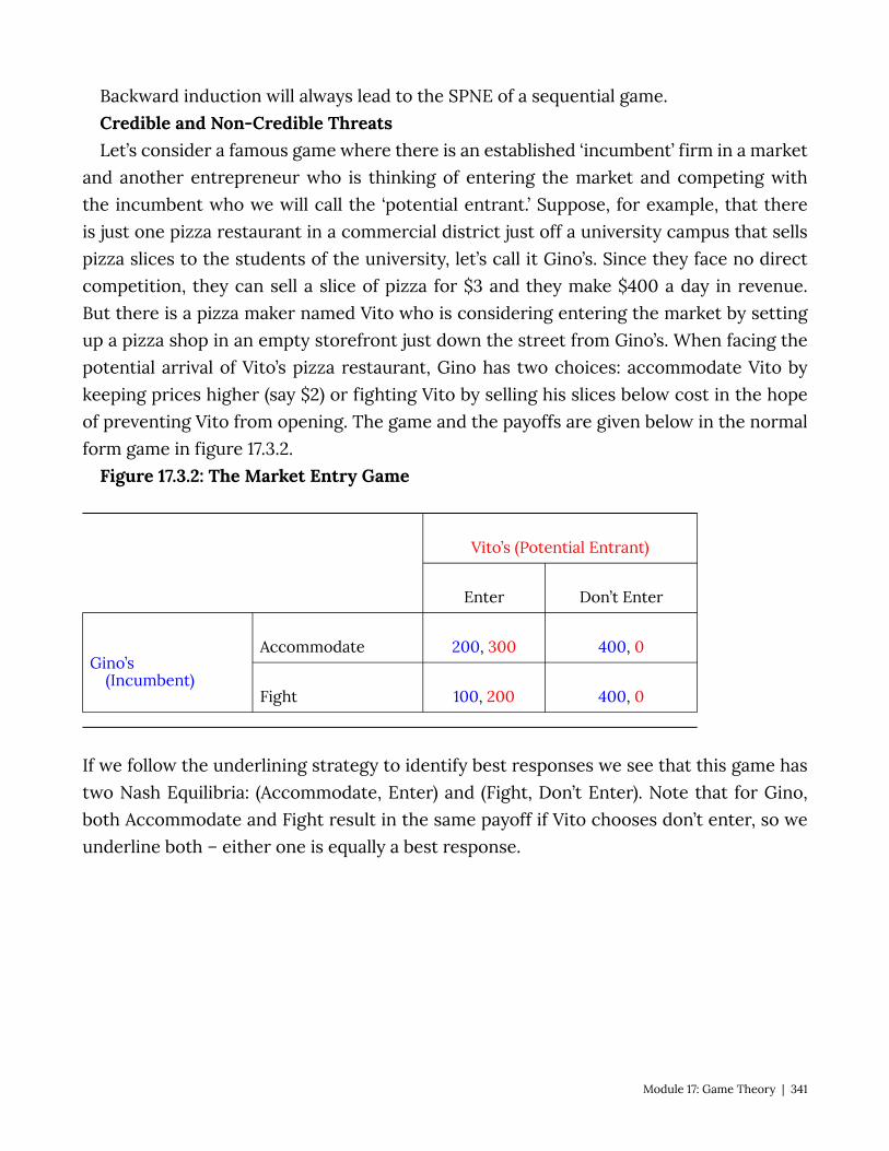
Backward induction will always lead to the SPNE of a sequential game. Credible and Non-Credible Threats Let’s consider a famous game where there is an established ‘incumbent’ firm in a market
and another entrepreneur who is thinking of entering the market and competing with the incumbent who we will call the ‘potential entrant.’ Suppose, for example, that there is just one pizza restaurant in a commercial district just off a university campus that sells pizza slices to the students of the university, let’s call it Gino’s. Since they face no direct competition, they can sell a slice of pizza for $3 and they make $400 a day in revenue. But there is a pizza maker named Vito who is considering entering the market by setting up a pizza shop in an empty storefront just down the street from Gino’s. When facing the potential arrival of Vito’s pizza restaurant, Gino has two choices: accommodate Vito by keeping prices higher (say $2) or fighting Vito by selling his slices below cost in the hope of preventing Vito from opening. The game and the payoffs are given below in the normal form game in figure 17.3.2.
Figure 17.3.2: The Market Entry Game
Vito’s (Potential Entrant)
Enter Don’t Enter
Gino’s (Incumbent)
Accommodate 200, 300 400, 0
Fight 100, 200 400, 0
If we follow the underlining strategy to identify best responses we see that this game has two Nash Equilibria: (Accommodate, Enter) and (Fight, Don’t Enter). Note that for Gino, both Accommodate and Fight result in the same payoff if Vito chooses don’t enter, so we underline both – either one is equally a best response.
Module 17: Game Theory | 341
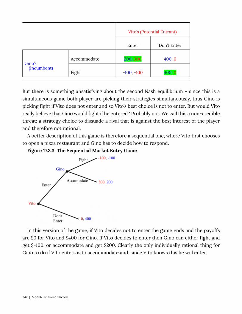
Vito’s (Potential Entrant)
Enter Don’t Enter
Gino’s (Incumbent)
Accommodate 200, 300 400, 0
Fight -100, -100 400, 0
But there is something unsatisfying about the second Nash equilibrium – since this is a simultaneous game both player are picking their strategies simultaneously, thus Gino is picking fight if Vito does not enter and so Vito’s best choice is not to enter. But would Vito really believe that Gino would fight if he entered? Probably not. We call this a non-credible threat: a strategy choice to dissuade a rival that is against the best interest of the player and therefore not rational.
A better description of this game is therefore a sequential one, where Vito first chooses to open a pizza restaurant and Gino has to decide how to respond.
Figure 17.3.3: The Sequential Market Entry Game
In this version of the game, if Vito decides not to enter the game ends and the payoffs are $0 for Vito and $400 for Gino. If Vito decides to enter then Gino can either fight and get $-100, or accommodate and get $200. Clearly the only individually rational thing for Gino to do if Vito enters is to accommodate and, since Vito knows this he will enter.
342 | Module 17: Game Theory
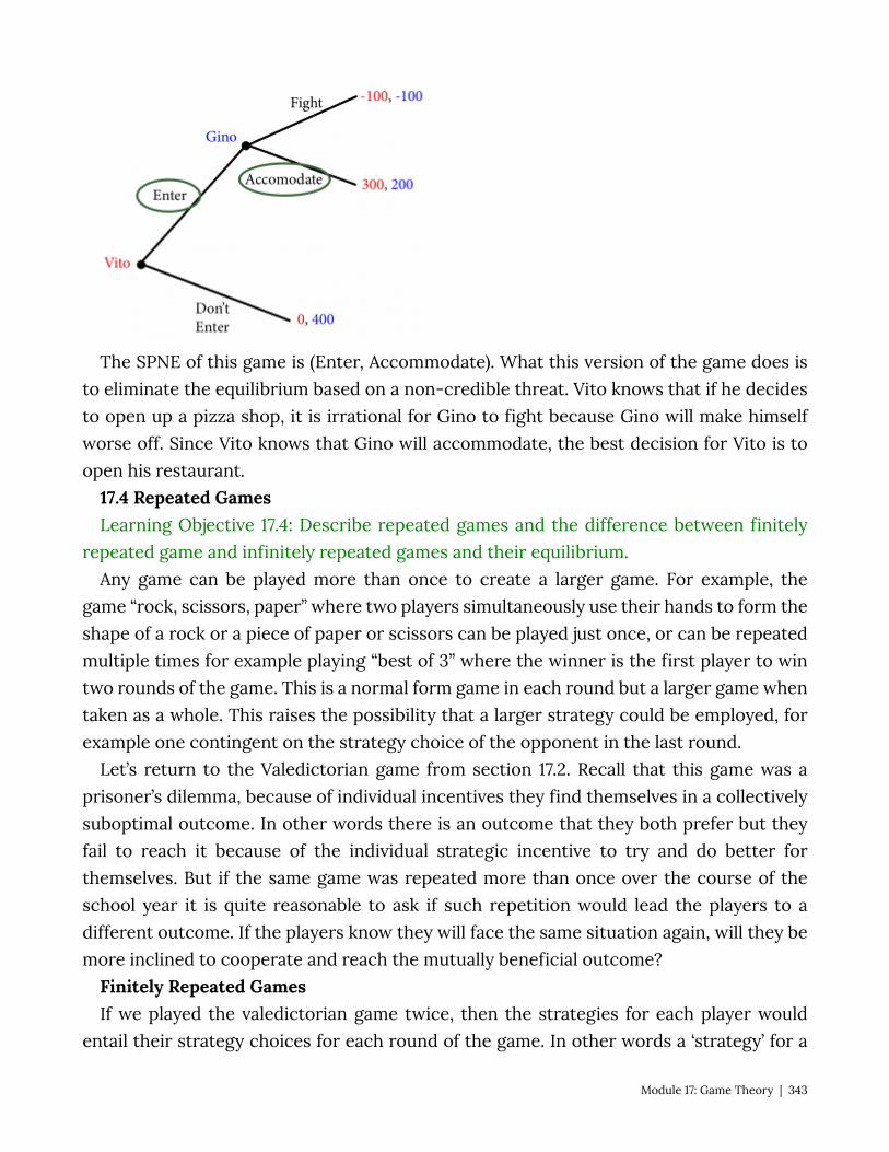
The SPNE of this game is (Enter, Accommodate). What this version of the game does is to eliminate the equilibrium based on a non-credible threat. Vito knows that if he decides to open up a pizza shop, it is irrational for Gino to fight because Gino will make himself worse off. Since Vito knows that Gino will accommodate, the best decision for Vito is to open his restaurant.
17.4 Repeated Games Learning Objective 17.4: Describe repeated games and the difference between finitely
repeated game and infinitely repeated games and their equilibrium. Any game can be played more than once to create a larger game. For example, the
game “rock, scissors, paper” where two players simultaneously use their hands to form the shape of a rock or a piece of paper or scissors can be played just once, or can be repeated multiple times for example playing “best of 3” where the winner is the first player to win two rounds of the game. This is a normal form game in each round but a larger game when taken as a whole. This raises the possibility that a larger strategy could be employed, for example one contingent on the strategy choice of the opponent in the last round.
Let’s return to the Valedictorian game from section 17.2. Recall that this game was a prisoner’s dilemma, because of individual incentives they find themselves in a collectively suboptimal outcome. In other words there is an outcome that they both prefer but they fail to reach it because of the individual strategic incentive to try and do better for themselves. But if the same game was repeated more than once over the course of the school year it is quite reasonable to ask if such repetition would lead the players to a different outcome. If the players know they will face the same situation again, will they be more inclined to cooperate and reach the mutually beneficial outcome?
Finitely Repeated Games If we played the valedictorian game twice, then the strategies for each player would
entail their strategy choices for each round of the game. In other words a ‘strategy’ for a
Module 17: Game Theory | 343
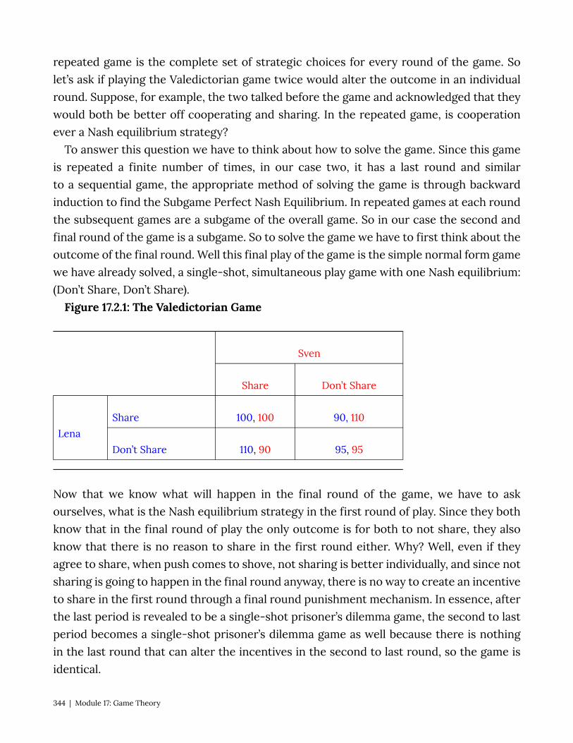
repeated game is the complete set of strategic choices for every round of the game. So let’s ask if playing the Valedictorian game twice would alter the outcome in an individual round. Suppose, for example, the two talked before the game and acknowledged that they would both be better off cooperating and sharing. In the repeated game, is cooperation ever a Nash equilibrium strategy?
To answer this question we have to think about how to solve the game. Since this game is repeated a finite number of times, in our case two, it has a last round and similar to a sequential game, the appropriate method of solving the game is through backward induction to find the Subgame Perfect Nash Equilibrium. In repeated games at each round the subsequent games are a subgame of the overall game. So in our case the second and final round of the game is a subgame. So to solve the game we have to first think about the outcome of the final round. Well this final play of the game is the simple normal form game we have already solved, a single-shot, simultaneous play game with one Nash equilibrium: (Don’t Share, Don’t Share).
Figure 17.2.1: The Valedictorian Game
Sven
Share Don’t Share
Lena Share 100, 100 90, 110
Don’t Share 110, 90 95, 95
Now that we know what will happen in the final round of the game, we have to ask ourselves, what is the Nash equilibrium strategy in the first round of play. Since they both know that in the final round of play the only outcome is for both to not share, they also know that there is no reason to share in the first round either. Why? Well, even if they agree to share, when push comes to shove, not sharing is better individually, and since not sharing is going to happen in the final round anyway, there is no way to create an incentive to share in the first round through a final round punishment mechanism. In essence, after the last period is revealed to be a single-shot prisoner’s dilemma game, the second to last period becomes a single-shot prisoner’s dilemma game as well because there is nothing in the last round that can alter the incentives in the second to last round, so the game is identical.
344 | Module 17: Game Theory
In fact, as long as there is a final round, it doesn’t matter how many times we repeat this game, because of backward induction, it simply becomes a series of single-shot games with the Nash equilibrium strategies being played every time.
Infinitely Repeated Games Things change when normal-form games are repeated infinitely because there is no
final round and thus backward induction does not work, there is no where to work backward from. This aspect of the games allows space for reward and punishment strategies that might create incentives under which cooperation becomes a Nash Equilibrium.
To see this let’s alter the scenario of our Valedictorian game. Suppose that Lena and Sven are now adults in the workplace and they work together in a company where their pay is based partly on their performance on a monthly aptitude test. For simplicity we’ll assume that their payoffs are the same as in the Valedictorian game but, this time that represent cash bonuses. The key here is that they foresee working together for as long as they can imagine. In other words they each perceive the possibility that they will keep playing this game for in indeterminate amount of time – there is no determined last round of the game and therefore no way to use backward induction to solve it. Player have to look forward to determine optimal strategies.
So would could a strategy to induce cooperation look like? Suppose Lena says to Sven I will share with you as long as you share with me, but as soon as you don’t share, I will stop sharing with you forever – let’s call this the ‘cooperate’ strategy. Sven, in response says, okay, I will do the same, I will share with you until such time as you don’t share and then I’ll stop sharing together. The question we have to answer is: is both players playing these strategies a Nash equilibrium?
To answer this question we have to figure out the best response to the strategy, is it to play the same strategy or is there a better strategy to play in response? To determine the answer to this question let’s think about playing the same strategy and alternate strategies and their payoffs.
If Lena claims she will play the cooperate strategy, what is Sven’s outcome if he plays the cooperate strategy in response? Well, in the first period Sven will get 100 because they both share and since they both shared in period one they will both share in period two, Sven will get 100 and it will continue on like this forever. To put a present day value on future earnings, we discount (see Module 25 for a detailed description), so Sven’s earnings stream looks like this:
Payoff from cooperate strategy: 100+100×d+100×d2+100×d3+100×d4+…
Module 17: Game Theory | 345

What is the payoff from not cooperating? Well in the period in which Sven decides not to share, Lena will still be sharing and so Sven will get 110 but then after that Lena will not share and Sven knows this so he will not share as well and he will therefore get 95 for every round after. Let’s call this strategy ‘deviate.’ Thus his earning stream looks like this:
Payoff from deviate strategy: 110+95×d+95×d2+95×d3+95×d4+… Note that we are only comparing the two strategies from the moment Sven decides
to deviate, as the two payoff steams are identical up to that point and therefore cancel themselves out.
Is to cooperate the best response to the cooperate strategy? Yes, if: 100+100×d+100×d2+100×d3+100×d4+…
>110+95×d+95×d2+95×d3+95×d4+…
Rearranging: 5 (d+d2+d3+d4+…) > 10 This says that cooperation is better as long as the extra 5 a cooperating player gets for
every subsequent period after the first is better than the extra 10 the deviating player gets in the first period. To determine if this is true, we have to use the result that
d+d2+d3+d4+… =
So:
or 5d > 10(1-d) 15d > 10
d >
You can think of d as a measure of how much the players care about future payoffs, and so this says that as long as they care enough about the future payoffs, they will
cooperate. In other words if d> , then playing cooperate is a best response to the other
player playing cooperate and vice-versa: the strategy pair (cooperate, cooperate) is a Nash equilibrium for the infinitely repeated game.
This type of strategy has a name in economics, it is called a trigger strategy. A trigger strategy is one where cooperative play continues until an opponent deviates and then ceases permanently or for a specified number of periods. An alternate strategy is the tit-for-tat strategy where a player simply plays the same strategy their opponent played
346 | Module 17: Game Theory

in the previous round. Tit-for-tat strategies can also be Nash equilibrium and, in fact, in infinitely repeated games there are often many Nash equilibria, the trigger strategy identified above is but one.
17.5 Policy Example: Do We Need to Regulate Banks to Save Them From Themselves? Learning Objective 17.5: Explain how game theory can be used to understand the
banking collapse of 2008. In the mid two thousands banks in the United States found themselves struggling
to satisfy a tremendous demand for mortgages from the market for mortgage back securities: securities that were created from bundles of residential or commercial mortgages. This, along with the low-interest rate policy of the Federal Reserve, led to a tremendous housing boom in the United States that evolved into a speculative investment bubble. The bursting of this bubble led to the housing market crash and, in 2008, to a banking crisis: the failure of major banking institutions and the unprecedented government bailout of banks. These twin crises led to the worst recession since the great depression.
Interestingly, this banking crisis came relatively soon after a series of reforms of banking regulations in the United States that gave banks much more freedom in their operations. Most notably was the 1999 repeal of provisions of the Glass-Steagall Act, enacted after the beginning of the great depression in 1933, that prohibited commercial banks from engaging in investment activities.
Part of the argument of the time of the repeal was that banks should be allowed to innovate and be more flexible which would benefit consumers. The rationale was increased competition and the discipline of the market would inhibit excessive risk-taking and so stringent government regulation was no longer necessary. But the discipline of the market assumes that rewards are absolute that returns are not based on relative performance that the environment is not strategic. Is this an accurate description of modern banking? Probably not.
In everything from stock prices to CEO pay relative performance matters, and if one bank were to rely on a low-risk strategy whilst others were engaging in higher risk-higher reward strategies both the company’s stock price and the compensation of the CEO might suffer. We can describe this in a very simplified model where there are two banks and they can either engage in low risk or high-risk strategies. This scenario is described in Figure 17.5.1 where we have two players, Big Bank and Huge Bank, the two strategies for each and the payoffs (in Millions):
Figure 17.5.1: The Risky Banking Game
Module 17: Game Theory | 347
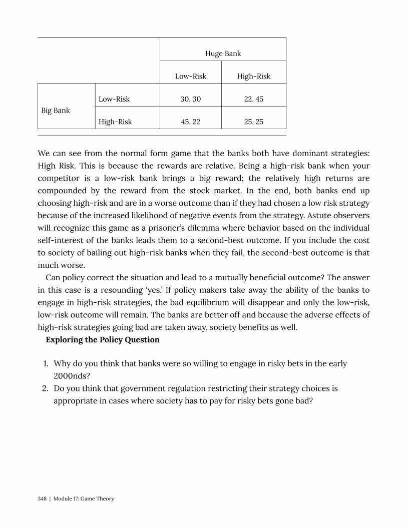
Huge Bank
Low-Risk High-Risk
Big Bank Low-Risk 30, 30 22, 45
High-Risk 45, 22 25, 25
We can see from the normal form game that the banks both have dominant strategies: High Risk. This is because the rewards are relative. Being a high-risk bank when your competitor is a low-risk bank brings a big reward; the relatively high returns are compounded by the reward from the stock market. In the end, both banks end up choosing high-risk and are in a worse outcome than if they had chosen a low risk strategy because of the increased likelihood of negative events from the strategy. Astute observers will recognize this game as a prisoner’s dilemma where behavior based on the individual self-interest of the banks leads them to a second-best outcome. If you include the cost to society of bailing out high-risk banks when they fail, the second-best outcome is that much worse.
Can policy correct the situation and lead to a mutually beneficial outcome? The answer in this case is a resounding ‘yes.’ If policy makers take away the ability of the banks to engage in high-risk strategies, the bad equilibrium will disappear and only the low-risk, low-risk outcome will remain. The banks are better off and because the adverse effects of high-risk strategies going bad are taken away, society benefits as well.
Exploring the Policy Question
1. Why do you think that banks were so willing to engage in risky bets in the early 2000nds?
2. Do you think that government regulation restricting their strategy choices is appropriate in cases where society has to pay for risky bets gone bad?
348 | Module 17: Game Theory

SUMMARY
Review: Topics and Related Learning Outcomes
17.1 What is Game Theory? Learning Objective 17.1: Describe game theory and they types of situations it describes. 17.2 Single Play Games Learning Objective 17.2: Describe normal form games and identify optimal strategies and
equilibrium outcomes in such games. 17.3 Sequential Games Learning Objective 17.3: Describe sequential move games and explain how they are
solved. 17.4 Repeated Games Learning Objective 17.4: Describe repeated games and the difference between finitely
repeated game and infinitely repeated games and their equilibrium. 17.5 Policy Example: Do We Need to Regulate Banks to Save Them From Themselves? Learning Objective 17.5: Explain how game theory can be used to understand the
banking collapse of 2008.
Learn: Key Terms and Graphs
Terms
Strategic interactions Game theory Non-cooperative games Players Strategies Payoffs Simultaneous games
Module 17: Game Theory | 349

Sequential games Single-shot games Repeated games Common knowledge Payoff matrix Normal-form games Dominant strategy Dominated strategy Dominant strategy equilibrium (dse) Best response function Nash equilibrium Pure strategies Mixed strategies Sequential move games Game tree Extensive form games. Subgame perfect nash equilibrium (spne) Trigger strategy Tit-for-tat strategy
Graphs
Figure 17.2.1: The Valedictorian Game Figure 17.2.2: The Party Game Figure 17.2.3: The Party Game, Version 2 Figure 17.2.4: The Matching Pennies Game Figure 17.3.1: The Curry Pricing Game Figure 17.3.2: The Market Entry Game Figure 17.3.3: The Sequential Market Entry Game Figure 17.5.1: The Risky Banking Game
350 | Module 17: Game Theory

Module 18: Models of Oligopoly – Cournot, Bertrand and Stackleberg Policy Example: How Should the Government Have Responded to Big Oil Company
Mergers?
Exploring the Policy Question
1. What are the strategic incentives for banks to take risks? 2. What policy solutions present themselves from this analysis?
18.1 Cournot Model of Oligopoly: Quantity Setters Learning Objective 18.1: Describe game theory and they types of situations it describes. 18.2 Bertrand Model of Oligopoly: Price Setters Learning Objective 18.2: Describe normal form games and identify optimal strategies
and equilibrium outcomes in such games. 18.3 Stackelberg Model of Oligopoly: First Mover Advantage
Module 18: Models of Oligopoly – Cournot, Bertrand andStackleberg | 351
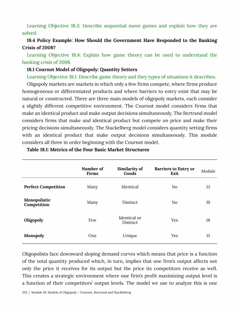
Learning Objective 18.3: Describe sequential move games and explain how they are solved.
18.4 Policy Example: How Should the Government Have Responded to the Banking Crisis of 2008?
Learning Objective 18.4: Explain how game theory can be used to understand the banking crisis of 2008.
18.1 Cournot Model of Oligopoly: Quantity Setters Learning Objective 18.1: Describe game theory and they types of situations it describes. Oligopoly markets are markets in which only a few firms compete, where firms produce
homogeneous or differentiated products and where barriers to entry exist that may be natural or constructed. There are three main models of oligopoly markets, each consider a slightly different competitive environment. The Cournot model considers firms that make an identical product and make output decisions simultaneously. The Bertrand model considers firms that make and identical product but compete on price and make their pricing decisions simultaneously. The Stackelberg model considers quantity setting firms with an identical product that make output decisions simultaneously. This module considers all three in order beginning with the Cournot model.
Table 18.1: Metrics of the Four Basic Market Structures
Number of Firms
Similarity of Goods
Barriers to Entry or Exit Module
Perfect Competition Many Identical No 13
Monopolistic Competition Many Distinct No 19
Oligopoly Few Identical or Distinct Yes 18
Monopoly One Unique Yes 15
Oligopolists face downward sloping demand curves which means that price is a function of the total quantity produced which, in turn, implies that one firm’s output affects not only the price it receives for its output but the price its competitors receive as well. This creates a strategic environment where one firm’s profit maximizing output level is a function of their competitors’ output levels. The model we use to analyze this is one
352 | Module 18: Models of Oligopoly – Cournot, Bertrand and Stackleberg
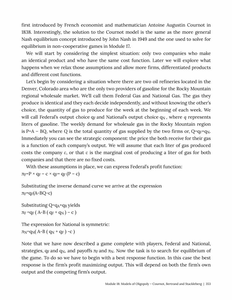
first introduced by French economist and mathematician Antoine Augustin Cournot in 1838. Interestingly, the solution to the Cournot model is the same as the more general Nash equilibrium concept introduced by John Nash in 1949 and the one used to solve for equilibrium in non-cooperative games in Module 17.
We will start by considering the simplest situation: only two companies who make an identical product and who have the same cost function. Later we will explore what happens when we relax those assumptions and allow more firms, differentiated products and different cost functions.
Let’s begin by considering a situation where there are two oil refineries located in the Denver, Colorado area who are the only two providers of gasoline for the Rocky Mountain regional wholesale market. We’ll call them Federal Gas and National Gas. The gas they produce is identical and they each decide independently, and without knowing the other’s choice, the quantity of gas to produce for the week at the beginning of each week. We will call Federal’s output choice qF and National’s output choice qN , where q represents liters of gasoline. The weekly demand for wholesale gas in the Rocky Mountain region is P=A – BQ, where Q is the total quantity of gas supplied by the two firms or, Q=qF+qN. Immediately you can see the strategic component: the price the both receive for their gas is a function of each company’s output. We will assume that each liter of gas produced costs the company c, or that c is the marginal cost of producing a liter of gas for both companies and that there are no fixed costs.
With these assumptions in place, we can express Federal’s profit function: πF=P × qF – c × qF= qF (P – c)
Substituting the inverse demand curve we arrive at the expression πF=qF(A-BQ-c)
Substituting Q=qA+qB yields πF =qF ( A-B ( qF + qN ) – c )
The expression for National is symmetric: πN=qN( A-B ( qN + qF ) -c )
Note that we have now described a game complete with players, Federal and National, strategies, qF and qN, and payoffs πF and πN. Now the task is to search for equilibrium of the game. To do so we have to begin with a best response function. In this case the best response is the firm’s profit maximizing output. This will depend on both the firm’s own output and the competing firm’s output.
Module 18: Models of Oligopoly – Cournot, Bertrand and Stackleberg | 353
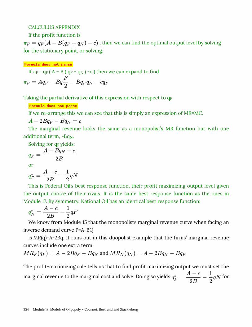
CALCULUS APPENDIX If the profit function is
, then we can find the optimal output level by solving for the stationary point, or solving:
If πF = qF ( A – B ( qF + qN ) -c ) then we can expand to find
Taking the partial derivative of this expression with respect to qF
If we re-arrange this we can see that this is simply an expression of MR=MC.
The marginal revenue looks the same as a monopolist’s MR function but with one additional term, -BqN.
Solving for qF yields:
or
This is Federal Oil’s best response function, their profit maximizing output level given the output choice of their rivals. It is the same best response function as the ones in Module 17. By symmetry, National Oil has an identical best response function:
We know from Module 15 that the monopolists marginal revenue curve when facing an inverse demand curve P=A-BQ
is MR(q)=A-2Bq. It runs out in this duopolist example that the firms’ marginal revenue curves include one extra term:
and
The profit-maximizing rule tells us that to find profit maximizing output we must set the
marginal revenue to the marginal cost and solve. Doing so yields for
354 | Module 18: Models of Oligopoly – Cournot, Bertrand and Stackleberg
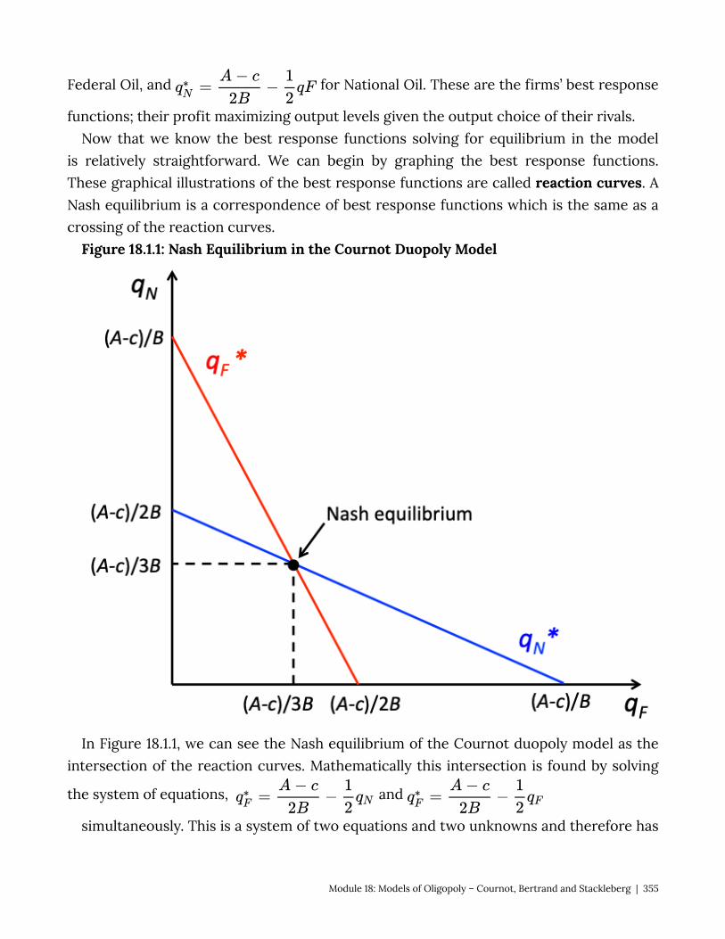
Federal Oil, and for National Oil. These are the firms’ best response
functions; their profit maximizing output levels given the output choice of their rivals. Now that we know the best response functions solving for equilibrium in the model
is relatively straightforward. We can begin by graphing the best response functions. These graphical illustrations of the best response functions are called reaction curves. A Nash equilibrium is a correspondence of best response functions which is the same as a crossing of the reaction curves.
Figure 18.1.1: Nash Equilibrium in the Cournot Duopoly Model
In Figure 18.1.1, we can see the Nash equilibrium of the Cournot duopoly model as the intersection of the reaction curves. Mathematically this intersection is found by solving
the system of equations, and
simultaneously. This is a system of two equations and two unknowns and therefore has
Module 18: Models of Oligopoly – Cournot, Bertrand and Stackleberg | 355
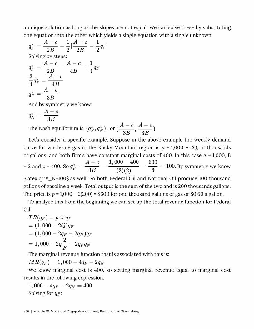
a unique solution as long as the slopes are not equal. We can solve these by substituting one equation into the other which yields a single equation with a single unknown:
Solving by steps:
And by symmetry we know:
The Nash equilibrium is: , or
Let’s consider a specific example. Suppose in the above example the weekly demand curve for wholesale gas in the Rocky Mountain region is p = 1,000 – 2Q, in thousands of gallons, and both firm’s have constant marginal costs of 400. In this case A = 1,000, B
= 2 and c = 400. So . By symmetry we know
$latex q^*_N=100$ as well. So both Federal Oil and National Oil produce 100 thousand gallons of gasoline a week. Total output is the sum of the two and is 200 thousands gallons. The price is p = 1,000 – 2(200) = $600 for one thousand gallons of gas or $0.60 a gallon.
To analyze this from the beginning we can set up the total revenue function for Federal Oil:
The marginal revenue function that is associated with this is:
We know marginal cost is 400, so setting marginal revenue equal to marginal cost results in the following expression:
Solving for :
356 | Module 18: Models of Oligopoly – Cournot, Bertrand and Stackleberg

This is the best response function for Federal Oil. By symmetry we know that National Oil has the same best response function:
Solving for the Nash equilibrium:
We can insert the solution for into :
18.2 Bertrand Model of Oligopoly: Price Setters Learning Objective 18.2:. In the previous section we studied oligopolists that make an identical good and who
compete by setting quantities. The example we used in that section was wholesale gasoline where the market sets a price that equates supply and demand and the strategic decision of the refiners was how much oil to refine into gasoline. In this section we turn our attention to a different situation in which the oligopolists compete on price. The example here are the retail gas stations that bought the wholesale gas from the refiners and are now ready to sell it to consumers. We still have identical goods, for consumers the gas that goes into their cars is all the same and we will assume away any other differences like cleaner stations or the presence of a mini-mart.
Lets imagine a simple situation where there two gas stations, Fast Gas and Speedy Gas on either side of a busy main street. Both stations have large signs that display the gas prices that each station is offering for the day. Consumers are assumed to be indifferent about the gas or the stations, so they will go to the station that is offering the lower price. So an individual gas station’s demand is conditional on its relative price with the other station
Formally we can express this with the following demand function for Fast Gas:
Module 18: Models of Oligopoly – Cournot, Bertrand and Stackleberg | 357
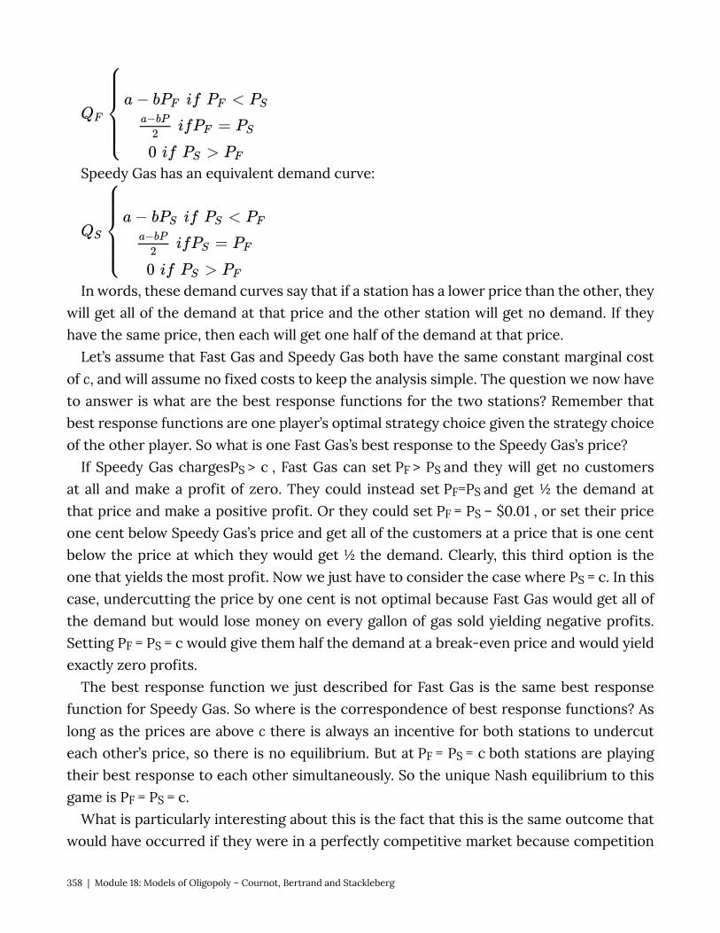
Speedy Gas has an equivalent demand curve:
In words, these demand curves say that if a station has a lower price than the other, they will get all of the demand at that price and the other station will get no demand. If they have the same price, then each will get one half of the demand at that price.
Let’s assume that Fast Gas and Speedy Gas both have the same constant marginal cost of c, and will assume no fixed costs to keep the analysis simple. The question we now have to answer is what are the best response functions for the two stations? Remember that best response functions are one player’s optimal strategy choice given the strategy choice of the other player. So what is one Fast Gas’s best response to the Speedy Gas’s price?
If Speedy Gas chargesPS > c , Fast Gas can set PF > PS and they will get no customers at all and make a profit of zero. They could instead set PF=PS and get ½ the demand at that price and make a positive profit. Or they could set PF = PS – $0.01 , or set their price one cent below Speedy Gas’s price and get all of the customers at a price that is one cent below the price at which they would get ½ the demand. Clearly, this third option is the one that yields the most profit. Now we just have to consider the case where PS = c. In this case, undercutting the price by one cent is not optimal because Fast Gas would get all of the demand but would lose money on every gallon of gas sold yielding negative profits. Setting PF = PS = c would give them half the demand at a break-even price and would yield exactly zero profits.
The best response function we just described for Fast Gas is the same best response function for Speedy Gas. So where is the correspondence of best response functions? As long as the prices are above c there is always an incentive for both stations to undercut each other’s price, so there is no equilibrium. But at PF = PS = c both stations are playing their best response to each other simultaneously. So the unique Nash equilibrium to this game is PF = PS = c.
What is particularly interesting about this is the fact that this is the same outcome that would have occurred if they were in a perfectly competitive market because competition
358 | Module 18: Models of Oligopoly – Cournot, Bertrand and Stackleberg
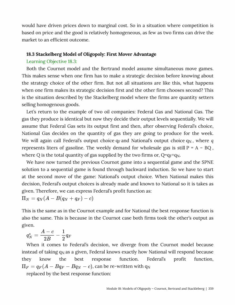
would have driven prices down to marginal cost. So in a situation where competition is based on price and the good is relatively homogeneous, as few as two firms can drive the market to an efficient outcome.
18.3 Stackelberg Model of Oligopoly: First Mover Advantage Learning Objective 18.3: Both the Cournot model and the Bertrand model assume simultaneous move games.
This makes sense when one firm has to make a strategic decision before knowing about the strategy choice of the other firm. But not all situations are like this, what happens when one firm makes its strategic decision first and the other firm chooses second? This is the situation described by the Stackelberg model where the firms are quantity setters selling homogenous goods.
Let’s return to the example of two oil companies: Federal Gas and National Gas. The gas they produce is identical but now they decide their output levels sequentially. We will assume that Federal Gas sets its output first and then, after observing Federal’s choice, National Gas decides on the quantity of gas they are going to produce for the week. We will again call Federal’s output choice qF and National’s output choice qN , where q represents liters of gasoline. The weekly demand for wholesale gas is still P = A – BQ , where Q is the total quantity of gas supplied by the two firms or, Q=qF+qN.
We have now turned the previous Cournot game into a sequential game and the SPNE solution to a sequential game is found through backward induction. So we have to start at the second move of the game: National’s output choice. When National makes this decision, Federal’s output choices is already made and known to National so it is takes as given. Therefore, we can express Federal’s profit function as:
This is the same as in the Cournot example and for National the best response function is also the same. This is because in the Cournot case both firms took the other’s output as given.
When it comes to Federal’s decision, we diverge from the Cournot model because instead of taking qN as a given, Federal knows exactly how National will respond because they know the best response function. Federal’s profit function,
, can be re-written with qN
replaced by the best response function:
Module 18: Models of Oligopoly – Cournot, Bertrand and Stackleberg | 359

We can see that Federal’s profits are determined only by their own output once we explicitly consider National’s response. Simplifying yields:
CALCULUS APPENDIX If the profit function is
then we can find the optimal output level by solving for
the stationary point, or solving:
If
then we can expand to find
Taking the partial derivative of this expression with respect to qF
Solving for qF yields:
This is Federal Oil’s profit maximizing output level given that they choose first and can anticipate National’s response.
We know that the second mover’s best response is the same as in section 18.1, and the solution to the profit optimization problem above yields the following best response function for Federal Oil:
Substituting this into National’s best response function and solving:
The Subgame Perfect Nash Equilibrium is ( , ). A few things are worth noting when comparing this outcome to the Nash Equilibrium outcome of the Cournot game in section
360 | Module 18: Models of Oligopoly – Cournot, Bertrand and Stackleberg
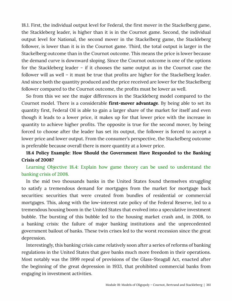
18.1. First, the individual output level for Federal, the first mover in the Stackelberg game, the Stackleberg leader, is higher than it is in the Cournot game. Second, the individual output level for National, the second mover in the Stackelberg game, the Stackleberg follower, is lower than it is in the Cournot game. Third, the total output is larger in the Stackelberg outcome than in the Cournot outcome. This means the price is lower because the demand curve is downward sloping. Since the Cournot outcome is one of the options for the Stackleberg leader – if it chooses the same output as in the Cournot case the follower will as well – it must be true that profits are higher for the Stackelberg leader. And since both the quantity produced and the price received are lower for the Stackelberg follower compared to the Cournot outcome, the profits must be lower as well.
So from this we see the major differences in the Stackleberg model compared to the Cournot model. There is a considerable first-mover advantage. By being able to set its quantity first, Federal Oil is able to gain a larger share of the market for itself and even though it leads to a lower price, it makes up for that lower price with the increase in quantity to achieve higher profits. The opposite is true for the second mover, by being forced to choose after the leader has set its output, the follower is forced to accept a lower price and lower output. From the consumer’s perspective, the Stackelberg outcome is preferable because overall there is more quantity at a lower price.
18.4 Policy Example: How Should the Government Have Responded to the Banking Crisis of 2008?
Learning Objective 18.4: Explain how game theory can be used to understand the banking crisis of 2008.
In the mid two thousands banks in the United States found themselves struggling to satisfy a tremendous demand for mortgages from the market for mortgage back securities: securities that were created from bundles of residential or commercial mortgages. This, along with the low-interest rate policy of the Federal Reserve, led to a tremendous housing boom in the United States that evolved into a speculative investment bubble. The bursting of this bubble led to the housing market crash and, in 2008, to a banking crisis: the failure of major banking institutions and the unprecedented government bailout of banks. These twin crises led to the worst recession since the great depression.
Interestingly, this banking crisis came relatively soon after a series of reforms of banking regulations in the United States that gave banks much more freedom in their operations. Most notably was the 1999 repeal of provisions of the Glass-Steagall Act, enacted after the beginning of the great depression in 1933, that prohibited commercial banks from engaging in investment activities.
Module 18: Models of Oligopoly – Cournot, Bertrand and Stackleberg | 361
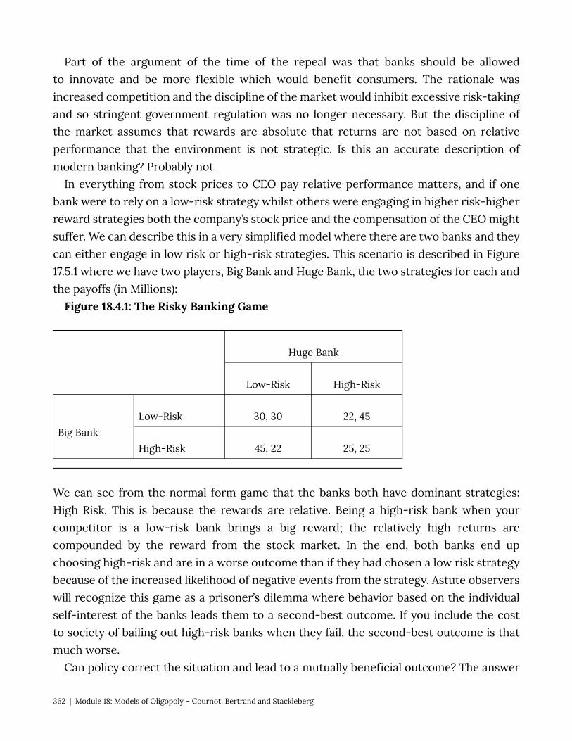
Part of the argument of the time of the repeal was that banks should be allowed to innovate and be more flexible which would benefit consumers. The rationale was increased competition and the discipline of the market would inhibit excessive risk-taking and so stringent government regulation was no longer necessary. But the discipline of the market assumes that rewards are absolute that returns are not based on relative performance that the environment is not strategic. Is this an accurate description of modern banking? Probably not.
In everything from stock prices to CEO pay relative performance matters, and if one bank were to rely on a low-risk strategy whilst others were engaging in higher risk-higher reward strategies both the company’s stock price and the compensation of the CEO might suffer. We can describe this in a very simplified model where there are two banks and they can either engage in low risk or high-risk strategies. This scenario is described in Figure 17.5.1 where we have two players, Big Bank and Huge Bank, the two strategies for each and the payoffs (in Millions):
Figure 18.4.1: The Risky Banking Game
Huge Bank
Low-Risk High-Risk
Big Bank Low-Risk 30, 30 22, 45
High-Risk 45, 22 25, 25
We can see from the normal form game that the banks both have dominant strategies: High Risk. This is because the rewards are relative. Being a high-risk bank when your competitor is a low-risk bank brings a big reward; the relatively high returns are compounded by the reward from the stock market. In the end, both banks end up choosing high-risk and are in a worse outcome than if they had chosen a low risk strategy because of the increased likelihood of negative events from the strategy. Astute observers will recognize this game as a prisoner’s dilemma where behavior based on the individual self-interest of the banks leads them to a second-best outcome. If you include the cost to society of bailing out high-risk banks when they fail, the second-best outcome is that much worse.
Can policy correct the situation and lead to a mutually beneficial outcome? The answer
362 | Module 18: Models of Oligopoly – Cournot, Bertrand and Stackleberg
in this case is a resounding ‘yes.’ If policy makers take away the ability of the banks to engage in high-risk strategies, the bad equilibrium will disappear and only the low-risk, low-risk outcome will remain. The banks are better off and because the adverse effects of high-risk strategies going bad are taken away, society benefits as well.
Exploring the Policy Question
1. Why do you think that banks were so willing to engage in risky bets in the early 2000nds?
2. Do you think that government regulation restricting their strategy choices is appropriate in cases where society has to pay for risky bets gone bad?
SUMMARY
Review: Topics and Related Learning Outcomes
18.1 Cournot Model of Oligopoly: Quantity Setters Learning Objective 18.1: Describe game theory and they types of situations it describes. 18.2 Bertrand Model of Oligopoly: Price Setters Learning Objective 18.2: Describe normal form games and identify optimal strategies
and equilibrium outcomes in such games. 18.3 Stackelberg Model of Oligopoly: First Mover Advantage Learning Objective 18.3: Describe sequential move games and explain how they are
solved. 18.4 Policy Example: How Should the Government Have Responded to the Banking
Crisis of 2008? Learning Objective 18.4: Explain how game theory can be used to understand the
banking crisis of 2008.
Module 18: Models of Oligopoly – Cournot, Bertrand and Stackleberg | 363

Learn: Key Terms and Graphs
Terms
Graphs
Metrics of the Four Basic Market Structures The Risky Banking Game Nash Equilibrium in the Cournot Duopoly Model
364 | Module 18: Models of Oligopoly – Cournot, Bertrand and Stackleberg

Module 19: Monopolistic Competition
Policy Example: Should Public Schools Require Students to Wear Uniforms?
Exploring the Policy Question
1. How are fashion and sportswear companies able to charge so much for clothes? 2. Would requiring the use of generic uniform clothes improve welfare?
19.1 What is Monopolistic Competition? Learning Objective 19.1: Describe the structure of the monopolistically competitive
market. 19.2 Equilibrium in Monopolistic Competition
Module 19: Monopolistic Competition | 365
Learning Objective 19.2: Explain how equilibrium is achieved in monopolistically competitive markets.
19.3 Policy Example: Should Public Schools Require Students to Wear Uniforms? Learning Objective 19.3: Use knowledge of monopolistically competitive markets To explain how switching to generic uniforms can improve welfare. 19.1 What is Monopolistic Competition? Learning Objective 19.1: Describe the structure of the monopolistically competitive
market. Monopolistically competitive markets are markets in which low fixed costs and free
entry and exit of firms make them competitive but firms are able to differentiate their products which causes them to face downward sloping demand curves like imperfectly competitive firms such as monopolists.
As an example, consider the market for athletic shoes. In the United States in 2017, Nike had a 35% share of the athletic shoe market, it’s Jordan brand had an 12% share, Adidas had an 11% share and Sketchers, New Balance, Converse and Under Armour had 6.3%, 3.7%, 3.6%, and 2.4%, respectively. The process of designing and making athletic shoes is not very capital intensive, so there are low fixed costs and there are no barriers to entry – any company who would like to sell shoes in the United States may do so. Athletic shoes are largely similar and, despite high-end shoes that may include special materials or technologies that enjoy patent protection, a regular pair of running shoes are relatively the same: cloth upper, foam padding and a rubber sole. Despite this, Nike is able to charge considerably more for their shoes than a generic equivalent, why? Part of the reason is that through branding and marketing Nike has differentiated its shoes from those of competing companies.
Though athletic shoe companies expend a lot of time and effort into product differentiation, even firms that produce very similar products might be monopolistically competitive with a small amount of differentiation if the market is small enough. In perfectly competitive markets the assumption is that firms are price takers because each individual firm is such a small part of the overall market. But if the market is so small that it only supports a few firms, each firm could have a downward sloping demand curve. For example, in a very small town with only two coffee shops, if the shops are able to attract a particular type of customer, they might be able to charge more because the customers prefer their shop to the rival shop. Perhaps one shop has a décor and music that appeals to a younger customer while the other has décor and music that appeals to older customers.
19.2 Equilibrium in Monopolistic Competition
366 | Module 19: Monopolistic Competition
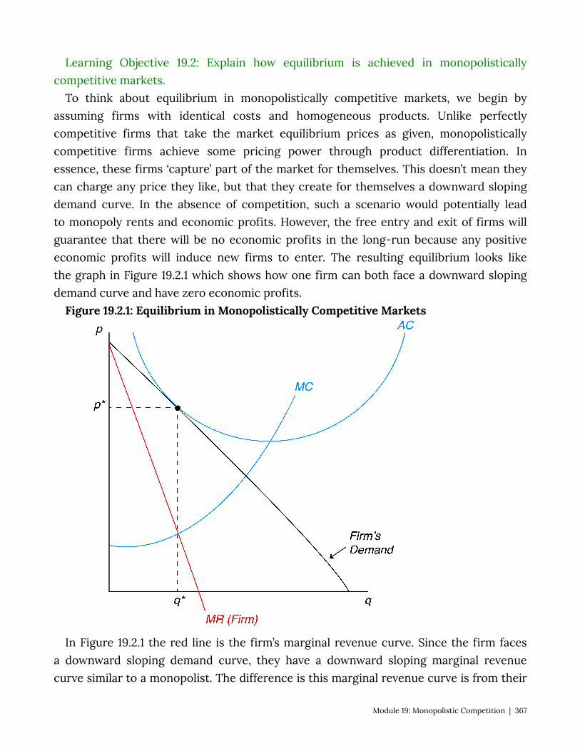
Learning Objective 19.2: Explain how equilibrium is achieved in monopolistically competitive markets.
To think about equilibrium in monopolistically competitive markets, we begin by assuming firms with identical costs and homogeneous products. Unlike perfectly competitive firms that take the market equilibrium prices as given, monopolistically competitive firms achieve some pricing power through product differentiation. In essence, these firms ‘capture’ part of the market for themselves. This doesn’t mean they can charge any price they like, but that they create for themselves a downward sloping demand curve. In the absence of competition, such a scenario would potentially lead to monopoly rents and economic profits. However, the free entry and exit of firms will guarantee that there will be no economic profits in the long-run because any positive economic profits will induce new firms to enter. The resulting equilibrium looks like the graph in Figure 19.2.1 which shows how one firm can both face a downward sloping demand curve and have zero economic profits.
Figure 19.2.1: Equilibrium in Monopolistically Competitive Markets
In Figure 19.2.1 the red line is the firm’s marginal revenue curve. Since the firm faces a downward sloping demand curve, they have a downward sloping marginal revenue curve similar to a monopolist. The difference is this marginal revenue curve is from their
Module 19: Monopolistic Competition | 367
individual demand curve with is only a part of total demand. Monopolistically competitive firms are profit maximizing firms and therefore set their output where marginal revenue equals marginal cost. To find this point we look at the firm’s cost curves, in blue, and find the intersection of marginal revenue and marginal cost. In the figure this occurs at the quantity q*. The maximum price the firm can charge and sell q* is p*. The firm’s average cost at q* is equal to p*, so its total cost is equal to its total revenue and therefore its economic profits are zero.
368 | Module 19: Monopolistic Competition
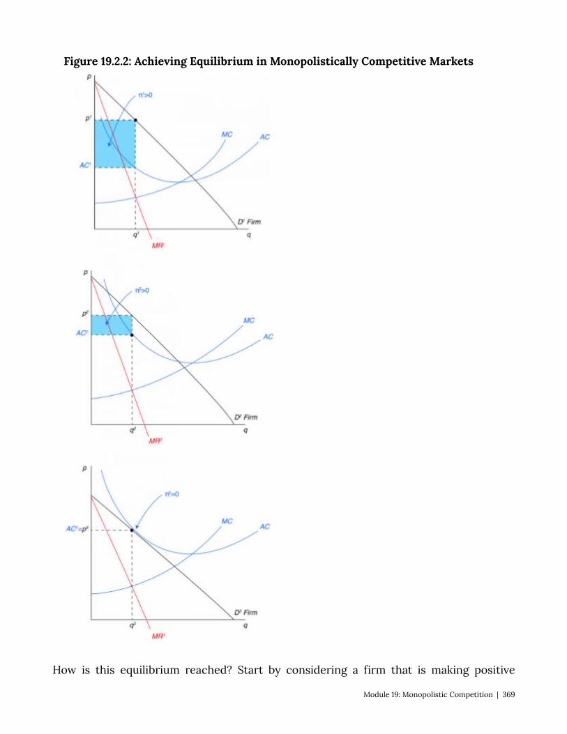
Figure 19.2.2: Achieving Equilibrium in Monopolistically Competitive Markets
How is this equilibrium reached? Start by considering a firm that is making positive
Module 19: Monopolistic Competition | 369
economic profits whilst facing a downward sloping demand curve as in Figure 19.2.2, panel a. As other entrepreneurs observe the profits being made by incumbent firms, they will decide to enter the market. This will whittle away some of the demand for the incumbent firm as seen in panel b. This will continue as long as any positive economic profits remain, but will stop once economic profits arrive at zero, as seen in panel c. Note that on the firm level this outcome is not the same as the competitive market outcome where firms’ price is equal to marginal cost. This means that there is some welfare loss from firms’ ability to differentiate products. It can also be true that if the process of product differentiation can be costly, for example when Nike pays athletes to wear its shoes and advertises its brand. This leads to higher costs and further diminishes welfare produced by the athletic shoe market.
19.3 Policy Example: Should Public Schools Require Students to Wear Uniforms? Learning Objective 19.3: Use knowledge of monopolistically competitive markets To explain how switching to generic uniforms can improve welfare. There are a number of rationales for school uniforms in public schools: so that kids from
poorer households don’t feel disadvantaged, to reduce problems with inappropriate attire, to eliminate the possibility of gang-related attire and so on. All of these are potentially good reasons, but good policy analysis requires that we think about the social welfare of the market itself. By removing the incentive to differentiate through fashion and brands, school districts are forcing pupils to move from a monopolistically competitive market to one that is closer to a perfectly competitive market. The cost to individuals could be a loss of utility from being unable to express individual style but the potential gain to the community is a lower cost of attending school.
370 | Module 19: Monopolistic Competition
SUMMARY
Review: Topics and Related Learning Outcomes
19.1 What is Monopolistic Competition? Learning Objective 19.1: Describe the structure of the monopolistically competitive
market. 19.2 Equilibrium in Monopolistic Competition Learning Objective 19.2: Explain how equilibrium is achieved in monopolistically
competitive markets. 19.3 Policy Example: Should Public Schools Require Students to Wear Uniforms? Learning Objective 19.3: Use knowledge of monopolistically competitive markets To explain how switching to generic uniforms can improve welfare.
Learn: Key Terms and Graphs
Terms
Monopolistic Competition Residual demand curve
Graphs
Figure 19.2.1: Equilibrium in Monopolistically Competitive Markets Figure 19.2.2: Achieving Equilibrium in Monopolistically Competitive Markets
Module 19: Monopolistic Competition | 371
Chapter 20: Externalities
The Policy Question: Should the city of New York ban soda to address the obesity epidemic?
In 2012, Michael Bloomberg the then Mayor of the City of New York announced the “Sugary Drinks Portion Cap Rule” which would have banned the sale of sweetened drinks in containers larger than 16 ounces in places that fell under New York City regulation, including delis, restaurants and fast-food outlets. The argument for the ban focused on the negative health outcomes associated with the consumption of high amounts of sugar. These negative outcomes, the promotors claimed, were a societal concern as the disproportionately affected pooper populations who rely more heavily on government supported health care.
Here’s an excerpt from the Washington Post, March 11, 2013 (http://www.washingtonpost.com/blogs/the-fix/wp/2013/03/11/the-new-york-city-soda-ban-explained/):
“Under Bloomberg’s ban, ‘sugary beverages’ larger than 16 ounces could not be sold at food-service establishments in New York City. At restaurants with self-service soda fountains, cups larger than 16 ounces could not be provided. Only outlets that get health-department grades were included, so supermarkets, vending machine operators and convenience stores … didn’t have to worry about the ban. There was no ban on refills. Failure to comply could have led to a $200 fine. It was set to take effect on Tuesday.
[A ‘sugary beverage’ is] a drink with more than 25 calories per eight ounces, which has either been sweetened by the manufacturer or mixed with another caloric sweetener. The ban did not apply to pure fruit juice or fruit smoothies, drinks that are more than half milk, calorie-free diet sodas or alcoholic beverages. Milkshakes, if they were more than half milk or ice cream, were exempt. But sweetened coffee drinks, if less than half milk, were not.”
To some people, the attempted ban represents a ridiculous intrusion of government into the market and individual choice. To others, the ban represents a reasonable government response to an obesity epidemic that puts a strain on and imposes real costs to the public health care system. In order to analyze these conflicting viewpoints, we need to
372 | Module 20: Externalities
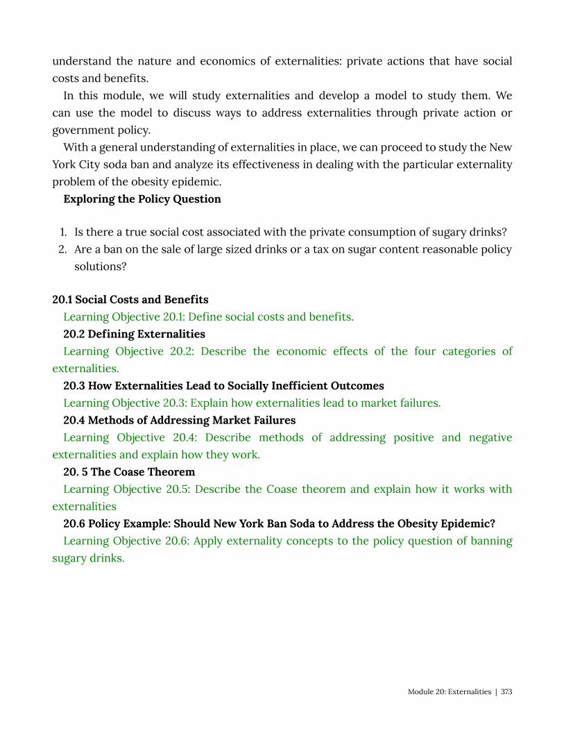
understand the nature and economics of externalities: private actions that have social costs and benefits.
In this module, we will study externalities and develop a model to study them. We can use the model to discuss ways to address externalities through private action or government policy.
With a general understanding of externalities in place, we can proceed to study the New York City soda ban and analyze its effectiveness in dealing with the particular externality problem of the obesity epidemic.
Exploring the Policy Question
1. Is there a true social cost associated with the private consumption of sugary drinks? 2. Are a ban on the sale of large sized drinks or a tax on sugar content reasonable policy
solutions?
20.1 Social Costs and Benefits Learning Objective 20.1: Define social costs and benefits. 20.2 Defining Externalities Learning Objective 20.2: Describe the economic effects of the four categories of
externalities. 20.3 How Externalities Lead to Socially Inefficient Outcomes Learning Objective 20.3: Explain how externalities lead to market failures. 20.4 Methods of Addressing Market Failures Learning Objective 20.4: Describe methods of addressing positive and negative
externalities and explain how they work. 20. 5 The Coase Theorem Learning Objective 20.5: Describe the Coase theorem and explain how it works with
externalities 20.6 Policy Example: Should New York Ban Soda to Address the Obesity Epidemic? Learning Objective 20.6: Apply externality concepts to the policy question of banning
sugary drinks.
Module 20: Externalities | 373
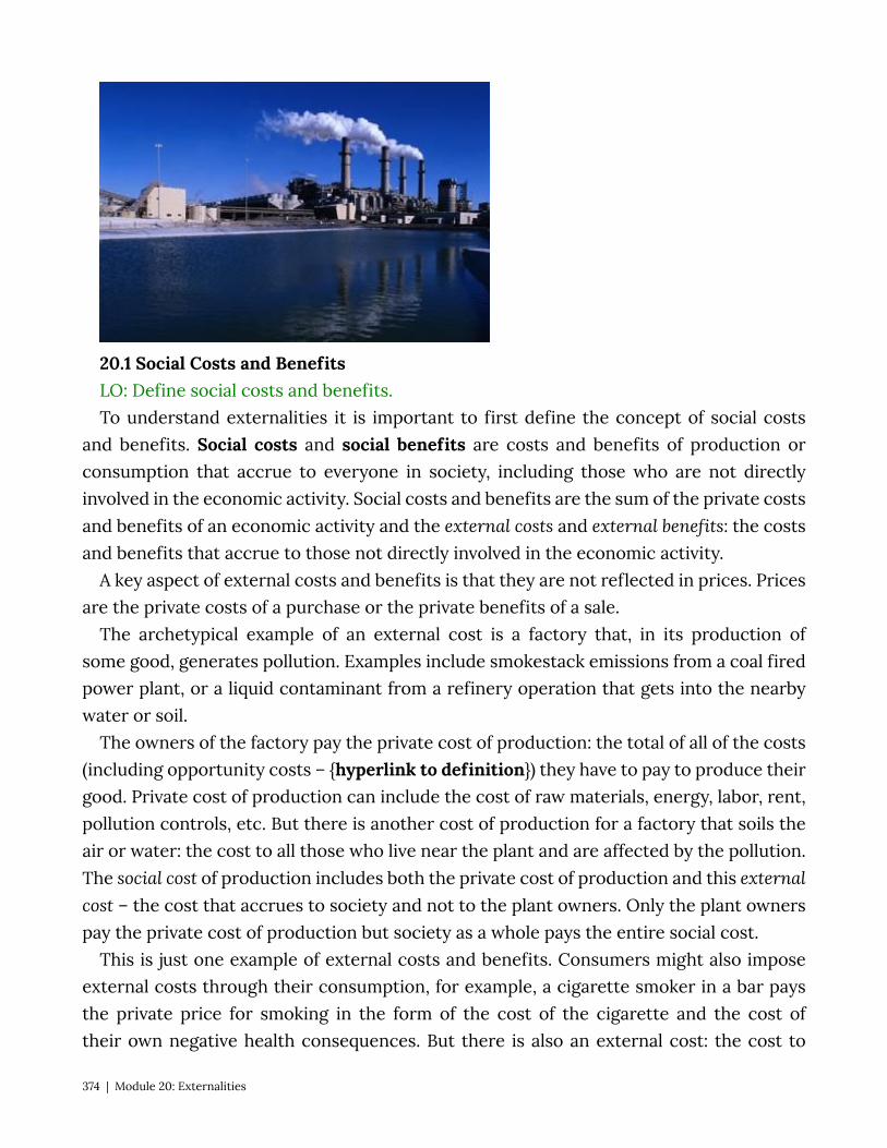
20.1 Social Costs and Benefits LO: Define social costs and benefits. To understand externalities it is important to first define the concept of social costs
and benefits. Social costs and social benefits are costs and benefits of production or consumption that accrue to everyone in society, including those who are not directly involved in the economic activity. Social costs and benefits are the sum of the private costs and benefits of an economic activity and the external costs and external benefits: the costs and benefits that accrue to those not directly involved in the economic activity.
A key aspect of external costs and benefits is that they are not reflected in prices. Prices are the private costs of a purchase or the private benefits of a sale.
The archetypical example of an external cost is a factory that, in its production of some good, generates pollution. Examples include smokestack emissions from a coal fired power plant, or a liquid contaminant from a refinery operation that gets into the nearby water or soil.
The owners of the factory pay the private cost of production: the total of all of the costs (including opportunity costs – {hyperlink to definition}) they have to pay to produce their good. Private cost of production can include the cost of raw materials, energy, labor, rent, pollution controls, etc. But there is another cost of production for a factory that soils the air or water: the cost to all those who live near the plant and are affected by the pollution. The social cost of production includes both the private cost of production and this external cost – the cost that accrues to society and not to the plant owners. Only the plant owners pay the private cost of production but society as a whole pays the entire social cost.
This is just one example of external costs and benefits. Consumers might also impose external costs through their consumption, for example, a cigarette smoker in a bar pays the private price for smoking in the form of the cost of the cigarette and the cost of their own negative health consequences. But there is also an external cost: the cost to
374 | Module 20: Externalities
the others in the bar who have to put up with the irritating and smelly smoke as well as potential negative health consequences of secondhand smoke. The smoker pays the private costs but not the external cost, so the social cost of smoking in a bar exceeds the private cost. Another example is the societal cost of treating obesity-related illnesses if a person with such an illness requires public assistance to pay their medical bills.
An example of social benefits in production is the classic story of the beekeeper that lives next to the apple orchard. The beekeeper produces honey and gets a private benefit from the honey: the total revenue of the sale of the honey. But in keeping bees next to the orchard, the beekeeper is also helping increase the apple orchard’s harvest of apples through the pollination that the bees facilitate. The extra revenue the owner of the orchard sees from the impact of the neighboring bees does not accrue to the beekeeper and is thus external. The social benefit of an economic activity includes the private benefit and the external benefit.
There can be external benefits in consumption as well. Consider a home owner who buys a lot of flowers and makes a lovely flower garden in their front yard. The home owner gets a private benefit from the consumption of the flowers but the neighbors also benefit – the lovely garden is not only pleasing to look at but it can cause home values to increase as well. The nicer the street of houses looks, the higher the price a house on the street will command. Here again then we have both private and external benefits with the consumption of these flowers for the flower garden.
20.2 Defining Externalities LO: Describe the economic effects of the four categories of externalities. Externalities are the costs or benefits associated with an economic activity that affects
people not directly involved in that activity. In other words externalities exist when there are external costs or benefits associated with an economic activity. Externalities can be present in both consumption activities and production activities.
All of the economic actions we take, like driving our cars and maintaining our homes, have private benefits and costs. Driving a car takes gasoline and you have to pay to maintain and insure your vehicle. Painting your house makes it more attractive, helps prolong its life and increases its resale value. But many economic activities have associated costs and benefits that accrue to non-users as well. We call these costs and benefits externalities.
Markets are efficient only when all the costs and benefits of an action are private. When external costs and benefits exist, private market fail to achieve efficiency. The market equilibrium results in too much of activities for which there are negative externalities, costs imposed on individuals not directly involved in the economic activity. The market
Module 20: Externalities | 375
equilibrium results in too little of activities for which there are positive externalities, benefits that accrue to individuals not directly involved in an economic activity.
Externalities can be categorized and doing so makes it easier to identify and analyze them. There are four categories depending on whether they are positive or negative and consumption or production:
• Positive production externalities • Negative production externalities • Positive consumption externalities • Negative consumption externalities
The clearest way to understand the effect of externalities relative to the market outcome is to start with the familiar supply and demand equilibrium. In a graph of this equilibrium, the supply curve is a private marginal cost (PMC) curve and the demand curve is a private marginal benefit (PMB) curve.
To go from the private to the true social cost and benefits, which include externalities, we need to account for external marginal costs and marginal benefits by drawing a social marginal benefit (SMB) curve and a social marginal cost (SMC) curve. How do the private marginal benefit (demand) curve and private marginal cost (supply) curve change with externalities?
When negative production externalities are present, to get the social marginal cost curve, we have to add the external marginal cost (EMC) to the private marginal cost (supply) curve. When negative consumption externalities are present, to get the social marginal benefit curve we have to subtract the external marginal cost from the private marginal benefit (demand) curve. When positive production externalities are present, to get the social marginal cost curve, we have to subtract the external marginal benefit (EMB) from the private marginal cost (supply) curve. When positive consumption externalities are present, to get the social marginal benefit curve we have to add the external marginal benefit to the private marginal benefit (demand) curve.
The following videos explain this graphically. Note that each externality generates deadweight loss – the difference in the total surplus generated by the private free market and what should be generated when we take into account the social costs and benefits. Table 20.1 summarizes the effects each type of externality.
Table 20.1 Effects of Externalities
376 | Module 20: Externalities

Type of Externality
External Marginal Cost or Benefit
Effect on Social Marginal Benefit or Cost Curve
Negative production External marginal cost Raises the social marginal cost above the
supply curve
Positive production External marginal benefit Lowers the social marginal cost below the
supply curve
Negative consumption External marginal cost Lowers the social marginal benefit below the
demand curve
Positive consumption External marginal benefit Raises the social marginal benefit above the
demand curve
20.3 How Externalities Lead to Socially Inefficient Outcomes LO: Explain how externalities lead to market failures. Externalities contribute to inefficient economic outcomes. We can begin to see this
with a simple example: You are a smart economics student on the eve of an exam. You study until you feel the marginal benefit of extra study is no longer greater than the marginal cost. Part of the marginal cost is the opportunity cost of not listening to music at a high volume, which is your favorite late evening activity. So, you close the e-text, put away your economics notes and crank up the stereo. You have successfully optimized your own utility and for that alone deserve an A in economics for the night.
However, you also have a roommate who studies chemistry and has an exam tomorrow. Your roommate still needs to study for a few more hours and your loud music will make it hard to concentrate. Your loud music listening imparts an external cost to your roommate, or an externality. If you took into account the effect of the music on your roommate, your calculation of the optimal amount of time listening to music would change, as can be seen in Figure 20.3:
Figure 20.3: Negative Consumption Externality
Module 20: Externalities | 377
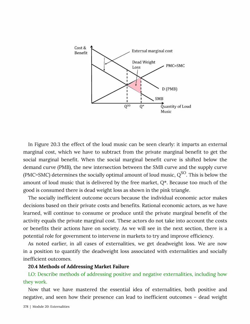
In Figure 20.3 the effect of the loud music can be seen clearly: it imparts an external marginal cost, which we have to subtract from the private marginal benefit to get the social marginal benefit. When the social marginal benefit curve is shifted below the demand curve (PMB), the new intersection between the SMB curve and the supply curve (PMC=SMC) determines the socially optimal amount of loud music, QSO. This is below the amount of loud music that is delivered by the free market, Q*. Because too much of the good is consumed there is dead weight loss as shown in the pink triangle.
The socially inefficient outcome occurs because the individual economic actor makes decisions based on their private costs and benefits. Rational economic actors, as we have learned, will continue to consume or produce until the private marginal benefit of the activity equals the private marginal cost. These actors do not take into account the costs or benefits their actions have on society. As we will see in the next section, there is a potential role for government to intervene in markets to try and improve efficiency.
As noted earlier, in all cases of externalities, we get deadweight loss. We are now in a position to quantify the deadweight loss associated with externalities and socially inefficient outcomes.
20.4 Methods of Addressing Market Failure LO: Describe methods of addressing positive and negative externalities, including how
they work. Now that we have mastered the essential idea of externalities, both positive and
negative, and seen how their presence can lead to inefficient outcomes – dead weight
378 | Module 20: Externalities

loss – it is appropriate to think about ways that policy could be used to correct this inefficiency.
Let’s start by dividing the externalities into negative and positive as the policy prescriptions are quite different.
Negative Externalities We can focus on two characteristics of negative externalities in designing policies to
address them:
• In equilibrium the amount produced or consumed is too high relative to the social optimum.
• In equilibrium the private marginal cost curve (production externality) or the private marginal benefit curve (consumption externality) do not align with the social marginal cost and benefit curves.
Quantity Controls – Limiting the Economic Activity One way to address the externality is to focus on the outcome and limit the amount
of the activity that an economic actor can do. For example if the production of a good produces harmful pollution a government could, theoretically, limit the amount of the production of the good to the socially optimal amount. In Figure 20.4.1 we can see the socially optimal amount is QQUOTA, so setting a production quota at that point will achieve the socially optimal level.
Figure 20.4.1: Quantity Controls to Achieve the Socially Optimal Production
Module 20: Externalities | 379
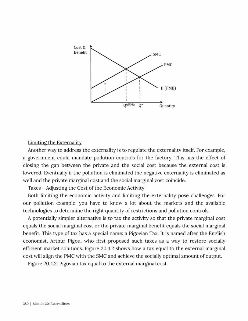
Limiting the Externality Another way to address the externality is to regulate the externality itself. For example,
a government could mandate pollution controls for the factory. This has the effect of closing the gap between the private and the social cost because the external cost is lowered. Eventually if the pollution is eliminated the negative externality is eliminated as well and the private marginal cost and the social marginal cost coincide.
Taxes —Adjusting the Cost of the Economic Activity Both limiting the economic activity and limiting the externality pose challenges. For
our pollution example, you have to know a lot about the markets and the available technologies to determine the right quantity of restrictions and pollution controls.
A potentially simpler alternative is to tax the activity so that the private marginal cost equals the social marginal cost or the private marginal benefit equals the social marginal benefit. This type of tax has a special name: a Pigovian Tax. It is named after the English economist, Arthur Pigou, who first proposed such taxes as a way to restore socially efficient market solutions. Figure 20.4.2 shows how a tax equal to the external marginal cost will align the PMC with the SMC and achieve the socially optimal amount of output.
Figure 20.4.2: Pigovian tax equal to the external marginal cost
380 | Module 20: Externalities
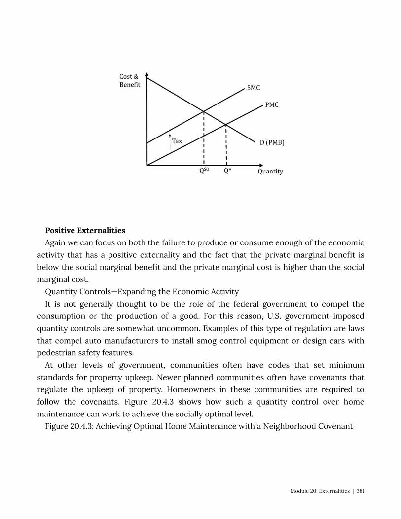
Positive Externalities Again we can focus on both the failure to produce or consume enough of the economic
activity that has a positive externality and the fact that the private marginal benefit is below the social marginal benefit and the private marginal cost is higher than the social marginal cost.
Quantity Controls—Expanding the Economic Activity It is not generally thought to be the role of the federal government to compel the
consumption or the production of a good. For this reason, U.S. government-imposed quantity controls are somewhat uncommon. Examples of this type of regulation are laws that compel auto manufacturers to install smog control equipment or design cars with pedestrian safety features.
At other levels of government, communities often have codes that set minimum standards for property upkeep. Newer planned communities often have covenants that regulate the upkeep of property. Homeowners in these communities are required to follow the covenants. Figure 20.4.3 shows how such a quantity control over home maintenance can work to achieve the socially optimal level.
Figure 20.4.3: Achieving Optimal Home Maintenance with a Neighborhood Covenant
Module 20: Externalities | 381
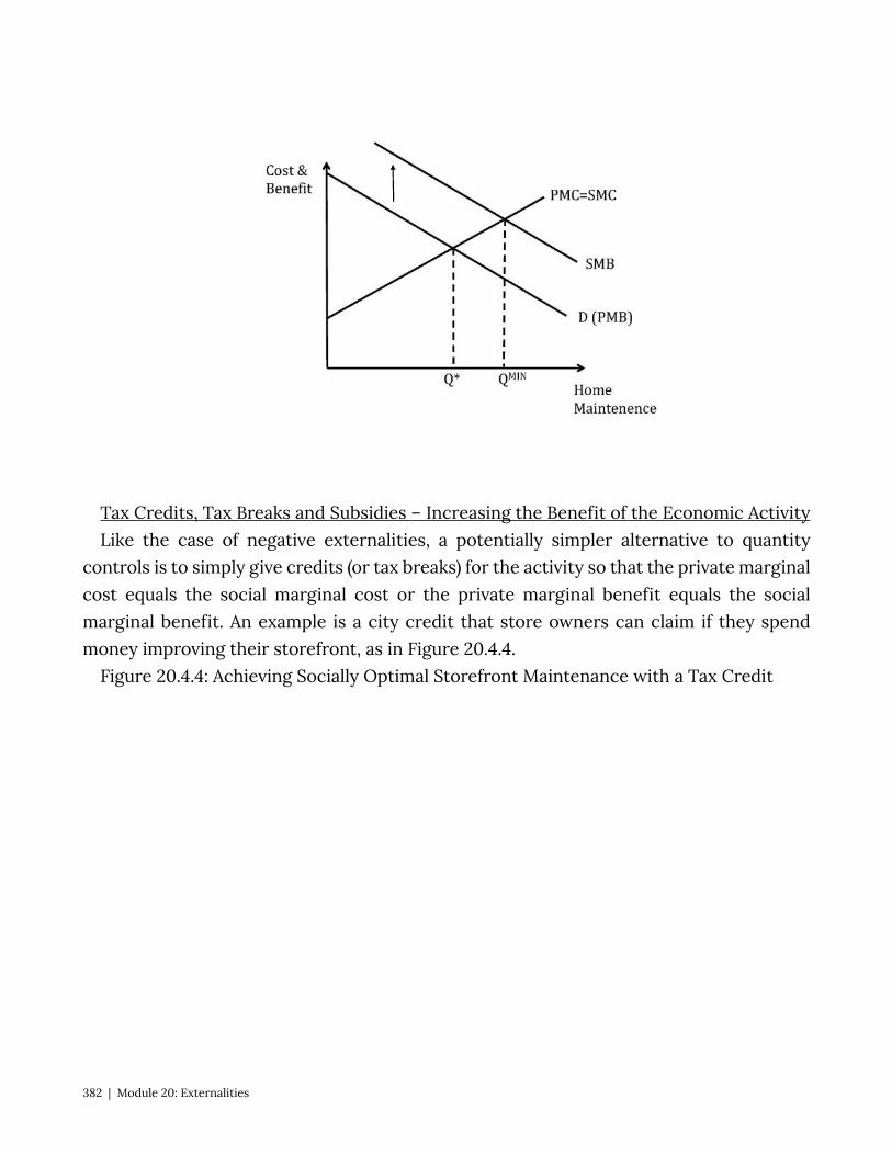
Tax Credits, Tax Breaks and Subsidies – Increasing the Benefit of the Economic Activity Like the case of negative externalities, a potentially simpler alternative to quantity
controls is to simply give credits (or tax breaks) for the activity so that the private marginal cost equals the social marginal cost or the private marginal benefit equals the social marginal benefit. An example is a city credit that store owners can claim if they spend money improving their storefront, as in Figure 20.4.4.
Figure 20.4.4: Achieving Socially Optimal Storefront Maintenance with a Tax Credit
382 | Module 20: Externalities
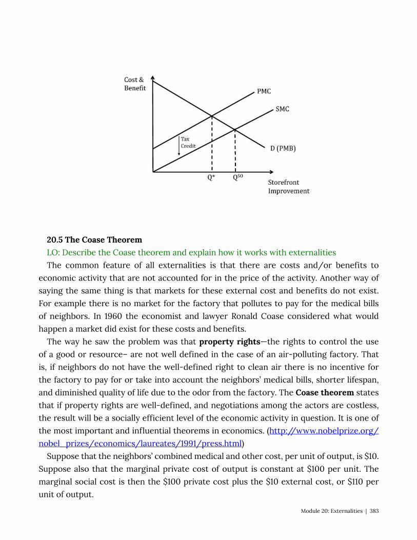
20.5 The Coase Theorem LO: Describe the Coase theorem and explain how it works with externalities The common feature of all externalities is that there are costs and/or benefits to
economic activity that are not accounted for in the price of the activity. Another way of saying the same thing is that markets for these external cost and benefits do not exist. For example there is no market for the factory that pollutes to pay for the medical bills of neighbors. In 1960 the economist and lawyer Ronald Coase considered what would happen a market did exist for these costs and benefits.
The way he saw the problem was that property rights—the rights to control the use of a good or resource– are not well defined in the case of an air-polluting factory. That is, if neighbors do not have the well-defined right to clean air there is no incentive for the factory to pay for or take into account the neighbors’ medical bills, shorter lifespan, and diminished quality of life due to the odor from the factory. The Coase theorem states that if property rights are well-defined, and negotiations among the actors are costless, the result will be a socially efficient level of the economic activity in question. It is one of the most important and influential theorems in economics. (http://www.nobelprize.org/nobel_prizes/economics/laureates/1991/press.html)
Suppose that the neighbors’ combined medical and other cost, per unit of output, is $10. Suppose also that the marginal private cost of output is constant at $100 per unit. The marginal social cost is then the $100 private cost plus the $10 external cost, or $110 per unit of output.
Module 20: Externalities | 383
Defining clean air as a property right and allowing for free negotiation enables the neighbors to quantify at $10 their willingness-to-pay for clean air or, conversely , their willingness-to-accept the dirty air. So, for each unit of output neighbors will demand to be compensated exactly the amount of their true loss: $10. Since they have the right to clean air, the factory owners are obliged to pay them and thus the private cost to the factory owners is exactly equal to the social cost, or PMC = SMC. We know now that this will result in a socially efficient outcome.
Students often are surprised to learn that it does not matter who has the property rights, only that they are well-defined. Suppose that the factory owners instead had the right to pollute the air as much as they like. Neighbors would be willing to pay the factory owners $10 a unit to reduce emissions from the current level. In this scenario, the opportunity cost of producing each extra unit has suddenly increased by $10. So again the PMC is now $110, not $100, the PMC = SMC, and the socially efficient level of output will result. The transfer of wealth is quite different here, so assigning property rights has big implications in terms of the relative welfare of the groups. But in terms of the socially efficient level of output assignment of property rights has no impact.
You may think that implementing the Coase theorem is an ideal policy solution for externalities, but a few words of caution are in order. The assumption of costless negotiation is quite improbable in practice. In order for it to be true in the example of the polluting factory, the neighbors all have to be able to identify themselves and band together, correctly assess the values of the damage done to them per unit of output and be able to demand the money from the factory owners. Costless negotiation is unlikely to be the case in any similar real word situation.
An interesting real-world application of the Coase theorem has happened in sparsely populated areas of eastern Oregon where residents have been paid $5000 by a wind-energy company to put up with the noise of wind turbines (residents must sign a waiver promising not to complain about the noise). Oregon law gives the right to peace and quiet to the residents, so for the turbines to exist the residents must agree to live with the noise. In this case, because the area is sparsely populated and it is pretty easy to determine who is affected (just use a decibel meter), negotiation is relatively easy. [http://www.nytimes.com/2010/08/01/us/01wind.html?_r=3&hp&]
20.6 Policy Example: Should New York Ban Soda to Address the Obesity Epidemic? Let’s return now to the proposed soda ban in New York City, applying the economic
tools, concepts and models from this module. Step 1: Understand the external cost of the consumption of ‘sugary drinks’
384 | Module 20: Externalities

We need to examine the link between sugary beverages and personal health and well-being. We can then try to relate these personal issues to social costs.
A number of studies have demonstrated a connection between consuming soft drinks and negative health consequences. The following points are from the Harvard School of Public Health (http://www.hsph.harvard.edu/nutritionsource/sugary-drinks-fact-sheet/):
Sugary drink portion sizes have risen dramatically over the past 40 years, and children and adults are drinking more soft drinks than ever.
On any given day, half the people in the U.S. consume sugary drinks; 1 in 4 get at least 200 calories from such drinks; and 5% get at least 567 calories—equivalent to four cans of soda. (17) Sugary drinks (soda, energy, sports drinks) are the top calorie source in teens’ diets (226 calories per day), beating out pizza (213 calories per day). (18)
Sugary drinks increase the risk of obesity, diabetes, heart disease, and gout. A 20-year study on 120,000 men and women found that people who increased their
sugary drink consumption by one 12-ounce serving per day gained more weight over time—on average, an extra pound every 4 years—than people who did not change their intake. (19) Other studies have found a significant link between sugary drink consumption and weight gain in children. (20) One study found that for each additional 12-ounce soda children consumed each day, the odds of becoming obese increased by 60% during 1½ years of follow-up. (21)
People who consume sugary drinks regularly—1 to 2 cans a day or more—have a 26% greater risk of developing type 2 diabetes than people who rarely have such drinks. (22) Risks are even greater in young adults and Asians.
A study that followed 40,000 men for two decades found that those who averaged one can of a sugary beverage per day had a 20% higher risk of having a heart attack or dying from a heart attack than men who rarely consumed sugary drinks. (23) A related study in women found a similar sugary beverage–heart disease link. (24)
A 22-year study of 80,000 women found that those who consumed a can a day of sugary drink had a 75% higher risk of gout than women who rarely had such drinks. (25) Researchers found a similarly-elevated risk in men. (26)
And, from Policymic (http://www.policymic.com/articles/16637/bloomberg-soda-
ban-how-a-soda-prohibition-might-cut-rising-health-care-costs): Currently, 58% of New York City adults and 40% of New York City public school
children are overweight or obese. Other studies have attempted to quantify the social cost of negative health
Module 20: Externalities | 385

consequences associated with obesity. The following information is from Reuters (http://www.reuters.com/article/2012/04/30/us-obesity-idUSBRE83T0C820120430):
Obese men rack up an additional $1,152 a year in medical spending, especially for hospitalizations and prescription drugs, Cawley and Chad Meyerhoefer of Lehigh University reported in January in the Journal of Health Economics. Obese women account for an extra $3,613 a year. Using data from 9,852 men (average BMI: 28) and 13,837 women (average BMI: 27) ages 20 to 64, among whom 28 percent were obese, the researchers found even higher costs among the uninsured: annual medical spending for an obese person was $3,271 compared with $512 for the non-obese.
Nationally, that comes to $190 billion a year in additional medical spending as a result of obesity, calculated Cawley, or 20.6 percent of U.S. health care expenditures.
Those extra medical costs are partly born by the non-obese, in the form of higher taxes to support Medicaid and higher health insurance premiums. Obese women raise such “third party” expenditures $3,220 a year each; obese men, $967 a year, Cawley and Meyerhoefer found.
In addition, there have been studies about the extra cost of heavier drivers on the roads in terms of road wear and tear and extra fuel use. There is also this: An obese man is 64 percent less likely to be arrested for a crime than a healthy man (this last from the above Reuters article).
For the sake of our exercise let’s accept the link between sugary drinks and social costs. Step 2: Categorize the externality In this case we have a classic negative consumption externality – there is an external
cost to an individual’s consumption of the good and therefore the social marginal benefit is lower than the private marginal benefit.
Step 3: Show the social inefficiency in terms of deadweight loss because this consumption activity, drinking sugary drinks, is associated with external
costs, the socially optimal level of consumption is lower than the market outcome. This results in dead weight loss. We can see the dead weight loss on the graph above.
Step 4: Considering whether the solution will have the desired effect How do we incorporate the large soda ban into the model? What this ban does is
increase the cost per ounce for producers. How? Well, it is cheaper to sell in bulk (see: economies of scale), so if producers are forced to sell in smaller packages the cost per-ounce will increase. This effect will raise the private marginal cost (supply) curve . If you raise it enough, you can reduce soda consumption to the socially optimal level.
But, in the real world we don’t always have a good idea where to stop the private
386 | Module 20: Externalities
marginal cost. Is this added cost proportional to the external cost? Is it greater or less than the external cost?
From this exercise we can conclude that the policy has the potential to achieve its aims, but there is a question about the magnitude of the effect of the policy relative to the magnitude of the cost of the problem.
Step 5: Consider possible policy alternatives What about an outright ban on ‘sugary drinks’? This clearly would go too far in the sense
that it is well below the socially efficient level of drink consumption. A Pigovian tax on sugary drinks seems like a much simpler policy. In fact this is a
common and popular policy solution to other goods that produce negative externalities, like cigarettes and alcohol. But again the challenge is to get the amount of the tax right so that the socially efficient level is reached.
Note that the ban was stuck down: http://www.nytimes.com/2013/03/12/nyregion/judge-invalidates-bloombergs-soda-ban.html?pagewanted=all
But it could be back: http://www.bloomberg.com/news/2013-03-12/ruling-can-lead-to-tougher-new-york-soda-ban.html
Exploring the Policy Question
• Do you think the ban on the sale of sugary drinks in large quantities is a good idea from a policy perspective? Why or why not?
• Do you think such a ban would have the desired effect? • Reading the articles above how much discretion do you think local authorities should
have to address externalities? • Do you think the true nature of this problem is an external cost that consumers don’t
take into account when making consumption choices or is it more a question of ignorance about the potential negative health consequences? If the latter, can you think of alternate policy solutions?
Module 20: Externalities | 387
http://www.nytimes.com/2013/03/12/nyregion/judge-invalidates-bloombergs-soda-ban.html?pagewanted=all

SUMMARY
Review: Topics and Related Learning Outcomes
20.1 Social Costs and Benefits Learning Objective 20.1: Define social costs and benefits 20.2 Defining Externalities Learning Objective 20.2: Describe the economic effects of the four categories of
externalities 20.3 How Externalities Lead to Socially Inefficient Outcomes Learning Objective 20.3: Explain how externalities lead to market failures 202.4 Methods of Addressing Market Failures Learning Objective 20.4: Describe methods of addressing positive and negative
externalities, including how they work. 20.5. The Coase Theorem Learning Objective 20.5: Describe the Coase theorem and explain how it works with
externalities. 20.6 Policy Question: Should New York Ban Soda to Address the Obesity Epidemic? Learning Objective: Apply the externality concepts to the policy question of banning
sugary drinks.
Learn: Key Terms and Graphs
Terms
Social Cost Social Benefit Externalities
Property Rights Coase Theorem
388 | Module 20: Externalities

Graphs
Positive Production Externalities Negative Production Externalities Positive Consumption Externalities Negative Consumption Externalities
Module 20: Externalities | 389
Chapter 21: Public Goods Policy Example: Should the Government Regulate the Extraction of Fish from the
Ocean? In waters within ten nautical miles of the United States shoreline Exploring the Policy Question
1. Does the societal benefit from the advent of new drugs outweigh the cost to society from the creation of monopolies?
2. What other way could society promote the development of new medicines?
21.1 What is a Public Good? Learning Objective 21.1: Describe the two key features of a public good. 21.2 The Free-Rider Problem Learning Objective 21.2: Explain how public good lead to overuse. 21.3 Problems with the Public Provision of Public Goods Learning Objective 21.3: Describe the problem of under-provision of public goods. 21.4 Policy Example: Fisheries Learning Objective 21.4: Explain how the application of property rights can help solve
the free-rider problem in fisheries. 21.1 What is a Public Good? Learning Objective 21.1: Describe the two key features of a public good. Public goods are goods that have some degree of non-rivalry and non-excludability.
Rival goods are goods that are diminished with use. An example of a rival good is a sandwich, when someone consumes a sandwich that sandwich is gone and no one else can consume it. Non-rival goods are goods that do not diminish with individual consumption, for example no amount of consumption of the music from a radio station leaves any less music for anyone else with a radio to listen to. Clean air, national defense and lighthouses are other classic examples of non-rival goods. Exclusive goods are good for which consumption can be controlled or prevented. The sandwich behind the deli counter in a market is an exclusive good, consumption can only happen if the deli workers allow it. Non-exclusive goods are things like the roads and parks in a city where anyone can drive on the roads or enjoy the park. Fisheries are another example of non-excludability.
390 | Module 21: Public Goods
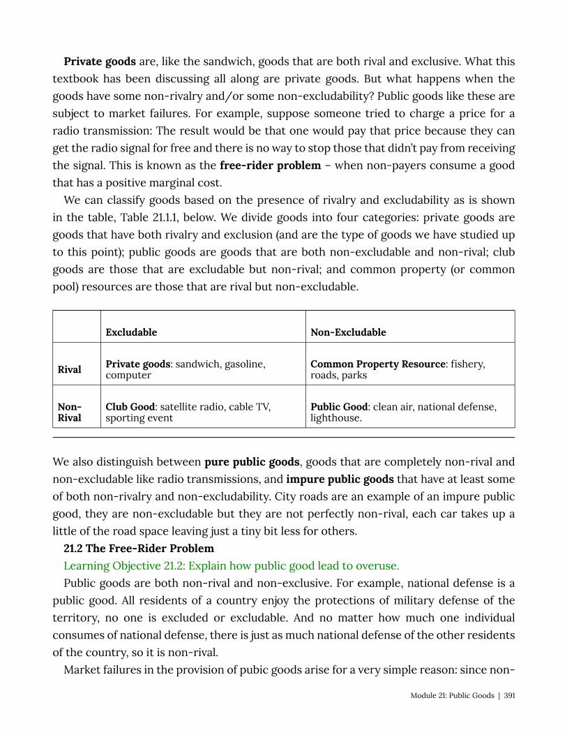
Private goods are, like the sandwich, goods that are both rival and exclusive. What this textbook has been discussing all along are private goods. But what happens when the goods have some non-rivalry and/or some non-excludability? Public goods like these are subject to market failures. For example, suppose someone tried to charge a price for a radio transmission: The result would be that one would pay that price because they can get the radio signal for free and there is no way to stop those that didn’t pay from receiving the signal. This is known as the free-rider problem – when non-payers consume a good that has a positive marginal cost.
We can classify goods based on the presence of rivalry and excludability as is shown in the table, Table 21.1.1, below. We divide goods into four categories: private goods are goods that have both rivalry and exclusion (and are the type of goods we have studied up to this point); public goods are goods that are both non-excludable and non-rival; club goods are those that are excludable but non-rival; and common property (or common pool) resources are those that are rival but non-excludable.
Excludable Non-Excludable
Rival Private goods: sandwich, gasoline, computer
Common Property Resource: fishery, roads, parks
Non-Rival
Club Good: satellite radio, cable TV, sporting event
Public Good: clean air, national defense, lighthouse.
We also distinguish between pure public goods, goods that are completely non-rival and non-excludable like radio transmissions, and impure public goods that have at least some of both non-rivalry and non-excludability. City roads are an example of an impure public good, they are non-excludable but they are not perfectly non-rival, each car takes up a little of the road space leaving just a tiny bit less for others.
21.2 The Free-Rider Problem Learning Objective 21.2: Explain how public good lead to overuse. Public goods are both non-rival and non-exclusive. For example, national defense is a
public good. All residents of a country enjoy the protections of military defense of the territory, no one is excluded or excludable. And no matter how much one individual consumes of national defense, there is just as much national defense of the other residents of the country, so it is non-rival.
Market failures in the provision of pubic goods arise for a very simple reason: since non-
Module 21: Public Goods | 391
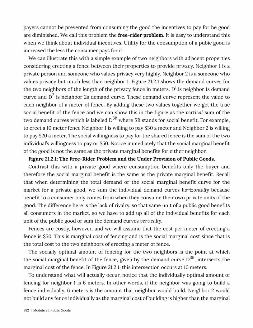
payers cannot be prevented from consuming the good the incentives to pay for he good are diminished. We call this problem the free-rider problem. It is easy to understand this when we think about individual incentives. Utility for the consumption of a pubic good is increased the less the consumer pays for it.
We can illustrate this with a simple example of two neighbors with adjacent properties considering erecting a fence between their properties to provide privacy. Neighbor 1 is a private person and someone who values privacy very highly. Neighbor 2 is a someone who values privacy but much less than neighbor 1. Figure 21.2.1 shows the demand curves for the two neighbors of the length of the privacy fence in meters. D1 is neighbor 1s demand curve and D2 is neighbor 2s demand curve. These demand curve represent the value to each neighbor of a meter of fence. By adding these two values together we get the true social benefit of the fence and we can show this in the figure as the vertical sum of the two demand curves which is labeled DSB where SB stands for social benefit. For example, to erect a 10 meter fence Neighbor 1 is willing to pay $30 a meter and Neighbor 2 is willing to pay $20 a meter. The social willingness to pay for the shared fence is the sum of the two individual’s willingness to pay or $50. Notice immediately that the social marginal benefit of the good is not the same as the private marginal benefits for either neighbor.
Figure 21.2.1: The Free-Rider Problem and the Under Provision of Public Goods. Contrast this with a private good where consumption benefits only the buyer and
therefore the social marginal benefit is the same as the private marginal benefit. Recall that when determining the total demand or the social marginal benefit curve for the market for a private good, we sum the individual demand curves horizontally because benefit to a consumer only comes from when they consume their own private units of the good. The difference here is the lack of rivalry, so that same unit of a public good benefits all consumers in the market, so we have to add up all of the individual benefits for each unit of the public good or sum the demand curves vertically.
Fences are costly, however, and we will assume that the cost per meter of erecting a fence is $50. This is marginal cost of fencing and is the social marginal cost since that is the total cost to the two neighbors of erecting a meter of fence.
The socially optimal amount of fencing for the two neighbors is the point at which the social marginal benefit of the fence, given by the demand curve DSB, intersects the marginal cost of the fence. In Figure 21.2.1, this intersection occurs at 10 meters.
To understand what will actually occur, notice that the individually optimal amount of fencing for neighbor 1 is 6 meters. In other words, if the neighbor was going to build a fence individually, 6 meters is the amount that neighbor would build. Neighbor 2 would not build any fence individually as the marginal cost of building is higher than the marginal
392 | Module 21: Public Goods
benefit even for the first meter of fence. Since Neighbor 2 does not want to collaborate on the fence, Neighbor 1 will build it alone, build 6 meters of fence, and Neighbor 2 will enjoy the benefit of the fence without contributing to it. We see in this example how private provision of public goods is subject to under-provision: Neighbor 2 free rides off Neighbor 1s fence and thus only 6 meters of fencing is constructed while 10 meters is socially optimal.
To ensure public goods are provided, governments usually step in and provides the good themselves or subsidizes or mandates its provision. An example is local fire departments. Fire protection is a classic public good, all those in the fire district benefit from the service and the protection of one household leaves no less for the other households in the district. Left to the market, we can be confident that a suboptimal amount of fire protection would be provided, thus it because part of the accepted role of government to levy a tax on homeowners and provide fire protection themselves.
21.3 Problems with the Public Provision of Public Goods Learning Objective 21.3: Describe the problem of under-provision of public goods. While the case of fire protection may seem straightforward, other public goods can be
both difficult to evaluate in terms of the value they provide to the public and difficult to provide even given the policy tools available to governments.
In order to value public goods, you must look beyond the market valuation. Because of the presence of free ridership, the market will undervalue public goods. Alternatively, governments can rely on surveys, but these types of surveys are often poor because it is very hard to judge the value to an individual of public good. An individual might be able to answer how much they would be willing to pay for a proposed new park in their neighborhood, but how much is the police protection they enjoy worth? Without knowing what life would be like in the absence of a police force, that is a very difficult question to answer. Other things for which individuals lack enough information to value correctly could include clean air and drinking water, national defense, and public education.
Another way to both value and to potentially provide public goods is through a popular vote. This seems to be a reasonable solution on the surface, but upon examination, it is clear that the ability of such a system to provide public good rests pivotally on the median voter.
Consider the following example: suppose a town on a river is considering building a bridge over the river. To keep the analysis simple, let’s assume a simplified world where there are five residents of the town and the bridge costs exactly $1000 to construct. The bridge is worth different amounts to each resident depending on factors such as income, how close they live to the bridge, how often they anticipate using the bridge, etc. The
Module 21: Public Goods | 393
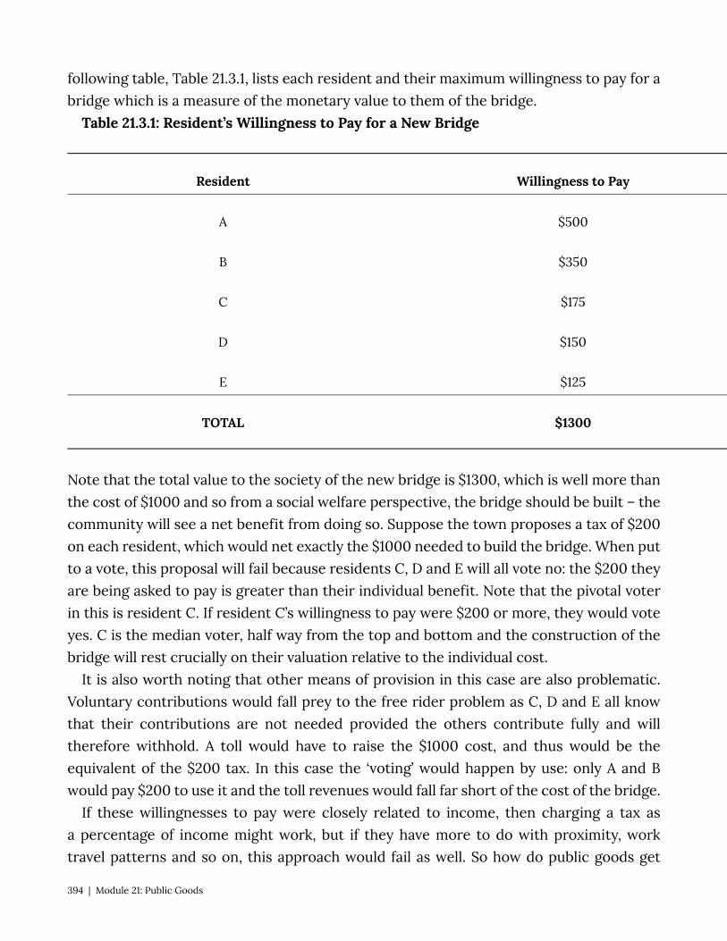
following table, Table 21.3.1, lists each resident and their maximum willingness to pay for a bridge which is a measure of the monetary value to them of the bridge.
Table 21.3.1: Resident’s Willingness to Pay for a New Bridge
Resident Willingness to Pay
A $500
B $350
C $175
D $150
E $125
TOTAL $1300
Note that the total value to the society of the new bridge is $1300, which is well more than the cost of $1000 and so from a social welfare perspective, the bridge should be built – the community will see a net benefit from doing so. Suppose the town proposes a tax of $200 on each resident, which would net exactly the $1000 needed to build the bridge. When put to a vote, this proposal will fail because residents C, D and E will all vote no: the $200 they are being asked to pay is greater than their individual benefit. Note that the pivotal voter in this is resident C. If resident C’s willingness to pay were $200 or more, they would vote yes. C is the median voter, half way from the top and bottom and the construction of the bridge will rest crucially on their valuation relative to the individual cost.
It is also worth noting that other means of provision in this case are also problematic. Voluntary contributions would fall prey to the free rider problem as C, D and E all know that their contributions are not needed provided the others contribute fully and will therefore withhold. A toll would have to raise the $1000 cost, and thus would be the equivalent of the $200 tax. In this case the ‘voting’ would happen by use: only A and B would pay $200 to use it and the toll revenues would fall far short of the cost of the bridge.
If these willingnesses to pay were closely related to income, then charging a tax as a percentage of income might work, but if they have more to do with proximity, work travel patterns and so on, this approach would fail as well. So how do public goods get
394 | Module 21: Public Goods
provided in most cases? Out of general funds from the government. By packaging together a whole host of public goods including roads, parks, schools, libraries, public safety and the like, governments can average out individual differences related to preferences and create broad support for the funding of these activities.
21.4 Policy Example: Fisheries Learning Objective 21.4: Explain how the application of property rights can help solve
the free-rider problem in fisheries. When fishing boats set out on the ocean and decide how many fish to catch, like
any economic actor they make a marginal benefit, marginal cost calculation. They will continue to fish as long as their private marginal benefit, the value of the next fish caught, equals the private marginal cost, the expense of catching the last fish. As a common pool resource, however, there is a social cost to the boat’s catch that is not part of their calculation: the fact that the more fish they catch the fewer fish there are for others to catch. In addition, fisheries need a healthy population of mature fish to remain uncaught so that those fish can reproduce and provide fish to catch next season.
The situation is shown in Figure 21.4.1. In this figure the private marginal cost and the social marginal cost differ due to the cost of depleting the fishery from one fishing boats catch. Without regulation, each individual boat will catch more than the socially optimal amount leading to dead weight loss.
With the application of property rights, typically a quota system which assigns the right of an individual fishing boat to catch only a limited amount of fish, the socially optimal amount of fish extraction is established as shown in Figure 21.4.2.
SUMMARY
Review: Topics and Related Learning Outcomes
21.1 What is a Public Good? Learning Objective 21.1: Describe the two key features of a public good. 21.2 The Free-Rider Problem Learning Objective 21.2: Explain how public good lead to overuse. 21.3 Problems with the Public Provision of Public Goods
Module 21: Public Goods | 395
Learning Objective 21.3: Describe the problem of under-provision of public goods. 21.4 Policy Example: Fisheries Learning Objective 21.4: Explain how the application of property rights can help solve
the free-rider problem in fisheries.
Learn: Key Terms and Graphs
Terms
Monopoly Natural monopoly Patent Inverse demand curve
396 | Module 21: Public Goods
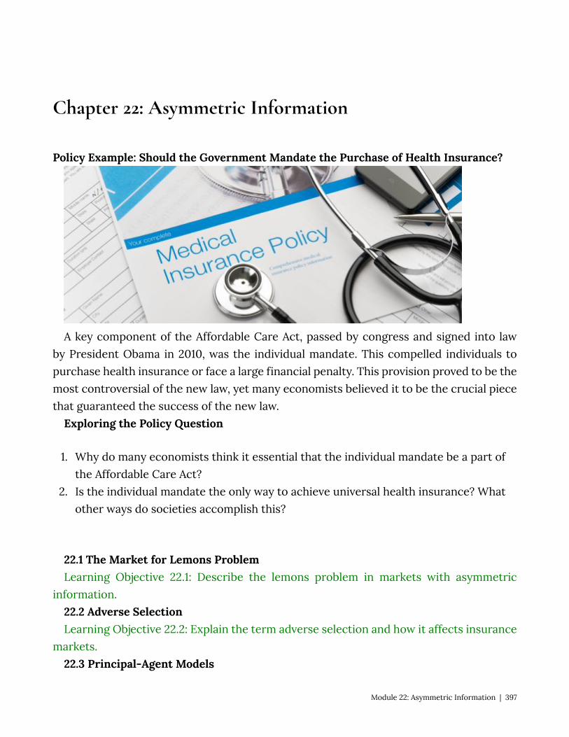
Chapter 22: Asymmetric Information
Policy Example: Should the Government Mandate the Purchase of Health Insurance?
A key component of the Affordable Care Act, passed by congress and signed into law by President Obama in 2010, was the individual mandate. This compelled individuals to purchase health insurance or face a large financial penalty. This provision proved to be the most controversial of the new law, yet many economists believed it to be the crucial piece that guaranteed the success of the new law.
Exploring the Policy Question
1. Why do many economists think it essential that the individual mandate be a part of the Affordable Care Act?
2. Is the individual mandate the only way to achieve universal health insurance? What other ways do societies accomplish this?
22.1 The Market for Lemons Problem Learning Objective 22.1: Describe the lemons problem in markets with asymmetric
information. 22.2 Adverse Selection Learning Objective 22.2: Explain the term adverse selection and how it affects insurance
markets. 22.3 Principal-Agent Models
Module 22: Asymmetric Information | 397
Learning Objective 22.3: Describe how asymmetric information can affect principal-agent relationships.
22.4 Moral Hazard Learning Objective 22.4: Explain moral hazard and how it can affect the efficiency of
markets. 22.5 Policy Example: The Affordable Care Act Learning Objective 22.5: Explain how adverse selection models explain the importance
economists place on the individual mandate in the Affordable Care Act. 22.1 The Market for Lemons Problem Learning Objective 22.1: Describe the lemons problem in markets with asymmetric
information. One of the assumptions of the efficient markets hypothesis is that buyers and sellers are
completely informed, they know everything there is to know about the goods for sale in a market, like their quality. This is critical for achieving efficiency since a buyer’s willingness to pay for a good depends on them knowing the value of the good to themselves. If a buyer, for example, over estimates the value of a good to themselves, perhaps by over-estimating its quality, then they might end up buying it at a price that exceeds their willingness to pay for the good once its quality is revealed. This would be an exchange that lowers total surplus and the market cannot therefore be efficient.
Asymmetric Information describes a situation when one side of an exchange, the buyer or the seller, knows more about the product than the other. Generally, we might expect the sellers of goods to know more about them than buyers, but not always – a collector of antiques might know more about the value of an item they see for sale by someone who found an old item in their attic. Items whose value is not immediately known to a buyer or seller are said to have hidden characteristics. Asymmetric information can also arise when agents’ actions are not visible to all parties. For example, a customer may hire a mechanic to fix their car, but they do not observe the actions the mechanic actually takes. The mechanic might say they replaced a part when, in fact, they did not. We call these hidden actions.
It situations where both parties to a transaction have the same information, either full or partial information, neither party has an advantage over the other. However, when one party has access to more information this can lead to opportunistic behavior, where the more informed party takes advantage over the less informed party for economic gain. This advantage taking leads to market failures where transactions fail to yield efficient outcomes. Two main problems associated with asymmetric information are Adverse
398 | Module 22: Asymmetric Information
Selection and Moral Hazard. Adverse selection refers to the situation where asymmetric information on the part of one party in an economic transactions leads to desirable good remaining unsold, even though they would be sold in a market with full information.
The classic example of this is called the market for lemons after George Akerlof’s 1971 paper of the same name. In this scenario, sellers of used cars possess more information about the true quality of the cars than sellers do since the owners of used cars have been using them and know their faults. In a simplified version of this model, consider a world in which there are only two types of cars: good quality cars and bad quality cars (or ‘lemons,’ which in the United States is slang for a bad car). There are equal numbers of both in the marketplace and both buyer and sellers know this. Buyers value good used cars at $10,000 and lemons at $5,000. Sellers are willing to sell good used cars for $8,000 and lemons for $3,000. For clarity, let’s suppose that there are exactly 100 cars of each type and over 200 buyers, each willing to buy either car, given the right price.
Immediately we can see that in a world of full information an efficient outcome will arise: owners of good cars will sell them at a price between $8,000 and $10,000 and owners of lemons will sell them at a price between $3,000 and $5,000. Each car sold will generate a total of $2,000 in total surplus regardless of the price agreed to as this is the difference between the sellers’ minimum willingness-to-accept and the buyers’ maximum willingness-to-pay. In the end the sake of 200 cars will yield a total surplus of $400,000 (or 200 cars times $2,000 surplus for each).
Now consider a world of asymmetric information where the sellers know the quality of the cars they are selling, and the buyers do not. Sellers of both types of cars have an incentive to claim that their cars are of good quality. Buyers understand the incentive to misrepresent the true quality of the car and therefore do not believe the sellers claims. So what happens in the market? Let’s keep things simple by assuming that buyers are risk neutral. In this case the buyers know that, with equal amounts of both types of cars in the market that choosing one at random will yield and expected value of $7,500.
Probability of a good car = .5, value of a good car = $10,000. Probability of a bad car = .5, value of a lemon = $5,000. Expected value = (.5)($10,000) + (.5)($5,000) = $7,500 This means that no buyer is willing to pay more than $7,500 for a used car. Since this
is true no seller of a good car is willing to sell as $7,500 is lower than their minimum willingness-to-accept. Because of this, no owner of a good quality used car will offer them or sale and the only cars for sale on the market will be the lemons. Both buyers and sellers can figure this out son in the end buyers know that only lemons are for sale and will not offer more than $5,000. This leaves a market for only lemons in which all 100
Module 22: Asymmetric Information | 399

lemons will be sold for a price between $5,000 and $3,000. Each transaction generates $2,000 in total surplus for a total of $200,000. This is the market failure: the asymmetric information problem leads to a deadweight loss of $200,000 or the difference between the total surplus in the full information marketplace and the total surplus in the market with asymmetric information.
The fact that the good quality cars disappear from the market is called Adverse Selection, a topic we will focus on in the next section.
22.2 Adverse Selection Learning Objective 22.2: Explain the term adverse selection and how it affects insurance
markets. Adverse Selection occurs when the more desirable attributes of a market withdraw
due to asymmetric information. This could be better quality products, better quality consumers or better quality sellers. The result is that consumer and producers may not make transactions that are socially beneficial, transactions that would yield positive producer and/or consumer surplus. This is the market failure associated with asymmetric information: the ability of the more informed agents to exploit their advantage.
Insurance markets are a classic example of market failures from information asymmetries. Information asymmetries exist in insurance markets due to the fact that there is both hidden action and hidden characteristics: insurers cannot monitor the actions and private information of the insured. For example, in car insurance, the insurer does not know how carefully a driver actually drives. In health insurance, the insurer might not know about pre-existing conditions and the lifestyle of their insured. Because of this information asymmetry insurers have to charge a price that is an average of the costs of their insured. This price is often too high for the most desirable consumers causing them to not purchase insurance. This decision to stay out of the market makes the situation worse as the average cost of the insured increases as the lowest cost consumers exit, further raising the price of insurance forcing even more of the healthier consumers from the market.
This outcome is inefficient because if insurance companies had full information about their clients, they could charge each a price that is above the cost of insurance but is less than the risk premium – the amount above the cost that consumers are willing to pay to avoid risk – that would allow these healthier clients to purchase insurance and create more surplus in society.
22.3 Principal-Agent Models Learning Objective 22.3: Describe how asymmetric information can affect principal-
agent relationships.
400 | Module 22: Asymmetric Information
Principal-agent relationships are situations in which one person, the principal, pays another person to perform a task for them. In its most basic form, this describes the employee-employer relationship. But is can also describe a situation in which a car owner pays a mechanic to fix their car, or a homeowner hires a housecleaner or many other everyday situations. These relationships are often subject to asymmetric information because agents can act in ways that are unobserved by the principal. If the individual incentives are not aligned, the agents might take actions contrary to the interests of the principal. For example, the owner of a car in need of repair would like the car to be repaired properly and inexpensively as possible. The mechanic’s incentives might be to repair the car properly, but to maximize their revenue from the situation. So, for example, the mechanic might like to perform extra, unnecessary work in order to earn more money. Since the car owner does not know that the extra work is unnecessary, the mechanic can claim it is and earn the extra revenue. Similarly, the employers incentive is to have each employee work hard and efficiently. But the workers incentive might be to expend as minimal an effort as possible but still perform their assigned duties. If the employer cannot detect that the employee is not giving maximum effort, the employee is free to give a diminished effort. In these situations, it would be unsurprising for employees to give less than full effort.
The key to these situations of misaligned incentives is the presence of hidden actions: efforts (or lack thereof) on the part of one or both parties that are unobserved by the other. For example, if a job simply requires and agent putting two component pieces of a computer together on an assembly line, the principal can presumable observe the agents’ actions through monitoring the number of parts they assemble in an hour. They can also test to make sure the connection of each set of two parts is good. In this case, it is easy to write a contract to align incentives: specify a number of parts the agent is required to join properly in an hour. But consider the situation where the principal cannot observe the effort of the agent. For example, in retail sales it might be difficult to observe each interaction with customers. We call these hidden actions and they make it difficult or impossible to write a contract specifying a particular level of effort.
Principal-agent relationships where there is hidden action can be addressed through contracts that seek to align incentives through rewarding performance instead of effort. A typical one in the case of retail sales is through the use of commission where the agent gets a percentage of every sale they make (or a percentage of sales over a certain threshold). This helps align the incentives of the principal, to make as much revenue as possible, with the agent who, with a commission contract, would like to maximize the
Module 22: Asymmetric Information | 401
value of their own sales. Other examples are CEO pay where the CEO of a company is compensated partially based on the performance of the firm itself.
22.4 Moral Hazard Learning Objective 22.4: Explain moral hazard and how it can affect the efficiency of
markets. Another consequence of hidden action is Moral Hazard where people who have entered
into contract to mitigate the cost of risk engage in riskier behavior because the costs have diminished. An insurance contract that covers the cost of damage from an automobile collision might cause the holder of the contract to drive in a less cautious manner, increasing the risk of an accident. Borrowers who have limited liability contracts might be more willing to take risks with the money they borrow. If the actions of the contract holder could be monitored, the problem would go away as the contract could be written to take behavior into account and either prohibit it or to charge a price based on the nature of the actions the contract holder engages in. It is the hidden action aspect of these contracts that gives rise to moral hazard.
The consequence of contracts that reduce the cost of risk taking and therefore increasing the incentives to takes risks is that they become more expensive. An insurer who sells auto insurance will have to charge higher premiums as a consequence of moral hazard because its costs go up with riskier driving on the part of the policy holders. This causes premiums to go up for all holders, making it too expensive for the most careful drivers and causing a market failure.
22.5 Policy Example: The Affordable Care Act Learning Objective 22.5: Explain how adverse selection models explain the importance
economists place on the individual mandate in the Affordable Care Act. Social insurance contracts like the Affordable Care Act rest on the principle that adverse
events, like an injury, accident or health crisis can happen to anyone and that, by pooling resources the unlucky can be cared for from the shared resources of society. When participation isn’t universal the cost to the participants depends on the average risk of the insured. If optional, adverse selection tells us who is the most likely to stay in the pool and who is most likely to leave, the most risky and the least risky, respectively. This will increase the cost of insurance for those who remain and threaten the viability of the system as care becomes less ‘affordable.’
402 | Module 22: Asymmetric Information
SUMMARY
Review: Topics and Related Learning Outcomes
22.1 The Market for Lemons Problem Learning Objective 22.1: Describe the lemons problem in markets with asymmetric
information. 22.2 Adverse Selection Learning Objective 22.2: Explain the term adverse selection and how it affects insurance
markets. 22.3 Principal-Agent Models Learning Objective 22.3: Describe how asymmetric information can affect principal-
agent relationships. 22.4 Moral Hazard Learning Objective 22.4: Explain moral hazard and how it can affect the efficiency of
markets. 22.5 Policy Example: The Affordable Care Act Learning Objective 22.5: Explain how adverse selection models explain the importance
economists place on the individual mandate in the Affordable Care Act.
Learn: Key Terms and Graphs
Terms
Hidden Characteristics Hidden Action Adverse Selection Moral Hazard Lemons Problem Principal-Agent Relationships
Module 22: Asymmetric Information | 403

Chapter 23: Uncertainty and Risk
Policy Example: Flood Insurance
Much insurance is provided by the private market, but one important exception is flood insurance, which is generally provided by the federal government in the United States. The country’s National Flood Insurance Program is run by the Federal Emergency Management Agency and provides supplemental flood insurance for flood prone homes as most private homeowner policies do not cover flood damage.
Exploring the Policy Question
1. Why don’t private insurers provide flood insurance? 2. What is the justification for government provision of flood insurance?
23.1 What are Risky Outcomes? Learning Objective 23.1: Define risky outcomes and describe how they are assessed. 23.2 Evaluating Risky Outcomes Learning Objective 23.2: Explain expected utility and risk preference. 23.3 Risk Reduction
404 | Module 23: Uncertainty and Risk
Learning Objective 23.3: Describe how diversification and insurance mitigate risk. 23.4 Policy Example: Flood Insurance Learning Objective 23.4: Apply knowledge of risk and insurance to explain how
systematic risk makes risk pools difficult and destroys private markets for insurance. 23.1 What are Risky Outcomes? Learning Objective 23.1: Define risky outcomes and describe how they are assessed. Risk describes any economic activity in which there are uncertain outcomes. For
example, a person who places a bet on the flip of a coin faces two different outcomes with equal chance. A driver of a car knows that there is a chance of a collision. People understand that in the future there is a possibility that they will fall ill or suffer an injury that requires medical attention. All of these scenarios are examples of uncertainty and uncertainty implies risk. For this module, as in economics in general, we use the terms risk and uncertainty interchangeably.
Associated with any uncertain outcome are probabilities. Recall that probabilities are numbers between zero and one that indicate the likelihood that a particular outcome will occur. In a coin flip, the probability of one side landing facing up is ½ or 50%. Sometimes these probabilities are known, like in the coin flipping example, and sometimes these probabilities are unknown, like in the car collision example. Even when we don’t know the probabilities we can often estimate based on aggregate data or some other information such as if the roads are covered in snow. In either case the ability to assign probabilities distinguishes these risks as quantifiable. We will only consider quantifiable risk in this module.
In the absence of a known probability like a coin flip, economic agents have to estimate. They generally do so in two ways: they can estimate based on frequency or based on subjective probability. Frequency is how often a particular outcome has occurred over a known number of events. For example, a person who lives in an area that only rarely gets snow in the winter might wonder what the chances are that there will be snow this winter. They might remember that in the last ten years it has snowed in three of them. Therefore, they might estimate the probability of snow this year based on its annual frequency, 3/10, or .3, or 30%. Formally if k equals the number of times an event has occurred and N equals the number of times possible, then the frequency, F, equals:
Subjective probability is when individuals estimate probabilities based on their own
Module 23: Uncertainty and Risk | 405
experiences and whatever data are available to them. For example, a homeowner might not have ever experienced a house fire but might make an inference about how likely they are based on their own knowledge of fires in their community and reports of fires they see in the news. A weather forecaster is also making a subjective probability estimate when forecasting a chance of rain. They look at the data and models available to them, but use their own experience as a guide to how to interpret the data and model predictions and make their own assessment.
If there are multiple possible outcomes, probabilities can be assigned to each possible outcome. The expected value of an uncertain outcome is the sum of the value of each possible outcome multiplied by the probability it will occur. For example, consider a jar of 100 marbles of four different colors: red, blue, green and yellow. If there are 40 red marbles, 20 blue marbles, 30 green marbles and 10 yellow marbles then the probability of randomly drawing a red one is .4 (40/100), a blue one is .2, a green one is .3 and a yellow one is .1. Suppose also that red ones are worth $10, blues ones are worth $50, green are worth $20 and yellow are worth $100. The expected value (EV) of one random draw is:
EV = Pr(Red) x Value(Red )+ Pr(Blue) x Value(Blue) + Pr(Green) x Value(Green) + Pr(Yellow) x Value(Yellow) Or EV =.4 x $10 + .2 x $50 + .3 x $20 + .1 x $100 = $30 The expected value from the marble game is the amount one could expect to earn on
average if the game is repeated many times. The average outcome of the marble game is to earn $30.
23.2 Evaluating Risky Outcomes Learning Objective 23.2: Explain expected utility and risk preference. Consider the following gamble. With a 80 percent chance, you will win $400 and with
a 20 percent chance you will win $2500. The expected value of this gamble is: EV = .6 × $1000 + .4 × $2500 = $1600. A fair gamble is one where the cost of the gamble is equal to the expected value. But how much would you be willing to pay to play this game? In order to answer that, we need to know about expected utility.
Expected utility is the probability-weighted average utility a person gets from each possible outcome of an uncertain situation. To understand this concept, we can apply it to the gamble. The expected utility from the above gamble is:
EU = .6 × U($1000) + .4 × U($2500) To look at a specific example, suppose a person’s utility can be expressed as a function
of money in the following way:
406 | Module 23: Uncertainty and Risk
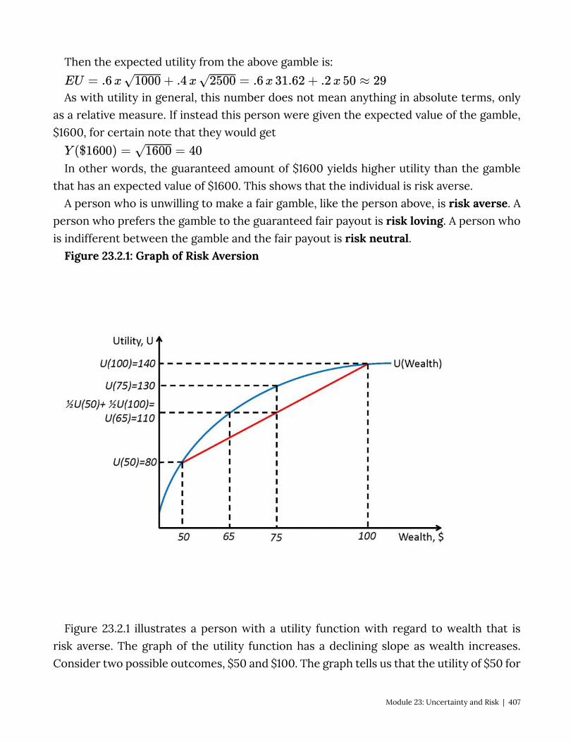
Then the expected utility from the above gamble is:
As with utility in general, this number does not mean anything in absolute terms, only as a relative measure. If instead this person were given the expected value of the gamble, $1600, for certain note that they would get
In other words, the guaranteed amount of $1600 yields higher utility than the gamble that has an expected value of $1600. This shows that the individual is risk averse.
A person who is unwilling to make a fair gamble, like the person above, is risk averse. A person who prefers the gamble to the guaranteed fair payout is risk loving. A person who is indifferent between the gamble and the fair payout is risk neutral.
Figure 23.2.1: Graph of Risk Aversion
Figure 23.2.1 illustrates a person with a utility function with regard to wealth that is risk averse. The graph of the utility function has a declining slope as wealth increases. Consider two possible outcomes, $50 and $100. The graph tells us that the utility of $50 for
Module 23: Uncertainty and Risk | 407

this agent is 80 and the utility for $100 is 140. Remember that the value of the utility has no meaning in absolute terms, only in relative terms. So this agent prefers more wealth to less but the marginal utility of wealth is decreasing. It is precisely this diminishing marginal utility of wealth that leads to risk aversion.
Now consider a game where a coin is flipped and the actual payment, $50 or $100 depends on which side of the coin is showing after the flip. This means that the agent has a 50% chance of getting $50 and a 50% chance of getting $100. In expected value the game is worth $75. The utility of $75 for this agent is 130 as shown in the figure. The expected utility is the average of the utility levels at the two outcomes and can be seen as the midway point on the chord that connects the two points on the utility function. Expected utility is (.5)(80)+(.5)(140)=110. This means that playing this risky game yields a utility of 110 for this agent. What certain payment would yield the agent the same utility? If we look at the figure we see that point (d) on the graph of the utility function is at $65. The difference between the expected value of the gamble, $75, and the amount of the certain payment that yield the same utility as the gamble, $65, is called the risk premium. In this case the risk premium is $10. The risk premium is the amount an agent is willing to pay to avoid the risk of a fair gamble.
Graph of Risk Neutral and Risk Loving Utility Curve Not all individuals are risk averse. An individual with a constant marginal utility of
wealth is risk-neutral and an individual with an increasing marginal utility of wealth is risk-loving. Figure 23.2.2 illustrates both situations using the same scenario as in Figure 23.2.1. Note that there is no risk premium for the risk-neutral individual and the risk-loving individual would actually suffer a cost of the gamble were removed.
Figure 23.2.2: Risk Loving and Risk Neutral Utility Curves
408 | Module 23: Uncertainty and Risk

23.3 Risk Reduction Learning Objective 23.3: Describe how diversification and insurance mitigate risk. Risk-averse individuals wish to diminish or eliminate entirely the risks they face. Even
risk-neutral individuals avoid unfair risks and risk-loving individuals may wish to avoid very unfair risks. The easiest way to avoid risk is to abstain from risky activities, but it is not always possible to do so. A farmer, for example, cannot avoid the inherent variability of the weather. But there are some actions individuals can take to mitigate risk: drivers can drive more carefully, farmers can plant drought resistant crops, travelers can avoid airlines with poor safety records. Often, the ability to mitigate risk though conscious choices requires information about the risks. For example, in order to lower risk from air travel, a traveler would need access to the safety records of airlines.
Another way to reduce risk is through diversification. In a simple example, a farmer might plant a number of different crops – some that grow well in dry conditions and others that grow well in wet conditions so that no matter if it is a wet or a dry year, the farmer will have at least one good harvest. This diversification requires that the risks are perfectly negatively correlated. Risks that are negatively correlated in general can
Module 23: Uncertainty and Risk | 409
be combines to reduce overall risk. For example, consider investing in the stock market. Investing in a few firms in the same industry is risky because their risks are probably positively correlated. If one firm in the automotive industry is doing poorly, it might be because demand for cars is soft and thus all automobile manufacturers might be doing poorly as a result. However, if you invest in many firms across a wide range of industries, it is likely that some will do well while others do poorly and therefore the overall risk will be reduced.
A common way that individuals reduce risk is through the purchase of insurance. Private insurance markets exist thanks to the risk premium described earlier in the chapter. Risk averse individuals are willing to pay a price to avoid or lower risk. Risk averse individuals will always choose to purchase fair insurance. Fair insurance is a contract with an expected value to the insurer is zero – in other words a fair bet. As a simple example, consider an auto insurance policy. Suppose there is a 1% chance a driver will have an accident in a year. If an accident occurs the cost of the damage will be $5000. Thus the expected loss is (.1)($5000) or $50. A fair insurance contract is one that would fully insure against this loss and charge the driver exactly the expected cost, or $50. This contract offers no profit for the insurance company, however. In fact, a risk averse individual would be willing to buy insurance that is less than completely fair due to the risk premium which gives rise to the private insurance industry.
The private insurance industry relies on diversified risk in order to stay in business. If an insurer has 1000 clients, each with a 1% risk of needing to make a claim, it is necessary that the 1% risk is not too positively correlated to avoid situations in which too many insured make claims in thee same year. The insurance company relies on the fact that it can expect, on average, 10 claims a year to keep its business going and not suffer a catastrophic loss from too many insured filing claims in the same year which could bankrupt them. Take mortgage insurance, for example. Insurers will cover the loss to banks if a homeowner with a mortgage defaults. Normally these risks are quite diverse, particularly if the insurer insures mortgages across a diverse geographical area so that an economic downturn in one city, like the closure of a large employer, will not cause too may claims at one time. This is normally a safe strategy but the housing crisis in the United States in 2006 spread across the entire country which lead to a number of mortgage insurers falling into deep crises, most notably American International Group (AIG) which was bailed out by the U.S. Government to the tune of $180 billion dollars and led to the government taking control of the firm.
23.4 Policy Example: Flood Insurance
410 | Module 23: Uncertainty and Risk
Learning Objective 23.4: Apply knowledge of risk and insurance to explain how systematic risk makes risk pools difficult and destroys private markets for insurance.
Risk-averse homeowners whose houses are situated in areas that have a possibility of flooding will have a demand for insurance as long as the insurance contract is within the risk premium the homeowners are willing to pay. But flood insurance is not easy to acquire on the private market. The reason for this is the fact that most people who wish to purchase flood insurance own homes in flood prone areas. Floods are relatively uncommon but very costly. When a flood happens, most homes in the flood area are severely damaged so the risks are very highly positively correlated. This makes insuring against floods very difficult for private insurers who struggle to diversify their risk portfolio and puts them in danger of a catastrophic payout should a flood occur. For this reason, much of private insurance is priced beyond the risk premium of private homeowners. This is exacerbated by the fact that it is common that homeowners in flood probe areas are disproportionately low-income households because flood prone land is generally cheaper than land in higher areas. Lower income households have more limited resourced with which to deal with the costs of a flood should they not have insurance.
For these reasons the federal government has stepped into the flood insurance market and provides subsidized insurance for flood-prone households. The federal government has the resources to deal with correlated risks and expensive payouts that most private insurers do not.
SUMMARY
Review: Topics and Related Learning Outcomes
23.1 What are Risky Outcomes? Learning Objective 23.1: Define risky outcomes and describe how they are assessed. 23.2 Evaluating Risky Outcomes Learning Objective 23.2: Explain expected utility and risk preference. 23.3 Risk Reduction Learning Objective 23.3: Describe how diversification and insurance mitigate risk. 23.4 Policy Example: Flood Insurance
Module 23: Uncertainty and Risk | 411

Learning Objective 23.4: Apply knowledge of risk and insurance to explain how systematic risk makes risk pools difficult and destroys private markets for insurance.
Learn: Key Terms and Graphs
Terms
Probabilities Frequency Expected Value Fair Gamble Expected Utility Risk Averse Risk Loving Risk Neutral Risk Premium
Graphs
Figure 23.2.1: Graph of Risk Aversion Figure 23.2.2: Risk Loving and Risk Neutral Utility Curves
412 | Module 23: Uncertainty and Risk
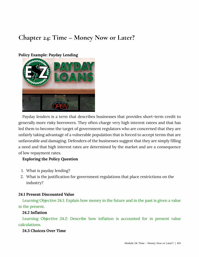
Chapter 24: Time – Money Now or Later?
Policy Example: Payday Lending
Payday lenders is a term that describes businesses that provides short-term credit to generally more risky borrowers. They often charge very high interest ratees and that has led them to become the target of government regulators who are concerned that they are unfairly taking advantage of a vulnerable population that is forced to accept terms that are unfavorable and damaging. Defenders of the businesses suggest that they are simply filling a need and that high interest rates are determined by the market and are a consequence of low repayment rates.
Exploring the Policy Question
1. What is payday lending? 2. What is the justification for government regulations that place restrictions on the
industry?
24.1 Present Discounted Value Learning Objective 24.1: Explain how money in the future and in the past is given a value
in the present. 24.2 Inflation Learning Objective 24.2: Describe how inflation is accounted for in present value
calculations. 24.3 Choices Over Time
Module 24: Time – Money Now or Later? | 413
Learning Objective 24.3: Describe how individuals can use present value to make decisions over time.
24.4 Interest Rates Learning Objective 24.4: Explain how interest rates are determined and how they
change. 24.5 Policy Example: Payday Lending Learning Objective 24.5: Apply knowledge of time in economics to evaluate the role of
payday lenders and to determine if there is a role for the regulation of such lenders. 24.1 Present Discounted Value Learning Objective 24.1: Explain how money in the future and in the past is given a value
in the present. Your grandmother gives you a savings bond that will pay you exactly $100 in one year.
You cannot cash it in until its maturity date so it is not convertible into money until exactly one year. This chapter is about how we value money and other costs and benefits across time. There main force that determines the value of money across time is interest rates. Interest rates determine the return an individual gets for allowing others to use their money for a period of time. Formally, an interest rate is a percentage extra of an amount of money that must be paid to borrow that money for a fixed period of time. For example if put $1000 into a savings account that pays a simple 3% annual interest rate, i, then after one year you would have $1000(1+i) = $1000(1+.03) = $1000*(1.03) = $1030. The interest rate allows us to do such calculations: determine the amount of money a person will gain after a determined amount of time from an investment or savings.
The discount rate is the method of placing a value on future consumption relative to present consumption. In general individuals do not like to wait to consume and waiting is a cost. The discount rate is a measure of the cost of waiting for consumption. Discount rates are personal, each individual has their own depending on how much they dislike waiting for consumption in the future. A person’s willingness to lend money depends crucially on the discount rate. If a person has a very low discount rate, meaning that consumption in the future is almost as desirable and consumption today, they would be willing to loan money for a low interest rate. On the other hand, if they had a high discount rate it would take a high interest rate to get them to lend money because lending that money means it is not available to fund current consumption.
Compounding is the process by which a sum of money, the principle, placed in an account that earns interest periodically will grow based on the interest earned by the principle and by the subsequent interest payments.
For example, if the $1000 in a savings account that pays 3% interest annually will earn
414 | Module 24: Time – Money Now or Later?

$30 after a year as noted above. If that interest is withdrawn, leaving $1000 for the second year, where it would earn another $30 for a total interest income of $60. So after 5 years the total interest earned would be $150, leaving a total of $1150. If instead the interest income is left in the account after the first year, in the second year the account would earn interest on the $1030, or it would earn $1030(1.03) = $1060.90. Thus, the process of compounding interest leads to an additional $0.90 in interest. After 5 years the total is $1000(1.03)(1.03)(1.03)(1.03)(1.03) or $1000(1.03)5 = $1159.27. The additional interest earned with compounding is $9.27 over five years.
The general formula for the growth of money where the interest is left to accumulate is: P(1+i/n)nt. Where P is the original amount of money, the principle, i is the interest rate
in decimal terms, n is the number of times per year the interest is paid, and t is the number of years the principle and interest sits in the account. The more frequent the interest is paid, the faster the money in the account will grow. In the example above, suppose interest is paid quarterly rather than annually, instead of being paid once a year it is paid four times a year. Applying the formula, $1000(1+ .03/4)20 = $1161.18. The more frequent interest payment leads to $11.18 in interest income versus the $9.27 earned with annual payments.
When growth is continuous the exponential function describes the rate of growth. This is used to calculate things like population growth but also for accounts that pay and charge interest continuously, like many bank accounts, savings vehicles and loans. The formula for the growth of money where the interest is left to accumulate for accounts that pay interest continuously is: Pe it. Where e is the exponential function (expressed as ‘exp’ on some calculators). This leads to the most rapid growth in money in an account. Using our example from before the calculation is: $1000e(.03)5 = $1161.83.
Now that we know how interest rates work and are calculated, we can use them to calculate both future values like we have been doing above but also present values. Future value (FV) is the value a sum of money is worth after a period of time if placed into an interest earning account and left to accrue compound interest. Present value (PV) is the value of an amount of money paid at a set time in the future is worth today given some interest rate. The best way to understand present value is to ask the question: how much money would I need to put into an account that earns the market interest rate today to have X amount of money at a specific time in the future. For example, if the market interest rate is 3% and the basic savings account pay interest annually, then the amount of money you would need to place into a savings account today in order to have $103 in exactly one year is $100. So the present value of $103 in a year is $100. Expressed as a formula we would say that PV(1.03) = $103. Solving for PV yields: PV = ($103/1.03) = $100. In general the formula for PV is PV = FV/(1+i)t for annual interest payments. For more
Module 24: Time – Money Now or Later? | 415
frequent payments the formula is PV = FV/(1+i/n)nt. For continuous interest payments the formula becomes PV = FV/e it.
As a final example, suppose you have a bond that will pay $5000 in exactly 6 years. If the market interest rate is 4.2% and accounts are paid continuously, the present value of the sum is PV = $5000/e (.042)6 = $3886.22. Remember that $3886.22 is the exact amount of money you could put into an account that pays 4.2% interest continuously and, if you left the accrued interest in the account, in exactly 6 years you would have $5000. In this way we can compare the value of money through time, both in the future and in the present.
24.2 Inflation Learning Objective 24.2: Describe how inflation is accounted for in present value
calculations. In the future and present value calculations we made above we ignored inflation. But
in general, prices tend to rise over time. So, though we calculate the amount of money we could put in a bank account today to have a precise sum after a fixed period of time, that sum might not buy as much if prices have risen over that time. In other words, the amount of consumption that $100 allows, falls over time if nominal prices rise. What we have done in the previous section is calculate present value in nominal terms, but what we generally want is to calculate present value in real terms using real not nominal prices. For example, if someone asks you to lend them $10 to buy a cheeseburger, you might want to make sure that when they repay it in a year, they repay you enough money to buy the same cheeseburger. If the price of the burger has risen to $12 then you would need to be repaid $2 more to compensate for the price inflation. In real terms the $12 in a year is the same as $10 today.
To adjust for inflation, g, we have to take it into account for our present value calculations. Let’s start with an example of a $100 debt that is due to be repaid in exactly one year. Suppose that inflation is 2%, or g = .02. The real amount you need to repay is $100 but the nominal amount is $100(1+g) or $102. This is how much you would need to repay for the lender to be able to buy the same amount of consumption as they could with $100 a year ago. Alternatively, the real value today of $102 paid in a year is $100.
To calculate the real present value if this future payment, we have to use the interest rate as before. To keep it in real terms we need to convert the nominal interest rate to a real interest rate by adjusting it for inflation using the inflation rate. If r is the real interest rate,say3%,thenthevalueof$100nextyearis$103inrealterms.Toconvertthisto
nominal value we have to multiply by (1+g) as seen above. If g is 2% then we multiply $103
416 | Module 24: Time – Money Now or Later?
by (1+.02) to get $105.06. This is the amount that the borrower would have to repay in order for the real value of the repayment to be a 3% gain.
Not that the formula for this calculation is: P(1+r)(1+g), where P is the principle amount (in this case $100). From this it is possible to describe the general formula for the nominal interest rate, i, as: 1+i = (1+r)(1+g). Solving for i yields:
i = r + r g + g Solving this equation for r yields:
Note that if the interest rates and inflation rates are low, then 1+g is very close to 1 and the relationship between the real and nominal interest rates can be approximated as: r ≈ i – g ,
or the nominal interest rate minus inflation. In our example the approximation is that the real interest rate is the nominal interest rate, 3%, minus the inflation rate, 2%, which is 1%. Since (.03-.02)/(1+.02) equals .098, or .98% you can see the approximation is very close but not exactly the real interest rate.
To calculate the real present value of a sum of money we use the real interest rate rather than the nominal interest rate. For example, using our values for nominal interest rates and inflation we can calculate the value of $100 in a year as worth $100/(1+.0098) or $99.03 in real terms. Note that in nominal terms this would be $100/(1+.03) or $97.09. The difference is the erosion in the real value of the money due to inflation over the year. If you put $97.09 in an account earning 3% interest you would get exactly $100 in a year but that $100 in a year would not buy the same amount of consumption as $100 today would. So in order to get the same consumption as $100 today in a year, you need to put $99.03 in the account today (and you would get $102 in nominal dollars in a year which is exactly $100 times the inflation rate).
24.3 Choices Over Time Learning Objective 24.3: Describe how individuals can use present value to make
decisions over time. Now that we now know how to evaluate money and consumption across time, we
can begin to study decisions across time. Let’s start with an example: the owner of a business can invest in a new production technology that will increase profits by $150,000 a year for five years. The cost of this technology is $450,000. Should the owner make this investment? Without thinking about time, you might think the answer is immediately obviously yes as the stream of extra profits is $750,000 and the cost is $700,000. However,
Module 24: Time – Money Now or Later? | 417
by using this logic we are ignoring the fact that the owner has to wait for the extra profits. In order to compare the $700,000 expenditure today to the future profits we need to bring the future profits into the present. To do so we need the interest rate, so for this example suppose the real interest rate is 2%. Our calculation is:
Note that each of the payments is appropriately brought into real present value terms based on the formula and summed together. Since the real present value of the return on the investment is $694,655.13 and the real present cost of the investment is $700,000, the answer to our question is actually no, the owner should not make the investment.
A different way to think about the same kind of investment decisions is to think about the net present value which considers the difference between the present value of the benefits of an action and the present value of the costs of the action. A rational economic actor such as a firm should undertake an investment only if the present value of the returns on the investment, R, are greater than the present value of the costs of the investment, C, or if R > C. Since net present value (NPV) is simply the difference in the two, the statement is equivalent to saying that the investment should only happen if net present value is positive, which gives us this rule:
To calculate this, assume that the initial year is t = 0, the firm’s revenue in year t is Rt
and the firms cost in year t is Ct. The stream of revenues and costs ends in year T. The net present value rule is:
NPV = R – C
Note that revenue minus costs is similar to profit, , and is profit if fixed and opportunity costs are included in . We can rewrite the NPV rule as a cash flow rule (or profit rule) which states that a firm should only undertake an investment if the net present value of the cash flow is positive. We can do this by rearranging terms in the expression above:
The expression makes clear that the decision to make an investment that has revenues
418 | Module 24: Time – Money Now or Later?
and costs into the future does not depend on the annual cash flow but on the present value of the net cash flow so that even an investment that has years in which there is a negative return in cash flow terms can be a good investment over the life of the investment. For example, consider an investment that costs $50 million in the first year and $20 million a year for two more years. In the first year there is no revenue, in the second revenue is $10 million and in the third revenue is $100 million. Using the NPVformula with a real interest rate of r = 3%:
So the firm should make this investment even though cash flow is negative for the first two years.
24.4 Interest Rates Learning Objective 24.4: Explain how interest rates are determined and how they
change. Interest rates determine investment decisions. At the most basic level interest rates
represent the opportunity cost of investing money if the alternative is to put the money into an interest earning savings account. But where does the market interest rate get determined? The market for borrowing and lending money is called the capital market where the supply is the amount of funds loaned, the demand is the amount of funds borrowed and the price is the interest rate itself. The capital market is a competitive market and as such the interest rate is determined in equilibrium. The market interest rate is the rate at which the quantity of funds supplied equals the quantity of funds demanded.
Figure 24.4.1: Capital Market Equilibrium
Module 24: Time – Money Now or Later? | 419
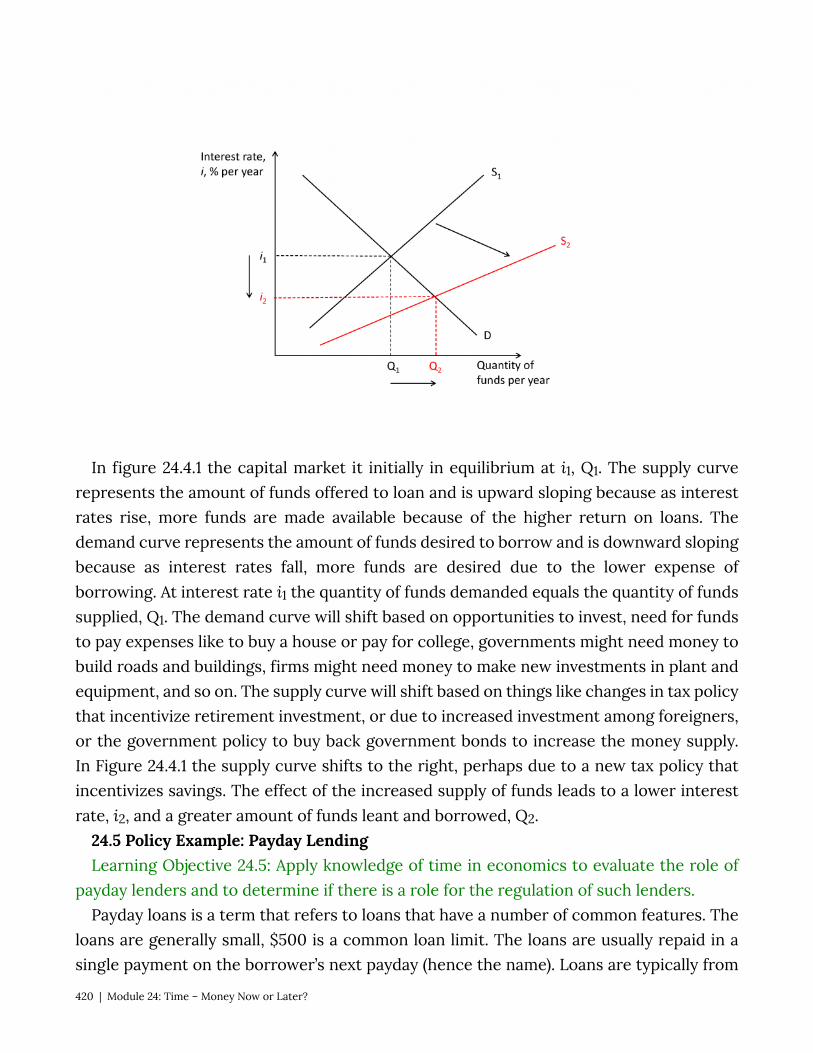
In figure 24.4.1 the capital market it initially in equilibrium at i1, Q1. The supply curve represents the amount of funds offered to loan and is upward sloping because as interest rates rise, more funds are made available because of the higher return on loans. The demand curve represents the amount of funds desired to borrow and is downward sloping because as interest rates fall, more funds are desired due to the lower expense of borrowing. At interest rate i1 the quantity of funds demanded equals the quantity of funds supplied, Q1. The demand curve will shift based on opportunities to invest, need for funds to pay expenses like to buy a house or pay for college, governments might need money to build roads and buildings, firms might need money to make new investments in plant and equipment, and so on. The supply curve will shift based on things like changes in tax policy that incentivize retirement investment, or due to increased investment among foreigners, or the government policy to buy back government bonds to increase the money supply. In Figure 24.4.1 the supply curve shifts to the right, perhaps due to a new tax policy that incentivizes savings. The effect of the increased supply of funds leads to a lower interest rate, i2, and a greater amount of funds leant and borrowed, Q2.
24.5 Policy Example: Payday Lending Learning Objective 24.5: Apply knowledge of time in economics to evaluate the role of
payday lenders and to determine if there is a role for the regulation of such lenders. Payday loans is a term that refers to loans that have a number of common features. The
loans are generally small, $500 is a common loan limit. The loans are usually repaid in a single payment on the borrower’s next payday (hence the name). Loans are typically from
420 | Module 24: Time – Money Now or Later?
two to four weeks in duration. Most lenders do not evaluate individual borrowers ability to repay the loan. As the U.S. Consumer Financial Protection Bureau states:
Many state laws set a maximum amount for payday loan fees ranging from $10 to $30 for every $100 borrowed. A typical two-week payday loan with a $15 per $100 fee equates to an annual percentage rate (APR) of almost 400 percent. By comparison, APRs on credit cards can range from about 12 percent to about 30 percent. In many states that permit payday lending, the cost of the loan, fees, and the maximum loan amount are capped.
Critics of payday lenders argue that the effective interest rates they charge (in the form of fees) are exorbitantly high and that these lenders are talking advantage of people with no other source of credit. The lenders themselves argue that credit markets are competitive and therefore the interest rates they charge are based on the market for small loans to people with very high default rates. The fact that borrowers are willing to pay such high rates suggests that the need for short-term credit is very high. On the other hand, critics suggest that the willingness to pay such high rates is evidence that consumers do not fully understand the costs or are driven out of desperation to borrow.
As seen in the quote above, many states have responded to the growth in payday lending with regulations that cap the loan amounts and limit the fees that the lenders can charge. Governments worry about low-income people being trapped in a cycle of debt which effectively lowers their incomes even further due to the payment of fees. This does not address the source of the problem, however, which is the cause of the need for short term credit itself.
See: https://www.consumerfinance.gov/ask-cfpb/what-is-a-payday-loan-en-1567/
SUMMARY
Review: Topics and Related Learning Outcomes
24.1 Present Discounted Value Learning Objective 24.1: Explain how money in the future and in the past is given a value
in the present. 24.2 Inflation
Module 24: Time – Money Now or Later? | 421
Learning Objective 24.2: Describe how inflation is accounted for in present value calculations.
24.3 Choices Over Time Learning Objective 24.3: Describe how individuals can use present value to make
decisions over time. 24.4 Interest Rates Learning Objective 24.4: Explain how interest rates are determined and how they
change. 24.5 Policy Example: Payday Lending Learning Objective 24.5: Apply knowledge of time in economics to evaluate the role of
payday lenders and to determine if there is a role for the regulation of such lenders.
Learn: Key Terms and Graphs
Terms
Interest Rate Discount Rate Compounding Future Value Present Value
Net Present Value Capital Market
Graphs
Figure 24.4.1: Capital Market Equilibrium
422 | Module 24: Time – Money Now or Later?

Creative Commons License
This work is licensed by Patrick M. Emerson under a Creative Commons Attribution-NonCommerical-Share Alike 4.0 International License (CC BY-NC-SA)
You are free to: Share — copy and redistribute the material in any medium or format
Adapt — remix, transform, and build upon the material
The licensor cannot revoke these freedoms as long as you follow the license terms.
Under the following terms: Attribution — You must give appropriate credit, provide a link to the license, and indicate if
changes were made. You may do so in any reasonable manner, but not in any way that suggests the licensor endorses you or your use.
NonCommercial — You may not use the material for commercial purposes. ShareAlike — If you remix, transform, or build upon the material, you must distribute your contributions
under the same license as the original. No additional restrictions — You may not apply legal terms or technological measures that legally restrict
others from doing anything the license permits.
Creative Commons License | 423
Recommended Citations
APA outline: Source from website:
• (Full last name, first initial of first name). (Date of publication). Title of source. Retrieved from https://www.someaddress.com/full/url/
Source from print:
• (Full last name, first initial of first name). (Date of publication). Title of source. Title of container (larger whole that the source is in, i.e. a chapter in a book), volume number, page numbers.
Examples
If retrieving from a webpage:
• Berndt, T. J. (2002). Friendship quality and social development. Retrieved from insert link.
If retrieving from a book:
• Berndt, T. J. (2002). Friendship quality and social development. Current Directions in Psychological Science, 11, 7-10.
MLA outline: Author (last, first name). Title of source. Title of container (larger whole that the source
is in, i.e. a chapter in a book), Other contributors, Version, Number, Publisher, Publication Date, Location (page numbers).
Examples
424 | Recommended Citations

• Bagchi, Alaknanda. “Conflicting Nationalisms: The Voice of the Subaltern in Mahasweta Devi’s Bashai Tudu.” Tulsa Studies in Women’s Literature, vol. 15, no. 1, 1996, pp. 41-50.
• Said, Edward W. Culture and Imperialism. Knopf, 1994.
Chicago outline:
Source from website:
• Lastname, Firstname. “Title of Web Page.” Name of Website. Publishing organization, publication or revision date if available. Access date if no other date is available. URL .
Source from print:
• Last name, First name. Title of Book. Place of publication: Publisher, Year of publication.
Examples
• Davidson, Donald, Essays on Actions and Events. Oxford: Clarendon, 2001. https://bibliotecamathom.files.wordpress.com/2012/10/essays-on-actions-and-events.pdf.
• Kerouac, Jack. The Dharma Bums. New York: Viking Press, 1958.
Recommended Citations | 425
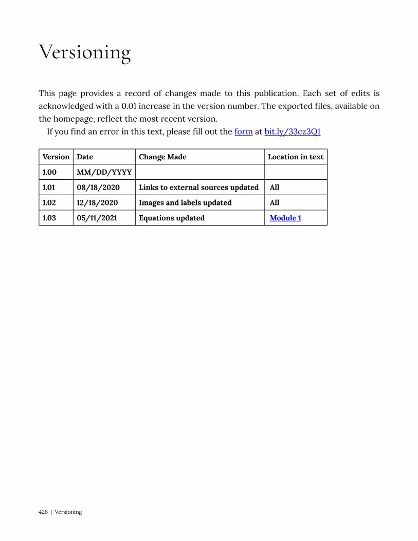
Version Date Change Made Location in text
1.00 MM/DD/YYYY
1.01 08/18/2020 Links to external sources updated All
1.02 12/18/2020 Images and labels updated All
1.03 05/11/2021 Equations updated Module 1
Versioning
This page provides a record of changes made to this publication. Each set of edits is acknowledged with a 0.01 increase in the version number. The exported files, available on the homepage, reflect the most recent version.
If you find an error in this text, please fill out the form at bit.ly/33cz3Q1
426 | Versioning