
Intelligent Kiosk Design - narrow-casting.nl
21
Developed and published by A guide from KioskMarketplace.com ere’s more to designing a kiosk than throwing a computer in a box. Learn how to use form, function and forethought to make a kiosk irresistible to customers. Sponsored by Intelligent Kiosk Design
-
Upload
khangminh22 -
Category
Documents
-
view
0 -
download
0
Transcript of Intelligent Kiosk Design - narrow-casting.nl

Developed and published by
A guide from KioskMarketplace.com
!ere’s more to designing a kiosk than throwing a computer in a box. Learn how to use form, function and forethought to make a kiosk irresistible to customers.
Sponsored by
Intelligent Kiosk Design
2© 2010 NetWorld Alliance LLC | Sponsored by Olea Kiosks
Contents
Page 3 About the sponsors
Page 4 Introduction | !e century of design
Page 5 Chapter 1 | Big-picture project planning — a five-step approach What is the application? Where will it be located? What is the form factor? What type of hardware is needed? What software will drive it?
Page 10 Chapter 2 | !e finer points: considerations that a"ect all five steps Usable aesthetics Branding Component selection Ergonomics and accessibility Keeping clutter out of the design
Page 18 Chapter 3 | !e convergence of kiosks and digital signage Design in the digital revolution ADA compliance
Page 21 Chapter 4 | Final thoughts
Intelligent Kiosk Design
3© 2010 NetWorld Alliance LLC | Sponsored by Olea Kiosks
About the sponsors
Published by NetWorld Alliance.© 2010 NetWorld Alliance LLCWritten by James Bickers, contributing writer, KioskMarketplace.com. Updated by Richard Slawsky, contributing editor, KioskMarketplace.com.Dick Good, CEOTom Harper, president and publisherAndrew Davis, senior vice president, sales and marketingJoseph Grove, vice president and executive editor
Olea Inc. has more than 35 years of experience in building kiosks, interactive displays, trade show exhibits and custom enclosures. !e company o"ers complete design, construction and integration services.
KioskMarketplace.com, owned and operated by Louisville, Ky.-based NetWorld Alliance, is the world’s largest online provider of information about and for the kiosk and self-service-technology industries. !e content, which is updated every business day and read by business and industry professionals throughout the world, is free.

4© 2010 NetWorld Alliance LLC | Sponsored by Olea Kiosks
Introduction
By James Bickers Contributing writer,
KioskMarketplace.com
There’s an old carpenter’s adage that bears repeating any time a new project is begun: measure twice, cut
once.
For those embarking on a new self-service project, that little adage can become a mantra during the project. Planning and executing a kiosk deployment involves a large number of moving pieces — literal moving pieces, in addition to the metaphorical ones — and the more good decisions that are made in the initial planning stage, the more time and money will be saved.
When designing a kiosk, a multitude of issues revolving around hardware configurations and installation locations must be considered, as well as the overall functionality. The design process involves understanding forming raw materials like sheet metal and wood into attractive enclosures ready for technological integration.
It also involves an understanding of aesthetics, of customer perception, of branding and marketing goals.
Kiosk design requires a deep understanding of usability in how consumers will interact with the device, as well as how it will affect their lives through convenience.
At one time, it was sufficient that a machine successfully carried out whatever function for which it was intended. The first ATMs didn’t need to be beautiful, they just needed to dispense cash.
Those days are over. Kiosk design goes beyond merely answering the question “Does it work?” It goes into questions that are much harder to answer, like “How do I want the customer to feel when using the device?”
Answering those questions calls for a multidisciplinary process from the very beginning.
This document breaks the planning process down into five steps, which can be seen on page five. Start the planning process by passing that list on to each member of a deployment team — the tech person, the marketing person, the project manager, etc. — and asking them to consider all five steps. The end result will be a handful of lists that will reveal some enlightening similarities and differences. The remainder of this guide will help kiosk deployers work through those steps and ensure a successful project.
We’d like to thank Olea Kiosks Inc., whose sponsorship of this guide allows us to provide it to you at no charge.
!e century of design
Kiosk design goes beyond merely answering the question “Does it work?” It goes into questions that are much harder to answer, like “How do I want the
customer to feel when using the device?”

5© 2010 NetWorld Alliance LLC | Sponsored by Olea Kiosks
A journey of a thousand miles begins with one step. The journey to build and deploy your self-
service project begins with five steps, as recommended by Frank Olea, CEO of Artesia, Calif.-based Olea Kiosks Inc, a provider of kiosk solutions.
What is the application?This may seem so obvious as to be self-evident, but surprisingly, companies often get their projects started on an entirely wrong foot by losing focus on the biggest picture of all: what, exactly, the machine is supposed to do.
“The client should never lose sight of what the kiosk was originally intended to do,” Olea said. “During the discovery or design phase, the client can easily be distracted by bells and whistles. It’s often that I find myself speaking with clients about a kiosk application and it seems as though they can only focus on key features or ideas they’ve seen elsewhere that they’d like to incorporate.”
Getting caught up in the whirl of possibilities and available features at this early stage in development is analogous to an auto manufacturer making plans for the stereo system before designing the drive train and engine. For self-service, focusing on technology prior to operational focus is putting the cart before the horse.
“Don’t start asking questions about software and hardware until you understand the business and what the business drivers are,” said Brian Ardinger, vice president of business development for Lincoln, Neb.-based software developer Nanonation. “People approach a kiosk
asking ‘What type of box do I need,’ instead of asking ‘How is this going to affect my customer and my business.’ You have to get those questions answered before you start looking at any technology whatsoever.”
A good rule of thumb: The purpose and intent of a kiosk program should be able to be summarized in one brief sentence.
Where will it be located?Again, this is territory so familiar it rises to the form of cliché: It is impossible to discuss this concept without referring to the old real estate adage about location.
But sometimes, things become clichés because they are so utterly true. Selecting placement for a kiosk program is one of the most important things a business will do.
“I always saw this as a common-sense item, but there still continue to be failures in this area,” said Derek Fretheim, president of Trabuco Canyon, Calif.-based I.T. consultancy Acire Inc. “Retailers use end-caps to sell and spotlight products. They position products in the center of the
Chapter 1 Big-picture project planning — a five-step approach
What is the application?1.
Where will it be located?2.
What is the form factor?3.
What type of hardware is needed?4.
What software will drive it?5.
The !ve steps of project planning

6© 2010 NetWorld Alliance LLC | Sponsored by Olea Kiosks
CHAPTER 1 Big-picture project planning — a five-step approach
shelves. Yet I still see a kiosk next to a trash can or stuck in a corner.”
Fretheim’s comment underscores an important point: Kiosks should be thought of as product offerings, not facilities.
Restrooms can be placed in any location necessary, because customers will seek those out when they need them. In a grocery store, milk does not have to be featured prominently at the front of the store — again, customers will find it because they need it.
Self-service devices, however, need places of prominence.
“Unless you’ve got a serious advertising budget and are planning on promoting your self-service device to the general public, they won’t come into your store looking for a kiosk,” Olea said.
Fretheim says the importance of marketing the kiosk once it is placed cannot be overstated, and as a result the chosen location must be one that will allow such marketing efforts.
“I have a grocery store in my area that placed the kiosk right at the main entrance next to the shopping carts,” he said. “They really did a nice job marketing this location with floor graphics and hanging signs. During the first two weeks, they had an employee set up next to the kiosk, talking with customers and showing them how they can get coupons by swiping their loyalty card. This kiosk gets swiped nearly once every 60 seconds.”
Olea pointed out another key challenge of location planning: regulatory compliance.
“If a kiosk is placed in a corner, a person in a wheelchair could not approach the machine properly,” he said. “Placed on top of a landing that requires stairs to get on top of would also make it impossible for some patrons to access.”
And servicing the machine — which is inevitable — becomes an issue.
“A wall-mounted kiosk placed in an inaccessible spot might cause you to have longer-than-necessary service calls,” he said.
Kiosks bene!t from high-tra"c locations. At Giant Food grocery stores in Pennsylvania, the machines are scattered strategically throughout the store.

7© 2010 NetWorld Alliance LLC | Sponsored by Olea Kiosks
What is the form factor?When the ATM made its debut, it came in one shape: square. Today, self-service devices are available in every shape, size and color imaginable.
Selecting the right form factor involves taking existing fixtures into account, and developing a look and size that is an extension of what already is in the store.
“Kiosks are almost always going into an existing retail environment, which means existing layouts and fixtures, and a space that was never designed for kiosks,” said Glen Fossella, vice president of marketing for Charlotte, N.C.-based Source Technologies, a provider of self-service kiosks. “So for our customers, smaller is always better. Some might argue that branding can also drive the form factor, but branding can be accomplished in so many ways, and keeping the form factor compact gives our clients maximum flexibility in how they use the balance of the environment for branding or other purposes.”
Keep in mind that size and price aren’t always related. In much the same way that laptop computers are more expensive than desktops, mini-kiosks can be pricier than floor-standing models, since internal components have to be smaller.
Maintenance also can be tougher, once again because of the diminutive size of the components.
“We see clients going for form factor based on necessity,” Olea said. “It might be that floor space is at a premium in their facility,
so placing the kiosks on a wall that can still have product below it might be best.”
Large environments might need a mix of floor standing and mini models. In this case, work with the manufacturer to make sure parts are as modular as possible, in order to cut down on maintenance expenses and make repairs easier.
What type of hardware is needed?Unless kiosk users are saints, the machine is going to take abuse over the course of its life. This is not to say customers will abuse the machines intentionally (although some of them will) — only that being a
CHAPTER 1 Big-picture project planning — a five-step approach
Today, self-service devices are available in every shape, size and color imaginable.
8© 2010 NetWorld Alliance LLC | Sponsored by Olea Kiosks
technology device in a public space is physically demanding.
Cutting corners on hardware costs can lead to massive headaches in the long run. Olea recommends asking any prospective hardware provider tough questions before making a purchase.
“A good rule of thumb is if it sounds cheap, it probably is,” Olea said. “Nobody has magic suppliers that can give them the best product for the cheapest prices. Check your manufacturer’s build quality. Is the fit and finish right? Do the doors close properly or do you have to fight them? Can you take a keyboard out if it needed to be repaired or do you need a degree in advanced yoga to get the bolts out?”
It often is said that when an auto dealer gets ready to resell a vehicle, the first thing he does is put new rubber pads on the brake and accelerator pedals. When studying hardware options, look closely at the peripherals that get the most wear and tear.
“Generally, just by looking at items like keyboards and printers, you can tell when something doesn’t seem to be built to last,” Olea said. “Remember, the public can be very brutal to kiosks. Trying to save a dollar now might cost you several dollars later due to broken hardware.”
What software will drive it?Finally, once the machines are purchased and their places within the store environment have been chosen, it is time to power them up. But what software will drive the kiosks?
Options are plentiful here, and range from off-the-shelf packages that allow drag-and-drop interface creation to bare-bones open-source tools that intrepid deployers can use to build an application from the ground up.
For devices that will interact with the company’s existing databases — like price look-up or gift registry, for instance — it is essential that a deployer doesn’t attempt to reinvent the wheel.
The kiosk front end should be designed to interface with the store’s existing back end, in which case the kiosk becomes just one more extension of the store’s current IT framework.
Many kiosk software packages are built to provide exactly this functionality.
CHAPTER 1 Big-picture project planning — a five-step approach
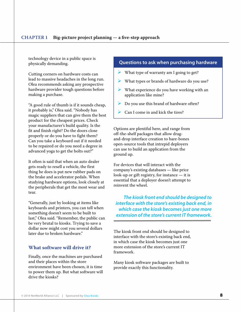
What type of warranty am I going to get?
What types or brands of hardware do you use?
What experience do you have working with an application like mine?
Do you use this brand of hardware often?
Can I come in and kick the tires?
Questions to ask when purchasing hardware
The kiosk front end should be designed to interface with the store’s existing back end, in
which case the kiosk becomes just one more extension of the store’s current IT framework.

9© 2010 NetWorld Alliance LLC | Sponsored by Olea Kiosks
Financial transactions are inherently complex, and any kiosk that will process payments of one sort or another should be tightly integrated into the existing POS system.
And sometimes, a custom software application is the only answer. That was the case with Canadian firm CDSoft Inc., which develops kiosks for auto dealer service departments. The machines “bust lines” by allowing customers to drop off their vehicles after hours, using the kiosks to start their own work orders.
Richard Deslauriers, president of CDSoft, says the company faced a unique challenge in integration.
“In the car dealer industry, there are two
major software vendors — Reynolds & Reynolds and ADP,” he said. “The most important thing we had to accomplish was to create an interface to these systems, because they represented more than 70 percent of the market share.”
Above all, avoid the mistake of thinking an existing Web presence can be ported to a kiosk. Web applications are designed to be accessed via a mouse, and usually are poorly suited to the kiosk interface of choice, a touchscreen.
Although the code behind the scenes still might be delivering the same information, the front end of a kiosk application needs to look very different from a website — larger buttons, fewer details on one screen, etc.
CHAPTER 1 Big-picture project planning — a five-step approach

10© 2010 NetWorld Alliance LLC | Sponsored by Olea Kiosks
Chapter 2 !e finer points: considerations that a"ect all five steps
The five steps covered in the previous chapter represent the “airplane-level” view of kiosk
design. In this section, we’ll get closer to the ground and move away from the theoretical into the practical.
Usable aestheticsIn the ongoing battle between form and function, a balance must be struck. Devices must work, and they must look great. Customers are no longer willing to accept one or the other.
Olea Kiosks’ CEO, Frank Olea, points to a concept he calls “usable aesthetics,” in which visual elements are turned into functional ones, and vice versa.
“A feature such as a shelf designed into the kiosk to make the user experience easier is an example of a usable aesthetic,” he said. “The balance lies in design vs. cost vs. usability. Adding a shelf to a kiosk might add cost and might not make the kiosk look the best. But does it make the user experience a whole lot better? If the answer
is yes, then the designer should look into incorporating a shelf but might have to use a different material or something to turn the shelf into an aesthetic feature instead of an eyesore.”
At the Bytes Café in Canterbury, England, touchscreen kiosks sit atop every table, waiting to take customer orders. The cabinets were custom designed to fit the look and feel of the restaurant — and that aesthetic sensibility extended all the way down to the manufacturing level.
“It has a contemporary feel that fits the restaurant’s appearance and environment,” said engineer Mark Bate, who helped design the kiosks. “This was achieved by housing the screen in a stainless steel case that was cut with water to avoid being able to see any joints in the stainless steel.”
In Irvine, Calif., 30 Minute Photos revamped its retail space to offer a “boutique approach” to photo kiosks. Gone were the solitary machines sitting on countertops; in their place are new, user-friendly kiosks situated in front of comfortable chairs.
At the Bytes Café in Canterbury, England, customers place their orders on kiosks built into each table. The kiosks were designed to !t the overall aesthetic of the restaurant.

11© 2010 NetWorld Alliance LLC | Sponsored by Olea Kiosks
CHAPTER 2 !e finer points: Considerations that a"ect all five steps
“We wanted to create a very friendly, non-high-tech appearance,” said 30 Minute Photos owner Mitch Goldstone. “With the changed evolution of the photo industry, today’s successes mandate the services be very easy to understand and use. Aesthetics are critical for differentiating and making sure customers enjoy their experience. It must be clean and inviting.”
The concept of usable aesthetics doesn’t just apply to hardware — it plays a big role in user interface design, as well.
“Kiosk UI design presents challenges for most kiosk vendors and their customers,” said Source Technologies’ Fossella. “Developing these customer-facing applications requires proficiency in all electronic media: graphic arts, static and full-motion graphics, and effective Web design.”
Fossella said there are six aesthetics-related questions that need to be asked when choosing a kiosk’s software application:
Are the UI screens attractive and easy on the eye, or are on-screen objects crowded or confusing in their positioning and labeling?
Are kiosk devices well integrated with the UI process flow? How easily do users find and interact with cash acceptors, card readers, PIN pads, etc.?
Does the design account for hardware and network latencies? Does it apply user input “threading” or other techniques to minimize the perception of waiting?
Do fonts and color schemes ensure that on-screen signage is legible?
Does the signage attract users? Is it consistent with store signage and overall branding?
How well does the design allow consumers to control their own experience?
BrandingMany of the topics covered so far fall under the category of “science” — easily quantifiable, with fairly firm guidelines for what works and what doesn’t.
Once the realm of branding is entered, however, deployers have departed science and entered the arts.
“Oftentimes when designing a kiosk, the client has a very definite brand identity,” Olea said. “The trick is to bring that into
BMW’s kiosk initiatives have leveraged the rich media assets of a very high-pro!le brand.
12© 2010 NetWorld Alliance LLC | Sponsored by Olea Kiosks
CHAPTER 2 !e finer points: Considerations that a"ect all five steps
the self-service space. Brand identity might not just be a logo or a color scheme. Oftentimes, clients think that painting a kiosk in their corporate colors is the key. Or take it a step further and brand the kiosk by placing graphics all over it. This doesn’t always work. Sure, it’s obviously owned by that company, but does it really speak about that brand?”
The branding discussion brings up an important distinction, and one that has to be agreed upon at the corporate level:
Self-service is not an IT initiative, nor is it a marketing initiative. It is a unique blend of the two, and both camps need to exercise give and take.
Nanonation’s Ardinger says one of the biggest mistakes companies make when deploying self-service is to treat it as strictly an IT project.
“They take it from a software development approach rather than a marketing approach,” he said. “It’s about how it matches with the customer’s perception of the brand. Is it consistent with the other ways the business is trying to communicate with the customer? Is it a similar look and feel, with similar terminology?”
Ardinger points out that good branding does not necessarily mean a “one-visual-fits-all” approach — that is, where all collateral media across all channels are identical. Rather, they must imply one another in ways that make sense to the customer.
“It doesn’t have to be the exact same terminology or experience as, say, the company’s website,” he said. “It doesn’t
have to be one-for-one branding, where Button A here looks like Button A over here. But it has to be consistent enough that there’s not a disconnect between what the customer is expecting and what is being delivered on screen.”
Branding extends far beyond software and into the physical presence of the kiosk in the company’s environment. When BMW North America kicked off its kiosk program in 2001, it had to meet the stringent requirements of a very high-end brand with equally high expectations.
BMW’s Robert Plante said the company got what it wanted in terms of its kiosks’ aesthetics by “being very tough and demanding about what we wanted.”
BMW is a brand built upon a perception of very high quality, and Plante says the company was rigorous in making sure its kiosks gave that same perception. The kiosks, which include product-information machines in every BMW Center as well as wireless “surfboard” kiosks that can be taken to remote events, are visually striking and memorable — again, perfectly in keeping with the BMW brand.
Olea says making such a synergy between an existing brand and a new device takes a variety of disciplines, from design and material selection to manufacturing processes.
Self-service is not an IT initiative, nor is it a marketing initiative. It is a
unique blend of the two, and both camps need to exercise give and take.

13© 2010 NetWorld Alliance LLC | Sponsored by Olea Kiosks
“We really study the client’s brand from top to bottom to understand what the brand means and try to capture that in the kiosk design,” he said. “Making a kiosk out of an exotic material, using a special paint technique or placing graphics in key locations might be what’s needed to drive the brand home.”
For the Colorado company RealTime Shredding, a visual brand is an essential component of its business. The firm, which manufacturers and deploys a kiosk that provides high-security shredding for a per-minute fee, designed its machine to convey a feeling of security, stability and strength.
“We experimented with colors and looked at a number of enclosure designs early on to find a balance between security objectives and design objectives,” said Amanda Verrie, president of RealTime Shredding. “We believe the current self-service shredder conveys a feeling of strength and security, important for a tool that assists in the prevention of identity theft.”
Component selectionWhen it comes time to select the nuts and bolts — or, rather, the touchscreens and keyboards — that will make up a kiosk, there are two prevailing schools of thought: deployers can build it themselves using the best parts they can find, or they can use a trusted vendor to provide a complete solution.
Fossella says his customers seem to be tending toward the latter.
“The market is telling us that the ‘roll-
Enclosures can be custom manufactured from the ground up, such as this green kiosk from Olea, or deployers can begin with an o#-the-shelf model and make modi!cations from there.
your-own’ stage of the kiosk industry is rapidly coming to a close,” he said. “Clients expect us to deliver a business solution and are pushing device component selection, among other things, over to our side of the table.”
Even so, it still is important to know exactly what goes into the box, and how to ask a vendor the right questions.
Some key areas to watch:
CHAPTER 2 !e finer points: Considerations that a"ect all five steps

14© 2010 NetWorld Alliance LLC | Sponsored by Olea Kiosks
Touchscreens: While all touchscreens aim to do the same thing, they use very different mechanisms to do so. Surface acoustic wave (SAW) technology measures the sound made when a finger touches the glass, while capacitive touchscreens use a low voltage electric charge to measure activity. And resistive technology uses a very thin coating that flexes when touched, making contact with the glass and producing a signal.
By and large, touchscreen choice will be a factor of environment and expected duty cycle. Olea recommends capacitive screens because of their ability to deal with dust, but added that other flavors have their respective uses.
Enclosures: The kiosk market is filled with options for enclosures, many of which will work for many applications right off the truck. Custom-designed enclosures can do much to set off a project and make it distinctive, but might not always be the best choice for entry-level deployments.
“Why invest the money in a custom design now when you don’t yet know what’s going to work for you?” Olea said. “If your vendor has an off-the-shelf kiosk that you love, why not go with it?”
“Standard kiosks are always better to use in a beta test rollout or small-scale project,” Acire’s Fretheim said.
Keyboards and input devices: Although touchscreens are the predominant form of user interaction with a kiosk, many projects will benefit from the addition of a keyboard and perhaps a trackball or other
It is important to know exactly what goes into the [kiosk], and how to ask a
vendor the right questions.
pointing device.
Obviously, off-the-shelf $10 keyboards are doomed to immediate failure in a public environment. But specialty keyboards and trackballs are becoming more and more rugged, able to withstand the abuse a kiosk will take.
“Make sure your keyboards are quality, just like the touch technology chosen,” Fretheim said. “Dead keyboards kill projects.”
Card readers, bill acceptors and dispensers: If the kiosk is going to accept payments, these devices become crucial. While some kiosks have succeeded without a cash acceptor (the United Postal Service’s Automated Postal Center, for instance), prevailing wisdom says a machine should be able to accept as many forms of payment as possible.
That said, select an acceptor that is aligned with expected transaction volume.
“Bill acceptors can range from inexpensive vending-grade types all the way up to multinote acceptors with locking safes and large-capacity cassettes,” Olea said. “If you only intend on taking $1 bills and only every so often, why would you go with a banking-grade bill acceptor that can hold thousands of bills? Maybe a vending-machine grade might be better and save
CHAPTER 2 !e finer points: Considerations that a"ect all five steps

15© 2010 NetWorld Alliance LLC | Sponsored by Olea Kiosks
you several hundred dollars per kiosk in the process.”
Printers: The workhorse of a kiosk, the printer also is the component with the most moving parts — and, therefore, the component most likely to break down. Choose a printer made by a manufacturer with a long, reliable track record. Pay careful attention to the availability and cost of replacement parts and repair services.
For most kiosk applications, thermal printers with guillotine cutters are the most efficient choice. Fretheim emphasizes the importance of buying high-quality paper.
“Don’t go cheap on paper quality,” he said. “Paper makes the difference in output, not the printer.”
Some applications may benefit from using a laser printer within a kiosk, but those are in the minority. Laser printing brings with it a higher cost — both in terms of original hardware and the toner used over time — but in some cases, as with a kiosk that prints full sheets of coupons, it may be a trade-off worth making.
Ergonomics and accessibilityOn July 26, 1990, President George H.W. Bush signed Public Law 101-336, 104 Stat. 327 — better known as the Americans with Disabilities Act. In broad terms, the law imposes penalties on businesses that discriminate against individuals with recognized disabilities.
For deployers of self-service, there are practical ramifications to the law — but
according to industry experts, it makes good business sense to keep devices accessible to all, whether or not there is a regulatory reason.
“Ergonomics is where good kiosk design starts,” said Fossella. “Every other aspect of the design wraps around it. Except for very unique environments, we believe one should take a standard approach based on well-defined user personas.
From the personas, the physical design
Designing a kiosk to be ergonomic, such as this Shutter$y machine, is an important consideration. Proper branding of the kiosk with company colors and logos also is vital.
CHAPTER 2 !e finer points: Considerations that a"ect all five steps

16© 2010 NetWorld Alliance LLC | Sponsored by Olea Kiosks
is driven to optimize usability — from the size and placement of touchscreens and devices that ensure easy access to enclosure materials, shapes and colors that are friendly and welcoming.”
According to Olea, ergonomics and accessibility also play a role in software development.
“There should be a flow to the kiosk,” he said. “Without mentioning names, I’ve used a self-checkout kiosk for several years here in Los Angeles that asks me to actually walk almost two feet to use my ATM card! Then I have to look around this six-foot-plus kiosk to find my receipt!”
He emphasizes that peripherals should be laid out in a way that suggests a logical workflow, one that makes sense with what is happening on the touchscreen.
“Don’t make your clients hunt around the kiosk to find a card reader and then have them bend over in an unflattering stance to find their receipt,” he said. “If for some reason you absolutely can’t place a device within an easy reach or view, make sure to use your monitor to show where the device is in a clear and concise manner. Good screenshots can make or break an application.”
Keeping clutter out of the design“Simplicity, simplicity, simplicity!” Henry David Thoreau wrote in Walden. “I say, let your affairs be as two or three, and not a hundred or a thousand; instead of a million count half a dozen, and keep your accounts on your thumbnail.”
Thoreau’s mandate for simple living applies to good software development. If it is important for a website to have a clean and logical interface, it is doubly important on a kiosk, where the same amount of information needs to be presented with less visual noise.
“If you’re designing a Web transaction, you can put a lot on the screen,” said Ardinger. “Drop-down menus, questions — you can pack more onto the screen because the customer is sitting down and
Keep simplicity in mind when choosing a kiosk design. This Olea-designed product was custom-made for deployment in churches, hence the podium-like, all-wood appearance.
“Keep it simple, keep it clean and don’t clutter the design with too many unnecessary
features just because there is blank space.”— Frank Olea, CEO, Olea Kiosks
CHAPTER 2 !e finer points: Considerations that a"ect all five steps

17© 2010 NetWorld Alliance LLC | Sponsored by Olea Kiosks
can study that screen. But in an in-store environment, you often have to break the transaction up into multiple screens so you can focus on one question you want addressed on a particular screen. Try to make it very simple — what is the one thing you want the customer to get from this screen?”
Olea says when it comes to kiosk design, yet another old adage-turned-cliché rings true: Less is more.
“Apple is a company that I admire greatly,” he said. “I love their ability to design clean, simple-looking products, yet they somehow turn them into cultural phenomena. They drive an entire industry based on design. … Remember, keep it simple, keep it clean, and don’t clutter the design with too many unnecessary features just because there is blank space.”
CHAPTER 2 !e finer points: Considerations that a"ect all five steps

18© 2010 NetWorld Alliance LLC | Sponsored by Olea Kiosks
Chapter 3 !e convergence of kiosks and digital signage
As kiosks, digital signage and mobile technology become more commonplace, the lines that
separate them are becoming increasingly blurred.
That blurring has been given a name: convergence. And it’s becoming more and more of a factor when considering kiosk design.
“It used to be that you’d integrate two monitors on a kiosk and that was the ‘convergence’ point for digital signage,” said Olea Kiosks’ Olea.
“While that is still a prevalent design, today we’re seeing it shift to kiosks that use a single display but much larger than the typical 19-inch monitor,” he said. “We’re designing kiosks often with 22-inch, 32-inch and 42-inch touchscreens in both wall-mount and freestanding form factors.”
The convergence of interactivity with large-format screens combines the best of digital signage with self-service kiosks to create a more immersive and engaging consumer experience, says Dusty Lutz, general manager of Easthaven, Conn.-based kiosk solutions provider NCR Netkey.
“The digital signage helps drive the visual merchandising marketing messages while the kiosk provides the ability for the consumer to view product and services information and, if necessary, order and purchase from the device,” Lutz said.
Design in the digital revolutionAs CEO of Olea Kiosks, Frank Olea is often asked how much one can do with the design of what basically amounts to a monitor in a box.
Olea’s response? How many variations are there when it comes to shoes, or automobiles? After all, aren’t they just leather and shoelaces, or four wheels, an engine and a few doors?
“That is probably the best part of my job as CEO,” he said. “Design is ever-evolving and so is the hardware that we design around. We’re constantly being challenged to come up with new ideas and new designs for kiosks.”
Products like the iPhone, the iPod and other hand-held digital devices are forcing companies to rethink what a kiosk might look and act like in the future.

19© 2010 NetWorld Alliance LLC | Sponsored by Olea Kiosks
Kiosk design increasingly is incorporating features that consumers have become accustomed to via their smartphones. Products like the iPhone, the iPod and other hand-held digital devices are forcing companies like Olea to rethink what a kiosk might look and act like in the future.
“Lately, we’ve been asked to come up with flush-mounted touchscreens like you have with the iPhone and many of the Droid-based phones on the market,” Olea said. “We’re working closely with our vendors to develop touchscreen technology for kiosks that can be flush mounted and eliminate the typical bezel you see on kiosks today.”
And with designs such as Olea’s new SoHo kiosk, the back of the kiosk is becoming as aesthetically pleasing as the front.
“On this kiosk, we’ve eliminated visible locks, speakers, power cords, vents, fans and hardware to come up with a kiosk that is completely smooth on the front and the back,” Olea said. “This creates a kiosk that can be placed anywhere in a store and not look like a refrigerator standing in the middle of a kitchen. Have you ever seen the back of an old refrigerator?”
One hardware evolution that’s having an impact on kiosk design is the latest product from Apple, the iPad. Since its April 2010 release, the iPad has set the standard for a new class of computing devices that exist between laptops and smartphones.
The device features a 10-inch touch LCD screen.
“We’re getting ready to launch a product line around the iPad that will take it from a handheld device to a secure customer-
CHAPTER 3 !e convergence of kiosks and digital signage
facing device for more intimate user settings and applications,” Olea said. “If you had told me a year ago that we’d be designing a product around a 10-inch screen and that it had mass appeal I probably would have laughed. That’s what’s exciting about technology and designing products that incorporate that technology in them.”
ADA complianceAs tends to be the case with most changes, the convergence of kiosks and digital signage carries effects that may not be immediately apparent. The first effect this has is on compliance with the Americans with Disabilities Act.
While generally not a factor in a digital signage application, once that application starts to take on the characteristics of a self-service device through interactivity, ADA compliance becomes an important and potentially costly consideration. Even something as simple as mounting a large monitor in portrait mode needs to be addressed very carefully or a deployer can find themselves on the wrong side of compliance laws.
ADA laws are meant to ensure the kiosk owner will provide equal access for persons with disabilities. This means hearing- and visually-impaired individuals and persons with physical disabilities must have access in the same manner as an individual
In a kiosk application, ADA laws apply not only to kiosk accessibility,
but also to the touchscreen and other peripherals

20© 2010 NetWorld Alliance LLC | Sponsored by Olea Kiosks
CHAPTER 3 !e convergence of kiosks and digital signage
with no physical disability. In a kiosk application, this applies not only to kiosk accessibility, but also to the touchscreen and other peripherals, such as a keyboard, bill acceptor or printer.
“ADA regulations state any user device must be no higher than 54 inches off the ground, so you can find yourself with a monitor that has up to half of its screen area above 54 inches,” Olea said.
“The flip side of that is if you place the monitor too low you can end up with other peripherals like printers outputting paper too close to the ground below the monitor,” he said. “The balance has to be struck between the hardware design and the software user interface to make sure that everything remains below the 54 inches. Sometimes that might require special handicap screens that lower all of the options below 54 inches to remain compliant.”
When Olea’s company designs a kiosk, they take into account ADA requirements
from the very beginning, he says.
“That’s not to say that we don’t have challenges dealing with them but they are never overlooked,” he said. “After all, most of us are users of the kiosks that we design. What if I was to find myself handicapped one day? I’d rather know the kiosks that I’ve designed in my lifetime are ADA compliant and that I can still use the very products that I’ve designed.”

21© 2010 NetWorld Alliance LLC | Sponsored by Olea Kiosks
Chapter 4 Final thoughts
“The kiosk must be attractive, ergonomic, fast and an e!ective use of the end-user’s time.”
— Frank Olea, CEO, Olea KiosksWhen he sits down with a new
client, Frank Olea says he goes through a five-part list of
thought exercises. His goal is to help his client walk through the five key groups of people that have to be considered when planning a self-service device.
It’s a process the company calls Better Kiosks through Intelligent Design.
“Each of these groups has very specific needs that must be met in order for them to be successful,” Olea said. “So, for example, if you are designing a kiosk because you have a particular piece of hardware that must be present on the kiosk, you’ll need to make sure that the hardware is designed into the kiosk intelligently and meets the needs of all five groups.”
Those groups are:
Software: Is the hardware compatible with the software?
Manufacturer: Is the manufacturer of choice capable of delivering what it has designed?
Service provider: Is the kiosk designed to be easily serviced?
Customer: Does the kiosk design meet the company’s branding needs?
End user: !e most important group. Do they accept the kiosk and will they use it?
“These are but a few of the questions that should be asked and answered during the development stages of custom enclosure design,” Olea said. “Failure to do so can doom your project.”
Of those five, the end user is the most important group, Olea says. It doesn’t matter how great a device is if the customers don’t care for it.
“The customer is king,” he said. “If the kiosk doesn’t attract the attention of customers and allow them to self-serve themselves better or faster than you can, you might be in trouble. This means the kiosk must be attractive, ergonomic, fast and an effective use of the end-user’s time. After all, if the kiosk gives bad service, it won’t know it and it can’t apologize and promise to do better next time.”
On the other hand, if the kiosk does the job it is supposed to do while delighting the customer, it becomes a massive asset to a business. Think about all those people who are so passionate about their iPhones; what if a kiosk was the recipient of that kind of loving fervor?
With an intelligently designed kiosk program, that’s exactly what might happen.