Greenfaulds HS - Glow Blogs
196
Page Higher/Advanced Higher Graphic Communication Study notes for Knowledge & Interpretation Greenfaulds HS Technical Department
-
Upload
khangminh22 -
Category
Documents
-
view
0 -
download
0
Transcript of Greenfaulds HS - Glow Blogs
Page
Higher/Advanced Higher
Graphic Communication
Study notes for
Knowledge
&
Interpretation
Greenfaulds HS
Technical Department
Page 2
Index Page No.
Introduction 4
Line Types 6
Dimensioning 7
Dimensional Tolerances 10
Types of Tolerance 12
Scales 13
Site Plans 15
Sectioned Drawings 18
Nuts, Bolts & Shafts 22
Construction Symbols 24
Common CAD Commands 26
DTP Layering 27
Advantages of CAD/CAG 28
3D Modelling Techniques 29
3P’s 33
Accent Colours 37
Title Blocks 38
Glossary of terms 39
DTP Terms 54
Rule of Thirds 63
Grids 66
Shapes 68
Mass & Size 70
Texture 72
Value 77
Grids & Columns 79
Symmetrical V Asymmetrical 81
Grids 1 Order out of Chaos 103
Design Elements 84 & 92
Grids 2 Consistency & Unity 109
The Design Process 102
Grids 3 Flexible Options 112
Thumbnails and Roughs 118
Typical Magazine layout 120
Typography and Page layout 124
Point size 128
Family of Text 129
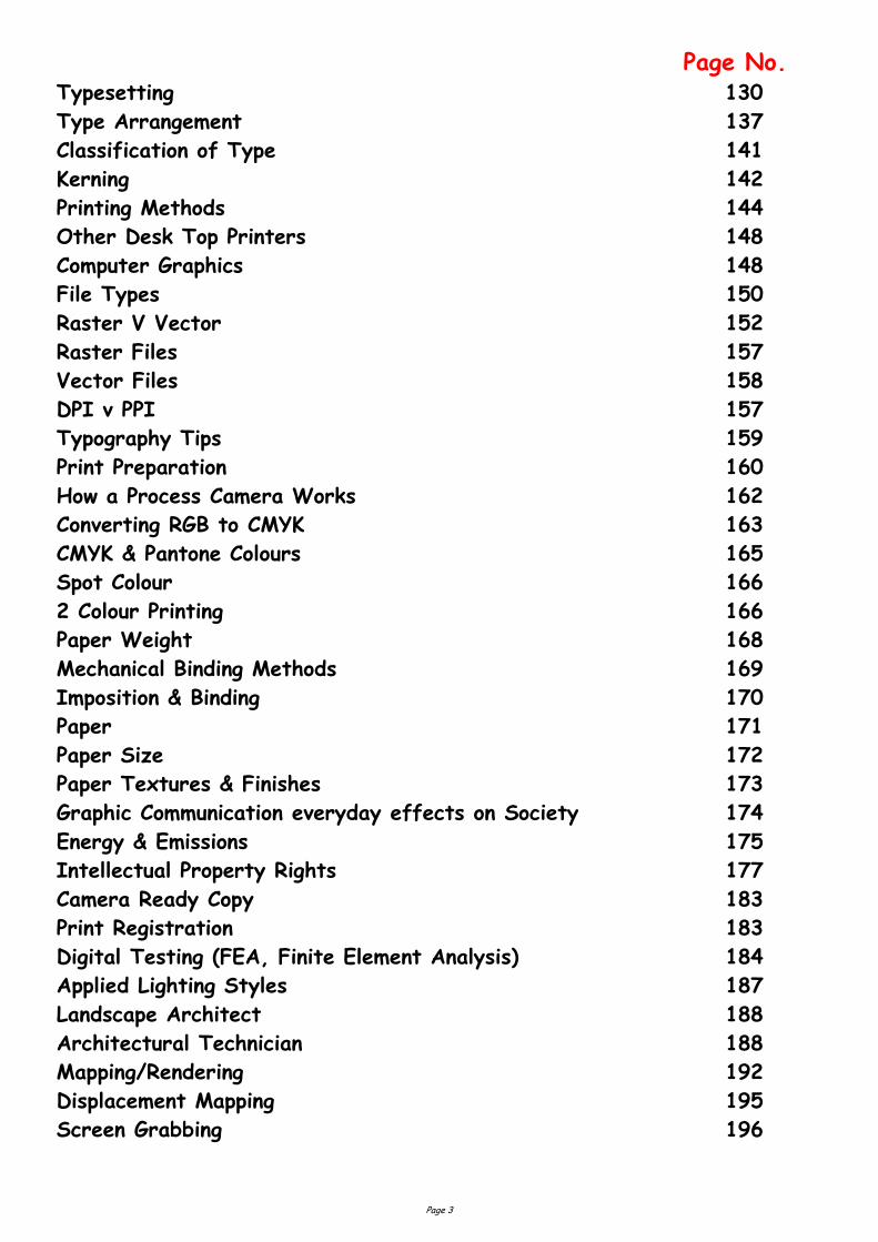
Page 3
Page No. Typesetting 130 Type Arrangement 137
Classification of Type 141
Kerning 142
Printing Methods 144
Other Desk Top Printers 148
Computer Graphics 148
File Types 150
Raster V Vector 152
Raster Files 157
Vector Files 158
DPI v PPI 157
Typography Tips 159
Print Preparation 160
How a Process Camera Works 162
Converting RGB to CMYK 163
CMYK & Pantone Colours 165
Spot Colour 166
2 Colour Printing 166
Paper Weight 168
Mechanical Binding Methods 169
Imposition & Binding 170
Paper 171
Paper Size 172
Paper Textures & Finishes 173
Graphic Communication everyday effects on Society 174
Energy & Emissions 175
Intellectual Property Rights 177
Camera Ready Copy 183
Print Registration 183
Digital Testing (FEA, Finite Element Analysis) 184
Applied Lighting Styles 187
Landscape Architect 188
Architectural Technician 188
Mapping/Rendering 192
Displacement Mapping 195
Screen Grabbing 196
Page 4
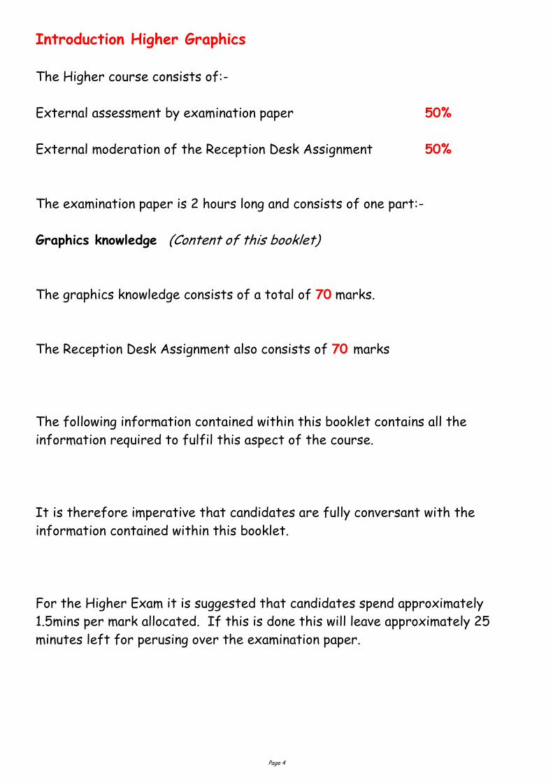
Introduction Higher Graphics
The Higher course consists of:-
External assessment by examination paper 50%
External moderation of the Reception Desk Assignment 50%
The examination paper is 2 hours long and consists of one part:-
Graphics knowledge (Content of this booklet)
The graphics knowledge consists of a total of 70 marks.
The Reception Desk Assignment also consists of 70 marks
The following information contained within this booklet contains all the
information required to fulfil this aspect of the course.
It is therefore imperative that candidates are fully conversant with the
information contained within this booklet.
For the Higher Exam it is suggested that candidates spend approximately
1.5mins per mark allocated. If this is done this will leave approximately 25
minutes left for perusing over the examination paper.
Page 5
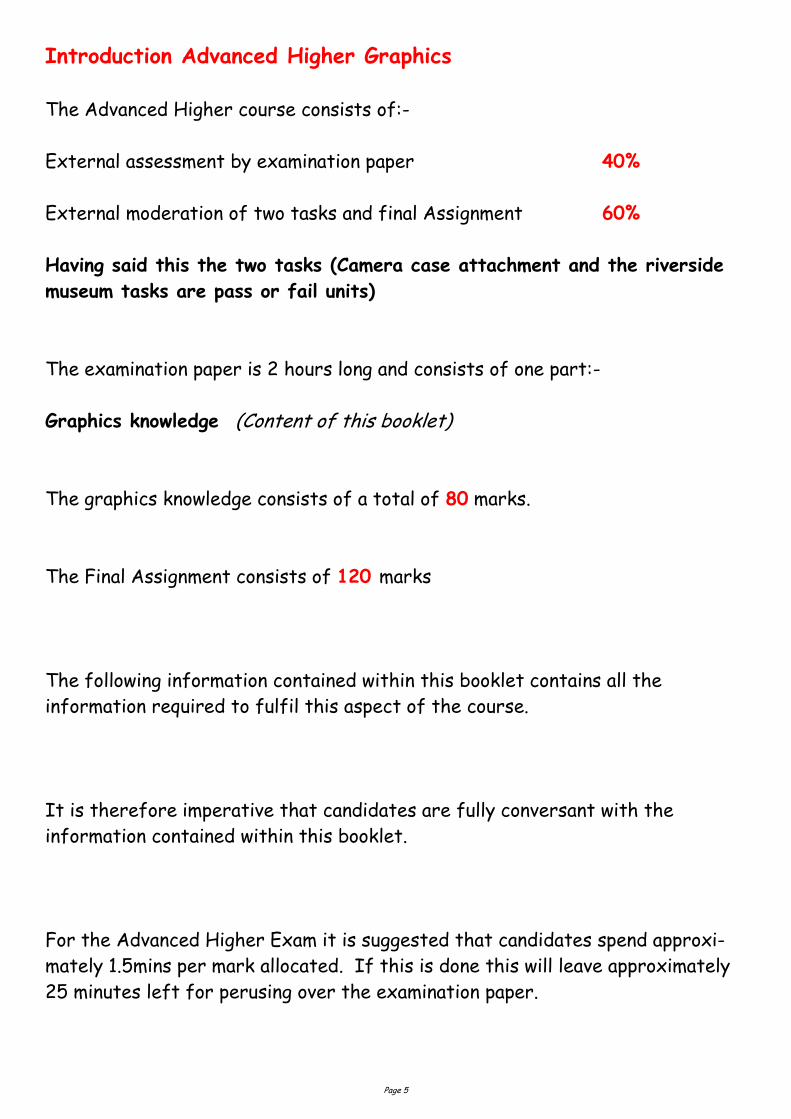
Introduction Advanced Higher Graphics
The Advanced Higher course consists of:-
External assessment by examination paper 40%
External moderation of two tasks and final Assignment 60%
Having said this the two tasks (Camera case attachment and the riverside
museum tasks are pass or fail units)
The examination paper is 2 hours long and consists of one part:-
Graphics knowledge (Content of this booklet)
The graphics knowledge consists of a total of 80 marks.
The Final Assignment consists of 120 marks
The following information contained within this booklet contains all the
information required to fulfil this aspect of the course.
It is therefore imperative that candidates are fully conversant with the
information contained within this booklet.
For the Advanced Higher Exam it is suggested that candidates spend approxi-
mately 1.5mins per mark allocated. If this is done this will leave approximately
25 minutes left for perusing over the examination paper.
Page 6
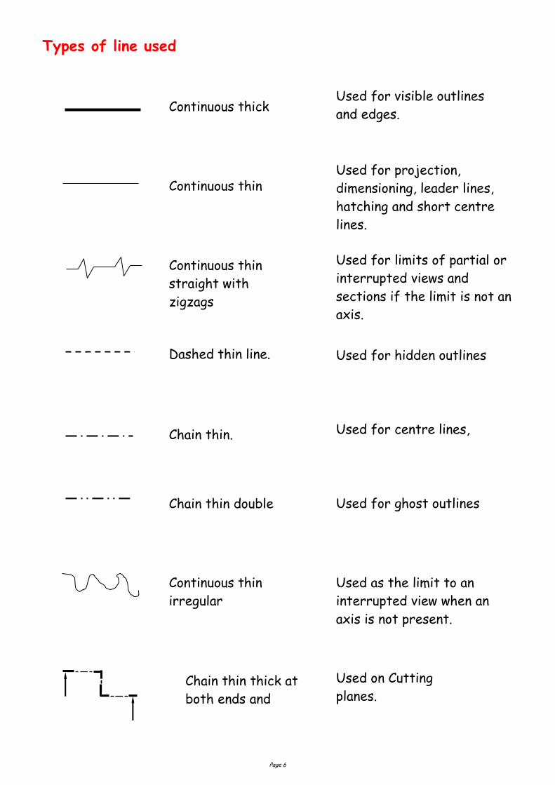
Types of line used
Continuous thick Used for visible outlines
and edges.
Used for projection,
dimensioning, leader lines,
hatching and short centre
lines.
Continuous thin
Used for limits of partial or
interrupted views and
sections if the limit is not an
axis.
Continuous thin
straight with
zigzags
Dashed thin line. Used for hidden outlines
Chain thin.
Chain thin double
Used for centre lines,
Used for ghost outlines
Continuous thin
irregular
Chain thin thick at
both ends and
Used on Cutting
planes.
Used as the limit to an
interrupted view when an
axis is not present.
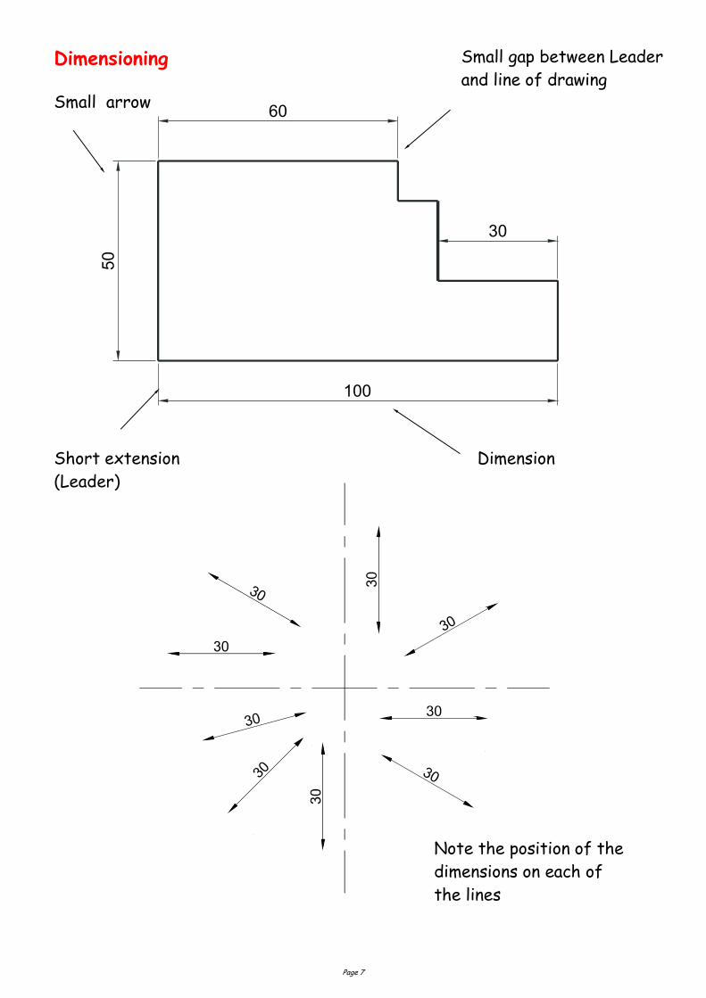
Page 7
Dimensioning
Short extension
(Leader)
Small gap between Leader
and line of drawing
Dimension
605
0
100
30
Note the position of the
dimensions on each of
the lines
Small arrow
Page 8
Notice on the above drawing that the largest dimension is placed on the
outside of the smaller dimensions. Where there is a limited space for
dimensioning, the dimension can be placed above, or in line with, the
extension of one of the dimension lines. E.g. the 3mm dimension uses the
50mm dimension leader. It is also important when dimensioning not to
include the units of measurement. As can be seen from the drawing above,
state on the drawing the unit of measurement. i.e. (All sizes in mm).
Ø6
5
Ø3
5
Ø4
1
Ø5
5
All sizes in mm
The sectioned drawing
opposite shows some
possibilities for putting a
diameter on a drawing. This is
by no means the only method.
If the section shown was
Square, then the following
symbol would be used. 45
Page 9
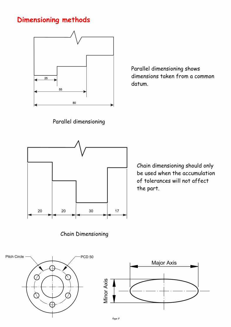
Dimensioning methods
Parallel dimensioning
20 20 30 17
Chain Dimensioning
Parallel dimensioning shows
dimensions taken from a common
datum.
Chain dimensioning should only
be used when the accumulation
of tolerances will not affect
the part.
Page 10
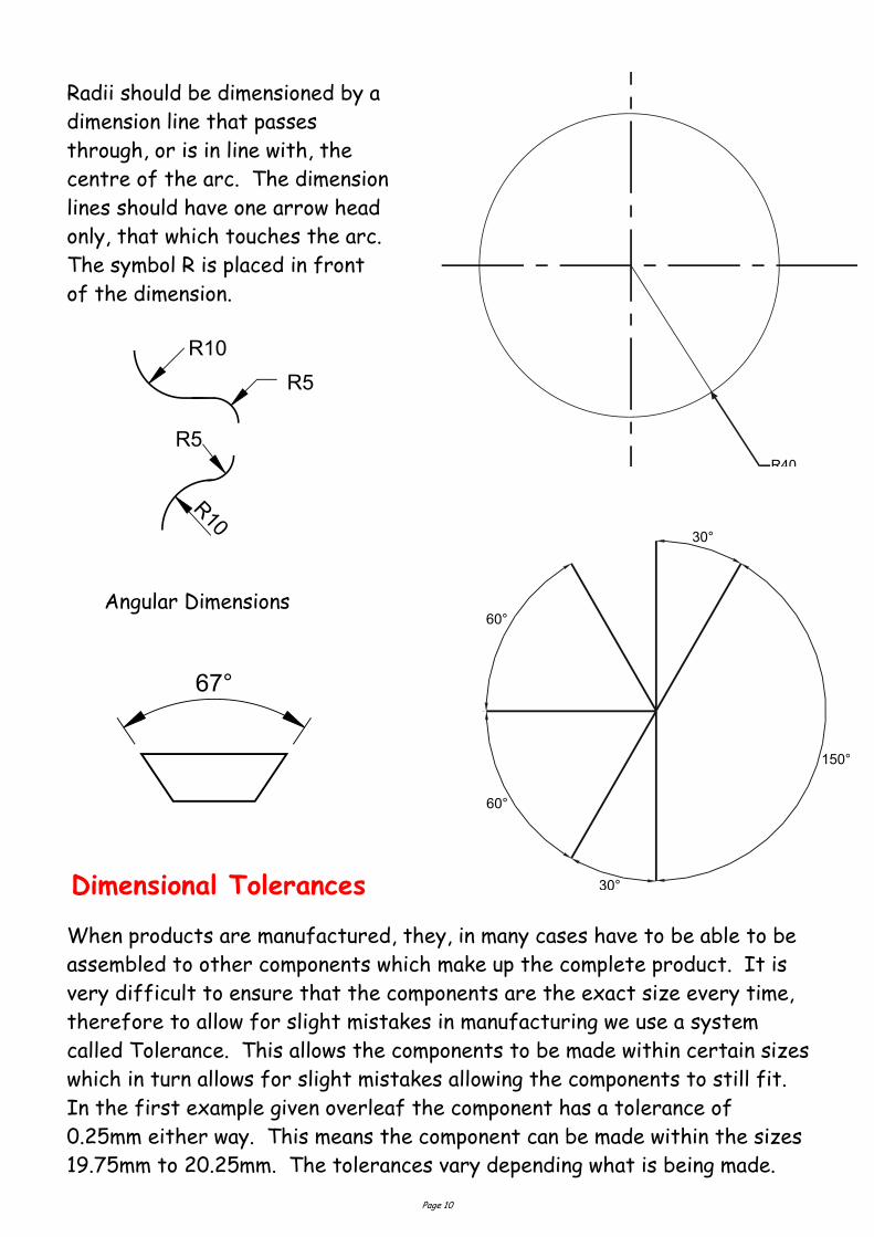
Radii should be dimensioned by a
dimension line that passes
through, or is in line with, the
centre of the arc. The dimension
lines should have one arrow head
only, that which touches the arc.
The symbol R is placed in front
of the dimension.
Angular Dimensions
30°
150°
60°
60°
30°
R40
When products are manufactured, they, in many cases have to be able to be
assembled to other components which make up the complete product. It is
very difficult to ensure that the components are the exact size every time,
therefore to allow for slight mistakes in manufacturing we use a system
called Tolerance. This allows the components to be made within certain sizes
which in turn allows for slight mistakes allowing the components to still fit.
In the first example given overleaf the component has a tolerance of
0.25mm either way. This means the component can be made within the sizes
19.75mm to 20.25mm. The tolerances vary depending what is being made.
Dimensional Tolerances
Page 11
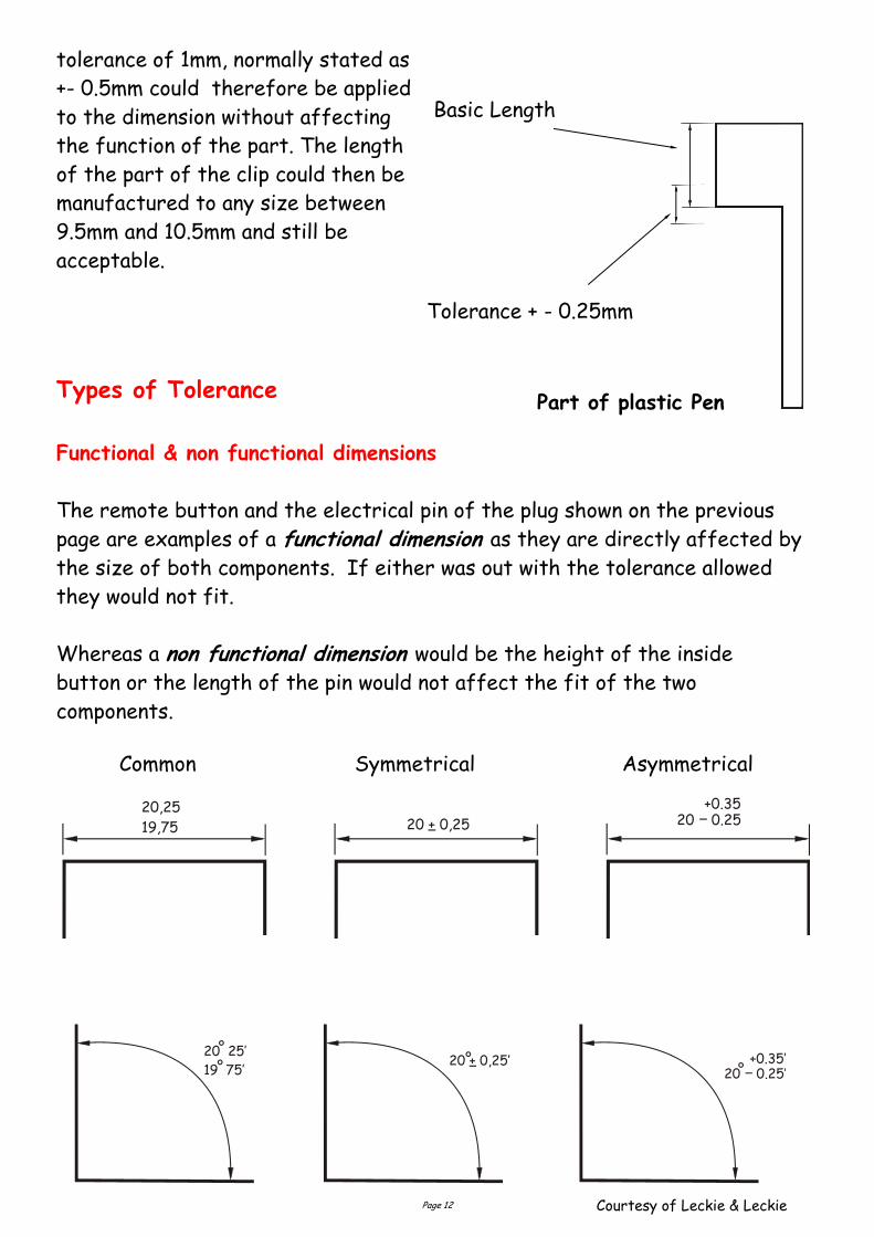
For example, the height of a pin of an electrical plug, has shown below, is
10mm. The company has determined that the size could vary between 9.75mm
and 10.25mm and still be able to fit in the slots in the socket. In this case a
tolerance of 0.5mm could be applied to this dimension without affecting the
function of the part. This size is normally stated as 0.25mm.
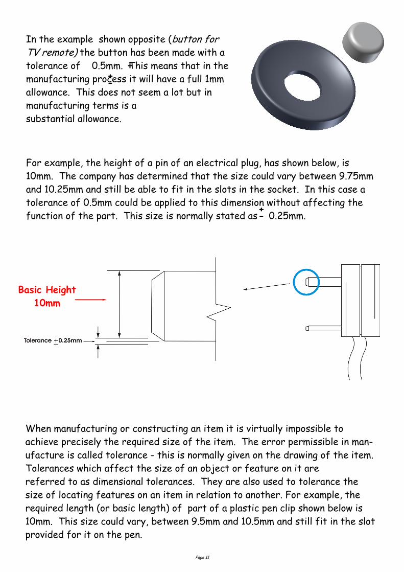
In the example shown opposite (button for TV remote) the button has been made with a
tolerance of 0.5mm. This means that in the
manufacturing process it will have a full 1mm
allowance. This does not seem a lot but in
manufacturing terms is a
substantial allowance.
+ -
Basic Height
10mm
When manufacturing or constructing an item it is virtually impossible to
achieve precisely the required size of the item. The error permissible in man-
ufacture is called tolerance - this is normally given on the drawing of the item.
Tolerances which affect the size of an object or feature on it are
referred to as dimensional tolerances. They are also used to tolerance the
size of locating features on an item in relation to another. For example, the
required length (or basic length) of part of a plastic pen clip shown below is
10mm. This size could vary, between 9.5mm and 10.5mm and still fit in the slot
provided for it on the pen.
+ -
Page 12
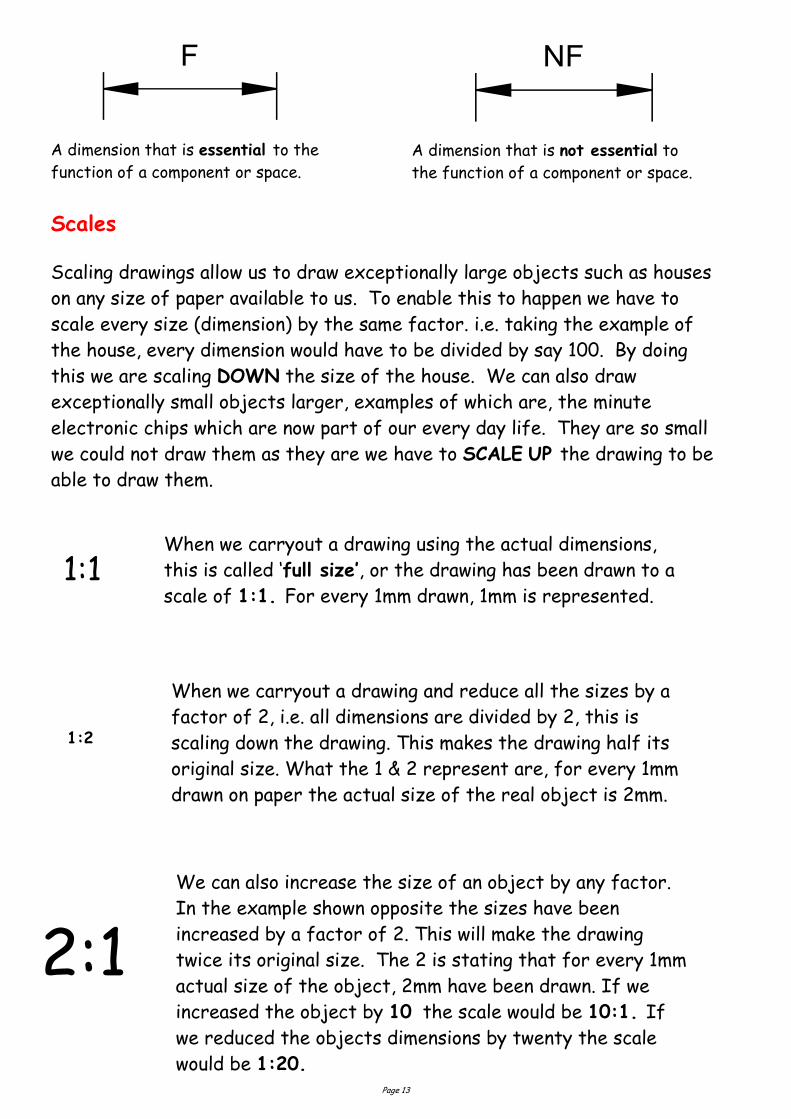
20,25
19,75 20 + 0,25 20 0.25+0.35
Common Symmetrical Asymmetrical
20 + 0,25’20 25’
19 75’ 20 0.25’+0.35’
Courtesy of Leckie & Leckie
tolerance of 1mm, normally stated as
+- 0.5mm could therefore be applied
to the dimension without affecting
the function of the part. The length
of the part of the clip could then be
manufactured to any size between
9.5mm and 10.5mm and still be
acceptable.
Types of Tolerance
Functional & non functional dimensions
The remote button and the electrical pin of the plug shown on the previous
page are examples of a functional dimension as they are directly affected by
the size of both components. If either was out with the tolerance allowed
they would not fit.
Whereas a non functional dimension would be the height of the inside
button or the length of the pin would not affect the fit of the two
components.
Basic Length
Tolerance + - 0.25mm
Part of plastic Pen
Page 13
Scales
Scaling drawings allow us to draw exceptionally large objects such as houses
on any size of paper available to us. To enable this to happen we have to
scale every size (dimension) by the same factor. i.e. taking the example of
the house, every dimension would have to be divided by say 100. By doing
this we are scaling DOWN the size of the house. We can also draw
exceptionally small objects larger, examples of which are, the minute
electronic chips which are now part of our every day life. They are so small
we could not draw them as they are we have to SCALE UP the drawing to be
able to draw them.
When we carryout a drawing using the actual dimensions,
this is called ‘full size’, or the drawing has been drawn to a
scale of 1:1. For every 1mm drawn, 1mm is represented. 1:1
When we carryout a drawing and reduce all the sizes by a
factor of 2, i.e. all dimensions are divided by 2, this is
scaling down the drawing. This makes the drawing half its
original size. What the 1 & 2 represent are, for every 1mm
drawn on paper the actual size of the real object is 2mm.
1:2
2:1 We can also increase the size of an object by any factor.
In the example shown opposite the sizes have been
increased by a factor of 2. This will make the drawing
twice its original size. The 2 is stating that for every 1mm
actual size of the object, 2mm have been drawn. If we
increased the object by 10 the scale would be 10:1. If
we reduced the objects dimensions by twenty the scale
would be 1:20.
A dimension that is not essential to
the function of a component or space.
A dimension that is essential to the
function of a component or space.
Page 14
We can also increase the size of an object by any factor. In the example
shown opposite the sizes have been increased by a factor of 2. This will make
the drawing twice its original size. The 2 is stating that for every 1mm actual
size of the object, 2mm have been drawn. If we increased the object by 10
the scale would be 10:1. If we reduced the objects dimensions by twenty the
scale would be 1:20.
With respect to Engineering drawings, there are recommended scales for
reduction and enlargement. These are as follows:-
Reduction:- 1:2, 1:5, 1:10, 1:20, 1:50, 1:100, 1:500, and 1:1000
Enlargement:- 2:1, 5:1, 10:1, 20:1, and 50:1.
The size of scale used is mainly dependant on two factors. These
factors are the;
Size of paper available
And the size of the object being drawn.
The amount of detail required
E.g. If house was being drawn on a piece of A4 paper opposed to a sheet of A2
paper, the scale used will obviously have to be different or it won’t fit onto the
page.
Page 15
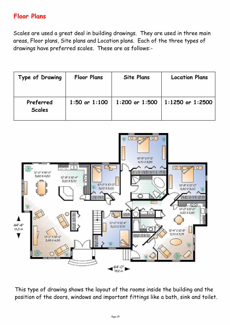
Floor Plans
Type of Drawing Floor Plans Site Plans Location Plans
Preferred
Scales
1:50 or 1:100 1:200 or 1:500 1:1250 or 1:2500
Scales are used a great deal in building drawings. They are used in three main
areas, Floor plans, Site plans and Location plans. Each of the three types of
drawings have preferred scales. These are as follows:-
This type of drawing shows the layout of the rooms inside the building and the
position of the doors, windows and important fittings like a bath, sink and toilet.
Page 16
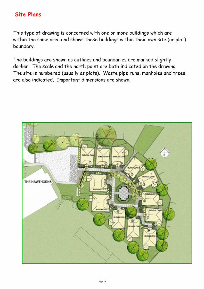
Site Plans
This type of drawing is concerned with one or more buildings which are
within the same area and shows these buildings within their own site (or plot)
boundary.
The buildings are shown as outlines and boundaries are marked slightly
darker. The scale and the north point are both indicated on the drawing.
The site is numbered (usually as plots). Waste pipe runs, manholes and trees
are also indicated. Important dimensions are shown.
Page 17
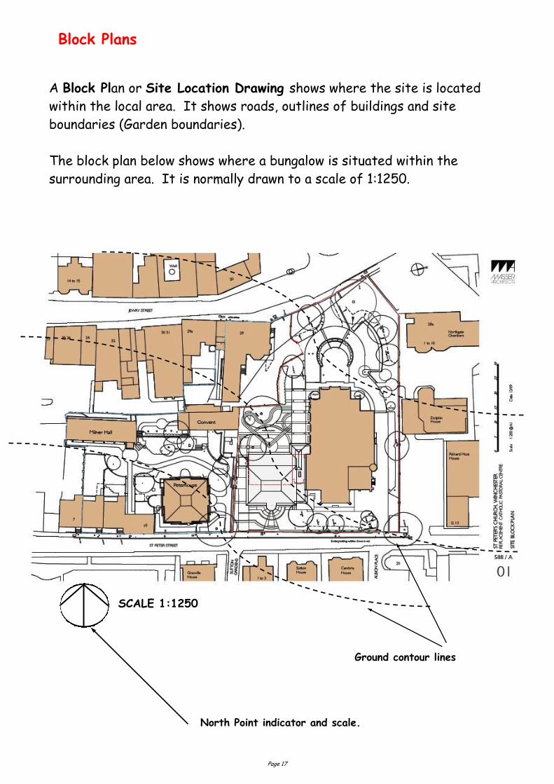
Block Plans
A Block Plan or Site Location Drawing shows where the site is located
within the local area. It shows roads, outlines of buildings and site
boundaries (Garden boundaries).
The block plan below shows where a bungalow is situated within the
surrounding area. It is normally drawn to a scale of 1:1250.
North Point indicator and scale.
SCALE 1:1250
Ground contour lines
Page 18
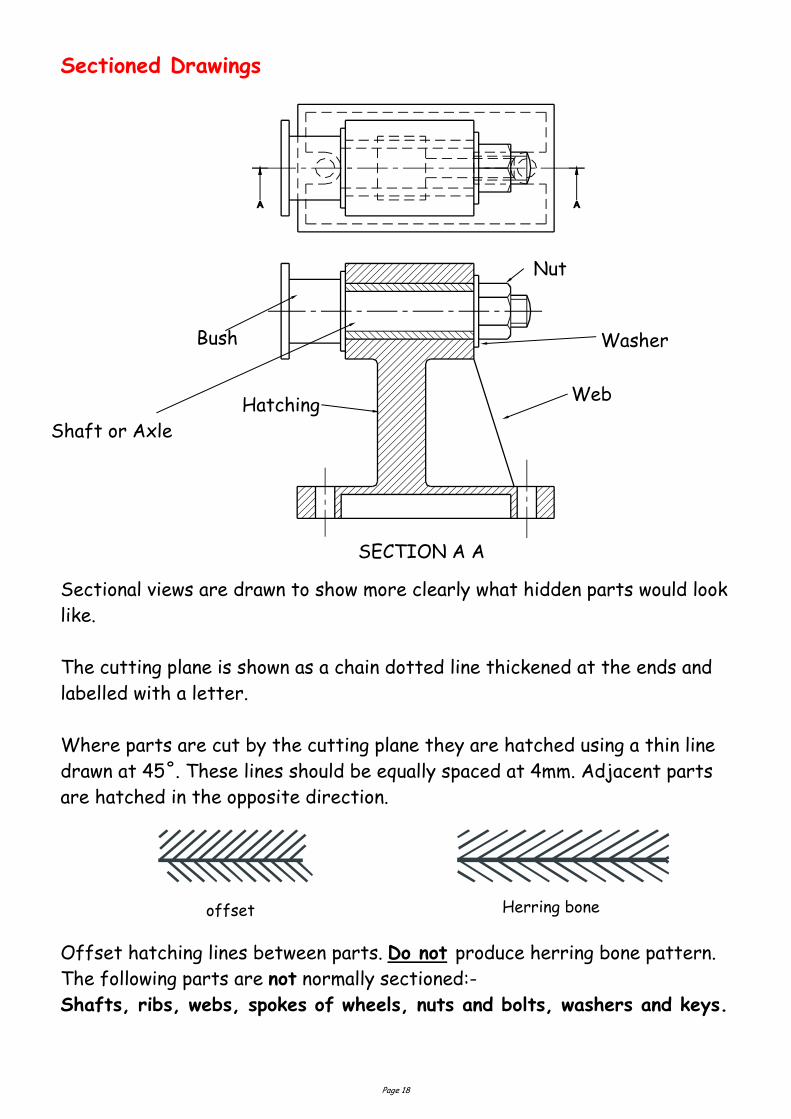
Sectioned Drawings
SECTION A A
Hatching Web
Shaft or Axle
Nut
Washer Bush
Sectional views are drawn to show more clearly what hidden parts would look
like.
The cutting plane is shown as a chain dotted line thickened at the ends and
labelled with a letter.
Where parts are cut by the cutting plane they are hatched using a thin line
drawn at 45˚. These lines should be equally spaced at 4mm. Adjacent parts
are hatched in the opposite direction.
Offset hatching lines between parts. Do not produce herring bone pattern.
The following parts are not normally sectioned:-
Shafts, ribs, webs, spokes of wheels, nuts and bolts, washers and keys.
offset Herring bone
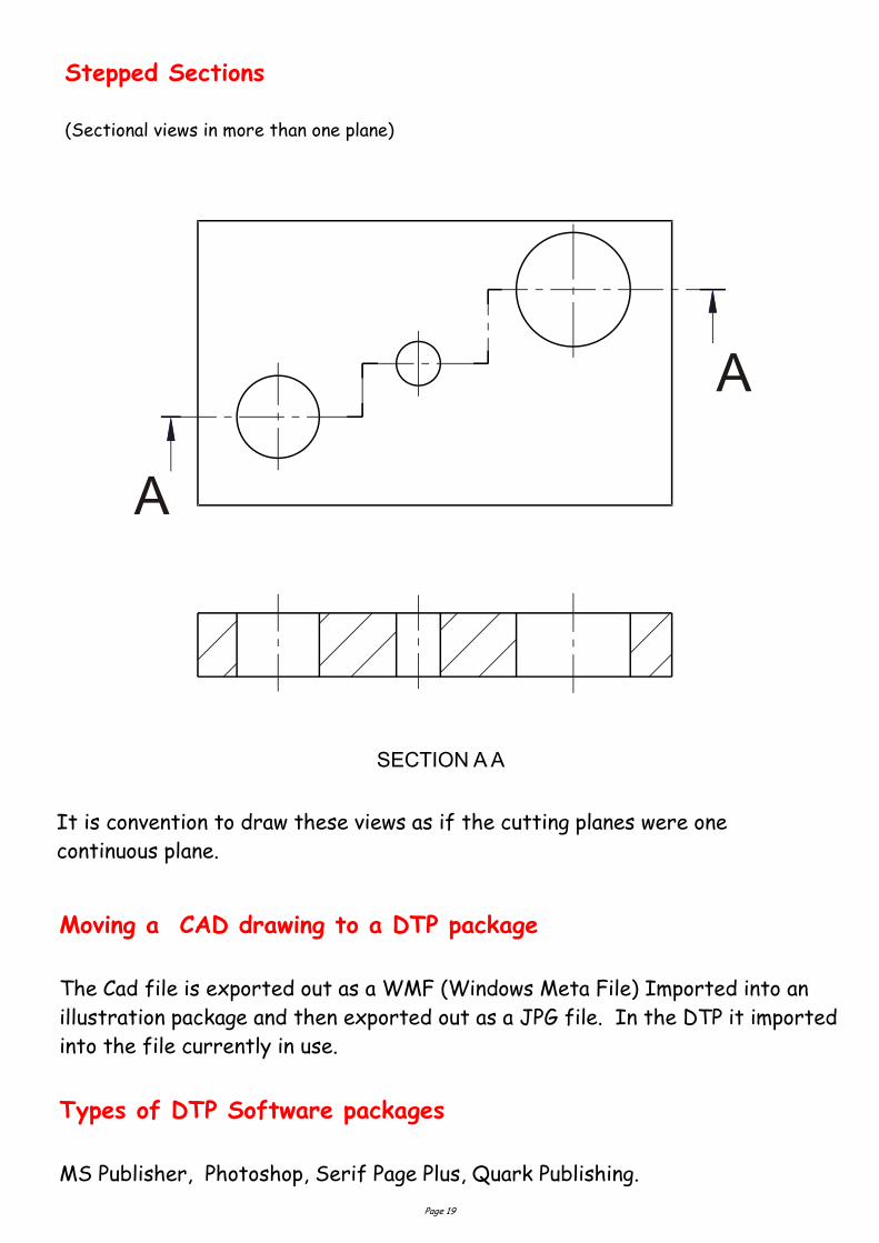
Page 19
Stepped Sections (Sectional views in more than one plane)
A
A
It is convention to draw these views as if the cutting planes were one
continuous plane.
SECTION A A
Moving a CAD drawing to a DTP package
The Cad file is exported out as a WMF (Windows Meta File) Imported into an
illustration package and then exported out as a JPG file. In the DTP it imported
into the file currently in use.
Types of DTP Software packages
MS Publisher, Photoshop, Serif Page Plus, Quark Publishing.
Page 20
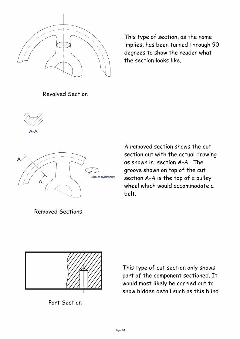
Revolved Section
A
A
Removed Sections
Part Section
This type of section, as the name
implies, has been turned through 90
degrees to show the reader what
the section looks like.
A removed section shows the cut
section out with the actual drawing
as shown in section A-A. The
groove shown on top of the cut
section A-A is the top of a pulley
wheel which would accommodate a
belt.
This type of cut section only shows
part of the component sectioned. It
would most likely be carried out to
show hidden detail such as this blind
Page 21
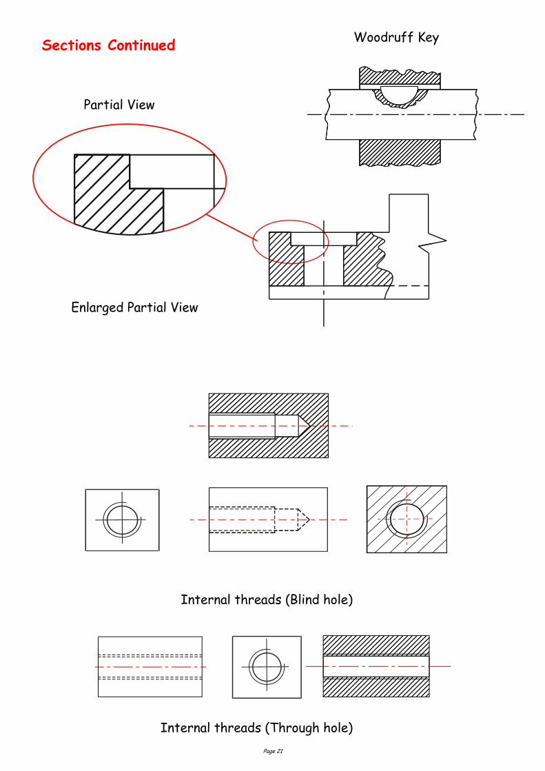
Sections Continued
Partial View
Enlarged Partial View
Internal threads (Blind hole)
Internal threads (Through hole)
Woodruff Key
Page 22
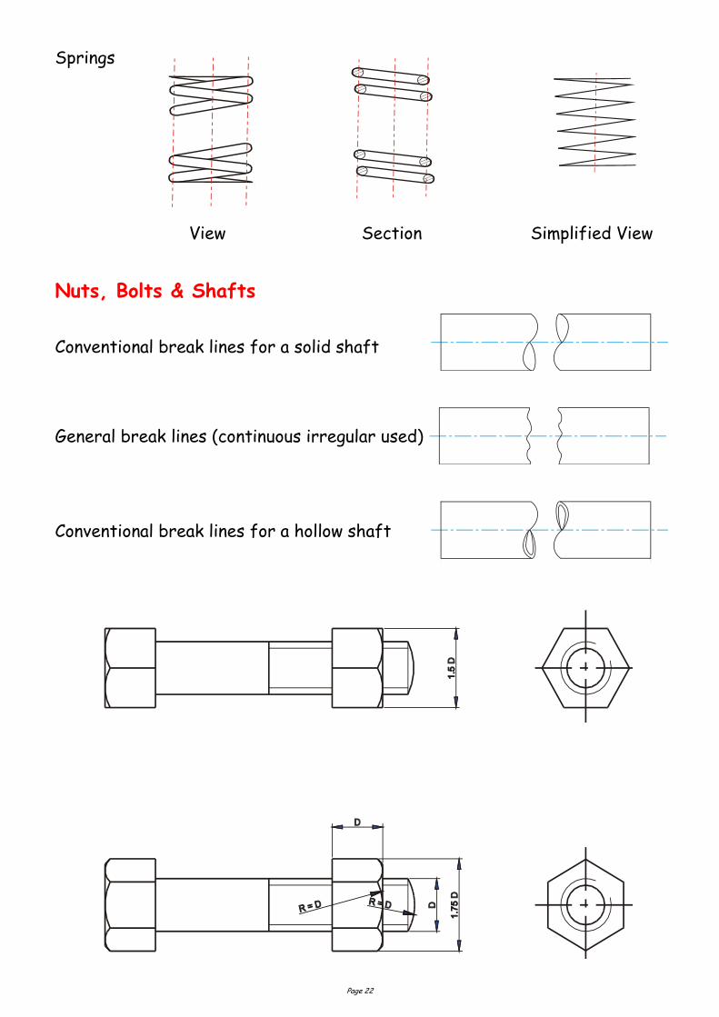
Nuts, Bolts & Shafts
View Section Simplified View
Conventional break lines for a solid shaft
Conventional break lines for a hollow shaft
General break lines (continuous irregular used)
Springs
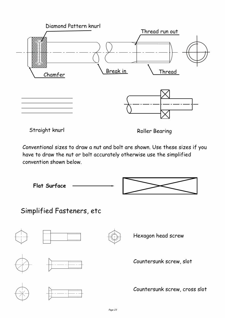
Page 23
Simplified Fasteners, etc
Hexagon head screw
Countersunk screw, slot
Countersunk screw, cross slot
Conventional sizes to draw a nut and bolt are shown. Use these sizes if you
have to draw the nut or bolt accurately otherwise use the simplified
convention shown below.
Straight knurl
Diamond Pattern knurl Thread run out
Chamfer Break in Thread
Roller Bearing
Flat Surface
Page 24
Door
In-line valve (any type) Softwood, machined Radiator
Wood, any type, sawn Brickwork Insulation
Switch Concrete Window
Wash basin Lamp Socket
Sink, any type WC Fan
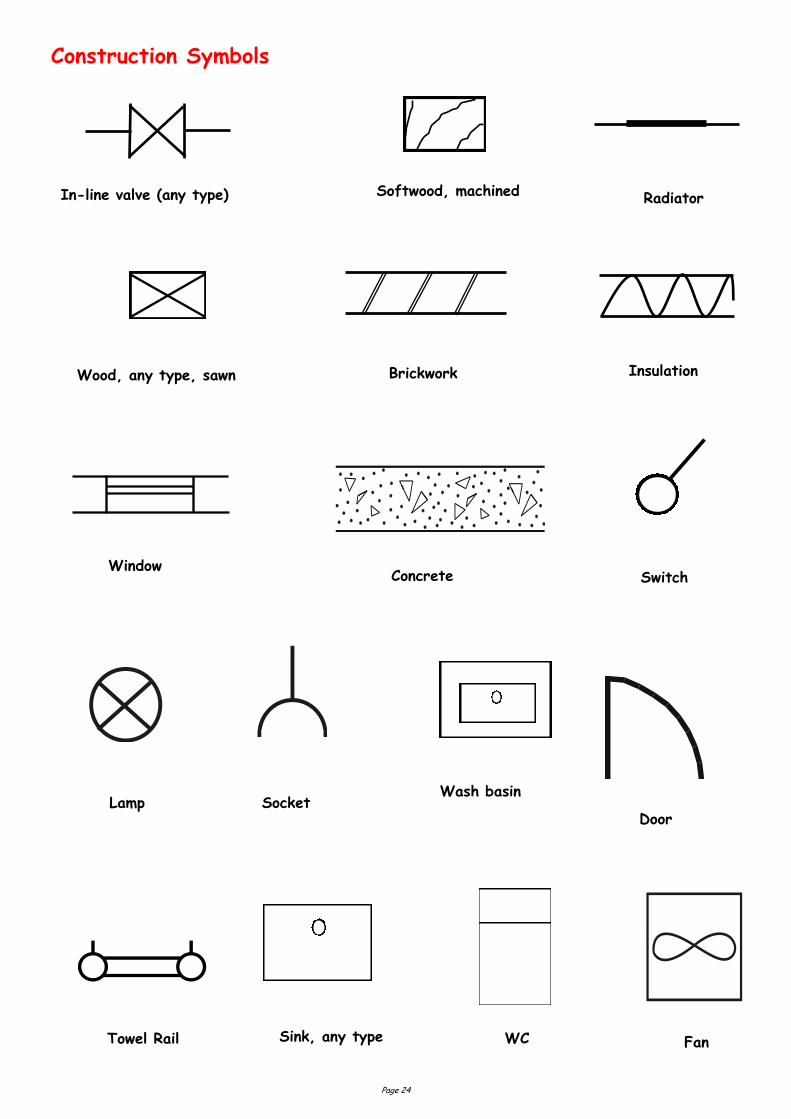
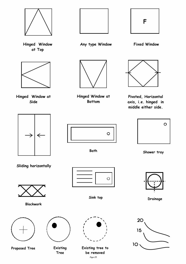
Construction Symbols
Towel Rail
Page 25
Bath
Sink top
Shower tray
Existing
Tree
Existing tree to
be removed Proposed Tree
F
Any type Window Hinged Window
at Top
Fixed Window
Hinged Window at
Side
Hinged Window at
Bottom Pivoted, Horizontal
axis, i.e. hinged in
middle either side.
Sliding horizontally
Blockwork
Drainage
Page 26
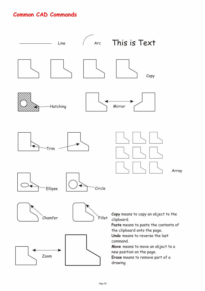
Ellipse Circle
Trim
Hatching Mirror
Chamfer Fillet
Array
Copy
ArcLine This is Text
Zoom
Copy
Paste
Undo
Move
Erase
means to copy an object to the
clipboard.
means to paste the contents of
the clipboard onto the page.
means to reverse the last
command.
means to move an object to a
new position on the page.
means to remove part of a
drawing.
Common CAD Commands
Page 27
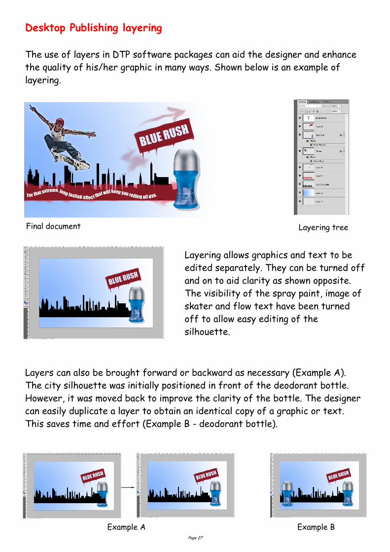
Desktop Publishing layering
The use of layers in DTP software packages can aid the designer and enhance
the quality of his/her graphic in many ways. Shown below is an example of
layering.
Final document Layering tree
Layering allows graphics and text to be
edited separately. They can be turned off
and on to aid clarity as shown opposite.
The visibility of the spray paint, image of
skater and flow text have been turned
off to allow easy editing of the
silhouette.
Layers can also be brought forward or backward as necessary (Example A).
The city silhouette was initially positioned in front of the deodorant bottle.
However, it was moved back to improve the clarity of the bottle. The designer
can easily duplicate a layer to obtain an identical copy of a graphic or text.
This saves time and effort (Example B - deodorant bottle).
Example A Example B
Page 28
Advantages of CAG over manual drawing techniques.
Drawings are produced quicker and very accurately.
Drawings are easier to edit/change.
Libraries of various parts can be created.
Lead time can be reduced.
Quality of drawings are improved.
Convenience of use (Lap top).
Standardisation.
Drawings can be easily scaled up or down.
Use of layers allows different parts to be drawn separately.
Easier to store drawings.
Easier to send drawings to another location quickly.
True 3D modelling made easy.
New designs from existing designs.
Disadvantages of CAG over manual drawing techniques.
Overall cost of hardware.
Overall cost of software.
Continual need to upgrade systems to stay competitive.
Risk of catching computer viruses.
Staff training costs.
System faults/crashes.
Data loss security.
Page 29
Intersection Sketch Completed Intersection
Union Sketch Completed Union
3D Modelling Techniques
School Bin
Revolve Sketch Completed Revolve
with Chamfer
Subtraction - Extrusion Sketch Completed Subtraction
Union
Subtraction
Intersection
Revolve
Page 30
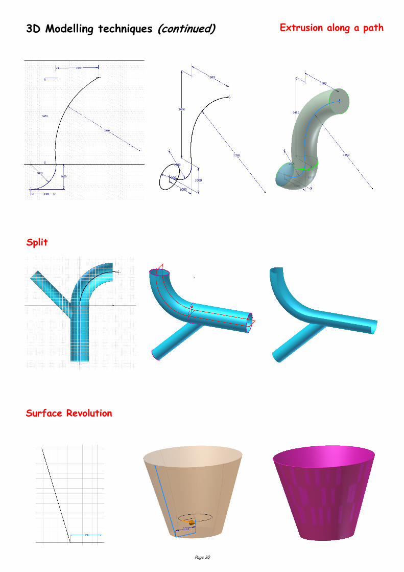
3D Modelling techniques (continued) Extrusion along a path
Split
Surface Revolution
Page 31
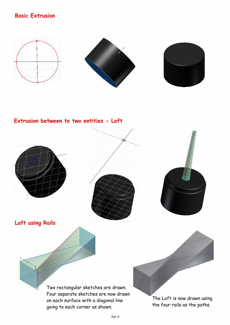
Basic Extrusion
Extrusion between to two entities - Loft
Loft using Rails
Two rectangular sketches are drawn.
Four separate sketches are now drawn
on each surface with a diagonal line
going to each corner as shown.
The Loft is now drawn using
the four rails as the paths.
Page 32
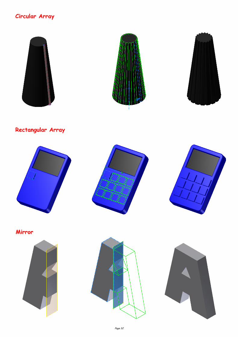
Circular Array
Rectangular Array
Mirror
Page 33
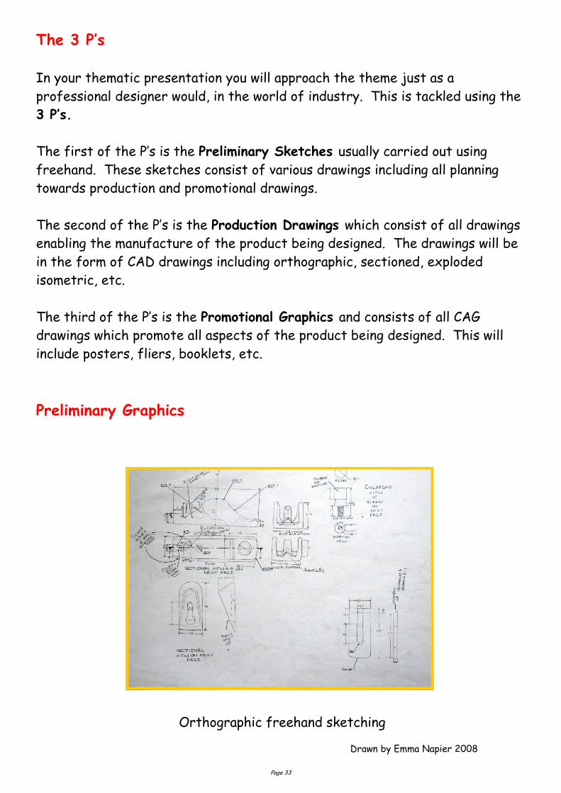
The 3 P’s
In your thematic presentation you will approach the theme just as a
professional designer would, in the world of industry. This is tackled using the
3 P’s.
The first of the P’s is the Preliminary Sketches usually carried out using
freehand. These sketches consist of various drawings including all planning
towards production and promotional drawings.
The second of the P’s is the Production Drawings which consist of all drawings
enabling the manufacture of the product being designed. The drawings will be
in the form of CAD drawings including orthographic, sectioned, exploded
isometric, etc.
The third of the P’s is the Promotional Graphics and consists of all CAG
drawings which promote all aspects of the product being designed. This will
include posters, fliers, booklets, etc.
Preliminary Graphics
Drawn by Emma Napier 2008
Orthographic freehand sketching
Page 34
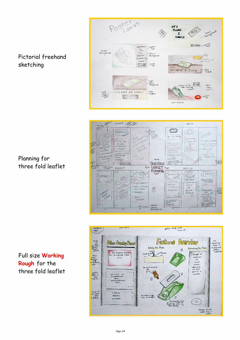
Pictorial freehand
sketching
Planning for
three fold leaflet
Full size Working
Rough for the
three fold leaflet
Page 35
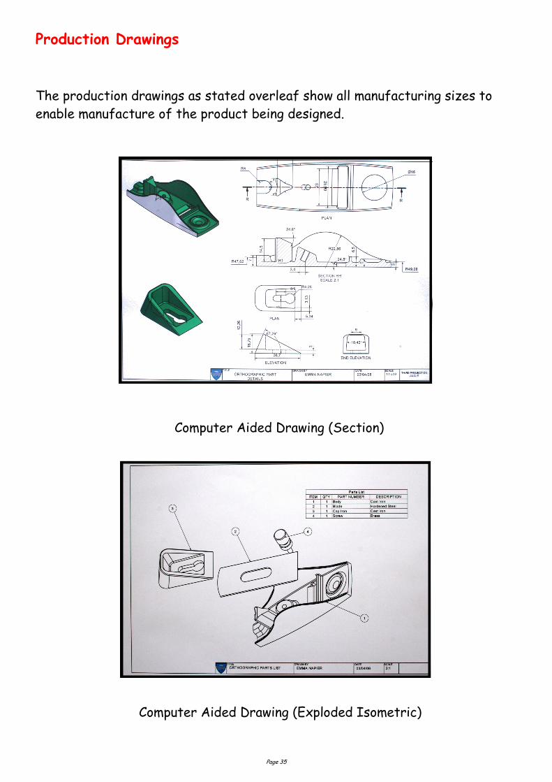
Production Drawings
The production drawings as stated overleaf show all manufacturing sizes to
enable manufacture of the product being designed.
Computer Aided Drawing (Section)
Computer Aided Drawing (Exploded Isometric)
Page 36
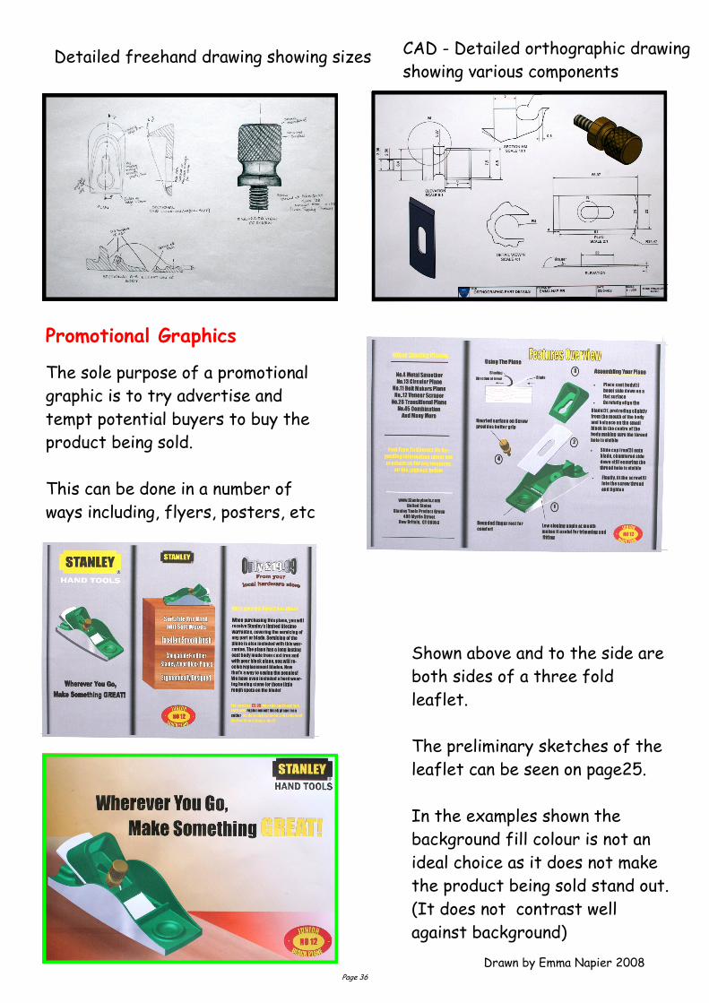
Promotional Graphics
Drawn by Emma Napier 2008
Shown above and to the side are
both sides of a three fold
leaflet.
The preliminary sketches of the
leaflet can be seen on page25.
In the examples shown the
background fill colour is not an
ideal choice as it does not make
the product being sold stand out.
(It does not contrast well
against background)
The sole purpose of a promotional
graphic is to try advertise and
tempt potential buyers to buy the
product being sold.
This can be done in a number of
ways including, flyers, posters, etc
Detailed freehand drawing showing sizes CAD - Detailed orthographic drawing
showing various components
Page 37
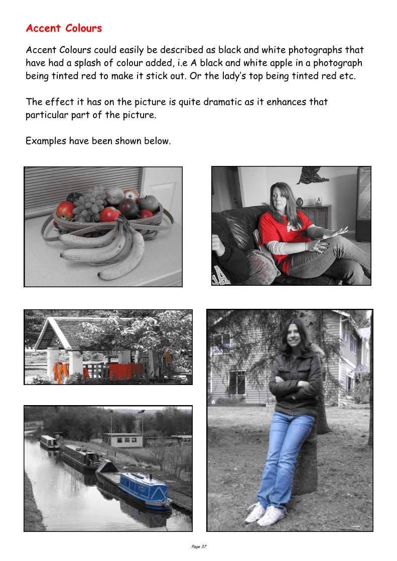
Accent Colours
Accent Colours could easily be described as black and white photographs that
have had a splash of colour added, i.e A black and white apple in a photograph
being tinted red to make it stick out. Or the lady’s top being tinted red etc.
The effect it has on the picture is quite dramatic as it enhances that
particular part of the picture.
Examples have been shown below.
Page 38
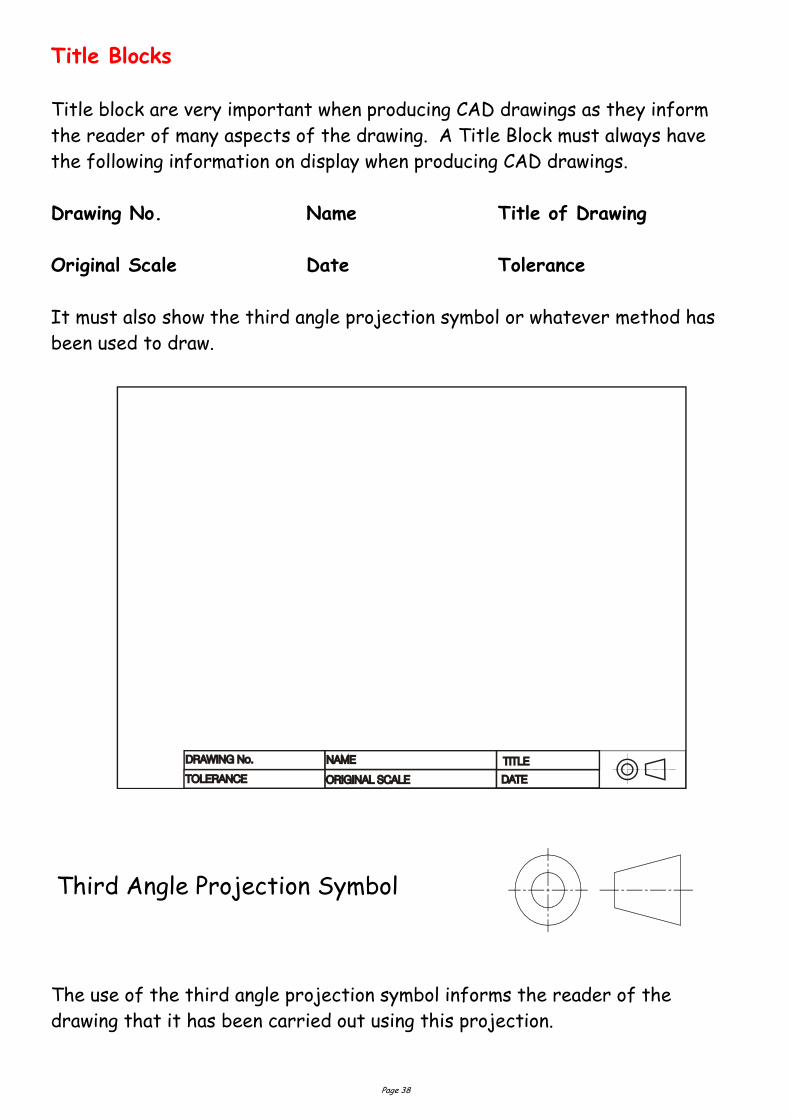
The use of the third angle projection symbol informs the reader of the
drawing that it has been carried out using this projection.
Third Angle Projection Symbol
Title Blocks
Title block are very important when producing CAD drawings as they inform
the reader of many aspects of the drawing. A Title Block must always have
the following information on display when producing CAD drawings.
Drawing No. Name Title of Drawing
Original Scale Date Tolerance
It must also show the third angle projection symbol or whatever method has
been used to draw.
Page 39
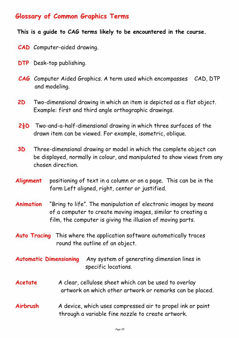
Glossary of Common Graphics Terms This is a guide to CAG terms likely to be encountered in the course.
CAD Computer-aided drawing.
DTP Desk-top publishing.
CAG Computer Aided Graphics. A term used which encompasses CAD, DTP
and modeling.
2D Two-dimensional drawing in which an item is depicted as a flat object.
Example: first and third angle orthographic drawings.
2½D Two-and-a-half-dimensional drawing in which three surfaces of the
drawn item can be viewed. For example, isometric, oblique.
3D Three-dimensional drawing or model in which the complete object can
be displayed, normally in colour, and manipulated to show views from any
chosen direction.
Alignment positioning of text in a column or on a page. This can be in the
form Left aligned, right, center or justified.
Animation “Bring to life”. The manipulation of electronic images by means
of a computer to create moving images, similar to creating a
film, the computer is giving the illusion of moving parts.
Auto Tracing This where the application software automatically traces
round the outline of an object.
Automatic Dimensioning Any system of generating dimension lines in
specific locations.
Acetate A clear, cellulose sheet which can be used to overlay
artwork on which other artwork or remarks can be placed.
Airbrush A device, which uses compressed air to propel ink or paint
through a variable fine nozzle to create artwork.
Page 40
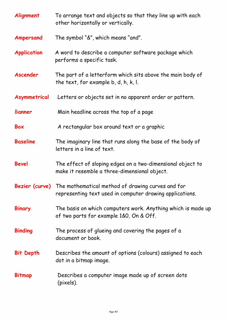
Alignment To arrange text and objects so that they line up with each
other horizontally or vertically.
Ampersand The symbol “&”, which means “and”.
Application A word to describe a computer software package which
performs a specific task.
Ascender The part of a letterform which sits above the main body of
the text, for example b, d, h, k, l.
Asymmetrical Letters or objects set in no apparent order or pattern.
Banner Main headline across the top of a page
Box A rectangular box around text or a graphic
Baseline The imaginary line that runs along the base of the body of
letters in a line of text.
Bevel The effect of sloping edges on a two-dimensional object to
make it resemble a three-dimensional object.
Bezier (curve) The mathematical method of drawing curves and for
representing text used in computer drawing applications.
Binary The basis on which computers work. Anything which is made up
of two parts for example 1&0, On & Off.
Binding The process of glueing and covering the pages of a
document or book.
Bit Depth Describes the amount of options (colours) assigned to each
dot in a bitmap image.
Bitmap Describes a computer image made up of screen dots
(pixels).
Page 41
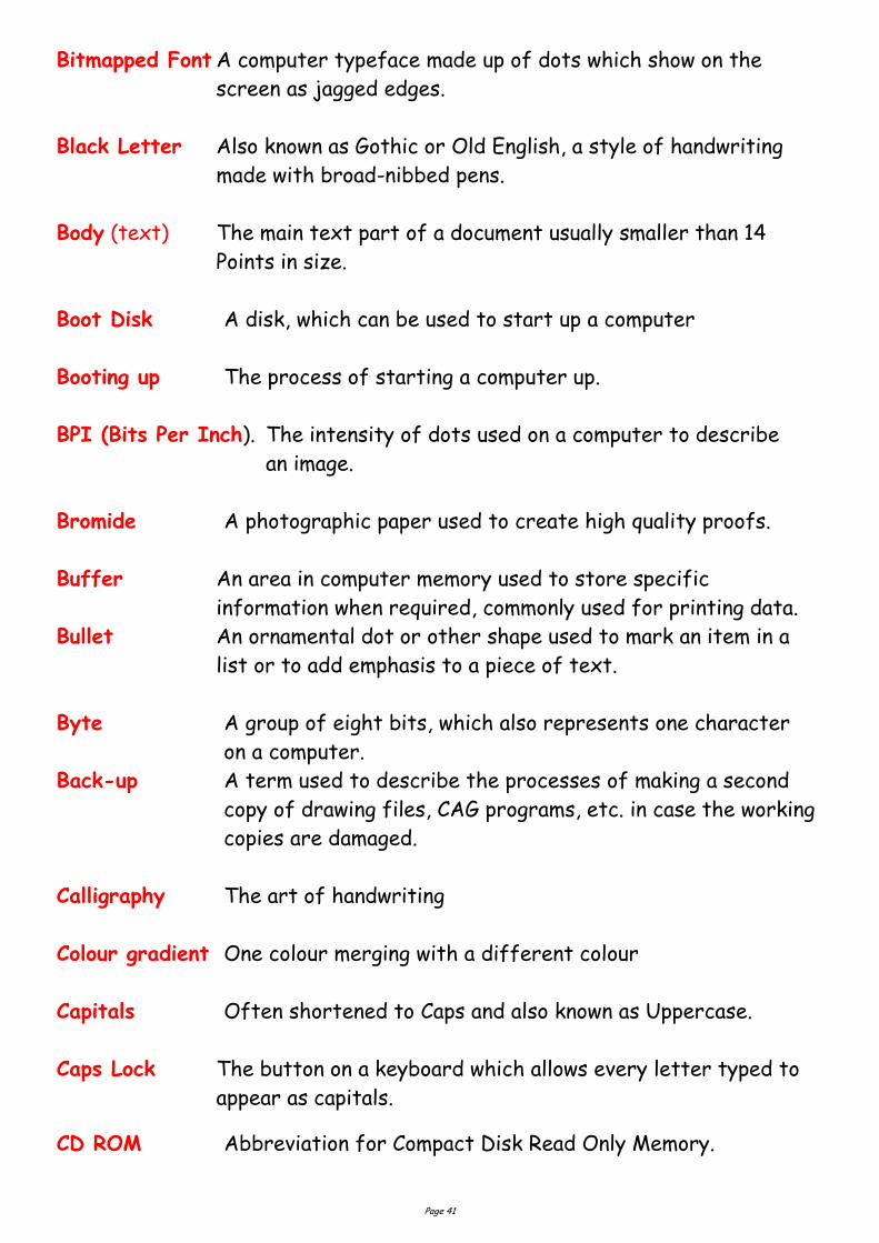
Bitmapped Font A computer typeface made up of dots which show on the
screen as jagged edges.
Black Letter Also known as Gothic or Old English, a style of handwriting
made with broad-nibbed pens.
Body (text) The main text part of a document usually smaller than 14
Points in size.
Boot Disk A disk, which can be used to start up a computer
Booting up The process of starting a computer up.
BPI (Bits Per Inch). The intensity of dots used on a computer to describe
an image.
Bromide A photographic paper used to create high quality proofs.
Buffer An area in computer memory used to store specific
information when required, commonly used for printing data.
Bullet An ornamental dot or other shape used to mark an item in a
list or to add emphasis to a piece of text.
Byte A group of eight bits, which also represents one character
on a computer.
Back-up A term used to describe the processes of making a second
copy of drawing files, CAG programs, etc. in case the working
copies are damaged.
Calligraphy The art of handwriting
Colour gradient One colour merging with a different colour
Capitals Often shortened to Caps and also known as Uppercase.
Caps Lock The button on a keyboard which allows every letter typed to
appear as capitals.
CD ROM Abbreviation for Compact Disk Read Only Memory.
Page 42
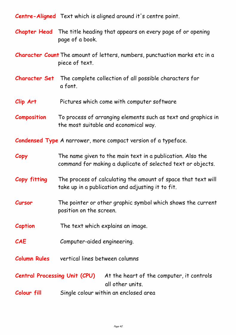
Centre-Aligned Text which is aligned around it's centre point.
Chapter Head The title heading that appears on every page of or opening
page of a book.
Character Count The amount of letters, numbers, punctuation marks etc in a
piece of text.
Character Set The complete collection of all possible characters for
a font.
Clip Art Pictures which come with computer software
Composition To process of arranging elements such as text and graphics in
the most suitable and economical way.
Condensed Type A narrower, more compact version of a typeface.
Copy The name given to the main text in a publication. Also the
command for making a duplicate of selected text or objects.
Copy fitting The process of calculating the amount of space that text will
take up in a publication and adjusting it to fit.
Cursor The pointer or other graphic symbol which shows the current
position on the screen.
Caption The text which explains an image.
CAE Computer-aided engineering.
Column Rules vertical lines between columns
Central Processing Unit (CPU) At the heart of the computer, it controls
all other units.
Colour fill Single colour within an enclosed area
Page 43
Centre spread Two adjacent pages which can be found in the middle of a
magazine.
Column guides non printable guides found in DTP software to allow
planning of work
Crop to trim excess parts of a screen graphic.
Colour Gradient This where a colour starts off dark and and gradiates to a
light colour OR gradiates from one colour to another; e.g. say
blue to yellow.
CGA Colour graphics adaptor. A colour adaptor which provides low resolution
up to four colours. (320 h x 200 v pixels at 4 colours)
Desk-Top Publishing (DTP) is the creation of a whole publication on
computer, preparing it for printing without the normal processes
of typing, typesetting, cutting & pasting and laying out. This book
let is produced using DTP.
DPI Dots per inch. A measurement of resolution of output devices. The
more dots per inch the greater the clarity of the graphic.
Drop Capital this is a large starting letter which si bigger than the rest of
the text. It falls below the baseline.
Default The values that are set when no other option is given.
Descender Any part of a letterform which sits below the baseline.
Digital Image Any image that has been converted into bits for use on a com-
puter.
Dingbat A font made up entirely of decorative symbols or images.
Disk, diskette A flat magnetised plate used for storing computer data.
Disk Drive A device used to spin a disk at high speed over a read / write
head.
Page 44
Display type The name given to text which is used for headlines or for
catching attention.
Download Transferring information from one computer source to
another.
DPI Dots Per Inch – the term used to describe the resolution of an
image, sometimes used to refer to screen images too. Drum Plotter A pen-type plotter in which the paper is rotated on a drum
under the pen while the pen also moves across the drum. Dump A colloquialism for transferring what is in the computer’s
memory to disc or printer or some other output device. DXF Drawing Exchange Format. A system controlling the format of data interchanged between CAG systems. Drawing files held in DXF format will have the suffix DXF. EGA Enhanced graphics adapter. A colour adaptor allowing a variety of high resolution modes (320 h x 200 v at 64 colours to 640 h x 350 v at 16 colours). Extrusion A command whereby an existing 2D (x,y) shape is translated into a 3D shape by addition of the Z depth or length. Ellipsis Three dots in a row used in punctuation to show the deliberate
omission of further characters
Extended type A wider, expanded version of a typeface. Facing Pages Pages which seen to be facing each other in a publication. File A file is the collection of data of which a drawing is com prised and which has been given a name (filename) by which it can be recognised when stored on disc. Flush Left/Right describes text, which is perfectly aligned on one side.
Page 45
Folio Page number
Font Collective name for every letter, number, symbol, accent, liga-
ture, fraction and punctuation mark for a typeface at a partic-
ular size.
Galley A proof of text before it is arranged on a page.
GUI Graphic User Interface. The visual way that the user works
with a computer, such as Windows™
Gutter The space between columns. Flat-bed plotter A flat table over which a pen moves in both the X and Y planes. Footer The space at the bottom of the page where the page number and any other text is placed Frame a box used to hold an imported graphic or text so as to allow movement around the page. Frame grab The screen image is captured and stored separately and may then be manipulated by software. Graphics Processor A special CPU that deals only with the handling of the graphics and screen display. called digitisers. Grid All CAG systems provide ‘transparent’ grids; patterns which appear on the screen as construction aids but do not form part of a drawing. Handles The small rectangles that surround a selected shape. Text
blocks in DTP software commonly have four handles.
Graphics Tablet A flat-bed input device with a grid of fine wire below the
surface. A puck, stylus or light pen will chase the cursor
around the screen as it moves over the surface. Useful for
‘tracing over’ existing drawings to convert them into
computer-stored versions, and for making free-hand sketches
dimensionally accurate. With overlaid menus they can be used
to input symbols from icons. Graphic tables are also, and more
frequently,
Page 46
Hairline The thinnest possible line.
Halftone The result of converting a continuous tone image, for
example, a photograph into a series of black dots which
imitate the tones.
Hanging Indent Describes when the first line of a paragraph aligns to the
margin, but the following lines are indented.
Hanging Punctuation When items such as inverted commas are allowed to be
positioned into the margins in order to keep the body of text
aligned with the margins.
Hardcopy A paper printout from the computer
Hardware The mechanical and physical components of a computer
system.
Headline The title or main introductory text in a publication.
Highlight in text Method of making the text stand out, eg colour flash,
underlining, bold, italic
Highlight in I & P Technique to show light reflection on edges and surfaces
and curves
Hyphenation The process of allowing a word which will not fit fully on a line
to be split with a hyphen. In Desktop Publishing hyphenation
can easily be controlled.
Hard Copy Simply means any copy of drawings produced as a plot, printout, or photograph, for example.
Hardware The physical parts of the computer. Example: the case,
disc drives, motherboard, floppy discs, etc.
Page 47
Header Space The space at the top of the page where the umber and any other text is placed Hidden-line removal A CAD command that removes background lines from 3D
wire-frame images. Wire-frame perspective views show every line used to assemble a model. To be able to display and plot views as seen in real life means editing out all the lines and planes which would be concealed by other lines and planes. This is known as hidden-line removal and poses massive calculation problems for the computer.
Housekeeping Embraces all the routines which, although essential to smooth
running, do not assist problem solving. Icon A graphical screen image used to represent a file,
programme or folder on a computer screen.
Image Compression The process of reducing a file’s storage size without nec-
essarily decreasing it’s quality.
Imagesetter A machine which produces high quality text and images on pa-
per or film for commercial printing.
Indent Where one or several lines of text are positioned a specific
distance from the margins or main text.
Initialising The process of preparing a disk for use on a computer. Also
known as formatting.
Import To bring in a copy of a text file or graphics, for example from
an external application to the page layout application.
Input A term used to describe information that is being sent to the
computer.
Inkjet Printer Computer printer (usually colour), which works by firing tiny
dots of charged ink at the paper.
Input device Any piece of hardware used to transfer data to a computer
such as a mouse, keyboard or scanner.
Page 48
Interface The way that a computer communicates with a user or other
device. Italics Slanted text which resembles handwriting. Often used for em-
phasis. Joystick An input device which normally moves in two axes. The output
from the joystick can be used to control the screen cursor movement.
Kerning The removal of excess space between letters to improve the visu-
al impact of text. For example, in the large type used for head-lines.
Landscape Description of the shape of a document page that is wider than it
is high. (See Portrait.)
Justified Text Text which has word spacing added so that it aligns to both
edges of columns or margins.
Kerning The process of adjusting the space between letters. Especially
important in headlines.
Kerning Pairs Specific pairs of letters which, because of their shape, re-
quire to have spacing between them adjusted e.g. Po, Pi, Pe, Ko,
Te. between lines of text
Landscape Page orientation with the long edge at the bottom.
Leading The addition of space between lines of text, so called, because
in traditional typesetting, lead was used as a spacer.
Ligature Where two or more characters are joined as one.
Line art Art work which is made up entirely of black.
Lowercase The small letters of the alphabet.
Page 49
Laser Printer A non-contact printing device predominantly used in DTP. La-ser printers use a laser beam focused on an electrically charged drum which forces the ink to follow the light pattern and form the characters. It is a fast method of printing which also provides very clear images.
Layers CAG software allows drawings to be built up as a series of
layers, each layer dedicated to one aspect of the drawing, e.g. construction lines, text, dimensions, hatching, or electrical layout. Layers can be switched in and out and act like clear film overlays which are always in perfect alignment with each other.
Light pen A light sensitive device which can be used as an input device.
The light pen is used by pointing it at a raster-type display. Not commonly used in desk-top CAG applications.
Margin The unprinted space on the sides, top and bottom of a
document.
Mb (Megabyte) One million bytes, or 1,000 kilobytes.
Menu On-screen display of options.
Modem (Modulator / Demodulator). A device which connects data into
signals, which can be sent along a phone line and back again.
Monospaced Font A font in which all of the characters take up the same
width.
Mouse A device for recording and plotting the movement of the
cursor on a computer monitor as well as for undertaking
on-screen commands.
Make-up An assembly of all the elements of a document. DTP allows this to be done accurately and creatively and makes it easy to modify.
Page 50
Maths Co-processor Known also as a maths chip, it processes numbers very rapidly using floating-point notation, 100 or more times faster than a standard CPU.
Modeling/Model A CAG model is more than just a three-dimensional screen
representation of an object: it is something which the computer can recognise as having three-dimensional ‘shape’ and which it can inter-rogate as such. Any screen display or plot is restricted to two-dimensional limitations, however, the shape exists in
computer memory as if it were a solid model. Montage A collection of separate graphics which when combined make up a
new picture Mouse A mobile hand-held interaction device for controlling the cursor position. Orphan A line of text that begins a paragraph but has been left at the bottom of the previous column or page. To be avoided in page layout. Optical Scanning A process in which documents are scanned and the incident light from their contents generates signals which are received by the scanning device and transmitted to the computer.
Oblique Text which is slanted, but not italic.
OCR (Optical Character Recognition) The ability to scan pages of text
and digitally re-create them as editable text. Pen plotter A drawing device that uses a pen. Any plotter using detachable
pens is a pen plotter. There are two main types, flat-bed and drum. Peripherals External equipment that can be added or connected to the
computer. Examples: printers, graphics tablet.
Page 51
Pixel Picture element. Video and screen displays are made up of tiny dots called pixels. These dots are arranged in a grid and can be set to give typical grid densities of 320 h x 200 v, 640 h x 200 v and 640 h x 400 v dots per grid.
Portrait Description of the shape of a document page which is higher than it
is wide. (See Landscape.) Proof A test print of a document used for checking for mistakes prior t printing react to a persons input. i.e. A flight simulator, or a games consol.
Paragraph Rules Lines used to separate paragraphs of text.
Paste-up The act of placing text, graphic and picture items on a page.
Pixel (Picture Element) The smallest dot element on a computer
screen.
Point The traditional unit of type measurement equal to 1/72 inch or
12 Picas.
Portrait Page orientation where short sizes are at the bottom.
RAM Random Access Memory. Memory chips which are used
temporarily when the computer is running. The more RAM
available, the more programmes can be running at the same
time.
Registration The correct alignment of one image on top of another in
printing.
Reverse Used to describe placing white text on a black or dark
background.
ROM Read-Only Memory. Its contents are fixed during
manufacture and cannot be changed. It is used to store the
permanent programs which form the basic intelligence of
the computer.
Page 52
Runaround Technique of setting text to follow the contour of an image or
object. Rough Manually produced design layout sketch Real time The term used to describe an event that is executed immediately, rather than an event that will be carried out after a
time delay. Register Mark Printers cross-hairs (thin lines) placed outside the page area
in order to check that the printed colours are accurate Resolution The sharpness of definition of a digitised image depending on the
number of pixels displayed on screen. Normally defined by the number of pixels shown on screen horizontally and vertically, e.g. 320 h x 200 v.
Rubber Banding CAG systems provide for a visible flexible connection between the screen cursor and the position from which it last
moved. As the cursor moves away from it, the connecting line seems to stretch.
Screen Dump When a screen image is sent to a printer to obtain a hard copy,
the resulting copy is a screen dump.
Simulation This is very similar to animation but with simulation the
graphics can be interacted by the user.
Spine Bound edge of a publication
Sans Serif Meaning “without serifs”. Any typeface which does not have
bars across the ends of letter strokes.
Scalable Typeface Typeface which will enlarge to any size without loss of
quality.
Scroll Bar The bar at the edge of a window by which the contents can be
moved up or down, right or left.
Page 53
Serif Any typeface which has bars crossing the ends of strokes such
as this one.
Small caps Capitals which match the x-height of a typeface.
Spread Two facing pages. Snap A CAG command that locks or ‘Snaps’ the cursor to the nearest
‘snapable’ point. This might be points on a screen-displayed grid, or any point naturally arising as a ‘lockable’ point (a line-end or ver-tex). Such ‘lockable’ points can often be forced into a
drawing by special commands. The ‘snap’ facility is a powerful tool for precision work.
Software The programs which the computer executes. In addition all data
files can be classed as software. Solid modeling The creation of a three-dimensional image on screen,
thereafter capable of manipulation to show other views and . Surface Modeling A three-dimensional model in which the surface is defined by connecting elements.
Tab A keyboard character which causes the cursor to jump to the
next point on a page, or to a specific point on a page set by the us-
er. Template A dummy publication that acts as a model, providing the structure and general layout for another similar publication.
Tonal scale A colour gradually becoming lighter or darker
Tracking The average amount of space between characters in a word.
True Type A font format, which generates a font at any size and at high
quality depending on the printer.
Uppercase The capital letters of a typeface.
Utilities Software programmes for undertaking jobs such as file
Page 54
Vector Graphic A graphic produced using a drawing programme in which the
image is described using points, lines and curves. Vectors are
generally able to be scaled without apparent loss of quality. Thumb Nails Design sketches of page layouts Type Sizes The standard ‘point’ system used to describe type sizes is
based on 72 points to an inch. (12 points is, therefore, 1/6” high.)
VDU Visual Display Unit: an alternative way of describing the monitor. VGA Video graphics array (adaptor). A colour adaptor allowing high resolution and a range of colours. (320 h
x 200 v at 256 colours to 640 h x 480 V at 16 colours.) Widow One or two words at the end of a paragraph that spill onto the
top of the next column or page. To be avoided. White Space Empty spaces on a page, graphic designers use this in publica-
tions to create balance on a layout as well as resting the read-ers eye.
Window A window is a rectangular box that can be used to define a
space around an object or set of lines. At its simplest, a window can be a frame drawn around a selected area of the
screen, to isolate the area within the ‘window’. Wire-frame model A three-dimensional image made up as a series of connected lines between all edges and line end-points.
Weight Describes the thickness of the strokes of a typeface.
White Space The blank areas on a page which are not occupied by text,
illustrations or colours.
Widow A word or line belonging to a preceding paragraph, which is
added to a new page or column.
Window The graphic device on screen which organises and alows access
to files, folders and applications.
WYSIWYG “What You See Is What You Get”. The ability of computer
monitors to simulate exactly the result of using software on
screen.
Page 55
DTP Terms Lines
Lines can be long or short, straight or curved. Lines can be horizontal, vertical,
or diagonal. They create patterns. Lines can be solid, dashed, thick, thin, or of
variable width.
Sometimes a designer uses a line alone to divide or unite elements on a page.
Lines can denote direction of movement (as in diagonal lines and arrows) or
provide an anchor to hold elements on a page (such as lines at the top, bottom,
or sides of a page).
You can use lines in conjunction with other elements. One well-known example,
the AT&T logo, is a pattern of thick and thin lines arranged in a circular shape.
Go through your own magazines with an eye on lines. I want you to find as many
different examples of lines of all kinds used in these pieces. Are the lines used
prominently? Are they part of a logo or used in other ways to divide the page
or add decoration?
Shapes
Circle, square, and triangle are the three basic shapes. Perhaps the most
familiar shape to desktop publishing is the square (and rectangle). Paper is
rectangular. Most text blocks are square or rectangular. While you may
encounter printed projects cut into other shapes, most circles, triangles, and
freeform shapes in desktop published materials are found on the page within
the graphics or in the way the elements are placed on the page.
Go through your own magazines looking for a variety of shapes. No doubt you
can find many examples of squares and rectangles but keep an eye out for
other shapes. Are the examples you find actual graphic elements or can you
find examples of lines or text arranged in geometric shapes?
Mass
Mass is size. There is physical size and visual size. Size can be relative. A
physically small brochure can have a great deal of mass through the use of
heavy text and graphic elements. A physically large brochure can appear
smaller, lighter by using text and graphics sparingly.
While the paper projects you create have a certain size because of the size
and weight of the paper, visual mass -- how light or heavy it appears -- is also
an element of the design.
Page 56
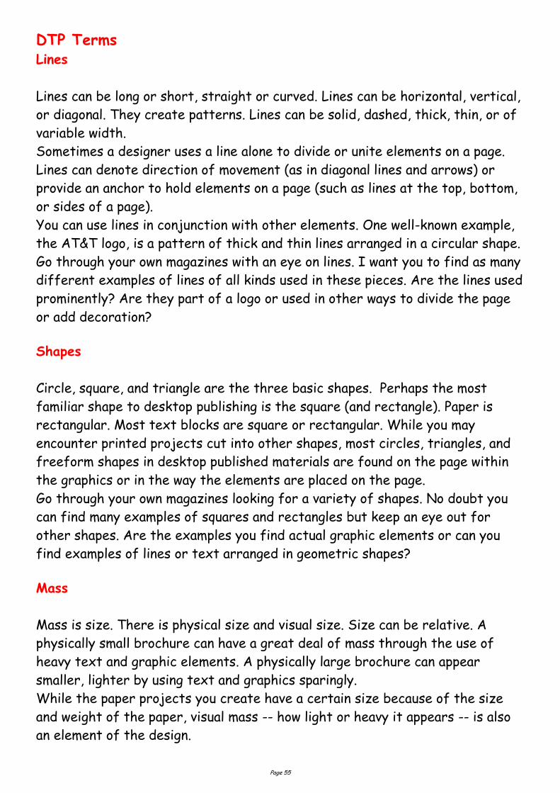
The CUTYOS standard layouts work well and are especially suitable for
posters, but sticking rigidly to symmetry can produce rather characterless
layout. Of the two report covers below, it seems to me that the asymmetrical
layout of the report on the right has a lot more going for it:
So it's always worth experimenting with a less obvious design. Also, be wary of
the automatic functions offered by word-processors and DTP software, they
certainly have their uses, but they can end up leading you into rather
unexciting designs.
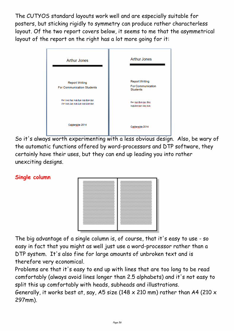
Single column
The big advantage of a single column is, of course, that it's easy to use - so
easy in fact that you might as well just use a word-processor rather than a
DTP system. It's also fine for large amounts of unbroken text and is
therefore very economical.
Problems are that it's easy to end up with lines that are too long to be read
comfortably (always avoid lines longer than 2.5 alphabets) and it's not easy to
split this up comfortably with heads, subheads and illustrations.
Generally, it works best at, say, A5 size (148 x 210 mm) rather than A4 (210 x
297mm).
Page 57
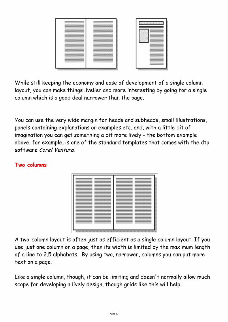
While still keeping the economy and ease of development of a single column
layout, you can make things livelier and more interesting by going for a single
column which is a good deal narrower than the page.
You can use the very wide margin for heads and subheads, small illustrations,
panels containing explanations or examples etc. and, with a little bit of
imagination you can get something a bit more lively - the bottom example
above, for example, is one of the standard templates that comes with the dtp
software Corel Ventura.
Two columns
A two-column layout is often just as efficient as a single column layout. If you
use just one column on a page, then its width is limited by the maximum length
of a line to 2.5 alphabets. By using two, narrower, columns you can put more
text on a page.
Like a single column, though, it can be limiting and doesn't normally allow much
scope for developing a lively design, though grids like this will help:
Page 58
Go through your own magazines and look at each piece and analyze mass in
terms of physical size of the piece and the visual mass. Does it have a heavy,
imposing look due to the size or weight of the paper or the density of text and
graphics? Is it small and compact or light and airy? Hold the items in your hand
to see if they feel light or heavy. Compare the physical size to the visual mass
of each piece.
Texture
For desktop publishing, actual texture is the feel of the paper. Is it smooth to
the touch or rough? Textures can also be visual. On the Web, especially,
backgrounds that simulate familiar fabrics, stone, and other textures are
common.
Certain printing and finishing techniques such as thermography and embossing
can add both actual and visual textures to a printed piece.
Go through your own magazines looking for as many different types of actual
and visual textures as you can find. Can you tell by looking whether a paper will
be soft and smooth or rougher? Are the visual textures used in place of actual
papers of that texture or do they relate in some way to the purpose of the
printed piece (such as a stone texture for a tile company)? See and feel the
difference in textures on embossed pieces or other types of raised printing.
Colour
Colour is everywhere. Every single piece in your Class Samples, even if it is
black and white, exhibits the element of colour. Colour is used to attract
attention. It can be subtle or bold.
Colour can be found in the paper, the text, or the graphic elements and photos.
A monochromatic colour scheme uses a single colour, perhaps in various tints,
while other layouts utilize combinations of two, three, or more colours.
1. Colour can be used to elicit specific emotions and reactions. Red is typically
thought of as an attention-grabbing, hot colour. Blues are more calming or
convey stability. Some colour combinations are used to create a specific
identity (corporate colours, school colours) or may be used in conjunction with
texture to simulate the look of other objects (the look of plain paper wrapping
or neon lights, for example).
Page 59
Lines
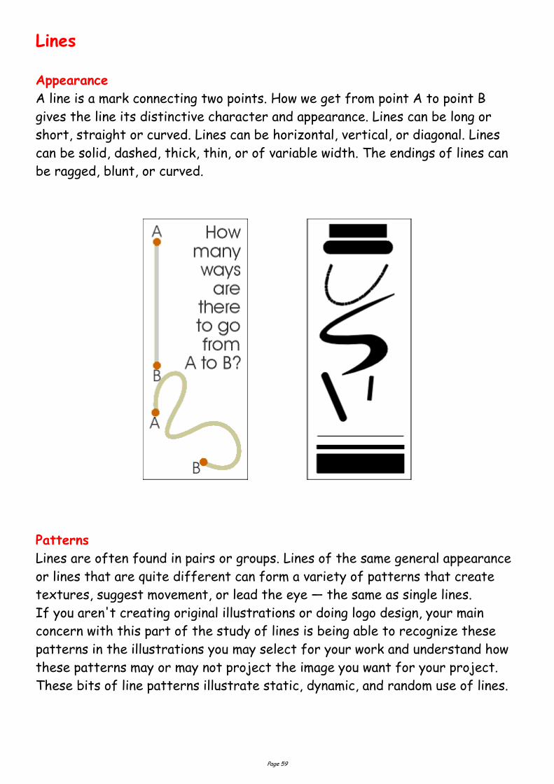
Appearance
A line is a mark connecting two points. How we get from point A to point B
gives the line its distinctive character and appearance. Lines can be long or
short, straight or curved. Lines can be horizontal, vertical, or diagonal. Lines
can be solid, dashed, thick, thin, or of variable width. The endings of lines can
be ragged, blunt, or curved.
Patterns
Lines are often found in pairs or groups. Lines of the same general appearance
or lines that are quite different can form a variety of patterns that create
textures, suggest movement, or lead the eye — the same as single lines.
If you aren't creating original illustrations or doing logo design, your main
concern with this part of the study of lines is being able to recognize these
patterns in the illustrations you may select for your work and understand how
these patterns may or may not project the image you want for your project.
These bits of line patterns illustrate static, dynamic, and random use of lines.
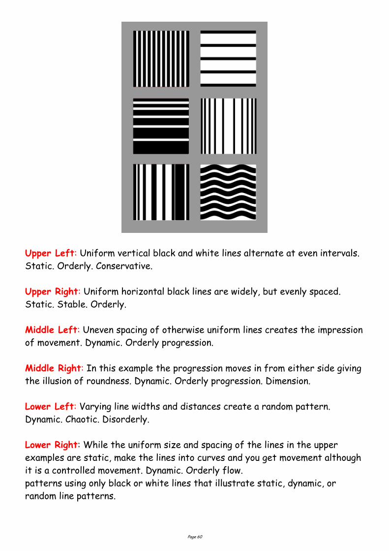
Page 60
Upper Left: Uniform vertical black and white lines alternate at even intervals.
Static. Orderly. Conservative.
Upper Right: Uniform horizontal black lines are widely, but evenly spaced.
Static. Stable. Orderly.
Middle Left: Uneven spacing of otherwise uniform lines creates the impression
of movement. Dynamic. Orderly progression.
Middle Right: In this example the progression moves in from either side giving
the illusion of roundness. Dynamic. Orderly progression. Dimension.
Lower Left: Varying line widths and distances create a random pattern.
Dynamic. Chaotic. Disorderly.
Lower Right: While the uniform size and spacing of the lines in the upper
examples are static, make the lines into curves and you get movement although
it is a controlled movement. Dynamic. Orderly flow.
patterns using only black or white lines that illustrate static, dynamic, or
random line patterns.
Page 61
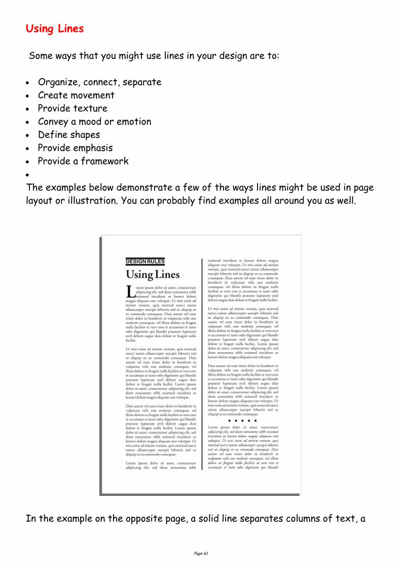
Using Lines
Some ways that you might use lines in your design are to:
Organize, connect, separate
Create movement
Provide texture
Convey a mood or emotion
Define shapes
Provide emphasis
Provide a framework
The examples below demonstrate a few of the ways lines might be used in page
layout or illustration. You can probably find examples all around you as well.
In the example on the opposite page, a solid line separates columns of text, a

Page 62
pair of lines set apart a phrase, and a short dotted line separates a section of
text from other parts of the page.
A few simple lines added to a piece of clip art gives a sense of movement to
the airplane. Short, choppy, vertical lines create a grooved texture along the
edge of the timepiece sketch.
Dashed lines suggest a coupon, whether there is one or not. It causes many of
us to take a second look at this ad because the familiar dashed line makes us
think "I can save money!"
OFF
All Christmas Decorations
Baileys Big After Holidays
Blow-out all merchandise
reduced 20-50%
Page 63
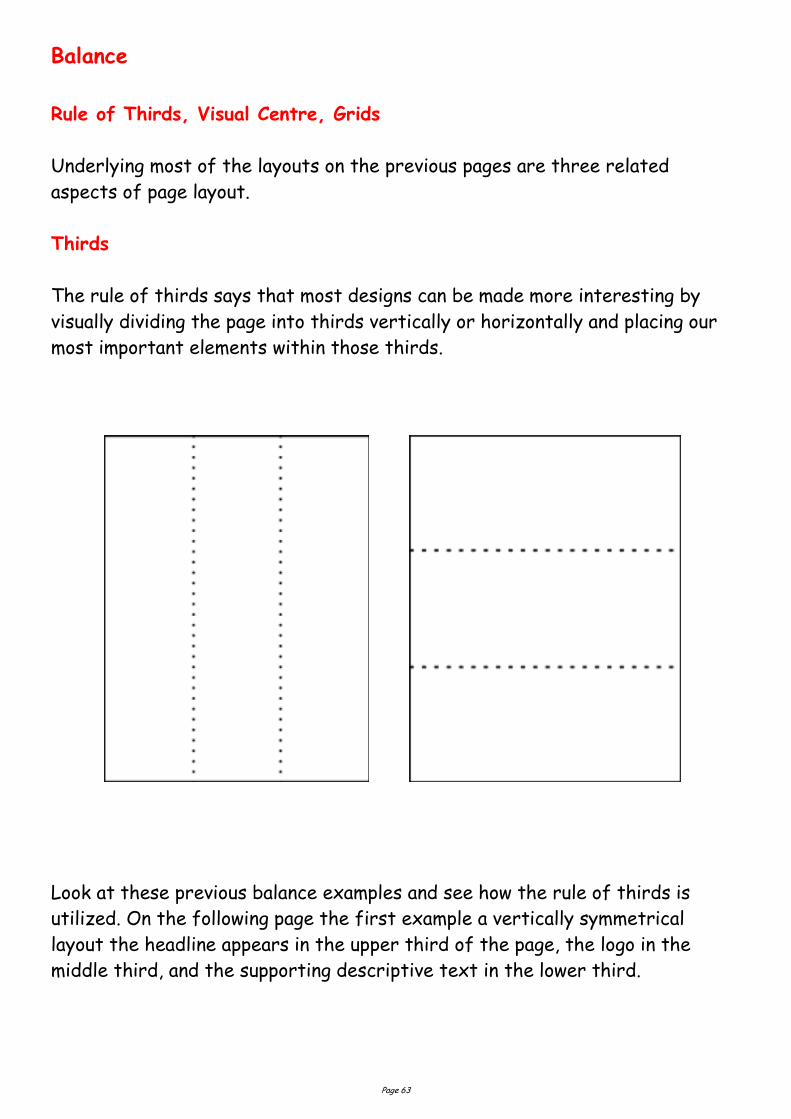
Balance
Rule of Thirds, Visual Centre, Grids
Underlying most of the layouts on the previous pages are three related
aspects of page layout.
Thirds
The rule of thirds says that most designs can be made more interesting by
visually dividing the page into thirds vertically or horizontally and placing our
most important elements within those thirds.
Look at these previous balance examples and see how the rule of thirds is
utilized. On the following page the first example a vertically symmetrical
layout the headline appears in the upper third of the page, the logo in the
middle third, and the supporting descriptive text in the lower third.
Page 64
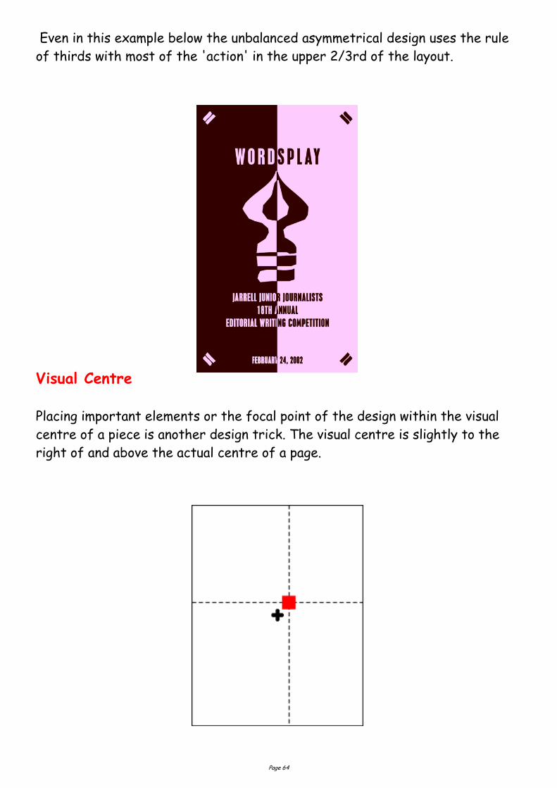
Even in this example below the unbalanced asymmetrical design uses the rule
of thirds with most of the 'action' in the upper 2/3rd of the layout.
Visual Centre
Placing important elements or the focal point of the design within the visual
centre of a piece is another design trick. The visual centre is slightly to the
right of and above the actual centre of a page.
Page 65
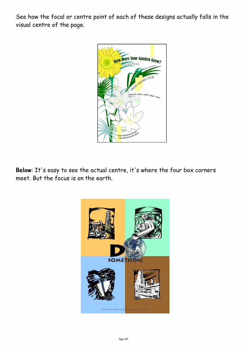
See how the focal or centre point of each of these designs actually falls in the
visual centre of the page.
Below: It's easy to see the actual centre, it's where the four box corners
meet. But the focus is on the earth.
Page 66
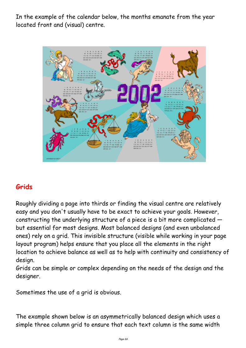
In the example of the calendar below, the months emanate from the year
located front and (visual) centre.
Grids
Roughly dividing a page into thirds or finding the visual centre are relatively
easy and you don't usually have to be exact to achieve your goals. However,
constructing the underlying structure of a piece is a bit more complicated —
but essential for most designs. Most balanced designs (and even unbalanced
ones) rely on a grid. This invisible structure (visible while working in your page
layout program) helps ensure that you place all the elements in the right
location to achieve balance as well as to help with continuity and consistency of
design.
Grids can be simple or complex depending on the needs of the design and the
designer.
Sometimes the use of a grid is obvious.
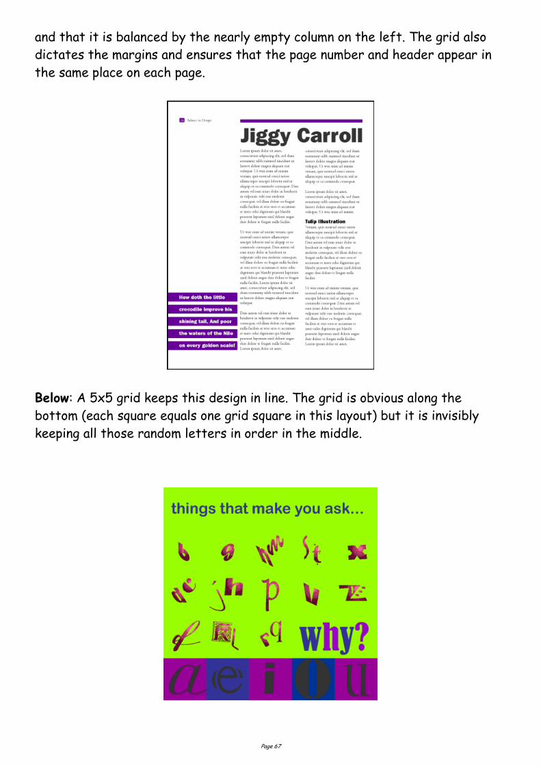
The example shown below is an asymmetrically balanced design which uses a
simple three column grid to ensure that each text column is the same width
Page 67
and that it is balanced by the nearly empty column on the left. The grid also
dictates the margins and ensures that the page number and header appear in
the same place on each page.
Below: A 5x5 grid keeps this design in line. The grid is obvious along the
bottom (each square equals one grid square in this layout) but it is invisibly
keeping all those random letters in order in the middle.
Page 68
Shapes
Squares
The square denotes honesty and stability. Squares are familiar, trusted
shapes. Because the vast majority of the text we read is set in squares and
rectangles, it has become familiar, safe, and comfortable.
Squares and rectangles are probably the most common geometric shapes we
encounter. A few books, especially those for kids, may be cut in irregular
shapes but adult (i.e. 'serious') correspondence comes in squares -- both the
physical shape of the books, magazines, newspapers, and the rectangular
columns of set text.
Some designers might equate square with boring. It's true that other,
unexpected shapes, can grab attention better than the simple square but don't
forget the importance of comfort and familiarity. Imagine how difficult it
becomes to file everyday correspondence if letterhead came in a variety of
triangles or freeform shapes. Try reading an entire book with all the text set
in circles. Squares and rectangles definitely have a place in design.
Some ways you can use squares and rectangles:
To symbolize honesty, stability, equality, comfort, or familiarity. It could
also symbolize rigidity or uniformity.
Related to the first bullet item, use repeating squares to suggest familiar
themes (checkerboard pattern to represent a game board, the chequered
flag at the end of a race, a tablecloth).
To highlight, organize, or set apart information using a solid or outlined
box.
Use a square unexpectedly. Set a block of text in a solid or outlined but
tiled box — with or without also tilting the text.
Circles
Circles suggest infinity. They are also protective (think of protective encircling
arms). They can also denote free movement such as a rolling ball or a more
controlled movement such as a spinning globe. The sense of movement is often
enhanced through shading or the use of lines.
Outside of logo designs, circles are less common elements of design which
Page 69
makes them good for grabbing attention, providing emphasis, and breaking up
familiar rectangular blocks of text. You could set text in circles or simply use a
circle as the background for more traditional blocks of text.
Some ways you can use circles:
To symbolize infinity and protectiveness. Circles could also suggest
something well-rounded or complete. Similar to protectiveness, circles
could also imply security.
Related to the first bullet item, use circles to suggest familiar themes
(bullet holes, a stack of cannonballs, a bunch of grapes -- or just about
any round fruit or vegetable, a target, the earth).
To highlight, organize, or set apart information using a solid or outlined
circle. Try a freeform circle that looks like it was drawn with a marker or
pen to highlight important text.
Replace the letter O or other 'round' letters in text with a circular shape
that suggests that letter. Try an orange in the word Orange or a
basketball, baseball, or soccer ball to replace an O or other letter in the
nameplate of a sports newsletter.
Triangles
Triangles suggest action. They are dynamic. Triangles may convey either
conflict or strength. Triangles can direct movement (up, down, left, right —
depending on which way they 'point') but rather than moving themselves, they
point the way for the reader.
Triangles are suggestive of many different shapes and ideas. They can
represent a religious Trinity, a pyramid, a flag or pennant, an arrow, a beacon.
Some ways you can use triangles:
To symbolize action or conflict. In a logo, a triangle might be better
suited to a growing, dynamic high tech company than the more stable,
familiar square, for example.
Related to the first bullet item, use triangles to suggest familiar themes
(flag, pyramid, arrow or pointer). A single or a series of triangles can point
the eye to important information or act as an arrow to get readers to turn
the page.
Page 70
To highlight, organize, or set apart information using a solid or outlined
triangle. Use a triangle to suggest progression. Place it behind a 'Top 10'
list or the steps to accomplish a specific task.
Replace the letter A or V in text with a trianglur shape that suggests that
letter. Try a wedge of pie for the letter A in the phrase Amy's Desserts.
Mass and Size Defining Mass
As stated in the introduction, mass equals size. Each piece you create has a
physical mass. The physical mass or size is the actual dimensions of the piece
— height, width, thickness/weight (of paper), and depth (3D objects).
Additionally, each element within the design (graphics, photos, lines, text
blocks) have their own mass relative to the whole piece. For example, a photo
that is physically 3 inches by 5 inches can appear smaller or larger depending
on the physical size of the paper it is printed on and the size and proximity
(closeness) of other items on the page.
Some ways to use mass within your designs:
to accommodate information, content Example: To present all the
desired or needed information comfortably a designer may create a
bi-fold rather than the usual single business card.
to accommodate normal size restraints or expectations Example: The
postal service has limitations on the height and width of different types
of envelopes. If a designer ignores those requirements it could incur
additional mailing costs for the client.
to convey a mood or provide emphasis Example: A place that is physically
large (such as an amusement park) or a business that offers a huge
assortment of products may use brochures or other marketing pieces that
are larger (physical dimensions) or heavier (weight) than normal to carry
out the 'bigger' or 'more' theme.
to create contrast Example: A designer might design a full-page magazine
ad using a single small image in the middle of the page with lots of white
space. The contrast between the size of the page and the size of the
Page 71
content (image) draws attention to the image and can create a specific mood
(depending on other elements) such as conservative, elegant, lonely, or
open.
Measuring the Size of Your Design
What is large? What is small? In graphic design and desktop publishing there
are many ways to specify size. This part of the class on mass focuses on the
mechanics of size and common measurement systems used in desktop
publishing..
What you learn here is critical to DTP.
To keep from getting lost, bookmark this page now. You can come back to this
page if you get 'lost' in the many pages and supplemental materials covering
size and measurements.
Auxiliary Materials: Size Matters
This multiple page complex covers the following topics:
Type Sizes
Using Picas in Page Layout,
Paper Sizes ,
Image Sizes
Conversion Tools.
In addition to the main coverage of each topic you'll find that many pages have
a Glossary section with related terms, or How-to pages related to that topic.
These pages are not included in the 'page count' for those topics but are
important supplemental information. Review them.
It will take several days or even longer to absorb all this information.
Page 72
Texture Paper Textures & Finishes
Paper is often something we take for granted. It's just 'there.' Sometimes
we have no choice about the type of paper on which our designs are printed.
Normally we can't dictate the paper used for ads in newspapers or magazines.
Even when we do have a choice, we're limited by budget, printing
requirements, or other factors. However, paper can be an important textural
element in our desktop published documents.
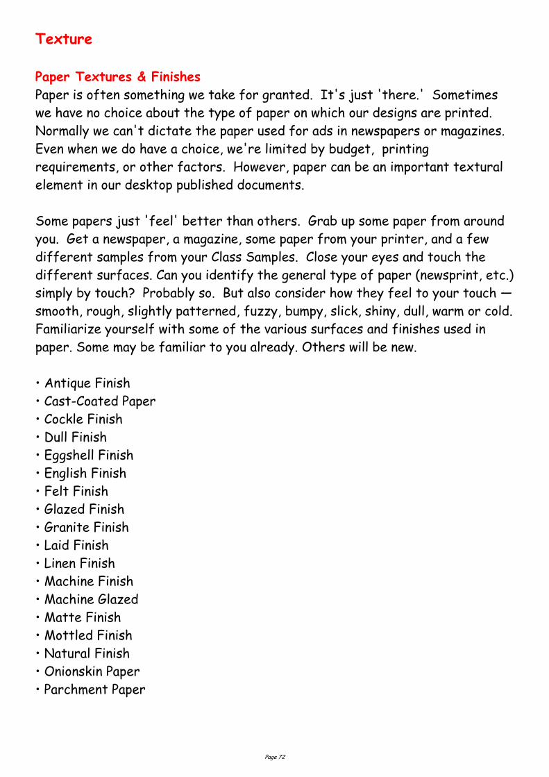
Some papers just 'feel' better than others. Grab up some paper from around
you. Get a newspaper, a magazine, some paper from your printer, and a few
different samples from your Class Samples. Close your eyes and touch the
different surfaces. Can you identify the general type of paper (newsprint, etc.)
simply by touch? Probably so. But also consider how they feel to your touch —
smooth, rough, slightly patterned, fuzzy, bumpy, slick, shiny, dull, warm or cold.
Familiarize yourself with some of the various surfaces and finishes used in
paper. Some may be familiar to you already. Others will be new.
• Antique Finish
• Cast-Coated Paper
• Cockle Finish
• Dull Finish
• Eggshell Finish
• English Finish
• Felt Finish
• Glazed Finish
• Granite Finish
• Laid Finish
• Linen Finish
• Machine Finish
• Machine Glazed
• Matte Finish
• Mottled Finish
• Natural Finish
• Onionskin Paper
• Parchment Paper
Page 73
Design Concept & Texture
Varying paper surfaces can dramatically or subtly alter the mood you want
your designs to convey. An exercise from Using Design Basics To Get Creative Results by Bryan L. Peterson uses the example of a piece of
jewellery placed against two totally different surfaces — a shiny tile of black
Formica vs. a piece of cement.
Translate this same concept to paper and imagine a photograph of a
well-preserved vintage automobile printed on extremely smooth, glossy paper
or printed on a rough, pepply surface. Neither one is necessarily better or
worse. It depends on the mood you want to convey. Increased contrast
between the image (and it's visual texture) and the actual surface of the
paper can create interest in your design.
When selecting paper, choose a texture that is related to the concept of your
design and doesn't overwhelm or get in the way of the message. While you
can make a bold statement with texture, sometimes a subtle texture that
stays 'in the background' is most appropriate. Make sure that your texture
works with your choice of type and images so that text does not become
unreadable or images unrecognizable.
It may be necessary to use a bolder typeface if your paper is rough or
strongly patterned.
Here is an example of paper texture from an assignment.
Unexpected contrast: In a brochure promoting a computer-related service:
"The grey colour also evokes a high-tech, sterile mood, although I might
expect a glossier surface to go along with that, rather than the sensual feel
of the textured stock." — Student ID S011203
My comments: "...the softer texture may indeed have been meant to soften
and humanize the high-tech image."
Page 74
Visual Textures
Everything around us has a texture. Sometimes we can simulate those
textures with paper, but more often the textures we create in our designs are
visual rather than tactile. However, those visual textures can be just as
provocative or full of meaning as actual textures we can touch.
It's extremely easy to find or create visual textures for your designs. There
are four basic ways to incorporate visual texture.
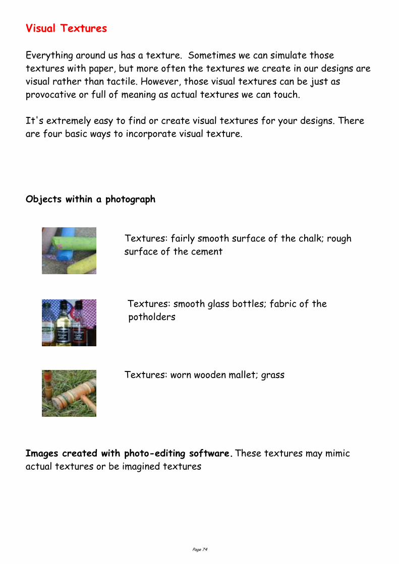
Objects within a photograph
Textures: fairly smooth surface of the chalk; rough
surface of the cement
Textures: smooth glass bottles; fabric of the
potholders
Textures: worn wooden mallet; grass
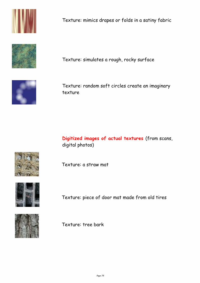
Images created with photo-editing software. These textures may mimic
actual textures or be imagined textures
Page 75
Texture: mimics drapes or folds in a satiny fabric
Texture: simulates a rough, rocky surface
Texture: random soft circles create an imaginary
texture
Digitized images of actual textures (from scans,
digital photos)
Texture: a straw mat
Texture: piece of door mat made from old tires
Texture: tree bark
Page 76
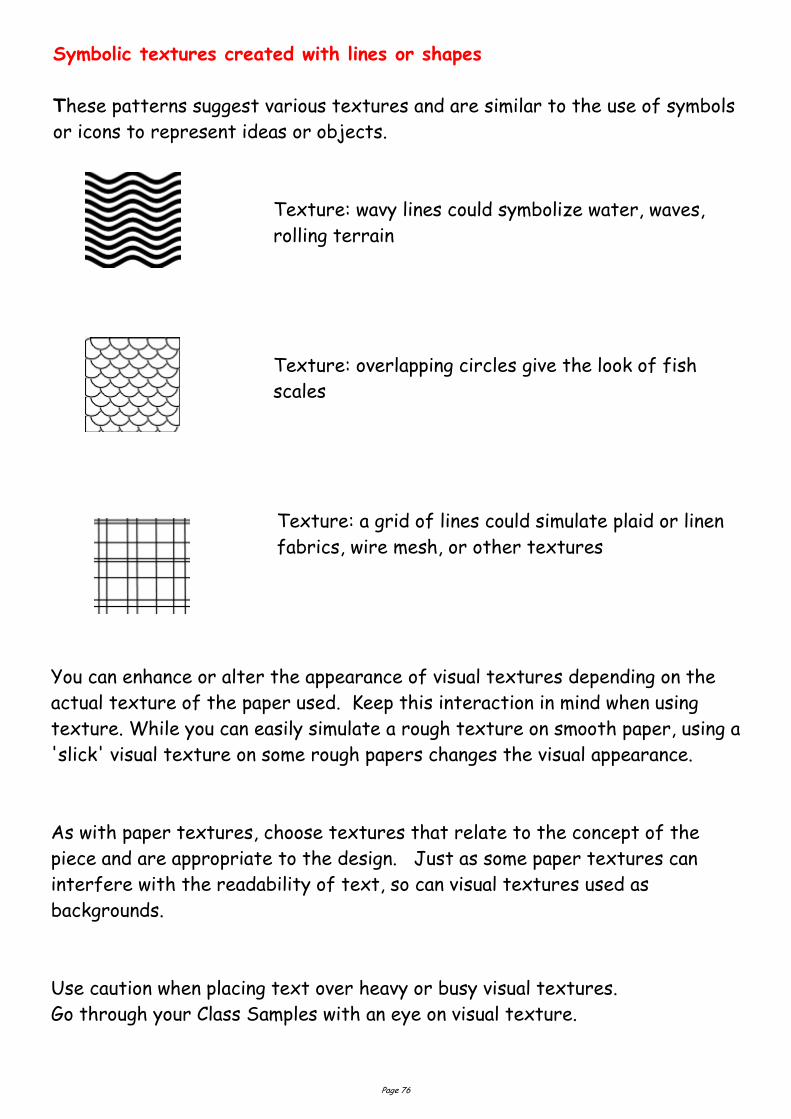
Symbolic textures created with lines or shapes
These patterns suggest various textures and are similar to the use of symbols
or icons to represent ideas or objects.
Texture: wavy lines could symbolize water, waves,
rolling terrain
Texture: overlapping circles give the look of fish
scales
Texture: a grid of lines could simulate plaid or linen
fabrics, wire mesh, or other textures
You can enhance or alter the appearance of visual textures depending on the
actual texture of the paper used. Keep this interaction in mind when using
texture. While you can easily simulate a rough texture on smooth paper, using a
'slick' visual texture on some rough papers changes the visual appearance.
As with paper textures, choose textures that relate to the concept of the
piece and are appropriate to the design. Just as some paper textures can
interfere with the readability of text, so can visual textures used as
backgrounds.
Use caution when placing text over heavy or busy visual textures.
Go through your Class Samples with an eye on visual texture.
Page 77
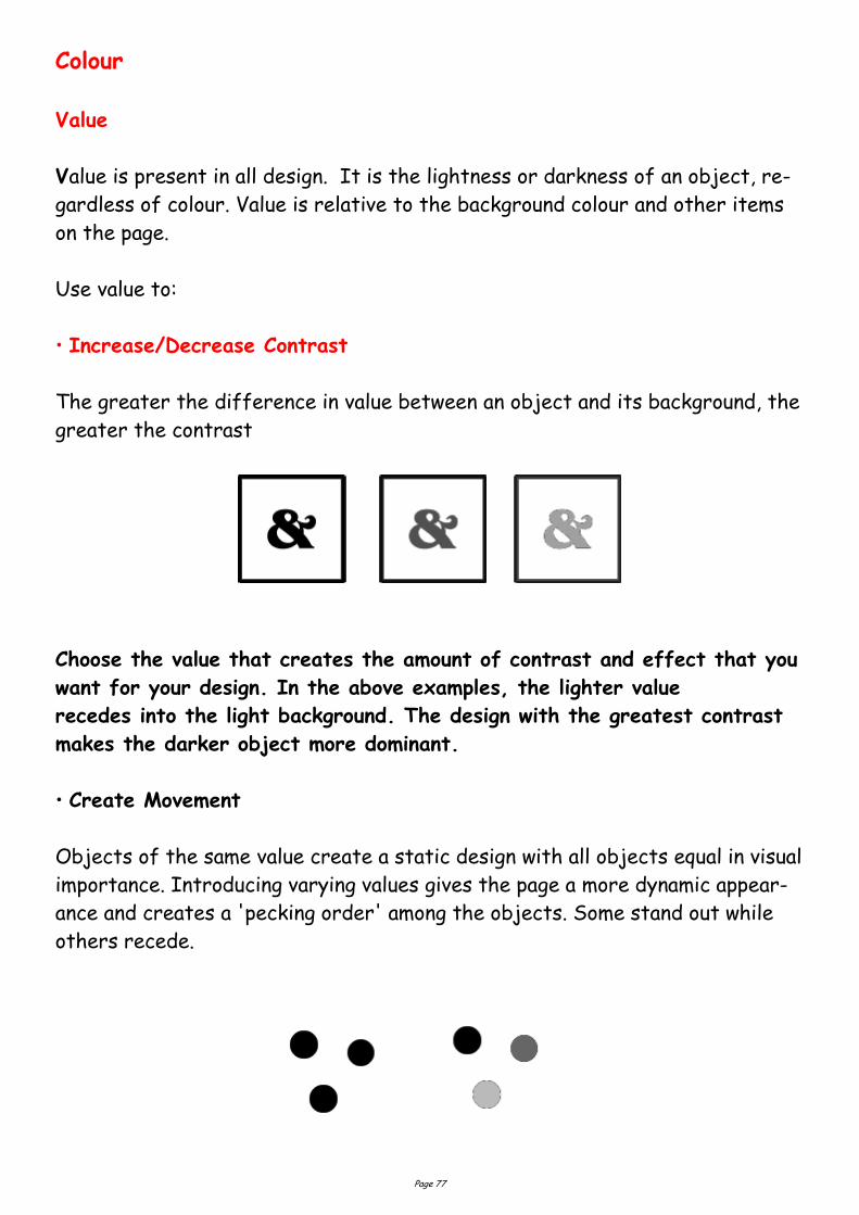
Colour Value
Value is present in all design. It is the lightness or darkness of an object, re-
gardless of colour. Value is relative to the background colour and other items
on the page.
Use value to:
• Increase/Decrease Contrast
The greater the difference in value between an object and its background, the
greater the contrast
Choose the value that creates the amount of contrast and effect that you
want for your design. In the above examples, the lighter value
recedes into the light background. The design with the greatest contrast
makes the darker object more dominant.
• Create Movement
Objects of the same value create a static design with all objects equal in visual
importance. Introducing varying values gives the page a more dynamic appear-
ance and creates a 'pecking order' among the objects. Some stand out while
others recede.
Page 78
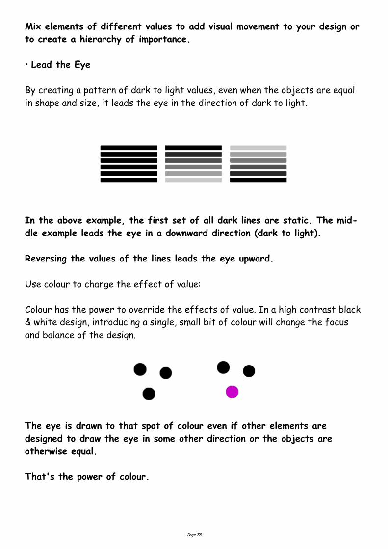
Mix elements of different values to add visual movement to your design or
to create a hierarchy of importance.
• Lead the Eye
By creating a pattern of dark to light values, even when the objects are equal
in shape and size, it leads the eye in the direction of dark to light.
In the above example, the first set of all dark lines are static. The mid-
dle example leads the eye in a downward direction (dark to light).
Reversing the values of the lines leads the eye upward.
Use colour to change the effect of value:
Colour has the power to override the effects of value. In a high contrast black
& white design, introducing a single, small bit of colour will change the focus
and balance of the design.
The eye is drawn to that spot of colour even if other elements are
designed to draw the eye in some other direction or the objects are
otherwise equal.
That's the power of colour.
Page 79
Layout : grids and columns
Grids
Most designers will set up a page grid before they start whacking elements
down on a page. Of course, if you're using a computer, it's quite easy to stick
stuff on a page and move it around in a fairly random fashion until you've got
something you like the look of. Generally speaking, though, that approach is
likely to result in some pretty awful pages and, over a lengthy document, may
well result in a total hotchpotch which simply confuses the reader.
To determine the grid appropriate for your design is no easy business, but it's
worth investing some time in it. Here are a few pointers you might find useful:
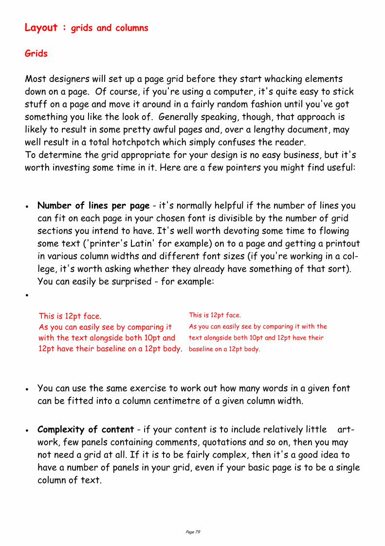
Number of lines per page - it's normally helpful if the number of lines you
can fit on each page in your chosen font is divisible by the number of grid
sections you intend to have. It's well worth devoting some time to flowing
some text ('printer's Latin' for example) on to a page and getting a printout
in various column widths and different font sizes (if you're working in a col-
lege, it's worth asking whether they already have something of that sort).
You can easily be surprised - for example:
You can use the same exercise to work out how many words in a given font
can be fitted into a column centimetre of a given column width.
Complexity of content - if your content is to include relatively little art-
work, few panels containing comments, quotations and so on, then you may
not need a grid at all. If it is to be fairly complex, then it's a good idea to
have a number of panels in your grid, even if your basic page is to be a single
column of text.
This is 12pt face.
As you can easily see by comparing it
with the text alongside both 10pt and
12pt have their baseline on a 12pt body.
This is 12pt face.
As you can easily see by comparing it with the
text alongside both 10pt and 12pt have their
baseline on a 12pt body.
Page 80
Margins - a function of how much you need to fit on to each page, which of
course will vary from one production to another, but the following general
rules are often followed:
Foredge (also known as outside margin): should be an average of head (top
margin) and foot (bottom margin)
Foot (also known as bottom margin): should always be bigger than the head
(top margin), probably at least 50% bigger (this is due to the
so-called optical centre - due to an optical illusion, we tend to see the cen-
tre of a page as being slightly higher than the actual centre. Thus, if ele-
ments are situated exactly equally on either side of the optical centre,
we tend to see them as too low down. For that reason, when setting up a
page, we normally set up the bottom margin around 50% bigger than the
top margin)
Back (also known as inside or gutter margin): the two back margins taken to-
gether should be roughly as wide as the foredge (when setting up the back
margin, you should bear in mind how your work is to be bound - some
bindings 'eat up' a large amount of paper)
Master pages - most desktop publishing systems will provide you with
master pages. It's on those pages that you should set up your grid once you've
decided what it should be.
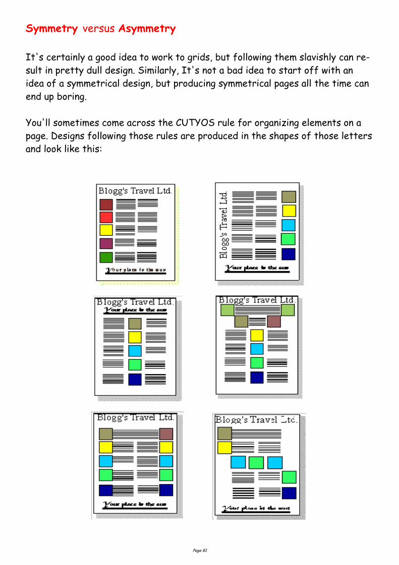
Page 81
Symmetry versus Asymmetry
It's certainly a good idea to work to grids, but following them slavishly can re-
sult in pretty dull design. Similarly, It's not a bad idea to start off with an
idea of a symmetrical design, but producing symmetrical pages all the time can
end up boring.
You'll sometimes come across the CUTYOS rule for organizing elements on a
page. Designs following those rules are produced in the shapes of those letters
and look like this:

Page 82
You can add some
interest to a
two-column layout by reducing the height of the columns and reserving the
space for headings graphics. It can look a bit odd, though, if there's nothing
there, though you can militate against that by having a running head on every
page.
You can also add interest by using two columns of differing widths. The
problem is that this only really works if the two columns are somehow
different in content, for example if the narrow column is providing a running
commentary on the wider one.
Three columns
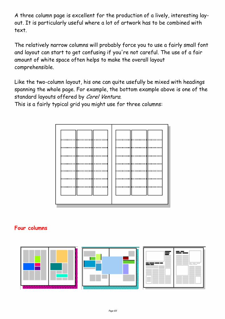
Page 83
A three column page is excellent for the production of a lively, interesting lay-
out. It is particularly useful where a lot of artwork has to be combined with
text.
The relatively narrow columns will probably force you to use a fairly small font
and layout can start to get confusing if you're not careful. The use of a fair
amount of white space often helps to make the overall layout
comprehensible.
Like the two-column layout, his one can quite usefully be mixed with headings
spanning the whole page. For example, the bottom example above is one of the
standard layouts offered by Corel Ventura.
This is a fairly typical grid you might use for three columns:
Four columns
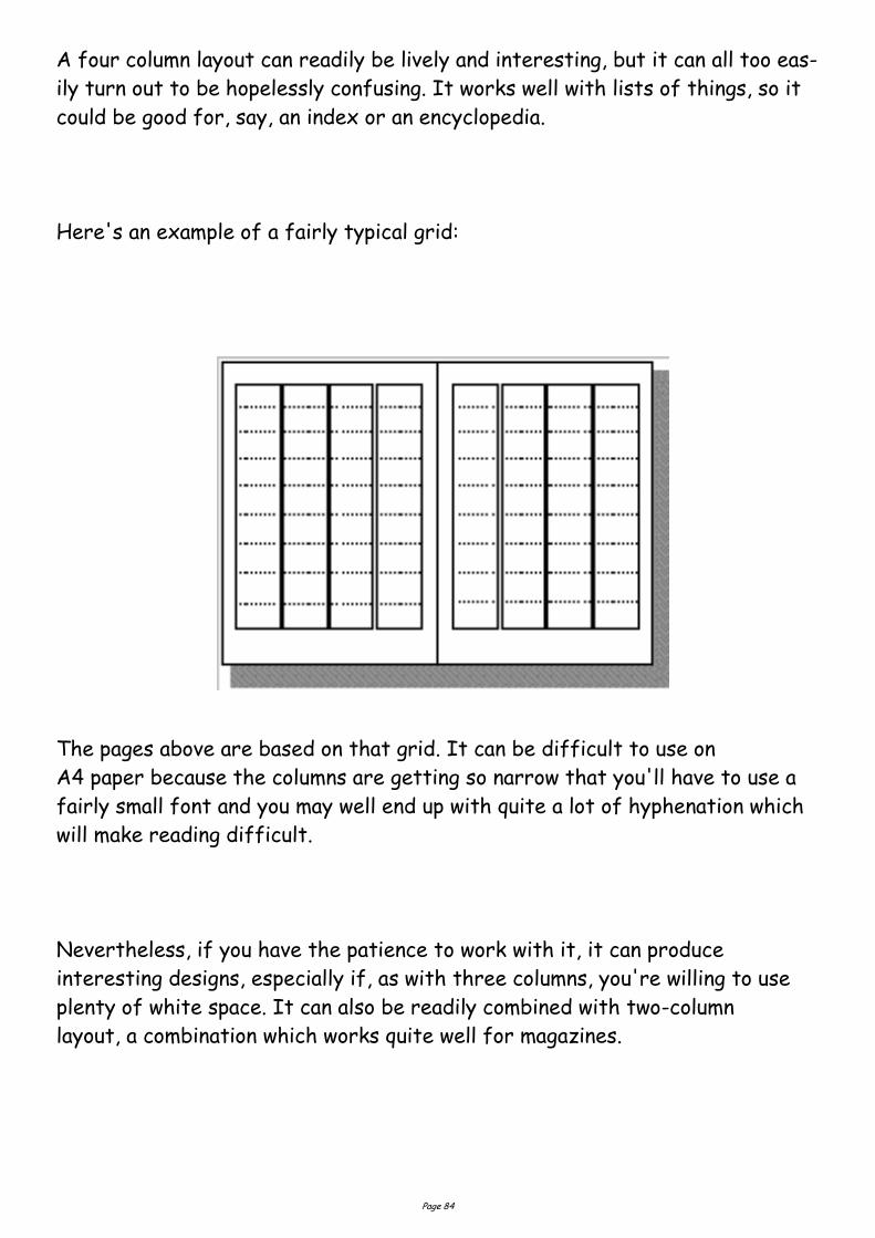
Page 84
A four column layout can readily be lively and interesting, but it can all too eas-
ily turn out to be hopelessly confusing. It works well with lists of things, so it
could be good for, say, an index or an encyclopedia.
Here's an example of a fairly typical grid:
The pages above are based on that grid. It can be difficult to use on
A4 paper because the columns are getting so narrow that you'll have to use a
fairly small font and you may well end up with quite a lot of hyphenation which
will make reading difficult.
Nevertheless, if you have the patience to work with it, it can produce
interesting designs, especially if, as with three columns, you're willing to use
plenty of white space. It can also be readily combined with two-column
layout, a combination which works quite well for magazines.
Page 85
Thumbnail Sketches
Thumbnail sketches are simple idea sketches which will help the designer to
obtain an attractive and acceptable final result. The client can see the ideas
and then choose the layout which he or she prefers.
Thumbnail sketches serve these three primary purposes; they:
1. Graphically preserve ideas;
2. Visually portray ideas; and
3. Compare two or more ideas visually.
Preparation of these sketches should begin immediately after the desired
product has been selected and after completion of the pre-layout planning
sheet. Copy selection precedes thumbnails; therefore, one of the
responsibilities of the designer is to obtain all the copy that will appear on the
final product. The originator of the planned printed product should have this
information readily available.
Design Elements and Principles
The principles and elements of good design and page layout include proportion,
balance, rhythm, emphasis, colour, lines, shapes, and textures. Additional
components may be considered graphic design principles or ways to achieve a
well-designed page layout including alignment, white space, contrast, and
repetition.
Elements of Design
From an online design class, definitions and graphic depiction of lines, shapes,
texture, and other design components.
Element of Design: Lines
From our online Design Basics Course, these lessons define and explore the
appearance, patterns, and uses of lines in desktop publishing and graphic design
projects.
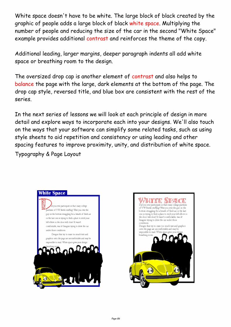
Page 86
White space doesn't have to be white. The large block of black created by the
graphic of people adds a large block of black white space. Multiplying the
number of people and reducing the size of the car in the second "White Space"
example provides additional contrast and reinforces the theme of the copy.
Additional leading, larger margins, deeper paragraph indents all add white
space or breathing room to the design.
The oversized drop cap is another element of contrast and also helps to
balance the page with the large, dark elements at the bottom of the page. The
drop cap style, reversed title, and blue box are consistent with the rest of the
series.
In the next series of lessons we will look at each principle of design in more
detail and explore ways to incorporate each into your designs. We'll also touch
on the ways that your software can simplify some related tasks, such as using
style sheets to aid repetition and consistency or using leading and other
spacing features to improve proximity, unity, and distribution of white space.
Typography & Page Layout
Page 87
Design Elements
Shape
Circles, squares, rectangles and triangles are the basic shapes. The most familiar shape is
the square (rectangle) used in DTP. The square denotes honesty and stability.
Circles suggest infinity, protection and movement.
Triangles suggest action but they can also convey either conflict or strength.
Mass/Weight
Mass is size. Mass can be physical and visual. 3 factors should be considered in mass.
Function – The size of the printed piece.
Attraction – The contrast of large and small items.
Organisation – The most important items should be the largest.
Texture
Paper type – There are various surfaces and finishes from newsprint, glossy paper, woven,
vellum etc.
Visual textures – Photographs of objects (glass paper, glass).
Photo-editing can be used to mimic textures (rough surface using dots).
Scanning the actual materials (straw mat, gravel).
Lines or shapes (wavy lines representing water).
Page 88
Element of Design: Shape
From our online Design Basics Course, these lessons define geometric, natural,
and abstract shapes with emphasis on the meanings and use of basic geometric
shapes of square, circle, triangle.
Principles of Design
From notes for a design class, definitions and graphic depiction of balance,
contrast, proportion, and other layout considerations.
Alignment - Principle of Design
Alignment is a design principle for page layout and good formatting. See an ex-
ample including aligning objects on the page and type alignment.
Balance - Principle of Design
Balance, a design principle for page layout, defined and illustrated. Types of
balance and how to achieve a balanced page.
Consistency - Principle of Design
Definitions and examples of how to achieve consistency and unity in design and
its importance.
Contrast - Principle of Design
How to achieve contrast in your design and page layout and why it's important.
Grids for Desktop Publishing
Learn what a grid is, formats for grids, and how to put together basic and com-
plex grids, leading grids, and layouts. Use grids to provide page-to-page con-
sistency, unify and align page elements, and provide design continuity across
related documents.
Proximity - Principle of Design
Grouping like objects and separating unlike elements is using proximity in de-
sign to show relationships and importance.
White Space - Principle of Design
Put white space into your design to give it some breathing room and make it
less cramped, confusing, or overwhelming.
Page 89
Frames: You've Been Framed
Effective use of boxes & borders in your desktop documents and Web pages.
Page Layout Principles
From a DTP class, guidelines on white space, consistency, grids, and other prin-
ciples of good page layout and design.
Principles of Design
Visually, there is very little originality in design — it is usually a rearrangement
of an idea observed and recorded previously. No matter how simple the design
may be, there are certain principles that must be applied.
Appreciation of their importance will be slowly gained by observation and prac-
tice together with good judgement. This will produce satisfactory results with-
out the need for any mathematical calculations.
Principles of design should always be incorporated in any graphic design project
to assist its communicating and graphic interest, however in the planning of a
basic design, the
designer must produce a job to suit the class of work, the copy, and the tastes
of the customer.
To develop a sense of design use the three `eyes':
1. Visual-eyes: Examine closely all types of printed material, i.e. physically
see/look at what everyone else is/has done. (What catches or eludes your
attention, and why?)
2. Critic-eyes: Separate the good from the bad. (What provokes the ad? What
motivates you? Those things that don't catch your eye — why?)
3. Analy-eyes: Select the element that makes it a good design.
There are three essential qualities needed to become a competent designer:
Vision. — To be able to detect an idea and then to toss it around in your head
(objects, tones, shapes, colours — everything around you).
Imagination. — To be able to use an idea effectively, i.e. brainstorm the idea
and bring it to a state where it can work.
Page 90
Judgement. — To be able to assess the idea's value and correct place and use,
i.e. limitations always arise after you come up with an idea.
The Principles of Design are qualities or characteristics inherent in any art
form, such as balance, harmony, contrast, variety, and action. These principles
must be used in any design if it is to be in any way effective. Not all of them,
however, will be used in the one design.
Whatever principles the designer may adopt, the ultimate result must be a de-
sign that can be easily read and clearly understood. Careful control of the
principles of design is necessary to successfully project an intended image.
Balance
This is the result of an arrangement of one or more elements in the design so
that visually, they equal each other. Every object in nature has structural bal-
ance, from the symmetry of a flower petal to the chambers of a snail's shell.
The balance needed every time we perform any form of physical movement is
automatically maintained by a built-in equilibrium that we take for granted.
Man-made structures, even if not formally equal on all sides, must maintain a
balance in relation to a perpendicular surface. Doubtless the Leaning Tower of
Pisa will someday fall when a greater portion of its weight shifts off balance.
Sound must also be balanced, both in its production and in its reproduction.
Achieving a physical balance is simple: the weight of one object must be coun-
ter-balanced by the weight of another on the opposite end of a fulcrum. If,
however, the objects are of different materials, the masses may not appear to
be balanced. Because steel is heavier than wood, for example, a large piece of
wood is needed to balance a small piece of steel.
Physical balance can be measured by use of a balance scale; there is no agreed
scientific method, however, for determining the weights of shapes in the arts.
Instead, balance is determined by weighing the objects visually.
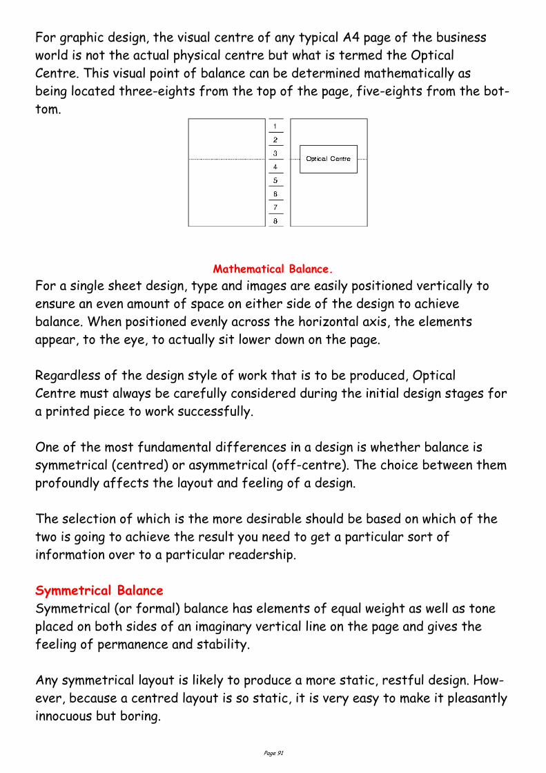
Page 91
For graphic design, the visual centre of any typical A4 page of the business
world is not the actual physical centre but what is termed the Optical
Centre. This visual point of balance can be determined mathematically as
being located three-eights from the top of the page, five-eights from the bot-
tom.
Mathematical Balance.
For a single sheet design, type and images are easily positioned vertically to
ensure an even amount of space on either side of the design to achieve
balance. When positioned evenly across the horizontal axis, the elements
appear, to the eye, to actually sit lower down on the page.
Regardless of the design style of work that is to be produced, Optical
Centre must always be carefully considered during the initial design stages for
a printed piece to work successfully.
One of the most fundamental differences in a design is whether balance is
symmetrical (centred) or asymmetrical (off-centre). The choice between them
profoundly affects the layout and feeling of a design.
The selection of which is the more desirable should be based on which of the
two is going to achieve the result you need to get a particular sort of
information over to a particular readership.
Symmetrical Balance
Symmetrical (or formal) balance has elements of equal weight as well as tone
placed on both sides of an imaginary vertical line on the page and gives the
feeling of permanence and stability.
Any symmetrical layout is likely to produce a more static, restful design. How-
ever, because a centred layout is so static, it is very easy to make it pleasantly
innocuous but boring.
Page 92
Magazine Analysis/Graphic Design
Design Elements and Principles
When designing any type of graphic it is very important to think of how the
graphics is Positioned on the page. The layout of any graphic takes a number
of factors into consideration. The factors come under the term Design
Elements and Principles. The following text will give a brief explanation on
each followed by exemplars of how they are applied
Design Principles
Generally, all the principles of design apply to any piece you may create. How
you apply those principles determines how effective your design is in conveying
the desired message and how attractive it appears. There is seldom only one
correct way to apply each principle.
Balance
Try walking a long distance with a 2 kilo bag of rocks in one hand
and a 10 kilo bag of marbles in the other. After awhile you'll be
wanting to shift your load around, putting a few marbles in the
rock bag to balance your load, make it easier to walk. This is how
balance works in design. Visual balance comes from arranging
elements on the page so that no one section is heavier than the
other. Or, a designer may intentionally throw elements out of
balance to create tension or a certain mood.
Symmetry Elements on one side each exactly elements on the other side (vertical or
horizontal).
Asymmetry not symmetrical. This allows for greater variety with an odd or mismatched
number of different elements.
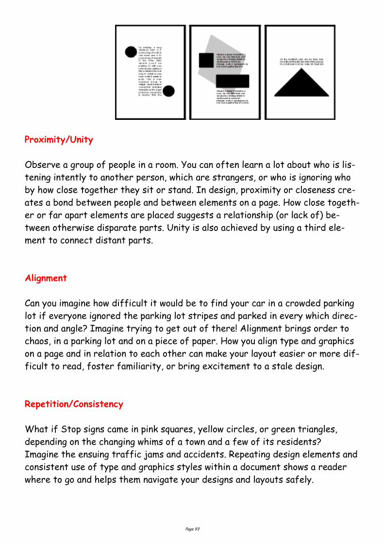
Page 93
Proximity/Unity
Observe a group of people in a room. You can often learn a lot about who is lis-
tening intently to another person, which are strangers, or who is ignoring who
by how close together they sit or stand. In design, proximity or closeness cre-
ates a bond between people and between elements on a page. How close togeth-
er or far apart elements are placed suggests a relationship (or lack of) be-
tween otherwise disparate parts. Unity is also achieved by using a third ele-
ment to connect distant parts.
Alignment
Can you imagine how difficult it would be to find your car in a crowded parking
lot if everyone ignored the parking lot stripes and parked in every which direc-
tion and angle? Imagine trying to get out of there! Alignment brings order to
chaos, in a parking lot and on a piece of paper. How you align type and graphics
on a page and in relation to each other can make your layout easier or more dif-
ficult to read, foster familiarity, or bring excitement to a stale design.
Repetition/Consistency
What if Stop signs came in pink squares, yellow circles, or green triangles,
depending on the changing whims of a town and a few of its residents?
Imagine the ensuing traffic jams and accidents. Repeating design elements and
consistent use of type and graphics styles within a document shows a reader
where to go and helps them navigate your designs and layouts safely.
Page 94
White Space
Did you ever participate in that crazy pastime of Fiat Panda stuffing? Were
you ever the guy on the bottom struggling for a breath of fresh air or the last
one in trying to find a place to stick your left elbow so the door will close? It
wasn't comfortable, was it? Imagine trying to drive the car under those
conditions. Designs that try to cram too much text and graphics onto the page
are uncomfortable and may be impossible to read. White space gives your
design breathing room.
Contrast
On the basketball court, one pro team looks much like another. But send a few
of those players for a stroll down most any major city street and
something becomes apparent — those players are much taller than your
average guy on the street. That's contrast. In design, big and small
elements, black and white text, squares and circles, can all create contrast in
design.
The Big Picture
Illustrating Principles of Design
The examples you'll find here demonstrate varying degrees of each of the six
principles of design in a before and after format. View them individually and as
a whole to see how different principles are applied. How might you do any of
these differently?
You can create balance with the three elements (text block, graphic, vertical
text) here but in the first example they appear to be just random elements
with no unity or balance. In the second "Balance" example the text block and
graphic are resized to bring them closer together and better balance each
other.
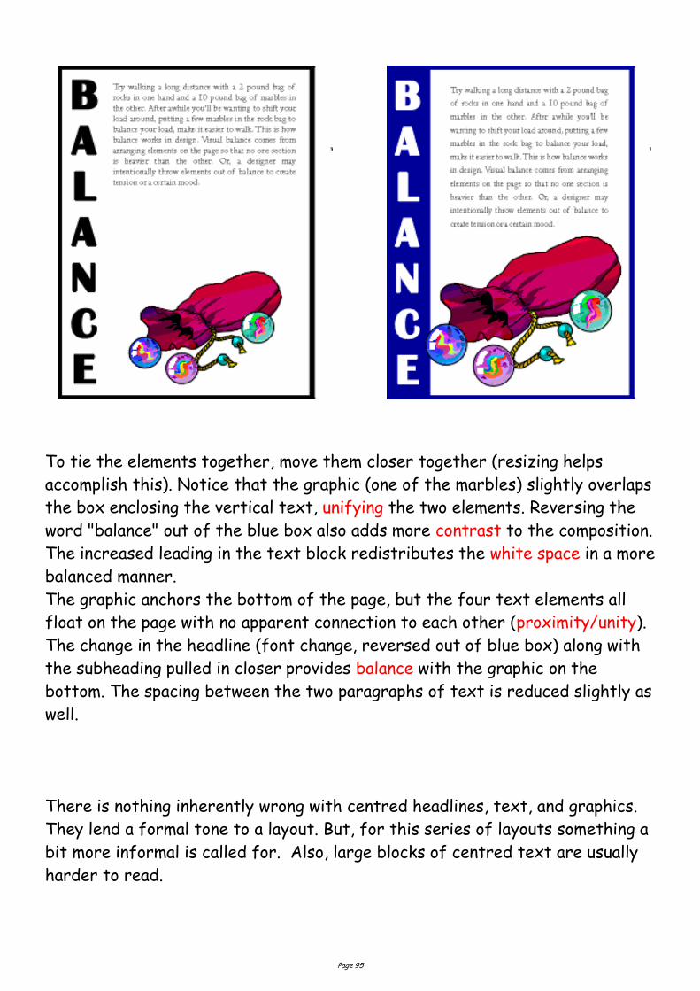
Page 95
To tie the elements together, move them closer together (resizing helps
accomplish this). Notice that the graphic (one of the marbles) slightly overlaps
the box enclosing the vertical text, unifying the two elements. Reversing the
word "balance" out of the blue box also adds more contrast to the composition.
The increased leading in the text block redistributes the white space in a more
balanced manner.
The graphic anchors the bottom of the page, but the four text elements all
float on the page with no apparent connection to each other (proximity/unity).
The change in the headline (font change, reversed out of blue box) along with
the subheading pulled in closer provides balance with the graphic on the
bottom. The spacing between the two paragraphs of text is reduced slightly as
well.
There is nothing inherently wrong with centred headlines, text, and graphics.
They lend a formal tone to a layout. But, for this series of layouts something a
bit more informal is called for. Also, large blocks of centred text are usually
harder to read.
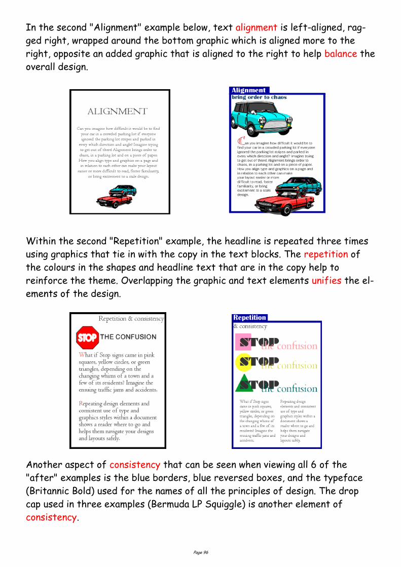
Page 96
In the second "Alignment" example below, text alignment is left-aligned, rag-
ged right, wrapped around the bottom graphic which is aligned more to the
right, opposite an added graphic that is aligned to the right to help balance the
overall design.
Within the second "Repetition" example, the headline is repeated three times
using graphics that tie in with the copy in the text blocks. The repetition of
the colours in the shapes and headline text that are in the copy help to
reinforce the theme. Overlapping the graphic and text elements unifies the el-
ements of the design.
Another aspect of consistency that can be seen when viewing all 6 of the
"after" examples is the blue borders, blue reversed boxes, and the typeface
(Britannic Bold) used for the names of all the principles of design. The drop
cap used in three examples (Bermuda LP Squiggle) is another element of
consistency.
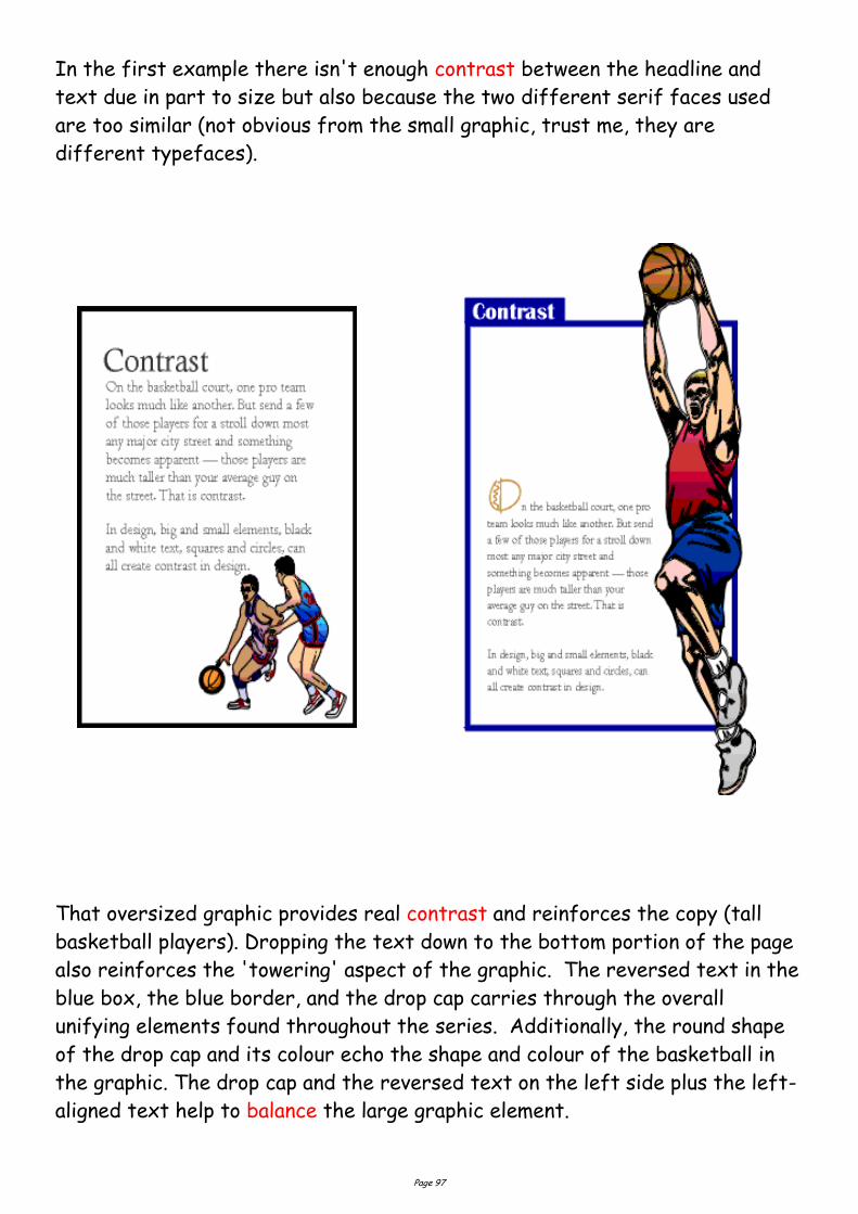
Page 97
In the first example there isn't enough contrast between the headline and
text due in part to size but also because the two different serif faces used
are too similar (not obvious from the small graphic, trust me, they are
different typefaces).
That oversized graphic provides real contrast and reinforces the copy (tall
basketball players). Dropping the text down to the bottom portion of the page
also reinforces the 'towering' aspect of the graphic. The reversed text in the
blue box, the blue border, and the drop cap carries through the overall
unifying elements found throughout the series. Additionally, the round shape
of the drop cap and its colour echo the shape and colour of the basketball in
the graphic. The drop cap and the reversed text on the left side plus the left-
aligned text help to balance the large graphic element.
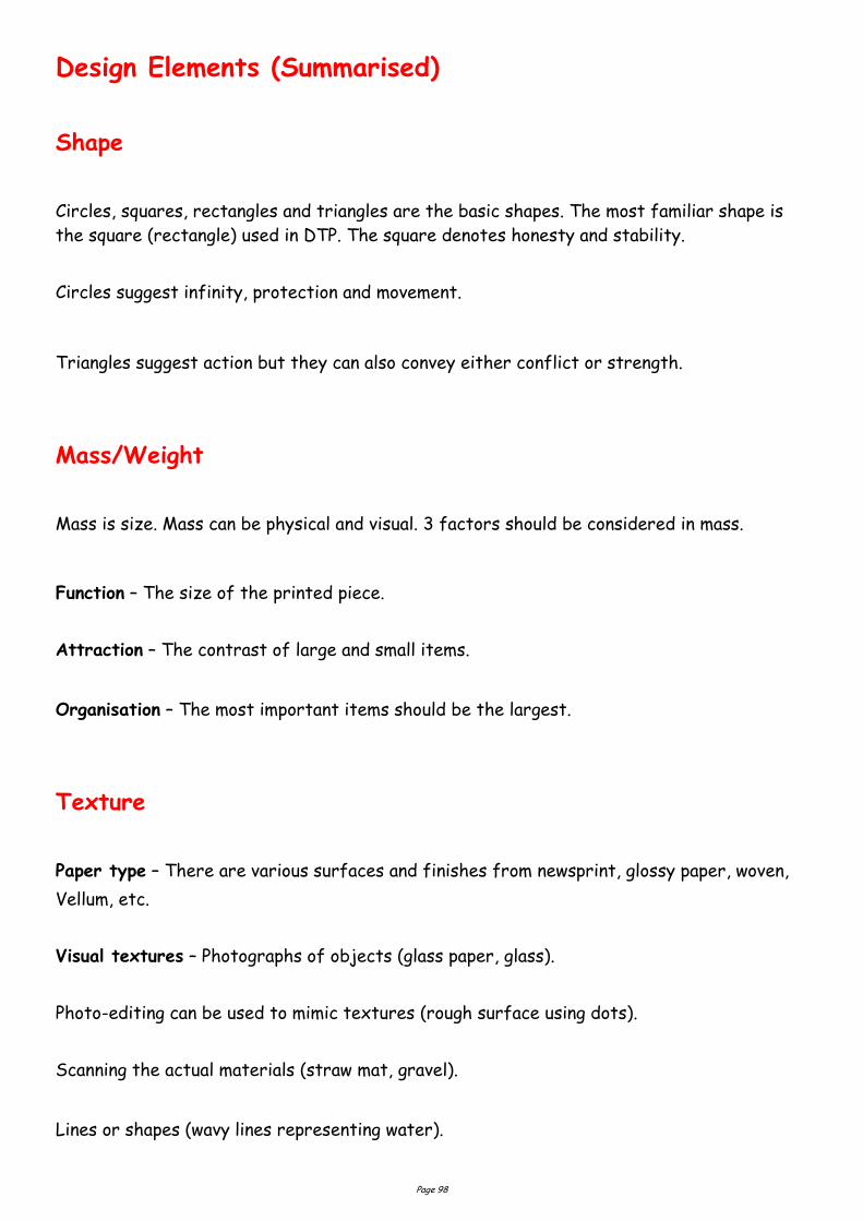
Page 98
Design Elements (Summarised)
Shape
Circles, squares, rectangles and triangles are the basic shapes. The most familiar shape is
the square (rectangle) used in DTP. The square denotes honesty and stability.
Circles suggest infinity, protection and movement.
Triangles suggest action but they can also convey either conflict or strength.
Mass/Weight
Mass is size. Mass can be physical and visual. 3 factors should be considered in mass.
Function – The size of the printed piece.
Attraction – The contrast of large and small items.
Organisation – The most important items should be the largest.
Texture
Paper type – There are various surfaces and finishes from newsprint, glossy paper, woven,
Vellum, etc.
Visual textures – Photographs of objects (glass paper, glass).
Photo-editing can be used to mimic textures (rough surface using dots).
Scanning the actual materials (straw mat, gravel).
Lines or shapes (wavy lines representing water).
Page 99
Value
Value is the darkness or lightness of an object regardless of colour. Value is relative to the
background colour and other items on the page. In a completely black and white design the
introduction of a small bit of colour will change the focus and balance of the design.
Size
Is LARGE or SMALL. 3 factors determine size.
Function – The size required of the design.
Attraction – Contrast large and small elements. Crop images to add interest.
Organisation – The most important element should be the largest - the least important the
smallest.
Colour
Colour in nature is represented by mixing the three primary colours, red, blue and Yellow.
For computer monitors the primary colours are red, green and blue (RGB). In commercial
printing digital colour is Cyan, Magenta, Yellow and Key (Black) CMYK.
Line
Can be used to divide or unite elements, create movement, provide texture, convey a mood
or emotion, define shapes, provide emphasis and provide a framework.
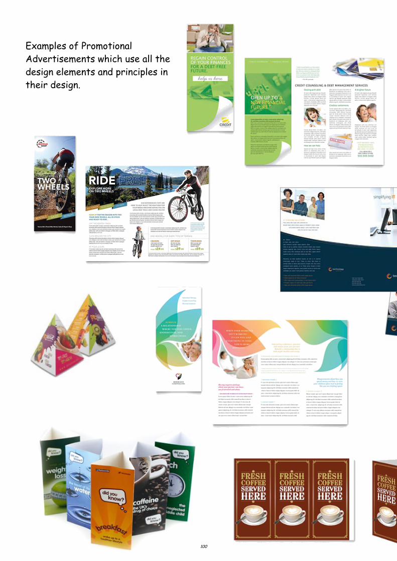
Page 100
Examples of Promotional
Advertisements which use all the
design elements and principles in
their design.
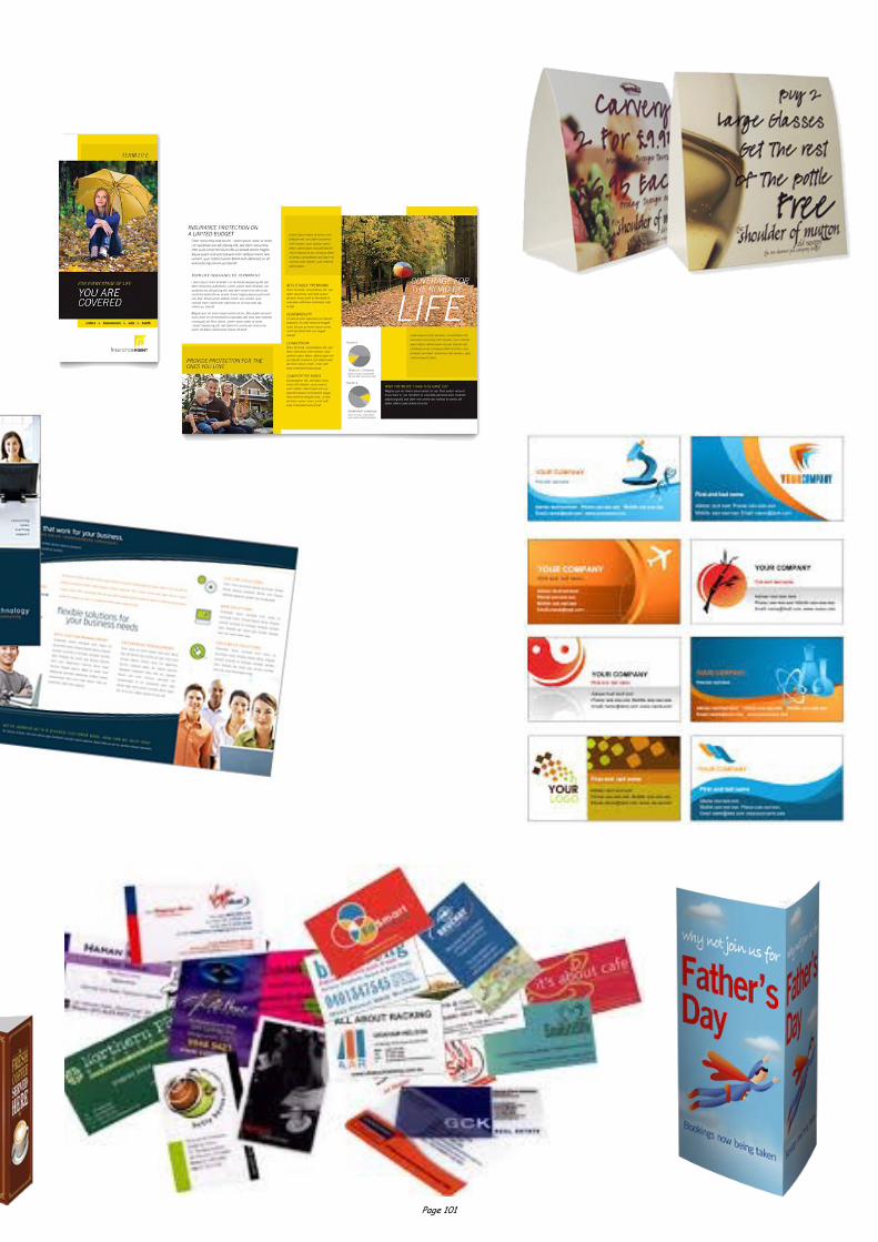
Page 101
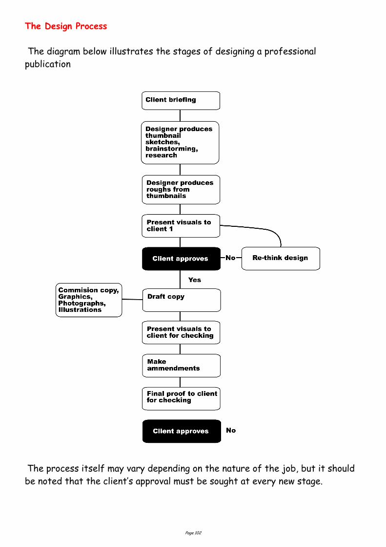
Page 102
The Design Process
The diagram below illustrates the stages of designing a professional
publication
The process itself may vary depending on the nature of the job, but it should
be noted that the client’s approval must be sought at every new stage.
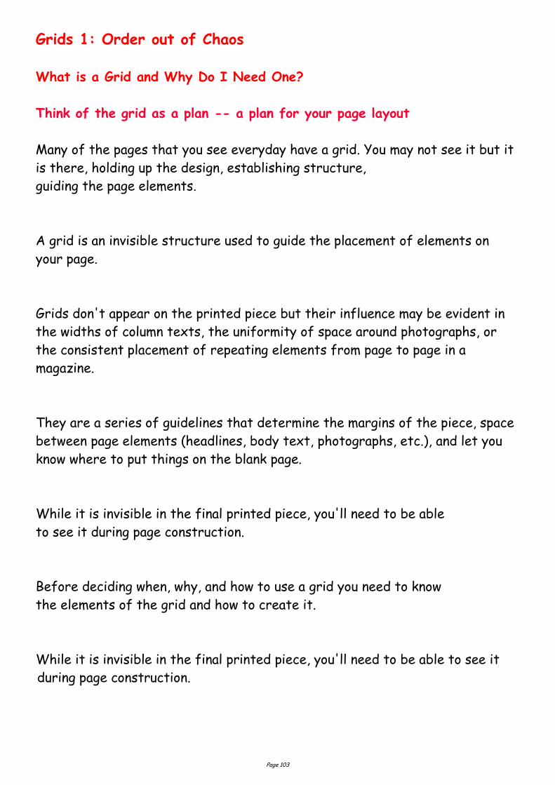
Page 103
Grids 1: Order out of Chaos
What is a Grid and Why Do I Need One?
Think of the grid as a plan -- a plan for your page layout
Many of the pages that you see everyday have a grid. You may not see it but it
is there, holding up the design, establishing structure,
guiding the page elements.
A grid is an invisible structure used to guide the placement of elements on
your page.
Grids don't appear on the printed piece but their influence may be evident in
the widths of column texts, the uniformity of space around photographs, or
the consistent placement of repeating elements from page to page in a
magazine.
They are a series of guidelines that determine the margins of the piece, space
between page elements (headlines, body text, photographs, etc.), and let you
know where to put things on the blank page.
While it is invisible in the final printed piece, you'll need to be able
to see it during page construction.
Before deciding when, why, and how to use a grid you need to know
the elements of the grid and how to create it.
While it is invisible in the final printed piece, you'll need to be able to see it
during page construction.
Page 104
In your page layout, you've probably set margins. These margins often show up
as light solid or dashed lines on the screen.
These top, bottom, left, and right margins create a box in the middle of your
page. Stop there and you have a single unit grid.
Further divide the page into uniform parts and you've created a multiple unit
grid. You can create a visible grid to aid in page layout using the guidelines fea-
ture of your page layout software or by drawing lines or boxes that you place
on a non-printing layer of your publication. Often you can "pull" a
guideline from the rulers on the sides of page and place them where you want
them.
Margins
Margins define the outside boundary of your page. They frame the content of
your pages. Margins may not be equal all around (but are normally
consistent from page to page or panel to panel). In most programs you would
set the margins when you define the page dimensions (format). You can also ad-
just the margins "on the fly" by moving the guides on screen (in some
programs).
Alleys
When you divide the interior space of your page into uniform parts the white
space between units are alleys. Depending on how you've set up your grid the
alleys may run horizontally, vertically, or both directions on your page. In some
designs this would translate to the white space or "gutter" between columns of
text.
Page 105
Gutter
In a two page or two panel spread, the gutter is the inside margin. It's the
space on either side of the fold. In some page layout programs the space
between two columns of text is sometimes called the "gutter" as well.
Grid Units
Grid units are the primary locations on your page where you will place text and
images. They determine placement not necessarily size. That is, if you have a
graphic image that is larger than your grid unit, it doesn't mean you can't use
it. You would use your grid units to help resize the photograph,
ideally to fill 1, 2, 3 or more grid units and then to place
Layouts for DTP & Printing
A printed product or job must be well planned. The combination of ideas used
in planning and designing the product is called a layout. It can be
defined as the arrangement of all the units or elements into a printed,
usable format. These units or elements include the heading, sub-heading, text
matter, illustrations, and photographs. The preparation of a complete set of
layouts will require: thumbnail sketches, rough layout, and a
comprehensive layout. A definite plan, predetermined, is very necessary.
Values of good planning
Graphic planning allows the designer to review and revise his or her thoughts.
Printed work is often completed in less time and each person who performs a
mechanical function leading to the final product knows their job.

Page 106
Typography & Page Layout
Questions are kept to a minimum.
Spelling, wording, and the placement of material must be accurate, otherwise
the final product will have little value. The specifications of the client for
their printed material must be accurately met. This will result in a high-quality
final product and the client, commercial printing plant management, and the
skilled workers will be satisfied that their work has fulfilled a particular
requirement.
Pre-layout planning
A pre-layout planning form should be completed to help formulate the ideas of
the person who is going to originate the printed job. Each of the 12 questions
that follow should be recorded for reference during the layout preparation:
1. Objective of the product. What is the purpose of the finished product? Is
it to sell? Inform? Reference?
2. Target group. Will the printed material be for personal use, for scientists,
for teenagers, or for some other group? The design approach would be
different for each.
3. Personality of the product. Should it be sophisticated, gaudy, dignified,
humorous, or have some other quality? The type of paper, typography, and
illustrations depend on these decisions.
4. Style of the finished product. Will it contain photographs? Will it be
strictly typographic, or will it contain cartoons, illustrations, or a
combination of both?
5. Layout format. Will the product be a booklet, folder, bulletin, brochure,
pamphlet, or an entire book?
6. Approximate trimmed dimensions. What will be the physical size of the
printed product? This will affect which standard paper size can be used.
Page 107
7. Approximate number of pages. Will there be one sheet printed on only one
side or on both sides? Will a sheet be printed on both sides and folded?
Will there be several pages?
8. Approximate number of copies. The number of copies desired often
9. determines the printing process used.
9. Finishing and Binding requirements. Will the printed sheets from the press
or duplicator need to be trimmed, folded, scored, or bound together by
one of several methods?
10. Layout required. Does the customer require thumbnail sketches, a rough
layout, and a comprehensive layout
11. Estimated hours for completion. How long will it take to complete the en-
tire job? The answer to this question will depend on the answers to the
ten previous questions, and will assist in making a cost estimate.
12. Approximate date of completion. This involves consideration of the time
available per day, and the number of hours or days required
Layout Procedure
The sequence followed for preparing graphic layout materials is drawing
thumbnail sketches, rough layout, and comprehensive layout. Several thumbnail sketches are usually prepared. The selection is made by the person who is
ordering.
The rough layout is made up of the thumbnail sketch chosen. This layout is
generally the same size as the final product and contains all of the copy and
illustrations. Alterations can be easily made between the thumbnail sketch to
the rough layout, and again between the rough and the comprehensive layout.
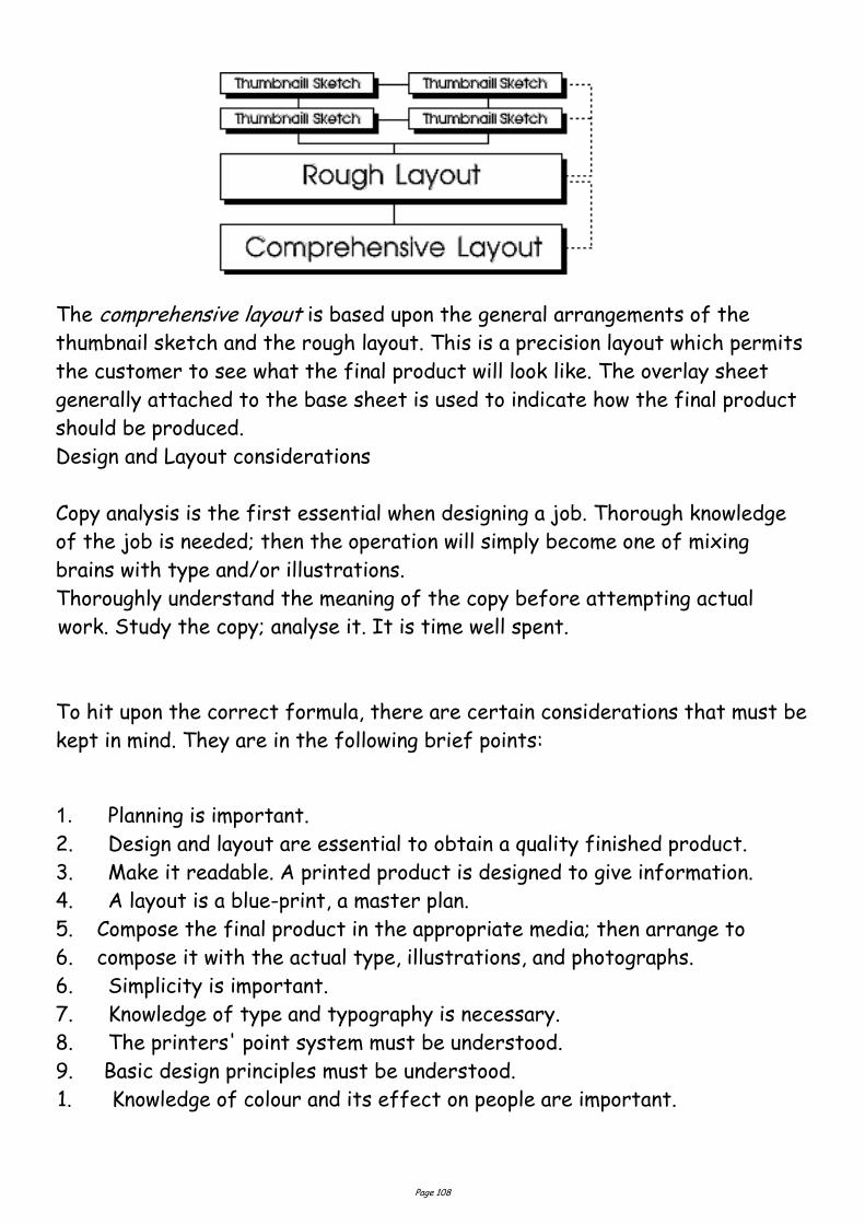
Page 108
The comprehensive layout is based upon the general arrangements of the
thumbnail sketch and the rough layout. This is a precision layout which permits
the customer to see what the final product will look like. The overlay sheet
generally attached to the base sheet is used to indicate how the final product
should be produced.
Design and Layout considerations
Copy analysis is the first essential when designing a job. Thorough knowledge
of the job is needed; then the operation will simply become one of mixing
brains with type and/or illustrations.
Thoroughly understand the meaning of the copy before attempting actual
work. Study the copy; analyse it. It is time well spent.
To hit upon the correct formula, there are certain considerations that must be
kept in mind. They are in the following brief points:
1. Planning is important.
2. Design and layout are essential to obtain a quality finished product.
3. Make it readable. A printed product is designed to give information.
4. A layout is a blue-print, a master plan.
5. Compose the final product in the appropriate media; then arrange to
6. compose it with the actual type, illustrations, and photographs.
6. Simplicity is important.
7. Knowledge of type and typography is necessary.
8. The printers' point system must be understood.
9. Basic design principles must be understood.
1. Knowledge of colour and its effect on people are important.
Page 109
Grids 2: Consistency and Unity
How does a grid tie elements together?
For the most part, people prefer organized visual information.
Newsletters, magazines, brochures, annual reports, and books often have many
visual elements: columns of text, headlines, photos, illustrations,
pull-quotes, etc. Grids allow the designer to build page-to-page consistency into
these documents.
Readers expect to find page numbers in the same location on each page.
When all the text in a given article -- even when it spans several pages -- has a
consistent look, including column width, it enhances readability. Readers often
expect to find sidebars, informational text, and other oft-repeated elements
in the same place from page to page.
A grid, used consistently on all pages of a multi-page document, makes it easier
for the designer to provide the consistent look that readers often expect.
A carefully conceived grid system also allows the designer to introduce
variations without forsaking readability or consistency. It also speeds layout
because it takes the guesswork and "look back to see what we did before" out
of where to place elements from one page to the next.
The following pages are examples of how you might combine text and graphics
in a 7-unit vertical grid (such as for a newsletter). Notice how page 1 (Figure
1) and 2 have a consistent (reversed) layout. Text columns are
two-grid units wide. One grid unit provides an extra wide column of space
separating the main text from the sidebar elements. Page 3 (right hand page
of the 2 page spread, Figure 2) is quite different from the first two pages but
if you look at the underlying grid structure (Figure 3) you'll see that all three
pages use the same grid system.
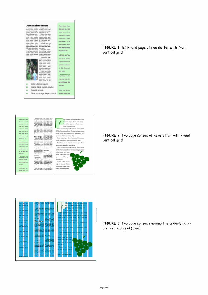
Page 110
FIGURE 1: left-hand page of newsletter with 7-unit
vertical grid
FIGURE 2: two page spread of newsletter with 7-unit
vertical grid
FIGURE 3: two page spread showing the underlying 7-
unit vertical grid (blue)
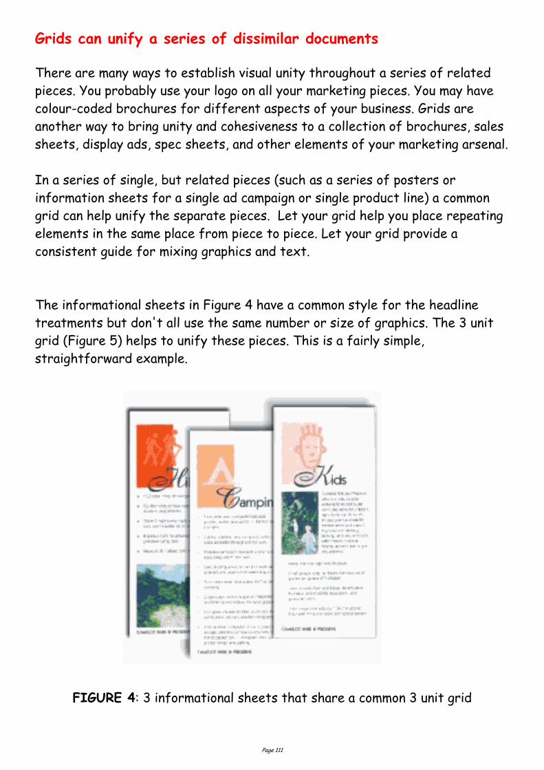
Page 111
Grids can unify a series of dissimilar documents
There are many ways to establish visual unity throughout a series of related
pieces. You probably use your logo on all your marketing pieces. You may have
colour-coded brochures for different aspects of your business. Grids are
another way to bring unity and cohesiveness to a collection of brochures, sales
sheets, display ads, spec sheets, and other elements of your marketing arsenal.
In a series of single, but related pieces (such as a series of posters or
information sheets for a single ad campaign or single product line) a common
grid can help unify the separate pieces. Let your grid help you place repeating
elements in the same place from piece to piece. Let your grid provide a
consistent guide for mixing graphics and text.
The informational sheets in Figure 4 have a common style for the headline
treatments but don't all use the same number or size of graphics. The 3 unit
grid (Figure 5) helps to unify these pieces. This is a fairly simple,
straightforward example.
FIGURE 4: 3 informational sheets that share a common 3 unit grid
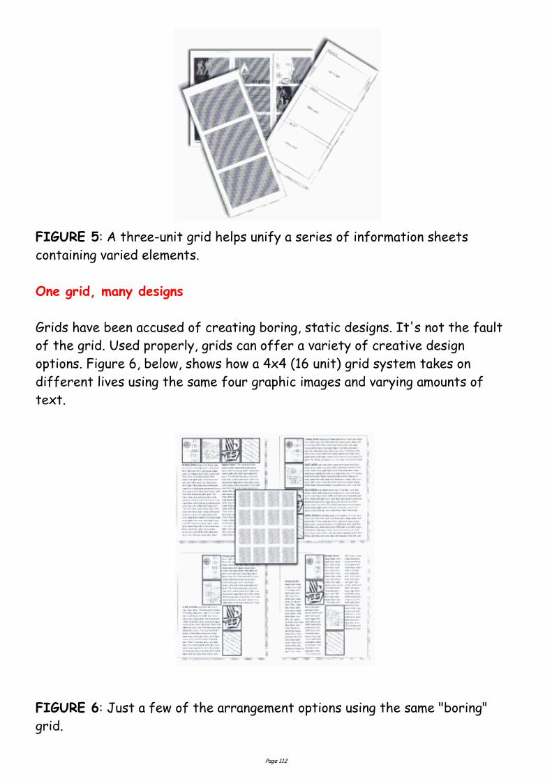
Page 112
FIGURE 5: A three-unit grid helps unify a series of information sheets
containing varied elements.
One grid, many designs
Grids have been accused of creating boring, static designs. It's not the fault
of the grid. Used properly, grids can offer a variety of creative design
options. Figure 6, below, shows how a 4x4 (16 unit) grid system takes on
different lives using the same four graphic images and varying amounts of
text.
FIGURE 6: Just a few of the arrangement options using the same "boring"
grid.

Page 113
Grids 3: Flexible Options Are grids too rigid?
Choose a grid based on the content and adjust content based on the grid
The right grid offers the designer flexibility without overwhelming them with
possibilities. The right grid also enhances organization and makes it easy for
the viewer or reader to understand the content.
There are no right or wrong grids, simply grids that are more suitable for
different content and design objectives. Of course that doesn't help you much
when you're staring at a blank page and a deadline. Here are some "thinking
points" to help you plan your grid and your design.
Content or Page Elements.
Is the publication heavy on text or heavy on graphics? Will there be
many headlines, rules, illustrations, pull-quotes?
Text.
Look at both amount of text and how it is broken down -- long articles,
lots of short articles, a mix of long and short articles. How many
subheads? Will you use eyebrows, decks, initial caps, and other visual
cues?
Photos and Illustrations.
Are there similarities in the type of illustrations or size of photos? Can
photos be grouped by size or type? Are there a lot of rectangular
elements or many irregularly shaped elements?
Complexity.
Generally the larger the number of grid units (and the smaller the
individual units) the more design options are available. However, too many
options can destroy the underlying unity that the grid provides.
So, which grid is best? Here are some guidelines (remember, I said
guidelines not rules).

Page 114
Lots of text with few graphics -- such as a book with long chapters and
few or no illustrations -- can use a simpler grid. 1 - 3 units, perhaps.
A newsletter, brochure, or magazine with many photographs usually
requires a grid with many smaller units to give more possibilities for
placing and sizing the photographs.
Newsletters, because they generally have more text, often use a columnar
grid.
1, 2, and 3 column grids are common. Each can accommodate lots of text,
especially long articles.
4 or more columns offer greater flexibility for publications with text,
photos, and other graphic elements and a mix of long and short articles.
Grids based on an even number of grid columns can suffer from too much
symmetry if text and graphics are confined to individual or double grid
columns throughout.
Newsletters don’t have to be tied to columnar grids. A newsletter
consisting of mostly small articles or "news briefs" and photos could use a
6(2x3), 9(3x3), or 12(3x4) unit grid of rectangular or square units quite
nicely.
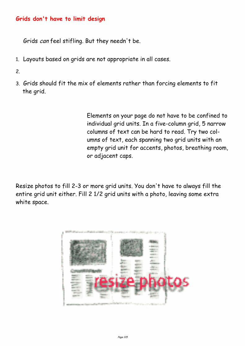
Page 115
Grids don't have to limit design
Grids can feel stifling. But they needn't be.
1. Layouts based on grids are not appropriate in all cases.
2.
3. Grids should fit the mix of elements rather than forcing elements to fit
the grid.
Elements on your page do not have to be confined to
individual grid units. In a five-column grid, 5 narrow
columns of text can be hard to read. Try two col-
umns of text, each spanning two grid units with an
empty grid unit for accents, photos, breathing room,
or adjacent caps.
Resize photos to fill 2-3 or more grid units. You don't have to always fill the
entire grid unit either. Fill 2 1/2 grid units with a photo, leaving some extra
white space.
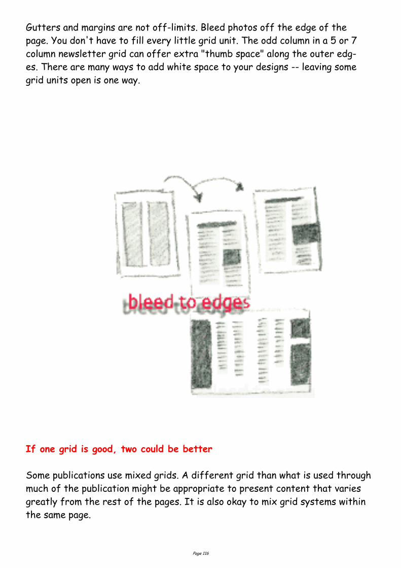
Page 116
Gutters and margins are not off-limits. Bleed photos off the edge of the
page. You don't have to fill every little grid unit. The odd column in a 5 or 7
column newsletter grid can offer extra "thumb space" along the outer edg-
es. There are many ways to add white space to your designs -- leaving some
grid units open is one way.
If one grid is good, two could be better
Some publications use mixed grids. A different grid than what is used through
much of the publication might be appropriate to present content that varies
greatly from the rest of the pages. It is also okay to mix grid systems within
the same page.
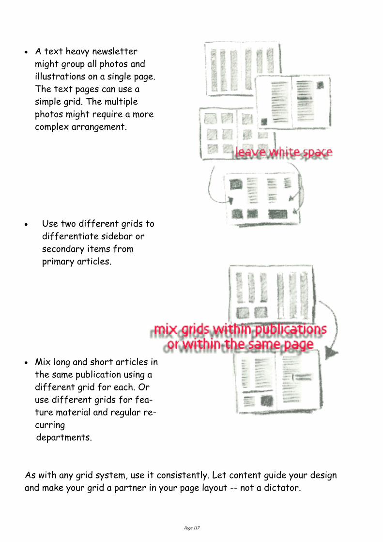
Page 117
A text heavy newsletter
might group all photos and
illustrations on a single page.
The text pages can use a
simple grid. The multiple
photos might require a more
complex arrangement.
Use two different grids to
differentiate sidebar or
secondary items from
primary articles.
Mix long and short articles in
the same publication using a
different grid for each. Or
use different grids for fea-
ture material and regular re-
curring
departments.
As with any grid system, use it consistently. Let content guide your design
and make your grid a partner in your page layout -- not a dictator.
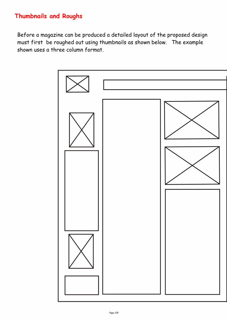
Page 118
Thumbnails and Roughs
Before a magazine can be produced a detailed layout of the proposed design
must first be roughed out using thumbnails as shown below. The example
shown uses a three column format.
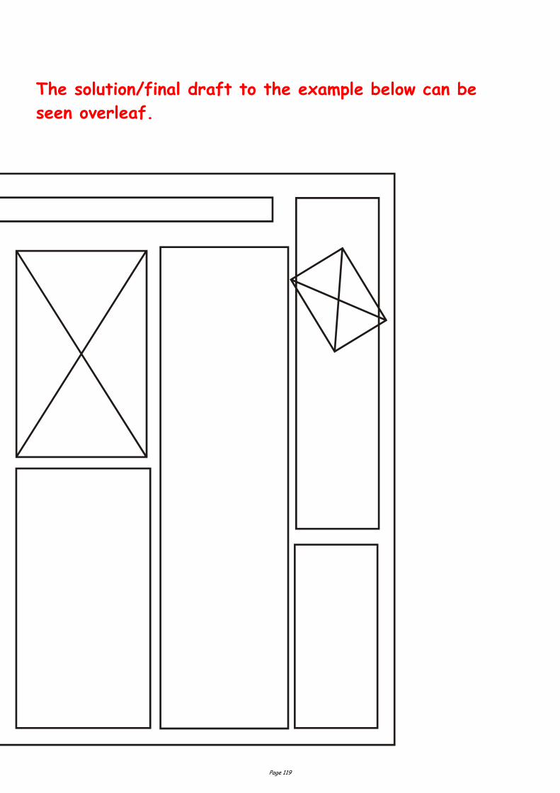
Page 119
The solution/final draft to the example below can be
seen overleaf.
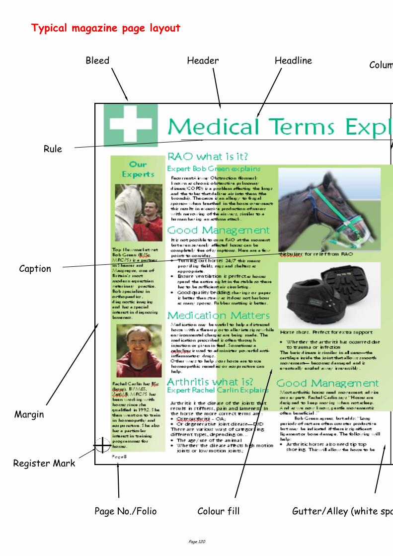
Page 120
Typical magazine page layout
Colour fill Page No./Folio
Bleed Headline
Gutter/Alley (white space)
Column Rule (black line)
Margin
Header
Caption
Rule
Register Mark
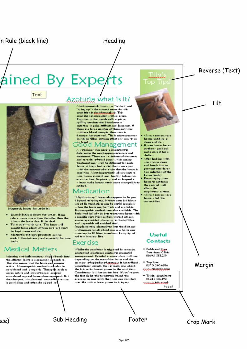
Page 121
Gutter/Alley (white space) Sub Heading
Margin
Heading Column Rule (black line)
Tilt
Footer
Reverse (Text)
Crop Mark

Page 122
Without Transparency tool applied
With Transparency tool applied
The above booklets shown are examples of multi page formats. Whereas the
three and two fold leaflets are examples of a single page layout.
The layout below has a white background which takes away from the main
image. To take this white background away we simply apply the
Transparency tool
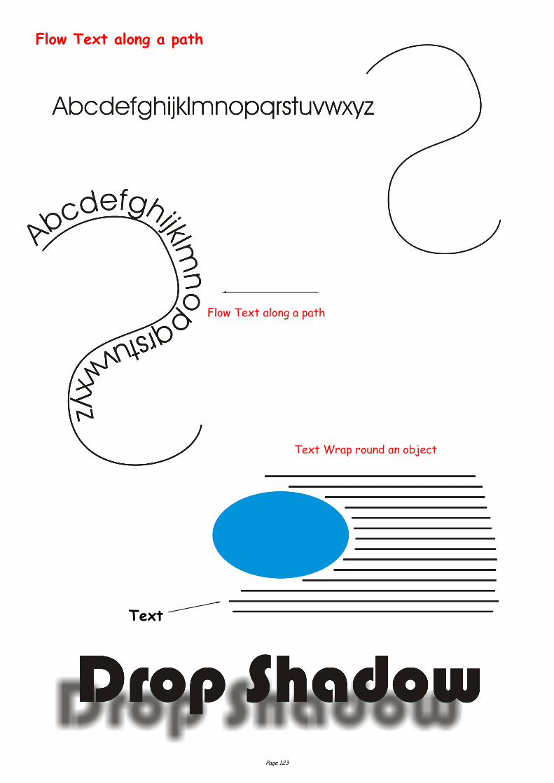
Page 123
Flow Text along a path
Text Wrap round an object
Flow Text along a path
Text
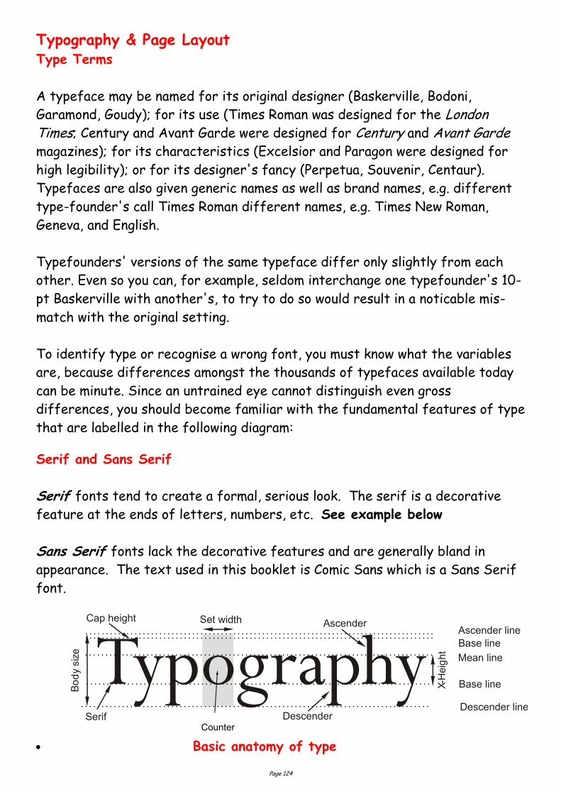
Page 124
Typography & Page Layout Type Terms
A typeface may be named for its original designer (Baskerville, Bodoni,
Garamond, Goudy); for its use (Times Roman was designed for the London Times; Century and Avant Garde were designed for Century and Avant Garde
magazines); for its characteristics (Excelsior and Paragon were designed for
high legibility); or for its designer's fancy (Perpetua, Souvenir, Centaur).
Typefaces are also given generic names as well as brand names, e.g. different
type-founder's call Times Roman different names, e.g. Times New Roman,
Geneva, and English.
Typefounders' versions of the same typeface differ only slightly from each
other. Even so you can, for example, seldom interchange one typefounder's 10-
pt Baskerville with another's, to try to do so would result in a noticable mis-
match with the original setting.
To identify type or recognise a wrong font, you must know what the variables
are, because differences amongst the thousands of typefaces available today
can be minute. Since an untrained eye cannot distinguish even gross
differences, you should become familiar with the fundamental features of type
that are labelled in the following diagram:
Serif and Sans Serif
Serif fonts tend to create a formal, serious look. The serif is a decorative
feature at the ends of letters, numbers, etc. See example below
Sans Serif fonts lack the decorative features and are generally bland in
appearance. The text used in this booklet is Comic Sans which is a Sans Serif
font.
TypographyDescender
Base line
Ascender
Mean line
Base line
X-H
eig
ht
Ascender line
SerifDescender line
Cap height Set width
Bo
dy
siz
e
Basic anatomy of type
Counter

Page 125
x-height The height of the lower case letters such as `x', `a', `e'.
Ascender The stroke of a letter which rises above the Mean line as `k', `l',
`h'.
Descender The stroke of a letter which hangs below the Base line such as
`p', `y', `g'.
Mean line The imaginary line which determines the height of lowercase
letters; ascenders rise above the mean line.
Base line The imaginary line on which all characters rest; descenders hang
below the base line.
Body size Size of the type being used; measured from the end of the
ascender to the end of the descender.
Serif Small strokes and cross-lines at the ends of major lines.
Set width Width, in units, allowed for each letter which varies between
letters and typefaces.
Cap Line The height of capital letters. Depending on type design, capitals
may be taller/shorter or same height as ascenders.
Type Categories
All typefaces that are to be used in the appropriate print media must be
purchased under a number of specific criteria. It is important to know whether
a favoured type design has the necessary flexibility to be used for a wide
range of design and publication needs.
To this end, you must be aware that not all typefaces that are used have the
same number of variations, or for that matter are available on the output
device that you wish to use.
Font
Many of the more popular typefaces used today are available in three
different alternatives: Commercial font, Expert font and Pi font.
A Commercial type font contains the usual range of characters that are
needed for most forms of typesetting, i.e. one complete assortment of
alphabet letters comprised of capitals and lower case, numerals, punctuation,
special characters, and symbols.
A type font is only available in one specific typeface design. Therefore, a
typeface such as 10-pt Times Roman is considered to be one font and 10-pt
Times Bold is another.
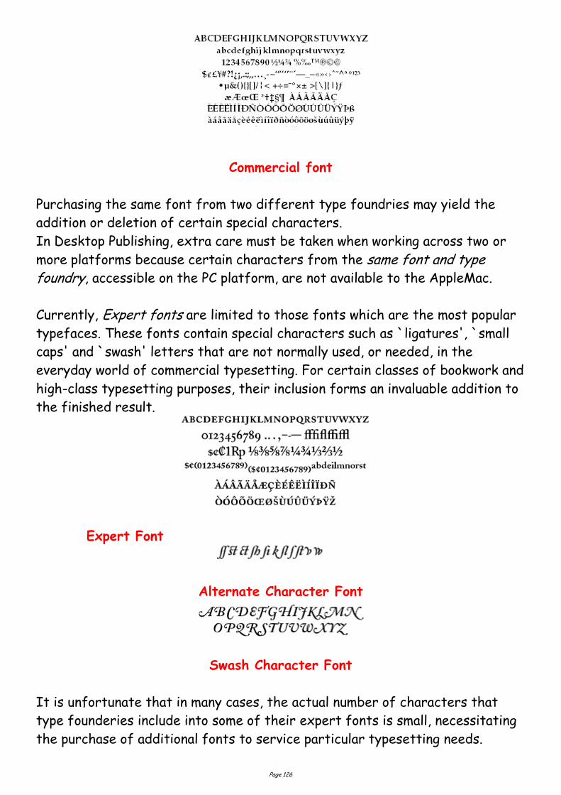
Page 126
Commercial font
Purchasing the same font from two different type foundries may yield the
addition or deletion of certain special characters.
In Desktop Publishing, extra care must be taken when working across two or
more platforms because certain characters from the same font and type foundry, accessible on the PC platform, are not available to the AppleMac.
Currently, Expert fonts are limited to those fonts which are the most popular
typefaces. These fonts contain special characters such as `ligatures', `small
caps' and `swash' letters that are not normally used, or needed, in the
everyday world of commercial typesetting. For certain classes of bookwork and
high-class typesetting purposes, their inclusion forms an invaluable addition to
the finished result.
Expert Font
Alternate Character Font
Swash Character Font
It is unfortunate that in many cases, the actual number of characters that
type founderies include into some of their expert fonts is small, necessitating
the purchase of additional fonts to service particular typesetting needs.
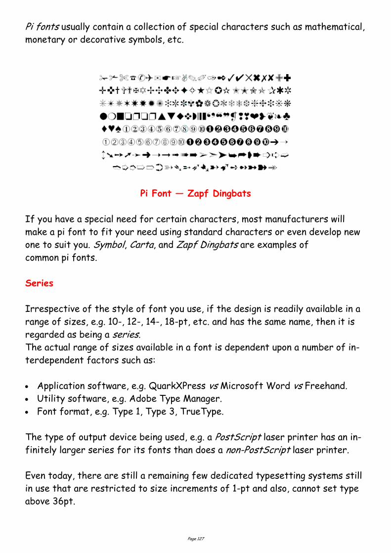
Page 127
Pi fonts usually contain a collection of special characters such as mathematical,
monetary or decorative symbols, etc.
Pi Font — Zapf Dingbats
If you have a special need for certain characters, most manufacturers will
make a pi font to fit your need using standard characters or even develop new
one to suit you. Symbol, Carta, and Zapf Dingbats are examples of
common pi fonts.
Series
Irrespective of the style of font you use, if the design is readily available in a
range of sizes, e.g. 10-, 12-, 14-, 18-pt, etc. and has the same name, then it is
regarded as being a series.
The actual range of sizes available in a font is dependent upon a number of in-
terdependent factors such as:
Application software, e.g. QuarkXPress vs Microsoft Word vs Freehand.
Utility software, e.g. Adobe Type Manager.
Font format, e.g. Type 1, Type 3, TrueType.
The type of output device being used, e.g. a PostScript laser printer has an in-
finitely larger series for its fonts than does a non-PostScript laser printer.
Even today, there are still a remaining few dedicated typesetting systems still
in use that are restricted to size increments of 1-pt and also, cannot set type
above 36pt.
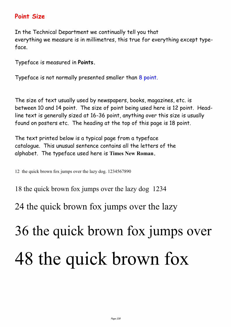
Page 128
Point Size
In the Technical Department we continually tell you that
everything we measure is in millimetres, this true for everything except type-
face.
Typeface is measured in Points.
Typeface is not normally presented smaller than 8 point.
The size of text usually used by newspapers, books, magazines, etc. is
between 10 and 14 point. The size of point being used here is 12 point. Head-
line text is generally sized at 16-36 point, anything over this size is usually
found on posters etc. The heading at the top of this page is 18 point.
The text printed below is a typical page from a typeface
catalogue. This unusual sentence contains all the letters of the
alphabet. The typeface used here is Times New Roman.
12 the quick brown fox jumps over the lazy dog. 1234567890
18 the quick brown fox jumps over the lazy dog 1234
24 the quick brown fox jumps over the lazy
36 the quick brown fox jumps over
48 the quick brown fox
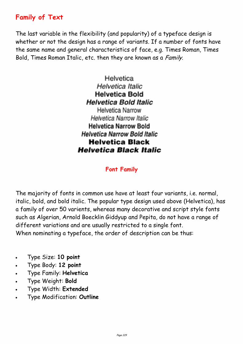
Page 129
Family of Text
The last variable in the flexibility (and popularity) of a typeface design is
whether or not the design has a range of variants. If a number of fonts have
the same name and general characteristics of face, e.g. Times Roman, Times
Bold, Times Roman Italic, etc. then they are known as a Family.
Font Family
The majority of fonts in common use have at least four variants, i.e. normal,
italic, bold, and bold italic. The popular type design used above (Helvetica), has
a family of over 50 varients, whereas many decorative and script style fonts
such as Algerian, Arnold Boecklin Giddyup and Pepita, do not have a range of
different variations and are usually restricted to a single font.
When nominating a typeface, the order of description can be thus:
Type Size: 10 point
Type Body: 12 point
Type Family: Helvetica
Type Weight: Bold
Type Width: Extended
Type Modification: Outline
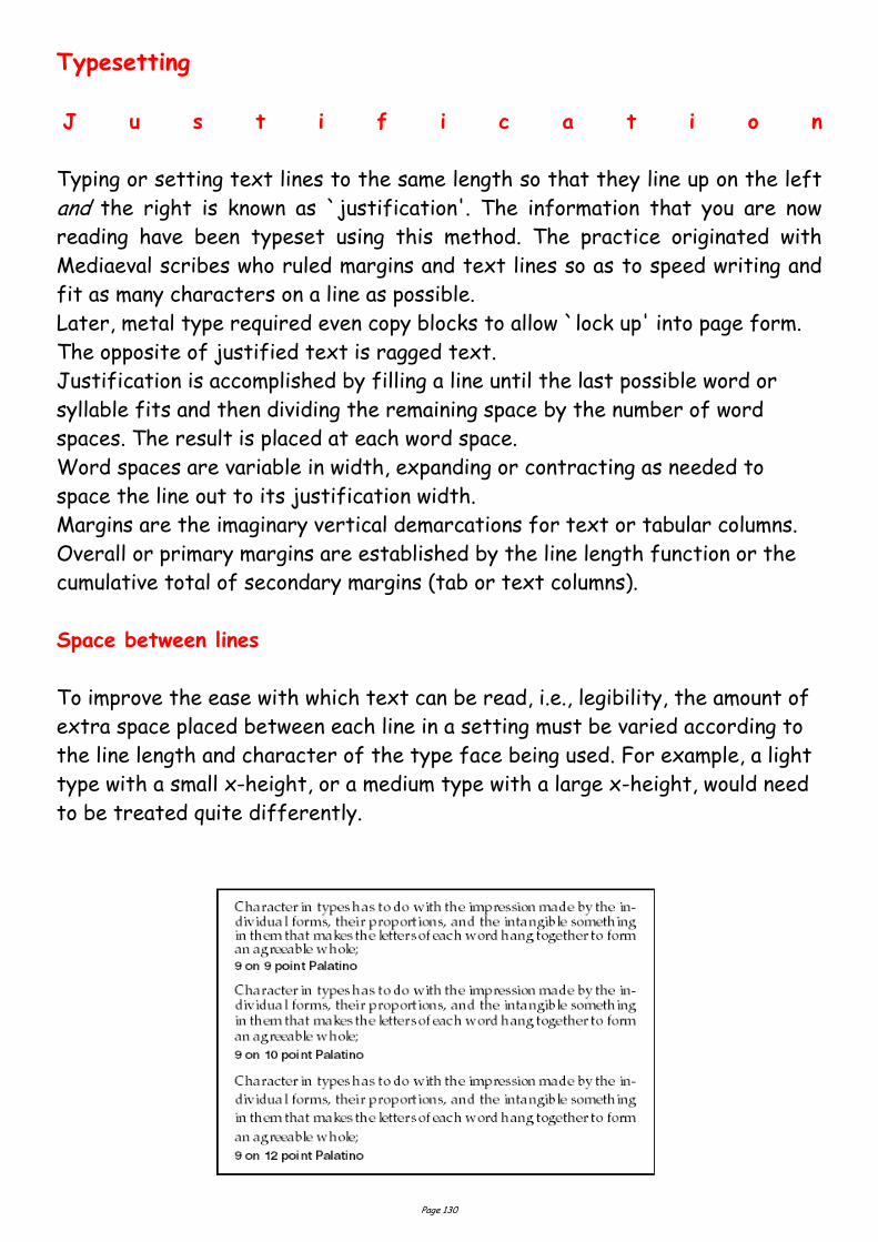
Page 130
Typesetting
J u s t i f i c a t i o n
Typing or setting text lines to the same length so that they line up on the left
and the right is known as `justification'. The information that you are now
reading have been typeset using this method. The practice originated with
Mediaeval scribes who ruled margins and text lines so as to speed writing and
fit as many characters on a line as possible.
Later, metal type required even copy blocks to allow `lock up' into page form.
The opposite of justified text is ragged text.
Justification is accomplished by filling a line until the last possible word or
syllable fits and then dividing the remaining space by the number of word
spaces. The result is placed at each word space.
Word spaces are variable in width, expanding or contracting as needed to
space the line out to its justification width.
Margins are the imaginary vertical demarcations for text or tabular columns.
Overall or primary margins are established by the line length function or the
cumulative total of secondary margins (tab or text columns).
Space between lines
To improve the ease with which text can be read, i.e., legibility, the amount of
extra space placed between each line in a setting must be varied according to
the line length and character of the type face being used. For example, a light
type with a small x-height, or a medium type with a large x-height, would need
to be treated quite differently.
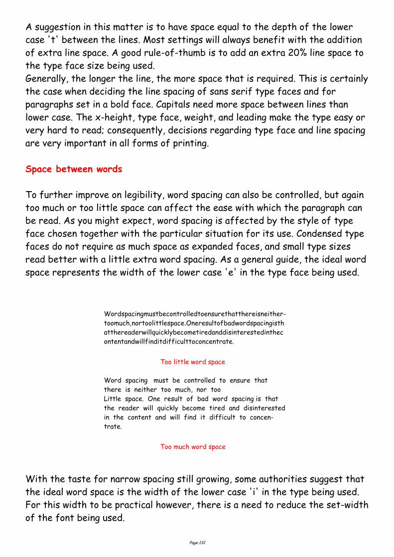
Page 131
A suggestion in this matter is to have space equal to the depth of the lower
case 't' between the lines. Most settings will always benefit with the addition
of extra line space. A good rule-of-thumb is to add an extra 20% line space to
the type face size being used.
Generally, the longer the line, the more space that is required. This is certainly
the case when deciding the line spacing of sans serif type faces and for
paragraphs set in a bold face. Capitals need more space between lines than
lower case. The x-height, type face, weight, and leading make the type easy or
very hard to read; consequently, decisions regarding type face and line spacing
are very important in all forms of printing.
Space between words
To further improve on legibility, word spacing can also be controlled, but again
too much or too little space can affect the ease with which the paragraph can
be read. As you might expect, word spacing is affected by the style of type
face chosen together with the particular situation for its use. Condensed type
faces do not require as much space as expanded faces, and small type sizes
read better with a little extra word spacing. As a general guide, the ideal word
space represents the width of the lower case 'e' in the type face being used.
With the taste for narrow spacing still growing, some authorities suggest that
the ideal word space is the width of the lower case 'i' in the type being used.
For this width to be practical however, there is a need to reduce the set-width
of the font being used.
Wordspacingmustbecontrolledtoensurethatthereisneither-
toomuch,nortoolittlespace.Oneresultofbadwordspacingisth
atthereaderwillquicklybecometiredanddisinterestedinthec
ontentandwillfinditdifficulttoconcentrate.
Too little word space
Word spacing must be controlled to ensure that
there is neither too much, nor too
Little space. One result of bad word spacing is that
the reader will quickly become tired and disinterested
in the content and will find it difficult to concen-
trate.
Too much word space
Page 132
Display
Display setting is the highest form of punctuation, this is where spacing of
groups is applied. For example, if a job was set in solid composition, a comma
would indicate a slight pause; a full point a longer pause; a fresh paragraph a
new thought; a new chapter an entire change of thought.
In display composition punctuation marks are dropped at ends of lines only —
but to serve the purpose, space is placed between lines or groups to the same
replacement value of a comma, full point, etc.
Keep to a minimum the number of groups in a job, as the fewer groups in a job,
the easier readability is achieved. Most jobs require no more than three
groups.
To express these ideas in a simple way, we place space between lines or groups
of equal in value to the degree of punctuation that would be otherwise used if
the setting were solid, i.e. small space for comma, large space for full point,
etc. The space is much more discernible than the punctuation mark.
In addition, in display we emphasise items according to their importance by the
use of larger or bolder type faces. It is a good idea to refrain from excessive
space which causes detachment of units, as too many points of interest in a
printed piece cause difficulty in reading.
However carefully the arrangement of solidly set text matter may have been
planned, with reference to type size and measure for example, and however
carefully that matter is subsequently set, it can almost always be made even
more readable by sensible leading.
The amount of leading in a given piece of text setting is usually decided by one
or more of the following:
The nature of the work;
The design of the particular type face;
The body size of the type;
The x-height of the type;
The weight and colour of the type; and,
The measure to which the type is set.
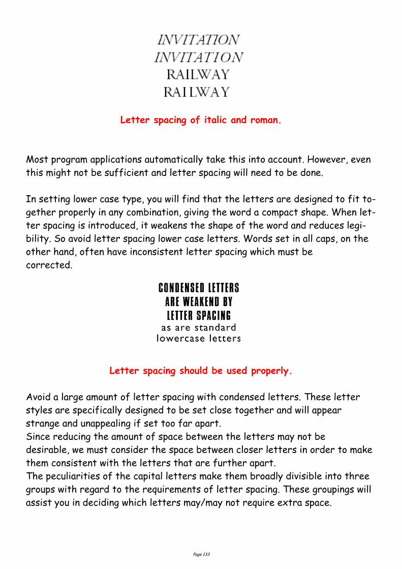
Page 133
Letter spacing of italic and roman.
Most program applications automatically take this into account. However, even
this might not be sufficient and letter spacing will need to be done.
In setting lower case type, you will find that the letters are designed to fit to-
gether properly in any combination, giving the word a compact shape. When let-
ter spacing is introduced, it weakens the shape of the word and reduces legi-
bility. So avoid letter spacing lower case letters. Words set in all caps, on the
other hand, often have inconsistent letter spacing which must be
corrected.
Letter spacing should be used properly.
Avoid a large amount of letter spacing with condensed letters. These letter
styles are specifically designed to be set close together and will appear
strange and unappealing if set too far apart.
Since reducing the amount of space between the letters may not be
desirable, we must consider the space between closer letters in order to make
them consistent with the letters that are further apart.
The peculiarities of the capital letters make them broadly divisible into three
groups with regard to the requirements of letter spacing. These groupings will
assist you in deciding which letters may/may not require extra space.
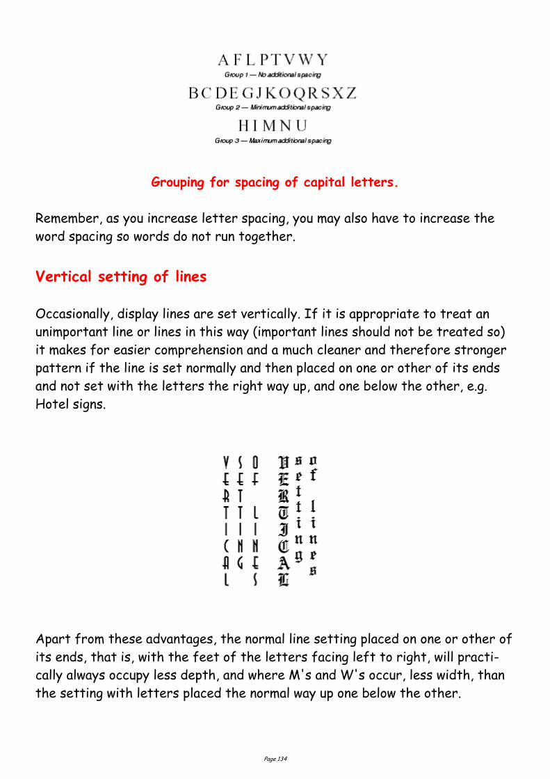
Page 134
Grouping for spacing of capital letters.
Remember, as you increase letter spacing, you may also have to increase the
word spacing so words do not run together.
Vertical setting of lines
Occasionally, display lines are set vertically. If it is appropriate to treat an
unimportant line or lines in this way (important lines should not be treated so)
it makes for easier comprehension and a much cleaner and therefore stronger
pattern if the line is set normally and then placed on one or other of its ends
and not set with the letters the right way up, and one below the other, e.g.
Hotel signs.
Apart from these advantages, the normal line setting placed on one or other of
its ends, that is, with the feet of the letters facing left to right, will practi-
cally always occupy less depth, and where M's and W's occur, less width, than
the setting with letters placed the normal way up one below the other.
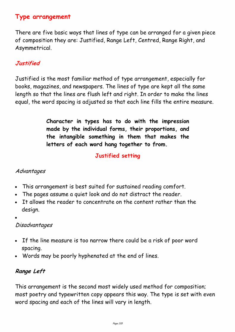
Page 135
Type arrangement
There are five basic ways that lines of type can be arranged for a given piece
of composition they are: Justified, Range Left, Centred, Range Right, and
Asymmetrical.
Justified
Justified is the most familiar method of type arrangement, especially for
books, magazines, and newspapers. The lines of type are kept all the same
length so that the lines are flush left and right. In order to make the lines
equal, the word spacing is adjusted so that each line fills the entire measure.
Justified setting
Advantages
This arrangement is best suited for sustained reading comfort.
The pages assume a quiet look and do not distract the reader.
It allows the reader to concentrate on the content rather than the
design.
Disadvantages
If the line measure is too narrow there could be a risk of poor word
spacing.
Words may be poorly hyphenated at the end of lines.
Range Left
This arrangement is the second most widely used method for composition;
most poetry and typewritten copy appears this way. The type is set with even
word spacing and each of the lines will vary in length.
Character in types has to do with the impression
made by the individual forms, their proportions, and
the intangible something in them that makes the
letters of each word hang together to from.
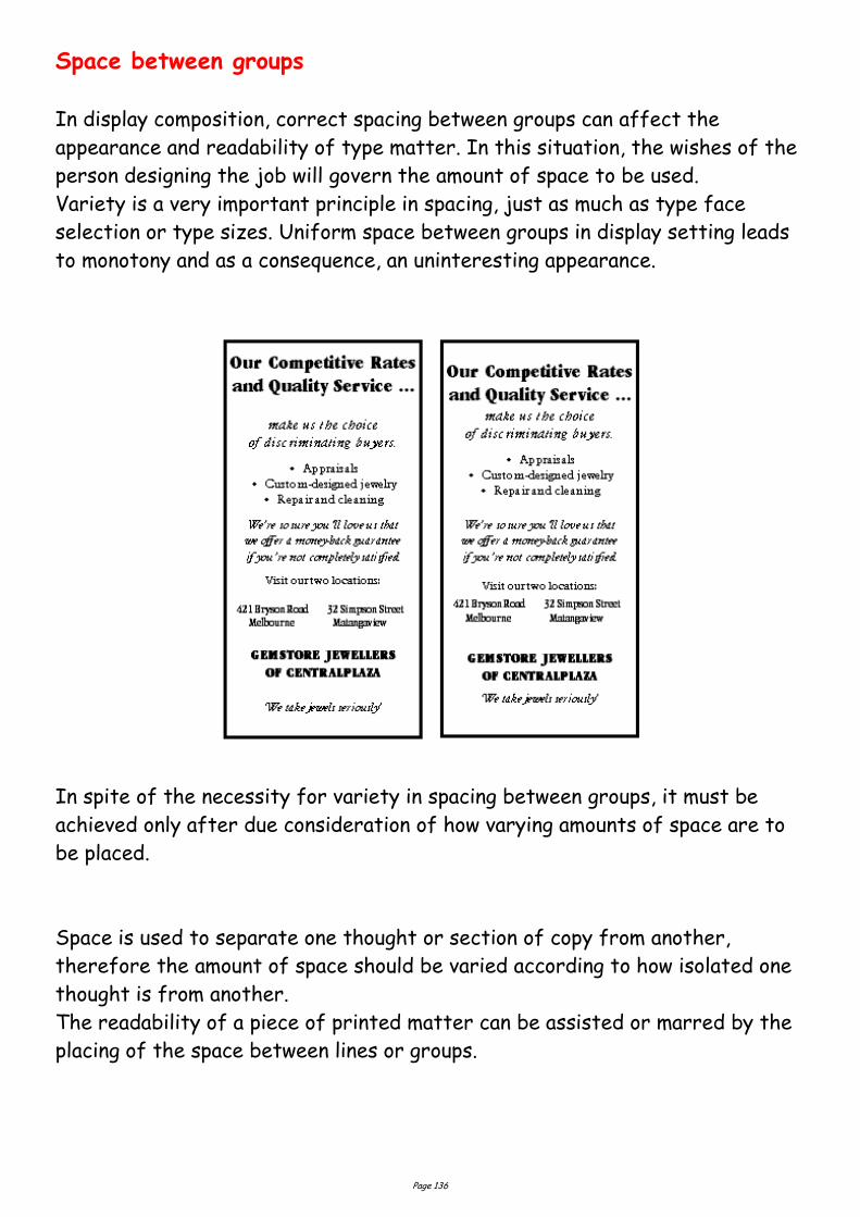
Page 136
Space between groups
In display composition, correct spacing between groups can affect the
appearance and readability of type matter. In this situation, the wishes of the
person designing the job will govern the amount of space to be used.
Variety is a very important principle in spacing, just as much as type face
selection or type sizes. Uniform space between groups in display setting leads
to monotony and as a consequence, an uninteresting appearance.
In spite of the necessity for variety in spacing between groups, it must be
achieved only after due consideration of how varying amounts of space are to
be placed.
Space is used to separate one thought or section of copy from another,
therefore the amount of space should be varied according to how isolated one
thought is from another.
The readability of a piece of printed matter can be assisted or marred by the
placing of the space between lines or groups.

Page 137
Align left setting
Advantages
The even word spacing creates a uniform overall texture.
It is ideal for setting type in narrow columns.
Hyphenation of words is at a minimum.
The risk of rivers of white flowing down the page is eliminated.
Lines can run either long or short, hyphenated words are virtually
unnecessary.
The ragged edge of the right adds visual interest to the page.
Disadvantages
If lines are set the same approximate length it can be a disturbing factor
in the design.
It is important that the ragged edge should create a pleasing silhouette, con-
vex rather than concave.
Centred
In this arrangement, the lines of type are centred on the page. When using
centred type the length of the lines must be varied enough to create an
interesting silhouette. To control the shape, a minimum and maximum line
length should be indicated.
Align centre setting
Character in types has to do with the impression
made by the individual forms, their proportions, and
the intangible something in them that makes the
letters of each word hang together to from.
Character in types has to do with the impression
made by the individual forms, their proportions, and
the intangible something in them that makes the
letters of each word hang together to from.
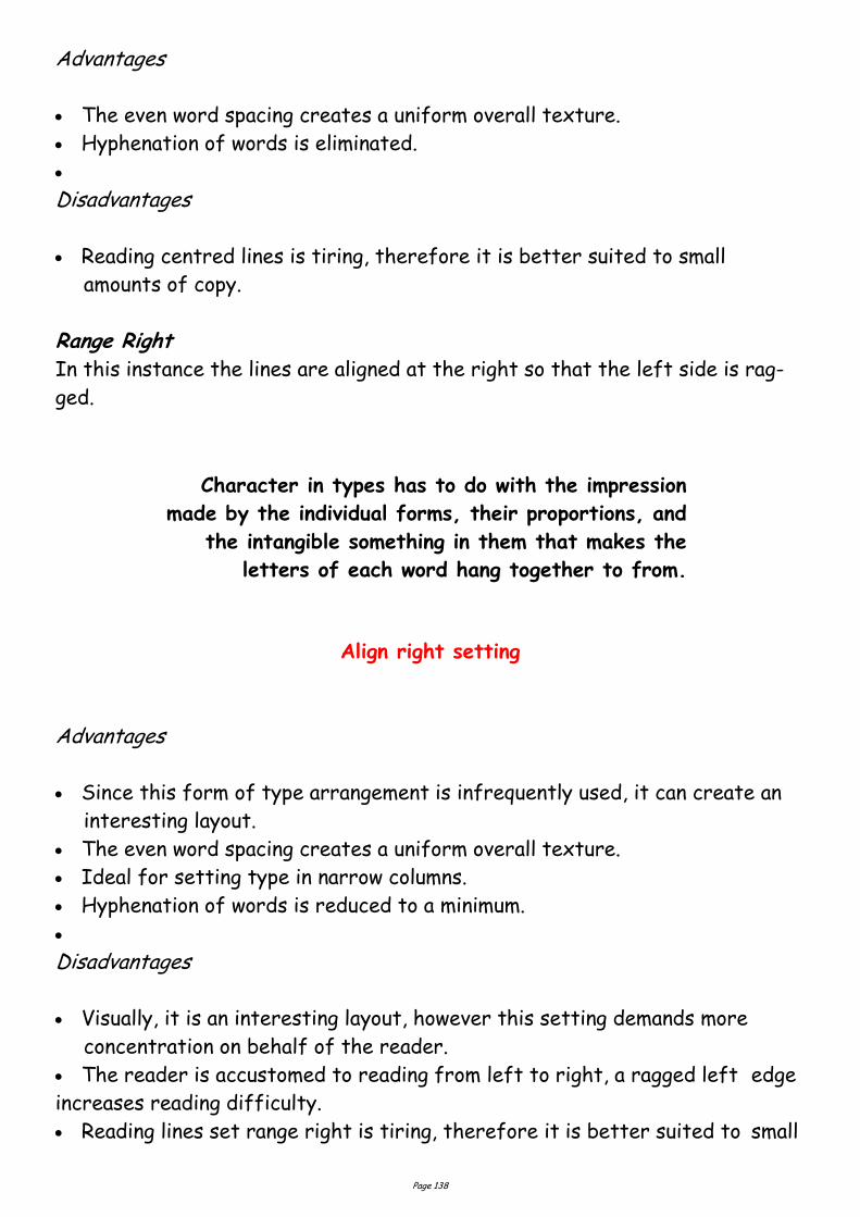
Page 138
Advantages
The even word spacing creates a uniform overall texture.
Hyphenation of words is eliminated.
Disadvantages
Reading centred lines is tiring, therefore it is better suited to small
amounts of copy.
Range Right In this instance the lines are aligned at the right so that the left side is rag-
ged.
Align right setting
Advantages
Since this form of type arrangement is infrequently used, it can create an
interesting layout.
The even word spacing creates a uniform overall texture.
Ideal for setting type in narrow columns.
Hyphenation of words is reduced to a minimum.
Disadvantages
Visually, it is an interesting layout, however this setting demands more
concentration on behalf of the reader.
The reader is accustomed to reading from left to right, a ragged left edge
increases reading difficulty.
Reading lines set range right is tiring, therefore it is better suited to small
Character in types has to do with the impression
made by the individual forms, their proportions, and
the intangible something in them that makes the
letters of each word hang together to from.
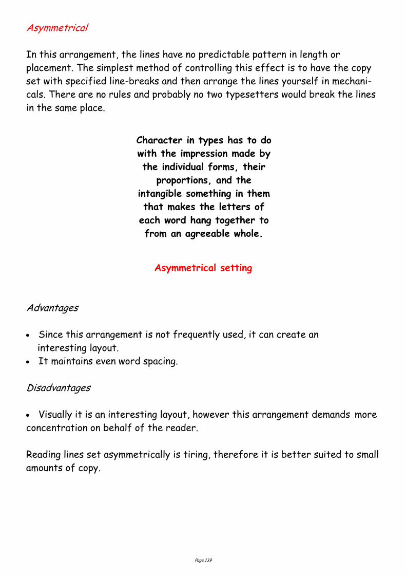
Page 139
Asymmetrical
In this arrangement, the lines have no predictable pattern in length or
placement. The simplest method of controlling this effect is to have the copy
set with specified line-breaks and then arrange the lines yourself in mechani-
cals. There are no rules and probably no two typesetters would break the lines
in the same place.
Asymmetrical setting
Advantages
Since this arrangement is not frequently used, it can create an
interesting layout.
It maintains even word spacing.
Disadvantages
Visually it is an interesting layout, however this arrangement demands more
concentration on behalf of the reader.
Reading lines set asymmetrically is tiring, therefore it is better suited to small
amounts of copy.
Character in types has to do
with the impression made by
the individual forms, their
proportions, and the
intangible something in them
that makes the letters of
each word hang together to
from an agreeable whole.
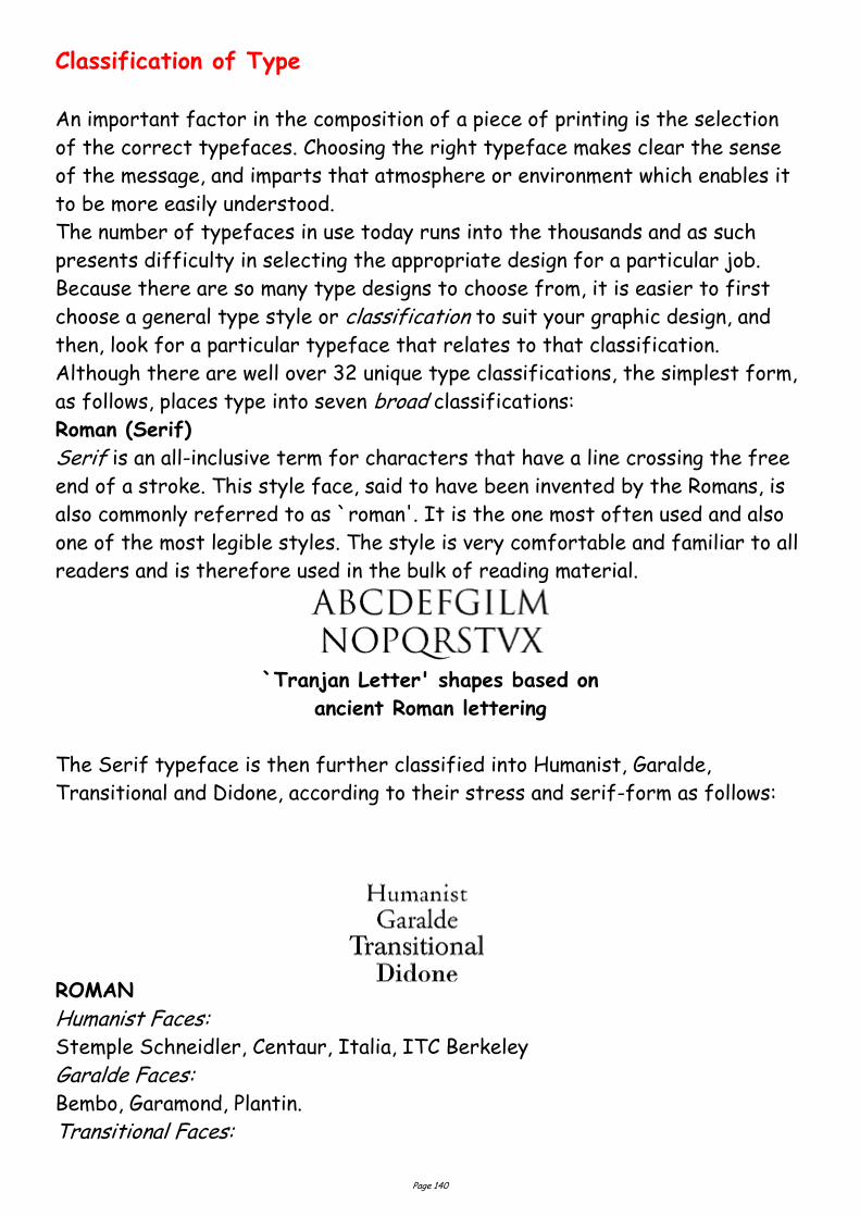
Page 140
Classification of Type
An important factor in the composition of a piece of printing is the selection
of the correct typefaces. Choosing the right typeface makes clear the sense
of the message, and imparts that atmosphere or environment which enables it
to be more easily understood.
The number of typefaces in use today runs into the thousands and as such
presents difficulty in selecting the appropriate design for a particular job.
Because there are so many type designs to choose from, it is easier to first
choose a general type style or classification to suit your graphic design, and
then, look for a particular typeface that relates to that classification.
Although there are well over 32 unique type classifications, the simplest form,
as follows, places type into seven broad classifications:
Roman (Serif)
Serif is an all-inclusive term for characters that have a line crossing the free
end of a stroke. This style face, said to have been invented by the Romans, is
also commonly referred to as `roman'. It is the one most often used and also
one of the most legible styles. The style is very comfortable and familiar to all
readers and is therefore used in the bulk of reading material.
`Tranjan Letter' shapes based on
ancient Roman lettering
The Serif typeface is then further classified into Humanist, Garalde,
Transitional and Didone, according to their stress and serif-form as follows:
ROMAN
Humanist Faces: Stemple Schneidler, Centaur, Italia, ITC Berkeley
Garalde Faces: Bembo, Garamond, Plantin.
Transitional Faces:

Page 141
Times New Roman, Lucida, Baskerville.
Didone Faces: Bodoni, Walbaum, Americana.
Humanist (Venetian) faces are named after the first roman typefaces that
appeared in Venice in 1470, Humanist typefaces were initially designed to
imitate the handwriting of Italian Renaissance scholars. These types that are
characterised by their strong, bracketed serifs. The letters are in general
wide and heavy in colour. Other characteristic letters are the wide lower case
e with a diagonal bar to the eye. A noticeable feature of true Humanist types
is the square full point.
These types have a small x-height, moderate contrast between strokes, and an
acute `angle of stress' and do not lend themselves to modern design
treatments of type such as reverse or stipple. The style prints best on a
unsized stock in black or brown ink.
Garalde (Old Style) were designed centuries ago by such masters as the
French printer Claude Garamond and the Venetian printer Aldus Manutius.
Garalde typefaces include some of the most popular roman styles in use today.
These faces have rounded serifs and moderate contrast between strokes. The
letters are open, rounded and very readable. The thick strokes of curved
letters are off-balanced. The `angle of stress' of these types is less acute
than Humanist types.
Like Humanist, these types do not suffer reversal and stippling well, except in
large sizes. Prints best on an unsized, off-white stock, in black ink.
`Angle of stress'
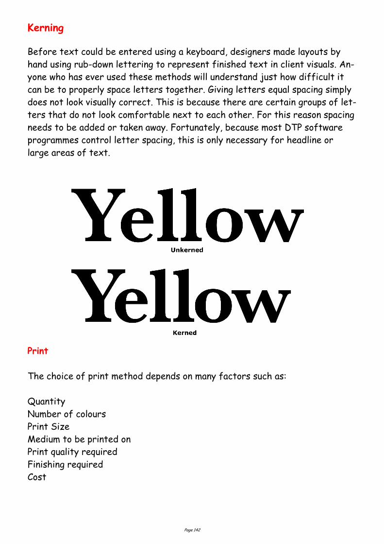
Page 142
Kerning
Before text could be entered using a keyboard, designers made layouts by
hand using rub-down lettering to represent finished text in client visuals. An-
yone who has ever used these methods will understand just how difficult it
can be to properly space letters together. Giving letters equal spacing simply
does not look visually correct. This is because there are certain groups of let-
ters that do not look comfortable next to each other. For this reason spacing
needs to be added or taken away. Fortunately, because most DTP software
programmes control letter spacing, this is only necessary for headline or
large areas of text.
The choice of print method depends on many factors such as:
Quantity
Number of colours
Print Size
Medium to be printed on
Print quality required
Finishing required
Cost
Page 143
Printing Methods
Offset Lithography
This is the most popular printing technique used for most printed matter we
encounter such as leaflets, booklets, magazines, catalogues.
The separated image is exposed onto film through a halftone screen. The
resulting “Lith” is then exposed onto a light-sensitive plate (sometimes made
from zinc, aluminium and even special paper stock). When exposed to a strong
light source, the transparent areas let light through the Lith onto the plate.
The chemicals on the plate react to the light so that when the plate is treated
with further chemicals, the print areas become resistant to water. This is the
basis of Lithography, the fact that oily substances repel water. When the
plate is dampened and oily printing ink rolled across it’s surface, the ink will
adhere only to the treated areas, i.e. the image areas. The term “Offset” re-
fers to the fact that a large soft roller is rolled over the plate picking up the
ink and offsetting it onto printing paper. For full colour printing there will usu-
ally be four full printings, one for each of the process colours. However, these
days printing presses are able to cope with up to five and perhaps six colours
allowing for the use of special inks such as fluorescents, gold, silver and
varnishes.
Offset lithography is the most cost-efficient and fastest method of
printing hence the reason it is so widely used.
Screen Printing (Serigraphy)
This is one of the most ancient methods of printing attributed to the
ancient Chinese and often called Silkscreen printing. This is because the mesh-
es used in the printing were made of silk before synthetic fibres were intro-
duced. Screenprinting was the preferred method for large-scale
printing and for printing onto anything from t-shirts to circuit boards and
glass. High speed, large format inkjet printing and other advances in print
technology have made Screenprinting less competitive for certain types of
work.
At its simplest, Screenprinting involves making a stencil which is adhered to a
fine mesh screen attached to a frame. Using a squeegee, the ink is pushed
Page 144
through the stencil and onto the print surface. A halftone from a colour sepa-
ration can be used as a stencil. This can be adhered by exposure onto a screen
coated with light-sensitive emulsion or by exposing onto a light
sensitive film, which is treated and then attached to the screen. The
photo-sensitive emulsion reacts to light, i.e. where the light penetrates the
stencil and hardens. Where the light does not penetrate, the emulsion will
remain soft. When the screen is washed, the soft areas of the emulsion wash
away leaving just the image area. The main advantage of Screenprinting is its
adaptability. One screen can be used again and again, but also easily
reconstituted. There are no limits on the amount of colours that may be used
and light colours can be overprinted easily onto dark colours.
Flexography
The image to be printed is formed onto a rubber plate, which is then wrapped
around a cylinder. It is a high speed, high output method of printing favoured
by the packaging industry for use on non-porous materials,
polythene bags, cellophane etc. Flexography also favours large-scale work with
fast-drying inks. One of the main advantages of flexography is that changes
can be made to the plate easily by making a patch, so that the whole plate does
not have to be reproduced. One of the disadvantages of
flexography is that halftones and small text do not print particularly well as
the ink tends to spread.
Gravure
This is known as an Intaglio method of printing just like etching. This means
that the image is bitten into a plate, the ink pushed into the bitten areas, the
surface wiped clean and the paper pressed onto the plate by a rubber roller.
The paper lifts the ink from the bitten areas. The image is formed by
engraving the screened image onto a metal cylinder. Gravure is a high speed,
long-run process suited to halftones and newspapers, postage stamps etc. Its
disadvantage is that plates are expensive to produce and therefore
mistakes are costly. Also, the whole image needs to be screened, therefore
text does not always reproduce too well.
Collotype
A very rare printing method these days, but is the only one to produce real
Page 145
continuous tone without using a halftone process. A negative is made of the
image, which is then contact-printed onto an aluminium plate coated with light
sensitive gelatine. The amount of hardening of the emulsion depends on the
amount of light reaching the plate through the negative. It is a slower method
of printing used for high quality reproduction work and for very short runs.
Photocopying
Photocopying is now the most common method of reproduction. We are so used
to the process that we do not consider it to be a method of printing at all.
There are many styles of photocopier available, but they mainly work along the
principle of projecting bright light at an image. The light is
reflected from mirrors onto an electrostatically charged drum. Toner
attaches itself to the charged areas of the drum and the image is fused onto
the paper using heat. In modern laser copiers a laser is used to draw the image
onto the drum. The advantage of photocopiers is that the cost is small for
fairly long runs and, without the need for processing, is very quick. The disad-
vantages of photocopying are that there are restrictions in
printable size, the choice of paper stock is limited and the quality is variable.
The cost of colour photocopying machines is falling at such a rate and the
quality is increasing so that copiers may soon compete with small colour
offset lithography, at least for short runs. Technology is such that laser copi-
ers now work straight from computer maximising quality and allow
editing.
“Direct from PC” methods
Desktop Printers
The massive growth of home computing coupled with the ever-decreasing
costs of software and hardware has meant that anyone is able to publish and
print quality publications from the comfort of their own home. The cost and
print quality of most desktop printers means that many small businesses are
Page 146
able to publish and print their own literature without ever being involved with
the printing industry. However, most desktop printers are designed for short-
run work only and are not financially viable for producing large
quantities.
The most common types of desktop printer available are the laser printer and
the inkjet printer of which there are many variations.
Laser Printers
Lasers are the best printers available due to the quality at which they are
able to print. The only disadvantage is that most affordable laser printers are
black and white only (colour lasers at present are very expensive). Lasers work
by using a laser to draw the image onto an electrically-charged rotating drum.
The laser removes the charge from the white areas of the image
leaving the image areas to attract toner which is then fused onto the paper by
a heat process. Many laser printers have PostScript™ capability installed which
allows for Postscript fonts and images to print at the best possible resolution.
The quality of laser output is such that it can be used for producing halftones
for newspapers, newsletters etc.
Inkjet Printers
Inkjets tend to be sold as colour printers and their cost is so competitive that
are usually the choice of most home users. The inkjet works by firing minute
drops of ink onto the paper through a print nozzle. The detail with which
inkjets can do this increases all the time and almost photographic quality is the
norm. The quality of colour is excellent, but the disadvantage is that inkjets
are really only intended for very short print runs. The types of paper that can
be used in inkjets is limited and best quality is a only available on specially
coated inkjet papers. Due to the time it takes to print and the cost of the ink
cartridges, inkjets can really only be considered for colour proofing.
Page 147
Other desktop printers
Bubblejet
Bubblejets work via a heating element, which causes droplets of ink
contained in a series of fine nozzles to be propelled onto the paper. Print quali-
ty is not as good as inkjets.
Thermal Wax
These printers work by using a roll of colour ribbon containing each process
colour. The paper is transported through the printer once for each colour. A
print head, the whole width of the paper, containing many heating elements
melts a dot of colour from the ribbon onto the paper repeating the process for
each colour in the process. Although it produces glossy, bright colour, the dis-
advantage of thermal Wax printers is the cost of the colour ribbon which has
to be replaced for each print and the paper which has to be
specially coated for the best results.
Dye Sublimation
Dye Sublimation printers work by a process that determines the colour
deposited by the amount of heat used on the inks. The result is high quality
even from fairly low resolution images. The disadvantage lies in the high cost
of consumables and the slow printing times.
There are new technologies being developed all the time for outputting
images directly from a PC, though most print techniques such as
large-format inkjet printing are designed for short run and one-off work. Many
printers now use systems that allow for the printing plates to be
created directly from the PC, speeding up the print process and allowing for
last-minute editing.
Computer Graphics
There are many different types of computer graphics, each with its own spec-
ifications and uses. The trick is to use the correct one for the correct output.
Some are specific to a particular software package and some are
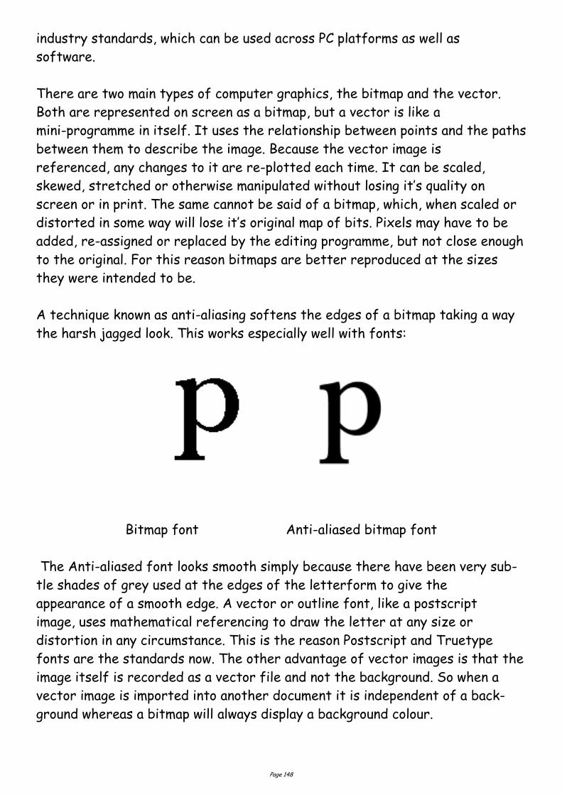
Page 148
industry standards, which can be used across PC platforms as well as
software.
There are two main types of computer graphics, the bitmap and the vector.
Both are represented on screen as a bitmap, but a vector is like a
mini-programme in itself. It uses the relationship between points and the paths
between them to describe the image. Because the vector image is
referenced, any changes to it are re-plotted each time. It can be scaled,
skewed, stretched or otherwise manipulated without losing it’s quality on
screen or in print. The same cannot be said of a bitmap, which, when scaled or
distorted in some way will lose it’s original map of bits. Pixels may have to be
added, re-assigned or replaced by the editing programme, but not close enough
to the original. For this reason bitmaps are better reproduced at the sizes
they were intended to be.
A technique known as anti-aliasing softens the edges of a bitmap taking a way
the harsh jagged look. This works especially well with fonts:
Bitmap font Anti-aliased bitmap font
The Anti-aliased font looks smooth simply because there have been very sub-
tle shades of grey used at the edges of the letterform to give the
appearance of a smooth edge. A vector or outline font, like a postscript
image, uses mathematical referencing to draw the letter at any size or
distortion in any circumstance. This is the reason Postscript and Truetype
fonts are the standards now. The other advantage of vector images is that the
image itself is recorded as a vector file and not the background. So when a
vector image is imported into another document it is independent of a back-
ground whereas a bitmap will always display a background colour.
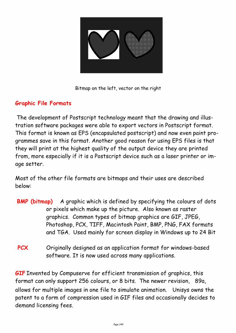
Page 149
Bitmap on the left, vector on the right
Graphic File Formats
The development of Postscript technology meant that the drawing and illus-
tration software packages were able to export vectors in Postscript format.
This format is known as EPS (encapsulated postscript) and now even paint pro-
grammes save in this format. Another good reason for using EPS files is that
they will print at the highest quality of the output device they are printed
from, more especially if it is a Postscript device such as a laser printer or im-
age setter.
Most of the other file formats are bitmaps and their uses are described
below:
BMP (bitmap) A graphic which is defined by specifying the colours of dots
or pixels which make up the picture. Also known as raster
graphics. Common types of bitmap graphics are GIF, JPEG,
Photoshop, PCX, TIFF, Macintosh Paint, BMP, PNG, FAX formats
and TGA. Used mainly for screen display in Windows up to 24 Bit
PCX Originally designed as an application format for windows-based
software. It is now used across many applications.
GIF Invented by Compuserve for efficient transmission of graphics, this
format can only support 256 colours, or 8 bits. The newer revision, 89a,
allows for multiple images in one file to simulate animation. Unisys owns the
patent to a form of compression used in GIF files and occasionally decides to
demand licensing fees.
Page 150
Thus, you may want to use the newer and completely free PNG for-
mat instead of using GIF files. Used for screen display. It is com-
pletely device-independent. Used mainly on for Web images, it can
be interlaced which allows the image detail to build up rather than
having it wait to download. Uses small colour palette, hence small
files.
JPEG (JPG) Joint Pictures Expert Group. The committee which set
standards for a file format for graphics. The JPEG file format is
a compressed format, with some loss of quality during
compression. A popular web format due to the generally small size
of pictures. File formats of .jpg,.jpeg and .jpe. Used for screen
display, particularly of photographic images on the Web.
PNG Portable Network Graphic. A newer graphic format which is small
in size. Usually .png ectension.
PICT Originally a Macintosh format designed for printing.
ZIP Zip is a file format where the files are compressed (referred to as
“zipped”). Using a file compression program (such as PKZip for
DOS, or Winzip for Windows), a zip file could be created from one
or more original files.
Windows XP includes “Compressed Folders”, a built-in file
compression and extraction utility. Nonetheless, Winzip and PKZip
still prove popular
additions to computers.
TIFF A Bitmap graphics file format. It was developed by Aldus in 1986
to provide a common format for scanners, and is mainly used for
that purpose, desktop publishing, and as the data
format for scanned faxes.
Most widely used image type for printing and for high resolution
images. It is a good cross-platform format. Some applications
allow for compression.
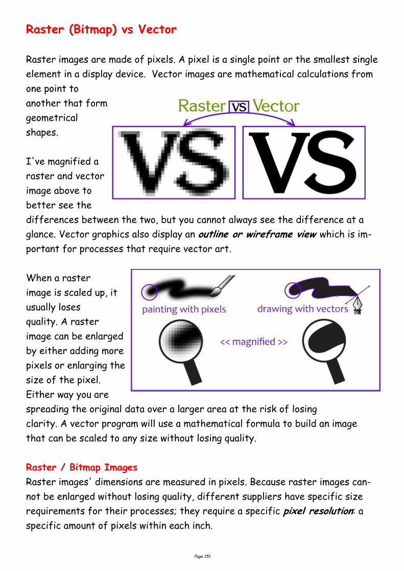
Page 151
Raster (Bitmap) vs Vector
Raster images are made of pixels. A pixel is a single point or the smallest single
element in a display device. Vector images are mathematical calculations from
one point to
another that form
geometrical
shapes.
I've magnified a
raster and vector
image above to
better see the
differences between the two, but you cannot always see the difference at a
glance. Vector graphics also display an outline or wireframe view which is im-
portant for processes that require vector art.
When a raster
image is scaled up, it
usually loses
quality. A raster
image can be enlarged
by either adding more
pixels or enlarging the
size of the pixel.
Either way you are
spreading the original data over a larger area at the risk of losing
clarity. A vector program will use a mathematical formula to build an image
that can be scaled to any size without losing quality.
Raster / Bitmap Images
Raster images' dimensions are measured in pixels. Because raster images can-
not be enlarged without losing quality, different suppliers have specific size
requirements for their processes; they require a specific pixel resolution: a
specific amount of pixels within each inch.
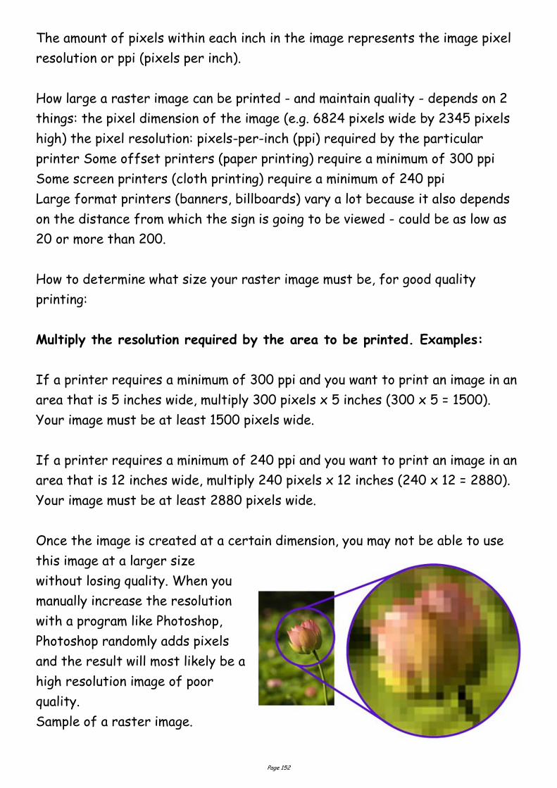
Page 152
The amount of pixels within each inch in the image represents the image pixel
resolution or ppi (pixels per inch).
How large a raster image can be printed - and maintain quality - depends on 2
things: the pixel dimension of the image (e.g. 6824 pixels wide by 2345 pixels
high) the pixel resolution: pixels-per-inch (ppi) required by the particular
printer Some offset printers (paper printing) require a minimum of 300 ppi
Some screen printers (cloth printing) require a minimum of 240 ppi
Large format printers (banners, billboards) vary a lot because it also depends
on the distance from which the sign is going to be viewed - could be as low as
20 or more than 200.
How to determine what size your raster image must be, for good quality
printing:
Multiply the resolution required by the area to be printed. Examples:
If a printer requires a minimum of 300 ppi and you want to print an image in an
area that is 5 inches wide, multiply 300 pixels x 5 inches (300 x 5 = 1500).
Your image must be at least 1500 pixels wide.
If a printer requires a minimum of 240 ppi and you want to print an image in an
area that is 12 inches wide, multiply 240 pixels x 12 inches (240 x 12 = 2880).
Your image must be at least 2880 pixels wide.
Once the image is created at a certain dimension, you may not be able to use
this image at a larger size
without losing quality. When you
manually increase the resolution
with a program like Photoshop,
Photoshop randomly adds pixels
and the result will most likely be a
high resolution image of poor
quality.
Sample of a raster image.
Page 153
How to determine what dimension your existing image can be printed at:
Divide the pixel dimension of your image by the resolution required by your
printer.
To view and edit an image pixel dimension you must use a photo-editing program
like Adobe Photoshop or Paint Shop Pro to open the raster file.
Examples:
If your image is 1993 pixels wide & printer requires 300 ppi (1993 ÷ 300) can
be printed at 6.643 inches
If your image is 1993 pixels wide & printer requires 240 ppi (1993 ÷ 240) can
be printed at 8.304 inches
. . . . . . . . . . . . . . . . . . . . . . . . . . . . . . . . . . . . . . . . . . . . . . . . . . . . . . . . . . . . . . . . . . . .
Common raster image files: jpg, jpeg, gif, png, tif, tiff, bmp, psd and pdfs
originating from raster files
• Common raster programs: paint programs like Photoshop & Paint Shop
• Common raster images: photographs, illustrations with soft blends of
colour gradients
. . . . . . .Vector Graphics
Vector graphics are made of mathematical calculations that form objects or
lines - they do not use pixels therefore they are resolution-independent.
Vector graphics can be enlarged and printed at ANY SIZE!
Instead of pixels, vector graphics use objects and lines (shapes) to represent
images. Vector graphics can be scaled to any size without losing quality.
Some Vector programs have two different views; preview/normal view which
displays the image as we normally would see it and an outline/wireframe view
which displays the outline of every object in the file. This vector outline/
wireframe is important to some companies like engraving & vinyl-cut signs be-
cause it guides the equipment they use to create their products.

Page 154
For categorizing purposes
I have named the above:
photo-realistic vector,
vector illustration, and
vector lineart.
Photo-realistic vector: a
photograph was traced as
vector using a multitude of
colours to allow the
image to have a closer
resemblance to the
original. This vector image
can be used in many
different processes like
CMYK or digital printing,
but as you can see from the outline/wireframe view, there are too many
objects for it to work for engraving or vinyl-cut signs, or any other process
that is guided by the vector outline. Photographs are best printed as they are:
raster images
Vector illustration. This is a hand-drawn, simplified illustration using a limited
amount of colours and colour blends. Colour blends can be created in vector
programs but they are actually raster effects so this image is NOT 100%
vector. The raster effects show up as boxes on the outline/wireframe view.
This vector image is suitable for many processes except those that are guided
by the vector outline such as vinyl-cut signs or engraving.
There are other ways to achieve colour blends, please see traced vectorization
of images with colour blends.
Vector lineart. This is 100% vector art; NO COLOR BLENDS. The outline/
wireframe is acceptable for all processes including those that are guided by
the vector outline.
Page 155
• Common vector graphic file format: eps* ai, cdr, ps, pdfs originating from
vector files
• Common vector graphic programs: drawing programs such as Illustrator,
CorelDraw, FreeHand
• Common vector graphics: logos, illustrations, drawings * eps and pdf files
can originate from either raster or vector programs, and/or can include
raster & vector elements. Is EPS Vector?
. . . . . . . . . . . . . . . . . . . . . . . . . . . . . . . . . . . . . . . . . . . . . . . . . . . . . . . . . . . . . . . . . . .
If I am creating a new design which software should I use; Raster or Vector
Graphic Program?
It depends on the design itself. If it's going to have photographic elements
with continuous tones and blends of color, you are probably better off using a
paint program like Photoshop which is a raster program that specializes in pho-
to editing, or use any other PAINT program.
If you want your final design to look like an illustration instead with clear con-
trasts between objects & shapes, then use a vector program.
You MUST use a vector program when creating art for plotters, vinyl-cut signs,
engraving and other specialty items.
Ideally a company that has a logo design with photographic elements, also has a
secondary version of their logo in vector format that can be used for those
specialty items that require vector art. Sample below:
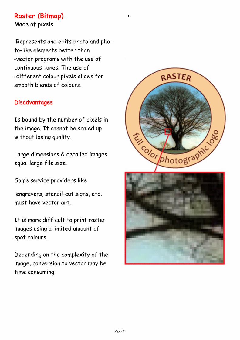
Page 156
Raster (Bitmap) Made of pixels
Represents and edits photo and pho-
to-like elements better than
vector programs with the use of
continuous tones. The use of
different colour pixels allows for
smooth blends of colours.
Disadvantages
Is bound by the number of pixels in
the image. It cannot be scaled up
without losing quality.
Large dimensions & detailed images
equal large file size.
Some service providers like
engravers, stencil-cut signs, etc,
must have vector art.
It is more difficult to print raster
images using a limited amount of
spot colours.
Depending on the complexity of the
image, conversion to vector may be
time consuming.
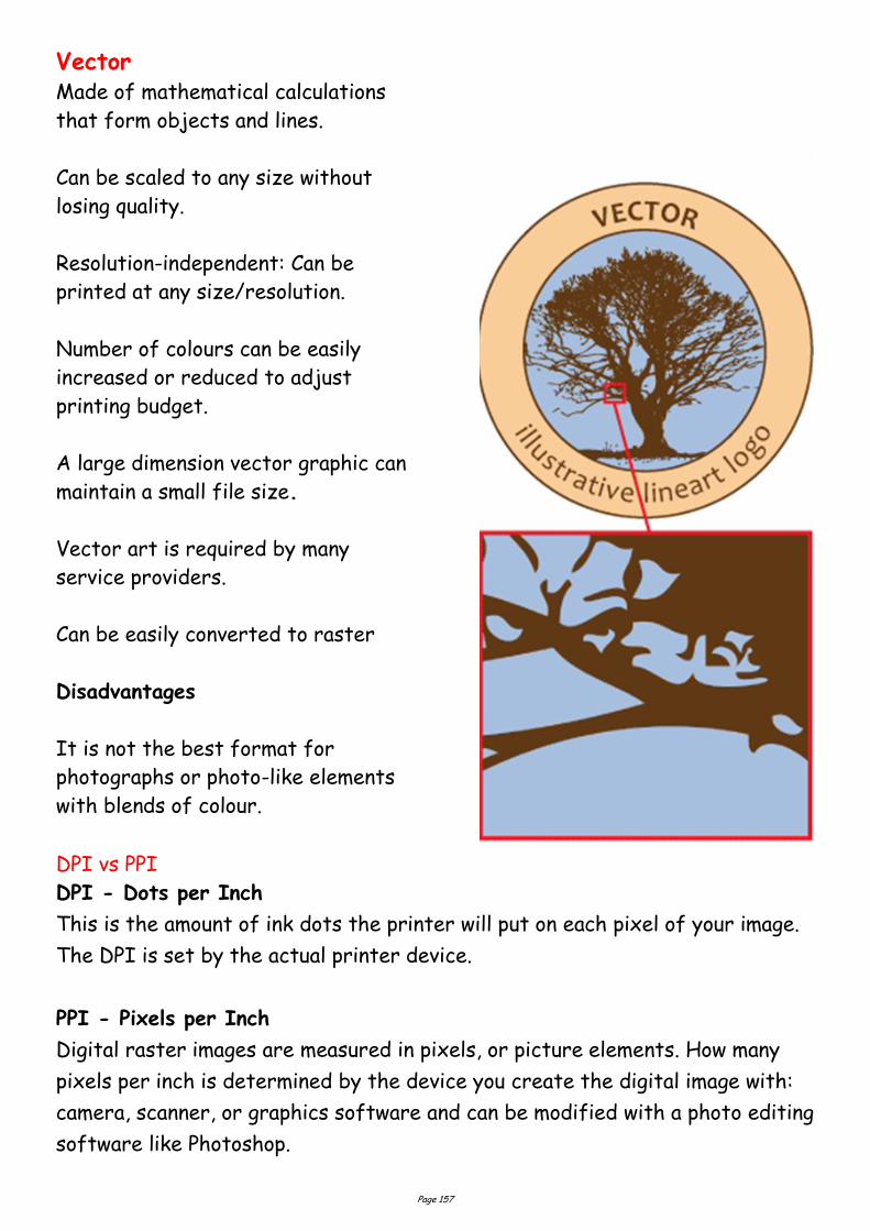
Page 157
Vector Made of mathematical calculations
that form objects and lines.
Can be scaled to any size without
losing quality.
Resolution-independent: Can be
printed at any size/resolution.
Number of colours can be easily
increased or reduced to adjust
printing budget.
A large dimension vector graphic can
maintain a small file size.
Vector art is required by many
service providers.
Can be easily converted to raster
Disadvantages
It is not the best format for
photographs or photo-like elements
with blends of colour.
DPI vs PPI
DPI - Dots per Inch
This is the amount of ink dots the printer will put on each pixel of your image.
The DPI is set by the actual printer device.
PPI - Pixels per Inch
Digital raster images are measured in pixels, or picture elements. How many
pixels per inch is determined by the device you create the digital image with:
camera, scanner, or graphics software and can be modified with a photo editing
software like Photoshop.
Page 158
Typography Tips
Try to match the typeface to the style of the document. Think carefully
about who is going to be viewing the document, who it is for and what it is in-
tended to say. For example, an Old Style typeface may not be suitable for a
magazine about cars unless it is about classic cars. Conversely a script type-
face would not be suitable for a fire safety leaflet.
Try never to use more than two typefaces on a page. Better results can be
achieved by varying the size and style of a typeface.
Be consistent. If using a certain typeface for headings and sub headings,
make sure that they are at the same size, style and weight throughout the
document.
Consider white space. Think of the opposite of the items in the document, the
areas not covered with text or images. These can be just as important as the
rest of the document adding balance or contrast where required.
Never make body text any larger than 14 Pts or any less than 8 Pts. The only
exception to this is when producing a document for people with who have a
visual impairment.
Leading in headlines may need to be reduced. Remember that as the size of
the type increases, so does the automatic leading settings which can lead to
quite large gaps between lines of type.
With body text, line spacing is very important too. Sans serif typefaces need
more leading than sans serif because without serifs to lead the eye across
the page, it easier for the reader to accidentally re-read the same line. Lead-
ing should normally be set at about 20% more than the type size.
Always set the type size before changing the leading.
In body text, the larger the x-height, the greater the leading should be.
Page 159
When placing white text on a dark background, make it bold for legibility and
check the kerning which is much more prominent.
Limit the use of styles like underline and outline. Instead use Bold for
emphasis.
Never make the spacing between words greater than the leading. This is
difficult to read, and can leave ugly rivers of white down the page.
Try never to use more than 64 characters per line (including spaces). Any
more make large amounts of body text difficult to read.
Avoid headlines that are set entirely in capitals. These can be too imposing
and more difficult to read. Also lines of capitals take up much more space on a
page.
Avoid widows and Orphans. That is words, or lines, which are left alone at the
top of a new page or column, or words, or lines, left at the end of a page or
column which belong to a following paragraph.
Hyphenation cannot be avoided with body text, but should never happen with
headings and sub-headings.
Justified text, although it looks neat can, especially if “force justified”, cause
unsightly, exaggerated word spacing often leaving single words stretched
across a whole column. It can also leave rivers of white space down the page.
Print Preparation
The modern print process is still changing as regards reproduction
technology, but the basic process is the same. The computer files may be sent
to the printer or graphics bureau who may be asked to make up a high quality
proof such as a Matchprint© or Cromalin© which are as near to the printed
document as possible in terms of colours and resolution. These can be very
expensive, but are cheaper in the long run than having to recreate an entire
plate or worse still reprint an entire publication.
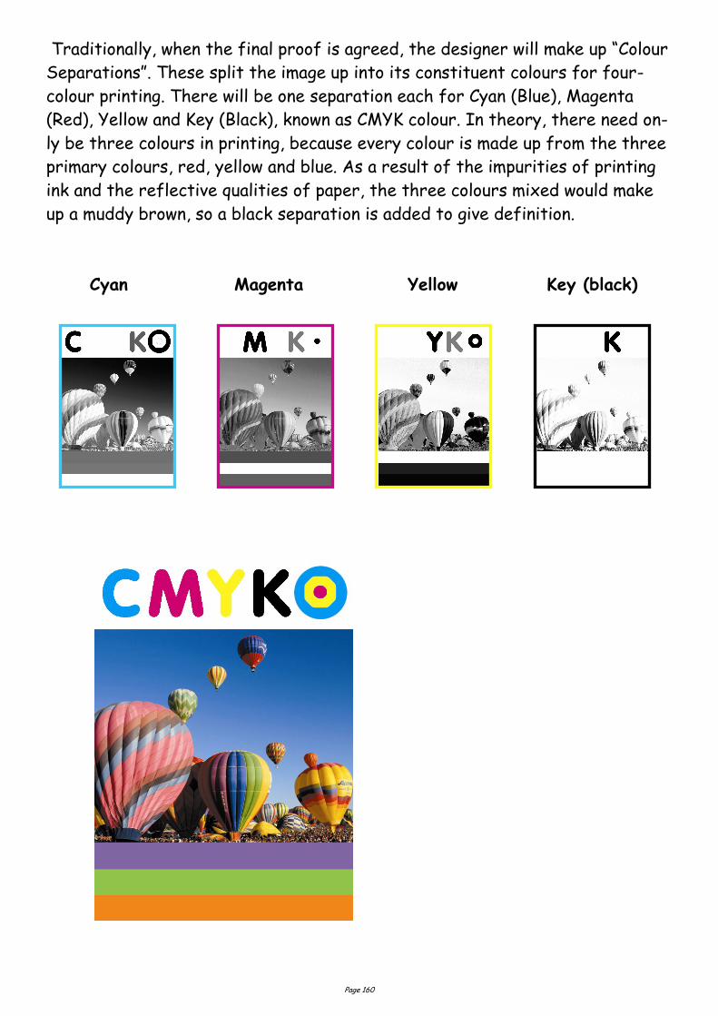
Page 160
Traditionally, when the final proof is agreed, the designer will make up “Colour
Separations”. These split the image up into its constituent colours for four-
colour printing. There will be one separation each for Cyan (Blue), Magenta
(Red), Yellow and Key (Black), known as CMYK colour. In theory, there need on-
ly be three colours in printing, because every colour is made up from the three
primary colours, red, yellow and blue. As a result of the impurities of printing
ink and the reflective qualities of paper, the three colours mixed would make
up a muddy brown, so a black separation is added to give definition.
Cyan Magenta Yellow Key (black)
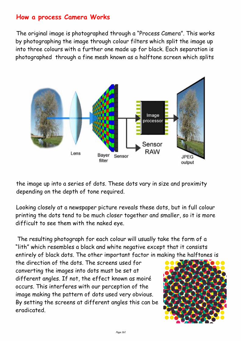
Page 161
How a process Camera Works
The original image is photographed through a “Process Camera”. This works
by photographing the image through colour filters which split the image up
into three colours with a further one made up for black. Each separation is
photographed through a fine mesh known as a halftone screen which splits
the image up into a series of dots. These dots vary in size and proximity
depending on the depth of tone required.
Looking closely at a newspaper picture reveals these dots, but in full colour
printing the dots tend to be much closer together and smaller, so it is more
difficult to see them with the naked eye.
The resulting photograph for each colour will usually take the form of a
“lith” which resembles a black and white negative except that it consists
entirely of black dots. The other important factor in making the halftones is
the direction of the dots. The screens used for
converting the images into dots must be set at
different angles. If not, the effect known as moiré
occurs. This interferes with our perception of the
image making the pattern of dots used very obvious.
By setting the screens at different angles this can be
eradicated.
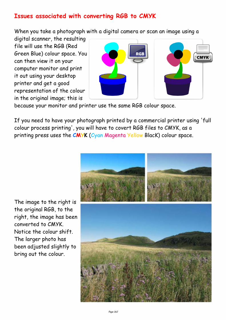
Page 162
Issues associated with converting RGB to CMYK
When you take a photograph with a digital camera or scan an image using a
digital scanner, the resulting
file will use the RGB (Red
Green Blue) colour space. You
can then view it on your
computer monitor and print
it out using your desktop
printer and get a good
representation of the colour
in the original image; this is
because your monitor and printer use the same RGB colour space.
If you need to have your photograph printed by a commercial printer using 'full
colour process printing', you will have to covert RGB files to CMYK, as a
printing press uses the CMYK (Cyan Magenta Yellow BlacK) colour space.
The image to the right is
the original RGB, to the
right, the image has been
converted to CMYK.
Notice the colour shift.
The larger photo has
been adjusted slightly to
bring out the colour.
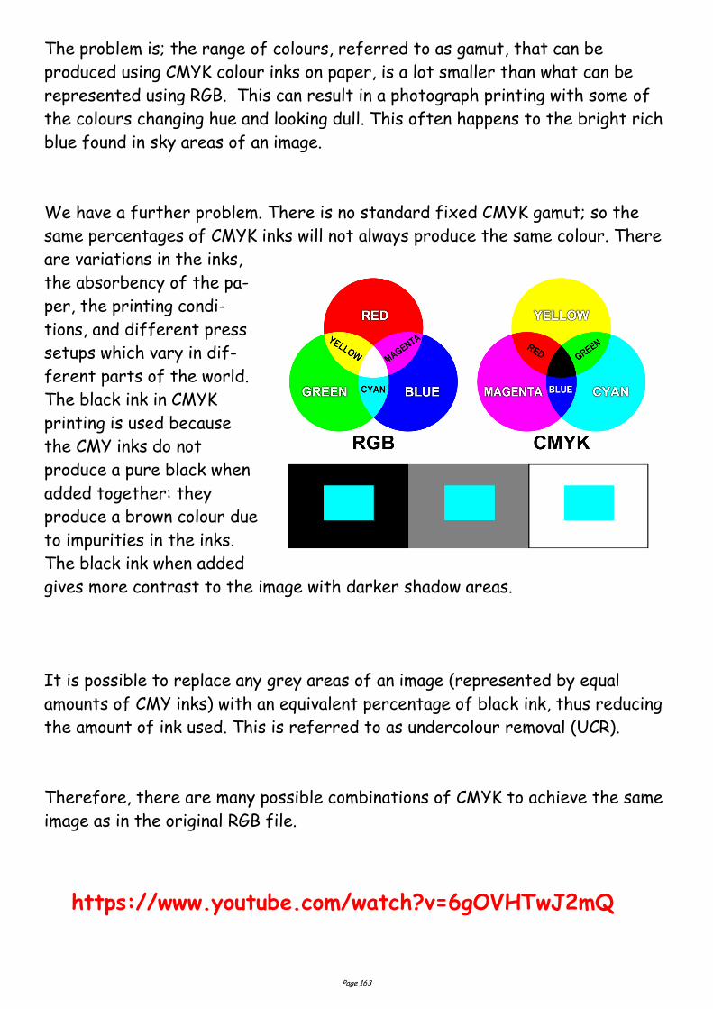
Page 163
The problem is; the range of colours, referred to as gamut, that can be
produced using CMYK colour inks on paper, is a lot smaller than what can be
represented using RGB. This can result in a photograph printing with some of
the colours changing hue and looking dull. This often happens to the bright rich
blue found in sky areas of an image.
We have a further problem. There is no standard fixed CMYK gamut; so the
same percentages of CMYK inks will not always produce the same colour. There
are variations in the inks,
the absorbency of the pa-
per, the printing condi-
tions, and different press
setups which vary in dif-
ferent parts of the world.
The black ink in CMYK
printing is used because
the CMY inks do not
produce a pure black when
added together: they
produce a brown colour due
to impurities in the inks.
The black ink when added
gives more contrast to the image with darker shadow areas.
It is possible to replace any grey areas of an image (represented by equal
amounts of CMY inks) with an equivalent percentage of black ink, thus reducing
the amount of ink used. This is referred to as undercolour removal (UCR).
Therefore, there are many possible combinations of CMYK to achieve the same
image as in the original RGB file.
https://www.youtube.com/watch?v=6gOVHTwJ2mQ
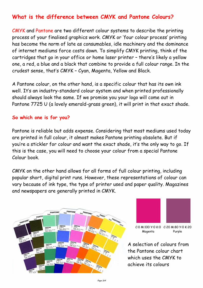
Page 164
What is the difference between CMYK and Pantone Colours?
CMYK and Pantone are two different colour systems to describe the printing
process of your finalised graphics work. CMYK or ‘four colour process’ printing
has become the norm of late as consumables, idle machinery and the dominance
of internet mediums force costs down. To simplify CMYK printing, think of the
cartridges that go in your office or home laser printer – there’s likely a yellow
one, a red, a blue and a black that combine to provide a full colour range. In the
crudest sense, that’s CMYK – Cyan, Magenta, Yellow and Black.
A Pantone colour, on the other hand, is a specific colour that has its own ink
well. It’s an industry-standard colour system and when printed professionally
should always look the same. If we promise you your logo will come out in
Pantone 7725 U (a lovely emerald-grass green), it will print in that exact shade.
So which one is for you?
Pantone is reliable but adds expense. Considering that most mediums used today
are printed in full colour, it almost makes Pantone printing obsolete. But if
you’re a stickler for colour and want the exact shade, it’s the only way to go. If
this is the case, you will need to choose your colour from a special Pantone
Colour book.
CMYK on the other hand allows for all forms of full colour printing, including
popular short, digital print runs. However, these representations of colour can
vary because of ink type, the type of printer used and paper quality. Magazines
and newspapers are generally printed in CMYK.
A selection of colours from
the Pantone colour chart
which uses the CMYK to
achieve its colours
C:0 M:100 Y:0 K:0
Magenta
C:20 M:80 Y:0 K:20
Purple

Page 165
Spot Colour
In offset printing, a spot colour is any colour generated by an ink (pure or
mixed) that is printed using a single run. The widespread offset-printing
process is composed of four spot colours: Cyan, Magenta, Yellow, and Key
(black) commonly referred to as CMYK.
2 Colour Printing - Two Colours are Better than One
In 2 colour printing, only two ink colours are used instead of one on lower end
marketing materials. The inks used are typically Pantone® colours, and are
frequently used to print a logo, design or symbol in a unique colour. Pantone inks
are the industry standard in two-colour printing because they are part of a
standardized colour matching system to help different manufacturers in
different locations or industries reproduce the exact same colour by referring
to the Pantone Matching System Colour Guides. Adding a second colour to
black and white printing will add colour and impact and can improve the
professionalism and increase the response on marketing materials. A unique,
readily identifiable spot colour is sometimes used by companies to create a
brand colour that is used on all their marketing and product materials.
Advantages to 2 Colour Printing
Having a specific reproducible colour for brand identification, especially if
you print multiple items across different vendors or product types.
Spot colours can be printed more consistently than a CMYK (four colour pro-
cess) colour build across multiple pages of a multi page catalogue, or across
multiple printed pieces or even
product types. If you need a standard logo
colour on a brochure, a plastic credit card
or something like a metal product, a spot
colour can more easily be matched on all of
them.
Heidelberg 2 colour printing press
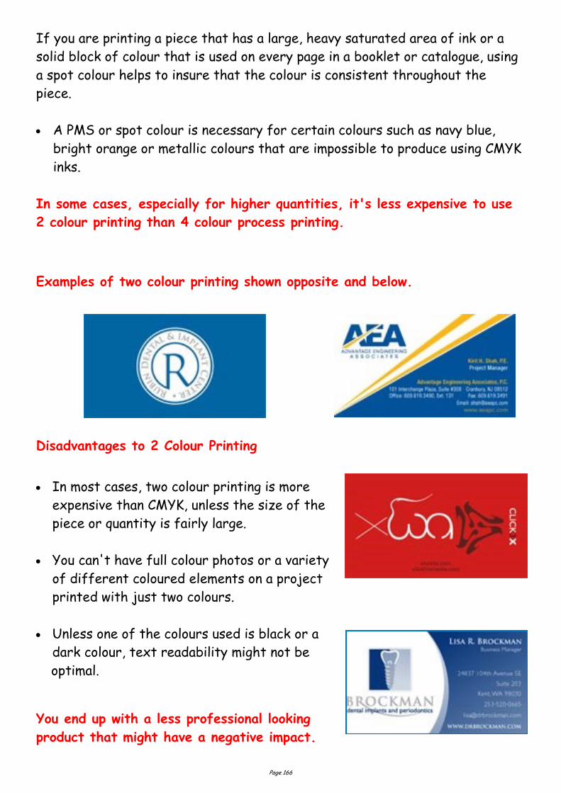
Page 166
If you are printing a piece that has a large, heavy saturated area of ink or a
solid block of colour that is used on every page in a booklet or catalogue, using
a spot colour helps to insure that the colour is consistent throughout the
piece.
A PMS or spot colour is necessary for certain colours such as navy blue,
bright orange or metallic colours that are impossible to produce using CMYK
inks.
In some cases, especially for higher quantities, it's less expensive to use
2 colour printing than 4 colour process printing.
Examples of two colour printing shown opposite and below.
Disadvantages to 2 Colour Printing
In most cases, two colour printing is more
expensive than CMYK, unless the size of the
piece or quantity is fairly large.
You can't have full colour photos or a variety
of different coloured elements on a project
printed with just two colours.
Unless one of the colours used is black or a
dark colour, text readability might not be
optimal.
You end up with a less professional looking
product that might have a negative impact.
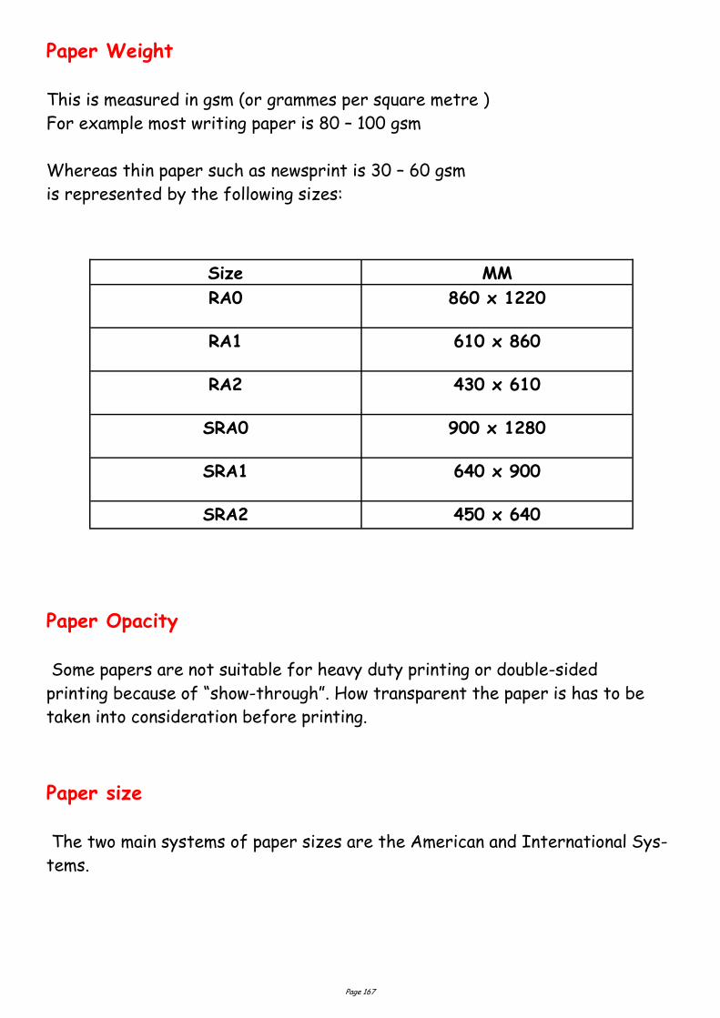
Page 167
Paper Weight
This is measured in gsm (or grammes per square metre )
For example most writing paper is 80 – 100 gsm
Whereas thin paper such as newsprint is 30 – 60 gsm
is represented by the following sizes:
Paper Opacity
Some papers are not suitable for heavy duty printing or double-sided
printing because of “show-through”. How transparent the paper is has to be
taken into consideration before printing.
Paper size
The two main systems of paper sizes are the American and International Sys-
tems.
Size MM
RA0 860 x 1220
RA1 610 x 860
RA2 430 x 610
SRA0 900 x 1280
SRA1 640 x 900
SRA2 450 x 640
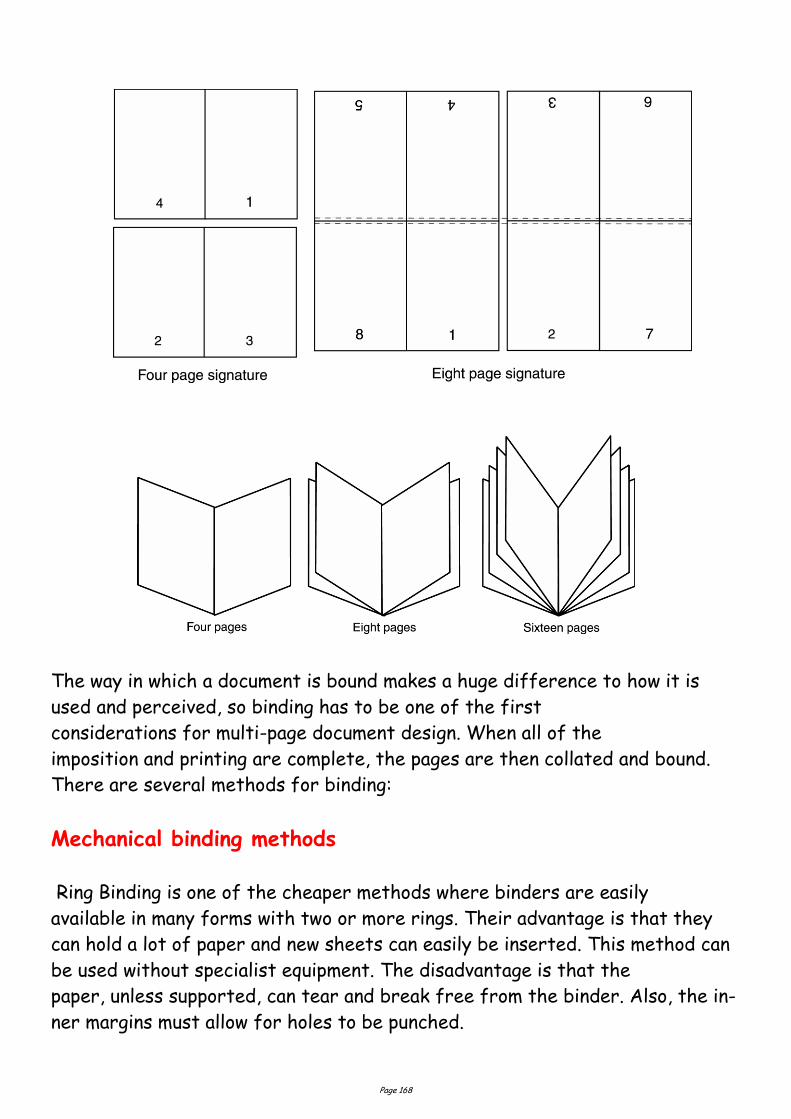
Page 168
The way in which a document is bound makes a huge difference to how it is
used and perceived, so binding has to be one of the first
considerations for multi-page document design. When all of the
imposition and printing are complete, the pages are then collated and bound.
There are several methods for binding:
Mechanical binding methods
Ring Binding is one of the cheaper methods where binders are easily
available in many forms with two or more rings. Their advantage is that they
can hold a lot of paper and new sheets can easily be inserted. This method can
be used without specialist equipment. The disadvantage is that the
paper, unless supported, can tear and break free from the binder. Also, the in-
ner margins must allow for holes to be punched.
Page 169
Imposition & Binding
Imposition is the process of ordering the pages to be printed in such a way
that they will read correctly when trimmed and bound using the least amount
of paper and ink. For very large numbers of documents, the savings in paper,
ink and time are crucial, so good imposition is almost a science. An imposition
of pages is known as a signature and here are a few examples:
Spiral Binding, again, is also one of the cheaper methods of binding where
specialist equipment is not needed. The spirals can be made from metal or
plastic and take various forms. Their advantage is that a document can be
opened out flat and that they are fairly sturdy. The disadvantage is that they
can be time-consuming to produce and that the metal spirals can sometimes
fray if badly fitted. Also, the inner margins must allow for holes to be
punched.
Saddle Stitch binding is a method where the pages are sewn along the cen-
tre-spread and then trimmed. One disadvantage is that an allowance has to be
made in the design for “creep”, where, with many pages the inner pages creep
further out than the outer pages, which means that the whole
document must be trimmed.
Side Stitching is used where the document is too thick to be
Saddle-stitched. The stitches are made through the side of the document. A
cover is then added. The disadvantages are that the publication will no longer
open out flat and that extra space has to be allowed in the design to accom-
modate that taken up by the stitching itself.
Perfect binding is one of the more specialised forms of binding, far
sturdier than the other methods above. The pages are gathered, roughened
on the spine edge, then glued, sometimes with a strip of gauze for strength.
Then the cover is glued on and the whole publication trimmed.
Edition binding is the most traditional and expensive form of binding. The
pages are gathered, and end papers glued to first and last pages. These are
then stitched and trimmed. A strip of gauze is glued to the spine end for
strength, the spine added, and the cover glued to the end papers.
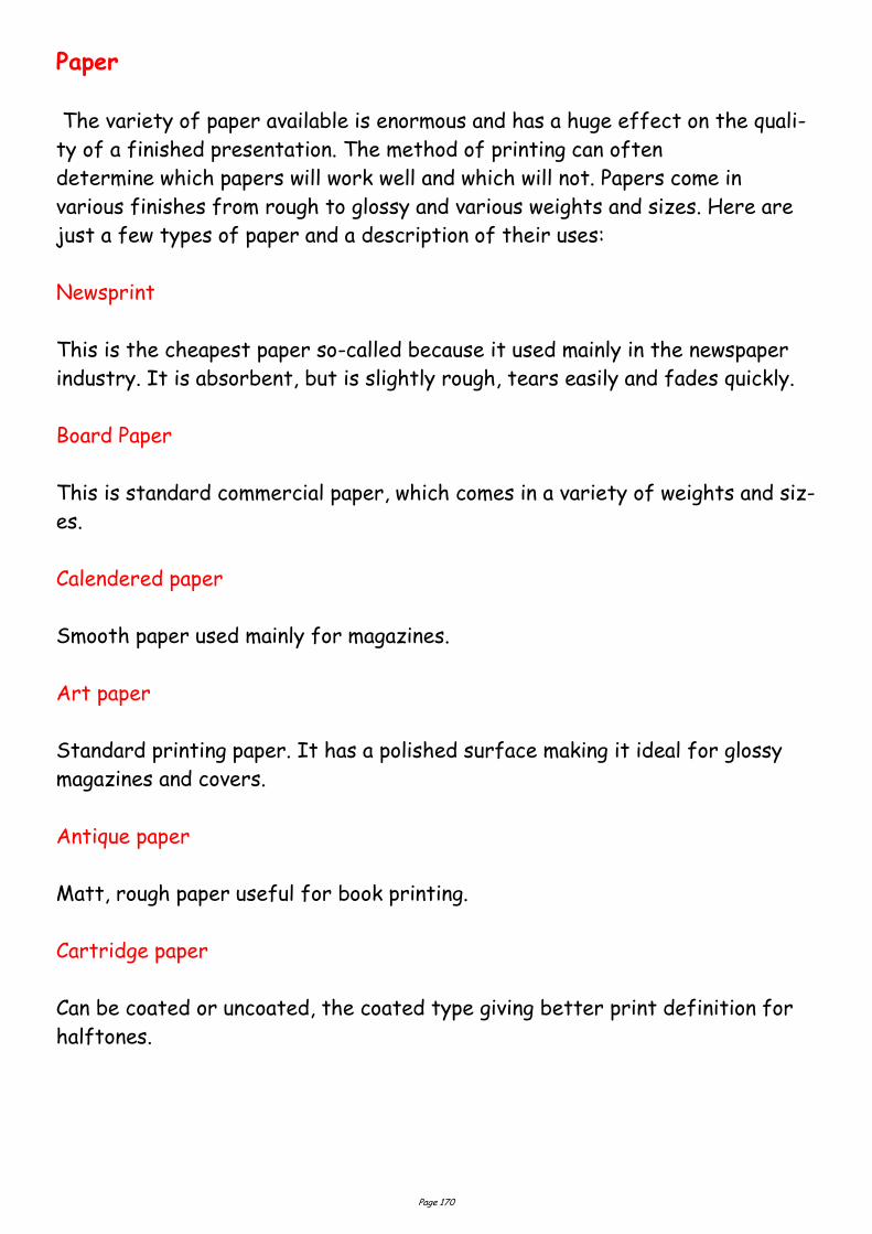
Page 170
Paper
The variety of paper available is enormous and has a huge effect on the quali-
ty of a finished presentation. The method of printing can often
determine which papers will work well and which will not. Papers come in
various finishes from rough to glossy and various weights and sizes. Here are
just a few types of paper and a description of their uses:
Newsprint
This is the cheapest paper so-called because it used mainly in the newspaper
industry. It is absorbent, but is slightly rough, tears easily and fades quickly.
Board Paper
This is standard commercial paper, which comes in a variety of weights and siz-
es.
Calendered paper
Smooth paper used mainly for magazines.
Art paper
Standard printing paper. It has a polished surface making it ideal for glossy
magazines and covers.
Antique paper
Matt, rough paper useful for book printing.
Cartridge paper
Can be coated or uncoated, the coated type giving better print definition for
halftones.
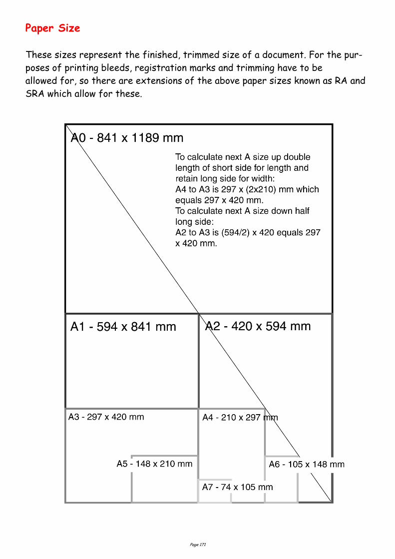
Page 171
Paper Size
These sizes represent the finished, trimmed size of a document. For the pur-
poses of printing bleeds, registration marks and trimming have to be
allowed for, so there are extensions of the above paper sizes known as RA and
SRA which allow for these.
Page 172
Paper Textures & Finishes
Paper is often something we take for granted. It's just 'there.' Sometimes we
have no choice about the type of paper on which our designs are printed. Nor-
mally we can't dictate the paper used for ads in newspapers or
magazines. Even when we do have a choice, we're limited by budget, printing
requirements, or other factors. However, paper can be an important textural
element in our desktop published documents.
Some papers just 'feel' better than others. Grab up some paper from around
you. Get a newspaper, a magazine, some paper from your printer, and a few
different samples from your Class Samples. Close your eyes and touch the
different surfaces. Can you identify the general type of paper (newsprint, etc.)
simply by touch? Probably so. But also consider how they feel to your touch —
smooth, rough, slightly patterned, fuzzy, bumpy, slick, shiny, dull, warm or
cold..
Antique Finish Cast-Coated Paper
Cockle Finish Dull Finish
Eggshell Finish English Finish
Felt Finish Glazed Finish
Granite Finish Laid Finish
Linen Finish Machine Finish
Machine Glazed Matte Finish
Mottled Finish Natural Finish
Onionskin Paper Parchment Paper
Supercalendered Paper Vellum Finish
Wove Finish
Design Concept & Texture
Varying paper surfaces can dramatically or subtly alter the mood you want your
designs to convey. An exercise from Using Design Basics To Get Creative Results by Bryan L. Peterson uses the example of a piece of
jewellery placed against two totally different surfaces — a shiny tile of black
Formica vs. a piece of cement.
Page 173
Graphic Communication and the effects of its use in every day
living.
As much as graphic communication has excelled in recent years making all of
our lives better, it does however leave a carbon footprint. A carbon
footprint is determined by the human effect on the environment through
green house gasses, paper waste, and pollution of volatile organic compounds
found in inks. The footprint is measured in units of how much carbon dioxide
has been released into the atmosphere.
Virtually every product you will see on a shop shelf has a package which has
been graphically designed and subsequently printed. The print
industry through the use of ink and paper has a lot to answer for.
Water
In 1995, 92 percent of the global population had a sufficient supply of
water. If the world continues to consume water at its current rate, it is
projected that water sufficiency in 2050 will be only 58 percent. It is
further predicted that nations will go to war over water supplies within the
next two decades.
The print industry makes a negative contribution to this situation. Large quan-
tities of water are used in most printing processes (even digital), the
exception being waterless printing.
Printers can reduce water usage by recycling the water used on the printing
presses.
At the other end of the process is the issue of water contamination. All print-
ers are legally required to clean waste water before disposing it. Some compa-
ny’s don’t do this as well as they should.
Page 174
Energy & Emissions
In addition to the waste printers use up, they also use a significant amount of
energy – from electricity to run the presses, to fuel for
delivering the finished product.
The industry can adopt measures to reduce energy consumption, such as using
voltage optimisers (making the most of the voltage available) on the presses,
driving fuel-efficient delivery vehicles, and switching to green electricity
suppliers.
But until measures like these are widespread, energy consumption will keep on
creating carbon emissions.
Waste
As has been discussed the print industry generates relatively high levels of
waste. As shown below, a lot this waste can be recycled or reused, but
currently much of it ends up in landfill.
Examples of how waste ink can be reused.
Waste inks and varnishes can be used as low grade fuel or mixed with
concrete and buried in 'special (or hazardous) waste landfill'. A large printer
could be chucking out around 9000 tins worth of waste ink per year.
Ink tins are usually crushed and recycled.
Ink cartridges are often favoured over tins, but although these
plastic cartridges waste less ink than tins, they're classed as
hazardous waste and usually sent to 'special waste landfill'.
Page 175
More environmentally aware printers will pay for them to be collected and re-
cycled into drainpipes etc. A large litho printer could be generating around
800,000 of these cartridges per year.
Waste chemicals (solvents, developer, fixer).
In a year a large printer could chuck out around 65,000 litres of waste solvent
and 85,000 litres of waste developer. Responsible printers will make sure
they're either used as 3rd grade fuel or that they undergo ‘bio-digestion’ to
make the chemicals safe before flushing them into the water course.
Wooden pallets are usually sent to landfill, but are occasionally recycled into
chipboard.
Plastic wrapping will usually be sent to landfill. However, if recyclable, it can
be washed, shredded and recycled into more plastic wrapping.
CDs and cases are usually sent to landfill, although they can also be ground
up, washed in caustic solution to remove the ink and foil, and then re-used.
Digital
There are some huge environmental advantages to printing digitally:
You can run a print job as and when needed.
Re-printing costs no extra, so there is no need to print 5000 extra copies in
case you run out.
Downsides:
Digital inks are currently difficult to remove in the recycling process .
The choice of paper can be limited to approved papers, which are rarely
recycled or FSC certified. (Forest Stewardship Council)
Large amounts of energy are used in the manufacturing of the machines
themselves.
Page 176
Intellectual Property Rights
This is a creative process to generate new ideas, whether in the field of
graphic design, music, art or elsewhere. These ideas, which may have
commercial value, are the intellectual property (IP) of the creator, whether
they are an individual or a company organisation.
These rights have enormous commercial value,
and can be traded as a commodity.
These six types of protection are:
Confidentiality
Copyright
Trademark
Design right
Registered design
Patent.
This is basically the big name for secrets. Secrets have been around for a long
time, and they are cheap to keep as long as the people keeping them can be
trusted. In general, the fewer people who know a secret, the safer it is.
Confidentiality
Some companies use confidentiality rather than patents because applying for
patents results in the application becoming public. Not much use if you are
designing a top-secret product!
Having said this, secrets are not much use for some people. For example,
protecting a new tune with a confidentiality agreement would mean that the
composer would never earn any money, as no one would be able to hear it.
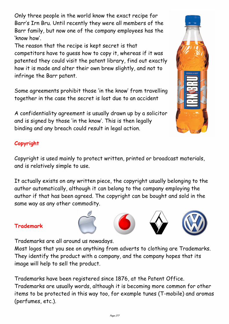
Page 177
Only three people in the world know the exact recipe for
Barr’s Irn Bru. Until recently they were all members of the
Barr family, but now one of the company employees has the
‘know how’.
The reason that the recipe is kept secret is that
competitors have to guess how to copy it, whereas if it was
patented they could visit the patent library, find out exactly
how it is made and alter their own brew slightly, and not to
infringe the Barr patent.
Some agreements prohibit those ‘in the know’ from travelling
together in the case the secret is lost due to an accident
A confidentiality agreement is usually drawn up by a solicitor
and is signed by those ‘in the know’. This is then legally
binding and any breach could result in legal action.
Copyright
Copyright is used mainly to protect written, printed or broadcast materials,
and is relatively simple to use.
It actually exists on any written piece, the copyright usually belonging to the
author automatically, although it can belong to the company employing the
author if that has been agreed. The copyright can be bought and sold in the
same way as any other commodity.
Trademark
Trademarks are all around us nowadays.
Most logos that you see on anything from adverts to clothing are Trademarks.
They identify the product with a company, and the company hopes that its
image will help to sell the product.
Trademarks have been registered since 1876, at the Patent Office.
Trademarks are usually words, although it is becoming more common for other
items to be protected in this way too, for example tunes (T-mobile) and aromas
(perfumes, etc.).
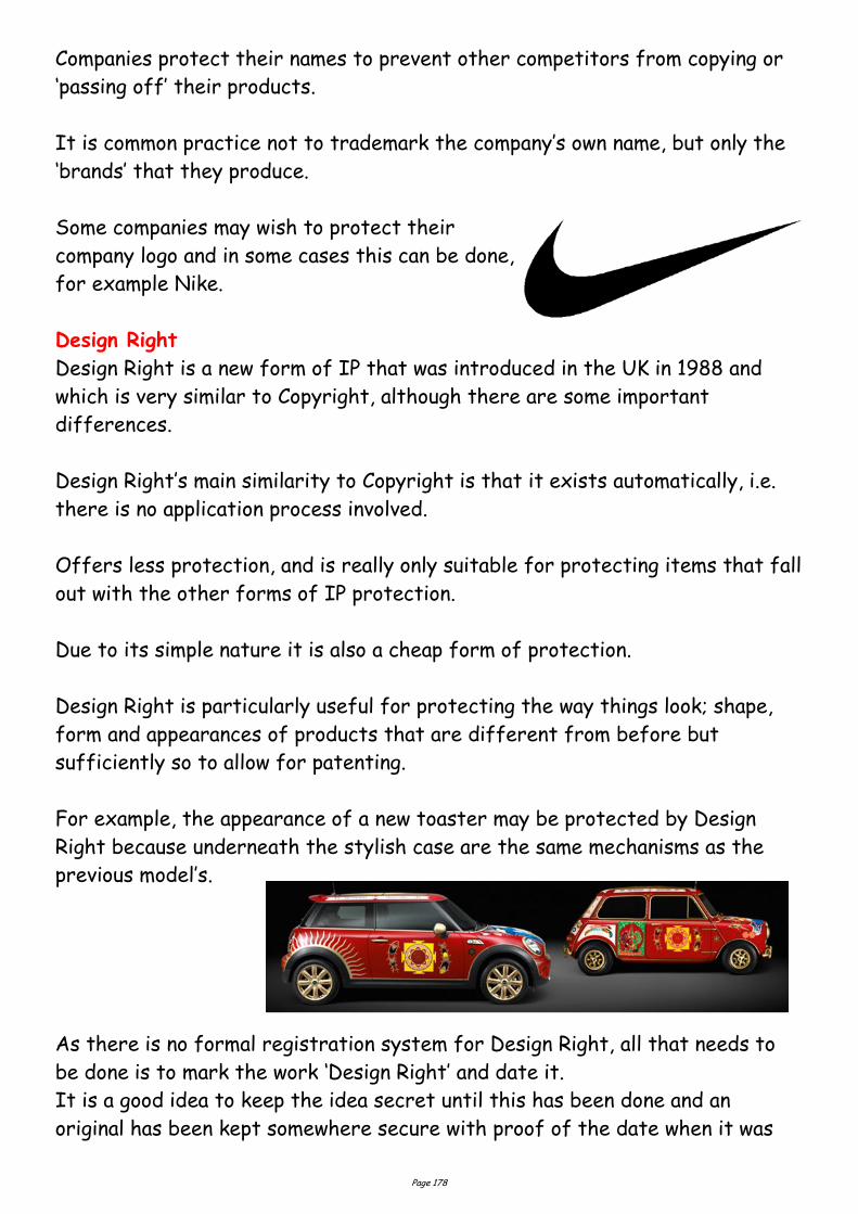
Page 178
Companies protect their names to prevent other competitors from copying or
‘passing off’ their products.
It is common practice not to trademark the company’s own name, but only the
‘brands’ that they produce.
Some companies may wish to protect their
company logo and in some cases this can be done,
for example Nike.
Design Right
Design Right is a new form of IP that was introduced in the UK in 1988 and
which is very similar to Copyright, although there are some important
differences.
Design Right’s main similarity to Copyright is that it exists automatically, i.e.
there is no application process involved.
Offers less protection, and is really only suitable for protecting items that fall
out with the other forms of IP protection.
Due to its simple nature it is also a cheap form of protection.
Design Right is particularly useful for protecting the way things look; shape,
form and appearances of products that are different from before but
sufficiently so to allow for patenting.
For example, the appearance of a new toaster may be protected by Design
Right because underneath the stylish case are the same mechanisms as the
previous model’s.
As there is no formal registration system for Design Right, all that needs to
be done is to mark the work ‘Design Right’ and date it.
It is a good idea to keep the idea secret until this has been done and an
original has been kept somewhere secure with proof of the date when it was
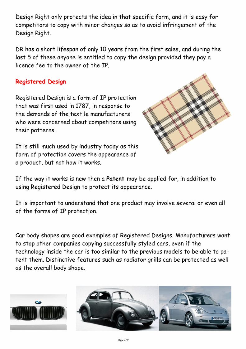
Page 179
Design Right only protects the idea in that specific form, and it is easy for
competitors to copy with minor changes so as to avoid infringement of the
Design Right.
DR has a short lifespan of only 10 years from the first sales, and during the
last 5 of these anyone is entitled to copy the design provided they pay a
licence fee to the owner of the IP.
Registered Design
Registered Design is a form of IP protection
that was first used in 1787, in response to
the demands of the textile manufacturers
who were concerned about competitors using
their patterns.
It is still much used by industry today as this
form of protection covers the appearance of
a product, but not how it works.
If the way it works is new then a Patent may be applied for, in addition to
using Registered Design to protect its appearance.
It is important to understand that one product may involve several or even all
of the forms of IP protection.
Car body shapes are good examples of Registered Designs. Manufacturers want
to stop other companies copying successfully styled cars, even if the
technology inside the car is too similar to the previous models to be able to pa-
tent them. Distinctive features such as radiator grills can be protected as well
as the overall body shape.
Page 180
The process for registering a design is similar to that for obtaining a patent
and is also controlled by the Patent Office.
The design has to be kept confidential before the application is filed, and then
a search is carried out to see if there is any previous work that is similar.
If the search does not show up any possible conflicts, the design is granted its
Registration.
Once granted, the registration can be kept for 25 years, as long as renewal
fees are paid.
If the company does not feel it is worth spending the money as the product’s
life cycle nears its end, they may allow its registration to lapse.
This enables competitors to begin copying the design legally.
The first patent was granted in 1449, to John Utynam, who wanted to protect
his method for making stained glass.
He was granted a monopoly on the process for 20 years by the King, in the
form of an open letter.
This was the method before the Patent Office was opened in London in 1852.
Nowadays, over 30,000 patents are applied for each year.
If you own the patent on a product you will have exclusive design rights on it
for up to 20 years.
However, as part of the process the patent is made available to the public for
any interested parties, including competitors, to see.
This has two results: competitors can keep an eye on what the opposition are
working on and see which way the market may be going; 65% of research and
development (R&D) has been done before and is available for viewing in the Pa-
tents Library. This can save vast sums of money in R&D budgets.
The main aim of this process is to encourage innovation.
Page 181
Camera-ready Copy
Camera-ready is a common term used in the commercial printing industry
meaning that a document is, from a technical standpoint, ready to "go to
press", or be printed.
History
The term camera-ready was first used in the photo offset printing process,
where the final layout of a document was attached to a "mechanical" or "paste
up". Then, a stat camera was used to photograph the mechanical, and the final
offset printing plates were created from the camera's negative.
In this system, a final paste-up that needed no further changes or additions
was ready to be photographed by the process camera and subsequently printed.
This final document was camera-ready.
Present usage
In recent years, the use of paste-ups has been steadily replaced by desktop
publishing software, which allows users to create entire document layouts on
the computer. In the meantime, many printers now use technology to take
these digital files and create printing plates from them without use of a
camera and negative. Despite this, the term camera-ready continues to be used
to signify that a document is ready to be made into a printing plate.
In this new digital-to-plate system, a digital file is usually considered
camera-ready if it meets several conditions:
It is created with a software program commonly used in the printing industry,
such as LaTeX, InDesign (Adobe), Illustrator (Adobe), Freehand (Adobe/Macromedia), Quark XPress (Quark, Inc), and exported in a commonly used file
format, such as EPS, PDF and sometimes TIFF. JPEG images are usually
considered not camera-ready, as the compression used in the JPEG format
deteriorates the quality of the image.
The document uses the correct colour setup. If printing a (full) colour
document, all graphics should be converted to CMYK (cyan, magenta, yellow,
and black). If it is a spot colour document, the colour(s) to be used by the
printer must be specified in the digital file.

Page 182
The layout is created at the correct and final size to be printed, and the docu-
ment size in the desktop publishing program matches the size of the final
printed piece.
Text or graphics that are intended to bleed off the page of the final printed
piece should be extended off the document boundary in the digital file. The
amount varies depending on location, but is usually 1/8 inch in the US, and 3mm
in metric systems.
Fonts used in the digital file are converted to vector graphics (usually defined
by the software as "convert to paths" or "outline text"), or alternatively, the
fonts are included in the final digital package sent to the printer.
Raster or image files are originally created at high resolution settings, such as
300 DPI (dots per inch). This ensures a high quality image. Images saved from
Internet web pages are usually low-resolution, 72-dots-per-inch JPG or GIF
files, which are not considered camera-ready.
Printing Registration
In colour printing, registration is the method of correlating overlapping colours
on one single image. There are many different styles and types of registration,
many of which employ the alignment of specific marks.
Ink Color Registration
Four colour process printing uses four ink colours
– Cyan, Magenta, Yellow and Black. These four
colours are applied one after the other on a
printing press. They overlap each other in various
concentrations on the paper to create the visual
effect we know as full colour printing. Because
these four colours combine to make an image, the
proper registration of these colours is crucial to
produce a sharp image. Even a slight position
shift in one of the four colours will cause the
printed image to appear blurred or fuzzy.
For the same reason as above, proper
registration is also a concern for two-colour and three-color printing. One-
colour printing is not concerned with ink registration since only one ink colour is
used (but like all printing jobs, the ink must be properly registered
Exaggerated example of a
mismatch of CMYK registration
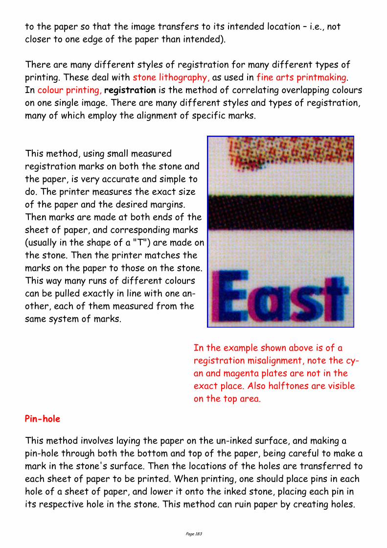
Page 183
to the paper so that the image transfers to its intended location – i.e., not
closer to one edge of the paper than intended).
There are many different styles of registration for many different types of
printing. These deal with stone lithography, as used in fine arts printmaking.
In colour printing, registration is the method of correlating overlapping colours
on one single image. There are many different styles and types of registration,
many of which employ the alignment of specific marks.
This method, using small measured
registration marks on both the stone and
the paper, is very accurate and simple to
do. The printer measures the exact size
of the paper and the desired margins.
Then marks are made at both ends of the
sheet of paper, and corresponding marks
(usually in the shape of a "T") are made on
the stone. Then the printer matches the
marks on the paper to those on the stone.
This way many runs of different colours
can be pulled exactly in line with one an-
other, each of them measured from the
same system of marks.
Pin-hole
This method involves laying the paper on the un-inked surface, and making a
pin-hole through both the bottom and top of the paper, being careful to make a
mark in the stone's surface. Then the locations of the holes are transferred to
each sheet of paper to be printed. When printing, one should place pins in each
hole of a sheet of paper, and lower it onto the inked stone, placing each pin in
its respective hole in the stone. This method can ruin paper by creating holes.
In the example shown above is of a
registration misalignment, note the cy-
an and magenta plates are not in the
exact place. Also halftones are visible
on the top area.
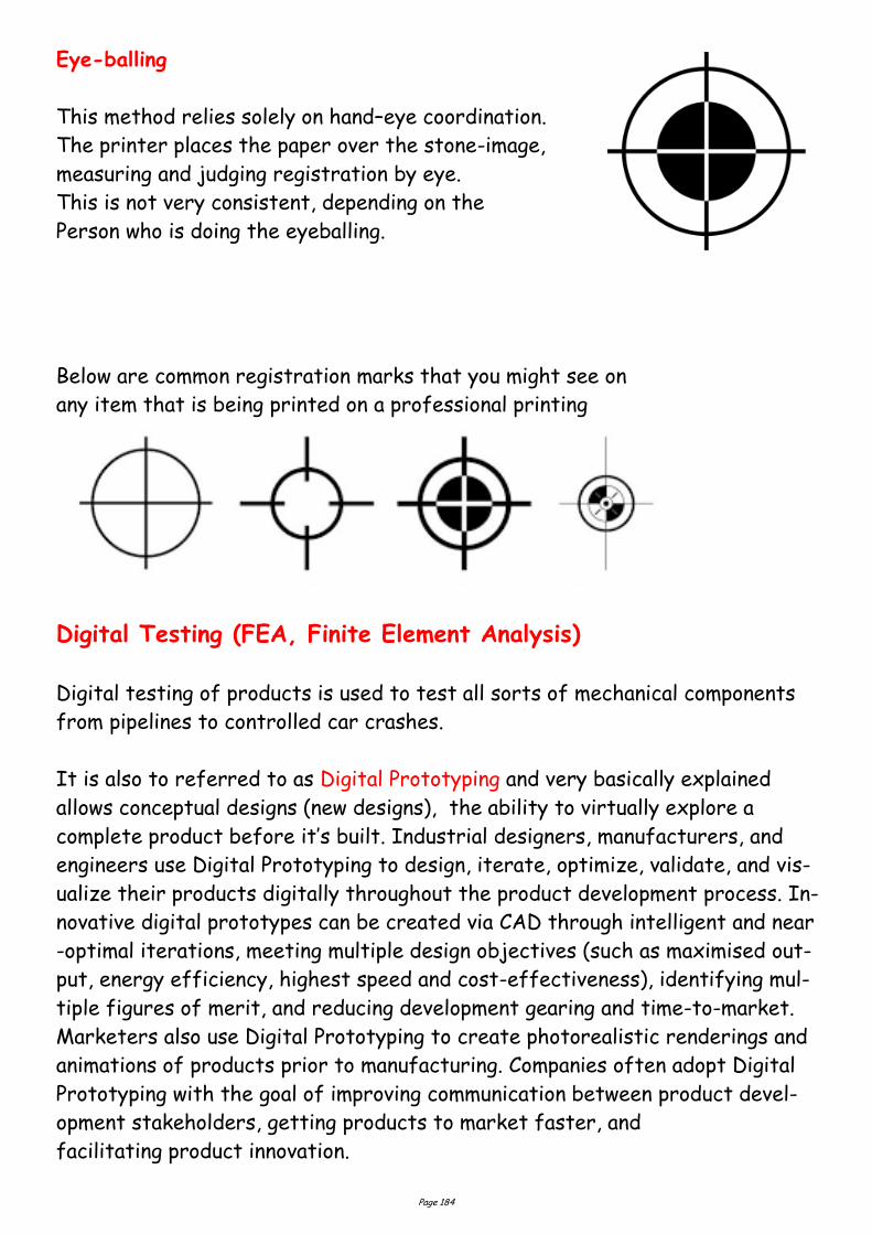
Page 184
Eye-balling
This method relies solely on hand–eye coordination.
The printer places the paper over the stone-image,
measuring and judging registration by eye.
This is not very consistent, depending on the
Person who is doing the eyeballing.
Digital Testing (FEA, Finite Element Analysis)
Digital testing of products is used to test all sorts of mechanical components
from pipelines to controlled car crashes.
It is also to referred to as Digital Prototyping and very basically explained
allows conceptual designs (new designs), the ability to virtually explore a
complete product before it’s built. Industrial designers, manufacturers, and
engineers use Digital Prototyping to design, iterate, optimize, validate, and vis-
ualize their products digitally throughout the product development process. In-
novative digital prototypes can be created via CAD through intelligent and near
-optimal iterations, meeting multiple design objectives (such as maximised out-
put, energy efficiency, highest speed and cost-effectiveness), identifying mul-
tiple figures of merit, and reducing development gearing and time-to-market.
Marketers also use Digital Prototyping to create photorealistic renderings and
animations of products prior to manufacturing. Companies often adopt Digital
Prototyping with the goal of improving communication between product devel-
opment stakeholders, getting products to market faster, and
facilitating product innovation.
Below are common registration marks that you might see on
any item that is being printed on a professional printing
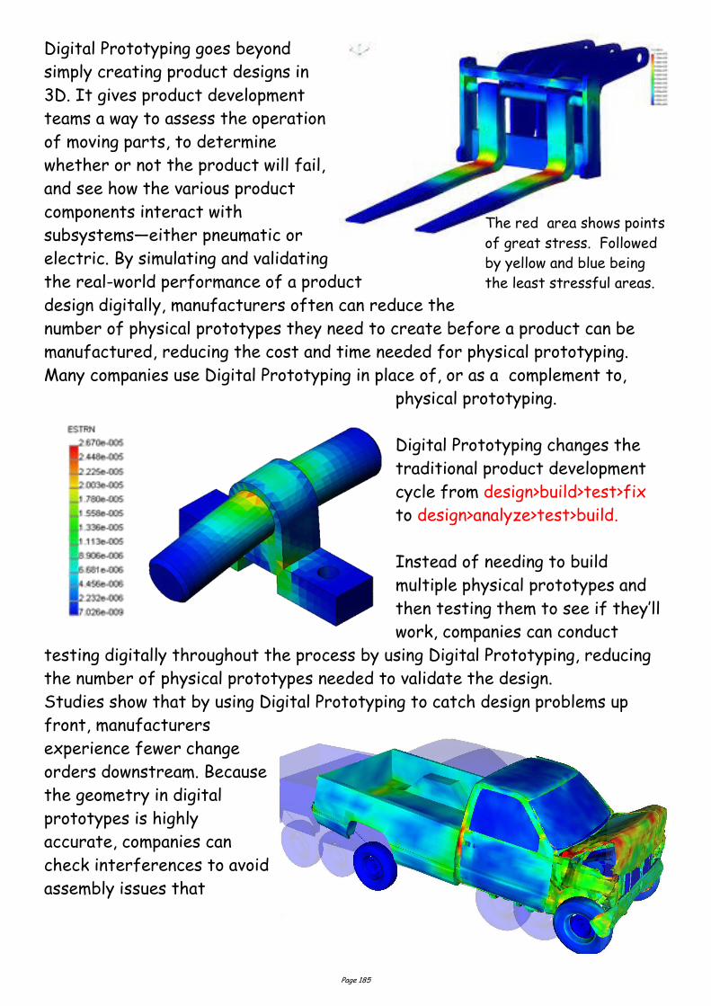
Page 185
Digital Prototyping goes beyond
simply creating product designs in
3D. It gives product development
teams a way to assess the operation
of moving parts, to determine
whether or not the product will fail,
and see how the various product
components interact with
subsystems—either pneumatic or
electric. By simulating and validating
the real-world performance of a product
design digitally, manufacturers often can reduce the
number of physical prototypes they need to create before a product can be
manufactured, reducing the cost and time needed for physical prototyping.
Many companies use Digital Prototyping in place of, or as a complement to,
physical prototyping.
Digital Prototyping changes the
traditional product development
cycle from design>build>test>fix
to design>analyze>test>build.
Instead of needing to build
multiple physical prototypes and
then testing them to see if they’ll
work, companies can conduct
testing digitally throughout the process by using Digital Prototyping, reducing
the number of physical prototypes needed to validate the design.
Studies show that by using Digital Prototyping to catch design problems up
front, manufacturers
experience fewer change
orders downstream. Because
the geometry in digital
prototypes is highly
accurate, companies can
check interferences to avoid
assembly issues that
The red area shows points
of great stress. Followed
by yellow and blue being
the least stressful areas.
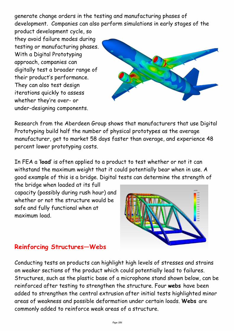
Page 186
generate change orders in the testing and manufacturing phases of
development. Companies can also perform simulations in early stages of the
product development cycle, so
they avoid failure modes during
testing or manufacturing phases.
With a Digital Prototyping
approach, companies can
digitally test a broader range of
their product’s performance.
They can also test design
iterations quickly to assess
whether they’re over- or
under-designing components.
Research from the Aberdeen Group shows that manufacturers that use Digital
Prototyping build half the number of physical prototypes as the average
manufacturer, get to market 58 days faster than average, and experience 48
percent lower prototyping costs.
In FEA a ‘load’ is often applied to a product to test whether or not it can
withstand the maximum weight that it could potentially bear when in use. A
good example of this is a bridge. Digital tests can determine the strength of
the bridge when loaded at its full
capacity (possibly during rush hour) and
whether or not the structure would be
safe and fully functional when at
maximum load.
Reinforcing Structures—Webs
Conducting tests on products can highlight high levels of stresses and strains
on weaker sections of the product which could potentially lead to failures.
Structures, such as the plastic base of a microphone stand shown below, can be
reinforced after testing to strengthen the structure. Four webs have been
added to strengthen the central extrusion after initial tests highlighted minor
areas of weakness and possible deformation under certain loads. Webs are
commonly added to reinforce weak areas of a structure.
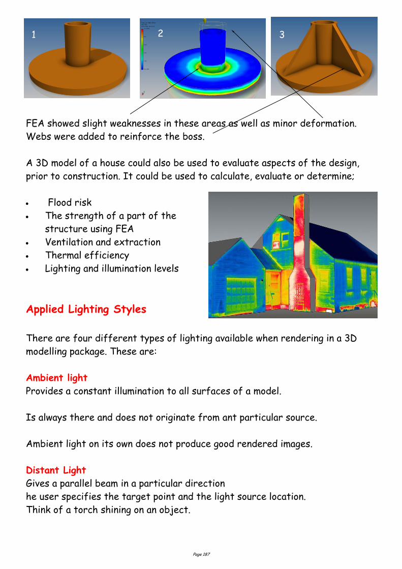
Page 187
FEA showed slight weaknesses in these areas as well as minor deformation.
Webs were added to reinforce the boss.
A 3D model of a house could also be used to evaluate aspects of the design,
prior to construction. It could be used to calculate, evaluate or determine;
Flood risk
The strength of a part of the
structure using FEA
Ventilation and extraction
Thermal efficiency
Lighting and illumination levels
Applied Lighting Styles
There are four different types of lighting available when rendering in a 3D
modelling package. These are:
Ambient light
Provides a constant illumination to all surfaces of a model.
Is always there and does not originate from ant particular source.
Ambient light on its own does not produce good rendered images.
Distant Light
Gives a parallel beam in a particular direction
he user specifies the target point and the light source location.
Think of a torch shining on an object.
1 2 3
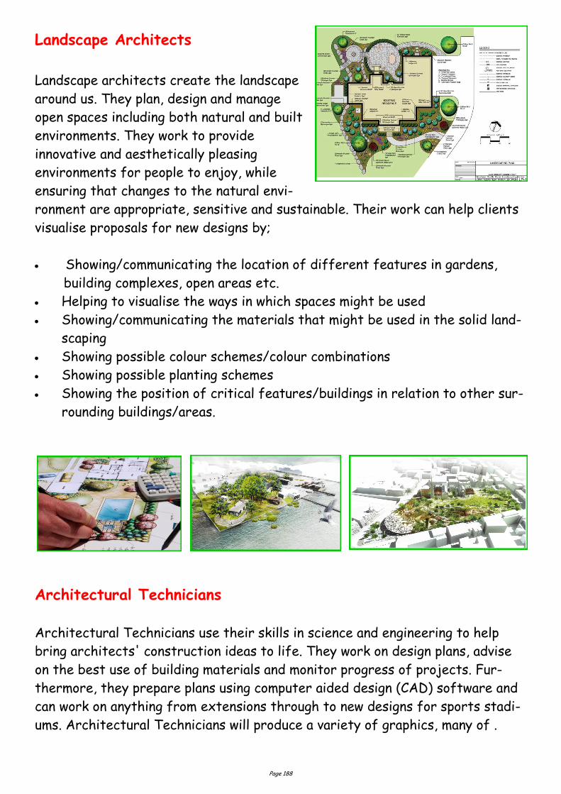
Page 188
Landscape Architects
Landscape architects create the landscape
around us. They plan, design and manage
open spaces including both natural and built
environments. They work to provide
innovative and aesthetically pleasing
environments for people to enjoy, while
ensuring that changes to the natural envi-
ronment are appropriate, sensitive and sustainable. Their work can help clients
visualise proposals for new designs by;
Showing/communicating the location of different features in gardens,
building complexes, open areas etc.
Helping to visualise the ways in which spaces might be used
Showing/communicating the materials that might be used in the solid land-
scaping
Showing possible colour schemes/colour combinations
Showing possible planting schemes
Showing the position of critical features/buildings in relation to other sur-
rounding buildings/areas.
Architectural Technicians
Architectural Technicians use their skills in science and engineering to help
bring architects' construction ideas to life. They work on design plans, advise
on the best use of building materials and monitor progress of projects. Fur-
thermore, they prepare plans using computer aided design (CAD) software and
can work on anything from extensions through to new designs for sports stadi-
ums. Architectural Technicians will produce a variety of graphics, many of .
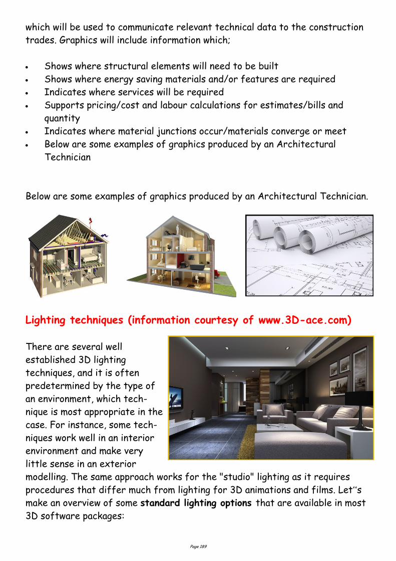
Page 189
which will be used to communicate relevant technical data to the construction
trades. Graphics will include information which;
Shows where structural elements will need to be built
Shows where energy saving materials and/or features are required
Indicates where services will be required
Supports pricing/cost and labour calculations for estimates/bills and
quantity
Indicates where material junctions occur/materials converge or meet
Below are some examples of graphics produced by an Architectural
Technician
Below are some examples of graphics produced by an Architectural Technician.
Lighting techniques (information courtesy of www.3D-ace.com)
There are several well
established 3D lighting
techniques, and it is often
predetermined by the type of
an environment, which tech-
nique is most appropriate in the
case. For instance, some tech-
niques work well in an interior
environment and make very
little sense in an exterior
modelling. The same approach works for the "studio" lighting as it requires
procedures that differ much from lighting for 3D animations and films. Let‟s
make an overview of some standard lighting options that are available in most
3D software packages:

Page 190
Point or Omni Light
A point light casts rays in every direction
from a single, small source in 3D
environment. It has no specific shape and
size. Point lights can add “fill lighting”
effect to a 3D scene, as well as simulate
any light source like candles, Christmas
tree lights, or others.
A point light emits light in all directions from its position.
The user specifies the point light location.
Point lights are used for general lighting effects.
Point lights are used with spot lights for lighting effects.
Directional Light
It is the opposite of omni light, it presents
a very distant source of light (like the
moon light). Directional rays go parallel in a
single direction. This type of 3D lighting is
often used to simulate sunlight. To change
the
illumination of the scene you can adjust the
position or colour of the light and rotate
the directional light source.
Spot Light
There are targeted spot lights and free
sports, which means that they have no
target objects. It is often used to simulate
light fixtures, for example desk lamps or
streetlights, as it casts a focused ray of
light.
Gives a directional cone of light.
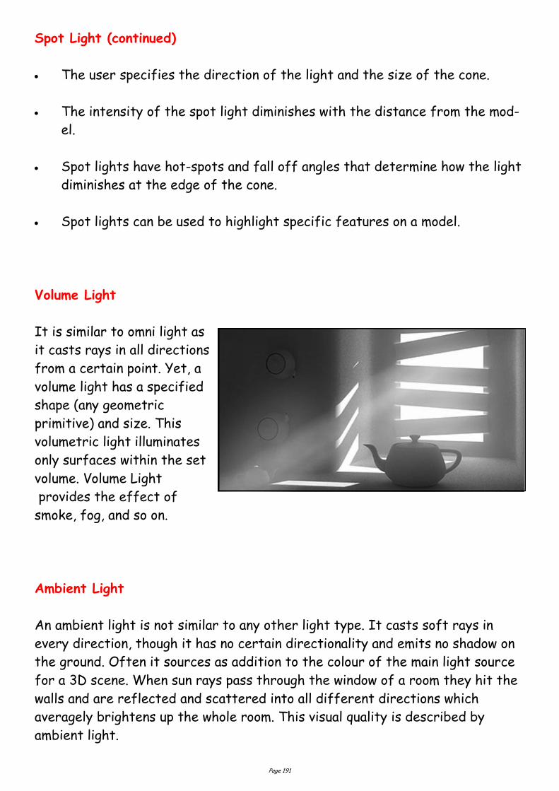
Page 191
Spot Light (continued)
The user specifies the direction of the light and the size of the cone.
The intensity of the spot light diminishes with the distance from the mod-
el.
Spot lights have hot-spots and fall off angles that determine how the light
diminishes at the edge of the cone.
Spot lights can be used to highlight specific features on a model.
Volume Light
It is similar to omni light as
it casts rays in all directions
from a certain point. Yet, a
volume light has a specified
shape (any geometric
primitive) and size. This
volumetric light illuminates
only surfaces within the set
volume. Volume Light
provides the effect of
smoke, fog, and so on.
Ambient Light
An ambient light is not similar to any other light type. It casts soft rays in
every direction, though it has no certain directionality and emits no shadow on
the ground. Often it sources as addition to the colour of the main light source
for a 3D scene. When sun rays pass through the window of a room they hit the
walls and are reflected and scattered into all different directions which
averagely brightens up the whole room. This visual quality is described by
ambient light.
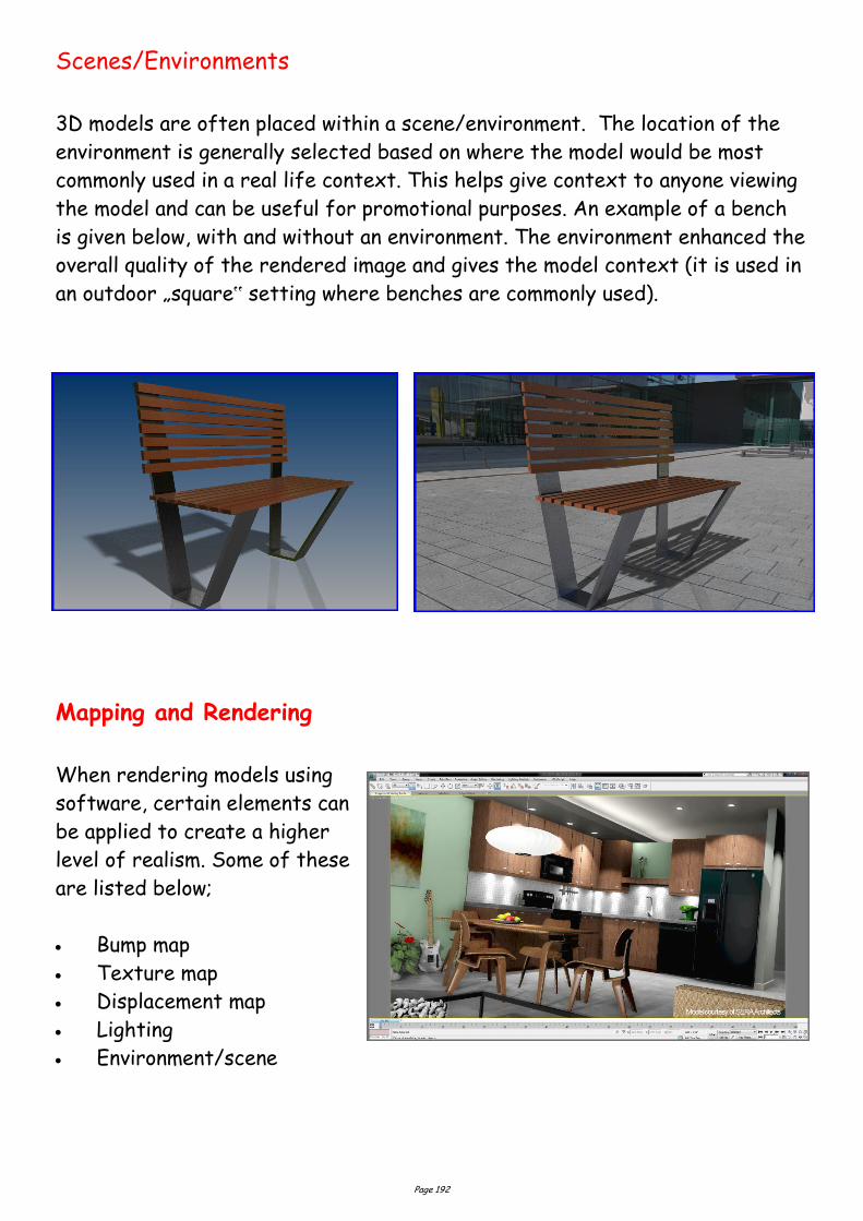
Page 192
Scenes/Environments
3D models are often placed within a scene/environment. The location of the
environment is generally selected based on where the model would be most
commonly used in a real life context. This helps give context to anyone viewing
the model and can be useful for promotional purposes. An example of a bench
is given below, with and without an environment. The environment enhanced the
overall quality of the rendered image and gives the model context (it is used in
an outdoor „square‟ setting where benches are commonly used).
Mapping and Rendering
When rendering models using
software, certain elements can
be applied to create a higher
level of realism. Some of these
are listed below;
Bump map
Texture map
Displacement map
Lighting
Environment/scene

Page 193
Bump Map
Bump maps are grayscale textures you map to objects, to create the illusion of
surface relief on an otherwise flat object. They are:
unable to cast or receive shadows
unable to be seen if you silhouette the mapped object
takes less time to render than displacement maps
Although the sphere with the bump map may appear to have physical raised and
lowered areas, it is just an illusion created by the grayscale texture. The
„bumps‟ on the object will not show in the object‟s shadow, as illustrated
above.
Texture Map
A texture map is the application of a 2D image/colour to the surface of a 3D
object. Some characteristics of a texture map are:
It does not show depth of colour
It is shown in plain colour
A texture map can be a 2D image saved from the internet which is then applied
to a 3D model. An example is given below.
Before applying
bump map
Before applying
bump map
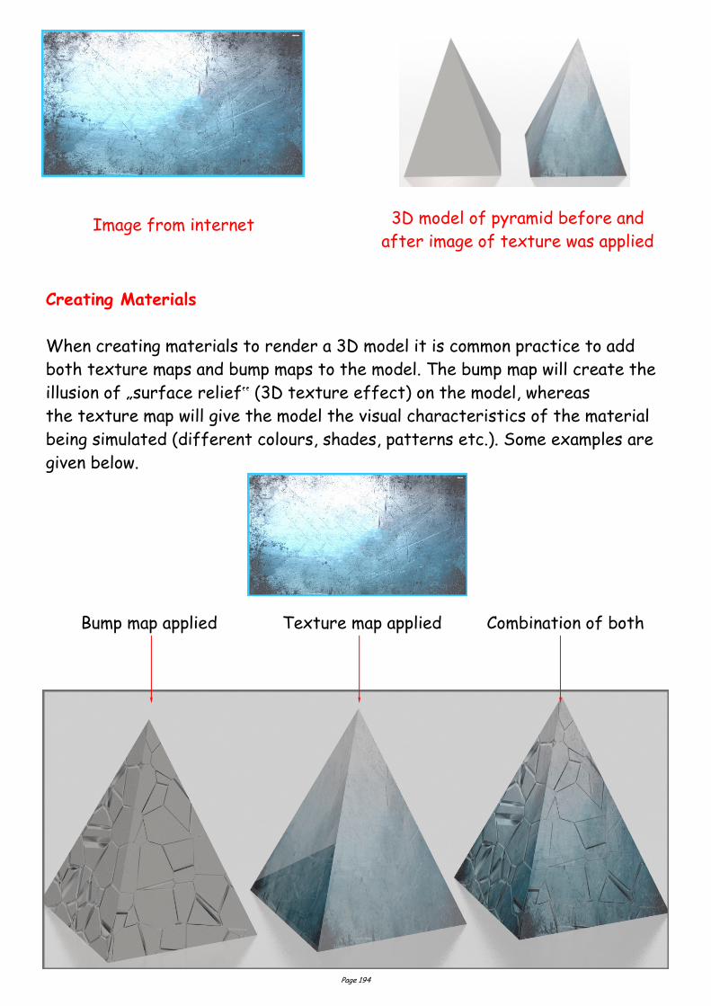
Page 194
Image from internet 3D model of pyramid before and
after image of texture was applied
Creating Materials
When creating materials to render a 3D model it is common practice to add
both texture maps and bump maps to the model. The bump map will create the
illusion of „surface relief‟ (3D texture effect) on the model, whereas
the texture map will give the model the visual characteristics of the material
being simulated (different colours, shades, patterns etc.). Some examples are
given below.
Bump map applied Texture map applied Combination of both
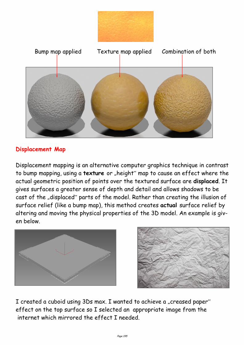
Page 195
Bump map applied Texture map applied Combination of both
Displacement Map
Displacement mapping is an alternative computer graphics technique in contrast
to bump mapping, using a texture or „height‟ map to cause an effect where the
actual geometric position of points over the textured surface are displaced. It
gives surfaces a greater sense of depth and detail and allows shadows to be
cast of the „displaced‟ parts of the model. Rather than creating the illusion of
surface relief (like a bump map), this method creates actual surface relief by
altering and moving the physical properties of the 3D model. An example is giv-
en below.
I created a cuboid using 3Ds max. I wanted to achieve a „creased paper‟
effect on the top surface so I selected an appropriate image from the
internet which mirrored the effect I needed.
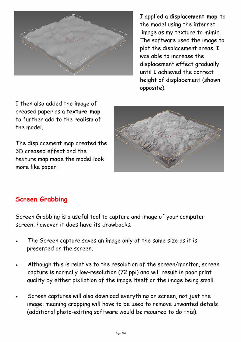
Page 196
I applied a displacement map to
the model using the internet
image as my texture to mimic.
The software used the image to
plot the displacement areas. I
was able to increase the
displacement effect gradually
until I achieved the correct
height of displacement (shown
opposite).
I then also added the image of
creased paper as a texture map
to further add to the realism of
the model.
The displacement map created the
3D creased effect and the
texture map made the model look
more like paper.
Screen Grabbing
Screen Grabbing is a useful tool to capture and image of your computer
screen, however it does have its drawbacks;
The Screen capture saves an image only at the same size as it is
presented on the screen.
Although this is relative to the resolution of the screen/monitor, screen
capture is normally low-resolution (72 ppi) and will result in poor print
quality by either pixilation of the image itself or the image being small.
Screen captures will also download everything on screen, not just the
image, meaning cropping will have to be used to remove unwanted details
(additional photo-editing software would be required to do this).