15CV82-Design of Pre stressed concrete Elements .pdf - Sri ...
Upload
daffodilvarsityCategory
view
0download
0
Graphic DesignMTC111

A design is a visual plan you can use to create in your project. Everything you can see has a design. When you describe something you see, you use words that tell about the lines, shapes, colors, textures, and spaces. Line, shape, color, texture, and space are the basic elements of design.
Elements of Design

LineLines can be horizontal, vertical, dotted, zigzag, curved, straight, diagonal, bold, or fine. Lines can show direction, lead the eye, outline an object, divide a space, and communicate a feeling or emotion.

ShapeShapes are made by connecting lines. Circle, square, triangle, and freeform are words used to identify shapes. Look at the objects around you and describe their basic shapes. Are they one shape, or are they a combination of many shapes? After doing this several times, you will begin to understand what shape really is. Line creates two dimensional or flat shapes. When shapes are three dimensional, we call them forms. A circle is a shape; a ball is a form. A square is a shape; a cube is a form. A drawing is a flat shape; a sculpture is a three-dimensional form.

ColorColor is described with the words hue, value, and intensity. Hue refers to the name of the color—red or blue, for example. Value tells the lightness or darkness of a hue. Intensity refers to the brightness or dullness of a hue.

TextureTexture is the surface quality of an item. It’s how something feels when touched, or looks like it would feel if touched. Sandpaper is rough. Velvet is smooth. A drawing of a tree stump could show rough outer bark and a smooth inner surface. Search for ways to add texture to your projects. Texture adds variety and interest.
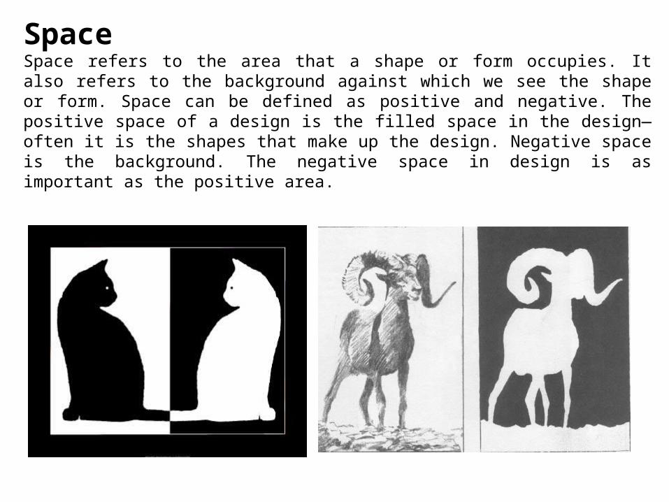
SpaceSpace refers to the area that a shape or form occupies. It also refers to the background against which we see the shape or form. Space can be defined as positive and negative. The positive space of a design is the filled space in the design—often it is the shapes that make up the design. Negative space is the background. The negative space in design is as important as the positive area.

Principles of Design
Some combinations of design elements (line, shape, color, texture, and space) work better than others. Here are some guidelines to help you understand why some combinations work and others do not work as well. These guidelines—rhythm, proportion, Perspective, emphasis, Movement, Pattern, balance, and unity—are the principles of design.
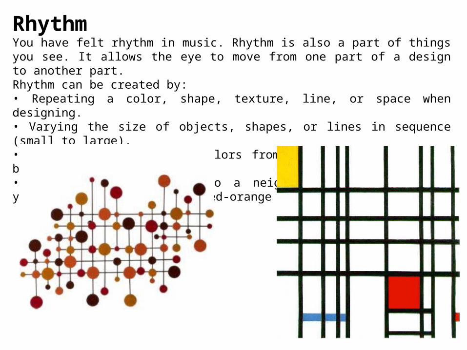
RhythmYou have felt rhythm in music. Rhythm is also a part of things you see. It allows the eye to move from one part of a design to another part. Rhythm can be created by:• Repeating a color, shape, texture, line, or space when designing.• Varying the size of objects, shapes, or lines in sequence (small to large).• Using a progression of colors from tints to shades (light blue to dark blue).• Shifting from one hue to a neighboring hue (yellow to yellow-orange to orange to red-orange to red).

ProportionProportion refers to the relationship between one part of a design and another part or to the whole design. It is a comparison of sizes, shapes, and quantities. For example, the relationship between the vertical and horizontal measurements of a wall hanging may be pleasing because the unequal lengths produce an interesting contrast.

Perspective Perspective is created through the arrangement of objects in two-dimensional space to look like they appear in real life. Perspective is a learned meaning of the relationship between different objects seen in space. Is the dark rectangle in front of a circle, or beside a semi-circle? Perspective adds realism to a visual image. The size of a rectangle means little until another object gives it the size of a desk, or the size of a building. Perspective can be used to draw the audience into a visual. Perception can be achieved through the use of relative sizes of objects, overlapping objects, and blurring or sharpening objects.

EmphasisEvery design needs an accent—a point of interest. Emphasis is the quality that draws your attention to a certain part of a design first. There are several ways to create emphasis:• Use a contrasting color • Use a different or unusual line • Make a shape very large or very small • Use a different shape • Use plain background space.

Movement The way the artist leads the eye in, around, and through a composition. The path the eye follows. Motion or movement in a visual image occurs when objects seem to be moving in a visual image. Movement in a visual image comes from the kinds of shapes, forms, lines, and curves that are used.

Pattern Pattern uses the art elements in planned or random repetition to enhance surfaces or paintings or sculptures. Patterns often occur in nature, and artists use similar repeated motifs to create pattern in their work. Pattern increases visual excitement by enriching surface interest.

Balance Balance gives a feeling of stability. There are three types of balance. Symmetrical, or formal balance, is the simplest kind. An item that is symmetrically balanced is the same on both sides. Our bodies are an example of formal balance. If you draw an imaginary line from your head to your toes dividing your body in half, you will be pretty much the same on both sides. Designs that have a radial balance have a center point. A tire, pizza, and a daisy flower are all examples of design with radial balance. When you look through a kaleidoscope, everything you see has a radial balance. Asymmetrical balance creates a feeling of equal weight on both sides, even though the sides do not look the same. Asymmetrical designs also are called informal designs because they suggest movement and spontaneity. Asymmetrical balance is the hardest type of balance to achieve and often takes experimenting or moving elements around until balance is achieved.

UnityWhen things look right together, you have created unity or harmony. Lines and shapes that repeat each other show unity (curved lines with curved shapes). Colors that have a common hue are harmonious. Textures that have a similar feel add to unity. But too much uniformity sometimes can be boring. At the same time, too much variety destroys unity.

Here are some questions to ask yourself about your designs. 1. Where did you get the idea for your design? 2. Describe one of the design elements. How did you use it?3. What do you like about the way your design looks?4. What might you change another time?5. Is your design honest in media, form, and function?

Thank you!
Copyright © 2022 FDOKUMEN