DEVELOPING PERFORMANCE DASHBOARD WITH QLIKVIEW
68
Sanna Rinta-Rahko DEVELOPING PERFORMANCE DASHBOARD WITH QLIKVIEW Wärtsilä Power Plants Technology and Communication 2015
-
Upload
khangminh22 -
Category
Documents
-
view
2 -
download
0
Transcript of DEVELOPING PERFORMANCE DASHBOARD WITH QLIKVIEW

Sanna Rinta-Rahko
DEVELOPING PERFORMANCE
DASHBOARD WITH QLIKVIEW Wärtsilä Power Plants
Technology and Communication 2015

VAASAN AMMATTIKORKEAKOULU Kone- ja tuotantotekniikan koulutusohjelma
TIIVISTELMÄ
Tekijä Sanna Rinta-Rahko Opinnäytetyön nimi Developing Performance Dashboard with Qlikview Vuosi 2015 Kieli englanti Sivumäärä 67 + 1 liite Ohjaaja Lotta Saarikoski Tämä opinnäytetyö tehtiin Wärtsilä Power Plantsille, joka on globaali liiketoimintayksikkö Wärtsilä-konsernissa ja joka tarjoaa joustavia, tehokkaita, ja ympäristöä säästäviä energiaratkaisuja. Opinnäytetyön tarkoituksena oli määrittää ja testata mittausperiaatteet alustavasti määritellyille Power Plantsin liiketoimintaprosessiin kytketyille suorituskykymitta-reille. Suorituskykymittaristo on järjestelmällinen tapa mitata suorituskykyä sekä tuotteiden ja palveluiden laatua. Tavoite oli analysoida mitä dataa on saatavilla ja mitä dataa tarvitaan, jotta mahdollistetaan automatisoitu raportointi ja suoritus-kykymittariston julkaisu Qlikview-sovelluksessa. Kehitysprosessin aikana mitta-reita kehitettiin siten, että niitä voidaan käyttää tehokkaasti analysoimaan liiketoi-mintaprosessin tilaa. Lopputuloksena voitiin todeta, että yhdeksän viidestätoista tutkitusta mittarista voidaan päivittää automaattisesti tietovarastosta, viiden tiedot luetaan erillisistä Excel-tiedostoista ja vain yhden arvot tulee siirtää kuukausittain raportille. Kehitysprosessi, joka mahdollistaa kahden Excel-tiedostoon perustuvan mittarin tietojen lukemisen automaattisesti tietovarastosta on jo alkanut. Muiden osalta on suositeltavaa tutkia, voidaanko tiedot kerätä SharePoint Custom list –luetteloon, josta tiedot voidaan automaattisesti ladata Qlikview-sovelluksen. Suurin osa prosessin aikana tehdyistä havainnoista ja parannusehdotuksista toteutettiin saman tien. Loput mainitut huomiot ja ehdotukset, otetaan huomioon ja toteutetaan käytännössä määriteltäessä vuoden 2015 mittaristoa, joka tullaan myös julkaisemaan Qlikview-sovelluksena.
Avainsanat liiketoimintatiedon hallinta, liiketoiminnan raportointi, Qlikview,
suorituskykymittari

VAASAN AMMATTIKORKEAKOULU UNIVERSITY OF APPLIED SCIENCES Kone- ja tuotantotekniikan koulutusohjelma ABSTRACT
Author Sanna Rinta-Rahko Title Developing Performance Dashboard with Qlikview Year 2015 Language English Pages 67 + 1 Appendix Name of Supervisor Lotta Saarikoski This thesis was made for Wärtsilä Power Plants, a global business division within Wärtsilä Group, providing flexible, efficient, and environmentally advanced energy solutions. The purpose of this thesis was to define and test measuring principles for preliminary defined performance indicators connected to business process of Wärtsilä Power Plants. The objective was to analyse what information and data is available and what data is needed to enable automated reporting and publishing of dashboard, a systematic way to measure performance and quality of products and services, with the Qlikview application. Along the development process indicators were also developed so that they can effectively be used for analysing the status of business processes. As an outcome nine out of fifteen indicators investigated can be accessed and updated automatically from the data storage, five needs manual Excels as data, and only one would need manual filling of the monthly value to the application. The development process to read data automatically has been started to have a solution for two of the Excel based measurements. For the rest it should be investigated if data can be collected to the SharePoint custom list or similar from where data can be automatically loaded to the Qlikview application. The majority of the findings and improvement proposals found during the process were immediately implemented into practise along the process. The rest of the results and proposals mentioned in this thesis as well as concrete publishing of the dashboard application will be taken into account and implemented into practise when the dashboard 2015 will be established and published with Qlikview.
Keywords business intelligence, business reporting, Qlikview, performance
indicator
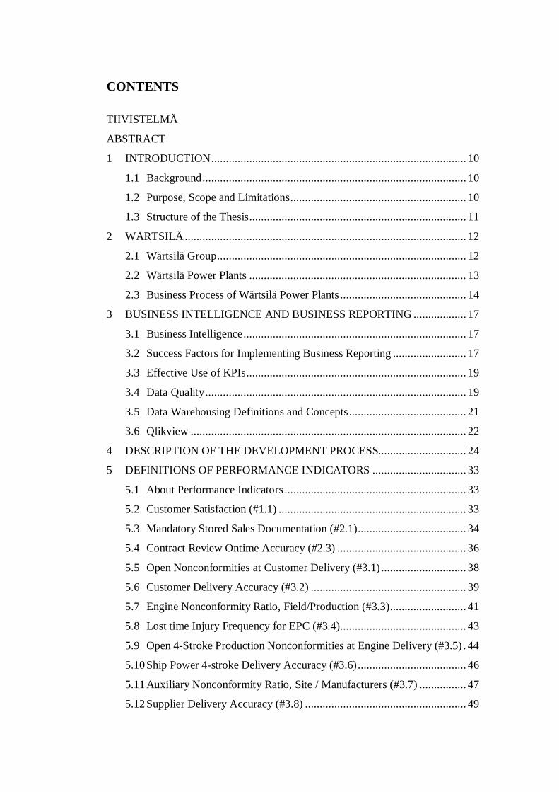
CONTENTS
TIIVISTELMÄ
ABSTRACT
1 INTRODUCTION ....................................................................................... 10
1.1 Background .......................................................................................... 10
1.2 Purpose, Scope and Limitations ............................................................ 10
1.3 Structure of the Thesis .......................................................................... 11
2 WÄRTSILÄ ................................................................................................ 12
2.1 Wärtsilä Group ..................................................................................... 12
2.2 Wärtsilä Power Plants .......................................................................... 13
2.3 Business Process of Wärtsilä Power Plants ........................................... 14
3 BUSINESS INTELLIGENCE AND BUSINESS REPORTING .................. 17
3.1 Business Intelligence ............................................................................ 17
3.2 Success Factors for Implementing Business Reporting ......................... 17
3.3 Effective Use of KPIs ........................................................................... 19
3.4 Data Quality ......................................................................................... 19
3.5 Data Warehousing Definitions and Concepts ........................................ 21
3.6 Qlikview .............................................................................................. 22
4 DESCRIPTION OF THE DEVELOPMENT PROCESS.............................. 24
5 DEFINITIONS OF PERFORMANCE INDICATORS ................................ 33
5.1 About Performance Indicators .............................................................. 33
5.2 Customer Satisfaction (#1.1) ................................................................ 33
5.3 Mandatory Stored Sales Documentation (#2.1) ..................................... 34
5.4 Contract Review Ontime Accuracy (#2.3) ............................................ 36
5.5 Open Nonconformities at Customer Delivery (#3.1) ............................. 38
5.6 Customer Delivery Accuracy (#3.2) ..................................................... 39
5.7 Engine Nonconformity Ratio, Field/Production (#3.3) .......................... 41
5.8 Lost time Injury Frequency for EPC (#3.4) ........................................... 43
5.9 Open 4-Stroke Production Nonconformities at Engine Delivery (#3.5) . 44
5.10 Ship Power 4-stroke Delivery Accuracy (#3.6) ..................................... 46
5.11 Auxiliary Nonconformity Ratio, Site / Manufacturers (#3.7) ................ 47
5.12 Supplier Delivery Accuracy (#3.8) ....................................................... 49

5
5.13 Supplier Reclaiming Ratio (#3.9) ......................................................... 52
5.14 Warranty Nonconformity Lead Time (#4.1) ......................................... 53
5.15 Total Amount of Nonconformities per Megawatts (#4.2) ...................... 55
5.16 Product Improvement Lead Time (Engine) (#5.2) ................................. 56
6 CONCLUSIONS ......................................................................................... 58
7 ASSESSMENT ........................................................................................... 63
REFERENCES .................................................................................................. 66
APPENDICES

6
LIST OF FIGURES AND TABLES
Figure 1. Quality strategy, business process, and dashboard. /3/ ....................... 15
Figure 2. Business process of Wärtsilä Power Plants........................................ 16
Figure 3. Stages of development process.......................................................... 25
Figure 4. Example of linking tables together. ................................................... 29
Figure 5. Example of mapping fact and dimension tables. ................................ 31
Figure 6. Dashboard indicators placed in business process of Power Plants...... 62
Table 1. Original task of dashboard. ............................................................... 26
Table 2. Example of creating formula for an indicator. ................................... 30
Table 3. Definition of #1.1 Customer Satisfaction. ......................................... 34
Table 4. Definition of #2.1 Mandatory Stored Sales Documentation. .............. 36
Table 5. Definition of #2.3 Contract Review Ontime Accuracy. ..................... 37
Table 6. Definition of #3.1 Open Nonconformities at Customer Delivery. ...... 39
Table 7. Definition of #3.2 Customer Delivery Accuracy. .............................. 41
Table 8. Definition of #3.3 Engine Nonconformity Ratio (Field/Production). . 42
Table 9. Definition of #3.4 Lost time Injury Frequency for EPC. .................... 44
Table 10. Definition of #3.5 Open 4-Stroke Production Nonconformities at
Engine Delivery. ............................................................................... 45
Table 11. Definition of #3.6 Ship Power 4-stroke Delivery Accuracy. .............. 47
Table 12. Definition of #3.7 Auxiliary Nonconformity Ratio (Site / Manufacturers). . 49
Table 13. Definition of #3.8 Supplier Delivery Accuracy. ................................ 51
Table 14. Definition of #3.9 Supplier Reclaiming Ratio. .................................. 53
Table 15. Definition of #4.1 Warranty Nonconformity Lead Time.................... 54
Table 16. Definition of #4.2 Total Amount of Nonconformities per Megawatts. . 56
Table 17. Definition of #5.2 Product Improvement Lead Time (Engine). .......... 57

7
LIST OF APPENDICES
APPENDIX 1. Print screens of Power Plants performance dashboard Qlikview
application

8
ABBREVIATIONS
BI Business intelligence
CAC Wärtsilä Customer Assistance Center
CEO Chief executive officer
Compass Intranet at Wärtsilä
CROL Customer relationship online
DW Data warehouse
EDW Enterprise data warehouses
EPC Engineering, procurement, construction (a power plant delivered to the customer ready for operation)
EXW Ex works
GW Gigawatt
GR Goods receiption
IDM Integrated Document Management (solution at Wärtsilä to store and track documents)
IOS Internal order specification
IPP Independent power producers
IT Information technology
KPI Key performance indicator
LNG Liquefied natural gas
LTI Lost time injury
MW Megawatt
NB Standard purchase order type in SAP
NC Nonconformity
ODS Operational data storage
PI Performance indicator

9
PIP Product improvement process
PE Personal edition
PO Purchase order
PP Wärtsilä Power Plants
QA Quality assurance
QE, QV Supplier nonconformity type in SAP
QI Internal nonconformity in SAP
SAP Enterprise resource planning software (systems, applications & products)
UB Stock transport order in SAP
WBS Work breakdown structure
WG Notification type in SAP for project nonconformity during commissioning and installation
ZDEL SAP transaction showing purchase order delivery dates versus goods reception dates
ZNOTE Notification query SAP transaction
ZW Notification type in SAP for warranty claims

10
1 INTRODUCTION
1.1 Background
This document is a thesis that was completed at VAMK, University of Applied
Sciences. The client for the thesis is Wärtsilä Power Plants.
The dashboard is a systematic way to measure and present the indicators for
performance and quality of products and services at Wärtsilä Power Plants. This
kind of performance measurement system is meant to support and deploy the
strategy of Power Plants as well as to improve the transparency in order to secure
that customers can rely on Power Plants as a partner. The objective of Power Plants
Business process performance end-to-end is to secure upfront selected quantified
actions for Power Plants organization to improve quality and to measure the
performance of the organization aligned with the implementing of the business
process of Power Plants.
Wärtsilä Group Quality established a dashboard to follow up the quality level of the
company. Wärtsilä Power Plants wanted to include also such performance
indicators, which were not only looking back to the history but also would show
what could be improved along the process. Therefore Power Plants’ own dashboard
was decided to be created to fulfill this gap.
1.2 Purpose, Scope and Limitations
The purpose of this thesis was to define and test measuring principles for Wärtsilä
Power Plants performance indicators (PI) and analyse what information and data is
available and needed for automatic reports to enable several people to have access
to performance reports. All indicators were covered even though the main focus
was on indicators, where the data source is SAP.
In the beginning there was a set of indicators, which were wanted to be measured.
The objective was to analyse if they can be measured and further on to develop
them so that they can be effectively used for analysing the status of business

11
processes. The actual indicator figures and results as numbers are not presented in
this thesis.
1.3 Structure of the Thesis
This thesis shall continue with Chapter 2, which concentrates on Wärtsilä as group,
Wärtsilä Power Plants and business process of Wärtsilä Power Plants. Chapter 3
concentrates on theoretical aspects of business intelligence and business reporting,
what are the success factors for implementing business reporting, how to use
effectively key performance indicators, what the influence of data quality is and
what the main definitions and concepts of data warehousing are. The last section in
Chapter 3 describes Qlikview; the software that has been used to build the
performance dashboard.
Chapter 4 explains briefly the entire development process how the dashboard was
developed and implemented and Chapter 5 goes into the details of each indicator
with their definitions and formulas. Chapter 6 presents conclusion and Chapter 7
assessment.

12
2 WÄRTSILÄ
2.1 Wärtsilä Group
Wärtsilä is a global leader in complete lifecycle power solutions for the marine and
energy markets. By emphasising technological innovation and total efficiency,
Wärtsilä maximizes the environmental and economic performance of the vessels
and power plants of its customers. Through the history Wärtsilä has grown into a
leading supplier of power systems and into a technology innovator on both land and
sea while it today serves its customers in nearly 70 countries in the world. /11/
Wärtsilä has organised its business into three main businesses: Ship Power, Power
Plants, and Services. Ship Power is the leading supplier of machinery, propulsion-
and maneuvering systems for shipping companies worldwide. Today every third
ship worldwide is equipped with a Wärtsilä engine. Power Plants is a significant
supplier on the power plant market. About 1 % of the world’s energy consumption
is produced with power plants made by Wärtsilä. Services provide customer support
during the supplied systems’ life cycle. /11/
Wärtsilä Power Plants is a leading supplier of modern, environmentally advanced,
highly efficient, and dynamic power plants that allow the maximum integration of
intermittent renewable power generation. Power Plants offers multi-fuel power
plants, including baseload generation, peaking and load following operation, as well
as dynamic system balancing and ultra-fast grid reserve, and serves both the current
and future capacity markets. In addition to the technical advantages, it also offers
fast track deliveries of complete power plants, together with long-term operation
and maintenance agreements, providing to customers complete solutions – in urban
areas as well as in the most demanding remote environments. /11/
Wärtsilä Ship Power enhances the business of its marine and oil & gas industry
customers by providing innovative products and integrated solutions that are safe,
environmentally sustainable, efficient, flexible, and economically sound. Ship
Power solutions are developed based on customers' needs and include products,
systems and services. Being a technology leader, and through the experience, know-
13
how and dedication of the personnel, it is able to customise optimised solutions for
the benefit of our clients around the world. /11/
Wärtsilä Services supports its customers throughout the lifecycle of their
installations by optimising efficiency and performance. Services provide the most
comprehensive portfolio of services and the broadest service network in the
industry, for both the energy and marine markets. It is committed to providing high
quality, expert support and the availability of services in the most environmentally
sound way possible, wherever the customers are located. /11/
2.2 Wärtsilä Power Plants
Wärtsilä Power Plants is a leading global supplier of flexible baseload power plants
of up to 600 MW operating on various gaseous and liquid fuels. The portfolio
includes unique solutions for peaking, reserve and load-following power
generation, as well as for balancing intermittent power production. Wärtsilä Power
Plants also provides LNG terminals and distribution systems. As of 2014, Wärtsilä
has 55 GW of installed power plant capacity in 169 countries around the world. /11/
Wärtsilä Power Plants provides superior value to its customers by offering
decentralised, flexible, efficient, and environmentally advanced energy solutions. It
offers dependable power plants that can be constructed in multiple parallel
generation units, and on a fast track basis. An offering based on flexibility, Power
Plants offer its customers solutions ranging from power generation equipment
deliveries to full turnkey power plants. Tried and tested power plants are
modularised to enable them to be located close to the end-user customers. This also
allows construction to be carried out in phases according to the customer's needs.
The fuel flexibility of the solutions supports the transition from oil to gas as the
markets increasingly embrace natural gas. Through operation and maintenance
agreements Power Plants support customers throughout the lifecycle of their
installations. It operates mainly in emerging markets; however, there is demand for
power plant projects also in the developed markets. /13/

14
The business of Power Plants is divided into three main customer segments:
utilities, independent power producers (IPP’s) and industrial customers. Utilities
supply electricity to residential, commercial, and industrial end users, whereas
IPP’s are financial investors investing in power plants and selling the generated
power to utilities. Customer needs in these segments vary according to the
application for which the plant is used. In traditional baseload power generation,
customers require competitive lifecycle costs, reliability, world-class product
quality, and fuel and operational flexibility. In balancing and peaking applications,
customer needs typically include rapid start and ramp up, the ability to operate at
varying loads, as well as competitive electricity generation and capacity costs.
Industrial customers are mainly private companies in industries, such as mining,
cement and oil & gas, investing in captive power plants. Reliability, reduced energy
costs, and independence from the grid are among the key factors in their decision-
making. /13/
2.3 Business Process of Wärtsilä Power Plants
In brief the main idea of quality strategy of Wärtsilä Power Plants is to move “from
reactive to proactive quality”. The business process of Power Plants is defined to
support actions to establish strategy with customer satisfaction driven approach.
This includes the feature of delivering high quality products and services, the
benefit of high plant availability and performance as well as the best return on
investment for the customer. The quality performance dashboard is supporting
strategy and actions in business process by measuring the fulfillment of promises
made to the customer throughout the life cycle. This combination of strategy,
actions in business process and quality dashboard is presented in the following
figure. /3/

15
Figure 1. Quality strategy, business process, and dashboard. /3/
Power Plants business process is a systematic business development model that
takes into consideration defined market specific customer requirements and
solutions. It includes the way of working, which enables that project management
competence is applied already in the early stages of customer process. By following
the process, the organisation is securing that the project specific customer and
project requirements are identified and communicated in the organization in each
project. Also the process supports to ensure that the value proposal meets the
requirements and that front-end project planning is applied in the entire process.
The process also ensures that the complete definition for scope of work (products
and services) is taken into consideration. The focus in the process is on internal and
external stakeholders through the entire project lifecycle. /3/
The following figure represents the business process of Wärtsilä Power Plants (PP).
The process is split into three sections: PP business development, PP business
operations – deliver to customer, and to Wärtsilä Services business operations. The
business development consists of strategic planning, active market development
and take to market sections; the business operations consist of sell solutions and
deliver to customer solution with support functions. The Services business
operation consists of operational support. The gate model starting from gate go/no-
go followed by gates to decide to offer, submitting a detailed offer, and to sign
leading to gates starting execution, accepting delivery, and closing the project is
built into the process.

16
Figure 2. Business process of Wärtsilä Power Plants.
The objectives of Power Plants business process are to maintain and improve the
deployed stage gate model in the business process as well as to review and map
existing processes with the focus on top activities within the business of Power
Plants. The intention of the process is also to clarify roles and responsibilities in
business that highlights cross-functionalities and to clarify and improve interfaces
to enable smooth handovers across functions. In addition, the objective is also to
document the processes to improve the transparency. /3/
The business process of Power Plants impacts to enhance globally the way of
working in all functions of Power Plants, ensure that customers can rely on the same
high quality service level across businesses, and improve efficiency and reduced
costs through effective delivery. /3/

17
3 BUSINESS INTELLIGENCE AND BUSINESS REPORTING
3.1 Business Intelligence
Business intelligence (BI) is a set of techniques and tools for the transformation of
raw data into meaningful and useful information for business analysis purposes. It
represents the tools and systems that allow a company to gather, store, access, and
analyse corporate data to support decision making and strategic planning process
of the corporation. BI technologies can handle large amounts of unstructured data
to help to identify, develop and form new strategic business opportunities. The goal
of BI is to allow for the easy interpretation of these large volumes of data.
Identifying new opportunities and implementing an effective strategy based on
insights can provide businesses a competitive market advantage and long-term
stability. /9/
Business intelligence can be used to support a wide range of business decisions
ranging from operational to strategic. Basic operating decisions include product
positioning or pricing. Strategic business decisions include priorities, goals and
directions at the broadest level. In all cases, BI is the most effective when it
combines data derived from the market in which a company operates (external data)
with data from internal company sources, such as financial and operations data
(internal data). When external and internal data are combined, they can provide a
more complete picture which creates an "intelligence" that cannot be derived by
any singular set of data. /1/
A Business intelligence system has four major components: a data warehouse, with
its source data; business analytics; a collection of tools for manipulating, mining, and
analysing the data in the data warehouse; and a user interface (e.g. dashboard). /12/
3.2 Success Factors for Implementing Business Reporting
Yeoh and Koronios have roughly categorized critical success factors of business
reporting into three dimensions: organisation, process, and technology /15/.
18
Elements as committed management support, a clear target, and a well-established
business case are considered as organizational dimension. The process dimension
contains business centric championship and balanced team structure, business
driven and interactive development approach and user-oriented change
management. The third dimension, technological dimension, has elements such as
business driven, scalable & flexible technical framework, and sustainable data
quality and integrity. /7/
Robert Ericsson has defined five essential steps to create successful business
intelligence platform: understanding the problem, collecting the data, analysing the
data, sharing results, and acting on the information with the help of technical,
managerial, and political skills. The first thing in developing a BI platform is to
understand the priorities of the business, which could be started by mapping
existing data flows and structures. This often also allows to start collecting and
identifying the most important elements of the operations. The second step is to
plan collecting the data and more precisely accurate and timely data. Quality data
is a critical success factor for the BI platform as poor quality data undermines trust
in the system. Also if decision makers cannot trust the data, they will not use the
system, no matter how well it has been designed. The third point is analysing the
data which usually means understanding the users of the business intelligence
platform. Most users will be primarily consumers of intelligence and a minority of
users will produce most of the consumed data. Even though deeper data-analysing
might be left for specialist, the tools to analyse the data should be placed as broadly
as possible in contrast to the old centralised style decision support. In today’s world
information and tools to analyse it needs to spread throughout the organization. In
addition to providing access to the data, the fourth issue is to provide the means to
publish and share the results of the analysis. The value of business intelligence is
subject to strong network effects; it is more valuable the more people in the
organization know about it. The fifth issue is including the main purpose of business
intelligence: supporting better decision making, which means that information is
easily actionable and facilitating change in the organization. /2/

19
3.3 Effective Use of KPIs
According to Bernd Heesen there are 12 issues that make use of key performance
indicators (KPIs) effective. First of all KPIs need to be aligned with corporate
strategy and objectives and each individual KPI must be owned by an individual or
group on the business side who is accountable for this outcome. They need to be
predictive so that KPIs measure drivers of business value and they are leading
indicators of performance desired by the organization. KPIs need to be populated
with timely, actionable data so users can intervene to improve performance before
it is too late and there should be few in number so that KPIs help users to focus on a
few high-value tasks, not scatter their attention and energy on too many things. /5/
KPIs should be straightforward and easy to understand and not based on complex
indexes that users do not know how to influence directly. They should also be
balanced and linked and reinforce each other, not undermine each other and sub
optimize processes, and they should trigger changes. The act of measuring a KPI
should trigger a chain reaction of positive changes in the organization, especially
when it is monitored by the CEO. /5/
Effective KPIs are standardized, based on standard definitions, rules, and
calculations so they can be integrated across dashboards throughout the
organization, and they are context driven so that they put performance in context by
applying targets and thresholds to performance so users can gauge their progress
over time. Effective KPIs can also be reinforced with incentives; organizations can
magnify the impact of KPIs by attaching compensation or incentivised to them, but
this should be done cautiously, applying incentives only to well-understood and
stable KPIs. Last but not least effective KPIs need to be relevant as KPIs gradually
lose their impact over time, so they must be periodically reviewed and refreshed. /5/
3.4 Data Quality
There are many types of data problems that effect business and its processes; they
can generally be divided into two categories: defective data and inconsistent data.
Types of data defects, such as inaccurate, incomplete, unavailable or obsolete data

20
are defined as defective data, for example, spelling errors, neglecting to fill in all
the fields or enter correct data. Also defective data is difficult to be found out once
it has been entered into the system. Inconsistent data occurs when the data is either
duplicated or outdated or because of the way different data is organized between
different data providers. Each analyst, department, or division sees the world
through its own lens and thus defines and models data differently. /6/
Data quality plays a critical role in BI success, since poor data quality can hinder
business decisions at all levels of the organisation. Data quality can be measured
and quantified according to various parameters. Sing and Kawaljeet have stated that
it is possible to define a basic set of data quality dimensions including accuracy,
completeness, consistency, timeliness, interpretability, and accessibility, which
represents the dimensions considered by the majority of the authors /10/.
Kumari has defined partially similar data quality dimensions as Sing and Kawaljeet.
According to him completeness deals to ensure is all the requisite information
available and are some data values missing, or in an unusable state, and consistency
denotes the uniformity of the information in a given table, e.g. syntactic consistency
refers to uniformity in the data format for a specific field. Validity refers to the
correctness of data and conformity refers to expectations that data values conform
to specified formats. Accuracy answers the question if the data objects represent
accurately the “real world” values they are expected to model. Incorrect spellings
fields and outdated data can impact operational and analytical BI applications.
Confidence describes the perceived accuracy and precision of the data, or the degree
of trust that the data present in a table or set of tables is accurate. Integrity shows
what data is missing important relationship linkages. The inability to link related
records together may actually introduce duplication across the systems. Some other
data quality characteristics are assurance, delivery, openness/transparency, and
responsibility. /6/

21
3.5 Data Warehousing Definitions and Concepts
Data warehousing cuts through the obstacle that data are often fragmented in
distinct operational systems by accessing, integrating, and organizing key
operational data in a form that is consistent, reliable, timely, and readily available
whenever and wherever needed. The characteristics of data warehousing such as
subject oriented, integrated, time variant (time series), and non-volatile enable data
warehouses to be tuned to almost exclusive for data access. /12, 52-53/
In simple terms data warehouse (DW) is a pool of data produced to support decision
making; it is also a repository of current and historical data of potential interest to
managers throughout the organization. Data are usually structured to be available
in a form ready for analytical processing activities. A data warehouse is a subject-
oriented, integrated, time-variant, non-volatile collection of data in support of
management’s decision-making process. /12, 52/
Whereas a data warehouse is a repository of data, data warehousing is literally the
entire process /14/. Data warehousing is a discipline that results in applications that
provide decision support capability, allows ready access to business information,
and creates business insight. The three main types of data warehouses are data marts,
operational data storages (ODS), and enterprise data warehouses (EDW). /12, 53/
A data mart is a smaller departmental data warehouse that focuses on a particular
subject or department. A dependent data mart is a subset that is created directly
from the data warehouse and hence has the advantage of a consistent data model
and provides equally quality data as from enterprise data warehouse. The
independent data mart is usually cheaper, but its source is not EDW and hence data
might not be aligned with EDW data. /12, 53/
An operational data storage is often used as an interim staging area for a data
warehouse where the contents are updated throughout the course of business
operations. An ODS is used for short-term decisions involving mission critical
applications rather than for the medium- and long term decisions associated with an
EDW. An ODS is similar to short term memory in that it stores only very recent

22
information while in comparison a data warehouse is like long term memory
because it stores permanent information. An ODS consolidates data from multiple
source systems and provides a near real time, integrated view of volatile, current
data. /12, 53-54/
An enterprise data warehouse is a large scale data warehouse that is used across the
enterprise for decision support. It is an organisational level data warehouse
developed for analytical purposes. The large scale nature provides integration of
data from many sources into a standard format for effective BI and decision support
applications. /12, 54/
3.6 Qlikview
Qlikview is business intelligence software, which enables fast, powerful and visual
business intelligence analysis without the limitations of traditional BI tools, high
cost, and complexity. The program is designed for all kinds of users and the
business sub-regions. Qlikview loads in memory all the information which the user
is likely to need, and calculates the required information when the user clicks the
functions. With the elements of Qlikview, data can be viewed easily from different
angles. /8/
Traditional BI solutions usually provide solutions with relatively static table
reports, which may have some graphs included. Qlikview can be used to produce
graphic functionalities that live in accordance with user needs. Visual information
perception is clearly faster and easier to use as answers to business questions is
obtained simply by pointing and clicking. That is why some call, that with Qlikview
you can create applications instead of reports. /8/
One Qlikview application can import data simultaneously from several different
data sources. Qlikview can use a variety of data sources: an event based application,
such as SAP, Salesforce.com and Lawson; databases used in personalized
applications, such as MS SQLServer, MySQL and IBM DB2 and Oracle; traditional
storage media-based BI data warehouses as well as the information contained in the
locally stored information, such as MS Excel spreadsheets, CSV files, and XML

23
files. All these files can be downloaded from either the user's own computer or the
Internet. /8/
Applications made with Qlikview can be used as a desktop application or they can
be published in a web browser to be used via the Internet or to be used in certain
supported mobile devices. The licence free personal edition is limited to be used as
a desktop application and it cannot open applications created by someone else. The
license is needed when the intention is to publish and distribute applications. /8/
Qlikview is free of charge for single-user use. This is called Personal Edition (PE).
Documents created in PE can be opened by fully licenced users or deployed on a
Qlikview server. The limitation is that, with the exception of some documents
enabled for PE by Qliktech, documents created elsewhere cannot be opened
including your own documents, if they have been opened and saved by another user
or server. /4/
24
4 DESCRIPTION OF THE DEVELOPMENT PROCESS
Developing the dashboard was a repetitive learning by doing process. If all the
knowledge that was acquired by the end of the process, had been easily available at
the beginning, a lot of time would have been saved. Along the process my role also
changed. Instead of just giving input how to measure delivery accuracy, my role
changed drastically and I was also the one trying to build Qlikview application of
all the indicators. This chapter describes what was done along the development
process.
Developing the dashboard took place in nine stages: 1) understanding what is
wanted to be measured and is there data available, 2) locating needed data in SAP
and export it as Excel files to build “data storage” for testing purposes, 3) defining
monthly formulas and do filtering with Qlikview selections; while 12 month figures
were needed to be measured manually in Excel, 4) adjusting definitions what to
measure and implementing changes into formulas, 5) connecting to data storage;
locating needed fact tables and relevant dimensions, 6) adjusting formulas to the
data storage language; creating 12 month rolling figures with variables, and to
including a 12 month time period into formulas so that selections are not needed,
7) connecting other (manual) data sources into the report, 8) publishing first report
as a pdf, and 9) fine tuning detailed Qlikview pages. In practise each stage started
before previous stage was over and they went on in parallel. To summarise the steps
this has been presented in the following figure.

25
Figure 3. Stages of development process.
The original dashboard task was given as a table, which included the name of the
performance indicator, short definition, measuring unit, target, and a tool or method
from where indicator results would be found. There was a preliminary idea of the
issues to be measured, but it was not precisely clear if these issues could be even
measured, so the first task was to clarify what should be really measured. A small
workgroup was established to define what could be measured and how those should
be measured. The members of this group were Non-conformity Manager; Quality
Management Systems Engineer; General Manager, Quality Management Systems;
and I. The following table defines the starting point and original task based on what
kind of dashboard was to be built.
Clarifying what should be measured
Collecting data
Defining basic formulas
Connecting to data storage
Adjusting formulas to the data storage language
Connecting manual data sources into the report
Publishing first report as pdf
Converting all to one dashboard
Finetuning detailed Qlikview pages

26
Table 1. Original task of dashboard.
PI # Name Definition Unit Target Tool/Method
PI#1.1
Customer Satisfaction Overall satisfaction of the customer concerning the products and services delivered by PP
% (CROL)
95 CROL/ manually
PI#2.1
Sales documentation in IDM
Quantity of required documents saved in IDM during Sales
% 100 Sales organisation/ manually
PI#2.2
Quantity of quality requirements analysis/ contract awarded
Quantity of projects for which quality requirements have been analysed at the contract review
% 100 Sales organisation/ manually
PI#3.1
Nonconformities open at delivery
Quantity of open NC in SAP when handing over the plant to the customer
Quantity 0 SAP
PI#3.2
On time delivery Accuracy of actual delivery date (or handing over date) against contractual delivery date
% 90 SAP
PI#3.3
NCs reported on field/NCs reported in production
Ratio of engine NC reported during installation and commissioning against NC reported at Wärtsilä factories
Ratio 1 SAP/engine by engine
PI#3.4
Lost time injury rate for EPC
Quantity of accidents involving lost days reported per hours worked
Quantity <3,8 LTI report
PI#3.5
Wärtsilä production nonconformity open at delivery for internal customer
Quantity of open NC in SAP when engine handed over to PP
Quantity 0 SAP/engine by engine
PI#3.6
Wärtsilä production on time delivery
Accuracy of delivery time against delivery date specified in IOS
% 97 SAP
PI#3.7
Suppliers acceptable QA inspections rate
Acceptable inspection result rate during PP QA inspections
% 90 QA report/ manually
PI#3.8
Suppliers Delivery Reliability
Amount of on time + beforehand delivered PO lines vs total number of delivered PO lines (Tolerance +2 working days for late deliveries)
% 92 SAP/manually
PI#3.9
Auxiliaries supplier reclaiming ratio
Amount of money received against amount of money claimed to auxiliaries suppliers
Ratio 1 SAP
PI#4.1
Lead time warranty claims
Time between opening & closing warranty claims
Days 30 CAC reports
PI#4.2
Total amount of NCs/MW
Overall quality performance at end of warranty period
Ratio - 10 % year to year
SAP
PI#5.1
Cost of quality Total cost of non-quality against net sales for same period
% net sales
<1,5% SAP
PI#5.2
Product improvement lead time (engine)
Resolution time for engine improvement task
Days 150 Not available
The listed indicators could be grouped in five groups based on from where the
monthly numbers were received: 1) existing indicators, which were regularly
distributed as a monthly report, 2) internal manually followed indicators, 3) SAP
based nonconformity notification related PIs, 4) SAP based delivery accuracy

27
related indicators, and those for which 5) either data source and/or measurement
logic was unclear. As the dashboard figures were in the beginning to be collected
in an Excel file and represented in a PowerPoint presentation, it was clearly seen,
that the first priority was on the SAP related indicators as they included so much
data that it would take too much time to calculate figures manually each month.
Existing external reports were received regularly monthly and internal manual
reports had so little data that they were easy to be measured manually in Excel and
transferred to dashboard.
External indicators were indicators which were monthly reported by some other
organization. Monthly figures from these were received regularly, but the issue with
them was to find out what the source data was, if it be can accessed automatically
and how the figures should be measured from the data. Internal indicators had same
issues to be clarified, but there it was clear that someone in the organization knew
what, how, and from where those should be measured. SAP was the source for two
kinds of indicators; those related to nonconformity notifications and those related
to delivery accuracy. It was known that data can be exported manually from SAP
to Excel, but the main task was to find out if there is a possibility to have automatic
access to the data and how the data differs compared to Excels exported from SAP.
Additionally, there were also few indicators where it was unclear what really was
to be measured and from which data and hence they were left on lower priority to
wait until someone knew what is wanted.
While collecting data the first thing was to locate all the needed information in SAP,
to find a SAP report where this information was, and to export data out as Excel
file to build “data storage” from Excel files on the hard drive and to upload data
into Qlikview. As most of the SAP related indicators were related to notifications
and delivery accuracy, there were two main SAP transactions needed; ZDEL - PO
Delivery dates versus GR dates and ZNOTE - Notification query. From project
delivery accuracy there was no Excel export as such available from SAP so later on
that information was connected via XML web service connection from data storage
to the report.

28
Another issue was the amount of needed data and how much system allowed to
export data from SAP to Excel at one time. To make sure to get everything into
Excel, data was to be collected into yearly files and then Qlikview read information
from those files. It was unclear also from how long period data was to be collected.
Lots of indicators were to be measured when the project had been handed over to
the customer, but it was unclear when the first notifications for those projects had
been created.
When all the data was collected, it was time to load data into Qlikview and link
different data tables together. A link between two tables was created with two
columns or fields which have exactly same name. Quite often it was noticed that
the same fact in both tables had a slightly different name and hence renaming of the
fields was needed. Also often the same facts were available from different tables
and therefore it had to be decided what should be used as the main source and what
information was not needed and what was wise to be filtered out when loading the
data into the report. The following figure shows an example of linking different
tables together. There each three tables have a field called “Project ID” which
creates a link between two tables. Also ZDEL and ZNOTE has a field called WBS
Element. As WBS Element can be considered as a more detailed project id, it is
acceptable to have two links between two tables.

29
Figure 4. Example of linking tables together.
After all the data was available, it was time to define mathematical formulas for the
indicators. For example in indicator #3.1, where purpose is to measure the amount
of open nonconformities per handed over projects when site has been handed over
to the customer, one has to measure the amount of open nonconformities and
secondly find out how many how many projects has been handed over. The
following table shows step by step how the results for #3.1 were measured. The
final formulas for each indicator can be found in Chapter 5.

30
Table 2. Example of creating formula for an indicator.
(sum ( if (Completed>[Actual Handing Over Date],1,0))
// Notifications completed after handover date
+sum(if(StatusOfNotification= 'Open',1,0))
// + Notifications currently open
-sum ( if ([Actual Handing Over Date]<[Notification date],1,0)))
// - Notifications opened after handover
/ // Divided by count([Actual Handing Over Date]) // Number of projects handed over
When measurement logic was clear and it was known how something should be
measured, it was time to find out how the same data was available from the data
storage. When notification related data was earlier exported from SAP transaction
ZNOTE - Notification query as an Excel file, which had all the information, the
same information was now split into a fact table Notification all and several
dimensions. The fact table has a lot of information as 10 digit keys, which need to
be linked to dimension tables which then have information “in readable format”
that is seen from SAP. E.g. in the next figure there is an example NotiAll table with
several keys which are then linked to fact tables. If this is compared to the previous
figure, where the data was only from one exported SAP table, it can be noticed that
from SAP all the information is in readable format, while with data sources only
the real facts are in the fact table and then dimensions are the ones translating keys
into the languages user understands. For example the notification type is described
with 10 digit number in the fact table as a notification type key while the dimension
table enables to translate it to a more easily understood notification type id and
notification description, which are used also in SAP.

31
Figure 5. Example of mapping fact and dimension tables.
Fact tables include also information that is not needed. To avoid having unnecessary
data in the report those need to be filtered out while loading the data from storage.
For example, Notification all table includes all the notifications made at Wärtsilä
since SAP was taken into use so 2004.Terefore, it was wise to filter only needed
notification types, notifications made by plants related to Power Plants, and limit
the time frame. Used data sources for each indicator are listed in Chapter 5.
At the same time when the data source changed, the formulas needed to be modified
to meet the language used in the new data source. It was quite straight forward, but
time consuming as everything was needed to be rebuilt. At the same time another
formula was created to show 12 month rolling or year-to-date figures, which were
earlier measured by filtering data by selecting needed time period and then reading
the average of the selected time period. By inserting time period filters into the
formula, the end user does not have the need to select any time periods to see 12
month rolling figures.
After SAP related indicators had been solved, the nexttopic was find a solution how
to include other indicators into the dashboard. It was found out that lost time injury
frequency as SharePoint custom list and the inspection report tool had already

32
databases which could be automatically connected to the application and Excel file
based measurements would be needed to be stored on the server with the Qlikview
file itself. Deeper results of how to connect other indicators to the application can
be found from Chapter 5.
When all the data was gathered together and each indicator had its formulas it was
time to create output of Qlikview to show the results. In Qlikview there is a feature
where one can create a pdf-report. These reports are basically made by dragging
Qlikview objects to an empty page and organizing and reshaping those so that they
fit properly together. This pdf-report was then printed and published as part of the
dashboard.
As the pdf-report is still a traditional static report, it was also started to build detailed
pages for each indicator, where one could click and analyse the details behind
figures. To make these details visible it was needed to make sure that measurement
logic was correct, but their visual side was not fine tuned to the end as it was not
clarified what and how was wanted to be presented on the detail level by the end
users.

33
5 DEFINITIONS OF PERFORMANCE INDICATORS
5.1 About Performance Indicators
This chapter defines each performance indicator, used data source, and formula how
indicator is being measured as well as how the indicators changed during the
development phase. The indicators, where it was not defined clearly enough what
should be measured, are left out.
5.2 Customer Satisfaction (#1.1)
Customer satisfaction was an already existing indicator which had been published
monthly as a PowerPoint presentation. Traditionally data was collected and
reported as PowerPoint by an external company, and monthly and rolling figures
were taken from that report and moved to the dashboard.
Customers received a questionnaire, which consisted of several questions. The one
effecting the dashboard is the question “Are you satisfied with Wärtsilä’s overall
performance?” The answer alternatives are satisfied, neutral, and dissatisfied. In the
script this field was used to define two new fields CROLSatisfiedCounter showing
result 1 for all satisfied answers and CROLOverallQTYCounter, showing 1 for all
answers to this question. Then the result was got as a sum of satisfied divided by
the sum of total number of answers.
As there was no need to modify measurement logic, the objective was to investigate
if it is possible to have access to the original data and get figures visible
automatically. As a direct connection to the data was not possible, it was agreed
that the external research institute would send an Excel file monthly, which
included all the results from that year. Each month the old file was replaced with
the new one.
When the indicator was built into the dashboard Qlikview file, one observation was
made: what had been reported as a 12 months rolling value, turned actually to be
the year to date value. The formulas were not changed, but the definition was

34
updated to be aligned with the existing PowerPoint report. The following table
summarises the main facts of the indicator #1.1 Customer Satisfaction.
Table 3. Definition of #1.1 Customer Satisfaction.
Measurement objective
The measurement of Customer satisfaction provides insight on how Wärtsilä Power Plants customers perceive Wärtsilä performance to sell, deliver and handover power plants.
Consequence Consequence of poor performance: limitation to repeat orders Definition PI measures overall customer satisfaction by comparing amount of "Satisfied"
answers to total amount of replies during the measurement period. Data User Definition
Not applicable
Reporting Cycle
Monthly
Publishing Channels
Compass, IDM
Unit of Measurement
%
Target 95% Data Source External data storage; distribution via Excel file to Wärtsilä Dimension/ Period
PeriodCROL
Rolling Logic Year to date (Year = YearCROL) Basic Formula
sum(CROLSatisfiedCounter) /sum(CROLOverallQTYCounter)
Colour Indicators
Green: I 0,9405, Yellow: 0,855 < I <0,9405, Red: I 0,855
5.3 Mandatory Stored Sales Documentation (#2.1)
Mandatory stored sales documentation was established at the same time with the
dashboard and hence taken as a new indicator in the dashboard. The purpose of the
indicator is to tell whether mandatory sales related documents are stored early
enough before the project kick of meeting, when the project is handed over from
the sales to the project management. Measurement is based on manual follow-up,
where the judgement of the accuracy is collected manually to Excel files. These
files include only the judgement of the accuracy and hence files cannot really be
considered as data, as judgement has been made by the person making the follow
up and the data does not include the dates effecting measurement. In the data
judgement it is indicated either with Yes, Ok, No or N/A (as not applicable). From
these Yes and Ok are considered as ontime and N/As are not to be included. In the
script there are additional clauses made for each document type to indicate their

35
accuracy. Yes and Ok gets a value 1 as ontime, No is as 0 as late and N/A is left
null.
As follow-up in Excel requires manual storing of the files to the server folder each
month, a better alternative for the follow up would be for example a SharePoint
custom list, as Qlikview can read information directly from there and that way the
manual transformation of the Excel files could be avoided. The custom list could
also support data quality better as fields can be forced to be filled in certain format,
which prevents manual typing errors from affecting the results. Additionally, the
custom list could measure the project specific results for the ontime and total
document numbers, which would then enable less complex measuring in the report
itself.
The following table summarises the main facts of the indicator #2.1 Mandatory
Stored Sales Documentation.

36
Table 4. Definition of #2.1 Mandatory Stored Sales Documentation.
Measurement objective
This performance indicator measures the actual percentage of documents that sales shall document against the list of required documents to be documented at sales stage.
Consequence Consequence of poor performance: difficulties for the project team to plan properly the project with risks of scope and time schedule creeping.
Definition PI measures number of ontime documented mandatory sales documents compared to the total amount of mandatory sales documents during measurement period. Documentation is considered ontime if it has been stored one week before project execution kick of meeting. Documents in scope are (when applicable) site visit inspection report, drawings, perf calculation, Quick Quote cost, contract review checklist, Commission & Margin statement, offer letter, technical specifications, scope of supply, performance figures/guarantees, and signed contract.
Data User Definition
PI sums up together all Yes and ok cells and divides those with total amount of filled cells. Cells with N/A are excluded.
Reporting Cycle
Monthly
Publishing Channels
Compass, IDM
Unit of Measurement
%
Target 1 Data Source Excel/IDM Documents DBAC962687, DBAC962684, DBAD045722 Dimension/ Period
PeriodSalesDoc
Rolling Logic 12 months rolling Basic Formula
(sum(SignedContractOntimeCounter+DrawingsOntimeCounter+ PerfOntimeCounter+QQCostOntimeCounter+ ContractReviewChecklistOntimeCounter+CMStatementOntimeCounter+ OfferLetterOntimeCounter+TechSpecOntimeCounter+ ScopeOfSupplyOntimeCounter+ PerformanceFiguresGuranteesOntimeCounter+SignedContractOntimeCounter)) /(count(SignedContractOntimeCounter)+count(DrawingsOntimeCounter) +count(PerfOntimeCounter)+count(QQCostOntimeCounter)+ count(ContractReviewChecklistOntimeCounter)+ count(CMStatementOntimeCounter)+count(OfferLetterOntimeCounter) +count(TechSpecOntimeCounter)+count(ScopeOfSupplyOntimeCounter) +count(PerformanceFiguresGuranteesOntimeCounter) +count(SignedContractOntimeCounter))
Colour Indicators
Green: I 0,99, Yellow: 0,9 < I <0,99, Red: I 0,9
5.4 Contract Review Ontime Accuracy (#2.3)
The accuracy of contract reviews was an existing indicator, which had been in the
past published quarterly in the management review. It was taken as a part of the
dashboard with the change that instead of quarterly publishing, the results were now
shown monthly as a monthly value and year to date value.

37
The measurement is based on manual follow up on Excel where various information
is collected about contract reviews. Monthly and 12 month figures were previously
counted manually separately, as the amount of data is quite small. The end result
was then manually moved to the dashboard.
As a development step, measuring was moved into Qlikview file. To enable this
follow up Excel was to be stored into the same location monthly from where
Qlikview looks for the data. Only data related to the indicator was then loaded to
the report. A problem was that Excel was needed to be modified each month to be
able to use it for reporting. Also information was filled as text and not dates so
additional formulas were needed in the script to change e.g. month names into
numbers. The following table summarises the main facts of the indicator #2.3
Contract Review Ontime Accuracy.
Table 5. Definition of #2.3 Contract Review Ontime Accuracy.
Measurement objective
This performance indicator give the percentage of contract reviews done on time in sell solutions.
Consequence Consequence of poor performance: when Wärtsilä specific contract template is not used and quality requirements have not been analyzed, risk not to deliver what customer has required increases.
Definition PI measures number of contract reviews done ontime compared to total number of contract reviews done during the measurement period. Contract review is considered to be done ontime if it has been done latest day before contract is signed.
Data User Definition
PI sums up together all cells including Yes and divides those with total amount of filled cells in column Contract Review.
Reporting Cycle
Monthly
Publishing Channels
Compass, IDM
Unit of Measurement
%
Target 1 Data Source Excel Dimension/ Period
PeriodContractRev
Rolling Logic Year to date (Year= YearContractRev) Basic Formula
sum(ContractReviewOntimeCounter) /count(ContractReviewOntimeCounter)
Colour Indicators
Green: I 0,99, Yellow: 0,9 < I <0,99, Red: I 0,9

38
5.5 Open Nonconformities at Customer Delivery (#3.1)
Measuring open nonconformities when handing over a power plant to the customer
was established as a new indicator to be measured in the dashboard. The indicator
was originally defined as Nonconformities open at delivery - Quantity of open
nonconformities in SAP when handing over the plant to the Customer. The
instructions for measuring were to count open WG (project nonconformity, which
is originated by nonconformity found during commissioning and installation before
handing over to the customer) and QI (internal nonconformity created at Wärtsilä
production) notifications at hand over date. The list of handed over projects were
supposed to be looked from the customer delivery accuracy report (see Chapter 5.6).
Quite soon it was realised that just by measuring open nonconformities it was not
possible to see the trend as the number of projects handed over to the customer was
changing each month. Therefore, the number of notifications was decided to be
divided by the number of projects handed over during the measurement period. In
addition also punch list items, which are registered project nonconformities (WG)
after handing over to the customer were excluded, as these were more considered
as an issue list of tasks the Power Plants project team had promised to take care even
though the project had been handed over to Wärtsilä Services for the warranty period.
To be able to measure open nonconformities from the data storage, fact table
notification all and project delivery accuracy data needed to be combined. As
notification all data source included all the notifications created at Wärtsilä since
2004, filters were needed to include only needed data. Filtering was done based on
notification type and project id; only QI and WG notifications with the work
breakdown structure (WBS) starting with P/0*, P/1* & PW/1* were brought to the
report. In practice this filter meant to include all customer delivery projects of
Power Plants as their project numbers started with these combinations. Some of the
field names were also modified to make them more easily understandable in the
report. The following table summarises the main facts of the indicator #3.1 Open
Nonconformities at Customer Delivery.

39
Table 6. Definition of #3.1 Open Nonconformities at Customer Delivery.
Measurement objective
This performance indicator aims to ensure that nonconformities are closed when the power plant is handed over to customer, and the project management is being switched from Power Plants to Wärtsilä Services.
Consequence Consequence of poor performance: risk for high warranty costs due to nonconformities not managed during project delivery.
Definition PI measures number of open nonconformities for the Power Plants customer delivery projects handed over to the customer compared to number of projects handed over to the customer during the measurement period. Nonconformity notification types included are internal nonconformity QI, which is created at Wärtsilä production, and project nonconformity WG, which is originated by nonconformity found during commissioning and installation before handing over to customer. Notification is considered open, if it has not been closed latest on the date project is handed over. Punch list notifications that are project nonconformities (WG) opened at handing over date or later are not included. Projects included are with status delivered, extended warranty, full release, handover / life cycle support, prolonged warranty, or warranty and they have been handed over to customer during the measurement period.
Data User Definition
Projects included in the PI are with WBS P/0*, P/1* & PW/1* and they have in SAP/CJ20N (Project Builder) on M-level basic data sheet user status DEL, XWAR, FRE, LSC, PWAR, or WARR and on M-level cust. enhancement sheet actual handing over date during measurement period. Notifications included are notification types QI and WG with WBS P/0*, P/1* & PW/1*. Notification is considered open, if notification completed date (SAP/QM03) is blank or later than “actual handing over date". Notifications with notification (creation) date later than or equal to actual handover date are not included.
Reporting Cycle
Monthly
Publishing Channels
Compass, IDM
Unit of Measurement
Number of open notifications / Projects
Target 0 Data Source SAP/EDW/V_TF_NOTIFICATIONS_ALL &
SAP/Cognos/projectservice.asmx Dimension/ Period
PeriodActualHandover
Rolling Logic 12 months rolling Basic Formula
sum(if((( NotificationTypeID='QI' or NotificationTypeID='WG') and NotificationCreatedDate<ActualHandoverDate), if(IsNull(NotificationCompletedDate) or NotificationCompletedDate>ActualHandoverDate,M_NotificationQty,0))) /sum(M_CD_Delivery)
Colour Indicators
Green: I 1,01, Yellow: 1,01 < I <1,1, Red: I 1,1
5.6 Customer Delivery Accuracy (#3.2)
Customer delivery accuracy was an existing indicator and hence the objective was
to get the same results visible into the dashboard. Traditionally official dashboard

40
figures were taken from a separate Excel macro report, but as several other
indicators were measured based on handing over sites to customers, measuring
accuracy was needed to be linked to the same Qlikview report.
Due to outdated documentation it was thought in the beginning that delivery
accuracy data was to be exported directly from SAP. After some months there were
some discrepancies noticed in the results compared to results seen in the Excel
macro based report. Then it was found out that there had been a Cognos database
created based on the SAP data from where delivery accuracy was being measured.
For the dashboard itself the need was then to make a connection to this Cognos
database via the web service.
The database included all the customer delivery projects Power Plants had created
in SAP and hence filters were needed to bring only handed over projects to the
report. Another filter checked that the project had at least one date filled with actual,
contractual and forecasted hand-over date. To ease measuring and to make more
simple formulas additional fields M_CD_AsPlanned, M_CD_Late, M_CD_Ahead,
M_CD_Ontime, M_CD_Delivery were created in the script by comparing
contractual and actual handover date to indicate whether delivery was done as
planned, ahead or late. M_CD_Ontime combined as planned and ahead deliveries
and M_CD_Delivery was measuring how many projects had been handed over. All
these got a value 1 or 0 as true and false by comparing actual and contractual
handover dates. The following table summarises the main facts of the indicator #3.2
Customer Delivery Accuracy.

41
Table 7. Definition of #3.2 Customer Delivery Accuracy.
Measurement objective
This performance indicator measures the capability of Wärtsilä to deliver power plants as per contract time schedule requirements.
Consequence Consequence of poor performance: delay in meeting time schedule can lead to payment of liquidated damages.
Definition PI measures delivery accuracy of Power Plants customer delivery projects by comparing contractual and actual delivery dates. If actual handed over date is later than contractual handed over date, delivery is considered late. If actual handed over date is before or at the same date than contractual handed over date, delivery is considered ontime. Projects included are with status delivered, extended warranty, full release, handover / life cycle support, prolonged warranty, or warranty and they have been handed over to customer during the measurement period.
Data User Definition
Projects included in the PI are with WBS P/0*, P/1* & PW/1* and they have in SAP/CJ20N (Project Builder) on M-level basic data sheet user status DEL, XWAR, FRE, LSC, PWAR, or WARR and on M-level cust. enhancement sheet actual handing over date during measurement period.
Reporting Cycle
Monthly
Publishing Channels
Compass, IDM
Unit of Measurement
%
Target 0,9 Data Source SAP/Cognos/projectservice.asmx Dimension/ Period
PeriodActualHandover
Rolling Logic 12 months rolling Basic Formula
sum(M_CD_Ontime) /sum(M_CD_Delivery)
Colour Indicators
Green: I 0,891, Yellow: 0,81 < I <0,891, Red: I 0,81
5.7 Engine Nonconformity Ratio, Field/Production (#3.3)
Nonconformity ratio between field and production was a newly created indicator to
be published in the dashboard. It was started to be measured by comparing the
amount of notifications made at site to the amount of notifications made at
production, but quite soon it was realised that as internal notifications are made only
at the engine production, all the other than engine related nonconformities should
be excluded from this indicator. Quite soon after also WG notifications created after
handover were excluded at the same time as those were excluded from the indicator
open nonconformities at customer delivery.

42
Engine nonconformity ratio and open nonconformities at customer delivery
indicators use the same data and therefore no additional filters or scripts were
needed to be created for measuring this indicator. To put it simply, it could be said
that created WG and QI notifications were counted on handover date of the project
and the number of WG notifications was divided by the number of QI notifications.
The following table summarises the main facts of the indicator #3.3 Engine
Nonconformity Ratio (Field/Production).
Table 8. Definition of #3.3 Engine Nonconformity Ratio (Field/Production).
Measurement objective
This performance indicator indicates how early the nonconformities are opened during the delivery process. It is preferable to identify nonconformities as early as possible in the delivery process.
Consequence Consequence of poor performance: Higher cost for repair or replacement at site than at the factory.
Definition PI measures ratio of Power Plants customer delivery projects engine related nonconformities reported during installation and commissioning before handing over site to the customer against nonconformities reported at Wärtsilä Engine factories. Punch list notifications that are project nonconformities (WG) opened after handing over to customer are not included. Projects included are with status delivered, extended warranty, full release, handover / life cycle support, prolonged warranty, or warranty and they have been handed over to customer during the measurement period. Engines included are originally ordered from factory and later delivered to the customer under the same project.
Data User Definition
Projects included in the PI are with WBS P/0*, P/1* & PW/1* and they have in SAP/CJ20N (Project Builder) on M-level basic data sheet user status DEL, XWAR, FRE, LSC, PWAR, or WARR and on M-level cust. enhancement sheet actual handing over date during measurement period. Notifications included are WG notifications with WBS P/0*.N1, P/1*.N1 & PW/1*.N1 and QI notification with WBS WBS P/0*, P/1* & PW/1* excluding plant IN01.
Reporting Cycle
Monthly
Publishing Channels
Compass, IDM
Unit of Measurement
Project nonconformity (WG) / Internal Nonconformity (QI)
Target 1 Data Source SAP/EDW/V_TF_NOTIFICATIONS_ALL &
SAP/Cognos/projectservice.asmx Dimension/ Period
PeriodActualHandover
Rolling Logic 12 months rolling Basic Formula
sum(if (NotificationTypeID='WG' and WBSElement like '*.N1*' and ActualHandoverDate>NotificationCreatedDate, M_NotificationQty,0)) / sum((if(NotificationTypeID='QI' and PlantNotification<>'IN01',M_NotificationQty,0)))
Colour Indicators
Green: I 1,01, Yellow: 1,01 < I <1,1, Red: I 1,1

43
5.8 Lost time Injury Frequency for EPC (#3.4)
Lost time injury rate for EPC project (Engineering, procurement, construction; a
power plant delivered to the customer ready for operation) was a traditional
indicator that had been measured with an Excel macro and distributed as a
PowerPoint report in the organization. Therefore, no development was needed for
the indicator as such, but due to the new WeCare reporting system, where all the
injuries have been reported since beginning of 2014, an analysis of the new database
was started.
The WeCare IT solution is a global system for managing the information related to
incidents which are threatening the safety, health and security of employees and
operations, as well as the environment. It can be used for reporting a new case,
investigation, setting proactive and corrective action, following the status of case
handling, analyzing incident trends and reporting, and sharing lessons learned.
However, from the dashboard reporting point of view, where the purpose is to
collect several indicators to one application, the downside of recently implemented
solution was that there was no usable data export or data connection available to
transfer data into the Qlikview file. Therefore, even though incidents had been
reported to WeCare for monthly reporting they were still manually collected to the
SharePoint folder from where the Excel macro was reading them. This same
SharePoint folder was then also decided to be used for the dashboard as a source
until the XML web service from WeCare was to be established. While investigating
different data sources, it was also found out that in the traditional report the figure
shown had actually been a 13 months rolling value. In the dashboard it was decided
to be shown as a 12 months rolling value.
The following table summarises the main facts of the indicator #3.4 Lost time Injury
Frequency for EPC.

44
Table 9. Definition of #3.4 Lost time Injury Frequency for EPC.
Measurement objective
This performance indicator reflects the level of safety performance on EPC (Engineering, procurement, construction; a power plant delivered to the customer ready for operation) sites
Consequence Consequence of poor performance: a high LTI rate reflects a high accidentology which involves unplanned additional costs and delays for the projects
Definition PI measures incident frequency at EPC sites. Total number of injuries involving one or more days away from work is compared to total working hours during measurement period. PI covers incidents and working hours for all external and Wärtsilä employees working at site.
Data User Definition
PI sums together Accidents Wärtsilä and Accidents Others and compares those to sum of Hours Wärtsilä and Hours others.
Reporting Cycle
Monthly
Publishing Channels
Compass, IDM
Unit of Measurement
Injuries / 1000000 hours
Target 3,8 Data Source SharePoint database in Compass (Environment, Health & Safety Management
> Power Plants) Dimension/ Period
PeriodLTI
Rolling Logic 12 months rolling Basic Formula
sum(AccidentsWartsila+AccidentsOthers)*1000000 /sum(HoursWartsila+HoursOthers)
Colour Indicators
Green: I 3,838, Yellow: 3,838 < I <4,18, Red: I 4,18
5.9 Open 4-Stroke Production Nonconformities at Engine Delivery (#3.5)
Measuring how many open nonconformities there are at the time when engines are
delivered from the Wärtsilä factories to Power Plants was a new indicator created
for the dashboard. Originally the intention was to measure just the quantity of open
nonconformities, but quite soon it was realised that the trend was impossible to see
just by looking at quantities, since the amount of engines delivered each month was
changing. Thus, the number of open nonconformities was decided to be divided by
the number of delivered engines.
At the beginning measurements were done and investigated by extracting
notification and engine delivery accuracy reports from SAP and joining them in
Qlikview with the WBS-element (work break down structure). Later on the
notification information was taken from notification all data, but the engine delivery
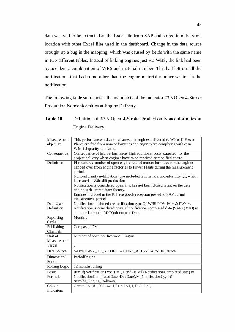
45
data was still to be extracted as the Excel file from SAP and stored into the same
location with other Excel files used in the dashboard. Change in the data source
brought up a bug in the mapping, which was caused by fields with the same name
in two different tables. Instead of linking engines just via WBS, the link had been
by accident a combination of WBS and material number. This had left out all the
notifications that had some other than the engine material number written in the
notification.
The following table summarises the main facts of the indicator #3.5 Open 4-Stroke
Production Nonconformities at Engine Delivery.
Table 10. Definition of #3.5 Open 4-Stroke Production Nonconformities at
Engine Delivery.
Measurement objective
This performance indicator ensures that engines delivered to Wärtsilä Power Plants are free from nonconformities and engines are complying with own Wärtsilä quality standards.
Consequence Consequence of bad performance: high additional costs expected for the project delivery when engines have to be repaired or modified at site
Definition PI measures number of open engine related nonconformities for the engines handed over from engine factories to Power Plants during the measurement period. Nonconformity notification type included is internal nonconformity QI, which is created at Wärtsilä production. Notification is considered open, if it has not been closed latest on the date engine is delivered from factory. Engines included in the PI have goods reception posted to SAP during measurement period.
Data User Definition
Notifications included are notification type QI WBS P/0*, P/1* & PW/1*. Notification is considered open, if notification completed date (SAP/QM03) is blank or later than MIGO/document Date.
Reporting Cycle
Monthly
Publishing Channels
Compass, IDM
Unit of Measurement
Number of open notifications / Engine
Target 0 Data Source SAP/EDW/V_TF_NOTIFICATIONS_ALL & SAP/ZDEL/Excel Dimension/ Period
PeriodEngine
Rolling Logic 12 months rolling Basic Formula
sum(if(NotificationTypeID='QI' and (IsNull(NotificationCompletedDate) or NotificationCompletedDate>DocDate),M_NotificationQty,0)) /sum(M_Engine_Delivery)
Colour Indicators
Green: I 1,01, Yellow: 1,01 < I <1,1, Red: I 1,1

46
5.10 Ship Power 4-stroke Delivery Accuracy (#3.6)
The delivery accuracy of engines, which are delivered from Wärtsilä Ship Power
4-stroke, had not been followed by Power Plants and for that reason the indicator
and measurement logic needed to be thought from the beginning. As engines were
being ordered almost the same way as regular purchaser orders from external
suppliers, the starting point was to modify the supplier delivery accuracy rules to
meet the engine delivery process (see indicator Supplier Delivery Accuracy
(#3.8)Supplier Delivery Accuracy (#3.8)). For the measurement the same SAP
fields were to be taken into account, but measurement was to be somehow easier.
Instead of working days (like external suppliers) engine deliveries were decided to
be considered as late, if they were delivered a week later than agreed. This eased
up measuring as measurements were doable directly based on calendar days. Also
it was known, that the incoterm was always Ex Works (EXW) which gave an
opportunity not to include the incoterm in the formula.
As the delivery data source did not exist for internal deliveries, data was to be
extracted manually from SAP to the Excel file. To ease measuring additional fields
were created to the script to show whether the delivery was done ontime or late.
This way the actual formula could concentrate only on counting deliveries as
judgement whether those were ontime or late was done already in the script.
M_Engine_Ontime and M_Engine_Late got a value 1 or 0 as true and false by
comparing statistical and document date in the material document issued at the
goods reception. M_Engine_Delivery got always the value 1 as an indication of
delivered engine.
The following table summarises the main facts of the indicator #3.6 Ship Power 4-
stroke Delivery Accuracy.

47
Table 11. Definition of #3.6 Ship Power 4-stroke Delivery Accuracy.
Measurement objective
This performance indicator measures the capability of Wärtsilä factories to deliver engines as per agreed time schedule.
Consequence Consequence of poor performance: delay in meeting time schedule can lead to payment of liquidated damages.
Definition PI measures delivery accuracy of engines from factories to Power Plants by comparing statistical delivery date with actual delivery date from factory during the measurement period. If engine is delivered more than 1 week after than statistical delivery date, delivery is considered late. If delivery is done before or within the week after statistical date, delivery is considered ontime. Measurement period is determined based on date goods reception is done. Engines included are originally ordered from factory and later delivered to Power Plants under the same project.
Data User Definition
Measurement includes amount of ontime vs. total number of goods reception material documents (SAP/MIGO) for stock transport (UB) and standard (NB) purchase order lines for engine material group 190100 from plant FI06 to FI05 and from 8000 to 8004 during measurement period. Delivery is considered ontime if [material document (SAP/MIGO) document date] - [statistical date (SAP/ME57)] <7. Measurement period is determined based on Posting date month in material document (SAP/MIGO).
Reporting Cycle
Monthly
Publishing Channels
Compass, IDM
Unit of Measurement
%
Target 0,97 Data Source SAP/ZDEL/Excel Dimension/ Period
PeriodEngine
Rolling Logic 2014 Year to date, 2015 onwards 12 months rolling Basic Formula
if(EngineYear>2013, sum(M_Engine_Ontime)/sum(M_Engine_Delivery))
Colour Indicators
Green: I 96,03%, Yellow: 87,3% < I <96,03%, Red: I 87,3%
5.11 Auxiliary Nonconformity Ratio, Site / Manufacturers (#3.7)
Indicator #3.7 was originally defined as an acceptable inspection ratio of supplier
inspections made by the quality assurance, but it was decided to be changed to
something else as the sampling between suppliers was not fair as more troublesome
suppliers and those nearby were inspected more often than others. When indicator
#3.3 Engine Nonconformity Ratio (Field/Production) was decided to be limited to
include only engine related nonconformities, it was thought to create a similar
indicator also for auxiliaries. As we did not have information of the internal
nonconformities at the suppliers, the suppliers inspections with result not accepted
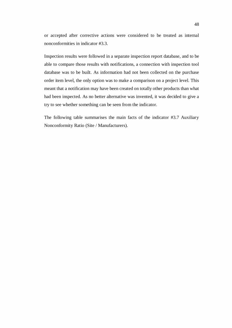
48
or accepted after corrective actions were considered to be treated as internal
nonconformities in indicator #3.3.
Inspection results were followed in a separate inspection report database, and to be
able to compare those results with notifications, a connection with inspection tool
database was to be built. As information had not been collected on the purchase
order item level, the only option was to make a comparison on a project level. This
meant that a notification may have been created on totally other products than what
had been inspected. As no better alternative was invented, it was decided to give a
try to see whether something can be seen from the indicator.
The following table summarises the main facts of the indicator #3.7 Auxiliary
Nonconformity Ratio (Site / Manufacturers).
49
Table 12. Definition of #3.7 Auxiliary Nonconformity Ratio (Site / Manufacturers).
Measurement objective
This performance indicator indicates how early the nonconformities are opened during the project delivery process. It is preferable to identify nonconformities as early as possible in the delivery process.
Consequence Consequence of poor performance: Higher cost for repair or replacement at site than at the supplier facilities.
Definition PI measures ratio of Power Plants customer delivery projects auxiliary equipment related nonconformities reported during installation and commissioning before handing over site to the customer against inspection findings reported with status rejected or approved after corrective actions at auxiliary suppliers. Punch list notifications that are project nonconformities (WG) opened after handing over to customer are not included. Projects included are with status delivered, extended warranty, full release, handover / life cycle support, prolonged warranty, or warranty and they have been handed over to customer during the measurement period.
Data User Definition
Projects included in the PI are with WBS P/0*, P/1* & PW/1* and they have in SAP/CJ20N (Project Builder) on M-level Basic data sheet User status DEL, XWAR, FRE, LSC, PWAR, or WARR and on M-level cust. enhancement sheet actual handing over date during measurement period. Notifications included are WG notifications with WBS P/0*, P/1* & PW/1* excluding WBS P/0*.N1, P/1*.N1 & PW/1*.N1 created before handing over date. Inspection findings are with project id with P/0*, P/1* & PW/1*and with status R or AC at inspection finding tool.
Reporting Cycle
Monthly
Publishing Channels
Compass, IDM
Unit of Measurement
Project nonconformity (WG) / rejected or approved after corrective actions inspection findings
Target 0,5 Data Source SAP/EDW/V_TF_NOTIFICATIONS_ALL, Inspection tool database Dimension/ Period
PeriodActualHandover
Rolling Logic 12 months rolling Basic Formula
sum(if(NotificationTypeID='WG' and not wildmatch(WBSElement,'*.N1*') and ActualHandoverDate>NotificationCreatedDate, M_NotificationQty,0)) /sum(if(InspectionResultID='AC' or InspectionResultID='R',1,0))
Colour Indicators
Green: I 0,505, Yellow: 0,505 < I <0,55, Red: I 0,55
5.12 Supplier Delivery Accuracy (#3.8)
Supplier delivery accuracy was a traditional indicator, but it had been mainly
reported by some other organization within Wärtsilä. Therefore, the most important
thing was to clarify what to include and what to leave out from the measurement
and later on to have needed information in the data. Answer to this was that
measurement needed to concentrate on equipment deliveries from the main
suppliers delivering products and equipment to regular customer delivery projects.

50
At the beginning of the year delivery data was extracted as Excel files for wanted
plants and then it was measured only for wanted suppliers and material groups in
Qlikview. As the reporting environment at Wärtsilä Central Supply Management
changed, there was a need to change also the way of measuring. We got access to
the data storage used in new reporting environment and hence were able to measure
figures automatically. The only setback in this was that the new reporting
environment did not include data from internal deliveries, which would have been
wanted to be included in the measurements. As the amount of internal deliveries
was quite small, it barely had an effect on the total figures, and therefore it was
accepted to measure the indicator from the available data and not to try to include
internal deliveries there manually. Another issue to be solved was how to indicate
wanted suppliers into the vendor data. This was solved by co-operation with the
data owners. An additional CSV-file was created that included all the suppliers on
the preferred suppliers list and their main responsible product teams. This enabled
using product team information as a filter to include only the wanted suppliers.
The following table summarises the main facts of the indicator #3.8 Supplier
Delivery Accuracy.

51
Table 13. Definition of #3.8 Supplier Delivery Accuracy.
Measurement objective
This performance indicator measures the capability of Wärtsilä Power Plants to deliver auxiliaries bought from suppliers as per agreed time schedule notified in the supplier purchase order.
Consequence Consequence of poor performance: delay in meeting time schedule can lead to payment of liquidated damages.
Definition PI measures delivery accuracy of equipment deliveries to Power Plants customer delivery projects from external suppliers listed on Power Plants Preferred Suppliers list by comparing statistical delivery date with actual delivery date linked to incoterm used in purchase order from supplier during the measurement period. If delivery is done more than 2 workdays after than statistical delivery date, delivery is considered late. If delivery is done before or latest 2 workdays after statistical date, delivery is considered ontime. With deliveries where incoterm used in purchase order states buyer takes care of the cost and/or risk to the agreed destination the delivery date is when goods are sent from supplier. With deliveries where seller takes care of the cost and risk to the agreed destination delivery date is when goods have arrived to destination. Measurement period is determined based on date goods reception is done. Each material document for one purchaser order line is counted separately.
Data User Definition
Measurement includes amount of ontime vs. total number of goods reception material documents (SAP/MIGO) for standard (NB) purchase orders lines delivered to plants FI05, IN03, and US15 excluding material groups for packing and documentation (30331, 150910-150930, 230540-230590) during measurement period from external suppliers listed on document WDAA18218. When Incoterm of purchase order (SAP/ME57) is EXW, FCA, FAS, FOB, CFR, CIF, CPT or CIP document date from material document (SAP/MIGO) is compared with statistical delivery date in the PO item (SAP/ME57). When term is DDU or DDP, posting date from material document (SAP/MIGO) is compared with PO item (SAP/ME57) statistical delivery date. Delivery is considered ontime if [material document (SAP/MIGO) document date] - [statistical date (SAP/ME57)] 2. Measurement period is determined based on Posting date month in material document (SAP/MIGO).
Reporting Cycle
Monthly
Publishing Channels
Compass, IDM
Unit of Measurement
%
Target 92% Data Source SAP/EDW/V_TF_MAT_DOC_PURCH_ORD Dimension/ Period
PeriodPosting
Rolling Logic 12 months rolling Basic Formula
sum(if(not isnull(PP_PROD_TEAM_NO),M_ONTIME_IND_PRCTR)) /sum(if(not isnull(PP_PROD_TEAM_NO),M_DELIVERY_COUNT))
Colour Indicators
Green: I 0,9108, Yellow: 0,828 < I <0,9108, Red: I 0,828

52
5.13 Supplier Reclaiming Ratio (#3.9)
Supplier reclaiming ratio was a new indicator created for the dashboard. Originally
it was defined as the amount of money received against the amount of money
claimed to auxiliary suppliers and it was measured by summing together the total
claimed costs divided by the sum of estimated costs during the measurement period
from all non-engine related supplier notifications. On the next stage it was realised
that we should not measure notifications where we have not received a reply from
the supplier and then the measurement period was defined based on the notification
completed period from the original notification created period.
After some months it was realised that this was not supposed to be about money,
but instead it was only to be about the ratio of how much money had been received
from the supplier compared what had been requested. For this end an additional
field was to be measured in the script. The reclaiming ratio was measured by
dividing the total claimed costs by the estimated costs per an individual notification.
The indicator itself was then to be the average of these ratios.
The following table summarises the main facts of the indicator #3.9 Supplier
Reclaiming Ratio.

53
Table 14. Definition of #3.9 Supplier Reclaiming Ratio.
Measurement objective
This performance indicator indicates to which extent the additional costs due to auxiliaries failure/nonconformities are compensated by Wärtsilä Power Plants suppliers.
Consequence Consequence of bad performance: a low ratio would indicate that Wärtsilä Power Plants is bearing the costs of low performance from the suppliers
Definition PI measures average succeed ratio of claiming suppliers during measurement period. Succeed ratio of each individual claim is measured by dividing amount of money received from supplier by amount of money claimed from supplier. PI value is the average of individual notification ratios during measurement period. PI covers supplier claims made by Wärtsilä Power Plants, Finland for non-engine related equipment. Measurement period is determined based on notification closing date.
Data User Definition
Measurement includes QE and QV notifications made by plant FI05 from SAP/QM03, where notification completed date is during measurement period and which are not on status DLFL or with WBS *.N1. Succeed ratio of each individual claim is measured by dividing total claimed by estimated costs. PI value is the average of individual notification ratios during measurement period. Measurement period is determined based on notification Completed date.
Reporting Cycle
Monthly
Publishing Channels
Compass, IDM
Unit of Measurement
Reclaiming ratio = Total claimed costs / Estimated costs
Target 0,95 Data Source SAP/EDW/V_TF_NOTIFICATIONS_ALL Dimension/ Period
PeriodNotificationCompleted
Rolling Logic 12 months rolling Basic Formula
Avg(if(NotificationTypeID='QE' or NotificationTypeID='QV',ReClaimingRatio))
Colour Indicators
Green: I 0,9405, Yellow: 0,855 < I <0,9405, Red: I 0,855
5.14 Warranty Nonconformity Lead Time (#4.1)
Lead time of handling warranty claims was a traditional indicator followed by
Wärtsilä Customer Assistance Center (CAC) and it was wanted to be brought to the
dashboard as such, but limited only to projects originally delivered by Wärtsilä
Power Plants.
As all the warranty claims (ZW) were followed in the indicator Total Amount of
Nonconformities per Megawatts (#4.2)Total Amount of Nonconformities per
Megawatts (#4.2) via notification all data, we had in the application data all the

54
notifications to be included, but the table itself did not have the information of the
fields to be compared (Malfunction start date and Reference date). The solution to
get the lead time into the application was to connect the data to the Qlikview file
behind the report where CAC measured the warranty lead time. This data had the
lead time measured for each individual completed notification and hence the issue
for the dashboard was only to limit notifications to the projects related to power
plants and to measure the average lead time out of individual notifications.
The following table summarises the main facts of the indicator #4.1 Warranty
Nonconformity Lead Time.
Table 15. Definition of #4.1 Warranty Nonconformity Lead Time.
Measurement objective
This performance indicator indicates the time needed to solve nonconformities during the warranty period.
Consequence Consequence of bad performance: a long lead time would indicate that the power plant cannot be operated according to its technical specifications involving additional costs, customer dissatisfaction, penalties, and consequences to repeat orders.
Definition PI measures average lead time of closed warranty notifications during measurement period. Lead time is measured between the date when the problem occurred for the customer and the date when the problem is solved at Wärtsilä. PI value is the average of individual notification lead time during measurement period. PI covers warranty notification made by Wärtsilä Services, Finland for Power Plants customer delivery projects. Measurement period is determined based on notification closing date.
Data User Definition
Measurement includes ZW notifications made by plant FI01 from SAP/QM03, where notification completed date is during measurement period and which are not on status DLFL. Lead Time is measured between "malfunction start date" and "reference date“. PI value is the average of individual notification lead time during measurement period. Notifications included are with WBS P/0*, P/1* & PW/1*.
Reporting Cycle
Monthly
Publishing Channels
Compass, IDM
Unit of Measurement
Days
Target 30 Data Source SAP/EDW/V_TF_NOTIFICATIONS_ALL,
SAP/EDW/cac_notification_data_201*.qvd Dimension/ Period
PeriodNotificationCompleted
Rolling Logic 12 months rolling Basic Formula sum(m_reference_malf_start_lt)/sum(m_cac_notific_qty) Colour Indicators
Green: I 30,3, Yellow: 30,3 < I <33, Red: I 33

55
5.15 Total Amount of Nonconformities per Megawatts (#4.2)
Measuring the number of nonconformities vs. handed over megawatts was a new
indicator established for the dashboard. In the beginning a challenge for the
indicator was to clarify from where and how to take the megawatts. As there was
no clear opinions it was decided to take megawatts from the handed-over projects
during the period in question as it was easily available in the project delivery data.
The number of notification created during that same period was then divided by the
amount of megawatts.
Over the months it was difficult to read the trend from the results as there were big
differences in monthly figures due to handed over megawatts were changing from
month to a month. After analysing the reason was seen, as when the time period
was the link it caused the fact that notifications and megawatts were totally from
different projects. Therefore, it was decided to take megawatts at the end of
warranty period and compare those to the amount of notifications for the projects
whose warranty period ended during the measurement period. As notifications and
megawatts were from the same projects, it was possible to see the trend and
connection between these.
The following table summarises the main facts of the indicator #4.2 Total Amount
of Nonconformities per Megawatts.

56
Table 16. Definition of #4.2 Total Amount of Nonconformities per Megawatts.
Measurement objective
This performance indicator reflects the overall quality performance of the project delivery to deliver a power plant with the lowest quantity of nonconformities as possible.
Consequence Consequence of bad performance: a high number of nonconformities per MW delivered reflect additional repairs, reworks and replacement orders that are non-budgeted costs for the project delivery.
Definition PI measures number of nonconformities recorded for Power Plants customer delivery projects compared to total amount of megawatts at the end of warranty period during measurement period. Nonconformity notification types included are internal nonconformity QI, which is created at Wärtsilä production, and project nonconformity WG, which is originated by nonconformity found during commissioning and installation before handing over to customer, and ZW, which is customer claim during warranty period.
Data User Definition
Projects included in the PI are with WBS P/0*, P/1* & PW/* and they have in SAP/CJ20N (Project Builder) on M-level Basic data sheet User status DEL, XWAR, FRE, LSC, PWAR, or WARR and on M-level cust. enhancement sheet warranty end date during measurement period. Notifications included are notification types QI, WG and ZW with WBS P/0*, P/1* & PW/1*.
Reporting Cycle
Monthly
Publishing Channels
Compass, IDM
Unit of Measurement
Number of notifications/ Megawatts
Target Not available Data Source SAP/EDW/V_TF_NOTIFICATIONS_ALL &
SAP/Cognos/projectservice.asmx Dimension/ Period
PeriodWarrantyEnd
Rolling Logic 12 months rolling Basic Formula (sum(if(NotificationTypeID='QI' or NotificationTypeID='WG' or
NotificationTypeID='ZW', M_NotificationQty))/sum(PlantOutPutMW))
Colour Indicators
Not applicable
5.16 Product Improvement Lead Time (Engine) (#5.2)
Production improvement lead time for engine was a traditional indicator where data
was collected to the PIP base (product improvement process), from where it was
monthly exported as an Excel file and then filtered manually to be able to measure
the monthly figure. The reporting itself was done as a PowerPoint presentation
distributed in the organisation.

57
When investigating measurement logic from one example file used in monthly
reporting, it was found out that unlike the assumed definition, the indicator was
measuring how long open improvement cases had been open on the measuring date
instead of how long it has taken to complete those. The used formula was measuring
against the current date and hence it was only possible to show one value instead of
separate monthly values just by measuring from data. Another preventive issue for
automation was that there was no possibility for an automatic connection to the
data. Because of these facts it was clear that to be able to show a monthly graph,
the numbers would need to be transferred into the Qlikview application manually.
As the figure was measured monthly by another Wärtsilä organization, a deeper
investigation of formula was stopped and a collection Excel was established where
each monthly value was to be inserted. Quite soon after it was also announced that
measuring and distributing of this indicator would be stopped. The following table
summarises the main facts of the indicator #5.2 Product Improvement Lead Time.
Table 17. Definition of #5.2 Product Improvement Lead Time (Engine).
Measurement objective
This performance indicator reflects the time needed to solve technical issues and product improvement concerning the engine.
Consequence Consequence of bad performance: a too long time for solving technical issues on engine indicates that mistakes & errors identify on a given project will be seen on other projects until issue solved. Same additional costs for repair, rework, and update will have to be taken off the project delivery budget.
Reporting Cycle Monthly Publishing Channels
Compass, IDM
Unit of Measurement
Days
Target 150 Data Source PIP Base/IDM Rolling Logic Monthly status collected Basic Formula Not available Colour Indicators Green: I 151,5, Yellow: 151,5 < I <165, Red: I 165
58
6 CONCLUSIONS
The purpose of the thesis was to define and test measuring principles for Wärtsilä
Power Plants Performance Indicators and analyse what information and data is
available and needed for automatic reports to enable automatic reporting and
several people having access to reports. As an outcome in brief 9 out of 15
indicators investigated can be accessed directly from data storage, five needs
manual Excels as data, and only one would need manual filling of the monthly value
to the application at the end of the study period (September 2014).
To enable automatic reporting the main thing is to have data available so that it can
be frequently automatically loaded from server. Data from SAP is connectable via
the data storage for most of the indicators, but for example engine delivery
reliability data exist in EDW, but it is not brought from there to ODS as traditionally
only external deliveries have been followed. To enable measuring engine delivery
reliability data model exists, but filters need to be removed to include also internal
deliveries. The biggest challenges are to find solutions for manual reports, where
currently Excel has been used as temporarily solution. One alternative is what is
already used with #3.4 lost time frequency indicator. Data is manually inserted
monthly to the SharePoint custom list, from where it can be loaded to the report
application. The advantage of the SharePoint custom list is also the fact that there
requirements can be given in which format data need to be filled in, which improves
the data quality. An Excel file could be in practise uploaded monthly similarly to a
server folder, but there data quality has much bigger risks to fail as nothing is
checking if the data is filled properly. One exception with Excel files can be seen
when the data in Excel has actually been extracted from some system which has
already been treated as data and where the data format has been checked. E.g. #1.1
customer satisfaction where an external party is collecting the results, an alternative
is to transfer data via Excel to Wärtsilä. Then data can be stored without modifying
it monthly on the same server, where actual application is also stored. As indicators
#2.1 mandatory stored sales documentation and #2.3 contract review ontime
accuracy both have data, which is purely manually collected from several sources,
the best alternative for those is to create SharePoint custom lists and collect data

59
there. Collecting data to an Excel file would only cause additional work as the file
should be stored monthly to another place and data quality is more fragile. This way
people can also have transparency to source data and data can be loaded
automatically to the report.
After data is available it needs to be mapped together by chosen keys in different
data tables. The purpose is to avoid creating duplicate values or loops. The main
link in the dashboard between different sources was the project id. In SAP each
project would have had behind also installation number (one installation can consist
of several projects; e.g. an extension project to an old project has the same
installation number than the original project), which would have been better
alternative. However, other data not based on SAP, such as that is collected in the
inspection tool database and lost time injury frequency had only the project id
collected while as sales related indicators had only a name as identification the
project in question. In the future if all the indicators are wanted to be seen project
wisely or project area wisely, this link between projects and different data sources
needs to be built stronger.
When data is loadable and properly linked, it is the time to define formulas to
measure wanted indicators. As the outcome of the dashboard is a more traditional
style report distributed as a PowerPoint presentation (instead of person clicking and
playing on the application), the challenge was to have several indicators with
different dimensions shown on one page. This was possible by including time limits
in the formulas, but the obverse of this is that clicking and playing is not really
purposeful on the same page. Therefore, if deeper analyses of the facts behind
measures are wanted, each or few indicators with the same time dimension need to
have their own pages built. Some deeper analysis pages were already drafted and
made, but so far there has been no interest to have those available for use.
When all the objects were created on the screen, the output report was still to be
done. This was done by creating a pdf-report, which could be printed by pressing a
button in Qlikview application and then copied to the PowerPoint presentation. As
other pages in the report were done traditionally in PowerPoint, the outcome of the
entire presentation did not look harmonized as all the pages looked a little different.

60
If the report is still wanted to be distributed as PowerPoint, the next improvement
area would be to learn how to create a macro in Qlikview, which would print out
the results as a PowerPoint presentation on the company template.
The nature of different indicators vary quite widely from percentage to ratio and to
quantity and others are ‘the better the bigger they are’ while others are the opposite-
‘the smaller the better they are’. Also some indicators are measured as 12 month
rolling values while as others are year to date rolling values from beginning of the
year in question. This can cause confusion to the reader and hence it would be worth
investigating which indicators can be measured in percentages or as 12 month
rolling figures as most of the indicators were measured.
My role was to test and to implement preliminary defined indicators, but not to
question if the indicators themselves are purposeful. However, along the way I did
make proposals how the way of measuring the topic could be improved and most
of the proposals were also implemented. E.g. in indicator #3.1 where the plan was
to measure open notifications when projects are delivered to the customer it is not
the same when one project is handed over to customer with 7 open notifications
than if seven projects are delivered to customer with seven open notifications in
total. Hence the number of open notifications was decided to be divided by the
number of handed over projects. Similar adjustments were also done with other
indicators where the plain quantity was being measured to be able to see the trend
and avoid influence of changing volumes.
Despite the fact that I was not in the position to question what is being measured, I
did question it anyway. But most often it was not because whether it was a good
indicator, but for the fact that if the indicator and its results were used or discussed
somewhere. There were indicators which were out of the target during the entire
time and no improvement was seen. Some people questioned if it was worth to
measure an indicator which is negative all the time – it might be if the indicator
would be communicated and discussed with the people who could have effect on
the outcome. These indicators were built and communicated at Power Plants, but they
were measuring the performance of another unit within Wärtsilä. Most likely the
awareness of that something is being measured would have already had an effect

61
on the outcome. Also these indicators would have needed deeper details presented
so that employees and management of the other units could have seen which actions
caused poor results. Furthermore I was questioning from the data that the way of
working and measuring did not match, but no one was responsible to communicate
or investigate what the way of working really was nor make proposals to change
the measurement logic.
Most of the new indicators were built by a small group of people who were not
involved in the process where the data for the measurements were created. The
results were also shown only on high level as a summary of all the transactions
involved. For me it was surprising that concerning the new indicators created for
the dashboard, I received only few detailed questions what was behind the figures.
Those questions were proof that people in that process were actually interested in
where the figures are coming from and how they could improve the outcome. But
how could the other indicators be taken seriously and actions made to improve
outcome? To get a purpose for the measuring it is essential to make sure that people
who are working in the process are aware how their work is affecting the
measurements. It is also vital to be able to show them which individual transactions
are affecting the outcome so that they have chances to improve the outcome. To
achieve this each indicator needs to have a responsible person who knows the
process and the data related to it and can align the way of working to be able to
define and develop what to measure e.g. including definition and work instruction
and possible follow up to keep data accurate. This person would be the main driver
of individual PI and contact person in that section of the process and would work
in close operation with the owner of the indicator and the one building report. The
role of the owner is more high level; to define what to measure and what the target
is, while the responsible person is the one who can turn measuring into practice
aligned with the actual way of working and who can investigate the root causes
based on data and propose improvements for corrective and preventive actions.
The objective was to have performance indicators, which were not only looking to
the history but also to show what could be improved along the process. When
looking and analysing PP business process one can see that some areas are not

62
covered in the dashboard while others might even have too much influence. It
should be deeper analysed which sections of the process are not included in the
dashboard and which might have too big influence compared to the others. The
following figure represents in which sections of the process indicators are located.
Figure 6. Dashboard indicators placed in business process of Power Plants.
One can see that for example project procurement has three indicators and also two
other indicators are linked to supplier quality, while areas, such as project planning
and project execution, which represent the core business of Power Plants, have no
leading indicators measuring their performance. Also areas, such as strategic
planning and active market development do not have indicators and the product
improvement related indicator is measuring Wärtsilä products which Power Plants
is not responsible for. A lot of indicators are also measuring performance of other
Wärtsilä units than Power Plants.
63
7 ASSESSMENT
This thesis touched the topic how to define and test measuring principles for
Wärtsilä Power Plants Performance Indicators and examined what information and
data is available and needed for automatic reports to enable automatic reporting. As
a conclusion two thirds of 15 investigated indicators can be accessed and updated
directly from data storage and one third needs some manual work to be able to insert
the data into the application at the end of the study period (September 2014). Two
indicators were left outside of the thesis as there was no common understanding
how and from where the numbers should have been measured.
Indicators, which are based on the data from SAP, will all be possible to be
automatically updated and measured in future. However, during the period of thesis
internal engine deliveries were filtered out from delivery data model, so they needed
to be manually exported into Excel from SAP. Development to include internal
deliveries also in the data has already been started so this should be possible in 2015.
Manual Excel files were needed for internal engine deliveries, customer satisfaction
and sales documentation related indicators. Need for using Excel with engine
deliveries will not be needed in near future any longer as it will be available from
the same data source as the supplier delivery data. Customer satisfaction data is
collected by an external party, who currently does not have a possibility for their
customers to access the data automatically and therefore data needs to be transferred
to Wärtsilä monthly as an Excel file. However, from data quality perspective this is
good data as it has been already in a system, which has checked that the data in
proper and consistent format. Both of the sales documentation related indicators
were followed manually in Excel. Their weakness is in the data format and data
quality as Excel files do not check if the information is filled systematically and
also the judgement and proof whether something was ontime or not is not clearly
seen from the data. It can be also said that information in the Excel files is more as
a note paper than data. Therefore it is strongly recommended to create a simple
database, for example such as a SharePoint Custom list, for the follow up. Using
the SharePoint custom list also enables automatic uploading of the data into the

64
Qlikview report while using Excel file creates always an unnecessary step as
someone needs to transfer the Excel file into the server, which has limited access
rights.
Lost time injury frequency has been using the SharePoint custom list as manually
filled data source already before the dashboard so it was obvious to continue the
same workaround with the dashboard. However, as the new WeCare IT solution
has been already taken into use to manage the information related to incidents, at
some point the information should be accessed from WeCare. During the thesis
period the automatic data source connection was still lacking from WeCare.
Indicators left out of the thesis were Quantity of quality requirements analysis/
contract awarded and Cost of Quality. A database for the quality requirement
analysis was not created during the study and hence there was nothing to be
measured. Cost of quality had a definition and it was also shown on the dashboard,
but the definition was not aligned how it was being measured. As a clear decision
what and how this should have been measured was not done during study, it was
left out of this thesis, even though the number was manually filled to the report and
shown on the dashboard.
As the majority of indicators were originated from SAP and can be automatically
measured in future, it is clear that it is worth to try to get as many as possible of the
remaining data sources into a format from where they can be automatically accessed
to be downloaded into the report. It was never timed how long it would have taken
to measure everything manually, but one could estimate it to be several days of
work from one individual. By automatic data loads everything can be done now in
less than 10 minutes. This does not cover filling data to those indicators, where data
is not being collected as part of the regular processes.
The current output of the dashboard is a pdf-report, which is monthly printed out
from Qlikview out as a snapshot showing the high level situation at the end of the
month. It can be still considered as a traditional relatively static report, which does
not use the benefits of Qlikview. The benefit of Qlikview is to produce graphic
functionalities that live in accordance with user needs. Visual information

65
perception is clearly faster and easier to use as it answers to business questions
simply by pointing and clicking. By clicking and playing in the application users
could dig into details and find out which individual transactions are affecting the
results. And only knowing the details lessons can be learned and corrective and
preventive actions can be defined after which effect of actions can be seen.
While building the report and finding out the measurement logic, it was a must to
check each individual transaction affecting the high level results to make sure that
the logic works. This also means that the pages for clicking and digging into the
details already exist on some level, but so far there has been no interest to have that
information available. To get measurements useful it is essential to make sure that
people who are working in the process are aware of how their work is affecting the
measurements. It is also vital to be able to show them which individual transactions
are affecting the outcome so that they have changes to improve the outcome. This
is impossible to show as long as detailed pages are not finalised and taken into use.
In the future each indicator should have a responsible person, who is be the main
driver of individual indicator; a person who understands the way of working and
the data around the indicator in question. This person would be the spokesperson
who makes sure that people in the organization know and understand what indicator
is about and can explain in detail to those working in the process how their work is
affecting the results and who can transfer the targets set by the management into a
measurable indicator which is aligned with the way of working. These responsible
need to be trained to understand what the requirements are to be able to implement
effective performance and quality indicators that can be utilized to define selected
actions to support and deploy the strategy of Power Plants.

66
REFERENCES
/1/ Coker, F. 2014. Pulse: Understanding the Vital Signs of Your Business. 1st edition. Bellevue, WA: Ambient Light Publishing.
/2/ Ericsson, R. 2004. Building Business Intelligence Applicaions with .NET. 1st edition. Massachusetts. Charles River Media, inc.
/3/ Hansten, A. Business Process Upgrade 2014 (presentation). PP Performance Dashboard & Project Quality Management Info Session 17.9.2014. Vaasa.
/4/ Harmsen, B. & Garcia, M. 2012. Qlikview 11 for Developers. Birminghan. Packt Publishing.
/5/ Heesen, B. 2012. Effective Strategy Execution; Improving Performance with Business Intelligence. 1st edition. Berlin. Springer.
/6/ Kumari, N. 2013. Business Intelligence in a Nutshell. International Journal of Innovative Research in Computer and Communication Engineering Vol. 1, Issue 4.
/7/ Olszak, C. & Ziemba, E. 2012. Critical Success Factors for Implementing Business Intelligence Systems in Small and Medium Enterprises on the Example of Upper Silesia, Poland. University of Economics, Katowice, Poland. Accessed 10.9.2014 http://www.ijikm.org/Volume7/IJIKMv7p129-150Olszak634.pdf.
/8/ Pengon. Qlikview pikaopas. Accessed 1.9.2014. http://www.pengon.fi/wp-content/uploads/QlikviewOpas.pdf
/9/ Rud, O. 2009. Business Intelligence Success Factors: Tools for Aligning Your Business in the Global Economy. Hoboken, N.J: Wiley & Sons.
/10/ Singh, R. & Kawaljeet, S. 2010. A descriptive classification of causes of data quality problems in data warehousing. International Journal of Computer Science Issues 7.3: 2, pp. 1-2)
/11/ Wärtsilä. 2014. This is Wärtsilä, 2014. Accessed 10.9.2014. http://www.wartsila.com/en/about/company-management/overview
/12/ Turban, E., Sharda, R., Delen, D., King, D. 2010. Business Intelligence; A Managerial Approach. Second Edition. New Jersey. Prentice Hall.
/13/ Wärtsilä Corporation Annual Report 2013. Accessed 10.9.2014 http://wartsila-reports.studio.crasman.fi/file/dl/i/RRSNxQ/ pWfq69cV7vzCf0T59W1rQA/Wartsila_Annualreport_2013.pdf
/14/ Watson, H. J. 2002. Recent Developments in Data Warehousing. Communication of the ACM, Vol. 8, Issue 1.

67
/15/ Yeoh, W., & Koronios, A. 2010. Critical success factors for Business Intelligence systems. Journal of Computer Information Systems. Vol. 50 Issue 3, 23-32.

APPENDIX 1 1(1)
Contents confidential information, removed from the public version.