descriptive statistics - Government Arts College Coimbatore
38
DESCRIPTIVE STATISTICS UNIT I STATISTICS INTRODUCTION In the modern world of computers and information technology, the importance of statistics is very well recognized by all the disciplines. Statistics has originated as a science of statehood and found applications slowly and steadily in Agriculture, Economics, Commerce, Biology, Medicine, Industry, planning, education and so on. As on date there is no other human walk of life, where statistics cannot be applied. ORIGIN AND GROWTH OF STATISTICS The word ‘Statistics’ and ‘Statistical’ are all derived from the Latin word Status, means a political state. The theory of statistics as a distinct branch of scientific method is of comparatively recent growth. Research particularly into the mathematical theory of statistics is rapidly proceeding and fresh discoveries are being made all over the world. MEANING OF STATISTICS Statistics are numerical statement of facts in any department of enquiry placed in relation to each other. - A.L. Bowley Bowley gives another definition for statistics, which states ‘statistics may be rightly called the scheme of averages’. Statistics may be called the science of counting in one of the departments due to Bowley. According to Croxton and Cowden Statistics may be defined as the science of collection, presentation analysis and interpretation of numerical data from the logical analysis. FUNCTIONS OF STATISTICS: There are many functions of statistics. Let us consider the following five important functions. Condensation: Generally speaking by the word ‘to condense’, we mean to reduce or to lessen. Condensation is mainly applied at embracing the understanding of a huge mass of data by providing only few observations. If in a particular class in Chennai School, only marks in an examination are given, no purpose will be served. Instead if we are given the average mark in that particular examination, definitely it serves the better purpose. Similarly the range of marks is also
-
Upload
khangminh22 -
Category
Documents
-
view
4 -
download
0
Transcript of descriptive statistics - Government Arts College Coimbatore

DESCRIPTIVE STATISTICS
UNIT I
STATISTICS
INTRODUCTION
In the modern world of computers and information technology, the
importance of statistics is very well recognized by all the disciplines. Statistics
has originated as a science of statehood and found applications slowly and
steadily in Agriculture, Economics, Commerce, Biology, Medicine, Industry,
planning, education and so on. As on date there is no other human walk of life,
where statistics cannot be applied.
ORIGIN AND GROWTH OF STATISTICS
The word ‘Statistics’ and ‘Statistical’ are all derived from the Latin word
Status, means a political state. The theory of statistics as a distinct branch of
scientific method is of comparatively recent growth. Research particularly into
the mathematical theory of statistics is rapidly proceeding and fresh discoveries
are being made all over the world.
MEANING OF STATISTICS
Statistics are numerical statement of facts in any department of enquiry
placed in relation to each other. - A.L. Bowley
Bowley gives another definition for statistics, which states ‘statistics
may be rightly called the scheme of averages’.
Statistics may be called the science of counting in one of the
departments due to Bowley.
According to Croxton and Cowden Statistics may be defined as the
science of collection, presentation analysis and interpretation of numerical
data from the logical analysis.
FUNCTIONS OF STATISTICS:
There are many functions of statistics. Let us consider the following five
important functions.
Condensation:
Generally speaking by the word ‘to condense’, we mean to reduce or to
lessen. Condensation is mainly applied at embracing the understanding of a
huge mass of data by providing only few observations. If in a particular class in
Chennai School, only marks in an examination are given, no purpose will be
served. Instead if we are given the average mark in that particular examination,
definitely it serves the better purpose. Similarly the range of marks is also

another measure of the data. Thus, Statistical measures help to reduce the
complexity of the data and consequently to understand any huge mass of data.
Comparison:
Classification and tabulation are the two methods that are used to
condense the data. They help us to compare data collected from different
sources. Grand totals, measures of central tendency measures of dispersion,
graphs and diagrams, coefficient of correlation etc provide ample scope for
comparison. If we have one group of data, we can compare within itself. If the
rice production (in Tonnes) in Tanjore district is known, then we can compare
one region with another region within the district. Or if the rice production (in
Tonnes) of two different districts within Tamilnadu is known, then also a
comparative study can be made. As statistics is an aggregate of facts and figures,
comparison is always possible and in fact comparison helps us to understand the
data in a better way.
Forecasting:
By the word forecasting, we mean to predict or to estimate before hand.
Given the data of the last ten years connected to rainfall of a particular district in
Tamilnadu, it is possible to predict or forecast the rainfall for the near future. In
business also forecasting plays a dominant role in connection with production,
sales, profits etc. The analysis of time series and regression analysis plays an
important role in forecasting.
Estimation:One of the main objectives of statistics is drawn inference about a
population from the analysis for the sample drawn from that population. The four
major branches of statistical inference are
1. Estimation theory
2. Tests of Hypothesis
3. Non Parametric tests
4. Sequential analysis
In estimation theory, we estimate the unknown value of the population
parameter based on the sample observations. Suppose we are given a sample of
heights of hundred students in a school, based upon the heights of these 100
students, it is possible to estimate the average height of all students in that school.
Tests of Hypothesis:
A statistical hypothesis is some statement about the probability
distribution, characterizing a population on the basis of the information available
from the sample observations. In the formulation and testing of hypothesis,
statistical methods are extremely useful. Whether crop yield has increased
because of the use of new fertilizer or whether the new medicine is effective in
eliminating a particular disease are some examples of statements of hypothesis
and these are tested by proper statistical tools.
SCOPE OF STATISTICS
Statistics is not a mere device for collecting numerical data, but as a means
of developing sound techniques for their handling, analyzing and drawing valid
inferences from them. Statistics is applied in every sphere of human activity –
social as well as physical – like Biology, Commerce, Education, Planning,
Business Management, Information Technology, etc. It is almost impossible to
find a single department of
human activity where statistics cannot be applied. We now discuss briefly the
applications of statistics in other disciplines.
Statistics and Industry:
Statistics is widely used in many industries. In industries, control charts
are widely used to maintain a certain quality level. In production engineering, to
find whether the product is conforming to specifications or not, statistical tools,
namely inspection plans, control charts, etc., are of extreme importance. In
inspection plans we have to resort to some kind of sampling – a very important
aspect of Statistics.
Statistics and Commerce:
Statistics are lifeblood of successful commerce. Any businessman cannot
afford to either by under stocking or having overstock of his goods. In the
beginning he estimates the demand for his goods and then takes steps to adjust
with his output or purchases. Thus statistics is indispensable in business and
commerce.
As so many multinational companies have invaded into our Indian
economy, the size and volume of business is increasing. On one side the stiff
competition is increasing whereas on the other side the tastes are changing and
new fashions are emerging. In this connection, market survey plays an important
role to exhibit the present conditions and to forecast the likely changes in future.
Statistics and Agriculture:
Analysis of variance (ANOVA) is one of the statistical tools developed by
Professor R.A. Fisher, plays a prominent role in agriculture experiments. In tests
of significance based on small samples, it can be shown that statistics is adequate
to test the significant difference between two sample means. In analysis of
variance, we are concerned with the testing of equality of several population
means. For an example, five fertilizers are applied to five plots each of wheat

and the yield of wheat on each of the plots is given. In such a situation, we are
interested in finding out whether the effect of these fertilizers on the yield is
significantly different or not. In other words, whether the samples are drawn
from the same normal population or not. The answer to this problem is provided
by the technique of ANOVA and it is used to test the homogeneity of several
population means.
Statistics and Economics:
Statistical methods are useful in measuring numerical changes in complex
groups and interpreting collective phenomenon. Nowadays the uses of statistics
are abundantly made in any economic study. Both in economic theory and
practice, statistical methods play an important role. Alfred Marshall said,
“Statistics are the straw only which I like every other economists have to make
the bricks”. It may also be noted that statistical data and techniques of statistical
tools are immensely useful in solving many economic problems such as wages,
prices, production, distribution of income and wealth and so on. Statistical tools
like Index numbers, time series Analysis, Estimation theory, Testing Statistical
Hypothesis are extensively used in economics.
Statistics and Education:
Statistics is widely used in education. Research has become a common
feature in all branches of activities. Statistics is necessary for the formulation of
policies to start new course, consideration of facilities available for new courses
etc. There are many people engaged in research work to test the past knowledge
and evolve new knowledge. These are possible only through statistics.
Statistics and Planning:
Statistics is indispensable in planning. In the modern world, which can be
termed as the “world of planning”, almost all the organizations in the
government are seeking the help of planning for efficient working, for the
formulation of policy decisions and
execution of the same. In order to achieve the above goals, the statistical data
relating to production, consumption, demand, supply, prices, investments,
income expenditure etc and various advanced statistical techniques for
processing, analyzing and interpreting such complex data are of importance. In
India statistics play an important role in planning, commissioning both at the
central and state government levels.
Statistics and Medicine:
In Medical sciences, statistical tools are widely used. In order to test the
efficiency of a new drug or medicine, t - test is used or to compare the efficiency

of two drugs or two medicines, ttest for the two samples is used. More and more
applications of statistics are at present used in clinical investigation.
Statistics and Modern applications:
Recent developments in the fields of computer technology and
information technology have enabled statistics to integrate their models and thus
make statistics a part of decision making procedures of many organizations.
There are so many software packages available for solving design of
experiments, forecasting simulation problems etc. SYSTAT, a software package
offers mere scientific and technical graphing options than any other desktop
statistics package. SYSTAT supports all types of scientific and technical
research in various diversified fields as follows
1. Archeology: Evolution of skull dimensions
2. Epidemiology: Tuberculosis
3. Statistics: Theoretical distributions
4. Manufacturing: Quality improvement
5. Medical research: Clinical investigations.
6. Geology: Estimation of Uranium reserves from ground water
LIMITATIONS OF STATISTICS:
Statistics with all its wide application in every sphere of human
activity has its own limitations. Some of them are given below.
1. Statistics is not suitable to the study of qualitative phenomenon: Since
statistics is basically a science and deals with a set of numerical data, it is
applicable to the study of only these subjects of enquiry, which can be expressed
in terms of quantitative measurements. As a matter of fact, qualitative
phenomenon like honesty, poverty, beauty, intelligence etc, cannot be expressed
numerically and any statistical analysis cannot be directly applied on these
qualitative phenomenon’s. Nevertheless, statistical techniques may be applied
indirectly by first reducing the qualitative expressions to accurate quantitative
terms. For example, the intelligence of a group of students can be studied on the
basis of their marks in a particular examination.
2. Statistics does not study individuals: Statistics does not give any specific
importance to the individual items, in fact it deals with an aggregate of objects.
Individual items, when they are taken individually do not constitute any
statistical data and do not serve any purpose for any statistical enquiry.
3. Statistical laws are not exact: It is well known that mathematical and
physical sciences are exact. But statistical laws are not exact and statistical laws
are only approximations. Statistical conclusions are not universally true. They
are true only on an average.

4. Statistics table may be misused: Statistics must be used only by experts;
otherwise, statistical methods are the most dangerous tools on the hands of the
inexpert. The use of statistical tools by the inexperienced and untraced persons
might lead to wrong
conclusions. Statistics can be easily misused by quoting wrong figures of data.
As King says aptly ‘statistics are like clay of which one can make a God or Devil
as one pleases’.
5. Statistics is only, one of the methods of studying a problem: Statistical
method does not provide complete solution of the problems because problems
are to be studied taking the background of the countries culture, philosophy or
religion into consideration. Thus the statistical study should be supplemented by
other evidences.
COLLECTION OF DATA
Any statistical data can be classified under two categories depending upon
the sources
utilized.
These categories are,
1. Primary data 2. Secondary data
Primary data:
Primary data is the one, which is collected by the investigator himself for
the purpose of a specific inquiry or study. Such data is original in character and is
generated by survey conducted by individuals or research institution or any
organisation.
For Example If a researcher is interested to know the impact of noon meal scheme
for the school children, he has to undertake a survey and collect data on the opinion
of parents and children by asking relevant questions. Such a data collected for the
purpose is called primary data.
The primary data can be collected by the following five methods.
1. Direct personal interviews.
2. Indirect Oral interviews.
3. Information from correspondents.
4. Mailed questionnaire method.
5. Schedules sent through enumerators.

1. Direct personal interviews:
The persons from whom information is collected are known as informants.
The investigator personally meets them and asks questions to gather the necessary
information. It is the suitable method for intensive rather than extensive field
surveys. It suits best for intensive study of the limited field.
Merits:
1. People willingly supply information because they are approached personally.
Hence, more response noticed in this method than in any other method.
2. The collected information are likely to be uniform and accurate. The
investigator is there to clear the doubts of the informants.
3. Supplementary information on informant’s personal aspects can be noted.
Information on character and environment may help later to interpret some of
the results.
4. Answers for questions about which the informant is likely to be sensitive can
be gathered by this method.
5. The wordings in one or more questions can be altered to suit any informant.
Explanations may be given in other languages also. Inconvenience and
misinterpretations are thereby avoided.
Limitations:
1. It is very costly and time consuming.
2. It is very difficult, when the number of persons to be interviewed is
large and the
persons are spread over a wide area.
3. Personal prejudice and bias are greater under this method.
2. Indirect Oral Interviews:
Under this method the investigator contacts witnesses or neighbours or
friends or some other third parties who are capable of supplying the necessary
information. This method is preferred if the required information is on addiction
or cause of fire or theft or murder etc., If a fire has broken out a certain place, the
persons living in neighbourhood and witnesses are likely to give information on the
cause of fire. In some cases, police interrogated third parties who are supposed to
have knowledge of a theft or a murder and get some clues. Enquiry committees
appointed by governments generally adopt this method and get people’ s views and all
possible details of facts relating to the enquiry. This method is suitable whenever

direct sources do not exists or cannot be relied upon or would be unwilling to part
with the information.
The validity of the results depends upon a few factors, such as the nature of
the person whose evidence is being recorded, the ability of the interviewer to draw
out information from the third parties by means of appropriate questions and cross
examinations, and the number of persons interviewed. For the success of this
method one person or one group alone should not be relied upon.
2. Information from correspondents:
The investigator appoints local agents or correspondents in different places
and compiles the information sent by them. Information to Newspapers and
some departments of Government come by this method. The advantage of this
method is that it is cheap and appropriate for extensive investigations. But it may
not ensure accurate results because the correspondents are likely to be negligent,
prejudiced and biased. This method is adopted in those cases where information
are to be collected periodically from a wide area for a long time.
3. Mailed questionnaire method:
Under this method a list of questions is prepared and is sent to all the
informants by post. The list of questions is technically called questionnaire. A
covering letter accompanying the questionnaire explains the purpose of the
investigation and the importance of correct information and request the
informants to fill in the blank spaces provided and to return the form within a
specified time. This method is appropriate in those cases where the informants are
literates and are spread over a wide area.
Merits:
1. It is relatively cheap.
2. It is preferable when the informants are spread over the wide area.
Limitations:
1. The greatest limitation is that the informants should be literates who are able
to understand and reply the questions.
2. It is possible that some of the persons who receive the questionnaires do not
return them.
3. It is difficult to verify the correctness of the informations furnished by the
respondents.
With the view of minimizing non-respondents and collecting correct
information, the questionnaire should be carefully drafted. There is no hard and
fast rule. But the following general principles may be helpful in framing the
questionnaire. A covering letter and a self addressed and stamped envelope should
accompany the questionnaire. The covering letter should politely point out the
purpose of the survey and privilege of the respondent who is one among the few
associated with the investigation. It should assure that the information would be
kept confidential and would never be misused. It may promise a copy of the
findings or free gifts or concessions etc.,
Characteristics of a good questionnaire:
1. Number of questions should be minimum.
2. Questions should be in logical orders, moving from easy to more difficult
questions.
3. Questions should be short and simple. Technical terms and vague
expressions capable of different interpretations should be avoided.
4. Questions fetching YES or NO answers are preferable. There may be some
multiple choice questions requiring lengthy answers are to be avoided.
5. Personal questions and questions which require memory power and
calculations should also be avoided.
6. Question should enable cross check. Deliberate or unconscious mistakes can
be detected to an extent.
7. Questions should be carefully framed so as to cover the entire scope of the
survey.
8. The wording of the questions should be proper without hurting the feelings
or arousing resentment.
9. As far as possible confidential information should not be sought.
10. Physical appearance should be attractive, sufficient space should be provided
for answering
each questions.
5. Schedules sent through Enumerators:
Under this method enumerators or interviewers take the schedules, meet the
informants and filling their replies. Often distinction is made between the
schedule and a questionnaire. A schedule is filled by the interviewers in a face-to-
face situation with the informant. A questionnaire is filled by the informant which
he receives and returns by post. It is suitable for extensive surveys.
Merits:
1. It can be adopted even if the informants are illiterates.
2. Answers for questions of personal and pecuniary nature can be collected.
3. Non-response is minimum as enumerators go personally and contact the
informants.
4. The informations collected are reliable. The enumerators can be properly
trained for the same.
5. It is most popular methods.
Limitations:
1. It is the costliest method.

2. Extensive training is to be given to the enumerators for collecting correct
and uniform information.
3. Interviewing requires experience. Unskilled investigators are likely to fail in
their work.
Before the actual survey, a pilot survey is conducted. The
questionnaire/Schedule is pre-tested in a pilot survey. A few among the people
from whom actual information is needed are asked to reply. If they misunderstand
a question or find it difficult to answer or do not like its wordings etc., it is to be
altered. Further it is to be ensured that every questions fetches the desired answer.
Merits and Demerits of primary data:
1. The collection of data by the method of personal survey is possible only if the
area covered by the investigator is small. Collection of data by sending the
enumerator is bound to be expensive. Care should be taken twice that the
enumerator record correct information provided by the informants.
2. Collection of primary data by framing a schedules or distributing and collecting
questionnaires by post is less expensive and can be completed in shorter time.
3. Suppose the questions are embarrassing or of complicated nature or the
questions probe into personnel affairs of individuals, then the schedules may
not be filled with accurate and correct information and hence this method is
unsuitable.
4. The information collected for primary data is mere reliable than those collected
from the secondary data.
Secondary Data:
Secondary data are those data which have been already collected and
analysed by some earlier agency for its own use; and later the same data are used
by a different agency. According to W.A.Neiswanger, ‘ A primary source is a
publication in which the data are published by the same authority which gathered
and analysed them. A secondary source is a publication, reporting the data which
have been gathered by other authorities and for which others are responsible’.
Sources of Secondary data:
In most of the studies the investigator finds it impracticable to collect first-
hand information on all related issues and as such he makes use of the data collected
by others. There is a vast amount of published information from which statistical
studies may be made and fresh statistics are constantly in a state of production. The

sources of secondary data can broadly be classified under two heads:
1. Published sources, and
2. Unpublished sources.
1. Published Sources:
The various sources of published data are:
1. Reports and official publications of
(i) International bodies such as the International Monetary Fund,
International Finance Corporation and United Nations
Organisation.
(ii) Central and State Governments such as the Report of the Tandon
Committee and Pay Commission.
2. Semi-official publication of various local bodies such as Municipal
Corporations and District Boards.
3. Private publications-such as the publications of –
(i) Trade and professional bodies such as the Federation of Indian
Chambers of Commerce and Institute of Chartered Accountants.
(ii) Financial and economic journals such as ‘ Commerce’ , ‘
Capital’ and ‘ Indian Finance’ .
(iii) Annual reports of joint stock companies.
(iv) Publications brought out by research agencies, research scholars,
etc.
It should be noted that the publications mentioned above vary with regard
to the periodically of publication. Some are published at regular intervals (yearly,
monthly, weekly etc.,) whereas others are ad hoc publications, i.e., with no
regularity about periodicity of publications.
Note: A lot of secondary data is available in the internet. We can access it at any
time for the further studies.
2. Unpublished Sources
All statistical material is not always published. There are various sources of
unpublished data such as records maintained by various Government and private
offices, studies made by research institutions, scholars, etc. Such sources can also
be used where necessary
Precautions in the use of Secondary data
The following are some of the points that are to be considered in the use of
secondary data
1. How the data has been collected and processed

2. The accuracy of the data
3. How far the data has been summarized
4. How comparable the data is with other tabulations
5. How to interpret the data, especially when figures collected for one purpose is
used for another
Generally speaking, with secondary data, people have to compromise between
what they want and what they are able to find.
Merits and Demerits of Secondary Data:
1. Secondary data is cheap to obtain. Many government publications are
relatively cheap and libraries stock quantities of secondary data
produced by the government, by companies and other organisation.
2. Large quantities of secondary data can be got through internet.
3. Much of the secondary data available has been collected for many years
and therefore it can be used to plot trends.
- Secondary data is of value to:
- The government – help in making decisions and planning future policy.
- Business and industry – in areas such as marketing, and sales in order
to appreciate the general economic and social conditions and to
provide information on competitors.
- Research organisation – by providing social, economical and
industrial information.
CLASSIFICATION:
The collected data, also known as raw data or ungrouped data are always
in an unorganized form and need to be organized and presented in meaningful
and readily comprehensible form in order to facilitate further statistical analysis.
It is, therefore, essential for an investigator to condense a mass of data into more
and more comprehensible and assimilable form. The process of grouping into
different classes or subclasses according to some characteristics is known as
classification, tabulation is concerned with the systematic arrangement and
presentation of classified data. This classification is the first step in tabulation.
For Example, letters in the post office are classified according to their
destinations viz., Delhi, Madurai, Bangalore, Mumbai etc.,
TYPES OF CLASSIFICATION:
Statistical data are classified in respect of their characteristics. Broadly,
there are four basic types of classification namely
a) Chronological classification
b) Geographical classification
c) Qualitative classification
d) Quantitative classification

a) Chronological classification:
In chronological classification the collected data are arranged according
to the order of time expressed in years, months, weeks, etc., The data is generally
classified in ascending order of time. For example, the data related with
population, sales of a firm, imports and exports of a country are always subjected
to chronological classification.
Example:
The estimates of birth rates in India during 1970 – 76 are
Year 1970 1971 1972 1973 1974 1975
Birth 36.8 36.9 36.6 34.6 34.5 35.2
Rate
b) Geographical classification:
In this type of classification the data are classified according to
geographical region or place. For instance, the production of paddy in different
states in India, production of wheat in different countries etc.,
Example:
Country America Chin
a
Denmar
k
Franc
e
India
Yield of 1925 893 225 439 862
wheat in
(kg/acre)
c) Qualitative classification:
In this type of classification data are classified on the basis of same
attributes or quality like sex, literacy, religion, employment etc., Such attributes
cannot be measured along with a scale. For example, if the population to be
classified in respect to one attribute, say sex, then we can classify them into two
namely that of males and females. Similarly, they can also be classified into
‘employed’ or ‘unemployed’ on the basis of another attribute ‘employment’.
Thus when the classification is done with respect to one attribute, which is
dichotomous in nature, two classes are formed, one possessing the attribute and
the other not possessing the attribute. This type of classification is called simple
or dichotomous classification. A simple classification may be shown as under
Population
Male Female
The classification, where two or more attributes are considered and
several classes are formed, is called a manifold classification. For example, if
we classify population simultaneously with respect to two attributes, e.g sex and
employment, then population are first classified with respect to ‘ sex’ into
‘males’ and ‘ females’ . Each of these classes may then be further classified into

‘ employment’ and ‘ unemployment’ on the basis of attribute ‘ employment’ and
as such Population are classified into four classes namely.
(i) Male employed
(ii) Male unemployed
(iii) Female employed
(iv) Female unemployed
Still the classification may be further extended by considering other
attributes like marital status etc. This can be explained by the following chart
Population
Male Female
Employed Unemployed Employed Unemployed
d) Quantitative classification:
Quantitative classification refers to the classification of data according to
some characteristics that can be measured such as height, weight, etc., For
example the students of a college may be classified according to weight as given
below.
Weight (in lbs) No of
Students
90-100 50
100-110 200
110-120 260
120-130 360
130-140 300
140-150 250
In this type of classification there are two elements, namely (i) the variable
(i.e) the weight in the above example, and (ii) the frequency in the number of
students in each class. There are 50 students having weights ranging from 90 to
100 lb, 200 students having weight ranging between 100 to 110 lb and so on.
TABULATION:
Tabulation is the process of summarizing classified or grouped data in the
form of a table so that it is easily understood and an investigator is quickly able
to locate the desired information. A table is a systematic arrangement of
classified data in columns and rows. Thus, a statistical table makes it possible
for the investigator to present a huge mass of data in a detailed and orderly form.
It facilitates comparison and often reveals certain patterns in data which are
otherwise not obvious. Classification and ‘Tabulation’, as a matter of fact, are
not two distinct processes. Actually they go together. Before tabulation data are
classified and then displayed under different columns and rows of a table.

ADVANTAGES OF TABULATION:
Statistical data arranged in a tabular form serve following objectives:
1. It simplifies complex data and the data presented are easily understood.
2. It facilitates comparison of related facts.
3. It facilitates computation of various statistical measures like averages,
dispersion, correlation etc.
4. It presents facts in minimum possible space and unnecessary repetitions and
explanations are avoided. Moreover, the needed information can be easily
located.
5. Tabulated data are good for references and they make it easier to present the
information in the form of graphs and diagrams.
PREPARING A TABLE:
The making of a compact table itself an art. This should contain all the
information needed within the smallest possible space. What the purpose of
tabulation is and how the tabulated information is to be used are the main points
to be kept in mind while preparing for a statistical table. An ideal table should
consist of the following main parts:
1. Table number
2. Title of the table
3. Captions or column headings
4. Stubs or row designation
5. Body of the table
6. Footnotes
7. Sources of data
Table Number:
A table should be numbered for easy reference and identification. This
number, if possible, should be written in the center at the top of the table.
Sometimes it is also written just before the title of the table.
Title:
A good table should have a clearly worded, brief but unambiguous title
explaining the nature of data contained in the table. It should also state
arrangement of data and the period covered. The title should be placed centrally
on the top of a table just below the table number (or just after the table number in
the same line).
Captions or column Headings:
A caption in a table stands for brief and self explanatory headings of
vertical columns. Captions may involve headings and sub-headings as well.
The unit of data contained should also be given for each column. Usually, a
relatively less important and shorter classification should be tabulated in the
columns.

Stubs or Row Designations:
Stubs stands for brief and self explanatory headings of horizontal rows.
Normally, a relatively more important classification is given in rows. Also a
variable with a large number of classes is usually represented in rows. For
example, rows may stand for score of classes and columns for data related to sex
of students. In the process, there will be many rows for scores classes, but only
two columns for male and female students.
Body:
The body of the table contains the numerical information on frequency of
observations in the different cells. This arrangement of data is according to
the description of captions and stubs.
Footnotes:
Footnotes are given at the foot of the table for an explanation of any fact
or information included in the table which needs some explanation. Thus, they
are meant for explaining or providing further details about the data, which have
not been covered in title, captions and stubs.
Sources of data:
Lastly, one should also mention the source of information from which data
are taken. This may preferably include the name of the author, volume, page and
the year of publication. This should also state whether the data contained in the
table is of ‘primary or secondary’ nature.
Type of Tables:
Tables can be classified according to their purpose, stage of enquiry, nature
of data or number of characteristics used. On the basis of the number of
characteristics, tables may be classified as follows:
1. Simple or one-way table 2. Two way table 3. Manifold table
Simple or one-way Table:
A simple or one-way table is the simplest table which contains data of one
characteristic only. A simple table is easy to construct and simple to follow. For
example, the blank table given below may be used to show the number of adults
in different occupations in a locality.
The number of adults in different occupations in a locality
Occupation No. of Adults
Total

Two-way Table:
A table, which contains data on two characteristics, is called a twoway
table. In such case, therefore, either stub or caption is divided into two co-ordinate
parts. In the given table, as an example the caption may be further divided in
respect of ‘ sex’ . This subdivision is shown in two-way table, which now contains
two characteristics namely, occupation and sex.
The number of adults in a locality in respect of occupation and sex
Occupation No. of Adults Total
Male Female
Total
Manifold Table:
Thus, more and more complex tables can be formed by including other
characteristics. For example, we may further classify the caption sub-headings in
the above table in respect of “marital status”, “ religion” and “socio-economic status”
etc. A table ,which has more than two characteristics of data is considered as a
manifold table. For instance , table shown below shows three characteristics
namely, occupation, sex and marital status.
Occupation No. of Adults Total
Male Female
M U Total M U Total
Total
Foot note: M Stands for Married and U stands for unmarried.
Manifold tables, though complex are good in practice as these enable full
information to be incorporated and facilitate analysis of all related facts. Still, as a
normal practice, not more than four characteristics should be represented in one
table to avoid confusion. Other related tables may be formed to show the
remaining characteristics

QUANTITATIVE DATA
Quantitative data is divided into two
i) Raw data or ungrouped data and
ii) Grouped data
Grouped data is divided into two depending on the type of variable as
a) discrete and b) continuous
Raw Data
Raw data is the unorganized data when we’re done with the collection stage. We
need to organize this raw data. It is important to realize that organized data facilitates
comparison and meaningful conclusions.
Further, to organize the data we need to look for similarities or group the data. In this
way, we effectively convert heterogeneous data into homogeneous data. To do so,
an investigator has to classify the data in the form of a series.
Series refer to those data which are in some order and sequence. The basis of the
arrangement of raw data can vary from purpose to purpose.
The weekly wages in Rs. paid to the workers are given below.
300,240,240.150,120,240,120,120,150,150,150,240,150,150,120,300,120,150,240,
150,150,120,240,150,240,150,120,120,240,150.
Variable
A variable is simply something that can vary with time and we can measure this
variation. In other words, a variable is a characteristic or a phenomenon which is
capable of being measured and changes its value over time.
A variable is classified into two:
1] Discrete variable
A discrete variable’s value changes only in complete numbers or increases in jumps.
Thus the phenomenon or characteristic, a discrete variable represents should be such
that its value cannot be infractions but only in whole numbers.
A discrete variable is countable, For example, the number of children in a family can
be 2, 3, 4 etc., but not 2.5, 3.5 etc.
2] Continuous variable
QUANTITATIVE DATA
grouped
discrete continuous
raw or ungrouped

A continuous variable assumes fractional values, or its value does not increase in
jumps. For example, the heights of students, the weights of students and so on.
GROUPED DATA OR FREQUENCY DISTRIBUTION
Frequency distribution is a statistical table which shows the set of all distinct values
of the variable arranged in order of magnitude or in groups, with their frequencies
side by side.
FORMATION OF FREQUENCY DISTRIBUTION
1) Discrete frequency distribution
In discrete frequency distribution, values of the variable is arranged individually.
The frequencies of the various values are the number of times each value occurs.
The weekly wages in Rs. paid to the workers are given below. Form a discrete
frequency distribution
300,240,240.150,120,240,120,120,150,150,150,240,150,150,120,300,120,150,240,
150,150,120,240,150,240,150,120,120,240,150.
Weekly wages in
Rs.(x)
Tally marks No. of
workers
120 IIII III 8
150 IIII IIII II 12
240 IIII III 8
300 II 2
2. Continuous frequency distribution
Continuous frequency distribution is also known as grouped frequency
distribution. This is a form in which class intervals and respective class
frequencies are given.
We can find frequency distribution by the following steps:
• First of all, calculate the range of the data set.
• Next, divide the range by the number of the group you want your data in and
then round up.
• After that, use class width to create groups
• Finally, find the frequency for each group.
Let us consider the following example regarding daily maximum temperatures
in in a city for 50 days.
28, 28, 31, 29, 35, 33, 28, 31, 34, 29, 25, 27, 29, 33, 30, 31, 32, 26, 26, 21,
21, 20, 22, 24, 28, 30, 34, 33, 35, 29, 23, 21, 20, 19, 19, 18, 19, 17, 20, 19,
18, 18, 19, 27, 17, 18, 20, 21, 18, 19.
Weekly wages in
Rs.(x)
120 150 240 300 TOTAL
No. of workers(f) 8 12 8 2 30

• Minimum Value= 17
• Maximum Value=35
• Range=35-17=18
• Number of classes=5 (say)
• width of each class=4
Table Showing frequency distribution of temperature in a city for 50 days.
Class Intervals (Temperatures in ) Frequency
17-21 17
21-25 7
25-29 10
29-33 9
33-36 7
Total 50
Terms used in continuous frequency distribution
Class Interval: The whole range of variable values is classified in some groups in
the form of intervals. Each interval is called a class interval.
Class Frequency: The number of observations in a class is termed as the frequency
of the class or class frequency.
Class limits and Class boundaries:
Class limits are the two endpoints of a class interval which are used for the
construction of a frequency distribution. The lowest value of the variable that can be
included in a class interval is called the lower class limit of that class interval. The
highest value of the variable that can be included in a class interval is called the
upper-class limit of that class interval. These are not the real limits or endpoints of a
class interval. Hence, class limits are called apparent limits of a class.
In the previous data, the class intervals are 17-21, 21-25, 25-29, 29-33 and 33-36.
Here, say for the class 17-21, the lower-class limit is 17 and the upper-class limit is
21. If there was an observation of 17, it would not be included in this class. An
observation of 21, would be included in the class 21-24 and not in 17-21. This type
is called as exclusive type.

Table Showing frequency distribution of temperature in a city for 50 days.
Class Intervals
(Temperatures
in )
Frequency
17-21 17
21-25 7
25-29 10
29-33 9
33-36 7
Total 50
The second table is inclusive type of data, i,e,, if a value is equal to 17 or 20 it will
be included in the first class itself.
The inclusive type of data can be converted to exclusive type as follows
We obtain class boundaries from class limits by dividing the difference between the
upper limit of a class and the lower limit of the next higher class into two equal parts.
Say, we are considering the classes 17-20 and 21-24. 21-20=1. Again, we
have . We add 0.5 to the upper-class limit of each class and subtract 0.5
from the lower-class limit of each class. So, the class boundaries are 16.5-20.5, 20.5-
24.5 and so on. For the class 16.5-20.5, 16.5 is the lower-class boundary and 20.5 is
the upper-class boundary. It should be noted that the upper-class boundary of the
lower class coincides with the upper-class boundary of the next higher class.
Open-end classes: It may be so that some values in the data set are extremely small
compared to the other values of the data set and similarly some values are extremely
large in comparison. Then what we do is we do not use the lower limit of the first
class and the upper limit of the last class. Such classes are called open end classes.
Class Intervals Frequency
below-21 17
21-25 7
25-29 10
29-33 9
Above 33 7
Total 50
Class Intervals
(Temperatures
in )
Frequency
17-20 17
21-24 7
25-28 10
29-32 9
33-36 7
Total 50

Size of the Class: The length of the class is called the class width. It is also known
as class size.
Class interval or size of the class = U.C.B. – L.C.B.
U.C.B. is Upper Class Boundary
L.C.B. is Lower Class Boundary
Mid-point of the Class: The midpoint of a class interval is called Mid-point of the
Class. It is the representative value of the entire class.
Mid-point of the class = (U.C.B. +L.C.B.)/2
Cumulative frequency distribution
There are two kinds of cumulative frequency distribution.
i) Less than cumulative frequency distribution and
ii) More than cumulative frequency distribution
i) Less than cumulative frequency distribution
Frequency distribution both discrete and continuous are to be taken in
ascending order. The total of the frequencies from the beginning up to and including
each frequency is found. That cumulative frequency shows how many items are less
than or equal to the corresponding value of the class interval.
ii) More than cumulative frequency distribution:
Frequency distribution both discrete and continuous are to be taken in
ascending order. The total of the frequencies from the end up to and including each
frequency is found. That cumulative frequency shows how many items are more than
or equal to the corresponding value of the class interval.
Weekly
wages in
Rs.(X)
No. of
workers(f)
Weekly
wages in
Rs.
Less than
cumulative
frequencies
Weekly
wages in
Rs.
more than
cumulative
frequencies
120 8 120 8 120 30
150 12 150 20 150 22
240 8 240 28 240 10
300 2 300 30 300 2
Marks(x) No.of
students(f)
Marks below No. of students Marks above No. of students
Upper limit Less than c.f. Lower limit More than c.f.
0 – 20 2 20 2 0 40
20 – 40 7 40 2+7=9 20 38
40 – 60 15 60 9+15=24 40 31
60 – 80 9 80 24+9=33 60 16
80 - 100 7 100 33+7=40 80 7
Total 40

DIAGRAMS AND GRAPHS
General Principles of Diagrammatic Presentation of Data
A diagrammatic presentation is a simple and effective method of presenting the
information that any statistical data contains. Here are some general principles of
diagrammatic presentation which can help you make them a more effective tool of
understanding the data:
• Write a suitable title on top which conveys the subject matter in a brief and
unambiguous manner. If you want to provide more details about the title, then
you can mention them in the footnote below the diagram.
• You must construct a diagram in a manner that immediately impacts the viewer.
Ensure that you draw it neatly with an appropriate balance between its length
and breadth. Further, make sure that the diagram is neither too large nor too
small. You can also use different colors or shades to emphasize different aspects
of the problem.
• Draw the diagram accurately using proper scales of measurement. You should
never compromise accuracy for attractiveness.
• Select the design of the diagram carefully keeping in view the nature of the data
and also the objective of the investigation.
• If you use different shades or colors to depict the different characteristics in the
diagram, then ensure that you provide an index explaining them.
• If you are using a secondary source, then ensure that you specify the source of
data.
• Try to keep your diagram as simple as possible.
Types of Diagrams
There are many types of diagrams which are used for data presentation. Some
popular types of diagrams are explained below:
One dimensional diagram-bar diagram
Two dimensional dimensional – circles, squares
Three dimensional diagrams - cubes, spheres
Pictograms and cartograms
Bar diagram
1. They are rectangles placed on a common baseline
2. The width of the bars are equal and height varies according to the value of the
variable
3. There should be equal gap in between the bars
There are four types of bar diagrams
a)Simple bar diagram

b)Multiple bar diagram
c) Subdivided or component bar diagram and
d)percentage subdivided bar diagram
Simple Bar Diagram:
Simple bar diagram can be drawn either on horizontal or vertical base, but
bars on horizontal base more common. Bars must be uniform width and
intervening space between bars must be equal. While constructing a simple bar
diagram, the scale is determined on the basis of the highest value in the series.
To make the diagram attractive, the bars can be coloured. Bar diagram are
used in business and economics. However, an important limitation of such
diagrams is that they can present only one classification or one category of data.
For example, while presenting the population for the last five decades, one can
only depict the total population in the simple bar diagrams, and not its sex-wise
distribution.
Example:
Represent the following data by a bar diagram.
Year Production (in tones)
1991 45
1992 40
1993 42
1994 55
1995 50
Solution : Simple Bar Diagram
60
50
40
30
20
10
0
1991 1992 1993 1994 1995
Year
Pro
du
cti
on
(in
to
nn
es)

MULTIPLE BAR DIAGRAMS
Multiple bar diagram is used for comparing two or more sets of statistical data.
Bars are constructed side by side to represent the set of values for comparison. In
order to distinguish bars, they may be either differently coloured or there should
be different types of crossings or dotting, etc. An index is also prepared to identify
the meaning of different colour or dotting.
Draw a multiple bar diagram for the following data.
Solution : 2
0
1
4
0
1
2
0
1
0
0
81998
1999
2000
2001
0
0
1
8
0
1
6
0
Multiple Bar Diagram
32 140 2001
45 165 2000
87 200 1999
80 195 1998
Profit after tax (in lakhs of rupees) Profit before tax (in lakhs of rupees)

Sub-divided Bar Diagram:
In a sub-divided bar diagram, the bar is sub-divided into various parts in
proportion to the values given in the data and the whole bar represent the total.
Such diagrams are also called Component Bar diagrams. The sub divisions are
distinguished by different colours or crossings or dottings.
The main defect of such a diagram is that all the parts do not have a common
base to enable one to compare accurately the various components of the data.
Represent the following data by a sub-divided bar diagram.
Expenditure items Monthly expenditure (in Rs.)
Family A Family B
Food 75 95
Clothing 20 25
Education 15 10
Housing Rent 40 65
Miscellaneous 25 35
Percentage bar diagram:
This is another form of component bar diagram. Here the components are
not the actual values but percentages of the whole. The main difference between
the sub-divided bar diagram and percentage bar diagram is that in the former the
bars are of different heights since their totals may be different whereas in the latter
the bars are of equal height since each bar represents 100 percent. In the case of
data having sub-division, percentage bar diagram will be more appealing than
sub-divided bar diagram.
Represent the following data by a percentage bar diagram.
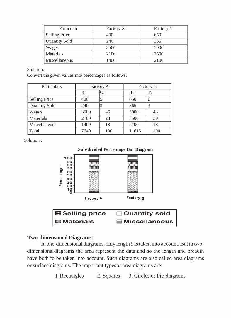
Particular Factory X Factory Y
Selling Price 400 650
Quantity Sold 240 365
Wages 3500 5000
Materials 2100 3500
Miscellaneous 1400 2100
Solution:
Convert the given values into percentages as follows:
Particulars Factory A Factory B
Rs. % Rs. %
Selling Price 400 5 650 6
Quantity Sold 240 3 365 3
Wages 3500 46 5000 43
Materials 2100 28 3500 30
Miscellaneous 1400 18 2100 18
Total 7640 100 11615 100
Solution :
Sub-divided Percentage Bar Diagram
Two-dimensional Diagrams:
In one-dimensional diagrams, only length 9 is taken into account. But in two-
dimensional diagrams the area represent the data and so the length and breadth
have both to be taken into account. Such diagrams are also called area diagrams
or surface diagrams. The important types of area diagrams are:
1. Rectangles 2. Squares 3. Circles or Pie-diagrams

Circular or Pie Chart
A pie chart consists of a circle in which the radii divide the area into sectors. Further,
these sectors are proportional to the values of the component items under
investigation. Also, the whole circle represents the entire data under investigation.
Steps to draw a Pie Chart
• convert the individual values to degrees using the formula
o Angle= (individual value/ total) x360
• Draw a circle of convenient radius
• Divide the circle into different sectors according to the angles calculated
using a protractor
Use of Pie Chart
The use of pie charts is quite popular as the circle provides a visual concept of the
whole. Pie charts are simple to use and hence are one of the most commonly used
charts. However, the pie charts are sparingly used only for the following reasons:
• They are the best chart for displaying statistical information when the number of
components is not more than 6. In the case of more components, the chart
becomes too complex to understand.
• Pie charts are not useful when the values of the components are similar. This is
because in the case of similarly sized sectors the viewer can find it difficult to
differentiate between the slice sizes.
Represent the following data, on India’s exports (Rs. in Crores) by regions from April
to February 1997.
Region Europe Asia America Africa
Exports 32699 42516 23495 5133
From the table we have,

Total exports = 32699 + 42516 + 23495 + 5133 = Rs. 103, 843 crores
Europe = (32699/103843) × 360 = 113°
Asia = (42516/103843) ×360 = 147°
America = (23495/103843) ×360 = 82°
Africa = (5133/103843) ×360 = 18°
GRAPHICAL PRESENTATION
Graphs are charts consisting of points, lines and curves. Charts are drawn on graph
sheets. Scales are to be chosen suitably in both X and Y axes so that entire data can
be presented in the graph sheet.
Statistical measures such as quartiles, median and mode can be found from the
appropriate graph.
Graphs are useful for analysis of timeseries, regression analysis, business
forecasting, interpolation, extrapolation, and inverse interpolation.
Types of graphs
Graphs are broadly divided into two
i) Graphs of time series or Historigrams and
ii) Graphs of frequency distribution
Graphs of frequency distribution is further divided into
a) Frequency lines used to represent discrete frequency distribution

b) Histogram
c) Frequency polygon used to present continuous frequency distribution
d) Frequency curve
e) Ogive curve used to represent cumulative frequency distribution
Graphs of time series or Historigrams
Time series are the values of the variables observed at different points of time.
A historigram is a graph to show a time series. It shows the fluctuation of a variable
over a given period. X axis is used to denote the time and Y axis the value of the
variable. Each pair of (time, variable) is denoted by a point on the graph. After
plotting all such points, successive points are joined by straight lines. The resulting
curve is historigram.
year sales in
crores
2003 4.2
2004 3.9
2005 4.8
2006 5.3
2007 5.8
2008 4.9
2009 6.2
2010 5.9
2011 4.9
2012 5.6
Graphs of frequency distribution
Histogram, frequency polygon and frequency curve
All the three graphs are used to represent continuous frequency distribution.
Histograms are similar to bar diagram without any gap in between. The variable is
taken in the X axis and the frequency in the Y axis, The width of the bars or
rectangles are equal to the class interval and the height is equal to the frequency.
Frequency polygon and frequency curves are drawn along with the histogram or
separately,
0
1
2
3
4
5
6
7
2003 2004 2005 2006 2007 2008 2009 2010 2011 2012
sale
s
year
sales in crores
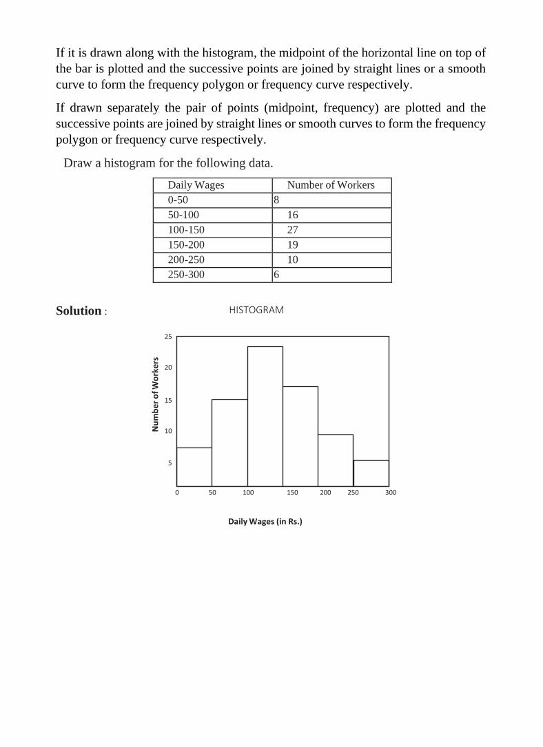
If it is drawn along with the histogram, the midpoint of the horizontal line on top of
the bar is plotted and the successive points are joined by straight lines or a smooth
curve to form the frequency polygon or frequency curve respectively.
If drawn separately the pair of points (midpoint, frequency) are plotted and the
successive points are joined by straight lines or smooth curves to form the frequency
polygon or frequency curve respectively.
Draw a histogram for the following data.
Daily Wages Number of Workers
0-50 8
50-100 16
100-150 27
150-200 19
200-250 10
250-300 6
Solution :
HISTOGRAM
25
20
15
10
5
0 50 100 150 200 250 300
Daily Wages (in Rs.)
Nu
mb
er
of W
ork
ers

For the following data, draw a histogram.
Marks Number of Students
21-30 6
31-40 15
41-50 22
51-60 31
61-70 17
71-80 9
Solution:
For drawing a histogram, the frequency distribution should be continuous. If it is not
continuous, then first make it continuous as follows.
Marks Number of Students
20.5-30.5 6
30.5-40.5 15
40.5-50.5 22
50.5-60.5 31
60.5-70.5 17
70.5-80.5 9
Draw a histogram for the following data.
Profits
(in lakhs)
Number of
Companies
0-10 4
10-20 12
20-30 24
30-50 32
50-80 18
80-90 9
90-100 3

Solution:
When the class intervals are unequal, a correction for unequal class
intervals must be made. The frequencies are adjusted as follows: The frequency of
the class 30-50 shall be divided by two since the class interval is in double. Similarly
the class interval 50- 80 can be divided by
3. Then draw the histogram.
Now we rewrite the frequency table as follows.
Profits
(in lakhs)
Number of
Companies
0-10 4
10-20 12
20-30 24
30-40 16
40-50 16
50-60 6
60-70 6
70-80 6
80-90 9
90-100 3
HISTOGRAM 30
25
20
15
10
5
0
10 20 30 40 50
60 70 80 90 100
Profit (in Lakhs)
No
. of
Co
mp
anie
s

Frequency Polygon:
If we mark the midpoints of the top horizontal sides of the rectangles in a
histogram and join them by a straight line, the figure so formed is called a
Frequency Polygon. This is done under the assumption that the frequencies in a
class interval are evenly distributed throughout the class. The area of the polygon
is equal to the area of the histogram, because the area left outside is just equal to
the area included in it.
Example :
Draw a frequency polygon for the following data.
Weight (in kg) Number of Students
30-35 4
35-40 7
40-45 10
45-50 18
50-55 14
55-60 8
60-65 3
FREQUENCY POLYGON
20
18
16
14
12
10
8
6
0
30 35 40 45 50 55 60 65 70
Weight (in kgs)
Nu
mb
er
of
Stu
de
nts

Frequency Curve:
If the middle point of the upper boundaries of the rectangles of a histogram
is corrected by a smooth freehand curve, then that diagram is called frequency
curve. The curve should begin and end at the base line.
Draw a frequency curve for the following data.
Monthly Wages
(in Rs.)
No. of family
0-1000 21
1000-2000 35
2000-3000 56
3000-4000 74
4000-5000 63
5000-6000 40
6000-7000 29
7000-8000 14
Solution :
80
FREQUENCY CURVE
70
60
50
40
30
20
1000 2000 3000 4000
5000 6000 7000 8000
No
. of
Fam
ily
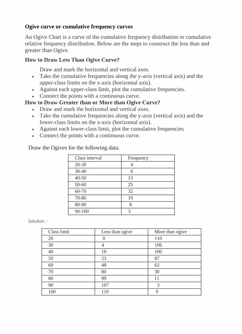
Ogive curve or cumulative frequency curves
An Ogive Chart is a curve of the cumulative frequency distribution or cumulative
relative frequency distribution. Below are the steps to construct the less than and
greater than Ogive.
How to Draw Less Than Ogive Curve?
Draw and mark the horizontal and vertical axes.
• Take the cumulative frequencies along the y-axis (vertical axis) and the
upper-class limits on the x-axis (horizontal axis).
• Against each upper-class limit, plot the cumulative frequencies.
• Connect the points with a continuous curve.
How to Draw Greater than or More than Ogive Curve?
• Draw and mark the horizontal and vertical axes.
• Take the cumulative frequencies along the y-axis (vertical axis) and the
lower-class limits on the x-axis (horizontal axis).
• Against each lower-class limit, plot the cumulative frequencies
• Connect the points with a continuous curve.
Draw the Ogives for the following data.
Class interval Frequency
20-30 4
30-40 6
40-50 13
50-60 25
60-70 32
70-80 19
80-90 8
90-100 3
Solution :
Class limit Less than ogive More than ogive
20 0 110
30 4 106
40 10 100
50 23 87
60 48 62
70 80 30
80 99 11
90 107 3
100 110 0

Ogives
Y
120
110
100
90
80
70
60
50
40
30
0
x axis 1 cm = 10 units
y axis 1 cm = 10 units
X
20 30 40 50 60 70 80 90 100
Class limit
Uses of Ogive Curve
Ogive Graph or the cumulative frequency graphs are used to find the median of the
given set of data. If both, less than and greater than, cumulative frequency curve is
drawn on the same graph, we can easily find the median value. The point in which,
both the curve intersects, corresponding to the x-axis, gives the median
value. Apart from finding the medians, Ogives are used in computing the
percentiles of the data set values.
Cu
mu
lati
ve fr
eq
ue
ncy