ClearView: An Interactive Context Preserving Hotspot Visualization Technique
Upload
khangminh22Category
view
0download
0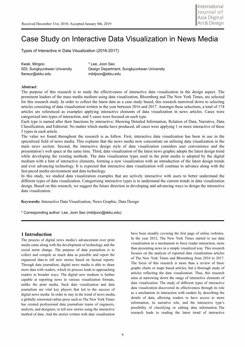
Case Study on Interactive Data Visualization in News Media Types of Interactive in Data Visualization (2016-2017)
Kwak, Mingoo * Lee, Joon Seo SDI, Sungkyunkwan University Design Department, Sungkyunkwan University [email protected] [email protected]
Abstract The purpose of this research is to study the effectiveness of interactive data visualization in the design aspect. The prominent leaders of the mass media medium using data visualization, Bloomberg and The New York Times, are selected for this research study. In order to collect the latest data as a case study based, this research narrowed down to selecting articles consisting of data visualization written in the year between 2016 and 2017. Amongst these selections, a total of 174 articles are referenced as examples applying interactive elements of data visualization in news articles. Cases were categorized into types of interaction, and 5 cases were focused on each type. Each type is named after their functions by interactive; Showing Detailed Information, Relation of Data, Narrative, Data Classification, and Editorial. No matter which media have produced, all cases were applying 1 or more interactive of these 5 types in each article. The value we found throughout the research is as follow. First, interactive data visualization has been in use in the specialized field of news media. This explains that the news media now concentrate on utilizing data visualization in the main news section. Second, the interactive design style of data visualization considers user convenience and the presentation’s web space at the same time. Third, data visualization of the latest news graphic adopts the latest design trend while developing the existing methods. The data visualization types used in the print media is adopted by the digital medium with a hint of interactive elements, forming a new visualization with an introduction of the latest design trends and ever advancing technology. It is expected that interactive data visualization will continue to advance along with the fast-paced media environment and data technology. In this study, we studied data visualization examples that are actively interactive with users to better understand the different types of data visualization. Categorizing interactive types is to understand the current trends in data visualization design. Based on this research, we suggest the future direction in developing and advancing ways to design the interactive data visualization.
Keywords: Interactive Data Visualization, News Graphic, Data Design
* Corresponding author: Lee, Joon Seo ([email protected])
1 Introduction The process of digital news media’s advancement over print media came along with the development of technology and the social norm change. The purpose of data journalism is to collect and compile as much data as possible and report the organized data to tell new stories based on factual reports. Through data journalism, digital news media is able to share more data with readers, which its process leads to approaching readers in broader ways. The digital new medium is further capable at reporting news in various visualization formats, unlike the print media. Such data visualization and data journalism are vital key players that led to the success of digital news media. In order to stay in the trend of news media, a globally renowned online press such as The New York Times has created professional data journalism teams of engineers, analysts, and designers, to tell new stories using the interactive method of data. And the stories written with data visualization
have been steadily covering the first page of online websites. In the year 2012, The New York Times started to use data visualization as a mechanism to force reader interaction, more than presenting news in a simple visualized way. This research focuses on the analysis of reported data visualization articles of The New York Times and Bloomberg from 2016 to 2017. The focus of this research is more than a review of basic graphs charts or maps based articles, but a thorough study of articles reflecting the data visualization. Thus, this research aims at narrowing down the range of interactive elements of data visualization. The study of different types of interactive data visualization discovered its effectiveness through its role as a mechanism in interaction with readers by describing the details of data, allowing readers to have access to more information, its narrative role, and the interactive type’s possibility of classifying or editing data information. The research leads to reading the latest trend of interactive
9
Received December 31st, 2018; Accepted January 8th, 2019
mechanism of data visualization based on the analysis of existing examples. Finally, the research will approach the possibility of expanding the use of data visualization in the entire new reporting system and suggest the direction to the future development of data visualization. 2 Theoretical Background 2.1 Data Visualization The data visualization serves as a purpose in translating the data information of the content’s details and the main message. Many studies have initiated different approach of interpreting and categorizing the existing terms such as an infographic, data visualization, and information design, but still remain in the grey area in explaining the concept. Data visualization is generally used to communicate the information most effectively by using graphic elements to transform data into information. [1] The goal of data visualization is the following: 1. To communicate the collected data most effectively to readers; the method is to communicate new insights more than conveying the basic information to users 2. To support a proposed theory or predict the outcome of a hypothesis by visualizing the calculated data. 3. To work as a supporting resource or provide visual examples as solutions to be considered to issues arise. In today’s generation of overloaded data in different areas of those calculated and still counting to be discovered, the collected data must be accurately reflecting the context of the data, in order to force valuable information. It is necessary to collect the data within the boundary of its context. Understanding the context will help the collected data to be transmitted to readers as more than just simple information. The interaction will allow the audience to have new perception and insight, thus data and information expected to create a new pattern of reading data visualization. Data visualization have been studied by experts of design or engineering who works for news media. Studies mainly point graphic design or data analyzing, which are how to show the data better. Dona M. Wong, the author of <Guide to Information Graphics> [2], guide us on how to present the data, facts, and figures according to graphic design. Such as how to use typography, color, and chart. This research focuses on the interactives of data visualization. How those interactions work and contribute to present data visualization. 2.2 Interactive News Graphic The development of internet media and digital technology has led to an increase in demand of internet newspapers and the decrease of subscription numbers of printed news was inevitable. Such changes in news media allowed positive transformation: the surpass of print media’s limitation from relying solely on text and photos in news stories to reaching the possibility of conveying the significance of the story to readers by adding videos and motion graphics. [3] The advancement of digital new media allowed enough room for data visualization to play a key role in news services. Today,
the multimedia ground has expanded the tool usage by adding a graphic, video, and sound. And interactive elements are used as a method of placing data visualization more effectively online based on the information to be collected. The interactive infographic is a new paradigm in interactive visualization method, which serves to be used as a method to communicate with users and to produce new results and even manipulate contents. Moreover, wireless Internet devices such as smartphone or tablet can allow full access to these contents anywhere. Many recent studies have been emphasizing the importance of interactive infographic research, including its effectiveness of interaction with information and users. [4] 3 Analysis of Interactive Data Visualization Cases 3.1 Research Method This research study selected globally renowned news media that are forward in producing data visualization articles to better understand different types of interactive data visualization. Articles published in the year between 2016 and 2017 used as a reference in supporting resources. The New York Times and Bloomberg articles are selected based on the following factors: 1. The news media must have a team dedicated to creating data visualization. 2. The new media must be an international online newspaper company providing services to more than two countries. 3. The news media must have published more than ten articles containing interactive data visualization between the years of 2016 and 2017. The different types of interactive methods are categorized by the function of interaction in the data visualization. (See Table 1)
Table 1 Interaction Types
Types of Interaction by Function
Showing Detailed Information
Relation of Data
Narrative
Data Classification
Edit Data
The selection of articles used in the categorization of the interaction types is referred to as The New York Times categorization. <The Year in Visual Stories and Graphics> [5] and <Upshot> [6] sections of the entire visualization articles are sorted annually. <2016 in Graphics> [7] and <2017 in Graphics> [8] were the pages of Bloomberg annually archive their data visualization. The task of categorizing the interaction types is based on whether the interaction between the user and the data visualization is effective or not. Amongst the interactive data visualization articles covered by The New York Times, the articles only referencing URL links connecting users to external pages have been excluded in this study. The research found that the interactive data visualization produced by The New York Times appear to be in five categories of interactive
10
types. Many of the selected visualizations were designed with more than two types in the chart above. Blooming was also found to be using the same interactive methods when describing data visualization. And the interactive functions are selected after an evaluation based on the following questions: 1. Are the details portrayed in the data visualized using user interaction? 2. Are the interactive elements used in data visualization explaining the correlations between information and data? 3. Is the narrative of the news article with data visualization using the interactive method? 4. Can user sort or edit the information within data visualization provided? 3.2 Cases by Interaction Design Type 3.2.1 Showing Detailed Information The following example shows the details used to view the data by having users hover or click the pointer over its visualization area. The creator’s intention in this certain type of design is giving users permission to have access to reviewing detailed information, name, category, and etc. This design’s details can be helpful in solving layout problems that come along with the limited web page space but with mass details to input. This interactive type also allows designers to overcome space limitations on the web page and sketch an efficient deployment. In other words, more data can exist within the same sized space when using this type of design. In addition, the approach that allows users to move the pointer on visualized shapes or charts to view the desired details will gain user’s attention without losing their interest of article.
Table 2 Case 1: Showing Detailed Information in Chart
How Far Is Europe Swinging to the Right? [9]
Before Interaction
After Interaction
News Section International
Visualization Type Chart - Graph
Data Type Category, Figure, Time
Interaction Description
Mouse Over > Detailed
Information
(a)As the pointer moves, it shows the detailed information of specific data in the chart. Which are a political party, electoral gains, and year.
Visualization Design
Separating categories with colors / Arrayed from left to right in time order / Showing detailed information by interaction
Content of Visualization
Finding a connection between immigrant crisis issue and right centered parties electoral gain in Europe.
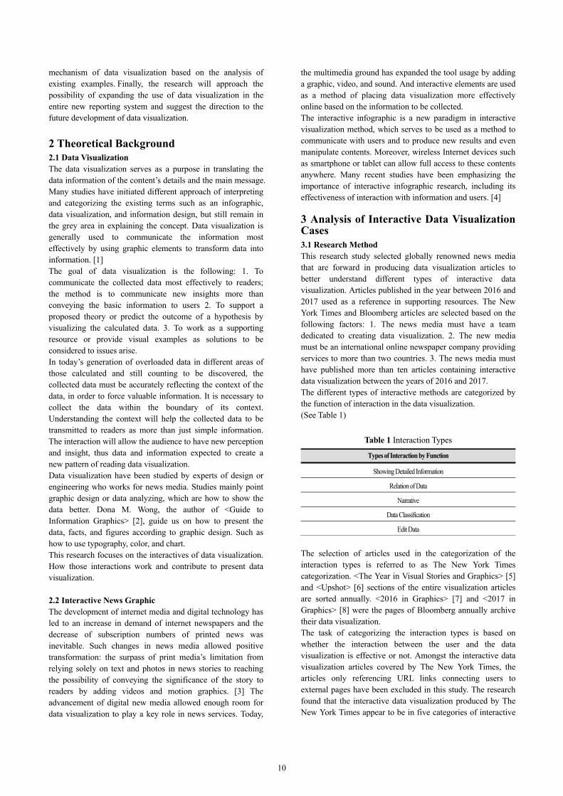
3.2.1 Relation of Data The following data interactive method allows users to have access to specific graphic through mouse-over or clicks. When users move the mouse pointer and drag over (or clicks) to a triggered visualized shape, the graphic is then activated. On the other hand, when the users are out of range, the graphic is deactivated. The activated graphic represents the correlation between data and information, which is designed for users to recognize the significance of this visualization of the data. This type of interactive data method helps users to understand when the visualized data is physically distant or irregularly blended. The graphic elements represented in this type are designed with changes of colors, increased brightness, and the type of graphic activation. This certain type can be found in complex visualization examples including numerous numbers in data charts, or in examples displaying categories with visualized shapes scattered in charts.
Table 3 Case 2: Relation of Data in Chart
Money Race and Success: How Your School District Compares [10]
Before Interaction
11
Received December 31st, 2018; Accepted January 8th, 2019

After Interaction
News Section Society
Visualization Type Chart – Graph & Shape
Data Type Category, Figure
Interaction Description
Mouse Over >
Relation of Data and Detailed
Information
(a) As the pointer locates in the visualization, a
graphic appears in line to show same area's data
separated by skin color
(b)Detailed information of visualization,
showing location and academic scores of each
skin color
Visualization Design
Separating categories with colors / Marks at the axis of the chart to show the section of figure value / Showing district and
detailed information by interaction
Content of Visualization
Proposing the racial achievement gap exists, influenced by wealth and race in the US.
3.2.3 Narrative The narrative type is using motion activation as users scroll the webpage. The visualized data used in this method’s motion movement is intended to have readers focus on the correlations of the data and the contents of the article. Even if the readers do not read the contents of the article, this style of visualization is designed with the intention to guide readers narratively. The narrative interaction type is used when a sequential approach is needed to help users understand the content thoroughly or by steps or by the time sequence in which the events occur. The sequential approach can enhance the narrative of the story being covered and it is found to be user friendly. This interactive type is designed to show sequential visualization according to the contents of the article, for users to operate, hence for the mechanism to narrate the contents itself.
Table 4 Case 3: Narrative designed through interaction
Donald Trump Will See You in Court [11]
↓
↓
↓
↓
↓
12
↓
News Section Politic
Visualization Type Chart - Shape
Interaction Type Category, Figure
Interaction Description
Scroll > Motion > Narrative
Specific data visualization appears through the motion based on the
content of the article.
Mouse Over > Detailed
Information
(a)A shape means each case. When pointer locates a shape, detailed
information about the case shows.
Click > Data Classification
(b)By clicking the category of the cases, changes visualization based on
a user's classification.
Visualization Design
Category separation with text and colors / Number of shape to express the figure data / Sequential
communication and classification of data through interaction
Content of Visualization
Organized the law cases related to President Trump to show which case are involved rather sued or be sued
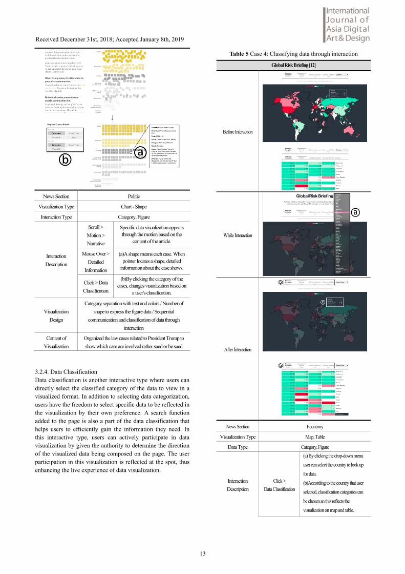
3.2.4. Data Classification Data classification is another interactive type where users can directly select the classified category of the data to view in a visualized format. In addition to selecting data categorization, users have the freedom to select specific data to be reflected in the visualization by their own preference. A search function added to the page is also a part of the data classification that helps users to efficiently gain the information they need. In this interactive type, users can actively participate in data visualization by given the authority to determine the direction of the visualized data being composed on the page. The user participation in this visualization is reflected at the spot, thus enhancing the live experience of data visualization.
Table 5 Case 4: Classifying data through interaction
Global Risk Briefing [12]
Before Interaction
While Interaction
After Interaction
News Section Economy
Visualization Type Map, Table
Data Type Category, Figure
Interaction Description
Click > Data Classification
(a) By clicking the drop-down menu
user can select the country to look up
for data.
(b)According to the country that user
selected, classification categories can
be chosen an this reflects the
visualization on map and table.
13
Received December 31st, 2018; Accepted January 8th, 2019

Mouse Over > Detailed
Information
(c)As pointer locates on a specific
country on a map, can be accessed to
detailed information.
Visualization Design
Separating categories with colors / Marks at the axis of the chart to show a section of figure value / Showing district and detailed
information by interaction
Content of Visualization
Proposing the racial achievement gap exists, influenced by wealth and race in the US.
3.2.5. Editorial The editorial interactive type is permitting the users to change the data used for visualization. Once users change the data in this interactive type, the result is visualized according to the changes in the related data materials. The numbers of algorithms or the design possibilities operate the edition of the data, leading to the visualization change as a result of the edit of the data.
Table 6 Case 5: Visualization reflecting user edited data
The Cold Hard Math of How Trump Can Win, and How Rubio Can Stop Him [13]
Before Interaction
After Interaction
News Section Politic
Visualization Type Chart - Graph
Data Type Category, Figure, Time
Interaction Description
Drag > Data Classification
(a)The electoral gain of Republican
Party candidates can be changed.
(b)Edit the date of adjusted approval
rate that user changed
Click > Data Classification
(c)Select the scenario among 6
Visualization Design
Separating categories with colors / Displaying the States from left to right according to the election date / Edit data through
interaction
Content of Visualization
Predicted the electoral gain of presidential candidates of Republican Party. A user can change the expected electoral gain
in the specific date to see the expected result visualized.
3.3 Analysis by News Section The New York Times and Bloomberg have been compared in this study in the use of common article section and the integrative types used to write the section. The research found that both news media utilized data visualization in the main news section of high interest of their readers. Bloomberg produced the most interactive data visualizations in the economy section, with the news stories centered in the main page under the economy section. On the contrary, The New York Times produced the most data visualization articles in the politics section, with political articles regarding the own state’s political issues.
Both Bloomberg and The New York Times commonly focused on the use of interactive data visualization in articles regarding politics, compared to other news sections, provoking a question to the news media’s intention of correlating data details to the politic section specifically. The articles regarding politics produced in 2016 were more prominent due to the US presidential election taking in place. A thorough review of the different types of interactive type showed that the high numbers of 35 data interactive designs were expressed in visualization. 3.4 Analysis of Interactive Type In this research study, five different interactive types have been reviewed and classified according to the functional role of interaction expressed between data visualization and users. The research found that typically one data visualization practice using either one interactive type or using several at the same.
Figure 1 Interactive data visualization usage by news section
Figure 2 Usage of interaction types by media
14
Both Bloomberg and The New York Times have shown high usage of the type, “Showing Detailed Information”. The main characteristic of this type is to show as many details as possible using the user interaction, and in fact, shown to be sharing more information despite the limited space. The users can have access to all the details through the interaction with the design, even without the creator having to list out all data visually. This lets users focus solely on the image without the help of text, thereby having a full access to the desired information. The mouse-over interactive motion, intended to disclose the details only during an interaction, is an example of the trend transformation since the times of “flash” used in a webpage. The Showing Detailed Information interactive type is most frequently used by data visualization creators. This explains that the efficiency of utilizing space and the user-friendly interactive type are considered to be important details to be reviewed when selecting the type of interactive design. Also, the Relations of Data and Data Classification types are both found to be effective when used in the similar context as Showing Detailed Information type. The Narrative type rose to popularity most recently compared to the other interactive types. The Narrative type uses Parallax Scrolling, a method used to interact through the scrolling motion of the webpage. Parallax Scrolling has become one of the latest trends in web design, as it has frequently appeared on many websites nowadays. Through this interactive type, we can see that the news graphic and the data visualization strive to change by adapting to the latest web design trend. The Editorial is the type where users can interact with visualization the most. However, this type is least likely to be produced due to the complexity of the visualization scenario and algorithm design. 4 Conclusion The Chief Creative Officer of Argodesign, Mark Rolston, wrote in Wired, <The Next Era of Designers Will Use Data As Their Medium>, and he mentioned: "data designers will play the most important and creative role within the next five years”. Data has been produced continuously in the past years until today’s modern society, and it is a tool used to help us with an objective perspective in many different parts of our lives. Data is produced in various fields, including but not limited to people's movement routines, patterns of consumption, communication, and etc. In addition, created data plays the role of the medium as a resource to a quality lifestyle in various services, such as an advertisement, news, car navigation, and social network services. The research provides no doubt in the significance of data visualization that must be emphasized. The digital news media is the most attractive platform for data visualization to exist in the account as medium expected to deliver accurate news and the role as a data channel to the public. The news media is taking the lead in the field of data visualization by highly influencing the public users interactively within the web page space. The news media use data visualization as a tool to deliver accurate information and facts to readers. This is also a strategy to promote the press itself as the superior
informational service where high competition exists in the news media industry. The fundamental purpose of data visualization is to provide data and information with epistemic value. The designers visualize data using shapes, movements, and text to achieve the goal of the contents intuitively and effectively. In order to visualize data that meets the purpose and to influence users with insights, it is necessary for the makers to understand the current trends and strive in forwarding thinking designs. This research study draws the following conclusion based on the interactive data visualization types studied from the world leading new media companies. First, interactive data visualization has become a key player in leading news companies in a wild competitive industry, with increased utilization in special sections of the news. Bloomberg used interactive data visualization the most in the economy section, and The New York Times used it the most in politics especially during the time of the presidential election. By deploying the interactive data visualization in the popular story section, there are more chances of readers being exposed to data visualization and the high probability of interaction. When data visualization reaches users interactively, the user then leaves the information page with a satisfaction of gaining the information and knowledge they needed. This supports the news media’s effort in competition with other news media in gaining more readers, using the interactive strategy to focus data visualization on their main news field. Second, the interactive design of data visualization considers user convenience and web space utilization at the same time. In the case analysis, most of the interactive functions were Showing Detailed Information, Relation of Data and Data Classification. These examples have shown to open the possibility of creators to take the full advantage of the limited space available on web pages. Interaction with the user in visualization is often provided through clicks and mouse over. The most graphic expression of the interactive types is commonly used on the web and is familiar to users, thereby no further direction should be mentioned by the providers. Third, data visualization of the latest graphics news reflects data technology and design trend while enhancing the details of existing methods. The type of visualization that has been transformed since the time of press media is the addition of interactive elements. And at the same time, new types of visualization have been evolving along with advanced technology and innovative trends. Visualization methods have begun to produce text visualizations in the benefit of big data technology such as text crawling. The Narrative type emerged by applying technology, parallax scrolling, recognized as a new trend in web design. The new approach to data visualization and the emergence of interactive design in graphic news are expected to be a firm ground to develop compelling data visualization in the future. Interactive data visualization can be expected to evolve organically along with the changes in the media industry and the growth of data technology. Among the interactive types in this study, the Editorial type is most familiarly interactive with users. But the number of examples is low due to its complicated production process. Once the related technology
15
Received December 31st, 2018; Accepted January 8th, 2019
involved in the creation process is improved, an increase in the production of this interactive type example is expected. In the news industry, the media companies struggle to maintain a positive reputation of their brand to encourage users to revisit the website. It is necessary to keep updated with continuous changes of media trends and data related technology. The user’s knowledge obtaining process through data visualization happens interactively intuitive and flexible. A thorough research in this study and the navigation to its effectiveness as outcomes contributes to raising awareness different styles used to cover news stories in media. The limitation of this study and possible further research is the following: The study was centered on data visualization produced in 2016 and 2017 by the global digital news media. The global news media, <Guardian>, <Wall Street Journal> and <Washington Post>, those press companies that have a specialized data visualization team are not included in this study. This is because the three news companies released less than one interactive data visualization article, in a monthly span. Also, the selected media for the study, <Bloomberg> and <The New York Times> provide articles covering stories within the United States of America. This means that once the production of interactive data visualization articles increases in the future, more case studies including new types are needed. Based on the results of this study, we suggest the following improvement and issues be resolved in the preparation of the advanced development of interactive data visualization field. First, in order to communicate data interactively effective, detailed research on existing data visualization and its interactive types suitable for different types of data are recommended. Second, it is necessary to study how interactive media visualization is designed with various devices like tablet and mobile phone. A research focused on a thorough review of the latest trends in the use of new devices can help to determine an appropriate and effective approach of interactive types. Third, the current trend of another industry applying data visualization can be analyzed and compared to existing types practiced in graphic news. Another example of data visualization being applied in a different field is annual reports by corporations. Third, a research to increase epistemic value to news media users as a service is needed. The impression of news media will be determined by the epistemic experience and attainment of information by users. References [1] Kim, H., Expression Methods and Delivery Effectiveness of Infographics in Internet News, Yonsei University, 2016. [2] Dona M. Wong, The Wall Street Journal Guide to Information Graphics: Dos and Don’ts of Presenting Data, Facts, ad Figures, W. W. Norton & Company, 2013.
[3] Park, K., Chon, B., A Comparative Study on Interactive News between the NYT and the Guardian, Korean Society For Journalism And Communication Studies, Vol. 59, No.5, pp.96-120, 2015. [4] Kim M., Jung, H., A Case Study on Visual Expression through Interaction with Information Types, The Korean Society Of Design Culture, Vol. 20, No.1, pp.145-158, 2014. [5] The New York Times Company. (2016, December 28). 2016: The Year in Visual Stories and Graphics. Retrieved from https://www.nytimes.com/interactive/2016/12/28/us/year-in-interactive-graphics.html The New York Times Company. (2017, December 21). 2017: The Year in Visual Stories and Graphics. Retrieved from https://www.nytimes.com/interactive/2017/12/21/us/2017-year-in-graphics.html [6] The New York Times Company. (2018, January 1). Upshot. Retrieved from https://www.nytimes.com/section/upshot [7] The Bloomberg Graphics Team. (2017, January 11). 2016 in Graphics. Retrieved from https://www.bloomberg.com/graphics/2016-in-graphics/ [8] The Bloomberg Graphics Team. (2017, December 29). 2017 in Graphics. Retrieved from https://www.bloomberg.com/graphics/2017-in-graphics/ [9] Gregor Aisch, Adam Pearce, Bryant Rousseau. (2017, October 23). How Far Is Europe Swinging to the Right? Retrieved from https://www.nytimes.com/interactive/2016/05/22/world/europe/europe-right-wing-austria-hungary.html [10] Motoko Rich, Amanda Cox, Matthew Bloch. (2016, April 29). Money, Race and Success: How your School District Compares. Retrieved from https://www.nytimes.com/interactive/2016/04/29/upshot/money-race-and-success-how-your-school-district-compares.html [11] Chris Dolmetsch, Sophia Pearson, Bob Van Voris, Dawn McCarty, Susannah Nesmith, Janan Hanna, Alex Tribou, Blacki Migliozzi, Jeremy Scott Diamond. (2016, April 25). Donald Trump Will See You in Court. Retrieved from https://www.bloomberg.com/graphics/2016-trump-lawsuits/ [12] James Crombie, Jeremy Scott Diamond, Dean Halford, Brittany Harris, Flavia Krause-Jackson, Alex McIntyre and Mira Rojanasakul. (2017, January 16). Global Risk Briefing. Retrieved from https://www.bloomberg.com/graphics/global-risk-briefing/ [13] Gregor Aisch, Josh Katz, Larry Buchanan, Nate Cohn. (2016, February 26). The Cold Hard Math of How Trump Can Win, and How Rubio Can Stop Him. Retrieved from https://www.nytimes.com/interactive/2016/02/27/upshot/republican-delegate-calculator-how-trump-can-win.html
16
Copyright © 2022 FDOKUMEN