
BBCi brand guidelines DRAFT version Contents
15
BBCi brand guidelines DRAFT version 2.2 April 21st 2005
-
Upload
fam-ulusiada -
Category
Documents
-
view
0 -
download
0
Transcript of BBCi brand guidelines DRAFT version Contents

BBCi brand guidelinesDRAFT version 2.2April 21st 2005
Con
tent
s1 THE BBCi BRANDIntroductionBBCi values
2 BRAND ELEMENTSBBCi logotype Reproducing the logotype in CclourReproducing the logotype in black and whiteLogotype artworkSingle colour logoLogotype exclusion zoneLogotype minimum size Backgrounds/propertiesIncorrect usage - what not to do with the logotypePrimary colour paletteTypeface
1 The BBCi brandIntroductionBBCi values
1 T
he B
BCi B
rand
These guidelines describe the basic rules of designing with/reproducing the
BBCi brand identity. In order to gain maximum benefi t from these
guidelines they must be used consistently, as even small variations will
undermine the impact of the BBCi brand identity.
Introduction
1 T
he B
BCi B
rand
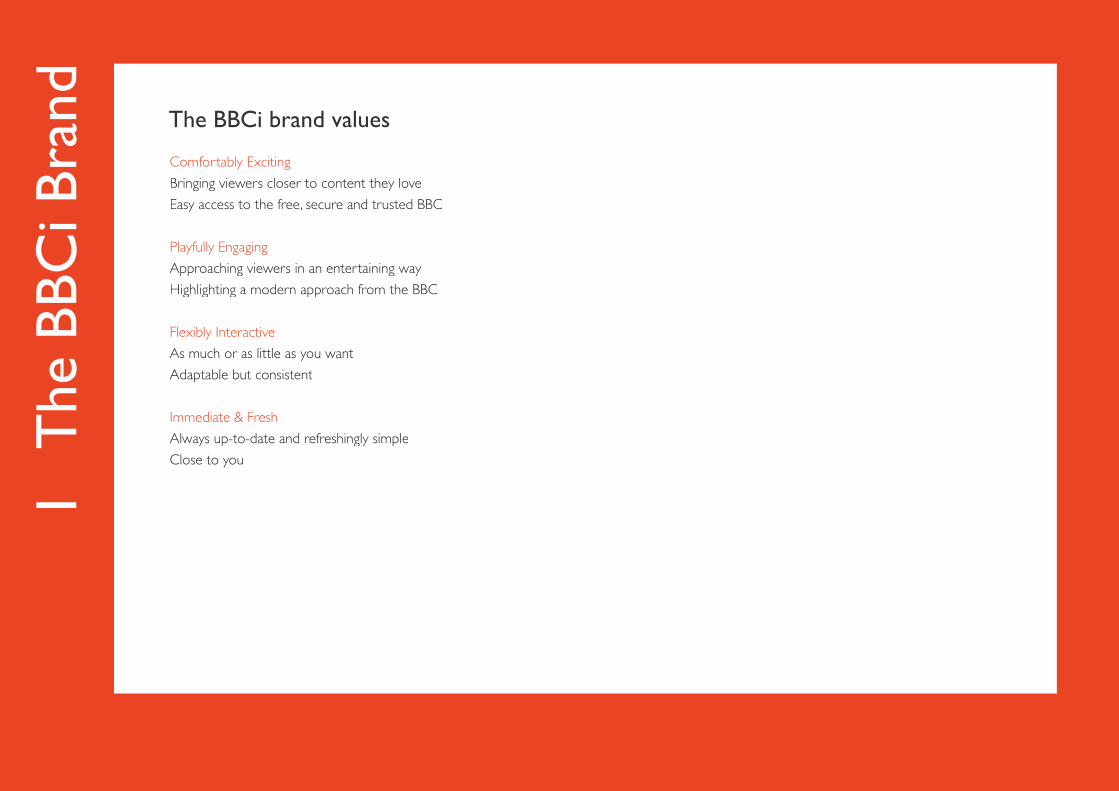
Comfortably Exciting
Bringing viewers closer to content they love
Easy access to the free, secure and trusted BBC
Playfully Engaging
Approaching viewers in an entertaining way
Highlighting a modern approach from the BBC
Flexibly Interactive
As much or as little as you want
Adaptable but consistent
Immediate & Fresh
Always up-to-date and refreshingly simple
Close to you
The BBCi brand values
2 Brand ElementsBBCi logotype Reproducing the logotype in colourReproducing the logotype in black and whiteLogotype artworkSingle colour logoLogotype exclusion zoneLogotype minimum size Backgrounds/propertiesIncorrect usage - what not to do with the logotypePrimary colour paletteTypeface
2 B
rand
Ele
men
ts
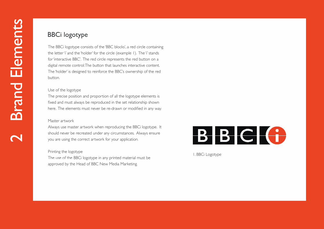
The BBCi logotype consists of the ‘BBC blocks’, a red circle containing
the letter ‘i’ and the ‘holder’ for the circle (example 1). The ‘i’ stands
for ‘interactive BBC’. The red circle represents the red button on a
digital remote control: The button that launches interactive content.
The ‘holder’ is designed to reinforce the BBC’s ownership of the red
button.
Use of the logotype
The precise position and proportion of all the logotype elements is
fi xed and must always be reproduced in the set relationship shown
here. The elements must never be re-drawn or modifi ed in any way.
Master artwork
Always use master artwork when reproducing the BBCi logotype. It
should never be recreated under any circumstances. Always ensure
you are using the correct artwork for your application.
Printing the logotype
The use of the BBCi logotype in any printed material must be
approved by the Head of BBC New Media Marketing.
BBCi logotype
1. BBCi Logotype

2 B
rand
Ele
men
ts
Where possible, the BBCi logotype should be displayed on a fl at
white background (example 2).
The logotype can also be displayed as white reversed out of black
(example 3).
When reproducing the logotype for print, care must be taken to en-
sure that the area surrounding the logotype is tonally even and either
suffi ciently light or suffi ciently dark to ensure the logotype is legible
(example 4).
When using a textured background, the legibility of the logotype is of
paramount importance (example 5).
Extra care should be taken to maintain legibility of the BBCi red when
placing the logotype on a coloured background with a similar hue and
tone (example 6).
Reproducing the logotype in colour
2 3
4 5
6
2 B
rand
Ele
men
ts
7 8
9 10
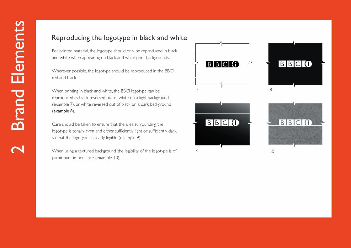
For printed material, the logotype should only be reproduced in black
and white when appearing on black and white print backgrounds.
Wherever possible, the logotype should be reproduced in the BBCi
red and black.
When printing in black and white, the BBCi logotype can be
reproduced as black reversed out of white on a light background
(example 7), or white reversed out of black on a dark background
(example 8).
Care should be taken to ensure that the area surrounding the
logotype is tonally even and either suffi ciently light or suffi ciently dark
so that the logotype is clearly legible (example 9).
When using a textured background, the legibility of the logotype is of
paramount importance (example 10).
Reproducing the logotype in black and white
2 B
rand
Ele
men
ts
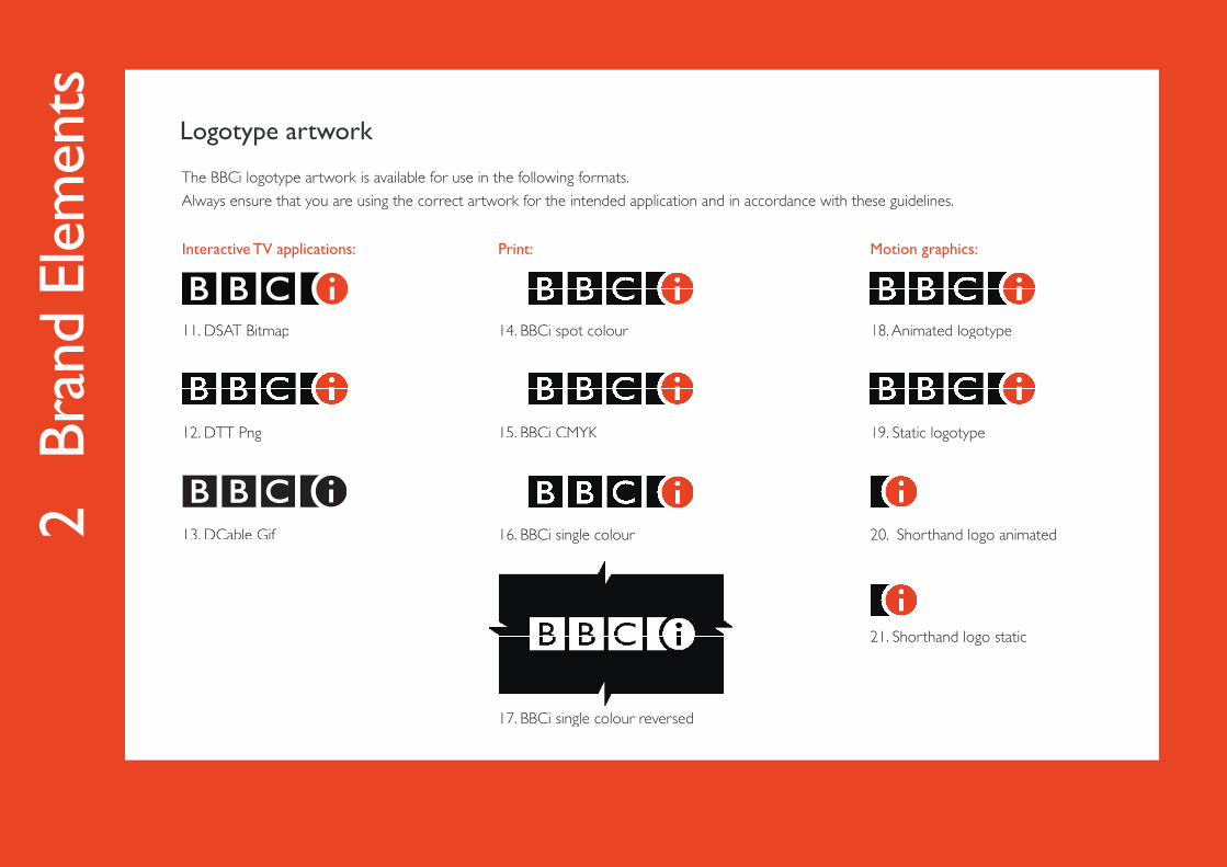
The BBCi logotype artwork is available for use in the following formats.
Always ensure that you are using the correct artwork for the intended application and in accordance with these guidelines.
Interactive TV applications:
11. DSAT Bitmap
12. DTT Png
13. DCable Gif
Logotype artwork
Print:
14. BBCi spot colour
15. BBCi CMYK
16. BBCi single colour
17. BBCi single colour reversed
Motion graphics:
18. Animated logotype
19. Static logotype
20. Shorthand logo animated
21. Shorthand logo static
2 B
rand
Ele
men
ts
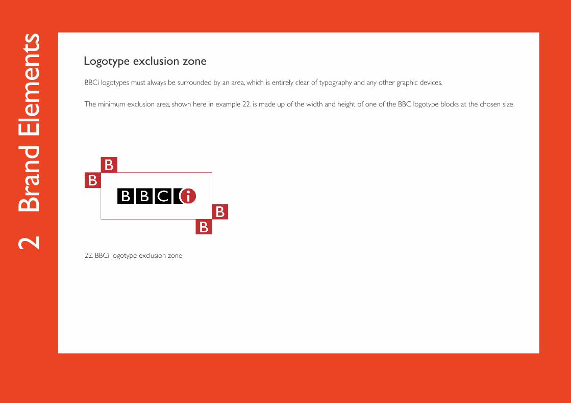
BBCi logotypes must always be surrounded by an area, which is entirely clear of typography and any other graphic devices.
The minimum exclusion area, shown here in example 22, is made up of the width and height of one of the BBC logotype blocks at the chosen size., is made up of the width and height of one of the BBC logotype blocks at the chosen size.,
22. BBCi logotype exclusion zone
Logotype exclusion zone
2 B
rand
Ele
men
ts
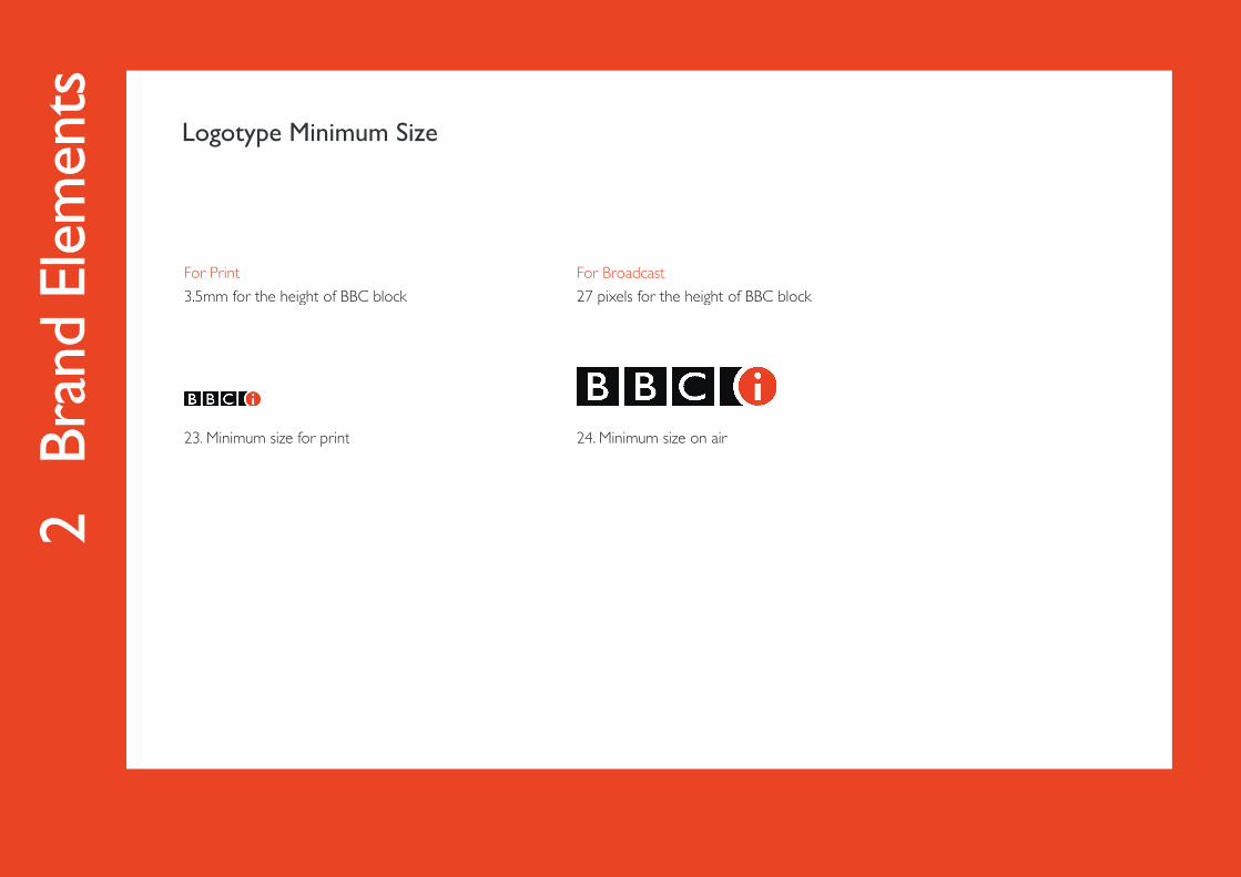
For Print
3.5mm for the height of BBC block
23. Minimum size for print
Logotype Minimum Size
For Broadcast
27 pixels for the height of BBC block
24. Minimum size on air
2 B
rand
Ele
men
ts
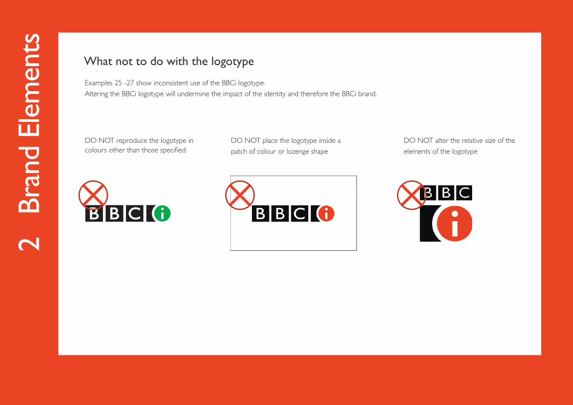
Examples 25 -27 show inconsistent use of the BBCi logotype.
Altering the BBCi logotype will undermine the impact of the identity and therefore the BBCi brand.
DO NOT reproduce the logotype in colours other than those specifi ed
What not to do with the logotype
DO NOT place the logotype inside a
patch of colour or lozenge shape
DO NOT alter the relative size of the
elements of the logotype
2 B
rand
Ele
men
ts
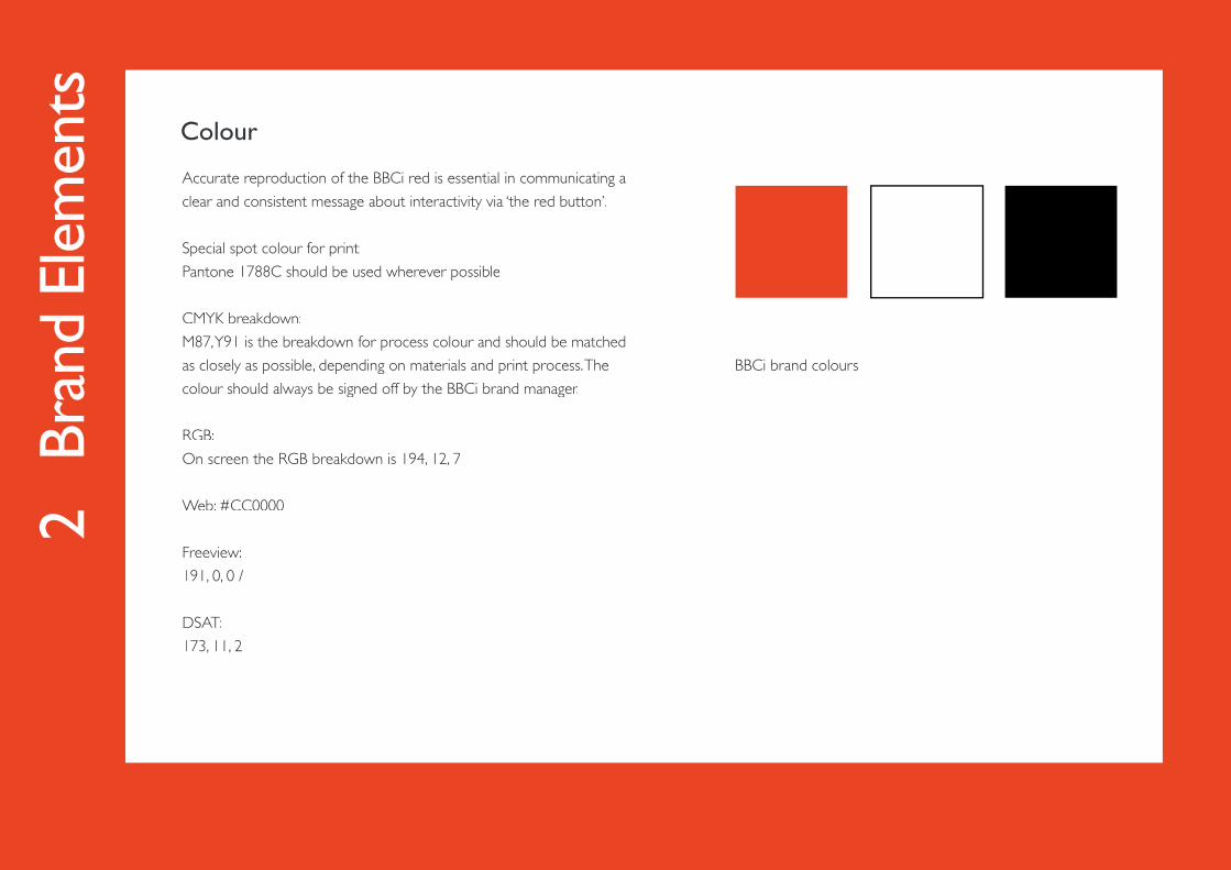
Accurate reproduction of the BBCi red is essential in communicating a
clear and consistent message about interactivity via ‘the red button’.
Special spot colour for print:
Pantone 1788C should be used wherever possible
CMYK breakdown:
M87, Y91 is the breakdown for process colour and should be matched
as closely as possible, depending on materials and print process. The
colour should always be signed off by the BBCi brand manager.
RGB:
On screen the RGB breakdown is 194, 12, 7
Web: #CC0000
Freeview:
191, 0, 0 /
DSAT:
173, 11, 2
BBCi brand colours
Colour
2 B
rand
Ele
men
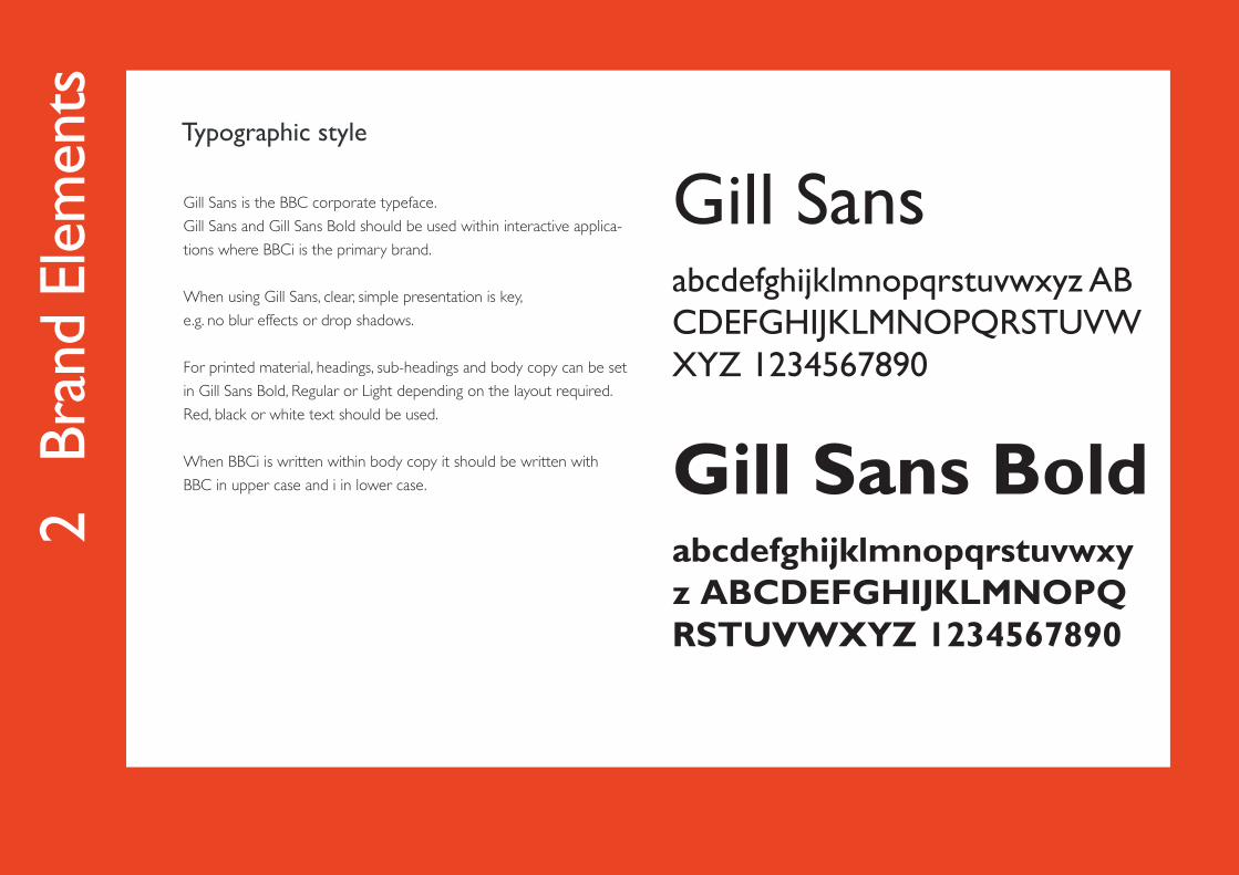
tsTypographic style