Experiential Brand Activation on Customer Brand Trust in ...
Upload
khangminh22Category
view
2download
0
March 2021
Version 1.0
Brand Guidelines

2Brand Guidelines
TOC Introduction Brand Strategy Brand Identity Brand Elements Brand Applications Contact
Introduction 3
System Overview 4
Brand Strategy 5
Brand Idea 6
Emotional Impact 8
Brand Identity 10
Logo Overview 11
Logo Clear Space & Minimum Size 12
Logo Color Variations 13
Logo Background Usage 14
Logo Incorrect Usage 17
File Nomenclature 18
Brand Elements 19
Color Palette 20
Typography 22
Iconography Style 27
Diagram Style 28
Illustration Style 32
Brand Applications 33
Website 34
Swag 35
Presentation Template 36
Poster 37
Out of Home 38
Zoom Background 39
Contact 40

3Brand Guidelines
TOC Introduction Brand Strategy Brand Identity Brand Elements Brand Applications Contact
We have created this document as a guide for anyone writing, designing, or producing Skyflow branded communications. These guidelines will help us capitalize on the brand’s strengths and will serve as a guide to protect the integrity of the brand from incorrect usage.
Inside, you will find an overview of our core design elements and basic rules around how these elements can be applied to various communications. These are the key building blocks of our brand expression. Understanding our brand and using these tools correctly and consistently is crucial.
Introduction

GT Pressura
Cosmica4Brand Guidelines
TOC Introduction Brand Strategy Brand Identity Brand Elements Brand Applications Contact
The Skyflow Brand Identity is optimistic, lively, future-facing, and ever-evolving. It is comprised of the primary elements shown here—logo, color palette, typography, diagrams, illustrations and iconography.
Together these elements form a flexible system for creating stories and experiences that amplify the Skyflow brand and inspire customers, employees, and prospects.
Note: All photography contained in these guidelines is for reference only and may not be used outside of this document unless licensed.
System Overview

Brand Strategy
5Brand Guidelines
TOC Introduction Brand Strategy Brand Identity Brand Elements Brand Applications Contact
Brand Idea 6
Emotional Impact 8
Brand Strategy informs and directs every aspect of brand expression. Alignment around Brand Strategy is key to achieving the greatest impact. What we do, what we say, and how we present ourselves impacts brand perception.

6Brand Guidelines
TOC Introduction Brand Strategy Brand Identity Brand Elements Brand Applications Contact
The Brand Idea is the essence or embodiment of what we stand for. It gives an emotional dimension to the brand. It is used to guide look, feel, and voice.
Brand Idea
No More Either/OrCTOs today face a series of false dichotomies. They’re told they have to pick between privacy or personalization. Secure the data or use the data. Centralized or decentralized. Tackle the big problems or serve up the easy answers. Our view? Never trust anyone who is only giving you two choices. Through zero trust data vaults, Skyflow rejects the binary to wield the best of both worlds: data that is not only fully encrypted and compliant, but provisionable, customizable, governable, and actually usable. Point solutions are band-aids for repairing this or that, but a new, holistic approach is needed if we truly want to solve this problem once and for all. In the privacy data cloud, you no longer have to make deals with your data.

7Brand Guidelines
TOC Introduction Brand Strategy Brand Identity Brand Elements Brand Applications Contact
Brand IdeaTruths
Reject false dichotomies.
Skyflow exists to solve a fundamental problem in a very simple way. Normally, that’s not possible. But Skyflow’s DNA is built on rejecting false dichotomies.
Simple can be radical.
Simplicity isn’t boring—it’s the highest form of sophistication. It can be provocative, confident, and blistering in its clarity.
Make our audience feel at home.We know developers are craftspeople. We know CTOs feel like Sisyphus, endlessly throwing money at point solutions. We have empathy and expertise for solving this pain in a straightforward way.
True security is about flexibility.When data is truly secure, it’s safe to flow, move, and solve new challenges. A vault is not a static thing—insights can vault from team to team, without jeopardizing security or privacy.
Resilience is the best offense.When it comes to brand perception, some things we can control, some things we can’t. We must build a brand that is consistent and resilient enough to endure the tide of any potential misconceptions.
Supporting our Brand Idea are five underpinning truths about Skyflow. When it comes to what we say, how we say it, and how we visually represent ourselves, these are the philosophies that guide us.

8Brand Guidelines
TOC Introduction Brand Strategy Brand Identity Brand Elements Brand Applications Contact
Our Emotional Impact is defined by how the Skyflow Brand makes people feel. It is a set of four positive emotions that drive the behavior of our brand across all experiences and touchpoints.
Emotional Impact
Emotional Impact follows a journey
Skyflow makes people feel
like a peer
Awareness Involvement Increased Engagement
Entrenched Relationship
Skyflow makes people feel
creativeSkyflow makes people feel
this is inevitableSkyflow makes people feel
confident

9Brand Guidelines
TOC Introduction Brand Strategy Brand Identity Brand Elements Brand Applications Contact
Emotional Impact
Skyflow makes people feel like a peer.Our customers are our peers. There’s a shared feeling of respect and understanding. No b.s., no fluff, no trickery. We’re not trying to fool you (and we don’t assume you can be fooled). We understand your pain, and we’ve stripped back everything that isn’t essential to solve that pain. We speak developer, CTO, and can help translate between the two. Partnering with us should feel like whiteboarding a great idea with your smartest friend: clear, unadorned, low-key brilliant.
Skyflow makes people feel confident.At our core, we’re challenging an established paradigm people have about their data, its security, and its capabilities. We want people to feel confident in our abilities to tackle this challenge. We understand that we work with the world’s most-sensitive data. At all times, we should instill trust, credibility, clarity, and certainty.
Skyflow makes people feel this is inevitable.Some solutions are so obvious that they become radical. We want people to say,
“Why hasn’t someone already invented this?” It’s going to be difficult to remember life before this existed. There’s a feeling of enlightenment, of having your eyes opened to the obvious yet radical solution. For the first time in a long time, CTOs can be uncompromising in their technical vision. No more trade-offs between security and freedom.
Skyflow makes people feel creative.Too often, developers are regarded as strictly rational. But when information is secure and usable, developers are free to craft stories and insights from their data. Within the protective overhead of an enterprise, developers are given an environment that feels like a startup— a place to safely experiment and innovate with data. A “vault” sounds like a static thing, but with Skyflow, insights can vault from team to team. It’s security and creativity in one movement.

Brand Identity
10Brand Guidelines
TOC Introduction Brand Strategy Brand Identity Brand Elements Brand Applications Contact
Logo Overview 11
Logo Clear Space & Minimum Size 12
Logo Color Variations 13
Logo Background Usage 14
Logo Incorrect Usage 17
File Nomenclature 18
The Skyflow identity is the visual manifestation of the brand idea No More Either/Or. As such, it is vital to implement all aspects of the Brand Identity in a consistent and thoughtful manner.

11Brand Guidelines
TOC Introduction Brand Strategy Brand Identity Brand Elements Brand Applications Contact
The Skyflow logo employs custom letterforms and optimized letter spacing to convey the creative and collaborative spirit of the company and its products.
Angles within the logo sweep skyward, left to right, and are formally unified to evoke the uplifting liberation of not only securing but using data—no more either/or.
The tangents and flow between letterforms symbolize partnerships and seamless collaboration, an expression of Skyflow’s zero-trust data security integration into any workflow.
Note: The Skyflow logo is custom drawn. Do not recreate it or its elements. Always use the supplied artwork.
Logo Overview
Collaboration
Partnership
Seamlessness
Flexibility
Upward
Secure
Structured
Technical
Optimistic
Creative
Eyes to the Future
Unexpected

12Brand Guidelines
TOC Introduction Brand Strategy Brand Identity Brand Elements Brand Applications Contact
The Skyflow logo must appear clearly and legibly in all applications.
Clear SpaceClear space is the area surrounding the entire logo. It must be kept free of any visual elements, including text, graphics, borders, patterns, and other logos.
Clear space is measured in relation to “X,” which equals the x-height of the logo. Minimum clear space should be equal to or greater than 0.5X on all four sides of the logo.
Minimum SizeThe minimum size is the smallest the logo may appear without compromising legibility. The exhibit shown to the right indicates the recommended minimum sizes for both digital and print applications.
Consult Marketing for guidance and approval should an application of the logo require it to be scaled smaller than the recommended minimum size.
Note: The minimum size exhibit shown to the right is enlarged 200%.
Logo Clear Space & Minimum Size
0.5X
0.5X
0.5X
0.5X
Clear space
Minimum size
Digital: 72 pxPrint: 0.5 in / 13 mm

13Brand Guidelines
TOC Introduction Brand Strategy Brand Identity Brand Elements Brand Applications Contact
The Skyflow logo is available in the seven brand colors shown to the right, plus black and white.
The preferred color variation is Night, which should be used in most cases. Other color variations may be used for variety or visual pacing, or when placing the logo on a colored background. (See following pages.)
A black variation of the logo is available for special-case print use, when reproduction is limited to 1-color. This color variation may also be used in co-branding situations, such as event sponsorships, or when the logo is applied to a surface (e.g. etched on glass or metal).
Note: The black logo variation may not be used on-screen or in full-color print applications.
Logo Color Variations
Preferred color variation
Additional color variationsPositive Reverse
Night
Day
Black (special-case use—print only) White
DawnDusk Front
Storm Air

Night on white
Dusk on Air
Day on Dawn
Storm on Front
White on Day
White on Dusk
Front on Storm
Air on Night
14Brand Guidelines
TOC Introduction Brand Strategy Brand Identity Brand Elements Brand Applications Contact
Shown to the right are the preferred background color pairings for our logo. These pairings have been chosen for their legibility and brand impact and should be used in most cases.
The logo may also be placed on other colors from our palette provided there is sufficient contrast for legibility. (Please see the contrast guide on the following page.)
Note: The Skyflow logo may never be placed on colors outside of our palette or on imagery.
For information about the Skyflow color palette, please see pages 20–21.
Logo Background UsagePreferred Combinations

15Brand Guidelines
TOC Introduction Brand Strategy Brand Identity Brand Elements Brand Applications Contact
The Skyflow logo may be placed on any of the colors from our palette provided there is sufficient contrast for legibility.
The logo/background color pairings shown on this page have been carefully chosen to be on-brand and legible. Do not use the prohibited pairings denoted with a red “X.”
The Skyflow logo may not be placed on colors outside of our color palette.
For information about the Skyflow color palette, please see pages 20–21.
Indicates preferred pairing
Logo Background UsageContrast Guide: Color
White Dawn Air Front Day Dusk Storm Night Lunar (UI only) Midnight
Night
Day
Dusk
Storm
Dawn
Front
Air
White

0% (white)
50% 60% 70% 80% 90% 100% (black)
10% 20% 30% 40%
16Brand Guidelines
TOC Introduction Brand Strategy Brand Identity Brand Elements Brand Applications Contact
Logo Background UsageContrast Guide: B&W
Use the contrast guide shown to the right when placing the black or white logo variation on black-and-white backgrounds.
The Skyflow logo may not be placed on photographic backgrounds.
Note: The black Skyflow logo may only be used in special-case print applications when reproduction techniques are limited to one color. It may not be used onscreen or in full-color print applications.
Use the black logo variation on backgrounds lighter than 50% black.
Use the white logo variation on backgrounds of 50% black or darker.

17Brand Guidelines
TOC Introduction Brand Strategy Brand Identity Brand Elements Brand Applications Contact
skyflow
The examples shown to the right illustrate uses that should be avoided. These usage rules apply to all versions of the logo.
The Skyflow logo is custom drawn. Never modify or recreate it or its elements. Always use the logo artwork as provided.
Logo Incorrect Usage
DO NOT horizontally scale the logo.
DO NOT change the logo’s font.
DO NOT use the black logo color variation onscreen or in full-color print applications.
DO NOT place the logo on imagery.DO NOT place the logo on colors outside of our palette.
DO NOT crop the logo unless used as a super graphic.
DO NOT vertically scale the logo.
DO NOT add drop shadows or special effects to the logo.
DO NOT alter the configuration of the logo.
DO NOT skew or distort the logo.
DO NOT change the color of the logo.
DO NOT outline the logo.

18Brand Guidelines
TOC Introduction Brand Strategy Brand Identity Brand Elements Brand Applications Contact
Skyflow-Logo-Pos-Night-CMYK.pdfBrand Descriptor
Logo
Color Variation
AirBlackDawnDayDuskFrontNightStormWhite
See page 13 for guidance on color variations.
Background Usage
Pos: PositiveRev: Reverse
See pages 14–16 for guidance on background usage.
Color Space
RGB: RGB/HexCMYK: 4-color processPMS: Pantone Matching System
RGB/Hex files are used for digital applications.
4-color process and Pantone files are used for print applications.
File Type
Vector: .ai.pdf.svg
Raster:.png
Vector artwork may be scaled up or down without compromising visual quality.
Raster files should never be scaled larger than their native resolutions. Contact Marketing if a raster file is required at a larger size. All files have transparent backgrounds.
File Nomenclature
Files are named so that you can easily find the right artwork for your needs. Once you know the details about the application you’re creating (color vs. b&w, print vs. digital, color space), you’ll be able to quickly locate the correct file.

Brand Elements
19Brand Guidelines
TOC Introduction Brand Strategy Brand Identity Brand Elements Brand Applications Contact
Color Palette 20
Typography 22
Iconography Style 27
Diagram Style 28
Illustration Style 32
This section contains the visual elements that extend the Skyflow Brand Identity—color palette, typography, iconography style, diagram style, and illustration style. These elements work cohesively to create a recognizable system.

20Brand Guidelines
TOC Introduction Brand Strategy Brand Identity Brand Elements Brand Applications Contact
Core PaletteRich and vibrant, our core color palette is anchored in Night, our primary logo color. Night’s depth and richness are complemented by white, neutrals, and a range of brighter colors that should be used according to the ratios shown to the right.
In most situations, white and the lightest grays are used as background colors, but any of our colors may be used as backgrounds when contrast, visual pacing, and/or moments of brand impact are desired. Text may appear in any Skyflow color provided there is sufficient background contrast for legibility, but avoid using our brighter colors for long passages of text, which can be hard on the eyes.
Note: Night should be used sparingly and purposefully. Do not overuse it, especially for backgrounds. Designs should never feel dark in overall value. (Exception: Dark Mode in UI.)
Dev/UIOur Dev/UI palette draws from our core palette and includes the additional color Lunar. This palette is used exclusively for product and is separated into Light and Dark modes for optimal readability in different lighting environments. Light Mode prominently features white and our lighter colors, whereas Dark Mode leans into our darker colors, with Midnight used as a background color instead of white.
For examples of our color palette in use, please see the Brand Applications section.
Color PaletteOverview
Core palette
Dawn
White
White
Grays
Grays
Air
Air
Front
Front
Day
Day (UI elements only)Day
Dusk
Storm
Storm
Night
Night
Lunar
UI Text (white) UI Text (Air)UI Text (Front)UI Text (Day)
Midnight
Midnight
Dev/UI palette
Light Mode Dark Mode

21Brand Guidelines
TOC Introduction Brand Strategy Brand Identity Brand Elements Brand Applications Contact
White
RGB255 255 255
Hexffffff
CMYK 0 0 0 0
6%
9%
12%
15%
18%
Front
RGB162 224 206
Hexa2e0ce
CMYK27 0 18 0
Pantone572 C
Lunar (UI only)
RGB62 62 78
Hex3e3e4e
Dawn
RGB250 247 155
Hexfaf79b
CMYK 5 0 55 0
Pantone600 C
Air
RGB222 239 255
Hexdeefff
CMYK10 2 0 0
Pantone656 C
Day
RGB247 134 109
Hexf7866d
CMYK0 58 53 0
Pantone2024 C
Grays (% of black)
Dusk
RGB104 109 196
Hex686dc4
CMYK76 56 0 0
Pantone2366 C
Storm
RGB0 115 100
Hex007364
CMYK97 13 78 16
Pantone335 C
Night
RGB64 62 107
Hex403e6b
CMYK81 67 0 42
Pantone5265 C
Midnight
RGB27 27 46
Hex1b1b2e
CMYK95 72 15 67
Pantone533 C
Skyflow colors are based on current RGB standards and the Pantone® Matching System. Shown to the right are specifications for reproducing our primary color palette in both digital and print applications.
These colors have been carefully chosen to represent our brand and should never be altered.
Midnight vs. BlackOur Midnight color looks black, but it is richer and deeper than standard black. Please be sure to use Midnight color specifications as noted here. Standard black specifications are RBG 0/0/0, Hex 00000, CMYK 0/0/0/100.
Note: The Pantone and CMYK colors specified here are for use on coated paper stocks. If a specific application requires printing on uncoated stock, please work with Marketing and your printer to determine optimum color matches.
Adobe Creative Cloud® color swatch libraries are available for both digital and print applications and are supplied with the Brand Assets.
Color PaletteSpecifications
The CMYK, RGB, and Hex values shown on this page and throughout these guidelines have not been evaluated by Pantone, Inc. for accuracy and may not match the Pantone color standard. Consult current Pantone color publications for accurate color.
3%
22Brand Guidelines
TOC Introduction Brand Strategy Brand Identity Brand Elements Brand Applications Contact
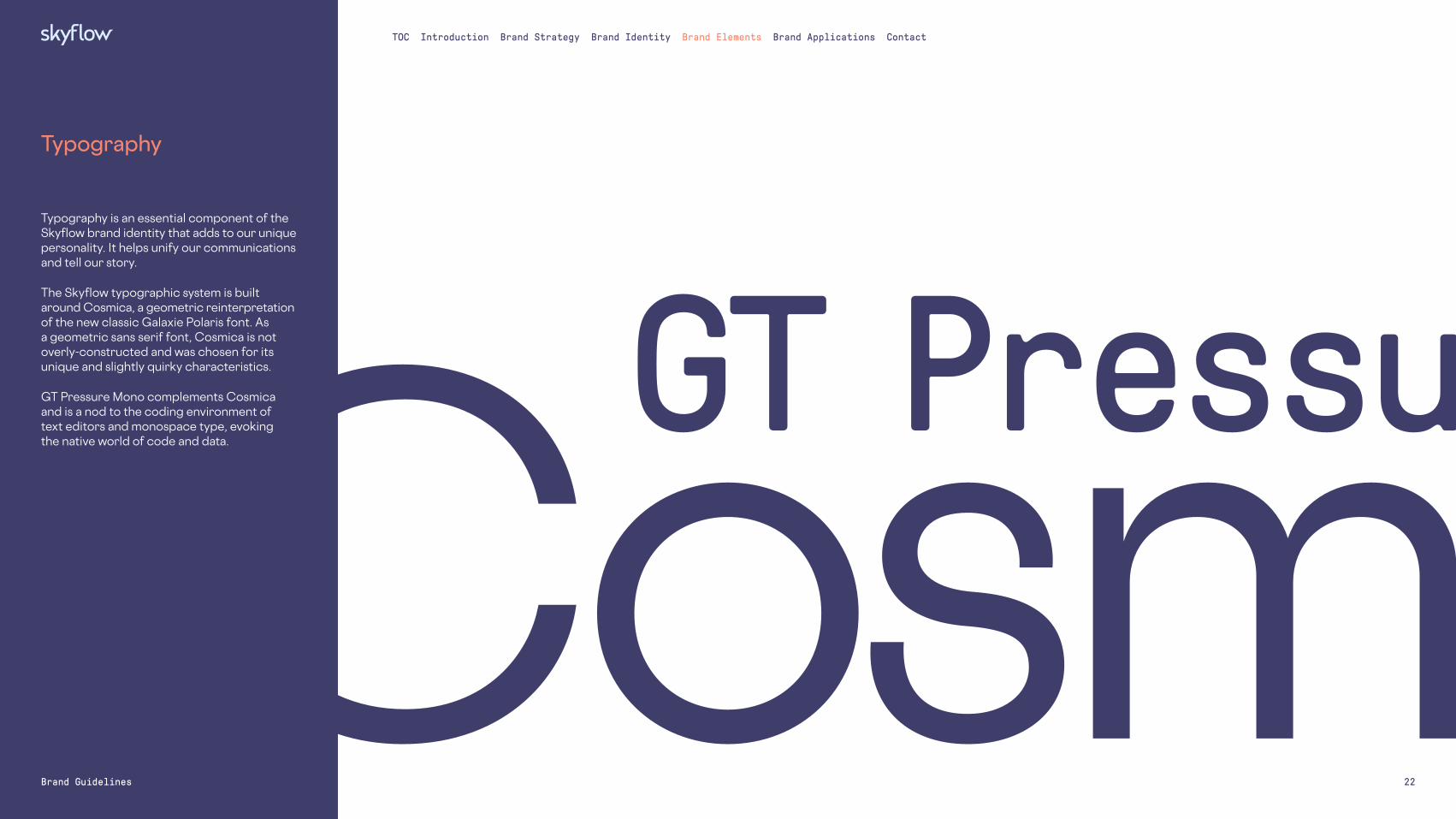
Typography
Typography is an essential component of the Skyflow brand identity that adds to our unique personality. It helps unify our communications and tell our story.
The Skyflow typographic system is built around Cosmica, a geometric reinterpretation of the new classic Galaxie Polaris font. As a geometric sans serif font, Cosmica is not overly-constructed and was chosen for its unique and slightly quirky characteristics.
GT Pressure Mono complements Cosmica and is a nod to the coding environment of text editors and monospace type, evoking the native world of code and data.Cosmica
GT Pressura

23Brand Guidelines
TOC Introduction Brand Strategy Brand Identity Brand Elements Brand Applications Contact
TypographyPrimary Font
The Cosmica font family includes three weights and two styles, as shown. It supports almost all languages based in the Latin alphabet.
Cosmica is available for licensing at vllg.com.
CosmicaAaBbCcDdEeFfGgHh IiJjKkLlMmNnOoPpQqRrSsTtUuVvWwXxYyZz1234567890!@#$%^&
AaBbCcDdEeFfGgHhIiJj 1234567890!@#$%&*
AaBbCcDdEeFfGgHhIiJj 1234567890!@#$%&*
AaBbCcDdEeFfGgHhIiJj 1234567890!@#$%&*
AaBbCcDdEeFfGgHhIiJj 1234567890!@#$%&*
AaBbCcDdEeFfGgHhIiJj 1234567890!@#$%&*
AaBbCcDdEeFfGgHhIiJj 1234567890!@#$%&*
Cosmica Medium
Cosmica Regular Italic
Available weightsCosmica Bold
Cosmica Medium ItalicCosmica Bold Italic
Cosmica Regular

24Brand Guidelines
TOC Introduction Brand Strategy Brand Identity Brand Elements Brand Applications Contact
TypographyMonospace Font
GT Pressura Mono is Skyflow’s monospace font. Our visual system uses only the Regular weight, shown to the right.
Note: GT Pressura Mono should be used sparingly. Do not use it for body copy or text passages that are more than 4–5 words.
GT Pressura Mono is available for licensing at grillitype.com.
GT Pressura Mono AaBbCcDdEeFfGgHh IiJjKkLlMmNnOoPpQqRrSsTtUuVvWwXxYyZz1234567890!@#$%^&
AaBbCcDdEeFfGgHhIiJj 1234567890!@#$%&*
Available weightsGT Pressura Mono Regular

25Brand Guidelines
TOC Introduction Brand Strategy Brand Identity Brand Elements Brand Applications Contact
DM Sans is our alternate font for instances when our primary font cannot be used. It should be used only for internal and external non-marketing documents in applications such as Microsoft Office and Google Workspace.
In situations where DM Sans is not available, such as email and email signatures, Arial may be used.
DM Sans is available as a free download from fonts.google.com.
Arial is available as a system font in both Windows and MacOS.
TypographyAlternate Fonts
DM SansAaBbCcDdEeFfGgHh IiJjKkLlMmNnOoPpQqRrSsTtUuVvWwXxYyZz1234567890!@#$%^&
ArialAaBbCcDdEeFfGgHh IiJjKkLlMmNnOoPpQqRrSsTtUuVvWwXxYyZz1234567890!@#$%^&
AaBbCdEeFfGgHhJjKkLl 1234567890!@#$%&*
AaBbCdEeFfGgHhJjKkLl 1234567890!@#$%&*
AaBbCdEeFfGgHhJjKkLl 1234567890!@#$%&*
AaBbCdEeFfGgHhJjKkLl 1234567890!@#$%&*
AaBbCdEeFfGgHhJjKkLl 1234567890!@#$%&*
AaBbCdEeFfGgHhJjKkLl 1234567890!@#$%&*
AaBbCdEeFfGgHhJjKkLl 1234567890!@#$%&*
AaBbCdEeFfGgHhJjKkLl 1234567890!@#$%&*
Available weightsDM Sans Bold
Available weightsArial BoldDM Sans Regular Arial Regular
DM Sans Bold Italic Arial Bold ItalicDM Sans Italic Arial Italic

26Brand Guidelines
TOC Introduction Brand Strategy Brand Identity Brand Elements Brand Applications Contact
Our typographic style is clean, simple, and sophisticated. A range of type weights brings flexibility and unity to our communications. Hierarchy is established across different levels of information through contrasting sizes, weights, and colors, creating a look that’s eye-catching and aesthetically pleasing.
Cosmica is Skyflow’s primary font. It is used for headings and headlines, where its personality can be most fully appreciated. It is also used for body text and captions.
GT Pressura Mono Regular is our monospace font. It may be used for section headings, buttons, tags, labels, navigation—anywhere a digital counterpoint to the more expressive Cosmica is useful.
For examples of typography usage, please see the Brand Applications section.
TypographyBasic Usage
Large HeadlinesFont: Cosmica RegularCase: SentenceLeading: 1.2x–1.4xKerning: MetricsTracking: -10
Medium TextFont: Cosmica RegularCase: SentenceLeading: 1.2x–1.4xKerning: MetricsTracking: -10
Medium Text (alternate)Font: Cosmica MediumCase: SentenceLeading: 1.2x–1.4xKerning: MetricsTracking: -10
Body TextFont: Cosmica Regular / BoldCase: Sentence, title for subheadsLeading: 1.2x–1.5xKerning: MetricsTracking: 0
Large headline text is set in Cosmica Regular.
Medium text 30pt or smaller may also be set in Cosmica Medium for better legibility.
Medium text is set in Cosmica Regular.
Subhead (Cosmica Bold)Body text is set in Cosmica Regular, with Cosmica Bold used for emphasis. When needed, Cosmica Regular Italics may be used to denote titles and names of works. Bis ium sequos nonecullaut est, aut reperum vent.
• Bulleted copy example est quo et etusam invel et res maxim acepe• Quis et endis aci que si nobit ut voloreius ma demo moles unto
Section Headings, Tags, and UI ElementsFont: GT Pressura Mono RegularCase: Sentence, all capsLeading: 1.2x–1.5xKerning: MetricsTracking: 0–5
Tag
Navigation
Label
SECTION HEADING
Button

27Brand Guidelines
TOC Introduction Brand Strategy Brand Identity Brand Elements Brand Applications Contact
Iconography Style
Our iconography is evolving and conceptual. Shown on this page is a collection of icons that have been created thus far.
Skyflow icons fall into two categories: primary and supporting.
Primary iconsPrimary icons are abstract and reductive. They appear front and center in our visual system and communicate key concepts and information. They are constructed with gray offset outlines that add gravitas and make the icons more ownable by the Skyflow brand.
Supporting IconsSupporting icons play a secondary role in our visual system. They are more literal and representational than our primary icons and are used only within the context of diagrams. (See pages 28-31.) Supporting icons must never be used on their own, and they should always appear secondary in scale to our primary icons.
As the brand grows, we anticipate our set of iconography to grow with it. When creating new icons, use the examples shown on this page as a guide to inform future designs.
Your App/ Tokenization
Access Control
Person/ User
Visibility/ Seeing
Secure
Time Healthcare/ Healthcare Vault
Check Mark
Payments Vault/ Cost/Expense
App Backend
Polymorphic Encryption
Enterprise Grade
Usable Data
Data Control
Your Skyflow VPC
Primary icons
Supporting icons
SpecificationsLineOnly one line weight per icon may be used. Icons within a set should use the same line weight. When outlining primary icons, offset the outline from the shape, and use a white fill to make the icon stand out when placed on gray backgrounds. Supporting icons should not be outlined.
ShapeOur primary icons use shapes that are more abstract, whereas our supporting icons use shapes that are more representational. In either case, simplicity is key.
ColorColor use should be minimal, no more than 1–2 colors per icon (plus gray for primary icons).

28Brand Guidelines
TOC Introduction Brand Strategy Brand Identity Brand Elements Brand Applications Contact
In keeping with the rest of our visual system, the Skyflow diagram style is direct, clear, and stripped back to the essentials. Evocative of whiteboarding, it communicates information and ideas in a manner that is straightforward and easy to understand. Shapes and lines are uncomplicated, and use of color is minimal and purposeful.
Diagram StyleOverview

29Brand Guidelines
TOC Introduction Brand Strategy Brand Identity Brand Elements Brand Applications Contact
Skyflow diagrams are constructed using the elements shown on this page. Proper use of these elements will ensure legibility and brand consistency.
Diagram StyleElements
_HEADING
Tag
HeadingBody text lorem ipsum dolor Iliquid ut mo enias iusam fuga.
Diagram lines may be solid, dashed, or dotted, with butt caps. Simple arrowheads are used when needed.
Our diagram system uses simple geometric shapes.
Diagram colors draw from the entire Skyflow palette. (Please see pages 20–21.)
Both primary and supporting iconography are used throughout our diagrams. (Please see page 27.)
Diagram typography follows the same general rules as the rest of the Skyflow visual system. (Please see pages 22–26.)
Lines Shapes Color Iconography Typography

30Brand Guidelines
TOC Introduction Brand Strategy Brand Identity Brand Elements Brand Applications Contact
Shown to the right are examples of our diagram style in use.
LineSolid lines are the default style, but dashed lines may also be used when needed to illustrate a concept. Only one line weight per diagram may be used. Arrows should be used only when necessary to indicate direction.
ShapeSimple geometric shapes, both solid and outlined, may be used. Avoid using shapes that are overly complex.
ColorColors should always be used purposefully to communicate categorization, progression, etc. Avoid using colors purely for decoration, and only use the minimum number of colors necessary to communicate information.
TypographyClear type hierarchy should be used to distinguish various elements. Title case and sentence case should be used in most situations, but all caps may also be used sparingly for categories and labels.
IconographyBoth our primary and supporting icons are used in our diagrams. Supporting icons should always be used at smaller scale and should never dominate.
Diagram StyleUsage
ColorSecure connection between app and cloud is highlighted here using one of our more vibrant colors (Day).
ColorColor highlights critical information here and visually connects it to a corresponding icon.
LineThe dashed line in this diagram indicates a clear delineation between public and virtual private cloud.
IconographyThe user is depicted here with our Person/User supporting icon.
IconographyHere our Visibility/Seeing supporting icon indicates the user’s view into data.
LineThe solid lines used here connect users to the information they can see.
ShapeSimple shapes are used to house user information in this diagram.
TypographyHierarchy is established using different sizes and case treatments.
IconographyIn this diagram, different areas of the cloud are depicted using a variation of our Your Skyflow VPC icon.
ColorLighter colors are used on foundational elements for legibility and to let highlighted information pop.
IconographyOur Your App/Tokenization icon is used here.
LineArrowheads at both ends indicates two-way communication in this diagram.

31Brand Guidelines
TOC Introduction Brand Strategy Brand Identity Brand Elements Brand Applications Contact
Like our iconography, our diagram system is evolving and conceptual. Shown on this page is a collection of assets that have been created thus far.
In the top row, we have defined our core products visually: Customer Vault is represented by a circle in Day, Payment Vault by a diamond in Dusk, and Healthcare Vault by an oblong oval in Front.
In the bottom row are unique representational elements. The device/mobile phone shown can be redesigned as needed. A device may also be shown as a tablet, laptop, or desktop computer.
The cloud shape, based on our Your Skyflow VPC icon, is very flexible and can be used in a variety of ways to depict different concepts, as shown here.
As the brand grows, we anticipate the set of diagram assets to grow with it. Please use the elements on this page as a starting point to inform future designs.
Diagram StyleAssets
Customer Vault
Your Skyflow VPC(icon)
The cloudDevice/mobile phone
Private cloud inside public cloud
Payments Vault Healthcare Vault

32Brand Guidelines
TOC Introduction Brand Strategy Brand Identity Brand Elements Brand Applications Contact
Illustration Style Linear Diagonal
Linear Horizontal
Linear Waves
Diagram Vignette
Logo
Our illustration style is abstract, bold and colorful. It follows the guiding principles of our diagram style (pages 28–31) to unify with the rest of the Skyflow visual system.
Illustrations fall into the following categories:
Linear DiagonalParallel diagonal lines and shapes mirror the sweeping, skyward-facing angles in the Skyflow logo. Angles are always 63.̊
Linear HorizontalParallel horizontal lines evoke data and forward motion. Lines used are heavier than those in linear diagonal illustrations.
Linear WavesThese illustrations use undulating curved lines, with or without solid shapes. A single line or a series of identically-shaped lines may be used, but avoid using too many elements, which can result in busy or overly-complex illustrations.
Diagram VignetteDiagram vignettes are simplified versions of diagrams used as evocative supporting imagery. Labels should be used minimally.
LogoThe Skyflow logo is showcased in these illustrations, either large as a bold super graphic, or small as a repeating pattern.
For examples of our illustration style, please see the Brand Applications section.
63˚

Brand Applications
33Brand Guidelines
TOC Introduction Brand Strategy Brand Identity Brand Elements Brand Applications Contact
Website 34
Swag 35
Presentation Template 36
Poster 37
Out of Home 38
Zoom Background 39
This section illustrates how the Skyflow brand identity and design elements can be used together in a consistent way to create impactful communications. The examples shown here are meant to help guide and inspire further design exploration.

34Brand Guidelines
TOC Introduction Brand Strategy Brand Identity Brand Elements Brand Applications Contact
Website

35Brand Guidelines
TOC Introduction Brand Strategy Brand Identity Brand Elements Brand Applications Contact
Swag

Building the Privacy Vault for B2C Customer Data
36Brand Guidelines
TOC Introduction Brand Strategy Brand Identity Brand Elements Brand Applications Contact
PresentationTemplate

37Brand Guidelines
TOC Introduction Brand Strategy Brand Identity Brand Elements Brand Applications Contact
Poster

38Brand Guidelines
TOC Introduction Brand Strategy Brand Identity Brand Elements Brand Applications Contact
Out of Home

39Brand Guidelines
TOC Introduction Brand Strategy Brand Identity Brand Elements Brand Applications Contact
Zoom Background

Contact
40Brand Guidelines
TOC Introduction Brand Strategy Brand Identity Brand Elements Brand Applications Contact
All inquiries regarding the Skyflow Brand Guidelines should be made to:
Skye Callan Marketing [email protected]
Adobe and Creative Cloud are either registered trademarks or trademarks of Adobe in the United States and/or other countries.
Pantone is a registered trademark of Pantone, Inc.
Copyright © 2022 FDOKUMEN